The Daily Promo: Angela Datre

Screen Shot 2016-07-16 at 3.39.26 PM

Screen Shot 2016-07-16 at 3.39.36 PM

Angela Datre


Who printed it?
I used Overnight Prints.

Who designed it?
I designed it.

Who edited the images?
I edited as well. I picked two of my favorite images from this shoot.

How many did you make?
I printed 50 and targeted publications that feature cooking, food culture and/or portraits. I’ve been shooting more food-related work this past year so I wanted to send out a promo that would highlight that.

How many times a year do you send out promos?
I usually will create a promo when I have new work that I want to share. Ideally I would like to do one booklet per year with postcards here and there as well.

What project did theses image come from?
These images were from a story I shot on two women butchers at The Meat Hook in Brooklyn for the Village Voice. I always enjoy photographing people in their studios or work spaces so this shoot was a lot of fun. I’m happy when photography assignments bring me somewhere I normally wouldn’t be (like in the freezer at a butcher shop).

The Daily Promo – Kenneth Ruggiano

Screen Shot 2016-07-16 at 3.38.11 PM

Screen Shot 2016-07-16 at 3.38.27 PM

2016-07-16 14.17.07

2016-07-16 14.17.18

2016-07-16 14.17.30

2016-05-12 12.16.03

Kenneth M. Ruggiano


Who printed it?
I had the prints done by Bay Photo. It’s printed on Moab Entrada. After I receive the prints I shoot them “copy stand style” onto slide film, I used Fuji Velvia. I tried a couple different slide films and liked the Velvia the best. After I’m done with the slide film I send it off to Fromex in Long Beach, California to have it processed. No one in my area process slide film any more, sad face. Once it’s back to me after a week or so I cut each positive out and place it into a slide viewer. It’s a total pain in the ass…I mean labor of love. Than I cut a piece of leather, stamp my branding on it and attach. One final piece of branding stamped on the inside of the box filled with some crinkle paper and out it goes.

Who designed it?
I designed it. The semester I was graduating  from art school at the University of Oklahoma, one of lower classes showed some of their work with viewers like this. They hung from string in the hall and you had to walk up and interact with the viewer to see the work. I was jealous I didn’t get to do it.

Who edited the images?
I edited the images. I sent @aphotoeditor one version. There are three others. Who gets what depends on who they are, but they are all fitness related.

How many did you make?
In all I’ve probably made just over a 100. The one I sent to @aphotoeditor was in the second wave.  The first set I did as a test, I got some really positive feedback so I went ahead and did another batch right away.

How many times a year do you send out promos?
I’ve been doing a targeted promo once a year. Normally in the beginning of the year but the getting ready/birth of my little girl slowed me down a bit this year.

Where did you find that viewer?
The first set of viewers I bought about five years ago when I first had the idea to do these as a promo. I think I got them from Calumet. I originally planned to find a printer that could print small enough but I couldn’t find anything I was happy with. When I bought more viewers this year I bought them from the manufacturer, Radex Inc.


The Daily Promo – Emiliano Granado


Screen Shot 2016-07-14 at 3.12.55 PM

Screen Shot 2016-07-14 at 3.13.03 PM


Emiliano Granado


Who printed it?
Postcards: gotprint.com
20 pg zine: Awlitho.com

Who designed it?
Kayla Kern

Who edited the images?
I edited the images.

How many did you make?
2000

How many times a year do you send out promos?
I send postcards throughout the year, 3-5 per year. I try to print more cohesive promos/zines 1-2 times per year.

The postcard promo was a teaser for this zine, what is this publication about?
This publication is about the Spectacle that is the Tour de France. My focus was NOT on the racers, but instead it’s a look at the whole thing. The colors, the landscape, the human spectacle, and even some dudes in lycra.

OCT1


20160711_OUI_Product_080

20160711_OUI_Product_084

20160711_OUI_Product_085

20160711_OUI_Product_097

20160711_OUI_Product_106

Tell me about your marketing strategy for the mail/ and the 20 page zine.
The strategy is to keep my brand consistent. To put out the work I’m most proud of. To continue to showcase the work that I believe is the most significant and could be most valuable to potential clients. I sent out 3 postcards leading up to the main piece to ‘tease’ the project. I’m launching the project on my site and making the zine for sale at quesofrito.com

The Daily Promo – Steve Pomberg


Screen Shot 2016-07-14 at 3.10.27 PM

Screen Shot 2016-07-14 at 3.10.40 PM

Screen Shot 2016-07-14 at 3.10.49 PM

Screen Shot 2016-07-14 at 3.10.58 PM

Screen Shot 2016-07-14 at 3.11.06 PM

Steve Pomberg


Who printed it?
Paper Chase Press printed my piece. They are based in Los Angeles, were awesome to work with, and I think they did an amazing job.
Who designed it?
Dana Silberman is a fantastic art director (and conveniently my wife). She designed the front and back cover and eagle eyed the entire piece.
Who edited the images?
I did most of the editing and Dana gave me some great feedback/input regarding layout and pagination.
How many did you make?
I had 100 books printed this time around.
 How many times a year do you send out promos?
I try and do an annual printed promo and keep my website current.
Tell us about your inspiration for this promo.
For this promo piece my intention was to share unpublished personal work that would appeal to potentially new and current editorial/commercial clients. I wanted to showcase my ability to work on location and in the studio so the selected images oscillate between those spaces. I grew up skateboarding and surfing so I wanted to give a nod to the the activities/subcultures that really got my creative juices flowing and inspired me to pick up a camera. Recent trips to Croatia and Nicaragua along with some of my favorite spots in the southeast provided me with vivid environments to experience and photograph. I am an avid art and record collector, and am fascinated with the concept of “Analog Versus Digital’ so I also included images that reference those areas of interest.

The Daily Promo – Jennifer Rocholl

01JenniferRocholl_LovesYou 12JenniferRocholl_Has2020Vision 03JenniferRocholl_SmellsGood

14JenniferRocholl_HasTheForce 13JenniferRocholl_WorksFast 11JenniferRocholl_WillShareDessertWithYou 10JenniferRocholl_HasGoodHair 09JenniferRocholl_SweatsGlitter 08JenniferRocholl_HasGoodManners 07JenniferRocholl_Genius 06JenniferRocholl_KittensOnSet 05JenniferRocholl_GivesGoodGifts 04JenniferRocholl_WearsCuteShoes 02JenniferRocholl_HireHer
JenniferRocholl

Who printed it? 
Southern California Graphics in Culver City

Who designed it? 
The amazing Jean-Marc Durviaux and his team at DISTINC_.  Jean-Marc put so much individual attention, thought, and care into my project.  This is the second promo he’s designed for me.  The previous one placed 2nd in the PDN promo awards in 2009 (just behind the DS reps’ promo and yes, it’s been that long since I last did a printed promo!).  There is so much heart in this design agency, I really adore them.

Alexey Brodovitch’s design work was the inspiration for this project.  Brodovitch is a master of juxtaposition and extreme scale and his layouts remind me of contact sheets that have been cut into strips.   Jean-Marc thought it jelled perfectly with the spirit of my work and ran with it.  It was his idea to integrate graphic elements and type to give a hint of how my work could potentially look as an “already consumed” product.  (Yes — Jean-Marc, I’m glad you talked me into this!)

Who edited the images? 
I presented Jean-Marc with a very broad edit from my entire body of work and he made his selects from there.  It was necessary to get fresh eyes on my work because I tend to get stuck on which photos are my favorites.

How many did you make?
2,000.  1,800 were blessed during a candle lit ceremony and sprinkled with unicorn dust, packed into hand painted envelopes, and mailed out.  The lovely NIkki (pictured) came over and spent about a week painting those envelopes on a tarp in my driveway, sometimes with the help / hindrance of my kids.  I really wanted each one to have a “I made this for you” aesthetic.  The remaining 200 are waiting to be handed out at meetings and mailed out to anyone else who’d like one — just hit me up.

Nikki_Painting

How many times a year do you send out promos? 
Since this promo was a substantial production and big cost, it will be my big annual hit in addition to a New Year postcard I sent earlier this year.

The Daily Promo: Stan Evans

Screen Shot_1

Screen Shot_2

Screen Shot_3

Screen Shot_4

Screen Shot_5

Screen Shot_6

Stan Evans


Who printed it?
Modern Postcard out of San Diego Printed it. Ture Lillegraven referred me to them. They are reasonable priced and efficient.

Who designed it?
I designed it. As far as the concept, I’ve been shooting a bit of motorcycling lately and it seems the market has been saturated with café racers, sunset shots and generic side of the road shots.  While some of those photos will always be timeless, I wanted to capture something that flew in the face of that. High-end motorcycles are precision machines and the apparel motorcyclists wear for protection at those speeds has many features and functions.  I wanted showcase a seamless connection between man and machine;  inspired by the work of artist HR Giger and director James Cameron did on the “Alien” series. It’s dark and moody but in a stack of sunset motorcycle work it sticks out.

Who edited the images?
I edited the images and did the post-production myself.  I had pretty clear vision of wanting to mix crisp product photography with dynamic action.  The photos themselves have very little photoshop.  Some of the on location photos had a bit of light spill because you are capturing things at speed but overall that it was getting the right mix of portraits and action so it flows nicely

How many did you make?
I made 200. I sent out about half of those. I handed out probably another fifty. I still have a few on hand to leave behind at meetings.  I’d be happy to send more out, shoot me an email if you are interested:  stan@stanevansphoto.com

How many times a year do you send out promos?
Usually 3 to 4 times a year. I do one larger one and 2-3 follow-ups.

How did this idea come about?
Originally I pitched this idea to a company for a shoot and they passed but the problem with good ideas is they stick, so I made this promo.  A promo is the best manifestation of what you can do with your own mind on your own time.  If you can get people to believe in that, they will believe in you and help manifest bigger dreams and ideas. People will say “no” to your ideas but you need to have the resilience to come back and define those ideas, shoot them and take them to fruition if need be.  Practice until you get to a point where people will take notice.

Later after they saw the promo they came back and commissioned a shoot. It also led to a recent work with Cycle World, which was pretty cool because I’ll be frank; I’m a portrait photographer that likes shooting motorcyclists and hearing their stories. I have an instagram (@upforadventuress) dedicated just my moto exploits but I separate the two because I don’t want to be stamped as just a “moto photographer.” It’s a great outlet to show that world as I see it without any constraints and it’s made my overall photography work better but I enjoy seeing and shooting many things.

Special thanks to Adey Bennett (model), Jeff Moustache (the assistant on the shoot but a talent photographer in his own right) and Yamani Watkins (an executive producer /co-founder of Karma Media Group  an amazing mentor for me in LA )  who all helped tremendously on this project.


The Daily Promo: Heather Byington


_HLB2030

_HLB2035

_HLB2038

_HLB2039

_HLB2043


Heather Byington

Who printed it?
Vista print made the post cards, envelopes were hand crafted by me.

Who designed it?
I did.

Who edited the images?
I did.

How many did you make?
452, though some were sent back, so roughly 420 made it out into the world. I sent promos to only to the agencies I had direct contact details for.
815 postcards were sent, just as a solo card/promo piece, these were all marketed to “art director/buyer”.

How many times a year do you send out promos?
This was my first real “big push”.  I have sent out a card here or there a couple times before, but nothing to this level. This is the first time I have heard anything back.

Tell us about the promo concept.
Anthology of Muddled Nightmares is a collaboration between myself and Mitchell Walter. I’ve always had an eye for the dark and macabre, but I balance it with visceral emotion and undeniable beauty.  Mitchell is a professional creative writer; he has always been smitten with short stories, finding their blend of narrative content and poetic metaphors powerfully engaging.

Having a mutual admiration for each others’ work, we decided to collaborate on Anthology of Muddled Nightmares. 

The Daily Promo – Steve Simko

PROMO_2016-6774-Edit PROMO_2016-6799 PROMO_2016-6810-Edit


Steve Simko


Who printed it?
I sourced it through FOXTONE PACKING in New York City. He’s a print broker and is known for his foil stamping expertise.

Who designed it?
Myself and longtime friend/designer Peter Scherrer at STUDIO MOUSETRAP here in Los Angeles.

Who edited it?
Myself. I had originally chosen a different image but felt it like I might have missed something in the first edit and went back a couple weeks later and found this timeless image.

How many did you print?
500 total with 300 for the mailing and 200 for hand outs.

How many times a year do you send out promos?
2-3 times a year with a very specific target of photo editors and art buyers.

Tell us about this image.
This image is from a personal project I photographed with Michael Wilkinson (Oscar nominated costume designer) and his husband Tim Martin. I had shot Michael a couple of years ago and they came to me with an idea for a project they were working on for their new branding company and asking if I had any interest in shooting some Haute Couture clothing. Yes, please !

The Daily Promo: Ryan Geraghty


Promo-Back Promo-Food-Corn-Dog Promo-Food-Cup-O-Noodles Promo-Food-Ice-Pop

 Ryan Geraghty


Who printed it?
I had my promos printed though Moo. I made test prints through a couple different vendors, but Moo seemed to have the best color and paper quality.

Who designed it?
The promos were designed by me. It’s important to me to keep a simple design that focuses on the images and my style of work. I like to shoot food clean and messy, and I wanted to keep the theme of the promo consistent from front to back.    

Who edited the images?
I did the editing myself, but I always have my girlfriend look over most of the work I send out. Having a second opinion is invaluable when looking at my own images for a long amount of time, and she is incredible at catching any small detail I may have missed. In my personal work editing is very light, mostly color correction and contrast adjustments. The bulk of the work is done with styling and lighting before the camera is even turned on.      

How many did you make?
I had about 30 promos printed up but only sent out 12 in total. This is actually my first time sending out any kind of promotional material, so I really wasn’t sure what to expect in terms of feedback I would receive.      

How many times a year do you send out promos?
Going back to the last question, this is my first time sending physical copies of promotional material to anyone. I mostly promoted myself online while getting my degree. Now that I’m beginning my career, I’ve talked to established professionals I respect who advised me to get my work out there. I’m hoping it will land on the right desk.     

The Daily Promo: Jordan Pay


Screen Shot 2016-04-10 at 12.17.25 PM

Screen Shot 2016-04-10 at 12.17.30 PM

image1 (2)

Screen Shot 2016-04-10 at 12.17.36 PM Screen Shot 2016-04-10 at 12.17.42 PM

Jordan Pay

Who printed it?
Peczah in Salt Lake City Utah printed it.

Who designed it?
Sam Rodgers designed it ( samsonrodgers@gmail.com )

Who edited the images?
I edited the images

How many did you make?
400 printed

How many times a year do you send out promos?
Send out once a year. I am putting out promos of personal work hoping to attract work that would fit what I love to shoot. Shooting personal work feels more inspiring, rather than putting in stuff that was shot for someone.

The Daily Promo: Jason Evans

Screen Shot 2016-05-15 at 7.30.48 PMScreen Shot 2016-05-15 at 7.30.53 PM
Jason Evans

Who printed it?
I looked at many different printers, some local and some of the larger mass production places.  In the end, I went with Agency Access as the printer as I was able to bundle many services together and their printing for this type of promo was perfect.  Since I was adding to my marketing list through their database, it made sense for them to print and mail.

Who designed it?
It was designed by Sara Jane Kaminski, a wonderful designer in Boston.  She had been recommended to me by several different business associates, and we’d been talking for several years trying to find the right opportunity to work together.  This was the first project that we worked on together and I was very happy with the results.  Sara came up with the template for emails and these printed bi-fold promos and I switch out the images and type.

I used to send promos in the clear plastic/cellophane envelopes that everyone uses now.  An art buyer in Florida emailed me to say that he had loved the images, but he had thrown the promo in the trash because of the plastic sleeve, as was his practice, and he hoped that the trend of using these envelopes would soon end. I am an environmentalist at heart, and that really stuck with me.  Since then, it has been very important in the mailer design, that they can ship without an envelope.  Sometimes, they are damaged, but I think that is a fair trade to avoid decorative plastic trash.

Who edited the images?
A great photo editor in Los Angeles, named Kathleen Clark, was recommended to me several months ago when I was looking to re-edit my website. We are in the process of finishing up the edit and redesign, and the site will be launched soon. Since she was so familiar with my work at that point, she was able to pull together these 5 images together very quickly.

How many did you make?
I am printing 1000 of each mailer and sending them to agencies, magazines, and photo agents

How many times a year do you send out promos?
I am sending out these mailers 6 times this year and am designing a larger promotional piece to coincide with the Olympics in Rio.

What project did the promo images come from?
This was a promo that went out in the winter and used images that I shot at the Winter Olympics in Sochi. I was working there for the International Olympic Committee. One of the images was selected for the the American Photography 31 Annual Book.  This was the first promo that went out for this year and was the first to go out with Sara’s design.

The Daily Promo: Luke Copping

iw4c4694 (1)

iw4c4716 (1)

iw4c4724 (1)

Luke Copping

Who printed it? Who designed it?
It was both printed and designed  by Agency Access, I recently moved my printing to them because of the extremely high quality and their ability to offer some objective insight into the layouts and flow of the work.

Who edited the images?
In this case I did, but in past efforts I have worked with designer Emilie Lamoreaux, as well and consultants Karen DSilva and Angee Murray to help with my editing and image selection. This collection was primarily focused on sharing some of my more recent projects and features subjects like Buffalo Bills Quarterback EJ Manuel, violinist and recording artist Yuki Numata Resnick, labor attorney Ginger Schröder. US Marine and endurance runner Tony Nash, and Guy William Gane — a historical reenactor who provides period accurate casting and costuming for a number of television shows and feature films.

How many did you make?
I printed 250 of them, I used to send out a much larger batch, but I have condensed and focused my list to primarily focus on editorial clients and a few selects agencies. A few are also earmarked to go out to existing clients that I like to keep updated with my projects.

How many times a year do you send out promos?
Of these tri-folds I generally send out about 4 mailings a year. However, I do send some other promotions throughout the year that go out to a list of key clients. These tend to be larger in scale and scope, and are often often designed by Shauna Haider of We Are Branch. Currently I’m sending out a 24 page newsprint style zine printed by Newspaper Club. I love newsprint promos because of the feel of them and there is something perfectly imperfect and lo-fi about the way the images end up looking. I also have some other promos that are aimed at acquiring new corporate clients, these tend to be a little more service oriented and currently take the form of small booklets that go out to potential clients in this space.

Tell us how the gap between personal work and commissioned work is becoming more narrow.
In the promos I’ve been sending out in the last year or two I’ve found that my personal work, which often features artisans and entrepreneurs from the Rust Belt (and specially the Western New York/Buffalo area) has become more prominent. Mostly, this is because the gap between my commissioned work and my personal projects is getting narrower — in that I am often getting hired for assignments that are more aligned with the personal projects I have been producing. I also feel that the compelling stories behind these projects have a wide appeal, a hook which is helpful to me in appealing to many different kind of clients that run the gamut from local small businesses to newsstand magazines.

The Daily Promo: Cade Martin

Screen Shot 2016-04-06 at 11.14.49 AM


Screen Shot 2016-04-06 at 11.14.59 AM

Screen Shot 2016-04-06 at 11.15.06 AM

Screen Shot 2016-04-06 at 11.15.11 AM

Screen Shot 2016-04-06 at 11.15.26 AM


Cade Martin

Who printed it?
Classic Color outside of Chicago printed the Mercy Street Promo. Matt Parris, the creative we having been working with, recommended them. This was my first time working with Classic Color and would work with them again in a heartbeat. The printer, Matt Claybour, was very collaborative, friendly and interested in the project. We came to them with the idea for a newsprint promo and we ended up with a hybrid newspaper ‘style’ promo that had the look of a newspaper, but used a slightly heavier paper that held the ink better and kept it from rubbing off onto people’s hands.

Who designed it?
Parris is the designer and art director of the Mercy Street promotional piece. We were introduced to Matt through a mutual colleague at the agency he works at in Chicago. Matt has been amazing to work with – lots of energy, great ideas and it’s been a joy to collaborate.

Who edited the images?
My agents, Kate Chase & Matt Nycz, at Brite Productions and I edited the images together. We started with nineteen final Mercy Street portraits and narrowed it down to six. It’s always difficult to edit it down and a lot of times you can’t just pick your favorites. You can start with your favorite images and expressions, but it comes down to the rhythm of the pages and how well the images work together.

How many did you print?
We printed 3,500 promos. We customize the list for each promotional piece sent out and there is always the balance of the printing and mailing costs when arriving at the final number you’d like to print.
How many times a year do you send out promos?
We send out printed promotional pieces four or five times a year. This seems to be a nice number and the right amount of outreach to keep the work in front of art producers and creatives without overwhelming their mailboxes.

Why did you choose this project to feature in your promos?
I love to send out images that are close to my heart and from projects that I have really enjoyed. For promotional campaigns, we feature either a series of images from one project or it could be just one isolated image. But I always want to put out images that mean something to me and are not based on trying to guess what someone else might want to see.

How did this promo develop?
I was hired to shoot the series portraits for Mercy Street, a new Ridley Scott produced PBS and BBC TV Series set in the Civil War. I have a lifetime interest in film and character and was very excited to be a part of this project. My idea was to create a uniquely textured and modern scene that complemented the period-piece subjects to help get them into character and to show the rich, multi-layered stories.


The Daily Promo: Carlos Serrao

Screen Shot 2016-04-10 at 12.23.29 PM

Screen Shot 2016-04-10 at 12.23.36 PM

Screen Shot 2016-04-10 at 12.23.43 PM

Screen Shot 2016-04-10 at 12.23.49 PM

Screen Shot 2016-04-10 at 12.23.56 PM

Screen Shot 2016-04-10 at 12.24.01 PM

Screen Shot 2016-04-10 at 12.24.07 PM

Screen Shot 2016-04-10 at 12.24.12 PM

Screen Shot 2016-04-10 at 12.24.17 PM

Screen Shot 2016-04-10 at 12.24.23 PM

Screen Shot 2016-04-10 at 12.24.30 PM

Screen Shot 2016-04-10 at 12.24.35 PM

Screen Shot 2016-04-10 at 12.24.40 PM

Screen Shot 2016-04-10 at 12.24.51 PM

Carlos Serrao

Who printed it?
AWLITHO. Anthony, the owner, has done the past four promos with me.  He’s great because he will work with different vendors for the production. In this case, we had to go to two different printing facilities, since the outside of this one was traditional newsprint (37lb Text stock), the first few pages had to be done at a web press, and the inside pages were coated stock on a sheet fed (50lb coated stock).

Who designed it?
A great designer: Michael Spolgaric. He likes to have fun with it.

Who edited the images?
Just Michael and I.

How many did you make?
5000 copies; 3000 went to my US agent and 2000 to my European agent.

How many times a year do you send out promos?
Ideally once a year, but last year got away from us.

Tell us why you chose a sport theme?
We wanted a sport driven one this year because of the Summer Olympics, because so many other clients besides the usual sport brands will be showing athletes. The web press was stressing out the printer because they we warning us the quality of photos on the newsprint stock would not be great, so we had to keep assuring them that’s what we were going for for the first few pages, in fact we added a little fading and yellowing tone to the newsprint to give it an aged look. Naturally, they should be how we want them in about a year, but we couldn’t wait that long!

The Daily Promo: Jeff Stephens

Screen Shot 2016-04-06 at 10.52.23 AM

Screen Shot 2016-04-07 at 12.34.55 PM

 Jeff Stephens

Who printed it?
Minuteman Press

Who designed it?
It was designed in house at my agency, The Photo Division

Who edited the images?
My agent, Maureen Dalton Wolfe

How many did you make?
50 total. This was a very small, specific run. We hand delivered with live Flowers to specific clients locally. But, sent flower seeds to clients nationally.

How many times a year do you send out promos?
1 significant promo a year, in addition to small run promos about each month.

How did the flower idea develop?
We try to come up with unique reasons to send a promo. This year we decided it should be all about new beginnings, something bright and promising for the spring ahead. We chose the yellow flower and Alex Rasi hand illustrated the back art and poem. We wanted to cheer people up and lighten the mood. We hand spray paint all of our envelopes, pick stamps to match and delivered this one with flower seeds and or an orchid.

Jeff Stephens Valentine's Day Promo 2016

We recently sent out a Valentine’s promo that was also well received. It was our grey envelope with our logo hand painted in pink or red spray paint. We sent a mix of lips or “kiss” postcards and chocolate lips or lipstick compact to go with it. We try to do anything we can to help brighten someone’s day and make their day in the office go just a little bit better.


The Daily Promo: Andrew Dominguez

Screen Shot 2016-03-08 at 3.31.10 PM

Screen Shot 2016-03-08 at 3.31.20 PM

Screen Shot 2016-03-08 at 3.31.28 PM

Screen Shot 2016-03-08 at 3.31.35 PM

Screen Shot 2016-03-08 at 3.31.41 PM

Screen Shot 2016-03-08 at 3.31.46 PM

Screen Shot 2016-03-08 at 3.31.53 PM

Screen Shot 2016-03-08 at 3.31.58 PM

Screen Shot 2016-03-08 at 3.32.05 PM

Screen Shot 2016-03-08 at 3.32.26 PM


Andrew Dominguez

Who printed it?
Minuteman Press located in Austin TX.

Who designed it?
To be completely honest in a message, a bottle of Evan Williams.

Who edited the images?
Myself, though I asked for feedback from two friends:  Maja Buck  & Carlos Salazar

How many did you make?
Fifty in total. Twenty of those were sent out to Austin Texas based art directors back in early February. The remaining thirty I’ve been selling while touring across America with punks bands. I have four left.

How many times a year do you send out promos?
Station Wagon Dad was the first zine I’ve put together. I’m planning to have another zine ready to send out in October, which would be a turn around time of about 9 months.(1.5 a year?) Though every month I’ve been sending out postcards that feature images I’ve taken of Goats. (goatmonthly.com)

Tell us how your backseat investment turned out this promo.
I woke up in Birmingham at the end of September, in a house known as ‘God’s Butt.’ I was hungover and looking for a place to sit while charging my laptop. The house was covered in filth, glossy black tile had a layer of grime similar to a stove top after deep frying.  The cold water knob in the shower was buster off and their hot water heater was at a ten. I left the shower feeling more disgusted than the start. The band I was touring with broke up later that day, canceling five days in Florida and driving eleven hours back to Texas.
I’m not investing my time in the back seat of a van so that two hundred images can sit in an untouched dropbox folder for eternity. Touring isn’t providing me stability or funding my retirement account.

A few days prior to Birmingham, we were playing in a basement somewhere in Indianapolis. There I met Grant Lewandowski ,who gave me one of his B&W film zines.
Most of his images are paired with a poem, written by someone he knows via the internet. It was sequenced to become this beautiful short story of youth. Grant’s zine encouraged me to start printing my work again.

Producing Station Wagon Dad (the promo) was a way for me to share my experiences and look back on images that I was stoked on. It’s a wonderful feeling to rid a digital file of keywords and likes; being able to hold a physical album of my youth. I mean, yeah I regularly update my Instagram, but that’s a curated image grid meant to look pretty for someone who’s trying to give half of their attention to a conversation going on in a car.
I’m more interested in hearing about others and sharing experiences face to face. I suppose that’s why I’m sitting in the back seat of a van again. I’m on a Midwest tour until April 22nd; just trying to figure out where I want to be in life.


The Daily Promo: Kevin Brusie

Kevin_Brusie_AR_001
Kevin_Brusie_AR_066 Kevin_Brusie_AR_064


Kevin_Brusie_AR_012

Kevin_Brusie_AR_009

Kevin_Brusie_AR_022

Kevin_Brusie_AR_030

Kevin_Brusie_AR_007


Kevin_Brusie_AR_055

Kevin_Brusie_AR_051

Kevin_Brusie_AR_048

Kevin_Brusie_AR_050
Kevin_Brusie_AR_063

Kevin_Brusie_AR_065

Kevin_Brusie_AR_067

Kevin Brusie


Who printed it?
It is being printed by Blurb, using their ‘Magazine’ format. 81/2”x11”, perfect bound, with some surprisingly nice stock. We were quite impressed.

Who designed it?
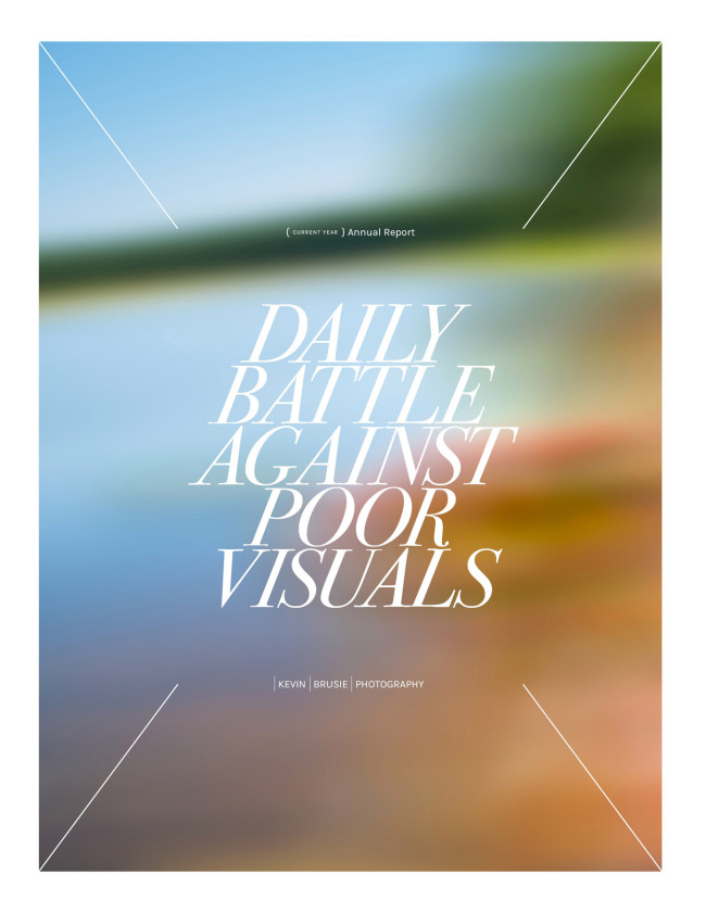
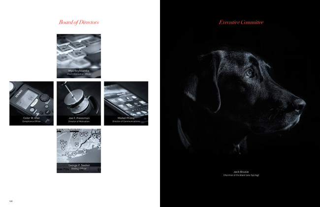
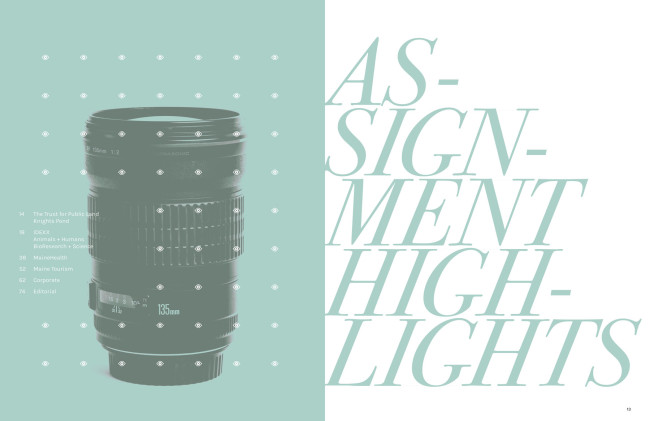
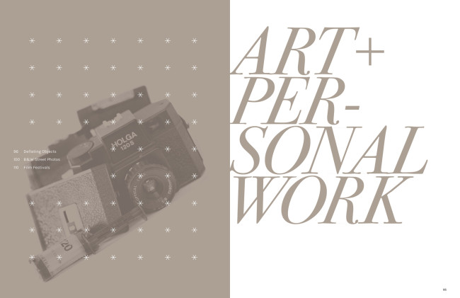
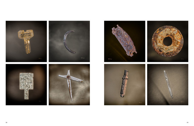
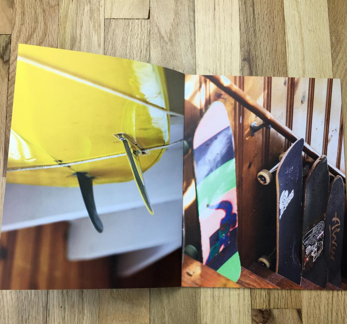
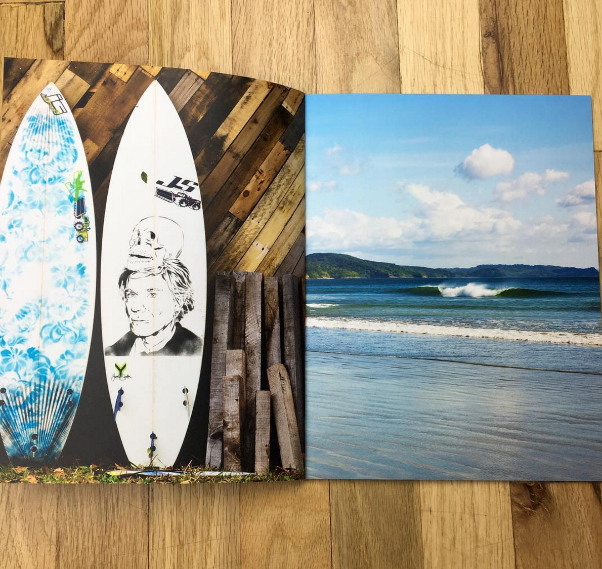
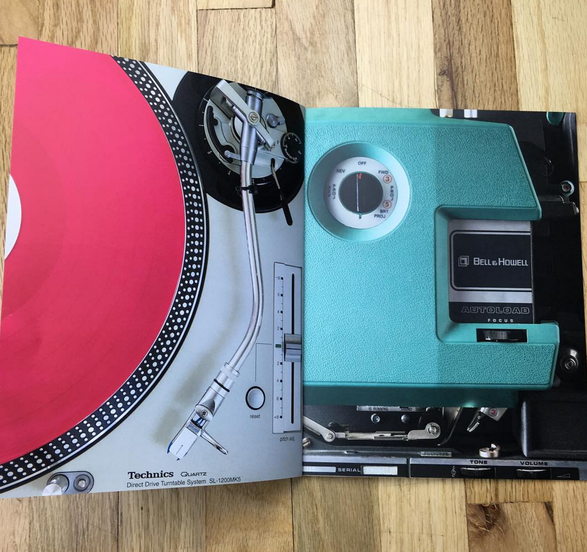
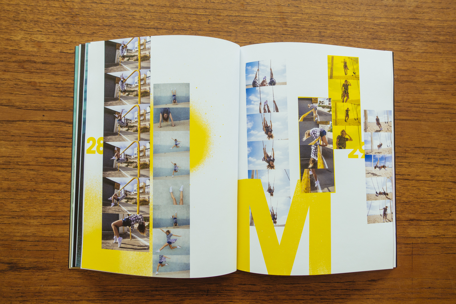
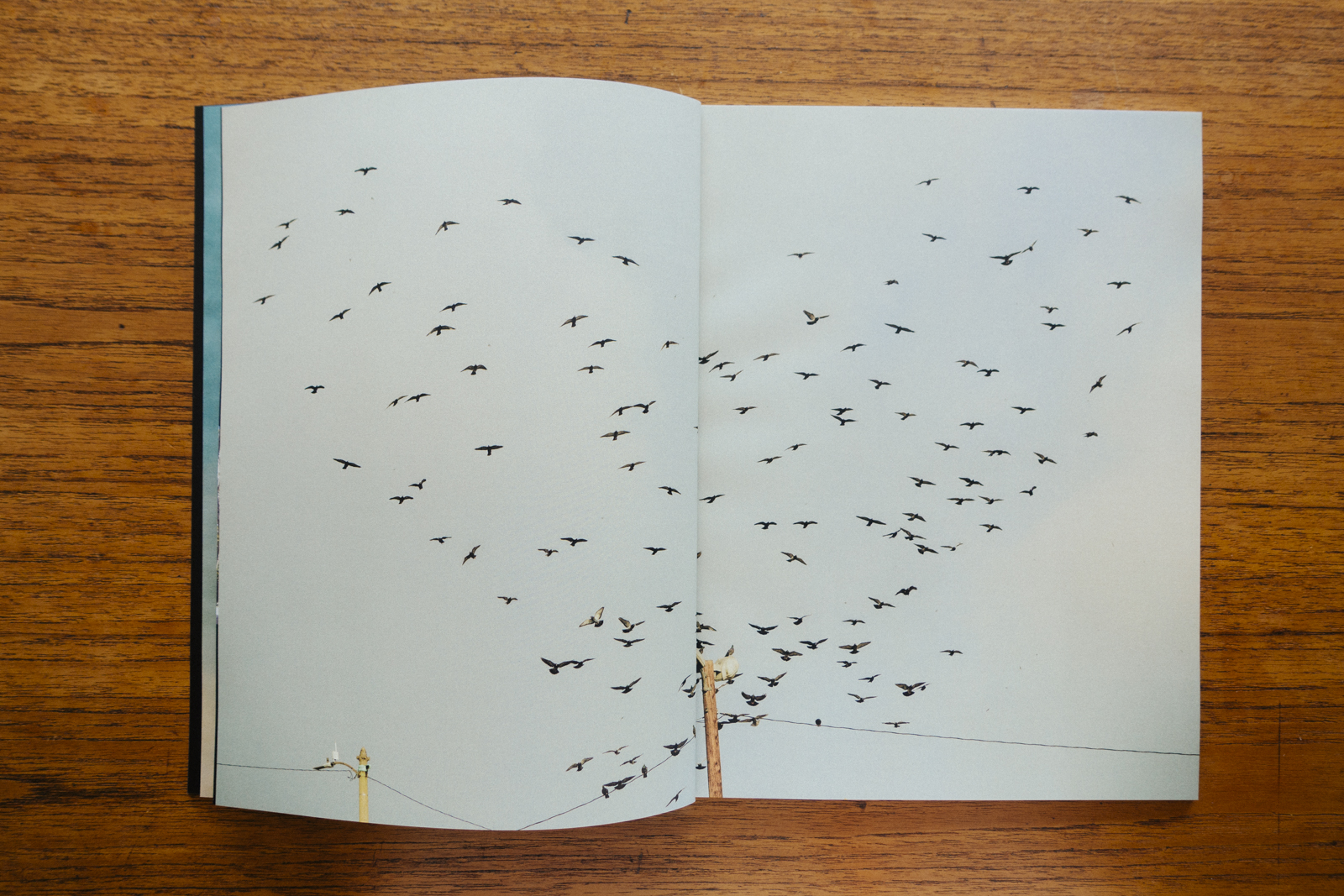
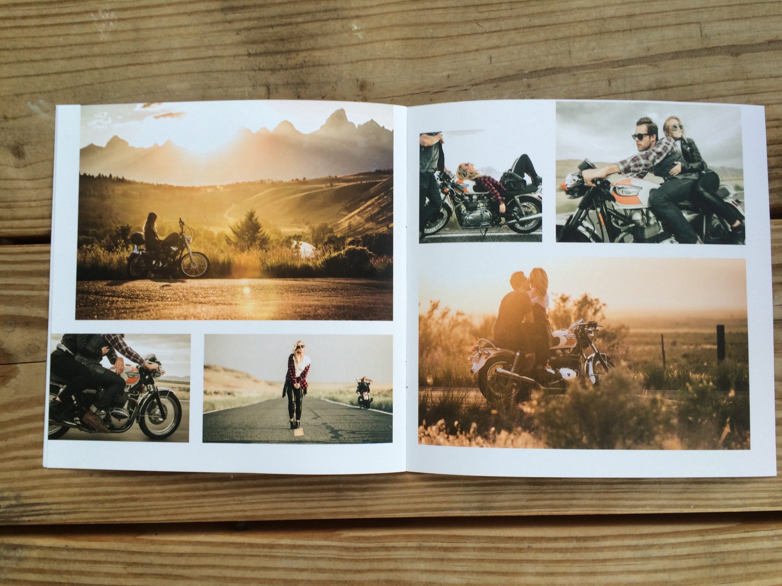
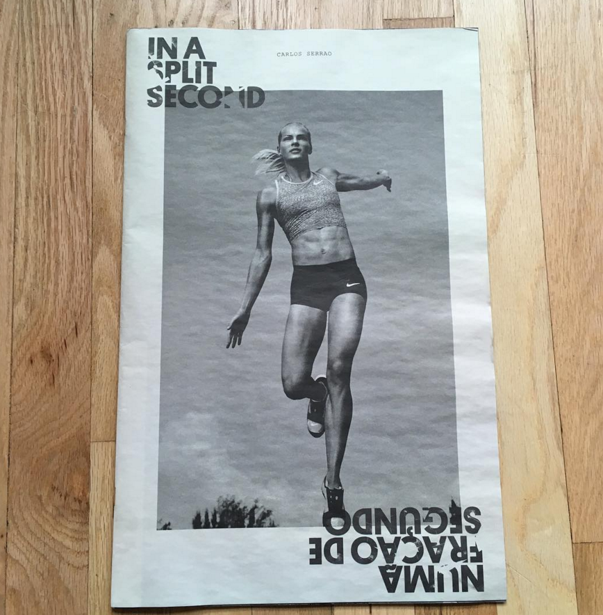
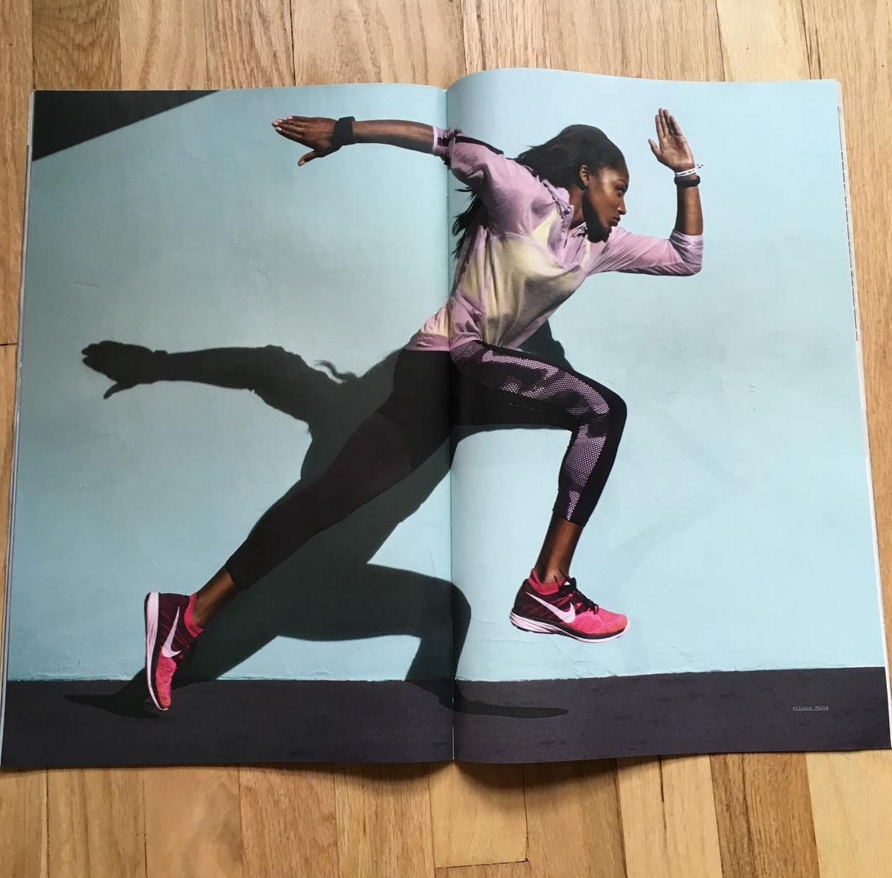
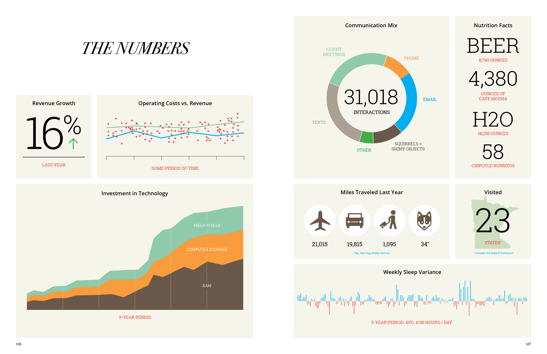
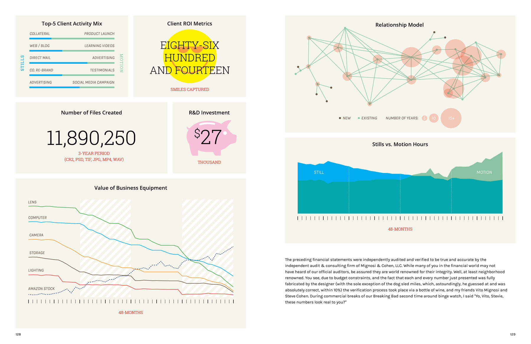
The {current year} Annual Report – which by definition never becomes obsolete – was designed by a long time collaborator and friend, designer Travis Goulder. I have had this concept in my head for quite a few years, and never was able to bring it to fruition. I knew I needed a talented and patient, designer to pull it together. So the summer of 2015 found Travis ‘under-employed’, so he graciously volunteered to help out. We finally wrapped up in December. His contributions really defined the style and refined my direction. This would not have been as successful without his vision. His extensive corporate experience brought sophistication and authenticity to the book, It also enabled the 4 pages of totally meaningless graphs, charts, and “financial” graphics, filled with small smile provoking visuals. And, believe it or not – not a single photograph!

Who edited the images?
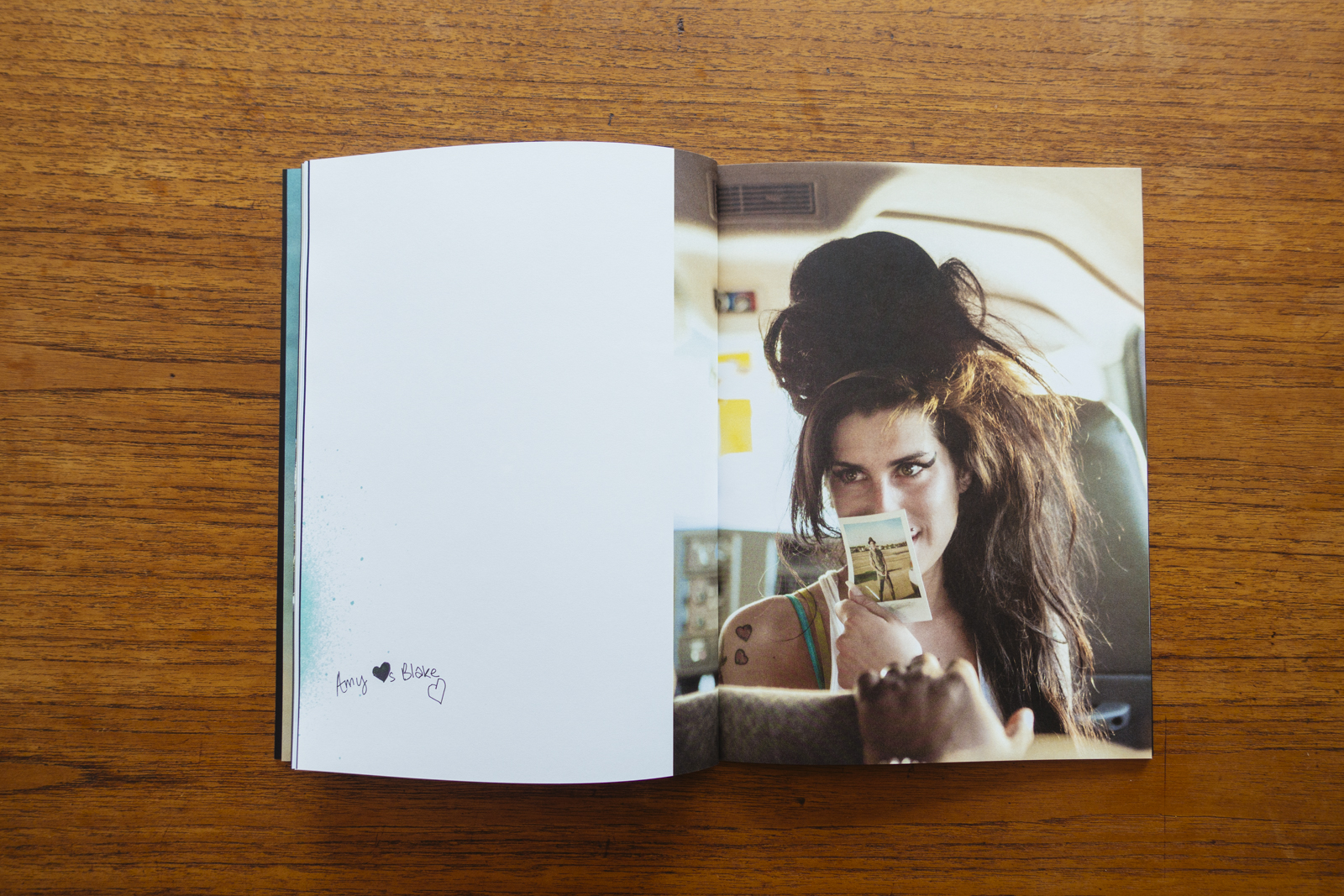
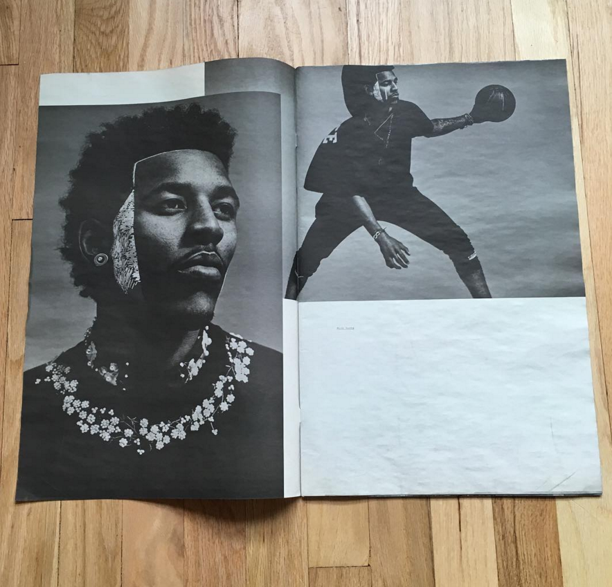
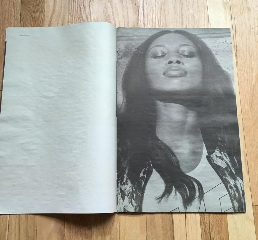
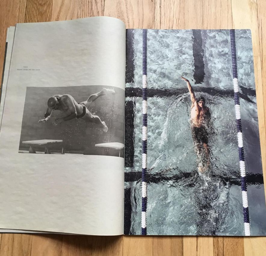
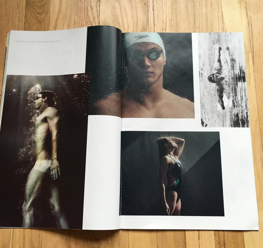
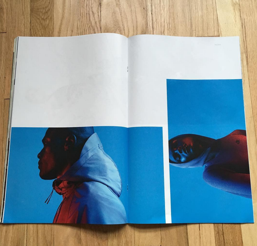
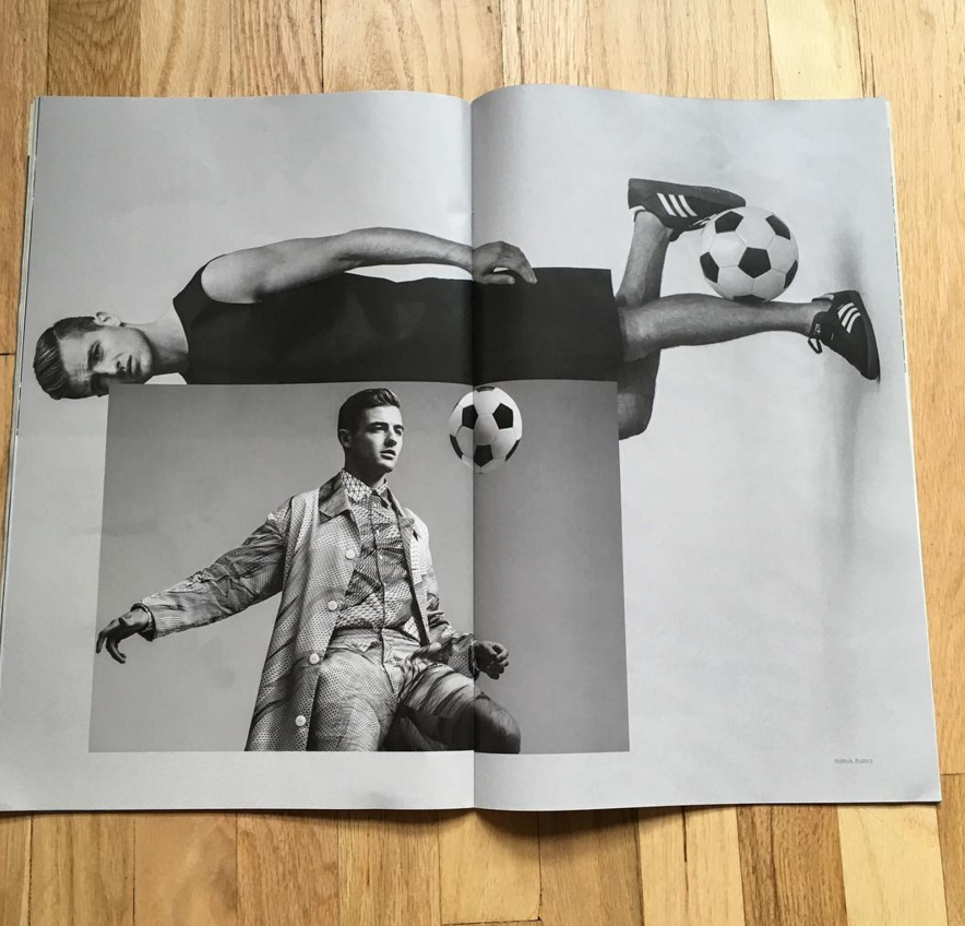
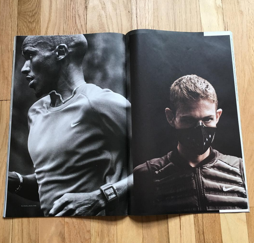
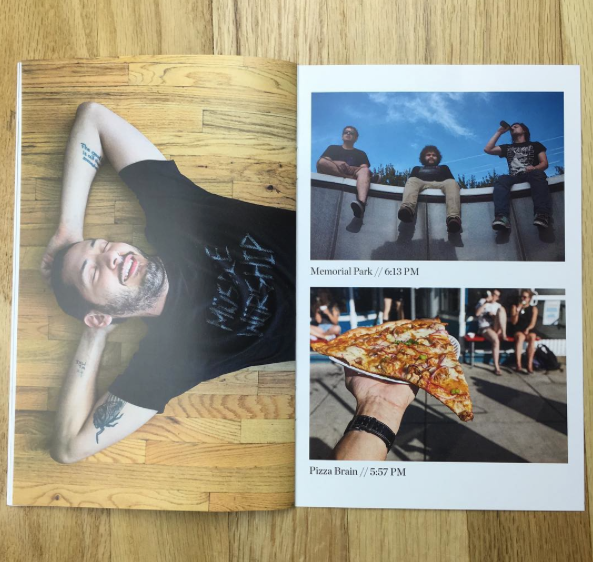
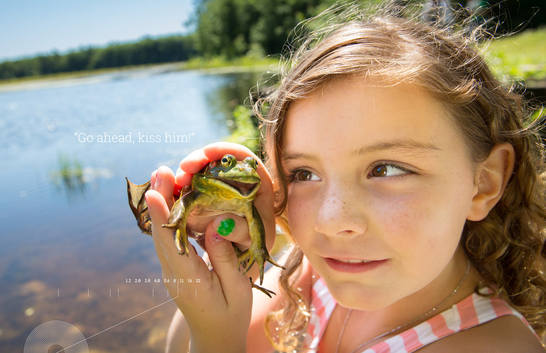
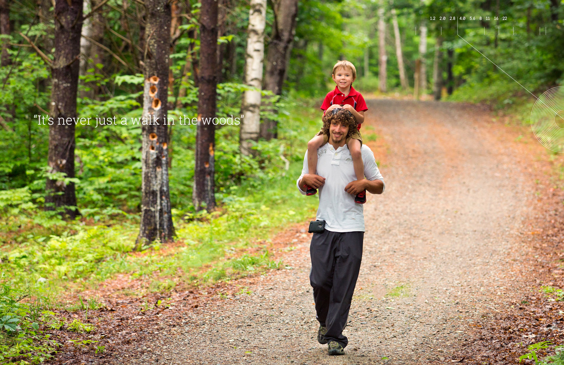
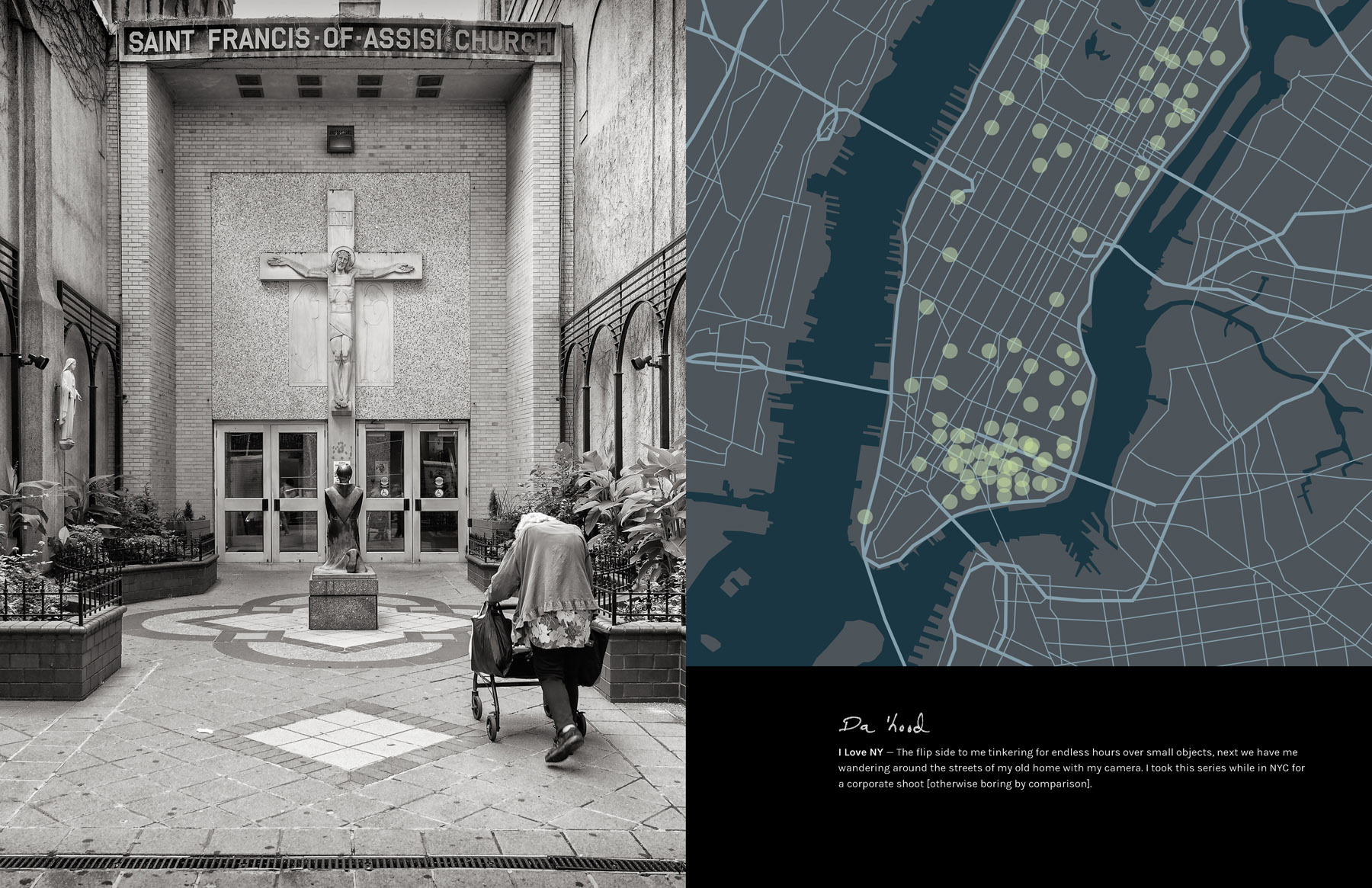
The initial images were selected by me and my studio manager, Heather Noonan-Kelly. We assembled folders of files based on categories of the book: assignment types; personal work; pro bono and let Travis have at it. I really let go of control, which any photographer will tell you can be difficult, and let the design drive the image selection.  We had a few meetings where the three of us would toss around ideas for this or that spread and somewhat democratically decided on the major image choices, like cover and big chapter spreads. I know I was overruled by vote more than once.

We finalized the design, and then printed just two copies to ponder for a few days as proofs. We changed a few images up, at that point, mostly due to gutter placement or bleed through from paper opacity issues. Then the next version was our final.

How many did you make?
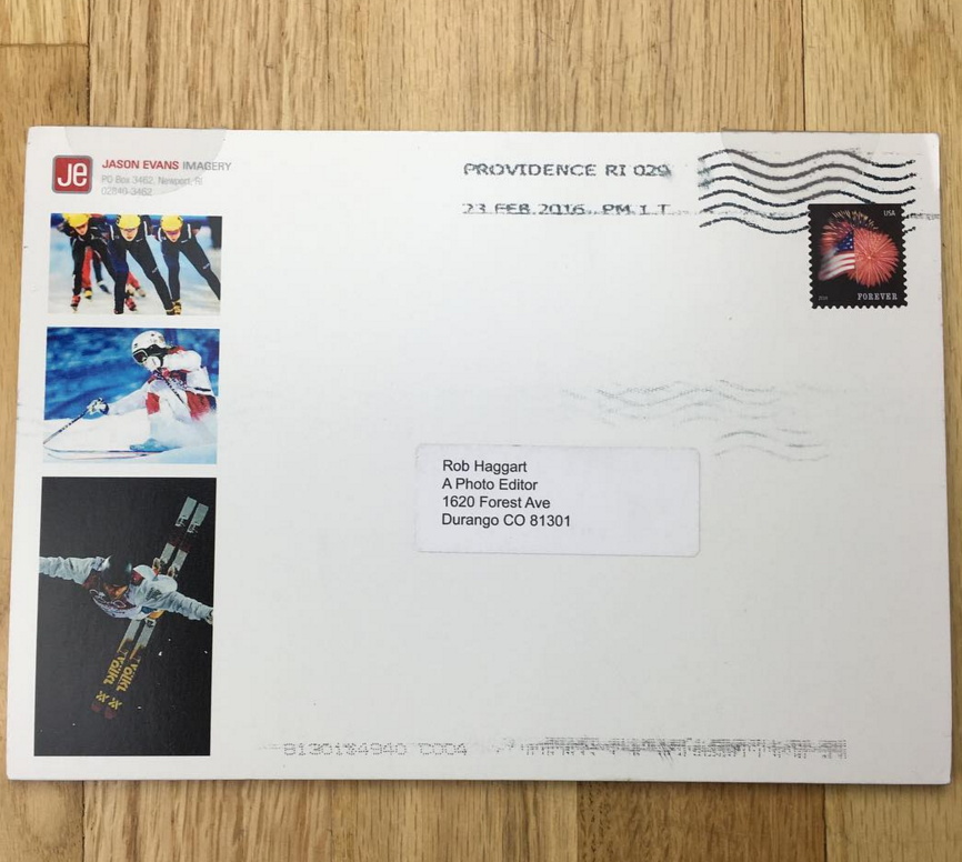
I wanted this promo to be more than just another photographer’s promo. I know buyers get inundated with them. The beauty of Blurb is ‘print on demand’.  We have been printing them in batches of 12 or so. Then we mail them out to selected high value prospects, or current clients. We want to be able to follow up closely with every recipient. So we are probably around 100 printed so far but we will keep this campaign going all year. The on demand printing makes it easy to manage the budget too. You don’t have thousands of dollars worth of print pieces sitting in a corner in boxes.

How many times a year do you send out promos?
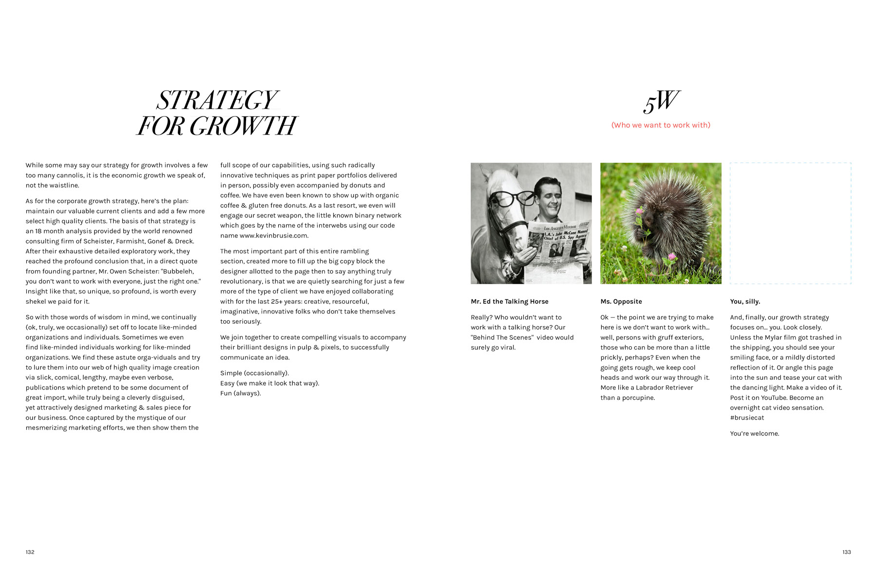
I have been a professional commercial photographer since 1990. I have probably created 5 serious print promos in those 26 years. Yeah. 5. I know, that’s pretty low; so when I do something, I really try to make it memorable and unique. I am not a fan of big number mass mailings. I don’t want to waste the time of buyers looking at cards or emails that just don’t matter. I do my research, look at the work I see that I really respect, and then share my best stuff with them. This Annual Report seems like a perfect way to do that. Our hope is the book is just too nice and entertaining to toss in the bin. One twist we did, we have a page right at the end called “5W” “Who We Want to Work With” – for most books we have three small “2×2” boxes with photos of some comical version of an ideal client, but the last box is a silver mylar film, serving as a mirror, with the copy “You, silly.”  For more personalized prospects, we acquire a photo from social media of our prospect, and drop that into the box. We add a custom message about this person, and then just print one copy at Blurb. We have gotten a couple of nice meetings out of that approach.

What type of reaction have you gotten from your clients?
So far, recipients seem to love it. It is dense enough that it needs to be digested. We packed it full of copy – which is different for a photo promo – that was mostly, for better or worse, written by me. Travis surprised me with some funny copy blocks placed about that I never would have thought of…

I see you’ve added some levity to the promo by poking fun of the annual report genre, how was that received?
I have been shooting, in both still & video, Annual Reports for years. It’s all so serious. Convincing the shareholders all is well with the world and management is thoughtful and contemplative. Clients are grateful and successful. I know the designers of these projects are bright, funny, creative people. I am sure when they are three glasses of vino into a Friday night, they just think of all sorts of crazy stuff they wish they could really do (I guess I do too. ) So why not make it happen for MY own Annual Report? Here’s an excerpt from an email I received from one client in late December:
This is to notify you that your recent so-called Annual Report does not conform to Financial Accounting Standards Board (FASB) regulations. It is not clearly associated with a defined accounting year, lacks elementary mathematical consistency, and seems to be irresponsibly flippant about the whole business of accounting. We are deeply hurt and plan to publish a photographic compilation using our best cell phone work in retaliation…..Great piece, Kevin. Hope we can work together in the new year.”

That’s exactly the response I hoped for. I have a motto in my work – “If we’re not having fun, then why do it?” Why not show that in my promo? I worked for 12 years in banking in NYC, pre 1990.  I know how to be professional. I can hold my own with the exec’s…I left that world to pursue my passion, having a shitload of fun in the process.

How did this idea come about?
MANY years ago (mid 1990s?) I saw a paper company sample, which was a beautiful Annual Report for a fictitious company, named something like “Clown, Inc.” It was shot, written, designed, like the best of the Annual Reports of the time but every photo of an executive or employee was a clown. In suits, around the board room table, with white makeup, red noses, floppy shoes, walking off the corporate jet, every stereotype Annual Report photo was recreated with finely dressed clowns. It was brilliant. That stuck in my head, and I knew I needed to have some fun with the genre.

The Daily Promo – Dominic Perri

Screen Shot 2016-03-08 at 3.27.06 PM

Screen Shot 2016-03-08 at 3.27.14 PM

Dominic Perri


Who printed it?
 
I used Nations Photo Lab to print the piece.    

Who designed it?
I designed it myself.

Who edited the images?
I have a few photographer and designer friends that I asked feedback after I made my initial selects, but for the most part it was me.

How many did you make?
I printed 100 and sent out 60. The other 40 I kept to use as leave behinds.

How many times a year do you send out promos?
I try to send out at least a postcard every 3 months or so to keep my work in front of creatives.  This was my first “special” promo

What made you decide to include the coffee? ( certainly it was well received )
Creatives receive so many postcards and mailings a day I wanted to send something that someone would remember getting. It was also a great ice breaker for follow up calls and emails.  Also, I love Share coffee and love supporting local businesses so this collaboration was a no brainer for me.

What was harder, choosing the images or choosing the coffee?
I shot so many images of the roasting, and cupping process over at Share it was really difficult.  Picking the coffee was actually easier.  Share has a few different types, each with a different color label.  When we were shooting I realized that one of the bags had the same color blue as my logo.  I wanted to keep everything consistent so we went with that one.

Who and how did you decide who to send the promo to?
I have a list of people and agencies I really want to work with.  I worked off that list.