Kevin Brusie
Who printed it?
It is being printed by Blurb, using their ‘Magazine’ format. 81/2”x11”, perfect bound, with some surprisingly nice stock. We were quite impressed.
Who designed it?
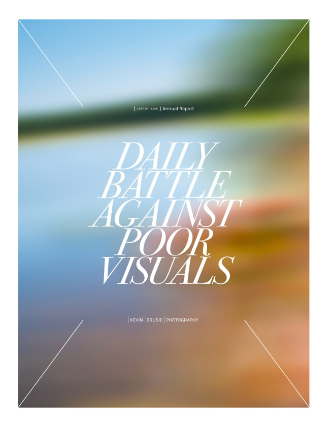
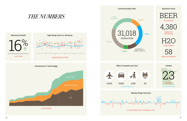
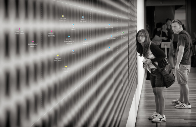
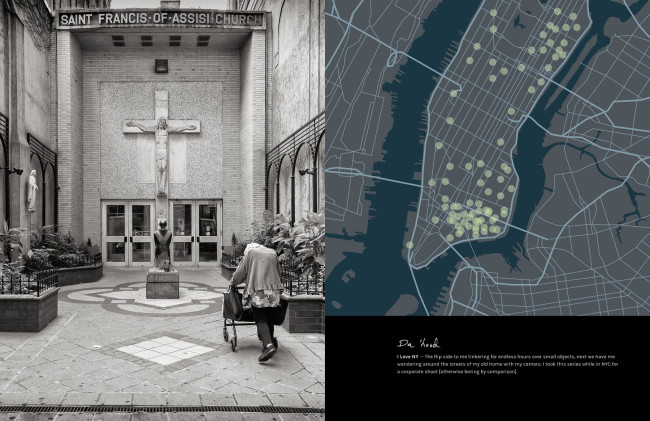
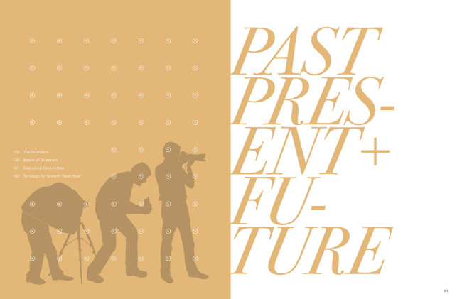
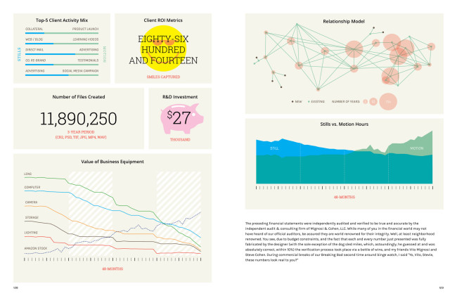
The {current year} Annual Report – which by definition never becomes obsolete – was designed by a long time collaborator and friend, designer Travis Goulder. I have had this concept in my head for quite a few years, and never was able to bring it to fruition. I knew I needed a talented and patient, designer to pull it together. So the summer of 2015 found Travis ‘under-employed’, so he graciously volunteered to help out. We finally wrapped up in December. His contributions really defined the style and refined my direction. This would not have been as successful without his vision. His extensive corporate experience brought sophistication and authenticity to the book, It also enabled the 4 pages of totally meaningless graphs, charts, and “financial” graphics, filled with small smile provoking visuals. And, believe it or not – not a single photograph!
Who edited the images?
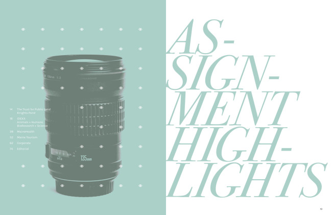
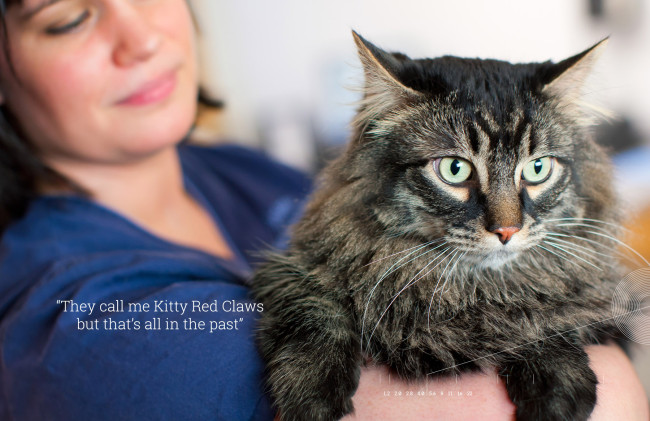
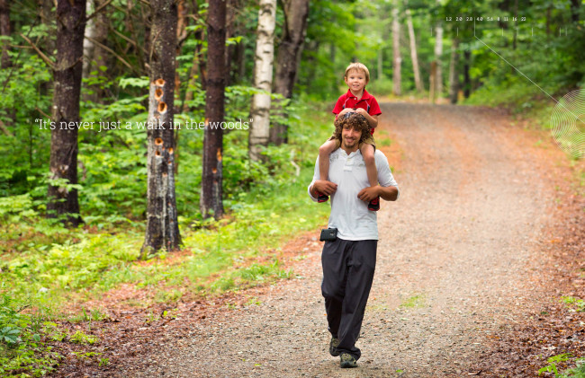
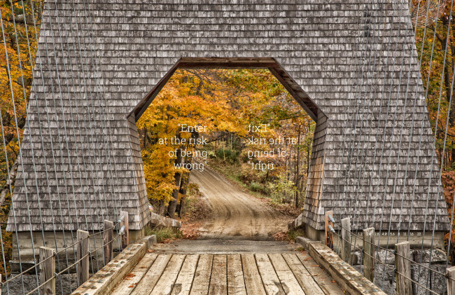
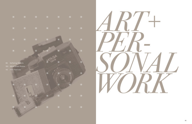
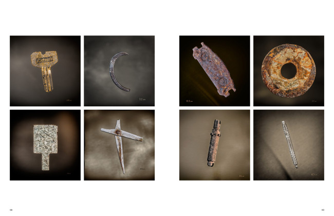
The initial images were selected by me and my studio manager, Heather Noonan-Kelly. We assembled folders of files based on categories of the book: assignment types; personal work; pro bono and let Travis have at it. I really let go of control, which any photographer will tell you can be difficult, and let the design drive the image selection. We had a few meetings where the three of us would toss around ideas for this or that spread and somewhat democratically decided on the major image choices, like cover and big chapter spreads. I know I was overruled by vote more than once.
We finalized the design, and then printed just two copies to ponder for a few days as proofs. We changed a few images up, at that point, mostly due to gutter placement or bleed through from paper opacity issues. Then the next version was our final.
How many did you make?
I wanted this promo to be more than just another photographer’s promo. I know buyers get inundated with them. The beauty of Blurb is ‘print on demand’. We have been printing them in batches of 12 or so. Then we mail them out to selected high value prospects, or current clients. We want to be able to follow up closely with every recipient. So we are probably around 100 printed so far but we will keep this campaign going all year. The on demand printing makes it easy to manage the budget too. You don’t have thousands of dollars worth of print pieces sitting in a corner in boxes.
How many times a year do you send out promos?
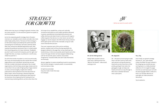
I have been a professional commercial photographer since 1990. I have probably created 5 serious print promos in those 26 years. Yeah. 5. I know, that’s pretty low; so when I do something, I really try to make it memorable and unique. I am not a fan of big number mass mailings. I don’t want to waste the time of buyers looking at cards or emails that just don’t matter. I do my research, look at the work I see that I really respect, and then share my best stuff with them. This Annual Report seems like a perfect way to do that. Our hope is the book is just too nice and entertaining to toss in the bin. One twist we did, we have a page right at the end called “5W” “Who We Want to Work With” – for most books we have three small “2×2” boxes with photos of some comical version of an ideal client, but the last box is a silver mylar film, serving as a mirror, with the copy “You, silly.” For more personalized prospects, we acquire a photo from social media of our prospect, and drop that into the box. We add a custom message about this person, and then just print one copy at Blurb. We have gotten a couple of nice meetings out of that approach.
What type of reaction have you gotten from your clients?
So far, recipients seem to love it. It is dense enough that it needs to be digested. We packed it full of copy – which is different for a photo promo – that was mostly, for better or worse, written by me. Travis surprised me with some funny copy blocks placed about that I never would have thought of…
I see you’ve added some levity to the promo by poking fun of the annual report genre, how was that received?
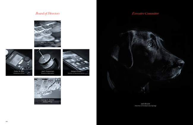
I have been shooting, in both still & video, Annual Reports for years. It’s all so serious. Convincing the shareholders all is well with the world and management is thoughtful and contemplative. Clients are grateful and successful. I know the designers of these projects are bright, funny, creative people. I am sure when they are three glasses of vino into a Friday night, they just think of all sorts of crazy stuff they wish they could really do (I guess I do too. ) So why not make it happen for MY own Annual Report? Here’s an excerpt from an email I received from one client in late December:
“This is to notify you that your recent so-called Annual Report does not conform to Financial Accounting Standards Board (FASB) regulations. It is not clearly associated with a defined accounting year, lacks elementary mathematical consistency, and seems to be irresponsibly flippant about the whole business of accounting. We are deeply hurt and plan to publish a photographic compilation using our best cell phone work in retaliation…..Great piece, Kevin. Hope we can work together in the new year.”
That’s exactly the response I hoped for. I have a motto in my work – “If we’re not having fun, then why do it?” Why not show that in my promo? I worked for 12 years in banking in NYC, pre 1990. I know how to be professional. I can hold my own with the exec’s…I left that world to pursue my passion, having a shitload of fun in the process.
How did this idea come about?
MANY years ago (mid 1990s?) I saw a paper company sample, which was a beautiful Annual Report for a fictitious company, named something like “Clown, Inc.” It was shot, written, designed, like the best of the Annual Reports of the time but every photo of an executive or employee was a clown. In suits, around the board room table, with white makeup, red noses, floppy shoes, walking off the corporate jet, every stereotype Annual Report photo was recreated with finely dressed clowns. It was brilliant. That stuck in my head, and I knew I needed to have some fun with the genre.

2 Comments
Clever and fun.
This is no doubt a great piece! Thanks for the push to look at at other business for inspiration, and put our own spin on it!
Comments are closed for this article!