
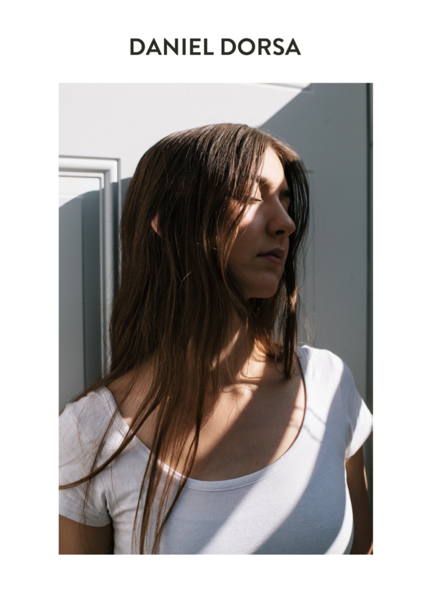
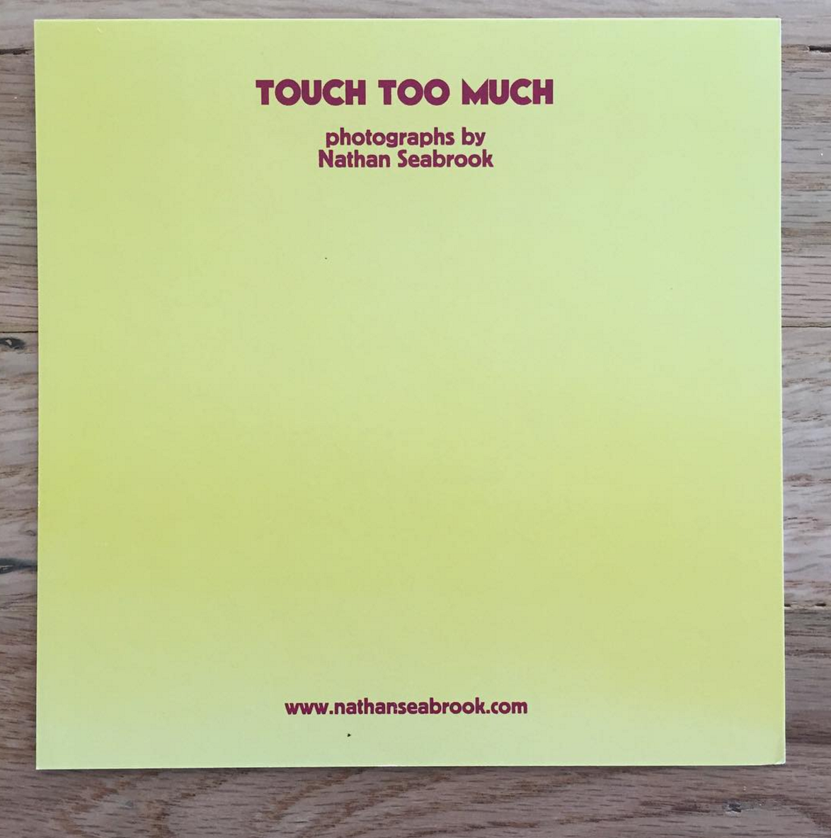
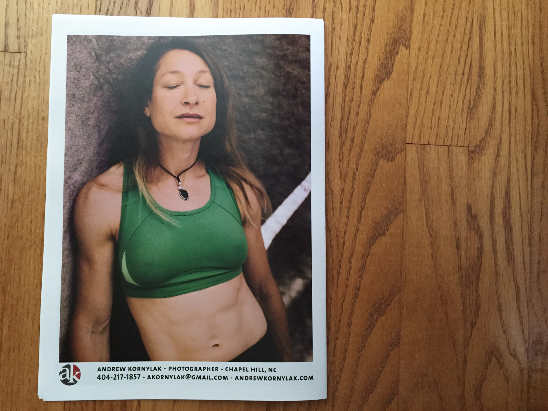
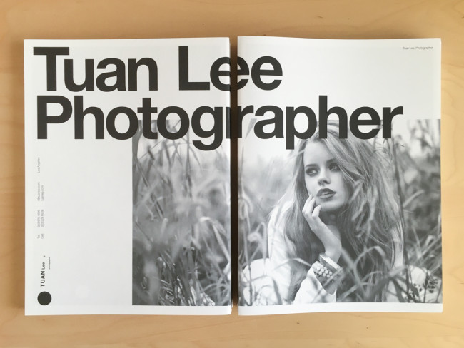
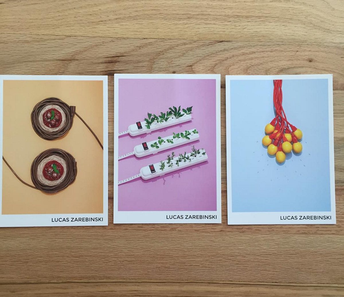
Nicholas Duers
Who printed it?
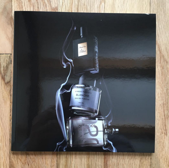
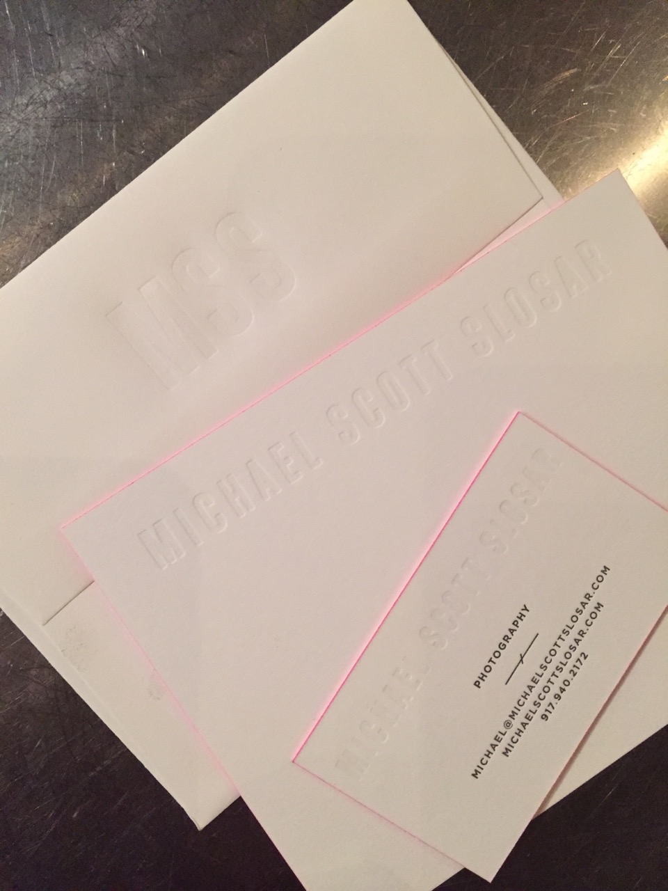
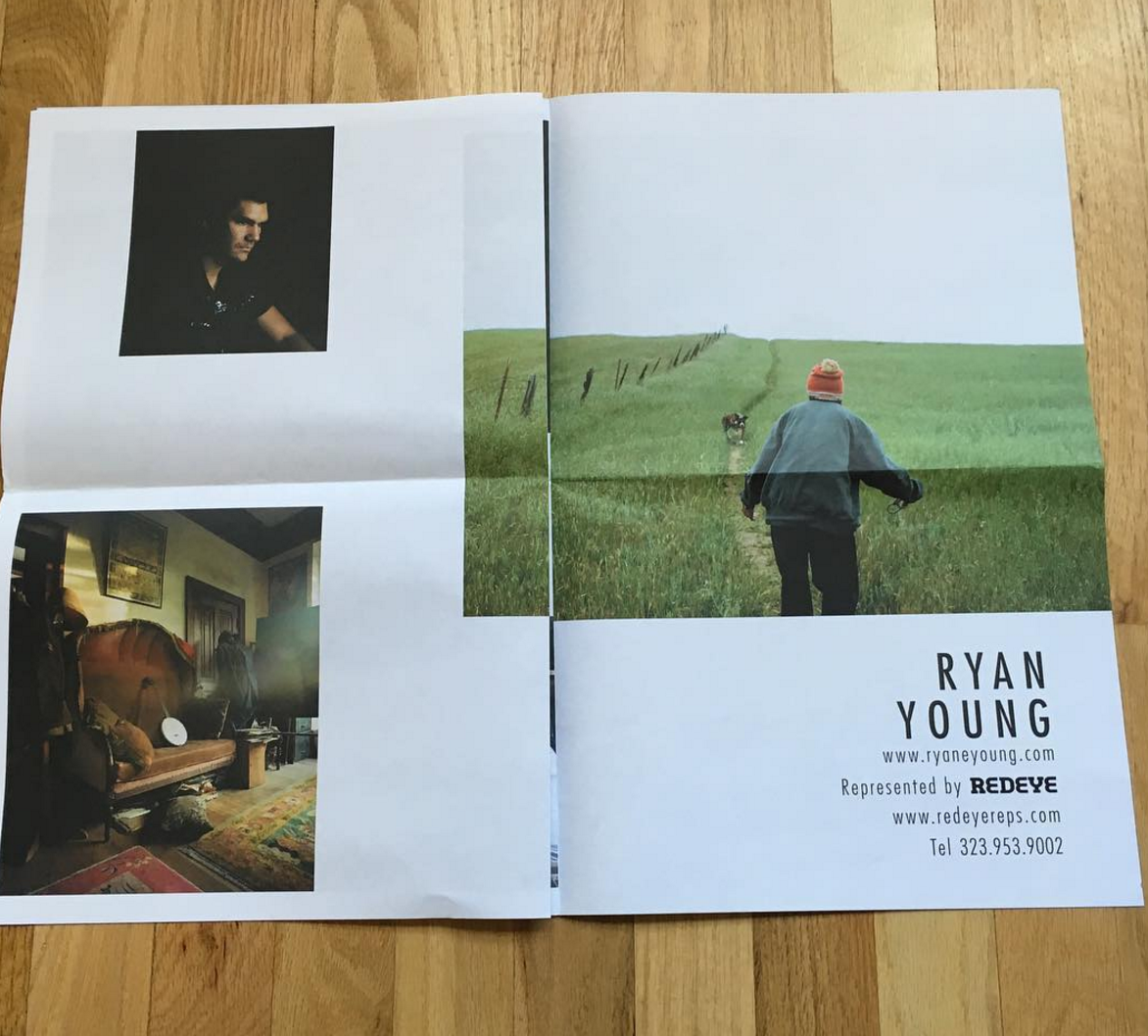
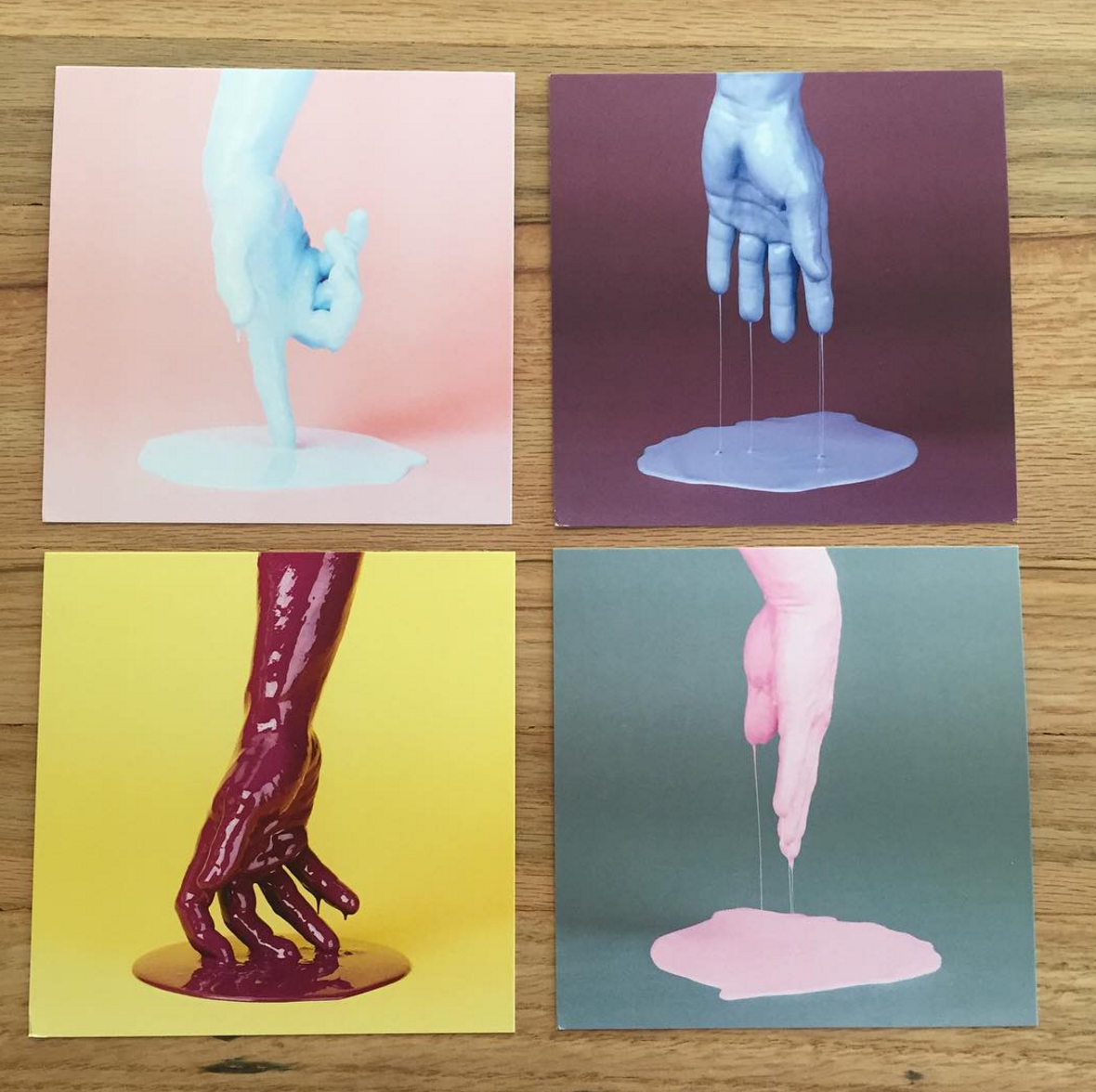
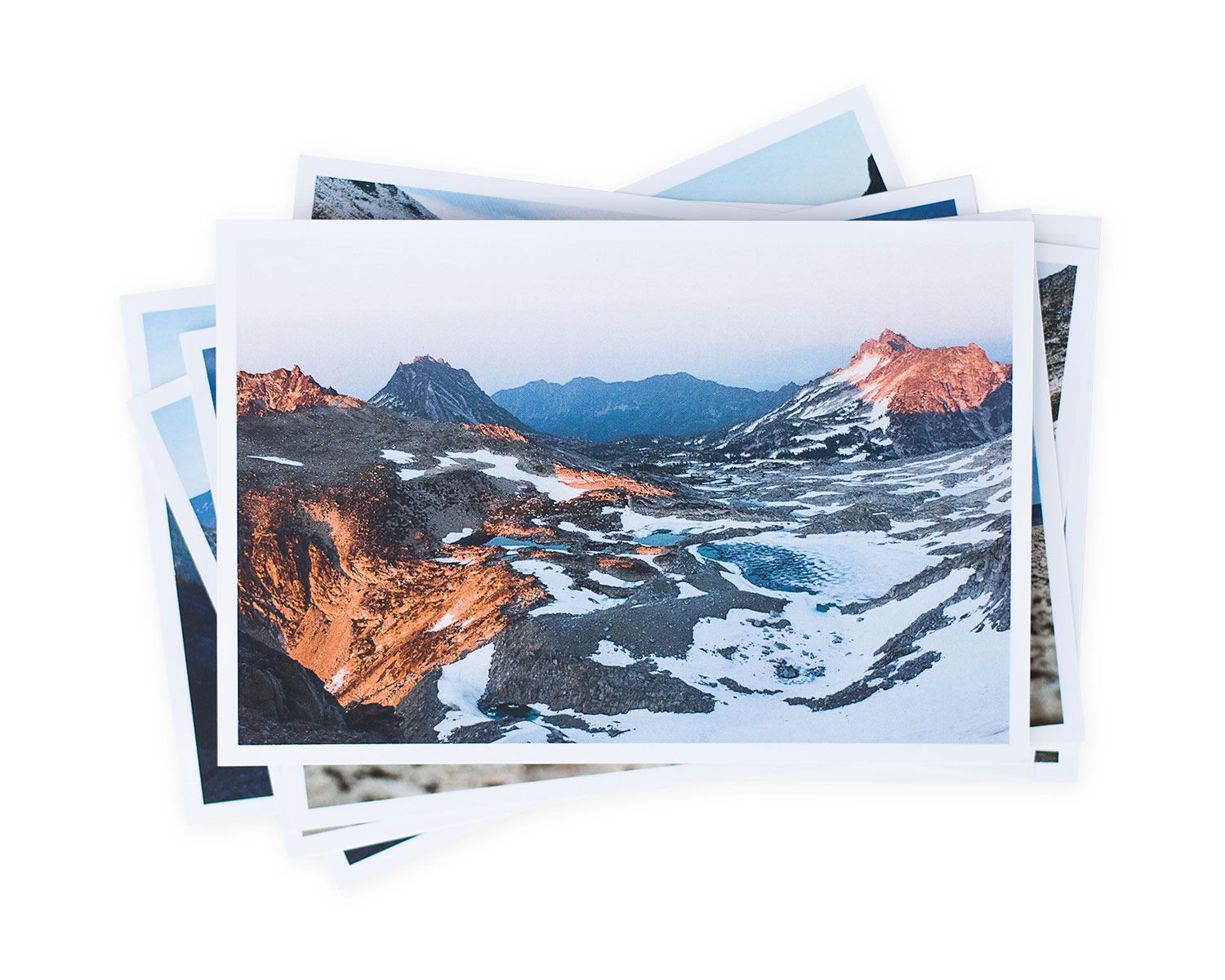
To print the promo, we utilized Blurb.com, using their premium lustre-finished paper and perfect binding style.
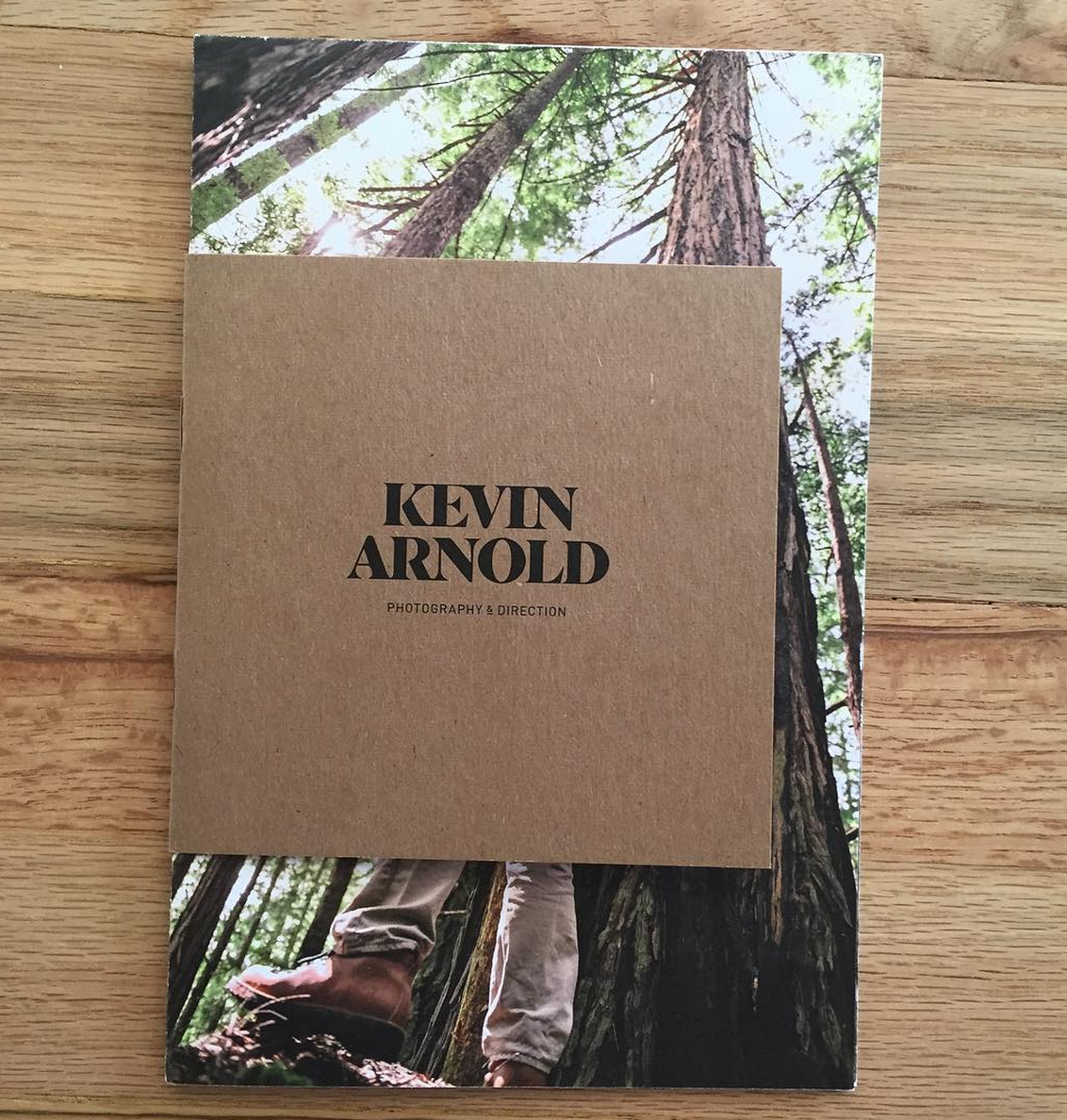
Who designed it?
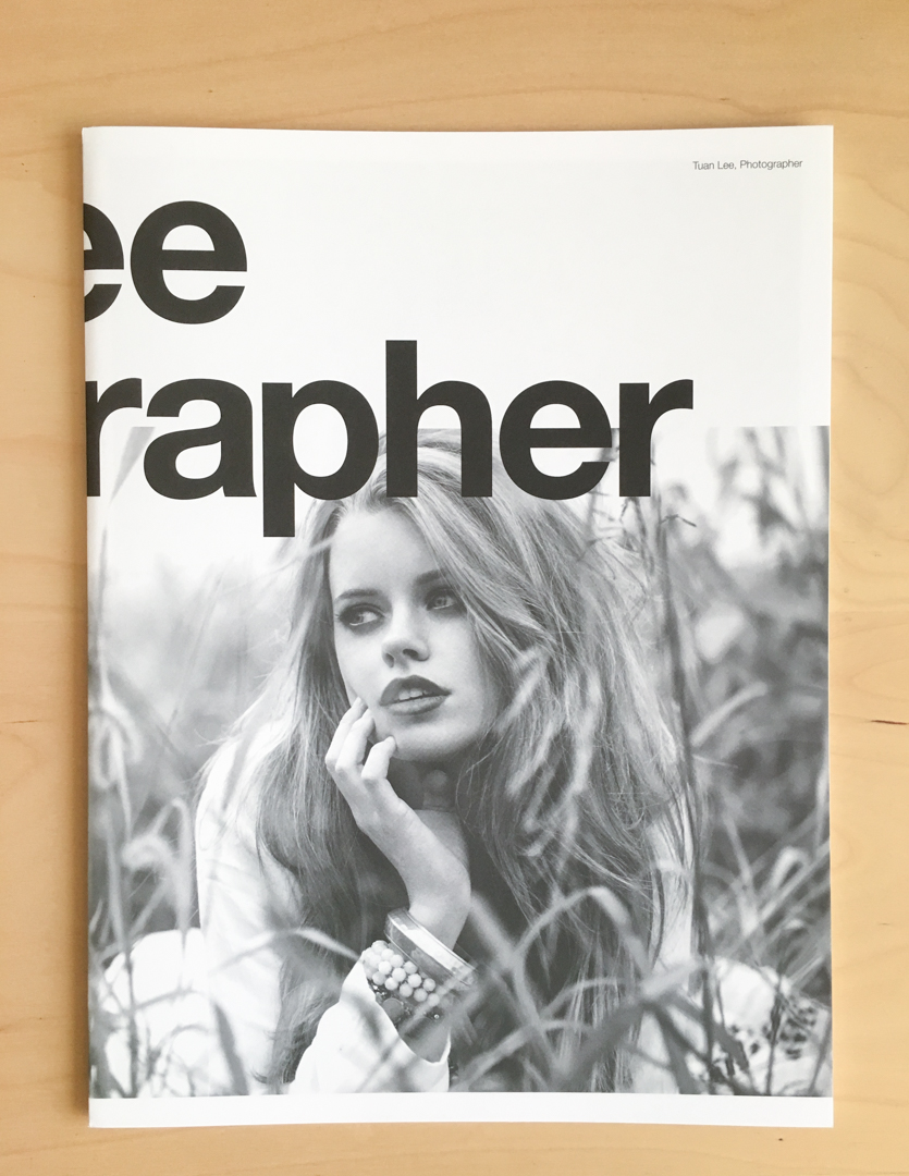
The design intent was to create a minimal and immersive physical platform for the presentation of the work, and it was done by myself in collaboration with my Agent, Farimah Milani.
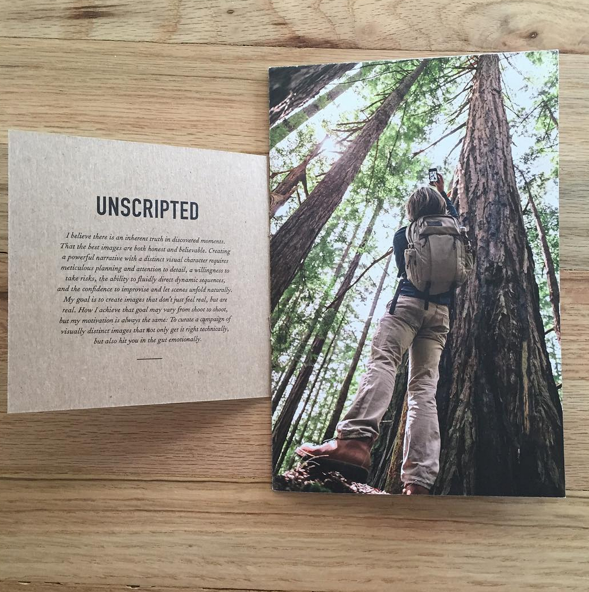
Who edited the images?
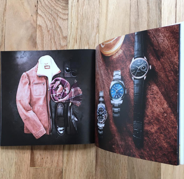
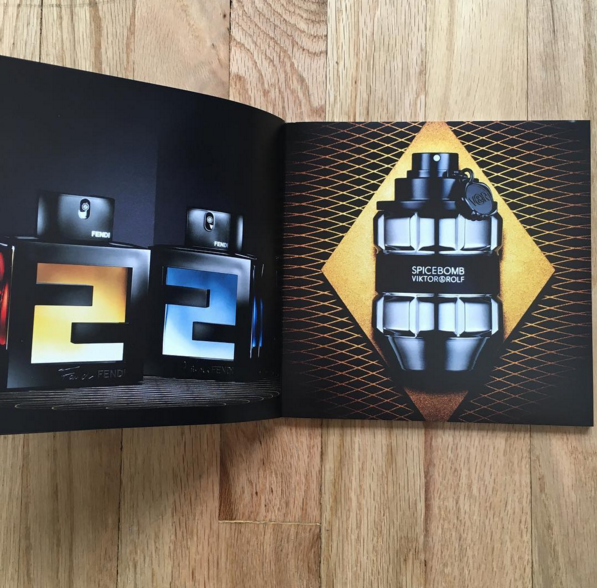
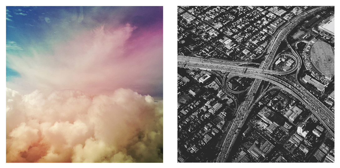
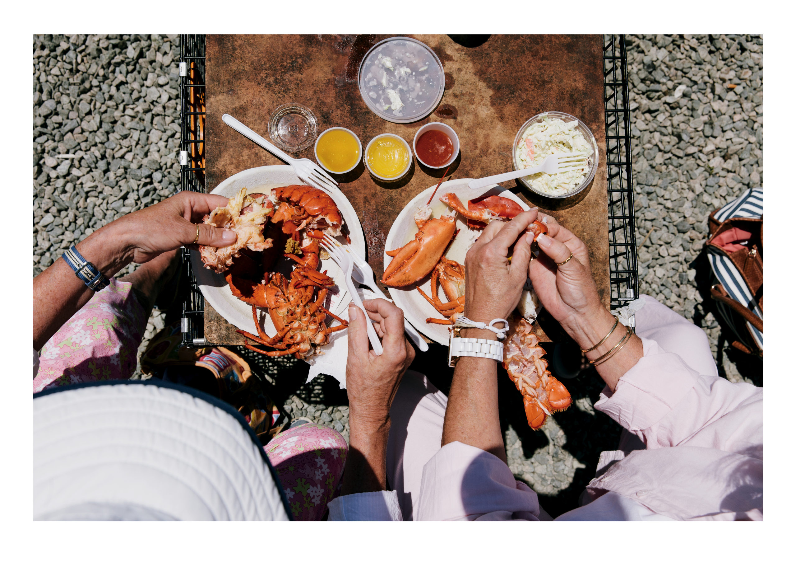
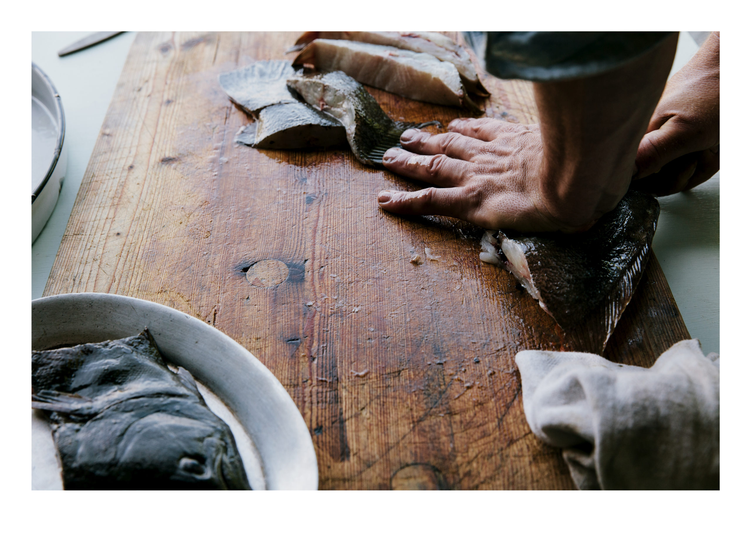
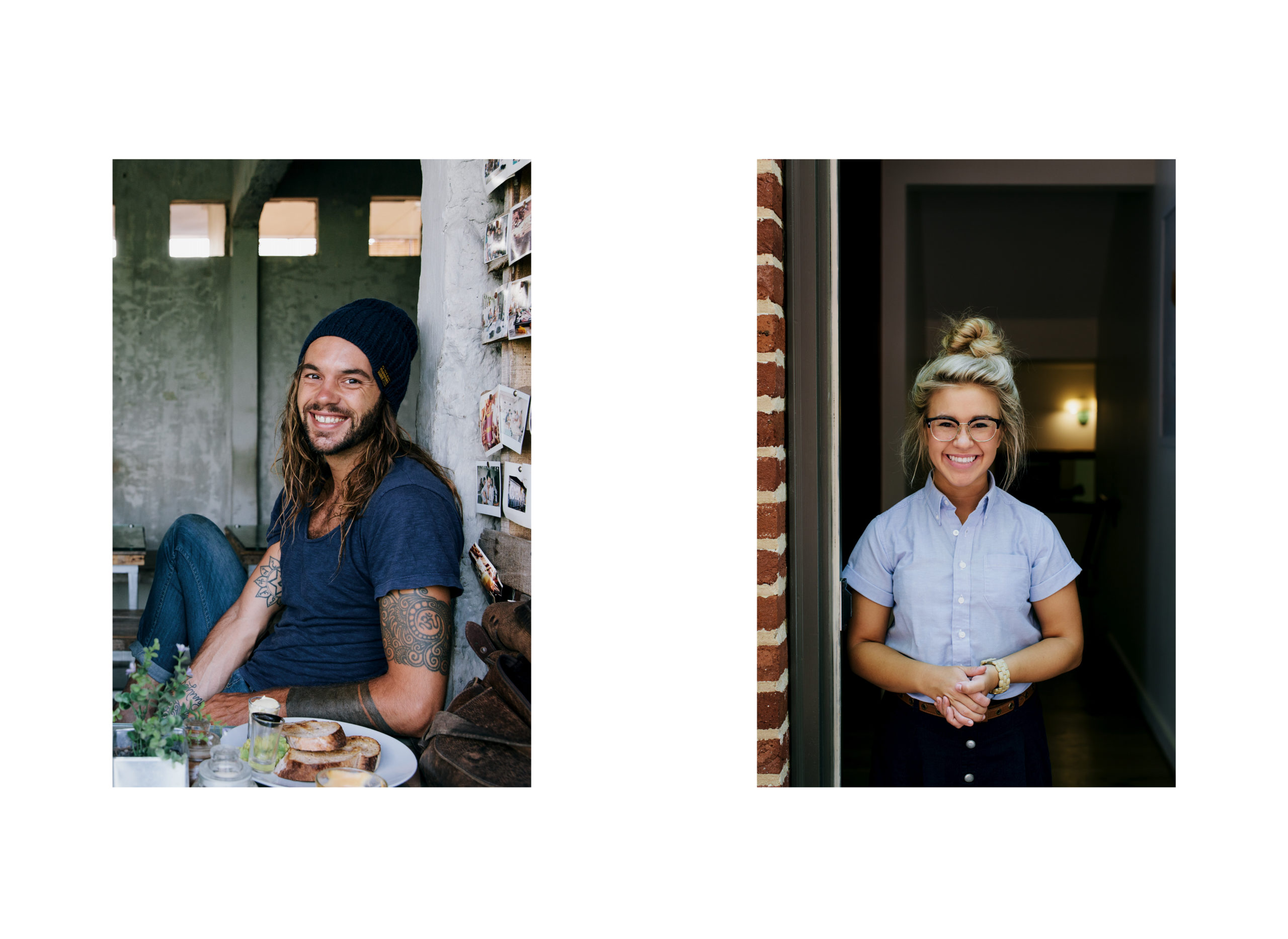
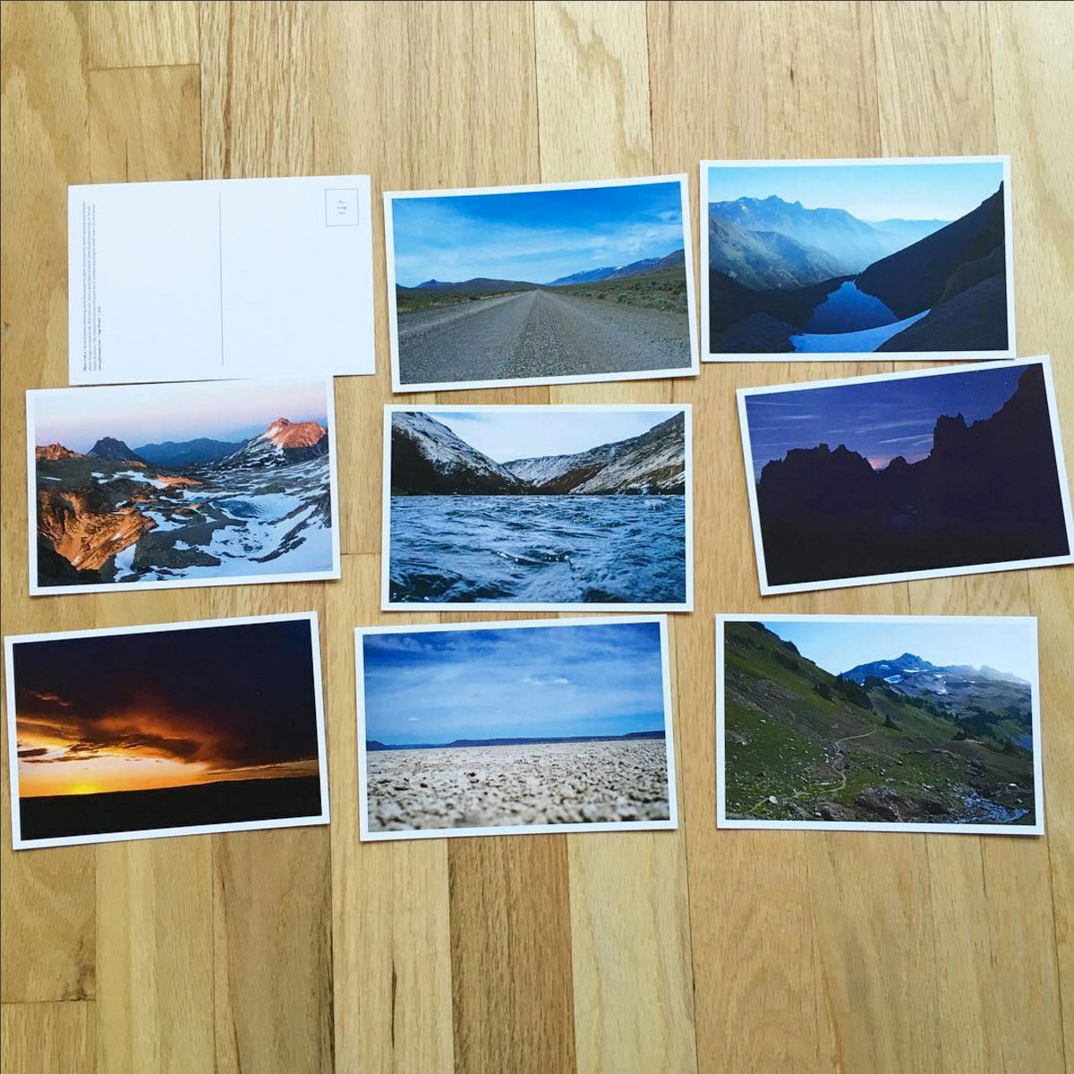
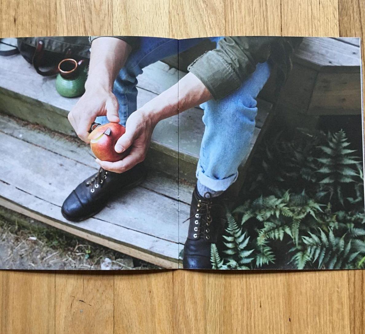
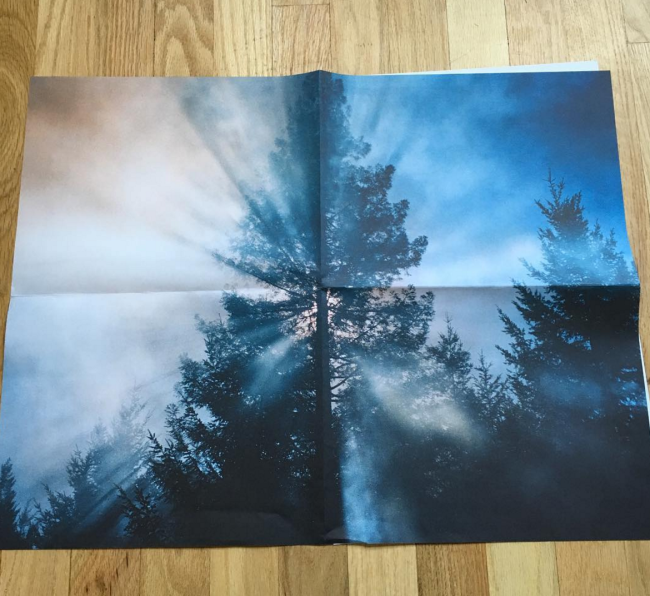
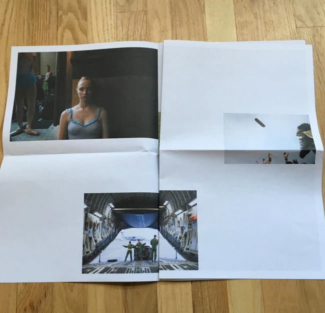
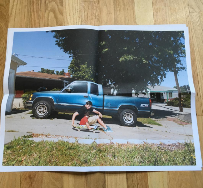
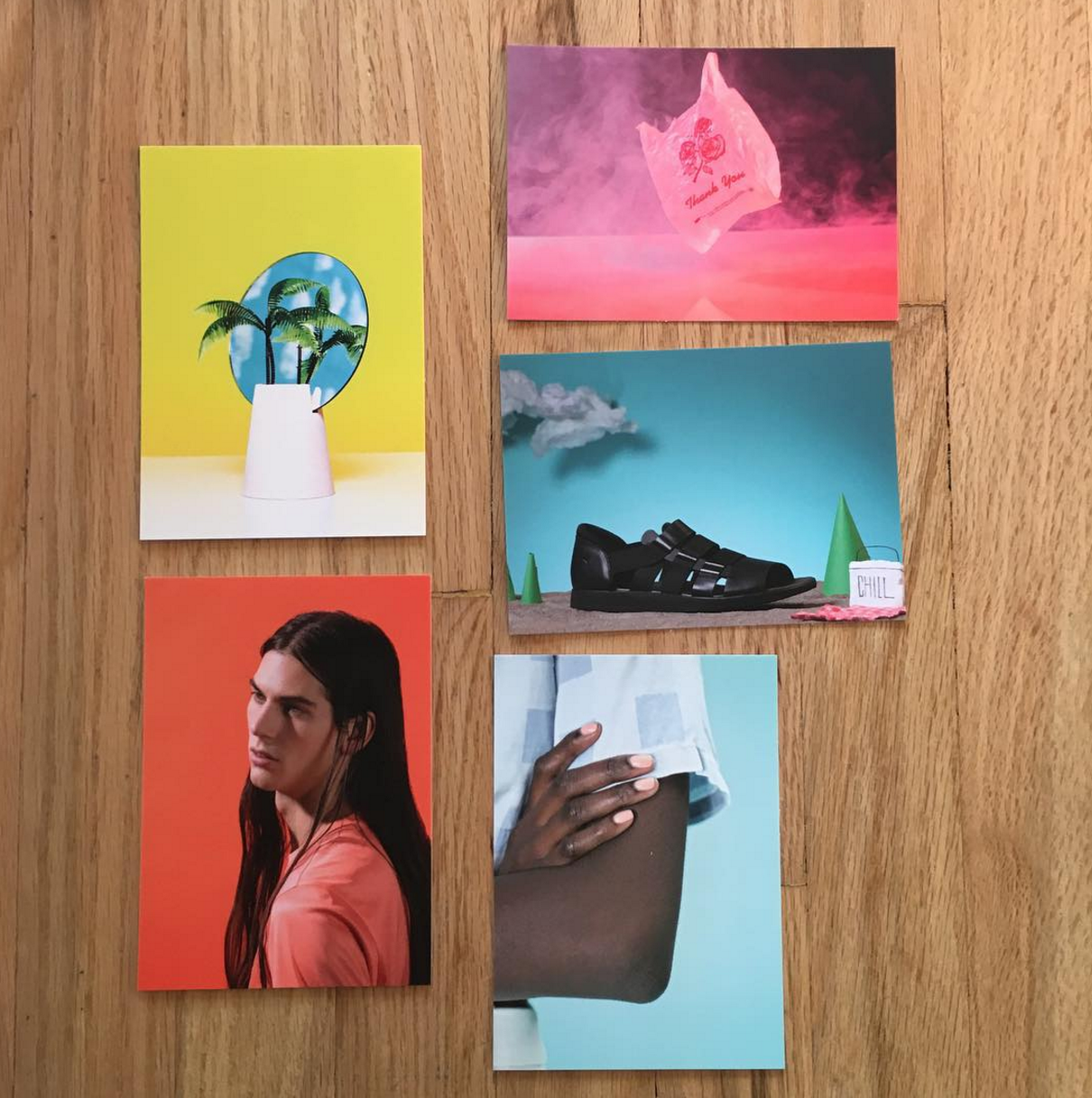
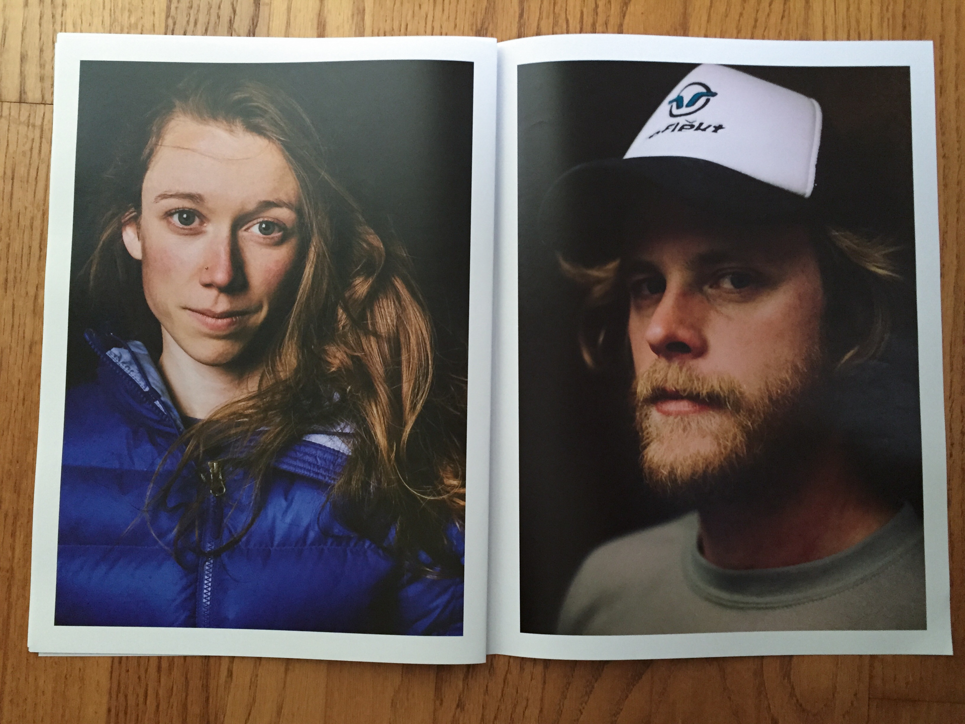
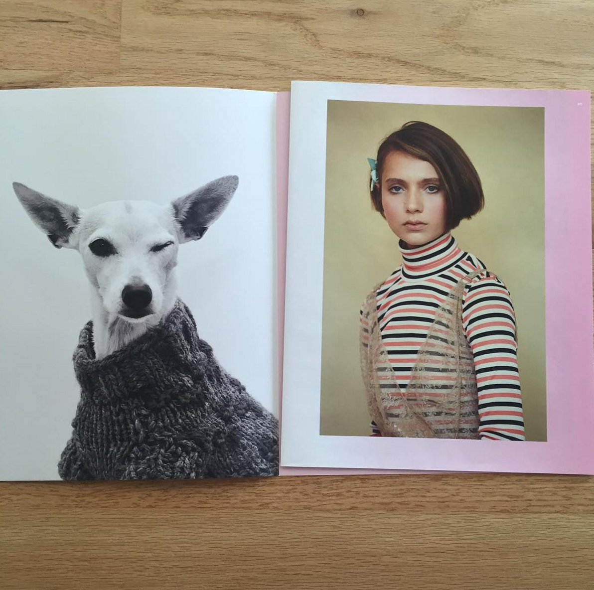
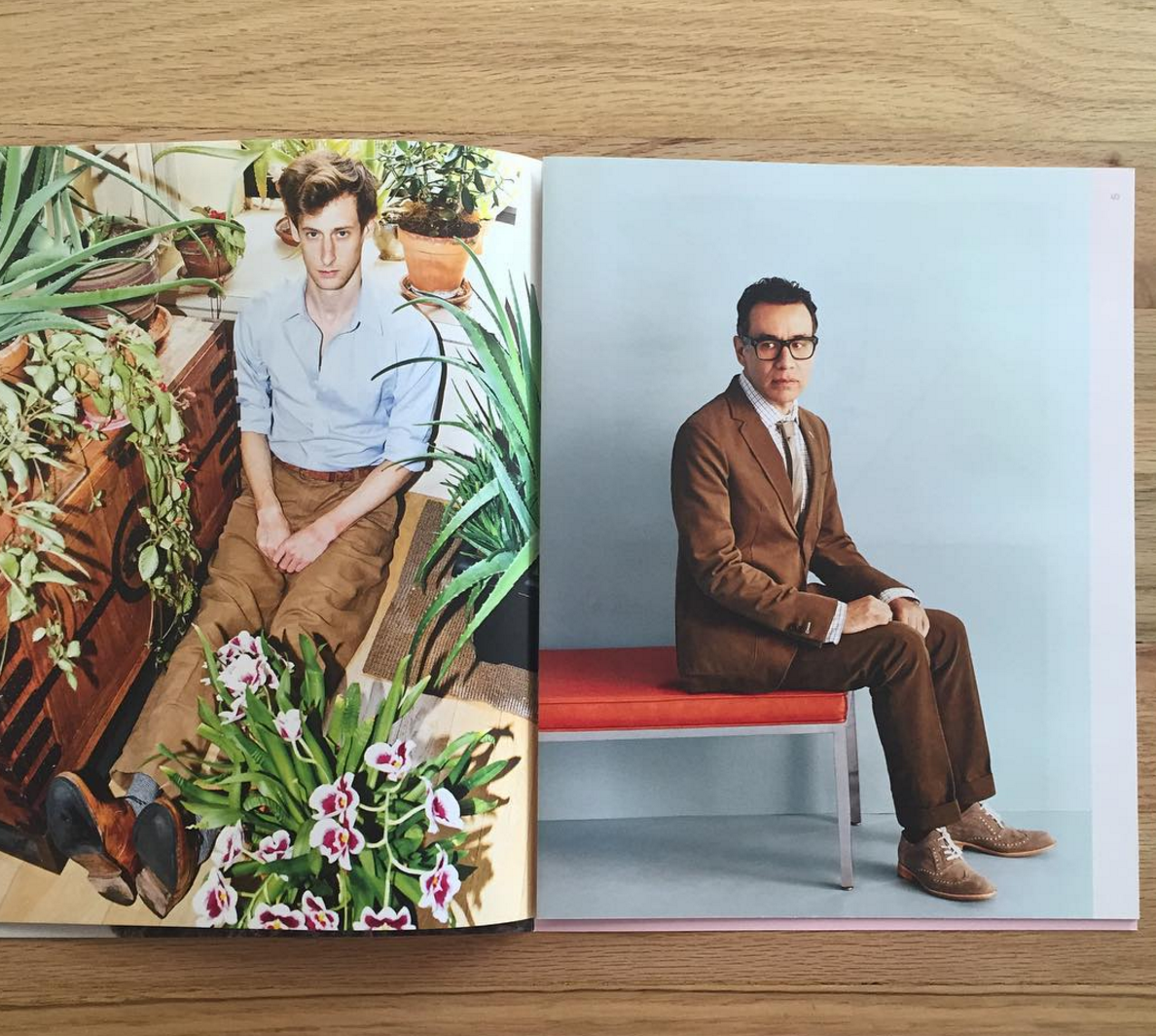
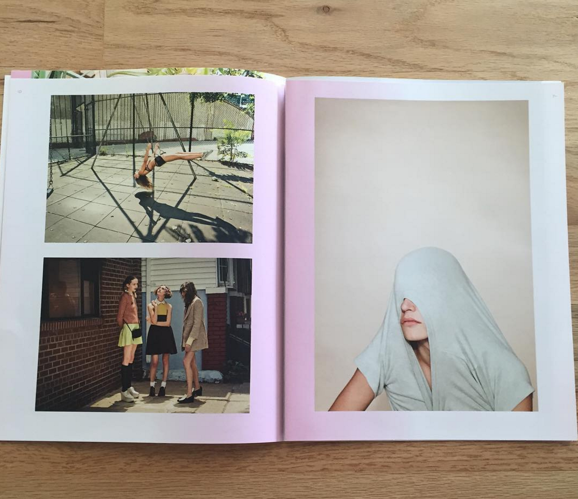
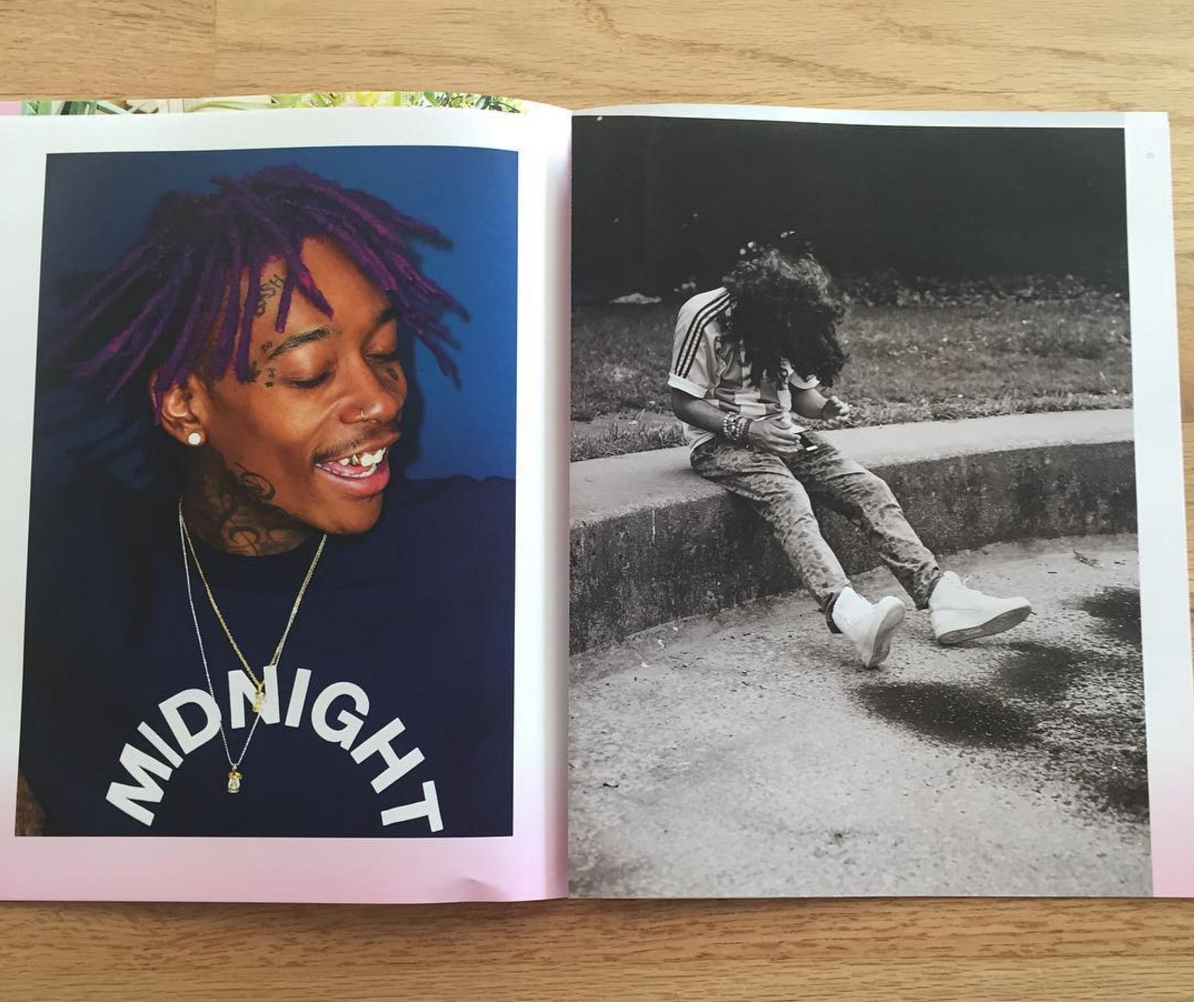
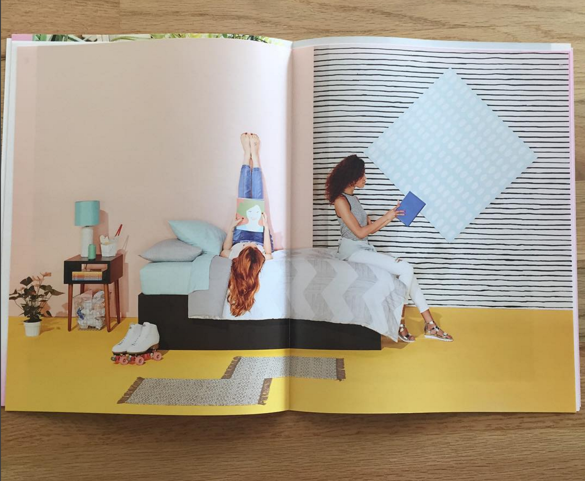
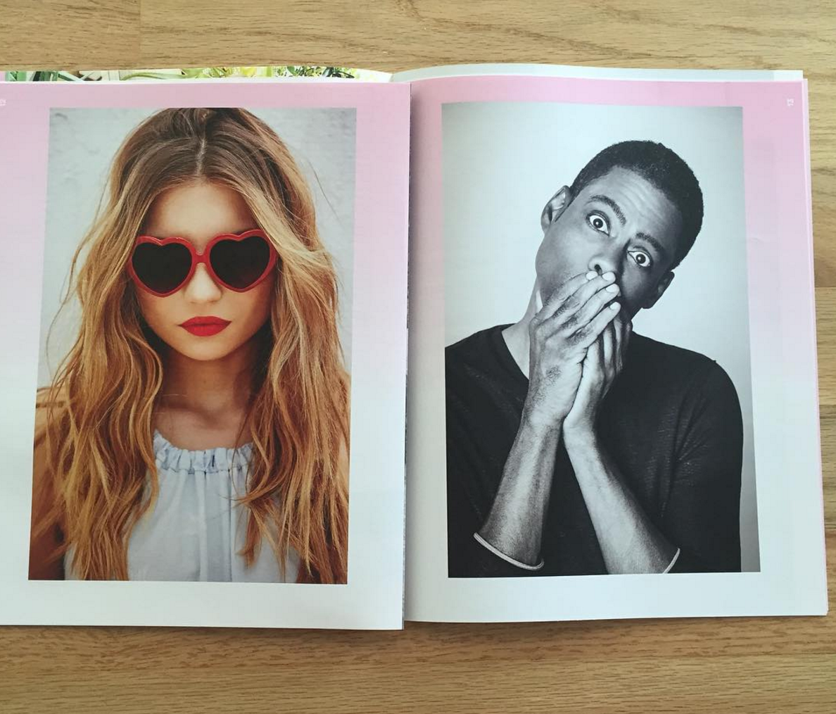
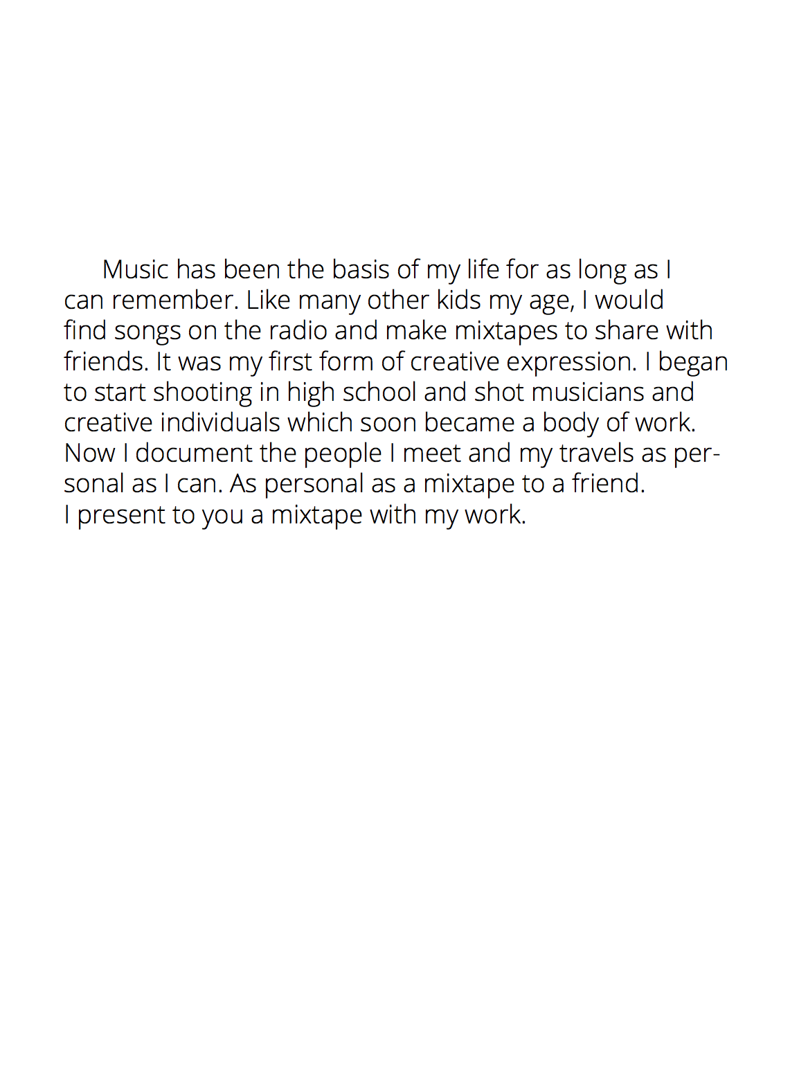
In terms of the edit, I worked closely with Farimah, to arrive at a sequence that worked for each of us. As a content creator, there is always the potential for choices to be influenced by sentimental attachment to the imagery. Having an outside perspective from an experienced Agent is tremendously useful! We were able to ensure an overall commercial appeal, and yet still be able to convey my personal aesthetic.
How many did you make?
250.
How many times a year do you send out promos?
We aim to send a physical promotion on a quarterly to bi-annual basis.
How long did this promo take?
The process from concept to execution required three months from start to finish: The back and forth discussions, creating new imagery to fill in any gaps, and the need to update my website before sending out led to the process taking longer than expected. This was our first major promo piece since collaborating, and I wanted to make sure it was executed as perfectly as possible.


