Promo Printer List
Here’s a resource list for your printing needs. We linked to the photographer’s site and listed the printer they used.
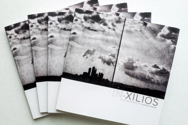
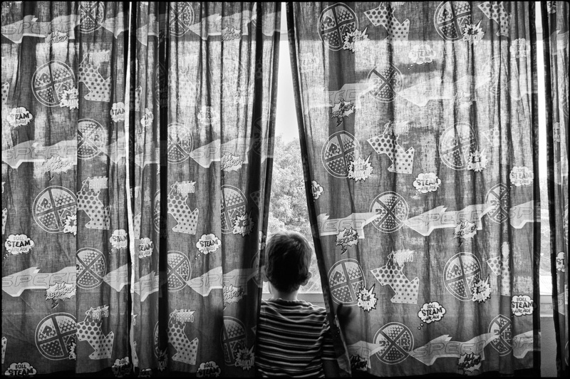
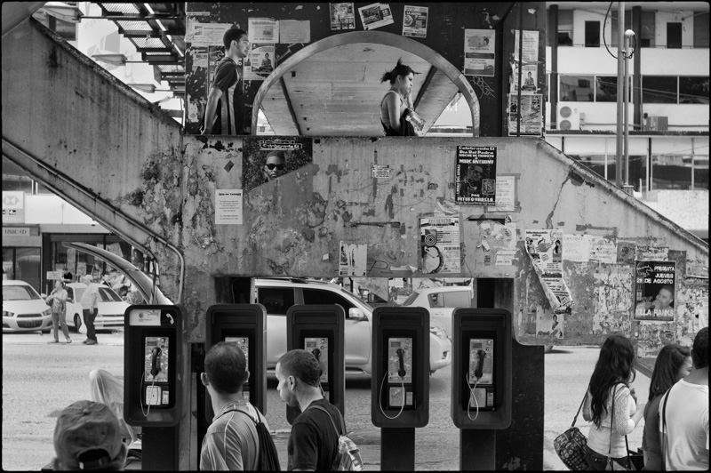
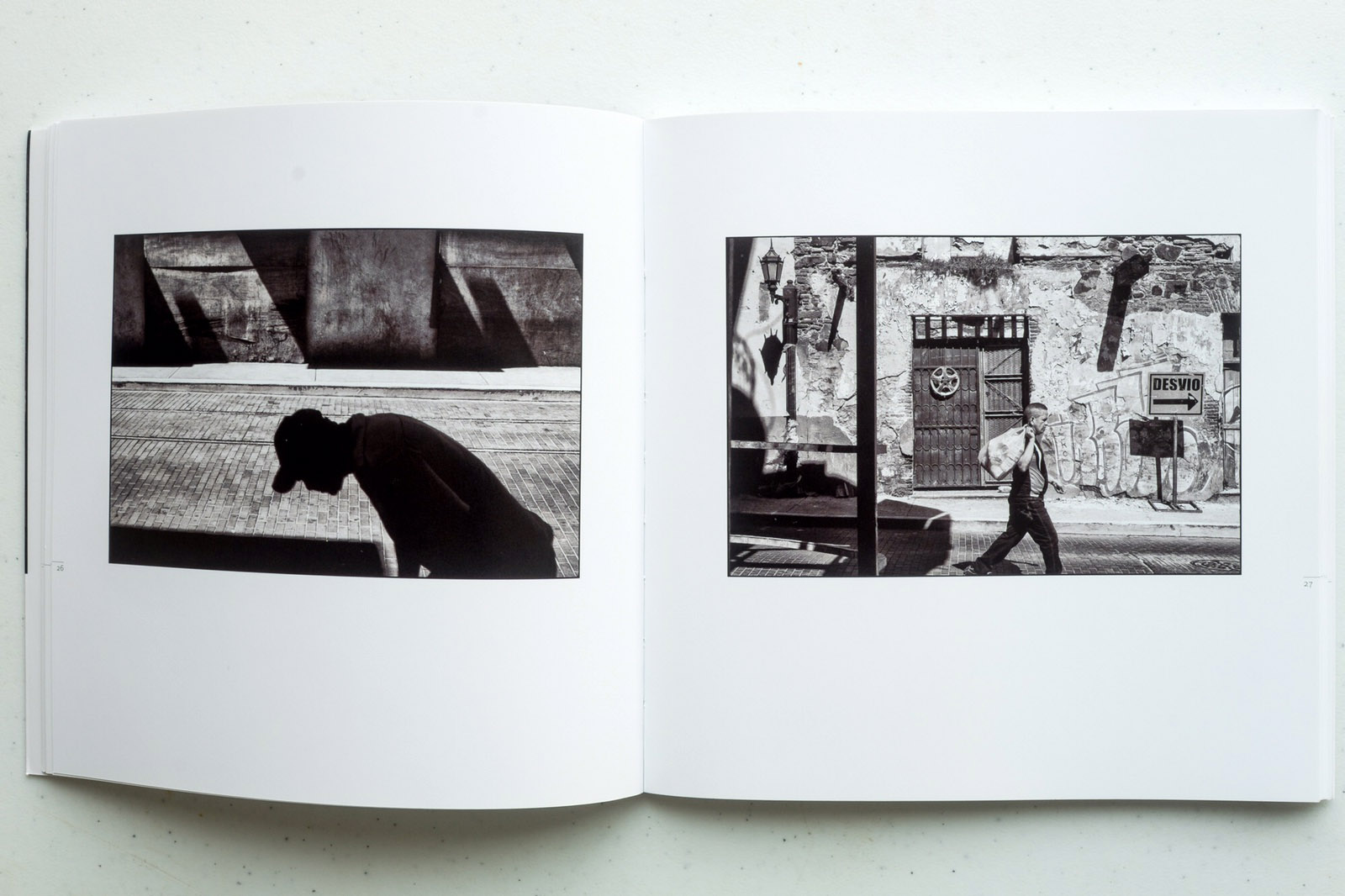
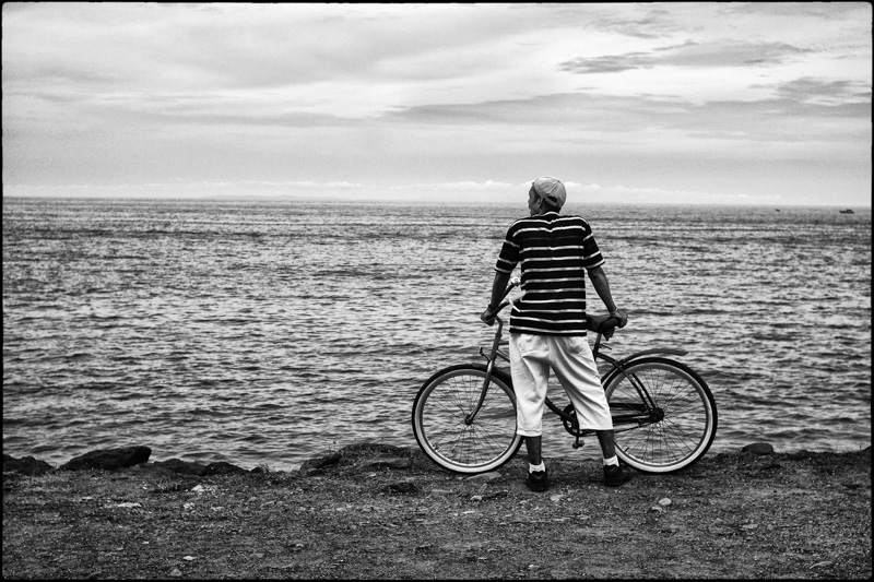
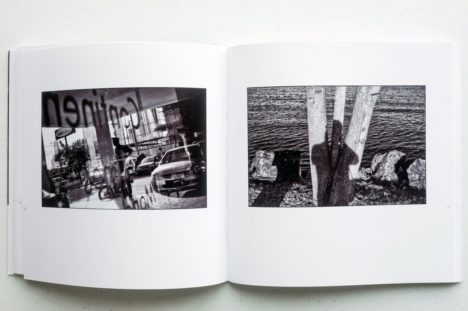
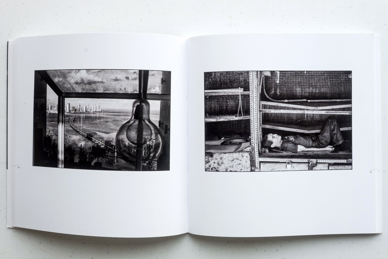
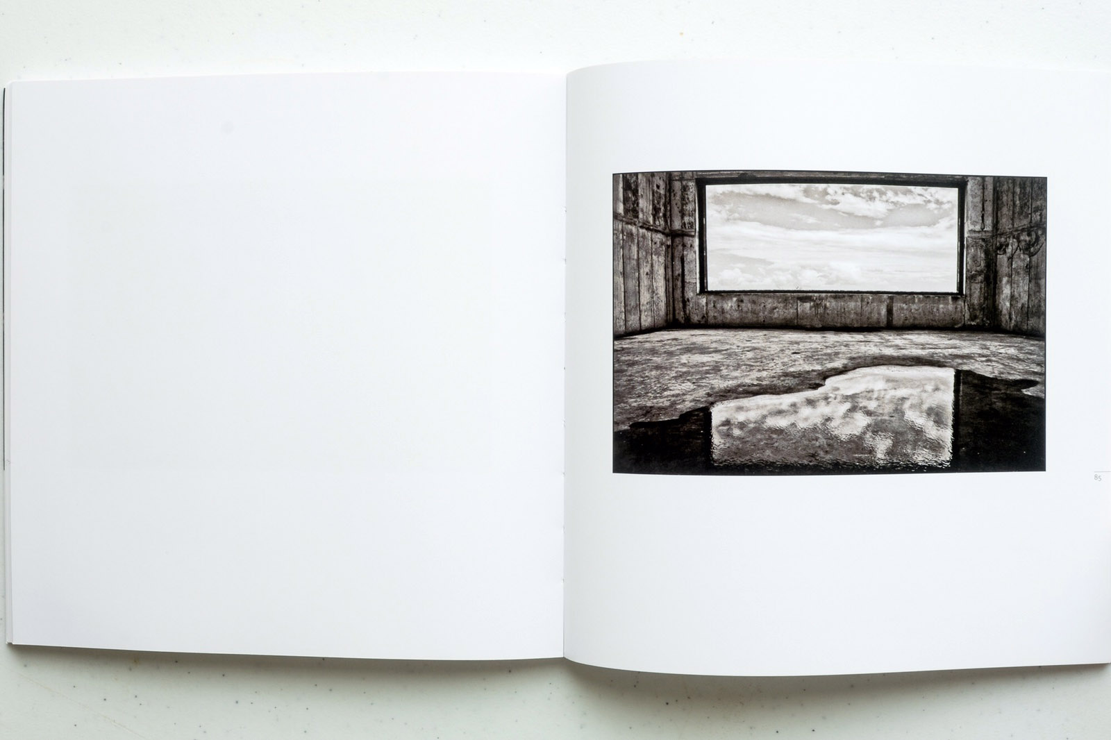
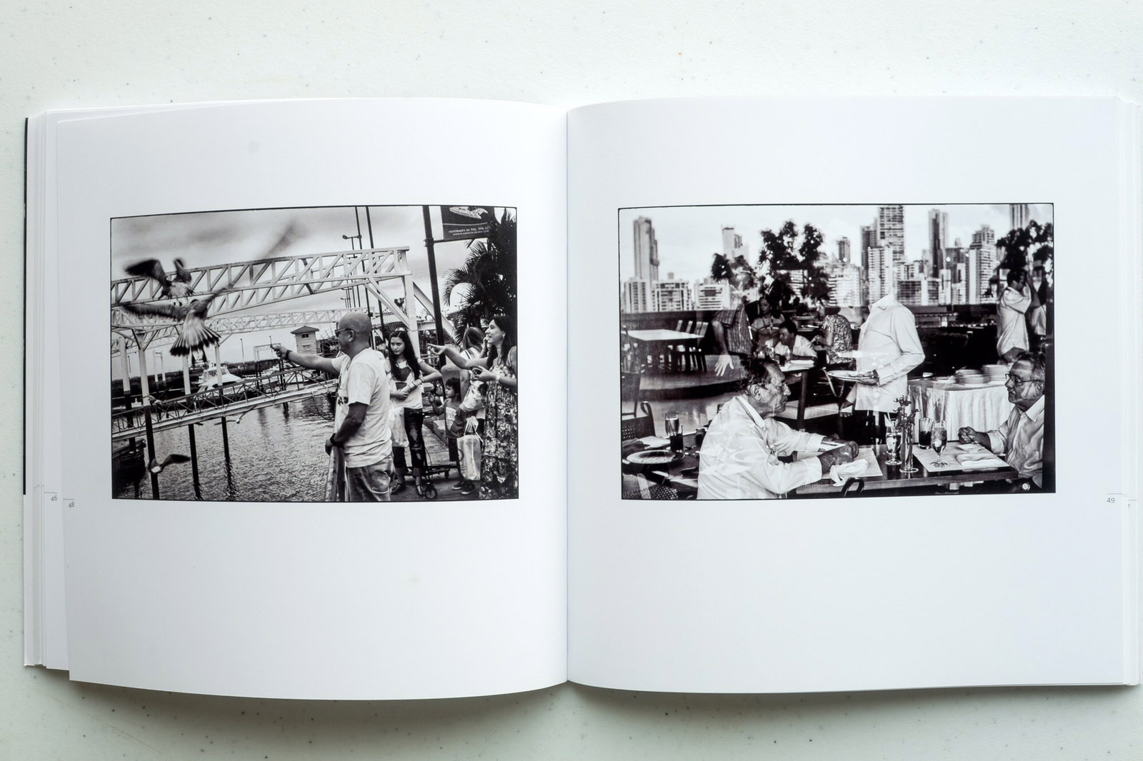
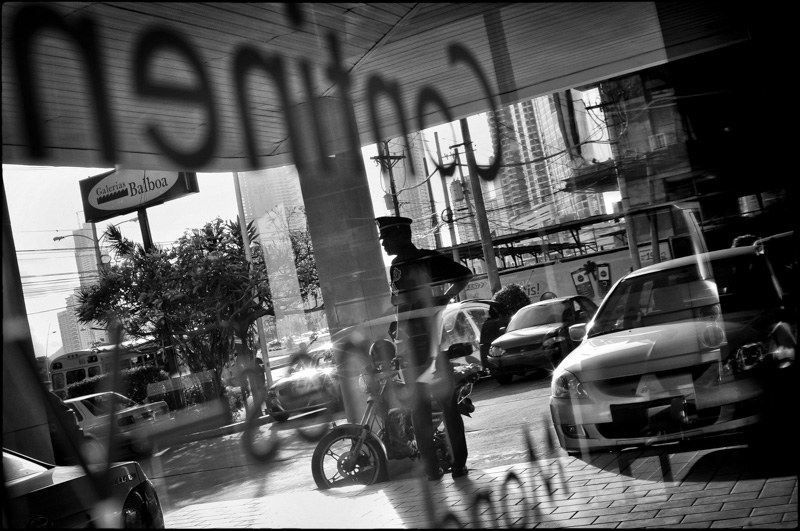
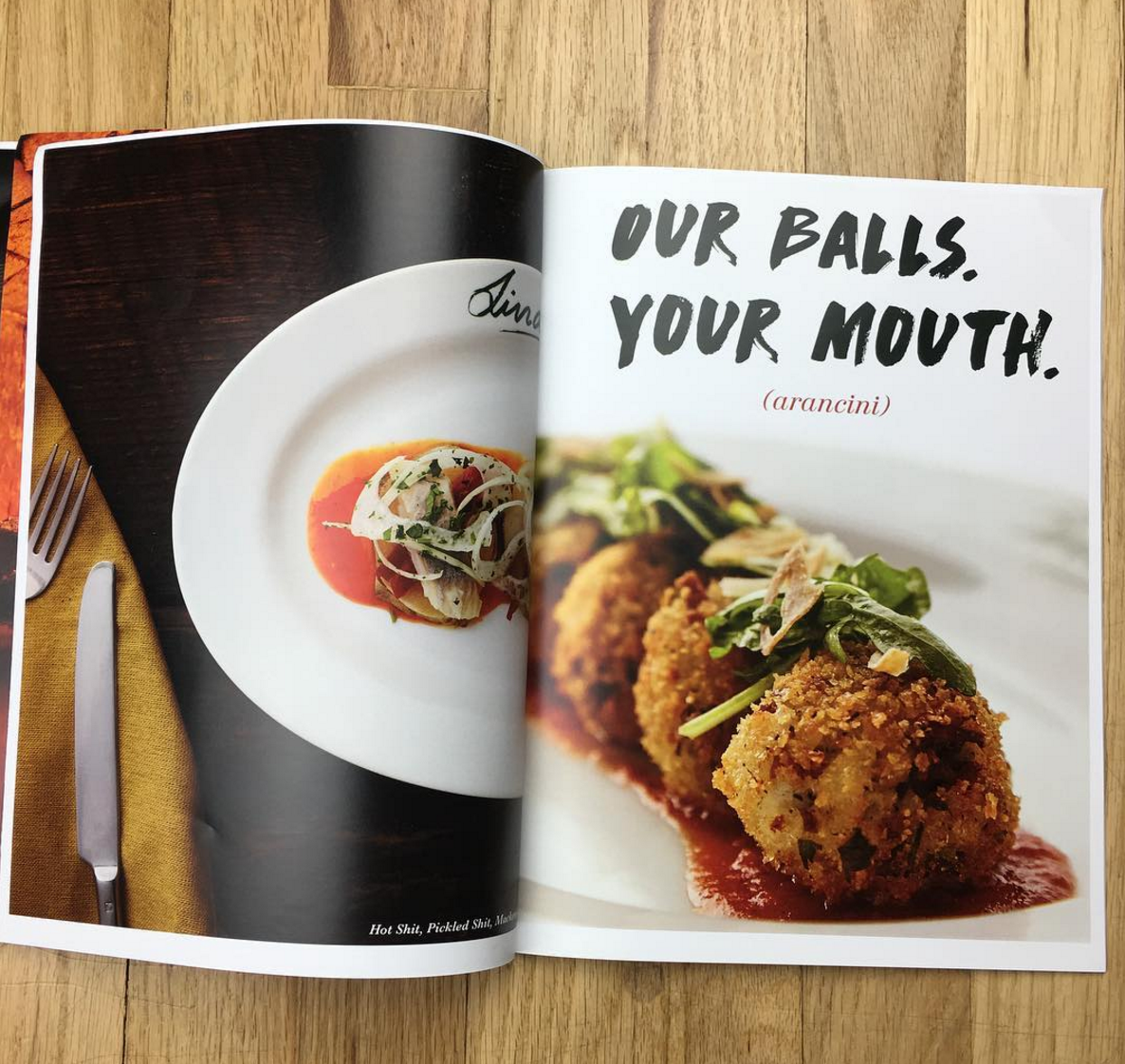
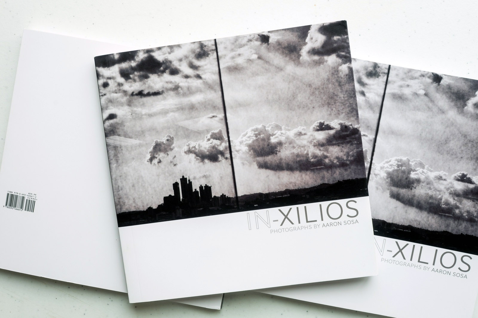
Aaron Sosa
Shenzhen Longyin Printing Packing Co. – China. Publishing House Igneo/Ediquid
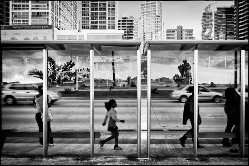
Doug Human
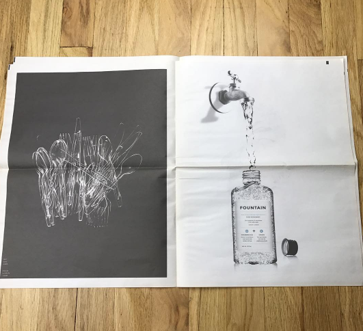
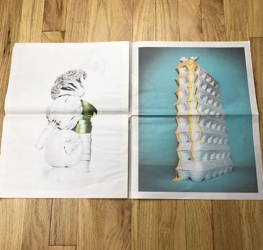
Newspaperclub of the UK
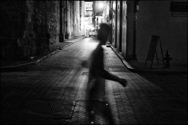
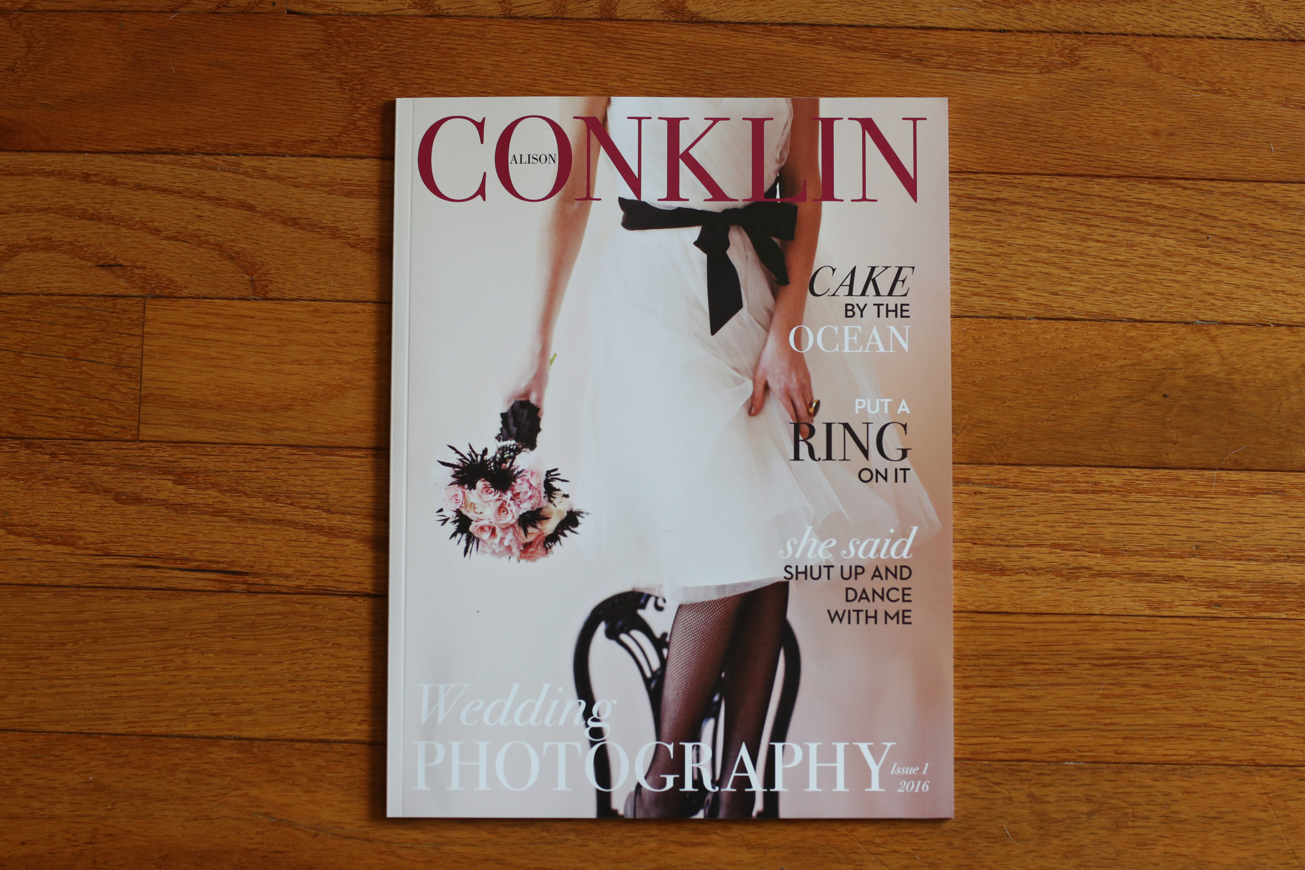
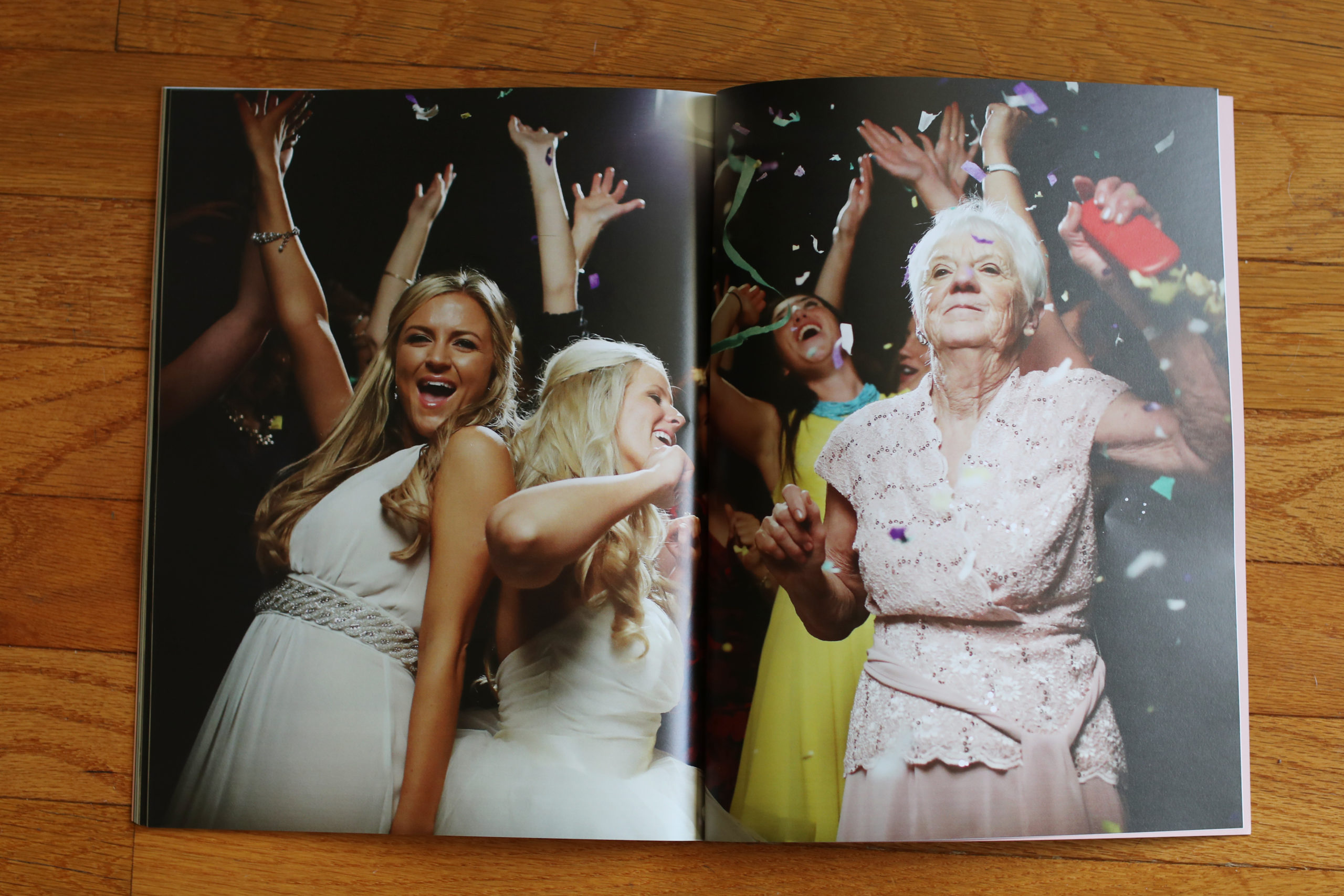
Alison Conklin
Blurb
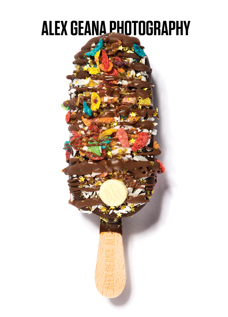
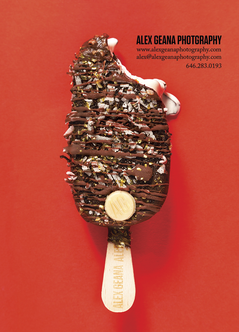
Alex Geana
Overnight
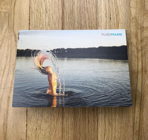
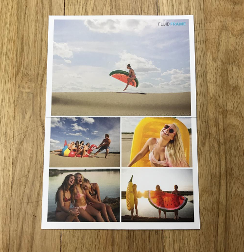
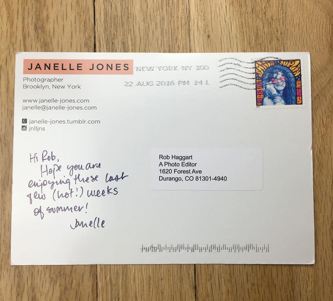
Janelle Jones
Modern Postcard
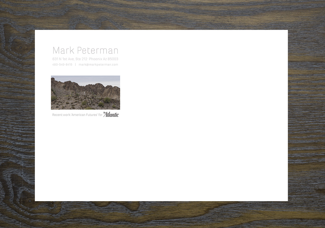
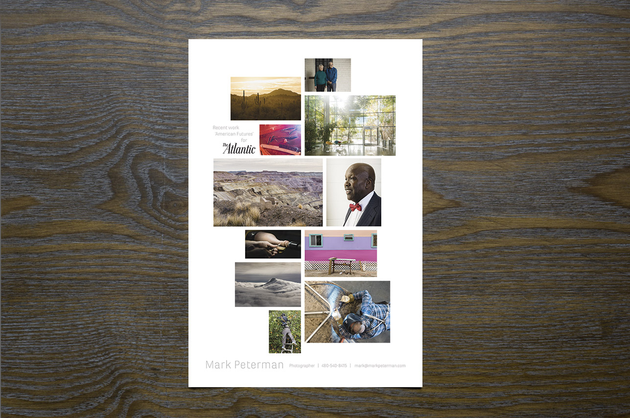
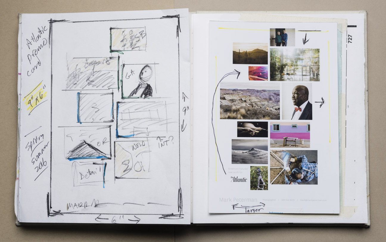
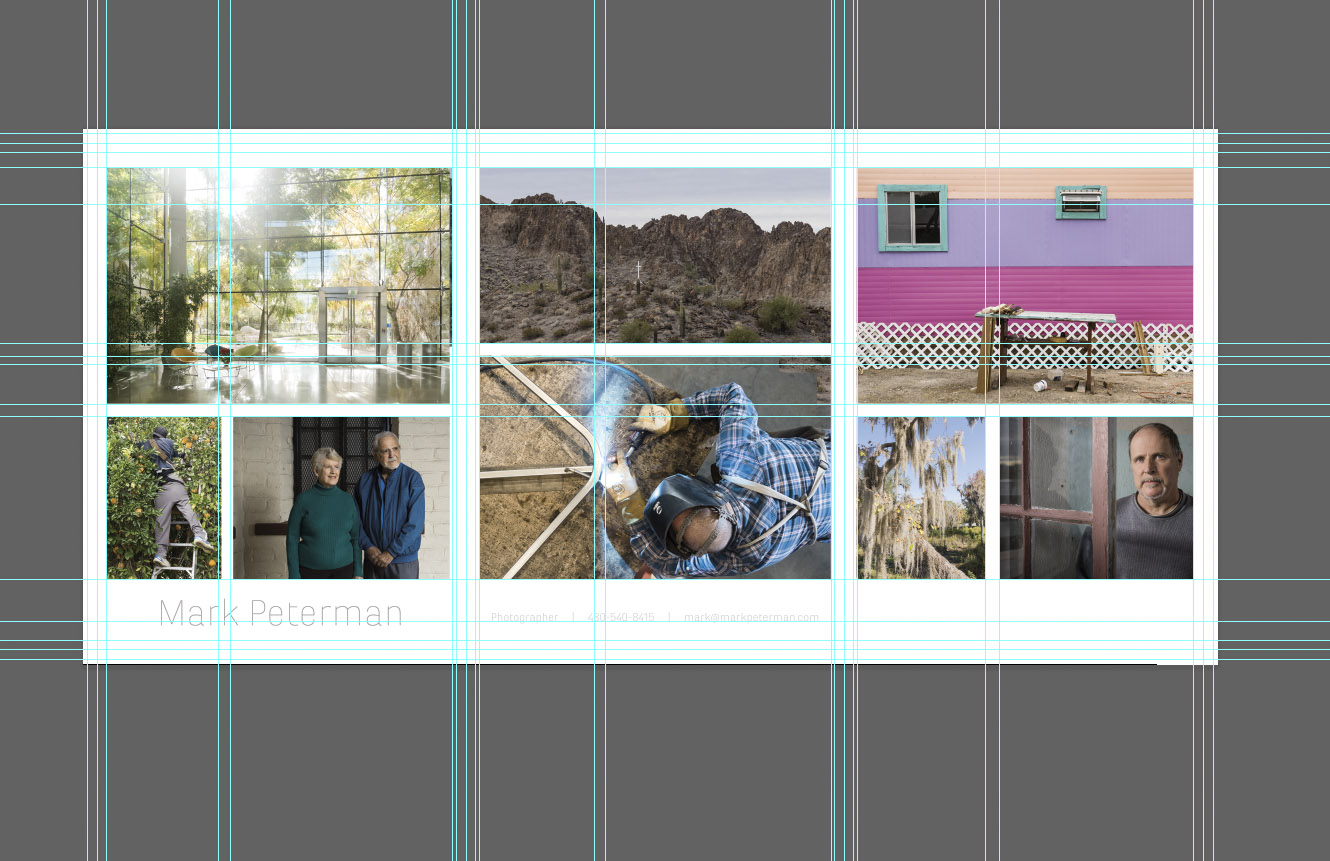
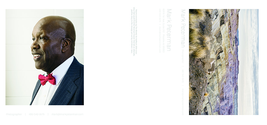
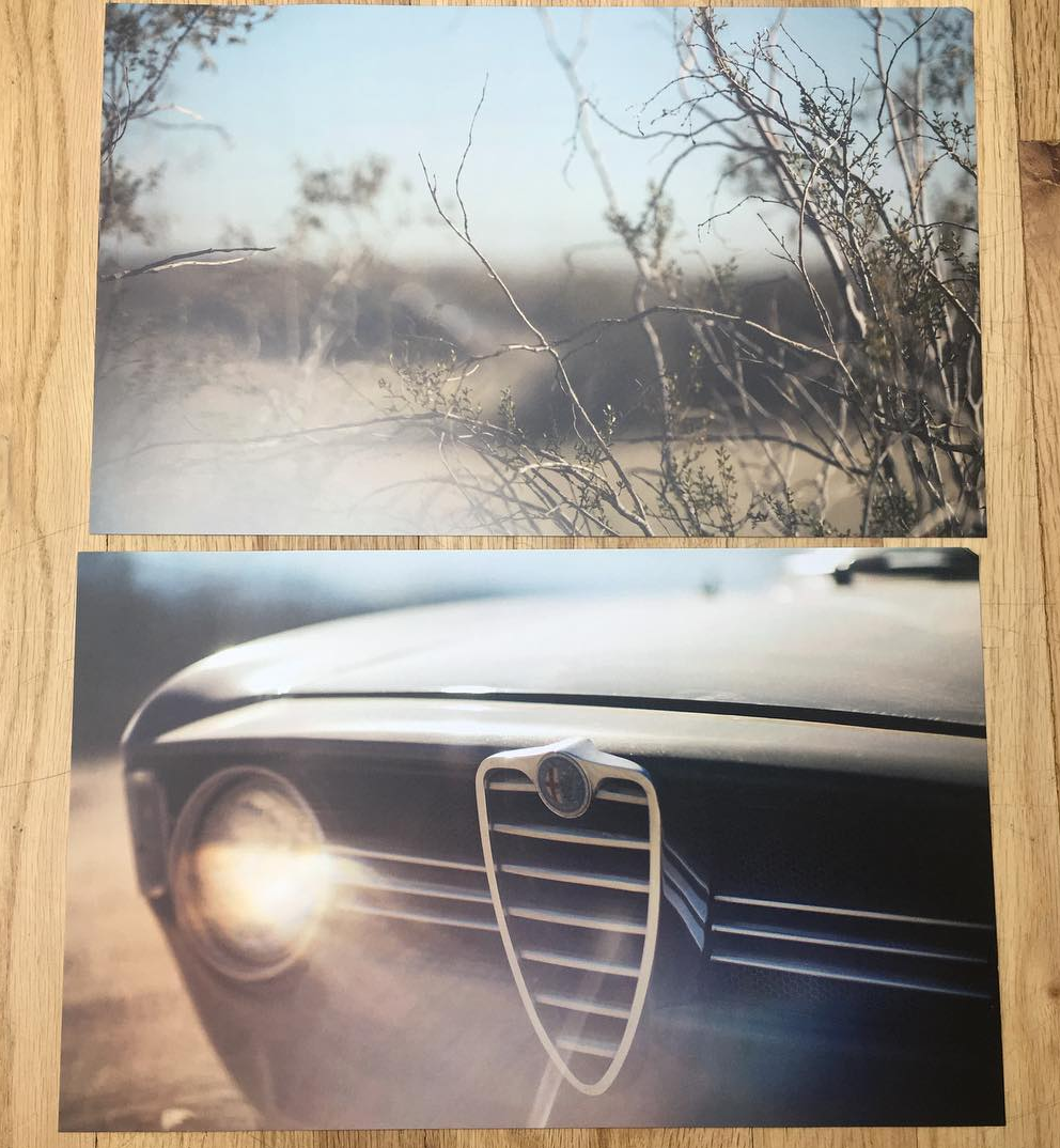
Mark Peterman
Next Day Flyers
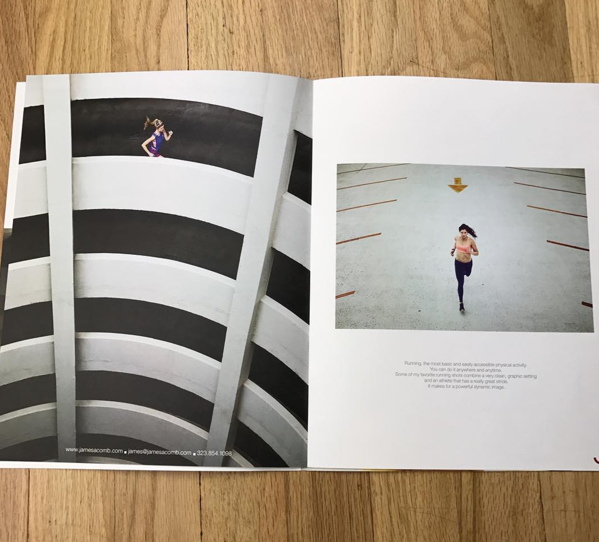
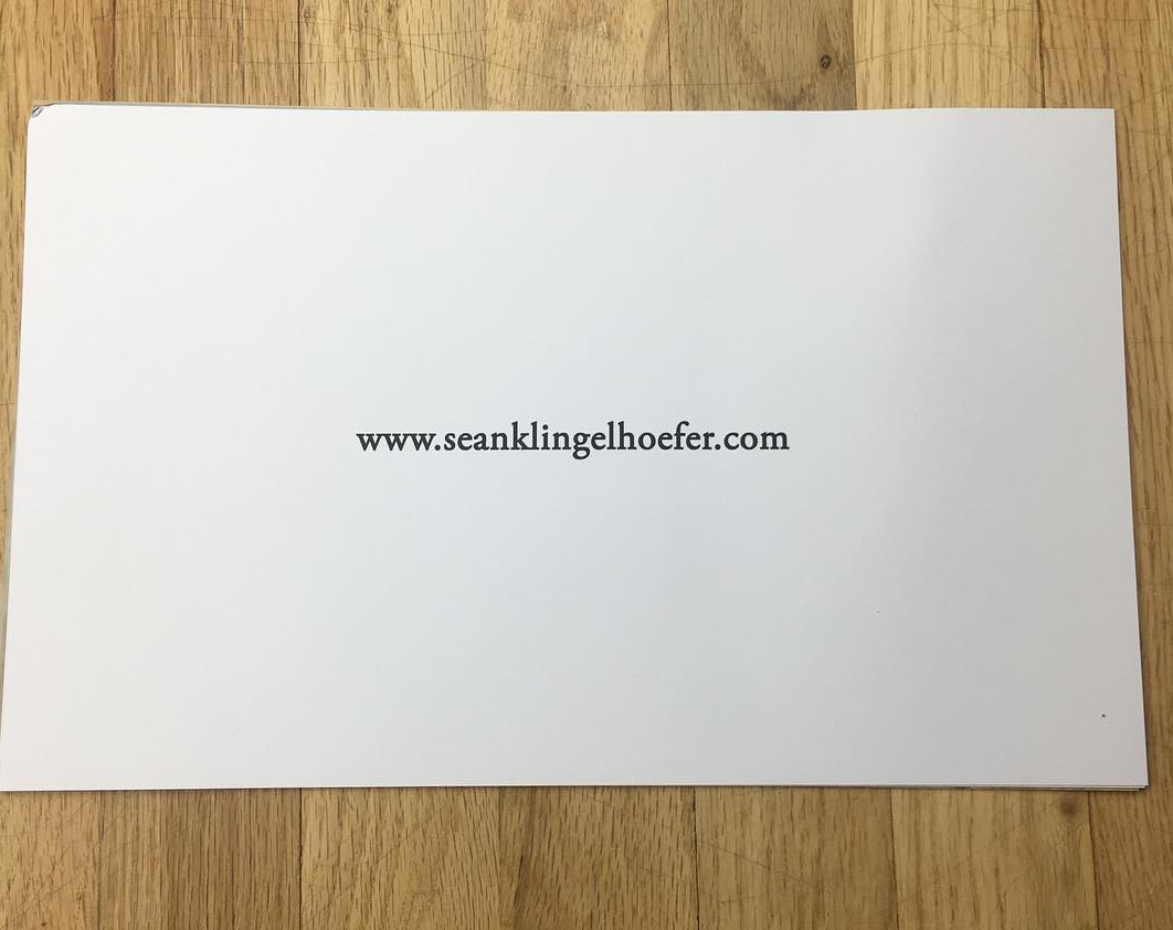
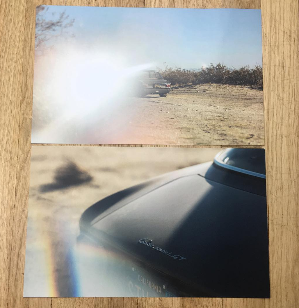
Sean Klingelhoefer
I had it printed through Ken at Continental Colorcraft in Monterey Park, CA but it ended up being outsourced to another print shop because they no longer had the HP Indigo printer I’ve grown to love when I have to do digital offset.
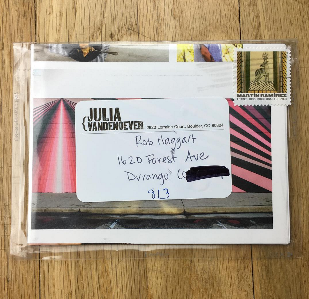
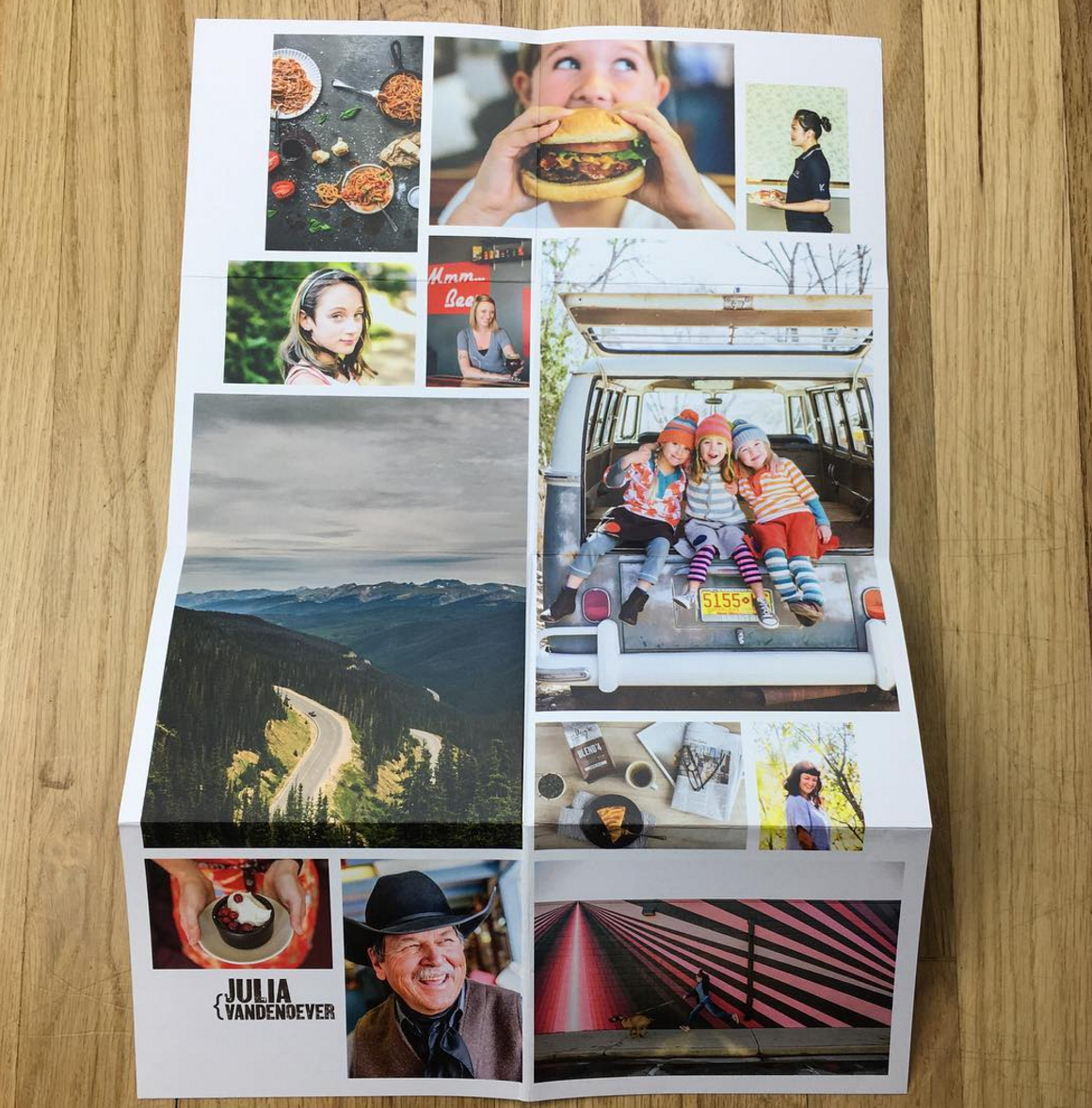
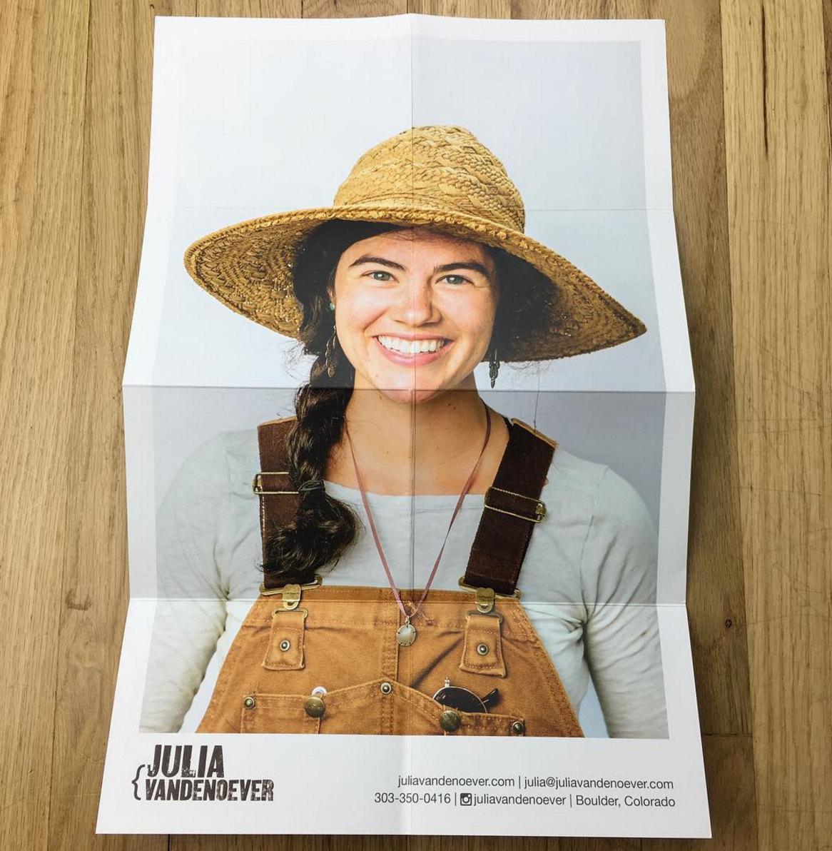
Julia Vandenoever
The Paper Chase Press
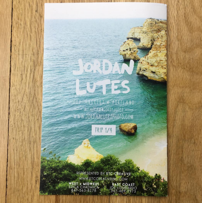
Jordan Lutes
Overnight Prints
Michael Rudin
Mag Cloud
Angela Datre
Overnight Prints
Kenneth M. Ruggiano
I had the prints done by Bay Photo.
Emiliano Granado
Postcards: gotprint.com
20 pg zine: Awlitho.com
Steve Pomberg
The Paper Chase Press
JenniferRocholl
Southern California Graphics in Culver City
Heather Byington
Vista print made the post cards, envelopes were hand crafted by me.
Stan Evans
Modern Postcard
Steve Simko
FOXTONE PACKING in New York City.
Ryan Geraghty
Moo
Kyle Johnson
This piece was printed by the incredible team at Blanchette Press in Vancouver B.C
Jordan Pay
Peczah in Salt Lake City Utah
Jason Evans
Agency Access
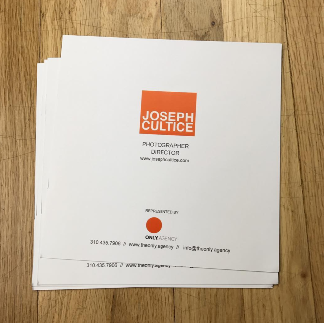
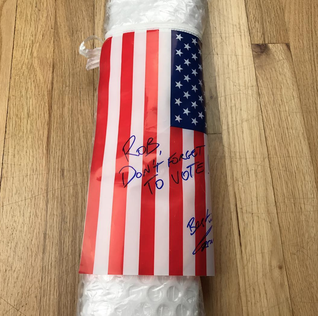
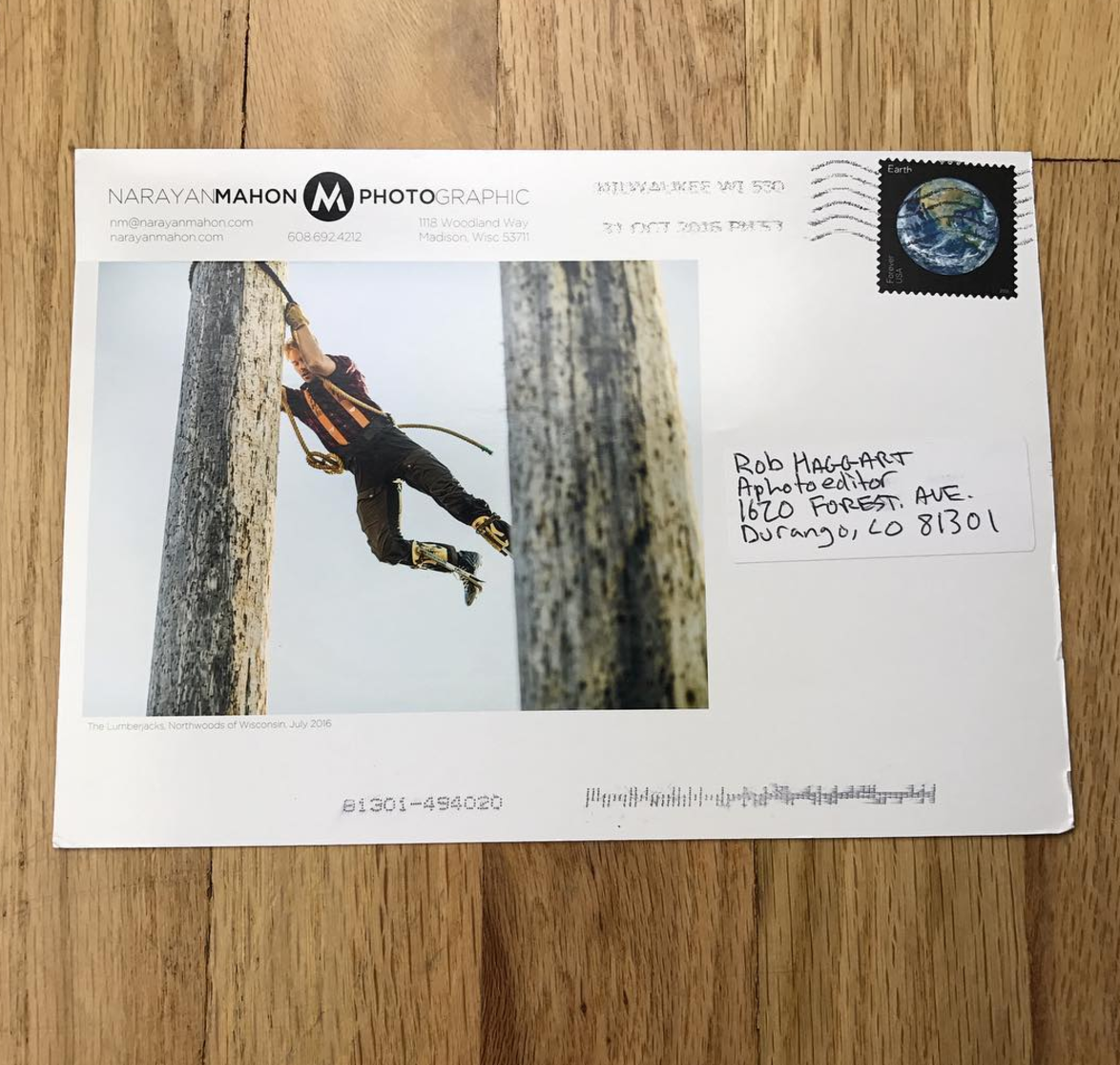
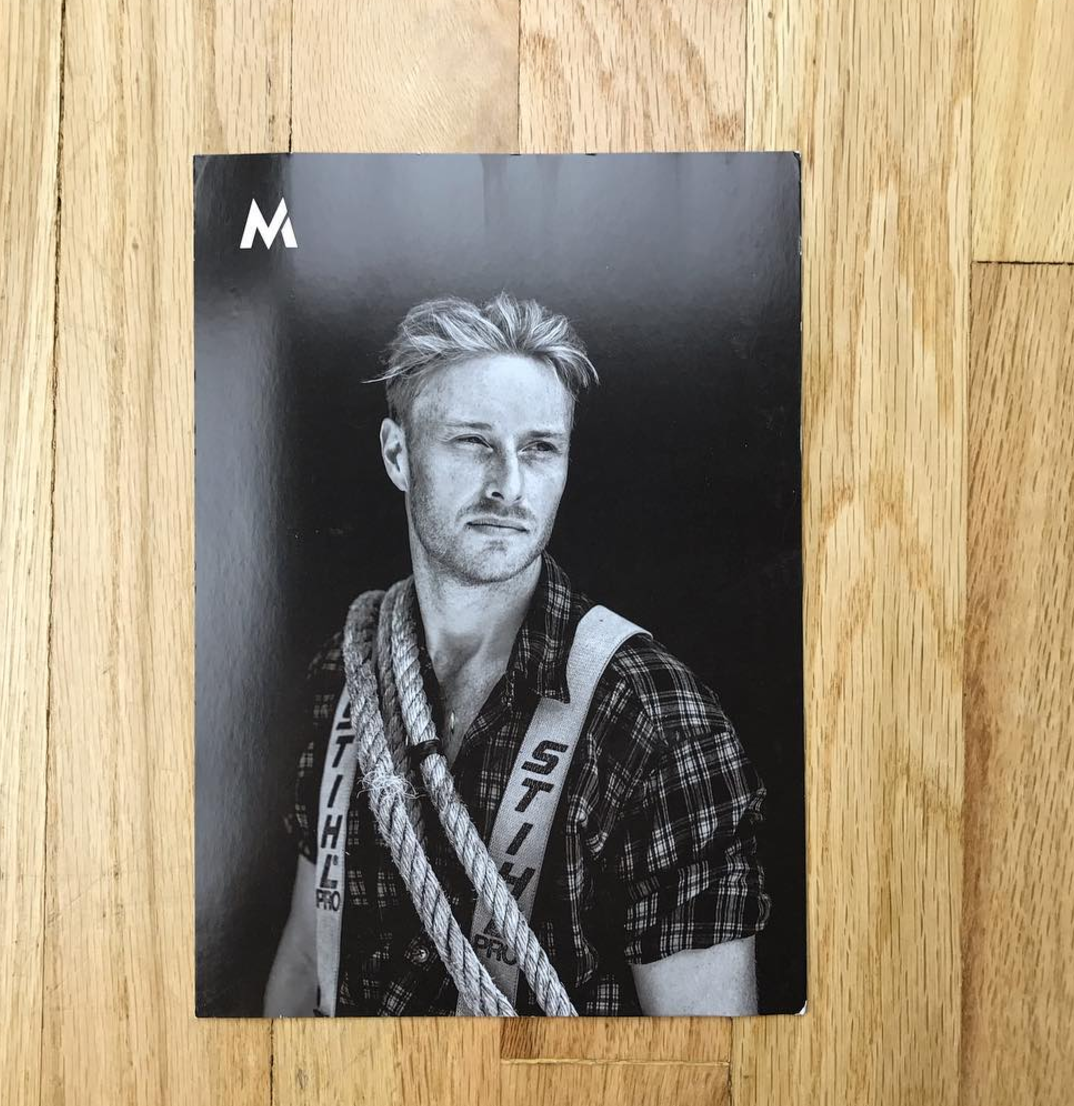
Rob Hammer
Agency Access
Luke Copping
Agency Access
Cade Martin
Classic Color outside of Chicago
Carlos Serrao
AWLITHO. Anthony, the owner, has done the past four promos with me.
Jeff Stephen
Minuteman Press
Andrew Dominguez
Minuteman Press located in Austin TX.
Lisa Shin
Agency Access printed, inserted, sealed and mailed the entire project with considerable customer service.
Kevin Brusie
Blurb
Dominic Perri
I used Nations Photo Lab
Nicholas Duers
Blurb
Trevor Traynor
Mag Cloud
Justin Fantl
The calendar was printed in San Francisco by Spot Graphics
Daniel Dorsa
The cassette tapes were made by MilkTape, I printed the J Cards myself, and the business card was printed by Mama Sauce.
Elizabeth Cecil
Hemlock Printers
Michael Scott Slosar
Aosaimage.com
Sage Brown
smartpress.com
Edgar Artiga
I worked with Rikki Webber at Modern Postcard
Callie Lipkin Photography
Modern Postcard
Tara Donne
This booklet was printed by J.S. McCarthy Printers.
Ryan Young
I had this promo printed by a family-owned business in Anaheim called, Quality Graphic Services.
Fab Fernandez
The printing was done by a company in London called the Newspaper Club.
Nathan Seabrook
4 x 6
JD White
Moo
Fedelestudio.com
Donoson Printing for the video carrier and Bender Graphics for the booklet insert.
Andrew Kornylak
Universal Printing in Durham, NC
Tuan Lee
I printed with Jennifer O’Neill at Marina Graphics.
Tom Hussey
I printed the images in house on a really nice feeling Red River paper
Meredith Jenks
NOVA in Brooklyn
Kevin Arnold
It was printed by Hemlock Printers in Vancouver
Isamu Sawa Photography
Bambra Press
Alex Thompson
I had the photos printed at Samy’s Camera
Sam Kaplan
Advanced Printing NYC
Bob Martus
Linco Printing in Queens, NY
James Worrell
Modern Postcard
Blair Gable
The books were printed by Photobook Canada – 40 copies. The postcards were printed by Vistaprint and the stickers were printed by Loudmouth Print House in Ottawa.
Kevin Zacher
Source Print Media in LA
Breungrega
It was printed by Pinguindruck here in Berlin
Tim Tadder
This was printed by my friends at Marathon Press in Nebraska.
Adam Cohen
I used a local printer, Minute Man Press
Ed Sozinho
Moo
Lori Eanes
Overnight Prints
Joshua Scott
The card was fromModern Postcard, and the screen wipes are from www.4allpromos.com.
Aaron Cobb
Somerset Graphics in Toronto
Brooklin Pictures
Modern Postcard
Cyndi Long Studios
Grogtag.com printed the coasters.
Cody James
QIS in Lower Manhattan.
Stephen Rose
The zine was printed by Shapco in Minnesota
Elizabeth Weinberg
Smartpress in Chanhassen, MN. I have used them for several years.
Rebecca Cabage
The Paper Chase Press
Stephen Kent Johnson
It was printed by Mirror NYC
Justin Poulsen
MSG Printing in Toronto
John Hafner
Blurb
Josh Ritchie
Dale Laboratories in Hollywood, FL.
Ryan Nicholson
Spangler Graphics in Kansas City
The Morrisons
The foil stamped folders were printed by a great local printer, Mr. Lam at Candid Bindery. He’s been foil stamping with expert precision forever. The nine double-sided image cards were printed by Shapco in Minneapolis.
Keith Barraclough
A company out of Arlington, Texas called Liberty Playing Cards


