The Daily Promo: Stephen Kent Johnson

unnamed-1

unnamed-2

unnamed

unnamed-3

201501_StephenJohnsonMushroomPromoCard_final2
Stephen Kent Johnson


Who printed it?

It was printed by Mirror NYC

Who designed it?
I designed it.

Who edited the images?
I edited the images, I tried to find an image that was interesting enough to make the inspiration boards of the people I want to shoot with.

How many did you make?
500.

How many times a year do you send out promos?
This is actually the first printed promo I’ve ever sent out. I was an art director in a former life and used to get a lot of promos in the mail, I found you can’t avoid looking at a postcard, there’s nothing to open.

Where did you source the mushrooms?
The mushrooms are all from Provincetown, MA. My boyfriend and I were up there one weekend this fall and they were everywhere! We’d been up there the year before around the same time and were dazzled by the mushrooms then. I brought my camera this year and my crossed fingers that they would be out again because I knew I wanted to get some shots of them. We went out one afternoon in forest and the sand dunes and brought a basket and loaded it up with the mushrooms, then brought it back to the house and I just played for a few hours with different compositions. I like the more organic shots too, but there was something nice about the old school instructional chart feeling of the dark background and all the little guys lined up in rows. After I was done we put them out on the front stoop in a row, and the people walking by liked looking at them.

Did you prepare any of the mushrooms?
No, we did not eat any of them.

The Daily Promo – John Hafner

john hafner_2
john hafner_11
john hafner_9 (1) john hafner_7 john hafner_5 john hafner_4 john hafner_3

John Hafner

Who printed it?
My promo book was printed by Blurb. It’s a Trade Book, 6X9.

Who designed it?
A graphic artist friend of mine, Paul Allen, in Missoula, Montana designed it.

Who edited the images?
Paul and I both edited the images. I did an initial edit, and then had him weigh in on which pics would make the strongest presentation. It’s really tough to edit objectively, and it’s important to
have a neutral set of eyes to narrow the selections. Just because a pic might be one of my favorites doesn’t mean it would add any value to my promo. The end result is, I think, a good mix of product/studio shots, people/portraits, wildlife and documentary that conveys the scope of what I shoot.

How many did you make?
This was actually my first hardcopy promo. My marketing and promo work has largely been digital. I’ve sent out several PDFs and e-books, which have been quick, cheap, simple and very effective. But this year, I wanted to have something more substantial; something that was portable yet impactful that my clients, and prospective clients  would hang onto and reference.

How many times a year do you send out promos?
The promo features some of my best work from 2014. I chose to include a pic of me in the field to give clients a sense of who I am and how/where I work. I primarily shoot for hunting and fishing markets, and my clients need to know that I, too, am an outdoorsman. This gives them the assurance that I know the industry, their brand and their customer. It’s vital that I can tell my clients’ stories not just creatively but also authentically.

What shoot is the opening spread from and whose paw is that?
The opening spread features some pics from a shoot I did last December with the guys from Duck Dynasty. Not only was it one of the more memorable and fun shoots from 2014, it’s great to have their super-famous facial hair in my portfolio. I also included a partial client list to give prospective clients a sense of my experience in the outdoor industry. And I included client and location info. for each pic in the book.

And yes, that’s my Golden Retriever/office manager/page turner/paw model, Shiley, in the promo pics.

The Daily Promo – Josh Ritchie

Screen Shot 2015-03-12 at 6.26.38 PMScreen Shot 2015-03-12 at 6.26.56 PM

Josh Ritchie

Heidi: Who printed it?
Josh: After searching around for a reasonably priced printer, since I was getting 1200 prints done at an odd size, I decided to go with a local print house, Dale Laboratories in Hollywood, FL. They were fast (they printed it same day within 3 hours), cheap, and most importantly their quality was exceptional.

Who designed it?
It was sort of a design by committee. It start with a chat with Andrea Maurio who edits a lot of my material. After we came up with a single image idea I tossed it around with fellow freelancer and very close friend Melissa Lyttle. She suggested that I turn the single image idea into a 12 image calendar. From there we both brain stormed both ideas for the images and the presentation until we came up with something I felt fit me while being sleek and functional. I ended up designing and constructing the wooden stands myself spending more that a week covered in sawdust in my driveway cutting, sanding and recutting just to get the perfect 4 x 4 block of wood. My wife began to think I was more of a lumberjack than a photographer.

Who edited the images?
This again was done by committee. Melissa Lyttle, Ed Linsmier, David Holloway, and many other photographer friends all weighed in on what they thought worked best. There was a lot of back and forth on what holidays to use and what techniques to shoot with as well as what final images to use.

How many did you make?
In total I made 100. I gave out a copy to everyone who participated and ended up sending out like 85 to potential clients.

How many times a year do you send out promos?
I send out an email promo 6 times a year, a print promo 6 times a year, and one special promo each year.

Did the calendar idea emerge from wanting to have a functional promo?
The thought behind the calendar was that I wanted a way to keep my images in front of potential clients as long as possible. After the initial idea grew into a calendar I knew it would allow me to do two things : First it would allow me to allow me to explore the making of the images a little deeper than I did when I first shot them at the Eddie Adams Workshop, and second it would allow me to keep my work in front of clients for a full year.

Did you match certain images with the months?
Yes. Once I decided to do a calendar I wrote out all of the months and started brainstorming for images ideas. Some months like December, January, October were easy. Other months like May, June, September were a bit harder. For any month that did not have a well known holiday I started writing down ideas and then looked from props that would fit my budget. For May the ideas was May flowers. September was the start of football season. June was BBQ season. After I had the idea’s firmed up I then went out and bought backgrounds in various colors to try and match a color to the time of the year. I then recruited friends and family for the shoot.

Screen Shot 2015-03-30 at 6.40.46 AM Screen Shot 2015-03-30 at 6.40.32 AM Screen Shot 2015-03-30 at 6.40.22 AM

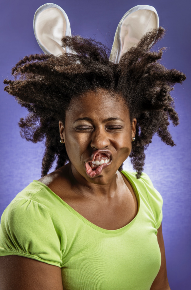
Where did the idea for the leaf blower come from?
The idea for the leaf blower came from some shots I had seen from an ad campaign. Off hand I forget what campaign it was but I like the idea and I stashed it away for a rainy day.

Here’s some BTS and one more.

How did you pitch this to talent?
My friends and family are pretty awesome so it didn’t take much convincing, although I did get some strange looks. I told them the plan and for the most part everyone bought into the idea right away. The ones who were on the fence jumped in with both feet once they found out they would be able to use the leaf blower on someone else. It is amazing what you can get people to do if you tell them they will be able to make someone else look foolish as well. I guess we all have a dark side

The Daily Promo: Ryan Nicholson

_NP_4600
_NP_4606 _NP_4608

final-LWH_NP_0161

final-LWH_NP_0180

final-LWH_NP_0415

final-LWH_NP_0425

Ryan Nicholson

Who printed it?
It was printed by Spangler Graphics in Kansas City where I am based.

 Who designed it?
Designed by Kirk Lakebrink a Kansas City based designer.

Who edited the images?
Edited by myself and JP Perlmutter an artist consultant.

How many did you make?
We printed 275 copies of the piece and I mailed out 220. I will use the remaining pieces as leave behinds at portfolio shows, etc…

How many times a year do you send out promos?
For the past two years I have sent out 6 direct mail pieces a year (basically one every other month) and this year I am going to do them quarterly.

Where did your idea of women and hoops come from?
It is a long story on how I ended up shooting the piece but I will try and summarize. I played high school and college basketball. I graduated with a history degree and started my professional career as a high school history teacher/basketball coach. I taught and coached in Moore, Oklahoma then in Kansas City, Missouri and finally out in Phoenix, Arizona. The last year that I taught in Phoenix I actually switched from teaching history to photography but through a combination of teaching burnout and revitalized interest in photography (my father was a photographer) I decided not to renew my teaching contract and to give photography my full time attention. I started as a stringer for a couple small newspapers in Phoenix and my business has grown and shifted in a variety of ways over the past ten plus years. I am now based in my hometown of Kansas City, Missouri shooting a mixture of editorial and commercial work.

Despite my career change away from coaching I have always maintained a love and interest in basketball and decided over this past year that I wanted to dedicate some time and attention to shooting it specifically. I had a trip scheduled to New York for portfolio shows last summer and was digging around for information on the street basketball scene in the city. I found a documentary on NYC street basketball called “Doin’ it in the Park” on Netflix which led me to their Facebook page. I was looking at the film’s Facebook page and saw a post about a group of women that play pick up ball every Sunday at Goat Park in the upper west side. I found that “Ladies Who Hoop” Facebook page and sent a message to the organizer asking if I could come and photograph them while I was visiting. The organizer Amber Batchelor welcomed me with open arms and I spent a good portion of a Sunday photographing the group while I was in town.

The second part of my interest in photographing the women was my desire to create images of women in a manner that shows them as strong, athletic, etc….I have two young daughters and any opportunity that I have to use my time and talents to document women that are strong and pushing boundaries I consider time well spent. I have to say watching the women take over one of the courts in a prominent New York City park was really cool to watch and document. I am in the planning stages of another trip there and will definitely go back and photograph the group again.

Read more in SLAM Magazine here
 

The Daily Promo – The Morrisons

Screen Shot 2015-03-02 at 11.09.45 AM


Screen Shot 2015-02-25 at 9.09.06 PM

The Morrisons

Who printed it?
The foil stamped folders were printed by a great local printer, Mr. Lam at Candid Bindery.  He’s been foil stamping with expert precision forever.  The nine double-sided image cards were printed by Shapco in Minneapolis.

Who designed it?
We worked with Studio Lin here in New York.  They have a great eye for detail, materials, and color, and we loved some of their previous work (check out the cat calendars for United Bamboo on their site.

Who edited the images?
We always go through extensive rounds of edits ourselves before enlisting the expert eye of consultant and artist Melissa McGill.

How many did you make?
This was our first promo working officially as a team, and we wanted to introduce ourselves in a thoughtful way, favoring quality over quantity.  We printed 500, which was thankfully just enough.

How many times a year do you send out promos?

We hope to mail promos once or twice a year.  We love working with designers and producing something from start to finish.  It’s a luxury and can be great fun.

The Daily Promo: Keith Barraclough

Keith Barraclough

Sample from the deck of The Redhead Playing cards The Redhead Project The Redhead Project The Redhead Project The Redhead Project The Redhead Project The Redhead Project
Who printed it?

A company out of Arlington, Texas called Liberty Playing Cards

Who designed it?

I designed the deck, using Liberty’s Adobe Illustrator-compatible playing card template.

Who edited the images?

My studio manager and I did an initial edit of the images (at the time the decks were produced, I’d photographed 75 redheads) and then I asked Maria Ragusa-Burfield, President of Alt-Pick, to weigh in.

How many did you make?

We ordered 250 packs.  Each pack contains a lead card describing The Redhead Project’s concept and features 54 different redheads’ portraits on the faces of 52 playing cards and two jokers. The backs of the cards feature a collage of 12 different portraits (all of which are featured in the deck).

How many times a year do you send out promos?

I have six email promos and six postcard promos scheduled for 2015. Many will be images from the Redhead series. The playing cards are being used as leave-behinds at portfolio showings and networking events.

Are you a card shark? Why the cards?

No, I’m not. The deck of cards idea came up while my studio manager and I were brainstorming ideas for showcasing and promoting my work on the project to prospective advertising and editorial clients.  We were immediately taken with the idea as a promotional tool.  It’s a tactile, novel, functional, and fun way to highlight 54 portraits from the project.

Where did your affinity for redheads come from?

The initial concept for The Redhead Project actually came to me during a corporate shoot while processing images of an executive who had red hair and piercing blue eyes. I was struck by the contrast of his features against the white Oxford he was wearing and the light seamless backdrop and thought that a series of redheads wearing white against a white seamless would make an interesting personal project.

Since I didn’t know any redheads, I initially relied on word of mouth to enlist participants. We hosted a Redhead Project launch party in July 2013 where we displayed images of the initial 10 redheads photographed, served red hors d’oeuvres and drinks, and invited creative professionals and friends to invite their favorite redheads to find out more about the project.

The scope, concept and reach of the Redhead Project have evolved since the early days of the project and social media (especially Instagram – @projectredhead) has really propelled interest.  All subjects still wear white—like the executive that unwittingly inspired this all—but I also have subjects bring their favorite clothes, accessories and props that reflect their personalities and style, and each shoot is a collaborative process.