This Week in Photography Books: Alice Garrett-Jones


I’ve lived through three seasons in the last ten days, and it’s making me crazy.

It was 80+ degrees here in Taos until October 1st, when fall arrived in earnest, with yellow trees and cooler days. (Nothing too bad, but definitely not summer.)

Then we drove into Colorado at the beginning of this week, and some freezing rainstorms blew in at 7000 feet, where we were staying.

It was the worst of cold-wet-nasty-late-autumn for sure.

It snowed at the higher elevations, so on Tuesday, we drove over the Rockies, near 10,000 feet for two hours, and there was a blanket of thick snow covering everything.

Sub-freezing temperatures.
Icy roads.

Total winter in every way.

You’re not supposed to experience three seasons in ten days. That’s not the natural order of things.

It’s like living in a jet-lag bubble.

And to top it off, I just got out of the car after a six hour ride, coming back across to the Western side of the Rockies yet again.

More storms. Cold rain this time.

There were sections of slick road where the slightest misstep would have meant peril. We passed chunks of the landscape that had been ripped through by wildfire in June, and already green things had grown up in between.

What I’m saying is, I’m in one of those mind-spaces where I’m a bit bleary, or punch drunk. I’d be willing to consider almost any strange idea with an open mind, because I’m a tad woozy.

Almost boozy.
You know what I mean?

I remember one time when I was jet-lagged, just back from Rome to NYC, and I got hired to scan an old, highly damaged piece of nitrate film. (The kind that could spontaneously combust.)

I’ve never before or since seen a negative as scratched up. It was more like a Seurat painting than any proper photograph. No sane, regular person would have attempted to retouch it.

But I wasn’t sane. I was jet-lagged.

So I started, (just to start,) and constantly moved around to different parts of the negative, in random ways, so that it didn’t seem to repetitive.

In honor of that woozy-brain moment, (and the fact that the film didn’t catch fire and kill me,) I’m going to consider another seemingly impossible idea: what if Evolution had played out in a completely different way?

What if human beings didn’t descend from apes? What if we’re not cousins with chimps, but rather evolved from a common bird ancestor?

What if human-bird hybrids were real, and the god-creatures we see in Mesopotamian relief sculptures were actual beings, rather than scary masks?

What the hell am I on about? Am I actually drunk, as opposed to metaphorically?

This week’s book, “Aunt Paloma Was A Pigeon: An Alternative Theory Of Evolution,” created by Alice Garret-Jones, turned up in the mail recently.

I’m glad it did, because this is one of my favorite books in a long time.

It’s strange and absurd and thoughtful and surprising. The book is exceedingly well done in every way, and as photography makes an eventual appearance, we’re going to consider it enough of a photo book to review here at the column.

What if we evolved from birds?

Pigeons, no less.

In New York City, (and likely elsewhere,) they call pigeons flying rats. People have concocted these metal-spike-impediments to prevent them from nesting in many places. (Have you seen them?)

But Ms. Garrett-Jones presents a parallel universe where things played out differently.

I must admit, I studied Biological Anthropology at Duke, as I needed to take two science classes, and they were reputedly the easiest.

I remember learning the difference between Australopithecus Afarensis and Australopithecus Africanus. Or when Homo Hablis morphed into Homo Erectus.

That we were literally apes, all hairy and making chimp noises, is pretty fucking strange, when you think about it.

Is it that much weirder to imagine we were Bird-People?

Coooooo, coooooooo.
Coooooo, coooooooo.

Or what about Simon and Garfunkel?

“Coo-coo-ca-choo, Ms. Robinson?” Is that some coded shout out to our avian ancestors?

I’m being silly here, and in fairness, the book is serious about it’s charmingly funny conceit.

It has statistics about how male pigeons are better Dads than humans, and uses drawings, graphics and type-face to great effect. Ms. Garrett-Jones considers attention span, so the reading/looking pace is smart and snappy.

I think my favorite page, (though it’s hard to pick one,) is the side view comparison between a human arm and a bird wing. It’s printed on vellum, (one of several surfaces throughout,) and the similarities are so striking.

“Why not,” I thought?

Is it any weirder than coming from monkeys?

That’s about all I’ve got for you this Thursday evening. (Yes, I’m writing at the last minute, by my standards.) I hope you have a great weekend, and that more books in my submission pile turn out to be this good.

If so, we’re all in for a treat this autumn.

Bottom Line: Marvelous, imaginative, mixed-media book about evolution

To Purchase “Aunt Paloma Was A Pigeon: An Alternative Theory Of Evolution” click here

If you’d like to submit a book for potential review, please email me at jonathanblaustein@gmail.com. We currently have a several month backlog, and are particularly interested in submissions from female photographers so we may maintain a balanced program.

The Art of the Personal Project: Leon Hendrickx

The Art of the Personal Project is a crucial element to let potential buyers see how you think creatively on your own.  I am drawn to personal projects that have an interesting vision or that show something I have never seen before.  In this thread, I’ll include a link to each personal project with the artist statement so you can see more of the project. Please note: This thread is not affiliated with any company; I’m just featuring projects that I find.  Please DO NOT send me your work.  I do not take submissions.

Today’s featured artist:  Leon Henrickxs

KINGS & QUEENS began in 2015 when Léon created a portrait of his friend Micha and his drag queen alter ego Snorella WC. Two personalities of the same individual laid bare; portrayed in juxtaposition, as if each has his or her own life. The blueprint for an international photo project had been formed: KINGS & QUEENS — guys besides the girl they are inside.

The KINGS & QUEENS portraits invite the viewer to enter into the exotic phenomenon of drag artistry, a world which is usually restricted to the clichés of spectacle, fantasy and entertainment. By gazing upon the fierce drag queen, accompanied by her soberly dressed male half, the viewer is asked to consider the relationship between the two personalities: whose desire is satisfied with the transformation back and forth? What does one ‘get’ from the other? And how do they react when meeting each other for the first time? Do they embrace, flirt or argue with each other?

One thing is certain: the depicted subjects were stunned when seeing the images for the first time. On seeing her portrait, drag queen Extasis Liquuid cried out: ‘Finally my two hearts beat in the same rhythm.’

KINGS & QUEENS is now conquering the world. Berlin, Madrid, New York have already experienced the power of drag, with Cape Town, Hong Kong, Tokyo, Los Angeles and Rio De Janeiro to follow soon. Exhibitions are usually accompanied with debates and discussions about gender, sex and identity conventions. Ultimately the KINGS & QUEENS portraits will be collected, internationally exhibited and eventually published in a book that captures the magic and reality of what it means to be a drag queen.

https://www.cnn.com/style/article/kings-queens-drag-portraits/index.html

To see more of this project, click here.

Instagram here

LÉON HENDRICKX

Léon is a Dutch photographer based in Amsterdam, NL. He started his photographic career as a university scholar, absorbing the theories of visual arts and photography at the University of  Amsterdam, Leiden and the Rijks Art Academy in The Hague. In the meantime, he learned the photographic trade while assisting the artists and photographers of the Dutch fashion and  advertising industry. During these assignments Léon developed his interest and skills for the technical possibilities of photography and how to utilize technology to make his dreams seem real.

Léon is intrigued by the extraordinary. He is determined to bring out the ‘realness’ of his subjects, no matter how bizarre, strange or fantastic that may be. But whether what’s depicted is real or not, he wants to make sure that the viewer believes what he creates.

In his series KINGS & QUEENS, Hendrickx explores the world of drag. For him, drag is becoming another character that resides inside yourself. Léon was fascinated by the question of how (or whether) these two sides of the same person could be reconciled. After much experimentation, Léon found a way to portraying both persons in the same image, thereby showing how two characters, wrapped up in the same body, are intertwined.


APE contributor Suzanne Sease currently works as a consultant for photographers and illustrators around the world. She has been involved in the photography and illustration industry since the mid 80s.  After establishing the art buying department at The Martin Agency, then working for Kaplan-Thaler, Capital One, Best Buy and numerous smaller agencies and companies, she decided to be a consultant in 1999. She has a new Twitter feed with helpful marketing information because she believes that marketing should be driven by brand and not by specialty.  Follow her at @SuzanneSeaseInstagram


The Daily Edit – Polaroids of Women: Dewey Nicks

Bijou Phillips & Emily Cadenhead, Bill Burgess House, Palm Springs

Cindy Crawford, Big Sur.

Isaac Mizrahi & Shalom Harlow, Pier 59 Studios,

Jasmine Guinness, Zuma Beach

Patricia Arquette, Morgan House, Hollywood

Natalie Portman, Upper East Side, New York

Patricia Arquette, Morgan House, Hollywood

Polaroids of Women

Book Designer: Tom Adler
Writer: Brad Dunning
Photographer: Dewey Nicks

Heidi: What made you want to keep all your Polaroids? how where they stored, organized?
Dewey: First and foremost we kept Polaroids for practical reasons: the Polaroids were a tool to help organize and identify film rolls. We made grease pencils notes on the Polaroids for the lab techs as color and exposure references for processing rolls of 120 and 35 mm which was considered the “real film”.

Because the Polaroids weren’t considered “important” they were looser.  I would have to reframe a bit when we changed to the Polaroid camera with its fixed lens. That change helped create a new momentum. The honesty of the Polaroid color reproduction creates an undeniable intimacy with the color and light quality of the original subject.   I always thought that Polaroids were worth saving because the image you see is a unique 1 of 1 photo with a surface that actually saw the light reflected through the lens, never to happen again.

Did you know you’d be doing a book someday?
I was working on 2 or 3 long-term projects that I imagined would be presented as books. Those projects were shot on negative or transparency film with the intention of making high quality images. The boxes of Polaroids were almost like scrapbooks of the moments we loved from shoots, testaments to favorite memories and once I rediscovered them, they rose to the top of the list.

How many did you have in total?
There were several thousand Polaroids.  Black and white Polapan, Polacolor, SX70, Fujicolor instant film were all thrown into a box and forgotten.

How long did the editing process take and what elements did a Polaroid have to have in order to make the edit?
I shared the box of Polaroids with my friend, designer Tom Adler, who creative directed many of the shoots included in the stack of Polaroids. Tom took the images and came back in a couple of days with layouts of an edit focused on portraits of Women. Some well-known women, some young faces, some friends and collaborators. All beautiful. I loved what Tom showed us and his first layout is basically what ended as the final book.

What do you miss about Polaroid?  Your work is often described as fun, energetic and your Polaroids have a type of freedom and unguarded moments, how do you satisfy that now?
Like pretty much everyone else I reach for my iPhone when I see something that I want to record quickly. As convenient as it is to have that technology in hand, nothing takes the place of viewing through the rangefinder of the camera knowing you get one quick chance to decide focus, exposure, and composition to make the picture, and you won’t be able to see the outcome for a couple minutes. It’s a risky process, but uniquely rewarding.

How did you and Brad collaborate for the forward? Did you have long chats, give him the box of images to sift through?
I was incredibly lucky to work with Brad on many photo shoots when he production designed and edited print stories. He had a lot of influence on many of the images in the book.  As a matter of fact, a few of the Polaroids used were from Brad’s personal collection from our shoots.  We spoke briefly about some of the specific Polaroids but Brad, who always references the most interesting details, wrote the foreward from his firsthand experience.


The Daily Promo – Jason Travis

Jason Travis

Who printed it?
TranspLAnts was printed by Newspaper Club, based in the UK. (They also conducted an interview with me.)

Who designed it?
I took the photographs and designed the layout. With this particular project, I utilize each subject’s handwriting to give it a personal feel.

Tell me about the images?
In early 2016, I moved from Atlanta to Los Angeles. It was the first time in my 35 years that I’d lived outside of Georgia. I wanted to create a photo series focusing on people I meet – people who have also moved to Los Angeles to start a new chapter of their lives. I wanted to hear about their journeys and experiences. I wanted to learn how living in different places has shaped their existence.

Tell me about the pin and stickers you use instead of business cards?
I went to design school and used to put importance on having a business card. Times change and often social media becomes the calling card. For a photographer it has its pros and cons. Rather than update and print new business cards when I moved, I decided to design some fun enamel pins and stickers. This was a small token I could give to new people I met and especially neighbors. A small way to say hello and show my appreciation for living in a new place. It’s not something that screams my brand name, but more of a memorable item that can be enjoyed, rather than tossed aside. That’s not a new idea, but I wanted to make something I enjoy, and if someone else happens to also then that’s great.

How many promos did you make?
I printed 100. The zine is 16 pages and labeled as Volume One. I’ve shot over 60 people at this point so I definitely plan to make a second volume.

How many times a year do you send out promos?
This is actually the first promo I’ve ever sent out. It’s also available for purchase on my design site. I’m always working on personal projects alongside my commercial work and have another printed newspaper in the works that should be finished this month.

Do you think printed promos are effective for marketing your work?
Tough to say quite yet but so far transpLAnts mini zine has received some attention and appreciation. I love the idea of someone holding a physical representation of my work in addition to viewing it on a screen.

This Week in Photography Books: Marina Font


There was a dead rabbit hanging from our fence yesterday morning.

(I saw the ravens picking at it.)

I only noticed as I looked in the car’s rear view mirror, ready to drive the little ones to school on an otherwise drab Tuesday.

It was pretty high up there, so I figured a bird had gotten its prey stuck, but then I made the mistake of telling Theo about it.

In a flash, (I have no idea how he covered ground so fast,) he was standing below it, and came back reporting it was stapled to the wood.

Not good.

Not good at all.

It’s twenty-five minutes to school each way, plus the drop off, so I had the better part of an hour to stew on the horror of someone stapling a dead rabbit to our fence, not 100 feet from my house.

I called my friend Ed, who was my mentor at a school for at-risk youth for many years. He understands the community, and what it might mean for someone to do that to us.

He thought we should call the cops, and alert the neighborhood. I agreed, and thinking about it made me so angry as I tore into the driveway at high speed.

But as soon as I exited the car, with my Iphone ready to capture the evidence, I saw the rabbit was gone.

Gone?
Gone!

I ran inside, yelling at Jessie, “Why did you take it down? We need to show the cops!”

“I didn’t take it down,” she said, still in her robe. “I didn’t even go out there.”

I was stunned.

The culprit returned to the scene of the crime to steal the evidence?

Oh my god!
This was a big deal now.

I ran, frantic to the fence, searching for any evidence I could find. Would the cops even believe me?

Halfway down the fence, where it reached about 8 feet high, right there on the ground, I saw a very dead rabbit with its eyes and guts eaten by the birds.

I looked up, and saw where the carcass had been wedged in between two fence planks. They were smeared with guts, in a natural way.

There were no staples, nor staple holes.

I could see how it all went down, and remembered I’d assumed it was birds before Theo came back with slightly false information.

(Only slightly false, but that little detail made all the difference.)

I immediately called my friend, thanked him for his advice, and apologized for the false alarm.

No need to start a neighborhood watch just yet.

It was only nature.

We humans fancy ourselves as distinct from nature, and of course that’s laughable. We’re animals, like monkeys or rhinos and lemurs or emus.

Our big brains and opposable thumbs helped Homo Sapiens evolve into the King of Earth, and sure we know how to shave our faces, but we’re still just animals.

Wearing clothes.

Clothes are what really separate us from everything else; trees and rocks included. We put on clothing as protection each day: from the sun, the wind, the cold, and the unwanted glances of strangers at our private parts.

Fabric provides people with a second skin, and like food, music and dance, the style in which fabric is created represents one of the most obvious ways that global cultures differ.

Our relationship to fabric, when you think about it, is a symbol of our relationship to our humanity, and the power-dynamics that shape how our societies have evolved. (I won’t get started on how women have been constricted by their clothing through various centuries.)

All of this comes to my mind having just looked at “la anatomia es destino/ anatomy is destiny,” a new book by marina font, published by minor matters in Seattle.

First off, I have to give a shout to the packaging here. The book arrived wrapped in tissue paper and tied up in red string. I photographed it before dissembling , so you can see it down below.

Ultimately, this book is a meditation on the near infinite ways an artist can riff off of one essential form: the naked female body.

As you’ll see in the photos below, though, it’s not a book of nude photos.

Quite the opposite.

Marina has used various forms of thread and yarn, or sometimes more random things I can’t identify, (Is that gold leaf in one of them?) to cover this one ubiquitous image.

Before I get started, I’m going to quibble for a moment, because it’s a book review and why not? I thought the opening three images were a bad choice to begin the narrative.

They don’t fit as well with everything that follows, and it took a bit longer to then necessary for me to figure out what was going on. (As far as sussing out the concept.)

I thought the rest of the editorial choices were spot on, and the pictures were cool as hell. You can see in one installation shot how the 2-dimensional-wall-photos connect via yarn/string to 3-dimensional sculptural installations in the real world.

(The book does a good job of translating the 3d into 2d, which is always problematic.)

I have some favorites, like “fire” and “ice,” and the mandalas, but overall, the feminist ideas, and the subversive thoughts about the role of craft practice in high art come through. It’s always tricky for typologies and conceptual pieces to get the right information across via stripped-back systems, and it’s very successful here.

Lisa Volpe, a photography curator a the Museum of Fine Arts, Houston, provides and ending-essay that makes these ideas visible and comprehensible for those viewers/readers who might not have connected the dots.

(3 minute pause.)

It’s funny, but I’ve been sitting here for a few minutes staring at this book, trying to figure out how to finish the review. (That never happens.)

As I’m looking, a new thought hits me: check out at all those sewn pieces. I bet each one takes a long time to make, and no small amount of skill.

Each individual piece. And there are so many! Not to mention the time it takes to make each photo-piece, and then photograph it for the book.

A project like this requires patience, and a willingness to put in the time. It’s philosophical in that regard, as is the original premise of all these variations on one female form.

Each one the same, yet different.

Like people.

Bottom Line: Hybrid, beautiful photo-sculptures of the female form

To purchase “anatomy is destiny” click here 


If you’d like to submit a book for potential review, please email me at jonathanblaustein@gmail.com. We currently have a several month backlog, and are particularly interested in submissions from female photographers so we may maintain a balanced program.

The Art of the Personal Project: Michael Grecco

The Art of the Personal Project is a crucial element to let potential buyers see how you think creatively on your own.  I am drawn to personal projects that have an interesting vision or that show something I have never seen before.  In this thread, I’ll include a link to each personal project with the artist statement so you can see more of the project. Please note: This thread is not affiliated with any company; I’m just featuring projects that I find.  Please DO NOT send me your work.  I do not take submissions.

Today’s featured artist:  Michael Grecco

My Venice People project started almost 30 years ago, when I moved to LA to work for People Magazine from my staff position at the Boston Herald. I was still doing photojournalism then, but yearned to be more of a portrait shooter, a Celebrity Photographer. The interesting this when I look at this work is, it’s a blend of photojournalism and the commercial portraiture I am known for. For a magazine or commercial client, I gather props, build sets, find environments and then use hair, makeup and wardrobe to tell a controlled story. A conceptual approach to storytelling, as opposed to the realist approach I learned at the Herald. But all of these people come with an interesting story written all over them; they have strong identities that tell a clear story.

I have then in turn, taking the lighting and the drama that is my style and turned in on them in the streets, most Venice, but also Santa Fe and Miami Beach. The more recent work has never been shown except on my website, but now I have an opening of large prints on October 4that the Terrace Restaurant in Venice. Venice on Venice, I guess it’s appropriate.

Luann, All Seeing, Venice, California
Smoking Girls, Venice Beach, California.
Beach Bikers, Venice, California
Banana Boy, Venice, California 2006.
Muscle Man, Venice, California

APE contributor Suzanne Sease currently works as a consultant for photographers and illustrators around the world. She has been involved in the photography and illustration industry since the mid 80s.  After establishing the art buying department at The Martin Agency, then working for Kaplan-Thaler, Capital One, Best Buy and numerous smaller agencies and companies, she decided to be a consultant in 1999. She has a new Twitter feed with helpful marketing information because she believes that marketing should be driven by brand and not by specialty.  Follow her at @SuzanneSeaseInstagram


The Daily Edit – Medmen: J.R. Mankoff

MedMen

Photographer: J.R. Mankoff

Heidi: How did this campaign come about?
JR: Medmen reached out to me with a simple concept for their latest campaign. Let’s shoot individual images based on the locations of each of their stores (West hollywood, Beverly Hills, DTLA, Venice, San Diego, Orange County, etc…) and focus on simple clean imagery where the identity if the individual is not as important as their expression of individuality. I was familiar with Medmens previous campaigns in which they have been identifying the stigma that all people consume cannabis. They executed this by showing portraits of a wide range of individuals. I know this to be true, but consuming cannabis is still very much “under the table”, though legal here in California, and Medmen has done a great job making it approachable to everyone.

Tell us about the creative process
It truly was a complete collaboration and Medmen was very open to my suggestions. I scouted locations for three days with them to figure out what would be the best locations and the best times of day to shoot each image. Some initially concepts worked out well, but once we scouted the location, new ideas formed that shifted to what you see today. I believe that a location often dictates the image and its best not to force an image upon it. Medmen was very understanding of the way I liked to work and create and this allowed these images to truly reflect both our visions. Which is why I believe they are so strong.

Were the images shot full length than cropped later as a concept?
Cropping out the heads was always part of the concept, but needed to be shot. Every image was shot on a single frame, knowing that the crop would take away half the image. The actually finished images where much wider then the ones seen on the billboards. It was fun to shoot for a crop that wide. Everything was shot in camera. There were no green screens.

This is a 4 million dollar ad campaign, tell us about its reach.
There are 36 billboards around LA, Wildpostings everywhere, T-shirts and all their delivery trucks (where I believe there are hundreds) all have my images on them. Not to mention ads in local magazines and newspapers. They recently just put up a 7 story tall hand painted mural of my image in DTLA. It’s so cool to see! It really is a big push by them and I think it’s an important campaign to help educate or direct people to start educating themselves on cannabis consumption.


Here’s a clip on NRP about this ad campaign

You can see J.R.’s full campaign here

This Week in Photography Books: Fred Lyon


The future is scary, and the present is complicated.

That’s the truth.

As I write this, the United States Senate is holding hearings about whether a man who’s been accused by three women of sexually inappropriate conduct should be given a life-time appointment to the highest court in the land.

Mind you, Judge Brett Kavanaugh was nominated by a President whose administration is currently under investigation, and there is a not-insignificant chance that the Supreme Court might at some point have to weigh in on things.

To a vast chunk of America, this is one more example of crony capitalism at work, in which corruption masquerades as party discipline, or shared principles, or MAGA.

What it really comes down to, though, is that for almost all of America’s history, Non-ethnic White Christian men ran the country in every way possible.

They got the jobs, they got the girls, the nice cars, the best houses. The stock options, the secretaries who’s butts they repeatedly patted, the second home at the beach, the three-martini lunches.

It was always thus, as the American colony was essentially founded by Non-ethnic White Christian men, and as we’ve discussed in this column in many ways over the years, those with all the power never, ever give it up without a fight.

Andrew Sullivan wrote just last week that to the Woke Left, white men are at the bottom of the social hierarchy, which is the exact opposite of where they stand in MAGA-land.

Of course a shift that radical, coming in a relatively short period of time, was going to cause a backlash in the world of White People. (And of privileged, Washington DC-area prep-school Yalies in particular.)

How could it not?

The reality is that America was never the meritocracy it claimed to be, so minority cultures have fought against racism and classism to try to claim a spot at the table, even if it required drastic programs like Affirmative-Action.

We’re seeing it clearly today, as organizations like Women Photograph and Diversify Photo close ranks around their own gender, or racial/ethnic/cultural affiliation, with the express goal of sticking together to battle the White Male Patriarchy.

Speaking as a man who’s often called white, (and also an avowed liberal,) I think it’s great that our media colleagues are now focused on presenting more diverse perspectives, and supporting those whose voices have inappropriately been suppressed by the traditional power structure. (We try to do our part here at APE as well.)

Personally, I’ve started calling myself Jewish-American, because who on the left wants to be considered a White Guy these days? But it’s also true, (I’m 100% Ashkenazi,) and growing up in the 70’s, even in the Greater NYC area, I was always aware that ethnic White people, (Jews, Italians, Irish…) were not in the same class as the WASPS who ran the show.

I was always aware of my ethnicity, even though I didn’t face much overt Anti-semitism. The Holocaust happened only 30 years before I was born, though, so as Jews we felt like a historically-dominated-and-tortured minitory, rather than the rich, elite culture that is so often pilloried by the same right-wingers who hate women, people of color, and fresh immigrants.

(Jews will not replace us.)

Like I said at the outset, the present is complicated. And that sense of fear about the now-and-whats-to-come often breeds heavy nostalgia, the type that fuels the aforementioned MAGA.

Make America Great Again means that this county was once great, and the changes that have come with a more diverse citizenry, (or population,) have made things worse.

The only way to get Great Again is to return to a world where those Non-Ethnic White Christian men run things exclusively, and get to grab all the crotches they want.

(Honestly, just when I think things couldn’t get more surreal, Trump comes out and says that he empathizes with Kavanaugh because he too has been inappropriately accused of sexual assault. Multiple times.)

Whether you think America is great, was great, or will be again, there’s no denying that we often romanticize the past, and deify its heroes, who were living under a very different context and culture.

Take Steve McQueen, for instance.

I admitted two weeks ago that I’d recently gotten into his films, after having caught up on the John Wayne canon 3 or 4 years ago.

I loved Clint Eastwood, growing up, because who doesn’t, but the macho stoicism they represent is a marked counterpoint to the over-the-top, cartoonish masculinity of the action stars of my childhood: Sylvester Stallone and Arnold Schwarzenneger.

Just yesterday, I watched “Bullitt” for the first time. It was mind-blowing to see how the English Director Peter Yates moved so slowly in his story, taking time for monotonous details that would be cut out of ANY Netflix film in 2018. (Or Amazon. Hulu. Marvel.)

McQueen rarely spoke, and his live-wire energy was barely contained in his body, as he didn’t move very often. There were no character-establishing feats of strength to introduce his talents.

No weightlifting or jumping over walls.

Rather, he was juxtaposed against Robert Vaughn’s slick, patrician, Pacific Heights, rich-Republican-type politician.

When McQueen refused to kowtow to the man who behaved as if he were inherently superior, he announced that middle-class, or more likely working-class White guys had just as much right to this country as did the 1%.

You can’t miss the message if you know where to look. (It helps to know the San Francisco signifiers, like which neighborhoods are WASPY, but really, the point is not subtle.)

Again and again, Steve McQueen just stares people down, letting them know he doesn’t give a shit. That he’s not afraid. That’s his super-cool-super-power. (And he relishes saying “No” to Vaughn, repeatedly.)

Later, they make him sprint in a turtle-neck-sweater and blazer, after he ditches his London-fog trench coat, but other than that, and the immortalized driving chase scene, it’s mostly McQueen’s I-don’t-give-a-shit-ness that encapsulates the American attitude of the late 60’s that he still stands for.

(Quick sidebar: as “Anchorman” has always been one of my favorite films, I laughed pretty hard when I realized that Ron Burgundy’s turtle-neck-sweater-look, and jazz flute, came straight out of “Bullitt.”)

At one point, early in the car chase, McQueen drives beneath an underpass onto Ceasar Chavez, (then called Army,) and I walked in that same spot just last year, on my way to my old neighborhood.

My mind exploded as I saw the earlier version of the Mission District, representing parts of a city that is changing so fast its residents are either leaving, bitching about it, or both.

“Bullitt” romanticizes San Francisco so strongly that I felt like Tony Bennett was about to pop out of my toilet and sing to me with all his heart.

And it also highlighted the Embarcadero freeway which was destroyed in the 1989 earthquake.

I worked across the street from the seedy hotel where part of the film takes place, yet had never once seen images of how radically different the city was with a concrete highway along the waterfront.

Luckily, San Francisco had a stalwart chronicler all these years. A man with a camera wandering the foggy corners where vice supplanted virtue. A photographer who ran with the famed Herb Caen, and hit all the jazz clubs you wish you were alive to have visited.

That man is Fred Lyon, and I believe he’s currently 94 years old. I had the privilege of interviewing him for the NYT a couple of years ago, and as I guess he enjoyed the experience, Fred was kind enough to send me a copy of “San Francisco Noir,” a new book published by Princeton Architectural Press. (With a foreword by PAP/Chronicle Books publisher, and San Francisco scion/mega-collector Nion McEvoy.)

To be honest, (when am I not?) I did find the production values here were not exactly to my liking, with some glossy paper and odd spread-design, coupled with the black backgrounds.

Not only that, but as many of Fred’s best photos went into a previous PAP book, which came out a couple of years ago, this one definitely feels like it’s B-sides and deep cuts.

Criticism done, of course these photographs are fantastic. Thank God Fred was out there, as how else would we have this trove of pictures of men in fedoras, and stevedores working the docks? Women in stockings stepping up onto streetcars, and long vistas up the huge, imposing hills. (My mechanic in SF, back in the early aughts, taught me to put an automatic transmission car in low gear before attempting to drive up the steepest of them.)

I know today’s column is long, and yet much of what I’ve written is not about the book. (What else is new?) But if you think about it, the entire review is about the book.

When people feel threatened, when their lives or jobs have gotten worse, it’s natural to wish things could go back to the way they were. Let’s slap up a wall to keep out the brown people. Take away their right to vote, or rescind their citizenship.

This type of reactionary thinking is not going away. But neither is this new America, I’d venture.

The one in which men and women, Caucasians and people of color, all feel like this country is supposed to be working for them. That the system should not be rigged for the steely-eyed, Christian white guys.

It’s one of life’s little ironies: non-MAGA Americans might not want to go back to the 1940’s and 50’s, but we sure like looking at photographs of what the world was like back then.

I know I do.

Bottom Line: Melodic vision of rakish San Francisco, back in the day

To purchase “San Francisco Noir” click here

If you’d like to submit a book for potential review, please email me at jonathanblaustein@gmail.com. We currently have a several month backlog, and are particularly interested in submissions from female photographers, so we may maintain a balanced program. 

The Art of the Personal Project: Paul Elledge

The Art of the Personal Project is a crucial element to let potential buyers see how you think creatively on your own.  I am drawn to personal projects that have an interesting vision or that show something I have never seen before.  In this thread, I’ll include a link to each personal project with the artist statement so you can see more of the project. Please note: This thread is not affiliated with any company; I’m just featuring projects that I find.  Please DO NOT send me your work.  I do not take submissions.

Today’s featured artist:  Paul Elledge

Selma

 I have always reflected on my history to inform and influence my projects.   An ongoing approach in my personal projects is to visit locations that have had influential historical events occur.  When I was a child the civil rights movement played as a continual unfolding story via the news on TV.   I remember seeing with horror the images of abuse of the people attempting to march from Selma, AL to Montgomery, AL.  Even then as a child, I wondered  about the madness of how people sometimes treat others.

My project titled Selma starts with those memories of a place and its history.  Although those historical events burned the town of Selma, AL into my mind, this project is not about that particular event.  I traveled to Selma to experience what was going on now, over 50 years later.  Particularly, given the heightened polarization of America currently.

I walked the streets near where the famous images from Life Magazine were taken.  I journeyed by foot to feel the spirit of the place and to meet the people.  The emotions felt on those walks, and the experiences of meeting today’s Selma are what are reflected in this project.   My goal was to create a body of work in Selma that illustrated the dignity and humanity that is in all people, whether historically or more importantly now.

To see more of this project, click here.

APE contributor Suzanne Sease currently works as a consultant for photographers and illustrators around the world. She has been involved in the photography and illustration industry since the mid 80s.  After establishing the art buying department at The Martin Agency, then working for Kaplan-Thaler, Capital One, Best Buy and numerous smaller agencies and companies, she decided to be a consultant in 1999. She has a new Twitter feed with helpful marketing information because she believes that marketing should be driven by brand and not by specialty.  Follow her at @SuzanneSeaseInstagram

Marketing Tips: Naming Website Portfolios and Entering Competitions

Guest post by Kristina Feliciano

Is it boring to name my website portfolios by category, like portraits, lifestyle, etc.?

In a word, no. Category names like portraits, lifestyle, automotive, and celebrity are the photo-industry equivalent of, for example, entertainment-industry categories like movies, TV, and podcasts. They’re universally understood labels, and everyone knows what to expect when they click on or refer to them.

That being said, sometimes it’s necessary to break the categories down further to make them more descriptive (like “movies that make you cry”) because of the sheer volume of imagery. Dedicated lifestyle shooters, for example, will have too much work to present in a compelling way in a single portfolio, so it makes sense for them to create sub-categories that highlight their specialties and make the images easy to navigate: families, kids, seniors, etc.

Some photographers like to play the numbers game: entertainment 1, entertainment 2, etc. This isn’t wrong in any provable way, but it feels like a missed opportunity. And it’s kind of confusing. There’s no aesthetic or qualitative difference between 1 and 2, so do I click on 1 because 1 comes before 2? If I’m not so impressed with what’s in 1, do I bother clicking on 2? Why put your viewers through that decision-making process? Chances are, you have enough work to create two distinct portfolios, like “entertainment: advertising” and “entertainment: publicity.” Or it’s time to do two discrete “celebrity men” and “celebrity women” portfolios. You can also divide by environment and studio. One more thought: Simply doing a tighter edit and leaving it at one entertainment portfolio might also be the way to go. It’s amazing how quickly portfolios grow over time. You have to keep going back and reassessing to make sure they’re communicating what you want them to.

Now, there are some photographers who choose to come up with unusual names for their portfolios in an attempt to look different from everyone else. It’s a strategy, but it’s not one I’m in favor of. Art buyers, creatives, and photo editors have very little time. Think of them when you name your portfolios, and be kind to them. Do you want them trying to solve an anagram in order to decipher one of your portfolio names? No, you do not.

How do I decide which competitions to enter?

Some broad-strokes advice: If you’ve never heard of the competition, chances are no one else has either. Avoid it. Given that you want to be a good steward of your money and time (which are basically the same thing), it’s smart to stick with the big brands: the PDN Photo Annual, American Photography, the APA Awards, Luerzer’s Archive, Communication Arts Photography Competition, the International Photography Awards, and the Graphis Photography Annual. All of the above have earned their status as trusted arbiters of the medium, as opposed to some new website that’s either looking to build its business model off your name and talent or collect entry fees from the growing population of aspiring photographers; their juries tend to be carefully chosen, with jurors who are well placed; and they have the means to properly promote the winning entries—on their website, through social media, and perhaps even through a notable event. Both PDN and American Photography, for example, draw a sizable and enthusiastic audience with their Photo Annual and The Party bashes, respectively.

Once you’ve decided which contests to enter, be strategic about the work you choose to submit. It should go without saying that you should send in only your strongest images, mercilessly pared down to a select few. But think, too, about what your submissions will say about you—and about what you want them to say. Getting into a photo annual or winning an award is helpful to you only if it aligns with your overall strategy. What’s that, you say? We can talk about it in a future column…

Kristina Feliciano is a marketing consultant based in Los Angeles and the former creative director of Stockland Martel. If you have questions about marketing send her an email and she  can answer them here: kris@kristinafeliciano.com

The Daily Edit – Wired: Anna Alexander

Wired

Photographer Director: Anna Alexander
Design Director: Ivylise Simones
Senior Photo Editor: Amy Silverman
Senior Photo Editor: Samantha Cooper
Associate Photo Editor: Lauren Joseph
Photo Editor: Sara Urbaez
Photo Researcher: Phuc Pham
Visuals Manager: Beth Holzer
Managing Art Director: Alyssa Walker
Photo Fellow: Halie Chavez
Photographer: Michellle Groskopf

WIRED celebrated its 25th anniversary this year. The magazine selected 25 icons of the digital revolution who have had the biggest impact on the worlds of technology, science, and business over the past quarter-century and hired LA street photographer Michelle Groskopf to take portraits of everyone in the issue. We caught up with photo director Anna Alexander about the making of this issue.

Heidi: Why did you feel it was important for one person to shoot the issue?
Anna: Since this was a very special issue celebrating Wired’s 25th anniversary, I felt that it needed a consistent aesthetic throughout. At the time, way back in March- when we were planning the issue- we didn’t have a design goal since we weren’t quite sure what stories would be the meat of it or what previous Wired signature “furniture” items we would resurrect, so we weren’t sure of the look. We knew we wanted it to be colorful and celebratory. We also knew that we were going to have fifty subjects contribute in some way, so – naturally- I HAD to photograph them all. I get possessive like that. We had been saving up for months, like you would for a vacation- a little out of each pay check (or issue in this case).

What were some of the obstacles, and some of the victories?
The main obstacle for this issue was time. Even though we started MONTHS before the issue closed, it still wasn’t enough time to send Michelle to shoot everyone AND edit AND sleep. There were around four subjects in Europe and Asia, but it would take a huge chunk of the precious time we had to send her there. She did not like hearing that, but I had to make the decision. For once, we actually had the funds to send her everywhere since we had saved for a very long time, but we could get double the portraits done in the US in the amount of time it would take her to go across the Atlantic to shoot only four.
Another huge obstacle was SUMMER VACATIONS. These well-known subjects actually DO go on vacation, just like us! Naturally, we invaded a couple of them on their family holidays. We also only had two cancellations, which were legitimate excuses and we were able to reshoot them. The only thing is that when there is a cancellation, we lost a full day of shooting (she shot around two subjects a day, based on geographic convenience to one another).

What type of direction did you give her?
I grabbed a selection of images from her site, both black and white and color. These were the images that I presented to the editors, so these were what I sent to her. “Like these.” I was honestly very open with art direction for her. I asked for black and white and color, vertical and horizontal, up close and full length and then for her to just go for it. “Do the thing you do that makes you feel it.” I don’t know what I said, but she got it. That is a large combination of frames if you match all of those options up with each other, especially in the short amount of time we had with each subject. I had NO idea how she worked with subjects since she’s a street photographer. They don’t necessarily interact with their subjects. They just compose each frame immediately and grab a shot without getting caught. I have to say, this technique worked really well with this project.

Was this a difficult issue to edit?
YES. Oh, very much YES. She sent so many, which I am very, very grateful for, actually. She also sent them all in high resolution final files, so if we had an emergency, which we did- of course, we were ready to fulfill. The edits that she sent to me had safe headshot shots, wonderful can-we-really-publish-this- shots, feet shots and hand shots. Lots of detail images too, just like what her signature style is.
I had to edit for the print features, then the print photo grid in the beginning of the issue, then for the online edition, then for marketing and promoting of the October anniversary event that all these subjects  are participating in.


Read about Michelle’s experience here.  
More information is available at WIRED.com/25.

The Daily Promo – Chuk Nowak

Chuk Nowak

Who printed it?
Paperchase Press in L.A. produced the promo. I’d worked with them in my previous life as a graphic designer. The quality for the value, especially with this type of printed piece was spot on for me.

Who designed it?
I designed it, with input from the eyes and minds a few trusted creatives. I knew I wanted to do an accordion-type card for this area of my work, as the form factor is initially compact. It took some massaging to land the sequencing in an appetizingly logical flow no matter which side you experience first.

Tell me about the images?
Most are images created for clients in the retail and restaurant space. This is my first mailer in this realm, so I wanted the edit to reflect a more polished aesthetic that might appeal to both editorial and commercial interests. One is from a cookbook I collaborated on with a local chef, and two are spec pieces I created for agency gigs that didn’t pan out.

How many did you make?
100, which went out to a targeted list of restaurant groups, food producers and a small number of related publications in my region.

How many times a year do you send out promos?
This is the first printed promo I’ve done for my food work, but plan to do another in the spring.

Do you think printed promos are effective for marketing your work?
Absolutely. A lot of food imagery still ends up in print one way or another, so It’s great for potential clients to see how my work translates. There’s an editorial project already in the works due to the piece, and a few commercial inquiries swirling about. I actually received a phone call from one the recipients just to tell me how “lovely” it is. Whether that matriculates into anything down the road or not, I’m definitely on her radar as a result.

The Best Work I Saw at the LACP Exposure Portfolio Review


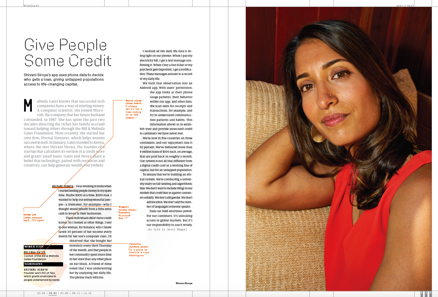
Almost everything I write is available for free on the internet.

There are a few exceptions, though.

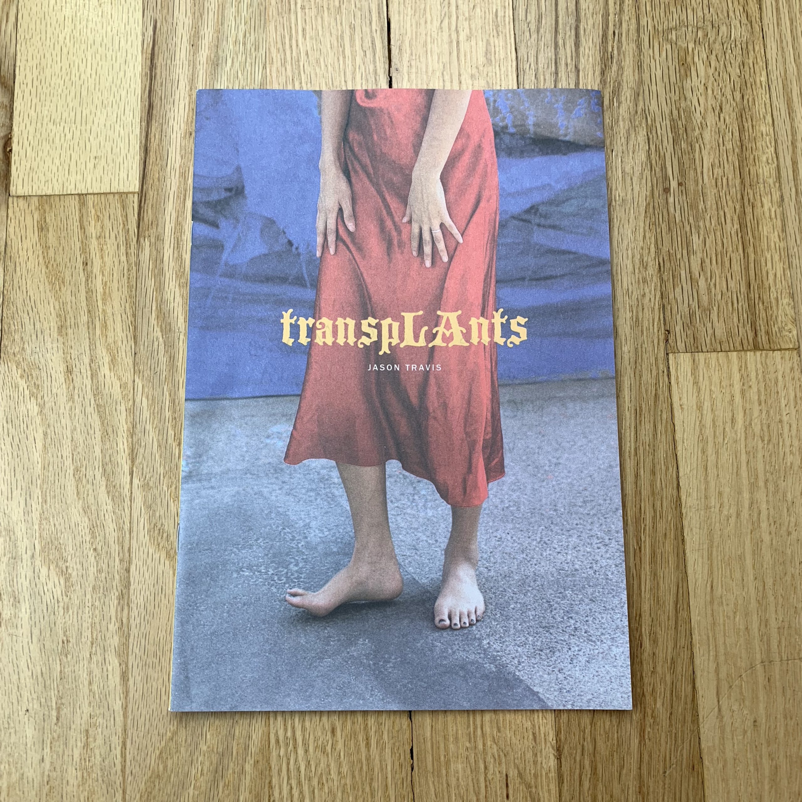
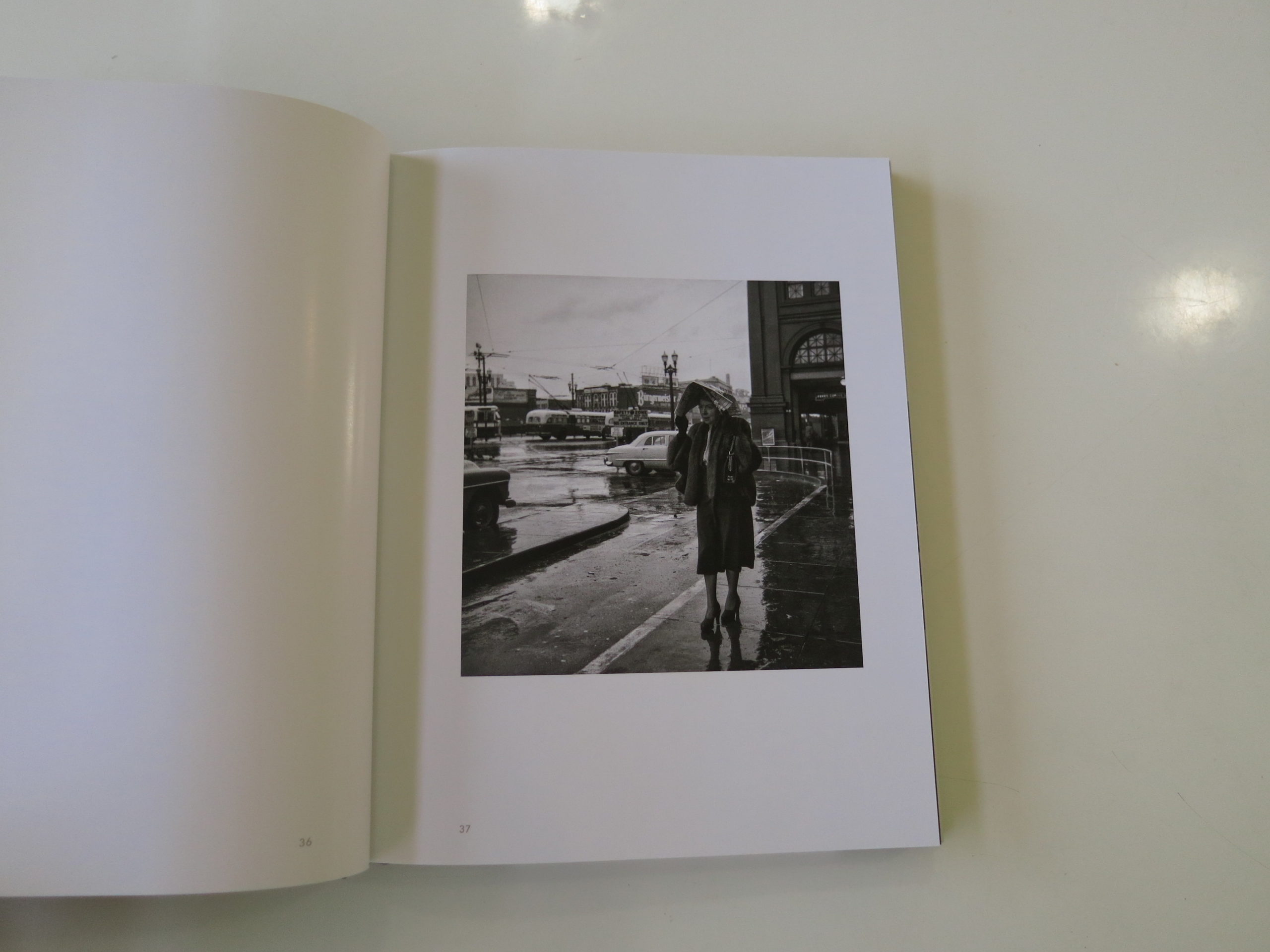
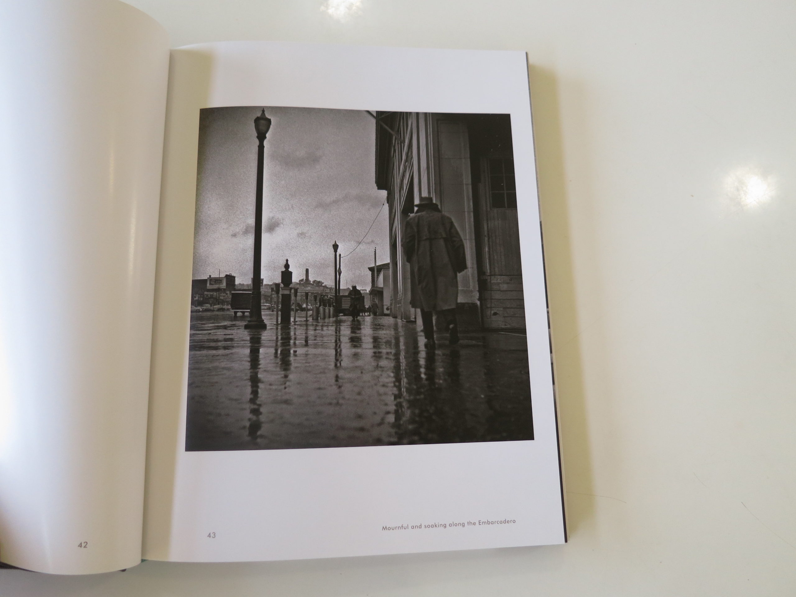
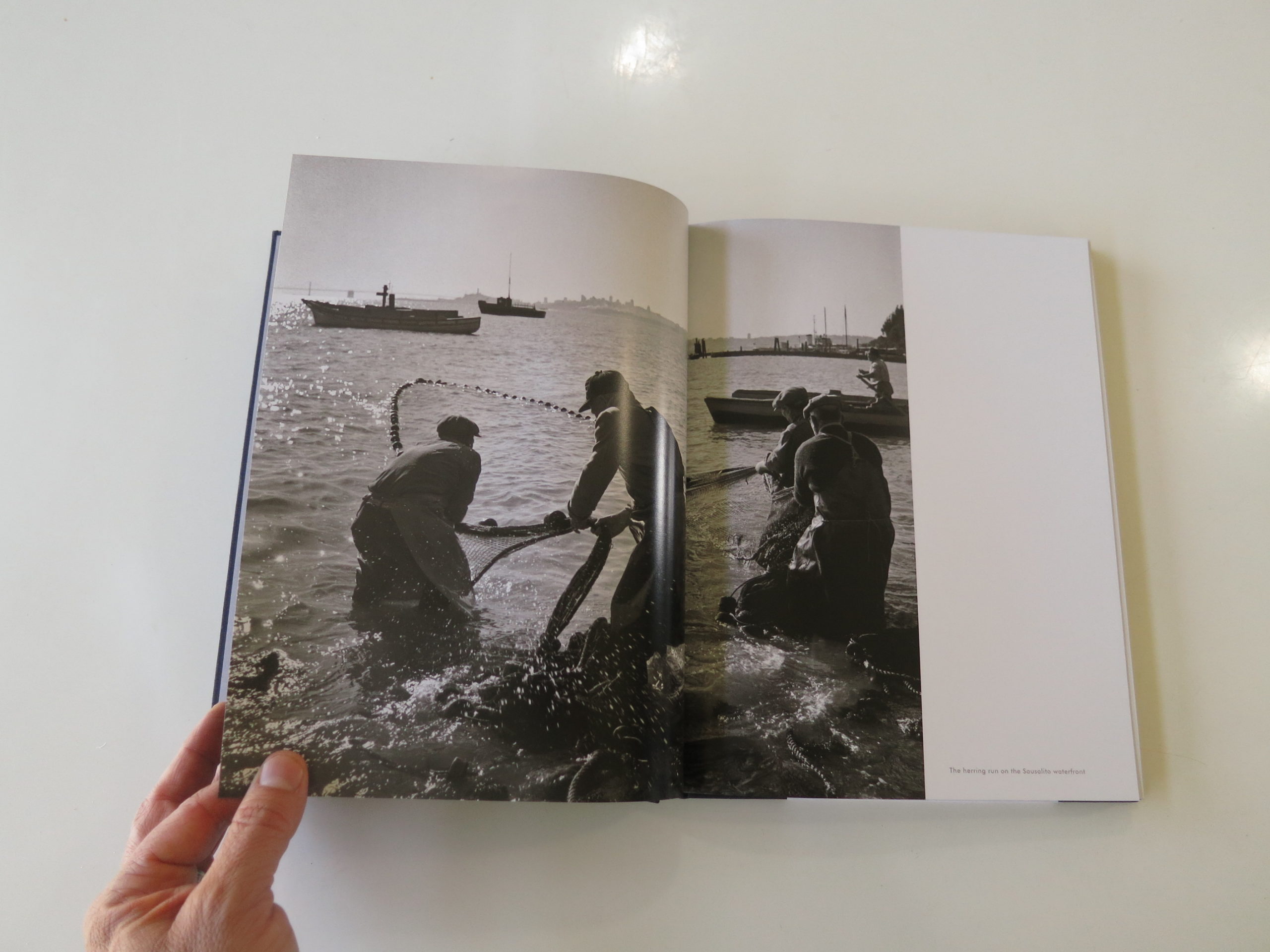
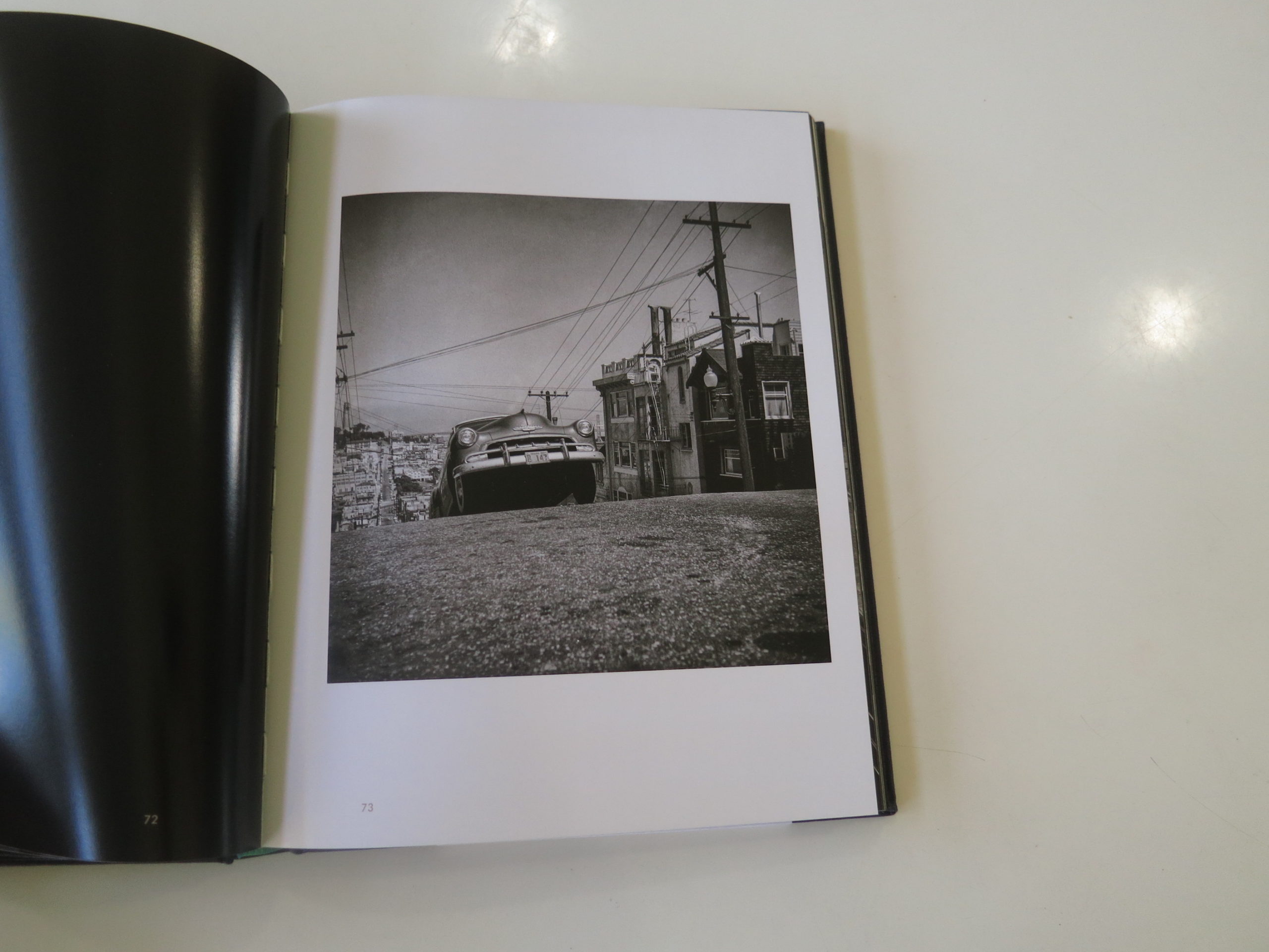
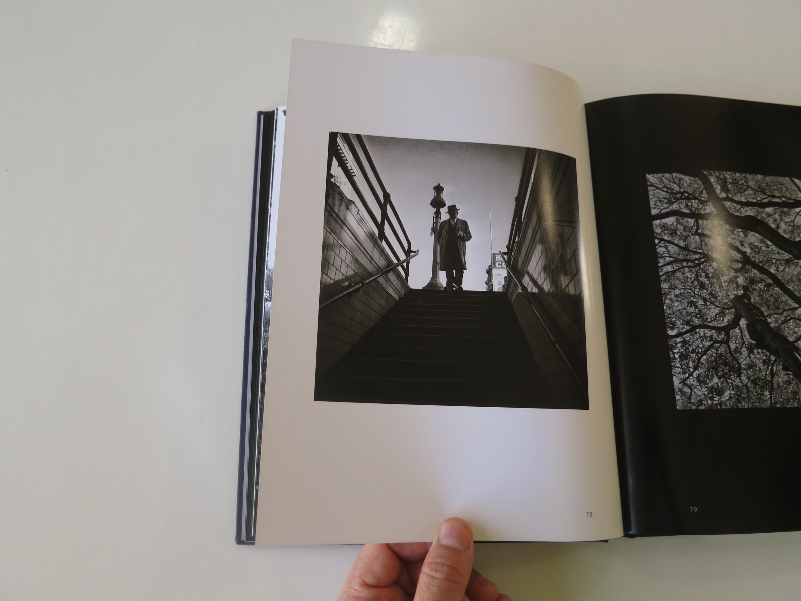
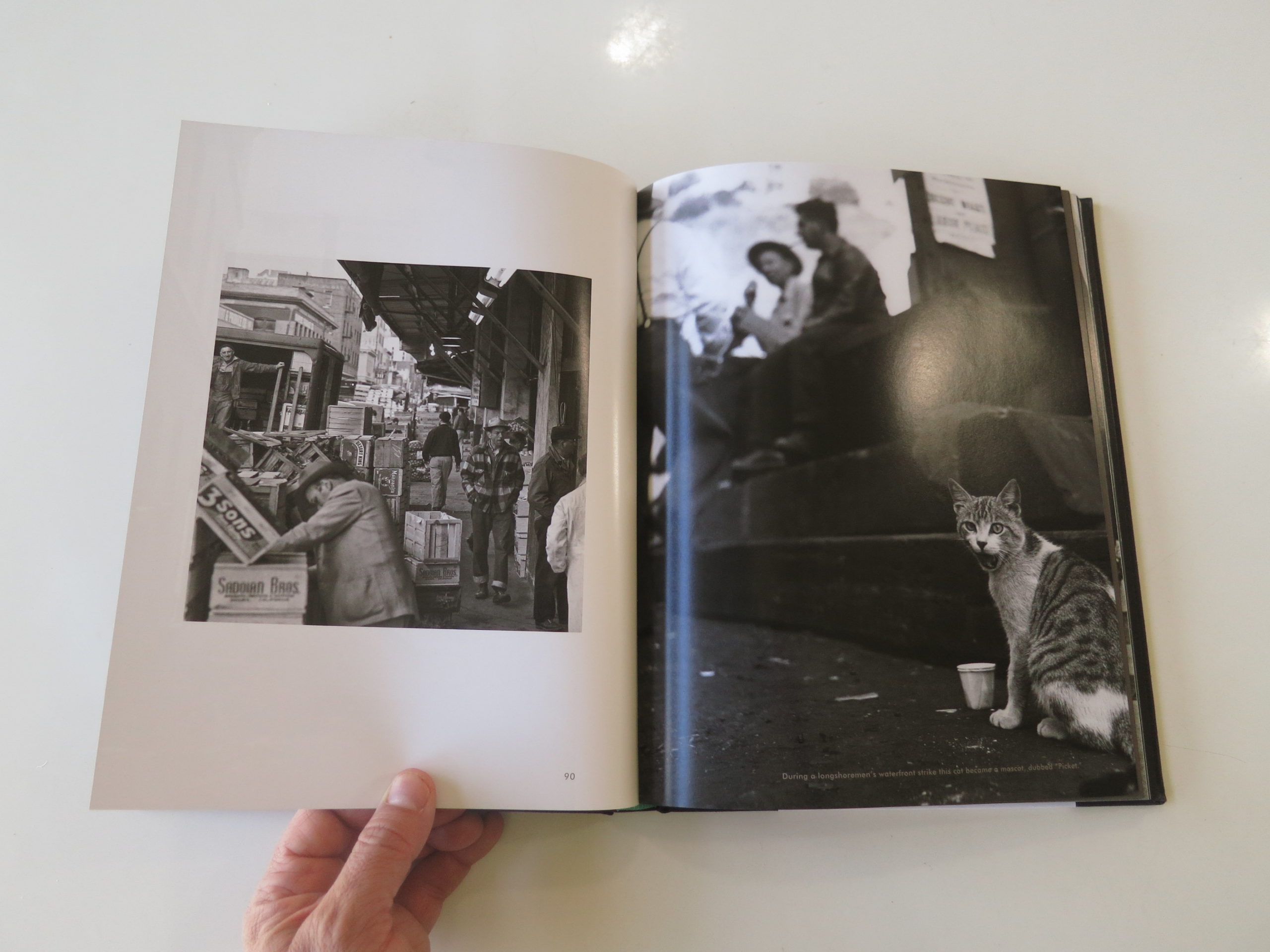
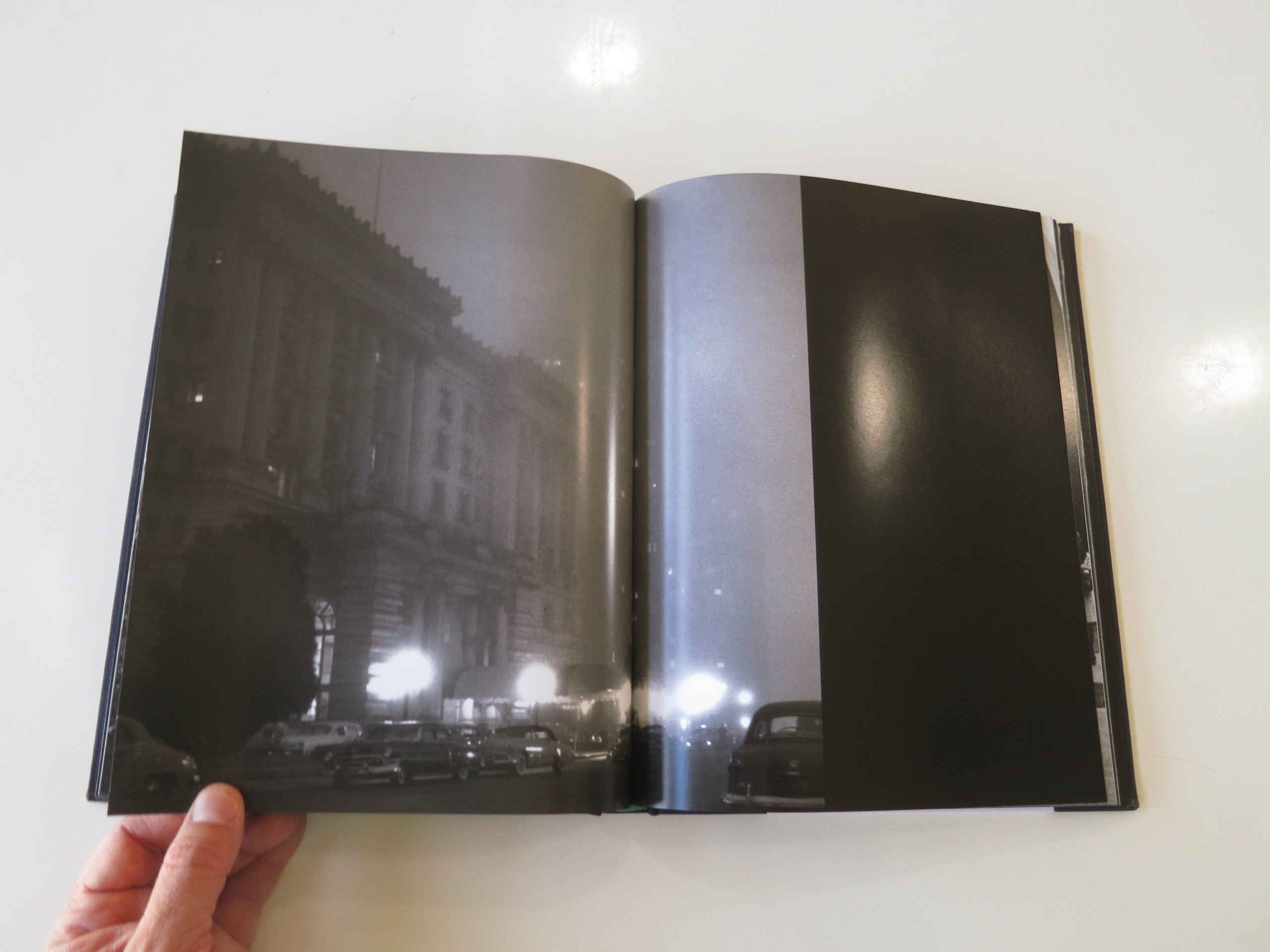
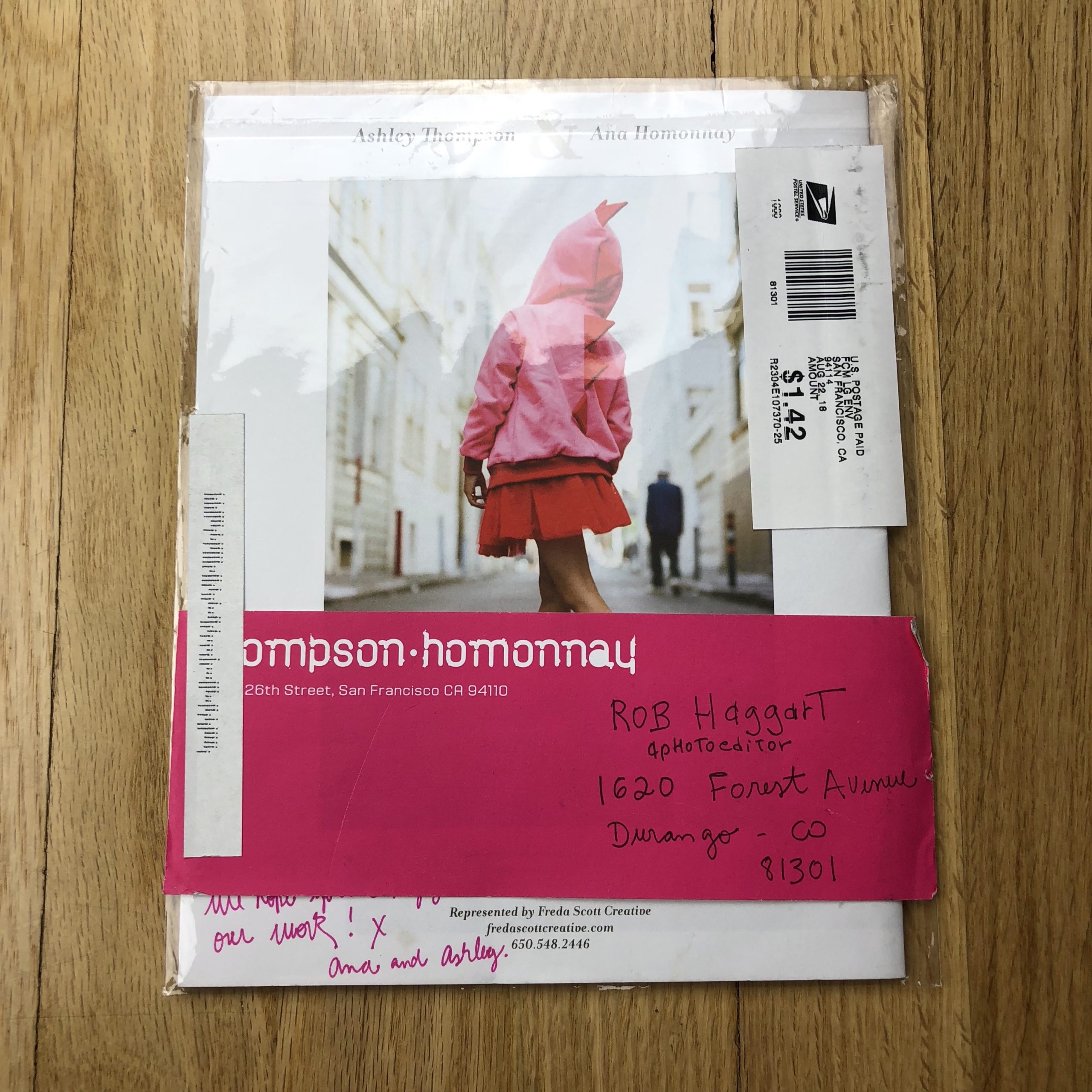
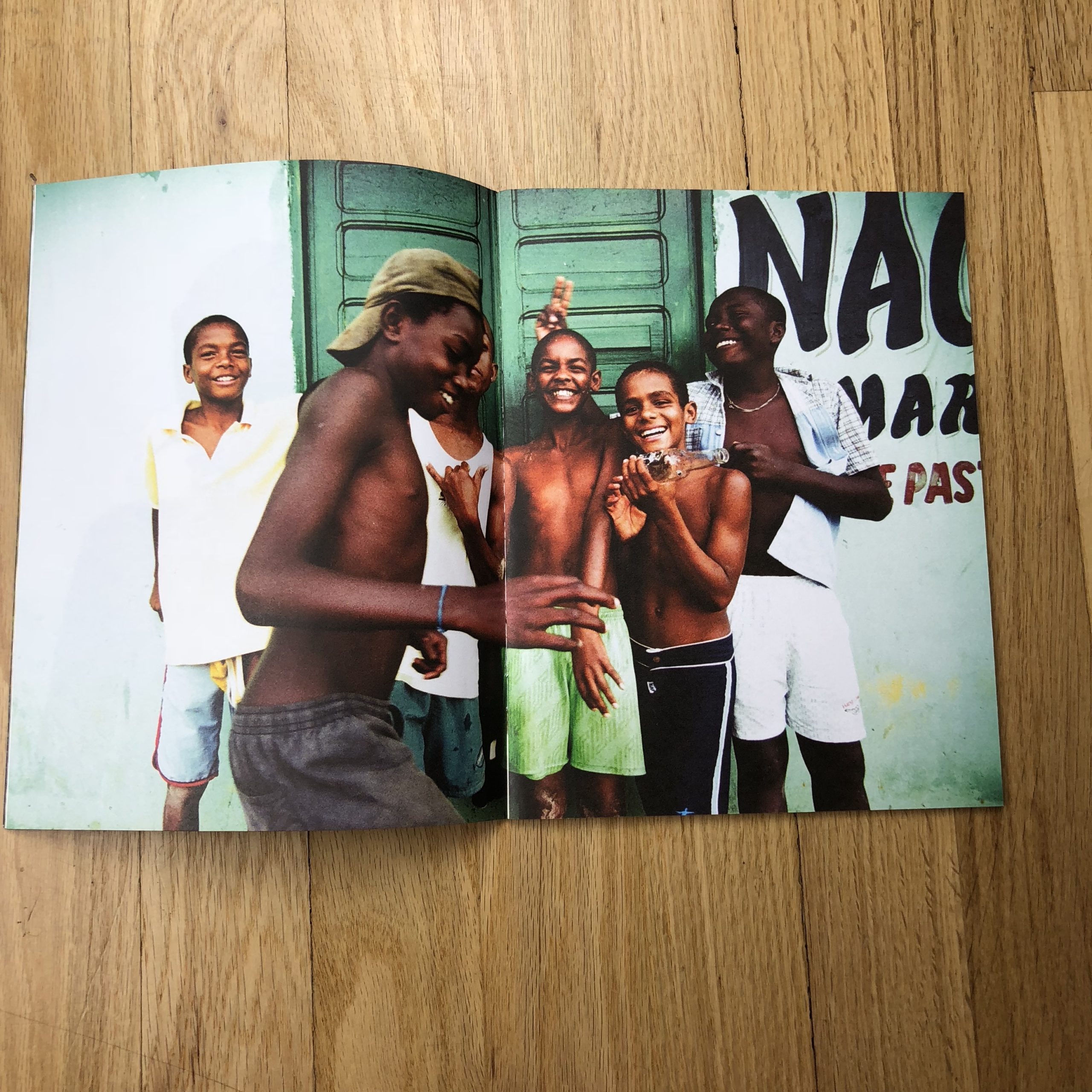
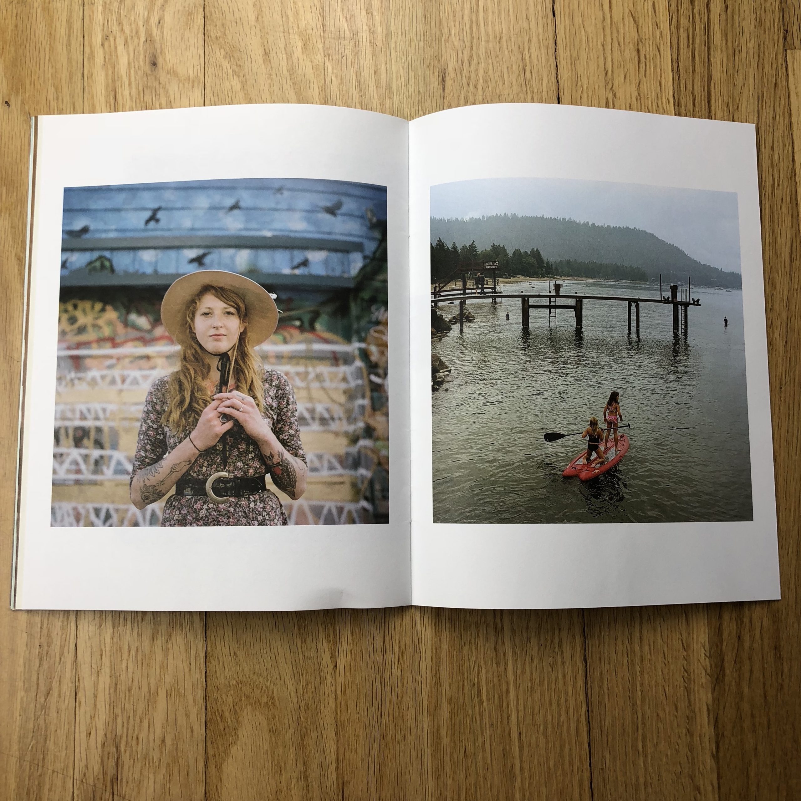
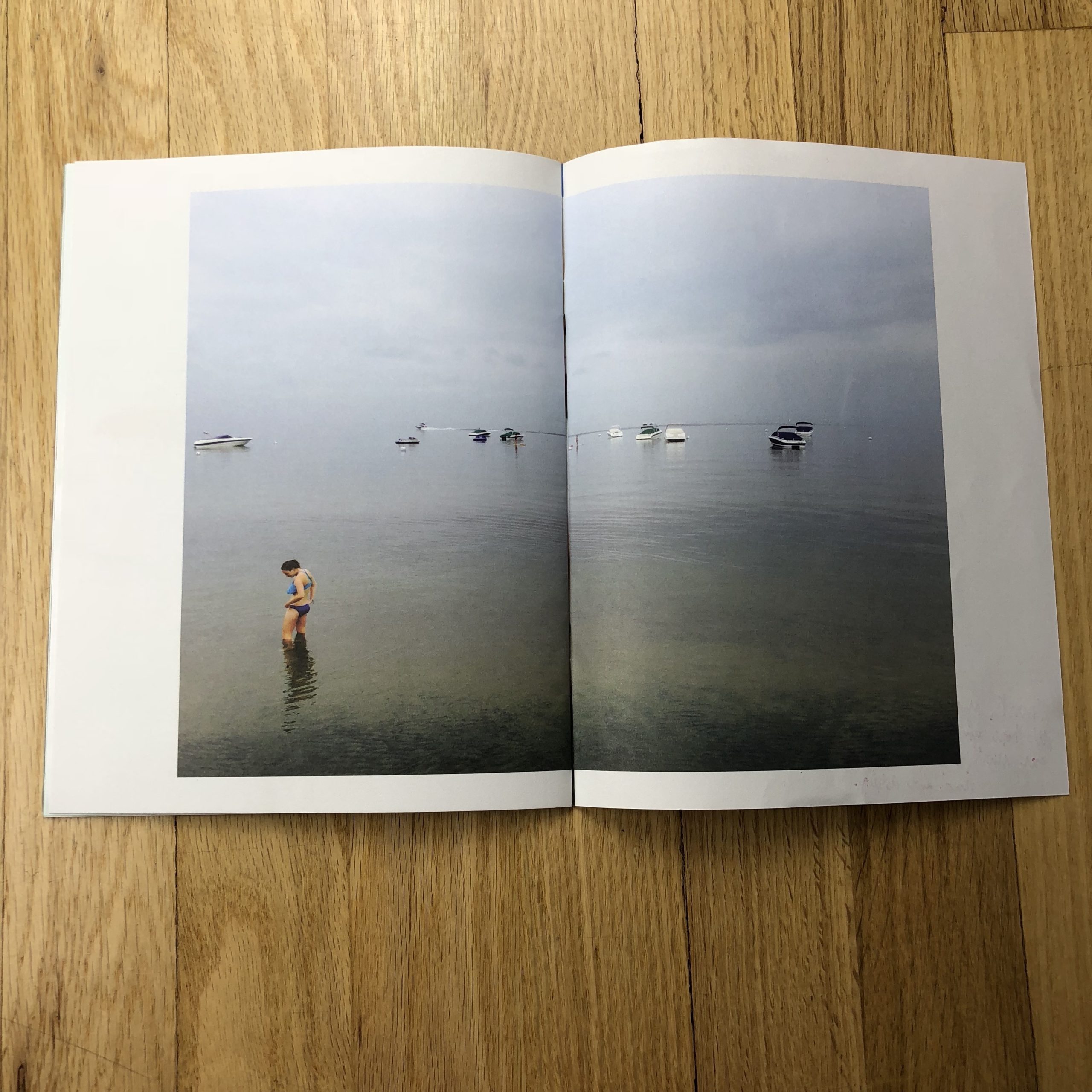
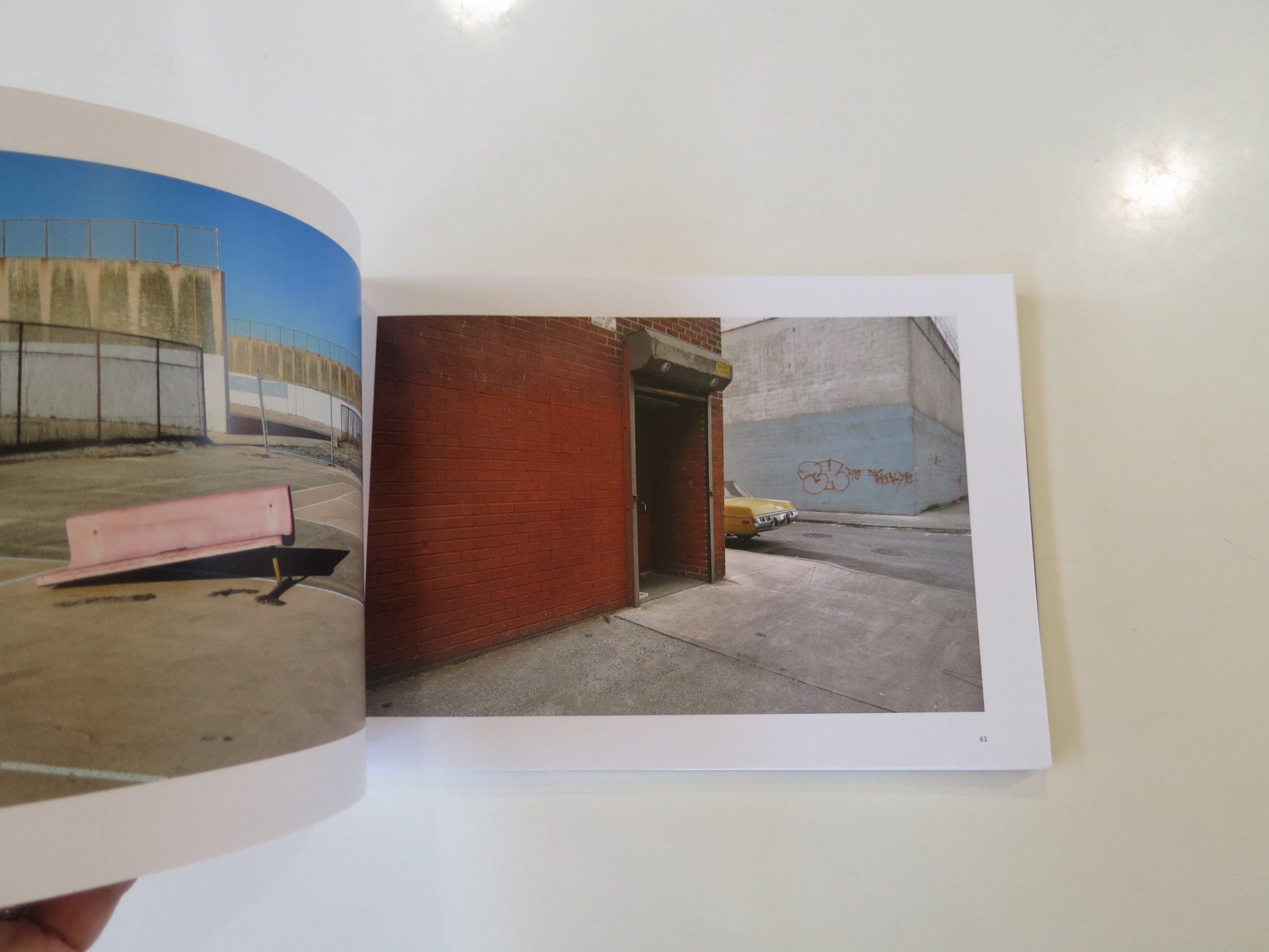
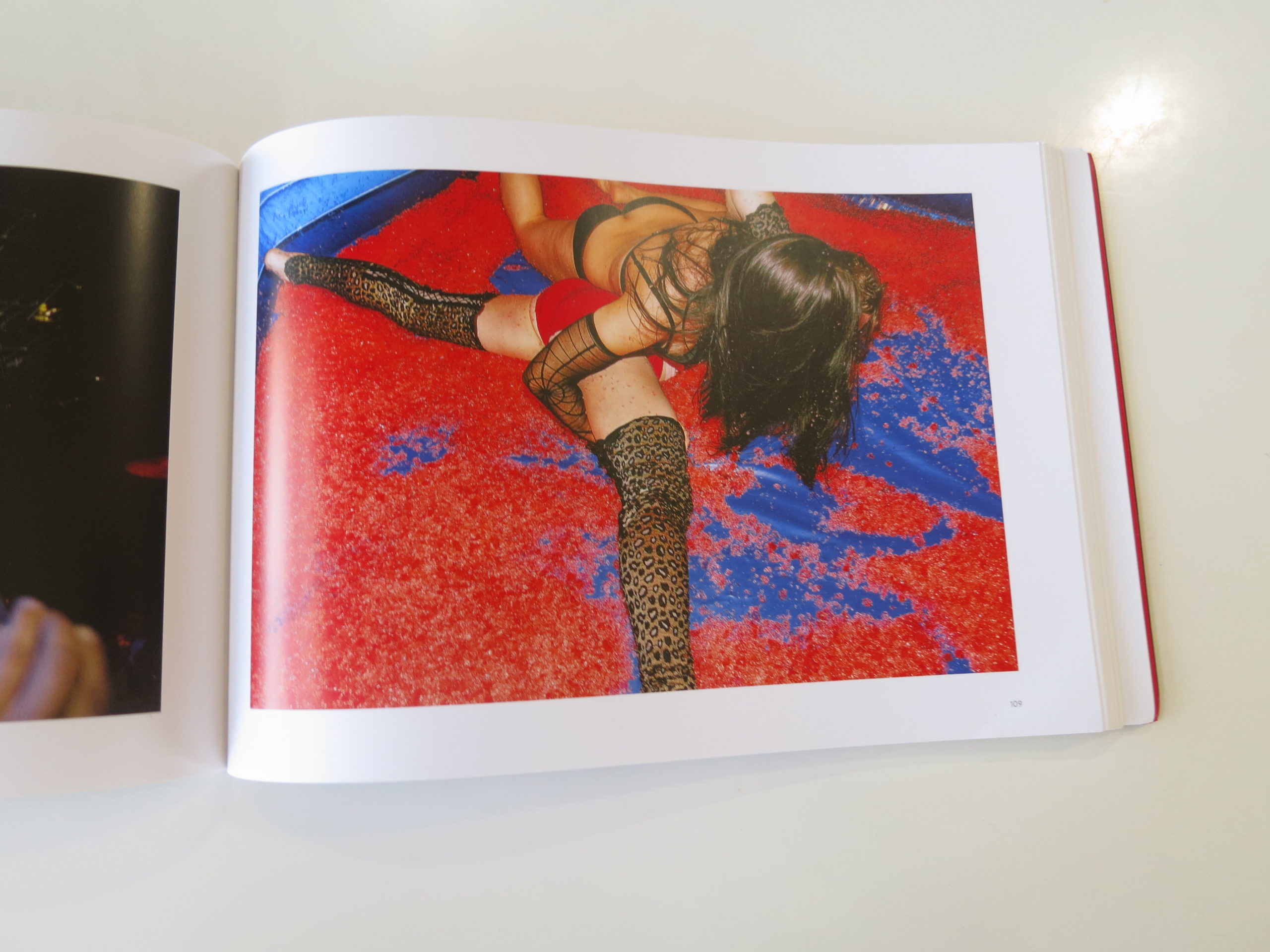
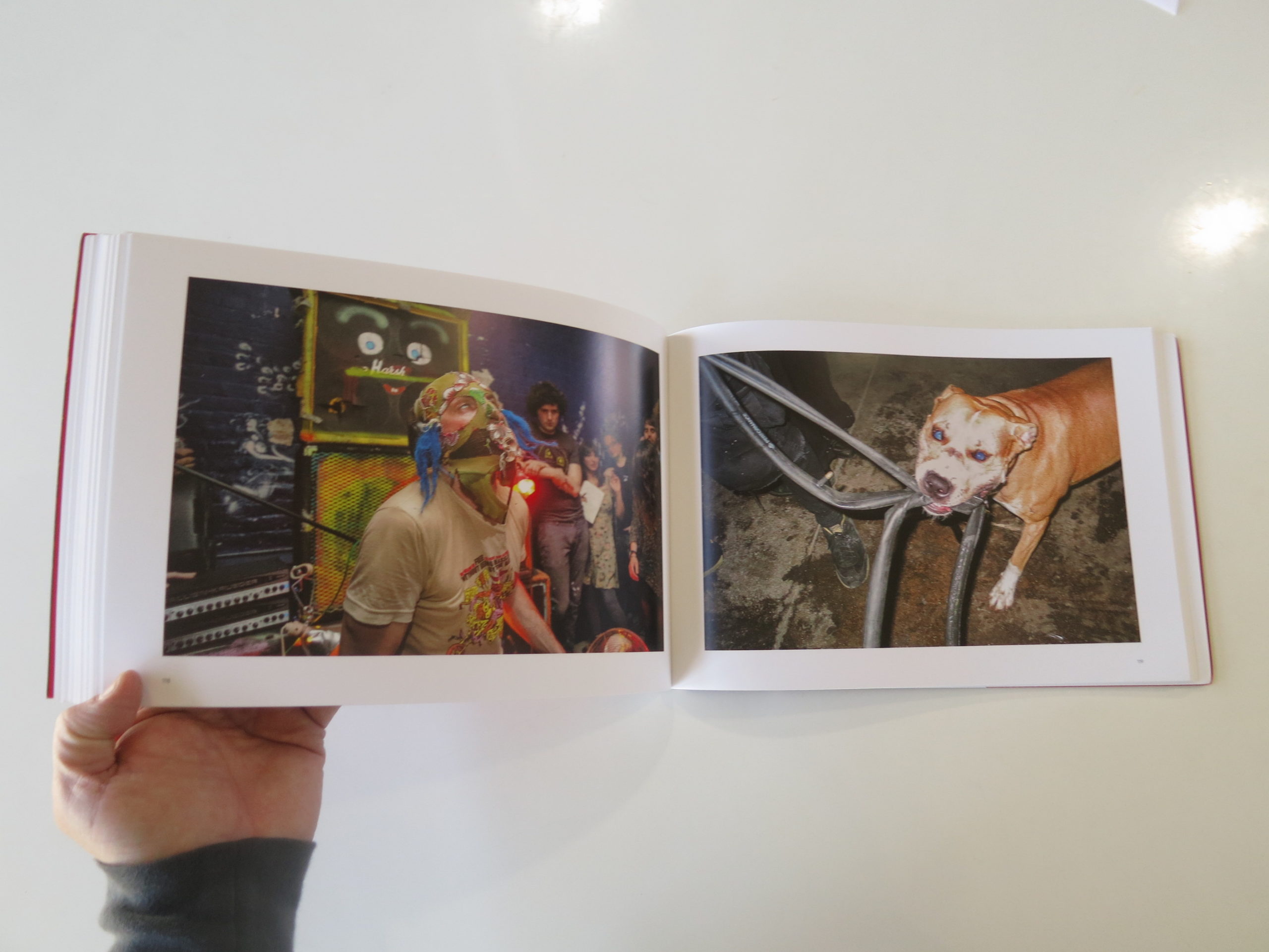
I’ve written essays for two of Alejandro Cartagena’s recent books, the companions: “Santa Barbara Return Jobs to US,” and “Santa Barbara Shame on US.”

These are limited-edition, fine art books in which the photography was obviously the main draw. The only people who read those pieces bought the book, and then also took the time to read the insert.

(Meaning, not everyone who bought the book. Let’s be honest.)

The ideas in those essays went up behind a paywall, essentially.
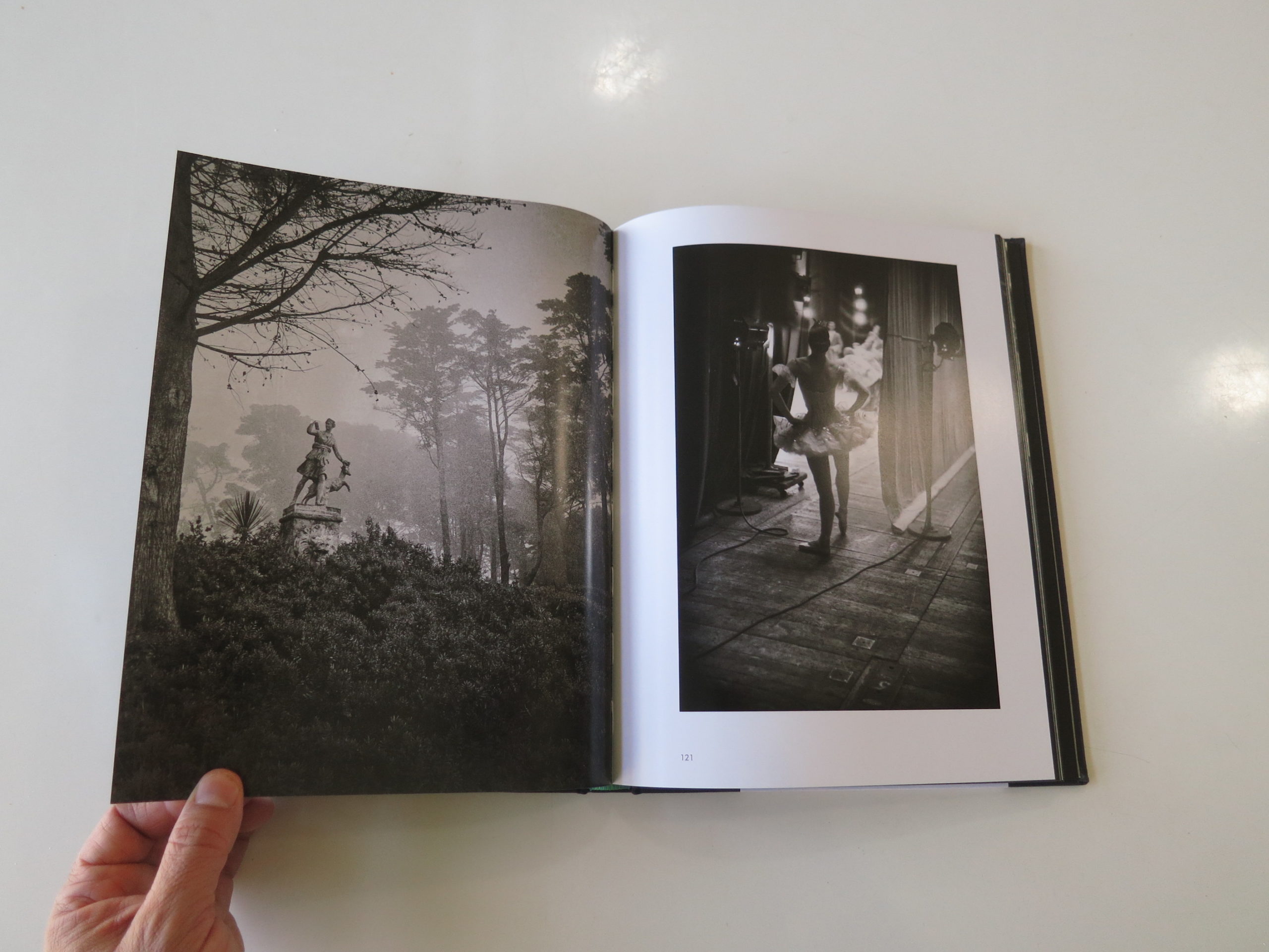
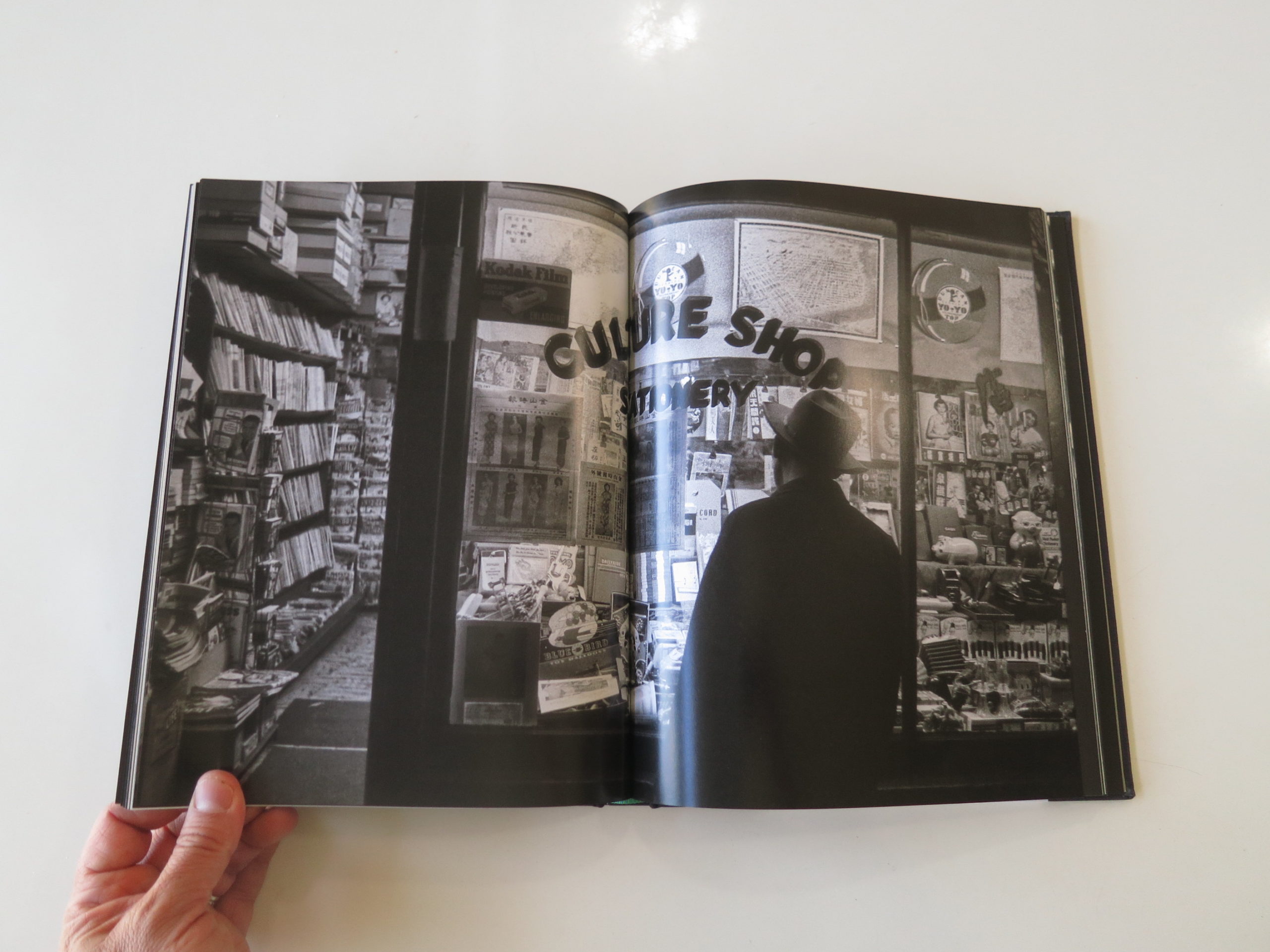
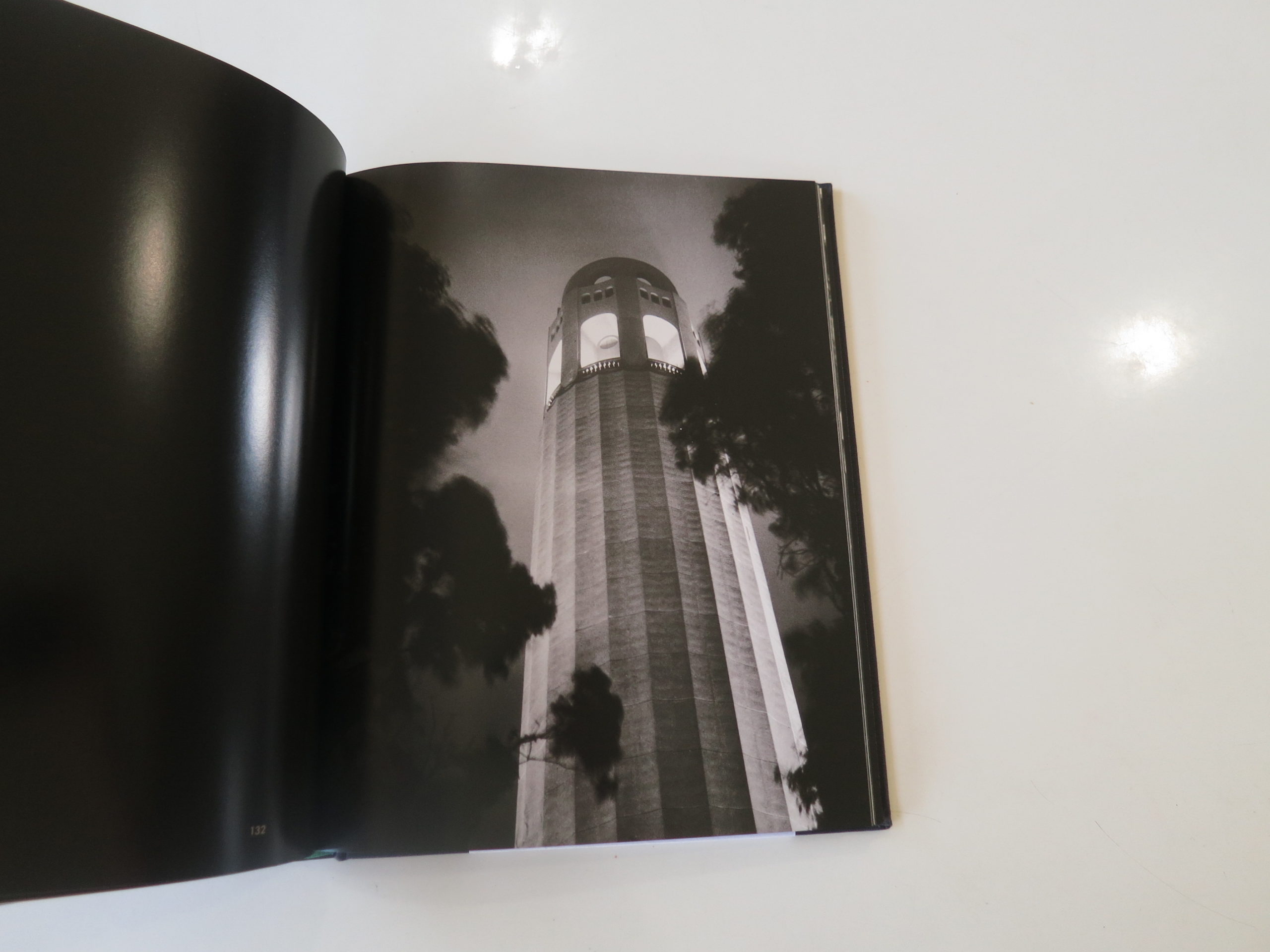
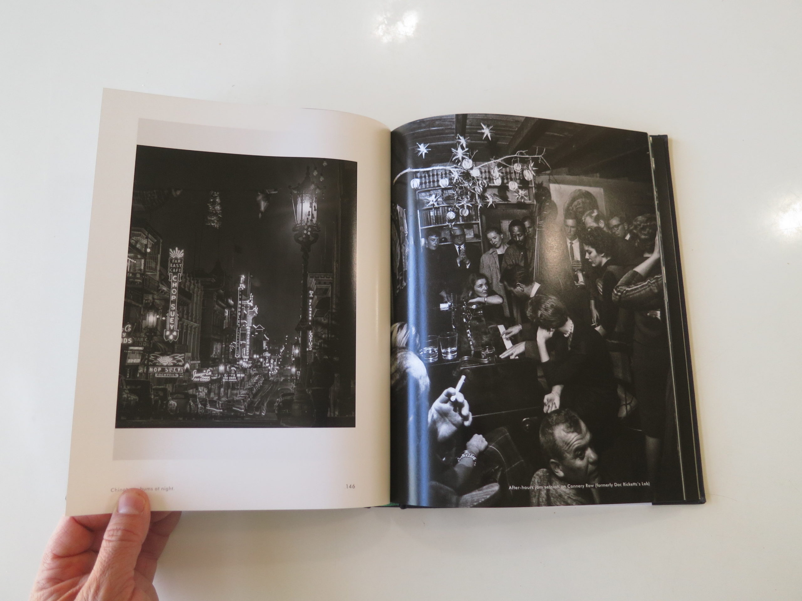
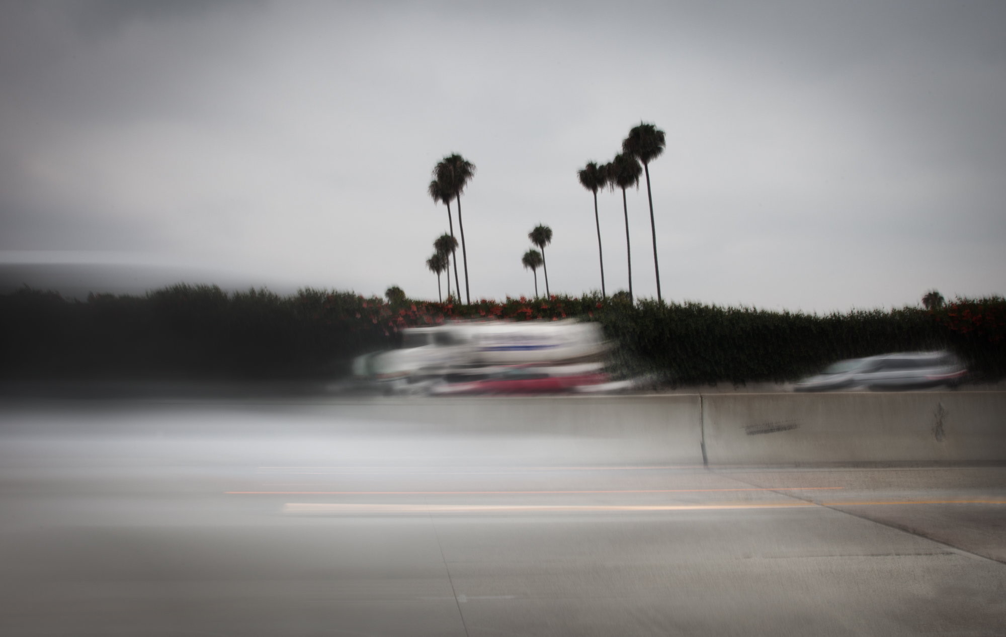
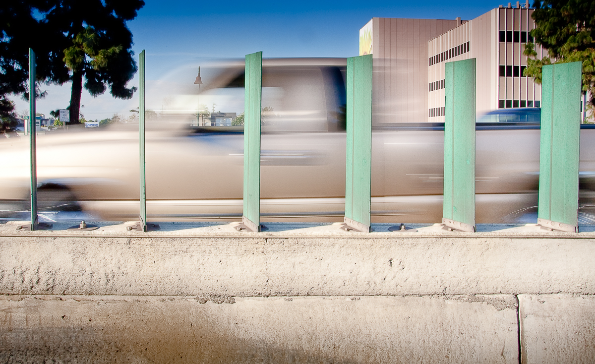
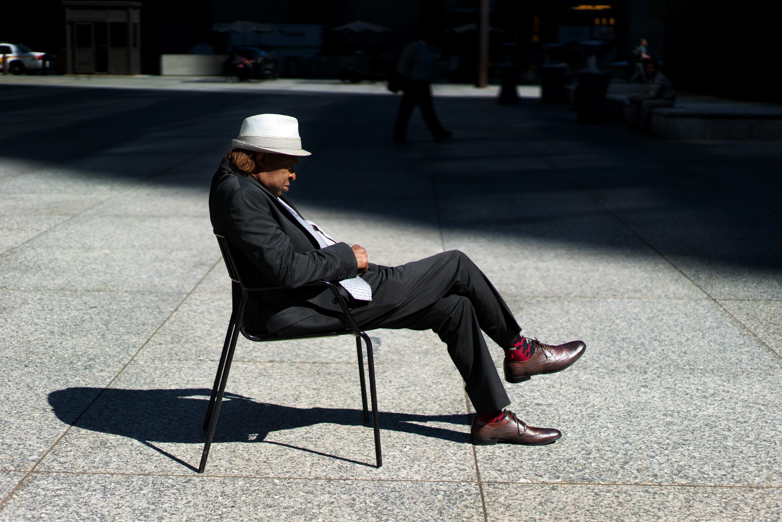
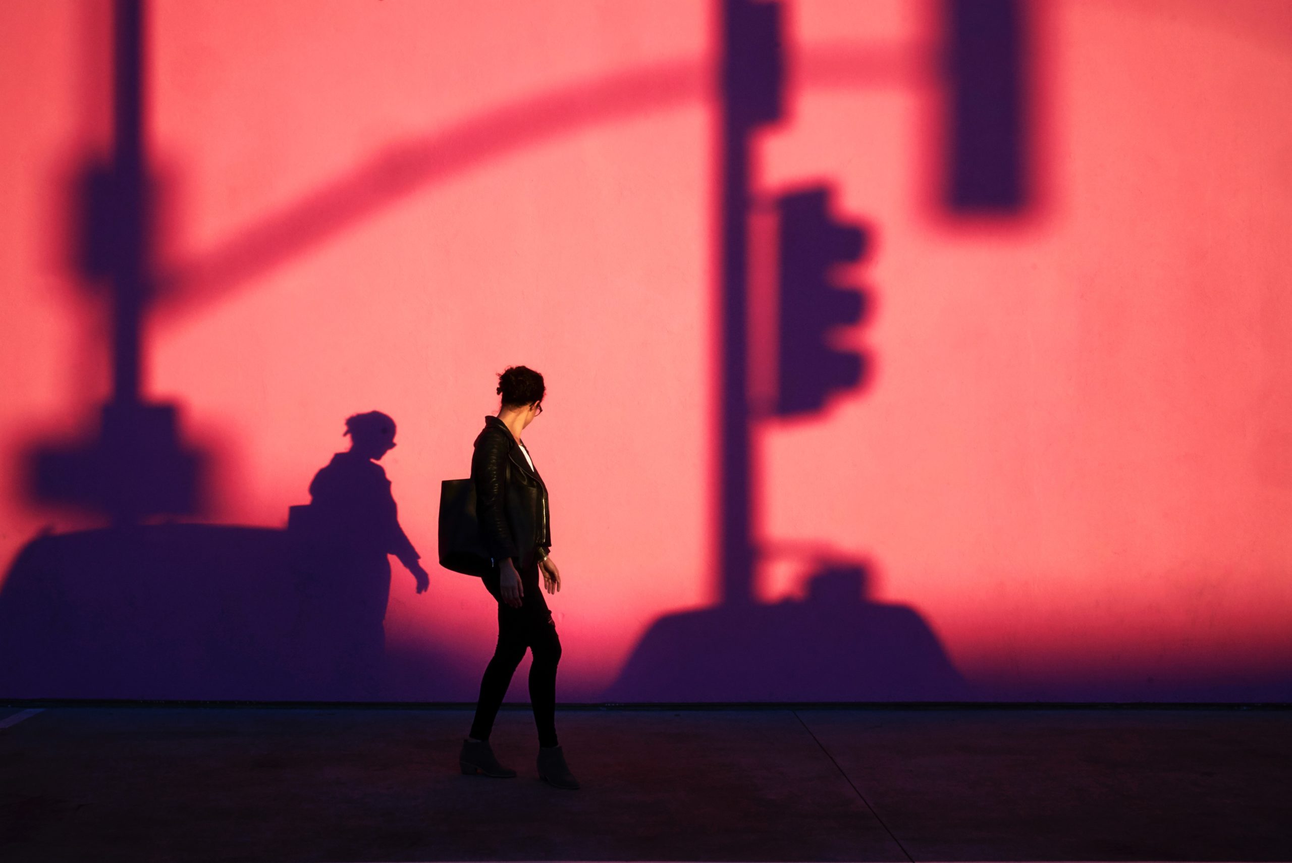
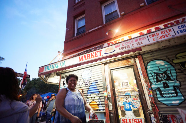
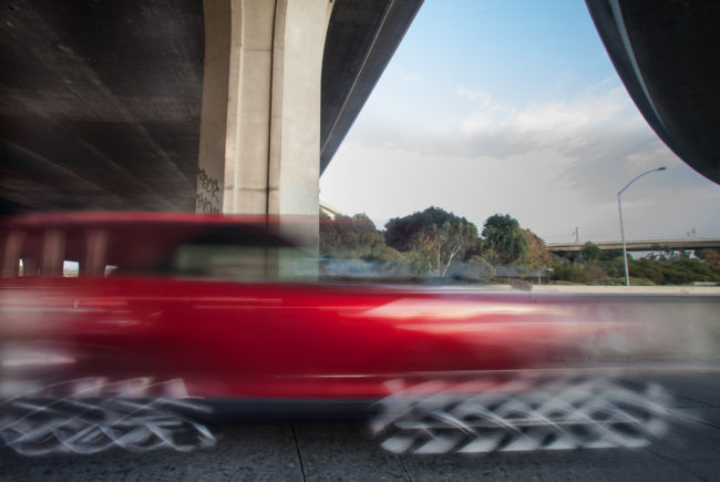
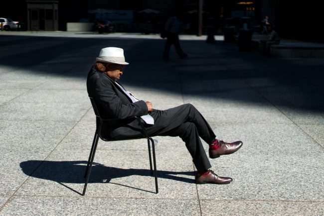
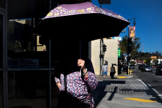
So I’m going to pull a few out today, as I think of sunny, hot, alluring California.

Beautiful, majestic, diverse, cool-as-shit California.

You’ll find few bigger fans of the Golden State than I, especially among those that don’t live there. I’m biased towards CA for sure, having lived there for 3 years, and visited more times than I could count, even if I tried. (Maybe 20? 30?)

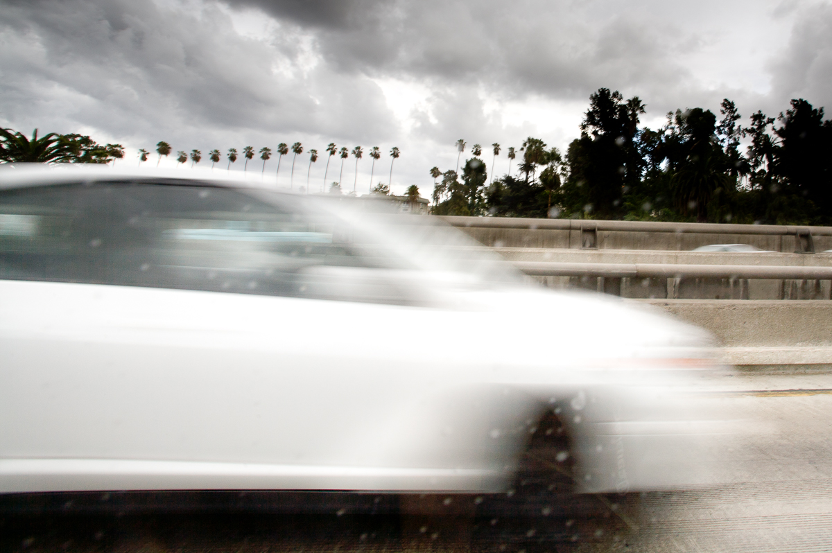
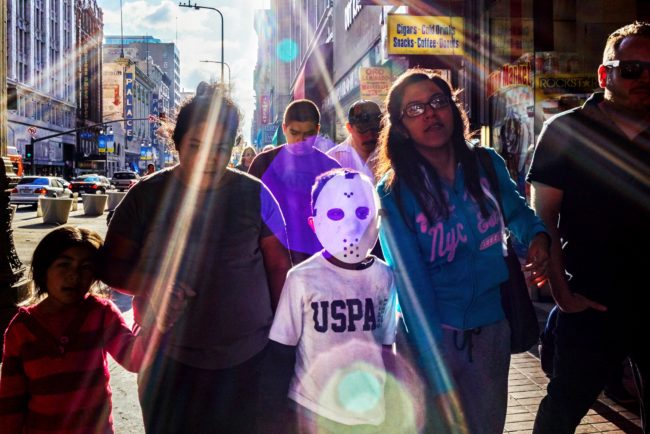
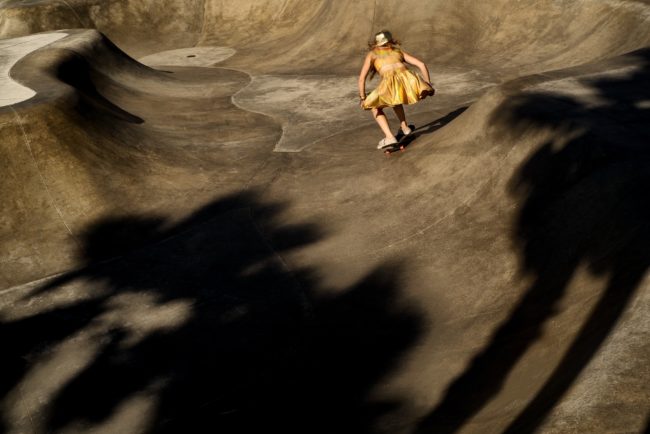
The Bay Area is amazing, LA totally rocks, and SoCal beach towns are among my favorite anywhere. (They put the Jersey Shore to shame, I’m afraid.)

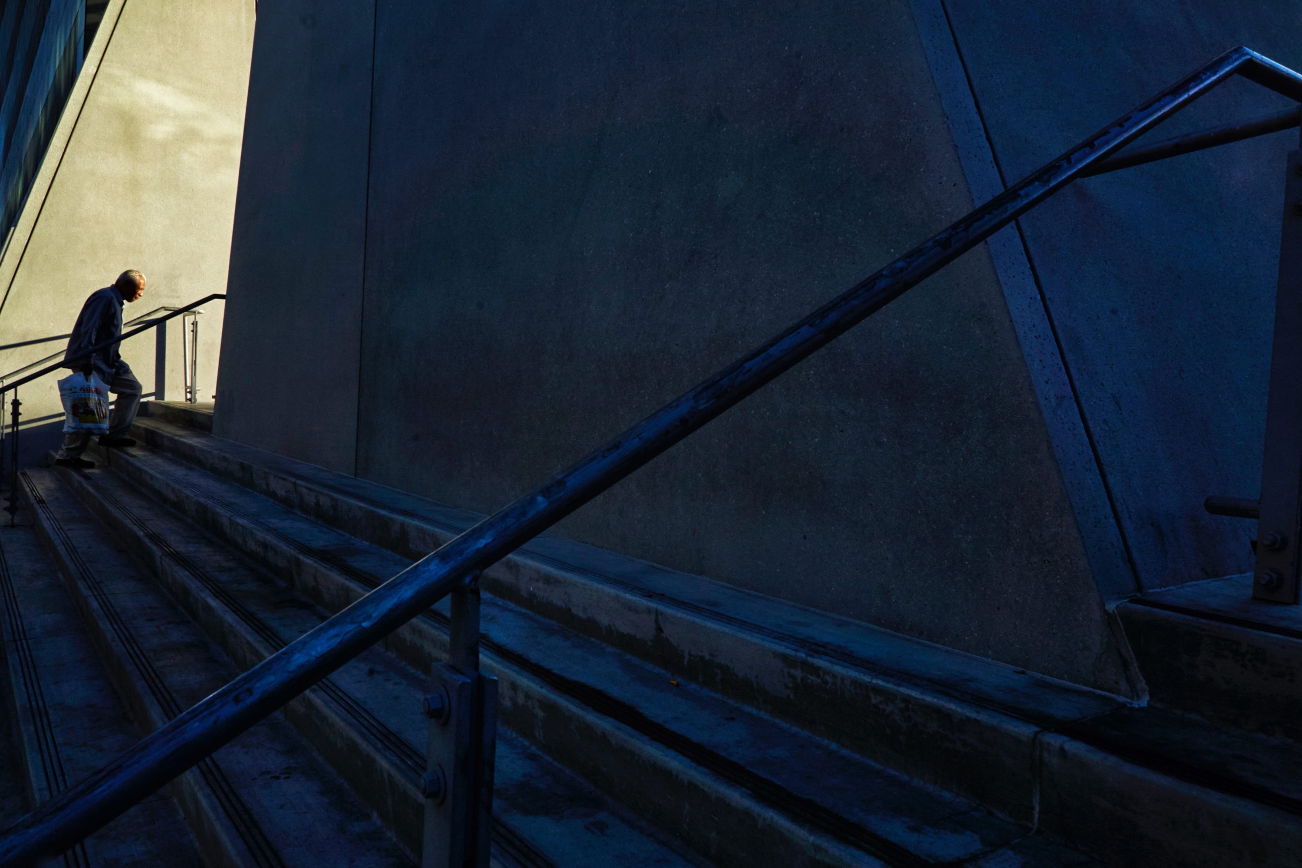
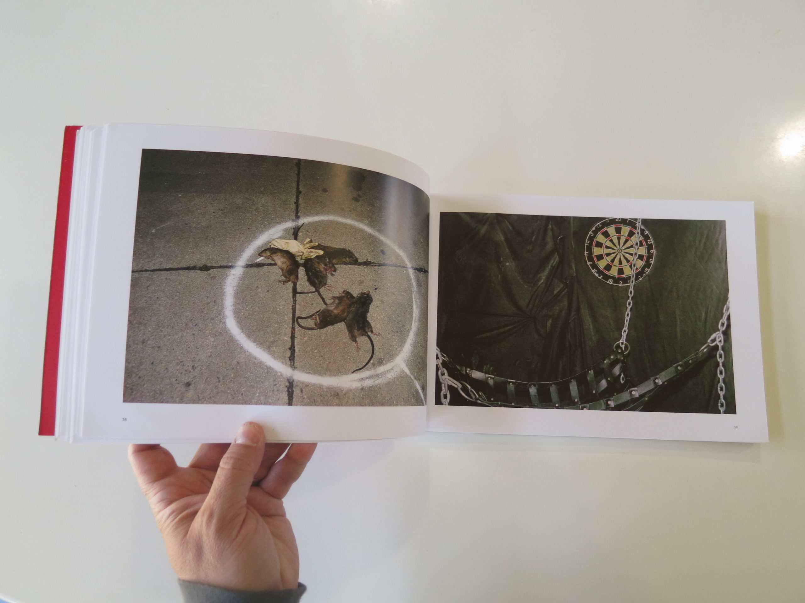
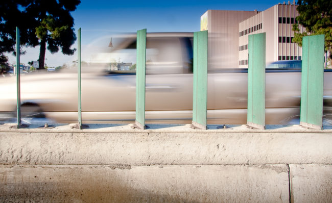
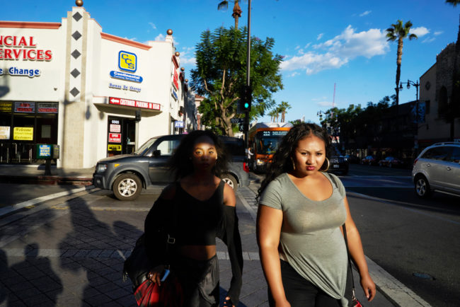
But writing for Alejandro in 2017, (in parallel with his critical agenda,) I questioned whether California, the laboratory of new American culture, was becoming a 3rd World Country? As I wrote about several years ago here, and for Lens, the homelessness problem is so bad there are essentially permanent public tent encampments now, mini-neighborhoods, and is that really going to un-happen?

Do we believe that any great new public policy will find homes for this increasingly large underclass? Or build fancy new shelters for them, as nice as Trump’s immigrant-kid-jails?

Will a sane drug policy all-of-a-sudden find ways to treat every heroin or oxy-loving junkie?

Of course not.
That’s ludicrous.

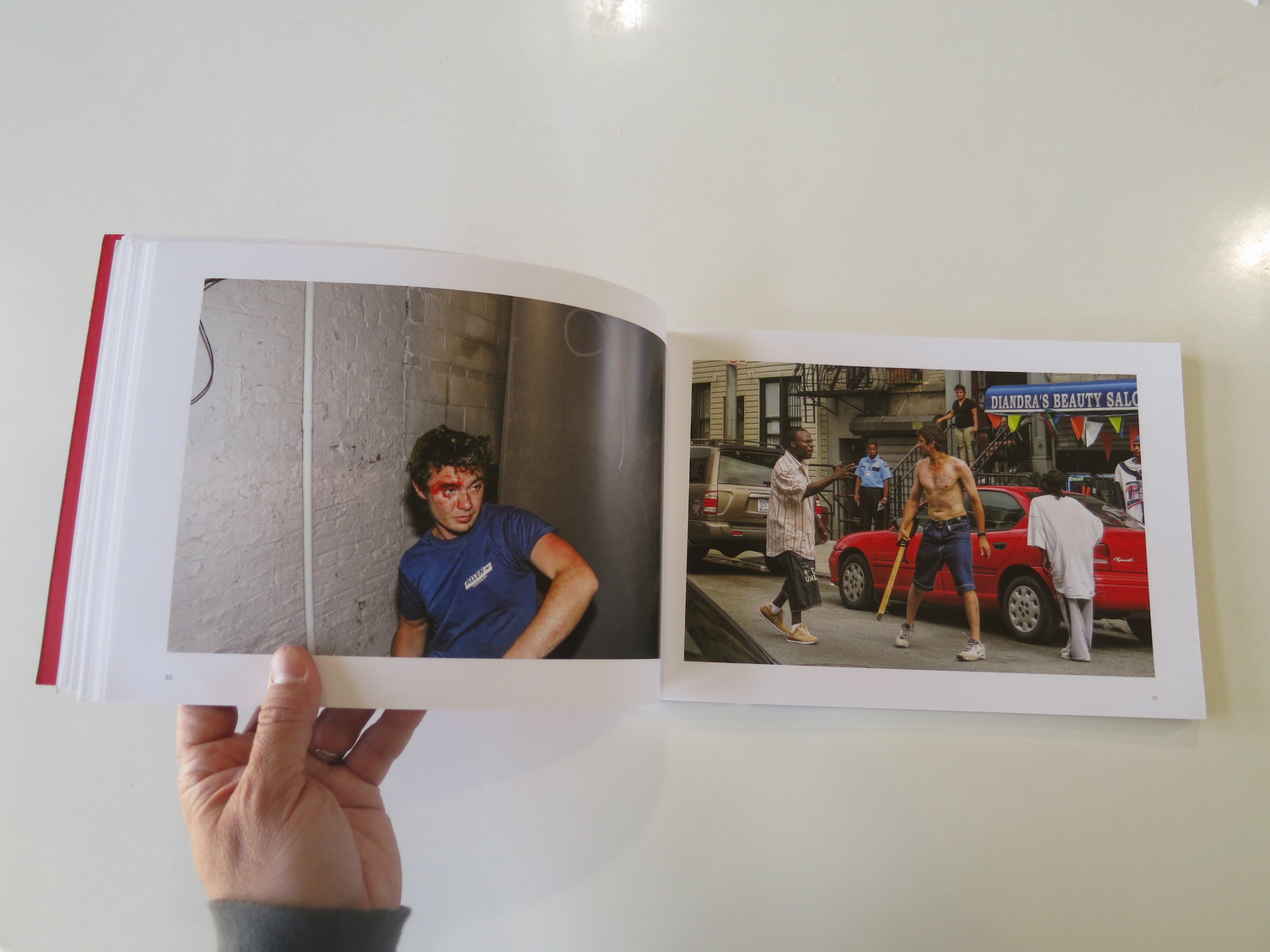
This massive disparity between mega-wealth and mega-poverty, mashed right up against each other, is likely to continue. And how long does it take to go from tent city to a full-on favela?

Who hasn’t heard of Brazilian cities where the wealthy only travel by helicopter?

Is that in California’s future as well?

Like I said at the outset, I love California. Hell, I love America, even though we have some serious problems at the moment.

Since I was a young child, it was inculcated in me that this society was ultimately a melting-pot, where people from all over the world came to live next to each other in peace, and try to make a better life for their children, and their children’s children.

I still believe America is Great, I honestly do, but this place has its challenges.

Chief among them right now is sorting out income inequality. If the American Middle-Class Dream of self-autonomy, in a safe home, with enough leisure time to enjoy your children, (or your friends,) truly goes away, then Banana Republic status will follow here in the US for certain.

I know it’s an odd way to start an article about the excellent, fantastic LACP Exposure portfolio review that I attended in July. Ranting about the striation of lifestyle in a State I’m also trying to rave about.

I get it.

But this column, as I recently admitted, is an extension of my art. And a photography festival is attended by artists, who are in general open-minded, critical thinkers.

You, the audience, know that there are no black-and-white situations.

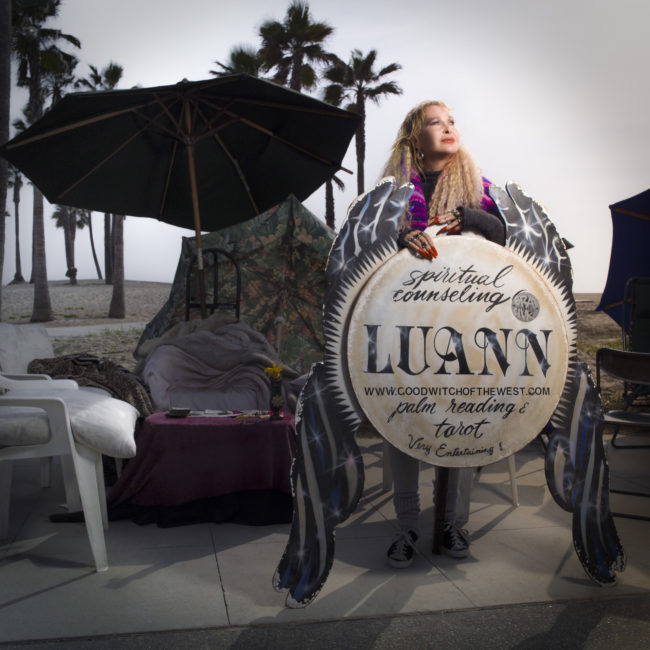
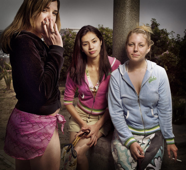
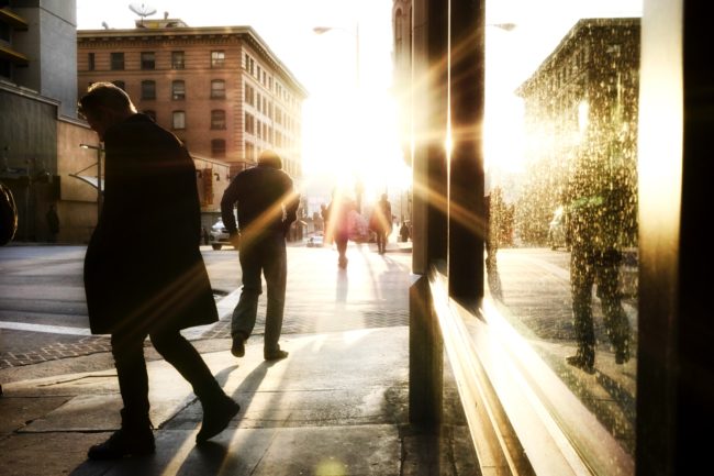
California, in this case the West Side of LA, is among my favorite places on Earth, and I can still notice what’s wrong with the picture. (Have I been a critic too long?)

For example, in my few days staying a the excellent Hotel MdR in Marina Del Ray, tooling around Venice/Santa Monica, (and once traveling to Studio City,) I saw more $$$$ worth of automobiles than the entire annual GDP of Taos County.

I must have been $10,000,000 of cars.
Easy.
(Including one sweet Ford GT.)

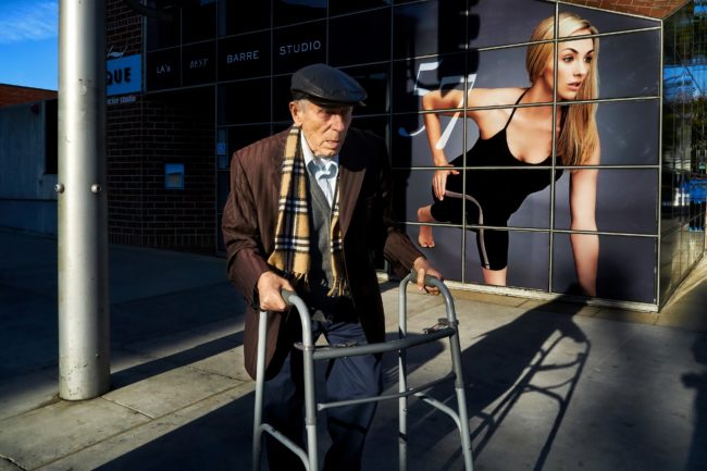
That money is massive, but my summer-camp friend Russell, with whom I reunited for some beach time, showed me a homeless encampment in Venice, along the boardwalk, that was always there now.

As far as Exposure weekend goes, and the beautiful Marina Del Ray community in which it was set, I had one of the best experiences yet, and I’ve been on the portfolio review circuit for 5 years straight.

I’ve got to give credit where it’s due, and Exposure is currently produced by Sarah Hadley, who was one of the co-founders of the Filter Photo Festival in Chicago. This is her second go-around, and she really knows what she’s doing.

Along with Brandon Gannon and Julia Dean, at LACP, the team was super-responsive to some feedback they got about the 2017 festival, and worked hard to improve upon the experience.

The hotel was 2 blocks from the marina, with the sun glinting off the boats and the water, and surrounded by restaurants, bars, shops, and of course a Ralphs. (The beach was just up the road too.)

The staff there was super-professional and friendly, the outdoor area overlooked a beautiful pool, (So SoCal,) and the reviews were run smoothly as well, with all the participants up-to-speed on how to present themselves, and how to handle the 20 minute meetings.

Not only that, but people left the tables promptly, there was always coffee and snacks around, both for the reviewers and participants, and the weather was bang-on-perfect. (Low 80’s. The heat wave that left town as I arrived ravaged New Mexico while I was styling in LA.)

When I complimented the participant preparedness to my colleagues, in a recent phone call, they gave credit to their super-star instructor, Aline Smithson, who lead the charge on getting people ready. They’d all done their homework on their reviewers, had the right amount of work to show, asked questions and listened to answers.

Really, it was a 10 out of 10 experience, and to have that happen one year after I was open in telling them (behind the scenes,) that there was work to be done on their young event.

This time it was a smash. Great food. Nice parties and events.

And I taught a full-day workshop with the most amazing, intelligent, thoughtful students. (One of whom I was able to profile in an NYT piece last month.)

As usual after an event, I’m going to show you selections of the best work I saw at the LACP Exposure portfolio review. It’s in no particular order, and we’ll feature all the artists today. (Back to book reviews next week.)

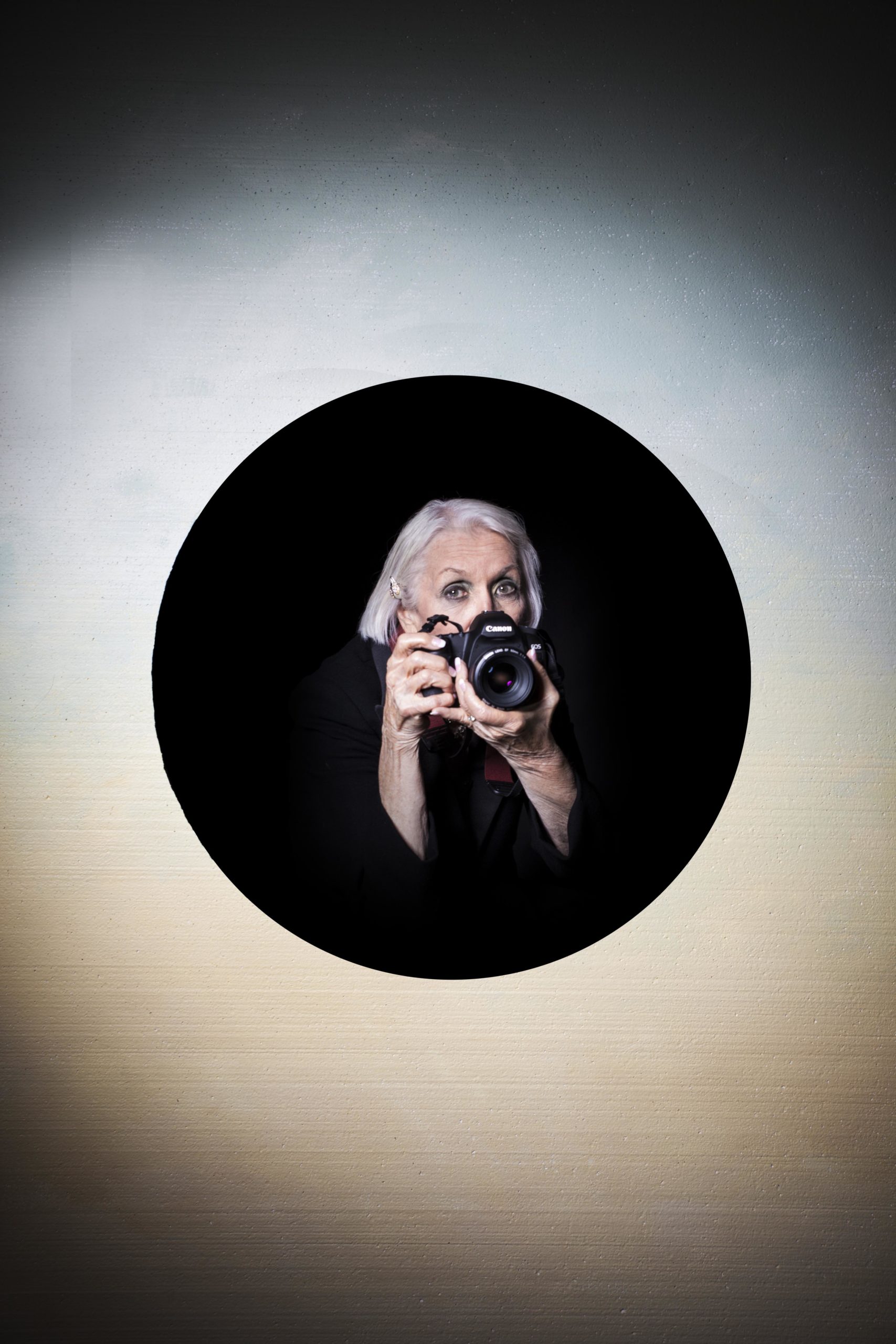
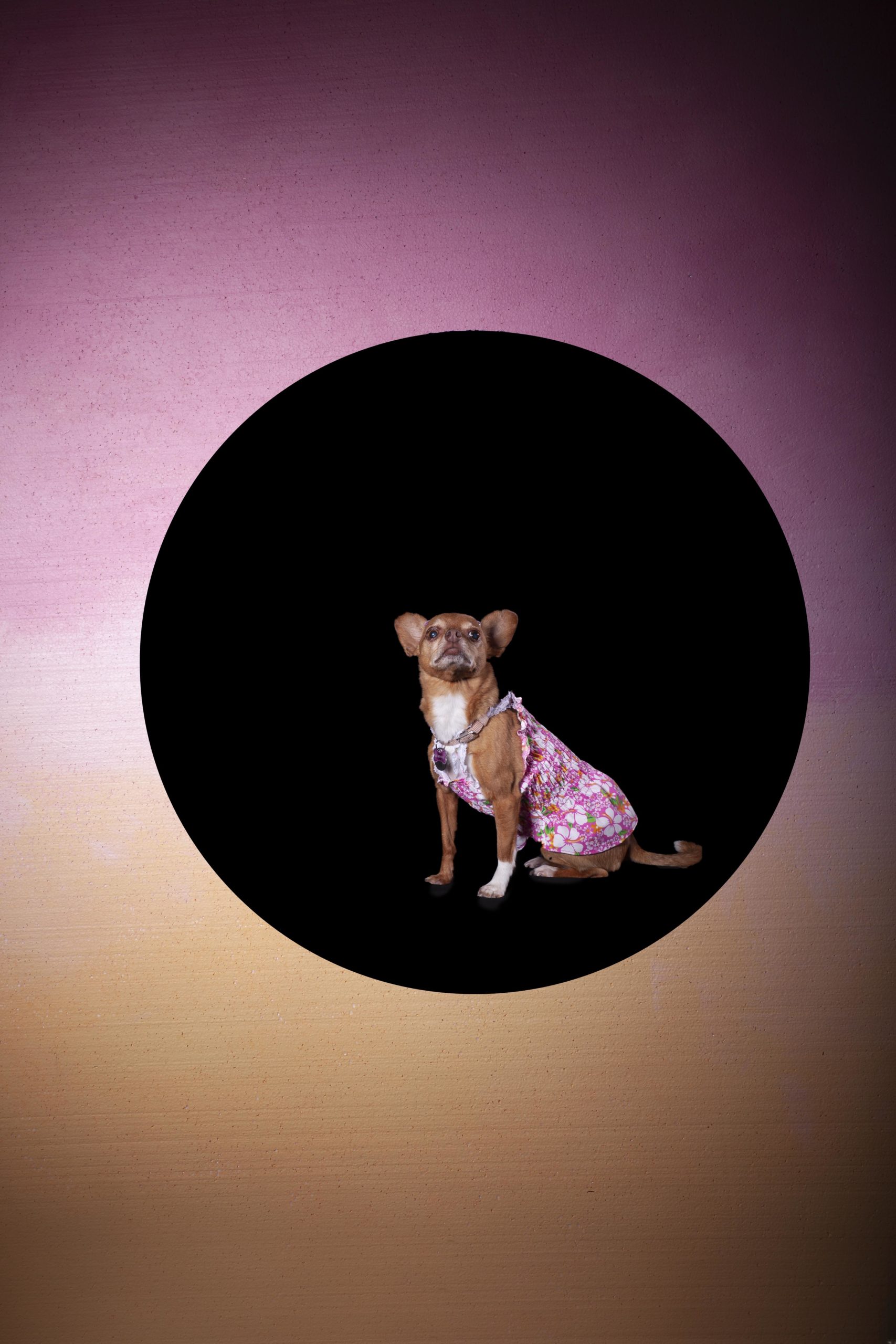
We’ll start with Susan Turner, as I became fascinated with one of her projects at the portfolio walk on Friday night. (Side note: they organized a social mixer with reviewers and reviewees poolside afterwards, which was a nice touch.)

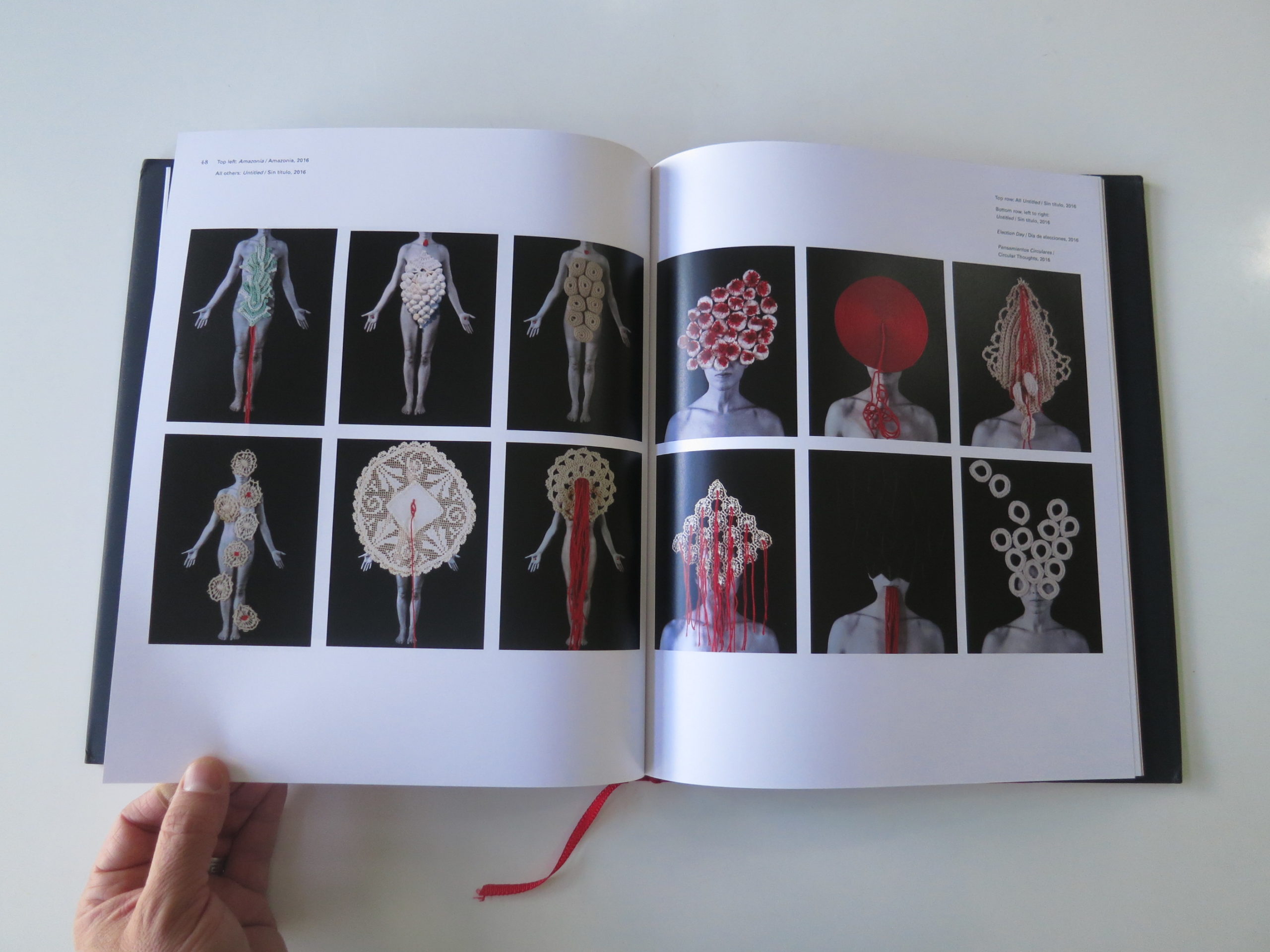
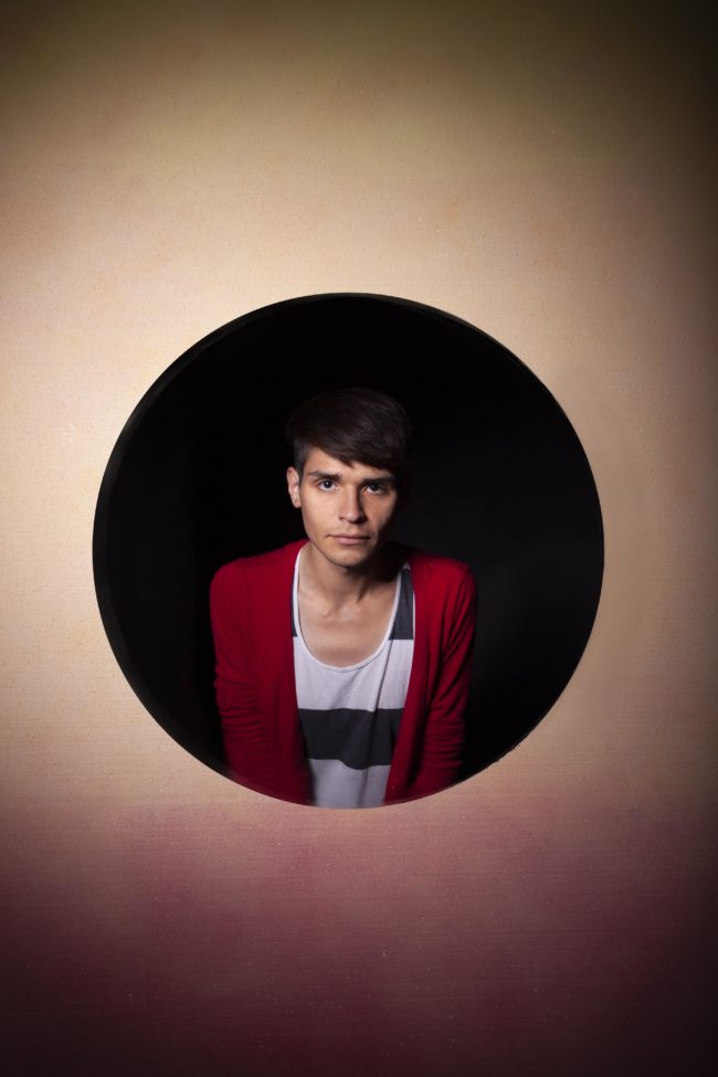
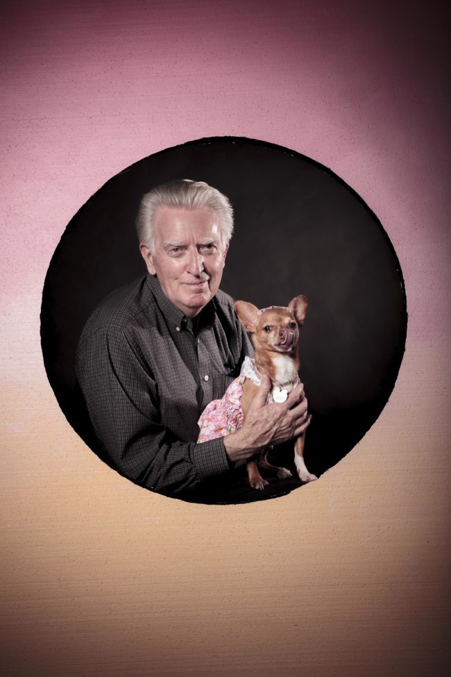
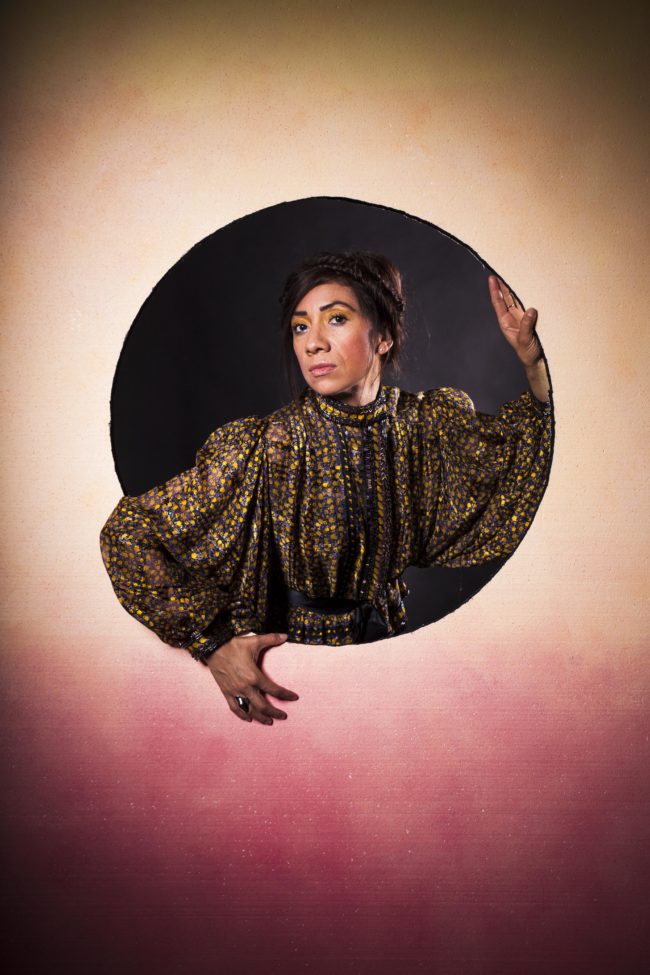
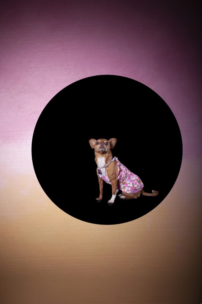
I didn’t know I’d be reviewing Susan the following day, but next to a larger project of generic, soft-focus, dreamy-pretty pictures, she showed me this kooky, zany, super-fun series in which she’d made cut-out backdrops, and shot portraits.

The two projects truly looked like they were made by different people, and Susan, who is in her late 70’s or early 80’s, I believe, seemed to like that I appreciated her more subversive side.

I almost met Mahala Mazerov on the plane from Albuquerque, as I overheard her saying she was headed to a portfolio review by the beach. (If you don’t know, Marina del Ray, Venice and Santa Monica make up the West Side beach communities in LA.)

I recognized her immediately when she sat down at the table, and she told me a challenging story of having had an accident in which she suffered a traumatic brain injury. The rehab was long, and as someone who was on the high side of intelligent, the struggle was torturous.

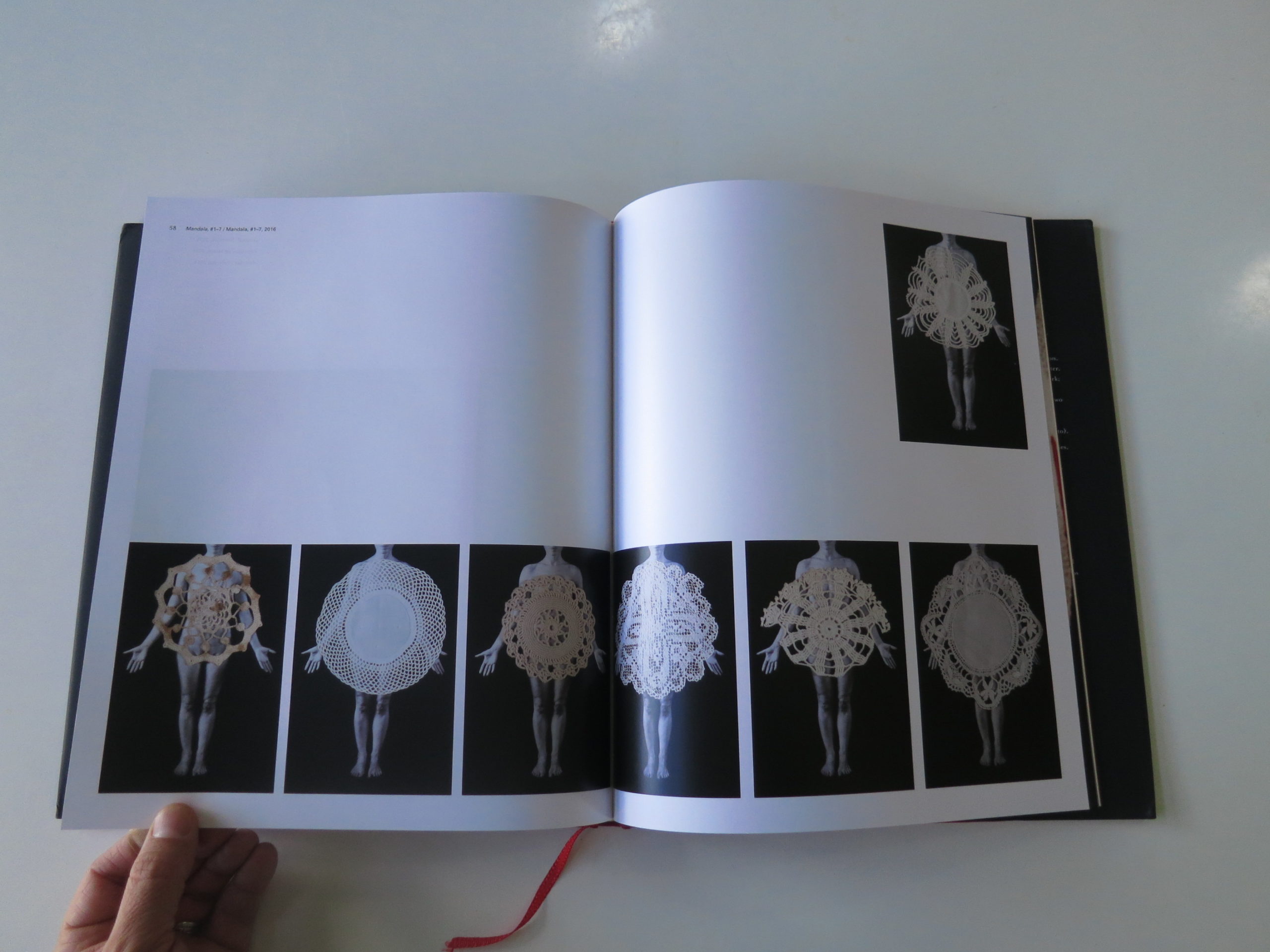
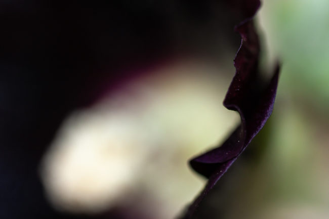
Luckily, she found photography gave her comfort as she worked her way back. These images of flowers, of beauty in its pure form, exude extra juice when you realize they’ve been a part of her re-embrace of her powers and faculties.

And she mentioned in a subsequent email that was so good I want to quote it, re: her symbolic resonance.

“If lotuses growing through mud are symbols of purity and pristine awareness, these hollyhock, growing in drought through cracks in the pavement should be a symbol of persistence.”

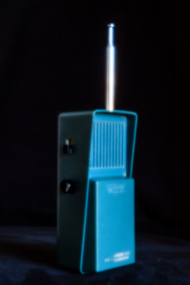
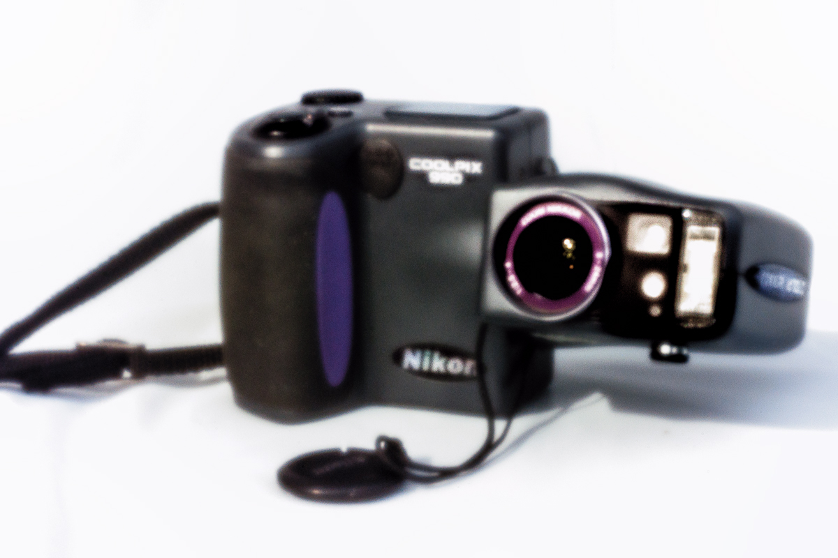
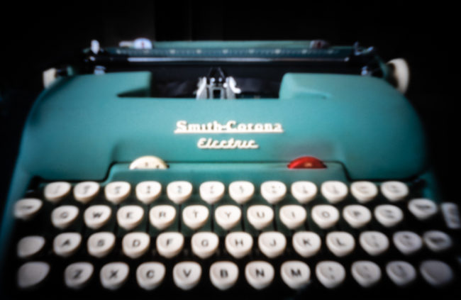
Wayne Swanson had digital pinhole images of outmoded technology. It was the second project he showed me, as once he figured out that I didn’t love his first project, he pivoted to something else that I totally appreciated.

Seriously, these pictures are awesome.

But it’s a good lesson on how to approach a portfolio review, and why Wayne was representative of a cohort that had been well-prepared.

Art is subjective. Sure, there are base-level components about technique, for example, about which most people would agree.

In general, though, different experts can have wildly different opinions. If someone hates one thing and loves another, it’s a win. (It doesn’t matter that they don’t like one of your babies, as long as they like another.)

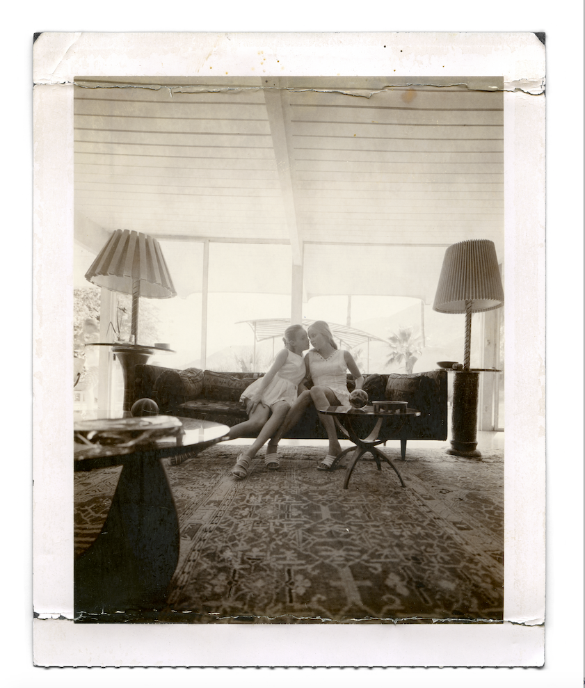
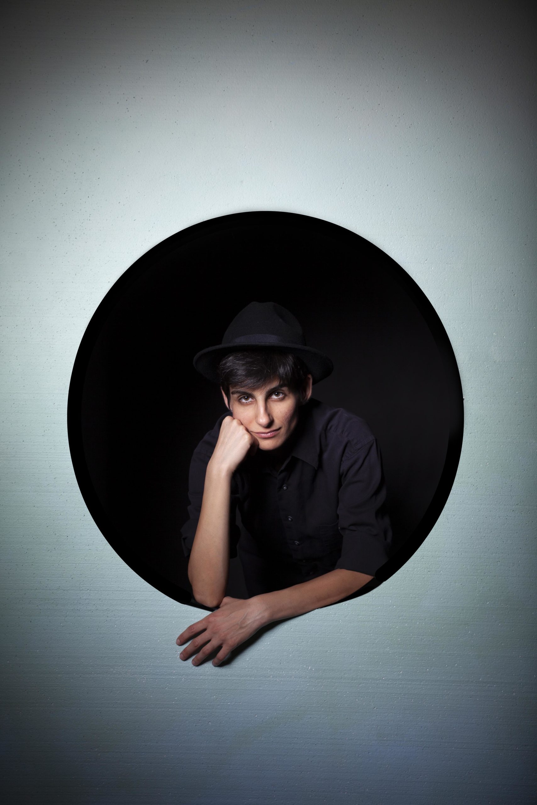
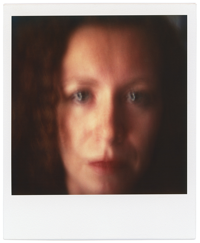
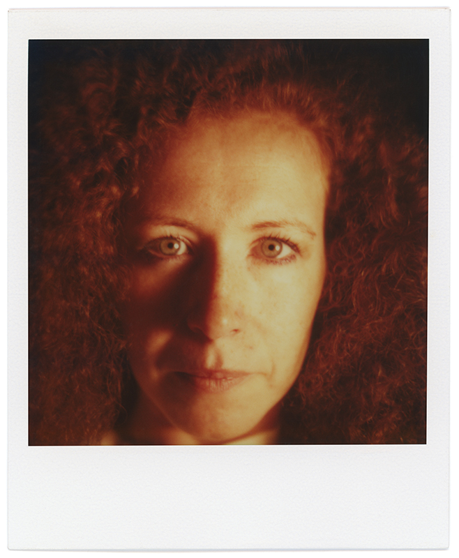
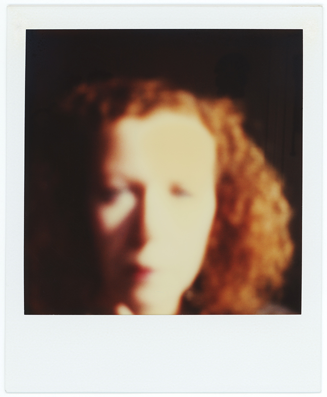
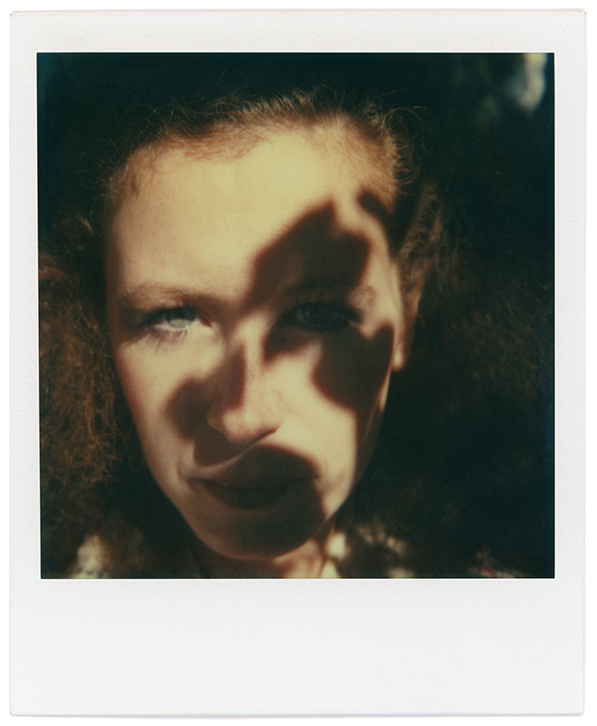
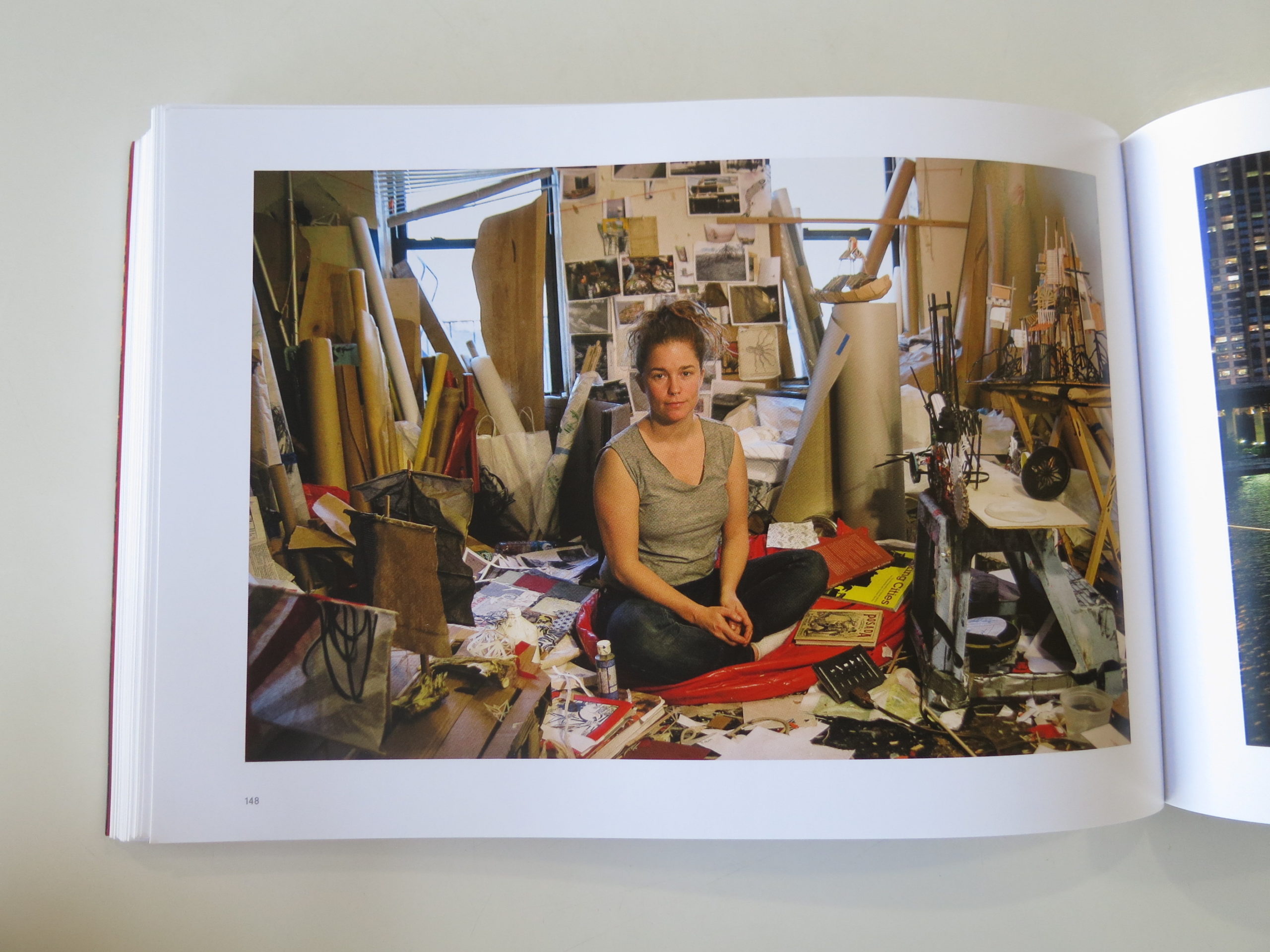
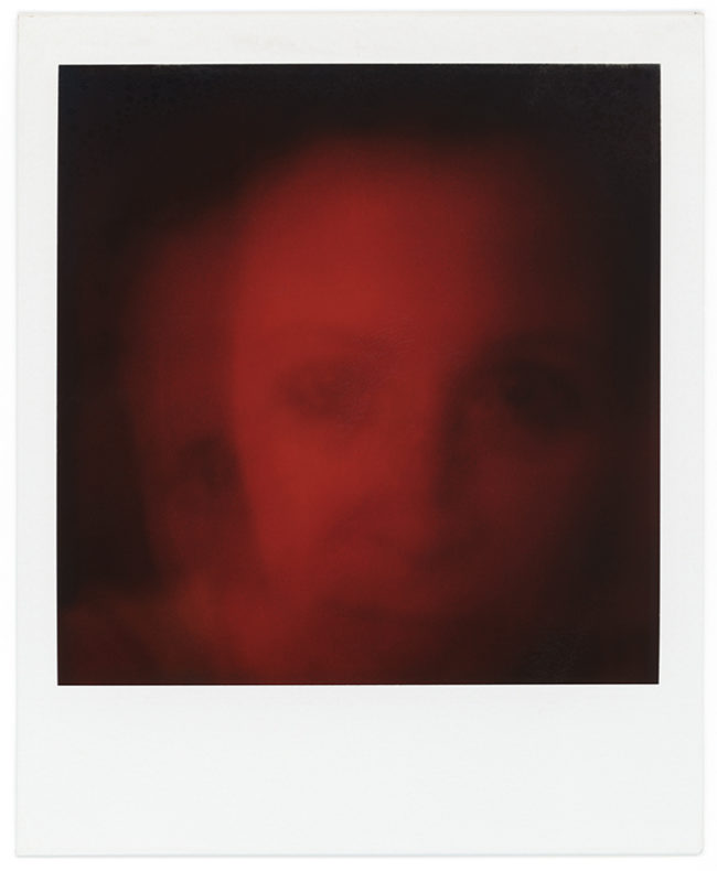
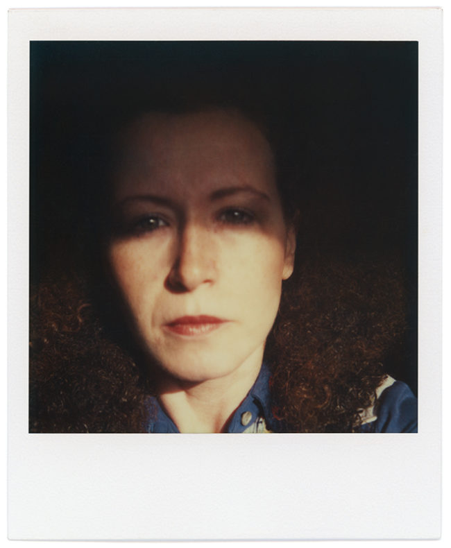
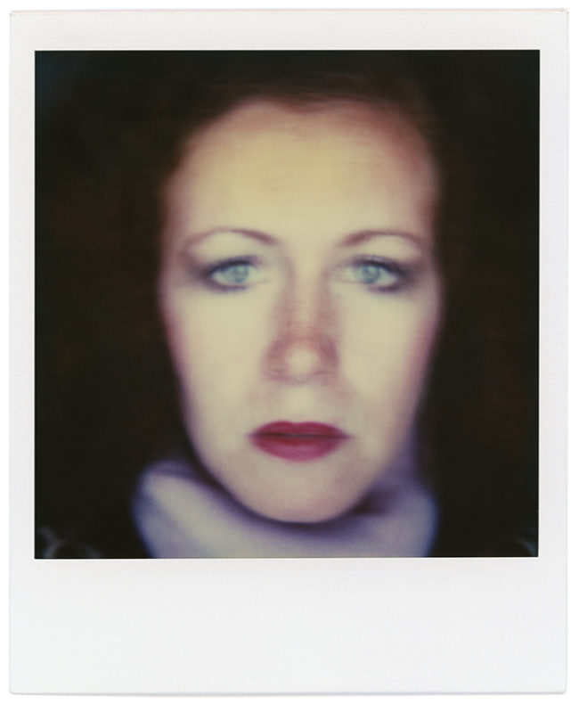
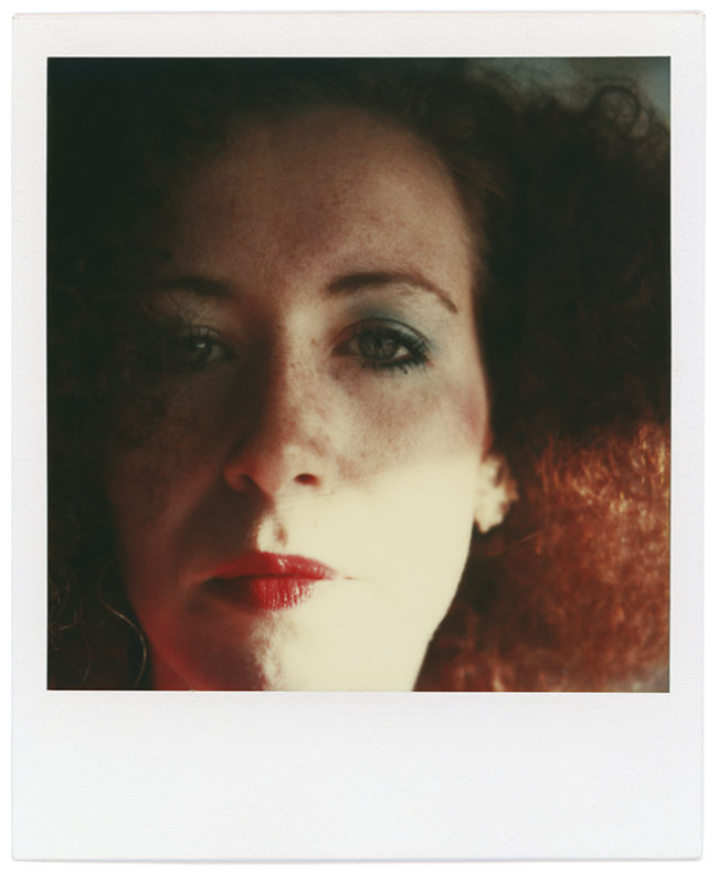
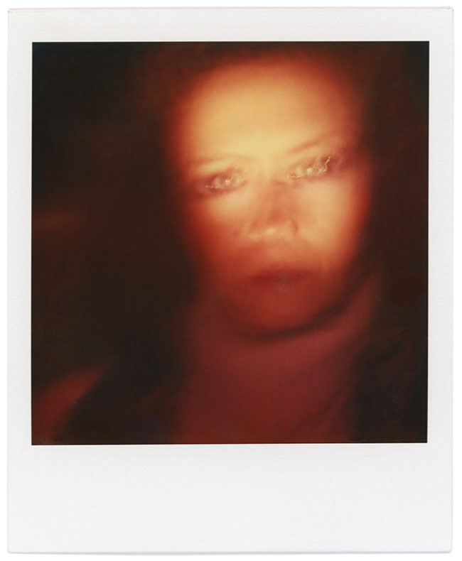
JK Lavin, from Venice, has been around the SoCal photo and art scene for years, as she went to Cal State Fullerton in the 80’s. She sat before me with flaming red hair, and I’d guess she’s in her late 50’s.

Her project showed a younger version of herself, in a stack of scanned and reprinted polaroids. It’s a proto-selfie project, as she shot herself each day for 8 years.

The images are great, of course, but the experience of looking at them while sitting in the presence of the artist added an even deeper dimension. The project will be a solo show at the Griffin Museum of Photography in Massachusetts, I’m happy to share, and deservedly so.

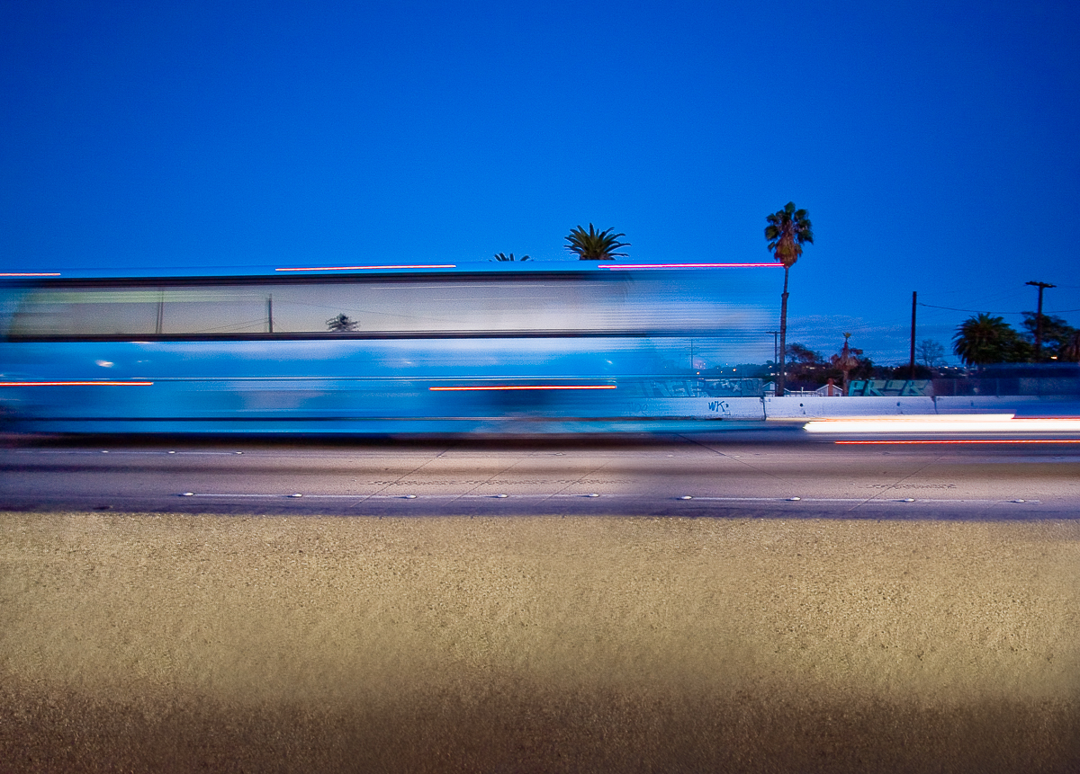
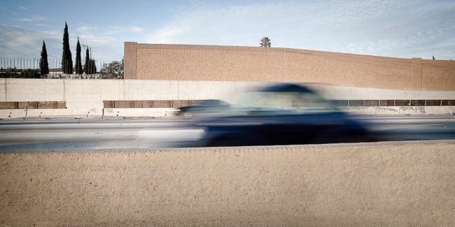
Dennis Keeley heads up the photo department at the Art Center in Pasadena, and was a very cool, chill, California guy, I must say. He told me that he commutes from the South Bay up to Pasadena, North of the City each day, which is a form of self-torture most would not inflict upon themselves for any amount of money.

But time in the car is a huge part of life in a driving, traffic-based culture. So Dennis decided to use the stressful situation to make art, and has photographed the commute for years. The resulting photographs are far more meditative than I expected, which I suppose reinforces that they help him find something positive in an otherwise shitty situation.

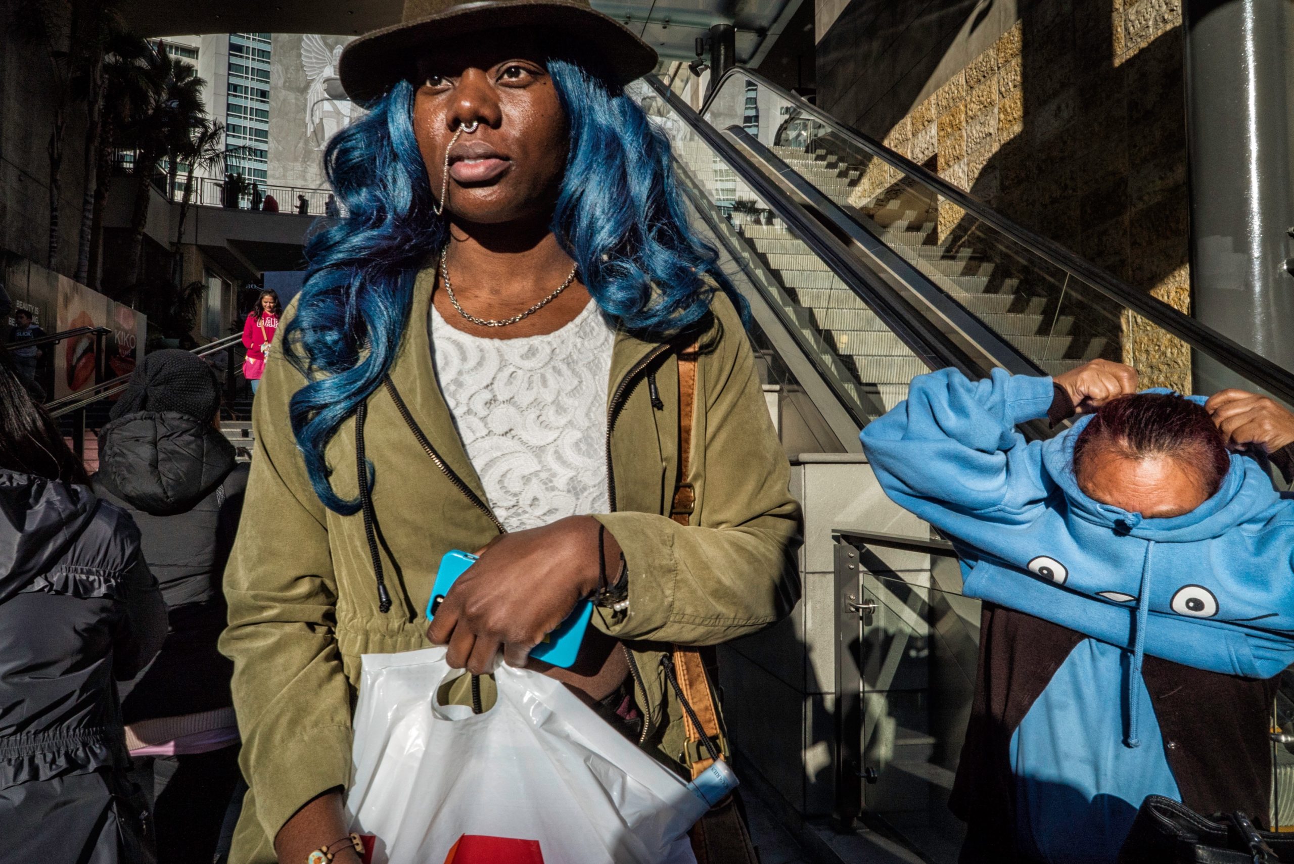
Kevin Weinstein, who also works for LACP, (and should have received a shout out sooner in the article,) sat down at the table to show me his colorful, Saul-Leiter-esque street photographs around Los Angeles.

Kevin is also a professional editorial and event photographer, and his skill-set really shows. The technical competence grounds his sense of whimsy, and I must say I like the pictures a lot.

Plus, he’s hilarious. What is it with those Jews and humor? You’d think they invented Hollywood or something.

(Oh, right.)

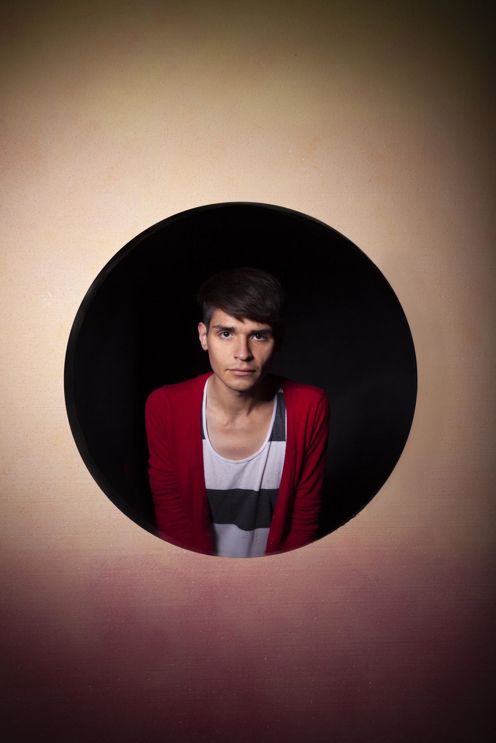
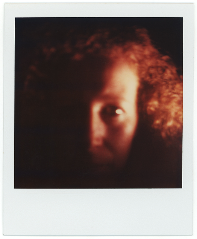
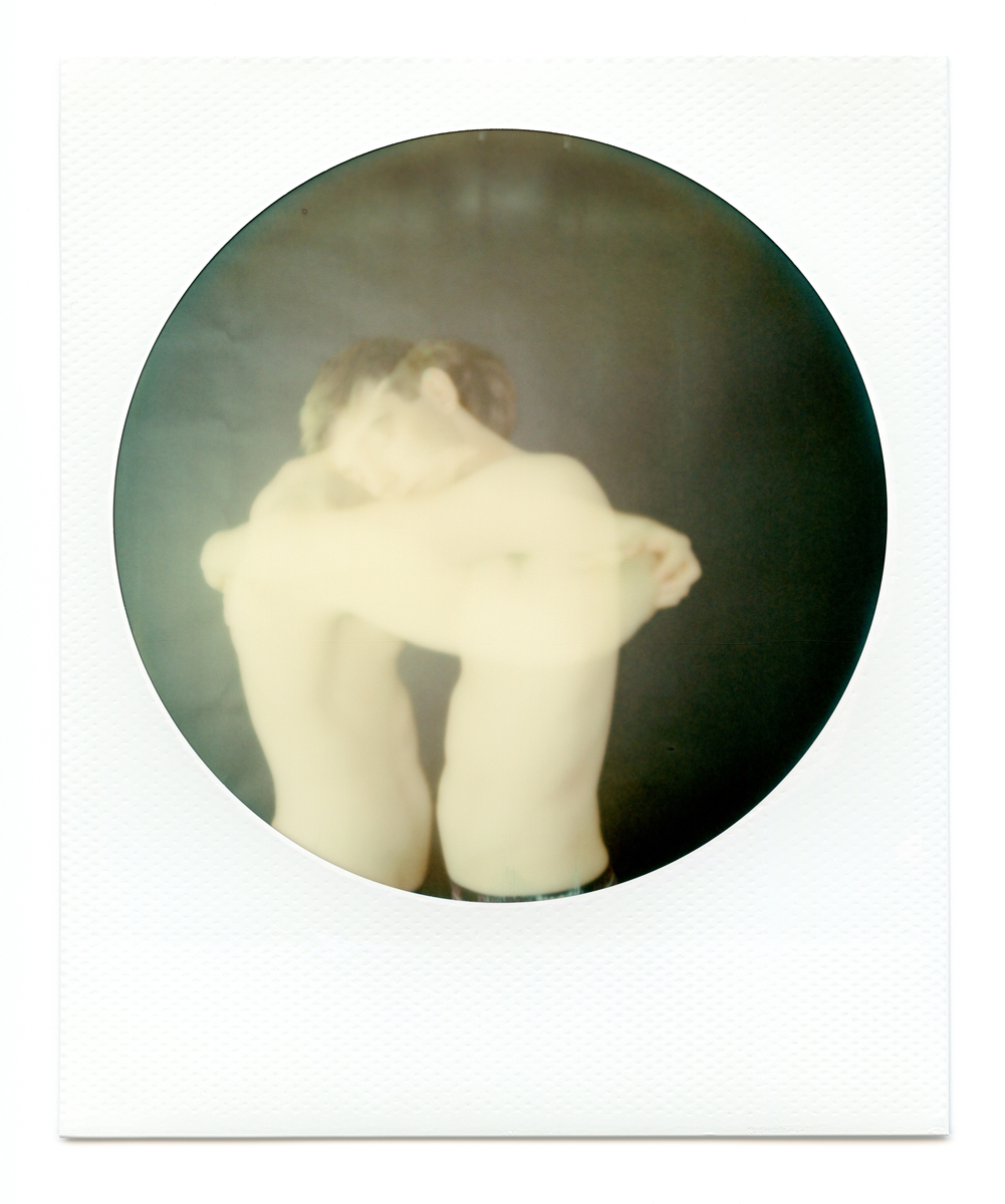
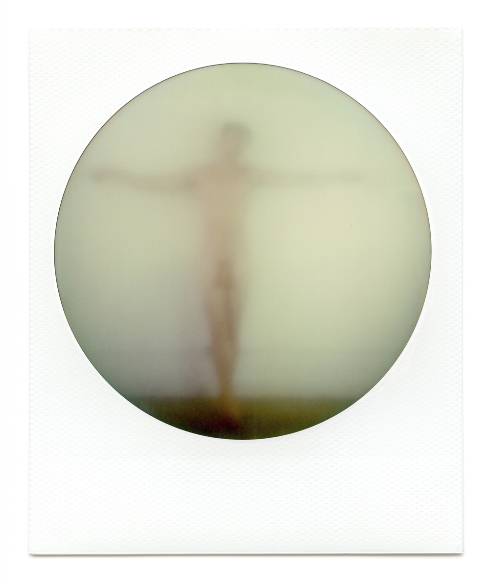
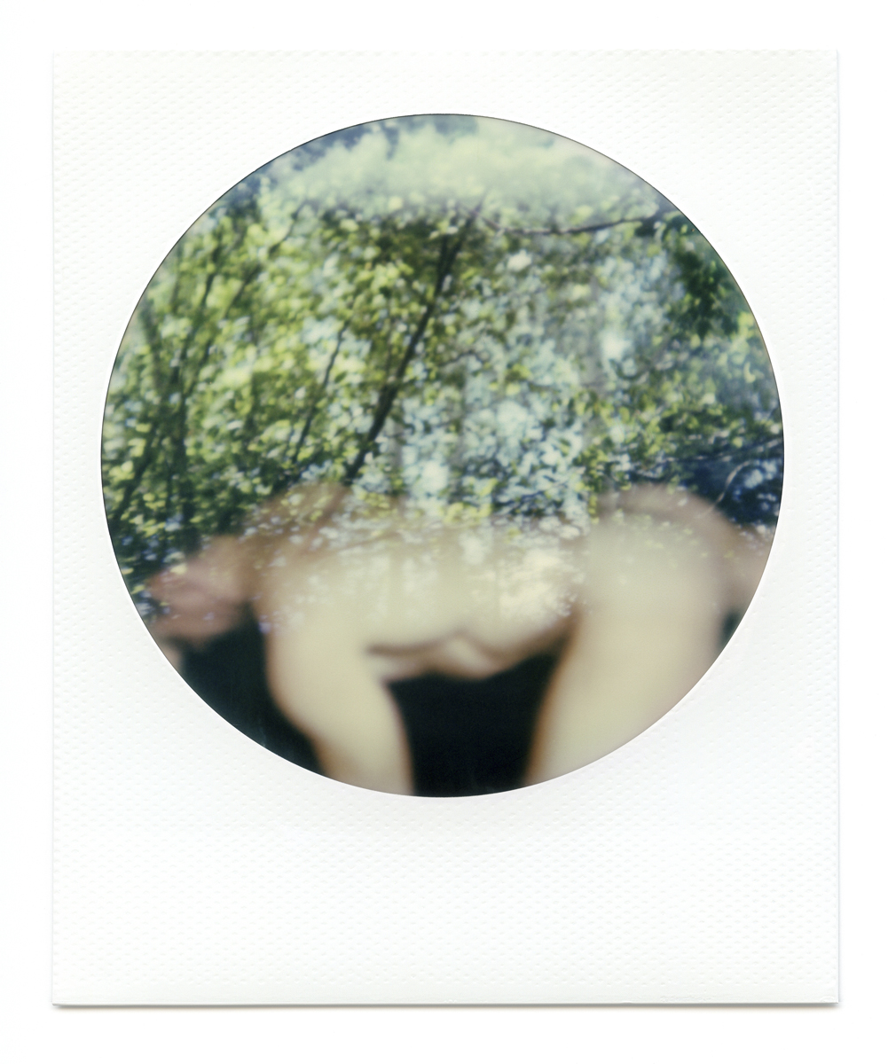
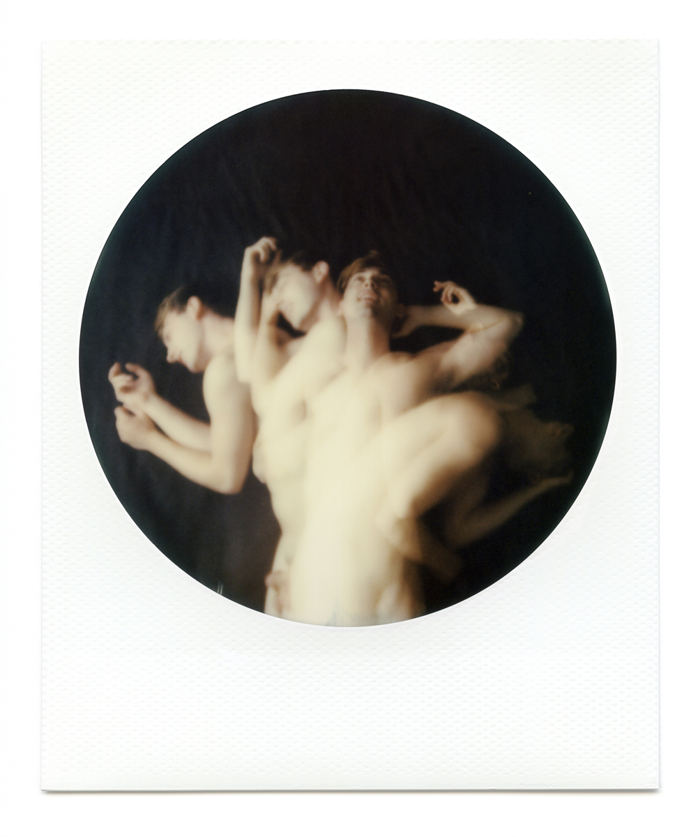
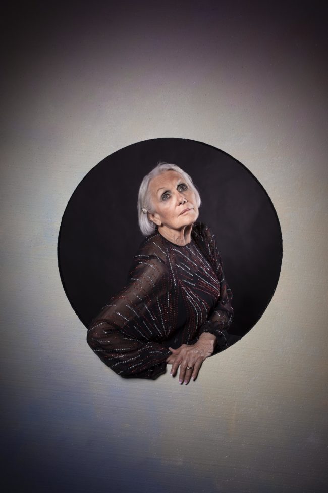
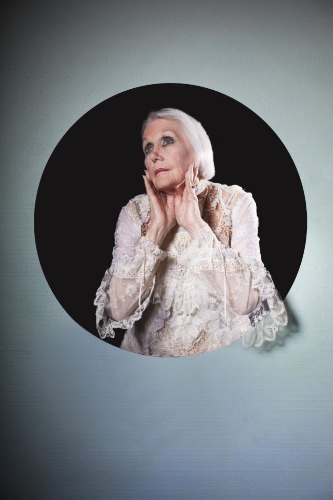
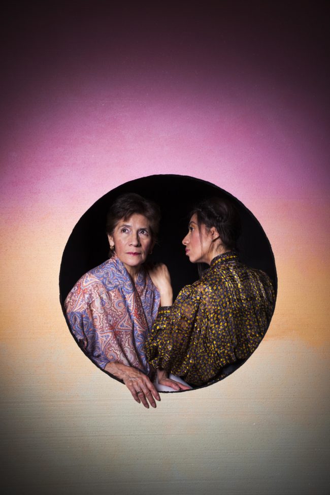
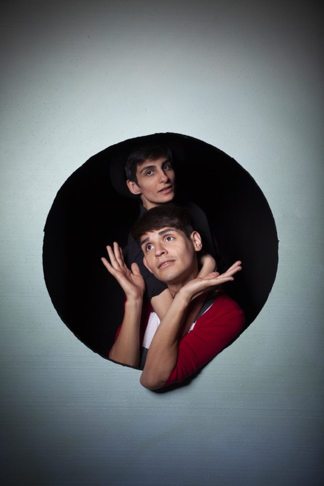
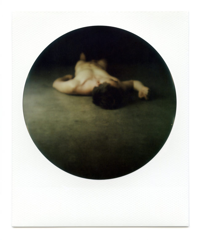
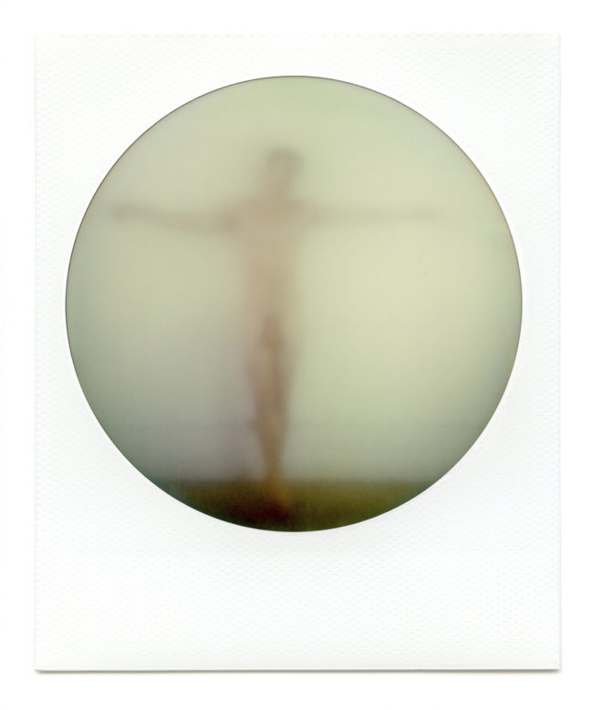
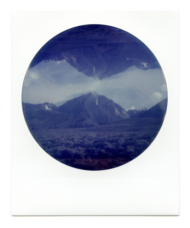
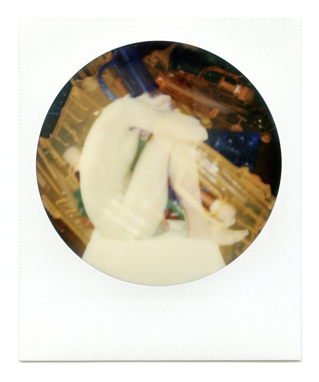
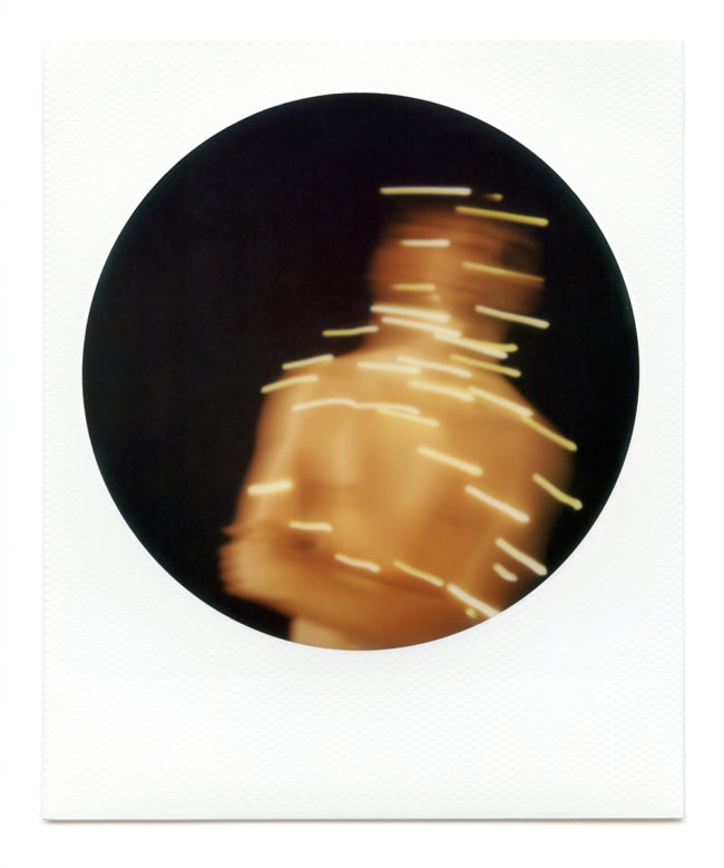
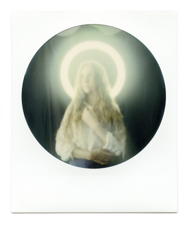
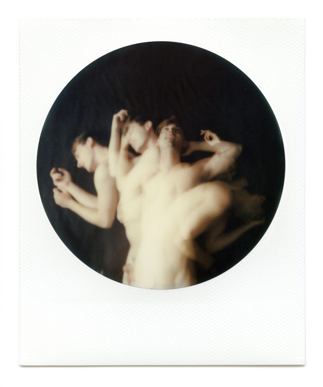
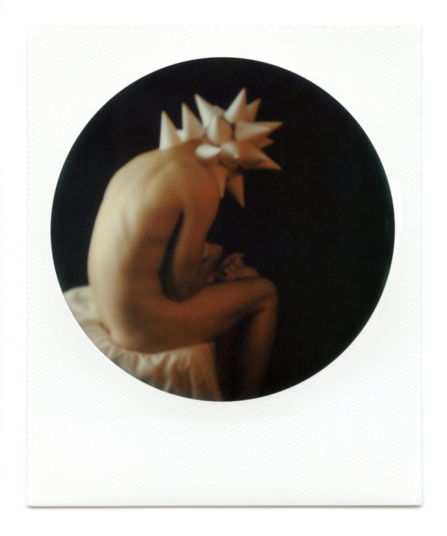
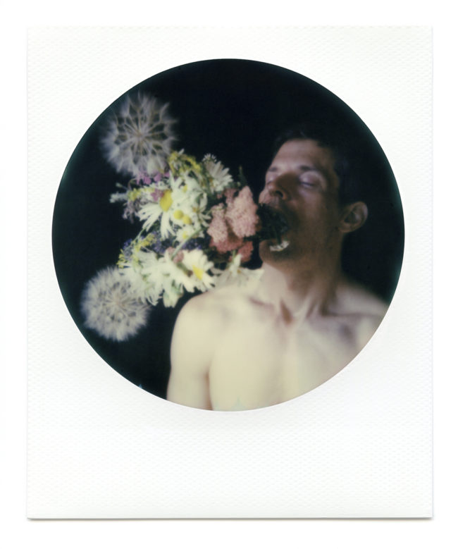
Matthew Finley had some very-IRL-physical-object-based images, so they don’t translate to the web as well as some other things. He builds layers of images, which deal with sexuality, but I just saw that it’s not what he sent me. (Last minute-photo editing.)

These are circular polaroids, and they’re cool too.

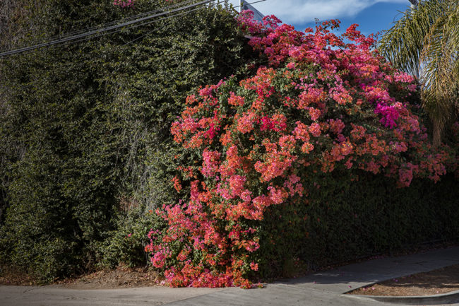
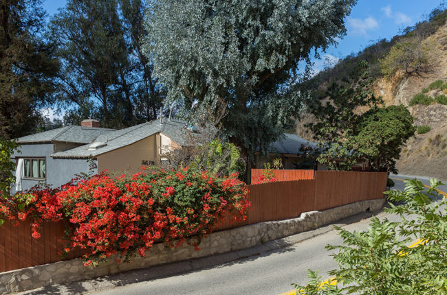
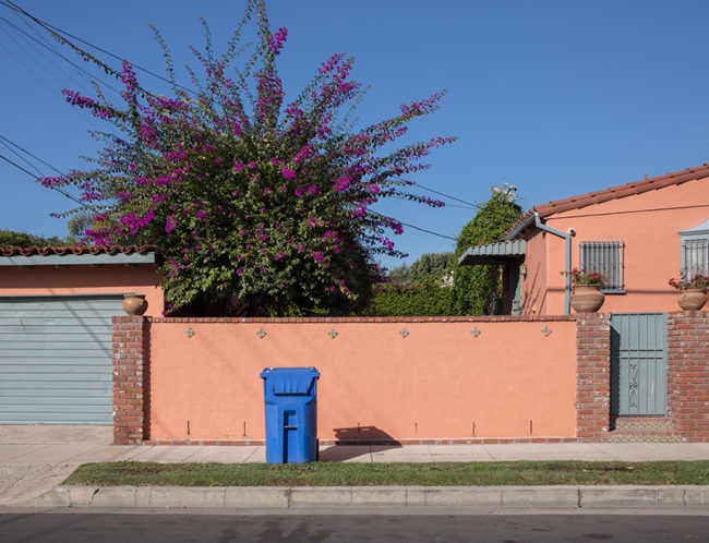
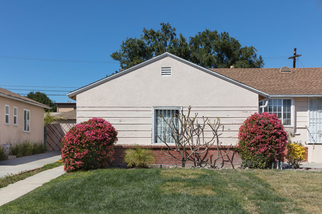
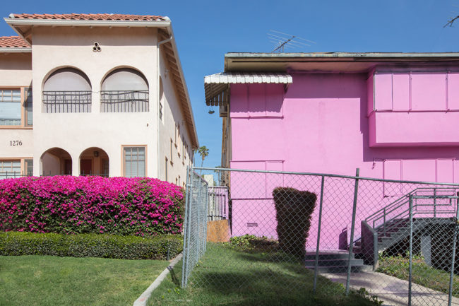
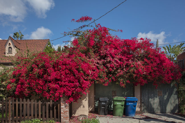
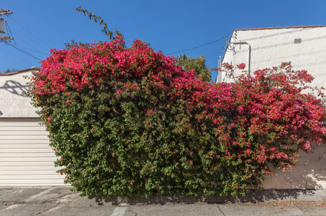
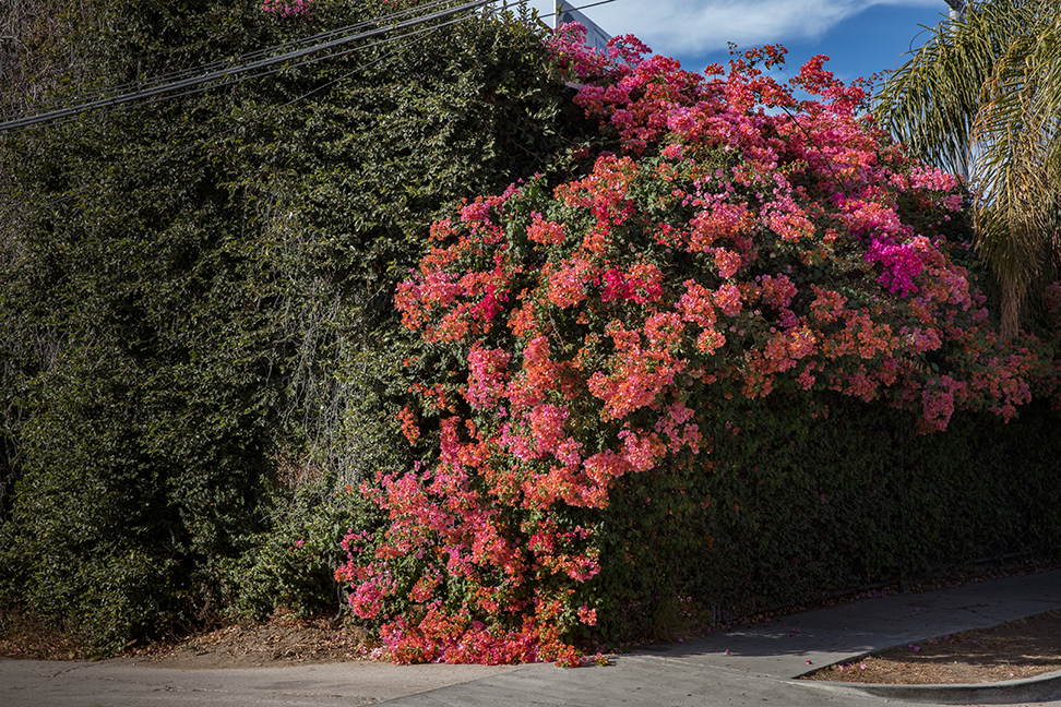
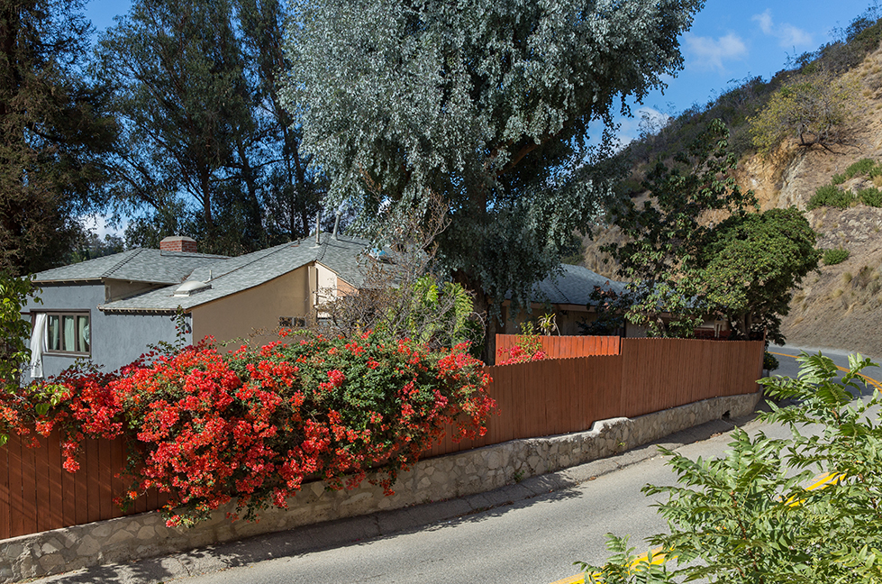
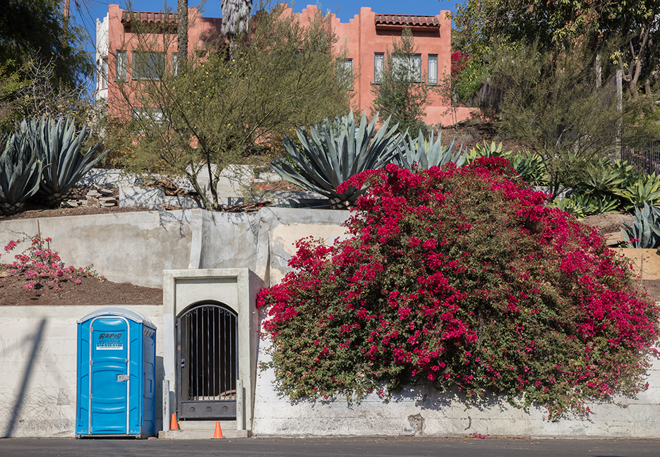
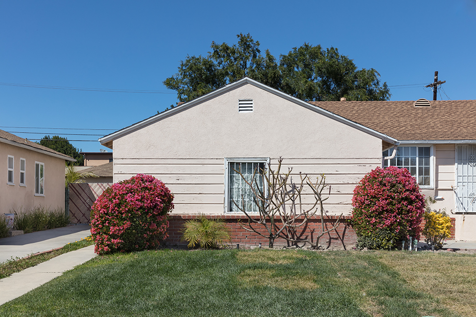
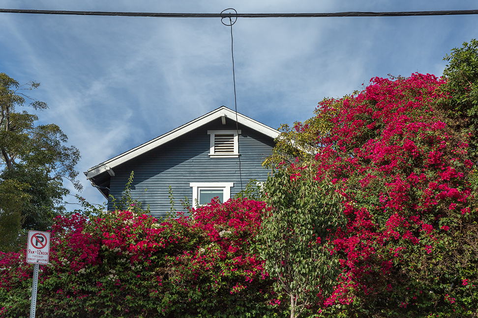
Finally, last but not least, we have Alexandra DeFurio. Hers was easily the most SoCal project I viewed over the weekend, as Alexandra photographs LA-Area bougainvillea in the bright sunlight.

Damn, seriously, look at those skies. That’s the California Dream right there.

I thought her photos were excellent, and suggested that as the work continued, I’d recommend some variance within her light palette, as the mid-day super-bright sun might be nicely complimented by some slight (or drastic) changes in mood and color.

Regardless, its the perfect project to end on today, as it’s cold, wet and gray here on September 20, the first real day of Autumn in New Mexico.

The Art of the Personal Project: Bonnie Holland

The Art of the Personal Project is a crucial element to let potential buyers see how you think creatively on your own.  I am drawn to personal projects that have an interesting vision or that show something I have never seen before.  In this thread, I’ll include a link to each personal project with the artist statement so you can see more of the project. Please note: This thread is not affiliated with any company; I’m just featuring projects that I find.  Please DO NOT send me your work.  I do not take submissions.

Today’s featured artist: Bonnie Holland

I’ve always considered myself to be a good writer.  In fact, in college I even got an A in creative writing.  But with this story series I experienced writers block for the first time and I’m not sure why.  It took awhile, but I think I’ve figured out why.   You see, all of my work is playful, creative and very colorful, even the editorials where I’ve “toned” it down.   My work is optimistic and designed for pure pleasure like a bowl of good ice cream with chocolate chips.  I seek to find and put under a magnifying glass the silver linings in life. Does that make me a Pollyanna? Maybe, and maybe I am.  I always felt a certain inadequacy with my work that it was all fluff and had no substance.  Like cotton candy, too sweet and bad for your teeth to boot.   War journalists…. now there was a group of photographers that had purpose, mattered and reminded us of the very real horrors in life.  Not only that, but they risked their very lives to do it.   How could I compete with that?  I almost quit….. almost.

This story was a personal turning point in my photography career and helped me define what inspiration is.  This was the first story that did not spark from daydreams and imagination.  It evolved from a phone call.   My dear friend Marlene was diagnosed with cancer.  Very bad cancer.   The kind that starts the phone call with, “are you sitting down?”  And I felt awful, helpless and devastated.  I wanted to do something, anything…. I wanted to fix her but I couldn’t.  So many emotions…. like a war zone.

My gift to her was a visual story of hope, optimism and the beautiful things in life worth fighting for.  We’ll put the best things in life under a microscope and as she always says, “think good and it will be good”.  She is the physical manifestation of my work… she is happy, optimistic and a fighter. And she has been winning for over 5 years now and going strong.

Her gift to me was vision:  To be able to see my work as a whip or shield against the darkness in life.   Part of problem solving is not only identification but also creating a path toward resolution or the end goal.  I’d like to optimistically believe that our world is moving toward a kinder more inclusive tolerant end goal and put that under a microscope along with Marlene’s beautiful life.

To see more of this project, click here.

APE contributor Suzanne Sease currently works as a consultant for photographers and illustrators around the world. She has been involved in the photography and illustration industry since the mid 80s.  After establishing the art buying department at The Martin Agency, then working for Kaplan-Thaler, Capital One, Best Buy and numerous smaller agencies and companies, she decided to be a consultant in 1999. She has a new Twitter feed with helpful marketing information because she believes that marketing should be driven by brand and not by specialty.  Follow her at @SuzanneSeaseInstagram


The Daily Edit – Los Angeles Magazine: Steven Simko


Los Angeles Magazine

Design Director: Steven Banks
Photographer: Steven Simko

Heidi: What was the cover direction?
Steven: The cover brief was “LA’s most iconic places for tourists to be locals ” so Steven Banks (design director LA mag) came up with the concept of photographing a model at the Paul Smith Wall on Melrose #paulsmithpinkwall

Is the cover a painted set?
I scouted the location the day before in the morning and then in the afternoon using the iPhone app LightTrac to figure out the Sun’s best timing for a deep shadow off the model on to the ground (this detail was the most important to Steven’s design).

did you simply tell her to jump? what type of direction did you give her?
We were very fortunate that Kari Michelle (model) used to do the long jump in High School but this was the direction I gave her as seen in this  BTS shot …pretty good jump right ?

Is that the sun or a did you light this? is that her true shadow on the wall?
With the sun’s optimal light between 4:00- 5:30PM the PS store gave us an hour to shoot. We shout non tethered on a Leica Sl with 24-90mm 1/1250 at  f/ 4.5 ISO 100

Did you need a permit, was there a crowd since it’s so iconic?
Yes, we needed an LA city permit. There was a ongoing crowd of selfie takers at one end of the wall but Paul Smith was nice enough to
give us our own section to shoot against away from  the crowd. It worked out perfect for everyone.”

What was the fashion story direction?
The Fall Fashion Story brief was based around a mood board of the clothes that style director Linda Immediato pulled for this shoot. We were able to find a perfect Mid Century Modern location on Peerspace.com

How many looks did you shoot?
We needed (12) shots ended up shooting (13), the model needed to be ready at 12:00 PM that would give us (2) shots per hour.

With such a tight schedule we shot non tethered on a Leica SL with a 24-90mm & 90-280mm  lenses  1/30-1/500 f/2.8 ISO 200 with daylight except for the first and last shots we had a Mole Richardson Senior LED Daylite Fresnel for fill.

What are the benefits on shooting tethered, what are the cons?
The benefits to shooting directly to card are speed. We needed to be in and out quickly from the location so we did a few tethered tests to confirm the exposure / shadows / model placement in the frame. Steven Banks and I felt like we had it; we unhooked the cable and shot three outfit changes

The Daily Promo – Ashley Thompson & Ana Homonnay


Thompson And Homonnay

Who printed it?
Anthony Wright at AW Litho. This was our first time working with Anthony, and he was an absolute dream to work with. He was so kind and so incredibly easy going, plus he did such a beautiful job. We will undoubtedly be calling on him again to work with us on our next promo.

Who designed it?
George McCalman. Ah-mazing. We feel so very lucky to have been able to collaborate with George on this promo. He is incredibly insightful and so good at what he does. He is the perfect mixture of being very direct and truly supportive in exactly the same moment. We love everything he does and hope to work with him again in the near future.

Tell me about the images?
With this promo, we really wanted to showcase our kids and teens work. The majority of the images are a collection from our personal work. Test shooting has always been one of the most important tools for us because it gives us the freedom to challenge ourselves, push our boundaries and to be fearless of making mistakes. The images we chose for this promo really reflect who we are as a duo, with our aim to create images that emotionally connect people with childhood and adolescent memories and/or the nostalgia of time.

How many did you make?
We did a run of 500 copies.

How many times a year do you send out promos?
Normally we try and send two per year.

Do you think printed promos are effective for marketing your work?
Yes, especially when they lead us to in-person meetings. This is where we feel like the magic happens and we get to shine, where the client gets to know us as a duo, and learns about our process and how we work on set. Promos are also a way to leave a beautiful little piece of us behind.

This Week in Photography Books: Tod Seelie


Last week, I told my parents to fuck off on their 50th Wedding Anniversary.
(Metaphorically, not literally.)

It was not my proudest moment, and I admit it looks bad upon the surface.

But there was more to it than all that, and it just so happened I reached my breaking point on a ceremonially important day.

C’est la vie.

We can’t control the way life plays out, and normally the most we can control is our own reaction to the hand we’re dealt. (Even then, it can be difficult.)

I never planned to have a weekly column here at APE for the last seven years, but that’s what’s transpired. I’ve been reviewing photobooks, and sharing my life story with you guys each week since I was 37 years old. (Back when I had a wife, a mortgage, and a toddler in the eye-teeth of the Great Recession.)

Yes, folks, we’ve made it to the anniversary column, as it all began in mid-September of 2011.

Now I’m 44, and I’ve got a wife, two kids, (6 and almost 11,) a refinanced mortgage, two car payments, a new photo retreat, and a global platform here, at the New York Times, and through my artwork, which has been seen by many.

Though I keep banging away at the keyboard, the person doing the tapping is essentially different from the guy who began here seven years ago.

All my cells have turned over, as have yours. (If you’ve been reading the entire time: a group that likely includes Rob, my wife, and the father I just pissed off at the beginning of this column.)

One way I know I’m different is that things that used to bother me, or make me insecure, no longer do.

As I grew up relatively-suburban-normal, by the time I embraced my inner artist/party-guy/cool kid, I never thought I was part of the most-in-crowd.

Even when I moved to Greenpoint, Brooklyn to go to Pratt in 2002, and had an underground gallery called BQE33 in my apartment, (along with the requisite hipster late-night-jammers,) I still thought the real players in the art world were well-protected by a velvet rope I would never cross.

Rich Kids.
Yalies.
Aristocrats.
And of course the “Beautiful Losers.”

I shared my story of Ryan McGinley-envy here in a column years ago, and won’t dredge it up again. (I probably re-mentioned it while critiquing Mike Brodie a few years later.)

Rest assured, no matter how cool I thought I was over the years, that type of artist, (or crowd,) definitely brought out my insecurities.

Nowadays, as grounded as I’ve ever been, that stuff simply doesn’t rattle me anymore.

Not one bit.

I see cool in a different way. It’s being truly comfortable in your skin, owning who you are, and treating everyone with respect until they prove they don’t deserve it.

Hell, just yesterday, I was watching “The Great Escape” for the first time. You’ve got to disqualify James Coburn and Charles Bronson, for the ridiculous accents they were forced to adopt, but DAMN, James Garner and Steve McQueen were so goddamn cool I almost became a bi-sexual.

Afterwards, I hit up Wikipedia and learned that McQueen had been in juvie, street gangs, the military, and military jail. And that he was in the saddle for those amazing motorcycle scenes.

Garner too had fought for his country, and been wounded, so both guys radiated their inner confidence onscreen, and it impressed me well after they’d passed away. (Reading they were both lifelong stoners was a pleasant surprise as well.)

Where does this all leave us?
Will I ever get to the book review?

Of course.
Glad you asked.

Today, I’m breaking with our pattern of male/female to show a book that is bang-on perfect for my musings, and also because the review is painfully late.

I normally keep proper track of my book stack, and get to everything within an appropriate amount of time, but somehow I lost Tod Seelie’s excellent “Bright Nights: Photographs of Another New York,” by Prestel, that he sent me back in January. (Apologies, Tod.)

My mistake was everyone’s gain, though, as this book fits squarely in the sweet spot of things I crave for a review. It gives us an insider’s view into several, (not just one,) subcultures we would not otherwise access, it’s extremely well done, and also represents a time and place in a seminal way.

(Add in the fact that I’ve probably reviewed more photobooks about NYC than any other subject, and you hit the trifecta.)

Coincidentally, given that I wrote about my time at Pratt last week, (before I found this book,) apparently Tod and his artist/hipster buddies were at Pratt the same time I was, in the early days of the new millennium.

I’m guessing they were young undergrads, and I was already a serious, near-30-something graduate student with a live-in girlfriend, but still. Same school. Same Brooklyn. Same overall life goal. (Become a successful artist, I’m guessing.)

As the photos in this book imply, (and the copious essays by art-world-insiders back up,) Tod Seelie and his friends are in the biggest museum collections. A band that existed at my own art school, Japanther, (of which I still hadn’t heard until today,) apparently was in a Whitney Biennial, the mother of all insider blessings.

And as I looked at these excellent, cool photographs, I didn’t feel jealous. Or unworthy.

No single dose of envy popped up.

The very kids who used to drive me crazy, who got the acclaim the young-me craved so badly, and all I could think was, “Great book.”

I admit, the Gen-X’er in me did roll my eyes at the requisite hot naked chicks, (as always, Boobs Sell Books,) but beyond that, I found it comprehensive and joyous.

These art-school kids, and bike-riding kids, and music-playing kids, all had a shit-ton of fun during the 11 or so years these pictures were made. (They seem to stop in 2012, around Hurricane Sandy.)

Tod Seelie sent me this book at the turn of 2018, and but it didn’t register in the moment. I’m glad it waited until today, because last week’s closing wish was that you get out there and have some fun this September.

I know there are a lot of you facing serious storm issues, so you have my very best wishes, (New Yorkers included,) but I’ll end today by suggesting that we all have growing left to do, no matter how old we are.

It’s not easy, but it’s worth it.

Bottom Line: Awesome, comprehensive look at the Beautiful Losers

To purchase “Bright Nights,” click here 

If you’d like to submit a book for potential review, please email me directly at jonathanblaustein@gmail.com. We are particularly interested in books by female photographers, so we may maintain a balanced program. 

The Art of the Personal Project: Eric Espino

The Art of the Personal Project is a crucial element to let potential buyers see how you think creatively on your own.  I am drawn to personal projects that have an interesting vision or that show something I have never seen before.  In this thread, I’ll include a link to each personal project with the artist statement so you can see more of the project. Please note: This thread is not affiliated with any company; I’m just featuring projects that I find.  Please DO NOT send me your work.  I do not take submissions.

Today’s featured artist:  Eric Espino

Artist Statement: “La Bodega” – The lost soul of a neighborhood

Around NYC we have noticed more and more Hispanic “bodega” markets disappearing, one of the major aspects making up the diversity within the 5 boroughs. Every bodega is a major key in Hispanic or urban area neighborhoods catering to the needs of the poor and working class. It is a major staple within the Hispanic culture that is, unfortunately, being driven out due to the “New” New York gentrification conditions and standards we have experienced over the last 10-15 years or so.

Our homes and neighborhoods are changing and are no longer affordable. Bodegas have always been the place to go to for the last minute ingredients to your home-cooked meal- to be the place where you always receive a warm welcome- to always having a place to be around the people you’re most connected to; no matter the color, race or religion, but most of all a place we all knew as “La Bodega”.

This was my home. We are the face of a born and raised NYC culture that will never be forgotten. – La Bodega


To see more of this project, click here.

APE contributor Suzanne Sease currently works as a consultant for photographers and illustrators around the world. She has been involved in the photography and illustration industry since the mid 80s.  After establishing the art buying department at The Martin Agency, then working for Kaplan-Thaler, Capital One, Best Buy and numerous smaller agencies and companies, she decided to be a consultant in 1999. She has a new Twitter feed with helpful marketing information because she believes that marketing should be driven by brand and not by specialty.  Follow her at @SuzanneSeaseInstagram