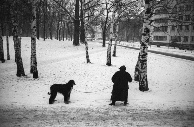
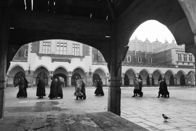
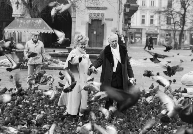
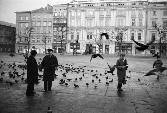
The Art of the Personal Project: The Rathkopfs

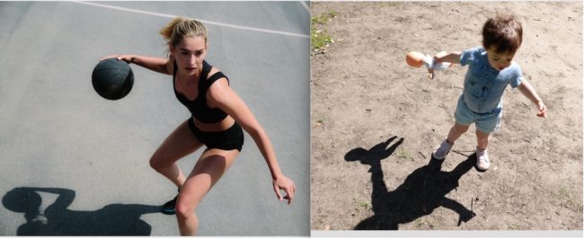
The Art of the Personal Project is a crucial element to let potential buyers see how you think creatively on your own.  I am drawn to personal projects that have an interesting vision or that show something I have never seen before.  In this thread, I’ll include a link to each personal project with the artist statement so you can see more of the project. Please note: This thread is not affiliated with any company; I’m just featuring projects that I find.  Please DO NOT send me your work.  I do not take submissions.

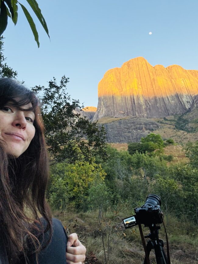
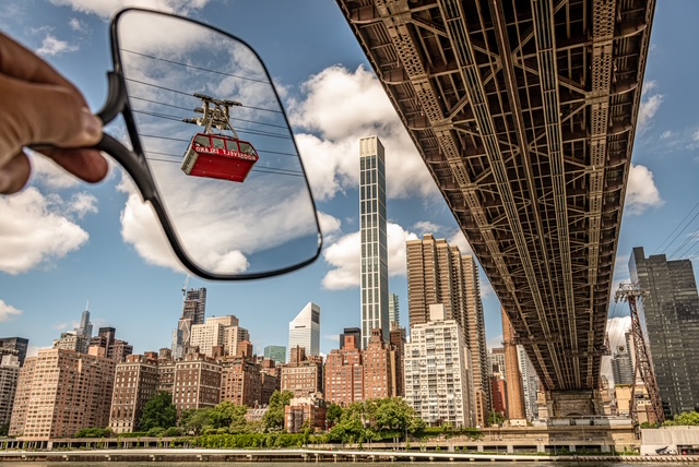
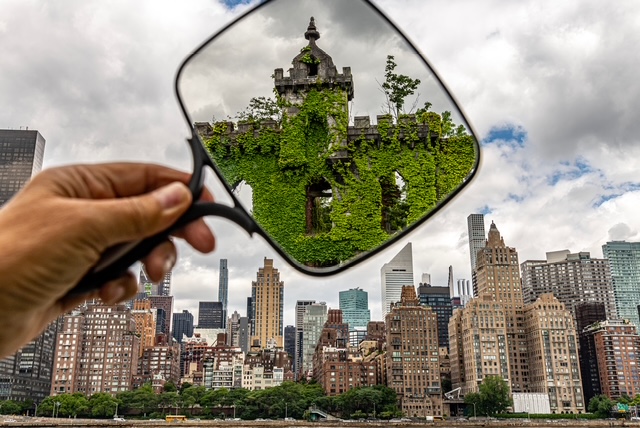
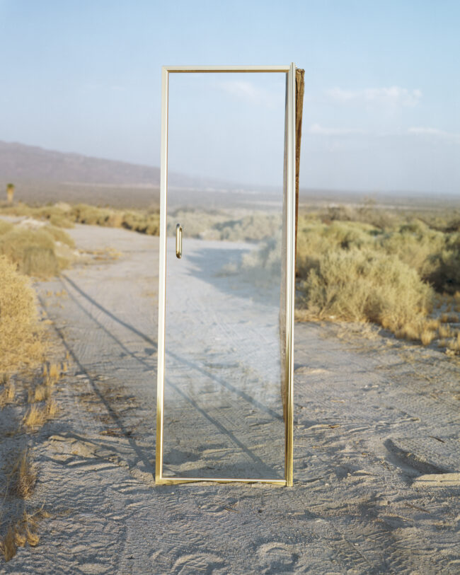
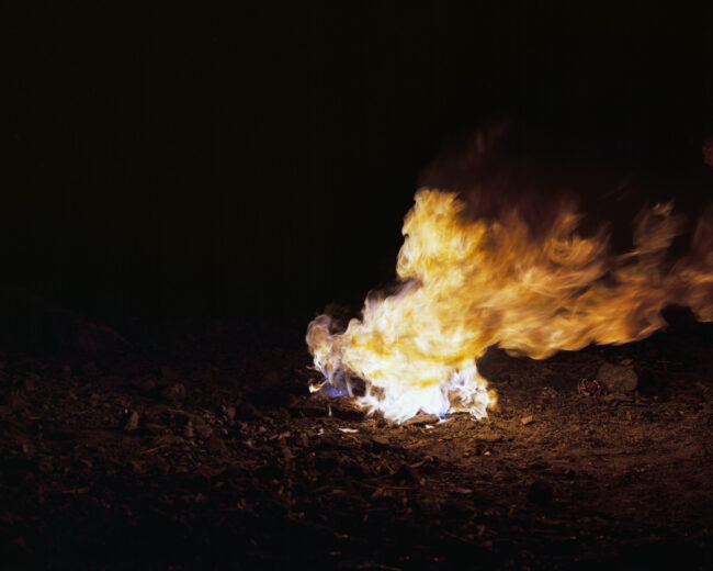
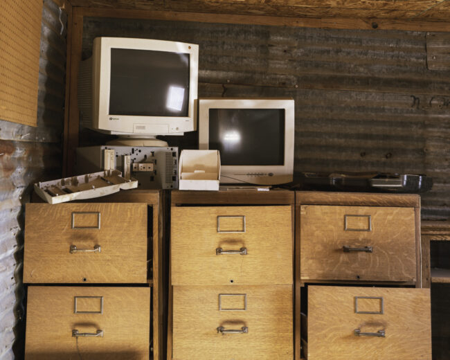
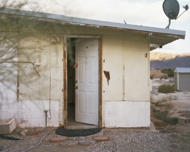
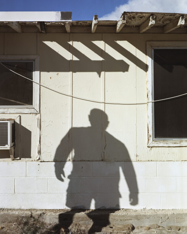
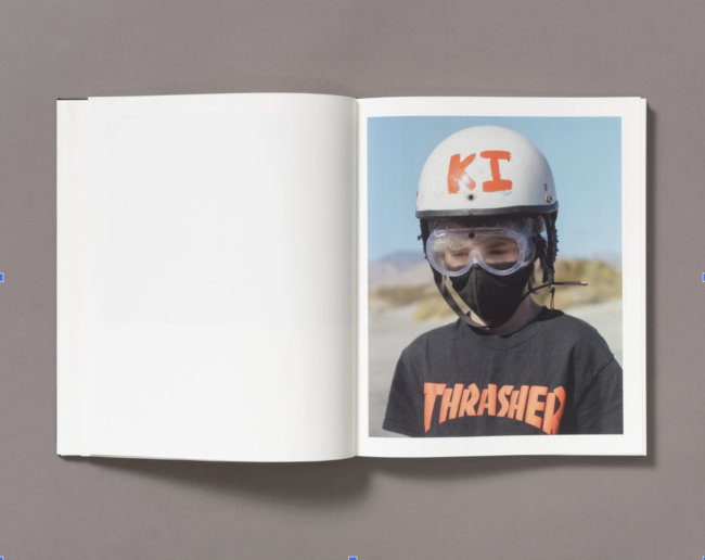
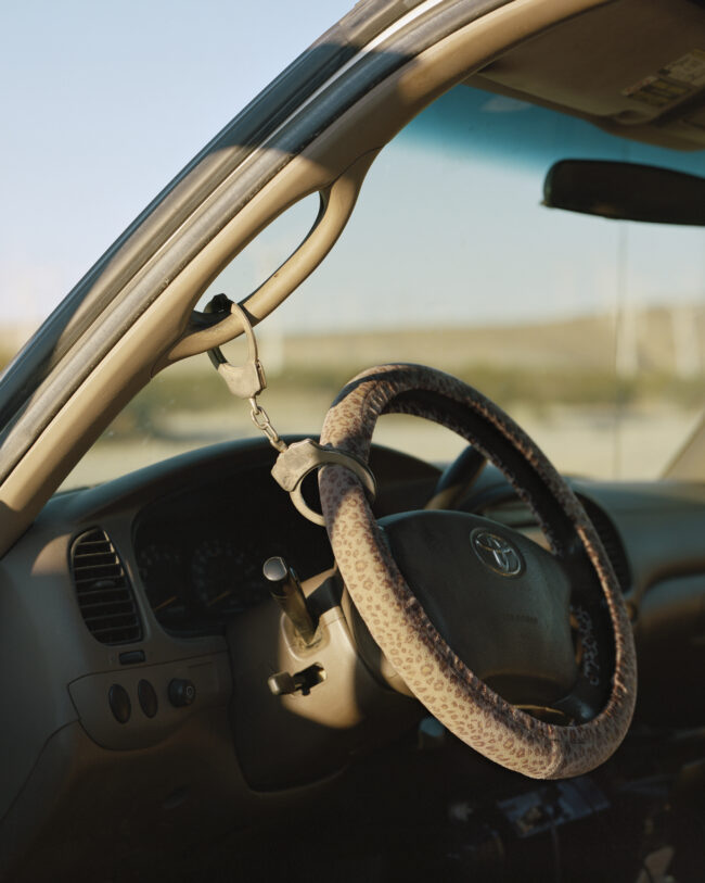
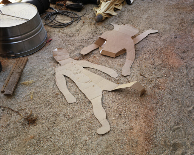
Today’s featured artist:  Anna Rathkopf /The Rathkopfs

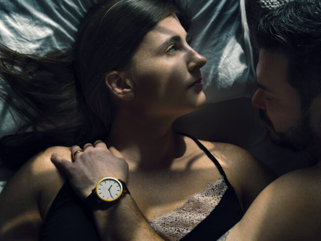
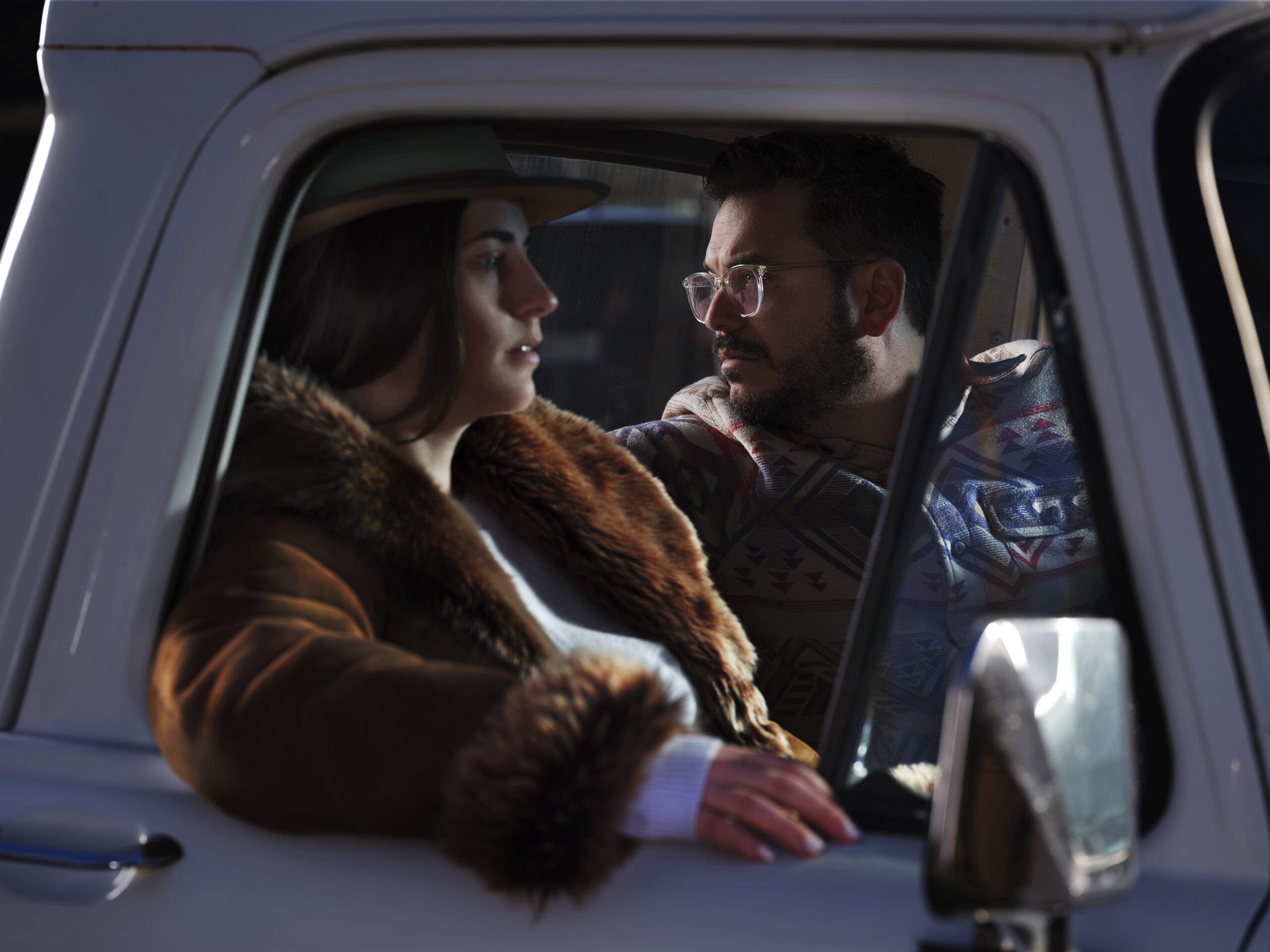
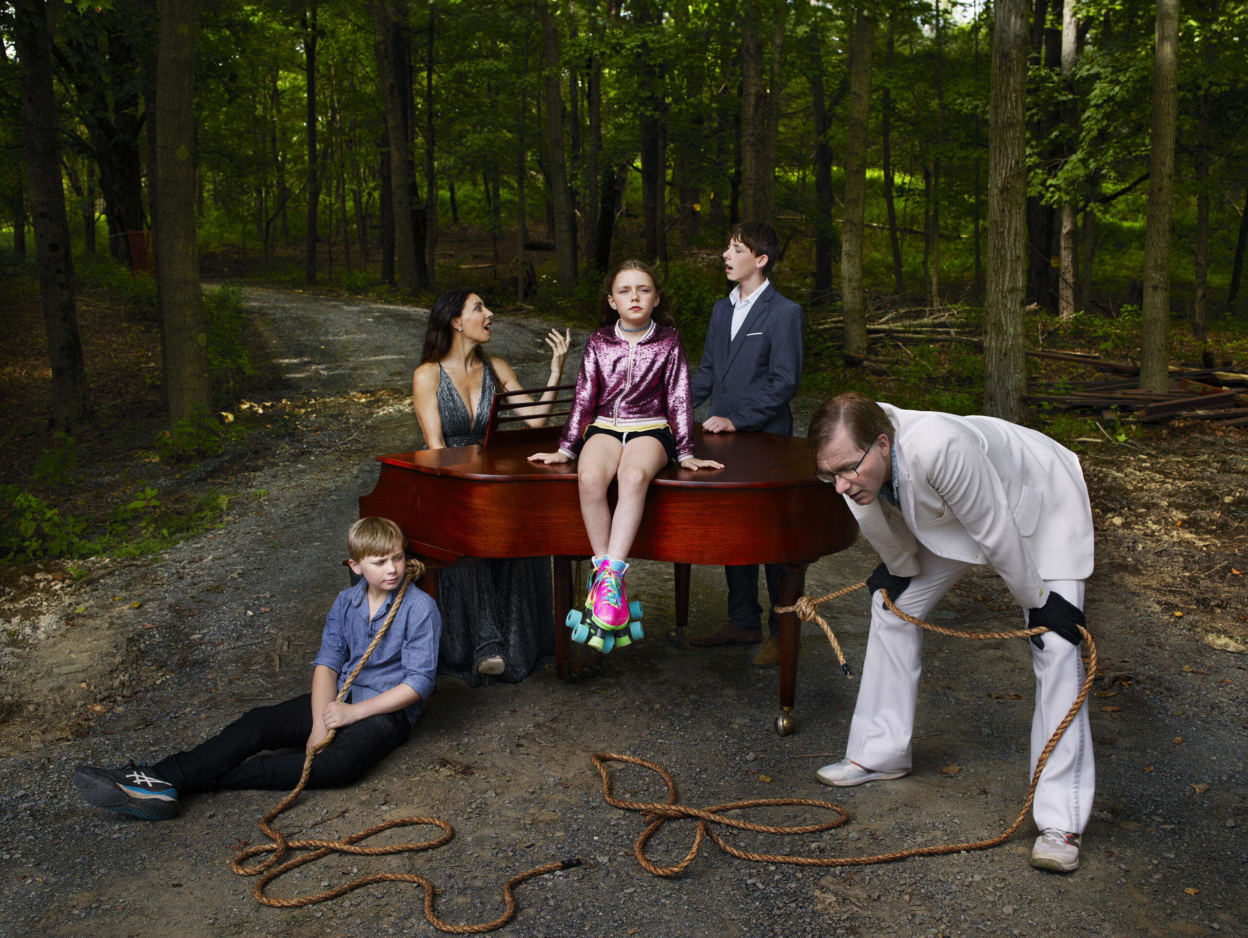
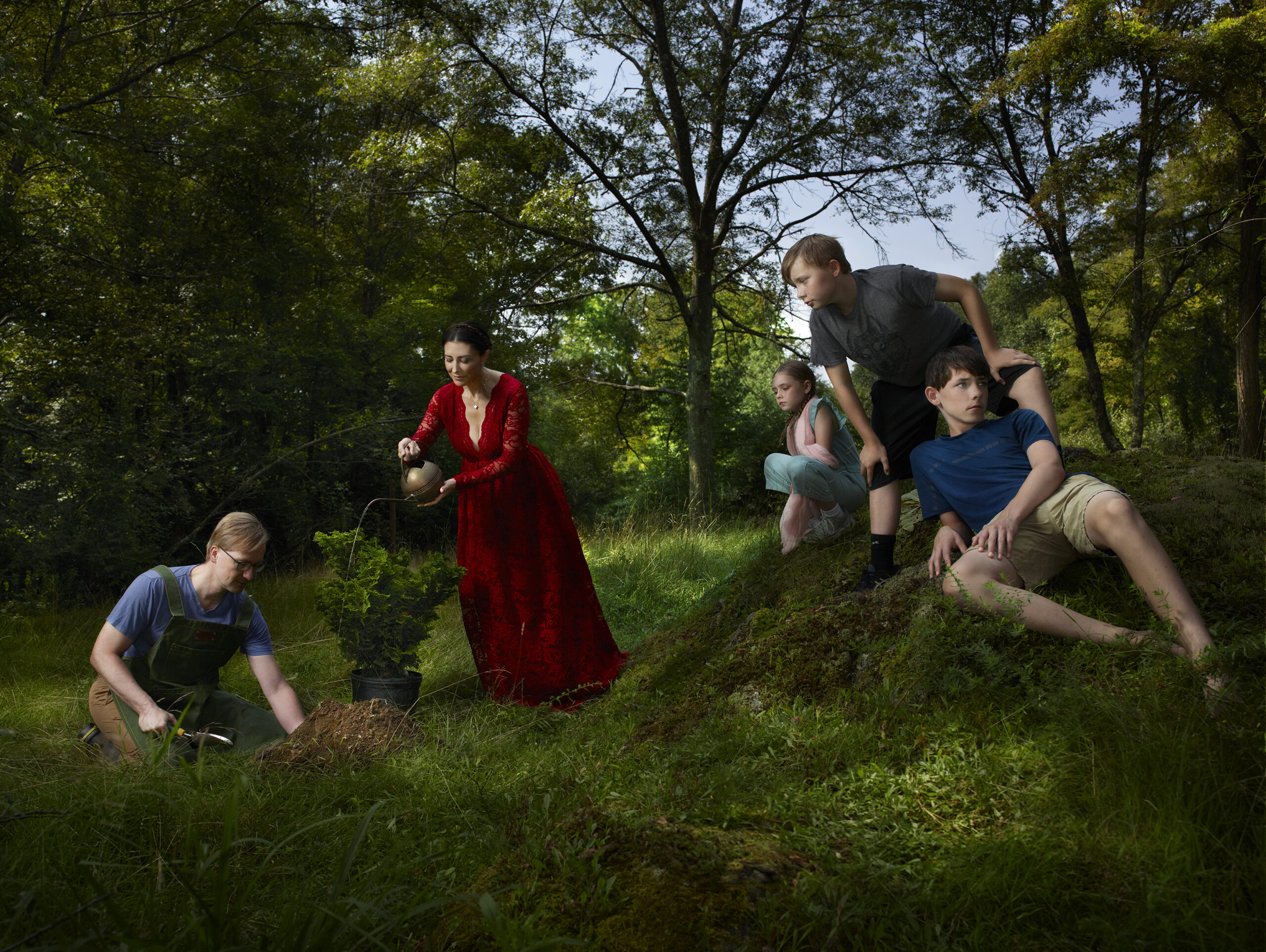
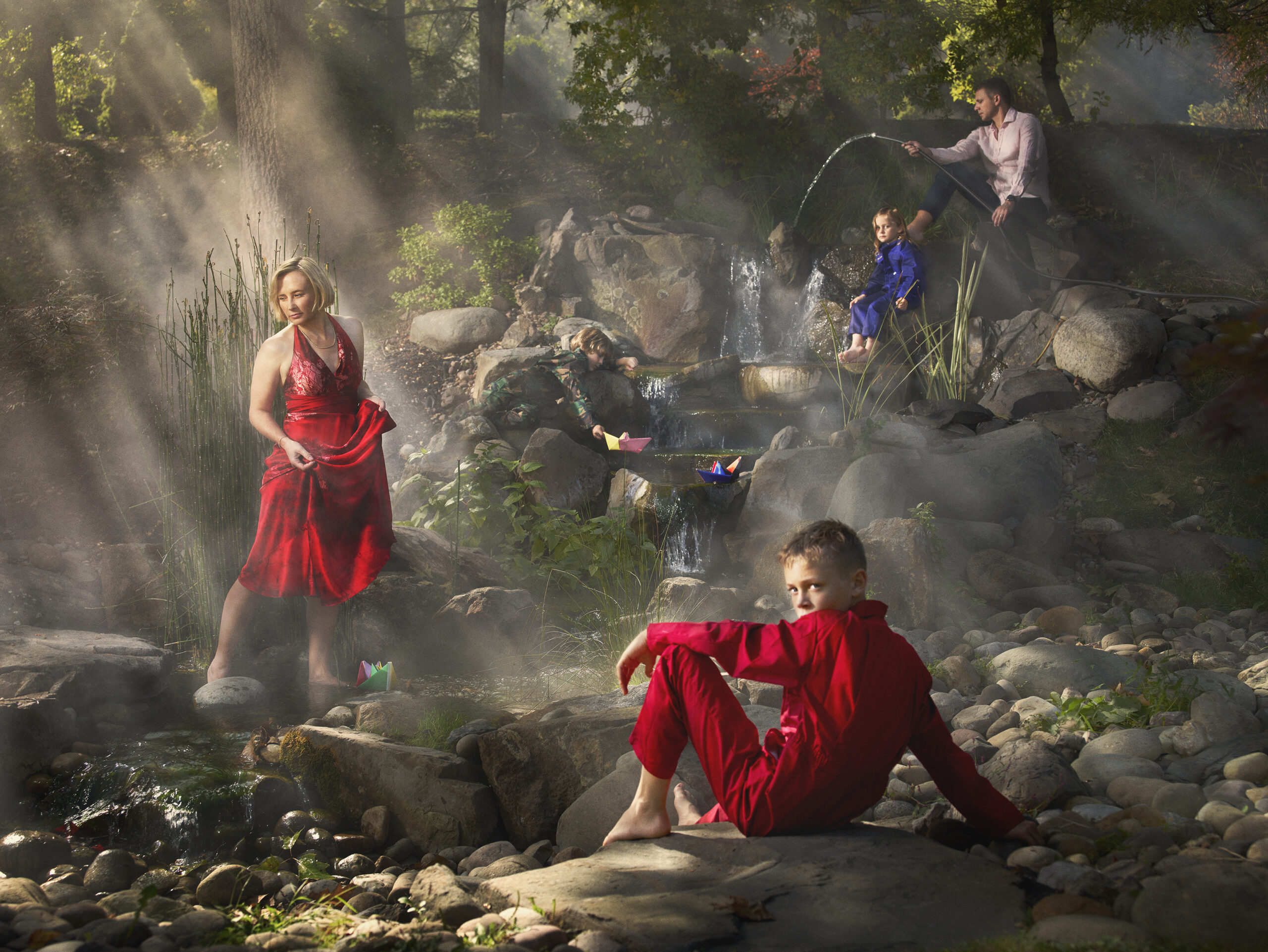
Artist Statement for HER2: The Diagnosed, The Caregiver and Their Son

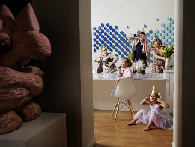
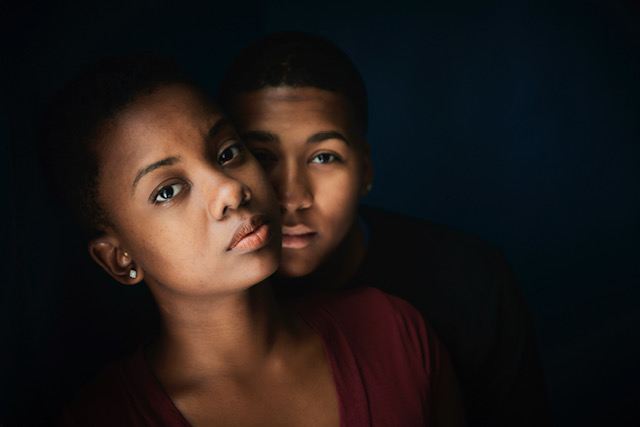
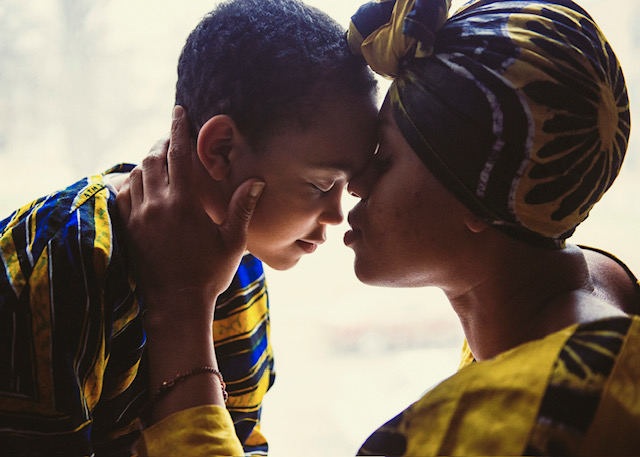
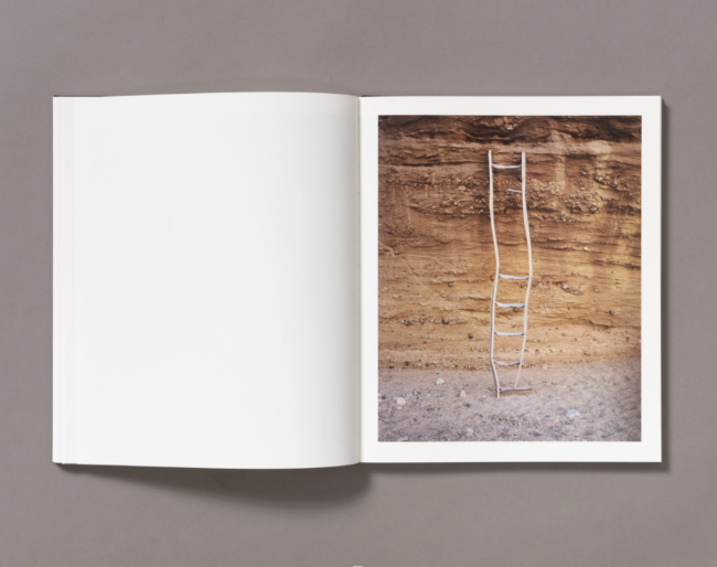
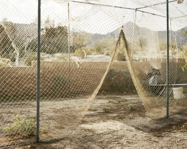
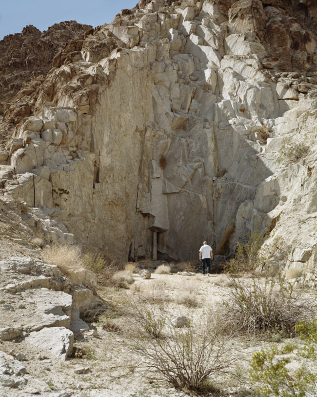
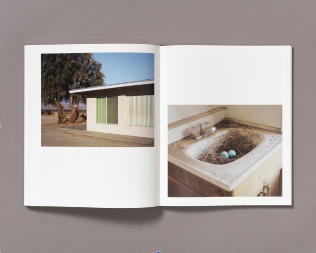
HER2: The Diagnosed, The Caregiver and Their Son, began as my attempt to regain control after being diagnosed with aggressive breast cancer at 37. When my husband Jordan and I—both photographers—couldn’t find images that captured the complexity of our experience, we turned the camera on ourselves. This became our way to process what was happening and to better understand the things we struggled to express in words. The result is HER2: The Diagnosed, The Caregiver and Their Son: a deeply personal visual chronicle of how serious illness reshaped our family’s life.

This project transcends the typical “warrior” narrative often associated with illness. It captures the raw, unfiltered reality—the fear, exhaustion, and grief, but also the love, connection, and moments of joy that sustained us. For me, the camera became a tool to process my changing body, the loss of my fertility, and the emotional upheaval, allowing me to reclaim my story on my own terms.

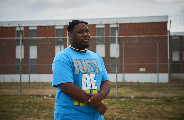
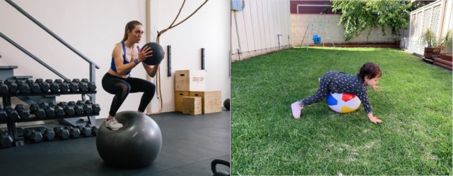
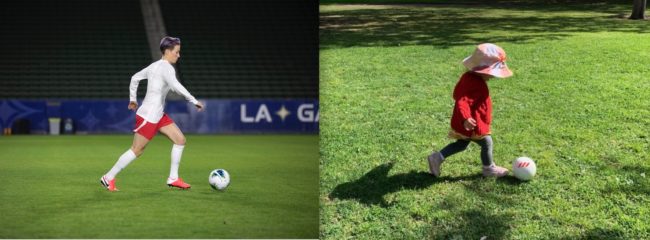
HER2: The Diagnosed, The Caregiver and Their Son also reveals how illness affected Jordan and our young son, Jesse. Jordan’s images portray the weight of caregiving while being a father, and how Jesse, in his own way, coped with the upheaval around him. This project isn’t just about cancer—it’s about the impact of illness on families, relationships, and identity.

Through HER2: The Diagnosed, The Caregiver and Their Son, and our dual photographic perspectives in conversation and collaboration with each other, we aim to show how art is a means of self-preservation, helping us navigate and make sense of profound life changes. We hope to spark deeper conversations about the emotional, physical, and financial toll of illness, offering a more honest, layered perspective on what it truly means to live through—and alongside—serious illness. By sharing our journey, we seek to foster empathy and understanding, contributing to a more inclusive dialogue about illness and its far-reaching effects, while exploring tangible solutions to support patients and caregivers.

To see more of this project, click here

Purchase the Her2 book

Instagram

APE contributor Suzanne Sease currently works as a consultant for photographers and illustrators around the world.  She has been involved in the photography and illustration advertising and in-house corporate industry for decades.  After establishing the art-buying department at The Martin Agency, then working for Kaplan-Thaler, Capital One, Best Buy and numerous smaller agencies and companies, she decided to be a consultant in 1999.  Follow her at @SuzanneSease.  Instagram

The Art of the Personal Project: Robin O’Neill

The Art of the Personal Project is a crucial element to let potential buyers see how you think creatively on your own.  I am drawn to personal projects that have an interesting vision or that show something I have never seen before.  In this thread, I’ll include a link to each personal project with the artist statement so you can see more of the project. Please note: This thread is not affiliated with any company; I’m just featuring projects that I find.  Please DO NOT send me your work.  I do not take submissions.

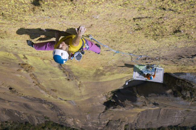
Today’s featured artist:  Robin O’Neill

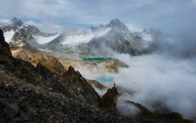
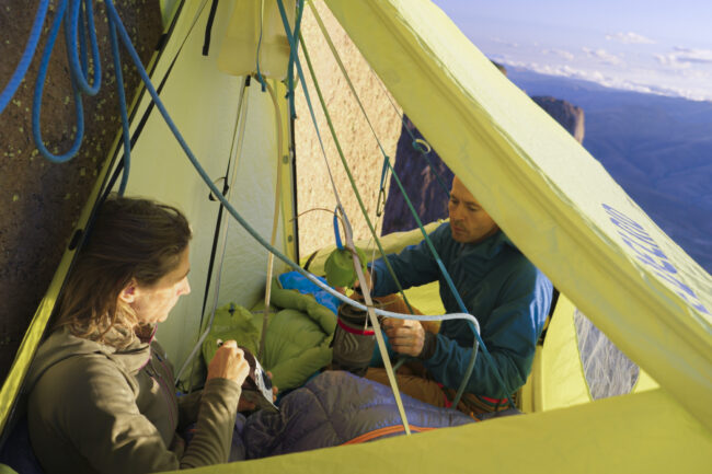
“Kevin is a friend, local alpine climber and ASMG guide. One day, he shares with me his eight-year-old’s passionate climbing pursuits. “She is too light to belay anyone and is working on problems beyond most adults.” So, he is her climbing partner. “Daddy-day care” is what he calls it, with a grin from ear to ear. He absolutely adores telling me about his time with Marion on the rock, so I think, why not ask him if I can photograph that experience? And I do.”

“I approach this project with no script other than to capture their relationship through climbing and to share that story as it unfolds organically. My camera serves as a tool that allows me to forge an intimate connection with people and landscapes that would otherwise be out of reach, giving deeper purpose to my curiosity.”

Whether commercial, editorial, or personal work, my images naturally gravitate to form a narrative. I like to create thoughtful, honest, spontaneous, and inspired images that tell a story. I love working collaboratively, and I am most fulfilled when both sides of the lens are equally happy with the images we make.

To see more of this project, click here

Instagram

APE contributor Suzanne Sease currently works as a consultant for photographers and illustrators around the world.  She has been involved in the photography and illustration advertising and in-house corporate industry for decades.  After establishing the art-buying department at The Martin Agency, then working for Kaplan-Thaler, Capital One, Best Buy and numerous smaller agencies and companies, she decided to be a consultant in 1999.  Follow her at @SuzanneSease.  Instagram

The Daily Edit – Douglas Marshall: Marshall Gallery

Artist Talk with Krista Svalbonas

Artist Consultation with photographer Michael James Hillman

Founder and Curator: Douglas Marshall
Marshall Gallery
Current Exhibition

Heidi: How long have you been doing portfolio reviews?
Douglas: Well, I’ve been doing reviews overall close to a decade now I guess. I’ve done many of the review festivals around the country as well as looking at countless portfolios in the galleries over the years. But for the last 2 or 3 years I have been doing the private portfolio reviews, meeting with artists one-on-one either online or at my Santa Monica gallery. These started in response to the ubiquity of the standard 20m-minute tabletop review format. Many people on both sides of the table relate to a form of speed dating. I found many artists felt unsatisfied, understandably, never getting to any depth in such a short meeting. So these longer private meetings allow us to go there. And that many artists had nuts and bolts questions about the gallery world which can often be murky and gate kept. Like commission percentages, production costs related to exhibitions, pricing, etc.

What form do you like to review photography work? Formed or unformed – one is open to possibilities, the other you build together as the discussion unfolds.
As far as the state of work we review… The work can be at any stage really, I just put myself in a position to help in whatever way is useful. It can sometimes be like a therapy session haha!  Sometimes the work is raw and unformed and it’s editing people want to go through and general framework development… what’s working, what’s not. Other times they are finished portfolios with which people want to discuss things like pricing, editions, printing, and gallery relationships. The former, for me, is more my background as a once-upon-a-time artist myself and the latter from my 15 years in the gallery field having worked for four galleries before starting my own. But I always try to be honest and direct with the artists. No one just wants a pat on the back, they are there for the fair criticism. There is so much BS in the art world, people appreciate honesty.

I do prefer to look at prints, when possible, but of course virtual meetings open the reviews to many more artists around the world. In person always allows for deeper connections and when artists ask about doing festival reviews, I always encourage to do in-person only. This business is all about relationships, and you can’t accomplish quite the same thing online.

Your gallery has a specific focus, was that in response to seeing beyond the medium – looking towards the hybrid of where photography and art intersect? Reframe photography?
Yes, the gallery focuses primarily on what I often refer to as process-based photography. That is to say, that for me and my curatorial focus the physical or conceptual act of how the photograph is made is of equal weight as what it visually records. So many of the artists whom I present use experimental analog processes, unique printing techniques, mixed media with painting, embroidery, etc.

The focus of which is probably three-fold in origin. My background in school and early in my career was all black and white humanist photography. Street, documentary, etc. But as I got exposed to the wider photo world primarily through visiting international art fairs, I began to see a growing prevalence of these experimental practices from contemporary artists and their origins in art history. I also have a love for the “traditional” fine arts, like painting and sculpture, so it sparked my interest to see the boundaries between them and photography blurred in contemporary work.

Sunburned GSP#1076 (Dietrich River, Arctic Circle, Alaska), 2015. two 12″x 41″ unique gelatin silver paper negatives

For the artists, my thinking is that it’s somewhat of a reaction, conscious or otherwise, to the mass consumption and ubiquity of digital images. Mass even seems an understatement with some billions of images produced daily. To see the work of an artist like say Chris McCaw, our current exhibition, who is creating real objects with his method of photography is so refreshing in a world drowning in pixels. We are just tired of staring at screens and want to get our hands dirty like painters, there is something quintessentially human about working with material while still loving the documentary / story-telling potential of the camera. And then for me, realizing there were few if any galleries focused on this intersection, I decided that my gallery would do so, but it’s always evolving.

We met when your studio was on Abbot Kinney, fast forward to today – what has changed, and how has your gallery evolved beyond showing work?
I’m not sure too much has changed. Even in the 500 sq ft shoebox in Venice where we met I was trying to produce exciting and ambitious shows. Now I just have 3x the space to do so. But certainly, Bergamot Station has a certain legacy of galleries and especially with focus on photography. So being here allowed me more access to collectors, curators and foot traffic by proximity with my gallery neighbors, many of whom I have worked with over the years.

But I am happy to say with certainty the gallery’s capabilities and awareness has grown exponentially since then, having recently exhibited in the most important international photography fairs and making regular acquisitions with major museums, both important signifiers that something we’re doing here is working.

Beyond the exhibitions, we of course host the private consulting appointments as well as quarterly critique nights that we call “Static Fire” where we invite four photo-artists to show work in progress with about two dozen guests and just have a fun night looking at work. We sell tickets for these events to cover costs and afford a small donation to various local art non-profits like Las Fotos Project and Venice Arts, both of whom are doing great work for LA youth. These have been fun and for me less pressure than the requisite salesmanship that is required for the exhibitions.

Robert Adams, House Construction, Colorado. 1975 Vintage silver gelatin print 6 x 7 1/2 in.

Rodrigo Valenzuela, New Land, 2024. Toner ink on canvas with acrylic. 36 x 48 in.

How you are defining the two sets of artists you are showing?
Well, most of my career pre-Marshall Gallery was in showing 19th and 20th Century work which has a strong market and thus many legacy galleries focus there. So, while the main exhibitions at Marshall focus on contemporary work, I really enjoy putting their work in conversation with vintage works which I source from a network of collaborative collectors in LA. For example, a recent show juxtaposed UCLA Photo Professor Rodrigo Valenzuela’s mixed-media works from his “New Land” series with vintage prints from the 1970s New Topographics movement such as Robert Adams and Henry Wessel. Both had conceptual angles of thinking about land use in the American West. It also helps to bridge the gap to contemporary work for collectors who may typically only be interested in vintage works. Many collectors are wary of the edition systems of contemporary photography, so I think it helps when works are one-of-a-kind due to the physical process of the artist.

Ultimately, I love the history of the medium and revere so many of our bygone photo-heroes, so I do love to show them when it makes sense with the contemporary show on view. But certainly, most of my energy goes to the artists working today. I keep close relationships with my artists, it’s like a sort of creative marriage.

The Art of the Personal Project: Winnie Au

The Art of the Personal Project is a crucial element to let potential buyers see how you think creatively on your own.  I am drawn to personal projects that have an interesting vision or that show something I have never seen before.  In this thread, I’ll include a link to each personal project with the artist statement so you can see more of the project. Please note: This thread is not affiliated with any company; I’m just featuring projects that I find.  Please DO NOT send me your work.  I do not take submissions.

Today’s featured artist:  Winnie Au

Seen on CNN:

It can be quite the sad sight: the family pet, recovering from surgery, having to wear that awkward cone on their neck to keep them from licking at their stitches.

They look miserable. They look silly.

But Winnie Au is hoping to flip the script with her new photo book, Shame. “In these portraits, dogs are wearing fashionable collars that they can be proud of.

“I wanted to take that post-surgery humiliation — that saddest moment for every pet — and twist it into something beautiful and majestic,” Au says in her book. “I wanted to take the shame out of the cone.”

To see more of this project, click here

To purchase her book “Cone of Shame here

Instagram


APE contributor Suzanne Sease currently works as a consultant for photographers and illustrators around the world.  She has been involved in the photography and illustration advertising and in-house corporate industry for decades.  After establishing the art-buying department at The Martin Agency, then working for Kaplan-Thaler, Capital One, Best Buy and numerous smaller agencies and companies, she decided to be a consultant in 1999.  Follow her at @SuzanneSease.  Instagram

The Art of the Personal Project: Vlad Sokhin

The Art of the Personal Project is a crucial element to let potential buyers see how you think creatively on your own.  I am drawn to personal projects that have an interesting vision or that show something I have never seen before.  In this thread, I’ll include a link to each personal project with the artist statement so you can see more of the project. Please note: This thread is not affiliated with any company; I’m just featuring projects that I find.  Please DO NOT send me your work.  I do not take submissions.

Today’s featured artist:   Vlad Sokhin   ( featured in NPR Picture Show)


Their lands are oceans apart but are linked by rising, warming seas of climate change

Editor’s note: As the 2021 U.N. Climate Change Summit convenes, NPR’s Picture Show is taking a look at work by artists and visual journalists that highlight climate change.


Charles Maynes

Vlad Sokhin’s interest in climate change came from his own global upbringing.

Born in Russia, and having spent formative years in Portugal, Sokhin made a career as a documentary photographer capturing health and human rights issues in Europe, Africa and Asia. Yet it was a 2013 assignment to cover deforestation in Papua New Guinea that convinced him to train his lens on humanity’s impact on the planet.

“I saw how the environment was changing because of illegal logging,” Sokhin tells NPR. “But the big picture wasn’t there. I thought, ‘What if I extend a little bit?'”

Eight years and thousands of miles later, the result is Warm Waters, (Schilt Publishing, 2021) an exploration of climate change traveling across 18 countries and off-the-map territories seen by seldom few.

Within his native Russia, Sokhin, 40, spends time with communities on the Kamchatka Peninsula. Across the Barents Sea, he photographs native Inupiat and Yupik settlements in Alaska. Both are confronting the same coastal erosion and melting permafrost — the once-frozen soil layer now fast disappearing throughout the Arctic region.

Mostly, Sokhin explores Oceania — the South Pacific — where rising tides have inundated communities in places like the Aleutian Islands, Micronesia, Kiribati, Vanuatu and Tuvalu. Some may recover, others may soon be lost to the sea forever. Yet Sokhin’s lens is constantly drawn to locals trying to adapt the best they can.

As a book, Warm Waters is no straightforward travel narrative. Sokhin eschews the traditional format of photos with captions and location information, and instead opts for what he calls “tonal narratives” — unexpected visual connections across cultures, countries, and, of course, bodies of water.

“You can see what’s happening there and it doesn’t matter which island it is,” says Sokhin. “This is affecting everyone.”

At its core, Warm Waters is one photographer’s attempt to show how global warming is connecting seemingly disparate lives across vast distances.

What Sokhin finds is cause for extreme worry, of course; but also, moments of resilience and wonder.

To see more of this project, click here.

Instagram 

APE contributor Suzanne Sease currently works as a consultant for photographers and illustrators around the world. She has been involved in the photography and illustration industry since the mid 80s.  After establishing the art-buying department at The Martin Agency, then working for Kaplan-Thaler, Capital One, Best Buy and numerous smaller agencies and companies, she decided to be a consultant in 1999. She has a new Twitter feed with helpful marketing information because she believes that marketing should be driven by brand and not by specialty.  Follow her at @SuzanneSeaseInstagram

Success is more than a matter of your talent. It’s also a matter of doing a better job presenting it.  And that is what I do with decades of agency and in-house experience.

The Daily Edit – Marshall McKinney: Garden & Gun


Creative Director: Marshall McKinney

Heidi: In our last interview in 2008 you had just taken the helm at Garden & Gun, a national magazine about a regional lifestyle – fast forward to 2024, tell us about this magnificent, long run as Creative Director.

Marshall: It all began in April of 2008 for me at G&G. What a run. Sixteen years! That’s like ten plus six years. That’s like 5,843.88 days according to Siri. This means I’ve lumbered through 192 weeks of closings (that’s 3.68 years of deadlines for those still doing the math). Can you believe it? Nope, neither can I. So many long days and nights sussing out and sorting through big ideas, prose, pictures and sketches to build a print brand unlike any other. Then, we were a small scrappy crew of misfits. Seriously, like eight of us. Some with no magazine experience at all. Didn’t matter. Within us burned the intangibles: heart, drive, determination, spirit, resourcefulness and f@#ing energy to burn, baby! Today, the foot is still hard on the gas and without a doubt, the brand, driven by the passions and minds of its people, is hurtling headlong into a bold new future. Unfortunately, this is where I get off. August, 2024. Adios.

T’was a thrill ride. In my professional career, I never thought I’d be so blessed as to work with the finest, sharpest minds in all of “Magazine-dom,” both internally and externally. I’ve watched interns come up through the ranks to become some of the best writers, editors, and photo editors in the business. I’ve seen editors and art directors go on to become VPs. Watched publishing prophets hail the coming of the iPad only to see it snuffed out like some ole Camel Light. To be sure, I’ve seen it all. Done it all. Er, won it all, #athankyouverymuchg&g. And, I wouldn’t change or trade a damn thing.

G&G’s success is, and always will be, directly connected to the creativity, fire and gusto that resonates in the youthful souls of the folks who bring it to life. Each person I interacted with there, young or old, was a remarkable teacher and I am grateful for the experiences shared and learned.

So, now that I’m slowly gliding into this next phase of my professional life, and can take a breath, if only for a minute, I have the luxury of hindsight. Thus, I’ve agreed to tackle a few questions from APE. An exit interview if you will. Buckle up. Here goes

What are your three favorite covers and why?
I not picking these covers on technical acumen or whiz-bang execution but rather on the “feels and vibes” and times associated with the experiences shared while nabbing them. I thrive in that space where ideas are manifested and sketched over morning coffee—together—before jumping in the car or on a plane to get them in the can. I adore all my photographers and I’m 100% sure I dig 98% of my covers. There are outliers but like red-headed children we tolerate them all the same—even when they do look a little kooky and act funny.

I only partner up on covers with people I trust.  I know them on a personal level and usually we have a deep rapport. Heck, all my lensmen are brilliant, empathic, whip-smart artists, technicians and masters at their craft. So again, I’m only picking these three covers through gauzy reflection, and like children, I don’t really have a “favorite” or three favs but here goes:

1. Dec 2019 – Jan 2020 Photographed by Gately Ben Williams

Keep it stripped down when you can.
This cover shoot was quite simply a fun trip with one of my best friends, Gately Ben Williams and his new, lovely and talented bride (and one-time co-worker of mine), Hunter. The idea was to take a road trip down to the Santa Fe river in Florida and get something that felt warm for a winter issue.

My mind, where covers are concerned, always leans toward the graphic and composed. If that happens to come off “arty” occasionally, well, so be it. My intention is not to be “arty” which I associate with fey, contrite or, worse yet, cute. Finally, my experience with newsstand covers is simple: don’t fuck around trying to be something you’re not. Be definitive. Be uniquely yourself and true to brand. Always and in all ways.

I want my G&G covers to be two things: direct and filled with as much subtext as possible. Meaning, the image has to hit on the reader’s senses (taste, smell, sound, etc). Get them to feel the coolness of the water for example or stop for a moment to reflect on the sounds they might have heard the last time they went tubing. I want to trigger a memory of, say, spending time with their spouse in their younger years at some watering hole of their own. Maybe it gets them to reflect on their own daughters growing up? The point is, subtext to me is leveraging the power of the form.

We are busy people living busy lives. As a creative director a big part of my job is to choreograph moments that give pause in the service of sparking fantasy or aspirations. So, back to Florida. After a long day of trying a number of ideas, which rendered shots that were great but perhaps too sexy or pinup-ish, at dusk I went back to the original sketch, the first big idea. You don’t ever have the luxury of time on a cover shoot. Making the manufactured feel authentic is an art unto itself. In order to pull that off, I highly recommend sketching out your ideas long beforehand.

On this day there were a bunch of kids in the springs splashing and playing along a dock, not the best situation for what I wanted the image to communicate, solitude and stillness. But, as the day waned, they slowly—mercifully—left the area. That’s when Ben and I were able to move to the end of the dock and shoot down on Hunter.

I love this image for a lot of reasons. One, Ben and Hunter gave me so much of their energy throughout the day. They gave me so many variations that could be used in the interior of the magazine, and that’s something I value. Two, everything we do as creatives, at its best, is a partnership predicated on balance and trust. I trusted Ben to give me a number of stellar solutions and, in turn, he trusted me and gave his all to my sketched idea. Three, the image is graphic. It plays with repetition of form. It’s tranquil and calm which lends to the narrative I wanted to achieve. The water is clear. The image has essence and to my eye it’s a catalyst for subtextual think. That being: I could use some stillness. I could use a vacation in warm waters. I’d love to be somewhere fun with my wife and daughter. Finally, this image reminds me of all the cocktails and conversation that flowed with these two lovebirds after we wrapped the shoot. Truly, it was a wonderful couple days work all around.

I’ve taken on many a cover mission like this with shooters including: Rob (and Lisa) Howard, Michael Turek, Brie Williams, David McClister, Robby Klein and others. All mega talented, affable, easy spirits that are a joy to behold and work alongside especially when it’s a stripped down scenario like this and not some big ass production.

2. Feb/March 2019

Throw the kitchen sink at it whenever you gotta and just build the damn thing.
What you see here is a bar we built in The Voorhes studio by some of the most baller, open, gracious, energetic and creative people in the business. Adam and wife Robin, assisted by the incomparable, Nicki Longoria took a sketch I made and ran with it a hundred times farther than I could have ever hoped. We had a custom neon sign made. We had working beer taps. We had a stuffed squirrel drunk on Miller Lite. This was devised at a time in publishing when covers needed that extra wink in order move the needle on digital newsstands—talking to you Apple. So of course I wanted everything to be analog and made of hand whenever and wherever possible.

Could we have shot this in some cool bar somewhere? Mmmmm, maybe? With that comes a whole host of other problems which I won’t go into now. Trust me, they are many. This to me felt like the only solution and it all started with a sign maker and the energy and can-do spirit Adam and team brought to solving the conundrum.

I’m not sure what’s in the water down there in Texas but if you head that way knock on The Voorhees or Darren Braun or Fredrick Broden’s door. No telling what you might find going on behind it.


3. Dec 2008 / Jan 2009.

This cover by Andy Anderson was a revelatory moment for me. Affably nicknamed, “Turtle Junk,” after the New York Times wrote a review—a positive one!—of our brand, it was the impetus that got my head screwed on tight as to how best to feature and approach subjects on G&G’s coves. It’s so singular and unique. It’s composed. It’s direct. It’s awash in story, cultural richness and wonder. It’s simple and in that way it’s elegant and timeless. Mostly though, it wasn’t until I put eyes on the image that I knew how we were going to visually stand apart.

Up until that moment G&G was kind of wobbly, like a newborn giraffe, the way a lot of new launches are in the beginning. It took seeing that image for me to begin to understand what the brand was telling me it wanted to be. For better or worse I’m not one to immediately suggest what I think any brand should be. I have instincts but I ain’t no Mussolini. I like to listen to the market and the material, then I like to react to what I think they’re suggesting to me. I can’t stand it when people march in on their high-horse talking so much shit about what they think this or that is. I’d rather saunter in on a turtle’s back—that way they never see you coming—and build something beautiful and solidly stable, together.

Further, where covers are concerned, were it not for the talents and eye of photographers Peter Frank Edwards, Squire Fox, David McClister, Andrew Kornylack, Johnny Autry, Brie Williams, Brent Humphreys, Amy Dickerson, Jim Herrington and Dan Winters G&G wouldn’t be here today. Truly, it’s all about the company you keep and they are the finest.


Do you have a favorite spread?
That’s impossible for me to answer. Not because I like so many but rather I have so few. Still, I’ll give you one I like a lot. It’s pretty simple but I just dig it.

Here’s the backstory: We asked Dan Winters to shoot musician, James McMurtry for us down in Texas. I spoke with Dan on the phone about how much I liked James’ music and about what he meant to me as a blue-collar genre-bender out there pounding stages night after night after night. I told him I felt a kinship with him. Perhaps Dan felt the same way because almost an hour had passed and we still hadn’t spoken about the shoot. Of course that didn’t matter to me because, well, Dan’s the man as they say. And I tend to agree.

Couple weeks later the images arrive in classic Winter’s style. Stoic. Iconic. Proud. Singular. Then, it occurred to me, oh shit, I gotta figure out what the fuck to do for the design. It was late in the cycle. I needed to turn this one around fast. Yet, I couldn’t. I felt helpless. I just wasn’t locking in on something worthy or original. It was torture.

I’m thinking to myself, this guy Winters is best buddies with all the great art directors and editors across the land. What the hell can I do that he’s never seen before? Am I even capable of hitting a high-taste level that honors a hardworking man like, James McMurtry? Oh, shit.

After an excruciating battle with self-doubt and worry, while sipping a couple of bourbons, it’s 1 a.m. and I’m still sitting at my desk in the office twiddling my thumbs. Part of the problem might have rested with the edit team. Maybe they were feeling the same way about the headline as I did about the design? They didn’t seem to have much cooking yet or, maybe they did and it just felt flat? Dunno, can’t remember. The one recollection I do have was that I put on McMurtry’s version of a tune called, Choctaw Bingo. I cranked that motherfucker up as loud as my i-mac would go and I stood up and danced. Right there in the middle of my office, which I shared with Maggie Kennedy, my photo editor, I shook my ass. Then, thoroughly awash in spirit, I cranked out a giant “J” with a guitar’s sound hole in the middle along with some filigree that felt a bit like McMurtry’s hair blowing in the breeze. With that I yee-hawed and went home to bed.

The next day I showed it to Sid Evans, my editor at the time, thinking he’d blow it apart because there was no definitive headline. Instead, he looked at it and nodded. Print it. We did. Not that we had a lot of other options because we were out of time and my hangover was setting in pretty good.

What would you tell anyone getting into the magazine business today?
To would be publishers:The sweet spot is somewhere between a mass newsstand magazine and a coffee table book. Do something deliberate and focused and beautiful. Do it on the best stock you can afford, no more than four times a year. Believe in your dream. Never give up. Don’t let obstacles stop you. Then, I’d advise them to buy a lottery ticket every couple weeks.

To journalists and editors: Tell the truth. Your currency and value is in your candor. Be your authentic self and find your own voice. Also, learn to think like an art director.

To photographers whom I fucking adore!: My best advice is to study a few masters, really lock in on them. Learn how to compose images that are graphic and expressive. Play. Write. Sketch. Work to become a natural born salesman, philosopher, psychologist and light-hound. Become proficient in the language of the trade. And, when you sense a trust building with an art director or fellow creative lean in and partner up. It’s amazing how far you can go, together. Lastly, pay close attention to all the others on the periphery of your craft. Explore the subtleties of make-up, watch what the stylists are doing and why, educate yourself on food propping and styling and acquire skill in interiors, exteriors, portraiture, reportage and more. Give yourself a wide base of knowledge then slowly tighten the focus on what you find the most interesting. NEVER STOP. NEVER GIVE UP.

What would you tell your younger self?
To my younger self I’d just say this: Stay resilient, hombre. Trust the process. Stay true to yourself and to those who are offering you their hard-earned knowledge. Make those folks an ally. While acumen can get you to the doorstep it’s experienceresolve and connection that’s going to define you and carry you across the threshold. Hold on tight Bubba! It’s gonna be a weird and bumpy ride.

The Art of the Personal Project: Stephen Wilkes

The Art of the Personal Project is a crucial element to let potential buyers see how you think creatively on your own.  I am drawn to personal projects that have an interesting vision or that show something I have never seen before.  In this thread, I’ll include a link to each personal project with the artist statement so you can see more of the project. Please note: This thread is not affiliated with any company; I’m just featuring projects that I find.  Please DO NOT send me your work.  I do not take submissions.


Today’s featured artist:  Stephen Wilkes

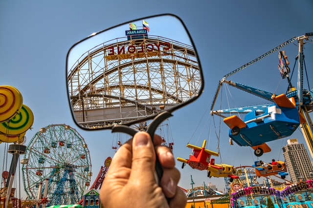
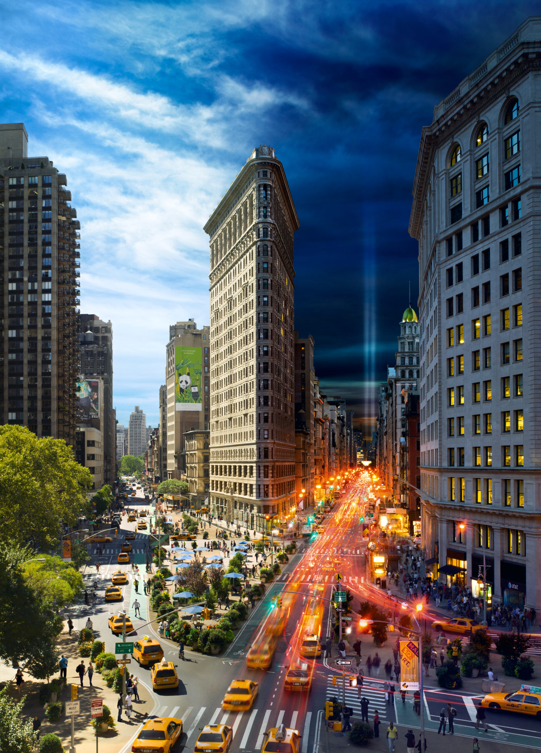
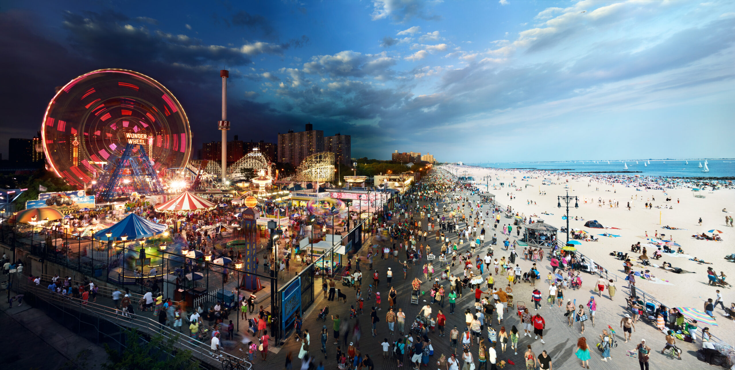
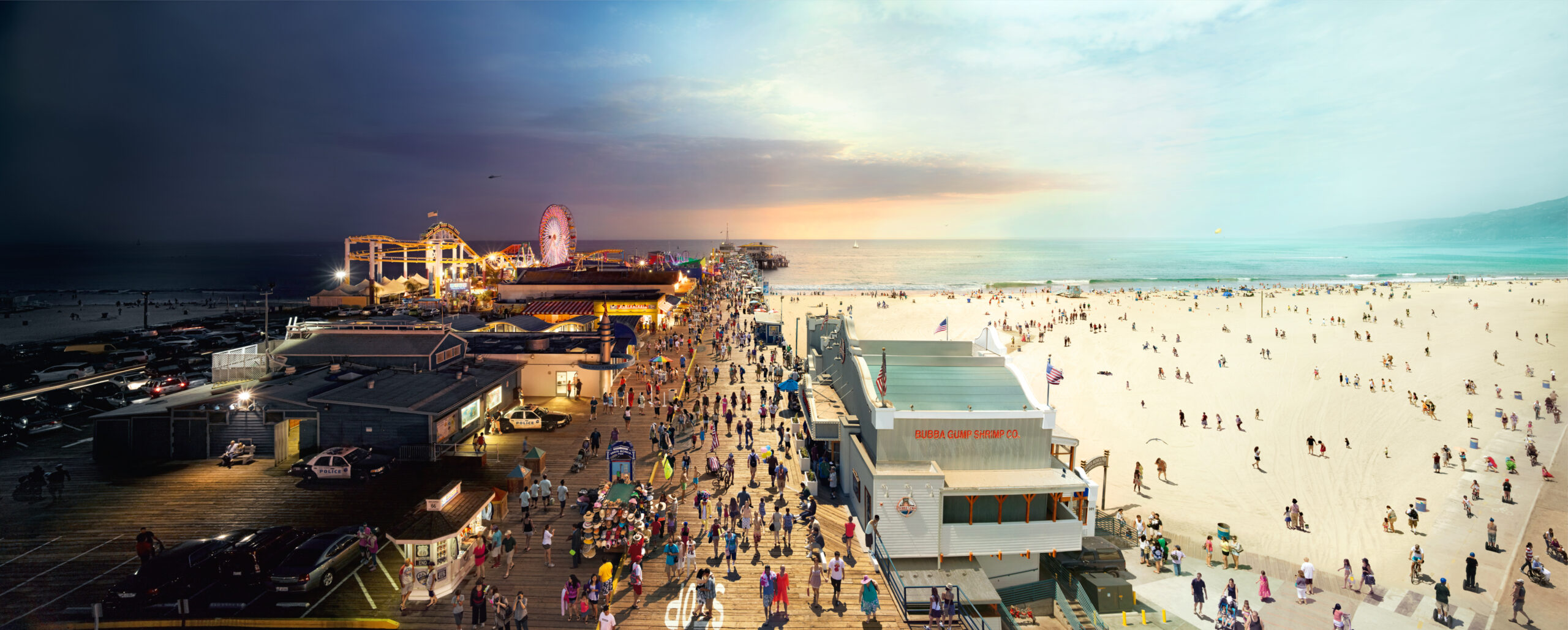
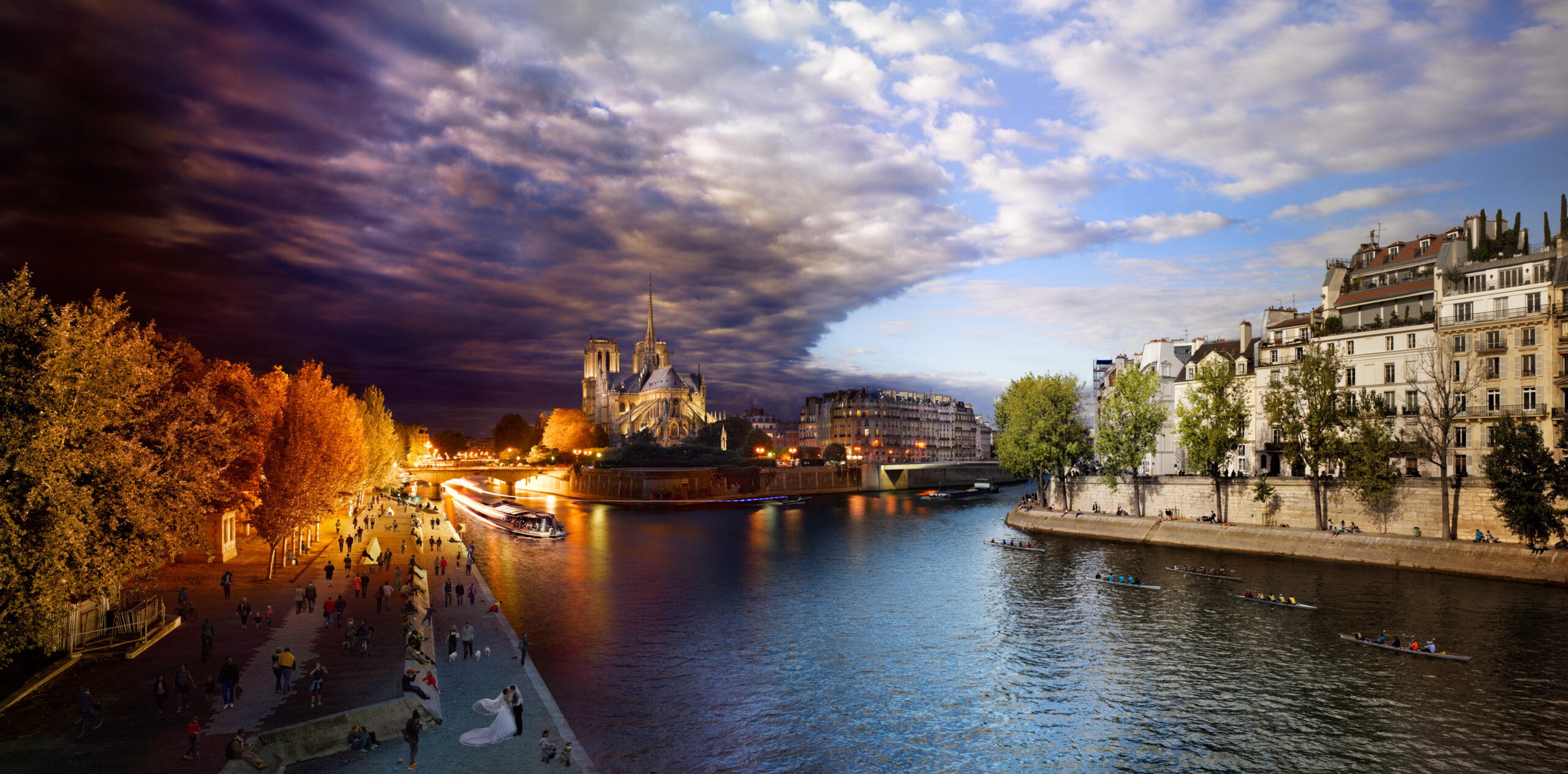
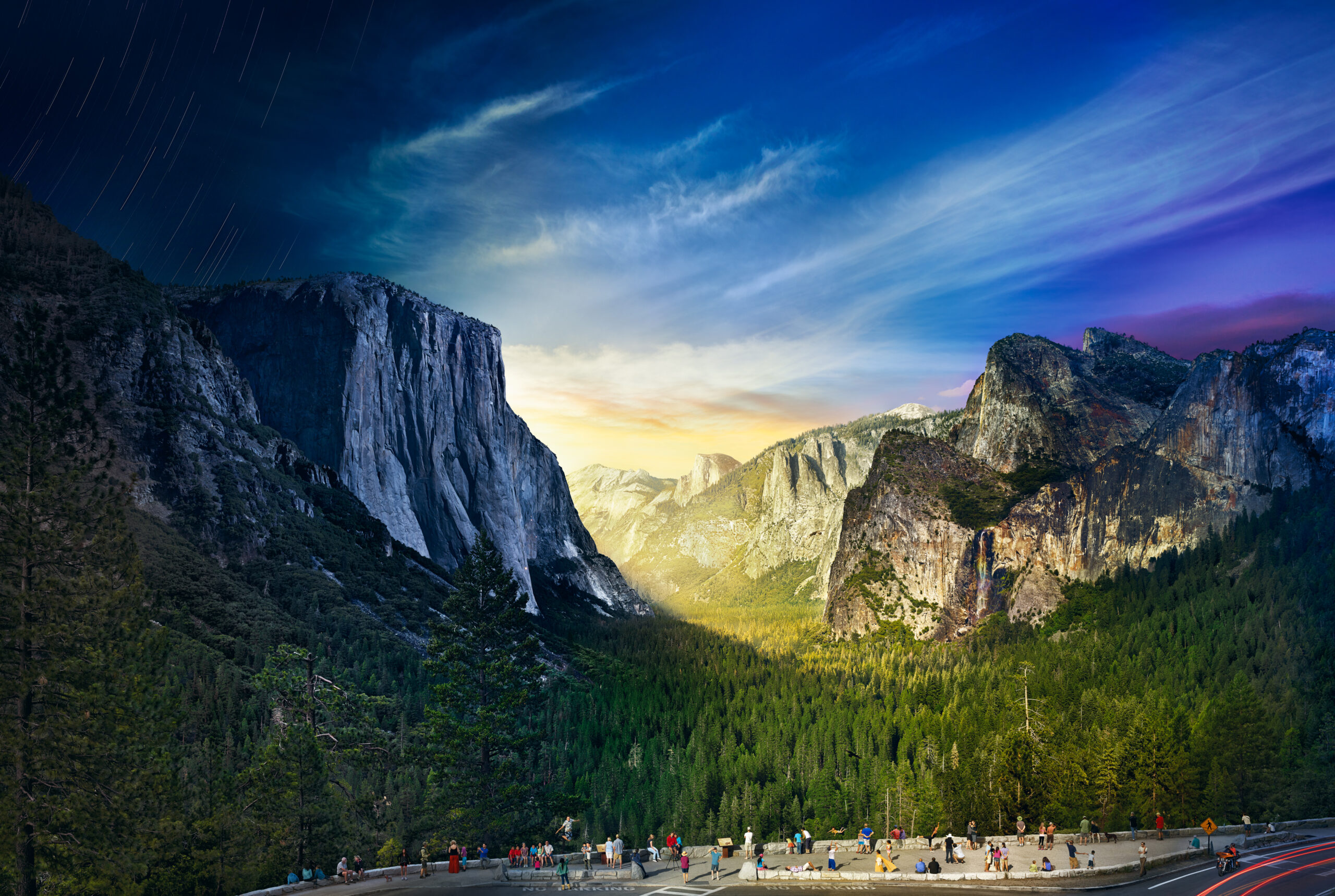
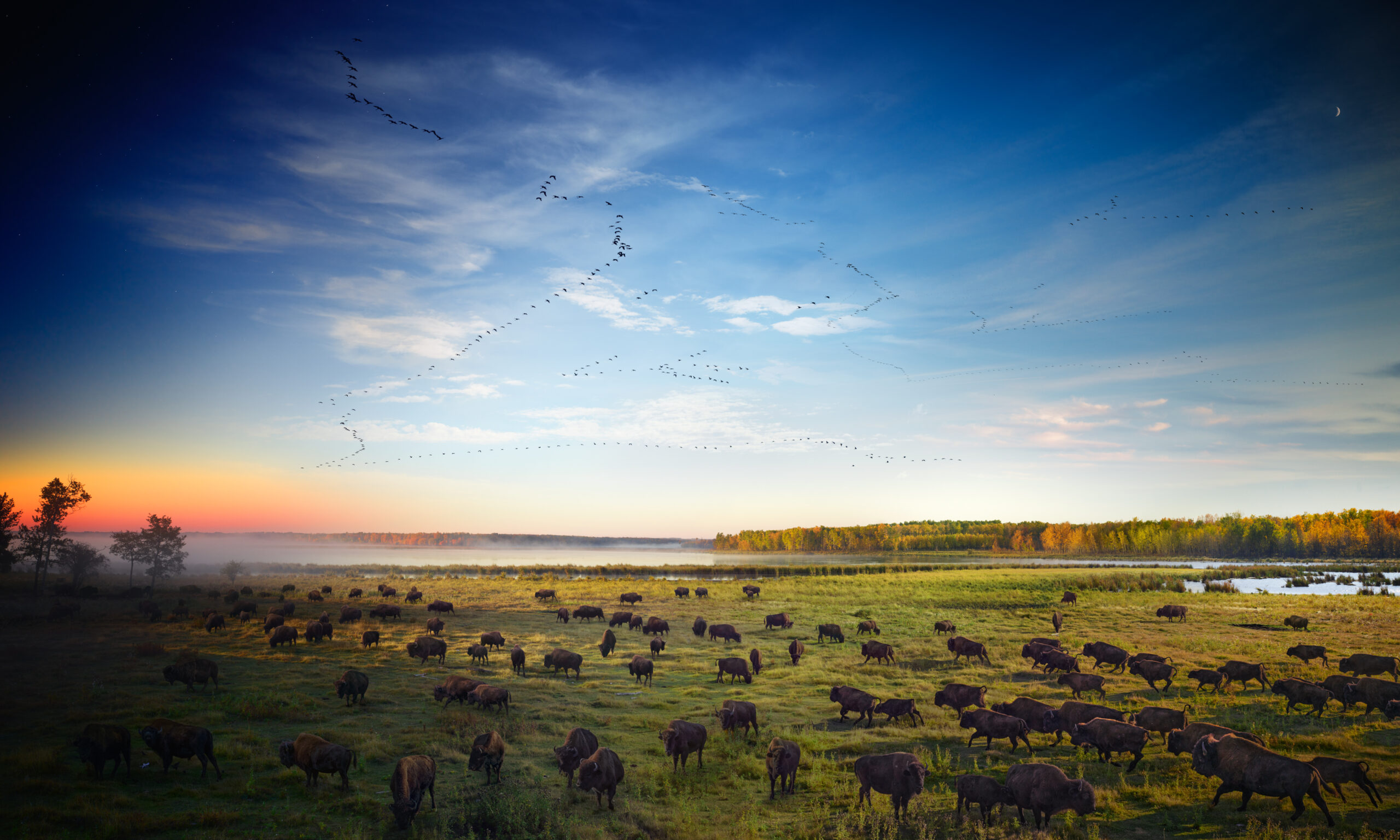
Coney Island, Day to Night™, 2011

Coney Island in Brooklyn, NY is home to one of the most iconic boardwalks and amusement parks in the United States. I photographed from a crane 40 ft. above the boardwalk, for 18 hours. It was a beautiful summer day in July, and the beach was filled with people. My favorite part of creating this photograph was simply the people-watching. Coney Island has an incredible mix of people; and as a street photographer, floating above that boardwalk is the best seat in the house.

“To me, every hour of the day and night is an unspeakably perfect miracle”.

-Walt Whitman

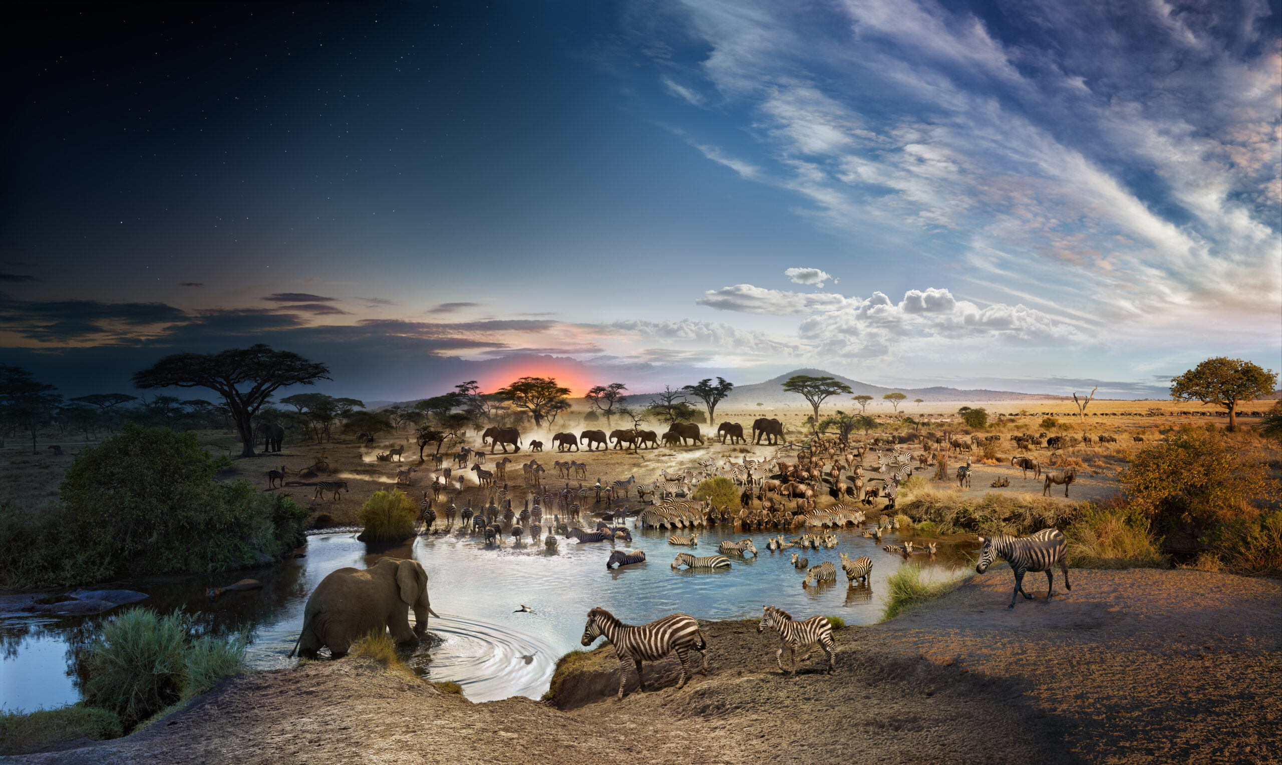
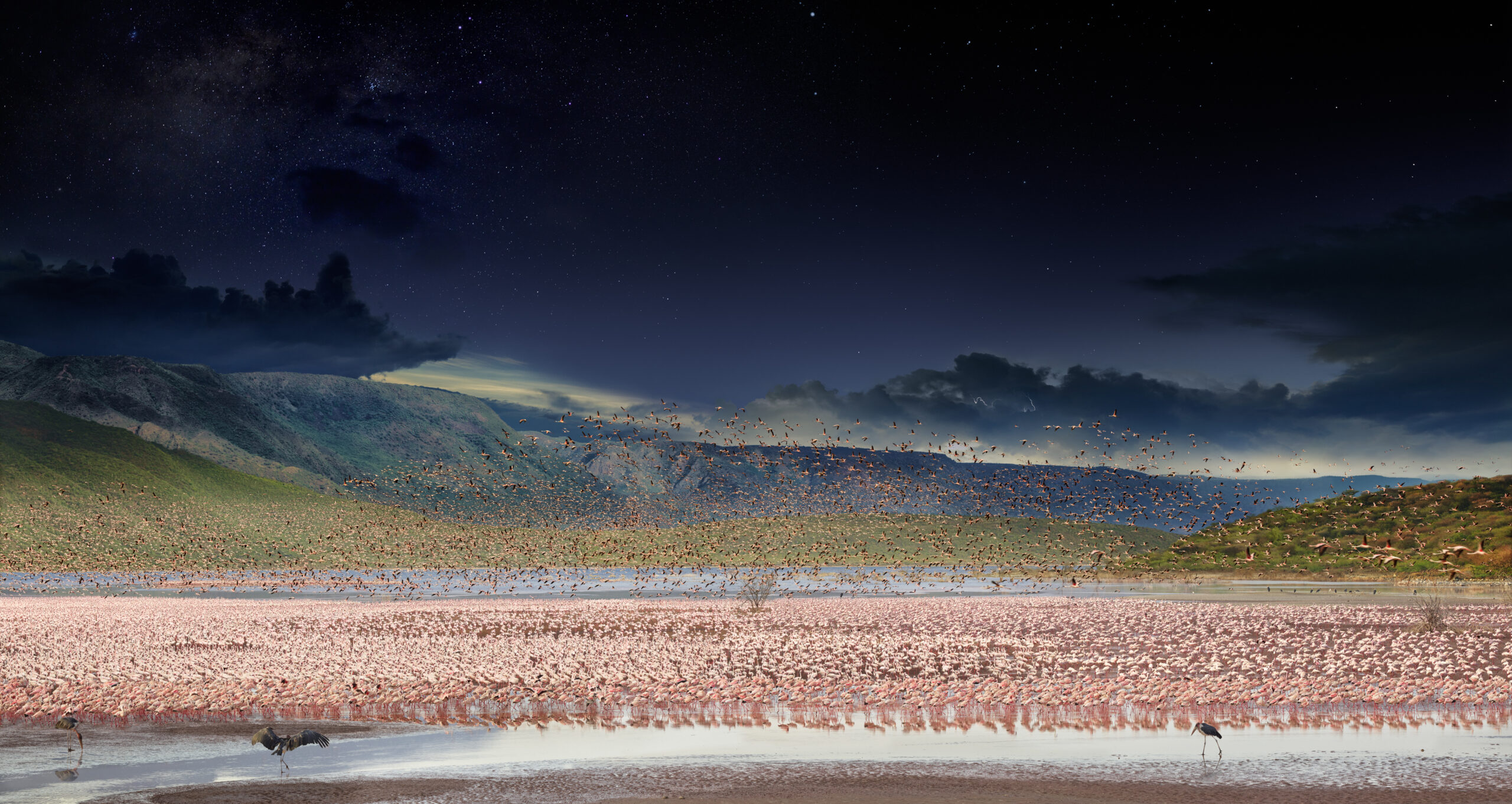
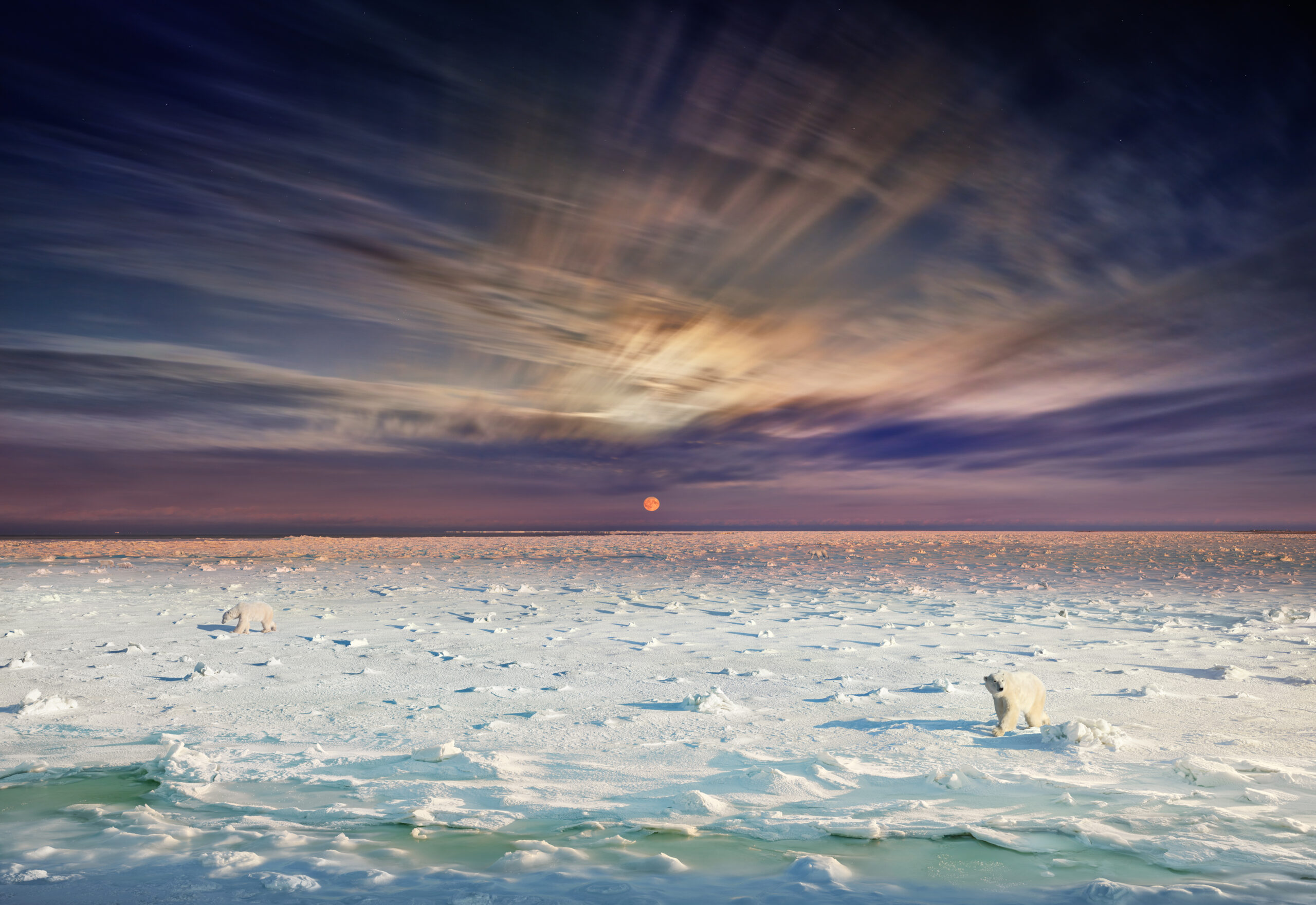
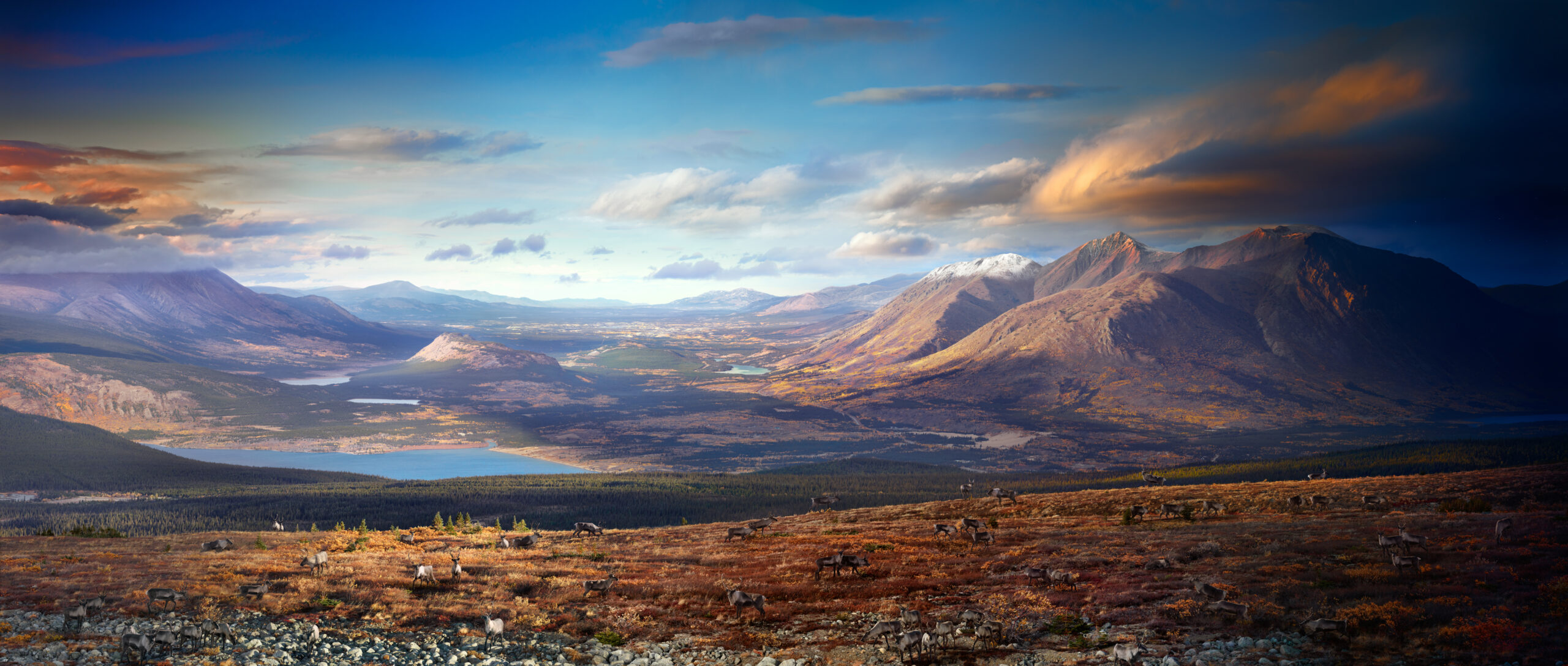
Day to Night is a 14 year personal journey to capture fundamental elements of our world through the hourglass of a single day. It is a synthesis of art and science, an exploration of time, memory, and history through the 24- hour rhythms of our daily lives.

I photograph from locations and views that are part of our collective memory. Working from a fixed camera angle, I capture the fleeting moments of humanity and light as time passes. After photographing as many as 1500 single images, I select the best moments of the day and night. Using time as my guide, all of these moments are then seamlessly blended into a single photograph – a visualization of our conscious journey with time.

In a world where humanity has become obsessively connected to personal devices, the ability to look profoundly and contemplatively is becoming an endangered human experience. Photographing a single place for up to 36 hours becomes a meditation. It has informed me in a unique way, inspiring deep insights into life’s narrative, and the fragile interaction of humanity within our natural and constructed world.

-Stephen Wilkes


To see more of this on going project, click here

Instagram

APE contributor Suzanne Sease currently works as a consultant for photographers and illustrators around the world.  She has been involved in the photography and illustration advertising and in-house corporate industry for decades.  After establishing the art-buying department at The Martin Agency, then working for Kaplan-Thaler, Capital One, Best Buy and numerous smaller agencies and companies, she decided to be a consultant in 1999.  Follow her at @SuzanneSease.  Instagram

The Art of the Personal Project: Josh Huskin

The Art of the Personal Project is a crucial element to let potential buyers see how you think creatively on your own.  I am drawn to personal projects that have an interesting vision or that show something I have never seen before.  In this thread, I’ll include a link to each personal project with the artist statement so you can see more of the project. Please note: This thread is not affiliated with any company; I’m just featuring projects that I find.  Please DO NOT send me your work.  I do not take submissions.


Today’s featured artist:  Josh Huskin

Dear Finley,

I created Dad Jokes in preparation for becoming your Dad. For 9 months I invited friends and       strangers alike to sit while I told them my best Dad Jokes while capturing their reactions.                                        My purpose is to juxtapose  “just got your nose’ against the gravitas of fatherhood. I now feel fully prepared to embarrass you in front of your friends, and collect many sighs and eyerolls

Love,

Dad

To see more of this project, click here

Instagram

APE contributor Suzanne Sease currently works as a consultant for photographers and illustrators around the world.  She has been involved in the photography and illustration advertising and in-house corporate industry for decades.  After establishing the art-buying department at The Martin Agency, then working for Kaplan-Thaler, Capital One, Best Buy and numerous smaller agencies and companies, she decided to be a consultant in 1999.  Follow her at @SuzanneSease.  Instagram

The Art of the Personal Project: Lars Schneider

The Art of the Personal Project is a crucial element to let potential buyers see how you think creatively on your own.  I am drawn to personal projects that have an interesting vision or that show something I have never seen before.  In this thread, I’ll include a link to each personal project with the artist statement so you can see more of the project. Please note: This thread is not affiliated with any company; I’m just featuring projects that I find.  Please DO NOT send me your work.  I do not take submissions.


Today’s featured artist:  Lars Schneider

So, the Happy Campers project … It really is a very personal project as I started it purely for fun, for documentation purposes and a to get a look into the world of other campers and their vehicles and ideas and thoughts about camping and a life on the road. It was in 2012 that I spent two months living and traveling out of a 1971 VW van with my wife Katrin and our just 8 months old son in the US Southwest (they are included in the series too ;-)) and whenever we pulled up to a campground, we looked around for interesting vehicles and people. In the evenings or mornings, I grabbed my Hasselblad H4D-50, and we took a casual walk as a family around the campsite. With our old van in the back and a baby on the arm it never was hard to start a conversation, and, in the end, I often took a few portraits of the owners and their rides. I naturally felt most drawn to other vintage motorhomes and the supersize ones that were just the opposite of how we were travelling.

To see more of this project, click here

Instagram

APE contributor Suzanne Sease currently works as a consultant for photographers and illustrators around the world.  She has been involved in the photography and illustration advertising and in-house corporate industry for decades.  After establishing the art-buying department at The Martin Agency, then working for Kaplan-Thaler, Capital One, Best Buy and numerous smaller agencies and companies, she decided to be a consultant in 1999.  Follow her at @SuzanneSease.  Instagram

Pricing & Negotiating: Brand Narrative And Interiors Photography For A Medical Client
By Bryan Sheffield, Wonderful Machine

Each month, we pick one of our recent estimates to write about in a Pricing & Negotiating article. Redacting the names of the photographer and client allows us to share valuable and educational information that would otherwise be confidential.

Concept: Architecture/Interiors and Brand Narrative content of an upscale medical center’s treatment facility in an affluent area of a major U.S. city

Licensing: Perpetual, Unlimited Use (excluding Broadcast) of up to 35 images

Photographer/Director: Architecture and Interiors specialist

Agency: High-end Public Relations Agency

Client: Medical Center

Summary

I recently helped a photographer build an estimate for a client seeking brand narrative and architecture/interiors photography of their upscale medical center and specialized treatment facility.

The client brief described atmospheric interiors, and stylized content of the location for use in the brand’s marketing and advertising efforts. The shot list consisted of 35 images created through eight unique set-ups within the location. The final use of the photography was described as client web and social placements, as well as advertising within trade and select consumer publications. We called this Unlimited use (excluding Broadcast).

The client wanted to handle all the location coordination, location styling, employee/staff talent and talent coordination, wardrobe/hair/makeup styling, crew meals and crafty. Therefore, we included a Client Provisionssection within the Job Description to note who would be handling these items.

Here is the estimate:

Fees

The client had a prescribed shot list of what they wanted to capture. And so, based on the client, our budget range conversations with the PR agency, and the intended content use, I advised a Creative/Licensing fee of $12,000 for up to 35 images. This equated to $2,500/day for the shoot and an additional $9,500 ($271/image) licensing fee. The photographer was happy with the suggested fee and we were both under the assumption that only a handful of images would be used within any paid placements. It should be noted that this fee was significantly higher than other Architecture/Interiors projects the photographer had worked on (albeit those licenses were mostly only for Collateral and Publicity use), and the photographer was initially apprehensive about the fees total, based on the rates of their competition.

Our estimate included a line stating the cost of additional images to be $1,250/each (including up to one hour of retouching). This additional image fee was purposely created to be significantly higher than the other images. I also added $750 for the photographer to scout the location in advance of the shoot.

Crew

We added a First Assistant at $600/day for both the tech scout and shoot day. Then we added a Second Assistant on the shoot day for an additional hand with lighting and camera equipment management to help to expedite the day. In addition, we included a Digital Tech at $750/day. These fees were consistent with previous rates the photographer had paid their crew on past productions in this city.

Equipment

We included $1,400 for cameras, lighting, and grip rentals. This would all go to the photographer as they anticipated bringing their own cameras, lenses, and basic lighting kit. Another $650/day was then added for the digital workstation rental. Finally, we also included a line for hard drives at $0 to be included with the production. We have found it always helpful to note items to be included, even if $0, to let the client know the photographer is considering all needs, and in this case the need to back up the images on site.

Misc

For insurance, we included $450, and we added $325 to cover taxis, additional meals, and any unforeseen expenses.

Post-Production

The photographer would perform a First Edit for Client Review and deliver roughs to the client for $500. We also included a retouching fee for the 35 images at $100/hr. The photographer would be doing the retouching themselves, and this hourly rate is consistent with their previous projects.

Results

The photographer was awarded the project. The client loved the work and returned about a month later to license an additional image at $1,250. The final images are gorgeous, and are currently in use on both the client’s web/social pages and the photographer’s portfolio!

Follow our Consultants @wonderful_at_work.

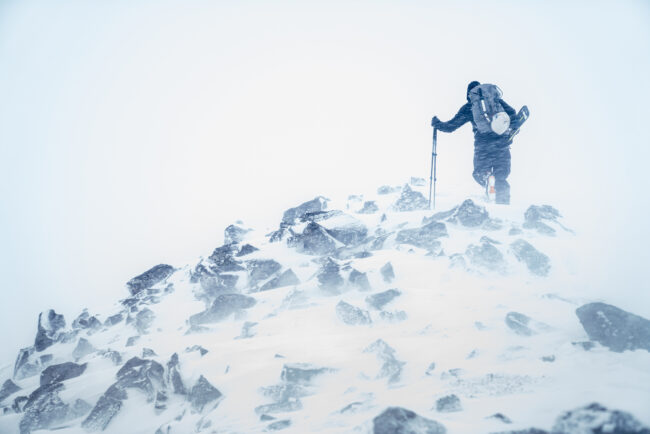
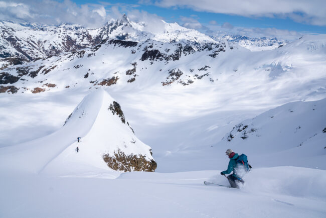
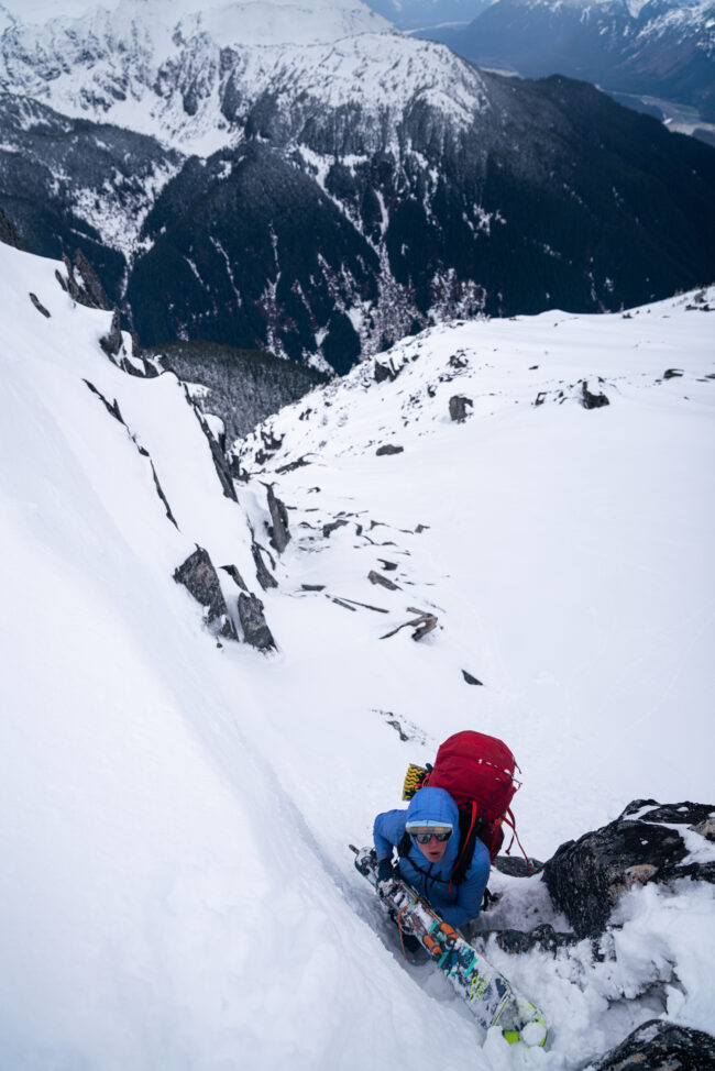
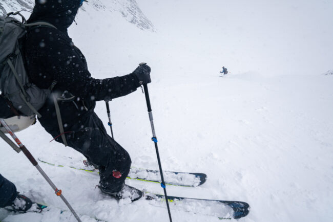
The Daily Edit – Tyler Lekki


Photographer: Tyler Lekki

Heidi: How long have you been living in Chaltén?
Tyler: I have been on and off for around 5 years now. It all started with a three-day trip, and then the following year, I returned for the entire three-month climbing season. Each year, I returned for the season February – April, and finally, two years ago, I pulled the trigger on moving here full-time. It’s been around 1.5 years straight and over 2.5 years cumulative. I just can’t get enough of this place.

Do you study local flora and fauna to see the changes year after year?
Yes, I have spent 5 fall seasons here in Chaltén over the years, and it’s fascinating to see the difference in when the leaves on the Lenga and Ñire trees begin to change to their fall colors. On my first trip, we didn’t even plan for the fall foliage back in 2018, but we were here during the perfect week—it was April 4th, and the colors were at their peak. It’s interesting that I’ve seen the colors last until late April and even into early May, depending on the season. It really does vary from year to year.

How did you integrate with the community?

It took a few seasons to really get involved with the locals. Coming here only for the Autumn photo season, and good weather, it was tough to meet people because I was always out in the mountains hiking and shooting. It wasn’t until I really moved here and spent the winter season that I felt my experience changed. Getting involved with the local Asado cookouts and getting to know the climbing and ski community, who go to the mountains every chance they get, was really special during my first winter season. It’s a small community, and everyone knows each other. I love that everyone helps each other and is always there to lend a piece of gear or help with beta when needed. The climbing community has welcomed me with open arms, and while I’m still getting more experience, I feel at home among them. We all share the same love for these peaks, and being present and lending a hand when needed goes a long way in this place.

How has your love of nature informed your eye, and when did 360-degree photography enter your kit?
When I first started, it was all about the adventure, and my love for nature grew deeper as time went on. The idea of hiking into a place like Los Glaciares National Park with everything you need to survive for a week, all to capture dramatic photos, is what truly excites me. There’s an element of unpredictability—you never really know what’s going to happen. Chasing the right weather conditions has made me appreciate this place even more. Through a lot of trial and error, I’ve learned what to look for when capturing images here.

One day, while flying my drone, I realized that a 180-degree panorama just wasn’t wide enough to capture the full scope of the landscape, so I decided to try a 360-degree shot. I had no idea at the time that this would become my obsession over the next two years.

Still images offer a moment and leave the rest up to the viewer—360-degree photography is immersive and allows anyone to travel. What were you trying to convey with this work?
When I first started taking 360 images, I didn’t initially think about how impactful they would be when viewed through a VR headset. But the first time I experienced it, I realized the incredible potential it had. You’re not just looking at a photograph—you’re transported into the scene, feeling like you’re truly there. The ability to bring people to these remote places especially those who might never have the chance to visit in person, is something really special.

While sharing photography has always been rewarding, seeing someone’s reaction when they put on the headset and are fully immersed in the landscape is on another level. It’s deeply gratifying and makes all the effort worthwhile. Beyond the immediate experience, I believe these 360 shots will serve as valuable references for years to come, particularly in glaciology and environmental research. They document the glaciers and landscapes in a way that traditional photos can’t, showing the impact of climate change on these mountains over time. This work is not just about capturing beauty—it’s about creating an immersive, educational experience that can inspire a deeper connection to nature and greater awareness of our environmental challenges.

Was this a straightforward response to the shift towards moving content these days?
After years of doing traditional landscape photography, diving into 360-degree photography felt like a breath of fresh air—something new and exciting to offer. The response has been overwhelmingly positive; people really seem to love the immersive experience it provides.

Once I captured those first few 360 images, I became obsessed with the possibilities and started building an archive of them from all over the Chalten Massif. This technology not only allows people to explore these remote landscapes as if they’re actually there, but it also opens up these incredible places to a much wider audience. The accessibility of these images is what drives my passion for this project—they make it possible for anyone, regardless of where they are, to experience the beauty and majesty of these mountains.

I’d love to hear the backstory about your first climb…

I have been doing novice mountaineering trips for a few years now, slowly learning the skill set. This past May, a good friend, Kiff Alcocer—a fellow North American and experienced climber/mountaineer who also lives here full-time—took me up Cerro Doblado. This was my first time on an ice mushroom. It was a three-day adventure, and we reached the summit with a view over the Patagonia Ice Field that stretches for hundreds of miles. I’m fortunate to have friends who take me to the mountains and to places I wouldn’t yet be able to visit on my own.

Chaltén draws the best alpinists in the world. Tell us about your first experience with friends on the mountain.
It all comes down to the experiences and the people you meet here. I’ve now gotten to know many of the world’s best alpinists who come and go each year, and I’ve realized that they’re all here for the same thing: the love of these unique peaks. Chaltén is a special place, and there’s really nothing like it in the world. My first experience in Chaltén was a three-day trip with a bunch of new backpacking gear in 2018. A friend and I didn’t even know how to set up the tent, but that short trip was all I needed to spark my return. We saw peak fall foliage and even a puma on that first trip, making it very memorable. I didn’t grow up with an outdoor background, so there is alot to learn, especially living here.


How has living in Chaltén pushed you both as a photographer and a newer alpinist?
Chaltén has absolutely pushed me as a photographer. Every spot here has its challenges, and there’s so much to do around here. All of the approaches are long, and with all the gear, there’s been a lot of learning. Plus, Patagonia—and especially this area, Los Glaciares National Park—is known for its crazy, unpredictable weather. Getting your butt kicked by the wind firsthand is really the only way to learn. Chaltén has always taught me that you just have to be out there. You can’t get too comfortable in town; if you want the shots, you’re going to have to go out there and wait for the right conditions. Anything can happen here at any time and you need to be prepared.

What inspired you to spend the winter in El Chaltén?
Winter images, especially with snow-covered peaks, have always held a particular allure for me. There’s something about seeing these mountains dusted with snow that amplifies their beauty. I was especially inspired by an image captured by Dörte Pietron, which featured Rolo Garibotti—a central figure in the climbing community here in Chaltén. This image was from the summit of Domo Blanco during a winter cloud inversion. These happen a few times a year in the winter and to be up there with the inversion above the cloud was something else. It really made me want to spend the winter season and try and capture this spectacle.  Rolo has been an incredible resource for me, always willing to offer weather advice, beta, gear, or just be a friend. His Patagonia Vertical guidebook has been a huge source of inspiration, filled with images from all around the massif that you wont see anywhere else. 

How would you describe your first winter experience in El Chaltén, and how does it compare to the summer season?
My first winter in El Chaltén was truly special. It was during this time that I really got to know the locals and had my first real taste of winter camping. Before this, apart from a few chilly days in autumn, I hadn’t experienced much snow. Teaching myself the ropes of winter camping was both challenging and rewarding. There’s something about winter that I find captivating, the conditions are more dramatic and moody, which adds a unique depth to the landscape.

Last winter, I became obsessed with a spot called Filo del Hombre Sentado (Sitting Man Ridge) on the west face of Cerro Chaltén (Fitz Roy). I made three week-long trips there, and we were blessed with amazing weather, week-long windows with no wind, despite the -20°C temperatures. This spot is particularly special because it lies outside the national park, making it a perfect location to fly the drone. It’s where I created most of my 360 VR series and experienced a few days out there with the cloud inversions of winter. This was the highlight of my season. 

Last winter, I became obsessed with a spot called Filo del Hombre Sentado (Sitting Man Ridge) on the west face of Cerro Chaltén (Fitz Roy). I made three week-long trips there, and we were blessed with amazing weather, week-long windows with no wind, despite the -20°C temperatures. This spot is particularly special because it lies outside the national park, making it a perfect location to fly the drone. It’s where I created most of my 360 VR series. Compared to summer, winter here offers a completely different atmosphere. The solitude, the snow-covered peaks, and the small community of the Ski community makes it really special. 

You’re up in unique and turbulent airspace, how many drones have you crashed? Are you 3D printing any parts (blades)?

The wind is such a challenge here. I’ve learned to study the weather reports and read the wind at different elevations, which has really helped me plan the 360 photos. I’ve crashed around four drones but was luckily able to recover them. It really pays to have insurance from DJI to get a replacement. I’m not using anything special when it comes to drone blades, but I am painting them all bright orange in case of a crash theyre a bit easier to find. I am using a drone that can go up to 1,000 meters, which helps with the height of these peaks.


The Art of the Personal Project: Clay Cook

The Art of the Personal Project is a crucial element to let potential buyers see how you think creatively on your own.  I am drawn to personal projects that have an interesting vision or that show something I have never seen before.  In this thread, I’ll include a link to each personal project with the artist statement so you can see more of the project. Please note: This thread is not affiliated with any company; I’m just featuring projects that I find.  Please DO NOT send me your work.  I do not take submissions.

Today’s featured artist:  Clay Cook

Today there are over 30,000 commercial sex workers in Ajmer, India. They originate from marginalized segments of Indian society and are forced into the commercial sex trade due to poverty, gender inequality, lack of education, and limited skills. These women dream of escaping abusive relationships, moving their families to safety, feeding their children, investing in education, and giving their families a chance at a better life.

‘Stitched In Strength’ is a personal project that dives deep into the lives of women who have been championed through difficulty, supported through craft, and given a chance at a better life with the help of the award-winning non-profit, Anchal. My goal is not only to portray the impact of Anchal but to also shine light on the dedicated artisan women who give it life.

Artisans make 25%-100% more than they did before working with Anchal. This salary increase has led to 70% of the Artisans becoming the primary breadwinners of the family, the purchasing of first homes, and healthcare for themselves and their families. For 65% of artisans, Anchal is their first legal, recorded career. Anchal employs artisans but also conducts monthly workshops to teach skills such as entrepreneurship, leadership, women’s health, self-defense, and stress management that go beyond Anchal and promote further opportunities in their lives.

This project is an invitation for viewers to reflect on the power of social entrepreneurship, where creativity and compassion converge to create a lasting impact. The vision of Anchal extends far beyond a quilt. It symbolizes a thread of opportunity and community that can mend and enrich the lives of women worldwide.

To see more of this project, click here

Instagram

APE contributor Suzanne Sease currently works as a consultant for photographers and illustrators around the world.  She has been involved in the photography and illustration advertising and in-house corporate industry for decades.  After establishing the art-buying department at The Martin Agency, then working for Kaplan-Thaler, Capital One, Best Buy and numerous smaller agencies and companies, she decided to be a consultant in 1999.  Follow her at @SuzanneSease.  Instagram

The Art of the Personal Project: Eric Melzer

The Art of the Personal Project is a crucial element to let potential buyers see how you think creatively on your own.  I am drawn to personal projects that have an interesting vision or that show something I have never seen before.  In this thread, I’ll include a link to each personal project with the artist statement so you can see more of the project. Please note: This thread is not affiliated with any company; I’m just featuring projects that I find.  Please DO NOT send me your work.  I do not take submissions.

Today’s featured artist:  Eric Melzer


I created ‘The Play Project’ to celebrate neighborhood play and good health during the isolation of the pandemic.  I challenged myself to build a photographic project around outdoor fun within a five-mile radius of where I live. That took me to the Peavey Park basketball courts in Minneapolis about a mile from my house.

I’ve shared these images with the players in both print and digital forms. The work earned a grant that I used to create a custom, unbound, tabloid-sized, poster book so players could share and display large images of themselves using inexpensive slip frames. I also created custom basketball cards and fine art prints for each player.

Images from this body of work have earned ten photography awards to date in Graphis, Communication Arts, IPA, American Photographer IA/IP and ASMP. The tabloid also just won a Gold award in the Graphis Design Competition.

I like pro sports and competitions like the Olympics because they give us heroes to look up to – but they are exclusive of most of us. The inclusive nature of neighborhood pick-up sports means everyone gets the ball, has fun, gets exercise, and builds friendships.

Photography really can build communities and help people feel seen. A quote from one of the players, Kenneth Walton, sums it up:
“Honestly when seeing the photos I felt a huge sense of accomplishment, community and pride. A lot of times when we play together outsiders look in with negative perceptions of us guys at the park. The pictures shine a positive light on the family we’ve built around Play!”

To see more of this project, click here

Instagram

APE contributor Suzanne Sease currently works as a consultant for photographers and illustrators around the world.  She has been involved in the photography and illustration advertising and in-house corporate industry for decades.  After establishing the art-buying department at The Martin Agency, then working for Kaplan-Thaler, Capital One, Best Buy and numerous smaller agencies and companies, she decided to be a consultant in 1999.  Follow her at @SuzanneSease.  Instagram
The Daily Edit – Carlos Serrao – 20 Years of Olympic Imagery

MURIEL HURTIS – 2004
NIKE SPEED PORTRAITS –  2004

BLANKA  VLASIC – 2009

ANNA BESSONOVA – 2011 


RYAN LOCHTE 2011


MONIKA PYREK 2011


MICHAEL PHELPS – 2011


TREY HARDEE – 2012


CHRIS HOY – 2012

NATHAN ADRIAN – 2013

DAYRA KLISHINA – 2015


KIRANI JAMES – 2015


TIA BROOKS – 2015

KOREAN WRESTLERS – 2018


TAEKYUNG PARK – 2018

GIANNIS ANTETOKOUNMPO – 2019

ANNA HALL – 2023

NOAH LYLES – 2023

Carlos Serrao


Heidi: You shot Super 8 movies and animations in 5th grade – that’s ambitious for a kid!

Carlos: Like many from my generation, the 1970’s and 1980’s’s sci-fi movies like the original Star Wars or Close Encounters were the catalyst into the visual arts. It was the first time seeing all the behind the scenes TV specials and making of stills in magazines like Starlog and Fangoria that showed us kids how these filmmakers problem solved and came up with creative solutions. My early super-8mm films were mostly claymation with sci-fi themes, as well as creating short animated films on subjects like “The Amoeba” for school science fair projects. Everything was shot in sequence in camera until I as able to get my hands on a reel to reel super8 viewer, where I was able to tape spliced scenes together. Later on, I was able to get a Sears branded 35mm Ricoh camera and darkroom kit, and taught myself how to process B&W negatives and printing.

Did you also skate?
Yes. I was heavy into the skate scene in South Florida if you could even call it a scene. This was the era when all the skate parks from the 70’s and early 80’s had all shut down, and no one was paying attention to skateboarding. Skating was mostly underground, on vert halfpipes in backyards, and of course street skating.

How did looking at urban geometric space, sequences, and movement in skateboarding impact your photographic style?
Interesting question…. as skaters, we were always sizing things up that could possibly be used to skate on. Miami didn’t have a lot of those above-ground drainage ditches like they do in the western states, and unless a swimming pool was built pre-Second World War, the transitions were too tight to skate. Because of that, we were always on the lookout for what could work, or what we could scrape together to build. It was the quintessential “Skate and Create” vibe. Also, a few of the backyard ramps we would visit were owned by some of the older guys who were already in high school and just entering college age. Those guys were doing really interesting stuff with photocopy punk skate zines, creating art and photography — the real D.I.Y. stuff. Being exposed to that, really inspired me to pick up a camera and try to emulate what was happening in those zines, as well as the great skate photographers from Transworld and Thrasher magazines like  J. Grant Brittain and Dave Swift.

Fast forward to a 20-year history of photographing Olympic athletes kicked off by shooting Nike’s 2004 Speed Campaign – looking back on that project can you share a few important creative moments?
At that time, I was starting my career, and I wasn’t shooting a lot of sports. I was mostly focused on portraiture and fashion editorials for more independent magazines like Paper Magazine and a few smaller apparel lookbook shoots for brands. At the same time, Nike was starting to hire some fresh, young art directors, and in their words, were moving away from a lot of “runners in fleece photographed motion blurred running thru the forest” imagery from the 1990’s. They were interested in experimenting and creating photography that would be much more aligned with fashion editorials with more of a controlled studio lighting scenario while merging that look and feel with sport. The perception at that time was that “fashion photographers” would shy away from anything that wasn’t deemed “high-end apparel”, and that those sportswear brands were strictly for sports-focused photographers. That impression seemed to shift after the global recession around 2008-2009, when we suddenly started seeing those deemed as higher profile fashion photographers expanding their genre and work for these types of brands. Nowadays, with mutual branding, it’s extremely commonplace.
For the Nike 2004 global Olympic campaign, Heather Amuny-Dey, a young art director at Nike, approached me to collaborate with her on this project. She had seen some of the lighting from a fashion studio shoot I did and thought the look would be a good fit for the creative direction of the campaign.
Six months before we started the Nike Speed campaign, we did a preliminary shoot with a few athletes in the summer of 2003. This allowed us to experiment with the lighting and create a proof of concept for her clients. This portion of the project was shot on film. One thing that I quickly realized, was that these elite athletes only have a finite amount of energy they can expend per day during their rigorous training schedules, not to mention the concern of injury. Because of this, we might only get one, or two takes to capture whatever respective sport action. This limitation helped hone my timing in looking for the athlete’s body’s “tell”, that would happen a faction of a second before the peak of action. We also had to work little hacks with the strobe lighting packs and transmitters available at that time, to achieve the highest flash duration to freeze the action. Because it was shot on film, and also while traveling to different countries, there was a little bit of frustration in waiting a few days to get the film back from a lab before knowing if we had gotten the shot.
The main campaign started ramping up in February 2004, and by that time a few viable digital camera systems had finally hit the market. I had shot with one in the interim on a small fashion brand project, and although I wasn’t fully impressed yet with the color look of the raw files, I thought this would be a perfect tool for the Speed campaign since we could instantly see if we got the shot. The art director had expressed concerns, as she had done a shoot a few months earlier with a different digital system, and the resolution and quality was subpar for their uses. The client requested we do a test shoot with this newer digital system we were proposing. We emailed the test jpegs in real-time during their project meeting in the Portland offices, and after seeing the results, they were sold on this approach. The only stipulation was that we traveled with backup film in case we encountered technical issues. The digital backs at that time were wildly expensive, so we could only afford to lease one to travel with.
Nike had come out with the “speed suit” which was novel in that the apparel is like a second skin that covers the athlete head to toe. We wanted to emphasize the sleek form of the apparel, as well as the musculature of the athletic bodies in action. We explored this by edging the lighting with a hint of a warm, red tone that was focused on the trailing end of the athlete’s body, like a glowing meteor trail. We kept all the action either straight on, or profile to keep the shapes graphic.
We started the shoot in early March of 2004 in a sound stage in Amsterdam. We then continued throughout the US to the various cities that the athletes were training in, then wrapped it up in Paris and London. It was encouraging to hear that all the creative teams back in the Nike global offices were excited and giving great feedback from the sample of images we were sending from the road.

Shortly after that campaign the book: Beauty of Speed featuring 37 global athletes was published by Nike – what was your biggest takeaway from creating that book?
The book was a surprise, as I had no idea they were going to collate all the athletes we shot into a book. I think it was something that wasn’t on the table until the work came back and everyone was stoked on the results.

How did your sport work transcend into fashion and portrait work?
As mentioned above, it was kind of the opposite, as the fashion work first transcended into these early sports campaigns. The only downside was once that campaign came out, clients and photo editors tended to pigeonhole me, and suddenly I was only being considered for the “athlete kicking ball in studio” shoots. It was lucrative and allowed me the budget to continue to learn more lighting techniques, but it took me a while to come across photo editors who could see past the sport angle and realize that the work could be applied to non-sport portrait or fashion photography.

Your use of color and shadow has a surreal, visceral quality (I’m struggling to define it – the viewer emotionally plugs in and there are no words) – where did that aesthetic stem from?
Thanks! That’s a hard question, as I’m not sure where the aesthetic came from either! It’s probably a bit silly, but I pride myself in knowing how to light and doing things really D.I.Y. Perhaps at times that approach has been detrimental, like not hiring out a DP. For me, researching and experimenting with the lighting is still part of the fun. I can’t wrap my head around some of the stories I hear of high-end photographers that don’t know how to light themselves, or worse those who don’t even push the shutter button, as that’s a whole different world! I think I’m always trying to mix the pragmatic of what lighting will work to achieve high shutter speeds, but also be subtle enough to feel simple and just a little more elevated, yet feel real and organic.

How did your collaboration with Monica May come about?
My partner Monica May is a great photographer, her work feels thoughtful and considered. The first collaboration we did together was in 2008, for an Esquire fashion story. The magazine wasn’t asking for a motion asset, but it was a nice editorial with male models in suits on a dry lake bed, the type of fashion story that pretty much shoots itself! Monica shot super 8mm, and since it was natural light, she was able to get the look cohesively with the stills. We got the film processed, scanned it, and fumbled a bit learning the editing software. We turned the final edited film to the magazine along with the stills, in case they wanted showcase the film on their website. It was extremely well received, and Esquire began to ask for these companion film pieces for our commissioned fashion shoots. Being editorial, the budgets could only allow little to no compensation for this additional asset, so they were mostly a labor of love. We used these types of shoots to learn and experiment with different processes. Eventually, we started bringing in higher quality motion cameras onto some brand ad campaign shoots (again on our own dime), and continued to hone these skills. We would do all of our own editing, not only for cost, but for the learning process as well. Editing can still be an exciting component for us because it’s like working on a complex puzzle.

Around this time, we were also getting ad jobs where on set timings would be shared with a TVC campaign. For whatever reason, the crews on the TVC motion teams were always a bit hostile and flexing some weird competitiveness with the stills team, even though we were all working for the same clients. We weren’t even taking on projects that required us to use their same set, but even with being completely autonomous, there were unnecessary complications thrown at us. We started thinking it might benefit these types of projects, especially in these pro athletes’ shoots, to school ourselves in continuous lighting that would allow us to capture both stills and motion simultaneously. The client began to see the potential and the benefit of hiring us as a team to capture both.

Tell us how you two harmonize creatively through the process.
We’re both technical, but as mentioned, she’s probably the more thoughtful one in her approach. I might be quicker to jump in and try to problem-solve along the way. Monica works with the motion cameras and her team, while I mostly handle the lighting and still photo aspects so it’s seamless between the stills and motion. Sometimes we cross over. Both of us tend to be highly involved with the production process, as we tend to get a lot of the more complicated timings and multiple asset request projects. We both work the logistics as well. While on set, we are either able to capture certain scenes at the same time due to the consideration of the lighting, or able to bounce the subject’s attention back and forth between my lens and hers. We both love to edit when the project allows, and we have developed a nice workflow where Monica usually takes the first pass and creates a “trim bin” of her favorite takes, then I take that and begin to assemble an edit, then we bounce it back and forth during this process. We also found we love working with music composers and sound design collaborators, since sound can evolve and reinterpret things for these short form projects.

Is The 20 Years of Olympic Imagery a good example project.
I don’t consider the 20 years of Olympic imagery as a project per se. It actually came about spontaneously over the first weekend of the 2024 Paris Olympics. I’m not a huge fan of social media, or the focus on “self branding”, but for better or worse, it’s obviously just another tool to showcase work. I’ve been reluctant to share older imagery, or ones that are heavily sport specific, with concern that the style of imagery might feel dated, or again get pigeon holed with the perception that I only shoot sports. I think the catalyst to share this work was seeing some recent Olympic campaigns with a similar aesthetic to the 2004 Nike Speed campaign, and realizing that the style within photography had once again come full circle, as trends tend to do.
I quickly edited the one minute collage film on the first Sunday of these Olympics, while watching the start of gymnastics and swim competitions, and posted it on the first Monday of the games. I didn’t have a plan going into it, so every night while watching the competitions, I would collate and resize imagery for the next days post. By not calling out brands, or the clients that these images were created for, I instead, wanted the focus to be solely about the athletes and the photography.

Life can be broken out into seasons, how would you describe your current season?
I’ve been fortunate enough to have a long career so far. No huge breakouts, and I’ve never considered myself a critic’s darling, just slow and steady. I can look back and see specific projects that were stepping stones, like the aforementioned 2004 Speed campaign, and those that were fulfilling and allowed us to discover, or learn something new. With all of that, I still find that I am excited to learn new things, hopeful for what the next project will bring, and confident in the experiences that have come with the years of work. So perhaps it’s a hybrid of all of life’s seasons!

What has changed the most – you, your process, or the Olympic Games, or photography itself?
That would take up another whole interview! I can attest that the landscape has changed so much since I started out, and moved even quicker in the last few years due to the sheer amount of photographers, directors, brands, social media, etc. With regard to the Olympics and photographing professional athletes, many of the changes I see are with the athletes themselves. Most of these young athletes have grown up with social media and self-branding. That can be an asset, as many understand all the publicity and brand asks of being a sponsored athlete. However, there are times I’ve seen all the self-branding and the focus of social media become a hinderance. There are also a lot more agents and PR representatives now then there used to be, and while it is necessary to have someone looking out for the athlete’s best interest, some come on set already with that “power flex”. They tend to forget that everyone is there to execute great imagery, while also creating a safe environment for the athlete. There are also a lot more brands besides athletic wear companies that sponsor the Olympics, like credit card companies, insurance companies, etc, that normally don’t shoot athletes, which limits access and timing further.

What are you excited about moving forward?
I think moving forward Monica and I want to continue doing these types of projects, but we are also looking to hone the work to showcase some more simplified and graphic work, as sometimes less is more, in the hopes that not every shoot needs to be a huge science project!

The Art of the Personal Project: Ryan Dearth

The Art of the Personal Project is a crucial element to let potential buyers see how you think creatively on your own.  I am drawn to personal projects that have an interesting vision or that show something I have never seen before.  In this thread, I’ll include a link to each personal project with the artist statement so you can see more of the project. Please note: This thread is not affiliated with any company; I’m just featuring projects that I find.  Please DO NOT send me your work.  I do not take submissions.

Today’s featured artist:  Ryan Dearth

For a few years now, I’ve been very interested in the concept of human identity, specifically how people perceive and express themselves. The way we dress is often a reflection of how we feel about ourselves and who we want to be. Cosplayers take this to the extreme, literally transforming into comic book characters, superheroes, and video game stars as a way of exploring different facets of their identities.

I began photographing cosplayers during Comic Con in Denver as an exploration of the metamorphosis from ordinary people to fantasy, while still remaining human.

This is an ongoing project, and if you’ll be in costume for Denver’s Comic Con in 2025, please reach out. I’d love to photograph you.


To see more of this project, click here

Instagram

APE contributor Suzanne Sease currently works as a consultant for photographers and illustrators around the world.  She has been involved in the photography and illustration advertising and in-house corporate industry for decades.  After establishing the art-buying department at The Martin Agency, then working for Kaplan-Thaler, Capital One, Best Buy and numerous smaller agencies and companies, she decided to be a consultant in 1999.  Follow her at @SuzanneSease.  Instagram
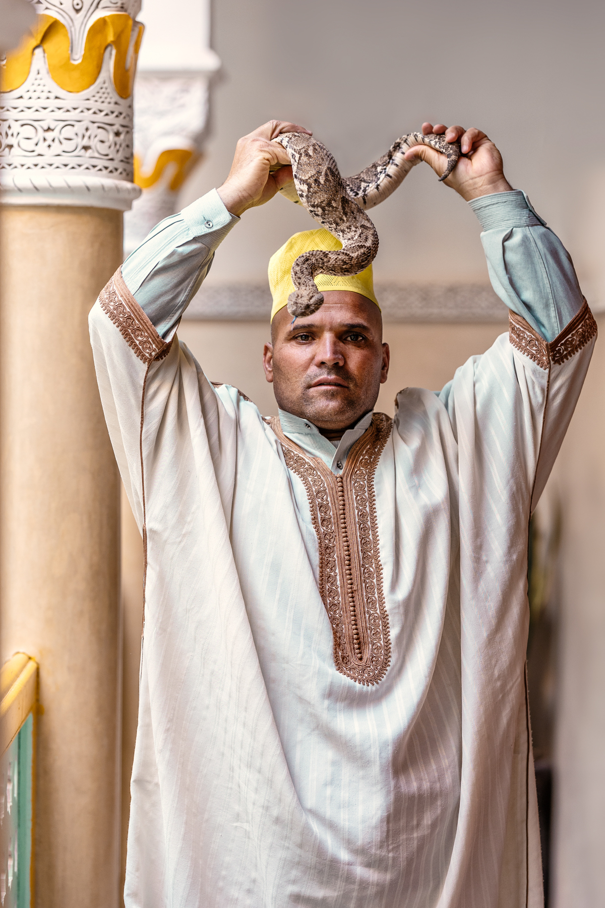
The Art of the Personal Project: Beth Galton

The Art of the Personal Project is a crucial element to let potential buyers see how you think creatively on your own.  I am drawn to personal projects that have an interesting vision or that show something I have never seen before.  In this thread, I’ll include a link to each personal project with the artist statement so you can see more of the project. Please note: This thread is not affiliated with any company; I’m just featuring projects that I find.  Please DO NOT send me your work.  I do not take submissions.

Today’s featured artist:  Beth Galton

Memory of Absence

So much of who we are is passed from generation to generation—our genes, our behaviors—molded by our family. In 2017, my mother and father—who had not lived together for 50 years—died within three days of each other. I discovered many artifacts from my life of which I had no memory.

In this series, I combined botanicals with objects and photographs that I found, in order to convey a sense of memory and loss. The organic and volatile botanicals serve as a reminder of the ever-changing nature of memory and emotions—an unstable and profoundly unreliable process.

My creative process is to compose and photograph botanicals with the collected objects I have gathered from my mother’s home. I then print out the image and create yet another still life by layering more objects with the print and re-photograph it. This creates a further sense of the complex and layered emotions found within family dynamics.

To see more of this project, click here

Instagram

APE contributor Suzanne Sease currently works as a consultant for photographers and illustrators around the world.  She has been involved in the photography and illustration advertising and in-house corporate industry for decades.  After establishing the art-buying department at The Martin Agency, then working for Kaplan-Thaler, Capital One, Best Buy and numerous smaller agencies and companies, she decided to be a consultant in 1999.  Follow her at @SuzanneSease.  Instagram
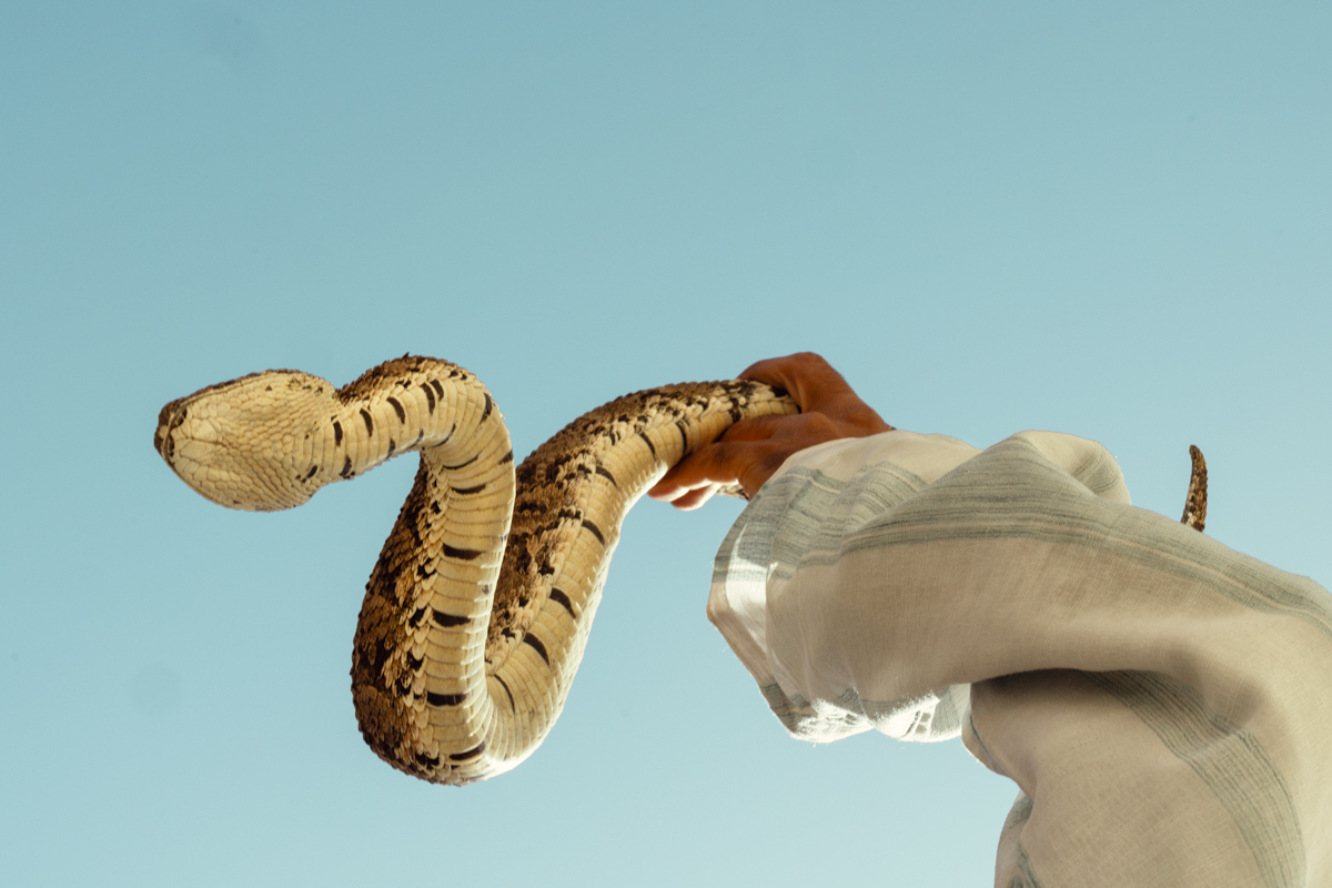
The Daily Edit – The New York Times – KC Cheng

A traditional beach seine bringing in a boat from an overnight trip from Kudawa Beach, northwestern Sri Lanka

A lady part of Kalpitiya’s few remaining traditional beach seines washing rice. Last year, they invested in drilling a motor pipeline–previously, they depended on natural wells. For half the year, one of Kalpitiya’s few remaining beach seines (a traditional form of collective fishing) stays in basic accommodations by a stretch of beach where St. Anne’s church is located, and works every day.

43-year-old Tiron Rodrigo, has worked as a captain for 12 years. ‘The crisis has made everything expensive,’ he says. For a week-long trip, he and his crew of 4 uses 200 liters of water for drinking and cooking, at a port in Kalpitiya, a fisherman on cooking duty for the evening.

Early morning at Negombo fish market, a fish seller weighs some tuna before it’s shipped to market.

A man washing himself at a public well in Negombo. Access to clean water remains a big challenge to remote and coastal communities.

A butcher filleting tuna at Negombo market. The economic crisis has taken a toll on most citizens, resulting in cash, food, and medicine shortages. Fish constitutes half of Sri Lanka’s protein intake.

A fisher carrying in his meager catches from the morning. Extreme poverty remains an endemic issue for fishing communities, who struggle with medical bills when they fall ill from manually taxing work and poor working conditions.

A young fish seller sorting prawns in a shop in Kalpitiya. In coastal regions, CKDu are rapidly spiking, a phenomenon confounding to researchers.

A fish seller sorting dried fish at a small market in Kalpitiya. CKDu in these communities is spiking at an alarming rate. The sleepy town of Kalpitiya is a majority-Tamil fishing village, that has seen an uptick in CKDus in recent years. Although a majority-Buddhist nation, many fishermen are Catholic due to Portuguese and British influences. Shrines by ports and landing sites are common throughout fishing towns.

A man fishing with a handline by Kalpitiya jetty. The economic crisis has reverberated throughout Sri Lanka’s societies, resulting in shortages of food and medicine.

A vendor selling filtered water at 1 rupee a liter. Although it’s becoming common knowledge that Sri Lanka’s groundwater isn’t safe for drinking, not everyone has the means to buy filtered water.

A beach seine fisherman, one of 15 or so in his collective, helping pull in a net bursting with anchovies on Kudawa beach.

A port in Kalpitiya, northwestern Sri Lanka, that has been hard hit by the economic crisis. At a port in Kalpitiya, a fisherman on cooking duty for the evening.

At a port in Kalpitiya, northwestern Sri Lanka, a fisherman on cooking duty for the evening.

Climate change in the form of rising sea levels has been plaguing Sri Lanka. Government attempts to build ‘salinity barriers’ to prevent the blackflow of seawater into rivers has had mixed results, including flooding out rice paddies upstream.

During one of the hottest parts of the afternoon, beach seine fishermen collect freshly dried anchovies on Kallady Beach in Batticaloa. Many work tirelessly without sufficient nutrition or sleep, under increasingly hot conditions, which are damages that manifest in decreases in kidney function. This stretch of coastline is still recovering from a tsunami in 2014.

New York Times
Photographer: Kang-Chun Cheng

Heidi: “Find a place you trust and then try trusting it for a while” was one of the truths of activist Corita Kent. What drew you to Nairobi as a home base for 4 years and counting?
KC: I get this question a lot, which makes sense! My first time in Kenya was in 2018––I’d just finished my post-grad fellowship in Arctic Norway and Finland, staying with Sami reindeer herders for nearly a year and a half (unusual, I know)––and was feeling lost. I’d studied ecology and studio art for my bachelor’s and had little idea what I wanted to do. The Arctic was amazing because I was more or less working as a long-form documentarian, staying with a few families over months, following them around, taking photos, and asking lots of questions. My project was about how climate change and tech are impacting traditional reindeer herders and their identity and culture. But I felt out of place coming back to the US, where most of my peers were working in banking or consulting, or pursuing more education––I knew none of that was for me. I visited a good friend in Nairobi, who’s Kenyan, and invited me to go ‘figure out life’ with her, and ended up staying for 8 months. It was my first time living in a city, full stop, and an African city undergoing remarkable changes at that. I just remember feeling very curious about everything, and how much buzz was going on.

I ended up moving to Nairobi, nearly inadvertently, in early 2020, which is when I started seriously looking into how to work as a journalist/documentary photographer.  It was a steep learning curve, having not only zero connections to the industry, but also knowing nothing about pitching/the editorial process. But I was very drawn to it since it felt like a neat way to engage and learn about what is happening around us.

I think ultimately I’m drawn back to Nairobi time and time again for a few reasons: because it feels like home––I spent a lot of time building my community there!–– and the diversity in landscapes is amazing. I love spending time outdoors; there’s great climbing, hiking, deserts, a beautiful coast, savannahs-  a lot of weekend adventures abound. From a professional outlook, it’s amazing how many underreported stories there are within Kenya, a country very saturated by journalists, both foreign and local. We’re very lucky to enjoy great press freedom, especially relative to neighboring countries since I don’t generally cover breaking news, I love working on stories that have just been sitting there for a while, years even, that no one else has picked up.

You continue to explore the mysterious kidney disease affecting coastal and rural communities in Sri Lanka – how long have you been working on this story?
I first became interested in Sri Lanka in late 2022, when I was semi-stranded there trying to get a visa to India for a friend’s wedding. I ended up working on a couple of stories about how fishermen there are heavily impacted by both climate change and the ongoing economic crisis. My time there really stuck with me, and I became connected with a few Sri Lankan researchers, which is how I came to learn about the kidney disease linkage. Besides Ed Kashi’s work some years ago, which is more confined to the photojournalism realm. I hardly remember any reporting on chronic kidney diseases of unknown causes (CKDUs) in media, and feeling like that was a gap that could be filled.

How do you integrate and gain trust in the community for your photo essays that deal with vulnerable communities?
I think this is a perennially tough question to answer! Amongst my photojournalist friends, we have ongoing conversations about what we’re doing, our motivations, how the result is perceived, etc. For instance, a hot topic is whether or not to ‘parachute’ into a community (meaning, report on a place you are not well integrated in/familiarized with). There’s a harmful precedent of how this was done in the past, notably by white men, and I do think there is a much sharper awareness in the current ecosystem against that. There’s also the stance that bringing in different sets of experiences and perspectives can help tell stories and advocate for certain communities.

I usually work with a local ‘fixer’ (lingo for translator or guide), or a researcher familiar with the community at hand. They help explain my motivation for being there– what story I’m working on–to set the context for the questions I’m asking. From my set of experiences, whether it’s northern Kenya or Sri Lanka, I find that the folks I’m working with are often very marginalized within their communities due to their ethnicity or remoteness––are generally very happy to share their experiences, and glad someone is paying attention. This is not to write off very real questions about foreigners not approaching communities in good faith, but I am someone who very much believes in vibes–in the sense that it’s hard to hide your real motivation. If you’re genuine and sincere, people can sense that––it’s something that transcends cultural and linguistic barriers.

And of course, the more time you have, the better. It’s hard to photograph folks with sensitivity and intimacy if you’re only there for a hot minute. I ended up photographing the same fishing group in Kalpitiya, northwestern Sri Lanka, in December 2022 and January 2024, which isn’t something that happens often. Having a few days to hang out so people not only understand why you’re there but are used to your presence and just go about their normal business, is a real luxury.

For the recent New York Times article, how long were you there? Was that a continuation of your Atmos piece?
I was there just under 3 weeks, from late January to mid-February of this year! And yes, it indeed was a continuation of the Atmos piece. I started in Negombo, just north of the capital Colombo, to Kalpitiya, and then to Medirigiriya (central) and Batticaloa (eastern), before heading south to Matara to try to get a full scope of the CKDU hotspot regions. This was my first original pitch that had gotten accepted by the Times (meaning I presented the story idea), which was very exciting–in the past, a photo editor had commissioned me to take photos to accompany the text.

The story behind this Sri Lanka story is that I’d applied to the Pulitzer Center and International Women’s Media Foundation for funding to make the reporting possible (the state of the industry is that few outlets have the means to pay for story expenses, and if you want to do it, you often end up spending your own money….). The Pulitzer Center requires ‘letters of commitment’ from publications as part of the application, to show that they will fund a story that’s getting published, and I’d gotten 3, but it was rejected. At that point, I’d invested so much time into these stories, that I thought I might as well go and do this on my budget and dime. But I’d pitched this to the science/climate editor at the Times I’d worked with previously, and 2 days after getting to Colombo, we had a call with the staff writer who was interested in the story. It was a big moment for me! I felt like I was being treated like a colleague, not just a disposable freelancer. I feel like admitting to them that I was already in Sri Lanka was a bit of a bold move, haha.

Your photos are full of emotion – is the edit difficult? You’re holding a lot of space for people/community.
It’s always special getting to work on stories that are personal or sensitive. I remember having this feeling, when I met with the subject who was the most ill, whose photo ultimately wasn’t in the final edit. I had a hard time spending time with him because he was so frail he couldn’t leave his bed and was clearly in a lot of pain. At that moment, something in me just felt like it was collapsing; it felt really wrong to be there. I took a few bad photos and rushed to leave. He and his wife had both been sick for collective decades and were barely scraping by without any income. And the wife made a point of thanking me, saying no one had ever come to ask them questions about their health before. That moment, as painful as it was, kind of amplified why I wanted to work on this story to begin with, even though I didn’t feel like the right person to do it at that moment.

What would you tell your younger self now about those acknowledgments and the work that goes into them?
While being in the thick of it, as a full-time editorial freelancer, I’m not great about taking stock of how far I’ve come. But I’d tell my younger self that no one is going to permit you to do any of these things––you have to find the drive and commitment within yourself. And that what I want is actually within reach, it does take a lot of work, but the agency and feeling of being engaged is worth it. I don’t like it when people describe journalism/photojournalism as ‘more than a job,’ but in a sense, it’s kind of true. I become very invested in my work in a way that makes me feel like I need to set better boundaries, haha.

At the same time, even though I’ll endlessly gripe about how this industry doesn’t feel sustainable (at the rate I have to work/keep on top of stories, there’s an expiration date to it–it’s not possible to have a family, for instance, but I suppose that’s true for quite a few industries!), the influx of newsroom closures, the fact that rates haven’t been raised in decades––I don’t see myself wanting to do anything else. I’m a gut-feeling kind of person–at the end of the day, I love what I do, and will keep doing it unless I’m forced to change.

Congratulations on your long list of grants, awards, and recognition
– which are the most memorable for you and why?

Thank you! They are special in different ways :) being accepted as part of the Women Photograph mentorship class was a pretty visceral moment since I remember coming across the website more than 5 years ago, and just being blown away by the quality and scope of what these fantastic photojournalists were working on globally. I remember wondering if I would ever be able to make such work or have anything to contribute. I think I applied 4 or 5 times to the mentorship class before getting in!

Can you tell us about https://www.thexylom.com/
I was working with Alex Ip, the editor-in-chief of The Xylom, on a number of stories last year! It’s America’s only science outlet run by and for the AAPI community. They’re 100% transparent with their finances which is unusual, and I really respect that. As the news industry is in constant flux, it’s good to get a sense of who is funding what you read. Alex and Shreya, the newsroom fellow, were very kind in inviting me to join as the editor at large earlier this year–which basically means I’m a regular contributor. I was touched when I heard the news, and am glad that they want more of my reporting, mostly from East Africa!

The Art of the Personal Project: Cade Martin

The Art of the Personal Project is a crucial element to let potential buyers see how you think creatively on your own.  I am drawn to personal projects that have an interesting vision or that show something I have never seen before.  In this thread, I’ll include a link to each personal project with the artist statement so you can see more of the project. Please note: This thread is not affiliated with any company; I’m just featuring projects that I find.  Please DO NOT send me your work.  I do not take submissions.

Today’s featured artist:  Cade Martin

The Chelsea.

An eclectic and electric icon in a city brimming with icons.

Written. Wolfe. Twain.

Shouted. Vicious. Pop.

Whispered. Keroac. Cohen.

Sang. Dylan. Hendrix.

Too alive with tall tales, deep secrets and notable guests not to photograph.

New York City. Even in the most seen city, there is adventure in chasing a what-might-be-around-the next-corner feeling. My favorite work is often something that catches me in the moment, scratching the itch of the unexpected in an obscure corner of an unknown town, or on the west Side of Manhattan. I wasn’t planning on it, but the Chelsea was spinning tales that I had to listen to.

– Cade Martin

To see more of this project, click here

Instagram

APE contributor Suzanne Sease currently works as a consultant for photographers and illustrators around the world.  She has been involved in the photography and illustration advertising and in-house corporate industry for decades.  After establishing the art-buying department at The Martin Agency, then working for Kaplan-Thaler, Capital One, Best Buy and numerous smaller agencies and companies, she decided to be a consultant in 1999.  Follow her at @SuzanneSease.  Instagram