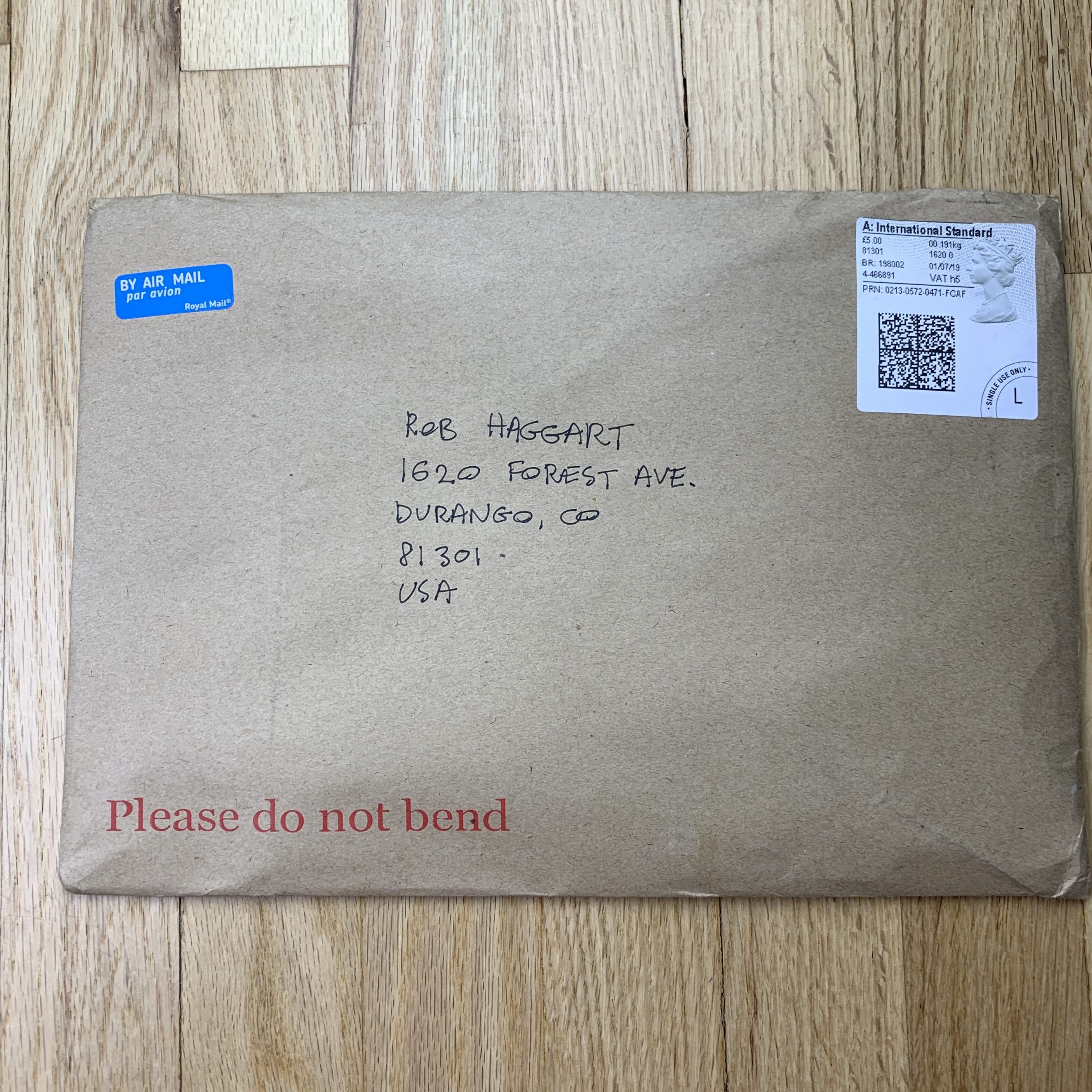
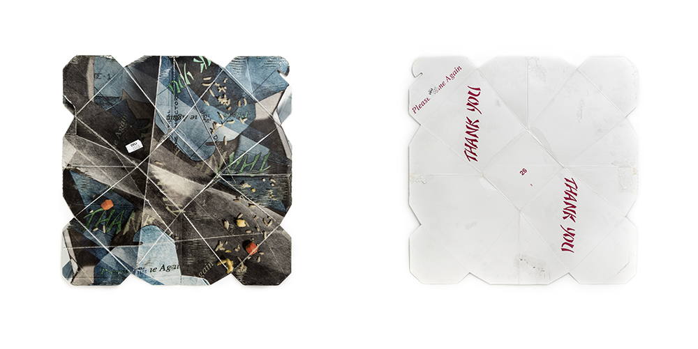
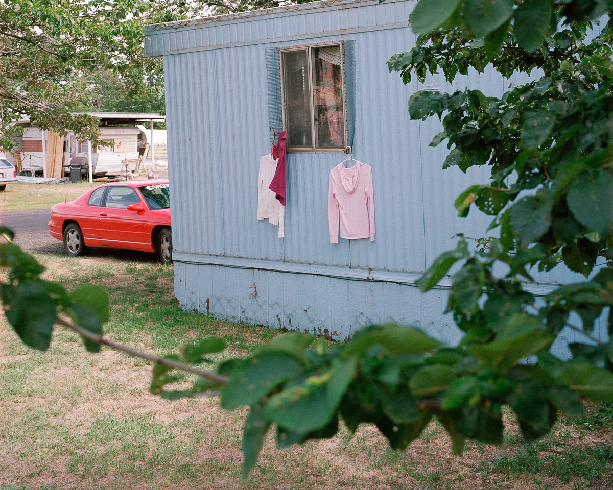
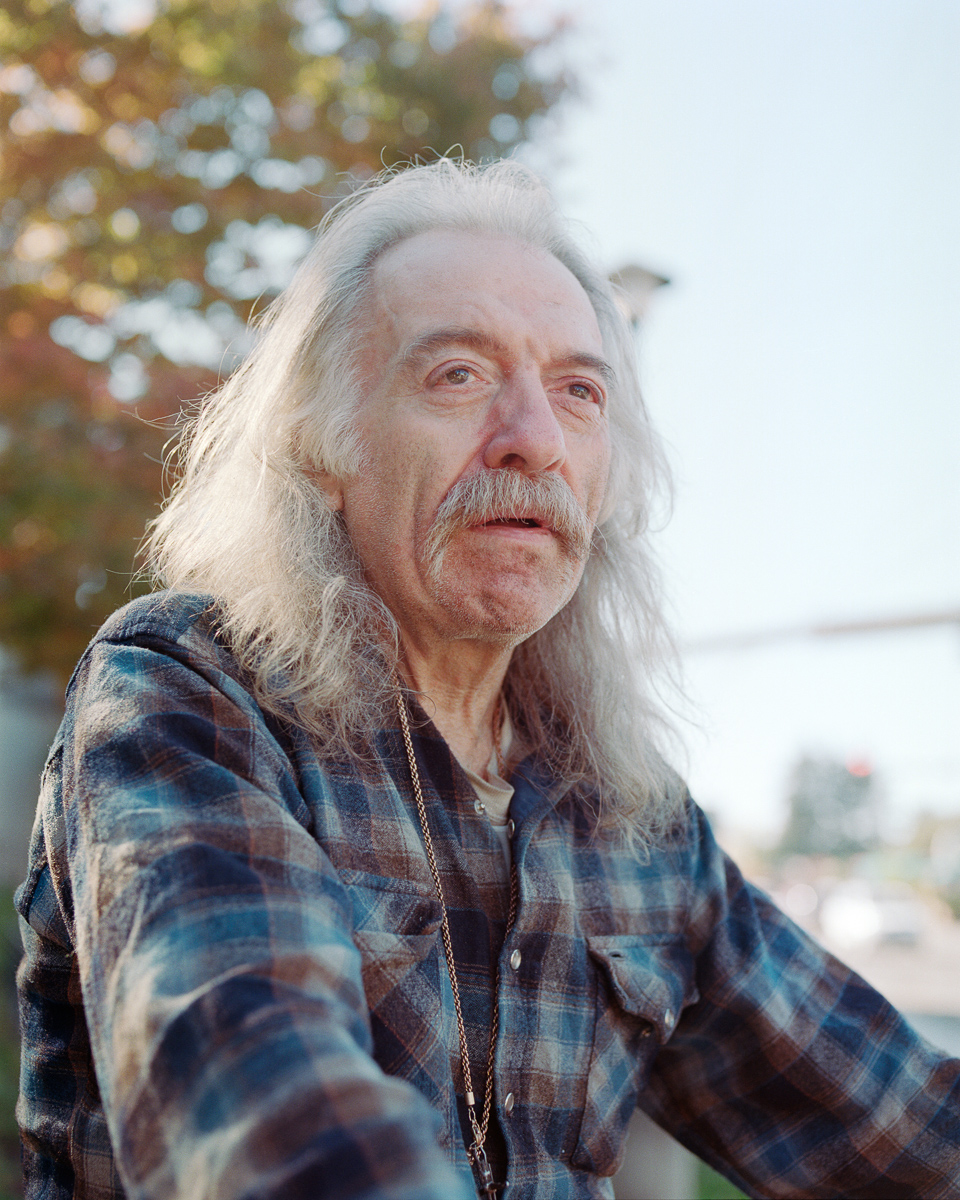
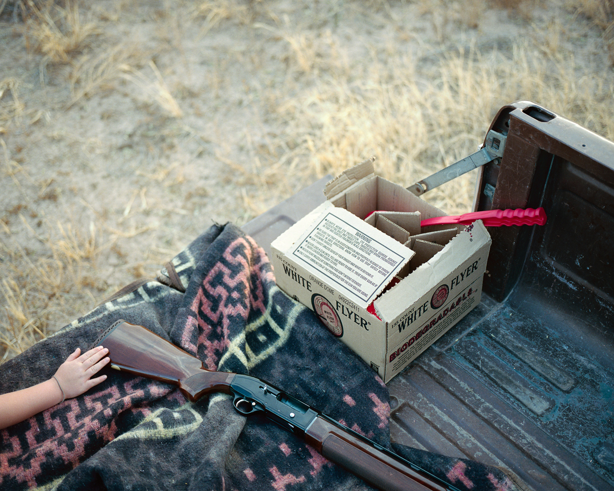
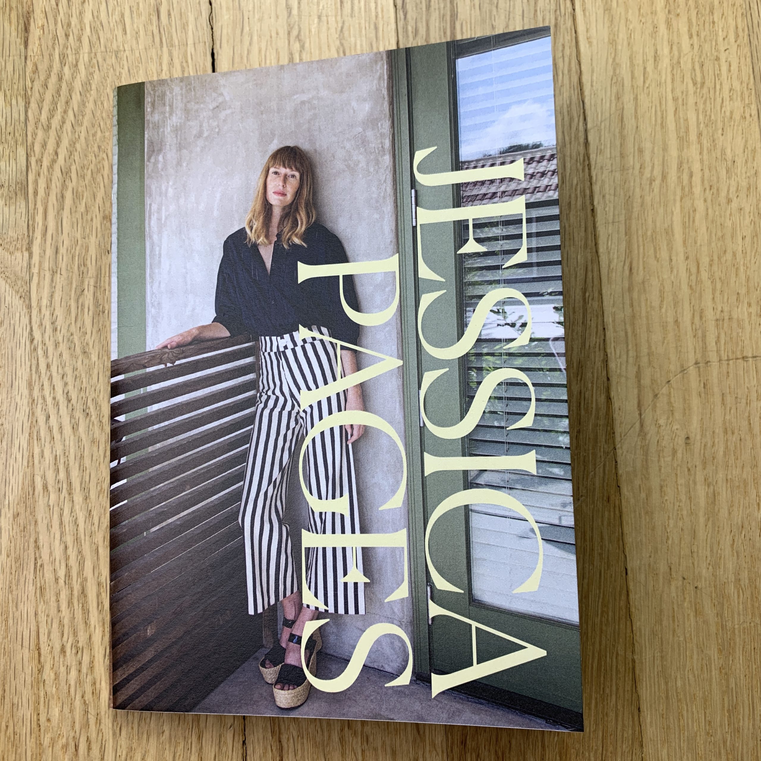
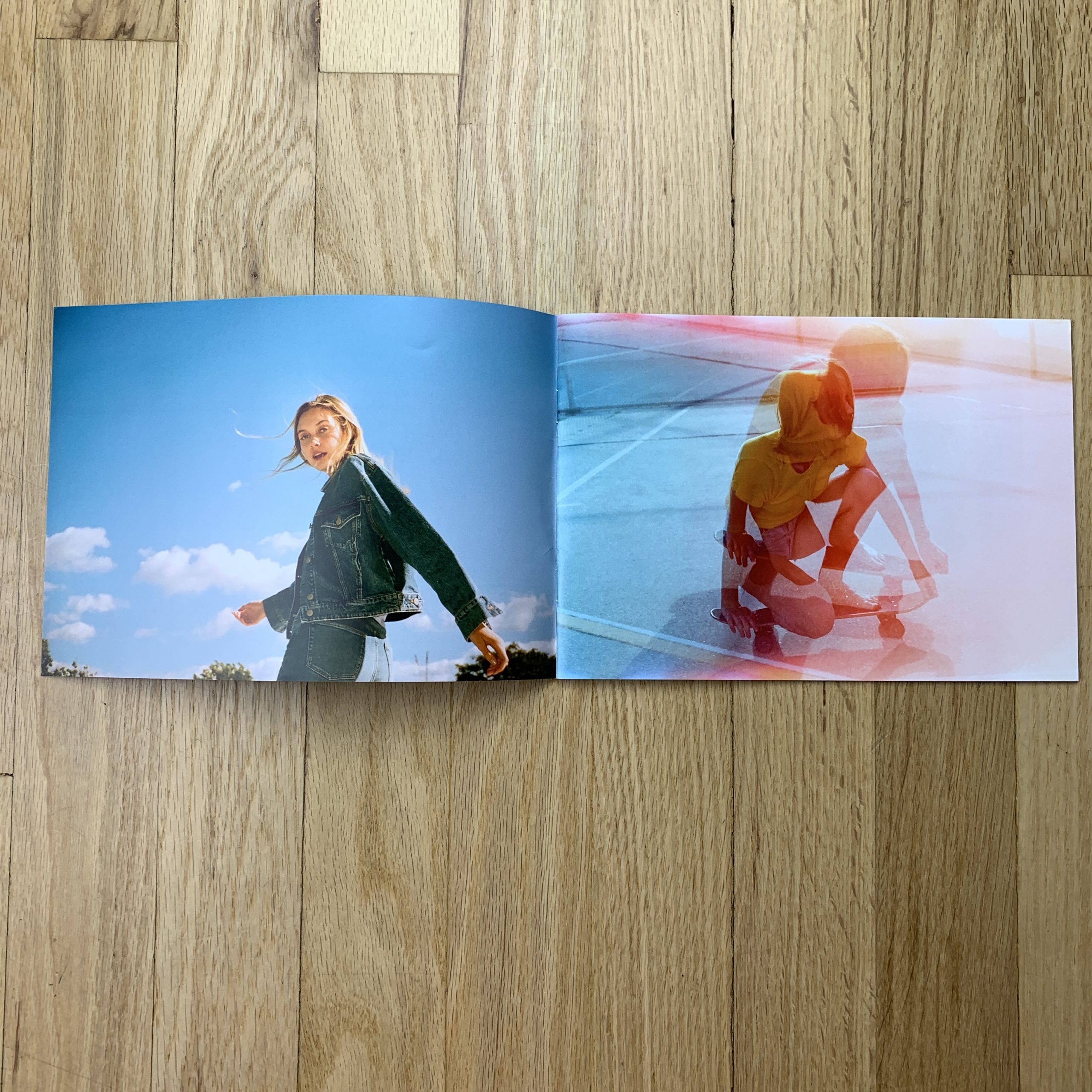
Who printed it?
Ex Why Zed in the UK. I’ve used them a few times in the past. I like them.
Who designed it?
I did.
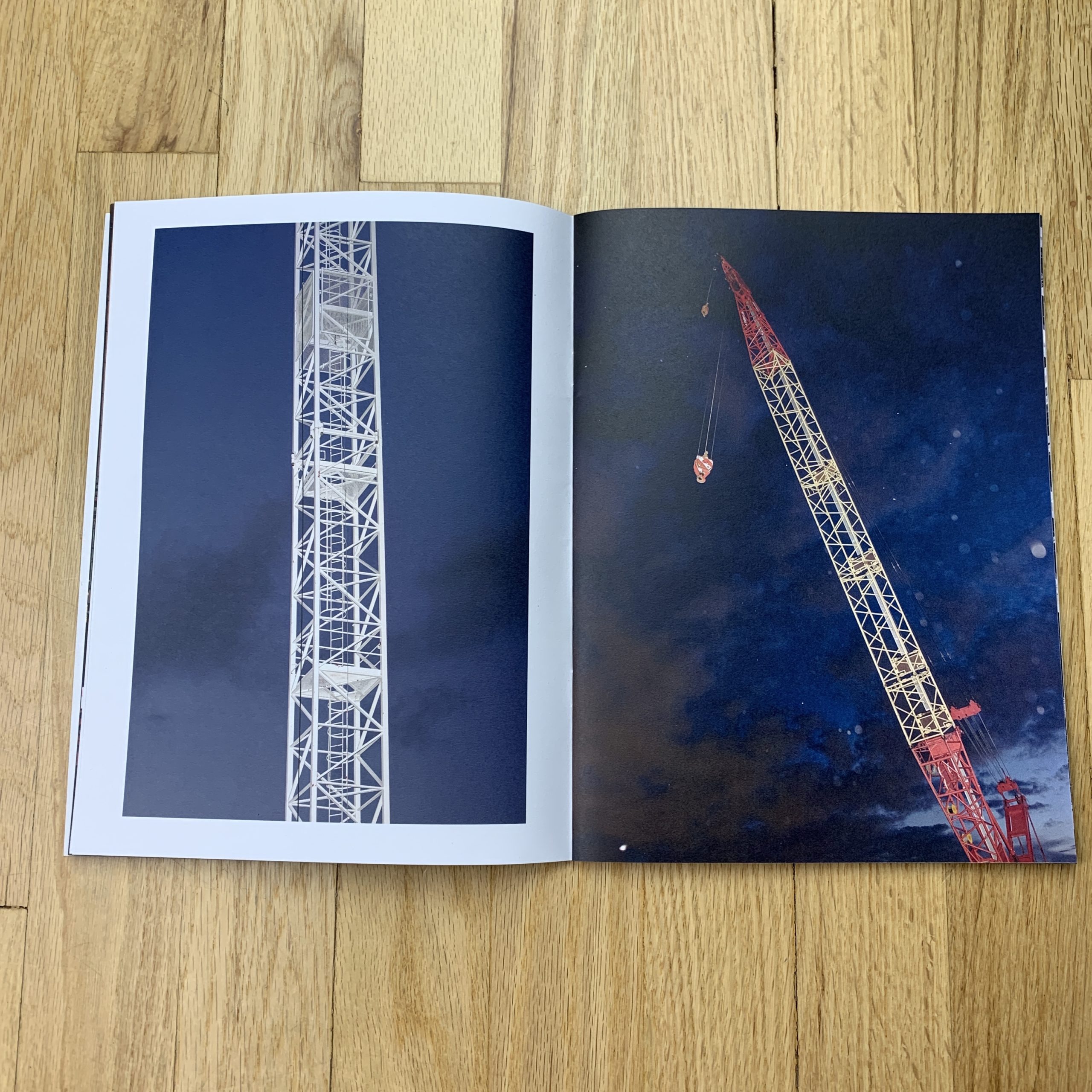
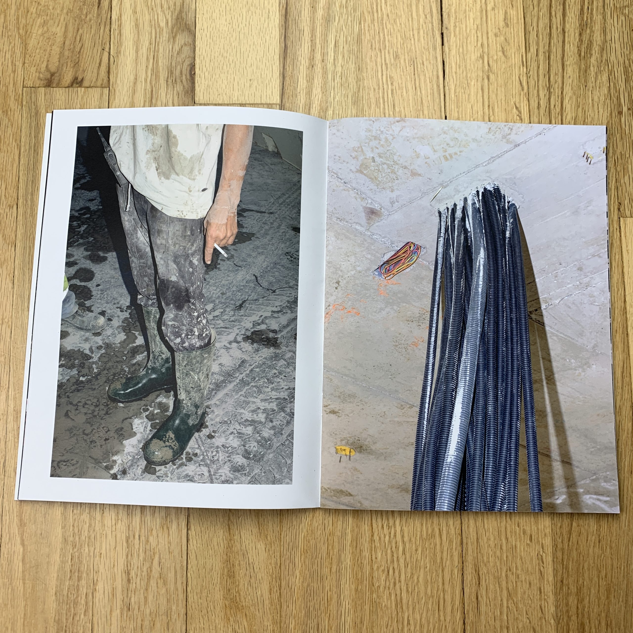
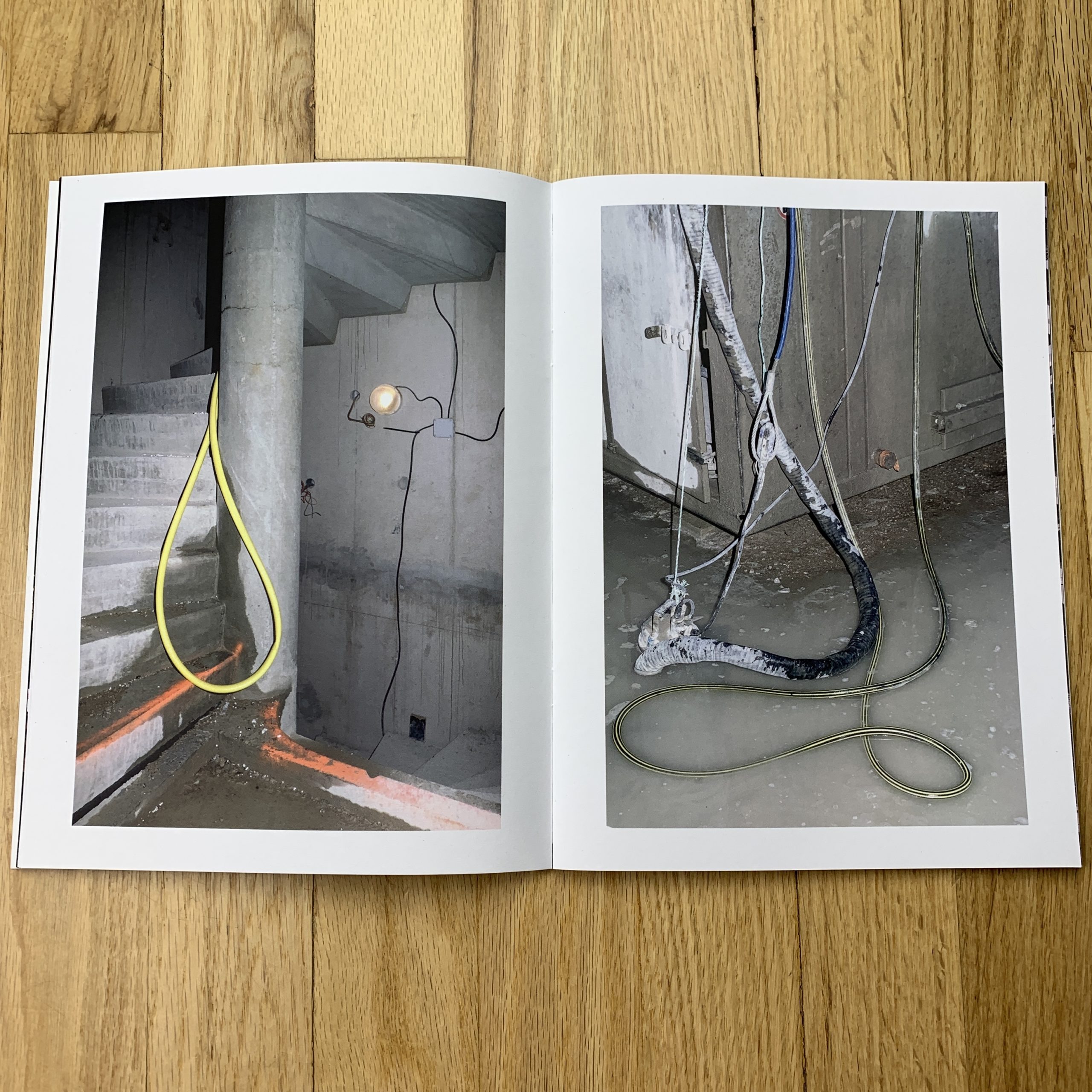
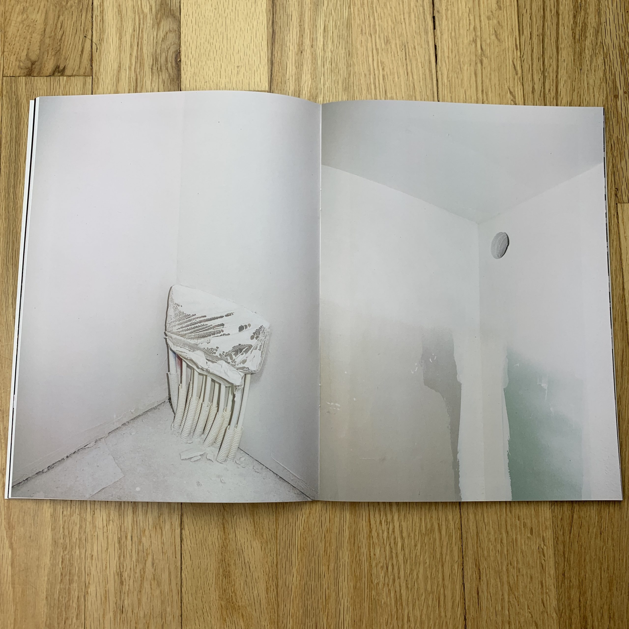
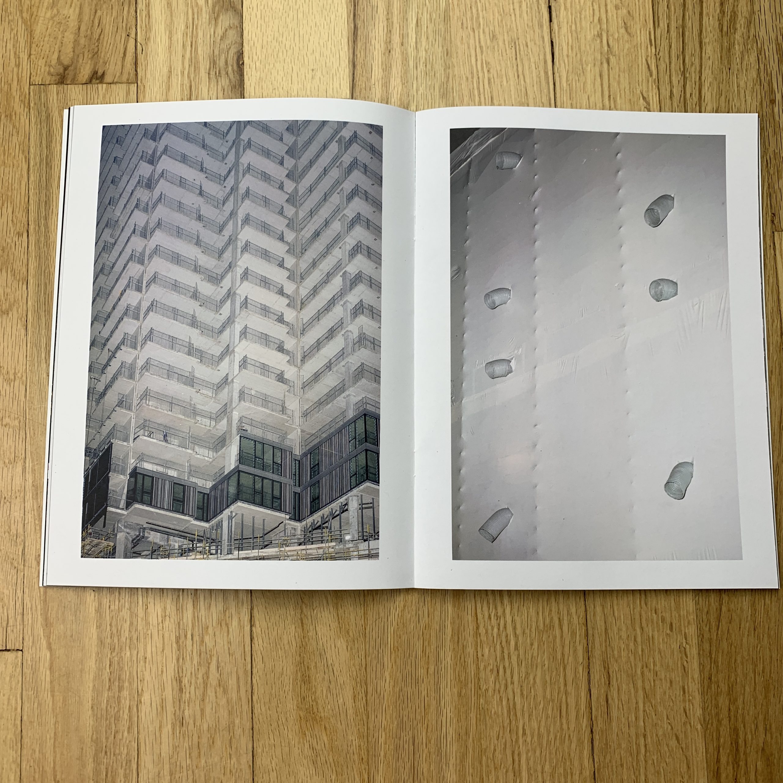
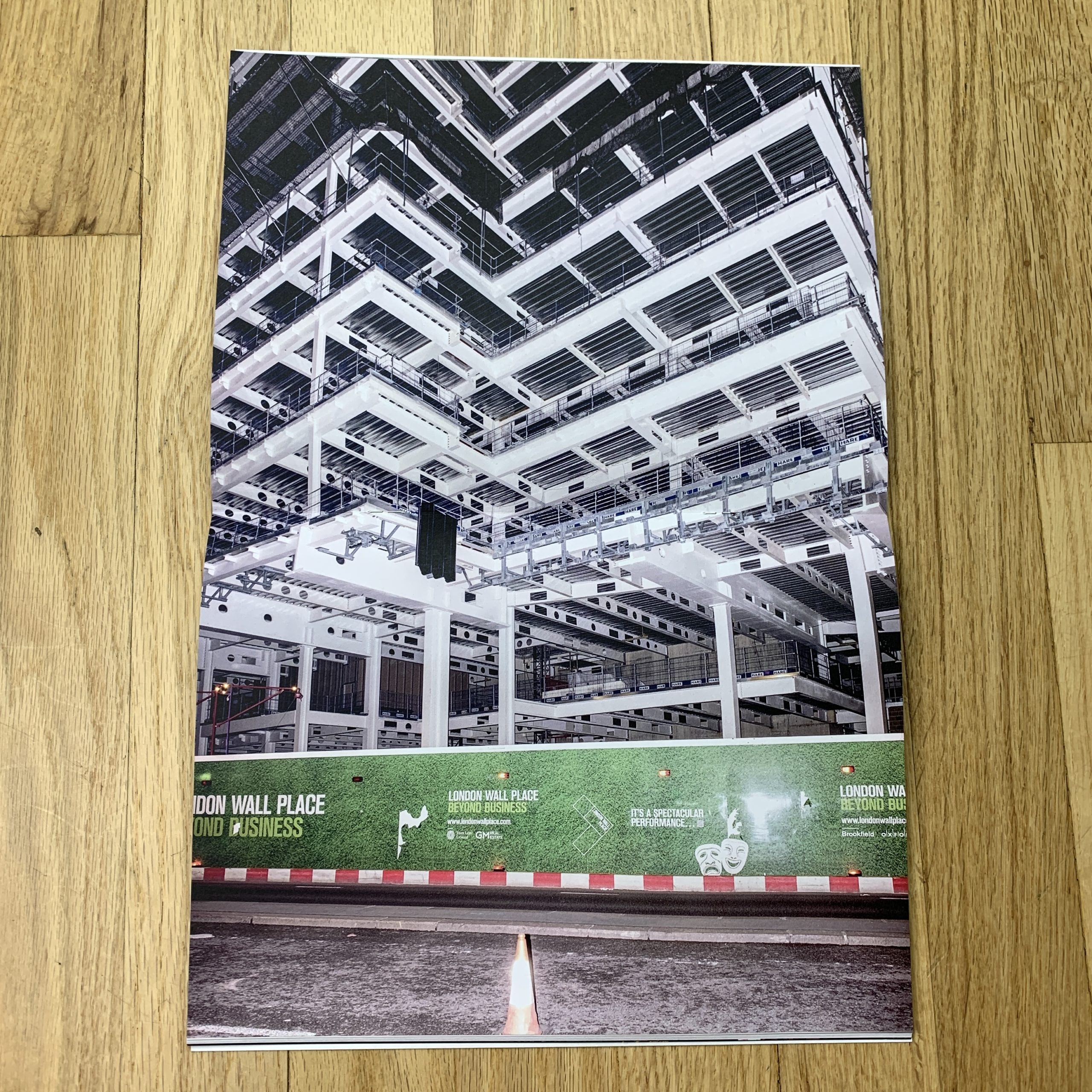
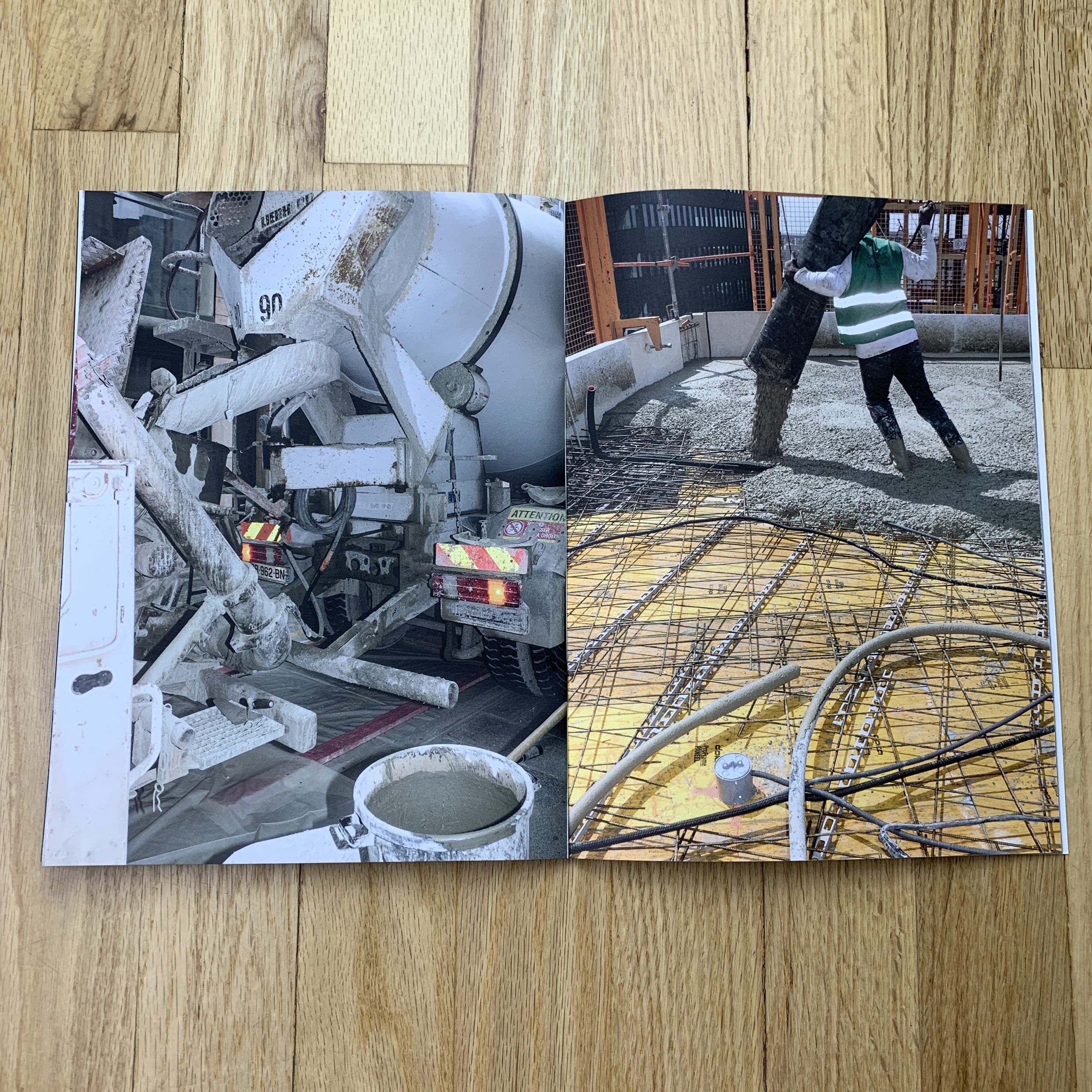
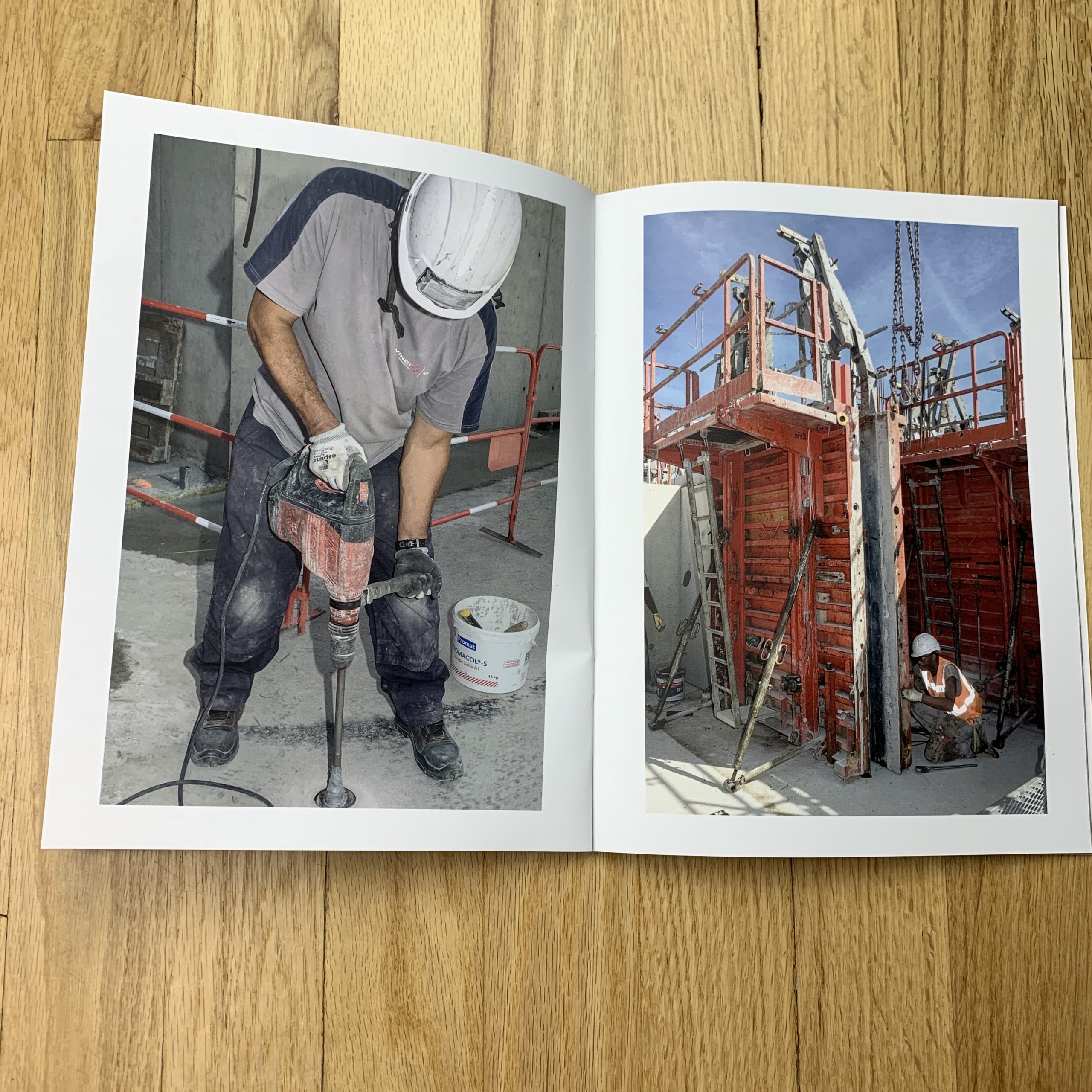
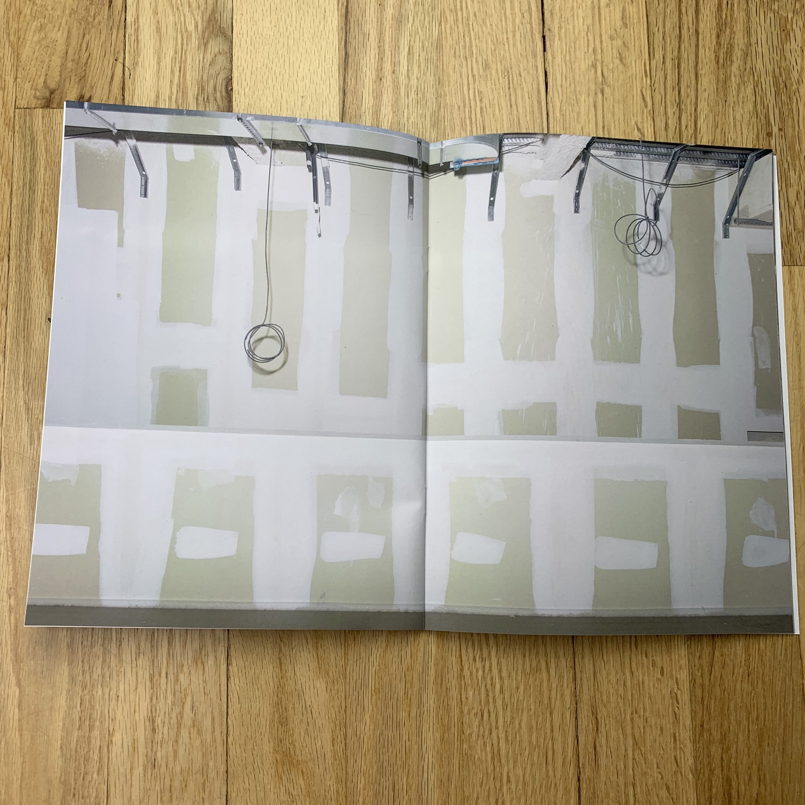
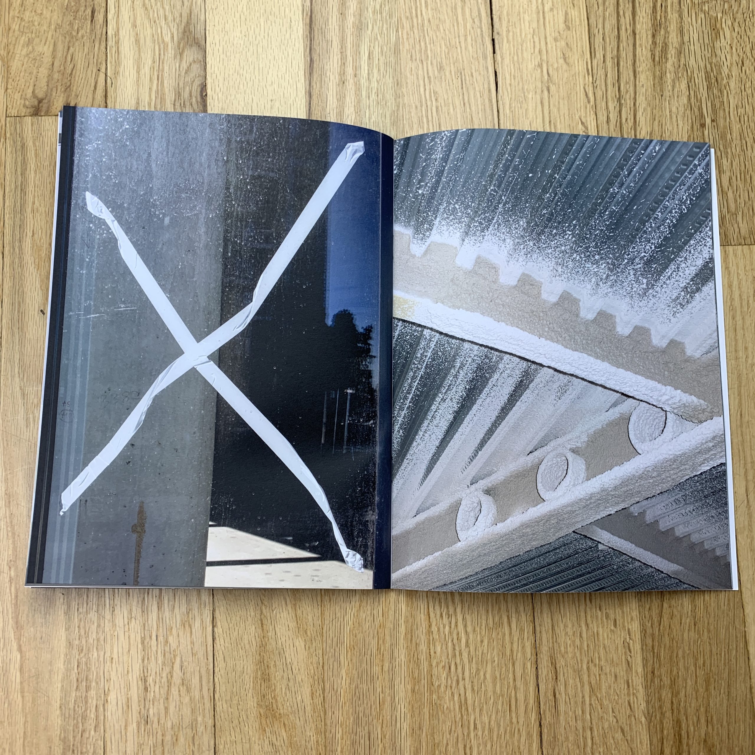
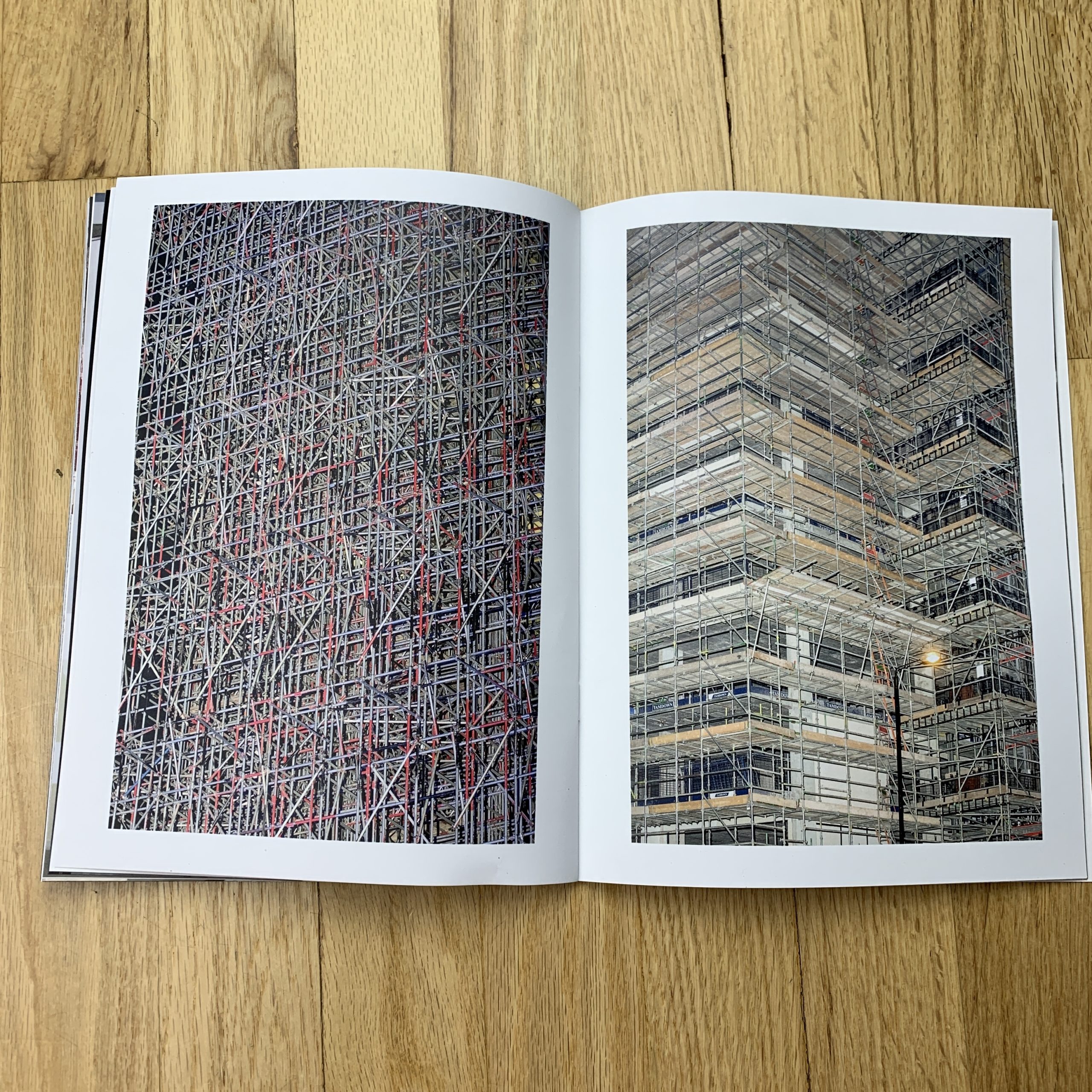
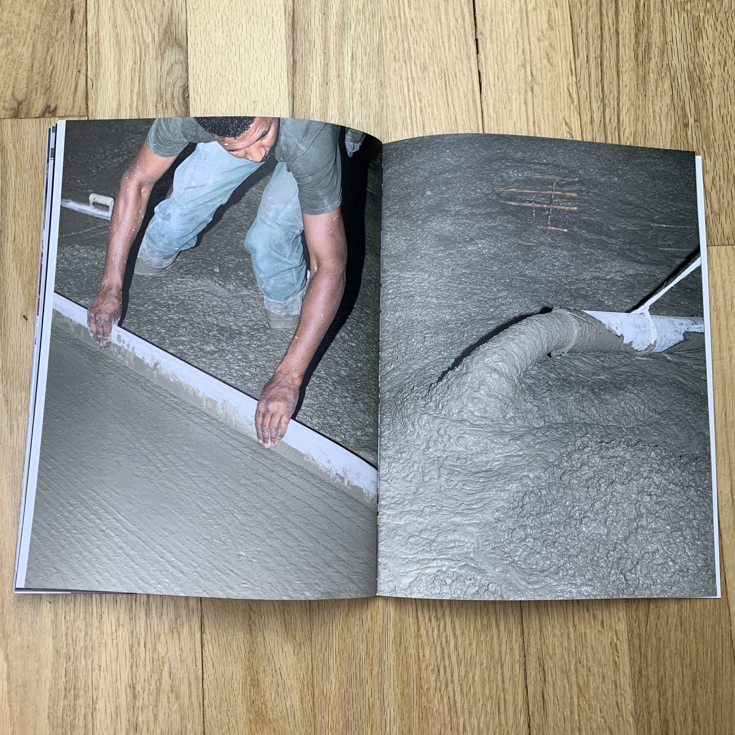
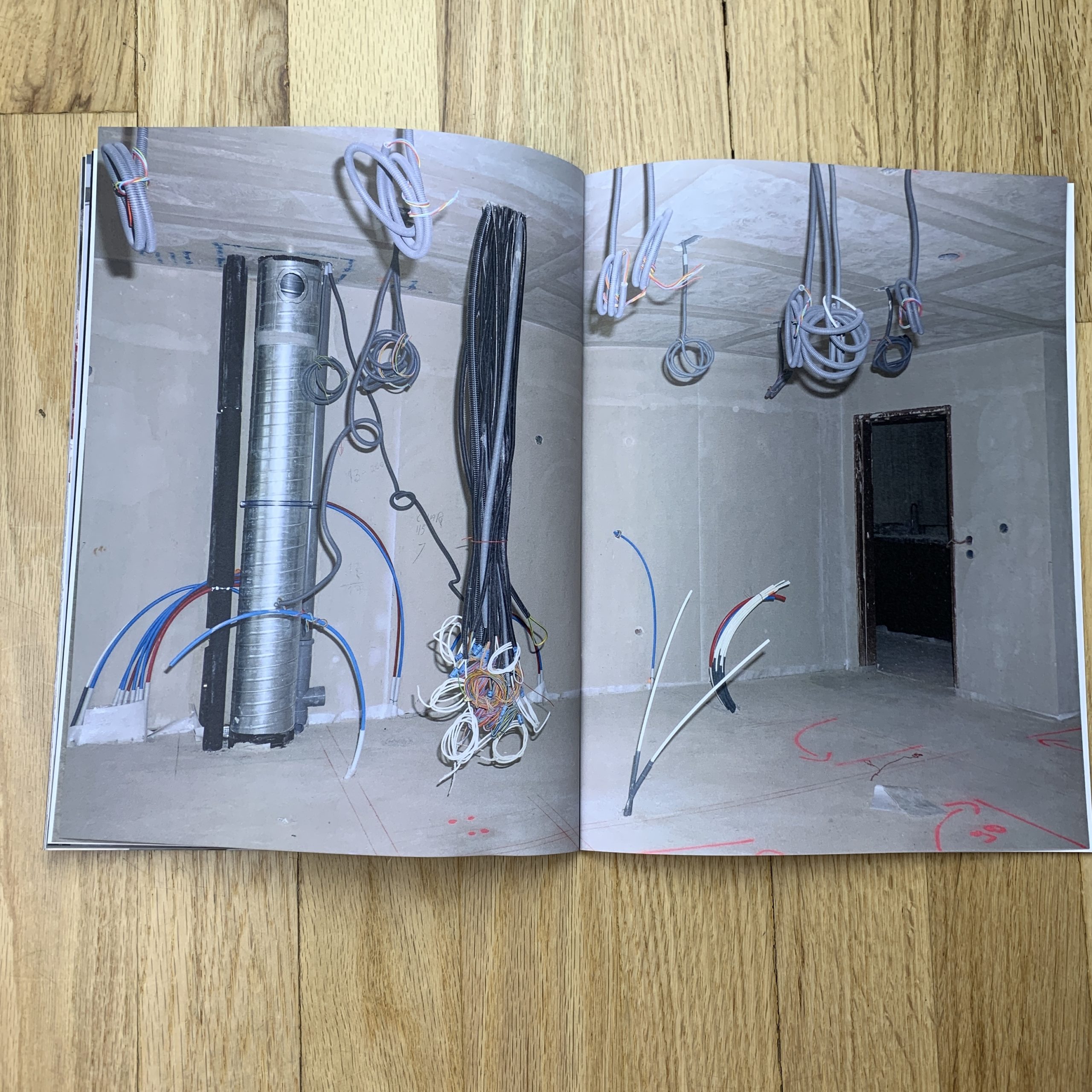
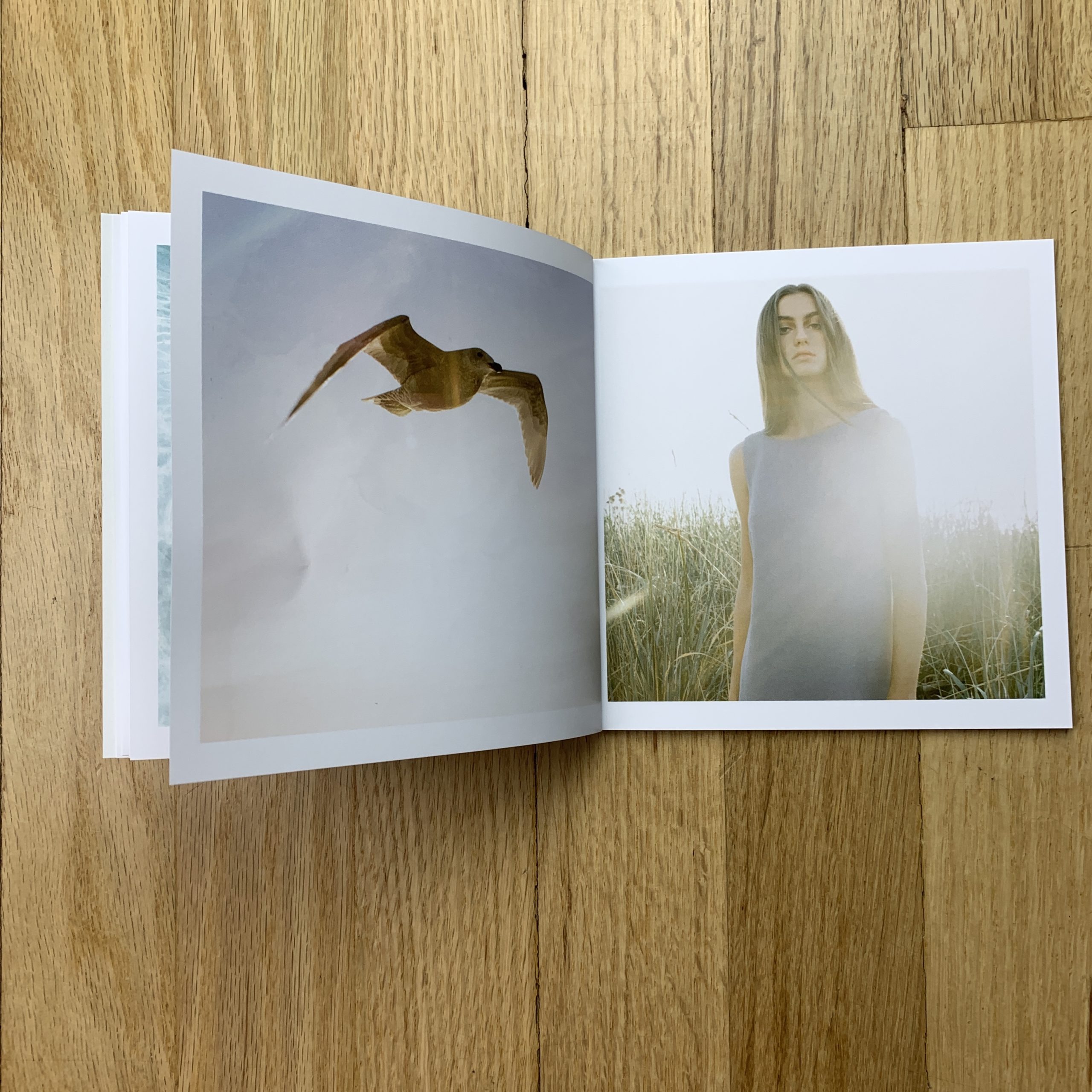
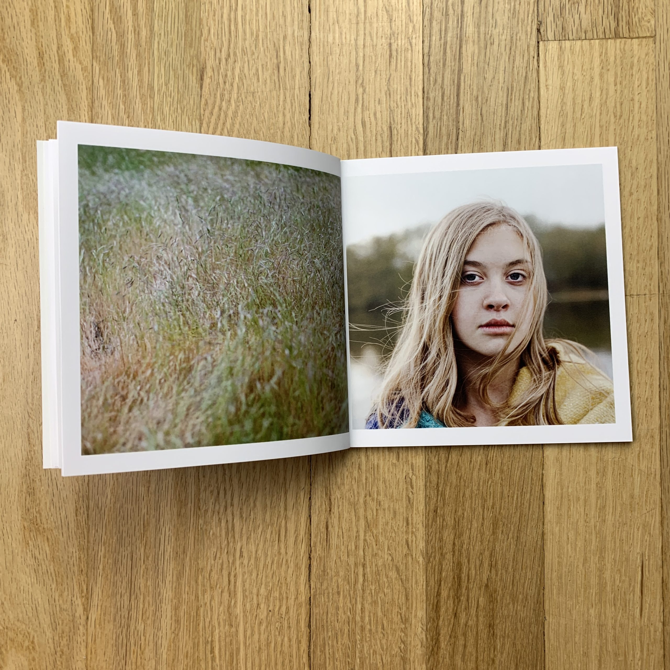
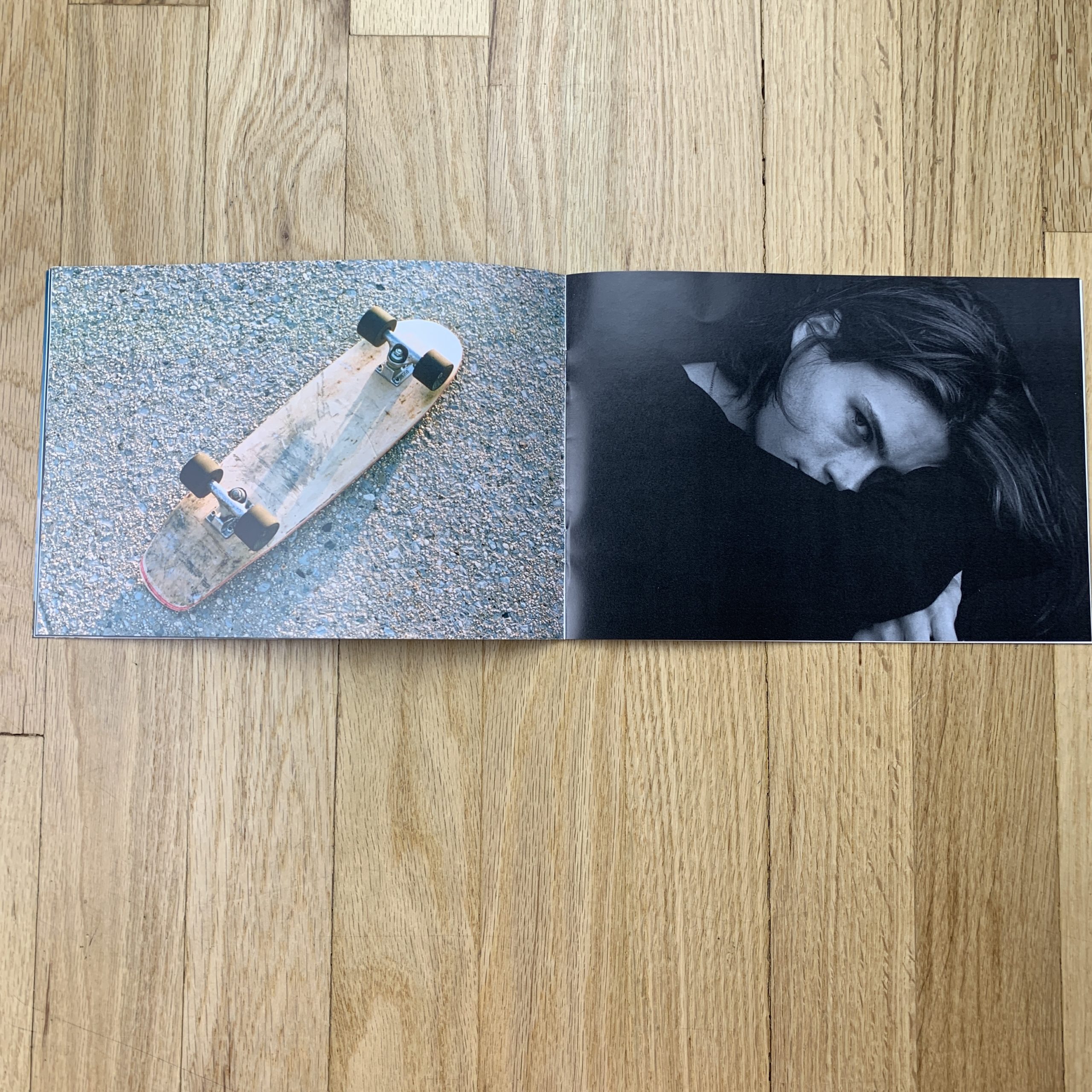
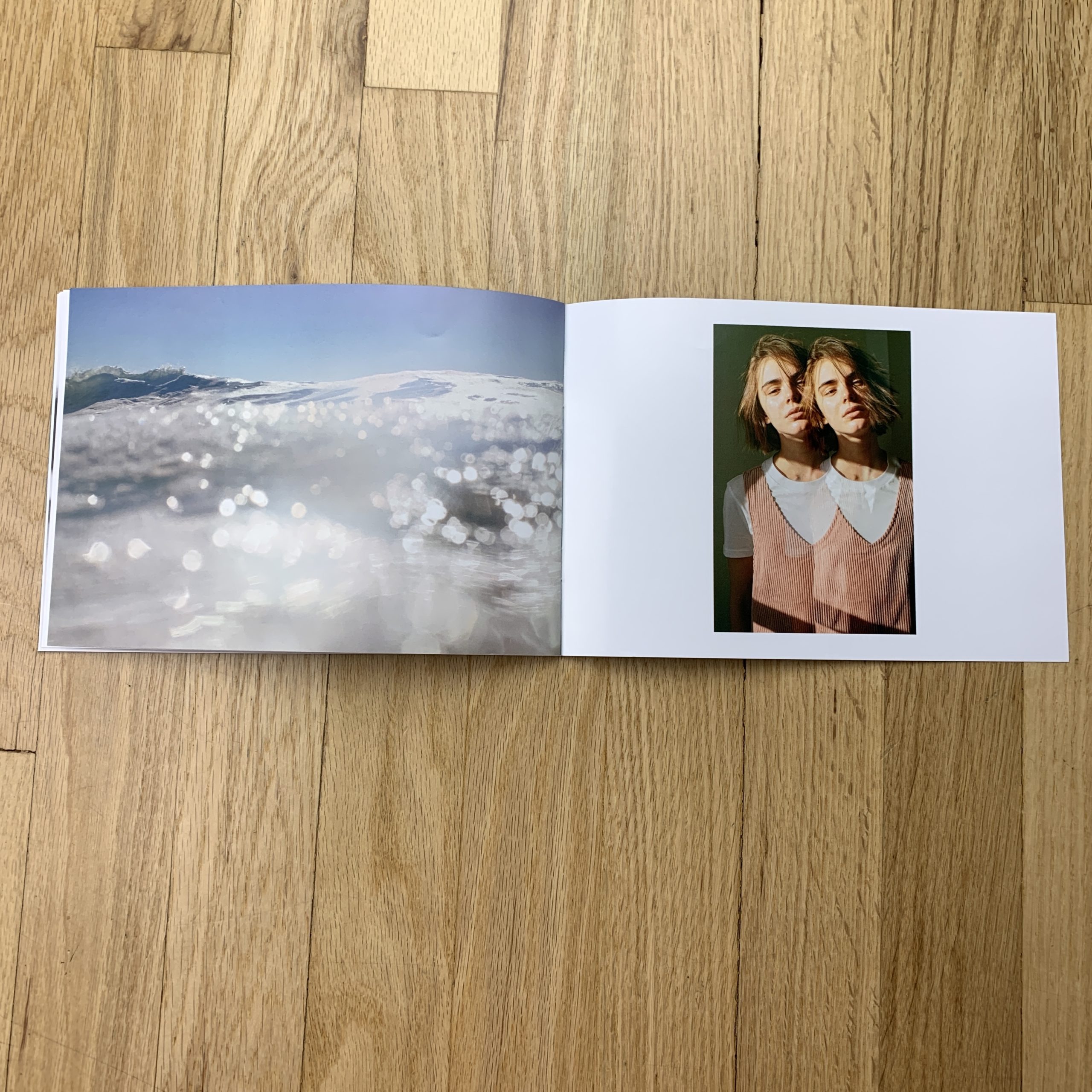
Tell me about the images?
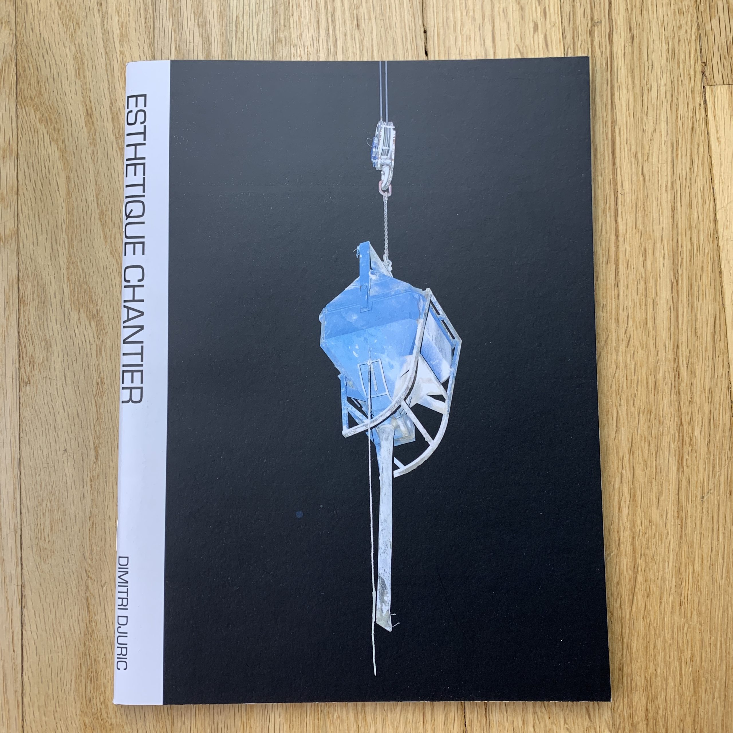
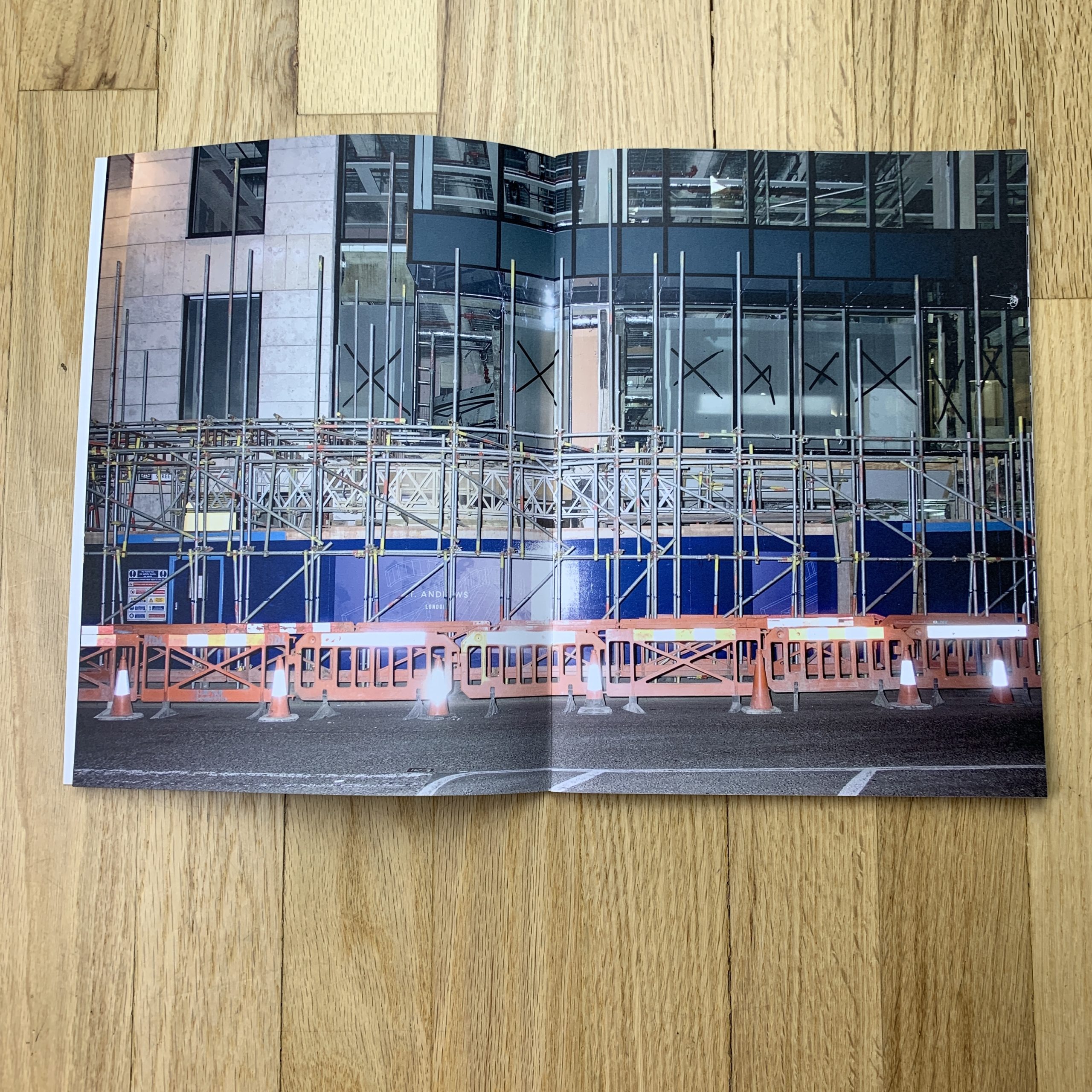
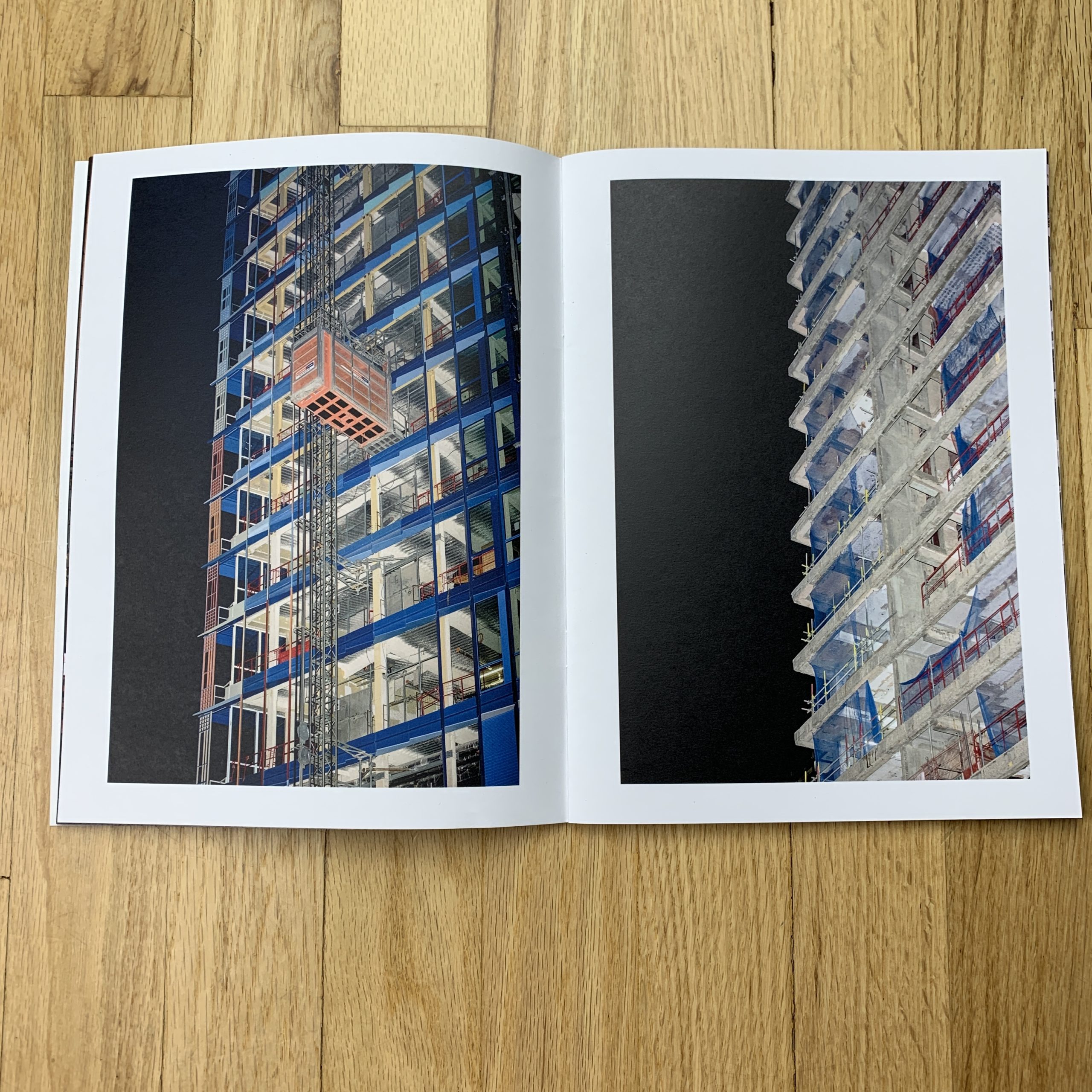
This is a series I’ve been working on for a while. It’s a visual study of the motifs of of construction. The title, Esthetique Chantier, is French for Building site aesthetics.
I’m interested in the temporary/permanent nature of building sites: They change all the time so it calls for documentation. Even though they are generally perceived as short term, they are also a permanent feature of large cities, always and everywhere around us. Both my father and sister are architects so there is a family interest.
I started taking pictures of buildings and construction sites from the street. I wanted to get access to some sites but this took a while. I contacted developers and building firms. The architects I knew didn’t have anything interesting in the building phase at the time. My sister put me in touch with some people and I got to photograph a couple of great projects. These discussions for access meant I was showing the work to a lot of various people, it was good networking.
How many did you make?
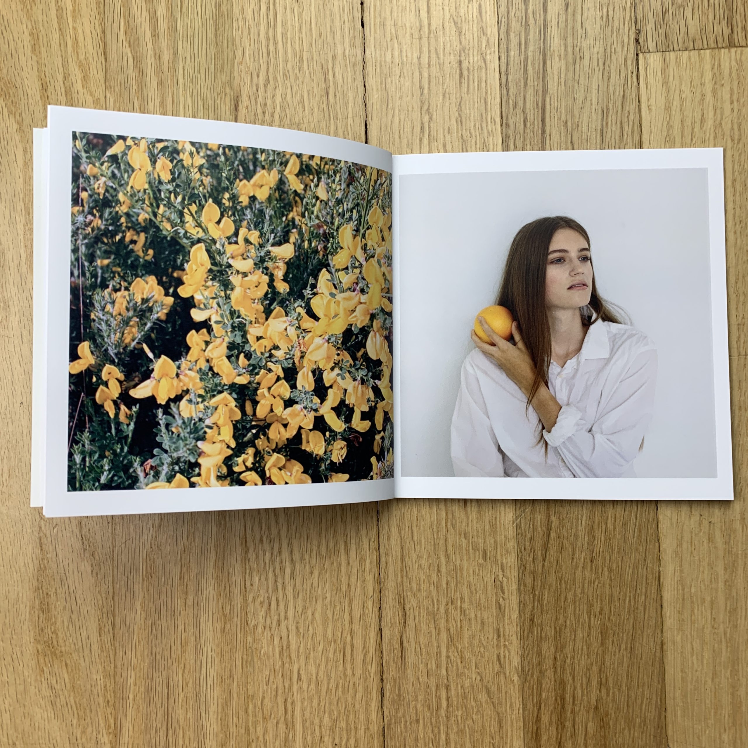
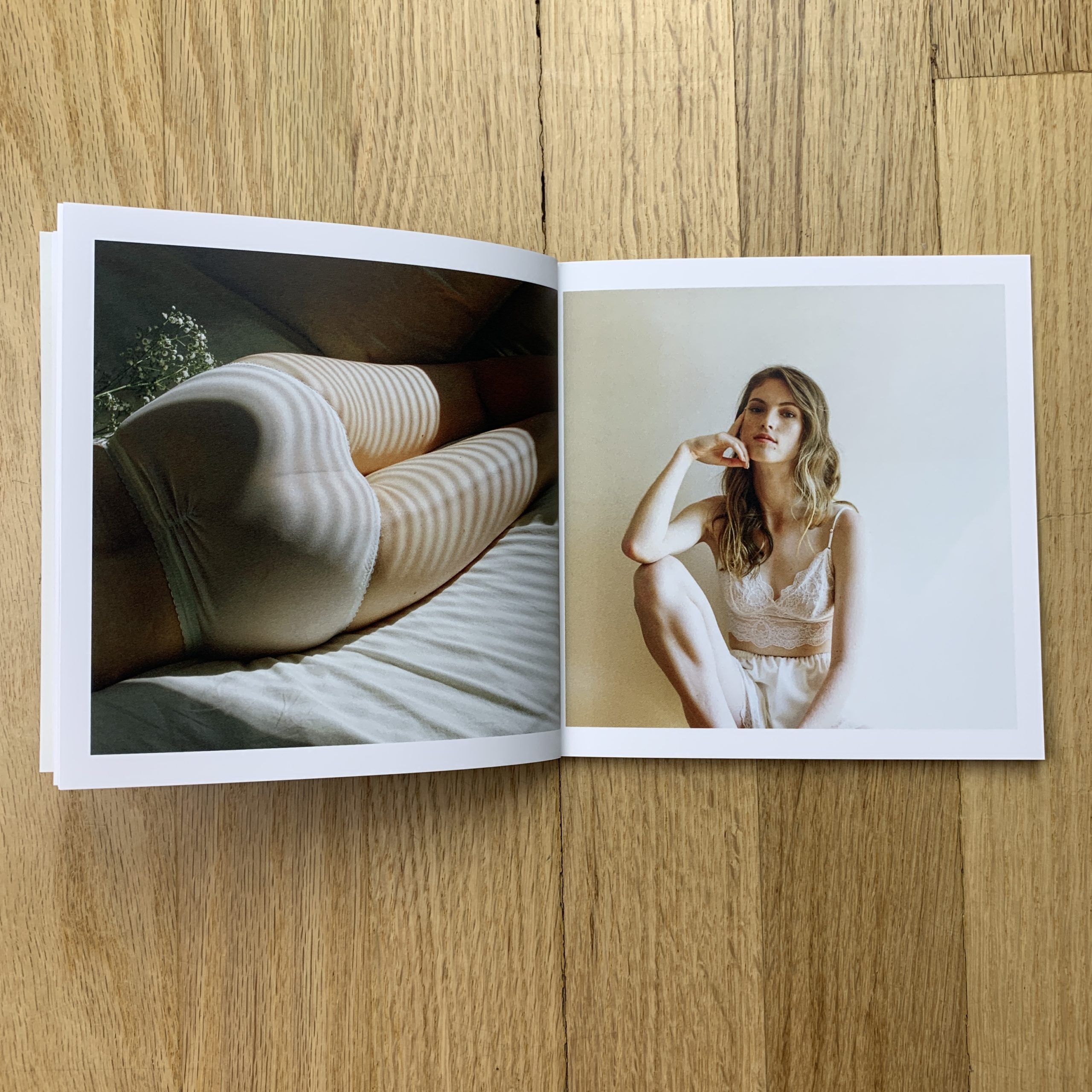
150. I use it as a promo piece and send it to prospects but it’s also a photo book in it’s own right and is sold in a few bookshops in London and Paris.
How many times a year do you send out promos?
Twice on average. I don’t do big campaigns. Generally personalised postcards. I have been doing a book or zine every year/18 month. Each has been used as promo as well as sold in a few bookshops.
Do you think printed promos are effective for marketing your work?
I think so. It’s definitely more memorable than emails or galleries on websites. I think people look at printed work in a different way than on screens.
Denver, New York, the Jersey Shore, Albuquerque, Portland, London, San Francisco, and Monterey so far, with Philly and Chicago up next.
Just writing that, no wonder I’m so tired.
Antidote starts up again tomorrow, then my daughter turns 7 a few days later, and I hang an art show the next week.
It’s easy to give in to negative thoughts, when the exhaustion sets in, I admit.
And after being in Peak-Fitness-Shape back in June and early July, now I’ve got so many niggles and out-of-whack muscles, I feel like I just went two rounds with Mike Tyson.
(Of course in reality I’d barely last 3 seconds…)
I’ve been whining and moaning, feeling sorry for myself because I’m wiped out. I’m even writing it here, two weeks in a row.
But…
Yes, there’s a but…
Just yesterday, separately, my wife and I came to the same conclusion. The negative thoughts follow exhaustion, true, and we even have a term for it: tired brain.
You can battle it, with exercise and sleep and rest, but at least one of those is always hard to come by for us, this time of year.
You can also fight it with a mental re-frame, which is what Jessie and I realized yesterday.
My family is healthy, our retreat is thriving, I’m super-lucky to have the chance to show my work on the walls of the Harwood Museum of Art, and in a new book.
And here I am complaining.
So right now, I’m sitting on the couch, typing on a computer, and I’ve got a smile on my face.
I’m doing it on purpose, sure, but it works. Smiling.
It’s easy, in 2019, the era of Trump and Climate Change, to succumb to a near-permanent hysteria. Social media, traditional media, and even hanging around the wrong people can lead us to believe the end of the world is imminent.
If we don’t fix Climate Change in the next 6 years, WE’RE ALL GOING TO DIE.
DIE, DID YOU HEAR ME?
DIE!!!!!
That’s the level of discourse these days.
No wonder everyone is so fucking stressed all the time.
(Me included.)
One of my favorite things about doing Antidote, and attending all the festivals I do, is that when creative people get together in one place, ideas happen.
Every time.
You can’t predict what will come of it, but you’re guaranteed something will.
2019 is a tricky time, so if you have any additional opportunity to get out there and hang out with your favorite people, or meet new ones, get it done.
I know I had fun in Portland, and even though the early spring seems a long time ago, I’ve got a good memory, and I take notes too.
So why don’t we check out some more of The Best Work I saw at the Photolucida festival in Portland earlier this year.
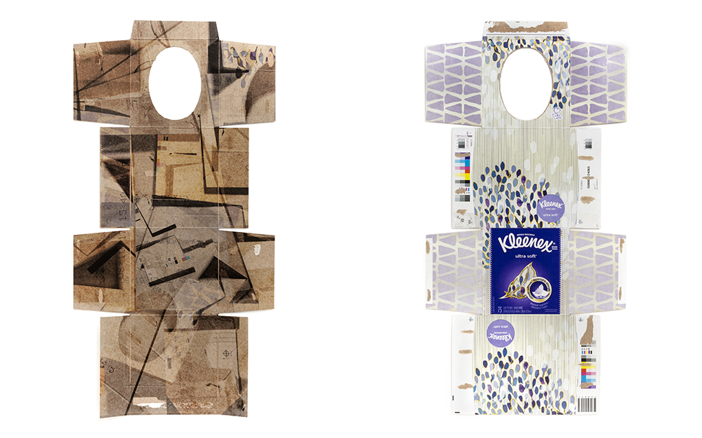
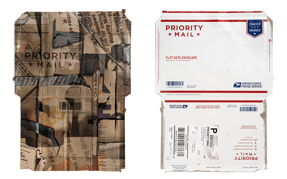
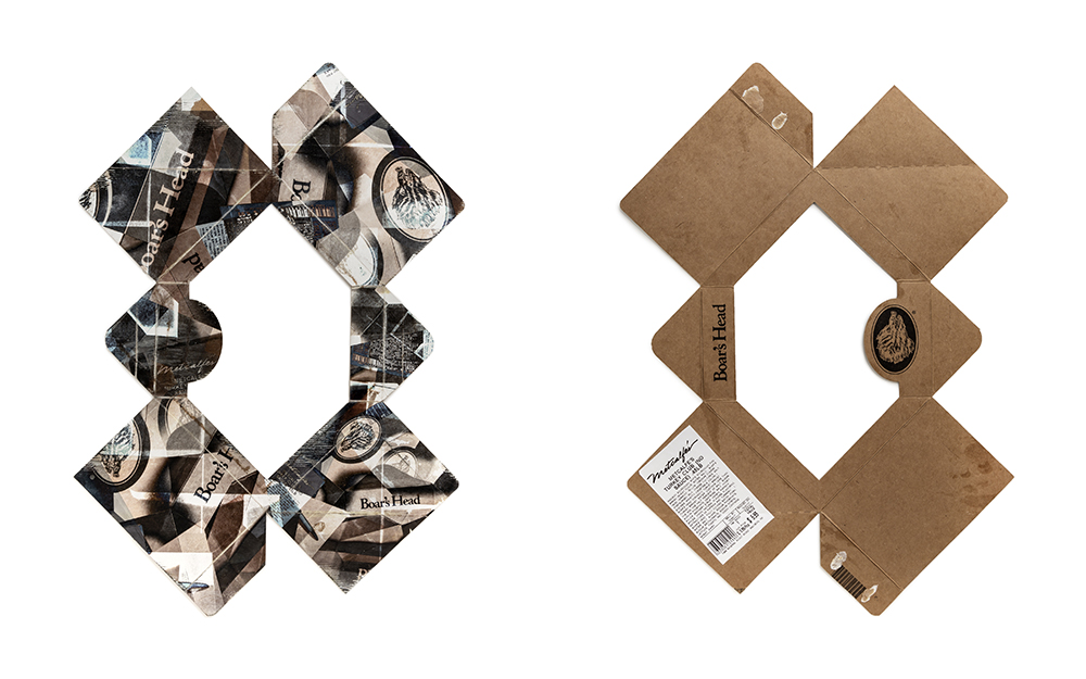
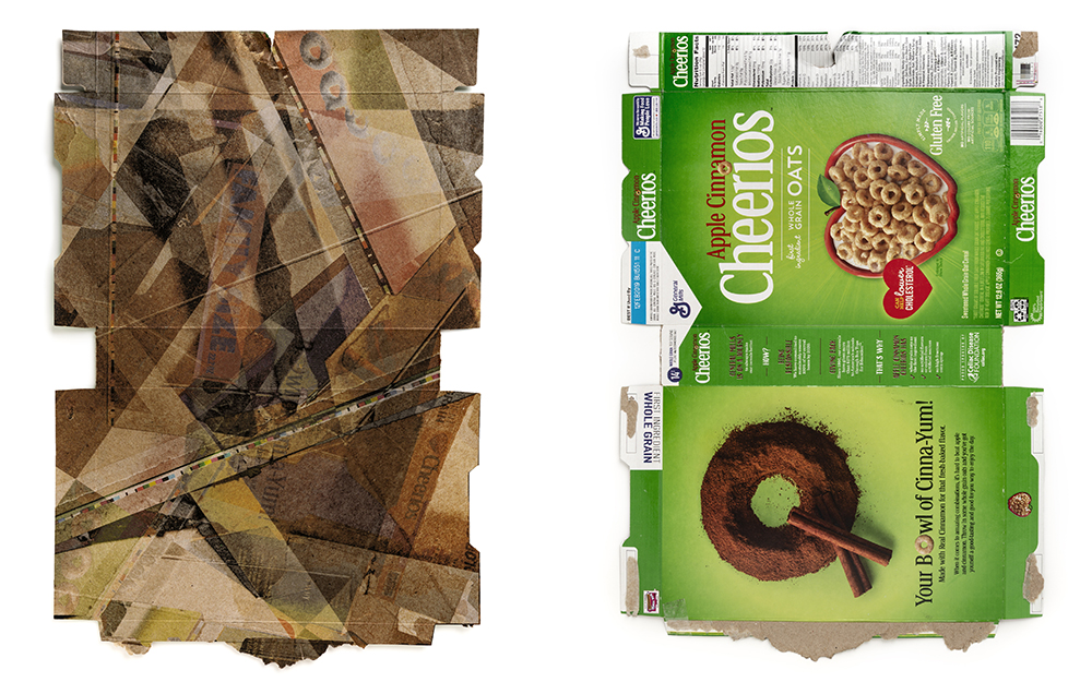
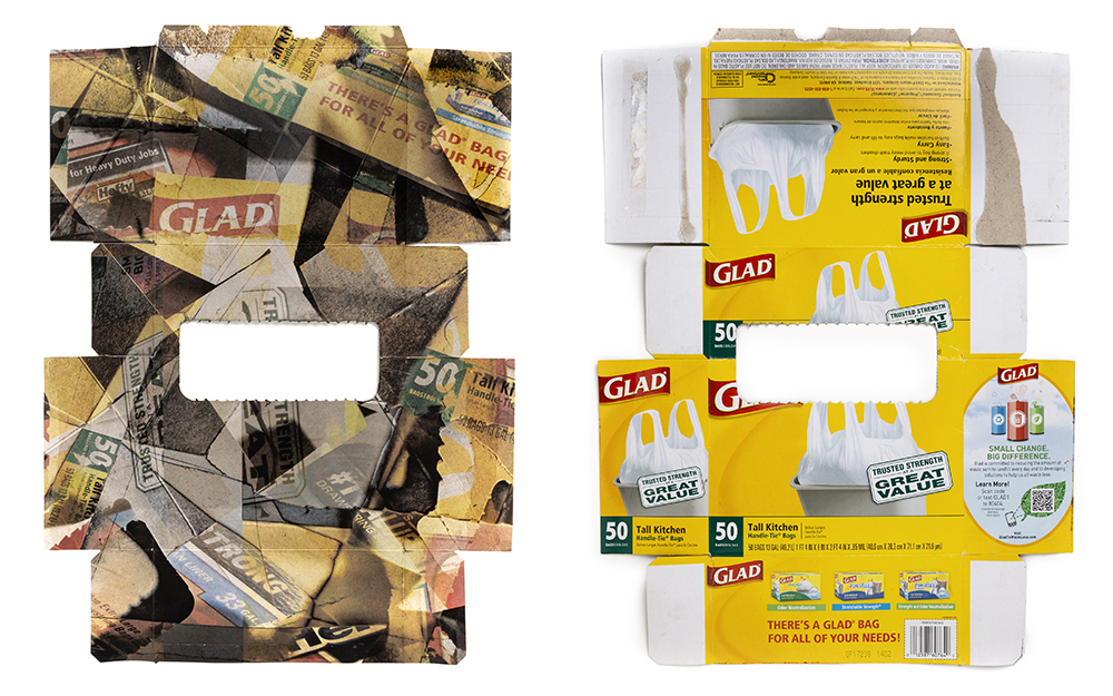
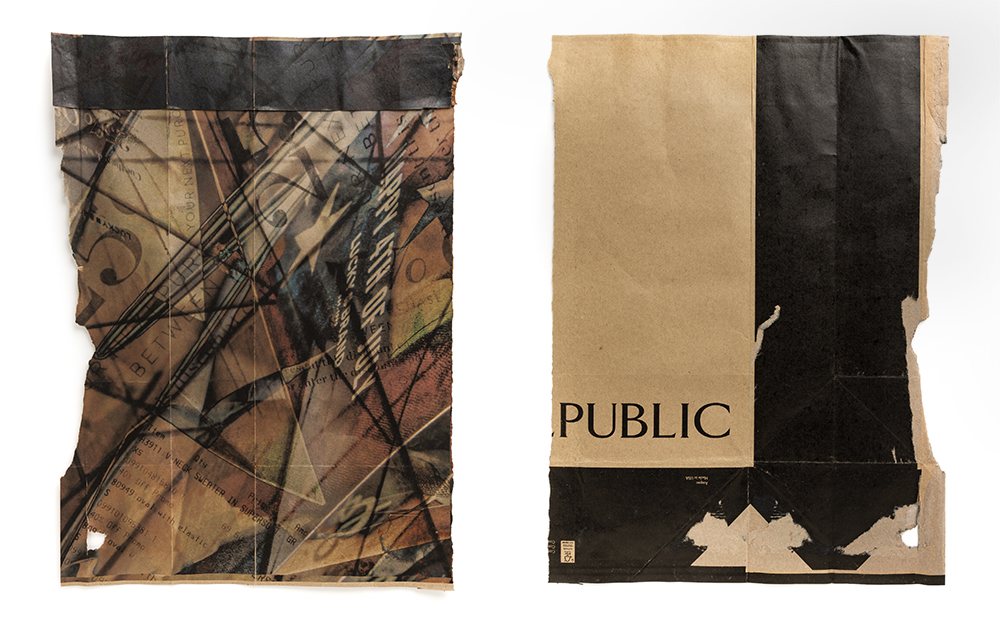
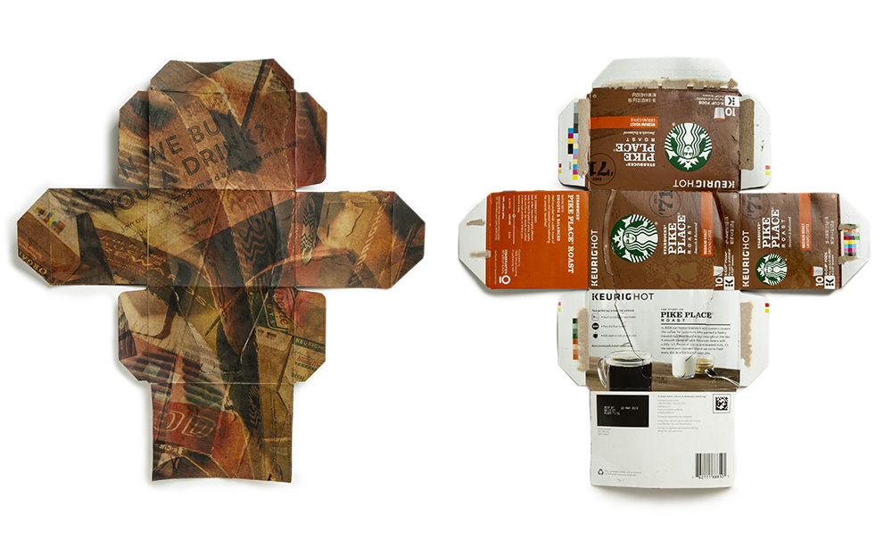
Jennifer Bucheit, from Wisconsin, showed me photographs that were printed on packaging, which feels of the moment.
She recycles the value of worthless things by incorporating them into art.
I think it’s important that art pieces like these have a strong connection between the object and the image, and I could maybe quibble here or there, but really, this is a cool project.
These jpegs show front and back, obviously, but IRL you can’t see them simultaneously. It makes the digital experience inherently different from the real.
Sunjoo Lee, from Seoul, Korea, had some of my favorite work. (If I’m allowed to say such things.) It’s just so up my alley.
Zen. Spare. Beautiful. Haunting. Quiet. Austere. (But not in a bad way.)
It feels silly to stay too much about these, though I should clarify that the subtle nature makes the prints a different thing than the digital experience.
Do I sense a trend?
Yes I do.
Jody Ake, whom I hadn’t seen at a portfolio review since 2009, was at the festival showing work, as he lives in the area, and had a new project.
I knew Jody back then, when he was making wet plate portraits of people, and there wasn’t much work like that then. Now, it’s all over the place, so perhaps he was ahead of his time.
(Maybe he still is, as Jody owns a marijuana edible company.)
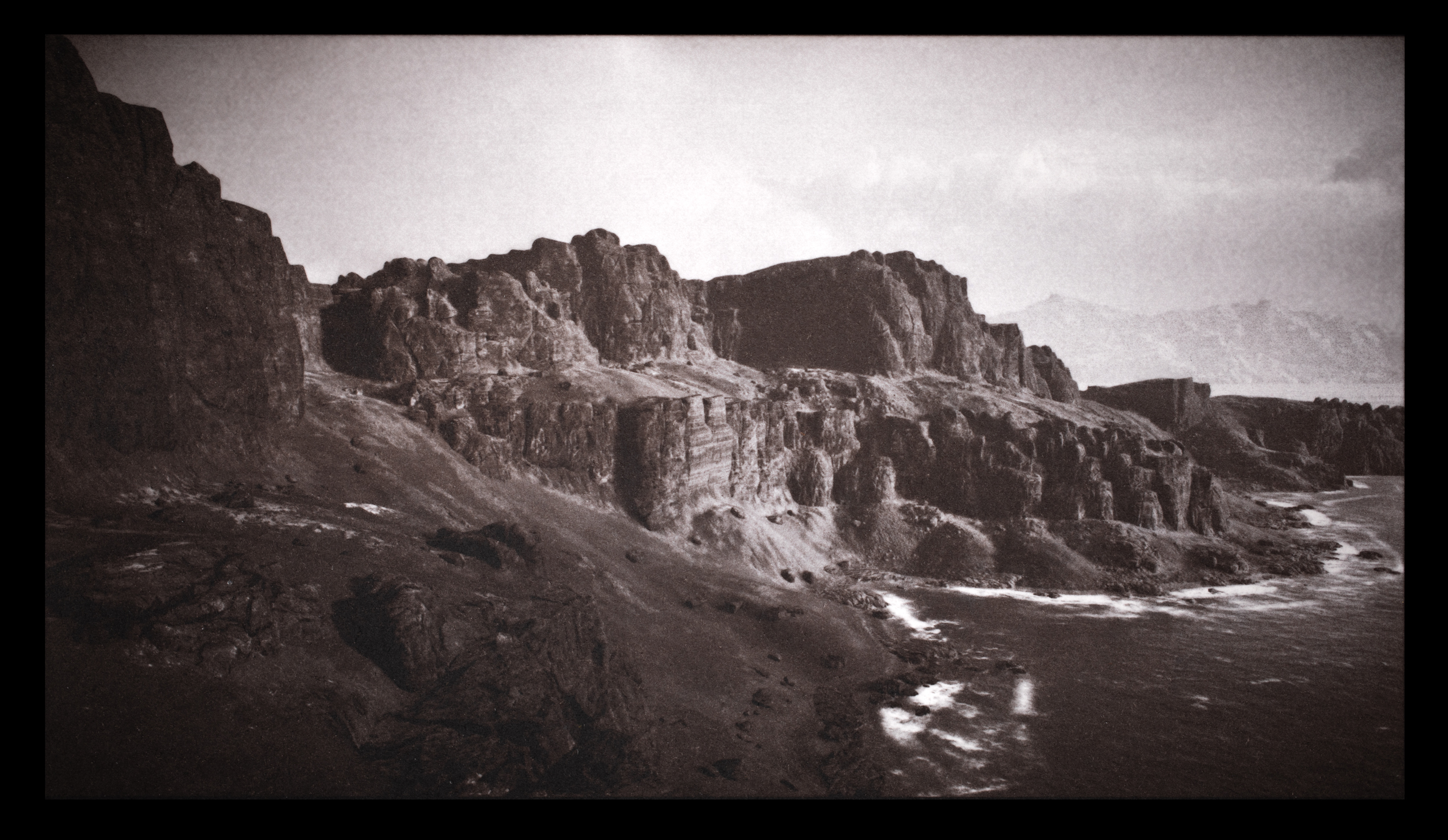
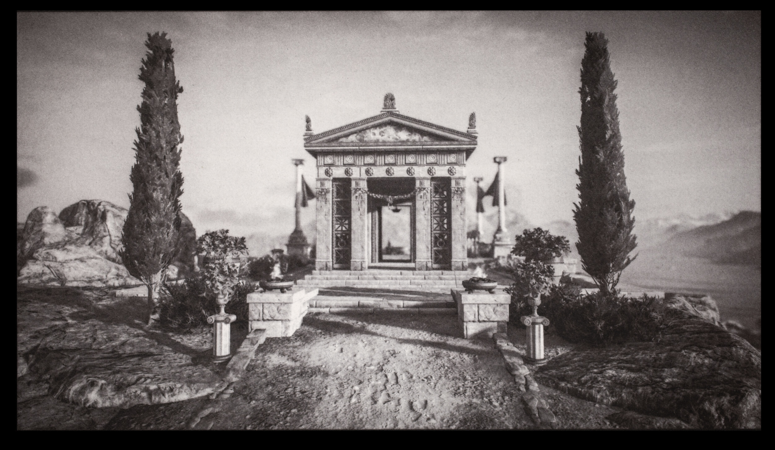
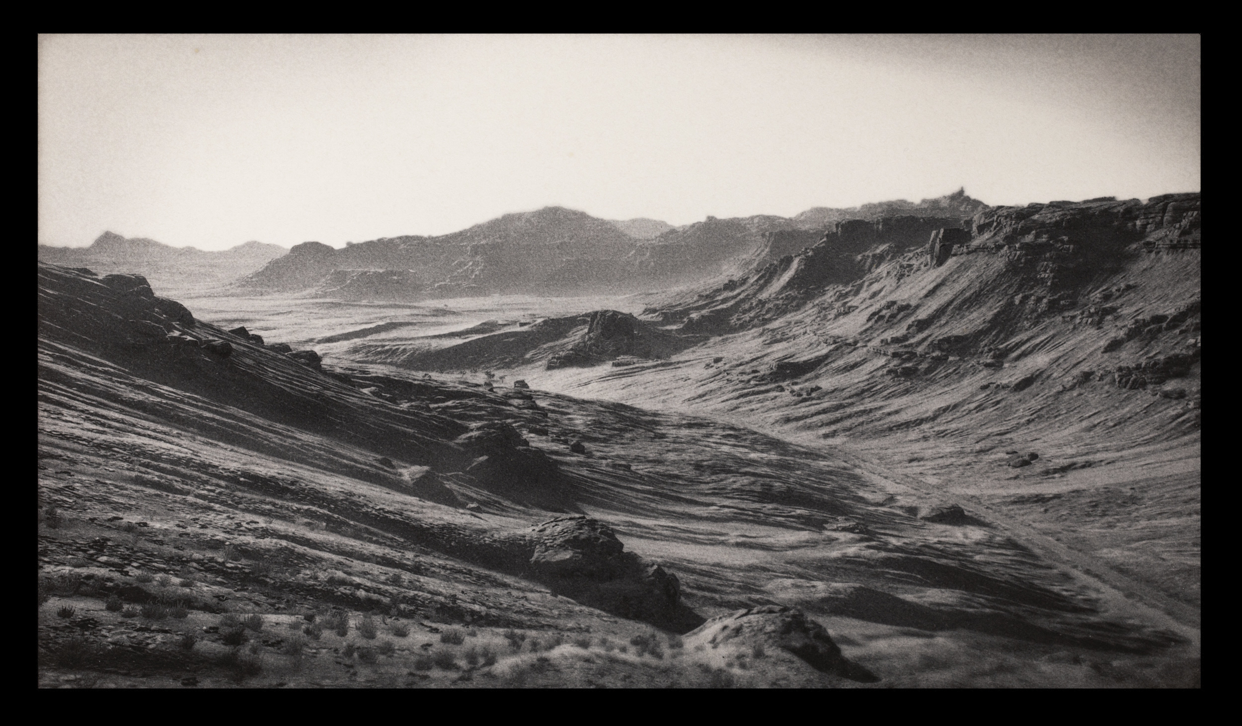
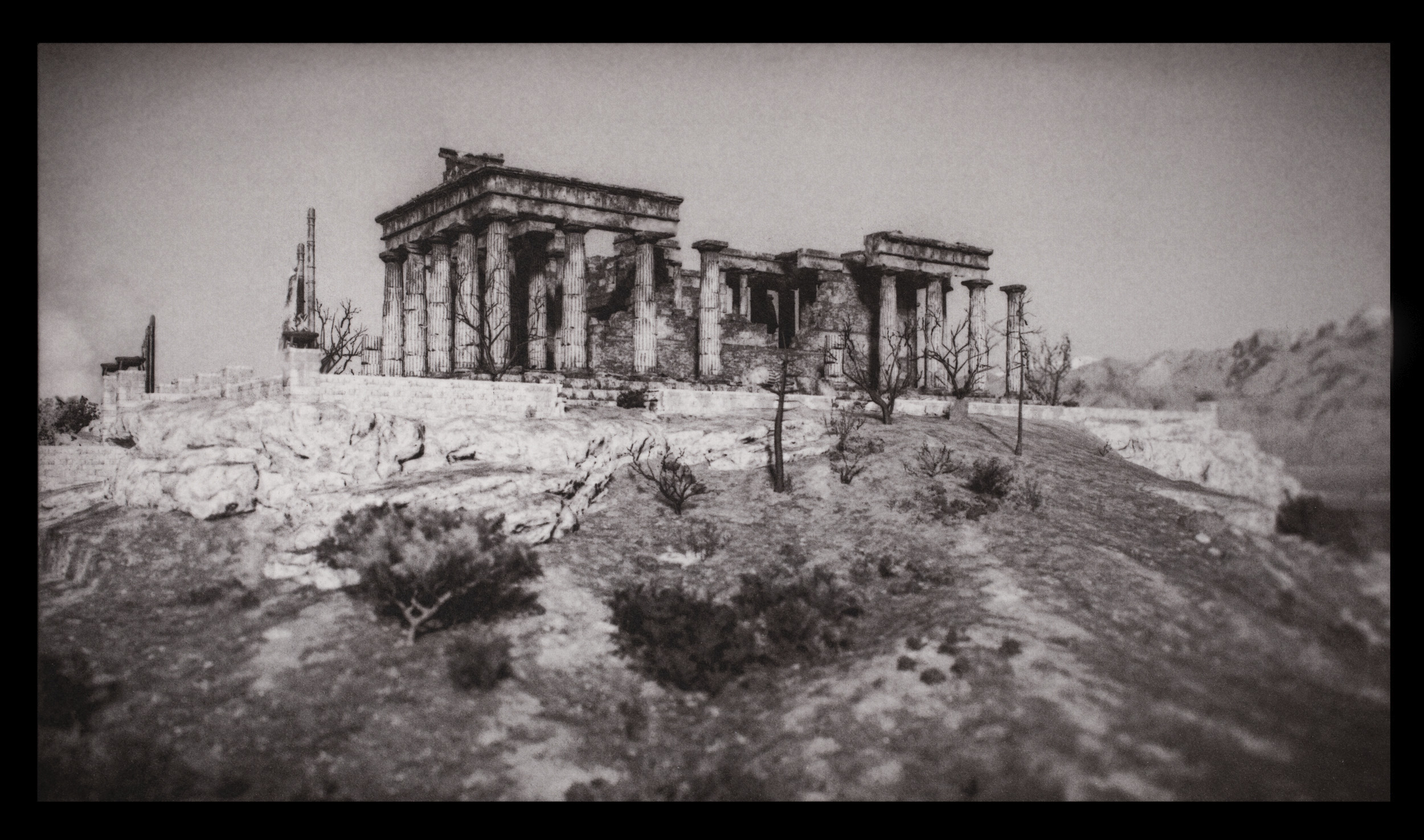
His new work features analog, old school images made of computer-generated landscapes in video games. These scenes, all ones and zeroes, were made for and of color, so stripping that back makes them eerie indeed.
Quinn Russell Brown, based in Seattle, had some pictures made of digital equipment from Microsoft co-founder Paul Allen’s personal collection, which he considers a visual obituary to the deceased mogul. (I swear, I didn’t plan this theme today. It just happened.)
The images were made at Paul Allen’s personal museum, and are super-cool. Pictorially, they’re very different than everything else today, even if they fit with the others, thematically.
The color and design elements are fantastic. Great stuff.
Lori Pond and I had a difficult conversation, at first, because I really didn’t like some of what she she showed me. I was nice about it, of course, but art is subjective, and it was not to my taste.
But we kept calm, and she had many other things to show me, including this really cool group of pictures, which marries text and imagery so well.
Like Jennifer’s work, it’s of the moment, with museums around the world having to reckon with the Colonialist past that brought in all their best loot.
Sage Brown, who’s based in Portland, had pictures made locally that reminded him of the vibe in his home state of Virginia. (He grew up in the Blue Ridge Mountains.)
We discussed that there is something of a trope, with pictures like this, especially in Portland, with the whole Portland-street-dude phenomenon.
That said, I like these pictures a lot.
They feel lived in, real, and authentic, and lacking in pretension in any way. They’re well constructed, and use the color palette to communicate the sadness.
We’ll finish with Soraya Zaman, whose Daylight book, “American Boys,” I saw at Blue Sky Gallery during the publisher’s night.
People lined up outside to get in, by the way, and I saw a ton of books being sold. (Good things happen when people get together.)
As to the images, I remember telling Soraya that they were way too edgy for the NYT Lens blog. (It was still going at the time.)
She asked me why and I said, “That’s their taste, not mine. I think they’re badass, and I’d publish them in a heartbeat on A Photo Editor.”
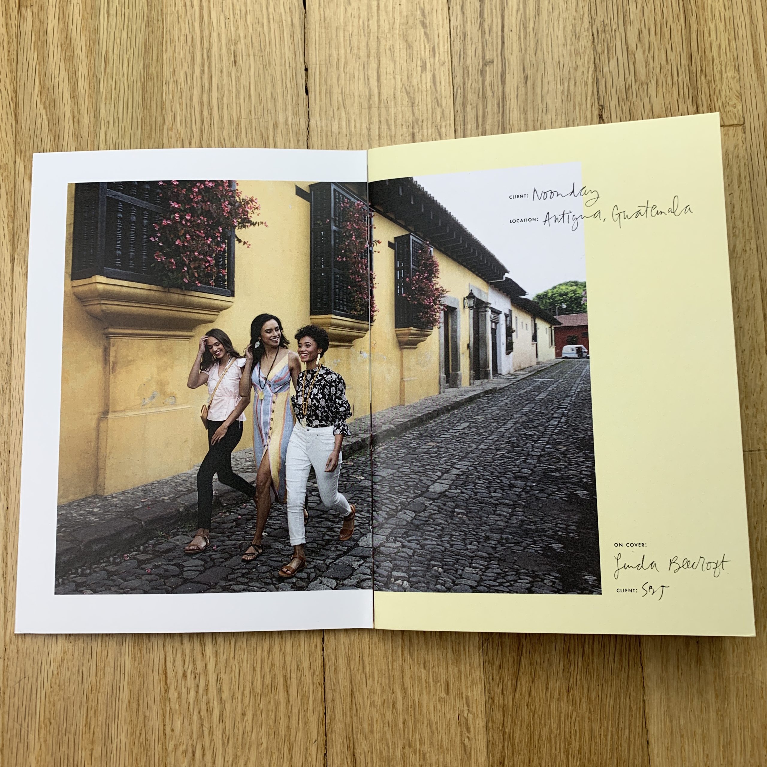
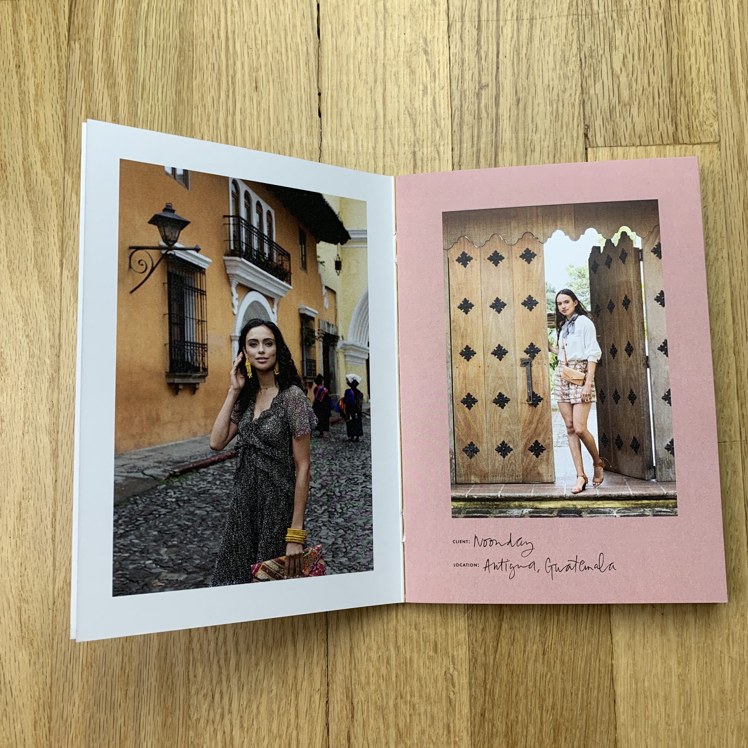
The Art of the Personal Project is a crucial element to let potential buyers see how you think creatively on your own. I am drawn to personal projects that have an interesting vision or that show something I have never seen before. In this thread, I’ll include a link to each personal project with the artist statement so you can see more of the project. Please note: This thread is not affiliated with any company; I’m just featuring projects that I find. Please DO NOT send me your work. I do not take submissions.
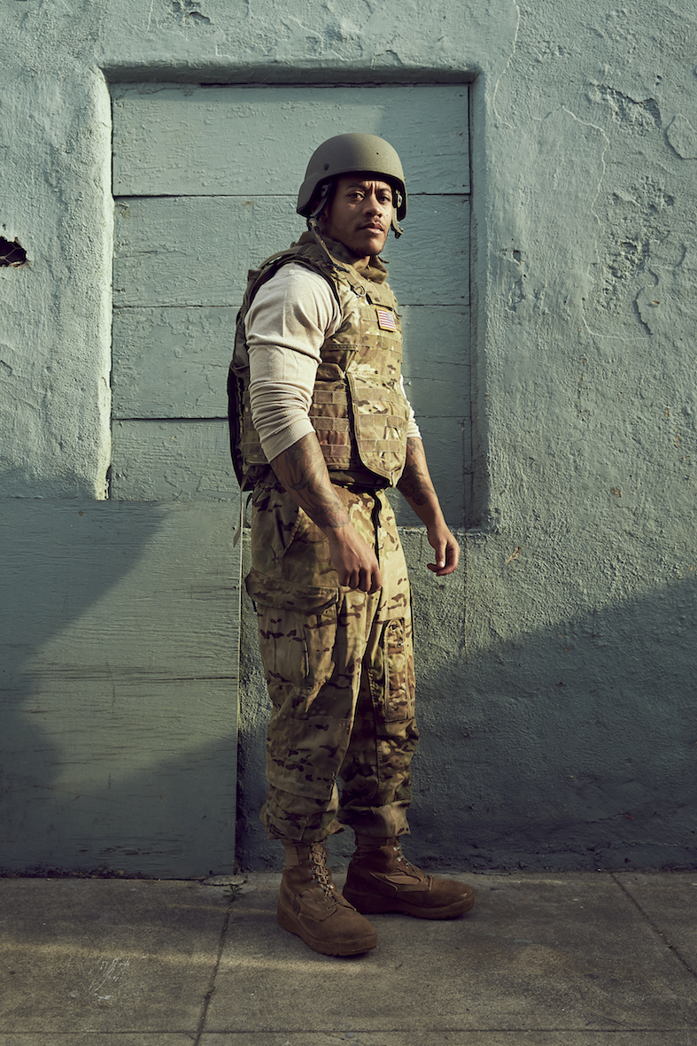
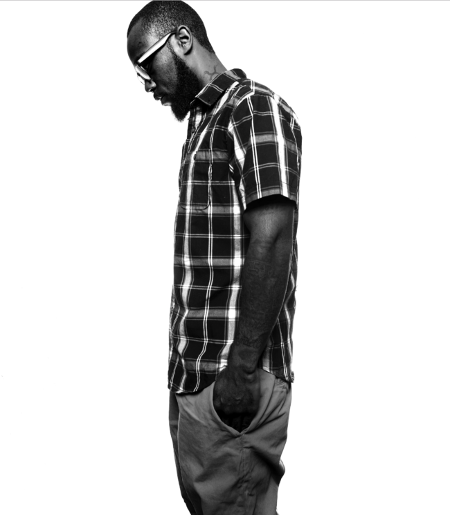
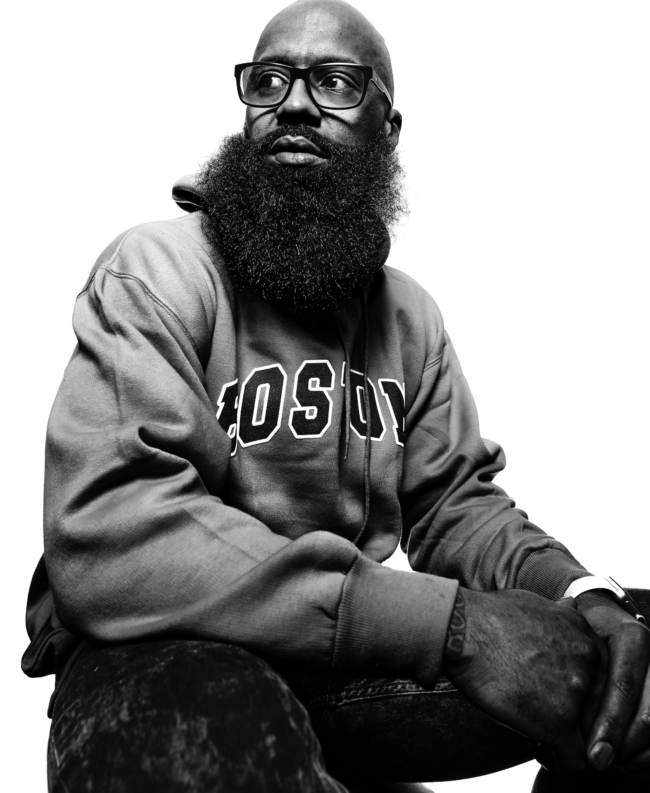
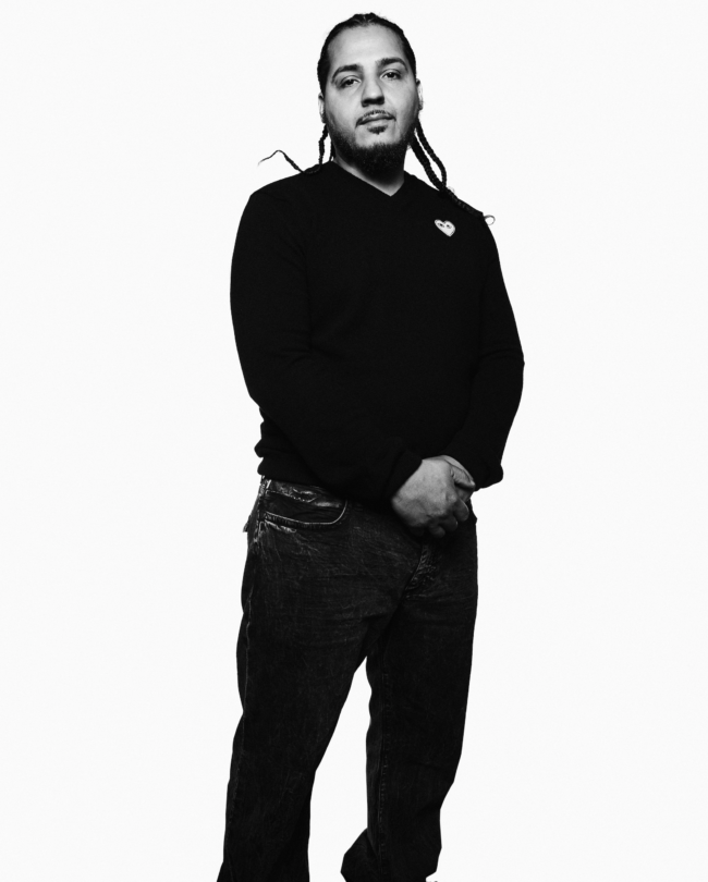
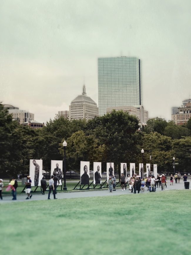
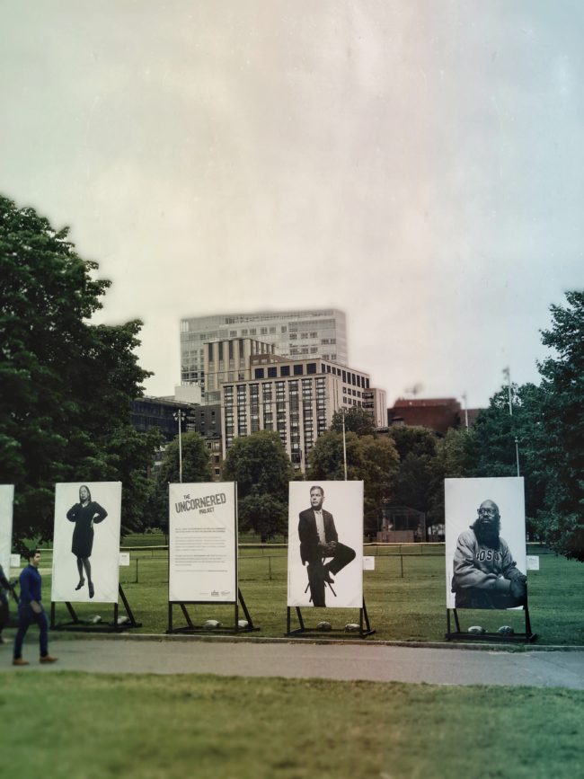
Last year Phil Johnson at @agencypja reached out to ask if I’d be interested in working on a pro-bono project for College Bound Dorchester, a nonprofit dedicated to reducing systemic, generational urban poverty and violence by helping formerly gang-involved individuals go to college and start a new life. I had the honor of meeting many of these students and capturing their resilience as part of College Bound’s “Uncornered Photo Documentary” project. The project reveals the power of choosing something different and the universal experience of what it means to be Uncornered, whether you’re a powerful public figure, an athlete, a business leader, a celebrity or gang involved.
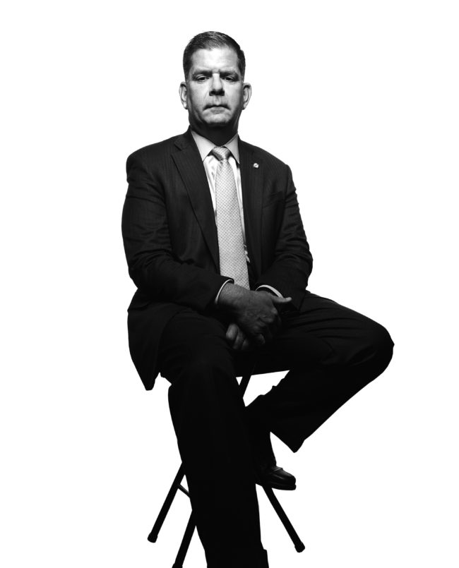
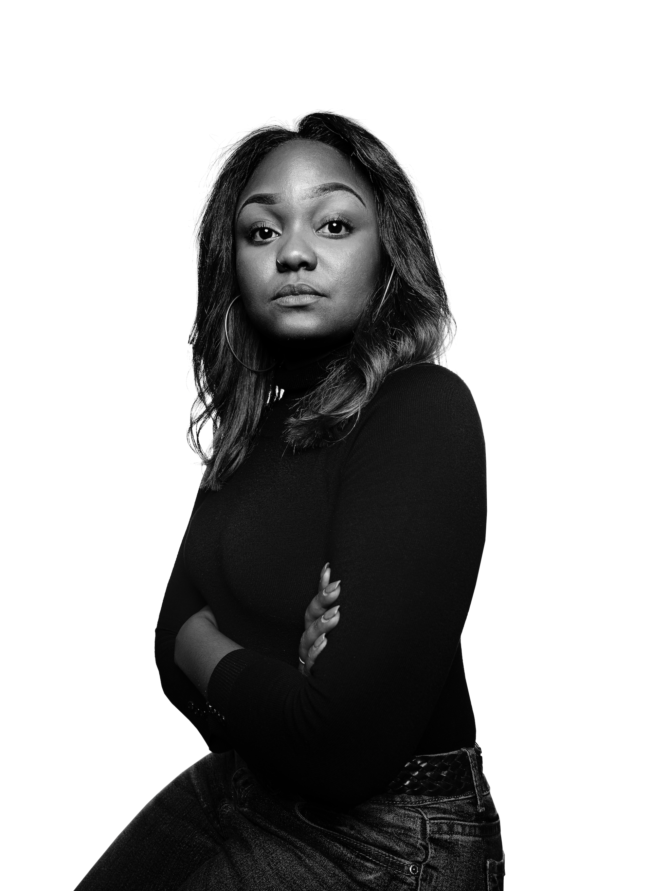
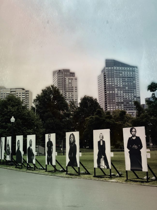
Now through August 25, my portraits and the stories of these students and many of Boston’s prominent public figures, including Mayor Marty Walsh, Congresswoman Ayanna Pressley, State Street’s Chief Diversity Officer Paul Francisco, Emmy-winning journalist Andrea Kremer, and Boston Police Commissioner William Gross, to name a few, will be on display at the Boston Common.
WHERE: Boston Common, adjacent to the Little League Field. Enter through the Charles Street entrance, midway between the corners of Boylston St. and Beacon St.
WHO: Photographer John Huet donated his time to photograph more than two dozen people including the following public figures:
Martin J. Walsh, Mayor of Boston
Rep. Ayanna Pressley, (D) Massachusetts
William Gross, Boston Police Commissioner
Steven Tompkins, Sherriff Suffolk County
Andrea Kremer, NFL Hall of Fame sports broadcaster
Miceal Chamberlain, Massachusetts President of Bank of America
Linda Dorcena Forry, Vice President of Diversity, Inclusion and Community Relations, Suffolk Construction
Jim Rooney, President and CEO Boston Chamber of Commerce
Paul Francisco, Chief Diversity Officer, State Street Corporation.
Karen Kaplan, Hill Holiday Chair and CEO
Callie Crossley, WGBH Host
Claude Dielna, Portland Timbers
Photographs of several Boston Uncornered students, staff and leaders will also be part of the exhibit:
Mark Culliton, College Bound Dorchester CEO
Michelle Caldeira, College Bound Dorchester Senior Vice President
Conan Harris, College Bound Dorchester Vice President of Policy and External Affairs
Raul Morales, Boston Uncornered student
Irvin Woods, Boston Uncornered student
Paul Burns, Boston Uncornered student
Alex Diaz, Boston Uncornered student
Kismauri Pena, Boston Uncornered student
Brittany Baldwin, Boston Uncornered student
Quaknesha Garvin Johnson, College Bound Dorchester
Elias Perea, College Readiness Advisor
Will Dunn, College Readiness Advisor
Francisco DePina, College Readiness Advisor
Luis Rodrigues, College Readiness Advisor
Lealah Fulton, College Bound Dorchester staff
WHY: The journey Boston Uncornered students make from the corner to college has the power to transform Boston, where the one percent of young people (those who are gang involved) occupy the five percent of city’s street corners where nearly 75 percent of the city’s shootings take place. Those with the charisma, influence and ingenuity necessary to form and run gangs are natural leaders. They know how to get others to follow. Boston Uncornered is turning these leaders of gangs into respected members of the city who will lead others toward education and well-paying jobs rather than lives of crime.
APE contributor Suzanne Sease currently works as a consultant for photographers and illustrators around the world. She has been involved in the photography and illustration industry since the mid 80s. After establishing the art buying department at The Martin Agency, then working for Kaplan-Thaler, Capital One, Best Buy and numerous smaller agencies and companies, she decided to be a consultant in 1999. She has a new Twitter feed with helpful marketing information because she believes that marketing should be driven by brand and not by specialty. Follow her at @SuzanneSease. Instagram
Success is more than a matter of your talent. It’s also a matter of doing a better job presenting it. And that is what I do with decades of agency and in-house experience.
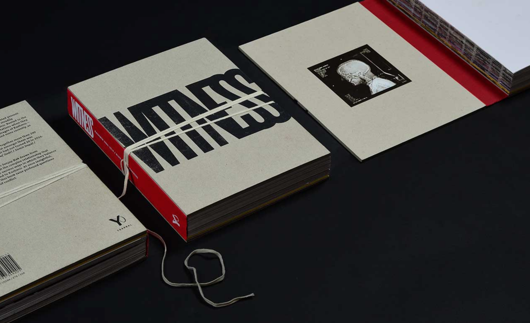
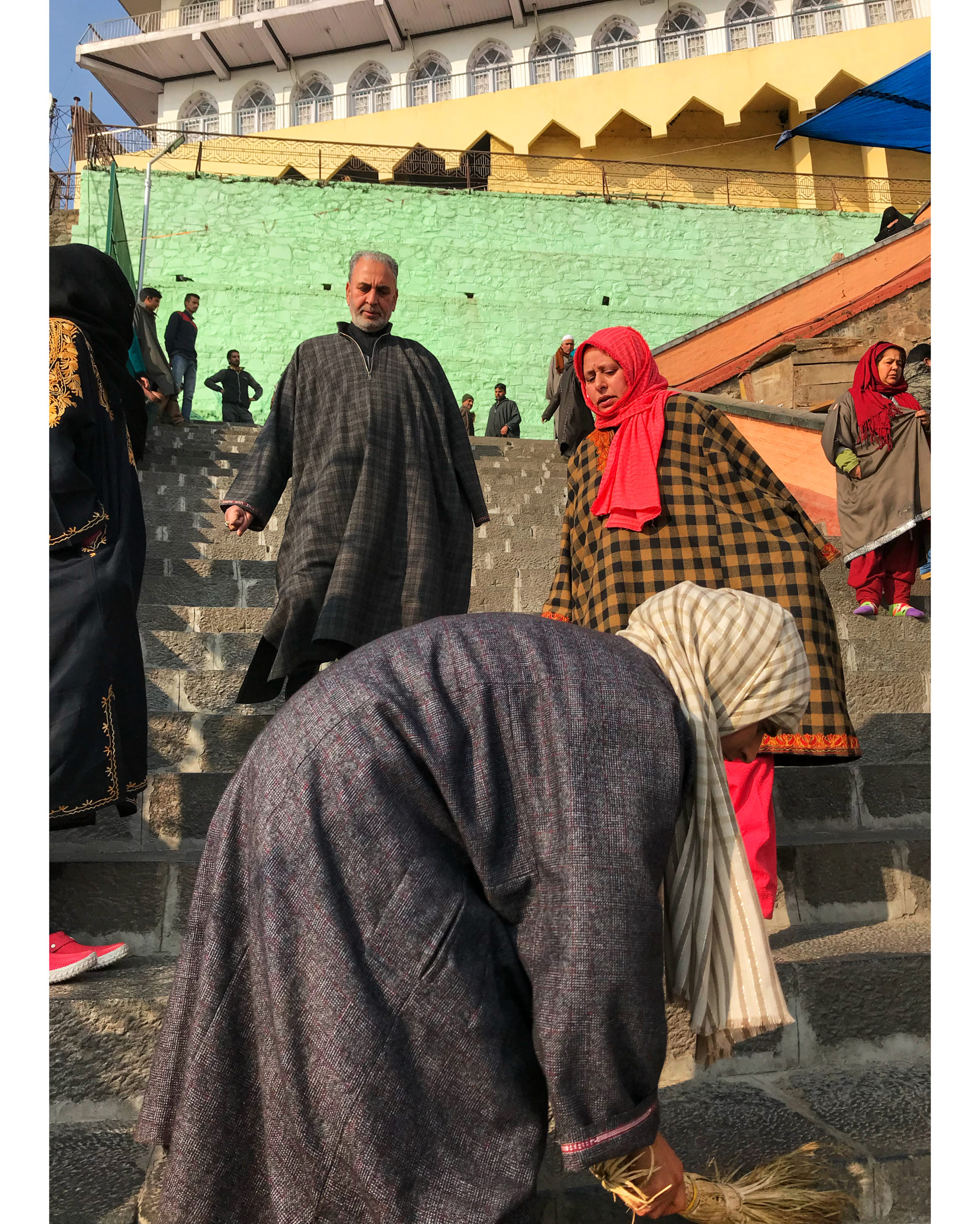
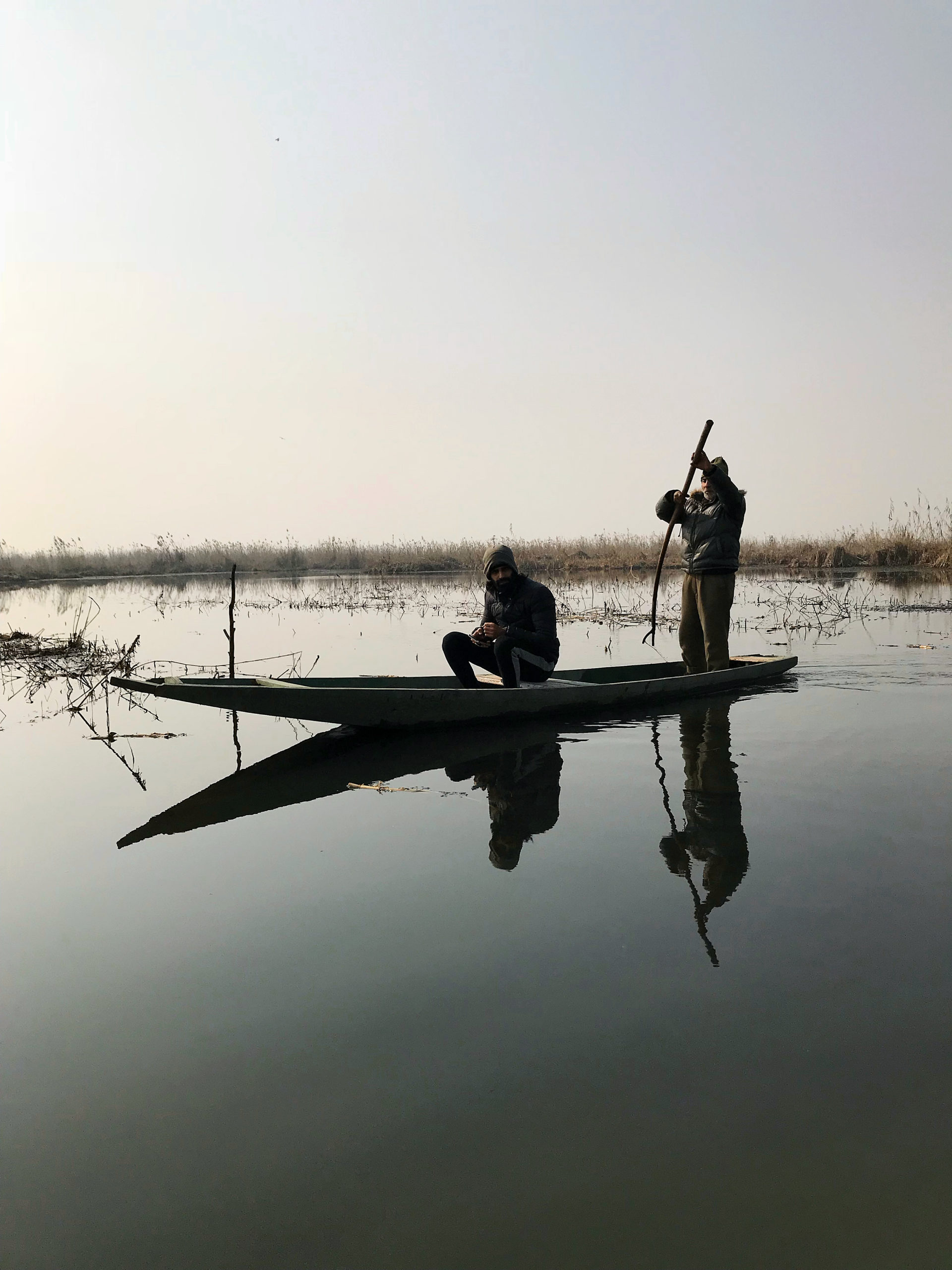
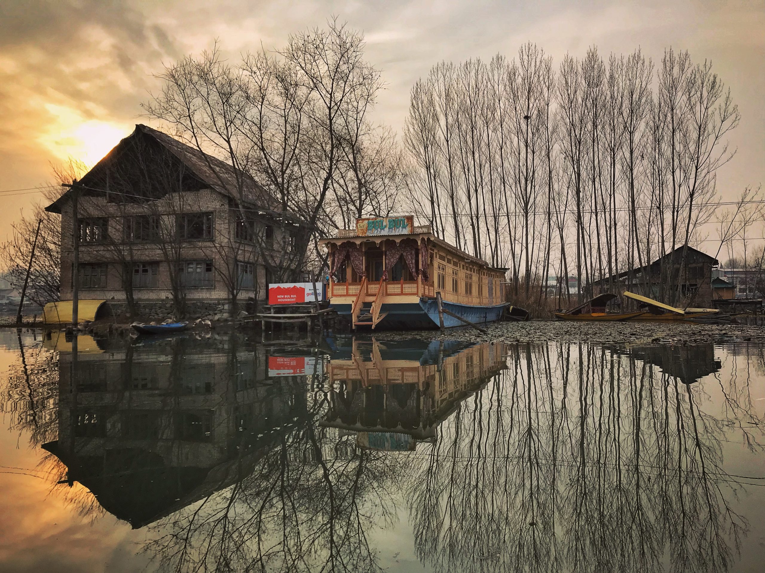
Nine photojournalist were featured in the award winning book Witness/Kashmir 1986-2016. A book that spans thirty turbulent years that have shaped Kashmir. As many know Kashmir, also knows as “Paradise on Earth” was under a clamp down for the past 14 days. No mobile phone, no internet and many land lines are just now being restored. This book designed by Itu Chaudhuri Design was meant to reflect a casefile, a collection and evidence during those three decades.
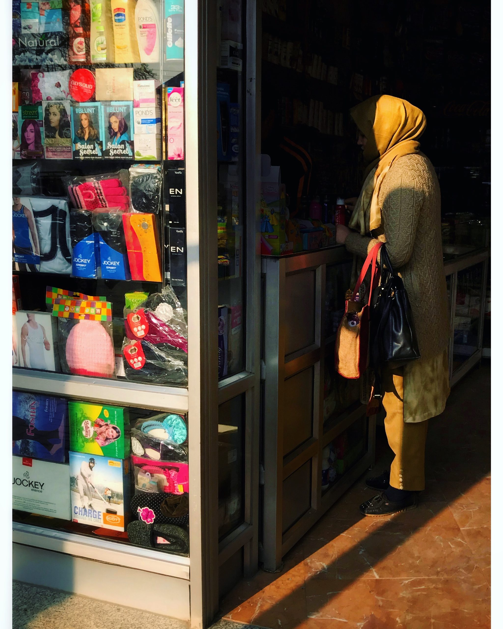
Mark Hanauer who had spend time in Kashmir shooting Huemn stories which is an ongoing project with the brand. in 2018 also photographed several of the photojournalists that contributed to this book. Despite Kashmir being on clamp down, today we are sharing images from his trip that remind us of this paradise.
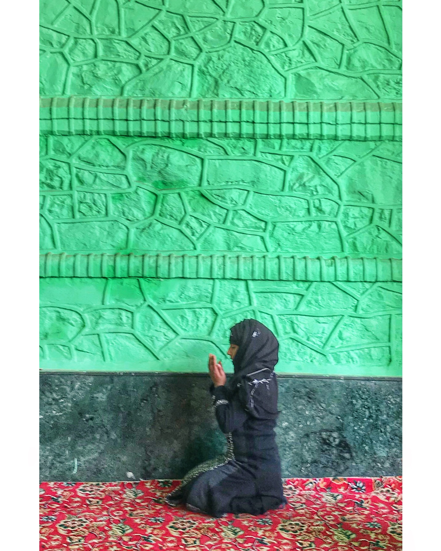
Makhdoom Sahib, a shrine at the top of a hill was extraordinary. Climbed many steps to the entrance. We met a holy man, he smiled at me, took my hand, gave me a blessing and two almonds. I was taken by his warmth and kindness. I still have the almonds, they always remind me of that moment. In the shrine only men are allowed into the inner chamber, the women pray just outside.
“I recall exiting the airport after arriving in Srinagar. The moment we stepped outside, I was hit with a very bright, blue sky, a number of heavily armed soldiers making their presence known, barbed wire and and a fighter jet flying menacingly low overhead. Driving toward Srinigar, I was surprised how different the architecture was to that of anywhere else I had been in India. Many Swiss chalet type structures in the foothills of the Himalayas, very surprising. We arrived in Sriningar and quickly met a few of the people that we were going to work with. I felt welcomed by them and everyone that I met in Srinagar. We drove to a small village to photograph a girl who at the age of 14 was peering out of her window and was shot in the face with rubber pellets by government security, rendering her blind and disfigured. When we met her, she was 16 and had just passed her 10th grade exam and was going on to Delhi Public School, a top school in Srinagar.
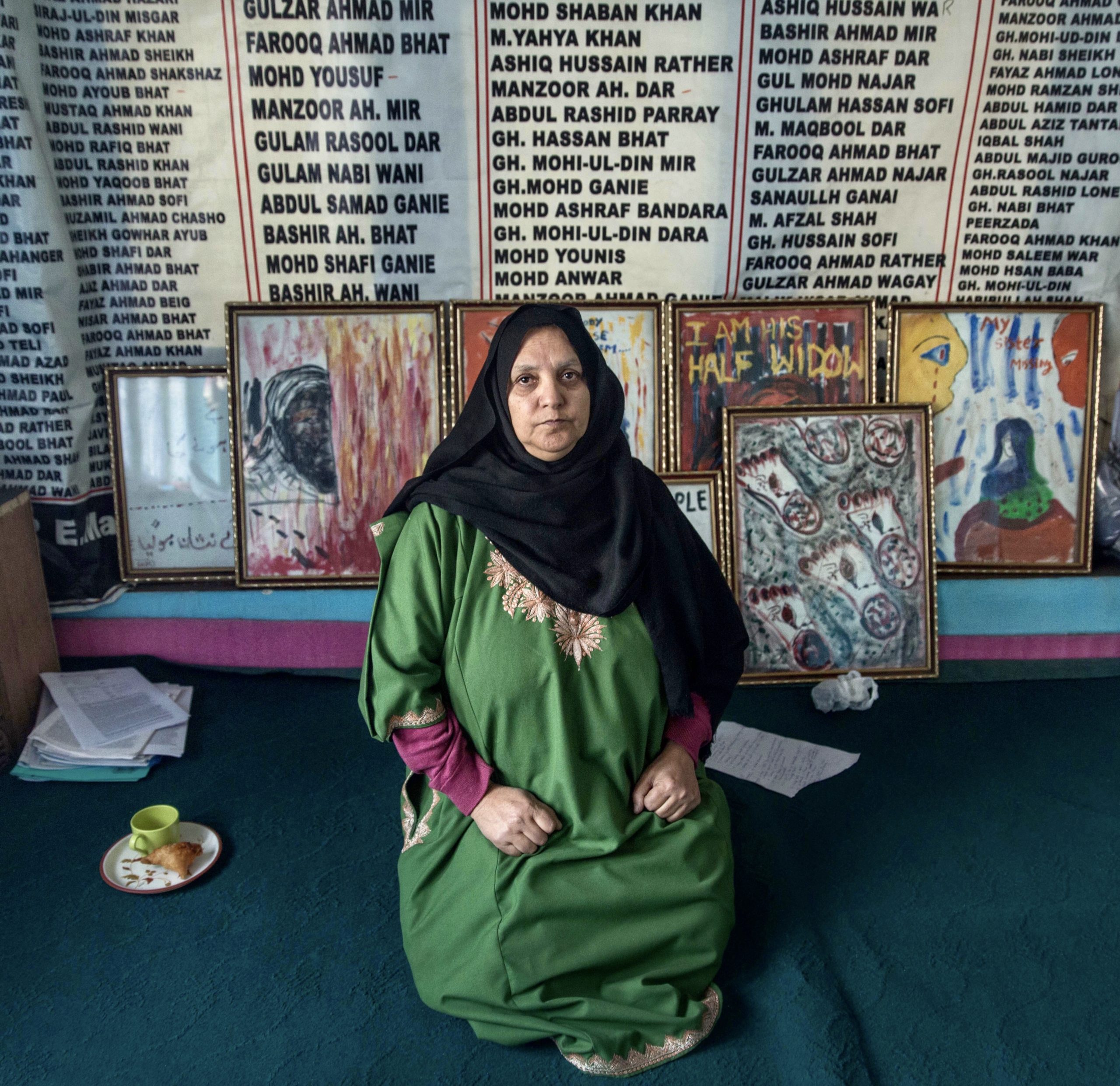
Parveena Ahanger, the ‘Iron Lady of Kashmir’ Her son ‘disappeared’ along with many other Kashmiri’s. A lawyer, she started the Association of Parents of Disappeared Persons, to search for those who are missing. The names behind her in the photo are all missing persons. She has won numerous awards for her human rights work.
Hokasir Reserve just to the northwest of Srinagar and the longest rifle ever! For shooting birds.
Dal Lake. Urban lake in Srinagar, stunning place, 3500 or so houseboats on the lake as rentals. Tourism is normally huge here.
Who printed it?
I printed with PIKTO based in Toronto, Canada.
Who designed it?
My rep and photo consultant Monashee did the image selection, layout and pagination – https://monashee.org/
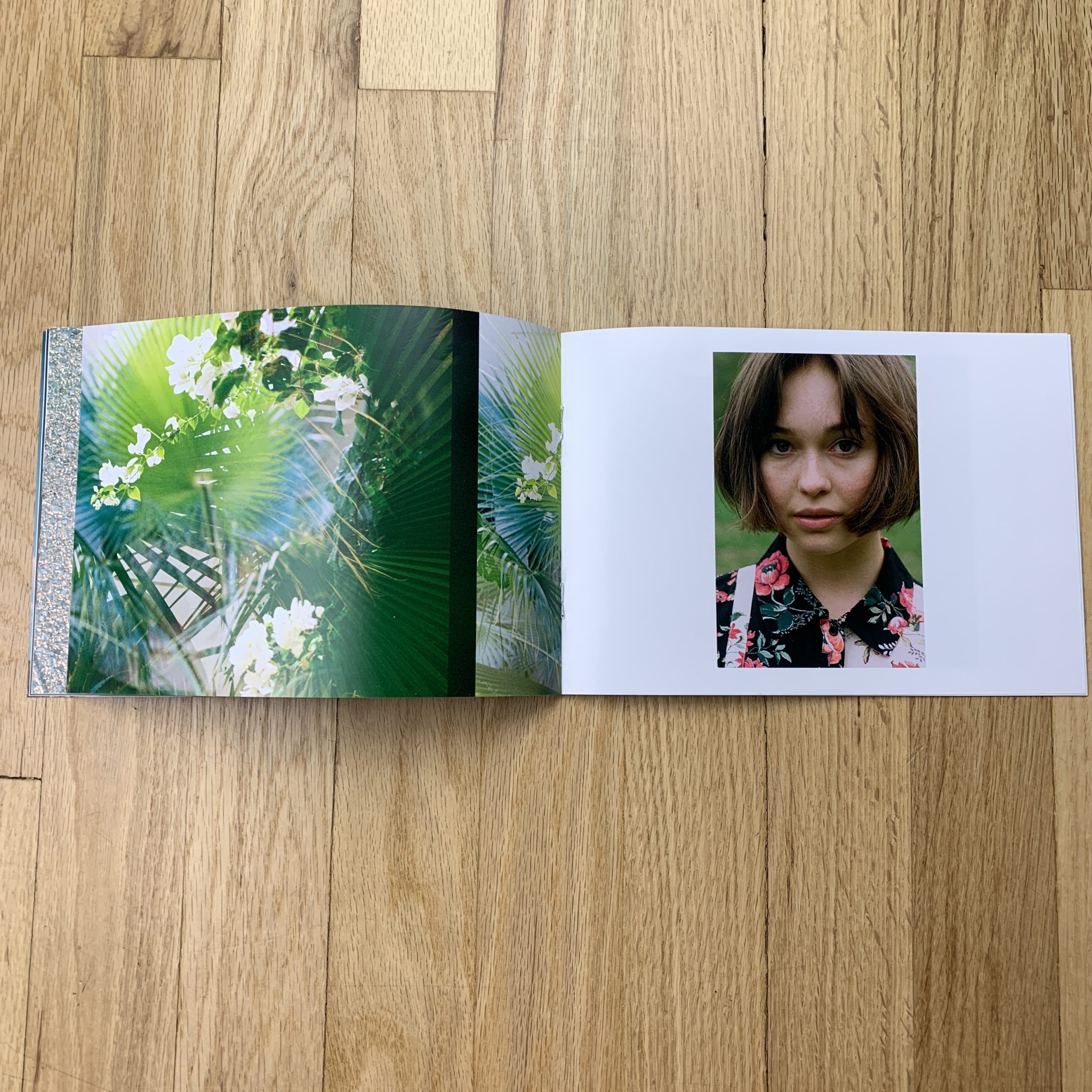
Tell me about the images?
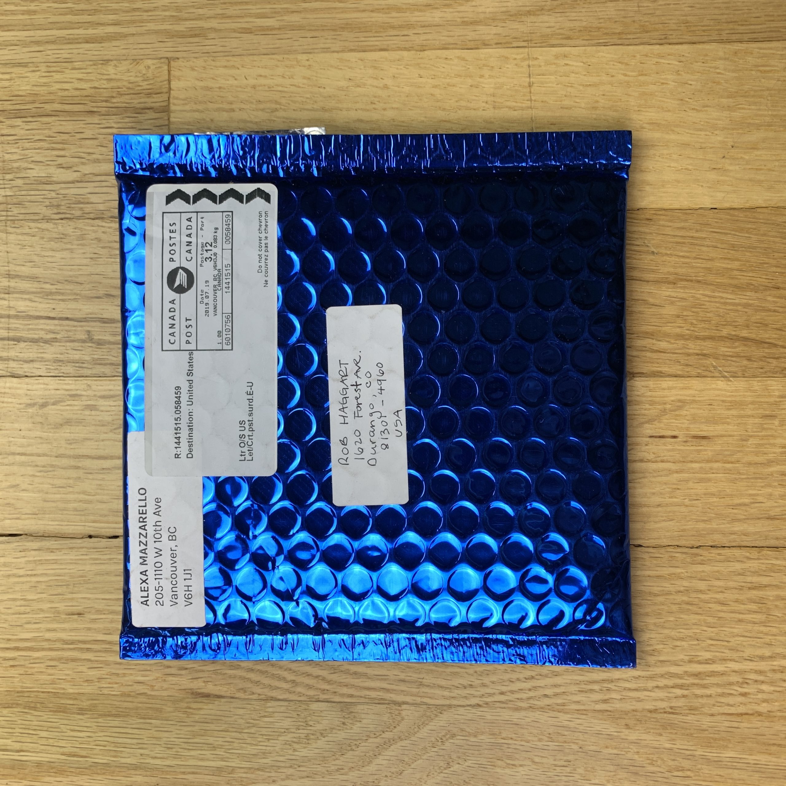
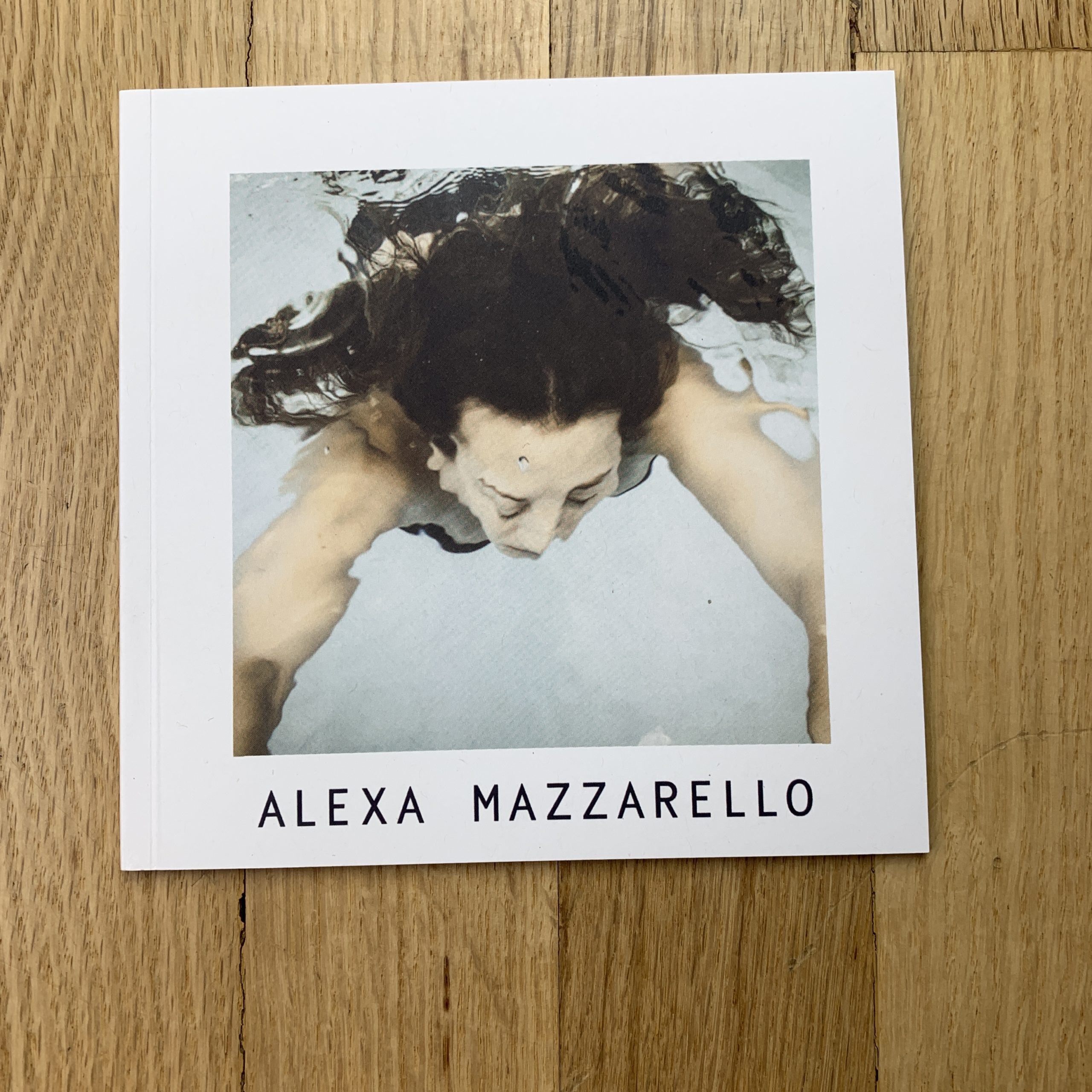
The book was created around the concept of “summer”. Given the time of year and that one of my ideal clients is swimwear, we wanted to showcase this through imagery and capture the dreamy feeling of summer. The packaging was chosen to echo this feeling with a reflective and shiny blue bubble mailer to elicit the feeling of diving into a pool, having it open onto the cover of the woman in a pool.
How many did you make?
I made 30 and sent them to a very targeted and specific sector of my list. It was meant to be special and tailored to them.
How many times a year do you send out promos?
This is the second promo I’ve sent out this year. I’m planning on sending one more this year, making it three total.
Do you think printed promos are effective for marketing your work?
I do. I think it’s important to show printed work to really showcase a theme or body of work. It’s also important to me to create an experience for the person receiving it. I think it helps guide them in how I want them to experience my work – that’s my favourite part.
But I’m always honest, and keep you apprised, so the issue is that I’m super-exhausted.
Good things, like bad things, sometimes come in threes, and we wrapped our first session of Antidote this week, I’ve got a big museum solo show coming up next month, and we’re working on my first book as well.
I’m as cooked as a lobster after an hour in the pot.
But deadlines are not forgiving, and Friday looms just ahead.
So I tried everything I knew to boost my creativity.
I drank some coffee.
Did some stretching.
Ate some sweets.
And then I went for a walk. (The best trick of all.)
Out there, in the fresh air, with the sun on my face, I remembered that we can’t force our creativity.
It doesn’t work.
With this weekly column, 8 years old next month, I’d say I’m an expert in keeping the creative juices in regular, working order.
No column, no job.
No job, no money.
And if I’ve learned anything, it’s that the creativity is the boss, and we’re the vessel.
The worker bee.
I often tell my students we don’t have an art boss, but as I sit here writing, on this day when my creativity is so battered, I realize that’s not entirely true.
The creative energy, or the force that makes it, is really in charge here.
If you want to tap into it, long term, you have to nurture it, and respect it.
That’s why I went for that walk, knowing it was my best chance of communing with the writing gods.
And idea would come, I hoped, as I couldn’t motivate to revisit London, or Portland, and the first two books I looked at weren’t right either.
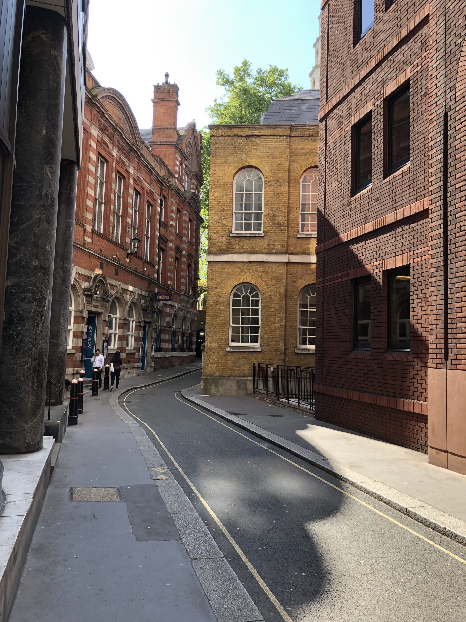
London, 2019
Out there, in the sun and the breeze, I thought of how instinctual creativity really is.
So much comes from the subconscious, or through happenstance and coincidence we take to “mean something.”
We imbue things or experiences with heft, believing that certain objects, places, or days, are just THAT MUCH MORE SPECIAL than everything else.
As photographers, we believe that some things can step out of time.
Out there, on my walk up the hill, I remembered the moment, in July of 2016, as my family and I spent a little vacation on California’s Central Coast.
My wife’s family live in/on the Monterey Peninsula, so I’ve visited many times, and think it’s about as ideal a California lifestyle as I have yet seen.
Public park, Monterey
I’ll write a cultural-critique-travel-piece about California sometime soon.
I promise.
But for today’s purposes, we’re going to focus on the drop dead beauty, and the impossibly lovely feeling of the ocean moisture on your skin, in the air, no matter where you are.
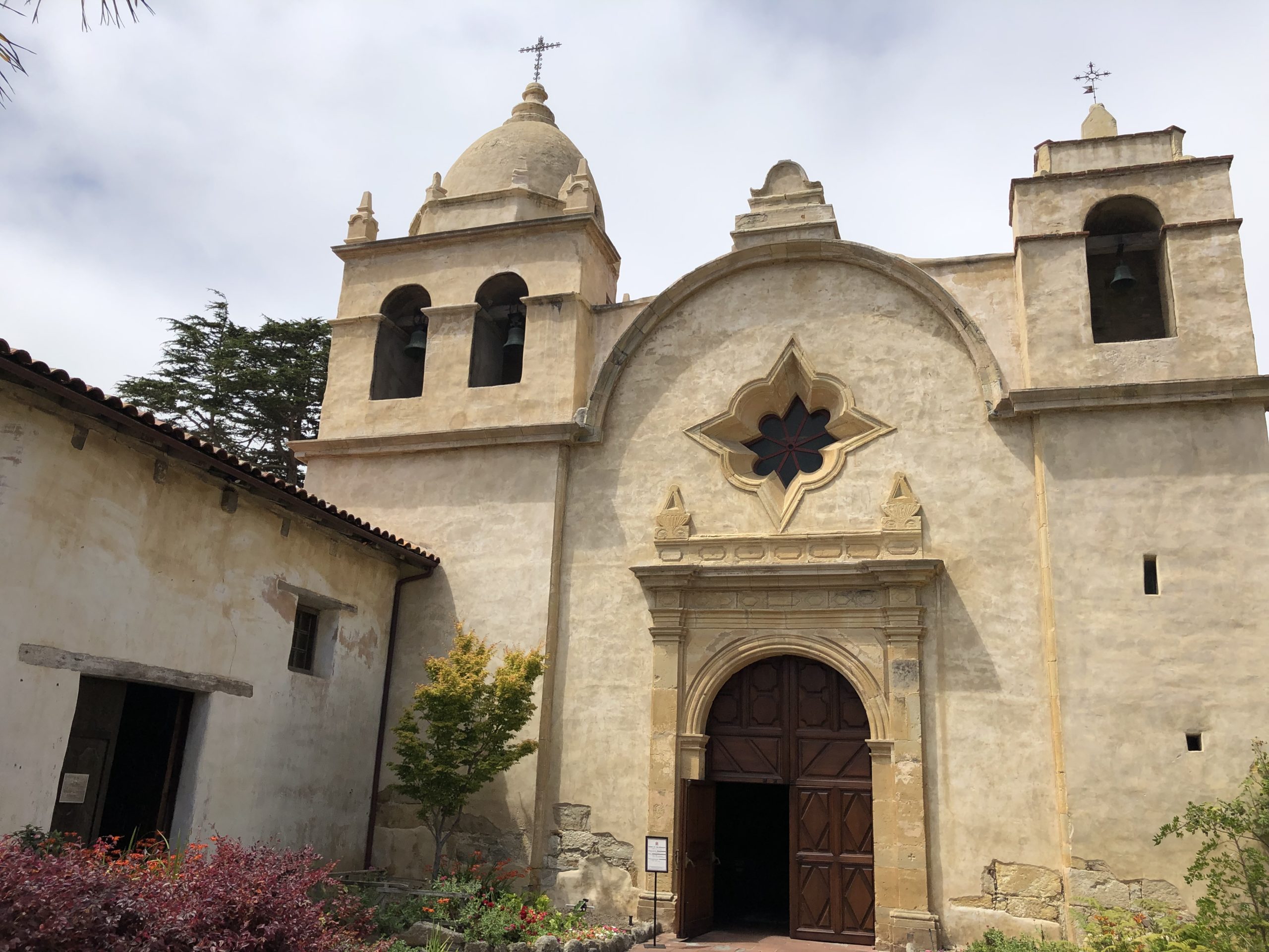
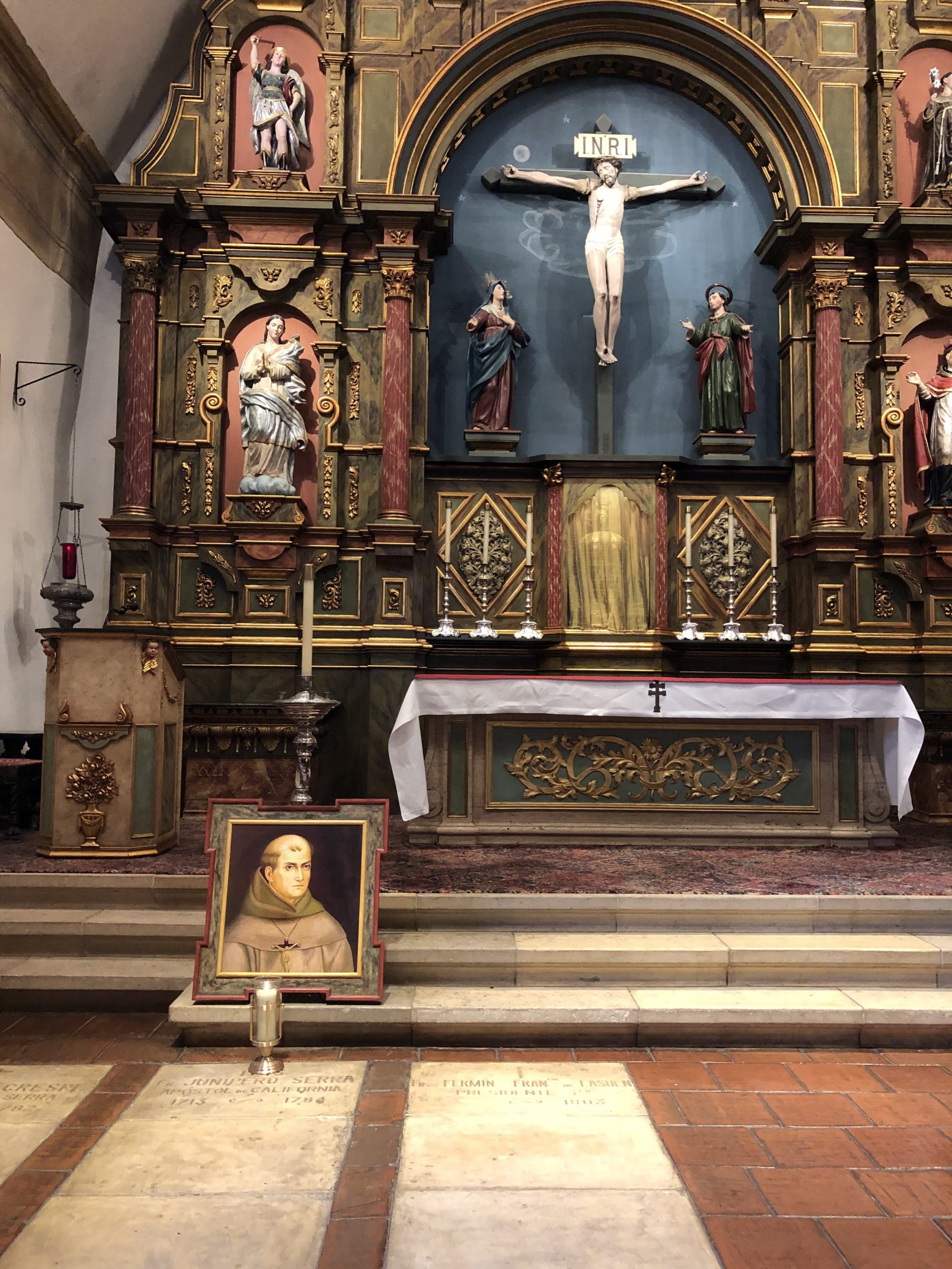
Back in 2016, we were in Carmel, headed South to Jessie’s Aunt’s place in Big Sur, and the traffic, now famous, was about to REALLY get going, when I saw a sign for a historic Mission.
I wanted to pull over.
Jessie and the kids were fried, so they tried to veto it.
“Five minutes,” I said.
“Five minutes,” she growled.
My daughter, who would have been three, came in with me, while the other two stayed in the car.
Maybe because it was a wedding, the courtyard was open, and we walked right in.
A fancy photo shoot was going on, and people seemed happy. I felt a pull into the courtyard, and then further still into the limestone church.
It was an energy I can’t describe, but it said, “Things of incredible weight happened here. This place matters. It is beautiful, so very beautiful, but it is also important.”
I had five minutes, god dammit, and I marched into the chapel, and peeked around.
It felt like I’d stepped back in time.
Like I was in Zorro’s California of the late 18th or early 19th Century.
I felt like Antonio Banderas and Catherine Zeta-Jones were going to leap out from an alcove and challenge me to a duel.
“Señor, you did not pay the entrance fee. You have offended me, and I challenge you to the death.”
“I’m sorry, Antonio Banderas. I didn’t know there was an entrance fee. The gate was open. I only have five minutes. You really were great as Zorro. Can I go now?”
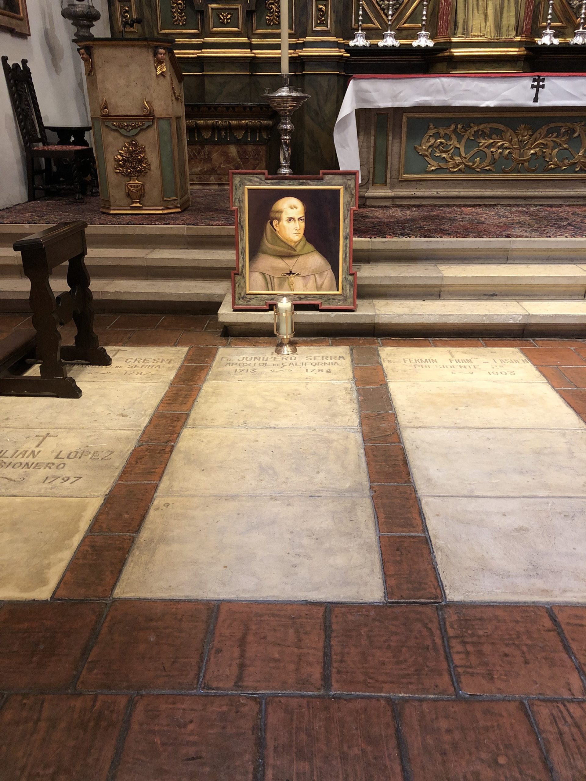
I was sure there was something special about the Mission, and when I saw the name Junipero Serra, and what appeared to be his grave, or tomb, it burned into my brain.
Look this man up.
Come back to this place.
So I got in the car, and told Jessie, “I’m going to figure out what the hell is so important about this church. And we’re going to come back as soon as we can.”
As it happened, there was a big, deadly accident on Highway 1, maybe five minutes down the road, in the direction we were headed.
Did the ghost of Junipero Serra save my family’s life?
I don’t know.
I don’t think I’m that openminded yet, even though I did once write here, in this column, about talking to Garry Shandling’s ghost through a medium via a Subaru’s bluetooth.
When I got home, I hit up Wikipedia first, and then read a biography on Junipero Serra that I purchased for my Kindle.
I read it in stages, and admittedly, this was an obsession from 3 years ago.
But the short version is that Junipero Serra, a Franciscan monk from Majorca, was an incredibly powerful, and seemingly power hungry dude.
He used to whip and flagellate himself, and walked around with an open wound on his leg, and also, he was a witch hunter for the Spanish Inquisition in Mexico.
It it undisputed that he colonized voraciously for the Catholic Church and Spanish Empire in the New World, and essentially enslaved native people when he ran things for the religious wing of Colonialism’s power.
Serra, who was recently Sainted, badly wanted to colonize California, as there were only rudimentary Jesuit missions in Baja California, and nothing but the native people up above.
After machinations, the Jesuits were removed from power, kicked out of Baja California entirely, and Serra was given license to take Alta California, with military guards for his relatively small operation.
This man, whose tomb I discovered, was the Religious Conquistador of California.
The boss of bosses.
Junipero Serra
His first mission was at San Diego, just as a beachhead, but the next, and the most important, was at Monterey and Carmel.
The 18th Century power center would be the Monterey Bay, with its proximity to fertile lands, and the abundance of the sea.
San Francisco would become bigger and more important after the gold rush in the late 1840’s, and of course Los Angeles would be the 20th Century mega-city of them all.
(Running on cars and optimism.)
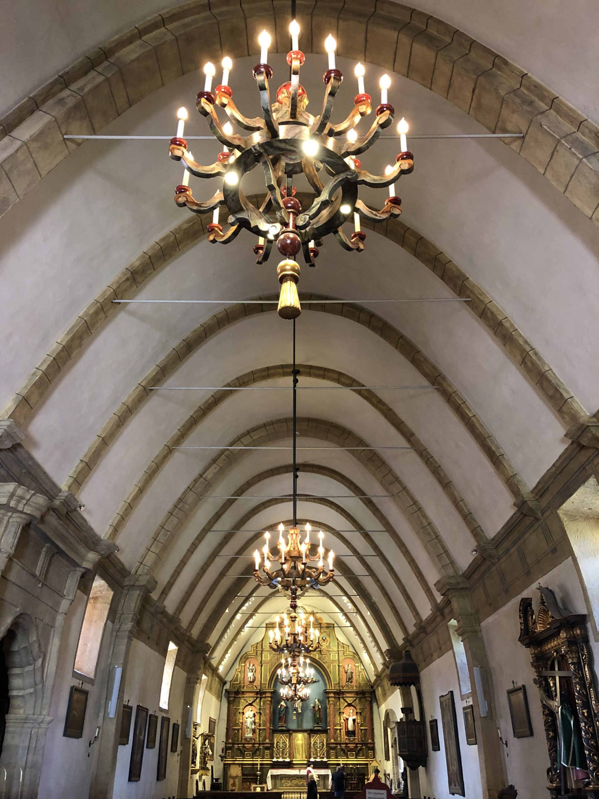
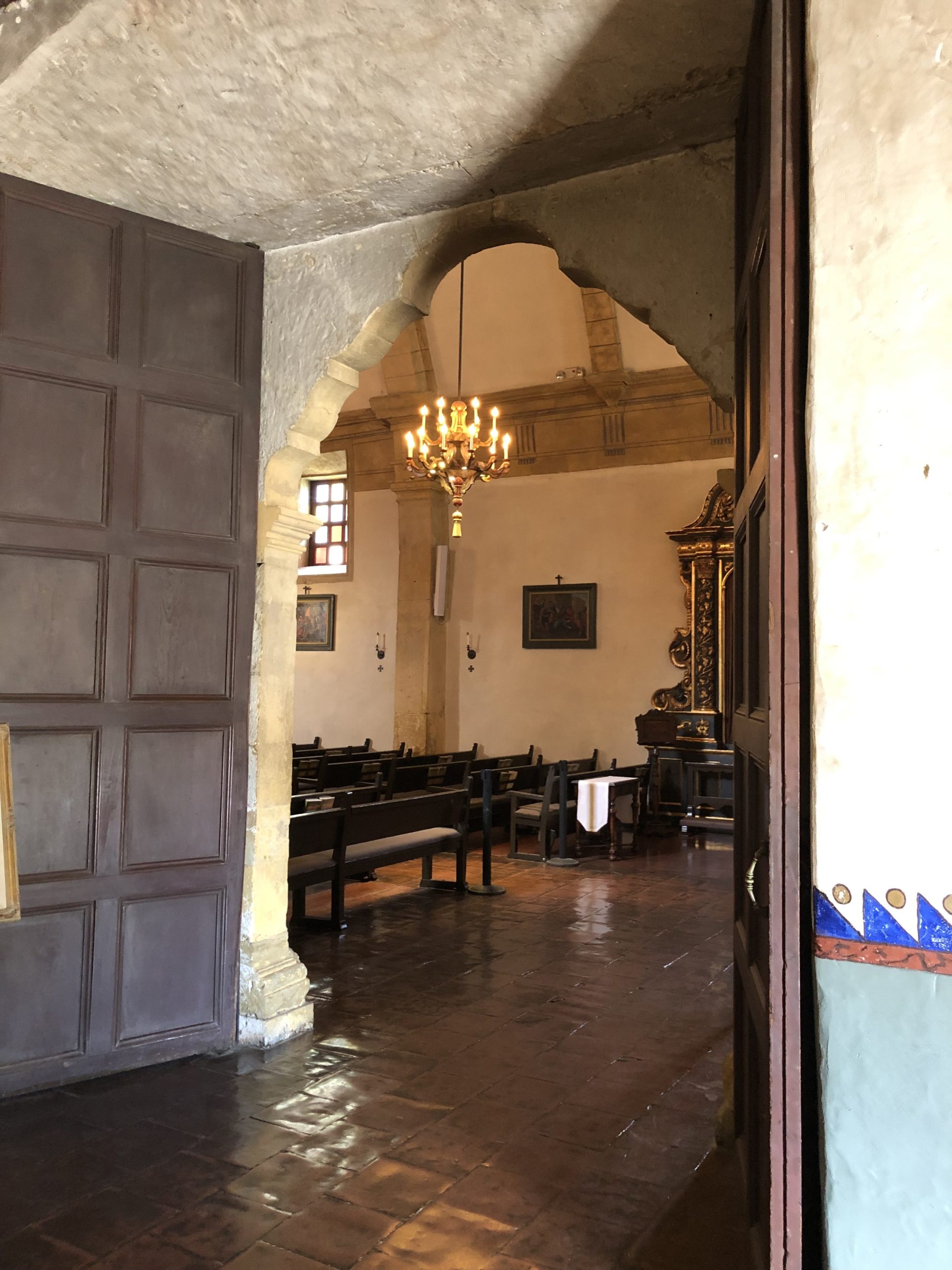
But it’s in Monterey and Carmel that you can feel the 18th Century vibe, and see the best, elegant beauty of that era of Spanish Colonial art and architecture in North America.
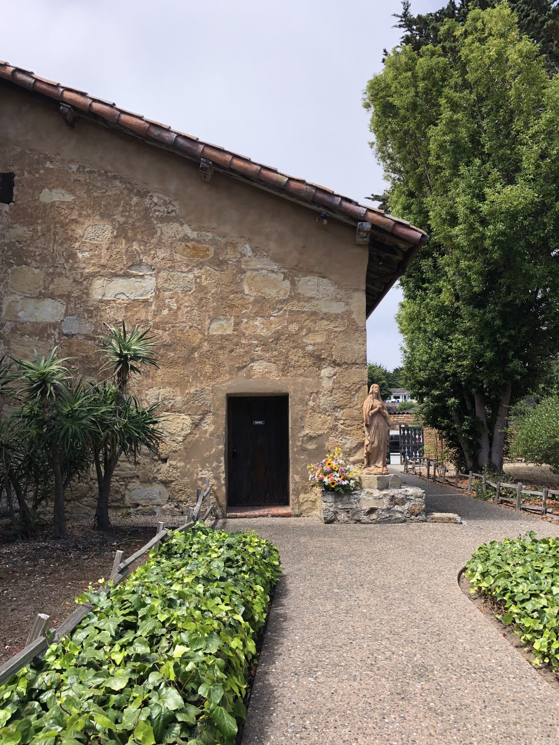
So when my family and I were in Monterey late last month, we went back to the Mission San Carlos Borromeo de Carmelo, in Carmel, and I paid the $9 entrance fee, which as a journalist I rarely do.
It was so, so worth it.
I know it’s silly to say that, as its a church, not a museum, but in this case there’s little difference.
The Carmel Mission was finished in 1797, rebuilt over the years, and recently underwent a major renovation, so it’s certainly looking its best these days.
I told my friend Ed about the hour we spent there, as a family, and the way my wife and two children were equally seduced.
The gardens, the fountains, the bougevvilla, the tall trees.
“Be careful,” he said.
“That’s how they hook you. Ever since Junipero Serra was out there making converts and crushing skulls. They know what they’re doing, the Catholic Church.”
Is it true? Were they using beauty, the limestone, the paintings, the history, to whitewash the original sin of Colonialism?
I guess, on some level, they were. It’s like a mini version of going to the Vatican, instead of the Prado.
It’s why my references, as an artist and occasional art historian, go to Madrid, or even Rome.
Junipero Serra lived at the Mission, and is buried there. Whether you’re a fan, or think he was a character from a horror film, either way, this was seismic ground.
I knew that something important happened there, back in 2016.
My gut was screaming, and in this case, it was totally right. The history of California ran through the walls, and by trusting my creative instincts, I had the most wondrous experience three years later.
(I even made a little promo video for you guys below. My first time in front of the camera)
My wife, kids and I were all entranced, so as a place to visit, I’d say this spot comes highly recommended.
Everyone else staying at our motel in Monterey was from Europe, or another continent, so this advice applies to all of you.
Next time you’re in the area, on your way to photograph like Weston at Point Lobos, stop in at the Carmel Mission.
The Art of the Personal Project is a crucial element to let potential buyers see how you think creatively on your own. I am drawn to personal projects that have an interesting vision or that show something I have never seen before. In this thread, I’ll include a link to each personal project with the artist statement so you can see more of the project. Please note: This thread is not affiliated with any company; I’m just featuring projects that I find. Please DO NOT send me your work. I do not take submissions.
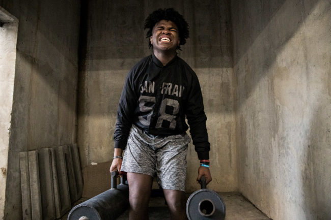
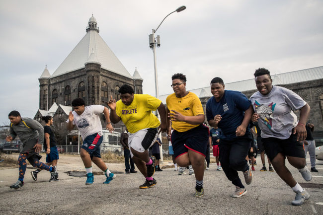
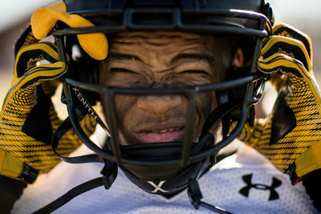
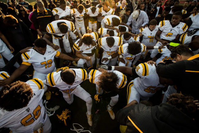
My friend, mentor and fellow Baltimore native Tim Tadder brought the story of the St. Frances Academy football team to my attention a few years ago. St. Frances Academy, located in an impoverished neighborhood in East Baltimore is the first and oldest continually operating African American Catholic educational facility in the United States. For years, the school’s underfunded football program struggled mightily. However, after investment fund manager and philanthropist Biff Poggi and his staff adopted the team, they went undefeated and have since turned into one of the nation’s top programs. Aside from providing substantial financial support, Poggi’s primary mission was and is to provide a foundation for the players and guide them to be young men of character.
I met the team during their first undefeated season and pursued the story in hopes of shedding some positive light on a city that had only been a year removed from the death of Freddie Gray and the uprising to follow. At the time the Panthers had no home field, no practice field and no blocking sleds amongst many other deficiencies not shared by the wealthy and predominantly white prep schools they competed against. It was a story of a group of players, most of whom faced tragic upbringings and heartbreaking personal loss, which rallied together for the love of football and a chance to turn their lives around. After a year of unheralded success the team traveled to Florida to take on national powerhouse IMG Academy. The kids from Baltimore were humbled that day but that only added to their strength and resiliency and propelled them to the tremendous success that would follow.
APE contributor Suzanne Sease currently works as a consultant for photographers and illustrators around the world. She has been involved in the photography and illustration industry since the mid 80s. After establishing the art buying department at The Martin Agency, then working for Kaplan-Thaler, Capital One, Best Buy and numerous smaller agencies and companies, she decided to be a consultant in 1999. She has a new Twitter feed with helpful marketing information because she believes that marketing should be driven by brand and not by specialty. Follow her at @SuzanneSease. Instagram
Success is more than a matter of your talent. It’s also a matter of doing a better job presenting it. And that is what I do with decades of agency and in-house experience.
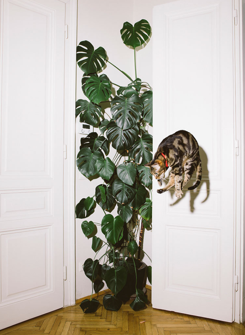
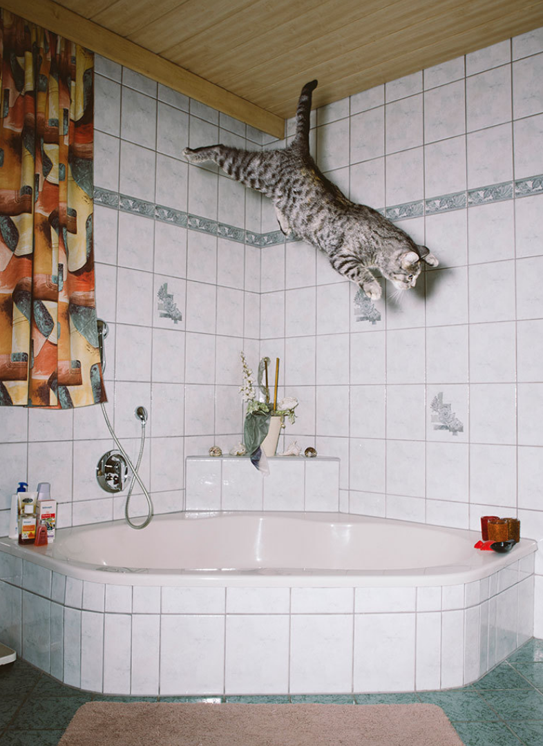
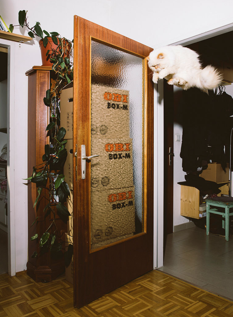
Heidi: Tell us about the first image that sparked this series? Daniel: The first cat was Elli – the one from my parents at their home in Tirol, Austria. She was also the one who got me in touch with the following cats: Ume, Elli, Flitzie, Nevio and Fiffy.
Are you provoking the cats to jump? I did not touch any of the cats. It all happens with trust. After many seatings we got very intimate and they started to relax and let lose. Finally they behaves like they always do when nobody is watching. They where just dancing and jumping around for fun. At this point it was super easy for me to take their picture. Im really happy and thankful to be able to share these moments with you.
Are the cats in the project all your own cats? if not, did you have to cast them? All mutual friends
At what speed are you shooting?
1/125 of a second
What happened once you posted this project online? It went quite viral, and now I sell prints and a calendar
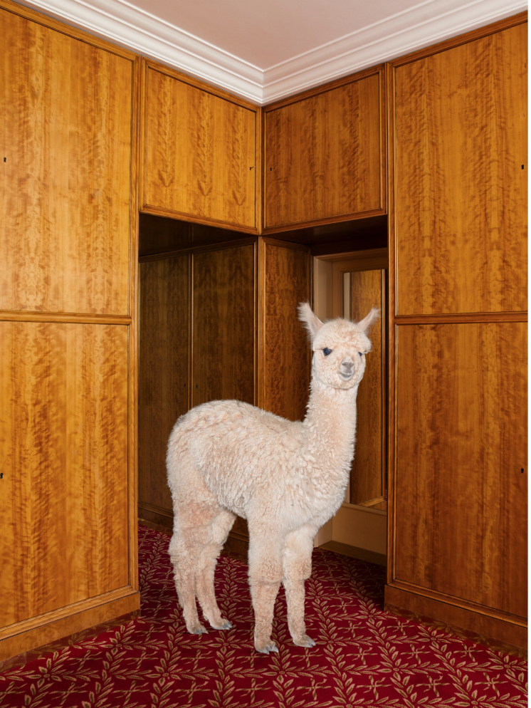
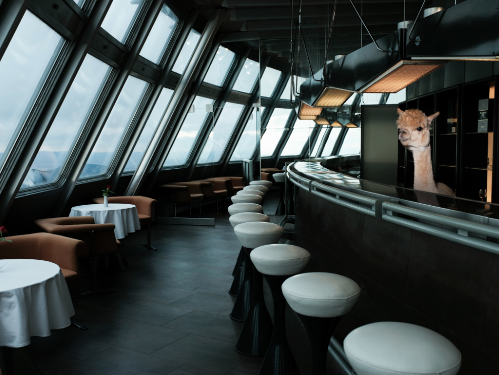
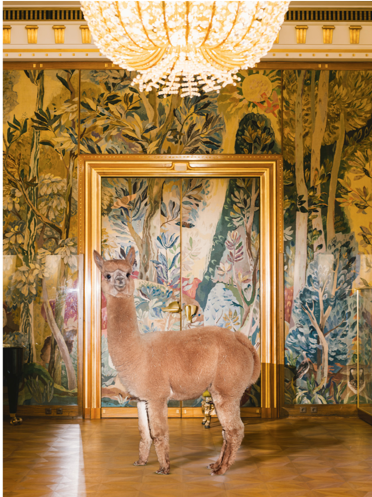
How did the alpaca story for the Office come about?
I was driving through the countryside of Austria after a stressful job. Suddenly I saw a field full of Alpacas and stopped my car to catch a glimpse. This was such an intense experience and immediately made me feel relieved. I decided to try to capture that feeling and worked on a project shooting them to send all their positive energy to those who get as much joy as I did from them. I came up with the idea to publish them as a calendar since thats a medium you can look at everyday in your kitchen and hopefully feel a bit better. Office was just the perfect match to publish that calendar with since they understand my ideas and share my love for alpacas.
It’s rare you find an archive welcoming downloading for comping and layout, can you tell me why you included this?
A few years ago everybody was super afraid that their content got stolen in the bad internet. So people started to build up websites that try to make it impossible to download their work; I think that makes no sense. The internet is a endless source of inspiration and it’s made to share and use work of others. So I decided to even go one step further and help people to steal my work and make it easy for editors and creative directors to include my pictures in their mood boards for upcoming projects. I believe in karma and think they will get back to me after they land a job with using my pictures for their pitch.
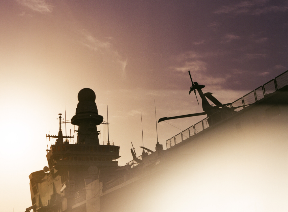
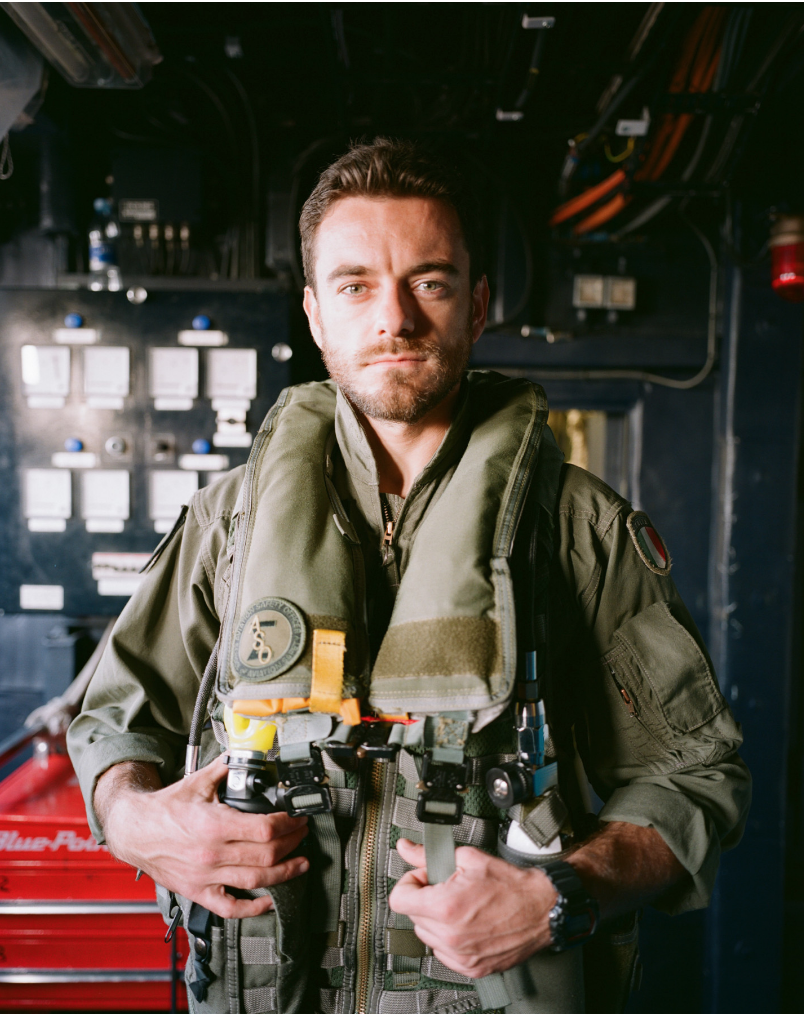
How was this shoot for Monocle a defining moment for you? This was a quite special assignment since they had to fight for a very long time to get access to that warship in Dubai. I’m very honored they choose me to cover that story, we decided to also shoot film. I was using two different medium format film cameras (Contax 645 + Mamiya 7) and on the second day I noticed a bit strange sound from my shutter. After I shot a full roll I checked my camera only to find out the shutter was completely broken almost giving me a got a heart attack! I was lucky to have a second backup camera with me (Mamiya 7) After this experience I decided to never ever again work with film on a assignment.
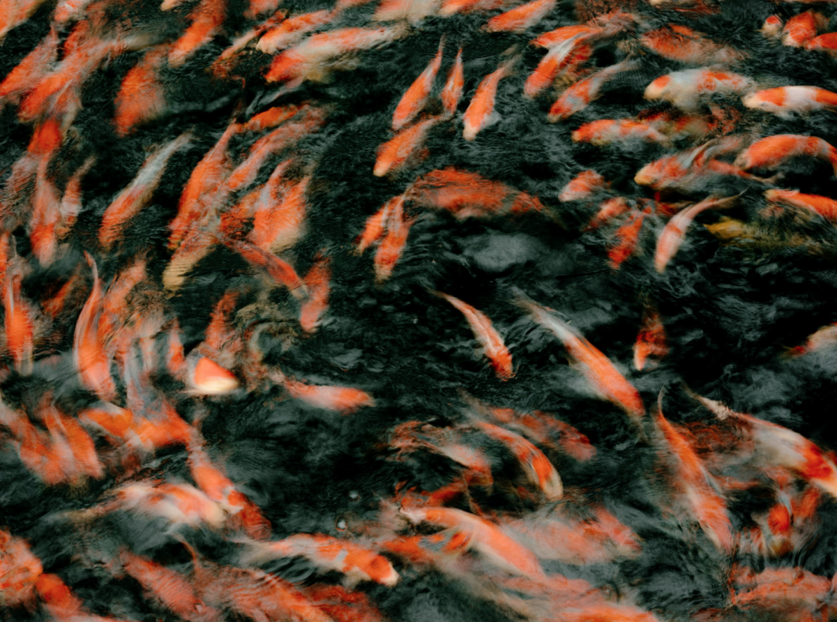
How difficult was it to shoot the Koi farm for Masses?
When I was working in Tokyo for a few assignments for Baron, The Travel Almanac and Monocle, Masses hit me up and asked me to find a Koi farm to shoot for them. This was not as easy as you might think. Shooting on location in Japan was very bureaucratic and not very open for photography. Luckily I had a great producer and she was able to convince a Koi farm to let photograph their farm. I was only allowed to shoot a specific range of Kois. I was not allowed to photograph those fish which were sold since they could not ask all their owners for their permission. I loved how respectful they were to the owners.
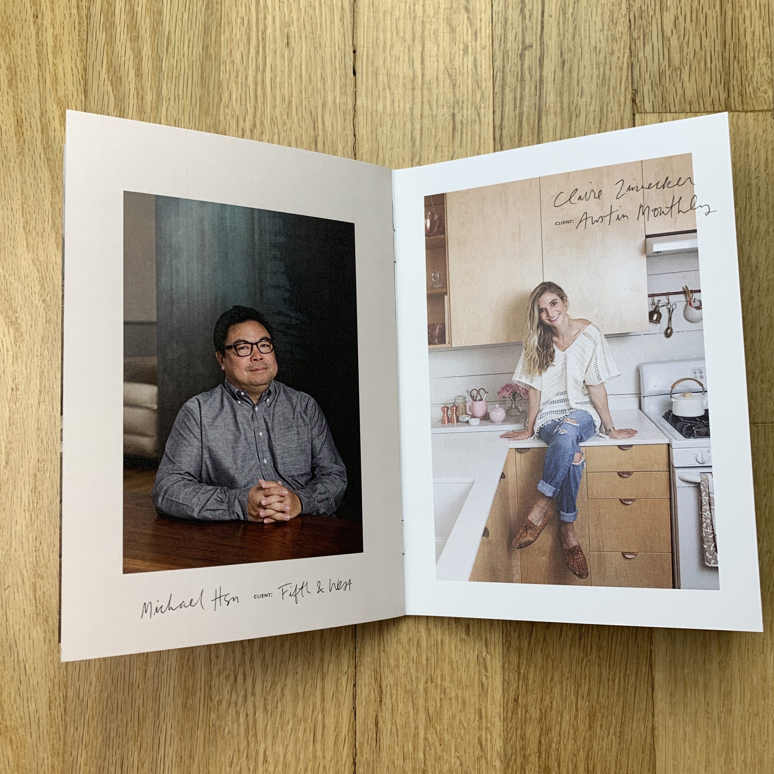
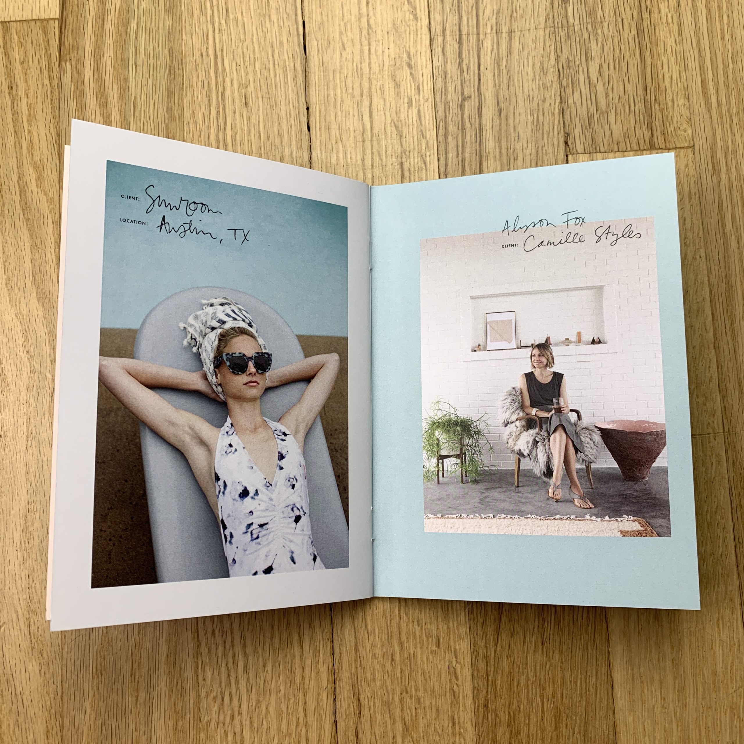
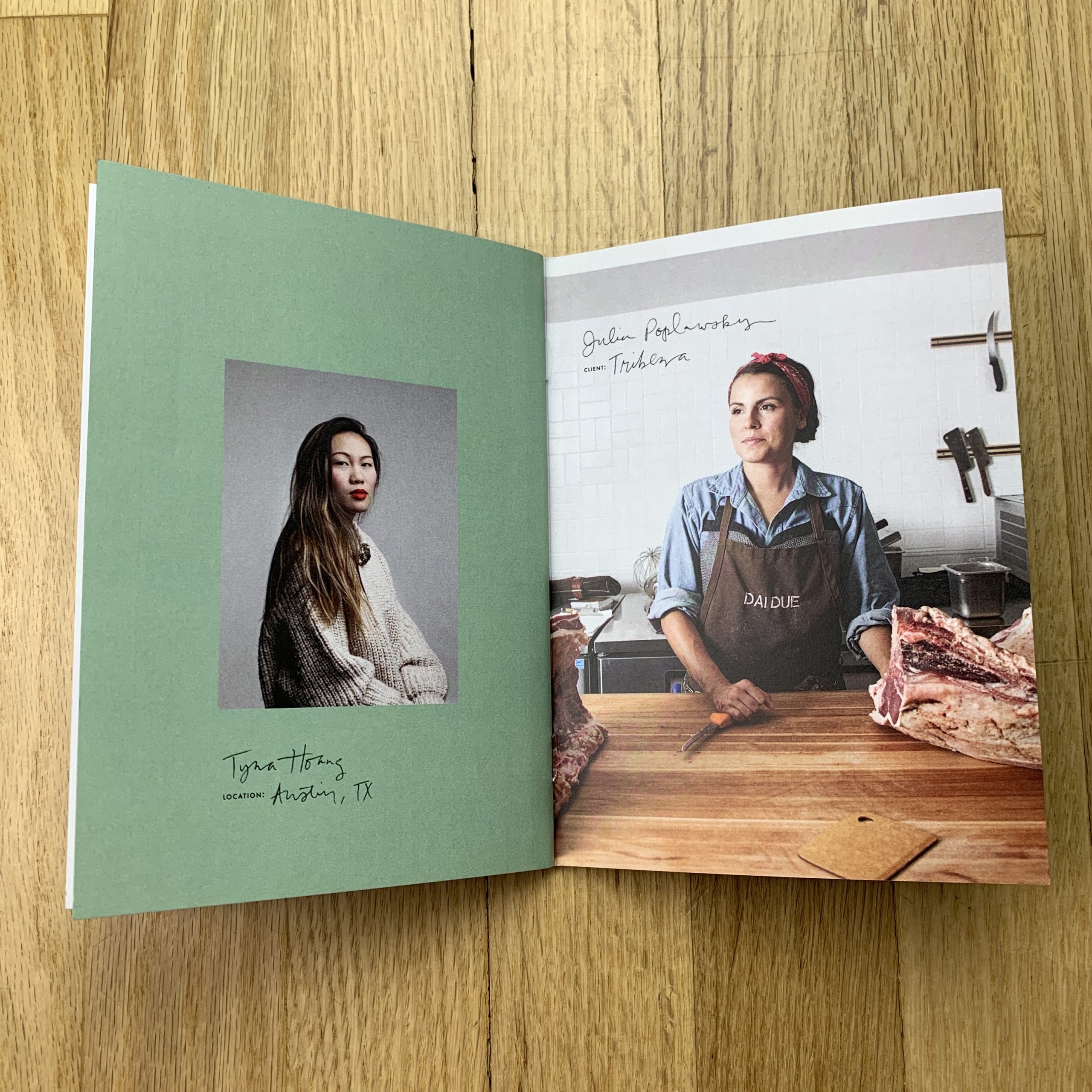
Who designed it?
My friend Avalon McKenzie designed it. https://avalonmckenzie.com/ This is the third promo we’ve worked on together. I love her aesthetic and style. I pretty much send her a ton of images that I’d to include and she narrows them down and puts them in an order that flows. For this one, I knew I wanted some kind of text to go along with the images, to make it feel a little more like a notebook or journal. She added the color blocking and the hand-lettered text that captured the look that I was going for.
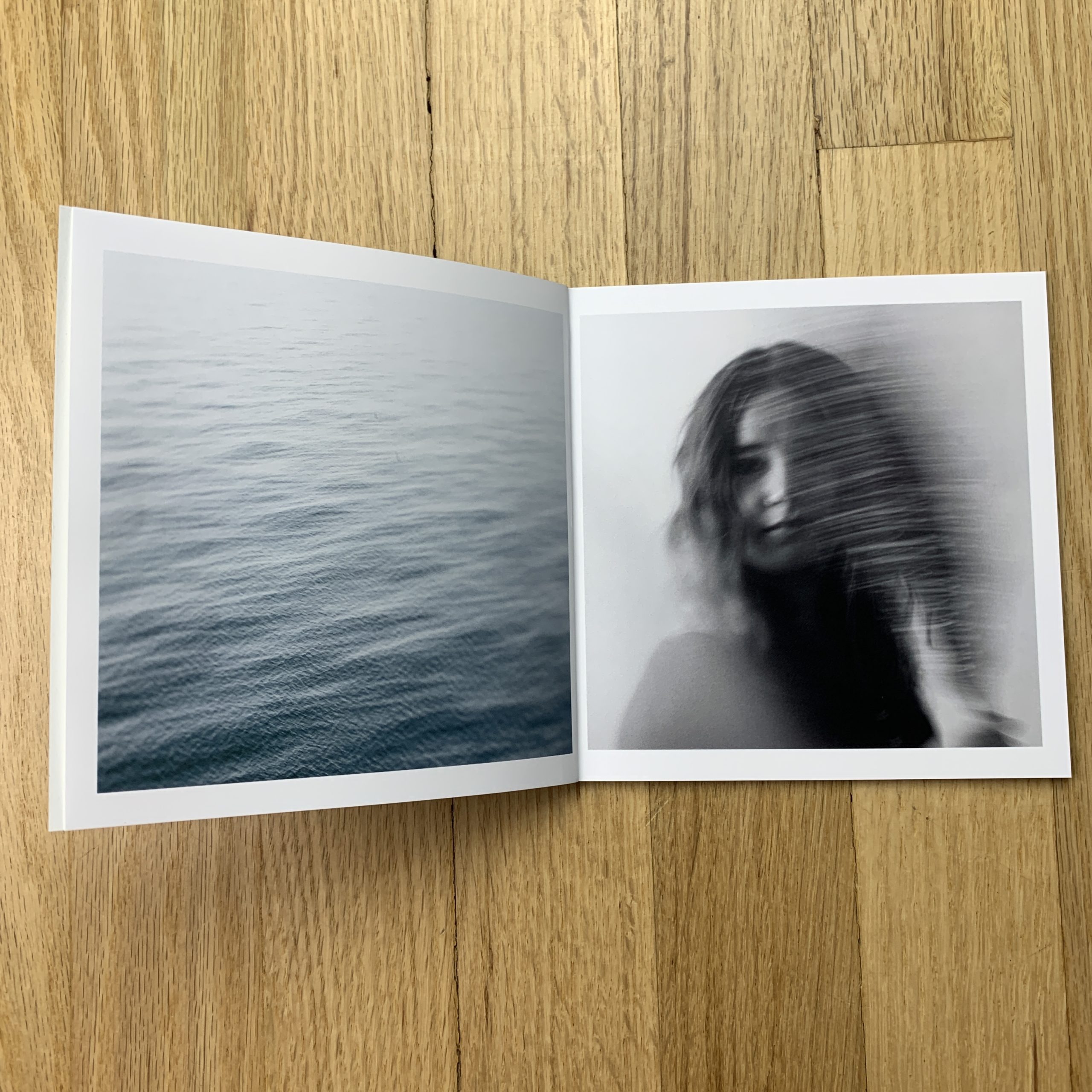
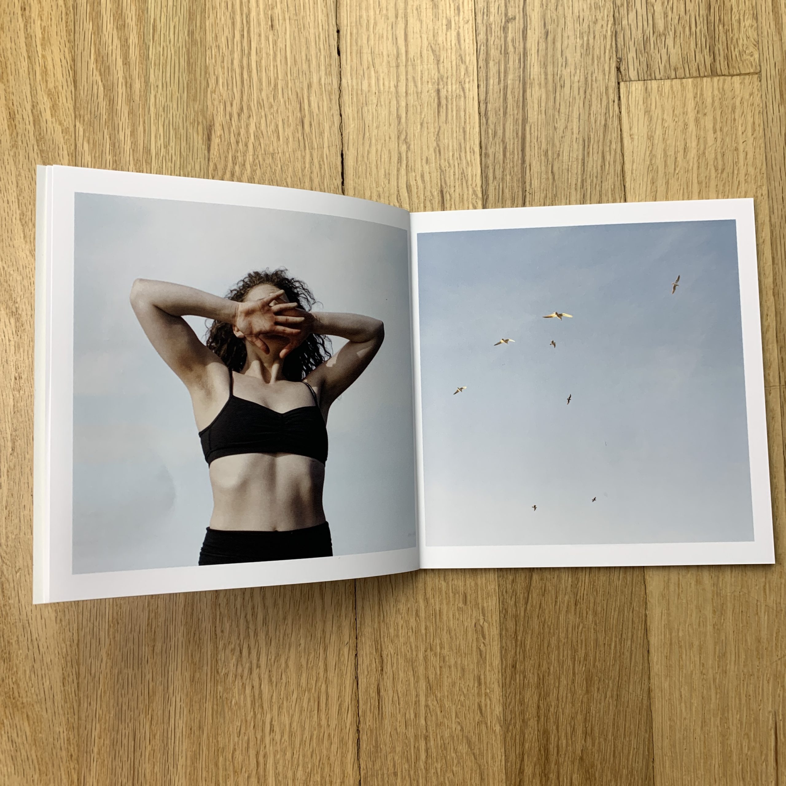
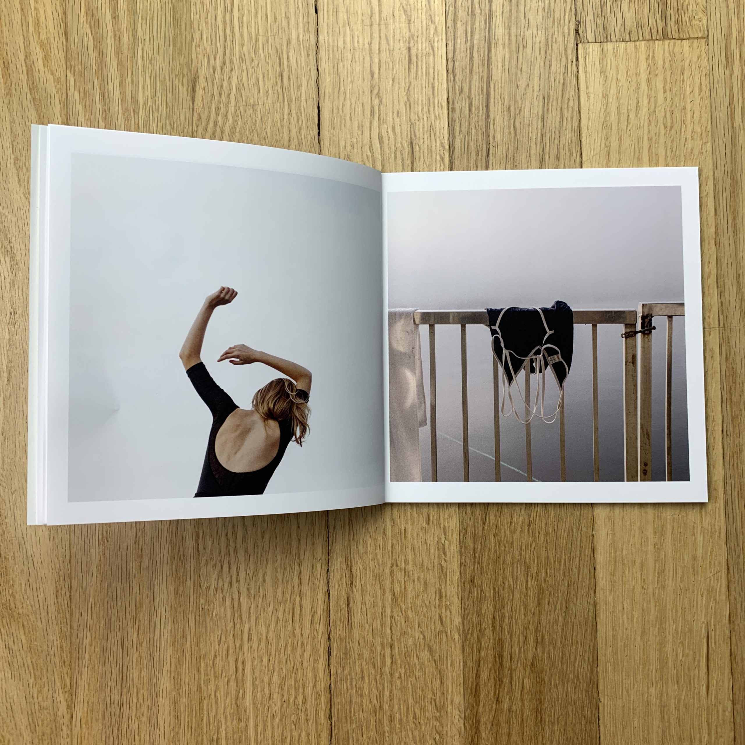
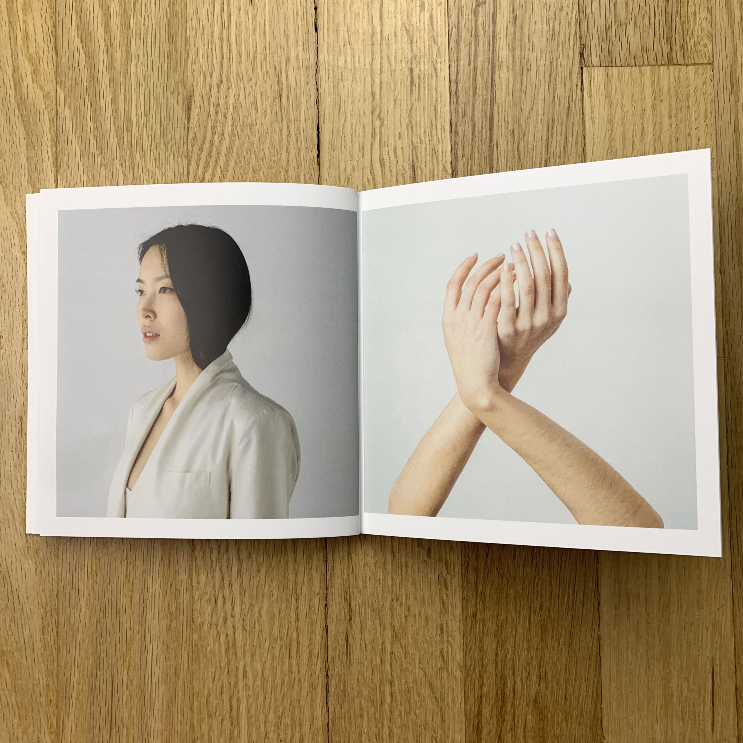
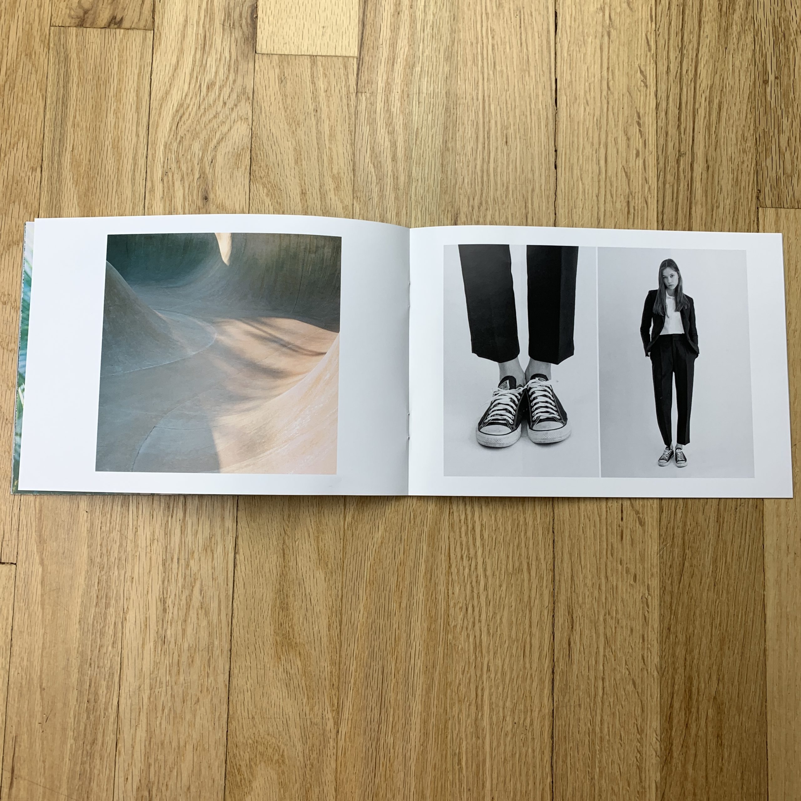
Tell me about the images?
Choosing the photos is always so hard for me. I start by thinking about who I’m going to send these to, what might be appropriate for them and what I want to showcase at the time. These particular images are a mix of my commercial and editorial work. I wanted to show a range with portraits and lifestyle photos while having them compliment each other.
How many did you make?
I made 100. I’ve sent out about half and have the other half to give away at meetings. I don’t really have a broad list, I make an effort to tailor to people that this work might be relevant to and clients/friends that I’m trying to keep in touch with.
How many times a year do you send out promos?
My goal is at least twice a year, but sometimes I don’t get there.
Do you think printed promos are effective for marketing your work?
I do think they are effective. They are a great way to keep in touch with clients you’ve already worked with. I end up hearing back from a lot of former clients I hadn’t worked within a while. I also really enjoy getting to collaborate on design and having a tangible project at the end that encapsulates the work I’ve done in the last few months.
He was IT, as far as New Jersey locals were concerned.
The Boss.
At some point, Bruce more or less became synonymous with the state.
Like, if the SNL guys had done a Springsteen skit, instead of one about Ditka, and if they’d gotten Stevie Van Zandt to do a parody of himself, instead of George Wendt, we’d be talking about an entirely different timeline. (Though perhaps still a good one. Is Jon Bon Jovi President in this alternate timeline, I wonder?)
I mention Bruce today, because I grew up loving his music, but lately, have begun to wonder if he is actually good at singing.
Which, you, know, with him being a singer and all, is kind of a bad question to ask, at this point.
I guess now that I’ve lived away from New Jersey longer than I lived there, the Bruce Springsteen-magic-fairy-dust is wearing off, and I’m awakening from a chloroform-like haze.
Sometimes, when the person and the place become the same thing, it can be hard to know of they’re still making the pizza with the same recipe, or of Junior is scrimping and buying cheaper mozzarella.
You know what I’m saying?
The legend can cast a large shadow, and as photographers, we all know how valuable the light is, if you feel me.
And speaking of famous institutions…
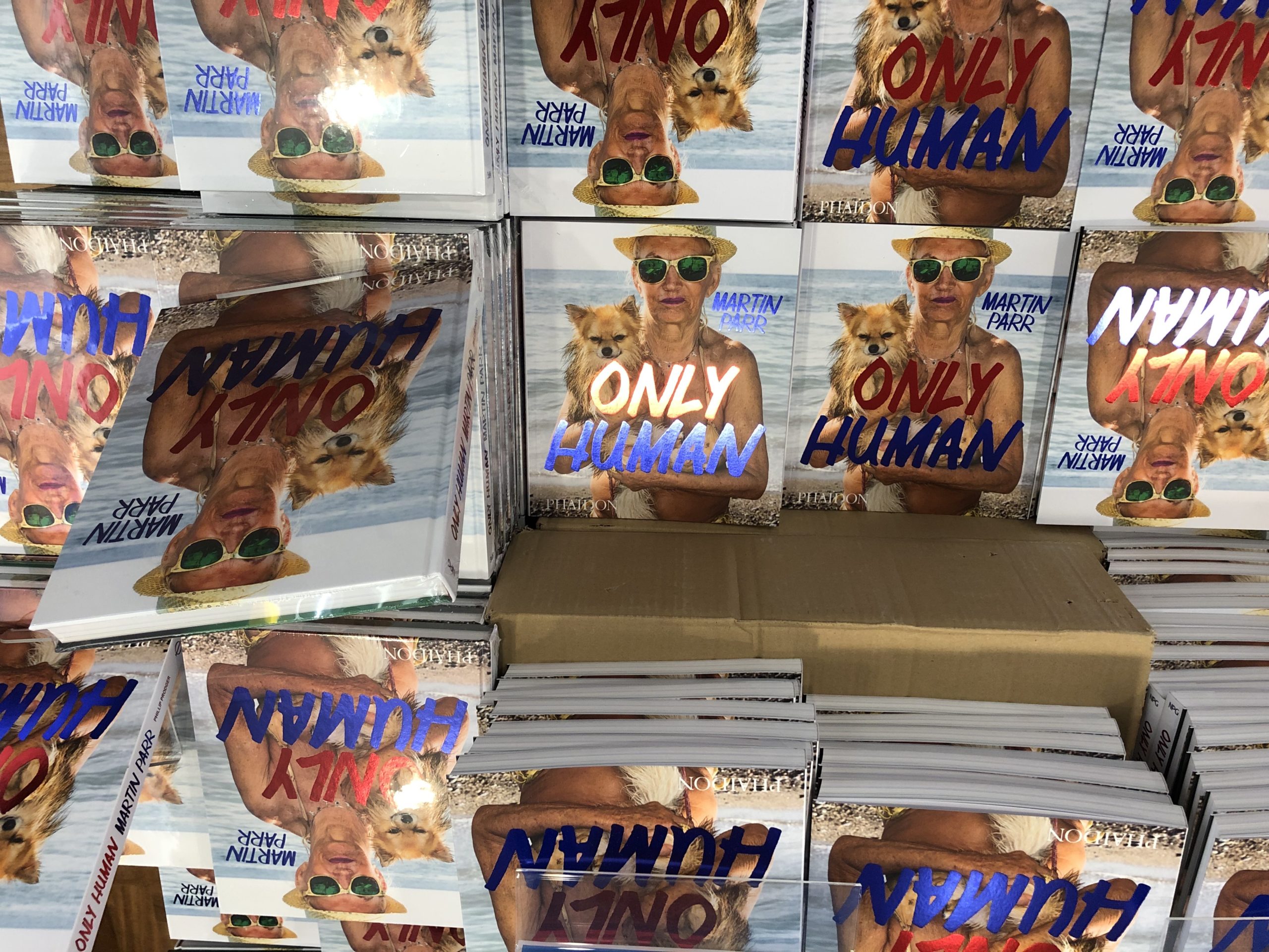
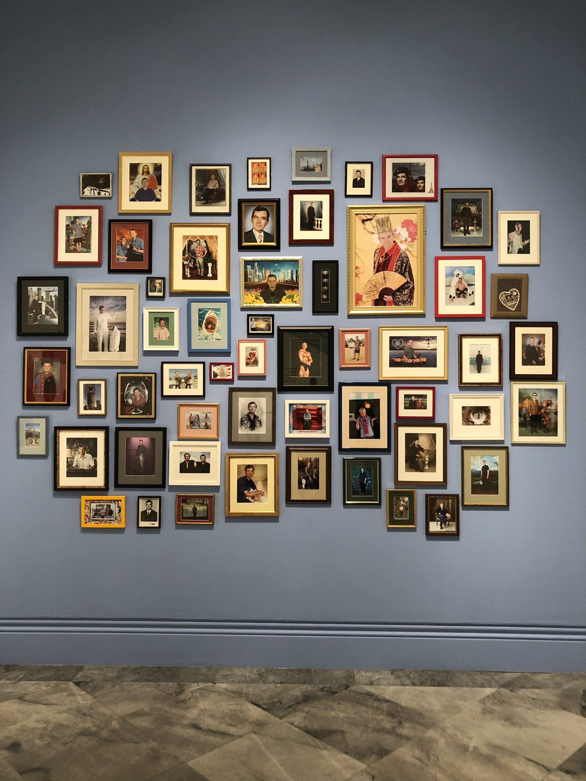
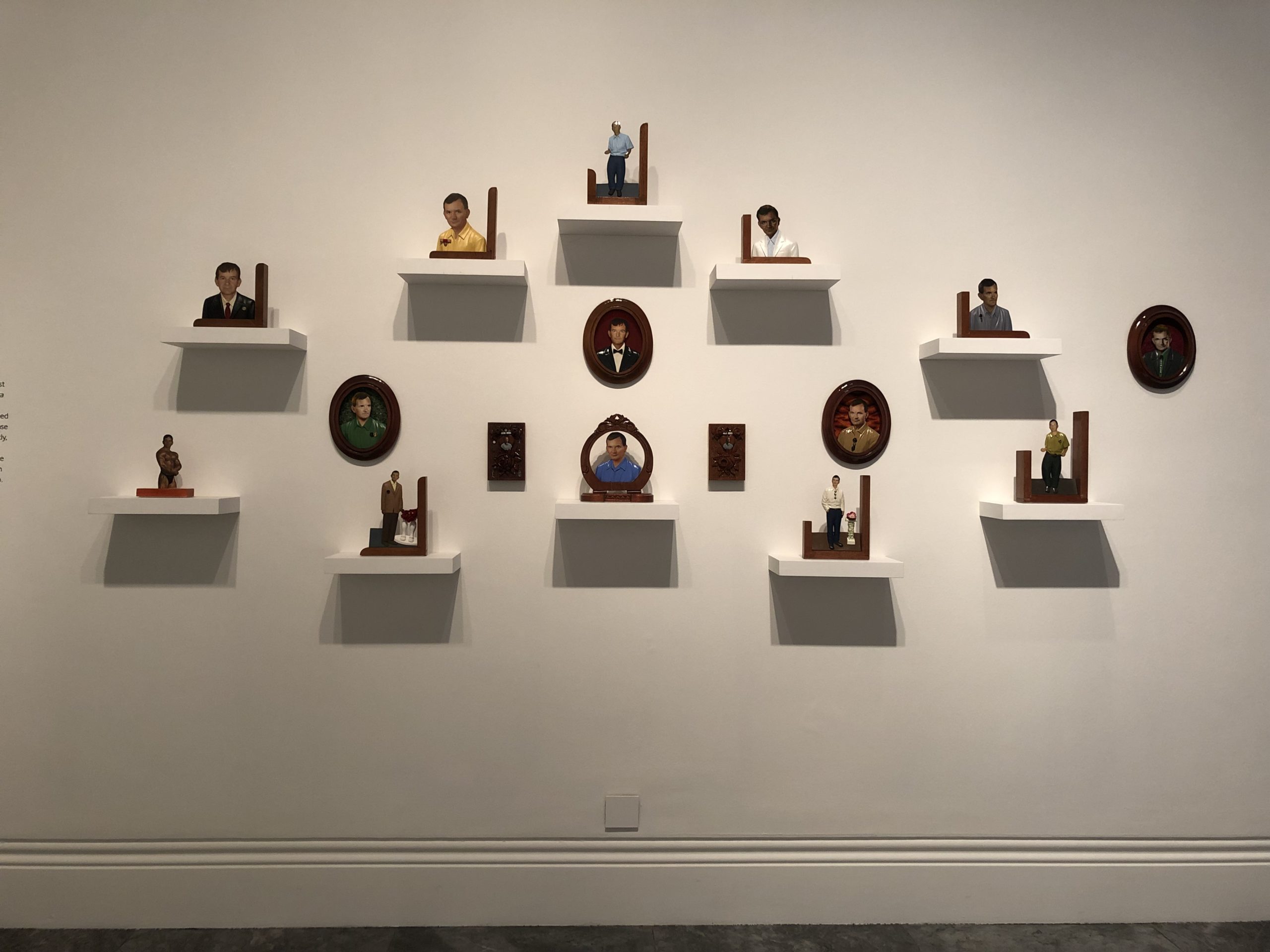
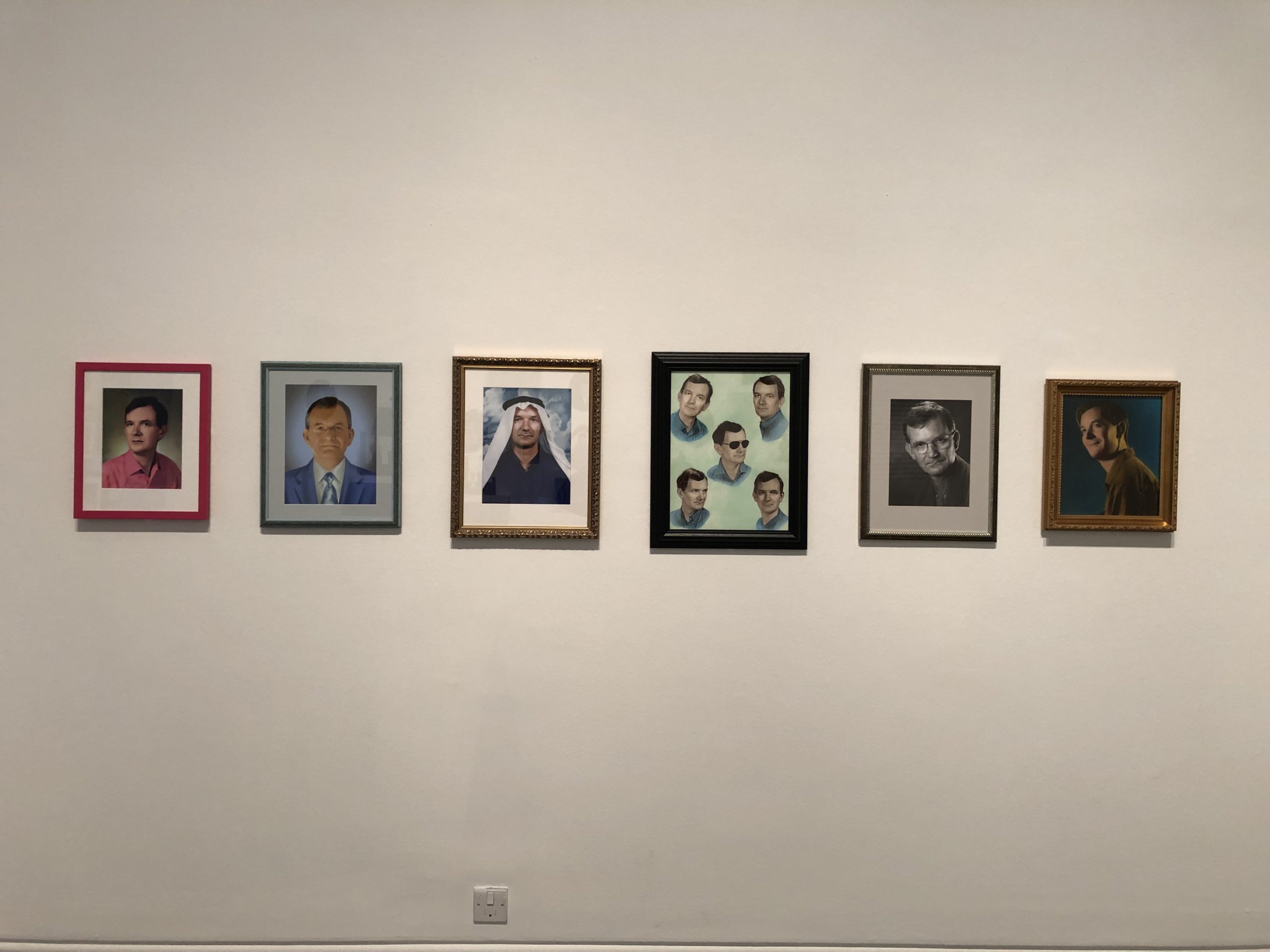
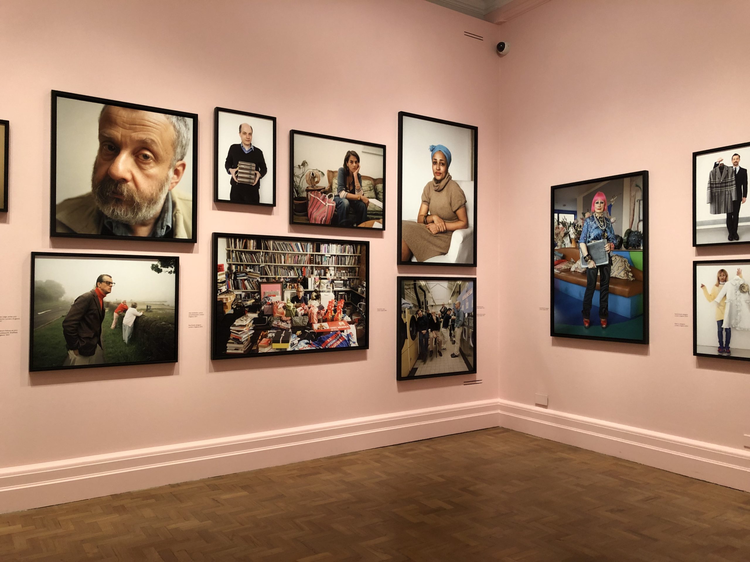
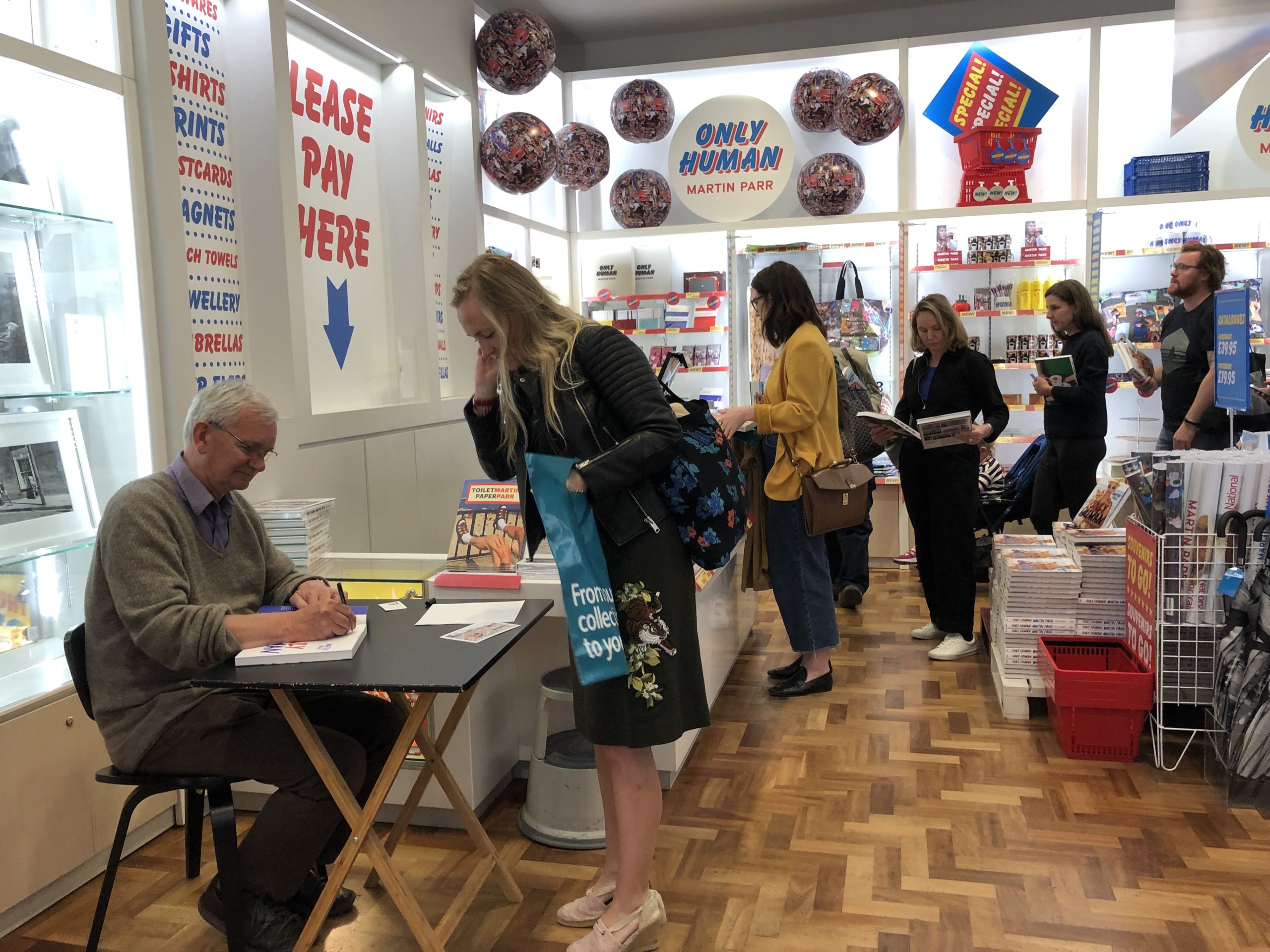
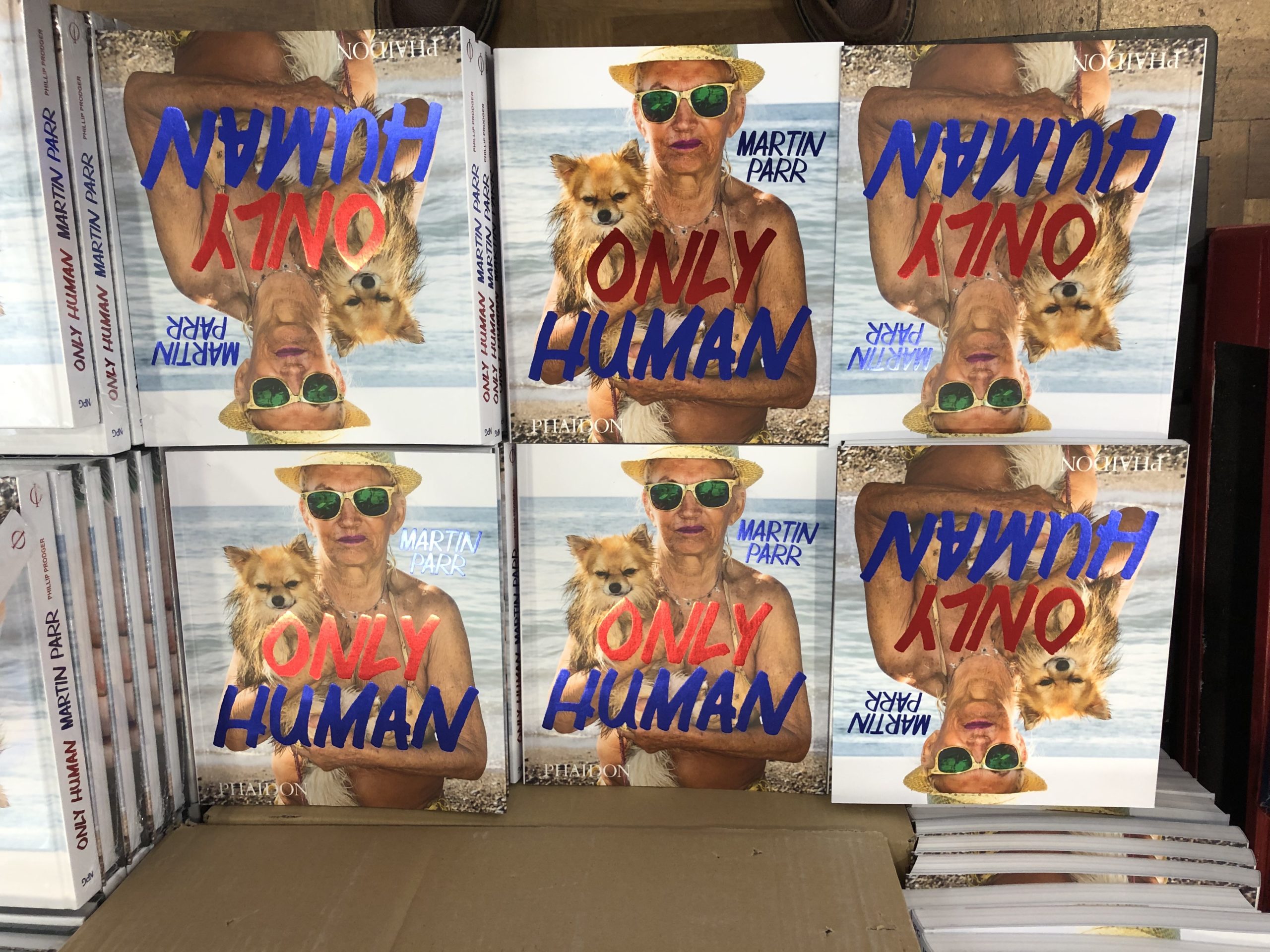
I’d like to discuss Martin Parr’s “Only Human” exhibition that I saw in May at the National Portrait Gallery in London, just before it closed.
I’d interviewed Martin Parr for an NYT Lens blog piece, back in April, and he invited me to attend a walk-through of the exhibition, if I was going to be in town.
I’ve previously covered the reasons why I was in London, so I accepted his offer, and oddly bumped into him at Photo London the afternoon before, where I confirmed I’d be attending. (He was doing a book signing at the fair.)
When I gave my name at the front desk, early in the morning, I wasn’t on the list, but when I assured the guard I was legit, I guess I seemed trustworthy, because they let me in.
I joined the talk a couple of minutes after it started, and found it all to be a bit perfunctory, really. (Like a docent tour at the zoo.)
When we spoke via Skype, Martin Parr was very funny, but we always kept the conversation with in range of our purposes. There were no off-the-wall digressions, nor any surprise details dropped.
At the talk, it was all business, but that spark of wit and charm was not on full display, unfortunately.
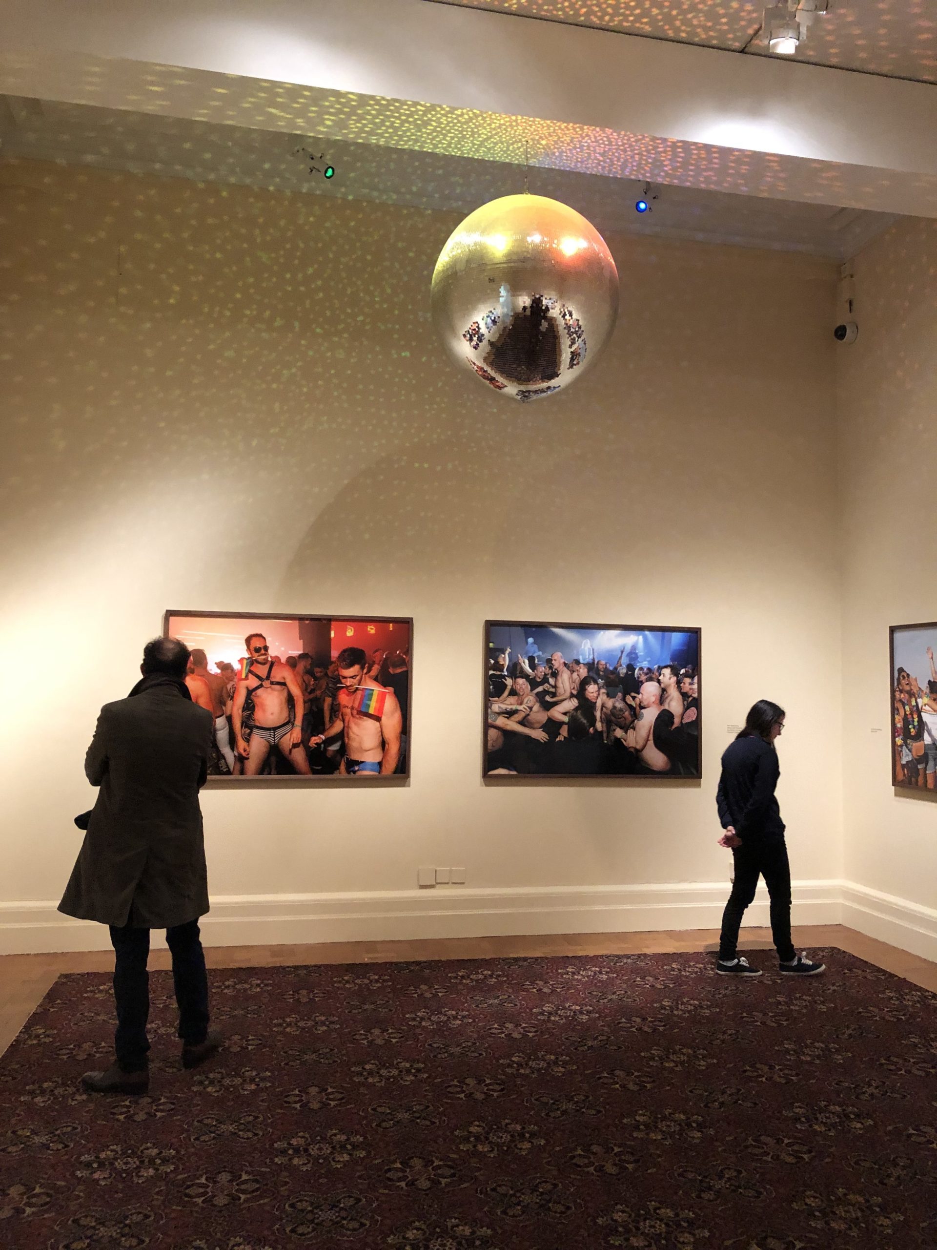
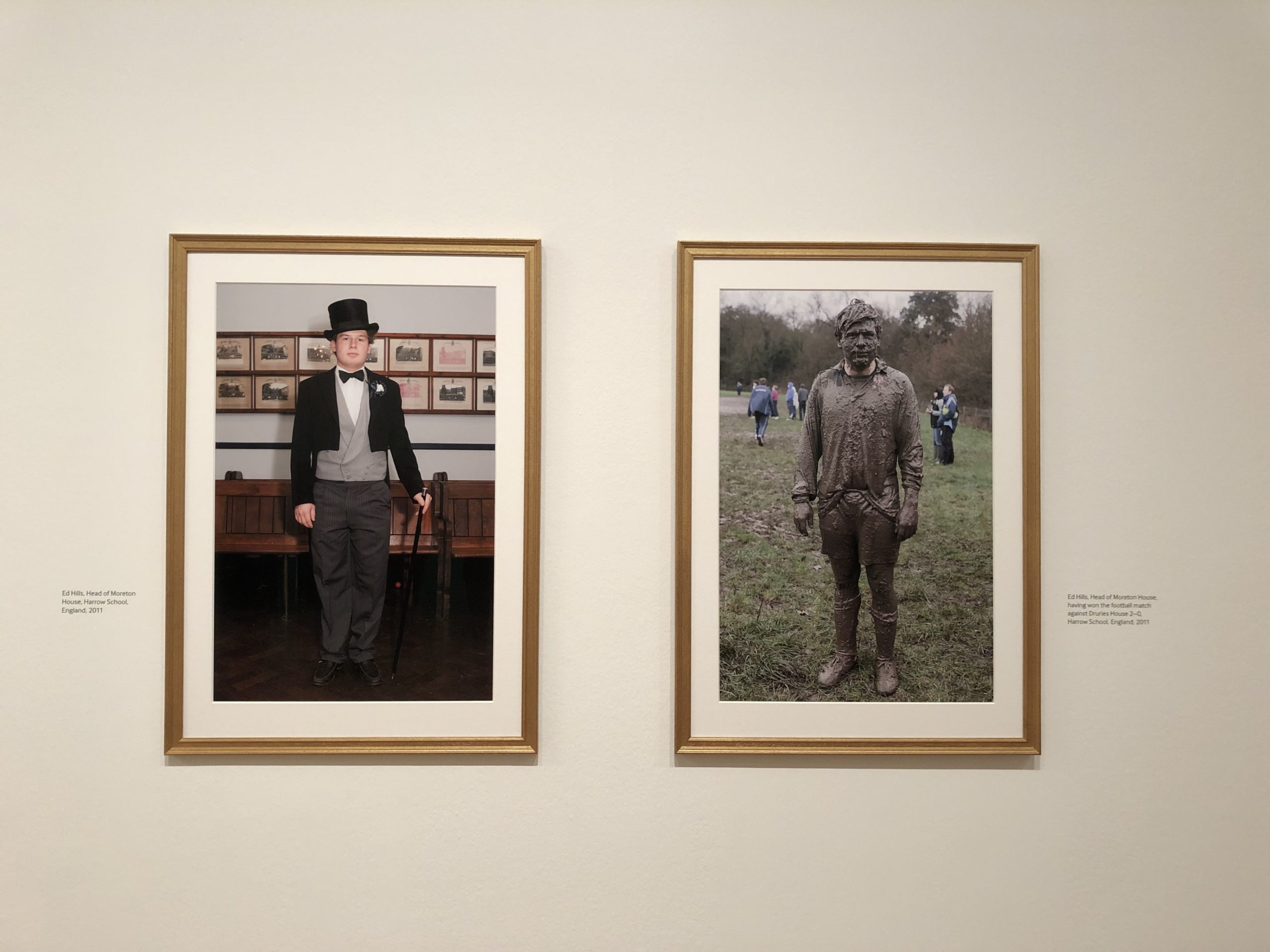
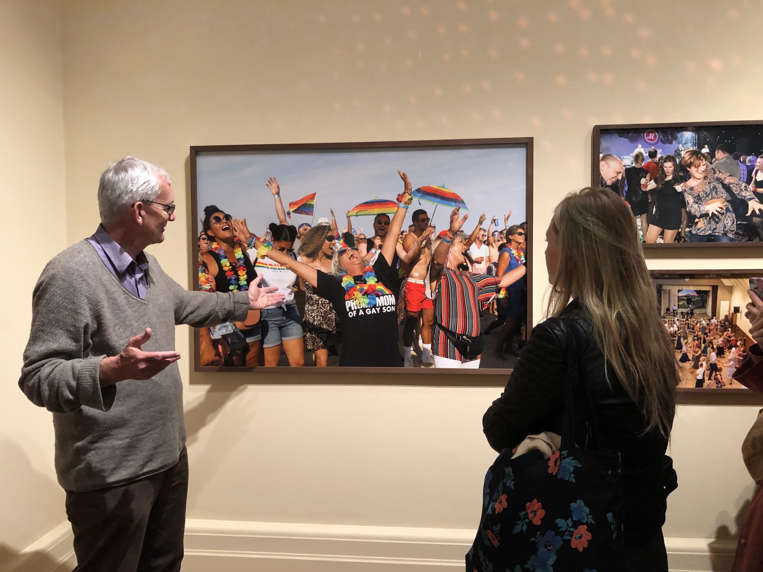
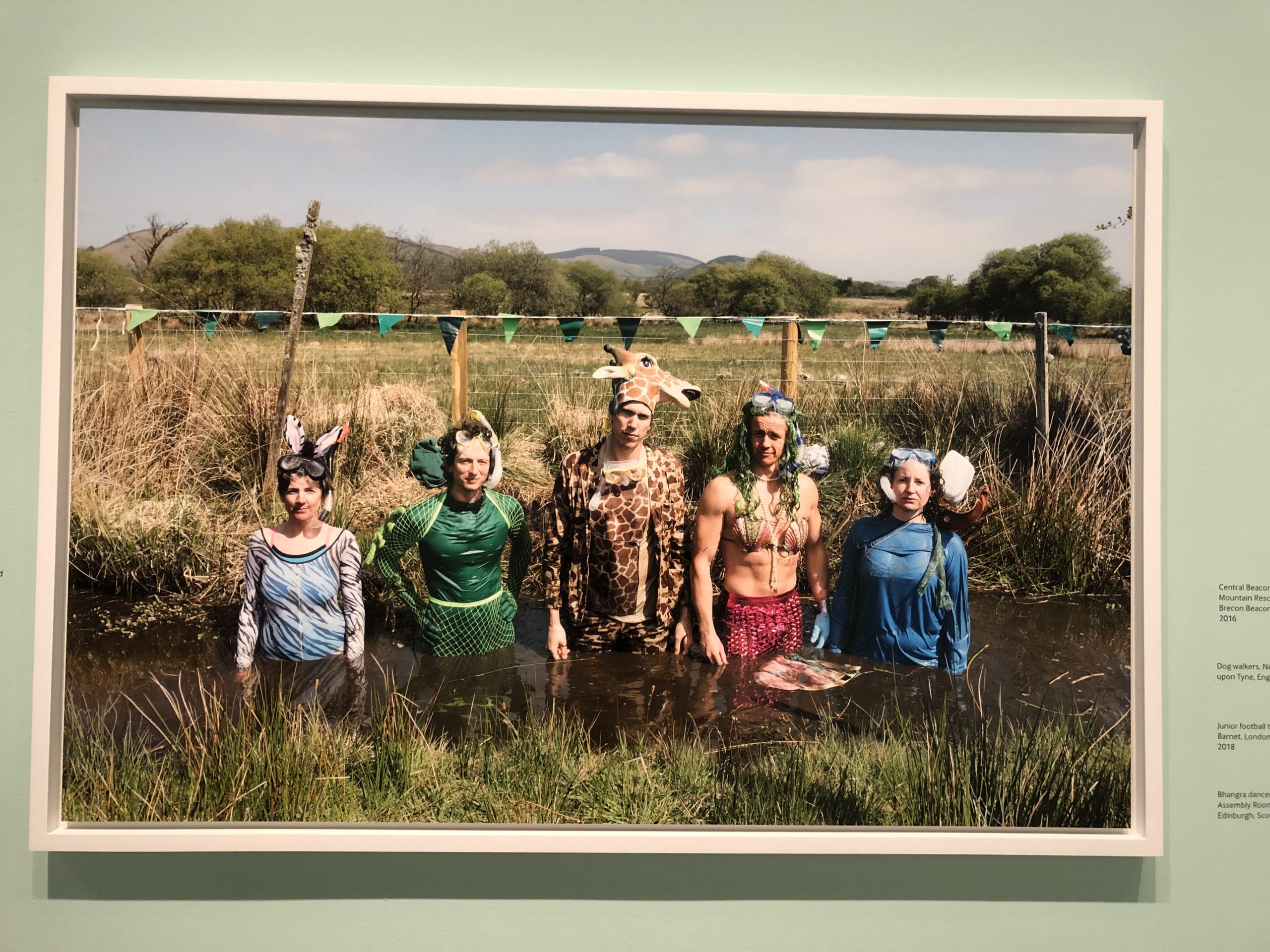
Below he describes people dancing.
And Brexit.
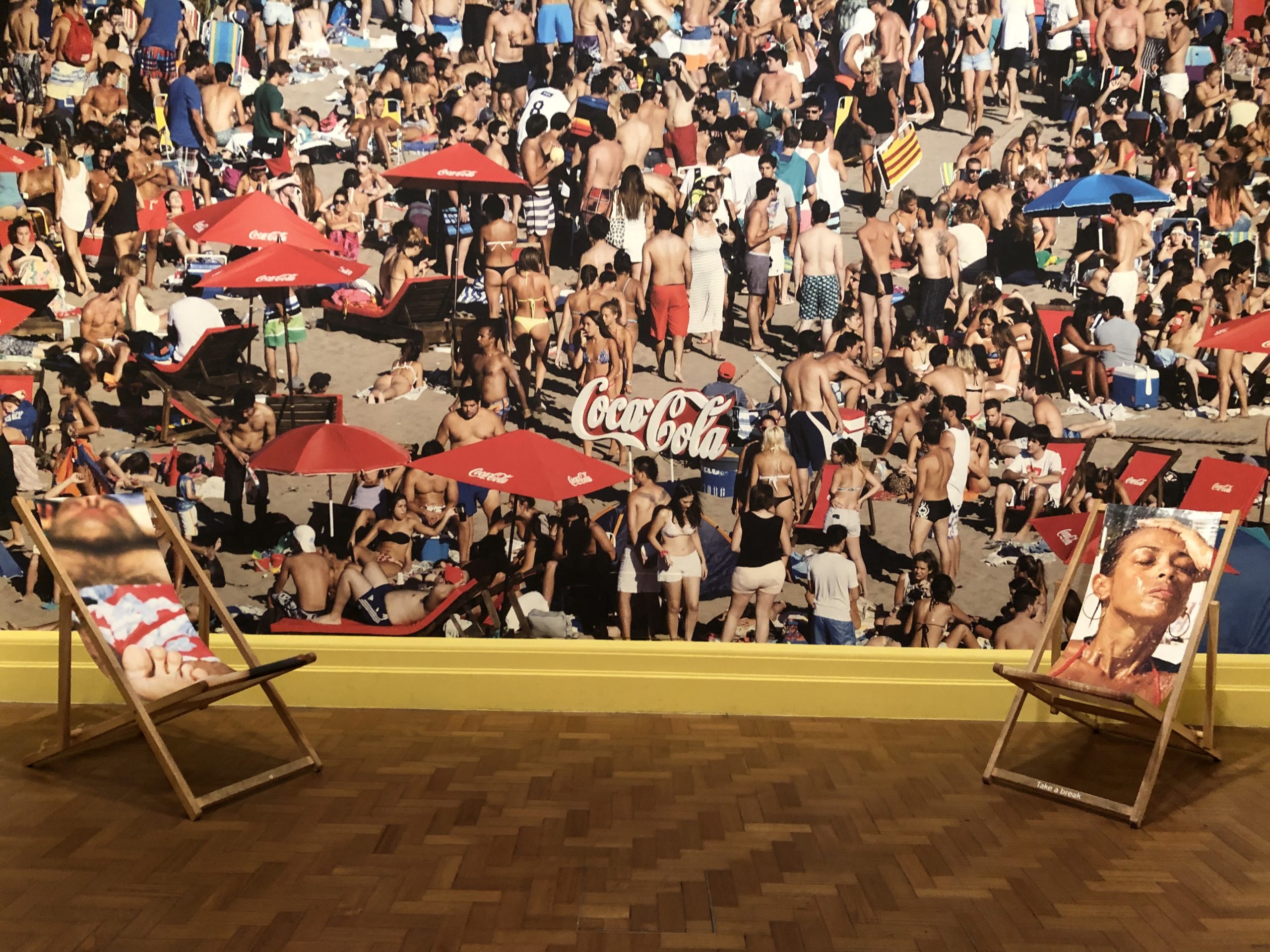
Here’s the selfie wall.
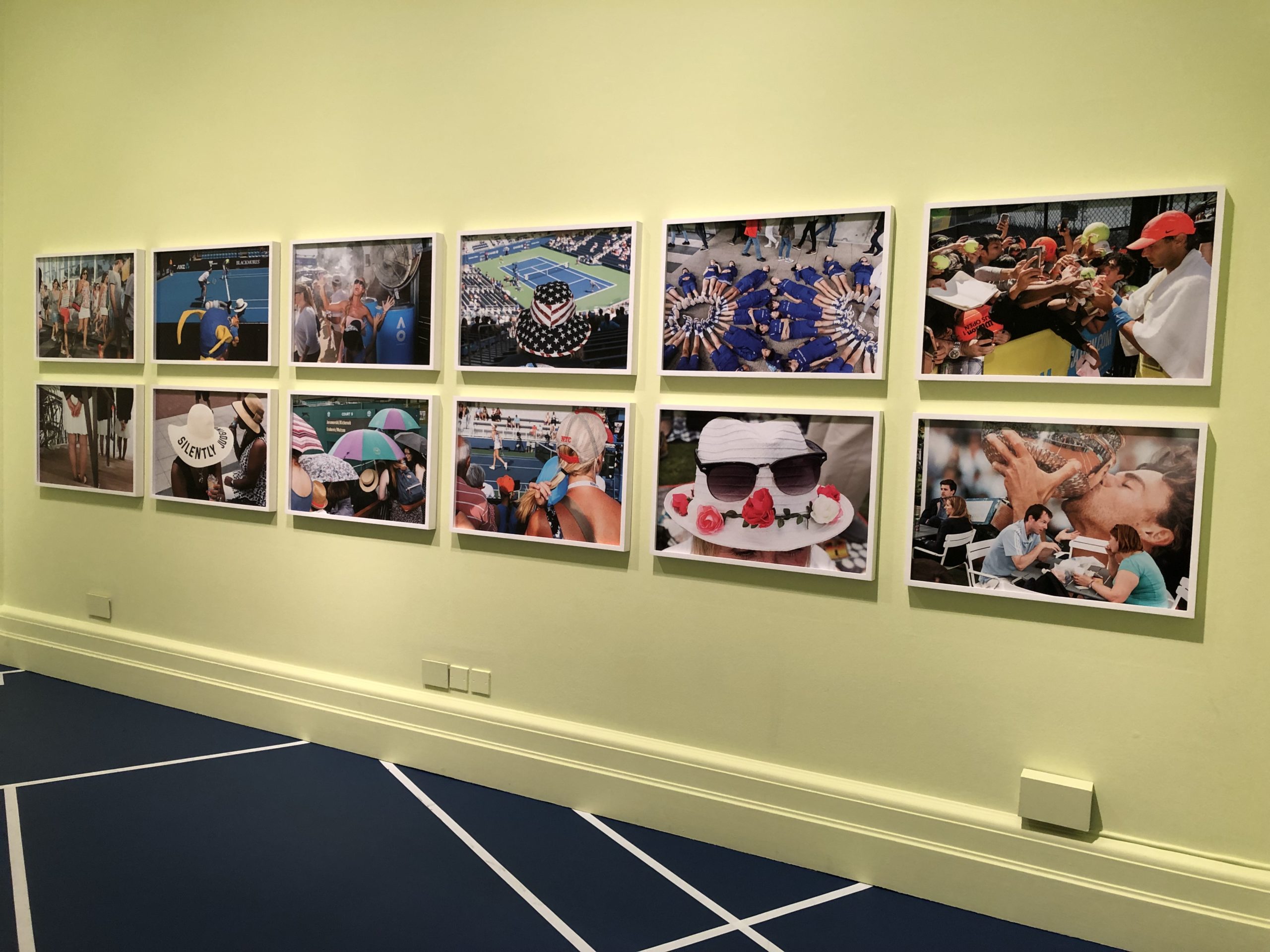
And there’s the tennis room.
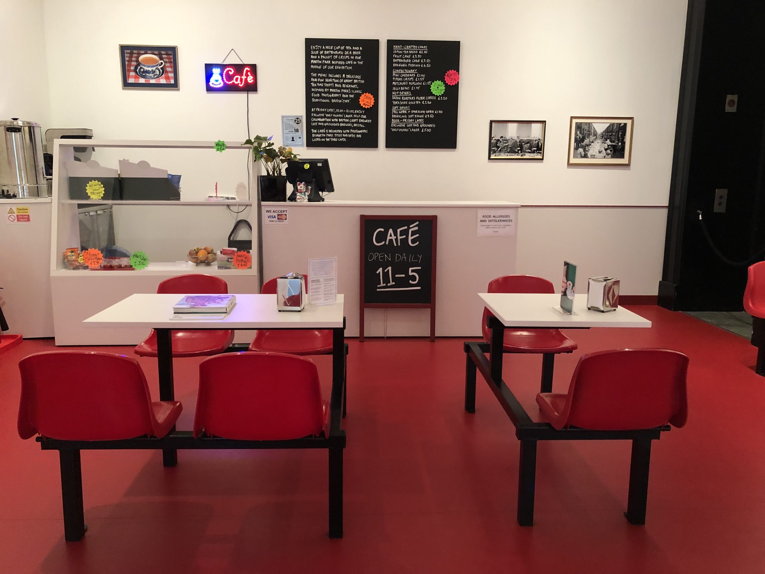
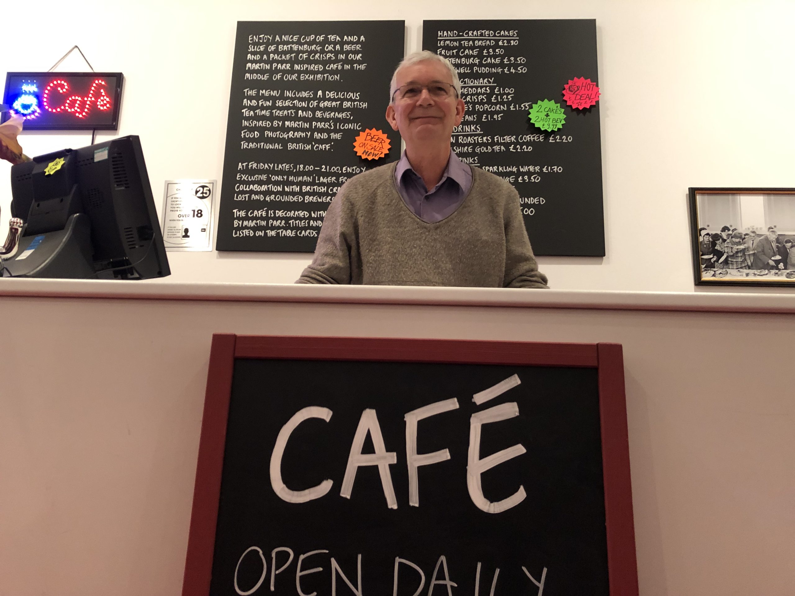
By the way, have you seen the cafe?
Martin said the art-installation-cafe had been his idea, and so they built an extra one that served real food, though it wasn’t open yet, being morning and all.
The Autoportraits, in which he allowed himself to be photographed by local portrait photographers, in their typical style, never smiling, were pretty great.
Funny and original, I laud the idea and the effort.
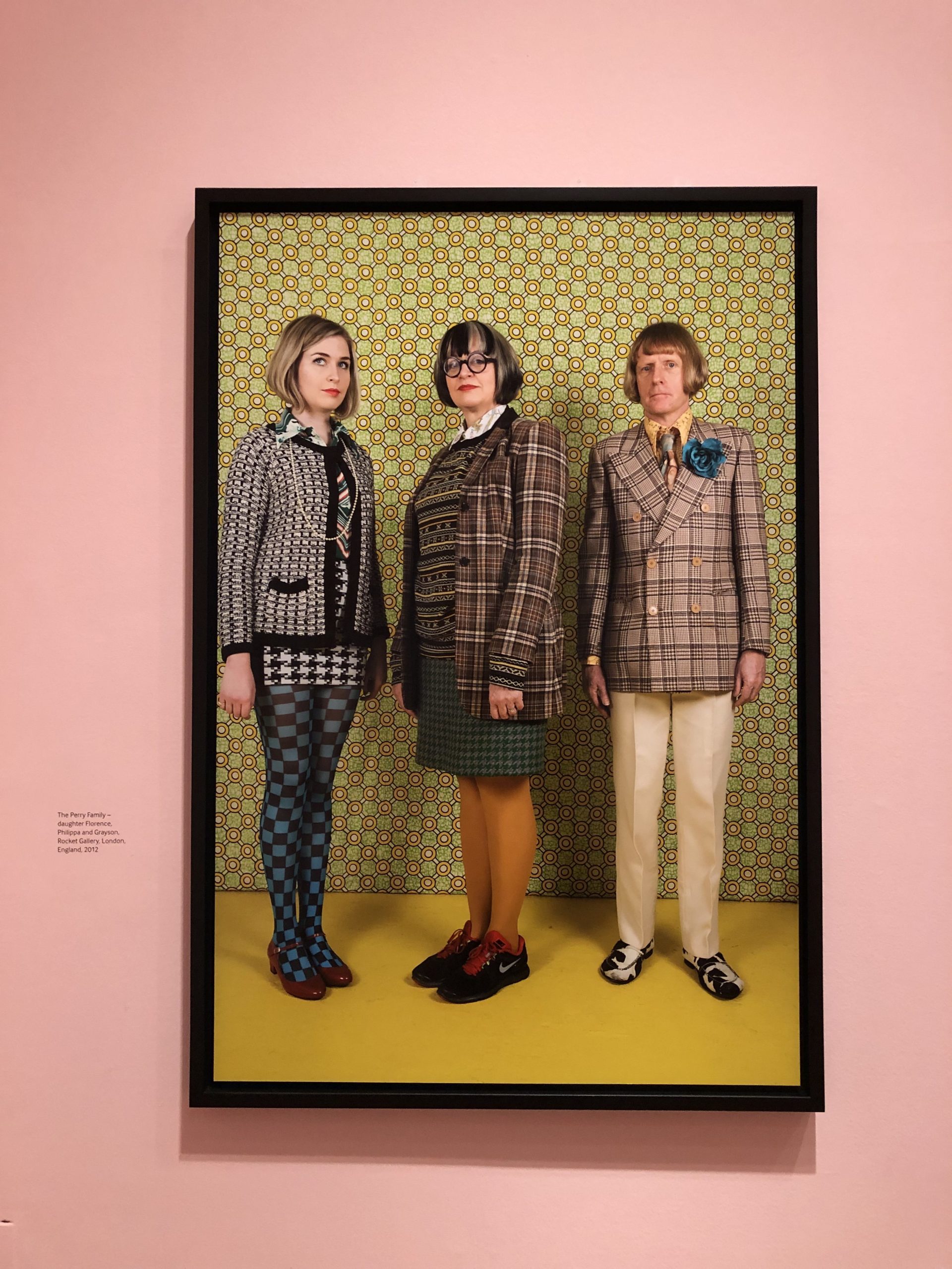
And I loved the Grayson Perry family portrait.
Grayson Perry family portrait
But the rest of it left me feeling a bit cold, if I’m being honest.
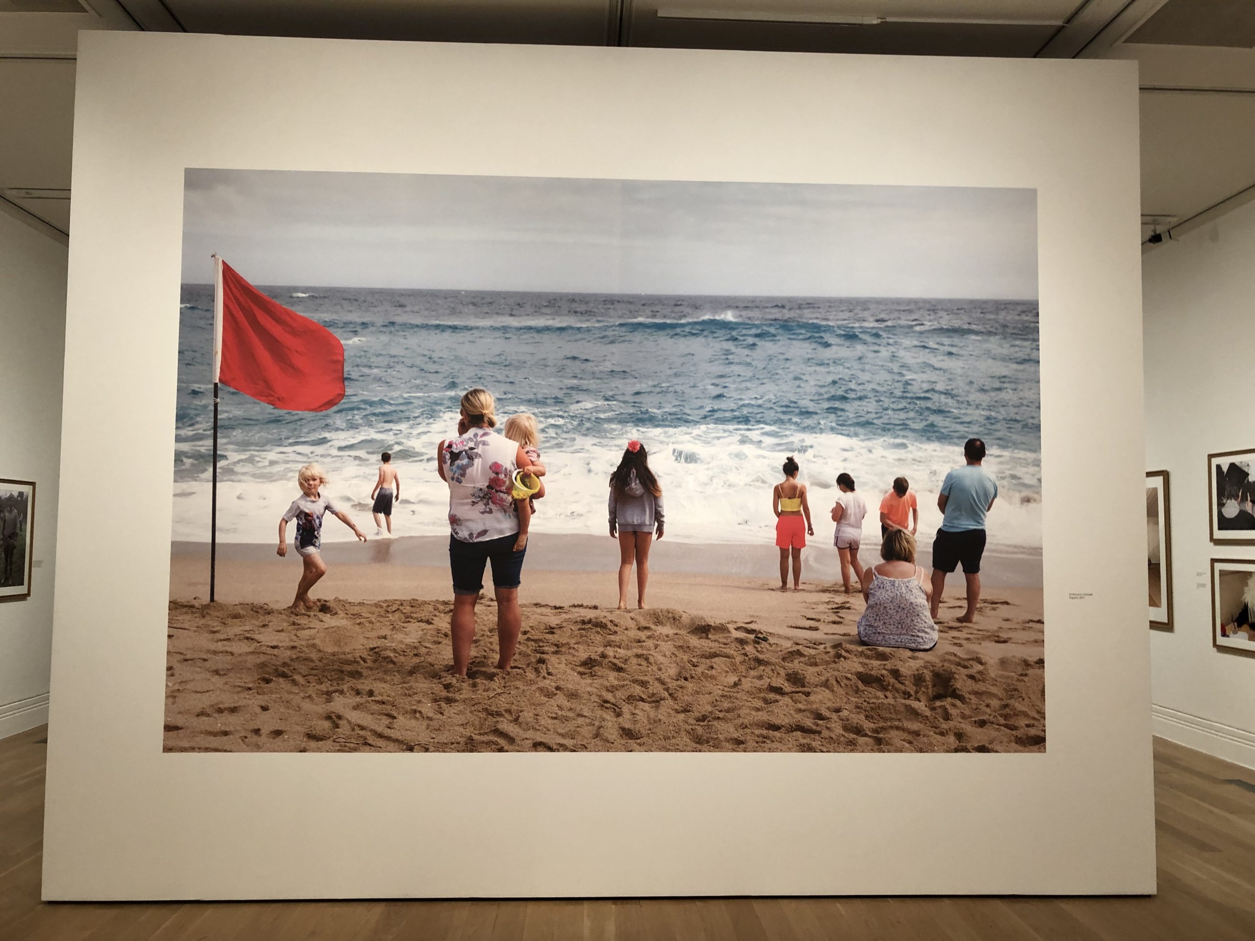
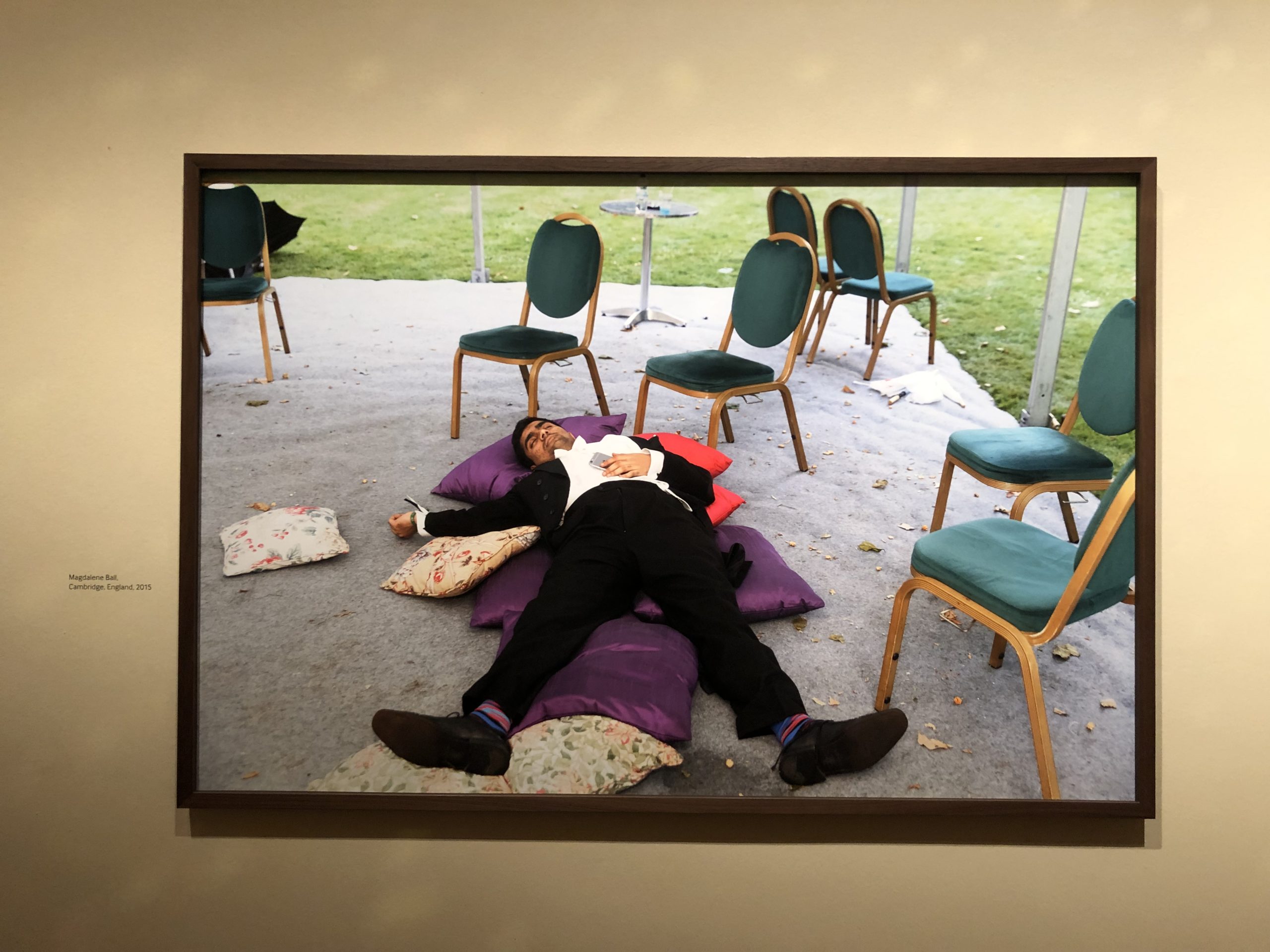
Martin Parr’s often lauded for being satirical, and surely there were images critical of the English across the racial and class divides.
He pointed cameras at the Brexiteers, and the diverse English residents driving the racists bonkers. The show gives us Aristocrats and fishmongers and everyone in between.
The photographer is known for being ambiguous; influenced by the dry, new topographics style of the 1970s.
And it wouldn’t be English if it weren’t at least a little absurd.
But maybe that was my problem?
In a shocking, Post-Trumpian world, these seemed a little average.
They felt current, but not RIPPED FROM THE HEADLINES.
I know the Parr style of big flash, saturated colors, and flattened picture plane was radical, at one point, but collected in the museum, work from the 21st Century, it was a bit tame for me now.
Does that make sense?
Like, when I heard “Born in the USA,” in the 80’s, I fucking loved that song, but now, when I hear it, I think, we’ll, that’s a bit dated, isn’t it?
I like to be moved, or feel inspired, and that didn’t happen in the “Only Human” exhibition.
If I were English, or hadn’t spent time looking at all the images in the catalog, preparing for my article, I might have felt there was more freshness.
When you see the photos and video I’ve included, you may think I’m off the mark.
(There were positives, of course. I’m not saying the show was bad, only that it was unremarkable.)
I was impressed that a wall placard gave credit to those behind the scenes, which was very decent, and it was clear the audience treated Martin Parr like a rock star.
And they lined up to meet him in the gift shop.
Ah, the gift shop.
I can’t not write about it.
I just can’t.
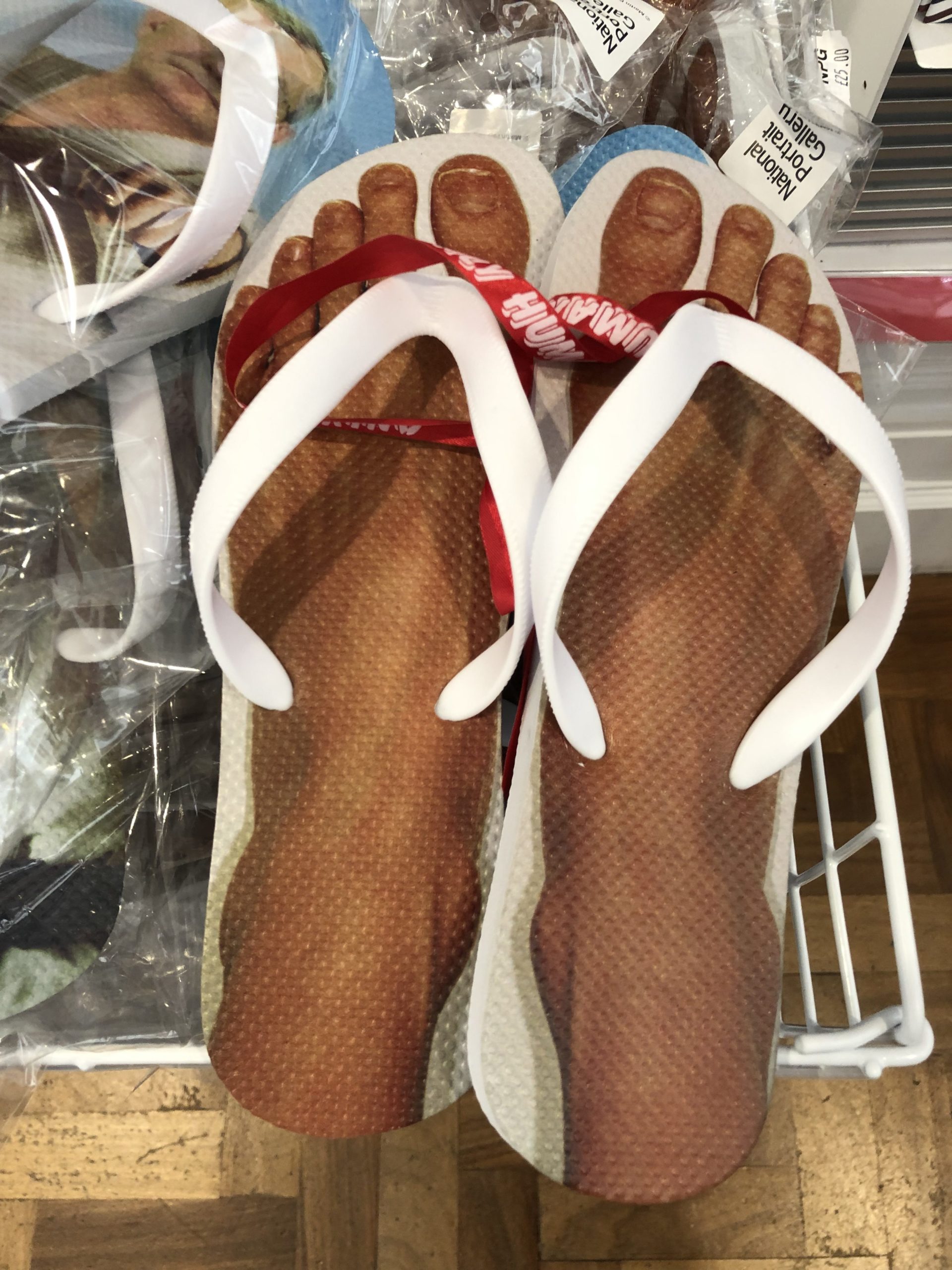
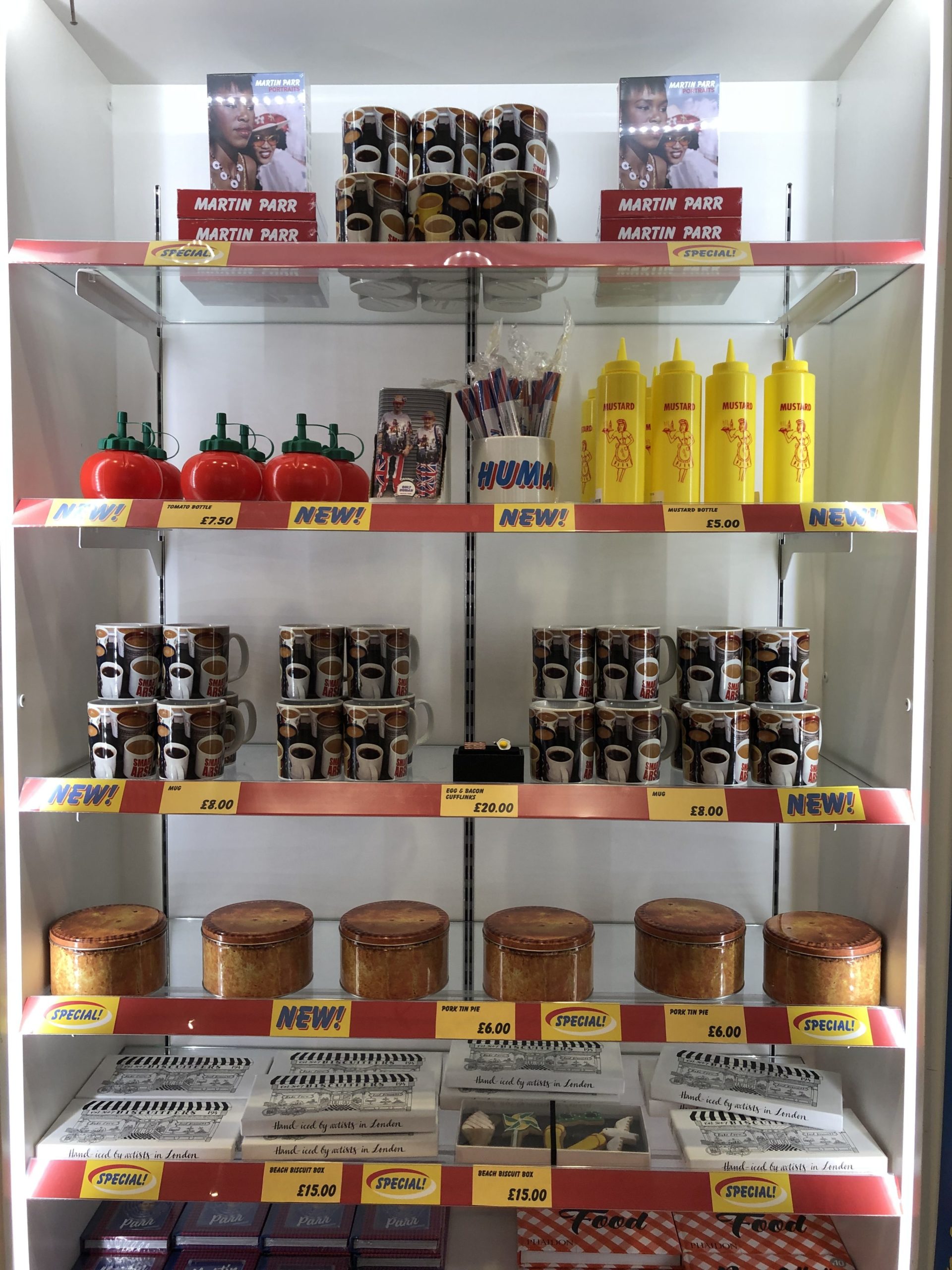
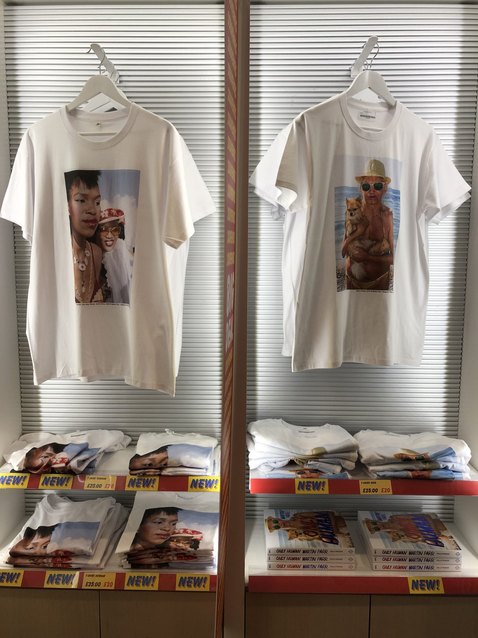
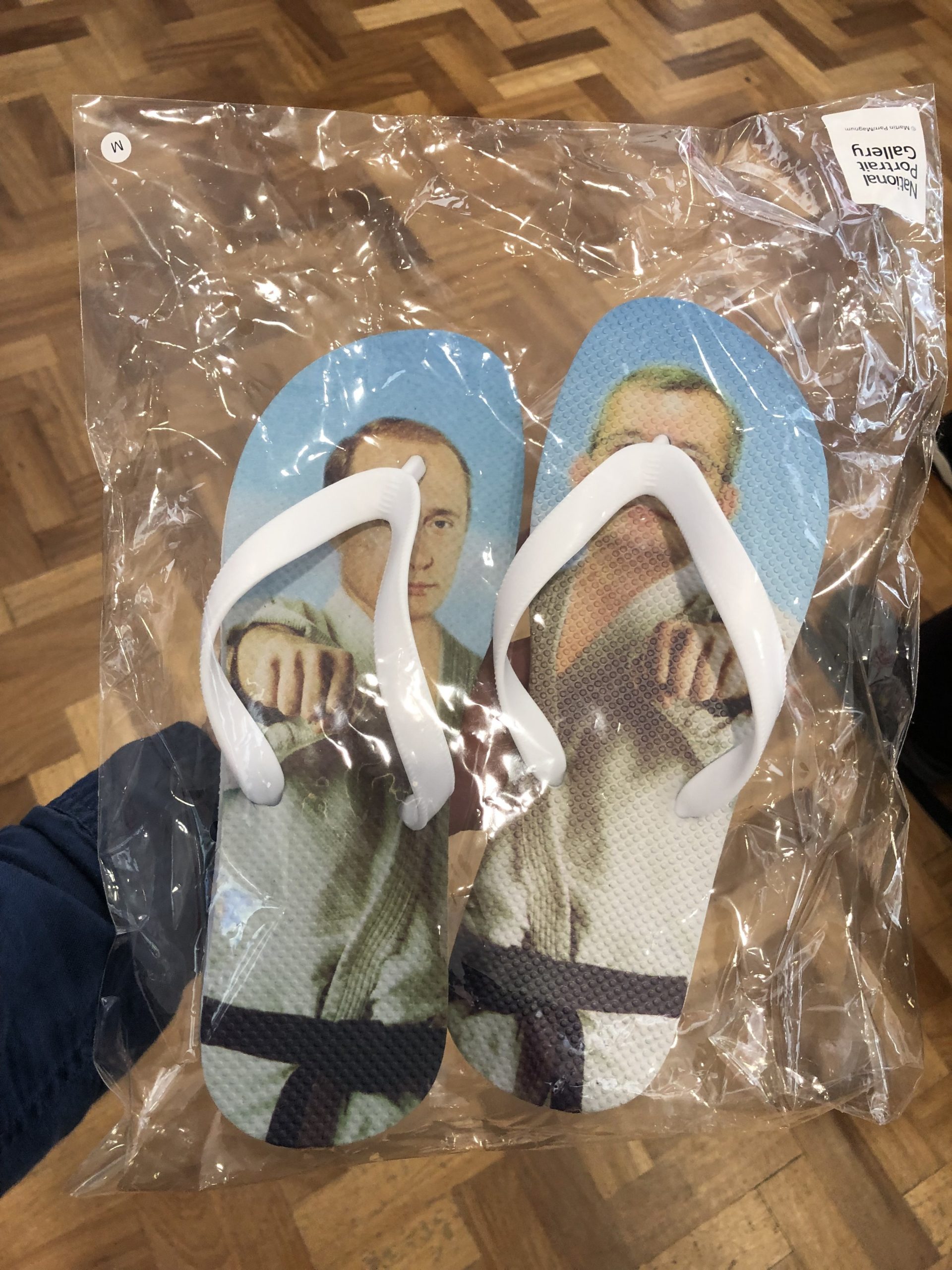
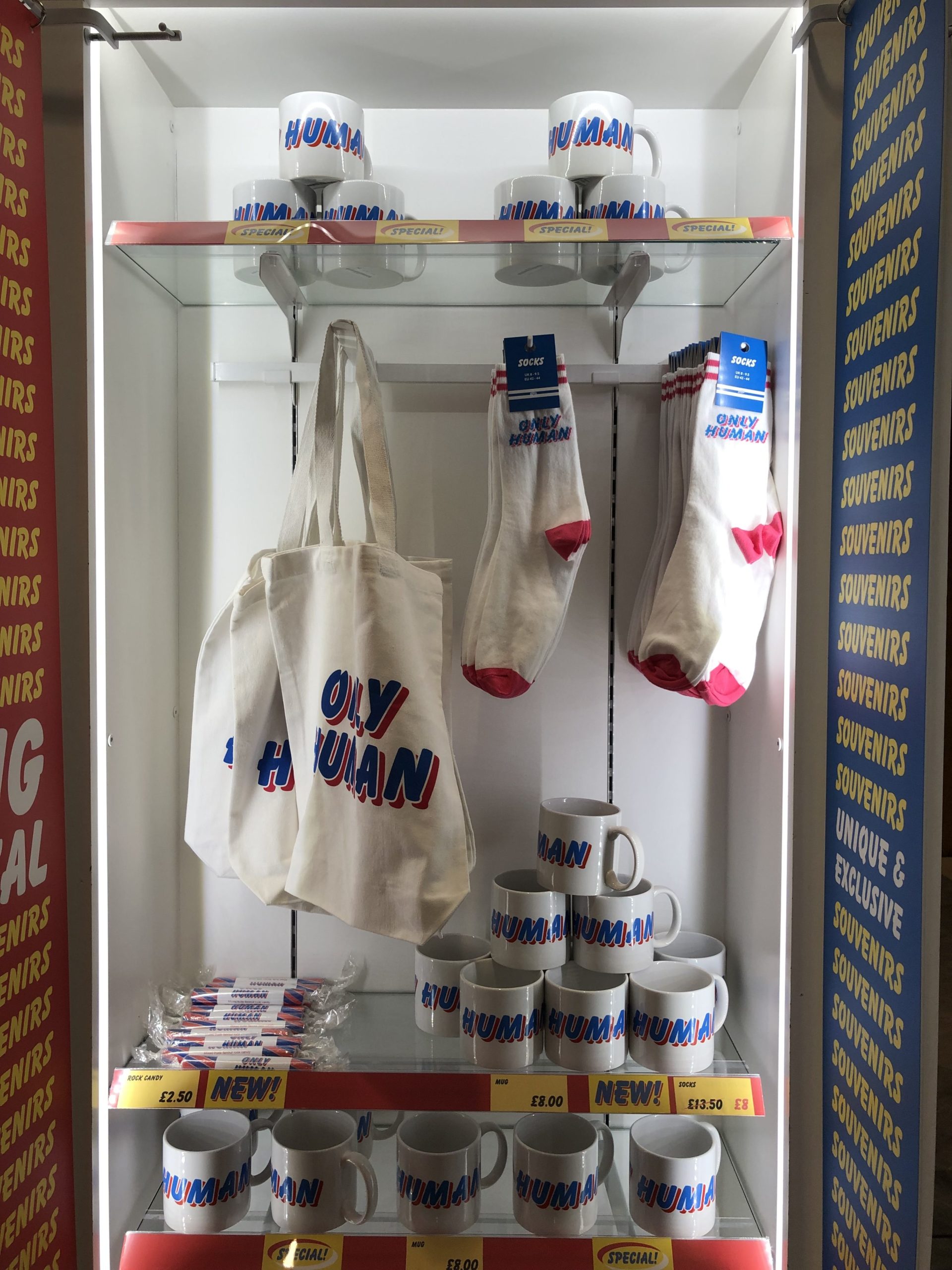
In my lede for Lens, I referred to Mr Parr as a cottage industry, and the variety of products on sale were staggering.
Chocolate bars, flip flops, t shirts, you name it.
Along with the Instagram wall, the entire gift shop felt like it was designed to be on the Gram as well. I suspect the merch on offer, and the hashtags generated, were a part of the show’s allure for the crowds too.
I know that for an opinionated critic, not taking a stand here is very unlike me.
Why bother spilling ink, if it was just OK?
Well, to begin with, I promised the review three times, so it would be lame to back out.
I normally love funny, and absurd, and English, but I willed myself to love “Only Human,” but only found it “Meh.”
The Art of the Personal Project is a crucial element to let potential buyers see how you think creatively on your own. I am drawn to personal projects that have an interesting vision or that show something I have never seen before. In this thread, I’ll include a link to each personal project with the artist statement so you can see more of the project. Please note: This thread is not affiliated with any company; I’m just featuring projects that I find. Please DO NOT send me your work. I do not take submissions.
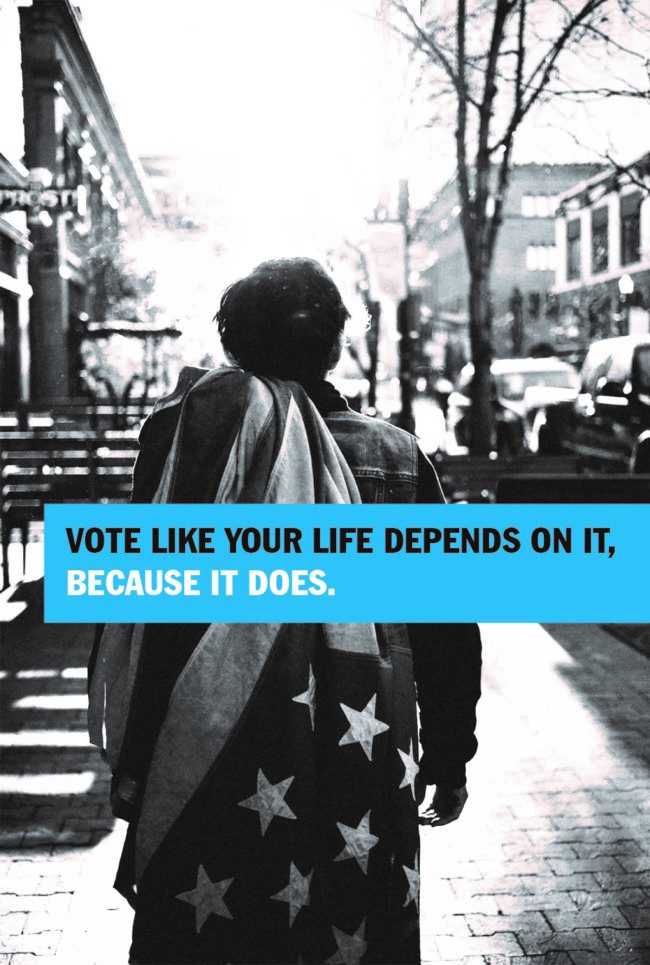
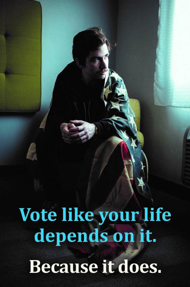
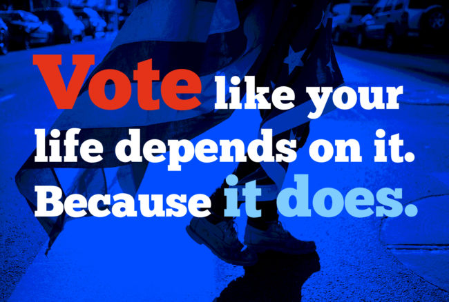
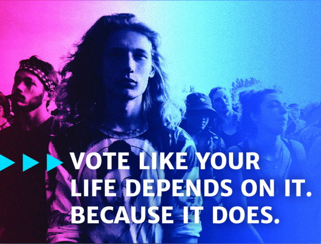
Bobbi Wendt has been consulting with Photographer /Director Zach Anderson for several years and they collaborated on a personal project using Bobbi’s oversized vintage flag. Bobbi mailed Zach her flag and suggested that he pack it with his gear so when an opportunity presented, he could make photos utilizing this beautiful prop so we could use the images to promote Voter Registration and Voting in future elections…everything from City Council to President.
Bobbi came up with the headline “Vote like your life depends on it. Because it does.”
John Kehe designed the layouts for the social media campaign and the project continues to evolve.
Everybody please make sure you’re registered and Vote. A thriving Democracy requires the participation of We the People.
To make sure you are registered to vote, click here
APE contributor Suzanne Sease currently works as a consultant for photographers and illustrators around the world. She has been involved in the photography and illustration industry since the mid 80s. After establishing the art buying department at The Martin Agency, then working for Kaplan-Thaler, Capital One, Best Buy and numerous smaller agencies and companies, she decided to be a consultant in 1999. She has a new Twitter feed with helpful marketing information because she believes that marketing should be driven by brand and not by specialty. Follow her at @SuzanneSease. Instagram
Success is more than a matter of your talent. It’s also a matter of doing a better job presenting it. And that is what I do with decades of agency and in-house experience.
Heidi: How long did it take for you to find this subject, befriend him and get the story? Scott: There were a couple of starts and stops on this one. I had initially approached a group of runners called The Skid Row Running Club. I described the kind of project I was looking to make and was invited to film. I went out and shot two or three times. I learned that there was a documentary team that was working on a feature length project that followed some of the runners who were training for a marathon. Since I was proposing something much shorter with a very different feel, it was deemed by the group not to be a conflict. The two filmmakers felt otherwise, and after receiving a hostile phone call I backed away.
What happened next? With some help, I ended up finding another group with a very similar mission. It was a program called “Back On My Feet.” Mark (the subject of 6th and San Pedro) was a member of that group. I filmed with the whole group a couple of times, but once Mark split away, I decided to focus in on him. So I shot maybe six days worth of footage that I didn’t end up using.
So once you started over, how many days did you shoot? Maybe six days of shooting spaced out over three trips to LA. I interviewed Mark on the tail end of one trip. I cut the audio together back in Portland. A job brought me back to LA and I managed to find an hour or two to shoot with Mark.Once I put those clips on a timeline with VO, and it that gave me the sense of how much more footage I might need. This meant getting back in the van one more time to drive down and finish it off.Meeting up with Mark wasn’t always easy, he had a lot going on in his life at this time, but we managed to get just enough footage for what I had in mind. What’s in the film is more or less every setup we shot, there’s not too much on the cutting room floor. I would say those six days are sort of equivalent to 2 with a crew.
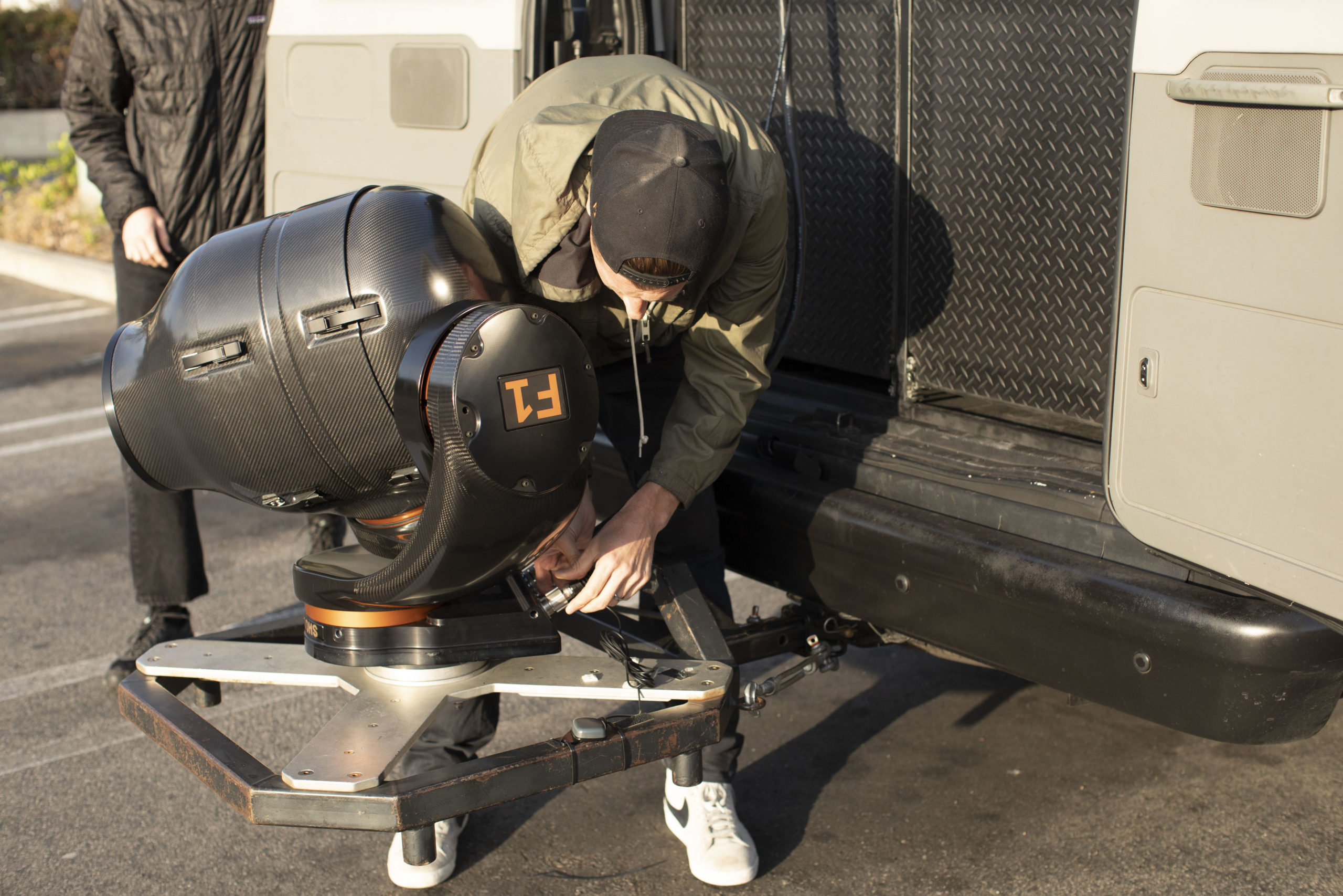
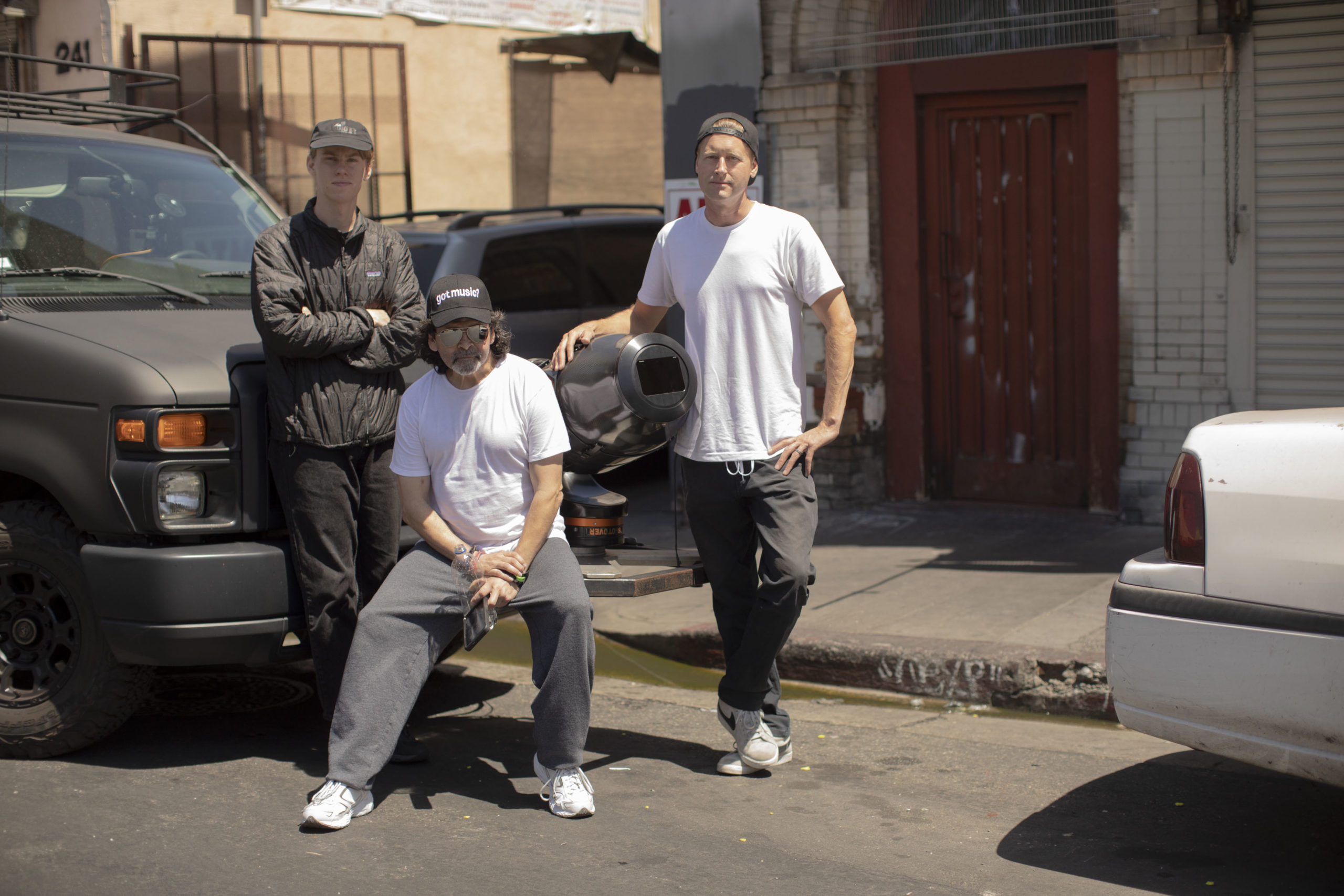
How many people worked on the film? Ghost Digital is a production company that a friend of mine runs. They have a van equipped with a stabilized head (Shotover F1.) It’s a 3 axis gimbal, inside a 3 axis gimbal. It’s amazing, you can drive down a pothole-filled road and footage is glass smooth, even with a 300mm lens. The telephoto tracking shots of Mark running were all captured with that setup. So on that day, I had a driver and an operator who controls the head remotely. He’s aiming it, zooming and focusing all at once, which is pretty crazy. I was seated behind the operator, with a monitor, and I had a walkie to communicate with Mark, but I think we ended up just yelling out the window for the most part. On the rest of the days it was me and a friend who I’d roped into helping me. I needed someone to help make sure the gear didn’t walk away, and for a few shots I was being pulled in a wagon. On those days I had nothing more than some still lenses, a camera and a tripod and a slider.
That’s it? To the extent that it was produced, I was the producer, also the director, the director of photography, the sound recordist, the editor, the mixer and I did the color grade and the titles. My very talented friend Arjan Miranda composed an original score. Anyone who finishes a personal project will tell you how grateful they are for every name in the credits.
Did you collaborate with a writer or you wrote this? There was no writer on this project, the voiceover is edited down from
an hour-long interview I did with Mark. I worked with a fellow photographer/director Andrew Norton on a few projects a couple of years back, Andrew has a background in radio production, and watching him conduct interviews taught me a lot about the process: What kinds of questions set up answers that you can use, how to listen for tenses and context, how to interview for the edit in the same way that a good DP or director is shooting for the edit. On the post side I learned how to shape an interview into a story arc, and how finesse the details. Adding or subtracting pauses, leaving in some of the quirks that we all have when we speak, but loosing anything extraneous. That said, Mark was very engaging and very emotive in how he told his story. We did the interview in my garage under a little tent made of moving blankets and C-stands. When we finished we were both a little misty.
Why black and white? I suppose metaphorically it’s a story of darkness and light, it just seemed to fit. That’s the joy of a personal project; you don’t have to make the case for anything. You have an instinct, and that’s enough.
Why did you feel it was important to tell this story? Obviously homelessness is a huge issue in this country, but I didn’t set out with any particular agenda. I was really just following my nose. The idea of a homeless running club was unexpected, that got me started. When I met Mark I was interested in hearing what the path was that lead him to where he was at. When I learned about his academic pursuits and career ambitions that added another layer too. I think there’s merit in challenging people’s expectations.
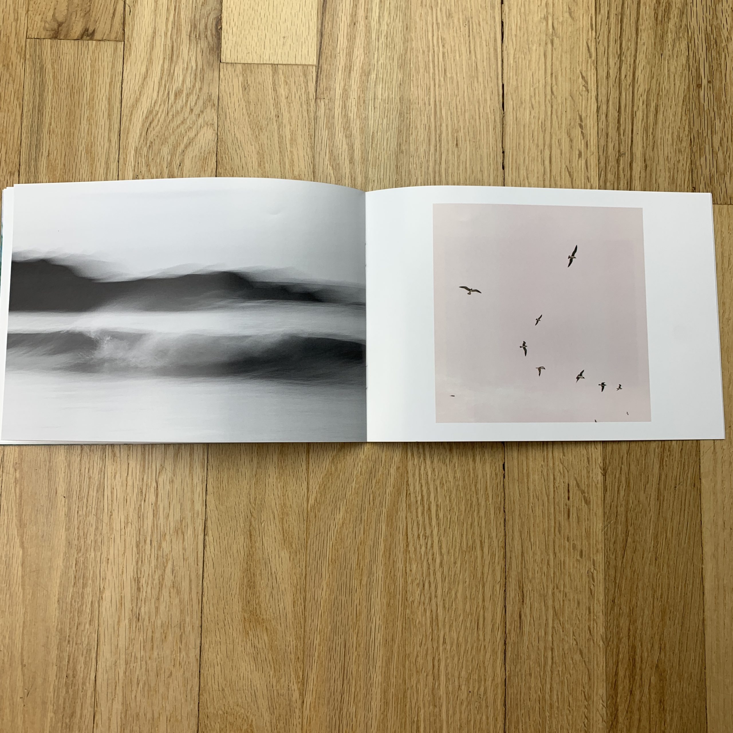
Tell me about the images?
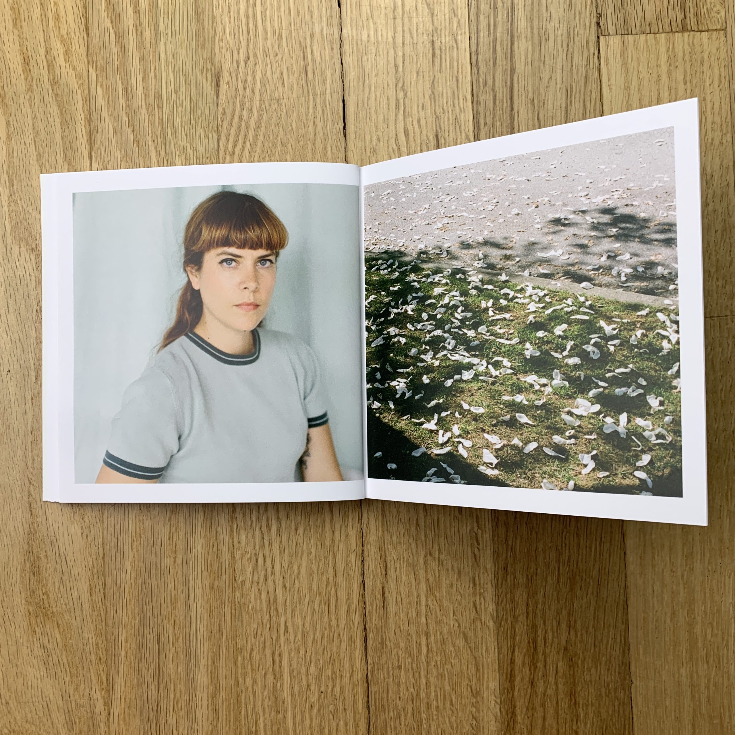
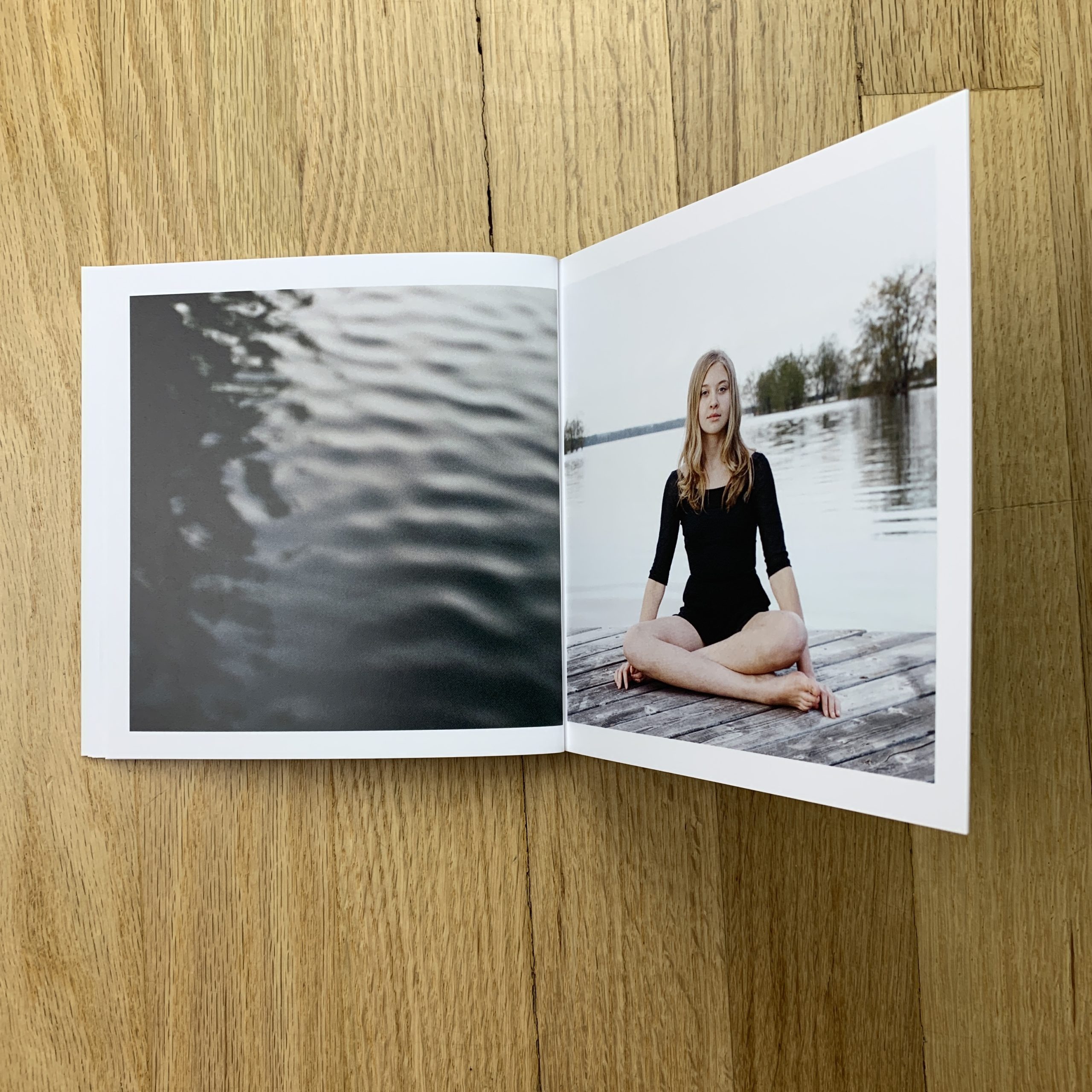
It’s mostly work shot in the last 6 months although there are a couple of photos a bit older that I used because they fit well in the edit. In my work, there are some different ways I like to play with light, water, form, movement, and other elements. So the idea was to have a collection of images that reflects that and an overall way of perception.
How many did you make?
200
How many times a year do you send out promos?
I have sent some out here and there but have not been super consistent. But I really enjoy it so I would ideally like to send something out every few months.
Do you think printed promos are effective for marketing your work?
Shortly after I sent this out, I was hired by one of the largest ad agencies to do a shoot in Los Angeles for one of the top 3 tech companies. Another time, I sent just a postcard that led to several large projects over the course of 2 years with what was for a time a great recurring client. But at the same time, it’s not a given that anyone particular thing is going to get a specific result.
As a reporter, or journalist, or whatever it is that I am, (when I’m not being an artist/teacher/dad/husband,) I’ve written about the Golden State, here, on many occasions.
Needless to say, California in the age of over-tourism is not a pretty sight.
Perhaps that’s the wrong turn of phrase, because it’s the undeniable prettiness that’s led to the insane overcrowding, and now the ridiculous tourist hordes.
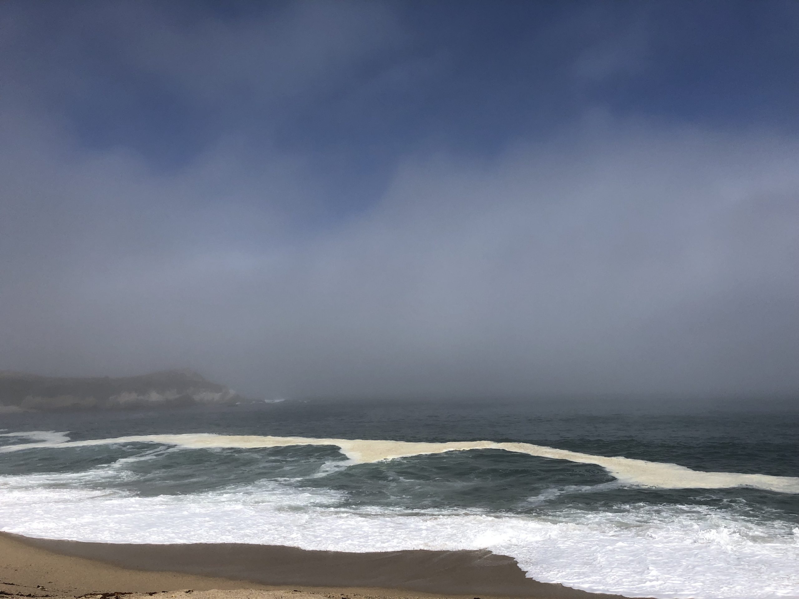
The Pacific Ocean in Carmel, looking towards Point Lobos
But as a travel writer, bashing tourism, (in general,) would qualify as biting the hand that feeds me.
And while I may occasionally tend towards the quixotic, people rarely call me stupid.
Therefore, I’m going to let my California experiences marinate a bit, (as usual,) so I can return to the subject in the future, without the road-weary-bitterness I’m feeling at the moment.
Rather than rip on Gavin Newsom’s hair, or the now-legendary homelessness problem, (which I first reported here 3 years ago,) I’m going to step back into my memory, and re-visit my life-changing trip to London.
Part 2: The Sifu
“Whatever you do, don’t be late,” said Hugo, and those were his last words before I headed out the door.
“Right,” I replied, “don’t be late. Got it.”
Hugo had set me up with City Mapper, an app that was meant to offer directions, even without an internet connection. And we’d planned the route carefully.
I had to change trains a couple of times from Holloway, so we discussed the track I’d need, and that I ought to check with one of the rail workers before I boarded.
He even told me to make sure I saw New Malden on the electric ticker, as there were multiple trains that left from each track. (I was headed from North London to Surrey, so it was going to be a long-ish trip.)
And where was I headed?
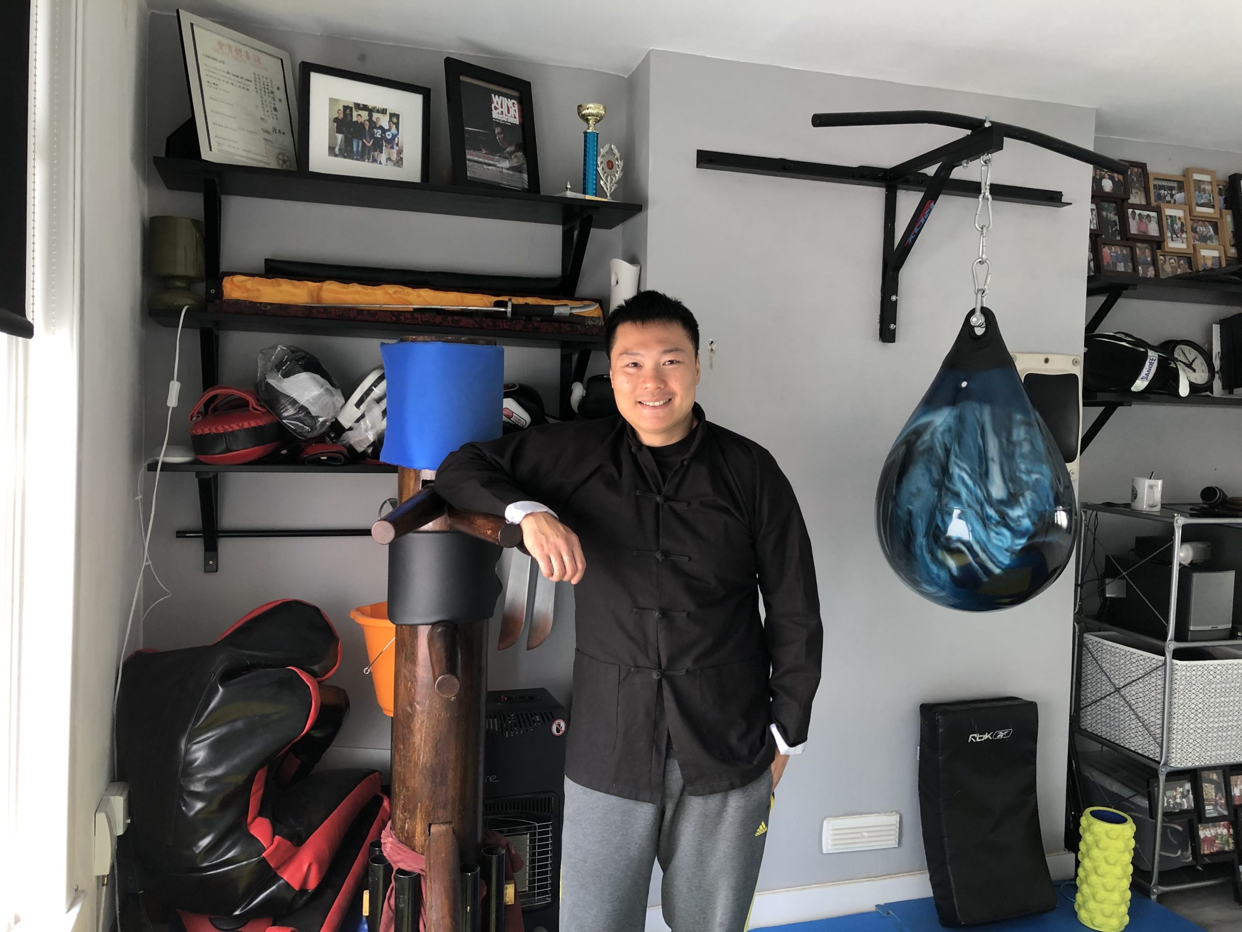
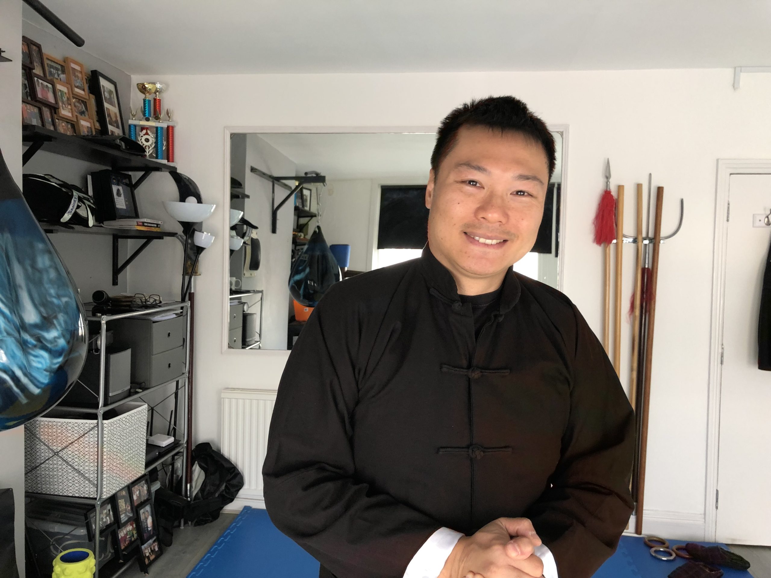
I’d booked a private lesson with Sifu Leo Au Yeung, one of the most impressive Kung Fu masters, and instructors, in the world.
Am I exaggerating?
You decide.
Sifu Leo, who is seemingly only in his 30’s, was the Wing Chun choreographer and instructor for Ip Man 1, 2, and 3, which happened to be the most popular Kung Fu movies of the new millennium.
Ip Man, if you don’t know, is credited with popularizing Wing Chun around the world, via his dojo in Hong Kong, where he trained Bruce Lee, among other greats.
Sifu Leo was also the Kung Fu teacher for Iron Fist Season 2, the now-departed Netflix-Marvel show that was notable mainly for being better than the genuinely bad Iron Fist Season 1. (How Marvel missed the moment, and cast Danny Rand as a whiny, rich, entitled white guy is beyond me.)
In addition to his star-connections, Sifu Leo also has a thriving Kung Fu program in London and Wimbledon, and unlike many a closed-minded martial artist, travels the world to study with other teachers, and learn from other arts.
In other words, he’s a genuine badass, and the nicest guy you’d ever meet.
Or so I’d been told by Hugo, after I’d recommend he study with Sifu Leo, after watching a few of his videos on Youtube. Hugo’s trained with him once a week for well over a year now, so oddly, after I recommended my friend to him, my friend now recommended me right back so I could book a lesson.
And his final words were, “Whatever you do, don’t be late.”
I left with plenty of time, (though perhaps not enough,) and did exactly as I was told. I double-checked with an attendant that I had the right track, and then watched “Malden” scroll by on the ticker before I boarded the train.
It was supposed to take 20 minutes or so, so I settled in for the ride, nervous as hell to train with a genuine Kung Fu master.
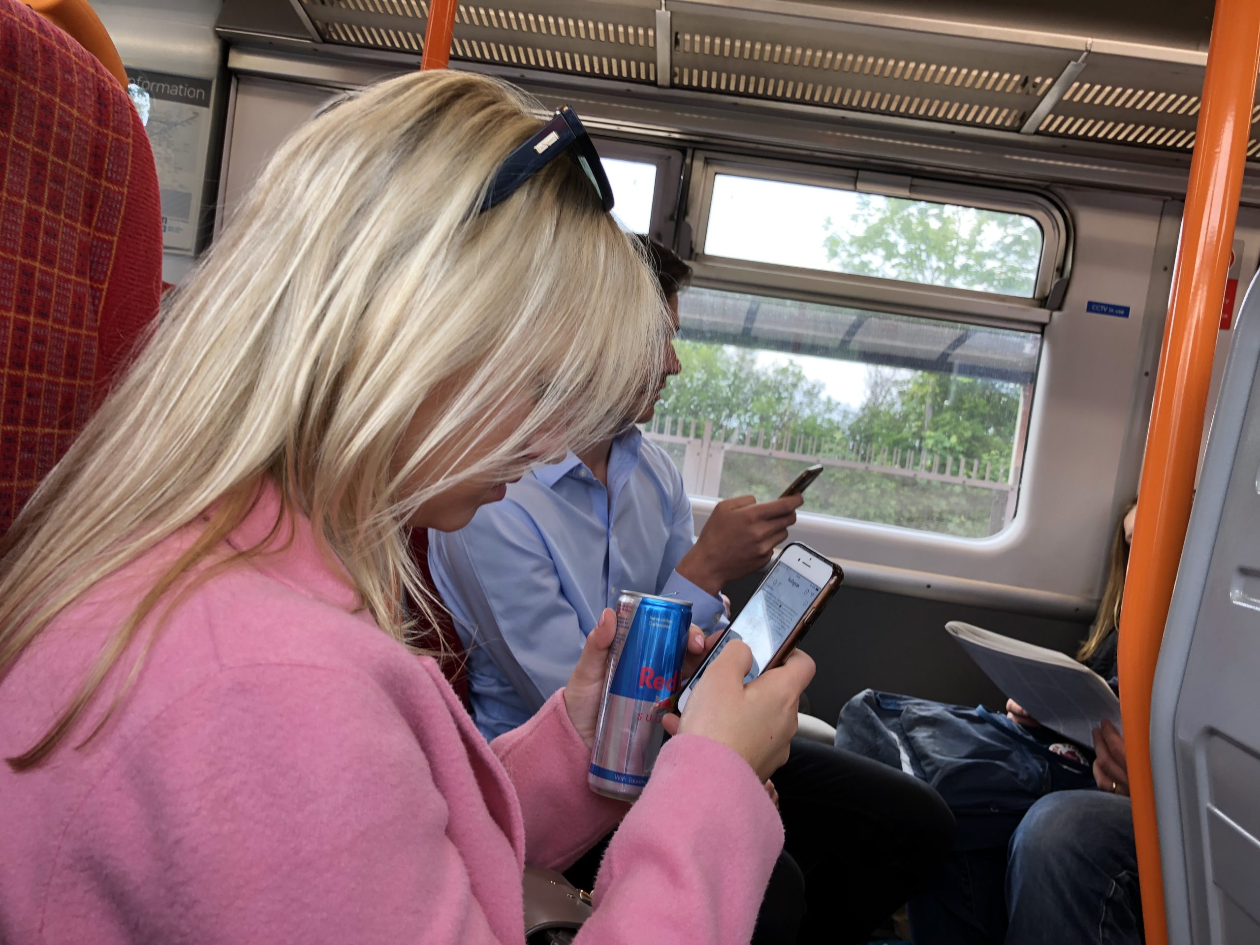
On the train with Red Bull and Instagram
After about 15 minutes, I checked with a conductor who confirmed we were headed to Malden.
But then at 30 minutes, I started to get a funny feeling in my chest.
Something seemed off. Not right.
So I got up, took a good look at the map, and noticed that there were in fact two Maldens: New Malden, where I was headed, and Malden Manor… where apparently the train was headed instead.
On the convoluted map, I could see where the spurs diverged, and that I was already two stops past where the train cut towards my putative destination.
Shit!
Double-shit!
I jumped off the train at Malden Manor, and considered taking the next train back in the opposite direction.
Thankfully, the uber-polite English folks on the platform were uniformly helpful, and assured me that would be a mistake. They said head into town and wait for the K1 bus, it would be faster.
I had about 20 minutes, before I’d be late, and my heart was pumping harder than Donald Trump’s, while he’s digesting an after-dinner snack of 2 Big Macs, an order of Chicken McNuggets, and a large fries.
I ran to the nearest bus station, as I could see a bus approaching, but the folks waiting assured me it was going the wrong way, and that the proper stop was around the traffic circle.
No worries, they said, they come every 10-12 minutes.
You’ve still got time.
So I sat, and tried unsuccessfully to poach wifi from a nearby food co-op.
Eventually, a nice English lady sat down next to me, in her late 50’s, and then a gentleman around the same age, of South Asian descent.
They could see I was miserable, so I told them the story, and they assured me it was best to wait, rather than walk, or try to find a nonexistent cab.
Sure enough, the next bus that came was also headed in the wrong direction, and then I was officially late. The lady had a calming voice, and told me things would turn out alright.
The nice man offered me his phone, so I could text, but at the last minute, the free wifi kicked in, and I was able to send an email to Sifu’s assistant, explaining the circumstances. (I assumed she was down the street, but later learned she lives in Japan, and therefore my message went from Malden Manor to Tokyo and back to New Malden.)
Eventually the bus came, and the nice lady took my hand, determined to see me off to my destination. So we sat next to each other, and she told me of her travels to Las Vegas, as her husband’s brother was a renown musician, who’d worked on the original James Bond theme.
The bus moved slowly, and all I could hear in my mind was the opening riff to James Bond, mixed with Hugo telling me, “Whatever you do, don’t be late.”
Late, I was.
I feel awful that I never asked my friend her name, as I was so frazzled, mostly because I wanted to turn up suave and calm, and that plan was clearly out the window.
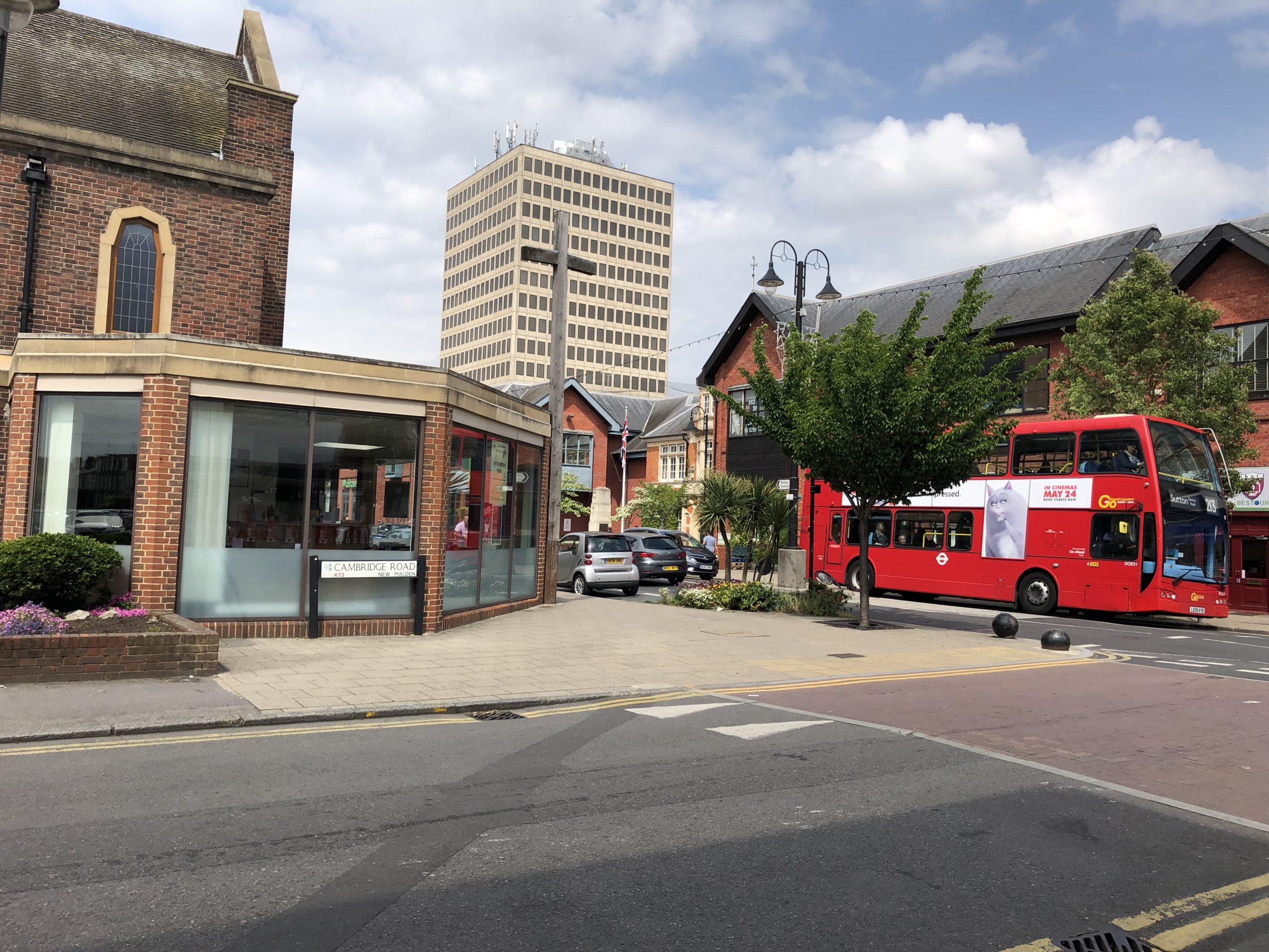
New Malden was a fair bit shinier than Malden Manor, with a cute little High Street, and then I finally made it.
New Malden, Surrey
Of course, Sifu was as gracious about my lateness as anyone could be, and his assistant Crystal wrote that she’d made the same mistake herself once. (Taking the wrong train.)
Plus, I was paying for the time I’d lost anyway, so in the end, it wasn’t as bad as I’d feared.
I went in with expectations, hoping to mix it up a bit to test my skills, and maybe practice on the wooden dummy, but when Sifu asked what I wanted to learn, I said, “Whatever you want to teach me. You’re the Sifu.”
I’ve heard from other teachers, (as I am one,) that the experience of getting a proper teacher, of being subordinate in the learning environment, can be a liberating and exciting feeling, and I must agree.
So Sifu Leo, instead, felt my body structure, appropriately detected my weak spots, and gave me some tips on how to improve.
Then, he taught me a technique of releasing my joints simultaneously, from the inside, with my mind, so that I could always regain leverage in any situation.
It was as close to a Jedi Mind Trick as I’m likely to ever encounter, and he demonstrated it by reversing position, every time I had the upper hand.
Rather than fight, or tussle, or show off his strength of body, Sifu showed me how the mind-body connection can be taken to levels I’d not previously considered.
And in the end, he even let me snap a few photos to share with you.
For my UK readers out there, I cannot recommend Sifu highly enough. If you’re looking for an opportunity to build up your mind, body and spirit, this guy is for real.
And in the end, my biggest fear came true, and it wasn’t that big a deal after all.
Part 3: Speaking of Violence…
I’m rewatching “Luther” this week, from the beginning, as I’m desperately trying to get a little bit of rest before Antidote, (our photo retreat program,) begins next week here in Taos.
For those of you who don’t know, (though I referenced it once already in the London series,) Idris Elba plays John Luther, a super-cop who’s such a badass, he seems more like a super-hero than an actual guy. (Which could probably be said about Elba himself.)
The series is as dark as it gets, with enough gruesome murders, haunting killers, and proper wing-nuts to give you a permanent set of nightmares.
The show fetishizes the grotesque, and the Gothic, in a way that sheds light on the recesses of the English soul. (Much the way Stieg Larsson’s books seemed to plumb the depths of Sweden’s buried-Viking-persona.)
I love “Luther,” and if there’s a better anti-hero than Ruth Wilson’s Alice Morgan character, I’d like you to show me.
But much the way John Luther is the hero England wants and perhaps needs, over here in America, it’s another John we’re all crazy for: John Wick.
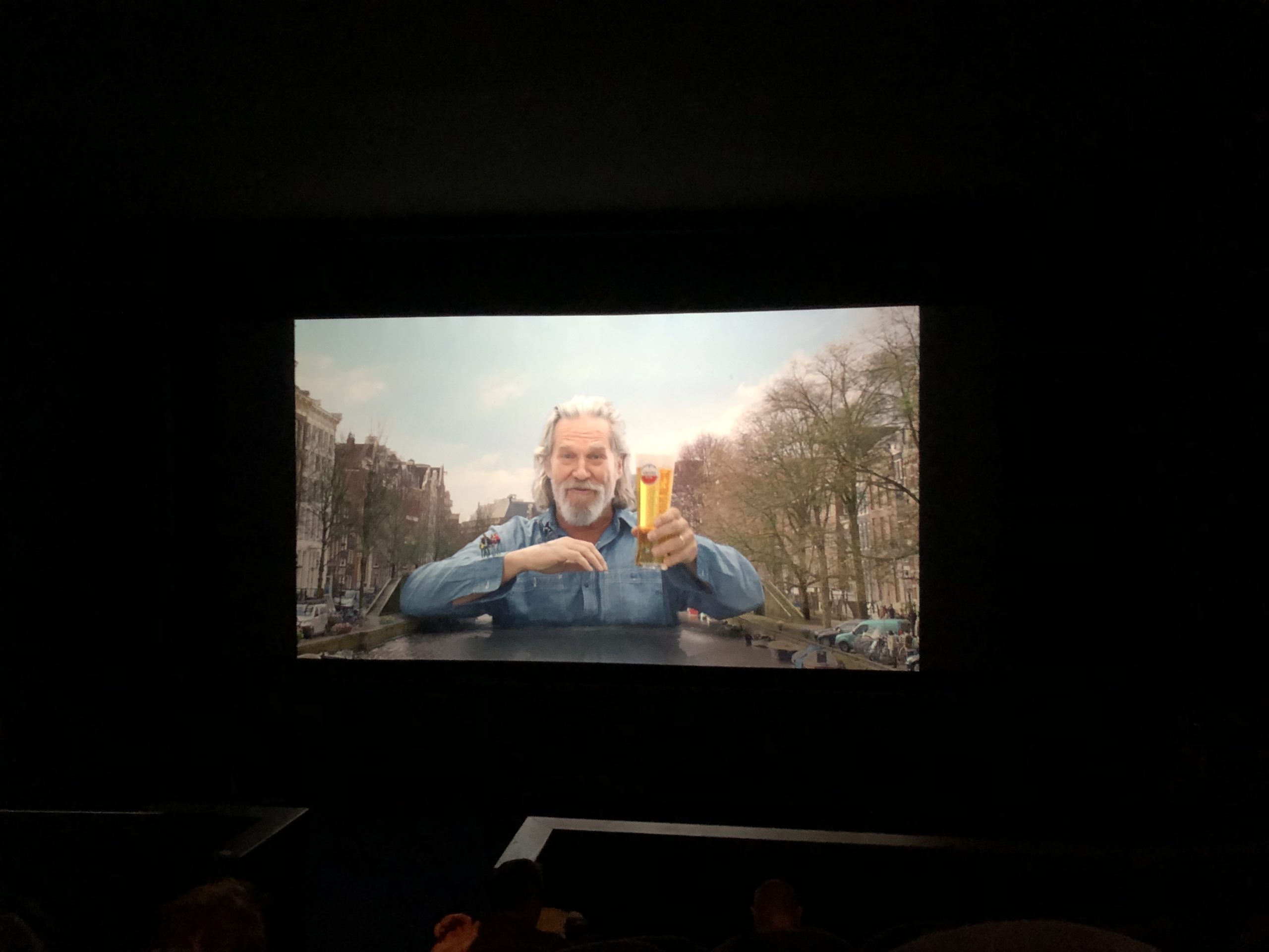
As it happens, Keanu Reeves’ “John Wick 3: Parabellum” opened while I was in London, and I managed to score a ticket on opening weekend, without even waiting in line.
I bought the ticket from a robot, because there are few humans doing such jobs in London, from what I could gather. (Look out, American movie-ticket sellers… I’m betting the robots are coming for your jobs soon.)
The film opened with commercials, which are the norm over there, I was told, as TV didn’t used to have commercials, so they were on the cinema instead. And when I saw Jeff Bridges, in full “Dude” character, pimping beer in Amsterdam, instead of weed, I was sure we were living in 2019.
I wrote on Twitter the other day that everyone’s on the hustle these days, and you know it’s true.
As for the film, I’m an action-movie junkie, and have seen more martial arts/action movies in my life than I could possibly count.
I know my Donnie Yen from my Jackie Chan from my Jet Li from my Bruce Lee from my Steven Seagal from my Keanu Reeves, is what I’m saying.
And the world is right to love the John Wick movies, which are so fucking stylish. World building is in these days, (Just ask Marvel,) and the John Wick films do it brilliantly, with their gold coins, assassin hotels, and intelligent use of Ian McShane. (And now Boban Marjanovich?)
I mention this, though, not to write a proper movie review, but because so much of the film felt made for the audience. It was fake-real, with trained dogs, kicking horses, and knife-throwing scenes that managed to bring humor and awe to a lot of blood.
Until.
Until a scene near the end, when John Wick decides that the only way forward is to get the biggest gun he can, with armor piercing bullets, and start shooing the bad guys one bullet a time.
Bang.
You’re dead.
Bang.
You’re dead.
The sound was so deafening I covered my ears, and the feeling was one of mass shooter on the rampage.
Immediately, I was taken out of the narrative, and thrust into my head again, thinking about all the AR-15 wielding, racist lunatics roaming my country, which at that point was 3000 miles across a big ocean.
I’ve never been near a mass shooting, thankfully, (before I drove past the Gilroy Garlic festival on Sunday, two hours before the shooting started,) but the references were unmissable.
If I thought it was political commentary, I might not have minded.
Instead, it felt wrong, and exploitative, and awful, and sad, and misguided, and strange, and I don’t know why they included it.
7 minutes of reality, in the midst of a violent fantasy.
And maybe that’s the problem?
I’ve been raised on fantastical violence, in all those movies, and maybe it was wrong to romanticize it in the first place?
The Art of the Personal Project is a crucial element to let potential buyers see how you think creatively on your own. I am drawn to personal projects that have an interesting vision or that show something I have never seen before. In this thread, I’ll include a link to each personal project with the artist statement so you can see more of the project. Please note: This thread is not affiliated with any company; I’m just featuring projects that I find. Please DO NOT send me your work. I do not take submissions.
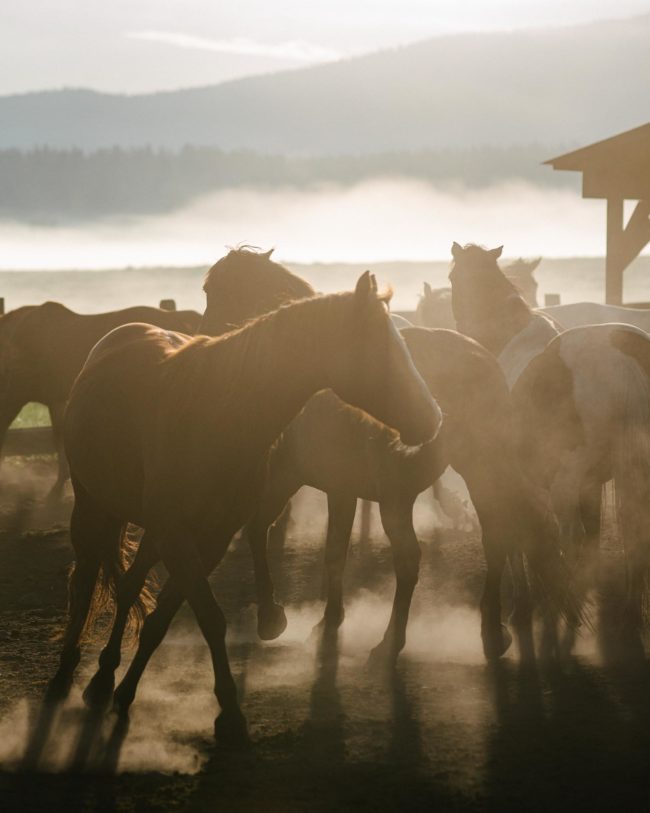
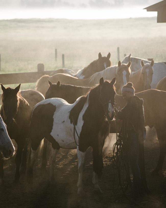
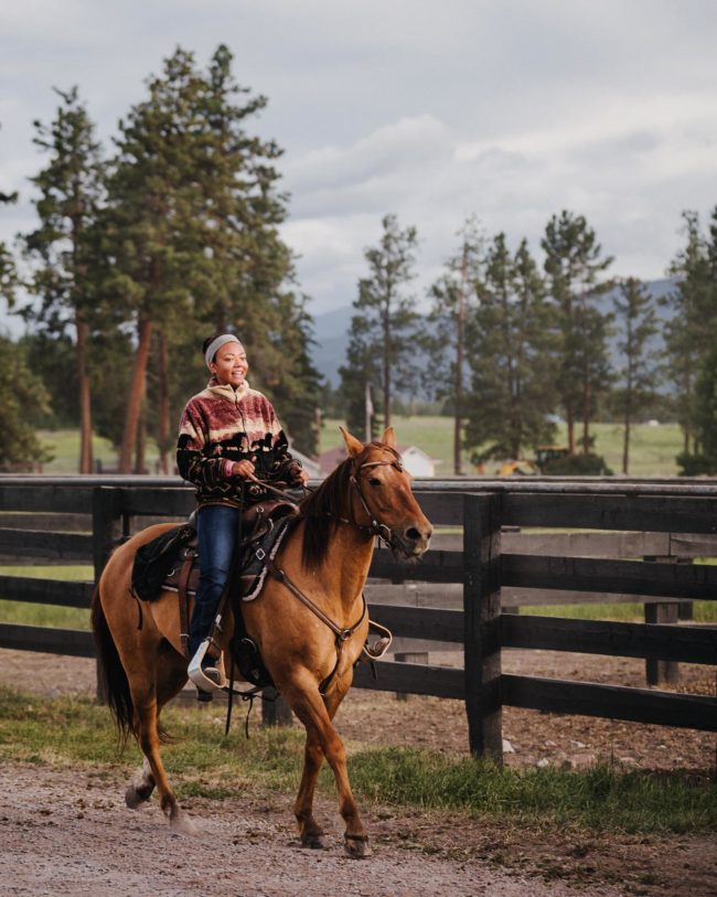
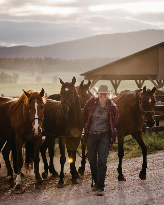
“Whenever possible, I’m a huge proponent of shooting personal work while on a project to make the images work towards my own personal goals (important note: this is great so long as nothing interferes with the project goals). Sometimes that means an extra setup of my design, or when I’m traveling, getting out before call time to shoot for myself. I use it as a time to take creative risks, and I’ve noticed that this practice can help inspire me for the rest of the day, week, or longer, and occasionally ends up working in my portfolio. This work came out of one of those cases.
I spent a week this summer shooting on a ranch in Montana for a job. Like most working ranches, the ranch hands bring in the horses from pasture early every morning to prep for the day. I made it a point each morning to get up early with the wranglers and shoot for myself before I started my client-oriented work. To be clear, I had no preconceived notions to make this into a full project. I noticed that every day the crew was made up almost entirely of women, which struck me as very cool and inspiring, and lent itself to a great narrative.
I love the idea of the badass cowgirls wrangling horses in Montana because I love the idea of flipping societal scripts. Women horse wranglers are not a new or unusual concept by any means, but I do think it goes against the grain of how many of us visualize ranch culture and who works physically-intense jobs. These women work their asses off to do what they love, and I certainly think it’s pretty cool.”
APE contributor Suzanne Sease currently works as a consultant for photographers and illustrators around the world. She has been involved in the photography and illustration industry since the mid 80s. After establishing the art buying department at The Martin Agency, then working for Kaplan-Thaler, Capital One, Best Buy and numerous smaller agencies and companies, she decided to be a consultant in 1999. She has a new Twitter feed with helpful marketing information because she believes that marketing should be driven by brand and not by specialty. Follow her at @SuzanneSease. Instagram
Success is more than a matter of your talent. It’s also a matter of doing a better job presenting it. And that is what I do with decades of agency and in-house experience.
Concept: Portraits of three people who received treatment from a hospital
Licensing: Unlimited regional use of up to 30 images for two years
Photographer: Portraiture specialist
Agency: Healthcare-focused
Client: Hospital
Here is the estimate:
Creative/Licensing Fees:
The agency identified three patients to feature in a regional advertising campaign to promote the hospital, and all of them would be photographed on one day at a single TBD location. We knew they hoped to license about 10 images per subject, however it was more likely that one or two images per person would be used in any significant way. Putting upward pressure on the fee was the unlimited use requested and their intent on using the images in print ads and on billboards. Downward pressure was placed on the fee due to the campaign’s geographical limitations, the likelihood they’d use just a few shots per person, and the duration of use capped at two years. One way I thought about it was per subject, basing the fee around $2,000 per person. Another approach was that perhaps the first set of images was worth $3,000, and the second and third sets were worth $1,500 each. Both approaches initially felt a bit low, however I’ve priced a handful of similar projects recently, and given all of the factors, I knew a palatable fee would be somewhere between $5,000-$7,500 plus expenses. We wanted to be competitive, thus landing at $6,000 for the fee. The agency also asked us to give them an option for perpetual use, and I quoted that at an additional $12,000 ($18,000 total creative/licensing fee), which was three times the 2-year price.
Tech/Scout Day: This covered the photographers time to walk through and see the location prior to the shoot.
Pre-Production Days: While the concept was straightforward, the photographer would still need to spend a decent amount of time lining up the production, and this accounted for that time. Often, for a shoot like this, we include a producer to do pre-production work. However, many of the tasks were within the photographer’s wheelhouse, and he had strong connections and the ability to line up the crew and coordinate logistics quickly on his own.
Assistants: We included a first assistant for both the shoot day and the tech/scout day. We also included a second assistant for the shoot day to be an extra set of hands, and these rates were appropriate for the local crew in this area.
Hair/Makeup Stylist: We included one day to help with minor touchups and make sure the patients looked presentable. I’d typically aim higher on the rate, but again, this was appropriate for the crew in this particular city.
Wardrobe/Prop Stylist: The exact scenarios were still TBD for each patient, but we knew they would each participate in some activity that required a mix of supplemental wardrobe and props. In addition to the shoot day, I included a day to prep and a day to return wardrobe/props. I based the wardrobe/prop expense on $500 per scenario/talent.
Location Fee: We were initially told that the location should be non-descript, but based on the creative brief, it seemed as if a residential property would offer a few indoor and a few outdoor locations, and would be appropriate to help stage the shoot. Typically I’d include a location scout to help find such a property, but the shoot needed to happen very quickly, and the photographer was comfortable offering up a few houses of local family/friends, and we felt this rate would be adequate to reimburse their favor.
Production Supplies: This covered a few items to help reduce the footprint within the house, and to ensure that the crew and client had a place to set up shop.
Catering: This was based on $50 per person
Equipment: This covered the photographer’s own grip/lighting gear and cameras/lenses.
First Edit for Client Review: This covered the photographers time to do an initial edit on the content captured, and provide a web gallery for the client to choose from.
Color Correction, File Cleanup, and Delivery of 30 Selects by FTP: The post-production would be pretty minimal, and we based this on $50/image.
Mileage, Parking, Misc.: While likely not needed, this included just a bit of buffer for unforeseen expenses.
Results: The photographer was awarded the project
If you have any questions, or if you need help estimating or producing a project, please give us a call at 610.260.0200 or reach out. We’re available to help with any and all pricing and negotiating needs—from small stock sales to large ad campaigns.
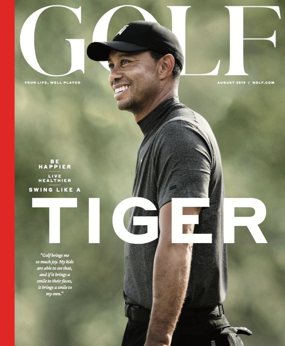
Creative Director: David Curcurito Art Director: Jessica Musumeci Consulting Photo Editor: Nancy Jo Iacoi Photo Editor: Jesse Reiter Photographer:John Huet
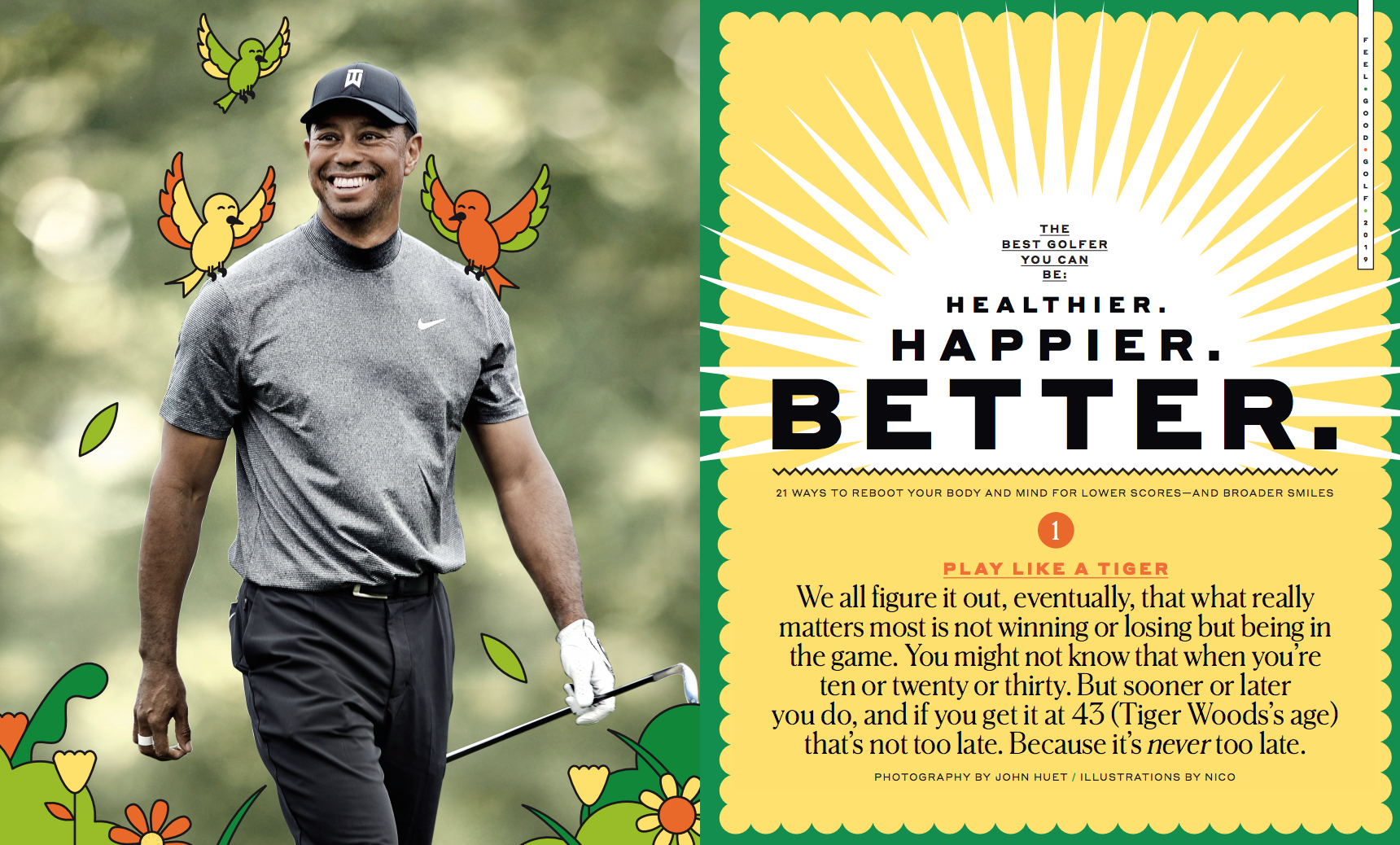
Heidi: What type of direction did you give the photographer? Jesse: The story was about how to be a Happier, Healthier golfer, with Tiger as our main example. We need Tiger looking just that: Happy.
Did you have access to Tiger during the shoot? I know John Huet has shot him before, so there was a familiarity. No, we didn’t but because we didn’t have access to him, we needed to capture that out on the course during a tournament. Nancy Jo Iacoi, who has been working on Golf Magazine as a Consulting Photo Editor, suggested we bring in John for this job because of his already strong relationship with Tiger from photographing him for so many years.
What was the biggest challenge with this shoot?
Now photographing a specific expression or mood of a golfer during a tournament is no easy feat. It takes a sharp mind, quite a bit of planning, a good amount of hustle and luck. The direction we gave John was simple: we need a cover worthy image of Tiger smiling and looking happy. Obviously a lot of variables need to align for it to be a successful cover, and John had the same press access as everyone else at the tournament. So it was going to be a challenge to get himself in the correct position and be ready to make the picture IF Tiger smiled.
Tiger is so heavily photographed, how did you want to make this project/cover different?
Most of the time if you see Tiger on the cover of a magazine, he has the standard “tough guy” look. But because of how the feature was being presented and designed, we wanted the opposite of a tough guy. At Golf Magazine, we want people to love and enjoy this game, because at the end of the day it should make you happy. And having John out there to capture that turned out to be the right decision. He crushed it and delivered beautiful images of a happy Tiger that we were not expecting.
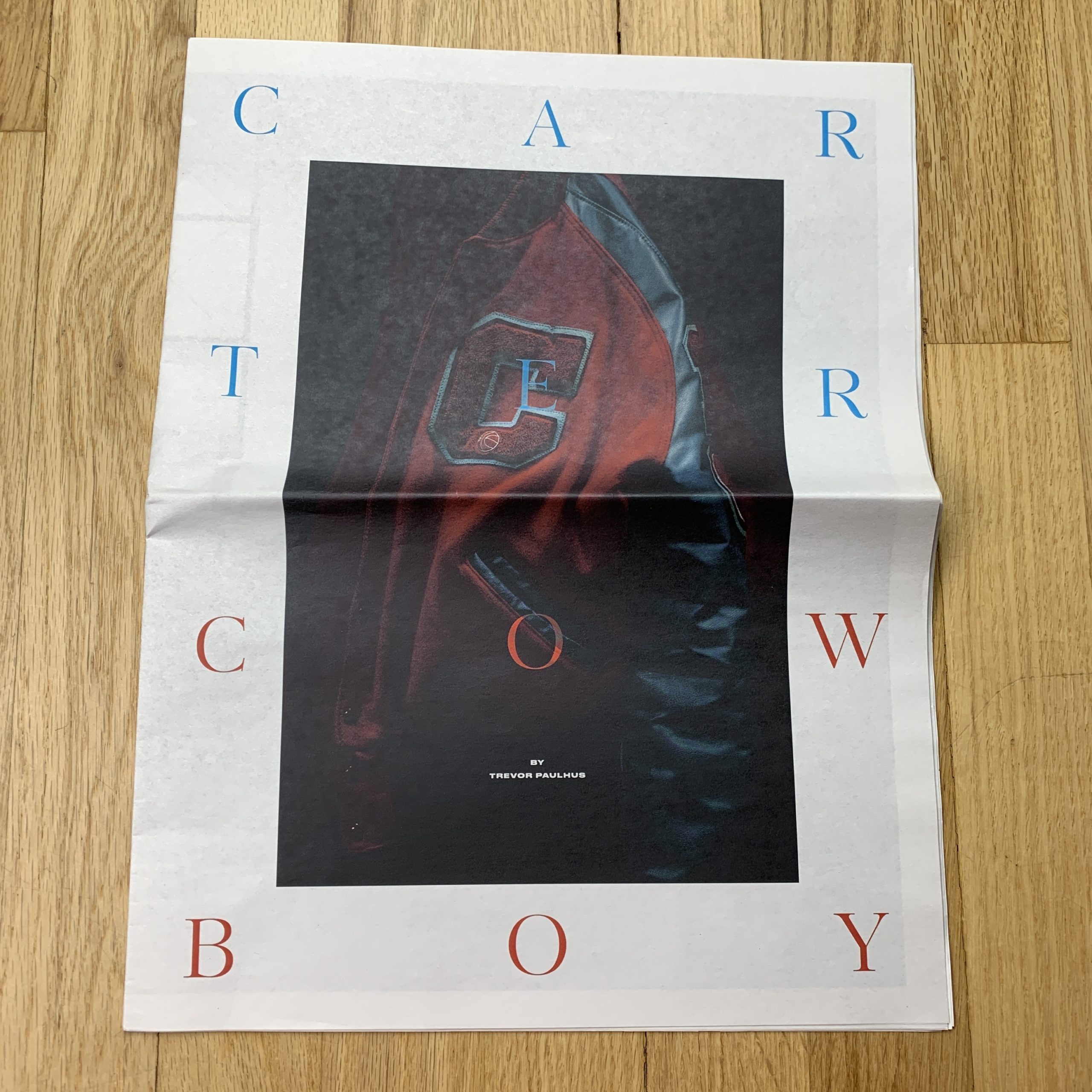
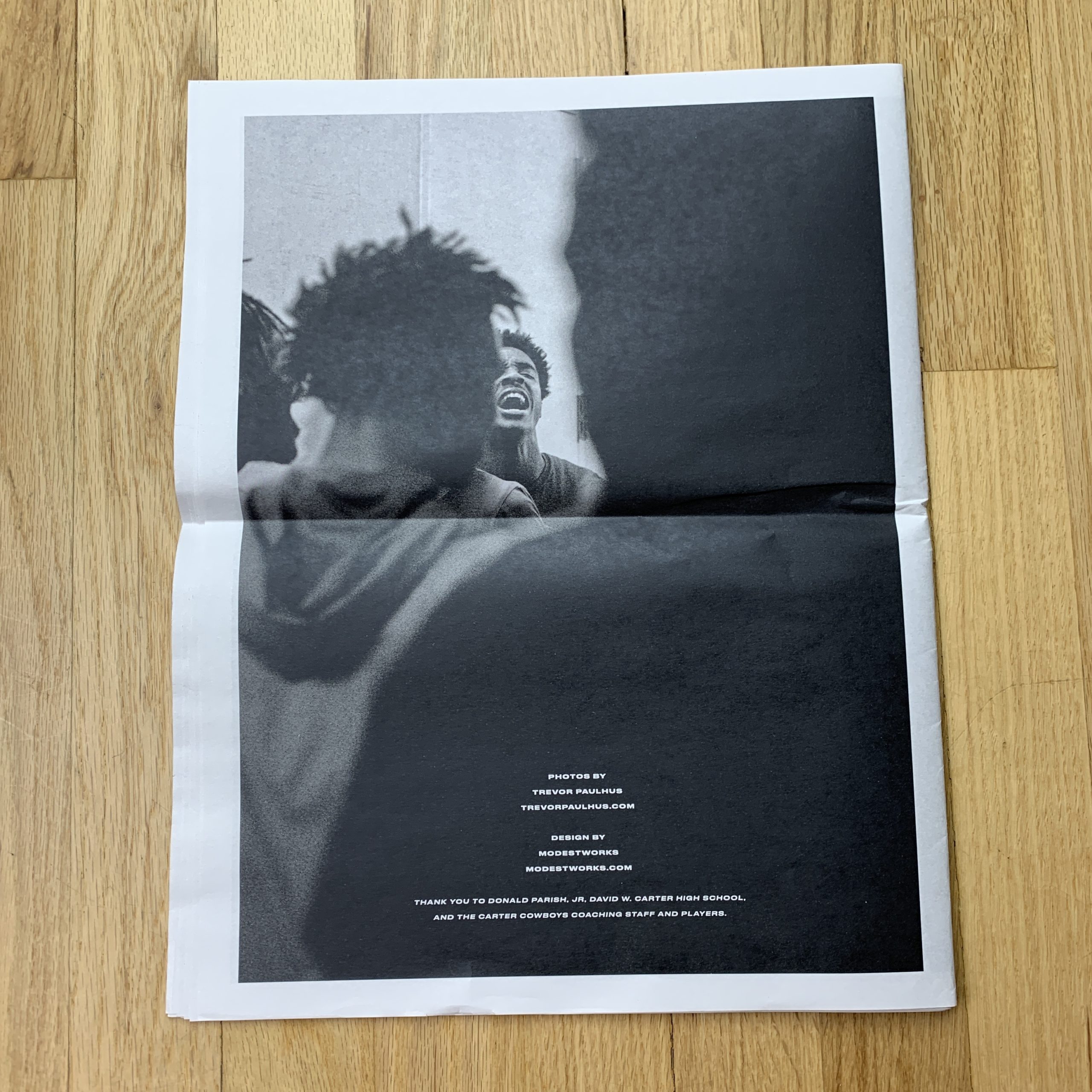
Who designed it?
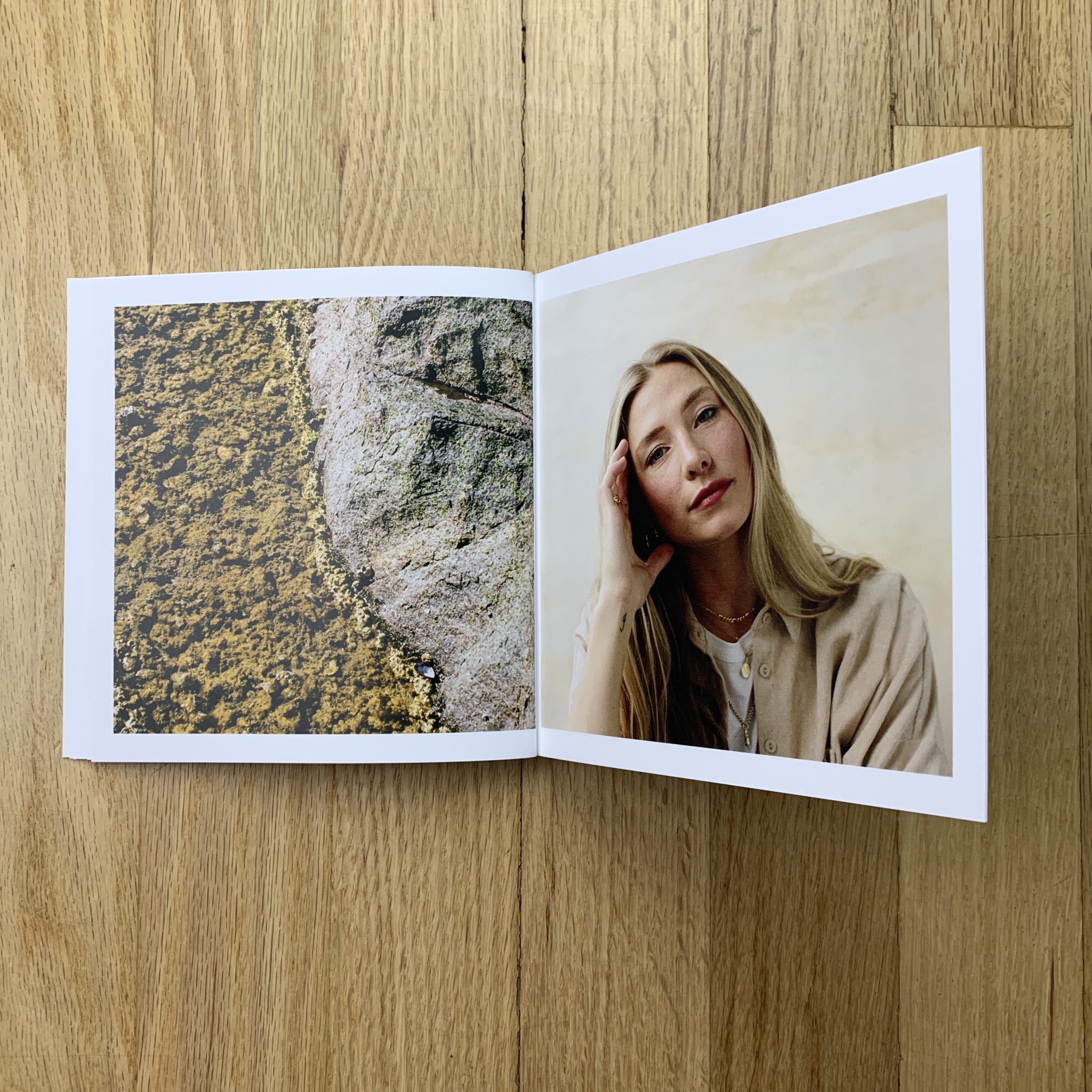
My friend Robert Milam designed it for me. He runs a great design studio called ModestWorks here in Dallas. I gave him an initial wide edit of images and then together the 2 of us narrowed it down to the final selects. Once the final images were selected, he just did his thing. We were on the same page about visual aesthetic for the piece (and in general), so getting to the final design didn’t take long at all. He presented me with 3 different options, all of which I loved. We made some small tweaks to the one I liked the most… and that was it.
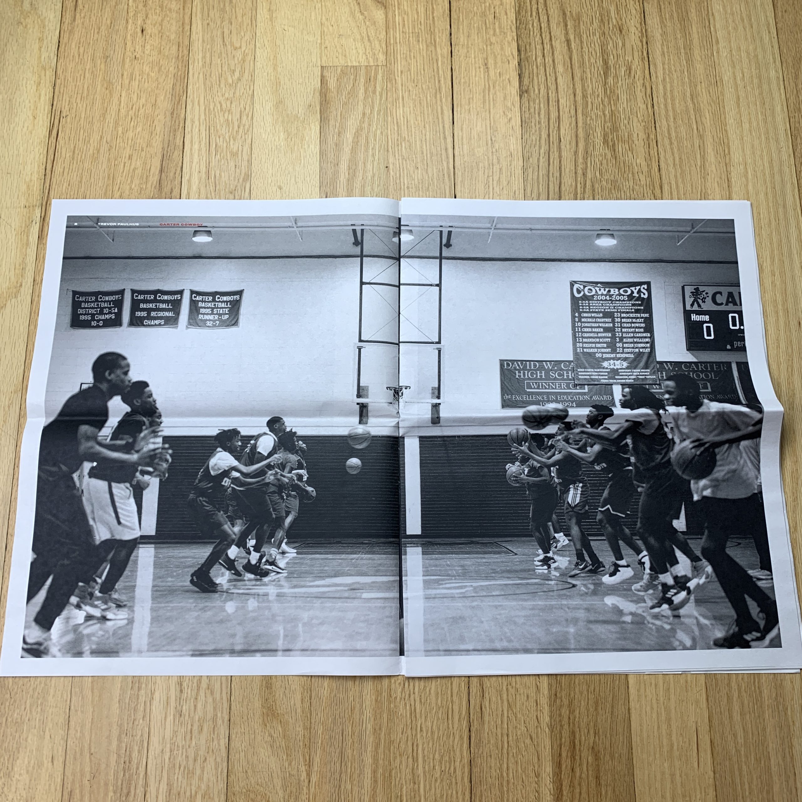
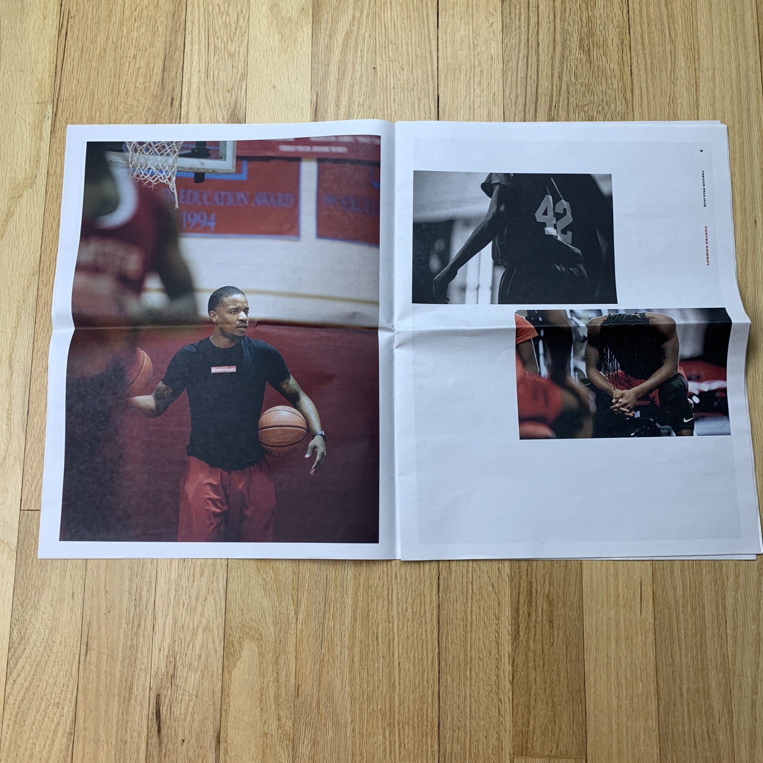
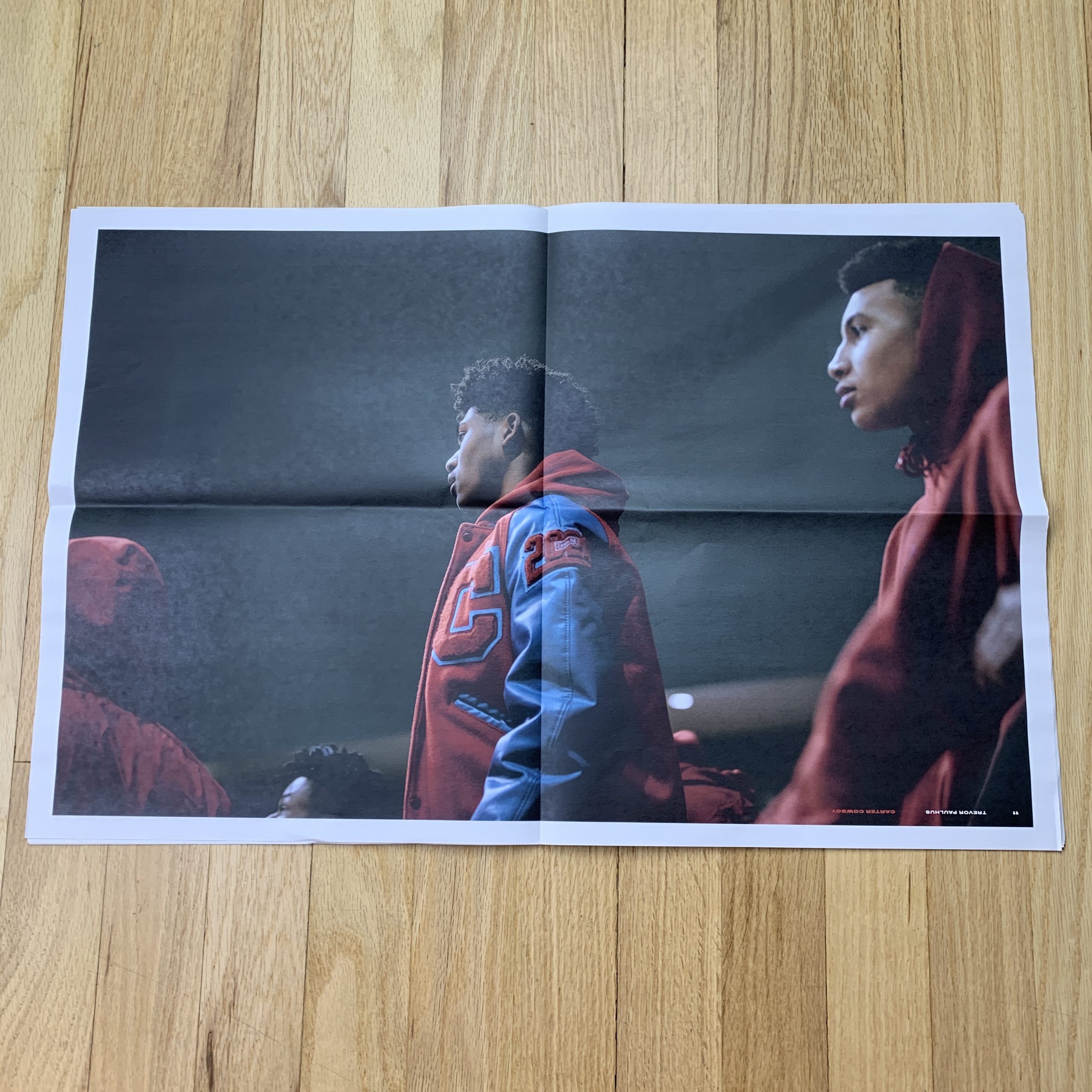
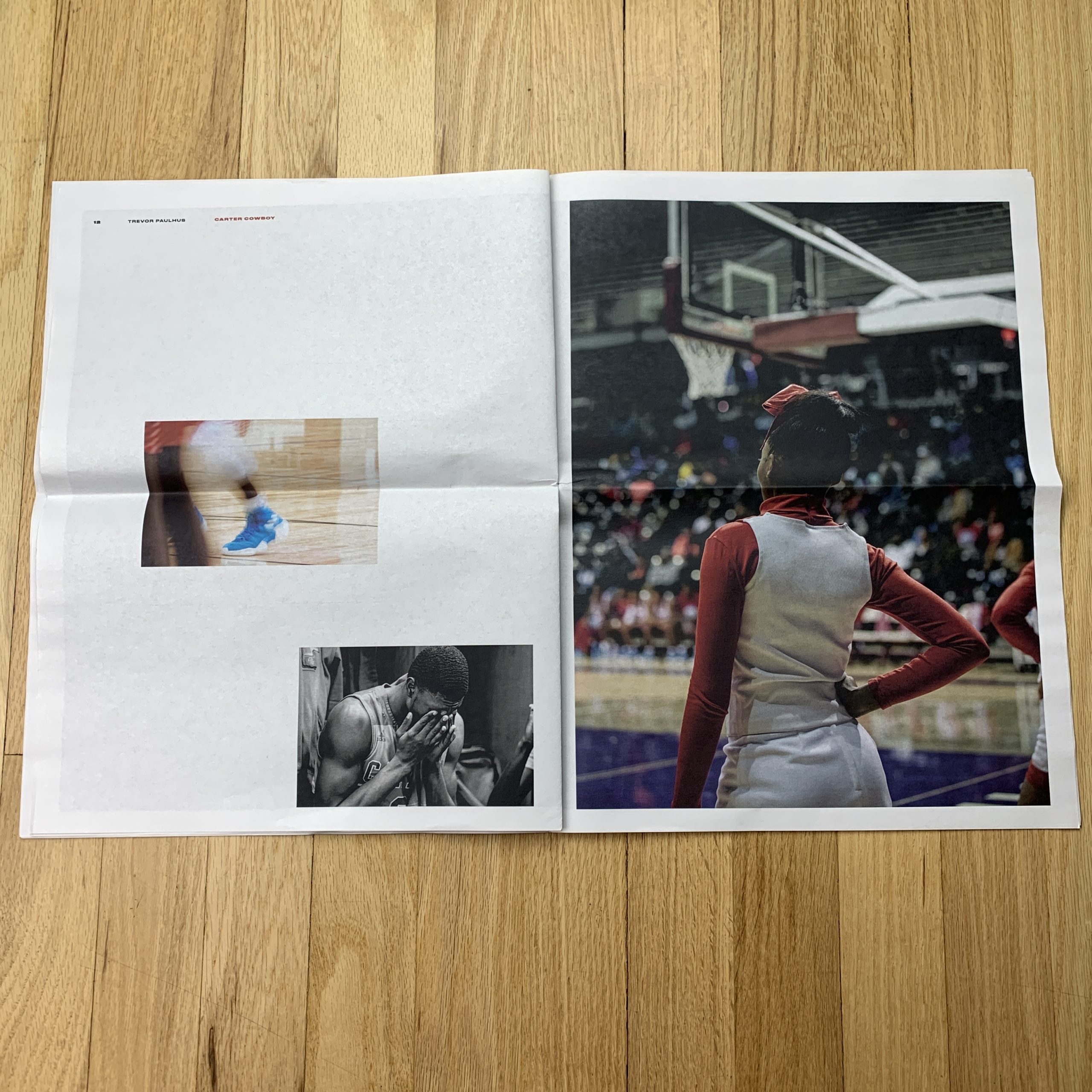
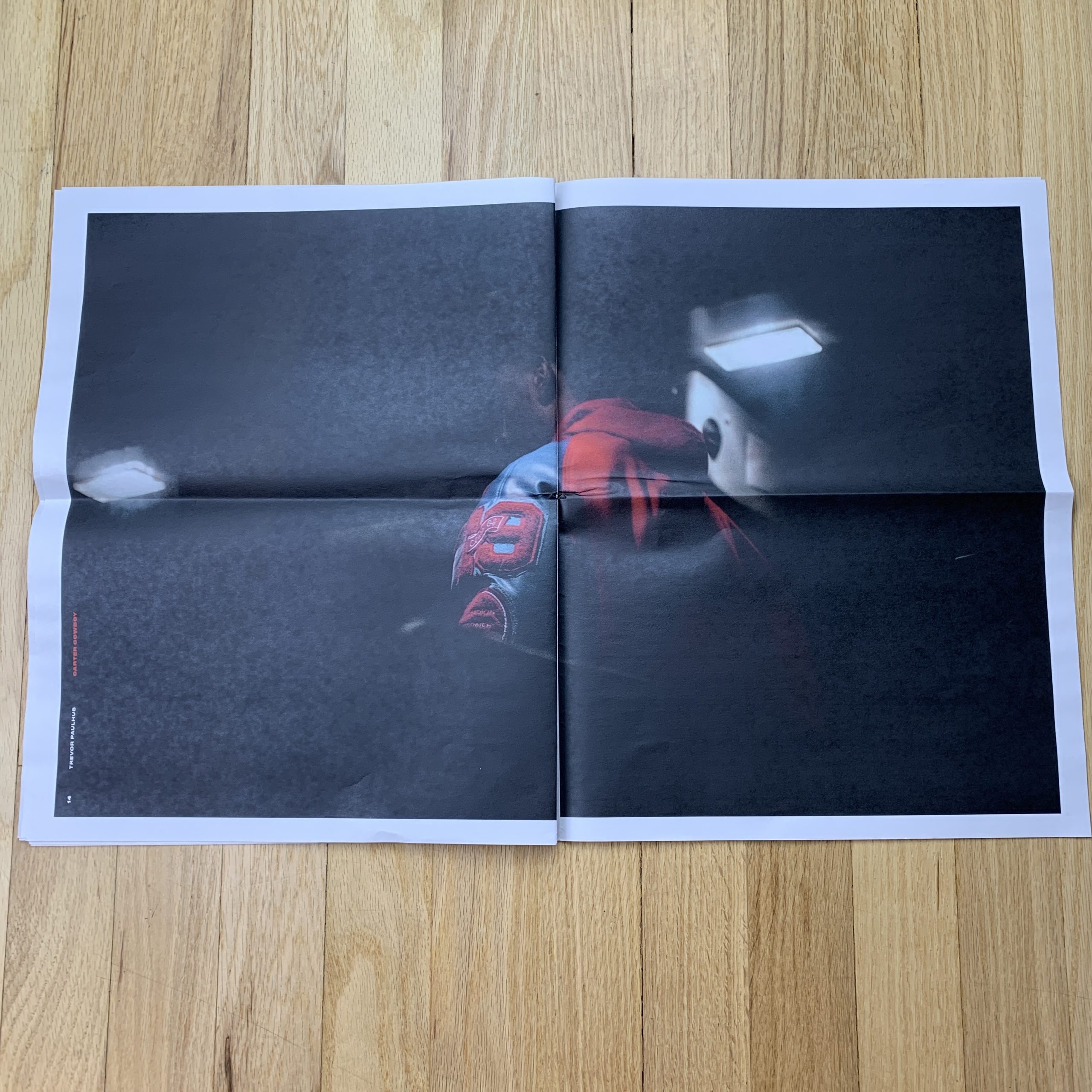
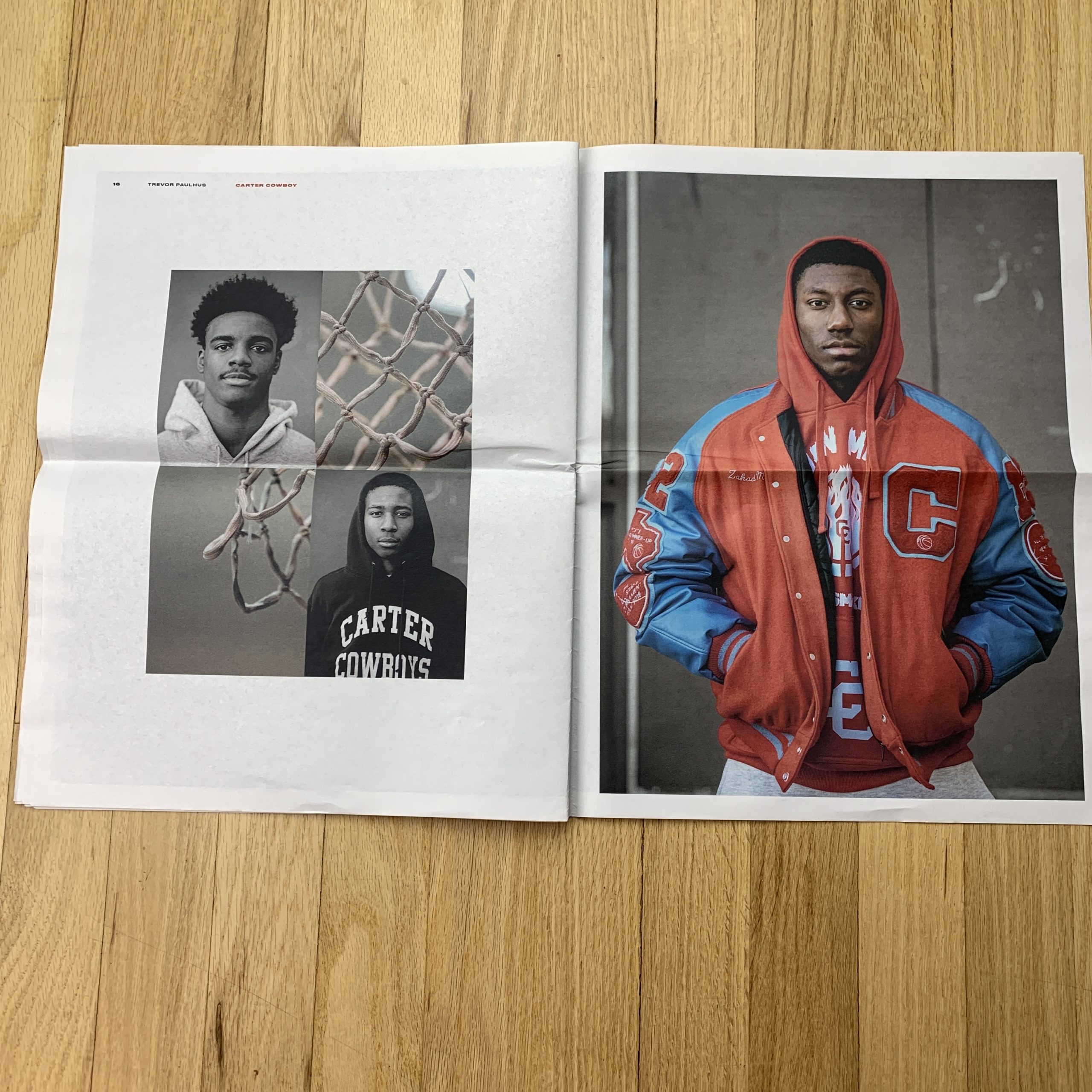
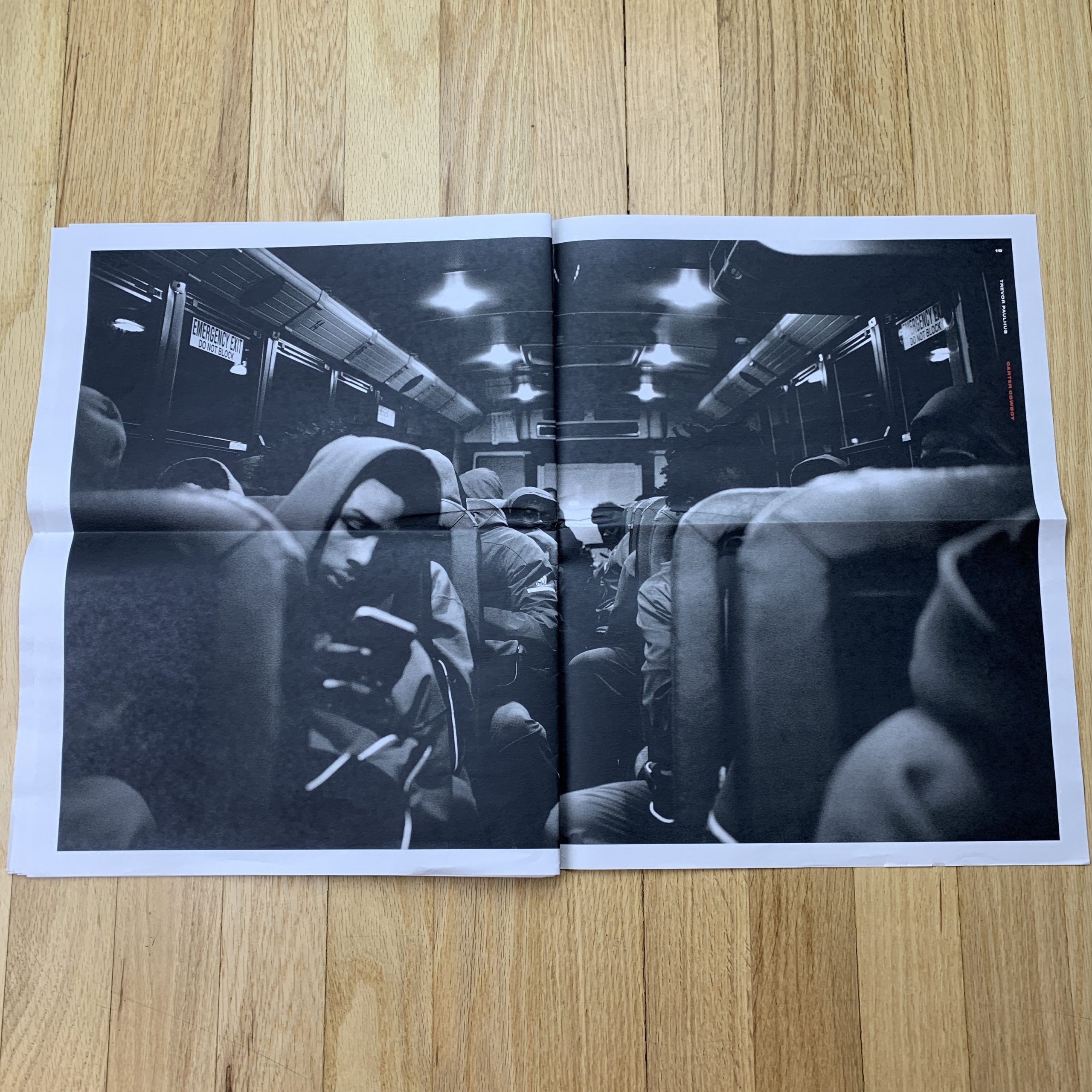
Tell me about the images?
The images are from a photo essay shadowing the David W. Carter High School (Dallas, TX) 2018/2019 basketball season. The photo essay was part of a much larger/in-depth personal project that is still taking shape with the Carter Cowboys. So in a way, this first installment is a bit of a “teaser” for what is to come. I am super excited to share more of it in the coming months.
How many did you make?
Because this was meant to be just a bit of a “teaser”, we did a pretty limited run. Just 200. 100 of those going to the team and the school, 30 to Robert Milam (ModestWorks) and 70 left for me to distribute. I am just now starting to send them out to a pretty select group. I may or may not consider having more printed once I see how things go with the 60’ish I have left to send.
How many times a year do you send out promos?
In the past I have struggled with being consistent about this. But I have been much better as of recently. I try to do about 4 printed pieces/year now. 2 smaller pieces with a larger mailing list (usually a postcard or something along those lines) and 2 more involved pieces.
Do you think printed promos are effective for marketing your work?
Absolutely! Outside of Instagram, a good website and face to face meetings, I believe that a well done printed marketing piece is the most valuable way to speak your creative voice to those you want to hear it. Things like source books, which can often take a big chunk of marketing budgets, sometimes end up having me feel like my work just gets lost in the shuffle of pages. I think a good printed piece with a tailored mailing list is such a better investment in ME.


