The Daily Edit – California Sunday Magazine

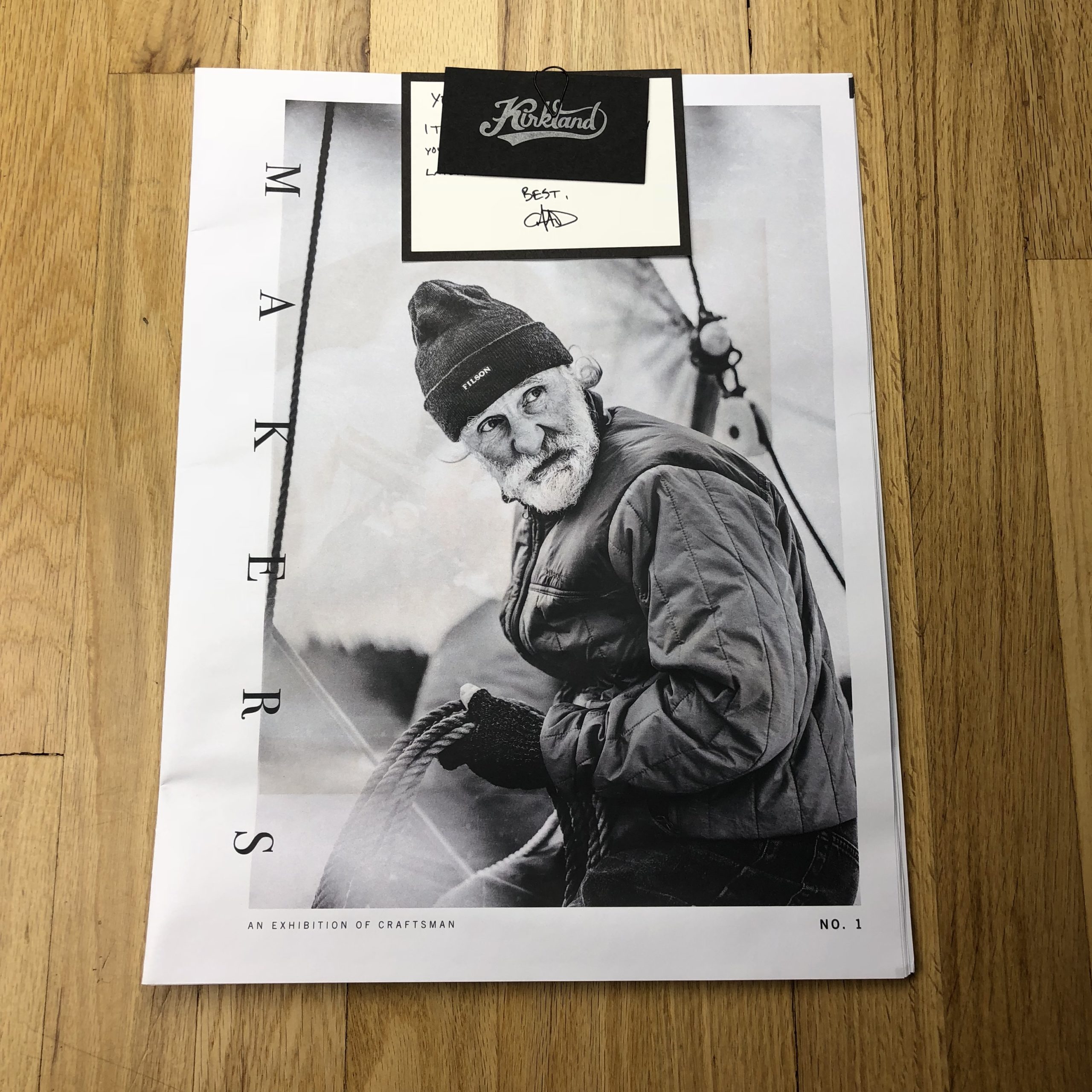
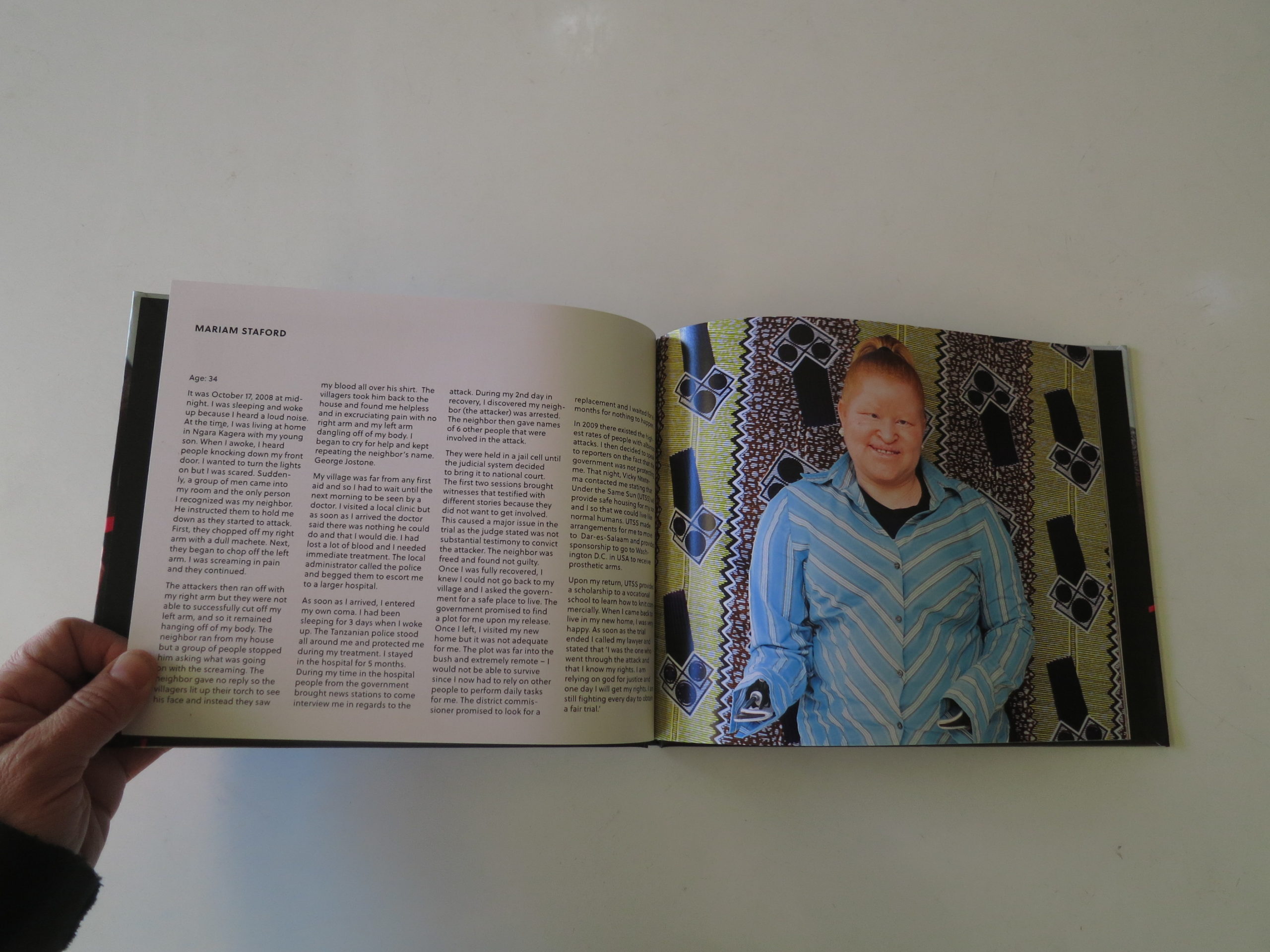
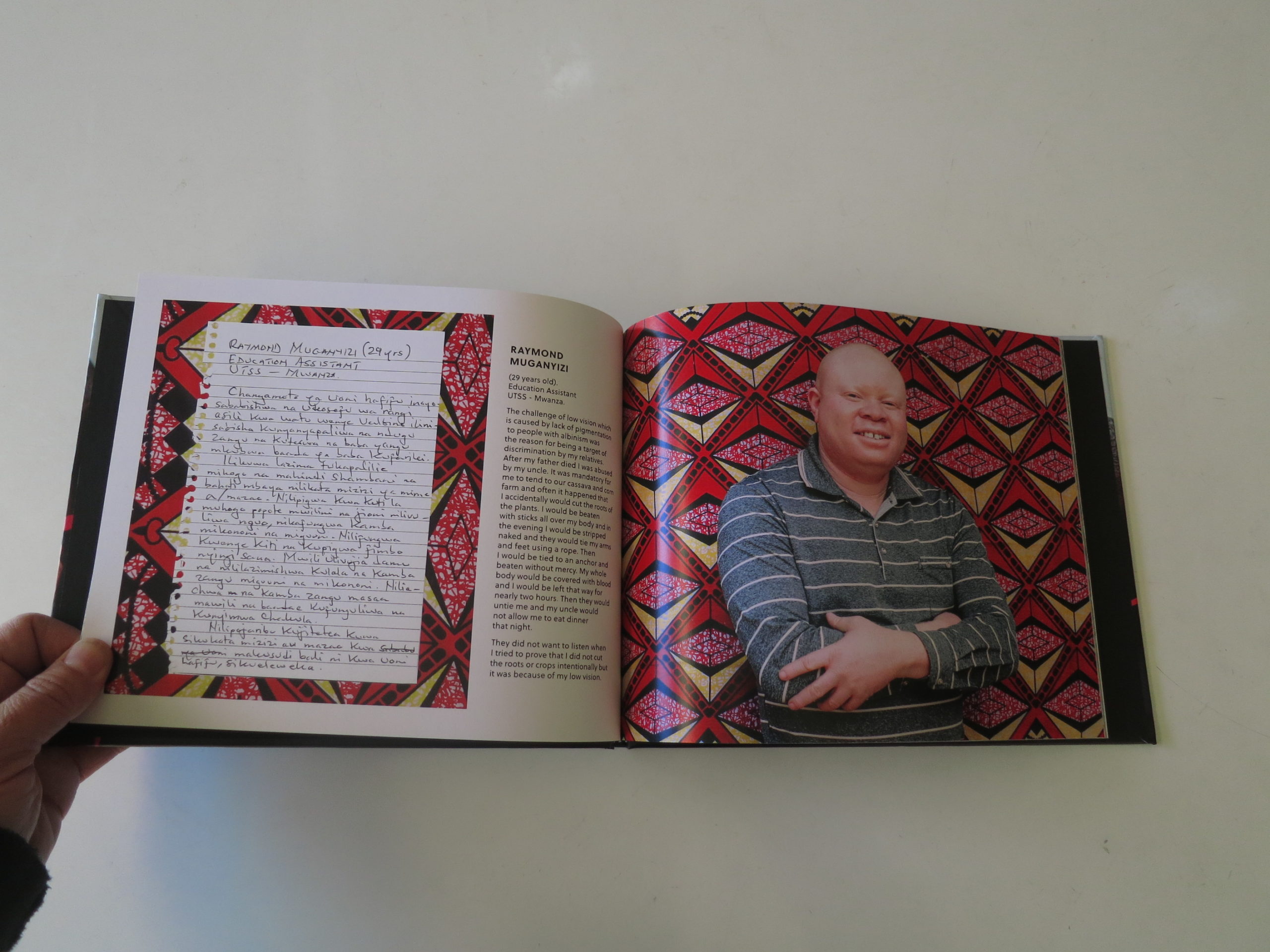
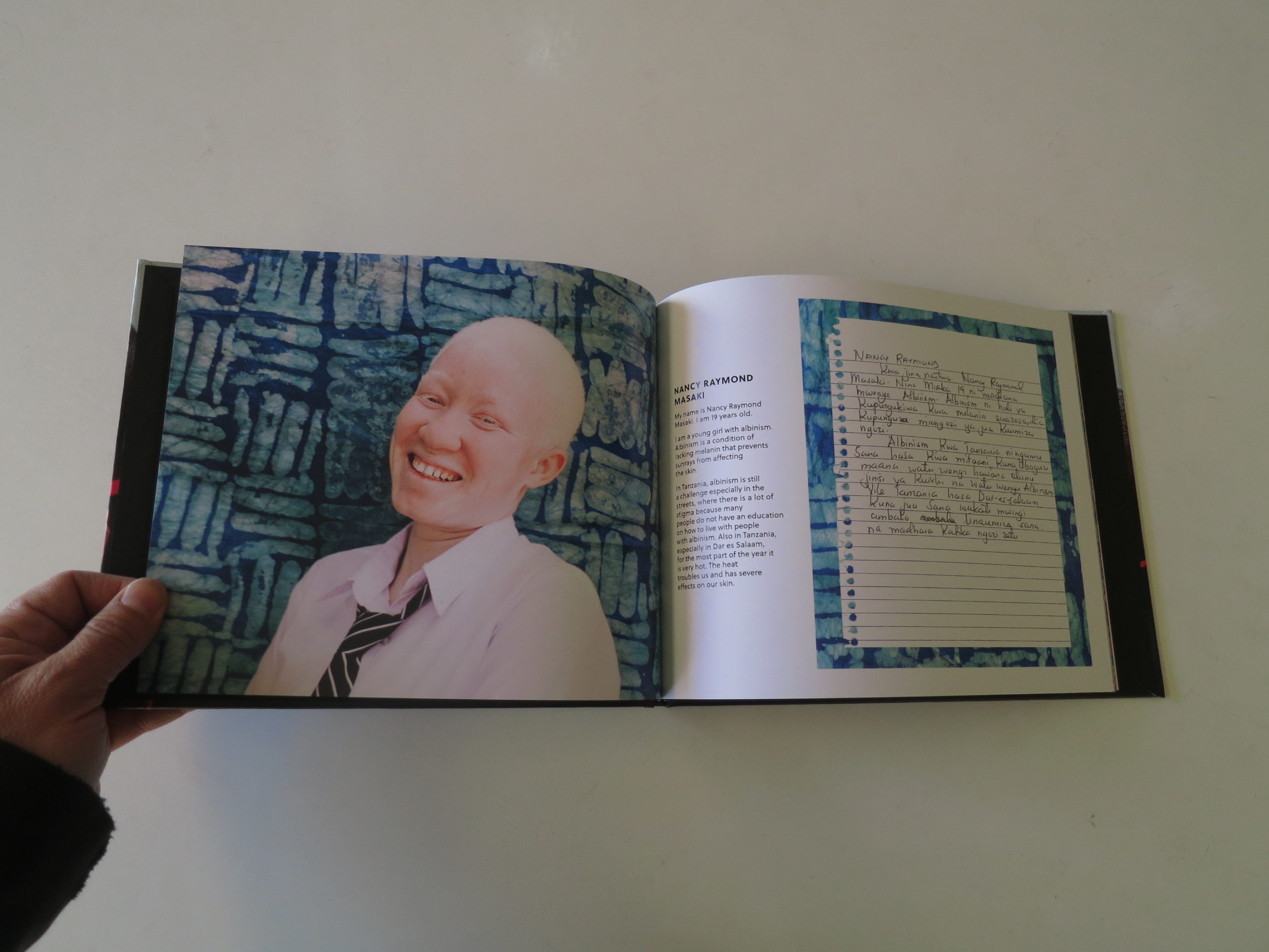
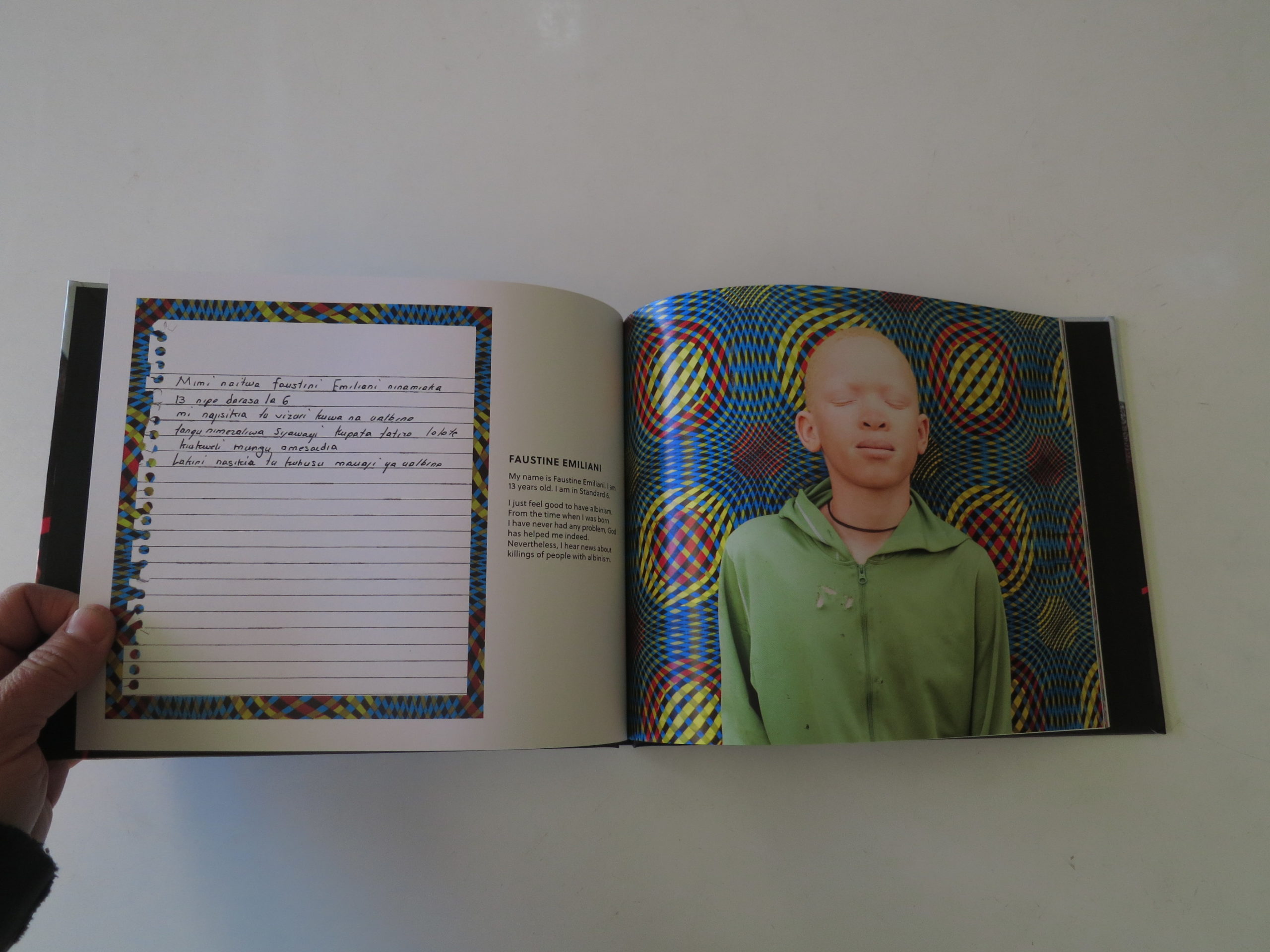
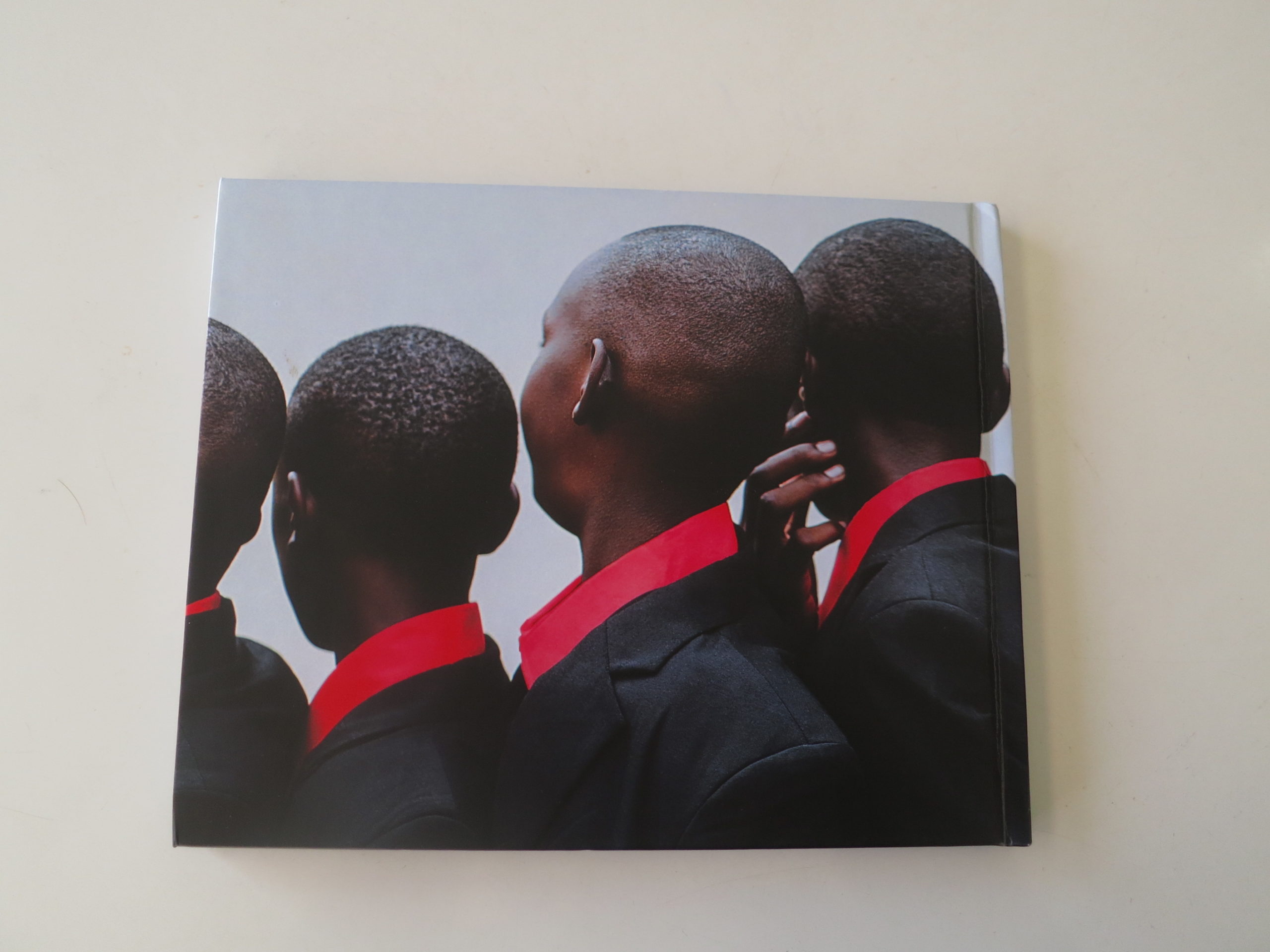
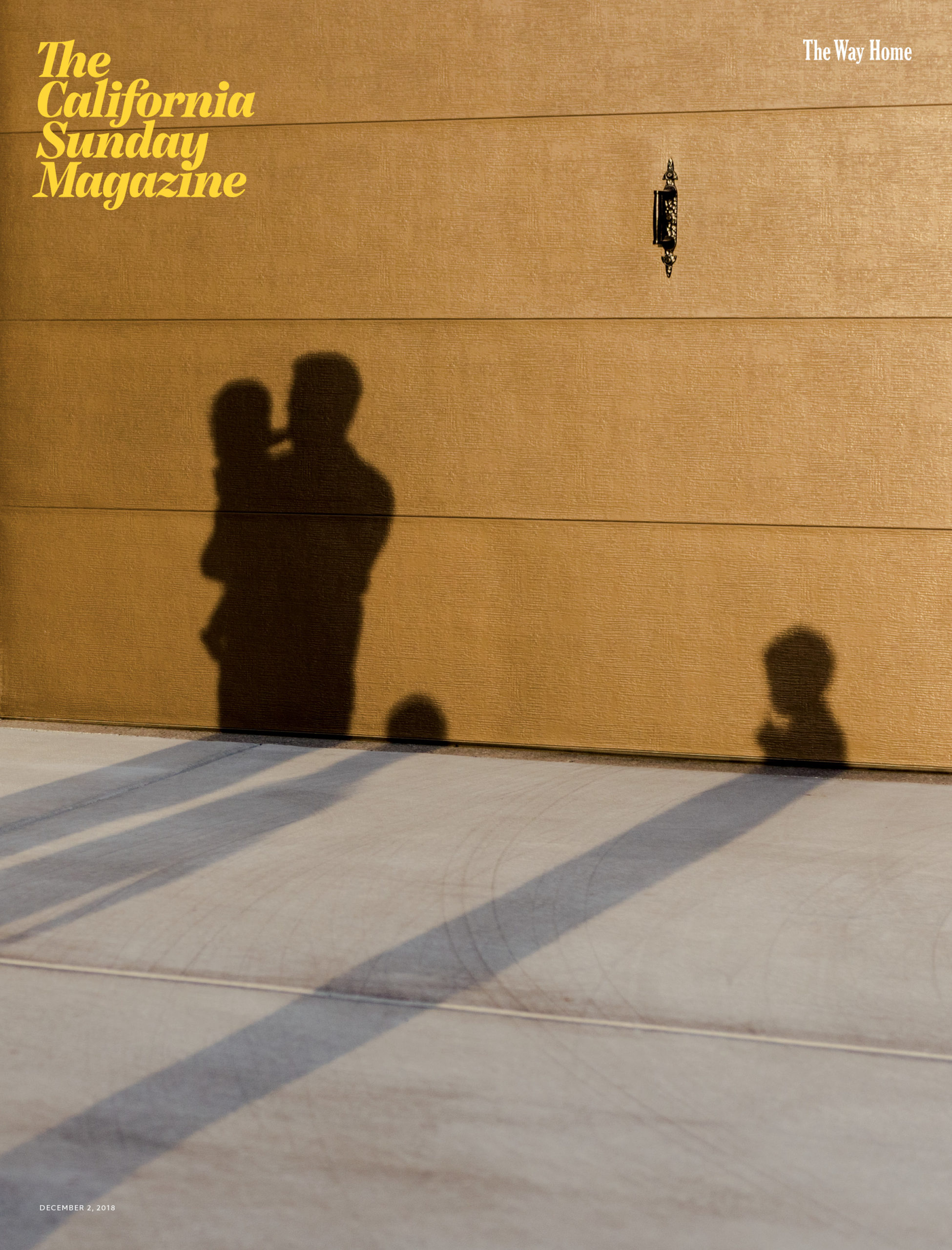
Cover photograph by Ricardo Nagaoka

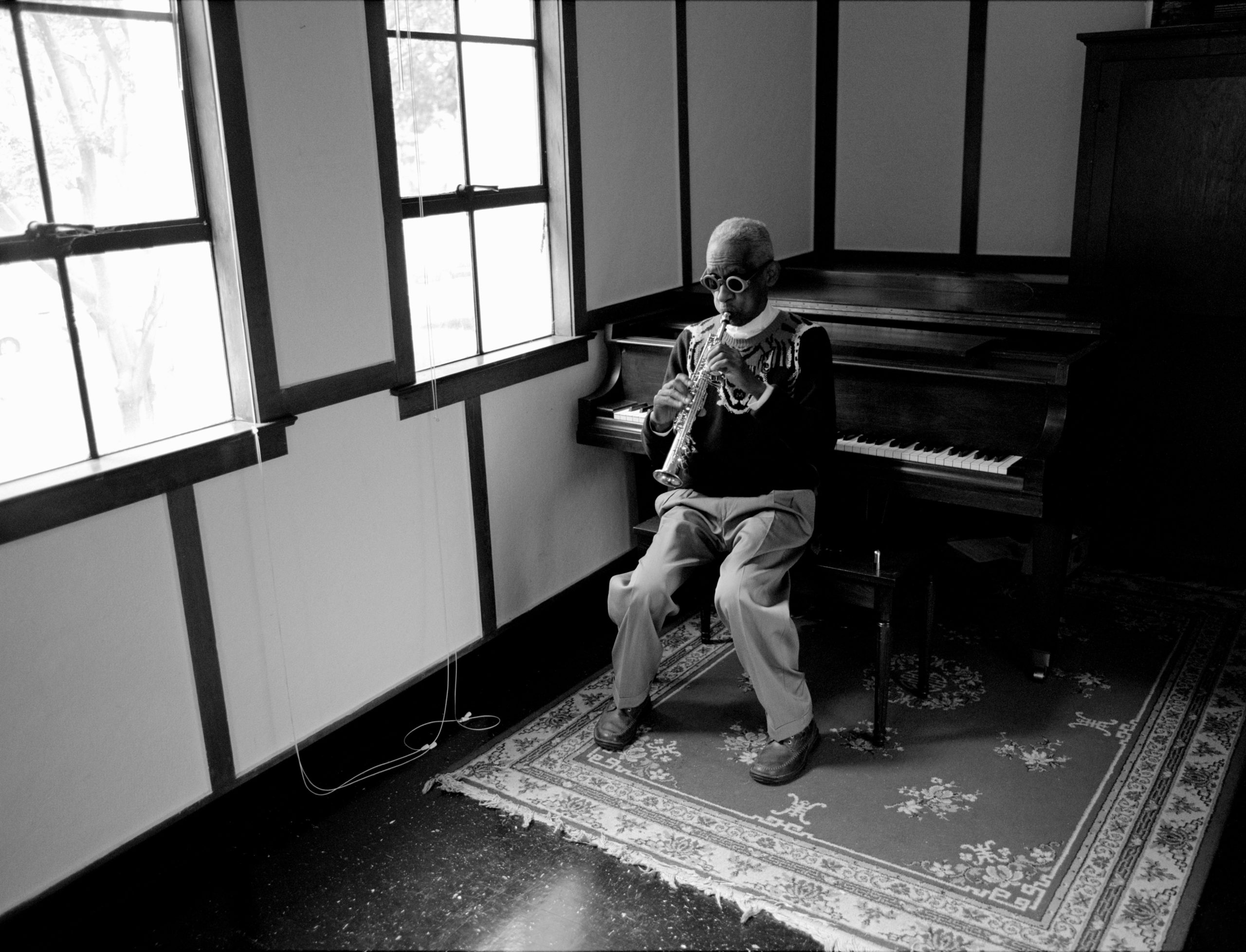
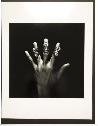
Roscoe Mitchell, Oakland, CA: David Black

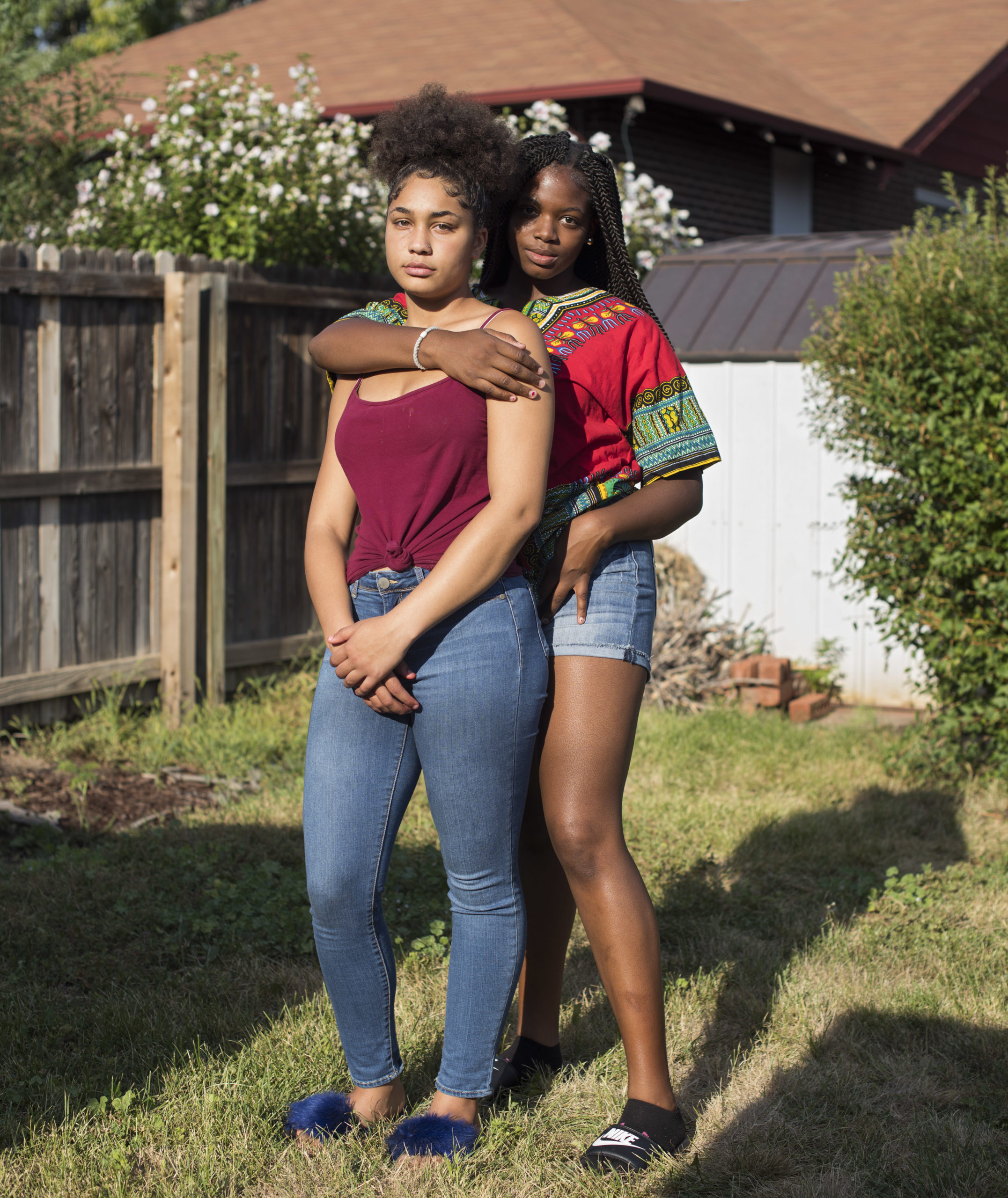
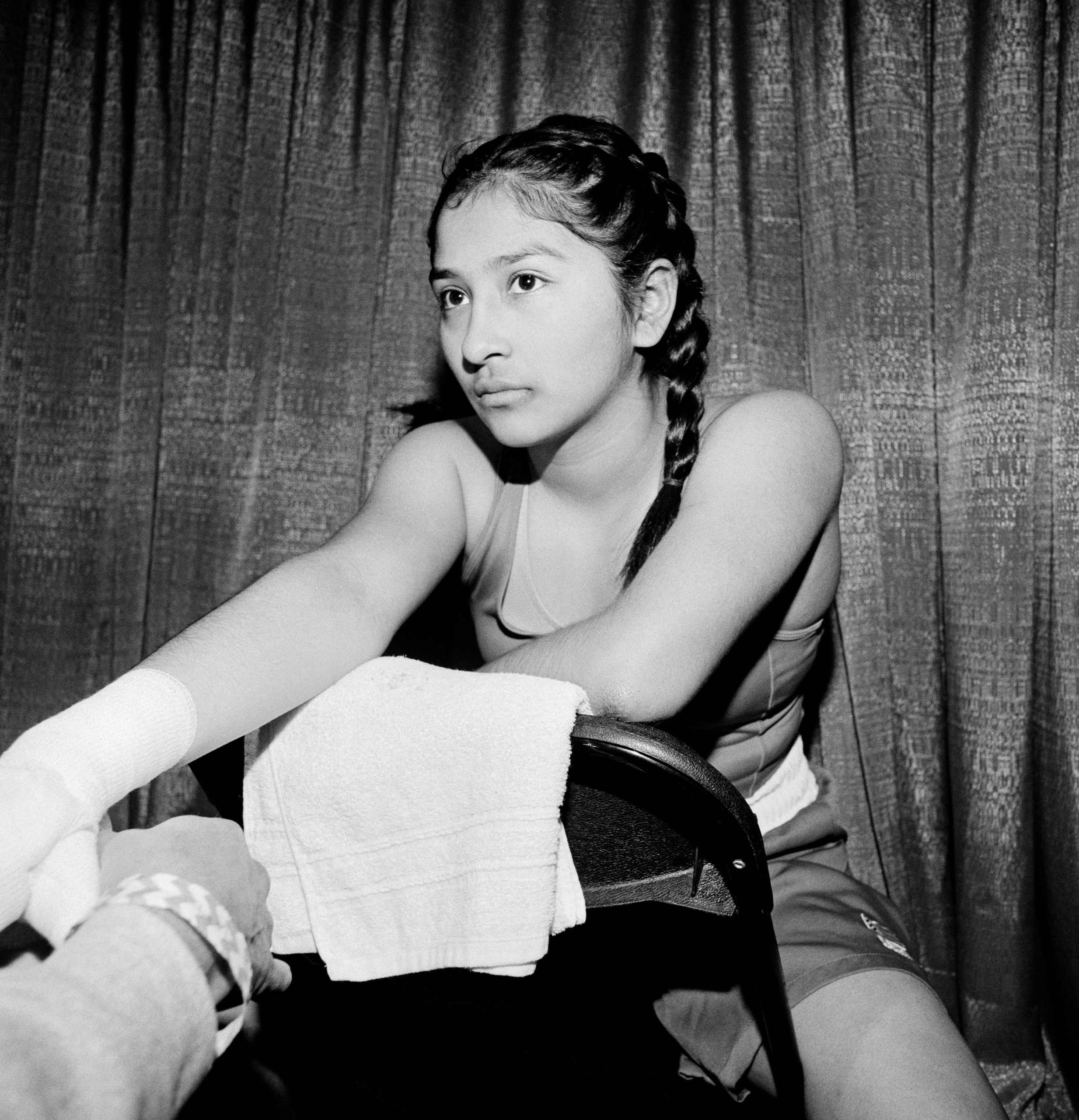
Hope Jimmerson & Najave Jimmerson, Denver, CO: Widline Cadet

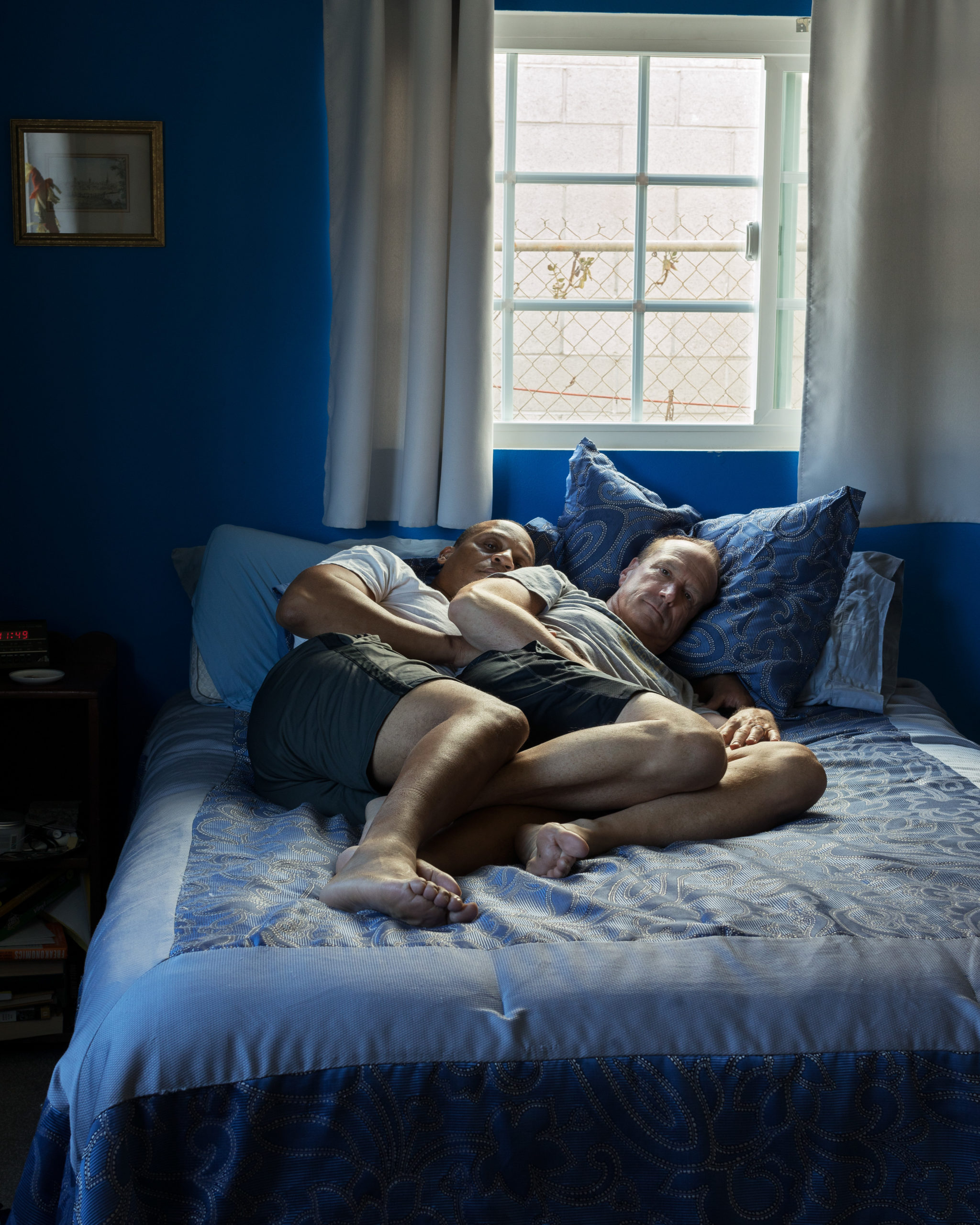
Derrick Washington & Kurt Gramm, Los Angeles, CA: Erica Deeman

Debbie Austin, Portland, OR: Lauren Angalis Field

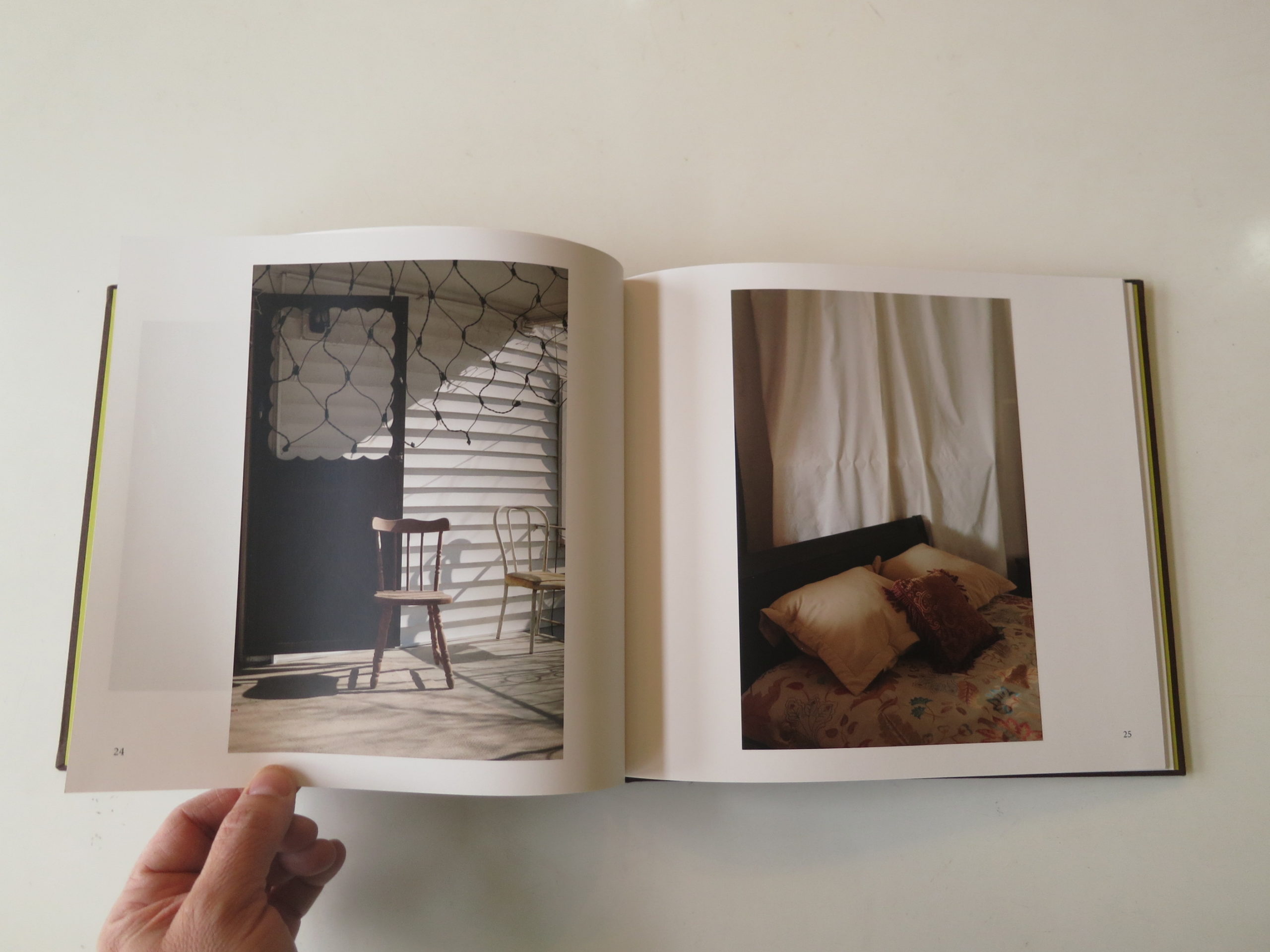
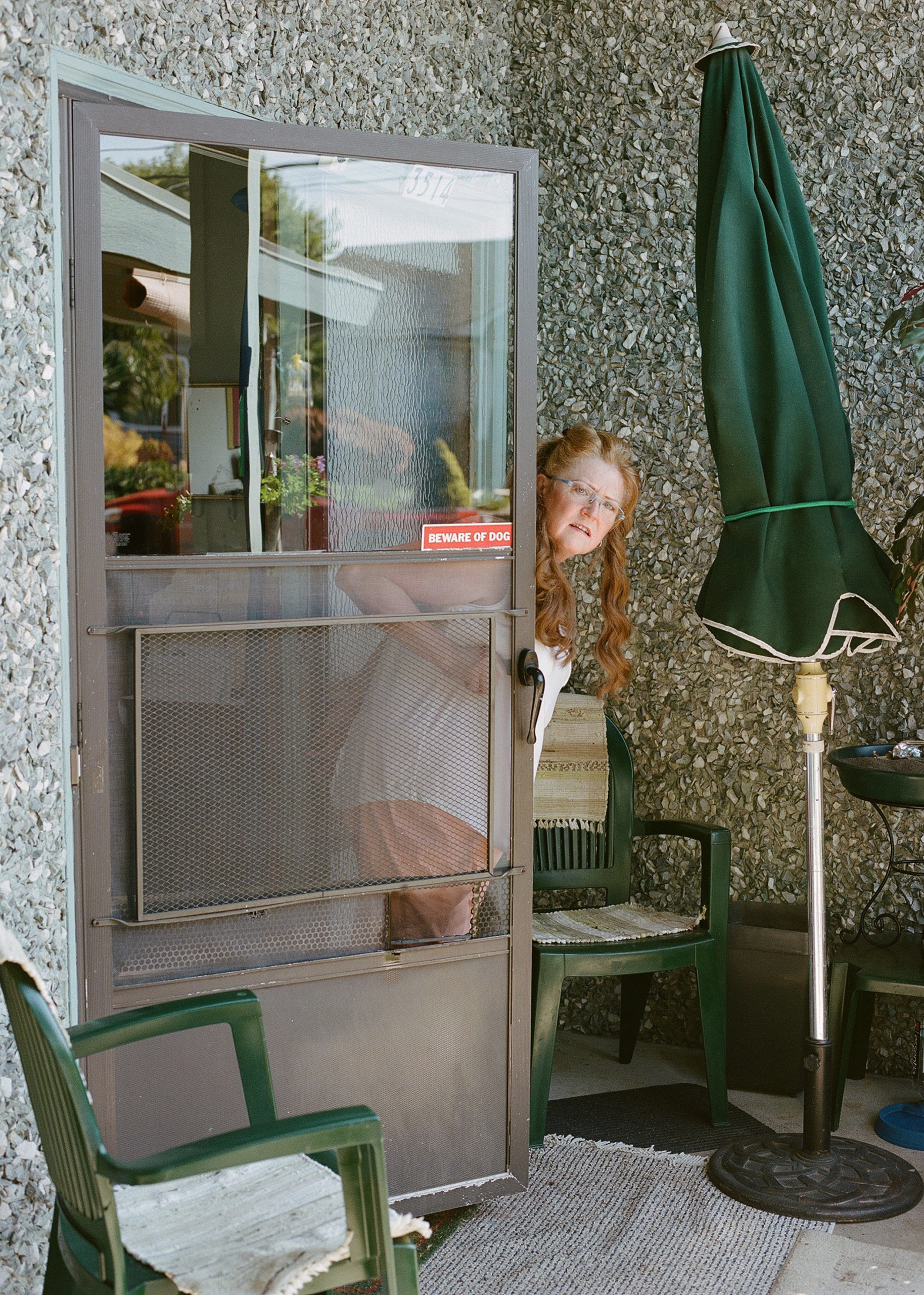
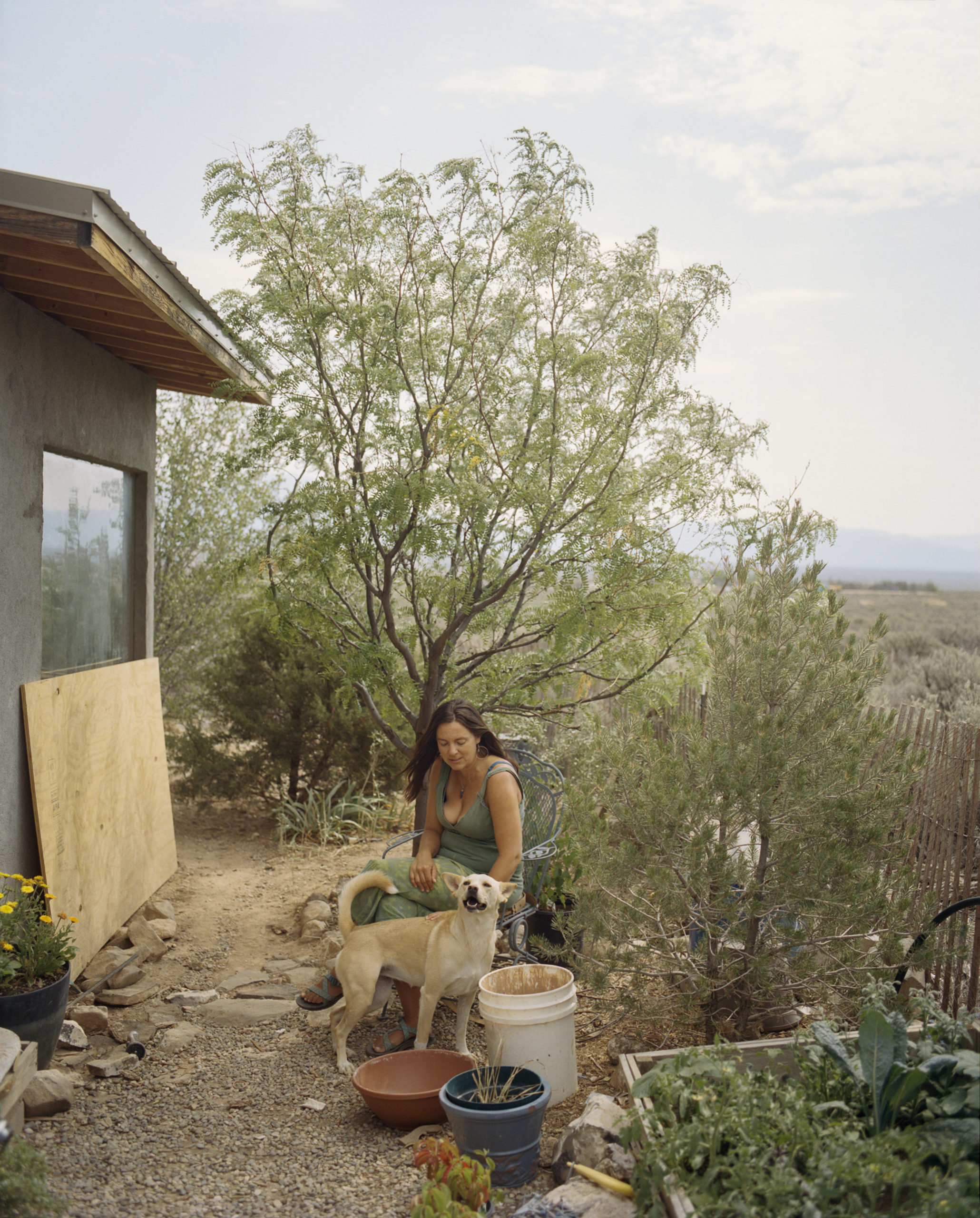
Elisabeth Gambrell, Gerlach, NV: Katy Grannan

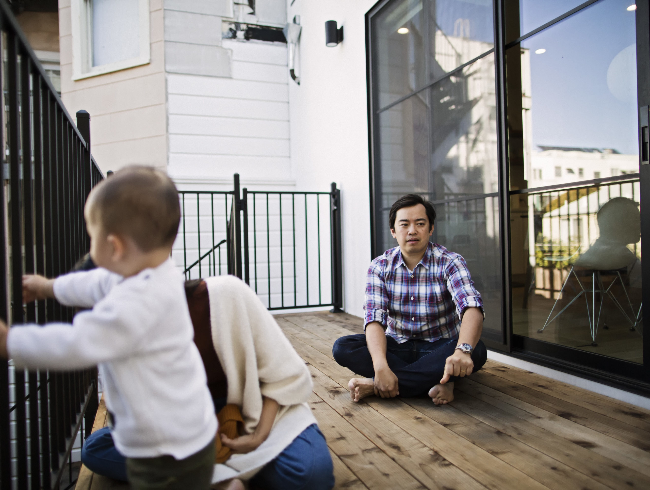
Dennis Yang, San Francisco, CA: Talia Herman

Teira Church, Los Angeles, CA: Texas Isaiah

Zyrria Rosales, Oakland, CA: Taylor Kay Johnson

Jasson Kyser, Longview, WA: Andrew Miksys

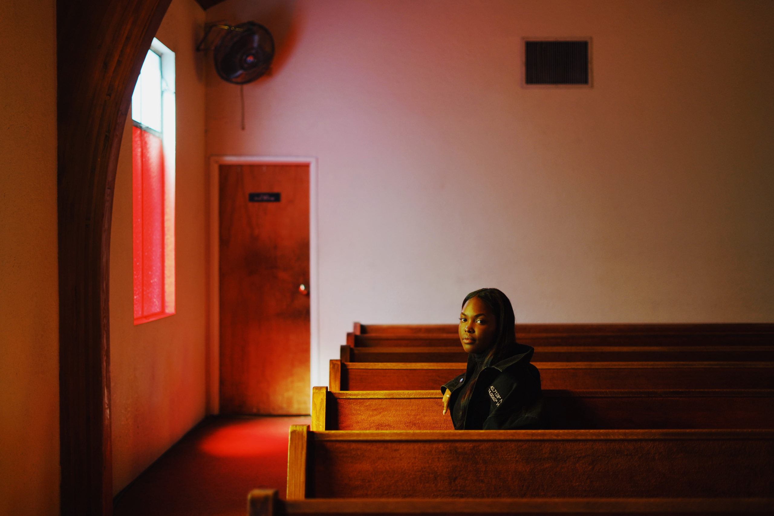
Terina Taulogo, St. George, UT: Ricardo Nagaoka

Mary Dambacher, Taos, NM: Ahndraya Parlato & Gregory Halpern

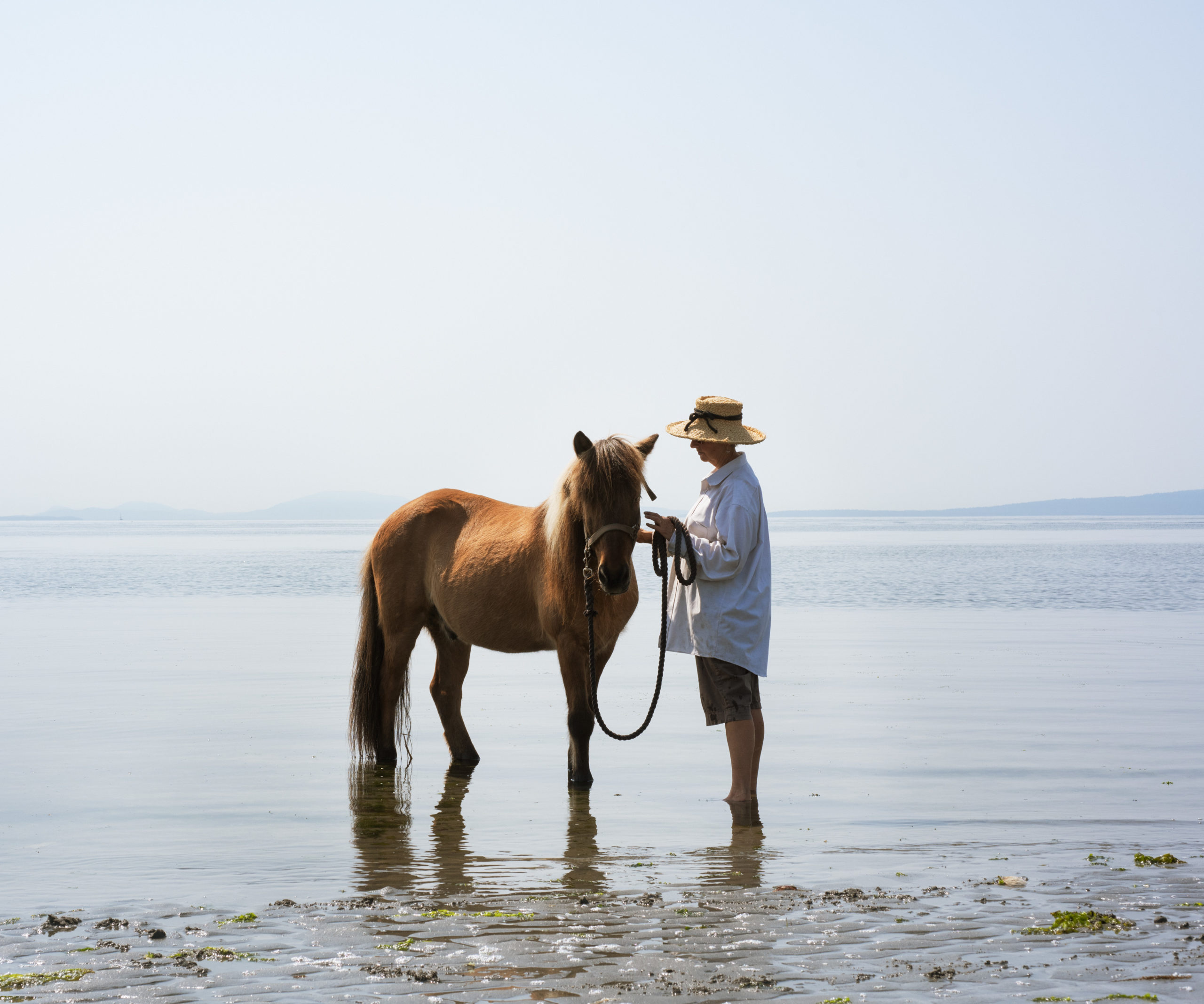
Liz Otwell, Point Roberts, WA: Irina Rozovsky

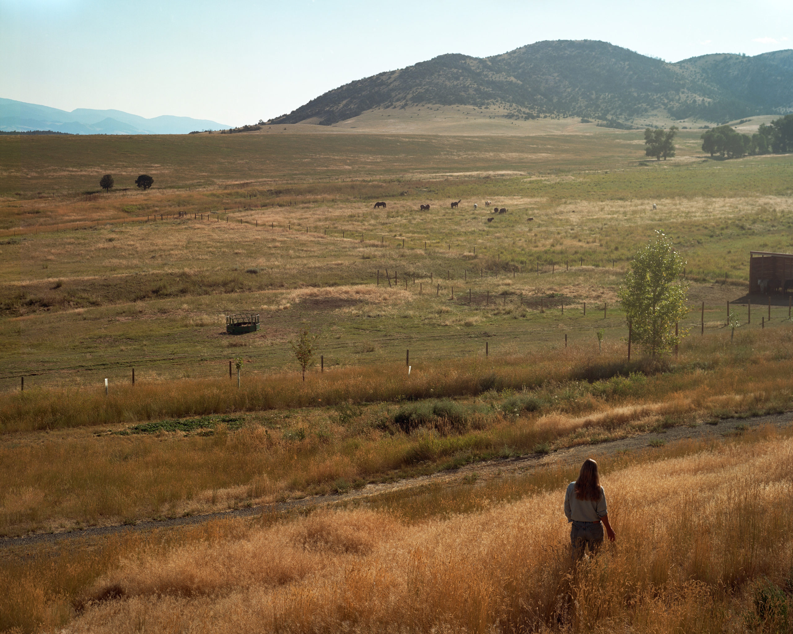
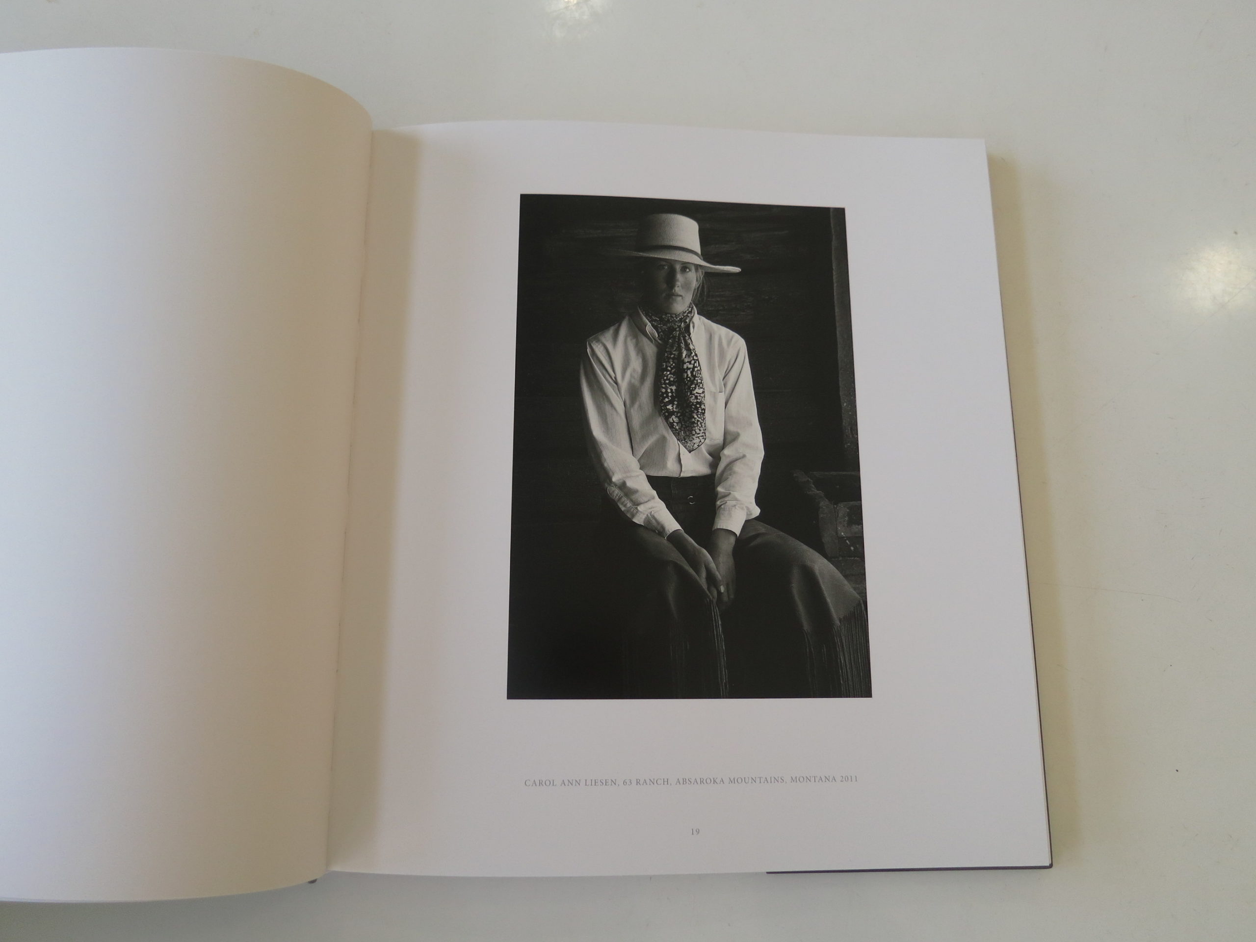
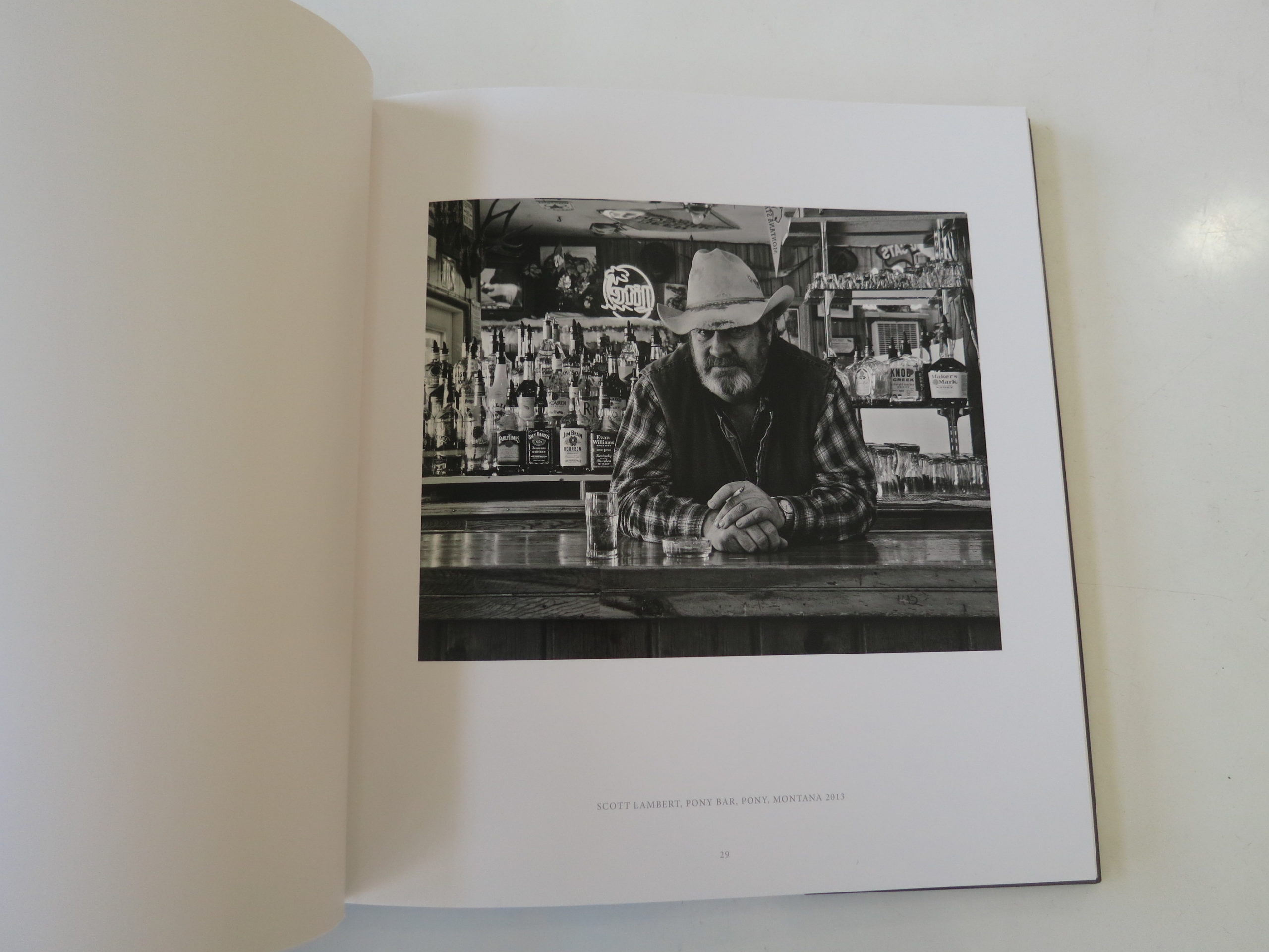
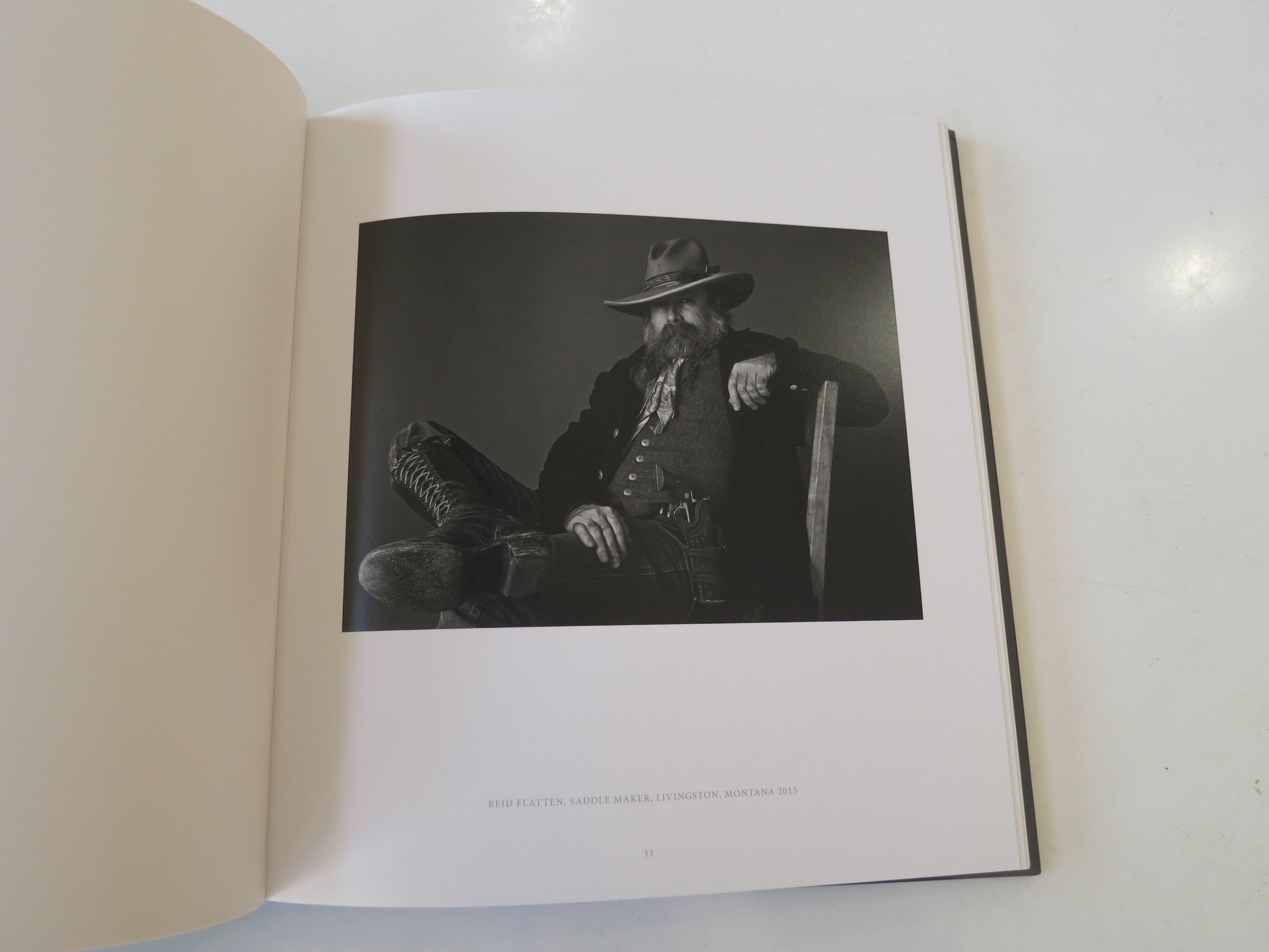
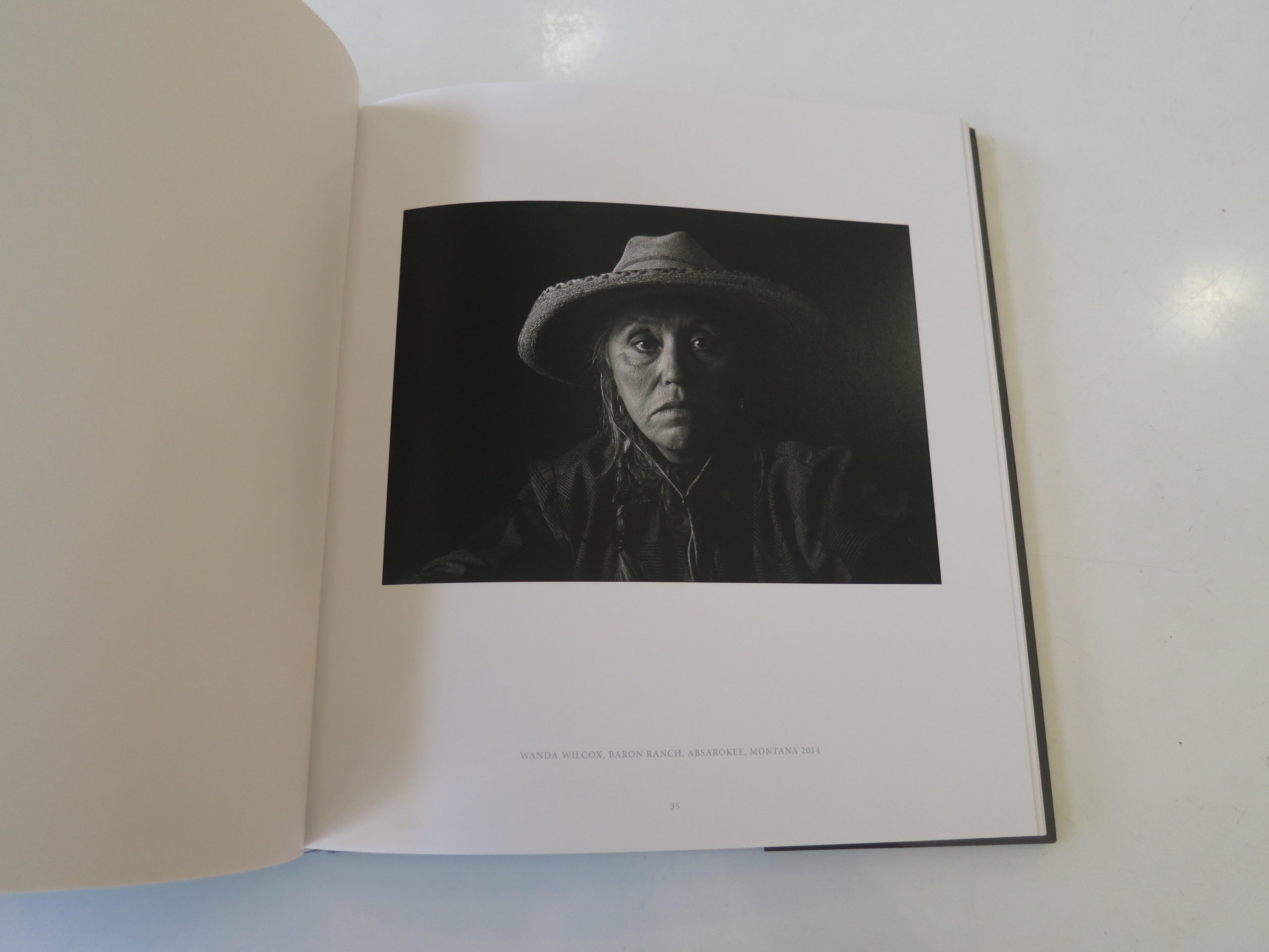
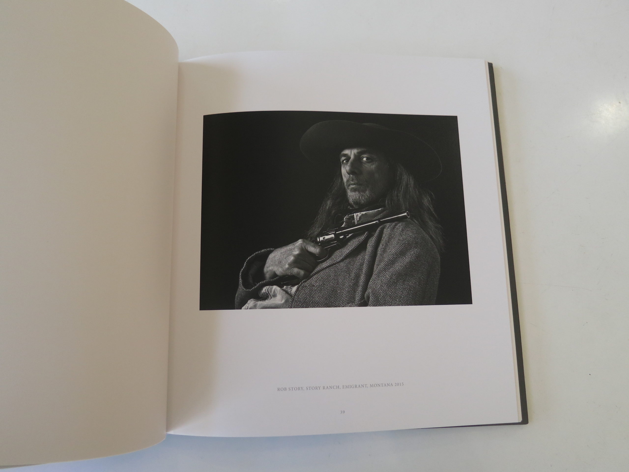
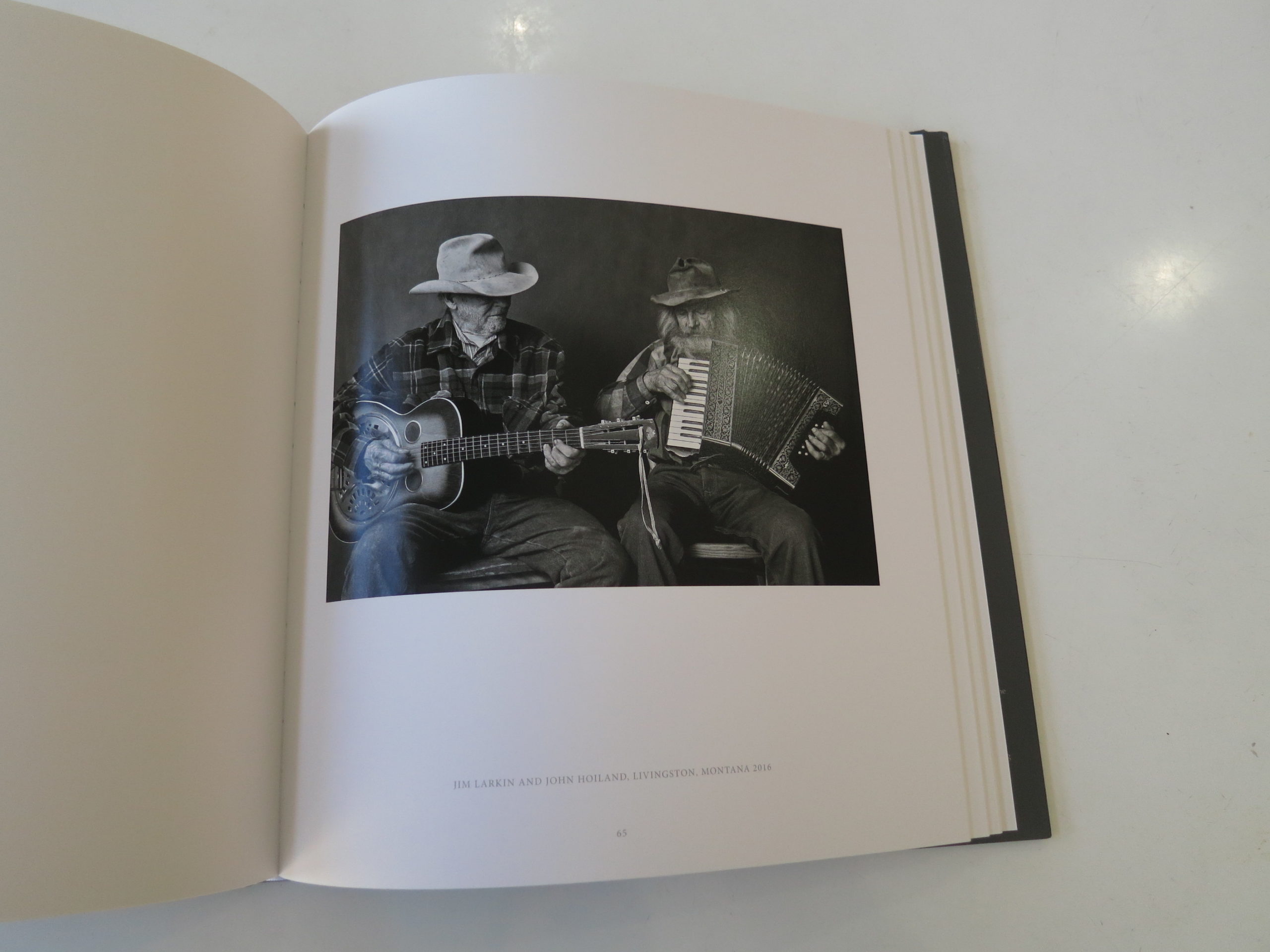
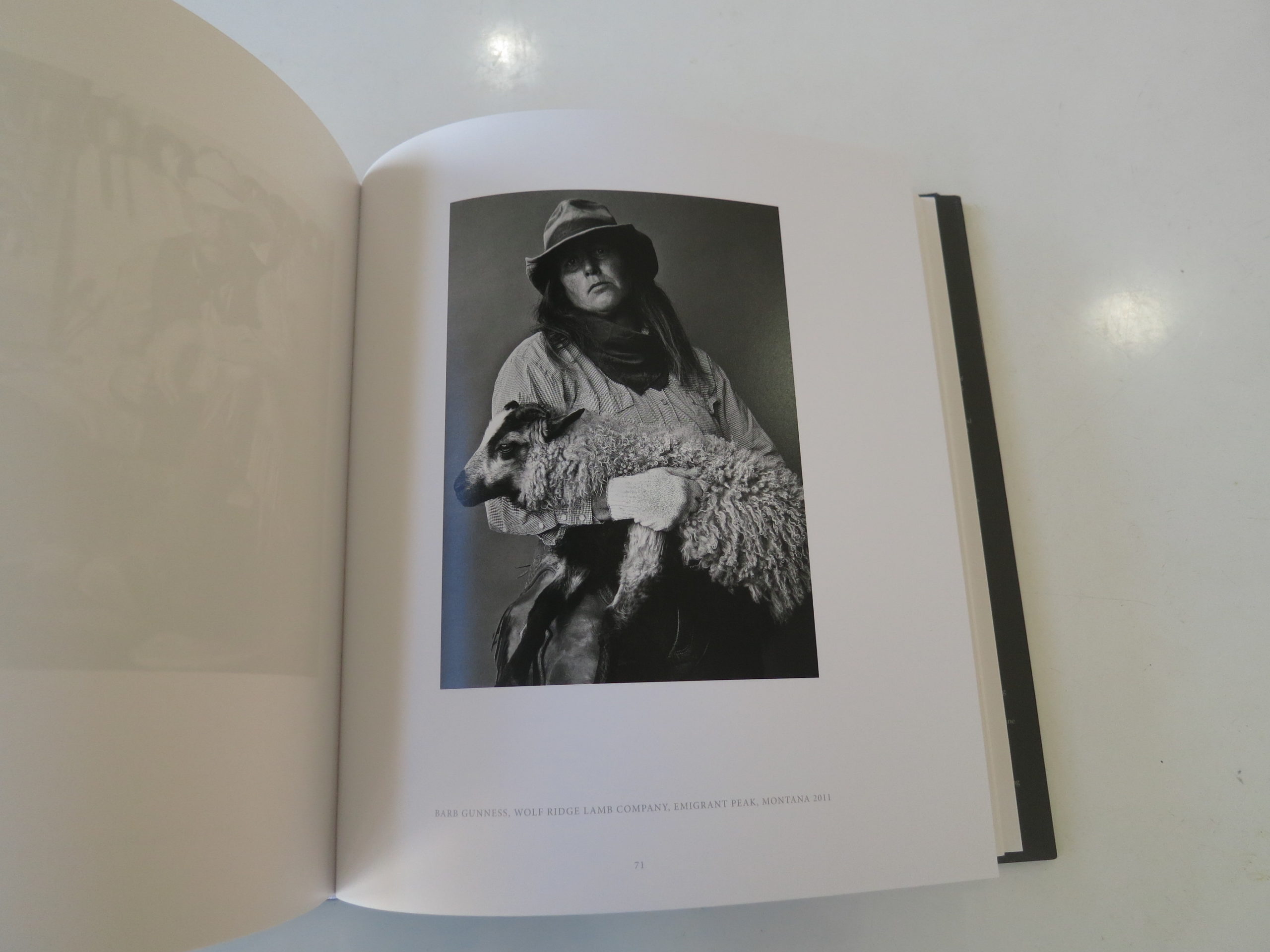
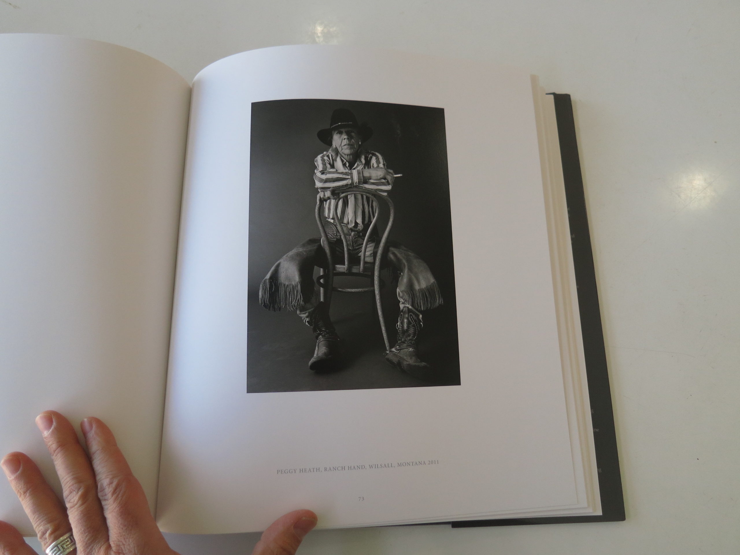
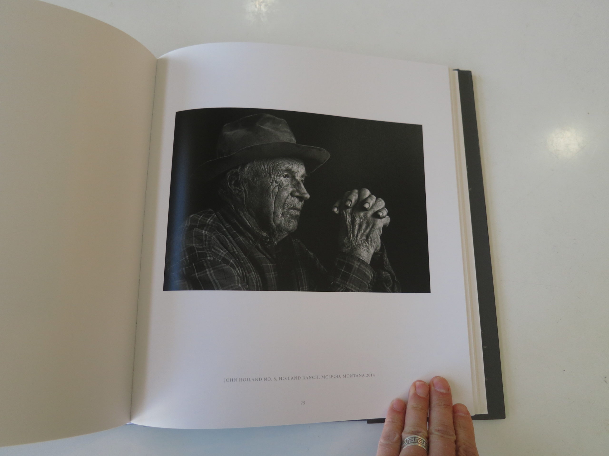
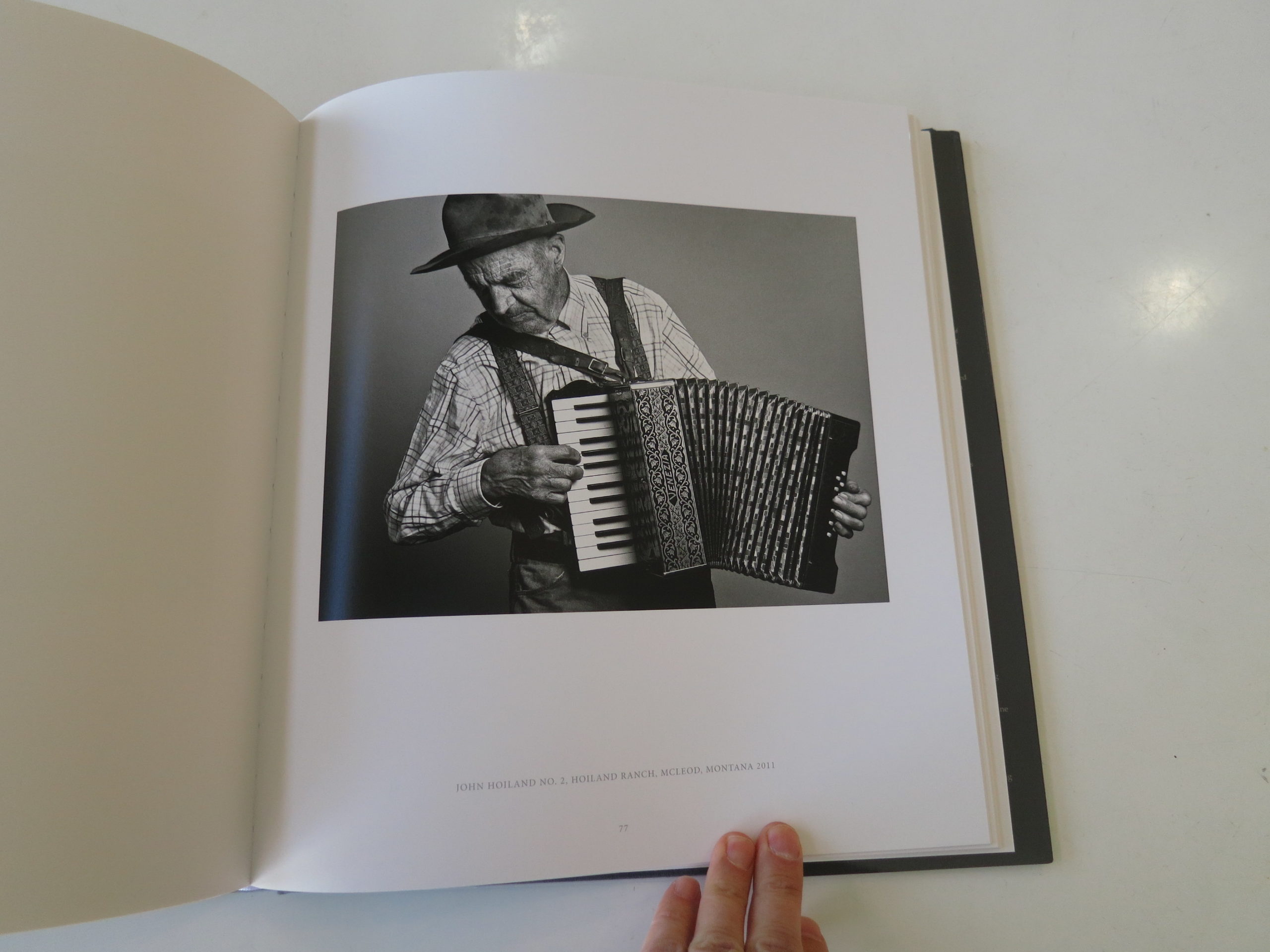
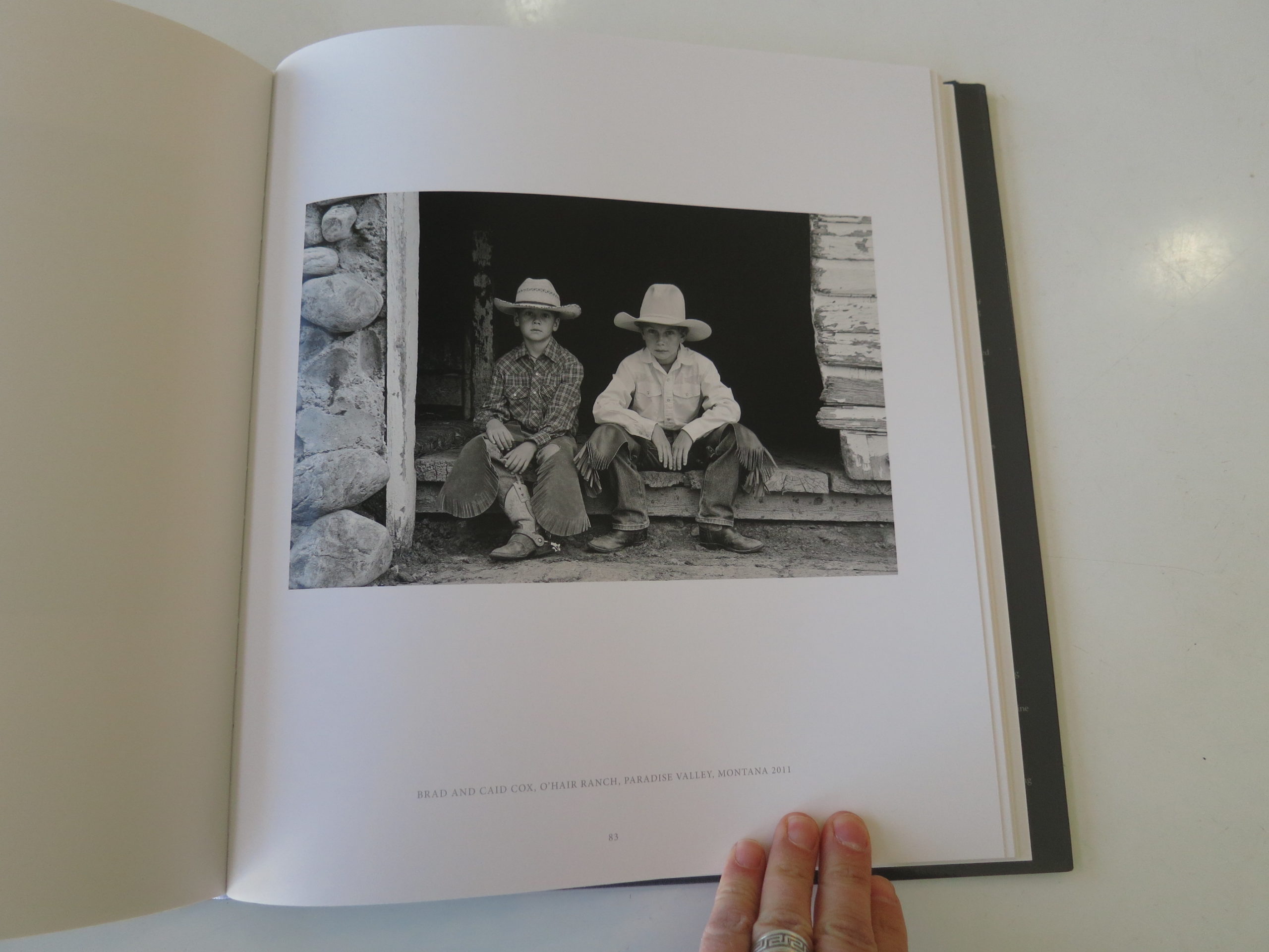
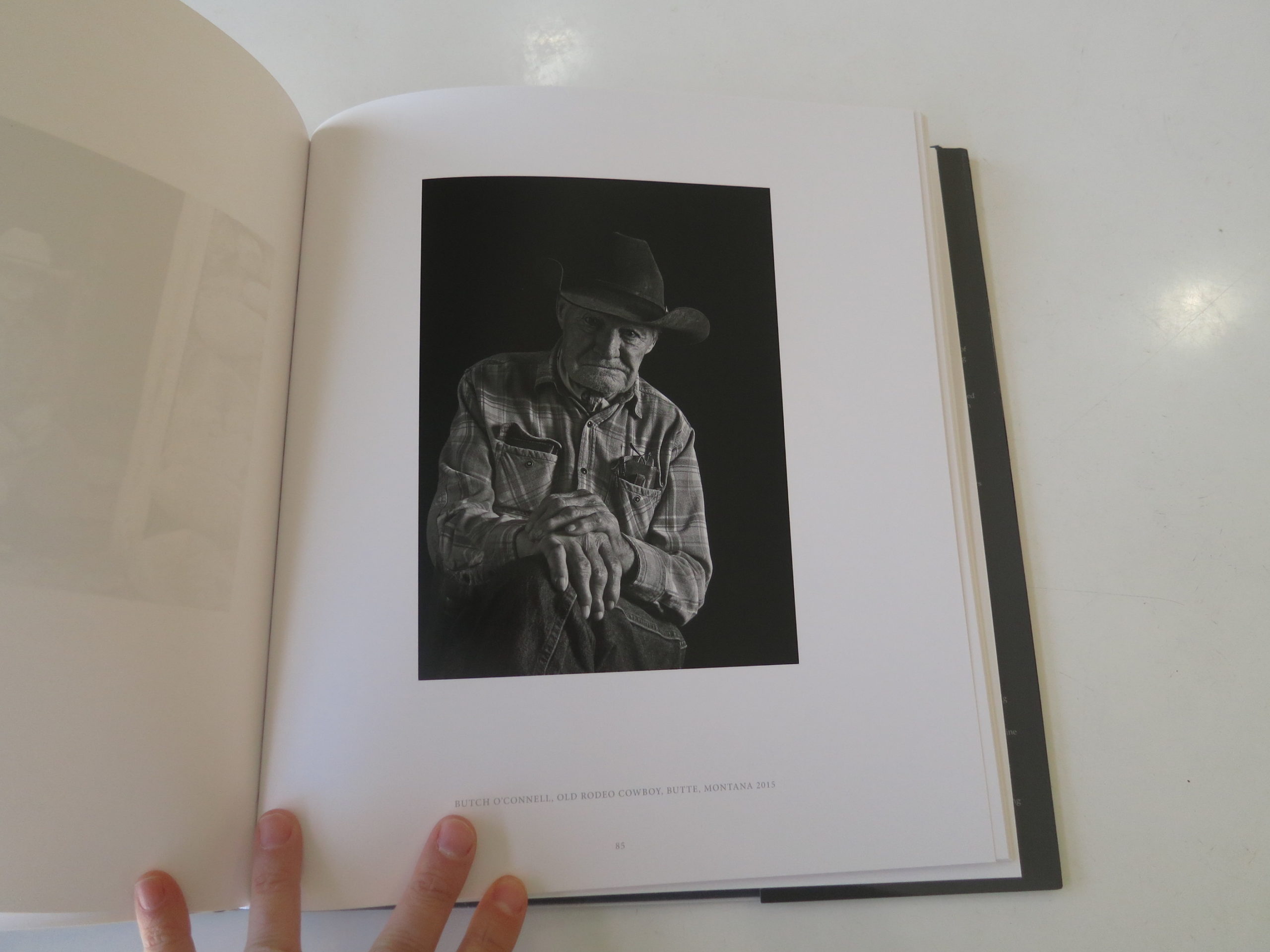
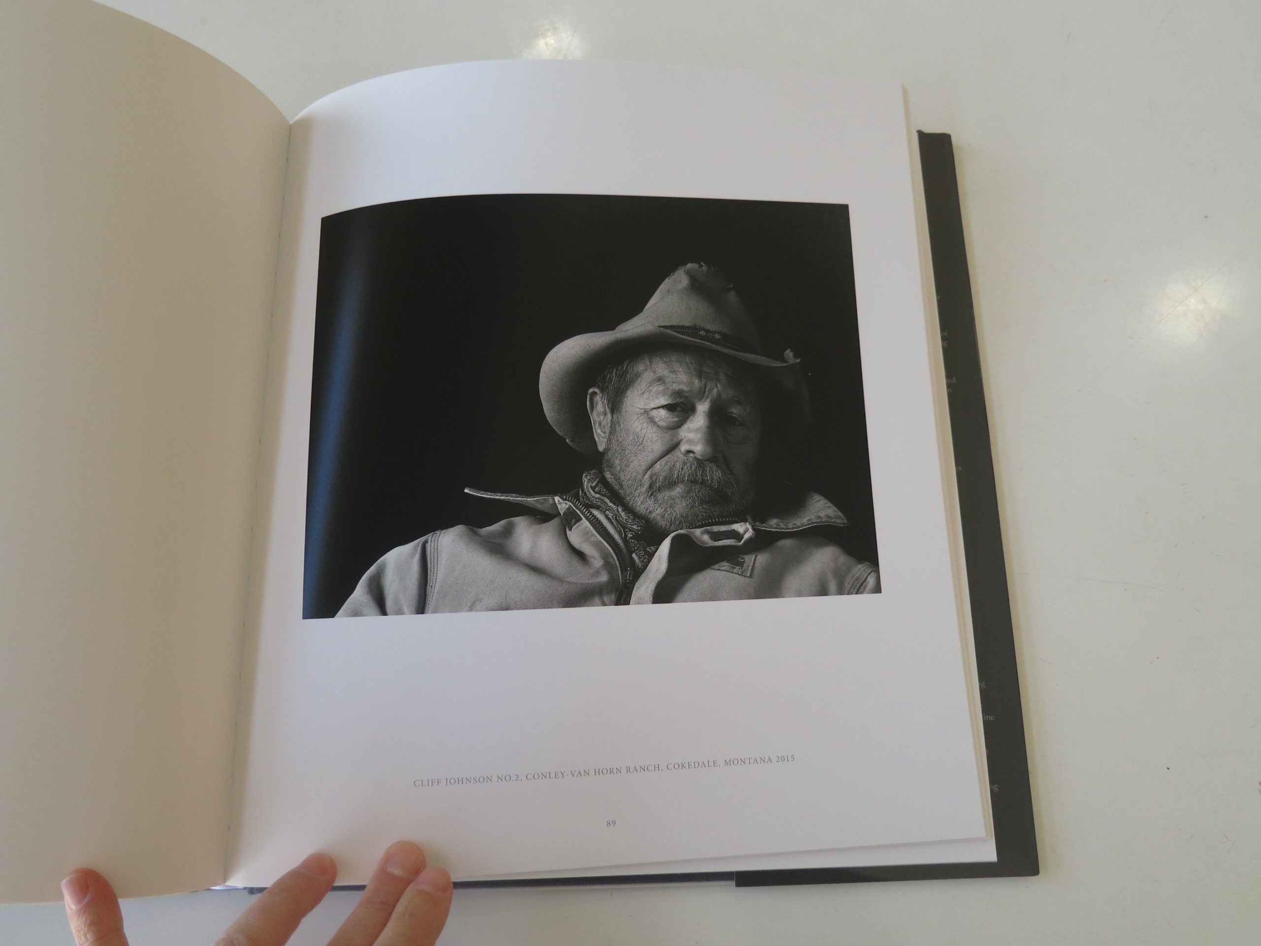
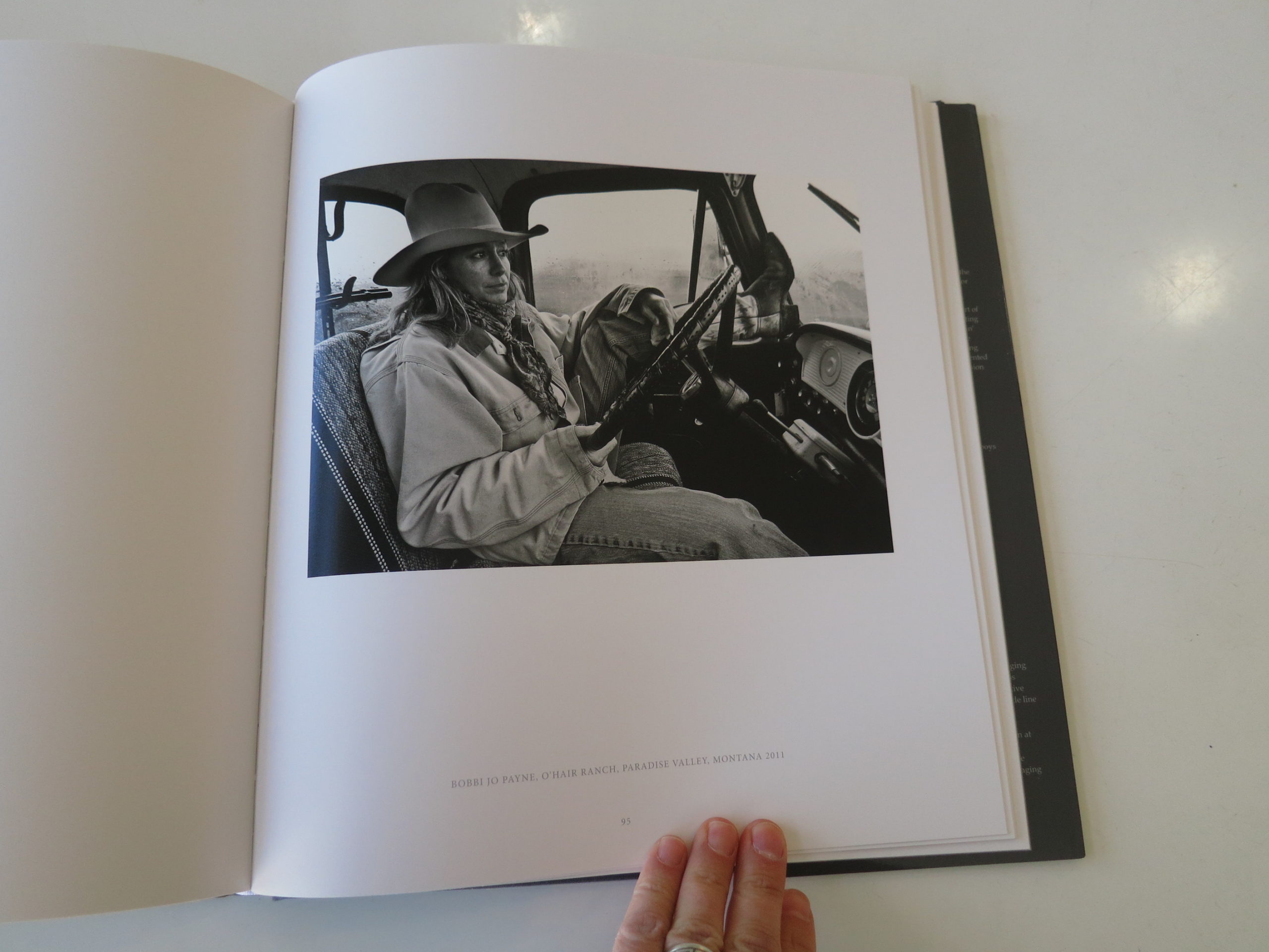
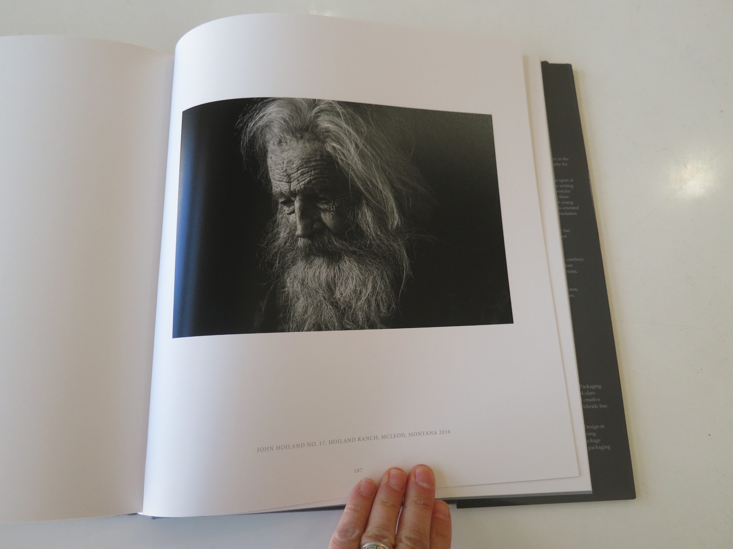
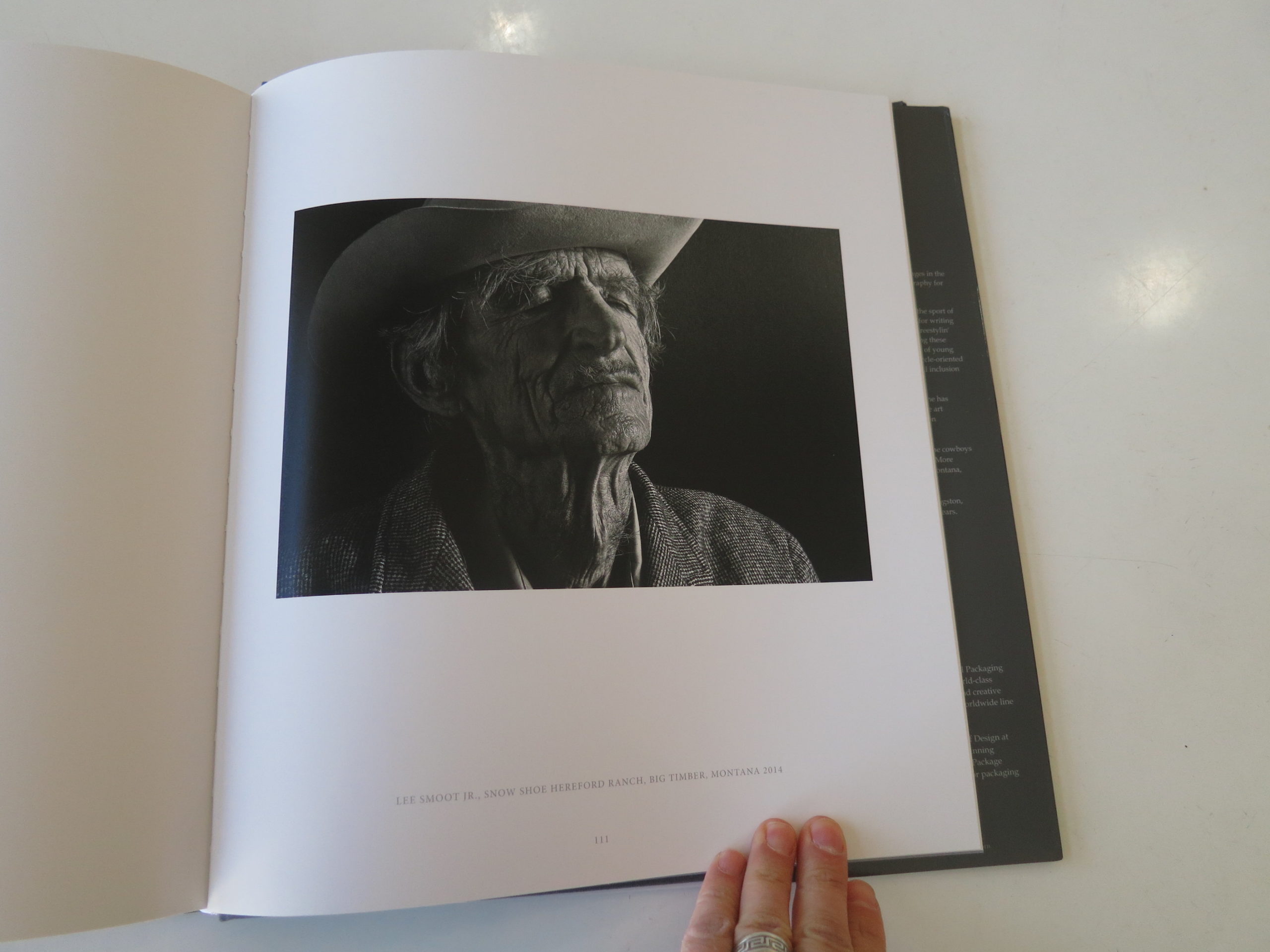
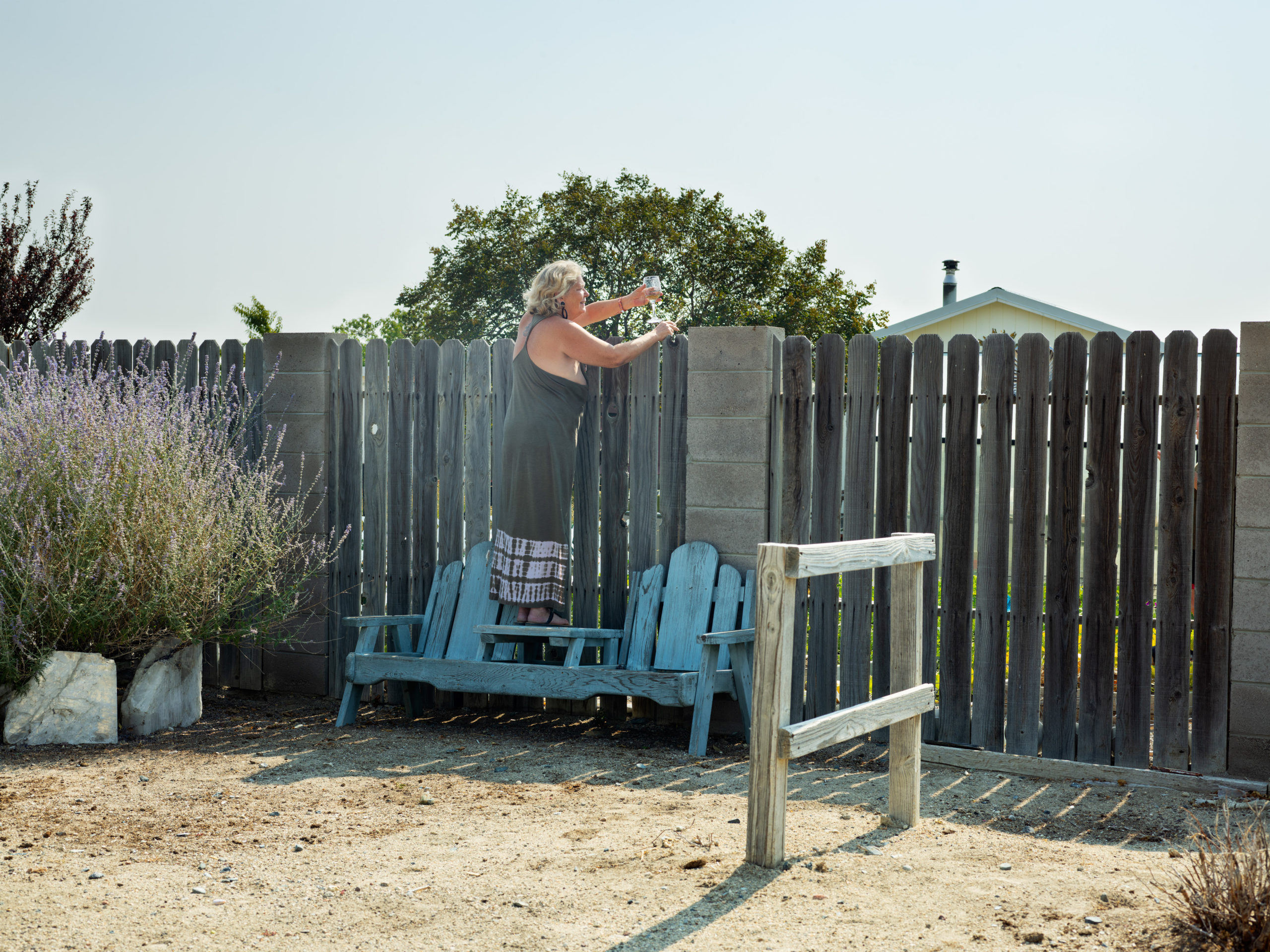
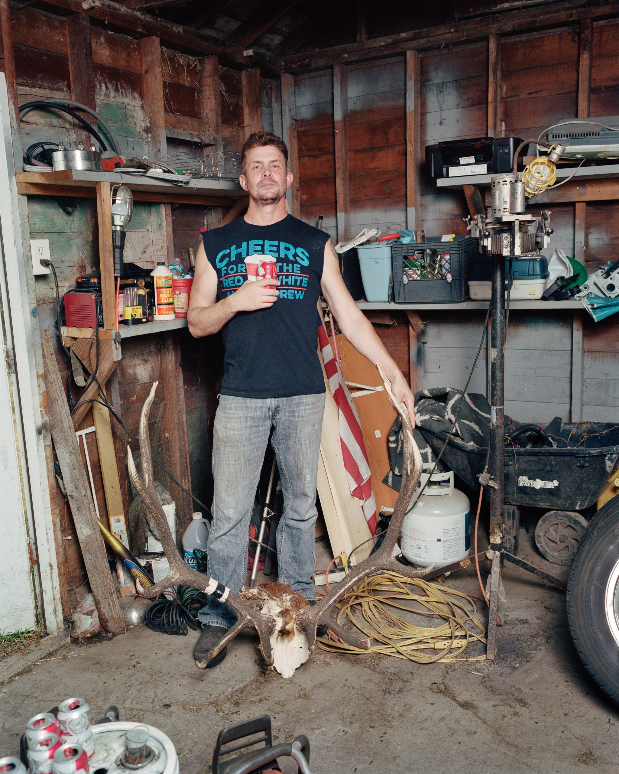
Susan Pullman, Cardwell, MT: Marshall Scheuttle

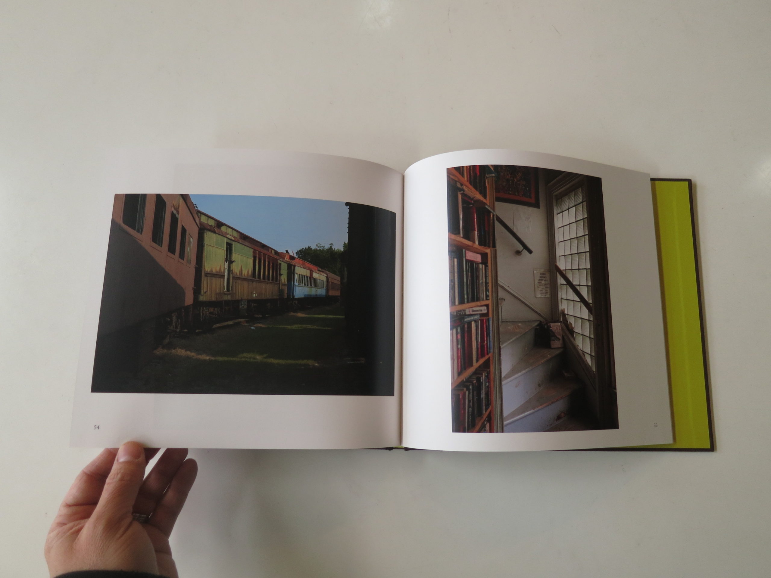
California Sunday Magazine : The Way Home

Creative Director: Leo Jung
Photography Director: Jacqueline Bates
Art Directors: Annie Jen and Supriya Kalidas
Photography Editor: Paloma Shutes
Production Manager: Thomas Bollier

Heidi: What can you tell us about the audio footnotes?
Jacqueline: Our photography issue features very minimal text. We believe photographs tell their own stories, but we also wanted to give readers a multilayered storytelling experience. Every story is accompanied by audio footnotes so that readers can listen to the subjects in the photos and hear from them directly (you can check it out at californiasunday.com). Similarly, at our exhibition At Home: In the American West, on view from 12/6-1/4 at Aperture Foundation in New York City, people can choose to walk through the gallery as is or they can also listen along to the footnotes on their phone, which we think makes for an interesting experience.


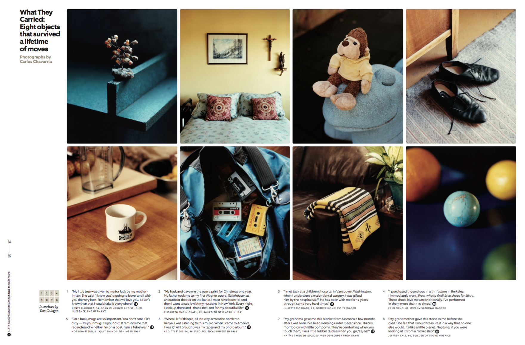
Sound clips embedded here for “What they Carried: Eight Objects That Survived a Lifetime of Moves
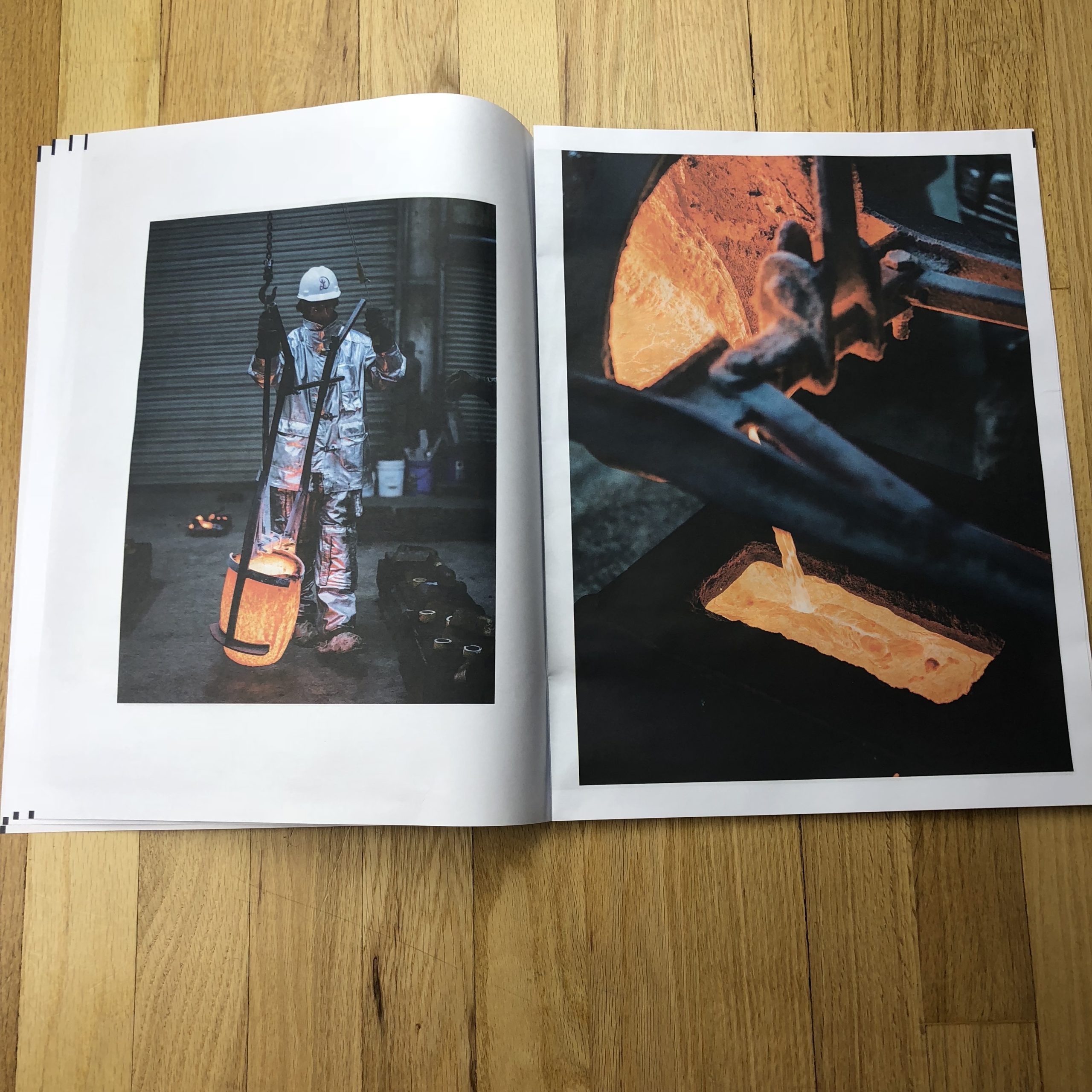
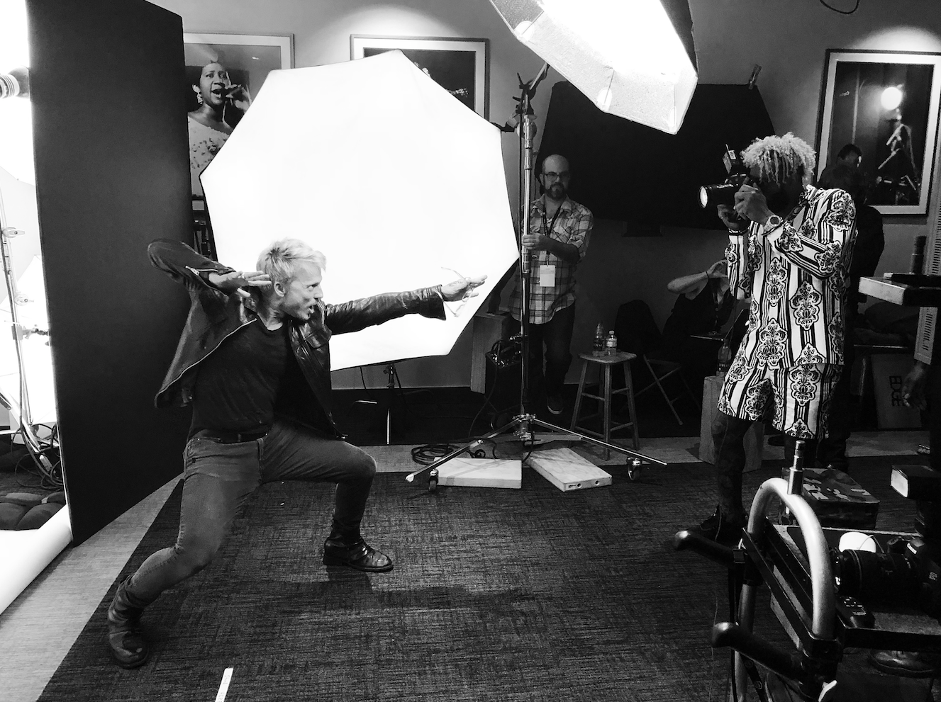
Photographs by Carlos Chavarría

How did the photographers come to choose their subjects? 
We commissioned 30+ photographers for this special issue, including Katy Grannan, Jim Goldberg, Erica Deeman, Texas Isaiah, Star Montana, Mark Steinmetz and Irina Rozovsky, just to name a few.

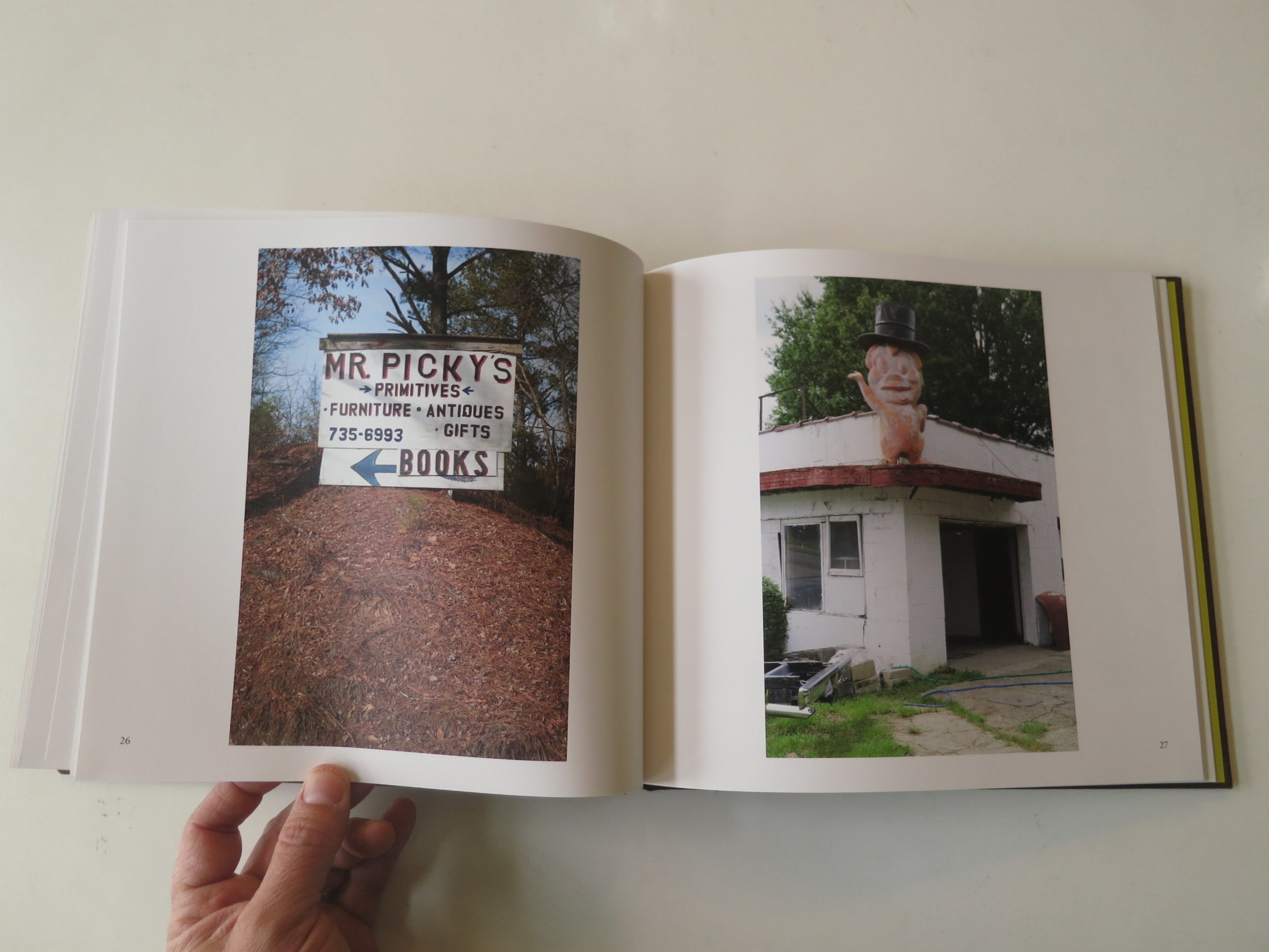
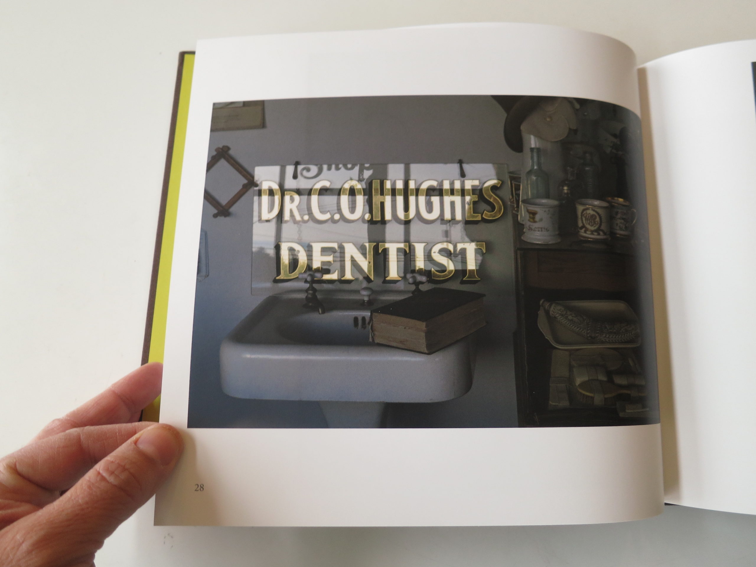
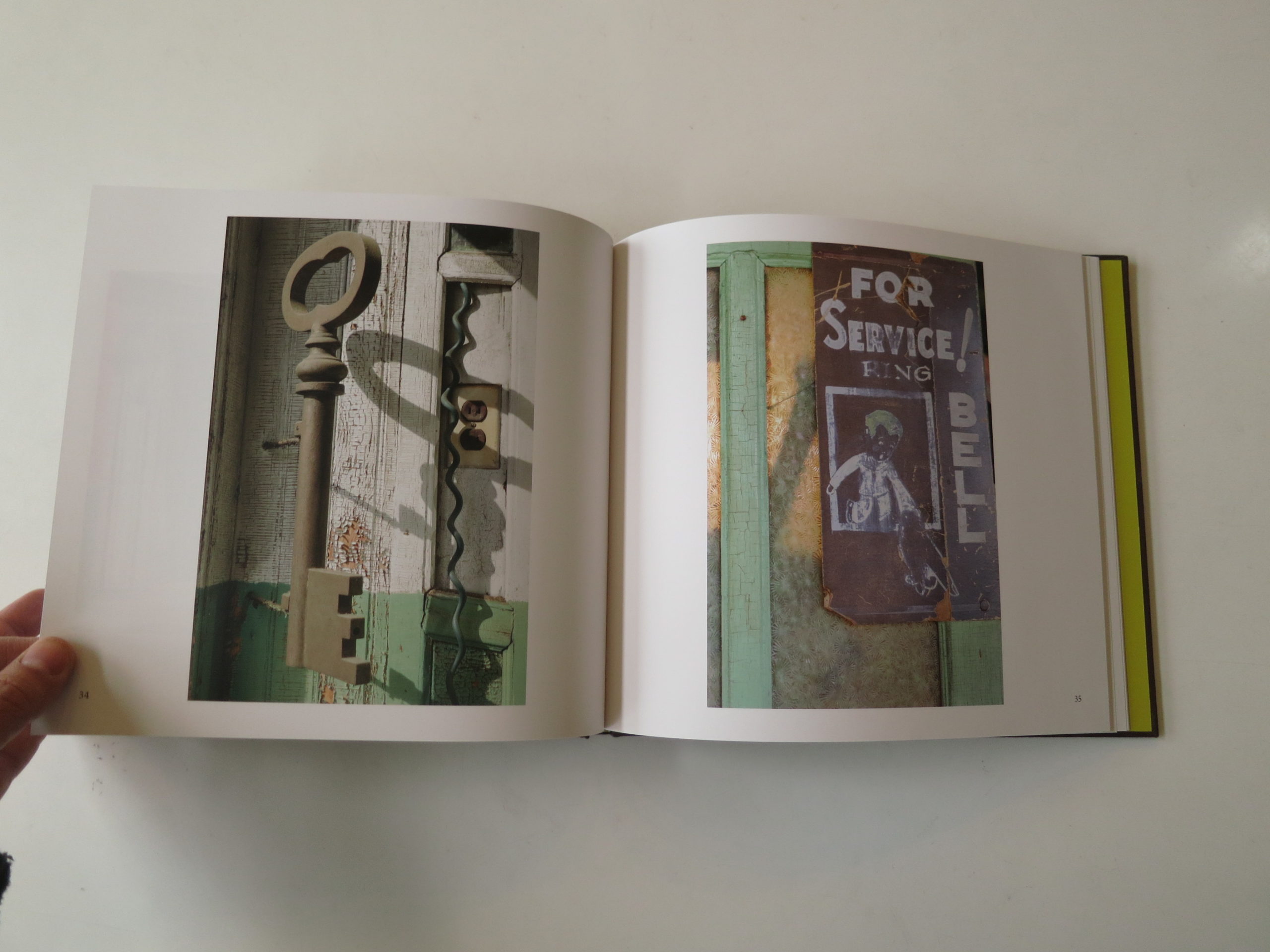
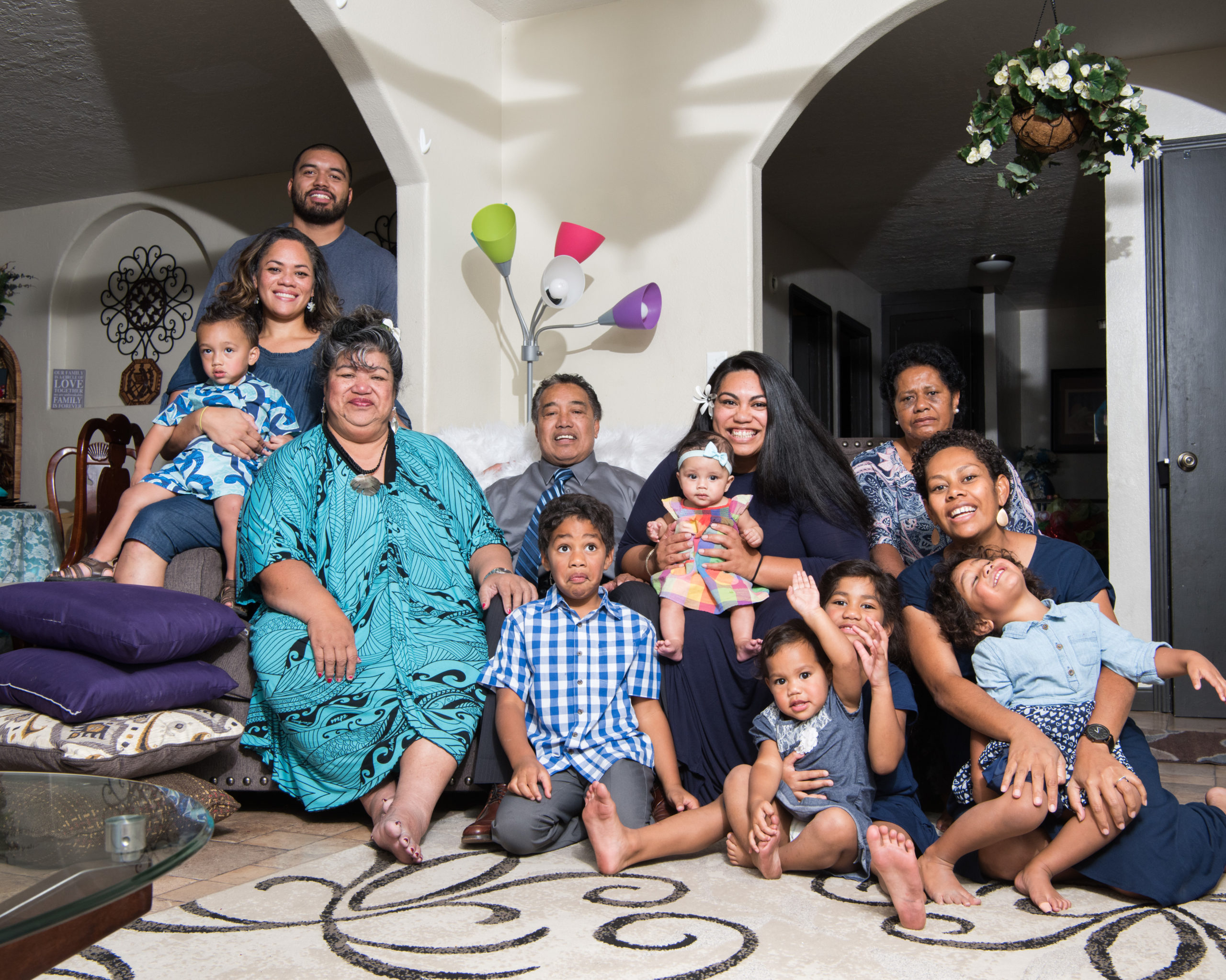
For our cover story, At Home, associate editor, Joy Shan, researched each state west of the Rocky Mountains and we looked into interesting, often overlooked, stories and events that were happening there—and how they related to our theme of “home.” We assigned photographers to one of the regions Joy researched, and from there, we gave them lots of breathing room and freedom to seek out stories of “home.” It was exciting to see the stories that came out of these journeys: In the mountains of Utah, we found a mother of four who designed her dream mansion with some help from Pinterest. In Oregon, we visited a woman who lost her house to foreclosure in 2013; convinced she would get the house back, she moved to an apartment four blocks down the street. We caught up with a screenwriter as he drifts between Los Angeles Airbnbs, and, in Seattle, we met a formerly homeless woman who has found stability and privacy in a tiny house of her own. And much, much more.

What made you focus on this particular theme?
With contentious immigration issues, wildfires, and housing prices dominating news cycles, the question of how people define “home” felt more important than ever. We wanted to dive into this subject and explore its complexities and richness.

How many images did each photographer turn in?
It was a range: For the photographers who shot on 4×5 film, their edits were tight (one or two options for each subject). But for others, who shot for weeks and were photographing many people, edits were much wider.

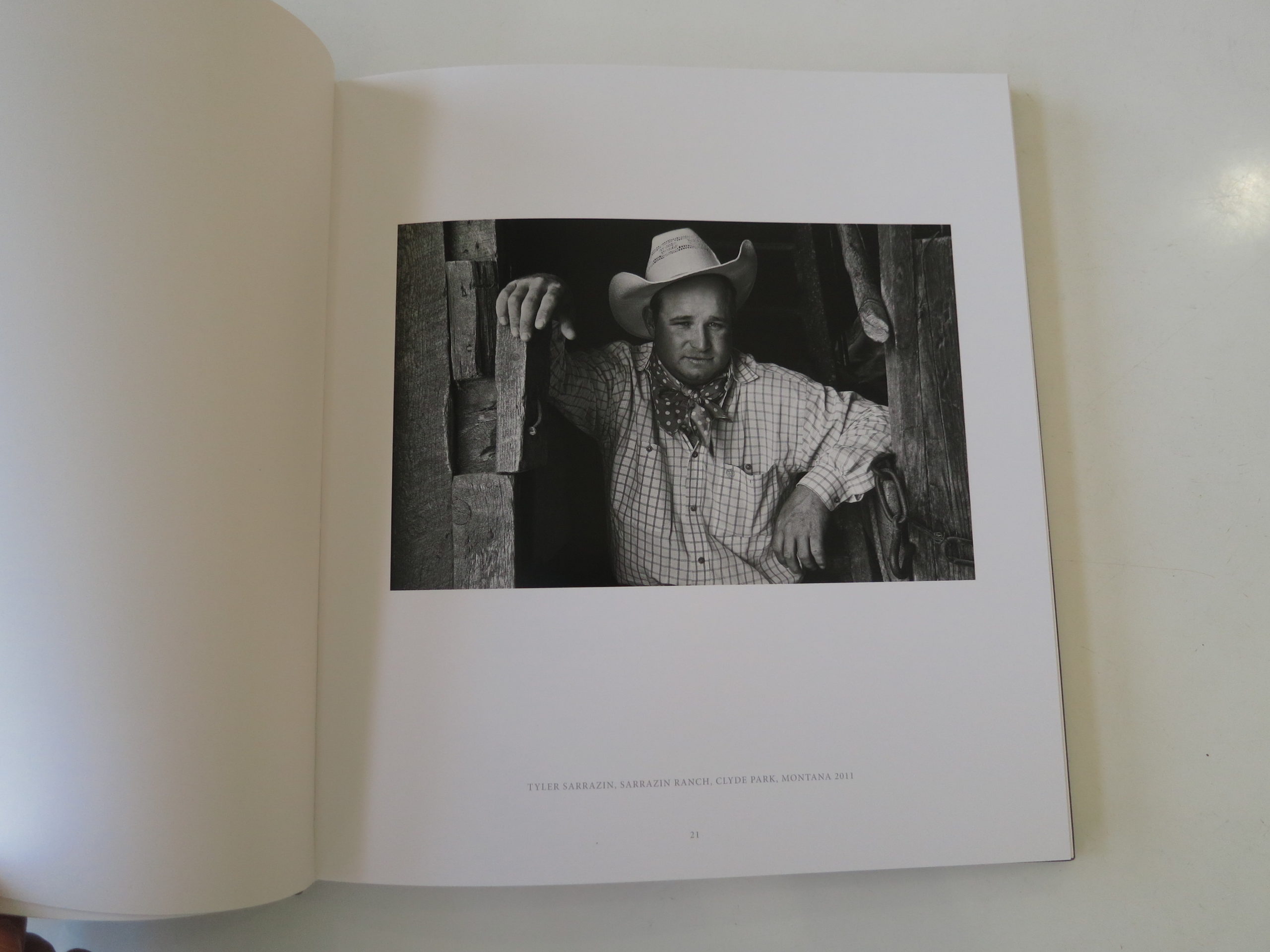
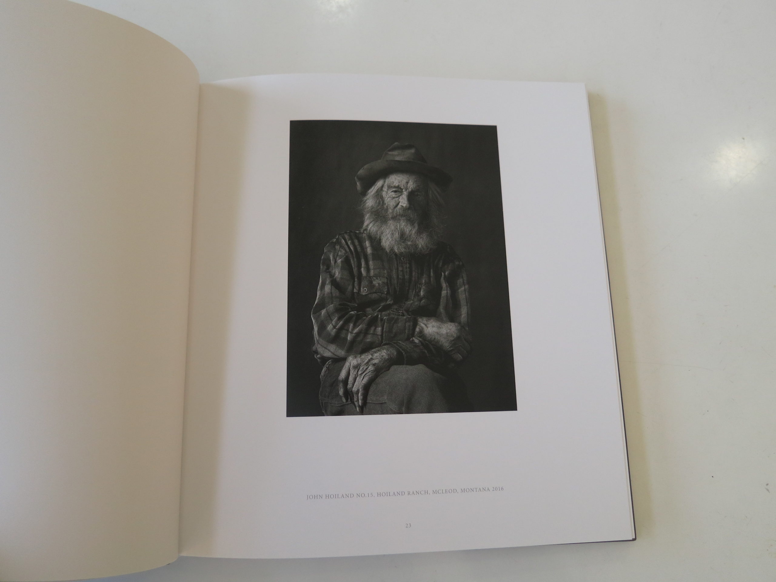
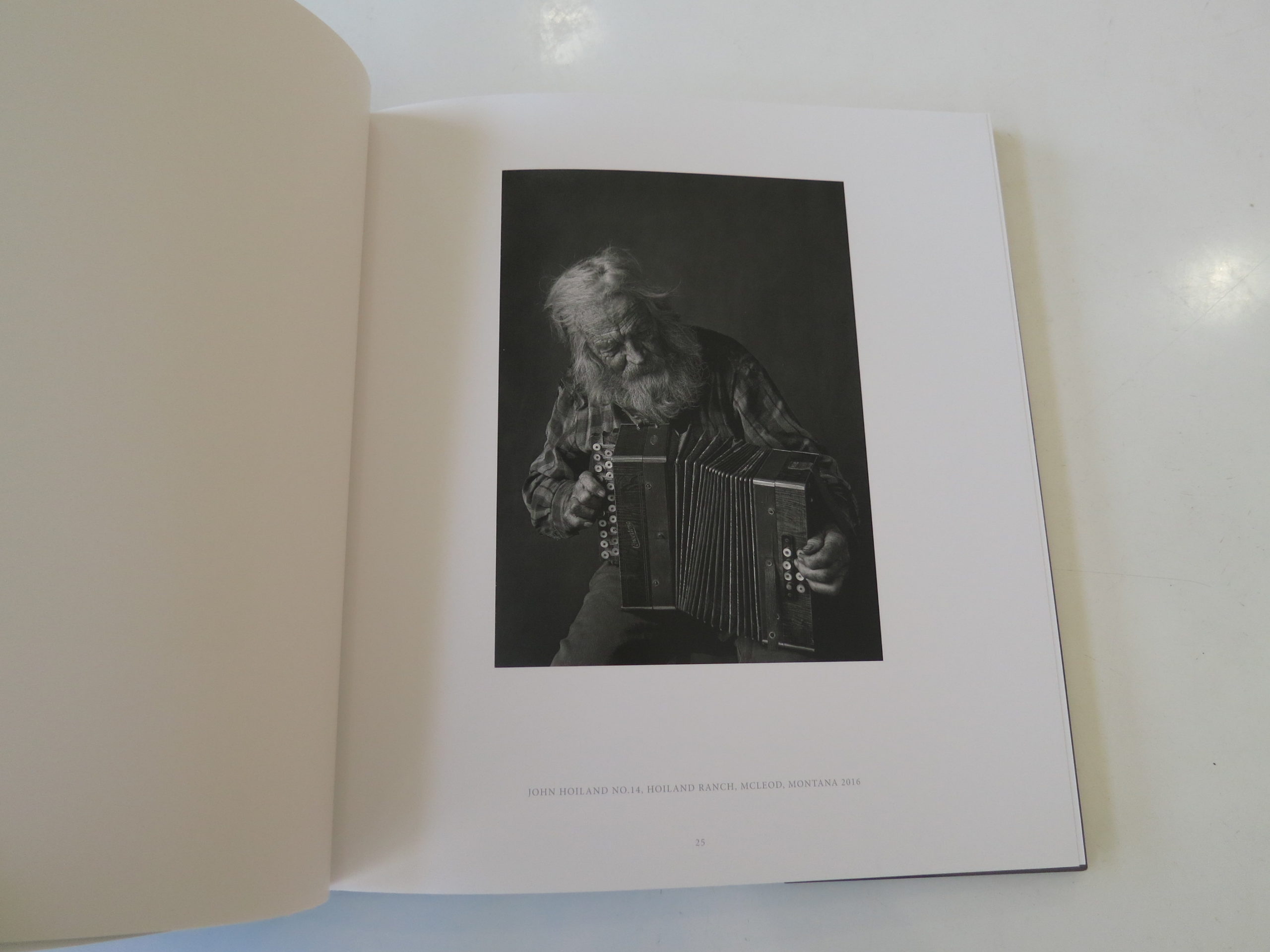
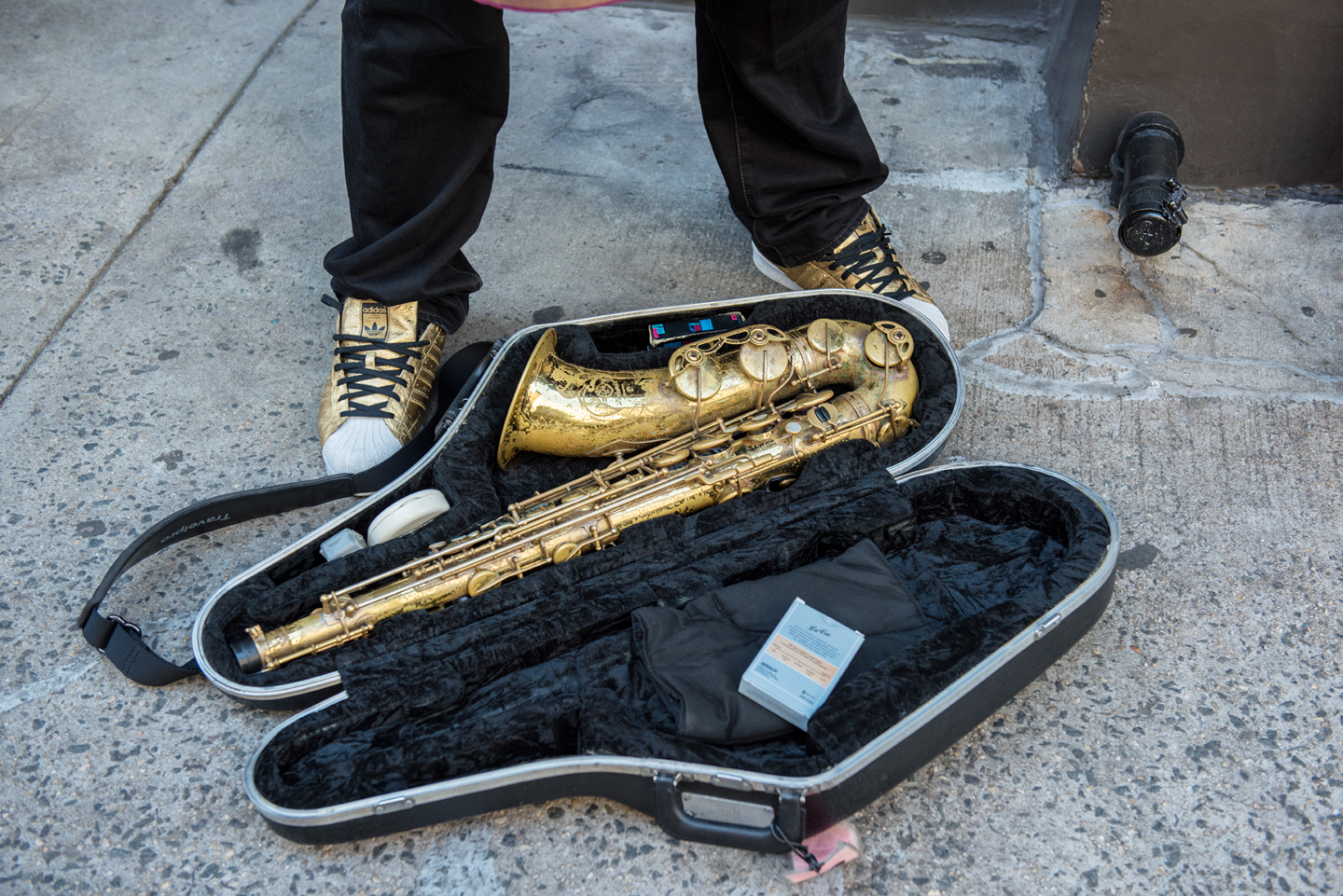
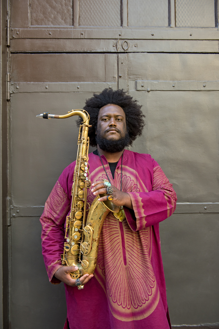
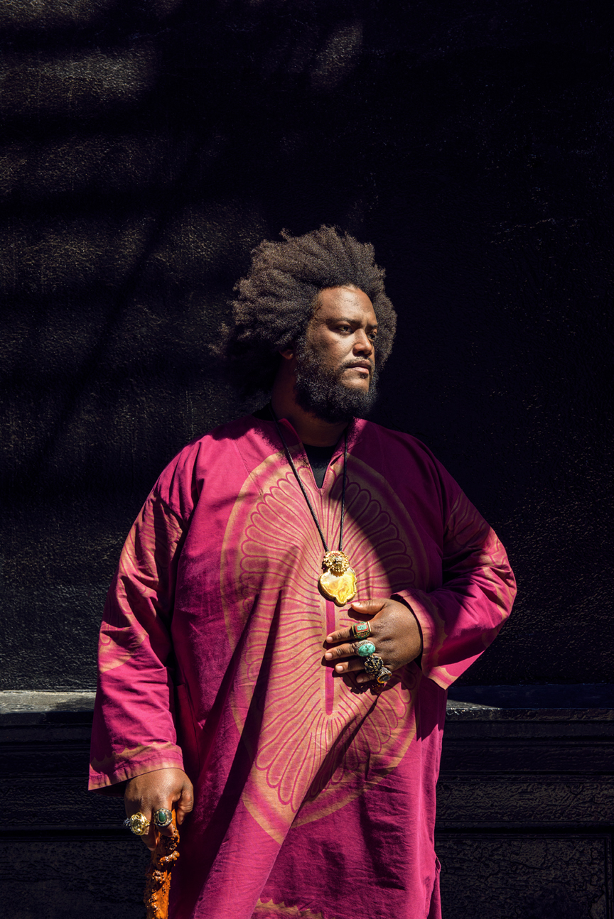
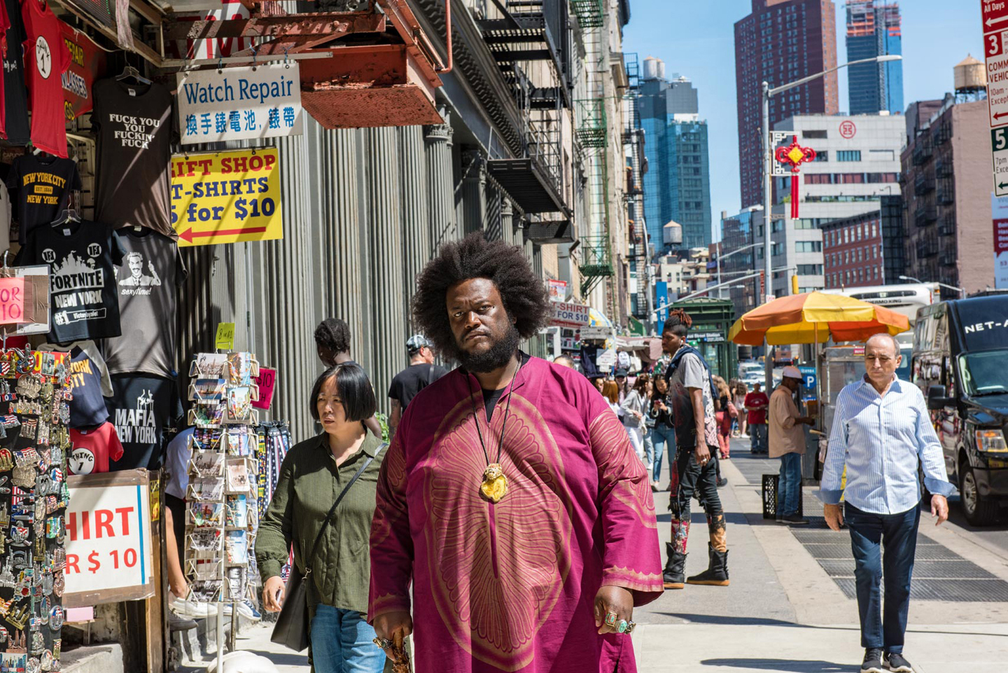
LIST OF PHOTOGRAPHERS

Ash Adams
Holly Andres
David Black
Erin Brethauer
Widline Cadet
Alejandro Cegarra
Carlos Chavarría
Natasha Dangond
Erica Deeman
Lauren Angalis Field
Brian L. Frank
Jim Goldberg
Katy Grannan
Michelle Groskopf
Gregory Halpern
Talia Herman
Tim Hussin
Texas Isaiah
Taylor Kay Johnson
Daniel Leivick
Pixy Liao
Justin Maxon
Sanaz Mazinani
Arlene Mejorado
Andrew Miksys
Star Montana
Ricardo Nagaoka
Ahndraya Parlato
Kristine Potter
Karen Miranda Rivadeneira
Irina Rozovsky
Marshall Scheuttle
Mark Steinmetz
Daniele Volpe


The Daily Promo – Art Streiber

Art Streiber

Who printed it?
The piece was digitally printed by DSJ printers in West Los Angeles. DSJ has been family owned and operated since the 1950s and handles all of my promo printing and stationery needs. I cannot say enough great things about their quality and their customer service.

Who designed it?
My Office Manager, Evan Mulling, and I paced the booklet, while its design is taken from booklets we produced in 2017 and 2015 called Gravity and Levity. Those booklets were designed by Edward Leida @eddieleida, a design director and typographer in New York City. Ed chose the typeface and laid out the type for the NOIR booklet as well.

Tell me about the images?
The imagery comes from a portfolio we produced this summer for a special Emmys issue of Vanity Fair and features Emmy nominees who either play “good guys” or “bad guys” on their respective shows. The NOIR “cops and robbers” theme is a direct, quick-read approach to illustrating that delineation.

We were inspired by movie stills from the 1940s and 1950s. Vintage wardrobe was pulled by stylist Jeanne Yang @jeanneyangstyle. Sets were designed and built by Anthony Altomare @photobuffalo. The shoot was creatively produced by Ron Beinner at Vanity Fair @runronrun and executive produced by LA-based producer Liz Lang @lizlangproduction. And… we shot each of the talent individually over a day and a half. Even the group shots were shot as singles and comped together in post by my long time retoucher, the immensely talented Angie Hayes at the Happy Pixel Project @angiemariehayes.

How many did you make?
We printed 350 NOIR booklets and mailed them to entertainment and editorial clients. The booklets are 9×12 and it was difficult finding the perfect envelope to match that size. We reduced our mailing hassle by taking the bulk of the envelopes to Mail and More, our go-to spot for all of our shipping needs.

How many times a year do you send out promos?
We create a booklet like this once a year, or every other year, depending on how much new work we have to show. In addition, we regularly print a variety of 5.5” x 8.5” single image promo cards to include with our thank you notes (that are also sized at 5.5 x 8.5).

Do you think printed promos are effective for marketing your work?
I do. I’ve surveyed a number of clients and it seems to be split down the middle as to how many prefer to receive electronic promos and how many prefer to receive printed promo pieces. With the booklets, their size and weight give them some gravitas that increases the chances that clients will hold onto them or perhaps, display them in their offices. I think it’s important to keep yourself in front of your clients in whatever thoughtful, elegant way you can. Now more than ever, clients have less time to consider our work and they’re inundated with imagery on multiple platforms…so sending a traditional, printed (oversized) piece can be an attention-getter.

This Week in Photography Books: Jack Carnell


Everybody makes mistakes.

(Even me.)

At the moment, I’m recalling the time I got snookered by a politician.

Genuinely hoodwinked.
Tricked out of my underpants.

The year was 2004, and I was living in Greenpoint, Brooklyn. As hard as it may be for some people to believe in 2018, liberal Americans hated George W. Bush, and his neocon cronies, about as much as the Millennials hate Trump.

He’d started two wars, including one based upon faulty evidence against a country that had NOTHING TO DO WITH 9/11, and oh yeah he also babysat the splintering of the global economy.

W. may have been affable to Trump’s nuclear-rage, but Democrats really wanted him out of office.

And John Kerry, the presumptive nominee, was a sure-loser, I felt. Yes, I voted for him eventually in the general election, but once the video was out of him wind-surfing in Oakley sunglasses, and he just wanted it SO BADLY, I knew he would fall to W.’s regular-guy-appeal.

So in the primary, even though deep down I knew he was too good to be true, I voted for John Edwards.

This was before people knew about the $350 haircuts, and oh yeah that he was cheating on his cancer-ridden, feminist wife, and oh that’s right, he fathered a baby with his side-piece.

It was before that.

Still, it was a horrible decision in retrospect, as I saw the slick veneer, and suspected it was only that, but given that Kerry was so uninspiring, I threw my vote in a riskier direction.

The one thing I liked about Edwards was he kept talking about Two Americas. Rich and poor. The land with opportunities, compared to the one without.

Sure, it’s hokey, and like I said, I’m embarrassed I voted for the guy.

But it’s certainly true today, and helps explain the enormous political divide in the US.

I’ve written about it in pieces, of late, but today I wanted to directly address the urban vs rural schism in America, and how it’s likely to get worse, not better.

Cities, as we all know, are almost always liberal. As one who’s lived in 3 big ones, (ABQ, San Francisco and Brooklyn,) I can attest to the power of mixing people together.

Food, culture, and proximity provoke an inherently mind-opening experience. Open-minded people are more free-thinking, or less fixed in their world views, and tend to vote Democratic.

Even in places as Red as Texas and Oklahoma, cities vote Blue.

I’m also something of an anomaly, as I live in one of the few rural, mountain communities that’s liberal, (much less deep blue,) as Northern New Mexico is.

In Red America, from Nebraska down to Mississippi, most people live in an Evangelical, white, agricultural culture in which farming, ranching, and growing things is a part of daily life.

Killing a chicken with your bare hands or fixing a pick-up truck with your buddy, for rural folks from Alabama to South Dakota, would seem as normal as drinking beer and eating beef.

Remember how vociferously Brett Kavanaugh yelled that he likes beer? It’s because that was code that even though he’s a rich kid who went to fancy private schools, he’s actually a regular-guy-rich kid, like Trump. (And W. before him.)

Not an effete-wine-drinking-snob like Barack Obama.

If you live in a hip part of Atlanta, your local coffee shop will be more similar to one in Oakland or Boulder than it will be to any establishment 150 miles outside the city.

That is the real two Americas.

Lifestyles, cultures, religions and demographics that are so different as to be unrecognizable to the other side.

As an optimistic pragmatist, (as I described myself at a recent lecture at UNM in ABQ,) I’d like to think that as America has knit her wounds before, we may again.

And living a hybridized experience, locally being surrounded by liberal ranchers, and then traveling each year to America’s best cities, I guess I understand connections between both Americas better than most.

It’s great, though, to be able to present a vision of one America to the other, and have it be a positive experience.

One dripping with respect and appreciation.

A vision, perhaps, that helps us view the past as it exists in the present. And today, we’ll see this homage to Red America in “True Places,” a book by Jack Carnell, recently published by Fall Line Press in Atlanta.

These days, I see books from all sorts of demographics, and basically show books in a 50/50 ratio between men and women. (Have you noticed?)

It means that over the course of a year, I’ll show books by 20-somethings, 70-somethings, and everything in between. (No lie.) From hipster ‘zines in Germany to staid historical compendiums by famous museums.

When I got a few pages into this book, though, I had the strong suspicion that the photographer had been around a while. That he was in his 60’s or 70’s.

Given the subject matter, (of the South,) and how many projects you see coming out of the Hartford MFA program that look like everyone wants to be Alec Soth-mixed-with-Eggleston, it could easily have been made by a younger artist.

(And not until the book’s end notes did I get confirmation, as Jack Carnell got an MFA in 1976.)

After the first picture, (which seemed way too generic,) and the second, (which was a bit boring,) this book really took off. Frankly, other than just a few street-scene pictures that seemed obvious, I thought the rest were both haunting and cool, which is a hard mix to pull off.

The compression of space makes the photographs personal, and maybe having been around a while helps him zero in on moments that are trapped in time, and likely won’t be around forever, like an old stationary store that’s hanging on against Walmart, selling one yellow highlighter at a time, but you know once the old lady retires there’s no way her son is taking over, and it will be gone for sure within two years.

This whole book feels like that imaginary anecdote.

It’s like an elegy to every hardware store that struggles and lingers, or every BBQ joint where the pit-master wakes up at 4am to tend the whole roast pig.

I think there’s a warmth to the light and the color palette, overall, that suggests the warmth of feeling for these dying, forgotten, or at least under-appreciated places.

The $2 shave.
Forgotten books on the staircase of the local store.
A Dentist’s office where you KNOW the toys are from 1989.

Even when the color palette shifts cool, the pictures still resonate with humanism.

The honest truth is, there are people living in rural areas that are cool as hell. They work the land because that’s the family culture they know.

They hunt or fish or four-wheeler because they’re surrounded by nature, and there’s not that much to do unless you’re active.

And Red America is far-from-exclusively-white, so there are rural Latinos and African-Americans living differently from their urban counterparts as well.

A few weeks ago, I wrote a little screed promoting understanding between these two Americas. This book is a love-letter from an MFA/art-professor/Guggenheim-fellow artist, (by definition a member of the elite,) to another America, and I think it’s an inspiration for all of us heading into 2019.

Bottom Line: Beautiful, hauntingly charming look at the forgotten South

To purchase “True Places,” click here 

If you’d like to submit a book for potential review, please email me at jonathanblaustein@gmail.com. We currently have a several month backlog, and are particularly interested in submissions from female photographers so we may maintain a balanced program.

The Art of the Personal Project: Randal Ford


The Art of the Personal Project is a crucial element to let potential buyers see how you think creatively on your own.  I am drawn to personal projects that have an interesting vision or that show something I have never seen before.  In this thread, I’ll include a link to each personal project with the artist statement so you can see more of the project. Please note: This thread is not affiliated with any company; I’m just featuring projects that I find.  Please DO NOT send me your work.  I do not take submissions.

Today’s featured artist:  Randal Ford

I’m portrait artist at the core of my photography, so these animals are rooted in classical portraiture, inspired by the greats like Richard Avedon.

In order to capture these images, it’s important that all the groundwork be laid in advance. Meaning, I need to have communication with animal’s owner prior to the shoot to discuss what I’m aiming to achieve, which is typically a headshot showcasing the animal’s personality. As mentioned above, on set, I need to be ready and prepared to capture anything and everything that an animal may give me. Because sometimes I may only get one split second for that perfect portrait.

Obviously access to the animals is a challenge with a project as large as this. I’ve worked with rescue facilities, zoos, private animal owners, or farm working animals (i.e. horses, cows, chickens). So they come from a range of sources and I worked closely with a team of producers to find the right animals and went to great lengths to ensure those animals were living in a great environment and being treated with the utmost respect for their wellbeing. For example, the Cheetah on the back of the book was photographed at an amazing sanctuary called Cat Haven near Dunlap, CA and we are donating a portion of the proceeds to Cat Haven as a way to give back and create more awareness.

Some of the animals I shoot in a traditional studio with a painted Cyc and cover while others I shoot on location where I bring the lighting setup to them. Regardless, I utilize lighting to create a consistent, timeless aesthetic

Finally, not exactly a production or tactical note, but all the animals have names. And this is a very important part of the intention to connect with the audience. By including the animal’s name and story in the book, it further humanizes and heroicizes them to bring you further into their story. The descriptions and names for all the animals are included at the back of the book and at randalford.art. For examples, Highland Cow No. 1 is named Gertrude and The Young Lion with his mane growing in is named Jabari, which means brave. So by including the name, we are pushing the boundaries of the story and connection with the audience.


To see more of this project, click here.

To purchase the book, click here

(or other major bookstores)

APE contributor Suzanne Sease currently works as a consultant for photographers and illustrators around the world. She has been involved in the photography and illustration industry since the mid 80s.  After establishing the art buying department at The Martin Agency, then working for Kaplan-Thaler, Capital One, Best Buy and numerous smaller agencies and companies, she decided to be a consultant in 1999. She has a new Twitter feed with helpful marketing information because she believes that marketing should be driven by brand and not by specialty.  Follow her at @SuzanneSeaseInstagram


Pricing & Negotiating: Architectural Images for International Hotel Chain

Craig Oppenheimer, Wonderful Machine

Concept: Interior and exterior architectural images of seven hotel properties

Licensing: Web Collateral and Web Advertising use of up to 56 images in perpetuity

Photographer: Architectural specialist

Agency: Medium in size, based in the Northeast

Client: A hotel brand part of a larger international hospitality conglomerate

Here is the estimate:

Estimate for Architectural Images for International Hotel Chain

Creative/Licensing Fees: When the project first landed on my desk, it was similar to a lot of hospitality projects in that the brand wanted a mix of images showcasing everything their hotels have to offer. The creative brief initially encompassed architectural images, lifestyle shots, food, amenities, and more. In my experience, many agencies that propose similar shoots are typically biting off more than they can chew, and their budgets typically don’t align with reality. After learning more about the project and discussing what it would take to accomplish a production of that scale in multiple locations, I was ultimately happy to hear that they decided to focus the efforts of this particular project on just acquiring architectural images, and putting the lifestyle shots on hold. That being said, they had seven different properties, three of which were in foreign countries, and they had a very specific style of black and white photography that they hoped to achieve.

In discussing what was feasible in one shoot day, we landed on eight shots per hotel as a reasonable deliverable. They were willing to limit the usage to web advertising and web collateral use (mostly their website and social media), although they did request perpetual use. On one hand, I wanted to start around a few thousand dollars per image, however I also knew that the photographer would be up against other architectural photographers (both domestic and abroad), and we wanted to make it appealing for them to hire one photographer, rather than several. Additionally, it was likely that they’d use just one or two of the images in a more robust way on their website, and many of the shots would ultimately just fall to social media. While the parent company of the hotel chain was one of the largest in the industry, this particular hotel chain was a smaller brand in their portfolio, and I had a sense they might not have what we wanted in terms of a creative/licensing fee within their budget. Based on the photographer’s experience working with this agency for some of their other clients, and on my experience on similar projects with other brands, we landed on $24,500, which ultimately broke down to $3,500/hotel.

Travel/Scout Days: The first four shoots would be at hotels within the US, and we anticipated one travel/scout day prior to each shoot. We then anticipated a full travel day and a full scout day prior to each of the international locations (which helped to account for limited flights, travel delays and more extensive travel time), followed by one travel day back home.

Pre-Production Day(s): In addition to lining up all of the travel plans, the photographer would also need to communicate with each of the hotel chains and essentially plan seven different small productions, and this covered all of the time involved to handle that workload.

Assistant Days(s): The photographer would bring their assistant with them, rather than hiring locally, and this included 7 shoot days and 11 travel/scout days. While it would have been cheaper to hire local assistants and not include the expense for their travel, sourcing crew (especially internationally) would unnecessarily add to the photographer’s workload. Additionally, working and traveling with a single assistant who understood the project just as well as the photographer would help to streamline communications and execution.

Airfare: This covered one-way flights to/from each location, and I used Kayak.com to help research pricing. When estimating projects like this, I typically add 15% to the cost of a ticket to account for price fluctuation, and also add around $100 in baggage fees per person to account for equipment and oversized/overweight items.

Lodging and Meals: The agency specifically asked us to mark this as TBD and not include this in the bottom line of our estimate. We were comfortable doing so for the lodging since we assumed the hotels could provide accommodations, and while we anticipated that meals could be covered within the hotel property, we still included additional funds for supplemental meals while in transit in the per diem line items below.

Equipment: The photographer owned all the gear they would need to bring, and we based the charge on $1,000/day, factoring in a discount of 3 days equaling a weekly rental, times two weeks.

Car Rental and Local Transportation: I included $350 for each of the domestic trips and $450 for each of the international trips to account for car rentals, taxis, and other modes of transportation needed for each shoot.

Per Diems, Parking, Carnets, Misc.: I included $50/day/person as a per diem, and anticipated at least another $1,000 would need to be spent on other miscellaneous expenses that would arise during the productions and while traveling.

Shoot Processing for Client Review: I included $250 per shoot for the photographer to do an initial pass on the images, and provide the agency with a gallery of images to consider.

Post Processing Day(s): I initially anticipated that we’d charge at least $100 per image, but it felt a little light, and I knew that it would take the photographer the better part of a week to handle the post for this shoot, so I included 6 post processing days, rather than basing it on a per image rate.

Results: We were asked to provide the client with the cost difference between this estimate and one where each of the domestic shoots would be independent trips, followed by a trip to capture the international locations consecutively. We determined it would add roughly $6,000 worth of travel expenses and additional travel days for the photographer and their assistant. The client opted to go with our initial proposal, and the photographer was awarded the project. As for lodging and meals, the client did end up providing accommodations and meals on-site.

If you have any questions, or if you need help estimating or producing a project, please give us a call at 610.260.0200 or reach out. We’re available to help with any and all pricing and negotiating needs—from small stock sales to large ad campaigns.

The Daily Edit – Outside Magazine: Hannah McCaughey

Outside Magazine

Design + Photography Director: Hannah McCaughey
Deputy Art Director: Petra Zeiler
Photographer: Sebastian Kim

Heidi: Who shot that image for you? 
Hannah: Sebastian Kim shot it originally for Interview Magazine. I have loved this image/shoot for a long time; it’s lingered on my mind. Generally we prefer to shoot original art for covers especially when it’s a big star like Alex who is a legend for our readers. The shoot we had scheduled we had to kill sadly as it was going to break our current photo budgets due to travel logistics and all the while we had this big strong image in our minds as the one to beat.
 
Why that image of him for the cover, what spoke to you?
His happy eyes which could be corny were it not balanced by the contrasty grainy tone of it all, plus I am a sucker for a big face (especially such a good one!)

Do you see syndication as a mandatory way forward for most magazines? I see this as a strong trend especially for global publishing companies.
Yes- if we are going to meet our current art budgets we have to do a certain % of covers as stock to save up for the shoots. I’d say somewhere between 3-4 this year are going to be stock as budgets shrink that ratio will shift.

What are you thoughts on giving a shoot a second life?
BIG FAN- I wish I could go back through all the shoots we’ve ever done and pull out a the hidden gems in there that never saw the light of day.

The Daily Promo – Chad Kirkland

Chad Kirkland

Who printed it?
Newspaper Club in the UK.

Who designed it?
Souk Mounsena of The Pursuit Society.

Tell me about the images?
My late father ran an electric sign company, so for as long as I can remember and until he passed when I was 15, I was surrounded by craftsmen of all kinds. I have some really fond memories of working with my dad and my brother in the shop. At first, when I was really young he’d have me sweep the shop for a few bucks, then when we got a little older, we would collect all the scrap metal to take to the recyclers for some spending money. As I grew up, I was given more creative and technical tasks like designing and building electric signs. I remember my dad teaching me how to wire up a sign and connect it to a transformer so he could send me up into tight attics where he couldn’t fit. Because of my background, which I think also led me to pursue a creative career, I also gained a huge appreciation for the art of building things by hand. Whether it was watching my dad paint an intricate sign, weld a massive frame from steel, or watch his neon contractor turn tubes of clear glass into a beautiful, glowing masterpiece with nothing but fire, gases, and a lot of patience, I really developed an intrigue in craftsmanship that will be with me forever. I plan on continuing this series and will likely make more promos from it in the future.

How many did you make?
100

How many times a year do you send out promos?
2, but I’m always trying to increase that number.

Do you think printed promos are effective for marketing your work?
Yeah, I do. You never really know how effective they are but sometimes you get feedback that seems to make all the cost and work worth it. If it lands in the right hands at the right time, it can be very valuable. I also love how it makes me slow down and really think about what I’m shooting and why.

This Week in Photography Books: Soraya Matos


It’s Thanksgiving morning. (It’s true.)

Some weeks, I get the column done early.
Like Tuesday.

If I write on Tuesday, it means I’m fresh as a daisy, and brimming with energy.

(Mondays are just not realistic.)

Thursdays happen often enough, because that’s how deadlines work.

Right?

You wait until the pressure of having-to creeps up, and then that bit of need kicks your butt, and rouses action.

Normally, though, you’d rather not work on Thanksgiving. It’s that totally secular holiday that people either love or love to hate.

There’s no in-between.

So many Turkeys die.
Football players get concussions.

And South Jersey breathes a collective sigh of relief once they’ve unloaded yet enough year’s worth of cranberries on the rest of America.

Other than a few cynical years, (I admit,) I’ve always loved Thanksgiving. I get why the roots of the holiday can rightly be given the side-eye, especially living here next to Native Americans.

But I grew up believing in many of the American ideals that were taught to me there in Central New Jersey, where the ghosts of George Washington were said to inhabit the area.

“We hold these truths to be self-evident, that all men are created equal, that they are endowed by their Creator with certain unalienable Rights, that among these are Life, Liberty and the pursuit of Happiness.”

Now, if you can temporarily set aside what you know about the flaws of the founders, those are some pretty idealistic notions. That Americans are granted the right to life, liberty and the pursuit of happiness. That all people are created equal.

Despite our many problems, the rule of law still exists here in America, and we are essentially free. Most of us, (if not all of us,) have many, many things for which to be thankful.

I know I do.

I’m thankful for my wonderful family, and the fact that I live in a relatively safe place.

I’m thankful that I get to write about interesting photo books, as a job, and I’m thankful for those of you who read my musings.

But the truth is, today’s column is about to get dark. (Consider yourself warned.) I didn’t mean for it, as I might have rather kept it light today.

No, I wanted to start with the positive today, and ask you to think about the things (and people) for which you’re thankful. That was the appeal to the head.

The gut-punch-of-a-book will wind up your heart for sure, so please trust that I didn’t plan this. It was totally random; the luck of the draw. I reached in to the bottom of the stack for a book by a female photographer, and “The Ghost People of Tanzania,” by Soraya Matos, published by Edition One Books in Berkeley, was next in line.

I liked that it came tied in fabric, because who doesn’t like the extra touches, but only when I untied the bow did I see that it was covering an albino boy or girl, surrounded by darker-skinned African children.

The intro text sets up that the book is a part of an advocacy project that accompanied public exhibitions of the images in public places around Tanzania, where the albino population is both sizable and menaced.

Contemporary norms including witchcraft place albino Tanzanians at risk of murder or dismemberment, as their body parts are used for witchcraft medicine.

(I told you this was going to be unpleasant.)

The book features a series of portraits of Tanzanians who have the condition, and a photo of their handwritten answers to a few questions, which are then translated into English as well.

I must say, some of the smiling photos were disconcerting. In most photo books, featuring difficult subjects like this one, the people might scowl or look serious in some fashion.

And the backgrounds are both nondescript and bright, likely
featuring local fabrics. (Hence the fabric that tied the book when it arrived.)

Those smiling faces are a set up, because when you turn to the first page with a portrait of an attack survivor, and the arm’s not there, the blood drains from your face.

Can you imagine?

There are enough such stories in there that then you begin to think, aren’t these people putting themselves at risk, even if some are at a protected government facility?

Running for your life while someone chases you, and then they catch you, and chop your arms off and leave you to die, and then they get away with it, that has to go down as one of the very, very worst things that can happen to a person.

And for what?

Because they have a genetic condition?

Because they look different?

It’s like living in a permanent horror movie, where you always have to look over your shoulder for the boogeyman.

Anyone involved with this project, including Ms. Matos, puts themselves at risk to try to educate the public, and that takes some serious guts.

I applaud the effort here, and hope she and all these people stay safe. There’s nothing fair about a world where this happens.

So let’s use it as inspiration to be truly thankful for what we’ve got, and I hope you have a safe holiday, wherever you are.

Bottom Line: Tragic, heart-breaking stories of albino discrimination 

To Purchase: The Ghost People of Tanzania,” click here 

If you’d like to submit a book for potential review, please email me at jonathanblaustein@gmail.com. We currently have a several month backlog, and are particularly interested in submissions from female photographers so we may maintain a balanced program.

The Art of the Personal Project: Anderson Smith (repeat)

In honor of Thanksgiving which is all about family.  Have a lovely holiday

The Art of the Personal Project is a crucial element to let potential buyers see how you think creatively on your own.  I am drawn to personal projects that have an interesting vision or that show something I have never seen before.  In this new revised thread, I’ll include a link to each personal project with the artist statement so you can see more of the project. Please note: This thread is not affiliated with any company; I’m just featuring projects that I find.  Please DO NOT send me your work.  I do not take submissions.

Today’s featured artist:  Anderson Smith

Anderson Smith Sr was an American photographer who started shooting roughly in the early 1960’s. He was part of a couple of camera clubs, one in L.A and The Chicago Camera Club where he has won numerous awards as an up and coming shutterbug. He was also a part of the only African-American ski club called the Snow Gofers who traveled around the midwest and skied in competitions. My father took a lot of picture of pretty much everything, from people, to objects and life. Some of his influences as a photographer as what he told me were Eggleston, Penn and Gordon Parks. As my mom told me, he always had a camera and was always shooting. Before he passed he left me his life’s work which I have been scanning and documenting since his death in 2006. Roughly 98% of his work has never been seen outside of the family and has been preserved in slides and in boxes for over 40 plus years.

My dad and I were never really close but we became a little closer a few months before he passed as we talked about photography and I had the opportunity to show him my work and hear his opinion as I was just starting out as a photographer.

To see more of this project, click here.

APE contributor Suzanne Sease currently works as a consultant for photographers and illustrators around the world. She has been involved in the photography and illustration industry since the mid 80s.  After establishing the art buying department at The Martin Agency, then working for Kaplan-Thaler, Capital One, Best Buy and numerous smaller agencies and companies, she decided to be a consultant in 1999. She has a new Twitter feed with helpful marketing information because she believes that marketing should be driven by brand and not by specialty.  Follow her at @SuzanneSease.

Marketing Tips: How do we get decision makers to seriously look at our work and meet with us?

Guest post by Kristina Feliciano

I’ve been doing this a while and been in the industry in all forms—PA, driver, photo assistant, shooter. From my experience and from talking with my peers, most work is not gotten by that “lucky break” but rather from some relationship that turned someone on to your work. My peers and I are a little older—30s/40s—so we have been around and know the industry and are really good at what we do, and are just good people, but we are not “sexy.” We all do promos and calls and emails, but how do we get the photo editor/art buyer/art director/in-house photo producer/etc. to actually consider taking the time to seriously look at our work or, better yet, meet with us? I am realizing no one has that answer. —Alex Palombo, palombophotography.com

Thanks for writing me, Alex. If I’m hearing you right, you want to know how someone who’s got experience, knows what they’re doing, and promotes themselves gets photo editors and art buyers to pay attention and give them work. And you say no one has the answer, which suggests that it’s an unanswerable question. And I totally get that it feels that way.

But we need to look a little more closely at the premise that you and the colleagues you mention are all doing the things you’re supposed to do and still coming up short. How consistent, well designed, and targeted are the promo efforts you’re talking about? How clear is your brand and—jargon alert—value proposition? Is your website well edited and easy to navigate? Does it clearly support your identity and vision? How’s your social presence? Number of followers notwithstanding, are your IG and/or FB pages genuinely compelling, illuminating, funny, or…?

I think by now, most photographers know that they need to market themselves, but I’m not positive they really know how to do it—that they need to take a big-picture view of their efforts, make an annual plan and set goals, establish a schedule, and understand how all their initiatives come together to add up to something larger and persuasive. You really have to know who you are and what you have to offer. That doesn’t mean doing only one kind of work or pigeonholing yourself, but it also doesn’t mean professing general competence and telling clients you can shoot anything—as if you have no point of view, as if you’re a blank slate waiting for someone to define your purpose for you.

Obviously, you have to be a damn good photographer, because this is an intensely competitive industry. But as a well-respected photo agent told the crowd at a recent photo talk here in Los Angeles, you also have to be a good businessperson. I know, gross. But it’s an inescapable reality.

So… I would suggest doing an honest assessment of, for example, the marketing and outreach efforts you made through 2018, as well as your website and social. Put yourself in the shoes of a potential client and be mercenary in how you evaluate what you see. Make note of what works, what’s confusing, what needs to go. When I look at your site, for example, the categories are “new work,” “men,” “women,” and “personal work.” But what does a portfolio called “women” mean? When I click through on it, I see the potential makings of a sports & recreation portfolio and one on beauty. Why not break it up into two portfolios? Having descriptive portfolio names helps define you to visitors to your site. As in, “Oh, he shoots sports & rec, and I work for Eddie Bauer, so let me take a look.” (Also, unless you’re a celebrity portrait shooter, portfolio names like “men” and “women” are probably going to be too vague.) For your personal work portfolio, which contains studio portraits on white, is there a story behind the images you’re showing? They’re so different from the other work on the site; it would be helpful to have a short paragraph to introduce why you shot them and explain what you’re trying to communicate. Or consider renaming it “real people” or “portraits on white”—category names that could appeal, for instance, to pharma clients—and eliminate the first four portraits (because they appear to be about something else entirely). Otherwise, the portfolio is just a collection of disparate images, you know?

I completely agree with you that most work comes from relationships. But to spark those relationships, it helps to have your presentation and marketing efforts as on point as can be. That’s what will get you work. That and patience, because marketing and refining your presentation are two items on your to-do list that you will never be done with.

Kristina Feliciano is a marketing consultant based in Los Angeles and the former creative director of Stockland Martel. If you have questions about marketing send her an email and she can answer them here: kris@kristinafeliciano.com

The Daily Promo – Oriana Koren

Oriana Koren

Who printed it?
The incredible Anthony Wright. My designer, George McCalman, has been working with Anthony on photographer promos for some time now and ensured Anthony would be the guy to get my colors just right. He absolutely did!

Who designed it?
George McCalman of McCalman Co! We actually met at brunch in San Francisco and immediately fell in love with each other’s work. George mentioned he was open to us collaborating in some way so around February I recognized that my marketing efforts needed to go up a notch and that’s when I reached out to George for ideas on how to make that happen. He immediately told me I should send out a booklet, particularly because, for the last three years I’ve primarily been seen as a food photographer, but I’m not. I have a documentary photography background and I shoot a lot of different subjects, it just happens that food is the subject I feel best allows me to show my strength as an editorial photographer who has the training of a documentary photographer. George really responded to this and asked me to trust him enough to allow him to choose the edit of images. I sent him a folder of 150 shots and dug deep into my archive for those selections. He sent me two edits and I think we swapped out 1-2 images out of what ended up in the 28-page book. He really understood that my work is a little offbeat and a little queer like me and ran with that: making a promotional piece that introduces me as both an artist and a human being. George is an art director with over a decade of experience in the editorial world and an illustrator, so he really understands what it takes to make an impactful promo piece that really allows an artist to shine in their own singular light which made me really excited because this is the artist I want to introduce to potential clients.

Tell me about the images?
I sent George a folder of 150 shots and dug deep into my archive, so there’s a mix of portrait, food still life, travel, and documentary work. There’s a photograph I took at the 10th anniversary of AfroPunk back in 2014 living alongside a Dutch-masters inspired still life for a cannabis magazine I photographed this past spring. There’s food journalism in the city of Charleston, a still life for a ceramicist who makes playful pieces for the kitchen, and a portrait of Boots Riley shot for WIRED. I wanted to demonstrate my nimbleness as a photographer both in subject and technique. The cover image I shot five years ago for Bevel (a black-owned wellness and beauty company based in SF) in Charlotte, NC so I also wanted to show through the images that there are certain stories and places I’ve been interested in exploring via my lens for a long, long time.

How many did you make?
100. I’ve got 25 remaining for winter meetings and portfolio reviews in SF and NYC. I’m looking forward to hand delivering some of them!

How many times a year do you send out promos?
Just about once a year for printed promos. I sent digital promos throughout the year usually in the form of a personalized introduction email with an attachment of work appropriate for the client. I also send out newsletter about 3-4 per year and those have been great for keeping clients aware of my travels, new published work and any personal work I might be doing. Next year I’ve got two printed promos already planned, so I’m excited about sending out more consistently because the response to this one has been really incredible.

Do you think printed promos are effective for marketing your work?
Absolutely. When I first started out, I sent 25 promos out. It was a series of 5 postcards and it was incredibly effective. You were kind enough to feature it on your Instagram and I ended up getting gigs with more than half of the clients I sent it out to that year. This year, I made my promo because I knew I was ready to look for new representation and I had my eye on a few rosters. I knew I needed a really strong print piece if I were going to, at the least, get some instagram follows. My goal was to just get my work in front of some agents so that they would be curious enough to keep an eye on me. My top choice roster, DSREPS, actually offered me a meeting based off of the booklet I sent to Deb and now we’re building a relationship. That doesn’t happen everyday, but I think the booklet was so strong and attention getting because I took the investment really seriously and got the absolute best team for my needs to produce it. I think clients and agents can really tell when you go the extra mile with a promotional piece and it doesn’t have to be gimmick or gift-y. I really believe good work sells itself. I sent this book out to some select travel and hospitality clients as I’ve been enjoying shooting social media ad work for food clients like Tillamook and then to a ton of book publishers as I’m shooting some cookbooks for Ten Speed Press (they got my 5 postcard promo and it got me a meeting with them) next year and really want to get publishers on my radar as someone for them to consider who can shoot still life in studio and on location for food-based travel projects. I’m hoping this promo will conjure up a food-travel based cookbook in the Caribbean next year, specifically in Martinique, Haiti, and/or and St. Lucia. Promos take a while before you see return but when I get an email for that perfect assignment or ad job out of what seems like the clear blue sky, that’s when I’ll know it’s doing the job I hoped it would.

This Week in Photography Books: Robert Osborn


Kids today are a bunch of sissies.

(So they say.)

I’m willing to bet that’s always been the refrain of the older generation, but I know for sure it’s a popular opinion at the moment.

Because I heard it directly on two occasions in the past week.

Last Thursday, I had a beer and a plate of tacos with two of my teaching mentors, Jim and Ed. These guys are role models for me, as they each represent the Platonic ideal of a Renaissance Man. (How’s that for mixing time periods and metaphors?)

Each worked in the Taos school system for years, in various capacities, and each is equally comfortable out of doors. (Even as age catches up with them.)

Jim and Ed were bitching about how they can’t work as long as they used to, and how it’s hard to reconcile their current age with how they see themselves. The guys both reported that previous incarnations, when they were younger, felt like something of a dream at this stage in life. (They’re 69 and 71.)

Jim has broken himself twice in the last few years: once from a head injury, and the other from a busted bottom. The first time, he ended up with a brain hematoma after hiking 20+ miles into the mountains on an elk hunt, even though a doctor had told him to chill the fuck out.

As for Ed, he once told me about the time he was invited into a ceremony at the Picuris Pueblo, and in order to properly perform the dance, he had to cut a stone into his flesh, twist it until it embedded in his chest, and leave the wound for the duration of the ceremony.

Nowadays, he’s not as spry as he used to be, mostly because he spent the last year recovering from a horrible bout of Black Mold infection.

As they traded stories of their previous exploits, I admitted that except for a summer of irrigation back in 2017, I avoided ranch work out here to the best of my abilities.

I might watch my in-laws traipse back and forth across the pasture, feeding horses and chopping weeds, but I’d rather recline on my sofa watching Netflix.

They smiled, a touch condescendingly, as I told them about my Kung Fu practice, as it seemed like a silly hobby, compared with chopping your own wood, or fixing an underperforming well.

“It’s good to get strong,” Jim said.

“I am strong,” I replied. “But it’s making me tougher. I was soft, not weak.”

The guys smiled, and then moved on to telling other stories.

Coincidentally, two days later, I was at a Kung Fu workshop with my Sigong, my teacher’s teacher. This guy, despite not being of Asian descent, oozes “Kung Fu Master” in all the right, cinematic ways.

He pinned me to the wall with only a finger, and watching him move around an opponent was like water flowing in an irrigation ditch.

Effortless.

But sure enough, in a room with at least 4 Millennials in it, (not me, of course,) Sigong managed to mock that generation at least three times.

They’re weak. They’re soft.

They don’t like doing the hard work necessary to become an accomplished martial artist.

(Like I said at the outset, kids are sissies, these days.)

But they’re also growing up in a world whose rules have changed, and the results aren’t pretty.

Grownups designed the college system, and run it, but it’s the Millennials who are now saddled with so much debt, to pay for that college, that they can’t afford to buy a house or have a kid.

Grown ups are the ones who’ve rampaged through the planet’s natural resources, (and killed off so many of its species,) but it’s the young people who’ll have to figure out how to Save the World.

Despite the City vs Country divide that’s destroying America at the moment, I’d bet this idea, that young people don’t have what it takes, would unite elders in both communities. (For example, just yesterday, I read an article about American Judaism that insisted on mentioning that the victims of the Pittsburgh Synagogue attack were all elderly, as the young people couldn’t be bothered to attend.)

Out here in Taos, you constantly hear that traditional families have stopped growing crops on their land, because the younger generation doesn’t want to put in the time.

Rather, most of the younger farmers at the Farmer’s Market each summer are white hippies and hipsters, rather than 4th or 5th generation Hispanic and Native New Mexicans.

So I guess my question today is, are we surprised that younger generations of Americans don’t want to live lives that no longer make sense within a context of robots and AI and Climate Change?

It it appropriate to mourn the loss a lifestyle that has brought the planet to the brink of peril?

It’s a heavy subject, (yet again,) but how can we avoid big topics in an era when there are no easy days, and so little good news?

As usual, a photo-book got me thinking today, in the form of “The Cowboys of Central Montana: 50 Portraits,” by Robert Osborn, published by Montana Art Books.

This one turned up in June, when the alfalfa and grass were growing strong, but it’s taken until November to get to it. (I’m not kidding when I tell you guys, at the bottom of the column, that we’ve got a big backlog.)

By now, we’ve got snow on the ground here in the Southern Rockies, so they must have tons up there in Montana too. And the winter is just getting started, though I learned from the book that calving season, the real go-time of the cowboy’s annual schedule, won’t be upon us until February.

Admittedly, I’ve reviewed a few cowboy books over the last 7+ years, and try to spread them out to once or twice a year. (Sometimes, it seems like if you’ve seen one, you’ve seen them all.)

But of course that’s not true.

And this book, in particular, presents really strong portraits, in the traditional sense. These pictures are super-sharp, with solid lighting, tonal range, and compositions.

There are lots of craggy faces, true, but the book was sure to include women, as well as men, and the clothing here seems pretty authentic to the contemporary Cowboy west, rather than hinting at Hollywood stylists, just outside the frame, outfitting folks in fake-garb meant to evoke Buffalo Bill and such.

The book’s text tells us this way of life is disappearing, as the new generations don’t want to do this kind of work, because it’s too hard for too little pay.

Ironically, the allure of the romantic lifestyle has made ranches play-things for the super-rich, and allowed big ranches to be broken into small pieces for McMansions to pop up.

(The simulacrum of the working ranch being more appropriate for the 21st Century.)

Of course, this is always delivered as elegy, in books like this. The ways of the past are dying, and kids today aren’t willing to put in the work to maintain the tradition.

There’s even a statistic in this one that describes just how much land is required to raise cattle, not to mention all the water to grow the hay, or wash away the aggregated cow-shit.

It’s a double-edged sword, if we’re being honest. Watching the past disappear is sad, and automatically evokes nostalgia. And as I wrote at the beginning of this column, smart, old, tough guys are easy to appreciate. (Call it the Clint Eastwood effect.)

But our obsession with eating cows is killing our planet. If there are less ranches, and less cows, or if Millennials decide to be vegetarians to try to under-consume our way out of this mess, who can blame them?

As long as there are old folks and young folks, this narrative will play out again and again.

So I guess our job is to make sure we don’t kill everyone on the planet with our forest fires, hurricanes, floods and mass murders?

Sorry, I know it was a bit bleak today. I really do like these pictures, and think you’ll appreciate the book as well. But it’s hard not to dig into nuance at times like this.

Have a good weekend.

Bottom Line: Excellent, expertly crafted images of the Cowboy life

To Purchase: “The Cowboys of Central Montana: 50 Portraits” click here 

If you’d like to submit a book for potential review, please email me at jonathanblaustein@gmail.com. We currently have a several month backlog, and are particularly interested in submissions from female photographers so we may maintain a balanced program.

The Art of the Personal Project: Fernando Decillis

The Art of the Personal Project is a crucial element to let potential buyers see how you think creatively on your own.  I am drawn to personal projects that have an interesting vision or that show something I have never seen before.  In this thread, I’ll include a link to each personal project with the artist statement so you can see more of the project. Please note: This thread is not affiliated with any company; I’m just featuring projects that I find.  Please DO NOT send me your work.  I do not take submissions.

Today’s featured artist:  Fernando Decillis

Photography is amazing for the access it gives the photographer to moments and stories that might not be apparent in a moving moment. It allows you to freeze time and look back at what happened. Or to draw someone out of their shell and learn about who they are. Without a camera, I would probably talk to people a lot less. And I’m already accused of being really quiet at least a few times a week.

My friends at We Love ATL had a brilliant idea— to highlight the unsung heroes who dedicate their lives to serving their communities within Atlanta. They asked me if I was interested in shooting in volunteering some time to making portraits of someone. After realizing how much these people do for their communities, I was hooked! I really took the project to heart and made a personal project out of it. I took pictures of 7 more people after the first.

I met some amazing people through this project. People who have literally changed this Atlanta to make it a richer, safer, and more friendly place to live.

Sanjay Patel, the founder of Soccer in the Streets, is the man Atlanta’s first Marta (Atlanta’s light rail) soccer station. It’s democratizes soccer culture in our city by making the field itself accessible by public transportation and allowing anyone to sign up for pickup games.

Jason Ikeem Rogers, established Orchestra Noir, Atlanta’s first all African-American orchestra. He’s invigorated music culture here and given an underrepresented group of musicians a place to belong and thrive.

Nedra Deadwyler of Civil Bikes offers bike tours of Atlanta that tie history into the neighborhoods’ current cultures.

Pat Hussein is a civil rights activist whose mission is to reframe the way the South is viewed by serving the LGBT community and creating a space of belonging in community. Her organization is called Southerners on New Ground (SONG).

Ultimately, personal projects connect me to my community and give me a window into what is going on right around me. It’s crazy how with a camera in my hand and a story to tell, people just invite me into their worlds.

http://www.weloveatl.org/the-time-is-right/

@weloveatl


To see more of this project, click here.

APE contributor Suzanne Sease currently works as a consultant for photographers and illustrators around the world. She has been involved in the photography and illustration industry since the mid 80s.  After establishing the art buying department at The Martin Agency, then working for Kaplan-Thaler, Capital One, Best Buy and numerous smaller agencies and companies, she decided to be a consultant in 1999. She has a new Twitter feed with helpful marketing information because she believes that marketing should be driven by brand and not by specialty.  Follow her at @SuzanneSeaseInstagram


The Daily Promo – Jørn Tomter

Jørn Tomter

Who printed it?
This issue was printed by Pensord in Wales, UK. For the next one I am looking at a London based printer, known for great quality print. The whole idea of the magazine is to keep things local, so it makes sense to print it closer to home.

Who designed it?
It is designed by Beatriz Coias at Studio Pyramid; a local design studio near my office. I also have a team of journalists for the stories, an editor to sub the text and each issue includes the work of a local illustrator.

Tell me about the images?
All the images are from my local neighbourhood based around Chatsworth Road, which is the high street, with mainly independent shops. In 2010 I returned to London after living in Berlin for two years. My wife and I just had a child and I wasn’t that keen on travelling much to do projects as I wanted to spend time with my son. I could see that the area I’d moved to would probably change a lot as part of the gentrification most big cities go through. I wanted to document this process and at the same time prove to myself that I don’t have to travel far to find good stories and interesting people. I decided early on to make sure that I covered all demographics and not exclude any groups of people; specifically those who grew up here and had deeper roots than middle class people like me arriving with the baristas. I am hoping the pictures can work as a bridge between the different cultures. All the photos in the magazine are of local residents, local businesses or visitors. I have a few different approaches: one set of images are created just by me walking around looking for situations or interesting people to photograph. This also includes the newly added drone photos. Part of my project is to photograph local business owners, so each magazine issue has a series of portraits of shopkeepers that I work more like a portrait commission for a magazine (except it is commissioned by me). I take a lot more portraits than I publish in print but they all go on the dedicated website. I also organise free portrait studios from time to time. These can be in empty shop spaces, at school fairs or anyone who can offer me a space for a day or more. People who turn up get a free portrait and a print to take home. Every mag issue has a selection of these portraits. One of the very interesting results of the portrait studio is that some people have turned up since the first one I did in 2011. It’s great to see how they change and how families grow in numbers. Then I also feature local talents like musicians. Millie Turner who is in the latest issue, is only 18 but has already been recommended by Billboard and Spotify for her music, so it is very fun to see how the people we feature actually make it. I was recently approached by the talented creative director Thomas Ollivier after he saw a previous issue. He had this idea of making a series of portraits of children (from cultural backgrounds unlikely to send people into space) in astronaut outfits. He had the outfits customised and all he needed was models and a photographer. A great thing about doing this project is the access I get to people and spaces. All I had to do was call up a local school I had already worked with and it organised all the children for us to photograph. It was great and the school used it as part of its learning about space that term. Overall, my photos are a document of an area and its people over a long period of time. If I have an idea for a shoot I have the world’s biggest studio and models on my doorstep.

How many did you make?
I print 5000 copies. Most of these are hand-delivered to local households. I think it is really important that the people I photograph feel part of the project and can follow it. Often they recognise each other in the street and new friendships are born. I feel it would be wrong to make something like this and have it for sale in shops that only a fraction of the people I photograph frequent. I keep some copies that I mail out to clients and agencies I think it would be fun to work with.

How many times a year do you send out promos?
I personally send out roughly once a year which is when the magazine is out. My agent, Tea & Water Pictures, do most of the promo for me and do it so much better than I ever could. They have been great and really understand the way I like to work. One of the reasons I started to invest so much time in the magazine was that I felt a bit lost doing all the promo (before I had an agent). At one point I felt I was just recycling old photos onto cards and felt no joy mailing out. It took a lot of time and I started asking myself how I could use my time differently and enjoy it more. I invested that time into making this publication and was hoping the clients would come to me rather me chasing them. So far it has landed me a few good commissions and one client did actually come to me.

Do you think printed promos are effective for marketing your work?
I believe print is the best way to look at photos, but it has to be done right and it has to be your way of doing it. Don’t try to replicate. I believe it works better to send out a project rather than a random collection of photos. I think giving the creative person whose attention you want a good story, presented well, means he or she will remember your work. For me it has worked very well doing the magazine.

What do you like about becoming a magazine publisher?
I would never be able to do this without working with a great team. I’ve also learnt new skills through this experience: I commission freelancers, am creative director, sell advertising to cover the print and am a publisher. I am even a newspaper boy. It is great to work in a team like this, since most of my work as a photographer is often quite solitary.

In the beginning I had no intention of creating a publication. The first issue was just meant to be a paper to go with an exhibition I did with some of the portraits early on in the project. Back then it was only 500 copies. It turned out to be so much fun making it. People loved it and it encouraged me to take more photos, so I decided to make another one. Then a third one. With the fourth issue, I stepped up the game and printed 5000 copies. This is when I decided to hand deliver to local households. I have some help doing this but most of them I do myself. I look at it as a free workout session! People ask me how often it comes out, but to be honest, there is no set time. I look at it as when musicians make an album. When it is good enough we are ready to publish. This tends to be about once a year.

The Daily Edit – Under the Radar: Ray Lego


Under the Radar

Publisher/Creative Director: Mark Redfern+ Wendy Lynch Redfern
Senior Editor/ Music Editor: Mark Redfern
Creative Director: Wendy Redfern
Photographer: Ray Lego

Heidi: You’ve shot so many musicians in your life, what kind of photographic responsibility comes along with working with such a change agent in the music scene?
Ray: I am the change agent! My goal usually is to take pictures that have a clear vision, not to take pictures that have been done before by other photographers .
Be persistent and lead by building trust with my subjects and clients. Some times you have to fail to move forward, “there’s more than one way to do things”.
Who, What, Where, When, Why and how is where i start…the uncertainty of change make it challenging! “Adapt or die!”

What type of direction did the magazine give you?
I’ve been working with UTR for years and  know what they want and what to expect. Knowing its a cover I need to keep it simple with negative space, leave room for text. Kasami was
so intense looking I wanted nothing to distract from that, the sun was blazing and it was one of the hottest days of the year. I wanted the sun to open up every detail in his
afro and beard. The shot looks like it was edited but really it was the electrifying sun playing with the cameras sensor. The magazine picked and mocked up a bunch of cover ideas
and I thought anyone of them would be great.

Since UTR is noted as the only real indie music magazine still around, what did you two discuss between takes?
We talked about music Art Blakey+John Coltrane and Eric Dalton. Snoopdog and how he use to play with him, Fist of Fury video game that he played and named a song after. and of course his GOLD superstar Adidas kicks

How difficult was it to shoot on a crowded Canal Street?
The Canal street images I shot over my shoulder and never looked though the camera, this makes people walk normal and not stop or duck not wanting to get in the shot etc.
It was over 100 degrees and super humid, that’s why some people have umbrellas and why i think it looks bare. The closer we got to the crossings the more people we attracted,
in the middle of the block was  more quite and we only did one pass and done. He was so big the people on the sidewalk would clear out and leave plenty of room, it didn’t hurt that he was carrying a solid wood staff about 4 feet and 2 inches round.

Did you two discuss wardrobe prior to shoot?
I read an article where he talks about being a big fan of african culture and the clothes, not being ashamed of being black or connected to Africa.
I told his PR people he should wear what ever he wanted. I thought be looked super cool showing up in a colorful tunic! Super Throwback! He also
had a cane/staff and trying to remember what he said about it, might have to ask PR person. He also had his sax case and the sickest pair of gold Adidas Superstars.

Tell us about the trance shot.
While flashing on set up and the only set up I used a flash ,I noticed that I was putting him in a trance. Every time the flash went off his eyes would roll back and he would be dazed for bit. I stopped using the flash. Not sure if he was doing this as part of an act” and it was never scary just bizarre.

Was that sun flare in the portrait?
Prism Spread: at one point I was shooting through a small prism and the flare and refracting light suited his vibe, it was very uncontrollable and focusing racking all over the place.

Tell us about the inspiration for the ring shot/last spread of the magazine story
Close up of Hand with Rings: His rings on his hand remind of an image made over 20 years ago of Kareem Abdul-Jabbar with all of his championship rings that barely fit
one on each finger.

This Week in Photography Books: Corinne Vionnet


Thanks for reading, and giving this column its legs.

Thanks for taking what I say seriously, but also having the self-awareness to know when I’m joking. Lord knows I’ve written some crazy things in this column over the last 7+ years, but I’ve never felt the need to dumb things down. (And I have the coolest editor in the world, which helps.)

But mostly I’m saying thanks because after last week’s nakedly honest column, I got several lovely, positive emails in reply.

I don’t do this for the feedback, obviously, or Rob and I wouldn’t have gone to war with the Trolls back in 2011.

Not all responses are worth considering, but I was caught off guard last week when several readers reached out to wish me well, and let me know they appreciated the candor we offer here, and the attempt to contemplate real ideas. (Rather than ripping off hot takes faster than Stephen A. Smith can say “New Yawk Knicks.”)

So today, rather than gloat at the Democratic House victory yesterday, or rip into Trump and his followers one more time, I’d like to do something different.

I’m going to speak to everyone at once.

Democrats and Republicans.
Urbanites and country-folk.
Artists and commercial photographers.
Haters and lovers.

All of you.

The experiment we have going on here in America, that of a massive, heterogenous, democratic Republic, is fairly new. Relative to China’s 5000 year history, we are newcomers.

And as we all know, the founding of America, and its subsequent expansion, was rife with corruption, misery, and genocide.

Yet I’m still proud of this country, and the system and values that were built by genius Americans like Ben Franklin and George Washington.

It’s easy to disparage those old Christian White guys, and to point out their sizable flaws, like slave ownership. In fact, it might be easier to dismiss them than mine for the brilliance of what they enacted.

The American system of government has allowed for our polyglot society to grow and flourish, and unless and until you can be legally shot for your opinions, then our free speech principle is one to support and uphold.

And perhaps, for once, it’s time to quote Rodney King: “Can’t we all just get along?”

These days, I feel like most people are defaulting to the idea that we can’t. That some awful future is guaranteed up ahead, and we’re all marching to the ovens with our eyes firmly on the floor.

But that is simply not the case.

There are nice, family-loving people in Red and Blue states. And there are cool, hip, fascinating childless folks in both urban and rural Americas as well.

It’s foolish to assume we can leave all this accrued hate behind, but then again, what is our alternative?

If “Divide and Conquer” is such an obvious and successful strategy, then perhaps it’s time to employ the “Re-unite and Thrive” response?

My Uncle and Aunt, whom I love, are both Republicans. They hate Obama, and want a wall.

But I can talk to them.
I don’t wish them dead.

Quite the opposite.

Perhaps, that’s the best I can offer you guys today. The idea that maybe, individually, each of us can make an effort to reach across the (metaphorical) aisle and tell your political counterpoint that you don’t hate them.

You don’t wish them dead.

You disagree, but conflict can lead to change, which begets growth.

Wait, isn’t this supposed to be a book review? Isn’t there an implicit promise that if you sit with my ravings, at the end, you get to look at a book?

Yes, that’s the deal.

And not surprisingly, today’s book inspired my desire to knit together what years of discord have rendered.

“Total Flag” is a new, small-batch, self-published photo book by the Swiss-French artist Corinne Vionnet. One of her representatives reached out offering the book a few months ago, as I’d reviewed another of her publications (by Fall Line Press) late last year.

Ironically, the European PR person was traveling to Texas, and thought she’d be able to send me this French-artist’s-take-on-America more easily, once inside our formidable borders.

Like Robert Frank, or de Tocqueville before him, occasionally the lone European flaneur has raided our shores to reflect our society better than we can from the inside.

This book is about the furthest thing from street photography you can get. Frankly, to the naked eye, it doesn’t look much like photography at all.

Sure, they could be shots of a computer screen. Maybe they’re totally straight, unmanipulated pictures too. But that doesn’t matter much, as what we really see is a set of digital information as it degrades to nothing.

I’ll admit, the idea of the flag succumbing to entropy is not the subtlest, or most original symbol for contemporary America.

Let’s be honest, it’s kind of obvious.

But as a book, it’s effective. Slowly, bit by bit, the fabric of America has begun to come apart at the seams. We were one nation, and that sustained us, but are we any longer?

Or will the City vs Country war allow us to implode?

Normally, I focus on what’s wrong, and call attention to our problems.

Today, I don’t feel much like doing that.

Rather, this book has inspired me to push for reconciliation, because the alternative is much, much worse.

Bottom Line: Abstract, symbolic book about the rendering of America

To purchase “Total Flag” click here 

If you’d like to submit a book for potential review, please email me at jonathanblaustein@gmail.com. We currently have a several month backlog, and are particularly interested in submissions from female photographers so we may maintain a balanced program.

The Art of the Personal Project: Dana Sabre

The Art of the Personal Project is a crucial element to let potential buyers see how you think creatively on your own.  I am drawn to personal projects that have an interesting vision or that show something I have never seen before.  In this thread, I’ll include a link to each personal project with the artist statement so you can see more of the project. Please note: This thread is not affiliated with any company; I’m just featuring projects that I find.  Please DO NOT send me your work.  I do not take submissions.

Today’s featured artist:  Dana Sabre

Personal projects are hard! I’ve been trying to do one for years.  I kept thinking…. what do I care about? Empowering women…. the first thing that came to mind was a project featuring the super badass high achieving women who have defied all odds, shattered glass ceilings… survived cancer.  But what about those of us who haven’t crushed chemo or invented Spanx? I started thinking about doing something more simple. Just something very “every day” and relatable…. more me.

I’m lucky to have a large group of amazingly talented and hilarious female friends and I’m one of three sisters. So I drew inspiration from the stuff we talk about and the things we find funny.  My sister and I have always joked about our “mirror faces” we make when we are trying to get ready and the way we must have our mouths hanging wide open to do our mascara (try to do it with your mouth closed, it’s impossible).

That was the idea. For the execution I had a giant mirror behind me while shooting and I told the models to do the things they would normally do in front of a mirror.  I practiced at home with my own mirror faces and wrote down about 50 different kinds of faces incase we ran out of ideas. I’m pretty sure if anyone had seen me preparing for this shoot they would have thought I was mental.  I also had an excellent team of two hair/makeup people and two wardrobe stylists.

Then I sent the work out in an email blast.  I specifically said in my email that this was a personal project. I didn’t say much else however, just a couple quick sentences. Within about 15 minutes of sending my second round of emails out I got an email back from a creative director who wanted me to bid on a job for Samsung.  He liked that I had my own ideas and wanted to work with someone who could get authentic moments from people. I was awarded the job AND I was able hire a couple of people from my original crew for the shoot, which was awesome.  That’s the long explanation. But to put it simply, the important question is — “what’s your mirror face?”

To see more of this project, click here.

APE contributor Suzanne Sease currently works as a consultant for photographers and illustrators around the world. She has been involved in the photography and illustration industry since the mid 80s.  After establishing the art buying department at The Martin Agency, then working for Kaplan-Thaler, Capital One, Best Buy and numerous smaller agencies and companies, she decided to be a consultant in 1999. She has a new Twitter feed with helpful marketing information because she believes that marketing should be driven by brand and not by specialty.  Follow her at @SuzanneSeaseInstagram


The Daily Edit – ESPN: Randall Slavin


ESPN

Creative Director: Chin Wang
Director of Photography, Print + Digital: Tim Rasmussen
Director of Photography, ESPN The Magazine: Karen Frank
Deputy Photo Editors: Kristen Geisler, Jim Surber
Senior Photo Editors: Nick Galac
Photo Editor: Kaitlin Marron
Associate Art Director: Linda Pouder
Photographer: Randall Slavin

Heidi:  Did you shoot this specifically as a cover or was it an outtake from the feature?
Randall: I was asked to shoot portraits at the 2018 ESPYS of 100+ victims of sexual assault who were receiving the Arthur Ashe Award for Courage. So I had a portrait studio set up in the green room to shoot the former gymnasts.  It was extremely taxing emotionally and creatively as we only had 2 hours to do all of them and i try to make some personal connection to everyone I shoot, even more so with portraits like this.

As I was set up the people from ESPN said “as long as you are set up feel free to try to shoot anyone you can get into the studio.” So before and after my shoot with the gymnasts I was able to pull some people into the studio for quick portraits including NFL hall of famer Jim Kelly, The Villanova Wildcats , and a few other people, and I had seen Odell Beckham Jr. around the green room and with his bleached hair and his black and white Gucci shorts outfit I was aching to shoot him.

I’m not a big NFL fan but I’m a fan of interesting characters. I had told someone who was working the event to try to wrangle Odell into the studio. The night wound down and nothing, the broadcast had ended and the green room was emptying out.  I told my crew to pack it up as it had been an extremely long day. We were taking down strobe and packing up lenses when my friend poked her head in and said
“Odell is on his way.”

I  hurriedly told my boys set everything back up just as OBJ walked in w a drink in one hand; after quick introductions he stepped on the paper.  At first it was pretty normal; then I told him to reach out to me to infuse some energy into the shot. (that was the cover shot) I asked him what his newest tattoo was so he lifted up his shorts to show me the jungle scene on his leg.

He had a new diamond inserted in his incisor so he loved snarling his lip to show me the sparkling cross. When I’m shooting these portraits I get really close to the subject as I’m usually shooting these at 24mm. It feels very intimate and personal. He was leaping and jumping. We only shot about 30 frames but I knew we had something special. and then he asked me for camera, “my turn” he said so we switched places and he took my picture. Odell shooting me leaping and goofing around. Its not usually my vibe but it had been such a difficult day, I was a bit punchy knew Odell and I had just shot something special, so sort of in a way to thank him and not ruin the good energy that we had going I did it. 10 later minutes later it was over and he grabbed my phone put his number in it
“text me these pictures,” and he was gone.

I turned to Alison Overholt and Tim Rasmussen the EIC and photo editor for ESPN THE MAGAZINE with a  big smile on my face.
“You know,you just shot our NFL preview cover,” Allison said.
“I did?”
“We have been trying to get Odell to do a cover for us but we weren’t able to make it happen.”

Did you always see this in B/W?
I always intended this to be black and white, I’ve never even looked at it in color!