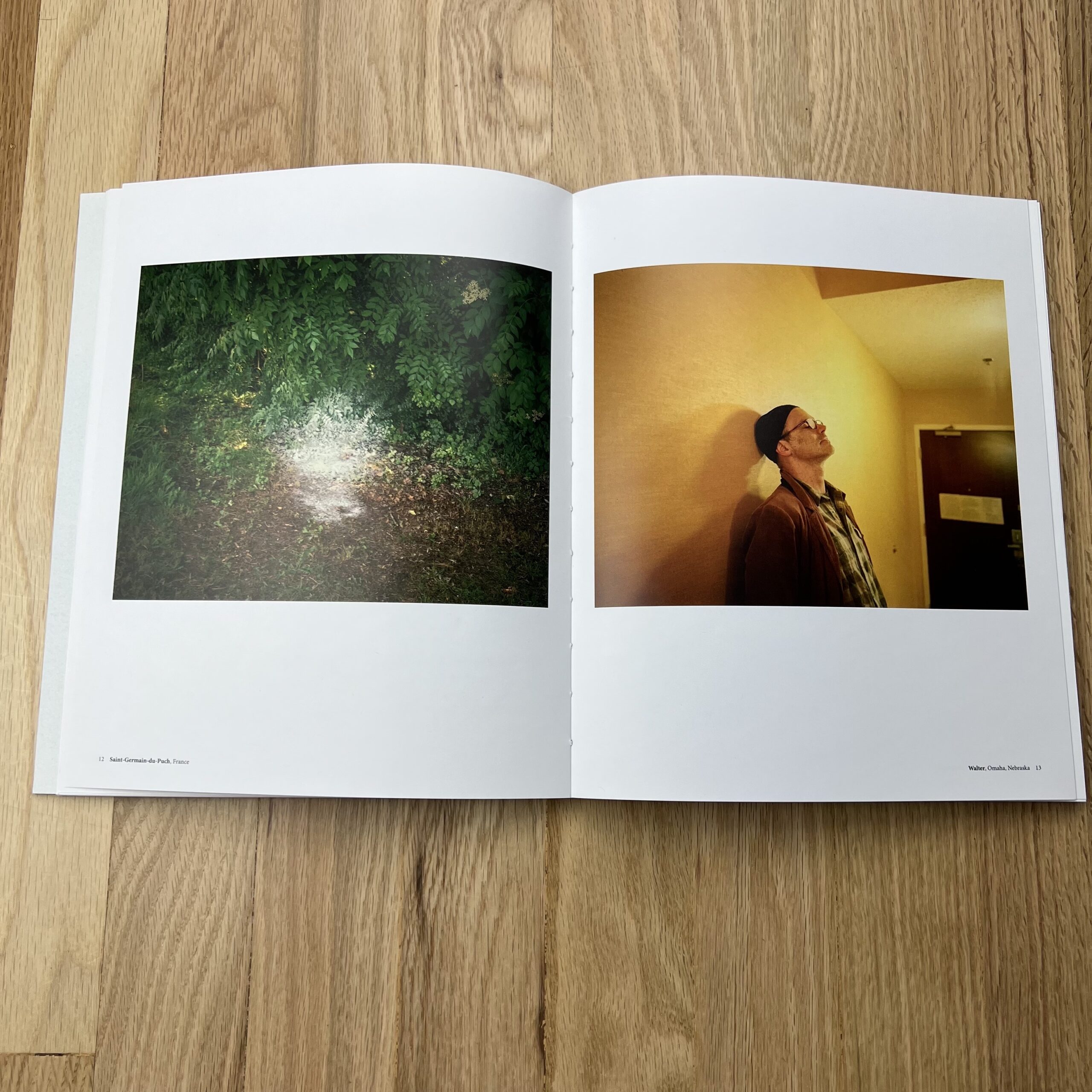
The Art of the Personal Project is a crucial element to let potential buyers see how you think creatively on your own. I am drawn to personal projects that have an interesting vision or that show something I have never seen before. In this thread, I’ll include a link to each personal project with the artist statement so you can see more of the project. Please note: This thread is not affiliated with any company; I’m just featuring projects that I find. Please DO NOT send me your work. I do not take submissions.
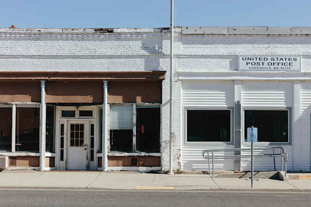
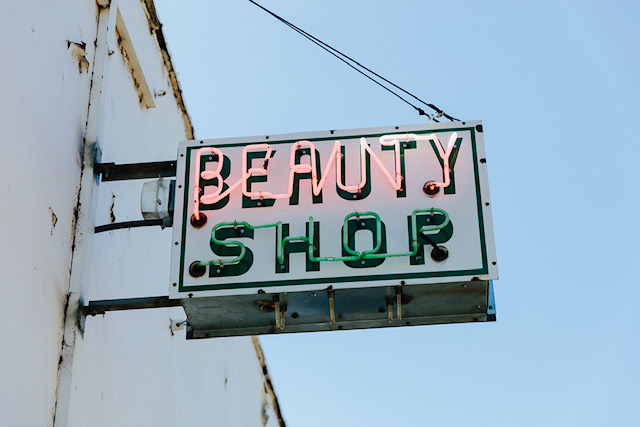
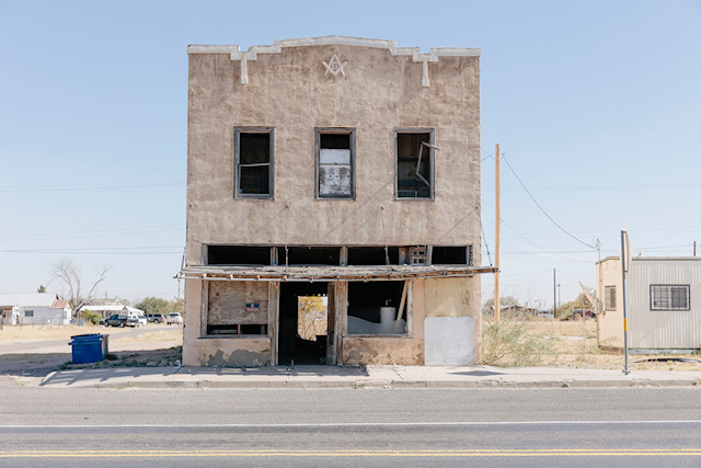
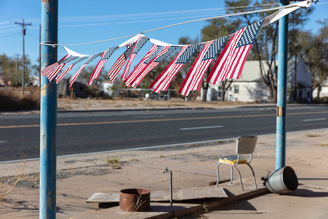
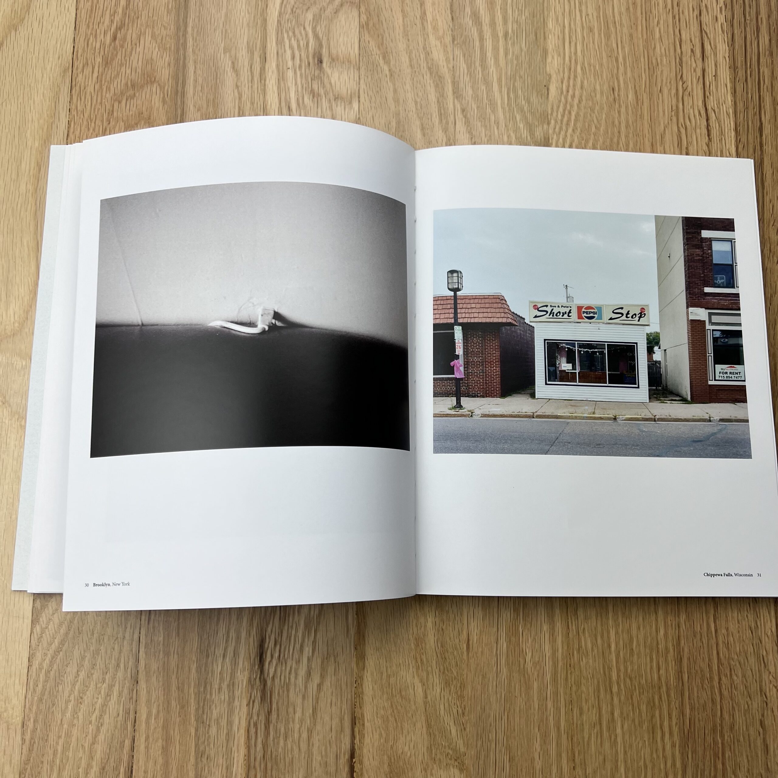
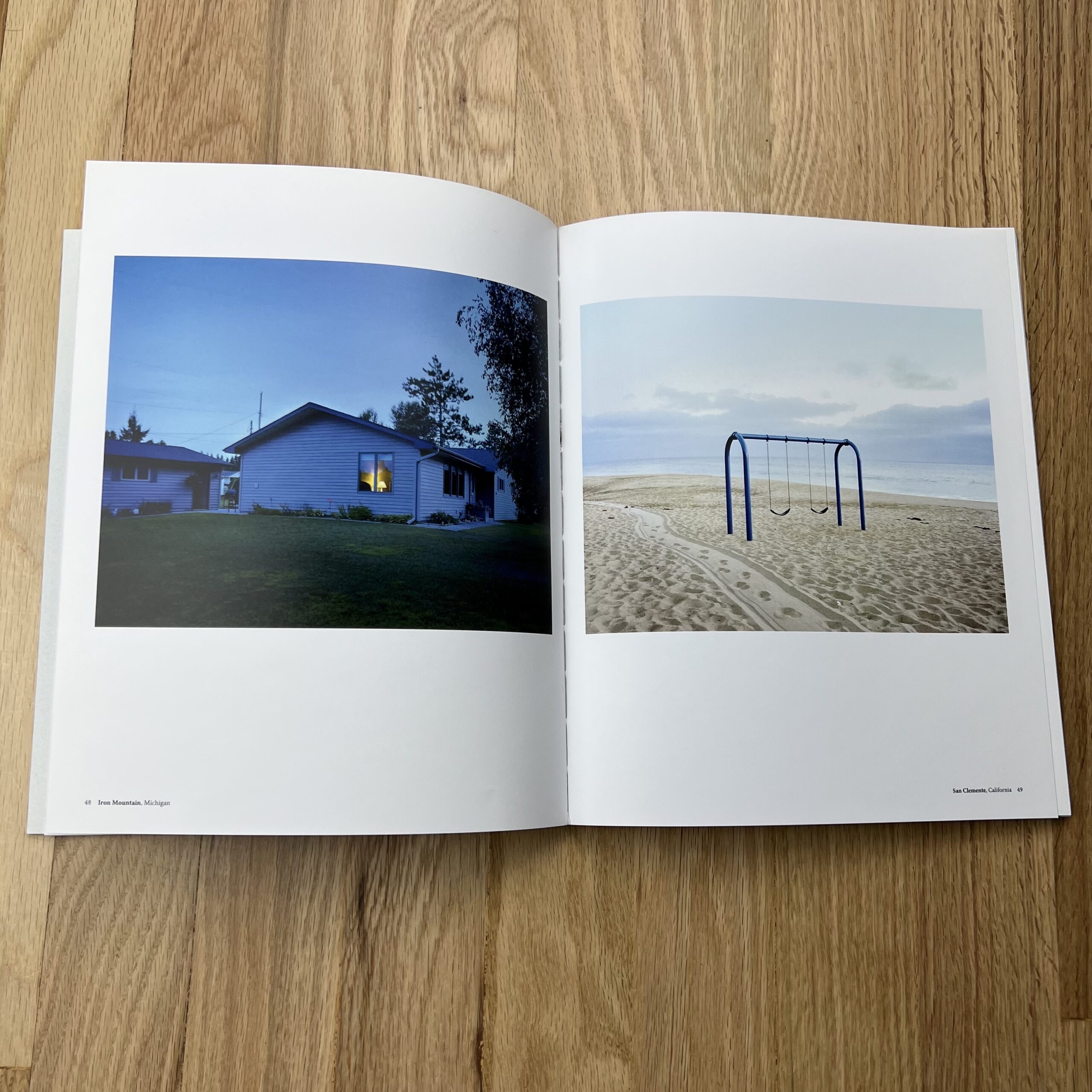
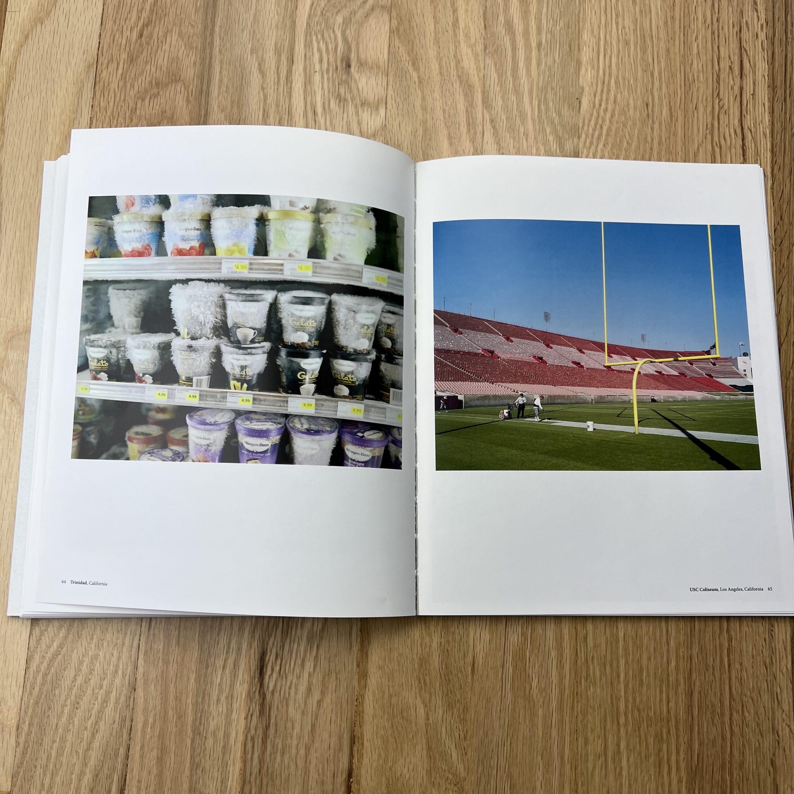
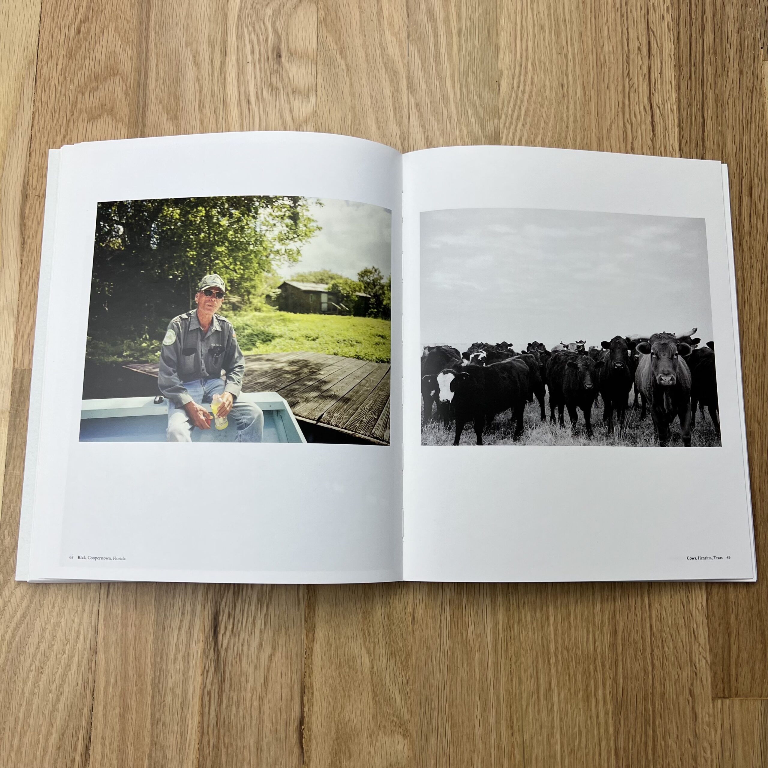
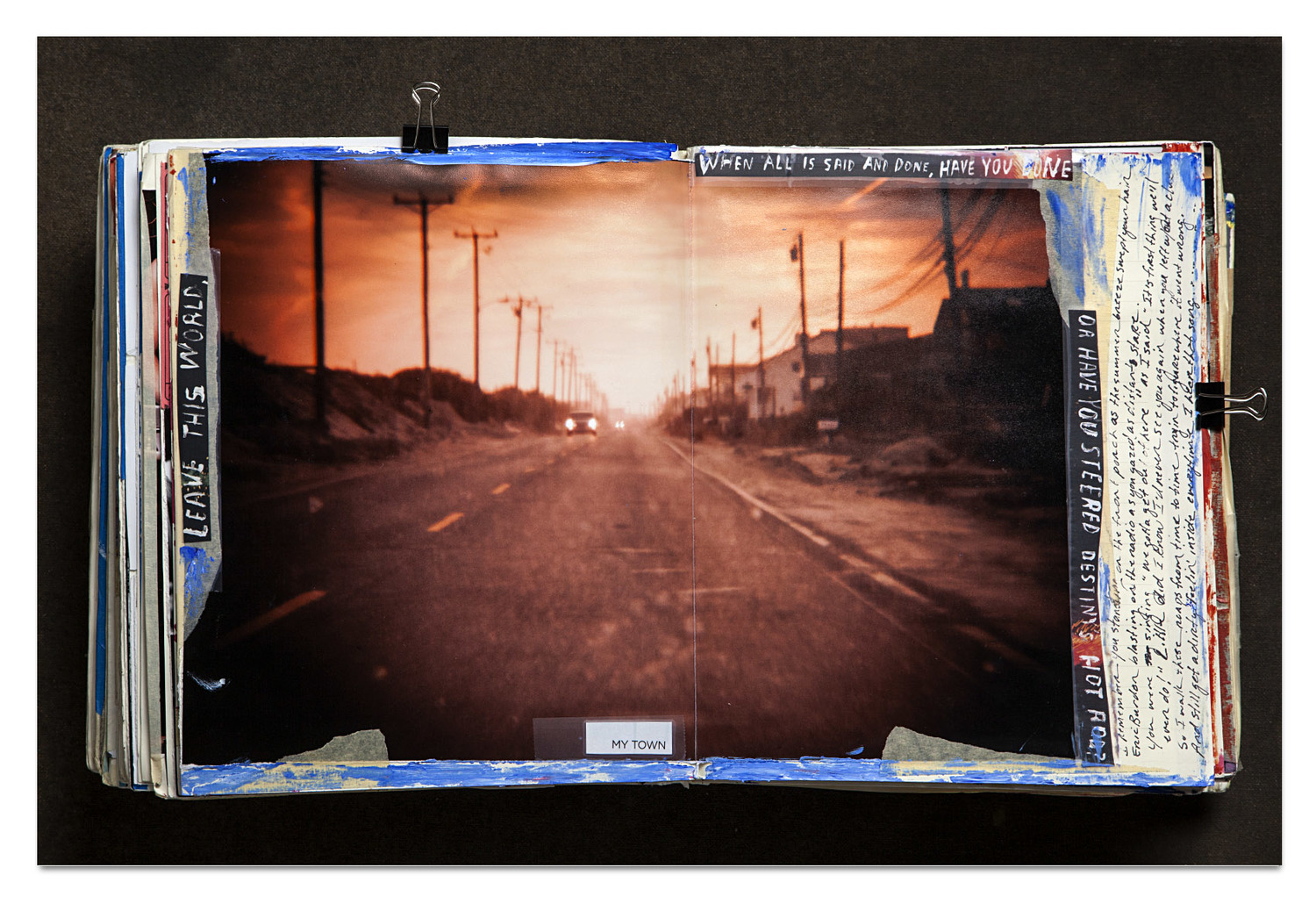
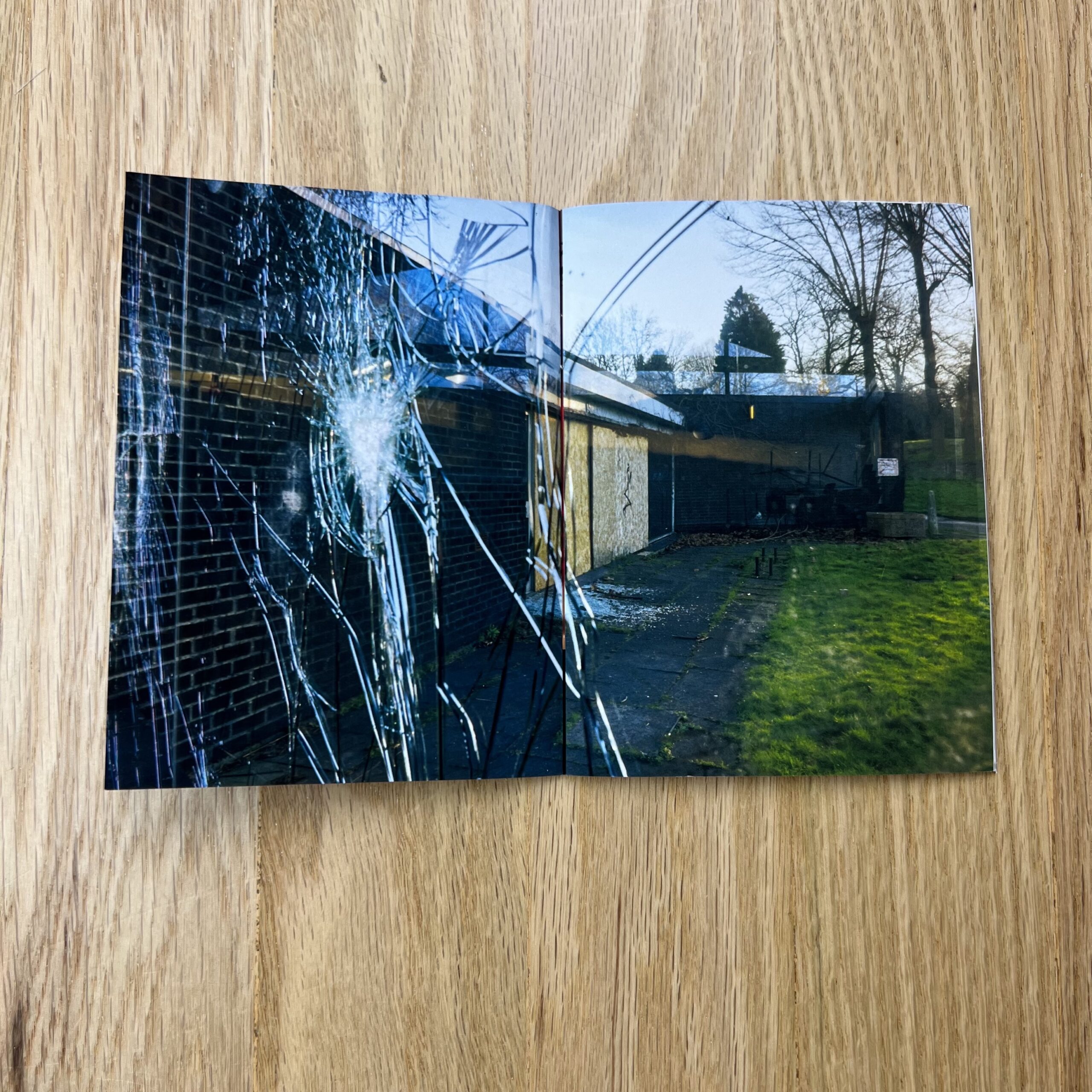
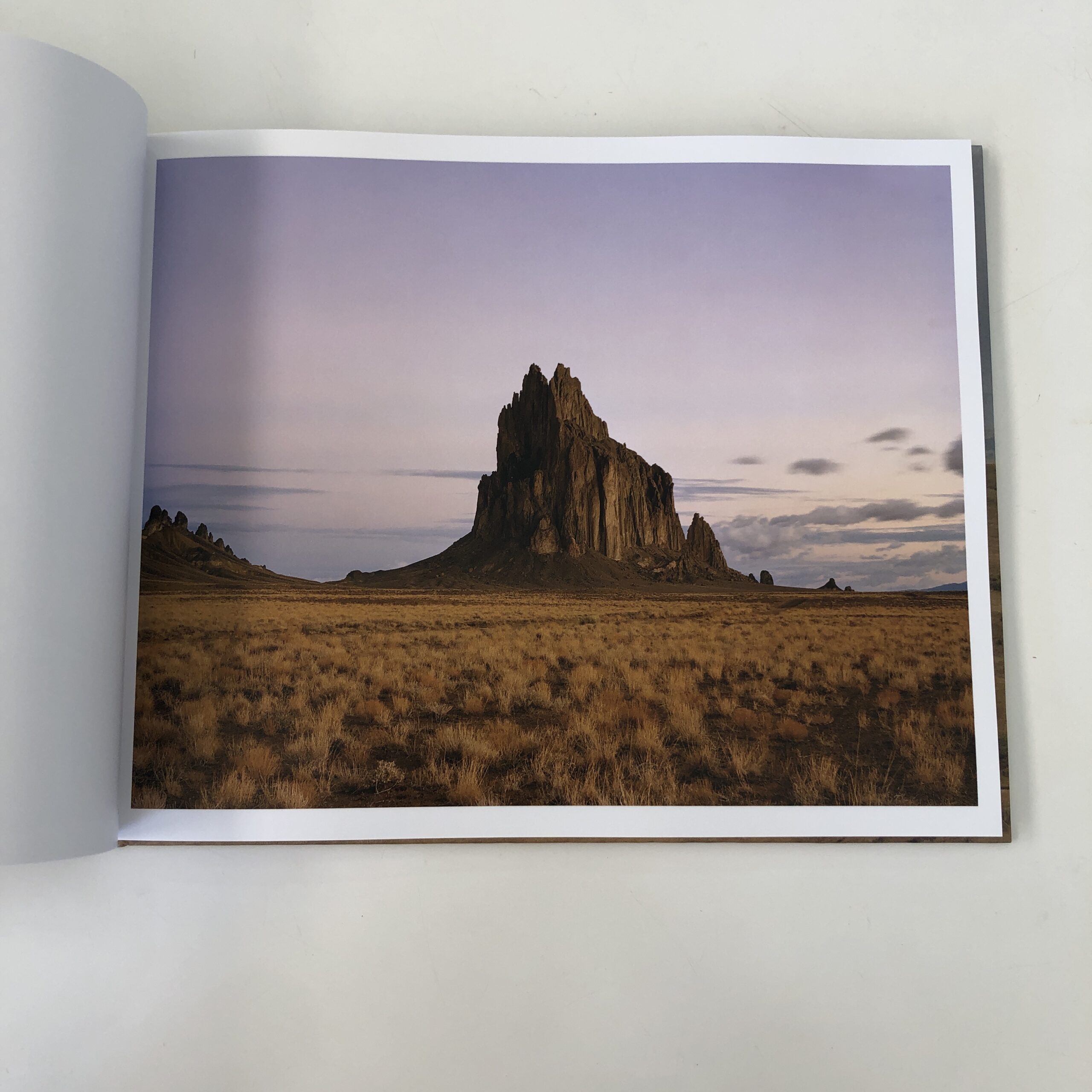
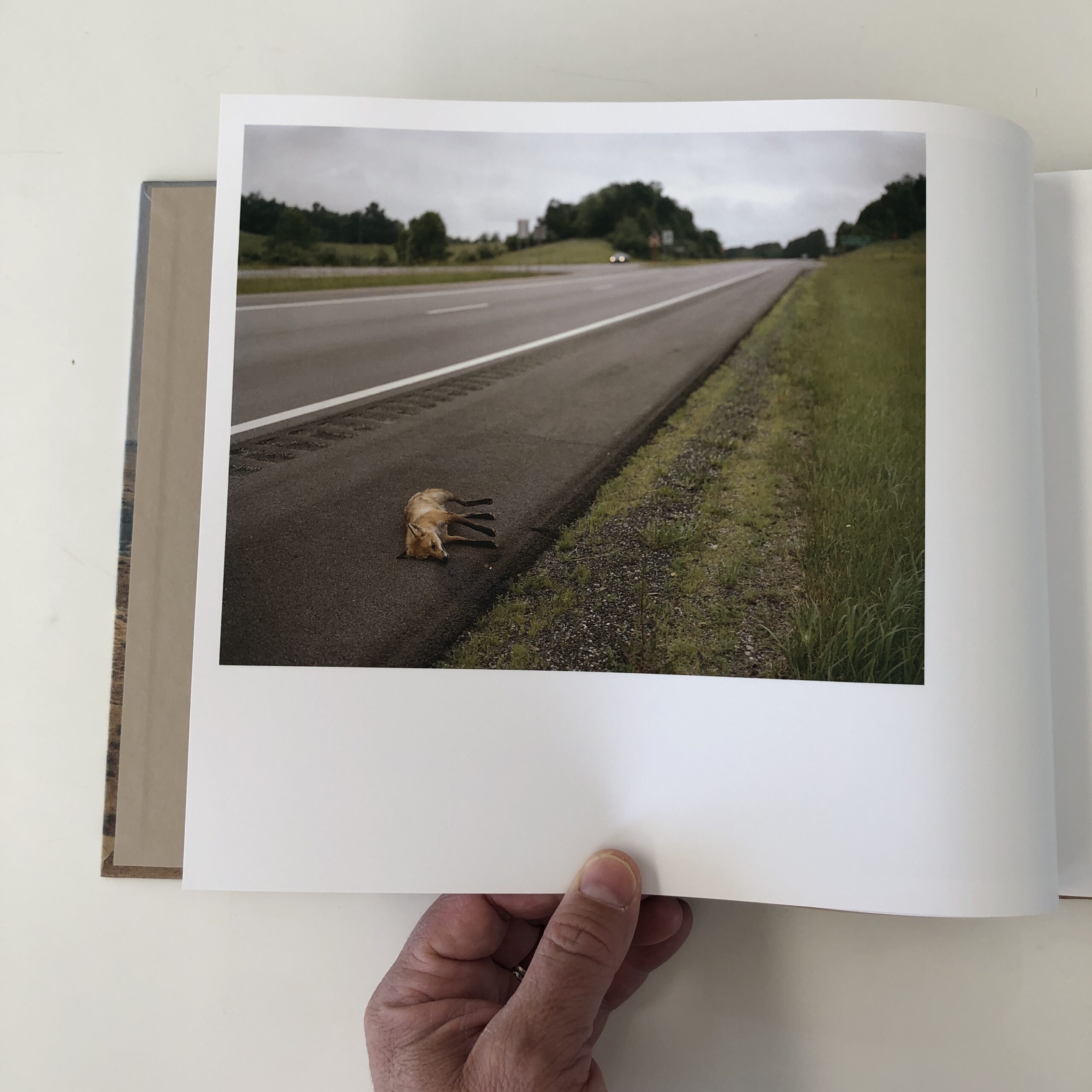
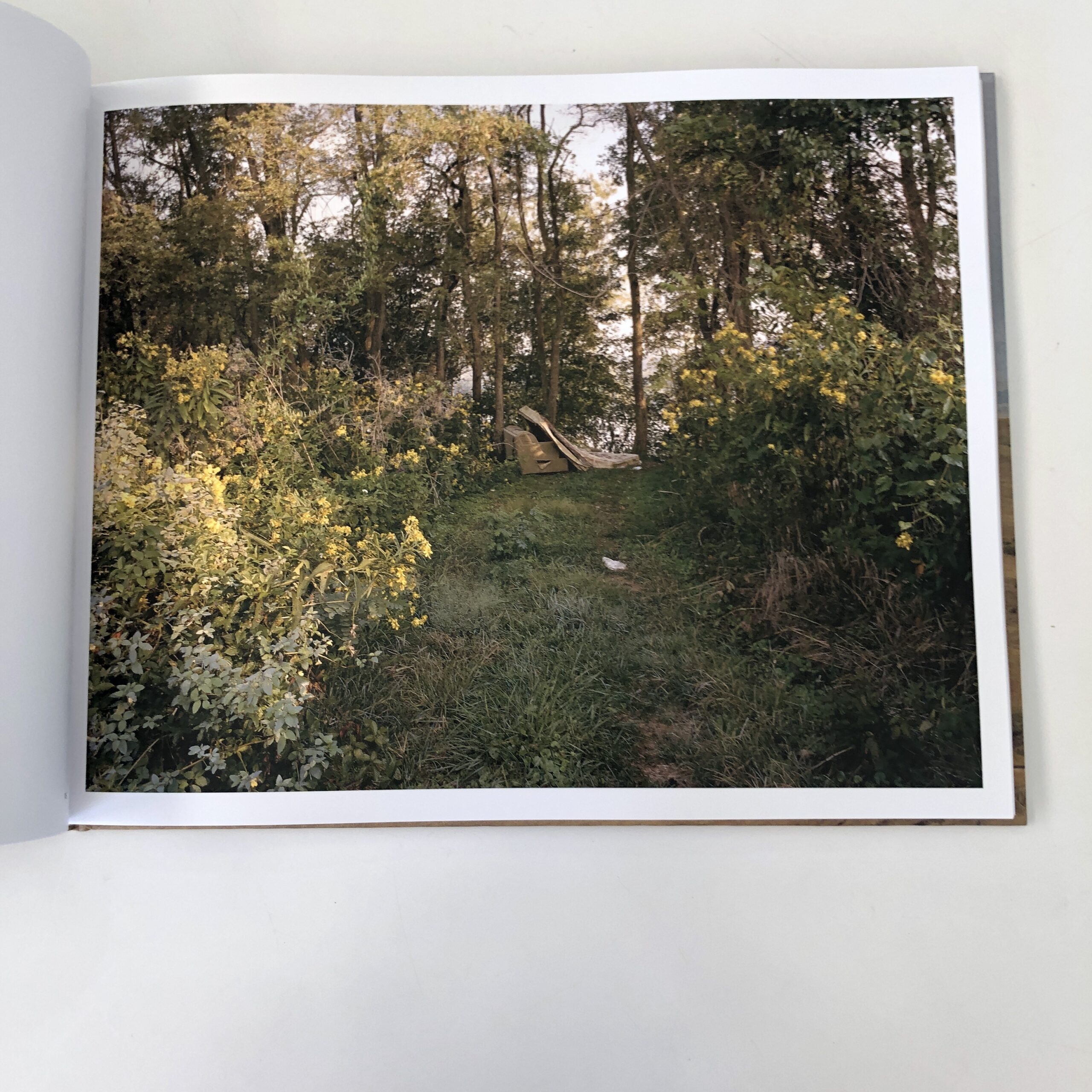
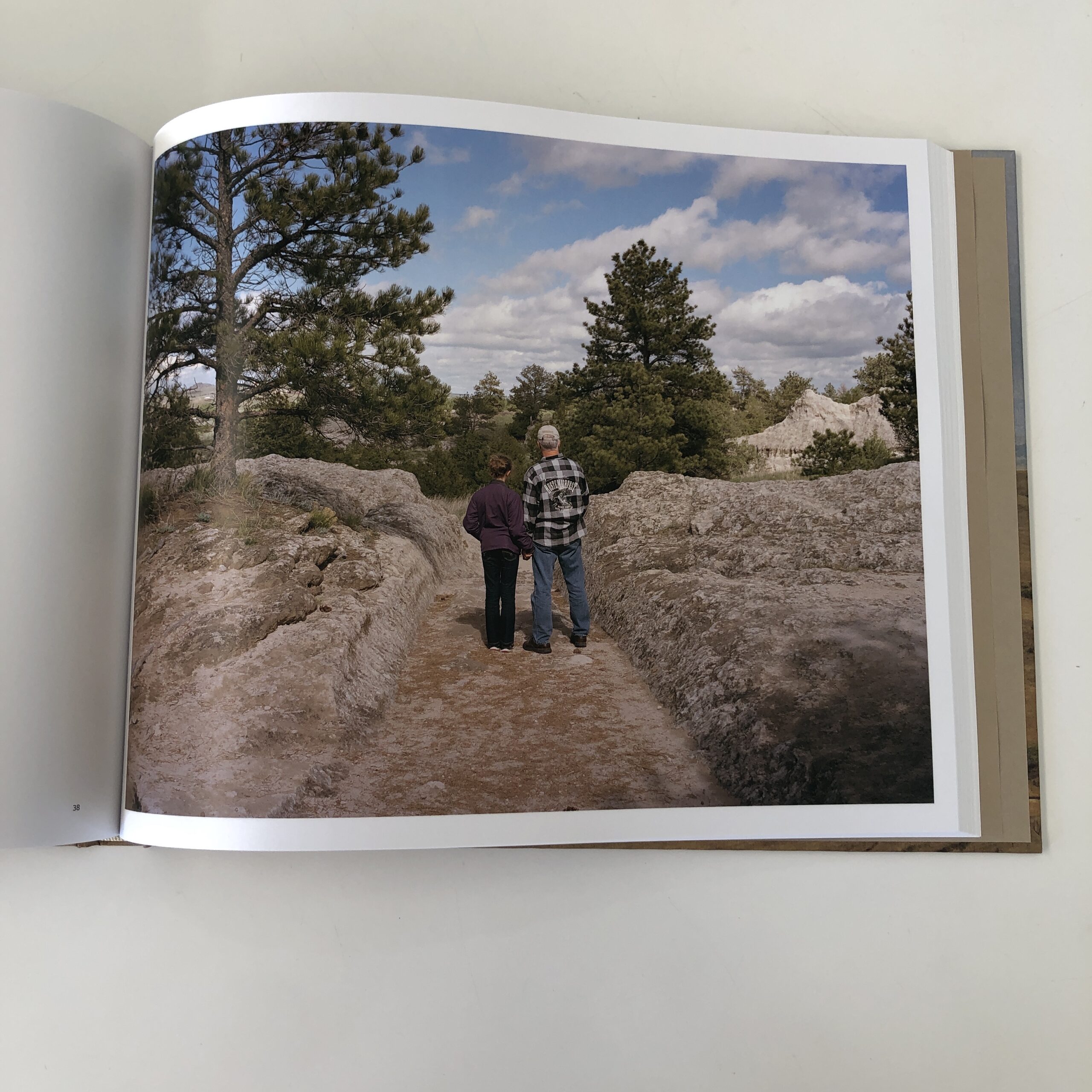
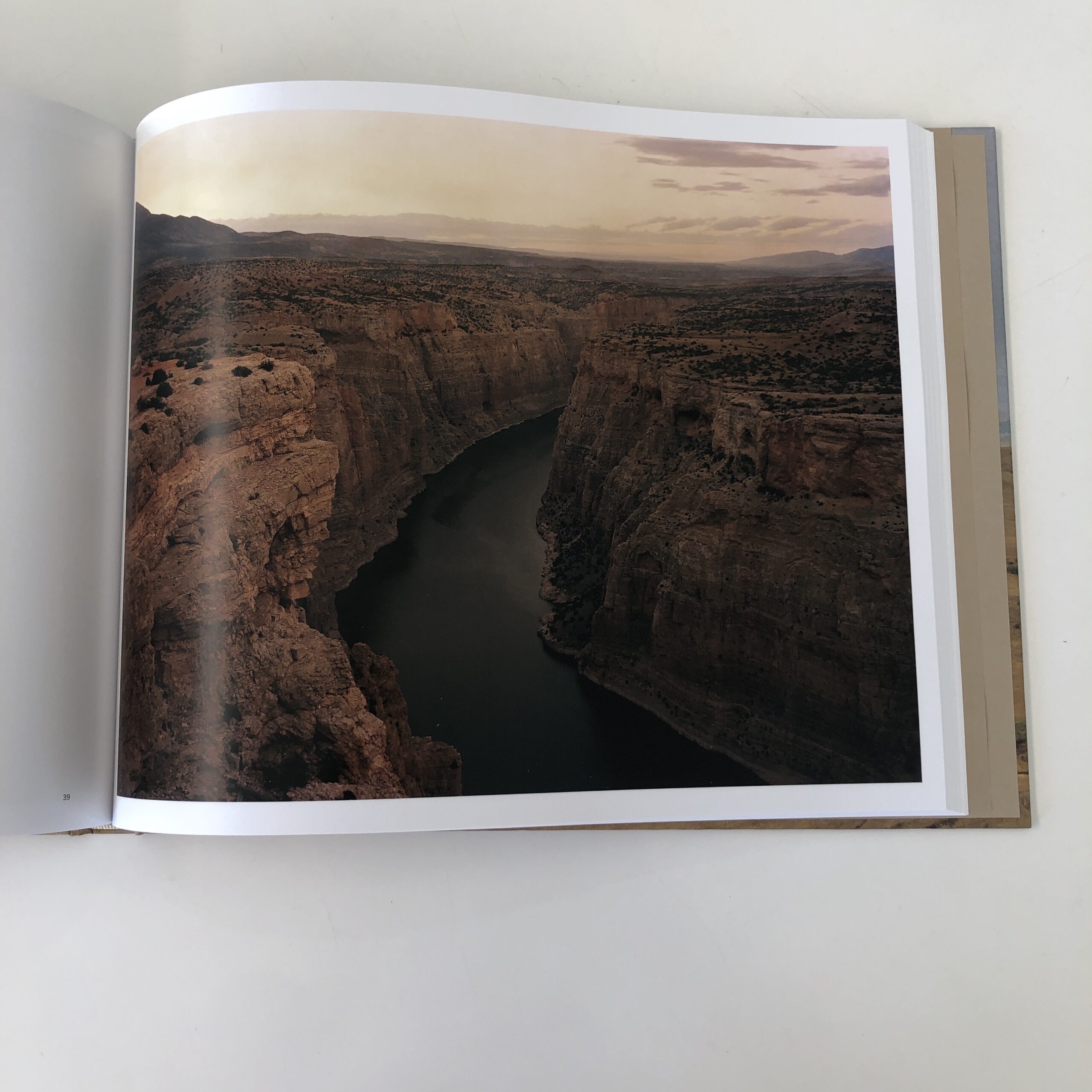
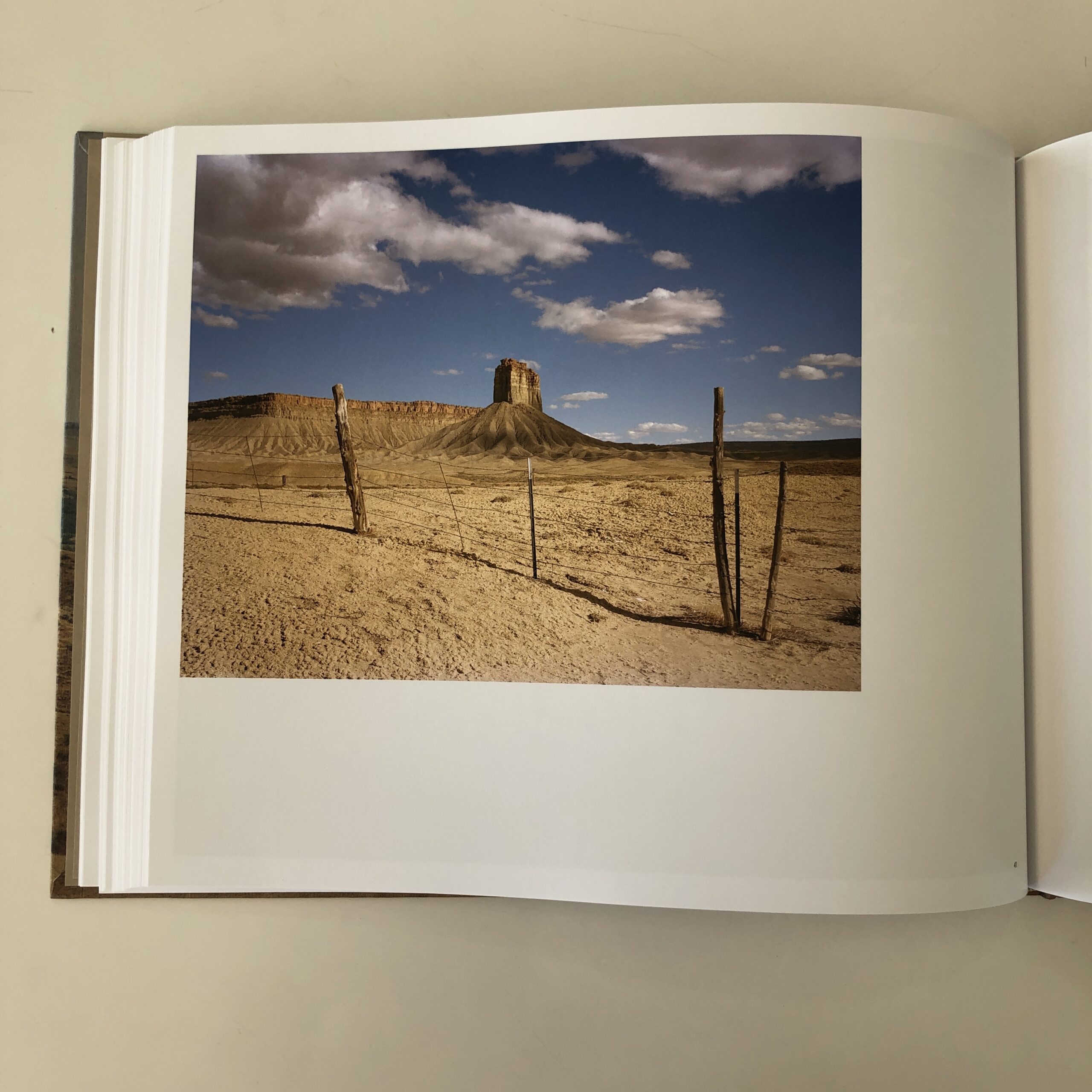
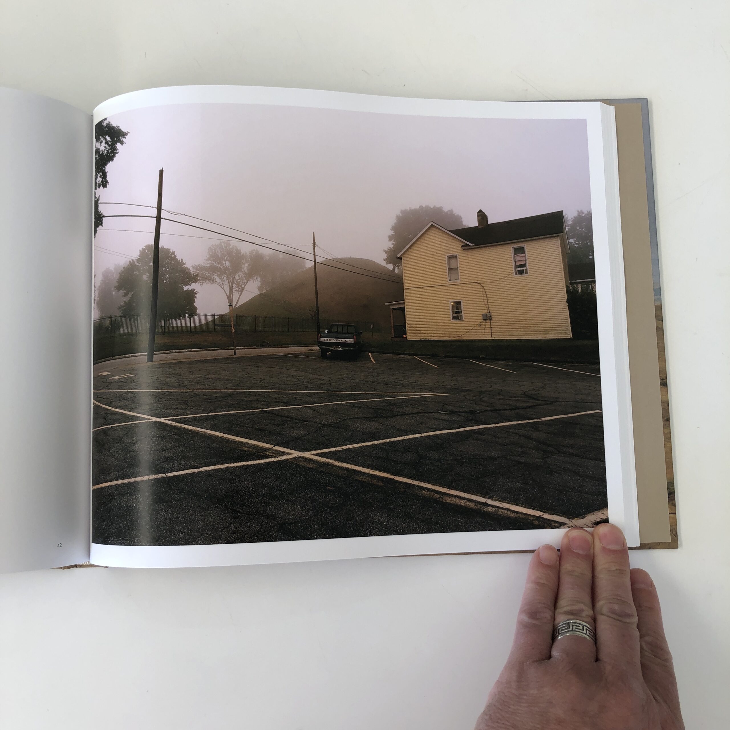
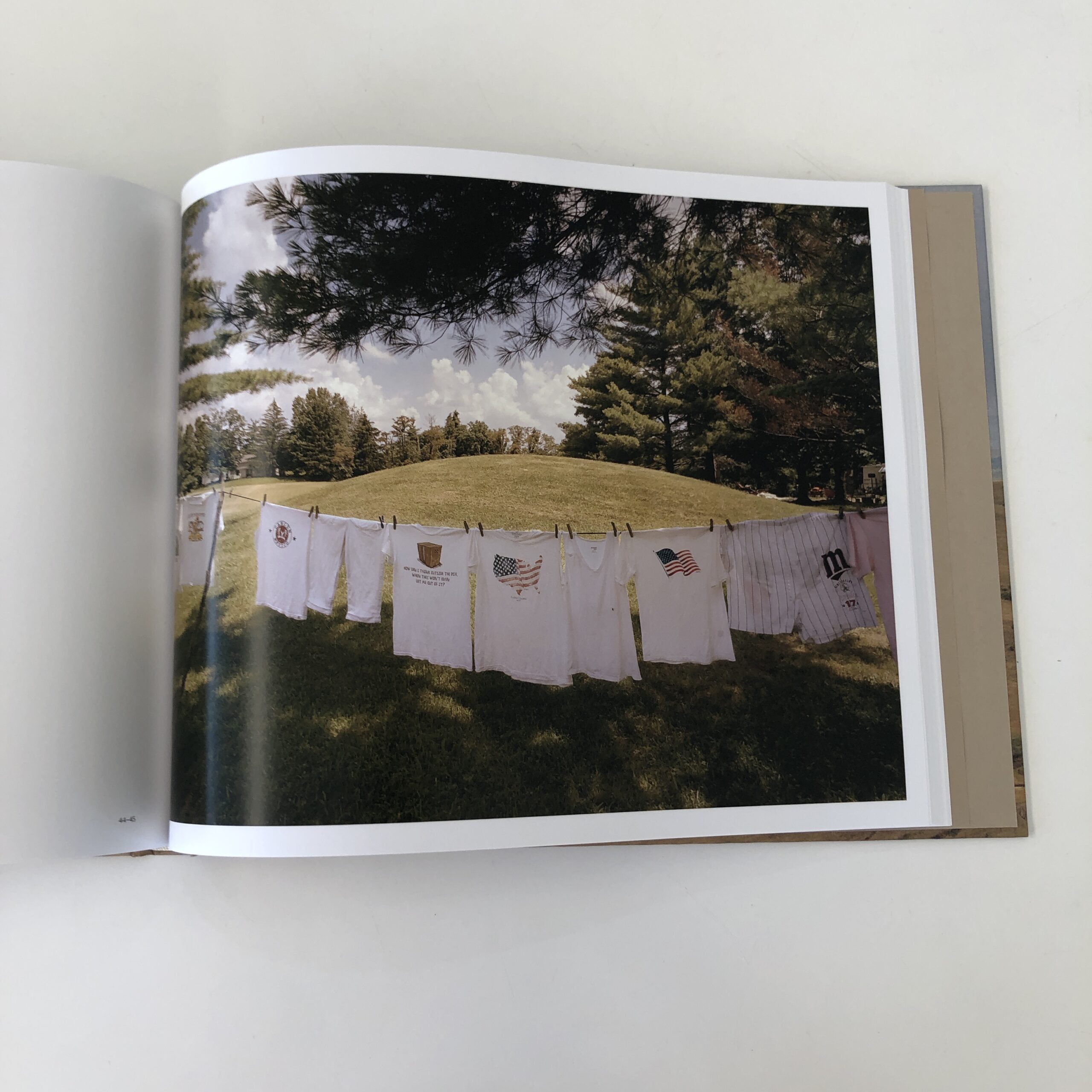
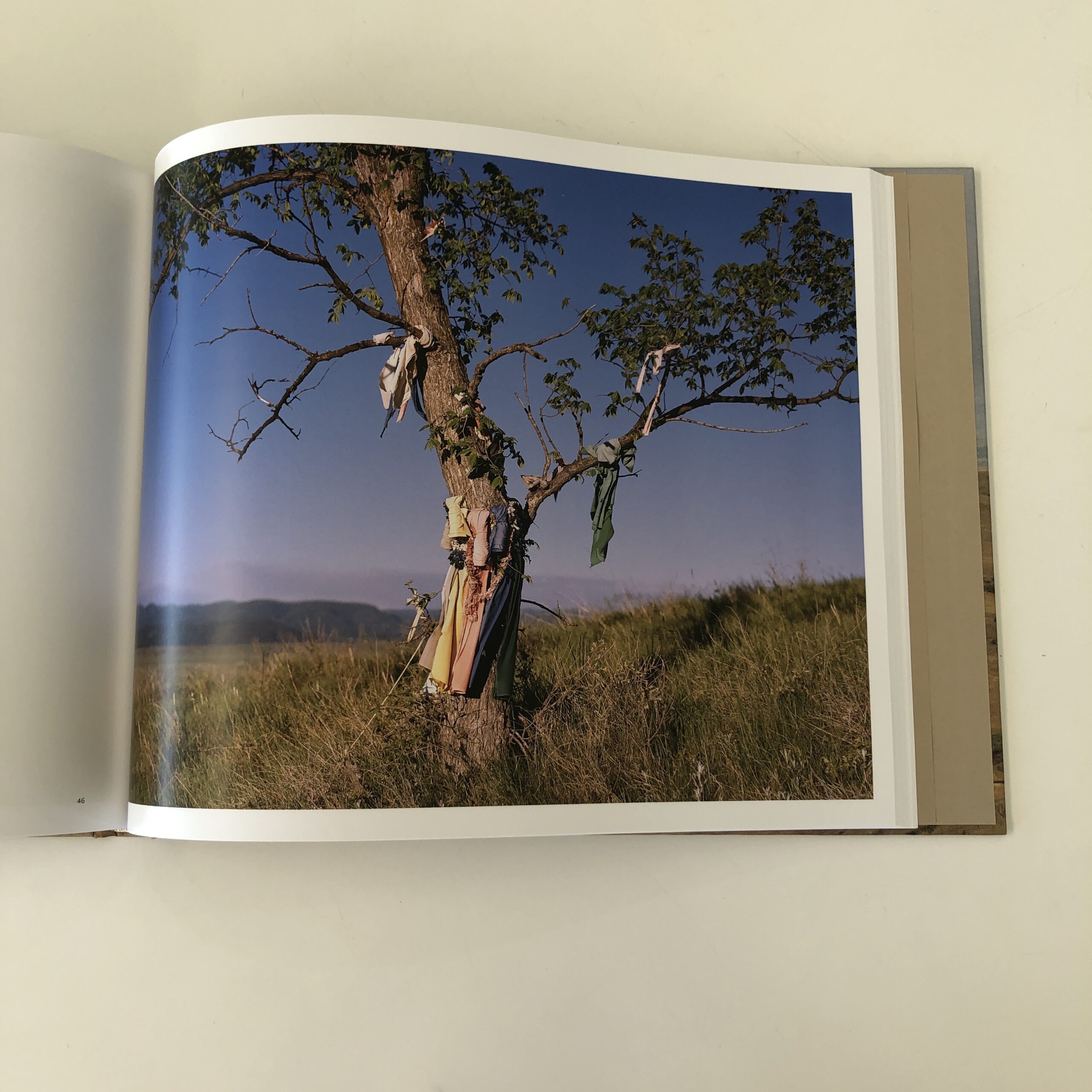
For the last 25 years I’ve been taking extensive road trips across the American west, searching for desolate locations for my landscape photography work. Most often on these trips I try to avoid driving on major highways and instead choose the smaller, county roads that crisscross the country. As a result of this slower, off-the-beaten-path approach to road travel, I started to become curious about the towns, street corners, buildings and farms that occupy so much of rural America.
After Trump won in 2016, it felt like many of the communities I was passing through started expressing the MAGA ethos in ways that I never could truly understand or grasp. And the visuals relating to American patriotism suddenly seemed politically charged and deeply partisan. But there was also the timeless and sometimes quirky small-town iconography that often caught my eye. I wanted to see if there was a way to combine these different elements into a cohesive body of work that expressed my own interpretation of today’s small-town America. I was also deeply inspired by Walker Evans, Stephen Shore, and many others.
When I started the series in late 2020, the working title was simply ‘Main Street’, but as the project neared completion I asked my gallerist Jenn Singer what else she thought might work – was there a more effective way of describing what the images conveyed? We agreed on ‘State of Main’, which I think more accurately describes the work. In many ways the series is an expression of the American dream – for opportunity, independence, and patriotism. But it’s also a study of hard times, abandoned homes and shuttered stores. It’s these dualities that interest me the most, and how in the end, it’s nature that almost always seems to win.
Paul Edmondson is an award-winning photographer best known for his minimalist landscapes of the American West, often in the places where humans and the natural environment intersect. He lives with his family in Seattle, Washington.
APE contributor Suzanne Sease currently works as a consultant for photographers and illustrators around the world. She has been involved in the photography and illustration industry since the mid 80s. After establishing the art-buying department at The Martin Agency, then working for Kaplan-Thaler, Capital One, Best Buy and numerous smaller agencies and companies, she decided to be a consultant in 1999. She has a Twitter feed with helpful marketing information because she believes that marketing should be driven by brand and not by specialty. Follow her at @SuzanneSease. Instagram
Success is more than a matter of your talent. It’s also a matter of doing a better job presenting it. And that is what I do with decades of agency and in-house experience.
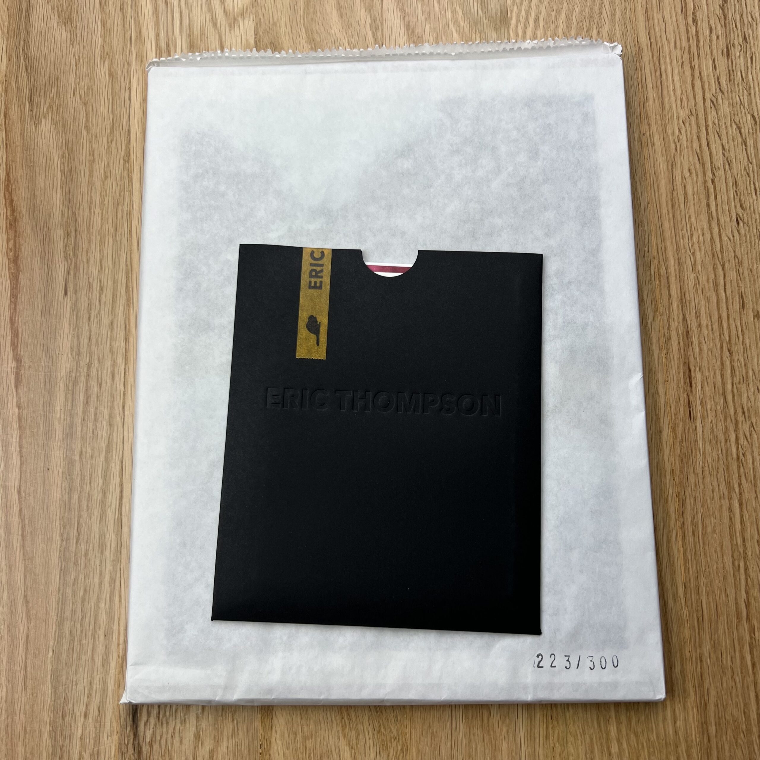
Who printed it?
The folded poster promo and packaging was printed by Paper Chase Press in Los Angeles, and the book was printed by Small Editions in Brooklyn, NY. Custom printed washi tape by Continental Tape in Deer Park, NY.
Who designed it?
They were both designed by me.
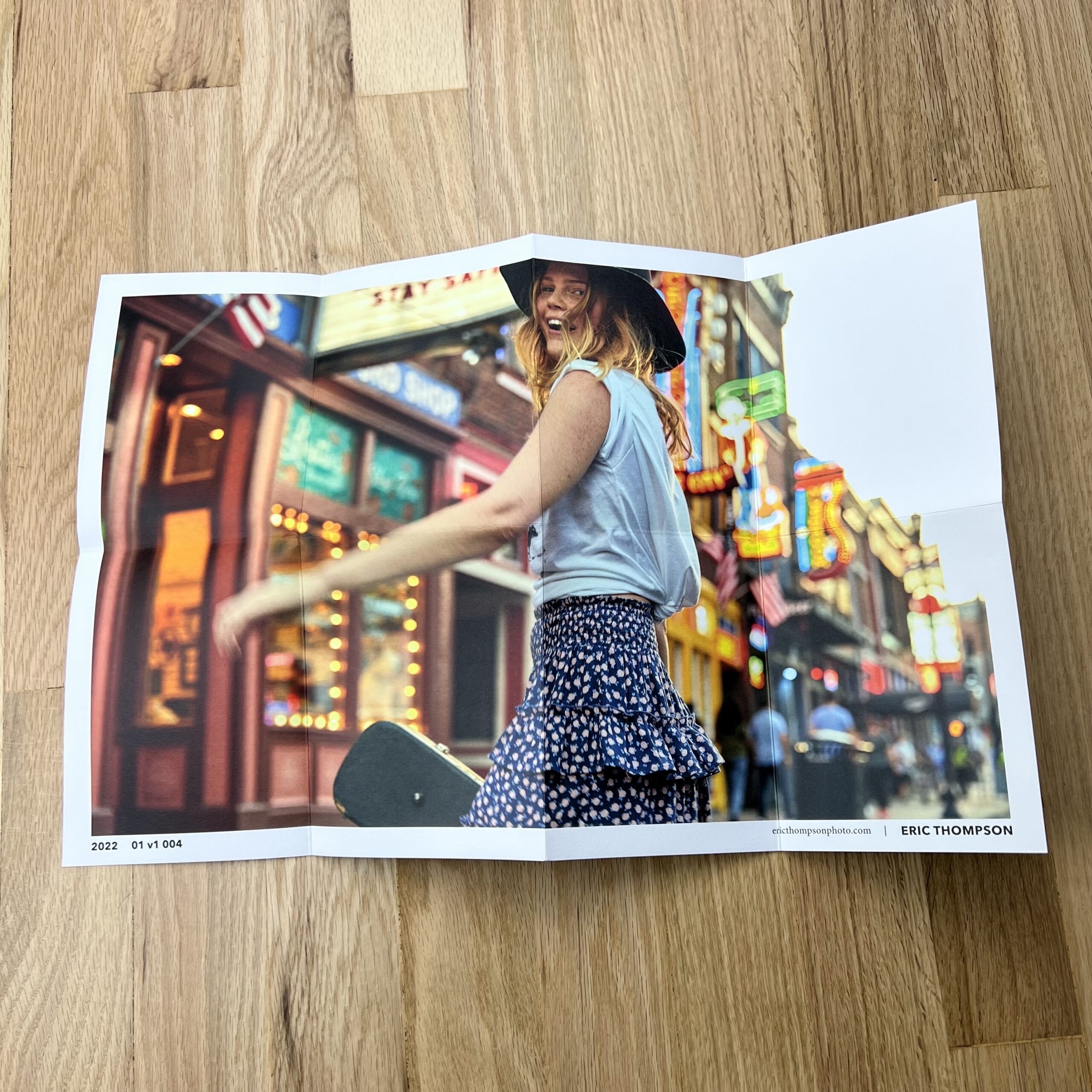
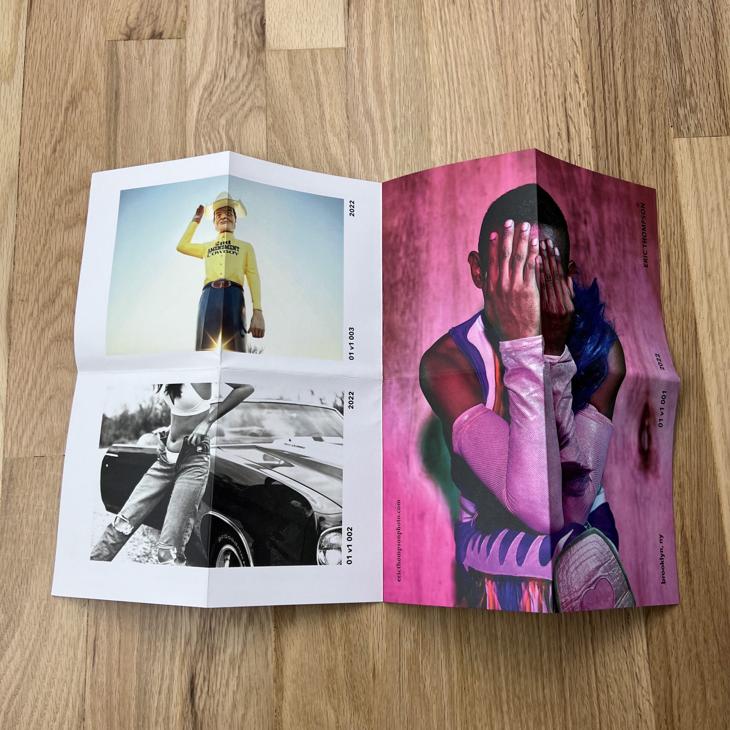
Tell me about the images.
The images in the folded poster are from a few projects, some personal, and some commercial – They are intended to portray a glimpse into what I do as a photographer, for hire or otherwise. They were chosen to give a good sense of color, energy, and variety in subject matter that I feel is important to represent in my work.
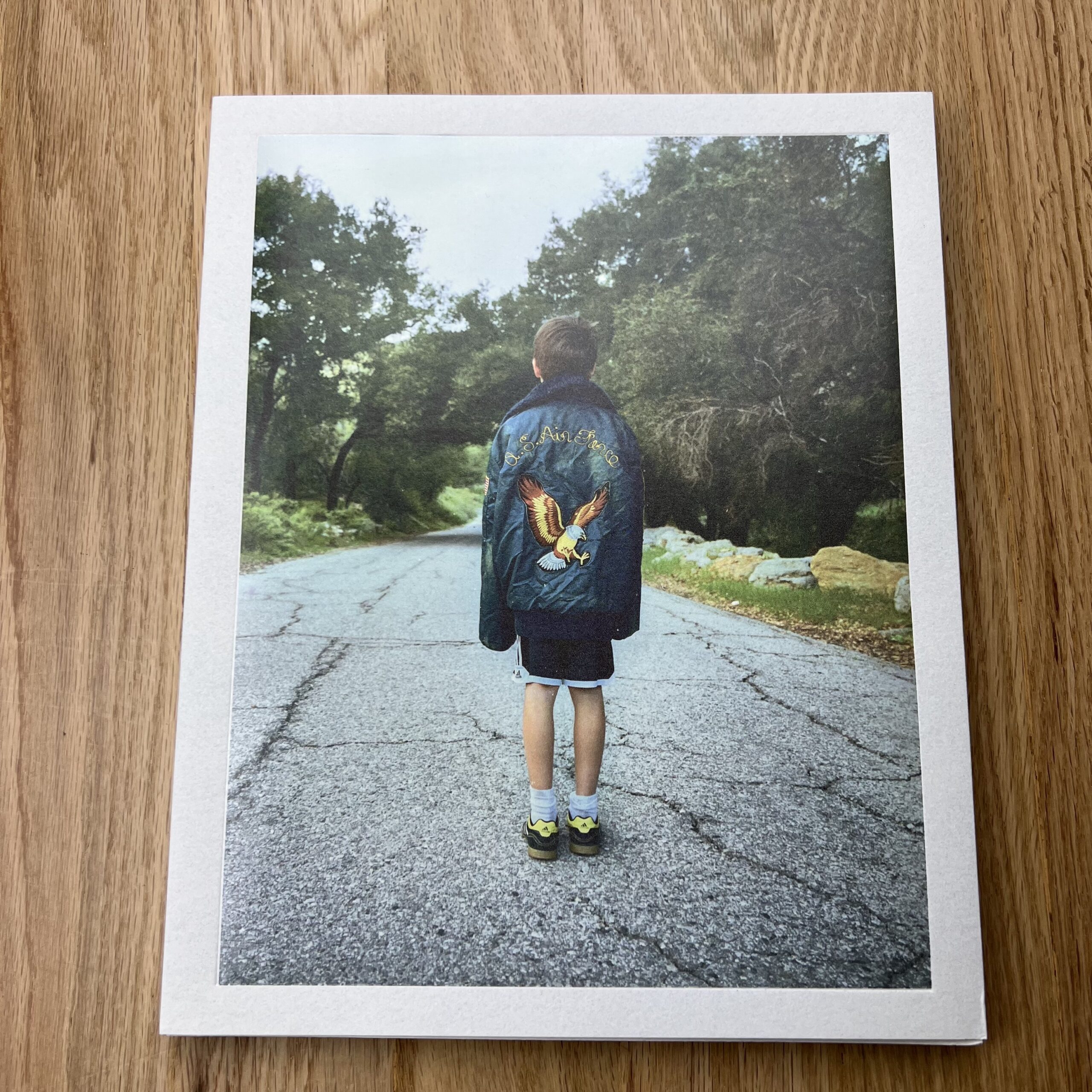
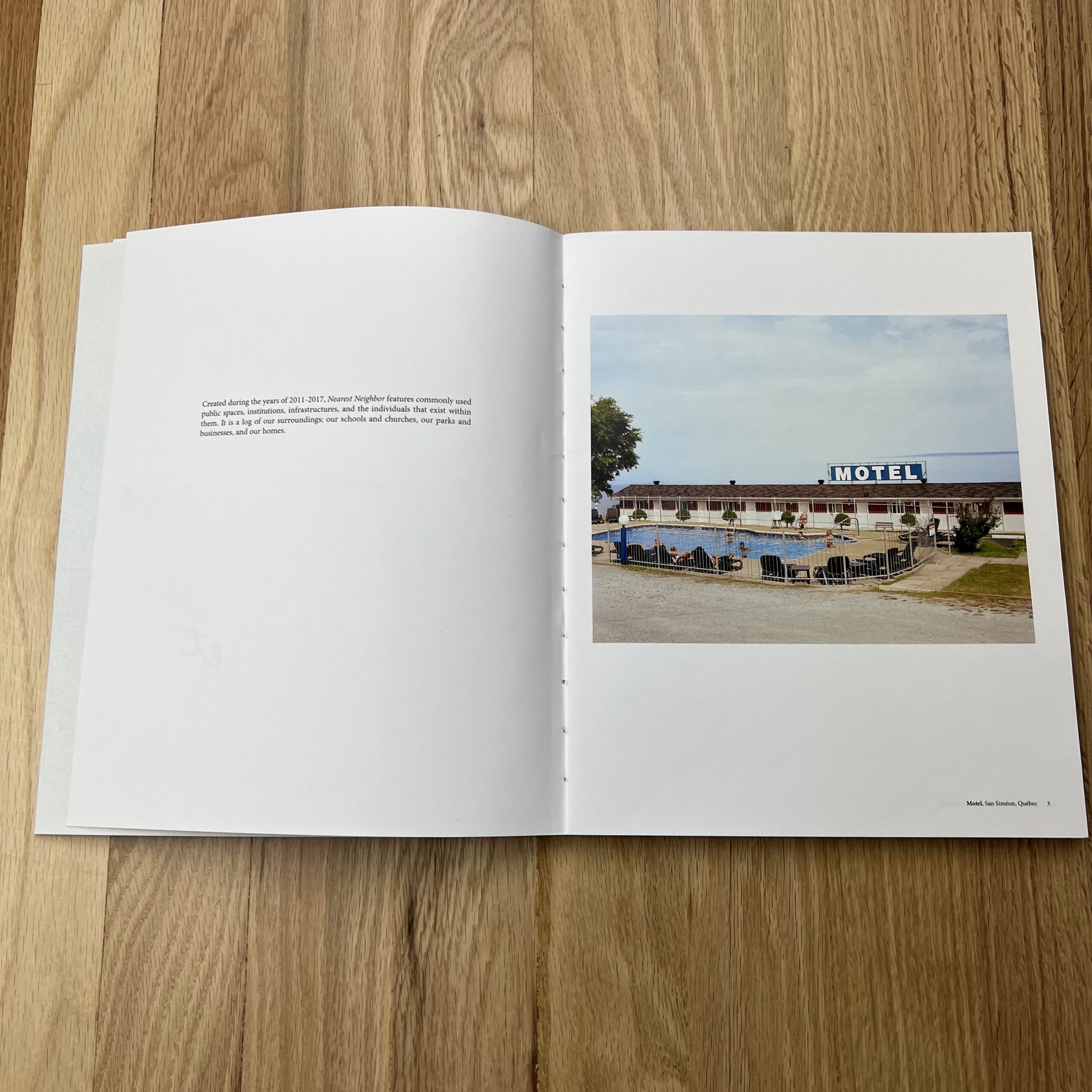
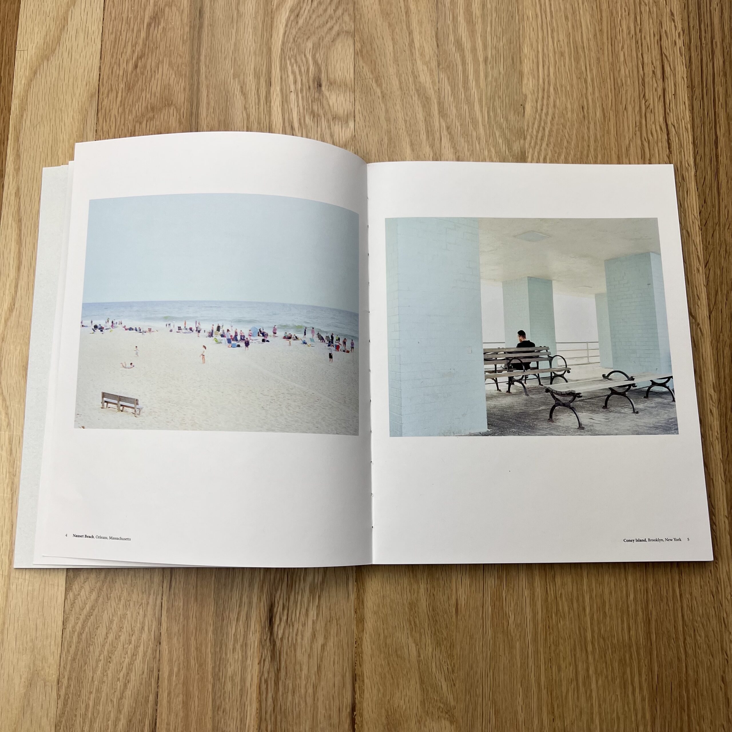
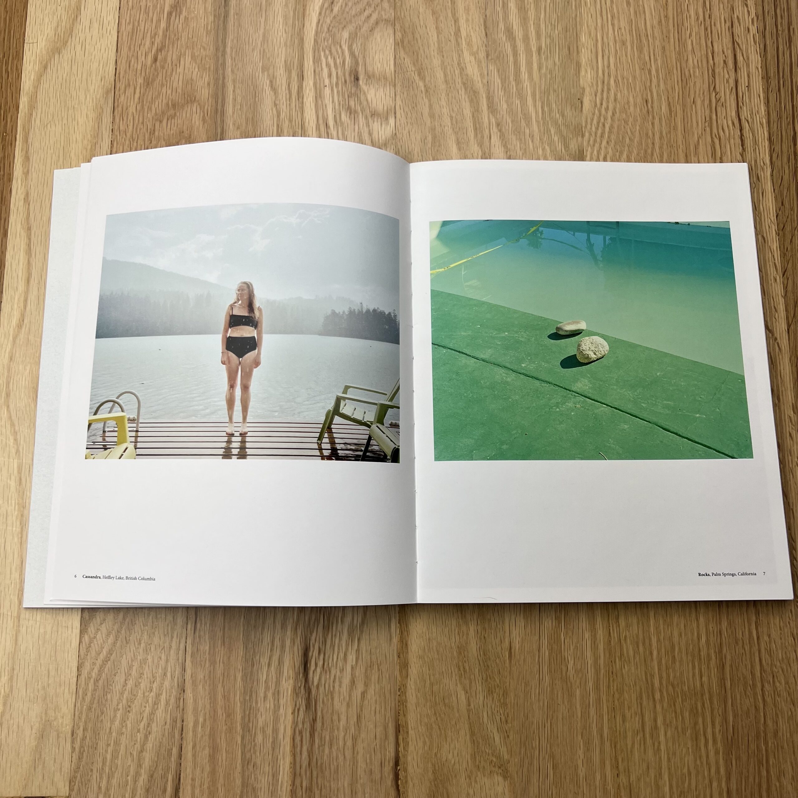
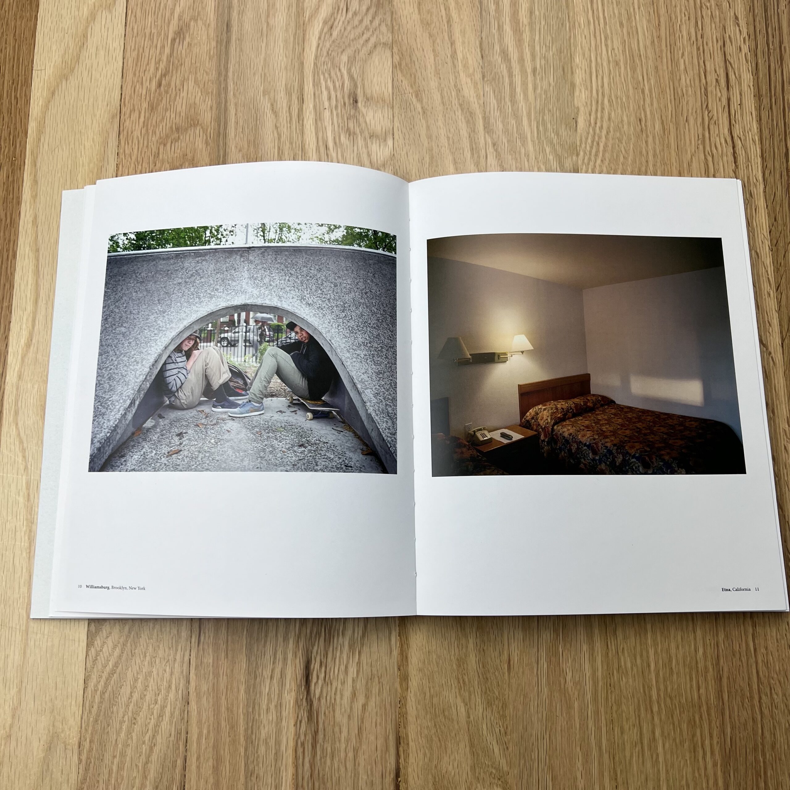
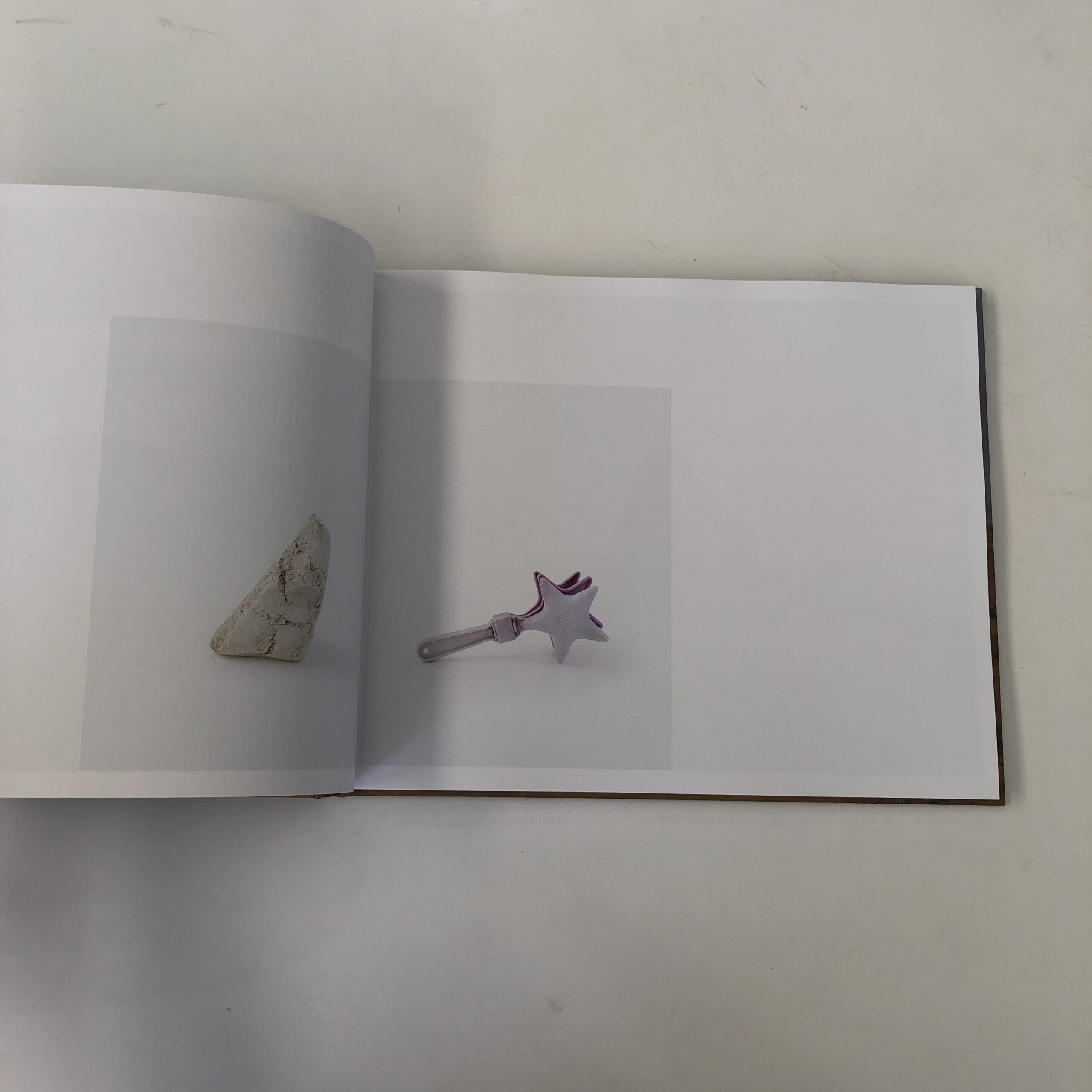
The photobook [Nearest Neighbor] is entirely personal, released as a book and as a gallery show as well. The work in it speaks most honestly to my personal style and viewpoint, and is very close to my heart. It was a tough project to take on from the ground up – learning how to publish and lay it out on my own while trying to retain the integrity and quality of something more bespoke and custom was a huge challenge. It features photos taken around the world while travelling for work mostly, using either a 55mm Voigtlander Bessa III 667W or an 80mm Fuji GF670, which I scanned myself on a Nikon Coolscan 8000/9000. As a project that spanned several years, my gear either changed or broke down, but 6×7 film became the only format I used for quite some time. The photos are meant to explore other peoples spaces + environments, how they are inhabited, shaped, and how often they seem so strange and peculiar from a foreign persons’ eye.
How many did you make?
For the folded posters, I believe it was 150, and for Nearest Neighbor, an edition of 300.
How many times a year do you send out promos?
This is the first set that I have sent out, and I have just completed a printed portfolio with an edition of 50 for 2022. I plan on doing one photobook/lookbook style portfolio per year and two folded posters per year, with the intention of finding specific creatives and art producers to direct them towards as opposed to casting a wide net.
Bookmaking and designing materials [when it comes to my work] has become something I really enjoy, I currently have several books that I would love to make – they end up coming from the strangest places, I kind of feel my way through them. It’s the one thing aside from shooting that continually gives me joy, it’s a bit narcissistic but I love looking through my own photos and creating cohesive collections. I have a deep relationship with them and the stories they evoke in me, so I feel like they’re better in a printed form, out in the world rather than on a hard drive.
Do you think printed promos are effective for marketing your work?
We will see! I have found that having a variety of printed material makes it more likely for something to land in the hands of creatives, when they may not want to take a full book, they are likely to take a small folded poster. My personal photobook has been effective, especially seeing as i’ve done a piss poor job of getting it out there. It has gotten me some work over the years, and for me is really great way to spark a conversation on why I love photography – also something I can speak to at length very easily.
(Season 6, the last of the original series, before it begat 3 spinoffs.)
Courtesy of Rotten Tomatoes
What brought me to this moment, (having now invested countless hours in a televised story,) is a classic case of Capitalism, straight out of one of my Economics textbooks at Duke University, back in the day.
They even have a name for it: the drug-dealer model.
Give someone a free sample of a (potentially) addictive product, and you may have yourself a customer for life.
The tactic is so good, it even works on people who know the potential risk.
In my case, a few weeks ago, I realized a new season of “Outlander” had come and gone, which meant I could probably watch it with a free week of Starz, courtesy of Amazon Prime.
(The world knows no better Capitalist than Future-Emperor Jeffrey Bezos.)
Now, in admitting I like “Outlander,” I’m outing myself as a sucker for high-quality-production values, and solid acting, in an immersive, period show, featuring great-looking leads with cool accents.
OK.
You got me.
It’s true.
But even if you take out the period element, (I majored in History as well as Economics in college,) if a show is truly immersive, and does a deep-dive into a subculture that teaches me about the world, I’ll probably get hooked.
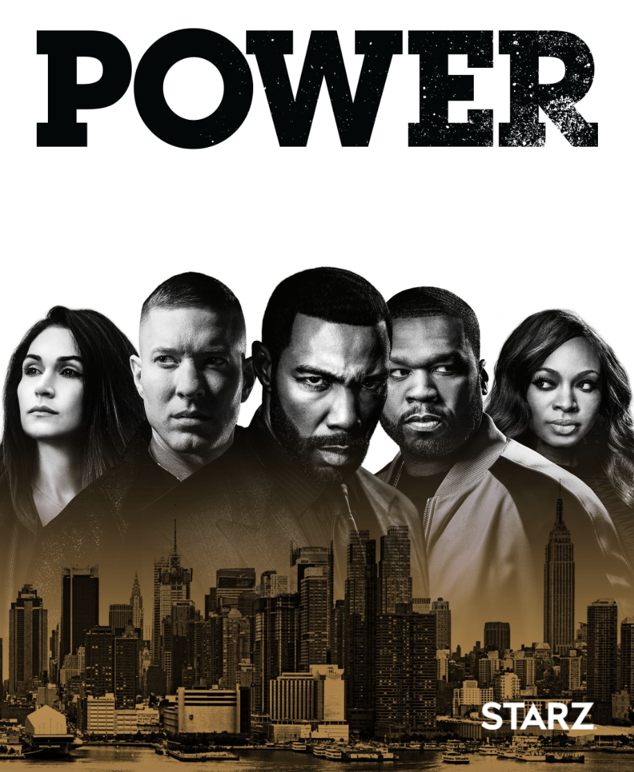
So after I finished “Outlander,” knowing full-well I might risk overstaying my free week, I jumped into “Power” through the backdoor.
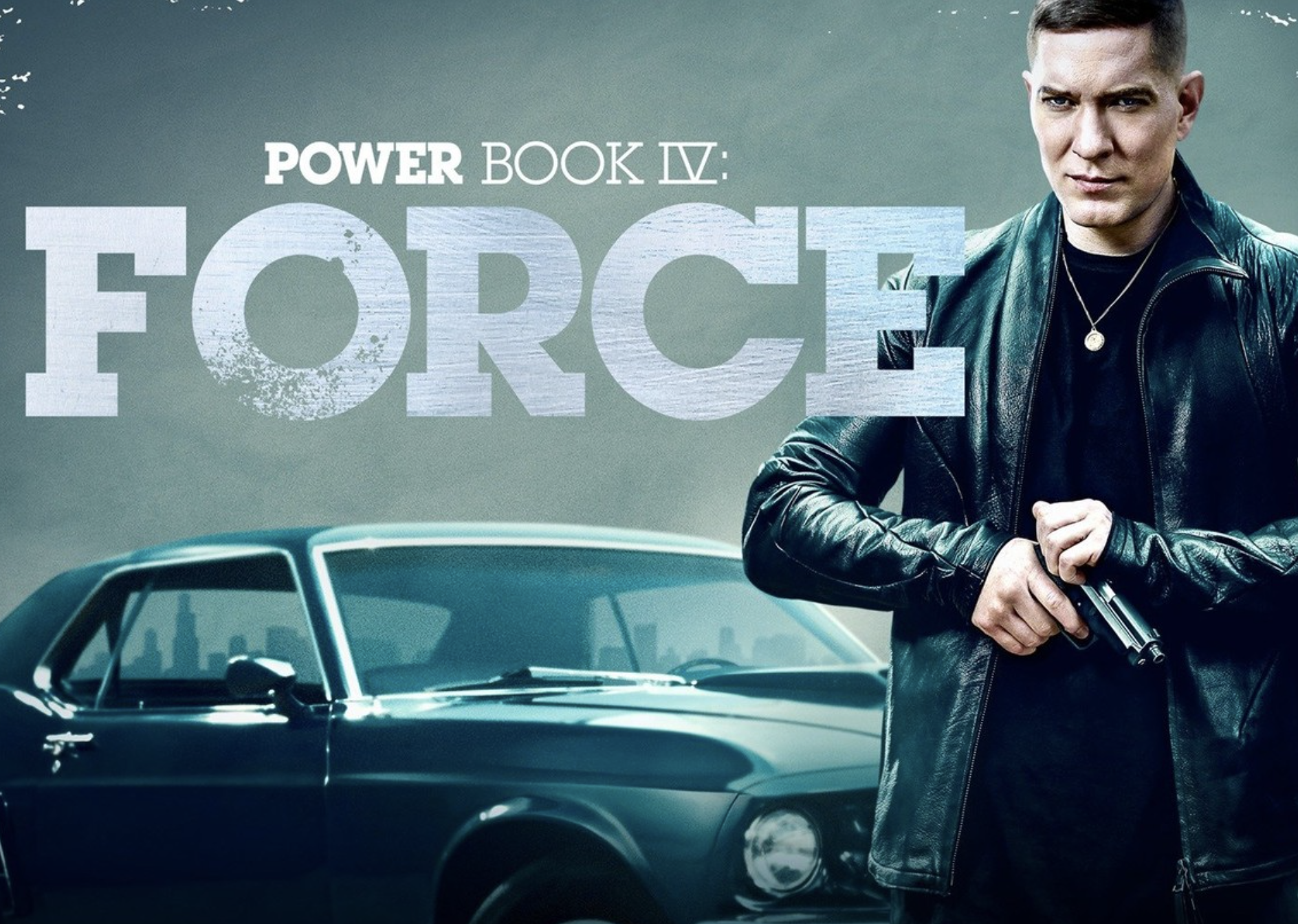
I began with a 2022 Spinoff, “Power Book IV: Force,” because I thought Joseph Sikora did a great job in “Ozark,” and his face was on the photo/graphic advertising the show.
Courtesy of Rotten Tomatoes
Set in Chicago, it’s only one season, so I was quickly ready for “Power,” Season 1, the NYC-based OG of the Power-Verse, (produced by low-key, mega-mogul 50 Cent,) and it’s been living in my brain ever since.
Do you want to know their trick?
Drop the viewer into the middle of an ongoing story.
Whatever semblance of stability might have existed with the main characters, as the series begins, interrupt that status quo with some SERIOUS drama.
Basically…shit goes wrong, right away.
And then… it never stops.
Drama, violence, sex, loyalty, betrayal, shady-backroom-dealing, exploding skulls, slit necks, slip-skirts slipping off in yet another sex scene… just never let it stop.
I’ve since learned that “Power” was one of the most highly watched shows in the history of Pay Cable, (or what used to be Pay Cable,) and I’m not surprised it spawned ongoing storytelling.
Once you have, (against all odds,) created rock-solid, original IP, that shit doesn’t EVER stop making money.
(It’s why we have Harry Potter theme parks.)
And even though “Stranger Things” and “The Boys” haven’t even ended their runs yet, deep down, we know we’ll be absorbing some version of that IP until we die.
Now, where was I?
As I watched “Power,” paying attention to the story-telling tricks, (including taboo-for-shock-value, to keep them hooked,) it made me think of one story-telling, IP-Empire in particular.
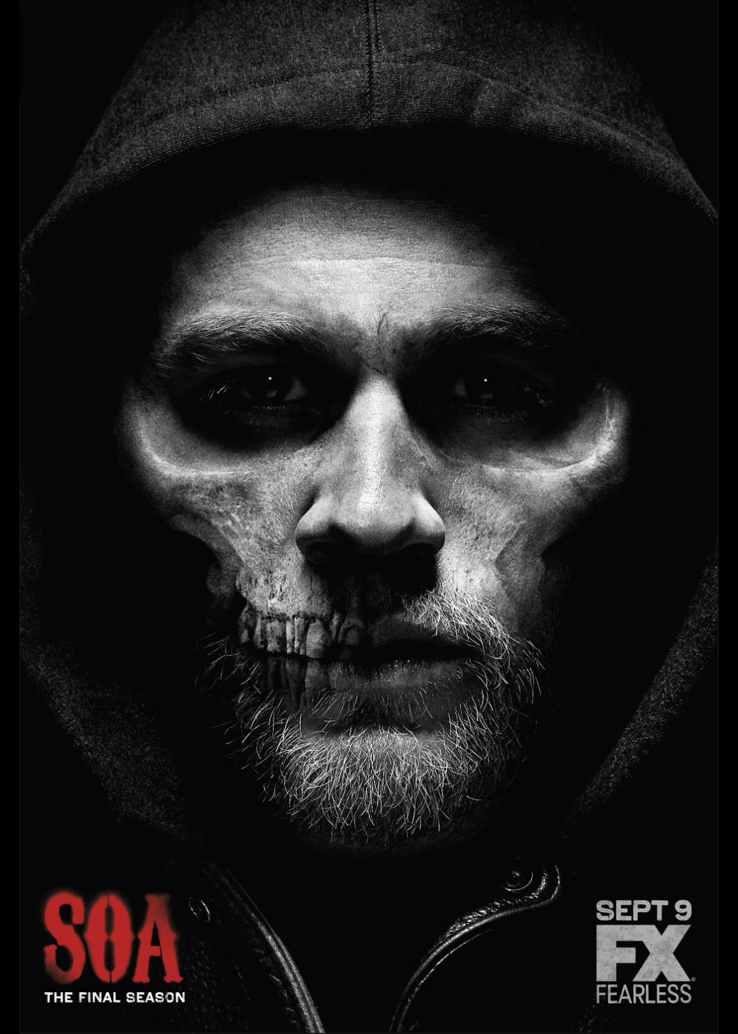
I was consistently reminded of “Sons of Anarchy” which I binge-watched on Netflix 4 or 5 years ago.
(Honestly, who can remember?)
Courtesy of Imdb.com
SoA first taught me the cardinal rule of addictive television: Make crazy shit happen to your characters, ALWAYS, and then amp it up, CONSTANTLY.
If you never give the characters a minute to breathe, and are willing to put outer-edge violence and violation on-screen, with good actors in a fascinating sub-culture, you’re good to go.
“Sons of Anarchy,” created by Jersey Boy Kurt Sutter, was set in an Outlaw biker gang in Southern California.
I knew nothing about that world, but quickly learned some Outlaw Motorcycle Clubs function like Mexican drug cartels. (Who were also featured prominently in the show.)
Bit by bit, SoA shares a fictionalized version of the Biker-Gang-world, complete with its own lingo, and set of rituals.
To be clear, (as far as I know,) not all Motorcycle clubs are gangs, nor criminal organizations.
But some are, which means if you see a certain type of biker, with a certain type of cut, (or leather sleeveless vest,) and he comes up behind your car on his chopper, looking like a movie-bad-guy-henchman, well, you let that guy pass as soon as he wants to.
Which I did.
Yesterday.
As I drove my daughter to her summer camp, where she’d be playing a pirate in a local children’s production.
My daughter asked about the biker on the chopper, and even though she’s 9, it quickly led to a conversation about Capitalism, and the international market for illegal drugs, which is dominated by organized, criminal gangs in every country on Earth.
(I swear, that’s just how it happened.)
I told her how to read the Motorcycle club, and local chapter, from the guy’s cut, or sleeveless leather vest.
Then I said, because selling “drugs” was illegal, but people still wanted to buy them, someone always had, and always would, rise up to sell it to them.
(The concepts of Supply and Demand are the core of Economics.)
She asked about which countries had big Mafias, so we discussed Italy, Mexico, Russia, China, and how as far as I knew, the Yakuza mostly stayed in Japan.
All the while, the guy on the chopper was right in front of us, cruising the highway into Taos.
Out of nowhere, the dude had became an official “topic of discussion,” which lead to a chat about the Global Drug Economy, with an inquisitive 9-year-old.
I’m telling you, those bikers have a SERIOUS presence.
OK, let’s keep it moving.
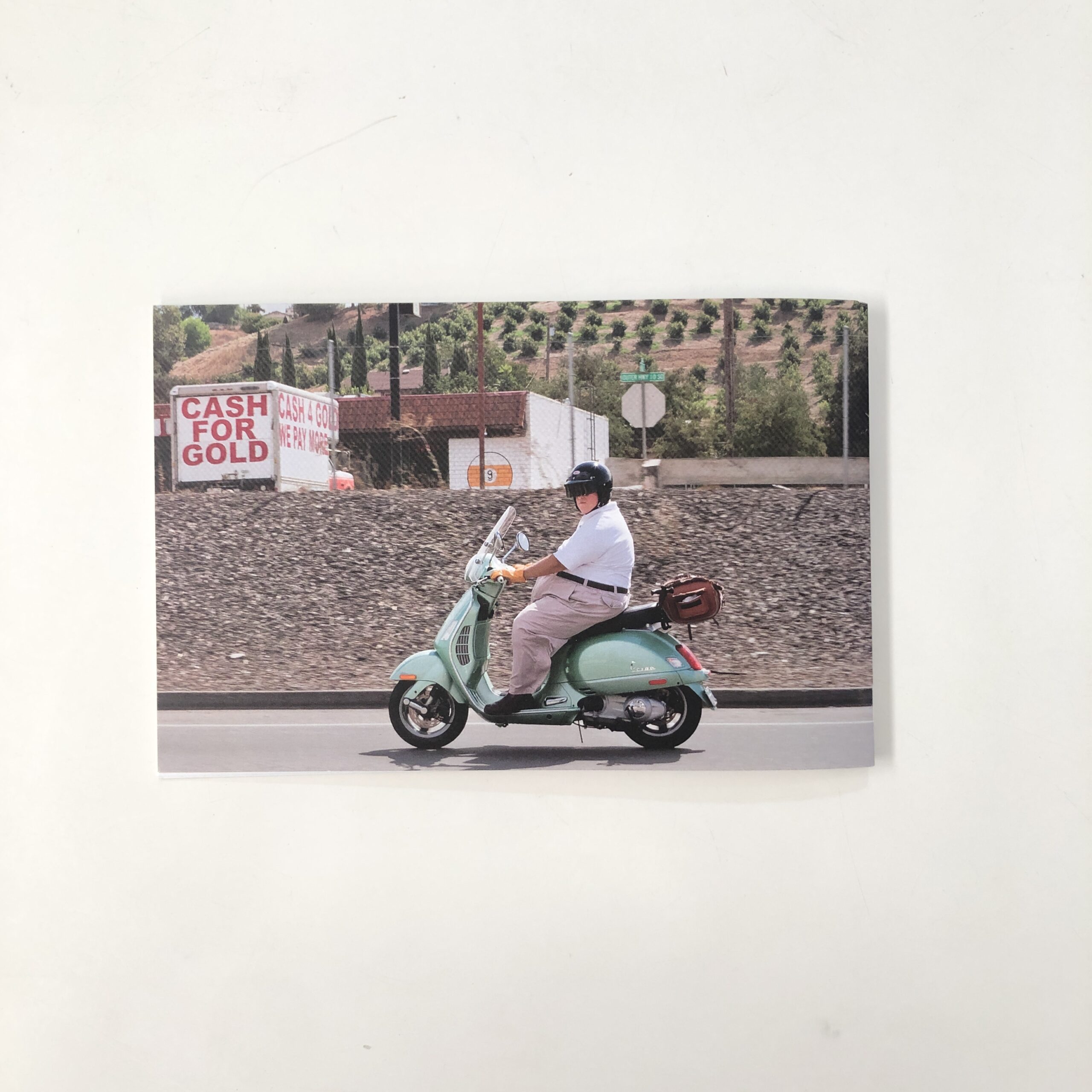
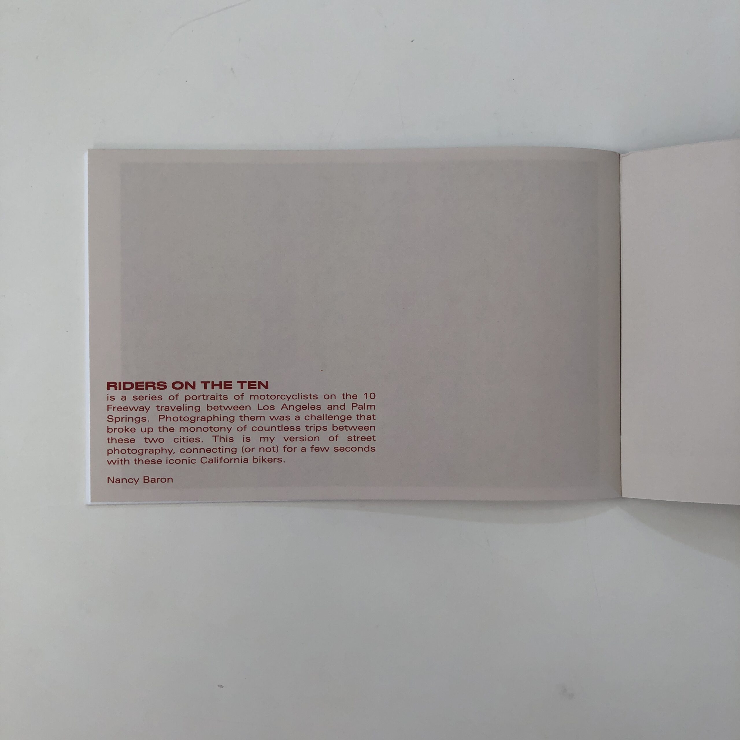
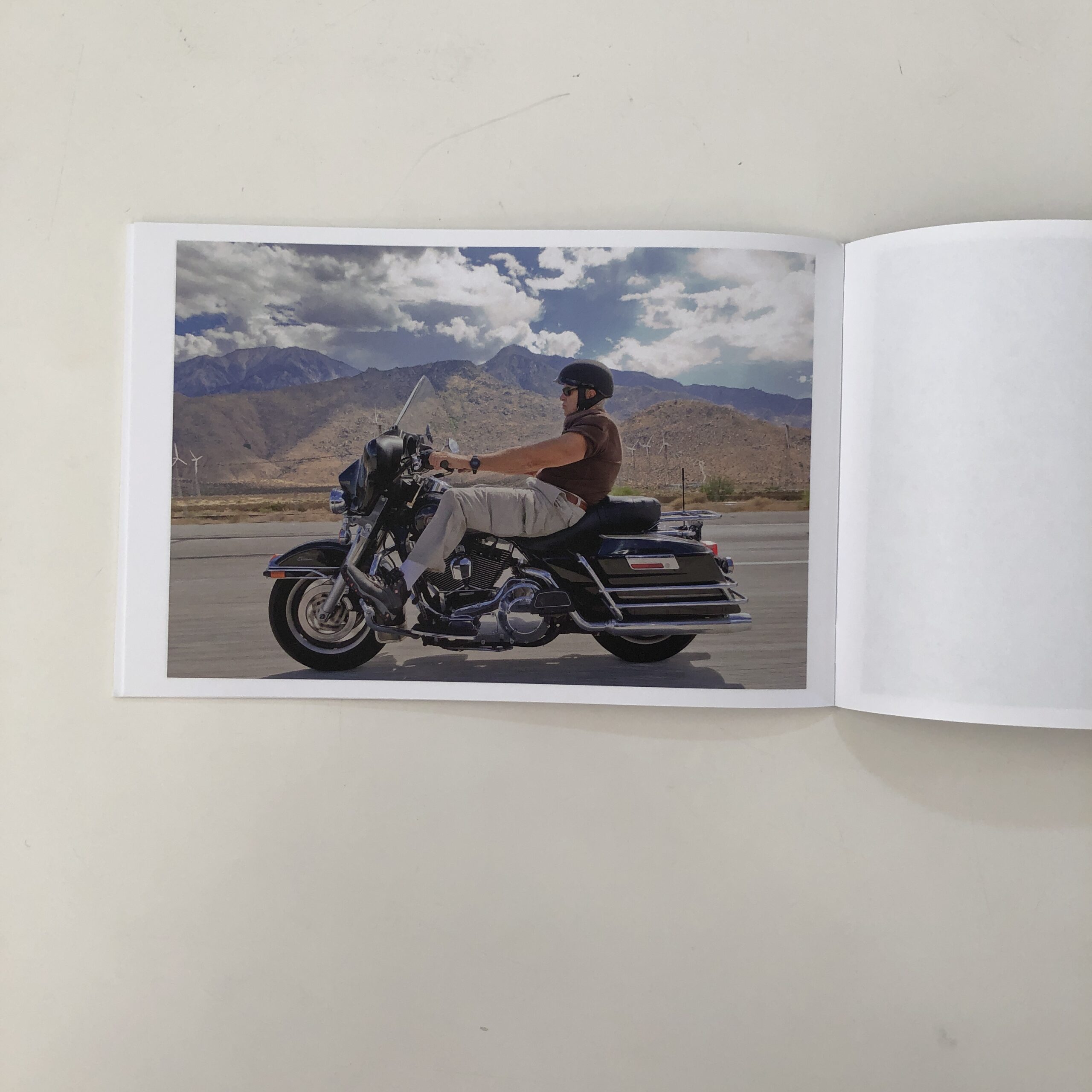
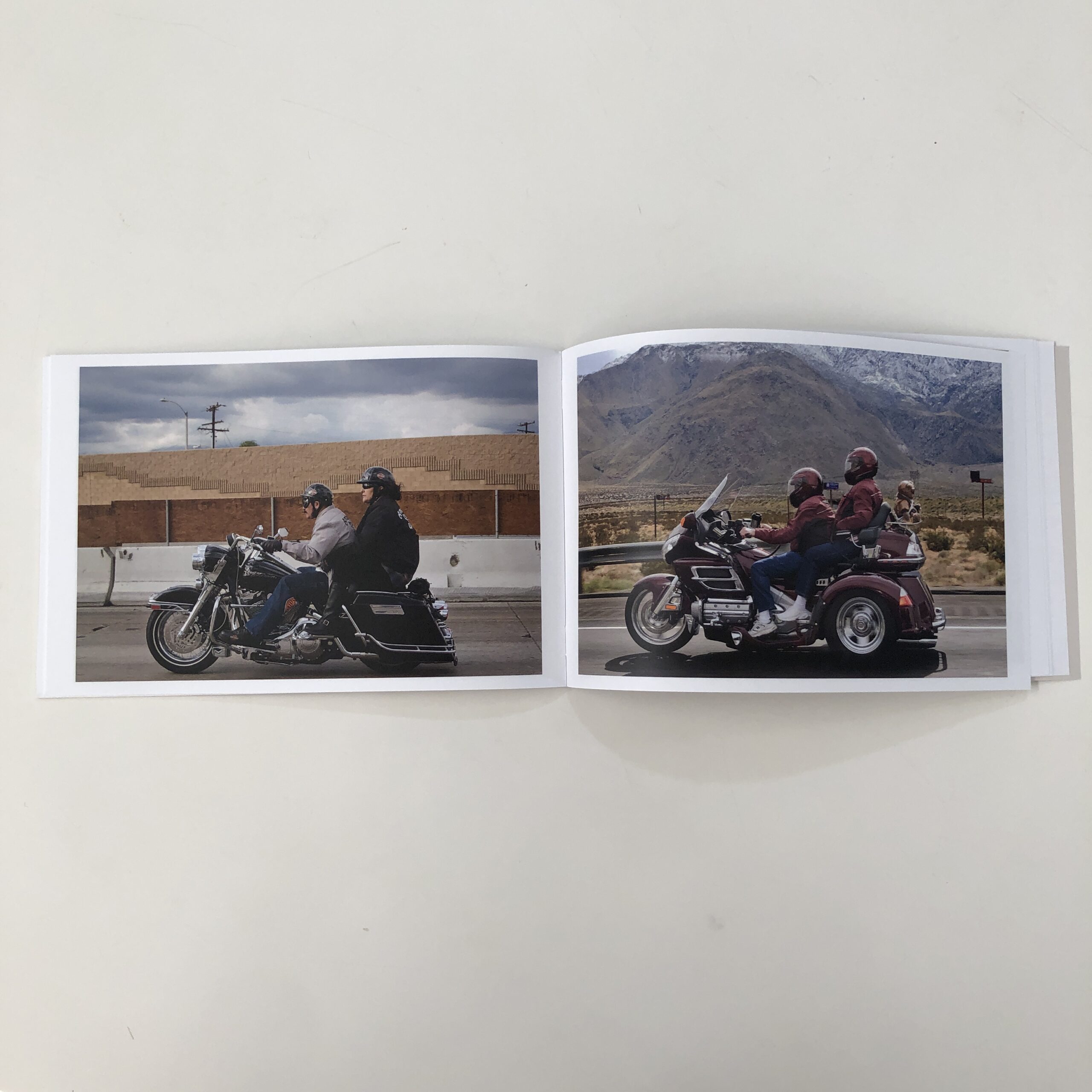
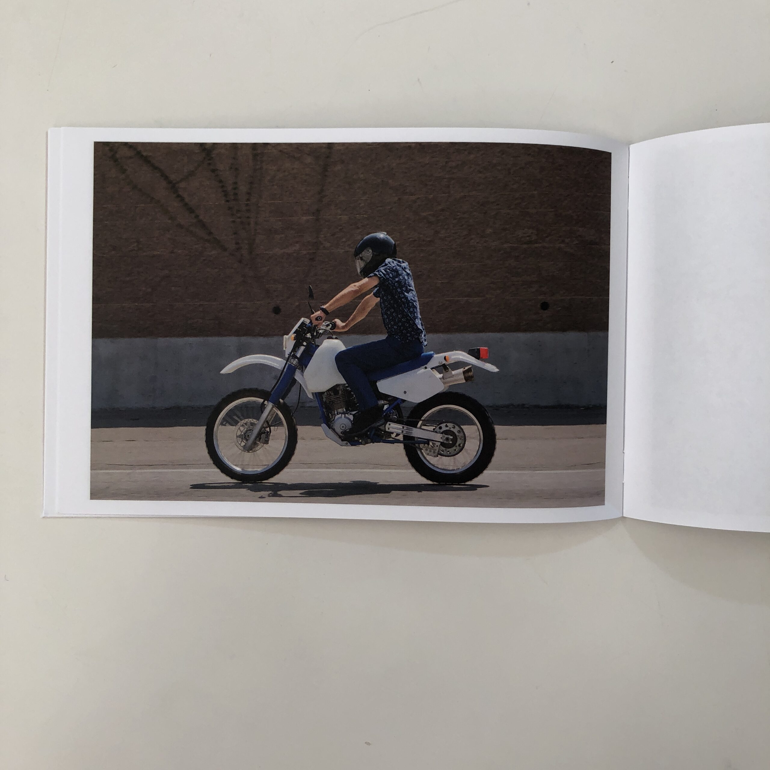
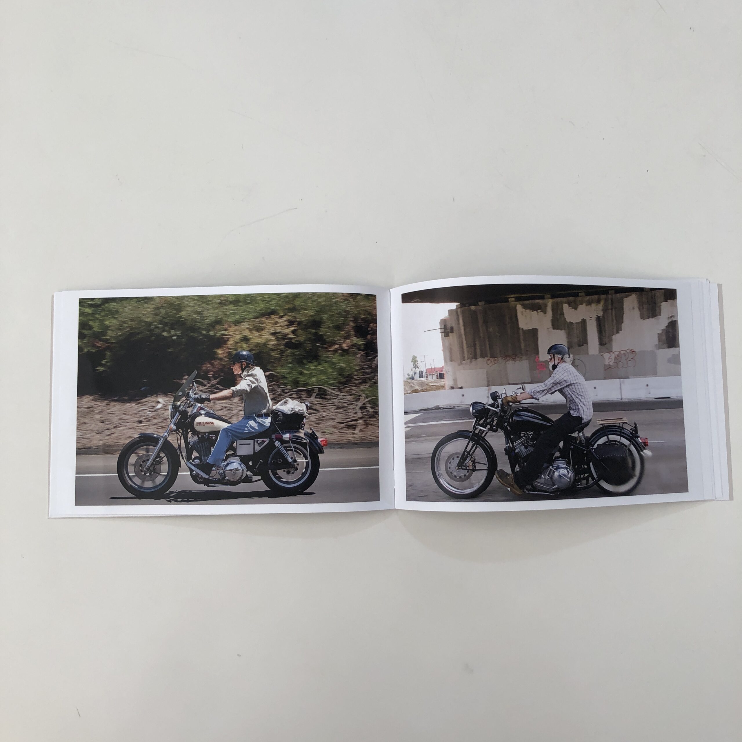
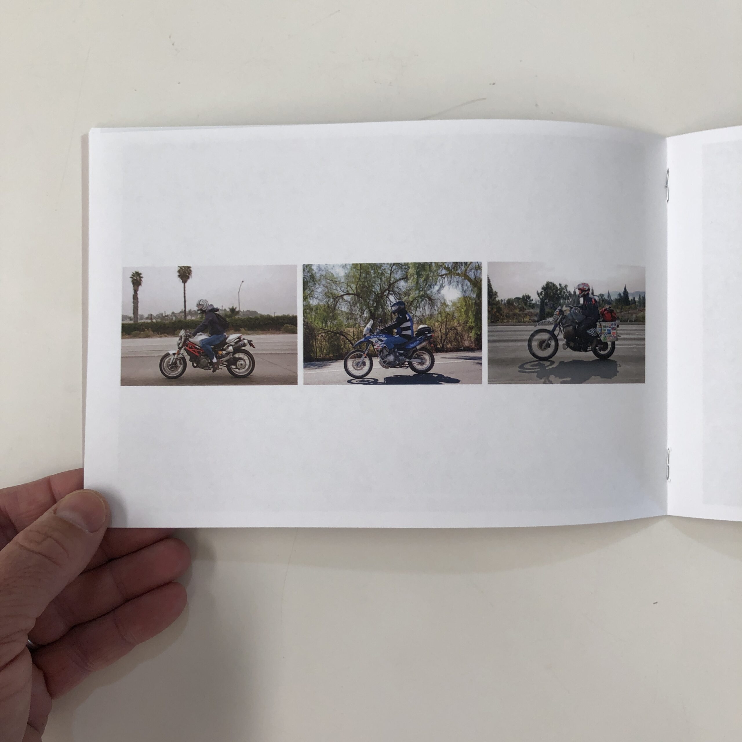
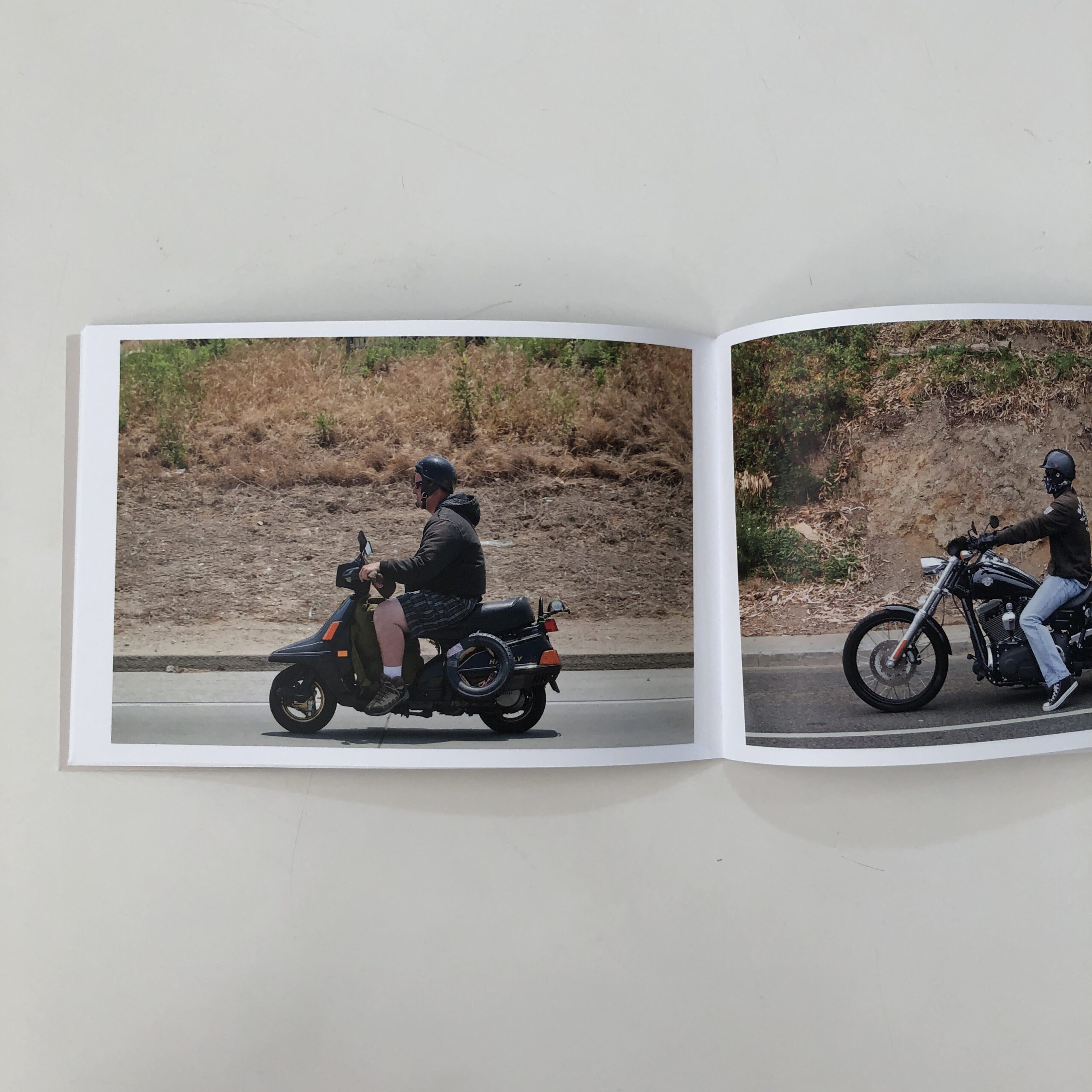
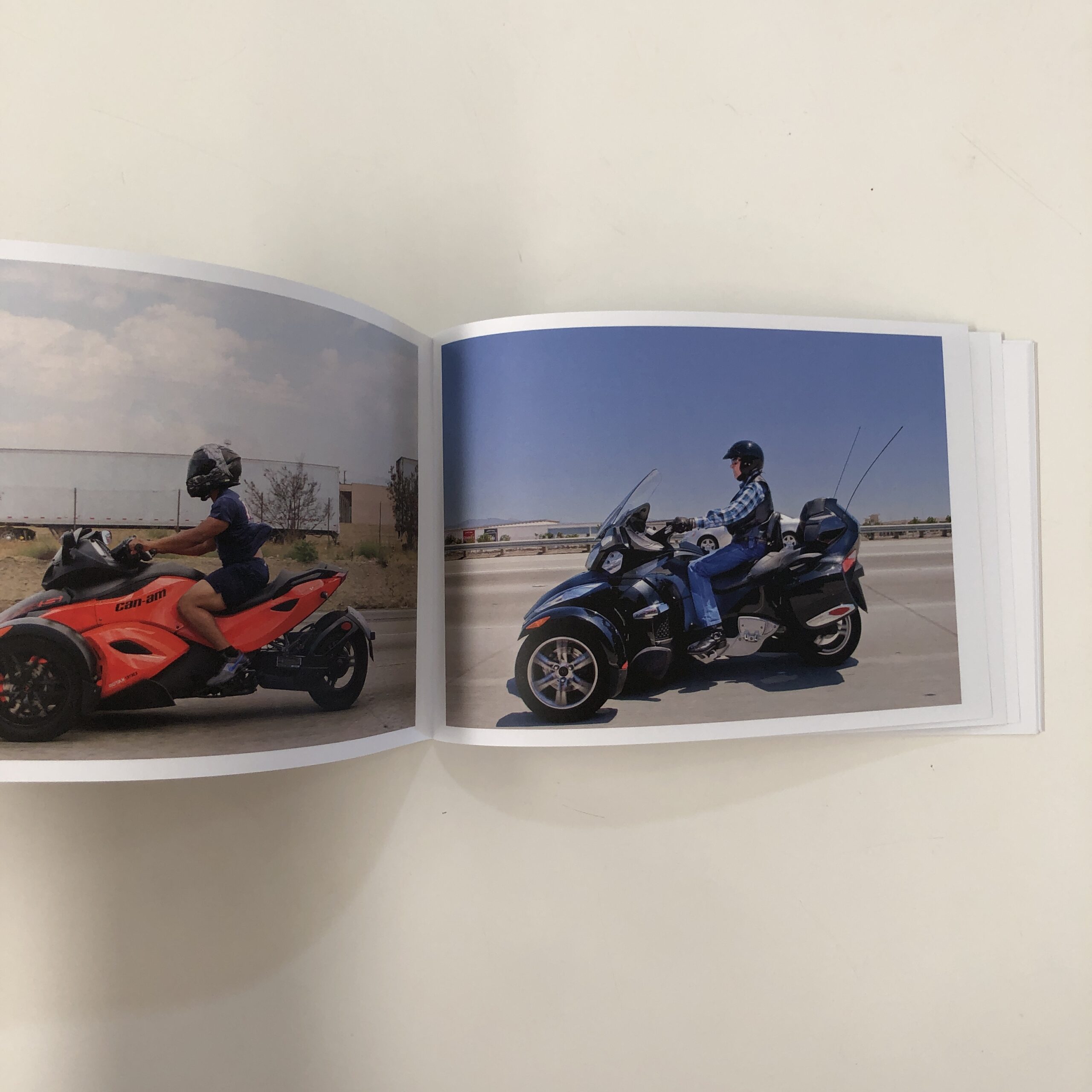
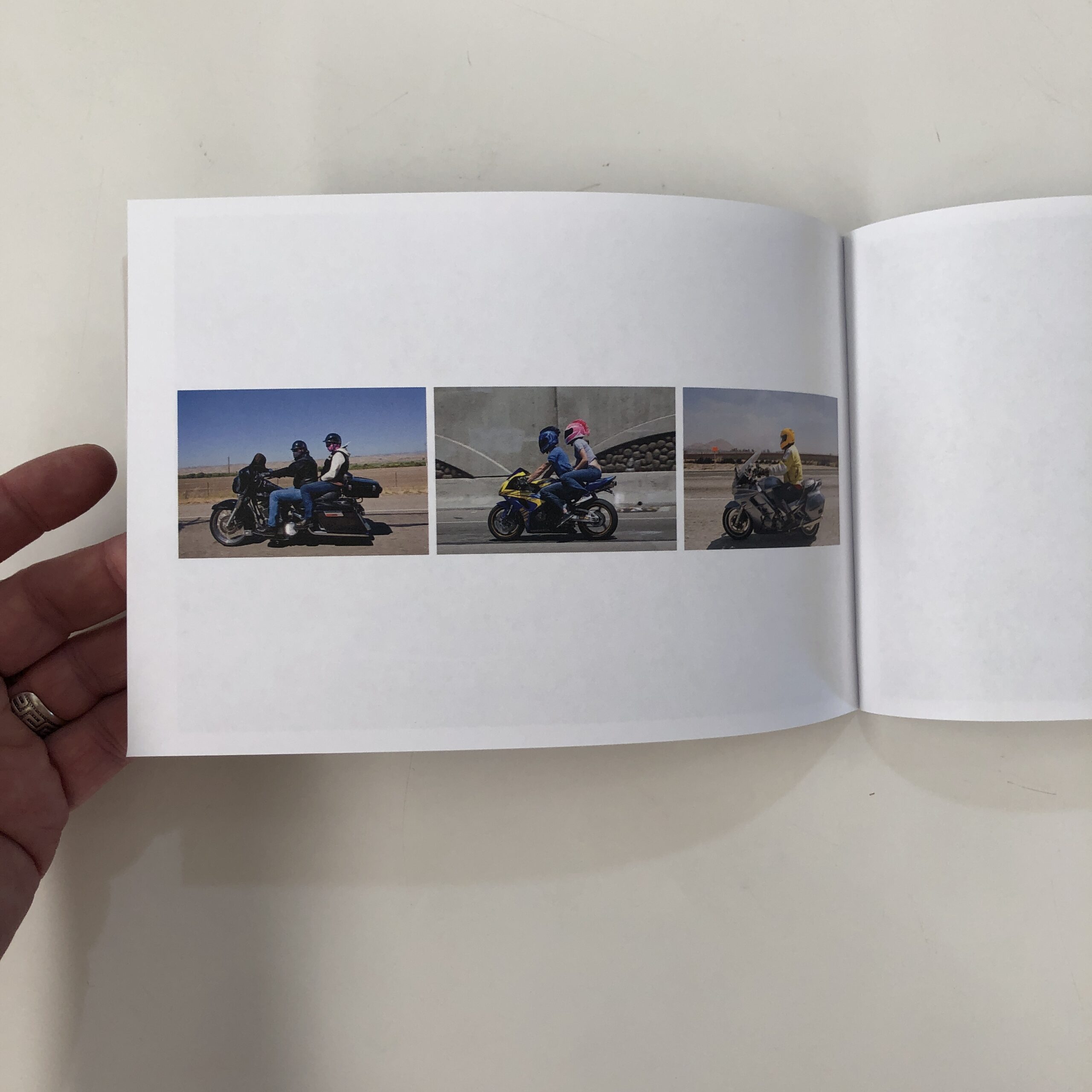
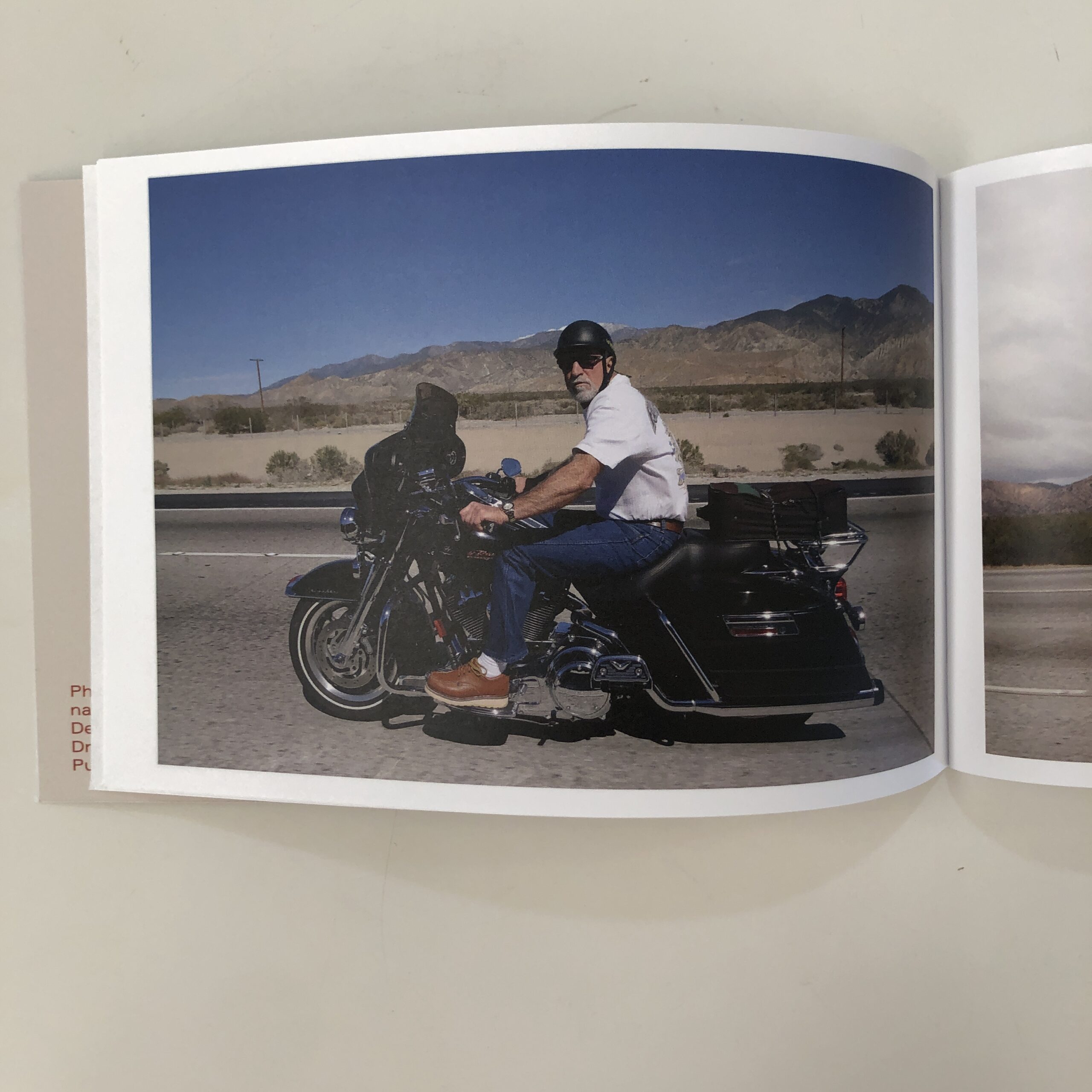
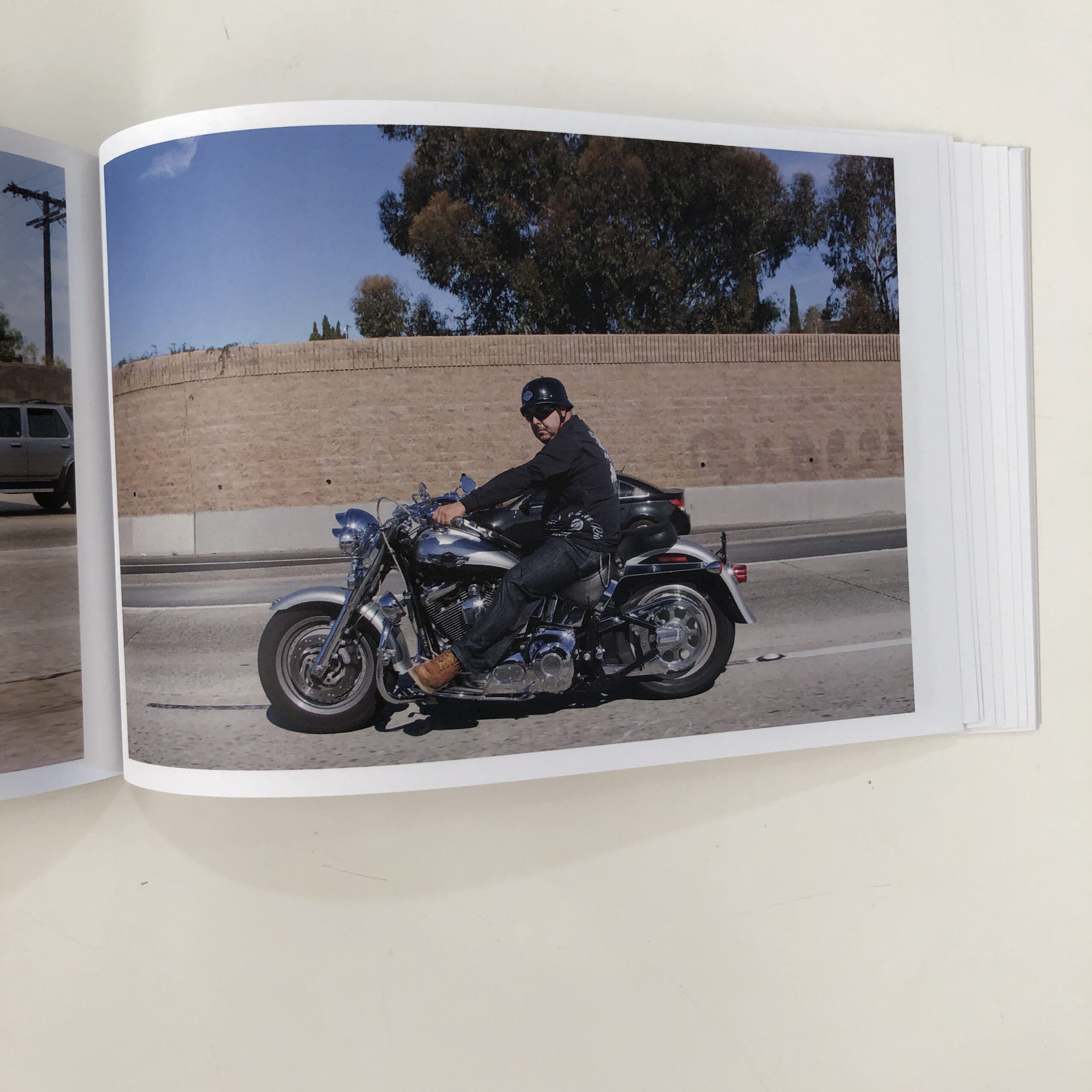
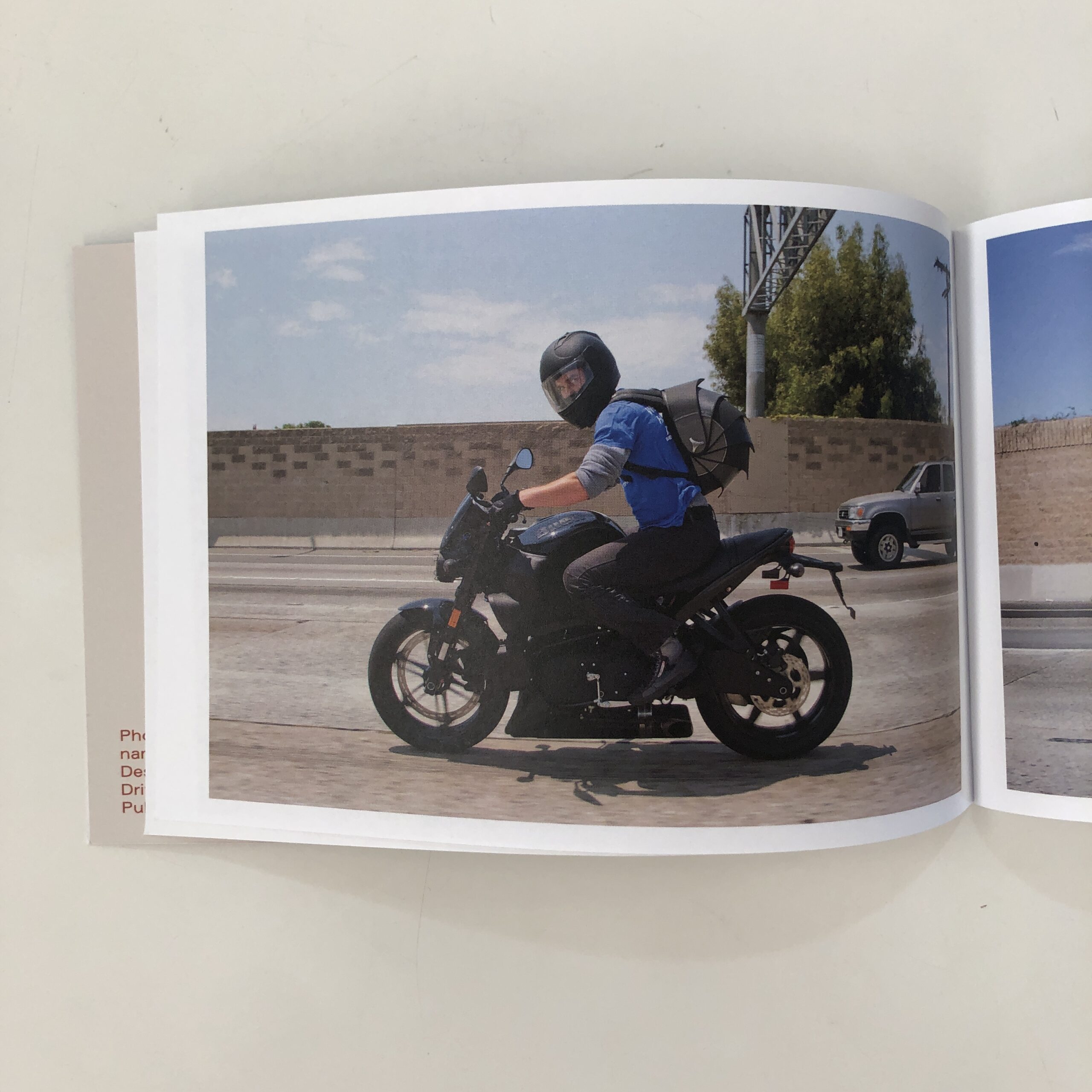
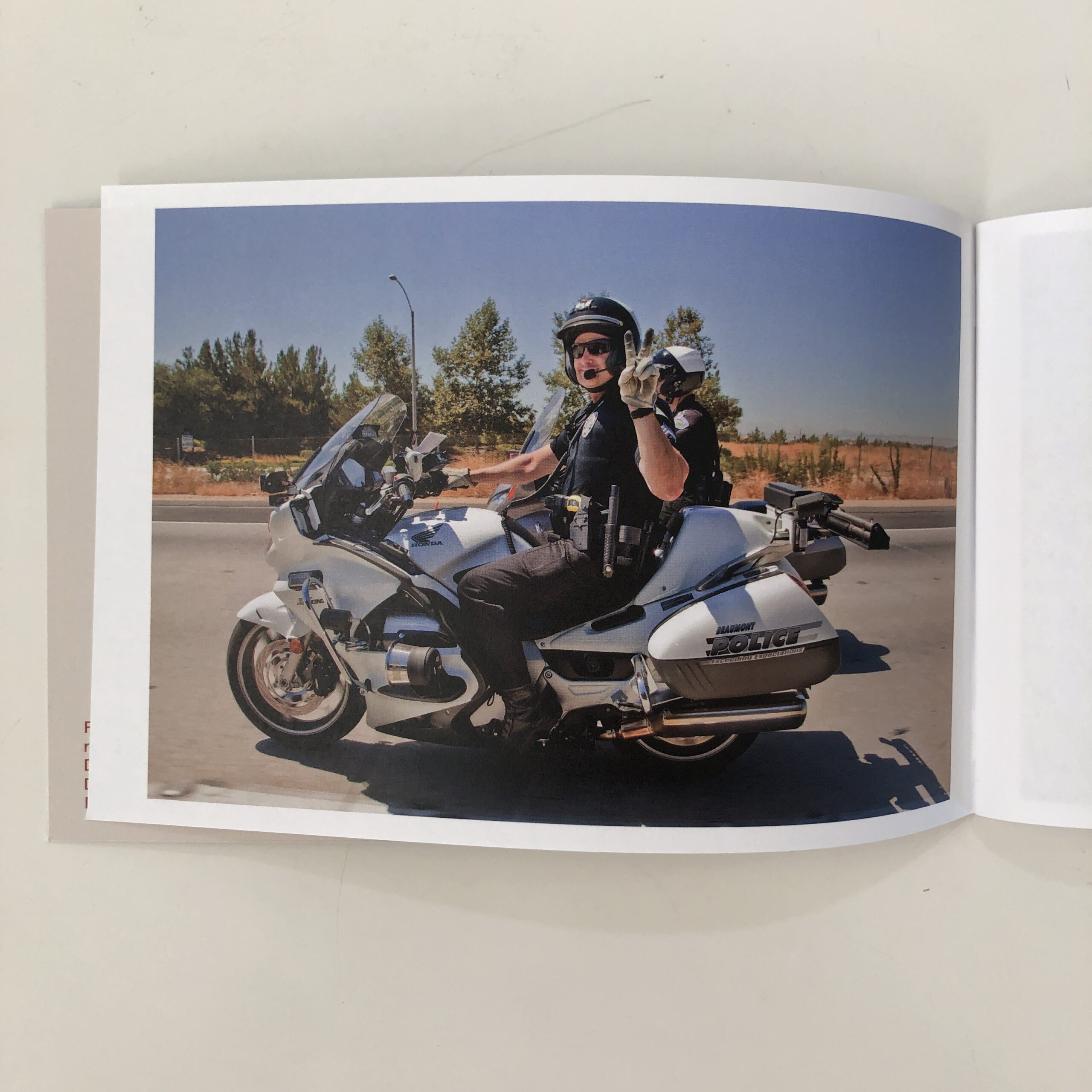
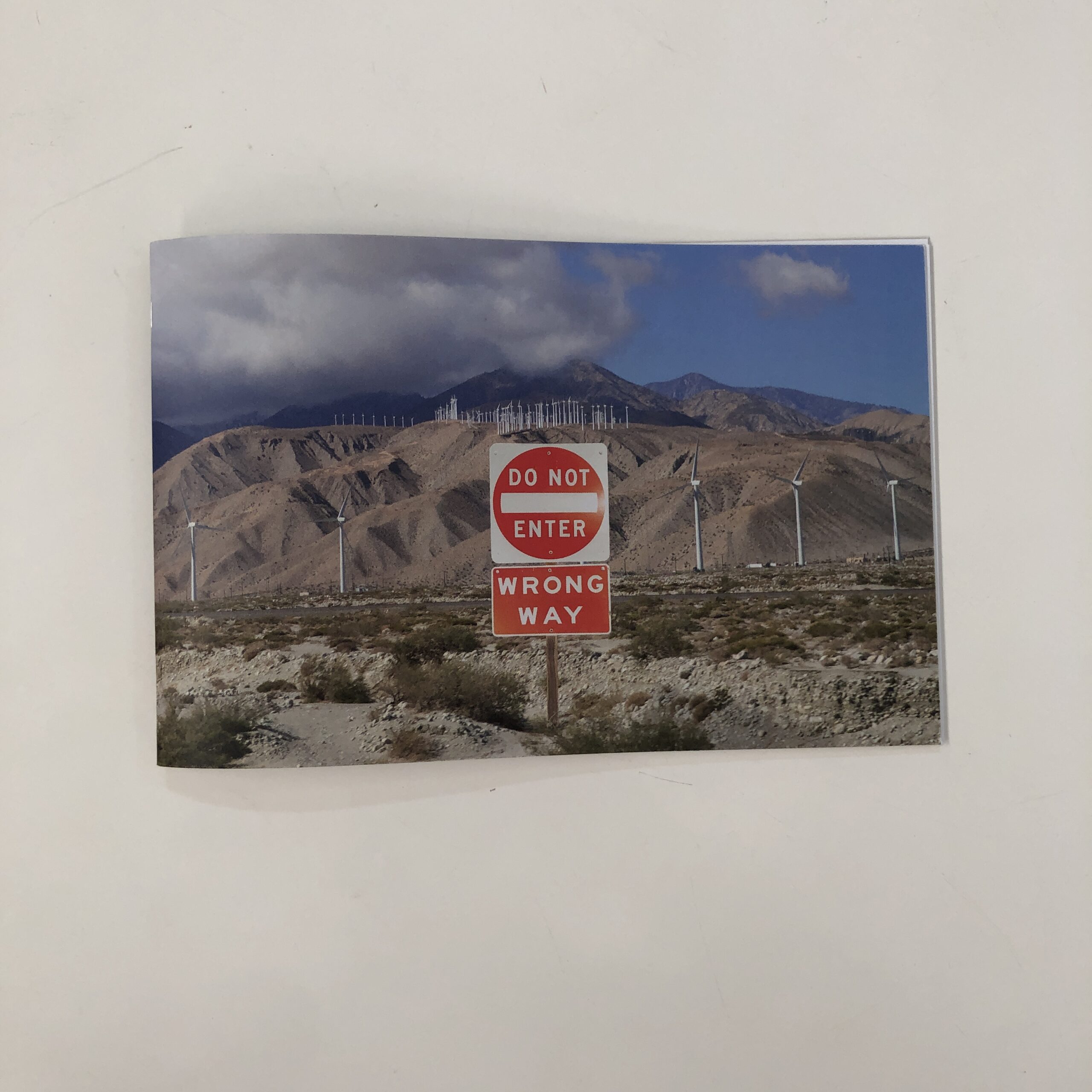
Photographer Nancy Baron, from Southern California, reached out a couple of weeks ago, and offered to send a little ‘Zine she’d just made.
From what I gathered, it had something to do with bikers on the highway.
In Southern California.
“Riders on the Ten” opens with a backwards orientation, and while I did peek at the accompanying post-card, which told me where to be begin, the other side says “Do Not Enter/ Wrong Way,” so design-wise, it’s a nice clue.
(Score one point for Nancy Baron.)
The title makes me think of “Riders on the Storm,” by The Doors, so then I’ve got Jim Morrison in my head.
And I fucking love that song.
(Score another point for Nancy Baron.)
From there, after the opening paragraph, informing us it’s the road between LA and Palm Springs, what you see is what you get.
(The front cover is actually a portly guy in a funny-visor helmet, on a Vespa, which is funny, so one more point for Nancy.)
It’s such a cute, little ‘Zine.
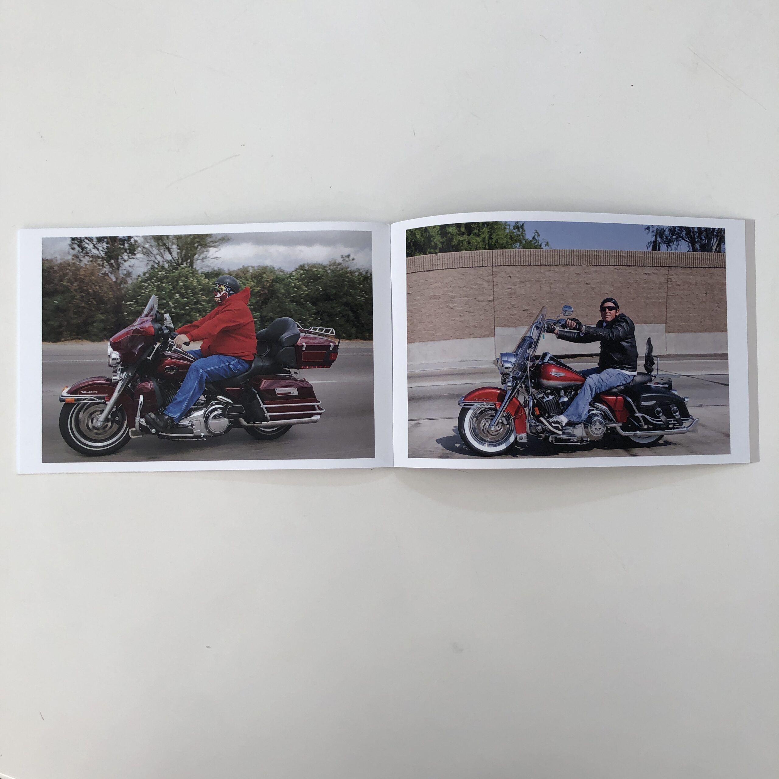
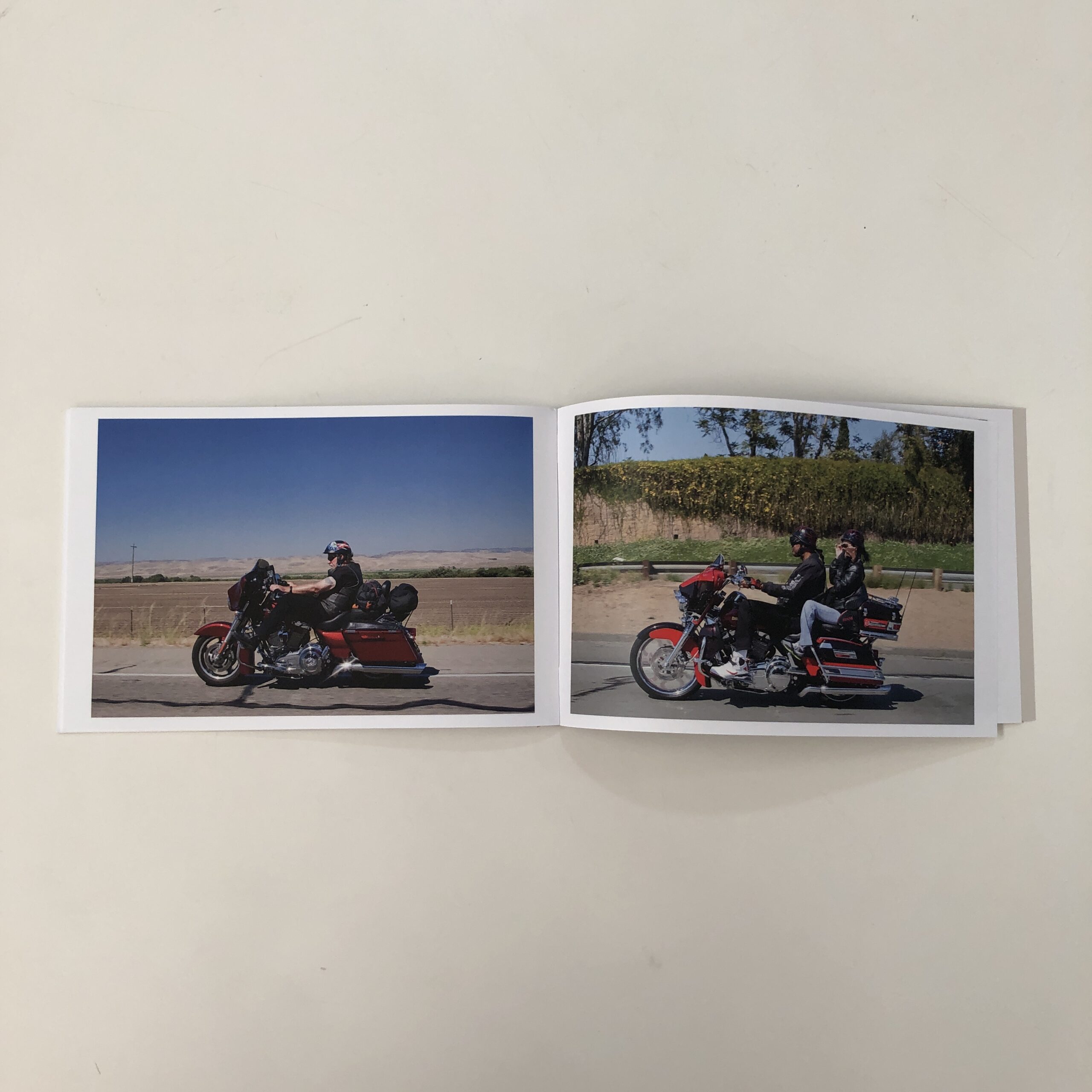
None of the dudes is as menacing as the guy we saw here in New Mexico, but just as you’re settling in to the whimsy, we have a run of images where the riders start staring Nancy down.
It’s such a tonal change, you notice right away.
And loved it, as I write here, all the time, how much I enjoy a good change of pace, to help hold a viewer’s attention.
Just when I wondered how far she’d take the stare-down pictures, we get a photo of a cop, giving us the peace sign, and then the ‘Zine is done.
Short and sweet.
Which is more than I can say for this week’s column.
If you’d like to submit a book for potential review, please email me at jonathanblaustein@gmail.com. We are particularly interested in books by artists of color, and female photographers, so we may maintain a balanced program. And please be advised, we currently have a significant backlog of books for review.
The Art of the Personal Project is a crucial element to let potential buyers see how you think creatively on your own. I am drawn to personal projects that have an interesting vision or that show something I have never seen before. In this thread, I’ll include a link to each personal project with the artist statement so you can see more of the project. Please note: This thread is not affiliated with any company; I’m just featuring projects that I find. Please DO NOT send me your work. I do not take submissions.
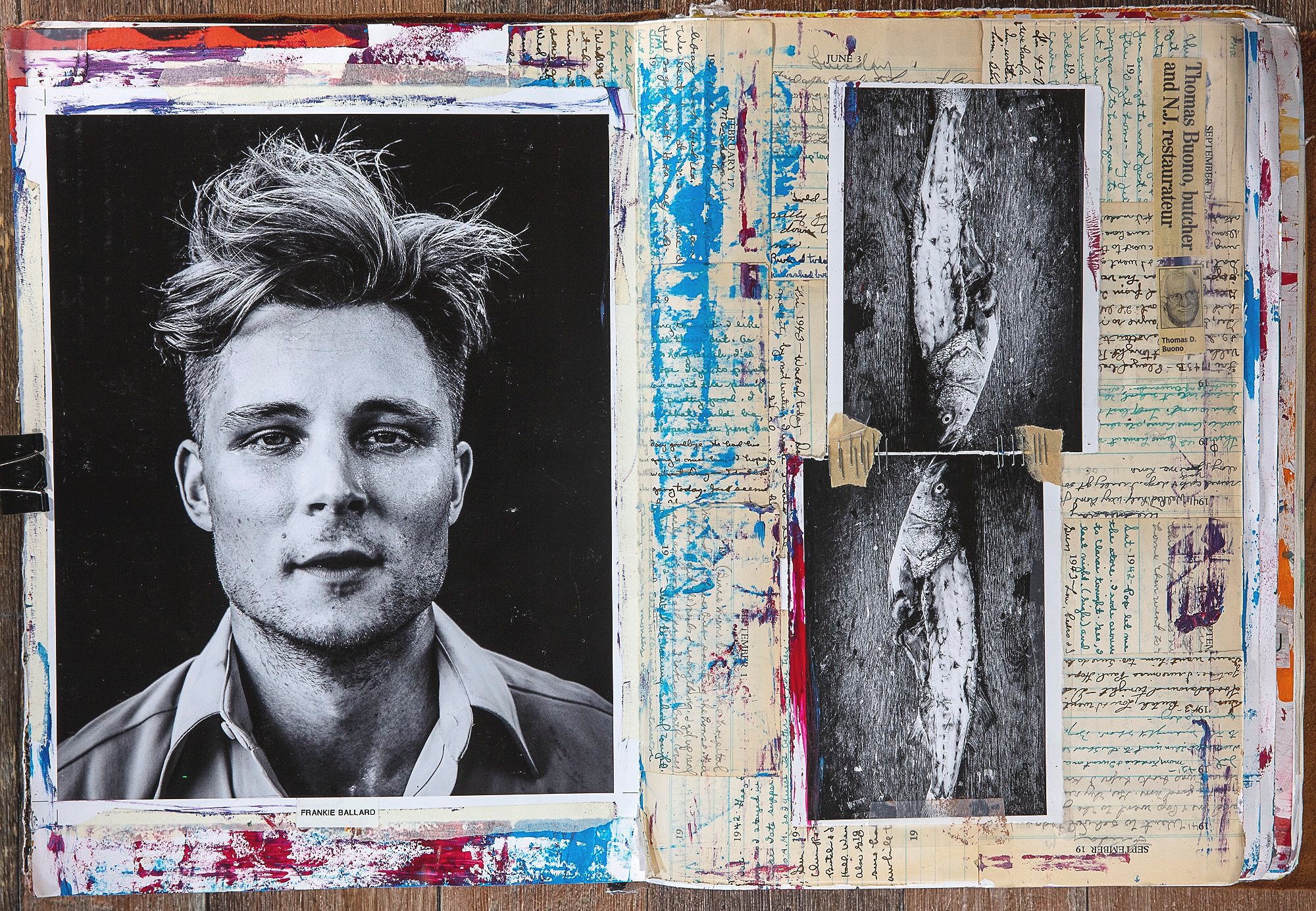
“What began some years ago as a way to explain to my family
exactly what I did for a living has turned into a lifelong project that
now involves meditation, writing, painting, photographs, clip art and
at times a “pop art” documentation of my journey through life.
Throughout the years, my journals have evolved from a way to
document past shoots into a way for me to actually document
myself on a more ethereal level. I use hints of people, place and
things to remind myself of the many courses and adventures that I’ve
not only taken in my career but more importantly my life. I like to
refer to many of the pages as “visual streams of consciousness”
based upon mood and emotion. Some of the written vignettes are
based in truth some in fiction. It is then left to the viewer to decide
which they believe. The painting, mixed media and graphics derive
from my love all things in an artist realm. I really enjoying editing and
rearranging graphics in order to send a new message. And of
course, the photographs which are my true passion are a
culmination of all of the previously mentioned elements.”
-Jim Wright
6/30/22
APE contributor Suzanne Sease currently works as a consultant for photographers and illustrators around the world. She has been involved in the photography and illustration industry since the mid 80s. After establishing the art-buying department at The Martin Agency, then working for Kaplan-Thaler, Capital One, Best Buy and numerous smaller agencies and companies, she decided to be a consultant in 1999. She has a Twitter feed with helpful marketing information because she believes that marketing should be driven by brand and not by specialty. Follow her at @SuzanneSease. Instagram
Success is more than a matter of your talent. It’s also a matter of doing a better job presenting it. And that is what I do with decades of agency and in-house experience.
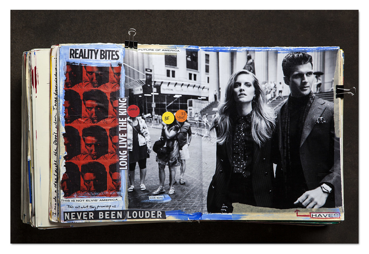
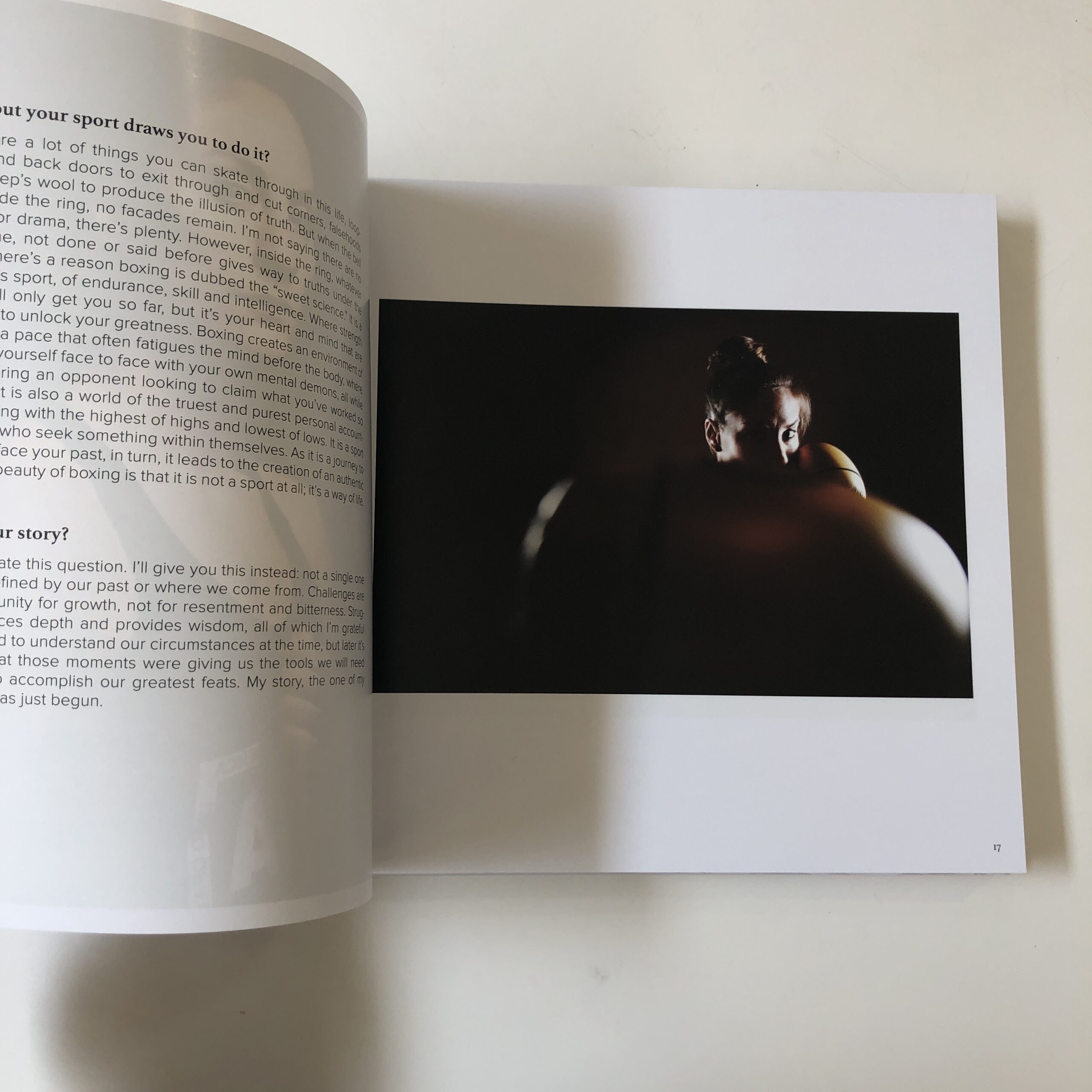
Heidi: How would you define your photography style?
Kate: I would describe my style as honest. I’m not interested in perfect or highly manipulated images. There’s no grit there, no story. I want my work to represent and feel like the moment I was in. While I want viewers to see the way I see things, more importantly, I want them to decide how my images make them think or feel.
What moments appealed to your eye?
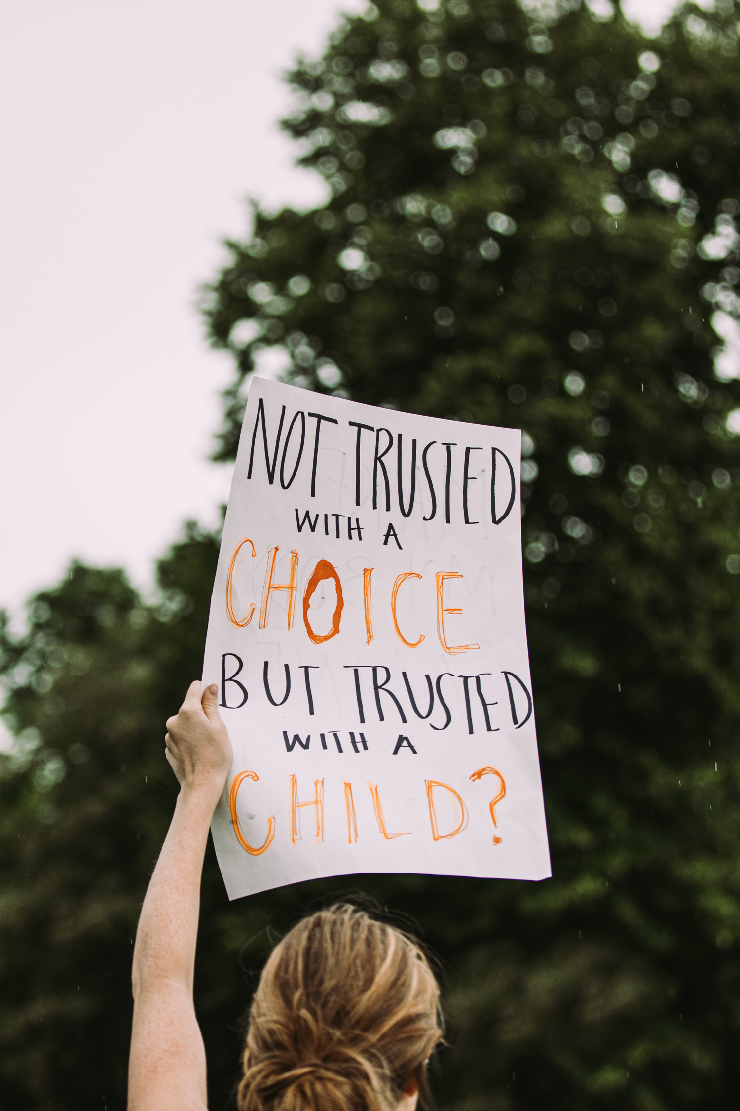
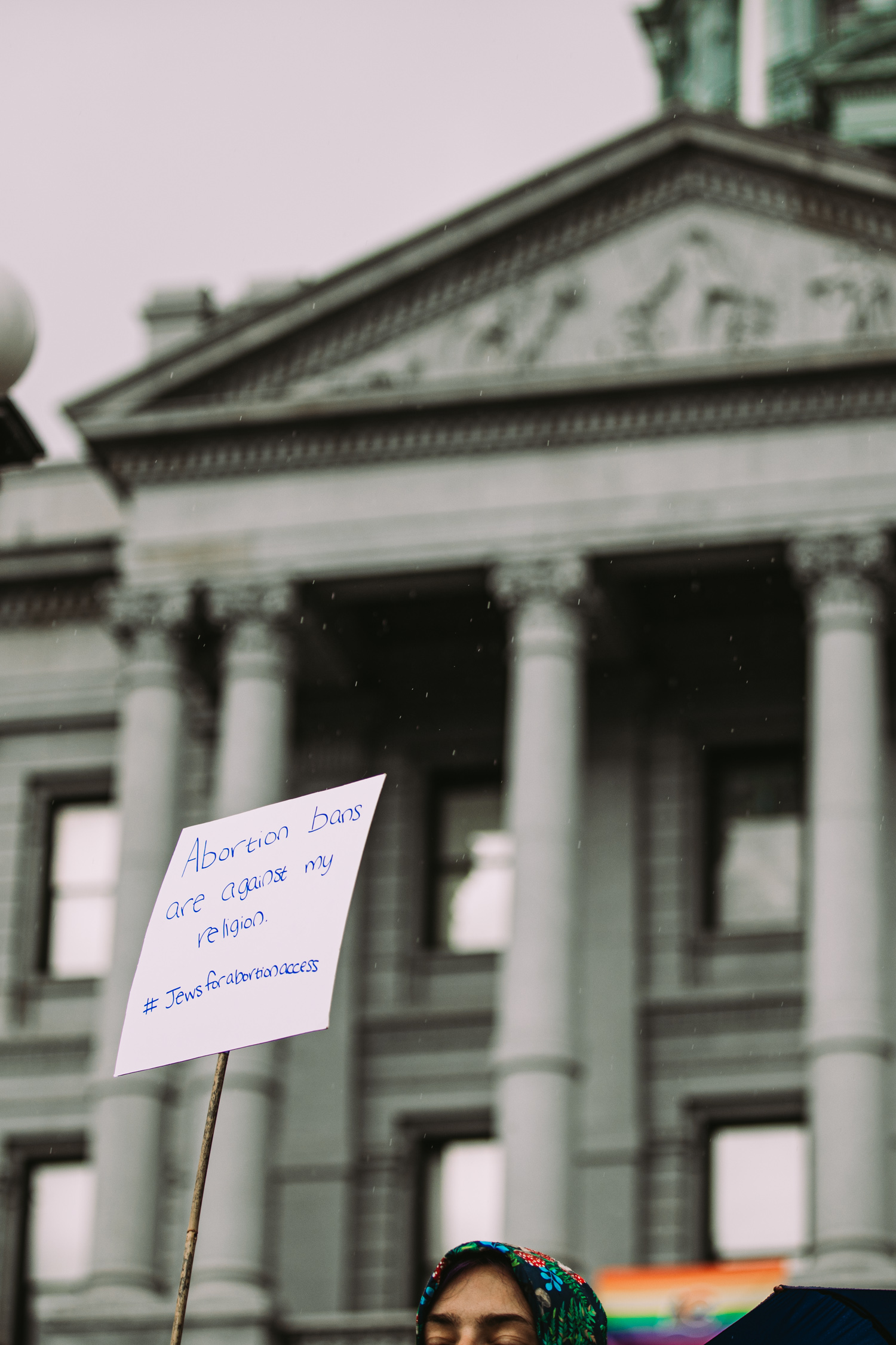
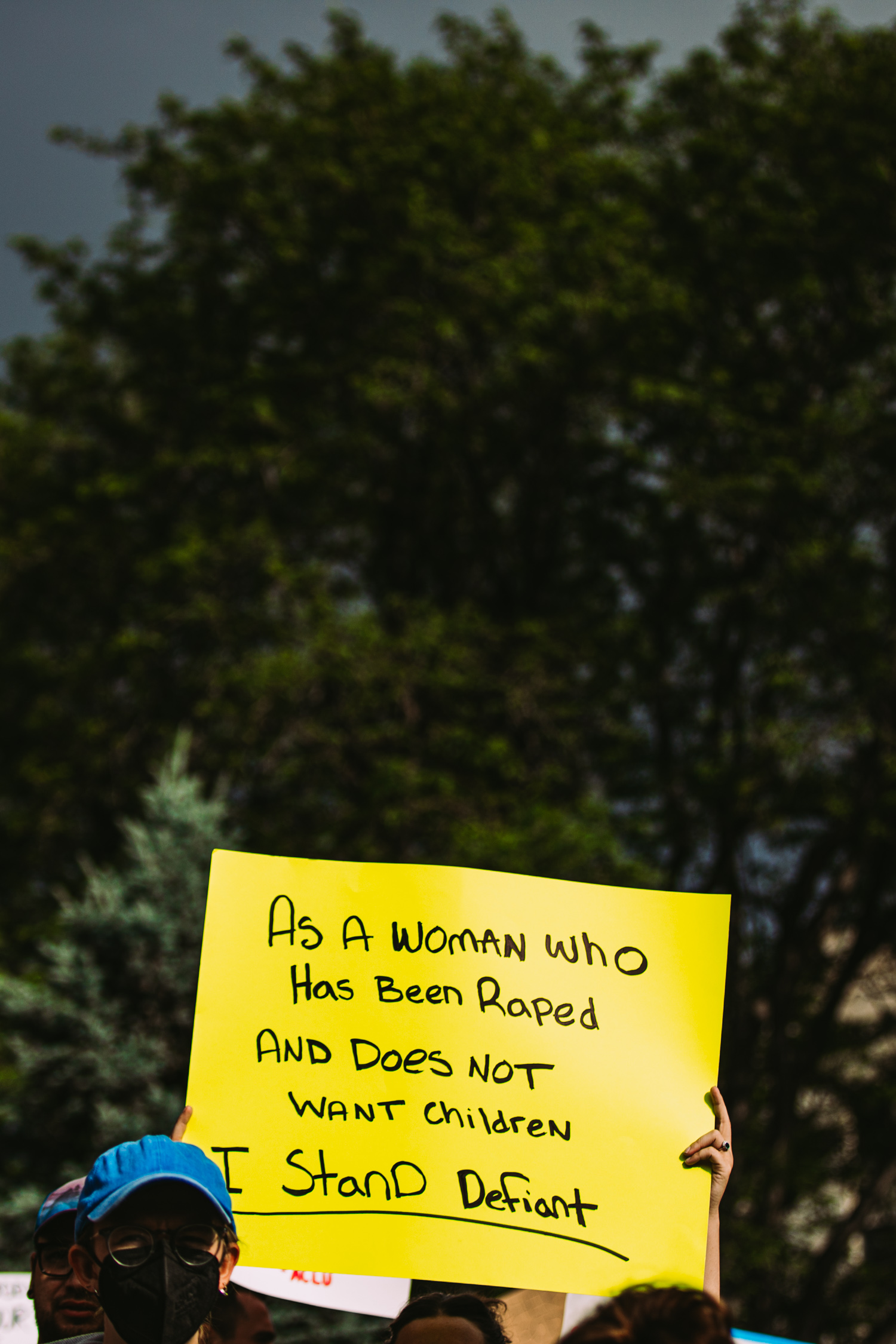
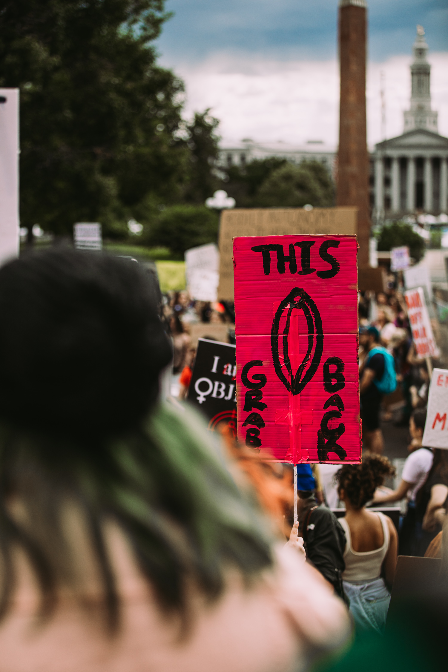
Opposites. Moments of juxtaposition. Messages written on the backs of signs, while the sign-holders moved forward. Fluorescent flashes of cardboard against heavy, black clouds. Mighty impactful phrases with so few words. A bright, rainbow pride flag, draped across the gloomy, gray facade of our Capitol building – a beacon of hope for equality, while standing in the trenches of inequality.
What moved you the most about this story?
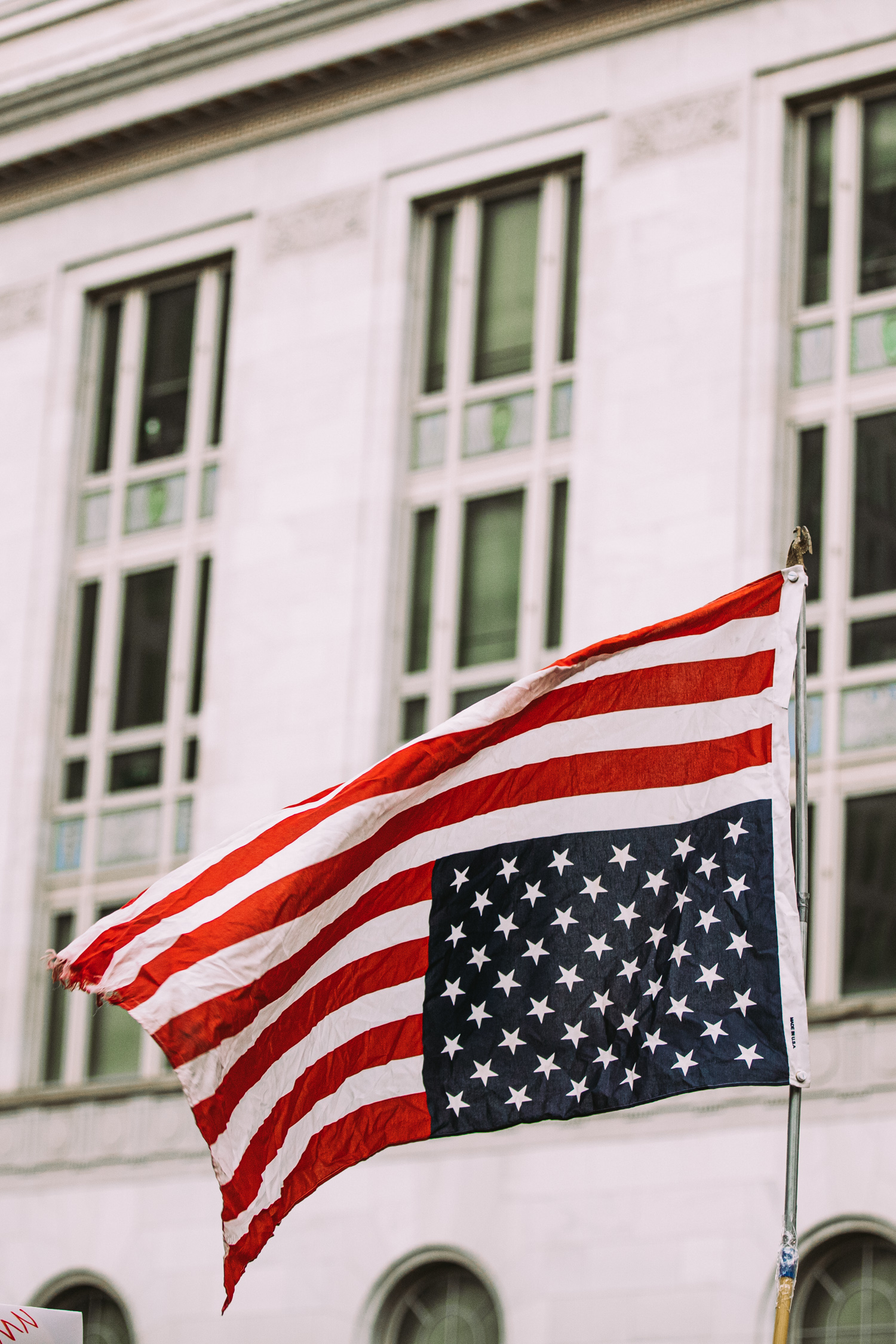
The American flag flying upside down. It was a gut-punch that I wasn’t expecting. I’m a Daughter of the American Revolution, and I come from a long line of veterans. Respect for our flag and country was instilled in me from a young age. When I wanted to buy Chuck Taylors in the eighth grade with an American flag print, my Mom said, “I won’t let you wear something on your feet that we fought so hard to defend.” I stood at my Father’s and Grandfather’s gravesites, listened 21-gun salutes that dropped me to my knees, and watched as their flags were lifted off their coffins, folded with such meticulous care and finally, handed over. My siblings and I grew up as flag code defenders, and I know what it means to fly it upside down. When I saw those stars waving in the wrong spot, I felt it – we’re in trouble.
What surprised you the most about this project?
Most surprisingly, were the intimate details that women so courageously shared. Stories of their lives scribbled with Sharpies on posters that lined a stormy sky. Skystories, I thought. Stories of loss, stories of rape, stories of religion, politics, grief, and anger. Stories that had nowhere else to go, except for up. I found myself wanting to tell everyone ‘thank you’. Thank you for sharing your trauma, thank you for showing up, thank you for fighting for the least of us, thank you for not quitting…please…don’t quit.
What do you hope for, for those who can become pregnant? I hope it’s their choice. I hope their family is supported. I hope they get to raise children in a country that values babies AND parents. I hope their kids don’t grow up to fight this same damn fight.
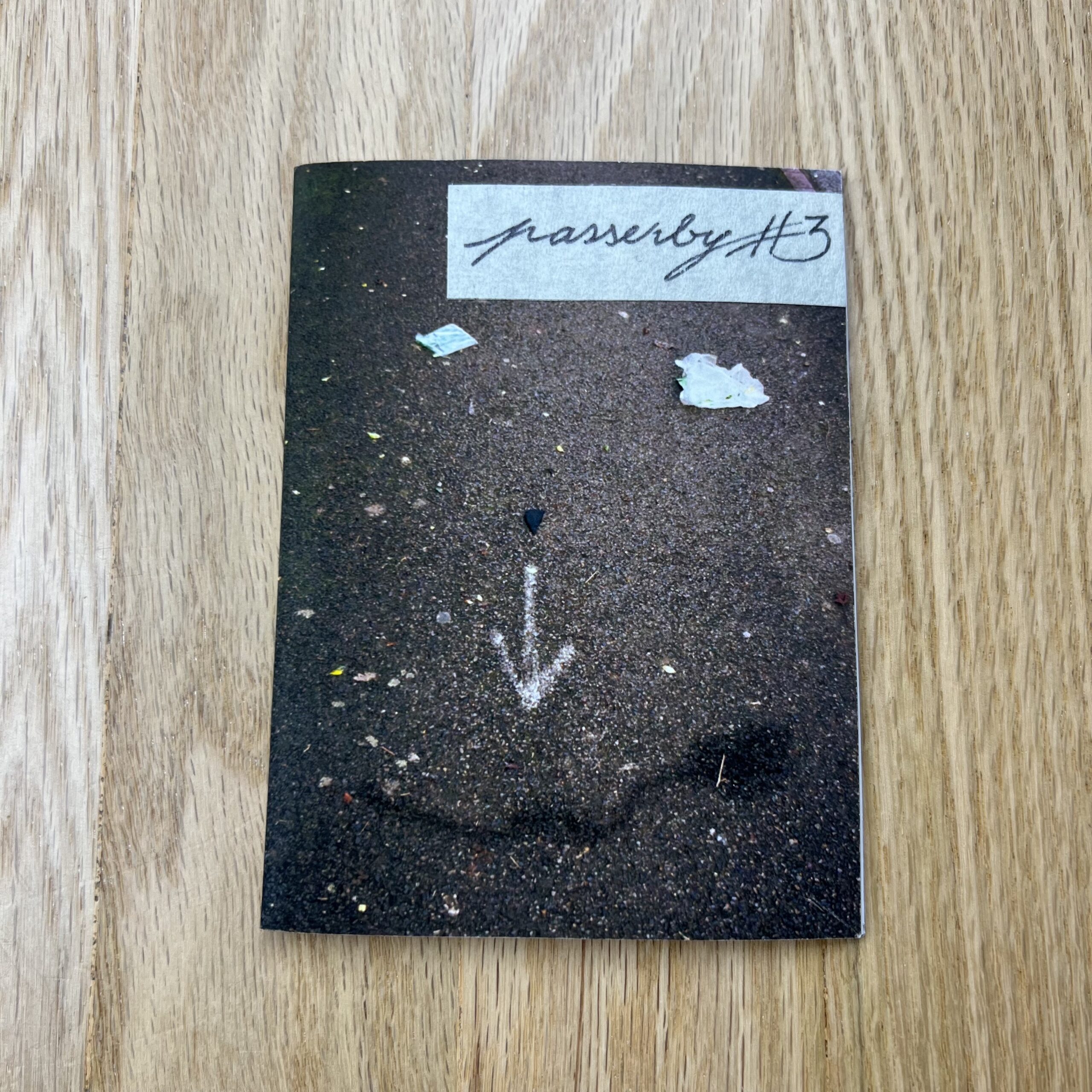
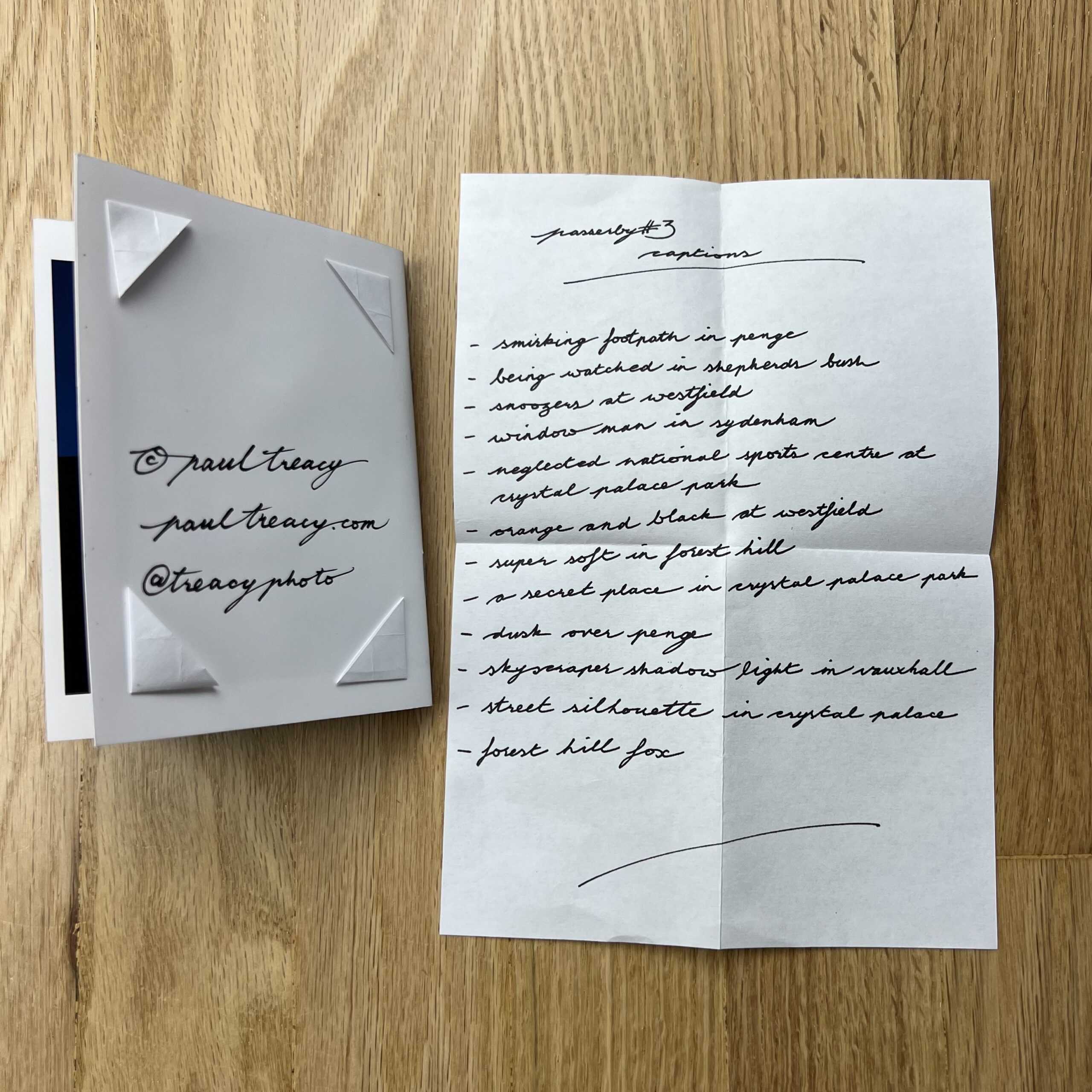
No one else is involved in this endeavour. Nor is it a promo piece. Rather it’s an exercise in focusing my mind.
I’ve been a contributor to Millennium Images here in London since 2003. However, I’ve not always been consistent in supplying material for curation, particularly during a period when I was primarily a carer to my two sons. So in an effort to produce work I needed some kind of facility.
Between 2008 and 2020 I had been making work in my neighbourhood of South East London which I put out as a handmade book called Hinterland. I sold about 40 of these and received copious encouragement from my peers. But I didn’t know how to follow it up.
I continued making work during the pandemic which was featured on the BBC. Someone who had moved overseas years earlier had seen this work and it made them homesick. They contacted me and asked me to make work in their old neighbourhood for them over a period of time. I had no idea how to go about this. Their old haunts overlap with mine so I figured I would just keep doing what I was doing where I was doing it. So the Passerby Zine project emerged from all of these influences.
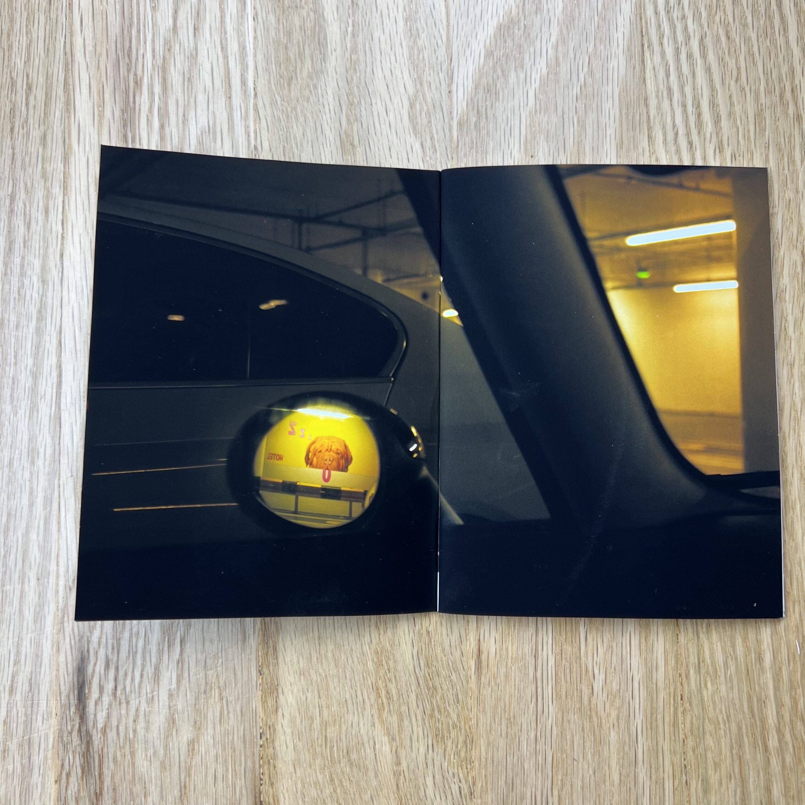
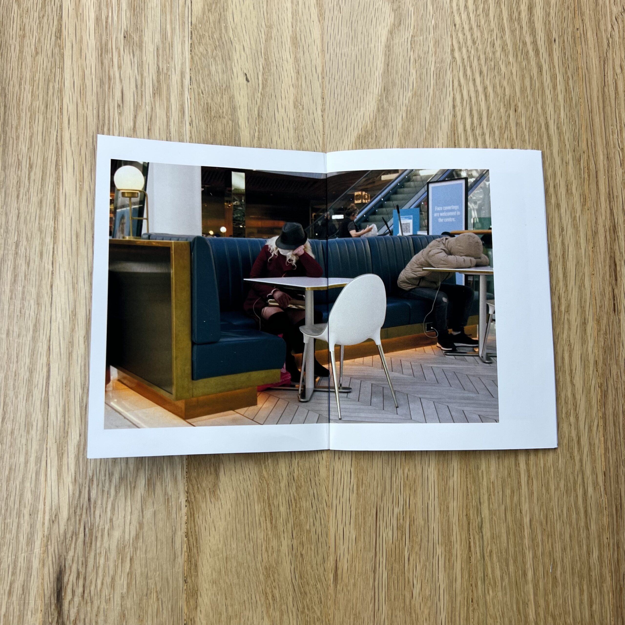
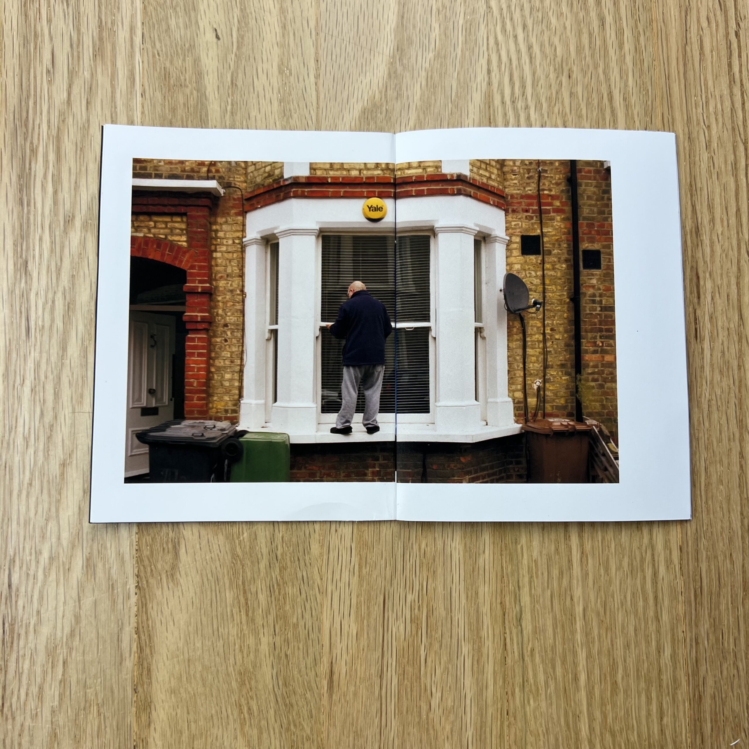
As I love the craft side of self-publishing and have some design chops having studied graphics in art school, I figured I would use the tools I already have to shoot, make and promote a periodical. I’ve been a serious street photographer since the late 80s and have a camera on me all the time so it seemed like an obvious thing to do.
The plan is to gather a handful of decent images every 4-6 weeks then edit and sequence them into a tiny home printed zine. From each edit there should be some strong photographs that can then be submitted to my agency for curation and consideration for editorial and commercial licensing.
As I settle into this project I am already thinking of spinoff projects, including timed print sales and an annual best of book.
Niall O’leary, Creative Director at Millennium Images, said of my work the I “like to find mystery and menace in the everyday”. He’s right. And that’s what Passerby is all about.
Normally, I tell you ahead of time, (and plan a proper get-away,) to help rejuvenate my creativity.
It’s a solid trick, and normally works well, but this time was different.
Rather than taking an actual vacation, I used the week-off to deal with some serious life stress.
Just like a mental-health-day isn’t really a “day off,” last week was about crisis management, and I guess the crises were averted.
But I can’t exactly say I feel refreshed.
(C’est la vie.)
I’m not mentioning this to complain.
(Though I know it might look like that.)
Rather, at the end of June, I gave a webinar for the Los Angeles Center of Photography, which was all about sharing strategies to maintain and support our creativity, over the long-term.
I’ve been a working artist for 25 years, so I created a list of 25 ideas that enable our creativity to flourish.
Much of the teaching would be familiar to you, (if you’ve been reading the column for years,) but of course some of it was new.
Somewhere in the middle of the lecture, I discussed the fact that outside forces in our lives, be they relational or geo-political, can have a massive impact on our creativity. (In addition to our happiness.)
Perpetual stress is hard on the body, and while creative practice is a brilliant form of self-care, sometimes it can get overwhelmed, and then diminished.
So today, feeling really bad, deep in my heart, I wondered how I was going to force myself to write the column, when all I wanted to do was put on my headphones and pretend the outside world doesn’t exist?
Denial doesn’t work, though, so I unboxed a book, read/looked at it, and went for a short walk to prep my thoughts. (As I often do.)
Don’t worry, I’m giving you all this context for a reason.
The truth is, I want you to decide for yourself whether the rest of this column, (the actual book review part,) is being colored by a bad mood, or whether I’m able to separate my emotions from my thoughts, on an admittedly difficult day.
Let’s get to it.
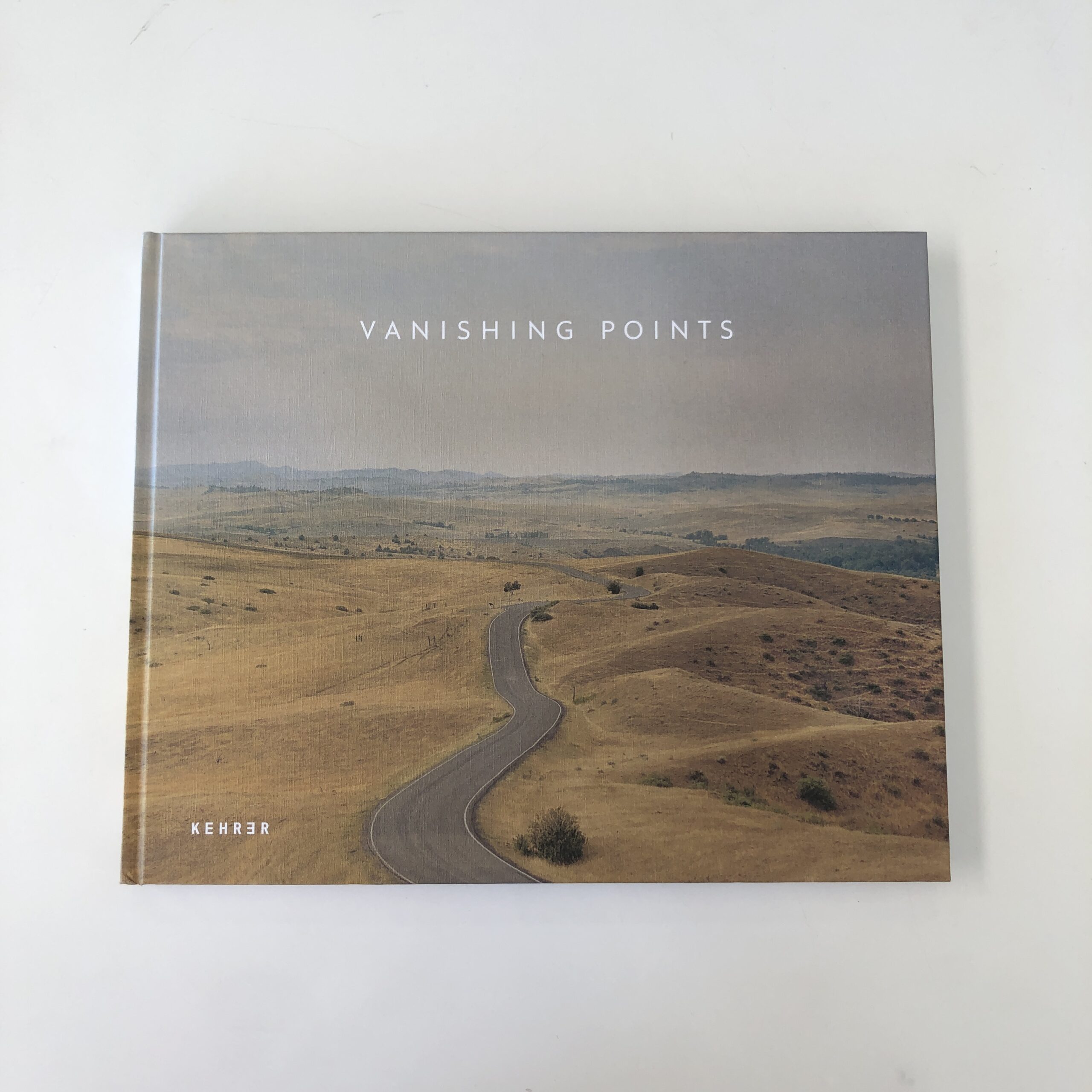
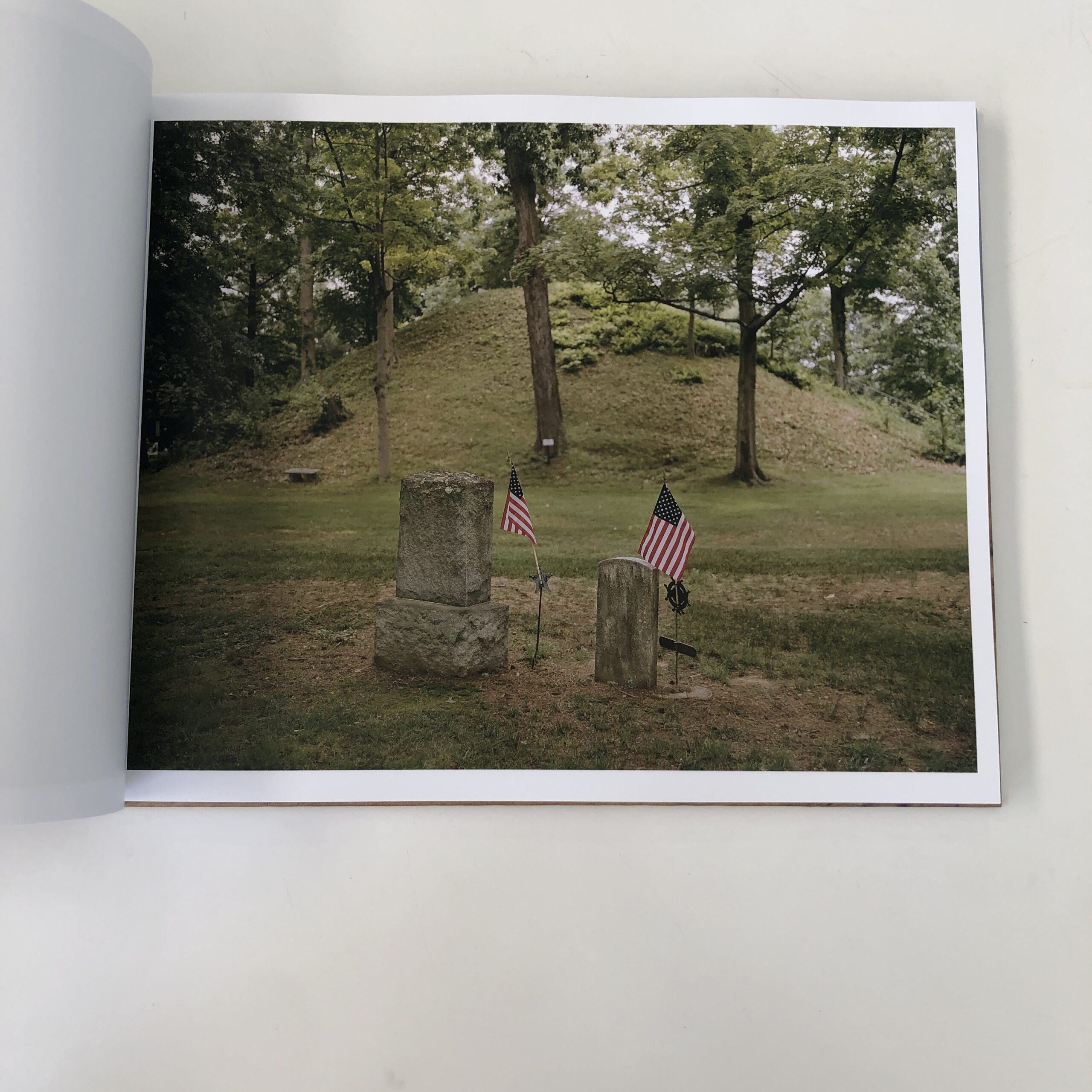
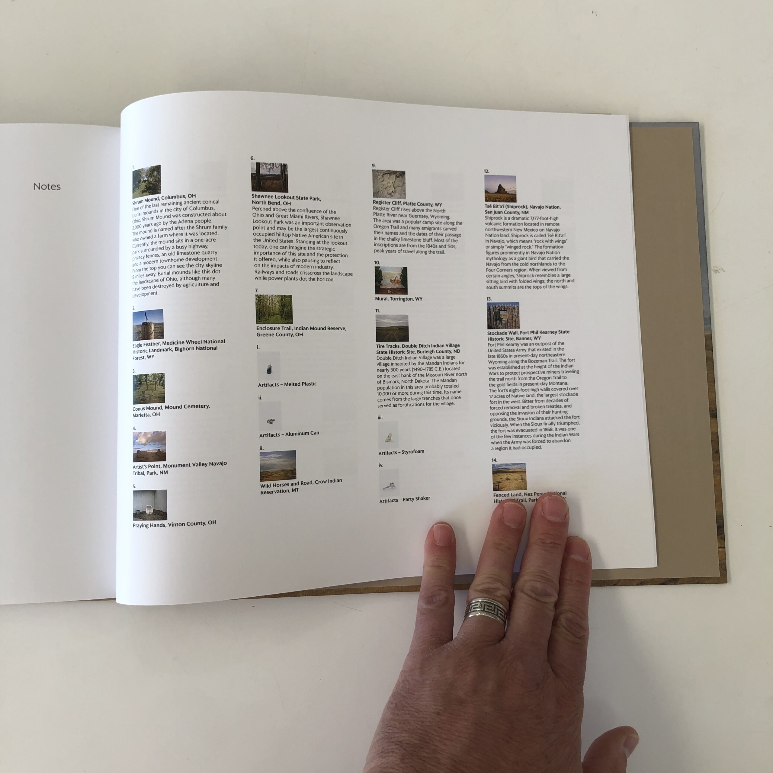
“Vanishing Points,” by Michael Sherwin, published by Kehrer Verlag in Germany, showed up in the mail a year ago.
This is one I remember requesting, and I even recalled a bit about its concept, which seemed promising.
So I wasn’t flying blind.
I was excited to receive it, because the book directly challenged the current status quo, with respect to theories about staying in one’s lane.
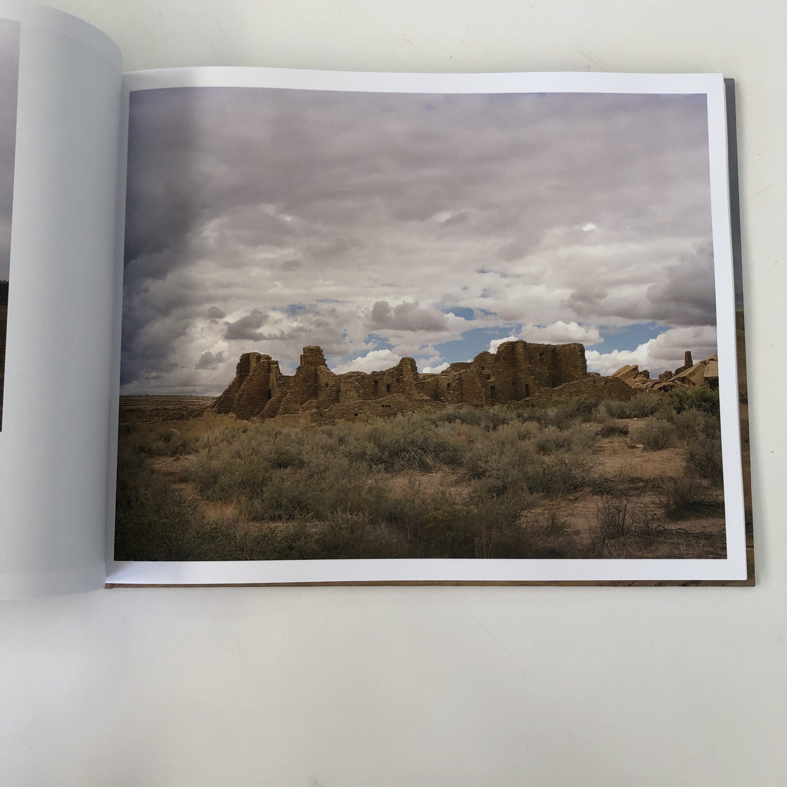
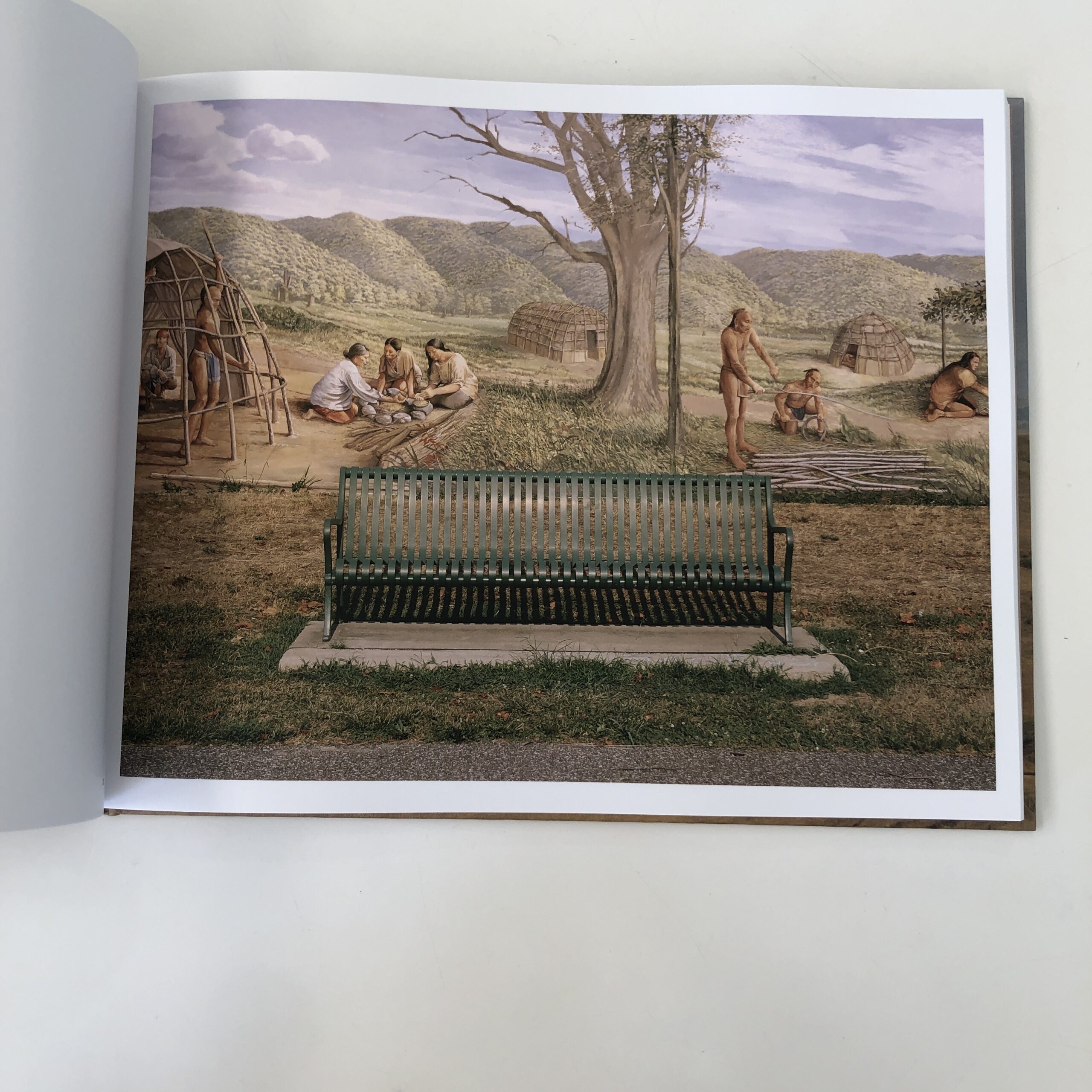
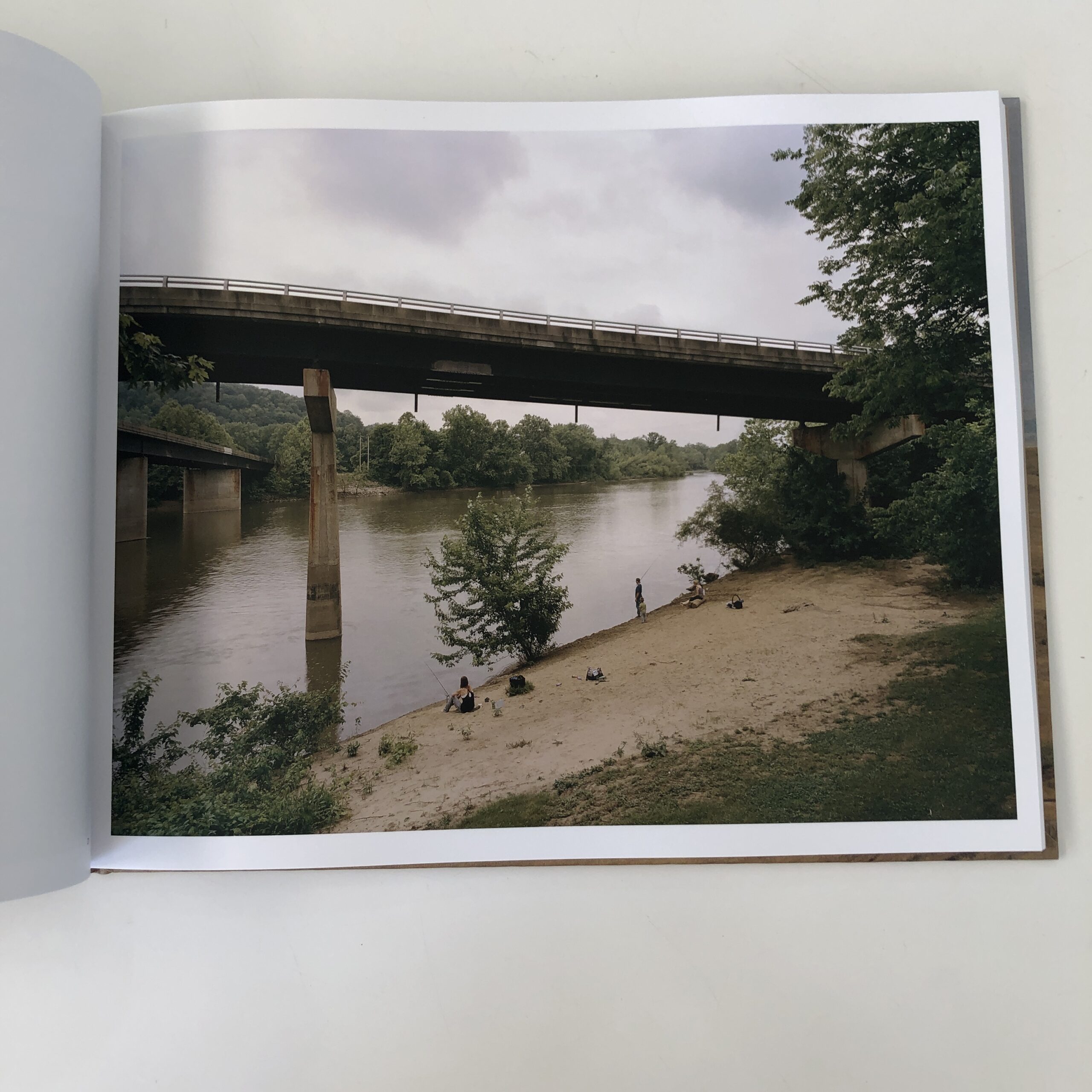
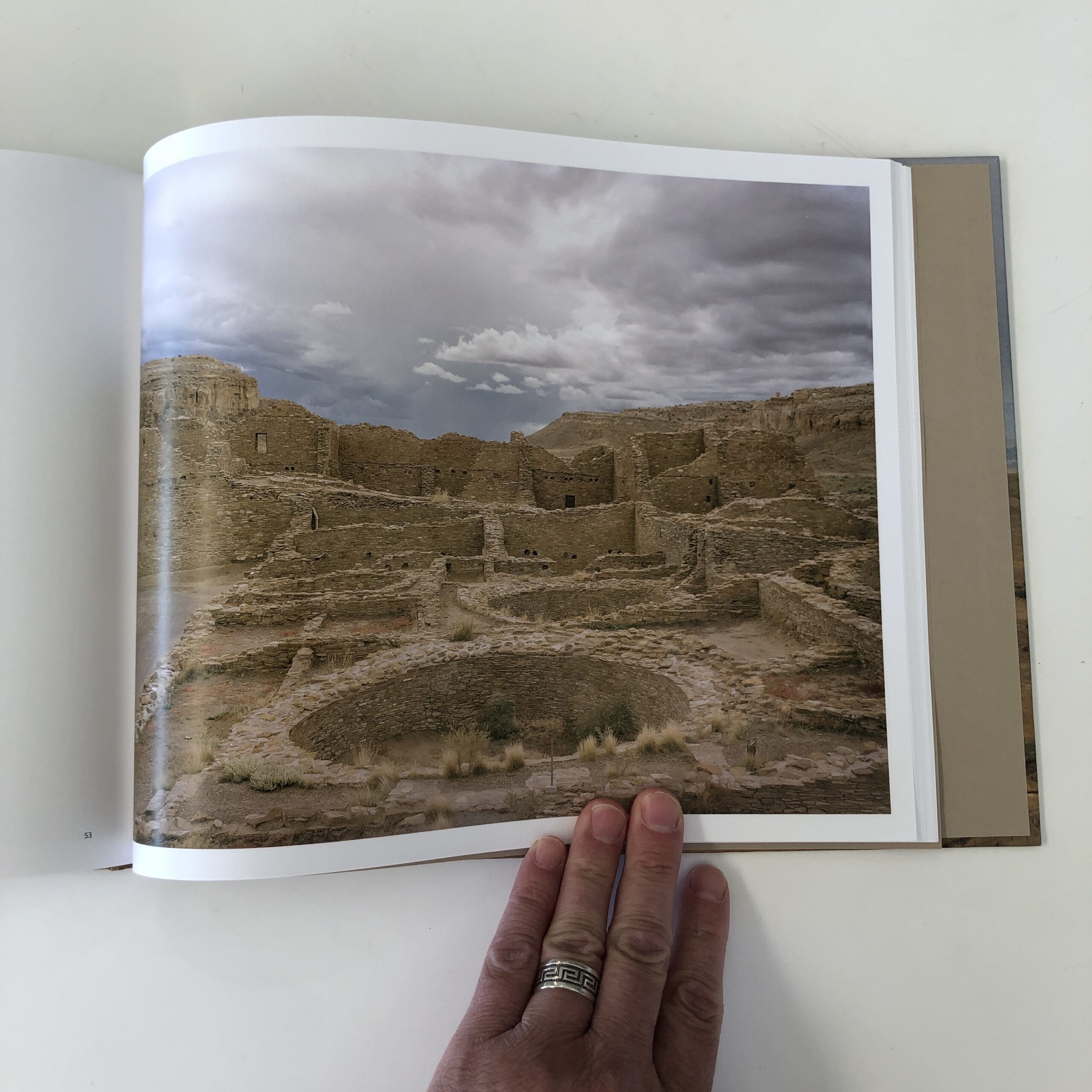
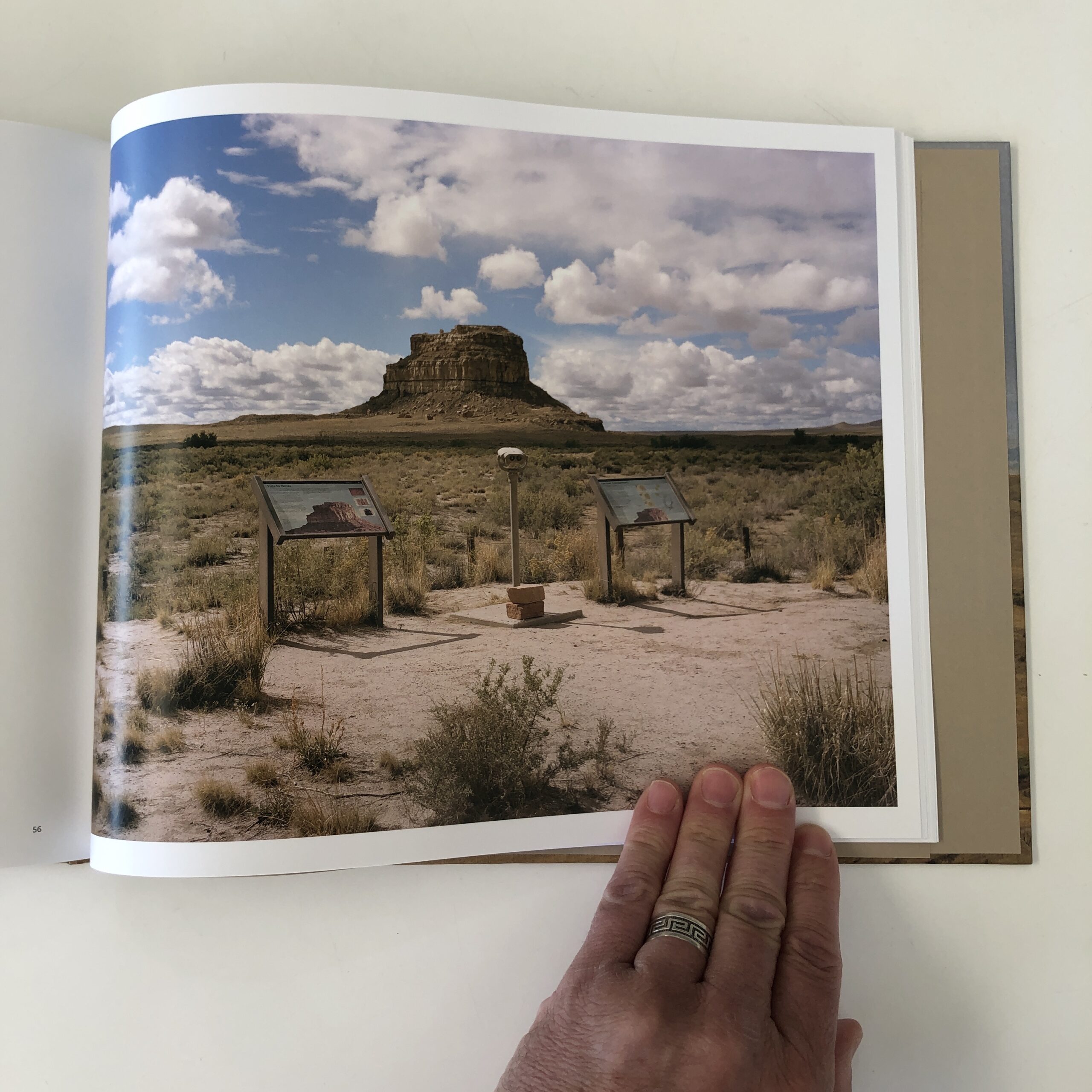
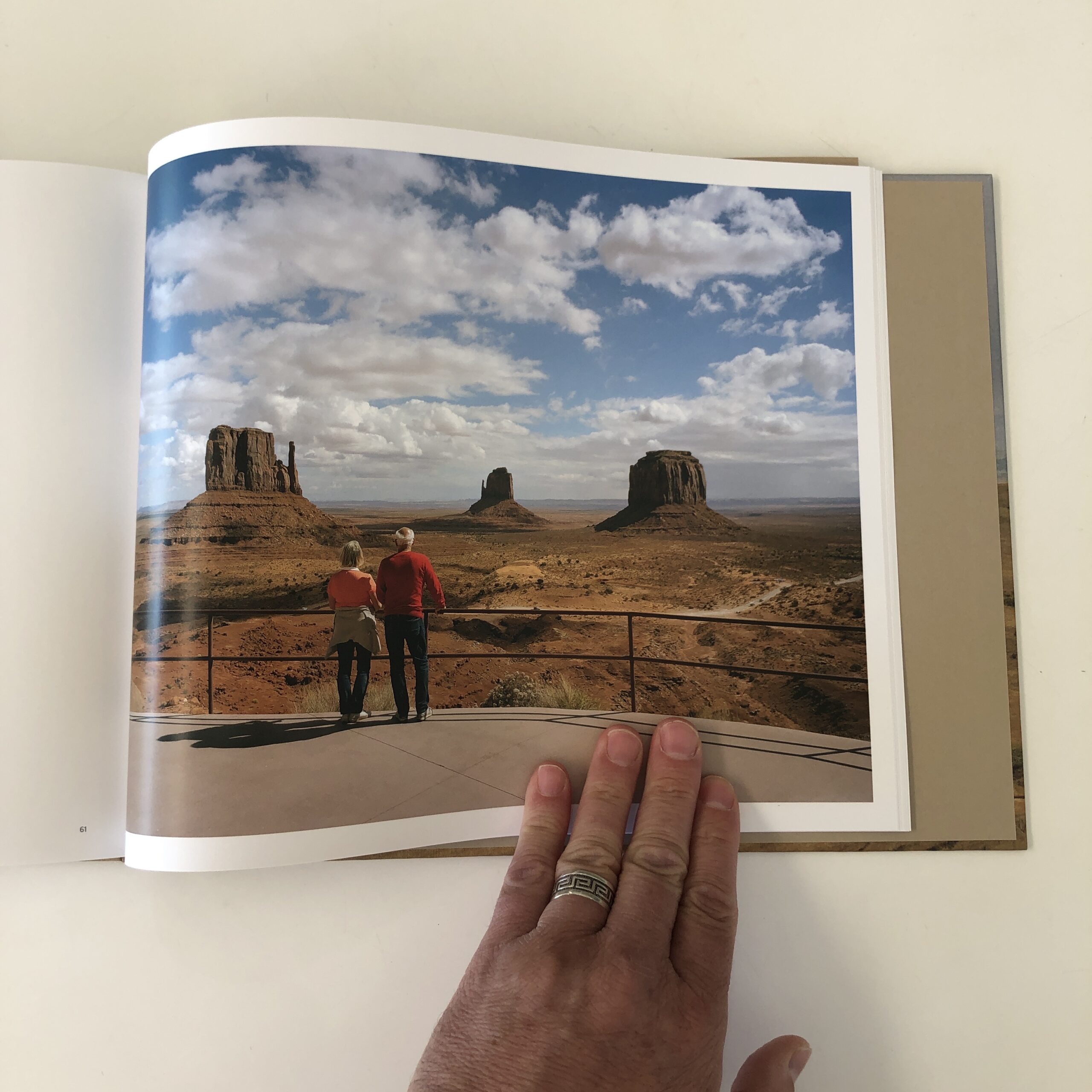
Near as I can tell, it’s a book by a White, male American, that attempts to tell stories, and gather information, about historical, Indigenous/ Native American sacred sites across the United States.
“Vanishing Points” is the exact book we’ve been hearing, for several years now, should not be made.
It’s the opposite of a project made by an inside member of a culture, and as I believe we should be allowed our creative freedom, I was hoping the book would be awesome, enlightening, fascinating.
(Alas, I’m not loving it, though I really hoped I would.)
Is it because I’m in a bad mood?
I really don’t think so.
“Vanishing Points” begins with a typical writerly essay, and then we get a statement by the artist, providing the backstory.
As I understand it, Michael Sherwin believes Indigenous philosophies might hold the key to a healthier relationship with nature, in a Climate Change era, and of course we’ve heard such things a million times before.
(I am not immune, living as I do in the midst of a historical Indigenous community in Taos, NM. Many gringos have been similarly seduced, through the centuries. And a more holistic relationship with the Earth would absolutely be a good thing.)
Again, I actually believe the roots of Michael Sherwin’s investigation are valid, and should be on-limits, so my problem lies with the execution.
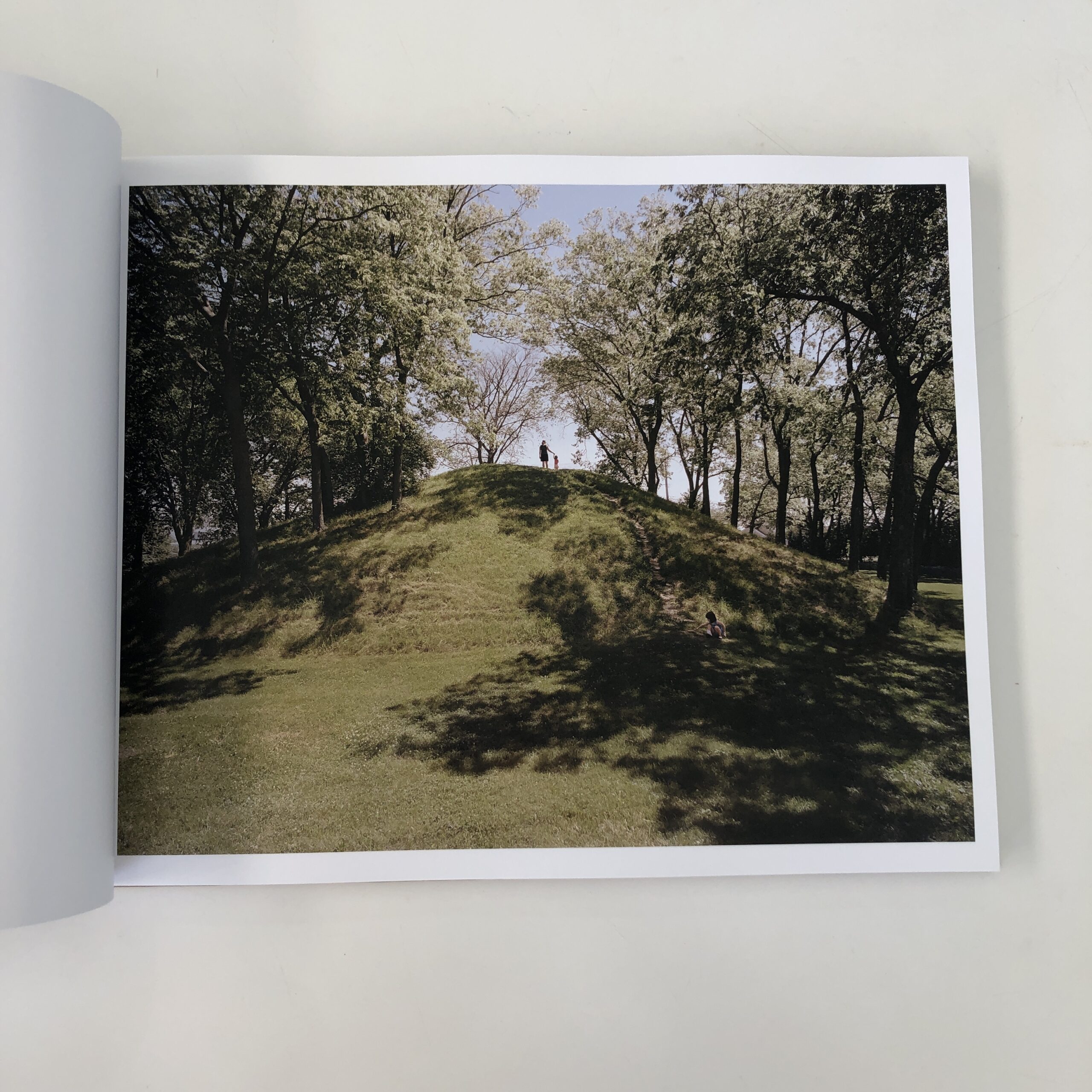
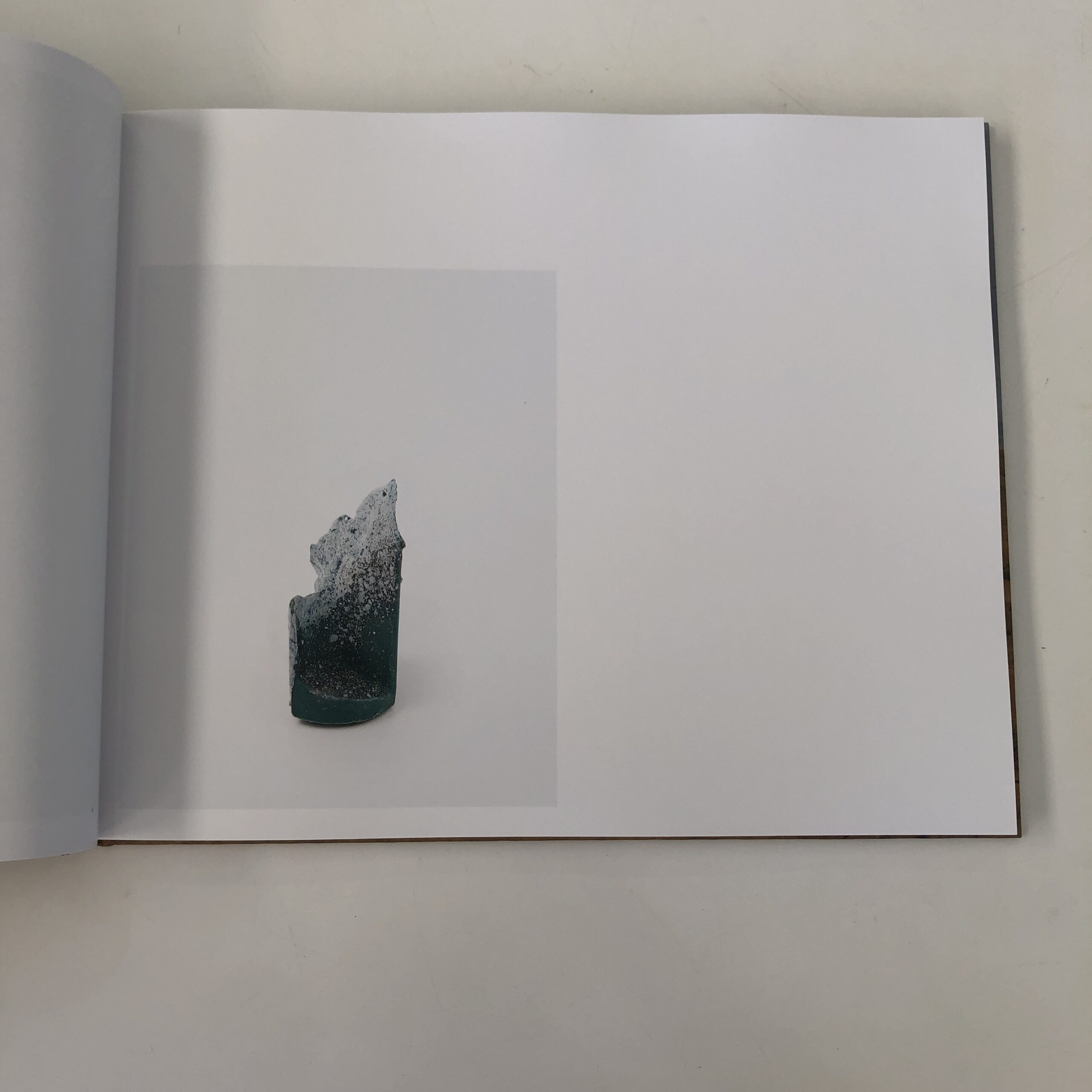
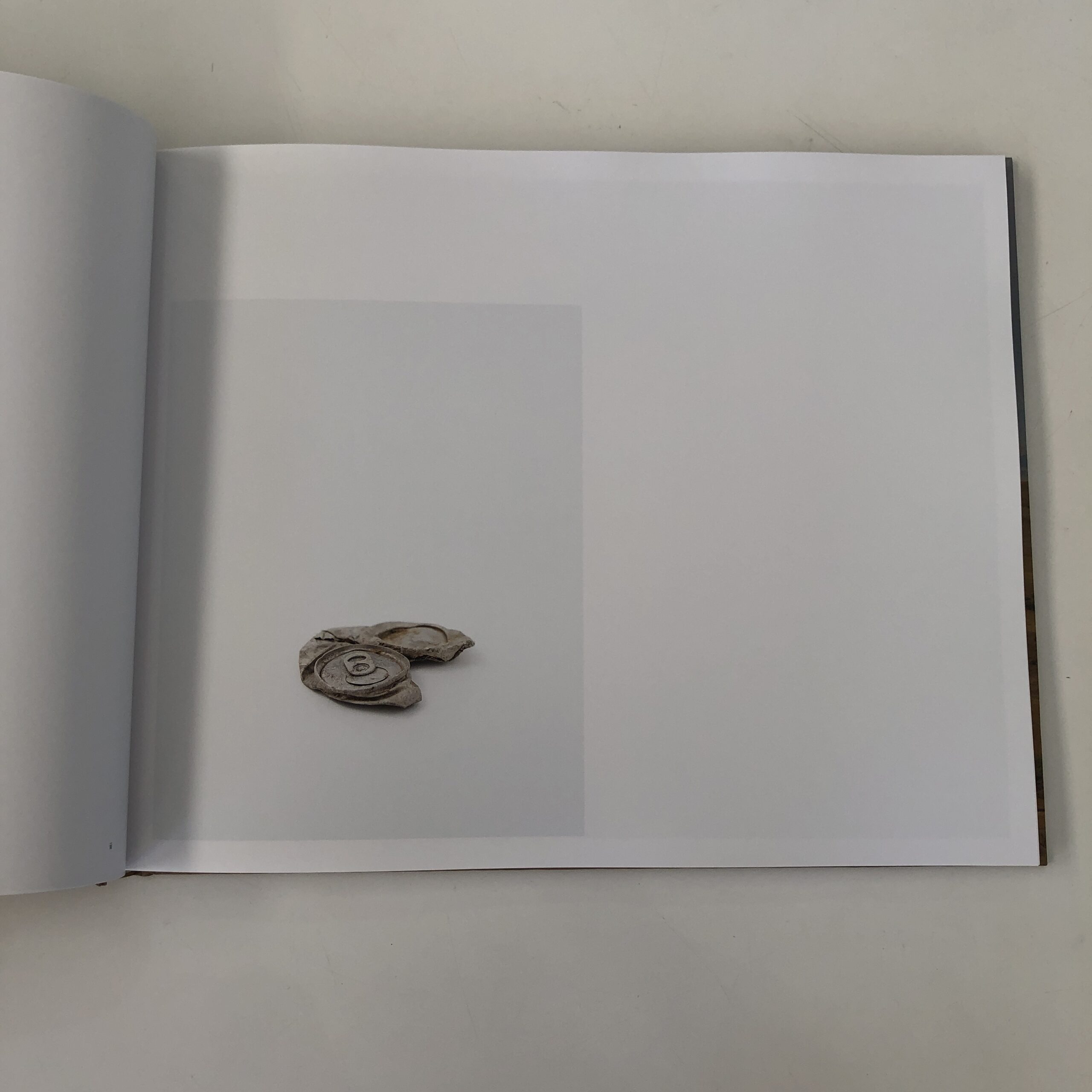
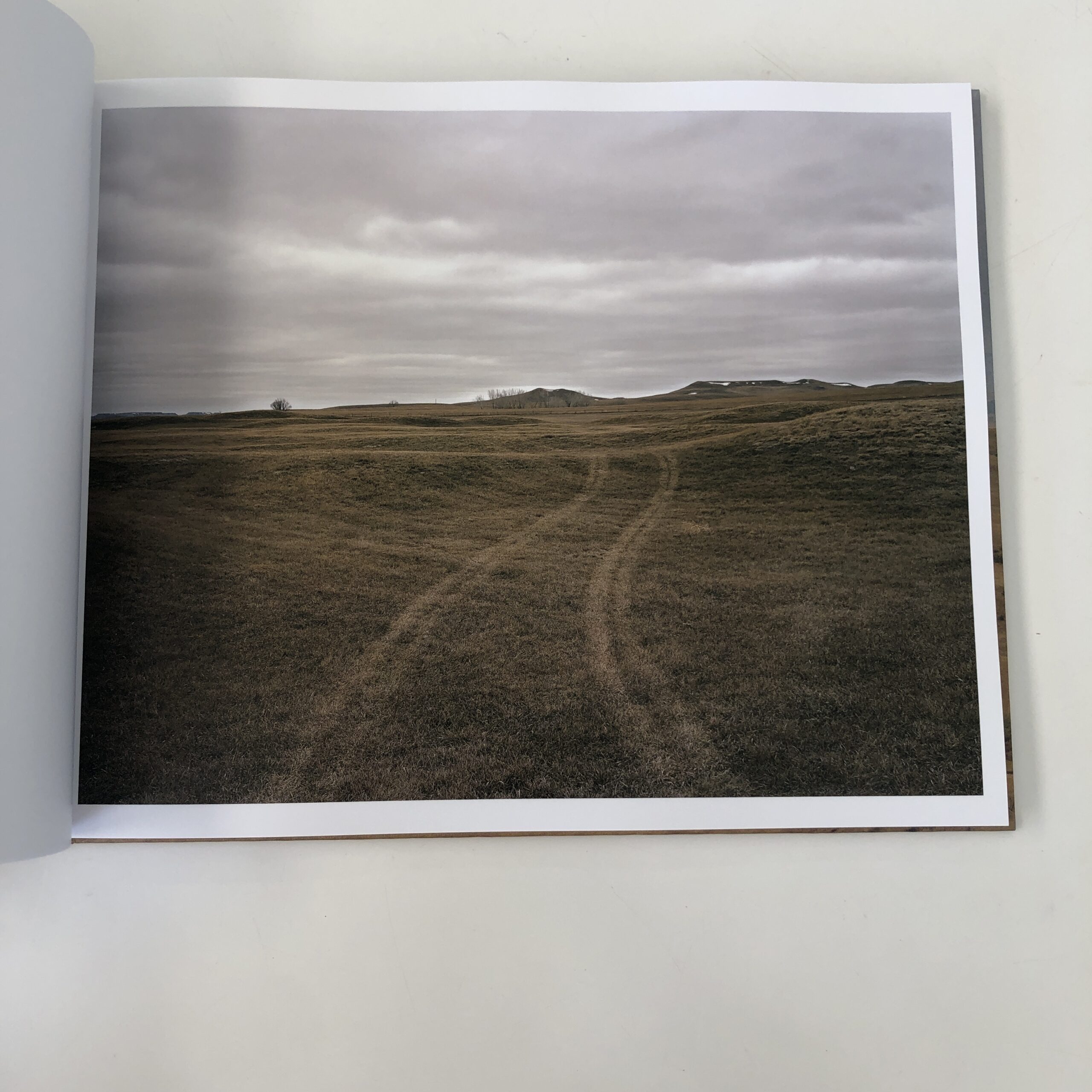
The book is a jumble of actual landscapes, cultural landscapes, obvious tropes, and trash artifacts removed from sacred sites, then photographed in a studio environment.
While there are captions at the end, to give us the specifics, it reads too much like a typical-photo-book template, (replete with a final, academic essay telling us what we just saw,) and the solid, but expected quality of the story-telling, and image-making, left me wanting.
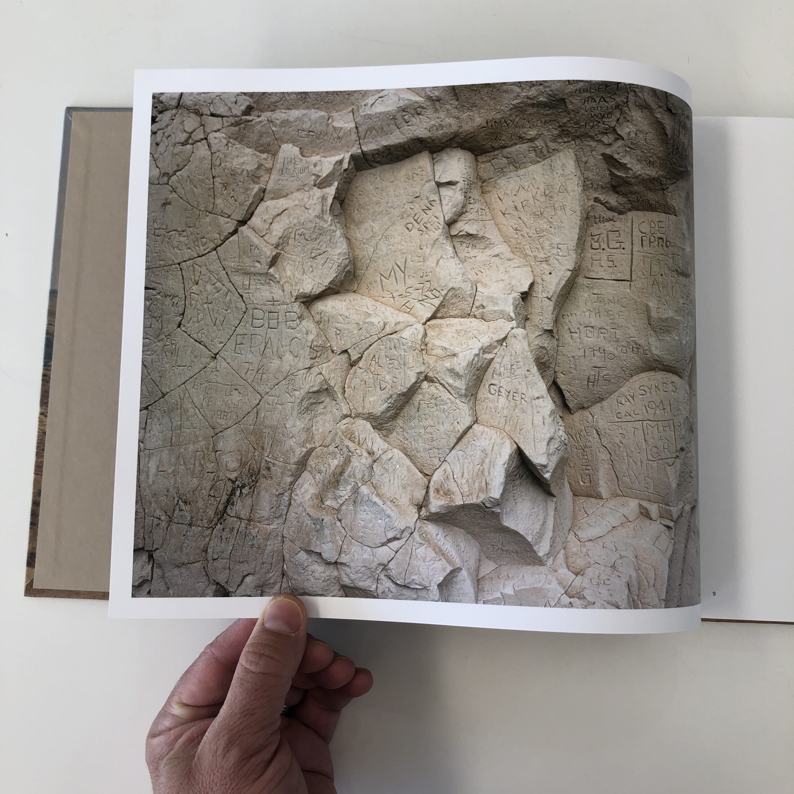
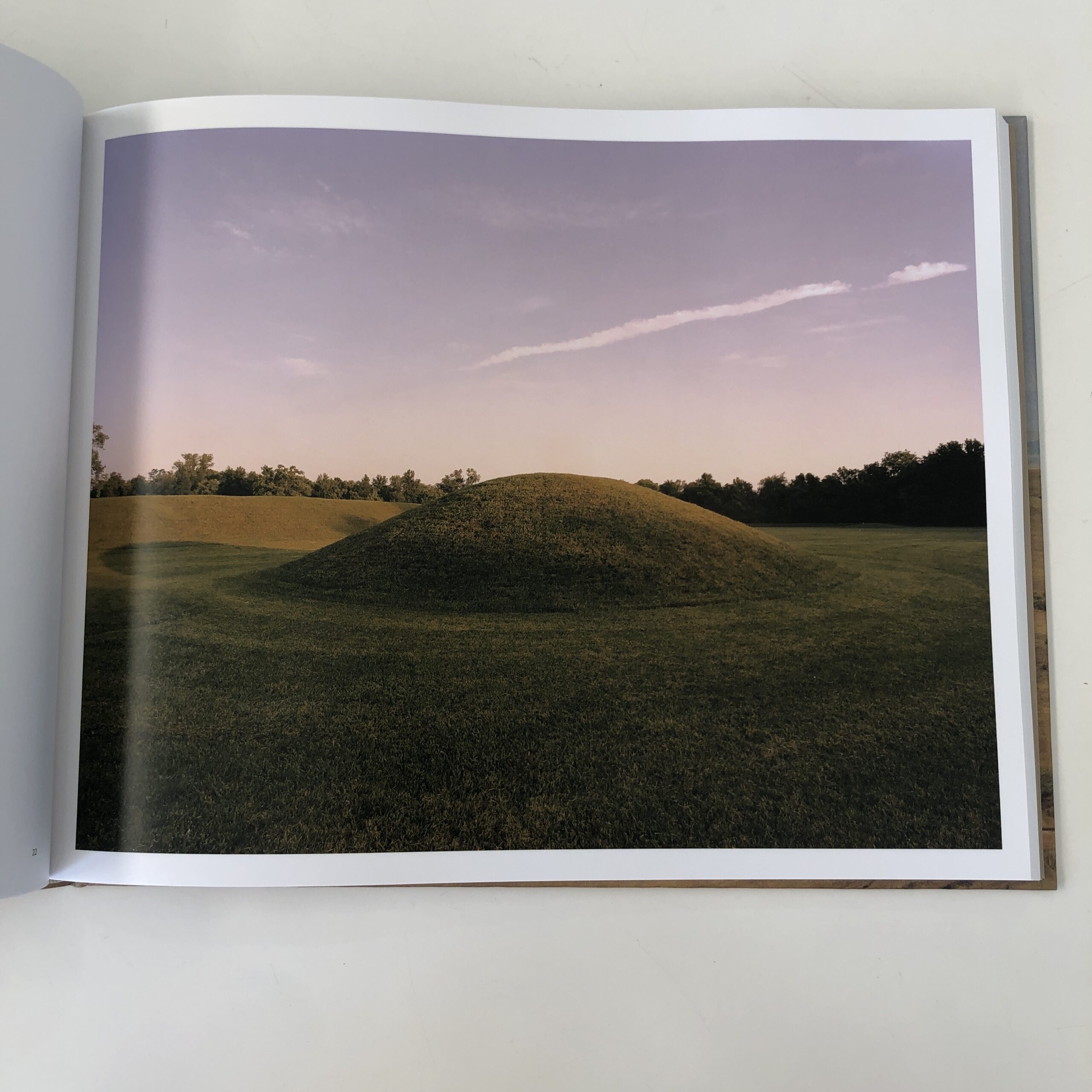
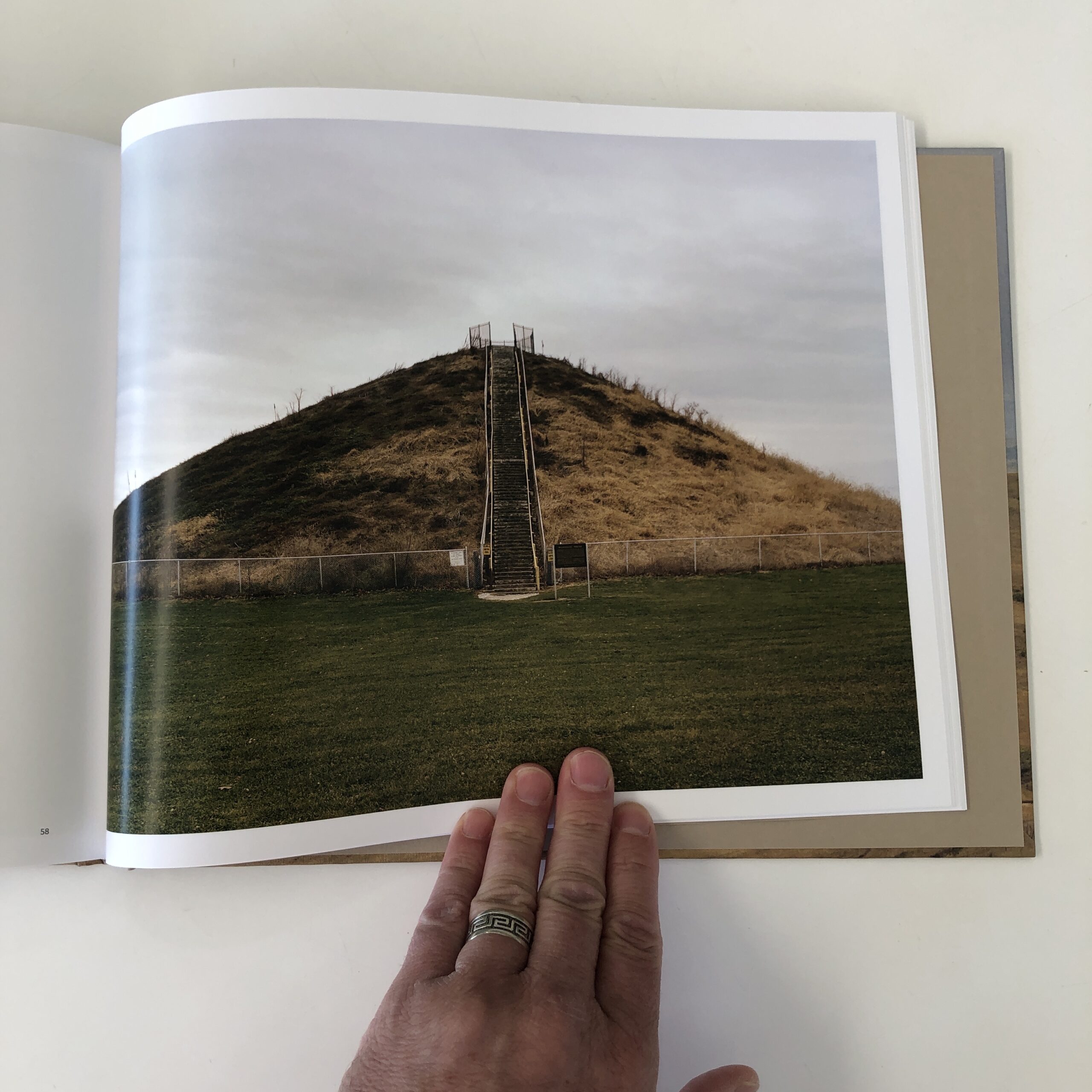
The photographs of earthen-mound-architecture were the stand-outs, and given how little most people know about the grassy structures, (which are so different from Mexico’s pyramids,) I think there could have been a much stronger project, had the artist done a deep-dive there.
With a dearth of general-cultural-knowledge about ancient, large-scale settlements like Cahokia, I believe this could have been something special, as a book.
But just as a Lenni Lenape warrior in 1700, in what is now New Jersey, could not have imagined Chaco Canyon, in New Mexico, linking so much of Native America together this way, through the experiences of a wandering, White photographer… I couldn’t make it work, as a critic.
And I wanted to.
Truly.
I sat there, after putting the book down, and asked myself how to write the review?
How to honor the artist’s right to his vision, and applaud the effort that went into crafting it, while still finding fault with the results?
Being a critic can be hard sometimes.
But so can being an artist.
As always, we do the best we can, and take one day at a time.
If you’d like to submit a book for potential review, please email me at jonathanblaustein@gmail.com. We are particularly interested in books by artists of color, and female photographers, so we may maintain a balanced program. And please be advised, we currently have a significant backlog of books for review.
The Art of the Personal Project is a crucial element to let potential buyers see how you think creatively on your own. I am drawn to personal projects that have an interesting vision or that show something I have never seen before. In this thread, I’ll include a link to each personal project with the artist statement so you can see more of the project. Please note: This thread is not affiliated with any company; I’m just featuring projects that I find. Please DO NOT send me your work. I do not take submissions.
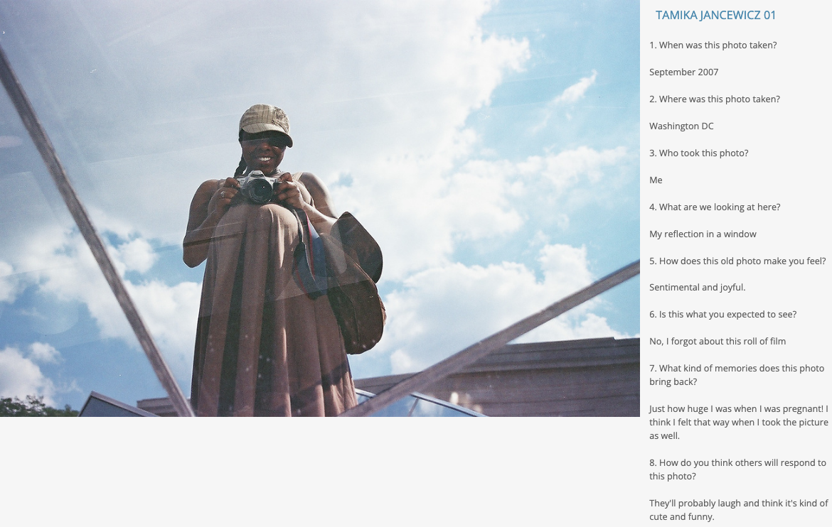
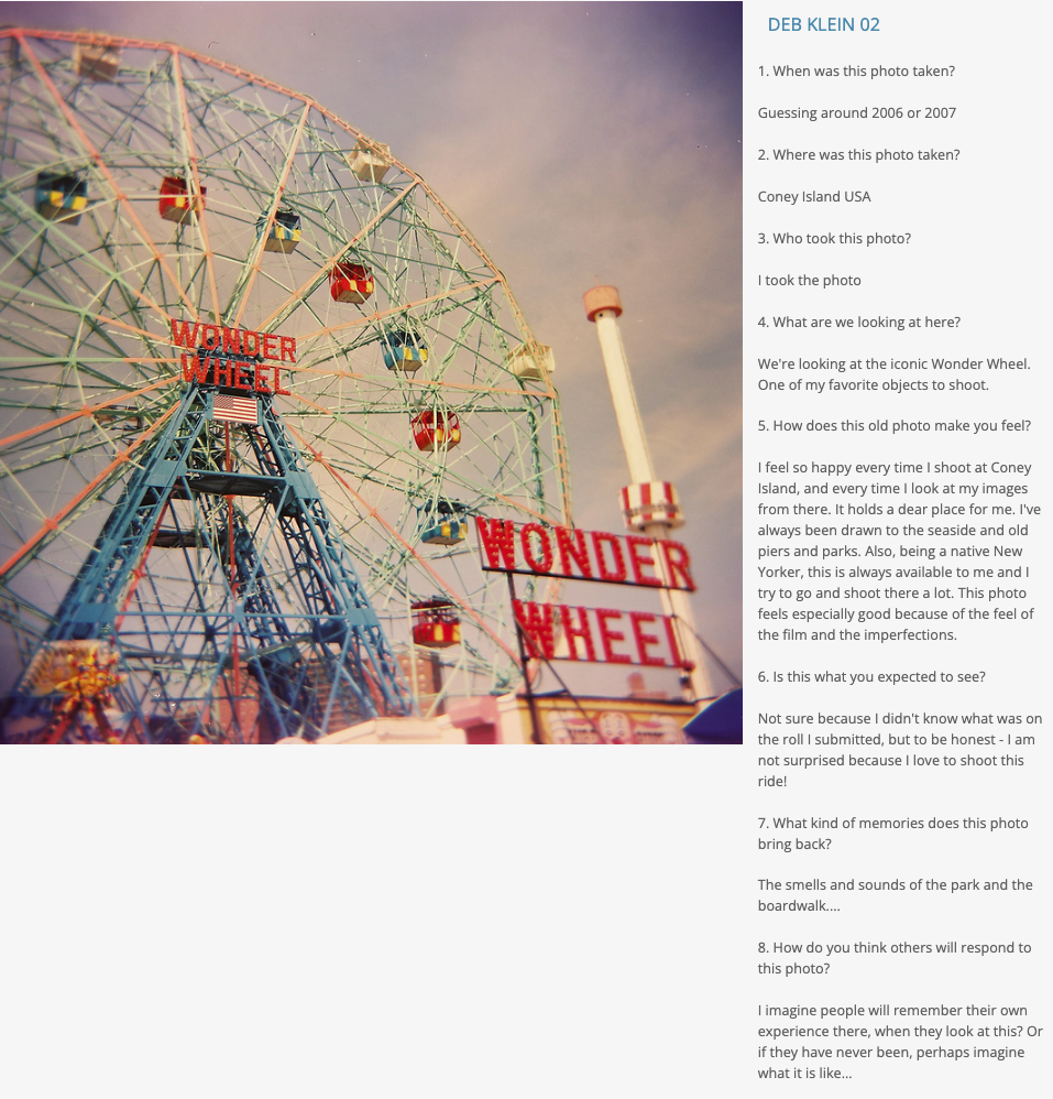
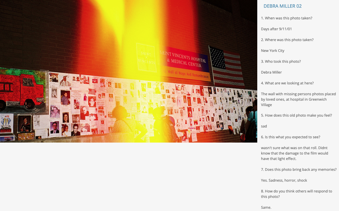
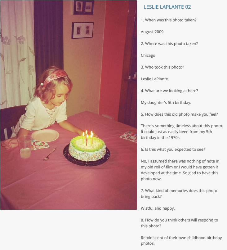
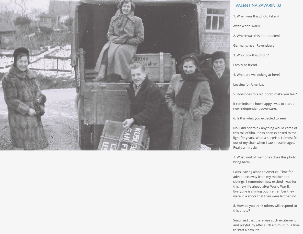
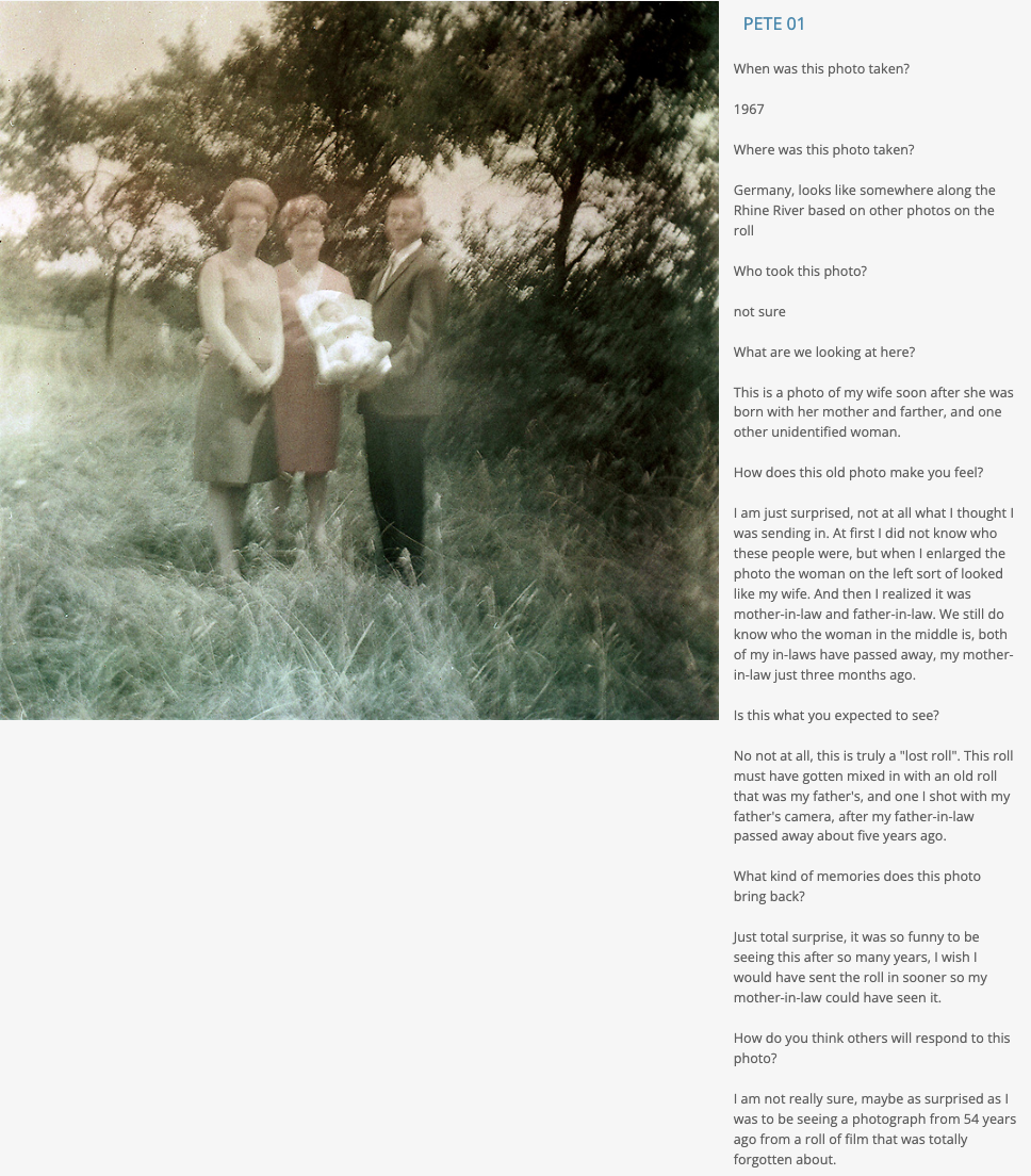
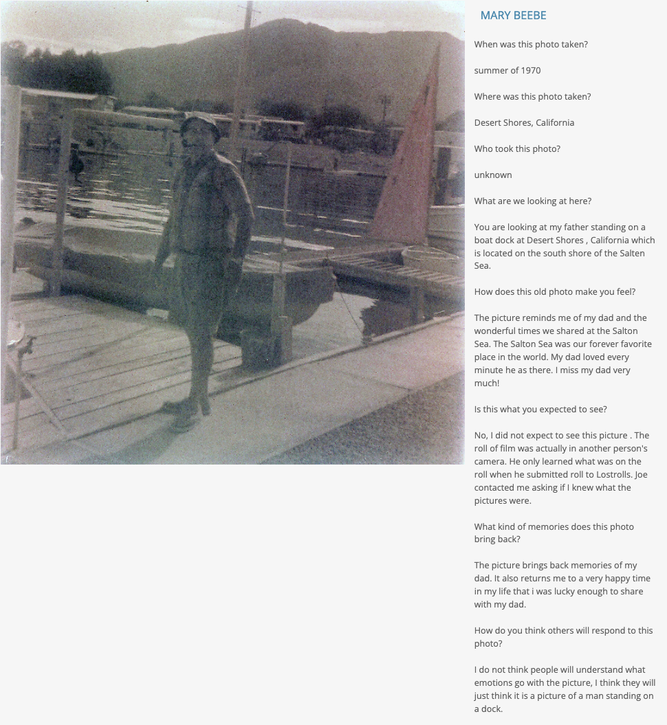
Do you have an old roll of film lying around—in the back of a drawer or tucked in a shoebox? Wonder what’s on it? How long has it been sitting there—5 years? 10 years? 20 years? Longer? Lost Rolls America opens the magical reencounter with the past to anyone who possesses unprocessed film rolls.
This project celebrates the role that photographs play in shaping the construction of memory. Imagine the old snapshot of a relative that brings back memories of family gatherings; or the image of a younger version of yourself wearing a shirt you haven’t seen, let alone thought about, in over a decade. The Lost Rolls America archive combines photos from the past with present-day recollections inspired by the found images.
The archive is a visual repository of America’s past: from the west coast to east coast; from post-World War II immigration, a 1969 Vietnam War protest to the aftermath of September 11th and beyond, from special occasions to mundane moments, all that constitutes daily life captured on film but then often forgotten. The pictures offer poignant and even surprising glimpses into which images are most meaningful to America’s visual past.
At a moment when the American landscape often feels divided, Lost Rolls America reveals the myriad ways the country is in fact united. Certain themes carry across the photos, regardless of race, gender, age, and geographical location: the value of family, the innocence of childhood,the memories of lost loved ones, and the exuberance of travel, to name a few.
With partners FujiFilm, PhotoWings, and Photoshelter, the project invites participants to provide one to two rolls of film, which is developed and scanned free of charge and made available back to them. Participants then privately choose one to two images and in a small write-up, explore the meaning of the photo and the significance of viewing a piece of their personal, sometimes lost past. Sincere and emotional, the responses are evocative words that speak to us all. The archive is an amazing testament to how much photography plays a role in remembering our own pasts.
APE contributor Suzanne Sease currently works as a consultant for photographers and illustrators around the world. She has been involved in the photography and illustration industry since the mid 80s. After establishing the art-buying department at The Martin Agency, then working for Kaplan-Thaler, Capital One, Best Buy and numerous smaller agencies and companies, she decided to be a consultant in 1999. She has a Twitter feed with helpful marketing information because she believes that marketing should be driven by brand and not by specialty. Follow her at @SuzanneSease. Instagram
Success is more than a matter of your talent. It’s also a matter of doing a better job presenting it. And that is what I do with decades of agency and in-house experience.
Concept: Still life and lifestyle images featuring beverages and products
Licensing: Collateral use of up to 10 images per shoot
Photographer: Still life and portraiture specialist
Client: Beverage company
Here is the estimate:
A photographer came to me looking for help with developing a retainer agreement for a beverage company. The photographer had a previous working relationship with this brand, and they required a consistent stream of content for use on their social media channels. Additionally, the company operated multiple brands, and they had the same need for each brand. Each shoot would be similar and would involve a mix of still life images of the beverages, and possibly lifestyle images of people enjoying or interacting with the products as well. The location for each shoot would be provided by the client, and having done this multiple times, the photographer had a good sense of the limited production footprint the client wanted, and a rough sense of what they might be comfortable paying upfront as a retainer.
Pros and Cons of Negotiating A Retainer
Negotiating a retainer agreement can be a bit tricky, but there can be major benefits for both the photographer and the client. For a photographer, the benefit of a retainer is that a client is willing to commit to a large amount of money and multiple shoots upfront. For a client, a retainer allows them to offload finances in one lump sum, rather than having to pay for each individual assignment, and this often alleviates accounting headaches.
However, retainers do sometimes come with downsides. A photographer will need to be able to keep track of how a retainer is being applied, and will ideally be ready to present these numbers to a client when asked. Also, sometimes clients feel that after a retainer is paid, they can control the photographer’s calendar, and that can sometimes become problematic if a photographer has other clients they would like to shoot for as well. A retainer also typically works best if each shoot that is to take place is more or less the same in terms of creative direction, deliverables, and usage. A retainer can be a win/win if the right set of circumstances present themselves, as they did in this case.
Building A Retainer Agreement
The first step was to determine how much to charge for photography fees and expenses and outline the needs of the project. Based on pricing for previous projects, we knew the client was willing to spend about $5,000 for a shoot, inclusive of a $1,500 fee for the photographer, plus expenses. They also anticipated walking away with 10 images to use for collateral purposes (mainly social media). Based on that, and knowing they hoped to do one shoot a month for a year, we came up with a retainer fee of $60,000 ($5,000 x 12 shoots). Below is a breakdown of the expenses we detailed in the agreement.
Photographer Fees: We noted that the photographer’s creative/licensing fee would be $1,500/day and include collateral use of 10 images in perpetuity. If a pre-pro day was needed, that would be $500/day.
Crew: Most of the projects would just require one assistant, but I listed the fees per day for both a first assistant and a digital tech. I considered adding a producer line item and additional assistants/crew if the projects ever expanded to include talent and a higher production level, but ultimately based the crew list on what was included on previous projects. Additionally, if more crew became necessary with increased project scope, the photographer would still have an opportunity to estimate each project ahead of time and add those elements in at that point.
Post Production: We noted that retouching would be $50 per hour, but purposefully didn’t list a total amount of time, with the intention of that it would be quoted with each job.
Casting and Talent: Since this could vary wildly, we noted that this was TBD and would be based on the creative direction for each shoot.
Equipment: We anticipated $500 per day would cover basic equipment, and the photographer would plan to bring their own gear. If more elaborate lighting setups were needed, that could be quoted on each estimate ahead of time.
Styling: We noted appropriate stylist rates for this particular market and noted wardrobe and props would be based on the creative needs of each shoot.
Miscellaneous: We simply note that there could be items such as mileage, parking, and meals and that those would be TBD until a specific project scope came to light.
The Fine Print
To ensure the pricing accounted for actual costs, we noted that the expenses were not firm costs and that for each shoot the photographer would create an estimate showing the exact expenses based on the creative needs and each project scope. We also included a clause that stated that after each production, the photographer would provide an invoice that showed how much was being deducted from the $60,000 retainer and clearly show the balance remaining. The agreement states that if the fees and expenses go over the retainer amount, it would be brought to their attention throughout this process and that those funds would be billed on top of this retainer.
Results
The photographer shared the estimate with the client and they agreed to the retainer fee.
Need help estimating or producing a project? Please reach out. We’re available to help with any and all pricing and negotiating needs, from small stock sales to large ad campaigns.
Part of an ongoing series where I explore the world of NFTs (Part 1, Part 2, Part 3)
Michael Yamashita, a far-east specialist, has been making pictures for National Geographic for over 40 years, and up until 2008, he was the only regularly contributing photographer of color. In addition to over 30 Natgeo magazine assignments over the years, Michael has sold stock, lectured, given workshops, and has made 16 books. In April of last year, Michael started selling his photography as NFTs and is currently listed on Opensea.com as #25 in all-time sales for photography. As someone with such a storied career that has found great success in NFTs, I reached out for an interview.
Michael Yamashita: It’s great having that many followers from all over the world, but since they changed the algorithm last year, if you are not posting video, you’re not getting any new followers, so Instagram is not as fun anymore for a still photographer. A year ago, I could see 100,000 likes on a post, and now a good post is maybe twenty thousand. And only a small percentage of your followers see all your posts as the formula chooses to send to maybe one-fifth of them. But what we’ve found with Instagram, and this is across the board with my colleagues, is that Instagram people are mostly bucket listers or aspirational travelers. It’s important to be visible on Instagram, but it’s never been a key way to sell anything. We have an occasional book or print sale, but you’d think you’d have more.
When I got involved with NFTs, everyone thought I would pick up sales from my 1.8 million followers, but that didn’t really happen because it’s a very different audience.
aPE: Can you tell me how you got started with NFTs?
MY: Two Harvard MBA grads approached me last year because of my large social media following. And as you know, it’s daunting getting into it; there’s a lot to learn with the vocabulary, dealing with the technical side, and all the Twitter stuff.
The big Beeple sale had just happened, and a bunch of us photographers, all well-known names in the industry, were sitting around trying to figure out how to get into NFTs, and I was the only one who made the leap, and that was mainly because these guys I met were ready to go ahead and help me promote and do what’s necessary to make it happen. We set it up like a photo agency, I chose the photographs, and they handled the technical aspects, and my job was to introduce myself on twitter spaces and get to know the community. It helped that many were already following me on Instagram. Because of that exposure, we got invited into several groups and had several whales who began collecting my work.
We were told initially that photographs would never sell as Nfts, so we teamed up with an NFT artist who for example took one of my best-known pictures – of Tibetan monks and, using AI, added motion and changing facial expressions to the individual monks and that was my first sale. It was bought by a collector, Drew Marshall, who goes by “hydrate.” He loves photography and happens to live close by, so we became friends. He is now part of my team as a consultant and is involved in our strategy.
aPE: Then didn’t you have a very successful sale on Opensea.com, where you are listed near the top of the sales chart?
MY: The Four Seasons of Jiuzhaigou, my second drop – all straight, non-AI manipulated photographs, took about four months to sell out. It was listed as #24 of the most traded NFT photography collections on OpenSea. And then my 3rd drop of photographs from Tibet was on Nifty Gateway in January, and that sold out in 30 seconds.
aPE: How important is marketing the work and selling out vs. the actual photography?
MY: For the NFT crowd, what makes a great photograph is not necessarily what you would choose as a picture editor who is used to seeing a lot of great photography. It’s more like what appeals to an Instagram crowd, people who just love the picture for whatever reason, but it doesn’t necessarily have to be something critical. There is some crossover between Instagram fans and NFT enthusiasts. I often use Instagram as a measure of how an audience is going to react to a particular photograph; when you see one on Instagram getting huge numbers, you can tell it’s something that grabs the attention of a large crowd, who are reacting emotionally to it.
About half the buyers are in this largely for the investment – they want to resell the work on the secondary market. Your value is often determined by the prices on the secondary market. I’ve had the good fortune that some whales have liked and supported my work. But the quality of the photograph still greatly matters – the cream rises to the top. You look at the big players, and they’re good photographers. You may not have heard of them before, but these guys are good. I have personal favorites, Billy Dinh, John Knoph, Dave Krugman, Reuben Wu. There’s some great photography talent out there. They are primarily a younger crowd; I’m easily the oldest guy in the room. But as I’ve gotten to know them, many have become my friends. The community is extremely enthusiastic and supportive.
aPE: You’ve done assignments for National Geographic, lectures, workshops, sold stock, sold prints, sold books and now NFTs. Can you talk about that progression?
MY: The magazine and photojournalism world has changed dramatically. Stock dried up years ago, and what few magazines are left are not at all the same. The covid years were terrible for photography; even with the PPP loans, I don’t know how anyone made it through the year. I had three assignments and no travel. If I didn’t get involved in the NFT sales, which I began as basically an experiment, I don’t know how I would have made ends meet. But at the same time, I got lucky that covid happened and I was not traveling; otherwise, I don’t think I would even have gotten involved. Being home afforded me the time to travel through my archive, finding the photographs to market as NFTs and getting involved with the community. Things are turning around now, and I’m traveling again, but NFTs are a bright spot for photography right now.
aPE: What advice can you give photographers who want to get involved with NFTs?
MY: I’m fielding many calls from my colleagues, and everybody wants in, but It’s a volatile market so you’ve got to embrace the entire experience and be in it for the long haul. The business is constantly morphing. Starting from ground zero is even more difficult now as many more photographers enter the space. Anyone can do NFT 101, but you’ve got to do the work to get your name out there in front of the community. And that is the issue, the marketing, without any recognition, nobody’s going to look at your stuff. Most big names in photography are not necessarily well known in the NFT space. The market is a community, and they expect NFT creators to be accessible and approachable. You’ve really got to network to get your stuff out there in front of this new group. The events where you can go and meet people are important; the Twitter talks, engaging followers on Twitter and discord, all of which can be a lot of fun. Getting your work on a platform like Super Rare is a big deal because some of the whales only go on a platform which is curated and the highest quality.
There’s been discussion about holding back your best work till you become recognized in the space as you can only mint a photograph one time, but I don’t think you can do that. You’ve got to put your best stuff forward which you can afford to do since remember, you’re not giving up your copyright. Once you become a commodity, you become a safe bet; buyers know your work will go for a certain price, and they know further down the line, they can resell it and make money back on their initial investment.
aPE: And are you ok with a market that is not image driven?
MY: The quality of the work is still the most important for me, and I make sure that my NFTs reflect my best work. Most everyone wants to make money in the space; that’s the name of the game if you’re in there as a photographer. We’ve always been in the business of making pictures and selling them. And if you get down to the basics with professionals, you need to make money in order to do what you love to do. NFTs are just another medium to continue that process; this is their moment. Some young photographers who did not have a showcase to sell their work, went into NFTs and found acceptance there and built these groups around them in which they encouraged each other. And when nobody else was buying, they were buying each other’s stuff. The amazing thing is how open and friendly these groups are to newcomers. A lot of the major money has been made by a small number of people and many have become friends.
aPE: What do you see in the future for NFTs?
MY: It’s not going away. When you’re in the twitter spaces, you meet people from all over the world who are getting into this stuff. I went to the Venice Biennale, and they devoted a whole pavilion to NFTs. Sotheby’s and Christies are involved, and galleries displaying NFTs are popping up in cities and art fairs around the world. The potential is huge, assuming the market is going to come roaring back, which everybody predicts. And it’s a big deal that photographers get 10% in perpetuity every time your work sells. That’s another major motivation for photographers to get into it. There’s not a photographer out there that’s not paying attention to NFTs.
As for the future, it’s likely that the bar will be raised collectively within digital art. Meaning, early adopters may have gotten notoriety and sales simply for showing up and making an effort. With many traditional artists and photographers using NFTs as a medium to sell their work, the overall quality of the work in the top sales category should improve.
The Art of the Personal Project is a crucial element to let potential buyers see how you think creatively on your own. I am drawn to personal projects that have an interesting vision or that show something I have never seen before. In this thread, I’ll include a link to each personal project with the artist statement so you can see more of the project. Please note: This thread is not affiliated with any company; I’m just featuring projects that I find. Please DO NOT send me your work. I do not take submissions.
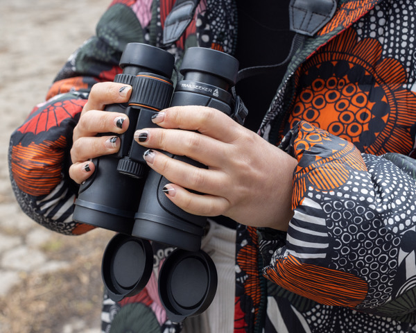
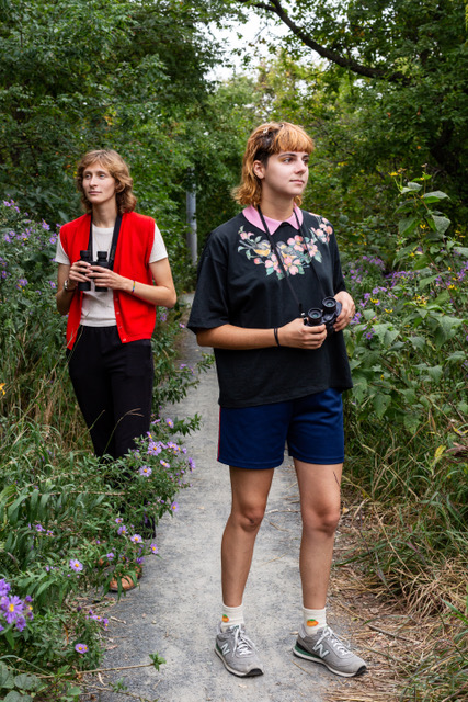
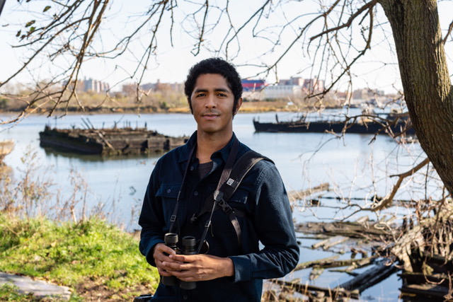
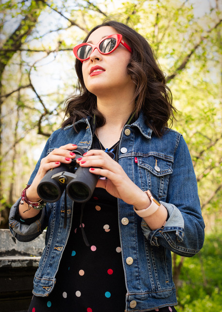
I have always been a birder, but the hobby had taken a backseat for a few years to family and work obligations. At the beginning of the Covid pandemic a lot of those obligations had ceased to exist (school lunches, photo shoots, etc.) and I became re-enchanted with the world of birding. Every morning I would wander NYC downtown parks with binoculars in hand, looking and listening for migrating birds. It brought serenity during an anxiety-inducing time. It’s a beautiful thing to see and hear a warbler in spring or fall.
Then in May 2020 an unfortunate incident occurred between two people in Central Park, a birder and a dog owner. I don’t want to mention names because they had their names mentioned enough. The incident planted a seed to start a portrait and interview series on birders in New York City. My regular work is mostly corporate and editorial portraits, and no one was booking at the time. To me it was necessary to start a project I could legally and safely do since New York City was still under social distancing and masking orders. The vibrancy of the birding community became apparent to me via eBird, Cornell University’s bird recording program. Every day it was inspiring to see the reports from people all over the city on the birds they have seen in places like Central Park, or Jamaica Bay. I loved getting these reports and wanted to get to know these fascinating people and show who they were.
I didn’t personally know a lot of birders during that time period, so I decided to use social media as a way to find them. Instagram was not very helpful, but I hit the jackpot with Twitter. The NYC birding community (as well as other birding communities) are very active on Twitter. I started to periodically send out tweets looking for participants to be photographed and interviewed. Those tweets got retweeted and so on. One of those tweets contained a photograph I had taken of a woman birder. Ted Floyd, editor at Birding Magazine (magazine for the American Birding Association) saw the tweet and asked if I’d be interested in publishing part of my project and of course I said yes. He chose to publish women birders because historically birding has been a male-oriented hobby.
This project will most likely be on-going, and potentially expand to other big cities. Thank you for viewing my project.
APE contributor Suzanne Sease currently works as a consultant for photographers and illustrators around the world. She has been involved in the photography and illustration industry since the mid 80s. After establishing the art-buying department at The Martin Agency, then working for Kaplan-Thaler, Capital One, Best Buy and numerous smaller agencies and companies, she decided to be a consultant in 1999. She has a Twitter feed with helpful marketing information because she believes that marketing should be driven by brand and not by specialty. Follow her at @SuzanneSease. Instagram
Success is more than a matter of your talent. It’s also a matter of doing a better job presenting it. And that is what I do with decades of agency and in-house experience.
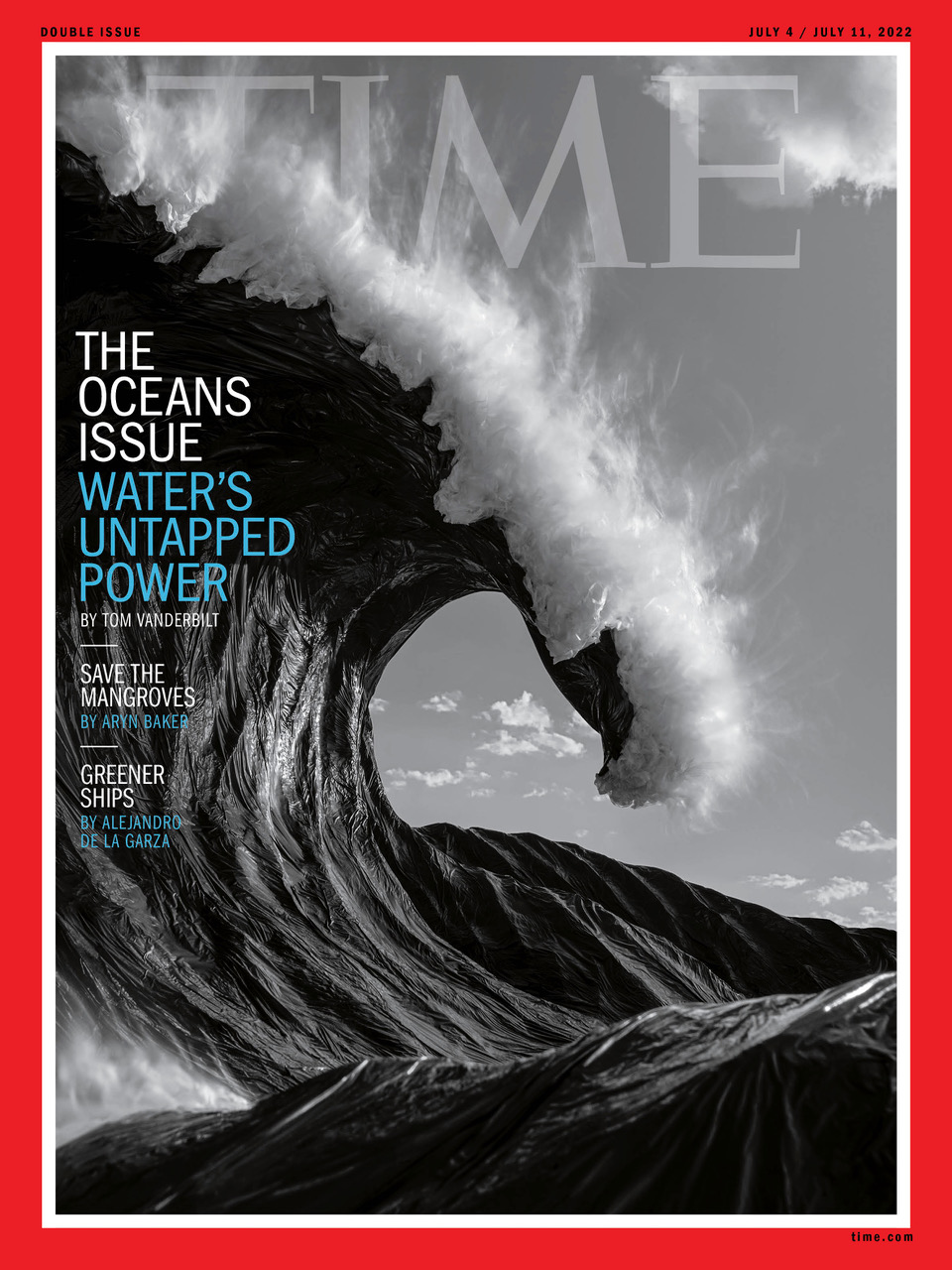
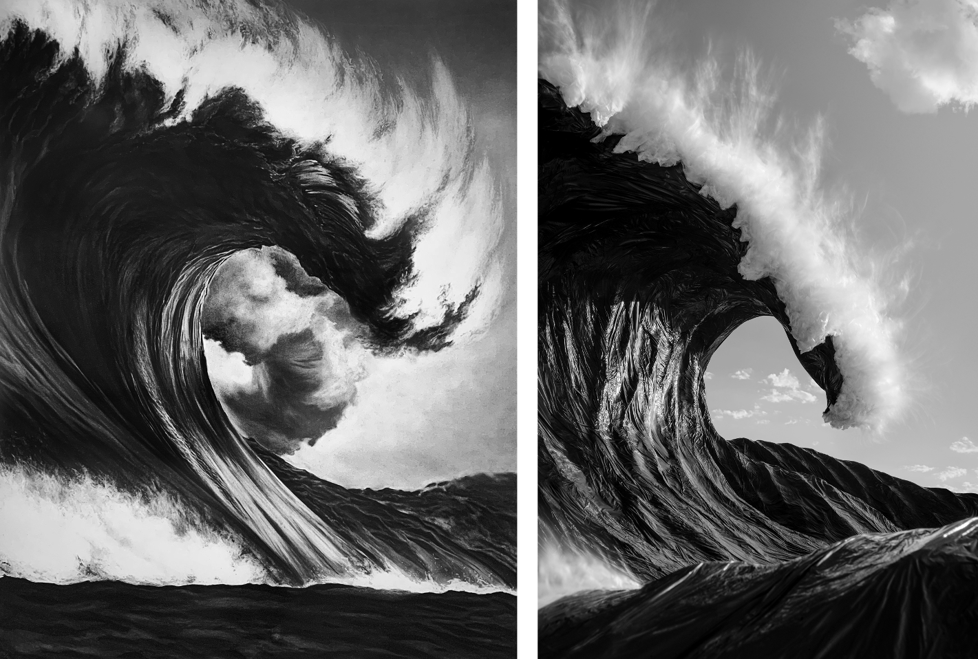
Heidi: How did the idea for Plastic Waves come about? Hugh: I had been working on a personal environmental project around water using recycled, repurposed, or rejected plastic sculpted into water effects. I would take the sculptures to specific locations and photograph them in the right light.After about a year, I saw a Robert Longo charcoal drawing at a gallery here in LA, and that was when the idea for Plastic “Waves” hit me. The artwork was from his Epic Wave series, and his masterful rendering of texture made me think of plastic garbage bags. Although a completely different interpretation, this one image out of the series is closest to one of Longo’s waves. It’s the one I saw in the gallery that day. Since then, I’ve shifted away from that first project, titled Mirage, and solely working on the Plastic “Waves” series.
Where did you photograph the sculpture? ( it looks like the wave is built in two pieces) It was during the early days of the pandemic when every public outdoor space was off-limits, and the beach where I photographed the first one was on that list. So, I had to hike the sculpture and gear up to a fire road near where I live in the Santa Monica Mountains. It’s a remote trail that was closed, but I set up behind a bend at the foot of the trailhead, out of view. Yes, this sculpture was designed in two parts. I wanted to force depth in the image and frame the smaller section in the foreground and close to the lens. It gives the perspective that feels as if you’re swimming in the ocean, watching the wave go by.
What did you use for the waves and the wave’s foam and spray? The process starts with chipboard as the base that defines the overall shape. Then repurposed pillow batting is applied to the surface, giving the sculpture visual volume. On top of that, I lay an aluminum screen over the entire area that is visible to the camera. The screen provides tooth for the next application, paper pulp made from old newspapers combined with a binder. Once it dries, I laminate black plastic garbage bags to the surface using a spray mount and a hairdryer.
The last step is the most time-consuming: recreating the foam and spray. It’s critical because that is where the eye goes first; the details must be as realistic as possible. That area is made from a translucent garbage bag of different thicknesses, each serving a particular purpose. The foam is loosely crumpled from a thicker plastic to hold its shape, while the spray is made from a thinner version. The spray is where most of my time is spent. I make hundreds of little pompoms that I hot glue to the surface and add hundreds of longer ones that I speckle throughout. During capture, I use a neutral density filter, small aperture, long shutter speed, and an electric leaf blower that gives off the illusion of motion to the spray.
How much testing did you do with the plastic bags? I didn’t test the plastic bags so much as learn how to turn a 2D artwork into a 3D sculpture. The first wave I attempted resulted in four iterations before I could get it right. That means starting over from scratch each time. I’ve gotten a lot better at controlling the issues by altering the techniques I use and having a complete understanding of what types of bags work best for each area of the sculpture I’m working on. Ultimately, it is all about the light and reflection and how it interacts with the particular garbage bags. I’ve been at this for a while and now design the waves in a specific way depending on the light at any given point in the year. The wave’s design has to be oriented to the right for summer projects, while the winter months require it to face the opposite direction.
What was most challenging about the build for the cover image and the wave image?
Creative Director DW Pines selected a photo from 2020, and I didn’t explicitly create it for the cover. He had already designed the cover with my image and sent it to me with his initial inquiry. But he asked about creating a shot in the week we had, but I told him they can take weeks, sometimes months, to make, and there wasn’t enough time. And time is the most challenging aspect of this work. The process has a mind of its own and is unpredictable, and is due to the materials I use not bending the way I want. However, I’ve changed the techniques to work around those issues. The capture phase of the project is also a challenge because I usually end up photographing the sculpture four or five times before I feel it’s right. Until the sculpture is ready to be photographed, I haven’t seen the sculpture in the intended lighting, and that’s when all the flaws and issues appear. So, I’ll bring it back to the shop, make the necessary changes, take it back to the beach and try again.
What was your intent for these images? One point I’d like to share is my intent for these projects. Plastic “Waves” and Mirage were both started because I wanted my work to have a purpose, and environmental causes are what these projects’ primary objective is geared towards. I want to benefit nonprofits devoted to water conservation through gallery print and book sales. This syndication is my first opportunity to do so, and I’m very proud to be writing that first check.
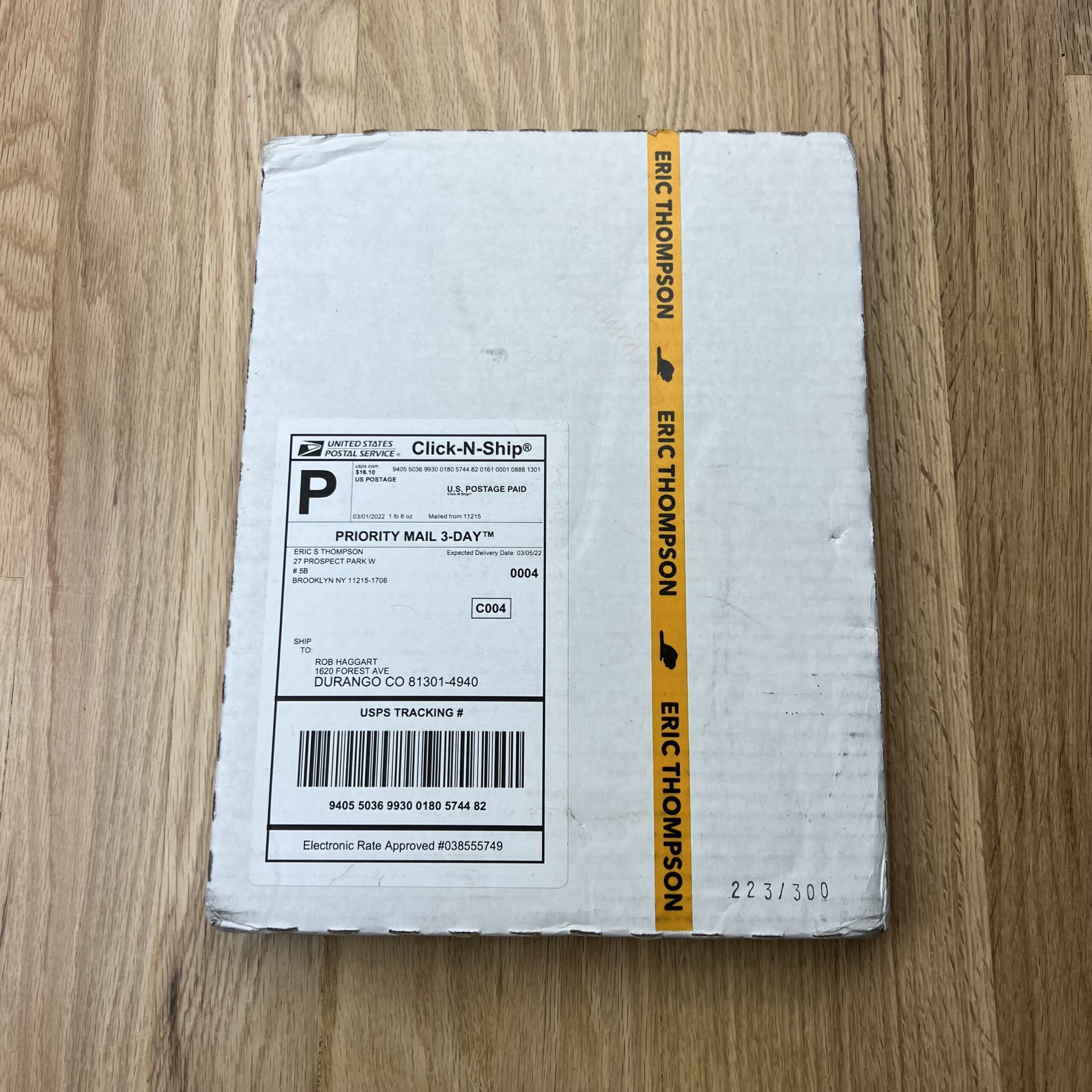
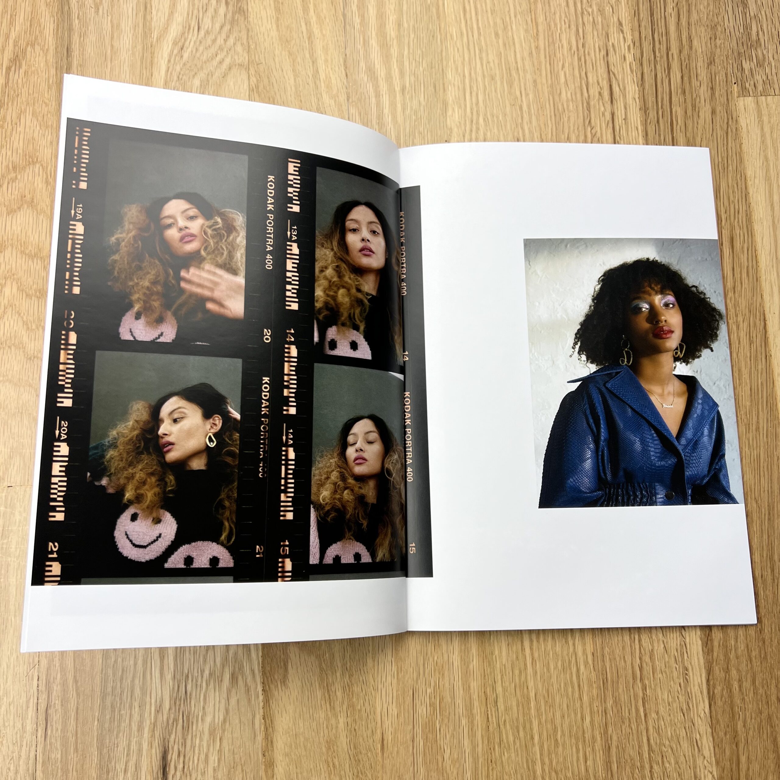
Who printed it?
Agency Access, sometime in 2021. Due to a massive mailing hiccup and “a series of unfortunate events”, the booklets weren’t actually sent out until this spring, around six months after their first mailing (thankfully I had extras and could mail out a second batch). Full disclosure: to my knowledge, Agency Access is no longer designing and mailing print promos, but I could be mistaken.
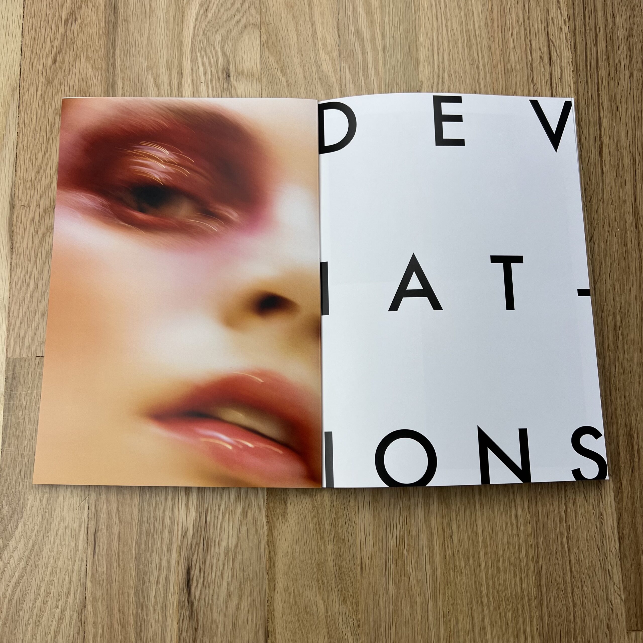
Who designed it?
I can’t actually remember specifics (design and production started in Spring 2021), but this was also with Agency Access. My website is organized by Standards and Deviations—more traditional, classic styling vs. more left-of-center—and the booklet was designed to reflect that division. I know their sister site, Found, produces booklets a few times a year, and I had asked if they could make one specifically for me. When I approached them, I explained I was hoping the booklet would be my “Alan Rickman moment”: before Die Hard, Rickman was working, but not as often as he liked, and only in smaller projects, but was consistently receiving positive reviews and feedback from that work. Then he shot Die Hard, and the rest is history. I see a lot of overlap between my career trajectory and his earlier experiences: under-employed, but fantastic response. I’m just looking for my Die Hard.
Tell me about the images.
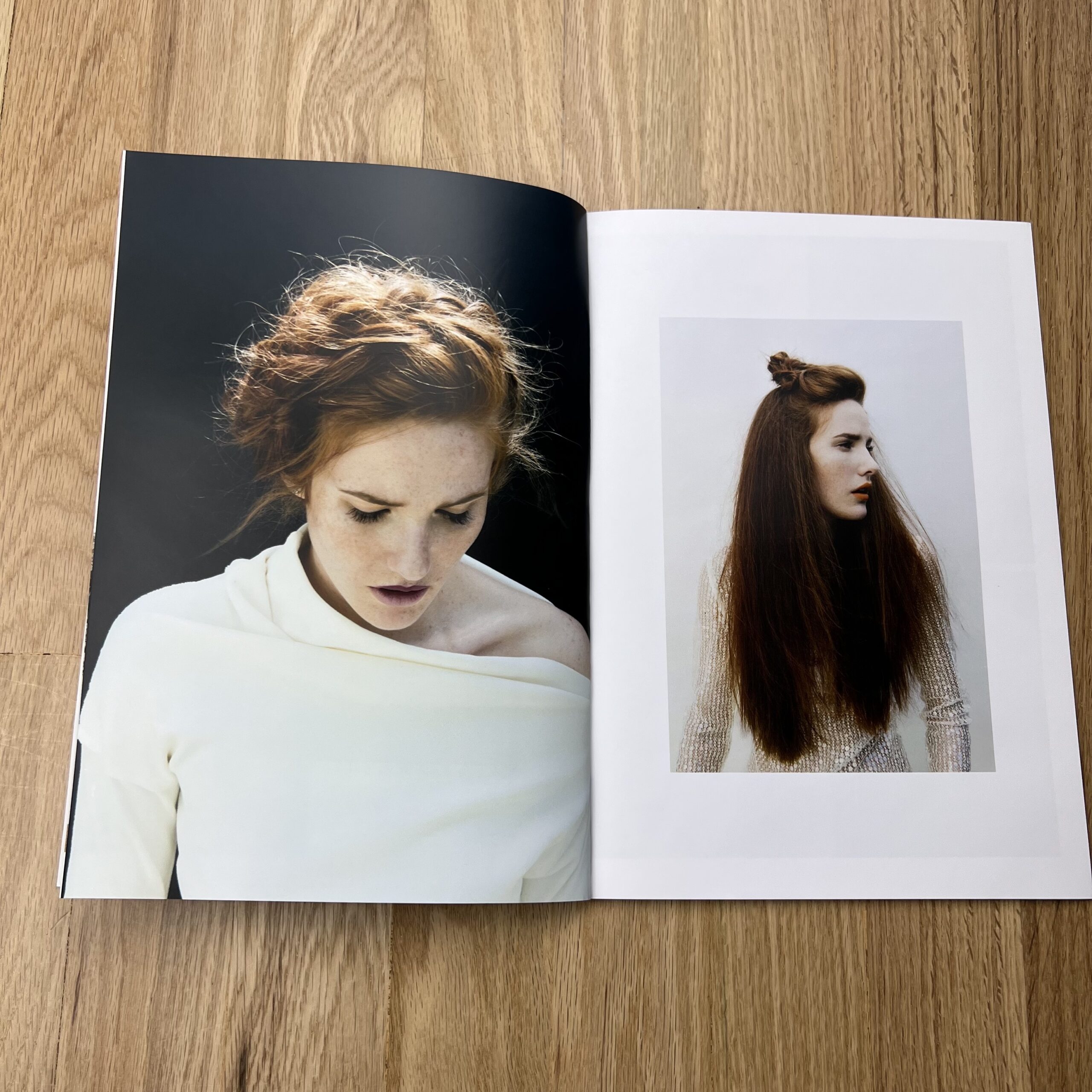
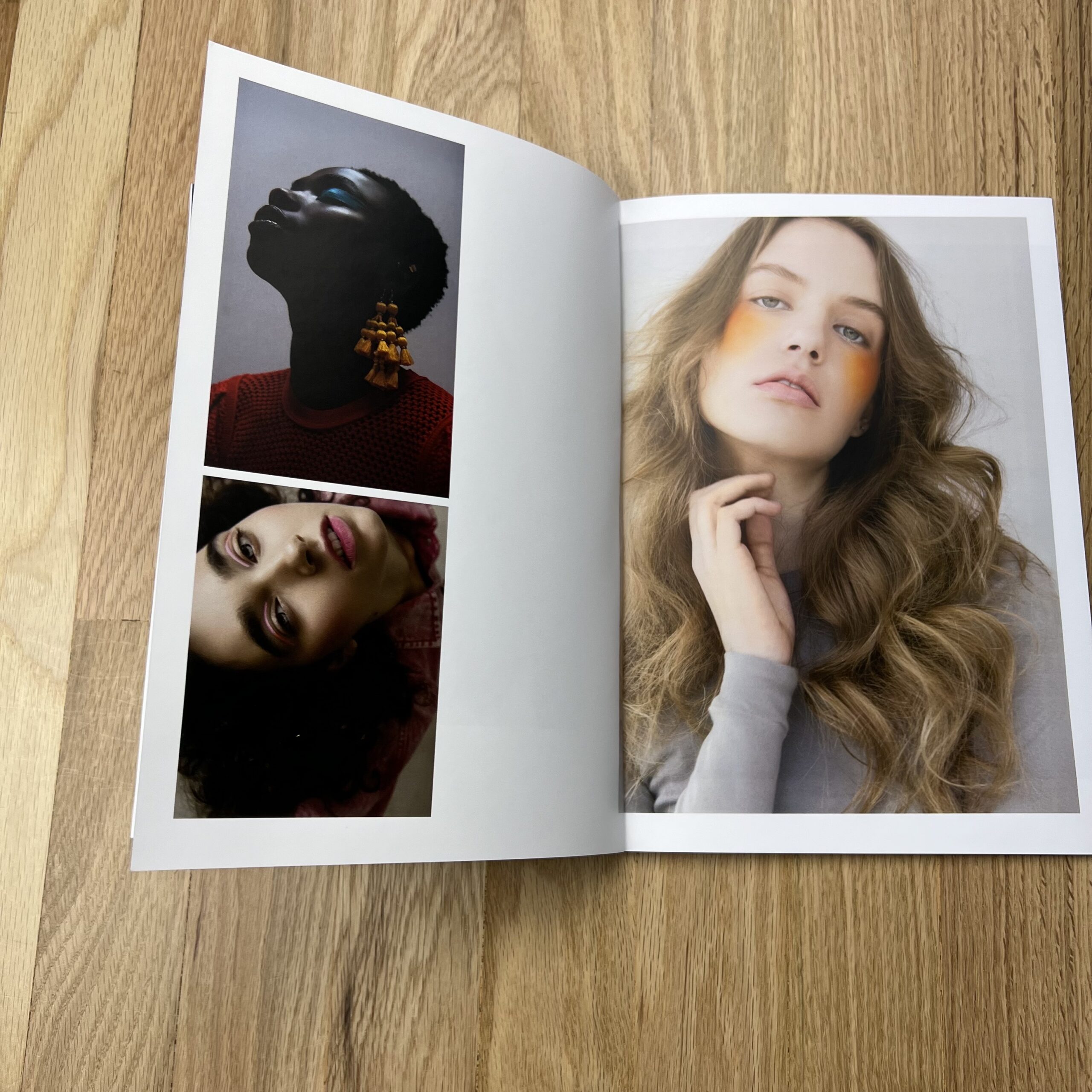
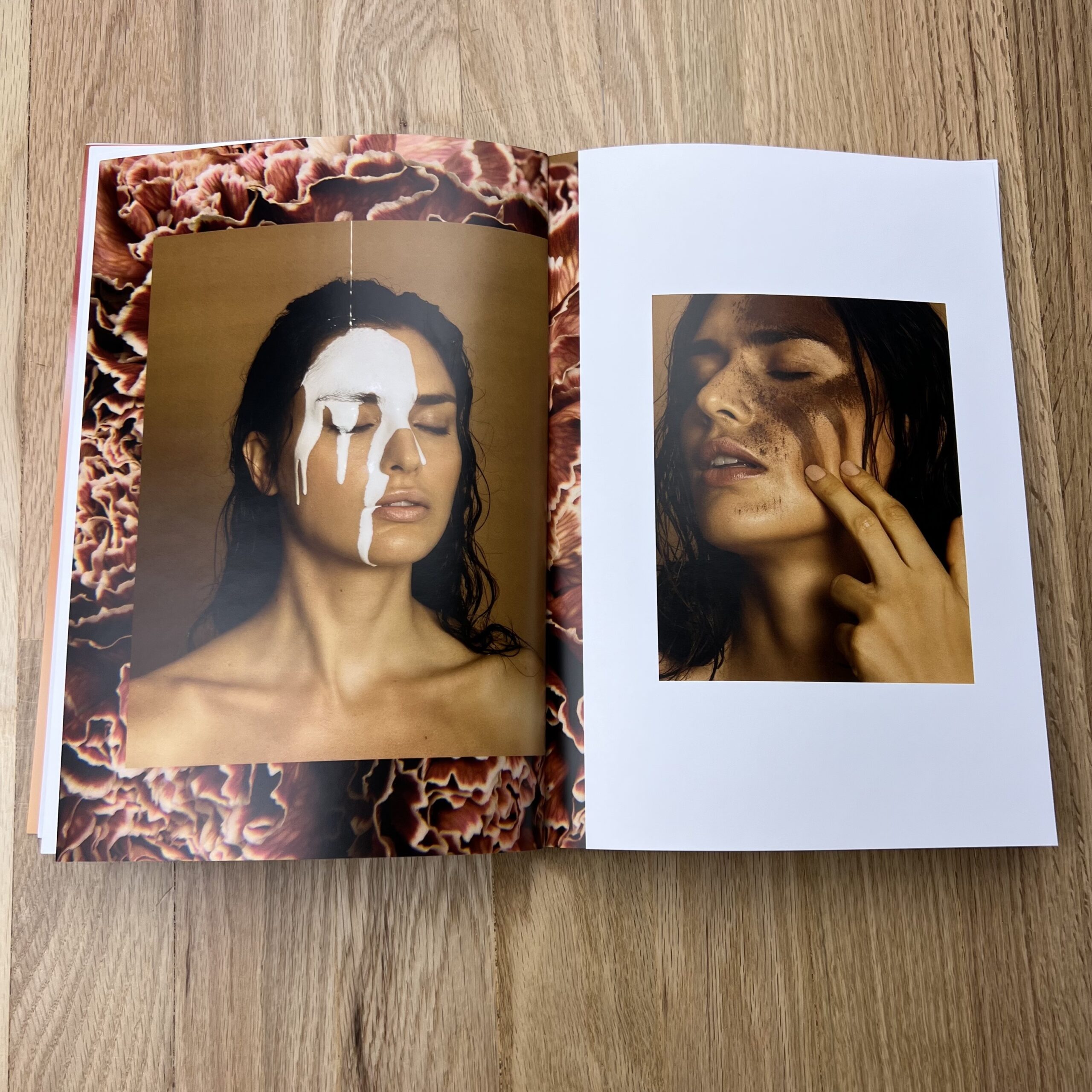
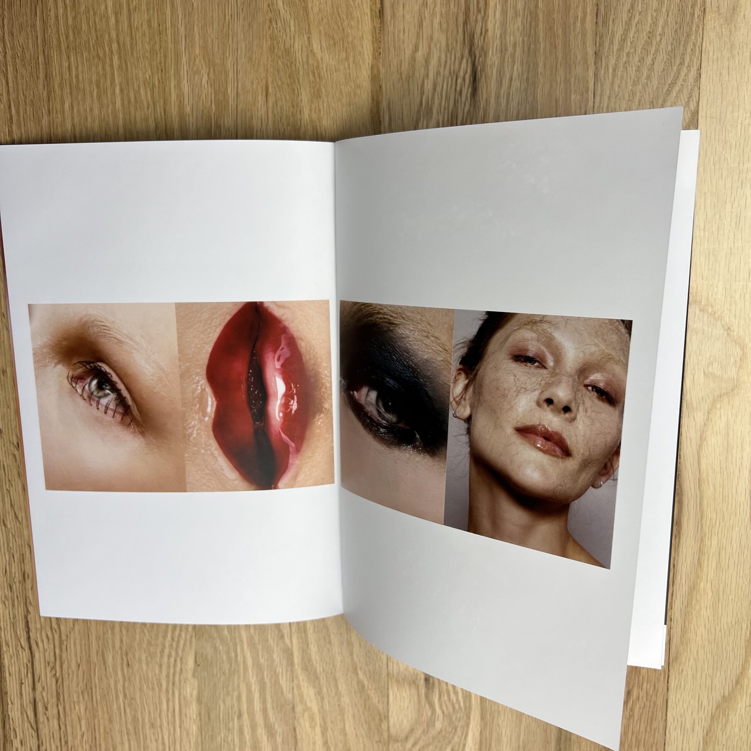
I have a fairly unusual background, [feminist, modern] art history and studio art, and I’m a self-taught photographer who learned about making images from painters, not other photographers, so the work itself feels somehow simultaneously extremely niche, and yet, can’t fully be categorized. My general understanding is that people enjoy and respond to my work, but they don’t know what to actually do with me; “I desperately want to hire you, but I don’t know if I actually can”. It’s tremendously flattering but understandably frustrating. That’s why I divide my work into Standards and Deviations, I want to offer some guidance as to how to look at my work. I’m a photographer who can shoot more classic, approachable imagery, but I’m also a photographer who isn’t afraid to experiment and really lean into that studio art background; I’ve made mixed media pieces with my prints, silkscreens using makeup instead of paint, and physically altered the composition of beauty products to use them as art supplies. I can’t have one without the other, I would feel incomplete otherwise.
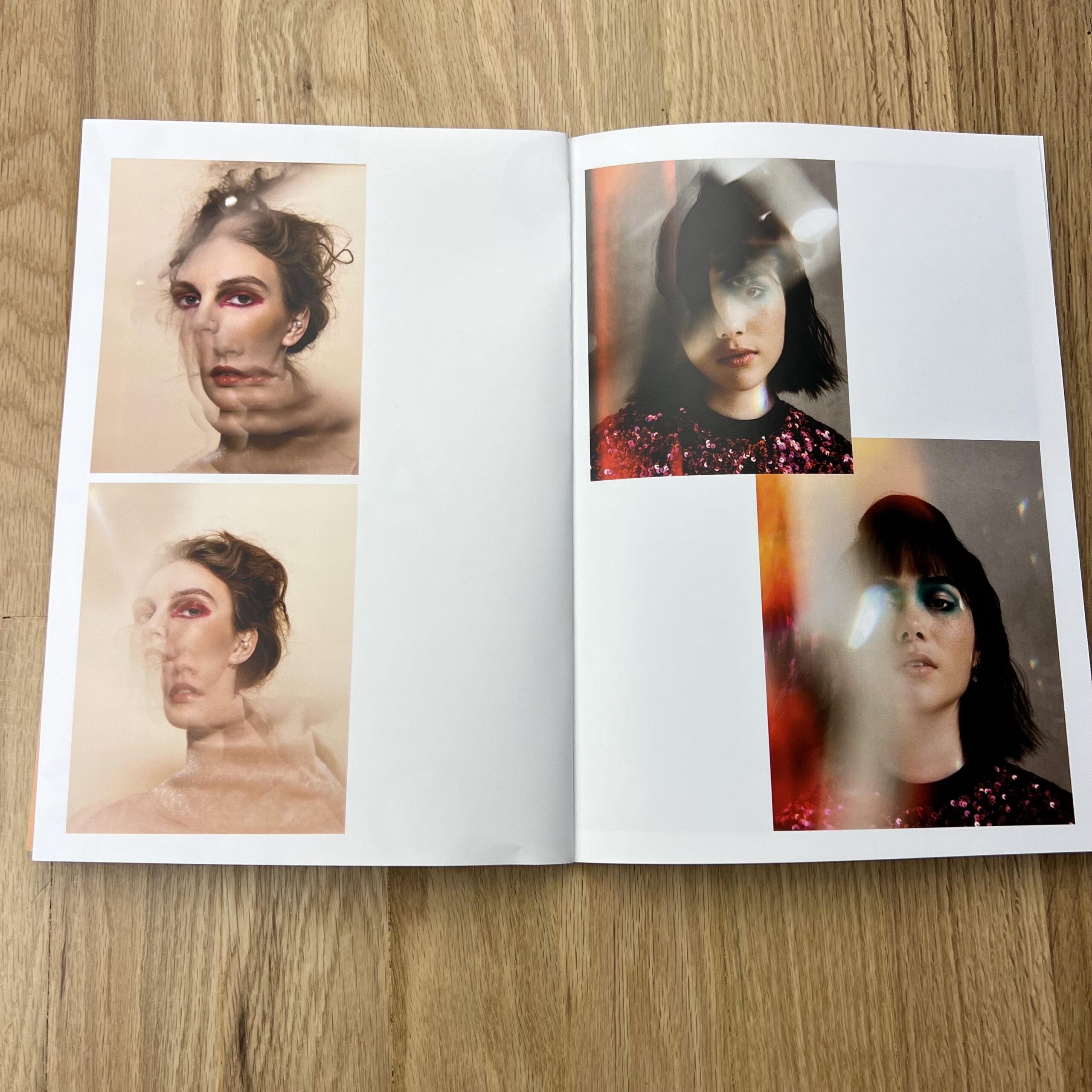
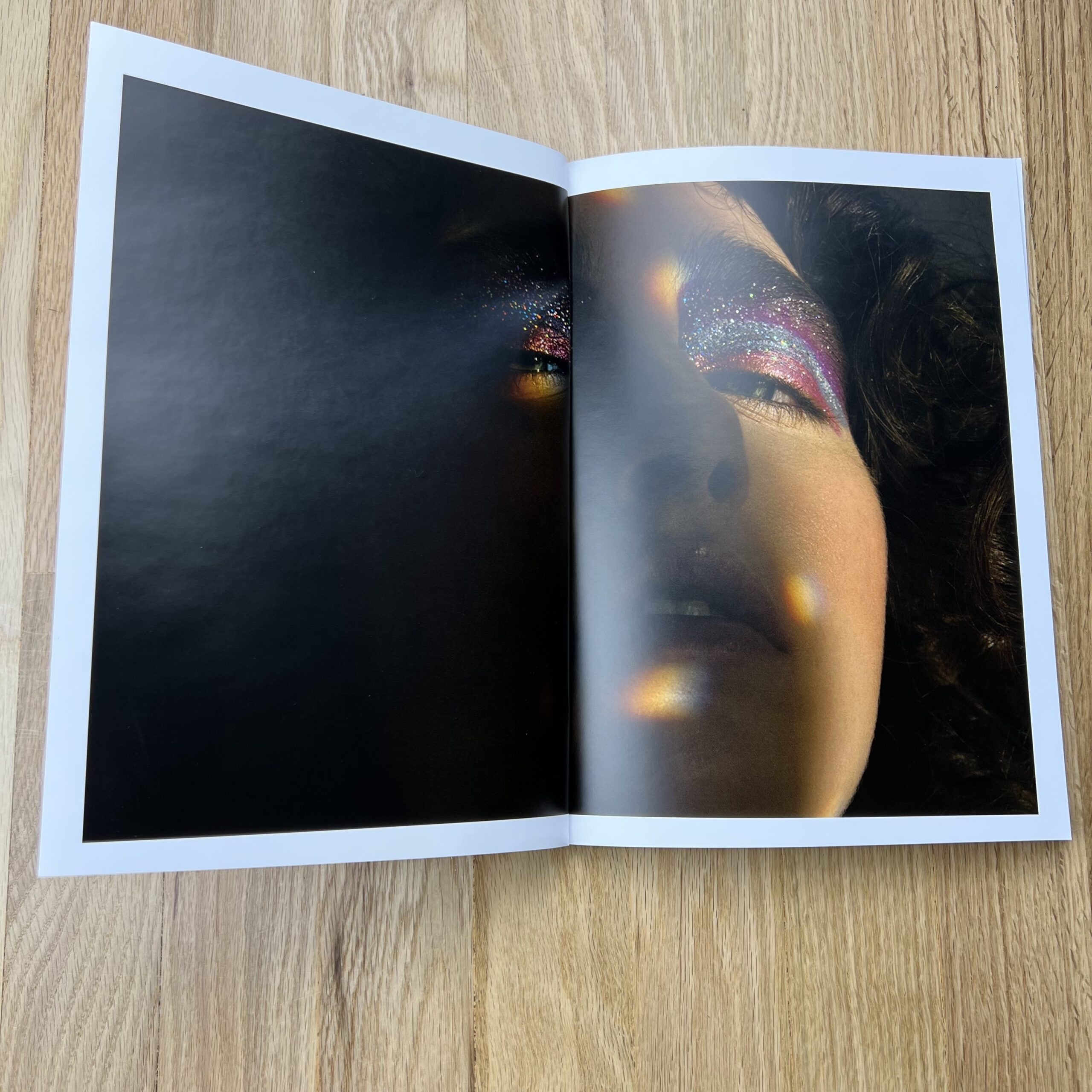
Tell me more about the images in the Deviations category.
I have Sensory Processing Sensitivity, but what that means for my work is that nothing is purely visual, they appeal to at least one other sense, usually touch. For me, I need to be able to feel an image, not just look at it. I didn’t even realize it was a part of my work until I showed my work at a portfolio review, and someone said he could imagine the smell of one of my images (it featured copious amounts of sunscreen). Since then, I’ve come to understand how unique my SPS is and moving forward, I’d like to print and design booklets that feature images that better represent my mental process, not just my artistic identity.
How many did you make?
I printed 200 booklets, I believe. This was an experiment, so I didn’t want to invest too heavily, but I also wanted to make sure the booklets had a chance to make the impact I was hoping they’d have. This was also all done during COVID, and very few people are returning to offices, so my plan had been to personally reach out to every potential recipient (500+ individualized emails), explain what I was trying to do, and hoped they felt comfortable sharing the appropriate mailing address with me (I recognized most of those addresses would be personal, and I didn’t want to overstep a boundary). Miraculously, people replied. I knew statistically I would only get a small number of responses, but it was enough. I’m thankful I printed as many as I did since as best as I can tell, no one received the original booklets, mailed in November 2021. After waiting until after the holidays (thinking there might have been a massive seasonal issue), I had to mail out a second batch.
How many times a year do you send out promos?
I try to send out email promos once every two months, and in the “before times”, I sent out a printed postcard version of the same images to anyone who might not have received the email due to server blocks and whatnot. Now that RTO is hit or miss across the industry, there’s no effective way to send out printed material, but I think print mailers still have their place. Despite all the mailing issues and delays, I’d like to try this again, maybe make a new booklet once a year. I’ve always maintained that a photographer should always present their work in any medium in which it could be consumed, and for me, that includes print.
Do you think printed promos are effective for marketing your work?
The booklets themselves? I’m not sure yet, I haven’t actually heard much about them. Oddly enough, I think what had a bigger impact was the email I would send to a potential recipient asking for a mailing address. Those were personal. I think it’s easy to forget that the names on one’s mailing list are actual people, and those people surely get bombarded on a daily basis by photographers demanding their attention, even if only for a few minutes. I take tremendous pride in being warm and personable, attributes that are nearly impossible to communicate digitally, and the emails I sent asking for addresses were a chance for me to connect with another human being, not a title. I could essentially say, “I admire the work your company produces, and I would love to work with you, but I also recognize that times are weird, and I’m a stranger asking for your address, but maybe we can meet each other halfway, and you can set a boundary for yourself while I attempt to do a somewhat awkward part of my job.” Marketing feels so anonymous, and honestly, it makes me uncomfortable. Before COVID, I attended in-person portfolio reviews religiously, and at least 75% of my jobs came from those meetings—I got booked because they liked me (which is such a wonderful compliment and never ceases to floor me). It’s much harder to make that connection with a person now, and if we’re being honest, I’m struggling with that. But with these booklets and the emails, I was able to approach someone and say, “I made a thing. I worked hard on it. I didn’t make that many. And I want you, you specifically, to have one, because I want you to have one.”
“There is something deeply Universal about this human instinct to rest and rejuvenate by the sea.”
Jonathan Blaustein, January 5, 2022.
I’ve never quoted myself to open the column.
(That’s a new one, for sure.)
But there’s a reason, I promise, and we’ll get to it.
The other day, my daughter asked what I used to do in Summer, when I was her age?
I told her my folks sent my brother and me to sleep-away-camp, beginning when we were 6 and 8 respectively.
We’d go off to rural Pennsylvania, (or later Upstate New York,) for two months at a time, over an 8 year period.
JB at Pine Forest Camp, circa 1985. (Can you tell which one is me?)
She was surprised, as that is wildly out of her life experience, growing up here in Northern New Mexico.
But, I assured her, though we weren’t packing her off like that, it was pretty common among suburban, Jersey Jewish kids, back in the day.
Before and after we left for camp, though, on nice days we went to the beach.
Down the Shore.
(Jersey in the 80’s was like living in a John Hughes’ film.)
Image courtesy of Sebastian Galaviz/ Spotify
It was pretty rad, I must say.
In fact, given it’s June 23rd, (as I’m writing,) there’s a good chance I would have been at the beach on this exact date, 40 years ago.
Damn!
I miss it.
Living in the mountains, the nearest, large body of water is 700 miles away, and that’s the Sea of Cortez in Mexico.
The Gulf of Mexico in Texas, the Pacific Ocean in SoCal, and the Great Lakes, all are nearly 1000 miles from here.
(It’s enough to make a Jersey-Shore-boy heartsick.)
But wouldn’t you know it?
I had a vicarious trip to the sea in a photo-book today.
(We’ll get there in a minute.)
After looking at the book, and ruminating on that urge to be near the ocean, I laid down on a rug in the living room, imagining the waves crashing and cresting.
Back in Jersey, on the Atlantic Ocean, there’s a particular smell to the water.
(Like sweetly rotting clams.)
I’d love to have that odor in my nose right now.
But that’s 2000 miles away.
(At least California is closer.)
So I started thinking of the big, blue waves of the Pacific.
“Wait a second,” I thought.
I have a solution to this.
We just need to get digital!
I grabbed my phone, and ran to a closet.
Finger-scrolling furiously, I found a video I made on the beach in San Diego, nearly six months ago, and it was as if past-me were speaking to current-me.
(Some legit, time-travel-type shit.)
Check it out.
OK, I know most of you don’t watch the videos.
Fine.
But context matters, such that (except for the embarrassing fingers-on-the-lens moment,) I was strolling along the oceanfront, narrating for you guys, (and my current-self,) how nice it is to relax by the ocean when you can.
(It’s where the column-opening-quote came from.)
Standing in the closet, remembering how nice the sounds and breezes were, I felt the heartsickness subsiding.
Then I found a video of my last look at the Pacific, seconds before we turned away, to head back East across the Great American West.
It’s so lovely, that one perfect moment.
Anyway, enough of the waxing philosophical.
(I saw a photo-book that put me on this rant. It wasn’t planned.)
My book stack is big, as I’ve said, so I reached in and pulled out a box from Summer 2021, published in 2020, so it’s not exactly ripped from the headlines.
Surely, I had no idea what would be inside.
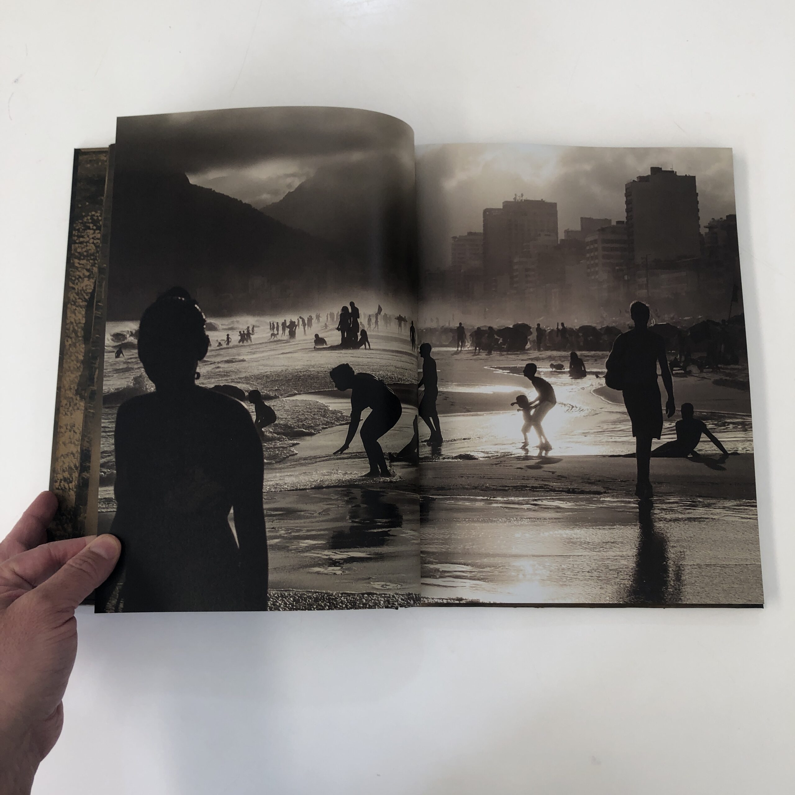
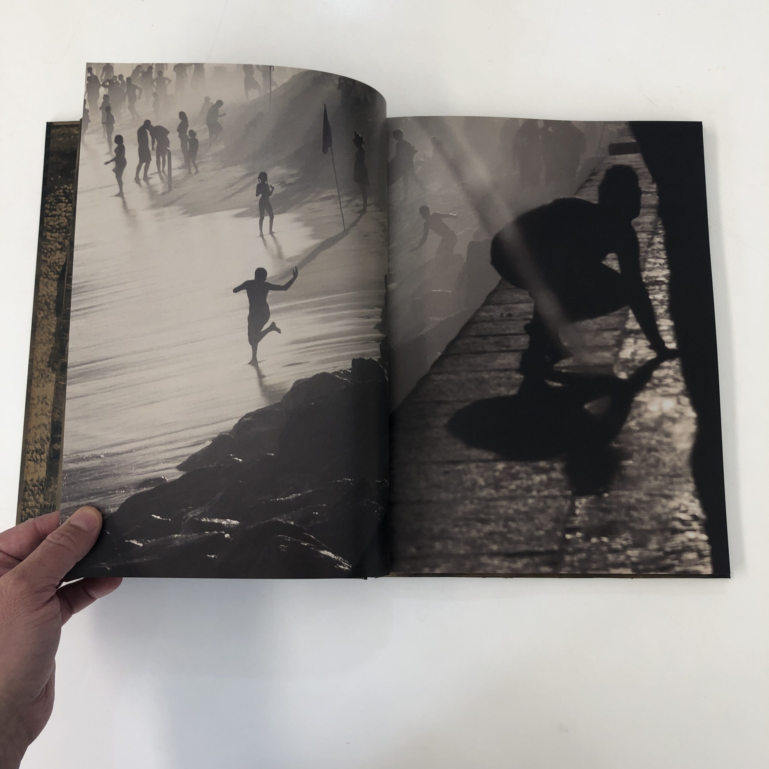
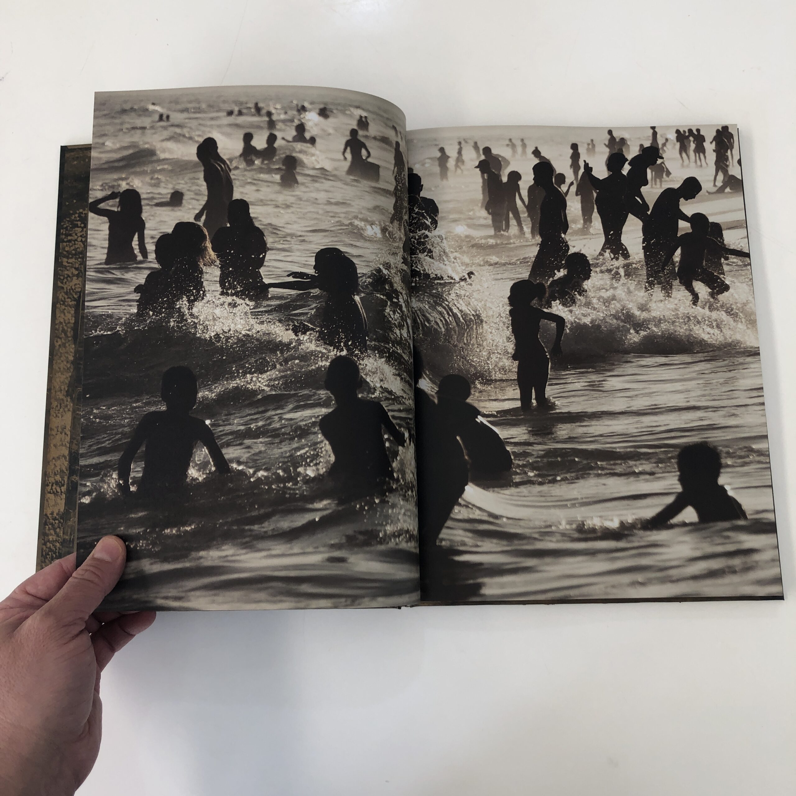
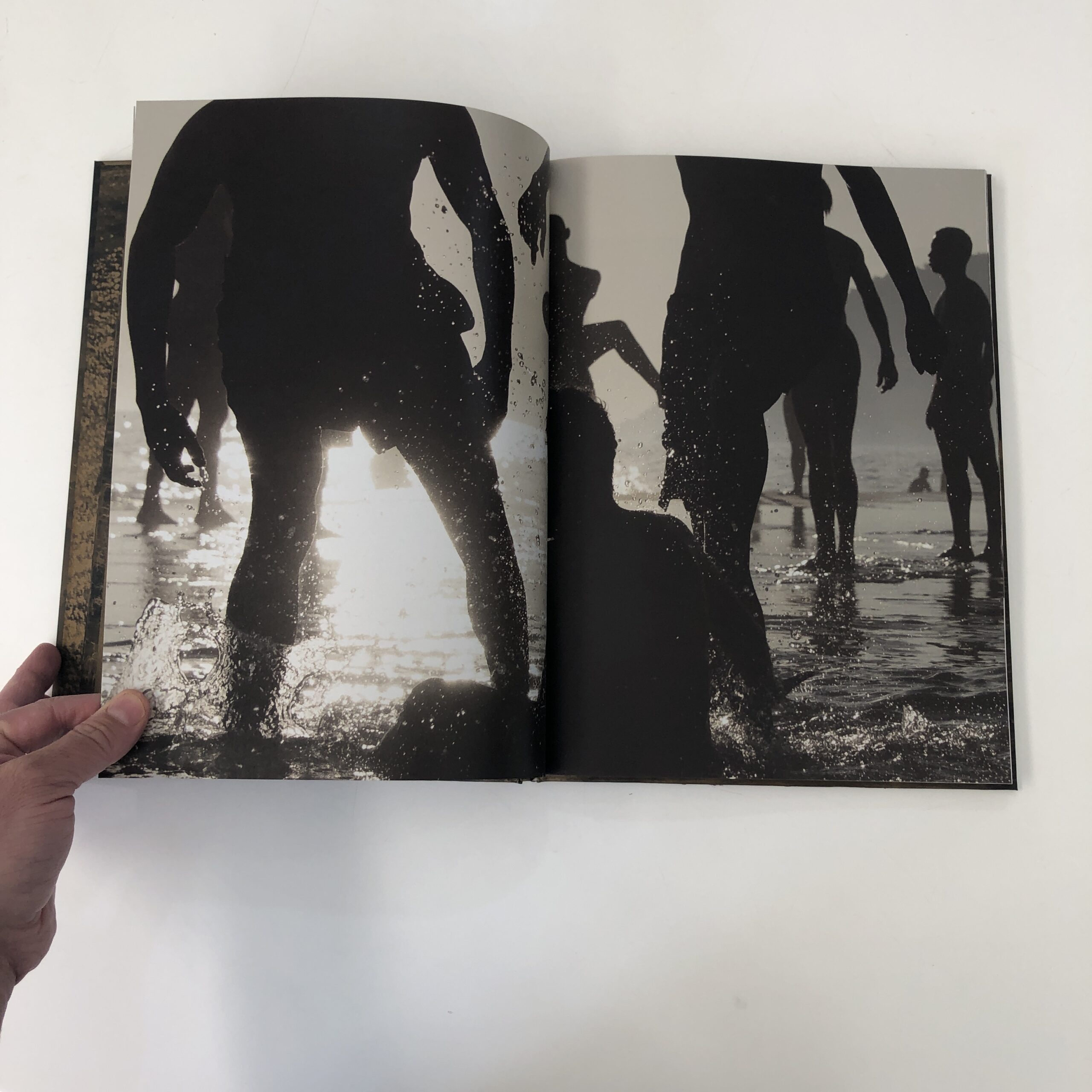
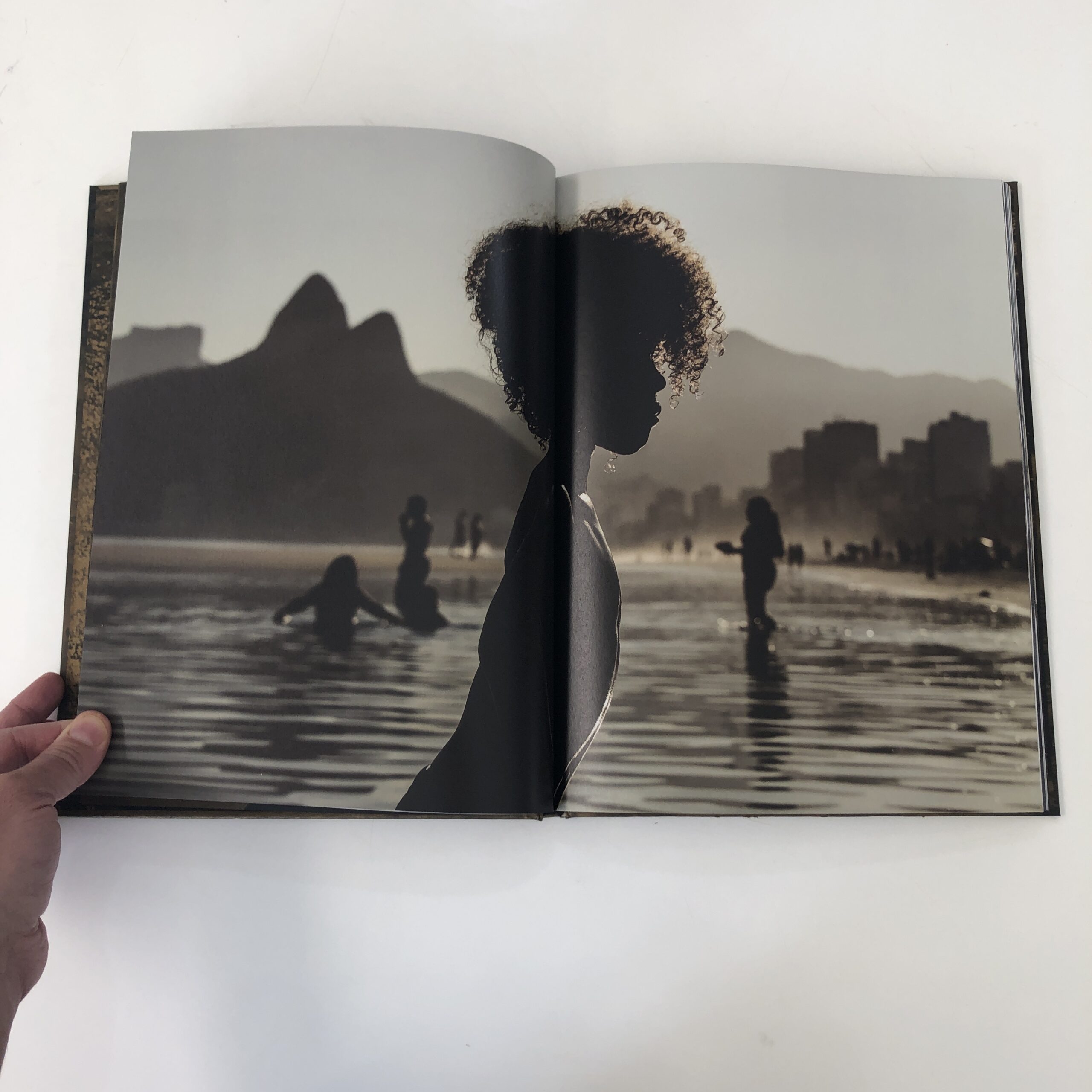
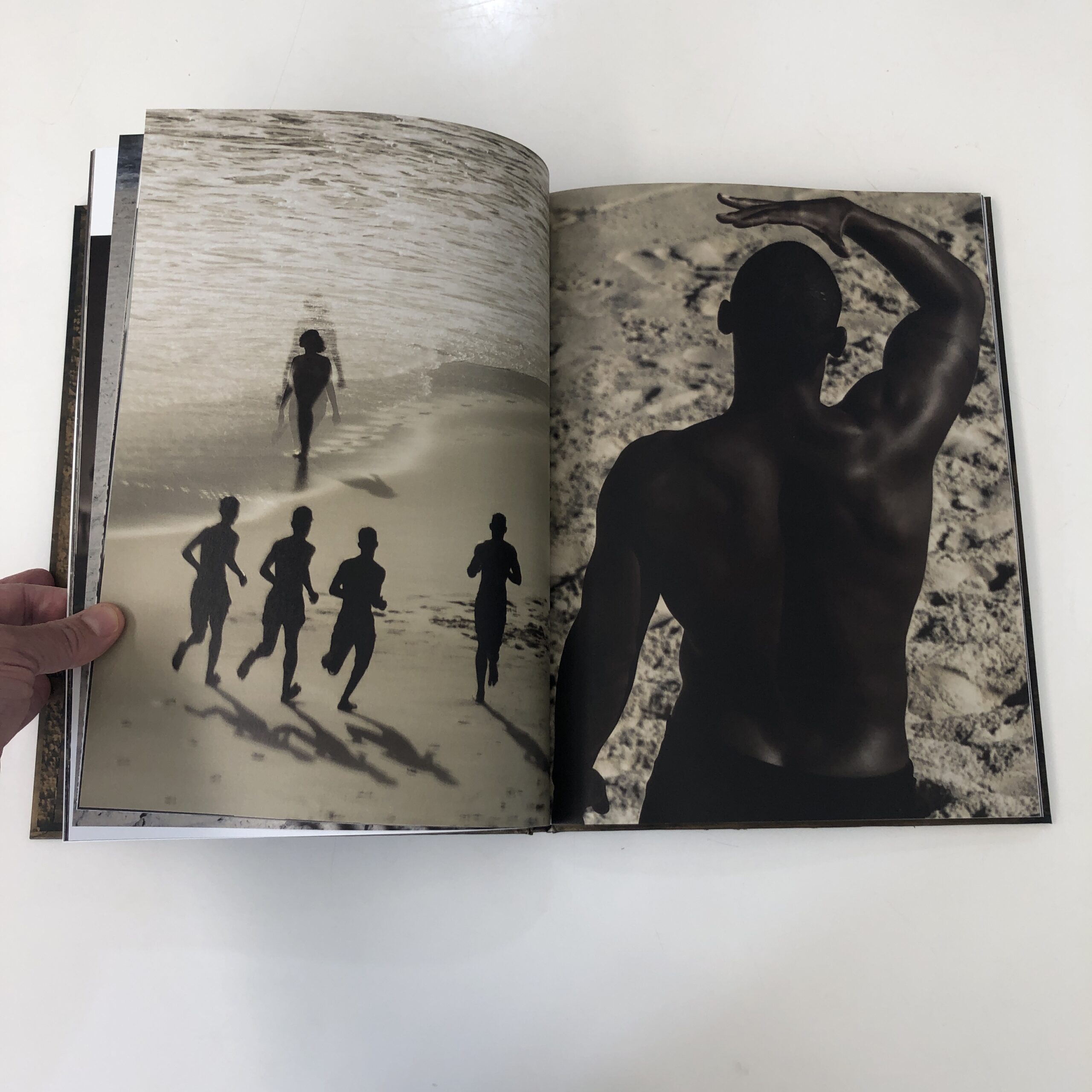
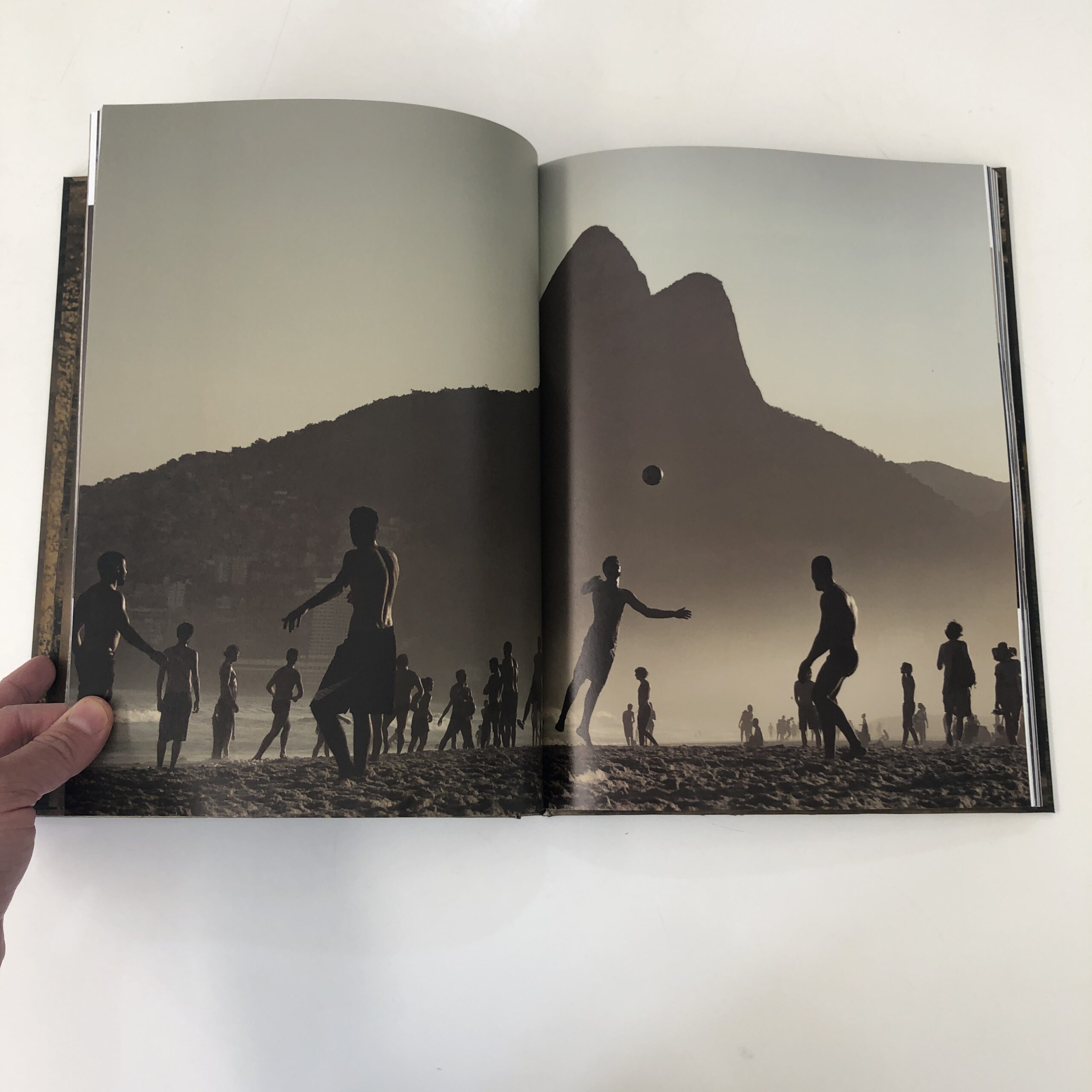
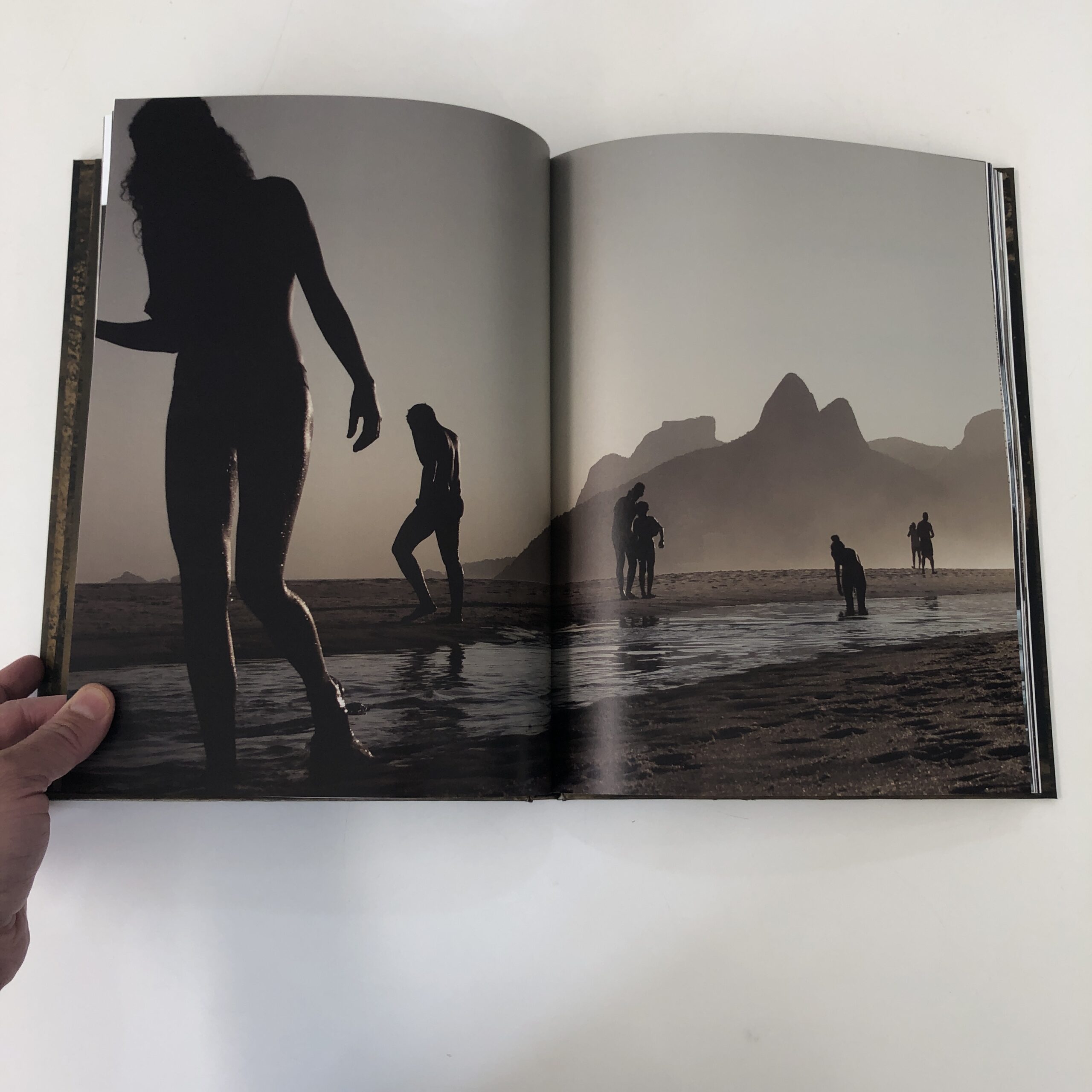
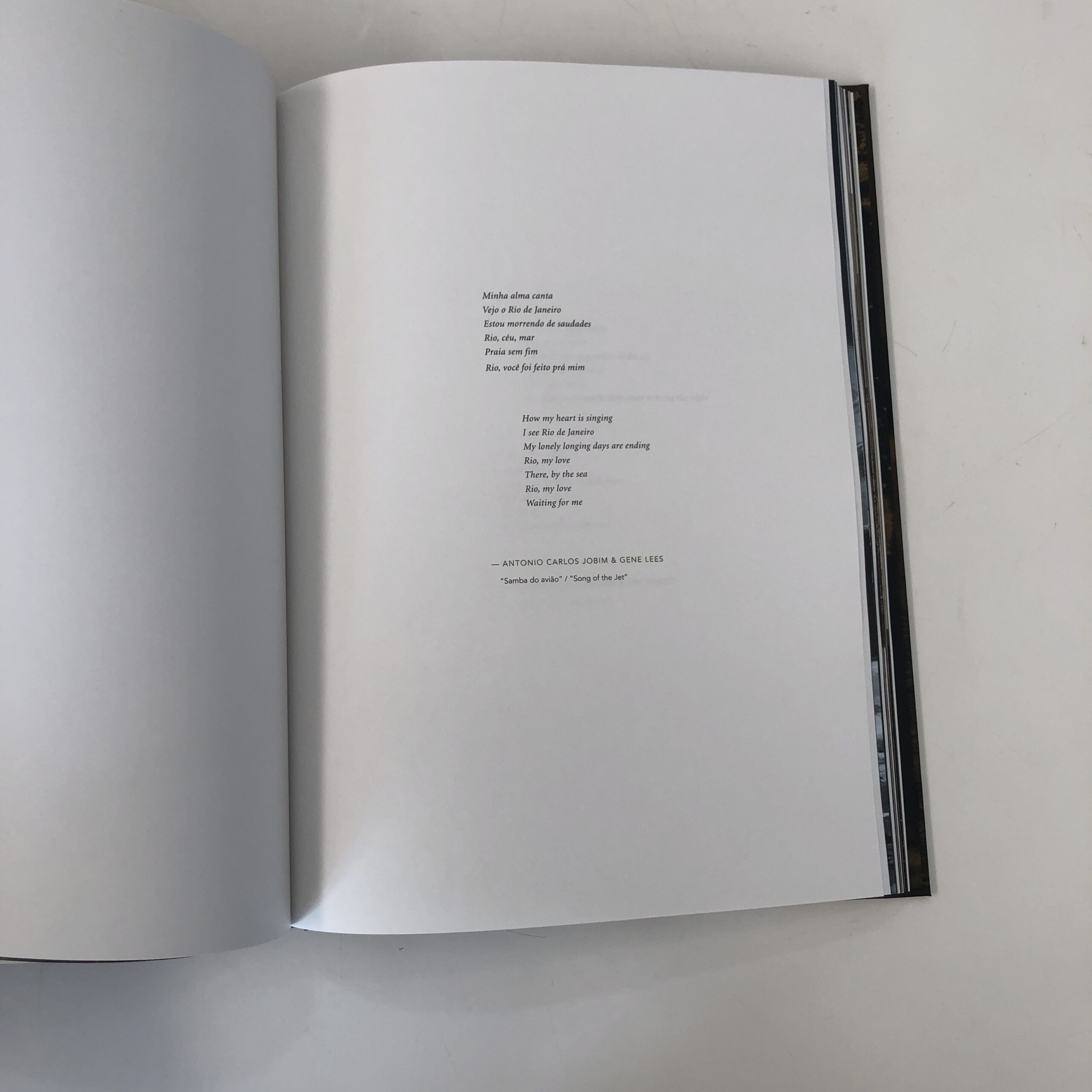
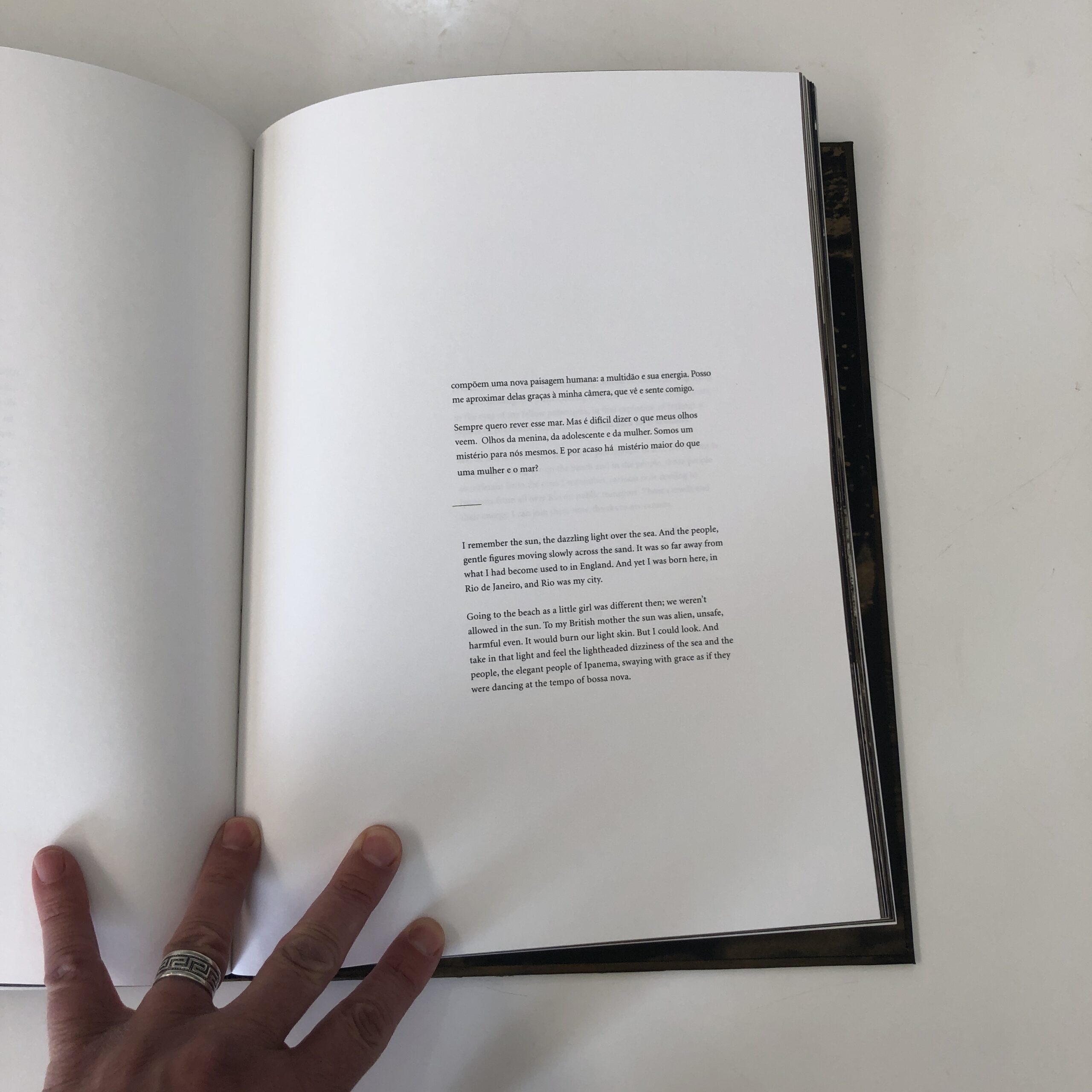
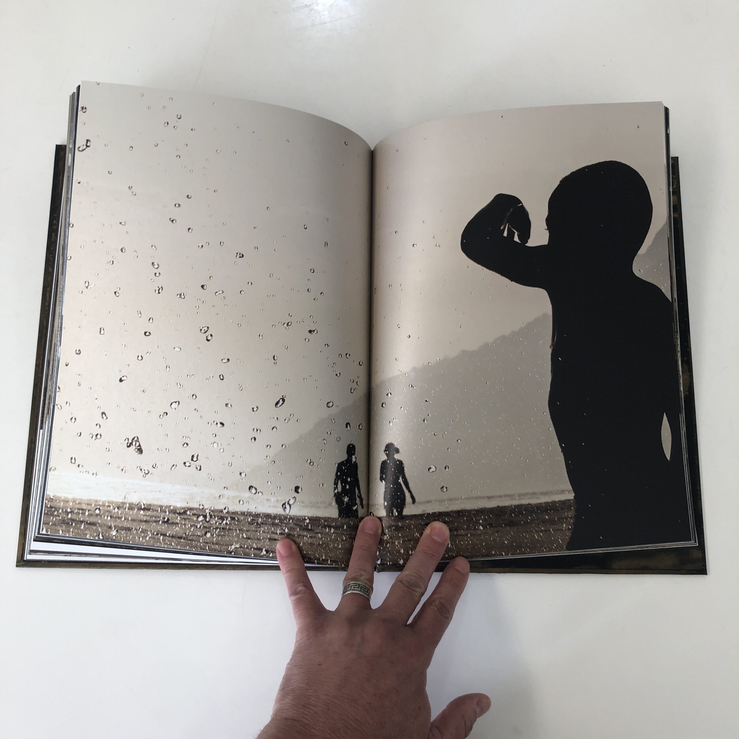
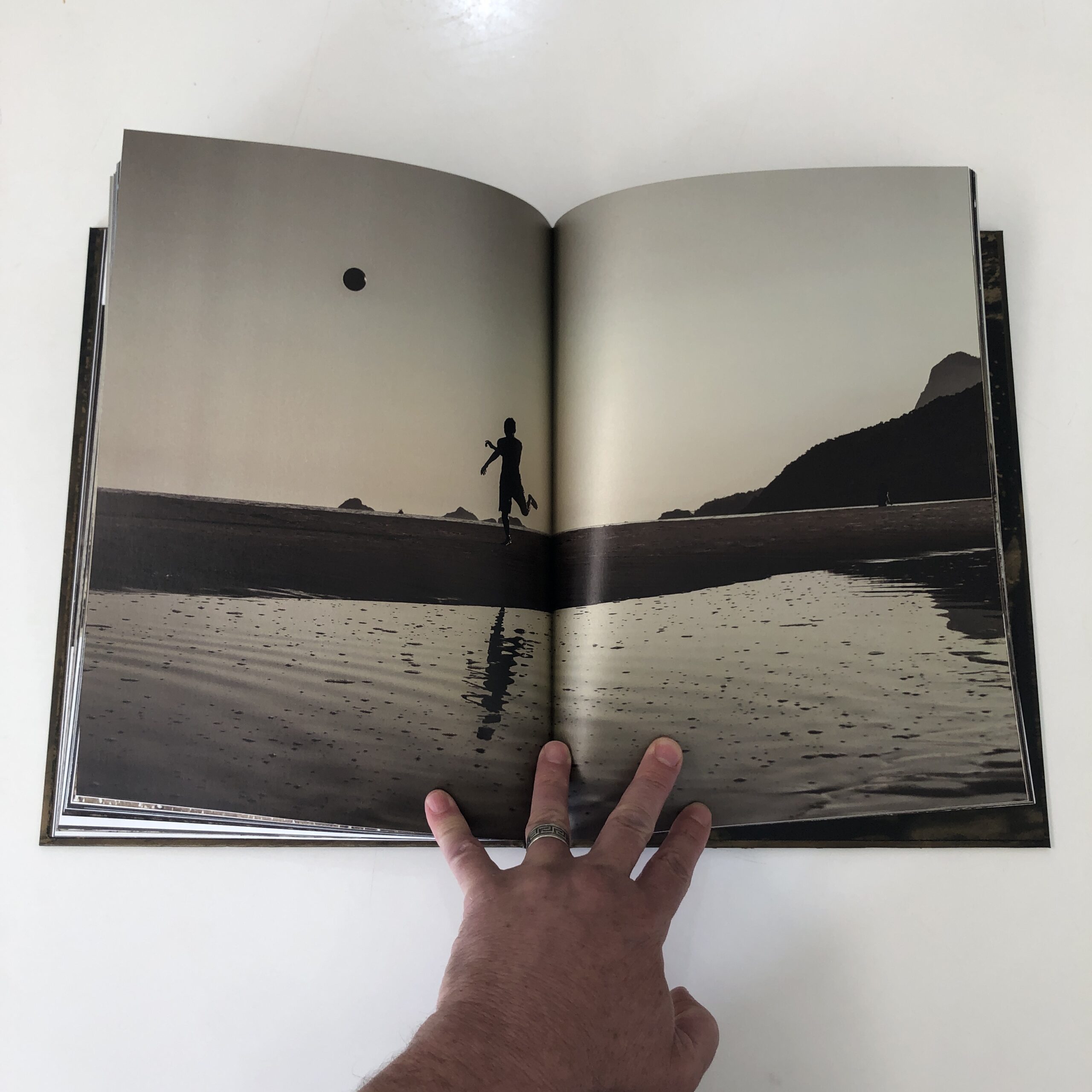
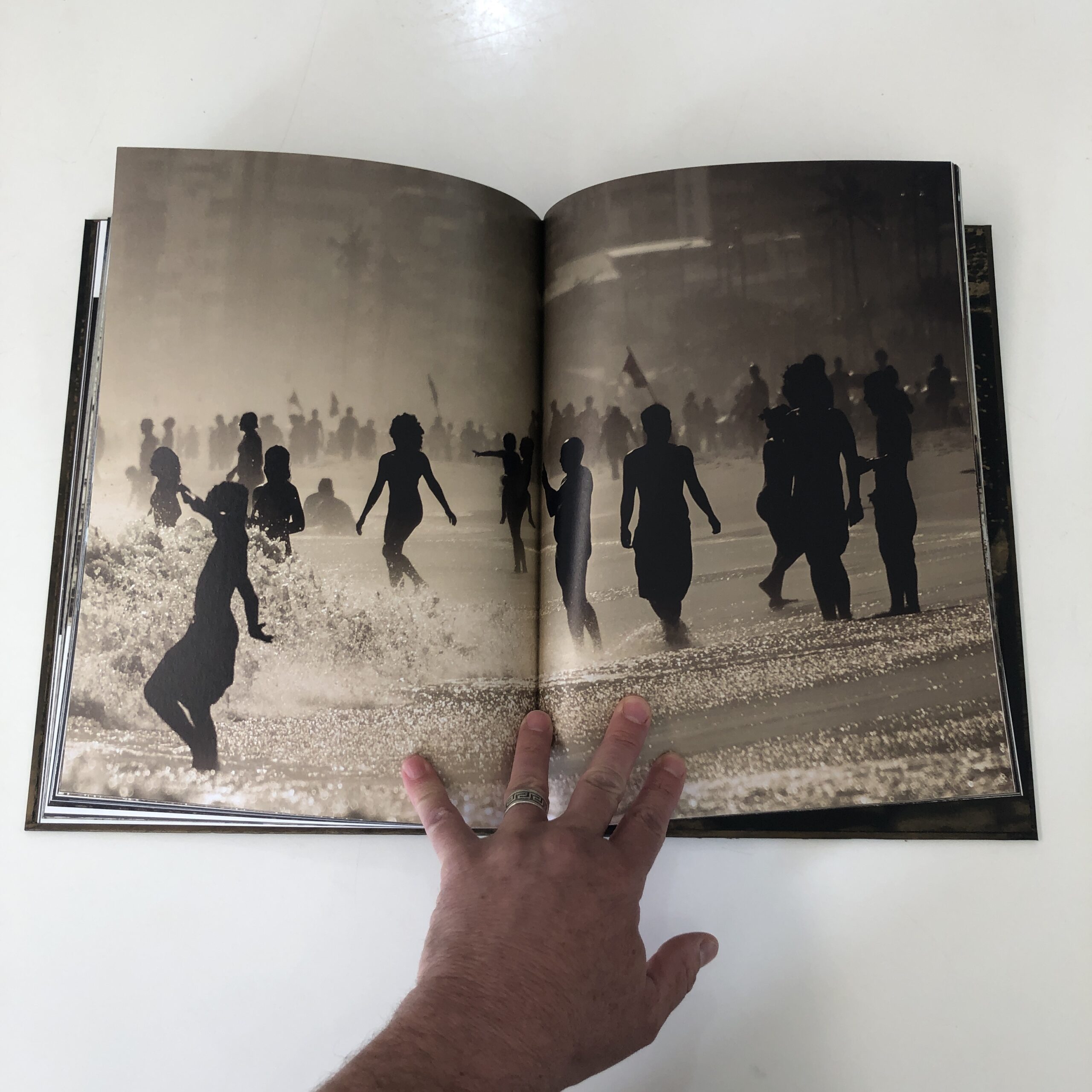
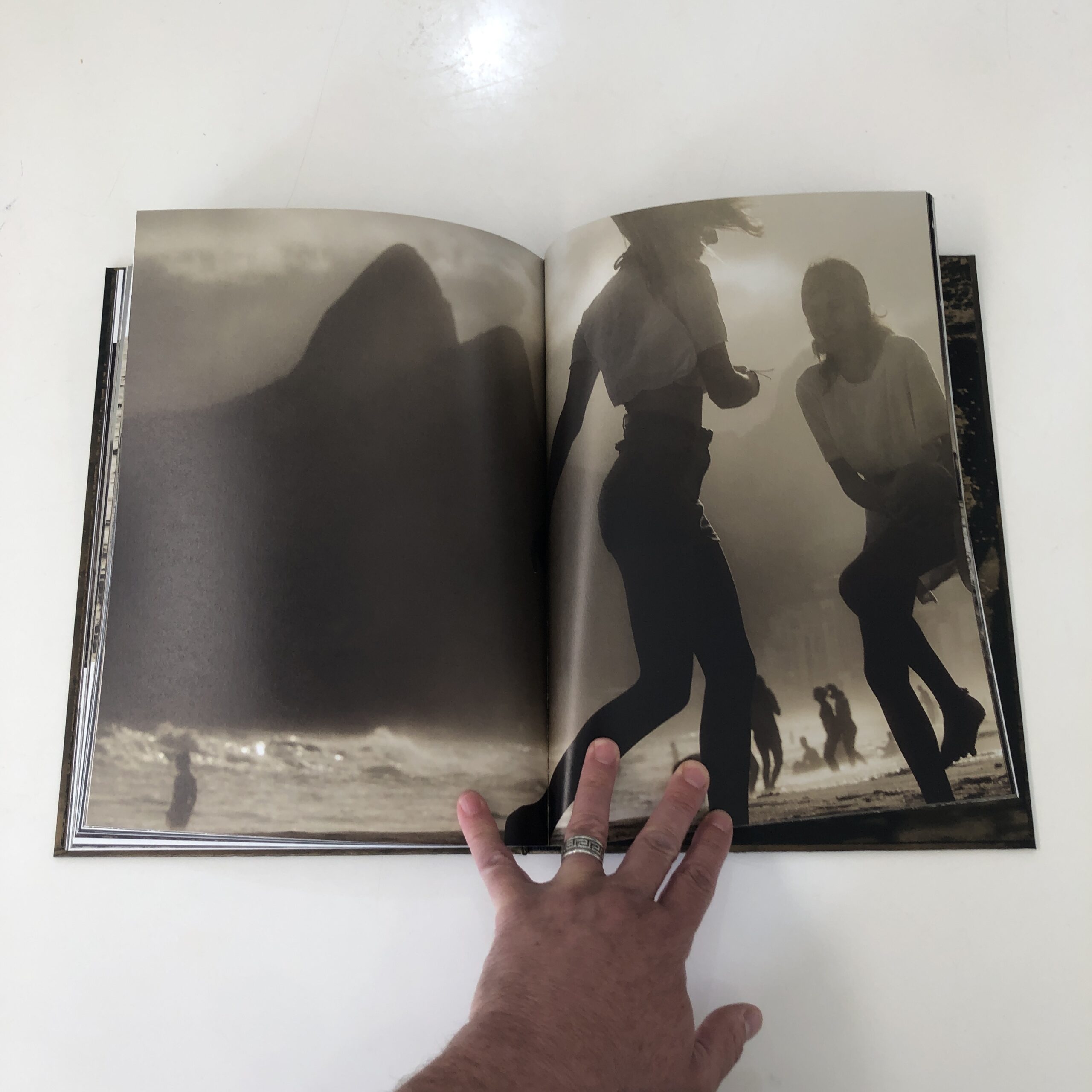
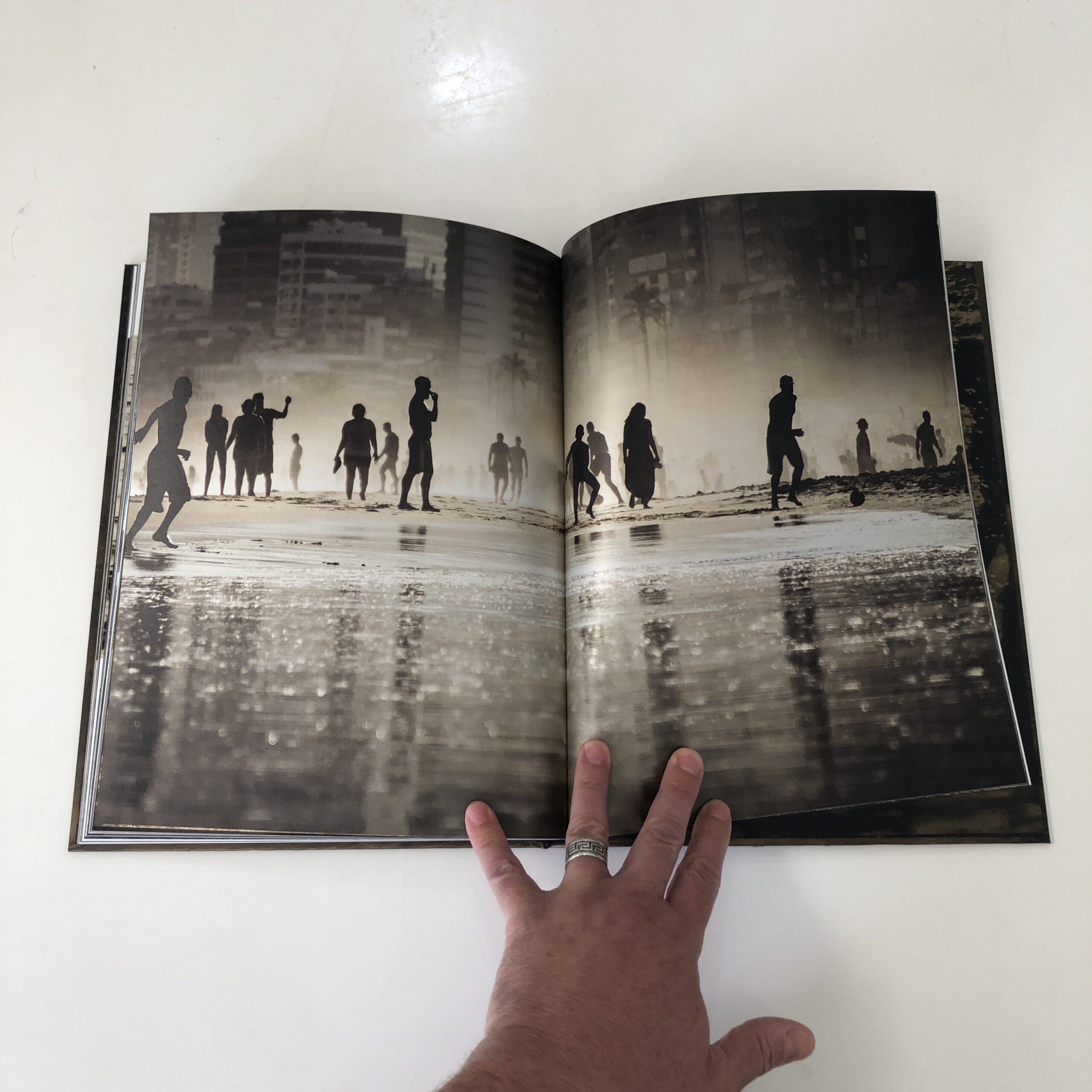
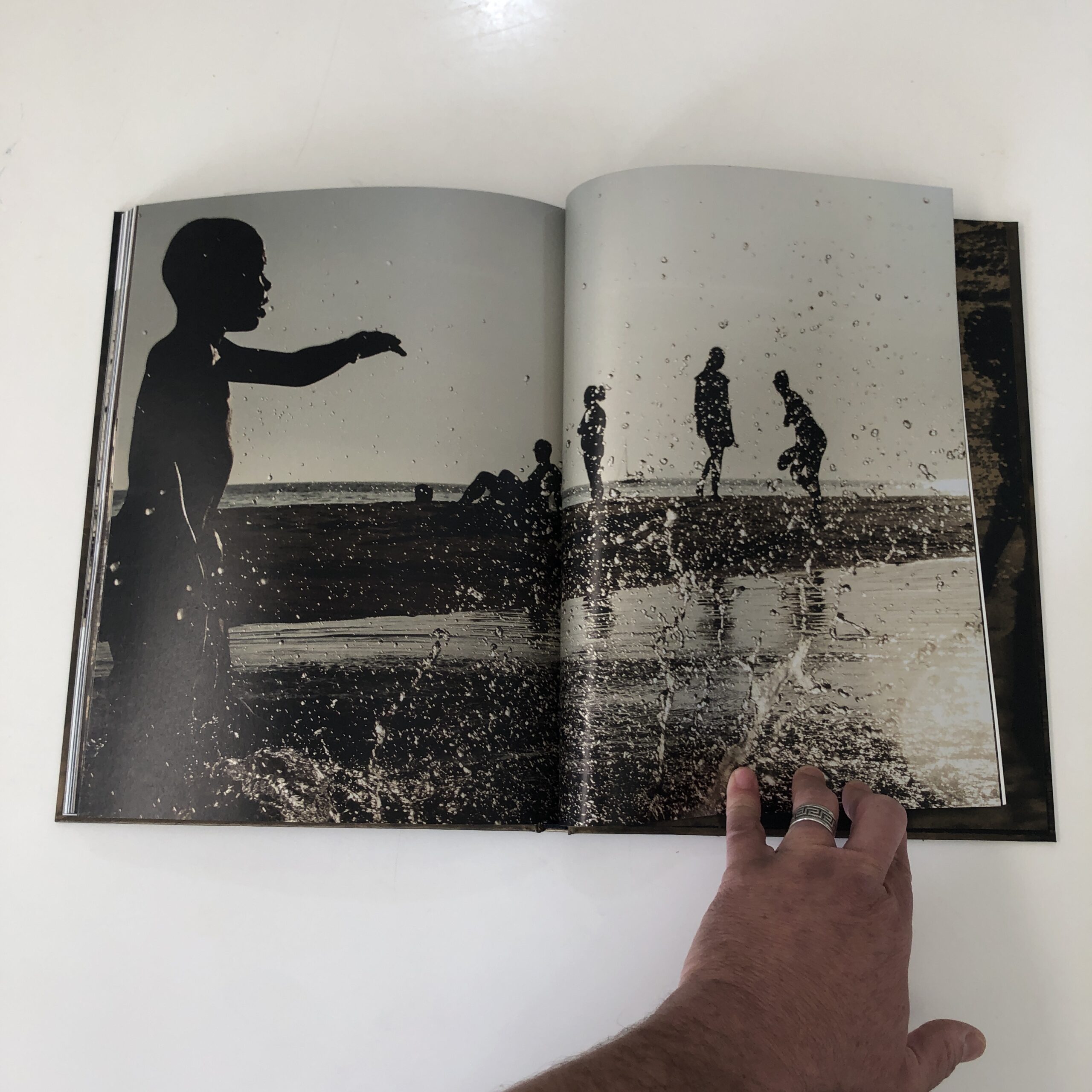
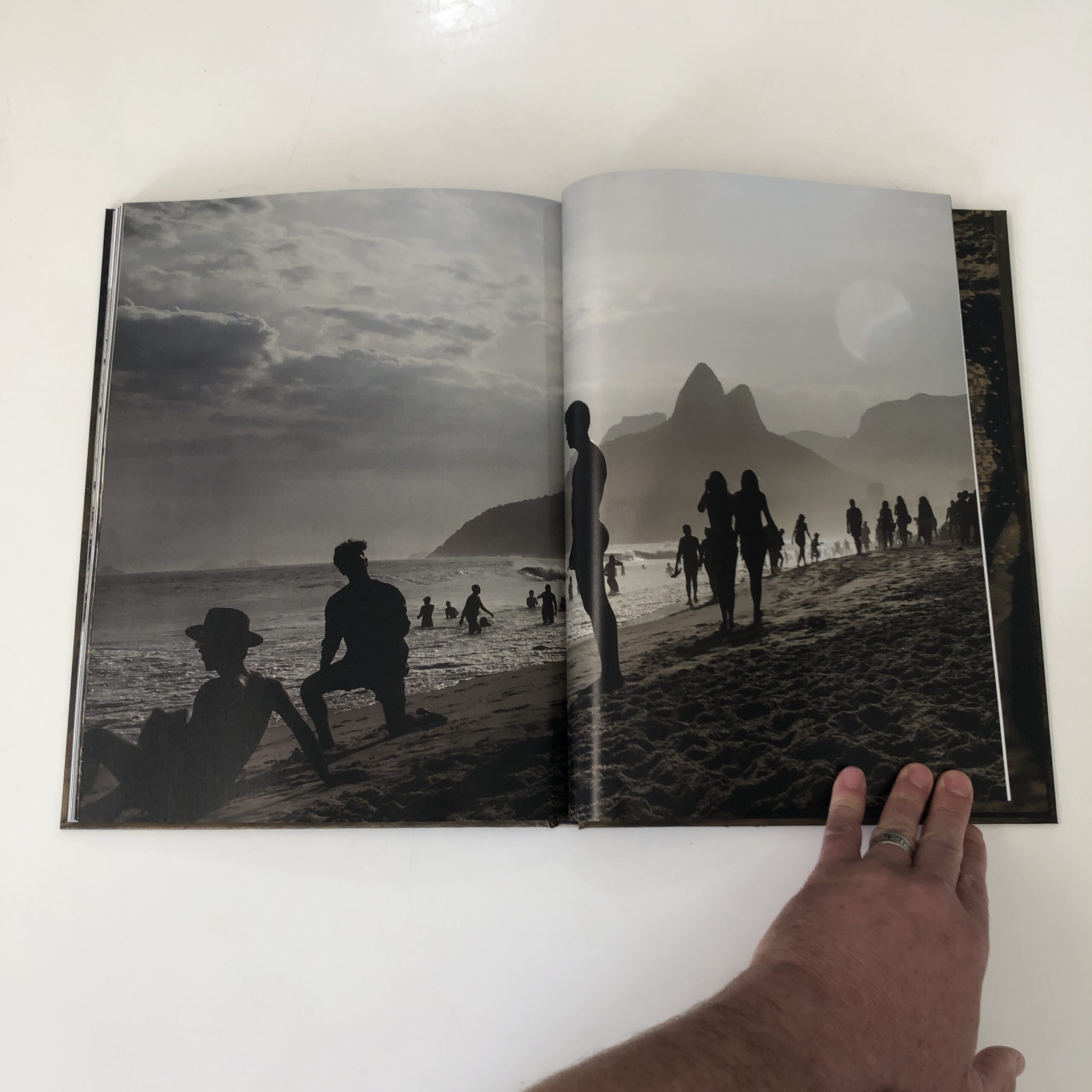
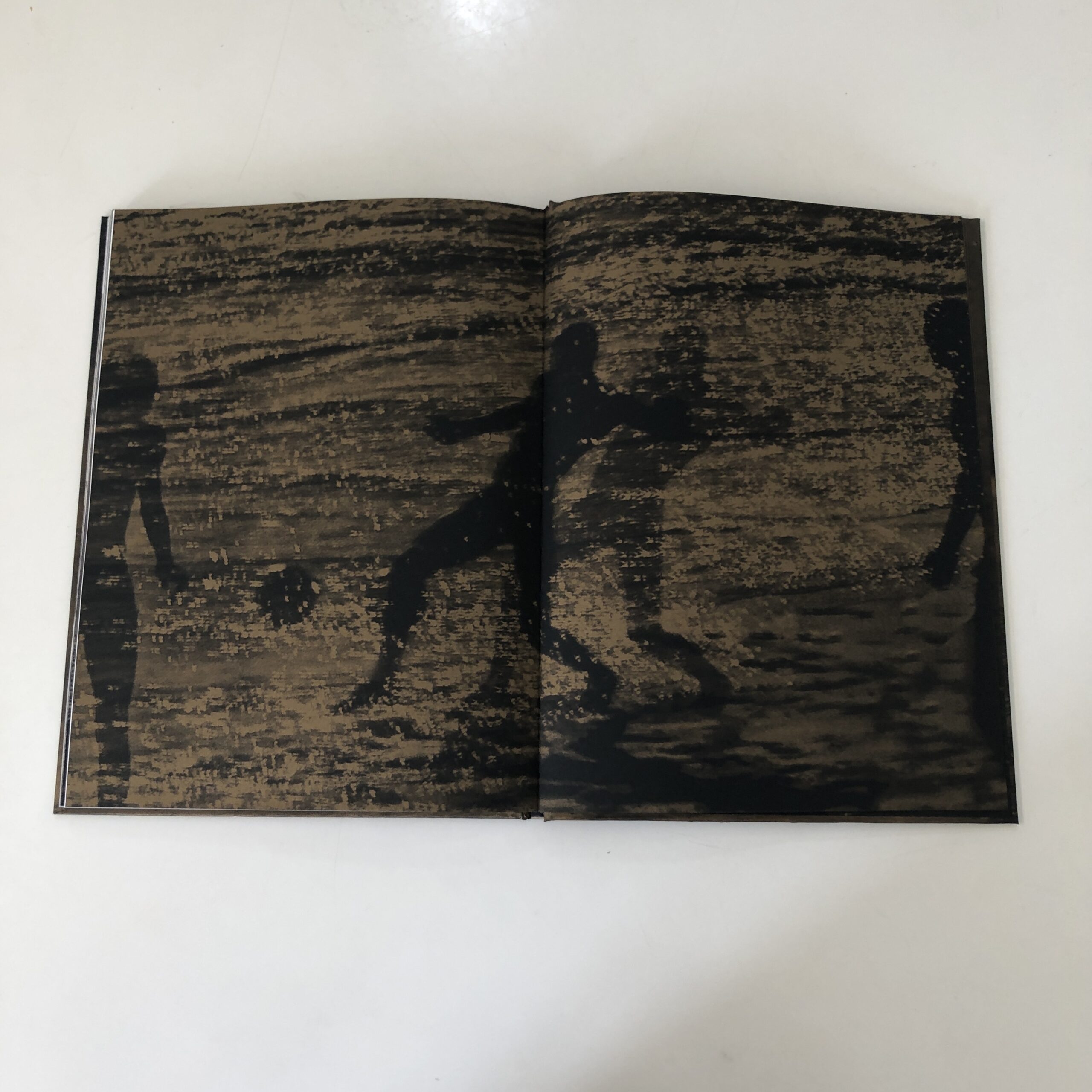
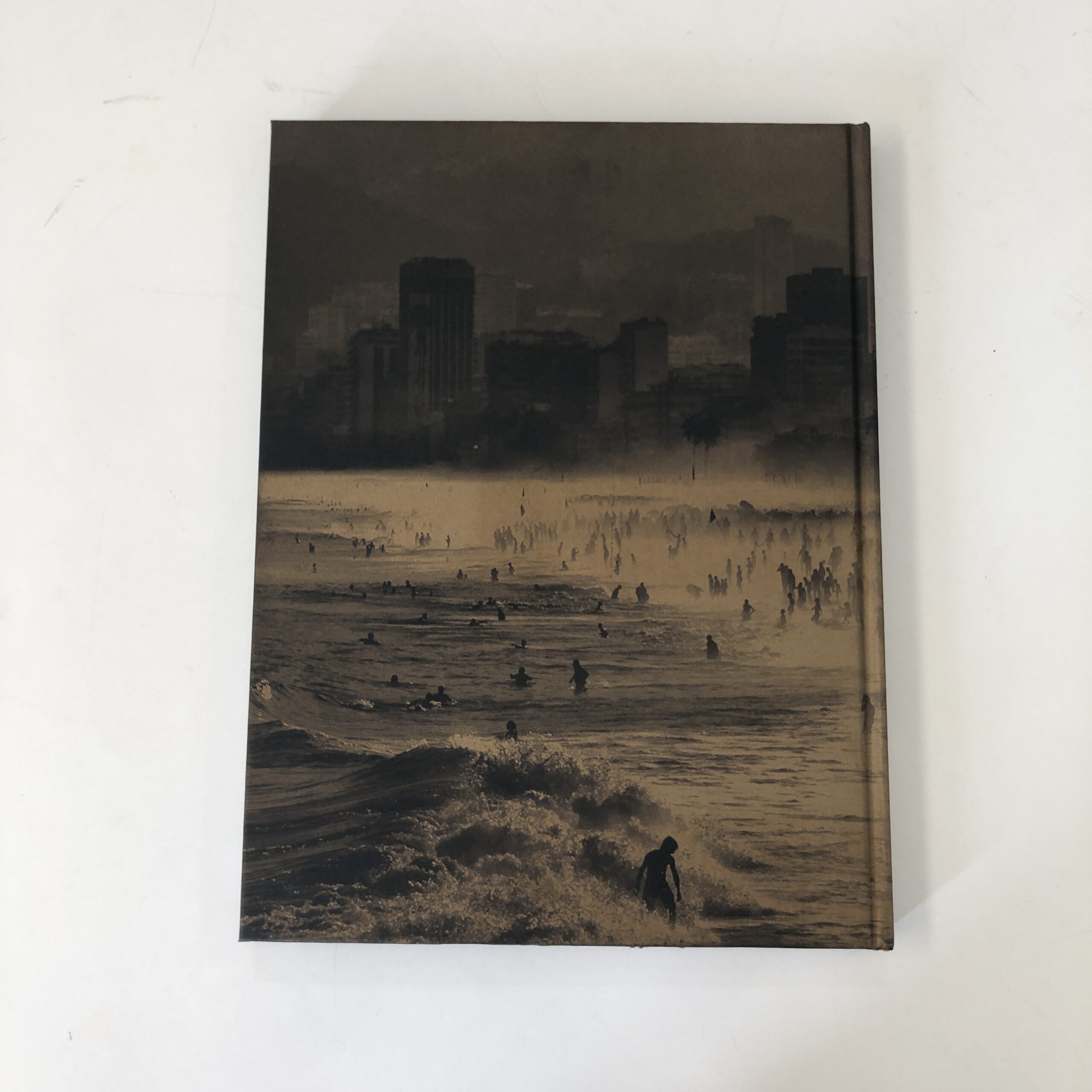
I found the attention-grabbing “Aquas De Ouro,” from Sandra Cattaneo Adorno, published by Radius Books in Santa Fe.
Straight up, Radius is known for craftsmanship and design, and I mean this cover!
Shimmering Gold!
I don’t speak Portuguese, but as I know some Spanish, Italian and French, I guessed the title meant Waters of Gold, and the coastline in the graphic made me think of Rio de Janeiro, though I’ve never been.
Sure enough, that’s what the book’s about, as it seems the artist was born there, spent a chunk of her life in England, and then returned to make these photos.
(I’m not clear if it was a part-time, or full-time return to make the work in the book.)
No matter.
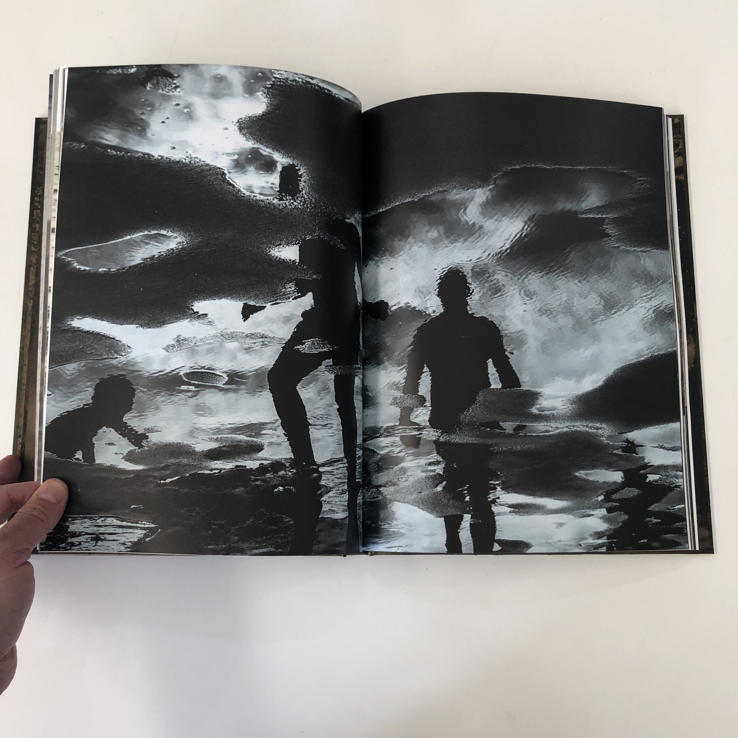
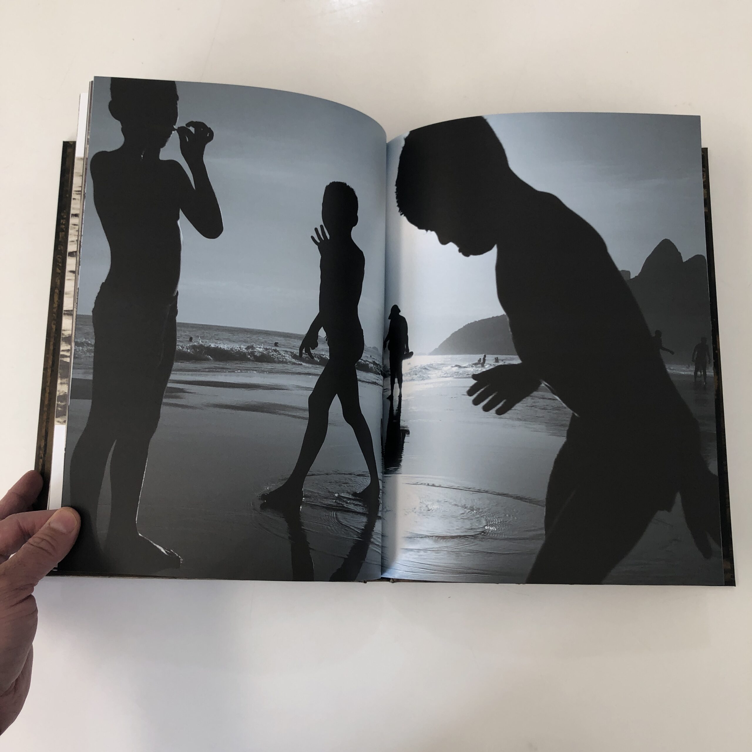
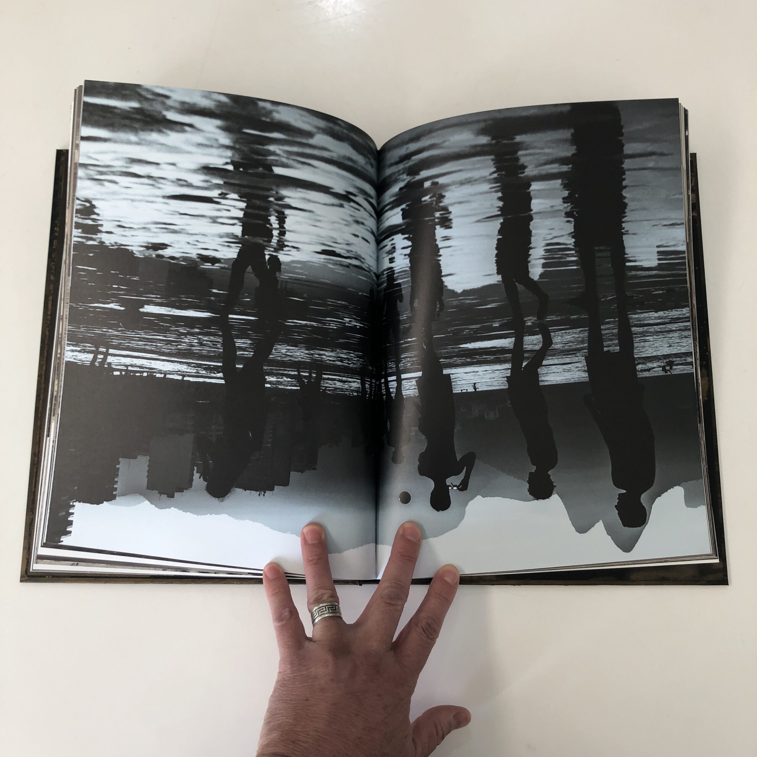
I write all the time that books are experiences, and this one actually felt like that was the main point.
Creating a real, lived-in experience for the viewer.
All those close-ups!
The movement, in and out of the crowds.
In and out of the water.
I was re-watching “Friday Night Lights” recently, and after looking over my shoulder, my wife said she’d forgotten how the many jump-cuts, and constant change of camera-angle coverage, made her feel like she really was in that small, West Texas town.
That’s what this book did for me.
It brought me to Ipanema Beach for a few minutes.
(Which is pretty cool.)
The print quality is super-high, as I’d expect from Radius, and frankly, I bought some weed in Santa Fe recently that got me super-high, so shout out to the quality that city’s turning out!
Big Ups to Santa Fe!
Back to the book, though.
The photos are dynamic, as I said, and there are a lot of them.
Probably, if I’d been editing, I’d have chopped it just a tad.
But text bits, in Portuguese and English, are sprinkled throughout, on different paper stock, so that does keep the narrative moving, and alleviates any potential viewer boredom.
(Especially as none of the text is overly-long.)
In keeping with my shorter, breezier, Summer style… this is a very well-made book.
I enjoyed my time with it, both for the art itself, and the fact it sent me back to my own digital archive, to re-live memories of the sea, from past sunny days.
If you’d like to submit a book for potential review, please email me at jonathanblaustein@gmail.com. We are particularly interested in books by artists of color, and female photographers, so we may maintain a balanced program. And please be advised, we currently have a significant backlog of books for review.
The Art of the Personal Project is a crucial element to let potential buyers see how you think creatively on your own. I am drawn to personal projects that have an interesting vision or that show something I have never seen before. In this thread, I’ll include a link to each personal project with the artist statement so you can see more of the project. Please note: This thread is not affiliated with any company; I’m just featuring projects that I find. Please DO NOT send me your work. I do not take submissions.
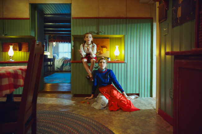
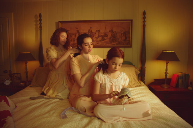
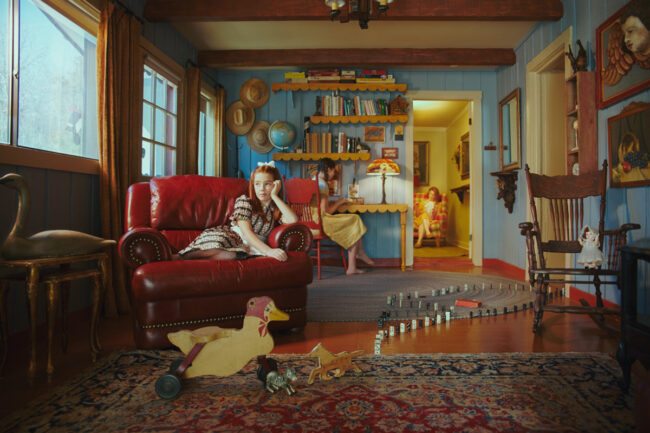
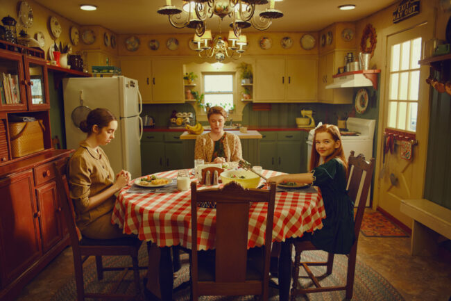
In 2018, I worked with a company to create a tutorial focused on color theory for photographers, which was sort of an exploration of how to employ color for maximum visual and emotional impact in an image. “Sisters” was the culminating series created for the tutorial, designed to showcase how color could be used effectively in set design, wardrobe and post processing to help tell a story.
In the process of coming up with ideas for this shoot, location scouting and sorting out the curriculum for this course, I really started to think hard about ideas and art that has continually interested and influenced me over the years; and two things that I always find myself coming back to are first, thisinfatuation with relationships—the varying dynamics therein, how they manifest and play out in different ways—and second, Americana and American culture—particularly from the vernacular perspective.
So when I think about these sort of themes, I start to think about artists like Normal Rockwell or Edward Hopper, or Andrew Wyeth, who are really sort of the champions of Americana art, and have spent their artistic careers portraying the beauty in the vernacular American life. Particularly, having grown up in the Northeast, I have found myself more and more drawn to the work of Rockwell, and his vignettes of every day scenes—nothing monumental, just ordinary people in the moment. Growing up visiting my grandparent’s house when I was little, they had a magnet on their fridge of Rockwell’s “Girl At Mirror”; and I remember becoming so enamored with this girl, dressing up as her—braided hair, nightgown and all—and would recreate this scene regularly.
Rockwell’s gift was in his ability to both immortalize and humanize the past, which, as an artist and a historian, is something that resonates deeply with me. For this series, I wanted to pay homage to these great Americana artists, while infusing some of my own experiences as a sister and daughter. Shot on a goose farm in rural Missouri, this series explores a day in the life of two sisters and their mother, capturing vignettes of their interactions—those humanizing moments of play, tenderness and bonding. Its set, styled and color graded in an early 20th century fashion, but these relationship dynamics are meant to transcend any specific time period.
APE contributor Suzanne Sease currently works as a consultant for photographers and illustrators around the world. She has been involved in the photography and illustration industry since the mid 80s.After establishing the art-buying department at The Martin Agency, then working for Kaplan-Thaler, Capital One, Best Buy and numerous smaller agencies and companies, she decided to be a consultant in 1999. She has a Twitter feed with helpful marketing information because she believes that marketing should be driven by brand and not by specialty. Follow her at @SuzanneSease.Instagram
Success is more than a matter of your talent. It’s also a matter of doing a better job presenting it. And that is what I do with decades of agency and in-house experience.
Concept: Architectural images showcasing a hotel and its amenities.
Licensing: Unlimited use of up to 5 images in perpetuity. Unlimited use of up to 30 additional images for 1 year
Photographer: Architecture and Hospitality specialist
Client: Large International Hospitality Brand
Here is the estimate:
Fees: This shoot required an experienced architecture and hospitality specialist with the ability to capture strong content in a very short amount of time. The shoot time was compressed as the location was re-opening with short notice due to the state’s relaxation of Covid regulations. Also, from what we could gather in our client conversations, was that a shoot took place recently and the agency was now tasked with getting it done right the second time. That put upward pressure on the fee, and I felt that a creative fee alone was worth $10,000 for the 2-day shoot.
The client requested two licensing terms for the 35 deliverables on the shot list. They requested 30 images with 1-year Unlimited use, and an additional 5 images to have a license for unlimited use in perpetuity.
For the 1 year Unlimited licensing, I felt $750 per image was appropriate for the quantity of 30 images.
For the perpetual Unlimited licensing, I felt $2,000 per image was appropriate for 5 images.
This totaled $32,500, and I arrived at a $42,500 creative/licensing fee by combining the $10,000 creative fee with the licensing fees. On top of that, I added a $750 fee for the photographer to attend a quick tech/scout of the location.
I added a Licensing Options section within the Job Description to outline possible additional image use fees, including possibly extending the use of the 30 images to perpetual use. This included a discounted rate for the bulk perpetual use.
Crew: We added a first assistant (who would also accompany the photographer on the tech/scout), as well as a second assistant. These rates were appropriate for the given market, and the rates the photographer’s assistants were accustomed to. I suggested to the photographer to bring on a separate person as digital tech, but the client pushed back on the crew footprint during Covid and the photographer was comfortable using his 2nd assistant to simply run a Capture One tether and backup files.
Equipment: We included $2,000 for cameras/grip/lighting, and a modest fee to cover the photographer’s computer set up to be used on set, and 2 hard drives.
Covid Safety: We included costs for 3 advanced Covid tests for the photography team, plus $75 for PPE.
Misc.: The location was about a 30-minute drive for the photography team. We added a line item to cover individual mileage for the 3 person team, parking, some additional meals, and a bit of buffer for any small unforeseen expenses that might arise.
Post Production: We included $1,500 for the photographer to perform basic color correction and provide a gallery of his favorite shots. The retouching estimate was based upon the photographer and creative team assuming each image would need roughly 2 hours of work. This would be billed at $125 per hour.
Results: The photographer was awarded the project. The shoot was a success and images are out in the world currently!
Need help estimating or producing a project? Please reach out. We’re available to help with any and all pricing and negotiating needs, from small stock sales to large ad campaigns.
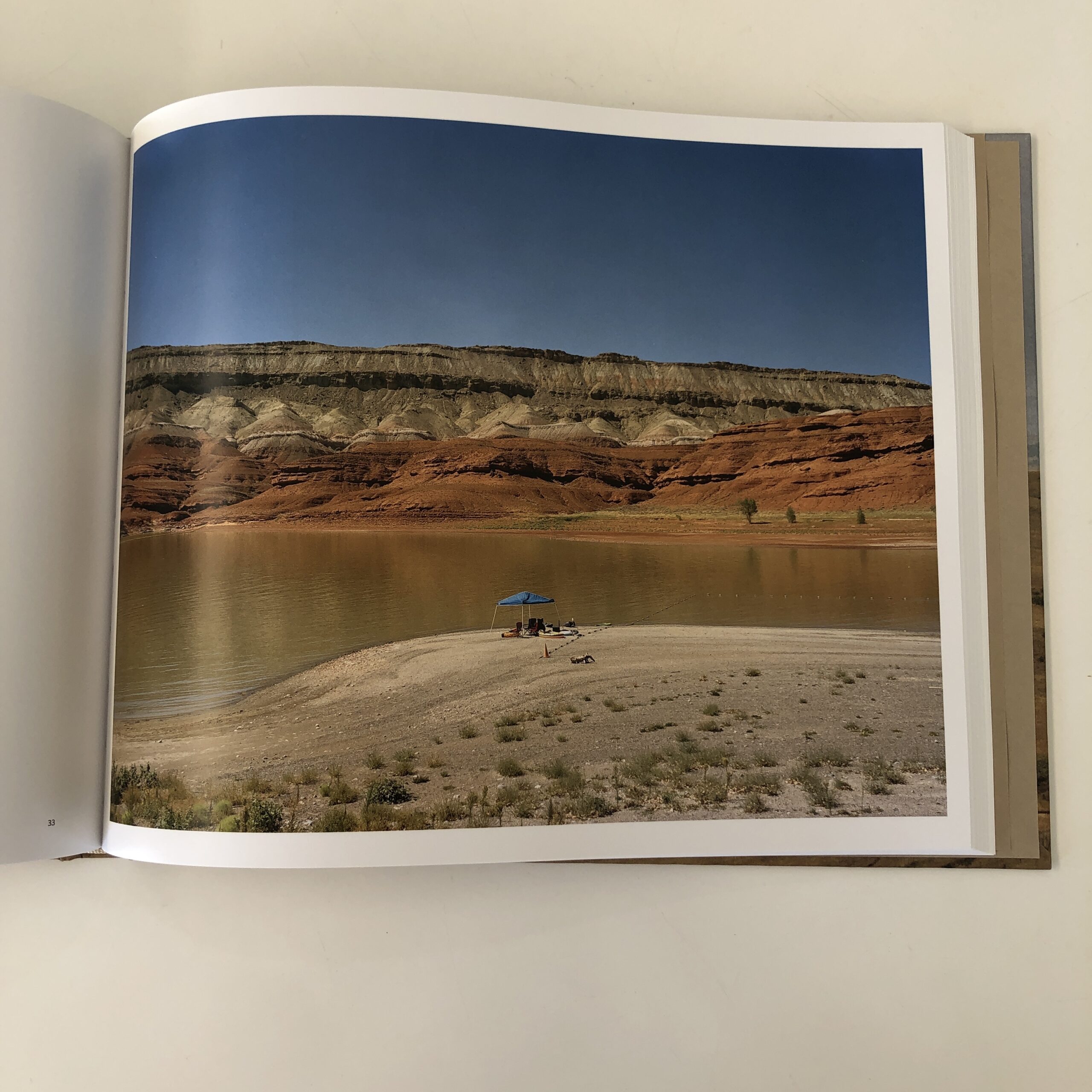
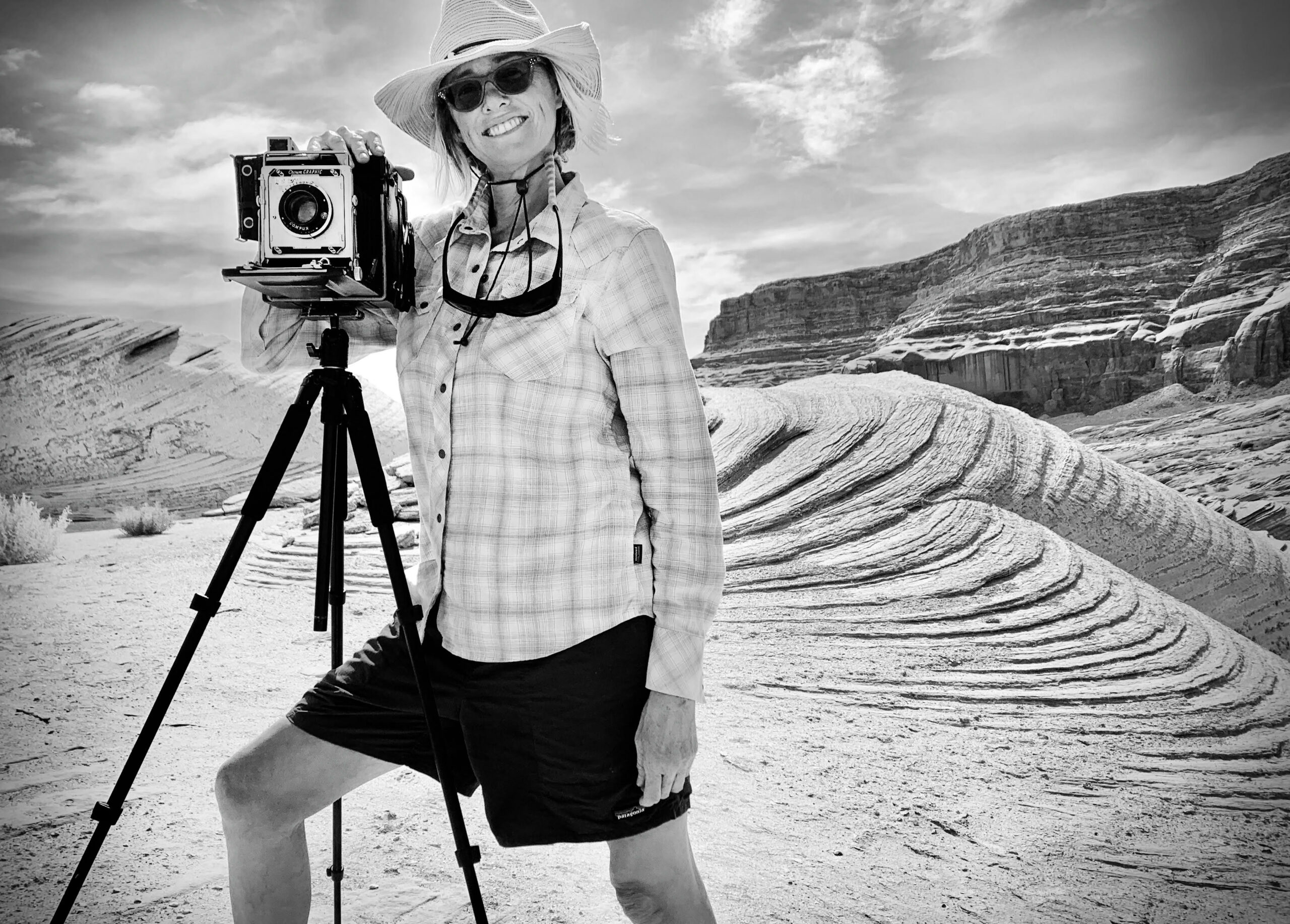
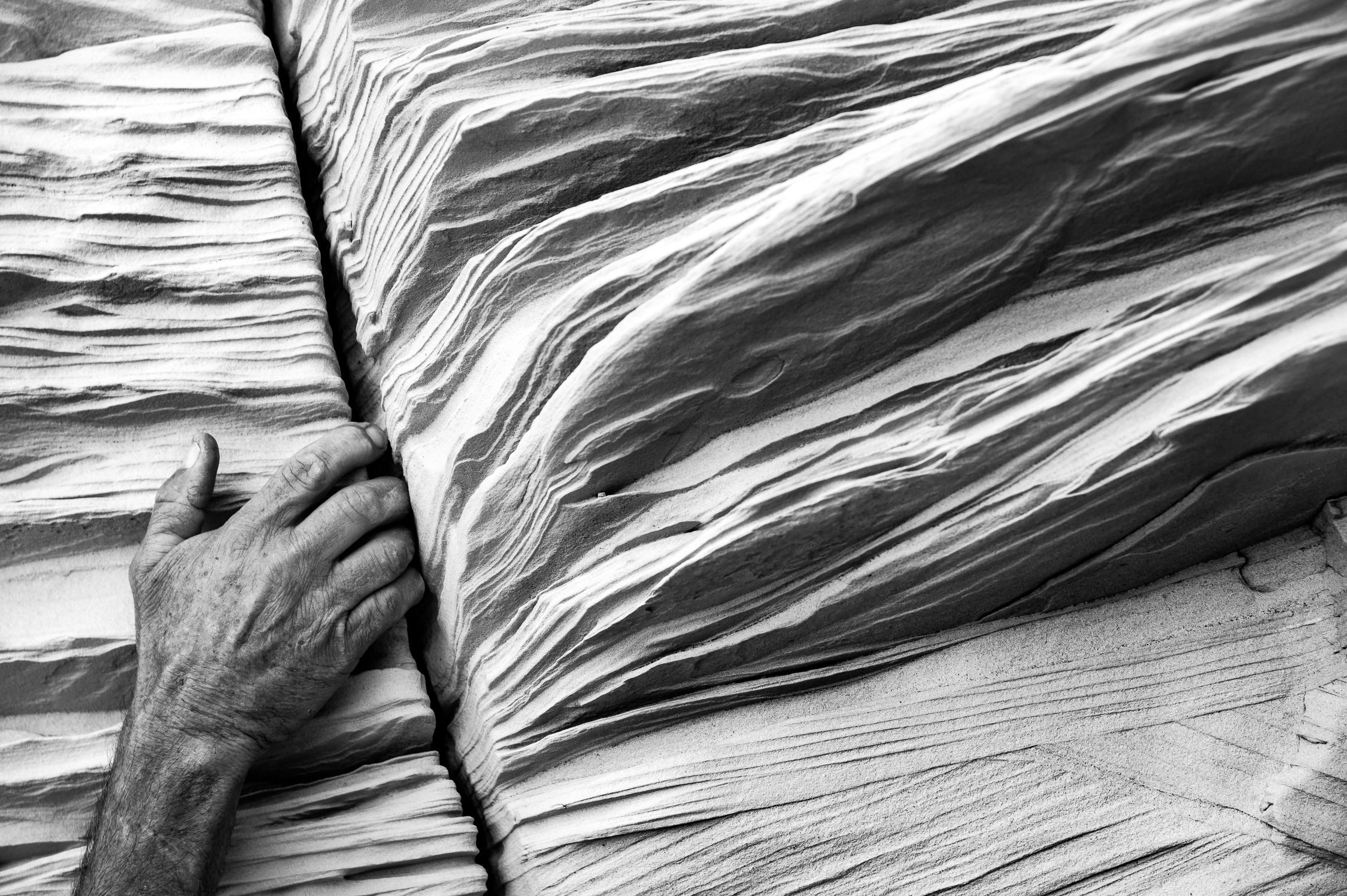
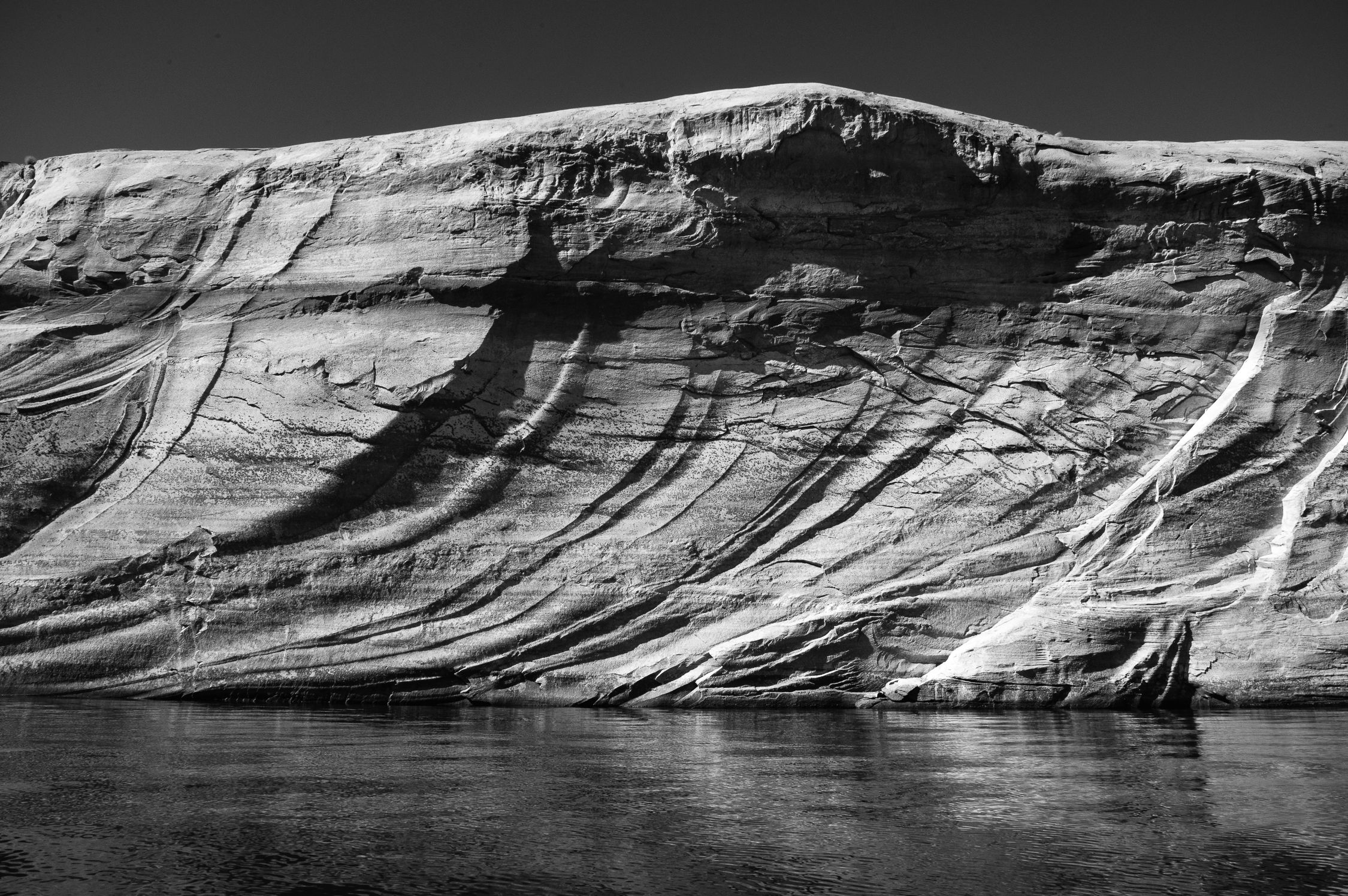
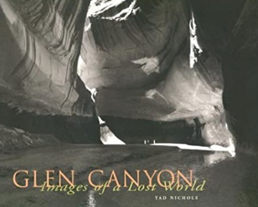
Heidi: How did that camera find its way to you? Dawn: A few years ago, my friend Richard Jackson and I were working on a large format project together. Jackson is a master printer and makes beautiful photographic prints. Out of the blue he hands me this old Crown Graphic 4×5 camera and says, “Would you be interested in using this camera? It belonged to Tad Nichols.” My jaw dropped. I am a huge fan of Tad’s work and feel like he is the Ansel Adams of Glen Canyon. He photographed Glen Canyon in the 1950’s before it was buried under a watery tomb called Lake Powell. Tad documented the pre-damed canyon with this camera and he did 16mm motion pictures as well. In 1998, there was a big push to get these important photos published and get his archive to Northern Arizona University (NAU). Tad and Richard became friends on a river trip many years before and he became the printer for his book, Glen Canyon-Images of a Lost World. Tad passed away in 1999 and bequeathed this camera to Richard.
I told Richard, “No thank you, I’m worried I would harm this historical camera.” This offer made me nervous but I was also elated, but I said, “I’ll borrow it when I have a good project for it.” Well, 2 years later, Glen Canyon started to emerge and Lake Powell’s water levels are at its all time low since the fill up of the reservoir in 1963. Finally, I’ll go see Glen Canyon, a place I never thought I would experience in my life time except in books, photographs, films and Katie Lee songs. And I’ll take TAD (the Crown Graphic) with me. WHOOP!
Why was this body of work important for you to document? This is a project of LOVE. The love for nature, photography, adventure and the historic significance. I can’t believe this happening. I feel it is my most important work yet to date. Plus, I’m from the Southwest and want to help preserve this iconic landscape. Tad spent time photographing pre-dam Glen Canyon, dam construction, and the resulting formation of Lake Powell with his 4×5
How much did Tads work from Glen Canyon: Images of a Lost World inform your body of work?
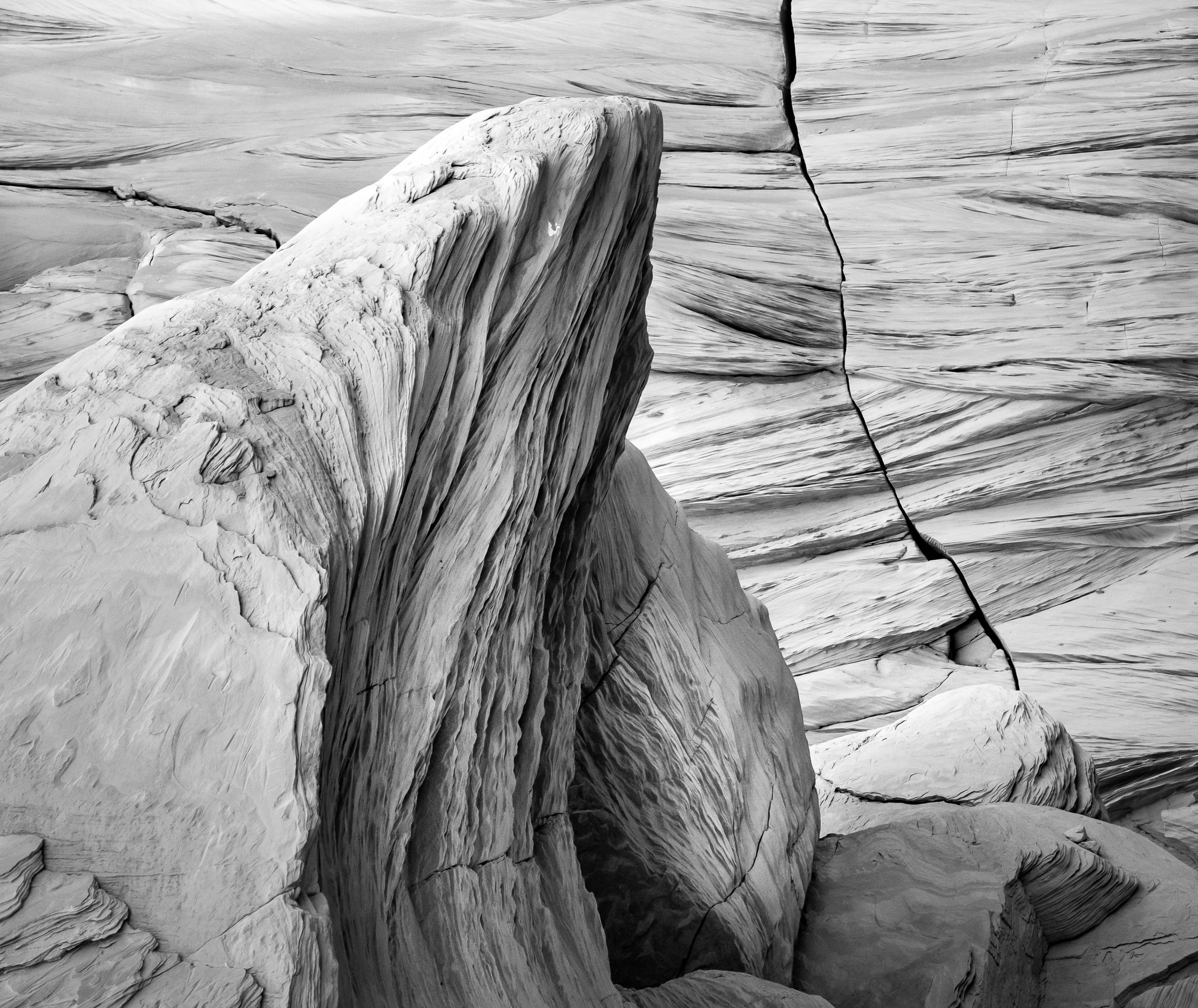
His book is definitely is an inspiration. I didn’t go back and recreate his work. I went back to explore and expose what I found and let creativity guide me. This is a creative project and not a replica of the old and new. Though, I do believe there are a few people doing this type of work. The book was my guide and Tad’s spirit to create art and advocacy for our public lands.
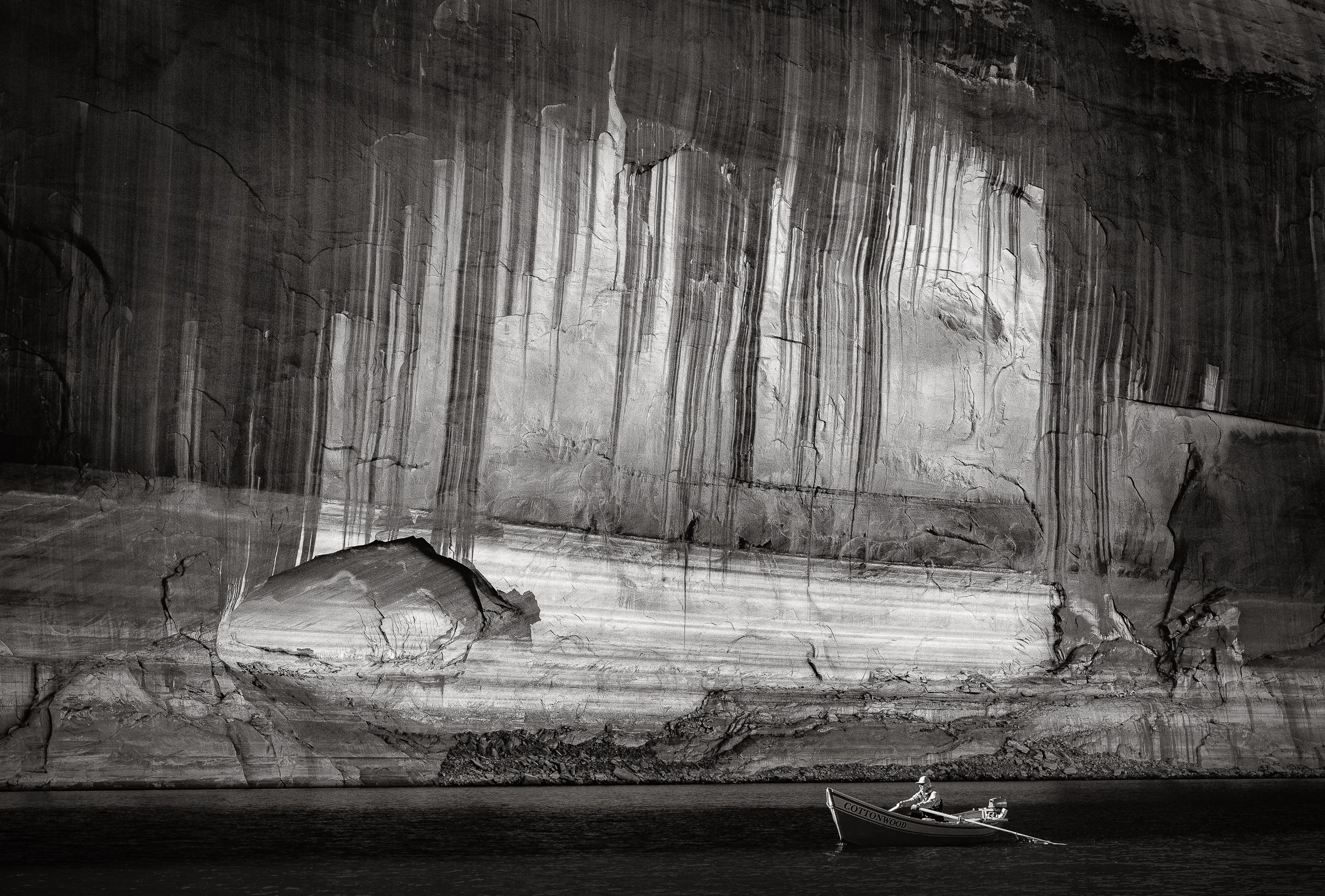
Since there’s a significant time and water gap, was it challenging to find the location? It is still a giant lake. There is still 300 feet of water till you hit the river channel in the deepest parts. But the very outside of the lake is being exposed so you do have a glimpse of what was buried. I feel so honored to get to these places. Glen Canyon is massive and many side canyon fall into it. The logistics are overwhelming and feel I got just a glimpse of what is to be discovered. Tad documented the canyon for over 10 years. I have had 5 journeys by boat so far, that added up to about 12 days on using the camera in the field. I used Gaia maps and marked waypoints of the places on the map that I took the photos. All most all the images look like they are taken underwater by todays maps. Looks like I needed underwater housing and some scuba gear to get the shots.
Just trying to get on the lake there were delays and mishaps of all sorts – bad weather (fucking wind that turns the lake into an ocean), forest fires, road closures, ramp closures, running out of gas, breaking tents, sand in the cameras, sand in your crotch…I’m sure you get the idea. Hahaha. The place is over whelming but over all worth it. The beauty keeps calling me back.
If you were able to connect with Tad, what would your message to him be? I would thank him for his determination in trying to save this beautiful canyon and documenting this natural wonder before it was all gone. I would tell him I’m going to Glen Canyon with his camera and called it “TAD”. To be honest, I talk to camera all the time when I’m making photos. I ask him to guide me and I usually take a huge breath when I release the trigger cable. I got a little nervous making the exposers on real film. I made sure I backed up my images with my Nikon. You don’t want to mess up because it is not a place you can return to so easily. There is a lot of money and time that goes into one exposer. So I try to relax, concentrate, breathe and talk to Tad and enjoy the beauty of the canyon.
What conservation groups did you work with for this project? I am involved with the Glen Canyon Institute (GCI) and NAU archive to prepare exhibits about the emergence of Glen Canyon. The work will have an art advocacy message and a percentage of the print profits will go back into these non-profits. If anyone would like a print they are available. I hope to get a book rolling too but not sure how to do this. I’ve never done a book before but i’m up for the challenge.
What’s your goal with this project?
My goal is to inspire people to not make the same mistake again and fight for our natural world. David Brower, CEO of the Sierra Club during the 1960’s, said, “This was my biggest mistake to let Glen Canyon go under.”
I also started a very personal heart felt film about the making of this project called, Tad’s Emerging World. I’ll be submitting it to film festivals end of July.
So I’m currently trying to limit my exposure to toxic people.
But I’m only here, at this new point in mid-life, because I made so many mistakes, over and over again.
Failure is the best teacher, if you’re willing to listen.
My son was 2 years old when I began writing for A Photo Editor.
I was 36.
(A youngish, new father to a toddler.)
36 years old, covering a portfolio review for APE
Now it’s 2022, and I’m the 48-year-old Dad to a teenager, and a soon-to-be tween daughter.
All along, I’ve been sharing my thoughts, and this blog has become interwoven with my life.
That’s quite the run here, and I think it’s because Rob and I share common values and beliefs.
One core tenet: Respect the Hustle.
It’s a hard world out there, and very few of us are ever given anything at all.
(If we are, let’s hope we’re humble and appreciative.)
To become successful in any field takes intelligence, planning, social skills, hard work, grit and determination.
Battling rejection.
Handling the almost moments, when it didn’t happen.
I mean, I once got accepted into a big NYC gallery, less than a year out of graduate school, only to have it fall apart when they didn’t like the color of my picture frames.
(Now that’s a kick in the nuts.)
Perseverance is a valuable trait; one that’s only learned through suffering.
As always, there’s a point to my musings.
We’re going to talk about a book today; one that waited quite a while for review.
It arrived in May 2021, and sat patiently in its red plastic pouch.
When it’s been that long, I never have any idea what’s inside, and this one was a self-published book by Alex Palombo called “The 20 2020 Project: The Pursuit of a Dream.”
There are two ways to talk about this book, and I aim to investigate both.
First off, I respect the hustle this book entails.
The photographer shares, in the opening statement, how tricky it was going to be, to photograph and interview 20 athletes training for the 2020 Summer Games in Tokyo.
It was a budget stretch, and Alex meant to stick to the Northeast corridor of the US, from DC to the South to Montreal in the North.
(He lives in New York.)
There is an anecdote about a highway mishap in Upstate NY, which lead to driving 5 hours in the wrong direction towards Buffalo.
Ouch.
(Can’t not share here that my Mom and Dad inadvertently headed West from Vail not-too-long-ago, instead of East towards Denver, and only realized it when they were well into Utah. Must have been some strong-ass reefer.)
Image courtesy of Turn the Page
Sorry.
Back on topic.
There was a lot of effort funneled into this book, as a passion project, BEFORE Covid hit, and then it became nearly impossible.
But somehow, here it is.
Hard-cover, serious business.
We have athletes, and their stories, which are themselves inspiring.
Each had to sacrifice.
To suffer.
To chase a dream.
In the world of sports, no cliché is ever too big.
All the meta-narratives have been told, (certainly since the US Hockey team won Gold in 1980,) yet they get us every time, such is their power.
{ED note: Just last night, Stephen Curry and his buddies proved the “aging vets who still have one more in the tank” narrative never gets old.}
Courtesy of NBC Sports
I’m the first person to admit I’ve become more cynical since 2016, and try to push back against those instincts.
Sports help me do that.
Not only do I admire the Grit’N’Grind that saw this book through to creation, self-published, but also how it amplifies that positive message with the powerful stories within.
These moments motivate us to do more.
Be better.
Dig deep.
That is the context through which I prefer to view this book, and one for which I have much admiration.
However…
The other context.
Do I think the photographs are special?
Is the pacing spot on?
Can I groove with the graphic design?
What about the fonts, image placement, and the balance of text and image?
Weekly, I judge books on those merits, and in many ways this one comes up short.
So I don’t want to wimp out, and not say what I’m thinking.
It’s not a “great” book.
But I don’t want to over-invest in that narrative, as the kids say these days.
The truth is, I review books of all types, intentions, and levels of craftsmanship.
Context matters.
I hope some, or even most of these fencers, wrestlers, sprinters, judokas, boxers, and synchronized swimmers made it to Tokyo in 2021.
And I hope you dig this fun, positive book on a warm summer day.
If you’d like to submit a book for potential review, please email me at jonathanblaustein@gmail.com. We are particularly interested in books by artists of color, and female photographers, so we may maintain a balanced program. And please be advised, we currently have a significant backlog of books for review.