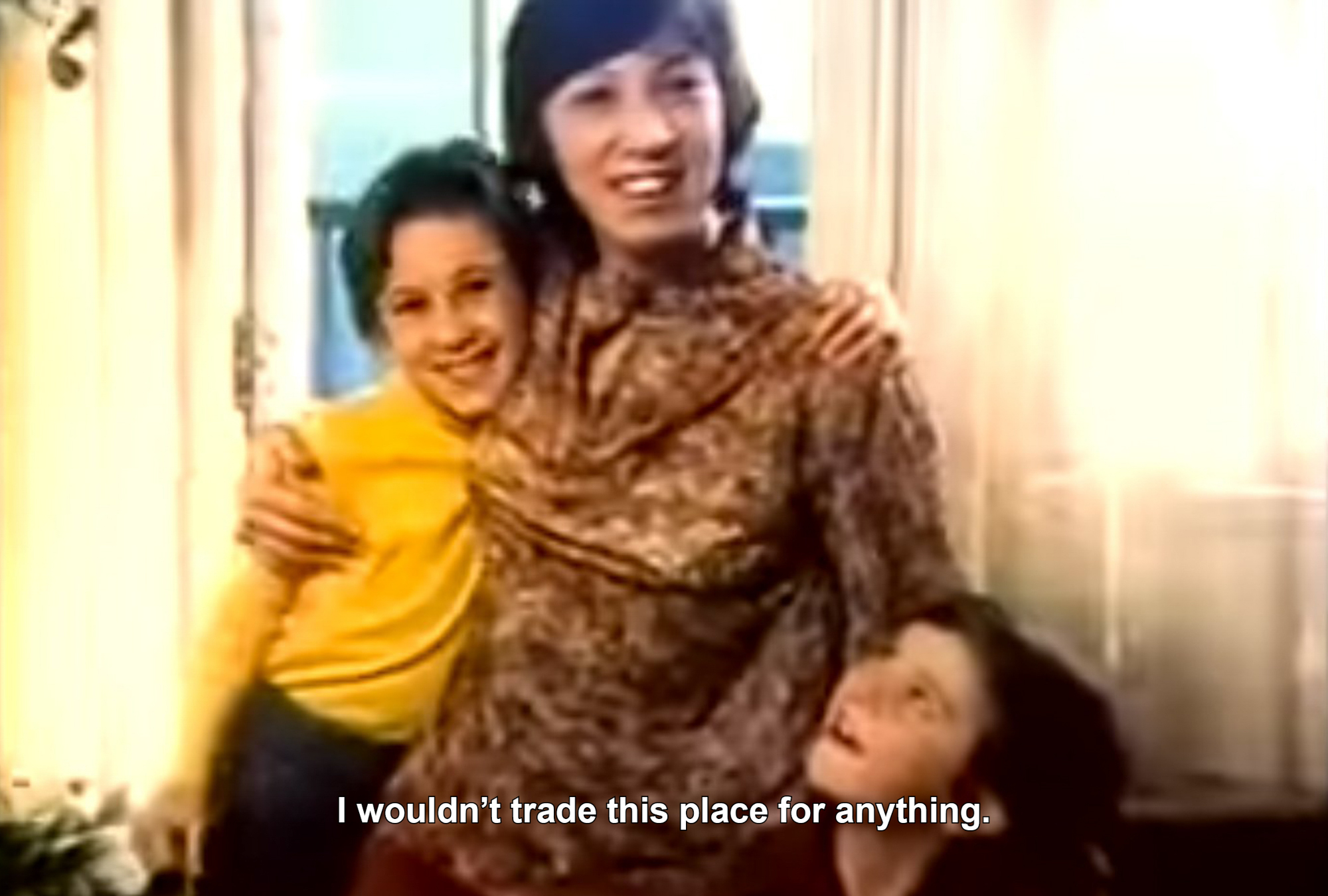
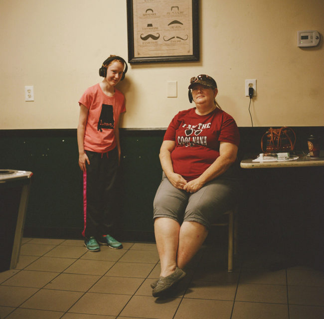
Heidi: When did you start this series?
Samant: The first egg I flipped on the first day of the lockdown was an act of imitation.
Why did you choose eggs?
My father would flip the egg perfectly when he would make omelettes for us in a small town where we lived back then. Egg was a treat in those days. It wasn’t everyday that we had eggs for breakfast. In fact, my mother could never flip the egg the way my father would. And over the years, I forgot about that art he had mastered. Lockdown meant a role reversal. A total overhaul, a complete reimagination of things, of life itself.
What did this lockdown project represent for you?
I was going to do everything on my own and it started with the flipping of an egg. The first egg I made was an ode to that memory. In silence and isolation, memories become a guidebook. I remember having stitched a school bag, having painted the walls of my house, and a lot of other things I had given up because I was chasing other dreams and ambitions. It might sound trivial but I decided to make eggs every morning as an ode to people who made them for me, including lovers, friends and family and even random strangers.
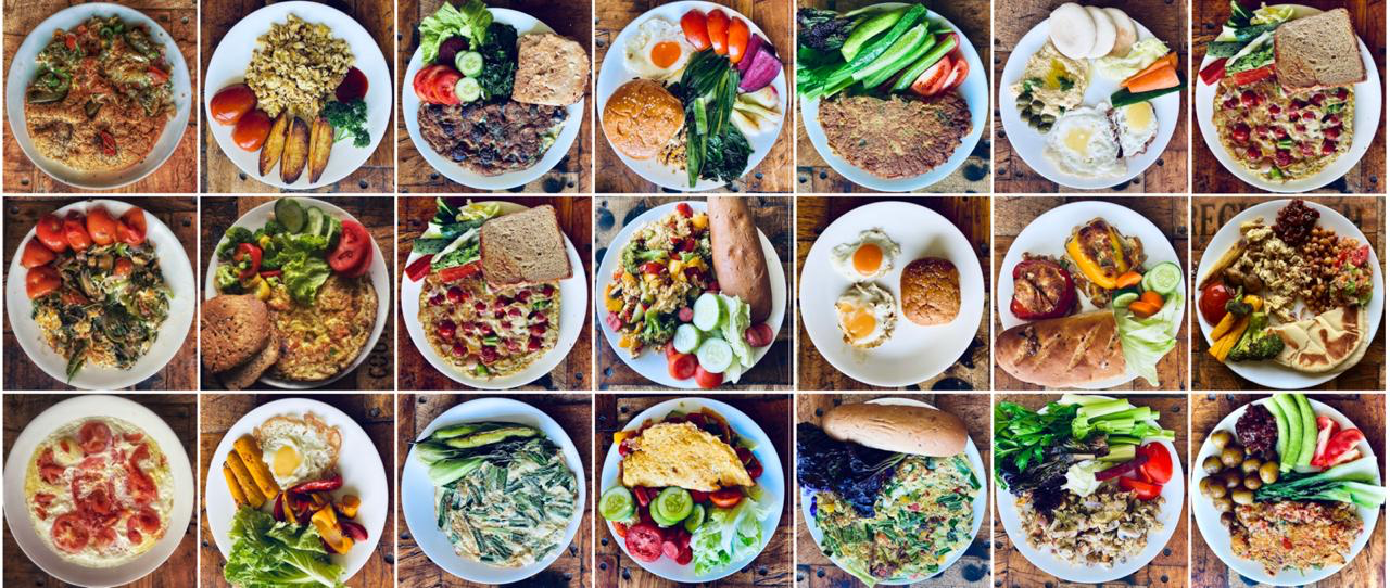
Why breakfast? The first meal of the day is a significant one and for me, it would be an exercise in memory, a way of paying homage to little acts of love, of camaraderie, of togetherness. So over three weeks, I conjured the memories of those mornings and those breakfasts and strangely enough, some of the people recognised the eggs and wrote to me. And that was it. A revisitation of sorts when you are alone and you want to hold on to people. The breakfasts became a ritual for me in the lockdown. I would make the egg, decorate the plate and capture it.
How did this honor your father? And it all started with the first egg I flipped and I could flip it the way my father would. It was pure joy because for a son, the act of growing up culminates when he can be like his father. And for me, it came with the flipping of an egg. Like he did in that house of love where we learned to be with each other. That’s how it started. The egg. The memory. The people.
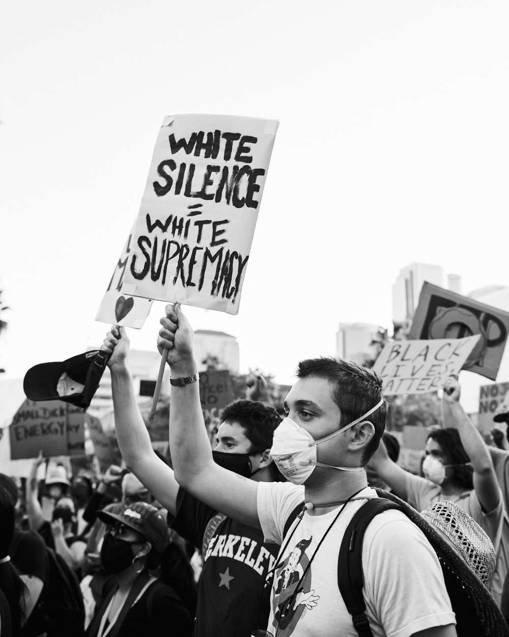
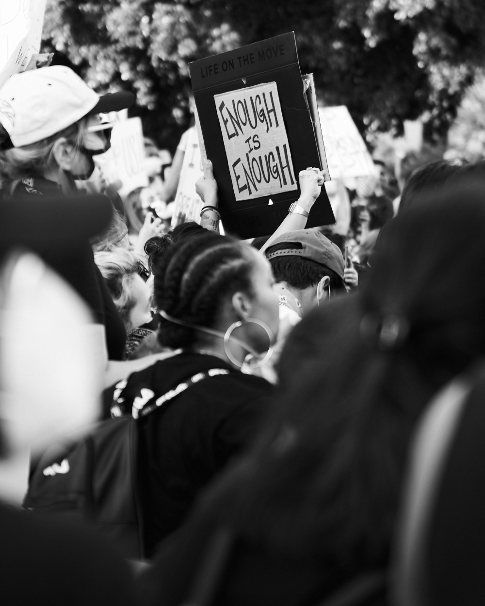
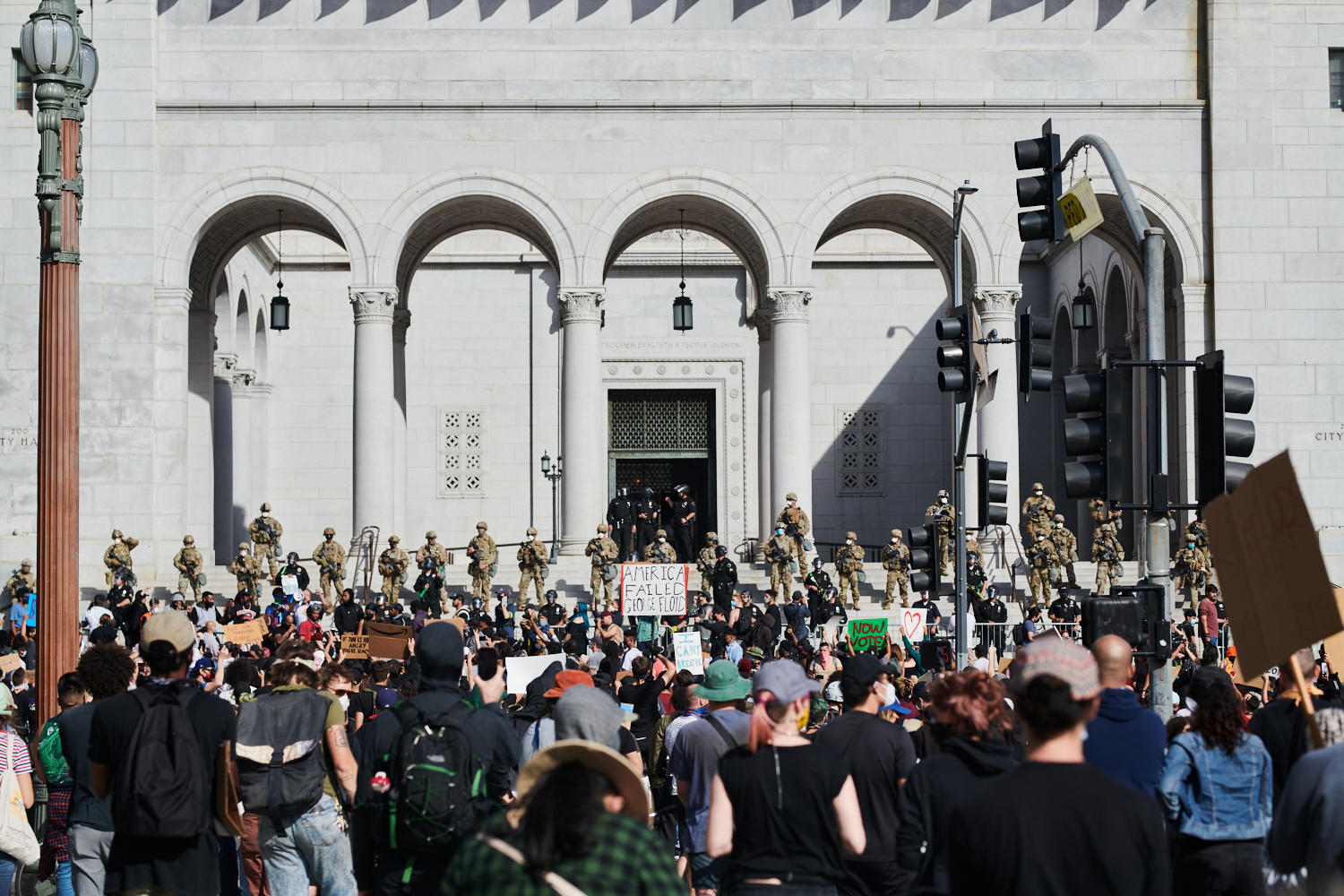
It all began when the Milwaukee Bucks, the putative best team in the NBA’s Eastern Conference, decided at the last minute not to take the court for their impending playoff game against the Orlando Magic.
For those of you unaware, the NBA resumed earlier this summer in a “bubble” at the Disney/ESPN campus outside Orlando, Florida.
The professional basketball league created an artificial community, cut off from the rest of America, with very stringent rules and testing procedures, to allow the players and associated staff to stay safe from Covid-19.
As there are no fans allowed in the games, the entire affair has been arranged for broadcast television, (which is now also done via streaming, for some,) so that the global audience, including millions of Americans, could have “entertainment” to soothe them from this psychotic year.
I’m a fan, and the father of a LeBron James super-fan, so I was glad to see the league resume, and have watched many games.
As the NBA is made up of predominantly Black players, and has a reputation for being the most progressive of the American sports leagues, there were special concessions made for this time of protest and strife.
In particular, the courts are painted with Black Lives Matter, and most of the players wear a slogan on the back of their jerseys, where their names traditionally go, which supports the movement as well.
(For the record, the players were offered a list of pre-approved slogans; they could not just choose whatever they wanted.)
Some players, including union leaders Kyrie Irving and Avery Bradley, were concerned that by entertaining America, they were just providing a distraction from the need for social justice, which was more important than a game.
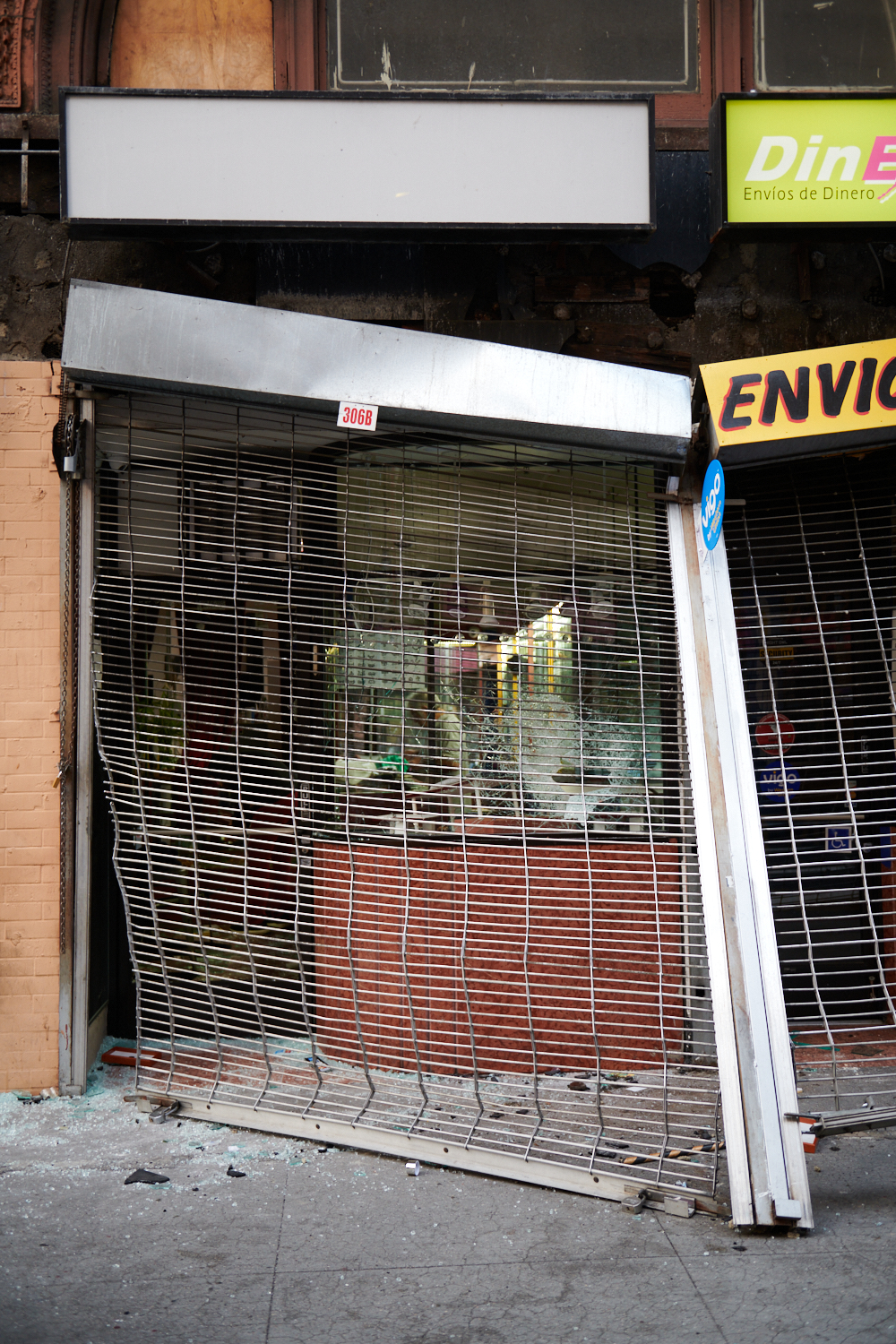
While a few players opted out of the bubble, almost everyone didn’t, but then yesterday, on the heels of the shooting of Jacob Blake, and the subsequent rioting in Kenosha, WI, including the murder of protesters by an unhinged 17 year old with a long-gun, the players went on strike.
And athletes from Major League Baseball, the WNBA, and Major League Soccer followed suit.
I was not surprised, as the day before, I’d read quotes from George Hill, a Bucks player, that expressed anger and exasperation at being in an artificial environment, playing ball instead of being out in the world, making a difference.
As of last night, the NBA players took an impromptu vote as to whether to resume the playoffs, and the LA Lakers and LA Clippers voted to cancel the season, though in an official vote today, the players decided to continue with the playoffs.
On Twitter, (where I learned of the resumption 2 minutes after it was announced,) I saw a tweet from a fellow blogger suggesting that marketers, podcasters, and others in different professions should go on strike as well.
I won’t say I considered it, because I didn’t, as part of having a weekly column for 9 years is that I’m trained to show up for you.
I’ve never missed a deadline, and don’t intend to start now.
However, while I considered writing a super-short column, (a mini-strike, if you will,) that obviously isn’t happening.
(500+ words so far.)
But, (you knew there would be a but, right,) instead, I’m coming at you with a promised column that does the next best thing: it provides direct access to a slate of diverse artists I met on Zoom earlier this summer.
I was reviewing portfolios for the school at the International Center of Photography in New York in early July, and as I wrote shortly thereafter, I saw some terrific and timely photography and art, all of which was made by women and men of color.
You know I’ve written many times, including recently, that I believe all voices in the photography world should be respected. Hell, a few years ago, (in this column) I rebranded myself as a Jewish-American, because I didn’t want to be known as a White Guy. (Ahead of my time, for sure.)
While I advocate against cutting out any particular group, (including my own,) I’ve also spent years championing work by female artists, and artists from a diversity of cultures and races whenever possible, because it’s the right thing to do, and it also affords you, the viewers, the chance to see things you would not otherwise.
A classic win-win.
So today, we’re going with “The Best Work I Saw at the ICP Online Portfolio Review,” and I’m sure you’ll dig these pictures.
Not surprisingly, most of the students I encountered were impacted by the pandemic in some way, including those who were in a 1 year program, but didn’t get to spend much time in NYC, or on campus.
As resourceful artists often do, they came up with elegant solutions, and I’ll share them with you now.
Normally, I say the artists are in no particular order, but today I’ll show them to you in the order I encountered the photographers that day.
We’ll begin with Danny Peralta, and I actually mentioned him in a previous column, as he works with diverse media, and his photographs were not what impressed me the most.
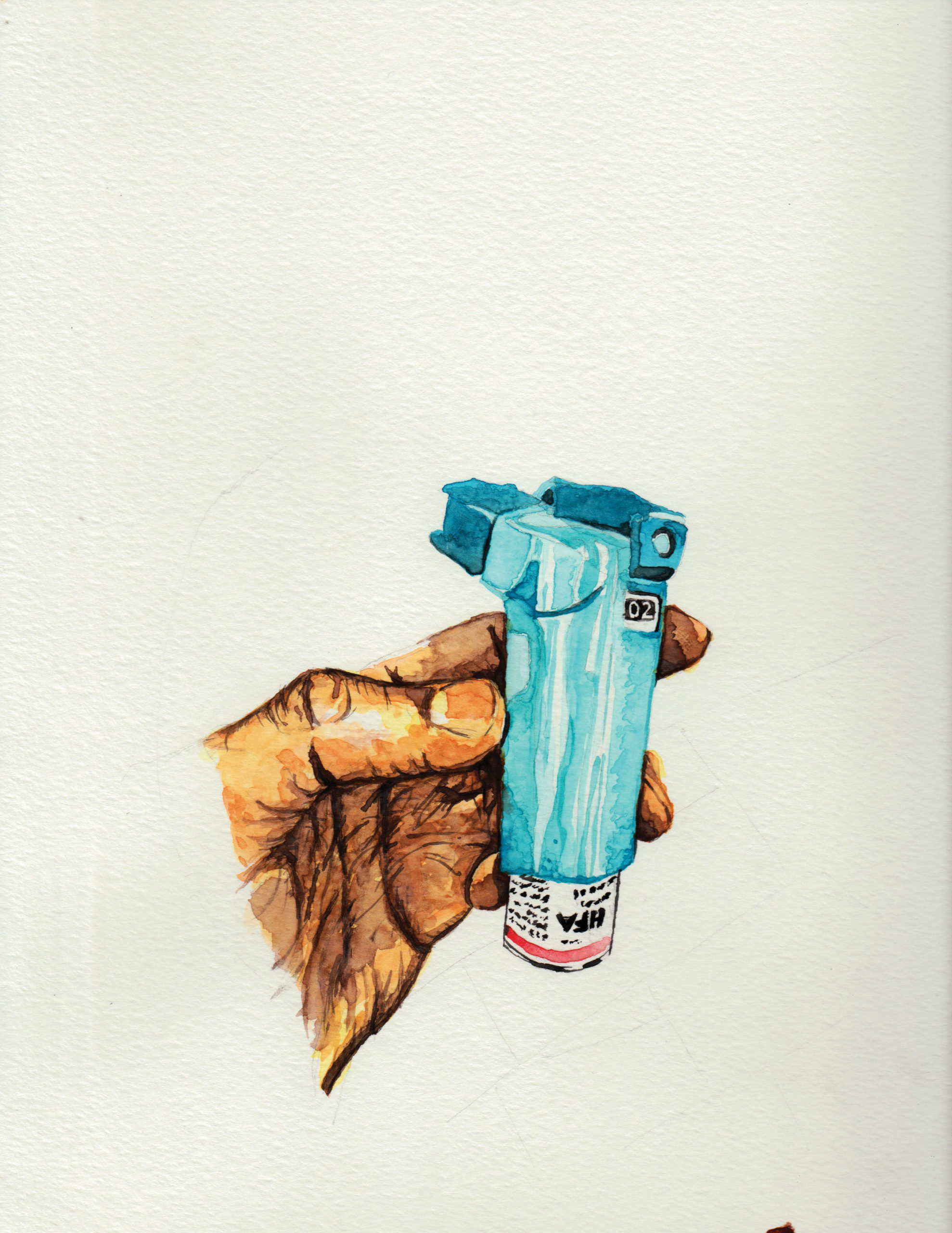
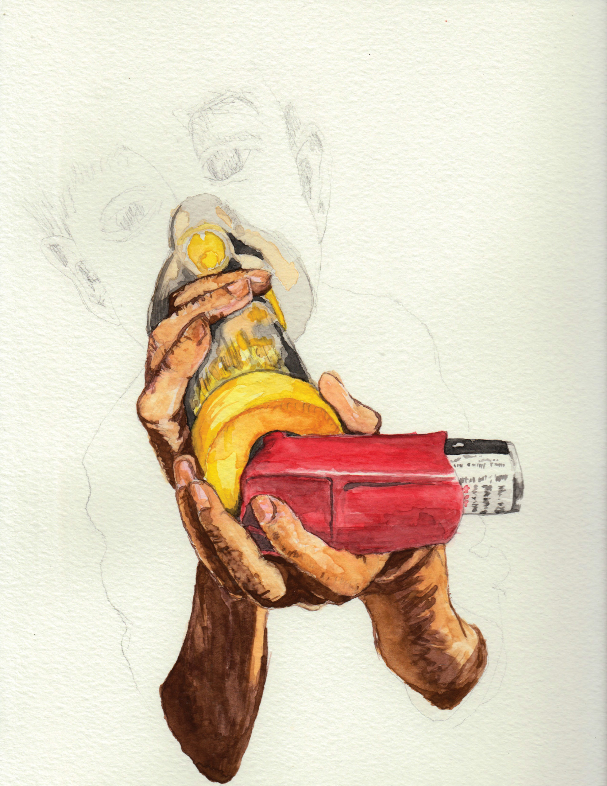
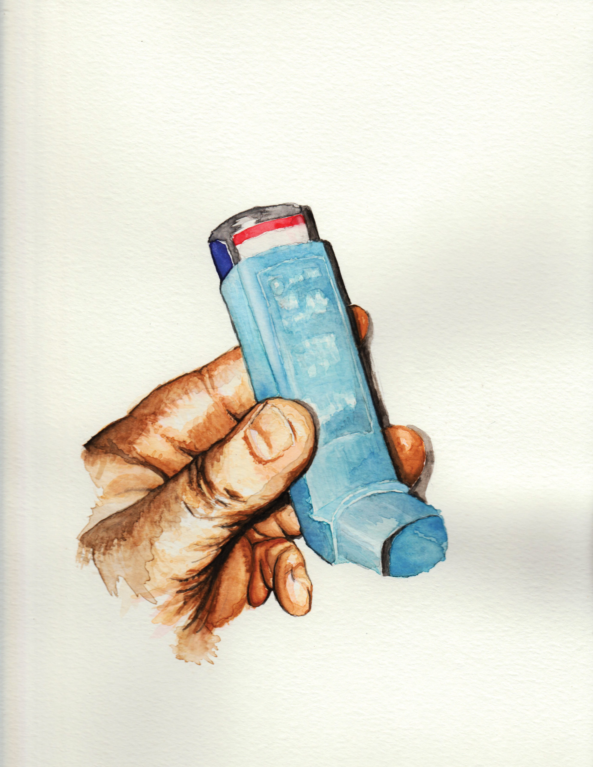
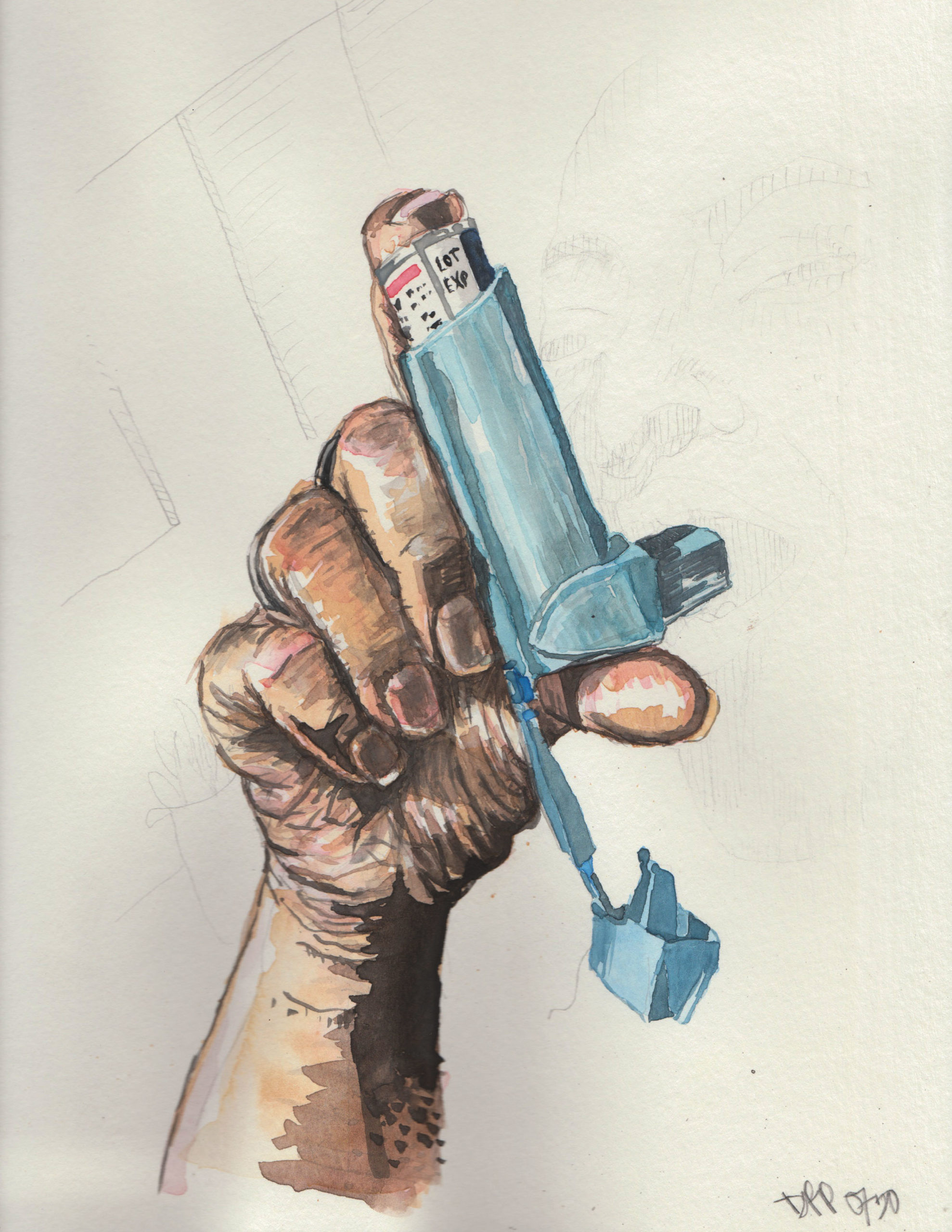
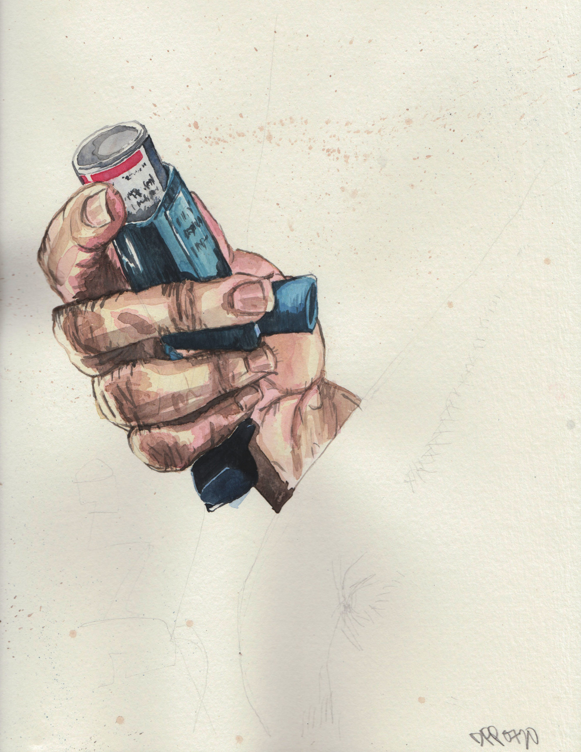
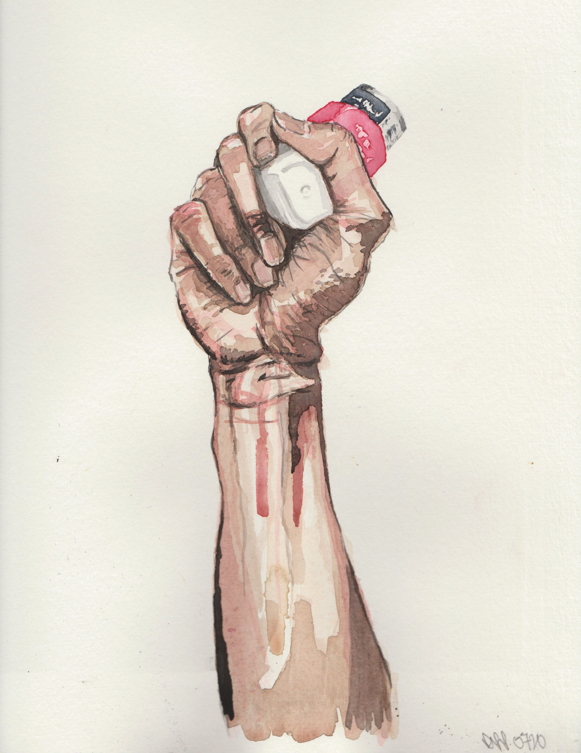
Danny is an educator and community developer from the South Bronx, in addition to being a talented artist, and he showed me a set of watercolor drawings that drew attention to the health effects of environmental pollution.
For whatever reason, eco art is often associated with white hippies, so I hadn’t seen many projects that directly tackled the issue from within a community of color.
Danny drew/painted a series about inhalers, as so many people in his community use them, due to asthma and other breathing issues due to pollution.
(I can’t breathe.)
It’s fantastic stuff, IMO.
Next, I met Zoe Golden-Johnson, who just finished her junior year of undergrad at ICP, having been in a joint-student program from St John’s University in Queens.
Due to the pandemic, Zoe was quarantining in Upstate New York, in a town near Poughkeepsie named Wappingers Falls.
Like many photographers during this strange time, (including me,) Zoe went on walks around her neighborhood, as her family had recently moved to a different part of the village, and it was all new to her. (And filled with creepy, late 19th C and early 20th C East Coast architecture.)
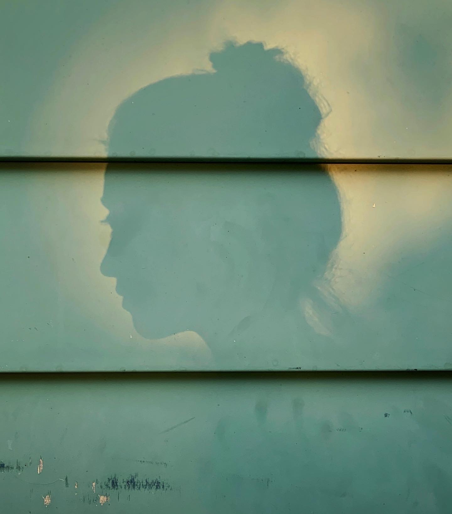
While at first, I told Zoe that this was not the most innovative of methodologies, a few photographs in, she showed me an image of a shadow puppet on the side of a green, siding-clad house.
It stopped me in my tracks, as it was created, rather than found, and it seemed like it had so much potential as a way of making photos.
“You should do a whole series of these,” I recommended.
Zoe smiled, and then a few images later, showed me an exquisite self-portrait, also in shadow, done in the same location.
I found it to be an exceptional picture, and hoped she’d continue working in that way. I also suggested it was brave, and a little risky, to use a stranger’s house, unless maybe it was her own home?
She confirmed it was, (no creeping necessary,) and I hope she continues working in that vein.
Next, I spoke to Madeline Mancini, who was in the exact same situation as Zoe, only 2500 miles away.
Madeline also finished her junior year at ICP, on loan from St. John’s, but was pandemic quarantining at her parents’ home in Las Vegas, Nevada.
(Ever the dorky New Mexican, when she said Las Vegas, I asked, “Nevada or New Mexico?”)
Madeline is into horror and suspense, weird and strange movies, and also looked at her neighborhood, and her immediate environment, trying to find the surreal and spectral in the mundane.
I’m always a sucker for normal-is-odd, so I liked this work immediately.
After a short break, I spoke with Violette Franchi, who spent a year at ICP after studying architecture in her native France.
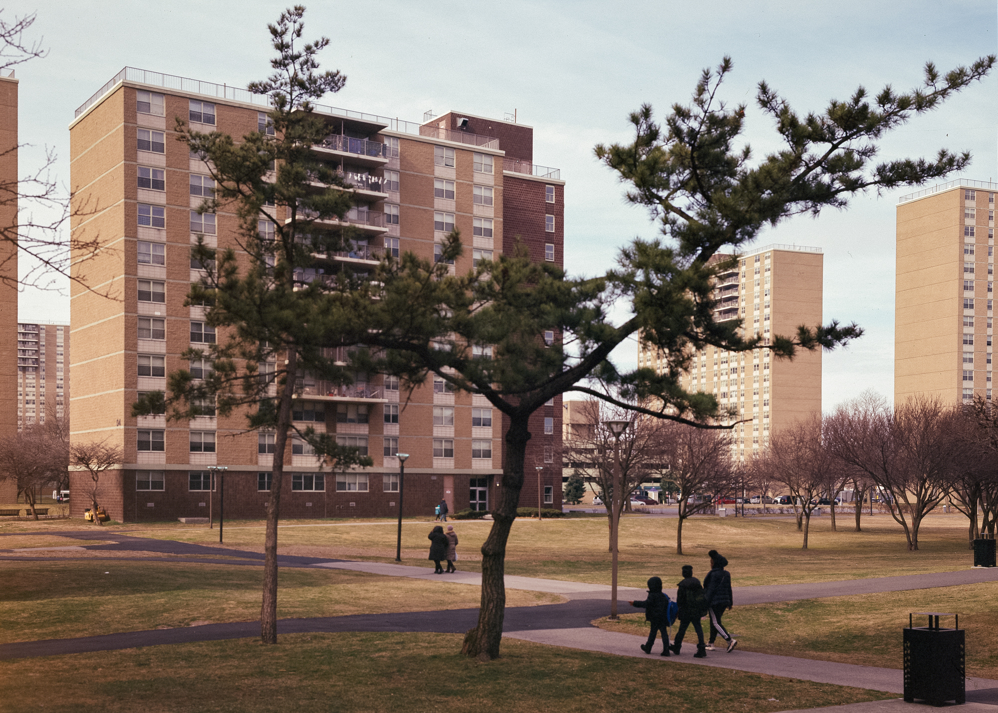
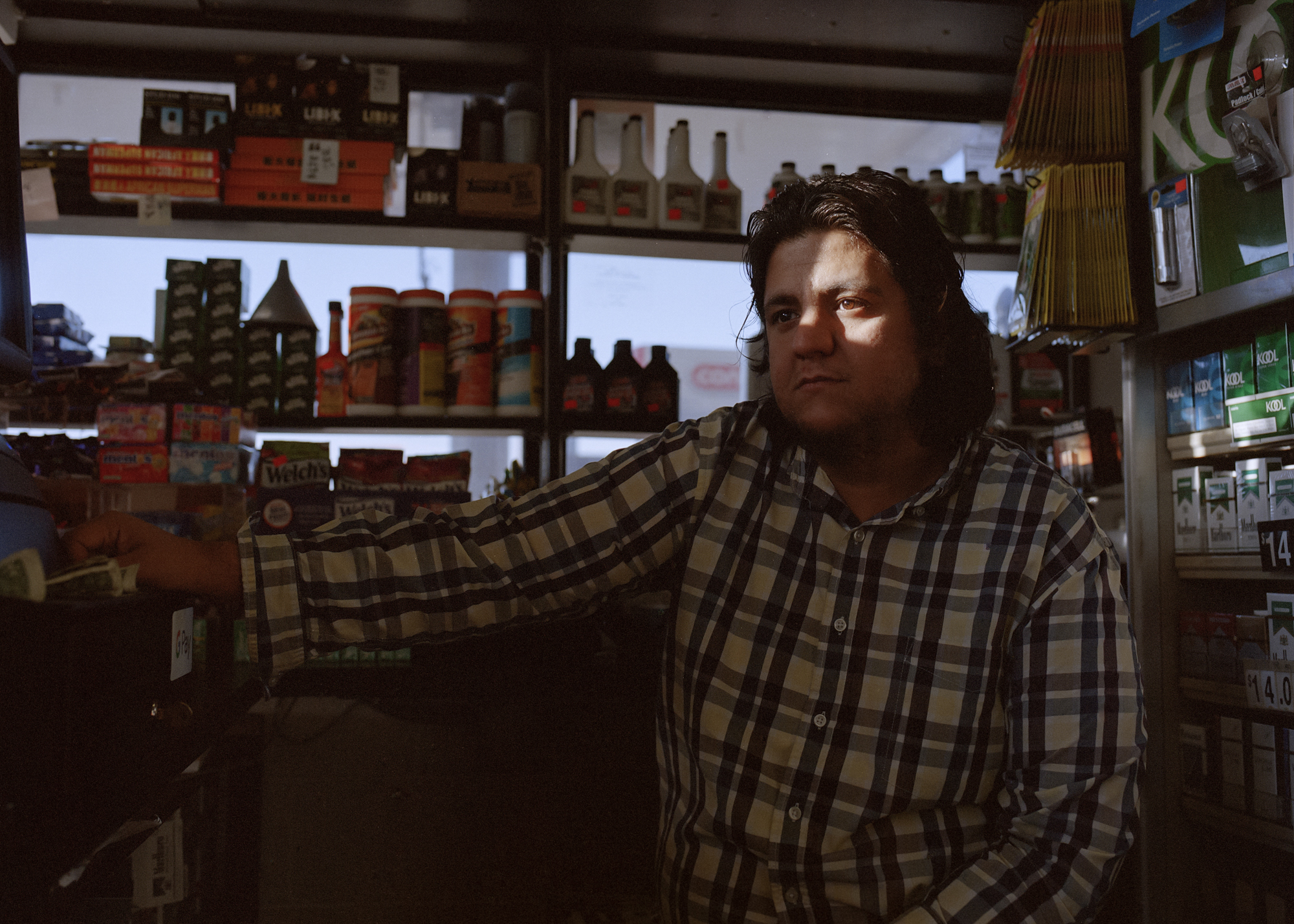
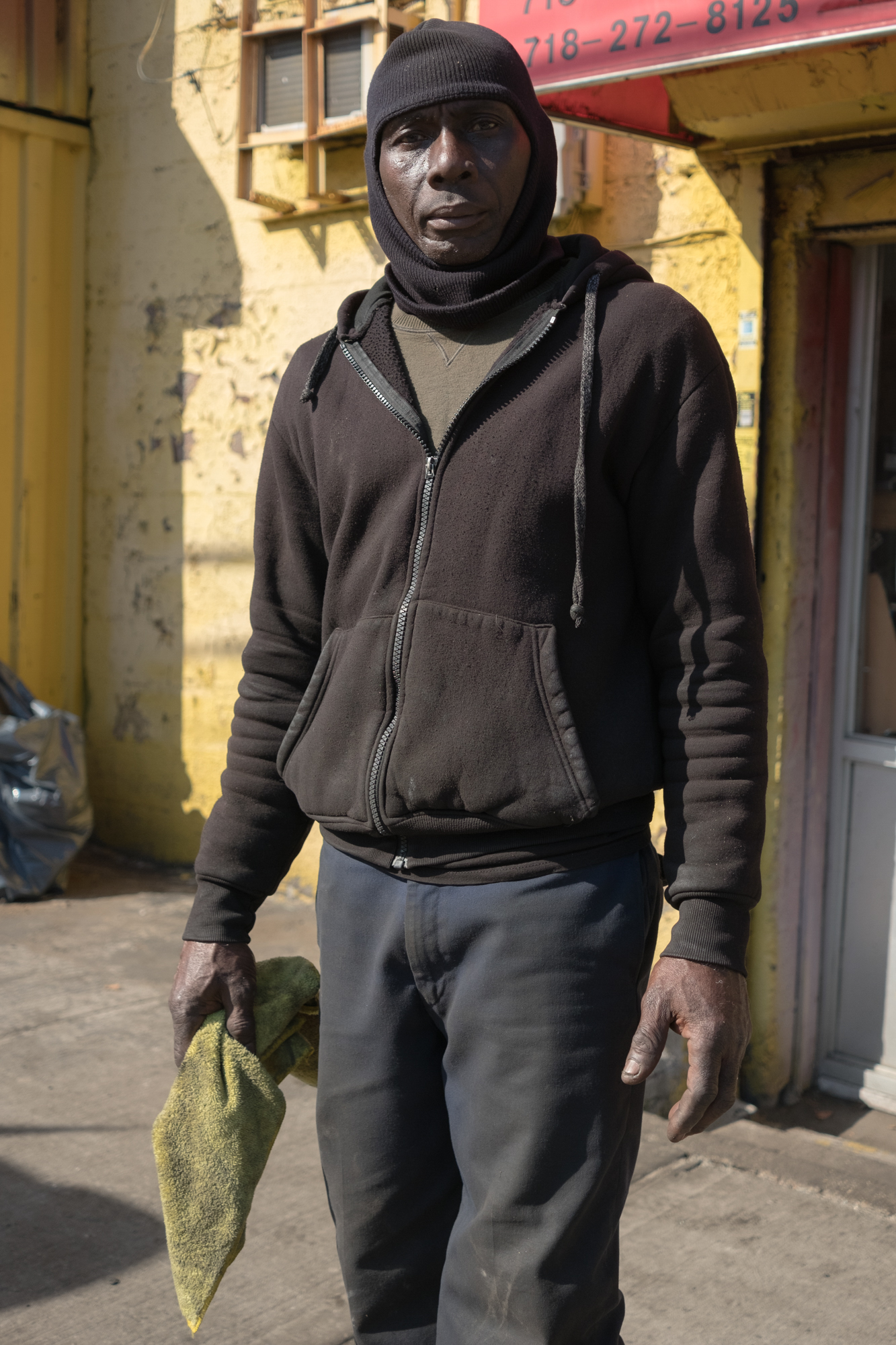
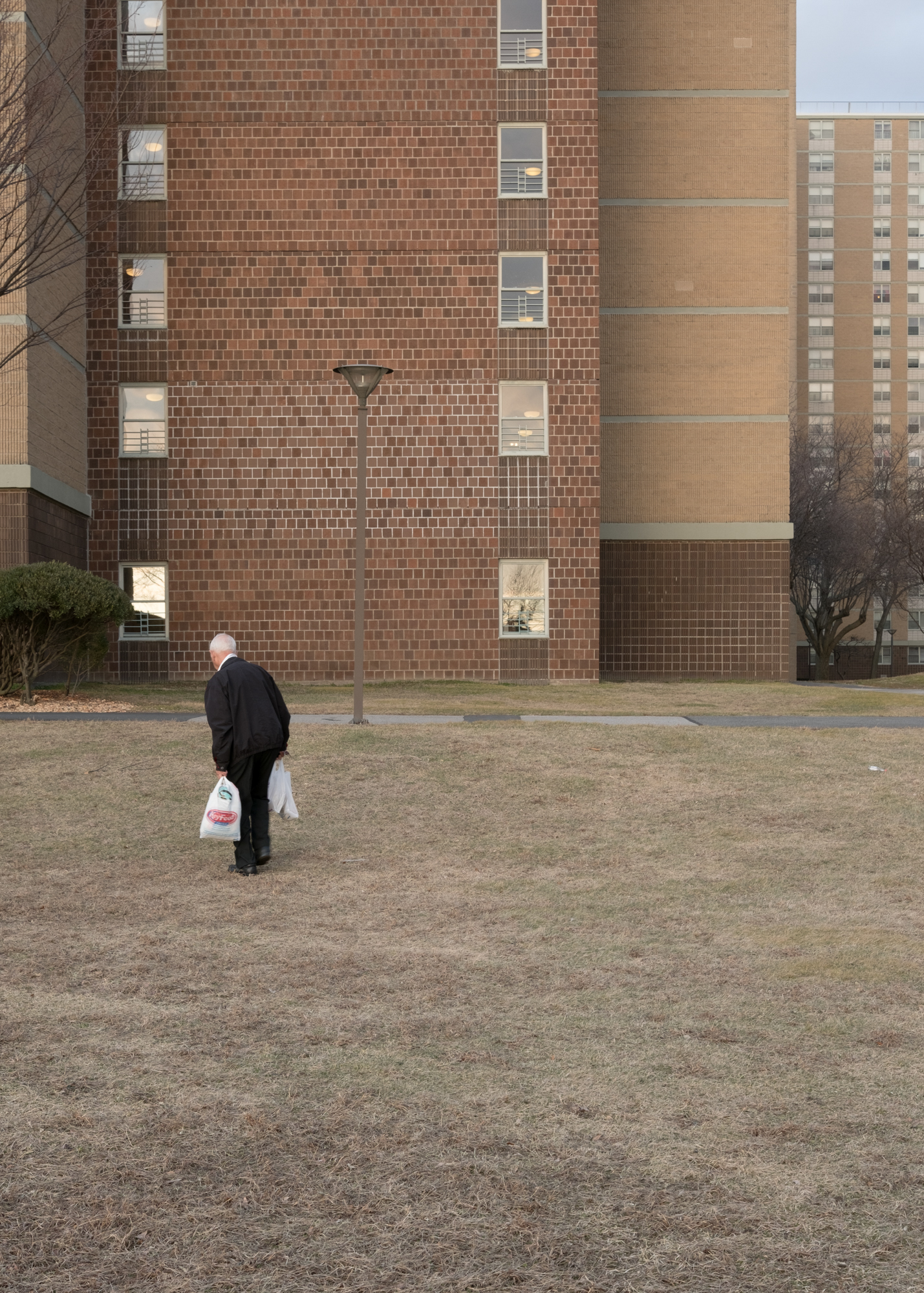
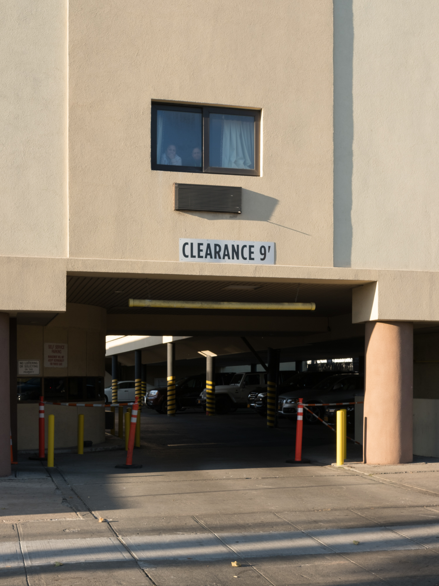
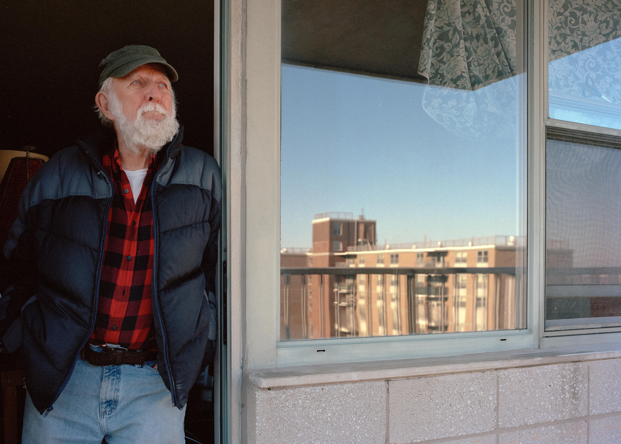
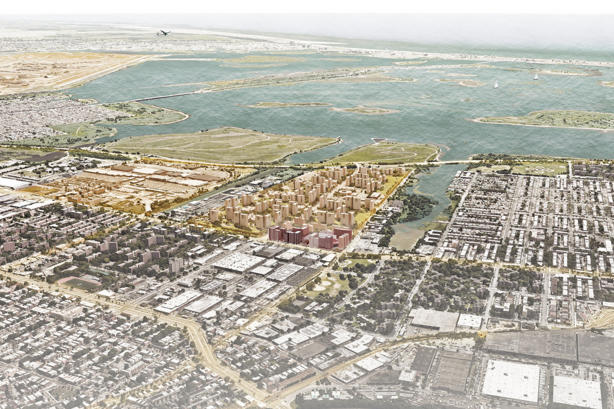
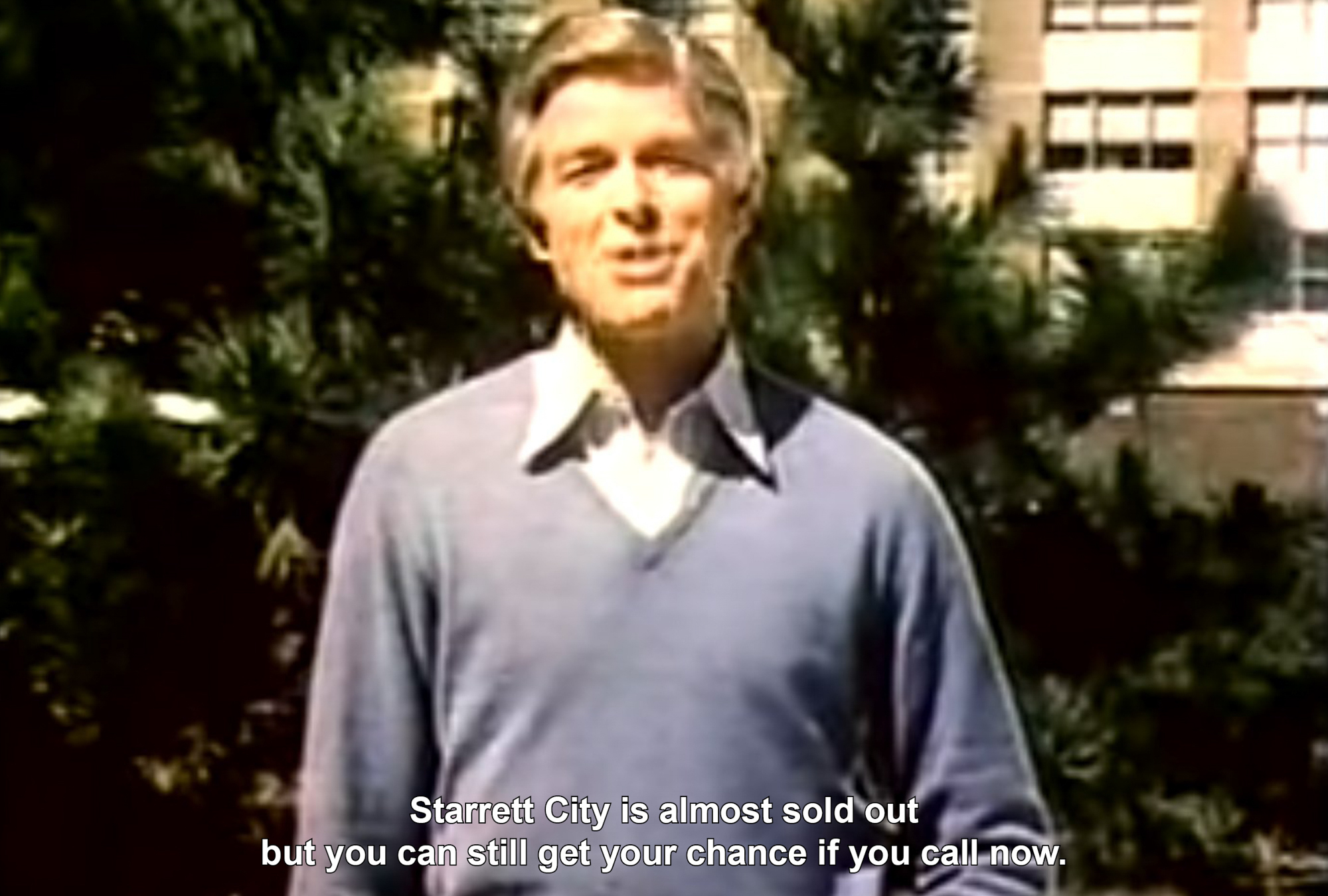
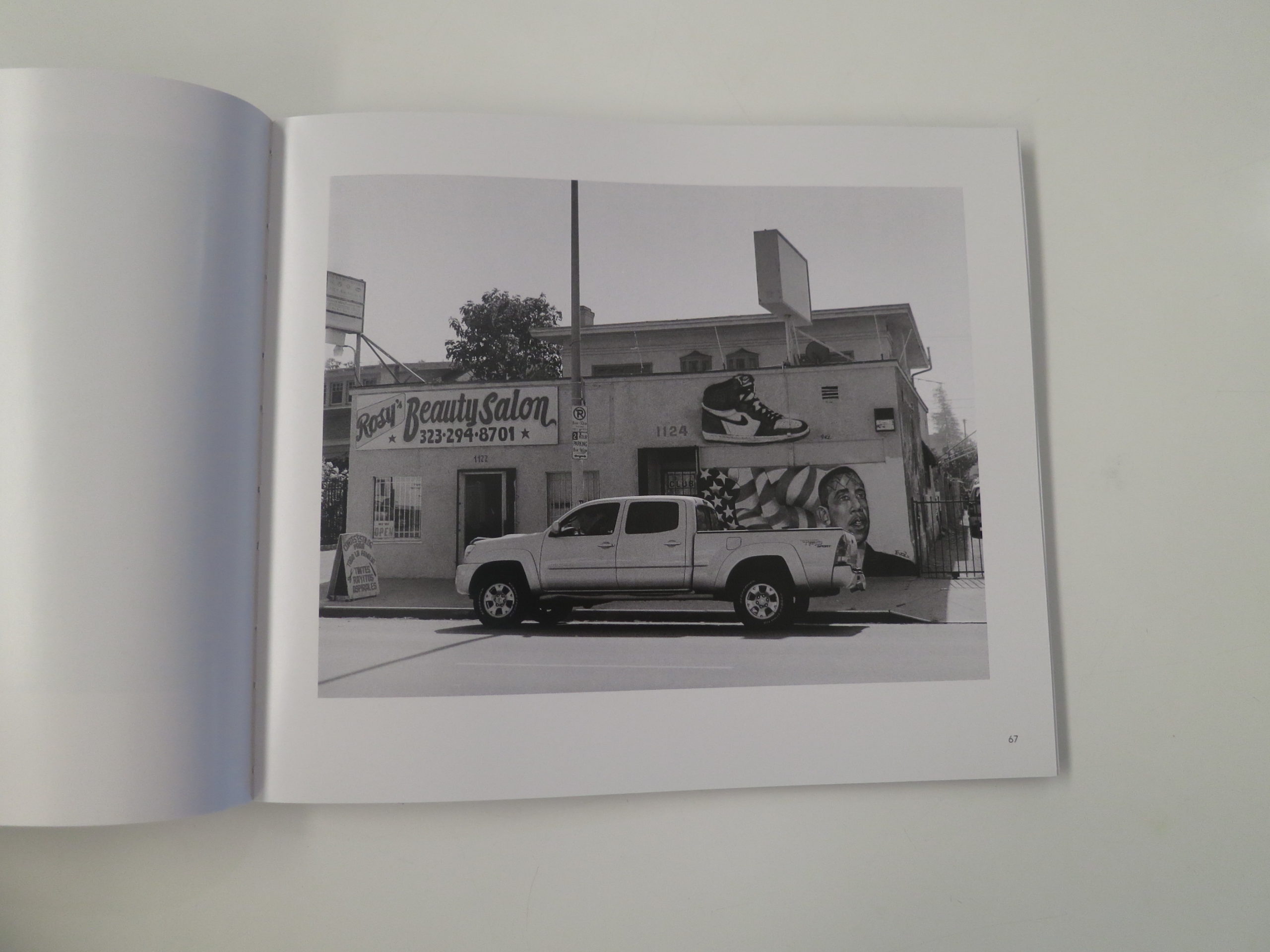
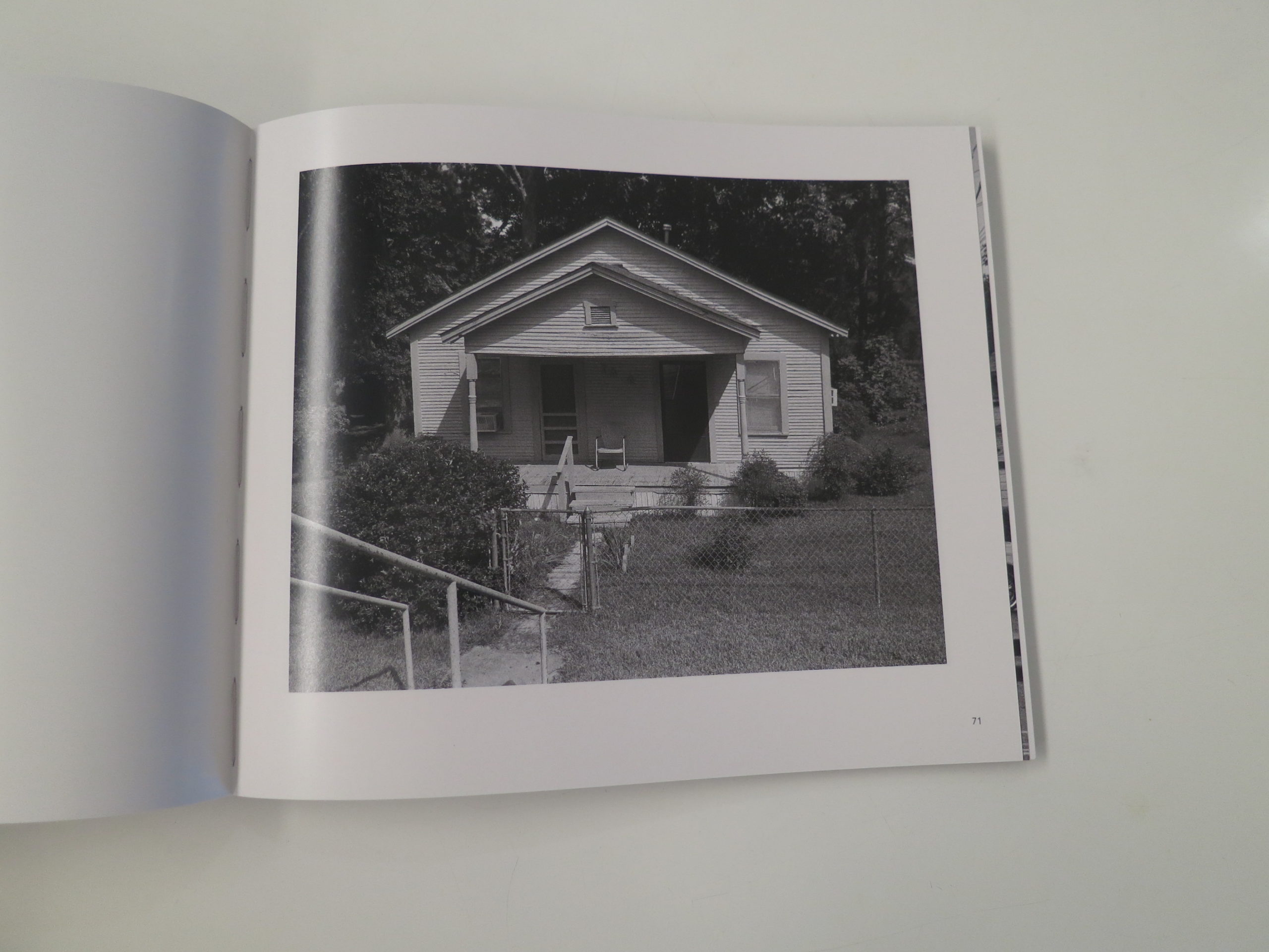
Violette used her time in NYC wisely, as she learned about, and then devoted her time to exploring and photographing in Starrett City, the largest housing project in East New York, Brooklyn, which is one of the most poverty-stricken parts of the city.
While I often find myself suggesting to students that they try to mix up varied approaches to making their photographs, Violette needed no such encouragement.
She had made friends and contacts in the local community on her own, without any fixers, and used big cameras for the landscapes and establishment shots, smaller cameras when appropriate, and also mixed in video and photographs of found imagery and tv screens.
(Including images of junk mail and advertisements she found on the ground of the mail room, and shots of cheesy TV commercials pimping the development back in the 70’s.)
I found it to be a sophisticated and nuanced look at a place in time, (including the future, as she also has images of renderings of impending development,) and was seriously impressed with her drive, work ethic and talent.
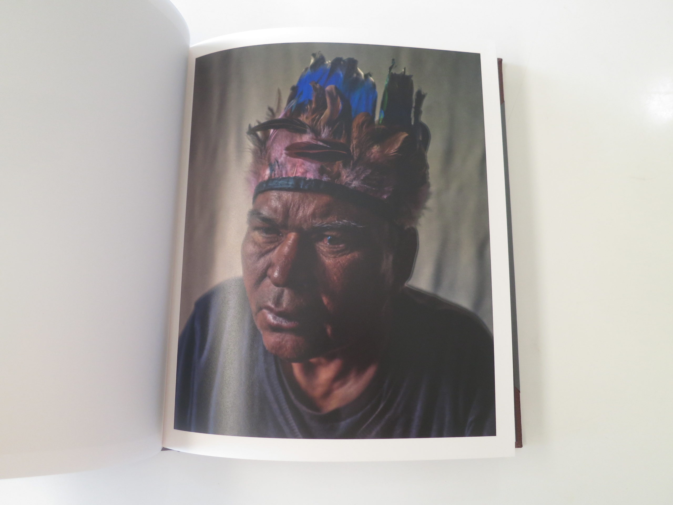
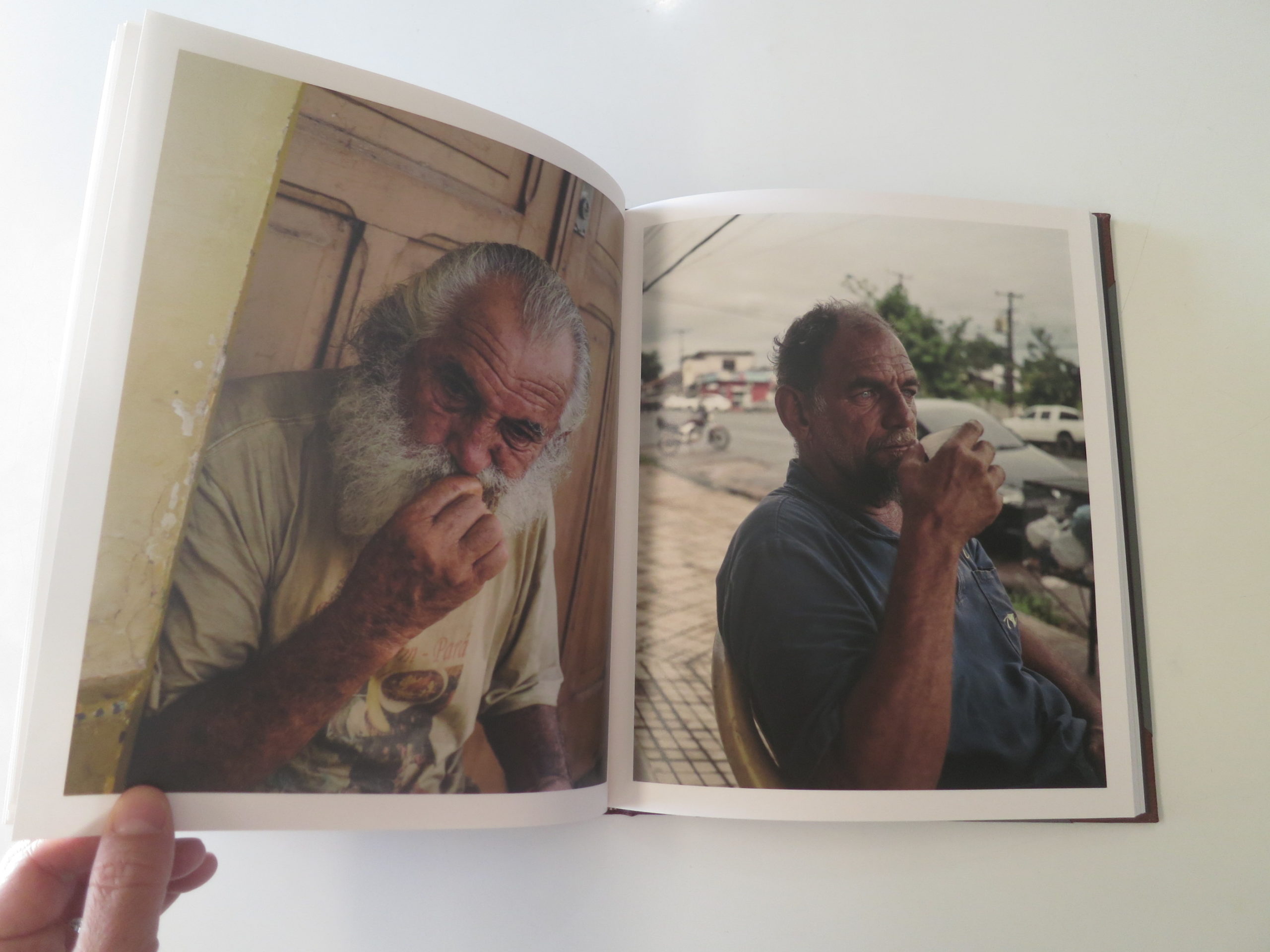
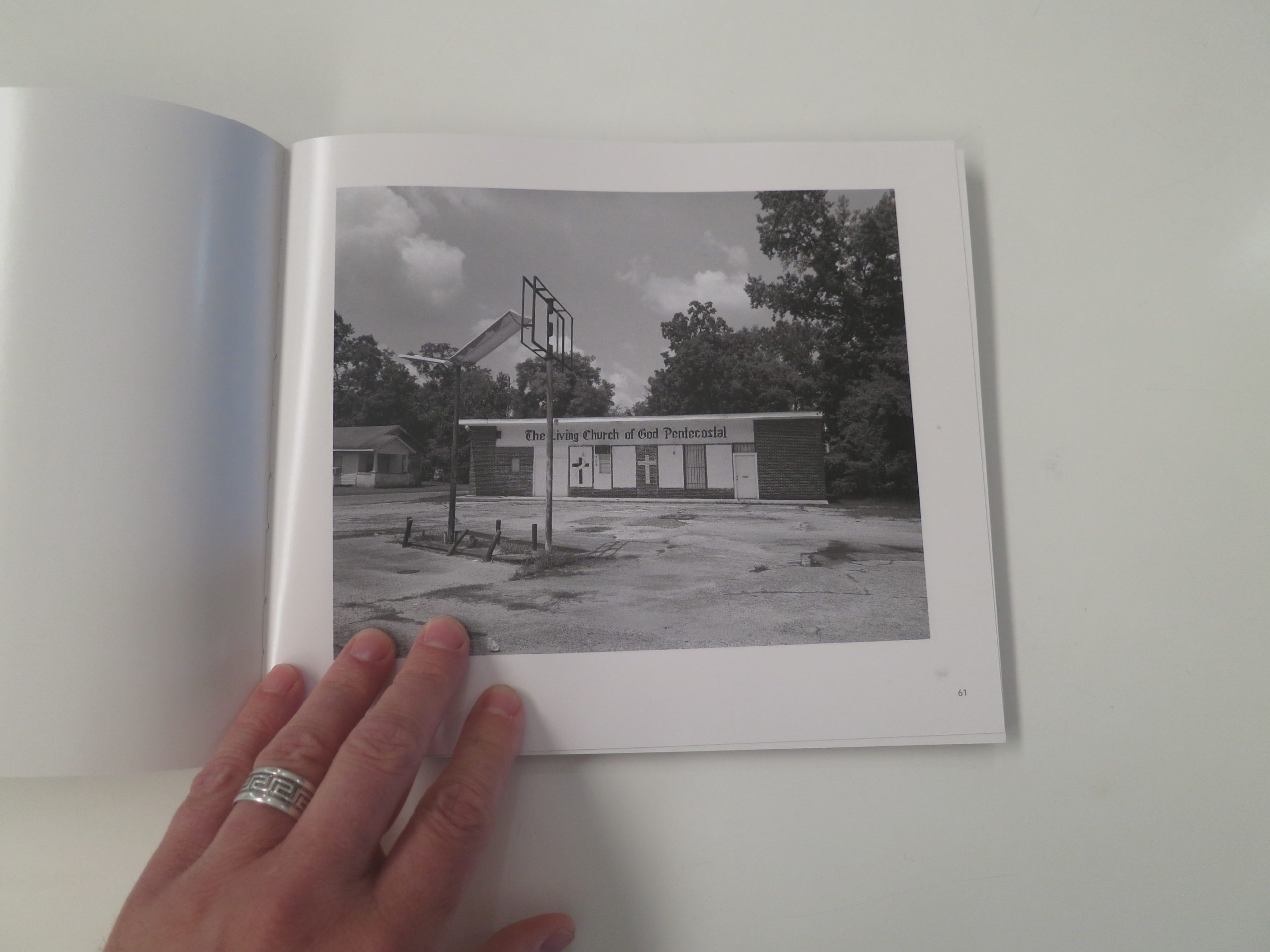
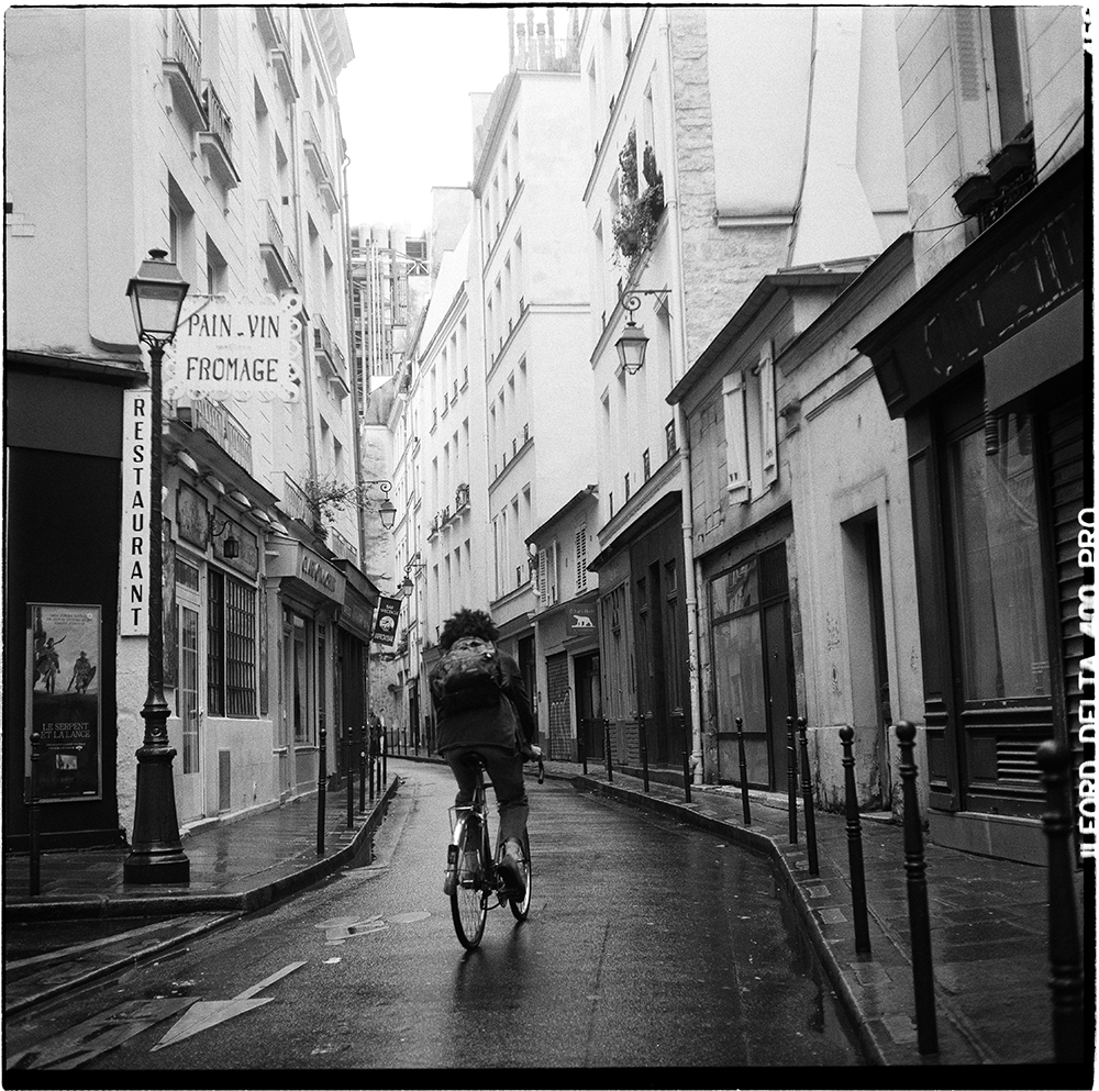
A2 tower’s entrance, Starrett City, East New York, 2019. Starrett City is located on the southeast corner of the studied intersection.View from the balcony of Jerry’s apartment, Starrett City, East New York, 2020. Starrett City is the US nation’s largest federally-subsidized apartment complex. Starrett City contains 5,881 apartment units in 46 buildings, ranging from eleven to twenty stories high.Laron and Bernard filling up their tank at Conoco gas station, East New York, 2020. Laron and Bernard are regular customers and live in East New York.17th floor entrance doors, Starrett City, East New York, 2020. Starrett City towers are all designed identically, with no designated communal spaces above the ground floor.
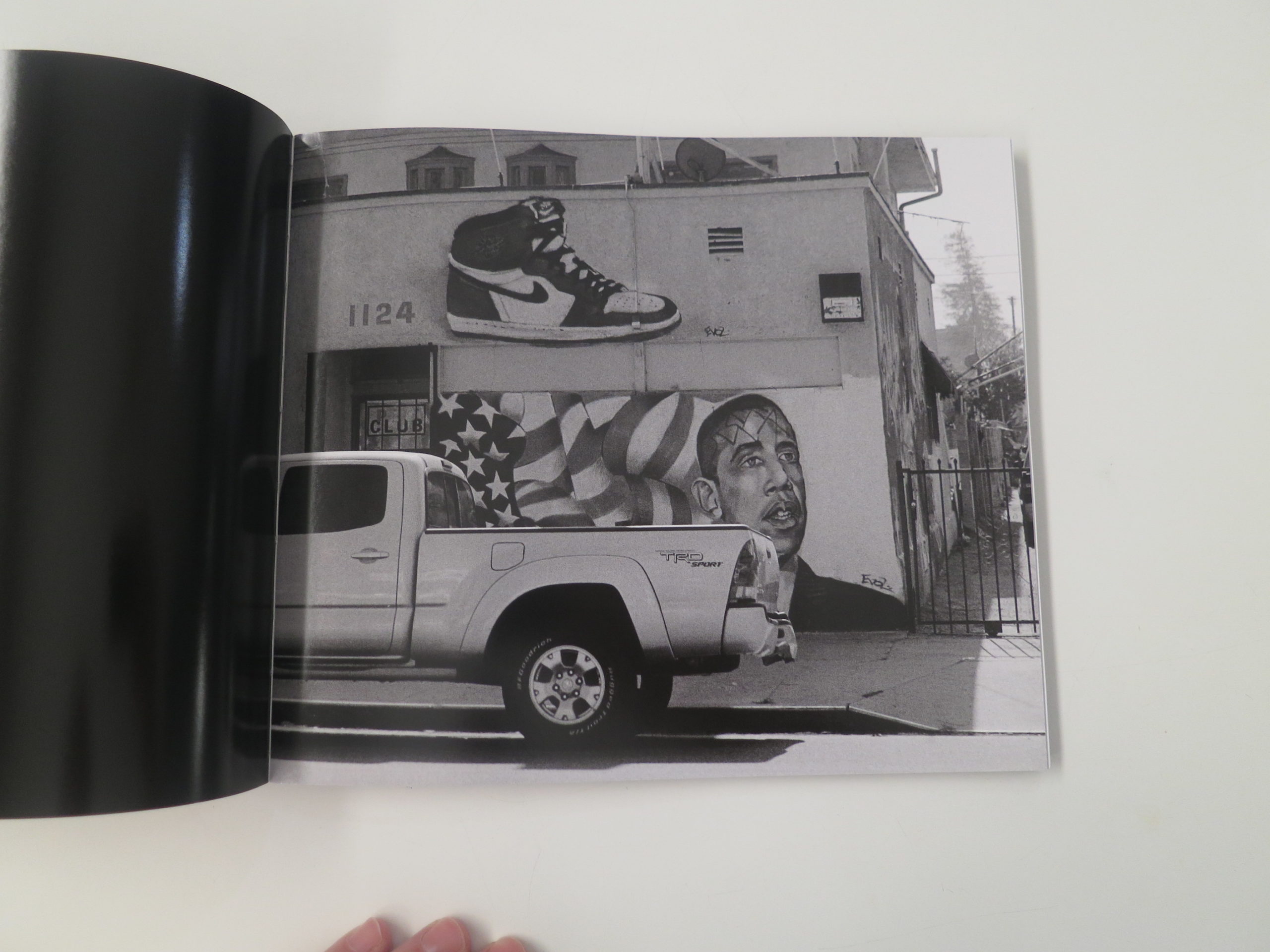
Archive from a TV Commercial advertising for Starrett City after its construction, 1979. Screenshot with added subtitles, 2020.
Syed, clerk at Conoco gas station, East New York, 2020. He lives with his wife and daughter in a shared house with his older brother Ali. Syed’s family is in the basement and Ali’s is upstairs. Ali and Syed emigrated from Pakistan with their parents in 1996.Mail left out in one of the towers’ lobby, Starrett City, East New York, 2019. All the 46 towers have the same design and elements for their ground floors: two elevators in the lobby space, postboxes, a shared laundry room, the janitor’s premises and staircases.Mackenzie, working at Ultimate Auto Parts, Flatlands Avenue, East New York, 2020. Mackenzie has worked at the used auto parts store for a year and a half. The store stands right by Oasis Motel, and is one of the eight auto-themed businesses within a thousand feet.
After Violette, coincidentally, came another young Frenchwoman who made work in Brooklyn: Tina Levy.
Tina, like Madeline, likes the surreal and bizarre, but her work shared far more in common with the Roger Ballen, black and white, aesthetic.
Tina had studied Philosophy at the Sorbonne, and was thrilled when I suggested she consider drawing and painting as well, (like Danny,) as that was where she felt her work was headed.
But I loved these photographs, which were made in her neighborhood and local environment in Brooklyn. (Greenpoint, where I lived back in the day.)
After Tina, I met Beverly Logan, who had completed an MFA at ICP, and had a very different process from everyone else.
Beverly had traveled extensively, and taken a lot of pictures in her life, and told me she had an archive of 250,000 images, which she searched for fragments to build collages.
Even in a digital age, these were laborious, as she made prints of the fragments, and then assembled real life pieces, rather than using Photoshop.
They screamed of Americana, and surrealism, but had a snappy, optimistic palette that seemed to contrast with these dark times.
I mentioned Patrick Nagatani’s “Nuclear Enchantment” to her, as her smart work made me think of my late teacher, and in general was super-impressed by what I saw.
Finally, (yes, finally) I met with Kechen Song, who was a Chinese national living in New York for his program. (Soon to move to Syracuse U to attend the prestigious MFA program there.)
He had barely left his apartment for months, during the pandemic, and told me he’d been wearing a mask for most of year, as he knew from China’s experience the chaos and death that was headed New York’s way.
Kechen had a few projects, including this mind-numbing and amazing video of taking and recording his temperature, over and over again, until his notebook went black.
The project I want to share, though, featured images he made by hacking, or mis-using his flatbed scanner, with only objects he found on his desk.
So many of these artists had their process, (and education) impacted by the pandemic, and used those constraints to fire up their creativity. This project is the perfect example of that, as everything came off of one desk, including the art-making equipment.
So I’ll leave you there, along with the reminder that if the NBA players can use their platforms to send a message, and I can show up to enlighten you on the regular, and all these artists can mine the pandemic for creative fuel, I hope you can do your best work, and make a difference too.
The Art of the Personal Project is a crucial element to let potential buyers see how you think creatively on your own. I am drawn to personal projects that have an interesting vision or that show something I have never seen before. In this thread, I’ll include a link to each personal project with the artist statement so you can see more of the project. Please note: This thread is not affiliated with any company; I’m just featuring projects that I find. Please DO NOT send me your work. I do not take submissions.
APE contributor Suzanne Sease currently works as a consultant for photographers and illustrators around the world. She has been involved in the photography and illustration industry since the mid 80s. After establishing the art buying department at The Martin Agency, then working for Kaplan-Thaler, Capital One, Best Buy and numerous smaller agencies and companies, she decided to be a consultant in 1999. She has a new Twitter feed with helpful marketing information because she believes that marketing should be driven by brand and not by specialty. Follow her at @SuzanneSease. Instagram
Success is more than a matter of your talent. It’s also a matter of doing a better job presenting it. And that is what I do with decades of agency and in-house experience.
Concept: Stills and video content featuring seven athletes participating in various sports, as well as images of each athlete posed with product.
Licensing: Unlimited use of all images captured for 2 months from first use.
Photographer: Sports and portraiture specialist
Agency: Canadian office of large international group
Client: Large telecommunications company
Here is the estimate:
Creative/Licensing Fees: The scope of the project included stills and video to capture seven athletes participating in five unique sports over four shoot days in two different cities. Each athlete had unique needs in terms of gyms/facilities where they would need to be captured, and the need for posed shots on white led to some unique scouting and location needs. Some of them could entirely be captured in a studio, and others were a combination of them at a facility where a seamless background would be set up.
The creative needs called for a specialist who was technically savvy and could photograph/direct athletes who had limited time. These needs, along with the large agency/client, put upward pressure on a creative fee (which they asked us to break out from a licensing fee, as opposed to combining the two numbers), and we landed on $5,000/day for each of the four shoot days. While the high exposure and request for all images captured put upward pressure on the licensing fee, we knew that they had hoped to get about 30 total images, and would likely use just two for each athlete. Additionally, while they asked for unlimited use, the duration was very limited with a request for just two months. With those factors in mind, and based on previous experience, I thought that around $3,000 per subject or less than $1,000 per image for 30 shots would likely be appropriate. We initially settled on $19,500 for a licensing fee, which broke down to $650/image for the 30 shots we had been discussing, and just under $1,400/image for the 14 shots they were likely to use (7 athletes X 2 shots each).
On top of the creative and licensing fees, we included two travel days and two tech scout days based on an itinerary we detailed in the job description.
Producer Day(s): While the talent would be provided and the styling would be minimal, this project had a ton of moving pieces, and the logistics required a seasoned producer to lend a hand. We included six prep days prior to the travel/tech/scout/shoot days plus a wrap day.
Production Assistant Day(s): We included 10 days, two of which would be prep days to lend a hand with whatever tasks arose, plus the travel and shoot days.
Assistant Day(s): We included four assistants in total, two of which would travel with the team to both locations, and the other two would be locals and just be needed on the individual shoot days. Given how fast the team would have to move, the multiple setups/scenarios that would be needed, and the equipment requirements, we needed a lot of hands-on deck.
Digital Tech Day(s): We’d hire a digital tech locally in each city, and this accounted for each of the four shoot days.
DP/Camera Operator Day(s): We included $3,500/day for each of the four shoot days, and $1,500 for two travel days. While the photographer would be capturing stills and directing the video, we felt it was important to have a separate person actually capturing and focusing on the video content.
Grip and Gaffer Day(s): To assist the DP/Camera Operator, we included a grip and a gaffer to help with equipment and electrical needs, hired locally for each shoot day.
Hair/Makeup and Wardrobe Stylist Day(s): The subjects would be providing their own wardrobe and would have minimal hair/makeup needs, so we just included a single hair/makeup stylist and a single wardrobe stylist, hired locally in each city, just for the shoot days without any prep/wrap time or expenses.
Location Fees: This was a big TBD, since we were told that that the athletes might be able to leverage relationships with various training facilities for scouting purposes, but we needed to account for the payment of those facilities in our budget. We ballparked some numbers here, and also added $2,000 for the day where we’d just rent a studio instead of shooting on location.
Equipment: We included $8k for both photography equipment and video equipment, based on $2,000/day for four shoot days.
Catering: We anticipated about 22 mouths to feed each day and included $90 per person to include breakfast, lunch, craft and additional meals to support a long day with overtime.
Travel Expenses: I based this on the schedule detailed in the job description and the number of people that would be traveling to each of the locations. The cities were within driving distance, which eliminated the need for airfare.
Parking, Expendables, Additional Meals, Misc: I included $1,500 here, truly as a buffer for unforeseen expenses that might arise throughout the production.
Insurance: A loose rule of thumb I use to calculate insurance is to base it on 2% of the expenses. In this case that was closer to $3k, but I wanted to come down a bit as it was feeling a bit excessive, so I included $2k.
Post Production: We included $2,000 to handle basic processing of 30 selects. The agency would handle most of the retouching, and this just included both color correction and file cleanup but would still take a decent amount of time to sift through the images and perform those tasks.
Overtime: On three out of the four shoot days, we anticipated 14-hour days rather than a typical 10-hour day. It’s customary to bill for crew at time and a half for up to 12 hours, and double time after 12 hours. So, in this case, we had two hours per day at time and a half, and two hours per day at double time, for three shoot days.
Once the photographer and I finished collaborating on these numbers, we looped in a local producer to further tweak the fees/expenses based on local knowledge and preferred logistical approaches. Overall, she bumped up the estimate by about $12k, bringing the bottom line just under $200k.
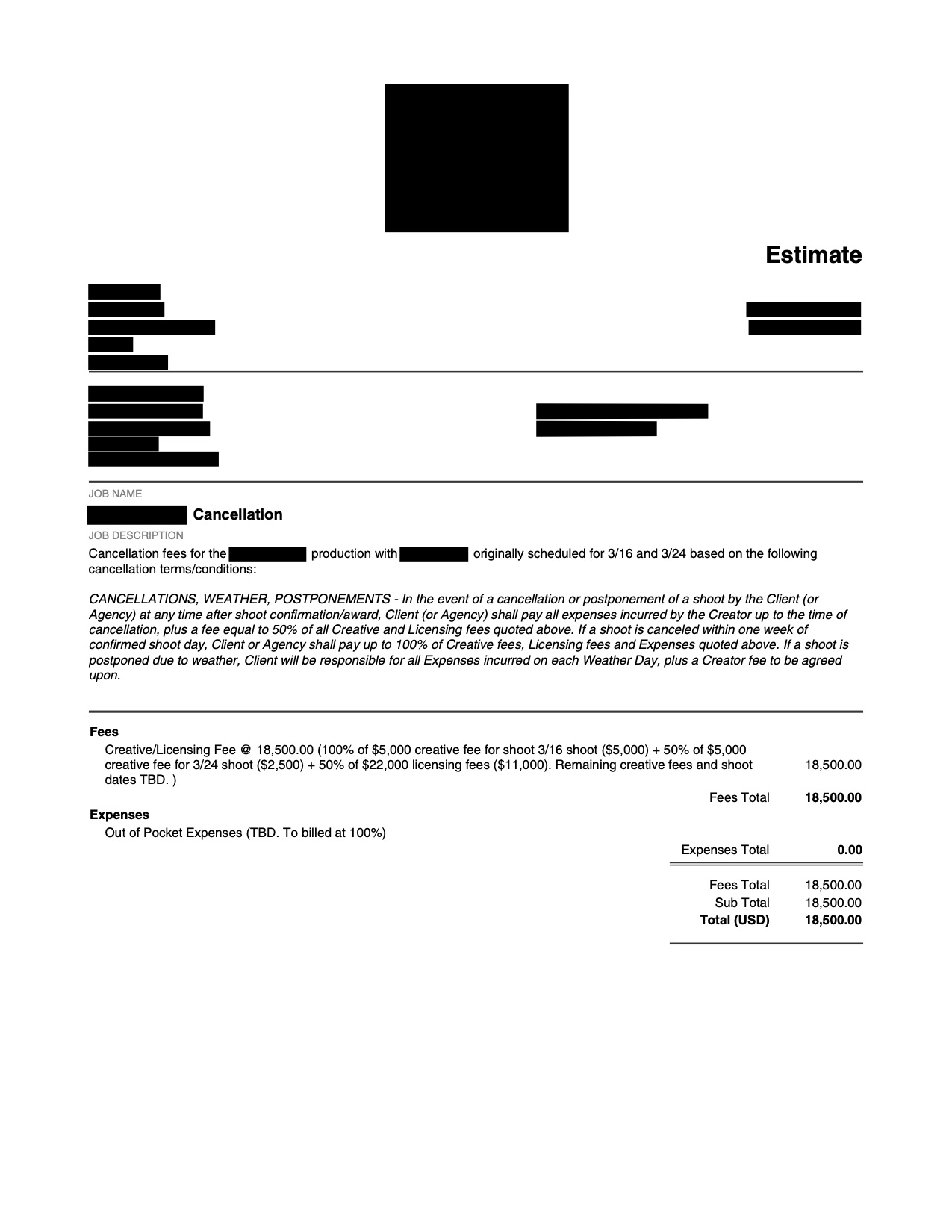
Results: The photographer was awarded the project…but then the COVID-19 pandemic hit. This led to a lengthy process of uncertainty regarding how to tackle the project. Since the dates for each part of the project were spread out, they had discussed canceling some dates but just postponing others, and each day brought a new update on how it might shake out. Surprisingly, given the size of the agency, their purchase order didn’t detail any sort of cancellation policy, so we stuck to the cancellation policy in our terms/conditions. At the time when they asked us to formalize what a cancellation agreement might look like, we were a few days out from the first shoot date, with the next trip schedule just over a week away. They asked us to focus our cancellation fees/expenses on just these first two projects for now, hoping to just push the later shoots/dates. Here is what we came up with:
I noted that the out of pocket expenses would be billed at 100% and handed this off to the photographer’s producer to help detail what those exact expenses were, and she tackled it from that point on. Ultimately, they cancelled the entire project. The photographer was able to charge part of his creative fees, half of his licensing fees, and all out of pocket expenses based on how our terms/conditions were worded.
If you have any questions, or if you need help estimating or producing a project, please give us a call at 610.260.0200 or reach out. We’re available to help with any and all pricing and negotiating needs—from small stock sales to large ad campaigns.
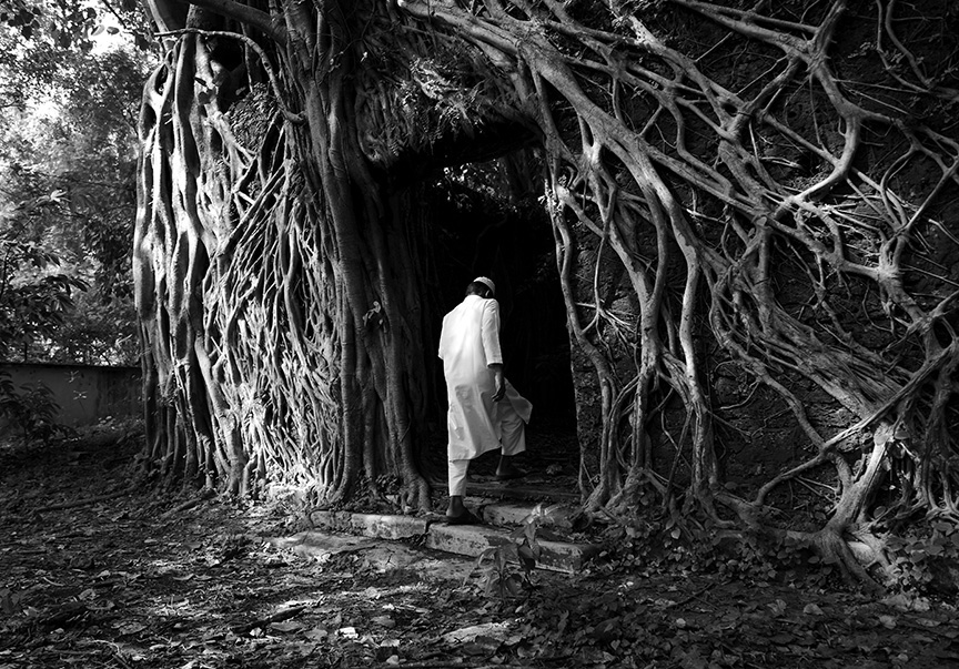
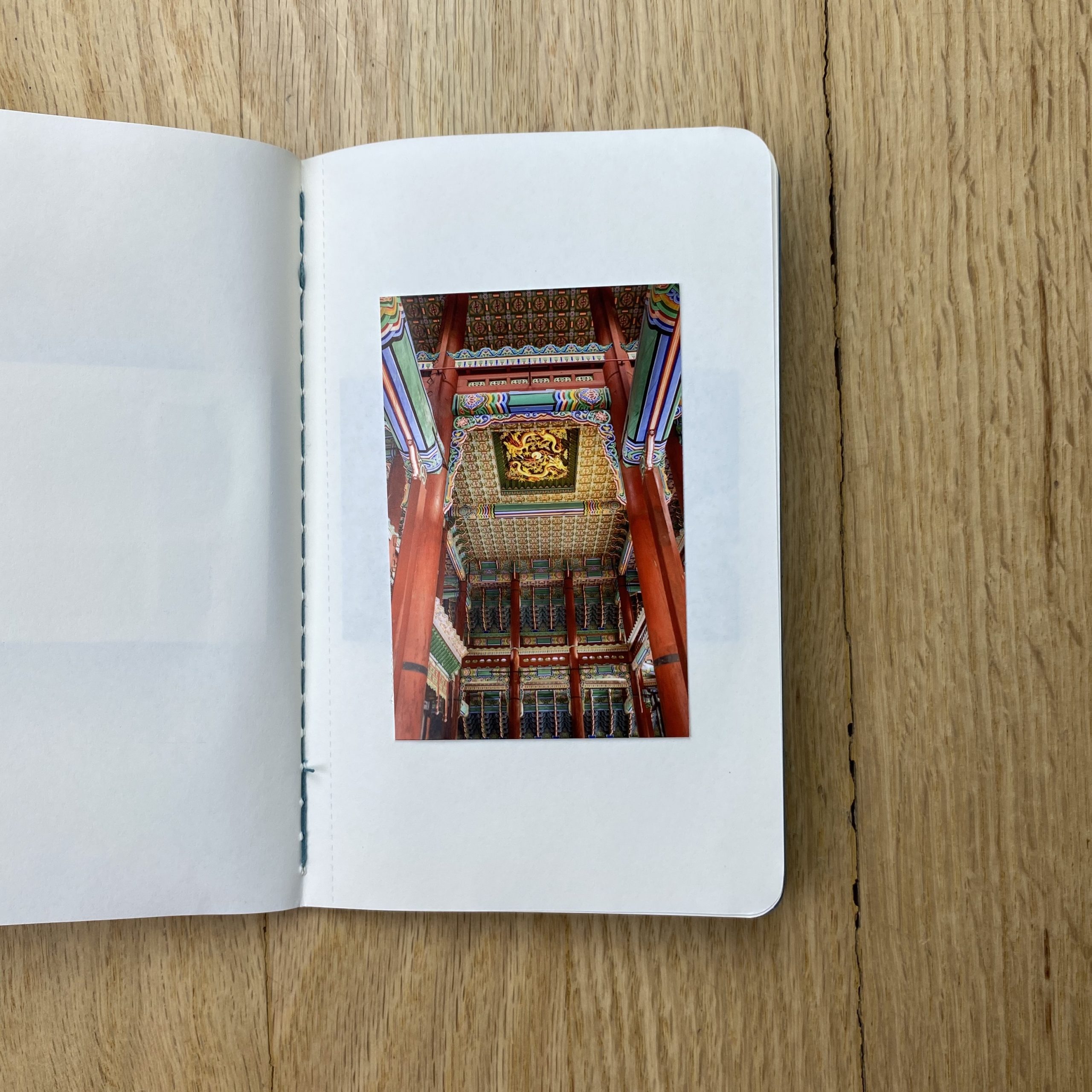
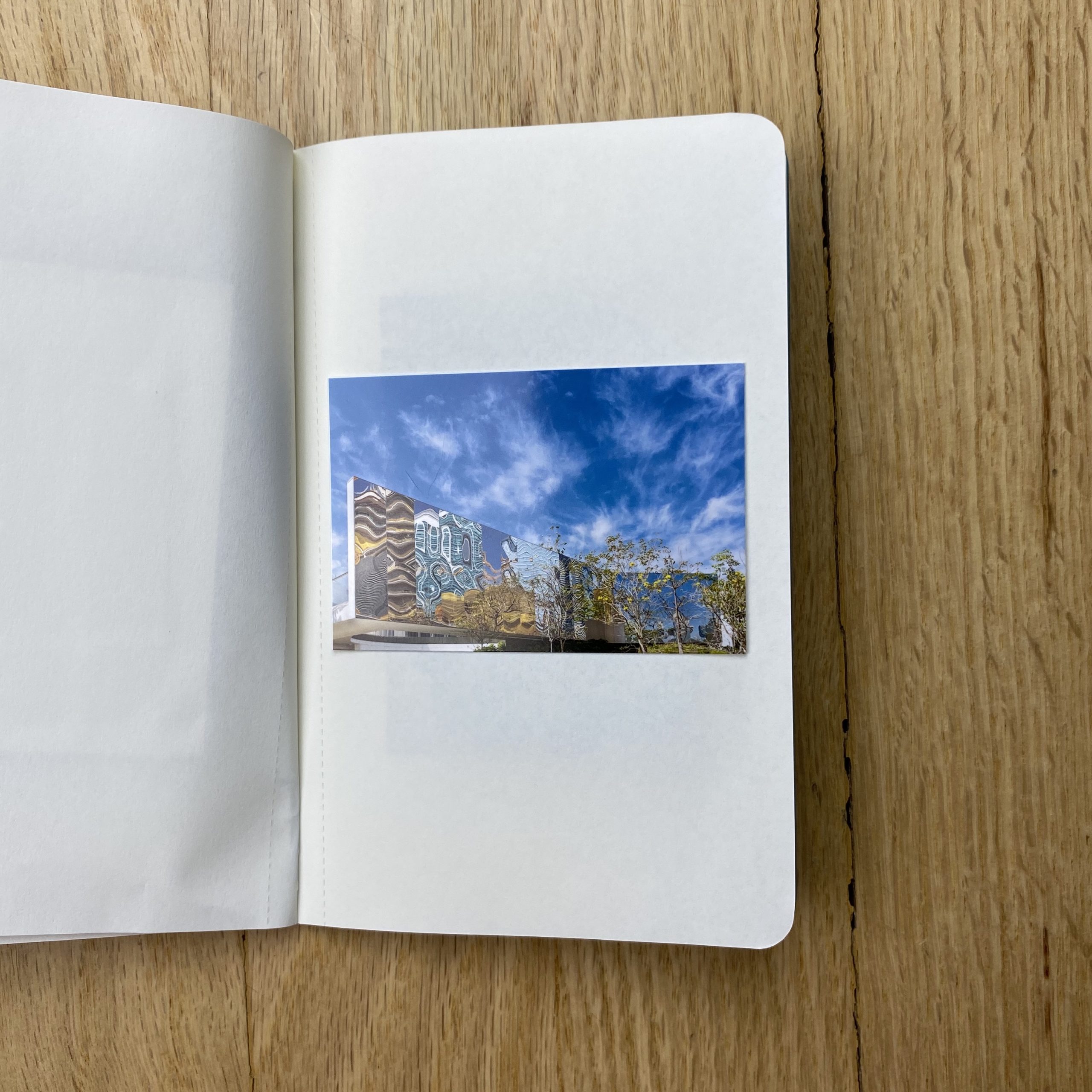
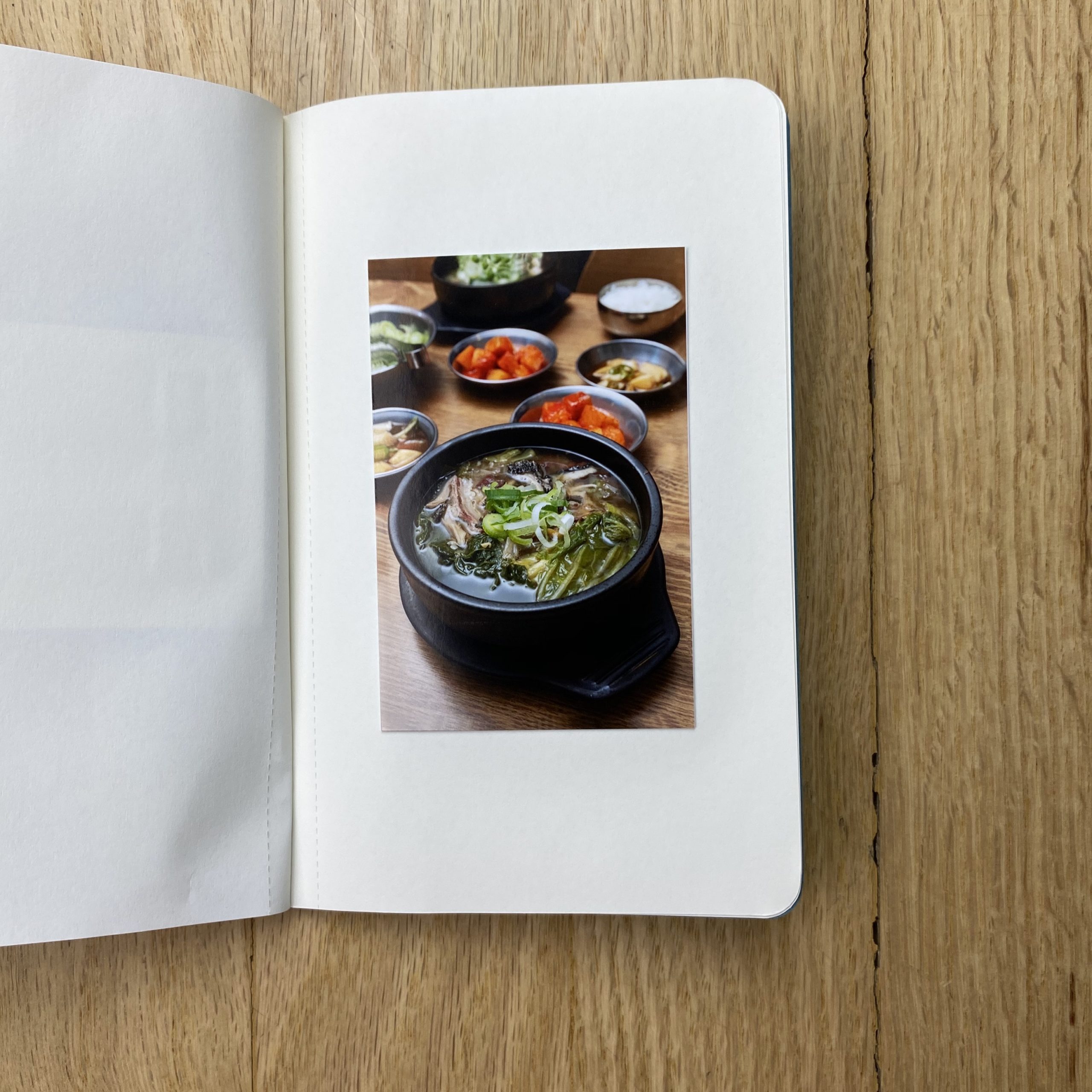
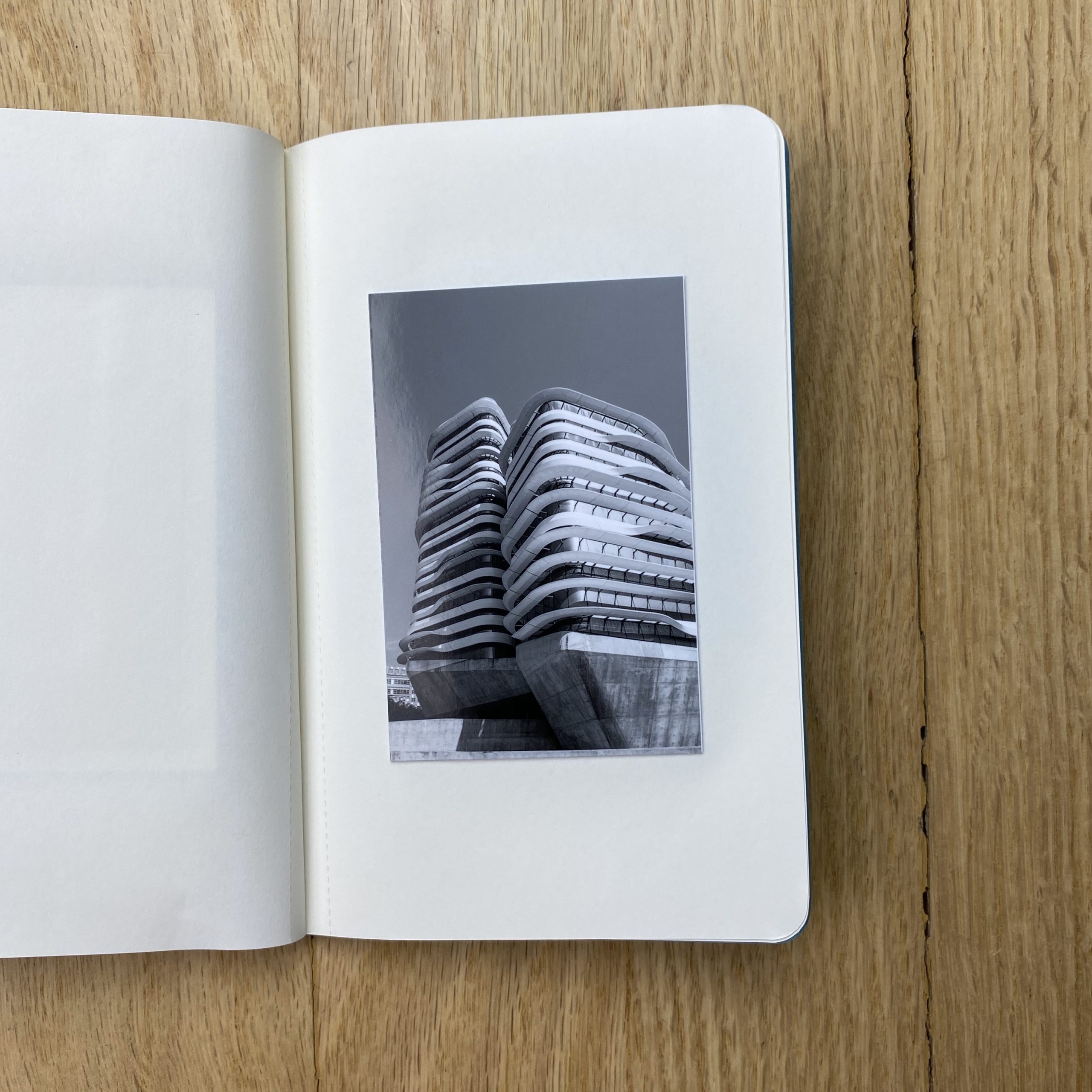
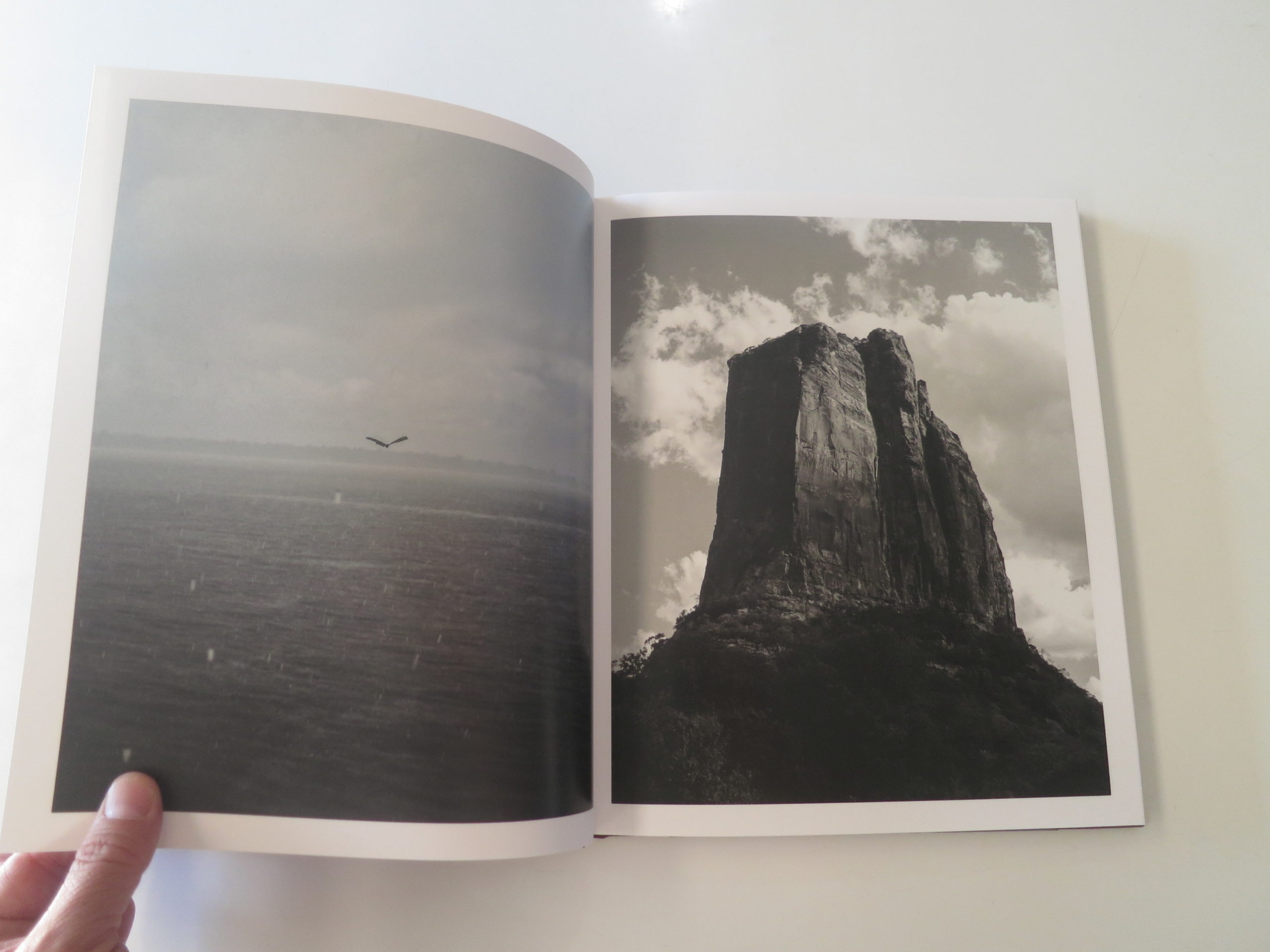
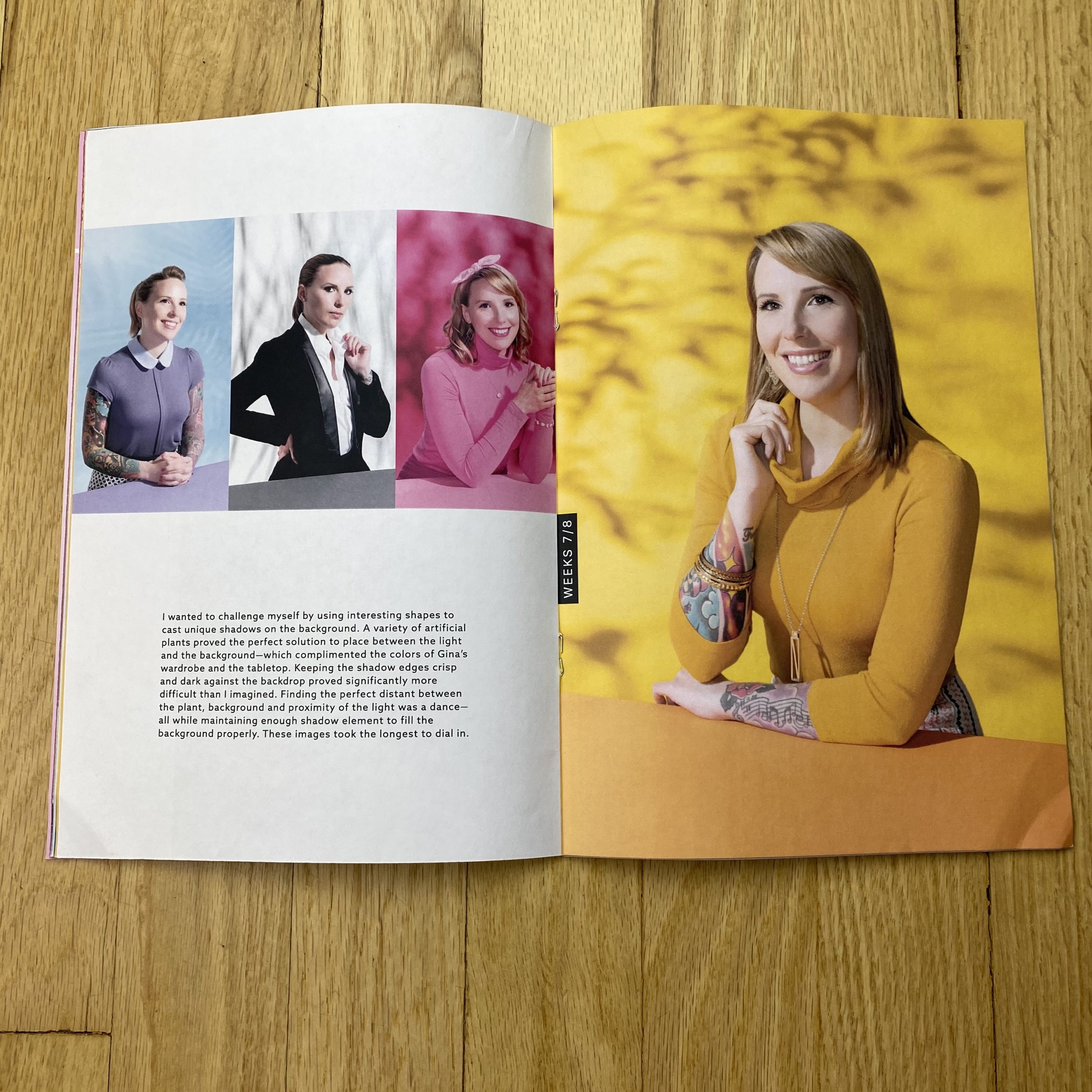
Home (Images 1,2,3) Vanishing Life Worlds (4,5,6) Manchukkar: The Seafarers of Malabar (7,8,9)
Heidi: How did this idea of “Home” come about, which was your first image, how did that inform the series? How long has it taken to photograph this body of work?
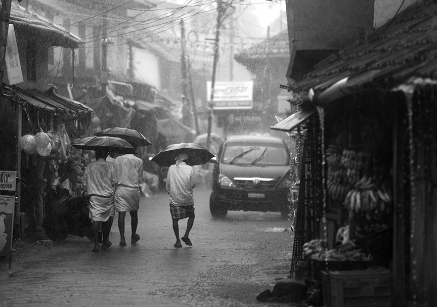
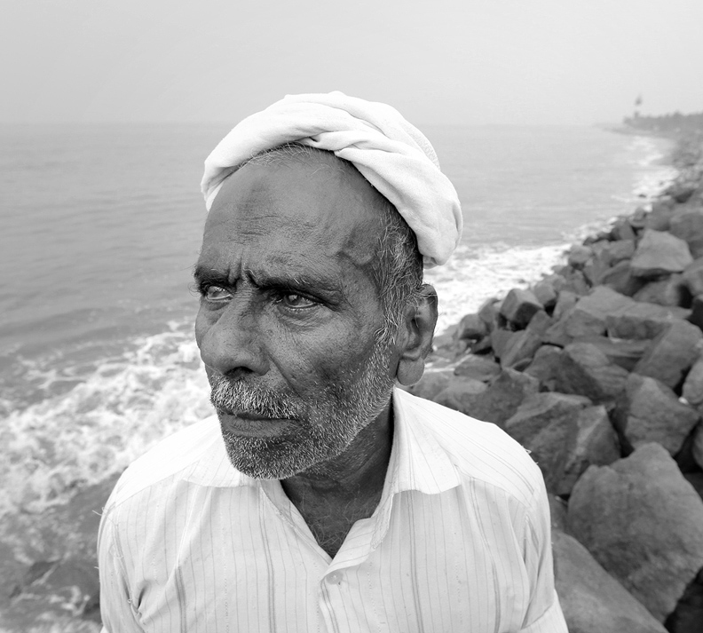
KR Sunil: I hail from Kodungallur (the ancient harbour town Muziris which was a significant presence in India’s port towns and trading history). So I have grown up closely related to the coastal life in this historical region. As a photographer, I have spent a considerable number of years with various series related to the sea.
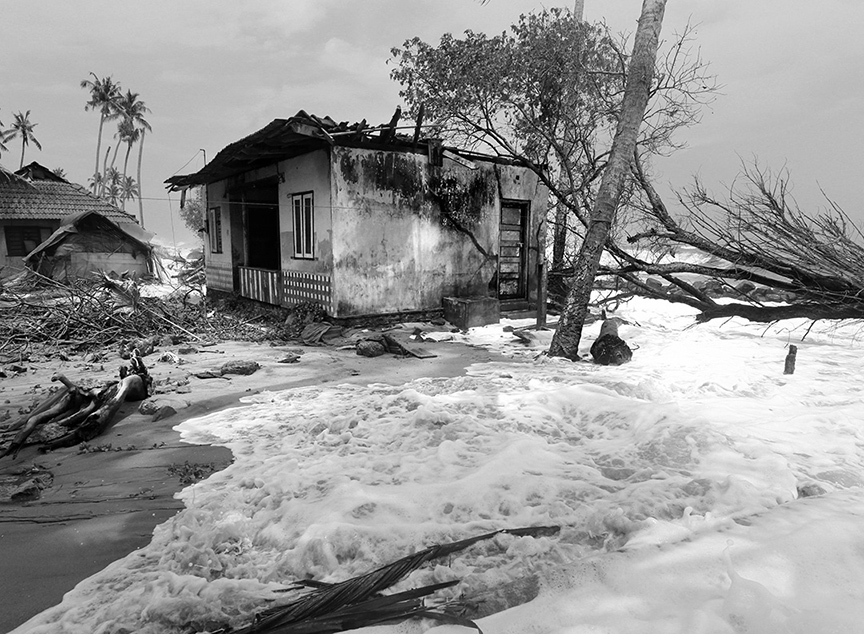
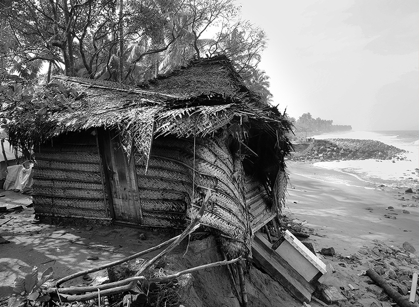
The idea for this particular series (‘Home’) occurred to me following an incident while I was working on the ‘Vanishing Life Worlds’ series in Ponnani (another port town). I photographed a thatched home of a young girl by the sea, which was on the verge of collapsing. On circulating this photo, few friends and well-wishers stepped up to rebuild this home for the girl. And they did too! But unfortunately, the renewed home too collapsed under the force of the tides in some time. This was the inception of the series for me, as I began to observe a growing number of desolated homes by the coast. For me, what struck was how hard-hitting this was for the people, as ‘home’ is a deep sentiment for them; it is much more than a shelter. For many, it is a lifetime’s endeavor to build a home. It is literally a dream come true for them. Also, for a close-knit community as theirs, the concept of home extends to the whole environment they live in. There are neighbourhoods, religious places they frequent and a camaraderie that they have to leave behind when the sea takes over. This encroachment by sea can be attributed to worldwide climate change and phenomena like global warming. But the unfair part of it is that these communities barely contribute to causing these. In fact, they are a community that holds utmost regard and respect for nature, to the extent of calling the sea ‘kadalamma’, which translates to ‘mother sea’. Yet, they’re forced out of their own homes by the same sea. This has been a growing effect in recent years, especially in the coastal regions of Kerala, which includes my hometown too.
Do you know any of the homeowners affected by this climate event, or do you know where they migrated to?
I have known a few of the families that were forced out in recent years. Not personally up close, but I would’ve seen them during my visits and walks to their localities. Now only remnants of their homes are seen there. They have been dispersed to different places – near and far, but safer. They have to then spend uncertain number of days (many of them in rented houses), pondering about the home and community they have had to leave behind. As far as they are concerned, this shift to a safer place is not a resolution; they are only left with an angst about their home.
What draws you to the sea?
I have spent a good part of the last 5-6 years on various series related to the sea. ‘Vanishing Life Worlds’ was a photographic series based on the lives of people at Ponnani, an old harbour town in Malabar coast. It was exhibited at the Kochi Muziris Biennale in the year 2016. SImilarly, ‘Mattancherry’ was a series about life at another port town Mattancherry in Kochi. Then there was a series on the last surviving group of seafarers of Malabar, titled ‘Manchukkar – The Seafarers of Malabar’. This text-and-photographic series narrated the stories of men who worked in traditional dhow (or uru) and endured painstaking lives. Another series is in development right now, which follows the life of performers of Chavittunadakam, a dying artform that survived through the coastal community.
So to answer you, I’d like to point out that it’s not the sea that draws me, but rather it is the lives related to the sea that drives me.
Port towns have a unique history of having welcomed and accommodated people from all parts of the world. The people of these towns get a better sense of the world, thanks to the visitors. This has defined a broad-minded trait in these people about life, which I believe is universal for coastal or port town communities. For instance, while visiting the port town of Ponnani, I came across Abubacker, who I’d describe as one of the finest personalities I have ever met. Operating from an abandoned go-down facility, he sources and gives out free medicines to the needy – medicines worth thousands of Rupees on a daily basis! And this, without seeking any recognition or returns. In the same town I have met people with varied traits and vocations. Like Asees, who was a pick-pocket but known and familiar to everyone in the region. (Sharing a video by Kochi Muziris Biennale featuring these personalities, for reference –
I always found these people fascinating – they even have a glow on their face which I believe is attributed to their positive approach about life. So these lives appeal to me rather than the sea itself…
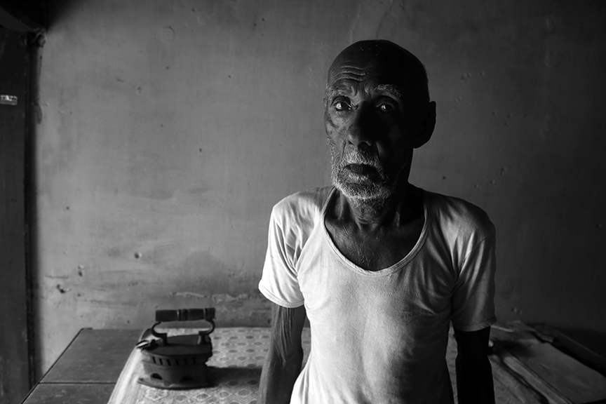
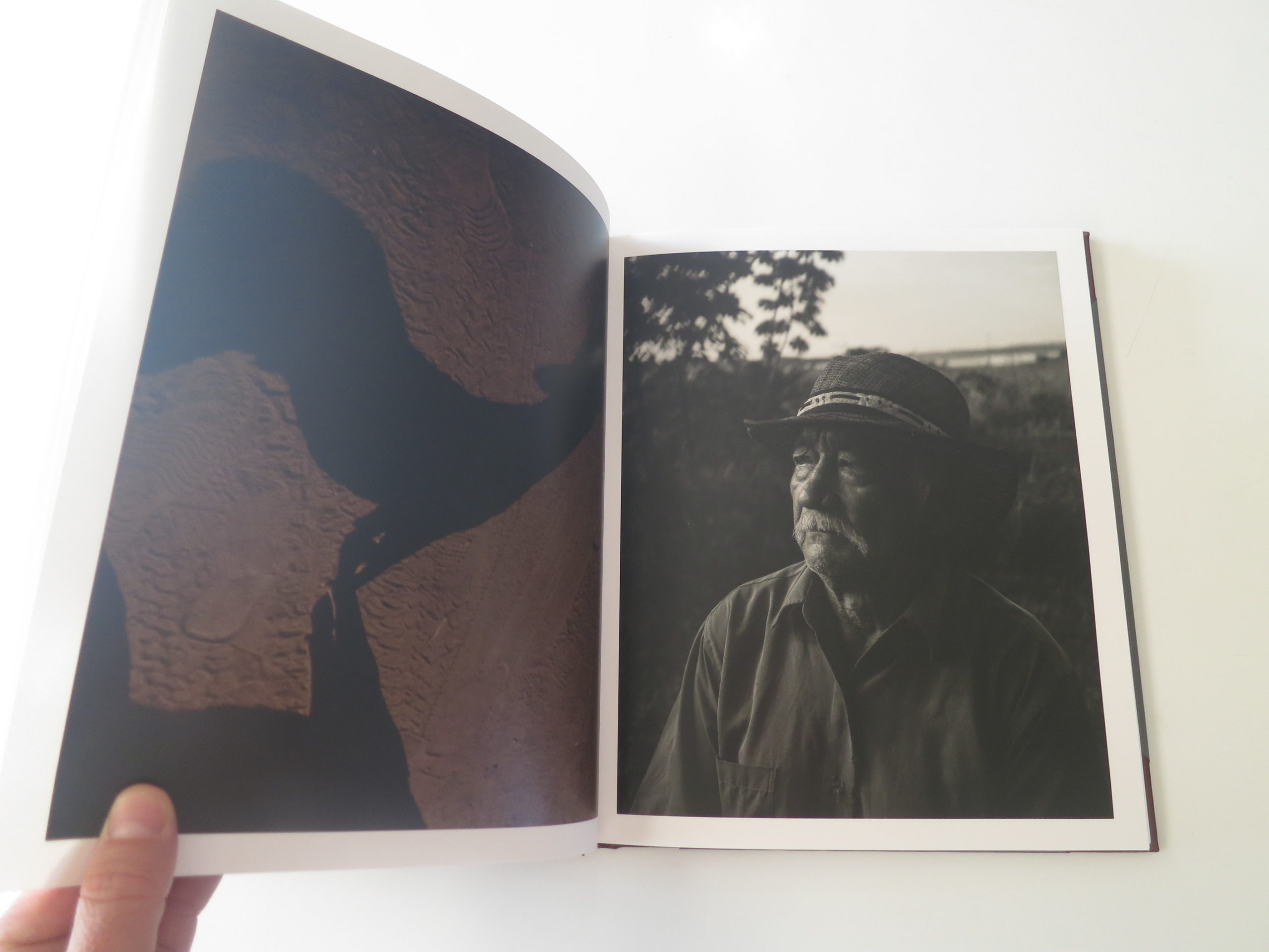
For “The Seafarers of Malabar” how much time did you spend with each subject prior to bringing out the camera?
The series occurred to me in a rather coincidental manner. I used to frequent the port town of Ponnani and interact with the people there. On one occasion, I came across Ibrahim, a very elderly man, who was singing a folklore about life at sea. I was intrigued by his rendition and listened to him for some time. When I started talking to him, I realised he was a seafarer in his youth. The more I spoke with him, the more fascinating his story grew into. He used to work in the traditional uru (or dhow ships) that carried out trading between port towns. He had spent his prime travelling around the world! I couldn’t have been more excited. He ended up inviting me to his home, where we sat and talked for quite a while. His home could not have been more basic, barely accommodating his own lonesome life. This man had travelled around the world, but his humble home and living conditions reflected nothing about his experiences. There, sitting in that tiny space, he was describing the great endless seas and journeys he had been part of. He narrated adversities, facing death and escaping it – he had even survived a shipwreck, clinging on to a wooden log for two days in the sea!
Was there a common thread for you during these portrait sessions?
A whole new chapter of coastal life was opening up for me right there. He spoke of his fellow seafarers; many of them had passed on and the rest were struggling with a difficult old age. I was compelled to pursue the story and these lives, because theirs was an untold story. There were celebrated stories of travellers, traders and explorers who may have ridden the same ships as them, but the story of such common labourers and their hardships had never been documented or told. Even for me, it was a fortunate coincidence that had opened this avenue. From meeting this lone seafarer, I ended up tracing up to 35 of the surviving lot – each of them with unique stories, mostly of hardships.
How did you build and earn trust?
I spent a considerable amount of time interacting with them. In fact, a few years passed while I continuously met them and discussed their stories. This meant we had gotten accustomed to each other with a cordial rapport over time. The portraits were in fact taken during those conversations, as and when I felt the time was right. So it was all an organic process…mostly with a human-to-human basis, rather than a photographer-to-subject one.
What compels you to share their stories?
I felt compelled to bring their stories to light mostly because they were untold. Like I mentioned, stories of sailors and traders were celebrated worldwide. Even a single journey to a far off land was sometimes lauded as discoveries and achievements. But the labourers spent a lifetime making the same journeys and enduring a much higher degree of hardships. But being labourers or common men, their lives were neither pursued by historians or researchers, nor did they have the voice and ability to speak out their parts. This was typical of the working class in any part of the world, in any industry. I happened to come across their lives by chance, but I always felt advocative about the stories of such subjugated, marginalized lives in society. The coastal life as a whole had this general trait, which is the reason I was always inclined to retell their stories.
How have you been creatively engaged during these unruly and isolated times of the pandemic?
The lockdown came with a lot of travel restrictions. But I have been able to visit the coastal strips and photograph the effects of monsoon there. The time has helped me develop the ‘Home’ series.
Tell me about your promo.
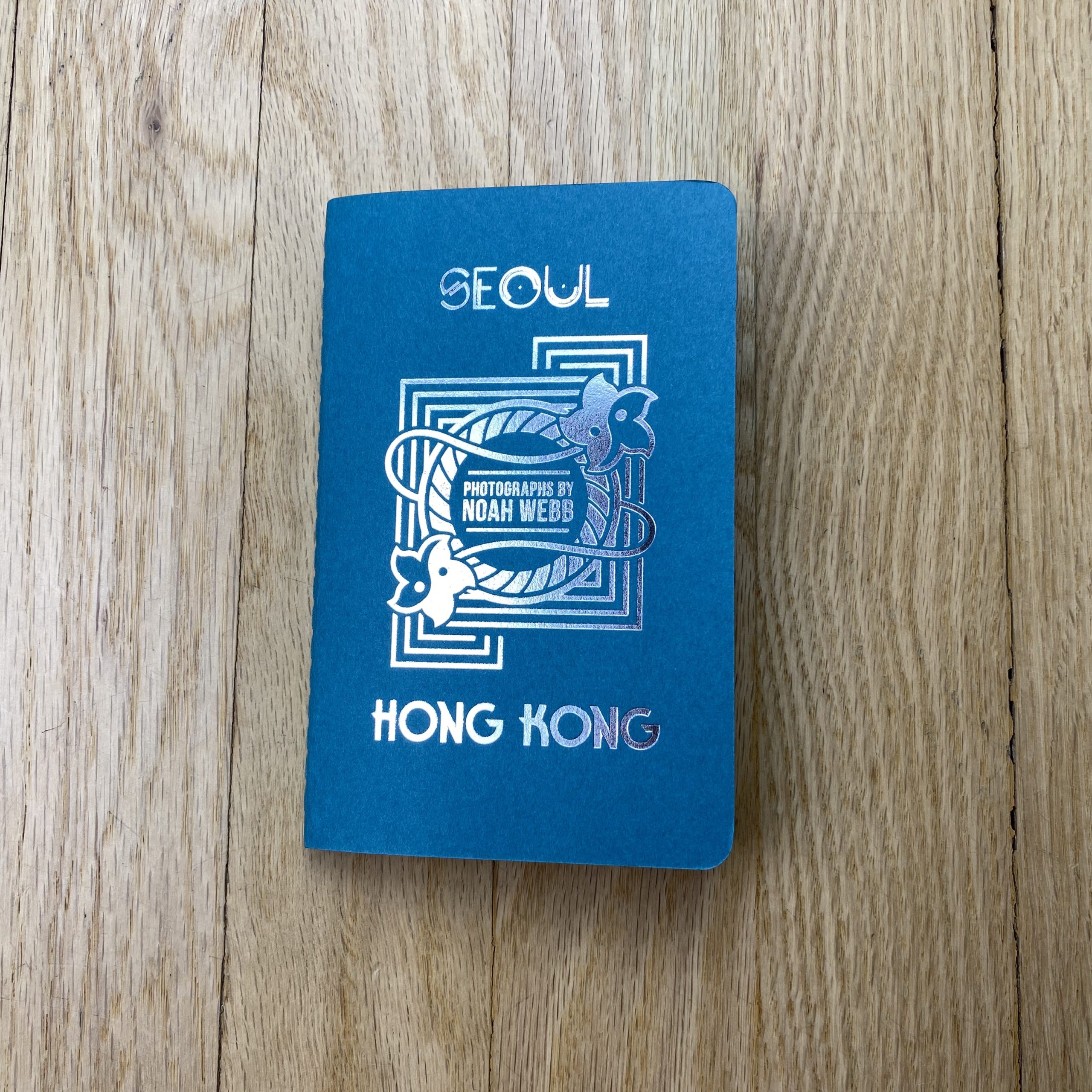
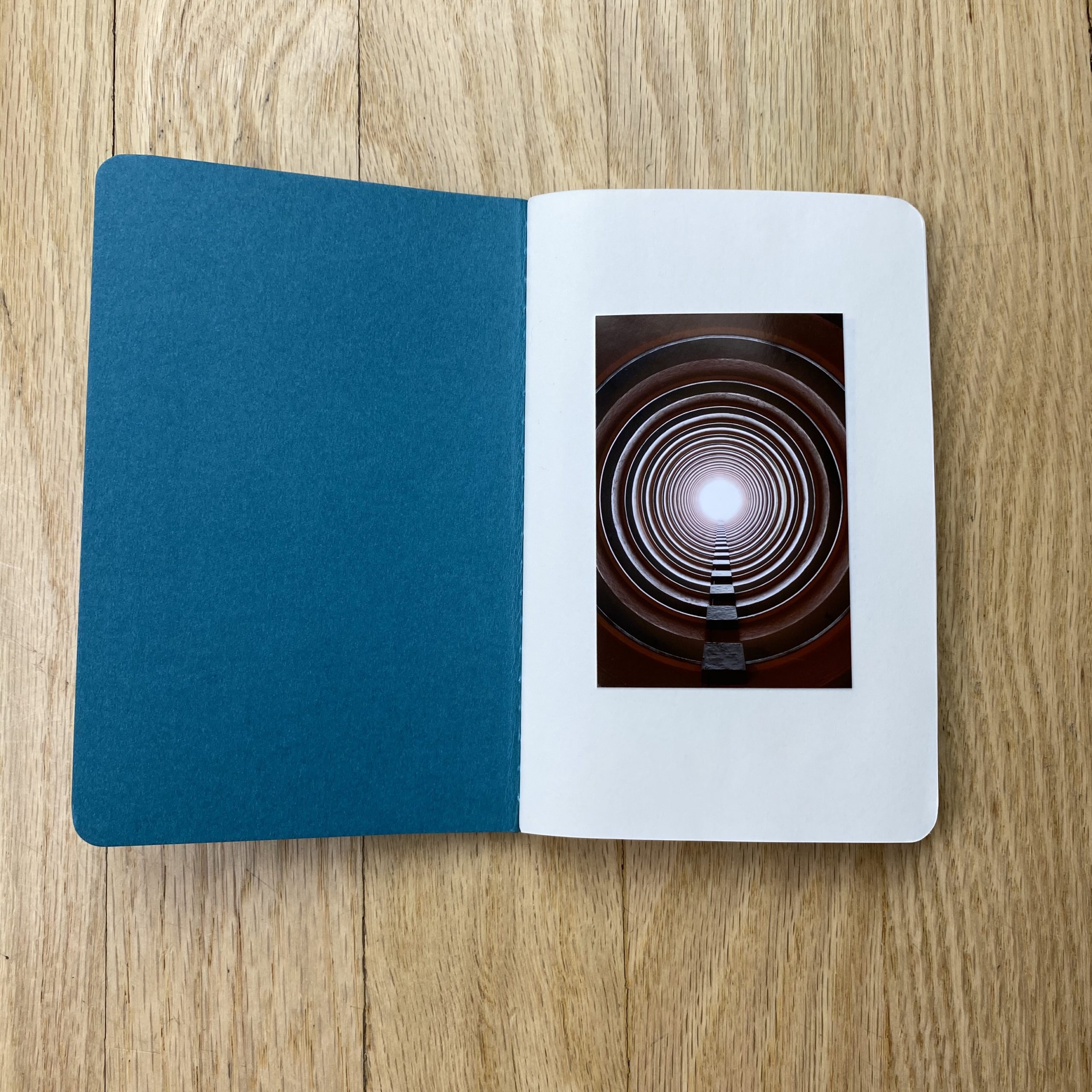
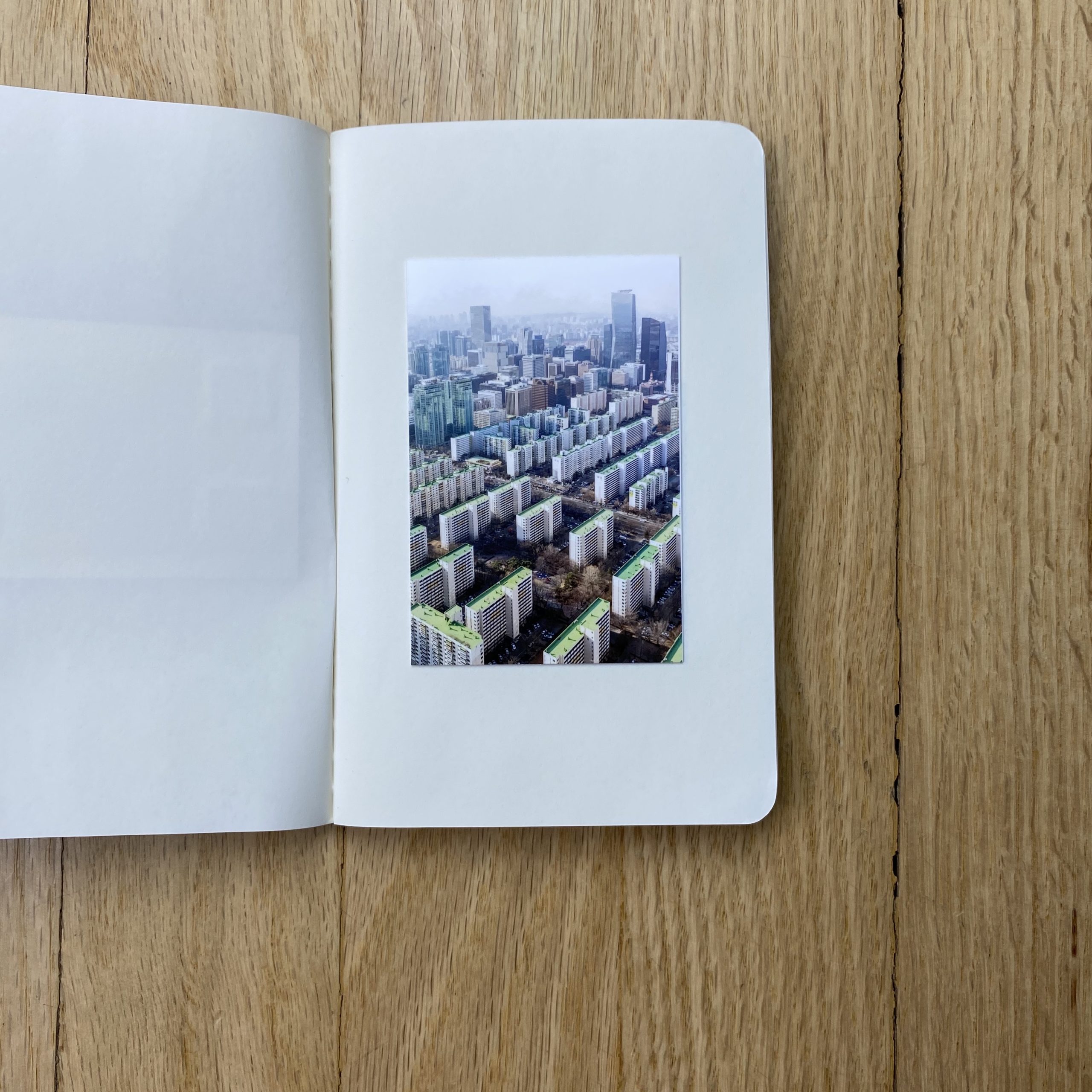
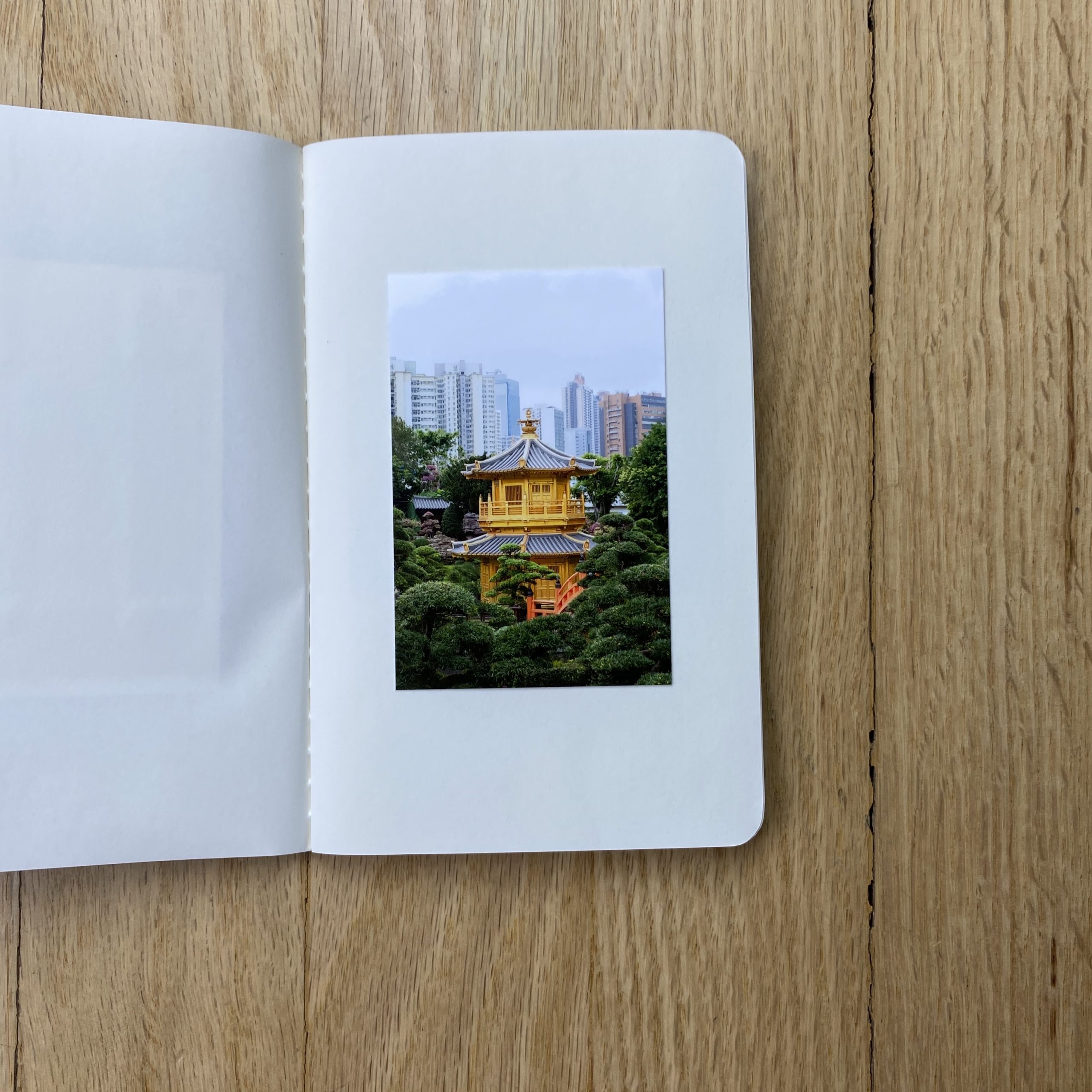
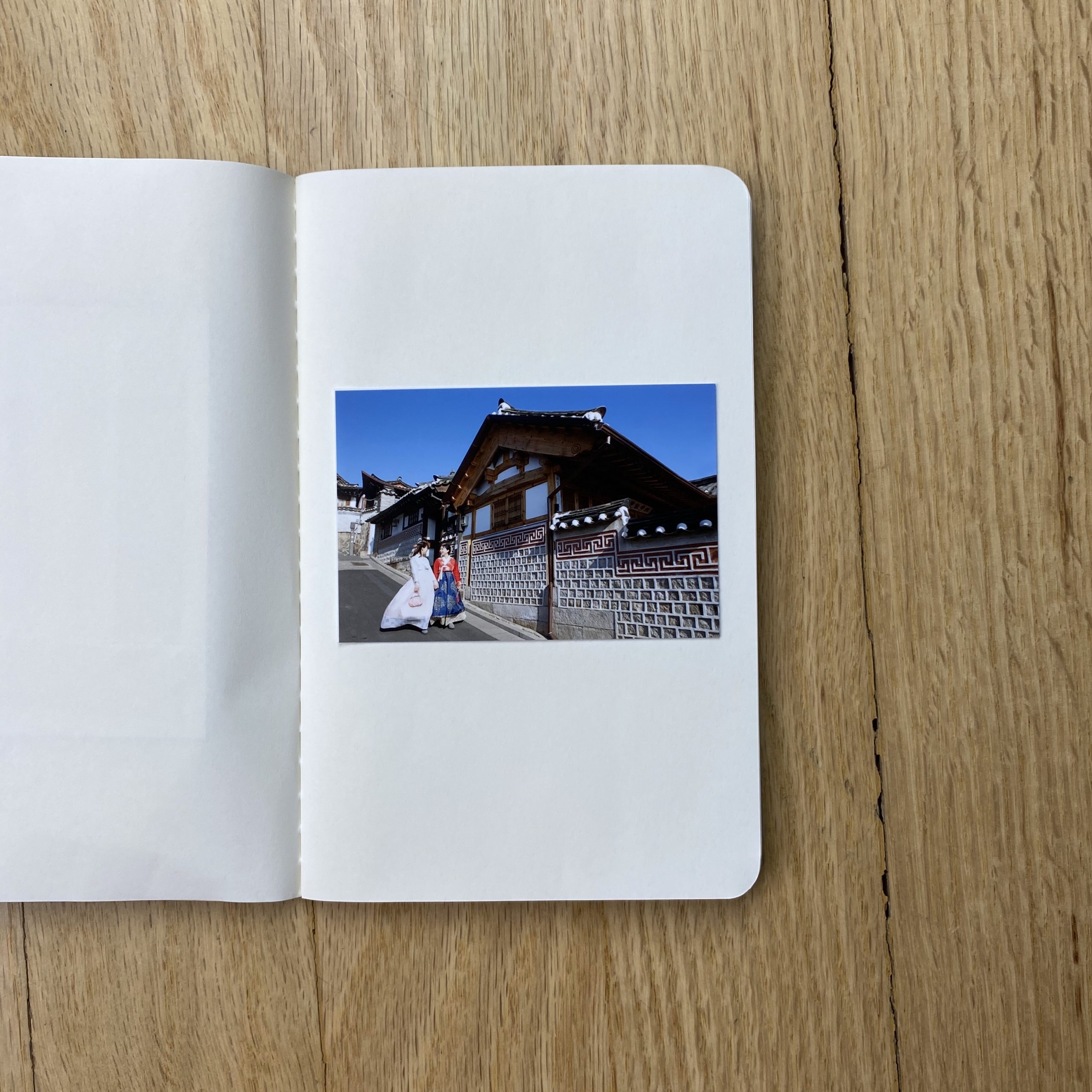
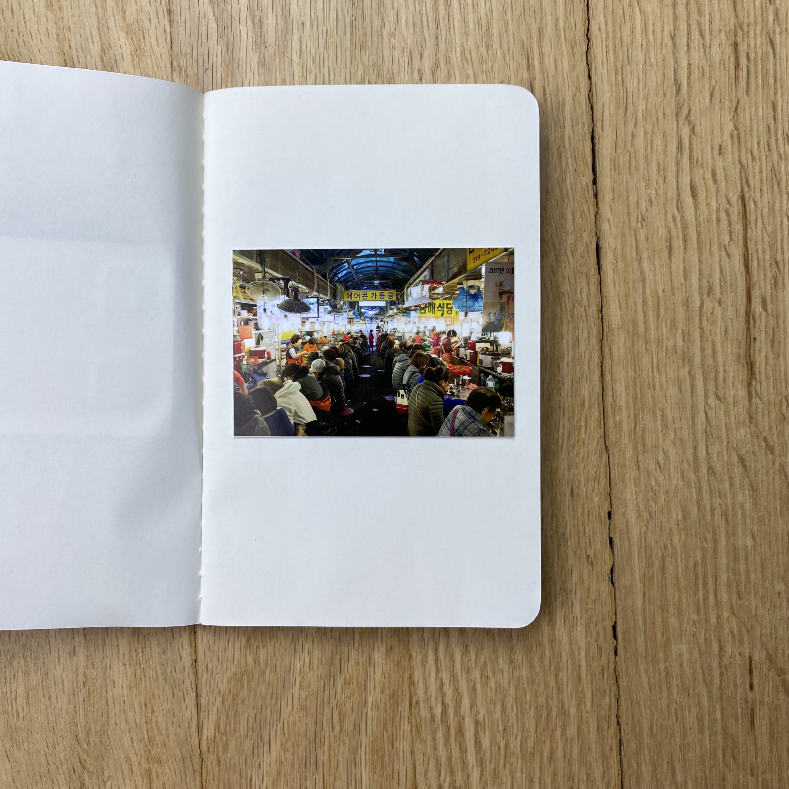
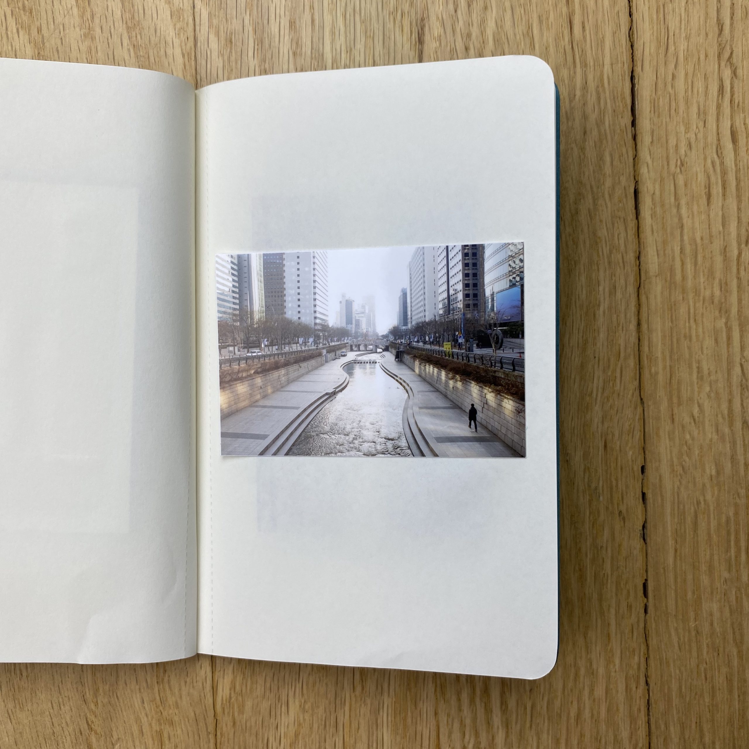
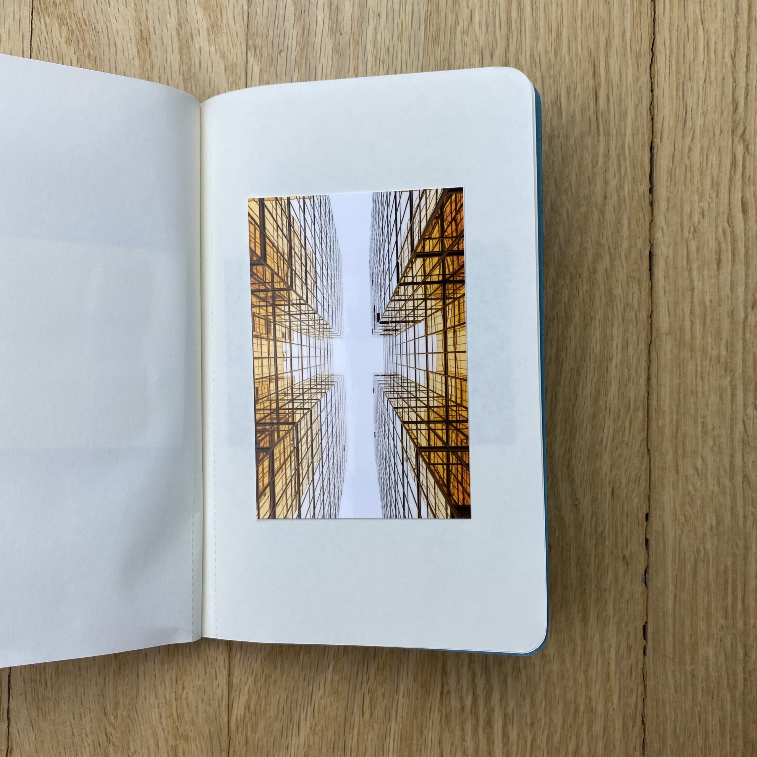
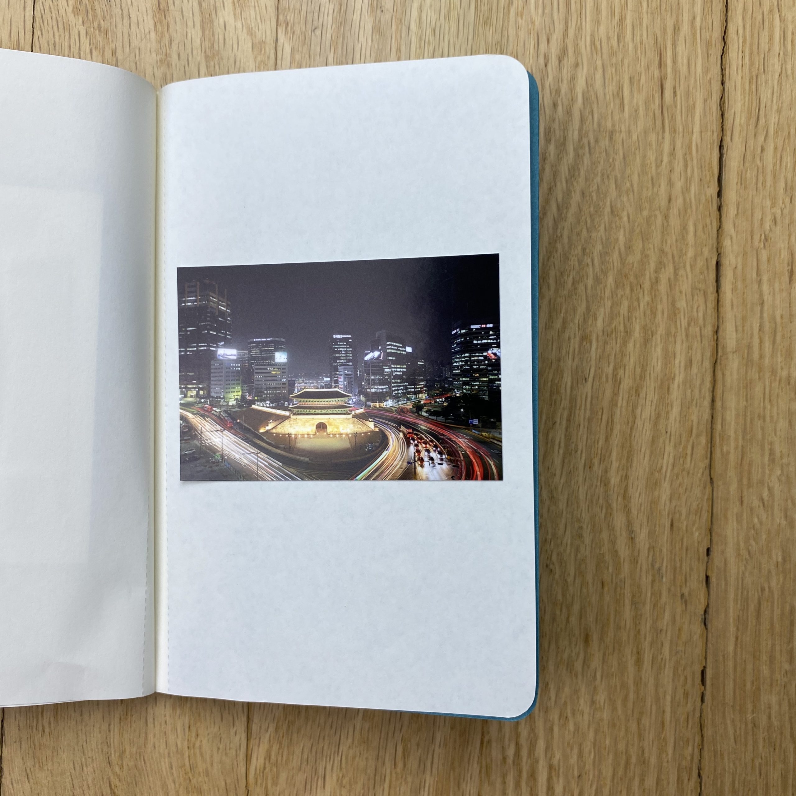
The one I sent you is book #6 in an ongoing series of books. The first book was created after an editorial assignment from Monocle magazine back in 2007. The magazine had sent me to travel throughout Ecuador and cover the status of events in the country at that time. Being that it was 2007 I brought both my film camera and digital camera to shoot. Upon returning I was going through my film proof sheets and started to cut out specific frames I really liked. It came to me then that I needed a way to tell my story of this adventure with these small proof prints. My first passport was fairly simple with a craft brown color passport size book with the words “Ecuador, February 2007” “Noah Webb” embossed on the front. I hand adhered the proof prints into the pages and made a total of 30 books. They idea clicked and people responded in a way I knew I needed to continue the idea. Subsequent books became more fine tuned in the design and feel of the passport. Each book different colors and overall cover design to match the travels abroad. I hire different designer friends to collaborate on the cover design and have a local print shop do the foil embossing. I increased the quantity of books as I progressed since I was getting more demand. The latest book is and edition of 250 and I am still in the process of printing, cutting out and adhering the rest of the books. It’s a great pandemic project. One born out of my love of travel, a physical memento to hold onto which seems appropriate right now. Ecuador 2007, France & Switzerland 2008, Italy 2009, Berlin 2012, Rotterdam & Brasilia 2017, Seoul & Hong Kong 2019.
These books take a lot of time and energy but I love making them. I’m fairly certain some jobs opened up to me specifically from these books.
Right here, in this space, I wrote about when she was born.
I discussed changing her diapers.
I shared how it felt.
It was 2012, and Barack Obama was about to be re-elected President of the United States.
His opponent, Mitt Romney, represented the Republican Party. Now, he’s one of its foremost critics, from the inside, and President Obama, out of power nearly four years, unloaded on Donald Trump in the digital version of a Democratic Party convention.
My daughter and her brother just got their first pet: a mutt that we rescued from the animal shelter.
This morning, she asked if I’d write about the dog, and so I have. (Her name is Haley, she’s a blue heeler/pit bull mix, and we already love her dearly, after only two weeks.)
#2020 feels like a different century than 2012. A different millennium.
Perhaps a different timeline entirely?
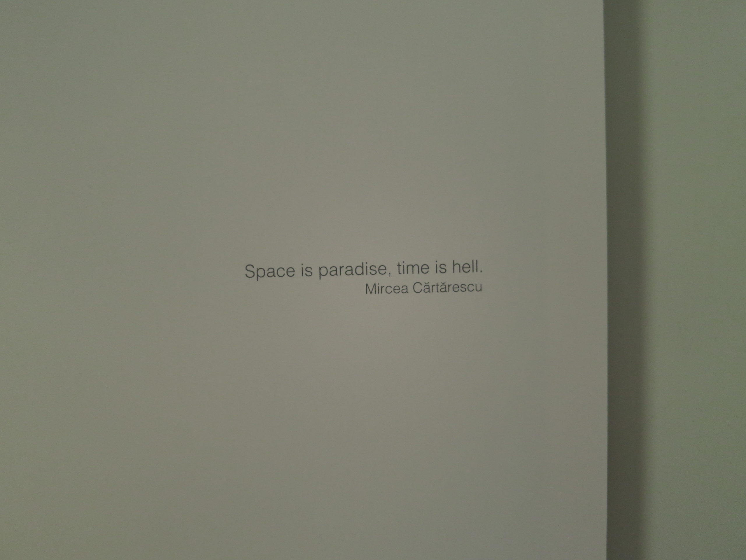
But then again, “Space is paradise, time is hell.”
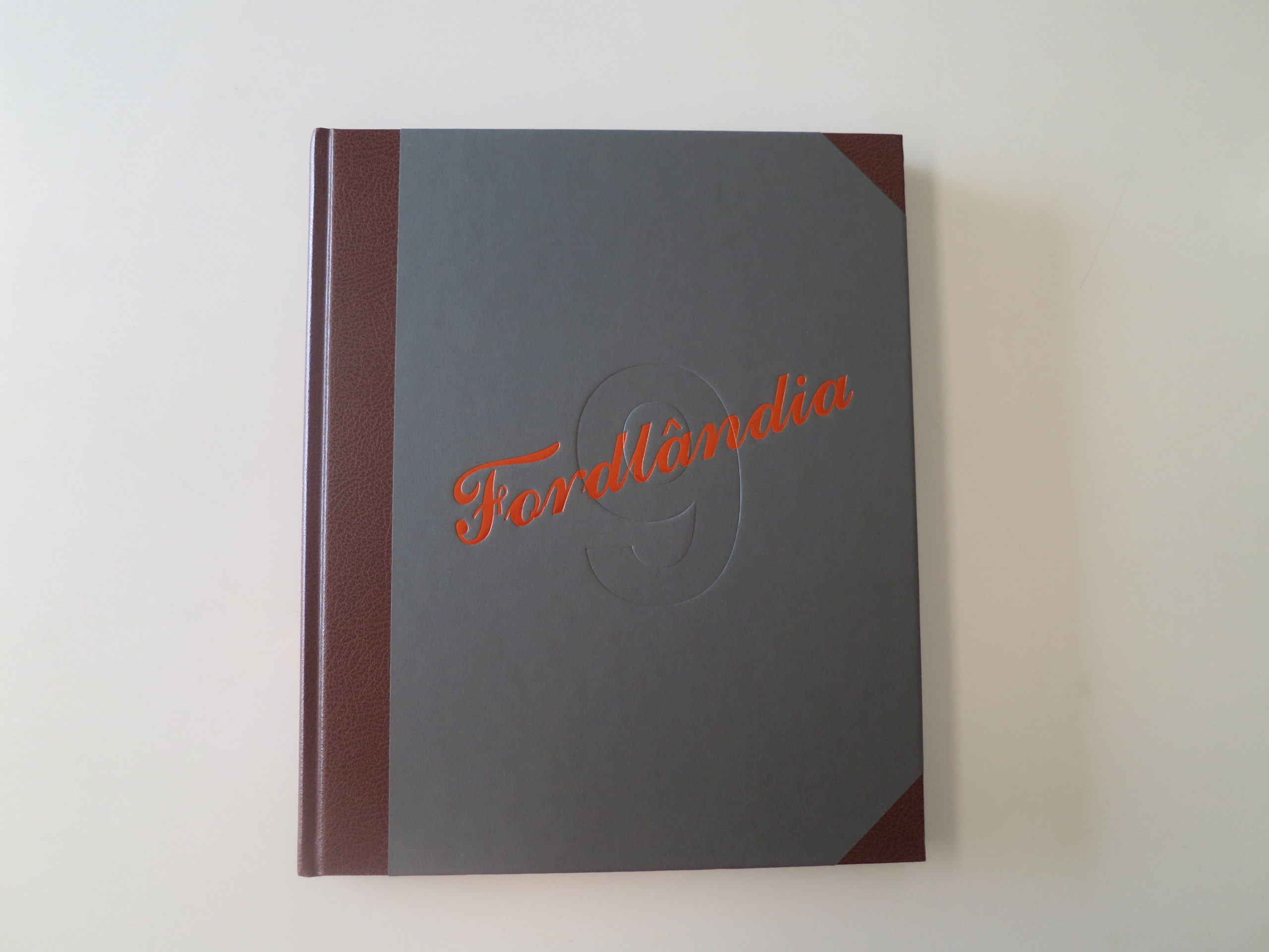
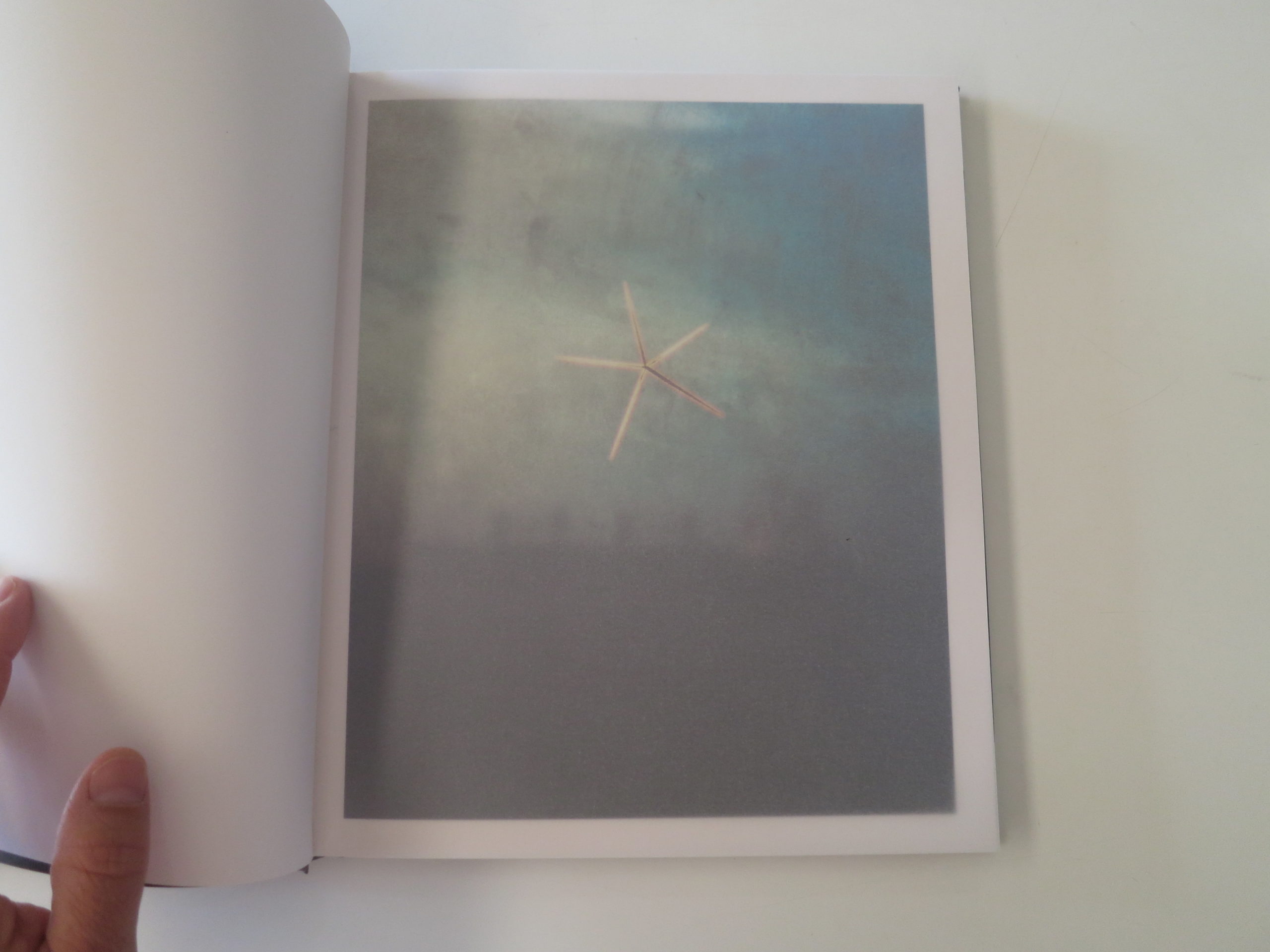
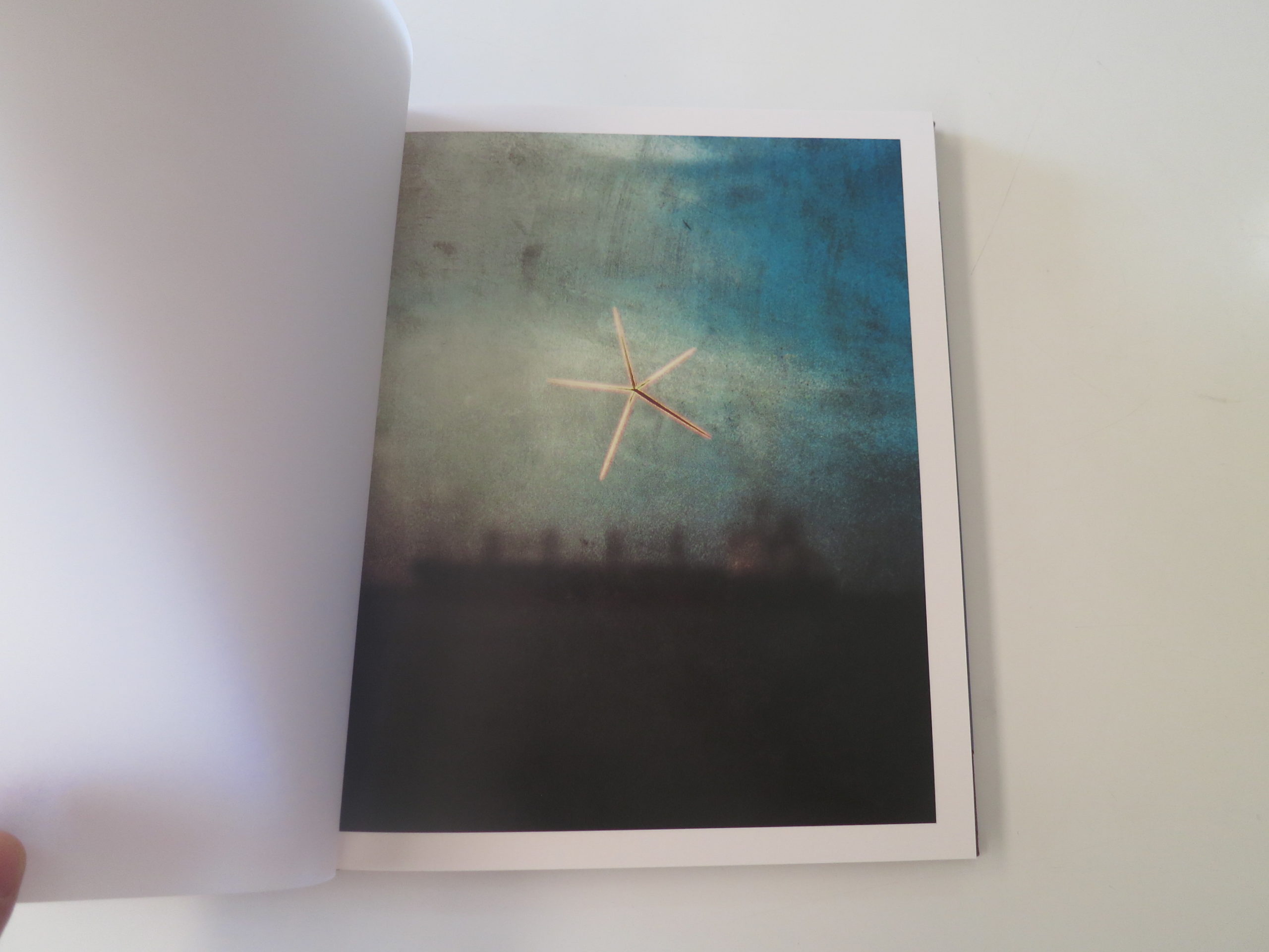
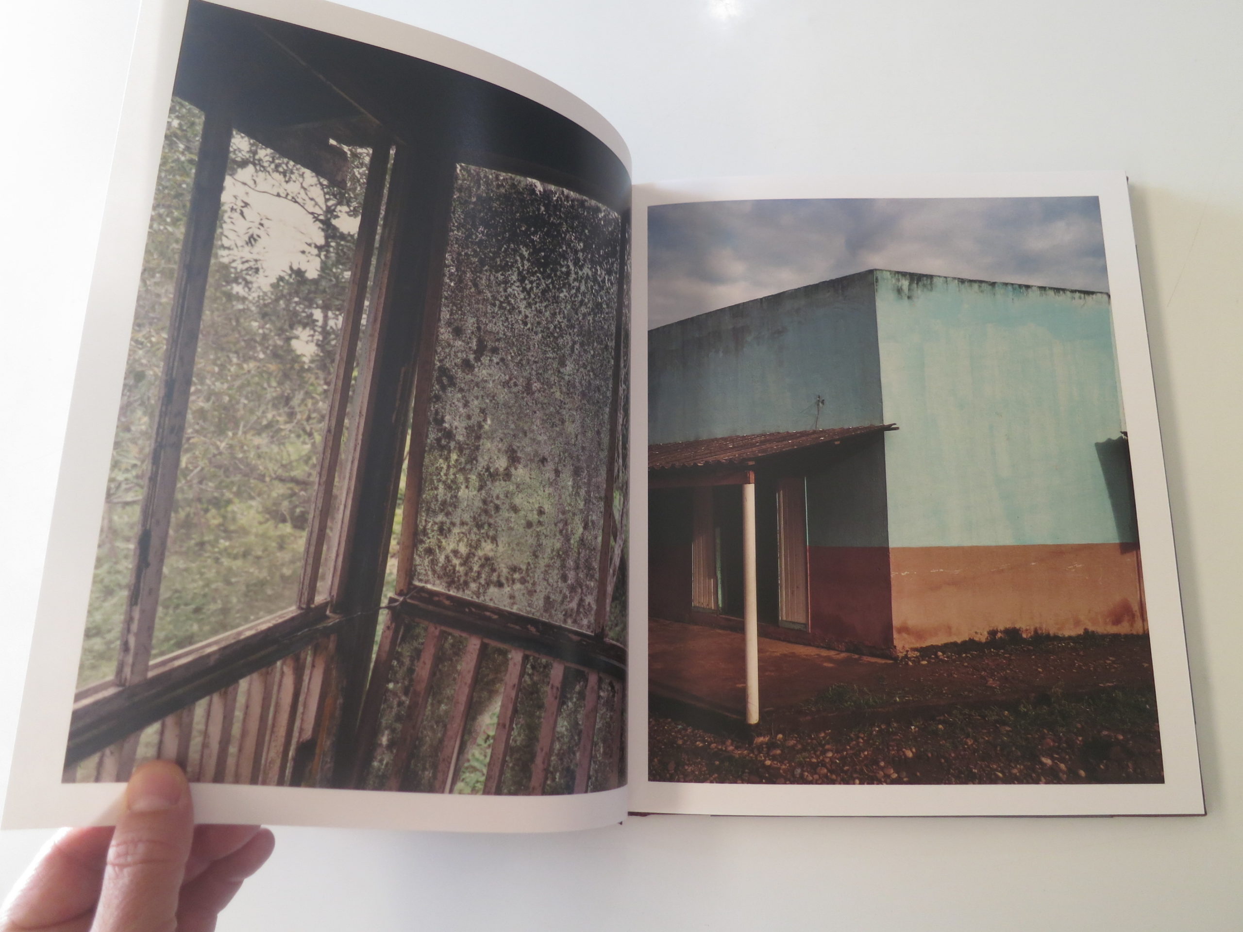
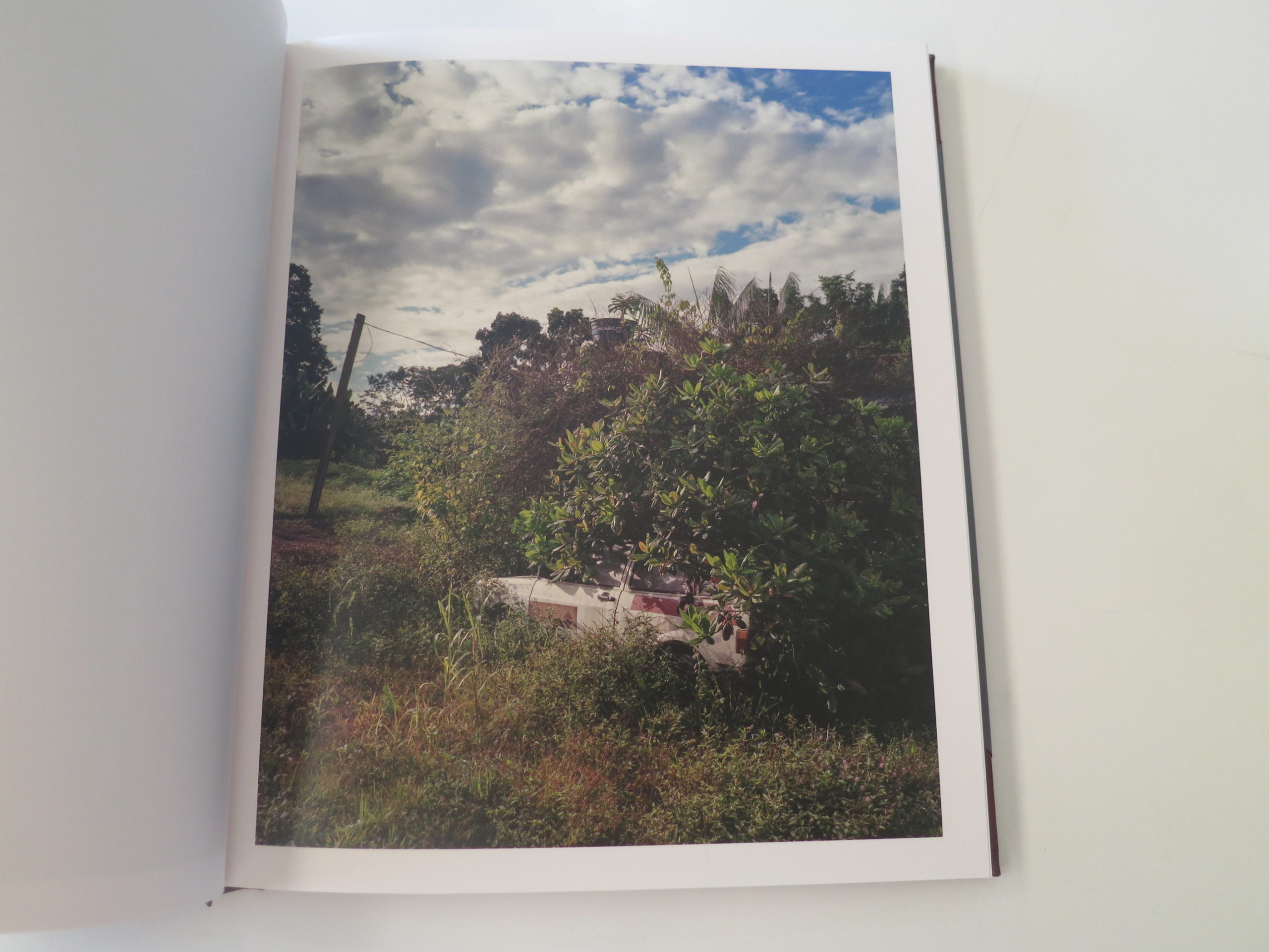
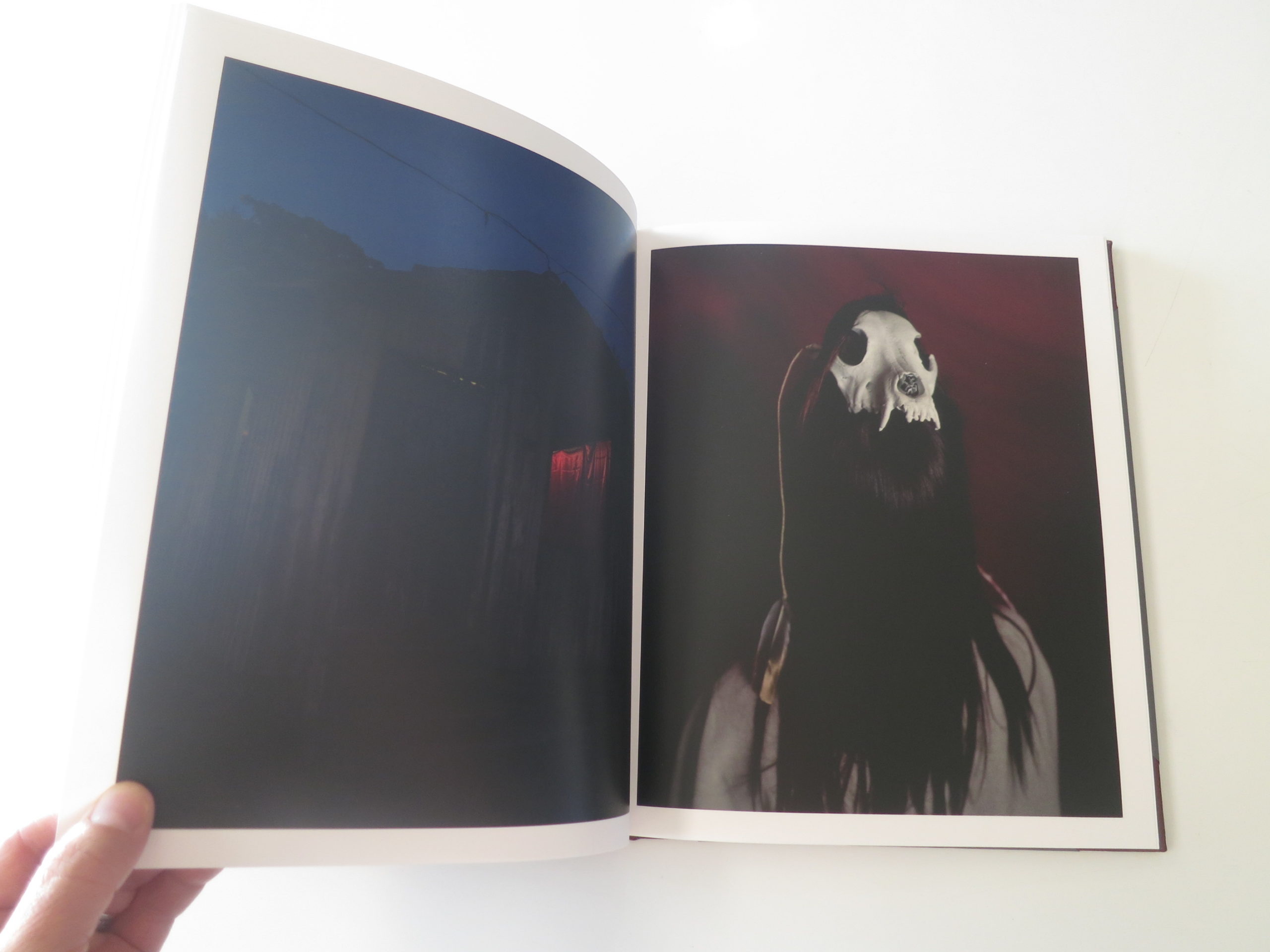
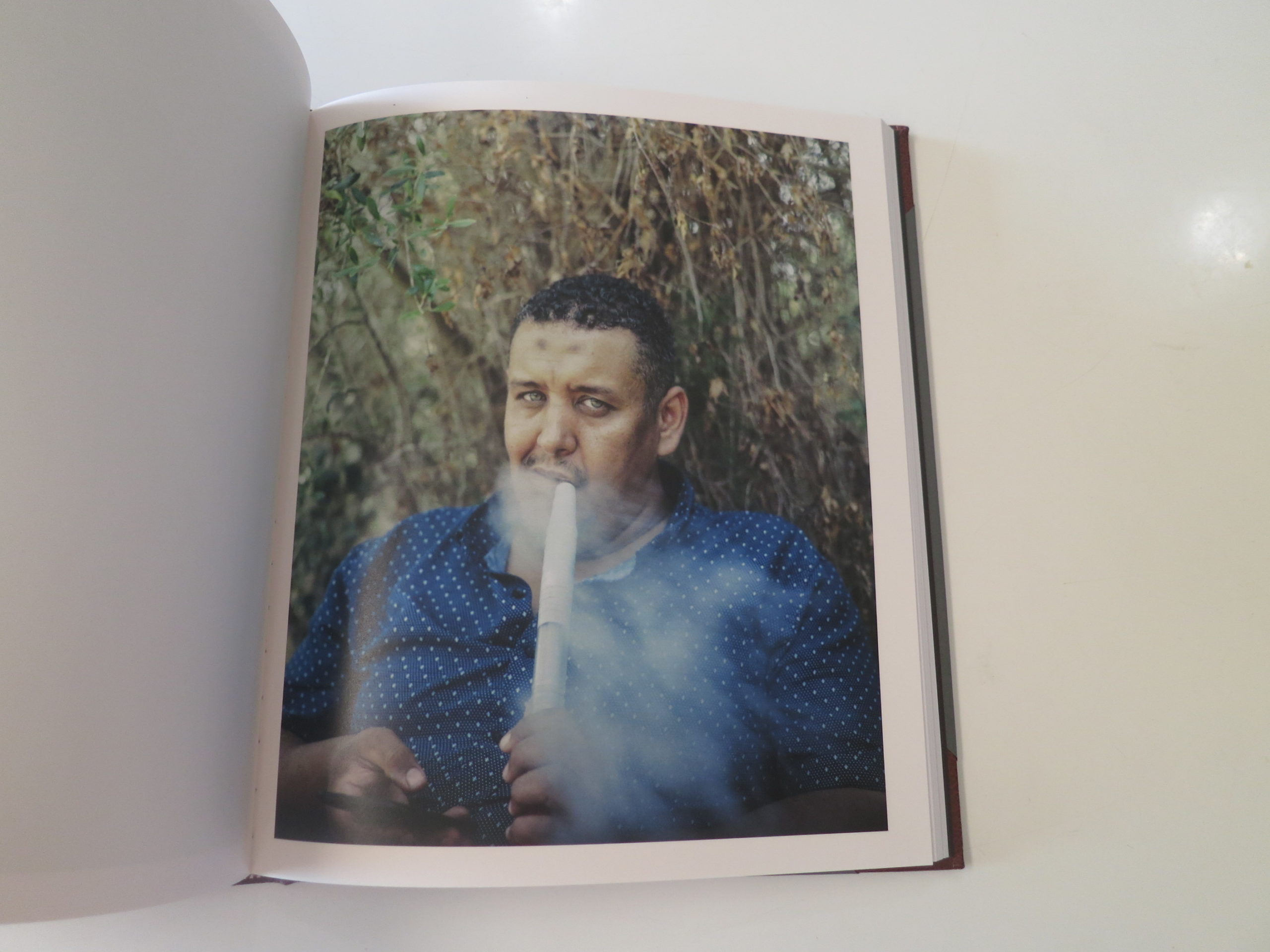
I read that just now, at the beginning of a super-impressive photobook, “Fordlandia 9,” by JM Ramírez-Suassi, from Madrid, published by NOW Photobooks, which turned up in the mail back in March.
I pulled the book from my stack this morning, knowing nothing about it, and my daughter spied me as I walked through the house with the cardboard box in tow.
She asked what I was going to do with the book, and I told her that I wrote about books for my work, and that sometimes I wrote about travel, but not now.
“Because you can’t travel?” she asked.
“Exactly,” I said.
But of course I can travel, in my mind.
A great photo book allows me, and all of us, to venture to far-flung parts of the world, in our imagination, if everything comes together just right.
Is time hell?
Was the quote correct?
I’m not sure I agree, but I do think time is experiential, and I’ve shared that thought with you before.
These days, people speak of Covid-time, and it’s generally accepted that #2020 feels like 10 years compressed into one.
And Einstein’s theory of relativity proves that time does change, relative to the speed of light, so why can’t it change relative to our perceptions as well?
While looking through this excellent book, time slowed down for me, and I lost track of where I was. Just as I write in flow, and forget where I am for a little while, this photobook took me out of my head, and out of my chair, and that was exactly what I needed today.
Honestly, I’m not sure if the artist is a man or a woman, given the name is comprised of initials, but I’ll check when I’m done writing and add it as a post-script, just so we know.
But I did break my traditional rule of no Googling while reviewing, and I’m glad I did. (We’ll get to that in a minute.)
I was impressed from the jump with “Fordlandia 9,” as the cover has a leather spine, and leather corners, which goes a long way towards making it look like a photo album. (At significant expense, I’d imagine.)
It opens with the aforementioned quote, and then unspools a narrative in a slow, luxurious manner.
I was immediately sucked in, because the reproductions are so good. (Immaculate, really.)
There are occasional vellum pages interwoven, which I also liked.
My first thought was this was a non-linear narrative, perhaps a collection of strong images that were not connected, as there is so little to go on.
Bit by bit, though, the story became clear.
First, there are hints of Portuguese, (rather than Spanish,) and a succession of jimmy-rigged objects that imply deep poverty, and the ingenuity that comes from having to make something out of nothing.
A leg-less chair tied and propped, so that it can be used as a seat.
A piece of cardboard fashioned to be sun protection.
Given the gritty texture and implication of humidity and poverty, I imagined it was set in Brazil, but that was only an educated guess, at first.
Then we see portraits, all of which depict serious people, perhaps a bit sad, but haunting in a way that we’ve seen before from images of residents of the “Third World.”
Muddy ground, gnarled trees, cars ensnared by growing vines.
The artist also weaves in just a few black and white images, which is tough to do, but works here as a repeating motif.
I use that term all the time, repeating motif, and then at one point, a subject is repeated, sitting in an old car, the first image in color, the second in black and white, but then there is a second man, a twin or look-alike brother, and it jarred me out of my reverie.
This book is so well thought out, and so well constructed.
Towards the end, we do see the Brazilian flag appear, and that’s the only legitimate tip-off of where we are, until the end notes.
Shortly thereafter, there is another piece of text, only the second after the opening quote, and it says “Matthew 15:13.”
That’s it.
Just a verse name.
So I felt compelled to break my no-Googling rule and look it up.
There are multiple translations, but the gist is this, “He replied, ‘Every plant that my heavenly Father has not planted will be pulled up by the roots.'”
(The He in question being Jesus.)
The text is placed in between one image that might be a person walking into a hole in a giant tree, (or a cave,) and right before a picture of some bent-finger-like tree branches.
Of course I took it to mean that the Amazon is being de-forested at such a rapid rate, we might all fucking die in a decade or two.
Powerful, powerful stuff.
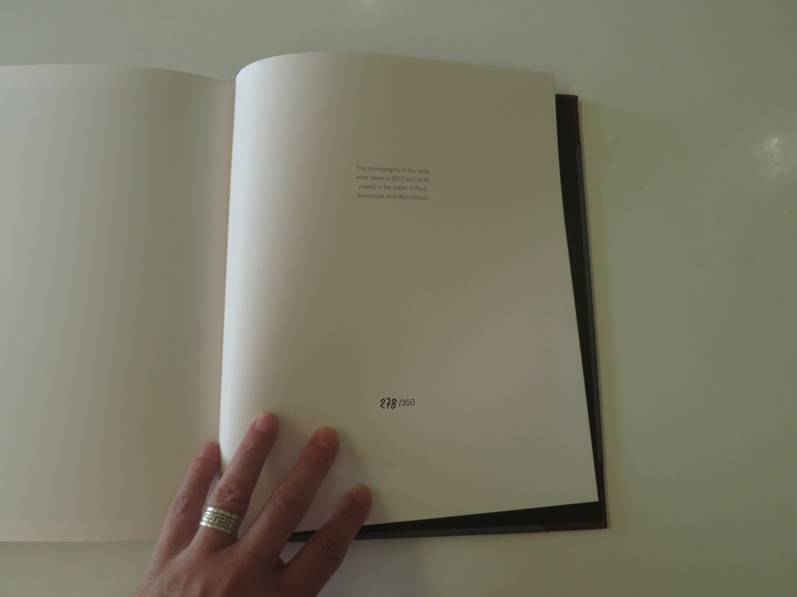
Finally, the end note tells us the photos were shot mainly in the states of Para, Amazonas and Mato Grosso, in 2017 and 2019.
I’m not sure I’ve ever learned so much from a book with so few words.
This one is brilliant, and now that I’m back from Brazil, and back in my comfortable chair, I’m thinking less about American politics, and more about appreciating the life I have.
And hoping the planet is healthy enough that my daughter gets to live to 88.
If you’d like to submit a book for potential review, please contact me directly at jonathanblaustein@gmail.com. We are particularly interested in books by women, and artists of color, so we may maintain a balanced program.
The Art of the Personal Project is a crucial element to let potential buyers see how you think creatively on your own. I am drawn to personal projects that have an interesting vision or that show something I have never seen before. In this thread, I’ll include a link to each personal project with the artist statement so you can see more of the project. Please note: This thread is not affiliated with any company; I’m just featuring projects that I find. Please DO NOT send me your work. I do not take submissions.
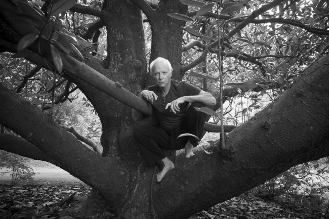
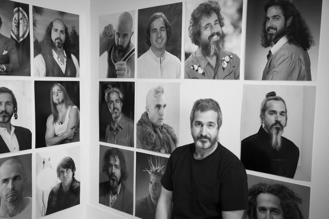
The portraits of artists appearing in this book “A R T I S T S” were taken in and around the city of Richmond, Virginia, over a six-year period. As a photographer who previously spent many solitary days making landscape images, I found the time spent with these artists to be nothing less than thrilling. Every portrait was collaboration with its subject, and to share ideas with each of them was revelatory.
I left Richmond to study photography as an undergraduate student at the San Francisco Art Institute. When I returned to my hometown in the mid- 1970s, I had been on the West Coast for five years and knew nothing about the art scene in Richmond. Soon thereafter, as I began my MFA studies in the VCUarts Department of Photography and Film, it was my good fortune to meet artists who were doing great work, and who were interested in what I was doing. Willie Anne Wright, George Nan, David White, Rob Carter, and Myron Helfgott were among those influential teachers who made me feel
at home and helped me to gain an artistic footing here. When I decided to undertake this series of artist portraits in early 2014, I started with these individuals.
Since then, I have met and photographed many artists, initially at the suggestion of the people with whom I began the project. To say that this experience has been a source of discovery and inspiration is an understatement. Simply put, interacting with all of these creative people has been amazing. It has instilled in me a much greater understanding of how important our arts community is, personally and collectively.
During my long career as a commercial photographer, I worked with many talented designers and art directors, including Rob Carter. He and I traveled around the country making aerial photographs for a Best Products Annual Report in 1983. Rob designed this book with stunning results, and I am immensely grateful once again to have had the opportunity to work with him.
The first public presentation of these portraits took place at the Richmond headquarters of Capital One (June 2–November 21 2017), thanks to an invitation from Art Program Manager Francis Thompson. On behalf of 1708 Gallery, board member Amie Oliver subsequently organized a two-part satellite exhibition at Linden Row Inn (January 15–July 8, 2018). More recently, VMFA educator Jeffrey Allison assembled a show of the portraits for the Richmond International Airport (February 3–August 2, 2020.) Selected portraits were also shown at Richmond’s Glave Kocen Gallery (June 15–July 18, 2020).
First and foremost, I hope this book will extend the recognition due these artists who have been so instrumental in the growth and visibility of Richmond’s cultural landscape.
APE contributor Suzanne Sease currently works as a consultant for photographers and illustrators around the world. She has been involved in the photography and illustration industry since the mid 80s. After establishing the art-buying department at The Martin Agency, then working for Kaplan-Thaler, Capital One, Best Buy and numerous smaller agencies and companies, she decided to be a consultant in 1999. She has a new Twitter feed with helpful marketing information because she believes that marketing should be driven by brand and not by specialty. Follow her at @SuzanneSease. Instagram
Success is more than a matter of your talent. It’s also a matter of doing a better job presenting it. And that is what I do with decades of agency and in-house experience.
Heidi: Has photography always been a part of your creative life?
Bhagvati: Yes, very much so. Photos play a big role in my work as an apparel and textile designer, I use photography to storyboard my ideas, identify concepts and visually communicate the direction I am headed. My love of photography started early; I was the yearbook photographer for my high school where I learned to print in the darkroom. I loved the control and artistic understanding that it gave me to go beyond just creating an image, but also to express a specific feeling. Photography also gives me a good excuse to get out, be in the world and document all it’s amazingness.
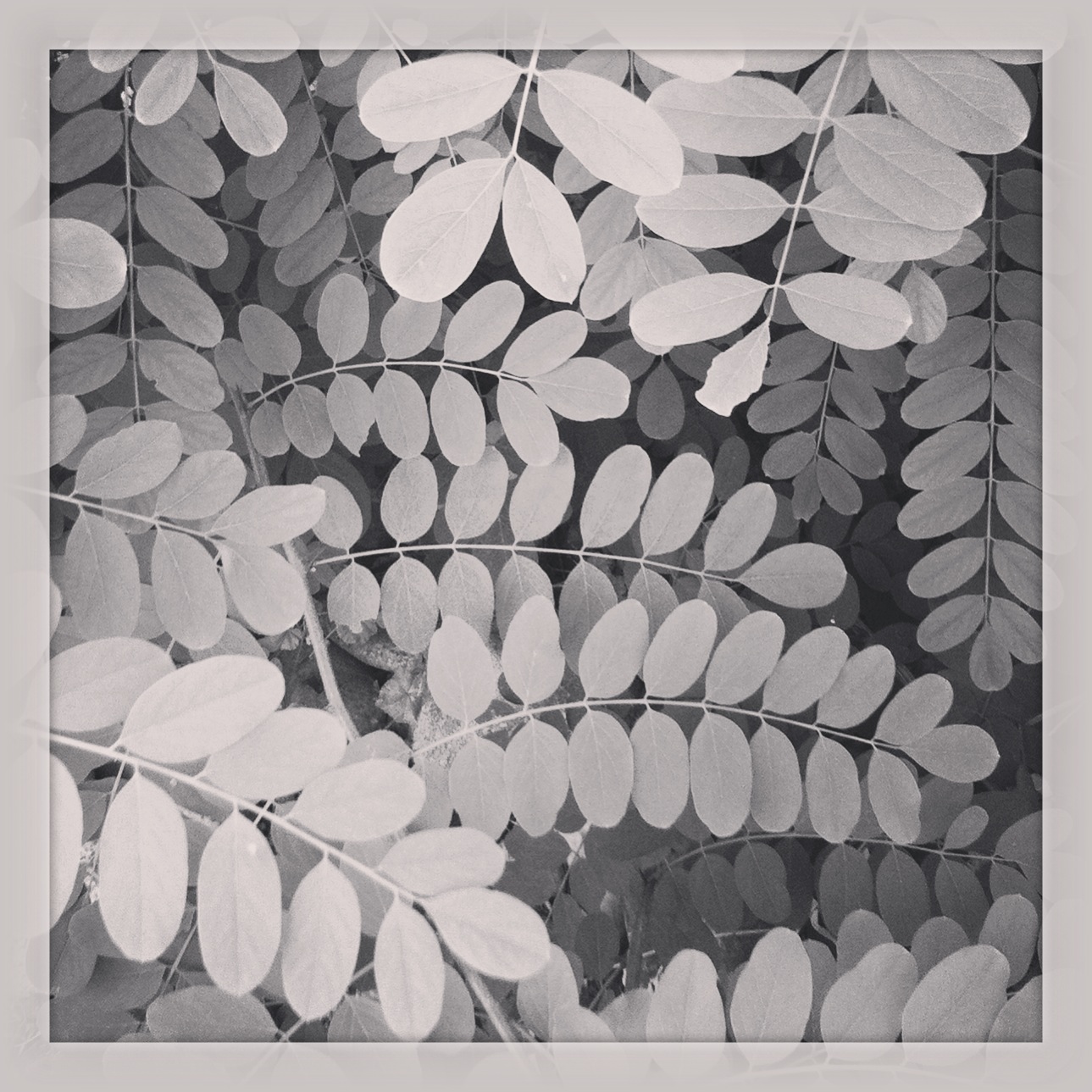
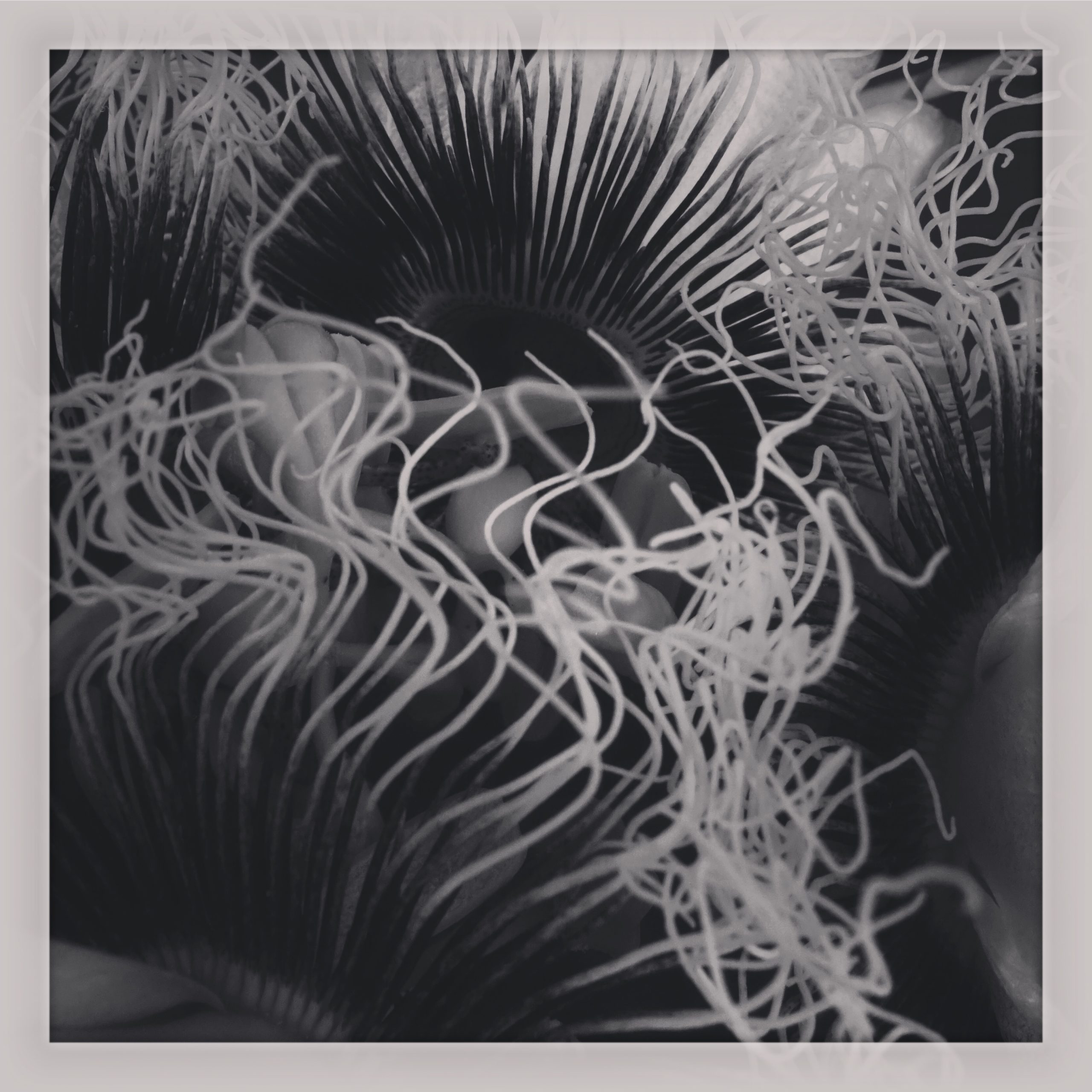
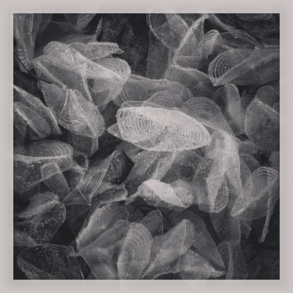
When did this idea of pattern plotting come together? While living in Denver I was taking daily walks at a local park. I had been making photos and paintings of clustered items for a long time. On these walks, passing the same spots daily I started seeing how the patterns in plants changed with different lighting. It made me start to think more about how lightning affects structure. By playing with the light in the editing process my images started to feel more akin to patterns rather than a representational photograph. The border around the images helped with a cut-off point giving ambiguity to the subject.
Why B/W?
By taking out the color from my images, it allows me to focus on the structure of the form and they can be more easily manipulated without having to also consider color. I am also influenced by 19th century German photographer Karl Blossfeldt. His microscopic plant-based images feel so architectural and perfectly toned.
How long has this series been going and what are your plans for it? The idea for #patternplotting started in 2013 as a series on Instagram, and for the last 5 or 6 years I’ve printed a calendar from selected images made during that year. I am not sure what the future holds, but the excitement that I get when I see the perfect lighting, or a cluster of objects compels me to photograph it, and in turn, the series continues. There have been requests for a book, but we shall see.
Did you start that hashtag #patternplotting?
Yes, on Instagram. The early adopters of Instagram had a big influence as there were a lot of artist and photographers that were using the platform as a place for creative expression, and I wanted to do the same. So, finding a hashtag that I could claim felt important. After a long while of being the only one who used it, I started to see people posting pictures with a similar aesthetic and the same hashtag. This gave me an interesting sensation knowing that the combination of those words was ringing true with others. To this day I have people send me pictures of things that they have seen that make them see the world through #patternplotting eyes.
How do these patterns inform other creative efforts in your life? For me patterns are about systems, process and a sense of order. I recently had a show that was called “Meanderings” and it was a combination of both oil painting and ceramics. The paintings were all based on moving water and were sketched from life. They were titled “choppy”, “stormy”, “crashing” and “flowing”, but instead of photographs like in #patternplotting I used my observations and sense order to find and plot the patterns from memory.
As for the ceramics all the forms had something circular in nature. One particular piece I made was called “move me”. It was a big table filled with sand, there were four shapes but in multiplicity. The idea was that the people could come in and rearrange the objects and make whatever type of patterns or order they wanted. Observing the different sense of order that each person brought to the piece, in a way moved me. It moved my sense of order and expanded it.
I had it printed in Los Angeles at a place called Nonstop Printing. I actually found them when I was doing my wedding invitations last year and they were really pleasant to work with. So when I was looking at making these promos, I asked a friend who works with Curran Hatleberg for his maquettes with TBW books and he ended up pointing me back to Nonstop Printing for cost efficiency & quality. With them I did an ed. of 25, which I mostly used for marketing at photo fairs and conferences, but once the pandemic hit I had about 12 leftover and so I decided to offload the rest of them. I designed the book myself and did all the typography, layout and sequencing. This is actually the first time I have ever sent any printed media out blindly, but during the pandemic I started sending a digital PDF of recent work which includes this project (which is ongoing) along with some other ongoing personal work. If you’d like to check that one out, here is the link to that.
I believe in the printed object within the photo community, but I am also a strong advocate for photobooks. Most of my personal work is project/series based so a lot of it has turned into book projects. I actually have a book coming out through Yoffy Press that was set to be released this fall, but with the pandemic, it may get pushed back slightly. (Here is a link to that one) With my small bit of experience talking with commercial clients/agents, I have found mixed emotions on printed vs. digital portfolios. But a general consensus seems to be that if a project is intended as a book or zine people do seem to react positively to it rather than a digital portfolio. That being said, I try to have multiple tailored portfolios for different forms of marketing. So when I have done meetings, if it is with a photo editor, I try to lead with giving them a printed object they can keep and I let them know that they don’t have to look at that with me because it is for them to take away. Then I segue into a digital portfolio on an ipad which I also let them flip through at their own pace. When I was doing meetings with publishers to try to find a home for my upcoming book I also brought with me the hand-bound maquette of that project as well, but I have only a few copies of that one. That being said, people also responded positively to that and every now and then I will bring that with me to set if I am working with a client that I have a relationship with to let them check it out because it is a rather unusual project where the tactility and physicality are part of the concept.
I suppose for my work, if there is a reason the project should be printed then I try to do it, but I always want to make it something special. I have another project I am currently developing with my partner and fellow photographer, Alan Nakkash, that is also going to be a physical magazine/promotion tool. Part of our thinking was this is a special opportunity to make something different that gives us a reason to reach out to photo editors and potential clients. Additionally, our intention is for this to be a long term project where with each issue we create a visual dialog & narrative between two new featured artists. At this stage, a large part of this project highlights photographers similarities and differences in their artistic processes. This results in something truly collaborative because one artist takes the other artist’s work and they build the layout based on their interpretation of said work. So when this is printed it will continually evolve with each issue, thus giving a reason for us to frequently send these promos, and also hopefully help under-represented artists get their names out into the world. Sorry for such a long-winded explanation of my enthusiasm for printed matter haha!
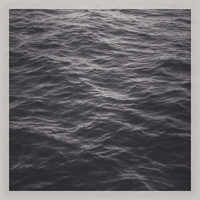
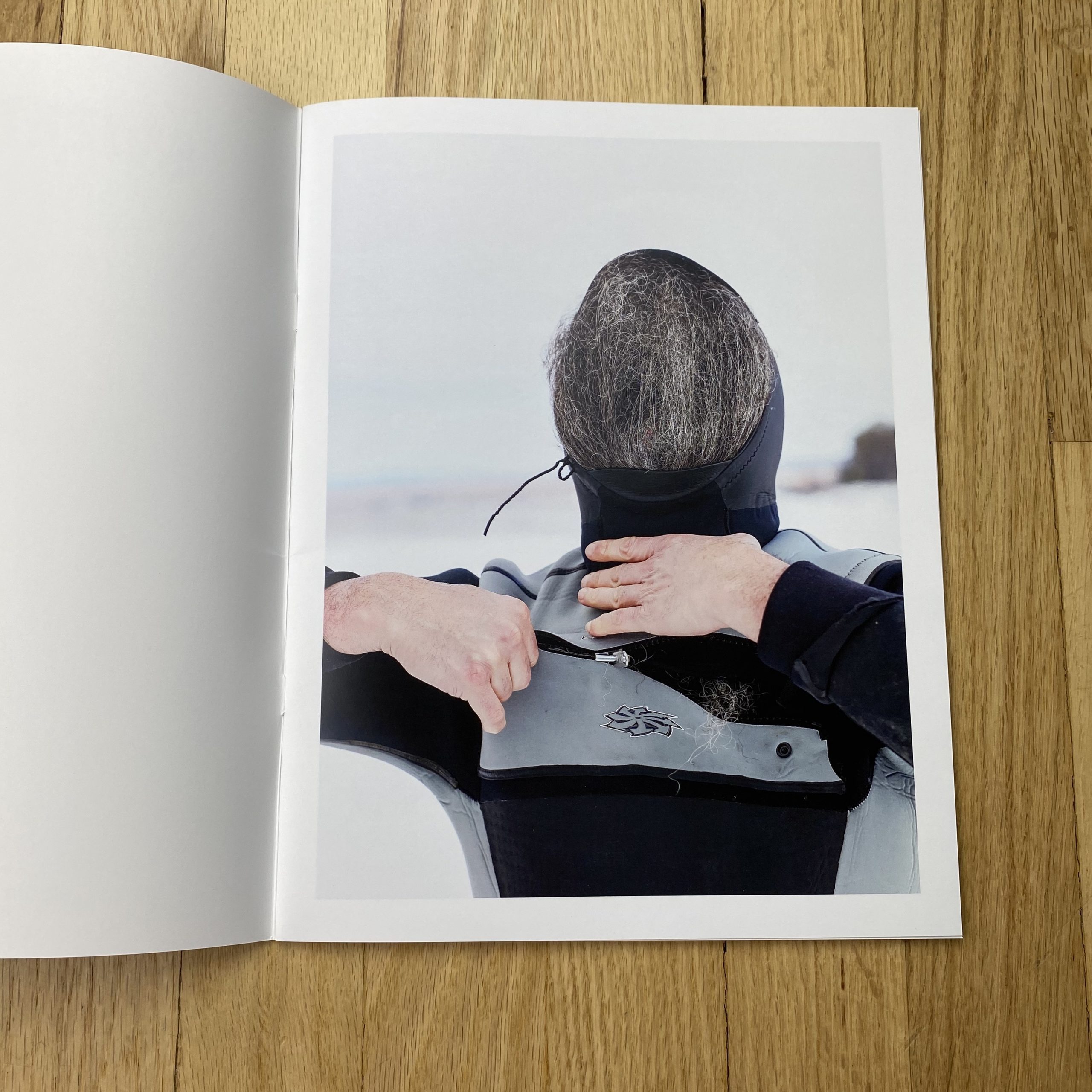
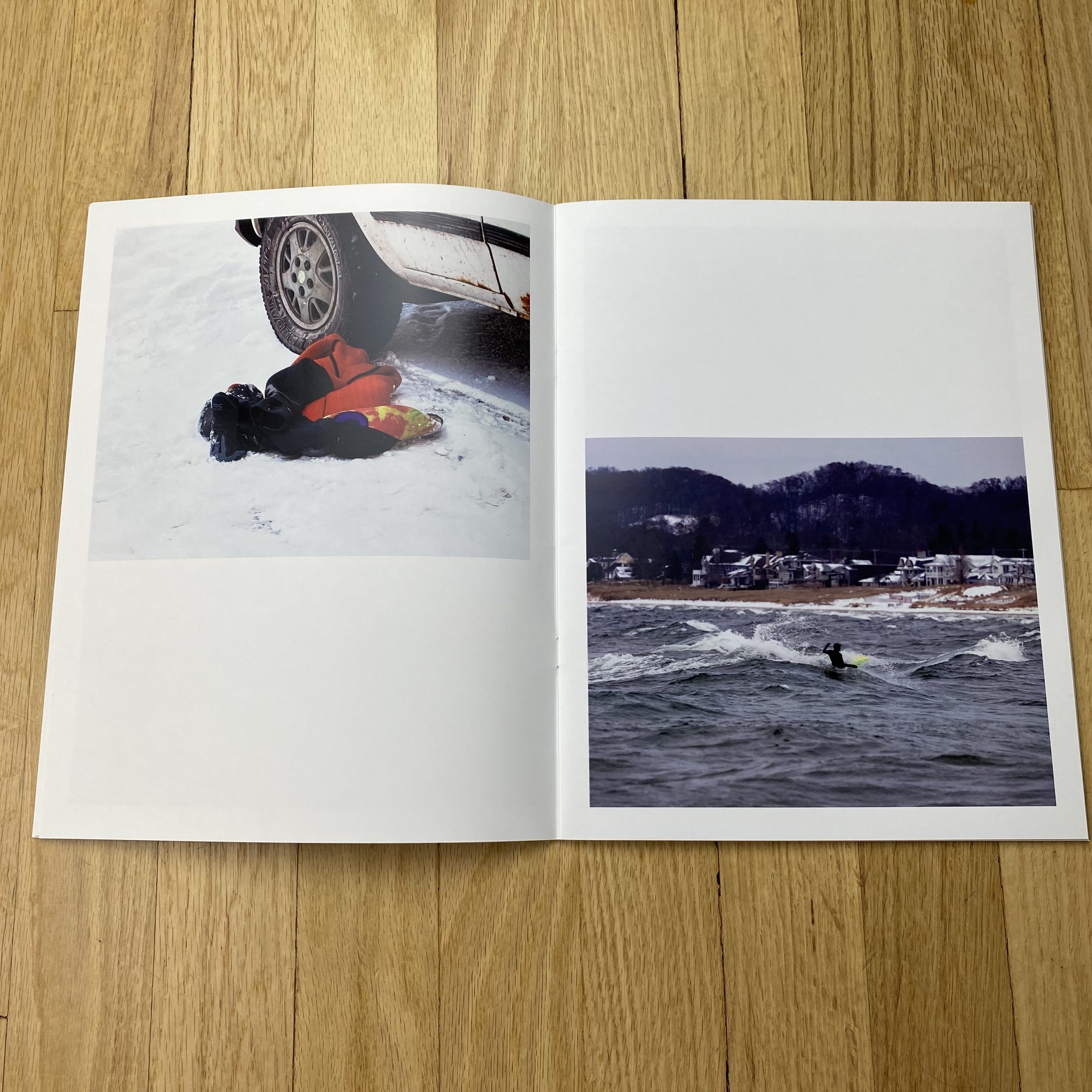
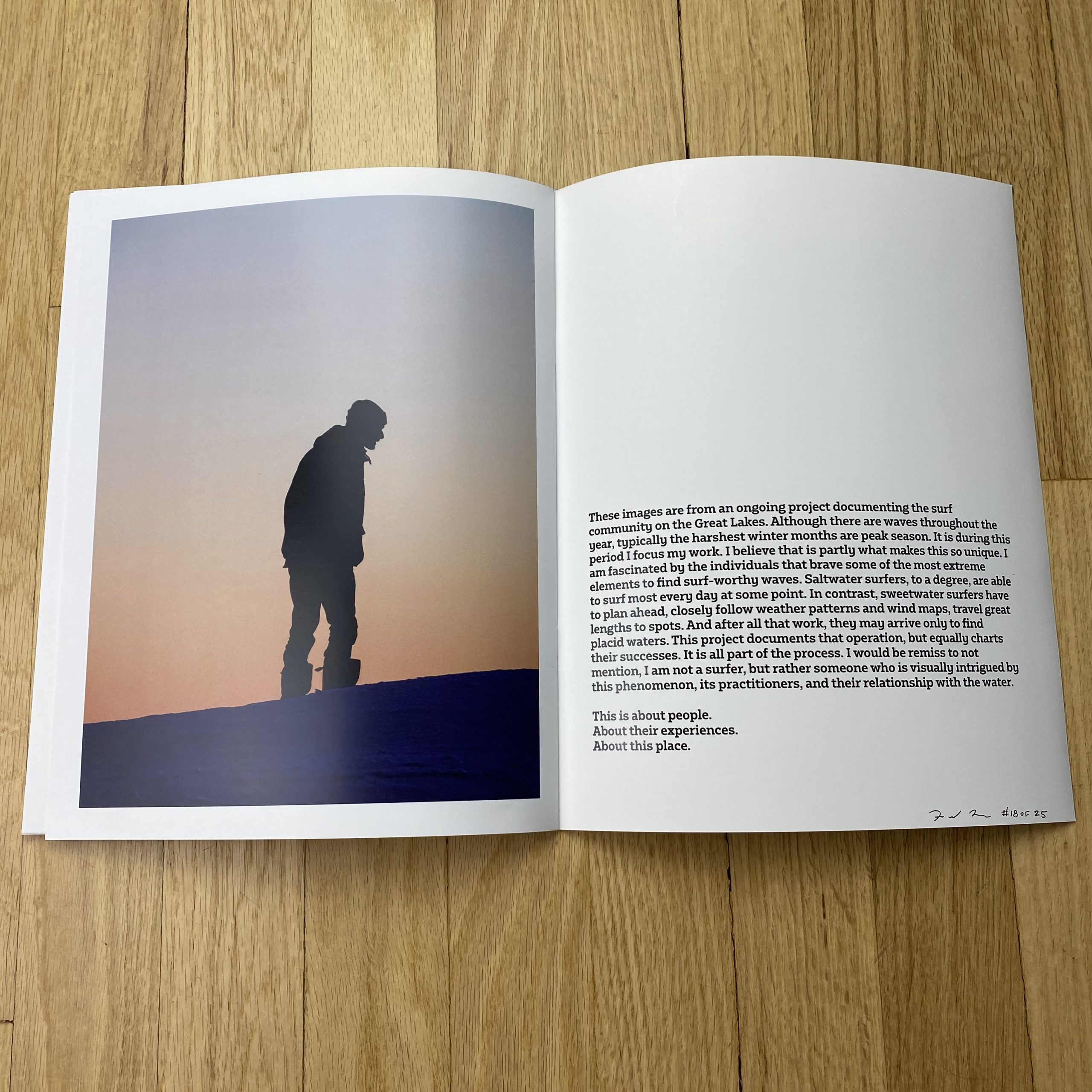
Finally, the stories behind the images in Sweetwater. Inevitably, each image tells a story of its own, so I will try to give general context and then highlight my favorites so I hopefully don’t bore you!
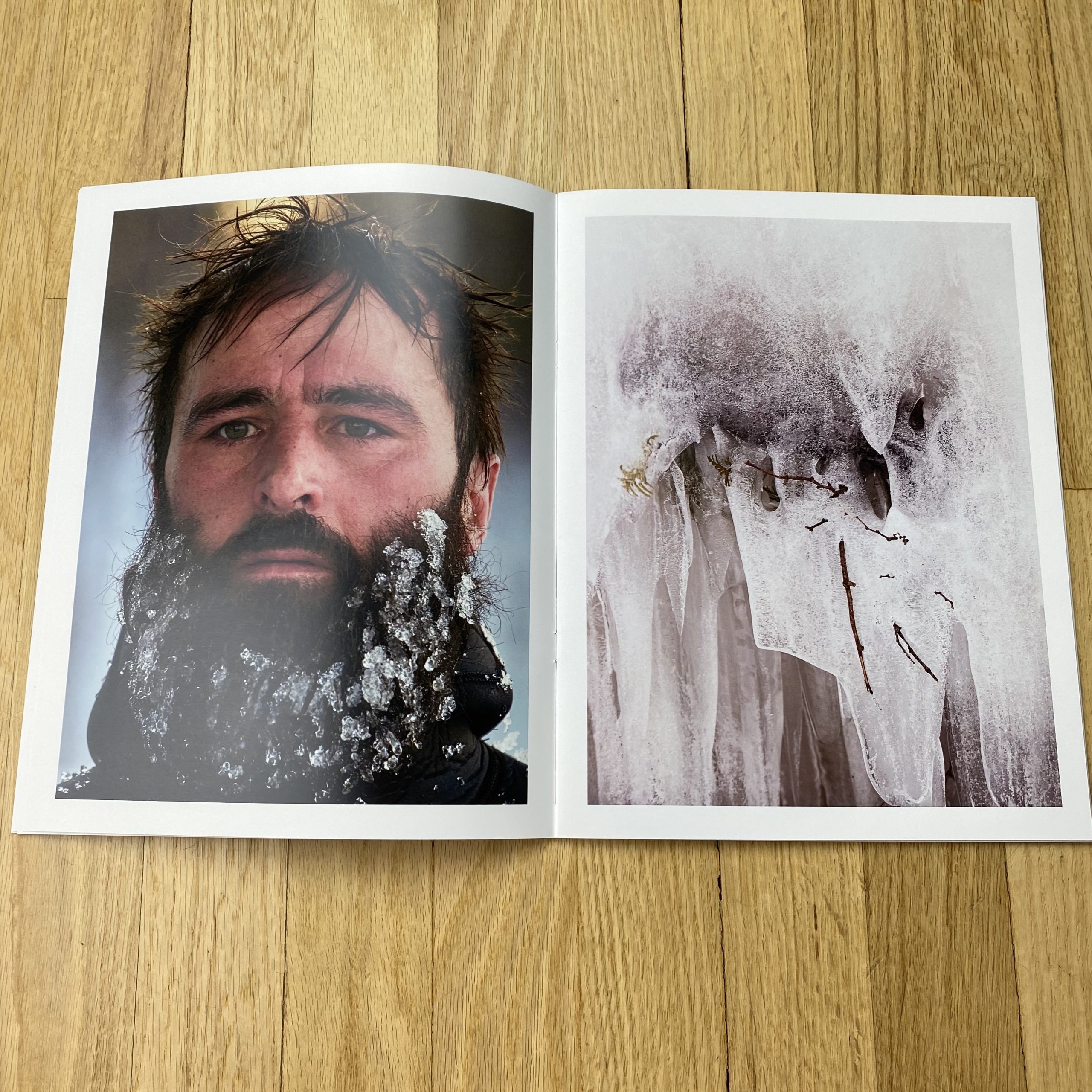
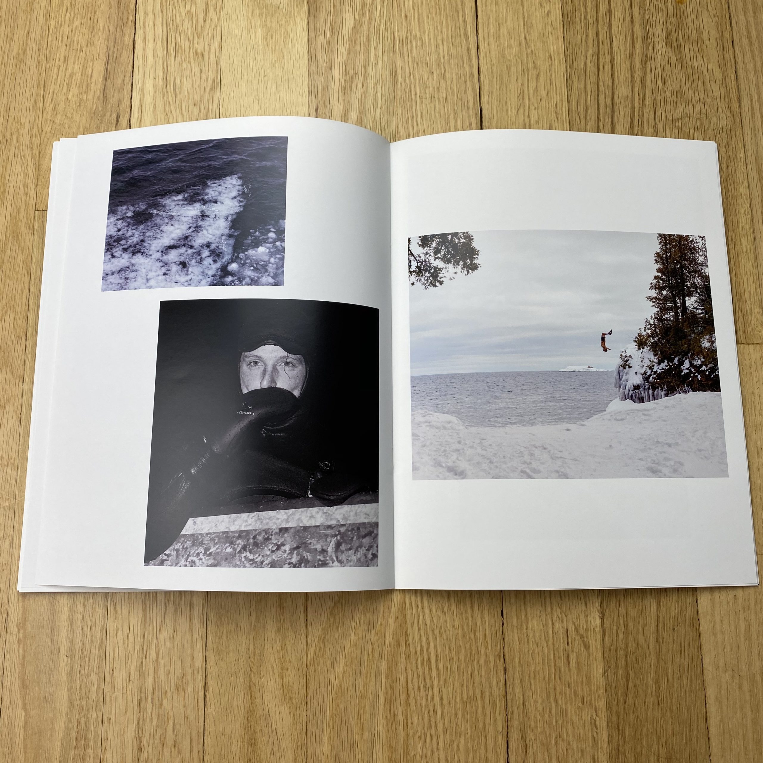
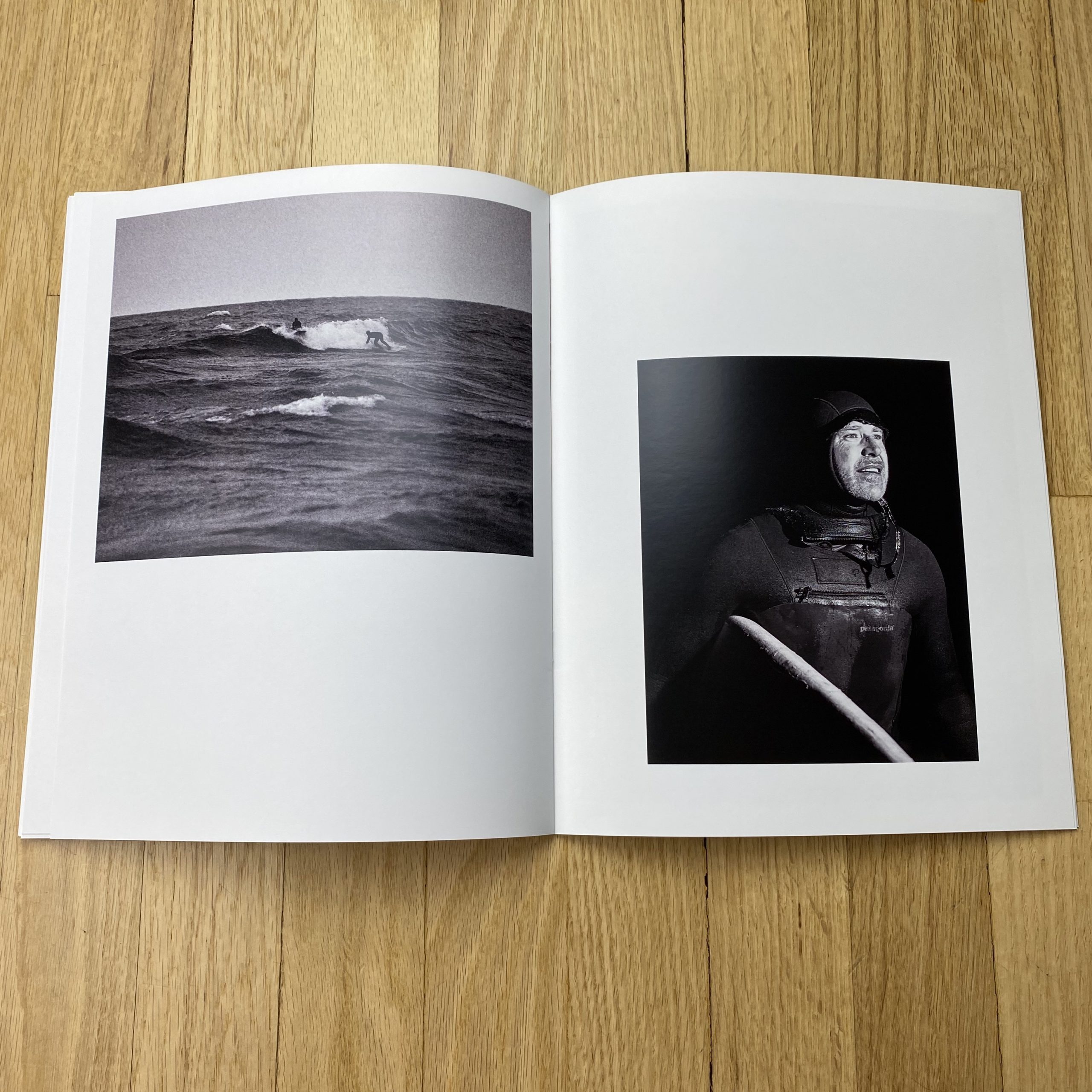
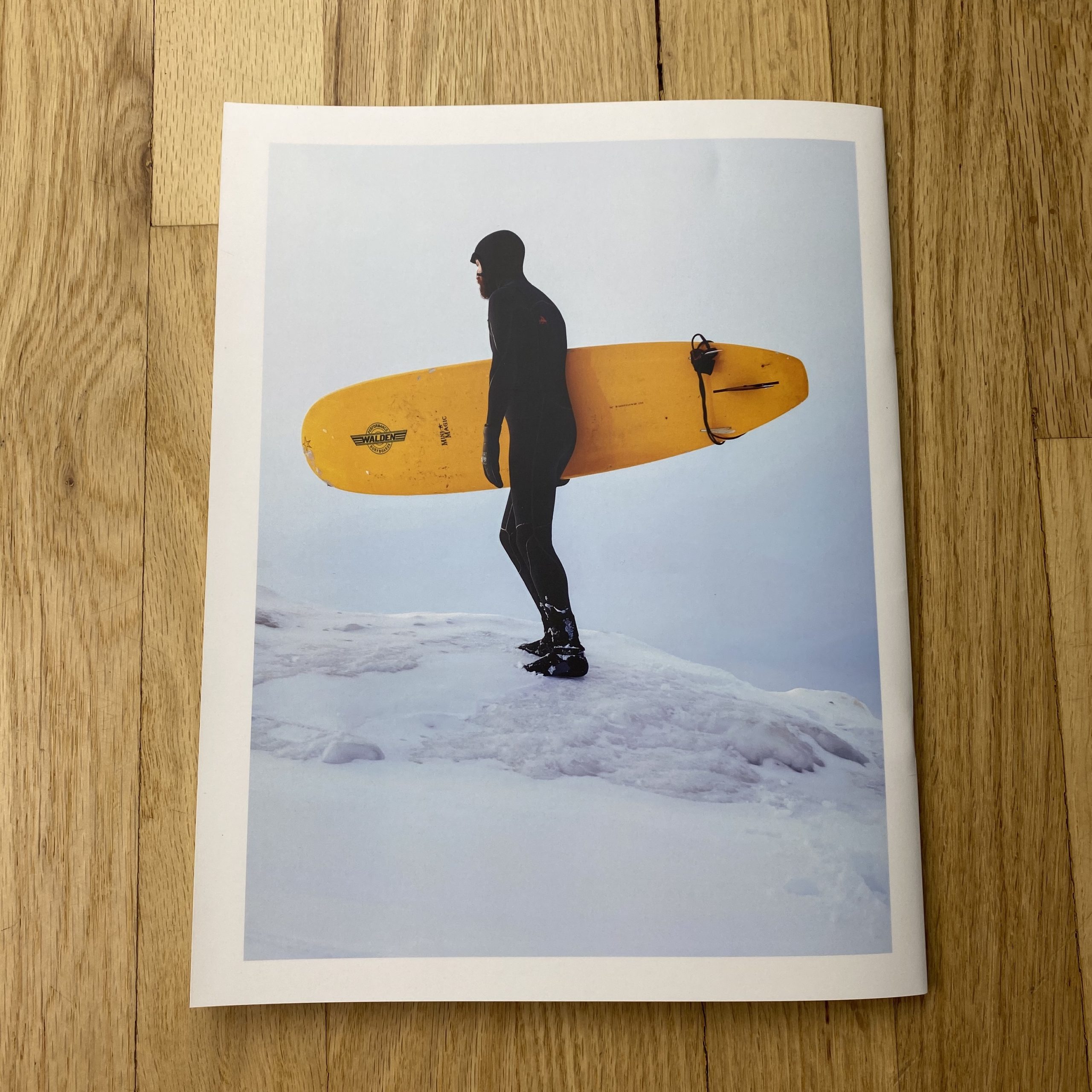
I grew up skating and that largely shaped my life as a young adult. California was a dream to me because it always appeared that this was where all the best skating happened. But as I grew up and eventually moved out west (first to Las Vegas where I did my MFA and taught college for about 3 years) I was terrified to visit this place I had dreamed of. When I finally did come out here it was just as incredible as I had imagined it would be. But I didn’t move here as quickly as I would have hoped. At the time when I had the opportunity to make the move, my (now) ex-girlfriend’s mother had been diagnosed with cancer, so we instead moved back to Alabama to be close to her family. The relationship didn’t last, and I ended up leaving the academic world when I was offered an in-house photographer job at a fashion brand. After three years of working in fashion as what turned out to be an art director, I met my now wife who lived in CA and I drove west. That first few months was tumultuous to say the least. I sold my camera equipment to have enough money to buy food. I lived in my car for the first 5 months or so, then I found a room share on Craigslist where I slept on a massage table. And finally I got my own apartment. Because I had spent the past three years learning the ins and outs of the fashion world, I found a place working as an unpaid intern at Milk Studios. I think it was the week that I was finally hired that I found out my father passed away. For fear of losing my financial security, I was unable to go to the funeral. Then my mother ended up undergoing brain surgery to remove a tumor (which turned out to be benign) but I was also unable to visit her because I would have lost my job. My coworkers became my surrogate family. We worked overnight from 3pm-8/9am, doing backbreaking work (literally, one of my coworkers broke his back on the job). Another person nearly lost a toe, and I fractured or broke my heel when it was run over.
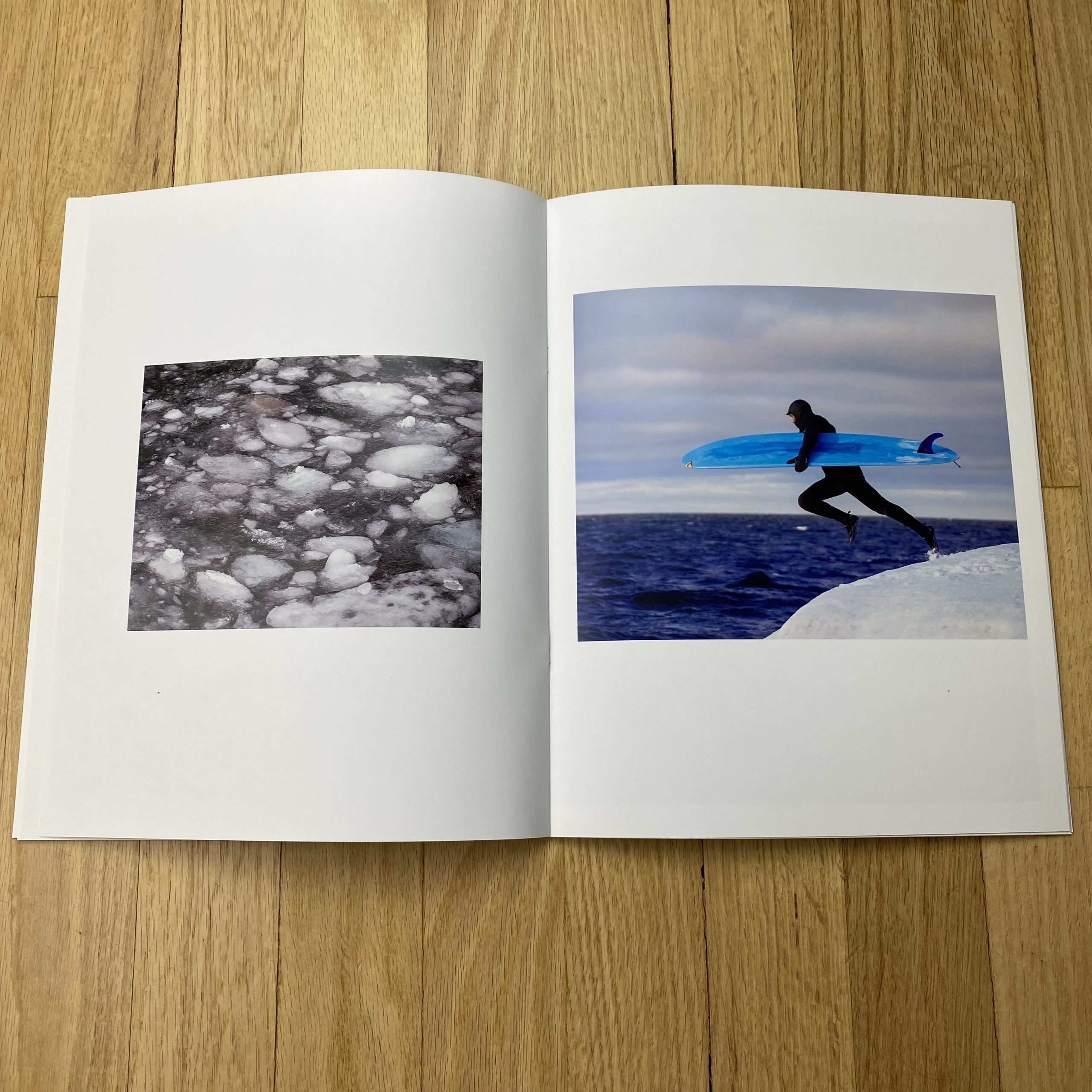
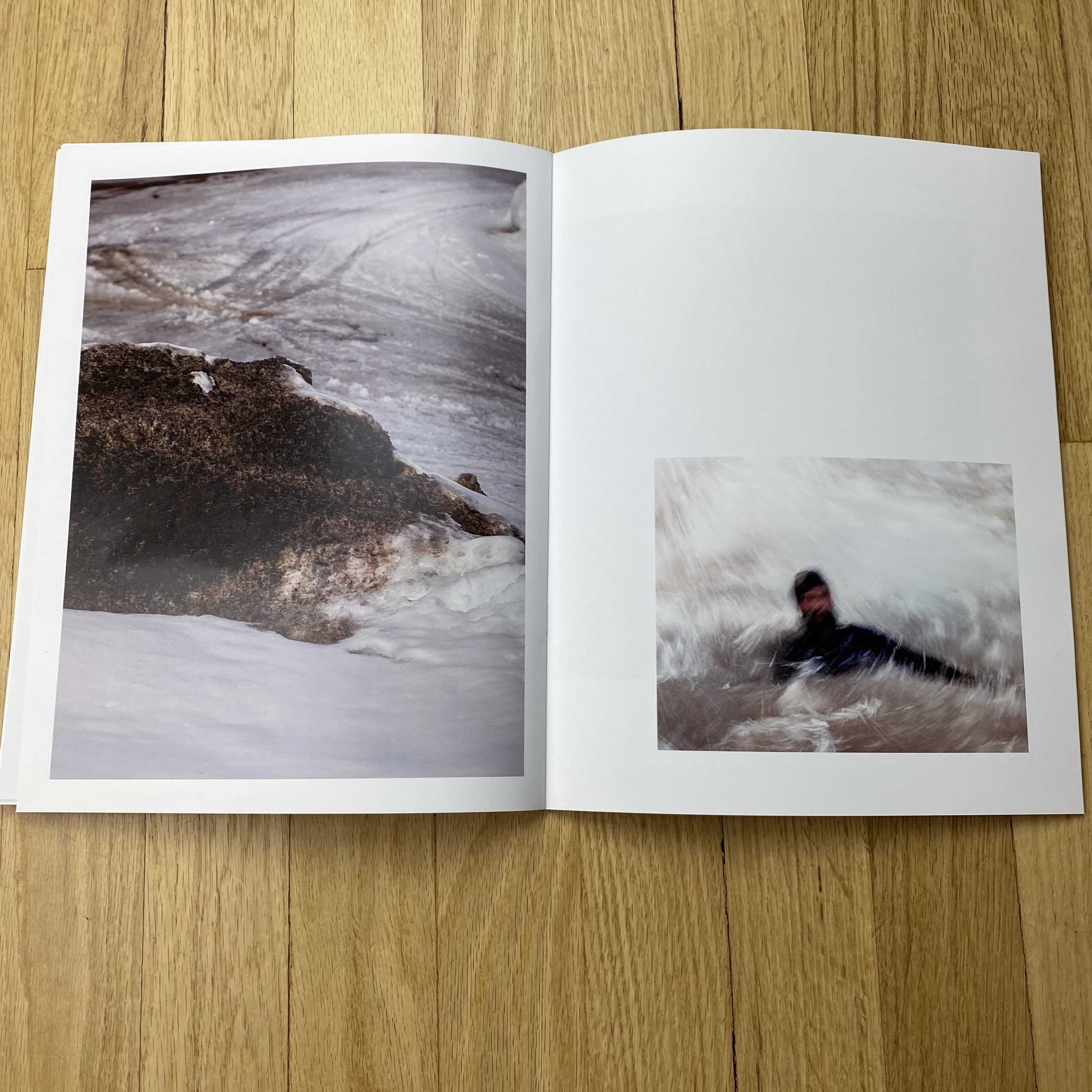
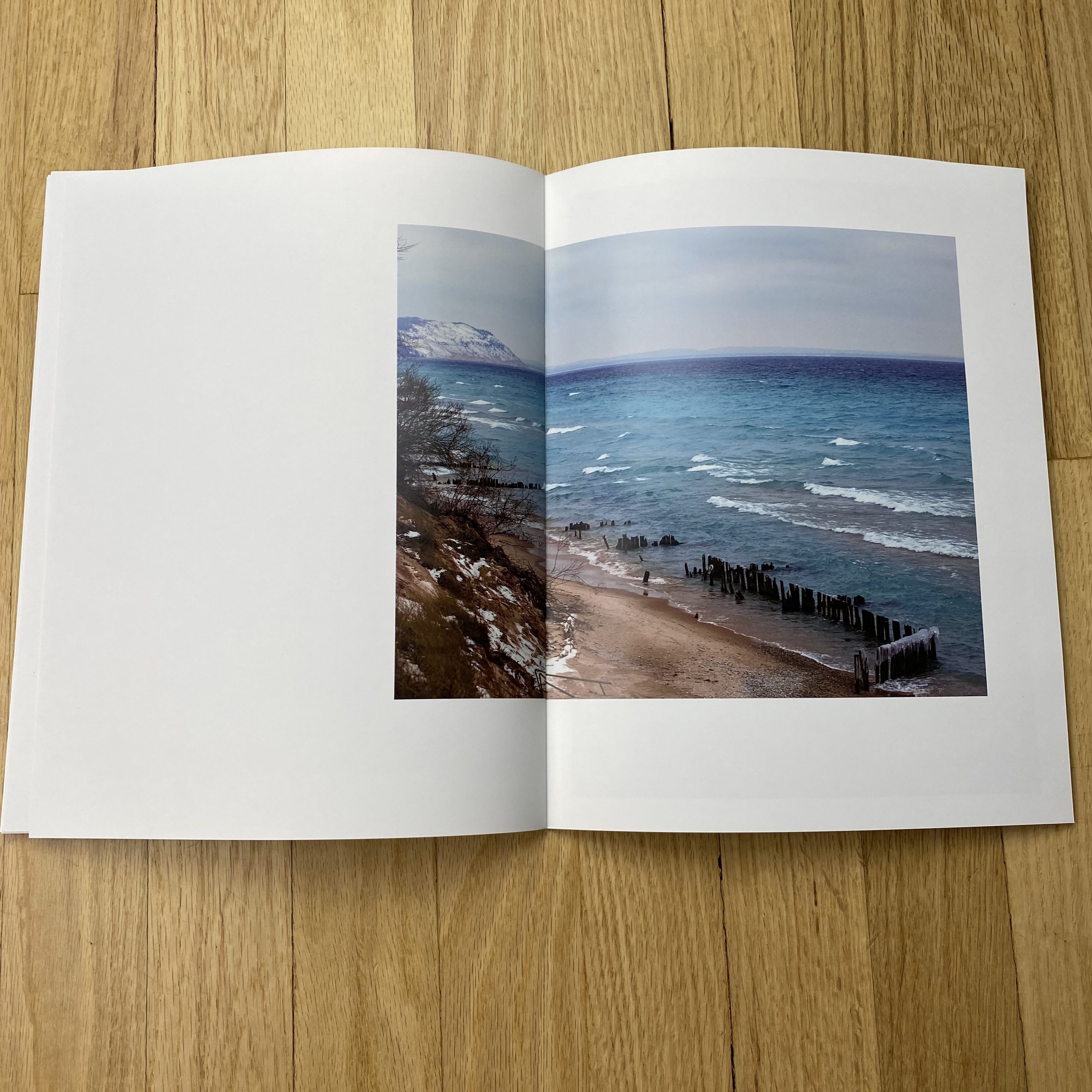
It was at this job that I began meeting many people transplanted from the midwest great lakes area. I didn’t know much about surfing but it always felt similar to the skating world. As I got to know these new friends they boasted of the surfing on the great lakes. Specifically how incredible but brutal the peak surfing season could be. I spent about 9 months researching this before my first trip to Lake Superior. I suppose my mentioning all the difficulties leading up to this because it informed where I was mentally & emotionally when I started this work. Essentially, I was broken and unsure about life, let alone making photographs. I had been fired from my position as night-time equipment manager at the studio and still without a camera, I told myself that if I got a flight and rented gear, I had to do it. I was photo assisting full time so I worked extra to save enough money for this trip and suddenly I was thrust into the frigid mid-western winter. I treated it as I had treated skating trips as a kid. I contacted friends of friends who introduced me to other people and I began making my way around the upper peninsula of Michigan. Across the Wisconsin Coastline on Lake Michigan. Over the Mackinac Bridge (terrifying to drive over in a white out). All over the Mitten that is Michigan. Whenever I encountered new people, they would always ask where I was staying and offer me a couch to sleep on or a spare bedroom. Literally the opposite of my experience in California when I was homeless. And then there is the surfing. I wanted to craft a narrative that was true to the experience and community. An experience consisting of days we would go out and find nothing but ice. Other times there were long fantastic sessions ending with long frozen ice beards and hair. All of these days, filled with incredible people in a foreign frozen tundra.
The day that stands out most to me can be seen in the image of the girl with the bloody lip. Her name is Jaime, and we had corresponded through text messages for about a week or so before meeting. On the day we were finally set to meet she told me that she was uncomfortable meeting with me alone because for all she knew I could be a crazy person. So I told her that I totally understood and if she wanted to bring someone along with her to feel more safe that would be more than fine. So Jaime agreed to meet and arrived with her springer spaniel Murph. We talked and snapped a few photos while Murph ran around the frozen beach. Eventually, while we were talking we realized Murph had made his way onto the icy break. He couldn’t figure out how to get back and he was more than comfortable swimming in the cold water. But instead of jumping into the side with open water, he leaped into the side of the break that was mostly chunks of ice. As Murph began to panic and try to get onto the ice we ran toward him. Jaime was in her wetsuit, but hadn’t put on her gloves yet. She entered the water and began to try to help her dog from drowning. I was close behind her but I had fallen making my way across the icy break. As I made it to the ladder Murph was pushing Jaime underwater and her hands were beginning to freeze. I threw the camera aside and climbed down the ladder as Jaime pushed Murph toward me. I grabbed him and helped him back onto the land but Jaime’s hands weren’t working anymore. We linked our arms at the elbows and I pulled her up and as I did blood streamed down her face. As Murph trotted back to the beach I first asked her if she was okay and she said she was alright, just glad Murph was safe. Then I told her that her lip was bleeding, and she asked “how bad?” I told her it was okay probably. Immediately she responded, “well, do you wanna take a picture of it?”
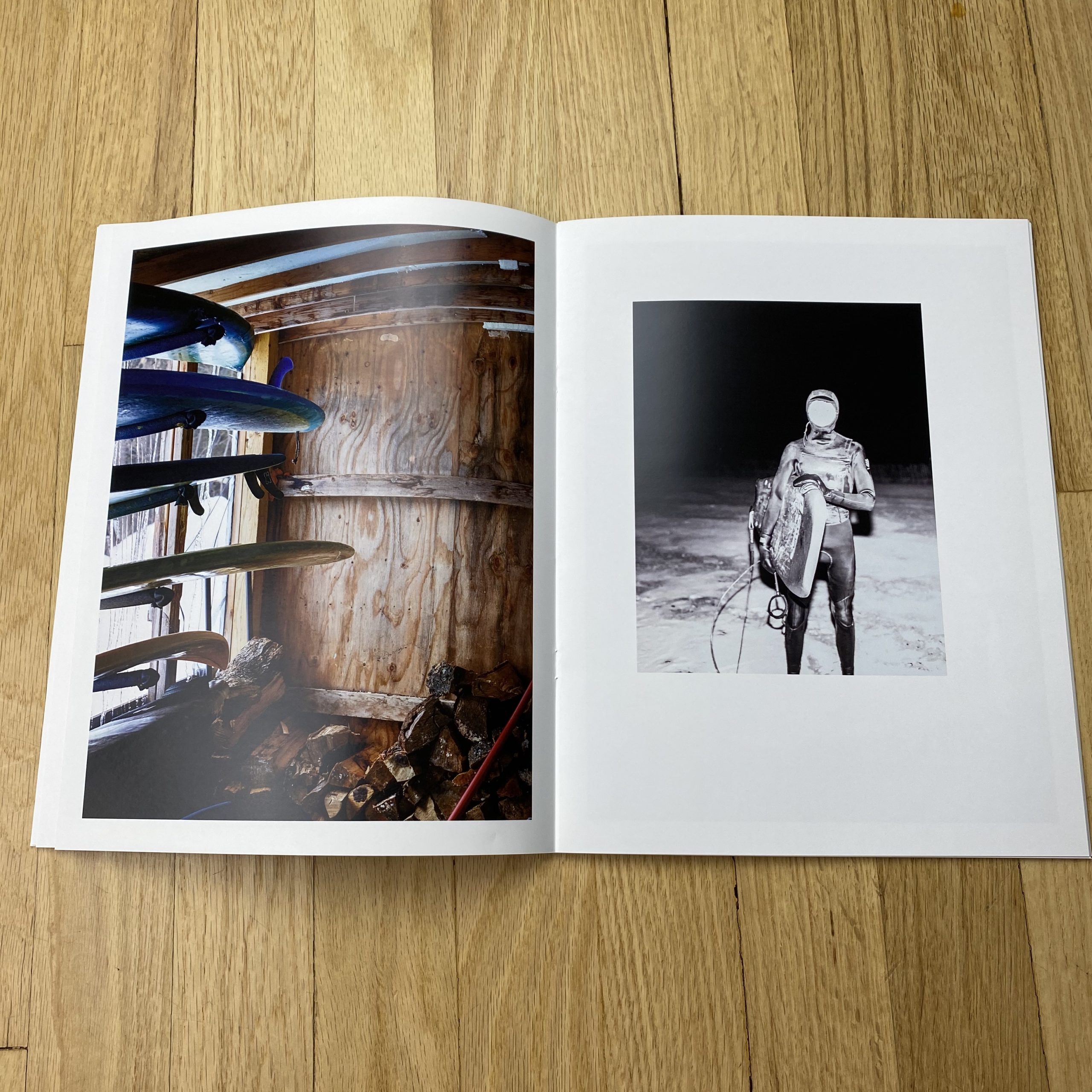
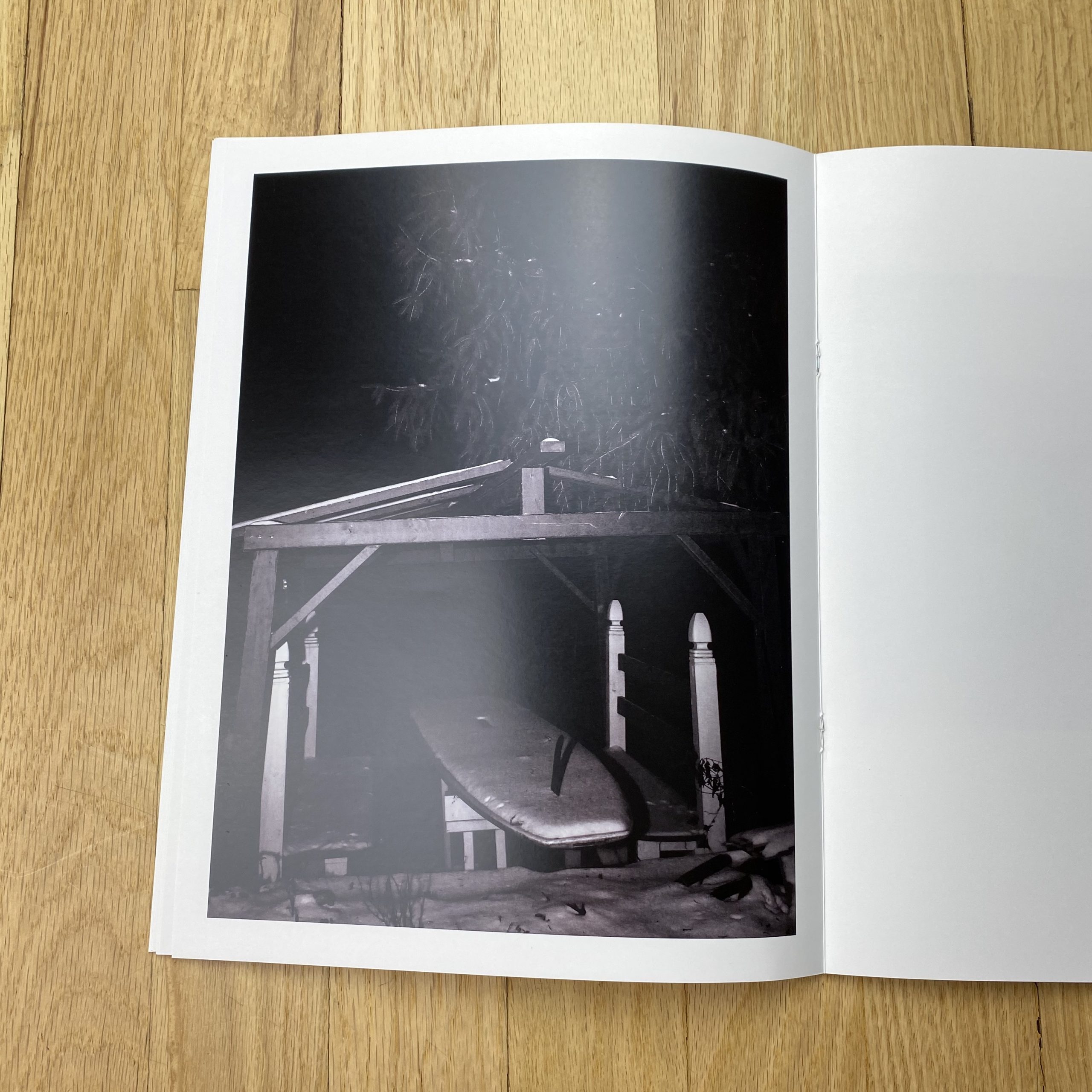
Honestly, most of these photographs are stories like this. Rental cars having blowouts in the middle of the night. There was a time some friends accidentally blew up a propane heater inside of a van (photograph of the orange wetsuit next to the van tires). Falling asleep inside camper vans in sub-zero temperatures (boards storage photograph with the plywood room). Late-night talks of philosophy in relationship to surfing while drinking freshly harvested chaga tea. Moments that felt like I was talking to Gary Busey’s character in point break when he jumps on the desk (someone literally did this haha). I could go on but I don’t want to bore, and if I have, then I apologize. It’s all really fun to discuss and relive for me.
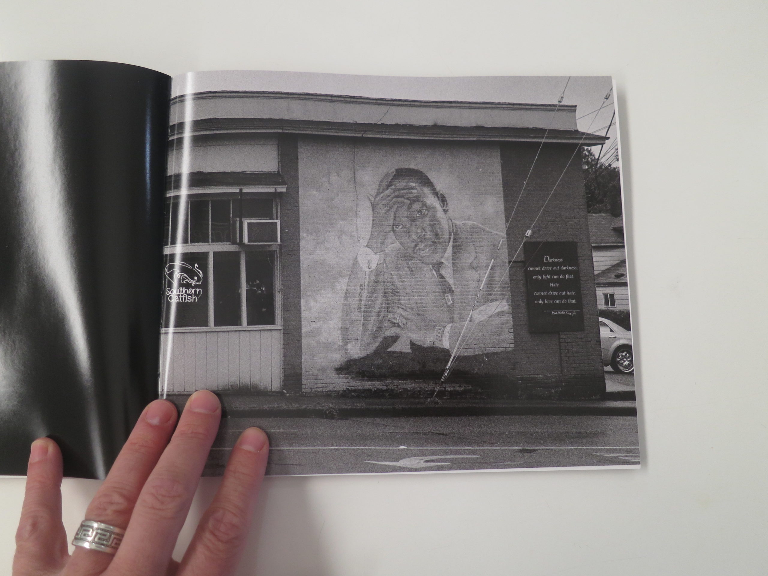
—“Now is the time to make real the promises of democracy. Now is the time to rise from the dark and desolate valley of segregation to the sunlit path of racial justice. Now is the time to lift our nation from the quicksands of racial injustice to the solid rock of brotherhood. Now is the time to make justice a reality for all of God’s children…
The marvelous new militancy which has engulfed the Negro community must not lead us to a distrust of all white people, for many of our white brothers, as evidenced by their presence here today, have come to realize that their destiny is tied up with our destiny. And they have come to realize that their freedom is inextricably bound to our freedom.
We cannot walk alone…
And when this happens, and when we allow freedom ring, when we let it ring from every village and every hamlet, from every state and every city, we will be able to speed up that day when all of God’s children, black men and white men, Jews and Gentiles, Protestants and Catholics, will be able to join hands and sing in the words of the old Negro spiritual:
Free at last! Free at last!
Thank God Almighty, we are free at last!”
Dr. Martin Luther King, Jr., American hero, August 28th, 1963
—“At first I was self-conscious about photographing in these communities. What would the residents think of this white woman with a big camera photographing on their street, telling their story? But the people I met along the way calmed my fears. Although there were some exceptions, once they knew what I was doing, they were excited. The people I met were usually eager to point out things I should photograph and wanted to know when they’d be able to see the pictures.
Even though the residents I met seemed to accept me, I became acutely aware of the things I was choosing to photograph. What do my choices say about me? Am I recording a realistic picture of the communities? At several exhibitions of these photographs, people have been surprised to discover that I’m not African-American. That people don’t feel that these photos were made by an outsider is comforting to me.”
Susan Berger, photographic artist, 2019
Fifty-seven years ago this month, in the dog days of August, one of the most famous Americans of all time delivered one of the most famous speeches ever given.
You know it, and I know it as the “I Have A Dream” speech, but I’m not sure I’ve ever read it in its entirety before today.
(Maybe I have and forgot?)
I was a little surprised to realize that it was given only one hundred years after Abraham Lincoln freed America’s slaves, (in legal terms,) via the Emancipation Proclamation.
That’s only the lifetime of a very old person.
Not much at all, when you think about it.
And as a forty-six year old American, I’ve spent many hours wondering what the 60’s were really like?
The division of my fellow citizens into hippies and squares. Pro-segregation assholes versus others who craved a country where people could at least attempt to live together, or eat together, or sit in the same section of a public bus.
Square-jawed 1960’s square, Don Draper
I wondered, at the time, did people feel like the world was unraveling? Did they know that the Civil Rights movement would make changes to our broken society, without healing all the wounds caused by slavery and systemic racism?
Did they fear that things might break completely, leaving us two nations instead of one?
Did anyone have confidence that the turmoil would lead to “better” days, or were all Americans sitting on the edge of their seats, unsure if things would ever get “better” again?
Now I no longer wonder.
We’ve passed the threshold of fifty years since the sixties, and one hundred and fifty-five years since the Emancipation Proclamation, and now all Americans know what it feels like to fear whether our country can withstand the fissures that threaten to implode our historical experiment.
China and India, the two burgeoning global super-powers, are both thousands of years old.
Like, five thousand years.
By comparison, the United States of America is an extremely young society, and one that was built upon lofty ideals, but rotten realities.
You may be tired of being reminded that the institution of slavery and the theft of Native American land allowed this nation to thrive, but it is an inescapable history.
And I’ve felt the need to write several columns asking you, and all of us, to open our minds to the fact that people of all races and genders “should” be able to appreciate each other, respect each other, and value contributions from those people who don’t look and sound like us.
Yet most of my friends are white.
I try, and have tried, to bridge the cultural and racial divide with friendships, and sometimes it’s worked, and sometimes it hasn’t.
Some may find me naive for thinking that our commonalities should be as important, or occasionally more important, than our differences.
You come for the photography reviews, and won’t stay if you feel like I’m preaching too much each week.
Perhaps you like it when I’m funny, or say fuck and shit all the time, or maybe you like that I weave politics, cultural criticism and a deep-rooted optimism together with a love of art?
(No matter. It’s time to get on with things.)
This column was inspired by a photo book by a white Jewish lady curious about African-American culture, and I even published some of the photos already, after reviewing them at Photo Nola in 2014.
(Back in the Obama era, when despite the promise of an end of racism, we were met with no such thing.)
This week, Obama’s second-in-command, a white man from Pennsylvania, synonymous with the tiny state of Delaware, offered his second-in-command position to a woman whose parents came from Jamaica and India.
A child of immigrants, reared in that great American melting pot of California, which is supposed to represent the best we have to offer. (In my opinion, anyway, and I’m not alone, which is why nearly 40 million people live there.)
Of course I’m rooting for Joe and Kamala, not just because I respect their politics, but because I genuinely believe that if Trump wins again, America might cease to be a democratic republic by 2024.
Like a person can only take so many whip lashes before dying, America can only handle so many sustained attacks on our democratic institutions before becoming an autocracy.
And while we can hope and dream of better days, no one knows what will happen in November of #2020, one hundred and fifty five years after the end of our Civil War.
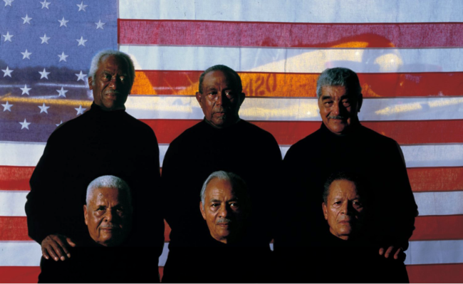
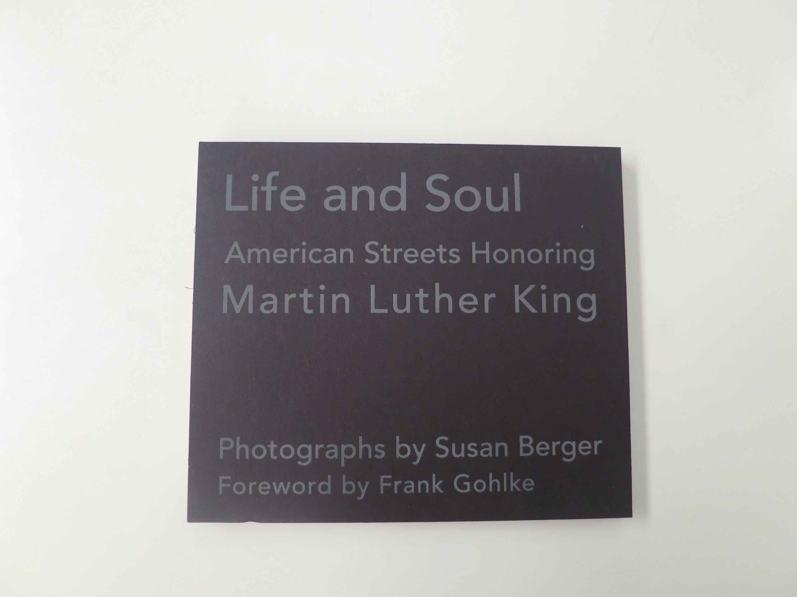
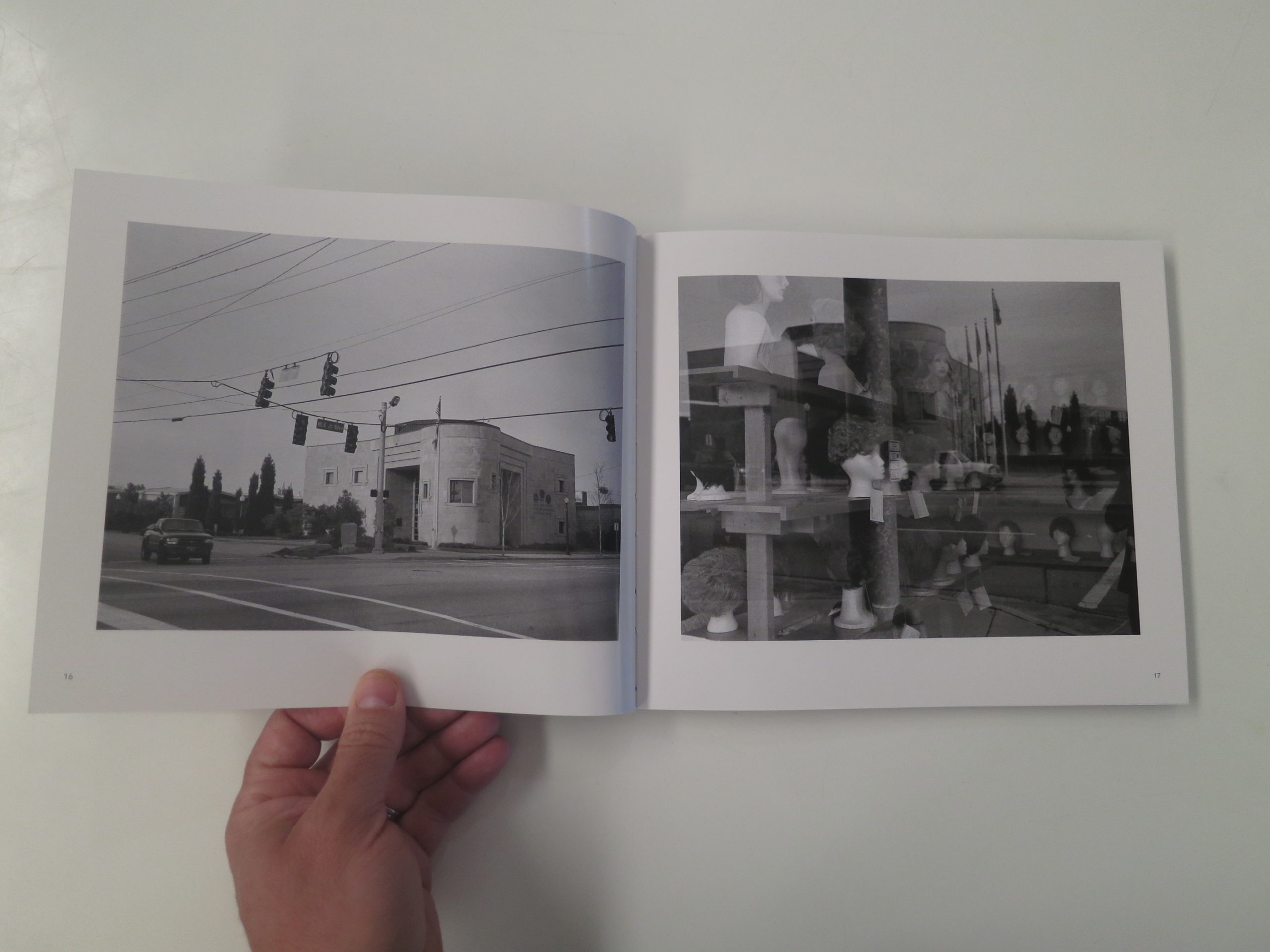
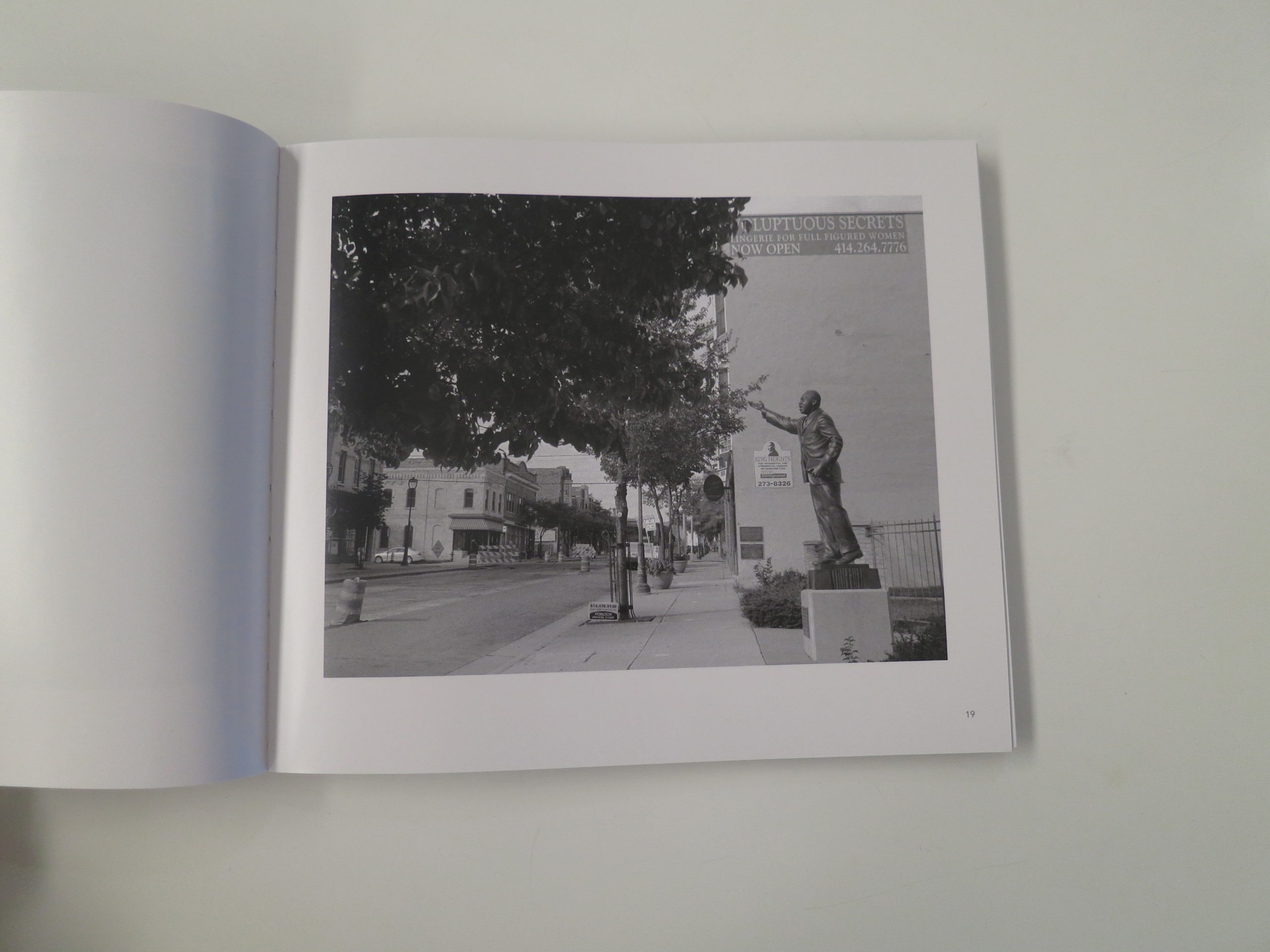
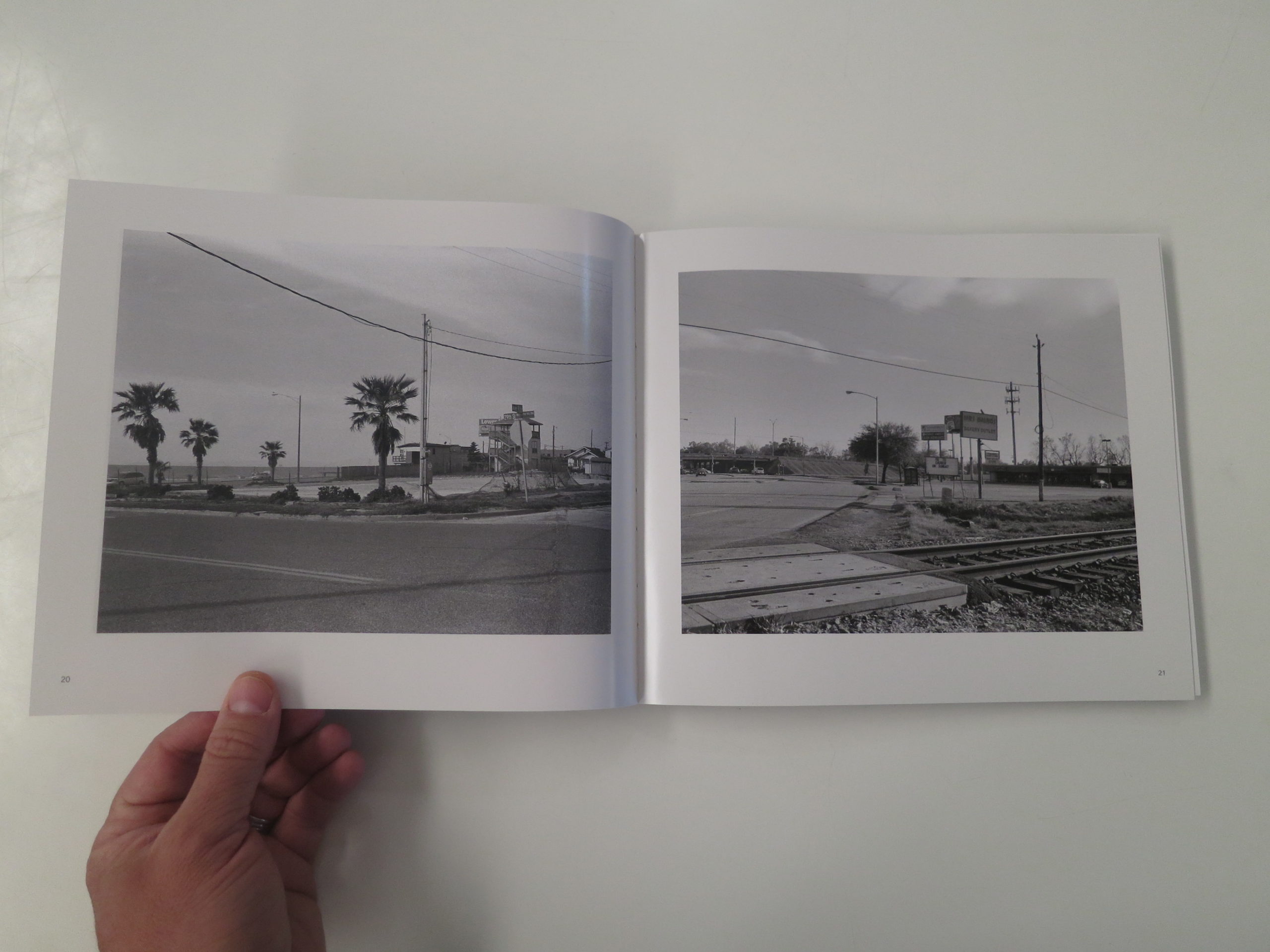
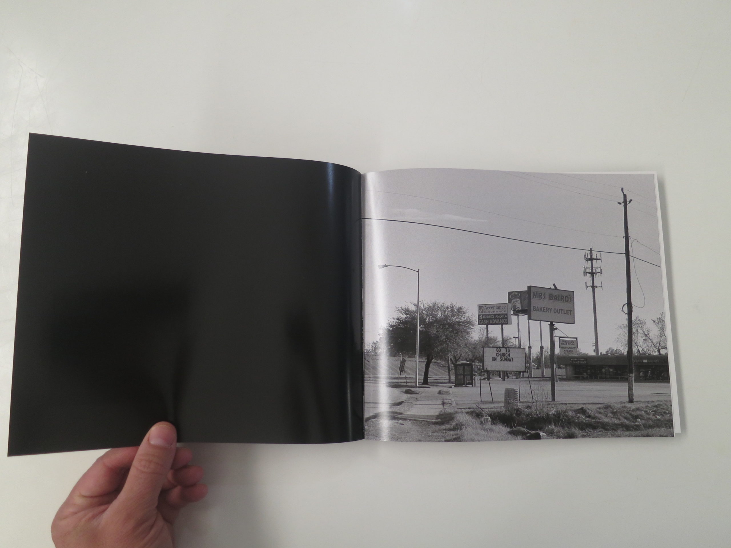
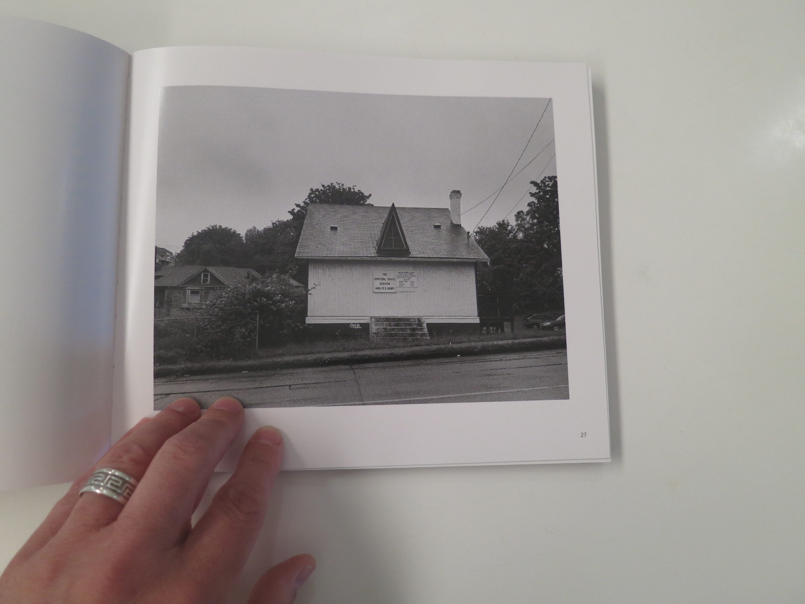
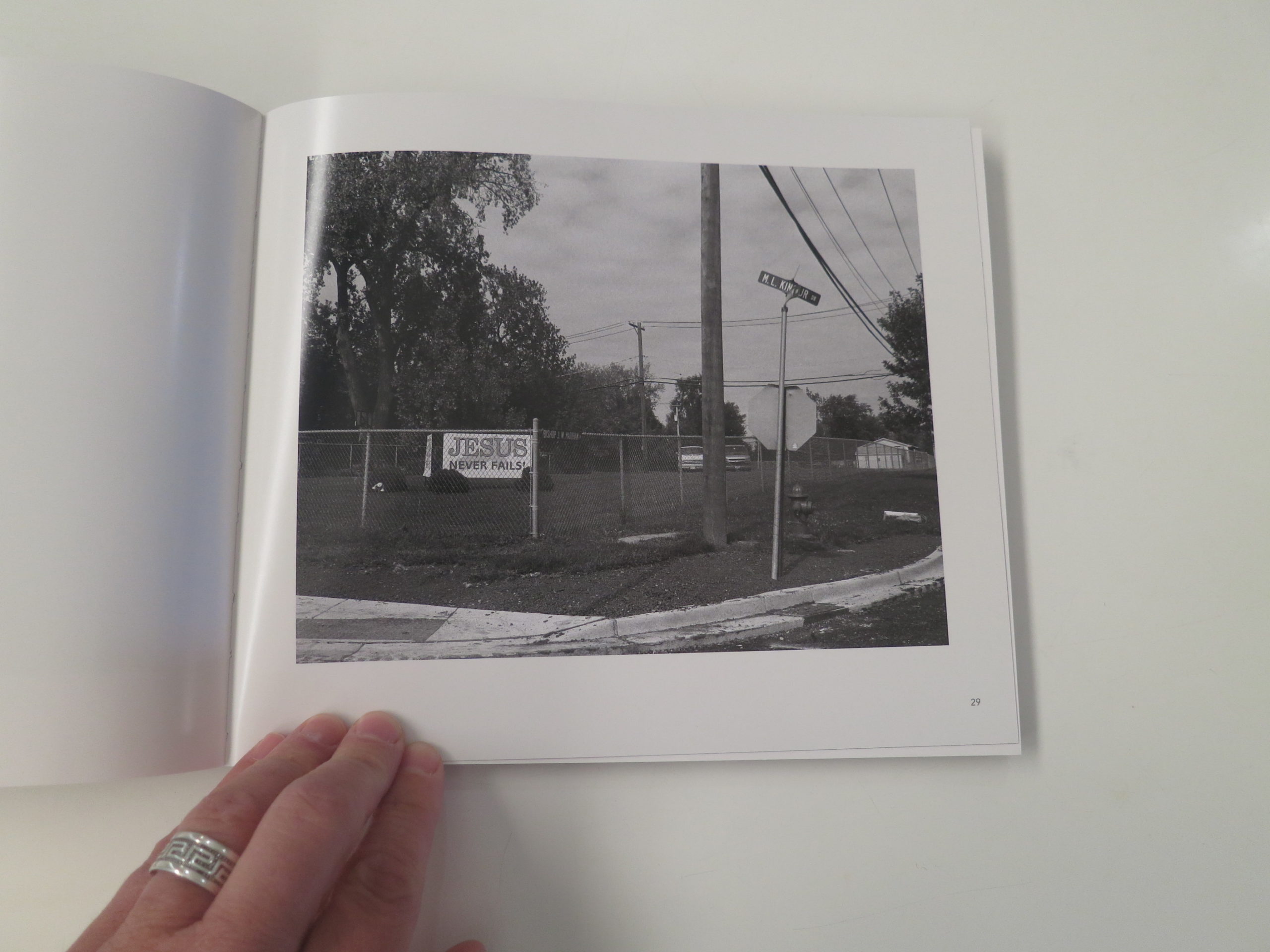
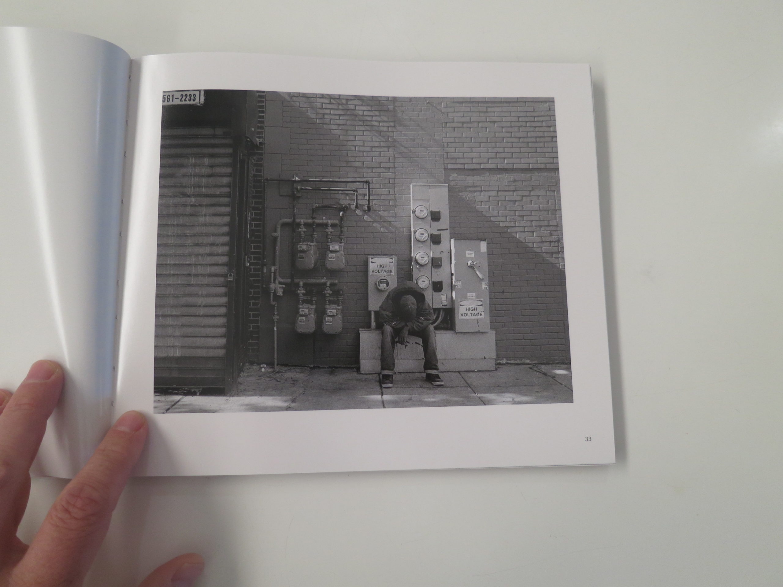
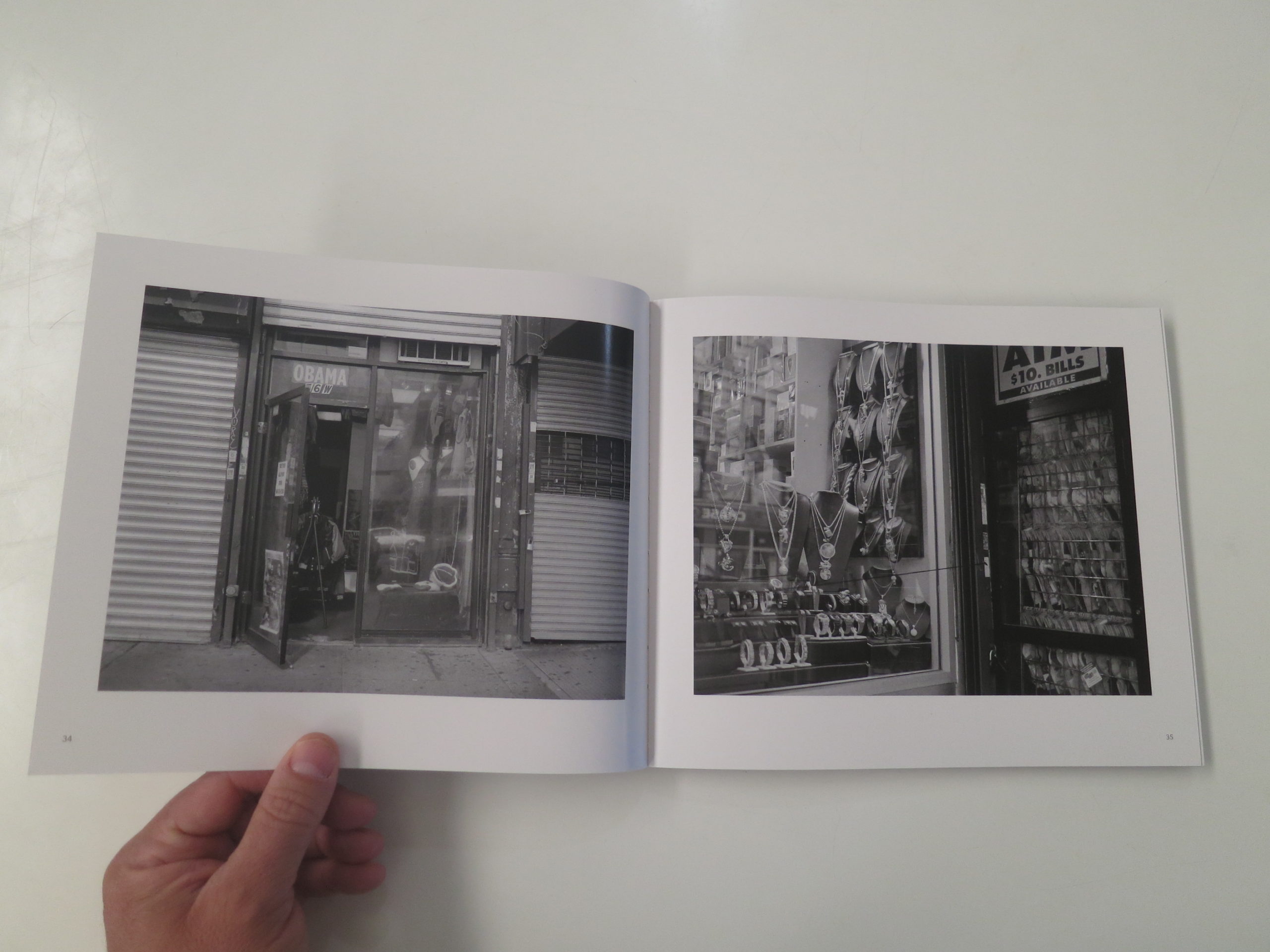
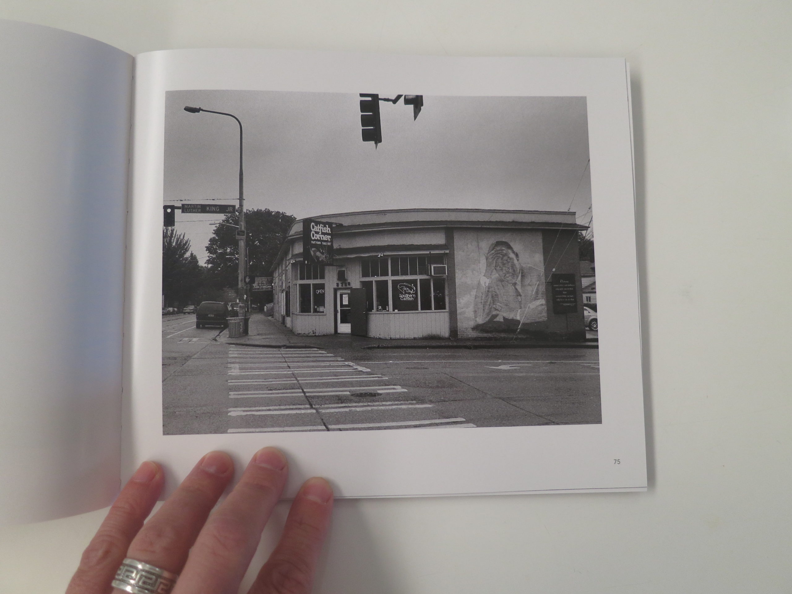
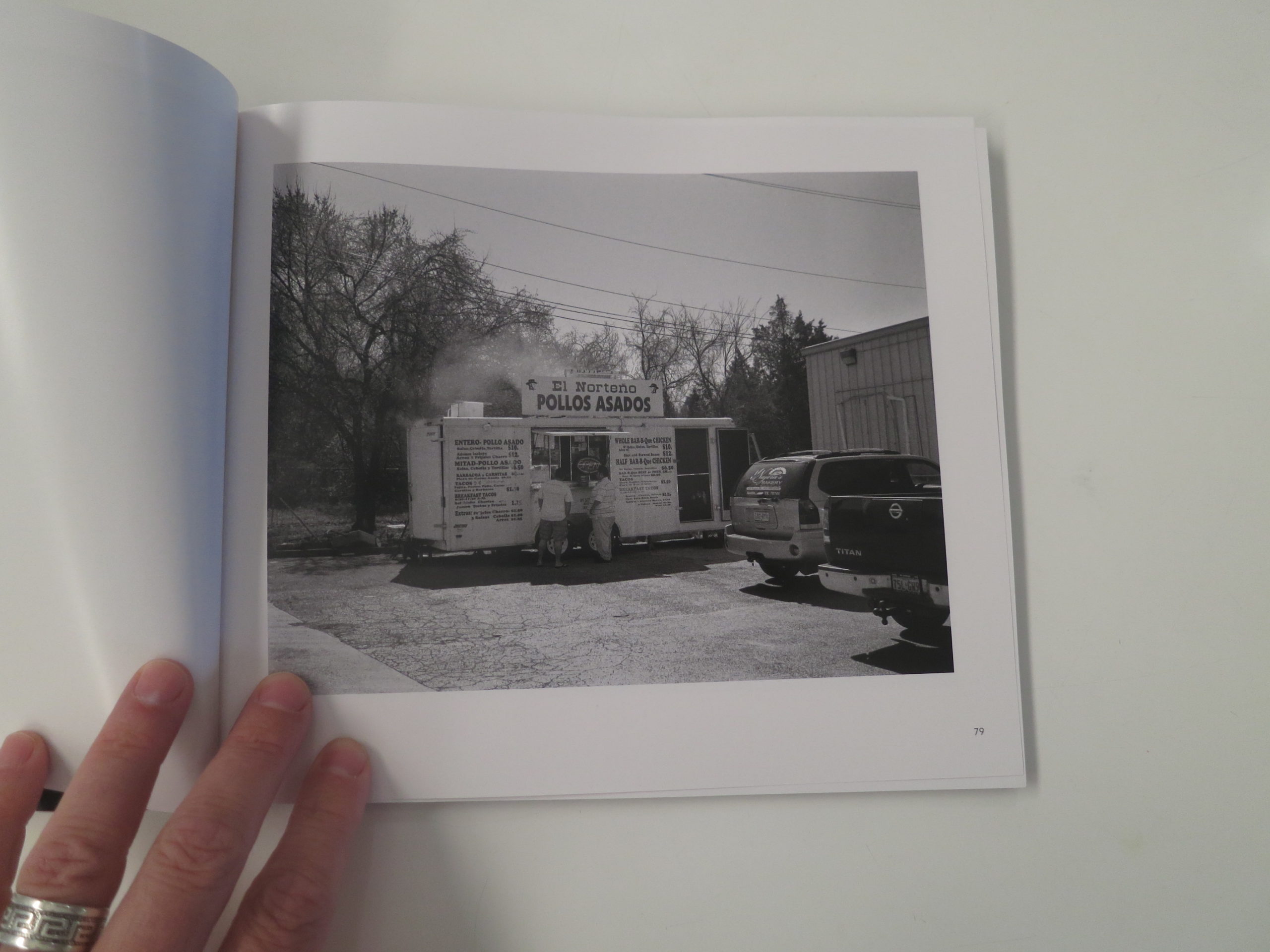
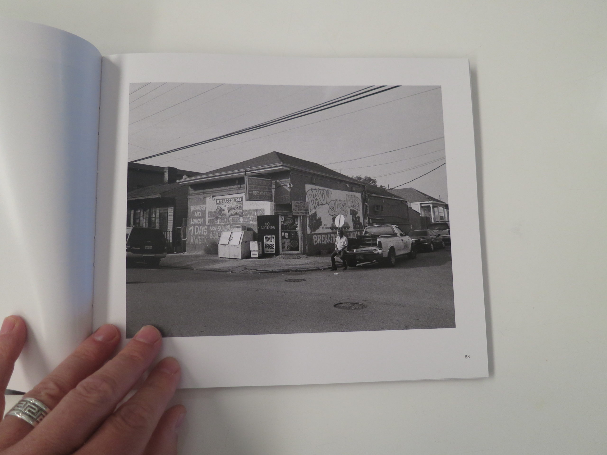
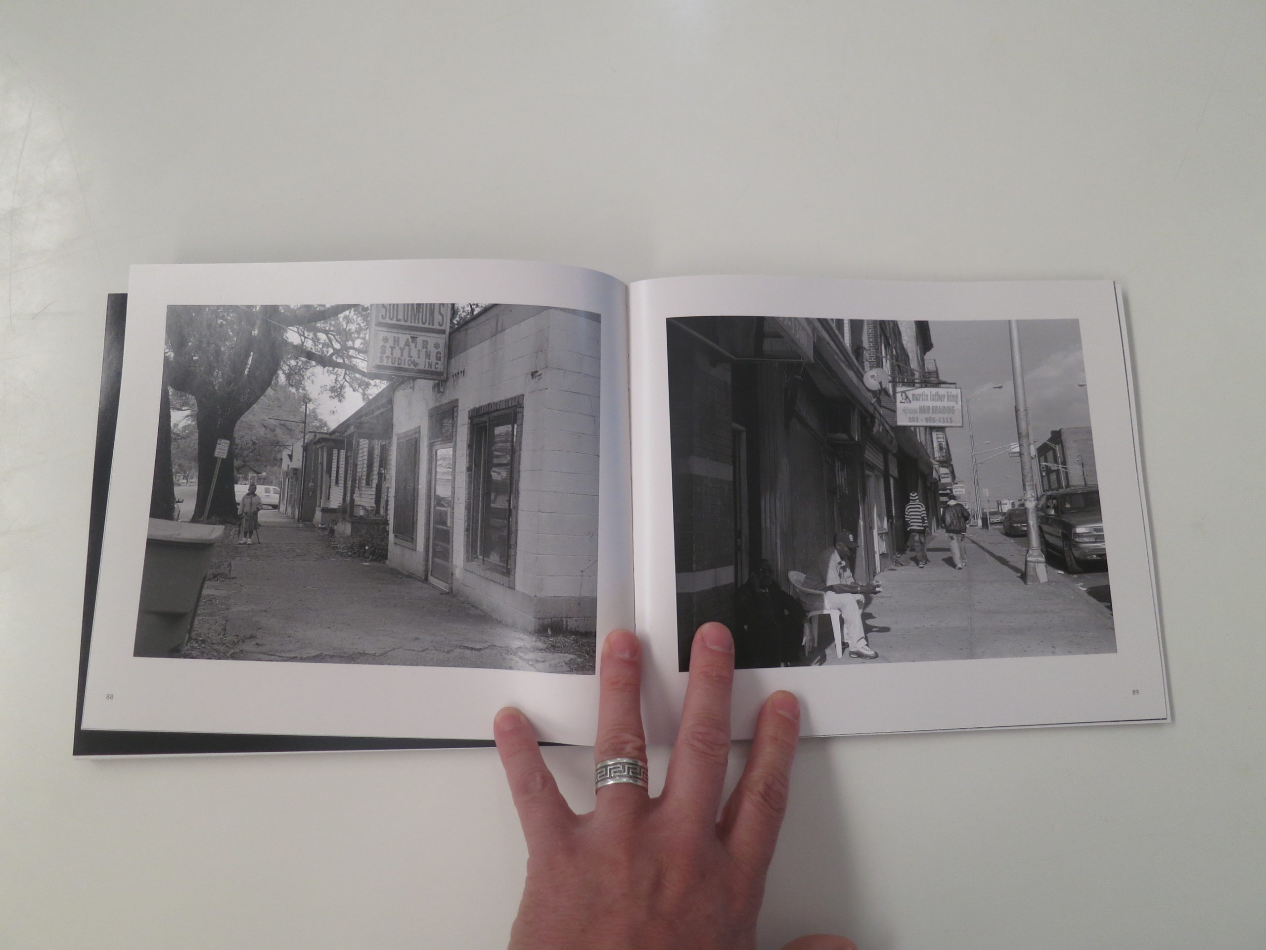
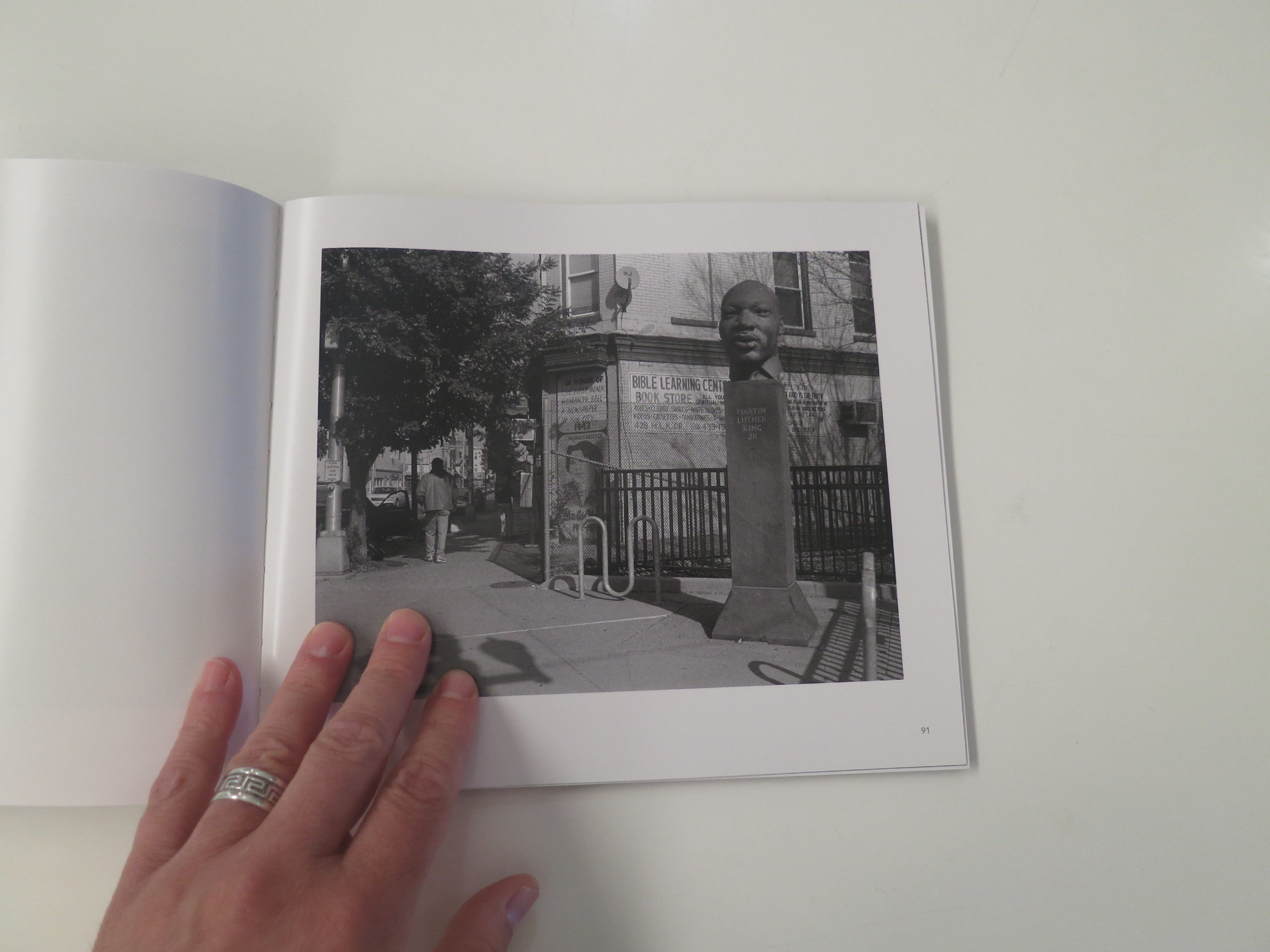
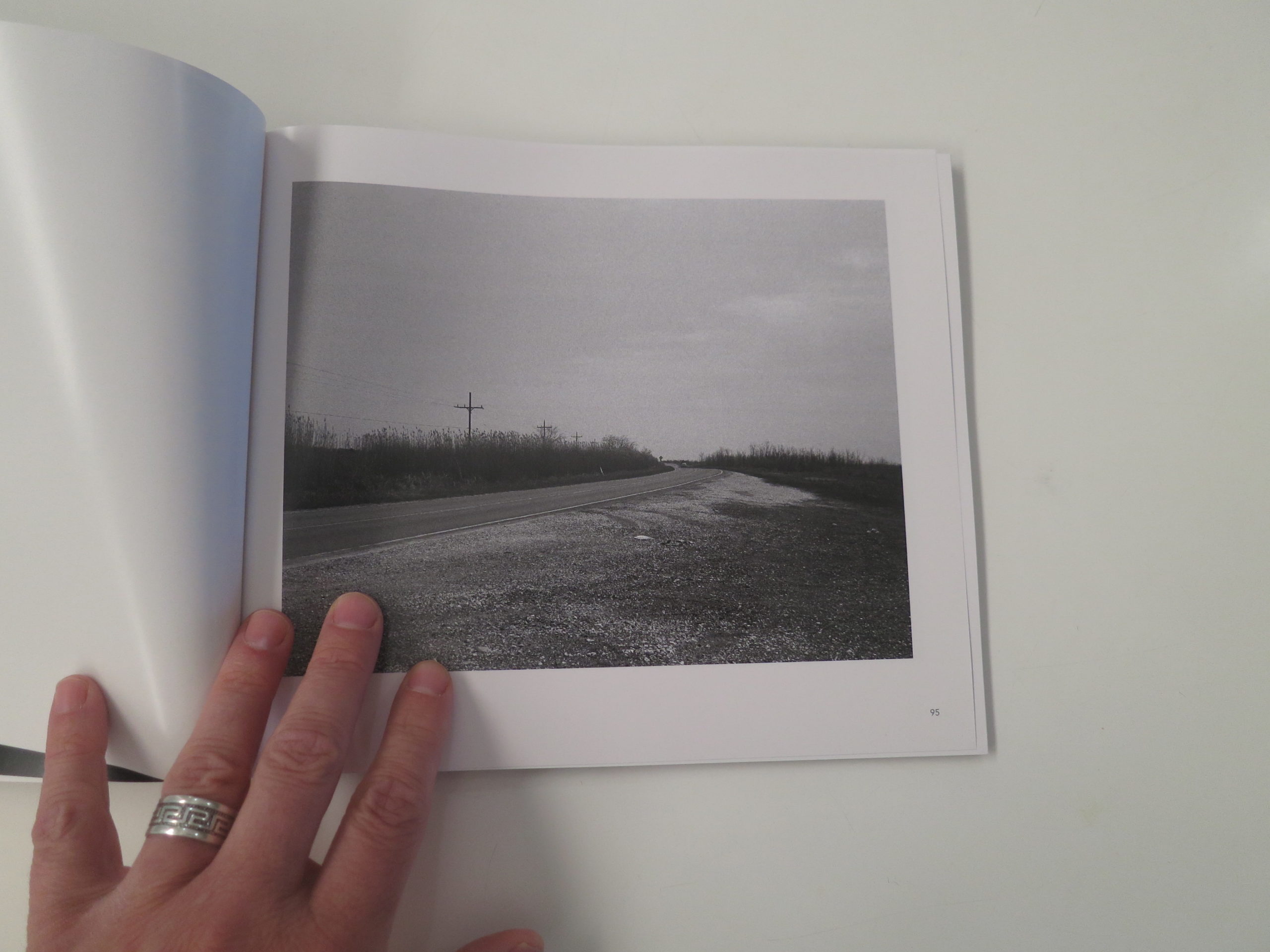
Having said all that, today I’m showing photographs from Susan Berger’s book “Life and Soul: American Streets Honoring Martin Luther King,” which was published last year by Dark Spring Press, and turned up in the mail in May of #2020.
It’s a thoughtful and well-crafted book, and one that takes a couple of risks, but it’s perfect to show today.
To begin with, in our current cultural climate, the mere fact that it exists, that it was shot by a non-African-American, would make it uncomfortable to some.
I get that, and so does Susan, which is why she wrote about it head-on in her excellent opening essay. (Accompanied by another strong essay by Frank Gohlke, a photo world legend for being a part of the seminal “New Topographics” show back in the 70s.)
They’re both a part of the tight-knit and talented Arizona photo mafia, and the end notes tell us that Susan worked for Mr. Gohlke back in day.
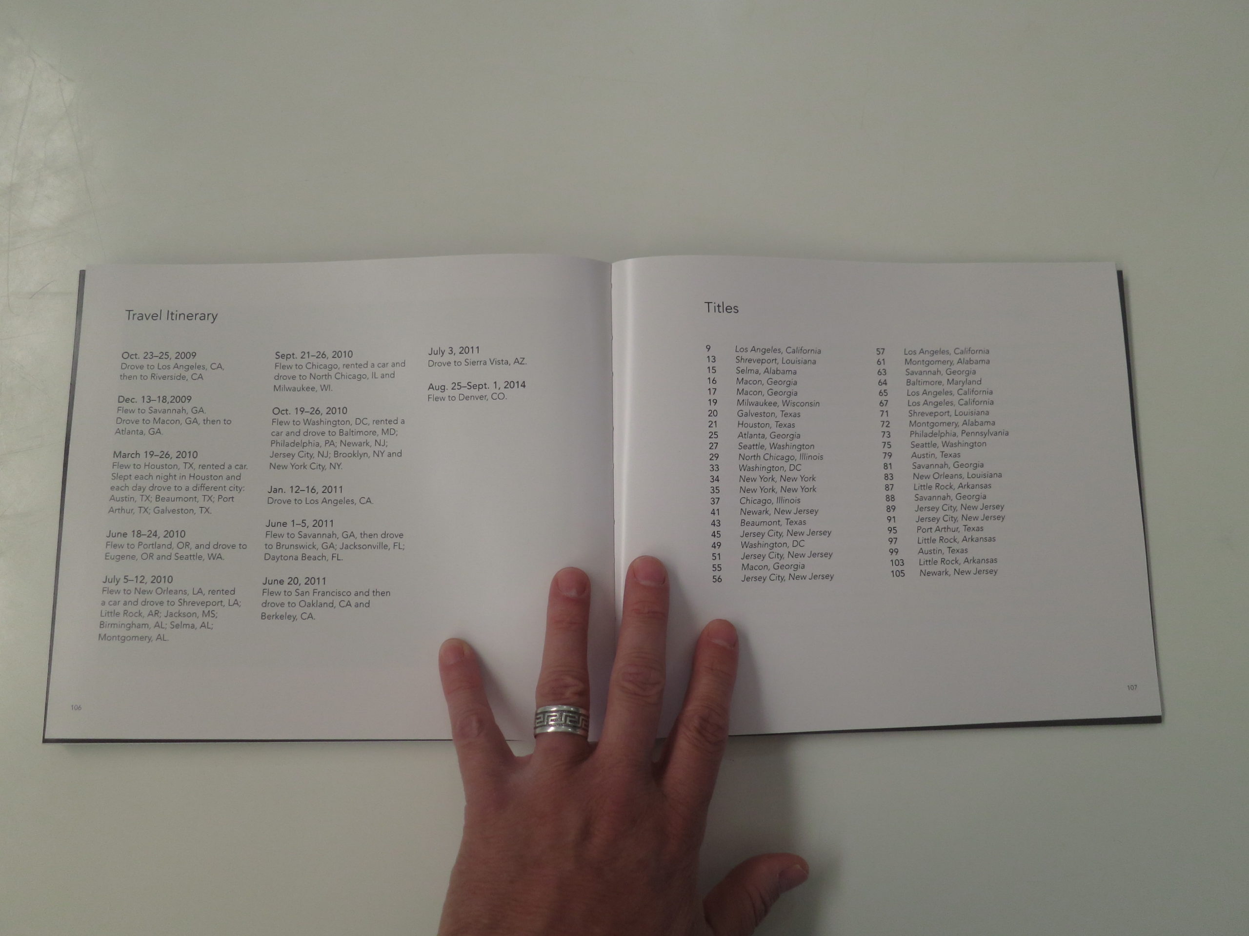
The end notes also give us a break-down of all the trips that Susan took to photograph MLK streets around the country, between 2009-14, trying to build a representative, (if not categorical,) view of where these streets are located and what they contain.
Apparently, but not surprisingly, they are almost exclusively in urban, African-American neighborhoods, some of which have absorbed Latino populations, and ironically the entire project was inspired by the artist driving by a sign for an MLK street in the middle of rural America.
Of course, it wouldn’t be #2020 if I didn’t point out that the resources required to fly around for one’s art, and the cost of purchasing and providing film for a medium format camera are marks of privilege.
Now it’s been said.
And I do find flaw with the other risk taken here, which is the repeating motif of reprinting close-up crops of images throughout, opposite blank, black pages.
That said, it’s an excellent book, and between the murals, statues, local restaurants, churches, small food markets, bleak vibes, (again, in the Obama era,) and hotels named after Dr. King, it certainly presents a vision of poverty and decline.
I suspect that Dr. King would be disappointed to know that this deep into the 21st Century, things are still as bad as they are.
Access to education and health care is still so uneven.
And among the tens of thousands of dead in this god-awful pandemic, too many are people of color.
But I also suspect that he might not like the manner in which like-minded people of different races distrust each other, and attack each difference, rather than building upon our common values.
Maybe it was always thus?
I’ll end here on a message of hope, just so you don’t feel like overdosing on sleeping pills.
We always have the opportunity to learn from the past, and the future has not yet been written.
Though many Americans have bought into Trump’s politics of hate and division, there are nearly 330 million people living in this Great country of ours, and I believe that a majority, enough to win the next election, (despite the obvious cheating he’ll try to engender,) desire a country in which we we can, indeed, all get along.
If you’d like to submit a book for potential review, please contact me directly at jonathanblaustein@gmail.com. We are particularly interested in books by women, and artists of color, so we may maintain a balanced program.
The Art of the Personal Project is a crucial element to let potential buyers see how you think creatively on your own. I am drawn to personal projects that have an interesting vision or that show something I have never seen before. In this thread, I’ll include a link to each personal project with the artist statement so you can see more of the project. Please note: This thread is not affiliated with any company; I’m just featuring projects that I find. Please DO NOT send me your work. I do not take submissions.
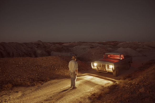
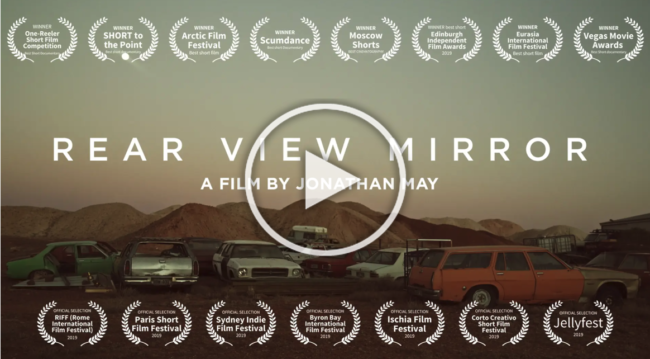
I was working on a photography series in Queenstown Tasmania called After they left which is an ongoing essay on mining towns that are a shadow of their former self when I first met Ingo Hansen. He was renovating an old hospital and turning it into a hotel, and we ended up having dinner together. I was captivated by his ability to recollect the past, and the town of Andamooka, where Rear View Mirror is set, sounded like it was from another planet. I knew right then and there that I had something special, and he told me to come visit him as the town was having a reunion.
I work as a commercial photographer and director with large crews; I enjoy the structured nature of this process and the collaboration with specialists. However, I do love the freedom that comes with breaking the rules and getting on the road with just my camera. There is something special in working organically, and it is the excitement of the unknown that I am drawn to. There is an unmatched opportunity to really dive deep into creativity without the usual constraints of life getting in the way.
I think coming through the ranks as a photographer has made me much more resourceful than most directors, being able to compose and shoot my own frames. I love taking the time getting to know my subjects, really embedding myself in their world… similar to Louis Theroux, but then applying an Emmanuel Lubezkin lens to it. While I do look at some of the frames and think they could be technically improved if I had a bigger crew with me, there is also a power that comes from being nimble and as I try to push the emotion that occurs from trust formed over time.
I originally went to Andamooka for 10 days with Ingo, as he gave me the guided tour I was shooting B-roll. I then interviewed him properly and with delving into his past, I realized how engaging he is and how vibrant life was in the days gone by. His ability to transport the listener into another world with his storytelling was impressive. Most of the past residents lived there in the hope of finding opal, and as I was sitting there in a small miners shack in the middle of an interview it dawned on me, Ingo was my rare stone… he was the rough and raw that you would expect to find in the desert, yet unique, articulate and polished.
Ingo had so many riveting stories from his days there, it was hard to limit it to just a few, but I wanted to really give the audience a taste of his world and leave them wanting more. Once I was in the edit, with the assembly and the narrative sorted, I organized another trip back with Ingo and this time I could be more specific with a shot list to match the chosen frames. Just prior to shooting Ingo had a serious health turn and his license was temporarily taken away, so I flew to Adelaide and drove to Andamooka with him. During the 6-hour drive I realized the film’s narrative had evolved, he was doing some serious soul searching and I needed to interview him again and flesh it out.
Music is such a big inspiration in my daily life, and with the film I needed the score to amplify the hauntingly beautiful landscapes and build emotion around Ingo’s world. While Ingo is the protagonist, I felt like Andamooka and the land was as much of a hero as Ingo was. I remember seeing the sunrise one morning over the countless piles of dirt in what can only be described as an alienesque landscape and was listening to Tillman Robinson’s Deer Heart album, it was giving me goose bumps as I imagined my visuals together with his score. He is a composer I’ve wanted to work with and I really felt that his artistic sensitivity would accurately complement the desolate and evocative landscapes captured in Rear View Mirror.
While I was only in Andamooka for a short time, I made some really good friends there and I can see why the desert has a strong pull. Countless others like Ingo keep returning to clear their minds and ponder on life. There is something about seeing an endless horizon that is good for the soul….void of skyscrapers, traffic lights and less disengaged people rushing around for unachievable happiness.
APE contributor Suzanne Sease currently works as a consultant for photographers and illustrators around the world. She has been involved in the photography and illustration industry since the mid 80s. After establishing the art-buying department at The Martin Agency, then working for Kaplan-Thaler, Capital One, Best Buy and numerous smaller agencies and companies, she decided to be a consultant in 1999. She has a new Twitter feed with helpful marketing information because she believes that marketing should be driven by brand and not by specialty. Follow her at @SuzanneSease. Instagram
Success is more than a matter of your talent. It’s also a matter of doing a better job presenting it. And that is what I do with decades of agency and in-house experience.
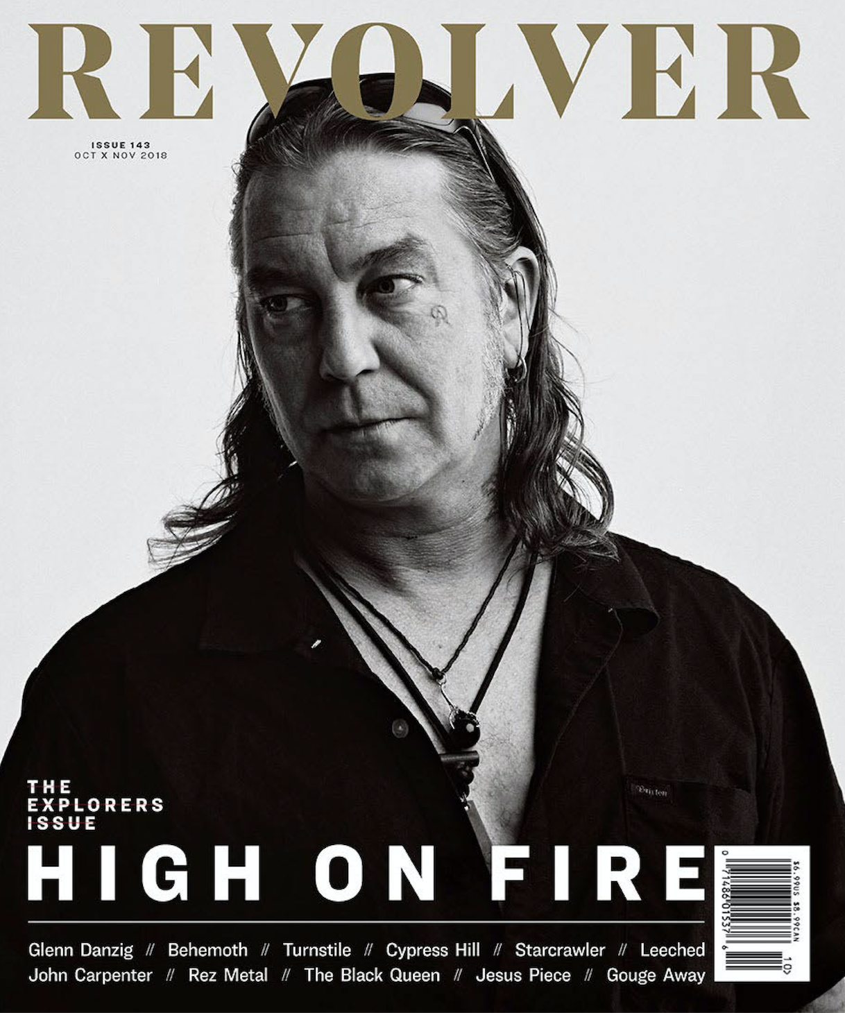
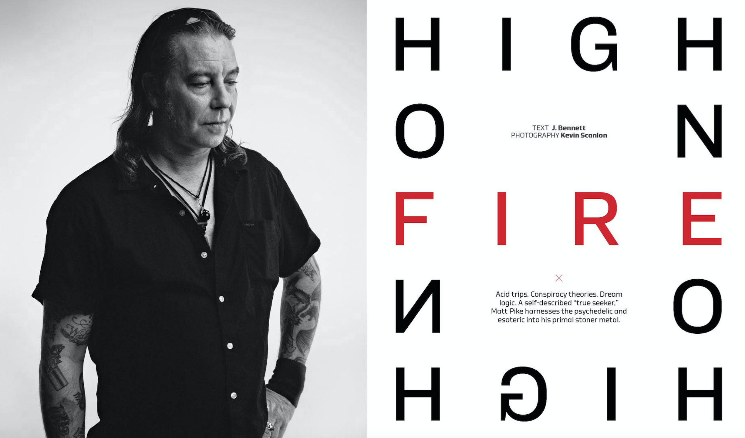
Heidi: How did the project evolve?
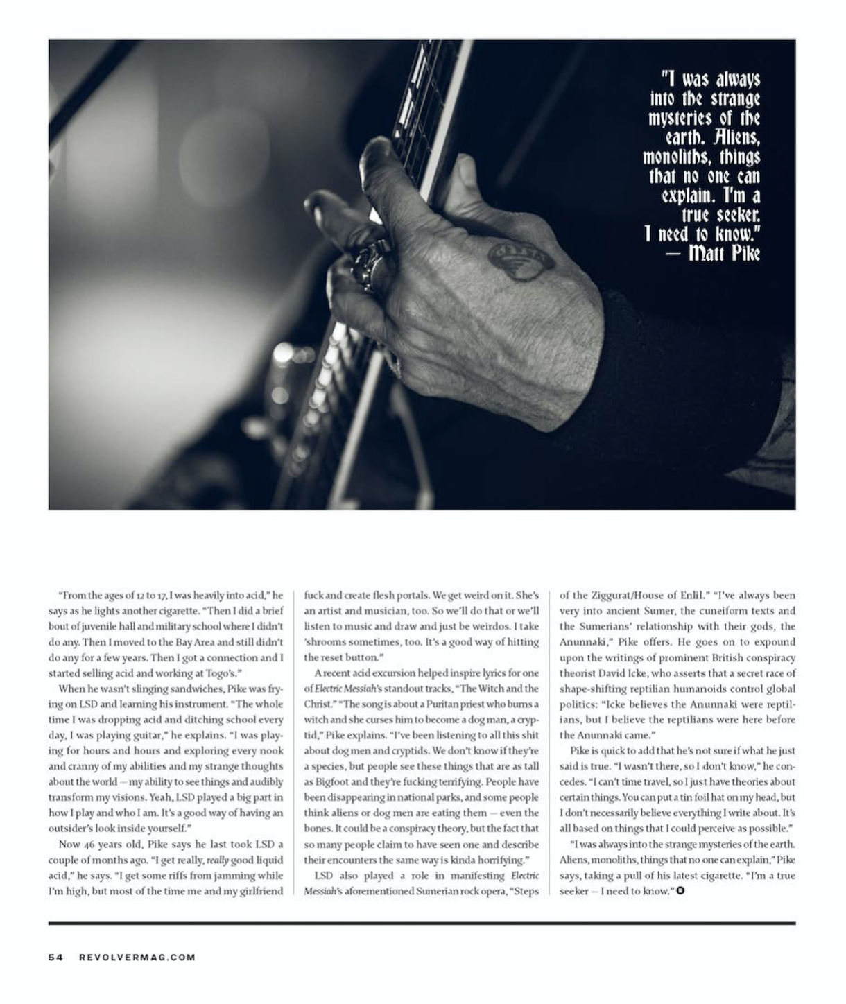
Kevin: Jimmy Hubbard called me last summer and asked me to shoot High On Fire, a stoner-metal three-piece band with legendary musician Matt Pike at the helm. The assignment was to shoot group and individual portraits in studio, and reportage imagery of the band prepping and sound-checking for a music fest in Las Vegas. This is my favorite kind of assignment.
What do you like about these types of assignments?
The controlled conditions of studio portraiture, and the run-and-gun of reportage. The sound check was in the morning. Tuning drums, changing bass strings, testing mics. One of the best things about sound checks is the freedom I have to move around on stage while they’re playing songs. I can’t do that during a concert. It’s a more casual atmosphere, to be sure.
What makes the sound check different from a live show?
Musicians aren’t sweating, smoke and lighting isn’t as dramatic, the fans aren’t there. But with High On Fire, the performance at that sound check was as authentic and energetic as a live performance of most other bands. So being on stage, amongst the band, feet away from them, it was incredibly exciting. Wrap sound check, load into the studio.
What type of cover direction did you get from the magazine?
Jimmy wanted portraits that considered the legacy of Matt Pike for the cover. Stoic and introspective. I went with simplicity for a lighting approach. Trees for the background and an Elinchrom octabank key. I had a smaller umbrella on standby for a fill, but I didn’t want it. I shot mostly digital, but I spent a few rolls of film too.
Tell us about the shooting film.
I’d been bringing film cameras to set in recent years. Hasselblad 500c or Fuji 680. In most cases, the client opted for the digital images, relegating the films shots for after-the-fact darkroom adventures. But Jimmy and the team at Revolver wanted one of the film shots…and they wanted it for the cover. My first thought was the deadline. As photographers know, it’s one thing to quickly turn around a digital shot. But a darkroom print? Maybe not so easy. For safety, I had the shot scanned at Vista CRC in Manhattan. That way the Revolver team could start designing the cover with a hi-res image. Then, off to Bushwick Darkroom to print. I spent the day printing straight prints, and also variations using solarization techniques. In the end, Revolver went for a clean look for the cover.
Who printed it?
Newspaper Club in the UK printed it after a design friend recommended using them. They even have an interface for you to layout your newspaper if you don’t have a designer.
Who designed it?
A client of mine named Wendy Sheaffer designed it. She takes on her own design work on the side as she works full time as a Director of Creative Services for a College. I knew she would be the perfect person to put it together as she has years of experience creating, printing, and mailing promo pieces of all sizes for higher education.
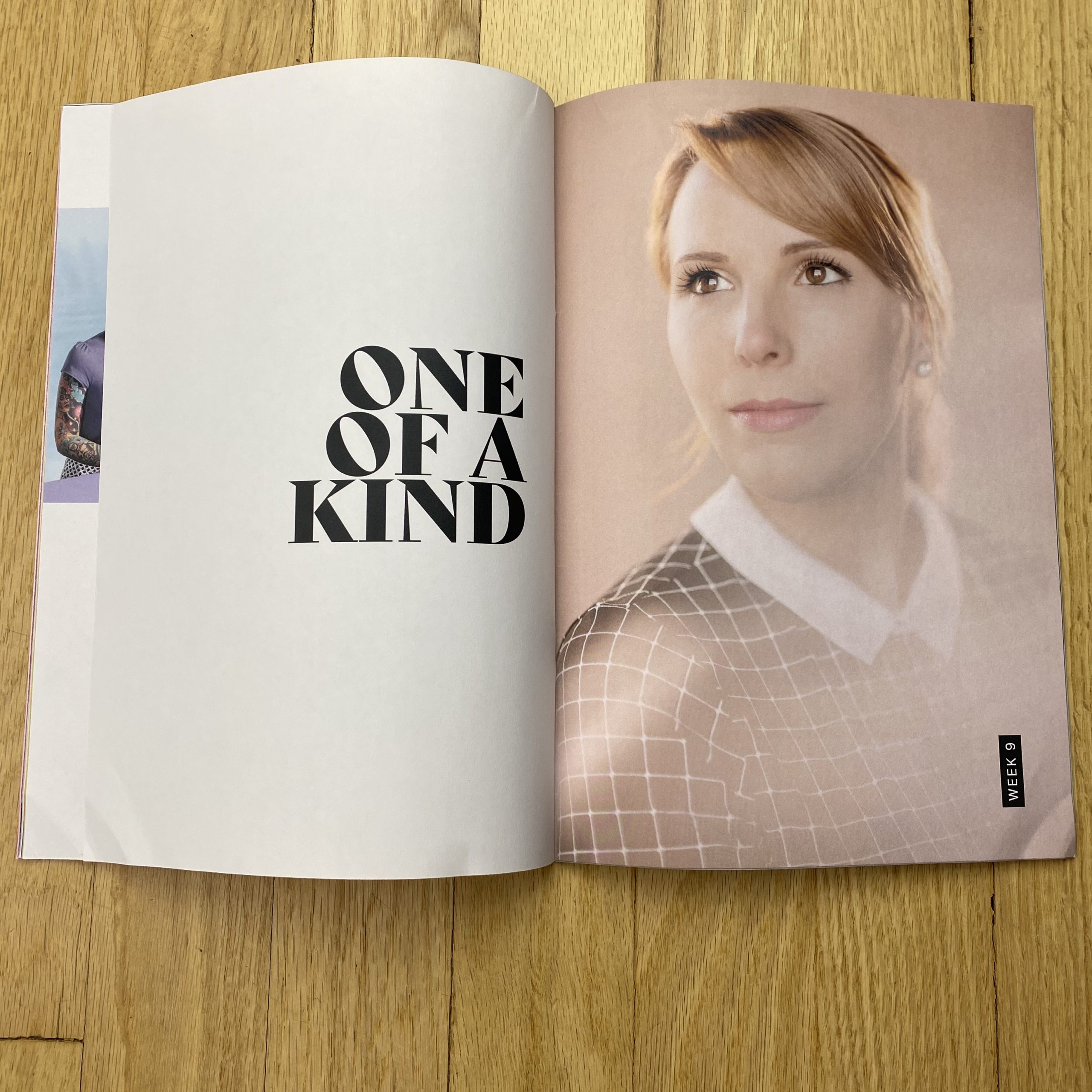
Tell me about the images?
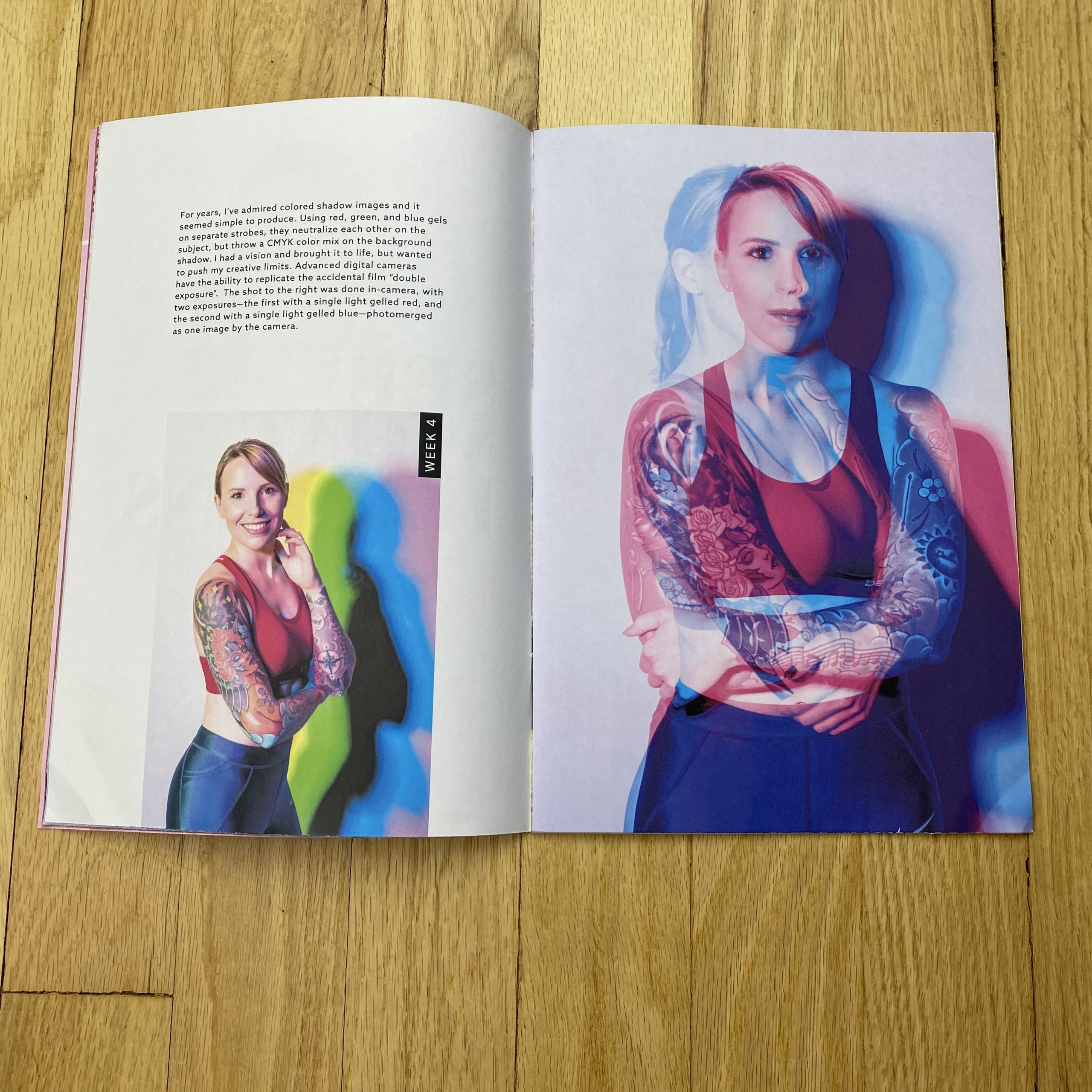
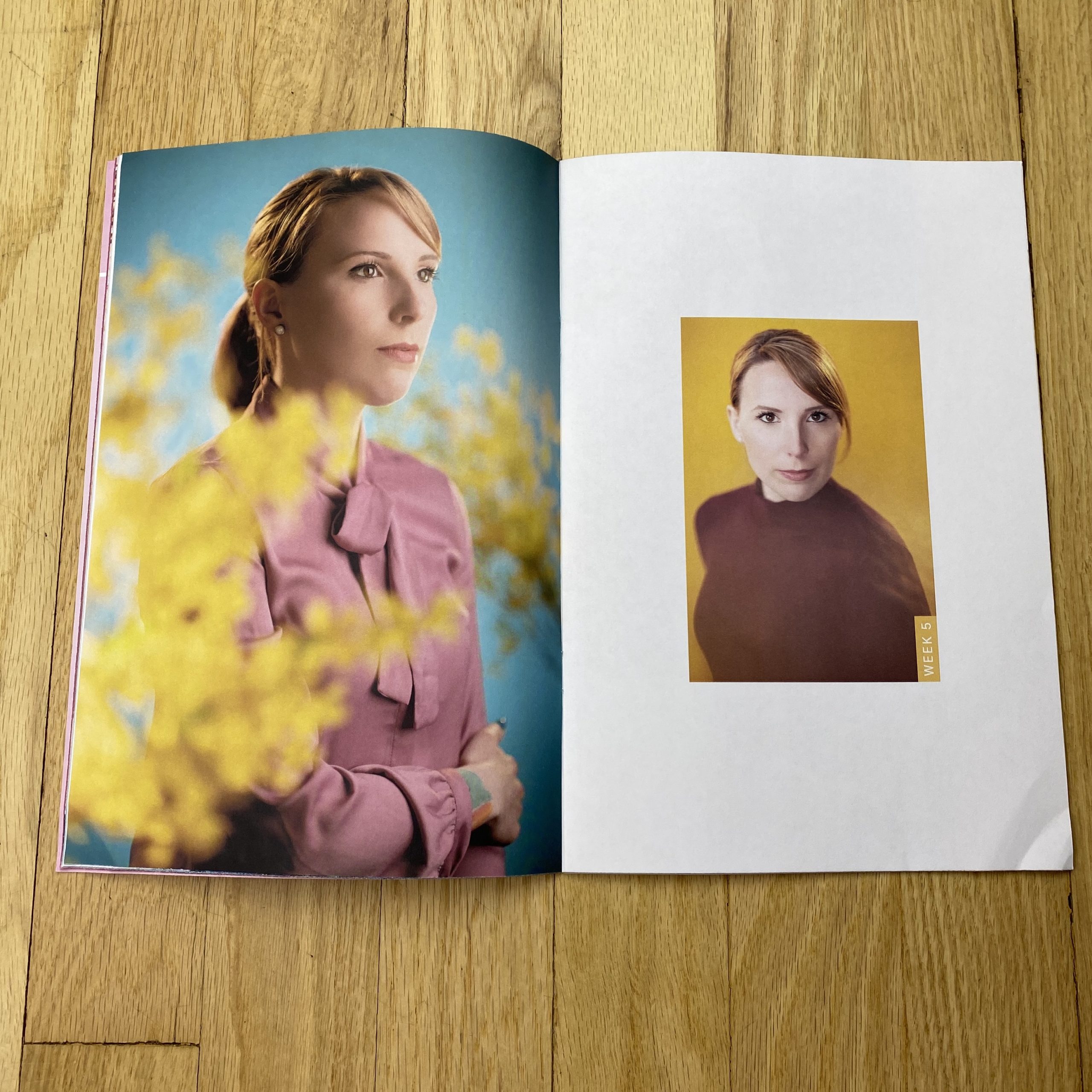
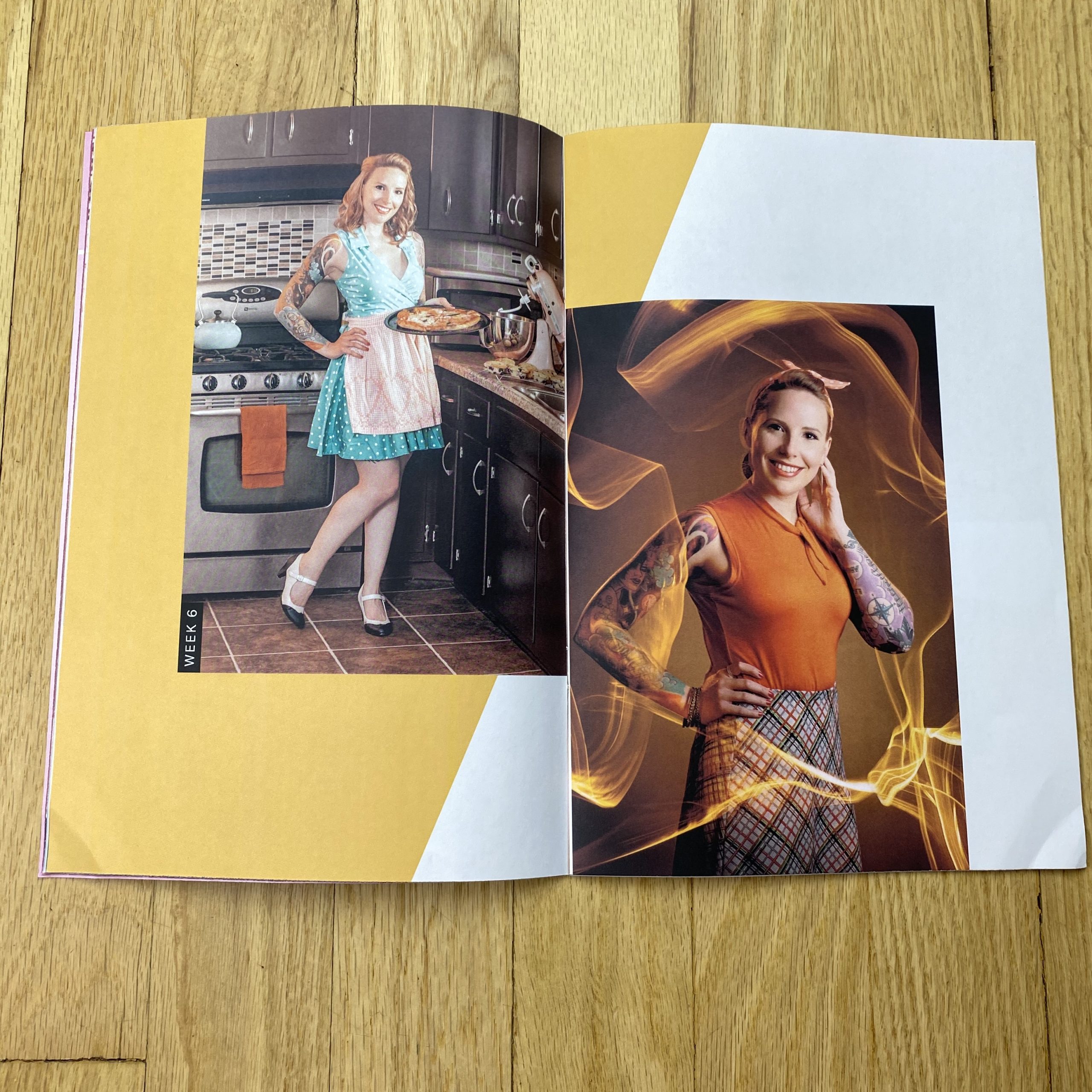
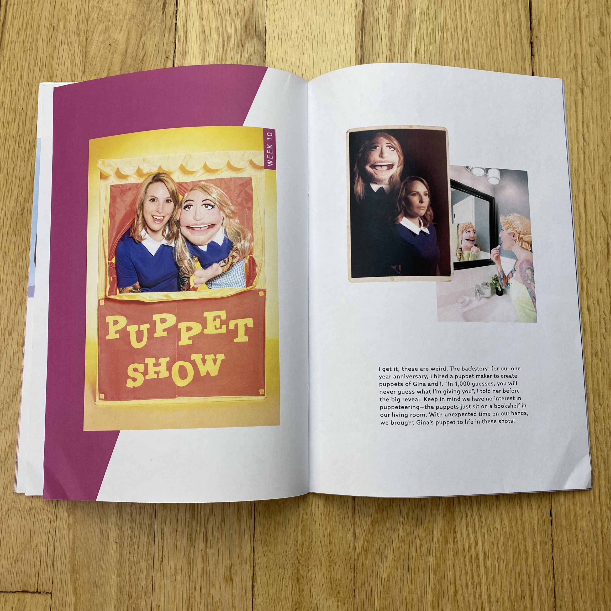
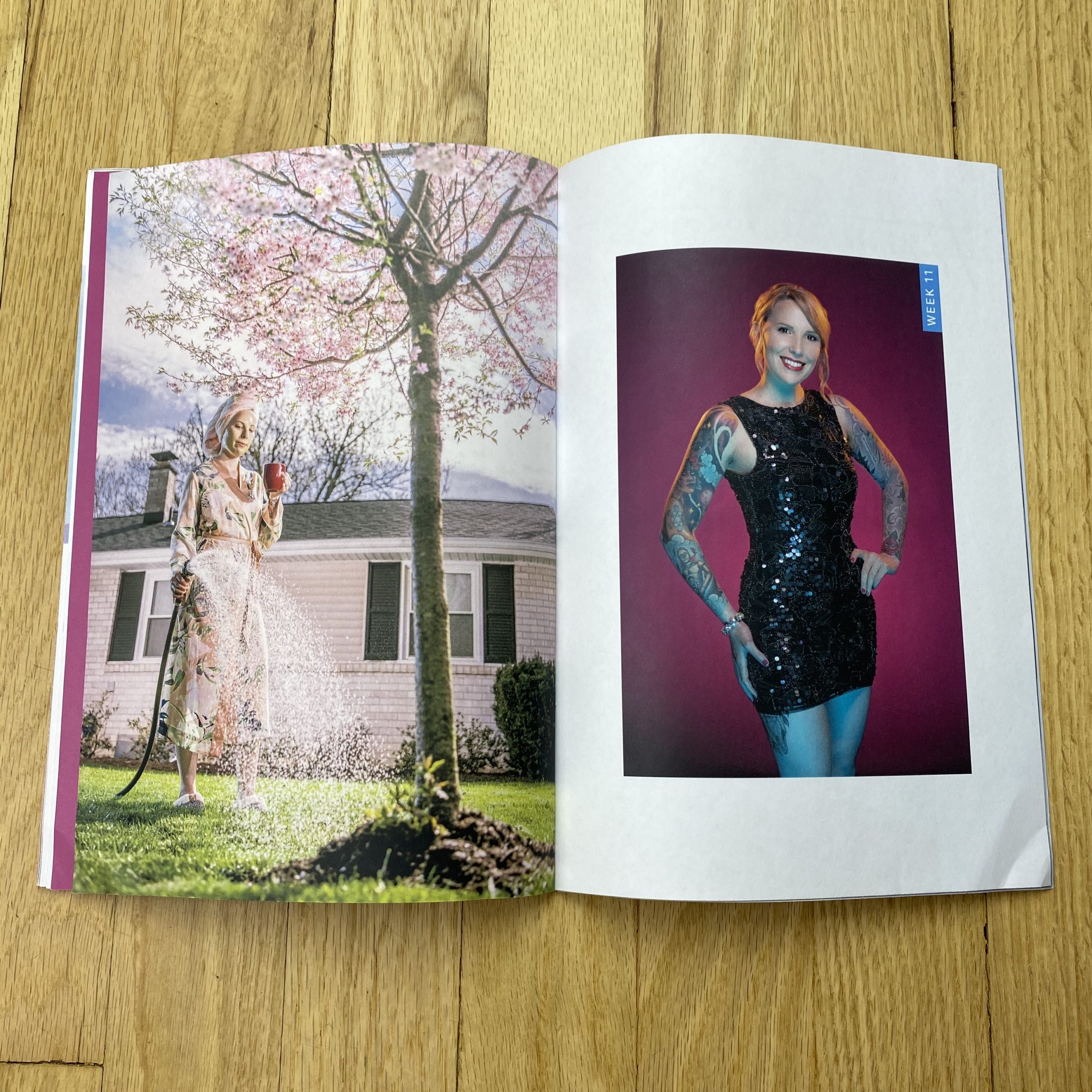
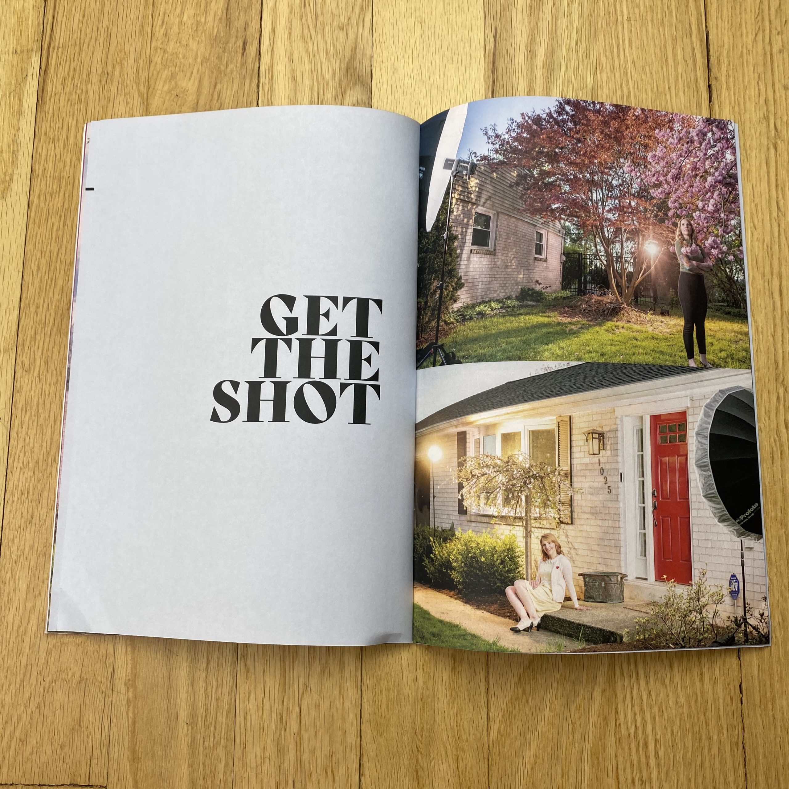
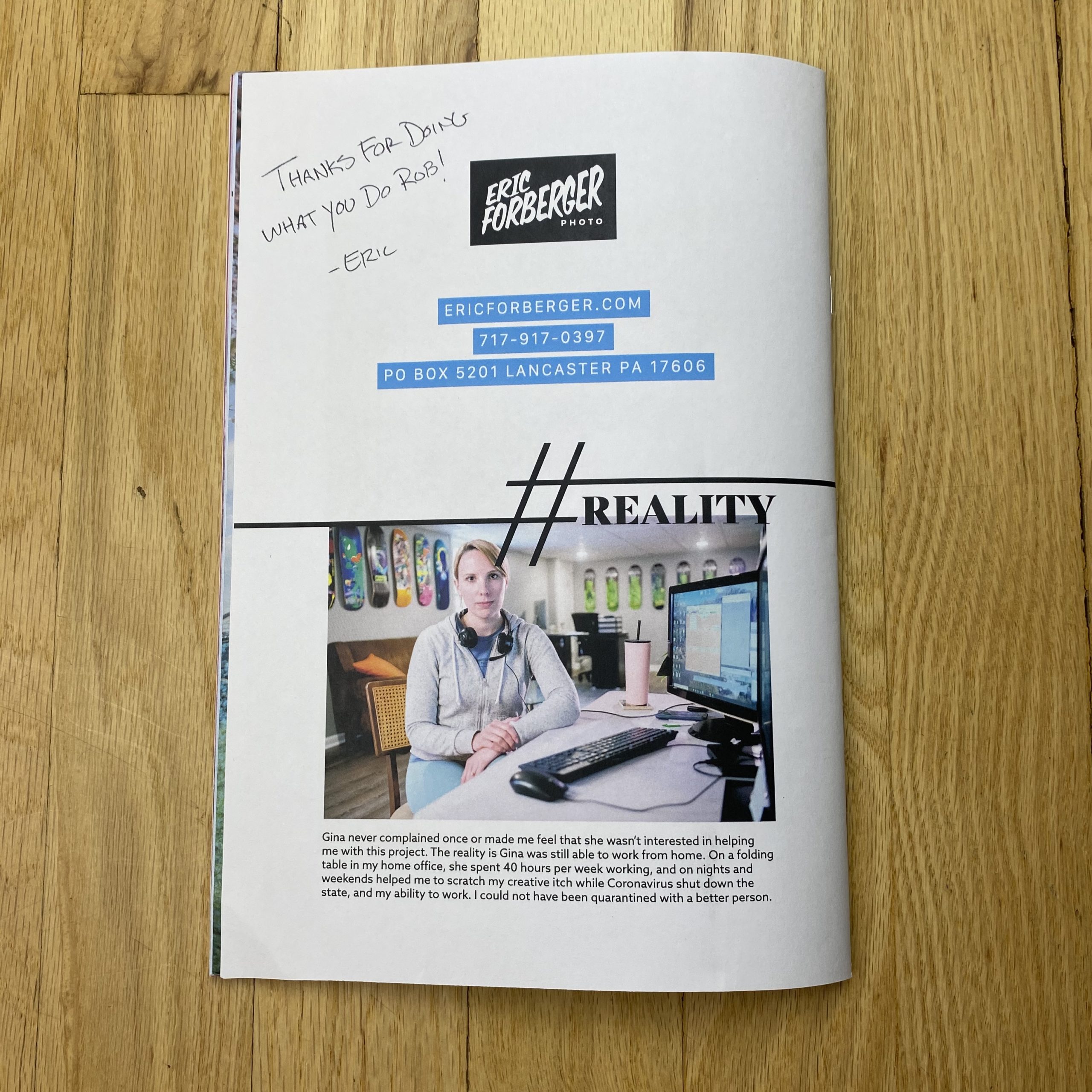
Once lockdown started due to Covid-19, I knew I had to stay busy creating so the time not taking assignments wasn’t wasted. It started out as me experimenting with techniques and styles I wasn’t normally doing so I could expand my abilities and once I got it down, then I could add that lighting style or photo technique to my toolbox to offer to clients once they were tested. I only had access to one person the whole time which was my wife Gina. I thought making different portraits of the same person was an awesome challenge to take on its own, then adding experimenting with new techniques would really force me to be creative. Once I started sharing these shots every week and they started picking up steam, I thought it would make a great project to feature as a gallery on my website. But then, an even bigger idea came, to take the project and present it as a promo piece to agencies and clients I was trying to get in front of. So additionally, I ordered seamfoam green envelopes with my logo in pink from envelopes.com to really make the piece stand out on the desks of Creatives. I was super happy with how the print job and the envelopes came out.
How many did you make?
I had 200 printed of the 32-page project
How many times a year do you send out promos?
I was just wrapping up with a 15-month promo project with Agency Access. Together we had sent out 4 mailers in that 15-month span. I think every quarter is a good average.
Do you think printed promos are effective for marketing your work?
That’s always been my question. I think regular directed promo mailings help keep your name in the forefront of clients’ minds. I’ve always loved seeing “project” based promos. Multi-page print pieces that together show a cohesive project that a photographer put together vs. many strong portfolio images that aren’t associated. It is one of the reasons I added small snippets of info about the shoots throughout this piece and even behind the scenes images at the end of the publication and lastly, a paragraph on the back page wrapping it all up for an ending. I have to say, that even with the limited numbers I have already mailed since not everyone is back in their offices yet from COVID, I’ve received a lot of email from prospective clients thanking me for sending it and giving great feedback about how much they enjoyed the mailer.
The willingness of my wife to help me out with this project is just one of the reasons she is such a great person. She was able to continue working her job from home, and because she knew how excited I was to try new things and keep creating, she was just ask excited as I was to shoot nights and weekends. She even helped me source props and wardrobe and I could not have made the best of the lockdown without her.
And I’ve found that the older I get, the more I like quiet, though give me a few drinks at a party, and I’ll never shut up.
(A party? I wrote the word, but am now having trouble remembering what it might mean. Party? Sounds familiar, but like something from a pre-#2020 reality.)
So I like quiet, which can be hard to come by, and I also like to read my own column.
Occasionally, though, the two strands will overlap, and I’ll come to the point, reading the column back, where I can’t stand the sound of my own voice.
(In my head, as I’m reading it.)
I’m not talking about being crazy, or doing a full “Being John Malkovich” either. Rather, sometimes I write the column, and then it just doesn’t feel right.
On a handful of occasions over the years, I’ll write in flow, (as usual,) and then decide, when I’ve finished, that it’s crap.
I’ll be reading it back to myself and think, “Oh, just get on with it already, you old windbag.”
Or, maybe, “Gosh, could you be any more self-involved? Please, tell us more about yourself, or your kids.”
Now, if I’m being honest, this almost never happens, but it did today.
I wrote 1600 words, (over four parts,) and but it was all wrong.
Luckily, I’d grabbed an envelope from my submission pile before I got sidetracked by a different idea, and once I opened it up, I knew the book-reviewing-deities were smiling on me today.
Because it is literally perfect for the moment, (based upon what I’ve been writing about lately,) but it also allows me to stop talking, and let the pictures in the publication do the work.
Brandon Tauszik reached out to me early in lockdown, asking if he could send me a self-published ‘zine, and as I’d shown a digital project of his a bunch of years ago, so I said, “Sure, I’d be happy to check it out when the time was right.”
And that time is today.
It’s called “Pale Blue Dress,” and features some bright and sharp photographs of Civil War re-enactors in California.
There are so few photographs here, when most people would have wanted to show a book’s worth.
It’s brief, which makes it seem more like a poem than a novel.
We see Abe Lincoln, who’s been featured in the column a couple of times lately, and visions of a 19th Century war that, as I wrote just last week, still dominates the American cultural narrative in the 21st Century.
Photography records history, whether we like it or not, and in this case, it’s a record of people who like to recreate history, visually, for pretend.
It feels lighthearted, (like this column today,) but masks a much darker message.
In an essay at the end of the book, the Stanford historian James T. Campbell, PhD, writes,
“They are generous, even gentle images, devoid of irony or condescension, inviting not ridicule but curiosity about people whose commitments may differ from our own. In this polarized, perilous moment in the history of our democracy, this is an attitude worth cultivating. Societies that lose it sometimes fight civil wars in earnest.”
I often think that part of why history repeats itself is that once an event has receded from living memory, because no one is alive from when it happened, nor their direct descendants, then it becomes more likely to happen again.
No one outside of a few thousand truly insane individuals really wants another Civil War here, so let’s all do our best to put out good energy these next few months, and hope the national mood dials back from “11.”
If you’d like to submit a book for potential review, please contact me directly at jonathanblaustein@gmail.com. We are particularly interested in books by women, and artists of color, so we may maintain a balanced program.
The Art of the Personal Project is a crucial element to let potential buyers see how you think creatively on your own. I am drawn to personal projects that have an interesting vision or that show something I have never seen before. In this thread, I’ll include a link to each personal project with the artist statement so you can see more of the project. Please note: This thread is not affiliated with any company; I’m just featuring projects that I find. Please DO NOT send me your work. I do not take submissions.
This series originated on a road trip from LA to Indiana four years ago. I knew I wanted to make a series while on the road but wanted a focus.
I have always been most interested in sub cultures. As an expat from the UK moving to America getting on for twenty years now the vast landscape you have here and the open road depicted in road movies has always fascinated me and fueled my photographic desire.
The idea for Women Truckers came to me before I departed Los Angeles when I was planning the series. I ran it by a few trusted friends in the film business and started to write a series of searching question to ask the women drivers who I met at the truck stops. I came up with a list of about 12 written out in a sketchbook knowing that this would come in handy when I was faced with someone I had never met and would provide context for the story.
I use my iPhone to record the interview and then later transcribe them into a text document.
My first stop was late in the evening driving out of LA near Ontario on the 10 freeway. There was no light left for a daytime exterior shot so I headed inside the truck stop and had a good scout around. I got some strange looks from people inside as I had a vintage film Hasselblad 501 cm hanging from my shoulder and a light meter, which people always wonder what it is.
On my first look around a real working truck stop I realized this was predominantly a man’s world. There were a plenty of men eating junk food, looking for spare parts in the store, paying for gas. Then I discovered that they had areas for showers and washing clothes. I was discovering a new underworld where drivers, men and women lived out of a suitcase on the road for around three months at a time.
Women truckers would be hard to find, they are about one in twenty on the road. I found a games room with pool table and sitting there in this sparse dimly lit room was a women and her young daughter who was wearing headphones. I opened the door, walked in and plucked up the courage to ask her if she would mind having a portrait taken and if I could ask some questions about being on the road and a female. Regina Campbell and her daughter Shelby who rode with her in the summer turned out to be open to my request. She too was heading to Indiana so we discussed route to break the ice. It turns out she has been driving for seven years, has a BA degree in sociology and formally worked in law. One point she made stuck with me in her words “ its one of the fairest places for a female to earn what a male earns”. She then told me many of the solo women drivers stay in their cabs and don’t come out at night for safety.
Regina was my first subject and over a period of about four years I now have about twenty-five subjects and interviews. Once I did a commercial shoot in New York and booked a one-way flight knowing that I wanted to drive back to Indy in a rental so I could make more truck stop portraits. Always with these kinds of portrait series you get quite a bit of rejection and resistance. There were times I spotted a woman who had an interesting face or who seemed like a character but they were not interested to be photographed or talk. That’s when you can feel deflated and start doubting your idea. Then you find someone who is really open to it and can’t stop talking and you are back on track.
My first edit seemed a bit monotonous just having portraits only. Luckily in most of the stops on the road I captured landscapes and details to tell the story of the road and show the truck stop as an American subculture. I would drive through the entrance which said trucks only and park my car right next to these huge 18 wheelers and start shooting details of trucks and anything which I thought was worthy of setting the scene to go alongside my portraits. Many of these wider shots included men, which I think is ok because they are a big part of this landscape.
Four years later and I’m still editing and pairing landscapes with portraits and wondering if this or that is a good shot. Finally it was time to show this work and get some feedback from editors like Suzanne.
I continue to shoot this subject and I have a whole binder full of color negatives of women truckers and the truck stops landscapes. One day this could turn into a larger body and printed book. I plan to make a zine next of some of my favorites to try it out in print and start paring up more and seeing if I have something worthy of ink. If anything it has been an exercise in documenting culture for me and I have learnt a great deal from talking with these strong women about life on the road.
APE contributor Suzanne Sease currently works as a consultant for photographers and illustrators around the world. She has been involved in the photography and illustration industry since the mid 80s. After establishing the art-buying department at The Martin Agency, then working for Kaplan-Thaler, Capital One, Best Buy and numerous smaller agencies and companies, she decided to be a consultant in 1999. She has a new Twitter feed with helpful marketing information because she believes that marketing should be driven by brand and not by specialty. Follow her at @SuzanneSease. Instagram
Success is more than a matter of your talent. It’s also a matter of doing a better job presenting it. And that is what I do with decades of agency and in-house experience.
Heidi: Why did you create that series, Marwang?
Cedric: Last fall I set out to capture the beauty and diversity of black skin, which is poorly represented and rarely celebrated in mainstream media. I wanted to create a project focused specifically on that. I’d worked previously with another model with a rich dark complexion and Marwang was on the same roster and riveted my attention. The conversation during our shoot was insightful; I was curious to know what kind of projects he typically worked on and whether the industry really understood how to represent models like him. And it was clear that the industry needed to do more. To do more than treating black representation as a trend. It was a reminder to me that this work was important.
What was your creative vision, I know you styled and also cast this project? For this project I was drawn to the idea of contrast, so I pulled white and reflective wardrobe for the studio shots. I offered some direction for him to be physically expressive, and he responded by dancing. His movement through the light made each shot different. For the naturally lit images I actually used an ND filter to create a more dynamic image and really draw on the richness of his skin. How did your photo career begin?
I took up photography as a way to share my journeys abroad with family and friends back home in the states during my time as an active duty Marine in China, El Salvador, and Morocco. But it also became a creative outlet in an otherwise restrictive environment; I felt freedom behind the lens. The Don’t Ask Don’t Tell policy was still in place during my time on active duty, and photography gave a true voice and allowed me to fully express myself in at least this one part of my life. The camera gave me a home and grounding when everything around me was foreign and temporary. Putting a lens between me and the people I encountered actually brought me closer to them. It wasn’t until years later that I realized that I could make a career out of it. So I taught myself technical skills and started to build a portfolio.
What was the catalyst for your start abroad?
My time in the Marines ignited in me a passion for experiencing the world. I documented everything; cultural sites and heads of state to local people in remote villages. I was constantly learning, absorbing, and inspired by the beauty of life and captured every detail. After establishing myself as a photographer I was eager to use my skills to build an international presence. The work I do abroad these days is often reportage, fashion or beauty. I’ve focused my international energy on working in places that inspire me, especially Mexico, France, and the UK. I feel fortunate to be able to blend my curiosity about the world with my livelihood in photography. The pandemic has thrown a wrench in those ambitions, but I am hopeful that the world will open up again and we will be stronger as we reconnect face to face.
How does your military experience influence your work today?
From large scale productions to streamlined minimalist studio portraits, I love the complexity of a big idea and the refinement of simple elegance. I think my time in the Marines sharpened my attention to detail and ability to work under pressure. I find myself always problem solving; just in case. Because having a few tricks in your back pocket in case something doesn’t go as planned on set it alway a good thing. I also see my time as a diplomat influence my ability to work with high profile subjects.
How were your portrait skills informed?
Because I always had a camera on me during my time abroad in the Marines I was quickly appointed as the unofficial photographer for the units I joined. With that came a responsibility to maintain the official headshots for each Marine unit. I had no portrait experience before that, and that experience gave me a great crash course.
Today those same early portrait skills have been influenced by the likes of Irving Penn, Gordon Parks and Jerry Schatzberg. I look to the clarity and simplicity of Penn’s approach. Portraits of the strong, graceful, and sensual bodies of both men and women are my continuation of his implicit challenge to see feminine and masculine as one. Even in commercial work and anonymous work I seek to express the precision and intimacy that his images teach.
You witnessed the the peace and the aftermath of the protest, can you share the two very different experiences?
I live in downtown Los Angeles and so was immersed in the initial uprising in response to the murder of George Floyd. The constant and overwhelming presence of police sirens and helicopters was almost unbearable. There was so much uncertainty about what would happen or when the violence outside my window would end. Needless to say, very little sleep found me that first night.
As I saw the sun start to peek through my window, I decided to sneak out of bed and go out and see what the city looked like. And I wasn’t prepared for what I saw. Armed with my camera, I documented my neighborhood: the remnants of burned trash cans and cars, and shattered store fronts in every direction. I couldn’t help but notice that many of the damaged shops were owned or operated by people of color and had been looted by people for reasons likely having nothing to do with the cause of racial justice.
How did you take ownership of the situation, by documenting it?
Documenting the aftermath of the initial violence left a touch of sorrow on my soul. I knew this destruction would cast a shadow over the massive uprising and critical issues at hand. But I wanted to bear witness; it felt so important. But in the days and weeks to come, I would also bear witness to the growing mass of humanity coming together in peaceful outrage over the tragic murders of George Floyd, Breanna Taylor, and so many others. I felt part of this movement by joining the protesters in the streets – not just a photographer documenting from the outside, but as a protester myself, capturing this movement that would change the world.
How does that experience linger for you today?
While the immediate unrest has settled and the size of the crowds in Los Angeles have gotten smaller, there is still so much work to be done. We all have a responsibility to use our skills and tools to witness and participate in this moment. The pandemic has made this moment harder; it’s tempting to feel helpless at times as our communities are under siege from so many different directions, and it’s difficult to know how to connect with each other and make a difference in this disorienting time. But being among the protesters reminded me that there are so many people all around us who deeply care and are willing to make sacrifices to uplift others and fight for them.
Tell Me about the images.
Notvery Athletic is a joint collaboration between myself and art director Mark Denton. Mark and I have worked together numerous times and the idea for this started as a tiny element to drop into a commercial job we were pitching on. The thought of a funny soccer card in the back of an advert- this was the idea that started it all.
A few months later, Mark and I decided to shoot a comedy soccer player. From there, we thought we should do a few more and then two years down the line, we’ve got 9 teams, a tonne of images and a full sticker album.
The images are designed to both satirise and evoke memories of a bygone era of soccer when the hairdo was almost as important as understanding the offside rule.
We had great fun shooting these, with myself even getting in front of the camera. Mark persuaded me to try on a wig. Initially thinking it would make a funny profile pic, I turned out to be one of the star players. (a.k.a Baqov De Nette).
A central part of these images was getting the hair right. We worked with expert hairstylist Anna Longaretti whose skill with wigs and 70’s hair creations are second to none.
The attention to detail that went into creating these is staggering, from casting to designing and creating teams, kits, backgrounds, lighting, and an exhaustive post-production process to authentically age the images.
Who Printed it?
The actual Zine is printed by a mid-level printing company called PrintedEasy.com, because in emulating soccer zines, a premium glossy print job wouldn’t have felt right.
It was printed digitally (as opposed to litho) which meant we could try out multiple paper stocks. We tried a number of uncoated and coated stocks of different weights and settled on 170gsm matt coated for the outside and 140gsm uncoated for the inside.
Although the print was better on coated stock, it had better colour repro and dynamic range. The uncoated felt more authentic for the images.
We ran a number of other print processes in order to create this unique look. All the cards were risographed once retouched, scanned back in, and then retouched again.
Although time-consuming, this analogue stage really made a difference.
One image was poster printed – we then creased it and rephotographed it to make it look like a pull out poster. The centre spread is also a photograph of a physical page we created. The cards were printed actual size and stuck to a print out of the background image and then rephotographed. Same with the inside front and inside back covers. A lot of extra processes overall, but all part of the endeavour to make it authentic and unique.
Who designed it?
It was designed by Mark Denton Esq. with the help of Kate Henderson and Tivy Jones.
How many did you make?
There are a few iterations knocking around with subtle changes to the print stock, images, and design but in total around 500 copies.
How many times a year do you send out printed promos?
Previously about 4 times a year, but in recent busy periods, it has been a lot less. This is the first thing I’ve sent out in 18 months.
Do you think printed promos are effective for marketing your work?
It’s really hard to say. In the past, I’ve been saddened by the lack of response but then equally, jobs come out of nowhere which could be down to printed promos.
This promo, however, has been a different experience altogether.
Being in lockdown, I sent this out all my existing mailing lists. It turned out a lot of these were no longer valid which meant I individually reach out to everyone I wanted to send it to. This turned out to be a fantastic opportunity to re-connect with old contacts, it helped me make new contacts and I believe this made the mailer more effective than usual.