


Joe Giacomet
Tell Me about the images.
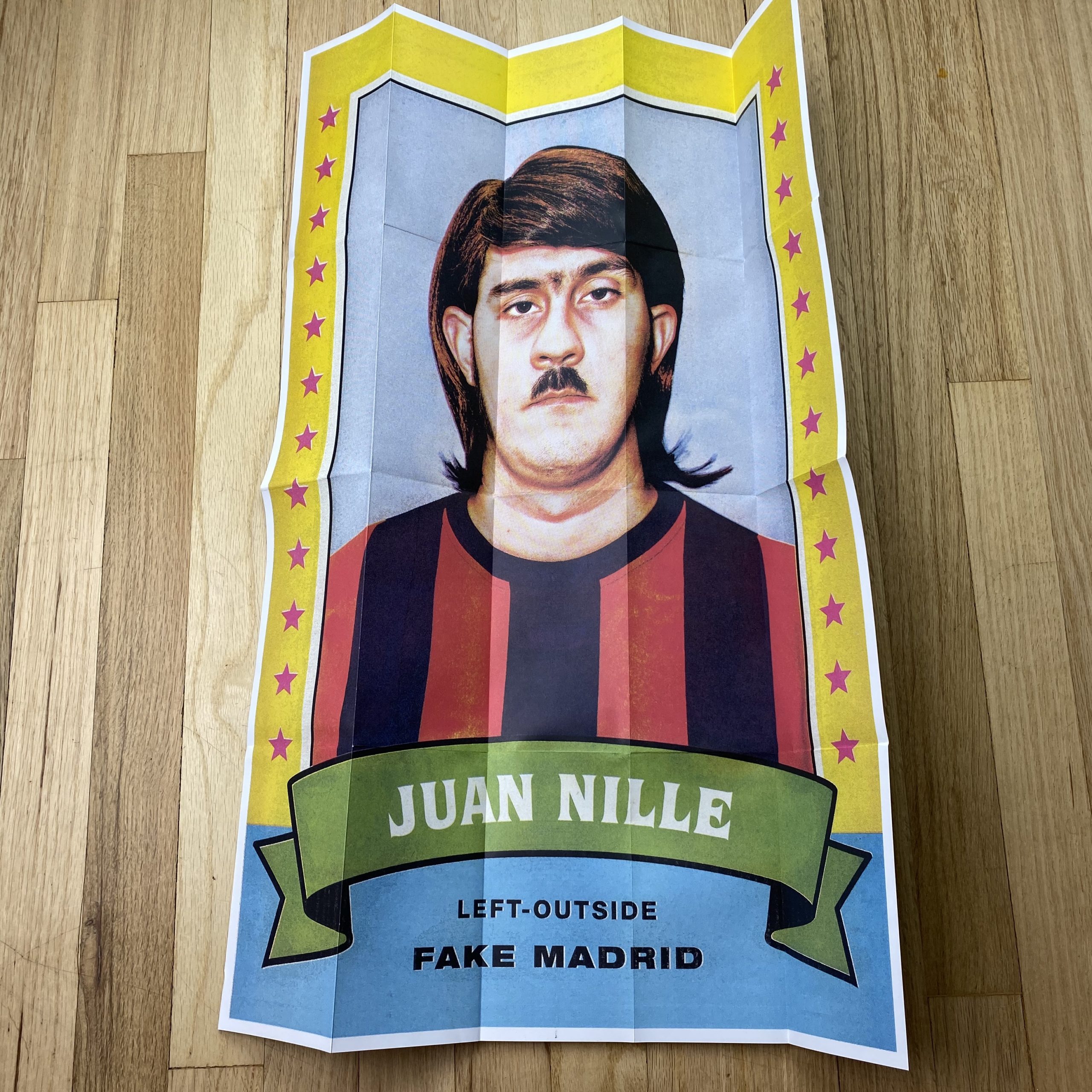
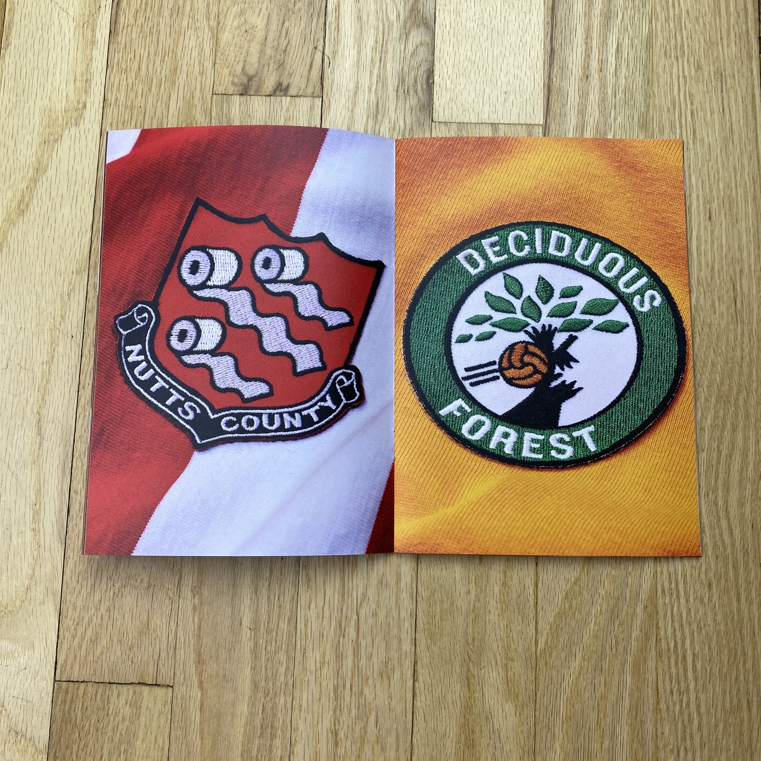
Notvery Athletic is a joint collaboration between myself and art director Mark Denton. Mark and I have worked together numerous times and the idea for this started as a tiny element to drop into a commercial job we were pitching on. The thought of a funny soccer card in the back of an advert- this was the idea that started it all.
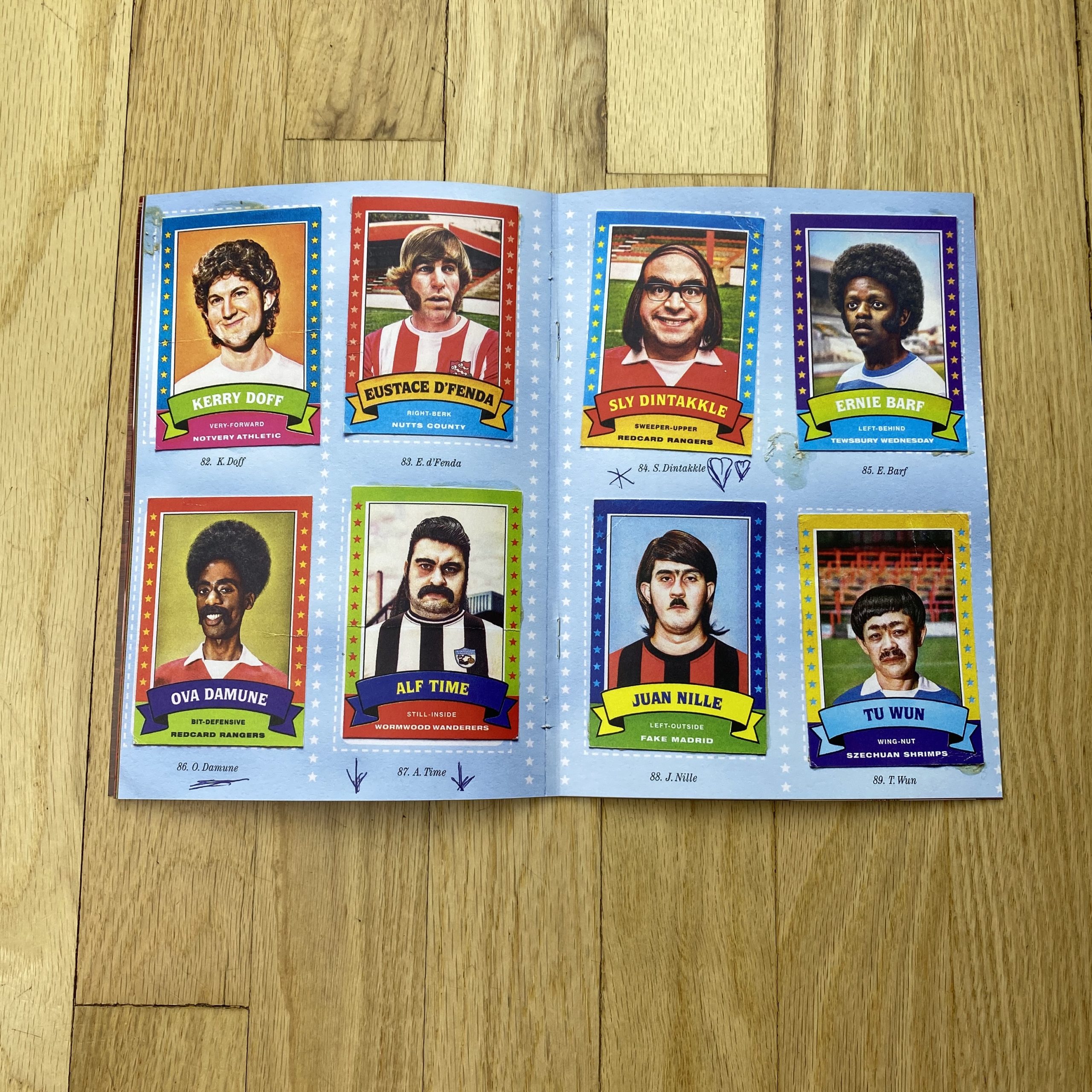
A few months later, Mark and I decided to shoot a comedy soccer player. From there, we thought we should do a few more and then two years down the line, we’ve got 9 teams, a tonne of images and a full sticker album.
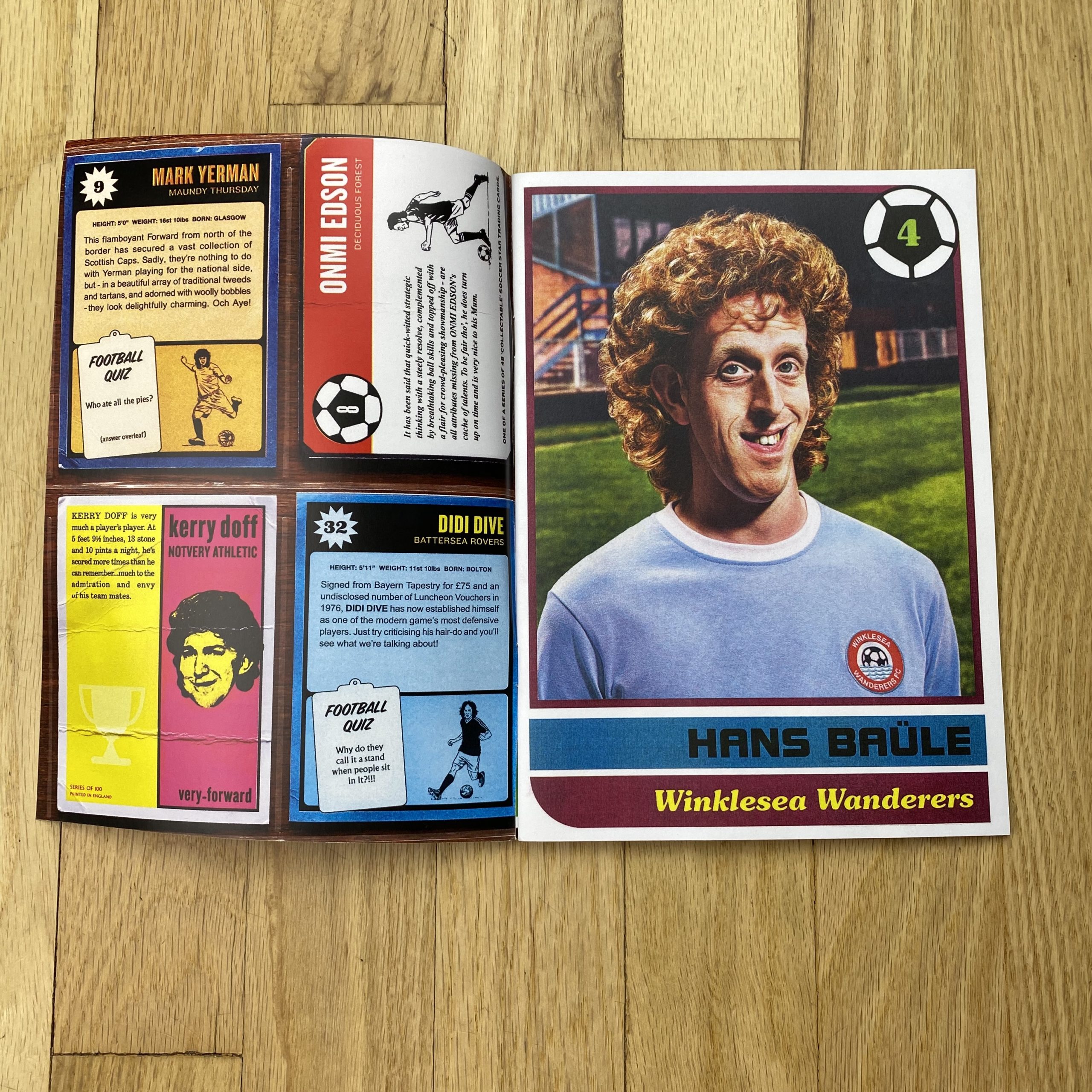
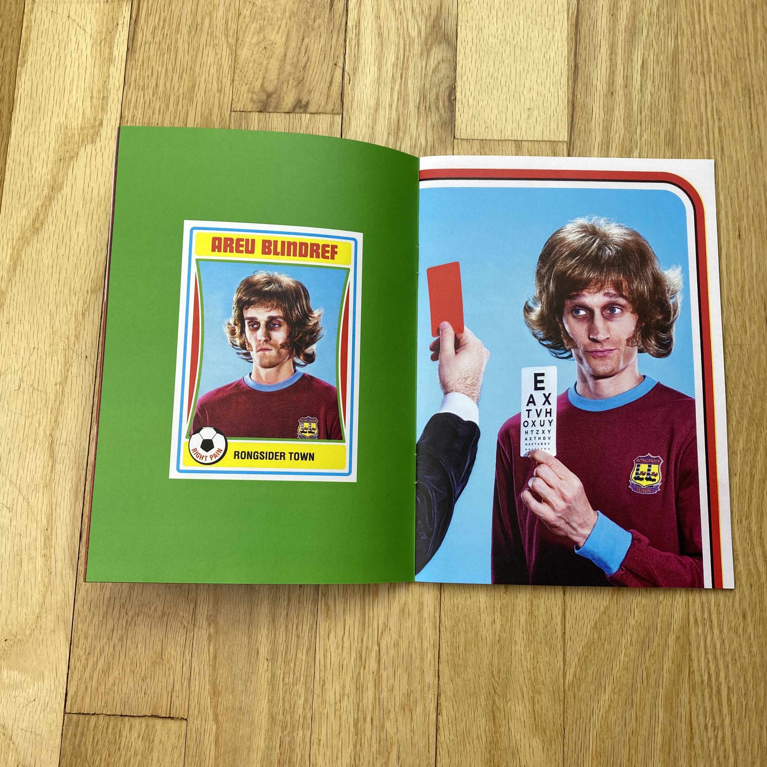
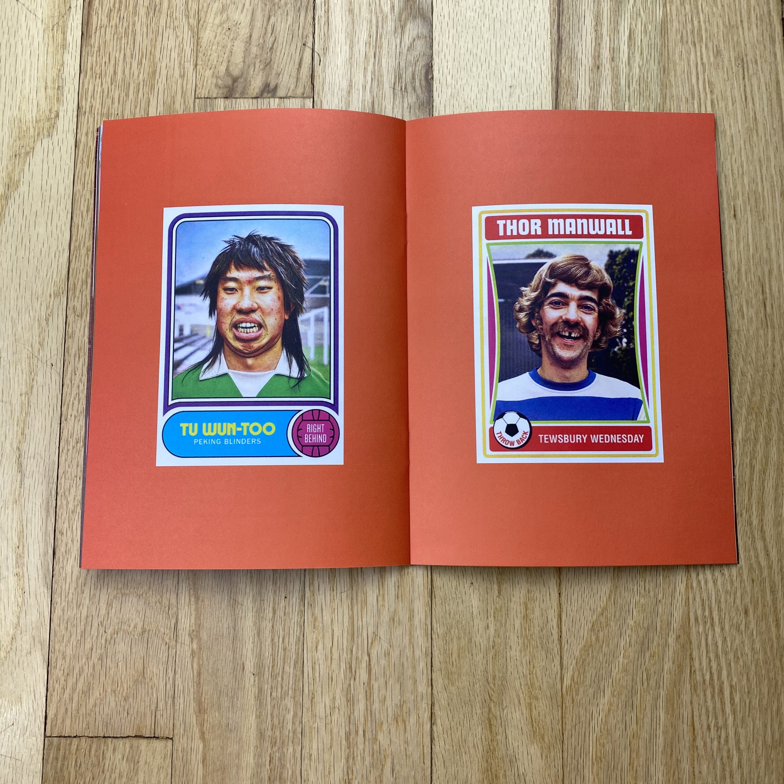
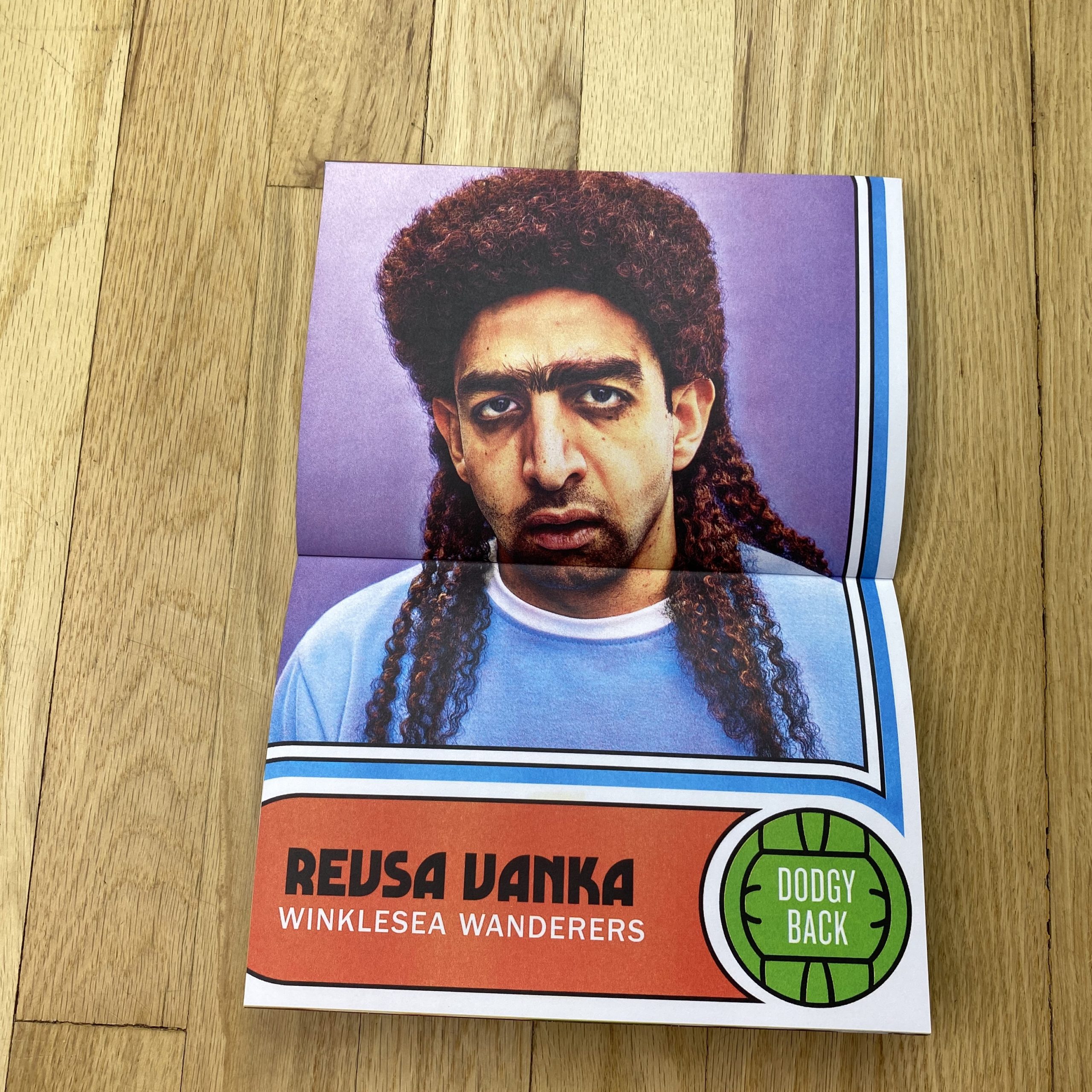
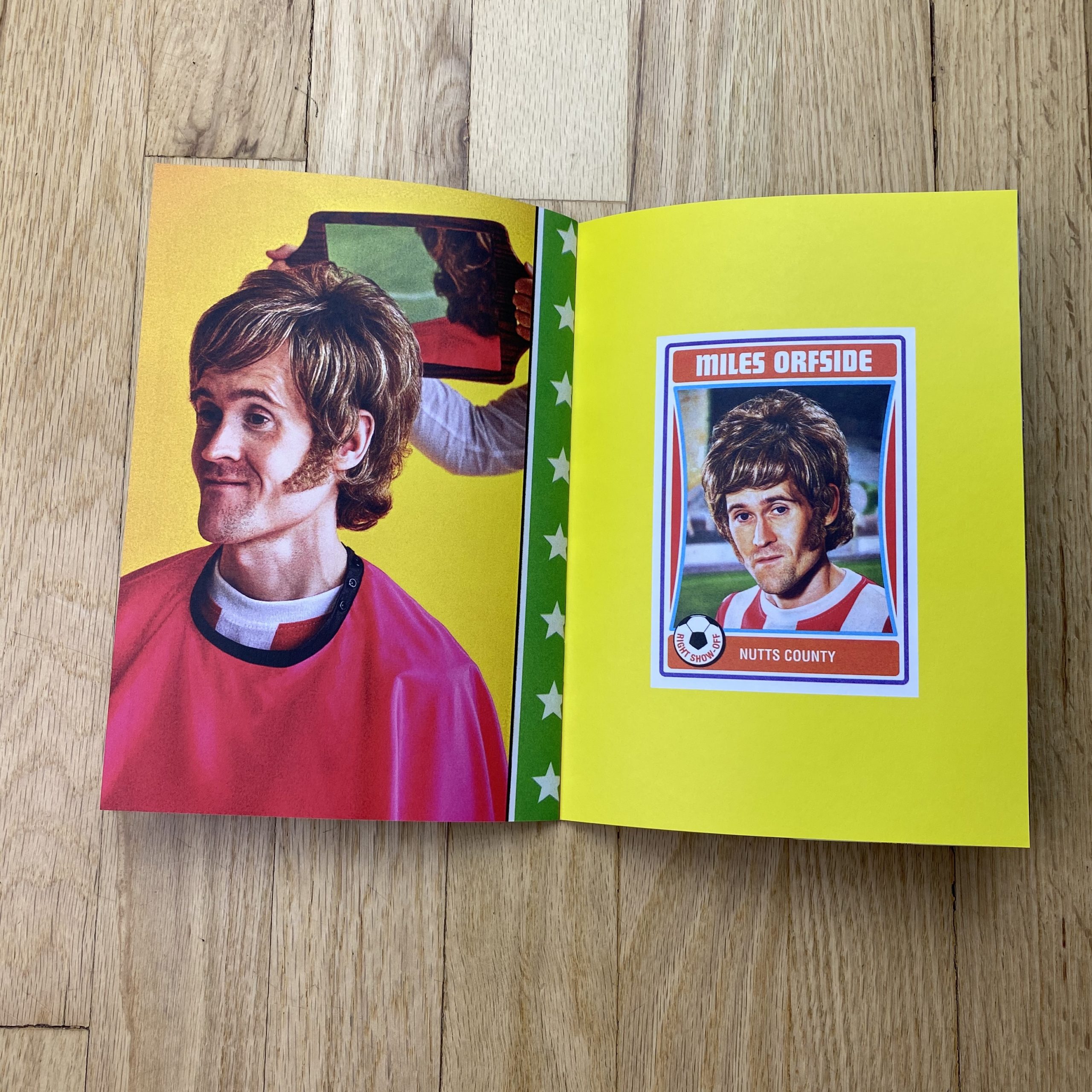
The images are designed to both satirise and evoke memories of a bygone era of soccer when the hairdo was almost as important as understanding the offside rule.
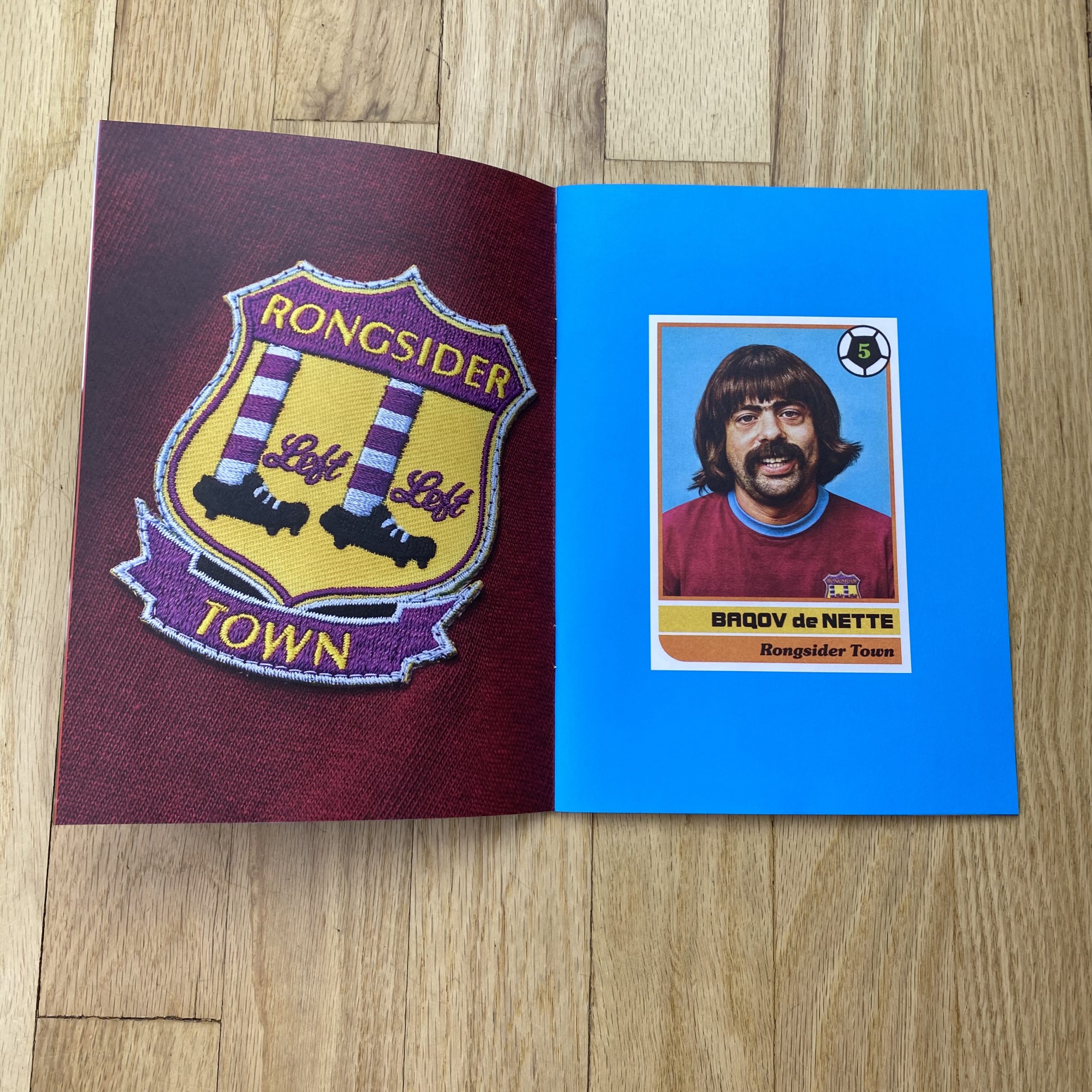
We had great fun shooting these, with myself even getting in front of the camera. Mark persuaded me to try on a wig. Initially thinking it would make a funny profile pic, I turned out to be one of the star players. (a.k.a Baqov De Nette).
A central part of these images was getting the hair right. We worked with expert hairstylist Anna Longaretti whose skill with wigs and 70’s hair creations are second to none.
The attention to detail that went into creating these is staggering, from casting to designing and creating teams, kits, backgrounds, lighting, and an exhaustive post-production process to authentically age the images.
Who Printed it?
The actual Zine is printed by a mid-level printing company called PrintedEasy.com, because in emulating soccer zines, a premium glossy print job wouldn’t have felt right.
It was printed digitally (as opposed to litho) which meant we could try out multiple paper stocks. We tried a number of uncoated and coated stocks of different weights and settled on 170gsm matt coated for the outside and 140gsm uncoated for the inside.
Although the print was better on coated stock, it had better colour repro and dynamic range. The uncoated felt more authentic for the images.
We ran a number of other print processes in order to create this unique look. All the cards were risographed once retouched, scanned back in, and then retouched again.
Although time-consuming, this analogue stage really made a difference.
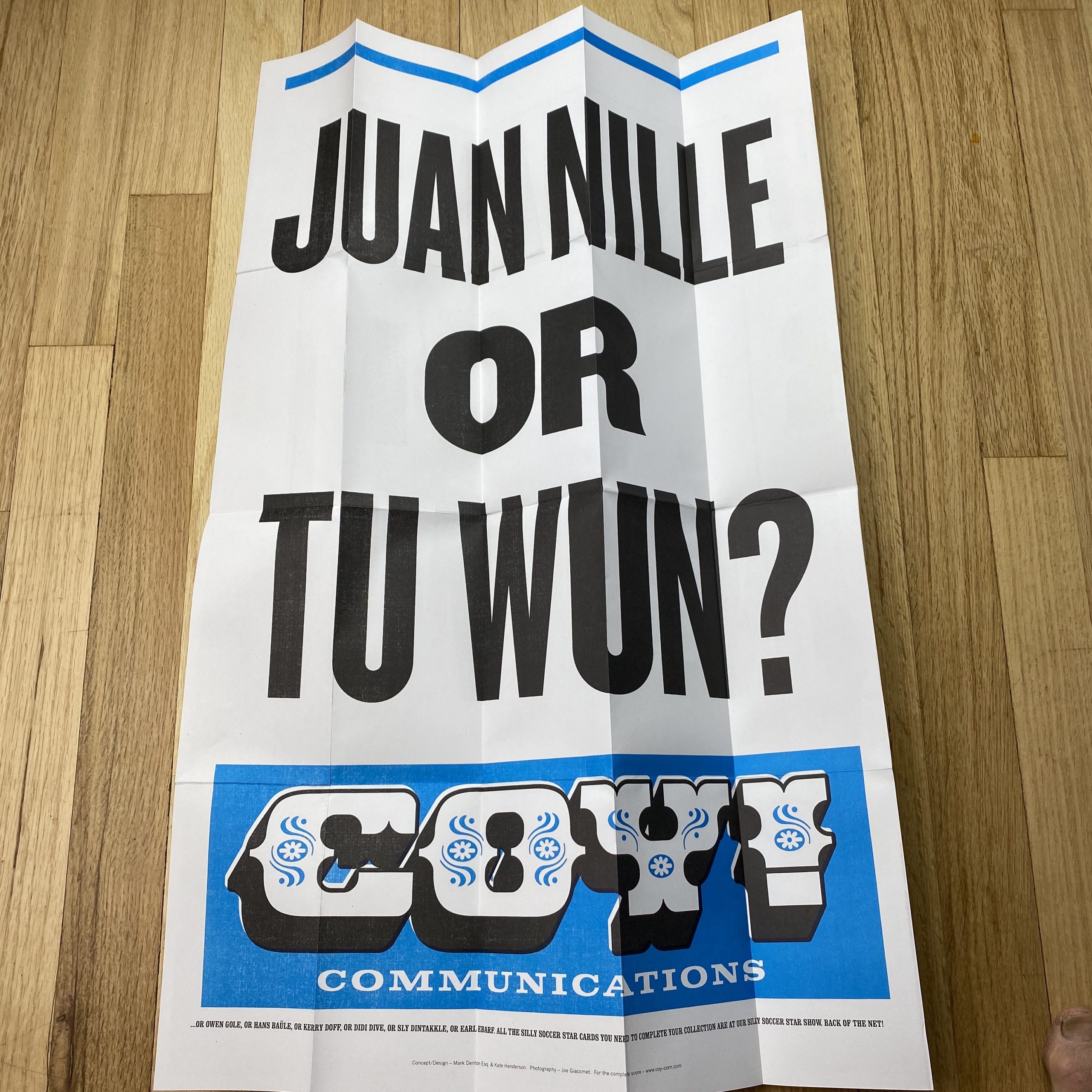
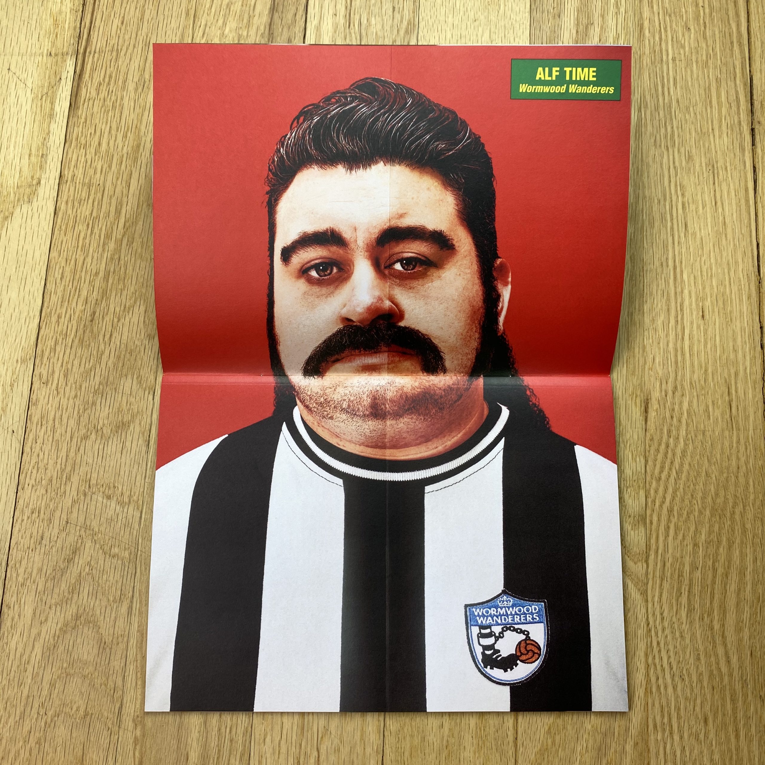
One image was poster printed – we then creased it and rephotographed it to make it look like a pull out poster. The centre spread is also a photograph of a physical page we created. The cards were printed actual size and stuck to a print out of the background image and then rephotographed. Same with the inside front and inside back covers. A lot of extra processes overall, but all part of the endeavour to make it authentic and unique.
Who designed it?
It was designed by Mark Denton Esq. with the help of Kate Henderson and Tivy Jones.
How many did you make?
There are a few iterations knocking around with subtle changes to the print stock, images, and design but in total around 500 copies.
How many times a year do you send out printed promos?
Previously about 4 times a year, but in recent busy periods, it has been a lot less. This is the first thing I’ve sent out in 18 months.
Do you think printed promos are effective for marketing your work?
It’s really hard to say. In the past, I’ve been saddened by the lack of response but then equally, jobs come out of nowhere which could be down to printed promos.
This promo, however, has been a different experience altogether.
Being in lockdown, I sent this out all my existing mailing lists. It turned out a lot of these were no longer valid which meant I individually reach out to everyone I wanted to send it to. This turned out to be a fantastic opportunity to re-connect with old contacts, it helped me make new contacts and I believe this made the mailer more effective than usual.
