The Art of the Personal Project: Michael Grecco

The Art of the Personal Project is a crucial element to let potential buyers see how you think creatively on your own.  I am drawn to personal projects that have an interesting vision or that show something I have never seen before.  In this thread, I’ll include a link to each personal project with the artist statement so you can see more of the project. Please note: This thread is not affiliated with any company; I’m just featuring projects that I find.  Please DO NOT send me your work.  I do not take submissions.


Today’s featured artist:  Michael Grecco

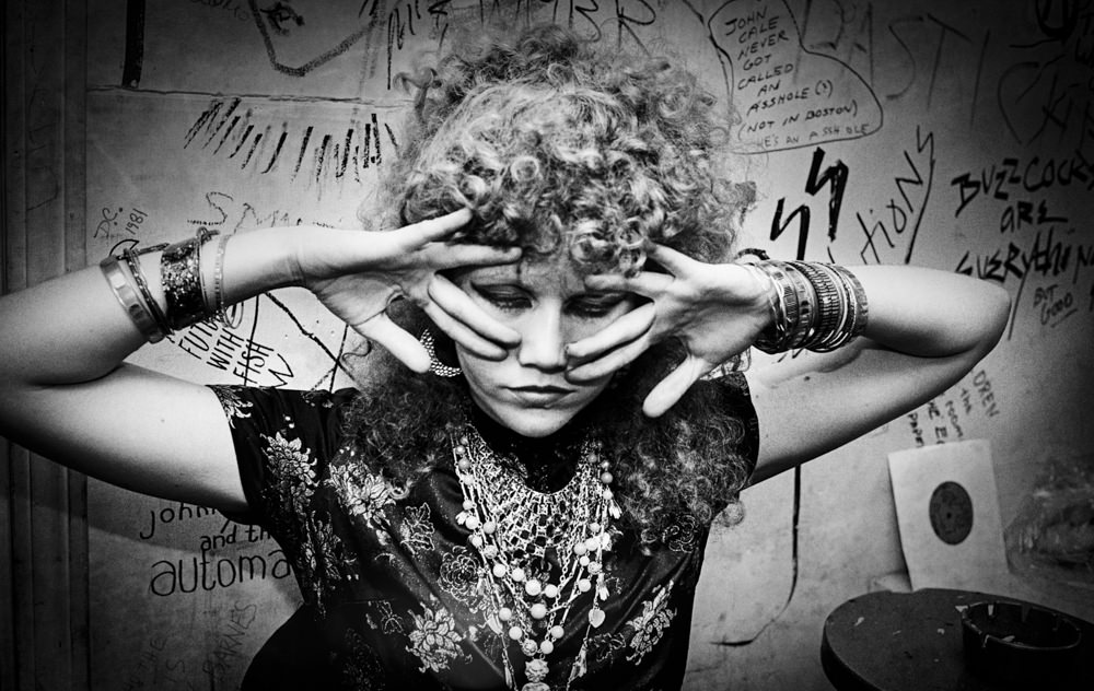
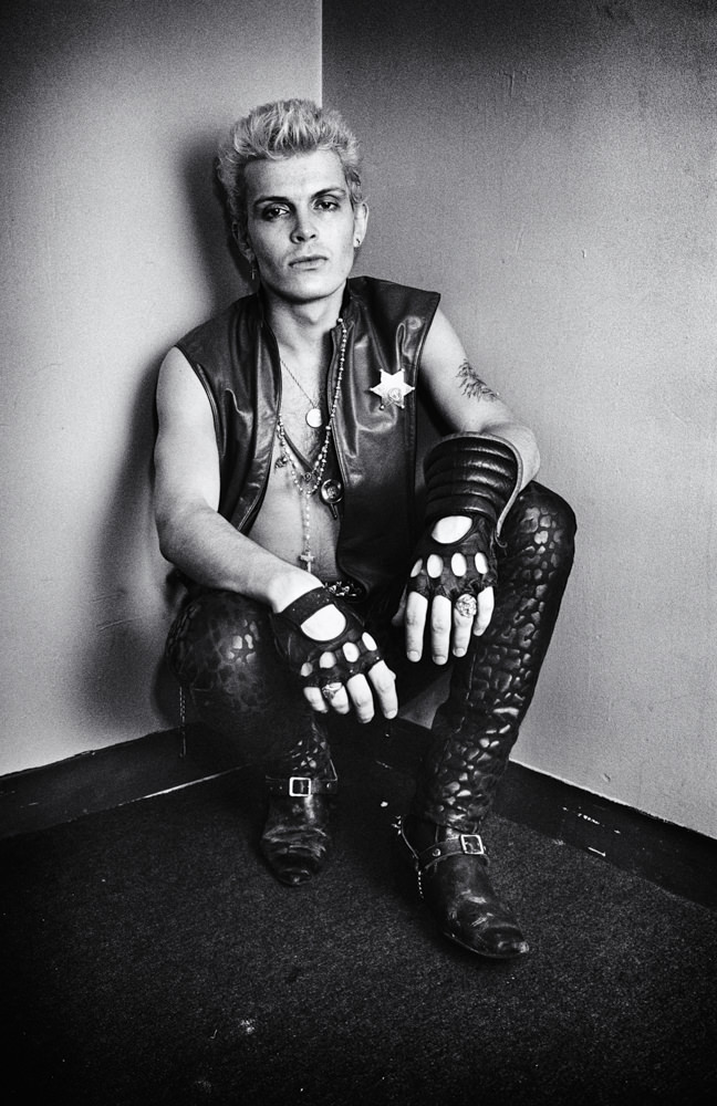
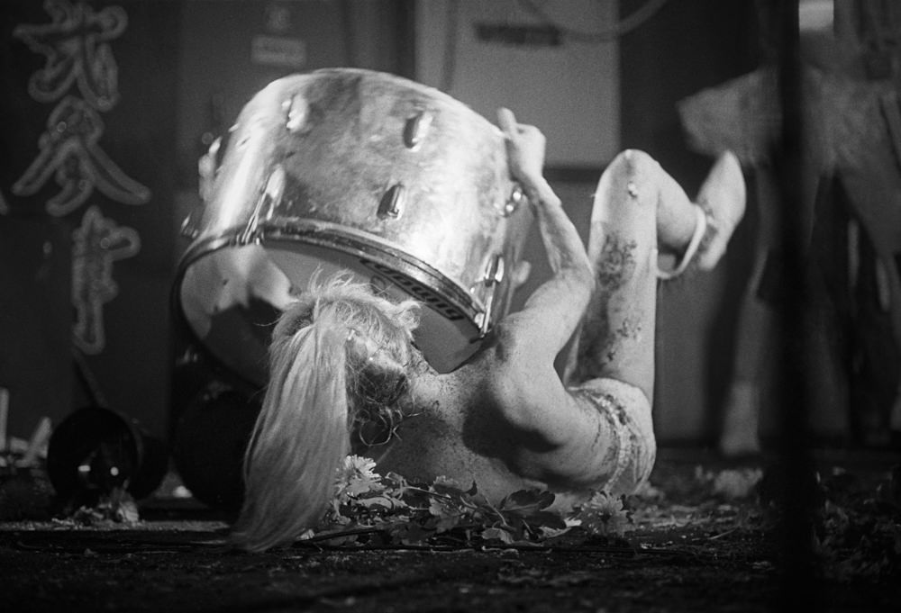
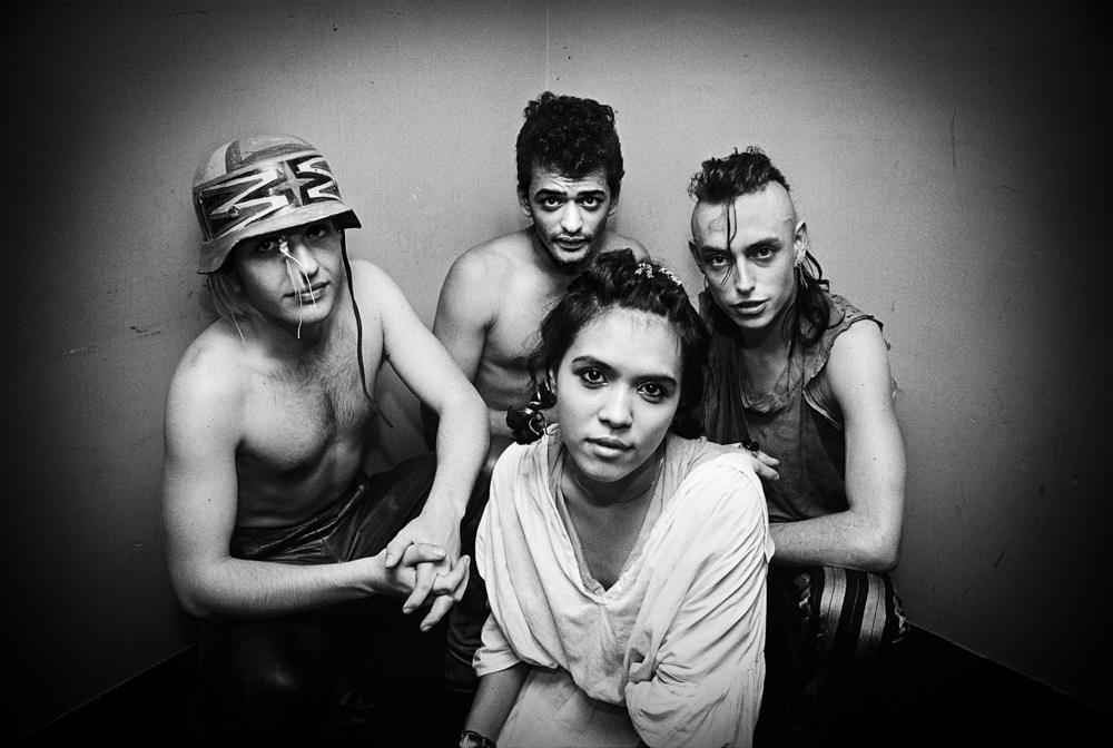
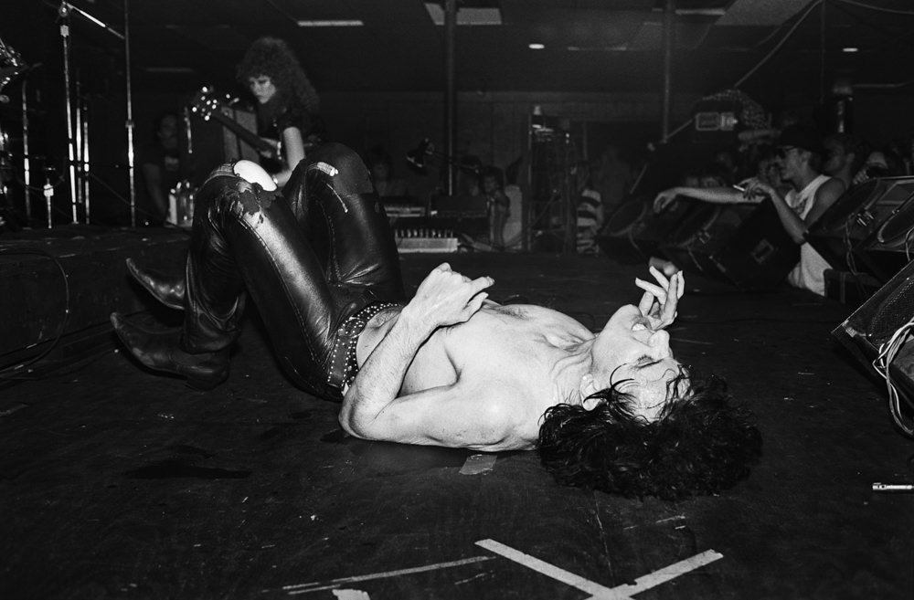
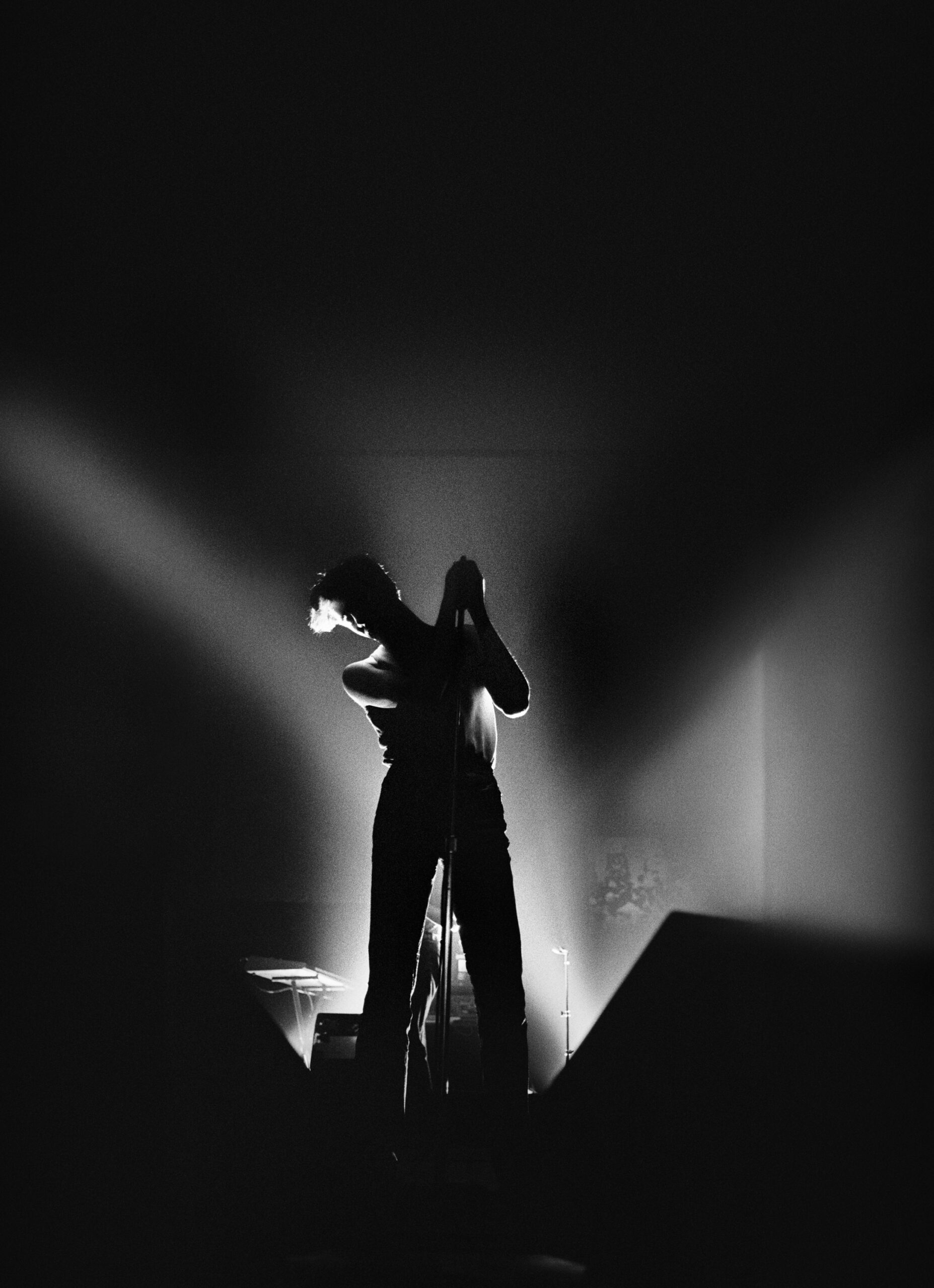
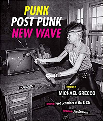
Days of Punk, The Punk and Post Punk Era

I moved to college in the mid-seventies in Boston a music elitist. My New York upbringings had created a music snob, into only the coolest rock, Bowie, The Velvets, the Ramones, Pattie Smith and a hatred for hair bands including Alice Cooper, Sabbath and Motley Crue. Especially after enjoying Jazz in NY also, the music being produced by the mega music industry went nowhere and said nothing interesting.

I knew it all, all there was to know about music, except what was coming around the corner. One day I took the short walked into the Rat in Kenmore Square, a few blocks from my dorms and my life changed. That night was a battle of the bands, but they were all punk bands. They played a musical extension of sounds and riffs I was familiar with from early groundbreaker, but yet it was new. I also realized that I would have never heard this bands on record or on the radio of the day. This was the outlet for them, the dark, smelly seedy underground. That night changed my life and led me on over a 5-year journey of sex, drugs and punk.

I was the club kid out every night, shooting bands, partying with the bands and then getting my shit together to as a photographer for the Associated Press during the day. I would disco nap at to 6 PM after work, have dinner at 10 PM and then back out to the clubs by midnight: Spit, The Underground, The Rat, The Channel, and The Paradise Club and Cantones. The music was starting to erupt and with it the first college punk radio show, The Late Risers Club. This was my life until a staff job at the Boston Herald made the drinking and drug and staying out all night impossible.

This is the recorded history of that world and that time, the story must be told.

Lead guitarist Poison Ivy (born Kristy Marlana Wallace) of the punk rock band “The Cramps” is backstage before performing at a theater in 1980 in Boston, Massachusetts.
Musician Billy Idol poses for a portrait back stage one month after his debut solo album release of ‘Billy Idol’ in Boston, Massachusetts on August 01, 1982.
Punk rock band lead singer Wendy O Williams and the Plasmatics performing on stage on November 13, 1980 in Boston, Massachusetts.
Members of the punk rock group “Bow Wow Wow” performing on stage at the Paradise Theater in Boston. Members include Annabella Lu Win (lead singer), David Barbarossa (Dave Barbe) on drums, Matthew Ashman (guitar), Lee Gorman on bass in Septemeber 1981 in Boston, Massachusetts.
Lead singer Lux Interior (born Erick Lee Purkhiser) of the punk rock band “The Cramps” performing on stage at a theater in 1980 in Boston, Massachusetts.
Members of the pop music group “Human League”, Susan Sulley, performing on stage at a theater in 1980 in Boston, Massachusetts.

To see more of this project, click here.

To purchase the book, click here


APE contributor Suzanne Sease currently works as a consultant for photographers and illustrators around the world. She has been involved in the photography and illustration industry since the mid 80s.  After establishing the art buying department at The Martin Agency, then working for Kaplan-Thaler, Capital One, Best Buy and numerous smaller agencies and companies, she decided to be a consultant in 1999. She has a new Twitter feed with helpful marketing information because she believes that marketing should be driven by brand and not by specialty.  Follow her at @SuzanneSeaseInstagram

Success is more than a matter of your talent. It’s also a matter of doing a better job presenting it.  And that is what I do with decades of agency and in-house experience.


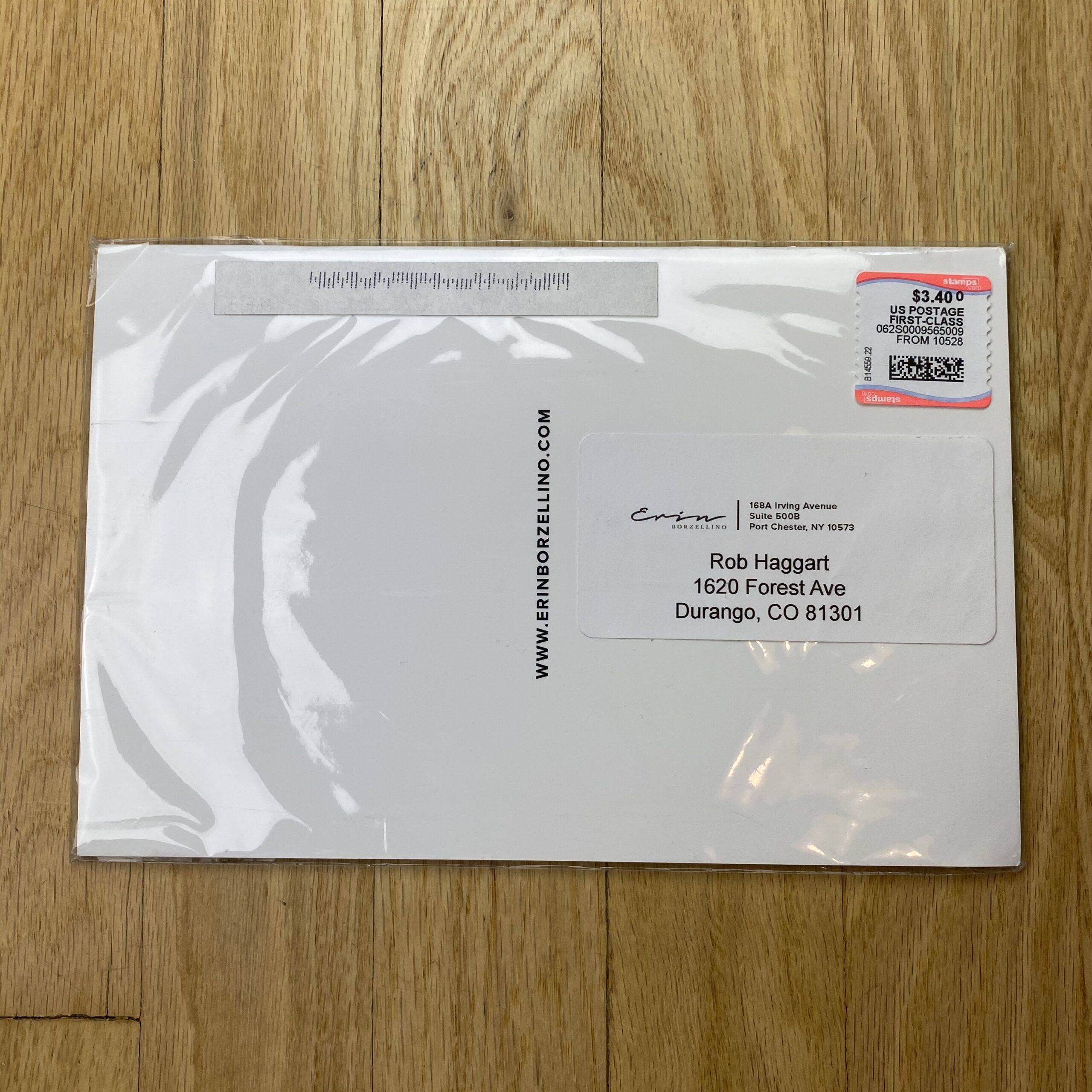
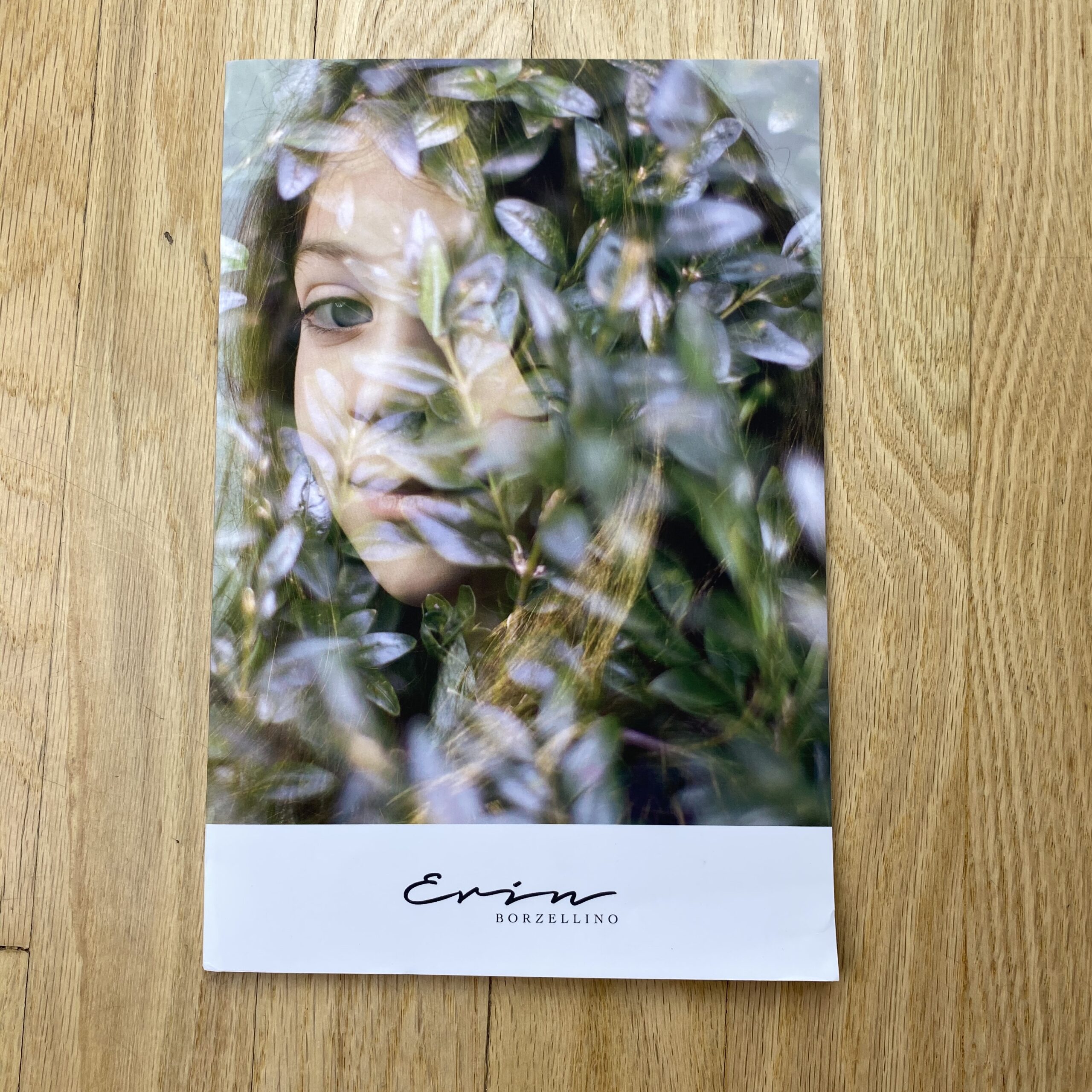
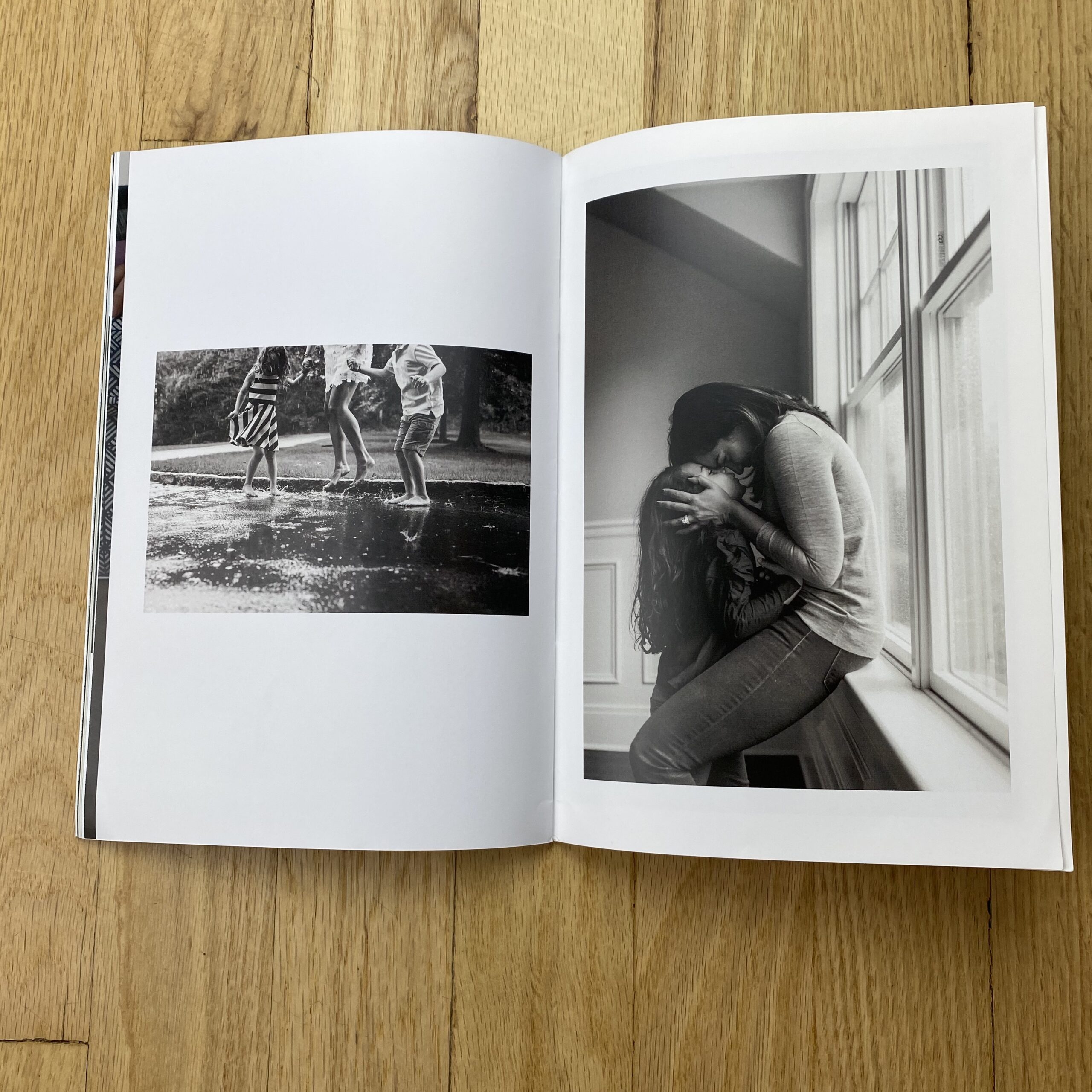
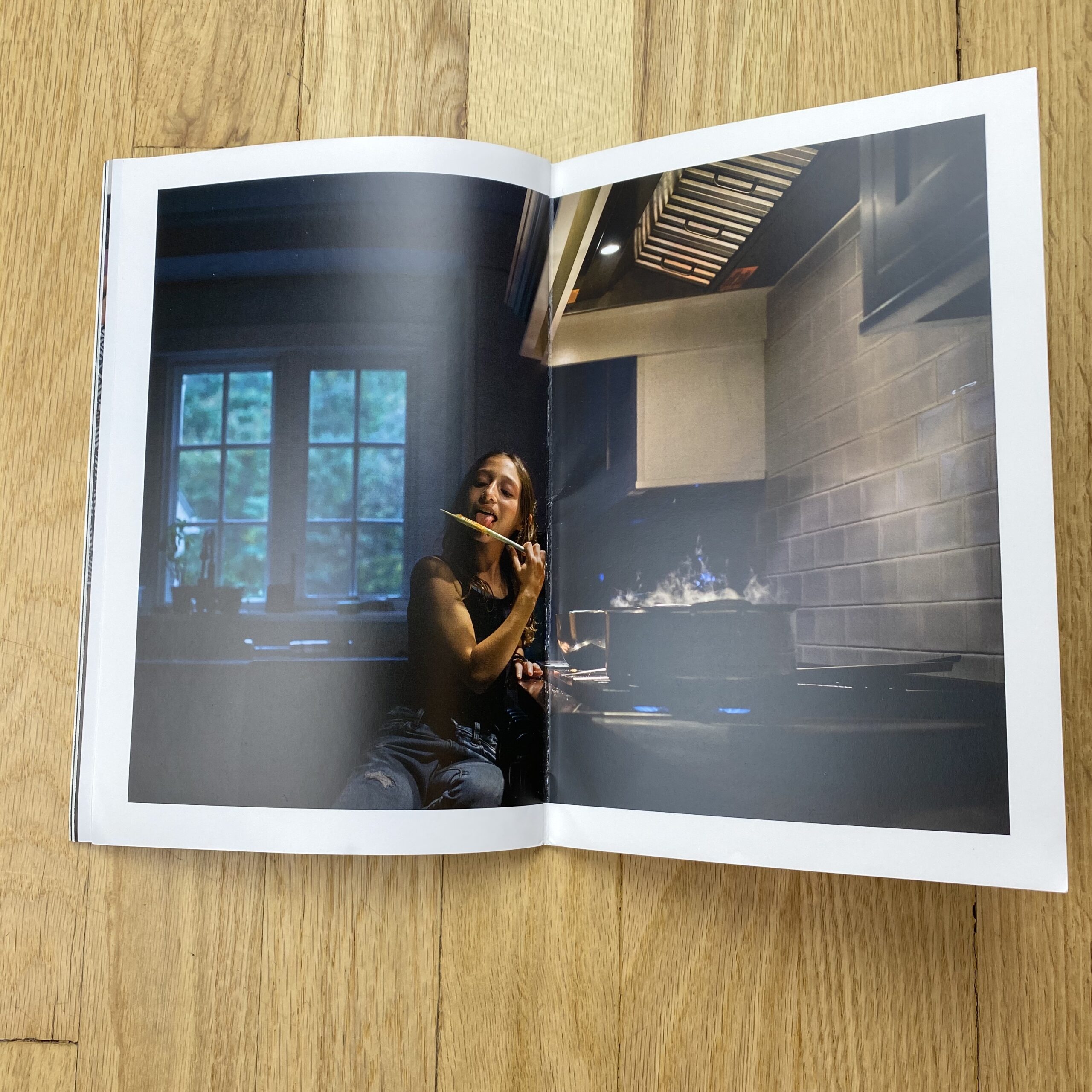
Featured Promo – Erin Borzellino

Erin Borzellino

Who printed and designed it?
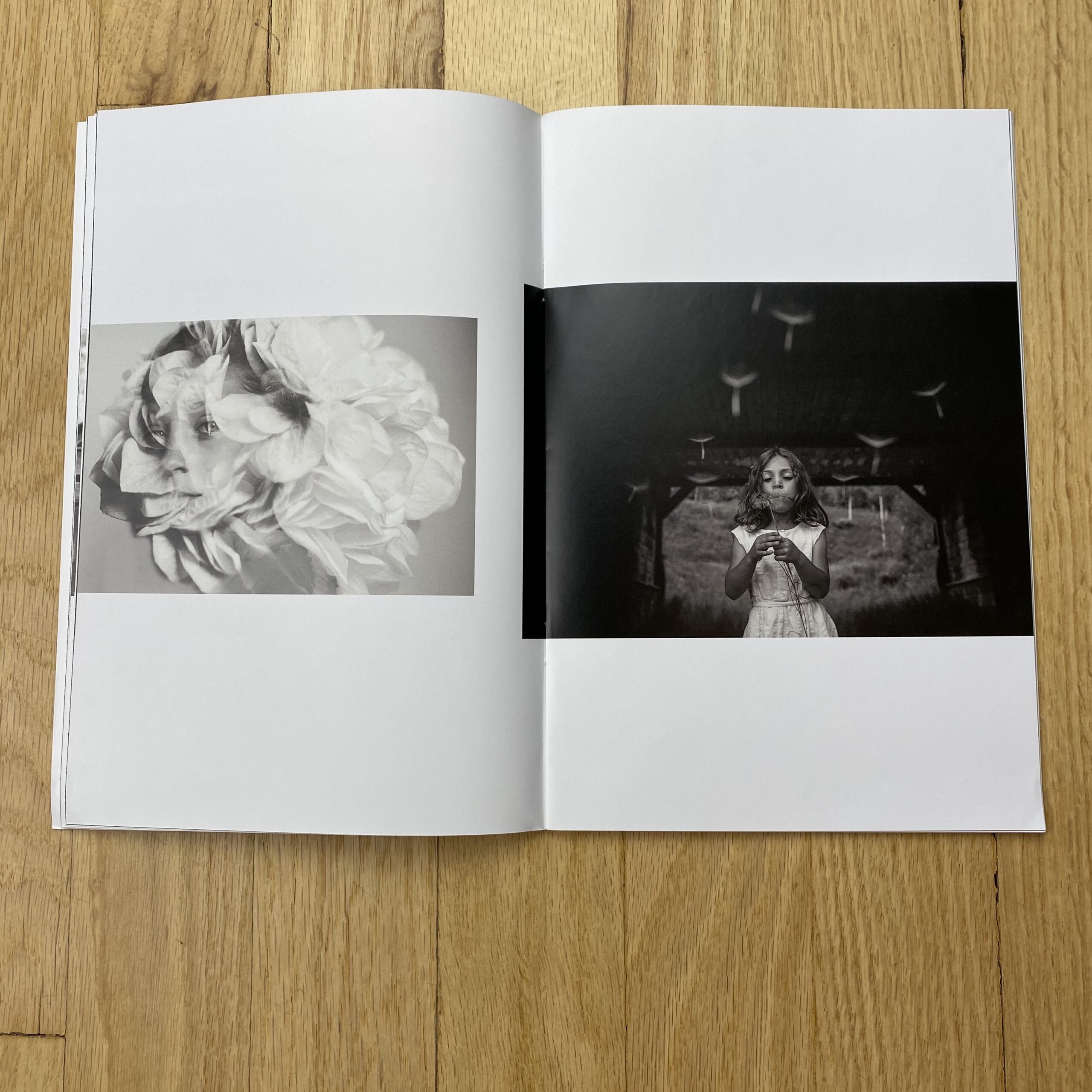
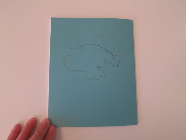
Peter Dennen of Pedro & Jackie (@pedroandjackie) did the bulk of the work choosing the photos and designing the layout. He really was a master at finding photos I forgot I created and organizing them to tell a story of childhood. The cover and title page were designed by Cody Cirillo (@codycir) using a couple of my double exposure images.

Having Peter’s eye on my work was invaluable. It naturally progressed to an editing and reorganization of my website, which I feel now better represents my strengths.

The booklet was printed by Smartpress. And I actually ended up having them re-print a small batch after I sent yours to fix a couple of problems and change to a thicker cover before sending to certain clients. Live and learn. I’m happy to send you a new one so you can see the difference.

Tell me about the images?
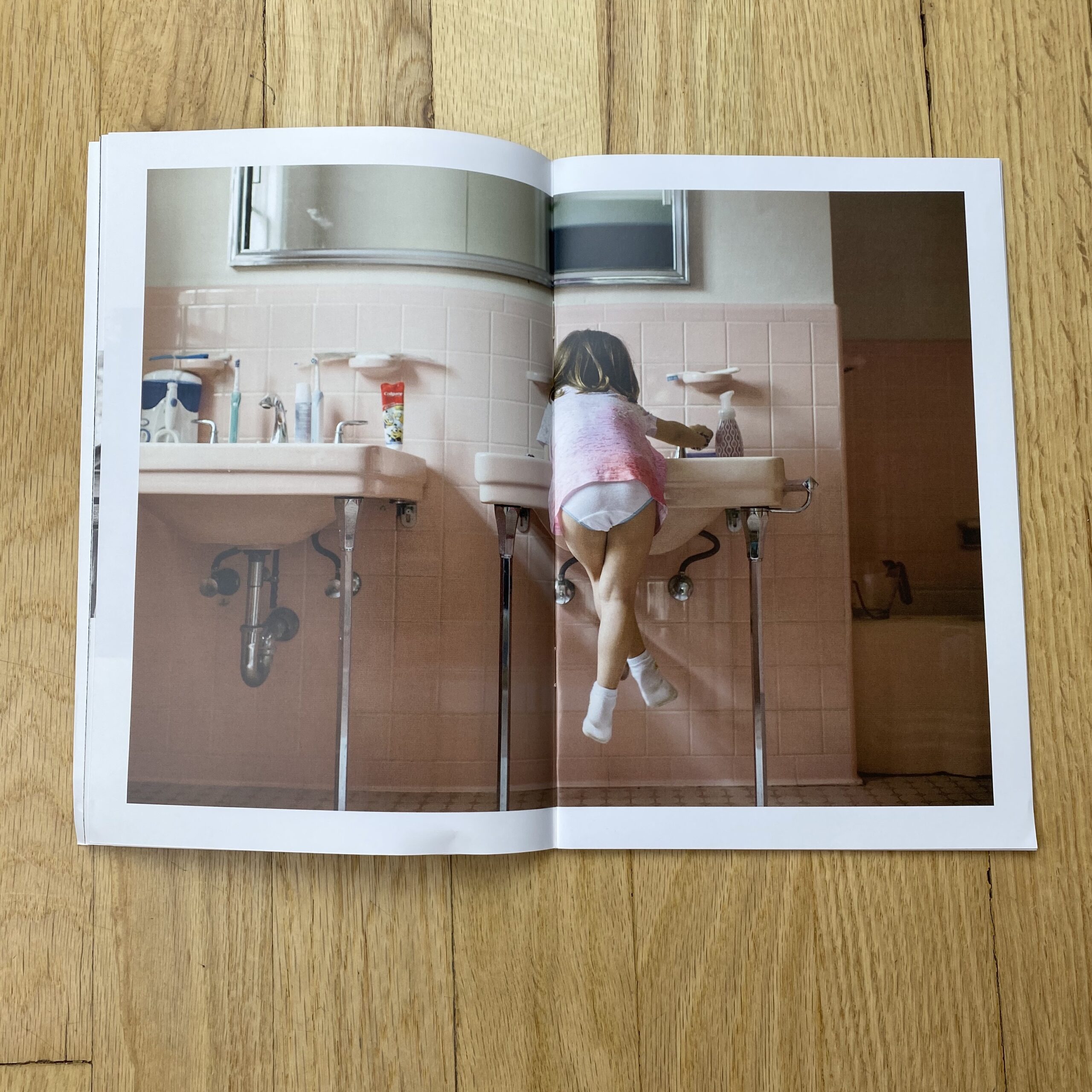
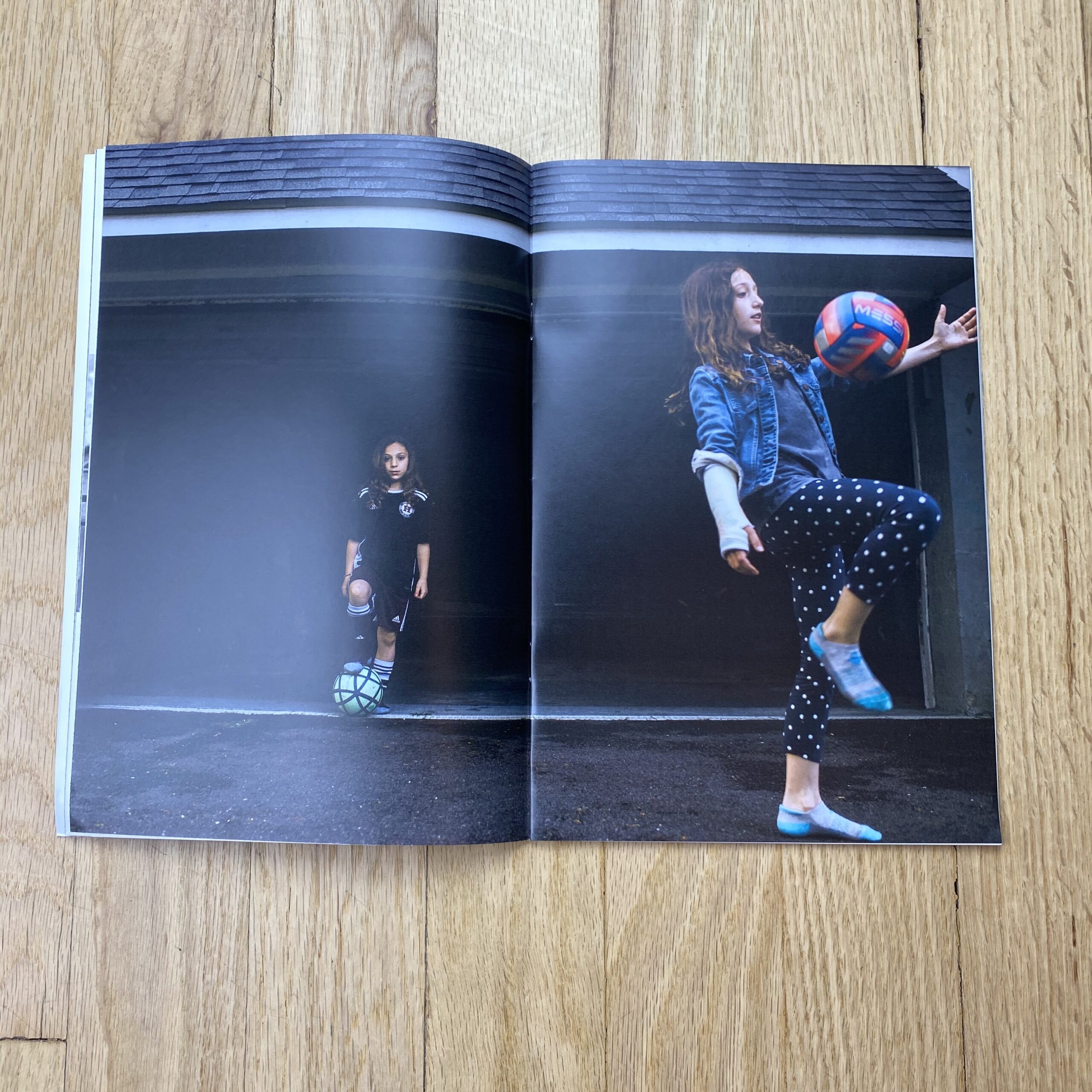
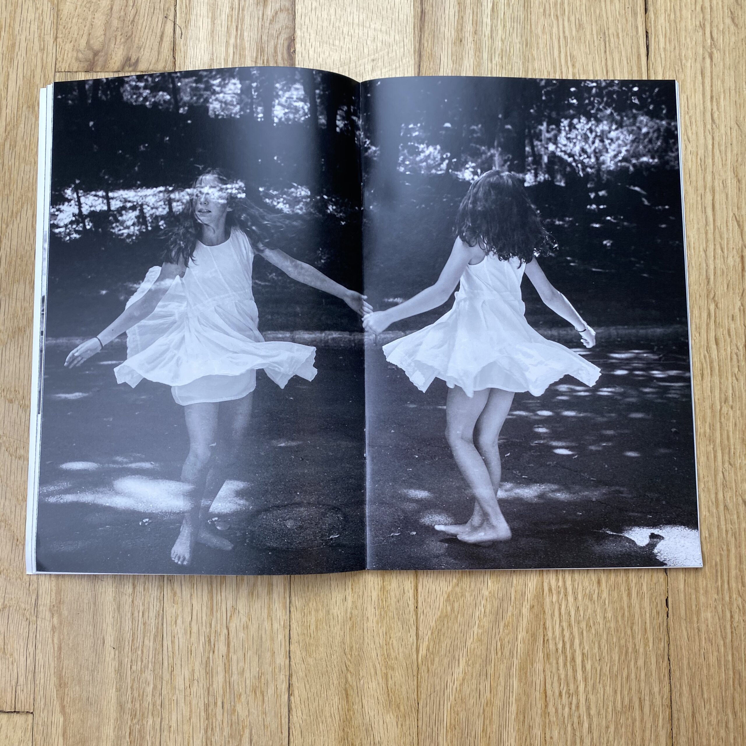
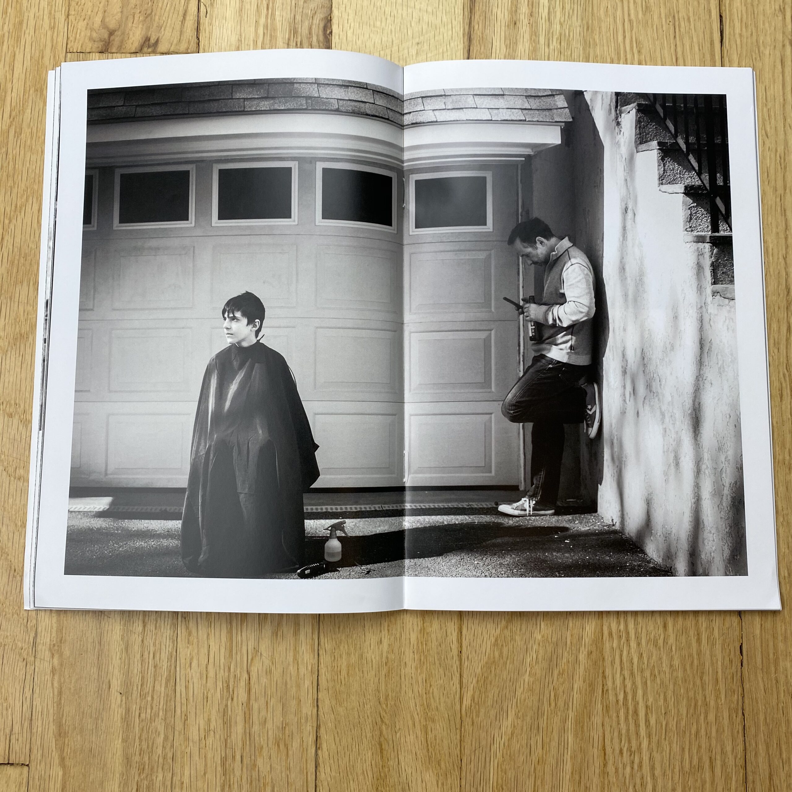
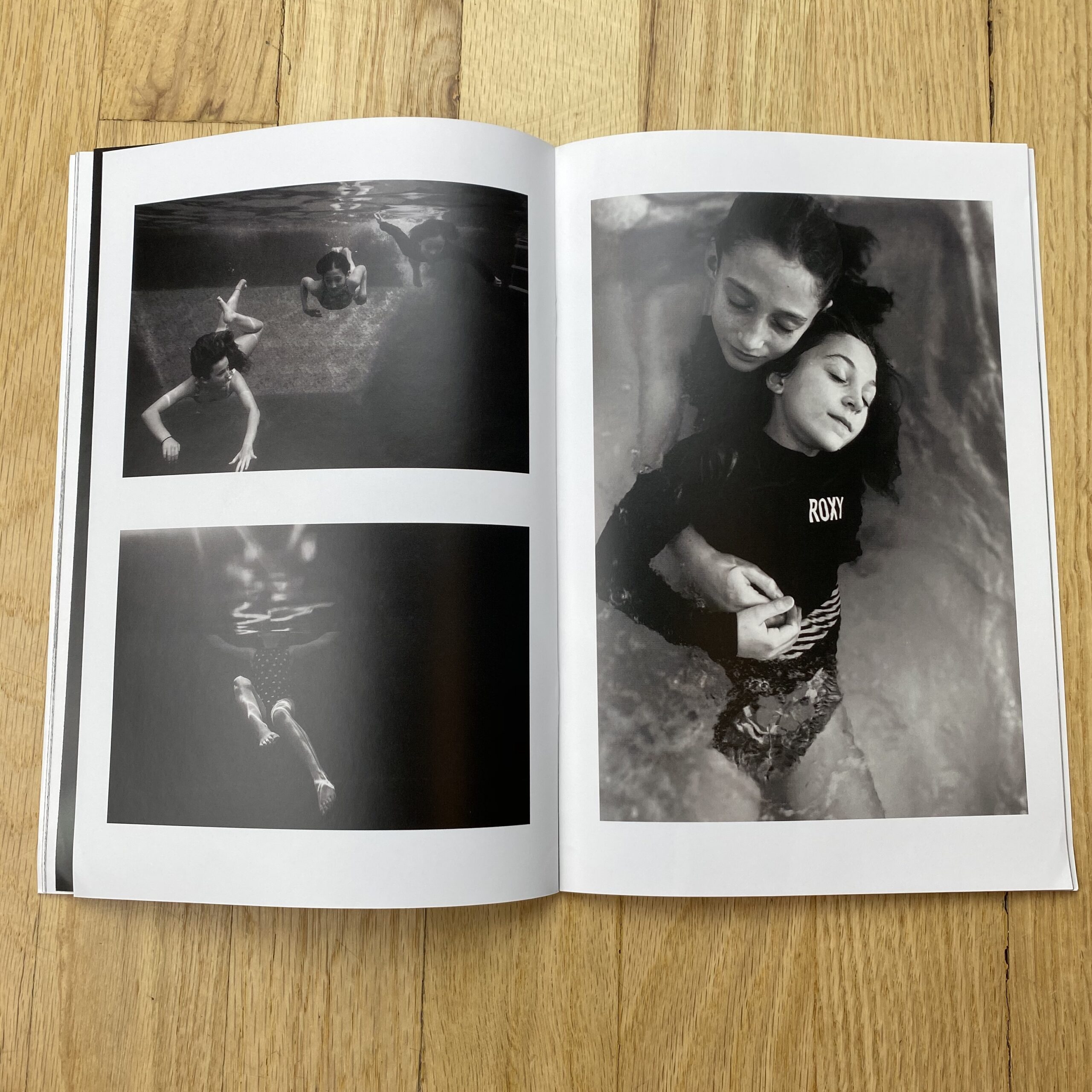
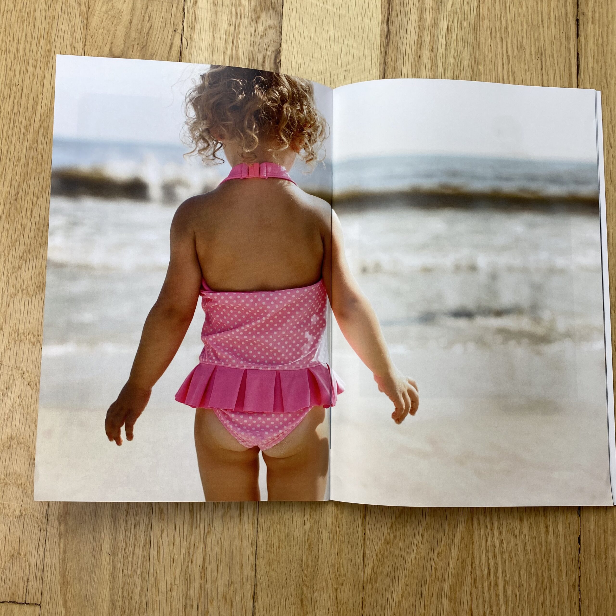
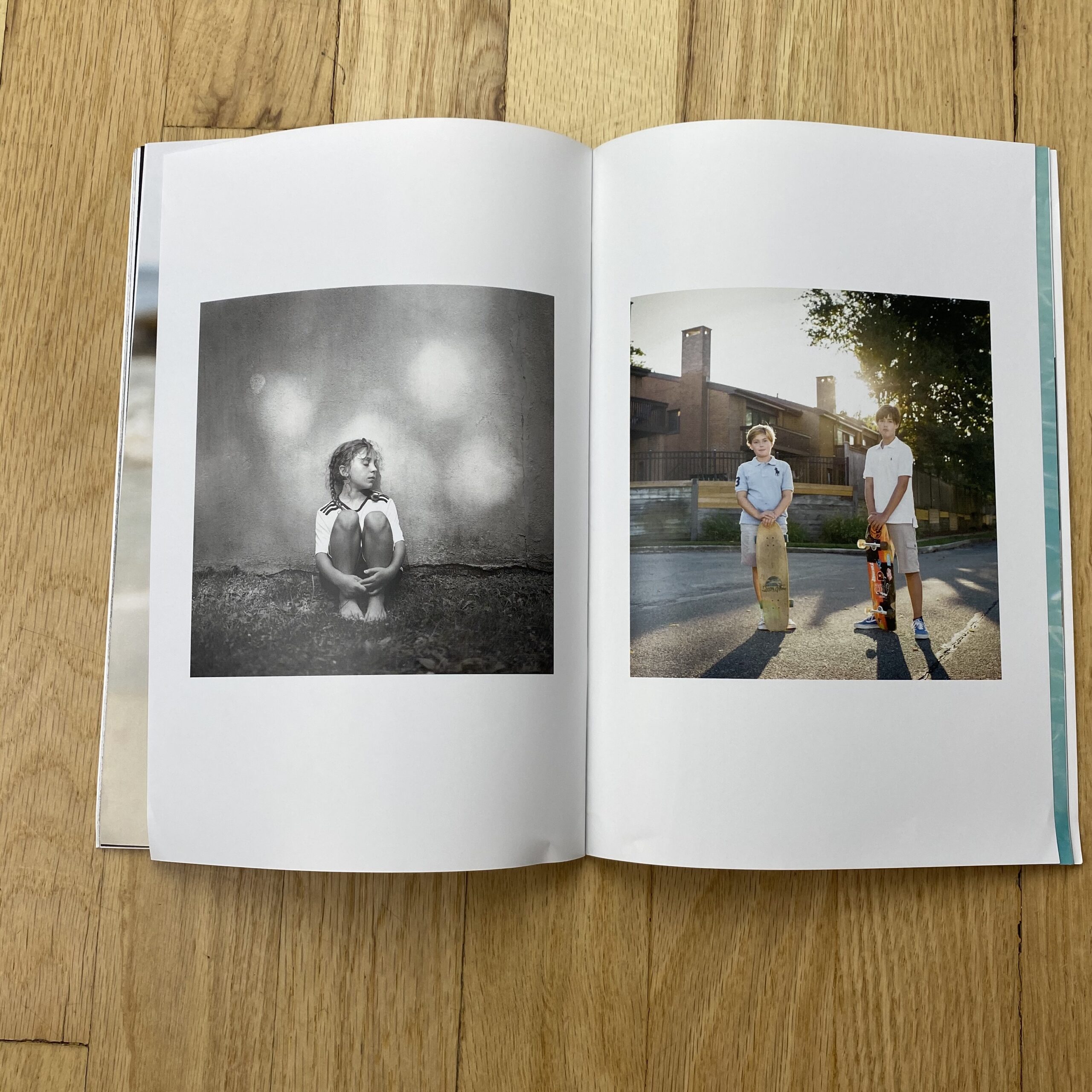
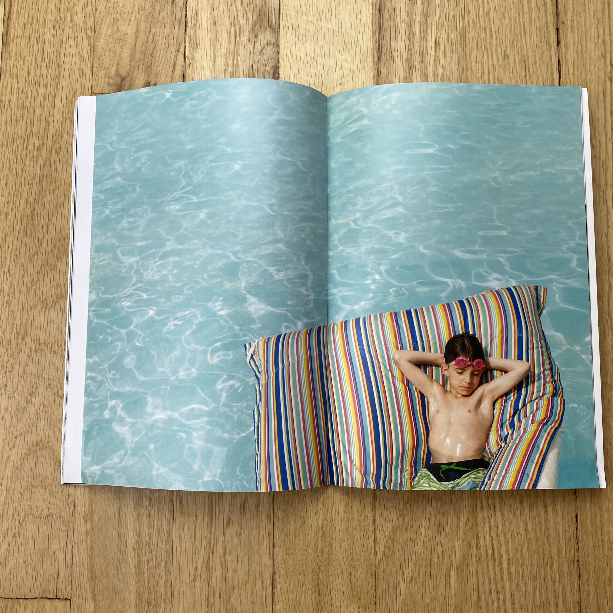
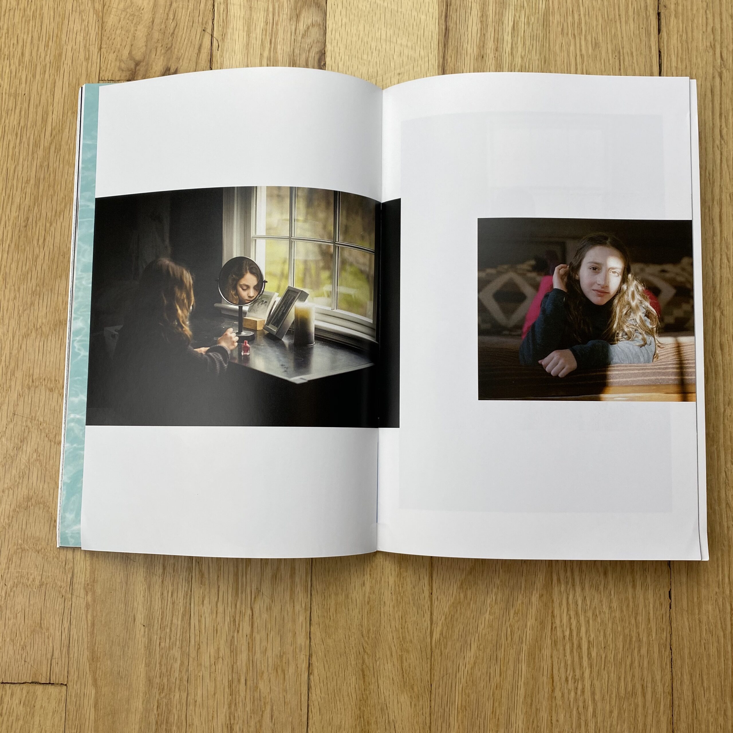
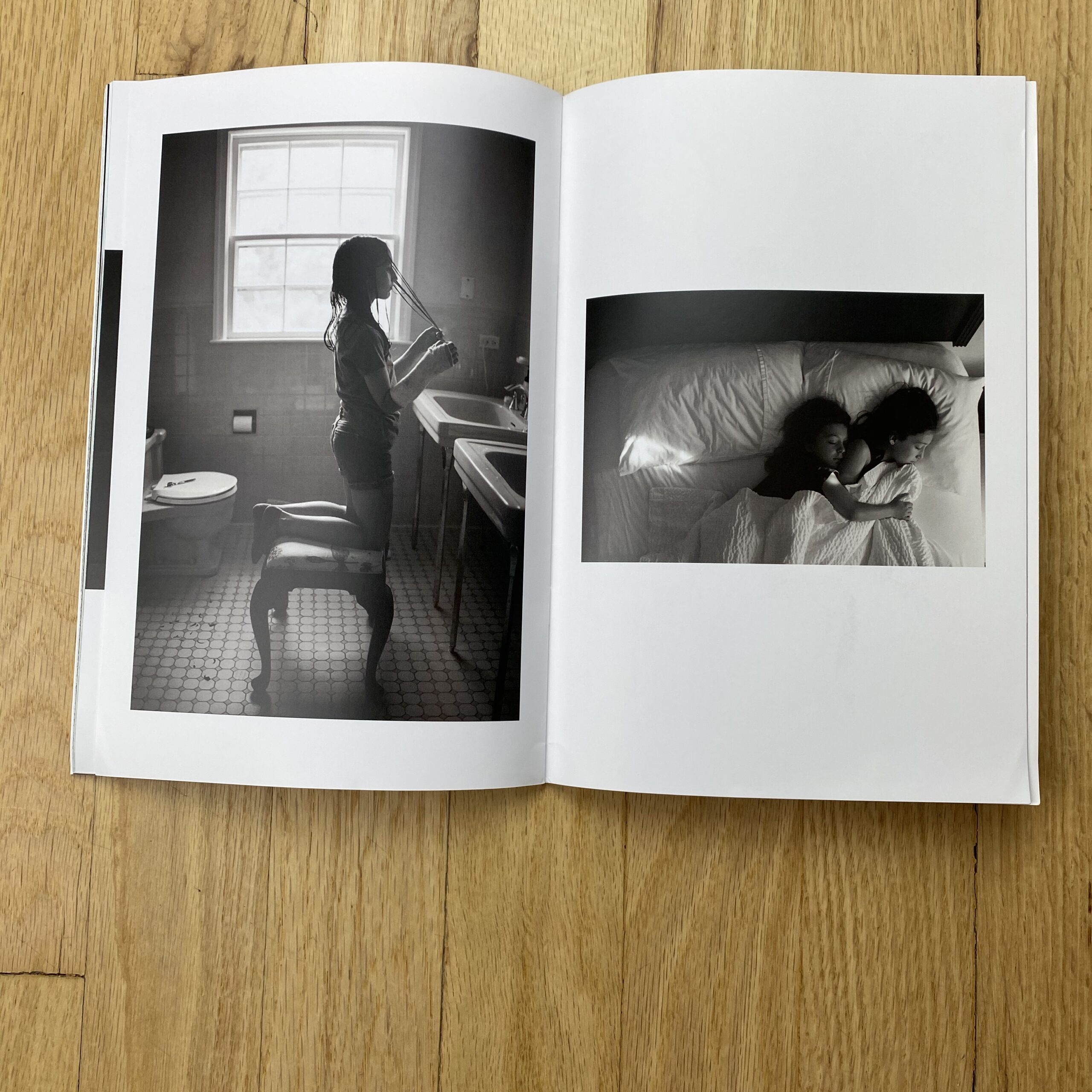
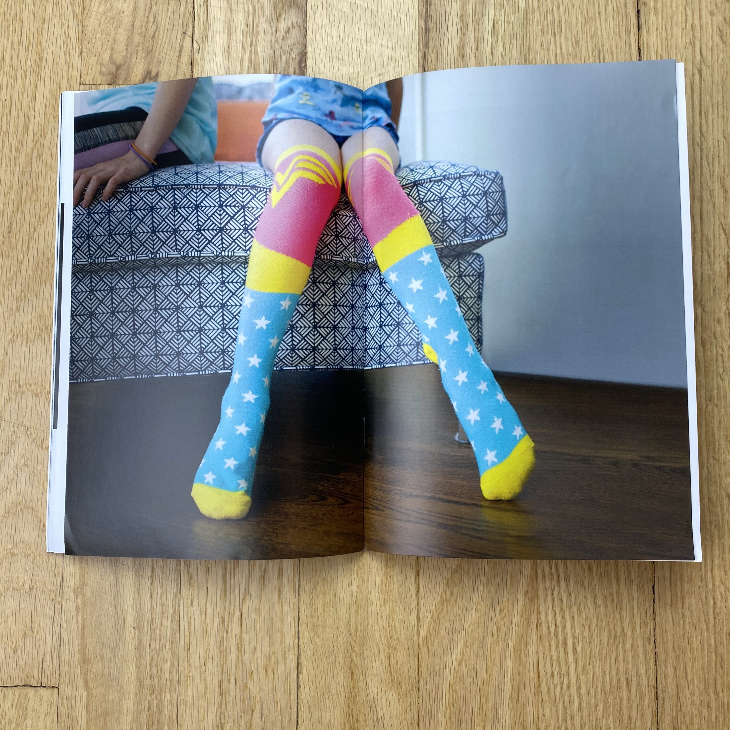
The bulk of my business and passion is photographing children and families. These images are a mixture of personal work of my own kids and commissioned work for families. I really wanted it to be full of images that were not over-produced and felt like true moments.

How many did you make?
The promo was meant to serve a dual purpose of beginning to market my style of shooting to a more commercial audience but still be appropriate for my existing retail clients. I printed 100 and have so far just mailed to about 70 of my retail and prospective corporate clients. I also made it into a digital flip book using Flip Snack and it resides on my website – which I plan to link to in an e-promo to a larger mailing list.

How many times a year do you send out promos?
This is my first printed promo and the experience was great working with Peter, so I think 2 a year would be realistic for me. I would gear the next one to a slightly different audience and will probably use either images from an upcoming corporate shoot or a personal project.

Do you think printed promos are effective for marketing your work?
I believe this has been very effective for getting my name out and making an impression in the NYC/Westchester area. I’ve heard they have been passed around and shared and that clients are hoping that a photo of their kids will make the cut in the next edition. Even in a year with so many challenges, this has been my most successful fall season.

This Week in Photography: Aliens Among Us


Do you know the Spanish word for fun?


It’s divertido.


In English, we use the word diverting, but that’s a far cry from fun.

To divert is to shift one’s attention.
Diversion is distraction.

To me, that’s a totally different concept from pleasure, or joy, both of which I associate with “fun.”

Right now, however, much of the human population of Earth is looking for distraction.

We want to be diverted from the raging pandemic, or the still-unresolved US Presidential election. (As I write this, on Thursday morning.)

{Ed note: Biden has pulled ahead as I post this.}

People want something, anything else to think about, because there is just so much depressing, bad news out there, and in most of the Northern Hemisphere, the leaves have now fallen, and winter will be here before you know it.

(Last Monday, for example, I awoke to 2 feet of snow, which put a serious crimp in my 5 mile a day walking habit.)

Just yesterday, I wrote my monthly Arsenal column for the English blog Le Grove, and my editor published it within two hours of the time I first began to write.

If the shit is readable, slap it up there, so people have something, anything, to focus on, beyond the uncertainty of this unique moment in time.

So please allow me to divert you today, with a really cool photo-book that arrived in the mail in March, just as the initial wave of lockdowns set in. (Always, I go for the hook. You should know that by now, as I’ve been doing this for almost a decade.)

I got a box from Surrey, England, but as usual, I put it in my review pile without knowing what it was.

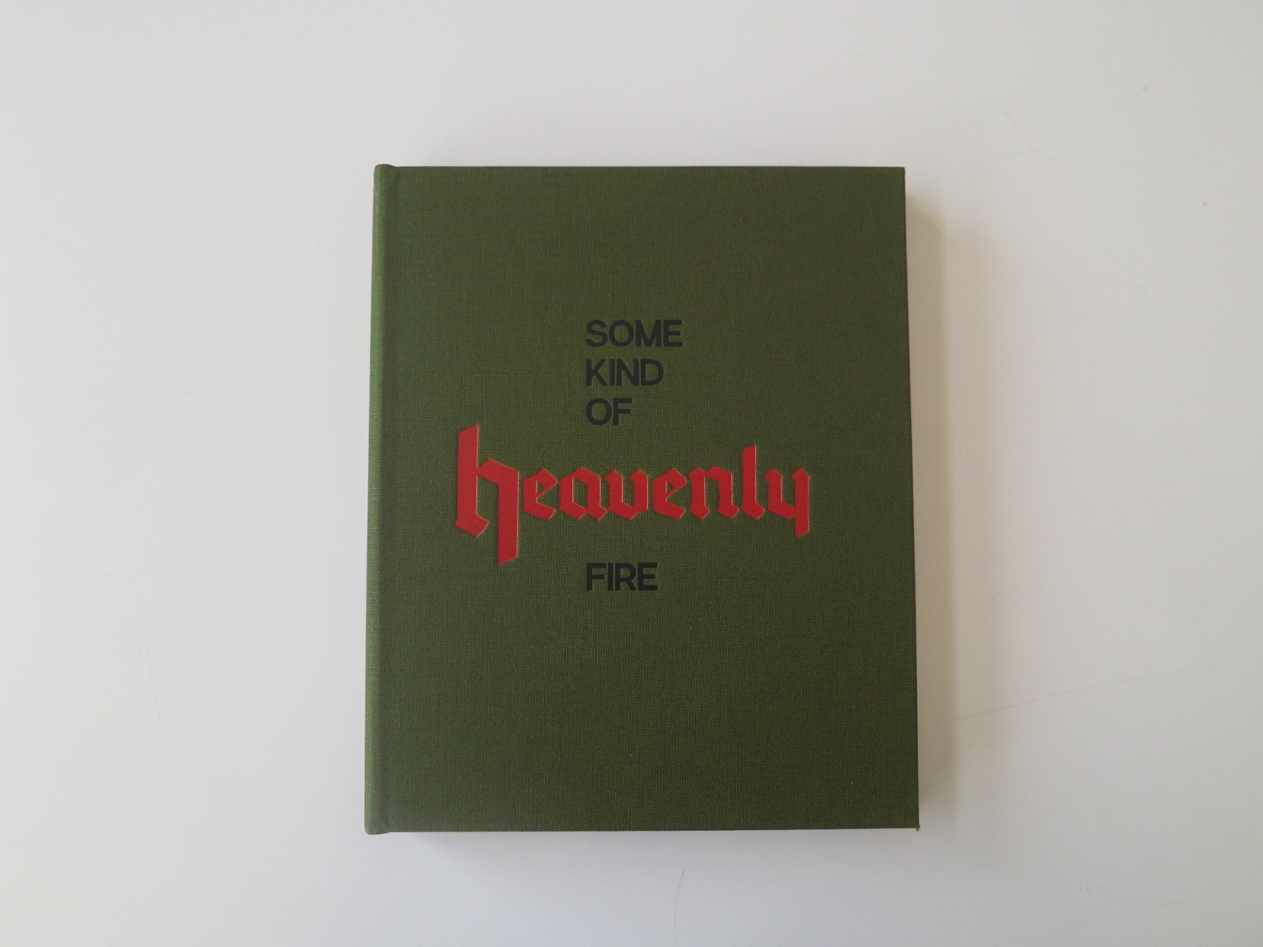
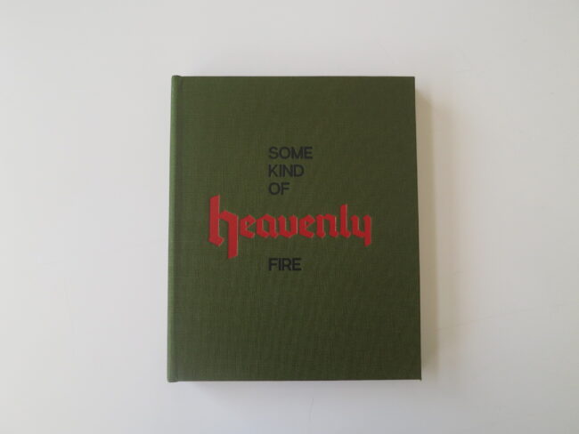
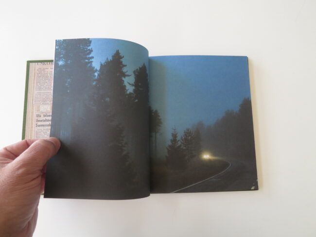
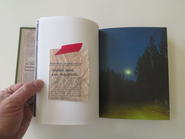
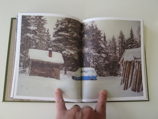
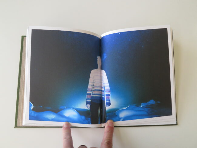
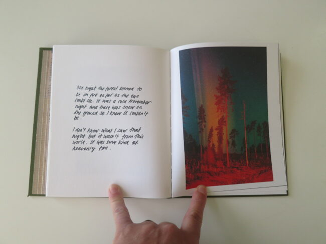
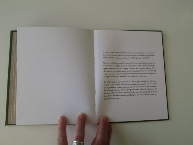
Today, as it felt like the right package, I opened it up, and found “Some Kind of Heavenly Fire,” by Maria Lax, published by Setanta Books.

I had no idea what it would contain, but was not surprised to find the perfect book for the moment, because that synchronicity has happened literally more times than I can count.

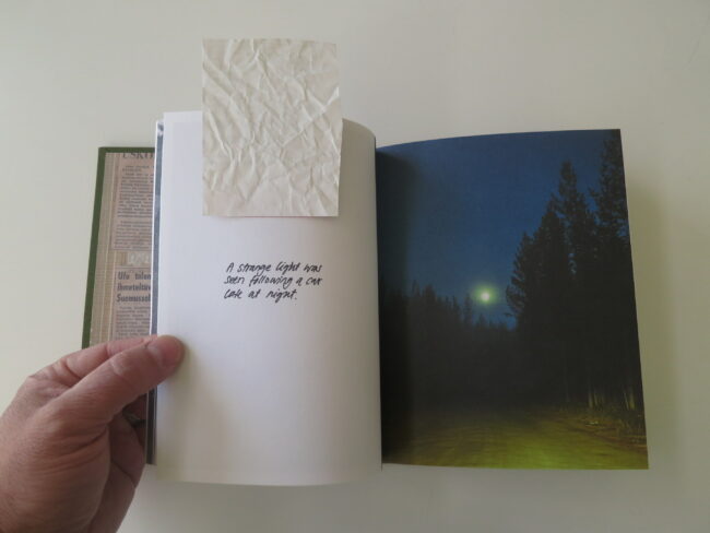
The book has a hunter green, fabric cover, with the ochre word “heavenly” embossed, but not a hint of what lies within.

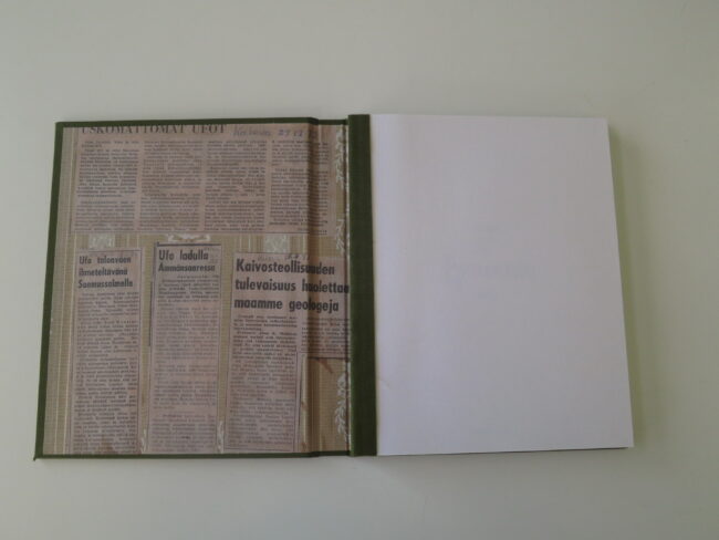
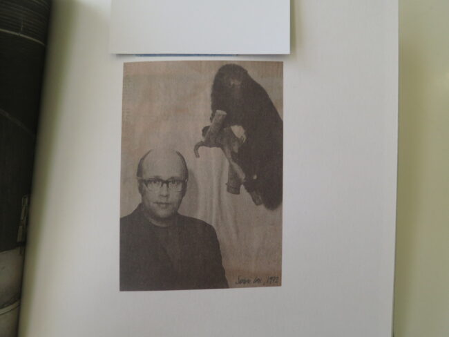
On the inside cover, a glued-down text page shows photo-copied newspaper articles, with the term “Ufo” present, and the language appears to be Finnish. (I’m guessing, having learned such things from reviewing hundreds of books over the years.)

Staying here, on the interior cover, you can really see the way the book was bound, both the pages to each other, and the interior to the cover, and I liked the touch of handmade.

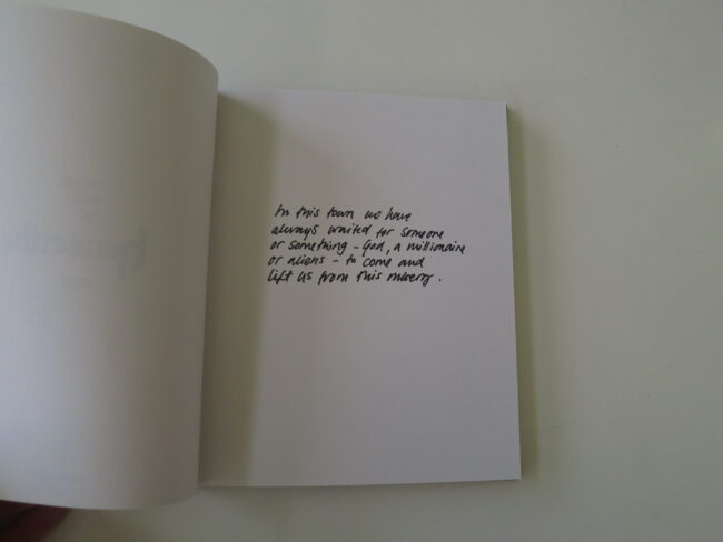
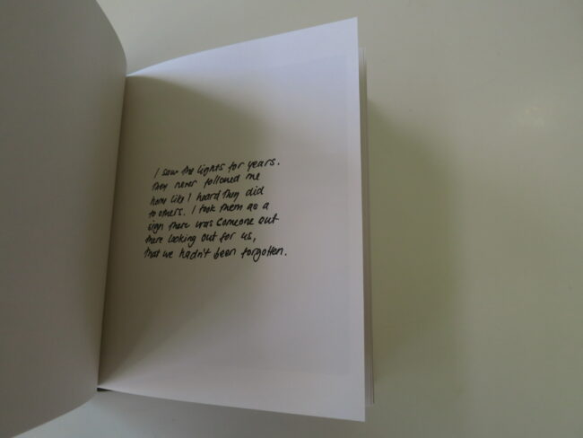
The opening text, printed in a hand-written-type font, says, “In this town, we have always waited for someone, or something- God, a millionaire or aliens- to come and lift us from this misery.”

Between the cover, and those words, we can now guess that aliens/Ufo’s are the book’s subject in some way.

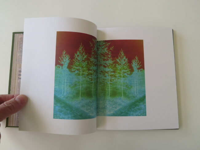
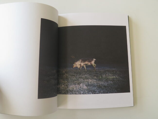
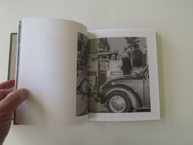
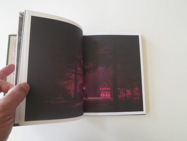
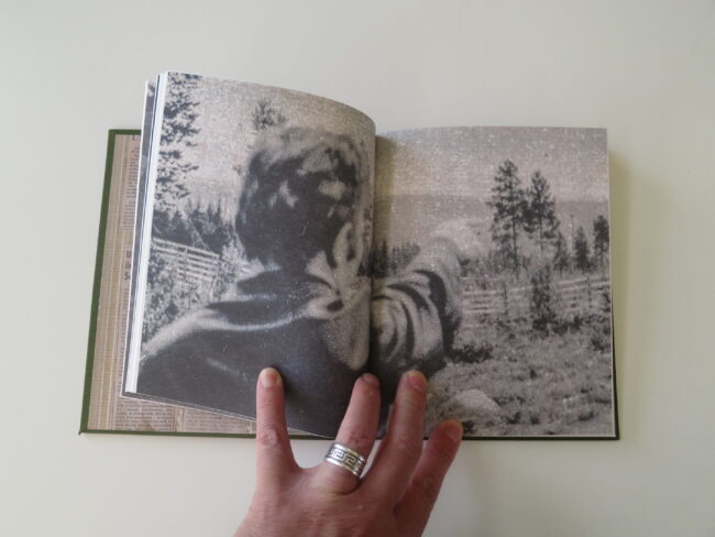
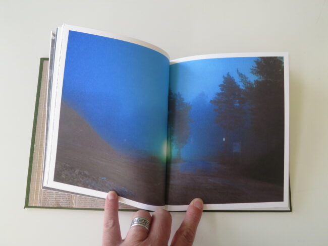
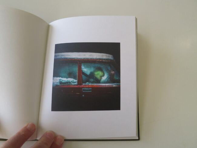
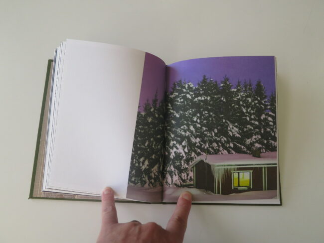
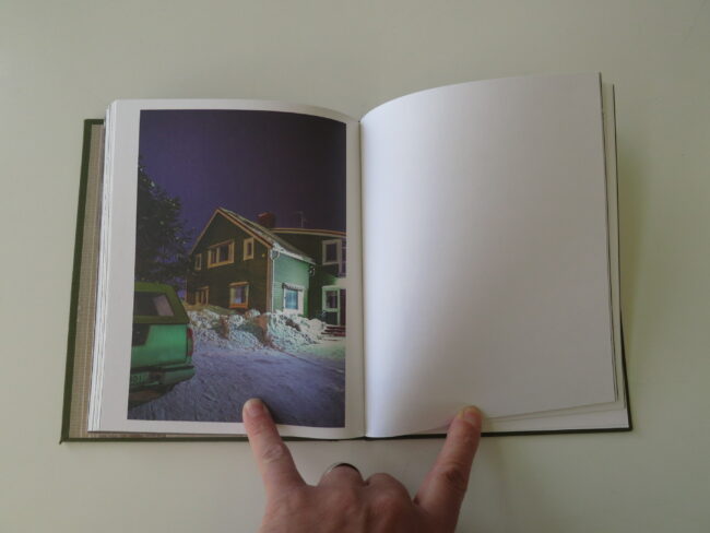
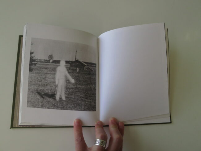
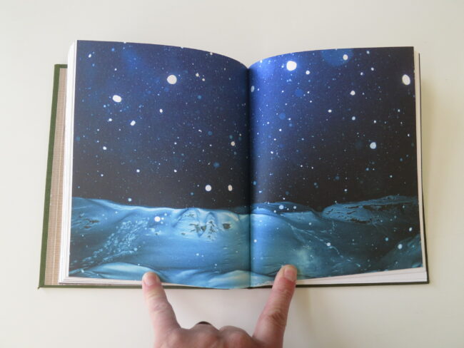
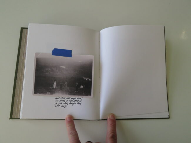
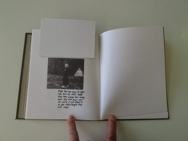
Next, we discover a set of vintage images mixed with contemporary photographs, and the idea of spectral lights becomes evident.

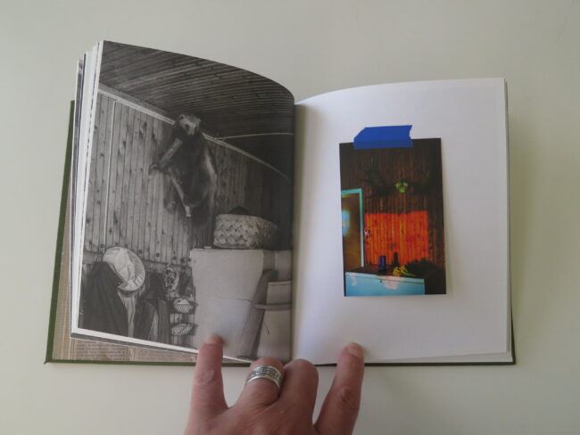
(The reindeer with glowing white eyes is a big tipoff to locale as well, in addition to being a badass photograph.)

This is the kind of object that reminds me that a photo-book, being experiential, does not need to be a collection of genius, mind-numbingly good pictures.

The art in here is cool, for sure, and some of the photos do stand out on their own.

But mostly, I loved it for the production values, including taped in pictures, and a copy of a newspaper article, which then had hidden images beneath.

The narrative structure and storytelling were standout as well.

In the end, from the final text, we learn it is indeed Finland, and that the artist grew up in a small town with a history of alien activity, even though she only learned of it recently, from the stories told by her grandfather, who has dementia.

Did the lights really follow people around in the 60’s?

Does it matter?

Maria Lax writes that Finland at the time was in crisis, and people needed distractions.

Sound familiar?

For more information from the publisher about “Some Kind of Heavenly Fire” click here 

If you’d like to submit a book for potential review, please contact me directly at jonathanblaustein@gmail.com. We are particularly interested in books by women, and artists of color, so we may maintain a balanced program. 

The Art of the Personal Project: Hugh Kretschmer

The Art of the Personal Project is a crucial element to let potential buyers see how you think creatively on your own.  I am drawn to personal projects that have an interesting vision or that show something I have never seen before.  In this thread, I’ll include a link to each personal project with the artist statement so you can see more of the project. Please note: This thread is not affiliated with any company; I’m just featuring projects that I find.  Please DO NOT send me your work.  I do not take submissions.


Today’s featured artist:  Hugh Kretschmer 

PLASTIC “WAVES”

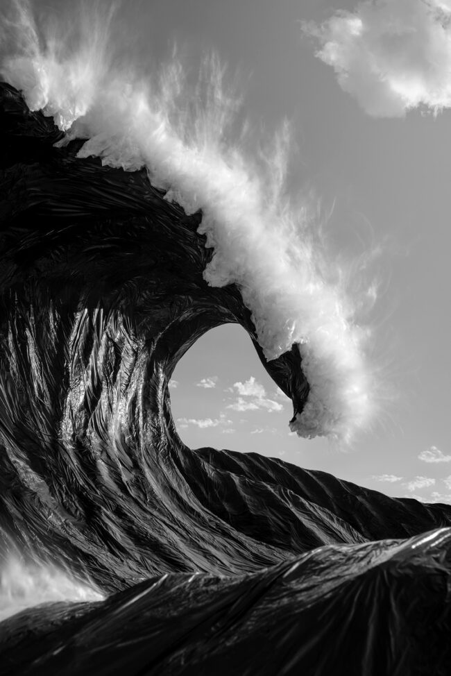
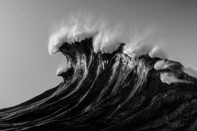
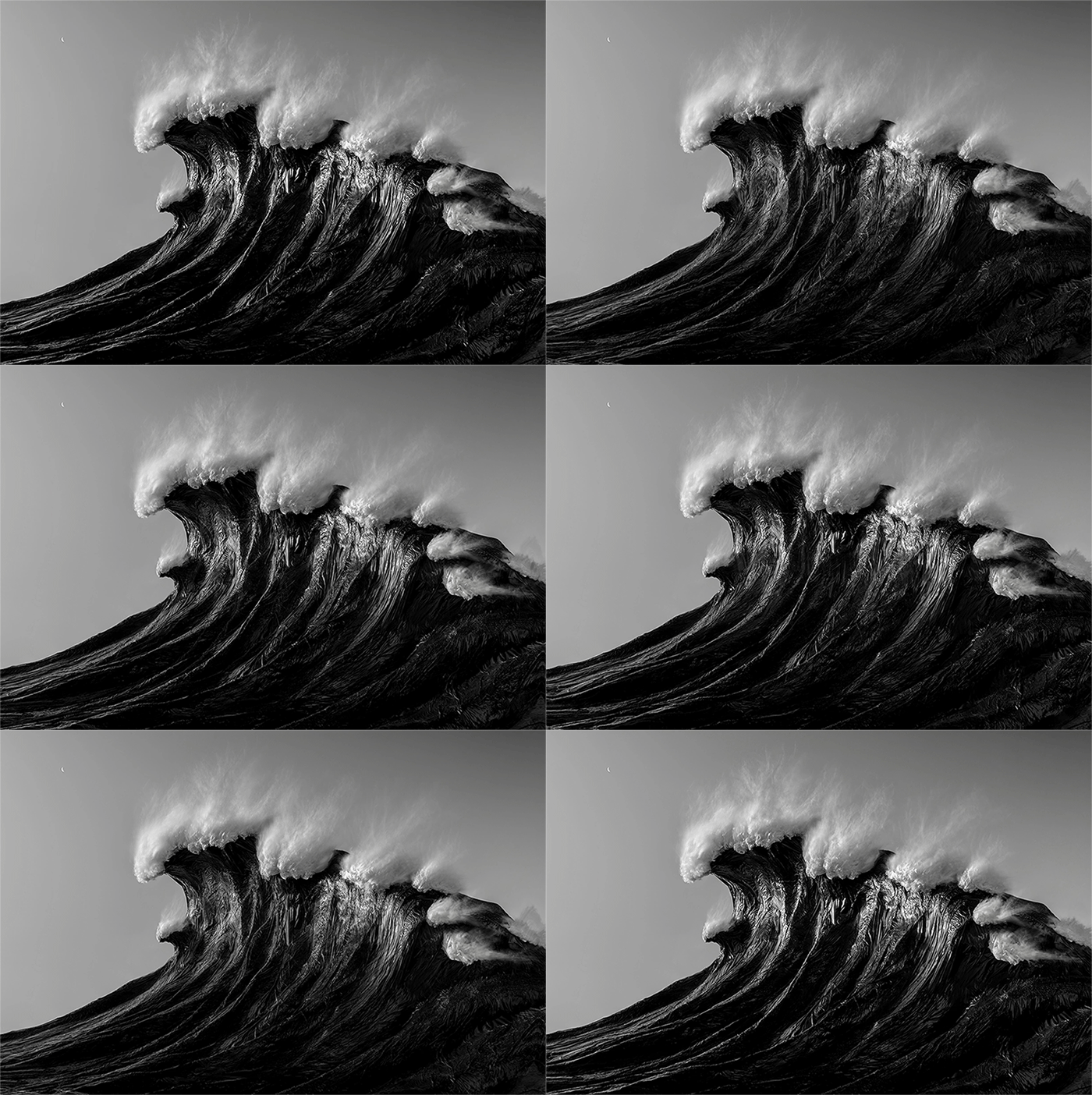
PURPOSE: Plastic “Waves” is a chapter of my ongoing project, Mirage— a visual commentary on the effects of human behavior on our natural water systems. Each image is constructed using recycled, repurposed or rejected plastic; a foreign element that is now, unfortunately, ever-present in our natural water systems. For these examples, I used recycled garbage bags.

My intent is to engage my audience with the alluring beauty of these images. But upon closer examination a deeper awareness of their intended message is revealed; a future where bodies of water, in their purest form, may only be seen through artificial means— something like a museum diorama.

These examples are the early stages of a long and in-depth exploration of sculpture and photography. My philanthropic purpose is to benefit a nonprofit organization devoted to water conservation through proceeds generated from gallery print and book sales.

INSPIRATION: Initially influenced by Robert Longo’s Epic Wave charcoal drawings they now include Wave Photographer @raycollins artwork as inspiration.

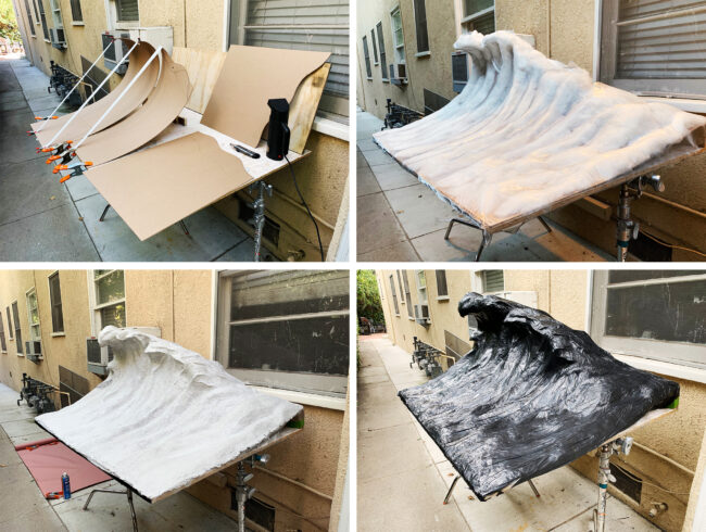
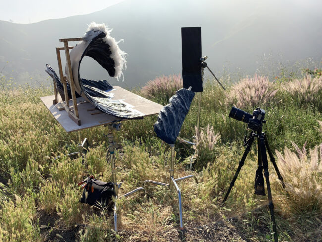
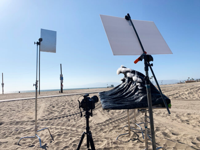
PROCESS: The construction of the water effect starts with a recycled chipboard base that is formed and teased into the basic shape. Then repurposed pillow batting is spray mounted to the surface and shaped in a way to give the wave visual volume. An aluminum screen is the next layer and is tacked down in certain points using hot glue. On top of that, a recycled paper pulp with a binder is applied and shaped in three layers, consecutively adding more detail with each application. Lastly, two varieties of recycled garbage bags were applied to the sculpture— a black lawn bag style for the waves’ base and a thin translucent type was used to represent sea foam. The blur effect of the sea foam was captured using a combination of a long exposure, enhanced by a variable neutral density filter, and a compact electric leaf blower.


To see more of this project, click here.

APE contributor Suzanne Sease currently works as a consultant for photographers and illustrators around the world. She has been involved in the photography and illustration industry since the mid 80s.  After establishing the art-buying department at The Martin Agency, then working for Kaplan-Thaler, Capital One, Best Buy and numerous smaller agencies and companies, she decided to be a consultant in 1999. She has a new Twitter feed with helpful marketing information because she believes that marketing should be driven by brand and not by specialty.  Follow her at @SuzanneSeaseInstagram

Success is more than a matter of your talent. It’s also a matter of doing a better job presenting it.  And that is what I do with decades of agency and in-house experience.


Pricing & Negotiating: Combining Food Still Life Projects

Shoot Concept: Lifestyle images of professional talent and still life shots of plated food.

Licensing: North American Advertising (excluding Out of Home) and Collateral use of 5 images for 1 year.

Location:  A residential property

Shoot Days: 2

Photographer: Portrait and lifestyle specialist

Agency: Mid-sized, based in the Southwest

Client: A well-known food company

Here is the estimate (click to enlarge):


Concept/Licensing:           

The agency provided a detailed spec sheet featuring two images of adults and children interacting and three images of plated food. Based on the layouts and my discussion with the production manager, it was apparent that the two lifestyle shots would be used in magazine ads and in-store marketing materials, while the three still life images would be used only for the website and in-store marketing materials. I also learned that, while they were requesting a licensing duration of one year, the images would likely be promoting seasonal products, and would therefore have a lifespan of just a few months.

I decided to price both lifestyle images at their full value (rather than discounting the second image) because they would be promoting two different types of products, and after weighing the factors, their full value was $7,500 each. The three supplemental still life images were much different than the lifestyle shots, but were quite similar when compared to each other. For this reason, I decided to price the first still life image at $5,000 (2/3 the price of a lifestyle image) and the other two at $3,750 each (1/2 the price of a lifestyle image).

After coming up with these fees, I checked a few other pricing resources to see what they recommended. Blinkbid priced one image between $7,000-$10,000 for one year use in print publications and collateral. Getty priced one image around $6,000 for North American advertising use in magazines and about $4,000 for point of sale use for one year. Combined, $10,000 would have been an appropriate starting point for the full value of a single image for a prominent client like this, but this didn’t take into account the short lifespan of the images. Corbis suggested $12,500 for one image for one year within their “Print Ad, Web, and Indoor Display” flexible use pack, while FotoQuote priced similar usage at $14,000. However, these fees included a bit more than the intended use I discussed with the agency.

Assistants: The photographer would be traveling for this shoot, and I anticipated that the he would bring his first assistant while hiring a local second assistant for the two shoot days. I included five days for the first assistant to account for two travel days, two shoot days and one prep day on location.

Digital Tech: The digital tech would help to manage the flow of file intake and display for client approval on set. I included $500 for the digital tech, and then added on $750 for their workstation for each shoot day.

Producer: A project like this required a producer to help wrangle and hire the crew, coordinate casting and location scouting, make travel and catering arrangements and work closely with the photographer and agency to compile a detailed schedule and production book. The producer would also travel to the shoot and be on set to manage the crew, schedule, and handle the invoicing process after the shoot.

Photographer Travel/Scout/Fitting Days: This took into account two days for the photographer to travel there and back, and a third day to scout the location and participate in a fitting day where the models would try on the clothing and the agency/client would make wardrobe decisions prior to the shoot.

Hair/Makeup Stylist: We’d be photographing four talent and capturing one lifestyle scenario per day. I anticipated that we’d have plenty of prep time for these shots each day, which would only require one hair/makeup stylist (as opposed to an additional hair/makeup stylist assistant) on each day.

Wardrobe Stylist and Wardrobe: I grouped the stylist and the assistant into a single line, and anticipated paying the stylist $800/day and their assistant $300/day. The four days accounted for the time it would take them to shop, attend the fitting day, be present at the shoot and return the clothing. The wardrobe costs were based on the need to have two final outfit choices for each of the four talent, and I estimated $200 per outfit. The wardrobe stylist would of course purchase many different options, but this budget accounted for the wardrobe that would be non-returnable.

Prop Stylist: During a call with the agency, they made it clear that the mix of still life and lifestyle images would call for a wide range of very specific seasonal props…and we’d need to find these items off-season. At $700/day for the stylist and $300/day for their assistant, I anticipated that they would need two days to shop/prep and a day to return props on top of the shoot days.

Props: In addition to the specific prop list that we were provided, we’d be shooting at a residential property, so I accounted for a few additional home/garden props to spruce up the interior and exterior. Also, the still life images would need a wide range of tabletop props such as plates, bowls and napkins, and $1,500/day would be appropriate after discussing our needs with a few prop stylists.

Food Stylist and Food/Supplies: We’d only be photographing food on one of the shoot days. I included a half-day for the stylist to shop for ingredients and a full day for them to cook and prepare for the shoot day. I typically don’t estimate half-days for crew members, but the ingredients needed were quite simple and I couldn’t justify the need for a stylist to spend an entire day shopping. However, the food that the stylist would need to bring to the shoot would in fact require a full day to prepare. In addition, many of the ingredients would be shipped to the food stylist from the client, and our food/supplies budget would therefore be minimal.

Location Scout and Location Fee: Based on the comps, layouts and discussions with the agency, I knew they would be very picky when choosing a location. Sometimes a location scout will charge a fee to “pull” from their files and deliver a gallery of locations they’ve already photographed. If needed, many scouts charge a fee of about $650 plus expenses to go out and scout new locations. Since I didn’t know which scout I was going to use yet, I included three days for a scout to find us the perfect residential property, and figured that one of those “days” might be dedicated to pay for their “file pull”.  Based on estimates from previous projects, I felt confident that $2,000/day would be appropriate for they kind of property we were looking for.

Casting Day: I planned on hiring a casting agent to help us find talent, and this covered their time, shooting space and booking of the talent.

Adult and Child Talent: We’d need two adults and two children on both shoot days. Typically I’d include backup children if they are young enough to potentially have a meltdown on set, but I didn’t’ feel that we’d have this issue with kids in the 8-10 age range. After speaking with a few casting and talent agencies in the city we’d be shooting in, I determined $2,000 per talent per day plus a 20% agency fee would be appropriate for the adults. For the children, I felt that $1,000 per talent per day plus 20% would attract a decent pool of options. In addition to the shoot days, we’d also need each talent to come to a fitting day before the shoot, and I felt that $1,000 would be an appropriate compensation for this.

Fit Day Location Fee: We would need a location for our fit day, and we could have approached this a few different ways. A photo studio would have worked, but it might have offered more than what we needed. Another idea was to pay for a conference room in a nearby hotel, or even rent a large room in a hotel at a convenient location. After making a few calls, I determined $800 would be more than enough to cover either a high-end spacious suite or a conference room.

Airfare, Lodging, Car Rental: I used Kayak.com to determine that it would be about $400 per person (including baggage fees) for the photographer, first assistant and producer to fly to/from the location, and that $200/night for 4 nights would afford decent hotel rooms for each person. I also used Kayak.com to find pricing for a minivan rental for the duration of the trip.

Production RV:  With a crew this large on location, an RV would allow the producer to keep as many “cooks out of the kitchen” as possible, while also providing a staging area, bathrooms, WIFI and an area for catering outside of the residential property. I confirmed with a local RV company that $1,500/day would afford us a nice vehicle including a driver, fuel, cleaning/dumping fees and mileage.

Catering: I anticipated $40 per person per day for light breakfast and lunch.

Equipment: After speaking with the photographer about his equipment needs, we determined that $900/day would be appropriate for the gear he was bringing and renting. This included a camera body and a few lenses (~$400), power packs and heads (~$300) plus miscellaneous modifiers, reflectors and grip equipment (~$200).

Image Processing for Editing: This covered the time, equipment and costs to handle the basic color correction, edit and upload of all of the images to an FTP for client review.

Retouching: The photographer and I determined that each of the 5 images could take up to 4 hours to retouch, and $150/hr would allow us to farm out the work to a retoucher if the photographer became unavailable.

Miles, Parking, FTP, Misc: This was to cover any additional minor miscellaneous expenses during the shoot days and while traveling.

Feedback: The agency told us that our numbers were in line, but that they’d be unable to issue the photographer an advance prior to the shoot, and they also wanted the talent to bill the photographer (rather than billing the agency directly). In addition, after reviewing our terms/conditions, they asked us to remove the clause detailing that if they don’t pay the photographer within 30 days of the final invoice, that they will be billed a $20.00/month handling fee and 1.5%/month interest.

This feedback raised some pretty serious red flags. This basically meant that the photographer would have to front approximately $38,000 out of pocket to cover the production expenses without a contractual guarantee for reimbursement or payment of the final balance.

Results: The photographer was awarded the project (and he accepted it despite the financial risk), and I produced the shoot.  The client did pay within 30 days.

In addition, the client decided to add on two product still life shots and one additional food shot to the project. While we were able to accommodate their requests within the estimated shooting time, we charged them an additional $5,000 for the first unique still life image, $2,500 for the second similar still life image, and $2,000 for the additional food image plus expenses for the stylists and retouching time. We originally quoted $2,500 for the fourth food image, but they asked if we could work with them and come down to $2,000, which we did. A few months after the shoot, we were already in discussions about extending the licensing duration.

Hindsight:

Our terms and conditions document states that “the expenses are estimated in good faith” and “actual expenses, which may be greater or less, will be invoiced”. We didn’t have any issues with overages (in fact, I was able to produce the shoot and come in about $11,000 under budget), but I did find out that our proposal was treated as a bid, rather than an estimate.

In a bid scenario, a photographer provides an invoice for the bottom line of their estimate, rather than providing receipts and billing for fees and actual expenses. If they come in under budget, the balance goes into their pocket. However, in many cases, if the expenses go over the estimated costs, the photographer is not granted an overage and they have to absorb the additional costs. This brings up the issue of including markups in estimates. We feel that billing for actual time and expenses is the most honest way of doing business (and most of the purchase orders we receive require that copies of receipts be provided with an invoice), but there are times when a client specifically asks for a bid, and in those cases we may estimate on the higher end just to cover potential overages.

You can find all of our Pricing & Negotiating articles here. If you’d like to hear more about our Pricing and Negotiating or other consulting services, please send us an email or give us a call at 1 610 260 0200!

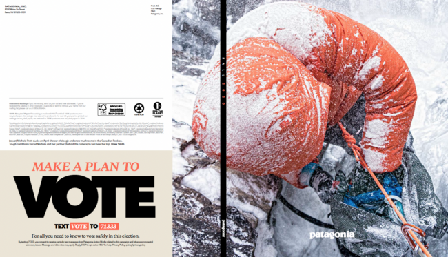
The Daily Edit – Patagonia Fall Journal 2020: Drew Smith


Patagonia Fall Journal 2020

Photographer: Drew Smith

Why is it important for you to vote for wild places?
Voting for wild places is imperative to protect the earth itself, our home. Wild places are not sustainable without our protection and preservation. I want future generations to be able to enjoy and admire open spaces with clean air and water. We need to work together to ensure the health of our ecosystems and the most effective way to do so is through voting. We need to protect our right to be wild.

With the roll back of the roadless rule, what concerns you the most?
The fact that it will be legal for logging companies to build roads and destroy National Forest land is disheartening, especially since native tribes rely on this land to fish and hunt as they have been for generations. Dominick DellaSala, chief scientist with the Earth Island Institute’s Wild Heritage project said “While tropical rainforests are the lungs of the planet, the Tongass is the lungs of North America”. I find it troubling that not only the findings of scientists but also the public consensus and native tribe’s opinions about the Roadless Rule were not taken into consideration. If anything, we should be vastly expanding protected land, not taking it away.

Thoughts on the future of our planet?
What concerns me most is that if we continue to undo our work of protecting these vital ecosystems, climate change will continue more rapidly, and our quality of life will be affected. At 19 years old, I had the opportunity to spend time in the Tongass. I returned for three more summers and that time affected me immensely. I wouldn’t be who I am today without experiencing the forest in its pristine state. I want that for future generations.

Where was this cover shot?
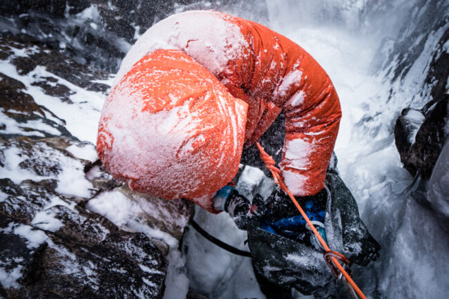
This shot was while climbing Zeitgeist IV+ M7- WI5R on the northwest face of Mount Ball in Banff National Park, Canada.

You’re always multitasking: enjoy the moment, take the image or focus on the climb; does that ever get hard?
For the most part, I find so much joy in capturing moments throughout the day and at this point, photography has become part of the climbing. Sometimes when it’s cold or when I’m exhausted it’s really hard to get the camera out, but I force myself to because that’s when you get the best shots. I feel fortunate to have these amazing experiences and also the images to reminisce on and relive those days.

What made you stop and capture this moment?
I always climb with a small camera attached to my harness or in a backpack, it’s just become a habit while out in the mountains. After finishing a pitch and at the belay, the first thing I do is take my camera out not knowing when I’ll see a good shot. Michelle Pratt and I were just getting ready to follow Quentin Roberts up an ice pitch he had just climbed, when spindrift from above started pounding us. I huddled against the rock and looked down, taking a few shots before we cast off.

How many days were you out?
This was just a long day in the mountains which is the norm while climbing in the Rockies. We awoke in Canmore around 3 am, drove an hour, then started a freezing 3-hour hike arriving at the base of the climb early morning. We bailed off of the climb not far from the summit, knowing it would be getting dark soon. I’m not sure how long the day was but we returned to the car safely with smiles, well after dark.

Climb partners: Michelle Pratt and Quentin Roberts who both live in Canmore, Canada.


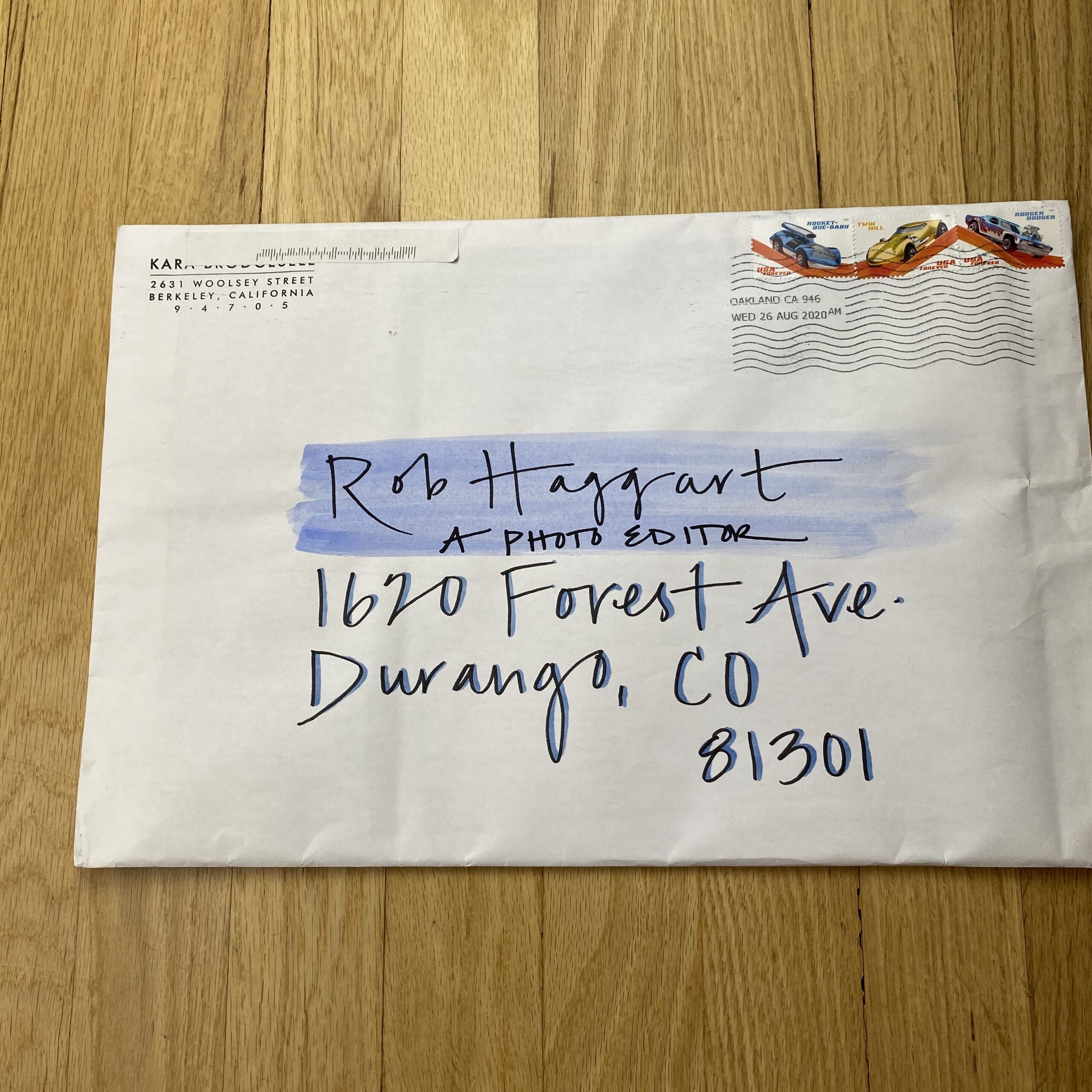
Featured Promo – Kara Brodgesell

Kara Brodgesell

Who printed it?
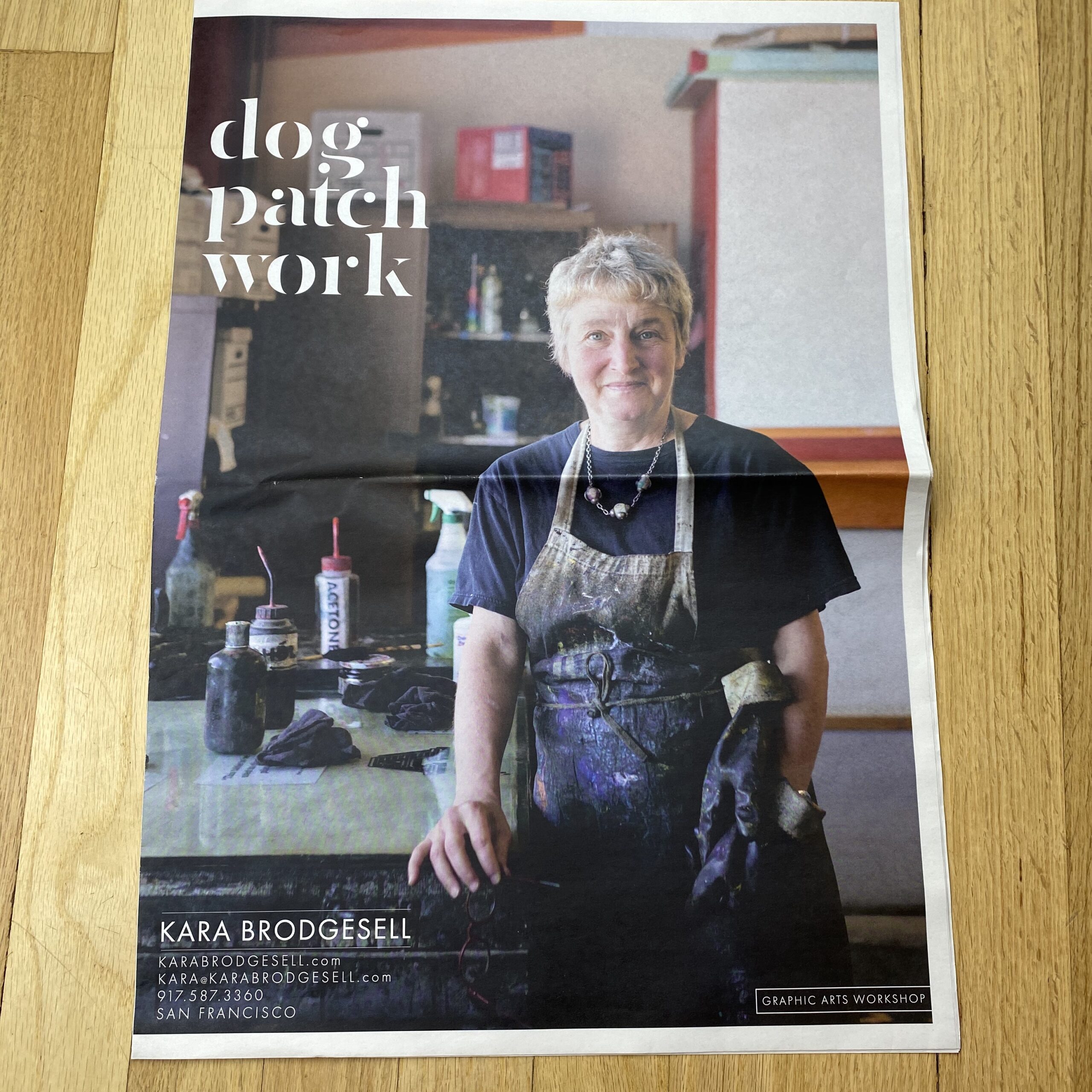
Newspaper Club https://www.newspaperclub.com/. I decided on them after diving into the archive of newspaper promo information on your website and was very happy with the results. I especially appreciated the informative samples they sent over before I submitted my order.

Who designed it?
My husband Noah, who works as a public programming director, but his InDesign skills are far superior to mine. We had a number of discussions about what I was hoping to achieve and which businesses should be featured, and then he helped me select the final images and he crafted the layout. I’d wanted to do a promo of this project for a few years and always stalled once it came to deciding how to format it, so his participation was invaluable.

Tell me about the images?
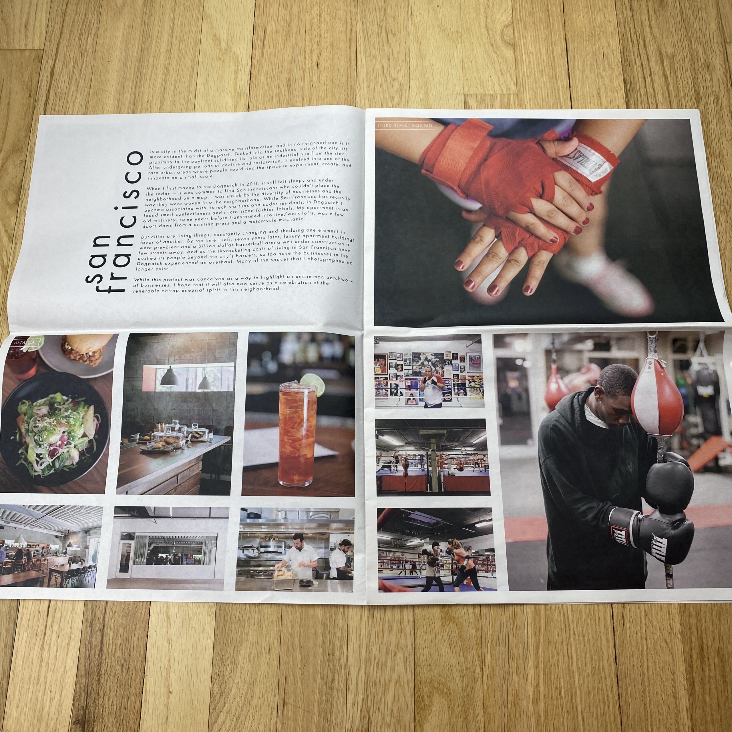
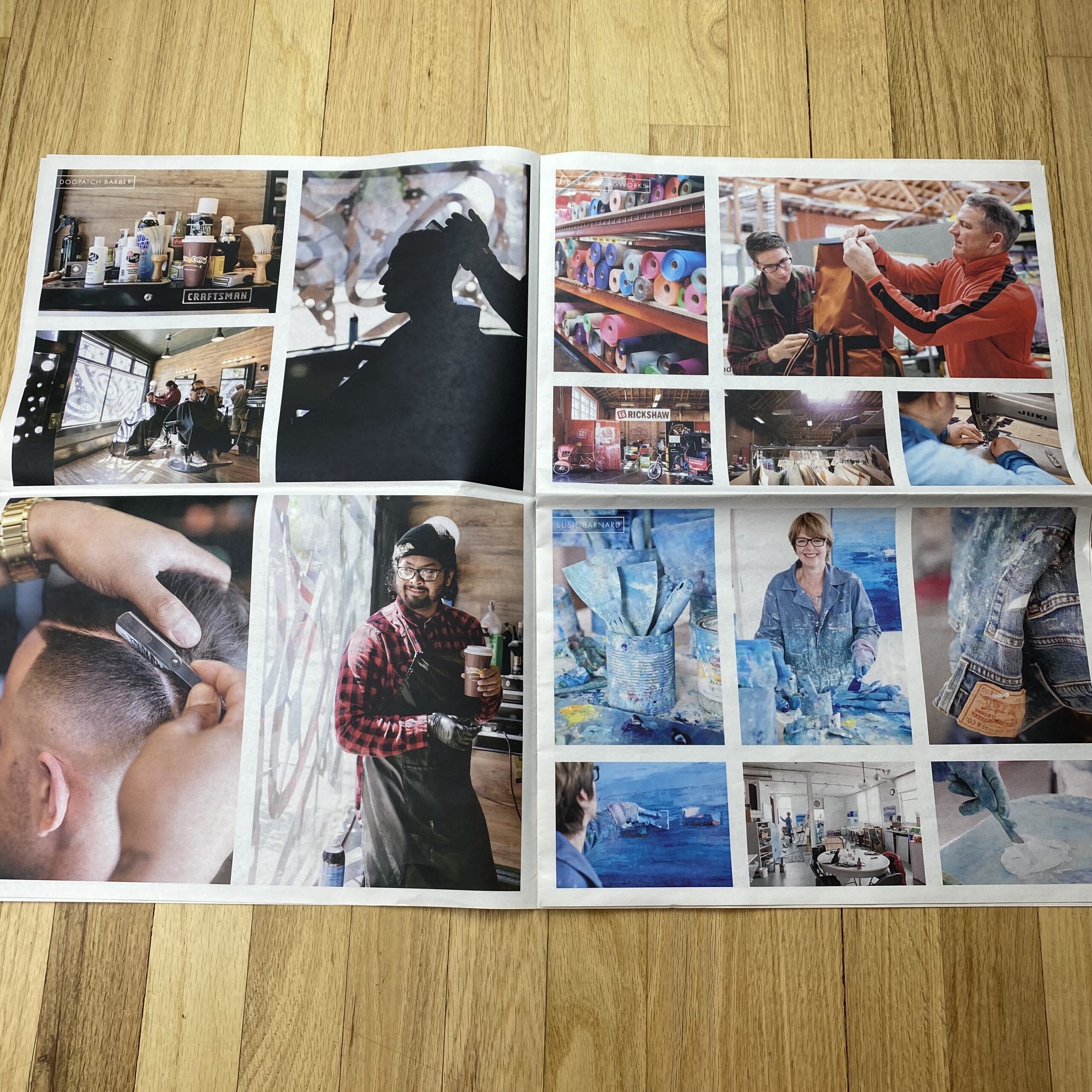
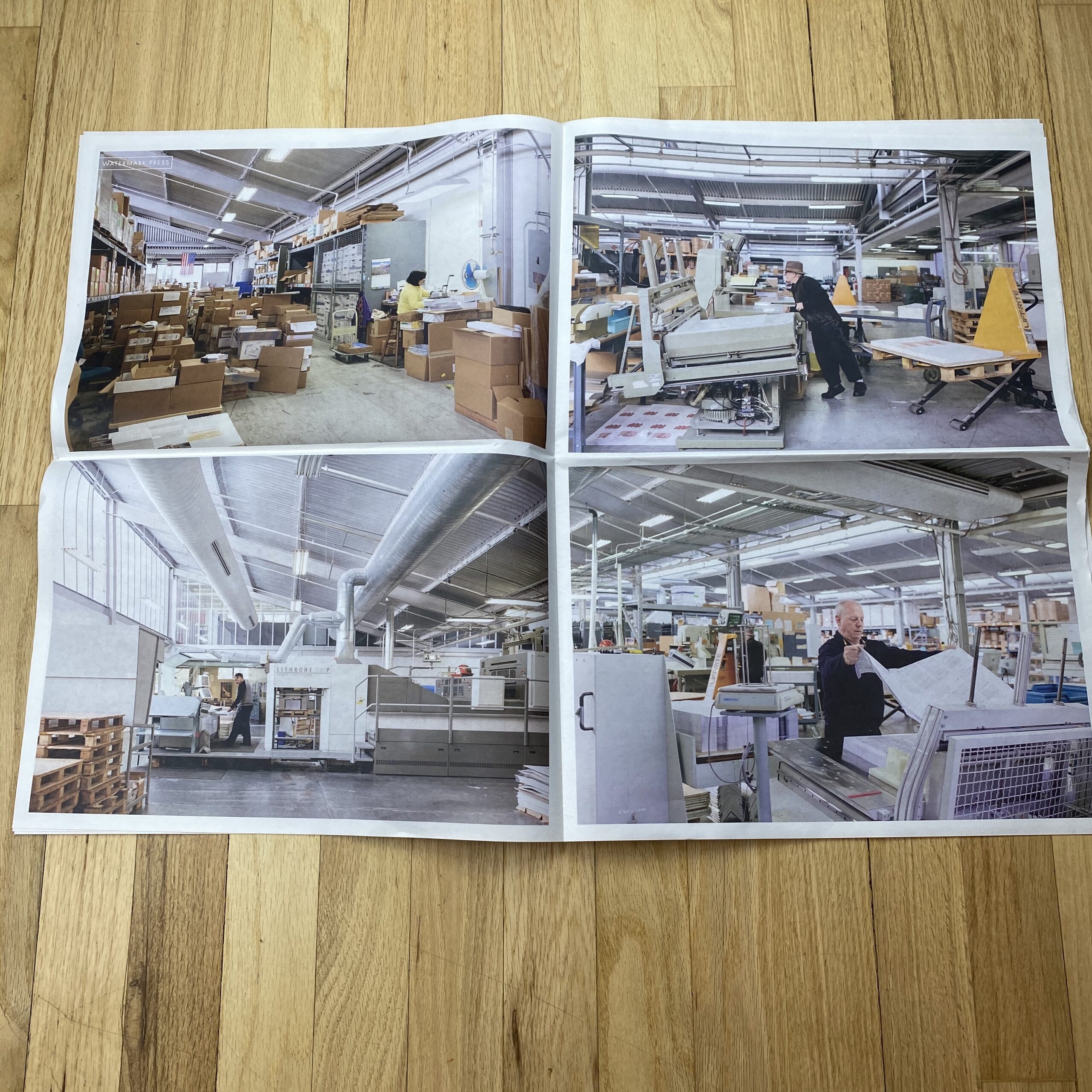
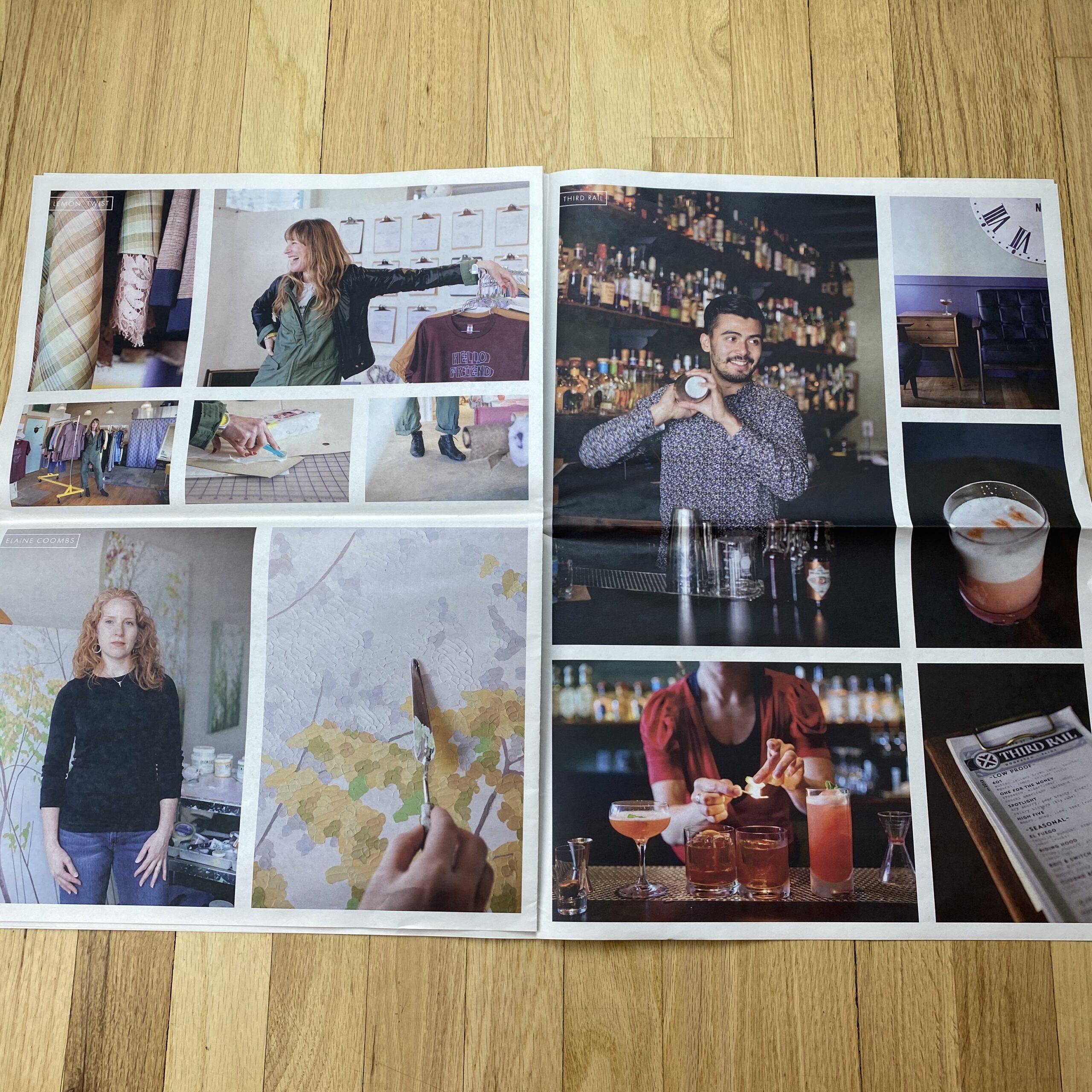
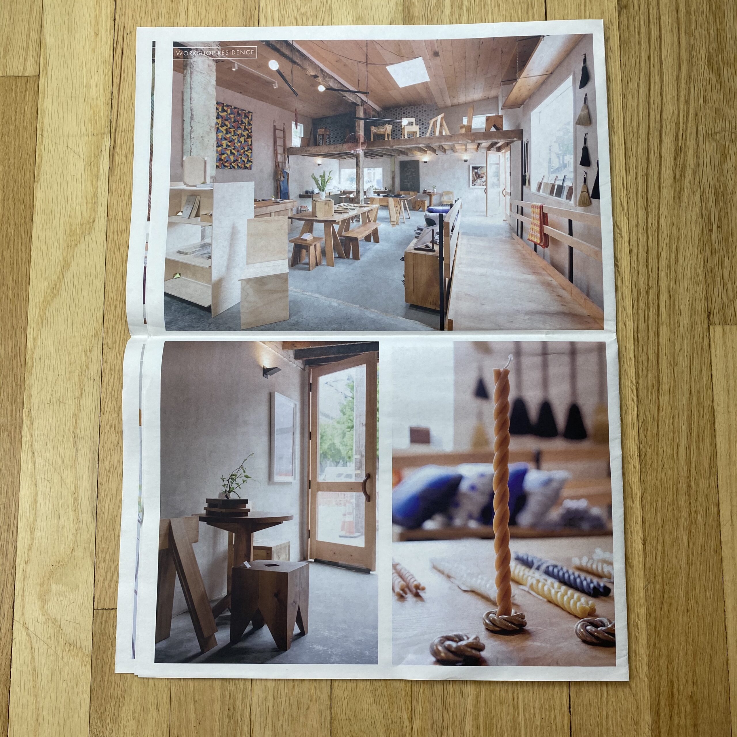
This was the classic personal project in that I pursued it all in my free time because I wanted to be hired to create photographs like this. I also loved having the chance to shoot such a wide variety of types of images. I lived in the Dogpatch neighborhood of San Francisco when I shot it, which has a unique patchwork of small businesses and manufacturing. It felt like I was surrounded by people making things and spaces and I wanted to celebrate that. It now also feels like a memorial for businesses that once were, as many have closed or moved out of the area.

How many did you make?
100

How many times a year do you send out promos?
This was my first one. I’ve been fortunate to be freelancing in the Bay Area for 9 years and I set a bunch of goals in early 2020 about how I wanted to grow my businesses and find new clients – all of my work thus far has been through references. A significant printed promo was a big part of that plan. The shipment arrived in early March and I was going to send them out by the end of the month, and continue with two more over the year. Instead, we went into lockdown days later, everyone is working from home indefinitely, and the box of promos is sitting in the corner of my office. It’s a bit heartbreaking.

Do you think printed promos are effective for marketing your work?
I’ll let you know! I’ve listened to so many panels, read interviews, and talked to other photographers about how to promote your work and I feel like, in the end, it comes down to: do it all, as much as you can. Social media, emails, printed promos… whatever may keep you in people’s minds. I certainly value printed pieces. I save promos and magazine/newspaper features that I respond to. And I thought that this body of work lent itself better to a newspaper-like format with many spreads, rather than an email or post with just a few small images.

Why did you choose a personal project for a promo?
My favorite way to photograph is to take a documentary approach with minimal equipment, in a place I may never get access to otherwise. This project afforded me that so many times, and it was a great exercise in finding shots quickly in new environments – there were no scout days or pre-production meetings. I’m also deeply grateful to the number of artists and business owners who let me wander around their spaces and ask a lot of questions. It’s one of the many things I’ve missed during this pandemic, not being able to explore and be inspired in this way.

This Week in Photography: Voting Time


“Now that I’m home, and the road is behind me, I’d like to thank everyone I met who showed me a good time, and reminded me that we need no Orange King to make us great again.

We’re pretty fucking great already.”

Me, writing in this column, October 28, 2016


I never intended to be political.

It wasn’t a plan.
Or a move.

But I was given this amazing opportunity, to write for thousands of smart artists, editors, writers, educators and photographers, and I’ve always taken it seriously

So speaking my mind, with respect to politics, was a natural evolution. Why would I keep such an important part of my world-view to myself, in a long-running weekly opinion column?

With all this freedom, to stay silent on the biggest issues of our times would have been moronic.

So here we are, and Election Day will soon be upon us, #2020 style.

Will any polling places get shot-up with AR-15’s?

Will mask-wearing voters rumble with anti-maskers in the streets of America’s cities?

Would such a sentence have even been comprehensible if it appeared in this column 4 years ago? (Maskers and anti-maskers…WTF!)

If you read the opening quote carefully, you’ll note that I had just been out on the road, as I’d covered Chicago, NYC and LA all within a few months.

Travel, and fresh impressions, were aplenty.

(Now, I walk in circles around the dirt roads of my neighborhood, multiple times a day.)

I also called Trump an Orange King, as I’d been critical of him for years, by that point. (And I was very, very worried he would break the world.)

But I also took a pretty Pro-America, positive stance, which is not something I’d do so easily 4 years later, now that Trump has indeed broken the world.

It’s been much easier to criticize this society, as it’s gone to seed, and Americans have turned on each other to the point that trying to save other people’s lives has become such a contentious political issue.

(You can’t force me to respect other lives! It’s my freedom to do what I want! When I want!)

But here we are.

It’s cold outside. Taos County, where I live, has seen a 50% spike in Covid-cases in under three weeks, and the future of our country, (if not the entire world,) is at stake.

Everyone needs to vote.

It’s that simple.

Please vote.

(If you’re allowed.)

Some felons are stripped of the right, and in other cases, the legal hoops required to register flummox citizens into giving up without trying.

But at least women can vote, right?

I mean, can you imagine if they couldn’t?

It seems like a pretty ridiculous thing to say, but the truth is, (of which most of us are oblivious,) that it was only 100 years ago that women were granted the right to vote in America.

100 years.

In the big picture, that’s nothing.

Within the last 160 years, this country had slavery, fought a war against it, took all the West from the Native Americans, and then slowly allowed certain segments of society to attain rights, but only when they fought for them.

That’s the big point I want to make today.

Just because things are so crazy, so perpetually on fire, we assume the world is irreparably wrong, or America is in a death-spiral, and that’s that.

The cynicism of the Trump era, on top of the mendacity and fear-mongering, has worn us all out.

But as creative people, we have the talent and skills to communicate big ideas and messages. (It’s literally what we do for our living.)

So sometimes, fighting for our rights, demanding things get better, and shouting it from the rooftops, is absolutely the way to go.

It’s what allowed each insane batch of prejudices and morally bankrupt ideas to fall away, a bit at a time.

Like women achieving the right to vote.

I mention all of this for obvious reasons, to get you inspired, but also to give props to two different groups of my colleagues, who are making a difference.

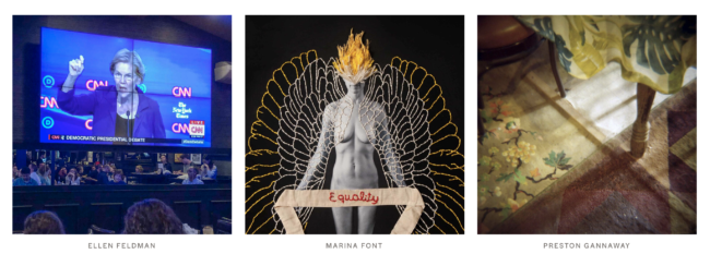
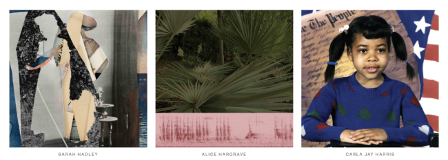
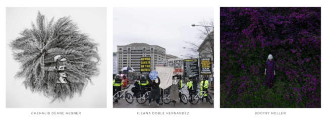
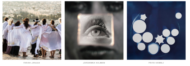
First up, this column was motivated by A Yellow Rose Project, a website/curatorial venture put together by Meg Griffiths and Frances Jakubek, which features the work of 100+ female photographers.


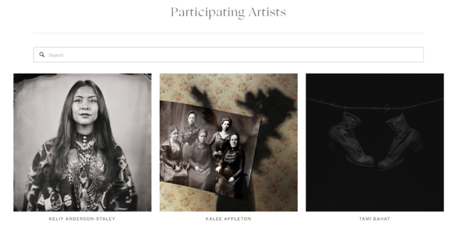
Each was given the chance to make work in honor of the 100th Anniversary of the 19th Amendment, and it features dozens of super-talented women that I’ve met on my festival travels over the years.

So many photographers I’ve written about here, or shared a meal or a coffee with.

It’s an amazing cross-section of our field, and I highly recommend you check out the work on the website, though I’ll feature some images from the homepage below.

Secondly, I wanted to also give a shout out to Andy Adams, of Flak Photo and associated projects, who recently launched a collective online effort to get out the vote.

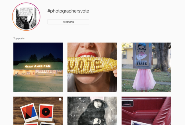
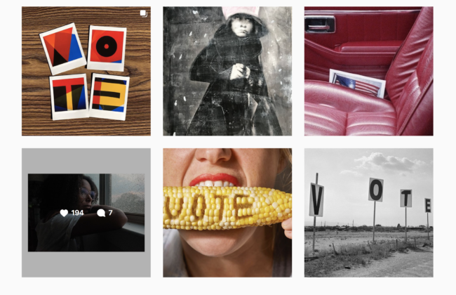
Along with a host of partners, (including Humble Arts’ Jon Feinstein, another friend of the column,) Andy has launched a #, #PhotographersVote, and an Instagram handle, asking people to share their voting-themed images on Instagram, Twitter and Facebook.

It is an opportunity for photographers to be creative, try to push others to do the same, and in a non-partisan way, hopes to get more Americans involved in the voting process.

I’ll also include some screen-grabs from the # on IG below, but encourage you to search through the archive. (Editors note: The archive is much less visible than it was yesterday. Not sure why, but it seems Instagram has changed some rules before the election.)


I chose to participate, and posted some images from my voting day experience, and you can too.

If we care about the outcome of this election, and want to vote the Orange King out, it’s the least we can do. (Or you can also donate money, write letters, make phone calls, or put on a scary mask and get yourself arrested.)

See you next week.

Hopefully we’ll know the outcome by then, but I doubt it.

The Art of the Personal Project: Marsha Bernstein

The Art of the Personal Project is a crucial element to let potential buyers see how you think creatively on your own.  I am drawn to personal projects that have an interesting vision or that show something I have never seen before.  In this thread, I’ll include a link to each personal project with the artist statement so you can see more of the project. Please note: This thread is not affiliated with any company; I’m just featuring projects that I find.  Please DO NOT send me your work.  I do not take submissions.


Today’s featured artist:  Marsha Bernstein

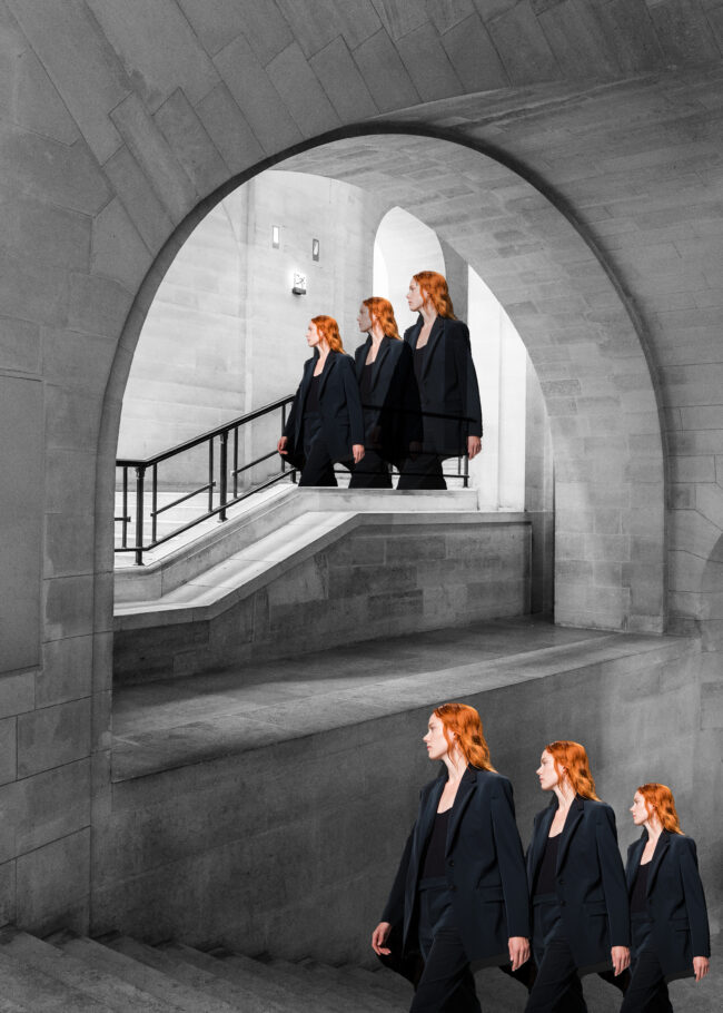
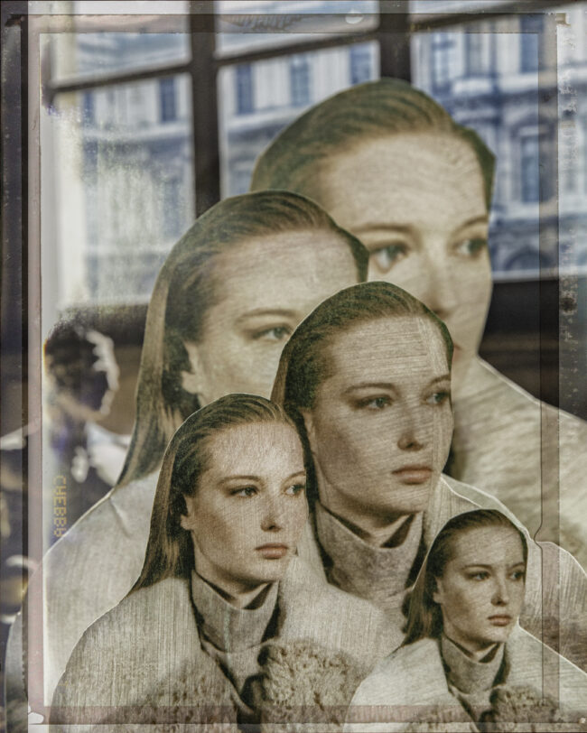
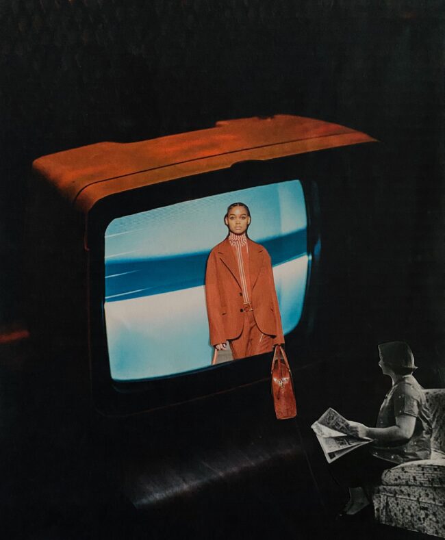
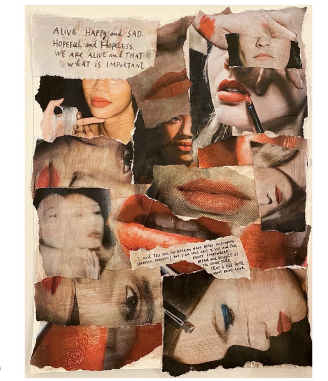
I’ve always been drawn to collage work, particularly the decollage work of French artist Jaques Villegle, which is more about subtracting and revealing layers than assembling and building. A lot of my professional work is fashion reportage – backstage at New York Fashion Week – so I thought those images would be fun to work with and explore my own collage style. I thought I would try something in the style of Villegle but I ended up just playing around and doing my own thing. I haven’t been in a darkroom in years so this is a way for me to create art in a tactile way. It’s nice to work away from a screen.

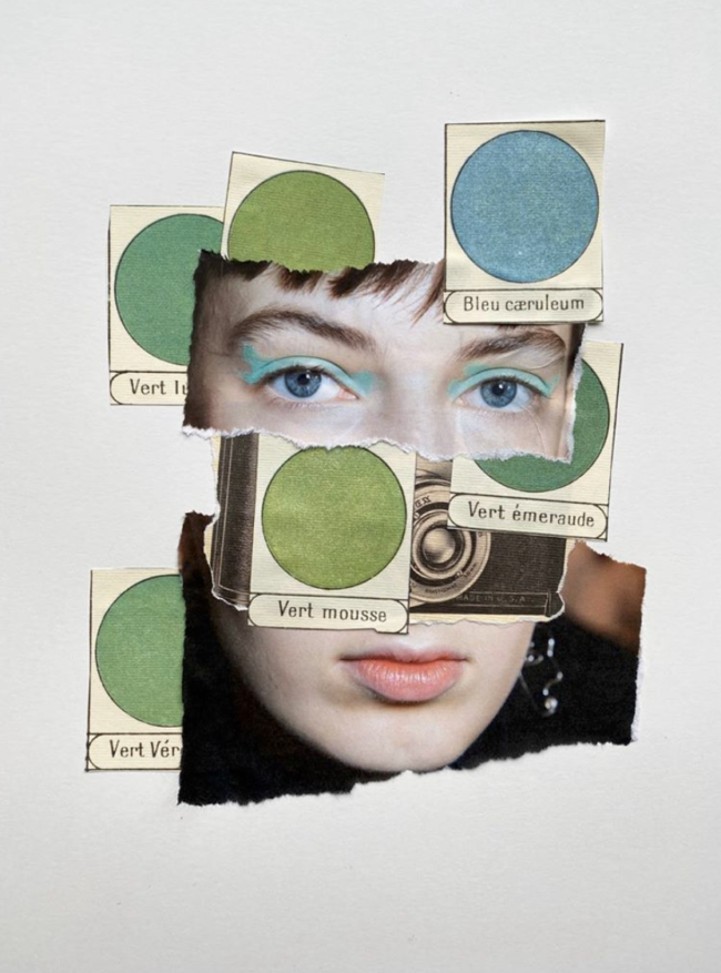
The process is very relaxing and meditative and a way for me to stay creative during periods where I’m not busy (but I’ve also enjoyed making collages during very hectic times as a way to unwind). I don’t have a fixed method – instead, I’ll just pick one of my own fashion images that I think will be interesting to work with – it might be because of a shape, a face, the colors – what draws me to it is always different. I’ll then often print the image in different sizes to play with scale. Other times I’ll use a singular image and bring in some sort of paper ephemera (a vintage French color palette poster, for example) or another image of mine as a backdrop (a London street, the Seine river, and the interior of the Louvre are a few examples). Then I’ll usually rip the images and paper and play with placement.

I’ve also experimented with digital collages in a similar way – using my own fashion images and playing with repetition and scale against a backdrop of something else I’ve photographed. More recently, because I wasn’t able to shoot this past fashion season due to the pandemic, I used images of mine from previous seasons and placed them in vintage scenes with televisions as a play on how we’d all be watching the digital shows. I also incorporated screenshots of a digital fashion show from Paris Fashion Week against a photo of mine of Paris rooftops. I missed shooting shows and this was a way for me to be in that world again.

I don’t spend too much time on an individual collage, as I like it to feel organic. (I think if I spent too much time planning one out it wouldn’t have the rawness that some of them have). Cross training, so to speak, is an important part of being an artist, in my opinion. Actually, I think it’s important for any profession or hobby – it’s good to work different parts of the brain in order to strengthen and grow the ones you use all the time. Or maybe I’m thinking too much about it – I just enjoy it.

To see more of this project, click here.

APE contributor Suzanne Sease currently works as a consultant for photographers and illustrators around the world. She has been involved in the photography and illustration industry since the mid 80s.  After establishing the art-buying department at The Martin Agency, then working for Kaplan-Thaler, Capital One, Best Buy and numerous smaller agencies and companies, she decided to be a consultant in 1999. She has a new Twitter feed with helpful marketing information because she believes that marketing should be driven by brand and not by specialty.  Follow her at @SuzanneSeaseInstagram

Success is more than a matter of your talent. It’s also a matter of doing a better job presenting it.  And that is what I do with decades of agency and in-house experience.


Expert Advice: Insurance for Photographers

Aimee Baldridge, Wondeful Machine

Want to rent some gear, get a permit to shoot in the park, or hire an assistant as an employee?

You’ll need to get insurance for that — equipment, general liability, and worker’s compensation, to be exact. While you’re at it, pick up some coverage for the gear you own (equipment again), any studio equipment you have (business personal property), and the medical bills for anyone who might ever take a spill on set (general liability).

But don’t stop there. Getting a data loss policy to help you recover work you’ve done might be smart. Covering the work you haven’t done is prudent too, since unhappy clients sometimes sue for errors and omissions. If something goes sideways and you can’t do any work at all, it’s great to have a business interruption policy that covers loss of income. And if things go sideways abroad, you’ll be glad to have an international liability policy, a non-owned and hired auto liability policy, or an emergency medical evacuation policy, as the case may be.

You get the idea. Insurance is available for just about everything and everyone you can have, use, do, or interact with as a photographer, and you’ll need some of it to be in business. Fortunately, by tailoring the types of coverage you purchase to the kind of photography you do (and finding a provider who can package it for you at a reasonable price), you can avoid being bankrupted by either losses or premium costs.


Types of Insurance

EQUIPMENT

What it covers: Gear that you own or rent. Each item you own must be listed in the policy in order to be covered. Make sure to include both photo/video and computer gear. If you use a rental house, you will usually need to provide a certificate of insurance from your insurance provider that covers the full replacement value of rented gear and names the rental house as the Certificate Holder or Loss Payee.

How much you need: A policy that covers the full replacement cost of your gear is best. Some policies pay out only what the insurer determines the lost or damaged gear was worth after depreciation.

The fine print: Make sure your policy covers every cause of equipment loss and damage you might encounter, from theft and accidental damage to weather and environmental conditions. An all-risk policy will cover all causes except for those named as exclusions, whereas a named-risk policy will cover only the causes that are explicitly named in the policy. Also check the locations covered. Worldwide coverage is obviously best. Look for a policy that covers gear stolen from vehicles, too. And use a provider that can supply certificates of insurance quickly.

Look out for: Policy exclusions. These are uses or items that make a loss ineligible for coverage under the policy. Examples include things like shooting near water, with gear mounted to a vehicle, or with a drone.

BUSINESS PERSONAL PROPERTY

What it covers: The contents of your studio or office space, including things like furniture, electronics, set elements, wardrobe items, and props.

How much you need: A policy that covers the full replacement cost of your property is best. Some policies pay out only what the insurer determines the lost or damaged property was worth after depreciation.

The fine print: Business personal property can be covered under its own policy, as part of a commercial property insurance policy that also covers the facility that you own or rent or as part of a business owner’s policy that also includes equipment and liability coverage. Look at different providers to find the best package for your situation.

Look out for: Policy exclusions. These are causes for loss or damage that make property ineligible for coverage under the policy. Flooding is a typical example. You should purchase flood insurance separately if that’s a risk.


PROFESSIONAL LIABILITY

What it covers: A dissatisfied client can sue you for “errors and omissions” in the work you produce, which can mean anything from missing a deadline to shooting out of focus to flubbing a key shot. Professional liability insurance will cover the cost of legal fees, settlements, and judgments.

How much you need: $1,000,000 or more. Getting sued can be pricey, even if you win.

The fine print: Coverage is offered with either a “claims-made” or an “occurrence-based” policy. An occurrence-based policy will cover any liability incurred when the policy was active, even if you don’t have the policy anymore when you get sued and have to make the claim. A claims-made policy will only cover a liability if the policy is still active when you make the claim. 

Look out for: Make sure you understand your coverage limits, which can be listed per incident or as a total for all claims.

GENERAL LIABILITY

What it covers: Your legal and court fees, defense costs, settlement, and judgment amounts, and other costs in the event that someone sues you for property damage or bodily injury occurring at your studio or on location, defamation, slander, or libel. Locations and venues may require you to be insured to shoot there.

How much you need: $1,000,000 or more. Again, getting sued can be pricey, even if you win, and locations that request a certificate of insurance will usually require a $1,000,000 policy minimum.

The fine print: Make sure your policy covers the types of locations where you’ll shoot outside of your studio. Also use a provider that can supply certificates of insurance quickly.

Look out for: If you work in international markets, consider an international liability policy. If you have employees or hire independent contractors, you may need worker’s compensation insurance to cover liabilities incurred through the actions of people working for you.


BUSINESS INCOME INTERRUPTION

What it covers: Income lost due to an interruption in your ability to do business, as well as costs for temporary relocations and operating costs due to the interruption. The interruption can be an incident such as a blackout, fire, or weather event.

How much you need: The limit of your coverage will be based on an estimate of your future earnings. Your policy should cover up to a year of costs and losses related to a business interruption.

The fine print: Business income interruption insurance generally doesn’t cover income lost due to personal illness or injury. Short-term or long-term disability insurance can be purchased separately.

Look out for: Coinsurance penalties. If you purchase less insurance than your provider determines would be required for you to recover from a total loss—say, if your studio and everything in it was destroyed by a fire—you may not receive full coverage in the event of any claim. Ask about the details on coinsurance penalties before you pay for a policy.

TRAVEL MEDICAL

What it covers: Medical care abroad, where your usual medical insurance can’t be used; and emergency medical evacuation, which generally means a flight home on a plane with medical staff and equipment.

How much you need: This depends on how often you travel for work, where you go, and how much risk of illness or injury you expect to encounter there. Purchasing insurance for each trip as needed can be an affordable route for infrequent travelers. Emergency medical evacuation insurance can be purchased on its own to cover only the most serious situations.

The fine print: Medical evacuation isn’t the same as general evacuation insurance. If you’ll be working in a conflict zone where you might need evacuation for non-medical reasons, look for a general evacuation policy.

Look out for: Policy exclusions. These are conditions that disqualify you for coverage. Things like being a combatant or the victim of a weapon of mass destruction are typical exclusions that you probably don’t have to worry about, but make sure the conditions you expect to encounter aren’t on the list.


WORKERS’ COMPENSATION

What it covers: The medical expenses and some part of the lost wages of an employee who is injured while working for you.

How much you need: This will depend on your location and the specifics of your business.

The fine print: Look for a policy that also protects you from lawsuits related to injuries.

Look out for: Workers’ compensation is often required by law. Get up to speed on state and local requirements before hiring anyone or purchasing a policy.


NON-OWNED AND HIRED AUTO LIABILITY

What it covers: Auto liability for rented and employee vehicles that you use for work.

How much you need: This type of insurance is very affordable, especially as an addition to a business owner’s policy, so opt for the maximum available.

The fine print: This type of insurance generally covers only liability and not physical damage to vehicles. Make sure physical damage to the vehicles you use is covered by other policies.

Look out for: If an employee rents a vehicle under his or her own name for use on a shoot, has an incident, and gets sued for it, the liability may not be covered. If this might be an issue for you, ask about adding an Employee-Hired Auto endorsement to your policy.


Force Majeure

One very serious and timely consideration involves the famous “force majeure” clauses appending most insurance policies. Although at this point COVID-19 may no longer be considered force majeure, you will want to look into how this clause can affect the policy you are purchasing.

Ways to Save

Choosing insurance is always a question of balancing cost with risk. You want to protect yourself from financial disaster without spending more than your budget permits on premiums.  If you’re at high risk for a loss or liability, it may make sense to pay a higher premium with a lower deductible.

There are a few ways you can reduce costs:

Join an association that offers discounted insurance to members. Many offer a range of options, from short-term insurance to packages of different types of insurance.

Purchase short-term insurance. If you can’t afford all the insurance you’d like year-round, you can find inexpensive policies for short periods when you’re on a riskier shoot.

Rent your gear through a peer-to-peer service that lets you purchase insurance with each rental instead of requiring you to have your own policy and insurance certificate.

Look for a Business Owner’s Policy. These policies bundle equipment, general liability, business personal property, and sometimes other types of insurance relevant to photographers in an affordable package.


Resources

INSURANCE COMPANIES

If you just need to insure a small amount of gear that you own, you can look into adding it to your renter’s or homeowner’s policy with a rider that lists each item and its value. Beyond that, companies that specialize in insurance for photographers will give you a better deal and packages that meet all of your needs. Here are a few:

TCP & Co.

Insureon

HISCOX

Package Choice

Heffernan Insurance Brokers

Athos Insurance 


PHOTOGRAPHERS’ ASSOCIATIONS

Professional associations for photographers often offer insurance packages at discounted rates, and some include certain types of insurance coverage in the cost of membership. Look for an organization geared toward the specific type of photography you do. Here are a few:

American Society of Media Photographers

American Photographic Artists

Professional Photographers of America 


SMALL BUSINESS, FREELANCER, AND PROFESSIONAL ASSOCIATIONS

Organizations that are not specifically geared toward photographers may still offer insurance discounts and benefits that will cover some or all of your needs, depending on the type of photography you do. Here are a few associations that offer insurance packages of interest to photographers:

Freelancers Union 


PEER-TO-PEER GEAR RENTAL SITES

You’ll usually need to have equipment insurance and present a certificate of insurance in order to rent gear from a rental house. However, peer-to-peer gear rental sites like KitSplit and ShareGrid offer an alternative by allowing you to purchase short-term insurance when paying for the rental. ShareGrid also offers members annual insurance options.

Kitsplit

ShareGrid


Further reading:

https://www.pixpa.com/blog/photographer-insurance

https://photographyspark.com/5-types-of-insurance-every-photographer-needs/
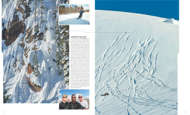
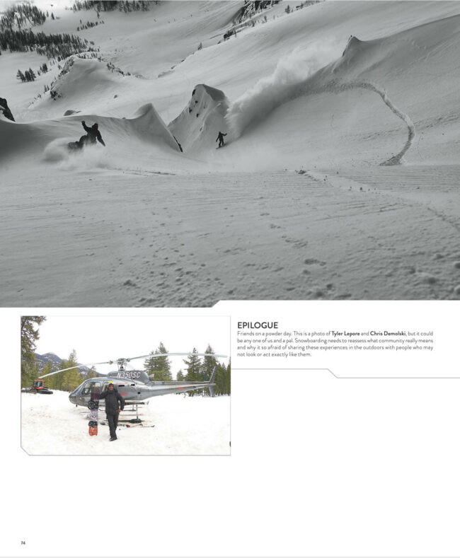
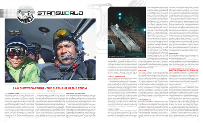
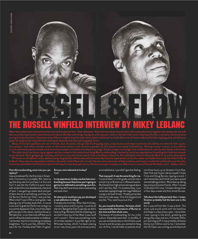
The Daily Edit – Snowboarder: Stan Evans


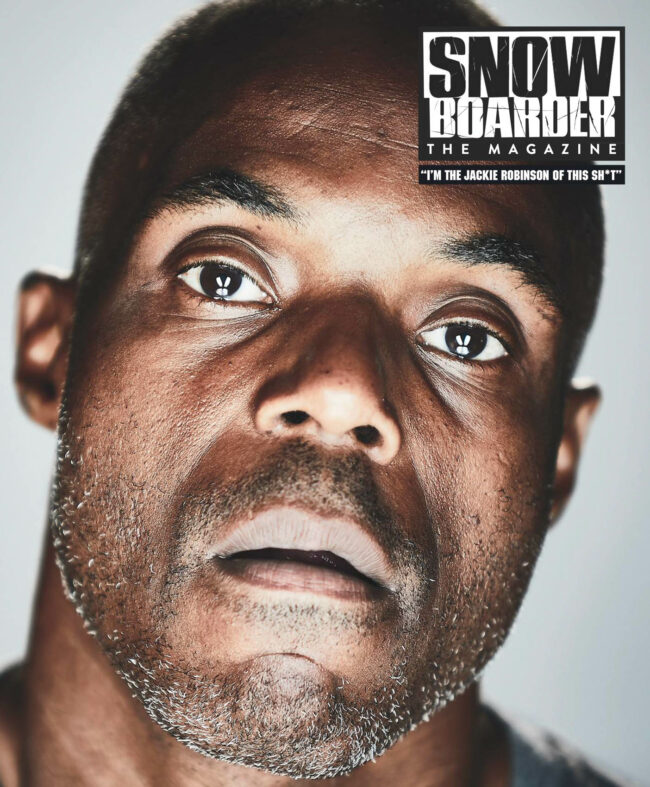
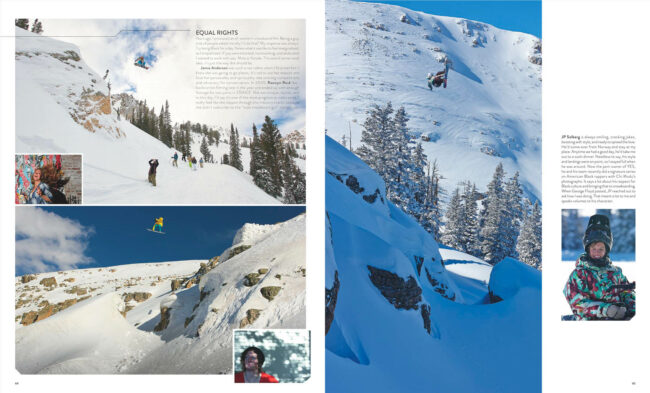
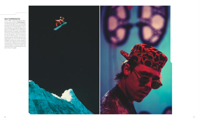
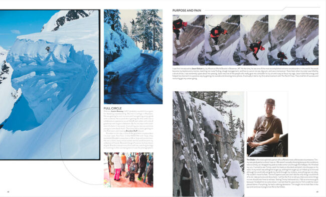
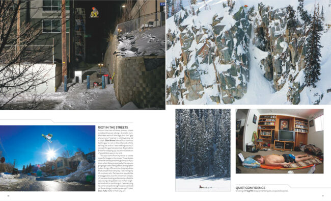
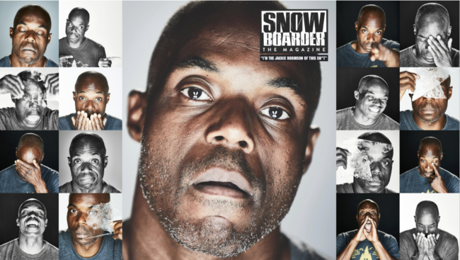
Snowboarder The Magazine


Photographer:
Stan Evans
Editorial Director: Pat Bridges
Editor: Stan Leveille
Photo Editor: Mark Clavin
Art Director: Dwayne Carter
Photo Assistant / BTS Cinematographer: Alex Kavanagh
BTS CInematographer: Myles Messinetti
BTS Editor: Jeff Moustache
Publisher: Micah Abrams
Snow Location Cinematographer: Connor WInton

Heidi: Has this issue been healing or a reckoning for your relationship with the snowboard industry?
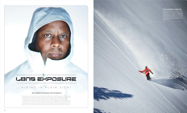
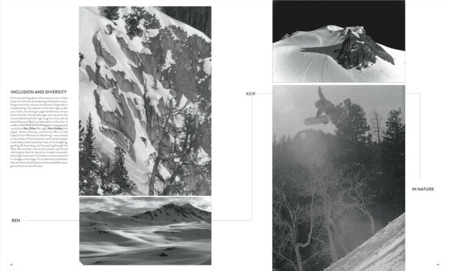
Stan: I’ll be frank. I love snowboarding. The freedom to explore, to  be in nature to take pictures as capturing unique moments in time with some amazing people but….  As a Black photographer I’d had a bit of a contentious relationship with the snowboard industry as it was very subversively racist.  In the way they marketed the sport and some of the things that happened to me throughout my career. No matter how many amazing photos I’d shoot there was always somebody there that thought because of the color of my skin I shouldn’t be here. People loved the photos but people didn’t want to hear my opinion so everyday was starting from zero and proving myself all over again. Besides being a middle class black kid I didn’t have family money to fall back on so it was  I think it’s important to view this issue and its creation through that lens.  Ironically that became the theme of the “Black experience” of snowboarding throughout the magazine –  we needed to show both sides of the coin, good and bad.  

What do you hope to share for those in your tracks?
The most difficult part of being first was not having a path. It’s a lot of trial and error and failure to be honest. There’s potholes out there and I probably hit everyone figuring it out but the tough part is the mental game of picking myself up and trying again. I had some good white mentors in high school and college but they can’t help you in navigating racists in a small mountain towns, other competitors talking behind your back about your photos. Marketing managers or team managers low balling you because they only think you are worth this much. Company employees leaving you on the side of a mountain because they don’t want to give you a ride back to the lodge. You have to develop a mental and physical toughness that nothing is going to phase you and you are going to get right back out there the next day and give %110. I want to share anything I can but the biggest thing I can give is perspective because I lived it.  For black people getting into outdoor marketing and for brands trying to earnestly help having my experience is a huge roadmap. Let’s miss those potholes this time around. Smooth the road for the next generation. 

I know you had some reservations, what tipped the scales to say yes?
To be honest It took about 3 weeks of talking before I said yes. To his credit the editor Pat Bridges called and emailed me several times. I revealed several slights I’d had from their editorial staff and in turn their publication in the past which made me adverse to getting involved. In those moments Pat gained some perspective of what it was like being the “only” –  I gave him an earful and he listened. We made a pact to try and right some wrongs with this issue.  Their publisher Micah Abrams also stepped up as I’d worked with him several times over the years and he’s always been amazing to work with. The biggest reservation I had was that David Pecker (the man who buried Trump’s Stormy Daniels story) owns ASC and it troubled me that me working on this issue potentially was putting more money in that guy’s pocket. But if I put my heart and soul into it, would it have a bigger impact than just him profiting? I tend to play the long game these days but on this one I wasn’t sure if I was winning the battle or the war? I had to roll the dice.  

What boundaries and qualifiers did you set in order to move forward?
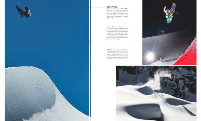
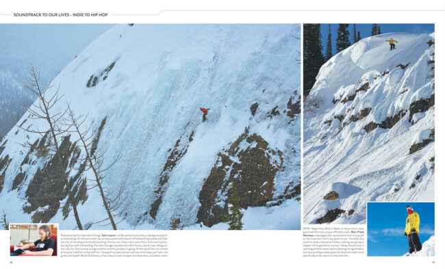
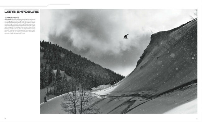
Snowboarder called first about having my portfolio included as I was the only Black Snowboard photographer but I pressed them as to who was overseeing production, we all saw a glaring hole in credibility. They had Dwayne Carter who is black as Art Director in editorial staff but his background is mainly skateboarding really no one to guide the ship to the black “snowboard” experience with a print production background. After some discussion they hired me to consult in the capacity of Contributing Editor.   Within that I shifted the narrative from just showcasing “Black Professional Snowboarders” to how “Black Culture” has contributed to snowboarding? Once we turned that corner we were off to the races.  I helped develop the well, posed the idea of creating a timeline of Black history within Snowboarding similar to Fast Company infographics, we made a selection of creators that contributed to the industry, (team managers, designers, reps, shop employees)  I advised some of the creators on their messaging and I layed out my portfolio. I delivered the basic template to Dwayne via  Indesign and he made it prettier with room for my extended captions.  Once most of those wheels were set in motion it became fairly obvious that I should write the opening oped as well. Stan (their editor) suggested it as a way to pass the mic and as he usually opens the issue with his Column “Stan’s World”  It was an ironically fitting swap. Specifically they paid Cover Shoot expenses, word rate, portfolio and consult time. My mantra is hire Black, let us create, pay us what we are worth. Snowboarder Mag followed through on that promise. It empowered ALL the contributors black, white, male, female, straight or gay and instead of anyone holding back for fear of judgement, everyone gave their all.  That’s why the issue was so profound.  

How did the pre-production of this issue help authentic stories come alive and how did you develop trust and community?
I think all of the riders had a personal relationship with the editor Stan Leveille. They all trusted him to give them a safe space to express themselves. Their staff is talented and I’m a huge believer in if you have talented people let them do their jobs. I gave them this analogy. “ You guys are driving the car, I’m just riding along to navigate and help keep you out of the ditch” One thing I did before agreeing to the magazine was have a zoom call with most of the professional riders featured. Most knew me and my history and felt more comfortable with the issue and  telling their stories if I was actually in the building making sure there were no missteps.

How did they editorially make space?
Snowboarder pooled the advertising to the front of the book (the first 4 pages) with simply a logo from each advertiser freeing up room for more Black voices to speak within the volume. It showed a deep commitment from Pat to get each of the advertisers to set aside their products for an issue to tell stories that needed to be told. It allowed for so many voices that don’t get a chance to share their story for a moment in the spotlight. 

How will this issue help move things forward in an actionable way?
At the end of the issue they also showcased several nonprofits that work with marginalized communities to get them involved in snowboarding which I found highly important as they highlighted resources for people to get involved in continuing the work. 

How did the issue come together, how many years of work did you look through?
The editor and photo editor went through archives of my past work which ranged past 20 years and I went to the office to shoot the cover, sit in on production,  review copy and art direction with the editorial staff. Originally the mag was going to  be in 2nd issue with an October release but they moved to the first issue which sped up my timeline line. I had 3 weeks to complete my work while working on 3 other photo / video shoots simultaneously. So it was a push. I didn’t sleep much that month. 
What was the biggest hurdle to overcome in creating this issue?
There was a lot of reconciliation, sharing of responsibility and effort to get things right. Beyond being proud of the mag I was proud of how the staff approached it.  They insured and created a safe space for me to do my thing (not to say there weren’t a few head butting moments) but for the most part, everyone came together to make something great. 

What are some emotions that come up when you think about the title of “Only Black Man in Alaska?”
The “Only Black Man In Alaska” is a play on stereotypes. Whenever I tell someone I grew up in Alaska inevitably they go for the (drumroll please) “You must be the only Black Man in Alaska?” joke. I figure at this point I might as well own it. I loved growing up in Alaska. Moving there as a young child literally changed my life. So I felt it was an appropriate title for BTS on the shoot and my past.  For the cover shoot I suggested we have a BTS video team just covering the shoot process. This was a once in lifetime moment  having the first black professional snowboarder shot by the first black professional snowboard photographer. We should have it on video for posterity. The interview came  about spur of the moment.   Their editor Stan Leveille actually came through with some poignant questions for me and we shot it one take.  

Featured Promo – Catherine Losing

Catherine Losing

Who printed it?
I was super trashy and went through Vistaprint.

Who designed it?
I did.

Tell me about the images?
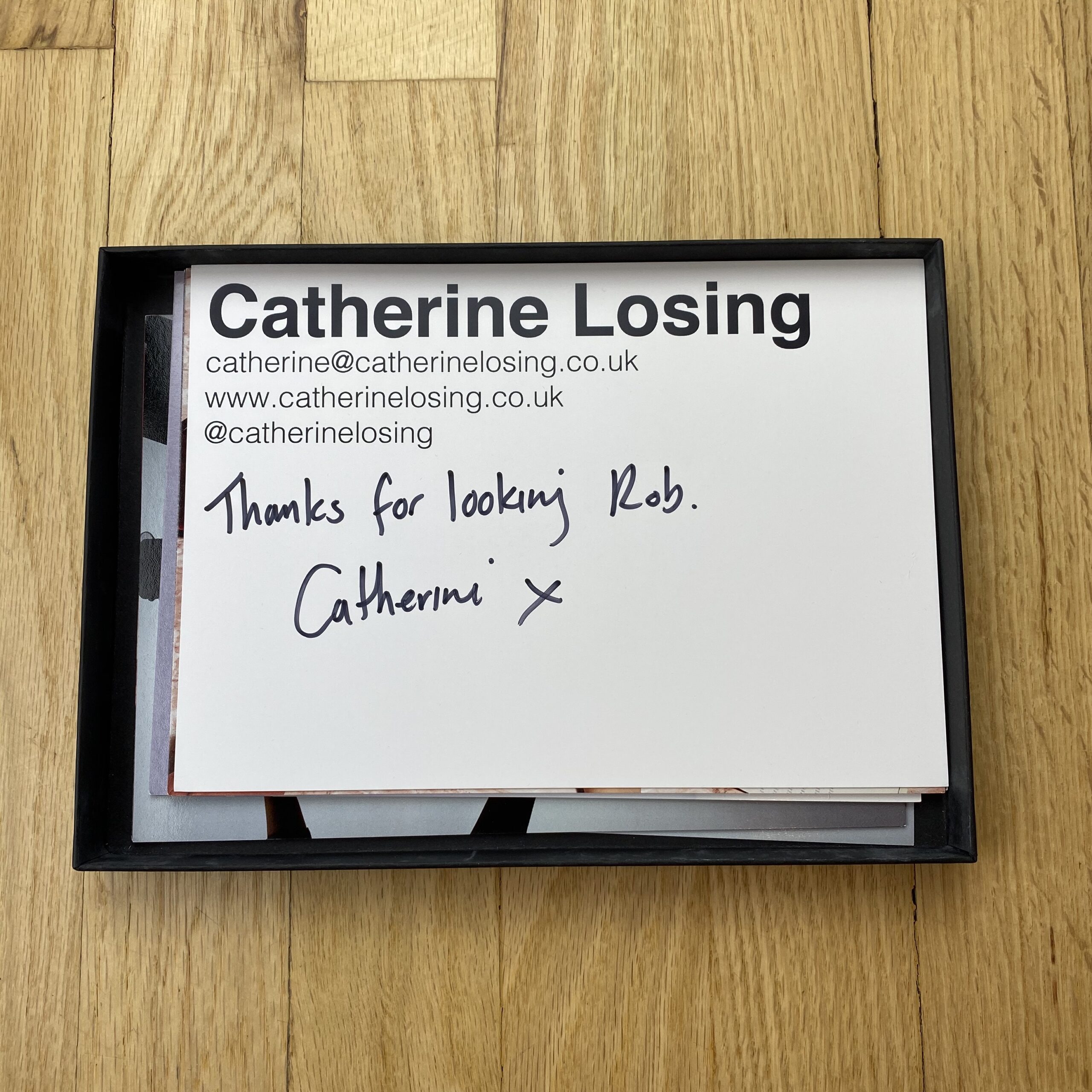
They are my favourite images from my portfolio over the past 3 years. A combination of editorial, personal projects, and commissions for names such as Vogue and MoMA. I’m always keen to include technical examples of my still life work with a variety of products as this is important to my commercial clients. However, I like to balance it out with more fun and creative shots as I often get hired to put my own spin on commissions.

How many did you make?
Only 10. I’ve been super selective about who I’ve sent them to, just a few art directors and creative producers at ad agencies, and you!

How many times a year do you send out promos?
I’ve never done a promo before. It’s a result of my London photography rep closing down and Covid. I’m usually lugging my portfolio around London meeting people at agencies face to face. I thought mailing out a mini-portfolio could be a good way to bridge the gap.

Do you think printed promos are effective for marketing your work?
Yes, I’ve only sent out 6 so far and had 3 advertising enquiries.

This Week in Photography: Creepy in Context


The high clouds came in this week.

For the first time in Autumn.


It means the November rains and snows are nearly upon us.

As we’re in a drought here in Northern New Mexico, and there is a fire on the other side of the mountains, it’s good that the moisture is finally coming.

It makes much more sense, seasonally, to have the cold and the wet and the brown.

Gray skies, so rare during the year, make sense in November, and as I write this on the back-side of October, (on a Thursday as usual,) bad weather “seems” more right than the extended-Summer we’ve been having all month.

It’s been very climate-changey, all this warm weather and blue skies.

Certain things make sense in our bones, in the deep reptilian part of our brains, because it has always been thus.

I think humans have always been creeped out by the end of October, Halloween, the leaves just dropped, the trees scraggly all of a sudden, and it seems like the ghosts are around the corner.

Boo!

Right?

The Day of the Dead in Mexican culture is at the same time, when the spirit world and the world of the living can almost touch.

So I won’t be surprised if it’s misty and cold on Halloween this year.

The harvest palette, all warm colors, disappearing: the yellows and oranges and ochres.

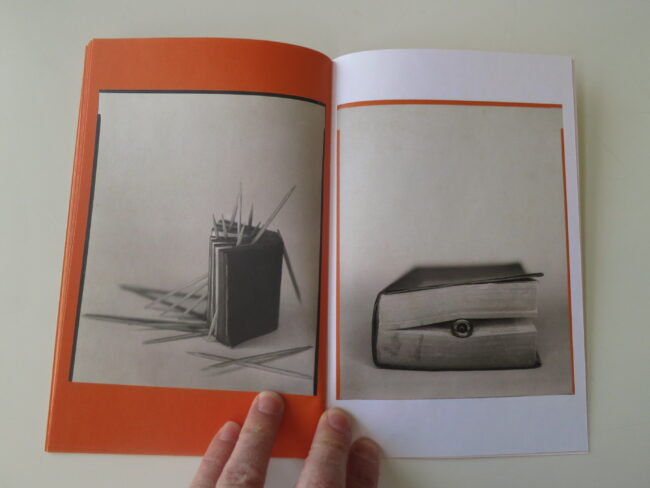
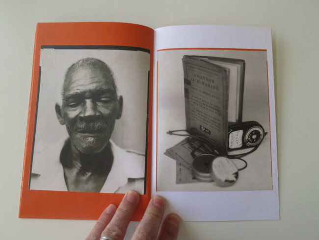
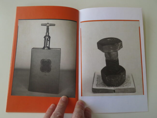
Because today’s zine makes me think of Halloween, in the best possible way, making it the perfect thing to review.

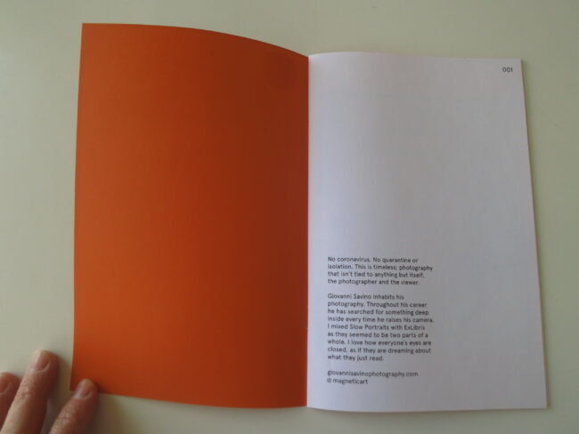
Stella Kramer wrote not too long ago, offering to send along her zine, “Stellazine,” and I had a gut feeling it was the one to pull off the stack.

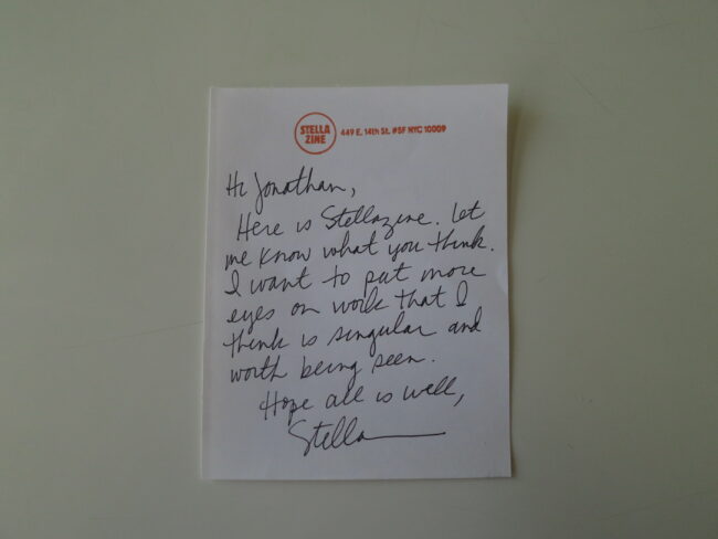
Open it up, and in a hand written note, Stella says she wants to “put more eyes on work that I think is singular and worth being seen.”

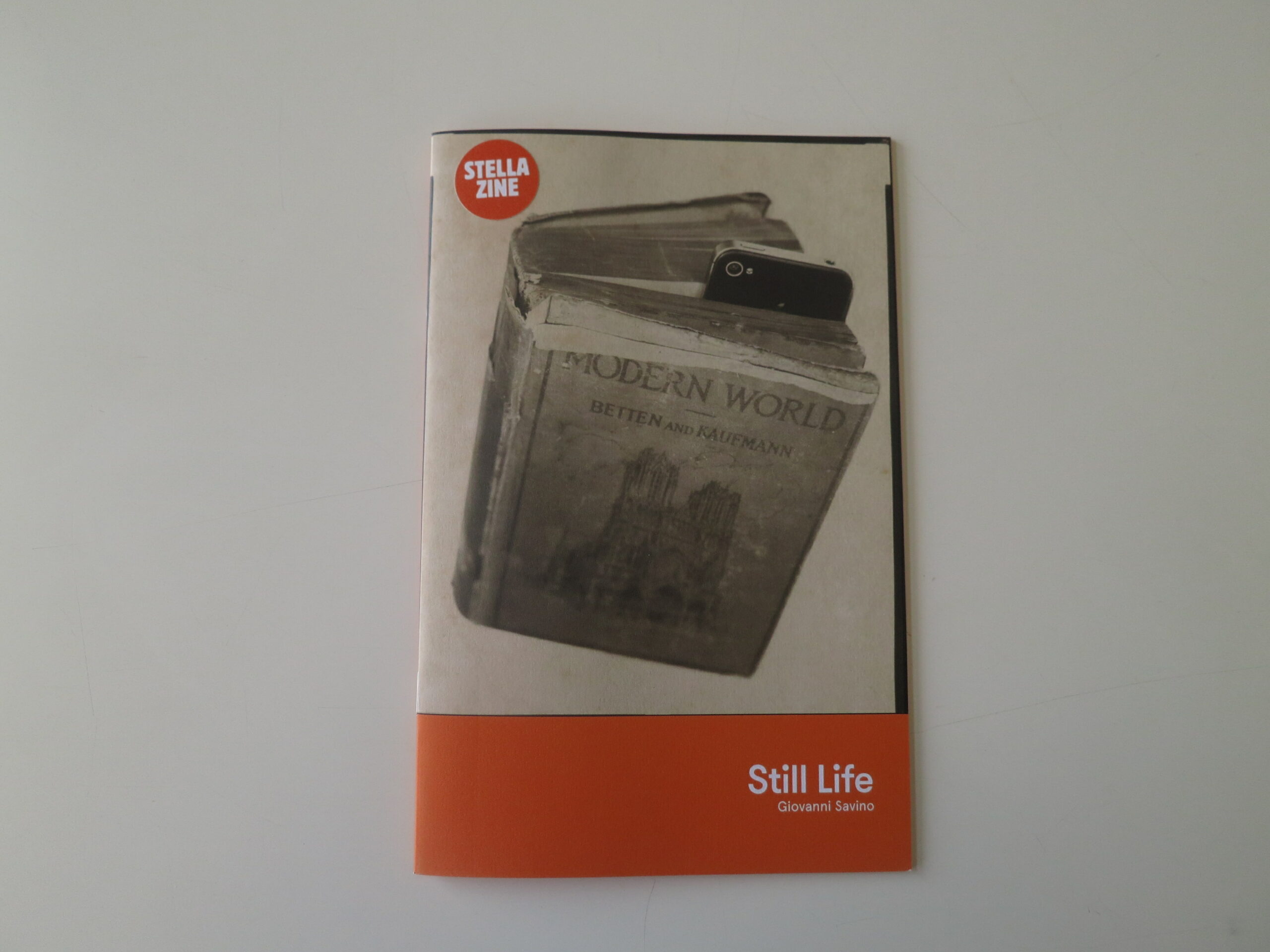
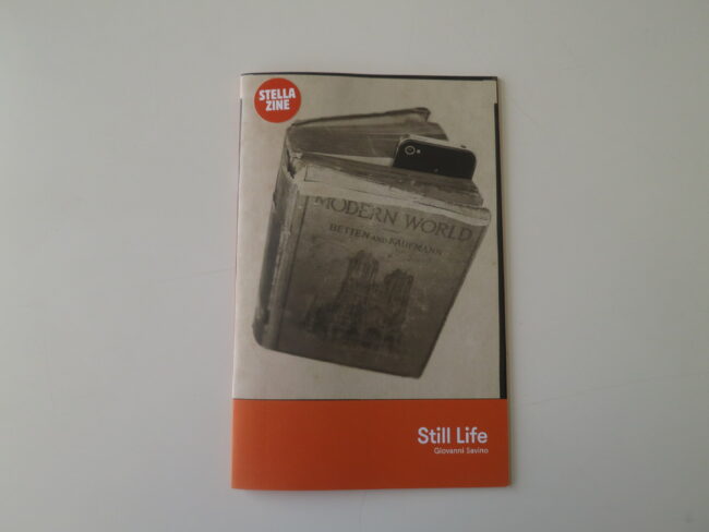
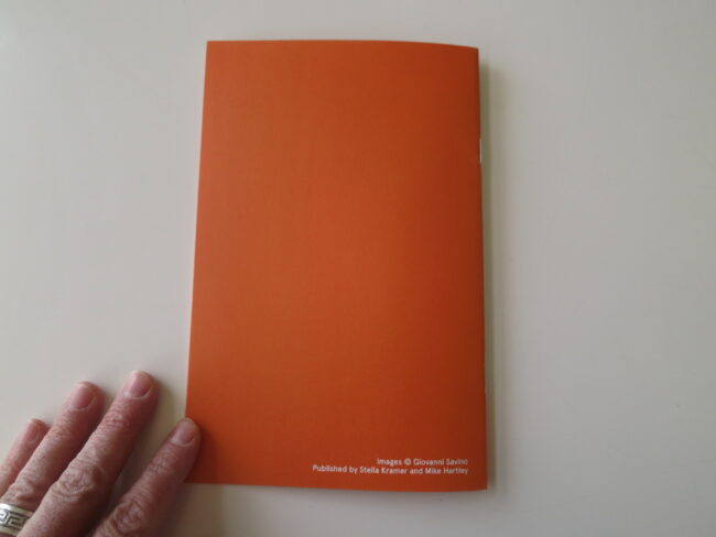
The cover says “Still Life” by Giovanni Savino, with white on orange, and then a round sticker added to the upper left hand corner reads “STELLAZINE.”

Open it up, and the first page says 001, which reads as page one, but also maybe the first of its kind in a new series of STELLAZINES?

Stella writes, “No coronavirus. No quarantine or isolation. This is timeless; photography that isn’t tied to anything but itself, the photographer and the viewer.”

And the short statement goes on to say we’ll be seeing a mix of two projects that she brought together for this volume.

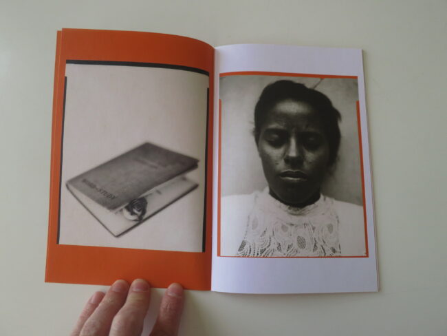
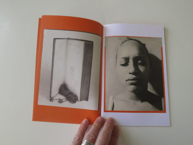
“I love how everyone’s eyes are closed,” she writes, “as if they are dreaming about what they just read.”

Well, that’s one way to look at it.

Another is that these people look like maybe they’re dead?

And the colors!

(Orange and black, like the permanent marker on the pumpkin near my front door.)

So Halloween that my autumn-craving bones started shaking from within my flesh.

Charlie Brown may have gotten booted off the networks, (only saw the headline, didn’t click the link,) but this can come back off my bookshelf any year at this time.

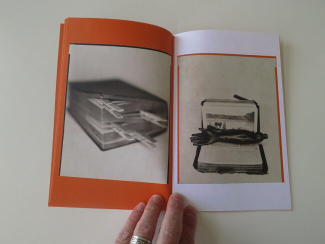
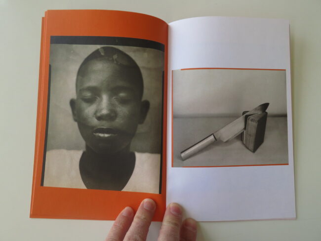
The second image spread is the weakest, for some reason, so I felt a tiny let-down after the very strong opening, but then the wooden arm, and the next page features a boy with his eyes closed, and a very sharp knife cutting into a book, on the page beside.

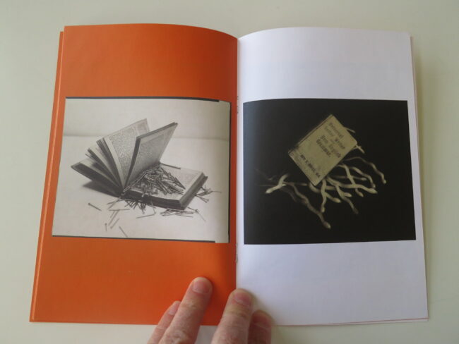
And then nails and snakes! And tooth picks and clamps!

The sense of menace becomes overt, and why are everyone’s eyes closed?

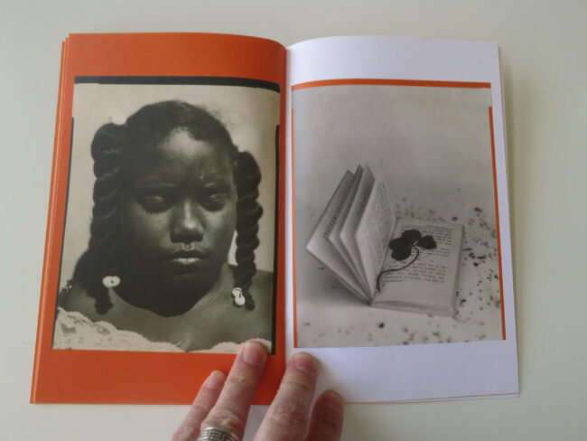
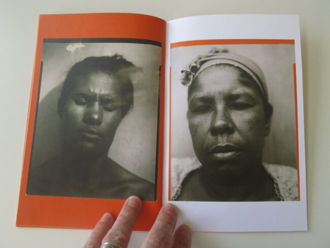
Then two young African American girls with big pigtails, on consecutive pages, and I think of photos of victims of church bombings in the 60’s.

Or girls who died of typhoid or something curable, but nobody had the money to buy the medicine.

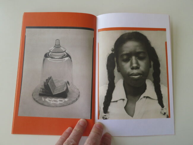
I’m sure these girls are alive and well, (IRL,) and were likely photographed in contemporary times, but in context with these old books, and torture devices, (and the wooden arm!) the creepy vibe envelops any and all things inside.

(As a thought experiment, I just opened the zine again, and looked at those two images in particular. If you skip the entire narrative, I can see the young women as strong, determined, and alive. But even then, the sense of the images not being contemporary is so strong.)

You turn the pages and there are no horizons.

No places to breathe.

And with no people looking back at you, no respite in friendly eyes, you keep turning the pages until the end, hoping for a break, but it never comes.

The ladies on the last pages look like they were killed many many decades ago, and then we’re only being introduced to their murder file pics now, after they’ve been unearthed by some hungry new cop looking to make a name for himself on cold cases.

Or maybe I just need to look past the orange and black color scheme, and the old-film aesthetic, and the old time styling.

Maybe these are two African-American women, shot in 2020, dreaming of a more equitable society?

Or a safer tomorrow?

Maybe it has nothing to do with darkness or demons?

Context is a funny thing, because as important as it is, it’s also highly subjective.

Happy Halloween.

To learn more about Stellazine click here


If you’d like to submit a book for potential review, please contact me directly at jonathanblaustein@gmail.com. We are particularly interested in books by women, and artists of color, so we may maintain a balanced program. 

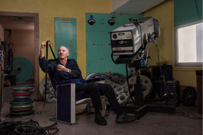
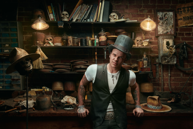
The Art of the Personal Project: Kremer Johnson

The Art of the Personal Project is a crucial element to let potential buyers see how you think creatively on your own.  I am drawn to personal projects that have an interesting vision or that show something I have never seen before.  In this thread, I’ll include a link to each personal project with the artist statement so you can see more of the project. Please note: This thread is not affiliated with any company; I’m just featuring projects that I find.  Please DO NOT send me your work.  I do not take submissions.


Today’s featured artist:  Kremer Johnson

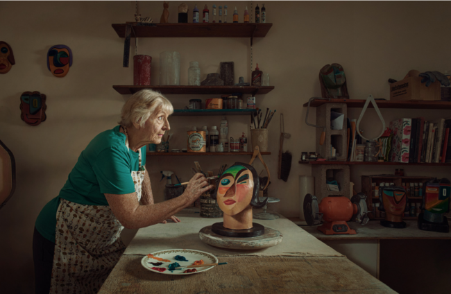
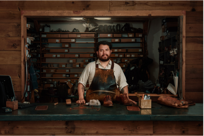
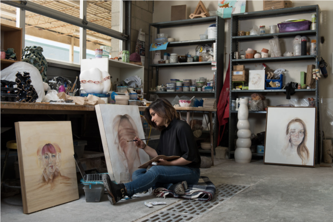
I grew up in a house where my parents worked with their hands.  Both had regular jobs, but each had a side business that they ran out of the house to make extra money.  My mom had an upholstery shop in our basement, and my dad did engine & auto bodywork in the garage.  There was constantly something being crafted around me.

Despite my parents’ best efforts to involve me, that genetic code apparently skips a generation & the skill sets never stuck.  I did, however, learn a healthy respect for the skills & maintain a proper appreciation for a well-crafted final product.  As the project was forming, it was great to have a business partner who was on board to grow this project with more creators.

Living in a largely digital world where most things are mass-produced and available for delivery to your door at a moment’s notice that level of care & craftsmanship seems to be in short older today.  This series celebrates the makers & creators who still take the time & care to create custom goods by hand.

To see more of this project, click here.

APE contributor Suzanne Sease currently works as a consultant for photographers and illustrators around the world. She has been involved in the photography and illustration industry since the mid 80s.  After establishing the art-buying department at The Martin Agency, then working for Kaplan-Thaler, Capital One, Best Buy and numerous smaller agencies and companies, she decided to be a consultant in 1999. She has a new Twitter feed with helpful marketing information because she believes that marketing should be driven by brand and not by specialty.  Follow her at @SuzanneSeaseInstagram

Success is more than a matter of your talent. It’s also a matter of doing a better job presenting it.  And that is what I do with decades of agency and in-house experience.


The Daily Edit – Photographers Without Borders

Photographers Without Borders

CEO + Founder: Danielle Da Silva
Photographer: Keri Oberly

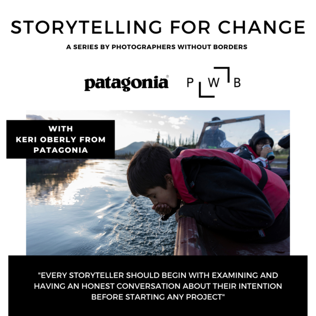
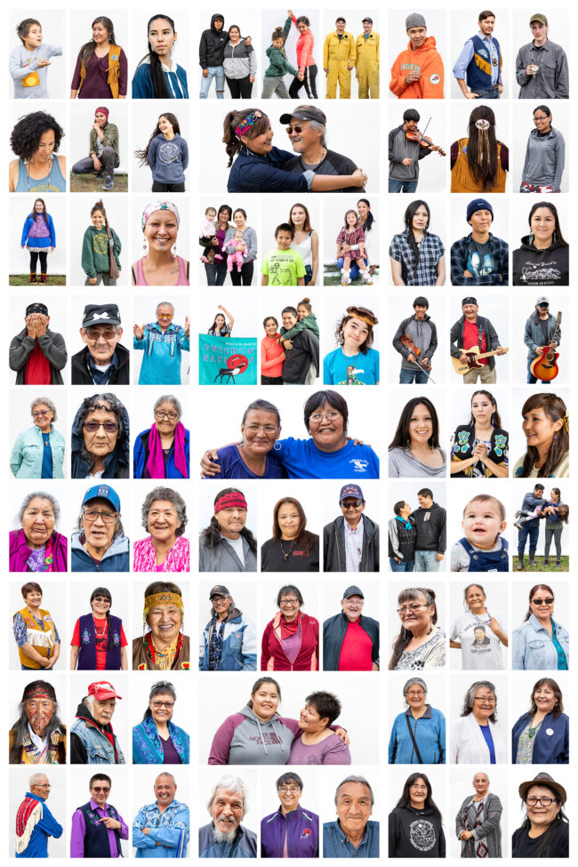
Photographers Without Borders will be talking with photographer Keri Oberly about standing in solidarity with the Gwich’in, her work with Patagonia, activism, and why she believes investing in people, relationships, and grassroots movements are going to save us. Tune in Tuesday, October 20th 10:00 am EST for the chat with Keri and CEO/photographer Danielle Da Silva.

Tickets are ‘pay what you can’ upon purchase, and all funds will go directly to support accessibility for our Storytelling School: Online program, specifically sponsoring BIPOC, Disabled, and LGBTQ+ individuals. Storytelling School: Online is an interactive online workshop to provide photographers with the tools and strategies to harness the power of storytelling and pivot their work online.

Photographers Without Borders is a collective of storytellers comprised of creatives coming together to support their community partners on volunteer assignments and inspire new generations of storytellers through PWB School and  other initiatives and resources.

Their mission is to make storytelling more accessible for communities around the world who are contributing to the 17 UN Sustainable Development Goals and UNDRIP.  Classes are taught by CEO & Founder, Danielle Da Silva, photographers will learn how to use the power of storytelling to shift online – a critical skill in today’s uncertain times.

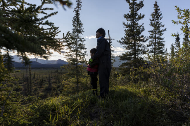
Bob Gilbert stands with his grandson, Victor, while looking for moose along the Junjik River outside Vashrąįį K’ǫǫ. The Gwich’in fear for the future of their children and grandchildren, if the Arctic National Wildlife Refuge is opened to oil and gas development, they believe it will threaten the very existence and identity of their people. To the Gwich’in, wilderness is not luxury; it is a way of life.
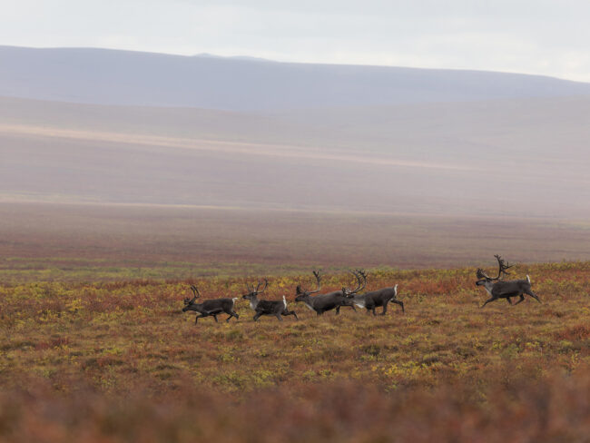
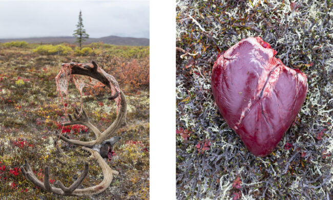
In late summer, the Porcupine Caribou Herd migrates toward Northwest Canada for the winter. The herd has the longest land migration route of any land mammal on Earth, migrating over 1,500 miles a year between their winter range and the calving grounds on the coastal plains of the Arctic National Wildlife Refuge. The Gwich’in call the coastal plains “Iizhik Gwats’an Gwandaii Goodlit” (The Sacred Place Where Life Begins). They treat the animals and land with reverence, because without them, they would not survive.

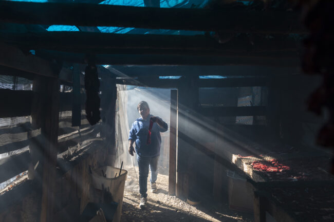
Kelly Fields hangs strips of caribou for dry meat in her cache in Gwichyaa Zheh (Fort Yukon), Alaska. The caribou was sent down by a family member in Vashrąįį K’ǫǫ. Today, the Porcupine Caribou Herd only migrates through two of the fifteen Gwich’in villages. Many families will send caribou to family and friends in villages that don’t see caribou anymore.
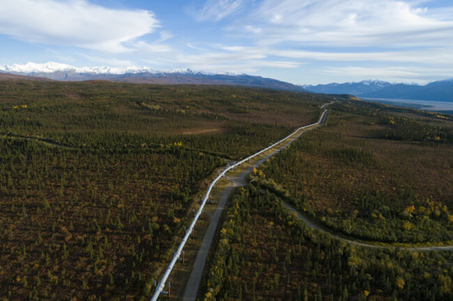
The Trans-Alaska Pipeline, an 800-mile pipeline that transports oil from Prudhoe Bay to Valdez, Alaska. The third richest state in the country, Alaska depends on one industry to fund its state spending, oil and gas. Since the price of oil has fallen considerably in recent years, the state is currently facing a $2.5 billion deficit. Republicans have been proposing to open the Arctic National Wildlife Refuge to oil and gas development for decades. Each time it has come close it was denied by Democrats or vetoed by President Clinton. With a Republican held House and Senate, Senator Lisa Murkowski snuck into the tax bill, that President Trump signed into law, the opening of the Arctic National Wildlife Refuge for industrial development. Aggressive steps have since been taken to fast track development; seismic testing is scheduled to start this winter. The U.S. Geological Survey estimates the proposed drilling area contains 10.4 billion barrels of recoverable oil, an amount that will not have a large impact on world oil prices.
Portraits of Gwich’in and their allies by photographer Keri Oberly.


Featured Promo – Ryan Duclos

Ryan Duclos

Who printed it?
Moo.com

Who designed it?
I designed the cards with help from my partner.

Tell me about the images?
I’ll start in the order that is posted on IG. The first image is a self-portrait I took in the Alaskan tundra on a 2-week moose hunt that I documented. The second image is a shot of our guide in Valdez Alaska on a 1-week Heli-snowbaord trip with Valdez Heli-Guides. The third image is the 2020 APA First place awards for Sports/Adventure. This was shot in the backcountry at Mt. Baker ski area. The peak in the background is Mt. Shuksan. One of my most favorite places on earth. The fourth image is of my good friend and pro snowboarder Johnny in the backcountry of Mt. Baker Skin area. The fifth image is a shot of our helicopter on a helicopter snowboard trip in the Canadian Rockies. The sixth and final image is of Mt.Hess and Mt. Dorothy in the Alaska Mountain Range. Both mountains sit at 11 thousand feet.

How many did you make?
I made 200. There are 4 different sets with 5 cards per set.

How many times a year do you send out promos?
I try and send out a new mailer twice a year. But to add to the mail out marketing, I started a monthly zine that I email out. The zine has new content that I shoot the month prior. This way clients can see new work and I stay on their minds constantly.

Do you think printed promos are effective for marketing your work?
I do feel that printed materials are effective marketing pieces. More now than ever. I have had a great response this year over previous years.

This Week in Photography: Enduring Humanity


Have you ever heard of Neal Stephenson?

The writer?

Dude is super-famous in geek culture, for having written a very predictive sci-fi screed called “Snow Crash,” in the early 90’s, which laid out much of what has come since.

Virtual reality, Google Earth, viral information, Evangelical cult religions, actual viruses, the rise of corporations more powerful than governments.

It’s all in there, along with a rip-roaring story, and a bunch of meta-criticism that would make Charlie Kaufman beg for mercy. (Like naming his hero/protagonist Hiro Protagonist.)

I bring this up, because five years ago, he wrote another book that feels like it could end up being predictive one day: “Seveneves.”

The majority of the time I was reading it, I thought the title all-one-word, pronounced seven-eh-vehs, with no long e’s.

But I was wrong.

It was really Seven Eves, with the second word being the name of Earth’s first woman, taken from the rib bones of Earth’s first man, if the Jewish Torah is to be believed. (And then Christianity was built upon that tale as well.)

Spoiler Alert, I bring this up because the book’s premise was that an asteroid broke the Moon, and once some fancy math was done, scientists realized the Moon would soon disintegrate into an endless supply of mini-rocks, which would rain down on Earth, destroying all life as we know it.

(That’s not the spoiler part, because it happens in the beginning of the book.)

No, I’m going to ruin the ending for you.

The entire plot revolves around some humans attempting to re-build life in space, so the world can be repopulated up there, (by seven eves and some artificial insemination,) and then the descendants can come back to Earth many generations later, once it’s safe again.

Against all odds, they succeed, and after a big time-jump in the book’s last section, when human-like creatures do come back to Earth, having evolved in strange ways due to some CRISPR-like genetic manipulation, they find a massive surprise.

Two other groups of humans lasted through the Apocalypse, one by living underwater for millennia, the other by tunneling deep into the Earth.

(Where they created a culture in which some people could breed, and others not, because of the limited air supply in their closed-loop-underground society.)

The book ends with the three strands of now-mutated humans meeting up in some frozen tundra, far from everything.

People standing on ground not fit for human society, but then again, they were no longer human society, as we know it.

My point today, if you haven’t sussed it out yet, is that the survival instinct is deep within us.

We make fun of cockroaches, rats and bats, but we are a similar type of creature, even if we smell better, look prettier, and have the capacity to create and appreciate beauty.

(Seriously, if a rat ever paints the Sistine Chapel, I’ll be the first to give props. Or if Remy from “Ratatouille” ever comes to life, all Patton Oswalt humor and amazing cooking skills, I will eat my hat. Highly Suspect!!!)


I’m not a self-hating human, but today I’m on my rant for a reason.

I just looked at “Chukotka,” a sleek, slim, excellent new book by Kiliii Yuyan, published by Kris Graves Projects in NYC, and I’m down to discuss.

Kiliii’s work has been featured in the blog before, as I published some of his Arctic documentary photography after a photo festival a few years ago, and then we hung out at a very-fun, late-night party in Portland last year.

(You know, back when people went places, crammed into small hotel suites, and passed vape pens back and forth with impunity. Shout out to Kris for hosting the party.)

As usual, when I share a book from an artist I know personally, it never makes the cut if it’s not good enough.

This one is filled with creepy-uncomfortable-cool photographs, but also succeeds in doing the one thing I love to share with you in a photo book: it shows us something we have never seen before.

Kiliii is an indigenous person, and I swear I had no plan to show his work this week, during a holiday to celebrate his people, now that we no longer genuflect at the genocidal remains of Cristoforo Colombo. (That was his real name: look it up.)

He’s spent a ton of time up in the Arctic before, and knows his way around. And I’ve certainly seen work from Alaska, Canada, Greenland and Iceland.

But this book is built upon photographs taken in the Russian region that gives the book its name, as it’s only 3 miles across the Bering Sea. (I guess Sarah Palin wasn’t wrong about everything. Almost everything, but not everything.)

The place is populated by a half Siberian indigenous population, (the ancestors of our Native Americans,) and half ethnic Russians, because like the Han sending citizens to Xinjiang, the Soviets also liked their own to live across their Empire.

There’s not much I can say about the pictures that they won’t say for themselves.

Polar bears, walruses, wolves, puffins, poor people, and lots of bones.

I might not want to go there in person, even in a world in which travel was possible, but the book lets us go there virtually.

(Who needs Oculus when you have a photo books?)

But there is one part of the well-written opening essay that I’d like to share, as it makes my opening even more relevant.

Kiliii tells us the mantra of the Arctic: “The resilient will endure.”

I somehow managed to avoid writing about ACB and the Orange one this week, even with the election getting so close, and the Republicans on the verge of sealing judicial power for a generation.

You know all that is happening, and I’ll be lucky if you stop scrolling through the NYT, WaPo, Reuters, the WSJ, Facebook, and Twitter long enough to read this column.

You’re well aware of the stakes of the 2020 US Election, even if you’re reading this in Moscow.

(Я плохо говорю по русски.)

So instead of focusing on that, think about the mantra of the people who live tougher lives than we’ll ever really understand.

The resilient will endure.

Think on that.

To purchase “Chukotka,” click here

If you’d like to submit a book for potential review, please contact me directly at jonathanblaustein@gmail.com. We are particularly interested in books by women, and artists of color, so we may maintain a balanced program. 

The Art of the Personal Project: Jeff Lipsky

The Art of the Personal Project is a crucial element to let potential buyers see how you think creatively on your own. I am drawn to personal projects that have an interesting vision or that show something I have never seen before. In this thread, I’ll include a link to each personal project with the artist statement so you can see more of the project. Please note: This thread is not affiliated with any company; I’m just featuring projects that I find. Please DO NOT send me your work. I do not take submissions.


Today’s featured artist: Jeff Lipsky

It was back in 2015 when I was on assignment for Outside Magazine where I first got the inspiration to do the father son personal project. The job was to shoot the best-selling author Norman Ollestad and his son Noah surfing together. Ollelstad’s book “Crazy for the Storm” was a true survival/ plane crash story with a father son relationship. I wanted to capture Norman’s passion of surfing and how he passed it to his son like his father had done to him. Not an easy thing to get. What is that exact moment that conveys that feeling? I was hooked.

After that assignment I decided to keep going. While shooting the late Chris Cornell’s album “Higher Truth” I had the chance capture him sharing his passion for playing the guitar with his son. It’s continued with an artist, golfer, writer, skater, and wine maker. Being a dad myself of two boys and girl I continually look for those inspirations. A dad and daughter project is currently in the works!


To see more of this project, click here.

APE contributor Suzanne Sease currently works as a consultant for photographers and illustrators around the world. She has been involved in the photography and illustration industry since the mid 80s. After establishing the art-buying department at The Martin Agency, then working for Kaplan-Thaler, Capital One, Best Buy and numerous smaller agencies and companies, she decided to be a consultant in 1999. She has a new Twitter feed with helpful marketing information because she believes that marketing should be driven by brand and not by specialty. Follow her at @SuzanneSease. Instagram
Success is more than a matter of your talent. It’s also a matter of doing a better job presenting it. And that is what I do with decades of agency and in-house experience.