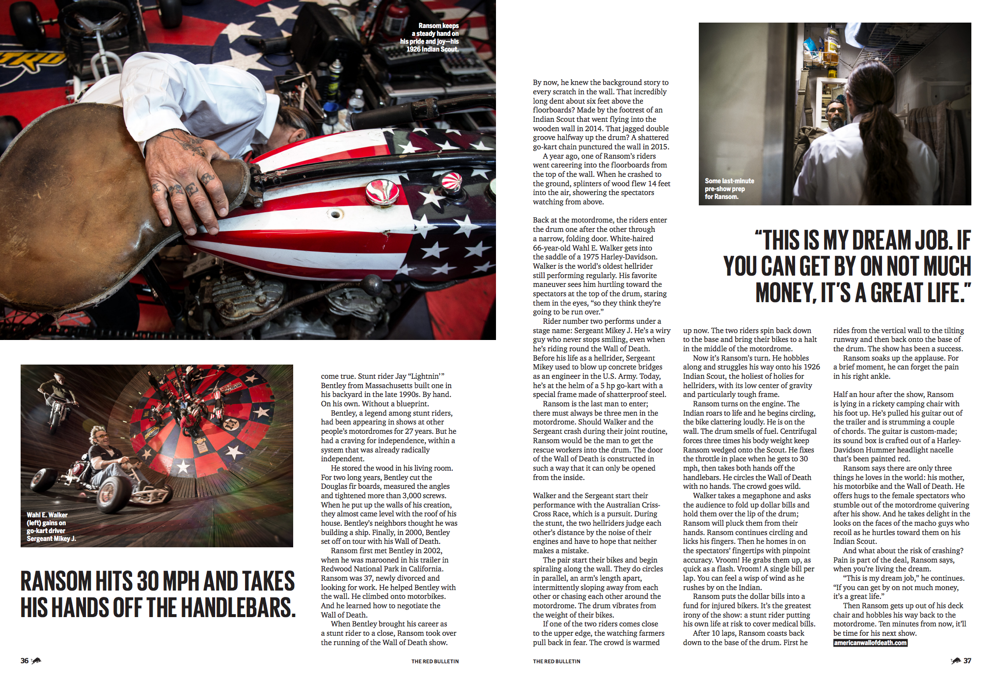
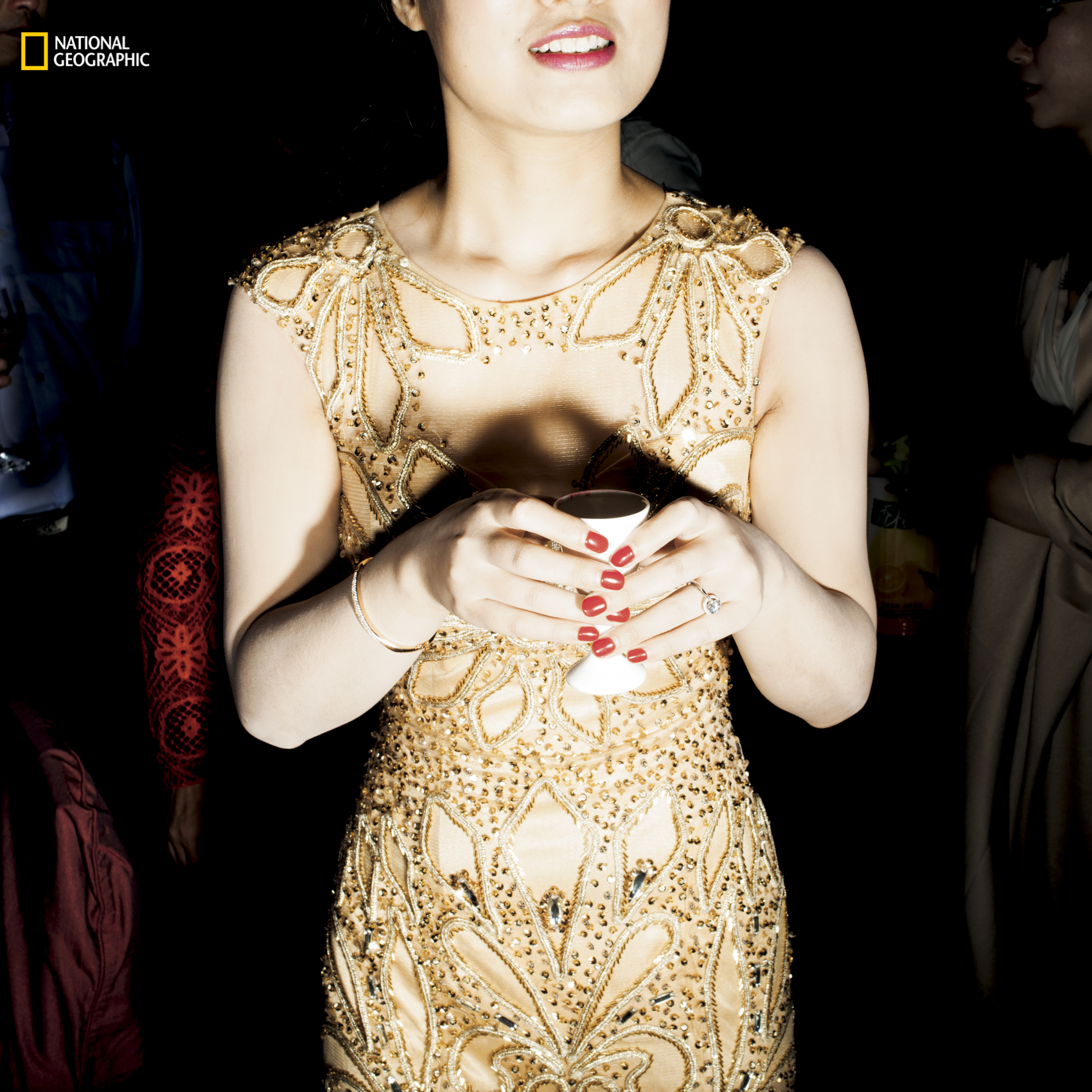
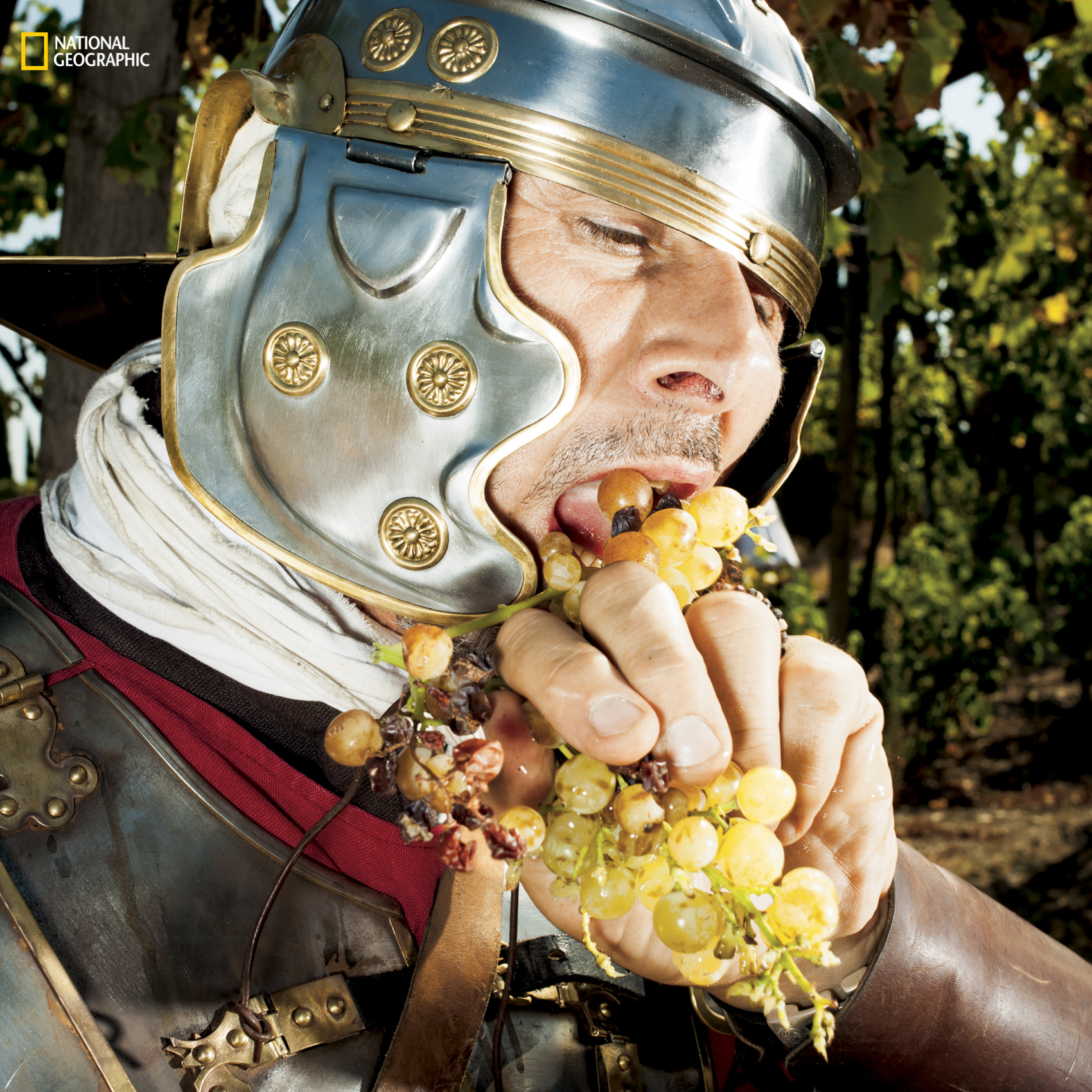
The Daily Edit – Ted Cavanaugh

Men’s Health

Creative Director: Mike Schnaidt
Deputy Director of Photography: Sally Berman
Deputy Art Director: Raymond Ho
Food Editor: Paul Kita
Food Stylist: Eugene Jho
Prop Stylist: Kaitlyn DuRoss Walker
Photographer: Ted Cavanaugh

Why did you choose that particular chile for the shot?

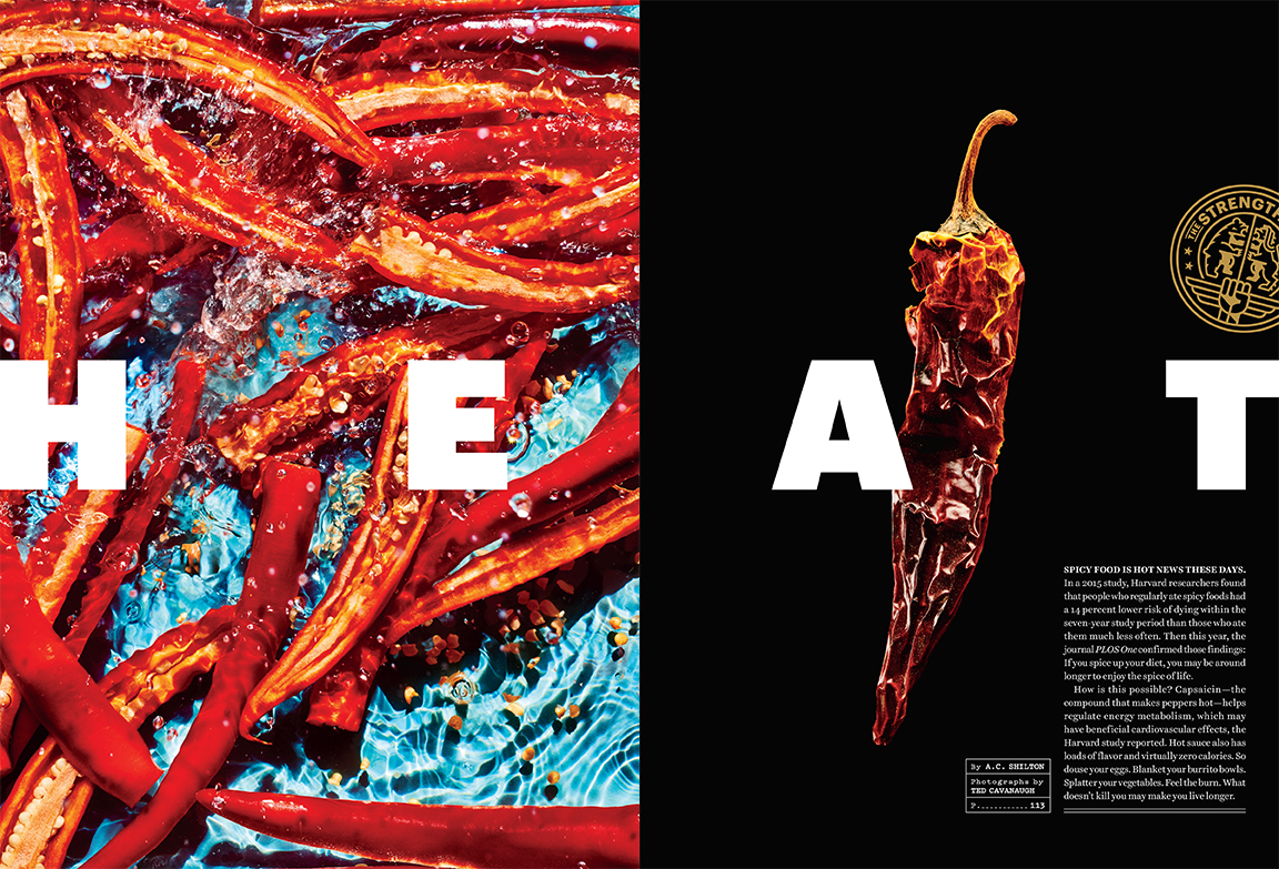
Our wonderful food stylist Eugene Jho found some pretty amazing dried peppers from all over Manhattan, but in the end, the reason we loved that chili pepper was that it had an insane fiery orange color at the top, and graduated to a more traditional dark amber color at the bottom. I thought this would be perfect on black because it would make the colors that much more vivid.

Did you wear gloves to handle them?
I didn’t, but Eugene certainly did!

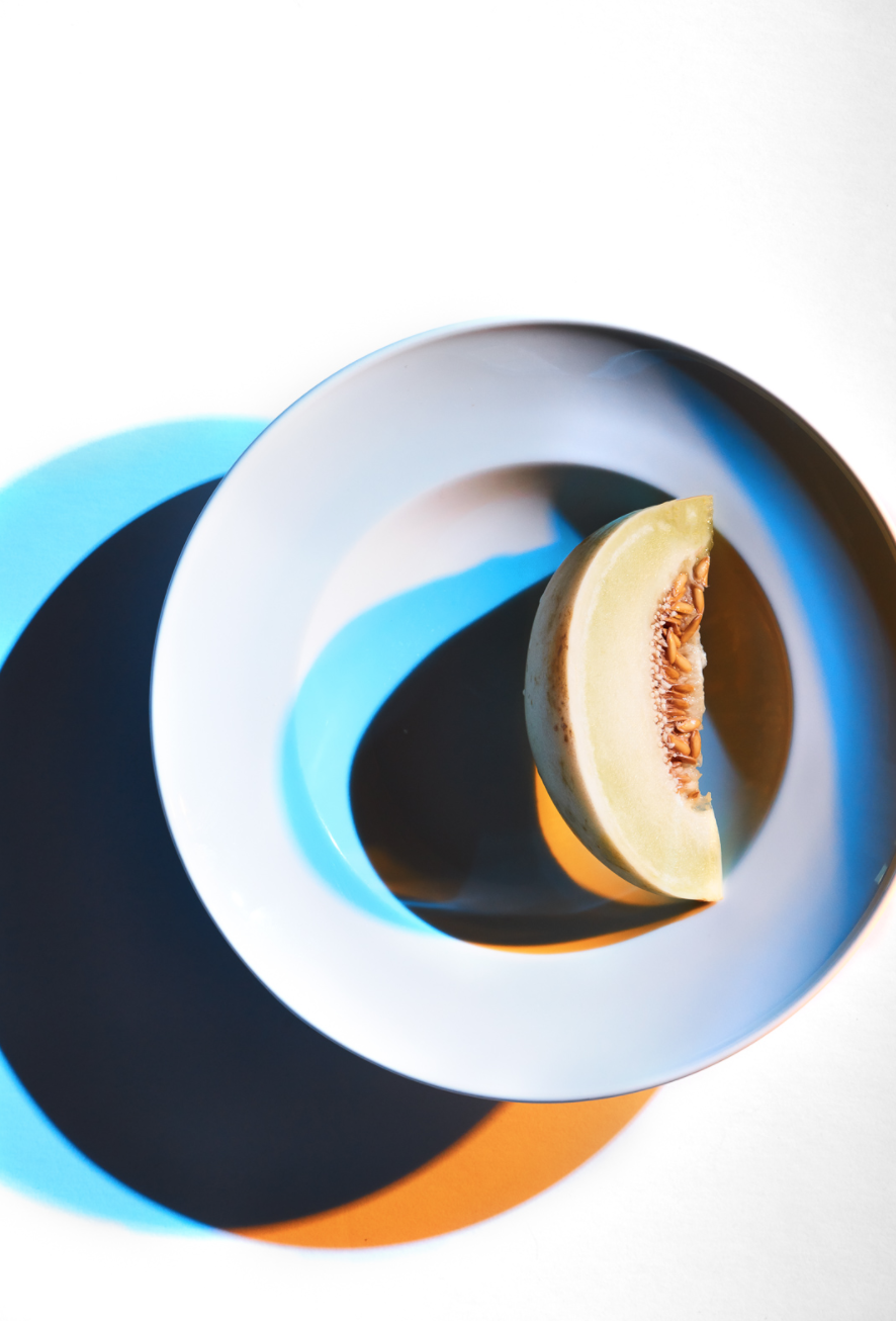
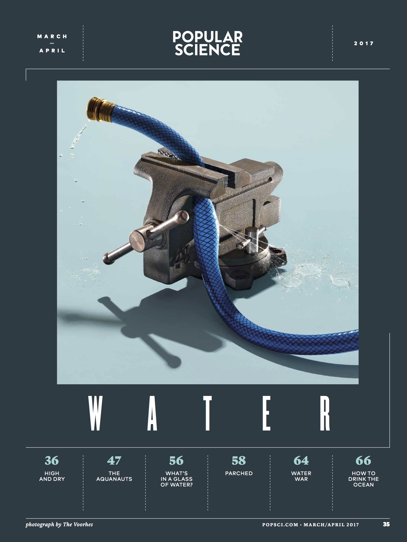
Tell us about the water background and liveliness of that shot?
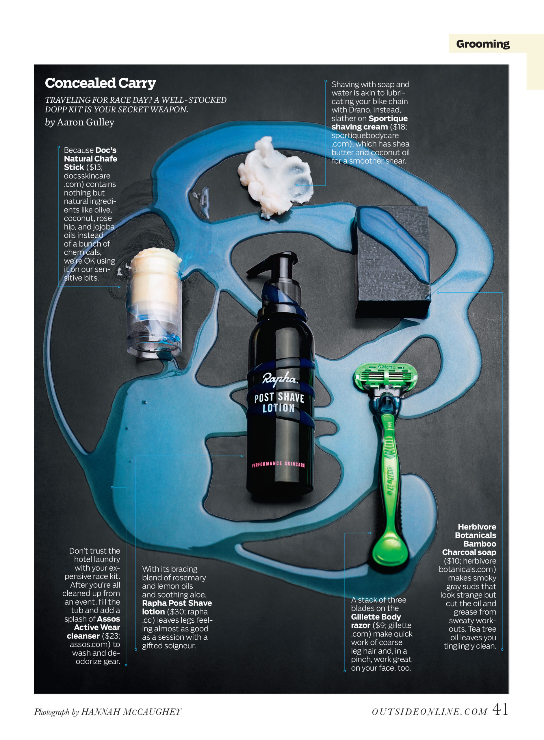
For this image, our concept was showing peppers in liquid, almost as if they were being pickled in a jar. We initially layered the peppers in a large plexiglass tray in water and a white background. It was immediately clear that the water didn’t read as well as we were hoping. In fact, the water was almost invisible.  After a few frames, I realized the white background and the stagnation of the water weren’t working. So, we switched the background to a beautiful blue and made the water as active as possible. To me, the most exciting thing about water is the textures and shapes it can easily create with the right amount of agitation. Part of what I love about working through concepts on set is the spontaneity of it. There can be long discussions beforehand about what the intended outcome is, but in the end, it’s more about the physical limitations of how the subject reacts with the light and the camera’s sensor….you know, physics and stuff.

Did you submit that spread or did the magazine put those two images together?
The wonderful designers at Men’s Health put that spread together.

What type of direction did you get from the magazine?
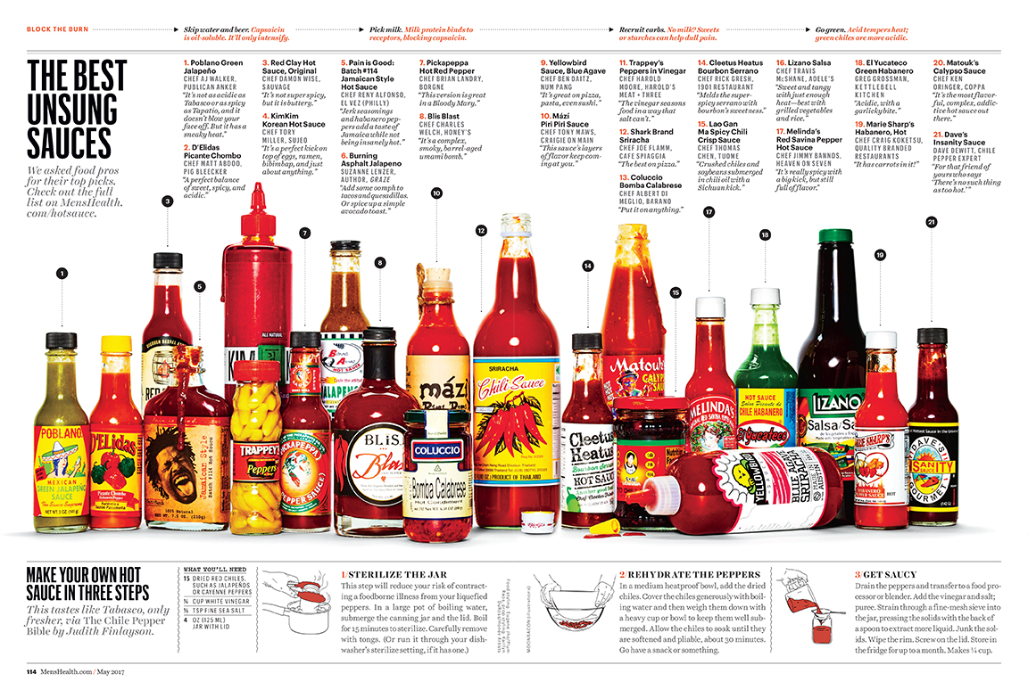
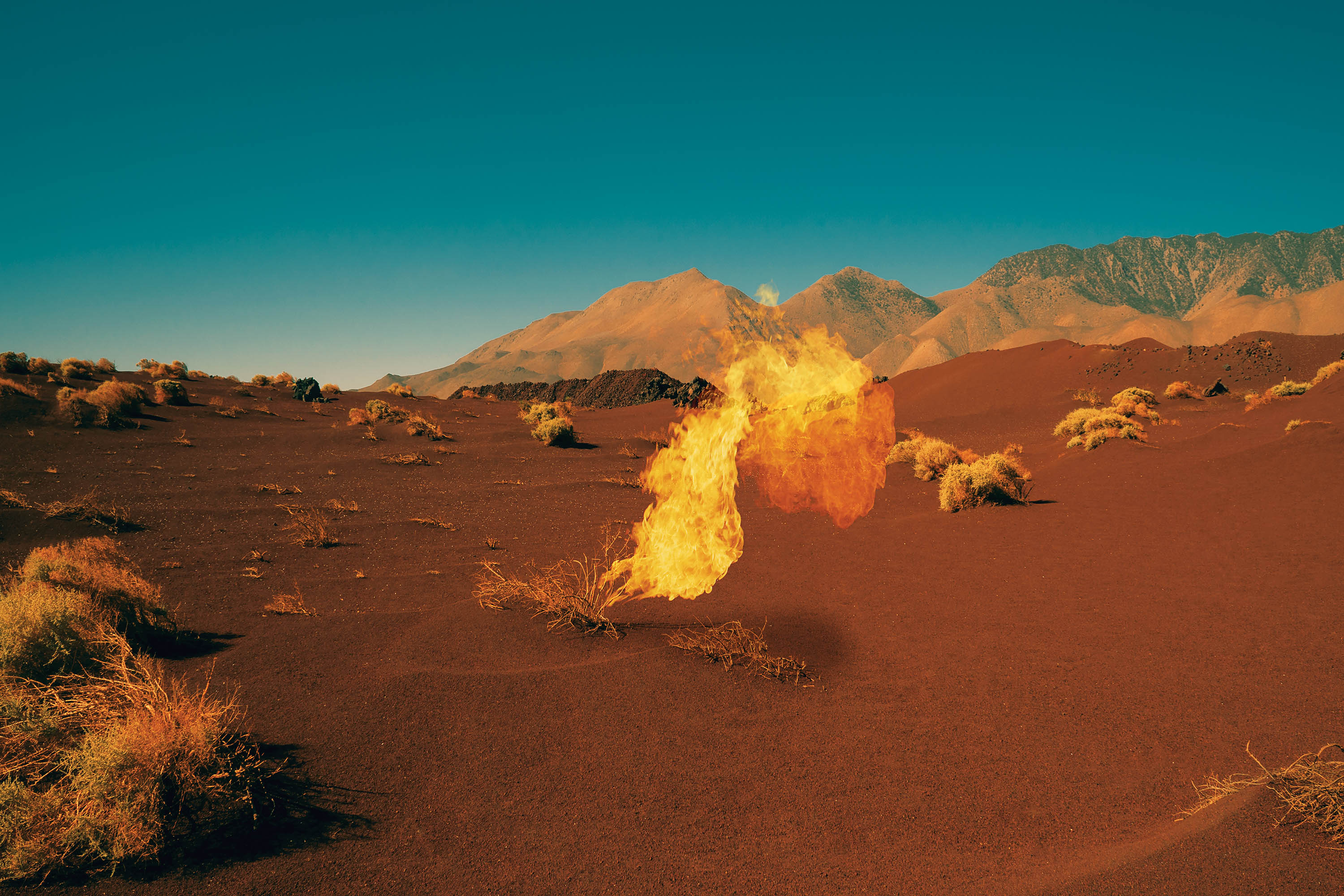
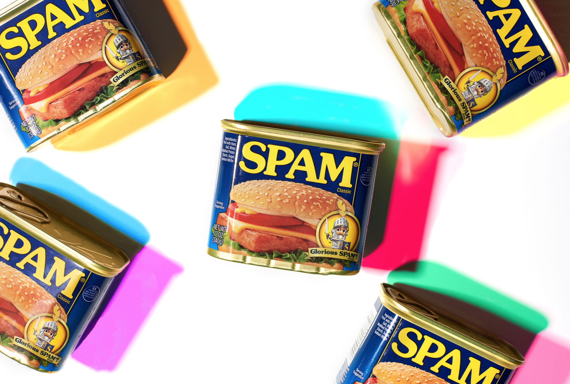
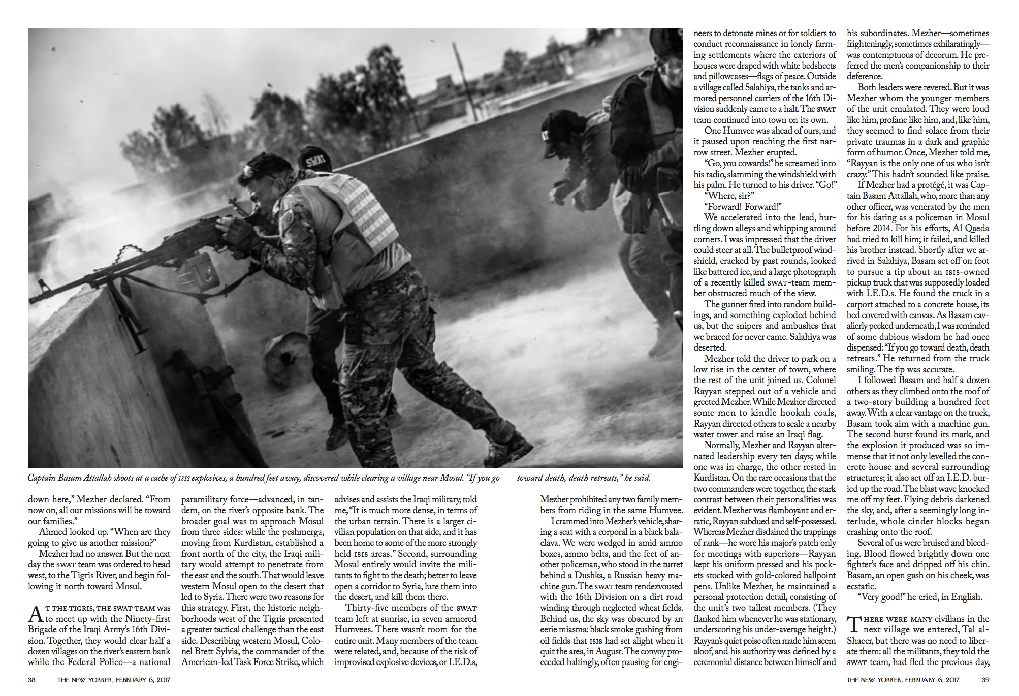
When I got the call from Sally, she had some images in which she was drawing inspiration from, but she gave me the go ahead to make really cool pictures. The main focus was absolutely all about hot sauce, so we needed to get a really solid composed photo of all the hot sauces. But after that, we just went wild and got as many different variations of graphic chili peppers in different scenarios as time allowed.

 Refinery 29

Senior Photo Editor: Deb Wenof House
Photo Assistant: Megan Madden
Senior Food Editor: Zoe Bain
Food Stylist: Victoria Granof
Prop Stylist: Megumi Emoto
Photographer: Ted Cavanaugh

What type of creative direction did you get to in order to develop these?
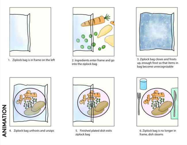
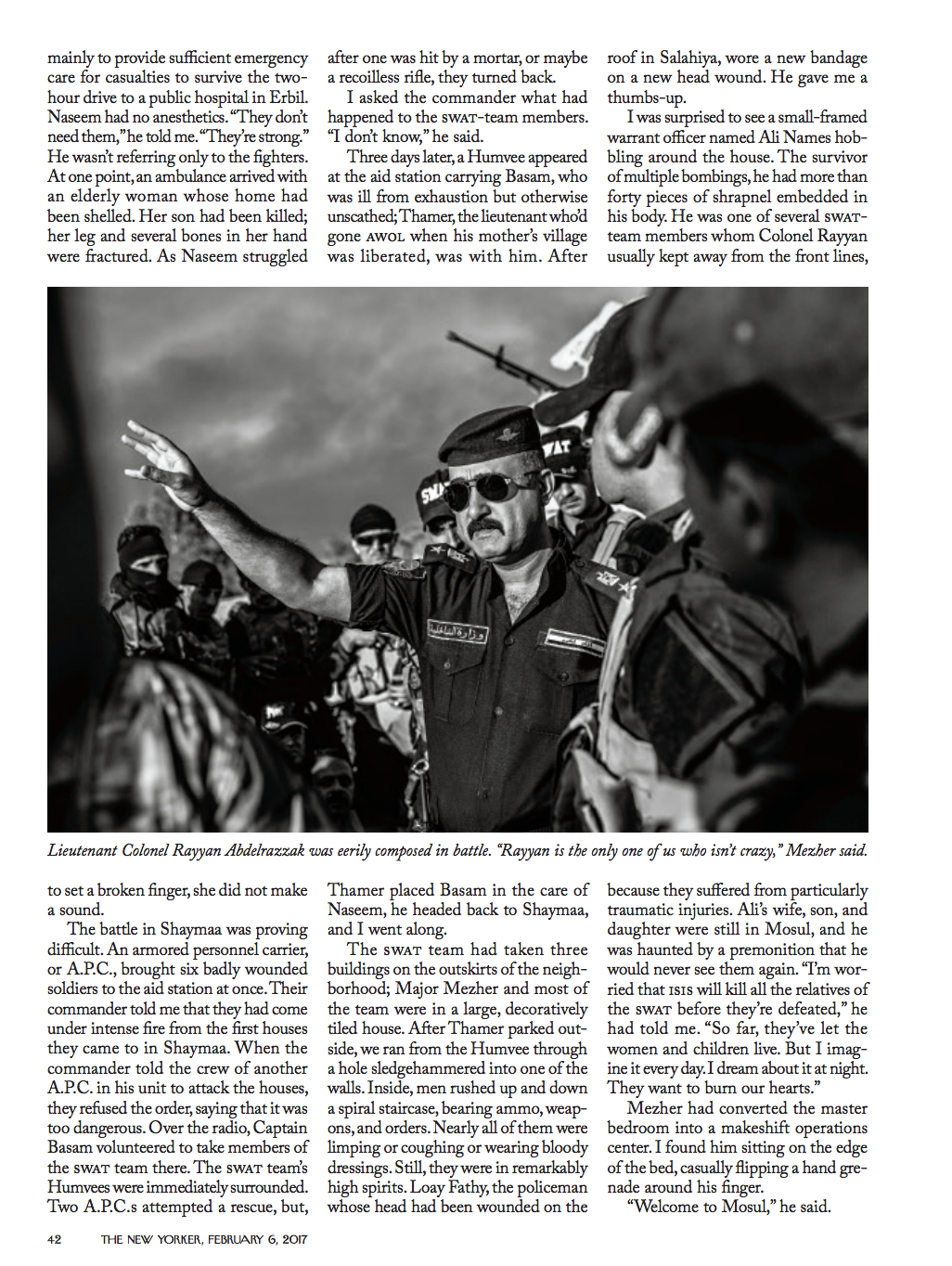
I got an email from the wonderful Deb Wenof House in February regarding a shoot in which they wanted to illustrate the convenience of prepping a meal, freezing it, and having it ready for you when you get home late and are famished. One thing I really love about the ladies at Refinery 29 is that they know their brand very well, and come prepared with a storyboard of how they envision a concept. Deb’s associate, Megan Madden, came up with this dazzling sketch. I enjoy collaboration, so if a client has an idea they would like me to make come to life, I’m all for it. One of my favorite parts of being a still life photographer is being able to turn a vision into an image.
It’s a refreshing take on food prep, what was your creative process, do you sketch?
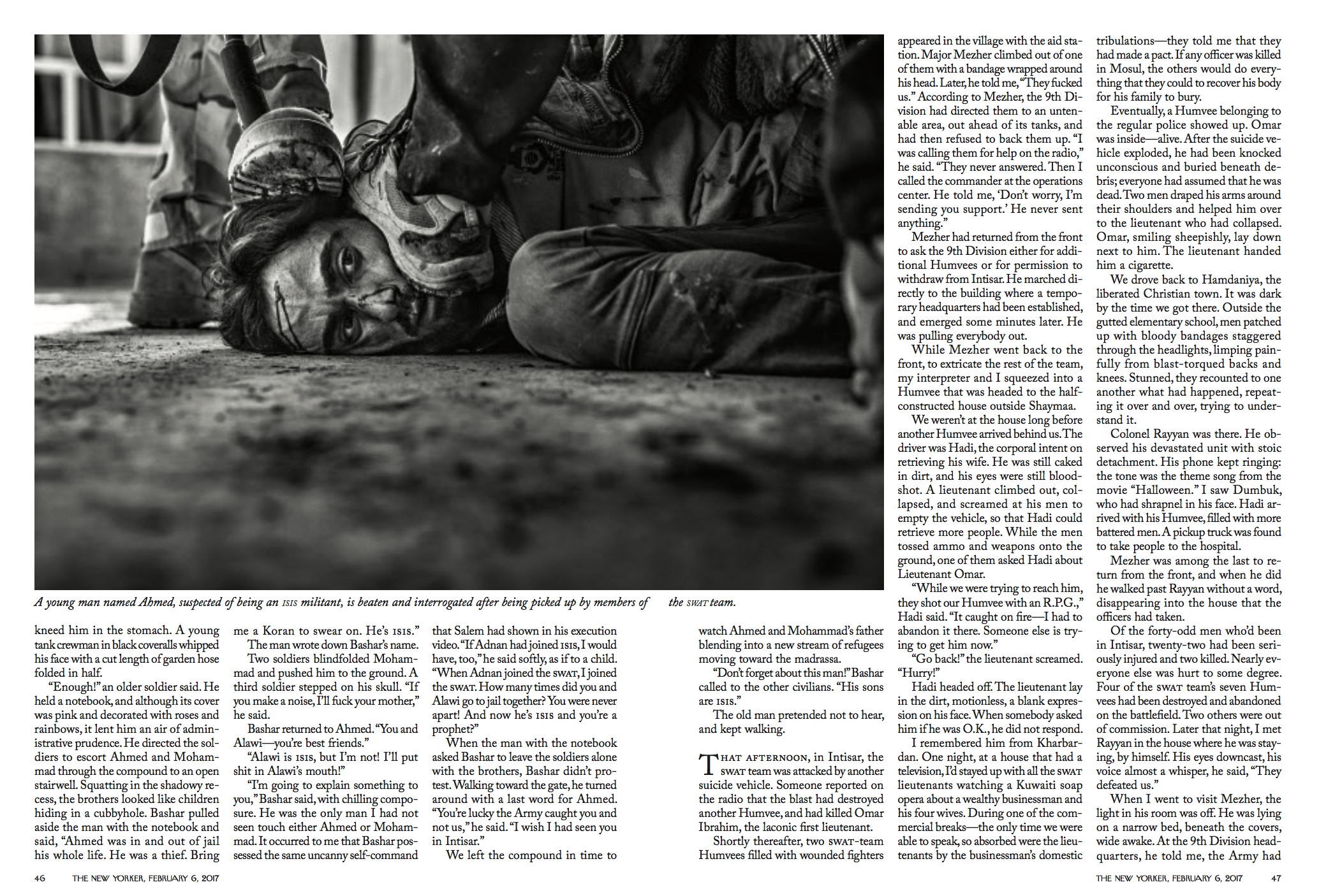
Luckily that day, I was lucky enough to work with Victoria Granof, she’s a food stylist that is always creative and always creating.  She puts her twist on food and it’s a pleasure to be a part of that. In my creative process, I make sure to stop and observe something that we might have otherwise taken for granted.  I remember a few years ago, in an airport, I noticed how beautiful the lighting was and took note of why. It’s just little things like lighting or textures that I find most inspiring. Part of my DNA is always wondering, always asking weird questions. I think a lot of my daily life is inspired by starting a phrase with, “I wonder if…” or, “I wonder why…” Generally speaking, it’s hard for me to turn creativity on and off. It’s more of me being a quirky, inquisitive person who happens to take pictures as well. A lot of my personal work is actually trying to answer those questions. Lots of caffeine never hurt either. My wife, Chelsea Cavanaugh, who is also a still life photographer, inspires me as well. We work together on every shoot, and she has an amazing vision for composition and styling. Lately, if I’ve been feeling anxious or need to change things up, I do some simple calligraphy on a post it note. Something about the process of calligraphy to me is so relaxing. I’m terrible at it, but it’s relaxing none the less.
How many frames are in the time lapse?
It averaged out to be 70 frames per animation.

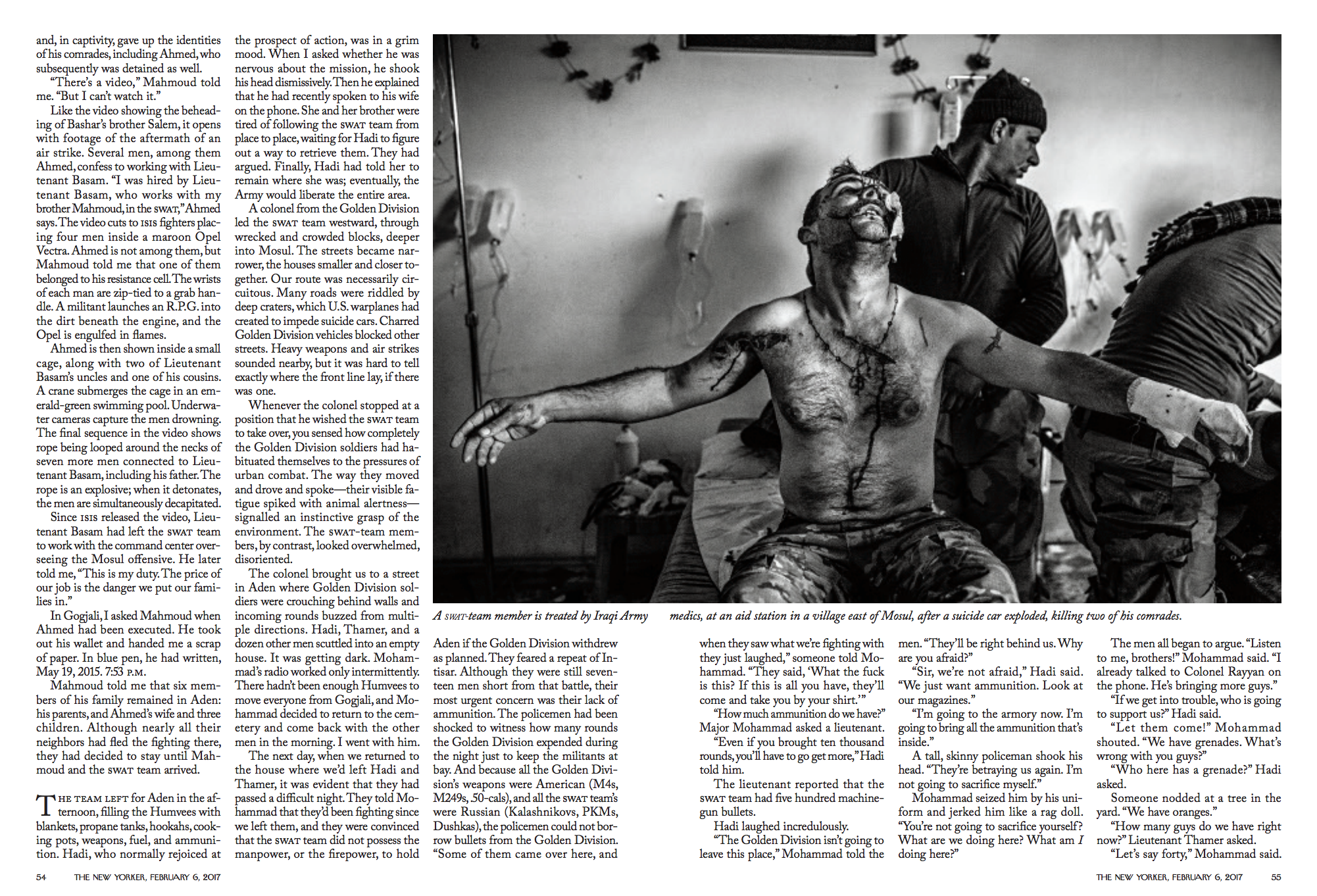
For the edit from raw ingredients to fully prepared, did you vacuum seal those and add steam to indicate “process”?
Yes! Our prop stylist Megumi Emoto took a straw and sucked out all of the air in each bag for the animation. The steam was created with a handy little thing called smoke sticks, which I, unfortunately, can only find at a local store in NYC.

The Daily Edit – Bonobo: Neil Krug

Photographer: Neil Krug
Artist: Bonobo
Record Label: Ninja Tune

Heidi: What inspired you to create this type of imagery for the album package?
Neil: I had one conversation with Simon (Bonobo) over coffee last summer in Los Angeles, and from that meeting the overall narrative of the package began to form.  I’ve been a fan of Bonobo for a long time and wanted the campaign to stand out amongst the rest, so it was a process of chasing a specific type of landscape imagery tied to the mood of his album, whilst complimenting my own sensibilities of the type of artwork I think will work best across all platforms.

I think the mantra we both took away from our meeting was “beautifully sinister”.  Once I honed in on those words and placed myself in the mojave desert at 4am, the imagery began to spill out. I wanted the work to feel primal and alive, building in momentum into the earth cracked open.  That feeling was materialized into the image that became the cover.

How many hours of drone flight did you accumulate to get the clips you were looking for?
If I remember correctly, only 45 minutes of drone material was shot.  I chased the edit I had in mind so everything was done in one or two takes, plus the sun was going down.

How did the unnatural surprises get incorporated into the images ( fire, blue light, smoke)
The elemental fire, smoke, and light are the characters the landscape shots required in order for the viewer to get involved, otherwise the imagery felt too safe as far as i’m concerned.  The elements invite you in and give the work a reason to exist.

Did you promote yourself to them or did they seek you out?
Ninja Tune (the record label) made the request.  I live by the code of do right by the work, and the work will do right by you.

I know photography wasn’t your first choice and your film experience was self-taught. Looking back, how did this influence you now and set you apart?

It’s hard to say, as it’s something I don’t reflect on often.  If anything, the self-taught method allowed time from me  to grow a thick skin, and more importantly to trust the work. I’m not certain I would be here now if I didn’t pay attention to these things early on.

How long have you been with FORM and has your work evolved or changed since you’ve been on board?
I’ve began working with FORM during the fall of last year and it’s been a rewarding working relationship ever since. Having a great team to work with on a day-to-day basis is an important part of the process, so it’s a blessing to be in the company of people who share your vision.

The Daily Edit – New York Times Sunday Magazine: Damon Casarez

The New York Times Sunday Magazine

Photo Director: Kathy Ryan
Photo Editor: Stacey Baker
Photographer: Damon Casarez
read about the story here

Heidi: Did you bring this story to the magazine or did you conceptualize the idea and bring to them?
Damon: The photo editor Stacey Baker brought this story to me. I believe I was assigned this project based on the success of my previous assignment work with them on boomerang kids across the country as well as an assignment on LGBTQ canvassers. Boomerang kids was a series of moody, mostly interior portraits and the canvasser story was shot in a South L.A. neighborhood in front of homes the volunteers were canvassing.

How long did the assignment take and what type of direction did you get?
The project was about a week of shooting in Boston and the surrounding cities with 1-2 shoots per day depending on the schedules. The direction was pretty simple from their end; create a strong, natural interior portrait of each family/subject and also create an exterior portrait that’s a bit more formal outside of their homes. After reading the article and taking some notes, Stacey and I talked about having consistency with the exterior portraits and being a bit looser with the interiors. Working with the Times mag is always an amazing experience because they will give some simple directions and trust you to do the rest.

What were the determining factors for interior and exterior images?
The challenge of the interior part was walking into a space I’ve never been in and meeting families I don’t have much info about and creating a dynamic family portrait in a way that is comfortable for them while still being visually interesting and revealing. But, that’s also the challenge of almost every portrait assignment. When meeting each family, I would take some time to talk with them so that we were both comfortable with each other and then we would start to figure out what would be a natural space for them to be photographed. One goal for the exterior shots was to have an option where they would all be executed in the same manner for possible layout options. They were of course open to me doing other options for the exterior but their direction worked out best visually.

How did you handle the dynamic of kids, multi-subject shoots and families? Did you take more frames, direct a bit more?
This was my first assignment with families and multiple kids in a confined portrait setting. My assistant and I would try and make things easy as possible by having lighting tested and ready for the family. The struggle with photographing kids is trying to get their attention to us at the same time and having them be still. One of the kids would be playing and making faces at me while the younger one would be running out of the frame! Sometimes you have no control and let them do what they’re going to do and it works out better and becomes a more natural photo. What helped was taking some breaks to release some energy and showing the kids my camera and having them take a couple of frames. We also had to negotiate with some of the kids. If we were struggling to get the shot, I would tell them that we would only need 5 more frames and they could go play and it would work. Once we had the kids in a good place, we shot a burst of frames to try and nail the shot. It was a super fun learning experience.

The Daily Edit – Shea Evans: Technicolor


Shea Evans

Heidi: How has this style evolved into your editorial and commercial work?
Shea: After building up a small amount of these images, I began to wonder if they might have some commercial applications for product shots.  Once I had five or six images to show, I reached out to a creative director I had worked with previously.  This was really casual, just over text (her preferred mode of communication), “Hey, I’ve been working with this style recently, I haven’t seen it around before, if you think you might have a client that it would be a good fit for, I’d love to work with you again”.  Just so happened that she was looking for a new style to match an imminent project.  We ended up working together to craft four images for her client in this color shadow style.  The end client was thrilled with the unique look and used the images as large storefront window posters.

What type of feedback are you getting from the personal body of work?
I’d say the feedback has been positive.  Certainly, with this type of work, the reaction has usually been “whoa!”, but part of that is because it’s such a departure from my previous work, which has a very natural, real and organic feel to it.  This has none of that.  I had a previous personal project, Deconstructed Flavor, that always seemed to excite people.  It leads to a lot more interviews than it did actual work (though I sold some prints and did do a commissioned cover).  But interviews can be great marketing, so I think if nothing else personal work can help in that way.  I don’t think you can really do personal work with an eye to turn it into jobs, it’s just not going to be genuine that way.

How did this style develop?
I started this particular project not as personal work, but more an exploration of technique.  I had had an issue on a shoot with mixing color temperatures from ambient and strobe light sources and so I began experimenting with using gels on my lights to try to match up temps, and really just see what my options were.  I had only used a warming gel here and there in the past but didn’t have much knowledge beyond that.

Pretty quickly into experimenting though, I started to notice the shadow effects I was getting out of combining gels.  And I started to play with multiple gels and subjects.  I got completely distracted from my original purpose.

Just on a creative level, it felt good to completely go away from my style of “real, natural, organic”.  In this way, my personal work has served as a kind of release valve for built up pressure by being boxed in by my own commissioned work.

What are the brain twisting gear elements you are referring to in your comment?
The shadows themselves are related to lights and gels you choose to use.  That’s pretty obvious.  What isn’t obvious though, is that the color of the shadow is related to the gel of the opposing light, not the one casting the shadow.  Also, depending on what combination of gels you use, that affects the color combination of shadows, change one gel out and the one that remains will also be affected and won’t be the same shade in the new image.  In addition to this, power in your light source has a great effect on the color, from a deeper color to a more pastel depending.  On top of this, some gels are denser, requiring more or less power from a light, so any change involves this total recalibration of your lighting setup to achieve a balance.  Then there’s the middle shadow to consider.  If you have an image where the shadows overlap, that creates a third color/shade or shape element.  How do you want that to look?  Then there’s the shape of the shadows themselves, long or short?  How can you turn the subject to get a more interesting shadow or a less interesting one?  Is that shadow too distracting?  Is it too small?  This work has a much more fine line between “Cool!” and “Crap!” than I’m used to working with on my more “normal” tabletop food work.  On the other hand, it makes it that much harder for someone else can replicate.  Lately, it feels like everyone can offer a “window-lit looking food/product beauty” so it feels good to have a difficult shot like this in my offering to clients.

How do you see this work influencing your current brand and style?
I don’t know if it represents a departure point as much as a branch.  I’m not evolving into a new style so much as adding something to my toolbox.  Any photography is partially about light and how you use it.  I love playing with big soft light and also really hard light and everything in between.  I think this is just another option and an expansion of that knowledge of how to use light.

Are you concerned about having too wide of a range with your style and becoming fractured?
A little?  Certainly, it is a little hard working this into the rhythm of my larger portfolio book since it looks is so different.  On the other hand, I’m running a business.  I’m a photographer but what I sell is products.  Before this shoot, my products were, “editorial food beauty”, “food lifestyle”, “portraits of people in the food industry”, “environments in the food industry”, “product in the food industry in a natural setting”.  This simply adds “product in the food industry in a DYNAMIC UN-natural setting” to that list.  It’s still under the umbrella of food/product and I think if I keep it like that, I’ll still be “niched” while really being able to keep my options open for client’s needs.

How do you decide what style to use?
I think that simply comes down to client preferences.  What look do they want for their product?  This could simply be another look I could give them, but of course, I’d be happy to continue with the “natural look” as well.  I’m not in this to force my artistic vision on the world.

The Daily Edit – The Hollywood Reporter: Christopher Patey

The Hollywood Reporter

Creative Director: Shanti Marlar
Photography&Video Director: Jennifer Laski
Deputy Photo Editor: Carrie Smith
Photo Editor: Kate Pappa
Photographer: Christopher  Patey

Heidi: What type of direction did you get from the magazine?
Chris: This shoot came in last minute (as they often do) so there wasn’t a ton of direction from the magazine in this case. Kate Pappa was the assigning editor. I received an email and a text from her on Thursday morning at 10:30 to see if I was available to photograph Carmine Caridi on Friday afternoon. Kate then gave me a quick rundown of Carmine’s story so I could get a good grasp on the tone that they were looking for in the photography. However, due to the time constraints, Kate had to work fast to find an affordable location that was easy for our subject to get to. Our first option fell through and we ended up at a restaurant/lounge at the Four Seasons in Beverly Hills. With no time to scout, we basically had to get to the location 2 hours before the shoot and figure it out.

What tools do you use when you are covering a subject that’s been in a difficult situation? How do you get the shoot started?
A handful of small things get tweaked for instances like this. Having a bit of a quieter set with a smaller crew definitely, helps keep the environment feeling intimate. Our photo crew was just me, Kate, a photo assistant, and a groomer. The writer was also there to interview Carmine after the shoot. We also keep the music and our conversation toned down. In situations where I’m shooting somebody related to a sensitive or emotional story, I try to speak with them for a little bit before we shoot to establish a bit of a rapport with them and also get a feel for how they would be comfortable being photographed. However, a subject like Carmine has been around the entertainment business for a long time so I know he just wants to come in, have his picture taken, and be finished as quickly as possible. Once he gets on set it’s all business. I quickly introduce myself and explain my plan and the different setups I’d like to shoot. If he and his publicist are on board then we get right to work. I showed him where and how I would like him to sit and we’re off. I can’t remember for sure but I think he forwent being groomed too.

You caught some unguarded moments in these images, was your conversation about his departure from the film academy?
There wasn’t much conversation between him and I during the shoot. Mostly just direction. I gave him different eye lines and tweaked small things with posing and posture. He knew exactly why he had come there that day and the gravity of the story was definitely on his mind which showed on his face. The writer, Scott Feinberg was also on hand and was stepping in at small windows of time to get his conversation with Carmine going between my setups. That helped keep him in that frame of mind throughout the session.

Outtakes from the shoot

How did you set the tone for the shoot? 
I did not speak with him directly about the story because I didn’t want to insert myself into the writer’s interviewing process. If I start asking him about details of the story right before his interview it could make him feel like he’s repeating himself when Scott started his line of questioning. In that situation, I felt like it wasn’t my place and I didn’t need that interaction to make the picture I wanted to make.

 I simply made sure to have my setups dialed in with solid test frames of my assistant to give Carmine a good idea about how the photo was going to look. The combination of the moody light and the standard dead-gaze of a seasoned photo assistant were perfect to portray the vibe I was going for. It was also necessary to be as ready as possible when he arrived so we could get everything we wanted in the short amount of time we had. There wasn’t a moment to waste on moving lights once we got going.

Was the reflection from the desk a hint at self-reflection or a happy accident?
The reflection on the table was something I found during our pre-light. I originally just wanted a shot with a bit of a longer focal length with some tables in the foreground to give the picture some depth. After a few tests at different angles, I found the reflection and I felt like it added something important to the fairly dark picture so we ran with it. I would love to say the idea of self-reflection was in my head when we were setting it up but honestly, that hadn’t crossed my mind before deciding to do it.

The Daily Edit – Portland Monthly: Michael Novak


Portland Monthly

Art Director: Michael Novak
Photographer: Andy Batt

Heidi: Did you time this piece with the filibuster?
Michael: We didn’t time it with the filibuster. The fact that we went to press right as all that was going down was a fortuitous coincidence which required some scrambling to get the piece online earlier than usual. But we timed the feature more generally to Merkley’s rise as an anti-Trump resister in the Senate. We started reporting it right around the time of the Jeff Sessions confirmation in February, of which Merkley was a leading opponent. Additionally, there was an old-school “stop the presses” moment on Tuesday during the filibuster. Though the magazine had already gone to press, we really wanted to change the story to more accurately reflect what was happening in the news, so we contacted our printers and made a last-minute alteration to the story before it was plated. Not something that happens often in magazine land!

Did you suspect this would have so much social media impact?
We knew the piece would be timely, but the timing couldn’t have been better. Merkley was already in the news when we posted the story and it snowballed from there. Since we posted it’s been our top story on Facebook, and our second for overall web traffic.

What type of direction did you give Andy?
The starting point was me simply asking for a portrait that would make Jeff Merkley appear heroic, since the story was about his rise from quiet sideliner to more vocal leader. During pre-shoot conversations the work of many photographers was referenced, from Penn to Schoeller to Platon. Andy asked me a lot of very specific questions about whether the shot should be B&W or color, what Merkley’s pose should be, shirt sleeves rolled up or down, background colors, suited or casually dressed, etc. A fairly thorough examination of possible image directions. And when I showed up for the shoot he’d built two different sets, one with a black background for a seated pose and one white background for full body. We ended up using the full body shot for the turn page.

Are most are your photographers regional or do you fly people to shoot for you?
We really only use local photographers—it’s just not budget-feasible for us to fly someone in most of the time. And since Portland has developed into a photographer-rich environment, it’s rare that I need to bring someone in from out-of-town.

How much time did you get with Merkley? He’s a busy man.
As often happens with celebrities and other people in the public sphere, we had very little time with our subject, less than 45 minutes total; but Andy and his team did amazing work in a short time. Especially considering that Merkley was super sick when the photo was taken. His people requested that we try to make him look “alive”, so with the magic of hair and makeup and good lighting we kept him looking good!

The Daily Edit – Parents Magazine: Priscilla Gragg

Parents

Creative Director: Agnethe Glatved
Photo Director: Lily Francesca Alt
Photo Editor: Joanna Muenz
Baby Wrangler: Melania Sawyer
Wardrobe Stylist: Annie Caruso
Hair and Make up: Thora Vikar
Photographer: Priscilla Gragg


How long have you been shooting for Parents and do you usually photograph babies for them? ?
As a parent myself I have been a reader of the magazine for a number of years. As a reader, I have always loved their editorial images, so getting a chance to collaborate with Parents has been wonderful opportunity. I’ve been shooting for them for about three years now. Mostly the magazine focuses on toddlers so when I got the call for The Baby Contest Cover, I was so excited, I actually jumped up and down. I absolutely LOVE being around and photographing babies! Babies are my comfort zone.

Did you see the casting photos of the messy babies faces prior to the shoot?
The magazine shared all of the photos with me but I wasn’t part of the selection process, thankfully because they are all so cute! You can still see them online. The sponsor for the contest was Dreft and they created a hashtag on Instagram #MessiestBabyContest. There are some really funny ones!

How do you get the babies to respond to the camera and become engaged?
Each baby is different and each responds to different things. For example, some babies love an audience, and the photo set is full of people – assistants, art directors, wardrobe stylist, hair and make up, etc – and this is perfectly fine. Some prefer a quiet environment. In that case, I ask everyone to leave the set, then it’s just me, baby and mom. There are peculiarities that you have to be sensitive too as well. For example, some babies will respond to high pitched voices. Sometimes the baby is ok, but the mom is nervous and she can pass that on to the baby. In this instance, you have to work with mom and make her feel more comfortable and reassure her. When photographing babies, you have to trust your intuition. After spending a few minutes with a child, I’m able to decide which direction to go. Then, if needed, I communicate that with my baby wrangler. Usually we know where to go just by looking at each other. We work very closely. I mean that both figuratively and literally. Sometimes they are on top of me using all sorts of props! Ha!”

The inside cover has a wonderful variety of expressions. Did you submit that edit to the magazine?
I edited the photos right after the shoot, while still at the studio. I probably sent about 5-10 images per baby. I usually color tag my favorite for each. The cover was selected from my top two so I was very pleased with the choice. When editing babies, I look for funny, cute or happy expressions that feel real to me.

Has your bag of tricks to get a babies attention grown with the times? (do you wave a cell phone/ iPad or a toy that lights up?)
Yes, absolutely. I’ve learned so much with all of the baby wranglers I’ve worked with over the years, though we never really use cell phones or light up toys. Last year I worked with an incredible team of baby wranglers while shooting a campaign in Japan. They had this cat toy which had a stick and a furry ball on top of it. They would gently touch the baby’s cheeks with the toy and so many of the babies would give us a gentle smile. They gifted me with the prop and since then, I always carry it in my camera case. In general, with babies there are lots of squeaky toys around, so I also carry around ear plugs!

I know some of the parents and children had never been to New York before. What were some of the sweeter moments on set with the thrill of it all: the city, being a part cover
I heard that there was a baby with 4 other siblings and we were all “wowed” by the mom’s energy and effort to enter her baby into a contest and for traveling all that way for a shoot. I mean as a first time mama I would probably have considered it. As a second time mama I would be like, “nah, no time for that” and there she was with her 5th baby! She is a SUPER mom!

It was fun to see the mother’s excitement about being on a set for the first time. They were taking as many behind the scenes photos as they could. However, we did need their attention while we were photographing the little ones so our photo editor was sweet enough to offer to take behind the scenes pics with their phones

The Daily Edit – The Red Bulletin: Jim Krantz


The Red Bulletin

Creative Director: Erik Turek
Art Directors: Kasimir Reimann, Miles English
Photo Director: Fritz Schuster
Photo Editors:  Photo Editors Rudi Übelhör (Deputy Photo Director) Marion Batty, Susie Forman, Ellen Haas, Eva Kerschbaum, Tahira Mirza
Writer: Andreas Rottenschlager
Photographer: Jim Krantz


Heidi: How did this assignment come about?

Jim: I was shooting a project in Austin Texas in 2015 and happened to stop in at the Hand Built Motorcycle show, and appearing there was The American Motordrome Company performing, I was captivated by the show and spectacle of the event. I presented the idea for the project to Red Bull and they loved the novelty of the idea and awarded the project to me to shoot.

I was shooting a project in Austin Texas in 2015 and happened to stop in at the Hand Built Motorcycle show, and appearing there was The American Motordrome Company performing, I was captivated by the show and spectacle of the event. I presented the idea for the project to Red Bull and they loved the novelty of the idea and awarded the project to me to shoot.

Having produced this project for you I know Charlie was injured but rose to the occasion.  How did you overcome that and what did you learn or what was reinforced about the creative process?
  As in any show regardless of injury or any misfortune “the show must go on” is Charlie’s mantra. On crutches and hobbling to his 1923 Indian motorcycle Charlie would mount up and without a grimace enter the Wall of Death and simply go for it. From my perspective, this unfortunate injury simply added an element that photographically defined his passion and dedication to his work. I embraced this aspect of Charlie’s current state of his health and photographed him making his way through the show. I think his example of pushing through and not letting this hamper his performance is also a characteristic I embrace when on a job, regardless of the situation, the show must go on.

Do you have difference creative processes for your still and video work?
Both still and motion take thorough preplanning and specific shot lists developed. I always make my shoot plan and have a backup plan “B” for the times situations change and a backup plan must be considered, this goes for still and motion work.

You have a gift for connecting with people, where does this stem from? Is this an innate trait or something you’ve practiced and built over the years?
Since I was a child I was alway curious and interested in people. I never felt uncomfortable around people I do not know, there were never “strangers” in my life. I think it’s also important to be open to inviting conversation and simply say “hi” to people, that’s where it all starts, it’s simple.

I know you have a love for the west and for motorcycles, how do your passions translate into your work?
The west, cowboys, and motorcycles are simply an expression of freedom. I think what I do best is photograph situations that give strength and empower my subjects.

Tell us about the collaboration with Supreme.
For me, the invitation to have my images expressed on clothing is a direction that I love. I appreciate that photographs do not have to be limited to 2-dimensional surfaces only, I have also been applying my work to furniture design as well as yet another example as to how images can integrate into a 3 D application and become something unexpected and fresh. Supreme is a magnificent brand and I was thrilled to collaborate with them to create clothing that was compelling and relevant. I have some unexpected and novel projects in the works at
For me, the invitation to have my images expressed on clothing is a direction that I love. I appreciate that photographs do not have to be limited to 2-dimensional surfaces only, I have also been applying my work to furniture design as well as yet another example as to how images can integrate into a 3 D application and become something unexpected and fresh. Supreme is a magnificent brand and I was thrilled to collaborate with them to create clothing that was compelling and relevant. I have some unexpected and novel projects in the works at  jimkrantzprojects.com that will expand the application and expression of my photography with other incredible artists to create collaborative works that redefine photographic applications.

You are a seasoned pro and have seen the industry evolve. What is some advice you can share for photographers getting into the game and those who need to stay relevant? Relevance is vital, as a career move on I feel it’s vital to continue to explore and remain curious. Without curiosity, there is nothing new to see or express. It sounds trite to say reinvent yourself but actually its never stop being curious and allow yourself to walk into situations that are unfamiliar and uncomfortable, that is where new work can be discovered. It’s not about technique, it’s about what you see, how you look at it and what you say about it that keeps you fresh and engaged. I think the distraction level in our lives is very high, so much information bombarding everyone, every second. For me, the key is to turn it off and simply look. Everything is right there.


The Daily Edit – Popular Science: The Voorhes

Popular Science


Group Design Director:
Sean Johnston
Deputy Design Director: Mike Schnaidt
Photo Director: Thomas Payne
Associate Art Director: Russ Smith
Photographer: The Voorhes

Heidi: When coming up with concepts, what is your process?
The Voorhes: It’s a collaboration the whole way. The magazine sends initial info (like what’s the theme of the issue, what are the features about, any loose initial thoughts. We then sit together (Adam and Robin) and brainstorm/sketch. We bounce ideas off each other, starting with obvious things or maybe not fully formed thoughts, tell them to each other and see how the idea grows. Then we take everything and refine sketches to around a dozen ideas. The magazine then usually take an idea and tweak it to fit the issue better. They send us back a cover mock-up using our sketches and we land on a final direction. Once we have a concept ironed out we fine tune things like color palette, prop direction, light direction, style and overall mood.

Do you journal, draw?
We don’t really think of it as journaling as much as concepting. But there is a LOT of drawing. We usually dedicate an afternoon a week to reading articles and brainstorming (Sunday afternoons on a patio during happy-hour is ideal!). Adam draws thumbnails as we brainstorm rather than taking notes. Robin too but her scribbles are not as legible so notes are required. Some ideas are half formed and some are really solid. We go round and round until we have a handful of solid ideas for each image a magazine needs. Then, later, at home at the kitchen table or at the studio over a cup of coffee we make refined sketches to send in to the magazine. Sometimes our sketches are nice, and sometimes they are pretty rough. Our goal is to simple get as many strong ideas out as we can.

 
How did this idea develop?
Avoidance I think. The whole issue is about water, the future of water, and in great part water scarcity. So the obvious is to do a play off of a glass of water, right? But we were given specific direction to NOT photograph any play on a of a glass of water. Adam couldn’t help but to doodle a glass of sand. The simplicity of it and the quick read was a draw. We also had sketched a faucet with fatter willing the bottom part of the page, and type was starting to break loose and float. We presented a bunch of ideas to the magazine, some well formed and some loose bits of ideas. They came back with the thought of sand replacing water in the faucet sketch. It was a totally collaboration. A mash up of brains and ideas.

What type of direction did you get from the magazine?
No glasses of water! ;-) Also there were ideas of water interacting with type in various ways. Our main direction was to create a simple graphic image that can be bold on the cover and work well with design. Beyond that it is a general nod to all of the features in the article. Something the wraps it all up into one general idea.During the shoot lighting direction came into play. Adam tends to light things in his head, then sets up exactly what he imagined. This, although a very convenient skill, can result in a lack of exploration. So, once things are lit and dialed in, Robin will ask Adam to light the scene a different way. Then after that she asks him if we can look at it any other ways. Often times the third variation is something new. It is one way we try to elevate out work.So this time we made options of pooling light from above, then we made a graphic option with crisp shadows. Same image, totally different vibe. We shared the light directions with Thomas at Pop Sci. He was digging the symmetry and cleanliness of the pooling light, so off we went!

How many ideas did you have before arriving at this one?
Oh man, maybe 30 on our end? Not that they were all GOOD ideas. And the magazine had a bunch to. It’s a journey sometimes.

How did you decide what was the right amount of sand to make things proportional?
The amount was decided on set with what looked right. The sand had to be completely dry to not clump together. We spread out and dried a couple big bags of sand from the hardware store then sifted it till we had around 40 pounds of really fine sifted sand. As we started putting together the set we realized we had WAY more sand than we needed. The sand was overpowering the faucet, so we came in closer, reduced the sand surface, and ended up maybe using 10 lbs of sand total. Then we had to take design and type into account, so there were some tweaks. For example the distance from the faucet to the sand surface was increased to accommodate type.

Were there any obstacles to getting the water shot? ( what’s in your water )
We shot this in January after a freeze. There was no alga floating on the lakes. Our assistant figured out how to make something that looked like alga using egg whites and matcha tea. It looked good for about an hour then started to get gross and dark. Other than that scale was an issue. Finding the right items that related to each other size wise and could all be styled into a vessel together so we would not have to make a Photoshop composite was tricky. Thank god for mini salt shakers and aquarium decor skulls.

What was the biggest challenge with this cover and feature assignment?
The details. Nothing was an overly complicated prop fabrication. But the details of each object mattered. Getting the right flash duration on the sand to have just enough drag to feel in motion but not blurred. Having light that is beautiful and just a touch dramatic. Pulling focus in a macro scene with moving subjects. It’s just attention to detail and a constant effort to make better work.

Where did you get the faucet?
We bought a variety of new faucets from the hardware store and tried various aging methods on them. While they looked fine, they were not quiet right. We needed something with character to be worthy of a cover. One of our assistant, who we keep asking to go get a tetanus shot, went to a metal recycling yard and spend an afternoon digging through rust piles till she found 5 different vintage faucets with PLENTY of character. The final faucet was with the knob from one and the spout from another. She still has yet to get the tetanus shot despite us telling her to go.

The Daily Edit – Design Director/Photo Director/Photographer: Hannah McCaughey


Outside Magazine

Design Director+Photo Director: Hannah McCaughey
Photography Editor: Amy Silverman
Deputy Art Director: Petra Zeiler
Assistant Photography Editor: Madeline Kelty
Junior Designer: Erica Clifford
Photographer: Hannah McCaughey

Heidi: I loved seeing your images in the latest issue, such a talent. Was this exciting for you?
Hannah: Yes, mainly because it’s a lot of fun, and by shooting a few things in house every month, we stay out of trouble with our accounting department. It allows us to save resources for the more ambitious projects in the magazine.

It’s similar to the way I feel about my design work. I don’t wow myself very often, but I find the process of it thoroughly enjoyable. I’m guessing that it’s this never fully satisfied, quasi-dissatisfaction that propels me forward. With every picture I (very spastically) make, the minute I see it in print, I see only what could have been better about it. It’s not that I’m aiming for perfection. It’s more like a running list of missed opportunities. This kind of thinking is well suited to the “work in progress” nature not just of life, but also of the cyclical nature of magazines. The repetition affords infinite possibilities to learn and grow, and it provides a kind of forgiveness for what went wrong. Much like in real life (although this example never happens), every day that I yell and scream at my kids to get dressed, eat breakfast, put on their shoes, file into the car to get to school on time, I can think about tomorrow and how we’ll be skipping and singing the whole way.

You’ve held the position at Outside as design director and photo director for some time; racking up several design and photography awards. Tell us about your evolution as a photographer.
Part of me was working at staying creatively engaged and satisfied. Sixteen years working on the same title has its wonderful moments and challenges. And I must have had enough bad art-directing moments in a row to where I thought to myself, “Why don’t I just shoot it myself?” And that thought alone was like ding! “Hey. Why. Don’t. I?”

Disclaimer: I’m not sure I’m ready to call what I’m doing photography exactly. I have so much help on both the front end (with assistance setting up all the lights and the camera) and on the back end (with pretty generous retouching). Because I’m so inexperienced, I’m forced to keep things incredibly simple. The idea itself is mainly what these images have going for them. Often, if these weren’t accompanying a specific story, I’m not sure they’d make any sense, and they’re not particularly beautiful or artful. I sometimes wish there was another word for it.

I started super low tech with my iPhone, some Xerox paper (for backdrop and bounce), my desk, and the New Mexico sunlight that comes into my office like a klieg light every afternoon. When I thought I had something that looked even remotely “profesh,” I got up the nerve to ask one of our photo assistants at the time, Michael Karsh, to help me work the camera and set up lights in the studio to shoot it for real. Since he moved back to San Francisco, I have been shooting and learning a lot from Dustin Sammann, who is the most patient and generous teacher on the planet. We created a new kind of freelance position for him: über assistant (when he’s not the photographer himself). Which is basically assisting someone who is super “special”—a.k.a. me.

With your understanding of great photography and composition from your design background, did you feel like, “I can do that”? Clearly, those skills come into play.
Now that I’ve dipped my toes in, I am—more than ever-—blown away by the giant talent and creative genius of the people who contribute to magazines (ours and others). My eyes have been exposed to so much amazing art, dating back to my early days at Rolling Stone in the nineties, and I hope some of it has rubbed off. Some parts of it, like finding a good balance in composition and seeing negative space, come more easily now. But part of the appeal is how much more there is out there for me to learn.

The magazine industry has certainly changed—budgets are lower, multitasking is essential. How does your creative control behind the camera influence your design? Most photographers don’t have a keen understanding of the book as a whole: layout, the volume of text.
Working as the art director gives me a huge, almost unfair leg up on shooting for this magazine. I go into it knowing what the headline is, how much space we have for art, what hasn’t worked in the past, why the story is running in that particular month—or what role it plays in the mix of stories planned for that issue—because I was there in the meeting when it was discussed as a pitch. I know what pitfalls the editors are worried about avoiding, the narrative arc; sometimes I know the writer personally. Add to that, I sit and design pages about 50 steps from where we shoot the art. I can literally ping-pong back and forth between the set and my desk with the layout on my screen (and text on the page) to see whether or not a shot is working. If it doesn’t work, we try something else. And if at day’s end it’s still not working, we try again the next day.

The upshot is that those two halves of my brain—photographer and designer—don’t always agree. Sometimes I’ll have a picture that I would love to see printed and another one that’s better suited to the story. The two halves have to fight it out. In my case, the art director always wins, because she is older (and crabbier). And now I know how that feels for contributors who say, “But why didn’t you print this one? It’s clearly the better photograph.” To which I have to say, “I totally agree, but this one works better for the story.” Not the easiest thing to have to hear or say.

Recently, I had a shoot where I was asking our cover photographer to try it this way and cover it that way “so we could have loads of options.” That’s something I think art directors say because we feel like that’s what’s expected of us by our bosses.  To which he said, “Why? Why do you need options? We have something we both like. We should be done.” It was a record-skipping moment for me, the photographer part of me could totally relate: Why do we feel like we have to “cover it” this way and that way and every way possible? Why can’t we just say that’s amazing! and that’s a wrap? Is this something that happened when we started ordering half caff extra hot no foam 2% lattes at Starbucks? Or, it is because we aren’t shooting film so we feel like why not shoot it every which way? I don’t know the answer to this one.

What made you choose to start doing still-life? Was this partially a response to the expense of sending gear out to get shot?
We have two amazing and talented photographers who shoot the mountains of gear that come through our offices for Outside and the two annual Buyer’s Guides, Inga Hendrickson and Dustin Sammann. That’s not something the magazine would ever need me to venture into. My happy place right now is conceptual still-life, which historically had been very difficult for us to assign. Sometimes it involves using a model to get a certain concept across (the Simplify package, for instance), but more often it means using basic objects from everyday life as symbols for something conceptual or hard to shoot, such as flexibility, traumatic brain injury, mental training, etc. And I like to shoot our one-page style and grooming pages just because there is a lot of freedom as far as what we can do. Young photographers always say to me, “I like to shoot people!” and I think, “Not me!” I much prefer to be alone in a dark room, just me and some random objects.

I know at Outside you transformed your gym into a photo studio—smart move. Did you propose this to the company? How hard was it to set up?
Rob Haggart came up with this idea. He was the one who got Larry Burke, the owner of the magazine, excited and on board to make the investment. He consulted various photographers on ordering the cameras and the lights and equipment and the design of the space itself—all of it, and years later it’s still a fantastic studio and a savvy business decision.

Describe how it feels to have done the entire layout from shooting, design and photo editing? Is it hard to be your own critic?
I think I’m getting better at being my own critic. It’s probably the most awkward for Amy Silverman, our photo editor, to pipe up when she doesn’t like something I’ve shot. I deliberately don’t mention it to the editors that I made the photographs when I first show them a layout, so they don’t get put in an awkward position. Because I’m such a beginner, I never care when they say, “Can we find something else for that?” And, it’s probably good to get thick-skinned about it.

Since now you do the job of three, what would you say are the challenges and benefits?
I feel like I made my bed on this one. I have a lot of designing and art directing left in me to do, and I enjoy it so much, that if I gave it up I would really miss it. By adding shooting to my list, I’ve made my life a lot busier but also more interesting and rewarding.

Do you remember you first assignment for the magazine, what it was like to see your image in print?
Yes! It was a very cool, somewhat scary moment. It was a broken melon duct-taped back together for a story about recovering from traumatic brain injury. I remember trying really hard not to be too precious about the retouching and the layout and the printing of it. I wanted to make sure I wasn’t giving it more attention than the other images in the issue as if the other photographs would tell on me.

Which thrills you the most of all the things you are currently doing?
At the moment, I’m doing a little DIY lighting seminar by moving objects around on my desk in the afternoon sun, mainly during long conference calls.

Do all art directors just want to shoot?
Yes! We do! Thank you, it feels so good to admit it. No, I’m kidding. In all my years of going on shoots for features and covers, I never wanted to be the photographer. How they manage the Herculean feat of juggling the big crowded set, managing all the assistants, dealing with the clients, the stylists and the groomers, the talent, the talents’ people, and, most importantly, pulling genius artwork out of all that chaos? I could no more fly to the moon.

It wasn’t until I found this quieter, calmer side of photography that I could even imagine myself shooting. What I could not have known is how incredibly gratifying it is for the cheerleader to jump in the game. I had no idea how much fun everyone was having. My hope is that the photographer in me is helping the art director and designer find better ways of communicating with our contributing photographers, now that I have a better understanding of the entire process. But on the flip side, I’ve noticed that if a photographer starts making excuses why they can’t or won’t do something for a story or a cover, I’m like “C’mon, quit yer whining!”

Tell us about being a woman in a lead position.
In my experience, being a woman in charge can be an incredibly tricky thing to maneuver. I’ve been going to various locations for feature and cover shoots all these years thinking that surely as I gain more experience, that would equal more respect. It’s true that I get to reap the benefits of being the more in-touch, capable, intelligent, compassionate, hard-working, better-at-multitasking, relatable, sensitive, and emotionally sensitive gender. The bad news is—and studies have proven this—that women don’t get heard as well as men because they’re not as well regarded. For my job, this has meant that in order to get what we need for the magazine, I sometimes have to come out louder, pushier, and more demanding than I’m sure my male counterparts have to be. Depressingly, being the “B—tch” seems like a way too easy booby trap for women in charge to fall into. And maybe part of me is tired of that. Which explains why shooting pictures (versus art-directing them) is so satisfying to me. It means being fully heard and seen, and not prejudged or discounted, and that feels really good.

The Daily Edit – Stock Pot Images: Ophelia Chong

Cover photo by Bettina Monique


Feature story by Josh Fogel


Above Images: Seagrass Photography


Photographer: James Walker

Stock Pot Images

Heidi: How long did you watch the trends in market before you felt it was a viable business?
Ophelia: My sister came to visit and she has an autoimmune disease, and she took a chance on ingesting cannabis to see if it could alleviate her condition, as I was watching her I thought “whoa, she’s a stoner”, it made me sad to think she would be stereotyped as that and not as a medical patient. A day later I had an epiphany that came to me in the shower to start a cannabis stock agency, I jumped out of the shower and started to google images, and found all of them lacking and stereotypical. A month later I had the LLC in my hands. Before January 8th, 2015, I might have smoked cannabis about ten times. I hit the ground like a tornado, read, got a medical marijuana card, went to dispensaries, attended cannabis events, I dove in like a crane after a sardine. With 28 states including DC having some cannabis legislation, the timing was perfect. California just passed Prop 64 which allows adult use of cannabis, and the prediction is $6.46 billion by 2020, and StockPot Images is there to service the needs of this unstoppable industry. After launching 4/20/2015 we are now over 200 contributors and over 17K in images and video. After careful consideration of the wonderful agencies that approached us, last Monday March 6th we signed an exclusive agreement with Adobe Stock to carry our library in the Premium Collection, this was a wonderful validation of our hard work over the last two years.  NOTE: Predictions from Forbes and revenue estimates from Time Magazine.

Have you observed market trends before and responded?
When I was the creative director for Workbook Stock, I was a huge fan of DIY zines, I started to see a resurgence of the hand-made, the guerilla style, the collageing of emphera and what I wanted to do was to take that for Workbook Stock’s marketing. I pitched the idea to give an artist our stock photography and to add their own illustrative style and incorporate it into a piece that spoke about creativity inspired by stock photography. I hired Adam Larson to create his sensual photo collages, his work won multiple awards and set him on his path out of an agency to his own.

If I wanted to be a contributor for the agency, what’s the process?
Cannabis has been prohibited in the US for 80 years, and because of that access to the plant was controlled. That being said, there are not many photographers of cannabis out there, at the beginning I searched Flickr, and social media to sign my first photographers, after 3 months I no longer need to search, I get inquiries every week and on the average sign 2 – 3 a week. All anyone has to do is to reach out to me and send me a portfolio to look at.

Do you have a team that reviews the caption and strains?
No, I am a one woman band, from curator to office manager to keyworder to bill payer.

You were the creative director at Workbook, what sets your agency apart ( features, specificity?)  
The most obvious is that we specialize in cannabis digital media, and I went from a staff of many to just myself, what I learned while at Workbook was what everyones’ responsibilities were. I observed and asked questions, and learned on the fly, under at times the most stressful times. I remember there was a period where I was designing a magazine, two stock books on top of my normal workload. I produced, curated, designed and sourced everything, and because of that I was able to get the full spectrum from idea to fulfillment.

How else are you connected to the industry?
Community Liaison: THC Design
I have been given the chance to lead the community outreach for a company that has the most diverse staff I’ve been a part of. I am working with veterans, LGBT, disabled and minority communities. My program is not about putting the THC logo on an event or to get “likes” on social media, it is about grass roots work to build a community that we advocate and become advocates for cannabis.

Creative Consultant:  PUSH MAG
I have worked with Abigail Ross at Dope over a year, and we produced feature articles and covers for Dope together with the photographers of StockPot Images. After Abigail left, we along with five other women created PUSH MAG, a magazine that is for the millennial woman in cannabis. Our mission is to be a voice that pushes back, to encourage other women, to celebrate the intrinsic need to be a strong community by saying it’s okay to scream and kick out of the box.

Asian Americans for Cannabis Education: Co-founder / Presently running the whole shebang

I took over AACE from my other co-founders, they had a full plate so I am not carrying the mantel. My goal is to find like-minded Asians in the cannabis community to help de-stigmatize the medicinal use of cannabis. In the last month I’ve found many who are going to join this journey with me, from all walks of life.

What other organizations are you involved with that an aligned with Stock Pot Images?
I am involved with Supernova Women, we are women of color in the cannabis industry, we educate, we promote, we support. ( I am going to be on the board of directors in mid march)

How did that name come about for the agency?
I had names on the whiteboard; all of them were too “weed-centric”. One day I was standing in the kitchen staring at a pot….

It took me a year to get the trademark, because each time the USTPO attorney clicked on the site, their “warning” radar came up. Then it was that the term “stock pot” was too generic, so my attorney suggested “stockpot” and it went through.

My banking story is since I am ancillary, I can get a bank account. However the bank I was with over 2 decades turned me down, I took all my money out of the bank and walked across the street to another bank and they took me on without a word. Cannabis is a schedule one drug so therefore you cannot have a bank account, it is a major downside to the industry that we have to manage all of in cash.

What’s the creative ethos behind the imagery?
Our mission is to offer the true faces and communities of cannabis, none of the subjects are models, and all are real users who signed model releases because they believe in our mission. We have two portraits that I am most proud of, one is of a 70-year-old African-American man, in his Sunday best holding a joint, the other a 90-year-old Chinese grandmother tending to her small cannabis plants. The gentleman is heavy with history, the history of incarceration of African-American men for the simple possession of cannabis.

A Chinese Grandmother tends to her Cannabis Plants by Linus Shentu

African-Americans only make up 13% of the population of the US, yet they make up 25% of prisoners, 60% of the people in jail are people of color. The Chinese grandmother represents the duality of the Chinese immigrant to follow the law and to not rock the boat; she is changing the paradigm by doing what she does on a daily basis.

Do you art direct photographers?
I only art direct my photographers (195 of them) when we need specific images. I am delightfully surprised by each of their uploads, it’s Christmas everyday.

The Daily Edit – The New Yorker: Victor J. Blue

The New Yorker


Director of Photography:
Joanna Milter

Art Director: Nicholas Blechman
Photo Editor: Thea Traff
Photographer: Victor J. Blue for The New Yorker
Full story here
Photo Booth feature with Victor here


Heidi: How long were you on assignment for this story?
Victor: We worked on the piece for 6 weeks.

What was the hardest aspect of this assignment?
As with any military operation, there was a lot of “hurry up and wait.” It was tough to stay sharp and keep shooting when the down time dragged on, and to balance it with the more dynamic times.

Did you learn anything new about yourself for this project?
I learned that I need to trust a little bit more, and I need to count on my second and third impressions of people and situations as much as my first one. A few times, guys that I thought weren’t really into our presence ended up being some of the ones I eventually connected to the most.

Did you have any protection?
Well, we had body armor and helmets. But we did not work with a security advisor or anything like that. It was just me, Luke Mogelson the writer, and our buddy Sardar, our fixer and translator. We looked out for each other.

How many languages do you speak?
I speak English and Spanish. The Spanish didn’t help me out much on this one.

For each published image how many frames were shot in that scenario?
That’s really hard to say. It just depends. Sometimes only a few, sometimes hundreds. I can say that we ended up publishing like 22 photos total, and I ended up with about 300 selects.

You have a gift for being accepted into closed/difficult communities, how do you earn their trust?
I just try to be really open with people, and easygoing. I try not to be a “bro” or fake about who I am or what I’m doing there. Folks usually seem to relate to that and while it doesn’t ingratiate you off the bat, it earns trust over time.

What coping skills to you use to deal with the intensity of the work you do?
When I’m working I write quite a lot, and I think that helps. When I get home, one of the hardest things for me is not wanting to let the experience go- to not slip back into my spoiled first world existence. But that happens and I guess that’s natural. I make a concerted effort to reconnect with my friends and loved ones. I usually get sad sometimes, and I try to pour that into the editing of the pictures.

This is your life’s work, what cues do you now have that tell you it’s not the right moment to take a photograph or the situation is too intense?
There was a moment that happened like the second day- one of the SWAT members came tearing into the base collapsing and crying- he had just found out his wife and children had been taken by ISIS. It was a really intense moment and we had just shown up. I was torn about what to do, but I hung back and didn’t really make a picture. I was betting that taking it slow with these guys, earning their trust before I jump in their face like that would pay off, and it did. Later, when things were way crazier, no one ever got mad at me making pictures. You just have to take it slow, figure it out, and be smart as well as brave about raising your camera when things get intense.

You are documenting some horrific situations, how do you cope with this form of photography while you are doing it? and after 
I just try hard to concentrate on the pictures, on understanding what’s going on, and making powerful images of that. It’s my job to take pictures of very serious circumstances. If I couldn’t cope with it, that would be fine, but it would be irresponsible for me to go there to do it. Then I ought to be shooting other types of stories. That’s what makes us professionals- our ability to function in what are difficult, fluid, and at times dangerous scenarios.

Have you ever self-edited feeling that an image was too much to share?
I’m not sure I believe that anything is too intense to photograph. It’s my job to interpret something horrific and make a picture of it that people can look at. I don’t think I pull too many punches. Of course sometimes the circumstances around making pictures require me to think about what’s going on- I have to be careful to be an honest witness and not work as a propaganda arm for anyone. If I feel like folks are trying very hard to manipulate the pictures I am making, I am wary about publishing them. But that was never an issue on this story.

When people look at your work are you hoping they see composition and balance in some of the photos along with your message?
For sure! I am trying to make visually dynamic photographs. My goal is a set of pictures that both inform people intellectually and move them emotionally. If the pictures are poorly made, if I’m not working really hard to “see” them, then I am not doing my job. They have to arrest you visually, make you stop and feel something, then want to know something about the people and the circumstances they depict.

Do you find beauty in cataclysmic images? Just because something is terrible doesn’t mean it can share something wonderful.
It’s an interesting question. Beauty per se isn’t a goal I’m concerned with personally. To me there are much more important aspirations for my pictures- truth being the first. Like I said, I am trying to make the most visually powerful pictures I can- but I believe in photojournalism and I am consciously working within its conventions. I work hard to be creative, but I am not making art. Wars, social crises, marginalized people- I don’t see these as legitimate vehicles for my artistic aspirations. I believe that making well-observed documentary pictures of their experience is how I can best serve as a bridge between them and the moral imagination of the readers that will see the pictures.

The Daily Edit – California Sunday Magazine: Jacqueline Bates

We interviewed Mark Manahey previously about this cover

Mateo Gómez García

Benjamin Rasmussen

Erin Brethauer

Gillian Laub

California Sunday Magazine

Creative Director: Leo Jung
Photography Director: Jacqueline Bates
Photography Editor: Paloma Shutes
Production manager: Thomas Bollier
Designer: Annie Jen

Have you kept with the same format since you launched or have you introduced any new sections?
We are always open to experiments and trying out new formats. In September, we published our first-ever themed issue, in which we asked writers and photographers, “What do California and the West sound like right now?” We gathered stories about entertainment, criminal justice, science, design, business, music, sports, culture, and technology. We asked our contributors to record the sounds they wrote about, and these snippets appear throughout the magazine as audio footnotes — readers can play them on their phones as they read the print edition. We divided the issue into three chapters, each with a separate table of contents, beginning with the quietest stories and ending with the loudest. It was a really fun challenge, and we are gearing up for another themed issue later this year.

How does Pop Up complement the magazine and are you also photo directing that as well ?
Leo Jung (our creative director) and I work on all the visuals for Pop-Up. He and his fantastic new designer, Annie Jen, commission all the illustrations. Paloma Shutes (our photo editor) and I work on the photography. Pop-Up is a multi-sensory experience, and there are so many ways to craft a story for a live audience rather than the printed page– we have to think about the pacing and the sequencing of images in combination with the dialogue, when our live orchestra should play. It’s a fun complement to making a magazine.

What are some of your favorite photo essays from the last year, and why?
We’ve published so many stories that I’m proud of this year, from a four-part photo essay centered on youth homelessness (as part of a coordinated effort by more than 80 media outlets to shine a light on homelessness in the Bay Area), to a Natalie Keyssar  project documenting political unrest in Venezuela, to an underground LA music scene shaping modern jazz and hip hop, photographed by Coley Brown.


Underground LA music scene shaping modern jazz and hip hop, photographed by Coley Brown

Congrats on the ASMEs—which categories did you win?
Thank you! We won the National Magazine Award for excellence in photography in 2016 and 2017. This year we also won for design, and were finalists in the single-topic issue and magazine of the year categories. It was a huge honor to be recognized among such iconic magazines. We are still in disbelief.

How if at all are you evolving the photography?
Four months ago, we hired a fantastic photo editor, Paloma Shutes, to join the photo department (For our first few years, it was just me). February was her first full issue at the magazine. I think it’s so important so have a coworker who has different sensibilities and distinct photography interests—it will only make the magazine more dynamic, and help it evolve. I’m so lucky to work with her and learn from her every day.

What has been the biggest surprise creatively this past year? 
I never could have imagined we’d win a National Magazine Award two years in a row. That hasn’t happened since 1992,  when National Geographic won a second consecutive award. This sort of recognition validates a young brand, and it also proves that when you have a boss who believes in you, anything is possible. Leo and I feel so fortunate to have Doug McGray as our editor. He adds so much value to our process and gives us breathing room to dream up things we are immensely proud of.

What has been the best lesson that you can share with other PDs?
I think it’s so essential for editors to share knowledge and to not work in a bubble. I’m really excited about the recently launched-site Women Photograph, a database of female photographers that features work from more than 400 women from 67 countries. It’s an incredible resource. We need more of these. I always tell photographers to slow down and research everything about the particular subject they are interested in shooting—and I think editors could do the same. Whenever I have a story in a particular region that I might not have any photographers in, I research everything I can about that world —we always try to hire local photographers whenever possible because of their close connection to that place.

How many photo essays or visual shorts do you get pitched in a typical month?
We get pitched a significant amount, and Paloma and I have weekly meetings to present ideas to our editor-in-chief and senior editors. Photographers are welcome to pitch unpublished projects or ideas to: art@californiasunday.com

The Daily Edit: Real Simple – Yasu+Junko

img_2695

Real Simple


Senior Designer: Dina Ravvin
Prop Stylist:
Elizabeth Press
Photographers: Yasu+Junko


Heidi: How many flowers did you purchase to get the color shifts?
Yasu+Junko: About 32 dozen

Did you follow the instructions in the article when setting up the set to keep the flowers lively?
No, we worked off of photo references for the inspiration.

How long the shoot take?
The shoot took us a couple of hours…but all morning prepping.

Were you concerned about wilting with the lights?
The light was rather far away from the subject that we did not have to be too careful. We usually turn off the modeling lights if necessary.

How many options do you typically shoot for something like this?
Not much options for this; little variations, like replacing flowers. Here is our original image, the magazine had cropped into it quite a bit.

101316_rs_rose_202

The Daily Edit – National Geographic: Brian Finke

February issue of National Geographic magazine cover story available here, Our 9,000-Year Love Affair with Booze.

07_cv-0217_news

© Brian Finke / National Geographic

PERMITTED USE: This image may be downloaded or is otherwise provided at no charge for one-time use for coverage or promotion of National Geographic magazine dated February 2017 and exclusively in conjunction thereof.  No copying, distribution or archiving permitted.  Sub-licensing, sale or resale is prohibited.   REQUIRED CREDIT AND CAPTION: All image uses must bear the copyright notice and be properly credited to the relevant photographer, as provided, and must be accompanied by a caption, which makes reference to NGM.  Any uses in which the image appears without proper copyright notice, photographer credit and a caption referencing NGM are subject to paid licensing.   Mandatory usage requirements: (Please note: you may select 4 branded images for online use and 3 images for print/unbranded)   1. Include mandatory photo credit with each image © Photographer / National Geographic **Please see additional credit and caption info below. 2. Show the February 2017 cover of National Geographic somewhere in the post (credit: National Geographic) unless using only one image 3. Provide a prominent link to: http://www.nationalgeographic.com/magazine/2017/02/alcohol-discovery-addiction-booze-human-culture/ at the top of your piece, ahead of the photos 4. Mention that the images are from "the February issue of National Geographic magazine” Images can be found here: https://foxgroup.box.com/s/dgwhhvkm23g02mhu4thrhvbsucs4foo9
© Brian Finke / National Geographic

A Chinese newlywed toasts her guests with a traditional cup of rice wine. The drink has been consumed in China for at least 9,000 years; a chemical residue found in a jar of that age is the oldest proof of a deliberately fermented beverage. But the influence of alcohol probably extends even deeper into prehistory.

PERMITTED USE: This image may be downloaded or is otherwise provided at no charge for one-time use for coverage or promotion of National Geographic magazine dated February 2017 and exclusively in conjunction thereof.  No copying, distribution or archiving permitted.  Sub-licensing, sale or resale is prohibited.   REQUIRED CREDIT AND CAPTION: All image uses must bear the copyright notice and be properly credited to the relevant photographer, as provided, and must be accompanied by a caption, which makes reference to NGM.  Any uses in which the image appears without proper copyright notice, photographer credit and a caption referencing NGM are subject to paid licensing.   Mandatory usage requirements: (Please note: you may select 4 branded images for online use and 3 images for print/unbranded)   1. Include mandatory photo credit with each image © Photographer / National Geographic **Please see additional credit and caption info below. 2. Show the February 2017 cover of National Geographic somewhere in the post (credit: National Geographic) unless using only one image 3. Provide a prominent link to: http://www.nationalgeographic.com/magazine/2017/02/alcohol-discovery-addiction-booze-human-culture/ at the top of your piece, ahead of the photos 4. Mention that the images are from "the February issue of National Geographic magazine” Images can be found here: https://foxgroup.box.com/s/dgwhhvkm23g02mhu4thrhvbsucs4foo9
© Brian Finke / National Geographic

Grapes are snacked on by a Roman soldier (left), and pressed with a massive oak-tree trunk. The juice is then fermented in open clay jars. The Romans flavored it with surprising ingredients: One of Durand’s wines contains fenugreek, iris, and seawater.

PERMITTED USE: This image may be downloaded or is otherwise provided at no charge for one-time use for coverage or promotion of National Geographic magazine dated February 2017 and exclusively in conjunction thereof.  No copying, distribution or archiving permitted.  Sub-licensing, sale or resale is prohibited.   REQUIRED CREDIT AND CAPTION: All image uses must bear the copyright notice and be properly credited to the relevant photographer, as provided, and must be accompanied by a caption, which makes reference to NGM.  Any uses in which the image appears without proper copyright notice, photographer credit and a caption referencing NGM are subject to paid licensing.   Mandatory usage requirements: (Please note: you may select 4 branded images for online use and 3 images for print/unbranded)   1. Include mandatory photo credit with each image © Photographer / National Geographic **Please see additional credit and caption info below. 2. Show the February 2017 cover of National Geographic somewhere in the post (credit: National Geographic) unless using only one image 3. Provide a prominent link to: http://www.nationalgeographic.com/magazine/2017/02/alcohol-discovery-addiction-booze-human-culture/ at the top of your piece, ahead of the photos 4. Mention that the images are from "the February issue of National Geographic magazine” Images can be found here: https://foxgroup.box.com/s/dgwhhvkm23g02mhu4thrhvbsucs4foo9
© Brian Finke / National Geographic

Since it began in 1810 as a wedding celebration for the Bavarian crown prince, Munich’s Oktoberfest has grown into one of the world’s largest festivals, with more than six million visitors crowding its tents each year to drain one-liter mugs of beer. Bavaria has had a big impact on beermaking: Its Reinheitsgebot, or Beer Purity Law, passed in 1516, ushered in a global trend toward uniformity by restricting brewers to water, hops, and malt (and later yeast, after it was discovered). These days some craft brewers are pushing back, experimenting with ancient additives and unusual yeasts.


National Geographic

Senior Photo Editor: Todd James
Photographer:
Brian Finke

Heidi: How did this project come about, was this your first time shooting for National Geographic? 

Brian: I got a call from Todd James, Senior Photo Editor at National Geographic asking if it’d be into shooting alcohol around the world. I said, “Hell Yea!” Todd and I had worked on three previous features for the magazine, I was psyched for our fourth story together. My first story with Todd was photographing “Meat in Texas”, a story about America’s obsession with meat. That job came about from my Instagram when I was posting tons of my backyard BBQ photos, the editors were familiar with my work but seeing also my obsession with meat landed me the story, along with my career of personal and editorial work.

How much do you use Instagram as a conscious promotional tool, or is it really self expression for you?
It’s a platform for trying new things, promoting, keeping people updated on latest work, it’s an immediate outlet for sharing everything.

What advice do you have for photographers using Instagram?
Always put out personal work because that’s where the best assignments come from.

What type of specific direction did you get from the magazine? What made this assignment different?

What makes National Geographic stories different is all the research before hand; the photo editor and photographer really build the story, then of course it’s the amount of time that’s dedicated. I shot on and off for four months for this story.

Did you travel with the writer?
No just myself and my assistant

It looks like you traveled extensively for this project, did you send in images as you traveled?
I traveled all over the place going to various birth places of booze around the world, started in Peru, then South of France, Republic of Georgia, Germany, China and a few paces around the U.S. Throughout shooting I’d send in photos, discuss the project and building the story with my editor.

Shooting for National Geographic is quite an honor (and it was a cover story) if you had any internal pressure, how did you deal with it? 
I’m always a little nervous but mostly excited. It’s really amazing, it’s always something new, with so many new experiences.

The Daily Edit – Nylon: Amy Harrity

2_page_1
2_page_3

Nylon

Photo Director: Sonia Ostrovsky
Photo Producer: Ricky Michiels
Photographer: Amy Harrity


Heidi: What was the direction from the magazine?
Amy: The wonderful thing about working consistently with Nylon is that they trust me. The photo director gives me some info about my subject, the location and the styling and then says “do your thing!’.

Did you direct her to do that hand gesture, or was it organic?
For this image, I shot through a window outside of the hotel. Before I went out I directed Callie to switch it up a lot since I wouldn’t be able to talk to her. Nylon loves having a playful energy in the photos, but I also think this is Callie’s personality.

How long did you spend with her before taking the photo?
I got to hang with Callie during her fitting and H+MU. We got to talk about music, boys, and politics before the shoot even started. We also had a all female team working on the job which also creates a sense of camaraderie.

How long into the photo session were you when this moment happened?
This was actually our first set up of the day. For me, getting the shot is about finding the perfect pocket of light. Once I find it, I stay there as long as possible and play around.

Where did you shoot?
We shot at the Hollywood Roosevelt, there were three other celebrity shoots going on that day including DJ Khaled.

The Daily Edit – Women’s Health: Landon Nordeman

screen-shot-2017-01-23-at-12-01-06-pm

screen-shot-2017-01-23-at-12-01-13-pm

screen-shot-2017-01-23-at-12-01-22-pm

screen-shot-2017-01-23-at-12-01-30-pm


Women’s Health

Creative Director: Jacqueline Azria
Photo Director: Sarah Rozen
Photographer: Landon Nordeman


Heidi: Did you pitch this concept to the magazine?
Landon: No. It was an assignment. The editors and I talked at length before each shoot. They had ideas about what they wanted each woman to be doing in the photos—but I was alone with the subjects on location, making decisions on the fly as always—responding to them and to the location.

What type of direction did you give the women?
To me a portrait is about showing the character of the subject and letting them shine in their own environment—or in the location in which you’re working.  This eclectic group was great to photograph. Strong personalities make for good pictures. I try to connect with my subjects any way I can before giving direction. Establish trust and then collaborate to make something great.

Describe the energy on set.
The energy on set was fantastic—celebratory and with a sense of purpose.

In a word: enthusiastic. Each one of these incredible ladies was excited to share their personality and their story with me. So, that means encouraging them and making them feel at ease. Then I am observing gestures and moments and photographing the ones that I respond to until I feel like we’ve reached that collaboration point of a successful portrait. To me the photographic process is always about discovery—whether it’s a candid photograph on the street, or in this case, a portrait.

In talking to them, did you discover the secret to the fountain of youth?
Yes! The fountain of youth entails eating healthy, exercising regularly, making time to have fun, being open to trying new things, and dancing. Lots and lots of dancing!

What type of inspiration, wisdom did you take away?
The wisdom I took away—of which all of these women reminded me—was that life is a marathon not a sprint and there is time for change. One’s happiness will not be based on what others think of you, or on material things—it will be based on the experiences you share with the people you love.  It’s about giving, rather than taking.

Did the ladies ask to see the photos during the shoot?
No one asked. In the past I ‘ve found that once you show the subject a picture, you enter a rabbit hole of looking at the photos you’ve taken, and not concentrating on making the next one.  Also, inviting the subject to look at the images tends to break the momentum of a shoot, so I don’t do it.

Younger women seem to fight aging, did you notice they had embraced the grace of time?
Yes, they all demonstrated a real comfort in their own skin: for example, practicing yoga, cheerleading, and running for the camera, and posing on a bed without any hesitation. There was nothing I asked them to do that each one of them did not embrace wholeheartedly.


The Daily Edit – Big Data: The Cover Snapshot

Big Data in 2016

In an age of big data analytics let’s not ignore the available visual information, it’s not only about spreadsheets and numbers. In my consulting work I  encourage specificity and direct targeting a client. As a photographer it’s important to fully understand how your work will behave inside a magazine. What features, departments or essays are you a natural fit for?  Here’s a simple exercise with a year long snap shot of three different magazines who share some of the same space in the market. What do these grids tell us?


  1. cover consideration involves strong portraiture for all. The Red Bulletin and Outside, photographing people, National Geographic it’s photographing animals.
  2. Both Outside and The Red Bulletin require action and environment on a consistent basis.
  3. Outside and National  Geographic covered National Parks for the 100th anniversary, big sweeping landscapes necessary.
  4. No women cover subjects.

these are just a few elements we can see. If you want to work with a magazine, know their brand.


screen-shot-2017-01-04-at-8-32-06-pm


screen-shot-2017-01-04-at-8-32-16-pm


screen-shot-2017-01-04-at-8-32-27-pm


Here’s another sample.

  1. It may seem obvious but the Food&Wine has to cover just that, on the cover from time to time they include a glass of wine.
    Bon Appetit, not this year.
  2. They both cover Thanksgiving in November, one with turkey, the other with pie. Cook Like a Chef, Cook like a Pro: The same editorial concept, both in March.
  3. Bon Appetit has human elements keeping in step with cultural influences (tattoo, smartphone food pictures). Food&Wine didn’t have a human element this year.
  4. For both titles April had a bright element of color.

Food photographers can see where their style may fit better, where there may be some overlap. Again, if you want to shoot for a magazine, know their content, know their brand.


fw


ba