

Shea Evans


Heidi: How has this style evolved into your editorial and commercial work?
Shea: After building up a small amount of these images, I began to wonder if they might have some commercial applications for product shots. Once I had five or six images to show, I reached out to a creative director I had worked with previously. This was really casual, just over text (her preferred mode of communication), “Hey, I’ve been working with this style recently, I haven’t seen it around before, if you think you might have a client that it would be a good fit for, I’d love to work with you again”. Just so happened that she was looking for a new style to match an imminent project. We ended up working together to craft four images for her client in this color shadow style. The end client was thrilled with the unique look and used the images as large storefront window posters.
What type of feedback are you getting from the personal body of work?
I’d say the feedback has been positive. Certainly, with this type of work, the reaction has usually been “whoa!”, but part of that is because it’s such a departure from my previous work, which has a very natural, real and organic feel to it. This has none of that. I had a previous personal project, Deconstructed Flavor, that always seemed to excite people. It leads to a lot more interviews than it did actual work (though I sold some prints and did do a commissioned cover). But interviews can be great marketing, so I think if nothing else personal work can help in that way. I don’t think you can really do personal work with an eye to turn it into jobs, it’s just not going to be genuine that way.
How did this style develop?
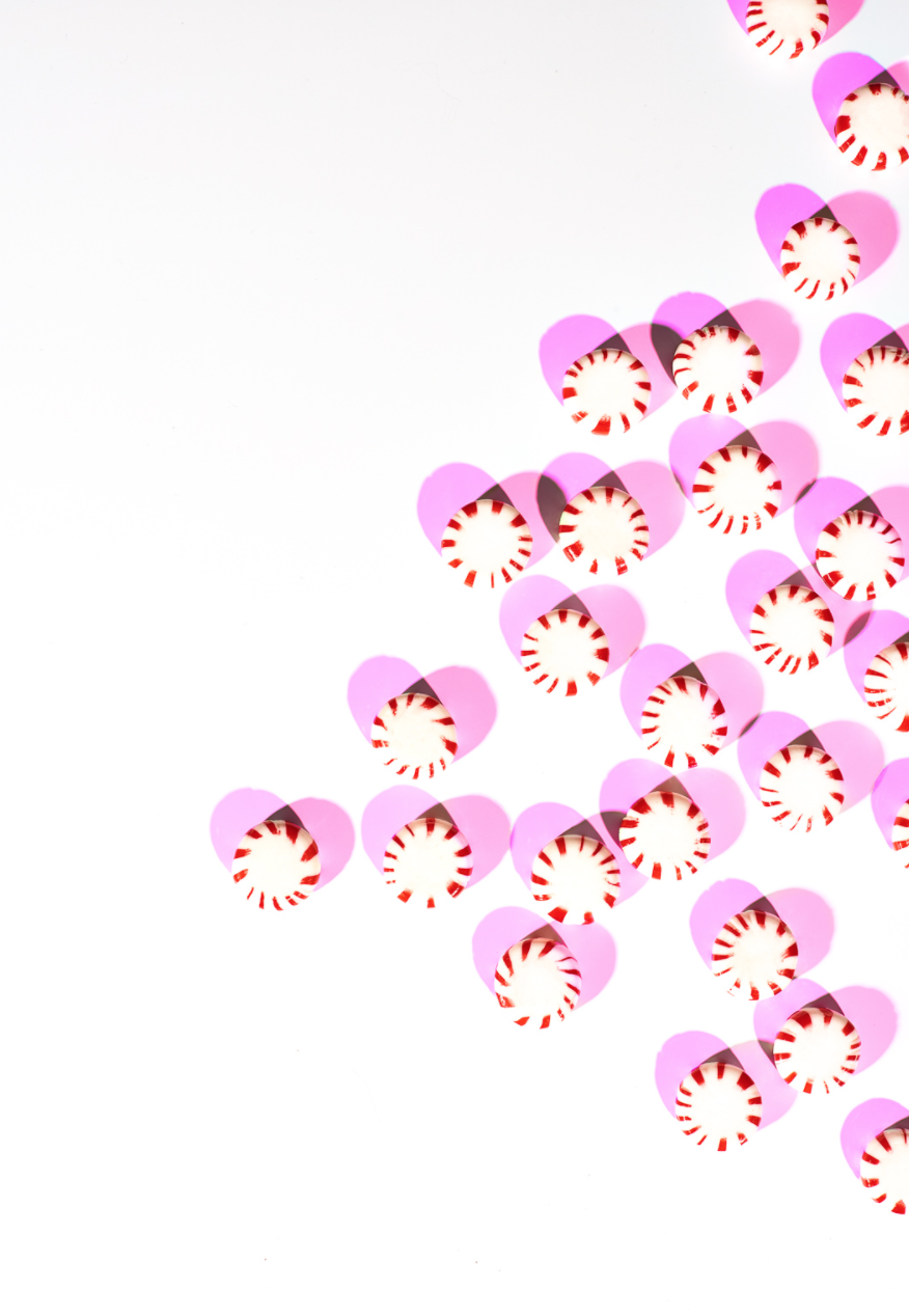
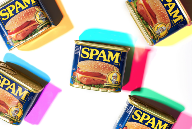
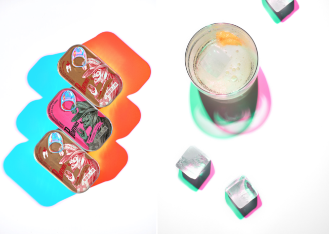
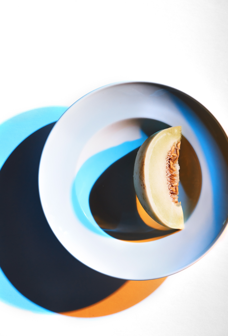
I started this particular project not as personal work, but more an exploration of technique. I had had an issue on a shoot with mixing color temperatures from ambient and strobe light sources and so I began experimenting with using gels on my lights to try to match up temps, and really just see what my options were. I had only used a warming gel here and there in the past but didn’t have much knowledge beyond that.
Pretty quickly into experimenting though, I started to notice the shadow effects I was getting out of combining gels. And I started to play with multiple gels and subjects. I got completely distracted from my original purpose.
Just on a creative level, it felt good to completely go away from my style of “real, natural, organic”. In this way, my personal work has served as a kind of release valve for built up pressure by being boxed in by my own commissioned work.
What are the brain twisting gear elements you are referring to in your comment?
The shadows themselves are related to lights and gels you choose to use. That’s pretty obvious. What isn’t obvious though, is that the color of the shadow is related to the gel of the opposing light, not the one casting the shadow. Also, depending on what combination of gels you use, that affects the color combination of shadows, change one gel out and the one that remains will also be affected and won’t be the same shade in the new image. In addition to this, power in your light source has a great effect on the color, from a deeper color to a more pastel depending. On top of this, some gels are denser, requiring more or less power from a light, so any change involves this total recalibration of your lighting setup to achieve a balance. Then there’s the middle shadow to consider. If you have an image where the shadows overlap, that creates a third color/shade or shape element. How do you want that to look? Then there’s the shape of the shadows themselves, long or short? How can you turn the subject to get a more interesting shadow or a less interesting one? Is that shadow too distracting? Is it too small? This work has a much more fine line between “Cool!” and “Crap!” than I’m used to working with on my more “normal” tabletop food work. On the other hand, it makes it that much harder for someone else can replicate. Lately, it feels like everyone can offer a “window-lit looking food/product beauty” so it feels good to have a difficult shot like this in my offering to clients.
How do you see this work influencing your current brand and style?
I don’t know if it represents a departure point as much as a branch. I’m not evolving into a new style so much as adding something to my toolbox. Any photography is partially about light and how you use it. I love playing with big soft light and also really hard light and everything in between. I think this is just another option and an expansion of that knowledge of how to use light.
Are you concerned about having too wide of a range with your style and becoming fractured?
A little? Certainly, it is a little hard working this into the rhythm of my larger portfolio book since it looks is so different. On the other hand, I’m running a business. I’m a photographer but what I sell is products. Before this shoot, my products were, “editorial food beauty”, “food lifestyle”, “portraits of people in the food industry”, “environments in the food industry”, “product in the food industry in a natural setting”. This simply adds “product in the food industry in a DYNAMIC UN-natural setting” to that list. It’s still under the umbrella of food/product and I think if I keep it like that, I’ll still be “niched” while really being able to keep my options open for client’s needs.
How do you decide what style to use?
I think that simply comes down to client preferences. What look do they want for their product? This could simply be another look I could give them, but of course, I’d be happy to continue with the “natural look” as well. I’m not in this to force my artistic vision on the world.