The Art of the Personal Project: Stephen Tayo

The Art of the Personal Project is a crucial element to let potential buyers see how you think creatively on your own.  I am drawn to personal projects that have an interesting vision or that show something I have never seen before.  In this thread, I’ll include a link to each personal project with the artist statement so you can see more of the project. Please note: This thread is not affiliated with any company; I’m just featuring projects that I find.  Please DO NOT send me your work.  I do not take submissions.  

Today’s featured artist:  Stephen Tayo

Featured on CNN 

Tayo, who grew up in Ikere-Ekiti, Nigeria, and now lives in Lagos, is not a twin himself, but he wanted to tell “a story that identifies my tribe.”

“It was really important for me to establish how twins are seen in our culture,” Tayo said in a phone interview. “Other tribes see twins as an abomination from the precolonial era onwards, but the Yoruba see them as a blessing.”

For Tayo, “Ibeji” signifies a more conceptual and multivalent approach to portraiture in comparison to the street style photography that has landed him on Vogue.com, Dazed Digital and Nataal. His subjects, friends or members of his wider community, were photographed at their homes or out on the streets of Lagos over a six-month period.


To see more of this project, click here.

APE contributor Suzanne Sease currently works as a consultant for photographers and illustrators around the world. She has been involved in the photography and illustration industry since the mid 80s.  After establishing the art buying department at The Martin Agency, then working for Kaplan-Thaler, Capital One, Best Buy and numerous smaller agencies and companies, she decided to be a consultant in 1999. She has a new Twitter feed with helpful marketing information because she believes that marketing should be driven by brand and not by specialty.  Follow her at @SuzanneSease.  Instagram

Pricing & Negotiating: Portraits for a Fashion Accessory Brand

Craig Oppenheimer, Wonderful Machine

Concept: 6 subjects photographed against a solid background wearing fashion accessories                                                                                          

Licensing: Unlimited use of 12 images for 6 months

Photographer: Portraiture specialist on the East Coast

Client: A fashion accessory brand                                                                       

Here is the estimate:

Pricing and Negotiating Example of a Contract by Executive Producer Craig Oppenheimer at Wonderful Machine

Creative/Licensing Fees: The client asked the photographer to bid on a project for the brand’s new campaign, despite having little to no creative brief. The client saw a picture they liked in the photographer’s portfolio, and wanted to accomplish a similar aesthetic while integrating their product. We knew that they envisioned photographing 3 men and 3 women, all in a similar setup against a solid background, and they hoped to walk away with 2 images for each subject, totaling 12 final shots.

Initially, the usage was described to us as primarily being focused on social media, placement on their website, limited print advertisements and a mix of other guerilla style postings out-of-home, all for 6 months. When I discussed the usage with the client, it became clear that they wanted unlimited use during this time frame, despite the limited intended use they described. On one hand, the usage did seem quite limited, especially in duration, but on the other hand, the prominent brand would likely take out ads in high profile publications, and would likely pay a lot for their ad buy. Additionally, downward pressure was put on the fee due to the photographer’s limited experience working with such a brand, his eagerness to collaborate, the simple nature of the project, and the likelihood that only one or two images might see the light of day in advertisements, as most of the images would likely just end up on their website and on social media for a short duration.

After weighing all the factors, and based on the client’s intended use, I initially priced each of the first 6 images at $1,500 each, and then each of the additional 6 images (the second portrait for each subject) at $750 each, which brought me to $13,500.  My gut instinct based on other similar projects was that a fee between $10k-$15k would be appropriate for the day, and based on this experience and the eagerness of the photographer to get the job, we ended up going with $12,000, which broke down to $1,000/image if you look at it that way.

Travel and Pre-Production Day(s): The shoot would take place across the country, and the photographer would need a full travel day to fly there, and a full travel day to fly back. I also included one pre-production day for the photographer to book travel, wrangle crew and go through the paces with the client prior to the shoot. Typically I’d include a producer to help with these tasks and to handle the coordination of the entire project, but the client planned to coordinate many of the elements for this project, and the photographers was comfortable with just 1 day of prep to handle his tasks.

Assistant and Digital Tech Day(s): The photographer would be bringing an assistant with him, and hiring another one locally. I’d typically anticipate that the traveling assistant would be the “first assistant” and the local would most likely be the “second assistant”, but we flipped that in this case, as the photographer’s traveling assistant gave him a favorable rate for the three days out of town. We included one day for the digital tech, anticipating $500 for their day, plus another $500 for a basic workstation.

Hair/Makeup Stylist and Assistant Day(s): The client said that they had a few people in mind for hair/makeup styling who they planned to hire directly, but asked us to provide a sense of cost if they wanted the photographer to handle this. So, we therefore detailed TBD prices that didn’t impact the bottom line.

Studio Rental: This was based on feedback from a few local studios that we contacted to discuss rates and availabilities.

Equipment: While the photographer would be traveling with a bit of gear, he’d still need to rent a decent amount upon arrival, and this rate was primarily based on quotes received from the studios to provide such equipment.

Airfare, Lodging, Car Rental: I used Kayak.com to price appropriate travel expenses for the photographer and his assistant.

Parking, Per Diems, Misc.: This included $60/day/person as a per diem for the photographer and his assistant while traveling, plus $50/day in miscellaneous and unforeseen expenses.

First Edit for Client Review:  This covered the time it would take for the photographer to do an initial pass on the images, and provide the client with a gallery of images to consider

Retouching: This was based on a post processing rate of $150/hour, assuming two hours per image for each of the 12 images.

Insurance: We included this expense to help the photographer increase and maintain an appropriate policy.

Results: The client asked for two revisions. First, they decided to put hair/makeup responsibilities on the photographer, and asked that we send a revised estimate including those expenses, which was not a problem at all. Second, they asked if they could get 1 year usage for the 6 month price we quoted. I typically don’t recommend giving up something for nothing in return, but based on my previous experience with similar projects/budgets, and given how eager the photographer was to get the project, we decided to accept their offer. We submitted a revised estimate, and the photographer was awarded the project.

A few days later we were told that the client might want to add an additional day to the production, to capture a few additional shots with different talent, and with a slightly different background/setup. Specifically, they hoped to capture 3 subjects, with this additional day yielding 10 more images. Initially we were told that they only had $13,000 for this additional day, including all associated fees/expenses.

After calculating some rough numbers, I knew we weren’t going to be able to hit that, so I gave them a ring to negotiate. I learned that they could limit the usage to Web Collateral use and placement in up to 10 window displays of 3rd party retailers. This was a big jump down from the Unlimited use we were previously granting them. With this in mind, we submitted the following estimate:

Pricing and Negotiating Example of a Contract by Executive Producer Craig Oppenheimer at Wonderful Machine

We landed on $6,000 for this additional day/usage which was appropriate considering all of the factors. We also detailed the associated expenses with the additional day. We removed the first assistant (while essentially marking it as TBD) since the photographer didn’t feel they’d be needed on the second day consider the lighting setup would be similar to the first day, and his second assistant and tech could lend a hand as a cost savings measure. We increased equipment a bit for this additional day to account for a specific background the client wanted to procure, and included appropriate travel expenses in addition to more post processing time.

The overage for the additional day was approved, and the photographer quickly launched into pre-production to line everything up.

If you have any questions, or if you need help estimating or producing a project, please give us a call at 610.260.0200 or reach out. We’re available to help with any and all pricing and negotiating needs—from small stock sales to large ad campaigns.

The Daily Edit – The Unseasonal: Ger Ger

The Unseasonal

Editor in Chief and Creative Director: Ger Ger

Heidi: Is this your first project where you’re the EIC? I know you’ve had long, successful career as a creative director/ photographer.
Ger: My career as an artist started early as a teenager and over the decades I’ve found myself in many different roles, crossing various disciplines and mediums. Today I look at an unusually extensive set of skills and experiences even from times before I segued into working almost solely as a creative director and photographer in the fields of fashion, photojournalism, celebrity culture and conceptual art. For The Unseasonal all of that becomes one and it can be seen as a  proof that being a jack of several trades can sometimes create unusual opportunities and outcomes. I believe that only with me serving in multiple roles, I could make this magazine what it is today. The Unseasonal is a very intimate and uniquely homogeneous publication with one strong unified vision behind it. So I do find myself the first time also in the role of the editor-in-chief but I look at it more as a necessity than a choice. To me the written word has to be in symbiosis with the imagery and choices of angles, style and topics are following similar rules. The result is an overall feeling with some depth and integrity that readers can sense, that is difficult to put into words but many people seem to resonate with.

What are the differences between those roles?
In reality I’m the photo director as well but for The Unseasonal photography is so much in the DNA that a mention in the masthead becomes irrelevant. So since, I find myself in the main roles as the editor-in-chief and the creative director I try to disregard the lines in a similar way I learned to dismantle the boundaries of different mediums. For a while I was lecturing on what I call a universal artistic language. Mediums can be interchangeable and without boundaries. The very same aesthetic of a photograph for instance can be expressed in acoustic work alike. Grain becomes hiss, fog static noise and so on. There is no question that for big corporations and most magazines separating demanding top positions make a lot of sense. But with my diverse background I also saw the advantage in doing things differently. Differences between my roles become indistinct and sometimes things become a bit autocratic or autobiographic, then again very open and collaborative. The overall atmosphere of the outcome is what really counts. I look on every issue of The Unseasonal as a mix tape and it all needs to start in my gut or my heart. It is a very personal, artistic approach with a fantastic team behind it. This framework makes it possible to transport an absolute pure vision without any compromises or battles of egos. It is a very professional, quiet and peaceful way of working.

How did this idea come about? The longer I had been working for many of the most renowned magazines in the world — including Vogue, L’Officiel, and Interview — the more I felt there was also room for something else. For something of a different curation, of another voice, for a more timeless approach, and for treating fashion more as a feeling, artistic form of expression, and way of living. I wanted to put photography on a center stage, offer more room to breathe, give editorial projects more time, and make a magazine that can be a common denominator for many different types and classes of people. I also believed in a magazine that can be truly global, feels like a light summer breeze and at the same time is deep and substantial — something you want to bring on a vacation or that accompanies you for a long time. Something of a certain value that is between a collectible item, a periodical and a book.

Why did you feel the need launch this magazine?
With what is going on in the world today, I felt the urge to provide people with the inspiration and lightness for making the world a better place.I also felt it was time for a new over-spanning genre of a magazine that adapts to the change in seasons – both in fashion and the world — and counteracts fast fashion and meaningless social media madness with timeless aesthetics and deep storytelling. I was dreaming of a magazine about passion that unifies fashion, art, travel, and the human condition. A magazine of a rare artistic quality that represents the feeling of a getaway, of slowing down, of exotic places, escapism, breathtaking dreams, and lightness of being, all with elements from the past, the present, and the future. With job and budget cuts in publishing left and right I was even more so dreaming about a magazine that puts quality and content first again.

What do you feel is the problem if any with existing publications?
With the rise of digital and Instagram the existing editorial market imploded but the number of independent magazines exploded. Together with people getting increasingly tired of globalization, capitalism, impersonal corporate structures and digital technologies, there was a growing demand for something different, more personal, tangible, and substantial but market surveys do not seem to identify the gaps. So budgets for editorial projects have been continuously decreasing, resulting in a decline in quality and no willingness to take risks. Many established magazines lost their unique selling proposition and slipped into irrelevance. I think people more and more gave up on the publishing industry since for a while it seemed there were not many revolutionary ideas left to try for how a magazine in today’s world can feel and be put together. There is room for much more than doing just another magazine. But people need to step back, observe, take risks again and adapt to the present and the future. Also to how social media and new technologies changed our behaviors but this does neither mean that all will be digital nor  that print always needs to look the same. I see it as a great opportunity. It’s the right time for new structures and something warm, beautiful and meaningful.

Do you have an online component to this?
Yes. Although print is absolutely essential for The Unseasonal, we strongly believe that online is an important part as well. Just like the print magazine, the website is evolving and there are many plans and ideas for it. Both components have different strength, so we do not try to blindly mirror content but rather embrace each medium’s strengths. Also — some readers generally do not buy magazines, others do not read much online. And then there is a group of people who do both. With online we can put out things faster and with print we can take more time.

If I someone wanted to contribute, how do they get involved?
We usually do not accept submissions but do appreciate and try to respond to every email, letter or message we receive. Whenever possible I take the time myself to look through the work and read the pitches. I do value the potential or a steady, unique voice in someone’s work above an established but mainstream portfolio.

This Week in Photography Books: Luciana Pampalone

Proper civilizations depend upon the rule of law, in my opinion.

It might not work as a general rule, though, because China is an impressive civilization, for sure. (I guess Russia is too, if for Dostoevsky alone.)

But since the times of Hammurabi’s code, the idea of a system of justice has long been at the heart of most idealistic, successful societies. (I’d include America on that list, though our justice system is heavily imperfect.)

Even when they’re functioning, laws require distinctions to be made, as well as decisions.

This act or behavior is permitted. But that one is not.

Sometimes, though, things get murky.

Even the idea of pornography, sexual imagery that is considered illegal for traditional methods of media distribution, is unclear as a category.

Famously, the US Supreme Court justice Potter Stewart declared in Jacobellis vs Ohio that the standard was essentially: “I know it when I see it.”

Which means what?

Penetration is always porn, but boobs alone rarely are? Female frontal nudity is considered more acceptable than male, and why is that?

(Or the amazing “Broad City” girls can talk about pegging, on cable TV, but probably couldn’t use the word fuck.)

Speaking of laws, we’ve almost always kept our content SFW here at my APE book review column. (Safe for work.) Rob asked me to run it that way from the beginning, and then was open-minded as I experimented with showing a bit of nudity and light sexual behavior stuff here, years ago.

But it didn’t feel right for the audience, and we tightened up the restrictions ever since.

(One time, I specifically remember using my finger to tactically cover a hippie-dude’s-johnson in a photograph.)

I don’t mind the restriction.

I don’t think the column would be better if I could show sexually explicit photo books.

I’ve made plenty of “Boobs Sell Books” jokes over the years, but adding intercourse would not make my articles better, in my opinion.

One photographer, Luciana Pampalone, reached out to me recently to see if I’d consider reviewing her exhibition catalog.

She said the pictures were erotic, not porn. And there were enough images for me to present that lacked out-right nudity. (Another photographer sent me a sample recently that was too hardcore, and I had to politely decline.)

The self-published catalog accompanied an exhibition that took place from December 2017 to January 2018 at The White Room Gallery in Bridgehampton, New York.

The pictures were made over a long range, dating back to 1990, so clearly it’s a subject of passion for the photographer.

An opening statement tells us she’s had a long commercial and editorial career, draws inspiration from Helmut Newton and Deborah Turbeville, and that she “depicts women as strong central figures in her work, allowing them to take on the roles of heroine or harlot, captivating onlookers and creating complex black and white compositions.”

Now, I’m not going to photograph the nude shots, as is our policy, but there are more than enough that suggest, but don’t show. As to the ones that are too racy, there are a few that contain women’s breasts, a few that simulate a soft-core orgy, and a whole set showing women’s butts through fishnet stockings.

I’m not sure what I think of these pictures, honestly. They’re not exactly to my taste, but they are well made.

Who is the audience for work like this?

Art that titilates?

And what about the context, that they’re made by a woman instead of a man? Nudity is problematic for men these days, and rightly so in my opinion, but what are the rules that apply to female photographers?

(Kind of like Sofia Coppola can get away with opening “Lost in Translation” with Scarlet Johansson’s butt in see-through panties, but a male director probably wouldn’t make that move these days.)

To be clear, I kind of like this booklet. It’s honest, as the word erotic is on the cover.

It’s in the title of the project, for heaven’s sake.

If you don’t like those sort of things, you won’t look. And as the artist is a woman, the politics align with 2019.

It’s certainly something different, which I try to offer you on a semi-regular basis.

Stay warm out there.

Spring will be here soon enough.

Bottom Line: Cool catalogue of 30 years worth of erotica

If you’d like to submit a book for potential review, please email me at jonathanblaustein@gmail.com. We currently have a several month backlog, and are particularly interested in submissions from female photographers so we may maintain a balanced program.

The Art of the Personal Project: Eric Espino

The Art of the Personal Project is a crucial element to let potential buyers see how you think creatively on your own.  I am drawn to personal projects that have an interesting vision or that show something I have never seen before.  In this thread, I’ll include a link to each personal project with the artist statement so you can see more of the project. Please note: This thread is not affiliated with any company; I’m just featuring projects that I find.  Please DO NOT send me your work.  I do not take submissions.  

Today’s featured artist:  Eric Espino

Artist Statement:“Let us Play”

Our Mission at Eyekonzis to Empower, Educate and Motivate the next generation of field hockey and lacrosse Olympians. It is our belief, that through the structure and development of playing field hockey, we will provide our girls & boys with the skill set and development they need in areas such as sportsmanship, healthy lifestyle, team work, self- esteem, history of their culture, healthy body image and academic achievement. This will translate into a wholesome productive lifestyle, on and off the field.

Unfortunately, there are some who don’t believe in this cause. The girls of Eyekonz, along with coach Jazmine A. Smith, were photographed in this series shortly after Strawberry Mansion High School and the Philadelphia Unified School District dismantled the league from it’s district. This issue has led to a class action lawsuit against the district, for the injustice of the treatment of Eyekonz Sports League.

This story was later published in Essence magazine, amongst others. For more info, please click on the links below.

Refinery 29

Philadelphia Weekly

Now This

-Eric Espino

To see more of this project, click here.

APE contributor Suzanne Sease currently works as a consultant for photographers and illustrators around the world. She has been involved in the photography and illustration industry since the mid 80s.  After establishing the art buying department at The Martin Agency, then working for Kaplan-Thaler, Capital One, Best Buy and numerous smaller agencies and companies, she decided to be a consultant in 1999. She has a new Twitter feed with helpful marketing information because she believes that marketing should be driven by brand and not by specialty.  Follow her at @SuzanneSease.  Instagram

The Daily Edit – New York Magazine Covers: Adam Moss Legacy

Excerpt from “The New York Cover That Made Me Want to Make Magazines” / New York Press Room

One of my favorite covers of this magazine is called “Notes on the Paralyzed Generation.” The issue came out in 1970, when I was 13 (not quite of that generation, but desperately wanting to be the hippie boy on the cover), and I remember yanking it from our mail pile. The cover picture is a deeply sarcastic portrait of mother and that bell-bottomed adult son — the son, obviously able, in a wheelchair. The photographer was a man who did many of New York’s early covers, Carl Fischer. He was a genius; satiric covers are incredibly difficult to pull off and he succeeded almost all of the time. The coverline of that issue read, “Of course he can walk. Thank God he doesn’t have to.” At the time, I thought it — picture and headline in unison — was hilarious. I still do. The cover taught me that great magazines are steeped in point of view, voice, tone. They live. And seeing that cover for the first time is probably what made me want to make magazines for a living, though I didn’t know that at the time. — Adam Moss

Adam Moss took over editorship of New York Magazine in 2004 and is now stepping down. Here’s a few of his seminal covers being shared online by those who praise his work.

This Week in Photography Books: Tony Fouhse

Did you hear about the guy who choked out a mountain lion?

Some Colorado-mountain-runner-guy got attacked by a cougar, from behind, and fought back.

The second I read it, (the story made national news, and you’ve likely already heard about it by now,) I thought, “I bet that guy does Brazilian Jiu Jitsu.”

Or martial arts of some sort.

I should know, because last week, within 24 hours, I found myself put in two potentially neck-crushing choke holds, (a rear-naked and a guillotine,) and then a proper sleeper hold, in which I woke up on my knees, facing the mat.

(I hadn’t realized quite how vulnerable our necks are, but there you go.)

We always minimize the risks out there, else how would we leave the house each morning to drive a car, trust the subway, or ski down the hill? (Three people have died at Taos Ski Valley since New Year’s.)

But back to the dude who killed the mountain lion.

Can you just imagine how that scenario played out?

You’re running along, you’re fit, you’re strong, and then you hear something behind you, and it’s the VERY WORST CASE SCENARIO, as it’s a FUCKING MOUNTAIN LION.

It starts biting and scratching you, trying to eat you.

TO EAT YOU.
RED ALERT.
INSTINCTS, KICK INTO OVERDRIVE!

Now, how many of us, even those who go to fighting class on a regular basis, would have the peace of mind to get behind the mountain lion, to take its back, and then crush its windpipe and choke it to death, while practically tasting its fur in your mouth.

Your heart is racing, your mind is thinking, “this can’t be real, this can’t be real.”

But it is real.
You’re choking out a fucking mountain lion, and then it’s dead.

It’s over.

You’ve won. You fought for your life, and he’s dead on the ground.

Now, a story like that is interesting now matter how you tell it. I opened by telling you how it ends, and still we’re fascinated.

I didn’t drag it out, teasing with tension.

Does the mountain lion prevail?

Does our intrepid hippie-mountain-runner-martial-artist-guy get eaten alive, a cougar baby nibbling on his jawbone?

But that’s not how I told it. I lead with the ending…

We all enter the pop-culture-continuum at different times, but I remember when I first saw “Reservoir Dogs,” as an 18-year-old, and was introduced by Quentin Tarantino to non-linear narrative.

Just last week, in this very column, I said that a good book should have a beginning, a middle and an end.

Just last week.

But today, I think it’s important to consider the alternatives, like non-linear, repeating, or reverse narratives.

It’s easy to think of movies, like “Pulp Fiction,” “Memento,” “12 Monkeys,” or “Looper.” (Man, what is it with Bruce Willis and weird-ass narratives?)

Given how many books I see, sometimes it’s fair to wonder, is the artist thinking two ways here?

That’s certainly what I came away pondering, after looking several times at the excellent photobook “After the Fact,” by Tony Fouhse, published by his company, Starlight Press, in Ottawa.

(This is the winter of the Canadians, I guess.)

The cover is a dream-scape in silhouette of black on blue, with ravens and a tree and the sky.

This will be a repeating motif within, birds, and while I was OK with it, maybe it did seem a bit obvious.

Open it up, and there’s a globe. The North Atlantic Sea is prominent, and I think it’s a pretty damn smart way to ground the story.

Then, a disaffected portrait of a tall guy crammed under a short ceiling.

Then bleak, cold, yet undeniably beautiful landscapes of what I take to be Canada in Winter.

We start with a smart quote by Bertolt Brecht about singing in the face of darkness, which I took to mean that we need to make our art, to speak our peace, to sing our songs, in particular when we think things are going to shit.

(And of course many people regard our current situation as a particularly dangerous one, relative to the Post World War II era.)

Then, some redacted text, and then a slew of excellent images.

Like I said, the bird theme is a bit on-the-nose for me, and I normally don’t use that expression. But I’d also like to ask that people stop including pictures of trash on the street or sidewalk. (We had them in last week’s book too.)

What do you say, folks?
A moratorium on garbage in the street pictures?

But other than that, the photography is spot on.

The portrait of the dog in the muzzle?
Amazing.

The yellow brick road, the policeman’s gun, the bloody bed, the sad portraits, the public places, it all adds up to a feeling of dread and impending doom.

Impending doom is the same as maybe-not-yet arrived doom. You can feel it coming, but is there still time to affect the outcome? To hope?

There’s a guy in camouflage unfurling a wire of some sort. Mennonite women, a power-company worker at night, more sad portraits, dead-people feet, power washing a building, and then that little girl looking right at you, from the side, like a young-21st-century-Mona-Lisa.

Towards the end, the book’s title page, “After the Fact.”

Then, another quote, this time from Martin Heidegger, “The possible ranks higher than the actual.”

Idealism before realism, I suppose?

Next, another portrait of a guy looking away, (behind the hoodie,) the birds, and a cold Canadian landscape.

A last credits page, which quotes Joe Strummer, “The future is unwritten,” and states, unequivocally, “This book is a work of fiction. The real people, places and incidents portrayed are used fictitiously.”

The end.

Is it, though?

If you open it in the back, and start here, doesn’t the book make just as much sense?

You get opening quotes for context, and you’re explicitly told to see this as a work of visual fiction.

It opens similarly, motif wise, (birds/landscape/dude portrait,) and this way, it includes the title page in the beginning, where it would normally be.

Plus, it’s just so easy to flip-it back to front, given its design.

There are narrative waves and repeating motifs that work just as well this way, and even better, you can reverse direction whenever you want.

It’s a good reminder, perhaps, that we not get too rigid in our thinking. That books should be made this way. Or that.

Book making is a creative endeavor, and I’d like to hope we can continue to be surprised.

As as the Clash dude said, “The future is unwritten.”

Bottom Line: Smart, bleak Canadian story with a reverse narrative

To purchase “After the Fact” click here

If you’d like to submit a book for potential review, please email me at jonathanblaustein@gmail.com. We currently have a several month backlog, and are particularly interested in submissions from female photographers so we may maintain a balanced program.

The Art of the Personal Project: Robin O’Neill

The Art of the Personal Project is a crucial element to let potential buyers see how you think creatively on your own.  I am drawn to personal projects that have an interesting vision or that show something I have never seen before.  In this thread, I’ll include a link to each personal project with the artist statement so you can see more of the project. Please note: This thread is not affiliated with any company; I’m just featuring projects that I find.  Please DO NOT send me your work.  I do not take submissions.

Today’s featured artist:  Robin O’Neill

My photography is driven by my curiosity and attraction toward different cultures. Thirty minutes from my culturally homogenous home in Whistler is a small community called Lil’wat Nation. This is a First Nations reserve at the base of the majestic 8500-ft Mount Currie, surrounded by the Coast Mountain range.

As a local backcountry skier, I make a weekly pass through the Lil’wat Nation in the winter. I look forward to this part of my day. I crane my neck to investigate the random items on the lawns, examine the texture of old paint cracking off the sides of houses, and watch the dogs roaming freely. Seeing the chimney smoke and warm condensation in the windows, all I want is to know the people inside.

Last winter I decided to drive out there more regularly, bring along my camera, and document the beauty I saw in these homes and in this community. Only 40 kms away, and a vastly different view of the world. I am left wanting more.

To see more of this project, click here.

APE contributor Suzanne Sease currently works as a consultant for photographers and illustrators around the world. She has been involved in the photography and illustration industry since the mid 80s.  After establishing the art buying department at The Martin Agency, then working for Kaplan-Thaler, Capital One, Best Buy and numerous smaller agencies and companies, she decided to be a consultant in 1999. She has a new Twitter feed with helpful marketing information because she believes that marketing should be driven by brand and not by specialty.  Follow her at @SuzanneSeaseInstagram


The Daily Edit – Motorcyclist: Amy Shore

Motorcyclist

Photographer: Amy Shore

Heidi: How did this assignment come about, did you bring the idea to them?
Amy: I had heard about the Malle London Great Mile previously and always thought it sounded amazing! But then I was approached by a German journalist to join the event for a number of magazines. I got to ride and photograph the journey. It was one of the best assignments I’ve ever been asked to photograph! I loved it so much as an assignment, myself and my fiancé have booked ourselves in for the 2019 Rally!

Do you find most are surprised you are a female in this type of work?
Yes!! I still get asked if I am photographing for a University project, and they are surprised when I tell them that I photograph cars for my job. I think it’s a little disappointing that it’s still a question I get asked, but I truly hope that I can try and help change this view for future females in the automotive world.

Do you ride motorcycles and where does your love for driving and and road tripping come from?
I learnt how to ride motorcycles just 2 years ago. I’ve always wanted to ride but felt I wouldn’t fit in to the riding world as a girl. It wasn’t until I started photographing the bike world that I realised it was so fun and anyone was welcome! I think I’ve always had a strong desire for adventure and road trips. When I was 19, I did a solo road trip in my classic Mini 1600 miles around Scotland, just because I wanted to. My parents have always encouraged us to explore, often taking us camping or hiking up mountains! My dad would always tell us stories of his road trips around the world, I don’t think I’d ever not be adventurous!

You have a lot of motorsport work, where does your interest in motorsport come from?
My dad has always worked in the motorsport world, at one point working for Team Lotus in Formula 1, so our family has always been around cars and had a love for classic cars especially. When I learnt to drive, I loved the feeling of freedom. I loved how classic cars looked, they were so full of character. I wasn’t interested in what was under the bonnet, I just loved the smells, the designs, the freedom these beautiful machines could give me. That’s when I bought my 1985 Mini Mayfair! And then when I learnt to ride motorcycles, I bought a 1972 Honda 350F. This year I acquired a 1930 BSA L30, a 1945 B33 and a 1961 BSA Bantam!

How many days was the rally? 
The Rally was 7 days in total, riding for 5 of them. We arrived on day 1, registered and met our rally-mates, and then set off early the following morning. Each day we roughly rode 230 miles along some of the smallest coastal roads in the UK, but the ones with the very best views. Each day was magical.

Did you shoot from the car or the back of motorcycle?
Both! At some points I was photographing from the back of a convertible Mini that came from the official Mini Museum! Other times I would sit on the back of one of our team members and photograph over their shoulder. I love to photograph from the bike of bikes as it gives the viewer a but better sense of doing the bike trip too, rather than simply observing the trip from a car.


The Daily Promo – Ramona Rosales

Ramona Rosales

Who printed it?
AW Litho x Clear Image

I use a broker (AW Litho) who finds the best partners & sourcing materials (with budget in mind). Clear Image was the best fit for this project, They have previously printed my promos and I can always count on them for the best equipment and care for detail.

Who designed it?
Boyfriend.Studio

This was in conjunction with a redesign of my website. The partner team designed the new website, promo booklet, and logo. There is an additional poster is production.

Tell me about the images?
I made a selection of my favorite new work that best showcases what I do and illustrates the type of projects I hope to do in the future. I love to weave color narrative within my promos which is an approach I use for my website, printed portfolio and social media feeds. All of the images are from recent editorial assignments, except for the back cover which is a personal project. The cover is of actor Samira Wiley (shot for Bustle), I wanted to start with a strong image and she just draws you into her gaze. I follow this with two images of Troye Sivan and Grace Vanderwaal, both shot for Billboard Magazine, next to comedian Sarah Silverman (for Bust Magazine). Using design elements in each layout we took take cues from the color used in each image, including the green from the outdoor location featuring rapper Lil Wayne and the sky gradation with the portrait of Emma Stone. Keeping things asymmetrical but simple, we included an image of Grammy-nominated musician Anderson Paak followed by Jessica Chastain and Rapper & Actor Joey Bada$$. Majority of my assignments are entertainment and celebrity based. It’s my priority to share my approach to portraiture and versatility with talent.

How many did you make?
1700, 1500 sent to handpicked contact list made by rep and my own research. 200 are hand given at meetings and at promotional events my rep attends.

How many times a year do you send out promos?
1-2 year

Do you think printed promos are effective for marketing your work?
I think any attempt at getting your work in front of creatives is effective, its another opportunity for your name and your work to be seen by potential clients. With the over saturation of social media, a tangible piece is almost a breath of fresh air, especially to creatives still working with printed production. There are some things that can’t be achieved digitally and this approach has so much potential to spark interest on a different level, beyond scrolling up a feed. I believe creatives are receptive & appreciative of good design and images, especially if you target people who you are aligned with your type of photography & aesthetic. A little bit of homework can go a long way to save you time (and money) by researching your list of clients who you estimate are a good fit creatively.

This Week in Photography Books: Lorena Turner


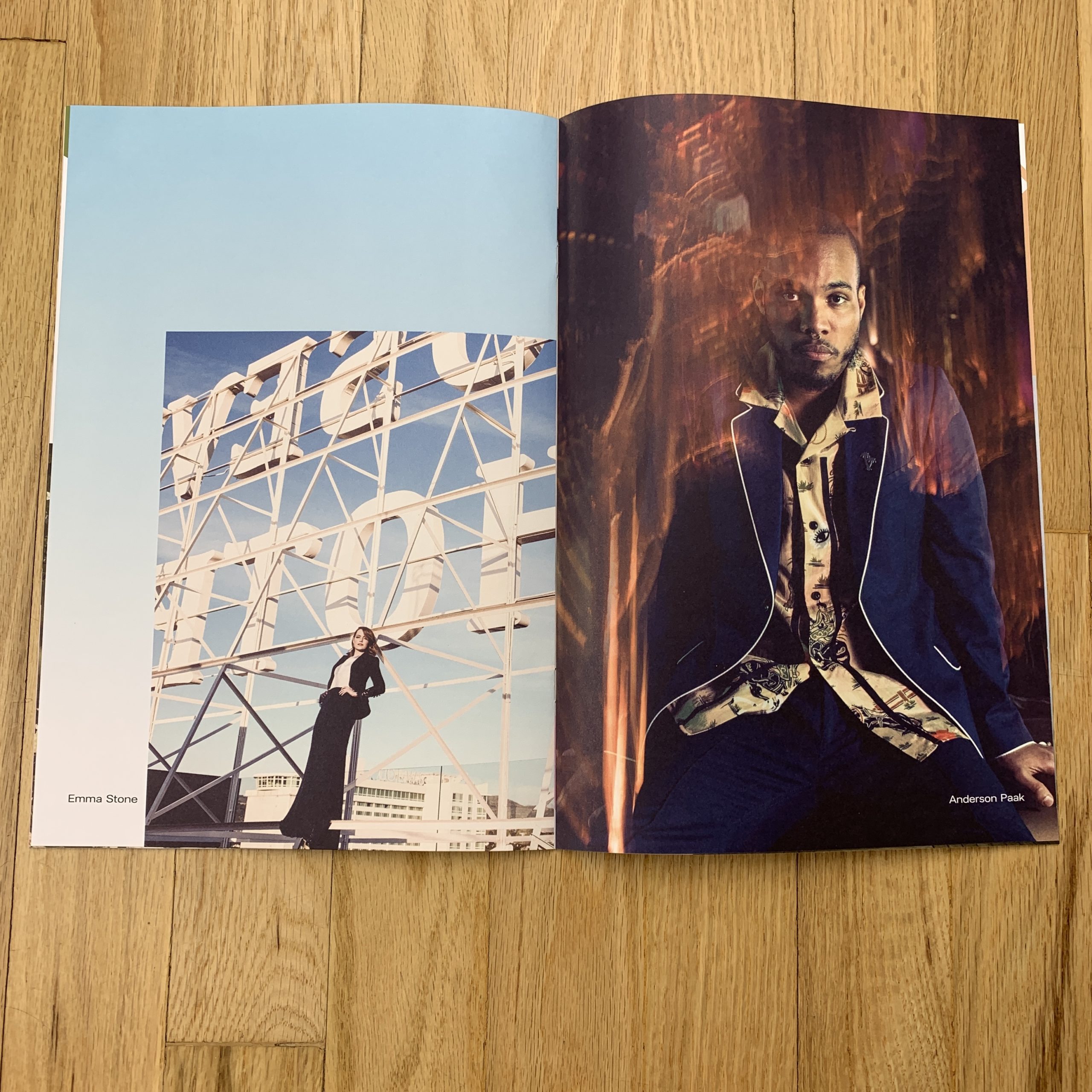
I used to know Keanu Reeves.

It’s true.

Back in the 90’s, I worked on a couple of movies in New York, just before moving back to New Mexico. One of them, a major Warner Brother production, was called “The Devil’s Advocate,” and starred Keanu, Charlize Theron and Al Pacino.

I got hired as an office intern, was soon promoted to office PA, and then got a second promotion to location assistant. (Before I was fired in winter so they could hire a much more qualified person for the job.)

Because I answered the phones, made the coffee and took out the trash well before shooting, I was around to hear the gossip, pick up on the undercurrents, and generally make myself a part of the furniture.

Surprisingly, my fellow intern Sarah, who’d just gotten a film degree at NYU, told me she wanted to date Keanu, and then she went ahead and made it happen.

So it wasn’t that odd, in the end, to hang out in Keanu’s trailer and shoot the shit while he smoked, or keep him company while he was waiting for an actress to come in and test opposite.

The strangest thing was, though, that Keanu Reeves was insanely charismatic in person. He would do voices, and crack jokes.

Personally dripped off the guy.

But then, as soon as the cameras started rolling, he’d become stiff and wooden, and his line-readings made me cringe more than once. (Once a day, maybe. He was really bad.)

It was odd to see him behave one way IRL, but then freeze up, or shut down, once it was time to do his job.

At that point, in 1996, he was still known as the cute guy from Bill and Ted’s who couldn’t act for shit. (And I had to admit the reputation seemed appropriate.)

Then, after “The Matrix” came out, all of a sudden, he was a Sci-Fi action superstar, and his subdued on-screen persona made more sense. It’s hard to re-create the feeling of awe many of us had, seeing that film for the first time, but it obviously never would have worked with another actor.

Seemingly, after that, he went into another fallow period, and got super-into martial arts, so much that he directed a film about a Tai Chi fighter, and acted in an awful Japanese sci-fi Samurai film that ended in mass Seppuku. (Mercifully.)

Fast forward to 2019, and the world is eagerly awaiting the third “John Wick” movie, because Keanu managed to reinvent himself yet again, and his laconic, restrained acting is just perfect, when surrounded by the absurd, almost campy, but extremely-well-done action filmmaking.

While we all grow and change in life, (hopefully,) it seems to me like Keanu Reeves just can’t be understood outside of the context in which he’s seen.

Is he really a better actor as John Wick than he was as Neo, or Kevin, the literal son of the Devil?

I’m not so sure.

And what about that amazing personality of his? Does it change one’s perception of his wooden on-screen-persona to know he’s a hoot as a real guy?

I’m not sure of that either.

But my point today, if you haven’t gotten there yet, is that context really does determine most of how we receive our information, and make the judgements that imbue us with individuality.

It’s why you’re more likely to trust the same story published in the NYT over Fox News. (Or vice versa, if you’re conservative.)

Or why some people, who watched “The Apprentice” for many years, came to believe that Trump was a competent, intelligent, corporate titan. (If you haven’t, read the New Yorker piece on Mark Burnett, which offers a pretty fascinating context in which to view our President.)

Photo books, of course, the subject of this long-running column, rely heavily on context. In fact, I find myself telling students that if they don’t consider it properly, they have no shot at making a good book, much less a great one.

The way a photo book releases its information, teases out its narrative, and gives you what you need to know is as important, in my opinion, as the pictures themselves.

It’s what really separates an exhibition, in which you look at the pictures, (most likely big,) and then try to understand them as objects, from a book, which as I’ve written many times is an experience.

In fact, I was just talking with a book-designer-friend about the fact that even the number of pictures included will determine if a viewer looks at a book in one sitting, ingesting the entire message, or flips through a few pages, puts it down, and then picks it up another time and does the same thing.

Think of a photo book as a story, with a beginning, middle and an end, and the whole process makes more sense. (Unless you love non-sensical, non-linear video art, in which case, go crazy and make whatever weird shit you see in your head.)

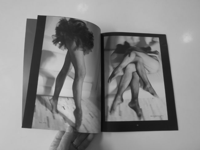
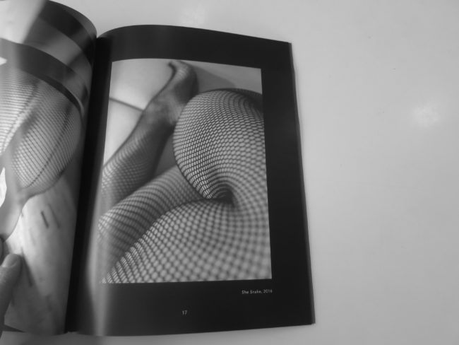
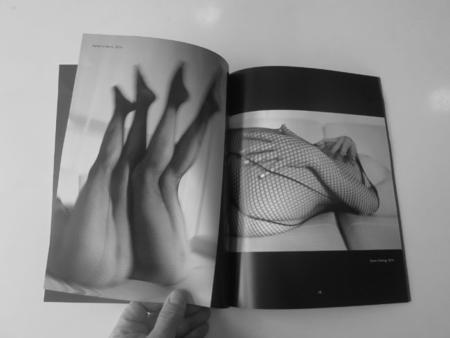
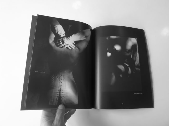
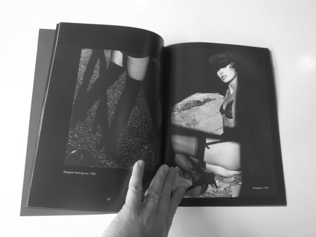
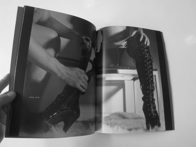
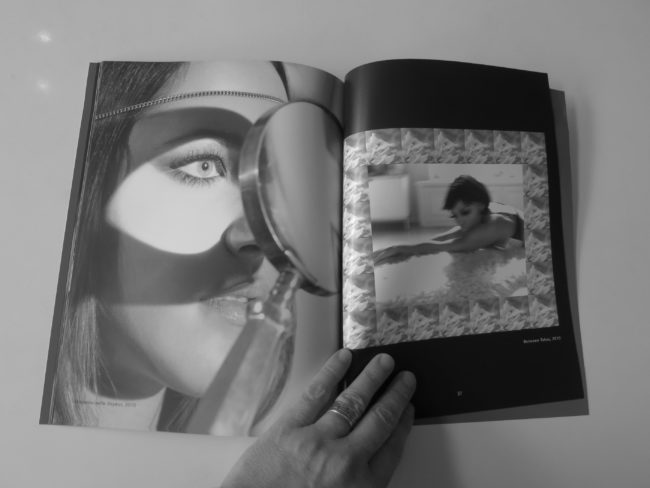
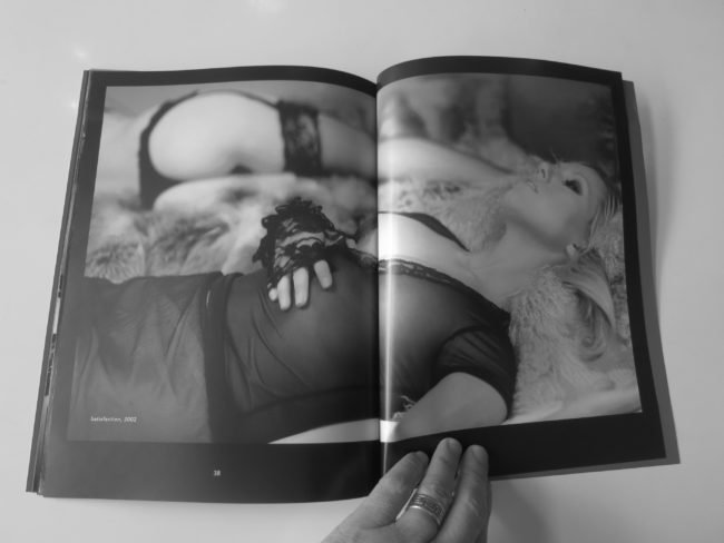
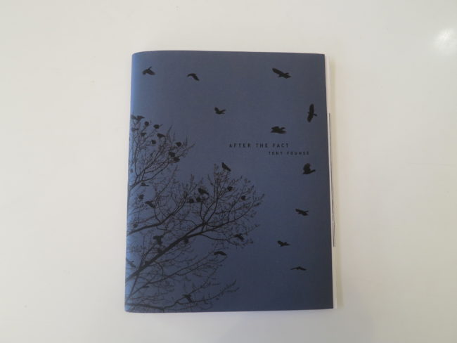
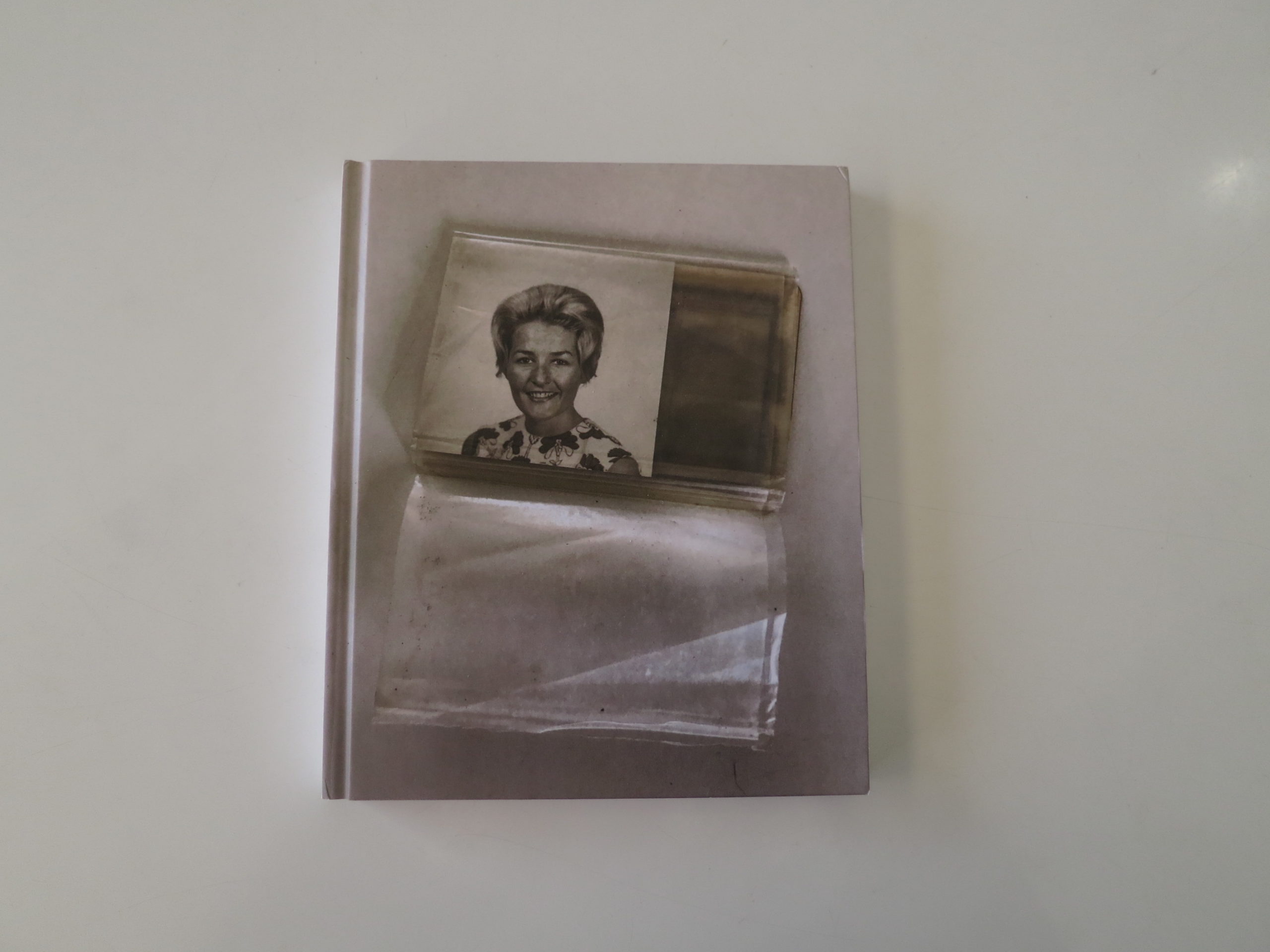
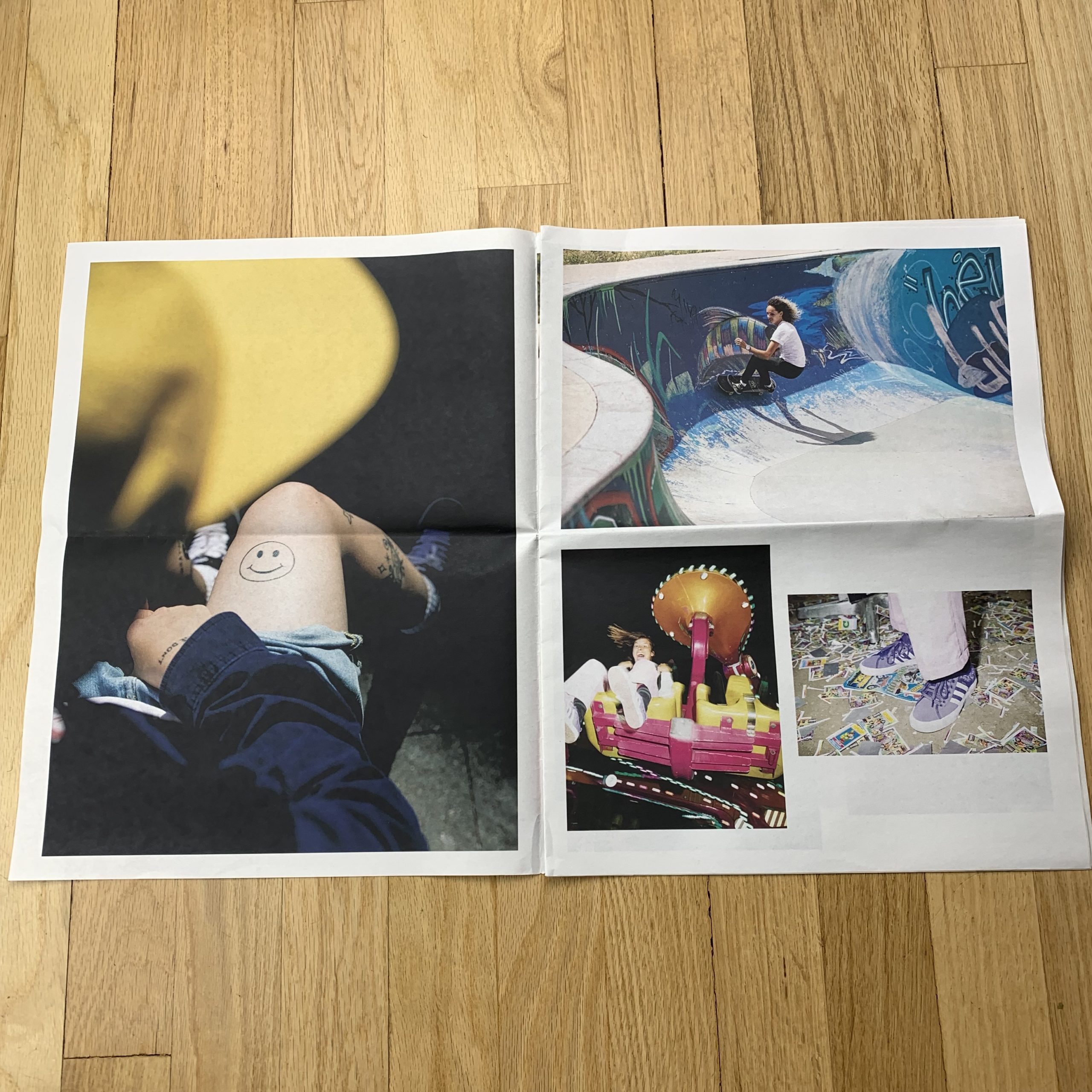
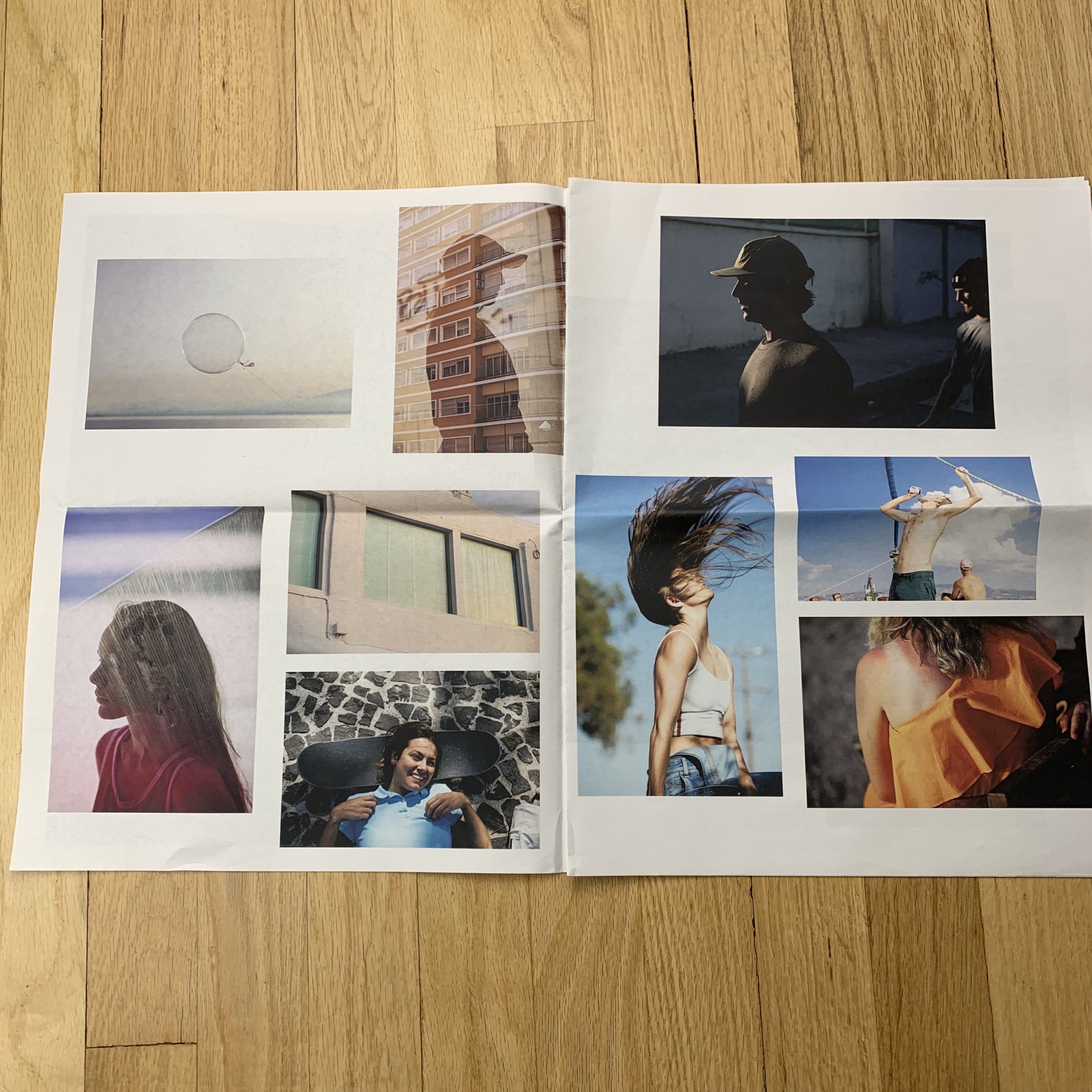
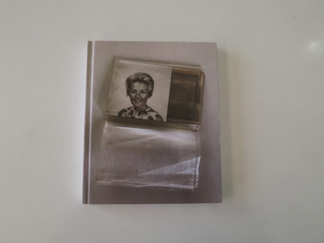
I mention all of this because today, I spent some time with “A Habit of Self Deceit,” a self published book by Lorena Turner that showed up in the mail, unsolicited, last fall.

It’s important to me that we now show women and men equally here, as it allows us to present a much broader perspective than when I was mostly showing guys, because that’s what showed up in the post. (Let me say it again here folks, outreach is necessary to make change.)

But just as I don’t normally plan the themes that carry over from week to week, I’ve noticed lately that I’ve been a bit critical of some of the books I’ve reviewed by female photographers.

I doubt anyone else has picked up on it, (and my review of Josée Schryer’s book was glowing,) but as this is a column that embraces criticism, I guess it’s fair game.

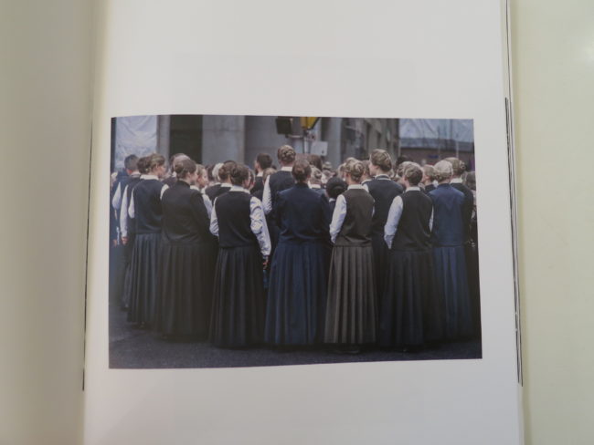
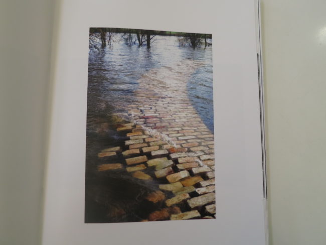
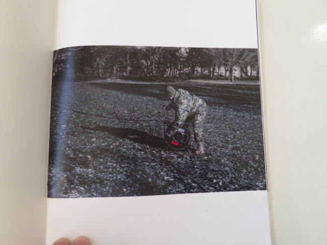
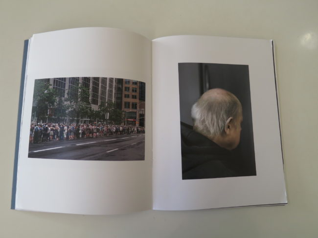
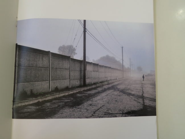
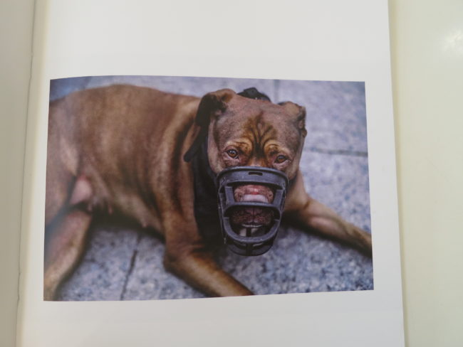
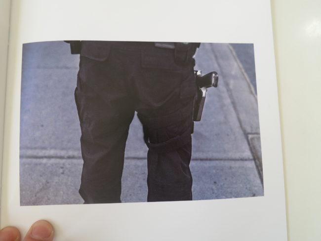
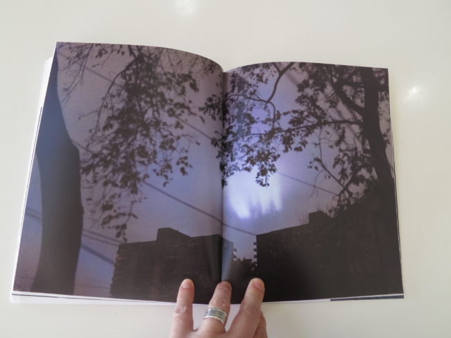
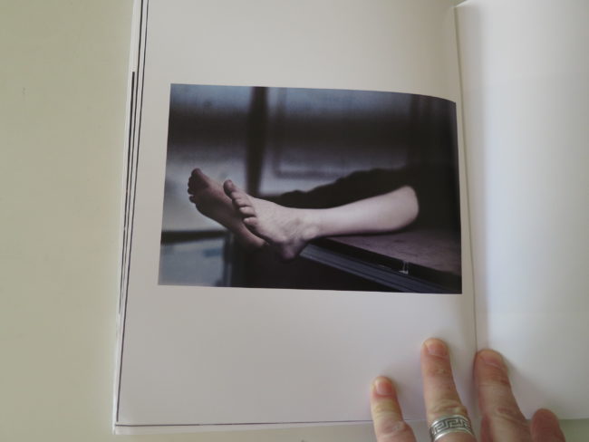
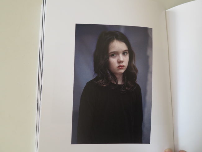
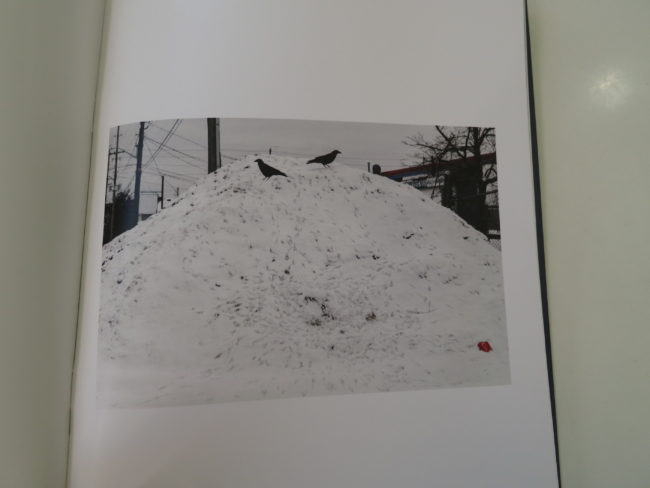
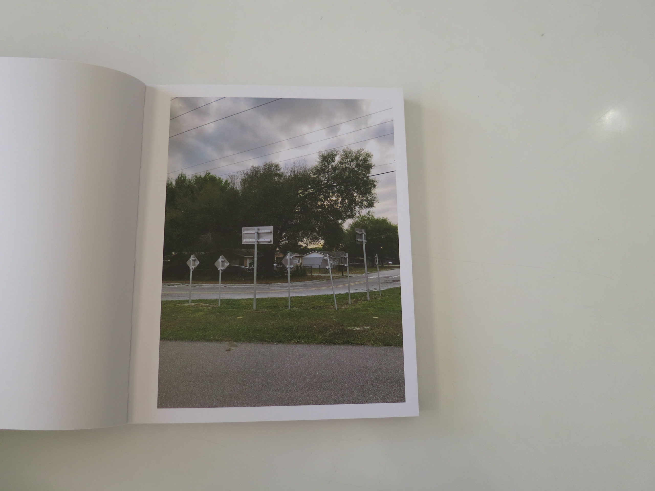
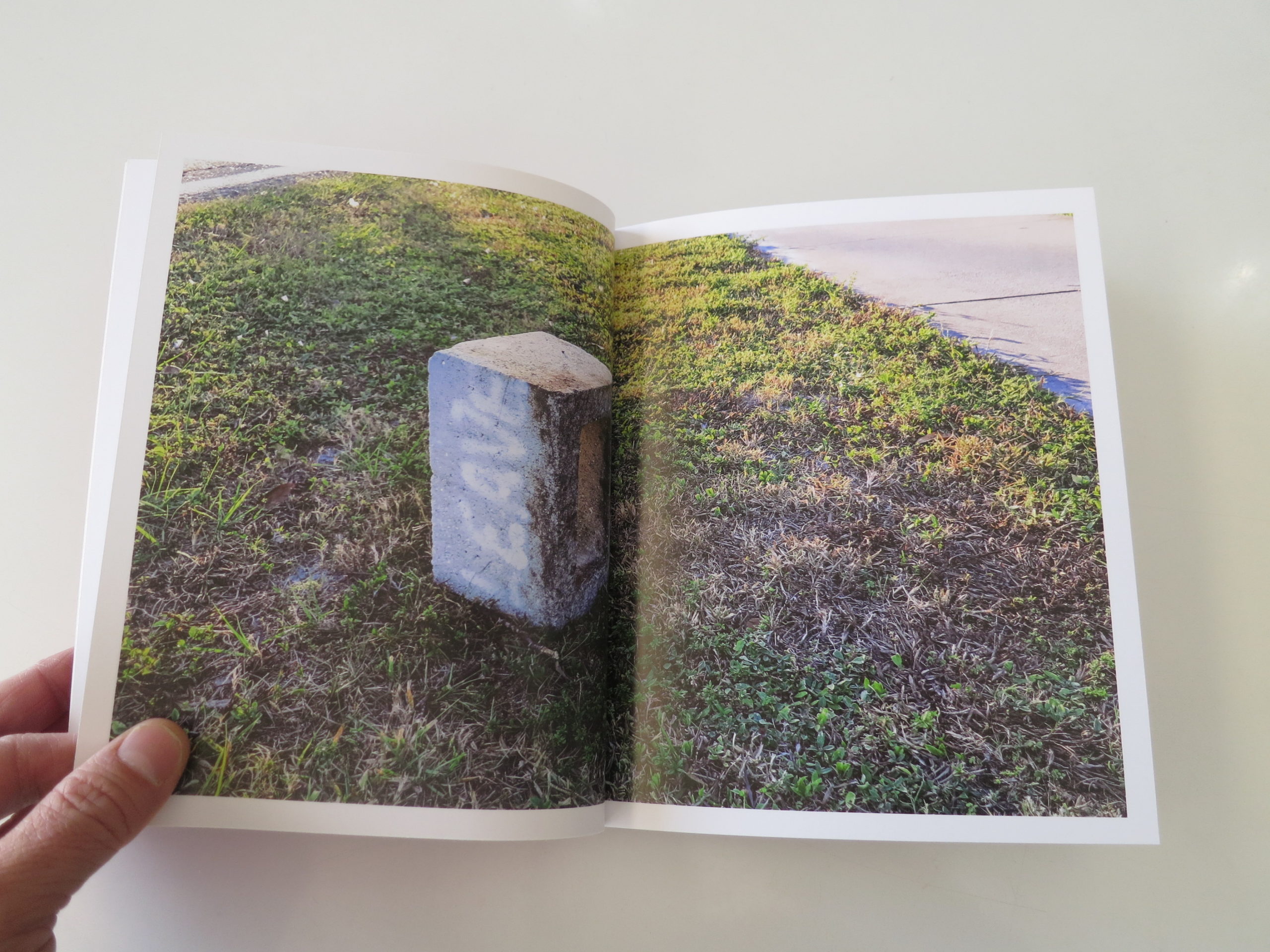
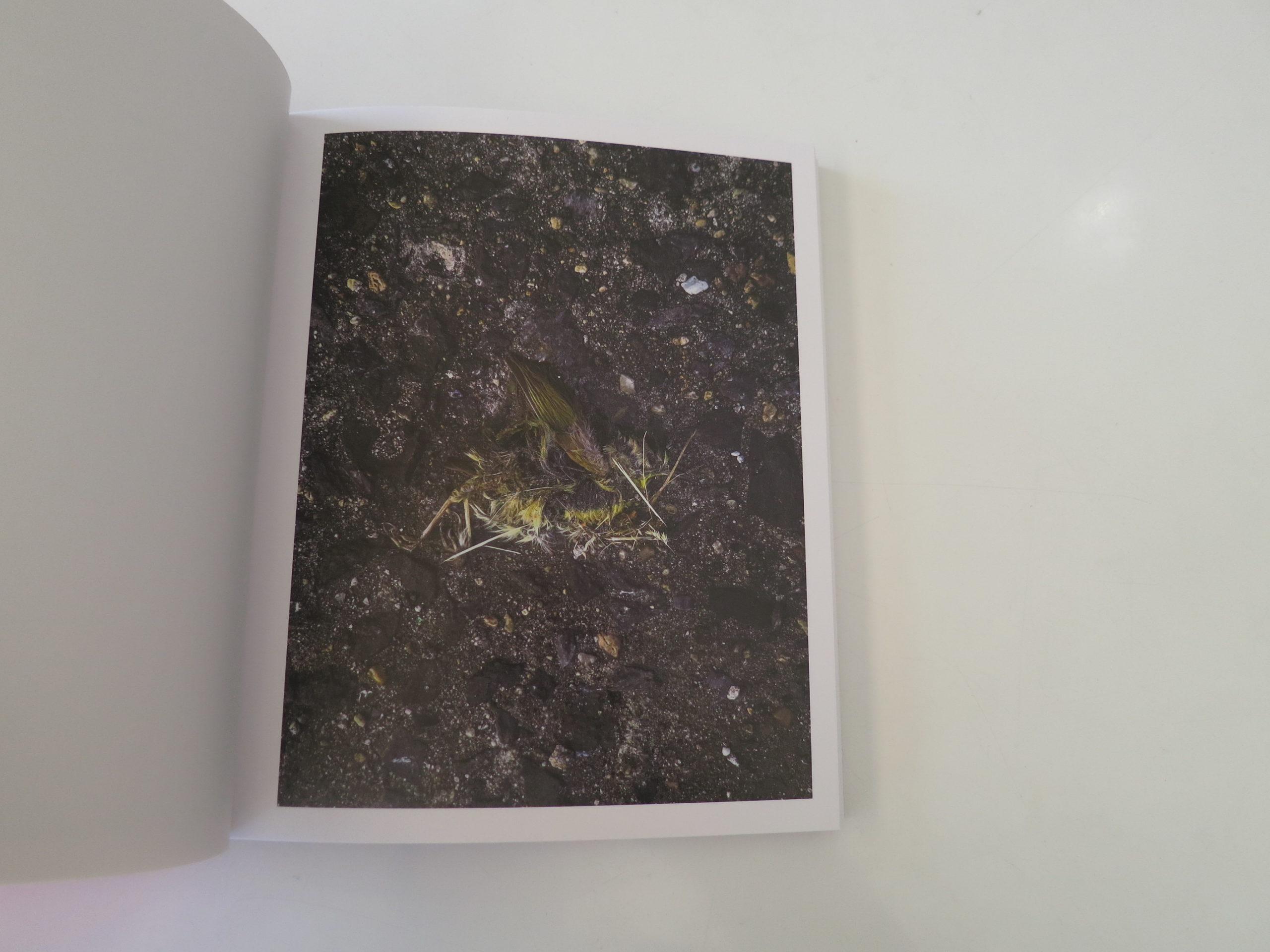
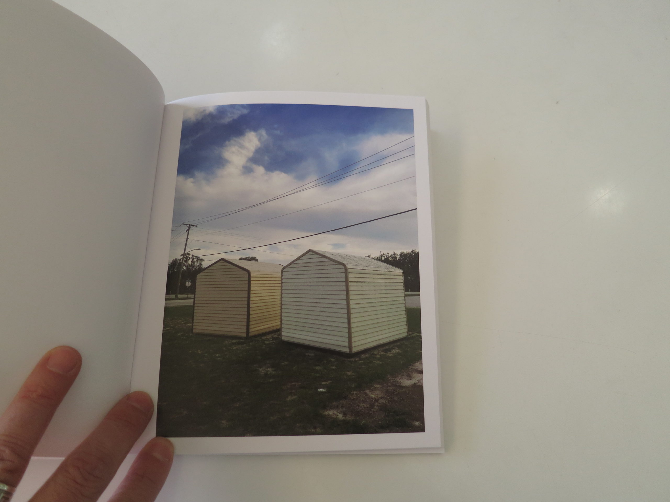
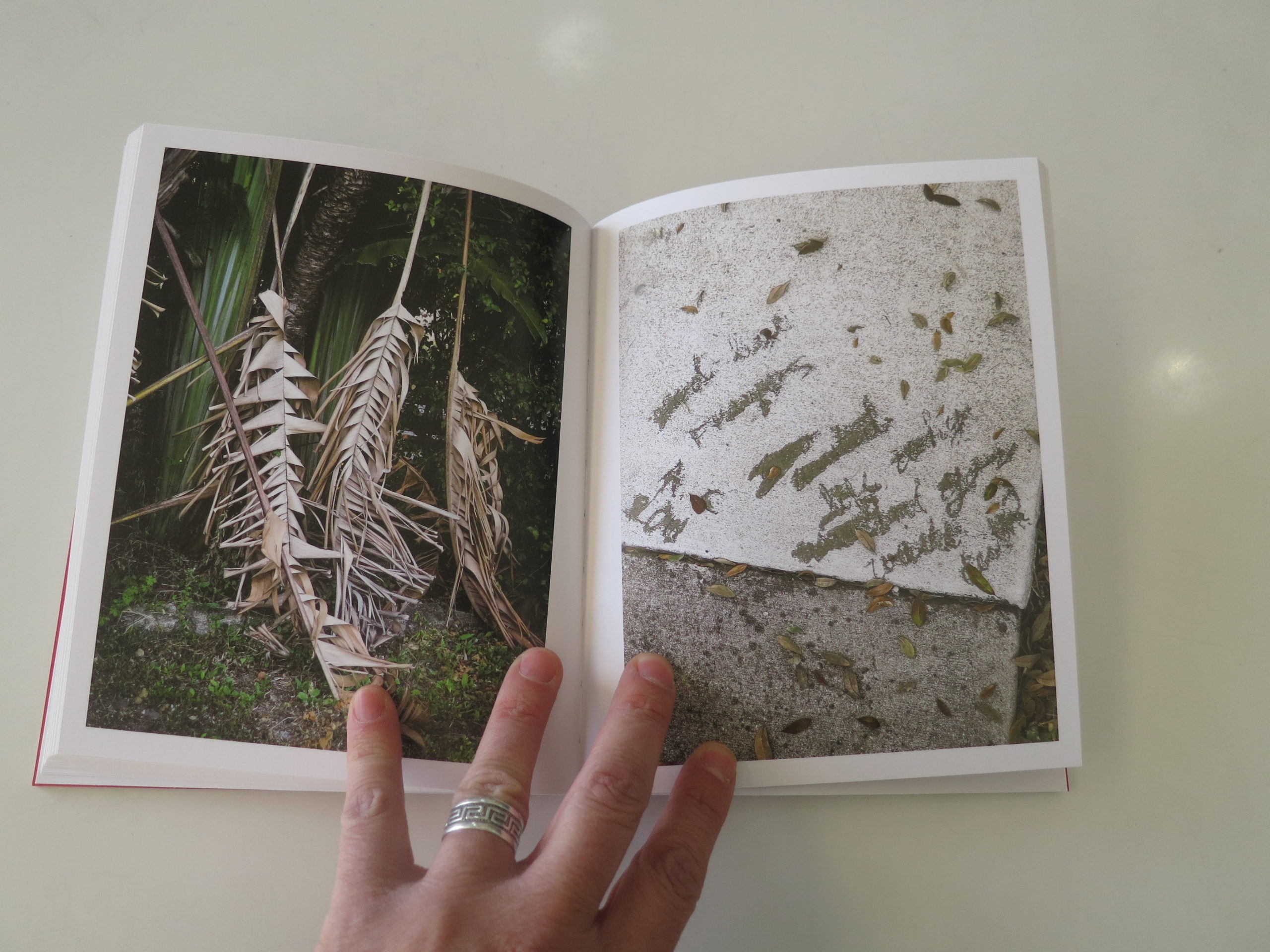
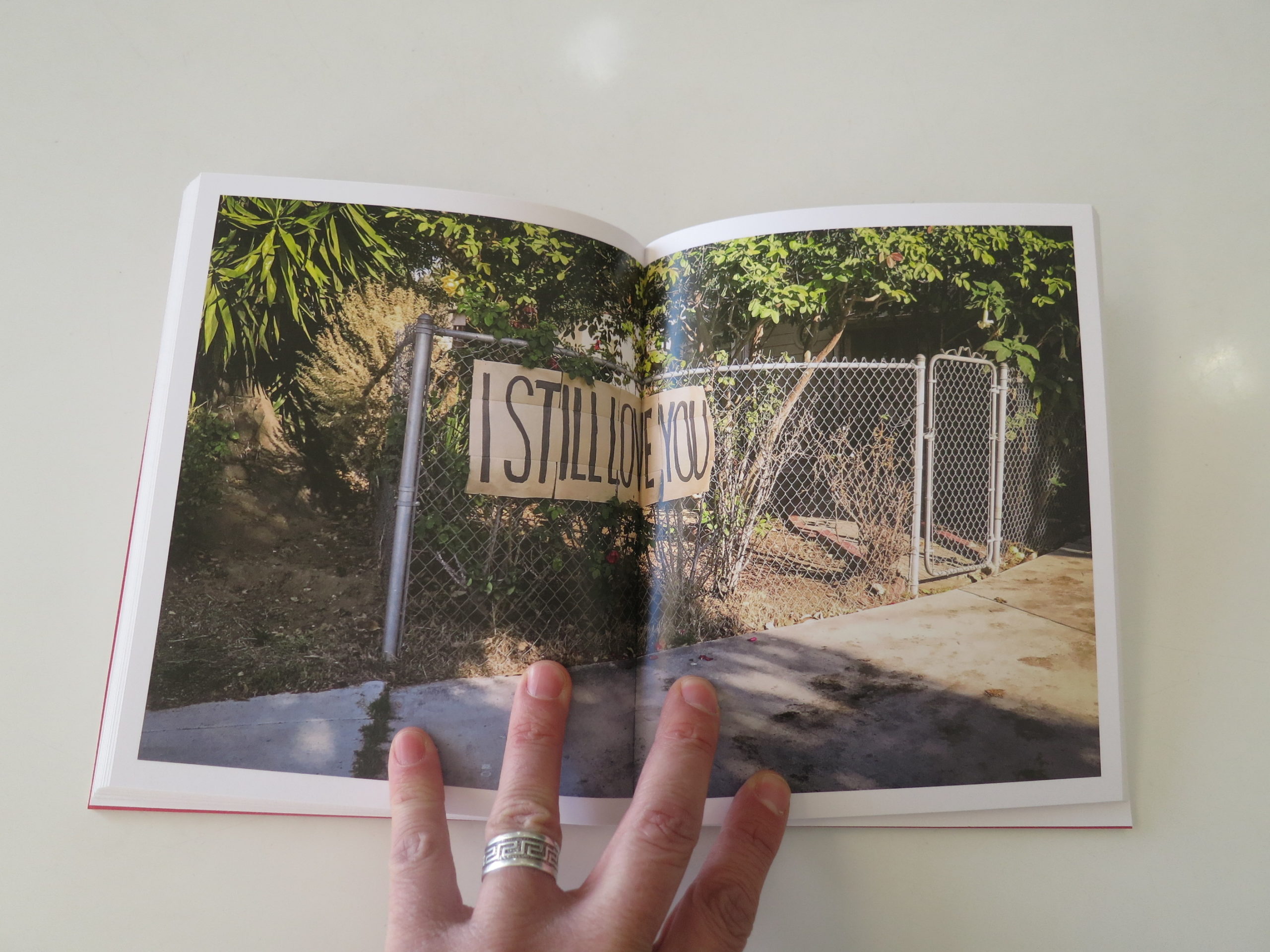
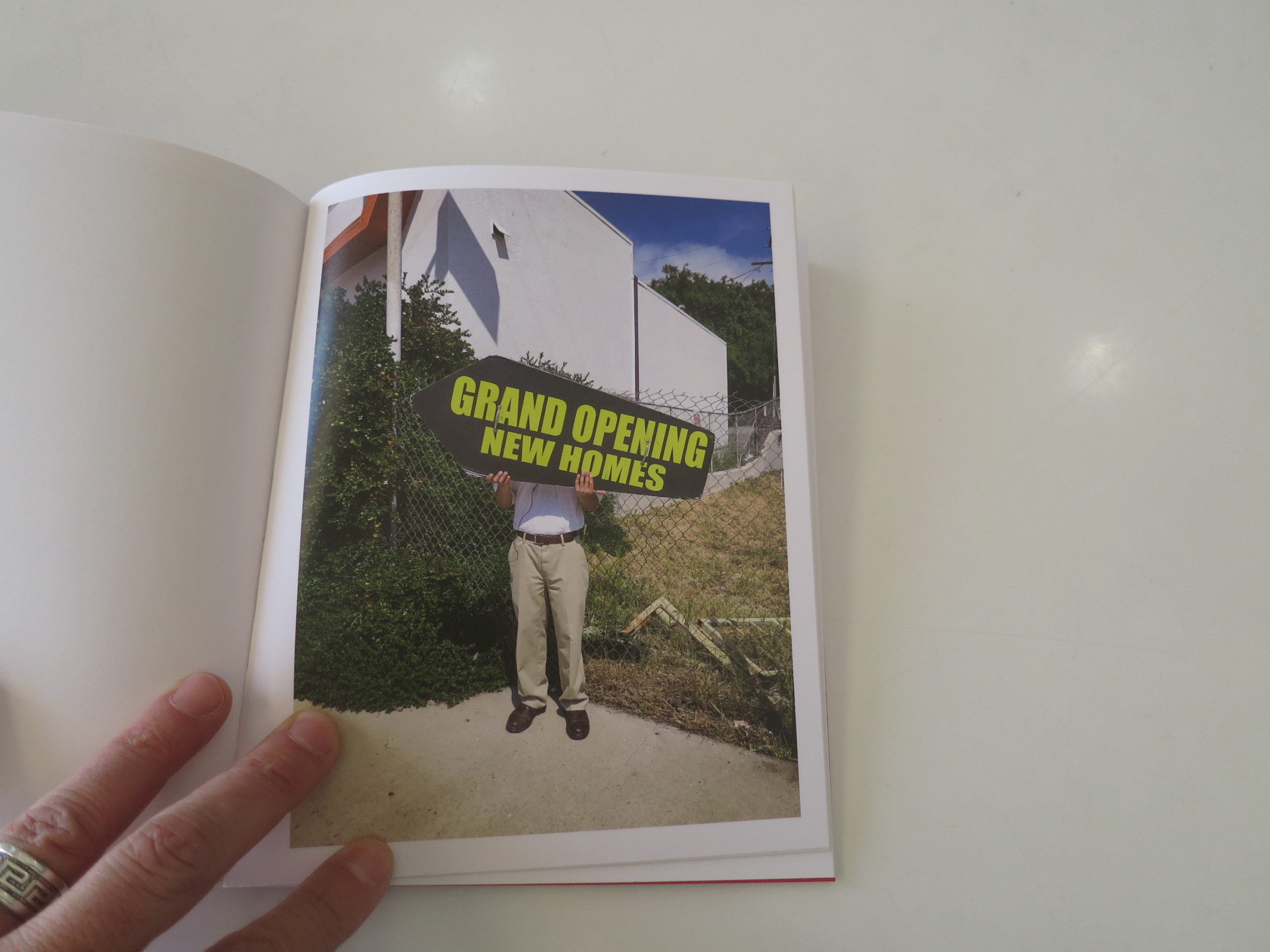
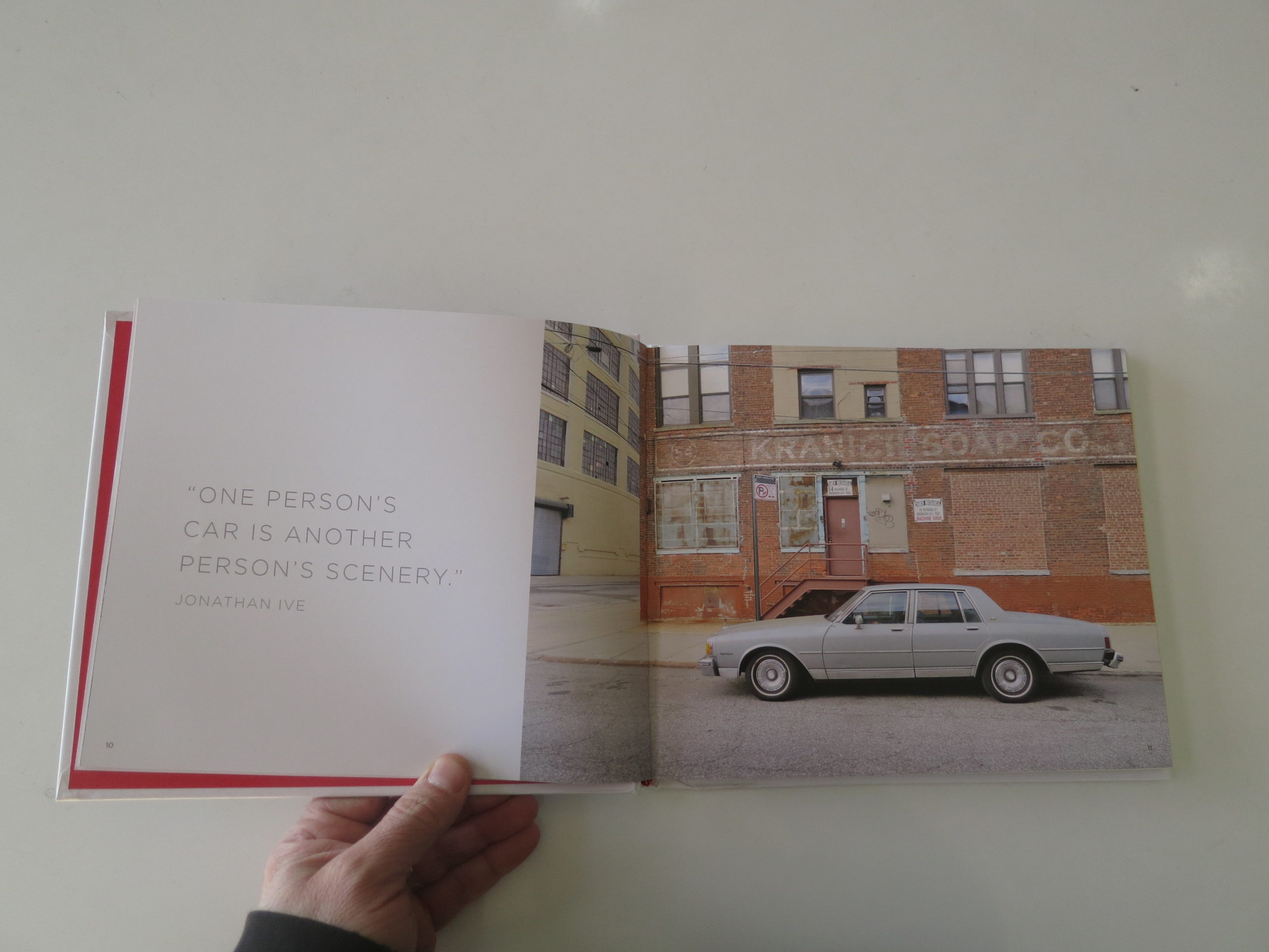
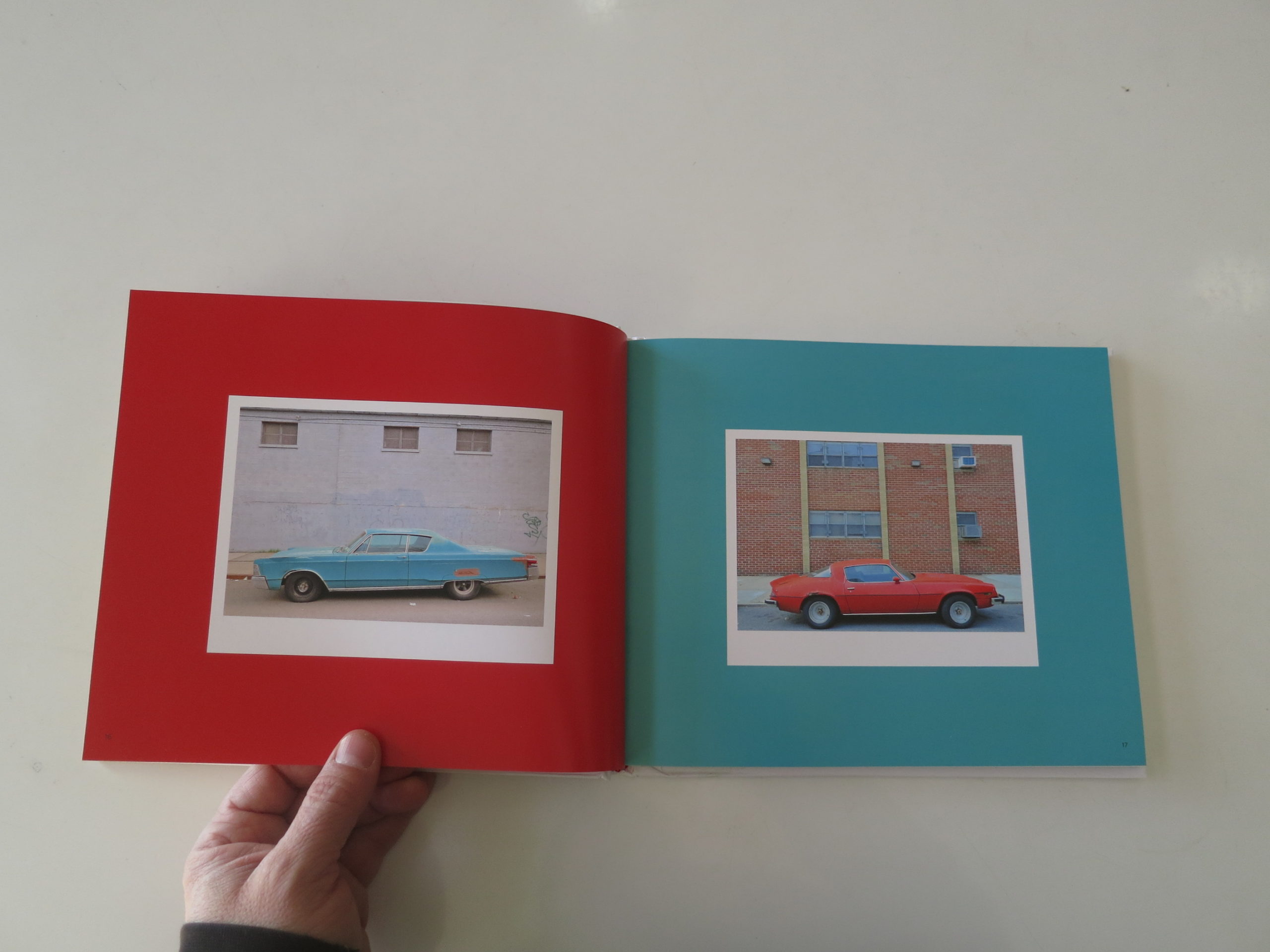
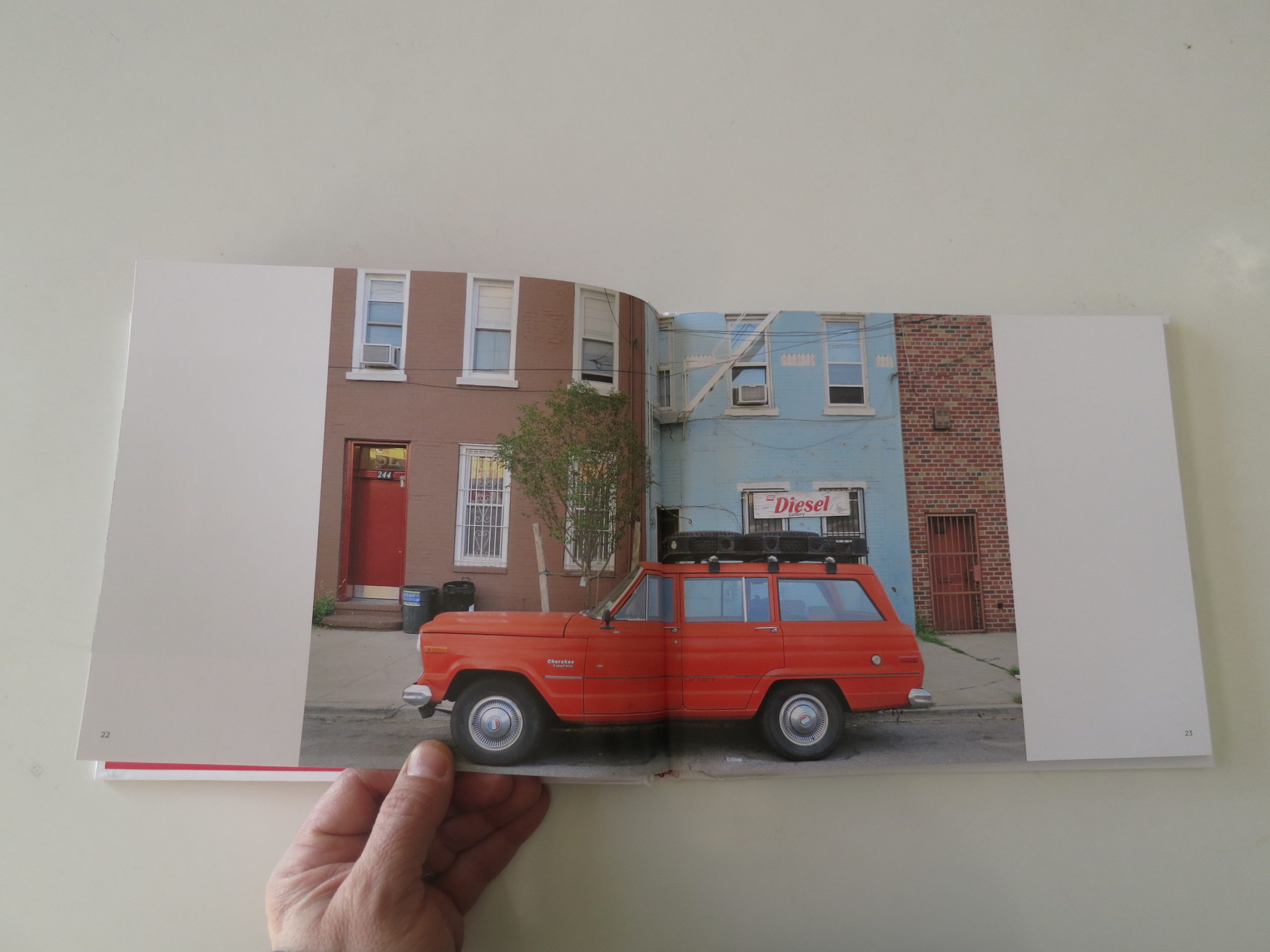
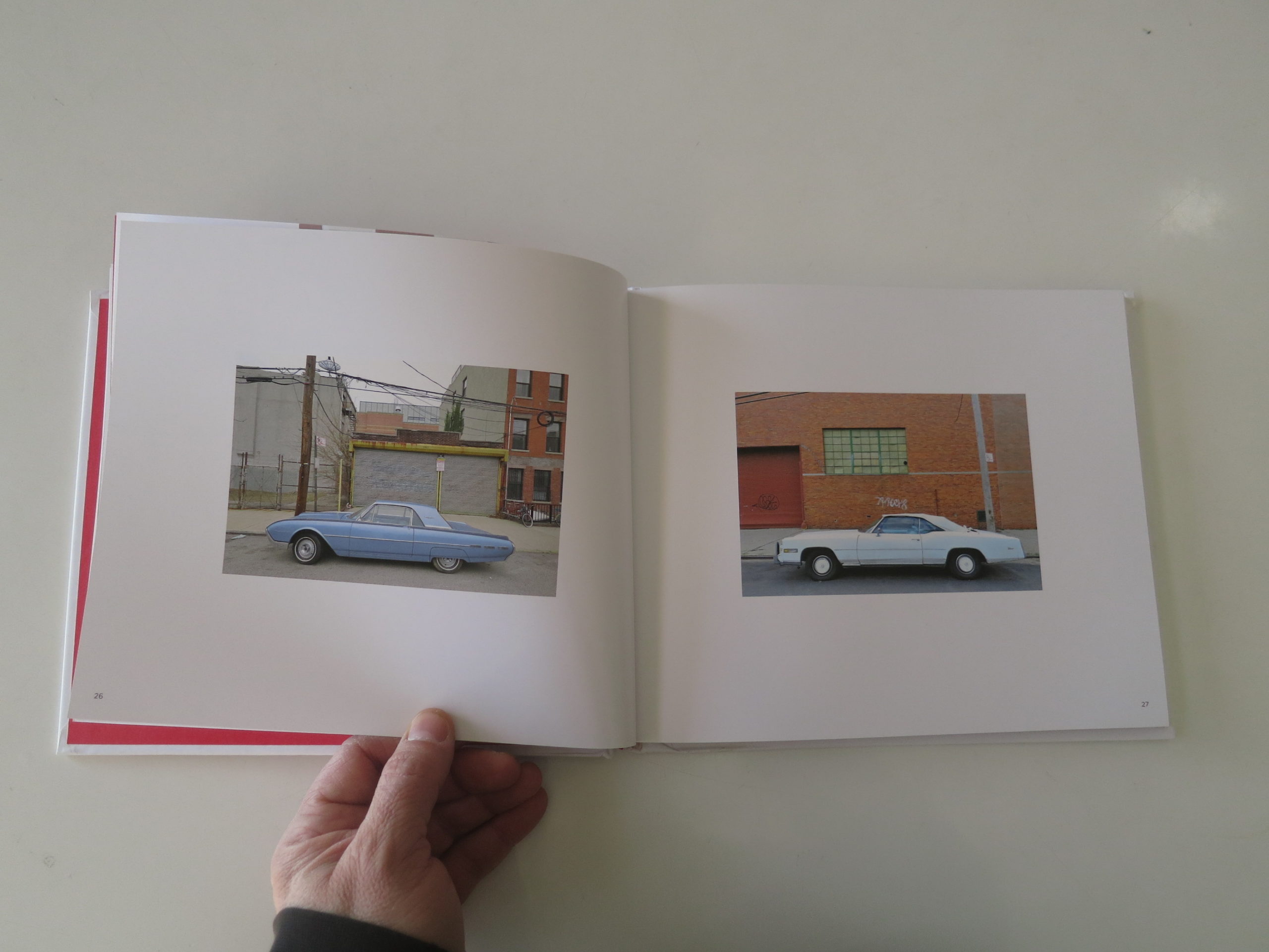
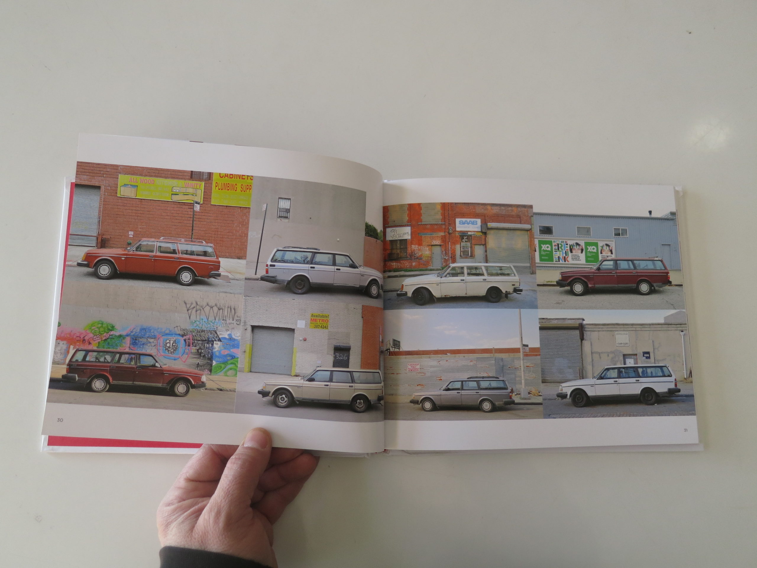
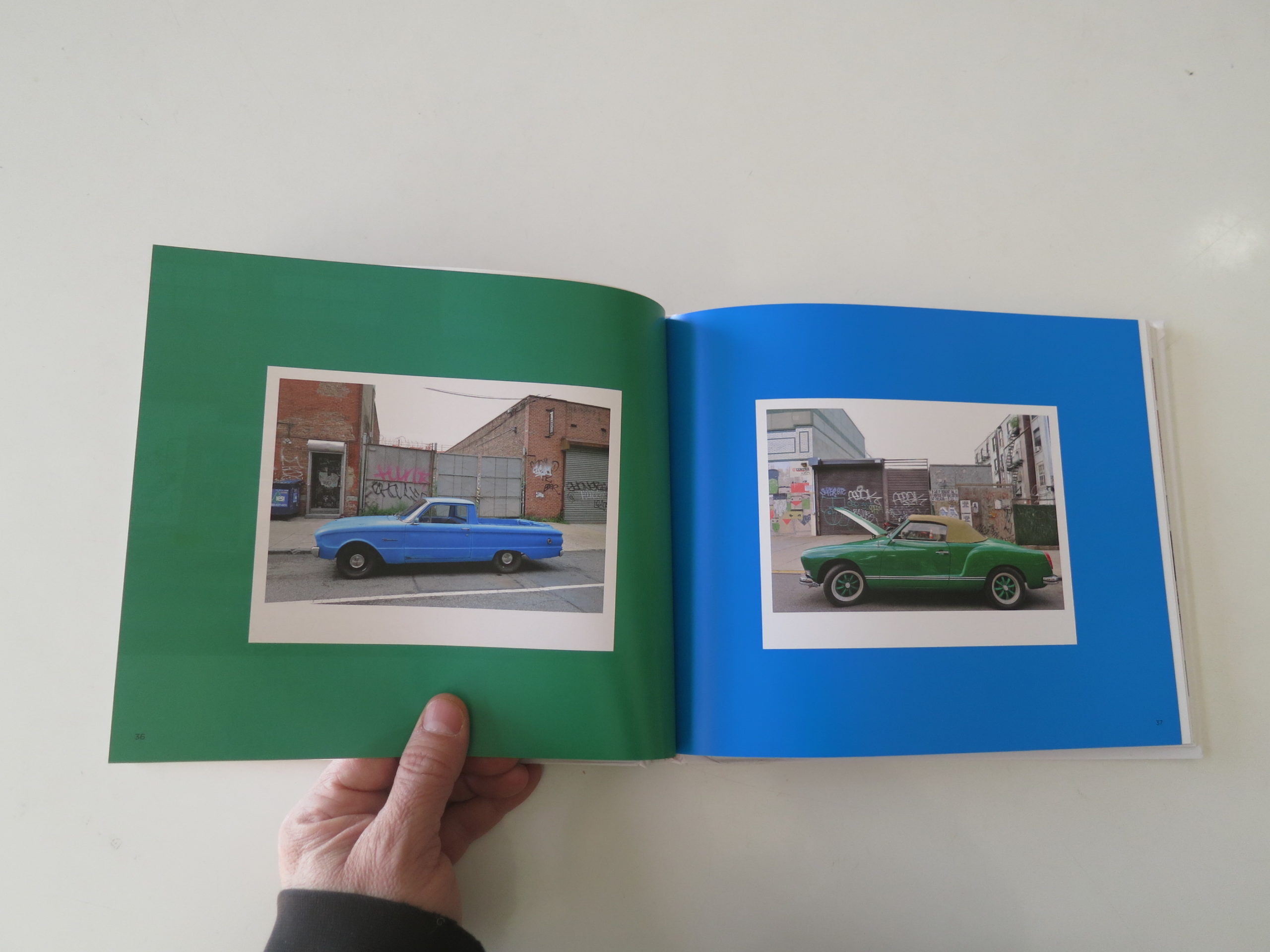
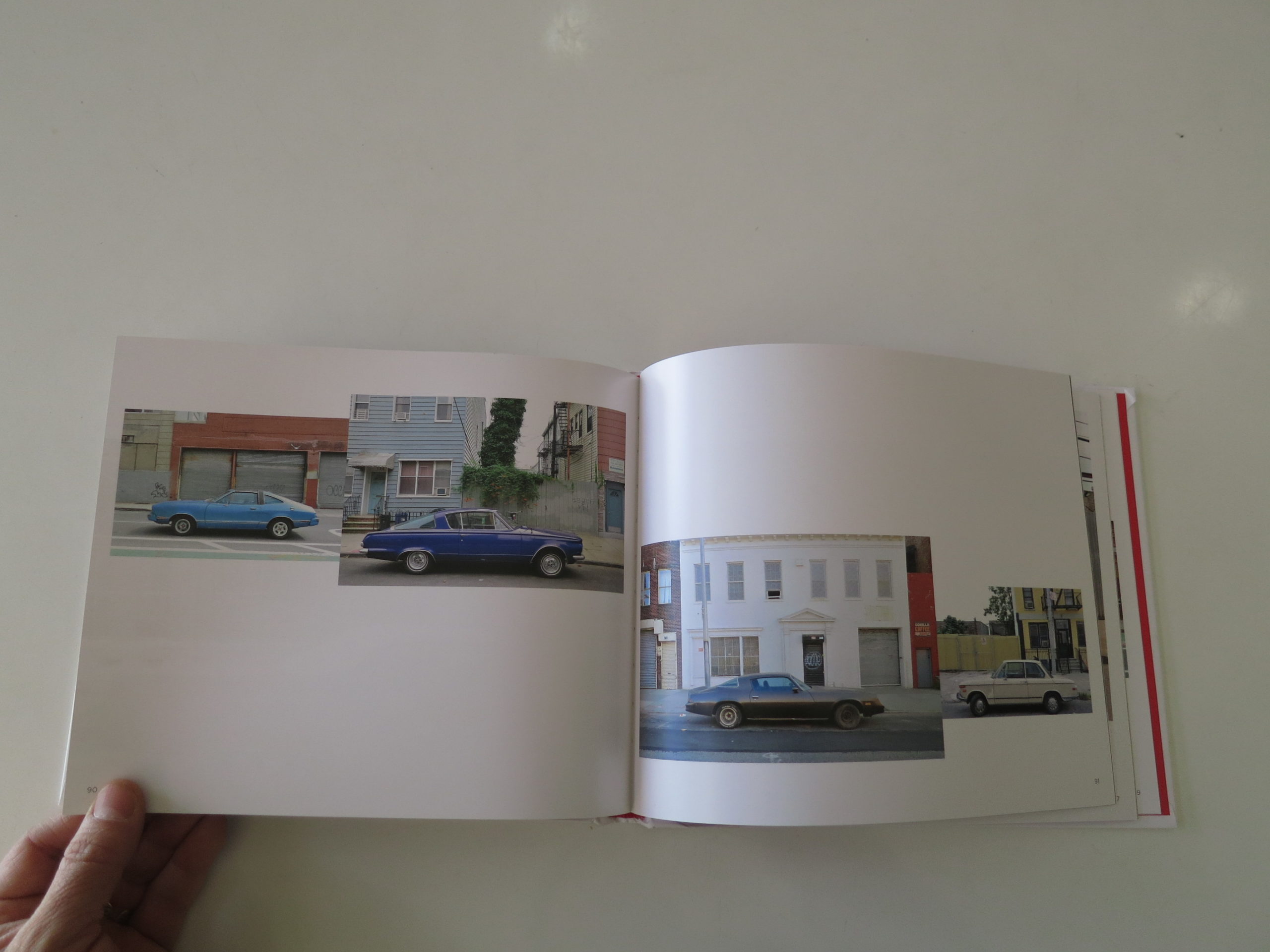
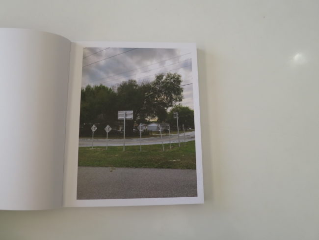
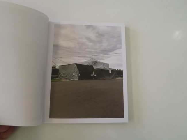
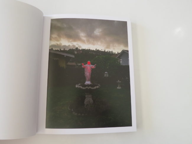
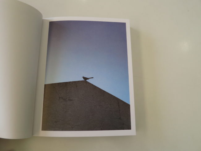
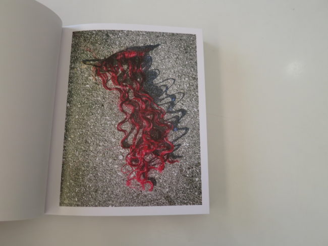
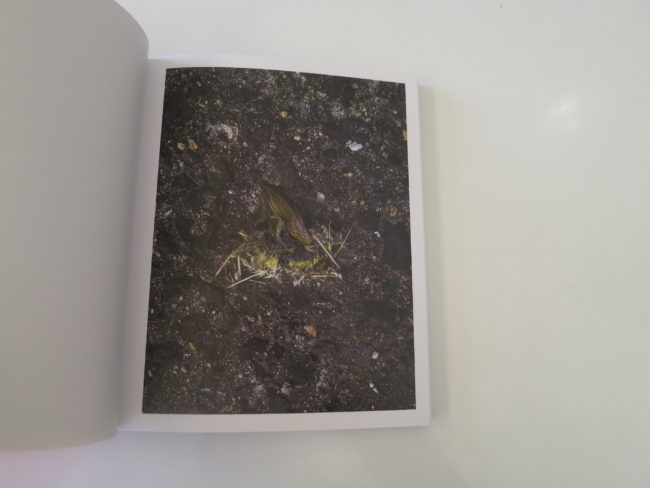
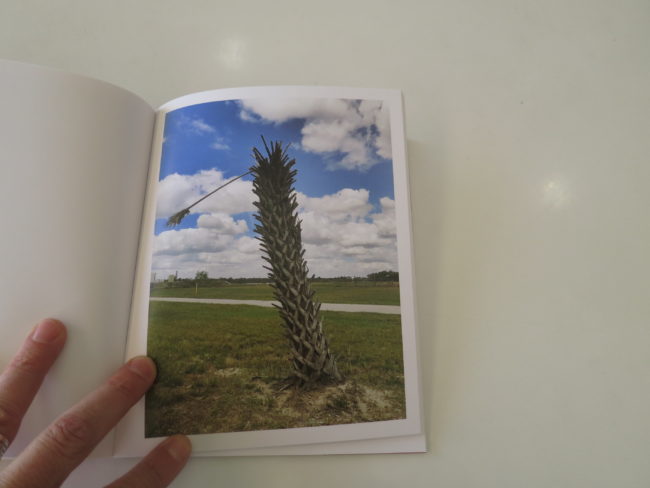
This book fits the theme, because the individual images, and the style in which they’re shot, are pretty generic for 21st Century fine art photography. Just as I lambasted the Hartford-MFA-style earlier this month, there is a certain type of dry-but-poetic color photography that makes projects indistinguishable from one another, and I’m sure you know what I’m talking about.

Based purely on the pictures, I’m not sure I’d review this book.

But as I said before, just looking at the pictures misses the point.

“A Habit of Self Deceit” is sad, and as soon as you get into the narrative, that context envelopes the experience like a shrink-wrapped house.

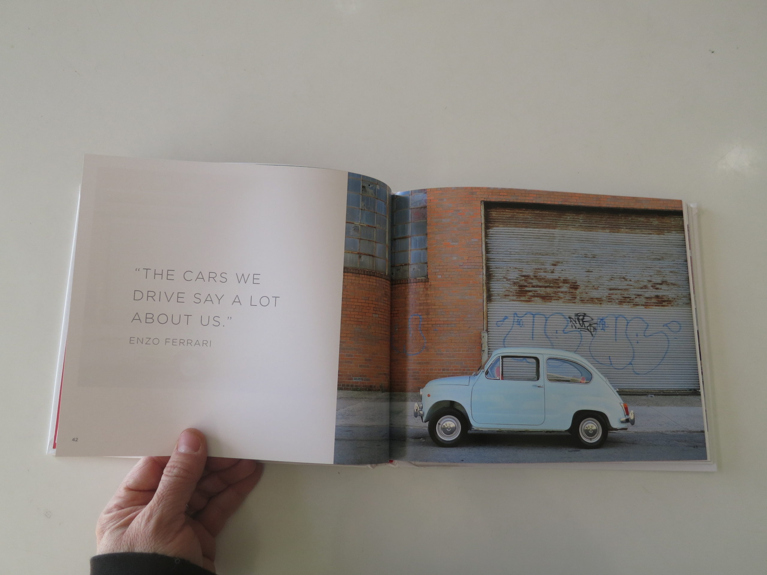
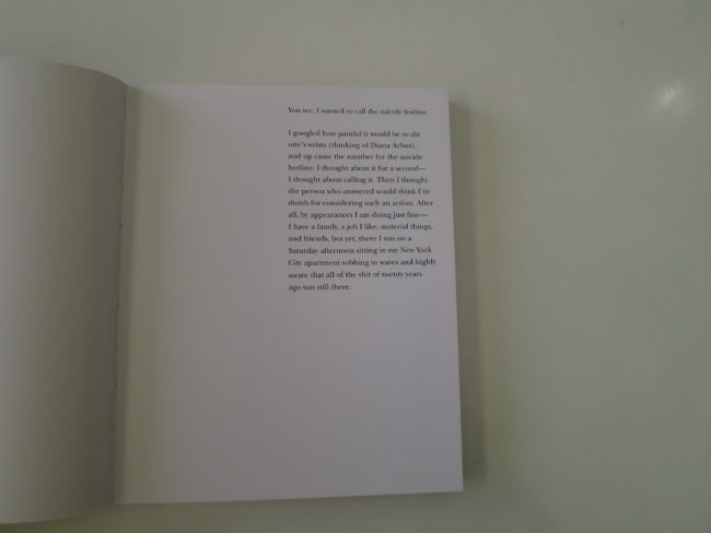
It opens with a short statement in which the artist admits to having contemplated suicide, almost calling a hotline for help, before abandoning the idea. (The piece also misspells Diane Arbus’s name, which I took to be intentional, but what is that supposed to imply?)

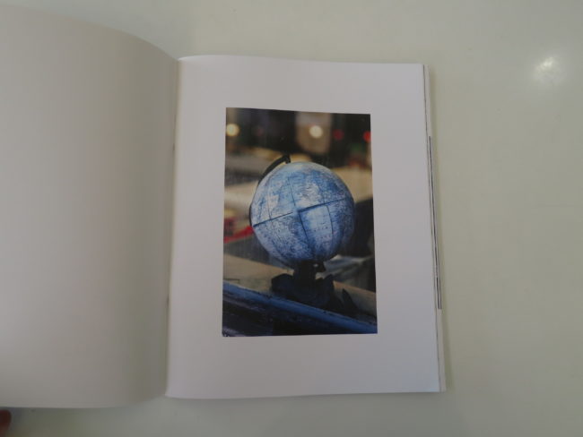
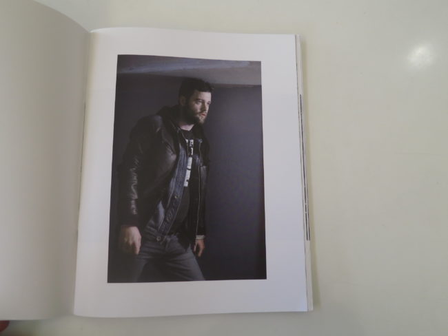
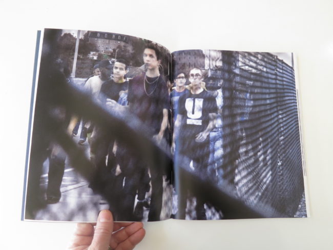
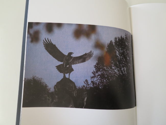
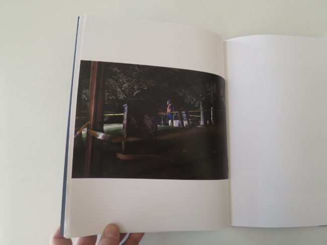
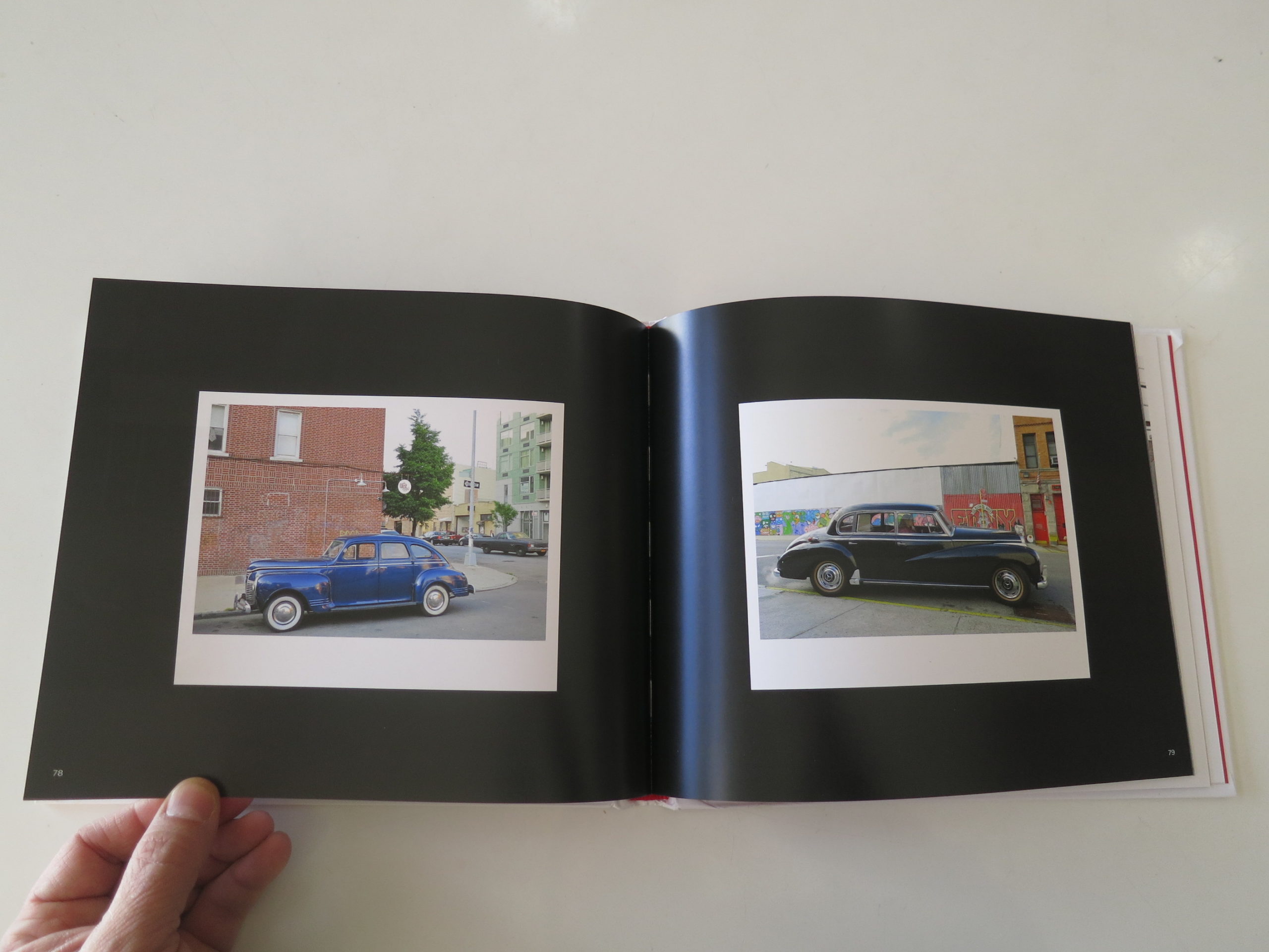
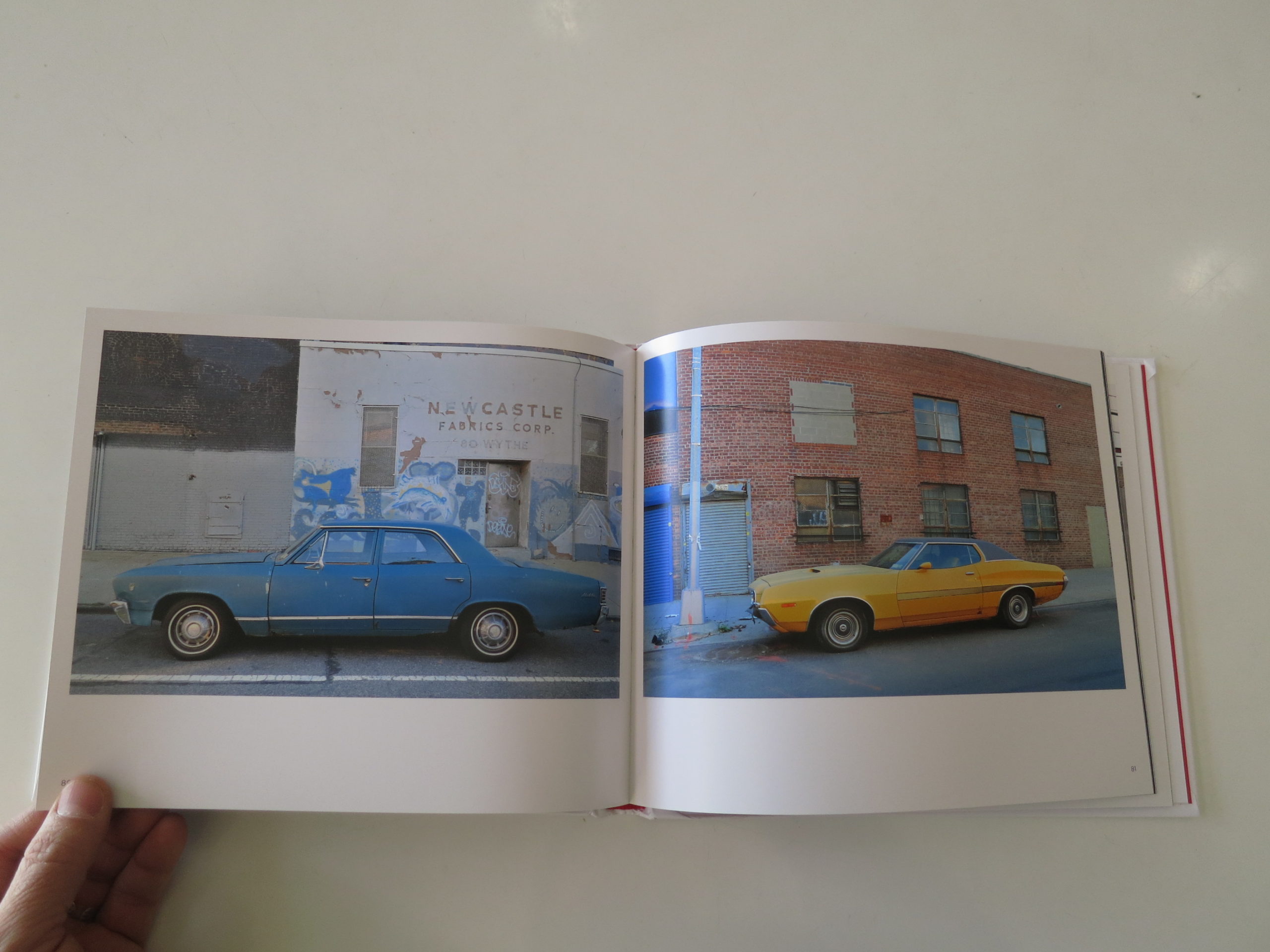
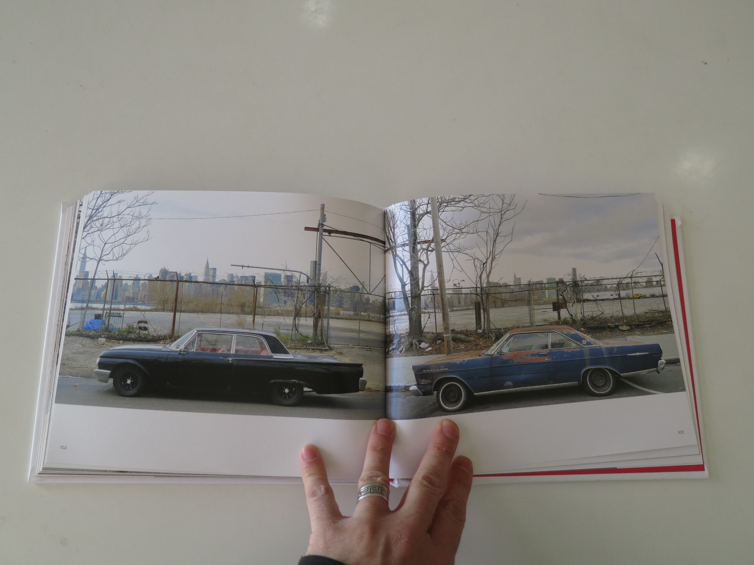
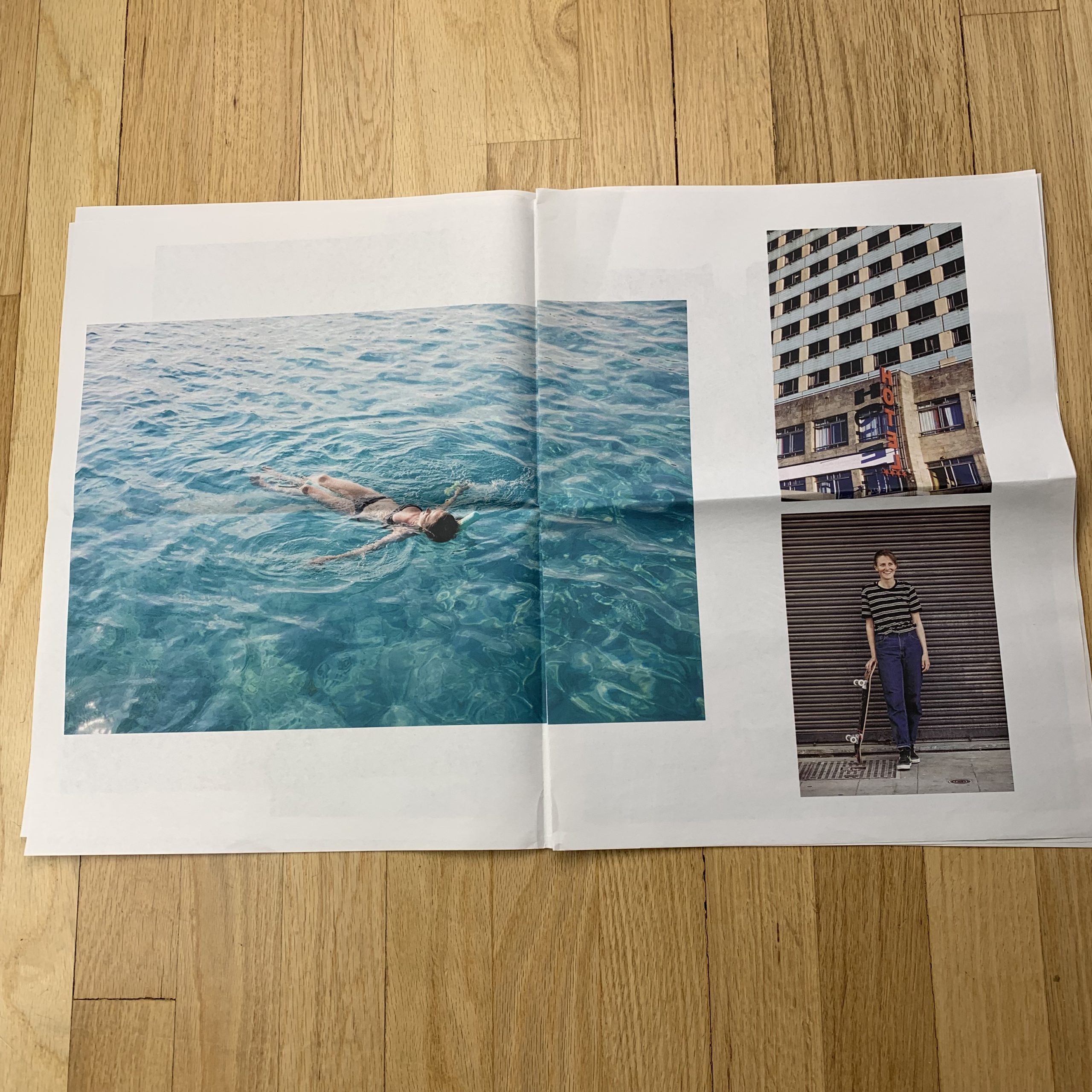
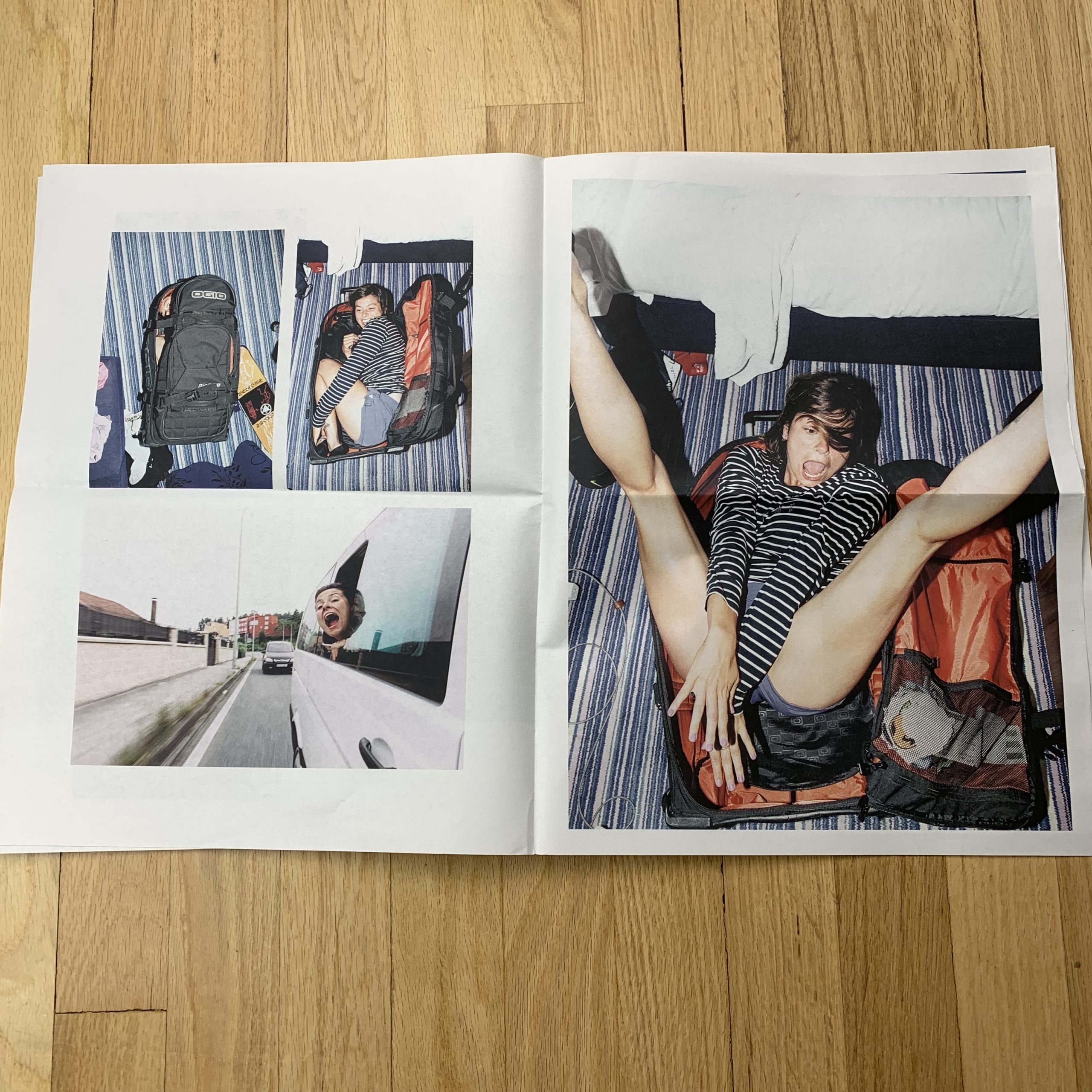
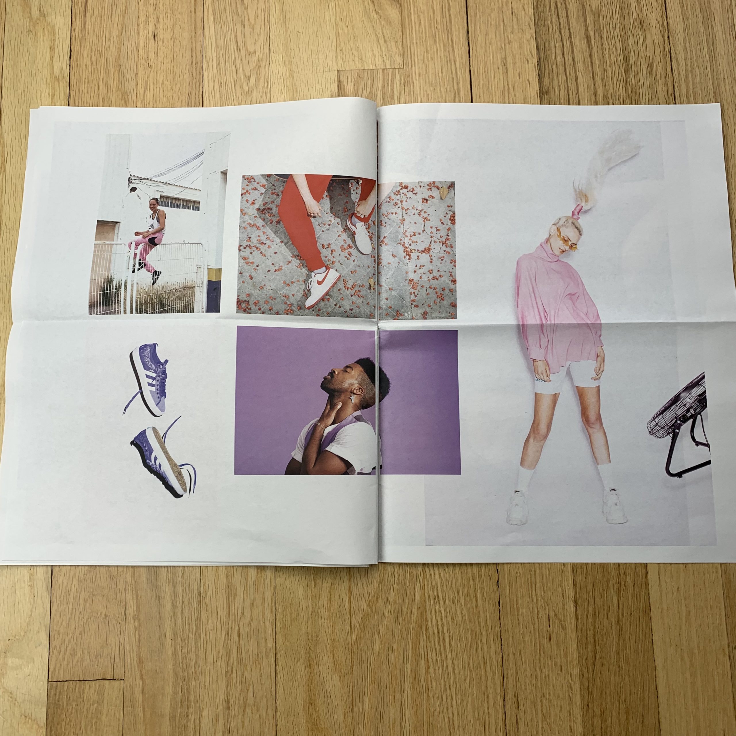
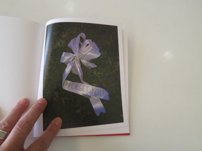
The writing is immediately followed by a series of bleak-light pictures featuring things hidden, covered, wilting, and alone.

Boom!
Emotional tenor established.

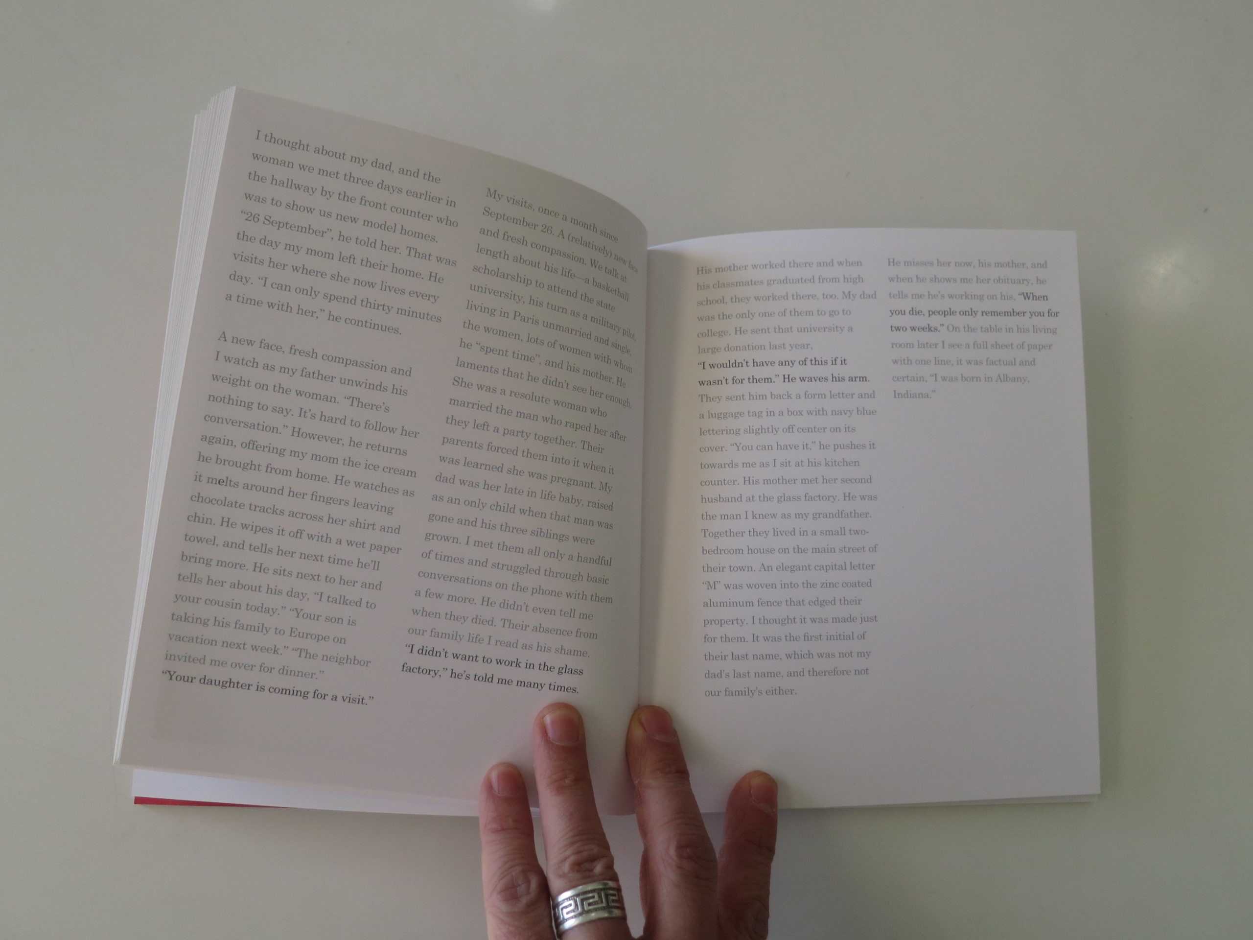
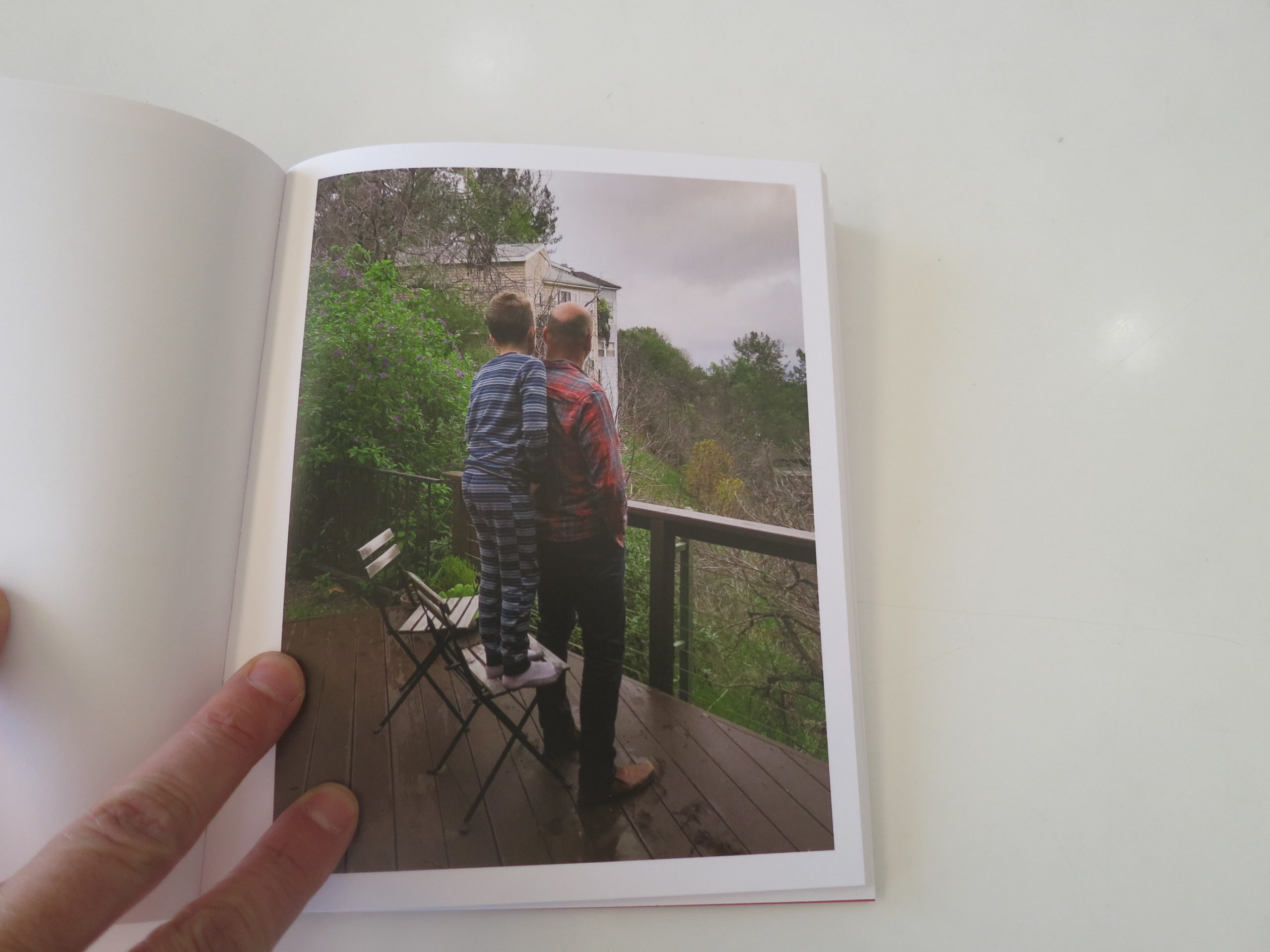
There are more textual interruptions, each very-well-written, which share that the artist was estranged for her adopted mother for years, but now she visits her in a home for the aging and demented, as her mom no longer knows who she is.

We read a story about how her Dad is likely lonely, living on his own in a new home, and how he visits his wife each day. The story tells us that his own mother married her rapist, and that the family history is not happy in general.

The heavy tale weighs down the pictures, throughout, in the best possible way.

And then, at the end, there’s another text piece that discusses the book’s title, which derived from Jean-Paul Sartre and Simone de Beauvoir. (Obligatory intellectual street cred established.)

Add it all up, and I really enjoyed my time with this book, even though it’s sad, and made me feel glum until I took nice walk in the sun.

If I open it up again, and randomly pick a page, I immediately think, “That picture’s nice, it’s good, but it’s nothing special.”

Really though, so what?

In my personal and professional opinion, I judge the entire book not by it’s cover, but by its gestalt.

And this one is pretty good, all things considered.

Bottom Line: A poignant tale of family and loss

To purchase “A Habit of Self Deceit” click here 

If you’d like to submit a book for potential review, please email me at jonathanblaustein@gmail.com. We currently have a several month backlog, and are particularly interested in submissions from female photographers so we may maintain a balanced program.

The Art of the Personal Project: Hugh Kretschmer

The Art of the Personal Project is a crucial element to let potential buyers see how you think creatively on your own.  I am drawn to personal projects that have an interesting vision or that show something I have never seen before.  In this thread, I’ll include a link to each personal project with the artist statement so you can see more of the project. Please note: This thread is not affiliated with any company; I’m just featuring projects that I find.  Please DO NOT send me your work.  I do not take submissions.

Today’s featured artist:  Hugh Kretschmer

I first noticed a change when I moved back to LA from New York after twelve years.  It seldom rains, and the weatherman is struggling to figure out when El Niño is supposed to arrive; a weather phenomenon that brings heavy rain to this part of the world every seven years. We’re past the seven-year mark.  I remember as a kid looking at the weather page of the newspaper on an El Niño year and seeing in the satellite photo one rainstorm after another coming from Hawaii.  It looked like they were on a conveyor belt, and they actually had a nickname for it – The Pineapple Express. Fire storms are more common than rainstorms, and I’ve been evacuated twice because of brush fires.  And then there are oil derricks out in the bay, a lot of them, and there is a faint smell of crude and a rainbow sheen on the ocean surface.  Like a siren call, it is alluring to the eye but toxic to the touch.

And, if all of this is happening in my home city, I can only imagine what the effects are elsewhere around the world. Add to the mix a prediction by experts that future wars will be waged over water, it is hard to sit on my hands and leave it to the experts, “more qualified than me”, to do something about this.

Then the idea came to me: create photographs around the subject of water but have not a drop of it in the images.  It sat in the back of my mind until I was interviewed by an Arab arts and culture magazine while teaching workshops in Dubai. It dawned on me why this project was gnawing at me when she asked, “Have you ever considered having your work serve a purpose?”  That one question brought it all together as if the universe was telling me to start the project.

“Mirage” has a double message: bring water back to where it once flowed and was pristine; and take a glimpse into dystopian future where the only way to see water in its purest form would be through artificial means. Think museum diorama!

My vision for this project is to ultimately expand my vistas beyond California to the rest of the country, and eventually other parts of world where natural water systems are in peril.  By way of gallery exhibitions, print sales, and an eventual book, I will donate a portion of the proceeds to a non-profit organization dedicated to water conservation — come hell or high water.

To see more of this project, click here.

APE contributor Suzanne Sease currently works as a consultant for photographers and illustrators around the world. She has been involved in the photography and illustration industry since the mid 80s.  After establishing the art buying department at The Martin Agency, then working for Kaplan-Thaler, Capital One, Best Buy and numerous smaller agencies and companies, she decided to be a consultant in 1999. She has a new Twitter feed with helpful marketing information because she believes that marketing should be driven by brand and not by specialty.  Follow her at @SuzanneSeaseInstagram


The Daily Edit – Wired UK: Christie Hemm Klok

Wired UK

Creative Director: Andrew Diprose
Photo Director: Dalia Nassimi
Acting Photo Director: Cindy Parthonaud
Photographer: Christie Hemm Klok


Heidi: What type of direction did you get from the magazine?

Christie: I got a lot of direction from the magazine. When Cindy Parthonaud, the acting photo director at the time, approached me about the shoot she had a pretty clear vision in mind. She referenced an image that I had taken for WIRED US back when I worked in house for them of the young actor Abraham Attah. The creative team worked up a mock cover using that image of Abraham and we went from there. It was so helpful from the get go to understand their vision and have what that wanted communicated to me so clearly. I had been wanting to do some moody portraiture and this was the perfect opportunity.

How did the idea to utilize the gutter come about?
I can’t speak to how the use of the gutter came about but Cindy or the CD over at WIRED UK came up with. We had always planned to photograph each person individually and piece together the cover but the use of the gutter was entirely the idea of the art team. I love that opener so much.


How difficult was it to schedule the shoot and how much time did you have?
The shoot was difficult to schedule and the time frame was incredibly tight. Although this is the case on most shoots this one was especially tough to pull off in such a small timeframe since we needed more shots in order to fill out a cover story. We had the guys for about an hour, although I think it ended up being closer to 45 min. I got there about 2 hours early to scout and set up. When I know I have a tight time frame I walk through the space with my assistant and map out a game plan. If we all know where to go next the shoot can happen a lot more smoothly. Since we set up a mobil studio and 5 environmental shots we needed to move quickly though each.

How much did you direct them in terms of styling and on set?
I directed them a lot. Since we knew what we wanted for the cover it was just matter of portraying that clearly to them. I tried to fit as many environmental shots as I could in our tight timeframe and knowing what I wanted out of each location was key. My assistant and I tested out positioning when we were setting up so I had those in my mind when I approached each location.

What type of energy do the two of them have that you were trying to portray?
Both of them were pretty quiet and reserved. They seemed to get along really well and have a very close relationship. Stripe is an incredibly successful company and the brothers are very young so we wanted to show that confidence and strength.

Are they aware of their impact and did that come through while you were interacting?
Honestly they were both a bit distracted the entire shoot. They are both clearly very busy so they were on their phones a lot answering emails. Despite their tight schedule and heavy workload we were able to accomplish a really successful shoot.

The thing about shoots like these is that it takes so many people to make it successful. Without my assistant, Cayce Clifford and the Photo Director, Cindy it really could not have happened the way it did. We ran up and down flights of stairs testing out each location and at least 40 min fine tuning the lighting for the cover.

The Daily Promo – Jason Myers

Jason Myers

Why did you decide to make a non-traditional promo?
I’ve always felt like I’m a pretty diverse photographer when it comes to genre, however, most people associate me as a portrait photographer. Having shot editorial and advertising work for many different clients over the years I was realizing I was missing more lifestyle opportunities recently and wanted to be sure clients knew I could shoot and enjoyed shooting lifestyle type work. We planned a personal Fall camping shoot at a friends farm just outside of Nashville and with the help of talent, wardrobe styling, prop styling and HMUA from AMAX a local agency, we shot a full day in November 2018 for fun to have something for my book and to show potential clients that I was capable of more than what they had seen previously. I enjoy shooting and collaborating period. I wanted my past clients, current clients, and future clients to know I could create the lifestyle imagery they often asked for but hadn’t seen much of in my portfolios.

After the shoot, Laurel and I decided very quickly that there was more to this shoot than simply getting images and tossing them on a print mailer or adding to the website. When I moved to Nashville in 2014 I made (with the help of some very talented friends) the “Fresh from Florida” promo announcing my move from Florida. It was ambitious but it paid off, getting me additional looks at my site, meetings beyond the people I sent the promo too and ultimately work.

This was a similar goal. Package the work in a way that was consistent with the shoot, my brand and get as many industry eyeballs on it as possible.

Laurel came up with the cooler idea and it’s red/white colors similarly matched my brand/logo. We worked with a local printer for the 5×5 folded promo (JIVE) and the custom bandanas designed by Lure Nashville and printed by Friendly Arctic. The Goo Goo Clusters which was founded in Nashville in 1912 was custom made with a smore’s flavor to compliment the campfire vibe. Inexpensive blankets were sourced from Academy Sports & Outdoors and the tin/metal cups from Amazon. All stickers were made by Sticker Mule.

At the end of the day, the goal was simply to break through the noise for just a minute and provide some folks with a fun gift to compliment the sharing of new work. We shipped the promos out on December 13th.

Who printed it?
The printed promo was done by a local printer here in Nashville called JIVE, A Printworks Studio.

Who designed it?
The layout and design of the actual the printed promo were done by my studio manager/assistant Laurel Higman. Overall concept and ideation were done by myself and Laurel.

Tell me about the images?
The promo images were shot towards the end of the day and we had started getting low on light. An earlier couple setups just didn’t have the camping feel I was going for. This end of day vibe was what I had envisioned and worked perfectly for my needs. Everything was pretty organic once our prop stylist, Angel Beddoe from AMAX set everything up. We shot all day and the crew and talent were equally enjoying themselves which was also a goal for everyone involved. As someone who typically uses a lot of strobes and likes to shape and craft light, this was a fun change of pace. We shot a lot but the edit is very tight.

How many did you make?
We made 50 “Happy Camper” promos that were sent to 48 individual art buyers/producers across the country. The other two were sent to A Photo Editor and PDN. The decision of whom to send these too was strategic also as I wanted them to get to people whom I thought I’d be an asset for or be an asset for them again if I’ve worked with them previously.

How many times a year do you send out promos?
I haven’t sent out a promo like this for a few years and honestly have backslidden a bit on sending print mailers also. I feel like staying on top of mind for clients is the goal and this year I’m focused to do that in any unique way possible.

Do you think printed promos are effective for marketing your work?
I believe in traditional mailed, printed promos however I want my clients to know I’m thinking a little outside of the box and willing to take the extra risk to ensure we get something great if we work together. There’s a place for the traditionally printed mailers, I just wanted this to be something talked about for a while longer.

What about the return on investment for an expensive promo like this?
Hopefully, someone is reading this right now or received the promo and wants to give me an opportunity so I can say the return was directly related to the promo. Please feel free to hire me! That said, as most folks know a single mailer, email blast or promo isn’t likely to get you immediate work. It’s the continual efforts to stay on top of mind and do something unique showcasing your work that gets people to associate with your brand. Folks always want to know the costs. These cost about $28 dollars each plus shipping (largest single cost averaging about $16 each). So yes, this was not a cheap endeavor however I see it as an investment. I could have bought a new lens or gear but wanted to invest in my marketing. Will that gear get me new clients? Doubtful. Will these promos get me new clients? Possibly.

I’m not afraid of risk when that risk is shooting something for myself and sharing it in a fun way with other creatives. That’s an immediate reward for me and I’m proud and thankful of the career I’ve built by rolling the dice every once in a while on showcasing my work.

This Week in Photography Books: Douglas Ljungkvist


For whatever reason, I’ve never been to Sweden.

(Though I’m sure it’s a lovely place.)

I’ve been to Copenhagen, though, so the sum total of my knowledge of Scandinavia amounts to smoking insanely good hash in the commune of Christiania, watching my brother annihilate my friend Pappy in several games of backgammon.

(Yes, he beat me too.)

Something tells me, though, there’s more to Scandinavia than hippies and board games.

I may not have been to Sweden, it’s true, but my neighbors down the street growing up, the Kappy’s, were half-Swedish, and proud of it.

This is probably the first time I’ve thought of the Kappy’s in twenty years, but Alma Kappy was 100% Swedish, and her extremely-blonde children carried on the stereotype as well.

I vaguely remember that Ed Kappy bought a Porsche at some point, as he was a successful orthopedic surgeon, but I’m absolutely certain they always had a Volvo in the garage.

Always.

Back before the internet, you learned about a country from International Day at school, (it was a thing,) the Encyclopedia Britannica, or from whatever heritage pride your neighbors exhibited.

(The Su’s across the street were Chinese-American, the Carducci’s to our left were Italian-American, and the Whiteman’s across the street from them were Jews.)

Discovering Volvos (and then Saabs) was a way of understanding that there were other places in the world, far from New Jersey, that made cars with different shapes and features. (The Swedes, apparently, were safety-conscious.)

Our cars may have gone from oversized hunks of metal with no seat belts to computers that do everything while we sit there numbed out on Spotify and Sirius radio, but their main purpose is still the same: to take us places.

Out here in the mountains of New Mexico, a car is pretty much a necessity.

Other places, though, cities with good public transportation and ubiquitous Ubers, can make car ownership seem a bit silly these days. (So say the Millennials.)

When I lived in Brooklyn, early this century, I had my trusty old Chevy Blazer, but almost never used it in daily life.

Good Ol’ Blazer brought me and Jessie to Jersey for the occasional weekend getaway, but other than that, I mostly just moved it across the road on street cleaning days.

Honestly, the whole city-car-ownership thing was less stressful than I’d imagined it would be, but then again, I never drove in the city.

Too damn stressful.

Mostly, Blazer sat there on Diamond St, waiting for me to come say hello.

I guess lots of people in Brooklyn park their cars and forget about them. Forlorn, alone, these pieces of vehicular sculpture await the observant passer-by who might ogle the proper Datsun, GTO, or Camaro.

The kind of passerby who might have a camera, perhaps, (not just a smartphone,) and who might appreciate the inherent beauty of, oh I don’t know, let’s call her Molly.

Molly got waxed and everything, put on her best face, but what does her owner do?

That’s right.

He bought a fuckin’ bike!
The nerve a this guy!

I name my cars, and would be willing to wager that many, if not most of the cars inside Douglas Ljungkvist’s “Urban Cars,” (the fun and cool photobook released last year by Unicorn in London,) are named too.

Orange Crush.
Yellow Betty.
British Blue.
The Undertaker.
Blue Velvet.
Zebra Benz.
Super Bee.

(That last one was real. The rest I made up.)

I’ll cut to the chase on the review here, and just tell you that I really like this book.

They made some great design choices, like the theme of printing a color complimentary to the car’s color on the background page.

Or the regular use of multiple image panels to break up the narrative, in addition to a few short quote pages, including this one by Jonathan Ive: “One person’s car is another person’s scenery.”

There’s an introduction by a guy named Dean Johnson, but they don’t tell you who he is, and I didn’t know. There’s an implication he’s European, (he says so,) and funny enough, Douglas is a Swede himself, so the whole story on Brooklyn cars takes on an international flavor. (When I turned the book over, I discovered a Dean Johnson bio on the back cover.)

Beyond the great design, smart pacing, and well composed photographs, I’m inclined to believe these pictures also serve as something of a time capsule.

Their purpose for being “saved for the future” as a book makes sense, as they lock in likely an 80 year stretch of global car design, and place it firmly in a place in time.

Namely, Brooklyn, New York, USA at the end of the second decade of the 21st Century.

I know much of it was shot around my old neighborhood, and adjoining Williamsburg, and recognized the place, in particular the Army Navy store on Manhattan Avenue, which is fronted here by a sweet, two-tone cream 80’s Thunderbird.

There’s lots of graffiti art, and other small tags, including the genius “Rent My Mom.”

Now that I think about it, the severe, geometric, modernist compositions are definitely a nod to Scandinavian design, and probably help the book stick the landing.

I love that the car makes and models are listed at the back, and that there’s a multi-image panel of Volvos as a shout out as well. Hell, the one old sports car I couldn’t place was actually a Saab, so the Swedes won the day here for sure.

(Actually, the Chinese own Volvo now, and Saab doesn’t make cars anymore, so maybe we’ll call it a draw.)

Bottom Line: Awesome, fun book of car portraits in Brooklyn

To purchase “Urban Cars” click here 


If you’d like to submit a book for potential review, please email me at jonathanblaustein@gmail.com. We currently have a several month backlog, and are particularly interested in submissions from female photographers so we may maintain a balanced program.

The Art of the Personal Project: Mark Hanson

The Art of the Personal Project is a crucial element to let potential buyers see how you think creatively on your own.  I am drawn to personal projects that have an interesting vision or that show something I have never seen before.  In this thread, I’ll include a link to each personal project with the artist statement so you can see more of the project. Please note: This thread is not affiliated with any company; I’m just featuring projects that I find.  Please DO NOT send me your work.  I do not take submissions.

Today’s featured artist:  Mark Hanson

I’ve been a lifestyle/fashion and commercial photographer my whole career, working with National and international clients, my job requires that the shoots I photograph or video, are planned out, stay in budget and are delivered on or before a deadline. But I’ve always enjoyed spontaneously capturing a moment, whether it’s an off guard moment on set, people on the street in another country or during a sporting event, such as football or volleyball. So when my daughters began playing volleyball, I started bringing my camera to all of their matches. At first it was just shooting my daughter when she hit, dug a ball or blocked. After a while those images all started to feel similar, just a different location or color of uniform. Then I started to shoot what was happening off the court and the moments between plays. I also started to experiment with shooting different angles while they were playing and using different focal lengths. I became obsessed with getting different images, getting that exact moment of the block at the net, or the celebration of the team when they got a huge win.

I spent three years shooting my daughters and their teammates at every tournament. Always looking for those shots I wanted but hadn’t had the opportunity to capture just yet. In my work with commercial and fashion clients, I can always control the images and direct the models so I can get the shot I want or the images my clients need, but you can’t stop a volleyball match, go out onto the court and ask the teams to do that again. A block at the net or a massive dig from the back row happen in a fraction of a second, so I have to be able to anticipate what the players are going to do and exactly when things are going to happen, but that’s all part of what makes it fun, that’s the challenge!

My youngest daughter still plays volleyball, so once again, this season; I’ll have my camera with me. I may not be as obsessed with taking pictures of everything that goes on this year, but I know I’ll always be looking for the next shot that will be different or more amazing than anything I’ve shot before. That’s what keeps it fun, and it helps keep me from stressing during those tight matches where they might lose.

To see more of this project, click here.

APE contributor Suzanne Sease currently works as a consultant for photographers and illustrators around the world. She has been involved in the photography and illustration industry since the mid 80s.  After establishing the art buying department at The Martin Agency, then working for Kaplan-Thaler, Capital One, Best Buy and numerous smaller agencies and companies, she decided to be a consultant in 1999. She has a new Twitter feed with helpful marketing information because she believes that marketing should be driven by brand and not by specialty.  Follow her at @SuzanneSeaseInstagram


The Daily Edit: Better Homes&Garden: Gabriela Herman

Better Homes & Garden

Art Director:Jarret Einck
Associate Photo Editor: Holly Pruett
Photographer: Gabriela Herman

Heidi: Was this your first shoot with the magazine?
Gabriela: It was my first shoot for Better Homes and Gardens and I felt like it was such a good fit for me based on many previous garden and flower stories I’ve shot for Martha Stewart Living.

How long were you at the garden?
We went down to the Naples Botanical garden where this was shot and had a glorious, (and sweltering!) 3 days documenting all the different varieties of water lilies.

What made this shoot stand out for you?
Besides just learning everything about water lilies and aquatic plants which I knew nothing about, one thing that stood out for me was meeting Danny Cox, the aquatics specialist at the garden, and seeing someone so young have such passion for his plants. “Water lilies are the sexy part of water gardening” he’s quoted in the article saying. While still in high school he got a part-time job at the garden and got obsessed with water gardening, went on to get a degree in environmental studies and now oversees over 300 water lilies on the property.

How did you get so close to the delicate flowers and manage the variety of bloom times?
I loved getting in waders and walking through the different ponds to approach the most prized lily. Some were only knee-deep, but a few we were up to our waists while shooting. It was also nice to have the luxury of time for this shoot to be able to approach the flowers at the exact time of day when they would be open to their fullest and the lighting would be best, including the night-bloomers which we caught early morning.

How did hurricane Irma effect the garden?
The story is actually kinda bittersweet, because a few days after we left, the entire garden was completely destroyed by hurricane Irma. I believe after much cleanup and recovery, they were able to open the garden back later that fall, but the President noted that it would never look exactly the same as it did before the hurricane. The power of photography becomes even more evident in a scenario like this, where through these images, the garden as it once was can be remembered.

The Daily Promo – Sam McGuire

Sam McGuire

Who printed it?
Newspaper Club (Digital Tabloid, 55gsm paper). I got a test done of the 90gsm bright and it looked really clean and amazing but the 55gsm added some nice contrast and a bit of grain, plus the paper has some grit to it and this nice paper smell… as dumb as that sounds.

Who Designed it?
My friend Jon San Nicolas at The Line Four – @jonsannicolas @thelinefour and then my rep Emily Heller @jellybeanreps helped with the photo editing.

Tell me about the images?
I spent most of my life shooting for magazines and making ‘zines. I would see other people’s promo’s and try to emulate it but had trouble wrapping my head around a handful of images that didn’t correlate with each other as part of a story or an assignment. I’d try, get frustrated and ultimately talk myself out of sending it. I would see other people’s promo’s on this website, and other places and think wow those look so cool I’m gonna try again and I’d piece together some stuff and it would just frustrate me and off to the bar I’d go.

I recently signed with a new agent and the ‘ole promo talk came up and I just tried to think of it in a different way this go around so I just came up with doing a promo sort of like a ‘zine I’d make as a kid and have it revolve around a season and have one of my favorite songs as the title/theme. I feel like music is similar to photography in that it can capture a moment without literally describing it and I really love the Belle and Sebastion song “I know where the summer goes.” It’s just a song that embodies this meandering summer feeling like in August where it’s just hot, stagnant and a part of you is exhausted from doing so much so you’re a bit lazy, a bit nostalgic, and a bit knowing you need to take advantage of the waining weather. It helped put a mood to a promo, and give it direction as if it were an editorial/commercial assignment. So I’d go on shoots, put some images aside from the shoot, sometimes there’d be a moment I’d think “oh this could be good for the promo…” and go shoot. Don’t know why giving it a theme helped but it really did.

How many did you make?
I made 500.

How many times a year do you send out promos?
Honestly, this is the first promo I’ve ever done. I would do email promos to clients I’d worked with maybe once every two months to check in but, always got stuck on the printed promo. I want to send some version of one every season, so four a year. Some maybe not this big but, not sure. I love seasons, I grew up in Iowa, life changes so much season to season and so I think it works as a cool theme for a zine/promo.

Do you think printed promos are effective for marketing your work?
For sure. I had a meeting at an ad agency and when I left I just gave the photo producer a copy and you could tell she was excited to have a printed thing. She said “oh great I’ll share this with the other creatives,” and then a few of the creatives got in touch and I just don’t know if stuff like that would happen with an email. I ended up getting a great response which has been amazing and surprising.

I just got burnt on emails, and I’ve been trying to grow my client base and get new work and so, I got a bit burnt trying to reach out, getting places but very slowly. I would shoot so much, and there’s only so much room on a website so, I just wanted to make something I was hyped on and then send it out and see what would happen. I think with a printed piece you can use your voice much more. If this were printed in glossy it would be a totally different promo – but you can’t do that with emails like you can’t make an email glossy, matte or newsprint, there just all the same.