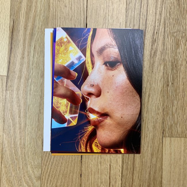
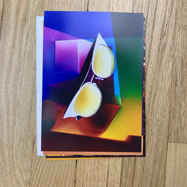
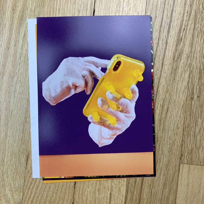
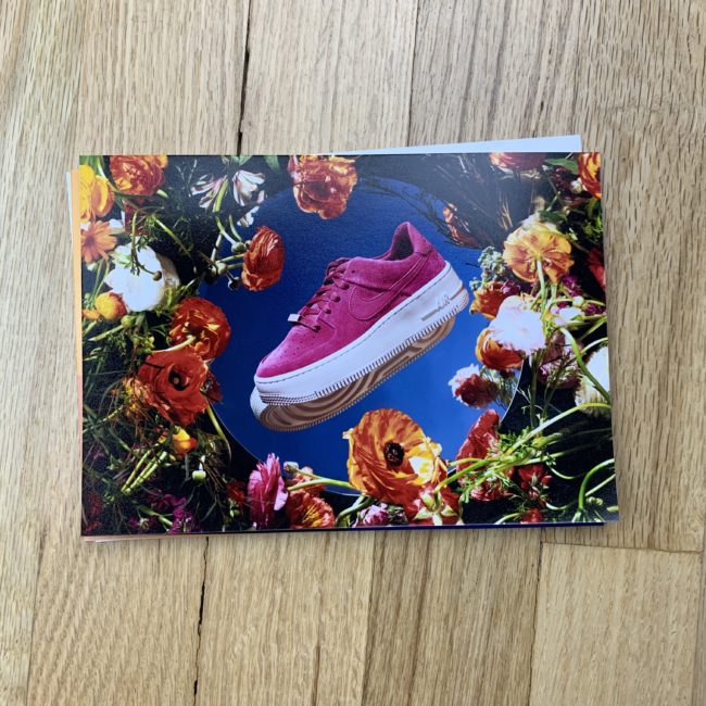
The Daily Edit – The New York Times Sunday Magazine: Jamie Chung

New York Times Sunday Magazine

Design Director: Gail Bichler
Director of Photography: Kathy Ryan
Photo Editor: Stacy Baker
Art Director: Matt Wiley
Deputy Art Director: Ben Grandgenett
Concept by: Declan Company/Pablo Declan
Props: Pink Sparrow
Photo Illustration: Jamie Chung

Heidi: How many people collaborated on this cover?
Jamie: The New York Times Magazine hired Pablo Delcan to concept the story. Then the prop make by the company Pink Sparrow. Then it was my turn to make Pablo’s sketches come to life. In addition to the camera work I also handled the retouch. New York times designer Ben Grandgenett came to set, we worked on tailoring the photography to meet his layout ideas. Photo Editor for the Times, Stacey Baker produced the project, overseeing the whole process.

Was the process long?
The entire project from concept to printed magazine happened super quick- one of the exciting things about a weekly magazine.

What was the most creative obstacle for the cover?
We shot the cover image with a variety of lighting scenarios and a various backgrounds. Ultimately we picked a clean, minimal treatment. We shot a stand in arm/ hand for placement and shadow, then the final robot hand was created in CG- I love it when the process and concept align.

How many options did you shoot?
For the cover image there was 14 options, but some of the variations were slight- like bottom jaw on/off, little rotations, background tones, etc.

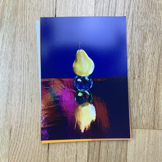
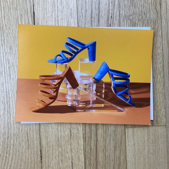
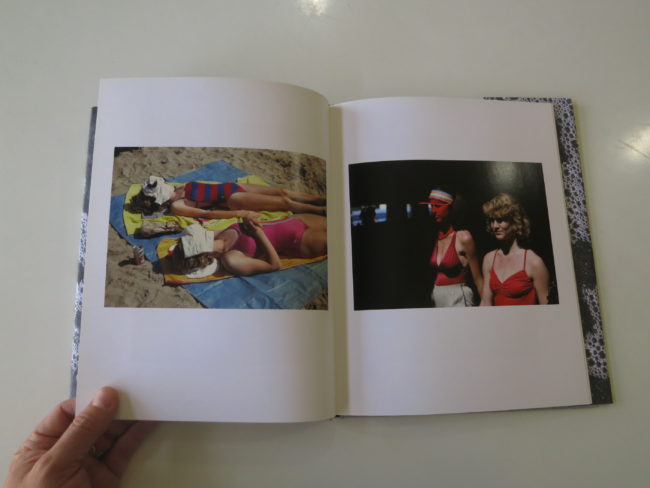
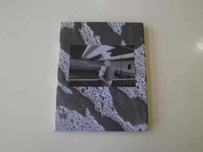
The Daily Promo – Hannele Lahti

Hannele Lahti

Who printed it?
smartpress.com

Who designed it?
David Labrozzi, my in-house designer/artist/husband, put it together. Nadia Hughes and Lori Franklin, from the Nat Geo Image Collection, helped me edit the images.

Tell me about the images?
The images are from my most recent personal project: The Office Dogs of Capitol Hill. The project came about after the 2016 election and my curiosity about culture on Capitol Hill. I’ve lived in DC for my entire career but never spent much time photographing politics. Since I specialize in animal photography, mainly dogs, this subject matter was a perfect fit and gave me access to Congressional offices. Everyone loves dogs, even politicians. The full project can be viewed here: https://www.adogphotographer.com/Projects/Political-Pups

How many did you make?
I made 100 copies and sent out 65. The rest I’ll hand out at portfolio reviews and client meetings. I keep my mailing list small and specific.

How many times a year do you send out promos?
I typically send out postcards 2-3 times a year and a more involved promo, like this booklet, once a year.

Do you think printed promos are effective for marketing your work?
I think they are an effective part of a marketing plan that also includes e-mails/newsletters, social media, and in-person meetings. It depends on who you are trying to reach.

The Best Work I Saw at the Medium Festival of Photography: Part 1


My kids are 6 and 11.

Right in that sweet spot where all the older people you meet say, “Cherish this time. It goes by so quickly.”

Seriously.
I’ve heard that a lot.

My wife and I are trying to appreciate it, but as my son told me the other day, (with respect to the natural beauty that surrounds him in Taos,) it’s hard not to take it for granted.

One thing I’ve discovered, one trick to make it last, is to try to make more memories.

To do it on purpose.

As a photographer, I’ll be honest, I don’t mean taking more pictures. (I might regret not doing more of that, I suppose, but whenever I have the camera out, I feel like I’m not living in the moment.)

Rather, traveling with my kids makes memories.

When we’re out of our natural environment, our senses sharpen, and we imprint more memories in the brain.

My wife and I realized that so much of our existence, living on the farm with the kids, was about the day to day. It was fun to go through, but not much stuck up in the cerebral cortex. (I’m guessing. It’s likely another part of the brain that stores memories, but I was lazy and didn’t bother to look it up.)

A couple of years ago, we made a conscious effort to plan more trips, even if it was staying overnight in a hotel in Albuquerque. (No offense, Burque.)

Visiting cousins in Colorado is an easy one, so we do it more.

Whether it was the Barbecue place we discovered off I-25 in Colorado City, (Shout out to Obies,) or the October blizzard on Theo’s birthday, or that great Thai joint we found in Boulder.

More experiences, more memories.

Along that line of thinking, for the first time ever, this past October, I had the idea to invite Jessie and the kids along on my trip to the Medium Festival of Photography in San Diego, and somehow we made it work at the very last minute. (Really cheap flights being the main reason.)

I’d already booked a rental car, and a hotel in ABQ to leave for an early flight, so it didn’t take much to make it work.

I did forget one minor detail though. (But we’ll get to that.)

This now the fourth time I visited Medium, at the Lafayette Hotel in North Park, and 5 years ago, it seemed like a transitional neighborhood. It’s inland, so it was less shiny than all the other parts of the city I’d seen.

In late 2018, though, there were gleaming-modernist-condo-projects everywhere, and a sparkling gentrification vibe that was unmissable. There were still some homeless people, as it’s a California-wide-problem I’ve written about many times before, but the overall impression is now of hip-trendy-neighborhood.

(For example, parking went from free to $5 to $10 to $18 per day.)

As I’ve said before, there are many excellent, affordable restaurants in the immediate vicinity, so if you visit Medium, you can eat very well on a budget. (Shout out to Mama’s Lebanese, Luigi’s pizza, and Bahia Tacos, all on El Cajon Blvd.)

Regarding my problem…I mentioned that I had it all planned out…but for some reason, I just assumed I’d get a room with two beds.

It was crucial to my delicate plan, yet I’d made no preparations at all.

So I checked in to the hotel, agreed to pay the parking, and just as I turned to leave, with my family smiling behind me, I casually asked, “The room has two beds, right?”

And I turned back to the front desk.

“No, sir, it doesn’t,” he said. “I’m afraid those rooms are booked.”

I stopped.
Crestfallen.
Downcast.
Uncertain.

“But, but, they’re here. My family. I’ve never brought them along to anything, ever. But this time I did. And I never thought to ask about the beds. How stupid of me. Can you please help?”

The young, Latino man behind the counter was handsome, and polite.

But there’s one key detail I may have left out.

His name was Jesus.

“Can you help me, Jesus,” I asked?

I swear.
I’m not making this up.

Jesus looked at me, with beneficent eyes and said, “Let me see what I can do.”

His hands flew across the keyboard, gracefully.

Tap. Tap. tap.
Tap. Tap. tap.

“Well, would you be OK with a family suite out by the pool? It’s all I have. No charge.”

“Thank, you, Jesus,” I said. “Thank you.”

And sure enough, there was a chalkboard on the wall for the kids to draw, two big rooms mere steps from the beautiful pool, (one with a bunk bed,) two bathrooms, two TV’s.

I’d say that Jesus was the nicest person in San Diego, but that might be an overstatement. Because there are so many nice people in San Diego, it would be hard to just pick one.

Honestly. They’re that nice.

As this is the first of two pieces about Medium, I’ll come right out and say it: San Diego might be the nicest place I’ve been in America.

The weather is great. The people are friendly. The beaches are gorgeous. The food is amazing. The views are spectacular. The traditional Mexican-American and other immigrant cultures are strong.

Honestly, if you set aside my general-California-critiques that I won’t reiterate here, there is nothing not to like about San Diego. (You could say traffic, sure, but the apps these days let you know what you’re in for, and suggest alternate routes, so even that is not quite so depressing as it used to be for me.)

In the end, I got my family memories, thank you very much. It all worked out just right.

(Normally I’d give you details, but I’m keeping those bits for myself.)

The point, rather, is that when we get out of our routine, out of our towns, and our regular lives, we enrich ourselves, and keep a more detailed record in our memory banks.

So as a New Year’s resolution, get out there and visit a festival in your local area in 2019!

Photo festivals like Medium are great places to make friends and create networking opportunities, to hear artist lectures and see exhibitions.

It’s a no brainer.

As usual, when I go to these events, I reviewed a slew of portfolios, and gave critical feedback when I was asked. Sometimes I might help photographers brainstorm about what to do with a project.

But I always write an article or two for you guys, so you can get a sense of what I’m seeing at the portfolio review table.

Which brings us to this part of the story, where I show you the best work I saw at the Medium Festival of Photography in October 2018.

As usual, the portfolios are in no particular order, and the projects ranges in style dramatically, which is always the most interesting thing of all.

Daniel Kariko is a professor at ECU in North Carolina, and was the first person I met, if my memory serves me. (It’s weird writing three months later, I must admit, but I’m good with the recall, and took solid notes.)

His images were made with electron microscopes, and zero in on the super-mega-pixel detail of insects faces. In light of news about the potential insect apocalypse, these pictures are important both as documents of a disappearing world, and visual reminders of why protecting the environment is important.

I was pleased to see Janet Holmes again, (we’d met at Filter in Chicago,) because I’d previewed her project “Rescued Chickens” in Critical Mass, and gave it the highest possible score. She featured vegan women who rescue chickens, and the chickens themselves.

As she writes, “How do you decide which animals are family, and which are food? Why are we surprised to see a rooster gazing out the kitchen window or a hen investigating the laundry? After all, chickens are present in most homes, as flesh and eggs, just not as individuals with personalities of their own.”

Really, I couldn’t love it more.

Mark Lipczynski, a commercial an editorial photographer, was visiting from Phoenix. I didn’t love one project he showed me, but as so often happens, I offered to look at his other series, because you never know.

When he emailed me a link to his pictures in the American West, I happily clicked through. The photos are witty and fun. What’s not to like?

Brian Van de Wetering is a SoCal artist I met at a previous review and published here before. (As I recall, he’s a part of the Aline Smithson mafia, and those students always marry strong craft with a personal intention.)

I didn’t review Brian’s work directly this time, but met him in the aisle during the portfolio walk, and he told me about his new project, in which he exposes photograms in direct sunlight.

The resulting images are scanned, and really, they’re just so beautiful. People think I’m a tough critic, and I guess that can be true. But I’m happy to enjoy visual objects for their own pleasure when they look like this.


Wayne Swanson did the double-double with me on the 2018 festival circuit, as we met at the Exposure review in LA in July, and I published a set of his images that were made with a pinhole polaroid. (I believe.)

This time, we got into something more personal. Wayne suffers from spinal stenosis, which I must admit has afflicted both of my parents. My Dad had 3 major spinal surgeries, including two fusions, and my Mom had a fusion surgery as well.

My uncle just underwent his second.

A lot of Baby Boomers have dealt with these structural problems, which can lead to debilitating pain, and affect lives deeply.

The pictures are dynamic.

And speaking of personal, big shout out to Christina Angarola Hsu, who had images of her triplet girls, in the years before two of them took extremely ill.

She only showed me photographs from a segment of their lives, and said she hadn’t been shooting for quite some time. I asked her if she had more, and if she’d consider shooting again, so we could see the girls now that they’re older, and thankfully healthy again.

Christina dug into her archive so I could show you this terrific selection today. Keep shooting, Christina! And I’ll bring you guys Part 2 next week.

The Art of the Personal Project: Donato DiCamillo


The Art of the Personal Project is a crucial element to let potential buyers see how you think creatively on your own.  I am drawn to personal projects that have an interesting vision or that show something I have never seen before.  In this thread, I’ll include a link to each personal project with the artist statement so you can see more of the project. Please note: This thread is not affiliated with any company; I’m just featuring projects that I find.  Please DO NOT send me your work.  I do not take submissions.

Today’s featured artist:  Donato DiCamillo

The Fringes

Like many of my photographs, these photos represent slices of humanity seemingly living without filters. In most cases they’ve become comfortable in what others may say are outside the norm.

To see more of this project, click here.


Born in Brooklyn New York, Donato Di Camillo is one son of three siblings born from Italian Immigrant Parents.

As a child Donato suffered behavioral problems with anger, he would soon be expelled from school at the age of sixteen for violence, then finding himself in and out of behavioral institutions and jails.

Ironically Donato became intensely interested in photography while serving out a federal prison sentence in Petersburg, MCI, Virginia

“I was always interested in magazines like National Geographic and LIFE. When I was a child I used to dream about being on adventures,

exploring, always fascinated about other cultures in different parts of the world”

Since his release in 2012 Donato taught himself to use a camera while being on home confinement. At first he photographed, bugs, plants or anything else within the 120ft of his home, which he was restricted to.

Donato was featured in multiple publications and news broadcasts around the world, such as, BBC, Washington Post, CBC, Huffington Post, and was invited to speak at the prestigious HEARST magazines annual summit.

Di Camillo continues to focus on people and plans to put out his first book late 2017. He currently resides in Staten Island, N.Y.

APE contributor Suzanne Sease currently works as a consultant for photographers and illustrators around the world. She has been involved in the photography and illustration industry since the mid 80s.  After establishing the art buying department at The Martin Agency, then working for Kaplan-Thaler, Capital One, Best Buy and numerous smaller agencies and companies, she decided to be a consultant in 1999. She has a new Twitter feed with helpful marketing information because she believes that marketing should be driven by brand and not by specialty.  Follow her at @SuzanneSeaseInstagram


Scam Alert: Fake Magazine Shoot (Departures, W, Others)

A new scam has been making the rounds with photographers. I’ve pasted the full text below so it will show up in searches. It follows scams in the past where they overpay then ask you to deposit the check then send part of the payment to other people or even return part as an accidental overpayment. It sounds like the scammer in this instance is posing as a producer and meeting up with photographers to collect the deposit for talent. The checks take a while to get rejected by your bank and so it’s too late by the time you’ve paid the producer or talent out of your own pocket. Be careful out there.

UPDATE: Here’s a picture of the check someone received:


UPDATE: Here’s the latest letter

From: Michael Beckert <beckertmichael65@gmail.com>
Date: January 24, 2019 at 5:13:56 AM EST
To: undisclosed recipients <beckertmichael65@gmail.com>
Subject: Inquiry for your photography services</beckertmichael65@gmail.com></beckertmichael65@gmail.com>

Hello,

I’m Michael, a fashion and lifestyle writer and editor at Wmagazine.com. I saw your profile on workbook.com which led me to some of your work online and after going through your portfolio, i would like to learn more about your services.

I am working on a new project for the new year and I’m compiling shots for www.wmagazine.com “fashion page” segment and would love to collaborate with an experienced photographer on genre such as beauty, vintage, art, lifestyle, and outdoor.

As the photographer on this project, you will concept, shoot, and produce 24 images, featuring 2 models. You will be required to work with a hair/makeup artist and a wardrobe stylist, and bring a smart, fun approach and distinct style.

Please check the link below for some samples of my previous work and the attached PDF for full job description and let me know if you find the project interesting and would like to know more.

https://www.wmagazine.com/gallery/suburbs-fashion-inspiration

https://www.wmagazine.com/gallery/chanel-metiers-dart-collection-new-york

Warm Regards

Michael Beckert

Hello,

I’m Jason, a fashion and lifestyle writer and editor at Departures.com. I saw your profile on workbook.com which led me to some of your work online and after going through your portfolio, i would like to learn more about your services.

I am working on a new project for the coming year and I’m compiling shots for www.departures.com “fashion page” segment and would love to collaborate with an experienced photographer on genre such as beauty, vintage, art, lifestyle, and outdoor.

As the photographer on this project, you will concept, shoot, and produce 24 images, featuring 2 models. You will be required to work with a hair/makeup artist and a wardrobe stylist, and bring a smart, fun approach and distinct style.

Please check the link below for some samples of my previous work and the attached PDF for full job description and let me know if you find the project interesting and would like to know more.

https://www.departures.com/fashion/style/stockholm-menswear

https://www.departures.com/fashion/kith-versace-nyfw

Warm Regards

Jason Sheeler

——————

Job Title: Freelance/Independent Photographer needed for a Fashion Shoot
Job Type: Contract/Freelance

Departures, one of the world’s fastest growing fashion and lifestyle media brands, is looking for a professional model/fashion photographer to produce an independent outdoor/indoor fashion photo shoot for the magazine’s fashion and style contents (web, Facebook, Instagram, and YouTube). The Photographer will shoot with our wardrobe stylist, two models and H/MUA. To be considered you should be experienced on genres such as beauty, fashion, portrait, vintage, art,
lifestyle, and outdoor.

Job details:
1. You will be required to work with 2 models (male & female), H/MUA and a wardrobe stylist.
2. There will be 3 outfits per model, 4 images for each model and outfit, which totals 24 images
3. Outfits/Wardrobe will be supplied by us
4. Shoot budget: $6,400
5. Photographer’s compensation: $2,300 ($800 upfront; and $1,500 balance payment).
6. Talents’ compensation: $4,100
7. You will hold full image right (Licensor)
8. Images will be posted as an editorial content on www.departures.com for 12 months

Deliverables:
1. We want 24 professionally taken pictures in High Res Digital Copies
2. Editorial Web Large images: 1080p
3. Image type: JPG
4. Transfer method: Fileshare or Dropbox
5. Images delivery deadline: January 15th, 2019.

Responsibilities:
1. Photograph six to eight hours outdoor fashion shoot
2. Produce focused images for use online.
3. You will evaluate and pick your Location, date, and shoot time
4. All editing/post production will be handled by photographer (little retouching)
5. After the shoot, photographer will upload the top 30-35 photos for the client to choose from
6. Contact and work with a recommended talents’ agent for the shoot

As the photographer we want you to handle other aspect of the gig and dictate the creative direction.

If this seems like a project you would like to work on, please reply for more details.

The Daily Edit – Variety: Art Streiber


Variety

Creative Director: Robert Festino
Photo Director: Jennifer Dorn
Deputy Design Director: Jennie Chang
Managing Art Director: Cheyne Gateley
Photographer: Art Streiber

Heidi: Were you star struck?
Art: Going in, I was a bit concerned about Gaga’s star power and how that might manifest itself; we were shooting in her garage, on her terms, and I really didn’t know which way the shoot would go.

But from the second she introduced herself (hours before we started working) wearing sweats and no makeup, I was immediately put at ease.  She was phenomenally collaborative and as she perched and balanced on a 4-foot wooden stool wearing 4-inch stilettos, her team said nothing…allowing her to move, pose and perform for the camera.

What stood out for you for this shoot?
This shoot is really an excellent example of the power of editorial photography and how great imagery can result from just one light, a backdrop and an endlessly giving subject. It’s so easy for us to get sucked into a “more is more” workflow and I have to remind myself that sometimes, all you need is one light…and no fill.

Did you always see it in black and white?
Yes…I always saw this in black and white.  And after taking to her about how she wanted to approach the shoot, stripped down, simple and unadorned, it confirmed my feeling that rendering the images in black and white was the right thing to do.

What was the conversation on set about?
After Gaga stepped onto the backdrop, it was really all about the photos.  Our give and take was effortless; she’d lead and I’d make suggestions, then I’d direct and she’d tweak my direction.  Then she’d make a move and I’d ask her to adjust.  Over the course of our shoot she took two breaks to take a look at the monitor, review what we’d accomplished, and improve on what she’d done.

You have an enormous body of celebrity work, what made this one different?
What made this shoot different and unique was how Gaga performed for the camera, how much she gave, and how she continued to push and explore for 40 straight minutes. The bottom line is that Gaga cared about making great photos.

How did the concept for the shoot come about?
Two weeks earlier, we had photographed Bradley Cooper, his DP, Costume Designer, Production Designer and his Editor, and we were supposed to have photographed Gaga with that group…but she was sick and didn’t make it. We photographed Cooper and his team on a Schmidli backdrop, in black and white with a single light source. Creative Director Robert Festino, Photo Director Jennifer Dorn and I were going for a 70’s-rock-band-group-shot look…a la Fleetwood Mac. So…we had the “one light on a grey backdrop” look in our back pocket two weeks later when we were set to photograph Gaga.
We arrived at her house in Malibu, not really knowing what direction the shoot would take.  Variety was featuring her on the cover and I thought we had to go “big” and “glam”.   We walked the property and considered photographing her with one of her horses. But ultimately we landed on just sticking with the backdrop and it was Gaga who suggested that she just wear one of the shirts that Bradley Cooper wears in the movie…and a pair of knee-high stilettos.

Did you feel you were shooting her character or her?
No question…I was photographing Gaga, but I was photographing that day’s incarnation of Gaga.  My feeling is that her character in the movie is as close to “Stephanie” as she gets when she’s in front of a camera.  When she’s photographed, she takes on a version of her persona; she decides what she wants to wear and how she wants her hair and makeup done…and that’s it. About 25 minutes into the shoot, after looking at a few images on the monitor, she turned to everyone and said, “I’m going to go get a hat…I’ll be right back.”  She returned with a black bolero which she used as the perfect exclamation point to the rest of her outfit.

Tell us put the image with her finger on her nose.
Another collaboration.  I asked her to go into a profile and once there, she very slowly ran her index finger down the length of her nose.  All I could do was try to keep up.

How much time did you have?
We were told we had an hour with her…but after 20 minutes we had an incredible array of imagery…and we kept going for another 20 minutes.  And from 1438 frames I turned in 99 First Selects.


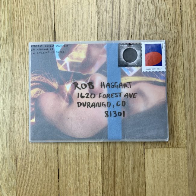
The Daily Promo – Rob Daly

Rob Daly

Who printed it?
I researched quite a bit and decided on Mixam, an online service. It was fast, affordable, and I am quite happy with the quality.

Who designed it?
Myself and my assistant, Art Davison, designed it in Photoshop and InDesign.

Tell me about the images?
This particular promo was created with the specific intention of sending to photo reps and advertising agencies. I’m actively looking for a new agent, so this is a good opportunity to share some current athletic and fashion campaigns that I feel is a good representation of how I shoot fashion, movement and portraiture with an editorial and advertising direction.

This selection of images has an element of restraint and ease, yet are also dynamic and explosive. I wanted to include both studio and location work, with clean technical proficiency and strong compositional value. When I look at this collection, I first and foremost feel so grateful for the incredible individuals I get to work with that give so much of themselves, as well as the talented teams I’ve had the honor to work alongside. However, I also feel I have already grown so much, that these images represent the starting point for what I do next. My intention is to create timeless, unique imagery, while continually pushing myself to go beyond my comfort zone.

I find the shoots that are most satisfying are those where I shoot for the client, but honor my journey as a photographer and push the limits that ultimately create growth as both a photographer and an individual. It’s easy to get caught in the act of comparison with thousands of images thrust upon us every day. As photographers, I feel one of the most important things is to respect your unique journey and find your own vision… because at the end of the day, do you just want to create some pretty pictures or do you want explore what is unique to you and only you?

How many did you make?
I started out with 50, mailing some and hand delivering most of them myself when I was shooting in NY.

How many times a year do you send out promos?
To be honest, this is one of the first ones in a long time. I am guilty of being a perfectionist, which tends to delay things like this promo getting out the door. I am acutely aware of how it holds me back and is something I want to work on.

Do you think printed promos are effective for marketing your work?
I absolutely believe so. Anyone taking a break from their screens and looking at beautiful, tangible imagery has to get noticed. I have gotten a lot of great feedback from this particular promo. I also think so much is learned from the simple act of creating the promo. You are forced to objectively look at your portfolio, identify what you feel are the best images for the purpose, which often brings light to what your portfolio is missing, where improvements can be made and most importantly, what direction you want to work towards.

This Week in Photography Books: Josée Schryer


It was 9 degrees below zero here this morning. (Fahrenheit, for all you non-Americans.)

That’s insanely cold.

An army of icicles hangs off my roof, each a menacing, translucent dagger that could impale a person without trying too hard.

In other words, winter has arrived in earnest here in the Rocky Mountains.

Ironically, our weather patterns have little to do with what happens in our part of the Great American West. Our mountains, rivers, ravens, cougars, and humans have nothing to do with it at all.

Rather, the temperature of ocean water in the Pacific, thousands of miles away, determines whether it snows like crazy, as it is this year, or nothing drops from the sky at all.

They call it white gold, the snow, since it brings money to town, as Taos Ski Valley remains the heart of our winter economy. (Such as it is.)

In El Niño years, like this one, massive, regular storms march across Southern California and Arizona, on a direct line East, and crush us with waves of delicious, champagne powder.

Every time.

But last year, just 12 months ago, our December was marked by a string of 50-55 degree days, with their attendant purple-blue skies, and massive amounts of unchecked sunshine.

It didn’t snow at all, and had Taos Ski Valley not been bought by a hedge fund billionaire 5 years ago, the entire resort might have gone out of business.

Things were that bad.

As you might have guessed, we did not have an El Niño pattern last season.

Quite the opposite.

It was La Niña, which pushes all moisture directly up the West coast, into Washington and Montana.

When they get all the moisture, we get none.

From that standpoint, selfishly, La Niña is quite a nasty, unforgiving little girl. (That’s what it means in Spanish: little girl. I’m not being sexist.)

Young girls grow up tough around here, as they have little choice. Life in the Sangre de Cristos, with its raw nature, poor economy, and capricious weather patterns, is not easy at all.

If you don’t grow up strong out here, really bad things can happen. (No examples today, but after 7+ years of this column, I think you know I don’t exaggerate.)

Just yesterday, on the mountain, I took my daughter up the big hill for the first time, as she’d stuck to the bunny slope so far in her short ski career.

Coincidentally, an acquaintance had her young daughter there as well, also for her first-ever-run, and we bumped into each other exactly as the girls were beginning their adventure. (Again, such coincidences happen here so often that most Taoseños will just say it was “meant to be,” or that Taos Mountain must have interceded.)

At one point, Autumn, (who’s 4,) was in the lead, and she wiped out with Amelie right behind her. My 6-year-old tumbled directly over the smaller girl, launching into the air, with her skis flying skyward as she descended right onto her head.

We adults were only 50 yards behind, and rushed to the scene of the accident, as it was ugly, and the tears were likely flying faster than an Elon-Musk-designed spaceship.

It did not look good.

But the second we arrived, we saw the girls smiling and laughing, ready to jolt up like a Pop-Tart coming out of an old-school vertical toaster.

No tears.
No drama.

Just a couple of hardened mountain sprites ready for more, giving the pain of the accident no more consideration than Jon Jones might worry about a scratch on his finger.

Like I said, they grow them tough out here, and as an avowed feminist, I take great pleasure in knowing that my beautiful, honey-haired daughter has an iron constitution.

I think it’s something of a universal phenomenon in harsh, cold, difficult places.

Girls who hunt with bows and arrows, chop wood with axes, ski off of cliffs, and learn jiu-jitsu to kick some serious ass. (In fairness, Autumn’s mother grew up a mountain girl in Vermont, and recently sermonized on the proper way to gut, skin and hang a deer carcass.)

If 2018 was the year of #MeToo, where women came out in droves to challenge traditional narratives of male dominance, perhaps 2019 can move the ball down the field a bit further?

Perhaps it’s the year to celebrate the idea of equality, in which men and women can appreciate each other’s strengths and differences, while simultaneously accepting that neither gender is better or worse than the other?

That strength, which historically was associated with men, is of course the equal purview of women.

As is wisdom, intelligence, compassion, and ambition.

I know it seems like this column was generated by the weather, and the obvious status as “first column of the year,” but that’s not entirely true.

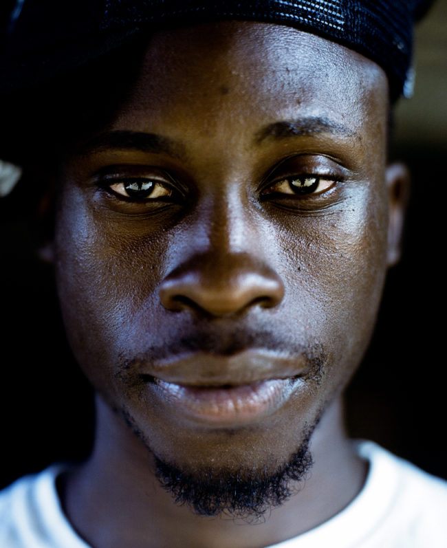
Rather, I was inspired by “sur-la-Rouge,” a photo book that turned up in the mail this autumn by Jo Schryer, from Montreal, published by Peperoni Books in Germany.

In a parallel universe, my “Blame Canada” opening last month was really meant for this book, as it’s the first Canadian offering I’ve reviewed in quite some time. Many years ago, in this very column, I actually shared a story about a couple of Canadian photojournalists I met who were discussing the taste qualities of eating bobcat versus other types of bushmeat.

Like I said, they grow them tough up there.

No question.

Canada, as you might know, is north of the US. Meaning no matter how cold it might be in Maine, Montana, or Minnesota, those Canadians have it worse.

It’s a massive landmass, smaller only than Russia, yet is populated by just 36 million people. (Thanks, Google.)

This book, thankfully, gives us an insight into life in the rural Quebec countryside. (I’m assuming, as there’s little text within.)

Unlike some books, which really need context, the imagery in this one, its pacing, and variation, seem to tell us what we need to know.

Unless I’m wrong, (which does happen from time to time,) it’s a visual narrative about Ms. Schryer’s world up there.

We see bright orange clothing, (associated with hunting,) and lots of bleak fall/winter light. Gold panners, and dead deer. Fallen leaves, and bleak horizons.

It’s all done in a poetic style that enticed me to look through it three times before writing, which is a rarity. (The subdued palette a reminder that quiet colors are not the same as no colors.)

Several times we see a young girl, posing with her eyes closed. Rather than hiding from the camera, though, we get the sense she’s self-possessed enough to serenely share herself with the viewer, denying eye contact to ruminate, rather than run from our attention.

At one point, we see her with a rifle in her hands, ready to shoot an apple off of a cart, where it will likely drop into a big pile of previously shot-up fruit. (They must have a lot of apples if they’d rather shoot them than bake them into pies, or cook them down into applesauce.)

Wooden cabins feature bear skins on the wall, “tacky” paintings of mallard ducks proliferate, and at one point we see an older man who may be the artist’s father.

Just last week, I admitted we often assume too much in a photo book narrative, and in art in general. But this story feels pretty straight, and honest.

Compared to Clare Benson’s “The Shepherd’s Daughter,” which I reviewed last year, I get the sense this is fine-art-documentary photography, rather than set-up situations dripping with metaphor.

My high school French came in handy, as the only text is a brief statement printed towards the end: “a mon pere, je regrette d’être partie aussi longtemps…” which is later translated for the rest of you to mean “To my father, I’m sorry I’ve been gone so long.”

Frankly, I don’t have any criticisms of this book at all.

I like it just the way it is.

But rather than start the year off with kudos only, I’ll stay on-brand and at least offer a tad of constructive feedback.

The credits page tells us that Ms. Schryer is another graduate of the now-famous Hartford low-residency MFA program. I’ve reviewed several books that have come out of there in the last couple of years, and seen even more than I’ve written about.

Always, the students thank their faculty members, including our APE friend/colleague Jörg Colberg, along with photo-world stars Alec Soth and Doug DuBois, and program head Robert Lyons, whom I’ve not met, but have heard good things about.

These days, I even make fun of their consistent aesthetic, (always the medium/large-format cultural landscape,) as I did in the “True Places” review late last year. The school has come on strong in a short time, and its students regularly get photo-books from the biggest publishers just as they graduate, including MACK, Twin Palms, and Dewi Lewis.

I doubt any of their professors are reading this, but JIC, let me make a small plea to broaden the student aesthetic just a touch. With the prominence the students are finding at young ages, it’s becoming a mini-Yale; another pipeline to success, and in my opinion, that type of acclaim ought to be accompanied by a bit more innovation, or at least differentiation between the students’ styles.

But that’s no fault of Ms. Schryer, who’s made a great book here, one I’m happy to share on this, the first review of 2019.

I wish you all a healthy, happy, and productive new year, and hope you’ll keep reading each week, because you can be sure I’ll keep writing.

Bottom Line: Beautiful, lyrical tale of life in the Canadian woods

To purchase “sur-la-Rouge” click here 
If you’d like to submit a book for potential review, please email me at jonathanblaustein@gmail.com. We currently have a several month backlog, and are particularly interested in submissions from female photographers so we may maintain a balanced program.

This Week in Photography Books: Griggs & Kwiatkowski


Everything is connected.

I believe that’s true.

I often write of my Jewish-American heritage, but like many American Jews, I’m quite taken with Buddhism. And that idea of Inter-being, or Interconnectedness, is a core tenet of Buddhist philosophy.

Growing up in the age of secular Enlightenment, it’s been hard for me to accept the pure faith that religion requires. Especially as a Jew who doesn’t keep Kosher, or dress like one of the Orthodox in a black suit, I never felt like I measured up to the expectations and requirements of my tribe.

So perhaps I took the easy way out, by migrating my status to Jew-Bu, but on the plus side, I do come by it honestly. My wife almost became a Buddhist Nun before she married me, studying under Thich Nhat Hanh at a monastery in France.

Beyond that even, I’ve had the privilege to marvel at many, many a fantastic Buddha and Bodhisattva statue in museums like the Met or the Art Institute of Chicago, so I know first hand the peaceful power that comes off these objects.

And the Kung Fu I study is also based upon a mix of Taoist and Buddhist concepts.

OK. Did I establish my bona fides?

Or did I come off like an insecure jerk who’s obviously sensitive to be seen as just another-hipster-slacker, embracing the trendy ideas of the moment?

(We’ll assume you chose the former, and continue.)

The idea of Interconnectedness is like viewing the human body from a different perspective. We live our lives on the level of a shared, 3 dimensional reality of chairs and doors and mountains.

But in our very bodies, we know that a cellular level exists. It’s something they told all of us in High School Biology.

Mitochondria and shit.

Beyond that, of course, when we move to the code below the chemical level, is the atomic level. Our bodies are made of up electrons and neutrons and protons.

They taught us that in Physics. (Shout out to Mr. Armitrani.)

If you pinch your own arm, (ouch, I actually did it,) you feel pain. Yet you have no idea what your electrons and protons are doing, nor have you or will you ever see a strand of your own DNA.

Humans are like that.

Individually, we’re atomized. We live our own lives, as the protagonist in our own tale, and think these things happen only to us. (Credit card debt, friend loss, petty jealousy, etc.)

These days in particular, it’s each to his or her own clan, tribe, race or ethnic group, in so many ways.

But collectively, as a human race, we impact the planet, (writ large,) and each other, on an individual level. I know I’ve shouted out the Dalai Lama’s Twitter feed before, but really, you should be following this guy. (Is it OK to call him a guy, or a dude? Or is that too callous?)

Daily, he reminds us that our individual energy, positive or negative, impacts others each day. If we’re angry or rude to others, it spirals as each victim of our wrath spreads the energy further out into the world.

Or, conversely, if you’re kind, respectful, and generous to others, they spread that good juju down the line as well.

I know this can sound New Age, so either bear with me, or skip to the photos. (My Dad nods, smiles, and then skips to the photos.)

Religions are really operating systems for reality, when they’re taken literally. Whether it’s about worshipping thousands of deities, as the Hindus do, or a human-like god who sits on a Greek mountain-top, humans have always known that our actions have consequences.

In antiquity, they looked to the heavens, or asked oracles and sages for signs.

For confirmation of these connections.

Patterns.
Symbols.
Invisible webs littered with meaning.

Even our planet, which seems like everything, is only one of billions; our Sun one among countless stars.

Our Universe, even, might just be one unremarkable unit out of the multitude.

Why am I going all philosophical today?

Did I just finish explaining the Big Bang to a six year old, who then asked me what was the Nothing that came before?

Yes, I did.

But really, I’m more motivated by “Ghost Guessed,” an excellent photobook that showed up this summer, by Tom Griggs and Paul Kwiatkowski, published by Mesaestander Editores.

I’m rarely troubled to synopsize for you, but this one’s a bit dense, so I’ll give it a go, and we’ll see how it works.

I believe Tom Griggs, (but I can’t be sure, as it’s a collaborative project,) had a cousin Andy who died in a small plane crash in Northern Minnesota in 2009.

(I think this because on one of the first pages, Sue Griggs sends and email with respect to the search, as the plane was not immediately found in such a massive open landscape.)

The story is told through some particularly excellent writing, and then a barrage of different styles of images from different types of capture. But it’s connected throughout to the amorphous link between the disappearance of Andy’s flight, and the lost Malaysian Airlines flight 370, as one of the artists (seemingly) went to Malaysia just after the plane vanished from the face of the earth.

It’s tricky for me, as I assume because of that email that this is Tom Griggs’ story, his life, because that’s what the book implies. (Or does each photographer add bits from his own experience?) But really, even looking at the back cover right now, there’s no confirmation who’s life this is, or even if it’s real at all.

They make mention of the fact that the flight Vlad Putin’s goons brought down in Ukraine was also Malaysian Airlines, which seems like an impossible coincidence.

And the book wonders if one person’s disappearance and death can set off a negative spiral in someone else entirely?

Watching night-vision war in Iraq for the first time on TV, hiding from reality in flight simulators, or learning about a grandpa who was bitter all his life that he got sick from meningitis, in an outbreak that killed 600 of 800 soldiers, so he could never fulfill his dream of becoming a fighter pilot.

The details weave together, and then spread apart again, like a raven’s wings. (OMG, flipping through the pages just now, I noticed a small plane named Crazy Horse, thereby referencing Native American history as well.)

It bugs me a bit that I want to ascribe these things and stories as real, but I can’t.

Should it matter?

The book’s title comes from a poem, included late on, and all the text is printed in Spanish throughout as well. I know Tom’s based in Colombia, and I previously reviewed another of his books that included both languages, so I’m not surprised.

But I must say, doubling the potential audience that can actually read a text-heavy book is a pretty smart idea.

Overall, it’s an excellent project. The design, structure, photography, and text are all standout, and help the book forge an emotional connection with viewer.

Assuming there was an Andy Lindberg, who crashed on a foggy night, despite having texted that the weather was gorgeous, I hope he’s at peace up there somewhere.

Happy New Year, and see you in 2019.

Bottom Line: Excellent, possibly diaristic book about a plane crash

To purchase “Ghost Guessed” click here
If you’d like to submit a book for potential review, please email me at jonathanblaustein@gmail.com. We currently have a several month backlog, and are particularly interested in submissions from female photographers so we may maintain a balanced program.

This Week in Photography Books: Paris Visone


I haven’t spent much time in Massachusetts.
It’s true.

Sure, I went there once or twice as a kid.

Saw the Faneuil Hall. Probably ate some clam chowder. Went to a Red Sox game.

But that was so long ago I barely remember it.

There’s lots of red brick in Boston, right?

I visited Northampton a few times when my wife was in graduate school, but even that was 20 years ago. And Northampton is its own little enclave, like Los Alamos in New Mexico.

Most of what I know of Massachusetts comes from popular culture, I must say.

Movies, mainly.

There’s a particular type of Massachusetts lowlife that you see on screen, again and again, and I’ve heard that damn accent so many times that it’s embedded more deeply in my brain than my aversion to coleslaw. (Or mayonnaise in general.)

Whether it’s Ben Affleck’s bank-robber-buddies in “The Town,” Johnny Depp playing Whitey Bulger in “Black Mass,” Sean Penn and friends in “Mystic River,” Jack Nicholson, Leo and Matt Damon in “The Departed,” Ben again with Matt and his Southie pals in “Good Will Hunting” or Casey Affleck in another of Ben’s directed films, “Gone Baby Gone.”

(I realize the list is Affleck-heavy. Clearly, much of what I know of lower-class white Massachusetts, and the Boston area in particular, comes through a very Affleckian lens.)

But that vision, of the heavy accent, the caricature, it’s out there.

Even my very-Jewish cousin Jeff, who’s from New Jersey, lived in NYC for two decades, and moved to Boulder a few years ago, can do a passable version of the Southie.

He said he learned it on “Ray Donovan,” another TV version of the Boston lowlife stereotype. (This time with Liev Schreiber and Jon Voight doing the accent work.)

I admit, I caught several episodes of “Ray Donovan” a few years ago, on a free Showtime marathon, and the actress who plays Schrieber’s wife, the Irishwoman Paula Malcomson, must have a slot in the lowlife TV Hall of Fame, having also had roles in “Deadwood” and “Sons of Anarchy.”

Quite the violent trilogy she’s got going there. I bet if they did a body-count-total on all three shows, it would exceed the population of a migrant-children’s-lockup in Trump’s America.

(To be clear, Paula Malcomson is probably a very nice lady. I doubt she’s been typecast as a criminal or a prostitute for any reason.)

But knowing what I know of poverty and violence here in Taos, the condition is definitely intergenerational, and often family or kin-network-based. (Gangs often being based on those self-same networks.)

There’s definitely bad blood out there, and it can sometimes express itself across a clan.

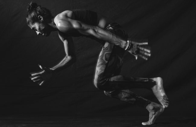
That’s what I began thinking about, anyway, as I put down “For Real,” a new photo book by Paris Visone, recently published by Peanut Press.

I swear, there’s never an intended connection between reviews, no pre-planned themes, but this book falls into a similar category to “Born,” from two weeks back, in that it feels right on the edge of what I’ll review here.

(Ultimately, the biggest criteria is, does it make me write, and here we are, with me writing, so there you go.)

The book opens with a screen-grab-facebook-message introduction from artist Cig Harvey, offering both praise and an odd character reference for Ms. Visone. (Apparently, she gave her fellow students the middle finger a lot.)

Then it’s on to the pictures, and like many books, there are maybe a few too many. The compositions are occasionally rough, with odd cuts, but it adds to the raw style. After a minute or so thinking on it, I decided the edgy-style was cool, and worked with the subject matter.

As each image is titled, and characters repeat, we suss out that the people seem to be the artist’s extended family, in Massachusetts.

One set of grandparents seems kind of normal, like regular old people, and the other, well, seems a fair-bit-different.

Her other Papa weighs 300 lbs, easy, and is all tatted out to boot. In one image, (I had to go back to double-check,) he also wears a blonde wig.

There’s a dyed-blonde cousin, or sister, who repeats named Paige. And others too.

At first, it seems like the narrative is centered around these folks in MA, but then odd destinations begin to pop up, like Russia or Amsterdam.

More and more characters are added to the story, and it becomes hard to keep track, beyond Papa’s huge belly.

I know my opening focused on criminality, and I must say, there no sign of it here. It’s not fair to call these people lowlives, like the fictional folks I referenced earlier. But lots of tattoo parlors, junk food, some drinking, and bikinis. It’s like a less charged version of the stereotype on TV.

Something more down to earth.
Something more real.

There are some great details, like the picture shot from behind a chihuahua’s butt, or the double-page spread where big Papa points a gun then aimed at little Papa.

When finally Dad makes an appearance, it is behind a car’s window glass, he wears sunglasses, looking menacing, like Anthony LaPaglia in some thug role.

Ultimately, we learn that the travel photos are related to a tour by the band Limp Bizkit, but I never figured out who was in the band.

Or why it was included. Probably her cousin or brother is involved? Maybe Wes is a dancer?

I know I’m hard on books, in the sense that I have high expectations.

Why not, right? I mean, this is a criticism column. We talk about the good and the bad.

I liked the photographs here, but felt like they weren’t quite out-there enough to be shocking, given all the things we’ve seen before.

But still, no knocking them.

Rather, my issue was I couldn’t figure out who was connected to whom and how, and why entirely I was supposed to care?

The photos are made over 10 years or so, and kids age, which is always nice. And again, it’s hard to knock a book of good photos that holds my attention and keeps me guessing.

That works.

But most books will then use end text, or some form of additional context to answer those questions. To make the cause of the tension, or the roots of the intention, known.

That was what was lacking in “For Real,” if we’re keeping it real.

Here we are though. It was worth reviewing, because I just reviewed it, and I liked it enough to recommend it.

More than anything, it makes me think it’s time to see Massachusetts for myself.

Go Sawx.

Bottom Line: A weird, fun and inscrutable family drama

To purchase “For Real” click here
If you’d like to submit a book for potential review, please email me at jonathanblaustein@gmail.com. We currently have a several month backlog, and are particularly interested in submissions from female photographers so we may maintain a balanced program.

The Art of the Personal Project: Nate Bressler

The Art of the Personal Project is a crucial element to let potential buyers see how you think creatively on your own.  I am drawn to personal projects that have an interesting vision or that show something I have never seen before.  In this thread, I’ll include a link to each personal project with the artist statement so you can see more of the project. Please note: This thread is not affiliated with any company; I’m just featuring projects that I find.  Please DO NOT send me your work.  I do not take submissions.

Today’s featured artist:  Nate Bressler

Between the fire lines~

With a fake press pass in hand, I made my rounds through town, gathering tools from friends, a water pump from the hardware store, enough Gjusta bread to feed a small Army and a small generator to bring the power needed. There are three major checkpoints between Venice Beach and the headland where the brave few stayed behind to fight the fire on their own. I’ve been through plenty of tornadoes and hurricanes in my life so there must be something I can do. All my adventure gear and camper were up in flames, along w so many of my surf and horse family homes, turning the mega fire into one of those nothing to lose but everything to gain situations.

As the fire raged on through the remaining drought stricken canyons, distress calls and rumors of starving animals cut off by the blaze made their way to our crew of unlikely hot shots. With thousands of horses throughout the windy canyons and a fire that moved like no other, many animals were left behind with no help able to get through. Luckily for them, a 250 gallon tank I commandeered from Larry Thorne’s farm, hay bails from anywhere I could find them and hoses that were brought in by boat with the rest of our gear needed to whoop this fire. The nights were spent driving the streets in groups of four, looking for flare ups that could possibly get out of hand and threaten the unburned houses. That left my days free to tend to the animals and distressed natives like Bonnie Decker who’s grandfather settled Decker canyon over 100 years ago. These fires were nothing new to a family that came out west in the 1860’s, when ranches covered the coastline and the PCH was nothing more than a couple of dirt ruts. Bonnie’s mom Millie had both the kids at the ranch house, all while keeping the 60 bee hives, feeding chickens and training horses to go along with all her daily chores. Even just shy of 100, Millie tried to stick this hell of a fire out but this was the biggest one yet and it would be just too much to handle. So to the nursing home she’ll go for safety as Bonnie and her married ranch hands fought to save what of the homestead they could defend with hoses, holding their livestock in turnout that they hoped to be safe. They took a gamble that day and lost a home, tack shed and most the corrals. “Of course moms place with all the clutter survived and mine burned down” Bonnie said as she sifted through her grandpa’s charred tack. Grateful to all be alive and with no shortage of spirit she had a lot to be thankful for. All her animals had survived in a canyon where so much had been lost in a community that suffered its biggest fire in history and a mass shooting at a country bar all within a day and a half. We know the rebuilding wouldn’t be easy but not much on a ranch is and if not for this settled chaparral landscape’s toughness…

the human spirit would’ve burned out a long time ago.

Here, my truck, Brutus delivers water, feed and insulin to the Decker’s ranch as the next canyon over burns in a matter of hours.

Bonnie Decker

To see more of this project, click here.

APE contributor Suzanne Sease currently works as a consultant for photographers and illustrators around the world. She has been involved in the photography and illustration industry since the mid 80s.  After establishing the art buying department at The Martin Agency, then working for Kaplan-Thaler, Capital One, Best Buy and numerous smaller agencies and companies, she decided to be a consultant in 1999. She has a new Twitter feed with helpful marketing information because she believes that marketing should be driven by brand and not by specialty.  Follow her at @SuzanneSeaseInstagram


Marketing: Is LinkedIn the new Facebook?

Is LinkedIn becoming the new Facebook?

When I asked Kelly O’Keefe, brand expert and partner of Brand Federation about LinkedIn (LI) becoming the new Facebook (FB), his concern was how will LI be able to control the quality of the content people are posting.  A recent New York Times article notes that Sandburg and Zuckerburg were so hell bent on growth that they ignored signs in their product being infiltrated by Russians to effect the 2016 election.  More professionals are moving away from FB to LI so now it is crucial for LI to control content so as not to fall in to the same predicament as FB.

I have noticed more articles and versions of e-promos being posted on LI since email promos are usually being deleted or unsubscribed. Facebook is full of either uplifting stories or political articles and concerns, so it seems as if LinkedIn is the place to show your professional talents.  But to what extent should you continue promote your work without folks disconnecting from you? How do you strike the balance and how do you connect to your market in a professional way?

I did a survey to Art Producers and asked them if they thought a photographer using the LI platform to market.  The majority said that is not how they use LI. It would be acceptable if they saw work from photographers they knew and had worked with but not random connection requests.  And to be honest, I agree with them. If I have never worked with you and don’t know your work ethic, I am not going to connect with you in an effort to protect those who I have worked with in the past.  My LI account is strictly for business. For assistance, I post the Art of the Personal Project on my LI account.  I enjoy seeing my business connections showing great campaigns they have worked on but not work they shot to direct me to their website.

When I see recent portfolio shoots on LI, I noticed vague hash-tags so I reached out to Heather Lefort to explain how to use LinkedIn professionally.  Heather owns iHeartmrktg to help photographers keep up with their marketing and the best ways to do it. “The LinkedIn algorithm is far more superior to FB or IG. When they launched in 2003 their purpose was to connect people professionally via resumes, networking and professional talents. Their growth rate (https://ourstory.linkedin.com/) has exceeded the levels of FB and IG and is expected to grow faster in 2019! Relevance, credibility, followers and connections play a huge part in the LI algorithm. So, it’s clear that you should be growing your personal or business audience (or both) on LI. The algorithm and tools allow you to tailor your feed accordingly. But be careful of spammy posts as the feed have precise rating tools based on the relevancy of your posts and other people’s preferences. In other words ask yourself these 3 check questions before posting:

  1. Am I over-posting?
  2. Will People in my network care about this post?
  3. Is my post relevant to others’ professional lives?

All of the posts on LI pass through a computerized virality check and a human check which is part of the uniqueness. These parameters determine: how you engage others as a poster and the quality of your personal network. This is the stage where your posts can potentially rank into the “Top” posts. Understanding the content checklist that LI craves is a great start to make sure your posting quality, useful information! “

LinkedIn is a professional business platform and it should be used as such.  The people I have surveyed all agreed-it should be used to showcase your work professionally, but personal posts should be posted on Facebook.


APE contributor Suzanne Sease currently works as a consultant for photographers and illustrators around the world. She has been involved in the photography and illustration industry since the mid 80s.  After establishing the art buying department at The Martin Agency, then working for Kaplan-Thaler, Capital One, Best Buy and numerous smaller agencies and companies, she decided to be a consultant in 1999. She has a new Twitter feed with helpful marketing information because she believes that marketing should be driven by brand and not by specialty.  Follow her at @SuzanneSeaseInstagram

With over 18 years of expertise, a love of marketing, and compassion for businesses Heather Lefort opened iHeart Marketing. Her years of sales and marketing experience allowed her to bring her personal services to business owners with a one-on-one strategy. Leading iHeart Marketing with the highest level of integrity she assists businesses in achieving all of their marketing and sales goals with a planned effort. Whether you are brand building, looking for marketing guidance or need assistance measuring your strategies iHeart Marketing can help! We are a one-stop marketing solutions boutique.

iHeart Marketing, Inc., is the parent company of Social Sparkz, a visionary agency focused on marketing and advertising, events, PR and brand building. In short, we make sparkz happen when it comes to your business!

https://www.iheartmrktg.com/about/

The Daily Edit – Flaunt: Mario Kroes

Flaunt

Creative Director: Jim Turner
Associate Art Director:
Isaac von Hallberg
Photographer: Mario Kroes

Heidi: Was this a personal project you expanded on for the magazine?
Mario: Flaunt had contacted me about a week and a half before their due date, asking if I was interested in shooting a story around furniture. I was apprehensive at first, because of the time constraints as well as having to shoot people and furniture together. I love a good challenge though, so I agreed to tag along.
How did this concept come about?
The original concept came from Flaunt. The collaboration came about when we started narrowing down the subjects and furniture pieces to use in the shoot. I like to come very prepared, so I spent a good amount of time trying to find references and inspirational images. I couldn’t find a lot though, so I just had a few loose concepts and decided to figure it out day of when the models and furniture showed up in the studio.
The project merges your love of shape/form and fashion. Did the objects drive the direction, or the human form?
Definitely both sort of collided the day of. It’s hard to bend the furniture into a certain position, so I tried to find angles and positions that lent itself well to the overall composition.
Did you always see this in black and white?
I try to get away with as much black and white as I can. I think for a story like this though, it’s so much better. The simplicity of black and white let the composition and shapes speak a lot more clearly. It would have been too busy in color, I think.

This Week in Photography Books: Charles Traub


My kids love the Beatles.

Can’t get enough, really. (My son in particular.)

Who doesn’t love the Beatles, though?
Right?

Those guys might well have been the four most-likable-mugs the world has ever seen. (You’d have to have quite the cold, dead heart not to enjoy some chunk of their canon.)

Honestly, I listen to that shit all the time. I love that Beatles channel on the Sirius radio.

One time, riding with my son, we actually heard a fan takeover on the station.

Some Baby-Boomer-Jewish-guy bid at a charity benefit to play DJ on the Beatles Channel for an hour, and the first thing he chose to play, I swear to god, was him and his son doing a Beatles-jazz-cover together at someone’s Bar Mitzvah.

Theo and I burst out laughing, as the dude had a heavy Long Island accent, and the whole thing was so ridiculous. But then, after like five seconds, we shut up.

Because the guys were really good.
Excellent, really.

I mean, you just never know.

But I mention the Beatles because we were discussing them, as a family, at the dinner table last night. (Frozen pizzas, if you’re wondering.) We all love the Beatles, but for dinner music, just for something different, I put on the Rolling Stones.

“Exile on Main Street,” from 1972.

Right away, they started asking questions.

Who is this?
What is this?

When is this?

My daughter, all of 6, lead the charge.

“I hate this. It sounds like it’s from the cheesy 70s.”

My son: “You don’t know what cheesy means.”

“Yes I do. Daddy told me.”

“Yes, it’s from the 70s. She’s right,” my wife said. “Right?”

“Yes,” I said, “It’s from the 70’s.”

“Fine, he said, “she was right. But I don’t like the way they blend jazz with rock. It’s weird.”

“It’s not jazz,” I said. “It’s blues. Blues and rock.”

“Whatever.”

“You guys think the Beatles are the best. Lots of people think they’re the greatest Rock and Roll band of all time. I do. But plenty of other people think the Stones were the best.”

“Well, we hate it,” they said.

“Fine, If you all hate it, I’ll get up and change the station.”

I got to the speaker, and had the Spotify in my hand, dialing up something new.

Before I could though, the song changed.

The Stones’ crazy soul/funk/blues/rock spirit wailed through the house on a cold December night.

“Wait,” I heard.

“Wait.”

“What?”

“Wait. It’s different. It’s new. We’ve never heard anything like this before.”

I waited.

“I’m done waiting. I want to eat my Paul Newman’s pizza. I’m coming back to the table.”

I sat back down.

“We like this,” they said.

“You should,” I said. “It’s amazing music.”

“They stayed together, right? The Stones?”

“Yes,” I said. “They never broke up, and still tour today. The lead players, Mick Jagger, Keith Richards and Charlie Watts are still around.”

“They made this album after the Beatles broke up, right?” he asked.

“That’s true. 1972. And they kept making good music until 1981, with ‘Tattoo You.'”

“But what about now, Daddy? Is their music good now,” my daughter asked?

“Good god, no,” I said. “Nobody listens to what they make now.”

“Why not, Daddy?”

I paused. I looked at my wife. She arched her brow.

Huh. How to explain that.

“Most artists aren’t good forever,” I said. “Lots of them seem to lose their mojo, and don’t keep making great stuff later in life.”

I said, “Remember that Willie Nelson album I played the other day, that he made when he was 85?”

“Yes,” they said.

“Well, that’s the exception to the rule. Very few people keep their creative edge later in life.”

“Most people run out of steam,” my wife said.

It’s the truth.

But not everyone. There’s a Bill Murray for every Chevy Chase. A Martin Short for every Eddie Murphy.

I mention this today as it came up a few weeks ago, when I reviewed “True Places.” I said I’d sensed the book was made by someone who’d been around a while.

Not a youngster. (Turns out I was right.)

With “Taradiddle,” by Charles Traub, I didn’t have to wonder. He and I have corresponded a few times, but never met, and Charles was kind enough to send the book along, which was published this year by Damiani.

I know he’s in charge of the photo program at SVA in New York, and kind of assume he’s in his mid-to-late 50’s. (Somewhere in that range, anyway.) He’s been around the block, is what I’m saying.

And it shows, as this book oozes a well-traveled joie de vivre, and is definitely one of my favorites of the year.

There are so many incredible color, (likely) digital photographs in this book. Scores, really. The best of them, and there are many, manage to break down the picture planes into various layers; so many variations of fore-mid-and-backgrounds.

Given digital photography’s inherent flattening of the picture plane, the look often ends up nearly surreal, making me think of Magritte, in particular.

Beyond the consistently excellent compositions, and smartly connected pairings, these pictures are comprehensive in their global scope. The more pages I turned, (all without titles,) the more I thought “Damn, where didn’t this guy go?”

It felt like I was seeing a cross-section of human culture in the 21st Century.

Now, to be clear, I’m not saying a younger person couldn’t have made these.

Sure, they could have.

I guess.

But the lived-in, masterful way these pictures are built, it feels more Bill Belichick than Sean McVay, for my NFL-fan-readers out there.

There were some photographs that mystified me more than others. Pictures where I stopped and stared, if you will. One, I couldn’t shake the feeling of familiarity, but couldn’t place it either. I swore to check the titles at the end, and come back. (Turns out it was my old neighborhood, Greenpoint.)

On the negative side, I think the book was 10-15 pictures too long. Early on, I felt the narrative stop when a few average photos popped up. Just when I forgave him, after dozens of great ones in a row, by the 70’s, there was a bad run again.

Bad being a relative term, meaning average.
Or just OK.

(In a book with this many killer photos, just OK stands out.)

That’s me, though. I like things to be as taut as possible.

It’s a quibble.

Photography is unique, as a medium, in how much it relies upon literal depictions of the actual world. By crisscrossing the globe, and bringing a humor, pathos, and dare-i-say-it wisdom to this photobook, “Taradiddle” feels like an honest slice of life, to me.

Which is ironic, as the word means a petty, little lie.

The dates are a little unclear, as the statement says they were made from 2002-17, but there are images dated 2000 and ’01. It essentially covers the entire new century.

Basically, it’s an absurdist archive of life on Earth at a time of great import in human history.

Hard to ask for more out of a photo book, I’d say.

Bottom Line: Witty, wise, color photos from around the world

To purchase “Taradiddle” click here 
If you’d like to submit a book for potential review, please email me at jonathanblaustein@gmail.com. We currently have a several month backlog, and are particularly interested in submissions from female photographers so we may maintain a balanced program.

The Art of the Personal Project: Dax Ward

The Art of the Personal Project is a crucial element to let potential buyers see how you think creatively on your own.  I am drawn to personal projects that have an interesting vision or that show something I have never seen before.  In this thread, I’ll include a link to each personal project with the artist statement so you can see more of the project. Please note: This thread is not affiliated with any company; I’m just featuring projects that I find.  Please DO NOT send me your work.  I do not take submissions.

Today’s featured artist:  Dax Ward

Concept of my work

Every derelict location has its own individual history, but each one is connected in the sense that they are reminders of what once was, what might’ve been, and what happens when we forget.  They are no longer freshly painted, not shiny and new anymore.  Windows are broken.  Doors, furniture, light fixtures, and most metal has been either stolen or scrapped.  They are not as they once were, nor will they ever again be.  Nonetheless, despite the decay and rust that many see as unsightly blots on the landscape, the allure for urban explorers and photographers lies in identifying and capturing the remaining beauty in these forgotten locations.  If we look closely, it isn’t hard to find.

at the abandoned New World Mall, Bangkok, Thailand
at the Bhirasri Institute of Modern Art, Sathorn Soi 1, Bangkok
at the Sathorn Unique ‘Ghost Tower’, Yan Nawa, Bangkok, Thailand

To see more of this project, click here.

To see a book he would love to have published, click here.

APE contributor Suzanne Sease currently works as a consultant for photographers and illustrators around the world. She has been involved in the photography and illustration industry since the mid 80s.  After establishing the art buying department at The Martin Agency, then working for Kaplan-Thaler, Capital One, Best Buy and numerous smaller agencies and companies, she decided to be a consultant in 1999. She has a new Twitter feed with helpful marketing information because she believes that marketing should be driven by brand and not by specialty.  Follow her at @SuzanneSeaseInstagram


The Daily Edit – Smithsonian Magazine: Erin Patrice O’Brien

Smithsonian Magazine

Art Director: Maria Keehan
Photo Editor: Jeff Campagna
Photographer: Erin Patrice O’brien

Heidi: What is your association with designer Stella Nolasco? 
Erin: The day before Hurricane Maria , my college friend Stella Nolasco called me crying. “Its going to be really bad”.  Stella was in Rome to try a treatment for her younger daughter who has asthma.  Her Italian husband Sandro and her older daughter Daniella were at home in Puerto Rico. In the months after the hurricane Maria struck. We watched in horror as there was no electricity telecommunications for months. Everyone’s home was flooded, many of Stella’s staff lost everything.

How did the fashion show come about?
Stella was able to keep some of her employees working to sew her collection with a generator when she was offered to show at New York Fashion Week to promote Puerto Rico.
The fashion show began with a video by the Foundation for Puerto Rico, featuring islanders rebuilding and inviting mainlanders to come back. The models walked on the runway with a protest sign that said Can’t Say American without the Rican and We Are US Citizens. Without congressional representatives, it was apparent to me that the only way to keep Puerto Rico in the news and the Trump administration accountable was through famous Puerto Ricans posting on their instagram.

Tell me about the message on the T-shirt
When photo editor Jeff Campagna called me to photograph John Leguizamo for the Smithsonian Ingenuity awards, I was so excited. Leguizamo has a one man show which is currently streaming on Netflix called Latin History for Morons. Leguizamo has been an incredible advocate for Puerto Rico and I wanted the photo to speak to his support. I called Stella right away and asked her to design a shirt based on her runway protest sign for him. Leguizamo appreciated the shirt and recently has been using the image for his Instagram and Twitter profile. When we were design students at Drexel University back in the day, I don’t think we would have ever dreamed this up.

You have a deep interest in social issues with your work, how did this develop for you? 
I enjoy photographing people who are helping others with their art or their service. It is inspiring to be around creative people who are making art to educate the public and make a statement. I do a lot of pro-bono work for different artists and organizations; sometimes it leads to paid work.

Erin’s Pro-Bono work includes: 

The Women’s March
I photographed Pratt professor and artist Gina Gregorio’s wood stenciled head pieces for the Women’s March in 2016. The profits from selling them went to Brooklyn Community Services.

Planned Parents
I worked with Michaela Angela Davis and Michelle Willems to do a social media campaign to show PP support for an important and often overlooked issue: accessible healthcare for women of color. The campaign dubbed #LiberatedWoman aims to draw attention to the lack of visibility and care given to minority women’s reproductive health, especially in disadvantaged communities.

Nordoff Robbins Music Therapy Foundation
I spent a few days at making a photo library to show the clinical work their musical therapists do with their clients. Their therapists work with a broad range of people, including children with autism and other special needs and individuals under psychiatric care.

Resistance Revival Chorus
This is a collective of more than 60 women who come together to sing protest songs in the spirit of collective resistance. As soon as I saw them I approached them to photograph them. There is such joy in their group of powerful women.


The Daily Promo – Priscilla Gragg

Priscilla Gragg

Who printed it?
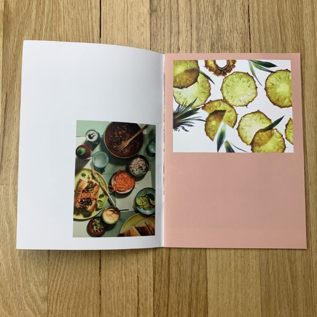
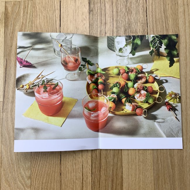
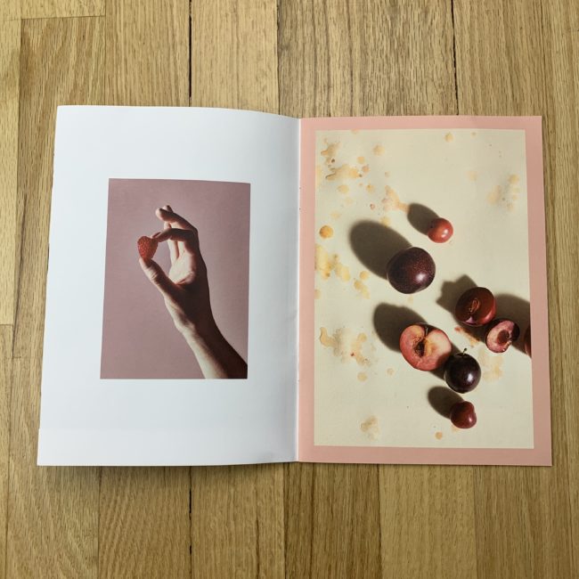
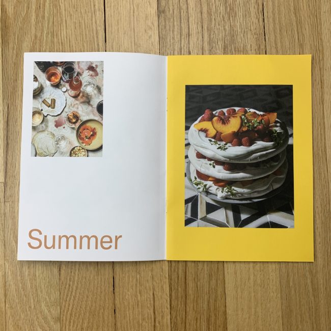
I printed the cover myself using my office’s hp desk jet 3755 printer. The images were printed with https://www.artifactuprising.com

Who designed it?
I designed it myself and I was inspired by the French company that makes photo books called Innocence (https://www.innocence-paris.com/fr/). Melissa McGill helped me edit the final selection for printing.

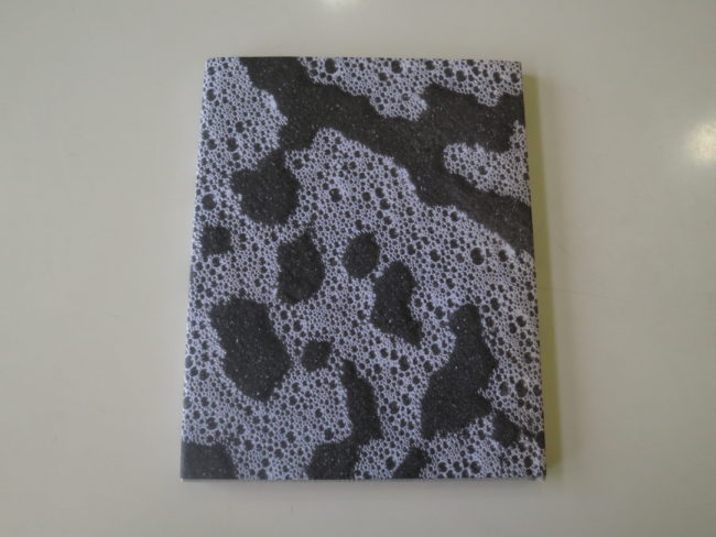
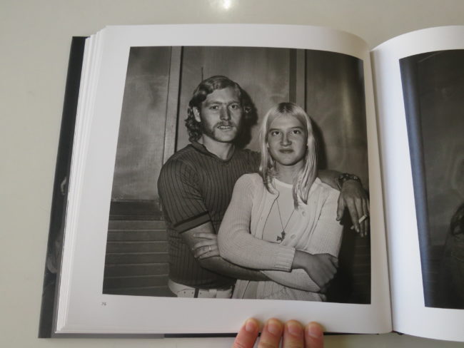
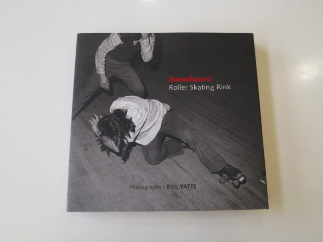
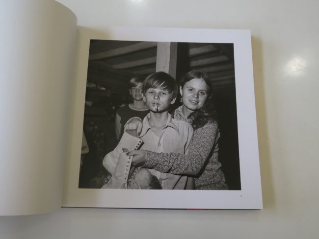
Tell me about the images?
The images are from a trip we took this summer to my home country Brazil. We went to Bahia, a place that I had never been to. We try to go to Brazil once a year and usually we just go to my parent’s home in São Paulo where I grew up. This year I wanted to try something that would be exciting and new for all of us, including my parents… so we all met in Trancoso. I was very excited about the location we were going to and I knew I wanted to photograph a fashion editorial story while there, so I packed a few looks for the girls that would be appealing to fashion magazines. Before Trancoso, we had a quick stop at Salvador to see Pelourinho, a historical town of Brazil. The first day was awful: the girls were super tired from our 30+ hours traveling (we missed a flight and had a few hiccups to get there), they were hot, they didn’t like the food, so it was complaining over complaining for an entire day. At that point, I thought: “there is no way I will get an editorial out of these girls”. Then I had to stop and manage my expectations given the fact that my daughters are not professional models and they just wanted to have fun on their trip too. So I took it easy, and every day for the next 7 days we were there, in the afternoon when the lighting was it’s most beautiful, I would ask my daughter Naya (7) if she would let mama take her photos. Most days she would say yes, some days I would bribe her with ice cream. Bia (4) only did it if there was ice cream involved. It would take us 10-15 minutes max each time. Of course, I took tons of iPhone photos of them during the day, but for this project, I took my Fujifilm X100F that is way lighter than my regular “work” camera to travel with and gives me decent file sizes. Upon my return, I shared the images with Milk Magazine and a fashion editorial was born. They must have really liked it as they published almost 30 images! That is very unlikely for fashion spreads. I was very pleased with the project too.

How many did you make?
I printed 300 copies which is a very small number and it goes by really fast!

How many times a year do you send out promos?
1-2 times per year

Do you think printed promos are effective for marketing your work?
It is really hard to say because nobody calls you and says: “Hey, I just got your promo, I have a job for you!”. I recently went to Minneapolis with my agent Kate at Apostrophe for a handful of book shows and meetings with prospect and old clients. At a lunch meeting, photographer Jeff Vallee who was also joining us asked an art director what are the promos that usually stands out to her. Her answer was: “The ones that have some type of meaning to it”. That really stuck with me and months later after that trip, when I was trying to decide what to promote, I picked the one that was the closest to my heart. I noticed a more positive reaction from receivers for this promo than my previous one. Last time I sent out 2k posters featuring new images and never once I got an email about it. This time there were emails, texts, tags on Instagram… art directors and photo editors were kind enough to show their excitement and it means the world to me!

This Week in Photography Books: Christina Riley


Blame Canada.

That just popped into my head, just this second. I was shaking off a first draft that I didn’t particularly like, (all the me, me, me,) and it hit me.

Blame Canada.

Such a funny musical number, in an audacious movie, which presents Saddam Hussein as Satan’s torturous gay lover.

I haven’t watched “South Park” in years, truth be told, but I did drive through Trey and Matt’s hometown in Colorado this autumn. It’s a shockingly beautiful and definitely strange place, and is cut off from the outside world by very big mountains.

My guess is, the show, “South Park,” is still funny. I bet the jokes are as offensive, juvenile and of-the-moment as ever, and maybe someone still kills Kenny?

If I turn on the next episode, once Cartman shows up, I’m sure I’ll laugh, because how can you not? He’s got as classic a cartoon voice as Beavis, Butthead and Homer Simpson, I’d venture. (“Respect My Authoritaaah!)

Those four would make quite the Mount Rushmore of animated American doofuses, would they not?

The tie binding these classic comedies, though, is that each satirizes the normal, or the everyday. These cartoons take life’s mundanity, and imbue it with the stench of the absurd, like a nasty wet fart hanging in the air. (I guess we could throw “Family Guy” in here too, if we’re being generous. Peter and Stewie Griffin would have fun dicking around with the other four for sure. )

The reason family and domestic stories are so damn popular, Imo, is that they wrap things we don’t know, (plot, concept, suspense, symbolism,) in the packaging of the world we live in each day.

Domestic stories, you could say, are the ultimate narrative Trojan horse.

Perhaps it’s the reason I write about my own family, and regular life, here so often. As this column is a weekly event, and has continued for so many years, my life and job have essentially merged.

But the line here is thin, I’d argue, because if everyone has a family, and everyone has daily-life-struggles-and-sqabbles, then if you’re not extremely interesting, or observant, or crazy, or strange, then your domestic story might fall a bit flat.

Right?

Today, you can see for yourself what I’m on about. I’ve got a photo book in mind, “Born,” by Christina Riley, which was printed by Edition One in Berkeley.

I’ll be blunt here, and admit this book is right on the edge of what I’ll normally review. It doesn’t give us a perspective we haven’t seen before, nor is it an insider’s view, as there have been countless books on the subject of motherhood.

It isn’t innovative either, but is rather a well-made, artistic, black and white family album, with Christina and her husband (or partner,) the hipster, Millennial parents dealing with a new baby.

The very first picture, with its huge blast of flash, and high key effect, seems like an edgy shot, but then most fall back on convention.

One photo drops in a “Nirvana” reference, and they will ALWAYS be cool, and the ease with which the camera is held at arm’s length, for selfies, meta-references the habits of Ms. Riley’s generation.

But…

I felt like I’d seen all these pictures before. Many times. Yes, it made me think of that phase in my own life, which is a good thing, but the generic nature of the photographs nagged at me.

As did the feeling that the images were a tad performative.
(Not that there’s anything wrong with that.)

But…

There were two photographs that really grabbed me, as they were dripping with emotion, and felt authentic. In one, the family sits together, eating, and the camera is at a distance. It looks as if they don’t know they’re being observed.

The second, a similar moment. (These pictures would make quite the diptych in an exhibition, frankly.) The mother, on the toilet, with the baby. The camera, again at a distance. The angle of her bent neck alone signals her deep exhaustion.

Certainly, these weren’t truly unguarded moments, as the camera shutter clicked. (A tripod and timer, most likely, or a helper photographer.)

Regardless, they offered something, a jolt, a shot of emotion, that really resonated.

There is no text in this book, save an early poem, and then a late dedication to the artist’s two daughters. (That bit made sense, for me, as there was another super-lovely image of what looked like the back of slightly older child’s head.)

It means, though, that we don’t have any additional context in which to view these pictures, should there be any. We’re left to consider a set of new parents, figuring it out, artfully.

Certainly not bad, in any way.

Like Canada?

Bottom line: A sweet-yet-gruff, family-album-type-photobook

To purchase “Born” click here 
If you’d like to submit a book for potential review, please email me at jonathanblaustein@gmail.com. We currently have a several month backlog, and are particularly interested in submissions from female photographers so we may maintain a balanced program.