This Week In Photography Books: Roger Eberhard

by Jonathan Blaustein

I met Bruce Springsteen a long time ago. When I still lived in New Jersey. Back when he was a GOD.

It must have been 1992, or thereabouts. I was working in a restaurant in Sea Bright. Down the Shore. The joint was built right upon a brackish inlet, across the street from the Atlantic Ocean.

I’d heard that Bruce liked to show up in an open-topped red Jeep, with Patti in the passenger seat, and the kids in the back. So I HAD been warned. But still, I was not prepared for what it felt like, being in his presence.

My tenure there was rather short, as I ran my mouth a lot, and made the mistake of allowing someone to buy me a drink in the bar, after my shift. I was patently underage, and they got rid of me as quickly as they could. Not the last time I would be fired, but it stung.

So I was doubly-lucky to be working the night Bruce showed up. I stood in the front, near the parking lot, next to two cute hostesses. Bruce pulled up in that Jeep, and bow-leg-strutted straight up to me. There’s no solid explanation as to why he came my way, instead of talking to the pretty girls whose job it was to greet him.

But approach me he did. My palms were sweaty, like a large man in a steam room, and I did my best not to stammer.

“Of course, Bruce. We have a table for you. Of course. We’d be happy to help you and your family. We’re so glad you’re here.”

“Thanks, kid, thanks.”

“Oh, and Bruce? I’m going to your concert next week. I hate to ask, and hope you don’t mind, but is there any way you’d play ‘Blinded by the Light?'”

“Maybe, kid, maybe.”

He didn’t.

But I couldn’t hold it against him. In fact, that night in the restaurant, I put sugar packets under his table to stabilize it, and filled his children’s ice tea cups when they were two sips below the top of the glass. I was attentive in the extreme.

He didn’t seem to mind. Bruce must have been used to the pure adulation of native Jersey boys. Especially Down the Shore. (That’s the local expression for at the beach, for those of you reading this around the world.)

Sometimes, certain people find themselves sitting on top of a pedestal carved from Carrara Marble. They peer down at the rest of us, uncomfortable at such heights, but seem willing to adjust their balance to keep the seat. (With others, like Michael Jordan, you’ll have to cut out their hearts and chop off their heads before they’ll give up their rightful place atop the perch.)

In the Photobook world, one I’ve managed to cover for you, here, for more than 3.5 years, one name reigns supreme: Martin Parr. I’ve got two interviews that we’ll publish in the coming months, with two genuinely excellent photobook publishers, each of whom agreed that the planet is currently inundated with photobooks. (The streets are flowing with four-color pages, all with photographs embedded in ink.)

That’s the way it is these days. So if you’re Martin Parr, it’s a rather good time to be the King of Photobooks. At least, if you like having lots of subjects. (Long live the King.)

That being said, there are probably more people in Albuquerque who’ve heard of Michael Jordan than there are humans alive who’ve heard of Martin Parr. Our culture still needs a sub- in front of it, if we’re being honest.

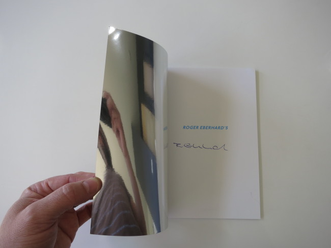
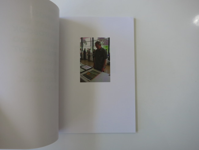
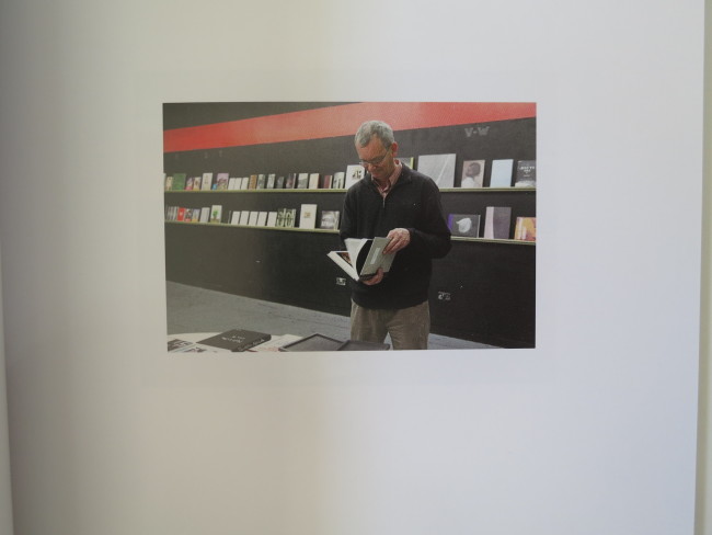
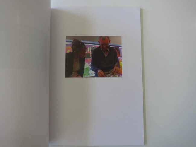
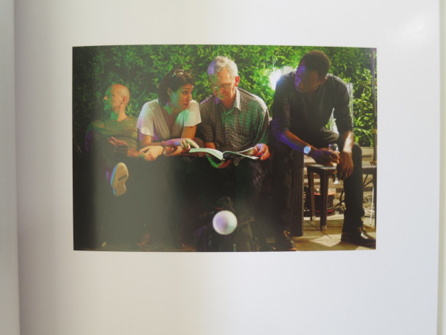
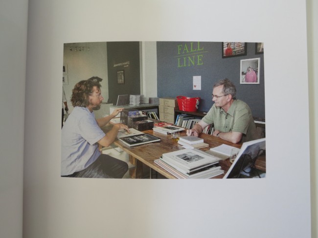
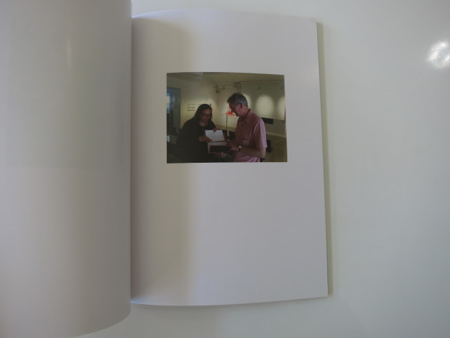
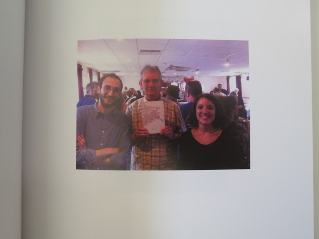
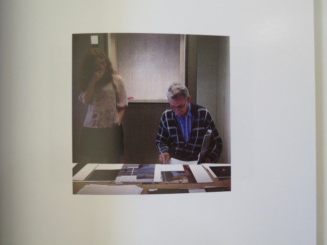
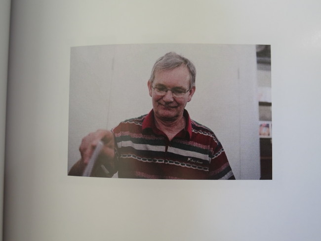
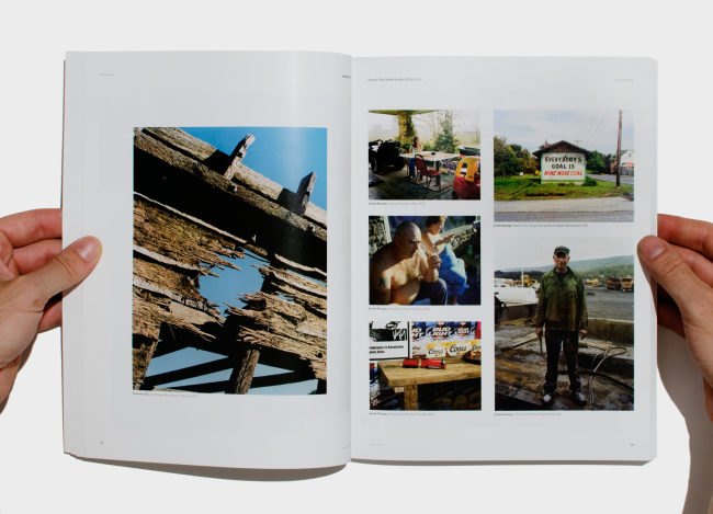
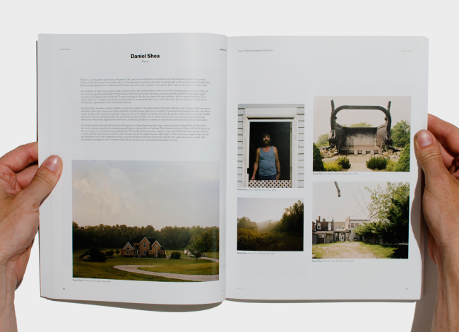
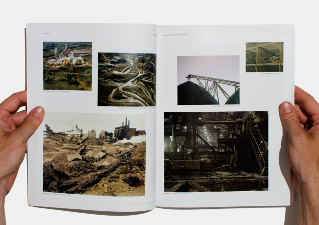
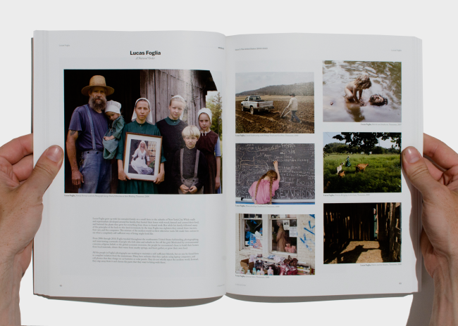
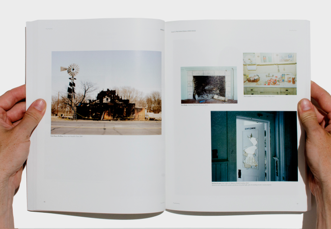
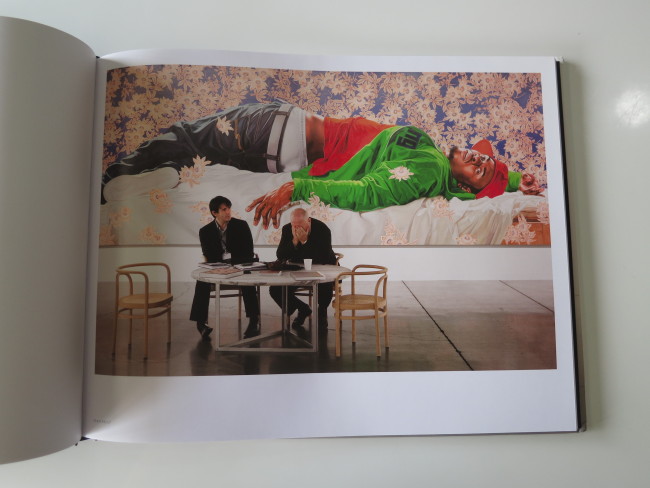
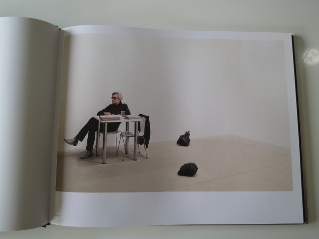
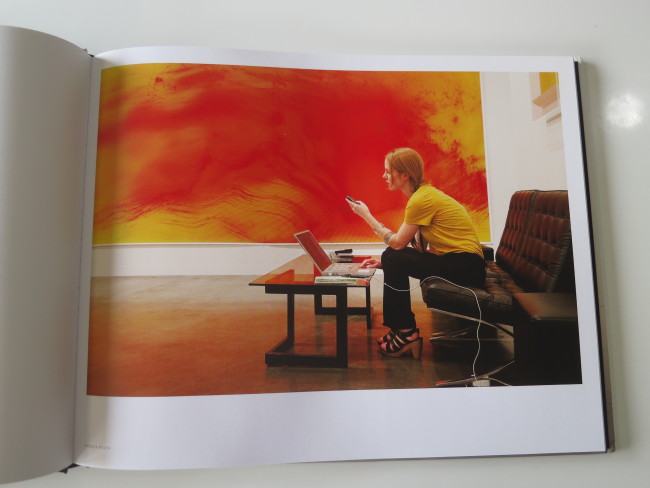
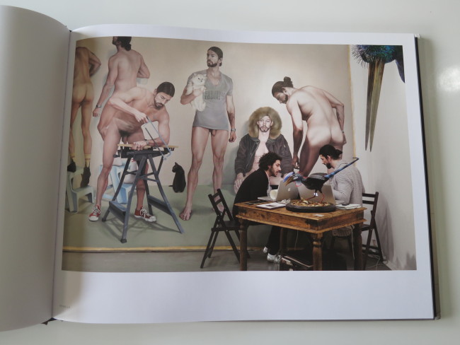
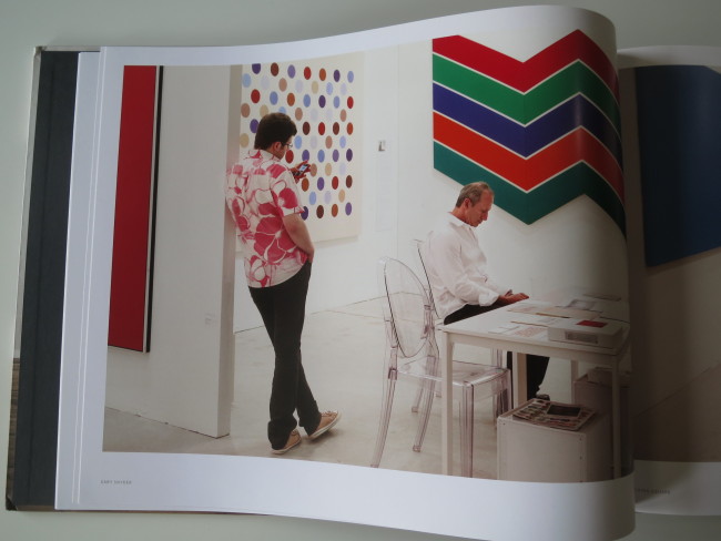
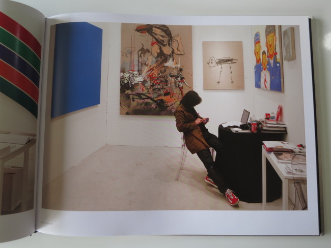
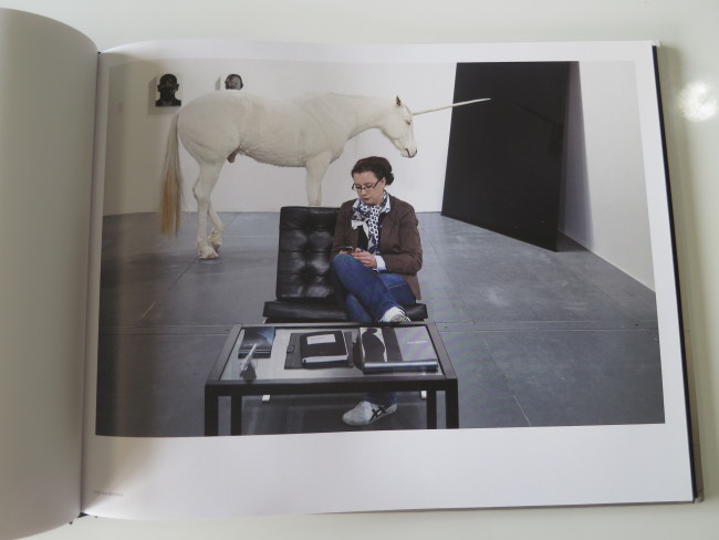
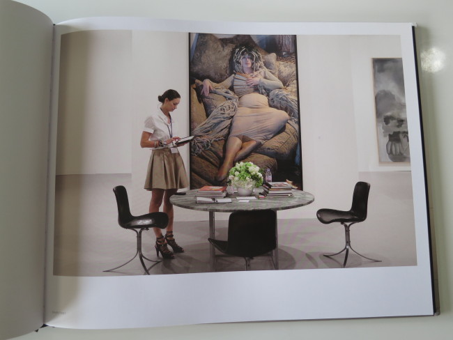
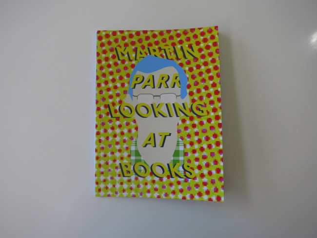
So “Martin Parr Looking at Books” is definitely a niche product, as far as I’m concerned. It’s a new photobook by Roger Eberhard, published by B. Frank Books, that shows us exactly what the title claims: Martin Parr looking at (photo) books.

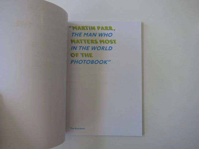
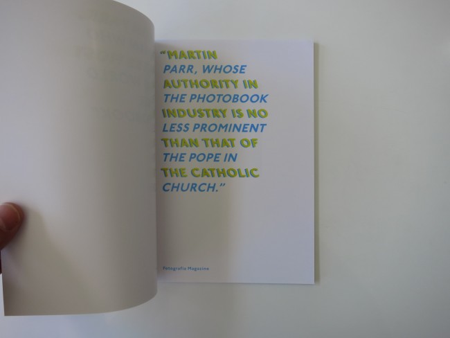
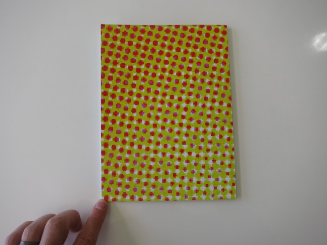
Clearly, this is not for everybody. Especially as the pictures are not-particularly-compelling. Mr. Eberhard gets around that fact by giving us a colorful front-cover, a mirror-metallic inside cover, and a few big-font pages with quotes establishing Mr. Parr’s preeminence.

Then, it’s photo after photo of nothing but what you’d expect, given what I’ve already told you. But it is funny. Not LOL funny, but chuckle and smile funny. Ridiculous. It’s a goof on all of us, yet a good-enough-goof that I’m writing about it.

Some of you have taken to the comment section recently to ask why I’d review a given book, when there are far-more-worthy offerings to discuss. I’m guessing some of you will share that sentiment this week. Here’s the only rule: if it inspires me to write, I write.

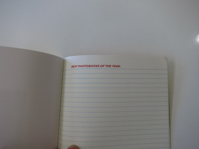
Before the close, we’re provided with some blank-lined-white pages, ostensibly to write up our own “Best Photobook of the Year List,” because Lord knows there aren’t enough of those already. Hilarious!

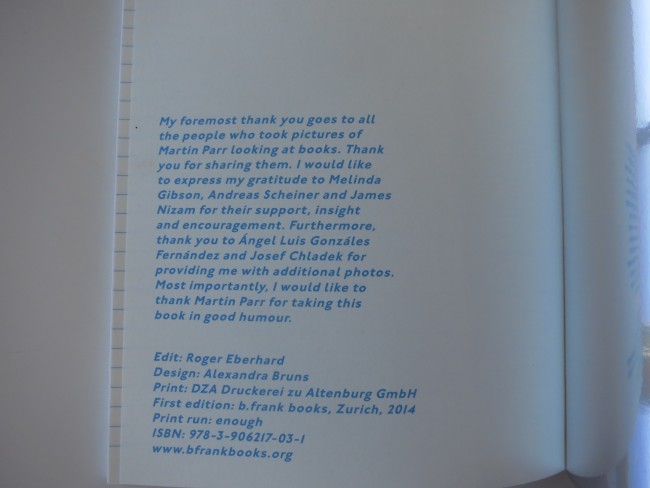
But then again, the pictures are not even special. Party Foul! The end notes tell us they were submitted, or provided, to the artist. It’s a collaborative effort, apparently, stalking Martin Parr, and taking his picture while he looks at books.

One can imagine a sister-publication where Robert Parker is photographed while sipping Cabernet Sauvignon? Seth Rogen smoking blunts? Or Bruce Springsteen, papparazzoed, while chowing down on greasy burgers Down the Shore?

Then end notes also claim that Mr. Parr appreciated the joke. I hope you do too. There are so, so many weeks when the books I write about explore tragedy, destruction, and sorrow. So today, “Lighten Up Francis,” and have a laugh at our collective-photo-geek selves.

Bottom Line: Zany, odd, niche photo book that skews itself, and us
Go here to purchase “Martin Parr Looking at Books”

IMG_0478

IMG_0479

IMG_0480

IMG_0481

IMG_0482

IMG_0483

IMG_0484

IMG_0485

IMG_0486

IMG_0487

IMG_0488

IMG_0489

IMG_0490

IMG_0491

IMG_0492

IMG_0493

The Art of the Personal Project: Michael Rubenstein

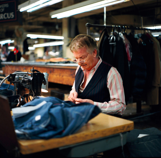
As a former Art Producer, I have always been drawn to personal projects because they are the sole vision of the photographer and not an extension of an art director, photo editor, or graphic designer. This new column, “The Art of the Personal Project” will feature the personal projects of photographers using the Yodelist marketing database. You can read their blog at http://yodelist.wordpress.com. Projects are discovered online and submissions are not accepted.

Today’s featured photographer is: Michael Rubenstein

rubenstein_craft_000001

rubenstein_craft_000002

rubenstein_craft_000003

rubenstein_craft_000004

rubenstein_craft_000005

rubenstein_craft_000006

rubenstein_craft_000007

rubenstein_craft_000008

rubenstein_craft_000009

rubenstein_craft_000010

rubenstein_craft_000011

rubenstein_craft_000012

rubenstein_craft_000013

rubenstein_craft_000014

Carrie Ashley White 5/6/2011

rubenstein_craft_000016

rubenstein_craft_000017

rubenstein_craft_000018

rubenstein_craft_000019

How long have you been shooting?
Ten years give or take.

Are you self-taught or photography school taught?
Photography is a second career for me. My undergraduate degree is in Environmental Policy from Prescott College in Arizona. When I first started learning photography I was self taught with a lot of help from other photographers and hours pouring over photo books at Powells in Portland, Oregon. 

At some point I decided that I wanted some formal training and I attended the graduate program of the School of Visual Communication at Ohio University. It is a two year program. I completed one year and then took a contract position at the Oregonian in Portland, Oregon. I learned an immense  amount at the Oregonian from the many incredible photographers and from Mike Davis and Patty Reksten, my editors. I wouldn’t be able to see things the way I do if it wasn’t for them.  I stayed there for about 8 months and then freelanced in Portland. Until I moved to Mumbai in 2007.

With this particular project, what was your inspiration to shoot it?
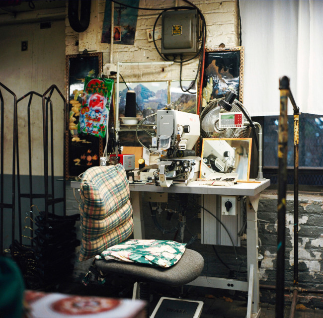
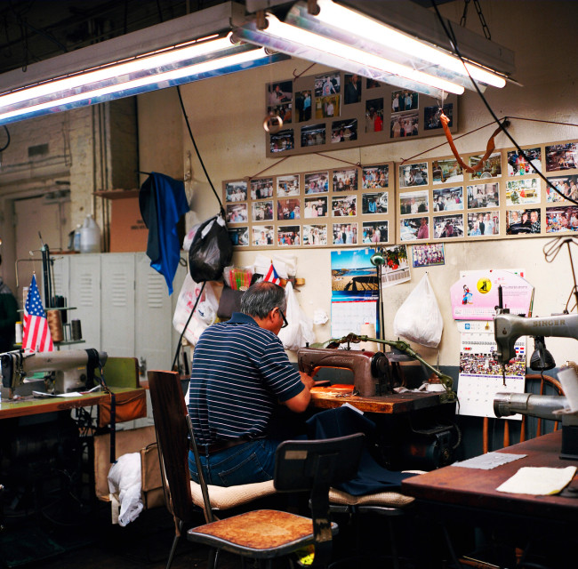
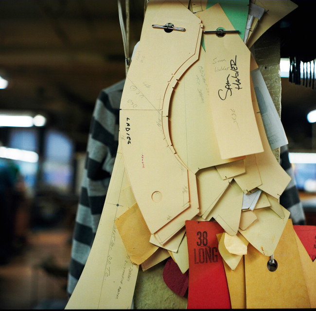
I’ve always been interested in craftspeople. People who make very high end goods by hand in small workshops.  Its always been amazing to me that one person an make something that most often is produced by robots in a giant mass production facility, and make it better.

How many years have you been shooting this project before you decided to present it?
I shot the project for a few months before I started to show it, but its ongoing. I think I’ll always be shooting this project.

How long do you spend on a personal project before deciding if it is working?
I’ll give it a few days of shooting before I look at it and say, “Do I continue to dedicate time and resources to you, or is this it?”

Since shooting for your portfolio is different from personal work, how do you feel when the work is different?
Variety is the spice of life right? To me, the challenge is making something that speaks to me. Whether its on assignment or personal really doesn’t factor into it. Once I have the project, self assigned or not, I need to make the best of it.
Have you ever posted your personal work on social media venues such as Reddit, Tumblr, Instagram or Facebook?
Yes, everywhere but Reddit.

If so, has the work ever gone viral and possibly with great press?
No not really.

Have you printed your personal projects for your marketing to reach potential clients?
Yes. I definitely have and they have responded very well to it. This project has helped me to get at least 2 or 3 commercial jobs and more than a handful of meetings.

Artist Statement:
While manufacturing continues its march towards automation the art of hand making beautiful and useful products is making a comeback. These people are at the pinnacle of design and craft. They produce the best of what they make in small workshops, the way things have been made for hundreds of years. As a documentarian it was my honor to photograph these men and women as they worked. 

————–

Michael Rubenstein is an editorial and commercial photographer and director based in New York City. He enjoys documenting interesting people and situations the world over. Before moving to New York he covered South Asia from his home in Mumai, India. His clients have included Merge Records, MasterCard, Budweiser, Saatchi and Saatchi, Nike, Yahoo!, The University of Massachusetts, Fordham University, AARP, NPR, The WSJ, The NYT, Mother Jones, Monocle and NBC News. 


APE contributor Suzanne Sease currently works as a consultant for photographers and illustrators around the world. She has been involved in the photography and illustration industry since the mid 80s, after establishing the art buying department at The Martin Agency then working for Kaplan-Thaler, Capital One, Best Buy and numerous smaller agencies and companies. She has a new Twitter feed with helpful marketing information believing that marketing should be driven by a brand and not specialty. Follow her on twitter at SuzanneSease.

Pricing & Negotiating: Stock Contract For A Record Label

by Craig Oppenheimer, Wonderful Machine

A photographer recently asked me to review a contract governing the license of his stock photographs to a record company. The record label (one of the largest in the country) was initially interested in using four of the photographer’s images of a musician performing live on the cover and interior of a vinyl record edition of the musician’s upcoming album. We were told that they planned to press and release 25,000 copies of the vinyl record, and that they had a firm budget of $2000.00. The fee didn’t seem to quite match the value of the images, but we asked if they could send over a contract to take a look at. That’s when things got interesting.

Here was the original contract:

Not surprisingly, the contract stated that the photographer would grant the copyright of his images to the record label. We quickly responded and pointed out that the contract didn’t match their requested use of the images, and they sent back another version of the contract removing the line about the copyright, while retaining the language about granting them “all rights.” It was clear that we weren’t on the same page, so it was time to bust out my red pen (aka Adobe Acrobat Pro PDF editing tools) and make some changes. Here is a revised version of the second contract they sent us:

I rewrote the entire first paragraph for a number of reasons. First, I didn’t like their language stating that the contract would “confirm” that they “purchased the rights” to the images. It was more appropriate to state that a specific licensing would be conveyed to them for a specific fee, and that was all dependent upon payment of that fee to the photographer in full. Second, none of the language regarding the “rights” to the images was accurate, so I drafted a new paragraph summarizing the fee and licensing that we had been discussing up until that point ($2,000 for four images on the cover and inside the vinyl record with a print run of up to 25,000 copies). I also stated that a credit in the name of the photographer would be required, which made the photographer more comfortable in justifying the less-than-favorable fee since he would be able to get some nice publicity out of the deal.

In addition to revising the first paragraph, I wanted to make it very clear that the record label would need to pay for any usage above and beyond what was described, so I clarified their language at the end of the second paragraph. Additionally, the label included an indemnification clause protecting them against any breach of the agreement by the photographer, and I added language stating that the label would similarly identify the photographer if they used the images in any way that got them into any legal trouble not at the fault of the photographer. Lastly, I struck out a portion of the third paragraph regarding amendments to the agreement because I felt it was a bit too vague. I wanted to make it clear that this document, once signed by both parties, would be the only document that solidified the agreement between both parties.

We sent the revised contract back and waited for a response. I should note that at this point, we were receiving pressure from the art administrator that we were working with as well as numerous other staff members at the record label who stated that we would need to sign the contract “by the end of the day” and that this negotiation was going to delay the release of the album while threatening to take the deal off the table if we weren’t willing to sign the contract as it was originally presented to us.

Wouldn’t you know, the next day they came back with some new information and wanted to negotiate a new price. I learned that they couldn’t limit the print run of the vinyl record to 25,000 copies, but they were however willing to pay more to lift any limitations on the quantity. They also insisted on being able to use the images to promote the album in various ways (although they didn’t want to define such use as advertising or collateral). We decided to ask for $4,000 (double their original budget) for use of the images on/in the first edition of the vinyl record (however many copies that may be), while also granting them the right to promote the record by using the images in their original context on/in the album. I didn’t feel that this fee was enough to include rights to use the images on merchandise such as t-shirts and posters, so we specifically excluded that from the contract. The record label verbally agreed to this on the phone, and then sent over a revised contract. Unfortunately (and again, not surprisingly) they failed to include many of the points we discussed in the new contract, and here is a revised version of what they sent us, which I returned to them:

Again, we received more disgruntled feedback from the record label, and they once again threatened to pull the deal off the table if we wouldn’t sign their contract by the end of the day. Standing firm on our revisions, we let them sleep on it.

We heard back from the label the next morning, and this time they let us know that they weren’t willing to limit the use of the images to just the vinyl record, as they were planning to release the album with the photographer’s images in CD and digital format as well. Additionally, they were concerned with our language regarding merchandising rights. As a negotiation point, the label asked for us to state that if their licensing was to exclude merchandising rights, then they also wanted to limit the photographer from using the images on merchandising in perpetuity as well. The photographer had no plan to create merchandise independently, however, we didn’t feel it was fare to limit the photographer’s ability to license his images for merchandising in the future, perhaps to another record label if the musician happened to jump ship. We decided to include language that limited the merchandising “embargo” to the length of the contractual relationship between the musician and the record label.

We also took these changes as another opportunity to renegotiate the fee. At this point, we had gone from $2,000 for use of the images on a limited number of vinyl albums, to $4,000 for use of the images on an unlimited number of vinyl record albums within the first edition plus promotional rights. Now we were jumping up to use of the images on all vinyl, cd and digital editions of the album plus promotional rights with the merchandising caveat I mentioned previously. Based on a few previous projects I’ve worked on (one of which you can read here), I knew the threshold for unlimited use for an album cover in many cases is around $6-10k plus expenses (sometimes) for a commissioned shoot, regardless of the number of images. Also those projects are frequently presented as a “take it or leave it” work made for hire. We decided to revise their contract once again with a fee of $6,000 (triple their original budget). Here is that version of the contract:

At this point, I was working directly with the Senior Vice President for Business and Legal Affairs at the record label. We actually had a very nice conversation (as opposed to the demanding correspondence from the other employees of the record label), and I think this was because at this point I was talking to the person governing the creation of the contract and development of the language included. Previously, I didn’t think our counterparts at the record label were doing a good job communicating the revisions we were requesting down the line, which is likely why they kept coming back to us with new contracts that didn’t correspond to our negotiations. Fortunately, after my conversation with this new contact, he provided a new, clean version integrating the changes, which was ultimately signed by both parties.

Here is the final version:

Hindsight: It’s ok to push back and negotiate rates, as long as you do it in a professional and cordial manner. Many times projects are presented to photographers as works made for hire, or with a “take it or leave it” mentality (which isn’t necessarily a bad thing if the rate is appropriate), but while sometimes the clients are firm, there should always be a conversation about possible ways to negotiate better rates or terms. Record labels are perhaps the most notorious clients for less-than-favorable rates and contractual terms, but I’ve successfully amended and negotiated multiple contracts to make them more favorable to the photographer.
A few months later while walking back to my hotel after a shoot in New York City, I saw one of the images on a flyposting stuck on a wall near Times Square. The image was used in its original context on the cover of the album as agreed to in the contract (which I was happy to see compliance of), and while it’s hard to say whether these postings are advertising in its true meaning or not (paid placement), it made me wish the record label paid even more for the licensing given the exposure.

If you have any questions, or if you need help estimating or producing a project, please give us a call at (610) 260-0200. We’re available to help with any and all pricing and negotiating needs—from small stock sales to big ad campaigns.

The Daily Edit – Mark Hanauer: We Transfer

Screen Shot 2015-04-05 at 3.15.40 PM

Screen Shot 2015-04-05 at 3.15.50 PM

Screen Shot 2015-04-05 at 3.16.01 PM

Screen Shot 2015-04-05 at 3.16.11 PM

We Transfer

Photographer: Mark Hanauer

We Transfer Facebook

We Transfer Twitter

Heidi: What sparked your interest in submitting to We Transfer?
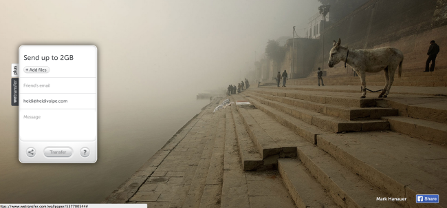
Mark: I had been using We Transfer for some time. It’s a great service for sending large files to clients and colleagues over the web. I enjoyed a lot of the graphics that they used on their site and one day I decided to send them a series of images that I thought were appropriate for their format.

Which images did you send and how many where sent/accepted?
Basically the images are horizontal with a lot of free space. To my delight they have used a handful of them. All of the images that I sent to We Transfer have been personal images from my travels, three from India and one from Central California. I don’t recall how many images that I sent to them, but I am very happy with what they have used. And they are appreciative as well, nice credit on the page and they share the contribution on Twitter and Facebook.

You’ve been drawn to photographing artists, why is this?
My first job assisting a commercial photographer was for Malcolm Lubliner. He had a studio on Melrose Avenue in West Hollywood that adjoined Gemini GEL. 95% of what Malcolm did was for Gemini. I recall my first day at work Malcolm giving me a tour of Gemini and I was mesmerized. The produce fine art lithography and silkscreen printing, very old-world style. Gemini would invite artists to print at their press, the likes of Frank Stella, Jasper Johns, Claes Oldenburg, David Hockney, Roy Lichtenstein, Ellsworth Kelly, the list is amazing and I was instantly drawn to the work that was created there. We photographed every print that Gemini produced. I learned more about photographic technique there than anywhere I have studied or worked. It was also a great intro for me into the fine art world, something that was very new to me.

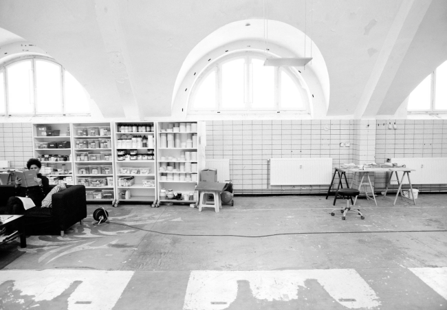
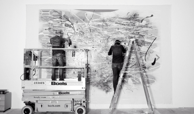
I enjoy a vicarious thrill looking through my camera at people that do extraordinary visual work, painting, sculpture, architecture, photography, dance, sports. I love seeing what artists do and I marvel at the process. Working with Julie Mehretu at her studio in Berlin was a remarkable experience. I spent a week photographing Julie, her staff and the studio for a museum catalogue. To have that kind of  time to record her working was amazing. I love to do more in-depth projects like that. Whenever I have time, I try to get together with local artists whose work that I enjoy to create a portrait or something in the moment that gives me joy.

Screen Shot 2015-04-05 at 3.19.35 PM Screen Shot 2015-04-05 at 3.19.42 PM Screen Shot 2015-04-05 at 3.19.53 PM Screen Shot 2015-04-05 at 3.20.21 PM

Tell us about your personal project.
My personal project is currently titled, Negative Space. It’s an idea that has been floating in my head for the last two weeks. The idea is based on something that I remember from a painting teacher in elementary school about the parts of a canvas where the subject isn’t. What do yo do with that space where there is nothing? Generally I think of an idea and by the time I pick up the camera, the idea has transformed into something else. We will see what happens….

The Daily Promo – John Hafner

john hafner_2
john hafner_11
john hafner_9 (1) john hafner_7 john hafner_5 john hafner_4 john hafner_3

John Hafner

Who printed it?
My promo book was printed by Blurb. It’s a Trade Book, 6X9.

Who designed it?
A graphic artist friend of mine, Paul Allen, in Missoula, Montana designed it.

Who edited the images?
Paul and I both edited the images. I did an initial edit, and then had him weigh in on which pics would make the strongest presentation. It’s really tough to edit objectively, and it’s important to
have a neutral set of eyes to narrow the selections. Just because a pic might be one of my favorites doesn’t mean it would add any value to my promo. The end result is, I think, a good mix of product/studio shots, people/portraits, wildlife and documentary that conveys the scope of what I shoot.

How many did you make?
This was actually my first hardcopy promo. My marketing and promo work has largely been digital. I’ve sent out several PDFs and e-books, which have been quick, cheap, simple and very effective. But this year, I wanted to have something more substantial; something that was portable yet impactful that my clients, and prospective clients  would hang onto and reference.

How many times a year do you send out promos?
The promo features some of my best work from 2014. I chose to include a pic of me in the field to give clients a sense of who I am and how/where I work. I primarily shoot for hunting and fishing markets, and my clients need to know that I, too, am an outdoorsman. This gives them the assurance that I know the industry, their brand and their customer. It’s vital that I can tell my clients’ stories not just creatively but also authentically.

What shoot is the opening spread from and whose paw is that?
The opening spread features some pics from a shoot I did last December with the guys from Duck Dynasty. Not only was it one of the more memorable and fun shoots from 2014, it’s great to have their super-famous facial hair in my portfolio. I also included a partial client list to give prospective clients a sense of my experience in the outdoor industry. And I included client and location info. for each pic in the book.

And yes, that’s my Golden Retriever/office manager/page turner/paw model, Shiley, in the promo pics.

This Week In Photography Books: Alexandra Huddleston

by Jonathan Blaustein

Today is Tuesday. The day I’m writing this. Tuesday.

But it’s also Friday. Because that’s when you’re reading it. Friday. Strange, no? The existence of twin temporalities? It’s enough to give me a headache.

Fortunately, that prospective malady will be the only one I complain about today. Because I’m finally feeling better. It only took 3 weeks, but hey, who’s counting?

Today (Friday) is no ordinary day, though. It’s Good Friday, which is holy in the Christian tradition, because it was first holy to the Jews. Jesus’ last supper was a Seder, because he was Jewish, which explains why Passover and Easter always seem connected.

They are.

If you were here in Northern New Mexico today, (Friday) and you drove along the highway, you might see pilgrims walking along the side of the road. There are hordes of them who head from all directions towards Chimayo, where they’ll convene to pray, and commune with the seemingly-sacred healing dirt.

I don’t know much about it, to be honest. But I do know that I’m sitting here in a mostly empty classroom, today, because many of my students celebrate. Some of them are even on a pilgrimage of their own, walking South from Costilla, on the Colorado border, to Questa, 20 miles away.

I should have asked them why they do it, but it didn’t cross my mind at the time. 20 miles is a long stretch, if you ask me. So I’d guess the suffering relates to the nasty business Jesus faced at the end of his life.

People often feel the need to walk until their bodies are begging to give out. To push their flesh to the breaking point, in the hope that their spirits will ascend to new knowledge planes. I’ve been known to drive to the Post Office, a mile away, so I’m clearly not one of those people.

But Alexandra Huddleston is. And she’s a New Mexican to boot. So perhaps we might learn a thing or two from her experience.

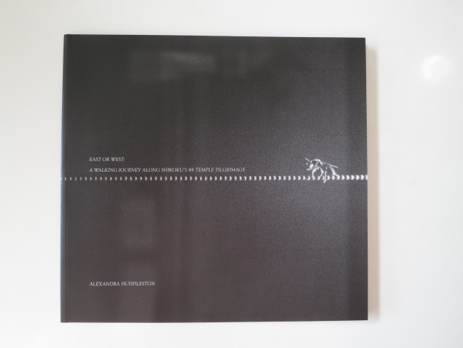
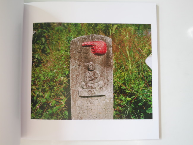
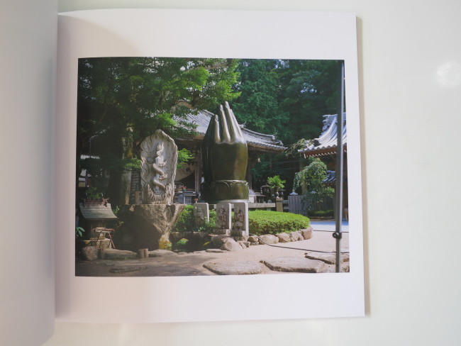
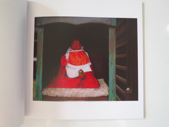
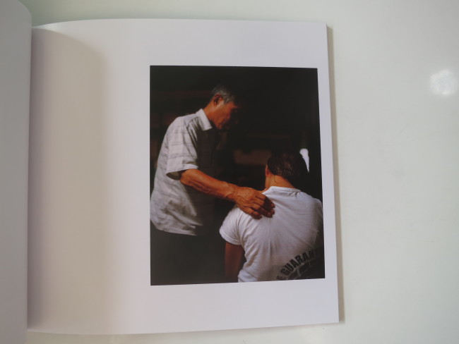
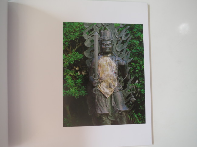
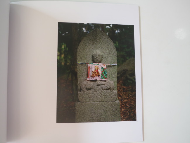
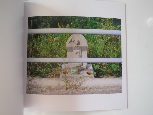
I know this having just looked through “East or West: A Walking Journey Along Shikoku’s 88 Temple Pilgrimage” her new book, published by Blind Cat Valentine. As I said earlier this year, I’m trying to expand my definition of a reviewable book, and this one helps me do just that.

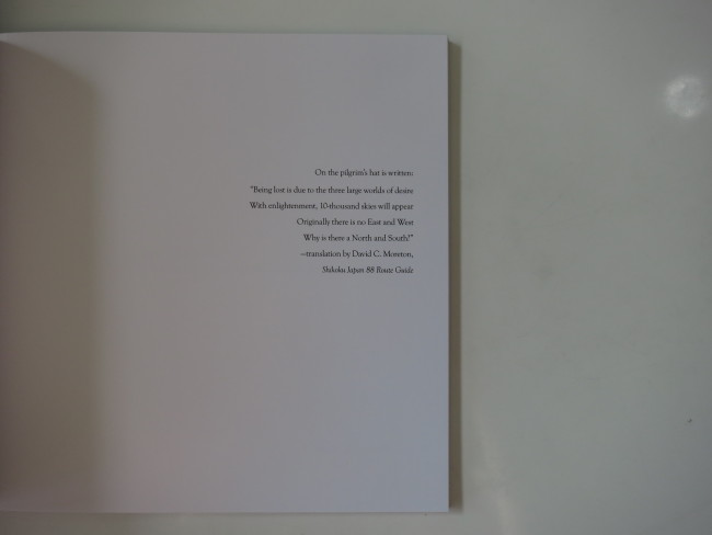
Apparently, in September of 2010, Ms. Huddleston set off on an 800 mile walk around the Japanese island of Shikoku, so she could follow the Buddhist pilgrim’s trail to the aforementioned 88 temples. Her diary entries, which are included within, seem to indicate that she made the trek over 7 weeks time. Which means her feet must have been really f-cking tired, when all was said and done. (Her blisters must have had blisters.)

The intro text also mentions that she completed the 500 mile Camino de Santiago pilgrimage in Spain the year prior, which means 1300 miles all told, in search of understanding in two religions. East and West.

Now, the reason why I’d normally not review this book is that the pictures are not amazing. They’re very good, for sure, but I normally prefer a shade more pizazz. More oomph. More edge.

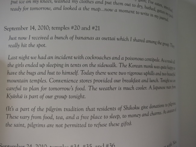
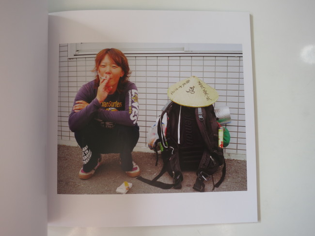
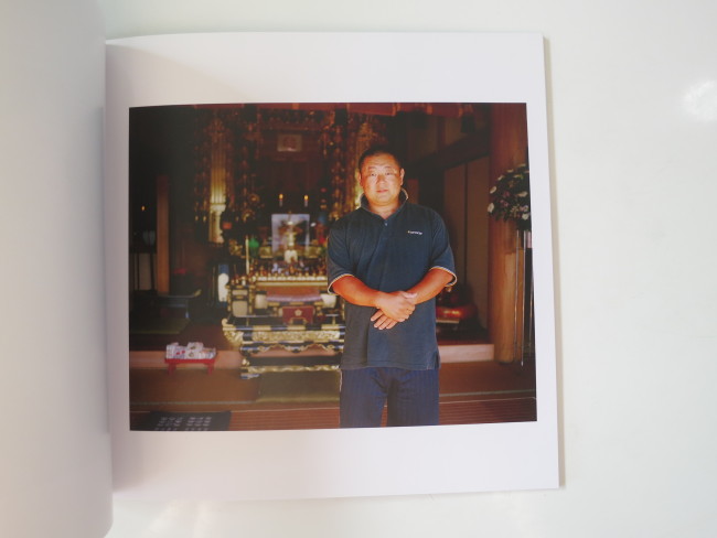
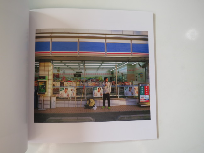
But they are personal, and in conjunction with the diary entries, which tell tales of poisonous centipedes, Korean monks, and free mochi, I get a real sense of who Ms. Huddleston is, and what she’s searching for in this life.

The book is intimate, and thoughtful, and it feels like something she’s sharing with the world, even though it was really meant for her. A way to flesh out her thoughts, to codify her memories, and to honor her journey.

That’s my takeaway, at least, and I felt that it was worth sharing with you, today (Friday? Tuesday?) so that we could acknowledge the power of other peoples’ beliefs, and wish them well as they pray, walk, and ponder.

Bottom Line: A personal, pilgrim’s journey around a Japanese island

Go Here To Purchase “East or West: A Walking Journey Along Shikoku’s 88 Temple Pilgrimage”

IMG_0462

IMG_0463

IMG_0464

IMG_0465

IMG_0466

IMG_0467

IMG_0468

IMG_0469

IMG_0470

IMG_0471

IMG_0472

IMG_0473

IMG_0474

IMG_0475

IMG_0476

IMG_0477

The Art of the Personal Project: Paolo Marchesi

As a former Art Producer, I have always been drawn to personal projects because they are the sole vision of the photographer and not an extension of an art director, photo editor, or graphic designer. This new column, “The Art of the Personal Project” will feature the personal projects of photographers using the Yodelist marketing database. You can read their blog at http://yodelist.wordpress.com. Projects are discovered online and submissions are not accepted.

Today’s featured photographer is: Paolo Marchesi

_MG_7372

_MG_7584

_MG_7617

_MG_7638

_MG_7833

_MG_7884-Edit-Edit

_MG_7942

_MG_7948

_MG_8070-Edit

_MG_8094

_MG_8102

_MG_8253

_MG_8349

_MG_8388

_MG_8597

_MG_8704

_MG_8736

How long have you been shooting?
20 years

Are you self-taught or photography school taught?
I went to Brooks Institute of Photography

With this particular project, what was your inspiration to shoot it?
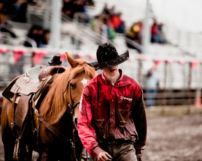
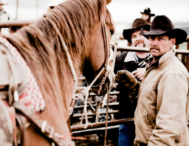
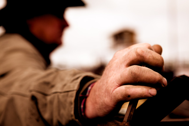
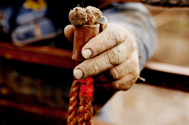
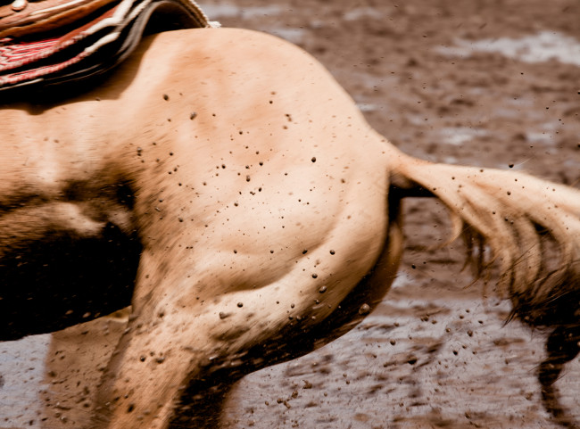
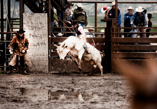
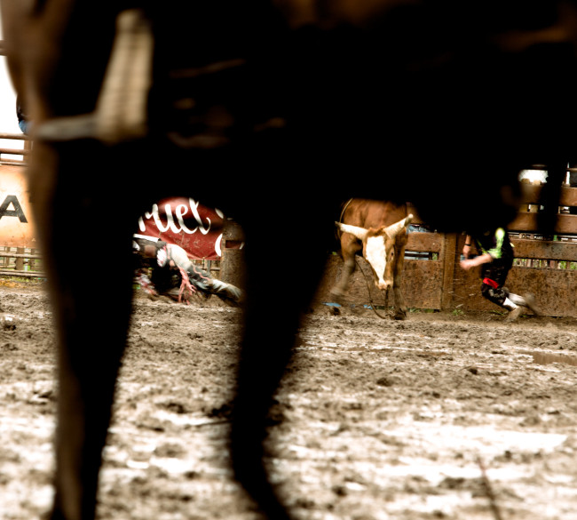
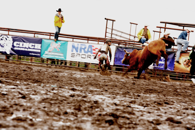
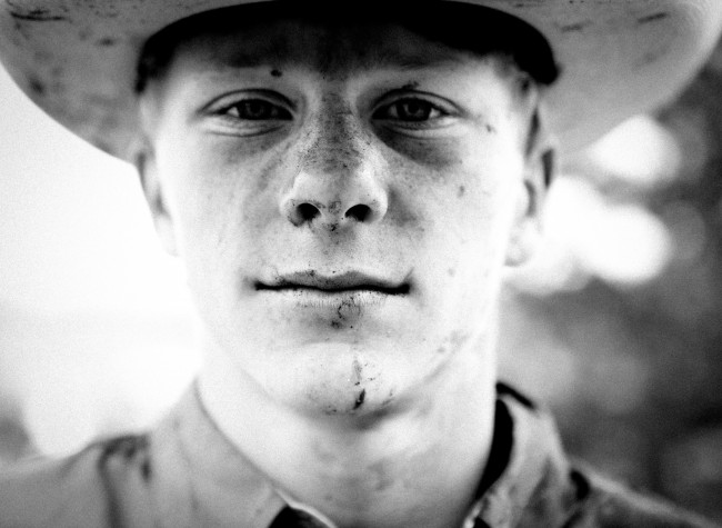
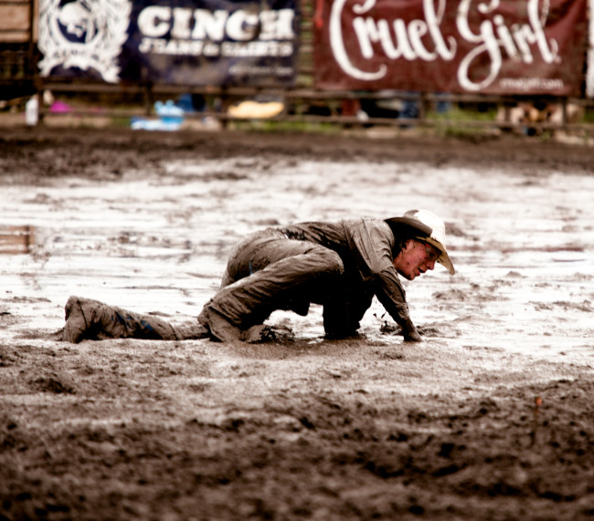
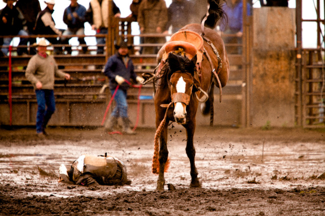
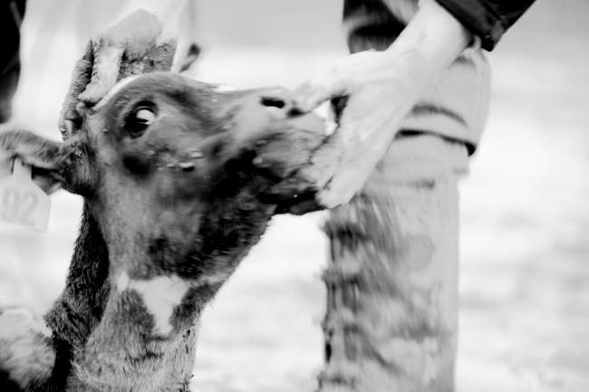
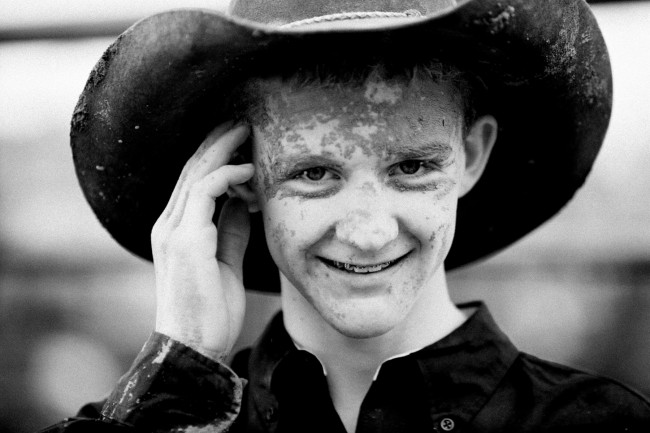
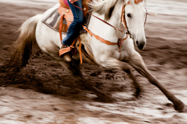
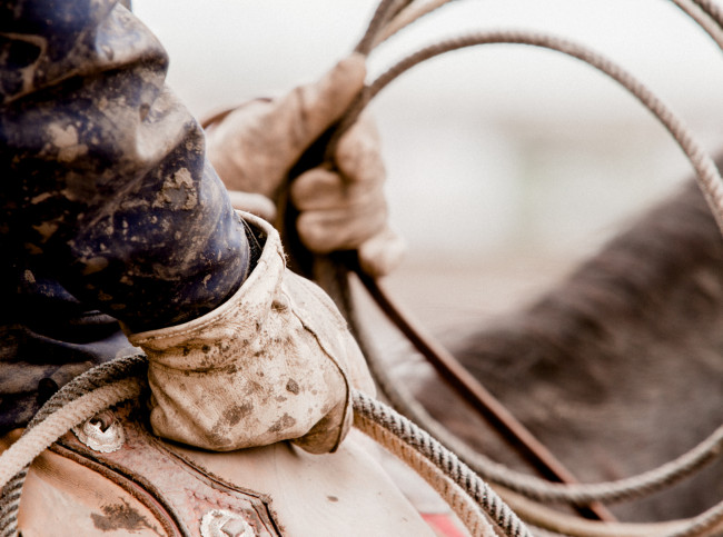
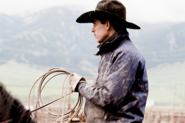
Living in Montana I had seen many rodeos, some smaller and others bigger and more commercialized. I find the bigger, more commercialized, rodeos to eventually get repetitive and not so interesting. Shooting the high school rodeo took all the commercial aspect out and it made it for a true experience. I was blown away by how good and tough these kids were. They are the real deal cowboys.

How many years have you been shooting this project before you decided to present it?
I had shot many rodeos over the years of living in Montana but none touched me as much as this one. You could truly feel the tension and energy. These kids and their parents put their soul into it and it showed.

How long do you spend on a personal project before deciding if it is working?
I tend to get distracted too easily by my many interests. I find it difficult to shoot the same thing over and over. I usually move from personal project to personal project. I like to experience it all and if you look at my body of work it shows. At times it can be detrimental as people like to see photographers who specialize.

Since shooting for your portfolio is different from personal work, how do you feel when the work is different?
I never shoot for my portfolio, my personal work is my portfolio. Since the beginning of my career as a photographer I only photographed things that I was passionate about or involved in. I never specifically photographed subjects that might sell or get me a job. If I am not interested in them I don’t shoot them. I became a photographer by documenting my lifestyle and activities I participate in.

Have you ever posted your personal work on social media venues such as Reddit, Tumblr, Instagram or Facebook?
I post on facebook and instagram. I started writing short stories in chapters on Instagram and has been fun. I love story telling using images and words. I just finished three stories about my dogs that had quite some success. You can check them out on Instagram @marchesiphoto

If so, has the work ever gone viral and possibly with great press?
Yes, I had a picture of a trout jumping and a river surfing story I wrote and photographed that went viral. For sure great press but I can’t associate much monetary gain from it.

Have you printed your personal projects for your marketing to reach potential clients?
Yes, I have printed them as promos.

————-

It all started with that trout at age 4. It was a beautiful morning on the Sesia River in the Italian Alps. Who would have known that a fish could change someone’s life forever. Many years and more fish went by before I graduated in Design from The Istituto Europeo Di Design, in Milan. I worked as a Junior Art Director in Paris and as a designer in Italy until I picked up a camera. It didn’t take long to realize that T squares and rulers weren’t for me. I grabbed the camera and flew across the Atlantic to move to Santa Barbara California where I graduated from Brooks Institute of Photography with a Degree in Commercial Photography. Upon graduation I packed my bags and moved to San Francisco. San Francisco is a cool city, and no one can deny it but every time I drove to Hat Creek or the Owens River to fly fish or the Sierras to climb something happened inside me. The peace and beauty of rivers and mountains inspired me and raised many questions. I had been working in the city for 5 years, doing mostly digital and studio photography until one day stuck in traffic on the Bay Bridge on my way to Yosemite I asked myself why? I watched the driver next to me honk in anger at the stranger in front of him and asked myself why again? I asked myself why many times until in spring 1999 I packed everything and moved to Montana. I wanted to be closer to my cold blooded friends and nature, away from stress and a crowded existence. A few years later, while visiting my brother in Indonesia, I discovered surfing and rekindled my passion for the Ocean. I realized I needed surf and Ocean in my life to have a complete picture. I decided to buy a house in Todos Santos, Mexico and have been splitting my life between the two places. Working worldwide from Mexico and Montana focusing my photography on the outdoor activities I love to do and being outside in nature in search for a new adventure. Couldn’t do it any differently…


APE contributor Suzanne Sease currently works as a consultant for photographers and illustrators around the world. She has been involved in the photography and illustration industry since the mid 80s, after establishing the art buying department at The Martin Agency then working for Kaplan-Thaler, Capital One, Best Buy and numerous smaller agencies and companies. She has a new Twitter feed with helpful marketing information believing that marketing should be driven by a brand and not specialty. Follow her on twitter at SuzanneSease.

The Daily Edit – Jen Judge: Virtuoso Life

Screen Shot 2015-03-11 at 2.55.46 PM


Screen Shot 2015-03-26 at 9.13.11 AM

Screen Shot 2015-03-26 at 9.13.43 AM

Screen Shot 2015-03-26 at 9.13.36 AM

Screen Shot 2015-03-26 at 9.13.22 AM

Virtuoso Life

Art Director: Melanie Prasetyo Fowler
Photo Researcher: Mary Risher
Photographer: Jen Judge

Heidi: How often do you and your husband get hired as a team, are you promoting yourselves that way?
Jen: It’s something of a work in progress. Aaron and I have been working together on and off for about ten years. In the beginning, we found that most editors wanted the freedom and flexibility to hire writers and photographers independently. But as we’ve built relationships with editors over the years, they’ve learned that we produce really good work together (and we’re not just trying to score freebie trips). So we’ve been working together more and more, probably about 30% of the time. With the changing media world, we’re also taking steps to begin formally promoting ourselves as a team.

How did this assignment come about?
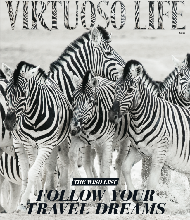
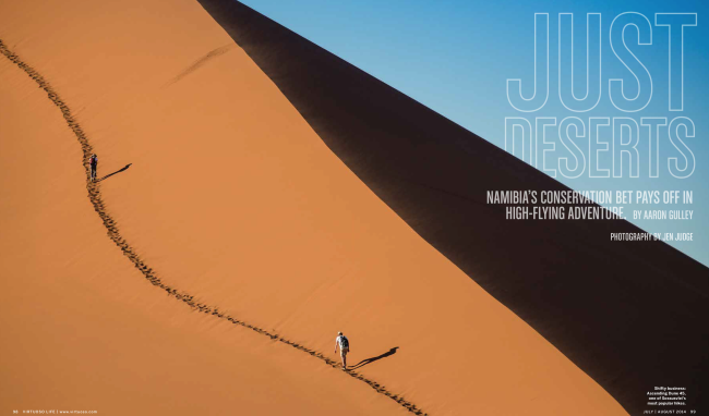
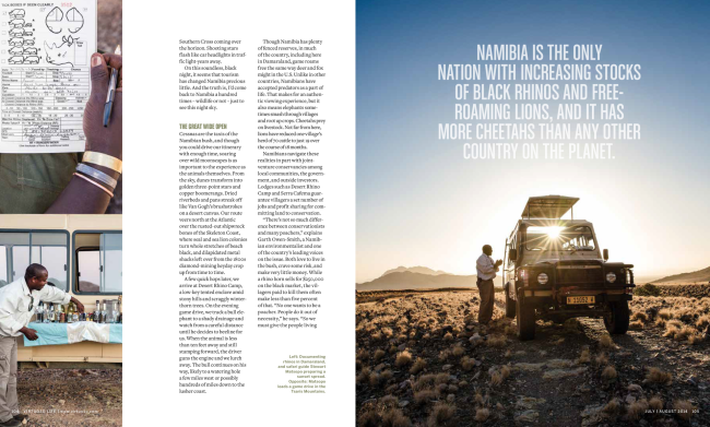
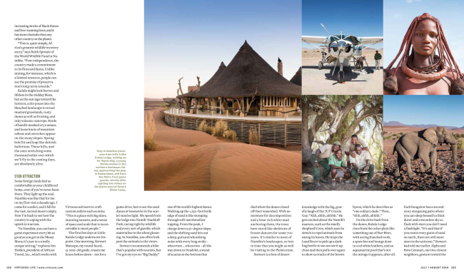
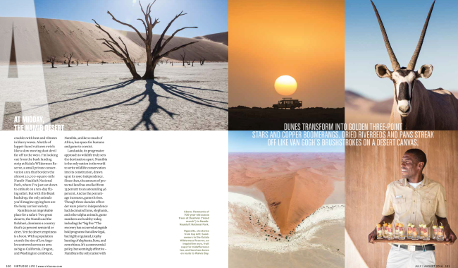
This is a story that Aaron has been wanting to write since our first trip to Namibia in 2005, and the country’s investment and dedication to wildlife conservation in the last few years had him looking for timely opportunities. Sometimes it’s just a matter of patience and persistence to get a story placed. So when the Adventure Travel Trade Association (ATTA) announced its annual conference in Namibia, we took it as the perfect opportunity, and he pitched the story to Virtuoso Life, a publication we regularly work for as a team and they loved the idea.

What was the biggest obstacle you faced with this project?
This was my first “re-assignment.” I had some anxiety about this trip for a number of reasons.

In 2005, Aaron was working as an editor and staffer at Outside magazine and had a story in Namibia for their travel title, Outside Traveler. At the time, I had a full time job in marketing in Santa Fe but was trying to return to my work in photography. So we convinced Outside to let me go with him and photograph the story. The only caveat, since I was a complete unknown, they wouldn’t assign it but would buy stock if they liked what I shot. Upon my return, they liked the images, but my employer didn’t like the time I’d taken off and fired me. Outside hired me for a Las Vegas feature a few months later, other publications saw my work, and the the rest was history. The idea of going back to a place that was the pivotal moment of my photography career was scary and exciting at the same time. I was curious to see how my vision had changed, but I was also nervous about trying to shoot the same thing over again. The fact that Aaron and I both independently won national magazine awards for this feature means a lot.

Travel assignments are the crown jewel for most photographers, what’s your best advice for someone wanting to break into this market?
Travel. You can’t get travel assignments if your work only show cases “local” travel work. Editors need to know you can handle yourself in foreign countries. Language barriers and local customs can be tough to deal with and can often make or break getting a great shot. Being able to adapt to your surroundings and set locals at ease is key.

How many days were you there traveling? and did you have a guide /driver?
Twelve days including travel to and from Namibia via South Africa. We were nine days on the ground. There was no driver, but a pilot flew us about the country.

How difficult was the edit and how many images do you typically turn in?
Edits are always hard. I love making photographs but I get a little stir crazy sitting in front of my computer for hours. I wouldn’t say this edit was any harder than others. The story and the length of time on the ground usually dictates how many images I shoot for a given story. This story was longer than most, so I shot more, about 5,000 images in total. I only like to turn in images I’m really excited about, so I typically submit about 200 and specifically call out about 50 of my favorites.

Does the job usually cover any type of shots, visas, immunizations?
It depends on the destination. As American citizens, we have a lot of flexibility and relatively easy access to other countries, which helps tremendously. For example, in Namibia visa’s were obtained on arrival and no immunizations were required. By contrast, Senegal required a long list of vaccines, and I’ve actually had to turn down two assignments to Brazil because I couldn’t get a visa in time. So every story and country is different.

With so much beauty and intrigue in front of you, is it hard to put down your camera? You must be constantly shooting since everything appears to be beautiful. How do you decide what to photograph (aside from the magazine’s shot list, if there is one)?
Since I was traveling with my husband (and writer), I didn’t get any shot list. We were creating the shot list as we went. In some ways, it’s harder to shoot in tandem with a writer. It means I have to cover everything we do because it’s all a work in progress and you don’t yet know what will or won’t be in the story. In those cases, I am always on.

Over the years, though, I’ve really had to learn to make myself step back. If I shoot constantly, I get overstimulated and don’t produce my best imagery. So I really work hard to conceptualize a few great shots a day and then go out and get them. It’s my way of being proactive and creating what I want versus running around and making mediocre pictures of a lot of things. Ultimately, I aim for variety and continue to check my image library each night to make sure I’m hitting all the bases. Great landscapes, people, architecture, lifestyle and culture, food, flora and fauna—and all at a variety of focal lengths.

Best local food and drink you enjoyed?
Any wild game is amazing, but in particular I love oryx. It’s the most tender, deep red, lean, and flavorful meat I’ve ever had, and I could eat it daily, washed down with a local brew of Windhoek beer, of course.

The Daily Promo – Josh Ritchie

Screen Shot 2015-03-12 at 6.26.38 PMScreen Shot 2015-03-12 at 6.26.56 PM

Josh Ritchie

Heidi: Who printed it?
Josh: After searching around for a reasonably priced printer, since I was getting 1200 prints done at an odd size, I decided to go with a local print house, Dale Laboratories in Hollywood, FL. They were fast (they printed it same day within 3 hours), cheap, and most importantly their quality was exceptional.

Who designed it?
It was sort of a design by committee. It start with a chat with Andrea Maurio who edits a lot of my material. After we came up with a single image idea I tossed it around with fellow freelancer and very close friend Melissa Lyttle. She suggested that I turn the single image idea into a 12 image calendar. From there we both brain stormed both ideas for the images and the presentation until we came up with something I felt fit me while being sleek and functional. I ended up designing and constructing the wooden stands myself spending more that a week covered in sawdust in my driveway cutting, sanding and recutting just to get the perfect 4 x 4 block of wood. My wife began to think I was more of a lumberjack than a photographer.

Who edited the images?
This again was done by committee. Melissa Lyttle, Ed Linsmier, David Holloway, and many other photographer friends all weighed in on what they thought worked best. There was a lot of back and forth on what holidays to use and what techniques to shoot with as well as what final images to use.

How many did you make?
In total I made 100. I gave out a copy to everyone who participated and ended up sending out like 85 to potential clients.

How many times a year do you send out promos?
I send out an email promo 6 times a year, a print promo 6 times a year, and one special promo each year.

Did the calendar idea emerge from wanting to have a functional promo?
The thought behind the calendar was that I wanted a way to keep my images in front of potential clients as long as possible. After the initial idea grew into a calendar I knew it would allow me to do two things : First it would allow me to allow me to explore the making of the images a little deeper than I did when I first shot them at the Eddie Adams Workshop, and second it would allow me to keep my work in front of clients for a full year.

Did you match certain images with the months?
Yes. Once I decided to do a calendar I wrote out all of the months and started brainstorming for images ideas. Some months like December, January, October were easy. Other months like May, June, September were a bit harder. For any month that did not have a well known holiday I started writing down ideas and then looked from props that would fit my budget. For May the ideas was May flowers. September was the start of football season. June was BBQ season. After I had the idea’s firmed up I then went out and bought backgrounds in various colors to try and match a color to the time of the year. I then recruited friends and family for the shoot.

Screen Shot 2015-03-30 at 6.40.46 AM Screen Shot 2015-03-30 at 6.40.32 AM Screen Shot 2015-03-30 at 6.40.22 AM

Where did the idea for the leaf blower come from?
The idea for the leaf blower came from some shots I had seen from an ad campaign. Off hand I forget what campaign it was but I like the idea and I stashed it away for a rainy day.

Here’s some BTS and one more.

How did you pitch this to talent?
My friends and family are pretty awesome so it didn’t take much convincing, although I did get some strange looks. I told them the plan and for the most part everyone bought into the idea right away. The ones who were on the fence jumped in with both feet once they found out they would be able to use the leaf blower on someone else. It is amazing what you can get people to do if you tell them they will be able to make someone else look foolish as well. I guess we all have a dark side

This Week In Photography Books: Ingvar Kenne

by Jonathan Blaustein

I often reference movies in this column. Have you noticed? You must have. Otherwise, you haven’t been paying attention.

What’s wrong with you? Why would you bother coming here, every Friday, if you weren’t going to pay attention?

What’s that? You do pay attention? I’m making unfair accusations? Jumping to conclusions based upon spurious assumptions?

I’m sorry. Forgive me. After 17 days of being under-the-weather, I’m grumpier than an alcoholic-undercover-Russian-soldier, fighting in Eastern Ukraine, after the daily vodka ration’s run out.

But I often find a good photo book will make me think of a film, and once the idea’s in my head, the fingers dance upon the keyboard like a Spring Break frat boy trying to impress a bevy of pretty ladies. (Sadly, it’s all in the hips, but most meat-heads are not flexible enough to move them.)

The movie I’ve got in mind at present is “Groundhog Day.”

Such. A. Classic.

Harold Ramis, RIP, had all sorts of Buddhist motivations, but nobody laughs in Meditation group, so he clearly needed Bill Murray’s genius to make this one fly. What a scenario. You wake up every day, and it’s the same day all over again.

How long did it take Bill Murray’s character, Phil Connors, to turn to a life of crime and perpetual suicide? Not that long. Monotony is a killer, even if you CAN fill your day torturing groundhogs, eating pancakes, or chasing after peak-hotness Andie MacDowell.

In the end, we all learn a valuable lesson, through Phil’s evolution towards enlightenment: Life without growth and change is meaningless. Even fun stops being fun, when that’s all you know. (When you’re trapped in a pleasure prison of your own making.)

Where is this coming from? Clearly, I’m not talking about me, because you already know I’ve been sick for two-and-a-half weeks. No, I haven’t had much fun at all.

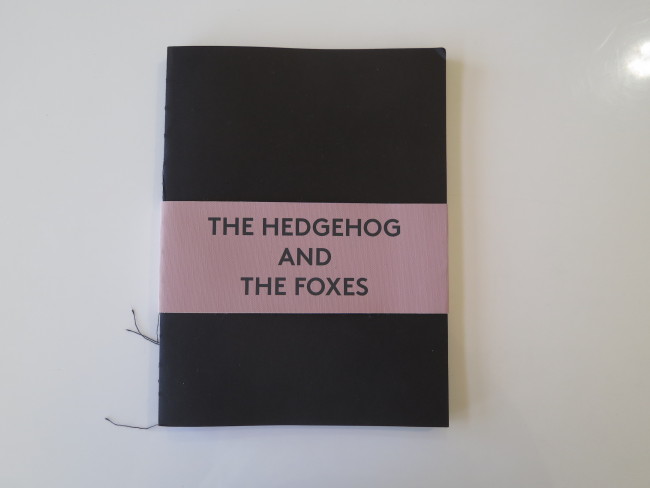
I’m thinking, rather, of “The Hedgehog and The Foxes,” a new book that turned up in my mailbox recently, all the way from Australia. It was made by photographer Ingvar Kenne, produced by the MAUD design studio, and forced me to ask the questions, above, for reasons I will elucidate for you. Now.

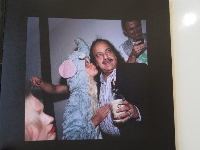
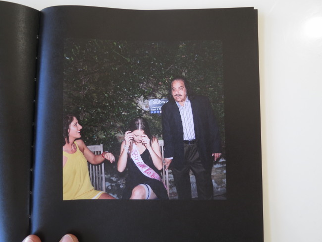
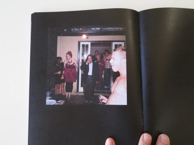
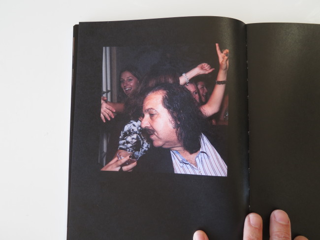
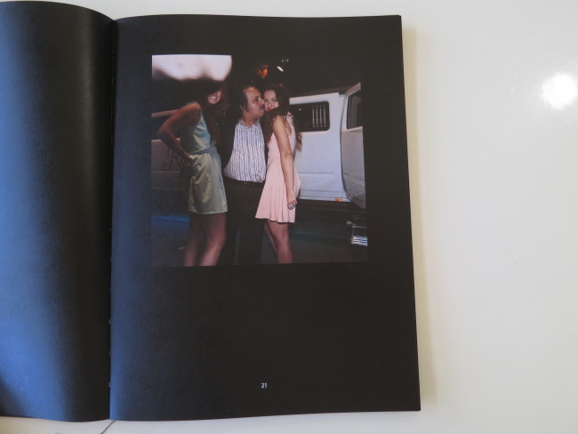
This book is about the legendary porn star Ron Jeremy. He may be the man living the oddest existence on Earth, or at least, the one with the least-expected life.

Have you ever seen Ron Jeremy?

I’d like to think we all have, but then again, not a safe assumption. Though this is the second book I’ve reviewed this year that delves into pornography, I should probably mention I’m no expert on the subject. But I’ve certainly seen Ron Jeremy’s ugly mug in the past, and I might have even seen his private parts.

The story is that his johnson is so prodigious that he’s had a long-standing career sticking it into various orifices, for money. It was never about his looks, or his sad sack physique. Always, it was about his penis.

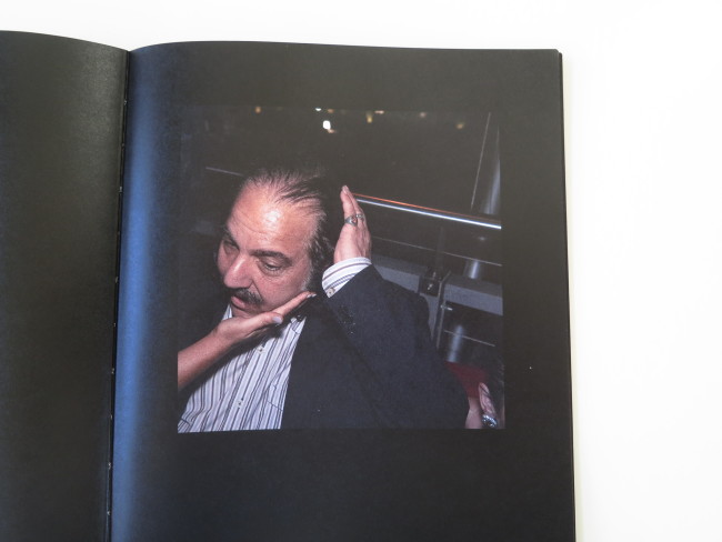
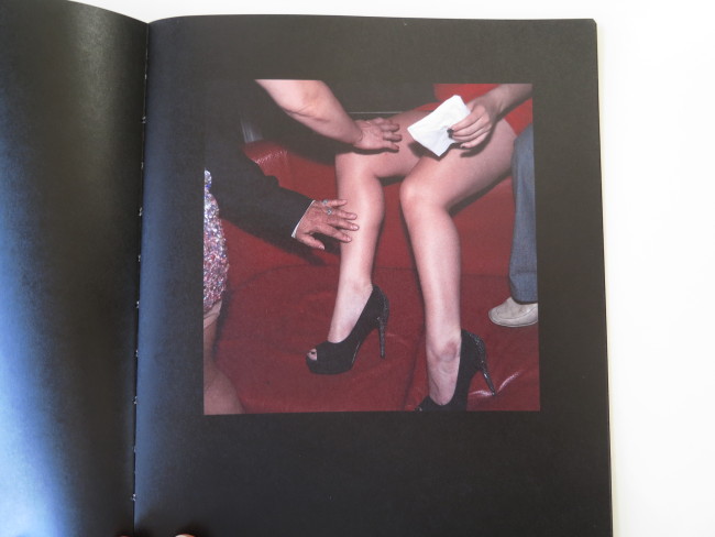
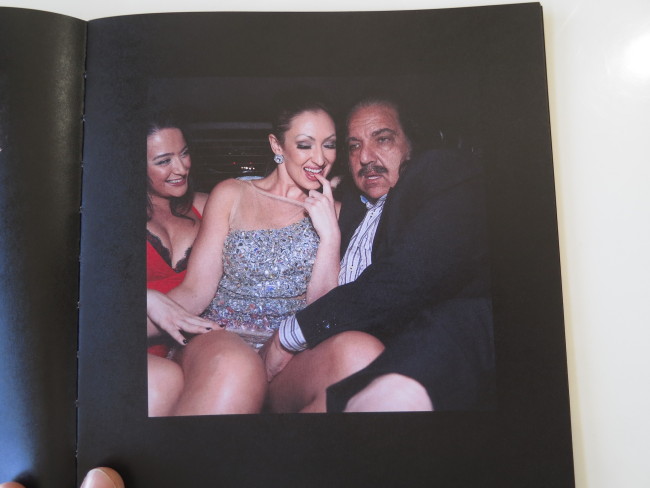
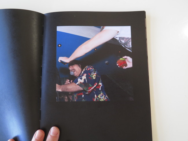
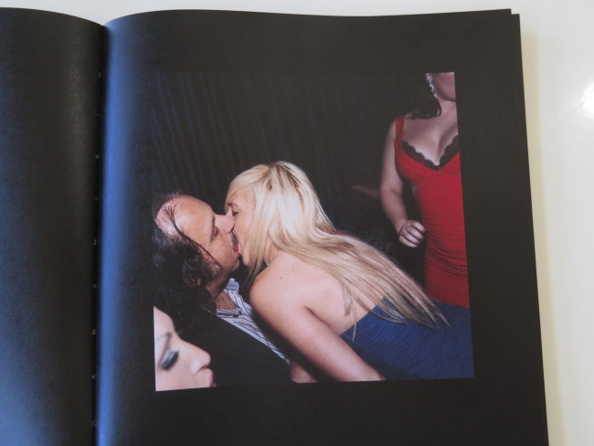
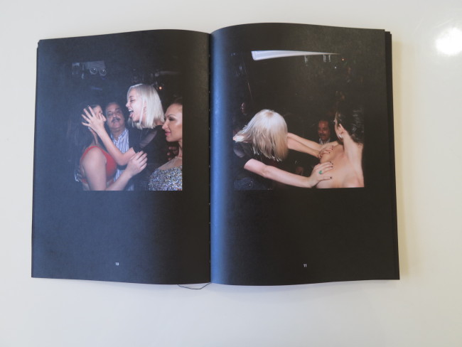
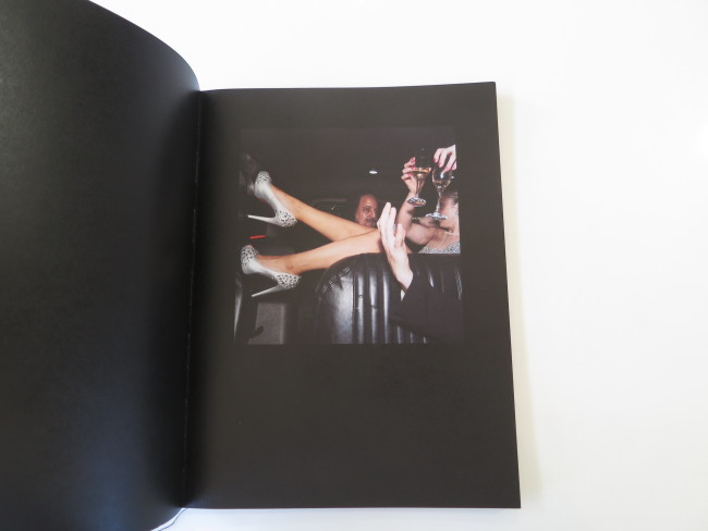
Mr. Kenne got to spend some quality time in the presence of “The Hedgehog” as he bounced from one vapid party to the next. He seems to have always been in the company of ladies, some of whom are very attractive. He signs boobs with sharpies, and shoves his hands up women’s pants, presumably at their request.

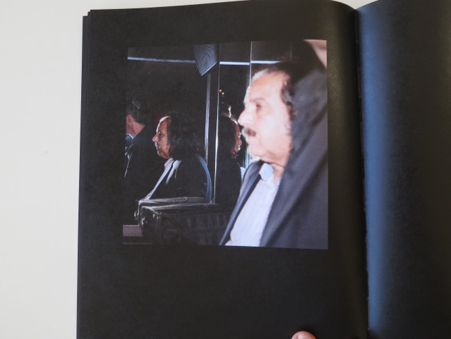
Through it all, Ron Jeremy exudes an Angst that would chill Vladimir Putin’s soul, if it weren’t already in cryogenic territory. Wow, do I feel bad for this guy. He seems so depressed, amongst the depravity, that I doubt he’s even capable of crying anymore.

Trapped in a world of his own making. A scenario many men would kill for, so I’m told. Getting paid to have sex with pretty women. But I wouldn’t trade places with “The Hedgehog” for all the money in the world.

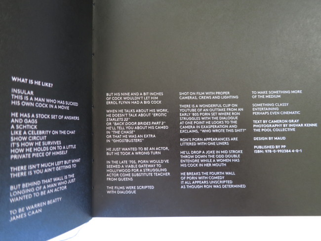
Kudos to the artist for really showing no boobs or butts or cocks at all. The book is essentially clean, focusing on the emotional tenor of the tale, rather than the dirty goodies. We see the story unfold with lots of black-page-breaks, enhancing the noir quality.

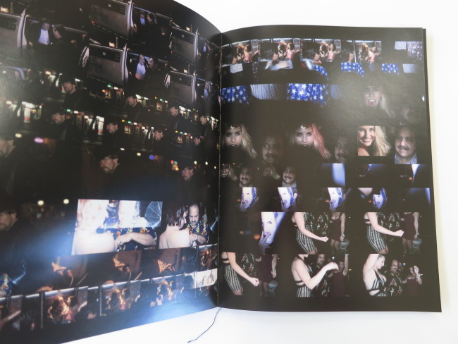
In the middle, Mr. Kenne manages to zoom in and zoom out at the same time, as the contact-sheet-style gives us smaller images, but many more of them. It makes it feel like we’re there for every moment, rather than just the best shots.

There’s a sad poem at the end, which gives words to those emotions. Apparently, all Ron Jeremy ever wanted was to be a serious actor. To be known for his talent, rather than his member. A letter, which the artist included in his packet, states that despite being in each other’s company for close to 24 hours, “no show of human interest and interaction took place between” Ron Jeremy and the artist. (Again, the pictures gave that one away too.)

Apparently, there’s a short documentary video that accompanies the book, and a Limited Edition too, but I’m not sure what they’re about. I don’t want to know, really. Because I need to put on a stupid movie, right now, to wash the bad taste out of my mouth.

Bottom Line: Very well made book that shows us the road to Hell is paved with good intentions

IMG_0460

IMG_0459

IMG_0458

IMG_0457

IMG_0456

IMG_0455

IMG_0454

IMG_0453

IMG_0452

IMG_0451

IMG_0450

IMG_0449

IMG_0448

IMG_0447

IMG_0446

IMG_0445

IMG_0444

IMG_0443

IMG_0442

The Art of the Personal Project: Agnes Lopez

As a former Art Producer, I have always been drawn to personal projects because they are the sole vision of the photographer and not an extension of an art director, photo editor, or graphic designer. This new column, “The Art of the Personal Project” will feature the personal projects of photographers using the Yodelist marketing database. You can read their blog at http://yodelist.wordpress.com. Projects are discovered online and submissions are not accepted.

Today’s featured photographer is: Agnes Lopez

Agnes-Lopez-Photo-Grape-Grain-Exchange-0001

Agnes-Lopez-Photo-Grape-Grain-Exchange-0002

Agnes-Lopez-Photo-Grape-Grain-Exchange-0003

Agnes-Lopez-Photo-Grape-Grain-Exchange-0004

Agnes-Lopez-Photo-Grape-Grain-Exchange-0005

Agnes-Lopez-Photo-Grape-Grain-Exchange-0006

Agnes-Lopez-Photo-Grape-Grain-Exchange-0007

Agnes-Lopez-Photo-Grape-Grain-Exchange-0008

Agnes-Lopez-Photo-Grape-Grain-Exchange-0009

Agnes-Lopez-Photo-Grape-Grain-Exchange-0010

Agnes-Lopez-Photo-Grape-Grain-Exchange-0011

Agnes-Lopez-Photo-Grape-Grain-Exchange-0012

Agnes-Lopez-Photo-Grape-Grain-Exchange-0013

Agnes-Lopez-Photo-Grape-Grain-Exchange-0014

Agnes-Lopez-Photo-Grape-Grain-Exchange-0015

Agnes-Lopez-Photo-Grape-Grain-Exchange-0016

Agnes-Lopez-Photo-Grape-Grain-Exchange-0017

Agnes-Lopez-Photo-Grape-Grain-Exchange-0018

Full disclosure Agnes is a client of mine.

How long have you been shooting?
Professionally since 2003. Many years before that, my brother-in-law bought a Minolta Maxxum 9000 for me from a pawn shop as a gift because he knew I was interested in photography.

Are you self-taught or photography school taught?
Self-taught. I got my start as a stylist for commercial photographers, so I picked up a lot on set. I would watch the photographers closely to see how they worked and then go off and practice on my own with local models, taking my film to Walgreens to get developed and scanned. I also took some classes at the local community college, where I learned how to use a darkroom and print my work. Cutting my teeth shooting film still influences the way I shoot today. I tend to be very calculating and specific when I finally hit the shutter.

With this particular project, what was your inspiration to shoot it?
In the past three years I’ve made a move into photographing food and food lifestyle images, though mostly for editorial, so I wanted to prove to myself that I could produce a full concept from start to finish.

How many years have you been shooting this project before you decided to present it?
I shot the project early last year and presented it about a month after the last day of shooting.

How long do you spend on a personal project before deciding if it is working?
When I plan a project, I spend a day or two scouting and a few days laying out my vision. I’ll break down the day into a detailed schedule so I can get the absolute most out of my time.

On the day of, I just try to feel it out. I shoot a few frames and don’t try to force it. Since it’s personal work, I give myself the freedom to move onto the next shot if a particular setup isn’t working.

Since shooting for your portfolio is different from personal work, how do you feel when the work is different?
Shooting personal work is more about the process for me. What I ultimately get from the shoot doesn’t have to be a set of portfolio images; I want to learn and grow from something outside of what I do every day.

In my day job shooting for a monthly magazine, I’m usually given a short amount of time and specific parameters for the images I’m producing. With personal work, I’m able to take as long as I need and can experiment with different lighting setups and compositions. The hope is always to bring what I do with my personal projects into the other work I do.

Have you ever posted your personal work on social media venues such as Reddit, Tumblr, Instagram or Facebook?
Occasionally. I will be posting more of it this year after I finish the project I’m working on now.

If so, has the work ever gone viral and possibly with great press?
Not yet, but I plan to do more of it and keep putting it out there for people to see.

Have you printed your personal projects for your marketing to reach potential clients?
Some of the images from this shoot are in my current portfolio, which is primarily my food work.

Artist’s Statement

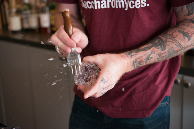
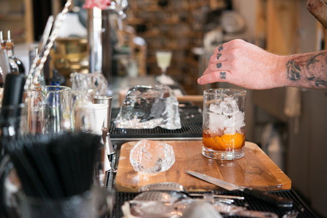
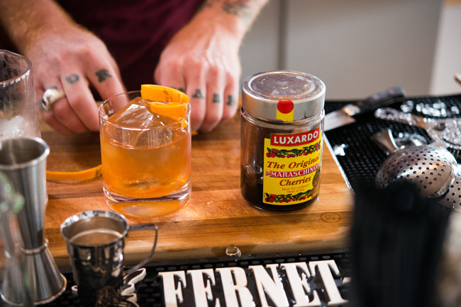
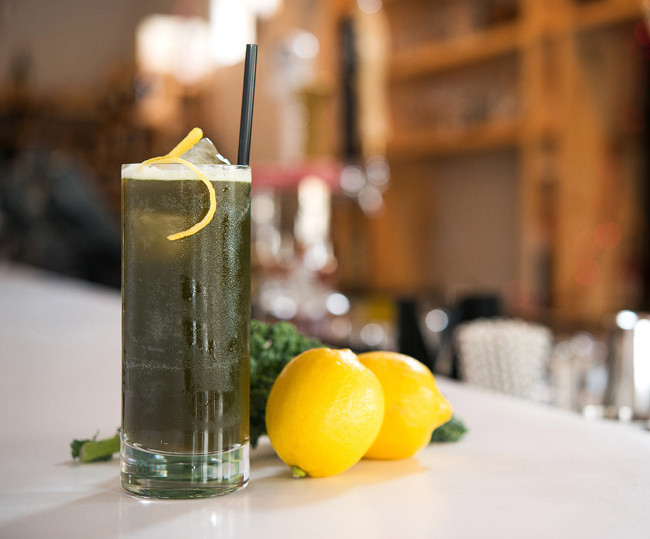
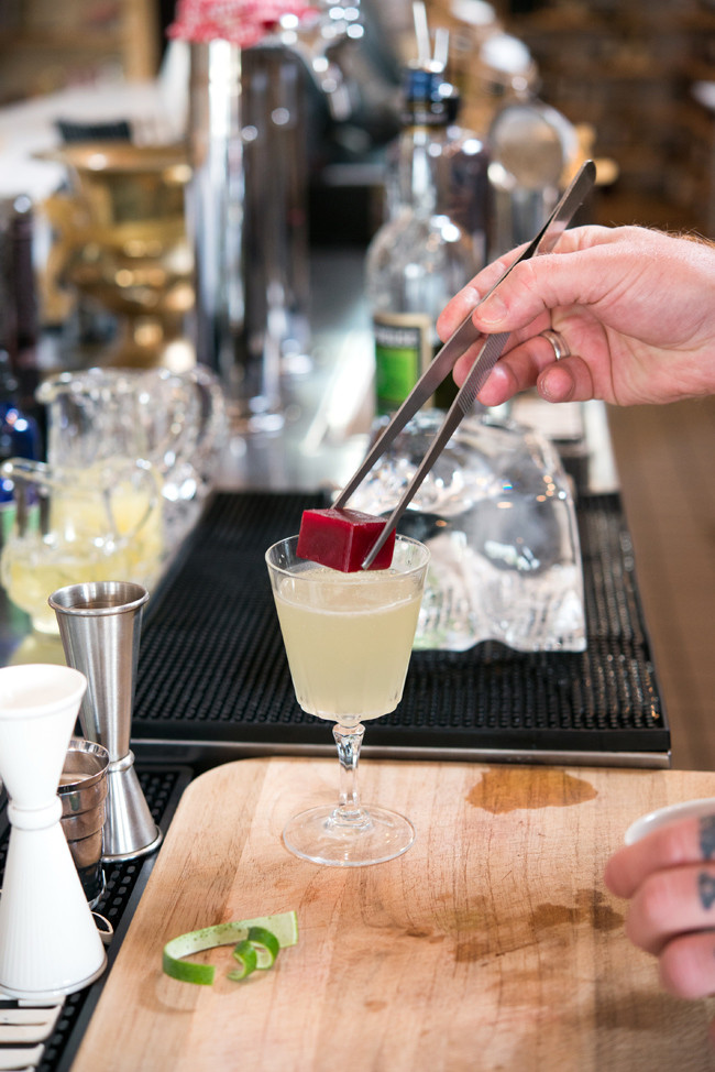
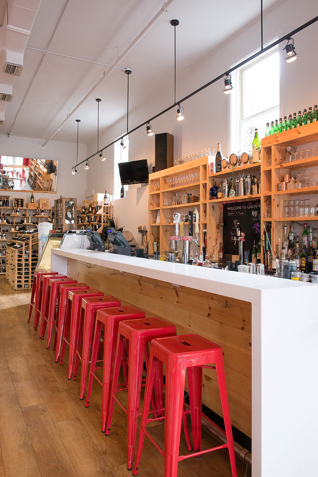
I had this idea to focus on cocktails and how bartenders make them. I pitched my idea to a package store in my area, the Grape and Grain Exchange, which sells small batch liquors and has a bar up front where they offer really unique drinks.

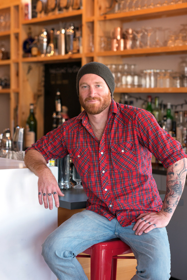
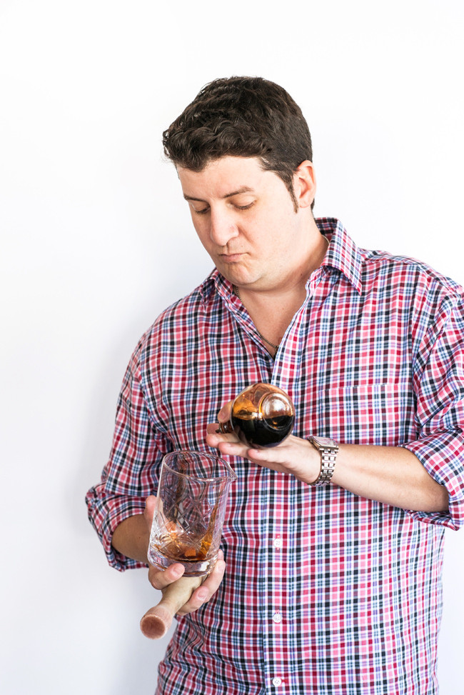
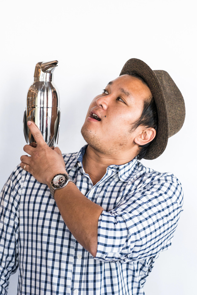
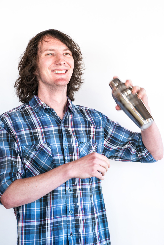
The bartenders are serious about what they do but they’re also funny guys. My goal was to show the bartenders in their element and how their personalities go into the drinks they make.

————–

Agnes is an editorial and food lifestyle photographer with a home base in the historic Riverside-Avondale neighborhood of Jacksonville, Florida and is available for assignments worldwide.

From documenting the effort that goes into preparing a pop-up dining event or photographing the fine cuisine of a AAA Five Diamond Award-winning restaurant, Agnes traverses the Southeastern US and beyond with her camera in search of inspiration and exceptional meals.

Her work can be seen regularly in the pages of Jacksonville Magazine and its other publications, Taste, Home, and 904 Magazine.


APE contributor Suzanne Sease currently works as a consultant for photographers and illustrators around the world. She has been involved in the photography and illustration industry since the mid 80s, after establishing the art buying department at The Martin Agency then working for Kaplan-Thaler, Capital One, Best Buy and numerous smaller agencies and companies. She has a new Twitter feed with helpful marketing information believing that marketing should be driven by a brand and not specialty. Follow her on twitter at SuzanneSease.

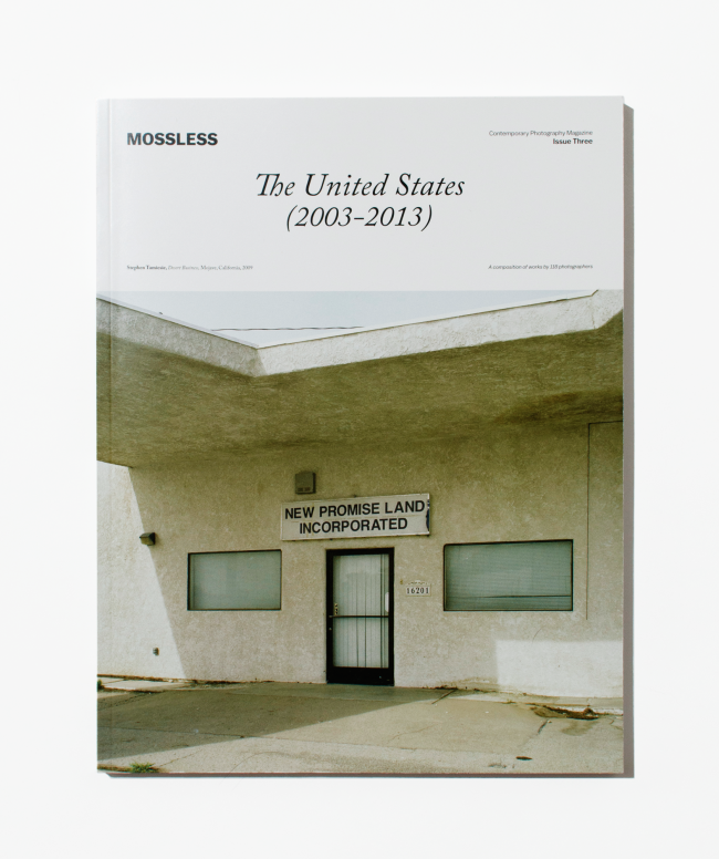
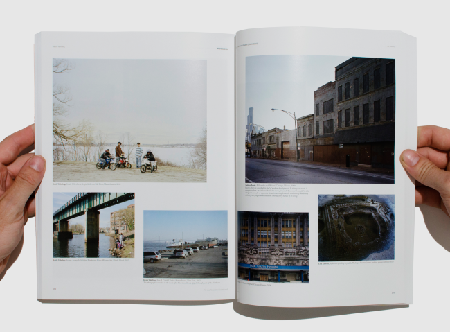
The Daily Edit – Mossless: Romke Hoogwaerts/ Grace Leigh

1 cover copy

Stephen Tamiesie

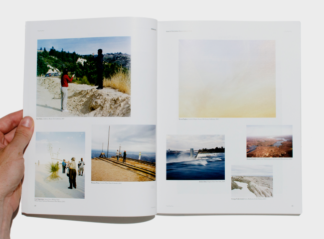
3 ~man&nature copy

( left to right ) Amy Stein, Cait Opperman, Thomas Prior, Trevor Paglan, Jessica Auer, Michael Itkoff, George Underwood

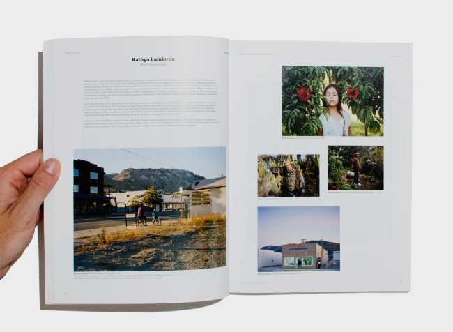
4 Landeros copy

Kathya Landeros

5 ~mining,Kaneps copy

( left to right )  Suzanna Zak and Justin Kaneps

6 Shea copy

Daniel Shea

7 Evans,~industry copy

 ( left to right ) Terry Evans and Carson Gilliland

9 Foglia copy

Lucas Foglia

10 ~domesticdebris copy

( left to right ) Nich Hance Mcelroy, Eric Ruby, Mo Castello, McNair Evans

19 Yahlring,~desolation copy

( left to right )  Keith Yahrling, Andrew Bruah, Lisa Kereszi

unnamed

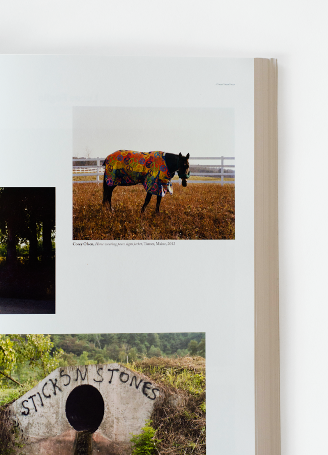
 Corey Olsen


Mossless

Founder: Romke Hoogwaerts
Partner: Grace Leigh

Heidi: What brought about Mossless magazine?

Romke: As a kid growing up abroad I had become attached to various online communities, one of which was photography. I loved photography, had wanted to be a photographer but I saw early on how hard of a career path it would be, regardless of talent. I wanted to study cinematography, but I also wanted to work in publishing. Once I realised that it would also be very hard for me to even get my foot in any door in publishing if I were to go down this other path, it struck me that I might as well try to develop my own. So I started a blog and soon interviewed a photographer every two days, preparing for a day where I might print a book of someone else’s photos.

Grace: I joined Romke in Mossless in February of 2012 when we started seeing one another. At first just to help packing and shipping copies of the first issue, which had just been released. I quickly became very interested in the project, being somewhat new to New York and the contemporary photography scene—I was raised by two documentary photographers—and found it to be an incredible crash course in everything from daily scouring the internet for content to book design and binding to handling distribution of our print issues. It’s been an incredible learning experience.


What is the best way for online and print photography to complement each other?

Romke: That’s a great question! A lot of newspapers and magazines would sure love to know the answer. I don’t know if I have it either but I do know that since it’s still hard to monetize web content, one should refrain from putting valuable work on there… unless you have some cunning secret interface that has it figured out. I think it’ll take a bit of a change of perspective on the value of content access across the whole internet before this conundrum is really solved. And who knows, some day soon our access to the internet may no longer need backlit screens, maybe then the internet will look more like it’s on paper, which could make physical books totally redundant!

In your mind, what are the differences between imagery that exits online vs print and what are the benefits to each? 

Grace: I find that seeing images online is generally more of a passive act, the images come to you through whatever host you happen to be using (tumblr, Flickr, etc) and can easily get buried or overpowered by the multitude of images moving past your eyes. For that reason in particular I think it’s an excellent place to get acquainted with different trends and movements and for sourcing work to put together collections of images. The appeal of print for me is the tangibility of it and the sort of ritualistic act associated with looking through a book or a magazine. By choosing to leaf through a collection of images you are taking a much more active role in viewing, it’s deliberate. There are so many amazing images online, print just gives them a place to live so they can be revisited again and again.

Romke: It’s a thrill to explore images online, as long as you know where to look to find stuff that will surprise and reveal new things, which isn’t too hard considering how many people across the world take part. With print, it’s a thing of ownership, or belonging and solidarity to a mentality. People buy books so that their contents can become a part of them in some way. It’s a potent feeling that is impossible to have online. Beyond the feeling of ownership and belonging I’d say that main difference is simply in an image’s illumination and resolution. Some images look spectacular backlit, others are best found matte and on paper. Some photos lend well to a calculated sequence, controllable in print, others suit the chaos online. It makes for quite a neat contrast. What really tips the balance, though, is exposure to the public. Books are limited in number, resources and by tangibility. An image online is at once at risk of being seen by no-one and by the whole world.

How many images did each photographer submit for the magazine?

Romke:  We didn’t really take submissions, we requested specific photos that we saw on their websites or blogs. We invited them to add any others they thought would be fitting. I think that most photographers sent an average of about six or seven photographs. Some sent just two or three, some sent about twenty.

What was your editing criteria?

Romke:  Once we had our huge folder of photos, we printed them all out, labeled them, and tried to organize them by loose categories like commerce, industry, rural, urban, and so on. We used those loose categories as groupings that we could move through and we tried to find ways to connect the different themes in a visual way. We had requested a number of photographs that would fall under  “on the road” which we used quite a bit to connect these themes. It was really hard. We created a few rules for ourselves and we broke them frequently in this mad goal of finding some kind of pure sequence.

Overall what was your theme for this issue?

Grace: The theme was photographs taken in the United States over a ten year period, as seen by a chorus of different photographers. It was our goal to create a survey of new american photography so we published a range of works from amateur  photographers we found on flickr to professional photographers with already published works, our only strict criteria that it be taken between 2003-2013 and that the work had already been published online. 

I know you’re developing a fly-on-the-wall/interview type video, which may be turned into a series, when can we look forward to that and how would we find it?

Grace: Yes! We’re really excited about our new project. We’re currently editing that video, which should go online within the next month. I wish I could say more, but I really shouldn’t!

The Daily Promo: Ryan Nicholson

_NP_4600
_NP_4606 _NP_4608

final-LWH_NP_0161

final-LWH_NP_0180

final-LWH_NP_0415

final-LWH_NP_0425

Ryan Nicholson

Who printed it?
It was printed by Spangler Graphics in Kansas City where I am based.

 Who designed it?
Designed by Kirk Lakebrink a Kansas City based designer.

Who edited the images?
Edited by myself and JP Perlmutter an artist consultant.

How many did you make?
We printed 275 copies of the piece and I mailed out 220. I will use the remaining pieces as leave behinds at portfolio shows, etc…

How many times a year do you send out promos?
For the past two years I have sent out 6 direct mail pieces a year (basically one every other month) and this year I am going to do them quarterly.

Where did your idea of women and hoops come from?
It is a long story on how I ended up shooting the piece but I will try and summarize. I played high school and college basketball. I graduated with a history degree and started my professional career as a high school history teacher/basketball coach. I taught and coached in Moore, Oklahoma then in Kansas City, Missouri and finally out in Phoenix, Arizona. The last year that I taught in Phoenix I actually switched from teaching history to photography but through a combination of teaching burnout and revitalized interest in photography (my father was a photographer) I decided not to renew my teaching contract and to give photography my full time attention. I started as a stringer for a couple small newspapers in Phoenix and my business has grown and shifted in a variety of ways over the past ten plus years. I am now based in my hometown of Kansas City, Missouri shooting a mixture of editorial and commercial work.

Despite my career change away from coaching I have always maintained a love and interest in basketball and decided over this past year that I wanted to dedicate some time and attention to shooting it specifically. I had a trip scheduled to New York for portfolio shows last summer and was digging around for information on the street basketball scene in the city. I found a documentary on NYC street basketball called “Doin’ it in the Park” on Netflix which led me to their Facebook page. I was looking at the film’s Facebook page and saw a post about a group of women that play pick up ball every Sunday at Goat Park in the upper west side. I found that “Ladies Who Hoop” Facebook page and sent a message to the organizer asking if I could come and photograph them while I was visiting. The organizer Amber Batchelor welcomed me with open arms and I spent a good portion of a Sunday photographing the group while I was in town.

The second part of my interest in photographing the women was my desire to create images of women in a manner that shows them as strong, athletic, etc….I have two young daughters and any opportunity that I have to use my time and talents to document women that are strong and pushing boundaries I consider time well spent. I have to say watching the women take over one of the courts in a prominent New York City park was really cool to watch and document. I am in the planning stages of another trip there and will definitely go back and photograph the group again.

Read more in SLAM Magazine here
 

This Week In Photography Books: Andy Freeberg

by Jonathan Blaustein

I got a lot of good feedback on last week’s review. Honestly, I wasn’t that surprised. Who doesn’t love to read the ramblings of a slightly deranged mind?

It was as if I were Raskolnikov for a few moments. Fleetingly crazy, only without the menace. Who knew what I might say? I could have written the whole thing stark naked, having a laugh at everyone’s expense, and no one would have been the wiser.

This week, however, I’ve moved past the pain-killer phase of this particular illness. As two of my students correctly predicted, it migrated from my throat to my chest. Now, I have bronchitis, which is less painful, but more annoying.

All day long, I’ve been hocking up phlegm.
Cough. Cough. Chest boogers.

Not. exactly. sexy.

And yet, as I said last week, the trains must run on time. Books must be reviewed. Content must be produced. It is the way of the 21st Century, and who am I to question reality?

(Were I still in the Dostoyesvky-impersonating phase, I might do just that. “The world. It is bleak. People. They are dark, miserable animals. Happiness is an illusion. We are all capable of murder. Why go on living? What is the point? I really should kill myself. Or better yet, someone else. They don’t deserve to live. I hate them. I love them. I am thoroughly confused.”)

Are you confused? Shall I make things less complicated for you?

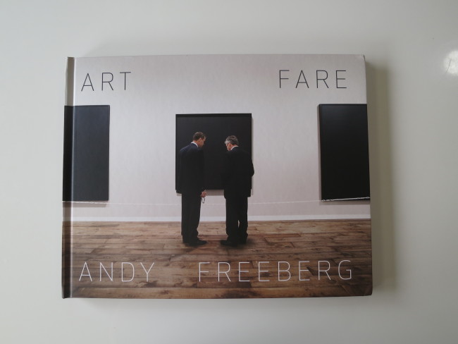
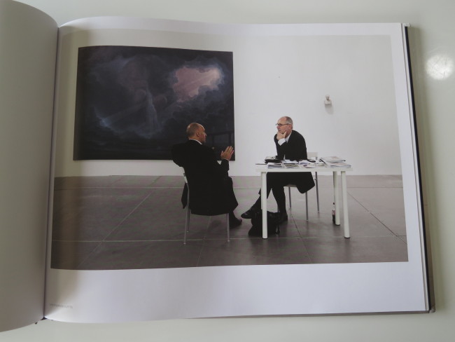
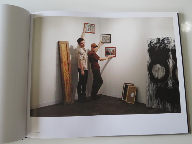
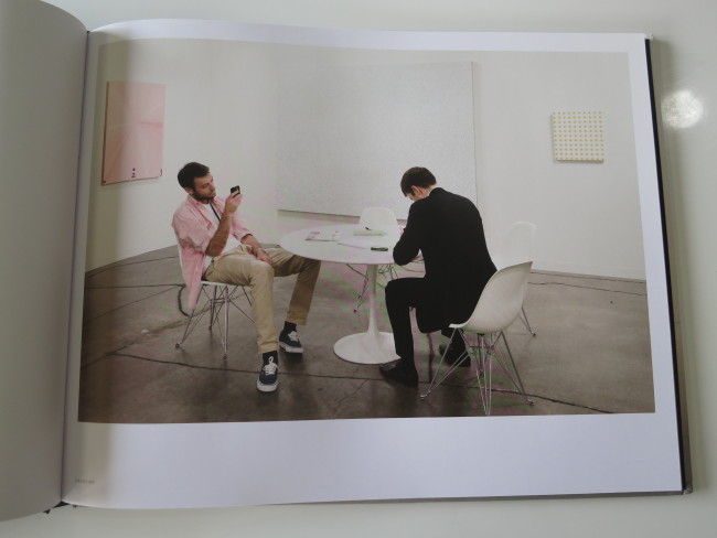
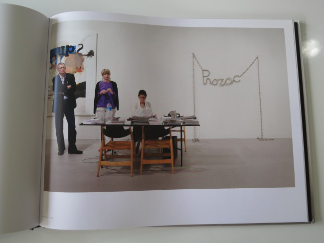
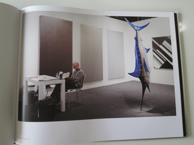
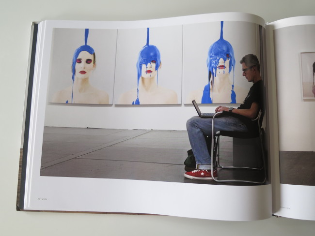
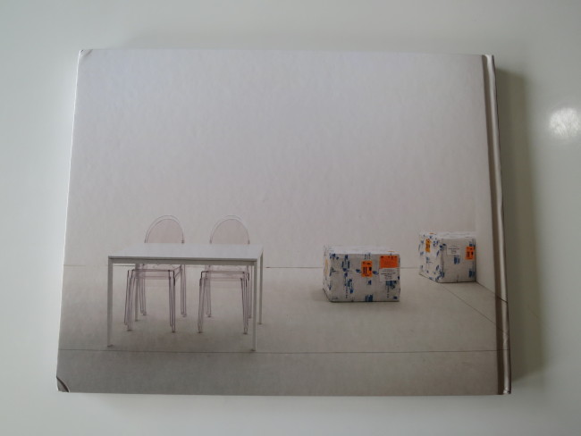
How’s this? Andy Freeberg’s new book “Art Fare,” published by Sojourn, is awesome and hilarious, in a dry, insider-kind-of-way. He laughs at the type of powerful, humorless people that normally intimidate the shit out of regular folks like us: Contemporary Art Dealers, and their bespectacled minions.

This book requires little explication, which is why it is perfect for today. The pictures below will amuse you, for certain, and allow me to wrap this column up quickly, so I can go back to my obnoxious, Russian-level suffering.

Cough. Cough. Chest boogers.

The pictures were made in the Miami Art Fairs, and feature gallery owners and workers in front of the goods they buy, sell and trade. Not much to figure out.

There are connections between the people and the art, occasionally. Like the guy in front of his own painting, with his wiener hanging out.

But what I really loved was the fact that almost all of these people have adopted the kind of affected, bored-of-the-world, I’d rather check my Iphone than stare at a wall, I’m-better-than-you-are kind of postures. It makes you want to punch them in the face, collectively, but then, not really. They’re just flawed human beings, as are we.

Everyone gets bored, I suppose, and if you stare at the art too long, perhaps your mind will explode.

I’m sure they’re secretly insecure, these Art World Denizens, and trying to fit in, like the rest of us. So they wear faded black T-shirts, like their buddies do, and pretend not to care. (Like their buddies do.)

Bill Hunt, who writes an essay, is also featured in a photograph, at his former gallery Hasted Hunt Krautler. In fairness, his pose affects no such ennui. (Which really ought to be a Russian word, instead of French. Don’t you think?)

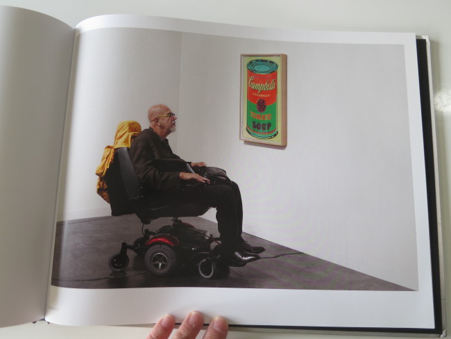
He ends with Chuck Close, in his wheelchair, looking at an Andy Warhol “Soup Can” on the wall. What a great way to “close” a book. Perfect, really.

Blaustein out.

Bottom Line: Hilarious, well-observed investigation of the Art-World-Gorillas in their natural habitat

To Purchase “Art Fare” Visit Photo-Eye

IMG_0425

IMG_0426

IMG_0427

IMG_0428

IMG_0429

IMG_0430

IMG_0431

IMG_0432

IMG_0433

IMG_0434

IMG_0435

IMG_0436

IMG_0437

IMG_0438

IMG_0439

IMG_0440

IMG_0441

Books are provided by Photo-Eye in exchange for links back for purchase.

Books are found in the bookstore and submissions are not accepted.

The Art of the Personal Project: Dennis Stevens

As a former Art Producer, I have always been drawn to personal projects because they are the sole vision of the photographer and not an extension of an art director, photo editor, or graphic designer. This new column, “The Art of the Personal Project” will feature the personal projects of photographers using the Yodelist marketing database. You can read their blog at http://yodelist.wordpress.com. Projects are discovered online and submissions are not accepted.

Today’s featured photographer is: Dennis Stevens

56853f5ac9c9cd9899c9a77046d77e89

0423689e74497094d560ad945b540e95-1

20141223-Day 3IMGL3302

20141227-Day 5IMGL9809

20141227-Day 5IMGL9844

AllMenAreBornEqualThenAHandfulBecomeFirefighters

Batallion61OnScene

DreamBigandDareToFail

IntoTheSmokeWeGo

MorningDuties

StayLowMoveFast

T61ToWinterPark

TheMinuteBeforeYouGoIn

VentEnterSearch

YouNeverKnowIfTheNextCallWillBeYourLast

How long have you been shooting?
I have been shooting for close to eight years now with three of those being professional.

Are you self-taught or photography school taught?
I am completely self taught through experimentation.

With this particular project, what was your inspiration to shoot it?
Growing up, I always had a strong fascination with firefighters. Last summer I took the initiative to speak with the local fire chief about my photography and he granted me the privilege of working alongside his firefighters. I spent nearly a week trying to get a sense of how I was going to capture such a powerful subject, but in the end it turned out fantastic.

How many years have you been shooting this project before you decided to present it?
This project began last July, and I released the first set of images in mid-august.

How long do you spend on a personal project before deciding if it is working?
It truly depends on the subject that I am capturing. Traditionally, I will spend around three days to determine if I connect with the subject, if not I normally abandon the idea until a later date.

Since shooting for your portfolio is different from personal work, how do you feel when the work is different?
I am very selective in the work I choose to publish in my portfolio. Portfolio work for me has to be perfect in quality, while my personal projects don’t have too high of standard since I am just expressing myself.

Have you ever posted your personal work on social media venues such as Reddit, Tumblr, Instagram or Facebook?
I present my work on different venues depending on the subject matter. For example, I posted this project nearly everywhere I could including the firefighting sub-reddit.

If so, has the work ever gone viral and possibly with great press?
My work with first responders has gone viral within the firefighting community. As of January 2015, my series had received over half a million views as a result of social media sharing. Although with a lot of viral images out there, only a couple thousand of viewers knew that I was the photographer.

Have you printed your personal projects for your marketing to reach potential clients?
At this point, I have not. Although, I plan to create multiple promotional pieces that I will distribute to agencies this summer to introduce my brand.

—————-

Dennis Stevens is an eighteen year old photographer based in Orlando, FL. He specializes in lifestyle, advertising, and performance photography with a hard focus on first responders. He is network driven and loves to create work with new clients. He has been shooting commercial photography freelance for the past three years while attending high school. He has been regarded by the greats of his industry as ambitious and someone who will make his mark.

His work with first responders has been widely recognized in the first responder industry. His continuous series highlighting the Winter Park Fire Department has been viewed by nearly half-a-million people worldwide as a consequence of social media sharing. His most recent campaign with Honeywell International received the attention of nearly twenty-thousand viewers within the period of a work week.


APE contributor Suzanne Sease currently works as a consultant for photographers and illustrators around the world. She has been involved in the photography and illustration industry since the mid 80s, after establishing the art buying department at The Martin Agency then working for Kaplan-Thaler, Capital One, Best Buy and numerous smaller agencies and companies. She has a new Twitter feed with helpful marketing information believing that marketing should be driven by a brand and not specialty. Follow her on twitter at SuzanneSease.

I Don’t Object To Staging – The Honesty Lies In My Ability To Understand

I remember your picture of a Spanish woman throwing water into the street. Was this staged?

A. I would not have hesitated to ask her to throw the water. (I don’t object to staging if and only if I feel that it is an intensification of something that is absolutely authentic to the place.)

Q. Cartier-Bresson never asks for this…. Why do you break this basic rule of candid photography?

A. I didn’t write the rules — why should I follow them? Since I put a great deal of time and research to know what I am about? I ask and arrange if I feel it is legitimate. The honesty lies in my — the photographer’s — ability to understand.

Q. Why do you print your own pictures?

A. The same reason a great writer doesn’t turn his draft over to a secretary… I will retouch.

via Discussing Honesty in Imagery – NYTimes.com.

The Daily Edit – Portland Monthly: Michael Novak

Screen Shot 2015-03-15 at 3.30.26 PM
Screen Shot 2015-03-15 at 3.30.43 PM

Portland Monthly

Art Director: Michael Novak
Photographer: Andy Batt

How often do you have celebrities on the cover? Is this a unique cover story?
This is actually almost unheard of for Portland Monthly. As a city mag, our covers tend to stick to standard tropes such as Best Restaurants, Travel, Schools, Real Estate, etc. Occasionally we experiment with more “newsy” subject matter, but those covers have typically fared poorly on newsstand. And more specifically, our covers almost never feature actual people, except in cases where they’re fairly anonymous, eating in a restaurant or hiking a mountain; our readership responds better to more tried and true reader service. In the 8 years I’ve worked here, we’ve published only three celebrity covers—so it was definitely an experiment to try this approach.

Is this an an annual theme: exceptional Oregon women?
We’ve never done this topic before. The subject was championed by one of our executive editors, Rachel Ritchie, and embraced by our founder, Nicole Vogel, who had experienced plenty of sexism herself in the process of raising capital to start this magazine 12 years ago. Nicole wrote an essay in the issue, about the disrespect she encountered in a city considered a bastion of liberalism.

What makes an exceptional woman for your title?
We chose women across multiple industries and geographies—all of them bravely innovating in their given fields. Our criteria was really just that the women included be doing impressive work that our readers didn’t necessarily know about. We wanted each profile to feel both surprising and inspiring, from the chief of staff for the Governor to a death row investigator to Portland’s first female head brewer.

How did the concept evolve, was it hooked on the idea of these women being pioneers?
The concept was always tied to the pioneering spirit of Oregon women; from a journalist’s perspective, it’s just such a rich subject with so much material to work with. The feature’s evolution was mainly due to our selection of individuals to profile and the format those profiles would take. We could’ve easily made a whole magazine on this subject—we started with a list of more than 100 women to whittle down to 10—so the real challenge was smartly editing our aspirations and limiting the feature to the 13 pages available.

What made you choose Andy Batt for this project?
Andy brings the right skills to the table. He’s worked on many Portland Monthly projects over the years, from shooting a school bus of screaming 7-year olds (never try art directing 7-year olds!) to ballerinas to the March Fourth marching band. He always comes to a project looking to try something new, and though he’ll always execute the client’s ideas, he also brings his own. In the case of the Carrie Brownstein shoot we only had an hour with her, so we had to figure out an approach that was simple enough that we could get options for both the cover and the interior. We had conceived of a Northwest referencial set, with Carrie standing on the stump of a tree with a rough-hewn wooden background. But when I got to the set on the day of the shoot, Andy had commissioned a prop builder to assemble a green background made out of fanned fern leaves, another powerful NW visual. And in the end we went with his fern idea because it just made a better visual.

Do you ever have photographers from out of state shoot for you?
Typically no. Occasionally I’ll have someone from Seattle shoot for me, but honestly our coverage is tightly Oregon-focused and we are blessed with an abundance of local talent so I almost never have to hire from out of state. I often joke that Portland is where photographers come to retire. We seem to have more of them per capita than NY and LA. That’s probably not strictly accurate, but it’s gotta be close!

What’s the best way for photographers to get in touch with you?
The can email me at mnovak@pdxmonthly.com.

The Daily Promo – The Morrisons

Screen Shot 2015-03-02 at 11.09.45 AM


Screen Shot 2015-02-25 at 9.09.06 PM

The Morrisons

Who printed it?
The foil stamped folders were printed by a great local printer, Mr. Lam at Candid Bindery.  He’s been foil stamping with expert precision forever.  The nine double-sided image cards were printed by Shapco in Minneapolis.

Who designed it?
We worked with Studio Lin here in New York.  They have a great eye for detail, materials, and color, and we loved some of their previous work (check out the cat calendars for United Bamboo on their site.

Who edited the images?
We always go through extensive rounds of edits ourselves before enlisting the expert eye of consultant and artist Melissa McGill.

How many did you make?
This was our first promo working officially as a team, and we wanted to introduce ourselves in a thoughtful way, favoring quality over quantity.  We printed 500, which was thankfully just enough.

How many times a year do you send out promos?

We hope to mail promos once or twice a year.  We love working with designers and producing something from start to finish.  It’s a luxury and can be great fun.