Discover and Cultivate Talent

The winners of the Hearst 8×10 Photography Biennial were recently announced (here). I was struck by how novel it seemed for a company like Hearst who publishes magazines like; Cosmopolitan, Esquire, Harper’s BAZAAR, Marie Claire, O, Popular Mechanics and Town & Country to hold a contest that “is an international competition to identify and promote new and emerging photographers” where they think the winners are “rising stars who will play an important role in the future of magazines, media, the Web and the worlds of design and photography.”

It used to be an open secret that one of the most profitable names in the television industry, HBO, went to great lengths to discover, develop and take chances on unknown talent. Many of their biggest hits came from unknown writers they took chances on (here) or discovered through one of their contests.

So, why don’t magazines do the same? Besides the obvious lack of vision at the top of most publication it’s likely because they don’t realize their future depends on finding talented people and attracting them to magazines over other mediums. The history of magazines is littered with ultra talented writers, photographers, designers and editors and somehow I think in the last 10 or more years many of these people may have gone into advertising instead and now with all the potential on the web who knows if they will find their way into the magazine industry.

I once worked at a magazine that built their reputation with a handful of extremely talented writers who all eventually moved on. I often wondered how they planned to find the next group of talented writers who would define the next phase of the magazine. Now that I think about it, talent scouting might have done the job. This Hearst Biennial seems like a good step in that direction for photography.

picture-2

The winning photographers are:
Andy Freeberg
Louie Palu
Benedikt Partenheimer
Brad Carlile
Edith Maybin
Nicholas Prior
Mark Kessell

Life.com Launches

picture-1

The new Life.com just launched and it’s worth a visit to go peruse some great old photography. I think they’re planning on simply using it as a portal to sell Getty images, but it’s nice that they put a decent user interface on it and created edited material to check out.

This is from the press release:
“More than 7 million photos from the Life and Getty Images photo collections are now available to consumers in the largest online photography site. The curated site features both rarely seen and iconic photos from the 1850s through today. More than 3,000 new photos from Getty Images award-winning photographers will be added to the site daily.”

Something To Prove Again

At some point we will arrive at the place where magazines have something to prove again. Maybe they will be owned again by brash men and women who want to electrify their readers or maybe the owners will need to pad their ego before their pocketbook or maybe they will need to prove the power of type, pictures and design on the printed page.

When I saw these old Rolling Stone pages (here) I thought how exciting it must have felt to ship that issue to the printer; a cover with one coverline, pages with no text and a photographer in his prime.

UPDATE: I just heard from Elizabeth Avedon who was working for Richard at the time as the resident Designer, Art Director, Photo Editor and she designed that issue of Rolling Stone including the cover. She says, “It was designed in-house at Richard Avedon Studio, as was everything of Richard Avedon’s as he always retained control of what went out. ”

rsavedon1

rsavedon2

rsavedon3

rsavedon4

rsavedon5

rsavedon6

rsavedon7

Magazine pages via, Things To Look At

JPG Magazine Profit And Loss

If you’ve never seen an income statement for a magazine it’s a very educational document to check out. It just so happens that JPG Magazine’s P&L was published recently over on Gawker/Valleywag (here) and I have it embedded here for you to see.  They are claiming that in part, the demise of the magazine was contributed to by CEO Mitch Fox and his $500,000 a year salary, the expensive salespeople he hired, launching a travel title called everywhere and preparing a fashion magazine. If that’s true, it’s simply run of the mill magazine making hubris where people assume something that works at one level can be scaled to the next. Maybe this is also the end of an era where a powerful sales staff with serious marketing dollars can bring in more advertising than great content and loyal readers on its own.

Back to the income statement. In May 08 here are the numbers:

The income:
$40,000 in advertising with online and print being nearly equal.
$19,000 in subscriptions
$50,000 in newsstand sales

The Expenses:
$23,000 paid in contributor fees ($100 a photo for the photographers)

$104,000 for paper and printing
$23,000 for subscription postage and newsstand shipping

$5,000 for website hosting

$10,000 in salaries for the circulation staff
$55,000 in salaries for the sales staff
$47,000 for the website staff
$58,000 for the magazine editorial staff
$18,000 for the marketing staff
$12,000 for marketing expense
$78,000 for executive salaries
$32,000 in general operating expenses
$17,000 for rent

For a grand total of -$375,000 in net income. Giant sucking hole.

You can obviously see why magazine making is a rich person’s game because $125,000 just to print and deliver the thing is a serious bill to pay every month.

Media Post is reporting that the magazine has been bought (here). I wonder if they can find any fat to trim. Apparently Mitch Fox is stepping down.


jpgmagnetincome – Get more Business Documents
Thanks, Joerg.

Wonderwall – Navigate By Photography

Finally some real progress in magazine-like website design. Wonderwall is a new celebrity tabloid site created by MSN and it’s no surprise if you’re familiar with MSN’s history on the web (Brian from Media Storm used to work there) that they’ve innovated the logical next step. Reproducing magazines online requires using photography in a big and powerful way and I really don’t think anybody realizes the role it plays in navigation, as an entry point to the stories plus most importantly how it sets the tone of your publication for the readers and advertisers. Regardless of how you feel about the celebrity tabloid genre this is groundbreaking. More please.

wonderwall-1

Newsweek Set For New Identity

From a story in the New York Times (here):

“Newsweek is about to begin a major change in its identity, with a new design, a much smaller and, it hopes, more affluent readership, and some shifts in content. The venerable newsweekly’s ingrained role of obligatory coverage of the week’s big events will be abandoned once and for all, executives say.”

“‘There’s a phrase in the culture, ‘we need to take note of,’ ‘we need to weigh in on,’ ‘ said Newsweek’s editor, Jon Meacham. ‘That’s going away. If we don’t have something original to say, we won’t. The drill of chasing the week’s news to add a couple of hard-fought new details is not sustainable.'”

*clap, clap, clap, clap* Brilliant move. Thanks, Ryan.

Rodale Publishes Nearly Up To Date Back Issues on Google

Looks like Rodale has some sort of partnership going with google or maybe they’re just giving in to the inevitable and allowing the scanning of all but the latest issues of the magazine. I found all these titles with the last 3 years of back issues available up to the November or December 2008 issue: Best Life, Men’s Health, Women’s Health, Bicycling, Prevention, Organic Gardening, Mountain Bike Magazine, Running Times and Runners World.

It’s somewhat ironic that a company with a stable of magazines that rely on dispensing the same advice year after year (how to get 6 pack abs!) would be the first to enter that information into a permanent database where anyone can look up content.

I’m not sure how the rights are going to be handled with this if at all. Publishers are already barred from selling the content to online databases (according to this) without renegotiation of the rights so I guess giving it away is the only way it can be done without paying extra. So, why is Rodale doing this? My only guess would be, to snag potential readers who might stumble on the content and discover they like it, but would rather have it delivered in the usual format.

rodale-cover-view

best-life

Flipping Digital Magazines

I agree with some of my readers who think this page flipping of digital magazines is a joke but if this is what it takes to get magazines to publish a digital version then by all means, go for it. I think there’s a very small portion of your audience that’s looking for a digital version but is not comfortable with it unless it looks like a magazine and the pages flip. Whatever.

These things seem to be sprouting up everywhere lately:

The originals: zinio.com and issuu.com

Trying to become legit: mygazines.com

More: ceros.com, openzine.com

What I find truly annoying with someone like zinio is that they save the publisher money on printing, paper and postage but still try and charge the same as a printed magazine. I don’t like reading digital flipping magazines in the first place but will do it to save time, money and trees. I would probably subscribe to 40 of these if they were a dollar apiece but if it’s the same price as print I prefer paper. What I really want to do is browse all the magazines and pay to read the articles that interest me. That’s how it works on the newsstand, why don’t they realize that.

zinio

Thanks for the tip Stephen.

JPG Magazine Can’t Stay Afloat with Inexpensive User Generated Content

I’m a little surprised by the number of emails I’ve received and the number of blog posts I’ve seen (here, here, here, here, here and here)  regarding the demise of JPG magazine. Taking something that works well online and printing it seems kinda like taking a magazine and turning it into a website. Does anyone still think this is a good idea? Sure, I think printing it and charging $20 an issue, (not $2) so the published photographers can have something for the coffee table and also using the printed product to prove some form of legitimacy to advertisers is a good idea. But, anyone who feels like user generated content should be printed and distributed the old way is missing the value of magazines in the first place. Original content.

It all comes down to a fairly common discussion at magazine story and photography meetings. Do we inspire our readers with content where they can say “I could do that” or do we give them aspirational content so they say “I wish I could do that.” A mix is probably closer to the truth but I’ve always been in the aspirational camp and that means running photography that not even my editor understands.

Time Magazine Trolling For Free Pictures on Flickr

Dear XXXXX,

We would like to publish your photo in Time Magazine in a year-end issue and also on Time.com. If you are the author of the photo and can give Time the rights to publish it, please send a high-resolution image to xxxxxxxx@timemagazine.com. While we can’t pay you for this use, we’ll give you an author’s photo credit with the published photo in the magazine and of course you retain the copyright.

Thank you for your participation.

Sincerely,

XXXXX

When I saw this I thought, how stupid it is to not to offer your space rate or at least a hundred bucks for the use and avoid getting people all riled up about it. But, on the other hand writers call people all the time and get them to contribute quotes for articles without any payment so how is this different? I can see a case where you’re sampling the opinions of Americans, using photography, where asking for free photos isn’t such a big deal. It really comes down to the end use, which isn’t indicated in the email.

Pentagram Redsigns The Atlantic

Pentagram’s Michael Bierut and Luke Hayman give the 151-year old general interest magazine it’s 8 redesign (see the process here).

They revert back to an old nameplate from the middle of the last century and bring back a version of the “TOC on the cover,” something that’s very common with literary magazines.

“In a magazine of ideas, writers depend on words to build their arguments, but we didn’t want The Atlantic’s pages to look like homework,” says Bierut.

“Photography has an enhanced presence, and is more journalistic and real-life in execution. The use of photoillustration or montage has been reduced: illustrations are illustrations, and photos are photos.” (*translation: photoillustrations and montage’s are lame)

As always Pentagram does an amazing job with restrained design, powerful typography and grounded photography. A redesign is always an exciting time to work at a magazine as the budgets get loosened a bit and the mantra for photography becomes “new and big.” I hope it works out for them.

Newsweeklies, Where To Go From Here

Here’s a debate on Fox Business via Mr. Magazine where the two pundits brought on to debate Time vs. Newsweek end up taking different positions on what those two newsweeklies should actually be covering to stay relevant.

Dr. Husni, J schooler and clearly a big champion of printed magazines argues that newsweeklies need to change their content to better become a bridge between what happened last week and what’s about to happen and how it will effect readers. John Friedman columnist at Market Watch dismisses printed magazines and the newsstand entirely claiming that the battle is on the web and the newsstand is dead.

Do you carve out your place on a shrinking newsstand to deliver something nobody else does or do you evolve your business model to chase news online? To do both well, will take a serious investment.

How Will Condé Nast Survive?

Condé Nast will survive the shift of media online because for the most part they produce something that can’t be replicated online.

This is from a story in the NY Times last weekend:

“Condé also consistently sells more ads than its competitors and at higher prices, though some of its magazines make little or no profit. Even so, spending money to make money, and focusing on premium products to attract readers and advertisers, has clearly worked for more than a decade, though its margins are thin compared with those of its competitors. Condé executives say it generates close to $5 billion in revenue, has operating margins of around 10 percent and profits of about half that. Analysts and bankers say that Advance as a whole, which carries no debt, is worth, conservatively, $15 billion.”

Read more (here).

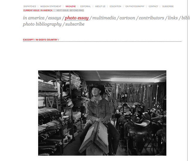
Dispatches- A Magazine For The Future

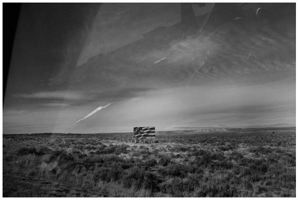
Dispatches is a new quarterly magazine co-edited by Mort Rosenblum, former editor of the International Herald Tribune and Gary Knight, founding member of VII photo agency. Each issue will focus on a single topic and the premiere issue topic is America. I’m told Antonin Kratochvil has an 80 page photo essay *repeat, 80 goddam pages of photography* from a month long trip across the US. Holy shit that’s awesome. The topic for the second issue is Beyond Iraq and will feature photographer Yuri Kozyrev. Awesome again.

Until I get my hands on the first issue I’ve only got the website (here) to go off, but I really like what I see and of course the 80 page photo essay sounds epic. This jibes perfectly with the role I foresee for magazines in the future. Covering topics in depth and displaying them in ways the internet can never compete with. Long form journalism and BIG photo essays. I honestly don’t need to see another thumbnail photo in a magazine for the rest of my life. I’ve got my fill right here on the internets.

Funny how none of the big publishers are going to step up to the plate on something like this so leave it to a photographer who’s sick of covering a story for a month and getting 2 pictures published in a magazine that will end up in the garbage can by Wednesday to make the big move.

Mort explains it further in the editors letter:

“We conceived dispatches to fit somewhere between Gutenberg and Google, a lively source of fresh knowledge about a world changing at warp speed in a format for people who savor the heft of words and images on paper.”

“Too often, these days, we forget a simple truth: the Internet is a means of delivery, not a source.”

“Gary Knight and I, co–editors, are journalists who were frustrated at trying to seek “truth” on the fly.”

Also, be sure to check out World Press Photo’s overall winner, Tim Hetherington’s acceptance speech (here). Love the honesty.

Good luck Mort and Gary. I hope you find your audience.

Magazines- User Experience vs. More Users

Magazines will deploy an entire bag of tricks to attract readers who normally wouldn’t be interested in buying their product. Getting people to subscribe usually involves pretty harmless marketing stuff like gift offers (SI’s football phone is the most famous and successful example), direct mail (send in your toaster warranty and suddenly Martha Stewart is sending you subscription offers), those annoying blow in cards (3 is the magic number and yes they always work) and the ridiculously low subscription price (if you see 12 issues for $10 they’re trying to pad the rate base).

Readers can be bought with football phones but they can’t be forced to buy your magazine at the checkout… or can they. The newsstand is actually where the real nefarious stuff happens. That’s because newsstand is the only metric anyone has to judge a magazine’s popularity (advertising sales isn’t a good indicator because you have no idea how much they discount the ad and how many are house ads).

I was reading a post by Craig Stolz (Web 2.Oh…really)–recently in Time Magazine’s top 25 blogs (here)–about newspaper websites using SEO trickery (worthless links to common words) to make their stories rank higher on google at the cost of degrading the user experience (here). Reminds me of the similar magazine practice where the cover will have fake numbers (chosen for how they look on the cover) to trick people into thinking there’s 234 tips or 55 great trips inside and then big cover lines will sell you on stories that turn out to be 1/3 page or worse–a sentence within a story. And then there’s all those lifeless packages (conceived to give you a number on the cover or a coverline), topical yet vapid front of book pieces and shiny products with hollow write-ups, all served up at the cost of user experience in hopes of attracting more newsstand buyers.

Of course the worst example of this bait and switch technique is the cover image. A subject chosen for their ability to hit it big on the newsstand accompanied by a perfunctory story on the inside. This has nothing to do with your mission as a magazine.

That’s why I love Esquire for owning up to it on the cover this month with a picture of Jessica Simpson and the coverline “We shot this image to catch your eye so you will pick up this issue and immerse yourself in the most gripping story you will read this year.” Bravo.

(click to make big)