The Daily Edit – Lisette Poole: ESPN

ESPN

Director of Photography Digital and Print: Tim Rasmussen
Director of Photography ESPN the Magazine: Karen Frank
Creative Director, Digital and Print: Ching Wang
Art Director: Eric Paul
Photographer: Lisette Poole

Heidi: How much of your work is based in Cuba vs North American/Carribean?
Lisette: I’m mostly based in Cuba but have worked all over Latin America and in the U.S. I have a lot of personal and assignment work in Cuba which I’d say makes up 60% of the work I do right now.

 Is there a large local talent pool?
 Yes, there are a large number of talented correspondents in Cuba. I feel lucky to have worked with them over the last two years. 

Tell us about this opening image. Did you shoot this particular image for the opener?
I hadn’t planned it as an opener. I discovered that scene when I went to meet the subject at his house, Dary. We missed Dary for our first meeting but it gave me a chance to scout our location which was his house. The next day I shot him prepping for training and when I knew he’d be coming up that hill, I ran ahead. I thought it gave a great sense of place for his life and current situation.

What were you trying to draw out of the subject here?
Dary was usually upbeat and funny, but I could tell deep down he was disappointed by some of the things that happened in his career. I hoped he would let his guard down for a moment. First thing in the morning (this was shot around 6-7am) he was tired, on his way to work, he had just introduced me to his newborn son. It seemed like he was more “himself” then without his guard up. On this quiet morning, I could sense that he was out of place, no longer home, and not having reached that dream.

How did you and Lerys connect during the shoot? (Lerys is the main character, the portrait shot with the green background)
We connected because I listened. I am also Cuban and have lived there for almost three years now so we had an automatic bond. It was fascinating to me to hear the players’ stories of leaving Cuba, especially Lerys. He said that he left his house, telling his grandma he was going to buy cooking oil and never returned. He was still visibly shaken from the migration experience, spending hours on a tiny boat which was ill-equipped for the trip to Haiti. He also missed Cuba and really wanted to be home. Lerys seemed to feel defeated and didn’t want to be photographed so it took time to build confidence with him. His story reminded me so much of all the Cubans I know who’ve left like my own family and the women I followed last year as they travelled to the U.S. from Cuba through 13 countries.

.

The Daily Promo: Shaughn and John

Shaughn and John

Who printed it?
We got it printed through the online service Modern Postcard.  It was our first time printing through them, so we weren’t sure how the process would go.  It turns out that it was very smooth and we were thrilled that one person at the company was assigned to us and was our point person throughout the entire process.  Huge thanks to Nick Kennedy at Modern postcard for taking care of us from beginning to end!

Who designed it?
We don’t really go around calling ourselves designers, but when it comes to our work we usually have a pretty clear idea of how we want it to be presented.  Often tackling the design ourselves means cutting out a lot of back and forth and getting to the heart of the piece quicker.  For this promo we basically locked ourselves in the studio for two days straight and were able to solidify the design of the book fairly quickly.

Who edited the images?
The images were edited by us as well.  We have a wall in our office coated in sheet metal so that we can display magnet versions of our work and rearrange the edit with ease.  We both previously interned for the amazing photographer Art Streiber and one of our many tasks as interns was to print new work onto magnets and maintain the editing wall.  Sometimes ideas are so good you just have to take them for yourself.  Thanks Art!

How many did you make?
We printed a run of 500.  350 were sent out to current and prospective editorial and advertising clients.  The rest have been given out at jobs, shows, trips…and of course you guys at A Photo Editor.  Each time we create a print a promo we push ourselves to order and mail out more than we did the time before.

How many times a year do you send out promos?
The last two years we have been averaging about 3/4 per year.  The process has evolved along with our shooting careers.  Past promos include printed coasters, postcards, newspapers, and now paperback books, We are hoping to start working on a new one soon as well as out first limited edition hard cover photo book.

The Daily Edit – Jeremy M. Lange: Men’s Journal


Men’s Journal

Creative Director: David Schlow
Director of Photography:
 Jennifer Santana
Art Director: Justin Long
Associate Photo Editor: David Carr
Photographer: Jeremy Lange


Heidi: Was this your first assignment with Men’s Journal?
Jeremy: No, in late March of this year I did my first story for Men’s Journal about rock climber Kai Lightner. Just a few weeks later, I got an email from DOP Jennifer Santana saying basically this “…interested in shooting a feature profile this week? It would need to be in a studio. It is a sensitive issue as the subject is in witness protection.”

I was obviously intrigued and pretty open the week so I immediately said yes and set about getting a studio rented in the area we had discussed. Some friends of mine run Shadow Box Studios in Durham, NC and they had couple open spots that week so I sent Jennifer back the possible dates.

What type of direction and information did you get about the assignment considering it was a sensitive issue?
Once we had a shoot date confirmed she sent over some details of what the images would have to be like. Martin, not his real name obviously, must be pretty much unidentifiable in the photos, so shoot in silhouette, or with directional like that obscured most of his features. Jennifer also sent over some examples of what was permissible in this situation so I could get thinking about how to get it done.

Had you done any images like this before?
Yes, I had made some portraits years ago of sexual assault victims that could not be identified so I had a little bit of experience with the general parameters, but those were outside so this situation was a little more difficult.

From there I made a few sketches in my notebook of what I was thinking and tested one or two at my little home studio to be sure it would generally work.

How much time did you have for this portrait and did you practice your light set up to be efficient?
There was no specific time frame for the session, but I generally planned on an hour in the studio. Given the constraints we had on the job, I knew that we would not be able to try too many things and spend hours playing with lighting set ups. I also have found that many “normal” people, i.e. people that are not used to being photographed all the time, are pretty exhausted by the whole thing in an hour or so. That is obviously not a hard and fast rule, but it has been my experience several times, especially in studio situations. And if they want to go home after work.

We, my assistant Ethan and I, got to the studio a couple hours early to set things up and make sure we had at least two working lighting scenarios so when Martin arrived we were ready to go. I like to take my time so it is nice to be able to show up early and play for a bit before settling on a couple things. The extra time paid off here as I was able to add a lighting element I had not considered before after Ethan and I experimented for a little while with what I had planned.

Did the subject request to see the images?
He did ask to see what I was capturing at one point but it seems more out of curiosity than out of concern. Under the circumstances, he was incredibly trusting of us to do what we had agreed upon.  He seemed to like what he saw when I showed him and we kept on going after that for a while

Did you direct him?
He had a good natural presence, comfortable in his own skin but I did direct him a bit after a while. I typically do not direct much at the beginning so I can see the gestures and positions people give of themselves and then perhaps have them repeat those, or we refine them to suit a photograph. This feels more natural and seems to give the person being photographed a sense of collaboration that helps us make better photographs. With this somewhat restrictive lighting set up, I did have to make sure his head and body were positioned in certain ways to disguise his identity but still give us a dramatic and powerful portrait. The photograph the magazine chose was one of the last setups we did, with the lights off center and raking across his face from behind. A little less standard, I think Jennifer chose a strong one.

I had produced a project in Mexico with a local celebrity where we spent $25,000 on security (24-hour armed guard and an executive evasion driver). Did this project require special security?
That sounds crazy! Here, surprisingly, no. Martin showed up on time with just his girlfriend with him, who sat in the lobby of the studio as we photographed Martin. He was incredibly low key about the whole thing, sharing some stories and some small facts about himself. Given the circumstances under which we were photographing him, it was very normal, not much different from the usual small talk that occurs during a portrait session. Some personal stories, some basic back and forth between shots.

The Daily Promo – Mikkel Jul Hvilshøj

Mikkel Jul Hvilshøj

Who printed it?
The promo has been printed by Gelato Globe. It’s a Norwegian company that has printing facilities around the world, so wherever you are they choose the closest facility to save shipping costs, and effectively, the environment. And as they put it on their website: “We believe that “collaborative consumption” can be the positive consequence of a “sharing economy”. We believe in sharing fixed assets – in our case sharing of print machines. And in allowing excess capacity to be intelligently allocated.”

Who designed it?
I designed it myself. I find your instagram page very inspirational and I always look at how other photographers have designed their promos.

Who edited the images?
The product shots on black background I have edited myself, the other two are edited by Martin Bo Kristensen of TheImageFaculty.

How many did you make?
I printed 50 in Danish and 50 in English, and send them out to specifically chosen people.

How many times a year do you send out promos?

I try to send out twice a year. My first promo went out in November last year, and this one went out in May.

The Daily Edit – Spencer Lowell: The New York Times Magazine

The New York Times Magazine

Design Director: Gail Bichler
Art Director: Michael Willey
Deputy Art Director: Ben Grandgenett
Photographer Director: Kathy Ryan
Associate Photo Editors: Amy Kellner, Christine Walsh, Stacey Baker
Photographer: Spencer Lowell

Heidi: How difficult was it to get to the location considering how remote the seed vault was?
Spencer: The seed vault actually isn’t that remote once you get to the town of Longyearbyen, which is only a couple of connecting flights from LA. You can actually see the vault from the airport up in the mountainside. It has to be accessible because it’s opened up a few times a year for deposits to be made. The biggest difficulty was dealing with the -20 degree temperatures once I was actually at the vault.

What was your security clearance process for the vault?
After some googling, I emailed the press department at the Norwegian Ministry of Agriculture and Food and told them I was working on a project for the New York Times and wanted to photograph the vault. They wrote me back saying the vault was actually going to be open the following week for a deposit and let me know I was more than welcome to come. I booked my travel and was there the next week. I assume they looked at my website but besides that, there was no security clearance.

Did you have to wear protective gear considering how precious the subject matter was?
For the shoot at the seed bank, I was wearing an obscene amount of layers because of how cold it was so no additional protection was needed. I could bare my hands being out of my gloves for a few seconds if I needed to change my camera and light settings but all the actual shooting was with gloves on.

Regarding the frogs, the staff who handled them were wearing gloves but my assistant and I didn’t touch them ourselves so we didn’t need to wear anything protective. However, we did have to clean the bottoms of our shoes before entering the facility to make sure we didn’t drag in any contaminates.

The biggest safety concern on this project was the shoot with the orangutan, Batang and her baby, Redd. Because their DNA is so similar to ours, they’re actually susceptible to our diseases. So I had to get tested for Tuberculosis the week before the shoot, which luckily I didn’t have and the shoot would’ve been called off if I’d had even a slight cold. Ultimately I had to keep my distance and wear scrubs, a mask and gloves.    

How long were you allowed in the seed bank?
I was allowed inside the vault for a total of about an hour between two visits. I also went back for another 3 visits to shoot the exterior.

How if at all do you think differently about food security, the fragility of life and our handprint on nature after this project; how did you try to convey that in your work?
We’re in the midst of the sixth mass extinction this planet has experienced. Four out of the other five extinctions were caused by climate change. The difference with what we’re seeing now is that human impact is changing the climate and it’s happening over decades rather than over thousands of years.

We know this because the ancient atmosphere is trapped in ice, which we’re able to extract from cores and study. I’ve seen a lot of images of ice melting but I felt like images of ice being artificially frozen would carry a powerful message. So, when Amy Kellner at NYT Mag asked me if I had any ideas for climate change stories, I pitched shooting the National Ice Core Lab. She was into the idea and asked if I could find any other facilities storing other natural assets. From there we collaborated on the story along with the writer, Malia Wollan until it became what it is.

It’s easy to forget that we’re a part of nature. We may live in cities and use tools but the fact is, we’re part of the natural world and are capable of causing natural disasters. With that said, we’re also capable of preventing them. That’s the main thing I learned from doing this project- that the hard work and dedication of a few can begin to counteract the mistakes our species is making as a whole.

How much underwater photography had you done prior to the reef shots?
I actually got certified to scuba dive for this job. Once I knew the coral nursery was going to be a component of the essay, I wanted to be the one to shoot it. I’ve always had a crippling fear of the ocean but I figured there wouldn’t be a better excuse to move through it. By the time I finished the scuba classes, the fear was gone.

Because I’d never shot underwater, I asked a photographer friend who has done some work underwater if he knew a good underwater assistant and he recommended a guy by the name of Mark Nakagawa. Mark is a seasoned diver and has worked in photo and video underwater so he helped me prep for the shoot and flew with me to the Keys to assist. We did four dives in the two days we were there and I couldn’t have done it without him.

Where there any technical obstacles for this project?
This was the most technically challenging project I’ve ever worked on because of the extreme shooting conditions. Between the below freezing temperatures, working underwater out in the ocean and being in the presence of living things that are either rare or no longer exist in the natural world, there was no margin for error. I like working with limitations because I’m forced to make decisions but this shoot left absolutely no room for second guessing.

What did you learn about your self creatively on this assignment?
I believe the creative process is in a constant state of refinement. I graduated from college almost a decade ago and I still strive for the same things that I did when I first started my career, I just have more clarity in vision and execution now. Creatively, my goal is to always keep things simple which I feel I was really able to achieve on this project because I didn’t have a choice. Passion for the subject matter plays a major role in my process and I find nothing to be more important than the future habitability of our planet.

What was the direction from the Times photo staff?
The whole project was a collaboration with Amy Kellner directly and Kathy Ryan and the rest of the photo department via Amy. With the exception of the Frozen Zoo in San Diego, I had multiple days at each location. So I would send Amy images with my notes from the first day’s shoot at each location and see if there was anything specific she wanted me to focus on the following day(s). If she asked for anything specific, I would do my best to deliver and regardless I would just shoot as much as possible. The clear stream of communication back and forth from the very beginning was the biggest contributing factor to the success of this project.

The Daily Edit – Maggie B. Kennedy: Garden&Gun


 Garden&Gun


Design Director: Marshall McKinney
Photography Director: Maggie B. Kennedy
Associate Photo Editor: Margaret Houston

Heidi: You came from the commercial side of photography as a creative director at Williams-Sonoma, Inc. in San Francisco. What surprised you about editorial photography now that your 11 years in the game?
Maggie: I think working on both the commercial and editorial sides of the photo industry has proved beneficial. I had the opportunity to work with so many talented photographers, stylists, art directors, creatives, etc. during my decade with Williams-Sonoma years as well as be exposed to the various company departments and business overall. How a photograph of a beautiful table setting or friends cooking together sets the tone of a brand. So much is thought about before the actual photograph is taken. Many of the photographers I was fortunate enough to work with at Williams-Sonoma shot both commercial and editorial projects. I think that time marked the beginning of the advertising/commercial world starting to explore a more editorial/lifestyle approach you see in campaigns today. I think the two worlds continue to weave together to keep up with new business models, whether for a retail company, a magazine, any business now. It’s all about creating a larger brand, a lifestyle.

When you left San Francisco, what did most of your peers say about your moving to a start-up?
I continued to work with Williams-Sonoma for a few years after relocating to Charleston, SC (Garden & Gun magazine’s hometown). A lot of the photographers and creatives I worked with for so many years in San Francisco, New York, Los Angeles, etc. thought I had lost my mind moving back to the South!! (I’m originally from North Carolina.) I, too, questioned my decision those first months after landing in Charleston but was ready to be back on the East Coast. But the start-up didn’t enter the picture until a year or so later. I decided to take a leap of faith when I met Rebecca Darwin, Garden & Gun’s president and CEO and one of the founders. She’s an incredible businesswoman and inspiring both professionally and personally. I instantly had a gut feeling and wanted to jump on board! That was September 2006. The first issue of Garden & Gun hit the newsstands April 2007.

Garden & Gun has a dedicated audience. Tell us the story behind the name and how this lifestyle stole everyone’s heart.
The name “Garden & Gun” comes from an old Charleston nightclub, popular in the late ‘70s. The Garden & Gun Club. Rebecca thought the name really captured the personality of this new magazine. The “garden” is a metaphor for the land that is the South, the “gun” for the sporting life. Both are key components of our content as well as food and drink, culture, literature, music and art. Nothing like it existed on the newsstand when the magazine was born a decade ago. And the response and dedication from our readers from the beginning has been like nothing anyone has ever seen. Passionate is putting it lightly! We received a letter from an avid reader in the first few years – “If you ever close down Garden & Gun, we will hunt you down and shoot you.” Jokingly of course but this letter is framed in our office and speaks to the heart of the brand.

The brand has exploded in its first decade and now has a store, hosts events, has a podcast, etc. Tell us about the first few issues and the genesis of the brand.
It really has been an honour and a privilege to have played a role in getting G&G off the ground since the first issue. It’s come a long way and definitely been a wild ride! That first year it was all hands on deck, only a few people doing a little bit of everything to make G&G a reality. From the beginning, photography has played a large part in the brand visually and it’s exciting to see that continue.

How did the magazine benefit from the recession in the mid-2000s  ?
The magazine was launched in Spring 2007, right before the great recession. Not the best timing but in the end proved G&G really was a unique brand. We did everything we could to keep the doors open and our readers were so supportive. The recession made G&G stronger than ever and showed us just what this brand could become. It was a time when so many magazines were closing in New York. Even though it was a struggle, I think we benefitted from being independent and not based in NYC. Everyone involved with G&G at that point was fully vested with their heart and soul. It wasn’t just a job, we really believed in what we were creating and so did our readers.

The magazine covers lively people and places off the grid, have you had any production challenges or difficulty explaining to subjects what the shoot entails?
Absolutely! But that’s what makes the best stories after ten years. I think that is one of the reasons photographers like shooting for us. Usually, for me, it’s “how are we going to pull this off with barely any budget and within only a week!” The name of our magazine turned heads in the first few years but I’ve always loved sending a copy of the magazine to a photographer, stylist, etc. so they can experience the content. Then they get it and are intrigued to learn more. It’s definitely helped to have a few years under our belt now to secure more high-profile subjects – actors, musicians, etc.

Your magazine celebrates emerging talent, how do you find your photographers?
One of my favorite parts of the job is finding up-and-coming photographers and working with them on a first project. Since we’re a general interest title, I get the opportunity to work with all types of shooters – food, still life, portrait, travel, etc. I enjoy discovering emerging talent through a variety of sources – emails, portfolio reviews, social media, blogs, word of mouth. I’ve been lucky to see some of our younger photographers develop professionally through this first decade of G&G. (And sometimes I can still get them on a project if I’m lucky!!) The biggest compliment is to see a G&G shoot on a photographer’s website and know they were inspired by the assignment.

Every title has some obstacles to overcome, such as remote locations and weather what else are you confronted with and what are your solutions?
G&G covers very specific subjects in unique locations. Probably 95% of each issue is original photography. That definitely keeps a two person photo department on our toes! One of my favorite “in the field” stories was many years ago. Photographer Jim Herrington shot Morgan Freeman at home in Mississippi. It was a project we’d tried to make happen for a long time and once we got the green light, everything had to come together in a matter of days. I checked in with Jim to see how the shoot was going and received this photo. No words, just photo. That’s the sign of an epic shoot!

Photographer Jim Herrington on assignment at Morgan Freeman’s farm in Mississippi. I emailed Jim to check in and see how the day went and this was the reply.

We always want to think about pairing personalities together (photographer and subject) that will make the best mix. A little matchmaking I guess! Earlier this year photographer Bill Phelps travelled to Gatlinburg, TN for us. The assignment was to take portraits of survivors of the horrible fire that happened last November. A few of the subjects were, of course, apprehensive about having their portrait taken and reliving that awful night. I wasn’t sure if it was going to happen and wanted to ensure they were comfortable and earn their trust. Even the day Bill arrived in Gatlinburg we still weren’t sure if one or two of the subjects would go through with it. Visually, these portraits needed to be artful and stoic rather than documentary in nature to make it feel right for G&G. Bill’s portraits speak for themselves and he and I were both so moved by the project and getting to know these individuals.

Despite being based in Charleston, you’ve been invited to be an SPD judge and involved in the NYC industry scene. What are the benefits of being a bit further from your industry peers?  
We all feel lucky to be able to do what we do in Charleston. Anytime a photographer is in town and stops by our office, they want to figure out a way to move here! Rather than an obstacle, our location away from NYC and independence has allowed us to follow our own creative path which is part of the brand loyalty and success. We’ve a national magazine that’s won two ASME General Excellence awards and received other industry recognition in our first decade. We just happen to have a different zip code. I’ve loved being an SPD judge as well as involvement with other creative organizations based in NYC or other cities. I do wish I had opportunities for more regular interaction with industry peers. It’s always an honor to have G&G recognized.

What were some of your favorite images?
I love all the work we do, if I had to choose a cover, I’d say the Oct/Nov 2012 cover – biscuits. One of my all-time favorite covers, we were thrilled to win ASME’s Most Delicious. Photographer Johnny Autry.


Chef Ashley Christensen photographed by Peter Yang. Peter was trying to think of what to do with this portrait when he looked out the window of Ashley’s restaurant in Raleigh, NC and saw a man walking his pig down the street. Barbeque is very fitting for this chef but we didn’t tell the pig owner that. Only happens in the South!


Photographer Rush Jagoe and the 610 Stompers in New Orleans, LA. A photo shoot that was inspiring and fun enough to deliver a little video as well.


Photographer Erika Larsen’s portrait of author Barry Hannah. One of the last photos taken before the legendary Southern writer passed away.


The photo of Morgan Freeman looking in the mirror. Jim Herrington took that in Morgan’s mother’s former home on his farm in Mississippi


Photographer Peter Frank Edwards on assignment in rural Virginia. He has photographed for G&G since the very first issue and is such a big part of the brand visually. Hard to choose just one of his assignments through the years but this falconry project was one of the more challenging and “open to interpretation.” We ended up turning in into a photo essay.

The Daily Promo – Embry Rucker

Embry Rucker

Who printed it?
These were printed & mailed by Modern Postcard – They are great. I printed my very first postcard with them in 1997 ish. It was a sunset silhouette of Stonehenge, wish I knew where that slide was.

Who designed it? 
Designed & laid out by my good friend & talented artist Dustin Ortiz dustinortiz.com We have worked together on a few projects now & he always has a great new eye on things.

Who edited the images?
Dustin & I worked on that together. I usually have a batch that I think ‘work together’ & he helps establish a priority or hierarchy. For example, having Tony’s face so big on the promo was his call, I would have been maybe a little leery of that because its… so big. But, fuck it, its a great shot of a cool looking dude – sometimes you just need someone to tell you that ‘yeah, that’s rad, run it big’.

How many did you make?
Around 2000, Mailed 1500 ish & picked the remainder up locally at Modern Postcard for hand written notes, leave behinds & a bunch for my reps.

How many times a year do you send out promos?
2-3 times a year ideally, but, I always have ambitions of doing more than I actually send out.

The Daily Promo – Ryan Anderson

Eric Ryan Anderson


Who printed it?
We worked with Chris Young at Prolific Group, wonderful experience.

Who designed it?
My friend Kayla Kern who does all kinds of amazing things.

Who edited the images? This promo all started with the harness racer image. I knew I wanted to print it large, and once we decided on a poster, Kayla helped me choose from a few options that made sense on the back. We chose the Tracksmith (shirt over head) image to lie under the mailing label since it was a bit more intriguing.

How many did you make? We printed 1000 of these and sent them out to a list of creatives and agencies who have a hand in the activewear/sports markets. I’ll usually hold on to 50-100 to use as leave-behinds for meetings and such.

How many times a year do you send out promos? Usually only think about it once we have a slow week or two and start questioning our existence : ) Jokes aside, I’ll send a print piece usually once or twice a year. I generally like doing things that have a design element and that I’d enjoy receiving in the mail (zines, newsprint, posters) and hope that there are others who enjoy the same thing out there!

The Daily Edit – Jolie Wernette-Horn

Shahrukh Khan is Bollywood royalty and also on of the top paid actors in the world. Vogue India Celebrated his 50th birthday, photographed by Mazen Abusrour.

Mumbai native and International star, Freida Pinto sat for Bharat Sikka for Vogue India’s 6th anniversary.

The chemistry onset was undeniable with Bollywood it-couple, Deepika Padrone and boyfriend Ranveer Singh, shot by Tarun Vishwa.

Deepika Padukone is one of the reigning queens of Bollywood, shot by photographer Prasad Naik.

The Ambassador car is a classic Indian design. Shot on film by Vikram Kushwah.

This gallery of Indian designers and their black pieces was shot on film by Vikram Kushwah for Vogue India’s 6th anniversary issue.


Supermodel Pooja Mor sat for photographer Bharat Sikka in this stunning editorial paying sartorial homage to fashion of the Indian subcontinent, styled by fashion director Anaita Shroff Adajania.

Irani cafes in Mumbai are a dying breed. Travel photographer Hashim Badani teamed up with Vogue India stylist (and fiancee) Priyanka Kapadia for one of my favorite shoots of 2016.

Manish Malhotra is one of India’s top designers, here photographed with Bollywood ingenue Alia Bhatt photographed by Vikram Kushwah

Vogue India

Editor in Chief: Priya Tanna
Fashion Director: Anaita Shroff Adajania
Creative Director: Jolie Wernette-Horn
Senior Fashion Editor: Priyanka Kapadia
Fashion Bookings Editor: Divya Jagwani

Heidi: Prior to Vogue India, you had a strong background in fashion publications here in the US, how did your role as Creative Director different if at all in India?
Jolie: I find the position of art director or creative director is basically the same. While responsibilities will, of course, change from magazine to magazine, even in New York, the main idea is to create and maintain a visual voice for the magazine.

Does Vogue India produce all original content?
We produce about 85-90 percent of our own content. The other 15 percent comes for any of the other Vogues, W, Glamour, and Allures. But, as an Indian magazine, we do aim to showcase women from the subcontinent. For example, we don’t often use blond models as it really doesn’t pertain to our audience.

I had done a redesign for Claudia, a Brazilian magazine set in Portuguese where the words are very long, this posed a design challenge for the cover and the typography selection. What cultural surprises did you have at Vogue India?
Luckily for me, Vogue India is produced entirely in English. The biggest challenge for me, and a constant learning curve, is finding out what will actually resonate with an Indian audience. For example, when I arrived in India I knew almost nothing of Bollywood, either of its current stars or its colorful history. Its hard to contribute to photo concept discussions for an upcoming celebrity shoot when you have no idea who that celebrity is or what has been done in the past! Six years laters, I can finally tell the difference between Kareena and Katrina.

What were the obstacles you had and how did you overcome them?
Compared to New York, the pool of talent is much smaller in India, as is the magazine industry itself. Because of this, unlike our American counterparts, it is very rare that we can claim exclusivity of a photographer or model. There have been months where one photographer shot covers for 5 difference magazines!

But there is new talent, and it is maturing and growing at an exponential rate, even in just the 6 years that I have been here. As a creative director, your job is always to decide what you think are the bet traits to focus on in bigger, existing talent and also to find and foster new talent. There is even more pressure to do this in India with fewer resources. We also have a lot of international talent floating around. Especially after Vogue Greece folded, there was a strange, yet fabulous, influx of Greek talent!

How has working internationally shaped you as a creative?
As an American and living in New York, it is easy to become very insular. People say that New York is the center of the world and I think I started to believe that. In moving to India, everything I thought was put into question. India has a completely autonomous fashion industry, with designers that hold the same stature here that, say, an Oscar de la Renta or Michael Kors would have in New York. Bollywood has its own superstars and a-listers that rival Hollywood for fans and influence. Personally, I  think the idea that America and New York are not the end-all-be-all of the universe has matured me. Professionally, I find this concept freeing. I think it allows me to look at design and conception challenges with new eyes.

How did your redesign/the magazine evolve over the 6 years that you were the Creative Director?
Diana Vreeland famously said, “Pink is the navy blue of India.” When I first arrived in Bombay from New York, I felt bombarded with color. Its vibrancy radiates from everything from the saris worn on the street to the billboards of Bollywood. So, in my first round of redesign for the magazine in 2011, I incorporated orange, yellow and pink into the type and graphic elements. But now, six years later, it is a decision I cringe at the thought of, in the same way one looks back at high school fashion. What was I thinking?! I think the main reason for that change of heart is my own transformation from tourist to local. Which isn’t to say that color doesn’t belong in design (Indian or otherwise). Quite the contrary. But I think after allowing myself to be saturated with the culture’s obsession with color, I’ve been able to look past the surface “exotic” and see the serious craft. In this sense, I feel the design of the magazine has matured with me. In its current incarnation, Vogue India’s design is more monochrome and simple, mainly to let the images and content speak for itself.

Are you using social media as a tool to find talent?
I am an Instagram addict and have found several photographers and illustrators using the app. I often find people keep their Instagram accounts more up to date than their own online portfolios. Its a great tool.

The Daily Promo – Joe Toreno


Joe Toreno


Who printed it? 

Next day flyers. 
I’ve used them for my last few promos. I really like their matte paper stock and they’re pretty affordable. My goal with my printed promos is to try and keep the budget around $500-$700 for the entire thing including postage. 

Who designed it? 
I designed it myself which is why it’s so simple. Just a couple photos and my contact info.

Who edited the images? 
I edited the images.  With these printed promos, I try to highlight some commercial work as well as some personal work.  In this case the commercial photo was a portrait of Ice Cube that I shot for People magazine. The personal was a photo of a falcon I shot for an ongoing series of animal portraits. 

How many did you make?
 I made 500 which mainly goes to magazine editors and a few reps

How many times a year do you send out promos? 
I try to send out two printed promos a year in conjunction with a couple email promos. 

The Daily Promo – Nathan Perkel


Nathan Perkel


Who printed the zine?
Influence Graphics

Who designed it?
I did the layout with some design aid from Ryan Giese

Who edited the image?
Edited by me

How many zines did you make?
Edition of 50

Which of these two promos was more successful and why?
I am personally more attached to the zine because of the amount of work that went into it as well as the experience of shooting it. But the bags seemed to get more of an initial response from people as it was different than most of my promos. Ultimately, both projects yielded a good amount of response and interest in other work of mine

Who printed the bag?
4imprint

Who designed it?
Designed it myself.

Who edited the image?
Edited by me.

How many bags did you make?
100

How many times a year do you send out promos?
2 or 3 printed promos and seasonal email promos

What made you want to do the bags as well as the cards?
I wanted to do the bags as they are functional and offer an extra layer of promotion in the event that they are worn. Also, I hate that in New York, plastic bags are given out so freely. I hope that the bags I made will reduce even just a handful of plastic bags given by stores.

Who printed the cards?
The cards were self-designed and printed by Influence Graphics
I did 250 cards – 100 went with the bags and the extra 150  went out separate to additional photo editors and art buyers as well.

.


The Daily Edit – Peden + Munk: Bon Appetit


Bon Appetit

Visuals Editor: Elizabeth Jaime
Creative director: Alex Grossman
Art director: Kristin Eddington
Visuals Director: Alex Pollack
Photo Assistant: Laura Murray (staff)
Photographers:  Peden+Munk 


Heidi: How did the interaction with the subject change with a phone in hand rather than a camera with a lens?
Peden+Munk: You can maintain eye contact with a model and really play off that deeper connection that just can’t be done with an SLR in front of your face. Especially when photographing real ppl.  The iPhone is not intimidating.  It allows people to open up and show their personalities.  It is familiar.  Everyone has one, from your grandmother to your nephew.  Composing an image by looking at a live view is different than looking through a viewfinder. I (Taylor)  found that I was more conscious of the composition.

Did the shoot feel less formal?
Yes, it did. We had a small crew and were able to walk the streets, visit markets, buy a lot of street food and keep it moving. It was important to us to keep it spontaneous.  It’s travel, we know the best experiences happen when you relax and go with the flow  (and follow the good light). We wanted to make room for magic moments you can’t predict.

What type of different circumstances did you face using the iPhone instead of a camera?
There was a different workflow We were able to edit in coffee shops, out for drinks, in the subway.  It was a fantastic and liberating to be able to work on the fly and not always be on the computer.

We had to think more about the quality of light since we couldn’t use strobes. The iPhone works best in bright natural light. We wanted to embrace the sun and the harsh shadows. Thankfully our subjects were gorgeous and took the light really well.

Since this is the first time the magazine showcased a iPhone image on the cover it underscores their trust in you. How did this impact you, if at all?
We have a great relationship with the CD Alex Grossman.  We are true collaborators and over the years he has come to trust us.  We are constantly pushing each other and I think that is where really healthy creative progress is made.

We worked with Alex from the conception of the idea and contribute to its growth. In our first trip to Oaxaca, we took a bunch of test photos on the iPhone of everything from colored walls, people, places and markets. We then made an edit of those images went to Alex’s office and presented him with our vision of the cover. These images helped guide us when we went back to do the cover.

Travel and food are such a natural extension of  iPhone images, what other message do you feel like this assignment projects about photography?
It really challenges the “no-make up/ make-up look”.  Most photographers realize it is so much more difficult creating an effortless look. In the magazine world, there are meetings and teams of creatives and so much research that goes into making beautiful imagery and stories.  This project highlights the concept that Ansel Adams so keenly spoke to  “You don’t take a photograph, you make it.”

This assignment has more to do with good concept, casting, styling and directing talent than the camera that takes the picture. Soon technology will be so good you won’t need a big DSLR, but good ideas never go out of fashion. As my dad who is also a photographer says, “its what’s in front of the lens that’s important”.

Do you feel like this project empowers everyone to be a photographer and in turn undercut the skill involved to take skillful photos?
We think it inspires people to shoot better.  It’s so easy to test and experiment that it pushes average photographers beyond what they think they are capable of.

The iPhone has really closed the gap between amateur and professional photographers. And now there is really no gap between the conception of a shot to the realization of one. For us, the iPhone is just another tool in our toolbox.

InfoTrends’ most recent worldwide image capture forecast takes a conservative route estimating consumers will take 1.2 trillion photos in 2017, do you ever feel threatened by the notion?
No.  So much more goes into being a successful photographer than taking good pictures.  A typical consumer would have a steep learning curve when it comes to client relations, business and the creative process.  That being said,  I (Jen) continually say that anything that ups the game is welcome.

The Daily Promo – Christopher Stolz


Christopher Stolz

Who printed it?
Newspaper Club printed it, they did an excellent job and even reached out to me before they printed to double check print quality. I really like the ease of use they provide.

Who designed it?
I got input from my graphic designer friend but this is my first paper so I designed it myself. I used one of the basic templates provided by Newspaper Club to keep it simple. I wanted the promo to feel like an old paper you’d pick up from a paperboy.

Originally, I tried to do small postcards, but my designer friend told me, “you’re a big man, you need a big paper,” so I listened to that advice.

Who edited the images?
I wanted to show the work that I’d want to look at in a newspaper, so I edited the images myself. These are very personal images to me. I really enjoyed making them and they’re kind of raw, imperfect. They have a feel to them that I want in all my images.

How many did you make?
I made 100 prints, they went a lot quicker than I thought they would. I’m going to shoot for 300 next time I make a promo this size.

How many times a year do you send out promos?
I plan on sending out bi-annual promos this year and eventually quarterly next year. I like the idea of issues.

The Daily Edit – Fortune Magazine: Tony Luong


Fortune Magazine

Art Director: Peter Herbert
Photo Editor: Armin Harris
Associate Art Directors: Josue Evila, Michael Solita
Senior Designer: Julia Bohan
Photographer: Tony Luong

Heidi: I know this shoot presented you with some obstacles, what did you learn about yourself from this?
Tony: I often get hung up on which setups to do first, last, etc and then slowly turn into a time bomb of sorts. I learned that I can actually trust my instincts at times and allow that initial reaction to make it’s way to the surface without being hindered by apprehension and doubt. This process  allowed me to learn what pictures I like to make.

Great assistants are an asset on every single shoot, what skills did both Anthony Tulliani and Jake Belcher bring to the table?  How long have you worked with them?
I have worked with Jake quite a bit but it was my first time working with Anthony. They both bring a lot to the table in terms of knowledge, patience and having great communication skills, they are also talented photographers themselves. It helps when everyone involved is invested in the project rather than think their role is to just schlep gear around. It’s also nice being able to hang out outside of shooting time rather than feeling like you’re on a bad date.

Tell us about the time management crisis you had and how you overcame it all.
The first shoot day, we were on the 36th floor of State Street where we scouted and setup around 11am. It was my understanding that we would be shooting the CEO of State Street from 1-2pm and then another associate of the company from 3-4pm and we would have access to both the 35th and 36th floors for the entirety of the shoot (the 36th floor had more opportunities).

At about 12:30, we were told that the 36th floor closes at 3pm and that we would have be out and off that floor by then.  This last minute surprise with a half hour remaining before the first shoot began, I went over with Anthony that we would have to break down all the gear immediately upon finishing and even during this 1-2pm shoot in order to have enough time to re-setup for the second shoot on the 35th floor before 3pm. Fortunately, I keep things somewhat simple and minimal gear-wise so we were able to transport everything fairly quickly. Fortunately, we still managed to get 4 setups in with each subject.

The second day involved a group shot of 8 women at the firm, I was given permission to be a fly on the wall during the meeting and then was told I would have 15 minutes after the meeting for a more formal portrait. I was shown the room that we would be shooting in Friday afternoon after both shoots had wrapped and had scouted a spot. The morning of the shoot day, we arrived an hour and a half in advance to setup only to be told as we began unpacking that the room we were in wasn’t actually approved. We were then told that we could go back to the 35th floor conference room where we shot on the first day to do the group pictures. We packed up, went to the 35th floor conference room and luckily were able to apply the same concepts and ideas for light and positioning of subjects.

How many images did you turn in despite the hiccups?
I turned in probably 350 images for a lo res edit and then there were 7 or 8 high res in the end for both print and web.

A few outtakes below

What kind of direction did you get from the magazine?
Since this was my first assignment for Fortune, Armin sent over some previous examples of how the stories get laid out; then we had a call and discussed l shot list. We both realized we had similar ideas about assignment work like this. Instead of conforming to what the office presents, we asked how can we turn the space into something for ourselves. Be by the use of a harsher light or showing the seamless, we disrupted the fact that we are shooting in an office space. Armin put complete trust in me and that’s was great.

What was the Fearless Girl statue publicity stunt and how did that key into this assignment?
The Fearless Girl state was part of a marketing push by State Street Global Advisors as an attempt to take on gender diversity in the finance world. This laid the groundwork and was a good jumping off point for the conversation that was had during the shoot about how important female mentorship and leadership in a predominately male industry is.

Tell us about the opening image.
The opening image is of the Fearless Girl statue from over the shoulder and the view you would see if you were in Wall Street at the installation. Originally there was intentions of using an image from the shoot to be the opener but in the end, Fortune decided to go with what you see here to further push a more cohesive look throughout the issue and round out the package of other stories revolving around investment guides. I’m still happy with how the turn pages came out.

The Daily Promo – Brian Lowe

Brian Lowe


Who printed it?

I printed the images on Hahnemuhle Fine Art Rag paper in my studio. I really love the feel of this paper and use it in my printed portfolio. I also printed my contact info on the back. I didn’t  want my name to interrupt the print. 

Who designed it?
I did. After a lot of research, and also scanning multiple formats on @aphotoeditor’s insta. I ultimately decided I wanted this  piece to feel more personal in hopes that you would want to keep a print or two. 

Who edited the images?
I did.  Selected prints were sent to editors, creatives and art producers of work that I want to get hired more to do. Portraits & active work. 

How many did you make?
100 boxes. 8 prints each. 

How many times a year do you send out promos?
1 big printed piece a year, that goes out to everybody for the past 3 years + selected prints to existing and potential clients every quarter. About 8 to 12.  

Who made the box for you?  
Design Aglow  a company out of  Canada made the box and Template cast with my font & name.  

The Daily Edit – Agei.st / David Harry Stewart

Agei.st

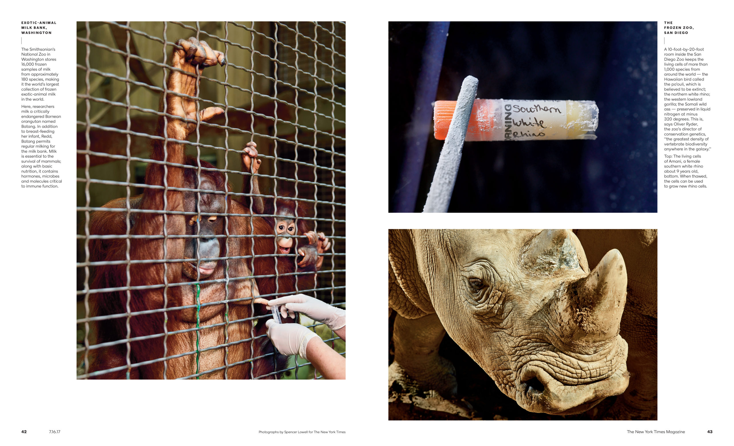
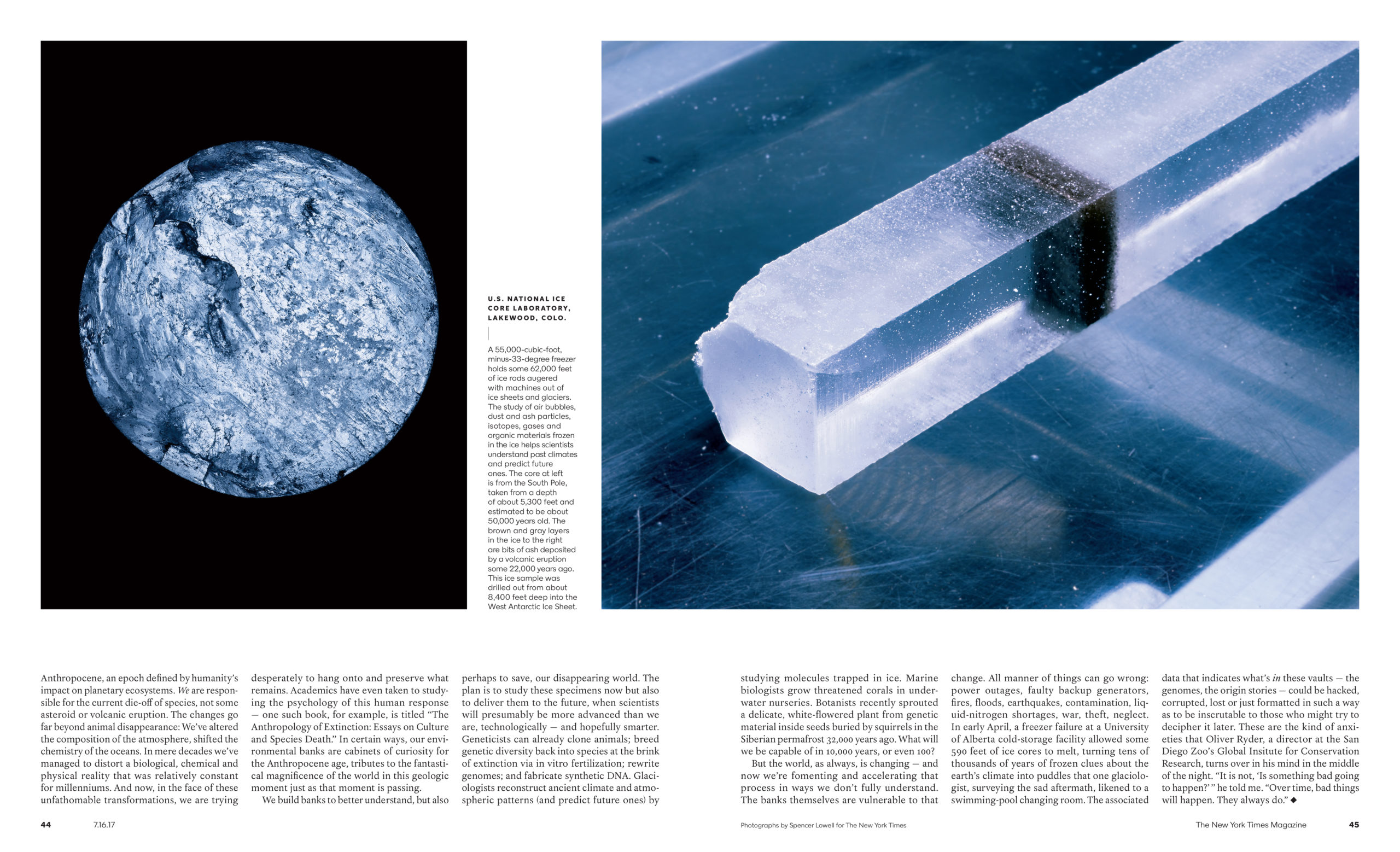
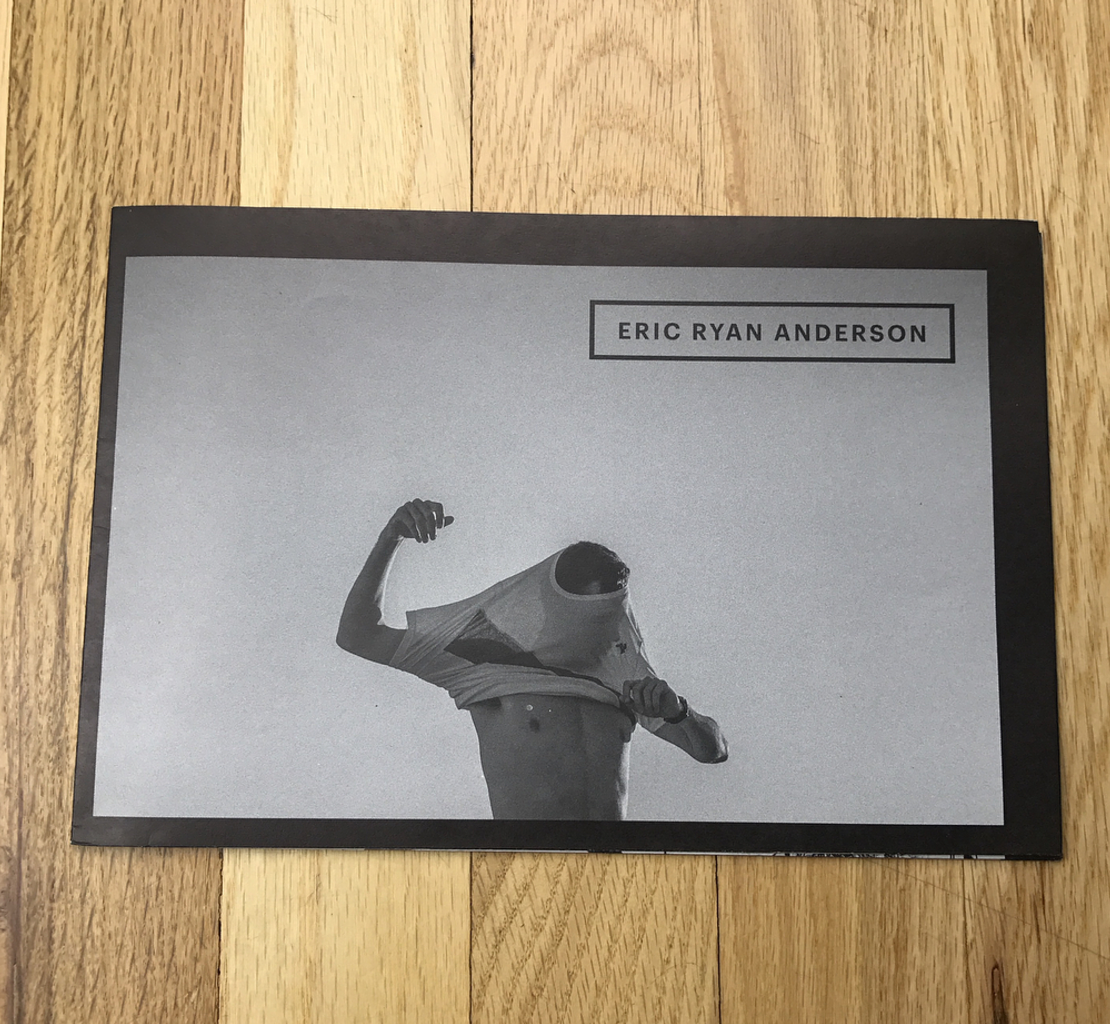
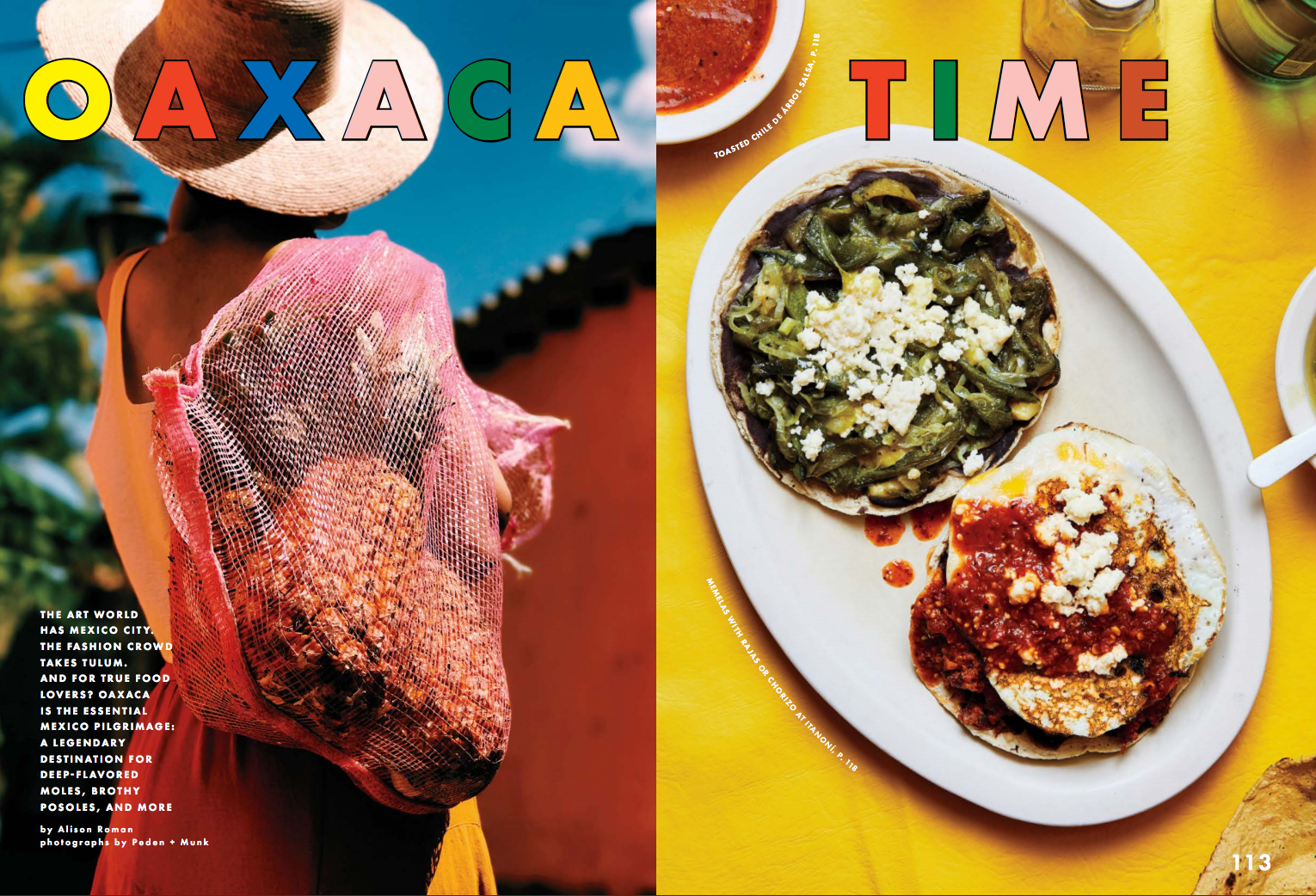
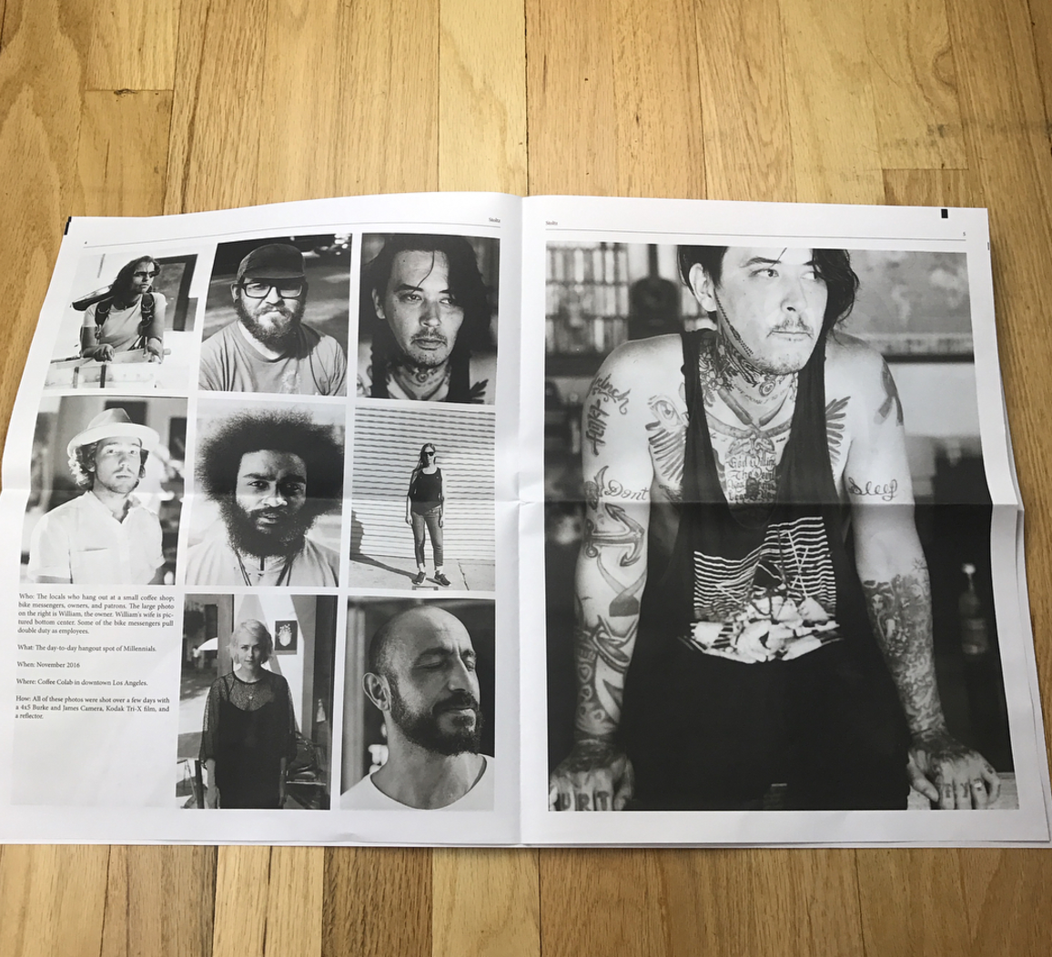
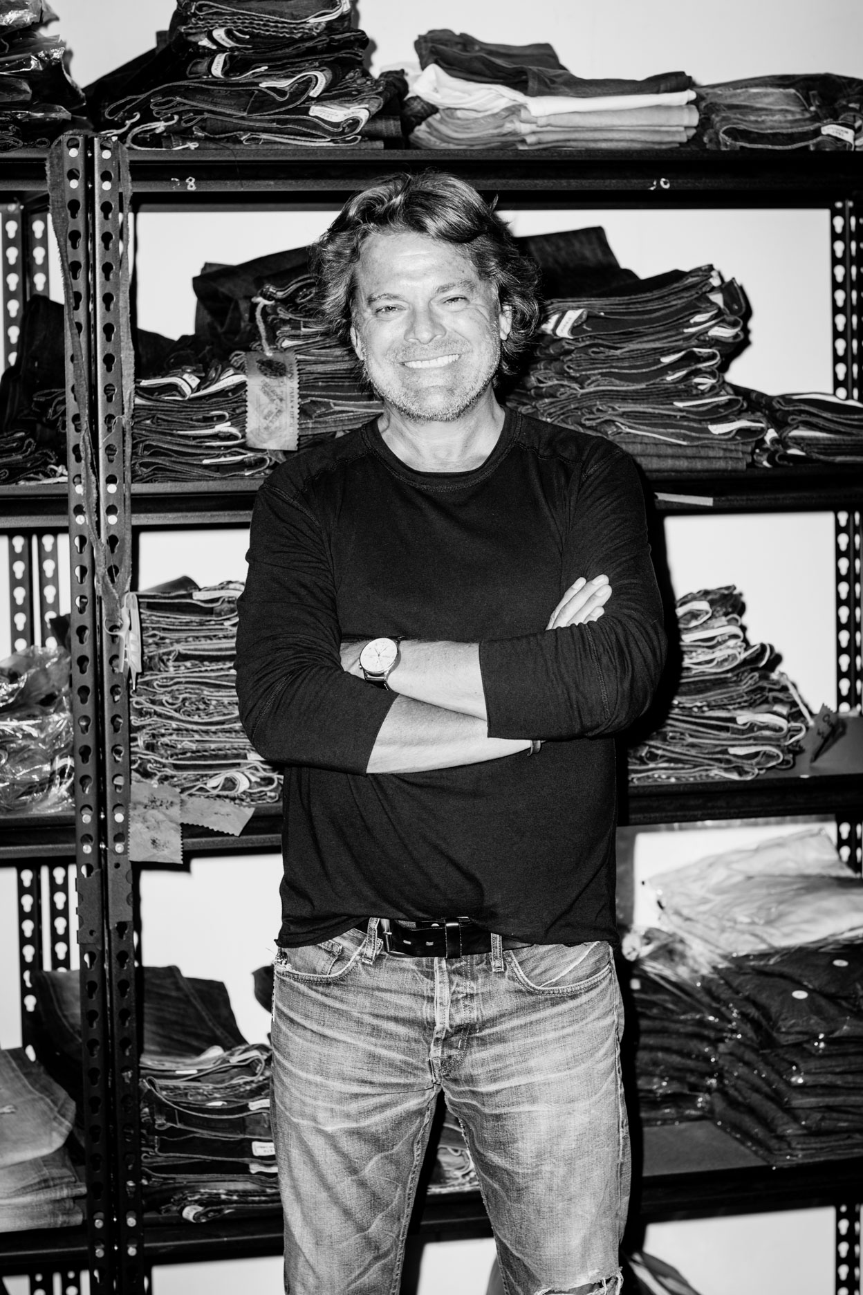
Founding Partner: David Harry Stewart
Founding Partner: Matt Hirst
Digital Media Specialist: Ed Delfs
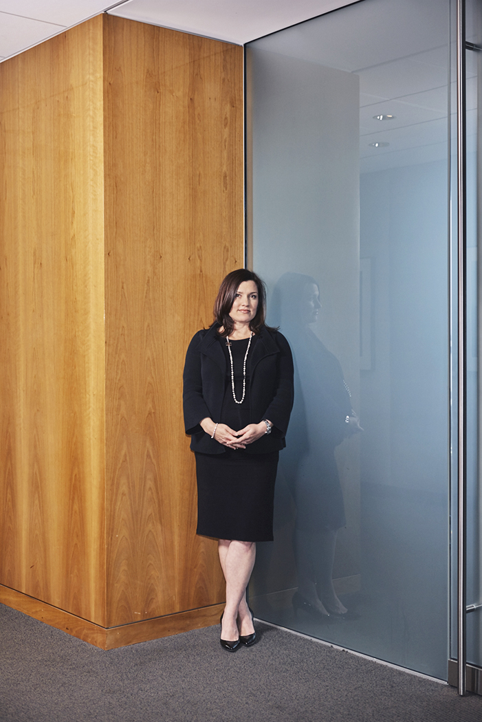
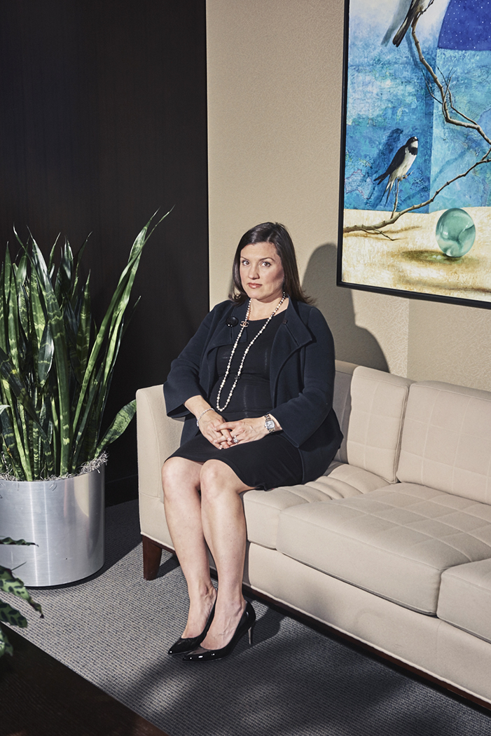
Women’s Content Director: Tara Shannon

We have a fantastic newsletter you can get by signing up here.

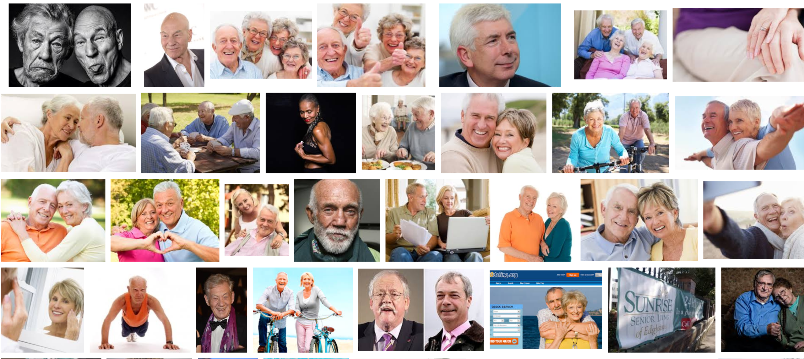
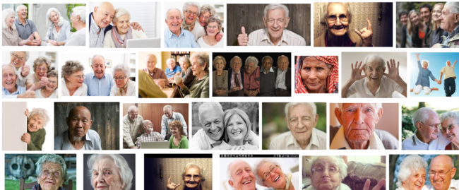
Heidi: Here’s a Google search that gives us a snapshot of what  50, 60 and 70 years of age looks like.

How do you see AGEI.ST changing the current visual landscape on this?
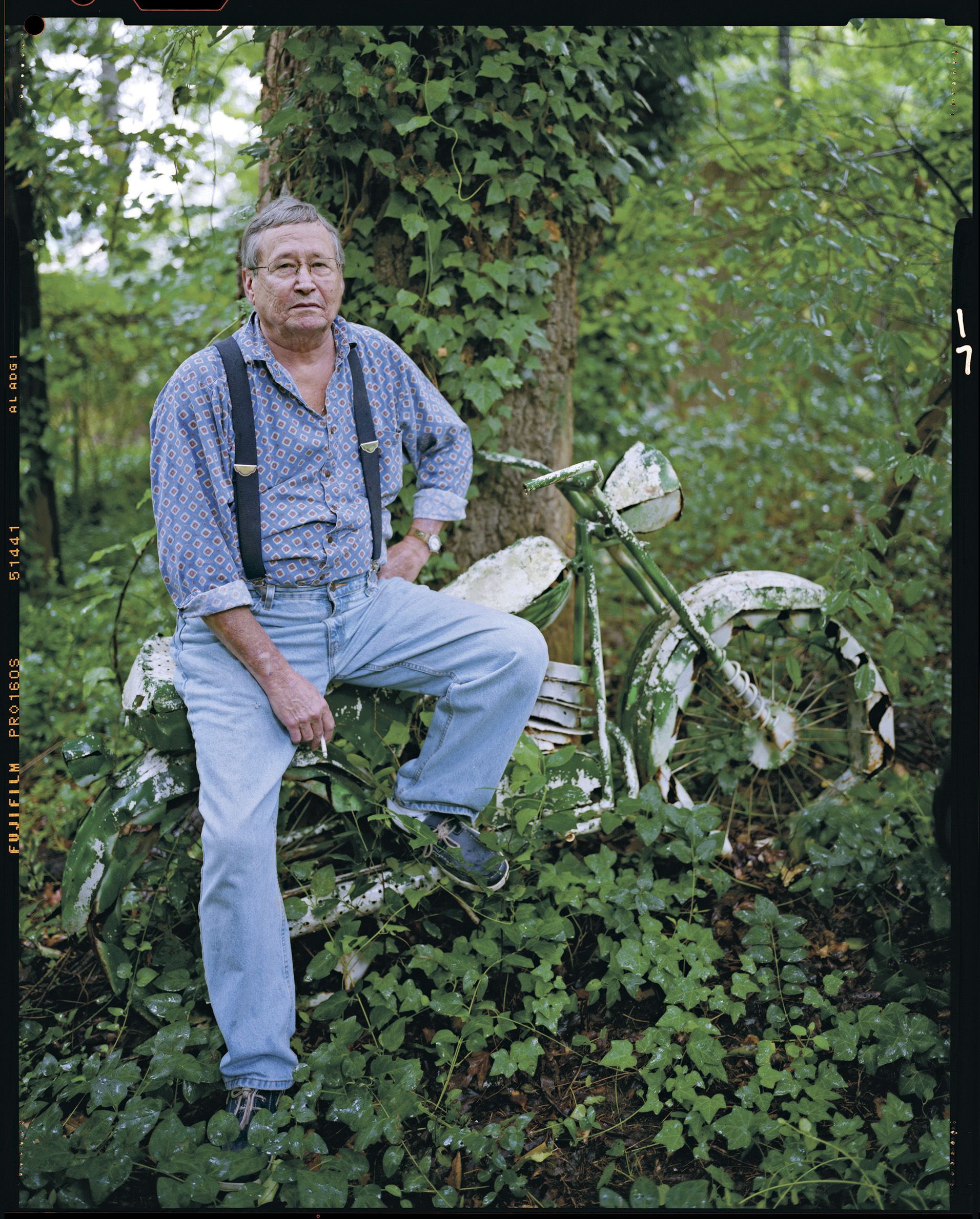
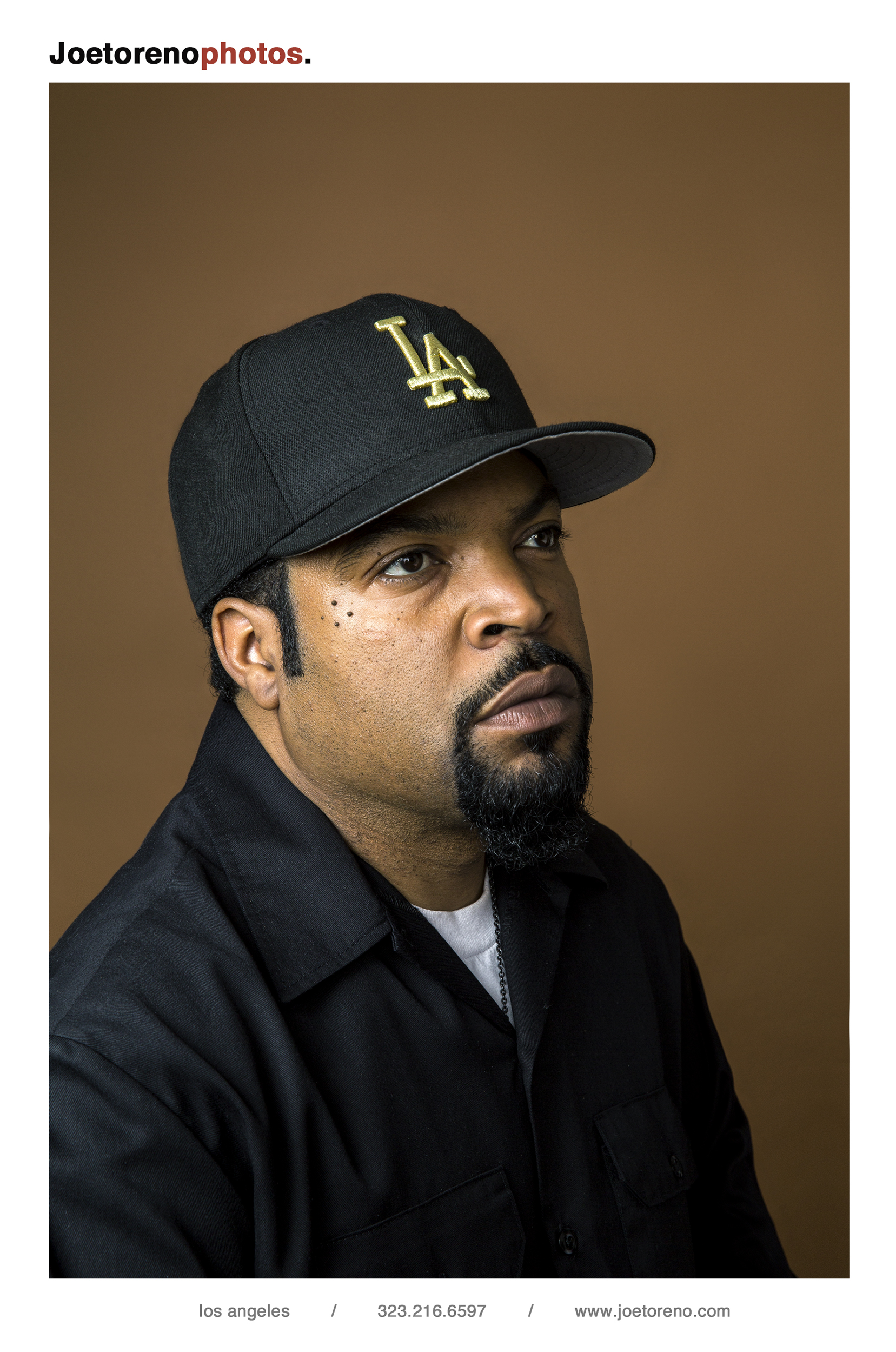
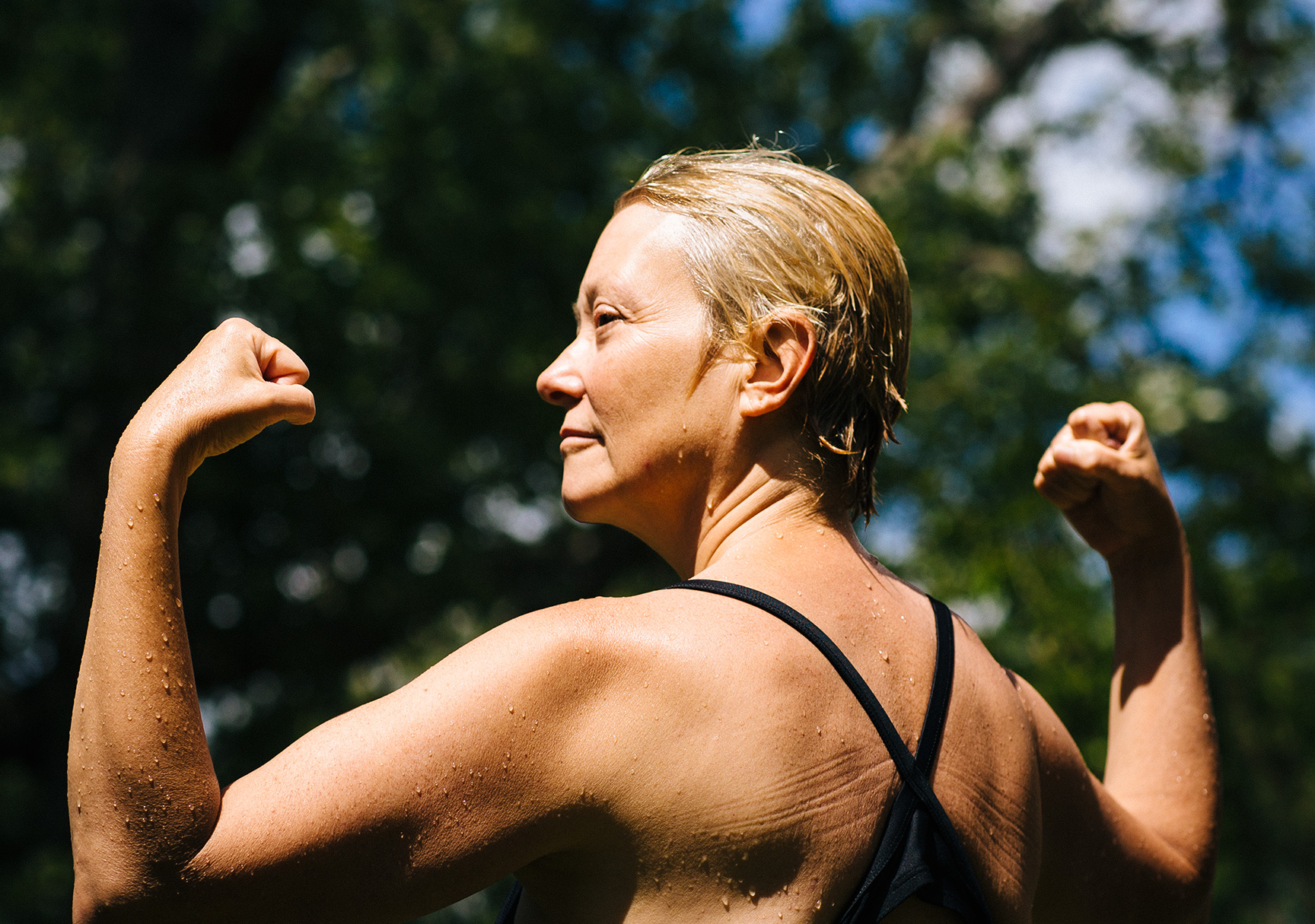
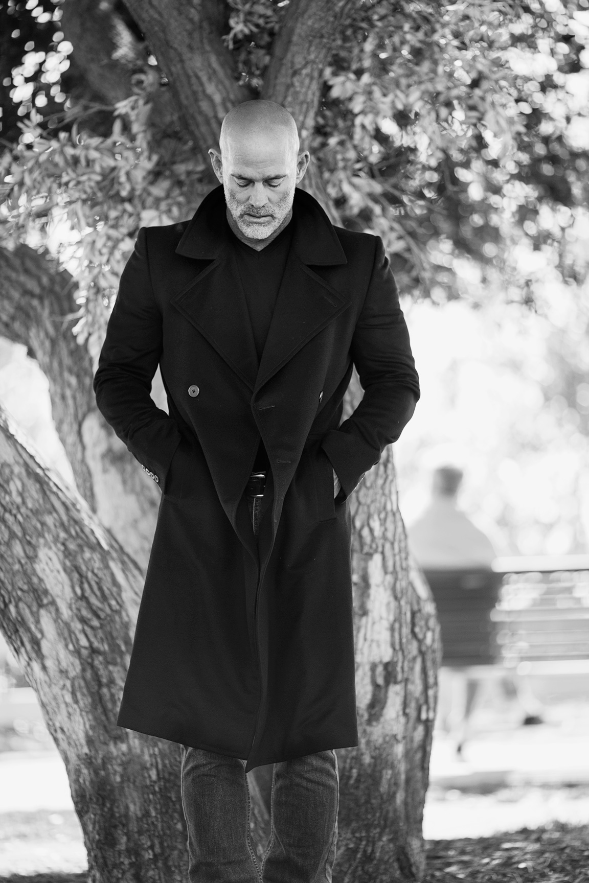
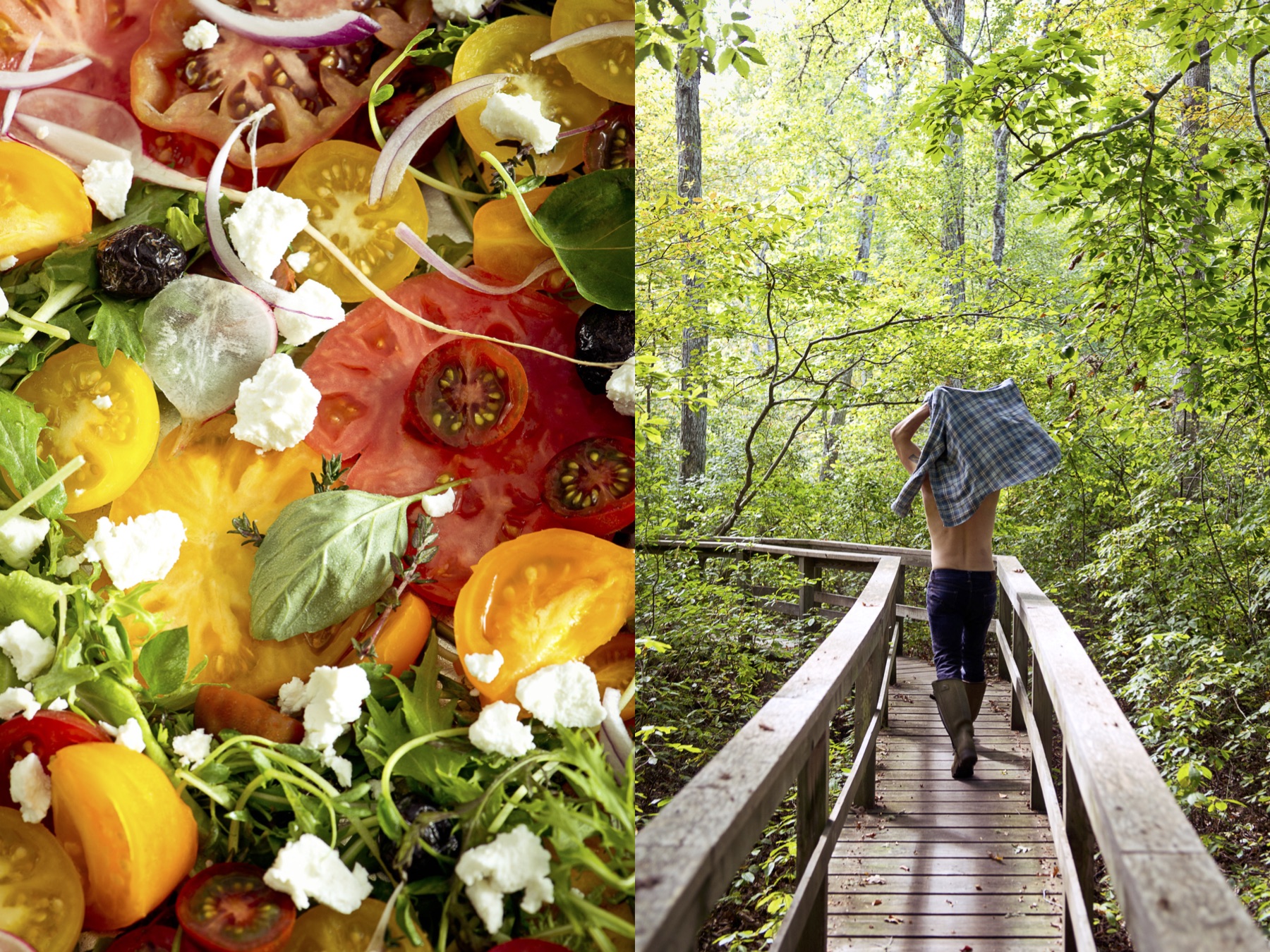
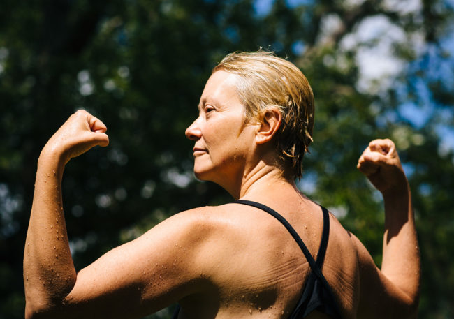
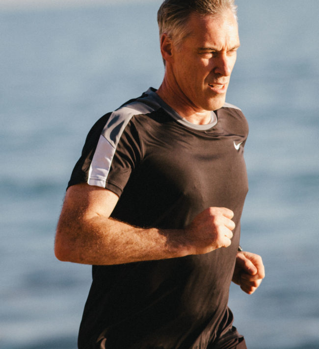
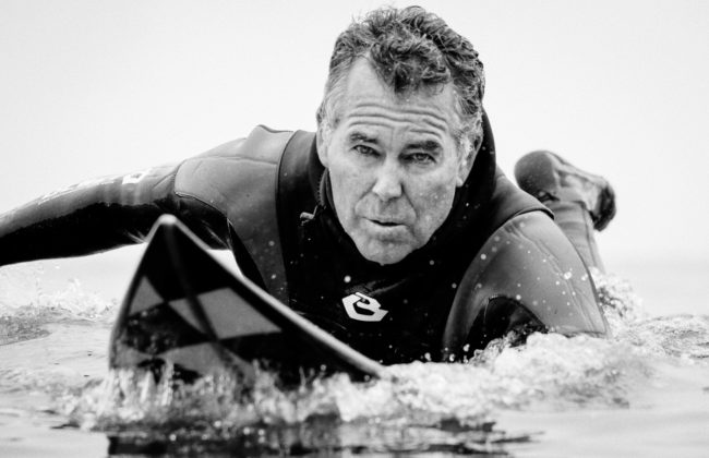
David: Do you know anyone who looks like that Google image search you did? They seem like slow, medicalized, out to pasture diminished people in need of some sort of help. True, there are those people, but I am not one of them, and neither are the people I know. We are at the very height of our powers, and to present us in a medicalized way is just not real, or effective communication.

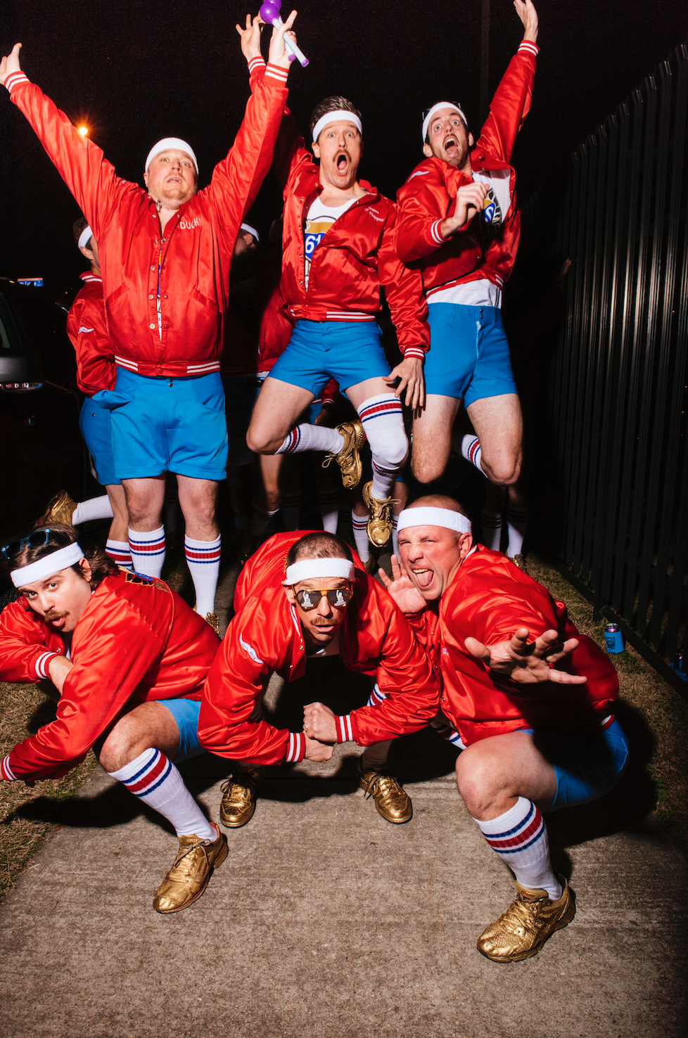
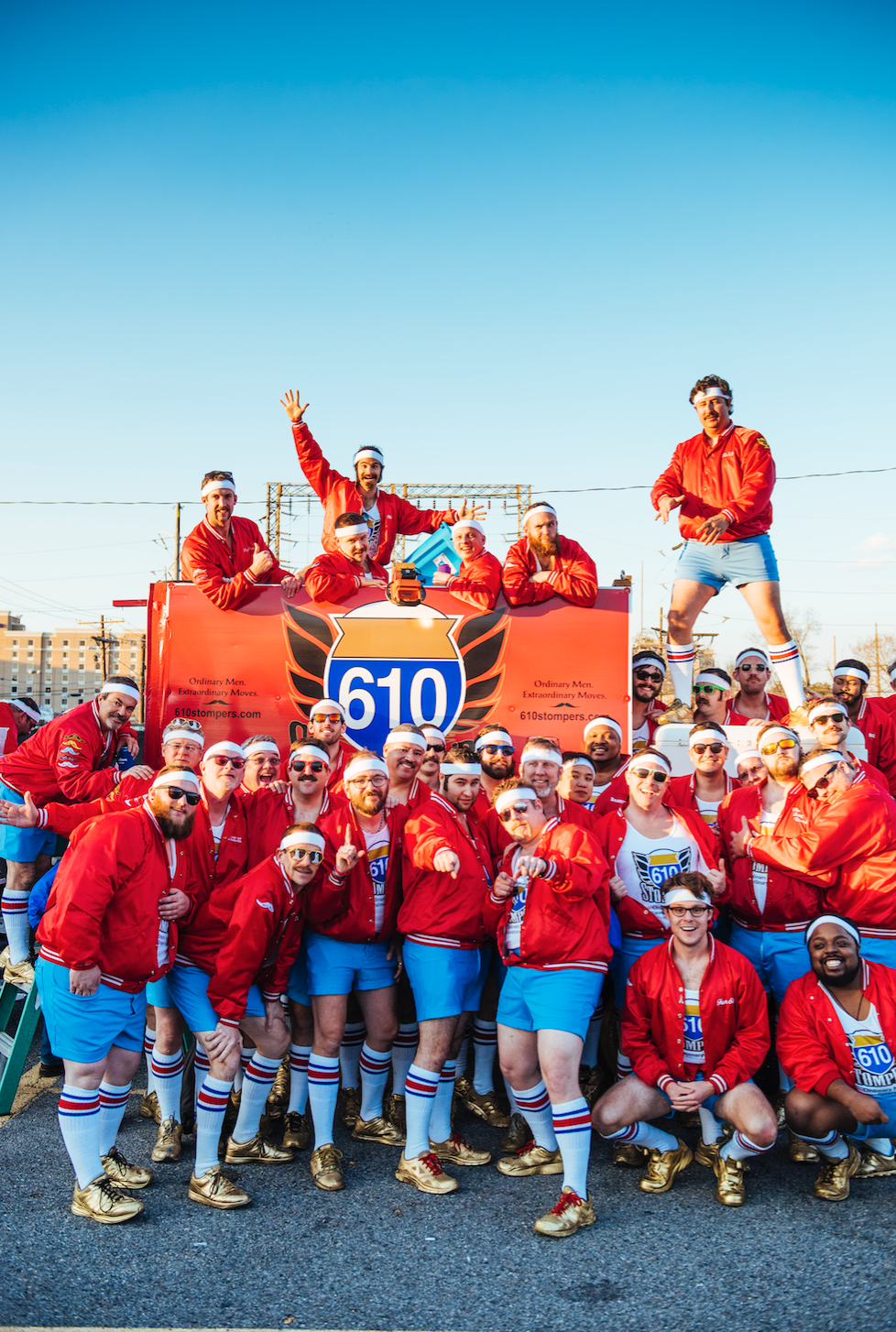
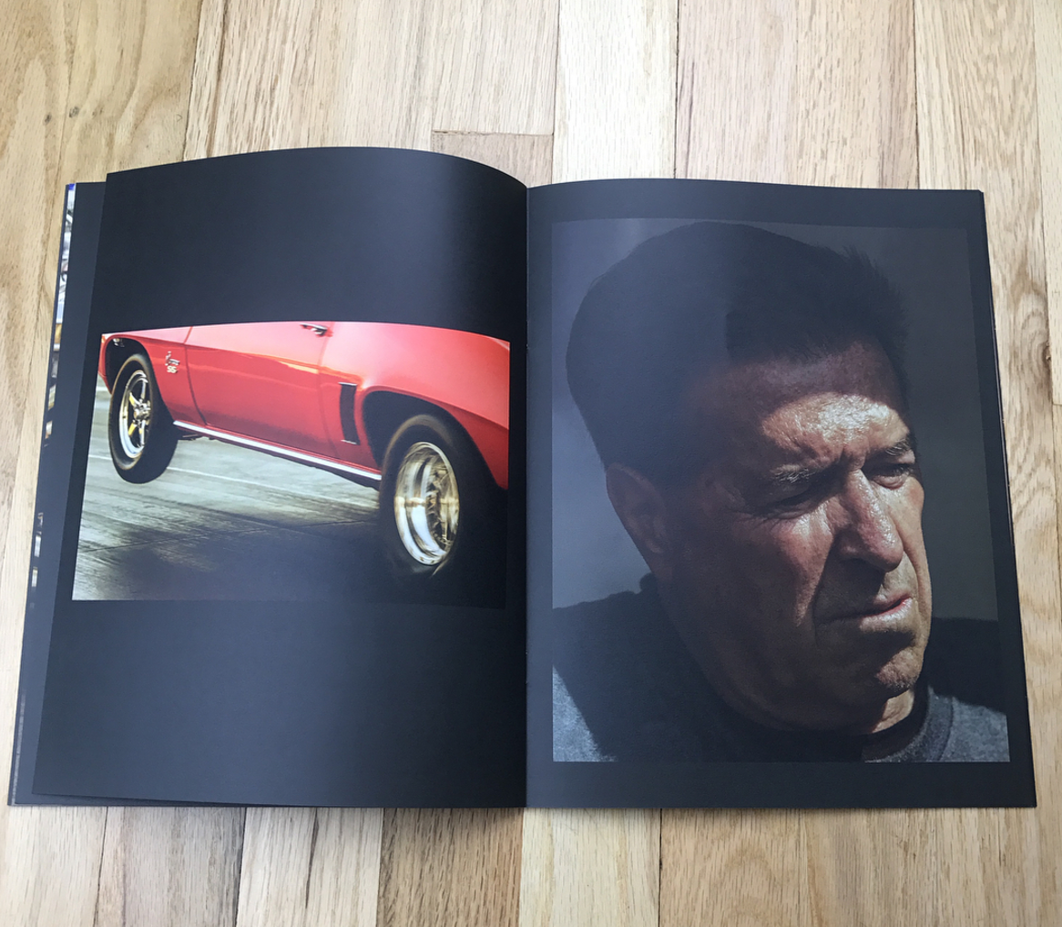
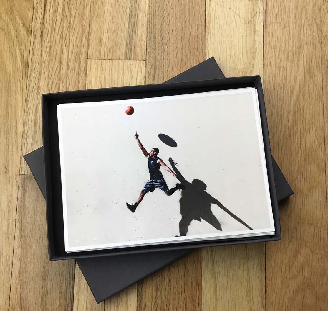
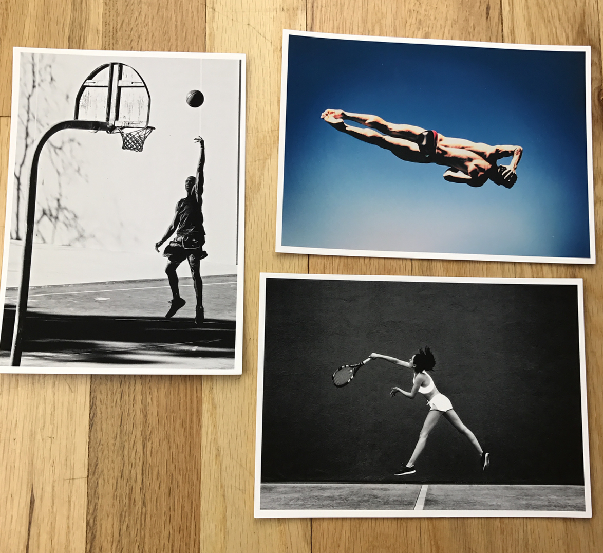
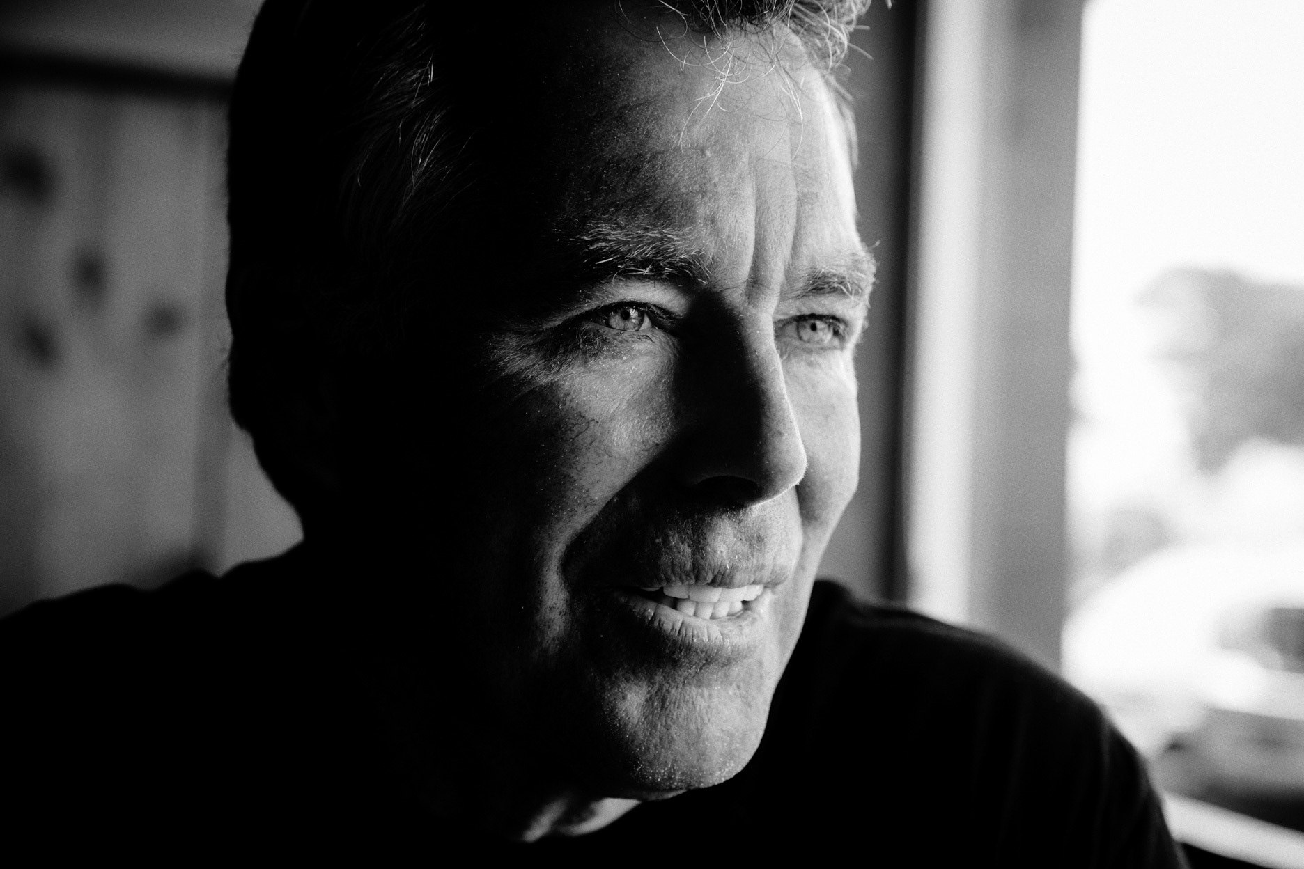
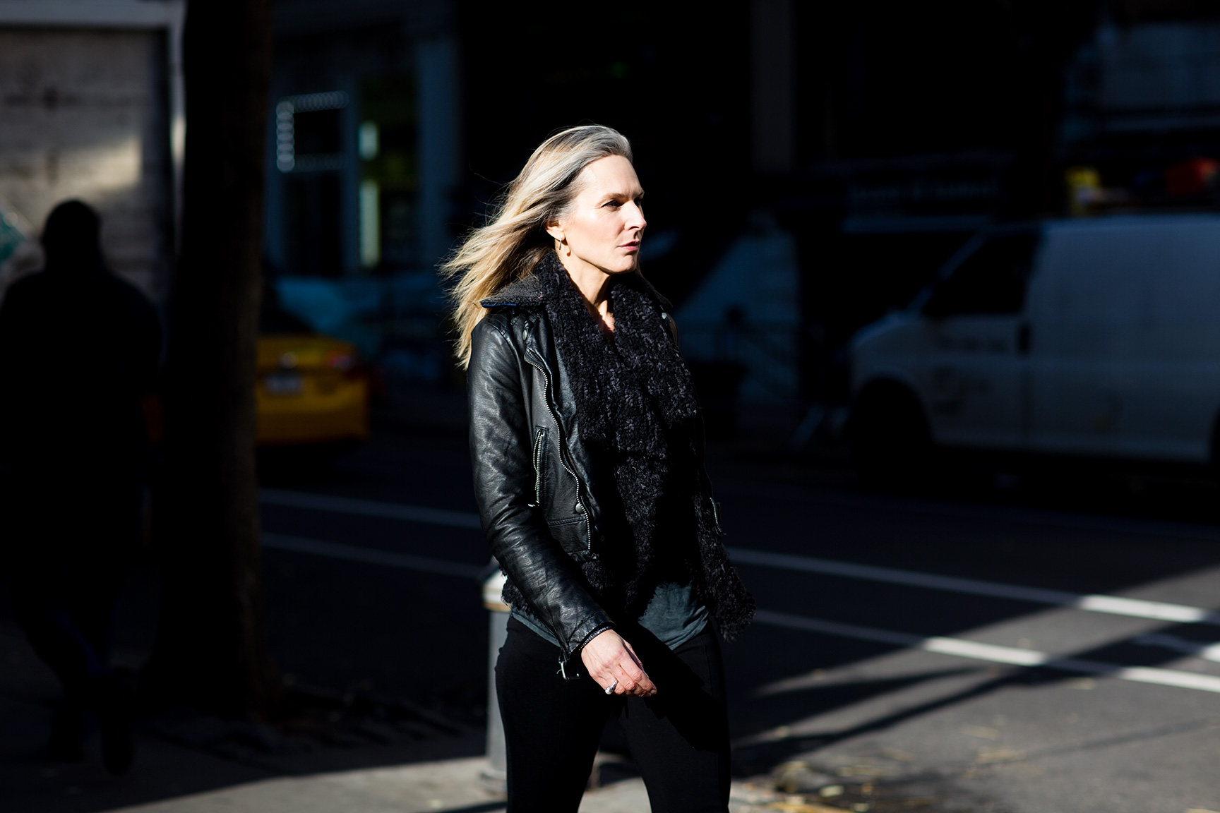
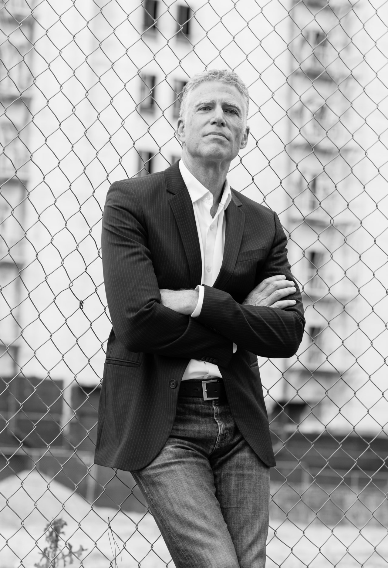
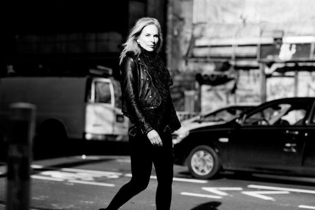
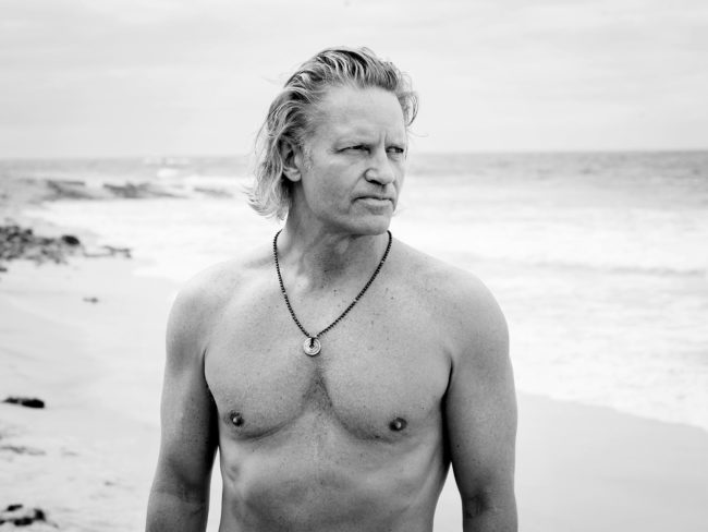
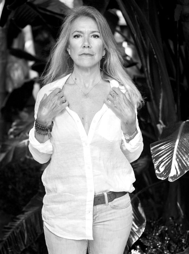
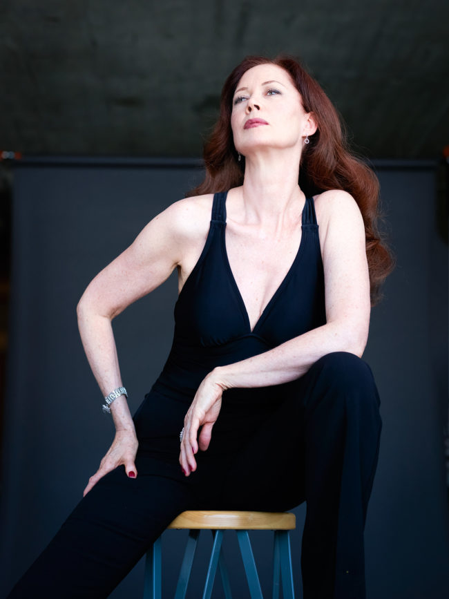
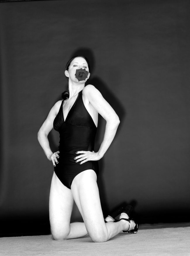
The first big issue we talk about with people over 50 is the visual vocabulary used. The major issue is not a capacity or capability question, it’s a visual issue, and that vocabulary was entirely bankrupt. When I photograph people for AGEIST, it is about self-empowerment, because it is the contrary is what is shown in the media: disempowerment. Our people are shown to be strong because they are strong, stronger than many of them realize. If we can move the needle on two points, strong and modern, we have made an enormous impact.

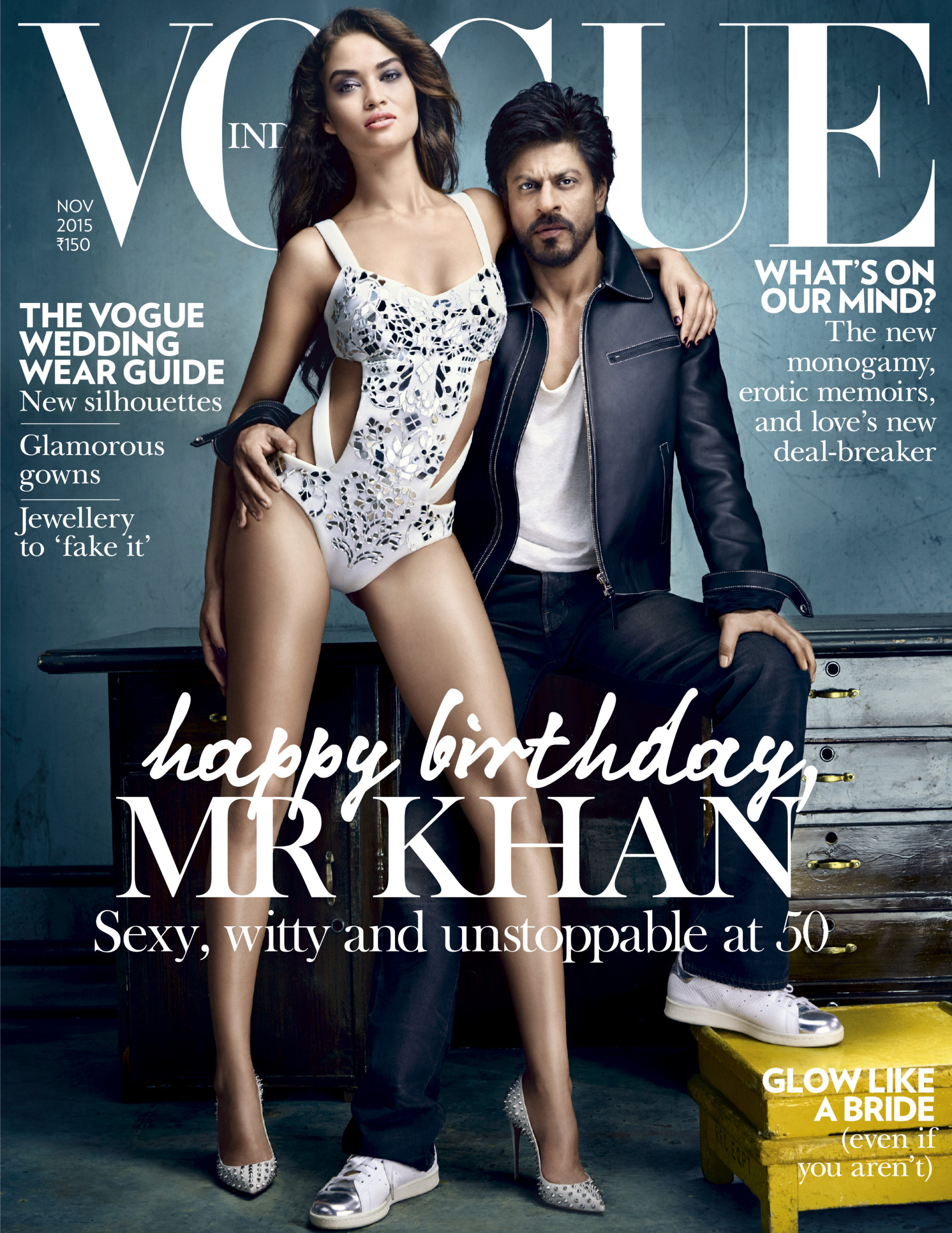
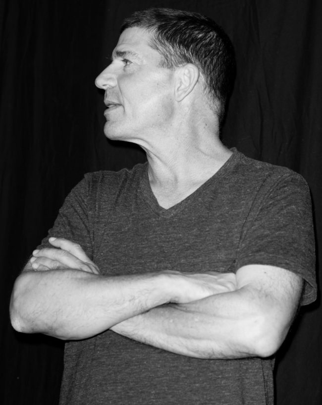
You’ve spent your career photographing vibrant, youthful beautiful people, defining the lifestyle category. What drove you to explore this seasoned group of people, which in turn throws a new lens on this generation?
Thank you for that, it’s true I sort of defined that category, but there is more to life than the 18-28 age group, and I wanted to get with what my own reality is. I’m 58, and I have been doing advertising and editorial work for 35 years, and all the while, the people I am photographing seem to stay the same age: 18-28. If you look at the spending power of people over 50 it’s $5 trillion/year in the US alone. If you look at millennials it’s several decimal points from that. This was the commercial driver of doing AGEIST, but from a personal standpoint, photographers are always strongest when they are doing what they know best. I can work with 20-year-olds very well, and I really enjoy it. But what is my unique contribution? Maybe it is more with people like myself.

Why is this project important to you and how did this develop?
It started with wondering why media is so millennial obsessed, and there are real reasons for it, but almost none of them are based in fact. Why are we spending such a giant amount of resources communicating with people who don’t have the spending power to buy the product? At this point, we realized we needed to question pretty much everything and to rewrite the playbook. The first thing was the visuals, what does it mean to be an AGEIST person and how do they look compared with other imagery out there? That took a while to understand. Our first iteration was a newsletter, which is still hugely popular.

When people go to our site, the first thing that people notice is how we look.  We have a unique and powerful POV. I would like to take all the credit for that, but it is really a team effort.

Your piece about tackling life after 50 is close to 100,000 hits on LinkedIn. Since most of your reach is digital are you considering print?
That article is actually over 135k now and climbing. In terms of exposure, and in terms of incoming comments and emails, it’s vast. If I do a cover for The New York Times Magazine, of which I have done several, maybe I will get 1 email. With AGEIST, we get flooded with them daily. It’s incredible. The button that we hit is so powerful and there is so much pent-up feeling out there; it humbles me every day.

I love print. To me print is a luxury product, it is premium as compared to the disposability and poverty of real estate that one gets on digital. But starting a print magazine, is a big commitment. We will do it at some point, but right now we don’t have the bandwidth to do it to the high level we would want to.

Who is on your team and what are their roles?
I do the photographs, the interviews and the creative direction. Our director of publishing takes the interviews and makes them sound great. He also oversees the social channels, the newsletter and all our content output.  Matt Hirst does strategy, research and finance. Ed Delfs is our digital media expert and big brand outreach. All of us work together on a daily basis along with the other team members.  It’s an A-level team, everyone plays at a very high level. We also have a rather esteemed group who advise us, including the CEO of HAVAS North America, and the head of BMW strategy. We have attracted the attention of some extremely influential people. I am regularly amazed by the people who are reaching out to us for our thoughts on things or wanting to be included in the AGEIST site.

How are you using quantitative data?
I have always been curious about brand values, brand messaging, and how to best serve that.

With our AGEIST clients, I want to make sure we are getting them the best possible results. We start with qualitative insights gathered from deep in-person interviews. We then boil those down to find specific behavioral drivers. These insights help us to ideate with the client and the social team about what those could look like and what channels we think would work best. Then we test in market, rinse and repeat until we really have it dialed in. Only then do we produce and shoot the high quality work that gets the big media push.

Tell us how you gather your information?
The main strategic model we have created for AGEIST relies on qualitative analysis.  We use our proprietary information, gathered from hundreds of interviews, to inform and educate our clients about what’s up with this remarkable new emerging group of adults. Never before has a 50-year-old had every reason to believe they are only 1/2 way through their lives. That has enormous ramifications on people’s value systems, their purchasing habits and most essentially, how they see themselves in the future. What we do is identify people we think are in this leading edge group living in a new way. I want to know their story, but I also want to know what are they doing now, what are they into, what do they want to learn, how do they feel about different brands, products, media.  We take all this information, fully timecoded, and unpack it, combine it with the hundreds of other interviews, and then pull out and correlate platforms and drivers of behaviours. With this, we can make a predictive model that helps us look forward into how they will feel about certain services, products or communications.

Does every photographer secretly want to be an interviewer? Is this simply the same process of taking a portrait but with words instead?
Personally, I’m a very curious person, and when I photograph someone for a magazine or an ad, it’s a privileged position. Generally, this person is of some interest or accomplishment, or I wouldn’t have been sent in. So I use that time to banter, make jokes, but also to chat with them about what’s they are into.

The process of making a photograph, if I can simplify something that is not so simple, is that we observe, we interpret and we record, which is very much like interviewing. With a great model, it’s like tennis, she hits the ball one way, then I hit it back, on and on. With portraits, it’s still always a partnership. People may not know what’s happening as I chatter away with them, but we are collaborating towards an image that I am focusing on getting. Of course, my vision is only half of that partnership. What the other person is bringing often makes for something wonderful and better than anything I could have pre-visualized.

Would you agree that you’re getting data from people but in a much more transparent and direct way? Whereas let’s say most practices are more subversive?
I would agree with that. We talk. If you don’t want to tell me something, you don’t. It’s not an interrogation, it’s a very pleasant 2-way conversation where I am just really curious about this other person.

What have you learned about yourself as a photographer in this process?
That I love photography. We do interviews, we make videos, we give presentations, we create campaigns, all of which is awesome. But my first love, the one I will never abandon, is photography. It is the driving organisational principle of my life. The still image as a reflective piece of art is a magical object. I have been looking at snapshots, contact sheets, prints and digital images for 50 years, and it holds me like nothing else.

Are you approaching your photography in a new way with this project?
Yes, I am. As someone once told me “if you want to get into the chair across the room, you need to get out of the chair you are in”. I edited my personal site, removing much of the younger lifestyle work. It was scary to do that, as that work was decades in the making.

But you have to choose your lane, and if I was going to do AGEIST, it just didn’t make sense to have the happy snap young people in there. It was a totally different expression. The work now comes from a very different place. It’s not so much “how will clients relate to this”, as “how do I like it and how will my gang in AGEIST like it”. How can I make the most powerful image possible at this moment?

Despite my fears, I am now contacted by advertising and editorial clients to work with them because of this new work.

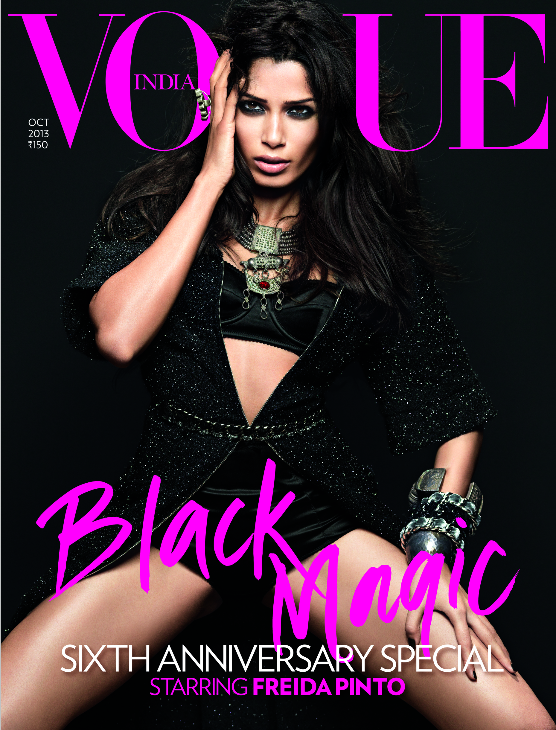
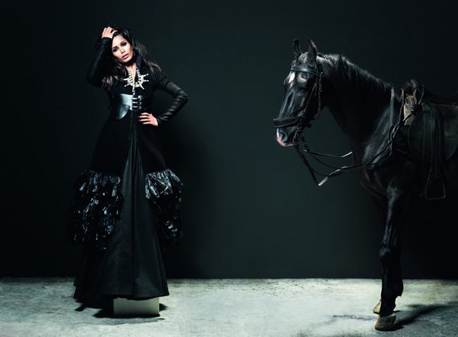
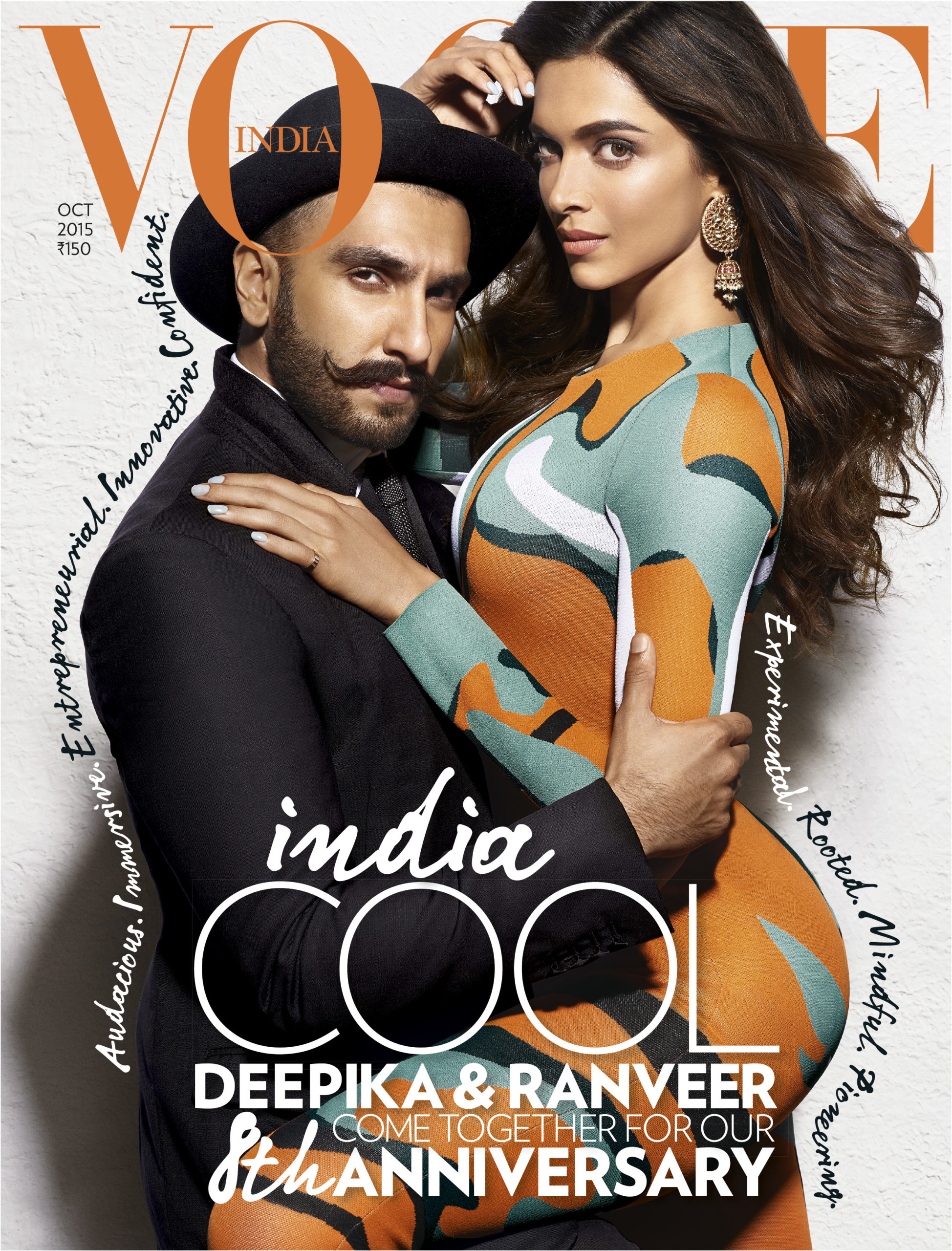
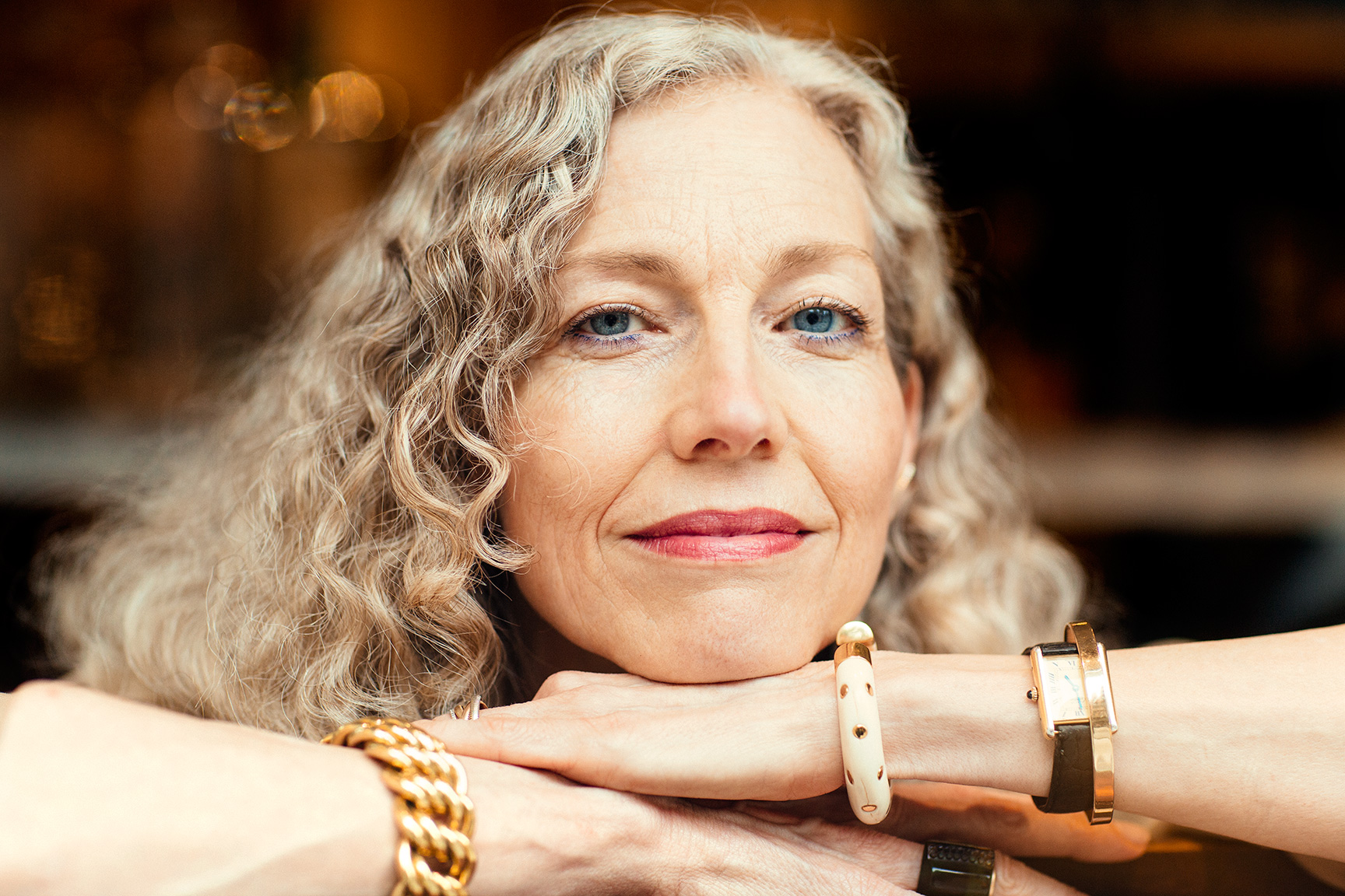
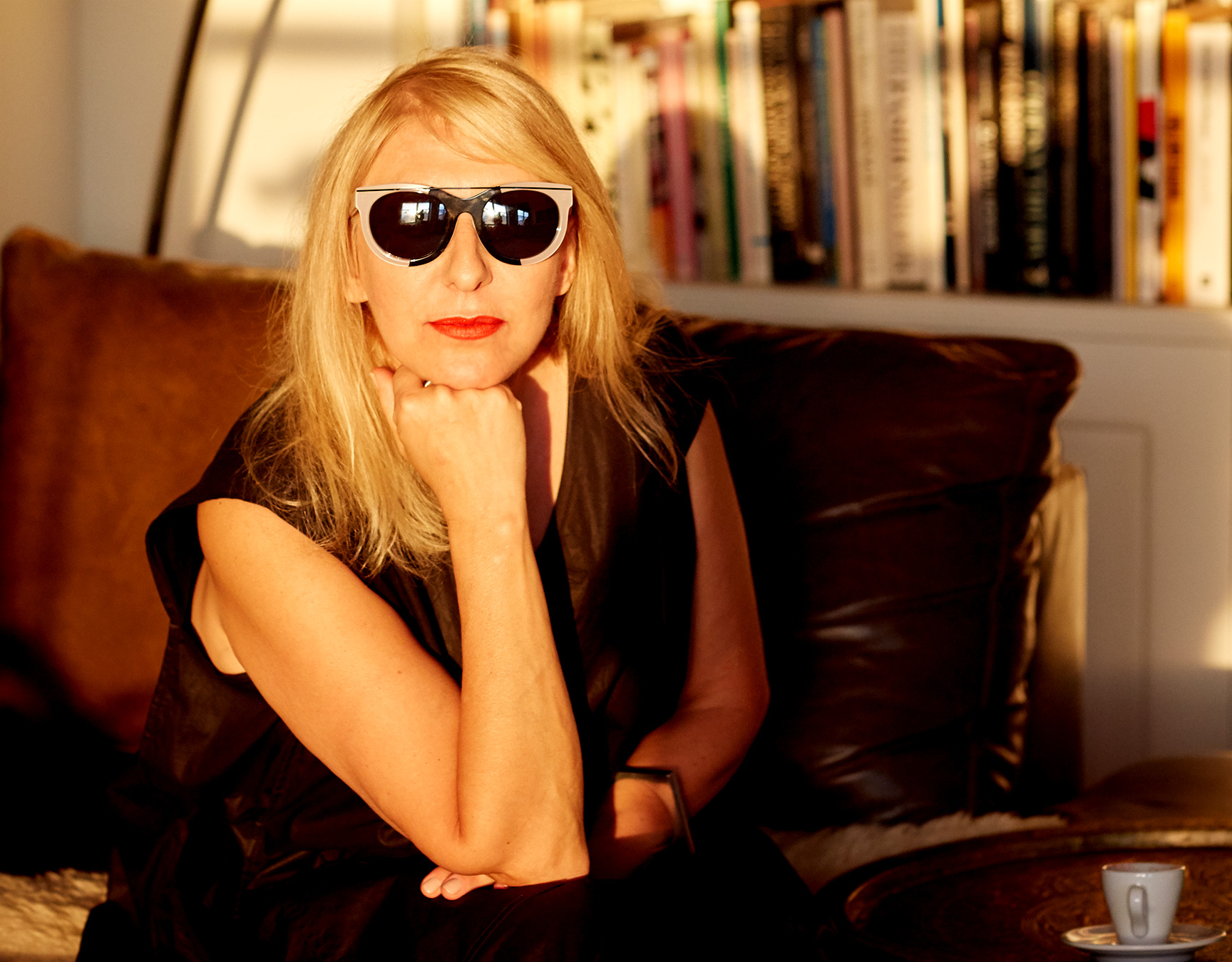
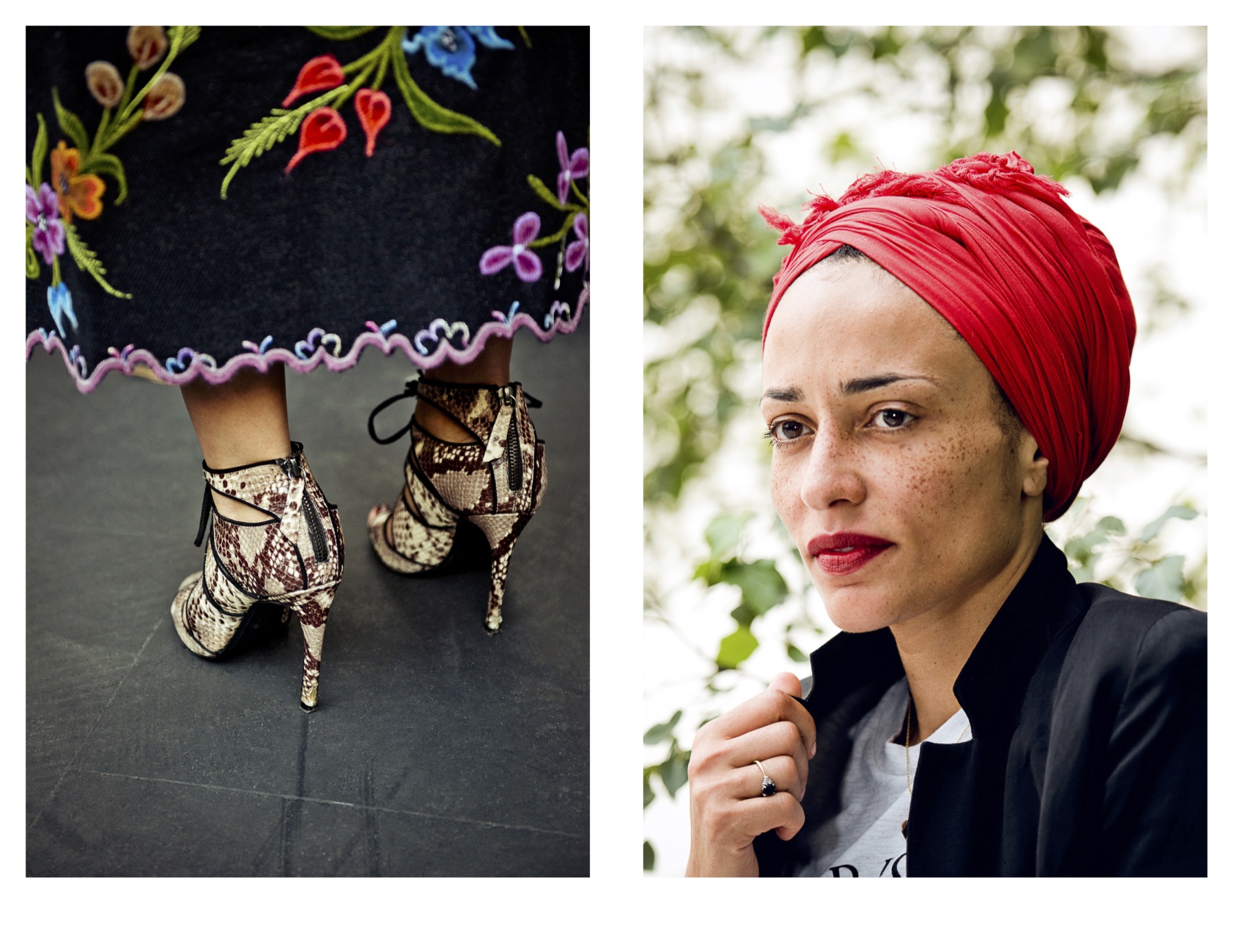
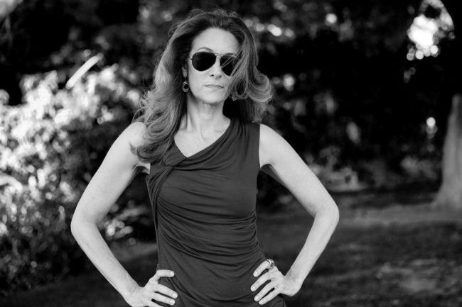
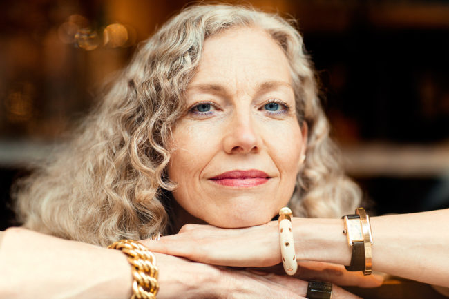
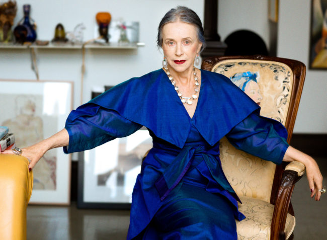
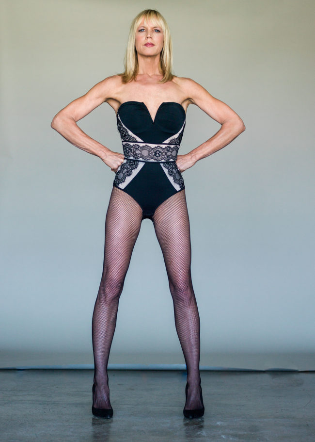
Your interview with Tara Shannon is a terrific example a woman that has deep roots in the high fashion industry modelling for Irving Penn and Richard Avedon amid many others. Her voice is an excellent discussion about models at 61 and what that wisdom brings to a shoot.
Thanks, that was a great conversation I had with her. She is a fantastic model and someone who has given considerable thought to the idea of invisibility/value as it intersects with age. People can read that here.


Age is a truly a gift. What do you think gets lost in this younger generation?
It’s a bit unfair to ask a 30-year-old to understand a 55-year-old. But it’s the same for me. I really don’t know what it’s like to be 80, I can guess, but I won’t really know until I am there. One of the shocking things about AGEIST is that about 1/3 of our audience is under 30. That is utterly surprising to me and completely unintentional. What they tell us is that we show being older as being filled with possibility, being cool, being people who they aspire to be. So for younger people, we are a north star.

I really dislike the whole idea of age brackets. The only reason we put people’s ages on AGEIST is it’s an interesting data point. But we don’t talk about age, it’s better to just say this person is rad, and they happen to be whatever age. It’s a bit insulting to say to anyone of any age “wow that’s great for someone your age”. That’s not helpful to say to an 8-year-old or an 80-year-old. When someone is cool, it doesn’t matter what age they are, they are just cool.

Why do you think her story is striking a chord with people?
Well, she is, for one thing, an incredible model. She is also a very smart articulate woman of 61 who knows what’s up. Not everyone at 61 can look like Tara, but so many people relate to what she is saying about invisibility and worth in society. Once you tell a group of people who are used to being ignored and are essentially invisible, that now we see them, and we understand them, well that is a massively powerful thing to do.


The Daily Promo – Gabriela Herman

Gabriela Herman

Who printed it?
This was printed by Smart Press. I’ve used them previously for other promos and have been pleased. 

Who designed it?
My patient and thoughtful husband worked on the piece with me- t
he perks of being married to a designer! My last big promo was an elaborate fold out poster (which he also designed) so I thought for this one that I wanted to do something else and went with a booklet. I let the images speak for themselves and included very little text, my name doesn’t even appear til page 6.

Who edited the images?
I did with input from various photographer friends (shout out to Steph Goralnick and Mark Wickens). Since I hadn’t sent out a piece in a while, I knew this was going to be more of an overview rather than focusing on just one story. I also wanted to make something that I could send to both editorial and advertising clients. And since this would be going out at the beginning of spring, I knew I wanted colorful, floral and outdoorsy images.

How many did you make?
I had 300 printed. I tend to have a targeted list and send mostly to people who I have worked with or been in touch previously. I’d say only about 20% went out to clients who I had never been in touch with prior. I also included a separate postcard inside with a hand-written note.

How many times a year do you send out promos?
Ideally? I’d send something like this out once a year in addition to a smaller item such as a post card a couple times. In reality- it’s been over two years since I last sent out a physical piece! Work got really busy and then I had a baby, so it is what it is. I, of course, also send out newsletters and individual emails, along with the thousands of other things we do as photographers to get work!