The Daily Promo: Caitie McCabe

screen-shot-2016-12-30-at-8-27-04-pm
screen-shot-2016-12-30-at-8-27-10-pm screen-shot-2016-12-30-at-8-27-15-pm

screen-shot-2016-12-30-at-8-27-21-pm
screen-shot-2016-12-30-at-8-27-30-pm

Caitie McCabe


Who printed it? Created the box
The box was printed by Packlane, a custom packaging company based in California.

Who designed it?
Because the project was so multi-faceted; I collaborated with several, wonderfully talented— creatives. They did an incredible job of bringing my vision to life; making a fun, cohesive project with an “All-American” feel.

Packaging Design: Ryan Bolhman
Rebrand Design: Caitlyn Dailey, Erika Saraniero, Matt Conte, Emily Menton, Augie Viera, Vincent Maltese, Tom Finnerty
Video Production: Laura Laperche http://goodandstickycontent.com
Copy: Hilary Giorgi, Matt Conte, Emily Menton
Website Design: Heidi Volpe

Who inspected the box?
A crew or 35 amazing volunteers (fueled mainly by pizza and beer) who helped throughout all of what we called “Rocket Weekend.” Each member of the team helped to pack and inspect the boxes. They even had their own personalized “inspected by” stickers! You can check out the behind-the-scenes video to get a pretty good idea of how hard everyone was working, AND how much fun we all had putting this together: You can also meet the whole rocket team here:

I was excited – and extremely fortunate – to work with Peter Dennen on this project, who I’ve been working with for the past three years. He also helped on the site redesign: overhauling the internal promo, the leave-behind pieces, and the overall vision of my brand.

How many did you make?
All together, we assembled 250 boxes and more than 400 rockets. Each rocket was hand painted and constructed by members of the team. Frankly, I’m flabbergasted that these people still talk to me!


Caitie McCabe Photography

10-caities-little-helper

How many times a year do you send out promos?
Because these large-scale promotions – like the Rocket Box – take an astounding amount of collaboration and effort, I only do them about once a year. I’ll send smaller promos, mailers, and email posters more frequently; but these big projects require a lot more attention. It’s easily six months of planning, designing, shooting, and assembly. And they’re always a project I take great pride in, so getting it just right is super important.

The interactive element to this box added some extra production time. We filmed a full safety and instructional video for the working rockets included, as well as made the box capable of becoming its very own launch-pad.


How did this project come about?
At the start of 2016,  it was time to re-launch my brand. I created a new logo, figured out new and exciting ways to show off all these samples of my work, and completely overhauled my website. I was pumped. I’m not one to do ANYTHING quietly, I found myself searching for the perfect way to announce all of these new and exciting business developments. That’s when serendipity took over.
Randomly – as one often does – I struck up a conversation with a man who accidentally bought $20,000 worth of model rockets. After the confusion – and thousands of questions –  the lightbulb went off.  I had begun the six month process of developing the most insane promo piece I’d ever done.
I’m NOT a rocket scientist – just a girl with a head full of ideas and several hundred explosive devices – it took a bit of help to fully “launch” Rocket Boxes. Luckily, I’m surrounded by people who were more than willing to come by in their free time to help build rockets, set up launch pads, assemble boxes, and hammer out those tiny details that made these promo pieces work. Whenever I had an idea – however crazy – my amazing team was right there to make it possible.
What we ended up with were 250 beautiful boxes, an incredibly well designed physical mailer, a poster, scripted and behind-the-scenes videos, a new website that I’m insanely proud of, and some AMAZING memories.
Of course; since I sent hundreds of rockets through U.S. mail, there’s an itsy-bitsy chance I’m now on a government watch list. But, honestly, I wouldn’t have it any other way.

The Daily Edit – Big Data: The Cover Snapshot

Big Data in 2016

In an age of big data analytics let’s not ignore the available visual information, it’s not only about spreadsheets and numbers. In my consulting work I  encourage specificity and direct targeting a client. As a photographer it’s important to fully understand how your work will behave inside a magazine. What features, departments or essays are you a natural fit for?  Here’s a simple exercise with a year long snap shot of three different magazines who share some of the same space in the market. What do these grids tell us?


  1. cover consideration involves strong portraiture for all. The Red Bulletin and Outside, photographing people, National Geographic it’s photographing animals.
  2. Both Outside and The Red Bulletin require action and environment on a consistent basis.
  3. Outside and National  Geographic covered National Parks for the 100th anniversary, big sweeping landscapes necessary.
  4. No women cover subjects.

these are just a few elements we can see. If you want to work with a magazine, know their brand.


screen-shot-2017-01-04-at-8-32-06-pm


screen-shot-2017-01-04-at-8-32-16-pm


screen-shot-2017-01-04-at-8-32-27-pm


Here’s another sample.

  1. It may seem obvious but the Food&Wine has to cover just that, on the cover from time to time they include a glass of wine.
    Bon Appetit, not this year.
  2. They both cover Thanksgiving in November, one with turkey, the other with pie. Cook Like a Chef, Cook like a Pro: The same editorial concept, both in March.
  3. Bon Appetit has human elements keeping in step with cultural influences (tattoo, smartphone food pictures). Food&Wine didn’t have a human element this year.
  4. For both titles April had a bright element of color.

Food photographers can see where their style may fit better, where there may be some overlap. Again, if you want to shoot for a magazine, know their content, know their brand.


fw


ba


The Daily Promo: Sara Remington

screen-shot-2017-01-08-at-6-44-11-pm
screen-shot-2017-01-08-at-6-43-29-pm
screen-shot-2017-01-08-at-6-43-48-pm
screen-shot-2017-01-08-at-6-43-56-pm

screen-shot-2017-01-08-at-6-43-13-pm

Sara Remington

Who printed it?

Essence Printing in South San Francisco.  They’re always 100% spot-on with their color matching; it’s fantastic.

Who designed it?
A friend of mine, Francesca Bautista, who designed a few cookbooks I worked on (‘The Blue Chair Jam Cookbook’ and ‘Blue Chair Cooks’).

Who edited the images?
I gave Francesca a general idea of what I wanted, and sent her my top 25 – 30 images to play with.  From there, we did a little back and forth to make sure things flowed nicely and were relevant to the overall ‘natural dyeing’ story.

How many did you make?
I made about 250, and carefully curated a list of people that had close ties to still life and food accounts.

How many times a year do you send out promos?
I send a promo this size about twice a year, and try to send a few more smaller, less multi page ones sprinkled throughout the year if I can.

What project did these images from come?
Most of these images came from one of my favorite books I shot to date, ‘The Modern Natural Dyer’ by Kristine Vejar.  It was an inspiring, multi-week shoot that involved capturing natural dyeing techniques, combined with how-to’s and high end projects to tie in those dyeing techniques with a finished product.  I have never felt so creative and alive and slightly out of my element on a commissioned project.  I’m used to having a time limit on the images I shoot, since most of what I shoot is food and drink, but for this project, we had the leisure to tweak and tweak until everything was exactly how we wanted.  I had the full trust in the editor, Melanie Falick (who at the time was with Abrams Publishing) to be as creative and wild as possible with our brilliant stylist, Alessandra Mortola.  We captured such a luscious portfolio of colorful, layered imagery that it had to be shared in a mini book promo, with the main objective being to showcase my work beyond the food world.

The Daily Edit – J.R. Mankoff: Standing Rock

Copyright 2017 J.R. Mankoff
Chief Mathews Black Eagle Man, Long Plane First Nation, Canada. This was shot minutes after the permit to deny the pipeline was announced.
Copyright 2017 J.R. Mankoff

This is Amanda. She’s about to head to the front line. There are no weapons allowed. Even a gas mask or bullet proof vest can be construed as a threat to the police. She’s brining a mirror with her to reflect light back onto the police as defense.

Copyright 2017 J.R. Mankoff

Rick Warrington, Menominee Tribe, Wisconsin. He drove from the midwest to deliver wood.

Copyright 2017 J.R. Mankoff

Rob McHaney came in from Reno, Nevada. He’s a veteran who stood at the front line at Standing Rock with his flag held proud.

Copyright 2017 J.R. Mankoff

Copyright 2017 J.R. Mankoff

Copyright 2017 J.R. Mankoff

Copyright 2017 J.R. Mankoff

Copyright 2017 J.R. Mankoff

J.R. Mankoff 

Heidi: What called you to do this?
J.R.:  Maybe it was Thanksgiving weekend, sharing an ironic celebration in a warm home while Water Protectors were shot by rubber bullets and water hosed in freezing temperatures. Maybe it was after my heart shattered when the Dakota Access Pipeline illegally bulldozed sacred Lakota barrel sites or my deep connection to nature, my love for the land and the people who protect it. Maybe it was my own spirituality pulling at my soul. A force greater than that which I could understand at the time. All at once I was swept off my feet with haste, in immediate motion, towards Standing Rock.

What was it like there?
I’m often asked how Standing Rock was. What was my experience there? Knowing full well this is a loaded question, people often offer an adjective or two about what they have indirectly experienced from it and project that on to me: “Interesting, intense, powerful, cold?”… The truth is I was experiencing all emotions at once. Sadness, empathy, anger, love. They were all there. At times I felt love stronger than anything else. At times I wept from sadness. All my emotions were present, not dormant, interacting with themselves every moment I was there. Standing Rock brought them forth and challenged myself to face them, appreciate them, and grow with them.
 
Tell us about the space between hesitation and action for you with this project.
Over 700 indigenous tribes were represented at Standing Rock. The largest gathering of indigenous people ever known and I needed time to acclimate before picking up my camera. I took part in a sweat lodge, I helped chop wood, I walked the camps and talked with the people there.
 
Photography is powerful, opinionated and can shape public opinion. I felt a strong responsibility to use this tool for good. Portraiture in particular involves trust. Trust is one thing the Native Americans do not share easily, for it has been broken time and time again. I was once asked after taking a portrait, “are you going to exploit me?”

I’ve come to Standing Rock as a photographer and compassionate caring human, yet I felt as if my press pass separates the two sides which I know are one and the same. I understand how important the media is to fighting this cause, yet I couldn’t help but feel intrusive. Many of the Indigenous people there do not want to be photographed and it is a delicate balance for me between shooting and picking up an axe to cut some more wood.

How many times did you visit the camp, and how long did you stay? ( and where did you stay?)

I’ve been twice so far. The first time I slept in my small station wagon. I had become sick around day ten from a severe blizzard that came through and most of camp evacuated. I slept on the floor in a large auditorium that evening with one thousand or so camp refuges at the local casino while we waited for the blizzard to pass. The following trip, I decided to stay at the casino. This trip was also cut short by a blizzard. I stayed ten days again.

How long after you arrived did you decide to start the Gofundme Firewood for Standing Rock project or was this decided before you arrived?

I developed a close relationship with Jumping Buffalo, one of the last direct descendants of Sitting Bull. I cried a lot on that trip back home while processing everything. I didn’t feel I had helped enough. During this drive home, Jumping Buffalo called me and asked if I would sweat with him. I felt so torn. I was half way home and I needed to take care of my health. I told him I would be back and asked him if there was any way I could help. He told me they desperately need firewood. It heats their homes, cooks their foods and centers their ceremonies. I started my gofundme that day.

Was it difficult shooting in this weather?  It’s far, far away from sunny So Cal.
There was a moment in a blizzard when a woman wearing a bear walked towards me out of the white abyss. I stopped her and she offered to dance for me. I took my hands out of my mittens, the autofocus kept focusing on the snow so I had to manual focus my camera while shooting her dancing at a shallow (f1.8) depth of field. The winds were nearing 40 mph and it was -7 degrees out. It was the hardest shooting i’ve ever done.
Copyright 2017 J.R. Mankoff

Jackie Andrew, Lil’wat Nation, Canada performing a St’at’imc Bear Dance for me.

How is your experience coming home from Standing Rock and whats next?
All I think about is Standing Rock. I’ve been back home for a few days and really enjoying being social and around people. I realize now that time alone and observing heightens me. It heightens my spiritual and observation side. My senses are amplified and awakened. I am listening. I hear and see clearly. I smell better. I feel better.
Spirituality has a muscle memory. Observation has a muscle memory. At Standing Rock I was in tune with them, using them daily: Praying at the sacred fires. Observing. You can learn a lot from observation and these type of experiences build onto themselves. The more I practice, the more connected I am. If I take a break from it, it fades. I’ll get rusty, but the foundations will still be there. The foundations build upon themselves, they shape who I am.
There has been a lot of journalism on Standing Rock, mostly from small news outlets. These organizations have helped put the word out. People are coming to me feel a personal experience, they are looking to connect. I want to share everything with them and it’s tiring giving of myself and my experiences to each person. I’m working on building an emotion experience, a book that will best express this journey. It’s exciting for me and feels right to create something from a true passion. It is lifting me, lightening me and fulfilling me.

The Daily Promo – Daniel Cullen

screen-shot-2017-01-08-at-6-51-10-pm

screen-shot-2017-01-08-at-6-51-17-pm

screen-shot-2017-01-08-at-6-51-24-pm

screen-shot-2017-01-08-at-6-51-31-pm

screen-shot-2017-01-08-at-6-51-38-pm

screen-shot-2017-01-08-at-6-51-46-pm

screen-shot-2017-01-08-at-6-51-52-pm

Daniel Cullen

Who printed it?
The newspaper promo was printed by The Newspaper Club, Glasgow, Scotland. I opted for the Digital Tabloid edition.

Who Designed it?
I designed the promo myself. I spent the early part of my career in editorial design and art direction with U.K., Canadian and U.S. magazine and book publishers, so it felt comfortable designing my own material. The switch to photography as a full-time gig is the second act to my career.  I absolutely loved designing my promo, I became the dream client, so patient, qualified, willing to listen, and rather easy on the eye*.

Who edited the images?
For this promo, I decided to edit in-house. Obviously this has its pros and cons, but I felt I learned a lot from the experience, especially the big picture stuff. It gave me a bird’s eye view of my recent projects which allows me to focus the direction of my work in 2017. For future promos, I’ll be reaching out for help and opinions. The idea of seeing your portfolio curated from an independent perspective is fascinating. I think this would be a unique process in gaining a honest edit.

How many did you make?
I printed two newspapers, only 20 of each, which in the world of photographer promos is laughable. The promo I sent to aPhotoEditor was a selection of images that simply acted as a gallery showcase and is meant to encourage a visit to my website to view a wider range of work. The second (identical in size and page count) was curated with an editorial narrative, with four double page spreads showcasing a singular photo essay. The biggest factor for such a low print run was the inability for me to attend any kind of press approval. I felt unsure committing to a 500-1000 print run without seeing exactly how the final piece would look. I’m still searching for a printer closer to home, which is Toronto, who could produce such a piece at a competitive price so I could significantly up the number of promos to send out. This decision has nothing to do with the Newspaper Clubs quality of work, it’s just my need to be closer to the actual printing. With each newspaper I included a 5×7 postcard that included all relevant contact details. A postcard is easier to file or post on an studio wall than a tabloid newspaper.

The concept of printing a newspaper is not particularly unique these days, but sure is fun, especially for those of us who enjoyed the heyday of 80’s & 90’s magazine publishing. It was a joy to feel and hold such a large printed piece.

How many times year do you send out a promo?
I like to produce three a year. This particular small batch promo will be sent out in January. I plan to send out at least two more in 2017, perhaps early summer and late fall. I’ve yet to decide if I will produce two more newspaper promos or design and present each portfolio differently. Postcards, small magazine, foldout poster, etc.

*This statement is utterly untrue. The English accent is adorable though.

The Daily Promo – Joseph Cultice

screen-shot-2016-12-30-at-8-26-50-pm

screen-shot-2016-12-30-at-8-26-42-pm

Joseph Cultice

Who printed it?
I got it printed at Type Craft, great people great prices! I worked with David Mayes.

Who designed it?
I designed it, edited it, mailed it, and with my agency help  The Only Agency  did the mailing list.

How many did you make?
About 300 were mailed out, printed around 350.

How many times a year do you send out promos?
I am planning on doing three promos like this next year, maybe four. Depends on if I have images I want  share.

Have you noticed a difference between email promo and printed promos?
I have been a lazy photographer the past few years when it comes to mailing printed work. I have been pretty consistent with email promos and social media; both seem to be losing effectiveness. Simply put, there is just so much of it out there, it’s a sea of digital pixels. Plus the email never get through, I use mail-chimp, and less and less gets to the clients face. I’ve been in several meetings in NY and LA  recently,  seeing my promo on the wall  that I sent out last year or even the year before feels good.  I think it’s really the only way to share your work in a tangible way, it’s personal.  When I’m proud of the work that gets out there, I want to share it with my friends and future friends.

The Daily Edit – GQ: Christian Weber

screen-shot-2016-12-19-at-9-46-13-pm

screen-shot-2016-12-19-at-9-46-23-pm

screen-shot-2016-12-19-at-9-46-32-pm

screen-shot-2016-12-19-at-9-46-43-pm

screen-shot-2016-12-19-at-9-46-54-pm

screen-shot-2016-12-19-at-9-47-00-pm

screen-shot-2016-12-19-at-9-47-06-pm 
screen-shot-2016-12-19-at-11-31-28-am

GQ

Design Director: Fred Woodward
Director of Photography: Krista Prestek
Photographer: Christian Weber

What music were you playing on set?
Generally I’ll play whatever I’m in the mood for unless someone has a special request, my go-to is Led Zeppelin and AC/DC. On the GQ Jazz Giants shoot none of the artists had any requests. I do remember we played Alice Coltrane’s Journey In Satchidananda while we shot Pharoah Sanders. Pharoah is a mysterious guy, very quiet and calm. The music fit perfectly with what we were doing.

What was your approach for this body of work? and why did you choose that style/color of lighting?
I wanted to create a body of work that paid tribute to these giants of jazz. Powerful images that were both modern and timeless. I am greatly influenced by the work of Irving Penn and Arnold Newman, there is an elegance to their portraits that I wanted to bring to life in this series. As for the lighting it is similar to work I have been creating lately in film, there is a hyper-real dimension to the mixed sources that I wanted to use to create a modernization in these portraits.

Did you prep by re-listening to each artist before you shot them?
I did. Once we were offered the project we created a playlist of one album from each artist we photographed. Charles Lloyd’s Manhattan Stories was a favorite.

How did you determine the approach for each one, did they always play for you?
I usually didn’t make any concrete decisions until I met the artist. Then I’d decide that we’re going to choose this set or that and which colors to play with on the spot. It was all mostly from the gut.

Not all of them played. At their age, if they didn’t feel like playing it wasn’t going to happen. But sometimes we were surprised. Cecil Taylor is known for his avant-garde piano yet he wouldn’t touch the thing. Instead he surprised us all by doing a crazy spoken word performance from his wheelchair.

How long did you spend with each artist?
It varied. I never knew how much time they would give me until we were together. Roy Haynes is pushing 92 and he could have gone all night, he has the energy of a teenager. Nearly all were incredibly generous with their time. We had several different sets going so we could keep the pace up and energy level high. Sometimes we got a half hour. Sometimes we got two. We photographed Roy Ayers until nearly midnight.

In a few words, what was the creative take away from photographing these legends?
I know it sounds cliche, but age is just a number. These guys prove that. I felt like they’re still as sharp, funny, stylish and talented as they probably were 50 years ago.

gq_jazz_cecil-taylor_j1a3052_b

gq_jazz_cecil-taylor_j1a3732

Cecil-Taylor

gq_jazz_charles-lloyd_j1a8406

gq_jazz_charles-lloyd_j1a8501_b

Charles Lloyd

gq_jazz_chick-corea_j1a9008_01va

Chick Corea

gq_jazz_herbie-hancock_j1a5951

gq_jazz_herbie-hancock_j1a5972

Herbie Hancock

gq_jazz_mccoy-tyner_j1a1376

gq_jazz_mccoy-tyner_j1a1983

McCoy-Tyner

gq_jazz_pharoah-sanders_j1a6691

gq_jazz_pharoah-sanders_j1a7452

Pharoah-Sanders

gq_jazz_ron-carter_j1a0033_b

gq_jazz_ron-carter_j1a1129

gq_jazz_ron-carter_j1a1177_c

Ron Carter

gq_jazz_roy-ayers-_j1a3974_b

gq_jazz_roy-ayers-_j1a4551

Roy Ayers

gq_jazz_roy-haynes_j1a3434_b

gq_jazz_roy-haynes_j1a3558

gq_jazz_roy-haynes_j1a4880_b

Roy Haynes

gq_jazz_wayne-shorter_j1a5238

Wayne Shorter

The Daily Promo – Cormac Hanley: Trump Shouts

screen-shot-2016-12-19-at-7-18-19-am

screen-shot-2016-12-19-at-7-18-27-am
001

002

003

004

image1

005

006

007

009

010

011

012

013

Cormac Hanley: Trump Shouts

Photography: Cormac Hanley
Casting: Olivier Duperrin, Antoine Duhayot
Styling: Emil Kosuge
Hair/MUA: Edoaurd Saussac
Graphic Design: Thierry Fèvre


Who printed it?
This promo was a limited run of A1 size prints on matte stock. The printing was handled by Tirage Grand Format in the Rhone-Alps.

Who designed it?
The graphic design is by Thierry Fèvre. I really appreciate his use of typography and aesthetic sense. His slobbering logo symbol is a reference to Trump’s insistence on using The Stones music during his campaign, despite their objections.

Who edited the images?
I had a clear idea of what I wanted, so when I saw the intensity I was looking for that was pretty much it.  I got together with Thierry and Barbara Soulié, my agent in Paris, to finalize the running order and layouts.

How many did you make?
80 A1 prints in total. I wanted the image size to be large. The layout we settled on was of a mock newspaper style front page alongside one large image. We printed three variations, each with a different image chosen from the series; the bikini, the golden gun, the man wrapped in the American flag. I also ran a number of copies in the format of a 24 page ‘Newspaper’ containing the entire series.


trump-a1-prophoto-01trump-a1-prophoto-02trump-a1-prophoto-03

How many times a year do you send out promos?
Once or twice a year.

Where did you get your content from?
All the text is courtesy of Mr. Trump. I compiled a collection of his quotes from various media sources and this guided me when I sat to sketch out my shooting plans. The project is not photojournalism. I approached it like movie-making. The content completely choreographed, each scene having a defined and scripted intention. I placed a lot of emphasis on the casting, styling and details. Visually my aim was to present a balanced response to his words with elements of satire contrasting the darker gravity.

Where did you find the subjects, did you have a casting Director?
I worked with Olivier Duperrin for the female casting and Antoine Duhayot on male.

How did you decide which phrases to realize in images? Which came first the images in your mind, or the phrases that disturbed you?
I shot with the general idea of the quotes in mind but without trying to illustrate them directly. The bikini with wig was in fact shot before the pussy-grabbing comments were broadcast.

For the portraits, I wanted to provoke. The flag man; we don’t know his nationality, we don’t know his religion, we don’t know if he is a rapist. What would Trump have us presume?

Why did you choose to photograph SPAM,  assume “pork” was also a slang reference to politics?
Since I wasn’t photographing Trump in person, I shot his Portrait as a still life image. The photo with the hair, the red tie and the Spam. His persona, broken down into component parts. A representation that could not be mistaken for any other person. Right down to the warning “90% Pork – Not for Muslims”.

002

I see that most of your representation is in Europe, clearly you were moved by US politics which is welcomed. What was the turning point for you to use your craft to send a message?
This project was something I’d been working on since long before the election. It was born out of my bewilderment that a nation of over three hundred million people might actually contemplate replacing Barrack Obama with an individual like Trump. Basing the project on his own quotes was the natural fit as nothing I could write would ever be as damning as his own ugly words. The series was completed before the election. My glimpse at the tip of the iceberg we all now have to face.

Since this project was a real departure for me I decided to place the content on a standalone website: Trump Shouts

The Daily Edit – Bicycling Magazine : Gruber Images


screen-shot-2016-12-13-at-7-30-50-am

screen-shot-2016-12-13-at-7-31-00-am

screen-shot-2016-12-13-at-7-31-09-am

screen-shot-2016-12-13-at-7-31-25-am


Bicycling Magazine

Design Director: Jesse Southerland
Art Director: Colin McSherry
Photographers: Jered and Ashley Gruber / Gruber Images

Heidi: How did you get started?
Jessie: I raced bikes in the US for some years and even managed to race professionally for two seasons. I met my wife, Ashley, as she walked home from school one day in 2008. I was riding with a couple of friends, she was on foot, crossing the street – we exchanged hellos, then continued on in our separate directions. I got about a hundred yards down the road, had this feeling that I really needed to turn around, and I did. I made a quick u-turn and rode back up to her and started chatting. She immediately tried to put me off by saying she was heading to China to study in the coming months, then moving directly to Austria to study abroad for a year.

Austria was the magic word. My family is from Austria, I’ve spent a lot of time there, I studied German all my life – it was the worst thing she could have said to get rid of me. We started chatting about that one thing we had in common, which led to a phone number, which led to an evening talking over tea, which led to my entire world changing in one day. I moved with her to Austria later that summer and left bike racing behind. It was in Austria, during that time where I was decidedly in between work, that I picked up a camera for the first time. I bought a 400 dollar Nikon D40 that Christmas, then started riding my bike with it and taking pictures.
I posted shots on Facebook, wrote some articles for a site called PezCyclingNews, and people started to notice. A Facebook friend eventually put us in touch with the editors at Road Magazine, and that’s when things started rolling. We got married in September 2010, and instead of physical gifts, we asked for money. We took that money and bought two tickets to Europe, a 1500 euro red Volkswagen wagon, and spent the final months of the year in search of stories and pictures. That went well enough, so we came back the next year – 2011 – in March. We stayed until November.
How much riding do you do on your own?
In general, I ride around 10-12,000 miles per year. I try to ride as much as I can. I’m a complete addict. I don’t feel good if I’m not riding my bike, which is why shooting a Grand Tour in cycling is such a conundrum. We got into taking pictures of bikes as a natural kind of thing: I love riding bikes, and I love taking pictures of what I see on a bike ride. At a race like the Tour de France though, it’s purely business, and I understand that, and I’m ok with it, but in those low moments when I’d rather be anywhere but the Tour, I can’t help but think that something got twisted up when I’m shooting people riding bikes, but I can’t ride a bike. I work 16-18 hours a day during the Tour, eat generally crappy food, and pretty much live on an IV drip of caffeine – while shooting some of the most bad ass endurance athletes in the world. It’s hard.
How much is riding a component of our job?
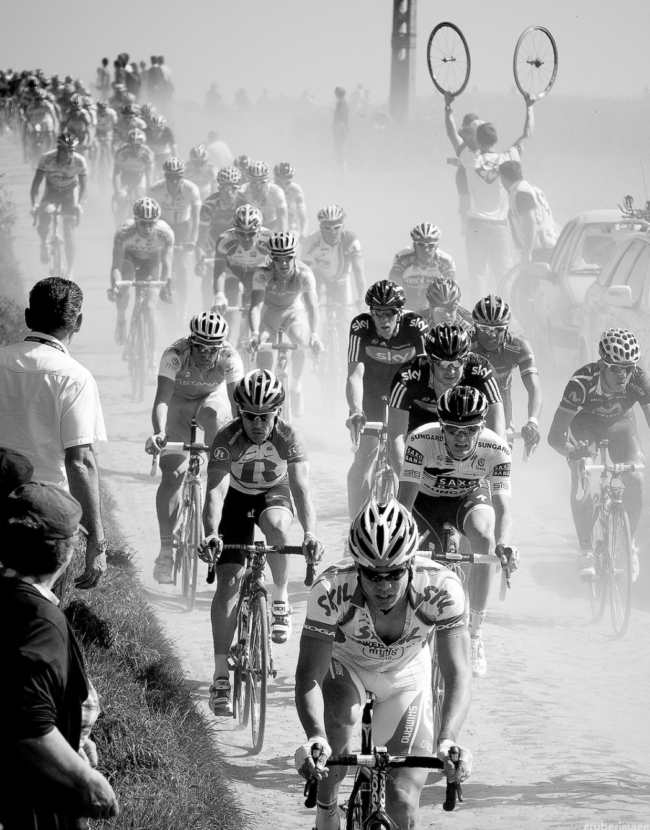
We have two very different components of our jobs. There’s the first part: shooting professional bike races, and then there’s the second part: catalog and editorial shooting. When it comes to shooting races, it doesn’t play too big of a direct role, but it plays a vital part in gaining a better understanding of the roads and the landscapes where we work. I know a lot of roads in Europe, because I’ve ridden them. In the case of the Spring Classics in Belgium, France, and the Netherlands, I know the race routes very well, not only because we’ve shot them for a few years, but because I’ve spent just as much time riding my bike on them. I don’t think there’s a better way to learn about where to shoot a bike race than from my bike. We’ve also spent a lot of time riding in the big mountain chains of Europe: Pyrenees, Alps, Dolomites, etc. We recently finished a ride called the Cent Cols Challenge through the Pyrenees: 10 days, 2000k, 100 cols, 50,0000m of climbing. It was a monster undertaking, but now, when the Tour visits the Pyrenees, I feel confident in a basic understanding of what each climb will look like, and that’s something that makes me that little bit more at ease, that little bit more confident. It means a lot. Plus, again, I love riding bikes, and I like to do anything I can to make it sound like me riding my bike a LOT is good for taking pictures. haha.
For the other side of our shooting life, feature stories and catalog shoots, riding is absolutely essential. We do some shoots for companies where I’ll do the entire thing from my bike. I ride with a Nikon D810 and a 24-120, and we go out and ride bikes with some friends. When I have the chance to shoot from my bike, I will generally take it. I feel better and more in tune with the area and what I’m shooting from the bike, rather than out of the back of a car. It’s also pretty much my favorite thing ever. There’s a great line from a poem by Robert Frost that I always, always think about in a moment like this: “My object in living is to unite / My avocation and my vocation / As my two eyes make one in sight.” It’s in those moments when we’re using our friends as models, and we’re riding down some perfect road around sunset, that I can’t stop the feeling that we got really, really lucky, and I want to do whatever I can to be able to continue down this path, because I love it.
 Are you shooting out of a car or on the side of the road?
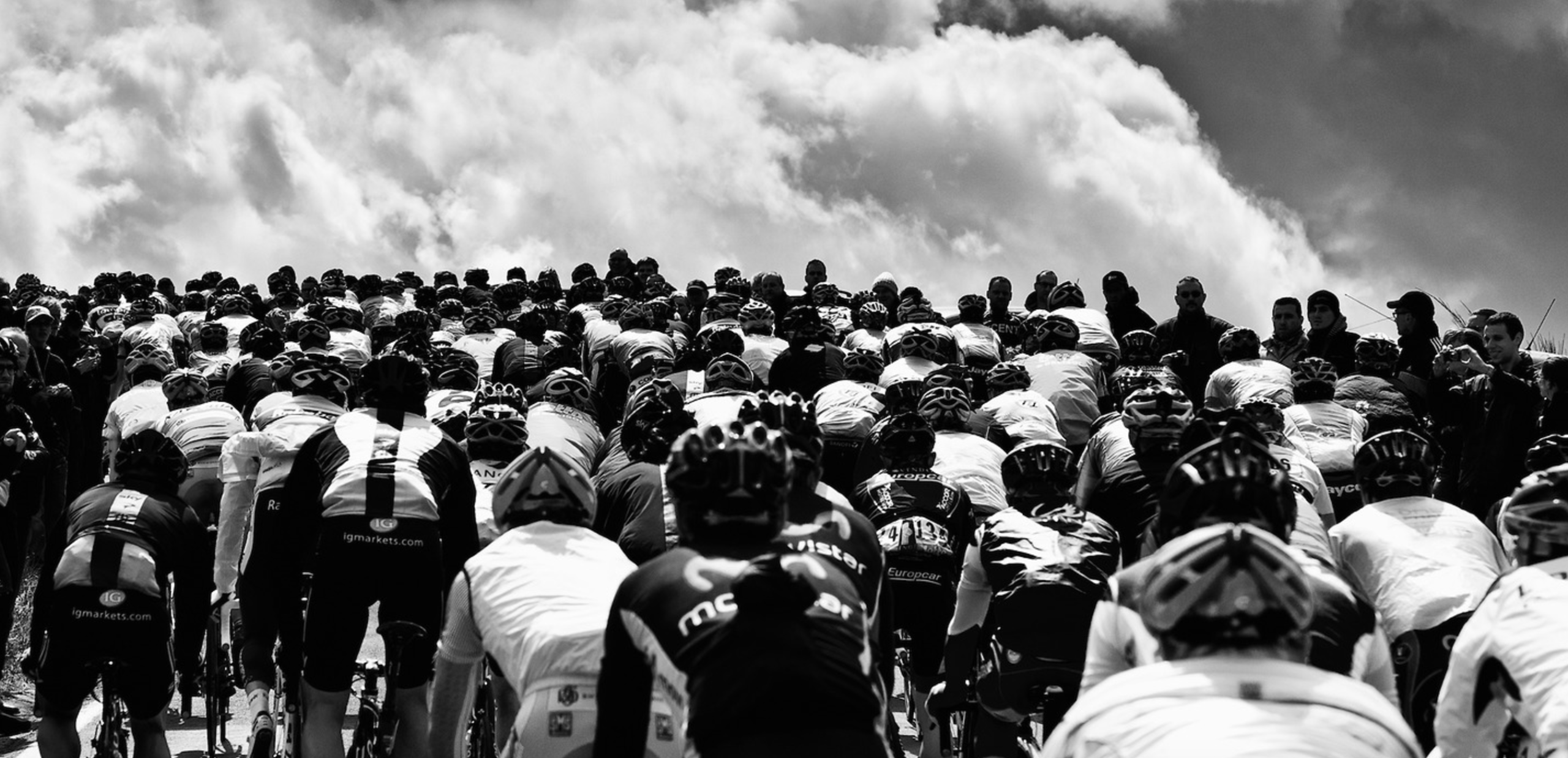
For the Spring Classics, we’re often on motorbikes, but not in the way you probably think of. It’s extremely rare that we get the chance to shoot a race as an in-race moto – meaning – we can take a picture in a certain spot, and then pass the peloton on the same road they’re on. Basically, an in-race moto gets full access. That’s really tough to get, and for the most part, we don’t even try. So, we’re left chasing races outside of the race route itself, which involves finding a spot on the side of the road, then going off-course, and then coming back to the race route to either get in front of the race, or shoot along the roadside right there. It’s a wild experience, which involves a lot of planning and a lot of stress, but I kind of love it. It’s like a giant puzzle that gets easier the better you know the roads and the more experience we acquire.
For a race like the Tour of Flanders, Ashley will be on a motorbike with a bike riding friend of ours, Michael. They have a to do list of spots to shoot. I ride a small scooter with a max speed of 30mph. It’s almost just right for a race as tightly compacted as the route of the Tour of Flanders, but I’m always a little behind. It works though. It’s fun. I end up tucked behind the bars, trying to get as low as possible, trying to eke out another mile per hour in hopes of getting to the next spot in time.
At the Grand Tours like the Tour or Giro d’Italia, Ashley and I are mostly together in our car. When we get to the big mountains, we’ll often split up, so that we can cover two different locations. When we do that, one of us will take our car, and the other will go with a team car from one of the teams we work for: Dimension Data or Cannondale-Drapac. Having the opportunity to cover two different mountains, or a mountain and a finish line, which would otherwise be impossible – is pretty fantastic.
What are some of the unique challenges that we might not encounter in other niches?
Packing light is crucial, and I’m terrible at it. I have a perpetual fear that I won’t take the right lenses with me, so I overpack, and trudge around all day regretting the fact that I brought three too many lenses with me – just in case. Because, what could be worse than not having what I need? Right, carrying around what I don’t need.
On the back of the moto, we carry a pretty simple set-up: two camera bodies (Nikon D5 and D810) and three to five lenses (14-24, 24-70, some kind of long lens, a prime, and maybe something else). That’s ok, as long as we keep the 200 f2 out of the mix. Once that thing ends up in a bag, my day gets a little grumpier…until I get home and see what kind of prettiness it pulled off that day. I hate that lens in every way – until I see the pictures later.
When I shoot on my bike, I generally carry a D810 and 24-120 f4. The 24-120 isn’t the best lens in the world, but it’s more than capable, and gives me a good working range to take some different shots. I’m working on trying to find some solutions that would allow me to carry lenses ON my bike via bikepacking bags. I think there could be some cool possibilities there, which would further free me from cars.

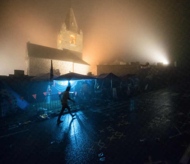
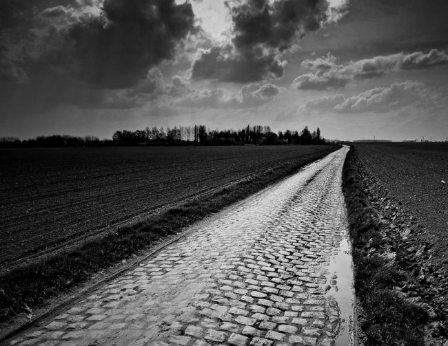
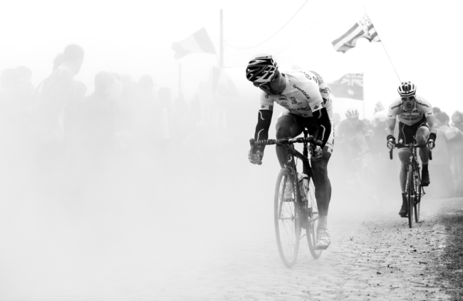
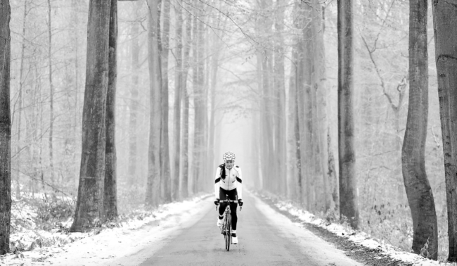
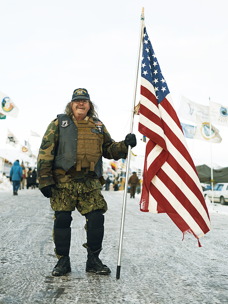
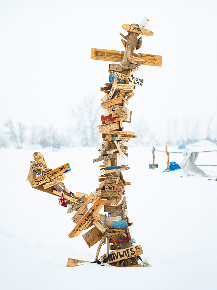
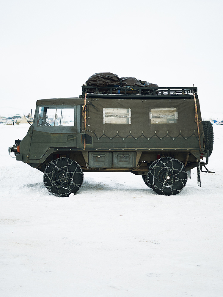
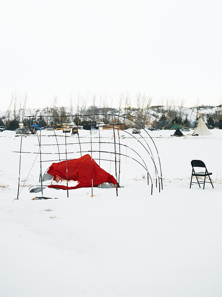
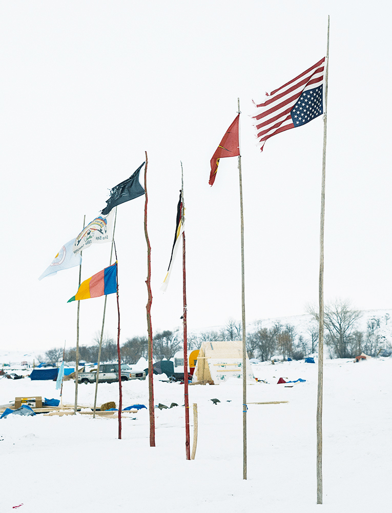
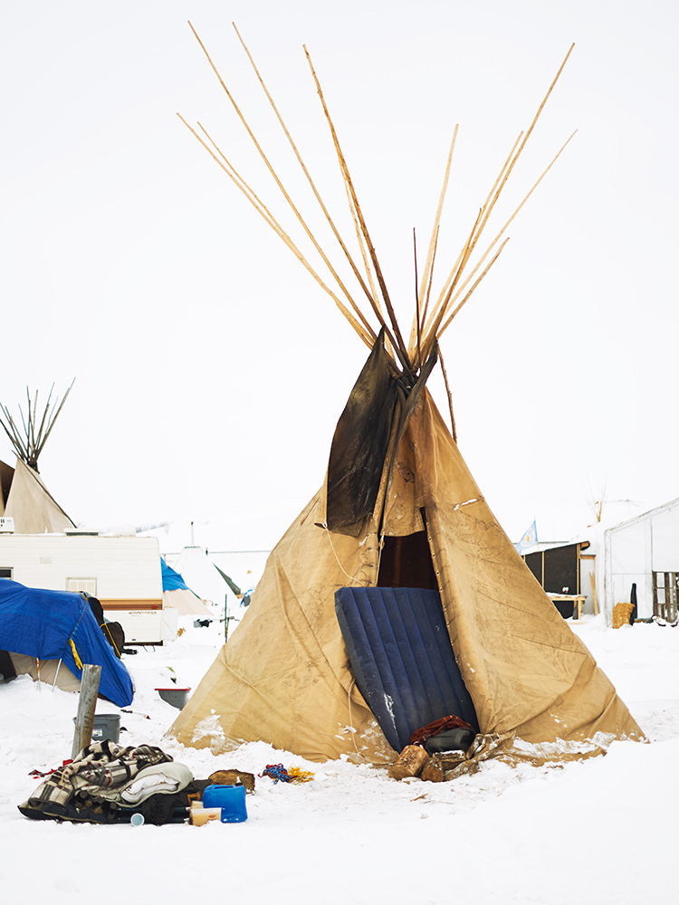
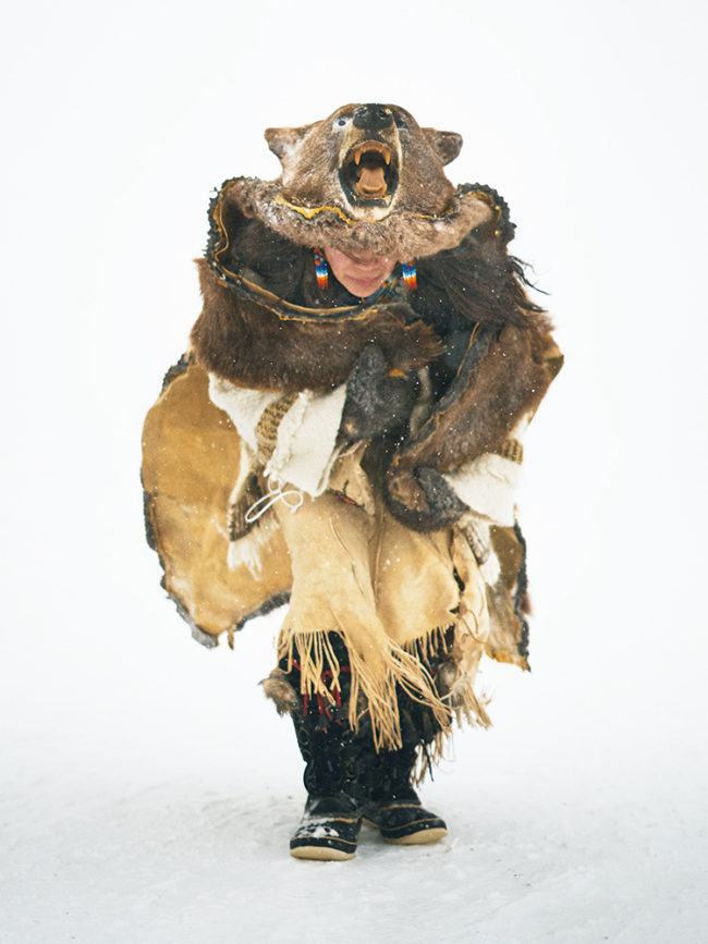
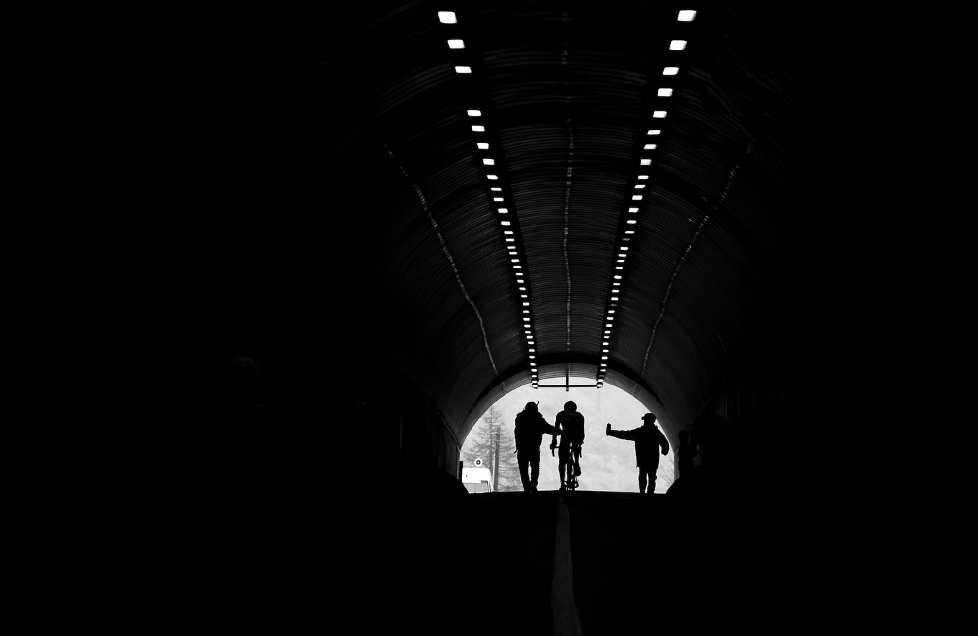
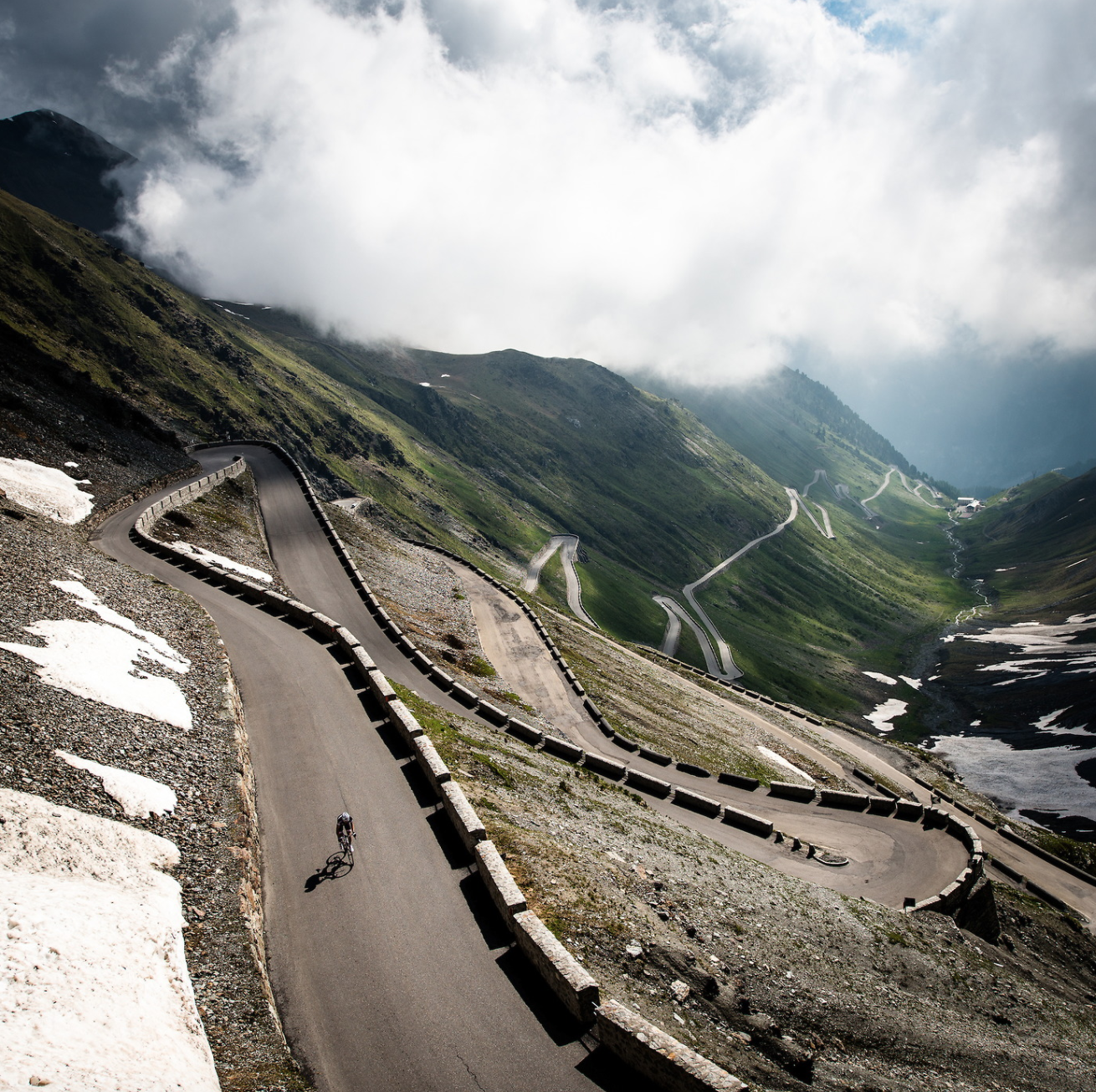
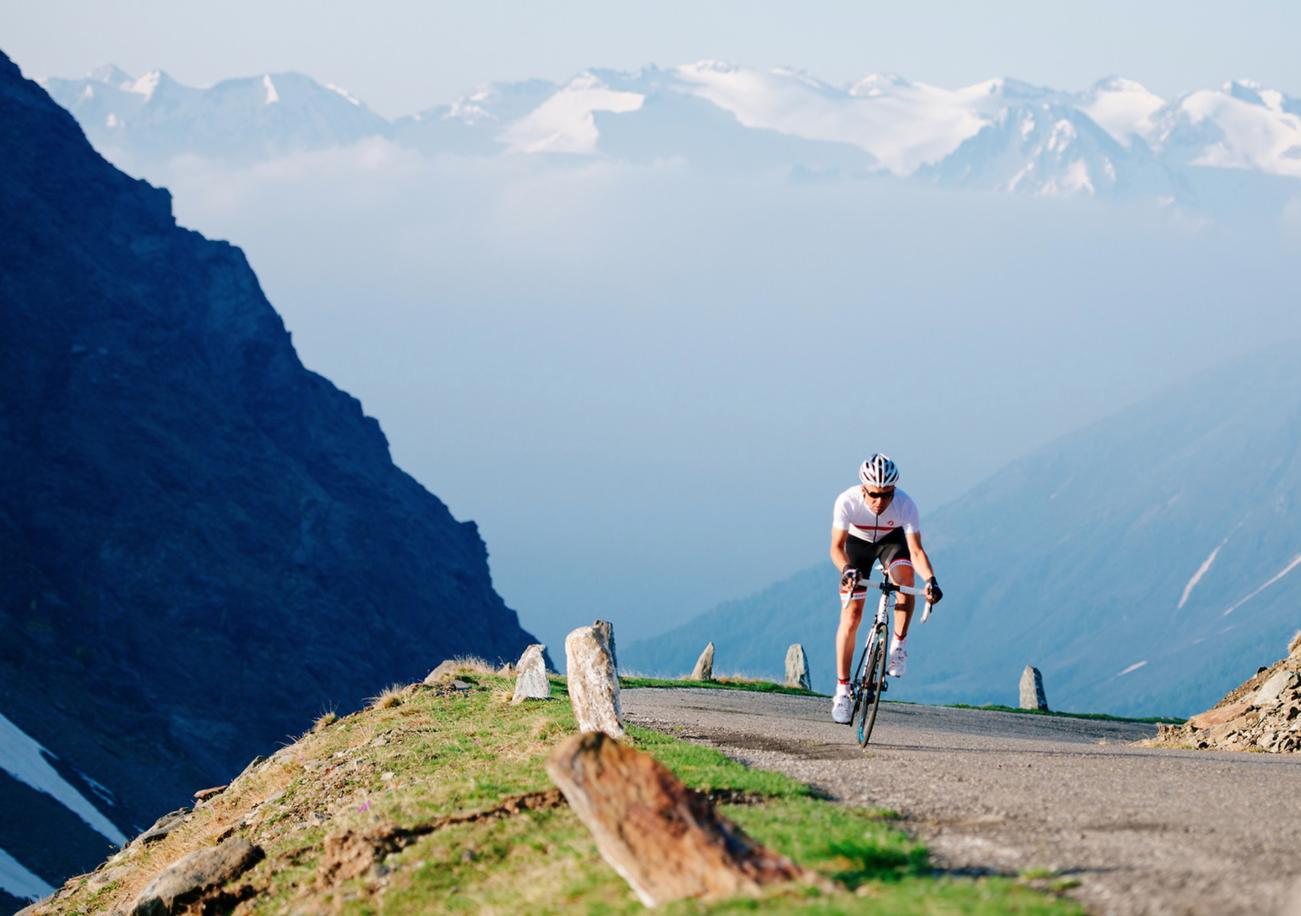
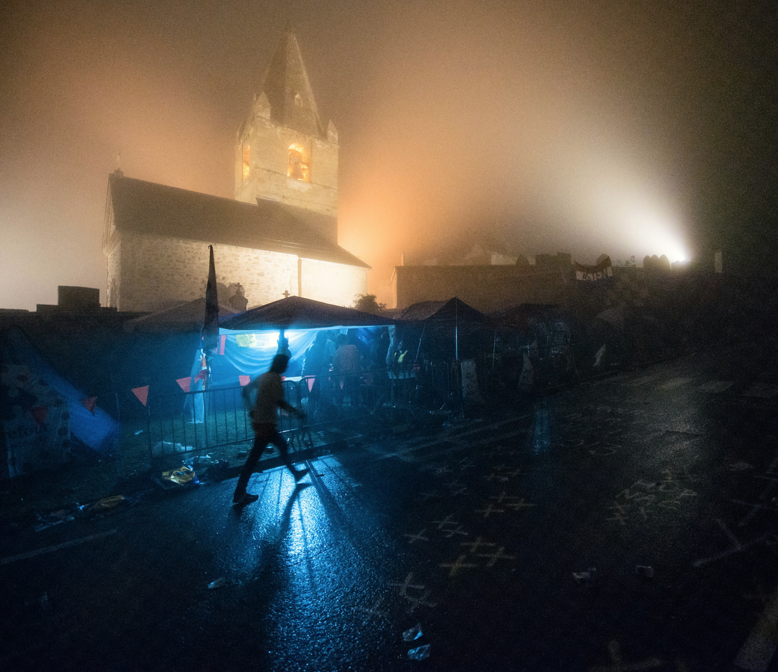
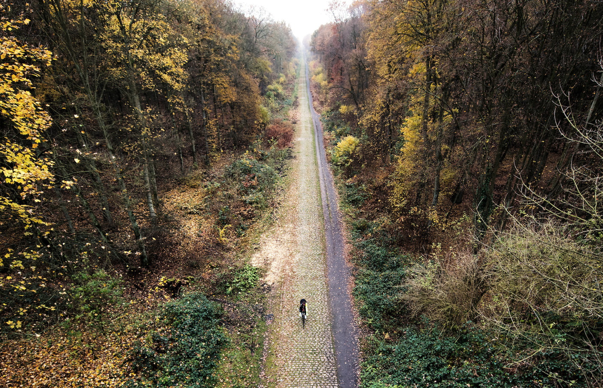
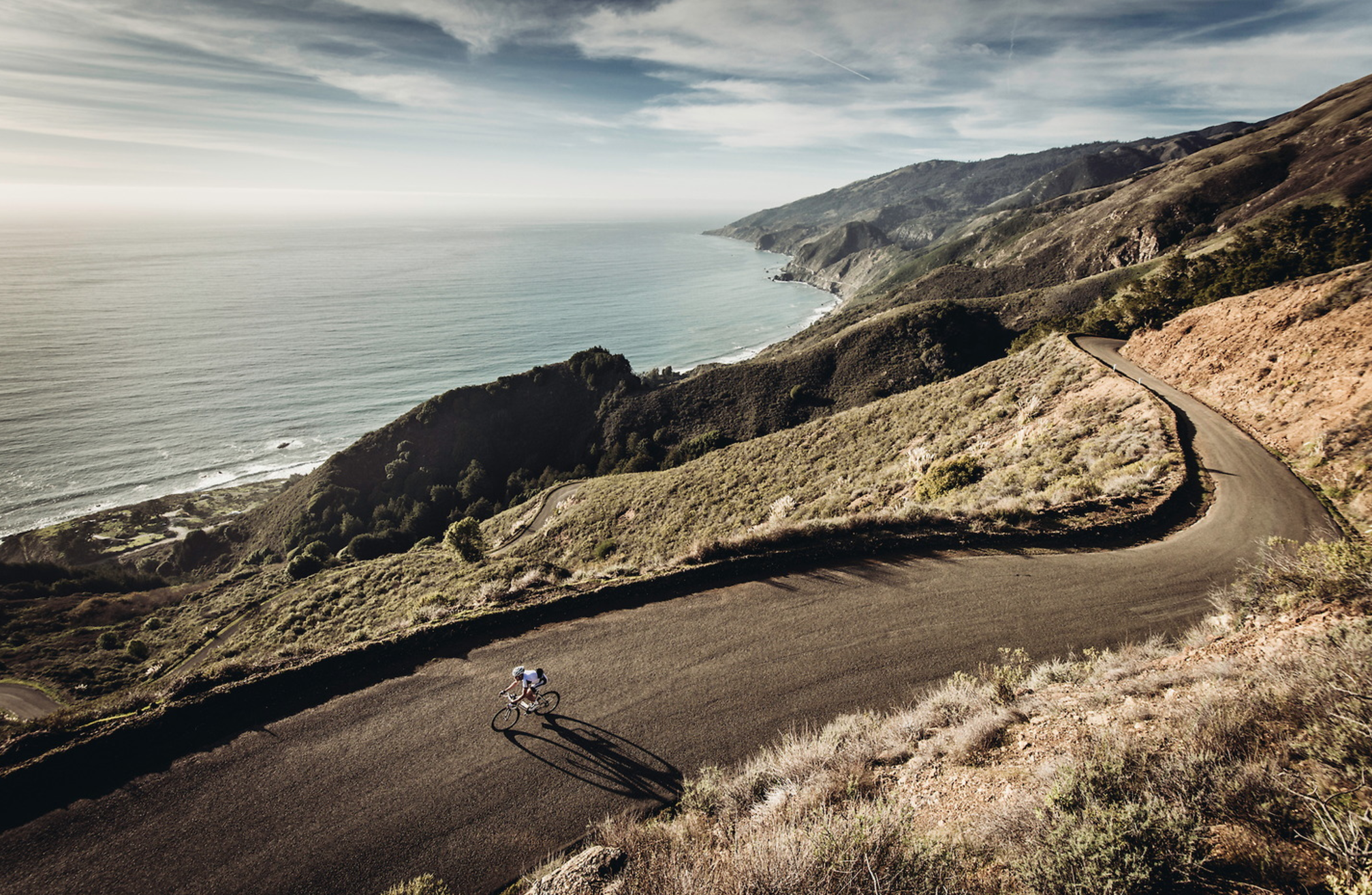
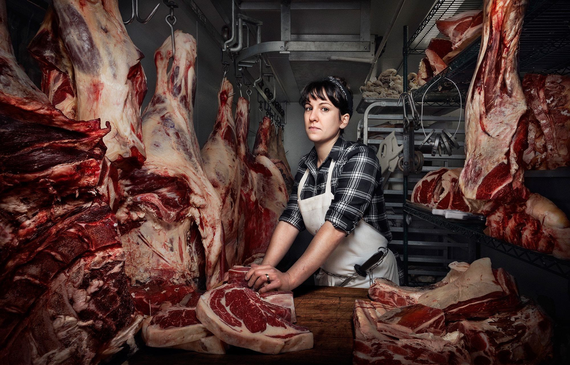
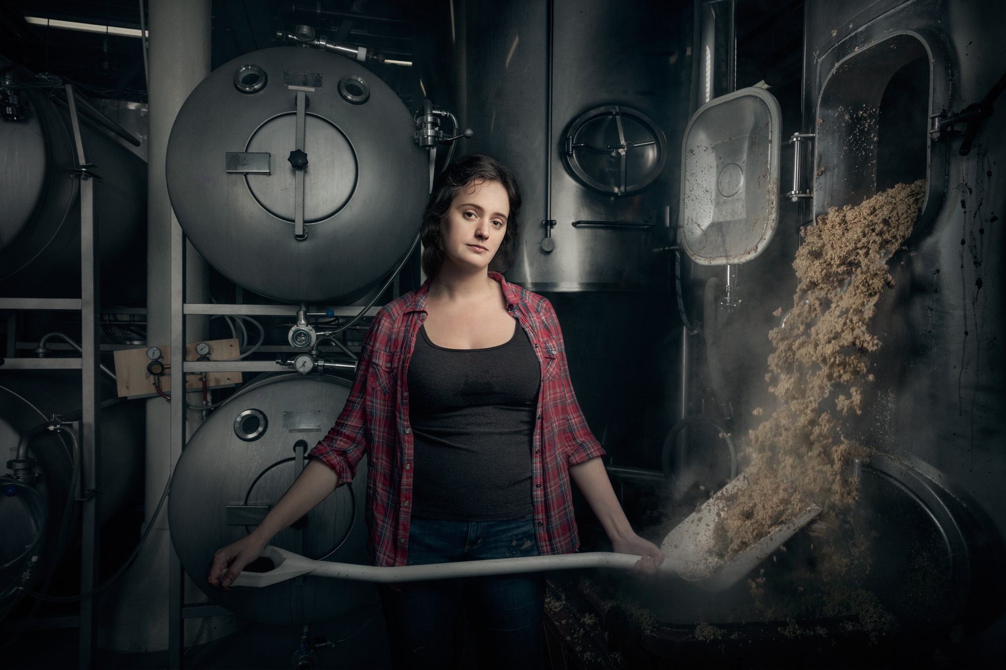
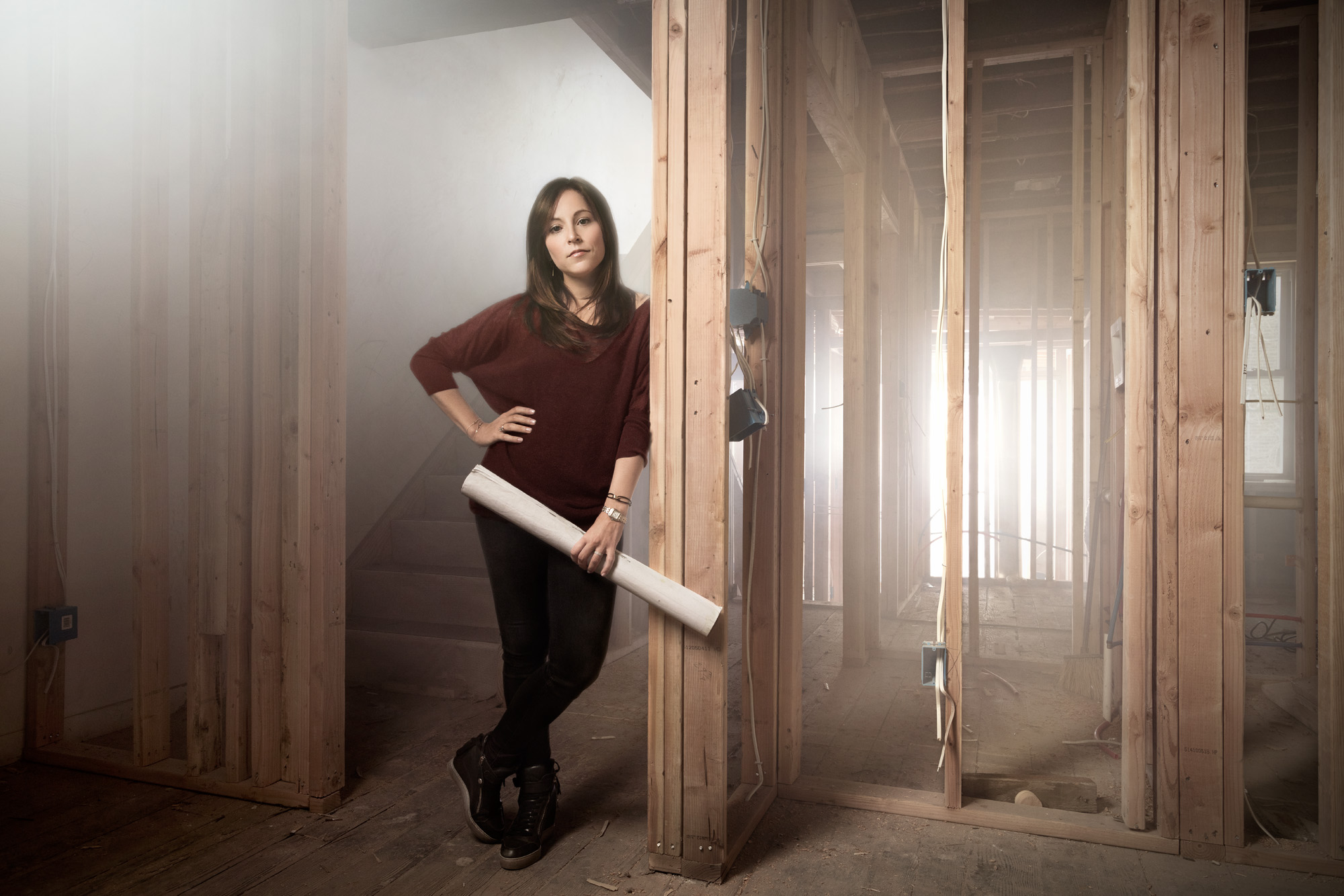
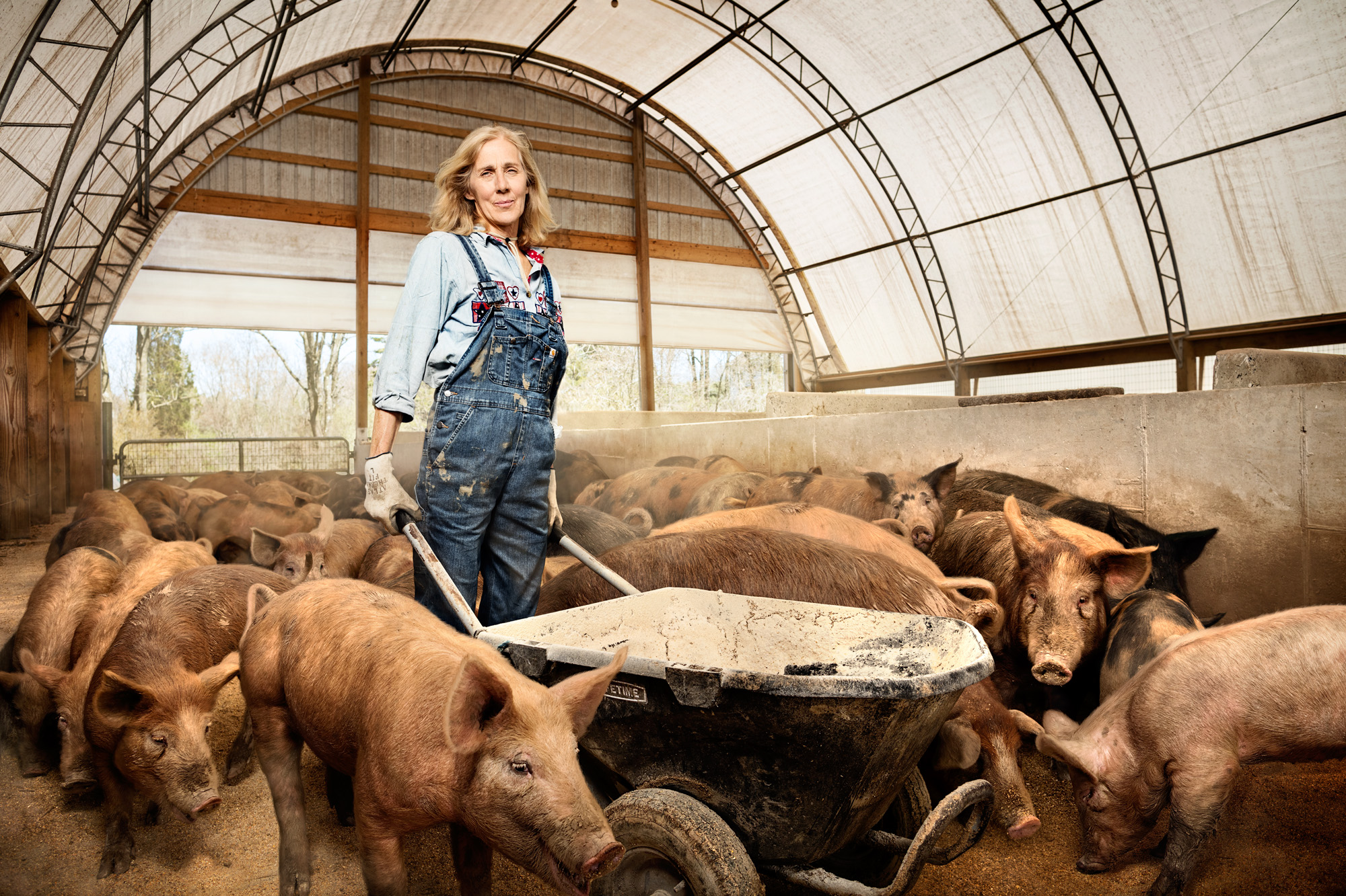
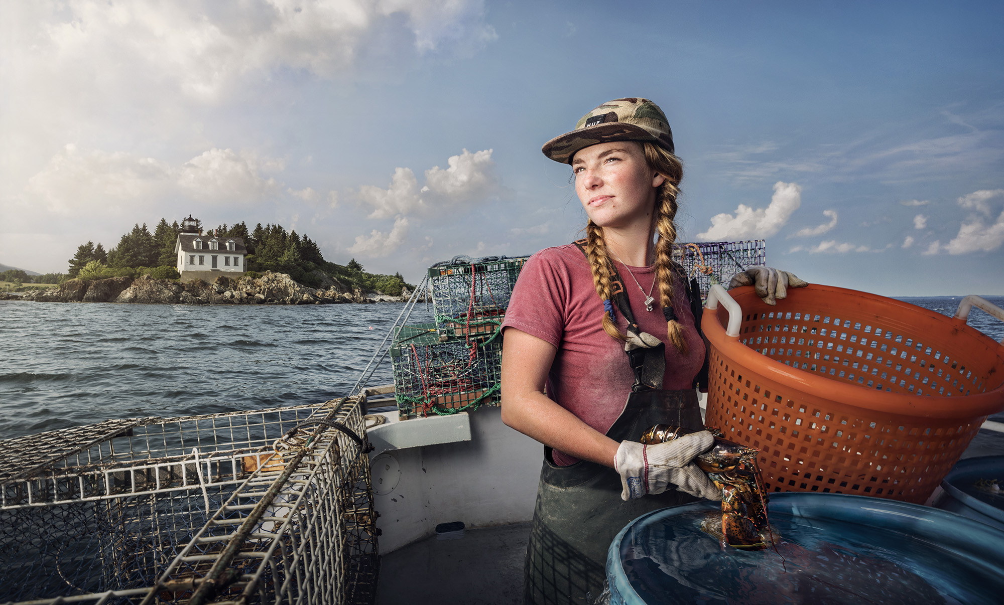
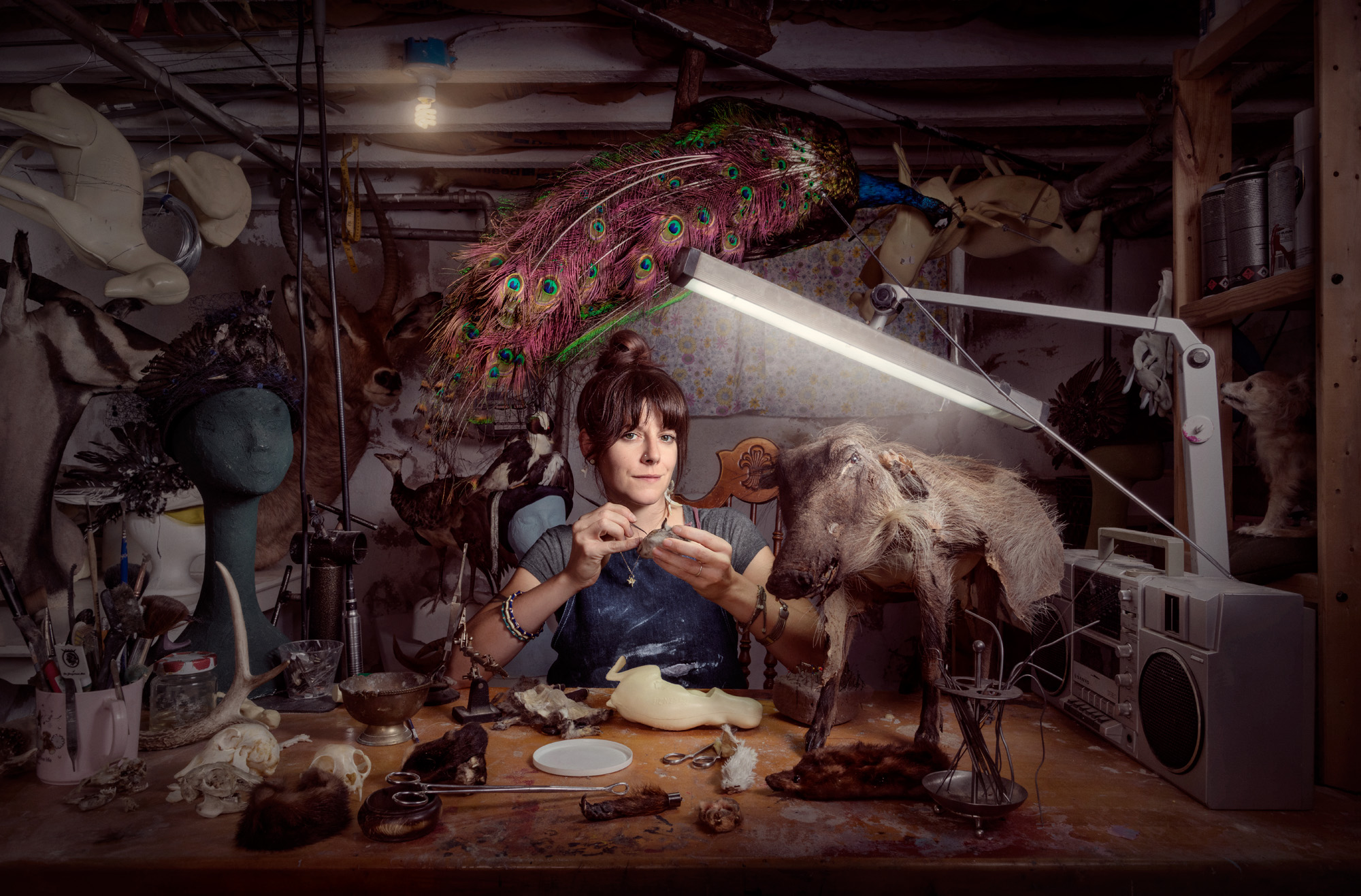
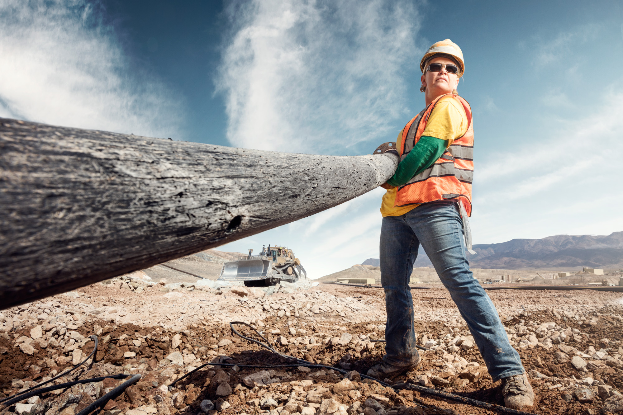
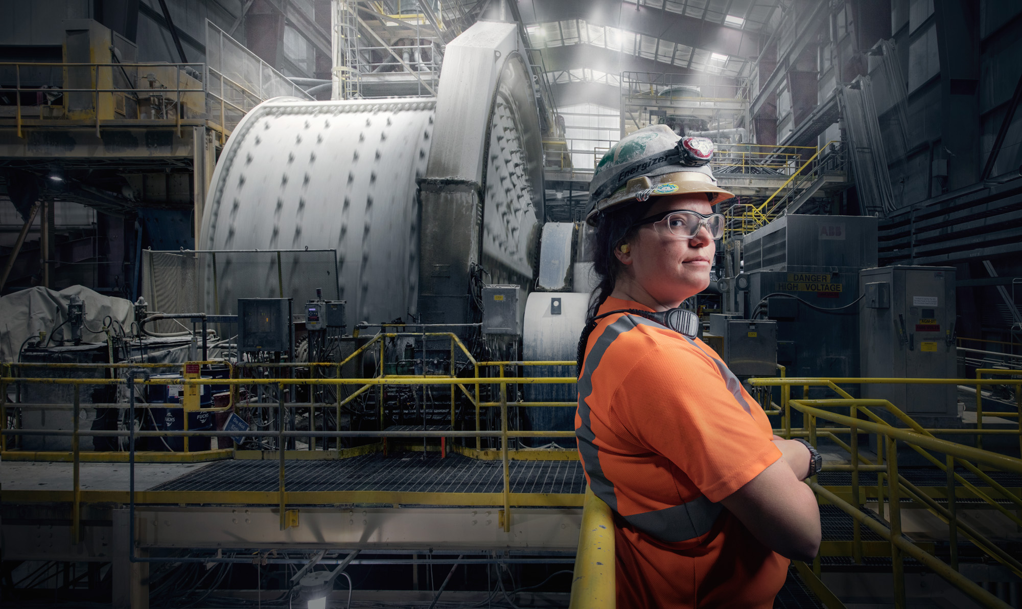
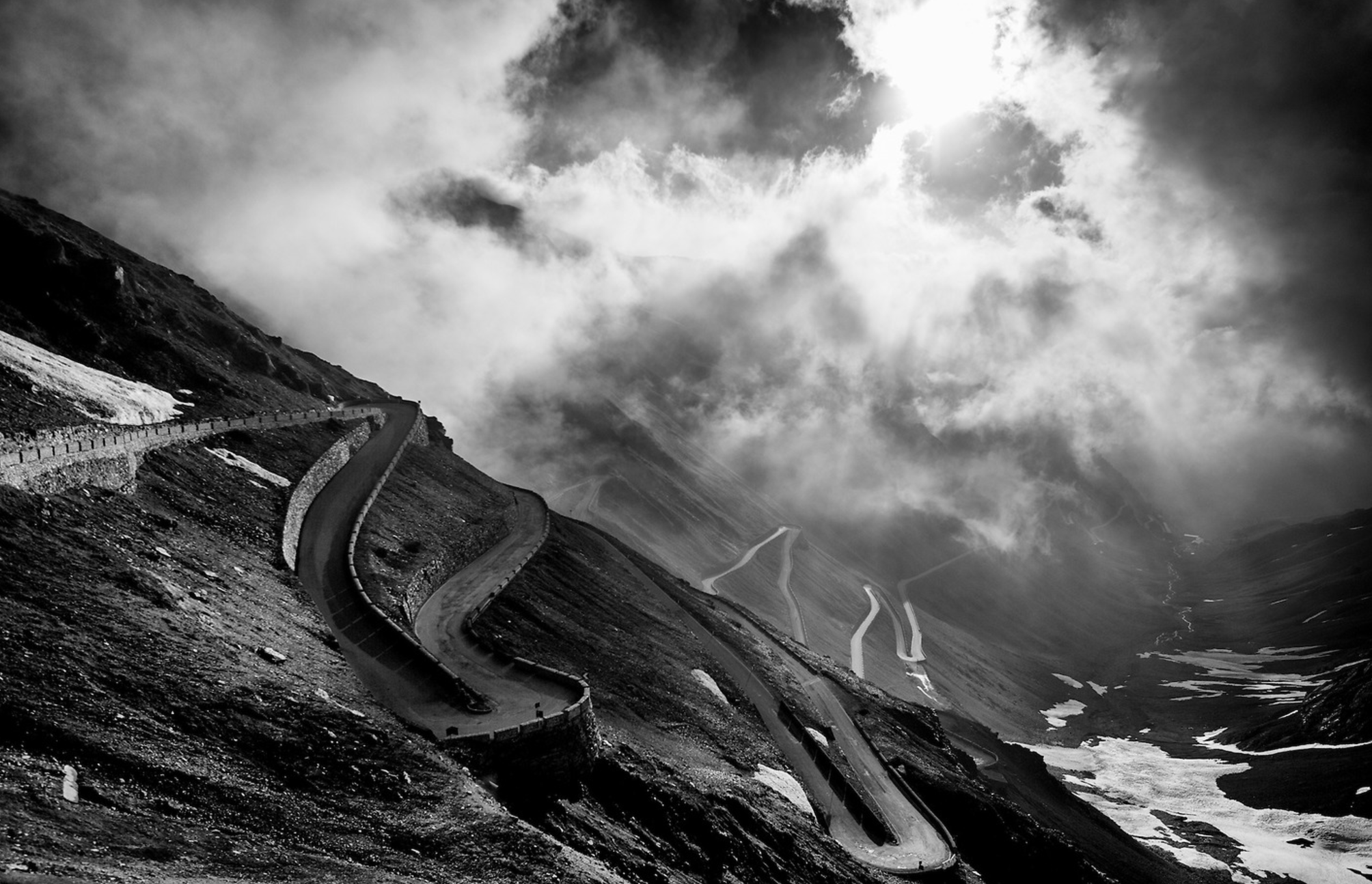
Images from their site below

screen-shot-2016-12-13-at-7-26-06-am

screen-shot-2016-12-13-at-7-26-42-am

screen-shot-2016-12-13-at-7-26-54-am

screen-shot-2016-12-13-at-7-27-07-am

screen-shot-2016-12-13-at-7-27-15-am

screen-shot-2016-12-13-at-7-17-54-am

screen-shot-2016-12-13-at-7-18-30-am

The Daily Promo: Wilson Hennessy

screen-shot-2016-12-08-at-6-24-30-pm

screen-shot-2016-12-08-at-6-24-22-pm

Wilson Hennessy 


Who printed it? 

It was printed by Generation Press in the UK

Who designed it?
Various people, My Uk Agent (Horton-Stephens) and I wanted to do a series of cards that promoted both my personal series, trick or treat, and also some of my commercial work. So we thought a fold out card would be nice, and still small enough people would keep it. The actual layout and design was done by Ben Fraser. 

Who edited the images?
Me and my agent

How many did you make?
2000

How many times a year do you send out promos?
Once or twice a year.

Tell us about your personal series.
Trick or treat was a personal series I shot. The original inspiration was: Trick or Treaters on my porch approaching my front door. I would view them, lit by my porch light from above, through the distorted glass of my front door.  The idea evolved slightly to simplify the picture into a graphic, colourful, image which intrigues and draws you in until you recognize the characters you are looking at. Each image is shot through a pane of Straight Reed Obscured Glass suspended above the masks. The series is attached below.

clown

devil

iron-man

tinkerbell

tmnt

The Daily Edit – One Shot Editions: Brian Finke

01-one-shot-print

03-one-shot-brian-finke

06-one-shot-24-shots

01-one-shot-print-delivery

02-one-shot-negatives-destroyed

One Shot

Co-Founders: Zack McDonald & Daan van Dam
Photographer:
Brain Finke


Why did you choose to collaborate with Brian?
We’re huge fans of Brian’s work. The man has an unbelievable knack for creating visual worlds that you can’t help but step into. Plus, he’s one of the nicest, coolest guys we know.

Where did this idea stem from?
We have a strong love for photography and have been watching closely as the digital revolution has really transformed every part of it.

It’s turned everyone into a photographer. For better and for worse. It’s given artists the freedom to go to new places, but it’s also taken some things away. The element of surprise, the rush of a happy accident or the joy of the unknown. We created One Shot to help people reconnect with the mysterious and fragile beauty of analog photography.

Why film?
If you take a stroll through the Internet at any given time, you’ll come across hundreds, if not thousands, of digital photos. And they’re multiplying by the second. We really liked the idea of putting something truly ephemeral and impossibly rare into the world. At the same time, we wanted to make the prints as accessible as possible so almost anyone can take a shot if they want. They’ve just got to be quick.

I know Brian can shoot whatever he wants, are you given any idea what he maybe up to?
We just received the prints and all we can say is they’re beauties. It’s almost a shame to destroy the negatives… But those are the rules.

If I wanted to buy one how do I sign up?
The 24 1/1 prints are on sale at oneshoteditions.com. People can select any available print from our store but once a shot has been purchased it will be gone forever. So you better be fast if you want to pick your lucky number. There’s also a limited edition zine available which includes an overview of the series, a Q&A with Brian and an essay about the origins of One Shot.

The Daily Promo – Narayan Mahon

screen-shot-2016-12-04-at-9-34-17-pm screen-shot-2016-12-04-at-9-34-23-pm

Narayan Mahon

Who printed it?
I use Modern Postcard for these types of smaller promos

Who designed it?
I do the layout and design myself for the postcard promos.

Who edited the images?
I edited the images myself, with some feedback from my wife and a few different colleagues/friends.

How many did you make?
1000.

How many times a year do you send out promos?
It depends on what I have planned for promos, when I’ve done larger promos, such as newsprint pieces, I might for one large and maybe 4 smaller promos such as this one per year. This fall I made 3 different promos at once so I could have them ready to send out as the time came and I wouldn’t get lazy about it.

Where did these images come from?
Well, this promo was a little different that most because they came from a test shoot that I did with another photographer, a friend who I consider a mentor and whose work and work ethic I truly admire, Andy Anderson and his son Zach, also a very talented photographer and supportive friend. I had photographed the Lumberjack Championships a couple years before and Andy invited me to come along with them this year so I jumped at the chance to spend some time with them and make some pictures together. It was a great experience to collaborate and learn from him and I ended up making some new work that I was proud of and that ended up being a real energizer for me.

The Daily Edit – Contact High Project

screen-shot-2016-11-28-at-9-19-33-pm


screen-shot-2016-11-28-at-9-20-48-pm

PHOTO BY JANETTE BECKMAN

screen-shot-2016-11-28-at-9-19-52-pm

PHOTO BY BARRON CLAIRBORNE

screen-shot-2016-11-28-at-9-20-01-pm

PHOTO BY JONATHAN MANNION


screen-shot-2016-11-28-at-9-20-11-pm

screen-shot-2016-11-28-at-9-20-20-pm screen-shot-2016-11-28-at-9-20-32-pm
PHOTO BY CHI MODU


Contact High Project

Editor: Vikki Tobak

Heidi: How did this idea come about?
Vikki: Hip hop is by now widely accepted as influencing just about every facet of life — ideas, fashion, visual language in general. And now it’s far enough along in its history that archives of rare and unpublished imagery tell the big story. Stories that are deeply woven into the fabric of a global mainstream. I worked as a music culture journalist for many years and before that was in the hip hop industry. When I started working as a producer for CNN and went deeper into photojournalism, the dots started to connect. Behind every photo there’s a story of how it happened and what was happening in hip hop culture during that time. By showing the contact sheet and interviewing the photographer, you go deeper into the story. They were rebels, artists who understood the power of words and the power of imagery. And so did the photographers who captured these images. For example, Janette Beckman, a photographer who was our first story, talks about ‘rebel cultures’ and how photographs encapsulate these significant cultural movements.. She shot the punk scene in England before moving to New York to photograph hip hop. I approached Mass Appeal Magazine with the idea of running the series and we have a great relationship. Bucky Turco is my editor there and he sometimes gives me a hard time for selecting certain contact sheets– like the time I decided to feature a black and white contact sheet from Jamel Shabazz rather than a color one he is so well known for. But it’s a great process and I really like working with the magazine because they are dedicated to urban culture.

In what ways did the “Magnum Contact Sheet” book inspire you?
The goal of the series from the start was to compile stories for a book based partially on the Magnum Contact Sheet book. I became really interested in the Magnum Photographers when I started working in mainstream news outlets like CNN and CBS Magnum Contact Sheet. I was really blown away by seeing all the shots on a contact sheet and knowing what was happening in all the frames before seeing the selected image. It really takes you in! And then to hear the photographers tell the deeper story was just so inspiring. I thought about hip hop imagery and how all these years later we have this archive, but, we don’t really have the stories behind what happened that day or what was happening for the culture at that time. This book was an inspiration to do something like that for hip hop.

My hope in doing this book and telling these stories and going a couple layers deeper was to paint a more nuanced picture of this culture that is now so mainstream. These photographers have played critical roles in bringing hip hop imagery onto the global stage. A rare glimpse into their creative process and understanding the behind-the-scenes of the imagery that shaped hip hop is part of a history. These photographers give me access to the original and unedited contact sheets which means alot to me in terms of trust and telling their stories in a deep way. Photographers typically don’t show their contact sheets. It’s very personal and I honor that.
Allowing us to look directly through the photographer’s lens and observe all of the other shots is a an honor.

What about contact sheets in general inspire you?
Contact sheets are like being let in on a secret, going backstage, going deeper into the story. What did the artist and photographer envision from the outset? What was happening in that artists life at the time? What decisions were being made about the imagery that would shape hip hop? People are curious about specific cameras, editing processes, editorial decisions etc.. For example, Chi Modu, who was the photo editor at The Source magazine for many years was in the room with editors talking about who they’re gonna put on the cover, what image to use, and things that contributed to telling this bigger story. It’s also fascinating to and nerd out on cameras, film and processes used for these shoots. 36 frames on a roll and you start to make some serious decisions about what to shoot and how. Hip hop has always been about self-definition especially when it comes to visual culture and style.

How did you try and make your project, different if at all?
I wanted to keep this projected specifically focused on hip hop visual culture. I wanted to talk about certain images, like the Barron Claiborne Biggie King of New York crown image because it’s such a part of the fabric of everything– you see it on murals, t-shirts on television in Luke Cage. People around the word recognize that image. Hip hop has now had enough of a story arc to be able to look back on certain photos and certain photographers and realize that this vast archive of imagery tells an important story.

Are you photo editing this, and how do you decide what is “iconic” being a writer, what is your narrative arc in both words and images?
Deciding which images and photographers are featured is part gut instinct and part earned knowledge. At 19, I moved from Detroit to New York and got a job working for a record label called Payday Records/Empire Management. At the time they represented Gangstarr,Jeru the Damaja, Masta Ace, Mos Def… we even had Jay Z for a minute. I worked as the director of publicity and marketing there and was the go between all those groups and the media which included accompanying the artists on photo shoots and making decisions on images. I toured with them, I traveled the world with them, and learned what it was like to see these images be put out into the world. So now deciding which narratives to highlight and which images are “iconic” is just a natural as looking back on the past few decades and knowing. That Joe Conzo anonymous Bboy photo is just as important as the Jonathan Mannion Jay-Z album cover shot.

Aside from the book, what are your goals for this project?
We also plan to show the series as an gallery/museum exhibition and have it travel the world to the various communities hip hop has influenced

Has it been difficult to find contributors?
Photographers love this series because they understand that their photos are part of a larger conversation about identity, black culture, race and all that hip hop has manifested. They love telling their stories and understand that it’s important to be part of the broader cultural conversation about hip hop and its influence on just about everything. We live in the digital age that is defined by image overload and the careful curation of artist persona. Showing these contact sheets, showing the mistakes, showing the experimentation and range of emotions is a much truer picture of the cultural conversation.

Who is next on your wish list for a story?
I’m interested in further exploring political or conscious hip hop and the way those artists used imagery. Glen E. Friedman’s cover image for Public Enemy’s ‘It Takes A Nation To Hold Us Back” is definitely high up on the wish list; So is Boogie Down Productions ‘By All Means Necessary’ cover which recreated the Malcolm X photo. Then there are the photographers that are definitely part of the conversation: Ernie Paniccioli, Danny Hastings, who shot the famous Wu-Tang cover, Nabil Elderkin who shot Kanye West’s first set of publicity photos, Cam Kirk, Brian Cross, Ricky Powell, Estevan Oriol etc… I also want to expand coverage of hip hop from regions other than New York — 2Live Crew, Too Short, N.W.A, Geto Boys. Oh and the Ice-T ‘Power’ cover with his then girlfriend Darlene.

The Daily Promo – Fluid Frame

screen-shot-2016-11-21-at-11-12-42-am

screen-shot-2016-11-21-at-11-12-48-am

screen-shot-2016-11-21-at-11-12-52-am

Fluid Frame

Who printed it?
It was printed by Fargo Print Company

Who designed it?
Designed by Sarah Sundberg at Agency Access

Who edited the images?
We did our own editing/retouching (Jennifer Kilberg worked with us image selection)

How many did you make?
We printed 250

How many times a a year do you send out promos?
We send out 6 promos a year

The Daily Edit – Andy Goodwin: Exonerated

Andy Goodwin

Heidi: Why did “give back” and offer up pro bono work? Where did that idea stem from?
Andy: My parents mostly. My mom started a foundation that helped raise over a million dollars for a variety of causes, including children’s charities, the homeless and AIDS research. My dad was a blue collared electrician and social activist, who among other things marched with MLK in Selma, AL. On a personal note, I’ve recently begun attending church, which has been a shocker to anyone that knows me. It’s truly helped me to put things in perspective and shown me what’s important.

How did you decide who would get your time? 
I posted a note on Facebook saying that I had some free time in my schedule and wanted to help out with a good pro bono cause. I got a lot of great responses but Northwestern’s Center On Wrongful Convictions really resonated with me. Over the past 18 years, they’ve helped free dozens of innocent people serving someone else’s time. After reading some of the Exonorees stories, I couldn’t believe what they had gone through and knew that I wanted to help.

Was that your idea to add the chalkboard in the background?
Yeah, me and my small crew brought the backgrounds to all of the Exoneree’s homes and set them up in their kitchens or living rooms. Besides shooting environmental portraits, I also wanted something consistent for everyone. The original idea was to have a hash mark for every day that they had spent in prison but sadly there just wasn’t enough room on the boards to allow for that.

_49a4662

_49a5705

How did the project shape you creatively?
Winning Best In Show at The Midwest Independent Film Festival was pretty amazing- and having a couple of the Exonerees with me that night was an incredible experience. It’s made me realize that I’ve been given a gift that I can use to give back with, like the new projects I’m shooting for Make A Wish and Chicago’s Homeless. Shooting for charities allows me to stretch myself creatively and has also introduced me to some incredible people.

We all agree photography is a powerful tool. That said, hearing people share their story with their own voice has incredible gravity. Tell us about the specific moment when you knew video was a must?
I’ve sort of come to video reluctantly but am warming up to it and gradually feeling more comfortable with it. Going into this I had so many questions that I wanted to ask and realized that only shooting portraits just wasn’t going to cut it.

Since this was your first video effort, what would you do differently next time?
Fortunately video is a far more collaborative effort than still photography, so having Patrick Duffy at Cutters Editing on board really saved my ass. Next time, I’ll have an actual video crew in addition to my stellar “still” team.

Do you have additional plans for this work and will it become an ongoing series.
Everyone involved, including the Exonerees wants to keep this project going, so we’re in the early stages of sussing that out. I’m also really excited to follow-up with video on the Charreada series that I recently photographed. It’s so steeped in tradition and pageantry, you feel like you are in another place and time.

The Daily Promo – James Acomb

screen-shot-2016-11-20-at-8-18-19-pm

screen-shot-2016-11-20-at-8-18-25-pm

screen-shot-2016-11-20-at-8-18-32-pm

screen-shot-2016-11-20-at-8-18-38-pm

James Acomb

Who printed it?
American Printing in Birmingham Alabama. I worked with Matthew Conde there. He was extremely helpful with paper stock selection and press checks to get the look and feel that I was going for and the budget I wanted to bring it in at.

Who designed it?
Suzy Weber, I’ve known Suzy for a while now and she did my logo and branding so it was a natural choice for me. I really like her aesthetic and she has always been very honest when we’ve worked together which is huge. I like working with people who tell it like it is. It’s a good working relationship.

Who edited the images?
Suzy and I both did the image edit. When we started the project I told her the basic idea and feel I wanted for the piece. I sent her 30-40 hero images and she did a 1st pass with her faves. It was spot on except for the cover image. We went back and forth on the cover image a couple of times. Then I sent her an image that I had shot the week before and we both agreed that it was the cover.

How many did you make?
 This was a very targeted mailer and I only ran 750.

How many times a year do you send out promos?
I do 2 printed pieces a year typically and I supplement that with a monthly email blast with new work. But I think printed pieces have so much more impact so I’m going to up it to 3 printed pieces this coming year.

How did this idea with text come about?
My original thought on the promo didn’t involve any text other than contact info. Suzy came up with the idea to give short captions that added a little backstory, or feeling to the images. I loved the idea but I’m not the best writer so I was a bit nervous about having to put something down on paper. After a lot of thought I just started writing some stories about the images that were in the piece or about the actual shoots and with a little editing from Suzy it turned into an element that I was very happy with and I think added some personality to the promo.

The Daily Edit: Chris Crisman – Women’s Work

Chris Crisman Presents: Women’s Work

cc2016012_0203_vf

“Heather Marold Thomason is the Head Butcher at Kensington Quarters in Philadelphia. In just a few years, she shifted her career in web design and is now a force in the sustainable food movement.”

cc2016016_brewer_v1bf

Christina Burris, Brewer and Operations Manager, St. Benjamin’s Brewing, Philadelphia, PA.

cc2016017_086_vf

“Alison Goldblum is a talented and inspiring property developer in Philadelphia, PA.
She also happens to be a great friend to our family and a mentor to my wife”

cc2016022_210_vff

cc2016022_pig_farmer_vff

Nancy Poli, Pig Farmer, Stryker Farms, Saylorsburg, PA.

image1

Leeann Johnson, Haul Truck Driver, Round Mountain Gold Mine

cc2016036 - Mindy Gabriel, firefighter, Upper Arlington, Ohio, for Women's Work

  Mindy Gabriel, firefighter, Upper Arlington, Ohio, for Women’s Work

cc2016040_057_vf

“Mira Nakashima, Designer and Woodworker, George Nakashima Woodworking, New Hope, PA.
Mira has been carrying on the traditions of woodworking set forth by her father, George Nakashima.”

cc2016046_005_vf

Sadie Samuels, Lobster Fisher, Rockport, ME.

cc2016046_058_vf-2

Sadie Samuels, Lobster Fisher, Rockport, ME.

cc2016050_053_vf

Beth Beverly, Taxidermist, Philadelphia, PA.
See more of her work at Diamond Tooth Taxidermy.

cc2016052_085_vf

Judy Bowman, Process Operator, Round Mountain Gold Mine, Round Mountain, NV.

cc2016052_206_vf

“Jordan Ainsworth, Mill Operator, Round Mountain Gold Mine, Round Mountain, NV.
She is a fourth generation miner and third generation of mining females in her family.”

cc2016052_249_vf

Carol Warn, Leach Pad Operator, Marigold Mining Company, Valmy, NV.

cc2016052_mine_pano_vf

“Kris Alvarez, Senior Geologist at the Round Mountain Gold Mine in Nevada,
mapping mine sidewalls in preparation for the next phase of development on the 55 mile site.”

What compelled you to create this body of work?
Back in February of this year I was having lunch in New York with some art producers from Droga 5. One of those art producers was Emily Heller. Emily mentioned that she had a friend who had recently relocated from Brooklyn to our home base of Philadelphia. This friend, Heather Marold Thomason, had recently switched careers and is now a butcher. My immediate reaction was how I’ve never met a female butcher. I asked Emily for an introduction and I was photographing Heather at her butcher shop just a few weeks later. Once we completed the shoot it immediately became something I wanted to further develop.

I am a father of two – a 4 year old boy and a 2 year old girl. I was raised to believe that I could do whatever I wanted to when I grew up. I want pass down a similar message to my children and without caveats. I want to raise my children knowing that their dreams have no limits and that they have parents supporting them to dive into anything they feel passionate about.

How did you find the women? 
This original shoot with Heather prompted a number of conversations and a snowball effect of similar shoots. We would do one shoot and then the subject would suggest another person.  Every opportunity being presented felt like one that I could not pass up. I reached out to a handful of my favorite industry contacts and the response was incredible. There are so many people that we would still love to include in the project, but we’ll get there.  I believe that Women’s Work is the type of project where the purpose does not have an expiration date. 

What were the determining factors?
Honestly, there was no exclusion to whom we considered. The strongest factors that led us to the people you see now were availability and excitement for participation. At the onset we did create a big list of professional positions that were not typically held by women, but after a few shoots and making contact with some friends, the participants just started flowing in on their own.

This is a fairly big roll out, did you have a planned strategy or was it more organic?
In mid-October we decided that the body of work was at a point that it was worth putting it out there. In light of last week’s election, I hope that this project can provide a hopeful message as we all move forward.

In a sentence, what’s your message?
Gender should not determine professional opportunities.

Post Production, Stills, Video: PXL House
DP, Must Be Nice: Ezra Migel
Producer, Must Be Nice: Robert Luessen


Here is some BTS of Chris and the making of these stunning portraits for Lynda.com


Promo Printer List

Promo Printer List

Here’s a resource list for your printing needs. We linked to the photographer’s site and listed the printer they used.

Aaron Sosa
Shenzhen Longyin Printing Packing Co. – China. Publishing House Igneo/Ediquid

Doug Human
Newspaperclub of the UK

Alison Conklin
Blurb

Alex Geana
Overnight 

Janelle Jones
Modern Postcard

Mark Peterman
Next Day Flyers

Sean Klingelhoefer
I had it printed through Ken at Continental Colorcraft in Monterey Park, CA but it ended up being outsourced to another print shop because they no longer had the HP Indigo printer I’ve grown to love when I have to do digital offset.

Julia Vandenoever
The Paper Chase Press

Jordan Lutes
Overnight Prints

Michael Rudin
Mag Cloud 

Angela Datre
Overnight Prints

Kenneth M. Ruggiano
I had the prints done by Bay Photo.

Emiliano Granado
Postcards: gotprint.com
20 pg zine: Awlitho.com

Steve Pomberg
The Paper Chase Press

JenniferRocholl
Southern California Graphics in Culver City

Heather Byington
Vista print made the post cards, envelopes were hand crafted by me.

Stan Evans
Modern Postcard

Steve Simko
FOXTONE PACKING in New York City.

 Ryan Geraghty
Moo

Kyle Johnson
This piece was printed by the incredible team at Blanchette Press in Vancouver B.C

Jordan Pay
Peczah in Salt Lake City Utah

Jason Evans
Agency Access

Rob Hammer 
Agency Access

Luke Copping
Agency Access

Cade Martin
Classic Color outside of Chicago

Carlos Serrao
AWLITHO. Anthony, the owner, has done the past four promos with me.

 Jeff Stephen
Minuteman Press

Andrew Dominguez
Minuteman Press located in Austin TX.

Lisa Shin
Agency Access printed, inserted, sealed and mailed the entire project with considerable customer service.

Kevin Brusie
Blurb

Dominic Perri
I used Nations Photo Lab

Nicholas Duers
Blurb

Trevor Traynor
Mag Cloud 

Justin Fantl
The calendar was printed in San Francisco by Spot Graphics

Daniel Dorsa
The cassette tapes were made by MilkTape, I printed the J Cards myself, and the business card was printed by Mama Sauce.

Elizabeth Cecil
Hemlock Printers

Michael Scott Slosar
Aosaimage.com

Sage Brown
smartpress.com

Edgar Artiga
I worked with Rikki Webber at Modern Postcard

Callie Lipkin Photography
Modern Postcard

Tara Donne
This booklet was printed by J.S. McCarthy Printers.

Ryan Young
I had this promo printed by a family-owned business in Anaheim called, Quality Graphic Services.

Fab Fernandez
The printing was done by a company in London called the Newspaper Club.

Nathan Seabrook
4 x 6

JD White
Moo

Fedelestudio.com
Donoson Printing for the video carrier and Bender Graphics for the booklet insert.

Andrew Kornylak
Universal Printing in Durham, NC

Tuan Lee
I printed with Jennifer O’Neill at Marina Graphics.

Tom Hussey
I printed the images in house on a really nice feeling Red River paper

Meredith Jenks
NOVA in Brooklyn

Kevin Arnold
It was printed by Hemlock Printers in Vancouver

Isamu Sawa Photography
Bambra Press

Alex Thompson 
I had the photos printed at Samy’s Camera

Sam Kaplan
Advanced Printing NYC

Bob Martus
Linco Printing in Queens, NY

James Worrell
Modern Postcard

Blair Gable
The books were printed by Photobook Canada – 40 copies. The postcards were printed by Vistaprint and the stickers were printed by Loudmouth Print House in Ottawa.

Kevin Zacher
Source Print Media in LA

Breungrega
It was printed by Pinguindruck here in Berlin

Tim Tadder
This was printed by my friends at Marathon Press in Nebraska.

Adam Cohen
I used a local printer, Minute Man Press

Ed Sozinho
Moo

Lori Eanes
Overnight Prints

Joshua Scott
The card was fromModern Postcard, and the screen wipes are from www.4allpromos.com.

Aaron Cobb
Somerset Graphics in Toronto

Brooklin Pictures
Modern Postcard

Cyndi Long Studios
Grogtag.com printed the coasters.

Cody James
QIS in Lower Manhattan.

Stephen Rose 
The zine was printed by Shapco in Minnesota

Elizabeth Weinberg
Smartpress in Chanhassen, MN. I have used them for several years.

Rebecca Cabage
The Paper Chase Press

Stephen Kent Johnson
It was printed by Mirror NYC

Justin Poulsen 
MSG Printing in Toronto

John Hafner
Blurb

Josh Ritchie
Dale Laboratories in Hollywood, FL.

Ryan Nicholson
Spangler Graphics in Kansas City

The Morrisons
The foil stamped folders were printed by a great local printer, Mr. Lam at Candid Bindery.  He’s been foil stamping with expert precision forever.  The nine double-sided image cards were printed by Shapco in Minneapolis.

Keith Barraclough
A company out of Arlington, Texas called Liberty Playing Cards