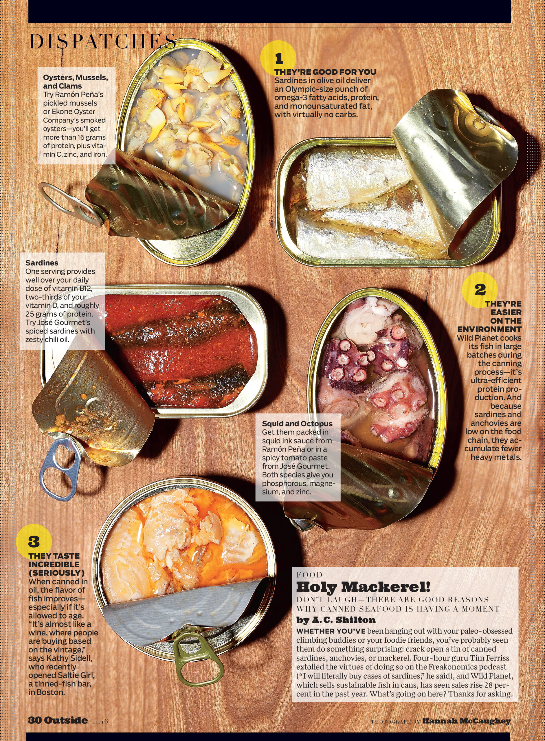
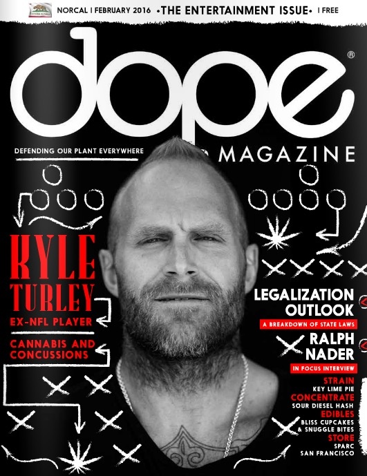
The Daily Edit – Popular Science: The Voorhes

Popular Science


Group Design Director:
Sean Johnston
Deputy Design Director: Mike Schnaidt
Photo Director: Thomas Payne
Associate Art Director: Russ Smith
Photographer: The Voorhes

Heidi: When coming up with concepts, what is your process?
The Voorhes: It’s a collaboration the whole way. The magazine sends initial info (like what’s the theme of the issue, what are the features about, any loose initial thoughts. We then sit together (Adam and Robin) and brainstorm/sketch. We bounce ideas off each other, starting with obvious things or maybe not fully formed thoughts, tell them to each other and see how the idea grows. Then we take everything and refine sketches to around a dozen ideas. The magazine then usually take an idea and tweak it to fit the issue better. They send us back a cover mock-up using our sketches and we land on a final direction. Once we have a concept ironed out we fine tune things like color palette, prop direction, light direction, style and overall mood.

Do you journal, draw?
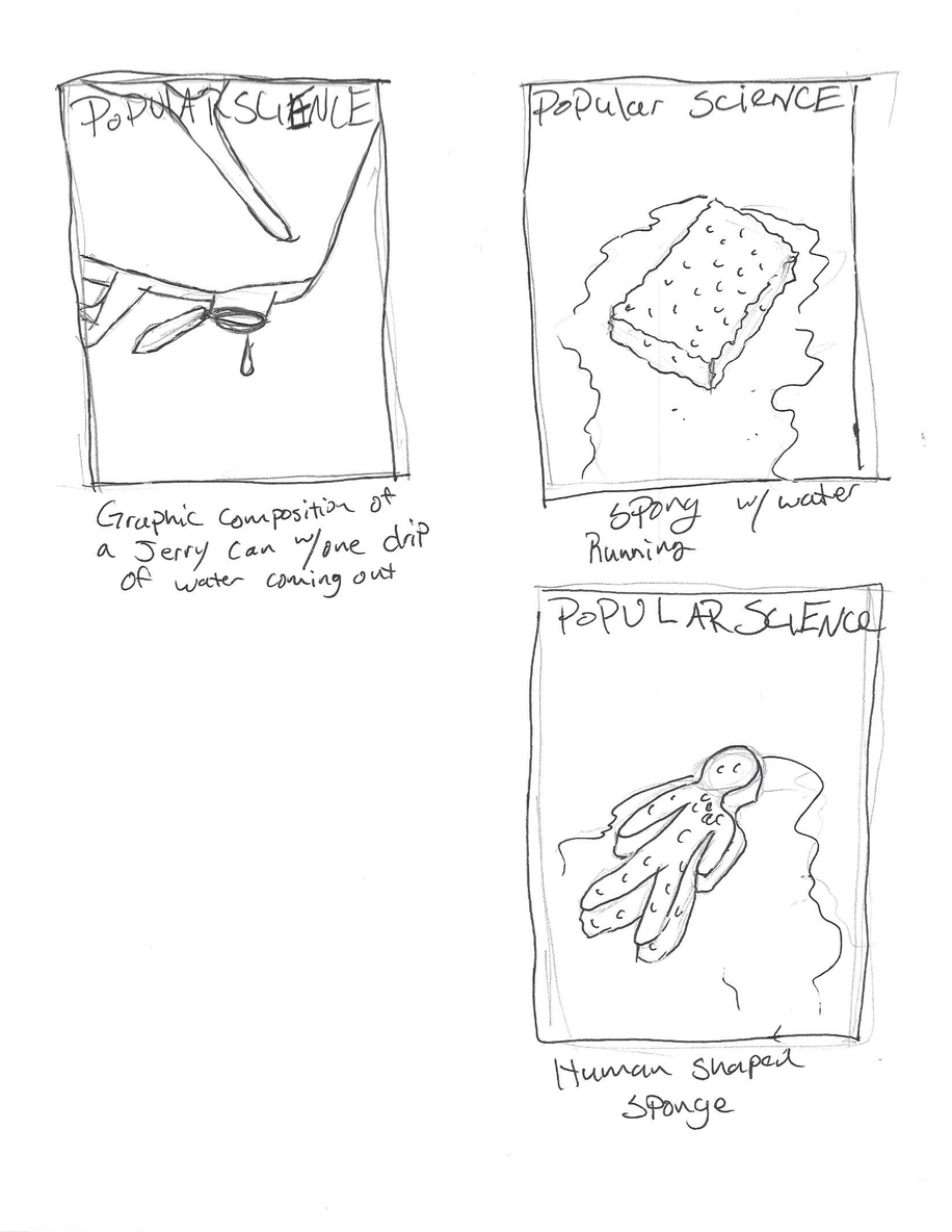
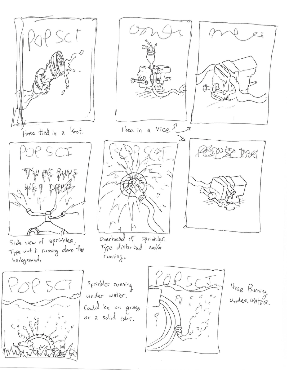
We don’t really think of it as journaling as much as concepting. But there is a LOT of drawing. We usually dedicate an afternoon a week to reading articles and brainstorming (Sunday afternoons on a patio during happy-hour is ideal!). Adam draws thumbnails as we brainstorm rather than taking notes. Robin too but her scribbles are not as legible so notes are required. Some ideas are half formed and some are really solid. We go round and round until we have a handful of solid ideas for each image a magazine needs. Then, later, at home at the kitchen table or at the studio over a cup of coffee we make refined sketches to send in to the magazine. Sometimes our sketches are nice, and sometimes they are pretty rough. Our goal is to simple get as many strong ideas out as we can.

 
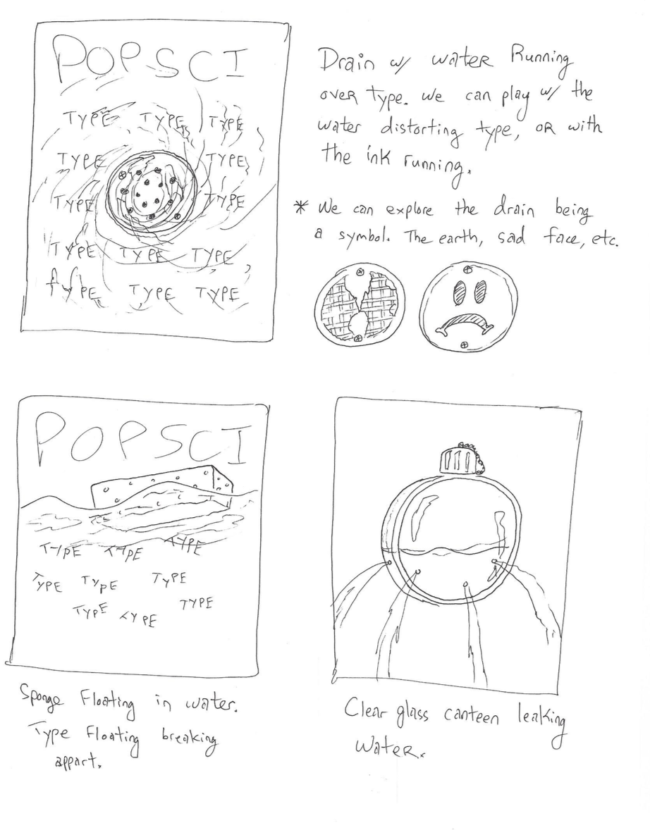
How did this idea develop?
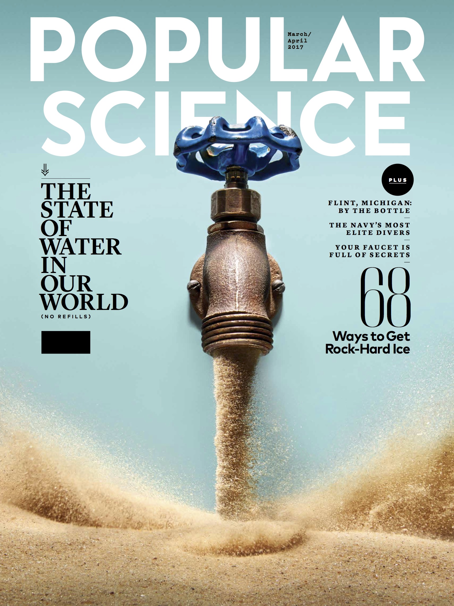
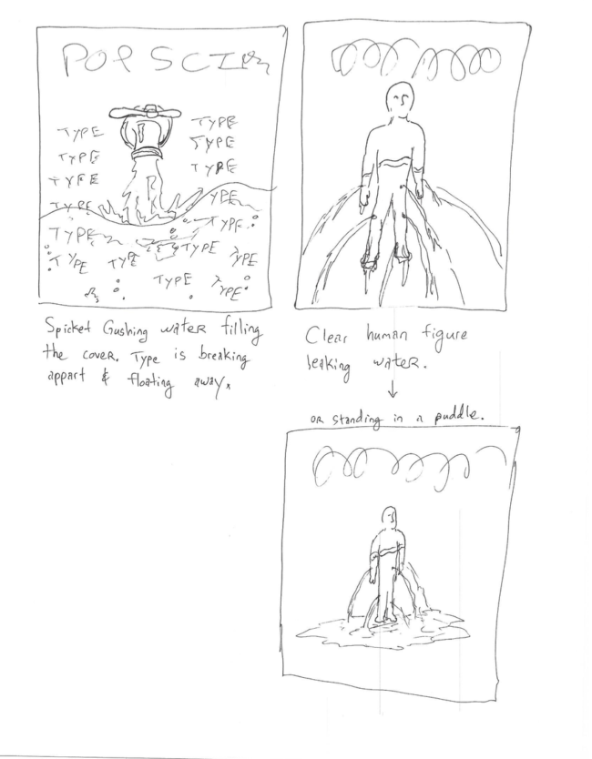
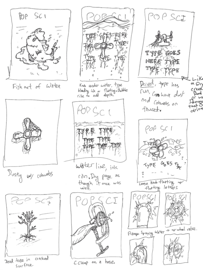
Avoidance I think. The whole issue is about water, the future of water, and in great part water scarcity. So the obvious is to do a play off of a glass of water, right? But we were given specific direction to NOT photograph any play on a of a glass of water. Adam couldn’t help but to doodle a glass of sand. The simplicity of it and the quick read was a draw. We also had sketched a faucet with fatter willing the bottom part of the page, and type was starting to break loose and float. We presented a bunch of ideas to the magazine, some well formed and some loose bits of ideas. They came back with the thought of sand replacing water in the faucet sketch. It was a totally collaboration. A mash up of brains and ideas.

What type of direction did you get from the magazine?
No glasses of water! ;-) Also there were ideas of water interacting with type in various ways. Our main direction was to create a simple graphic image that can be bold on the cover and work well with design. Beyond that it is a general nod to all of the features in the article. Something the wraps it all up into one general idea.During the shoot lighting direction came into play. Adam tends to light things in his head, then sets up exactly what he imagined. This, although a very convenient skill, can result in a lack of exploration. So, once things are lit and dialed in, Robin will ask Adam to light the scene a different way. Then after that she asks him if we can look at it any other ways. Often times the third variation is something new. It is one way we try to elevate out work.So this time we made options of pooling light from above, then we made a graphic option with crisp shadows. Same image, totally different vibe. We shared the light directions with Thomas at Pop Sci. He was digging the symmetry and cleanliness of the pooling light, so off we went!

How many ideas did you have before arriving at this one?
Oh man, maybe 30 on our end? Not that they were all GOOD ideas. And the magazine had a bunch to. It’s a journey sometimes.

How did you decide what was the right amount of sand to make things proportional?
The amount was decided on set with what looked right. The sand had to be completely dry to not clump together. We spread out and dried a couple big bags of sand from the hardware store then sifted it till we had around 40 pounds of really fine sifted sand. As we started putting together the set we realized we had WAY more sand than we needed. The sand was overpowering the faucet, so we came in closer, reduced the sand surface, and ended up maybe using 10 lbs of sand total. Then we had to take design and type into account, so there were some tweaks. For example the distance from the faucet to the sand surface was increased to accommodate type.

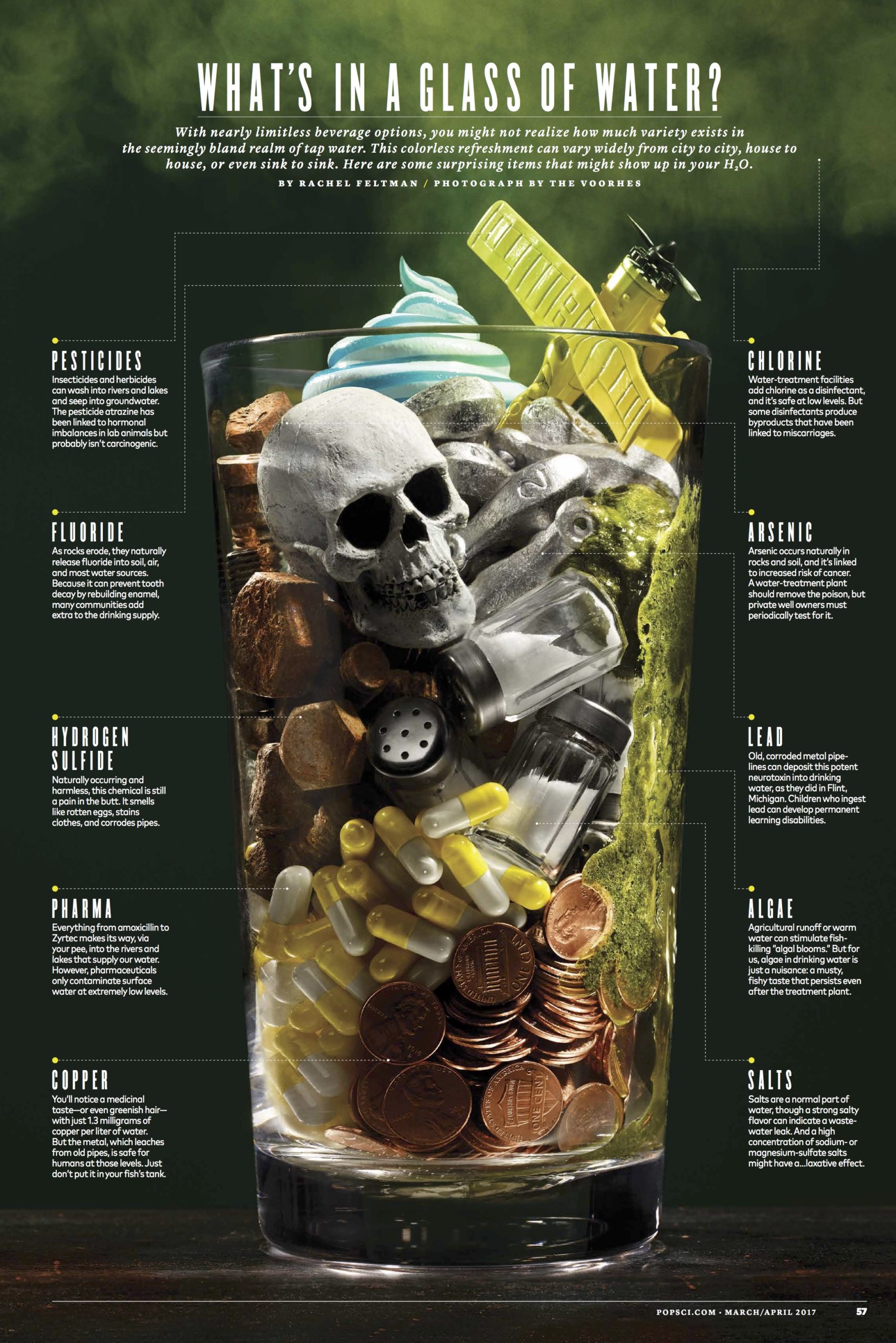
Were there any obstacles to getting the water shot? ( what’s in your water )
We shot this in January after a freeze. There was no alga floating on the lakes. Our assistant figured out how to make something that looked like alga using egg whites and matcha tea. It looked good for about an hour then started to get gross and dark. Other than that scale was an issue. Finding the right items that related to each other size wise and could all be styled into a vessel together so we would not have to make a Photoshop composite was tricky. Thank god for mini salt shakers and aquarium decor skulls.

What was the biggest challenge with this cover and feature assignment?
The details. Nothing was an overly complicated prop fabrication. But the details of each object mattered. Getting the right flash duration on the sand to have just enough drag to feel in motion but not blurred. Having light that is beautiful and just a touch dramatic. Pulling focus in a macro scene with moving subjects. It’s just attention to detail and a constant effort to make better work.

Where did you get the faucet?
We bought a variety of new faucets from the hardware store and tried various aging methods on them. While they looked fine, they were not quiet right. We needed something with character to be worthy of a cover. One of our assistant, who we keep asking to go get a tetanus shot, went to a metal recycling yard and spend an afternoon digging through rust piles till she found 5 different vintage faucets with PLENTY of character. The final faucet was with the knob from one and the spout from another. She still has yet to get the tetanus shot despite us telling her to go.

The Daily Promo: Newspaper Club


Newspaper Club

Instagram


Heidi: Why do you specialize in newspaper?
Newspaper Club: Newspaper is really versatile and great for all kinds of storytelling, but historically it’s only been available to massive publishers printing thousands of copies. We want everyone to be able to share their ideas quickly and easily with newsprint, even if they just need one copy. 

It’s been interesting to see the reaction to newsprint in a technology-focused world. Digital products tend to be sleek and flawless, and we’ve found people welcome a format that’s tangible and imperfect, and that doesn’t take itself too seriously.

Are you a global company?
Yes. Our newspapers are all printed in the UK, but our business is totally online and we can deliver just about anywhere. So far we’ve sent newspapers to 22 different countries!

How many clients do you service in the US and what are the shipping costs (average)?
About 20% of our orders come from the US. Prices start at $36 and larger runs can cost as little as $0.24 per copy. Shipping is included in the price, so there are no hidden fees. 

Do you have designers to help the clients?
We don’t have designers, but we do have templates, guides and our free layout tool, ARTHR.

When you upload a file, our system automatically checks that it’s set up correctly and will flag up issues like low resolution or spot colors. We also have a friendly support team ready to answer any questions along the way.

What is the largest segment of your client base?
That’s hard to say! We work with some big companies likes MailChimp and Spotify, but most of our customers are creative individuals – art students, graphic designers, illustrators and definitely lots of photographers.

We try to share a good overview of what we’re printing on our blog, and our monthly roundups show what a mix it can be. Last month we printed Handsome Frank’s annual promo, a catalogue for an architecture exhibition and a set of posters for a furniture studio – to name just a few!

What has been a unique application of the service?
We’re surprised all the time by the ways people think to use newsprint! A few examples that come to mind: Fresh Flowers offers an alternative to short-lived bouquets, Eye of the Beholder has 25 animal eyeballs printed at life size (the giant squid’s just fit across a tabloid spread!) and a few years ago Canadian band The Famines released a “newsprint single” – a really cool poster that has a link to download the music.

We’ve printed newspapers for every part of life’s cycle – from birth announcements to birthdays, weddings, anniversaries and funerals. A couple weeks ago a customer tweeted us a photo of his proposal – he hid behind a broadsheet on one knee! That made our day.

Tell us about your tag line, “Print’s not dead” where does the love of print come from?
It’s very special to hold something you’ve made in your hands, and we don’t think people will ever get tired of that.

Newsprint is an effective medium that still has a lot of life in it. You don’t need batteries to read a newspaper and everyone knows how to use one. We love flipping through newspapers our customers have made and hanging favorites up in the office.

It’s not about print vs. digital, but rather the two working together to change how people can share ideas. Now, you can upload a file from your computer on a Sunday night, from just about anywhere in the world, and find your newspapers on the doorstep a few days later. That’s a great feeling.

The Daily Edit – Design Director/Photo Director/Photographer: Hannah McCaughey


Outside Magazine

Design Director+Photo Director: Hannah McCaughey
Photography Editor: Amy Silverman
Deputy Art Director: Petra Zeiler
Assistant Photography Editor: Madeline Kelty
Junior Designer: Erica Clifford
Photographer: Hannah McCaughey

Heidi: I loved seeing your images in the latest issue, such a talent. Was this exciting for you?
Hannah: Yes, mainly because it’s a lot of fun, and by shooting a few things in house every month, we stay out of trouble with our accounting department. It allows us to save resources for the more ambitious projects in the magazine.

It’s similar to the way I feel about my design work. I don’t wow myself very often, but I find the process of it thoroughly enjoyable. I’m guessing that it’s this never fully satisfied, quasi-dissatisfaction that propels me forward. With every picture I (very spastically) make, the minute I see it in print, I see only what could have been better about it. It’s not that I’m aiming for perfection. It’s more like a running list of missed opportunities. This kind of thinking is well suited to the “work in progress” nature not just of life, but also of the cyclical nature of magazines. The repetition affords infinite possibilities to learn and grow, and it provides a kind of forgiveness for what went wrong. Much like in real life (although this example never happens), every day that I yell and scream at my kids to get dressed, eat breakfast, put on their shoes, file into the car to get to school on time, I can think about tomorrow and how we’ll be skipping and singing the whole way.

You’ve held the position at Outside as design director and photo director for some time; racking up several design and photography awards. Tell us about your evolution as a photographer.
Part of me was working at staying creatively engaged and satisfied. Sixteen years working on the same title has its wonderful moments and challenges. And I must have had enough bad art-directing moments in a row to where I thought to myself, “Why don’t I just shoot it myself?” And that thought alone was like ding! “Hey. Why. Don’t. I?”

Disclaimer: I’m not sure I’m ready to call what I’m doing photography exactly. I have so much help on both the front end (with assistance setting up all the lights and the camera) and on the back end (with pretty generous retouching). Because I’m so inexperienced, I’m forced to keep things incredibly simple. The idea itself is mainly what these images have going for them. Often, if these weren’t accompanying a specific story, I’m not sure they’d make any sense, and they’re not particularly beautiful or artful. I sometimes wish there was another word for it.

I started super low tech with my iPhone, some Xerox paper (for backdrop and bounce), my desk, and the New Mexico sunlight that comes into my office like a klieg light every afternoon. When I thought I had something that looked even remotely “profesh,” I got up the nerve to ask one of our photo assistants at the time, Michael Karsh, to help me work the camera and set up lights in the studio to shoot it for real. Since he moved back to San Francisco, I have been shooting and learning a lot from Dustin Sammann, who is the most patient and generous teacher on the planet. We created a new kind of freelance position for him: über assistant (when he’s not the photographer himself). Which is basically assisting someone who is super “special”—a.k.a. me.

With your understanding of great photography and composition from your design background, did you feel like, “I can do that”? Clearly, those skills come into play.
Now that I’ve dipped my toes in, I am—more than ever-—blown away by the giant talent and creative genius of the people who contribute to magazines (ours and others). My eyes have been exposed to so much amazing art, dating back to my early days at Rolling Stone in the nineties, and I hope some of it has rubbed off. Some parts of it, like finding a good balance in composition and seeing negative space, come more easily now. But part of the appeal is how much more there is out there for me to learn.

The magazine industry has certainly changed—budgets are lower, multitasking is essential. How does your creative control behind the camera influence your design? Most photographers don’t have a keen understanding of the book as a whole: layout, the volume of text.
Working as the art director gives me a huge, almost unfair leg up on shooting for this magazine. I go into it knowing what the headline is, how much space we have for art, what hasn’t worked in the past, why the story is running in that particular month—or what role it plays in the mix of stories planned for that issue—because I was there in the meeting when it was discussed as a pitch. I know what pitfalls the editors are worried about avoiding, the narrative arc; sometimes I know the writer personally. Add to that, I sit and design pages about 50 steps from where we shoot the art. I can literally ping-pong back and forth between the set and my desk with the layout on my screen (and text on the page) to see whether or not a shot is working. If it doesn’t work, we try something else. And if at day’s end it’s still not working, we try again the next day.

The upshot is that those two halves of my brain—photographer and designer—don’t always agree. Sometimes I’ll have a picture that I would love to see printed and another one that’s better suited to the story. The two halves have to fight it out. In my case, the art director always wins, because she is older (and crabbier). And now I know how that feels for contributors who say, “But why didn’t you print this one? It’s clearly the better photograph.” To which I have to say, “I totally agree, but this one works better for the story.” Not the easiest thing to have to hear or say.

Recently, I had a shoot where I was asking our cover photographer to try it this way and cover it that way “so we could have loads of options.” That’s something I think art directors say because we feel like that’s what’s expected of us by our bosses.  To which he said, “Why? Why do you need options? We have something we both like. We should be done.” It was a record-skipping moment for me, the photographer part of me could totally relate: Why do we feel like we have to “cover it” this way and that way and every way possible? Why can’t we just say that’s amazing! and that’s a wrap? Is this something that happened when we started ordering half caff extra hot no foam 2% lattes at Starbucks? Or, it is because we aren’t shooting film so we feel like why not shoot it every which way? I don’t know the answer to this one.

What made you choose to start doing still-life? Was this partially a response to the expense of sending gear out to get shot?
We have two amazing and talented photographers who shoot the mountains of gear that come through our offices for Outside and the two annual Buyer’s Guides, Inga Hendrickson and Dustin Sammann. That’s not something the magazine would ever need me to venture into. My happy place right now is conceptual still-life, which historically had been very difficult for us to assign. Sometimes it involves using a model to get a certain concept across (the Simplify package, for instance), but more often it means using basic objects from everyday life as symbols for something conceptual or hard to shoot, such as flexibility, traumatic brain injury, mental training, etc. And I like to shoot our one-page style and grooming pages just because there is a lot of freedom as far as what we can do. Young photographers always say to me, “I like to shoot people!” and I think, “Not me!” I much prefer to be alone in a dark room, just me and some random objects.

I know at Outside you transformed your gym into a photo studio—smart move. Did you propose this to the company? How hard was it to set up?
Rob Haggart came up with this idea. He was the one who got Larry Burke, the owner of the magazine, excited and on board to make the investment. He consulted various photographers on ordering the cameras and the lights and equipment and the design of the space itself—all of it, and years later it’s still a fantastic studio and a savvy business decision.

Describe how it feels to have done the entire layout from shooting, design and photo editing? Is it hard to be your own critic?
I think I’m getting better at being my own critic. It’s probably the most awkward for Amy Silverman, our photo editor, to pipe up when she doesn’t like something I’ve shot. I deliberately don’t mention it to the editors that I made the photographs when I first show them a layout, so they don’t get put in an awkward position. Because I’m such a beginner, I never care when they say, “Can we find something else for that?” And, it’s probably good to get thick-skinned about it.

Since now you do the job of three, what would you say are the challenges and benefits?
I feel like I made my bed on this one. I have a lot of designing and art directing left in me to do, and I enjoy it so much, that if I gave it up I would really miss it. By adding shooting to my list, I’ve made my life a lot busier but also more interesting and rewarding.

Do you remember you first assignment for the magazine, what it was like to see your image in print?
Yes! It was a very cool, somewhat scary moment. It was a broken melon duct-taped back together for a story about recovering from traumatic brain injury. I remember trying really hard not to be too precious about the retouching and the layout and the printing of it. I wanted to make sure I wasn’t giving it more attention than the other images in the issue as if the other photographs would tell on me.

Which thrills you the most of all the things you are currently doing?
At the moment, I’m doing a little DIY lighting seminar by moving objects around on my desk in the afternoon sun, mainly during long conference calls.

Do all art directors just want to shoot?
Yes! We do! Thank you, it feels so good to admit it. No, I’m kidding. In all my years of going on shoots for features and covers, I never wanted to be the photographer. How they manage the Herculean feat of juggling the big crowded set, managing all the assistants, dealing with the clients, the stylists and the groomers, the talent, the talents’ people, and, most importantly, pulling genius artwork out of all that chaos? I could no more fly to the moon.

It wasn’t until I found this quieter, calmer side of photography that I could even imagine myself shooting. What I could not have known is how incredibly gratifying it is for the cheerleader to jump in the game. I had no idea how much fun everyone was having. My hope is that the photographer in me is helping the art director and designer find better ways of communicating with our contributing photographers, now that I have a better understanding of the entire process. But on the flip side, I’ve noticed that if a photographer starts making excuses why they can’t or won’t do something for a story or a cover, I’m like “C’mon, quit yer whining!”

Tell us about being a woman in a lead position.
In my experience, being a woman in charge can be an incredibly tricky thing to maneuver. I’ve been going to various locations for feature and cover shoots all these years thinking that surely as I gain more experience, that would equal more respect. It’s true that I get to reap the benefits of being the more in-touch, capable, intelligent, compassionate, hard-working, better-at-multitasking, relatable, sensitive, and emotionally sensitive gender. The bad news is—and studies have proven this—that women don’t get heard as well as men because they’re not as well regarded. For my job, this has meant that in order to get what we need for the magazine, I sometimes have to come out louder, pushier, and more demanding than I’m sure my male counterparts have to be. Depressingly, being the “B—tch” seems like a way too easy booby trap for women in charge to fall into. And maybe part of me is tired of that. Which explains why shooting pictures (versus art-directing them) is so satisfying to me. It means being fully heard and seen, and not prejudged or discounted, and that feels really good.

The Daily Promo: Drew Gurian

Drew Gurian

Who printed it? 
Prestone Printing in Queens, NY printed the piece.

Who designed it?
Catherine Gray– an amazing creative director who splits her time between New York City and London.

Who edited the images?
Catherine and I worked on the image edit together.  I’ve depended on a group of friends, as well as hiring photo editors to help with image edits, who generally have an editorial background.  This was a bit different for me, in that I worked with someone embedded in the advertising world who’s not a photo editor by trade.  I really loved her perspective on my work, and since I’ve been meeting with lots of agencies, it made perfect sense to work with her.

How many did you make?
100

How many times a year do you send out promos? 
In the past, I’ve sent out small promos 4-5 times per year, but this promo is much more substantial (and costly).  With that said, this will certainly be my main promo for the year, marketing to a very specific group of people.  I plan to follow-up with some more simple promos as well throughout the year.

The Daily Edit – Stock Pot Images: Ophelia Chong

Cover photo by Bettina Monique


Feature story by Josh Fogel


Above Images: Seagrass Photography


Photographer: James Walker

Stock Pot Images

Heidi: How long did you watch the trends in market before you felt it was a viable business?
Ophelia: My sister came to visit and she has an autoimmune disease, and she took a chance on ingesting cannabis to see if it could alleviate her condition, as I was watching her I thought “whoa, she’s a stoner”, it made me sad to think she would be stereotyped as that and not as a medical patient. A day later I had an epiphany that came to me in the shower to start a cannabis stock agency, I jumped out of the shower and started to google images, and found all of them lacking and stereotypical. A month later I had the LLC in my hands. Before January 8th, 2015, I might have smoked cannabis about ten times. I hit the ground like a tornado, read, got a medical marijuana card, went to dispensaries, attended cannabis events, I dove in like a crane after a sardine. With 28 states including DC having some cannabis legislation, the timing was perfect. California just passed Prop 64 which allows adult use of cannabis, and the prediction is $6.46 billion by 2020, and StockPot Images is there to service the needs of this unstoppable industry. After launching 4/20/2015 we are now over 200 contributors and over 17K in images and video. After careful consideration of the wonderful agencies that approached us, last Monday March 6th we signed an exclusive agreement with Adobe Stock to carry our library in the Premium Collection, this was a wonderful validation of our hard work over the last two years.  NOTE: Predictions from Forbes and revenue estimates from Time Magazine.

Have you observed market trends before and responded?
When I was the creative director for Workbook Stock, I was a huge fan of DIY zines, I started to see a resurgence of the hand-made, the guerilla style, the collageing of emphera and what I wanted to do was to take that for Workbook Stock’s marketing. I pitched the idea to give an artist our stock photography and to add their own illustrative style and incorporate it into a piece that spoke about creativity inspired by stock photography. I hired Adam Larson to create his sensual photo collages, his work won multiple awards and set him on his path out of an agency to his own.

If I wanted to be a contributor for the agency, what’s the process?
Cannabis has been prohibited in the US for 80 years, and because of that access to the plant was controlled. That being said, there are not many photographers of cannabis out there, at the beginning I searched Flickr, and social media to sign my first photographers, after 3 months I no longer need to search, I get inquiries every week and on the average sign 2 – 3 a week. All anyone has to do is to reach out to me and send me a portfolio to look at.

Do you have a team that reviews the caption and strains?
No, I am a one woman band, from curator to office manager to keyworder to bill payer.

You were the creative director at Workbook, what sets your agency apart ( features, specificity?)  
The most obvious is that we specialize in cannabis digital media, and I went from a staff of many to just myself, what I learned while at Workbook was what everyones’ responsibilities were. I observed and asked questions, and learned on the fly, under at times the most stressful times. I remember there was a period where I was designing a magazine, two stock books on top of my normal workload. I produced, curated, designed and sourced everything, and because of that I was able to get the full spectrum from idea to fulfillment.

How else are you connected to the industry?
Community Liaison: THC Design
I have been given the chance to lead the community outreach for a company that has the most diverse staff I’ve been a part of. I am working with veterans, LGBT, disabled and minority communities. My program is not about putting the THC logo on an event or to get “likes” on social media, it is about grass roots work to build a community that we advocate and become advocates for cannabis.

Creative Consultant:  PUSH MAG
I have worked with Abigail Ross at Dope over a year, and we produced feature articles and covers for Dope together with the photographers of StockPot Images. After Abigail left, we along with five other women created PUSH MAG, a magazine that is for the millennial woman in cannabis. Our mission is to be a voice that pushes back, to encourage other women, to celebrate the intrinsic need to be a strong community by saying it’s okay to scream and kick out of the box.

Asian Americans for Cannabis Education: Co-founder / Presently running the whole shebang

I took over AACE from my other co-founders, they had a full plate so I am not carrying the mantel. My goal is to find like-minded Asians in the cannabis community to help de-stigmatize the medicinal use of cannabis. In the last month I’ve found many who are going to join this journey with me, from all walks of life.

What other organizations are you involved with that an aligned with Stock Pot Images?
I am involved with Supernova Women, we are women of color in the cannabis industry, we educate, we promote, we support. ( I am going to be on the board of directors in mid march)

How did that name come about for the agency?
I had names on the whiteboard; all of them were too “weed-centric”. One day I was standing in the kitchen staring at a pot….

It took me a year to get the trademark, because each time the USTPO attorney clicked on the site, their “warning” radar came up. Then it was that the term “stock pot” was too generic, so my attorney suggested “stockpot” and it went through.

My banking story is since I am ancillary, I can get a bank account. However the bank I was with over 2 decades turned me down, I took all my money out of the bank and walked across the street to another bank and they took me on without a word. Cannabis is a schedule one drug so therefore you cannot have a bank account, it is a major downside to the industry that we have to manage all of in cash.

What’s the creative ethos behind the imagery?
Our mission is to offer the true faces and communities of cannabis, none of the subjects are models, and all are real users who signed model releases because they believe in our mission. We have two portraits that I am most proud of, one is of a 70-year-old African-American man, in his Sunday best holding a joint, the other a 90-year-old Chinese grandmother tending to her small cannabis plants. The gentleman is heavy with history, the history of incarceration of African-American men for the simple possession of cannabis.

A Chinese Grandmother tends to her Cannabis Plants by Linus Shentu

African-Americans only make up 13% of the population of the US, yet they make up 25% of prisoners, 60% of the people in jail are people of color. The Chinese grandmother represents the duality of the Chinese immigrant to follow the law and to not rock the boat; she is changing the paradigm by doing what she does on a daily basis.

Do you art direct photographers?
I only art direct my photographers (195 of them) when we need specific images. I am delightfully surprised by each of their uploads, it’s Christmas everyday.

The Daily Promo – Andrew White

 
Who printed it?
I printed this piece as well as my print book at Soli in Kansas City. They’ve always been good to me, and guided me through paper stocks and printing processes. Added bonus that I can pedal from the studio to check out proof sheets, and they let me bring my bike inside.

Who designed it?
Gage Wente at RW2 and I designed it. We wanted different dimensions than an internet printed 8.5 x 11 book so that it had more impact, but close to it to capitalize on shipping and envelope costs. It ended up being a taller format based off the cover option that worked best.

Who edited the images? and did the pairings?
I edited the images with input from Lyndon Wade of The Wade Brothers. My work is split among sports, music, and portraiture, and all needed to be represented evenly. Similarly, I made sure there was a good mix of advertising, label, editorial, and personal work.

How many did you make?
I printed 250. 100 went in the mail, 50 were handed out in person, and the rest are on hand for leave behinds or for new contacts that come up.

How many times a year do you send out promos?
This piece is pretty comprehensive of my work from the past 18 months so I don’t imagine I’ll do another like it till next year. But I plan on sending out specific project promos. I just wrapped a book for the Nashville Visitors Bureau, so I’ll do a piece with those images around mid-year. And I’m directing a live action sports project which I’ll do an accompanying marketing campaign for.

I had this piece set to release in December, but held off until January. Didn’t want it to get lost in holiday party hangovers, better to land on desks when work ramps up and budgets are fresh. Here’s a digital version to check out. It’s a not as cool as the printed version but at least I’m certain the mailman won’t lose it!

The Daily Edit – The New Yorker: Victor J. Blue

The New Yorker


Director of Photography:
Joanna Milter

Art Director: Nicholas Blechman
Photo Editor: Thea Traff
Photographer: Victor J. Blue for The New Yorker
Full story here
Photo Booth feature with Victor here


Heidi: How long were you on assignment for this story?
Victor: We worked on the piece for 6 weeks.

What was the hardest aspect of this assignment?
As with any military operation, there was a lot of “hurry up and wait.” It was tough to stay sharp and keep shooting when the down time dragged on, and to balance it with the more dynamic times.

Did you learn anything new about yourself for this project?
I learned that I need to trust a little bit more, and I need to count on my second and third impressions of people and situations as much as my first one. A few times, guys that I thought weren’t really into our presence ended up being some of the ones I eventually connected to the most.

Did you have any protection?
Well, we had body armor and helmets. But we did not work with a security advisor or anything like that. It was just me, Luke Mogelson the writer, and our buddy Sardar, our fixer and translator. We looked out for each other.

How many languages do you speak?
I speak English and Spanish. The Spanish didn’t help me out much on this one.

For each published image how many frames were shot in that scenario?
That’s really hard to say. It just depends. Sometimes only a few, sometimes hundreds. I can say that we ended up publishing like 22 photos total, and I ended up with about 300 selects.

You have a gift for being accepted into closed/difficult communities, how do you earn their trust?
I just try to be really open with people, and easygoing. I try not to be a “bro” or fake about who I am or what I’m doing there. Folks usually seem to relate to that and while it doesn’t ingratiate you off the bat, it earns trust over time.

What coping skills to you use to deal with the intensity of the work you do?
When I’m working I write quite a lot, and I think that helps. When I get home, one of the hardest things for me is not wanting to let the experience go- to not slip back into my spoiled first world existence. But that happens and I guess that’s natural. I make a concerted effort to reconnect with my friends and loved ones. I usually get sad sometimes, and I try to pour that into the editing of the pictures.

This is your life’s work, what cues do you now have that tell you it’s not the right moment to take a photograph or the situation is too intense?
There was a moment that happened like the second day- one of the SWAT members came tearing into the base collapsing and crying- he had just found out his wife and children had been taken by ISIS. It was a really intense moment and we had just shown up. I was torn about what to do, but I hung back and didn’t really make a picture. I was betting that taking it slow with these guys, earning their trust before I jump in their face like that would pay off, and it did. Later, when things were way crazier, no one ever got mad at me making pictures. You just have to take it slow, figure it out, and be smart as well as brave about raising your camera when things get intense.

You are documenting some horrific situations, how do you cope with this form of photography while you are doing it? and after 
I just try hard to concentrate on the pictures, on understanding what’s going on, and making powerful images of that. It’s my job to take pictures of very serious circumstances. If I couldn’t cope with it, that would be fine, but it would be irresponsible for me to go there to do it. Then I ought to be shooting other types of stories. That’s what makes us professionals- our ability to function in what are difficult, fluid, and at times dangerous scenarios.

Have you ever self-edited feeling that an image was too much to share?
I’m not sure I believe that anything is too intense to photograph. It’s my job to interpret something horrific and make a picture of it that people can look at. I don’t think I pull too many punches. Of course sometimes the circumstances around making pictures require me to think about what’s going on- I have to be careful to be an honest witness and not work as a propaganda arm for anyone. If I feel like folks are trying very hard to manipulate the pictures I am making, I am wary about publishing them. But that was never an issue on this story.

When people look at your work are you hoping they see composition and balance in some of the photos along with your message?
For sure! I am trying to make visually dynamic photographs. My goal is a set of pictures that both inform people intellectually and move them emotionally. If the pictures are poorly made, if I’m not working really hard to “see” them, then I am not doing my job. They have to arrest you visually, make you stop and feel something, then want to know something about the people and the circumstances they depict.

Do you find beauty in cataclysmic images? Just because something is terrible doesn’t mean it can share something wonderful.
It’s an interesting question. Beauty per se isn’t a goal I’m concerned with personally. To me there are much more important aspirations for my pictures- truth being the first. Like I said, I am trying to make the most visually powerful pictures I can- but I believe in photojournalism and I am consciously working within its conventions. I work hard to be creative, but I am not making art. Wars, social crises, marginalized people- I don’t see these as legitimate vehicles for my artistic aspirations. I believe that making well-observed documentary pictures of their experience is how I can best serve as a bridge between them and the moral imagination of the readers that will see the pictures.

The Daily Promo: Patrick Marinello

Patrick Marinello

Who printed it?
I got my promos printed at Overnight Prints.

Who designed it?
I designed the promos.

Who edited the images?
I edited the photos.

How many did you make?
I originally made 30 but I went the cheap route and didn’t go with the hard-cover for the booklet thinking it would save money, and that it would look fine. When I got the them they looked unfinished so I decided to make another 30 which I was pretty happy with, minus some color issues.

How many times a year do you send out promos?
This was the first promo I’ve ever made; I wanted to do something different. I didn’t want to put my best work on a postcard and then have the same images on my website. I wanted to do some something unique and really creative. Plus even if you hate the promo who’s going to forget someone mailed you a booklet that resembles a sandwich?

What made you want to do bread and cheese?
The idea behind the sandwich promo was that I was shooting a photo series on cold cuts. I wasn’t really sure what I was going to do with the series. At the same time I was figuring out how to get paid photo work. I’ve never made a promo before so I came up with this crazy idea to turn the cold cuts into a booklet that resembles a sandwich. I told a few people and they thought it was a great idea so I  decided to make the booklets. I figured photo editors get so many promos, I really needed to stand out.

How many slices of bread did you review before picking that one for the closing image?
There is a bakery I go to by my house and I tried 2 styles of bread. A round loaf and a more classic pullman loaf. I shot a couple slices from the round loaf and then a day later I wasn’t happy with the the shape of the bread so I went with the pullman since it’s more of a classic sandwich bread.

The Daily Edit – California Sunday Magazine: Jacqueline Bates

We interviewed Mark Manahey previously about this cover

Mateo Gómez García

Benjamin Rasmussen

Erin Brethauer

Gillian Laub

California Sunday Magazine

Creative Director: Leo Jung
Photography Director: Jacqueline Bates
Photography Editor: Paloma Shutes
Production manager: Thomas Bollier
Designer: Annie Jen

Have you kept with the same format since you launched or have you introduced any new sections?
We are always open to experiments and trying out new formats. In September, we published our first-ever themed issue, in which we asked writers and photographers, “What do California and the West sound like right now?” We gathered stories about entertainment, criminal justice, science, design, business, music, sports, culture, and technology. We asked our contributors to record the sounds they wrote about, and these snippets appear throughout the magazine as audio footnotes — readers can play them on their phones as they read the print edition. We divided the issue into three chapters, each with a separate table of contents, beginning with the quietest stories and ending with the loudest. It was a really fun challenge, and we are gearing up for another themed issue later this year.

How does Pop Up complement the magazine and are you also photo directing that as well ?
Leo Jung (our creative director) and I work on all the visuals for Pop-Up. He and his fantastic new designer, Annie Jen, commission all the illustrations. Paloma Shutes (our photo editor) and I work on the photography. Pop-Up is a multi-sensory experience, and there are so many ways to craft a story for a live audience rather than the printed page– we have to think about the pacing and the sequencing of images in combination with the dialogue, when our live orchestra should play. It’s a fun complement to making a magazine.

What are some of your favorite photo essays from the last year, and why?
We’ve published so many stories that I’m proud of this year, from a four-part photo essay centered on youth homelessness (as part of a coordinated effort by more than 80 media outlets to shine a light on homelessness in the Bay Area), to a Natalie Keyssar  project documenting political unrest in Venezuela, to an underground LA music scene shaping modern jazz and hip hop, photographed by Coley Brown.


Underground LA music scene shaping modern jazz and hip hop, photographed by Coley Brown

Congrats on the ASMEs—which categories did you win?
Thank you! We won the National Magazine Award for excellence in photography in 2016 and 2017. This year we also won for design, and were finalists in the single-topic issue and magazine of the year categories. It was a huge honor to be recognized among such iconic magazines. We are still in disbelief.

How if at all are you evolving the photography?
Four months ago, we hired a fantastic photo editor, Paloma Shutes, to join the photo department (For our first few years, it was just me). February was her first full issue at the magazine. I think it’s so important so have a coworker who has different sensibilities and distinct photography interests—it will only make the magazine more dynamic, and help it evolve. I’m so lucky to work with her and learn from her every day.

What has been the biggest surprise creatively this past year? 
I never could have imagined we’d win a National Magazine Award two years in a row. That hasn’t happened since 1992,  when National Geographic won a second consecutive award. This sort of recognition validates a young brand, and it also proves that when you have a boss who believes in you, anything is possible. Leo and I feel so fortunate to have Doug McGray as our editor. He adds so much value to our process and gives us breathing room to dream up things we are immensely proud of.

What has been the best lesson that you can share with other PDs?
I think it’s so essential for editors to share knowledge and to not work in a bubble. I’m really excited about the recently launched-site Women Photograph, a database of female photographers that features work from more than 400 women from 67 countries. It’s an incredible resource. We need more of these. I always tell photographers to slow down and research everything about the particular subject they are interested in shooting—and I think editors could do the same. Whenever I have a story in a particular region that I might not have any photographers in, I research everything I can about that world —we always try to hire local photographers whenever possible because of their close connection to that place.

How many photo essays or visual shorts do you get pitched in a typical month?
We get pitched a significant amount, and Paloma and I have weekly meetings to present ideas to our editor-in-chief and senior editors. Photographers are welcome to pitch unpublished projects or ideas to: art@californiasunday.com

The Daily Promo: Sam Zide


Sam Zide

Who printed it?
The portfolio piece was printed by GSB digital in Long Island City. Their print shop was located above our Macy’s photo studio, I took a tour of the facility and got to know the designers. They do a lot of commercial catalogs, but have passion for working with artists for portfolio pieces. I thought they were perfect for this larger piece.
Who designed it?
The piece was designed by myself, but was shown to 3-4 designer / art directors for feed back on the entire process. Working in the Macy’s studio was great resource for talent, a few of the freelance Senior Art Directors sat with me through out the process.
Who edited the images?
The edit was made myself and one Art Director I work closely with, I thought it best to get direction from one source, whose work I admire. We sat down daily over a weeks time, and edited the images down to the ones seen.  I did all the retouching and color balancing

How many did you make?
Only 25 were printed at this time. I like the idea of keeping the run very small on this larger promo piece, and sending them out numbered and in series.
My wife and I just made the move to Oakland from Brooklyn, I have been on staff shooting for Macy’s the past 2 years full-time. Before that I was freelance working mainly in NYC for the 10 previous years. I tried to send out promos twice a year, now I need to get back in the swing of things, and would like to send out quarterly postcard pieces, with an annual large piece showcasing the years work to a much tighter pool of clients and friends. Going from full-time to freelance while moving across the country is quite an undertaking, but I pan to have my next card promo out and new website relaunched in early February.
What inspired you during your creative process?
While I was putting this piece together, I was listening to Leonard Cohen a lot, He has a lyric from his song Famous Blue Raincoat were he says “I hope you’re Keeping Some Kind of Record” The lyric just stuck out to me while editing through the images. The images shown I feel represent a very wide gamut of my work, while I might want my next book to have a more specific theme. So I thought that name for this book was a perfect fit.

The Daily Promo: Drew Anthony Smith

Drew Anthony Smith

Who printed it?
Thomas Graphics in Austin.

Who designed it?
I designed it.

Who edited the images?
I selected and toned the images.  Two were used in the Cosmo feature while the others were some of my favorites.

How many did you make?
300

How many times a year do you send out promos?
I send a physical promo piece out about every quarter.

Did you write the copy and cast this model?
Irvin Randle has gained Instagram fame by being the man behind #MrStealYourGrandma.  This was an assignment for Cosmopolitan and part of their Internet’s Most Fascinating series.  In addition to this shoot, I also flew to Charlotte the same week to photograph Ryan Lochte as part of the collection.


I spent more time driving to Houston than photographing Irvin.  My assistant and I hit the ground running when we arrived and knocked out a dozen locations in about two hours.  Irvin had a great attitude and was ready to go with his slick outfits.  My assistant got a work out because in addition to helping me, Irvin kept asking her to shoot behind the scenes shots.  Gotta get that fresh Instagram content.

The Daily Edit: Real Simple – Yasu+Junko

img_2695

Real Simple


Senior Designer: Dina Ravvin
Prop Stylist:
Elizabeth Press
Photographers: Yasu+Junko


Heidi: How many flowers did you purchase to get the color shifts?
Yasu+Junko: About 32 dozen

Did you follow the instructions in the article when setting up the set to keep the flowers lively?
No, we worked off of photo references for the inspiration.

How long the shoot take?
The shoot took us a couple of hours…but all morning prepping.

Were you concerned about wilting with the lights?
The light was rather far away from the subject that we did not have to be too careful. We usually turn off the modeling lights if necessary.

How many options do you typically shoot for something like this?
Not much options for this; little variations, like replacing flowers. Here is our original image, the magazine had cropped into it quite a bit.

101316_rs_rose_202

The Daily Promo: Michael Becker

Michael Becker

Who printed it?
Anthony Wright at AW Litho

Tell us about your experience with AW.
Anthony was amazing to work with.  We initially wanted to do the promos as lithographs on a beautiful matte paper.  Ultimately, I felt these particular images were a bit dark for the process and media, and after a couple test runs decided to go with a digital print on a luster photo paper.  Anthony was incredibly patient and tenacious about getting it right.  Big thanks to AW Litho!

Who designed it?
Heidi Volpe! Fortunately for me the editor I work with, Lisa Thackaberry, thought you’d be a great fit to design this promo and sent you the images unbeknownst to me.  We wanted to do a tri-fold with a strong, clean design to showcase the images.   Next thing I knew, Lisa sent me your mock up which was beautiful and exactly what I had hoped for.

Who edited the images?
Lisa Thackaberry.  I initially approached Lisa 3 years ago to help me prep for the Palm Springs portfolio reviews.  We have been working together ever since.  Working with Lisa has given me a much deeper understanding about the power of the edit.  It has changed the way I shoot.

How many did you make?
We made 200 pieces for this promo.

How many times a year do you send out promos?
I’ve been doing one or two a year for the last few years, but plan on doing more this year to reflect my commissioned work and personal projects.

The Daily Edit – National Geographic: Brian Finke

February issue of National Geographic magazine cover story available here, Our 9,000-Year Love Affair with Booze.

07_cv-0217_news

© Brian Finke / National Geographic

PERMITTED USE: This image may be downloaded or is otherwise provided at no charge for one-time use for coverage or promotion of National Geographic magazine dated February 2017 and exclusively in conjunction thereof.  No copying, distribution or archiving permitted.  Sub-licensing, sale or resale is prohibited.   REQUIRED CREDIT AND CAPTION: All image uses must bear the copyright notice and be properly credited to the relevant photographer, as provided, and must be accompanied by a caption, which makes reference to NGM.  Any uses in which the image appears without proper copyright notice, photographer credit and a caption referencing NGM are subject to paid licensing.   Mandatory usage requirements: (Please note: you may select 4 branded images for online use and 3 images for print/unbranded)   1. Include mandatory photo credit with each image © Photographer / National Geographic **Please see additional credit and caption info below. 2. Show the February 2017 cover of National Geographic somewhere in the post (credit: National Geographic) unless using only one image 3. Provide a prominent link to: http://www.nationalgeographic.com/magazine/2017/02/alcohol-discovery-addiction-booze-human-culture/ at the top of your piece, ahead of the photos 4. Mention that the images are from "the February issue of National Geographic magazine” Images can be found here: https://foxgroup.box.com/s/dgwhhvkm23g02mhu4thrhvbsucs4foo9
© Brian Finke / National Geographic

A Chinese newlywed toasts her guests with a traditional cup of rice wine. The drink has been consumed in China for at least 9,000 years; a chemical residue found in a jar of that age is the oldest proof of a deliberately fermented beverage. But the influence of alcohol probably extends even deeper into prehistory.

PERMITTED USE: This image may be downloaded or is otherwise provided at no charge for one-time use for coverage or promotion of National Geographic magazine dated February 2017 and exclusively in conjunction thereof.  No copying, distribution or archiving permitted.  Sub-licensing, sale or resale is prohibited.   REQUIRED CREDIT AND CAPTION: All image uses must bear the copyright notice and be properly credited to the relevant photographer, as provided, and must be accompanied by a caption, which makes reference to NGM.  Any uses in which the image appears without proper copyright notice, photographer credit and a caption referencing NGM are subject to paid licensing.   Mandatory usage requirements: (Please note: you may select 4 branded images for online use and 3 images for print/unbranded)   1. Include mandatory photo credit with each image © Photographer / National Geographic **Please see additional credit and caption info below. 2. Show the February 2017 cover of National Geographic somewhere in the post (credit: National Geographic) unless using only one image 3. Provide a prominent link to: http://www.nationalgeographic.com/magazine/2017/02/alcohol-discovery-addiction-booze-human-culture/ at the top of your piece, ahead of the photos 4. Mention that the images are from "the February issue of National Geographic magazine” Images can be found here: https://foxgroup.box.com/s/dgwhhvkm23g02mhu4thrhvbsucs4foo9
© Brian Finke / National Geographic

Grapes are snacked on by a Roman soldier (left), and pressed with a massive oak-tree trunk. The juice is then fermented in open clay jars. The Romans flavored it with surprising ingredients: One of Durand’s wines contains fenugreek, iris, and seawater.

PERMITTED USE: This image may be downloaded or is otherwise provided at no charge for one-time use for coverage or promotion of National Geographic magazine dated February 2017 and exclusively in conjunction thereof.  No copying, distribution or archiving permitted.  Sub-licensing, sale or resale is prohibited.   REQUIRED CREDIT AND CAPTION: All image uses must bear the copyright notice and be properly credited to the relevant photographer, as provided, and must be accompanied by a caption, which makes reference to NGM.  Any uses in which the image appears without proper copyright notice, photographer credit and a caption referencing NGM are subject to paid licensing.   Mandatory usage requirements: (Please note: you may select 4 branded images for online use and 3 images for print/unbranded)   1. Include mandatory photo credit with each image © Photographer / National Geographic **Please see additional credit and caption info below. 2. Show the February 2017 cover of National Geographic somewhere in the post (credit: National Geographic) unless using only one image 3. Provide a prominent link to: http://www.nationalgeographic.com/magazine/2017/02/alcohol-discovery-addiction-booze-human-culture/ at the top of your piece, ahead of the photos 4. Mention that the images are from "the February issue of National Geographic magazine” Images can be found here: https://foxgroup.box.com/s/dgwhhvkm23g02mhu4thrhvbsucs4foo9
© Brian Finke / National Geographic

Since it began in 1810 as a wedding celebration for the Bavarian crown prince, Munich’s Oktoberfest has grown into one of the world’s largest festivals, with more than six million visitors crowding its tents each year to drain one-liter mugs of beer. Bavaria has had a big impact on beermaking: Its Reinheitsgebot, or Beer Purity Law, passed in 1516, ushered in a global trend toward uniformity by restricting brewers to water, hops, and malt (and later yeast, after it was discovered). These days some craft brewers are pushing back, experimenting with ancient additives and unusual yeasts.


National Geographic

Senior Photo Editor: Todd James
Photographer:
Brian Finke

Heidi: How did this project come about, was this your first time shooting for National Geographic? 

Brian: I got a call from Todd James, Senior Photo Editor at National Geographic asking if it’d be into shooting alcohol around the world. I said, “Hell Yea!” Todd and I had worked on three previous features for the magazine, I was psyched for our fourth story together. My first story with Todd was photographing “Meat in Texas”, a story about America’s obsession with meat. That job came about from my Instagram when I was posting tons of my backyard BBQ photos, the editors were familiar with my work but seeing also my obsession with meat landed me the story, along with my career of personal and editorial work.

How much do you use Instagram as a conscious promotional tool, or is it really self expression for you?
It’s a platform for trying new things, promoting, keeping people updated on latest work, it’s an immediate outlet for sharing everything.

What advice do you have for photographers using Instagram?
Always put out personal work because that’s where the best assignments come from.

What type of specific direction did you get from the magazine? What made this assignment different?

What makes National Geographic stories different is all the research before hand; the photo editor and photographer really build the story, then of course it’s the amount of time that’s dedicated. I shot on and off for four months for this story.

Did you travel with the writer?
No just myself and my assistant

It looks like you traveled extensively for this project, did you send in images as you traveled?
I traveled all over the place going to various birth places of booze around the world, started in Peru, then South of France, Republic of Georgia, Germany, China and a few paces around the U.S. Throughout shooting I’d send in photos, discuss the project and building the story with my editor.

Shooting for National Geographic is quite an honor (and it was a cover story) if you had any internal pressure, how did you deal with it? 
I’m always a little nervous but mostly excited. It’s really amazing, it’s always something new, with so many new experiences.

The Daily Promo: Ian Bates

screen-shot-2016-12-30-at-7-42-41-pm

screen-shot-2016-12-30-at-7-42-49-pm
Ian Bates

Who printed it?
SmartPress.com

Who designed it?
I did.

Who edited the images?
I did.

How many did you make?
140

How many times a year do you send out promos?
Up until now, I’ve sent 2 a year since starting my career two years ago. This year I’m sending a postcard a month that will reflect the nature of my commissioned work and project work.

How did you determine what images to use?
For this promo I wanted to show how my work is translated over various platforms. I picked a commissioned picture, a picture from a project and a personal picture from a trip I took earlier last year. My work is best seen in groupings or projects, as I believe that pictures work really well leading off each other.


The Daily Edit – Nylon: Amy Harrity

2_page_1
2_page_3

Nylon

Photo Director: Sonia Ostrovsky
Photo Producer: Ricky Michiels
Photographer: Amy Harrity


Heidi: What was the direction from the magazine?
Amy: The wonderful thing about working consistently with Nylon is that they trust me. The photo director gives me some info about my subject, the location and the styling and then says “do your thing!’.

Did you direct her to do that hand gesture, or was it organic?
For this image, I shot through a window outside of the hotel. Before I went out I directed Callie to switch it up a lot since I wouldn’t be able to talk to her. Nylon loves having a playful energy in the photos, but I also think this is Callie’s personality.

How long did you spend with her before taking the photo?
I got to hang with Callie during her fitting and H+MU. We got to talk about music, boys, and politics before the shoot even started. We also had a all female team working on the job which also creates a sense of camaraderie.

How long into the photo session were you when this moment happened?
This was actually our first set up of the day. For me, getting the shot is about finding the perfect pocket of light. Once I find it, I stay there as long as possible and play around.

Where did you shoot?
We shot at the Hollywood Roosevelt, there were three other celebrity shoots going on that day including DJ Khaled.

The Daily Promo: Dwight Eschliman

screen-shot-2017-01-08-at-6-42-22-pm

screen-shot-2017-01-08-at-6-42-29-pm

screen-shot-2017-01-08-at-6-42-34-pm

screen-shot-2017-01-08-at-6-42-41-pm

screen-shot-2017-01-08-at-6-42-50-pm

Dwight Eschliman

Heidi: Did you have someone with cattle experience on set?
Dwight: We worked with a cowboy out in Oakdale, California who has experience as a stuntman for film. His knowledge from being on set was incredibly helpful since he both understood what we were looking for and how difficult it would be to actually achieve. We also learned that cowboys like to drink Keystone beer all day (which seems to have no impact on job performance!)
Was it difficult to get the Corriente cattle to pose?
Yes! While cattle may be considered to be domestic animals, these cows are in no way trained. By nature they are completely uninterested in following directions or turning their heads just so. Originally, the cowboy we worked with said getting the cows to stand still long enough for their “portrait” couldn’t be done. Somehow, over the stretch of a couple of days, he figured out a way to make it possible.
cow20-355-1
What inspired you to create this body of work?
Cataloging has been a consistent theme in my studio’s work – such as Bicycle San Francisco and Ingredients:. I’ve always been fascinated with herds of cattle, but wanted to shoot them in our distinct style. Having them pose for individual portraits is what really makes the project ours.
Who printed it?
Oscar Printing Company in San Francisco – we’ve worked with them on several projects and they are located close to the studio which is convenient for press checks.
Who designed it?
Our friends over at Manual Creative. They designed a similar poster for our Bicycle San Francisco project a few years ago and we thought the format would lend itself well to the Cattle project.
Who edited the images?
Jamie and Taylor at my studio did the initial prep work on the files, I took them from there and then my longtime retoucher – Alex Katz at blinklab – finished them.
How many did you make?
We made 2,500 and sent out about 2,000. My rep, Kelly Montez at Apostrophe Reps, will use some as leave behinds and we keep the rest around the studio to hand out.
How many times a year do you send out promos?
We try to send printed promos about 4 times a year but in reality we get 2-3 out. We generally send out postcards and once a year feature a special project, like the cattle.

The Daily Edit – Women’s Health: Landon Nordeman

screen-shot-2017-01-23-at-12-01-06-pm

screen-shot-2017-01-23-at-12-01-13-pm

screen-shot-2017-01-23-at-12-01-22-pm

screen-shot-2017-01-23-at-12-01-30-pm


Women’s Health

Creative Director: Jacqueline Azria
Photo Director: Sarah Rozen
Photographer: Landon Nordeman


Heidi: Did you pitch this concept to the magazine?
Landon: No. It was an assignment. The editors and I talked at length before each shoot. They had ideas about what they wanted each woman to be doing in the photos—but I was alone with the subjects on location, making decisions on the fly as always—responding to them and to the location.

What type of direction did you give the women?
To me a portrait is about showing the character of the subject and letting them shine in their own environment—or in the location in which you’re working.  This eclectic group was great to photograph. Strong personalities make for good pictures. I try to connect with my subjects any way I can before giving direction. Establish trust and then collaborate to make something great.

Describe the energy on set.
The energy on set was fantastic—celebratory and with a sense of purpose.

In a word: enthusiastic. Each one of these incredible ladies was excited to share their personality and their story with me. So, that means encouraging them and making them feel at ease. Then I am observing gestures and moments and photographing the ones that I respond to until I feel like we’ve reached that collaboration point of a successful portrait. To me the photographic process is always about discovery—whether it’s a candid photograph on the street, or in this case, a portrait.

In talking to them, did you discover the secret to the fountain of youth?
Yes! The fountain of youth entails eating healthy, exercising regularly, making time to have fun, being open to trying new things, and dancing. Lots and lots of dancing!

What type of inspiration, wisdom did you take away?
The wisdom I took away—of which all of these women reminded me—was that life is a marathon not a sprint and there is time for change. One’s happiness will not be based on what others think of you, or on material things—it will be based on the experiences you share with the people you love.  It’s about giving, rather than taking.

Did the ladies ask to see the photos during the shoot?
No one asked. In the past I ‘ve found that once you show the subject a picture, you enter a rabbit hole of looking at the photos you’ve taken, and not concentrating on making the next one.  Also, inviting the subject to look at the images tends to break the momentum of a shoot, so I don’t do it.

Younger women seem to fight aging, did you notice they had embraced the grace of time?
Yes, they all demonstrated a real comfort in their own skin: for example, practicing yoga, cheerleading, and running for the camera, and posing on a bed without any hesitation. There was nothing I asked them to do that each one of them did not embrace wholeheartedly.