
John Davidson
Who printed it?
Smartpress. I’ve used them for the last couple of years, and the quality has been excellent every time. For photographers, color accuracy is obviously one of the first things we look at and I feel they do a great job in that regard. Their pricing is also very fair, helped in part by the flexibility they offer in terms of production quantity.
Who designed it?
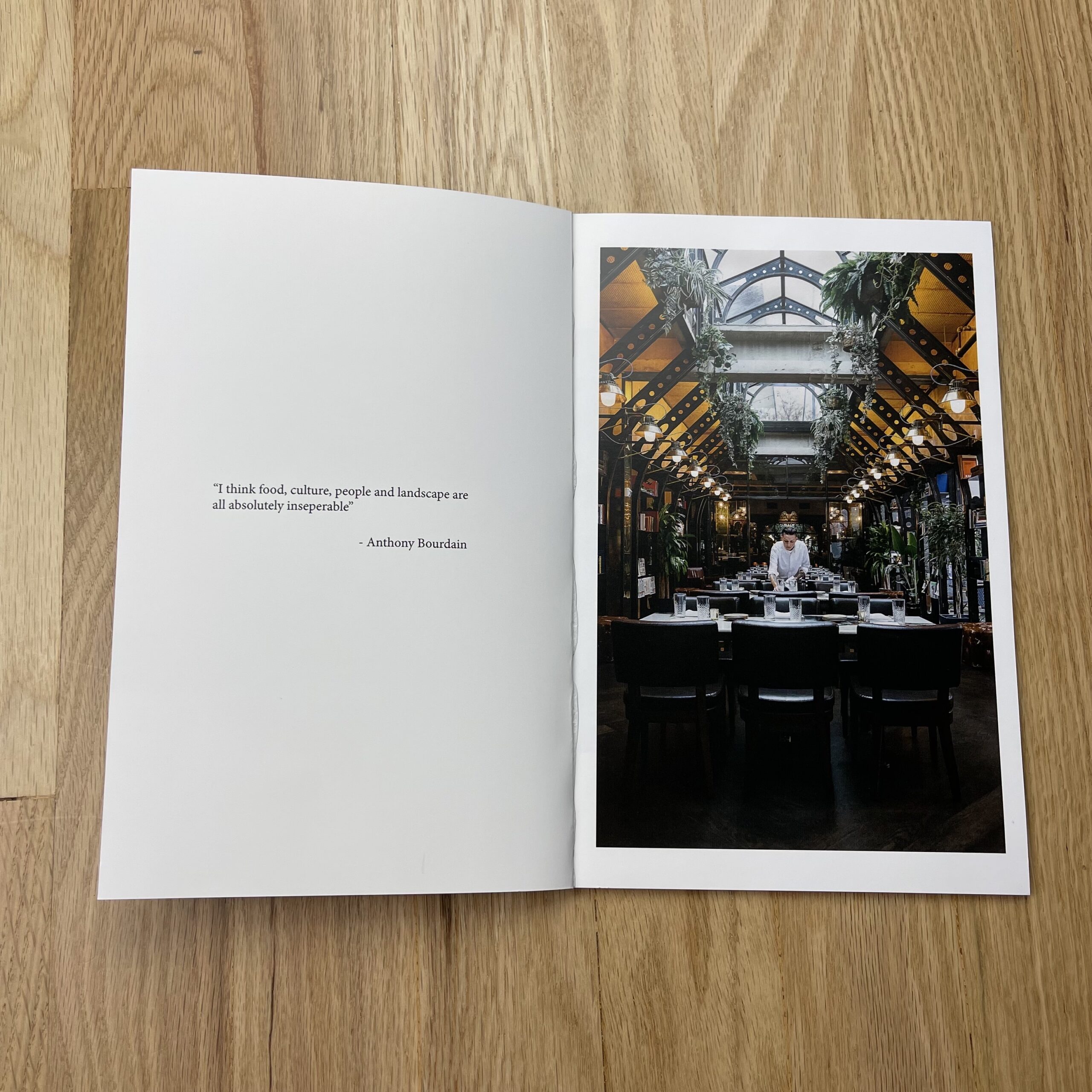
It was a collaboration between myself and Peter Dennen of Pedro + Jackie. I usually have a fairly clear idea of the overall look and feel I’m after, but Peter was particularly instrumental in putting this one together.
I’ve worked with Peter on web edits, print book edits and a couple of promos. It’s always a conversation, which is as it should be, I think. Obviously one characteristic of a good conversationalist is the ability to listen, and Peter is not only good at that, but he’s good at parsing the necessary information from the conversation. He’ll also tell me if he thinks I’m headed in the wrong direction, which I appreciate. Of course, I’d like to think that doesn’t happen too often! But Peter has frequently made visual connections in my work that I might otherwise have missed.
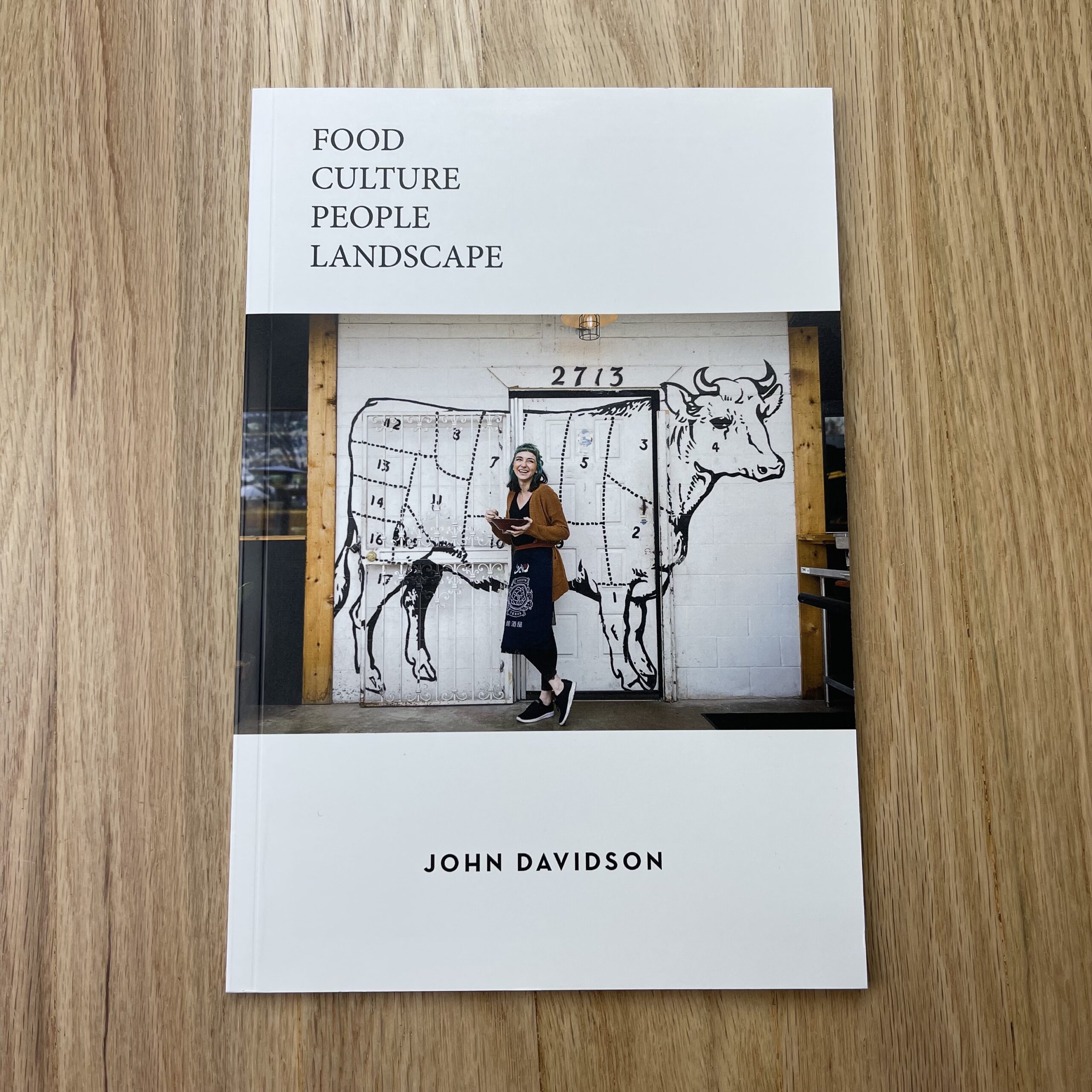
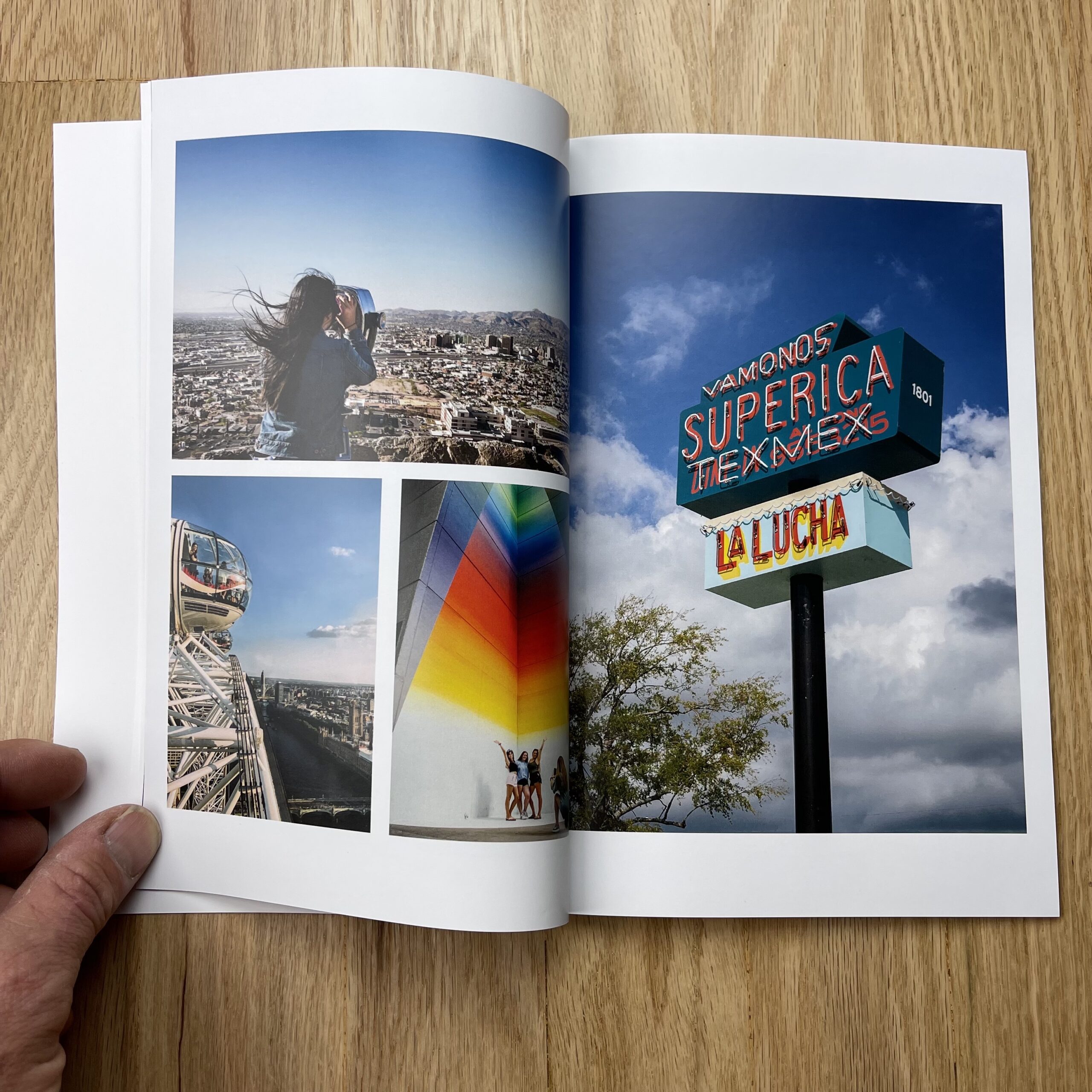
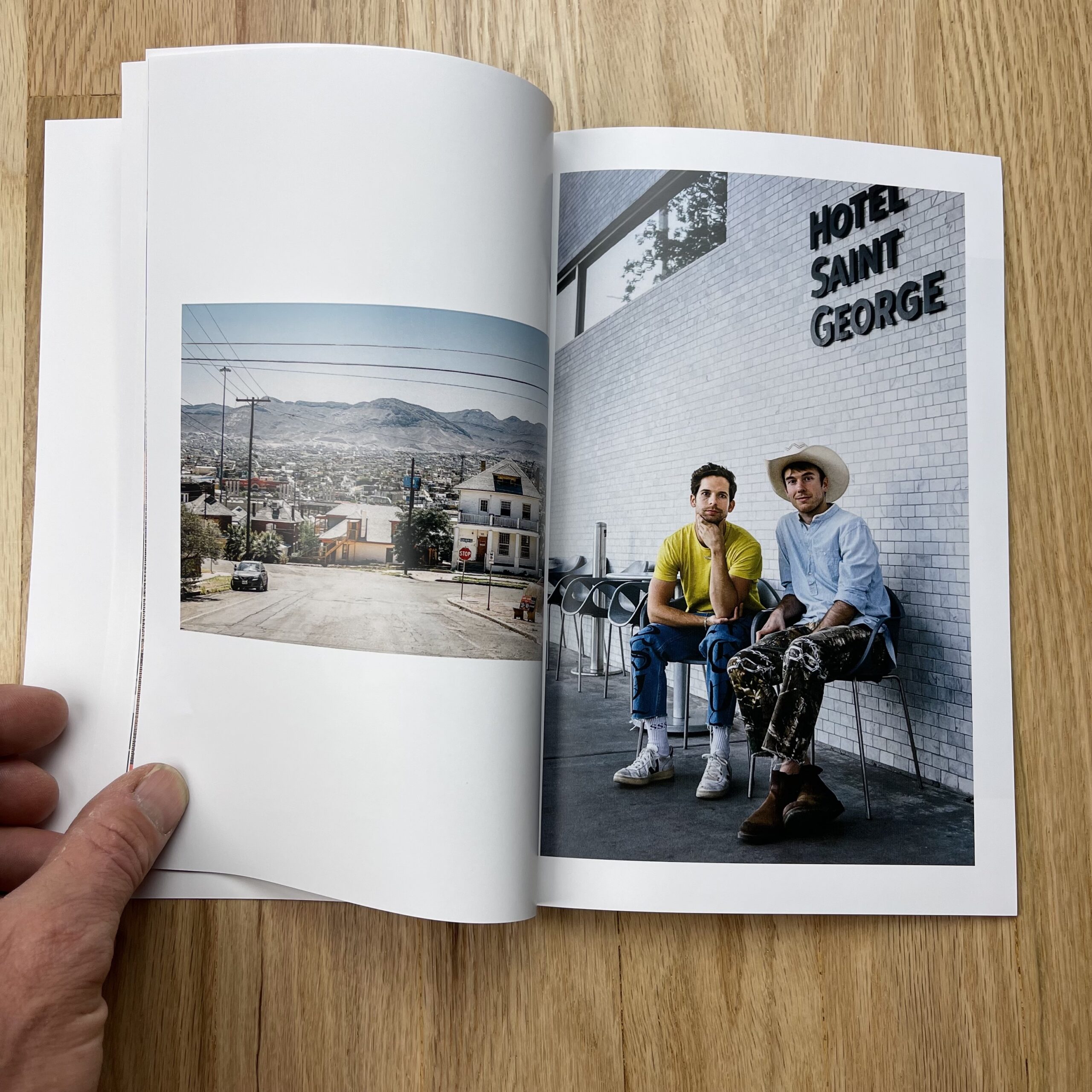
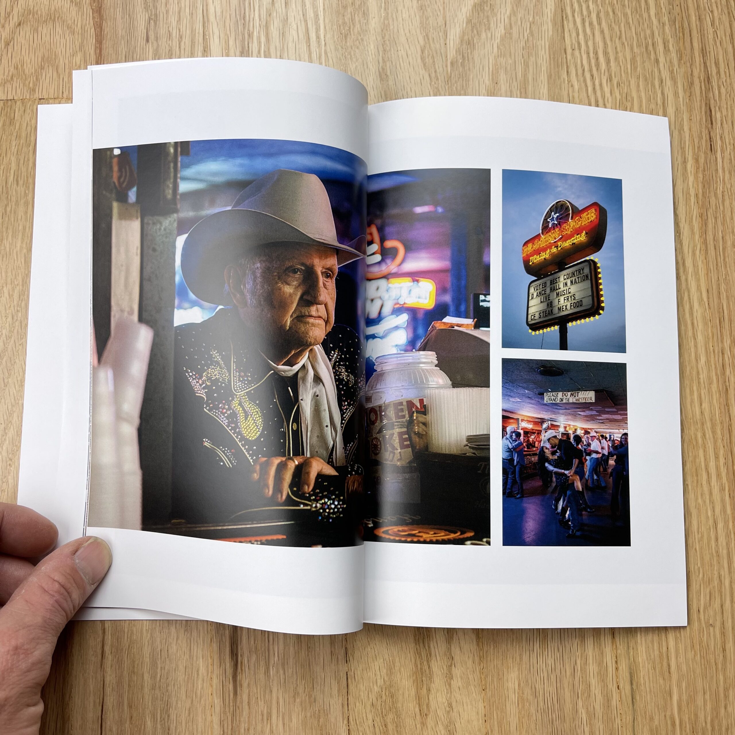
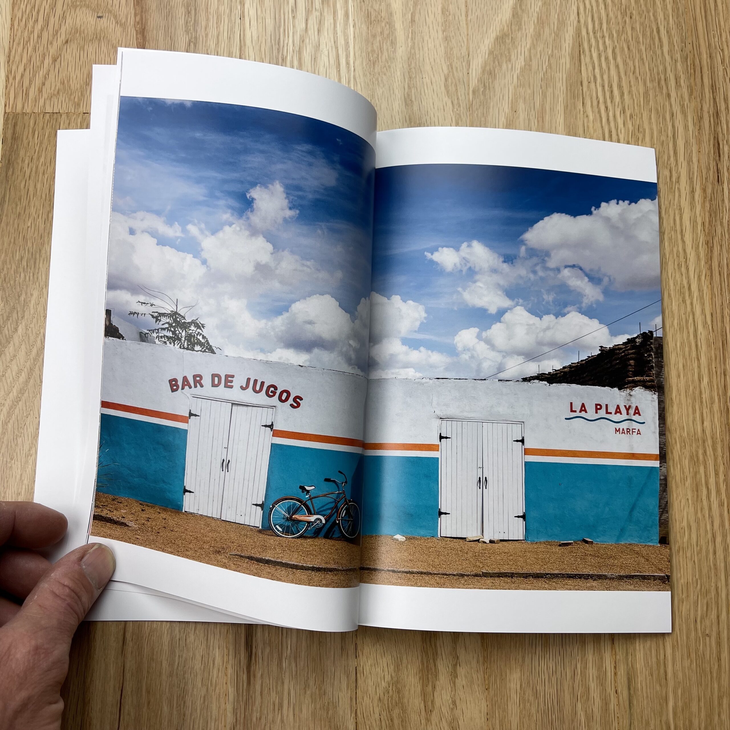
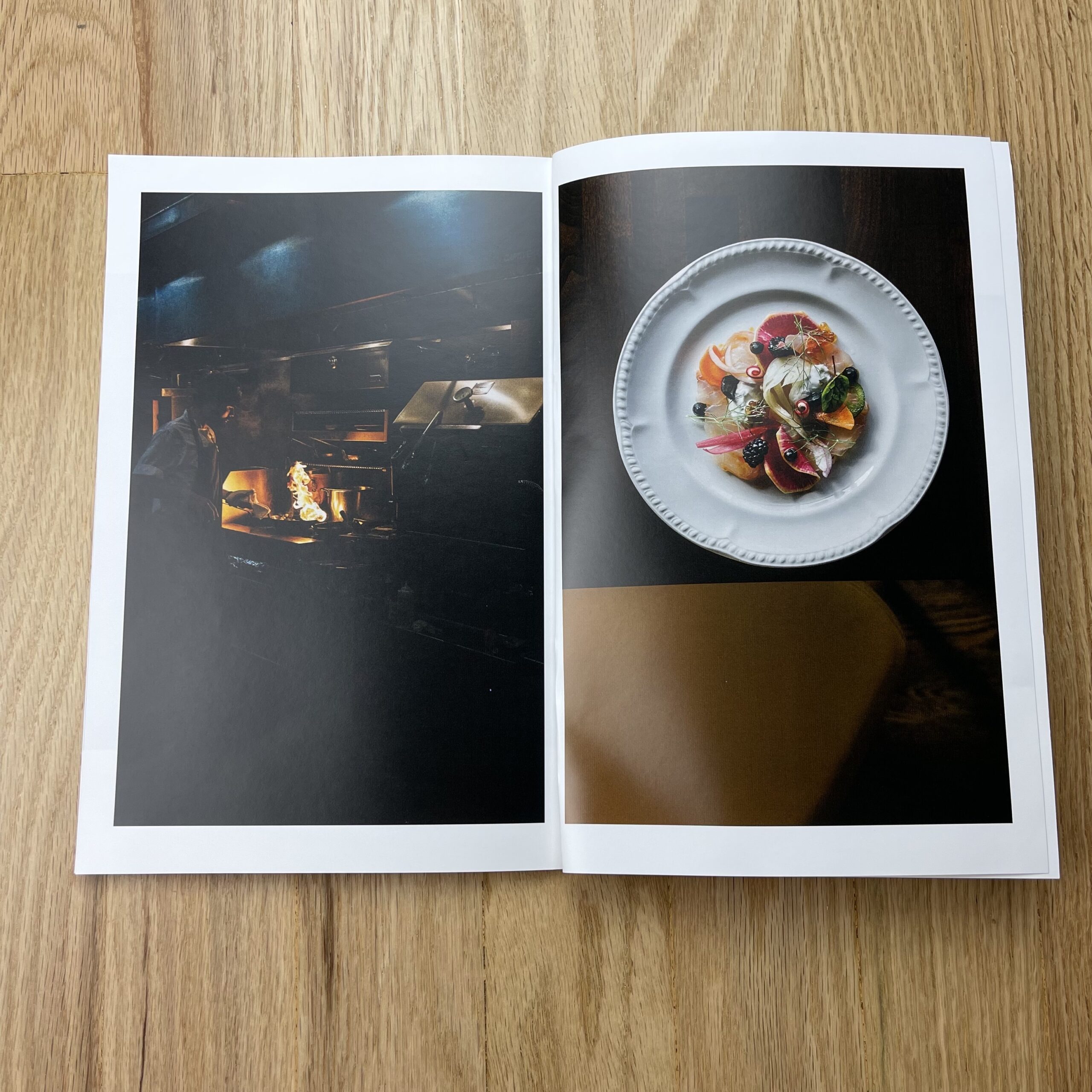
Tell me about the images.
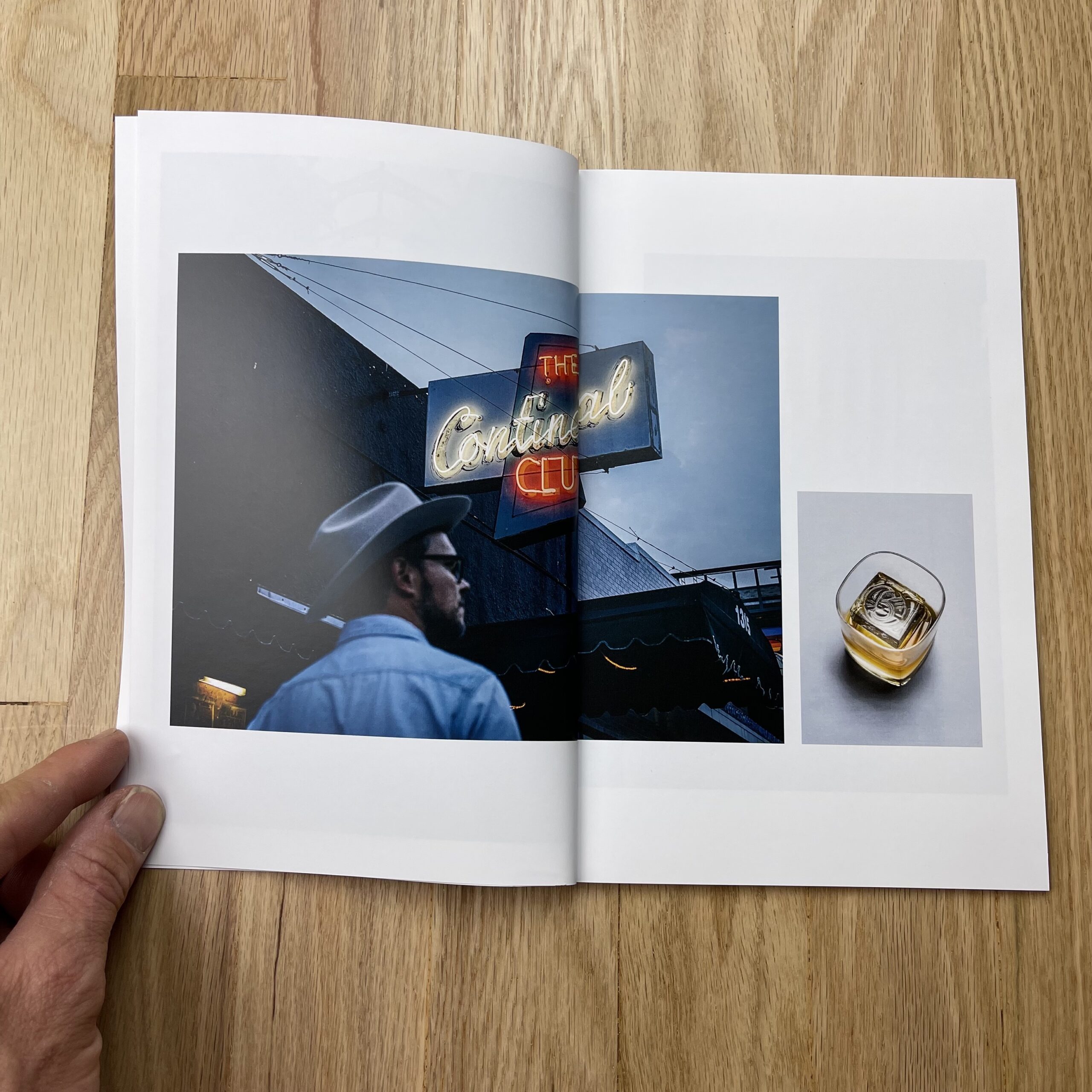
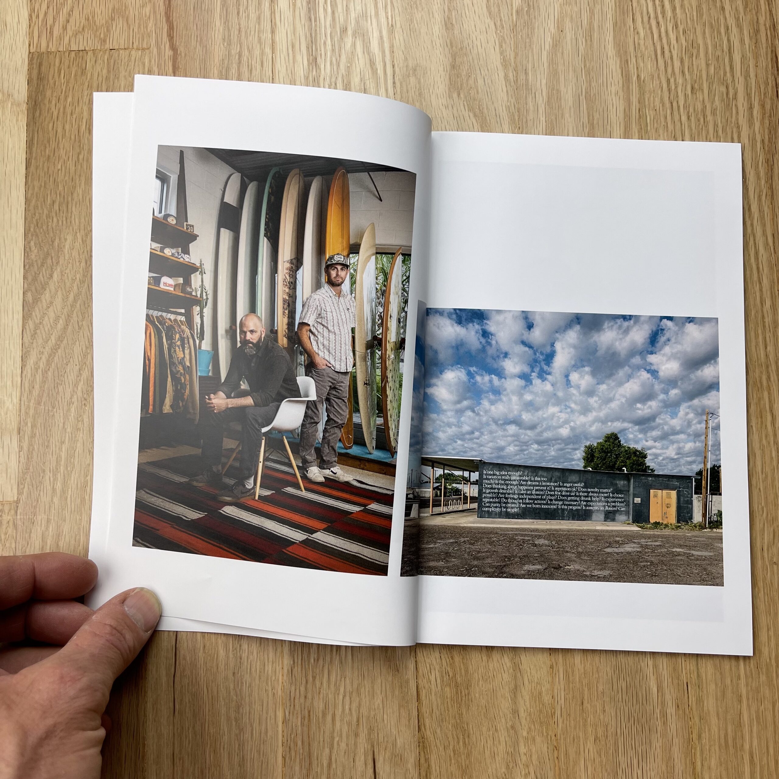
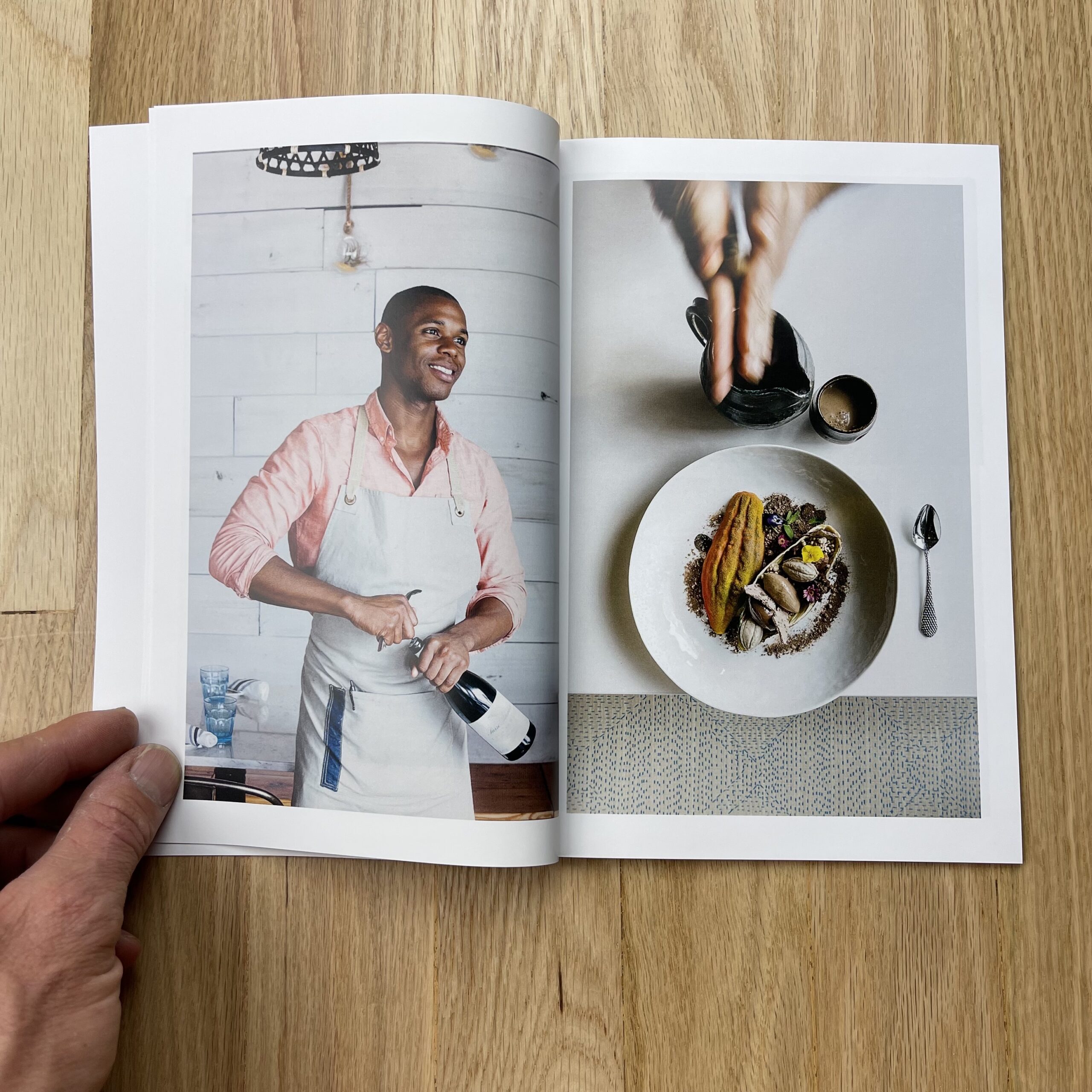
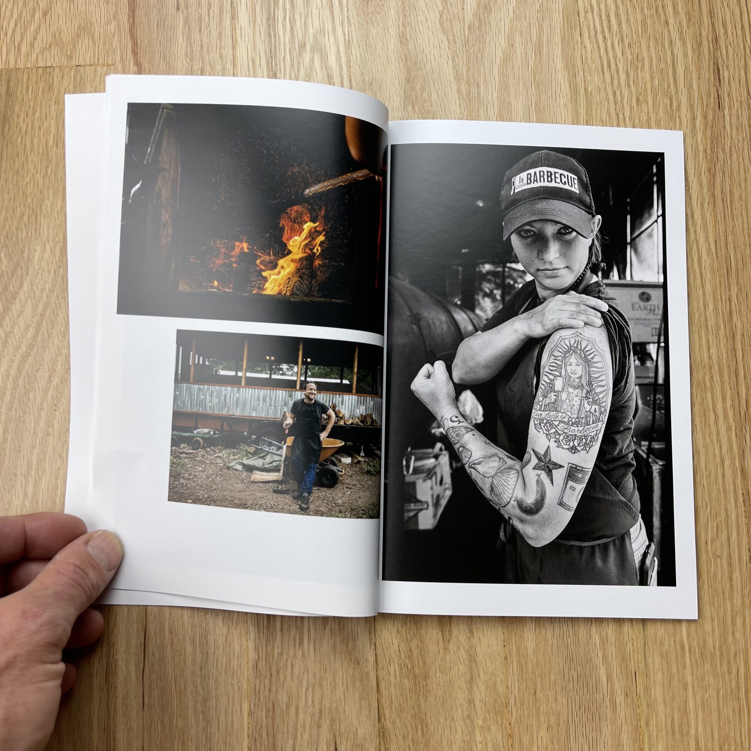
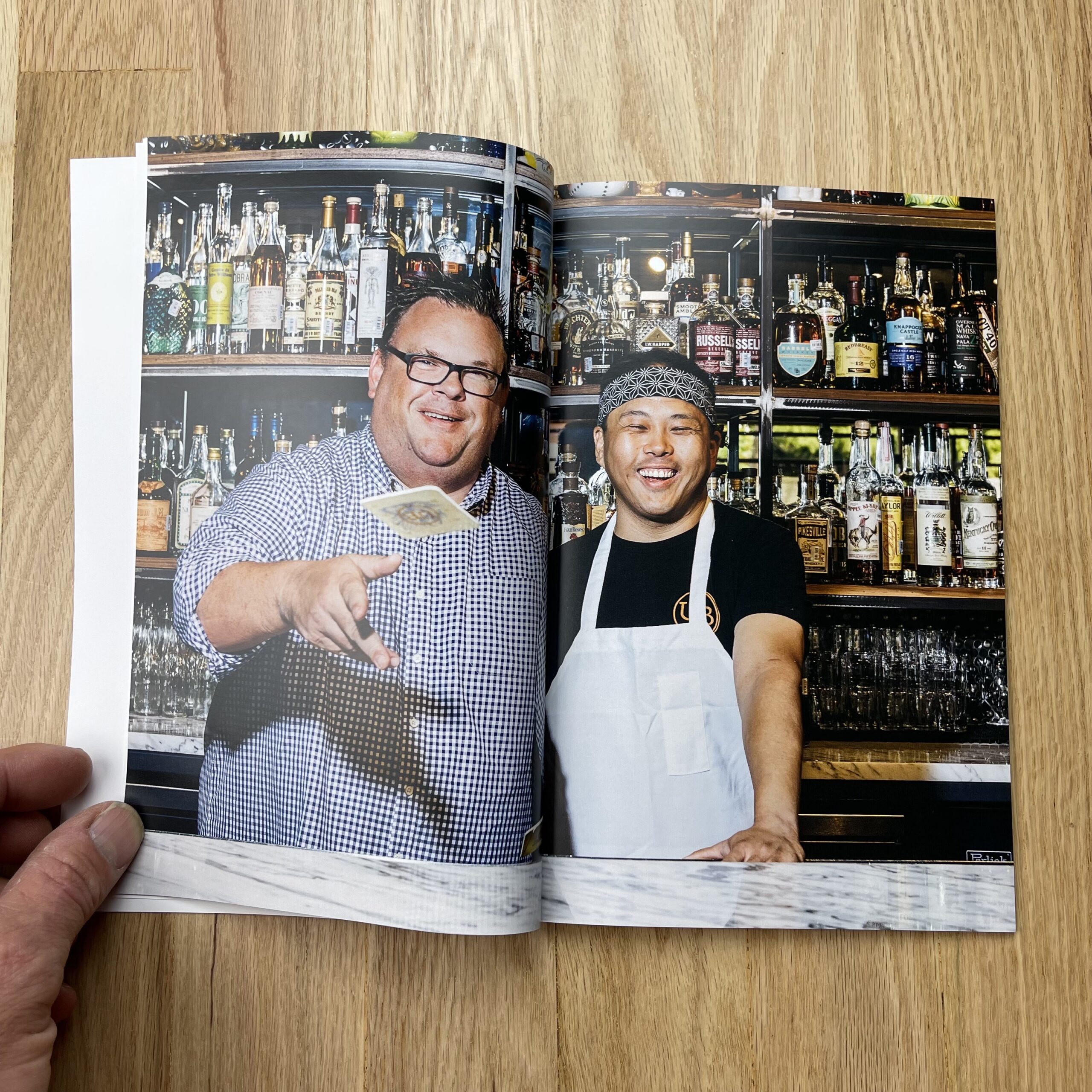
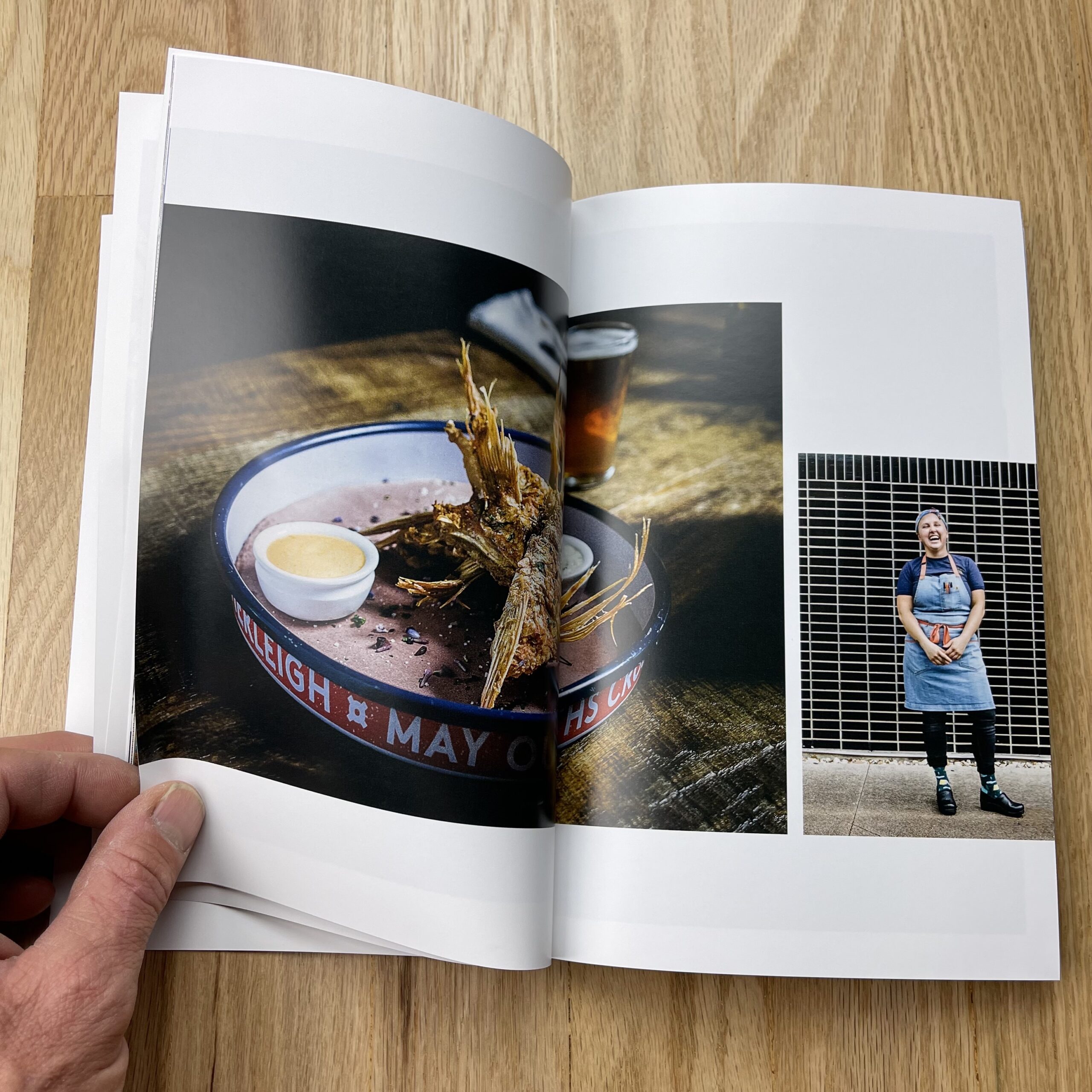
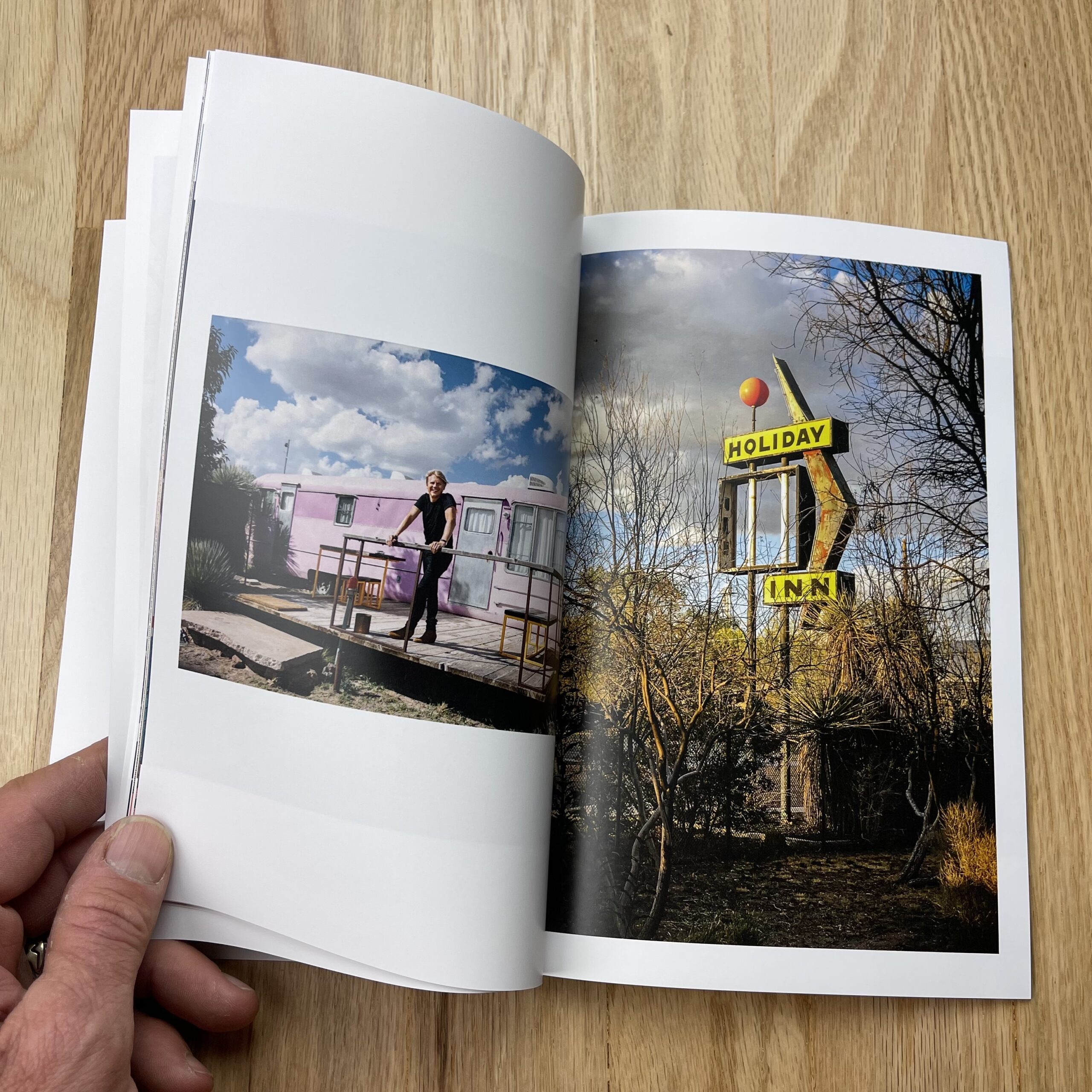
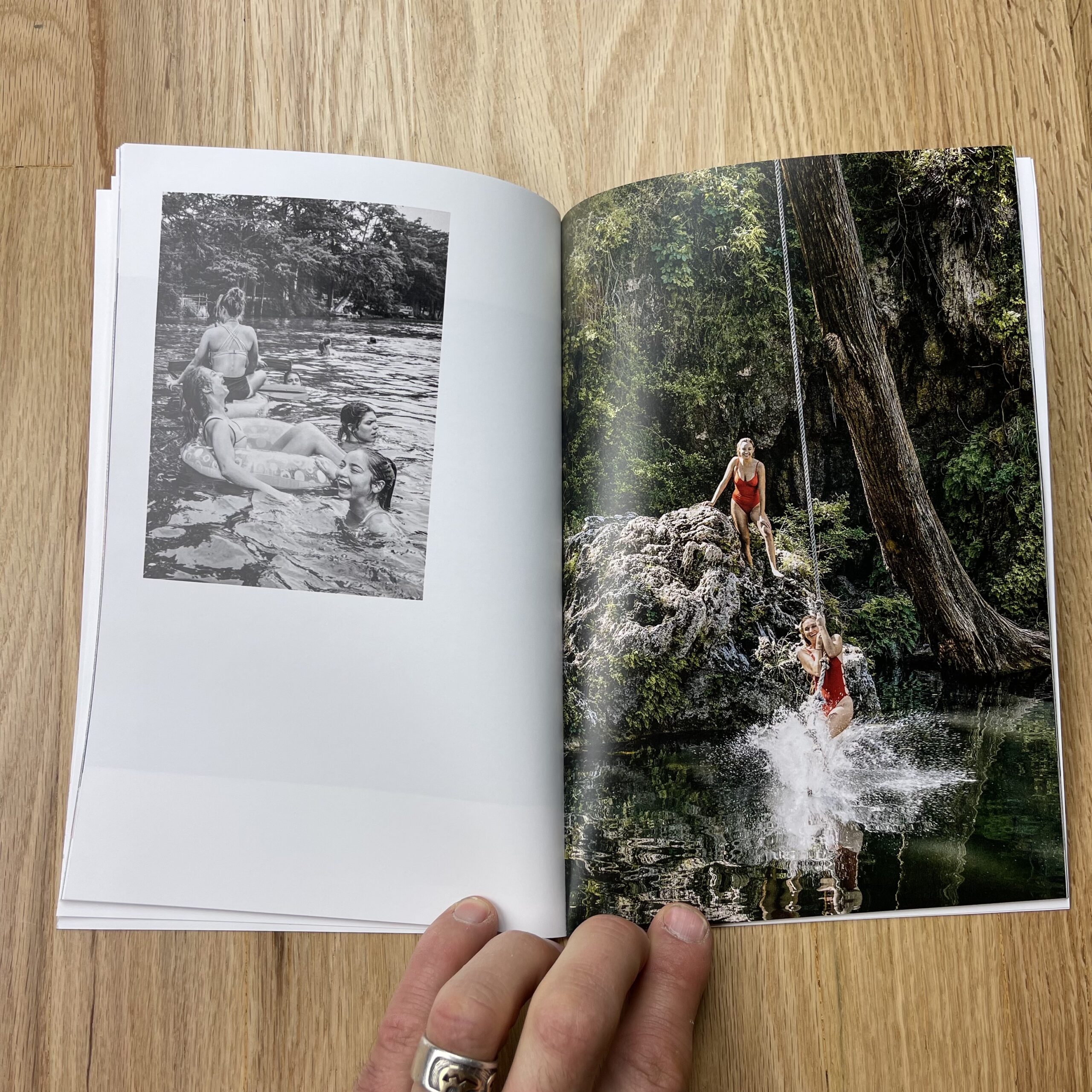
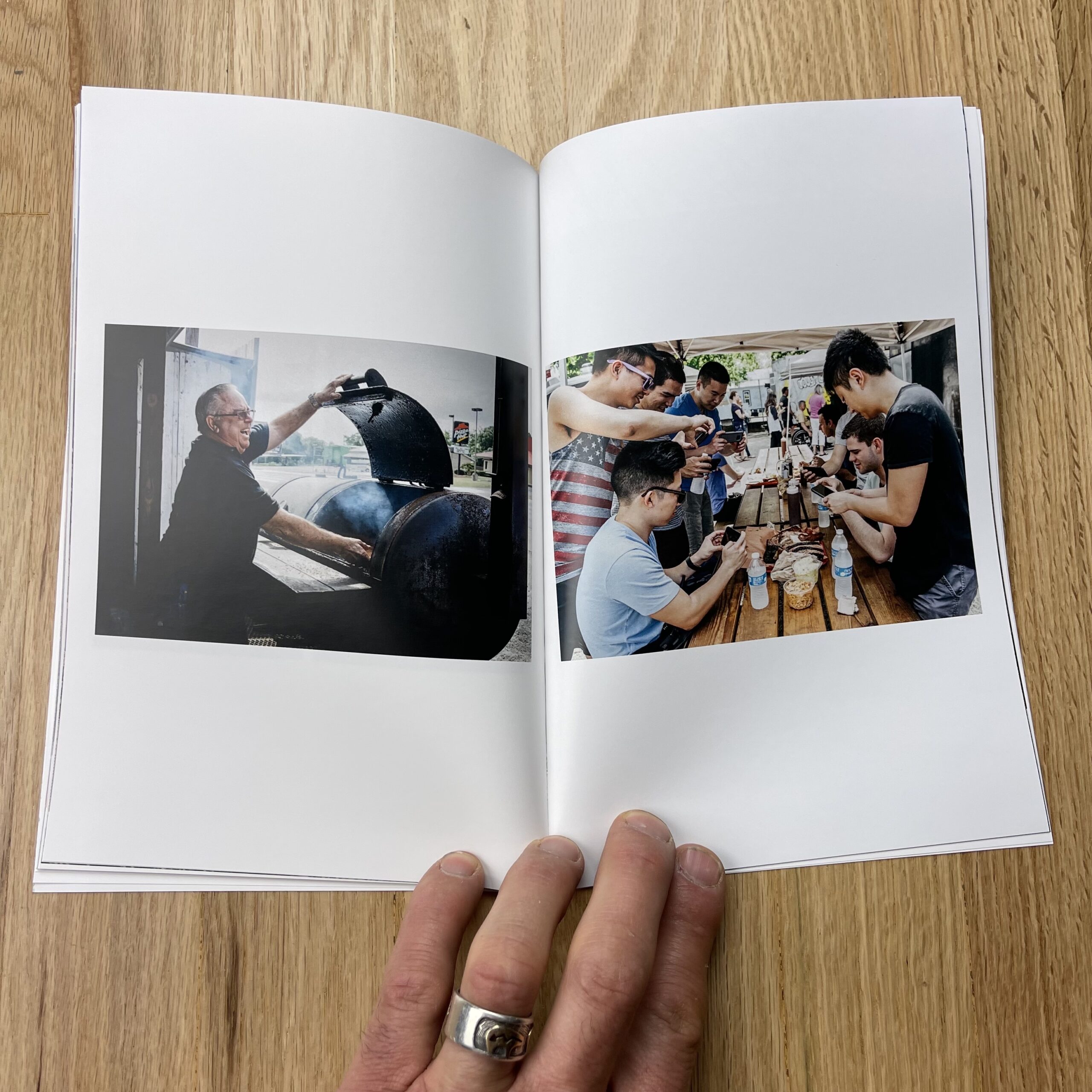
I conceived of this promo mostly as an introduction to this element of my work for potential clients who might not already know me or my work. With that in mind, I drew from a larger body of work rather than the most recent work specifically.
One of numerous privileges of my long relationship with Texas Monthly is that I’ve covered Texas far and wide… and as we know, it really is far and wide.
I think there’s only one image that’s not from Texas (it’s potentially a little awkward thematically, but I don’t think it registers in a huge way visually), so I think it really grounds me as a Texas-based photographer (for better AND most definitely for worse!).
How many did you make?
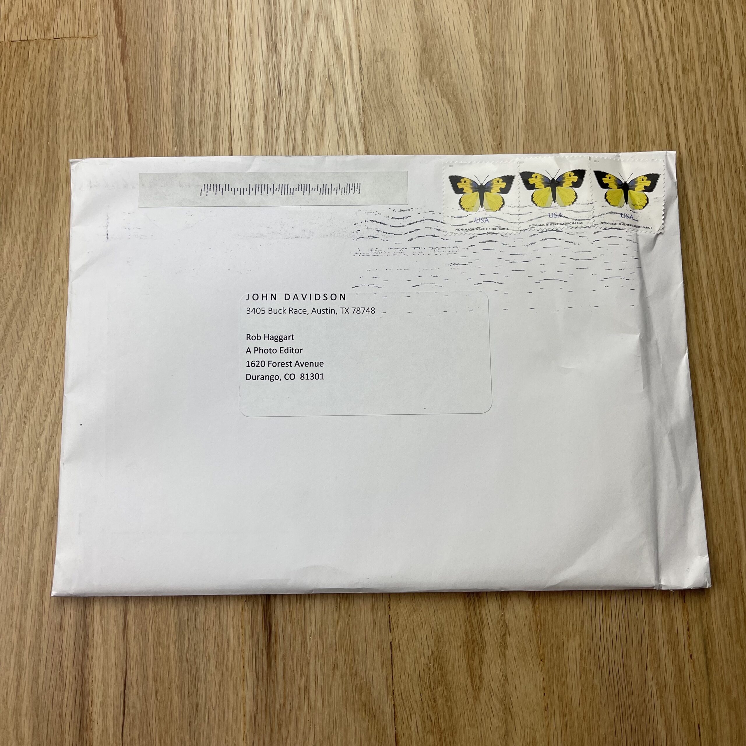
60. It’s a 28 page booklet, and it’s a fairly targeted campaign. I felt that I could order more a little later if needed.
We also designed a large-format hardcover print book that was largely based on this booklet. I intended ordering a handful of these books, thinking I’d show them at portfolio reviews and also send a couple to the likes of Wonderful Machine for them to show at their client meetings. Then the pandemic happened before I had chance to order them.
How many times a year do you send out promos?
In a normal year 3-4. I try to put together one booklet or at least a tri-fold, and beyond that, I typically send out a couple of postcards every year too.
But of course, this wasn’t a normal year…
Do you think printed promos are effective for marketing your work?
How much space do we have to devote to this subject?! Typically, I would say yes. The message when it comes to effective marketing seems to be about consistency across multiple channels. As many of us would admit, this a theory that isn’t always put into practice with as much reliability as we’d like… That said, I think a good printed piece is always going to resonate. Done well, it shows an extra level of care and attention to detail.
However. What about in the midst of a pandemic? What about now that work culture has irrevocably changed, and many art buyers, art directors, and editors won’t be returning to the office with anything approaching regularity? Truth be told, these promos were delivered to me literally DAYS before we went into our first lockdown. I sat on them for a year because who was going to be in an office receiving them? I finally reached the point that I felt they had to go out if they were to represent current work in any way. I sent them out in the knowledge that a significant number of them wouldn’t reach their intended audience, yet 50% of something beats 100% of nothing.
Meanwhile, the email boxes of industry creatives overfloweth. Honestly, I empathize with them. Who can possibly keep up? But right now, even as many emails will go ignored out of sheer necessity, it’s still the best option we have in terms of reaching creatives. This is obviously a time to nurture established relationships as well as seek to make new connections.
With all of this in mind I recently worked with a designer to create an attractive, adaptable email template, hoping to up my email game. Whatever we can do to grab a moment’s attention, right?
1 Comment
Lovely series of images. They work so well together. (Even though we share the same last name – no relation)
Comments are closed for this article!