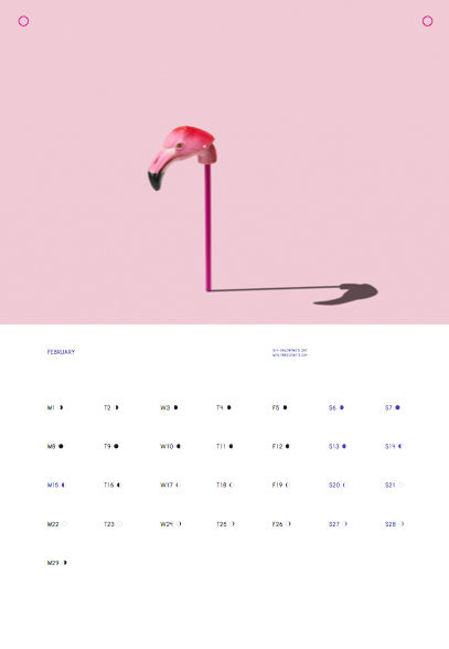
Who printed it?
The calendar was printed in San Francisco by Spot Graphics.
Who designed it?
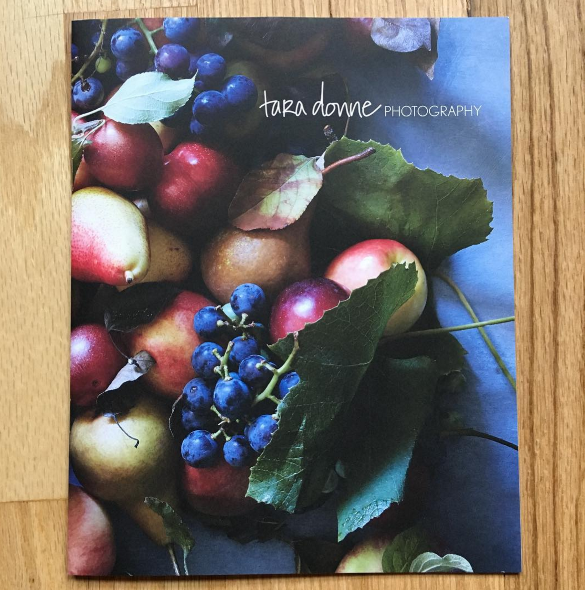
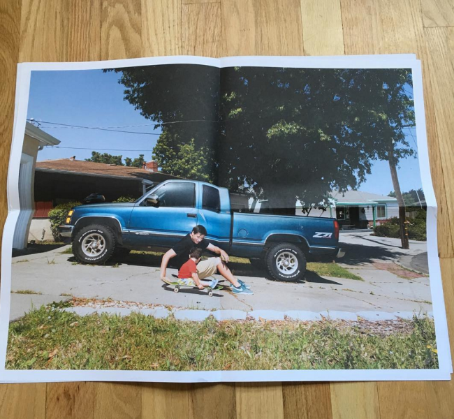
It was designed by the team at Manual Creative also in San Francisco. I had worked with CD Tom Crabtree a number of years ago on the “Looseleaf Editions” project. It was one of the most interesting briefs I had ever received. Basically, the concept being to interpret a landscape through still life. I loved the way the project came together and when the idea of making a calendar as a promo piece surfaced, Tom immediately came to mind. The format of “Looseleaf” reminded me very much of a calendar but a really cool one! I thought that from a design sense it would make sense to approach Tom about the concept and he was very receptive to it.
Who edited the images?
The team over at Manual refined the edit. I had given them an initial grouping of images I was interested in using and they came back with a great selection in their first version. I think in the end we only ended up changing one image. The one caveat I had was that I wanted to showcase both my landscape and still life work.
How many did you make?
I sent out around 1200.
How many times a year do you send out promos?
I send out 2 promos a year. One comes from my studio, and in this case was the calendar, and the other comes from my rep, Giant Artists. I think two provides a nice balance without overkill. The Giant Artists promo typically showcases more commissioned work and the one I put out can be a bit more conceptual. I really wanted to make something this year that people could use and I do hope that people utilize the calendars; mark them up, cut them up, live with them, and interact with them. It might even be that this becomes a piece that I make each year. I feel like there are so many ways to approach the promo piece. There are a lot of fun to conceptualize and use your own work in any way that you want to.
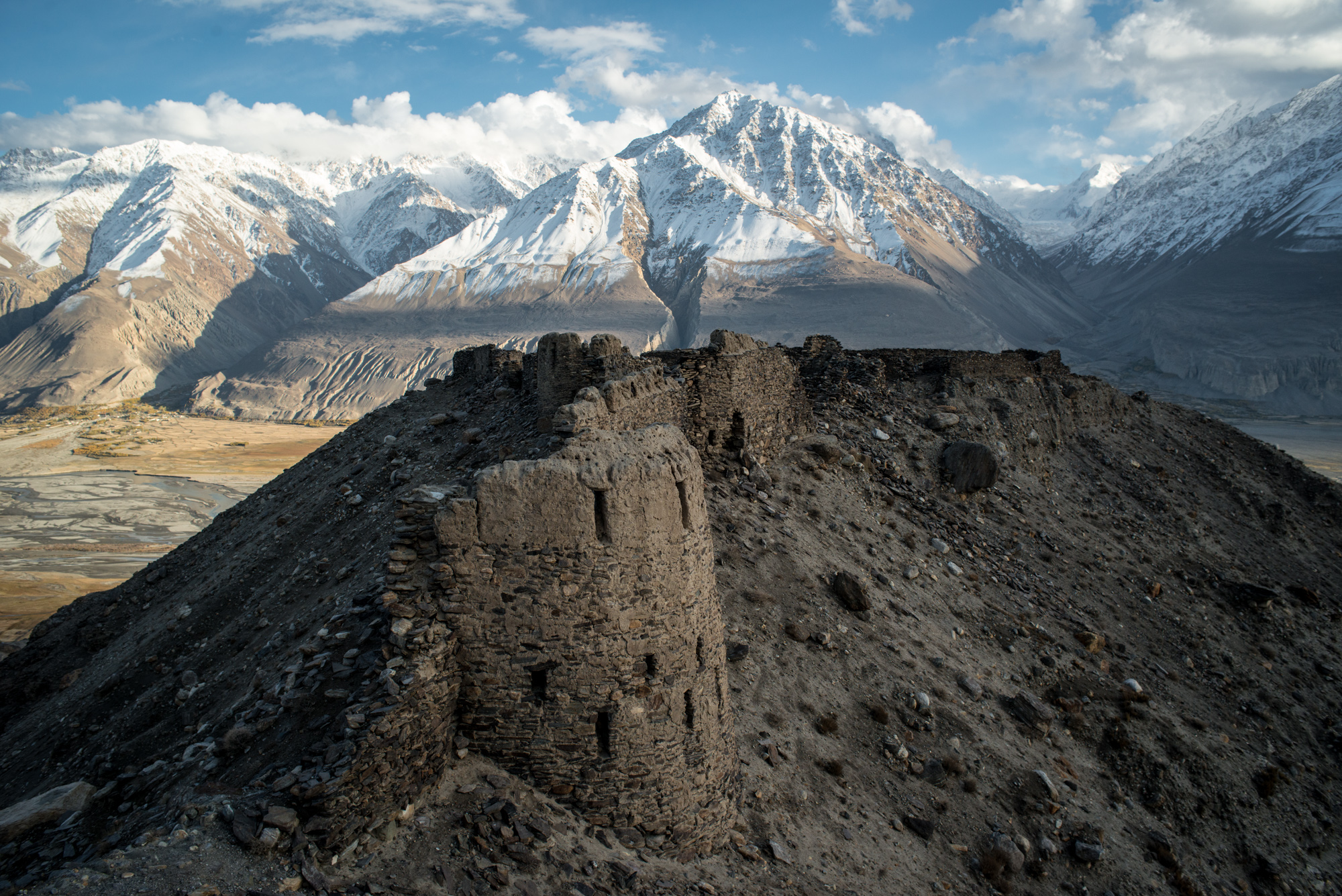
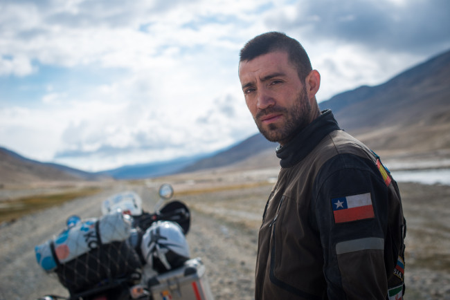
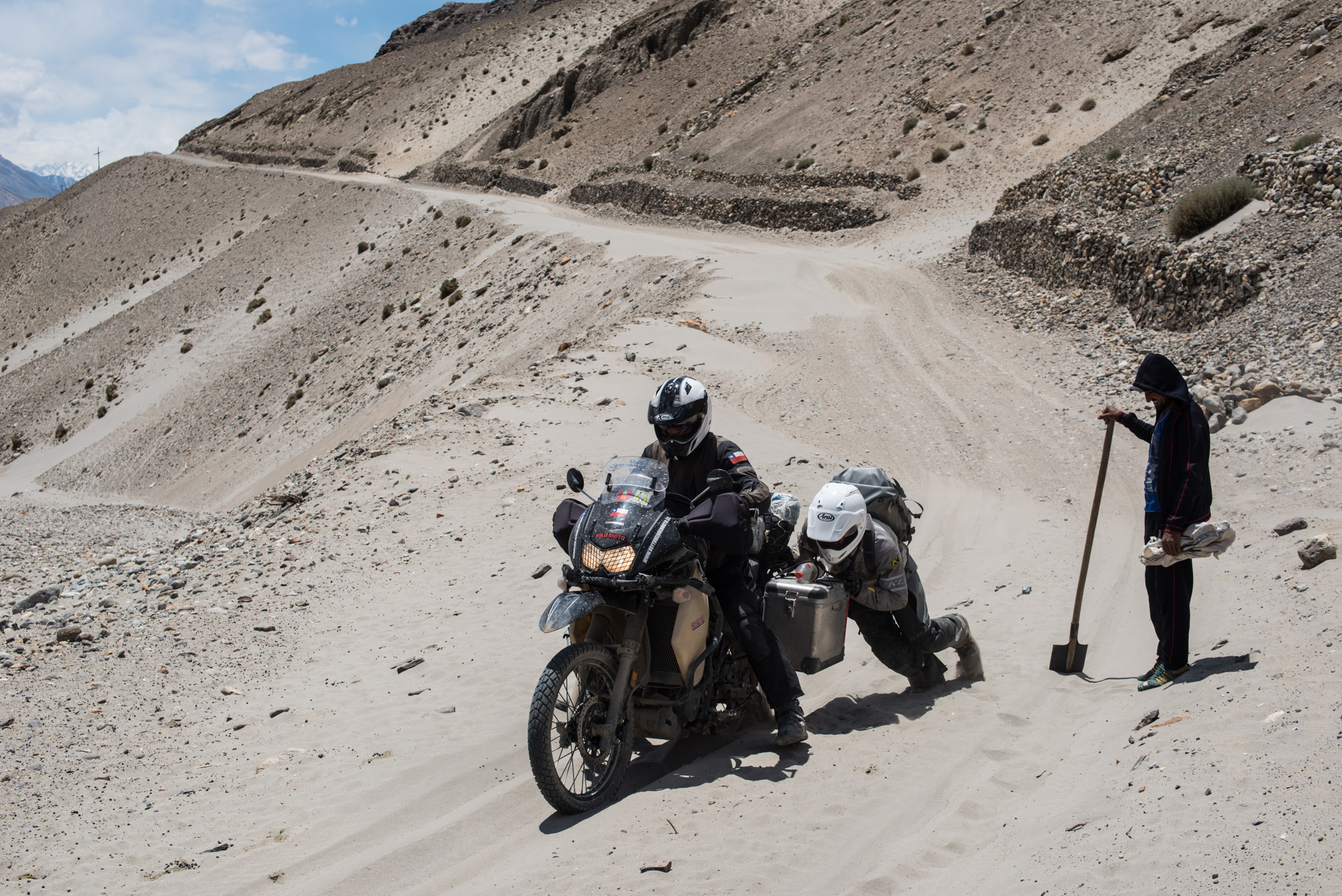
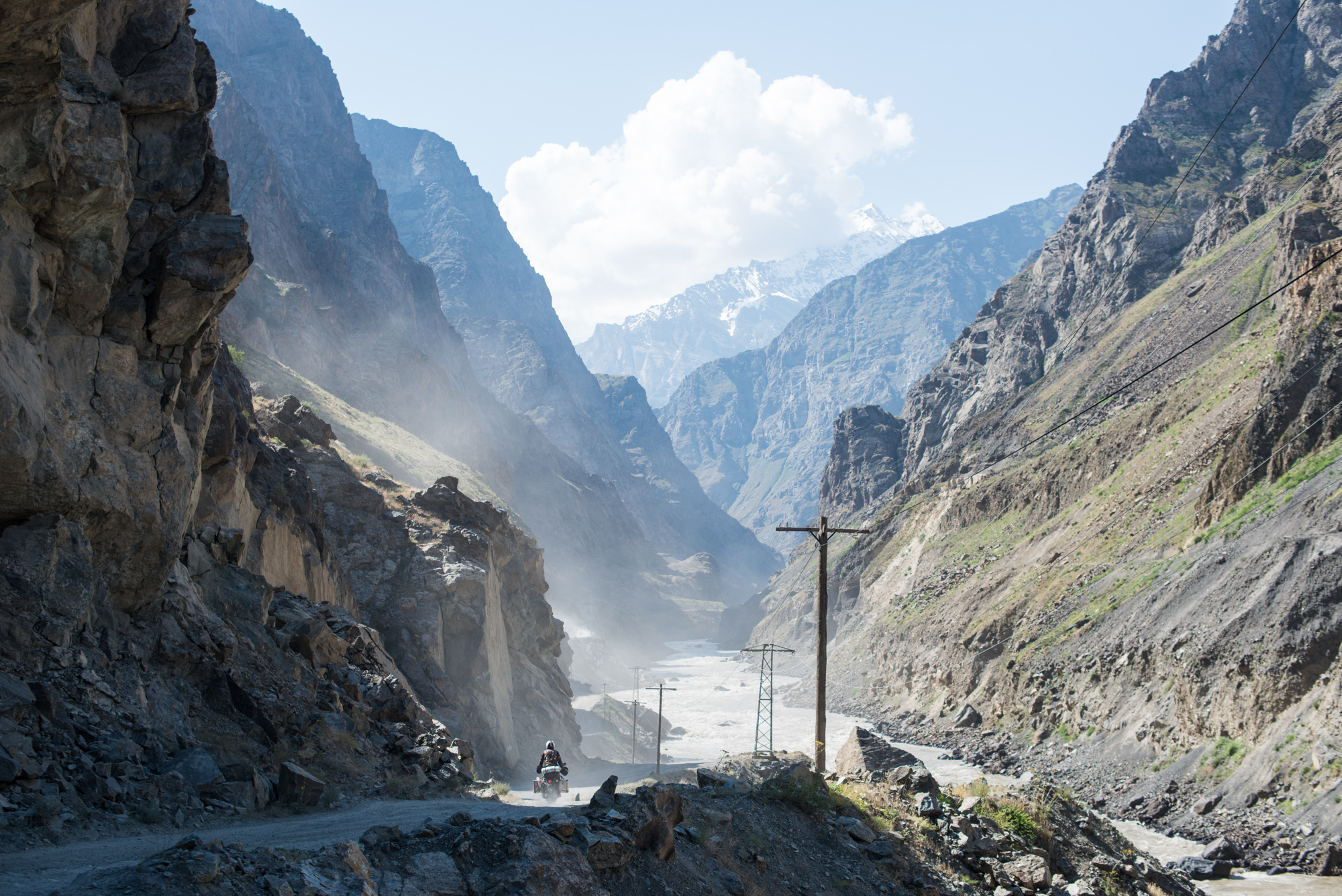
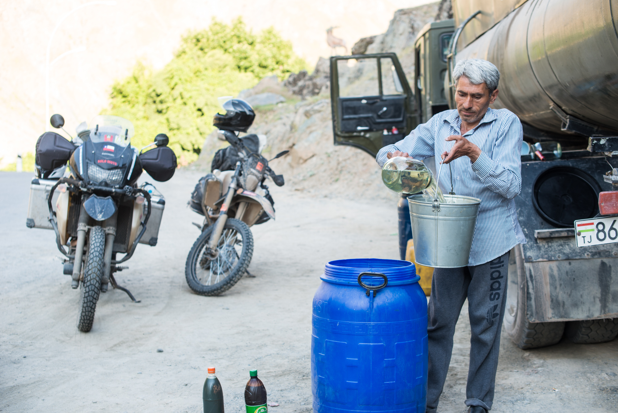
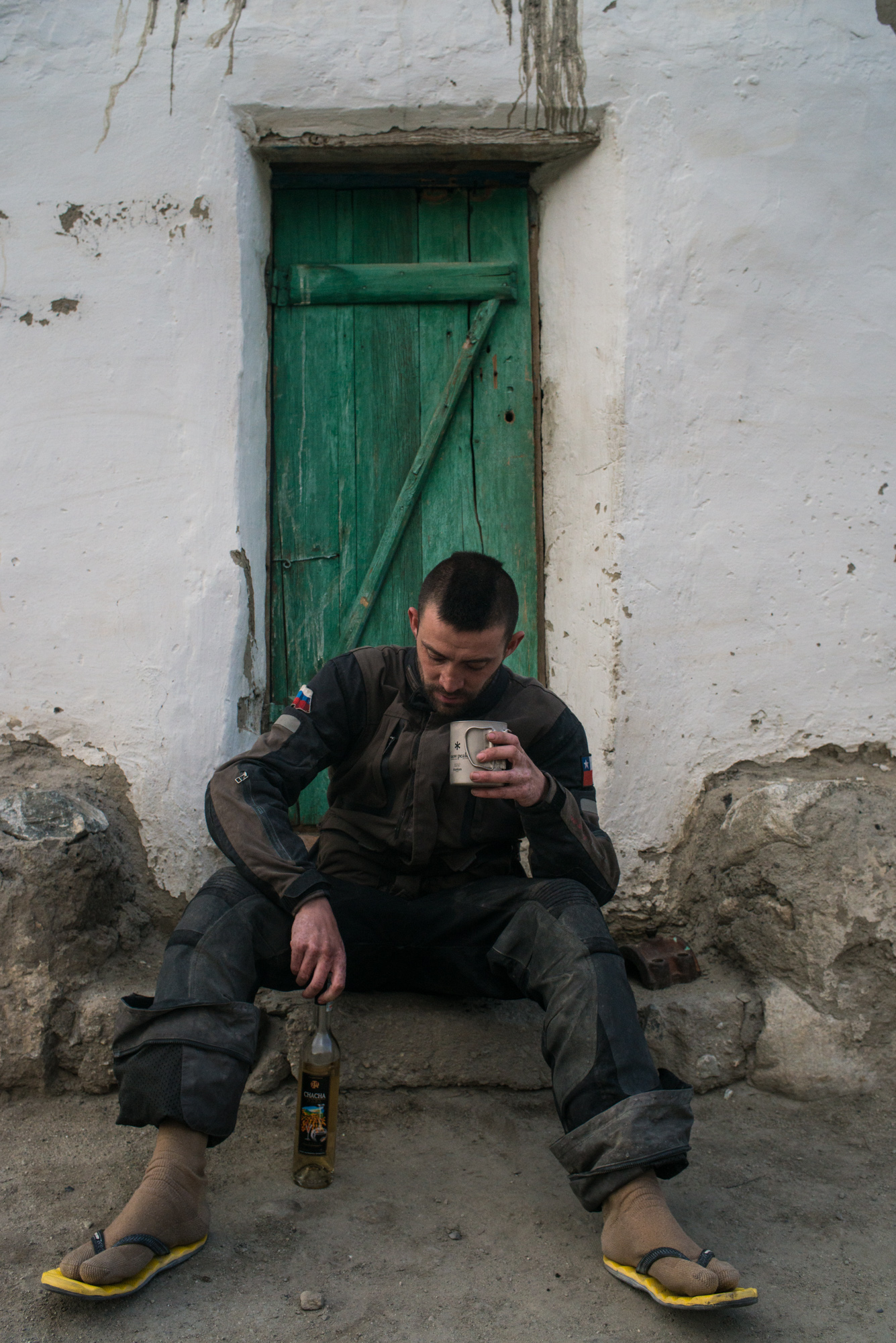
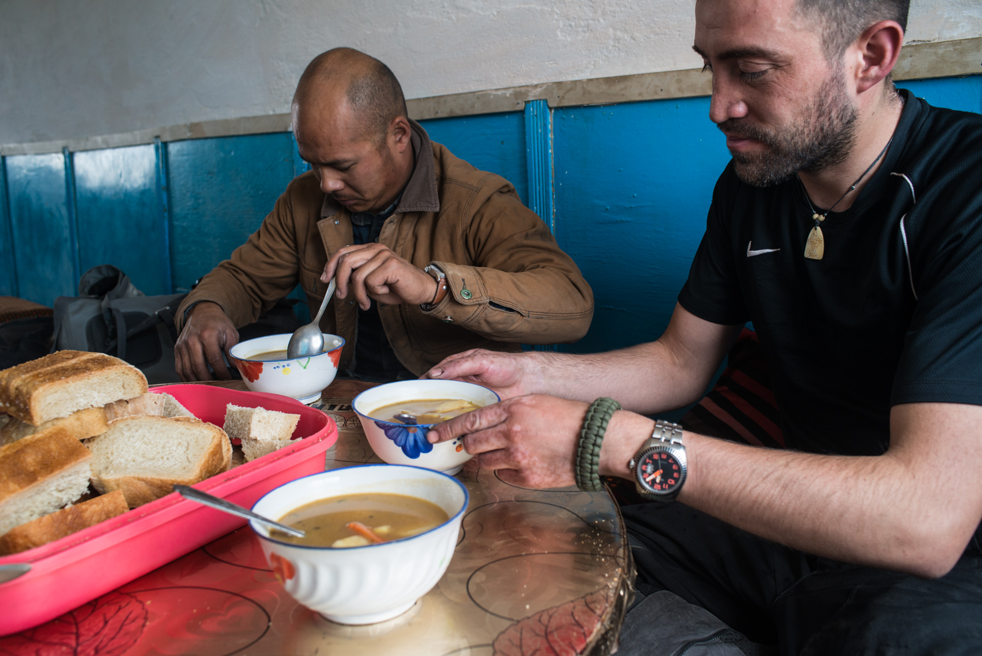
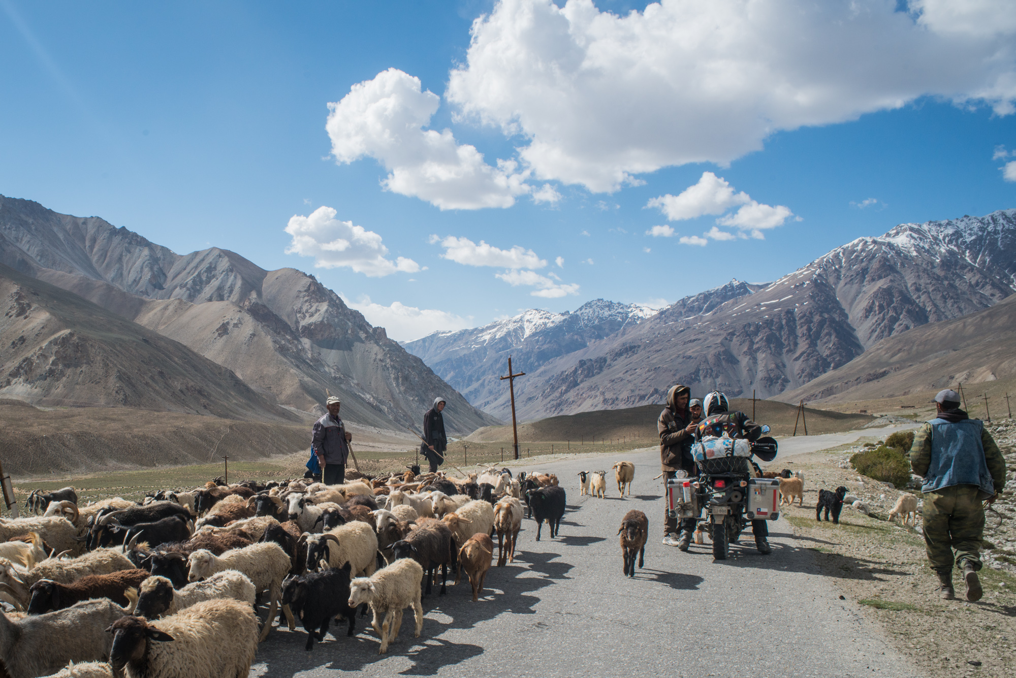
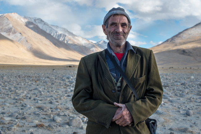
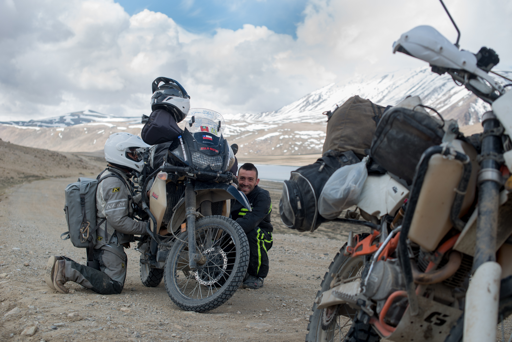
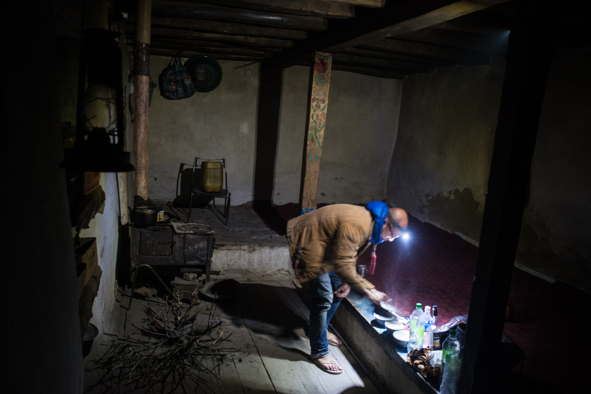
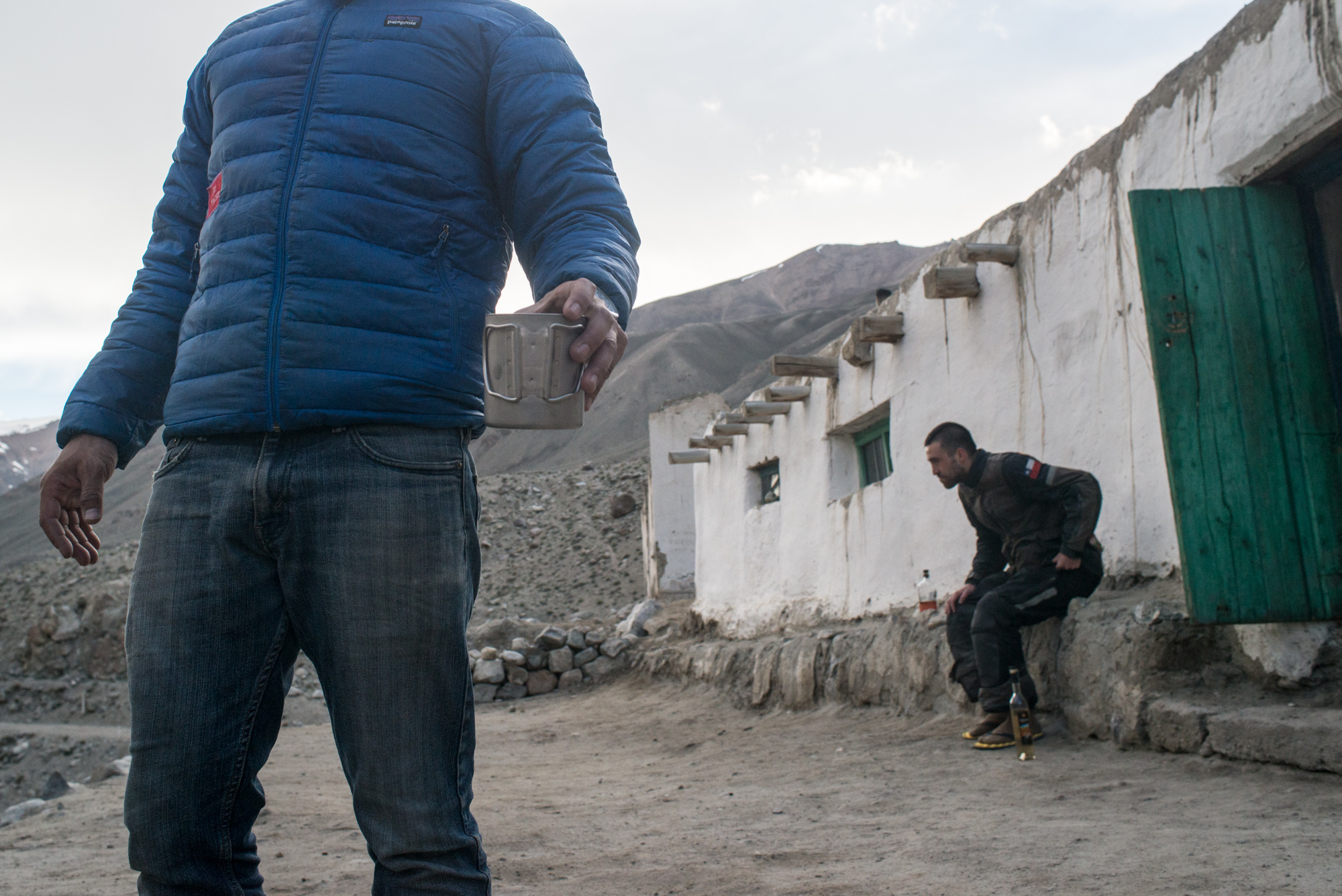
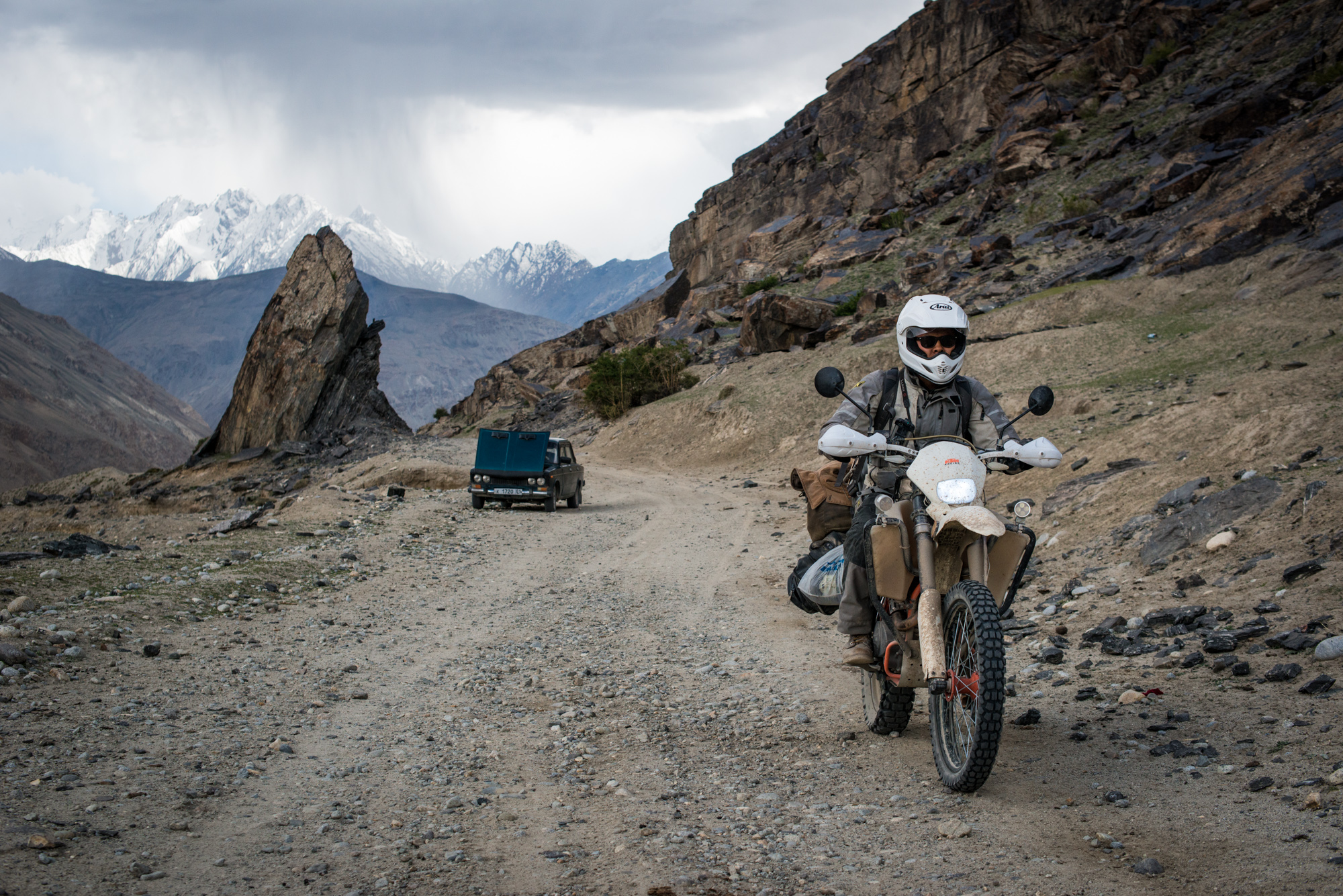
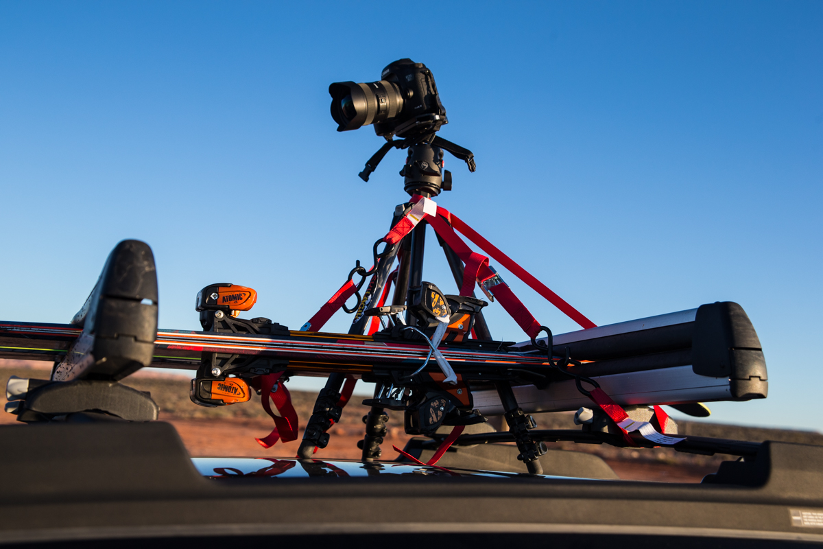
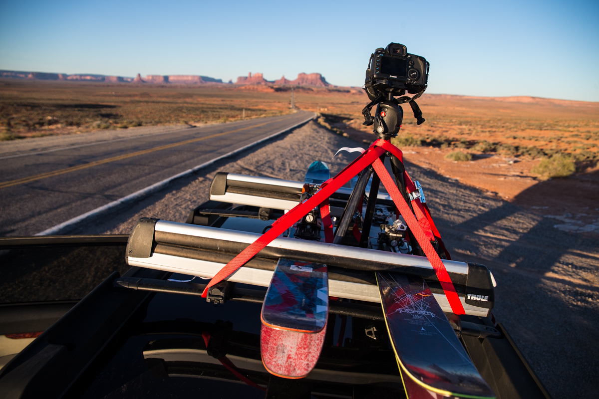
How often do you do spec or self assigned travel jobs? I don’t do spec jobs that often per se but I always keep an eye open for an opportunity whenever I’m traveling. This particular piece was conceived while on an assignment in Tajikistan. I was a part of a team going to teach a photography/story-telling workshop in Gorno-Badakhshan region of Tajikistan. To get to Khorog, the capital of the region, we flew into Dushanbe and were forced by weather to drive rather than fly. So a 2 hour helicopter flight turned into a 17 hour ride in a fully packed Toyota Forerunner. Originally we were going to fly a helicopter through the Himalayas the group was understandably a little bummed; however the trip by road was an battering steel-lined-bouncy-castle of a ride. I simply had to come back and do a longer version on motorcycle. As luck would have it, by the end of our assignment we had a return trip planned and I began research on what our extended route would be. Having finished the trip and told some stories to my rider buddies, I’m convinced a lot of people would enjoy the tale and may even find it inspirational enough to go on one like it themselves. So I’m pitching it around.
Have you had success with this before?
I have had success with this before but beyond the obvious magazine coverage, it’s always the weirder spin-off stuff that makes it more interesting. The last time I did this sort of thing I was going to Thailand on a mountain bike trip with a bunch of guys from my local riding group. We had planned an epic weekend around a local “friends match” and I actually didn’t intend on shooting much. However, as soon as we got to the mountain I met a couple of the event organizers and a writer covering the race and that was that. I covered the event and the photos were picked up by a UK riding mag and a mountain bike apparel company. It also turned into 4 more days of shooting stills and video for the apparel maker.
Who are you hoping to pitch this story to?
I’m planning to pitch the story to some of the more general travel adventure mags first: Outside, Afar, Travel + Leisure, Adventure Travel, Lonely Planet, etc. One of these guys would be ideal as they are more generally in my wheelhouse. If none of them bite however, I’ll move on to the more specific adventure motorcycle rags: Adventure Rider, Road Runner, Overland Magazine, etc.
What does your pitch look like? Basically, I write an email with a hello or an introduction if I don’t know the contact. I include a gripping (but short) narrative summary with a couple of images and then I wait. I don’t like dropping a pitch on an editor cold if I can help it but the nature of my (non)process is such that I sometimes find myself shooting a story I probably haven’t done before. That being the case, sometimes I find an audience I’ve never been in front of before. I try to keep it short and sweet and while I like to be friendly, I understand that most editors are swimming in work and I don’t want my pitch to be heavy. If they’re interested they’ll write back…if not, I move on.
Did you have a writer with you, or you wrote all your own content?
Almost every time I’ve gone out with writer we’ve been on assignment. Since I tend to do these sorts of spec pieces sporadically, almost accidentally, I end up doing my own writing. It’s not that big of a stretch since I tend to journal during my travels anyways and it’s another way of creating a link between my thoughts and experiences and the audience. Interestingly, since there’s another workflow to writing about a trip vs. photographing one, in a circular way this gives me another avenue of relating to an experience while I’m having it.
How do you formulate the story? Do you try and outline something or simply allow it to unfold organically?
Certainly I think it’s important to be familiar with your subject and to have a plan but I also believe, as they say, “strategy is only good until the first shots are fired.” So in a sense I am a reactionary photographer in that, when I’m interacting with a subject, I not only follow it around as it does whatever it does, I let the mood of the thing inform how I photograph and tell the story. For example, I photographed a small town, again in Thailand, during a Chinese New Year celebration. As the day wore on and the festivities developed, things began to get more and more chaotic and fast paced. The drums and gongs turned to a near constant ear-splitting drone and the firecrackers and bigger explosions began to resonate in our bodies. Soon I began adopting that chaotic energy in the way that I photographed the town. The result was a series of images that were full of motion, vibrant colors, and portraits instead of the romantic images of a quaint rural town that they had started out to be. Well, I write and photograph a story in the same way; I let the story describe itself to me. It’s my favorite thing that as I have an experience and let things develop, story eventually begins to take on it’s own form and tell me what it’s meant to be.
Creative Director: D.W. Pine Director of Photography and Visual Enterprise: Kira Pollack Deputy Director of Photography and Visual Enterprise: Paul Moakley Photographer: Benjamin Rasmussen
Was this your first project with Time?
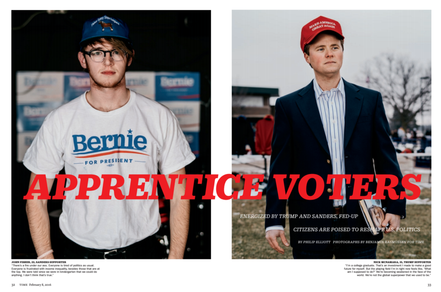
Yes, this was my first assignment with Time magazine, so I was pretty terrified going into it. I grew up in the rural Philippines and every couple of months we would get our mail and there would be a pile of Time magazines to explore. It has always been the one that got away and has a lot of my favorite photo editors, so I was both incredibly excited and anxious. I got the call for the assignment on Thursday and then flew out Friday night and shot Saturday and Sunday.
What type of direction did you get from the magazine?
Paul Moakley wanted clean environmental portraits of newly engaged voters. He referenced work that I had done of protestors in Ferguson for Bloomberg Businessweek, which is a style that I usually shoot on Polaroid in really active and sunny situations. It is a flat lighting style that relies on the energy and personality of the person being photographed to carry the frame. I tweaked it a bit because of shooting digital medium format instead of Polaroid and because we were photographing in grey and snowy Iowa.
How did you decide who to approach for a portrait?
Because the style relied so much on the subject, I was really intentional about trying to find people who had a presence to them that could translate photographically. But because they needed to be newly engaged voters and were going to be quoted, they also needed to be thoughtful and articulate. Sam Frizell, the writer from Time, and I would talk with people in line and then tap one another if they would work visually or for the story.
How did you engage them during the shoot?
I would chat at the beginning and build some rapport as we walked from the line to where we were set up to shoot; I would try to listen as Sam interviewed them. During the shoot I would ask them to think through a specific scenario, which would change depending on what they had said during the interview. One man said that the only candidates he had ever liked were Ronald Reagan, Ron Paul and Donald Trump; so I asked him to imagine sitting with the three of them for five minutes and what he would want them to discuss. Or I would ask a person to image the feeling of the evening of November 8 and their candidate declaring victory. This would put people in a thoughtful and internal space, which tended to carry into the portraits.
How long was each portrait?
Sam would interview people for about five minutes or so, and I would photograph them often times for just a few minutes more. We were typically taking people in groups of two – four and were rushing to get them back to the line so that they wouldn’t lose their spot.
I know this was your first job with Time, did you send them promos? Is that how they connected with you or did you have meetings with them prior to the assignment?
Time was near the top of my list when I started doing promo books five or six years ago. And I would always try to come by when I was in New York with my book and show new work and get their thoughts on it. My project By The Olive Trees that I did with Michael Friberg was featured on Lightbox and I have had other interactions with the crew there as well.
I tend to take a pretty long view with these kinds of relationships. I like and respect the folks at Time because I think that they are really good at what they do and they have a passion for good photography. Whether or not I work with them immediately, or ever, doesn’t directly impact how I feel about them. Some of my favorite photo editors work at places that I am not a good fit for, but I will still always keep up with them and reach out because I respect them and love getting their insights.
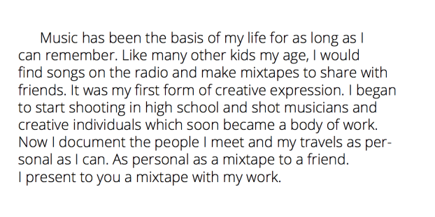
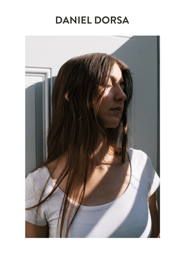
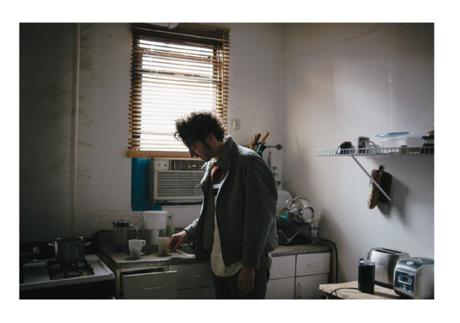
Who printed it? The cassette tapes were made by MilkTape, I printed the J Cards myself, and the business card was printed by Mama Sauce.
Who designed it? A long term friend of mine, Devin Jacocviello, designed the tape as well my business cards.
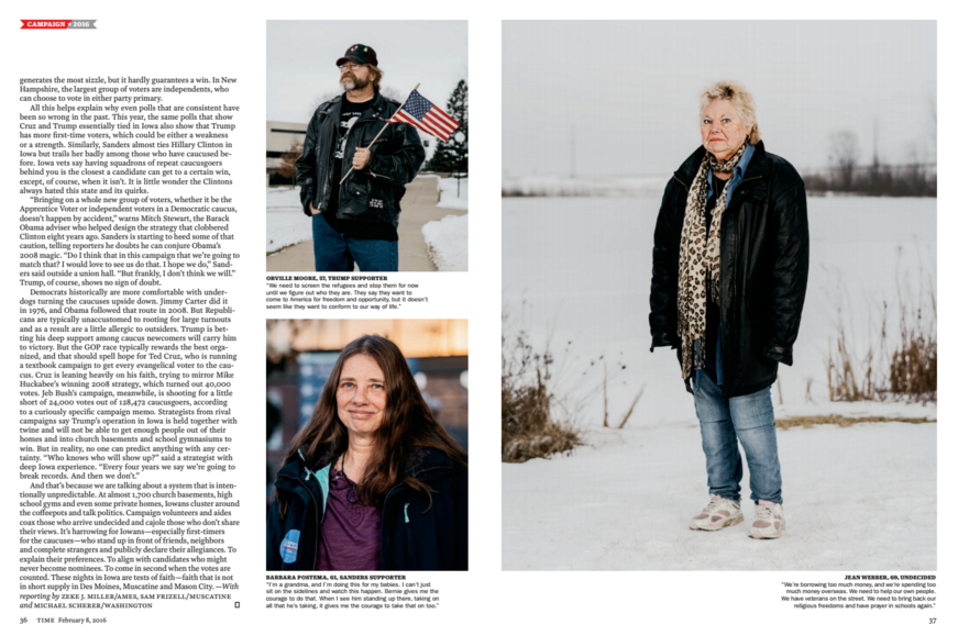
Who edited the images? I edited the images myself.
How many did you make? I made a limited run of the thirty.
How many times a year do you send out promos? This is my first promo ever so I’ve only mailed out one a year! I plan on sending out promos twice a year though.
How did this promo idea develop? I decided to create this promo for a few different reasons. First off, I love music and have loved it since I was young. I would create mixtapes of the radio and share them with friends. Once CD’s and downloading became prevalent, I was making tons of mix CD’s for my friends in high school and would always be having new music bump in my car. Without really realizing it, it was my first form of creative expression.
While figuring out what type of promo to make, I was a bit unsure the best route. I was considering making a zine, but I felt like people may not really pay attention to it if the work didn’t speak to them directly. I wanted to make something a bit obscure so that people would give my work a chance, but also practical. My roommate suggested I make vinyl records and send those with a zine, but there was no real concept with that. That suggestion though got me thinking of something relating to my love for music and after some research, I found these tapes. It was the perfect blend of something practical, interesting, and personal. It took months for me to actually receive the tapes, but it was well worth it.
Creative Director: Janet Froelich Photo Editor: Alice Jones Photo Editor: Emily Kinni Photographer:Kenji Aoki
What type of direction did you get from the magazine?
The magazine was seeking something conceptual and abstract based on some of my earlier work.
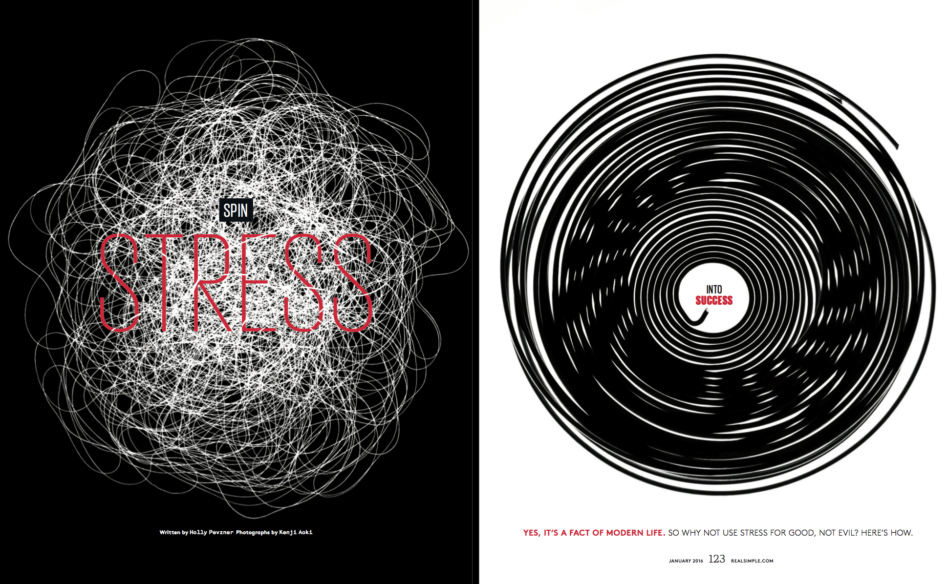
Tell us about your creative process for this simple, elegant solution for stress. The article was about stress and how stress can be a positive motivation depending on its type and cause; so I thought about these four key words from the article: “Chaos”, “Calm”, “Pressure”, and “Relief/Release.”I find working through language in this way is often the most important first step before shooting.
Is there a pattern to when or where you ideas occur?
Focusing on one word can conjure many images, in this case I felt I could best extract the essence of these concepts by using geometric conceptualizations. Rather than trying to think up ideas, I sought a resolution by ridding myself of all unnecessary information and focusing on these few words.
Do you have a journal for your ideas, sketchbook?
Having studied design, I find it very helpful to draw rough sketches before shooting, so yes, I keep a sketchbook.
What is that white ball of lines: fishing line, wire?
We used thread for “Chaos” and wire for “Calm”, but we tried to shoot them in such a way as to not be recognizable as such.
For the two contrasting opening spread images, how closely did you work with the art department on your ideas, especially for the type placement?
Prior to the magazine’s release, I wasn’t sure how exactly my images would be used. The typography and layout was done by Janet Froelich, the creative director. Her layouts are always amazing and I am always inspired by her work.
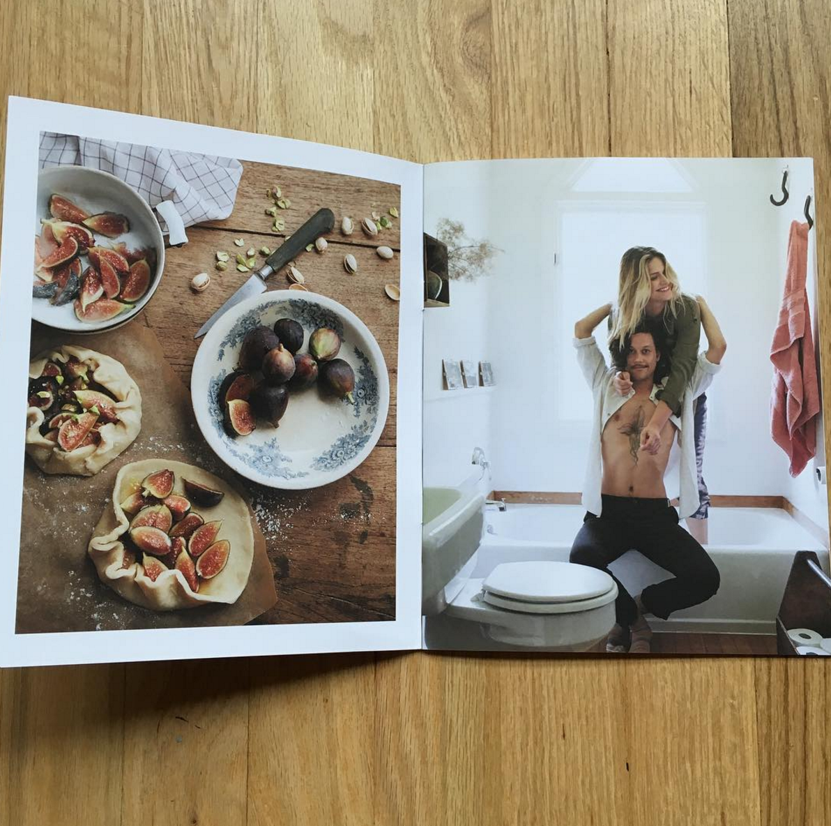
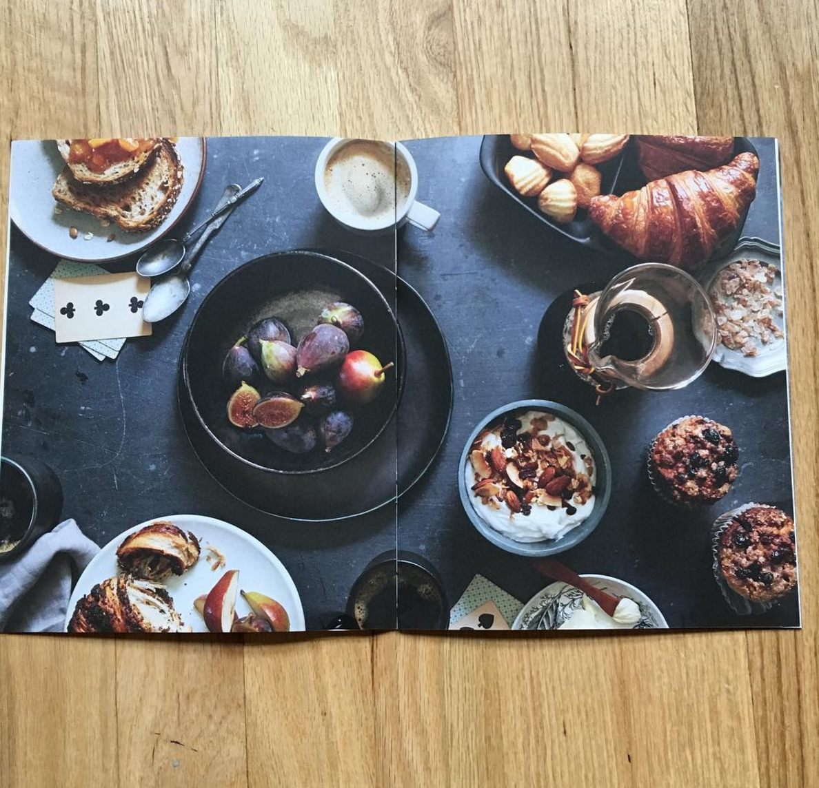
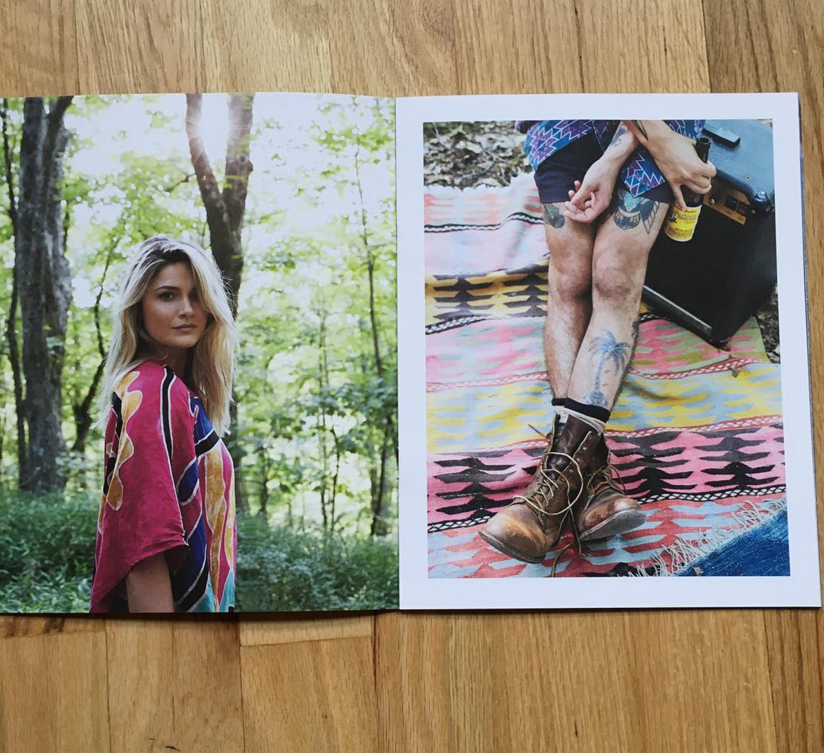
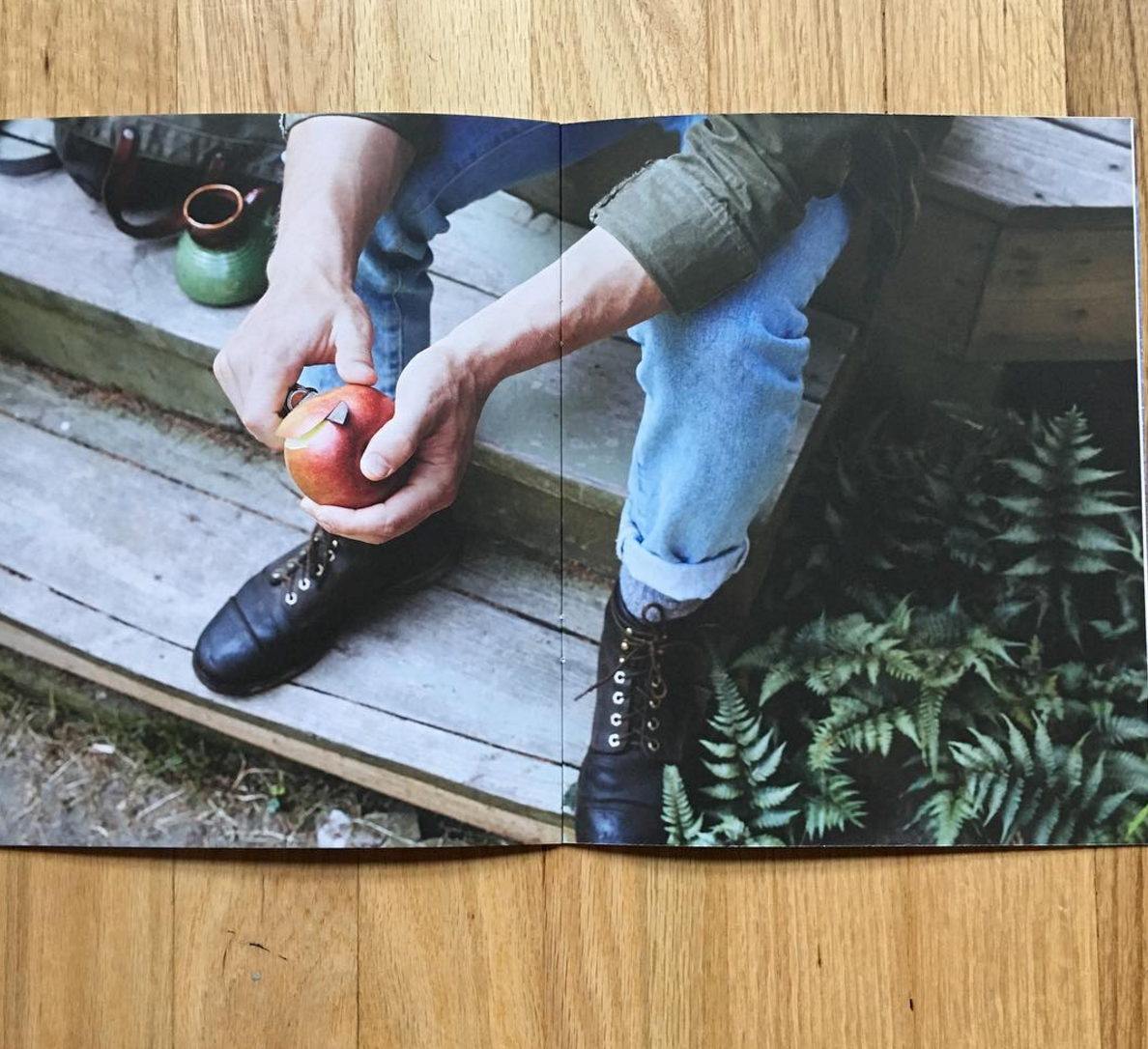
What was your inspiration for this promo? I’ve been working with Melissa McGill for the past few years on branding, editing, and creative direction. We have developed various promos to highlight my portrait, lifestyle and food photography as well as my personal work, with inspiration drawn directly from the work being considered. We focus on clearly communicating my core interests; color, light, nature and authenticity. It’s a collaboration that really flows! This recent promo booklet developed from appreciating the colors on my recent trips to St. Bart’s and Bali and wanting to tell a story using color to create a unifying thread through the book.
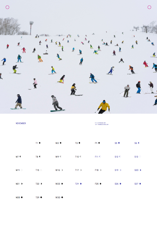
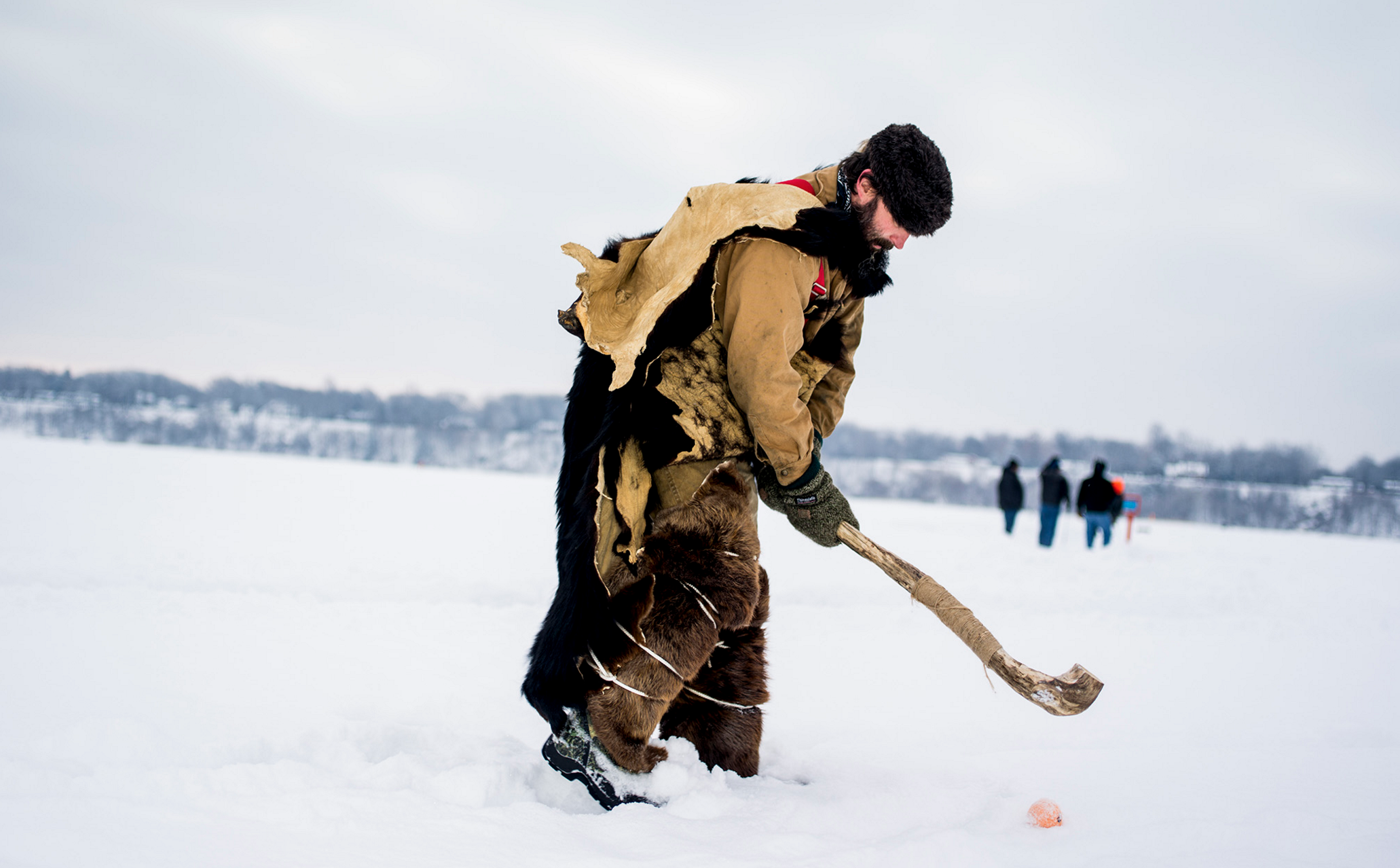
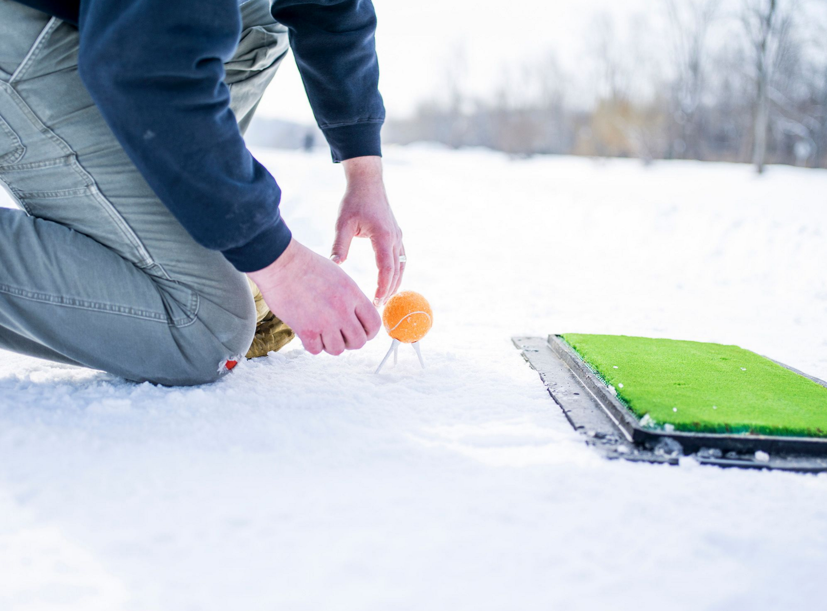
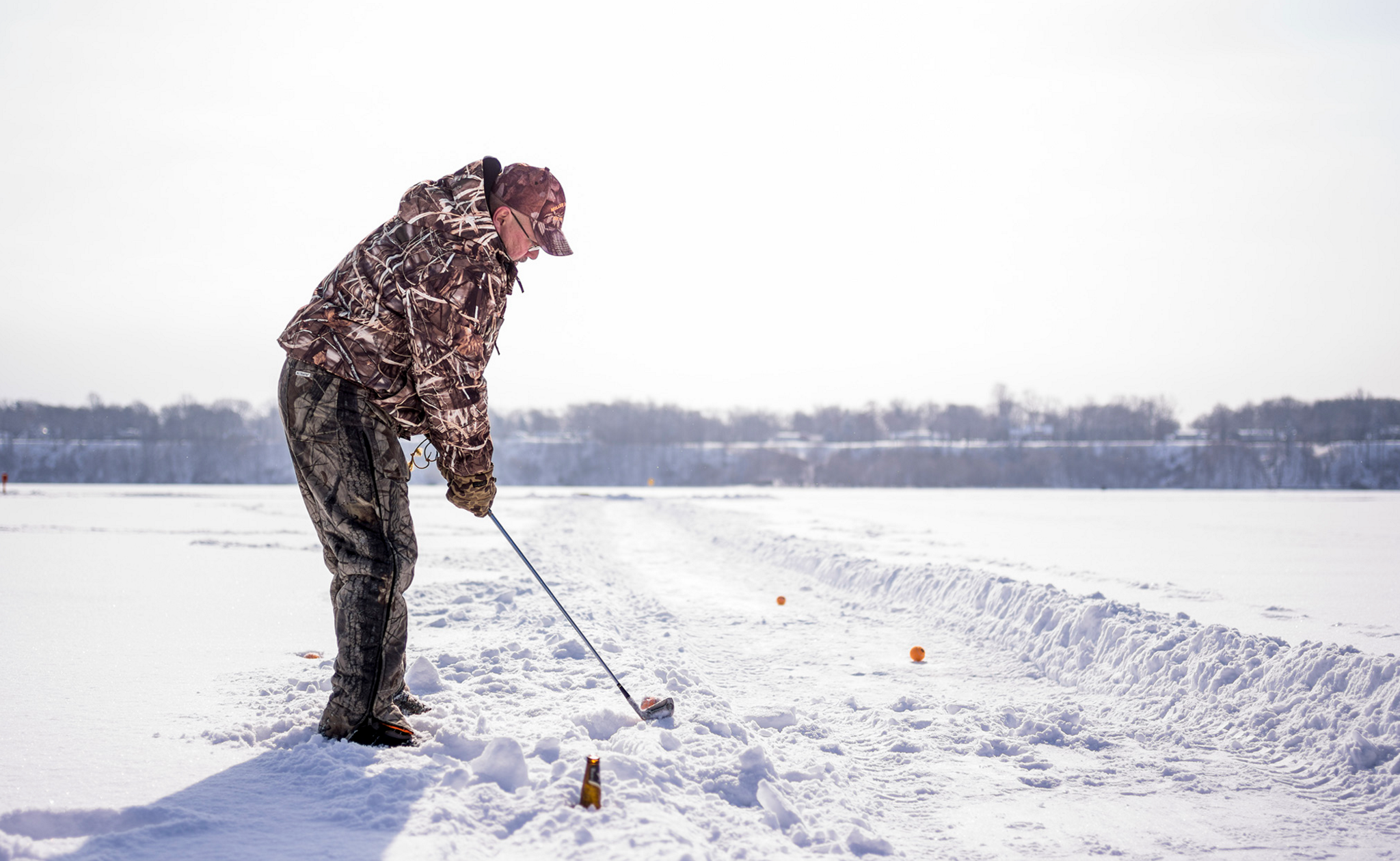
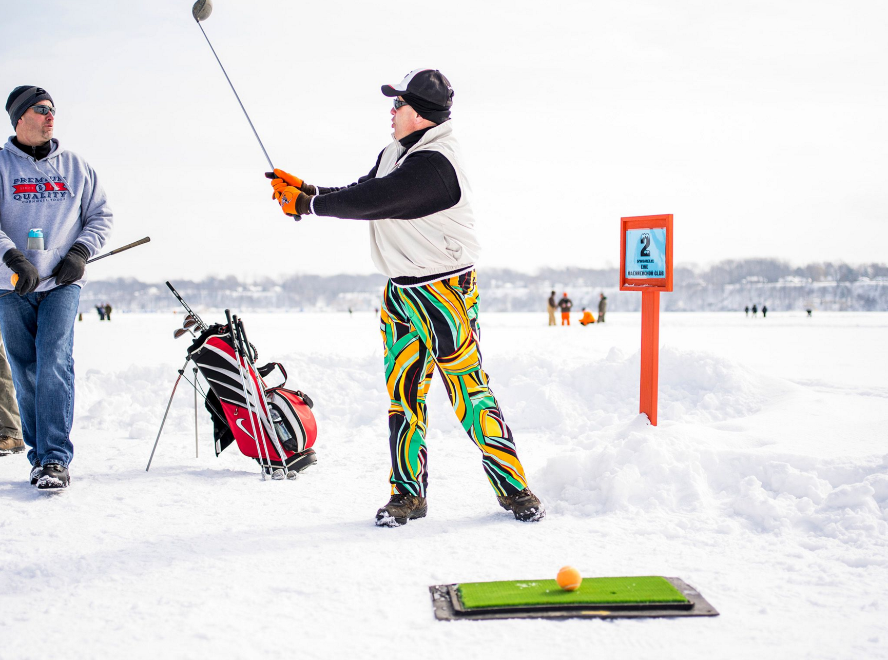
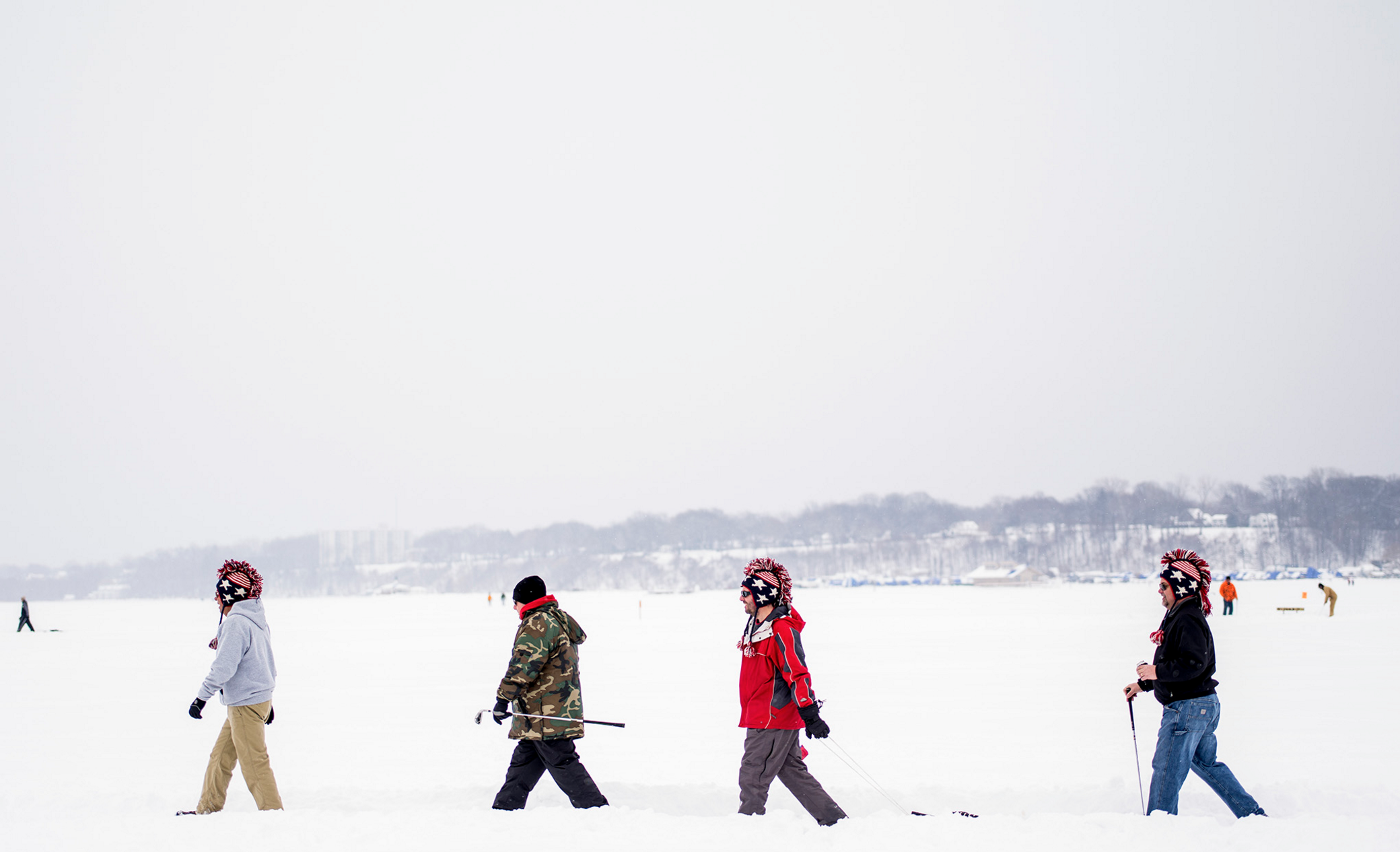
Do you golf?
I have never golfed a day in my life. But I were to golf one day, it would definitely be on a frozen lake with lots of belly-warming booze and layers of wool.
What type of direction did you get from the magazine?
Don’t get frostbite. But there really was no direction from the magazine other than to shoot anything and everything and just to make a fun photo essay.
How often do you work with ESPN?
It varies, of course, but about five times a year.
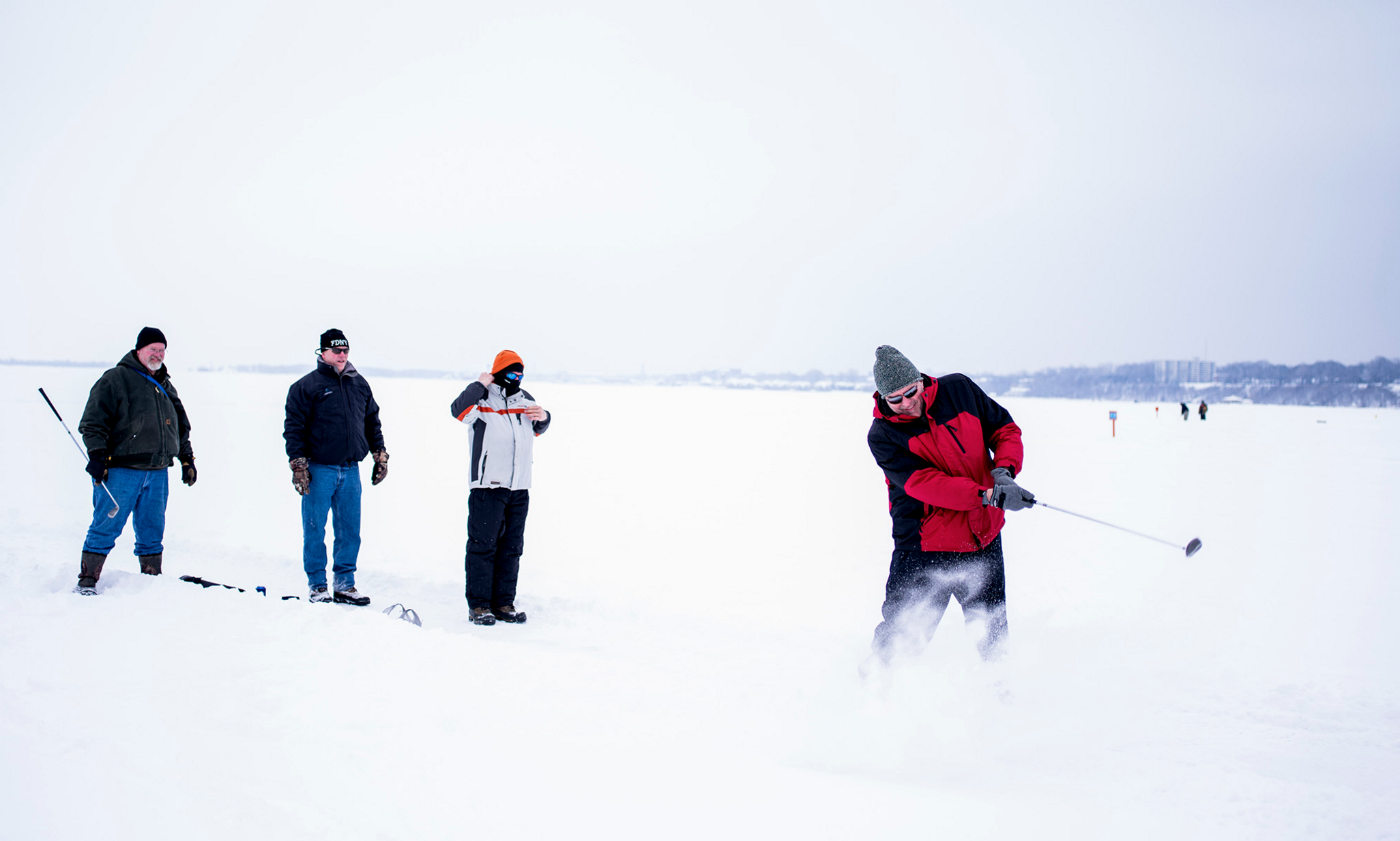
What was the biggest challenge for this shoot?
Originally the weather was supposed to be cloudy all day but it turned out to be sunnier, so the snow on the lake was intensely bright. My plan was to shoot this with a ringflash but the snow-sun combo was all the fill light I needed. After that the biggest challenge was staying warm while standing on ice and snow for eight hours. My face was wind burned and my corneas burned from the brightness of the snow, which hurt for a couple of days after the shoot. The things you do for love!
Did you learn anything new that you think could transcend into future shoots?
I learned that I need a pair of insulated overalls! I should have learned that on the previous year’s snowy cross country skiing shoot for ESPN when I was waist deep in snow; but seriously, insulated overalls.
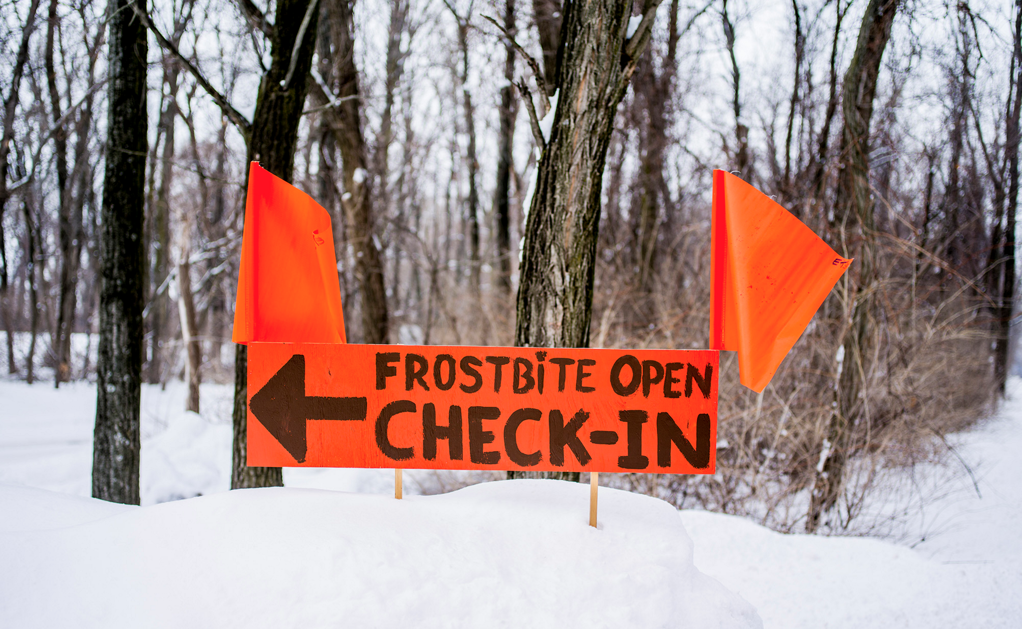
I know the tournament started because of freak storm several years ago; had you shot this before?
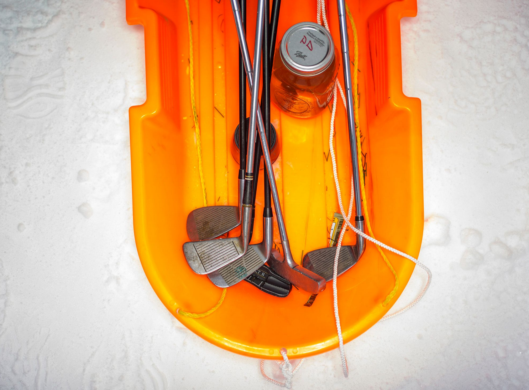
It’s a neat way for people to get outside, raise money for a charity and, apparently, because they are on the lake, open container laws don’t apply, so there’s a lot of drinking, for better or worse! But this was the first time I had photographed it.
When your face froze to the camera, how did you peel it off and what did you do to prevent that from happening again?
Well, I had a wool neck gaiter on, too, which I had pulled up over my mouth and nose, but then the viewfinder fogs up so quickly I can’t have it on while shooting. So I take it off for a second and then there’s condensation of the back of the camera and my nose would freeze to it every time, like a tongue on a flag pole! Just a quick pull-apart to detach myself was all that was needed… but no fun either way.
I know this started out as a print project and then got bumped to the web, did you have to do anything different for delivery or edit?
The edit was the same, it just meant delivering smaller files. I shot this medium format so the files were pretty robust for something just going online.
Did you find out about the change in plan after you turned in your edit?
Yeah, I found out after. It’s always a possibility; still just as heartbreaking, though.
Who printed it?
This specific promotional piece I had printed at Aosaimage.com They do tons of amazing creative printing techniques. My direct contact there is Mike Hill. He is such an awesome guy!
Who designed it?
The design came from a collaboration of myself and Mike Hill. We have worked on a few other creative printing processes in the past on some larger prints on wood and metal and had discussed ideas like this in the past.
Who edited it?
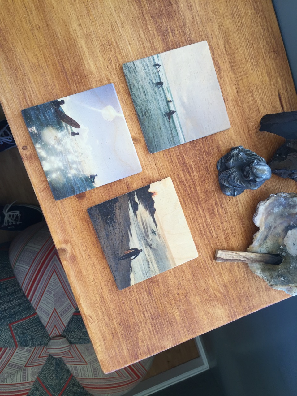
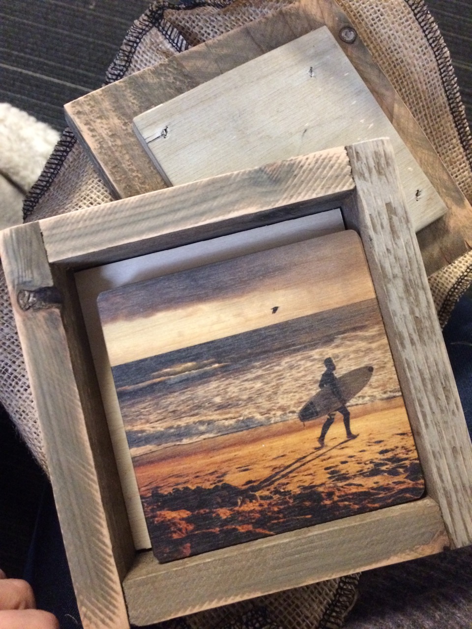
The images were edited and selected by me. This was a personal series i had shot beach camping in San Onofre Camp Pendleton south of San Clemente, CA
How many did you make?
My goal with these pieces was to share something that was close to me, with people whose creative impact I respect and value. So, I only printed this as a limited series of 50 pieces. All of which are hand signed and numbered.
How many times a year do you send out promos?
I have just begun to conceptualize more and more creative promotional series like this one for release in small personal runs. In the past I have done more standard promos in bulk of 500-1,000 and sent out 3-5 times a year between LeBook shows and through direct mail.
How did this concept come about?
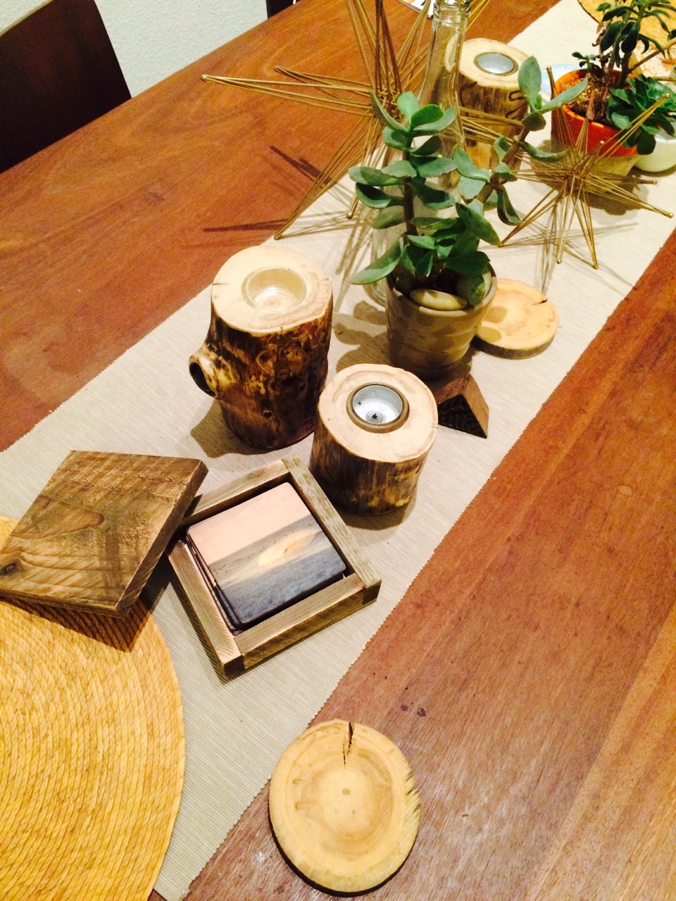
The concept behind this piece was to use materials that were natural to the environment of the images. The burlap hand sewn sacks, the handmade and sanded drift wood box and the wood coasters. I wanted something that people would want to have as decoration and consider a series of personal art released. Im not trying to spam my promotional series out. Moving forward, I want to continue creating promos that are intimate and close to my heart. My goal with all my clients is to develop a working relationship on a more personal level. My hopes are that this is felt and seen through this series.
Who printed it?
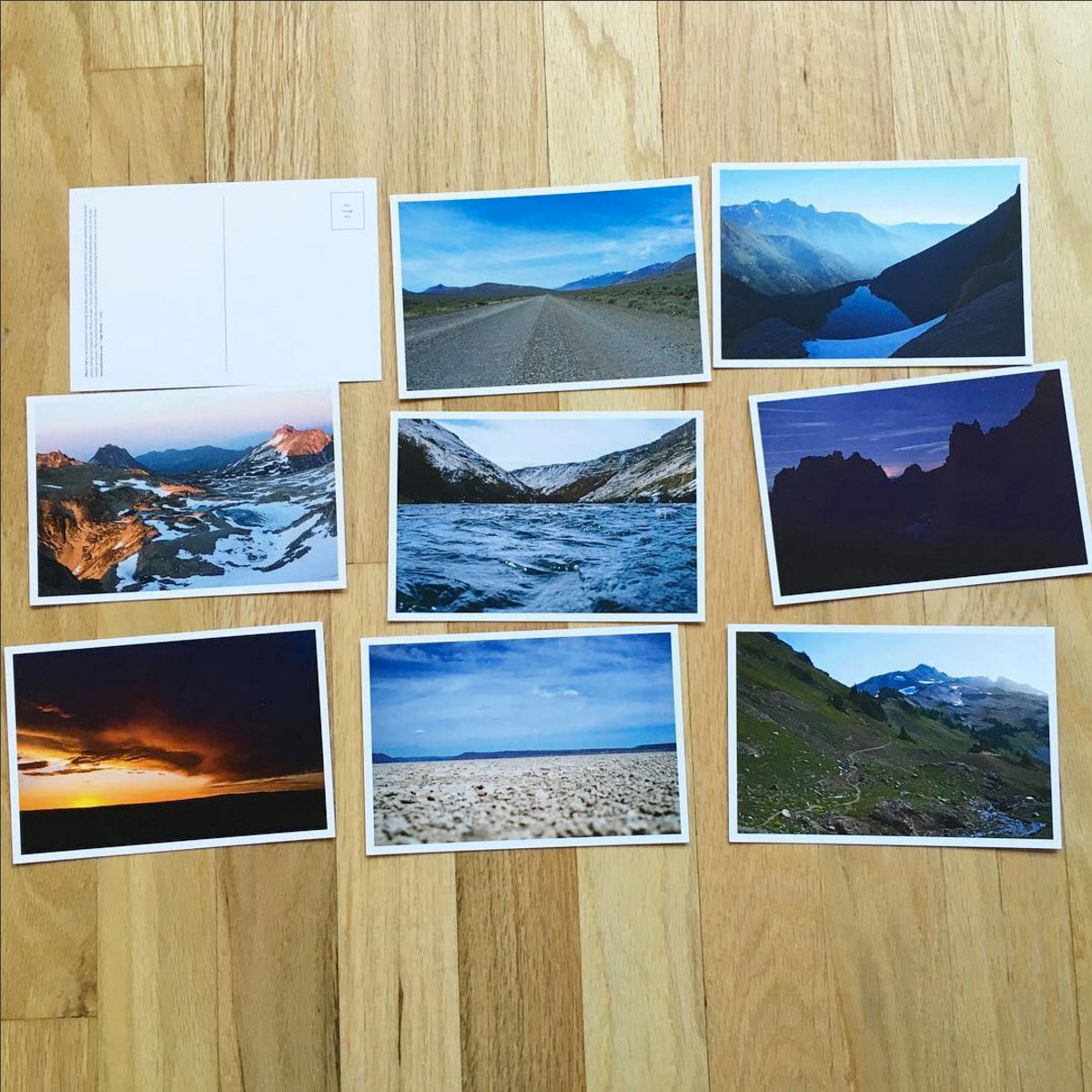
I had the postcards printed at smartpress.com – they allowed me to do different versions in the same order which I think helped save on cost in the long run.
Who designed it?
My background is in design, so I designed it myself.
Who edited the images?
Mostly just me – I narrowed the edit down from a much larger selection of images from the past year and a half, and then got some input from friends and colleagues.
How many did you make?
I think it was about 100 sets.
How many times a year do you send out promos?
This was my first, but this year I’d like to get in the regular habit of mailing work out. There’s something so nice about getting a nice postcard or printed piece in the mail.
Tell us how this promo evolved.
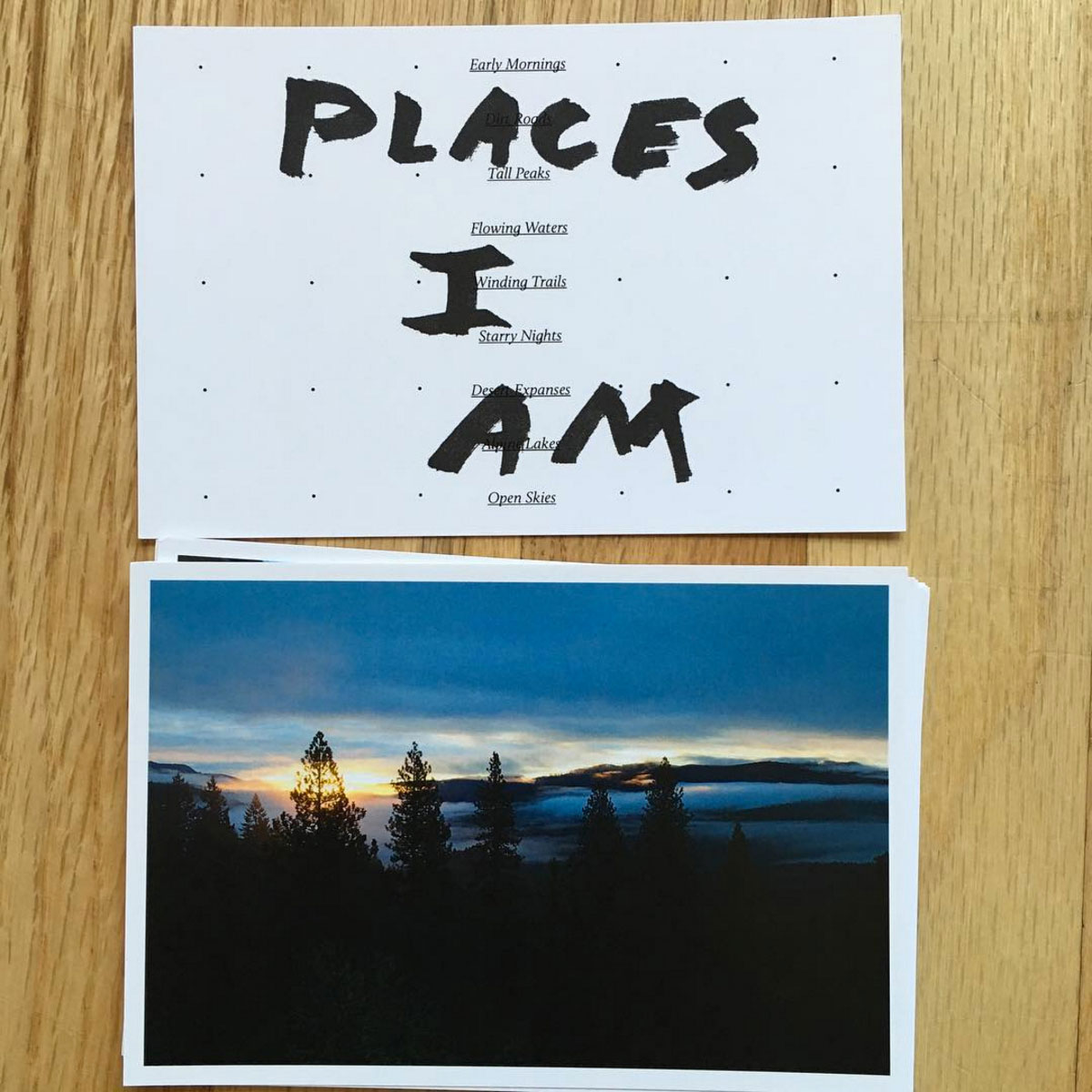
As a designer and photographer, spending a lot of time in front of the computer as part of my job is extremely difficult. I really need to get outside, move, and be active on a regular basis. At some point last year I was having a particularly hard time with it, and often found myself wishing I was anywhere but at my desk. At the time I was working at an agency, going through some fairly major health issues, and was slowly losing my mind. So, I began to make a list of places I’d rather be.
The original list went something like this: early mornings, running, dirt roads, sunrises, mountains, streams, road trips, unknown trails, swimming holes, lakes, birds, hiking, cool water, flowers, the desert, climbing, hot springs, two wheels, sunsets, and so on…
The idea slowly morphed and changed, and after talking to a friend I realized it’s not the places I’d rather be that I was dreaming of, but the Places I Am. It’s the places that have inspired me, shaped me, and in some way become a part of me that I was day dreaming about.
Instead of just posting another photo from a past adventure to Instagram, I decided it was time to make something that might stick around a little longer. So I made a website and some postcards. It’s fairly simple, but I think the entire process was somewhat cathartic.
In the end, Places I Am ended up being a small series of photos taken in 2014 throughout Oregon and Washington. The accompanying website can be seen at www.placesiam.com.
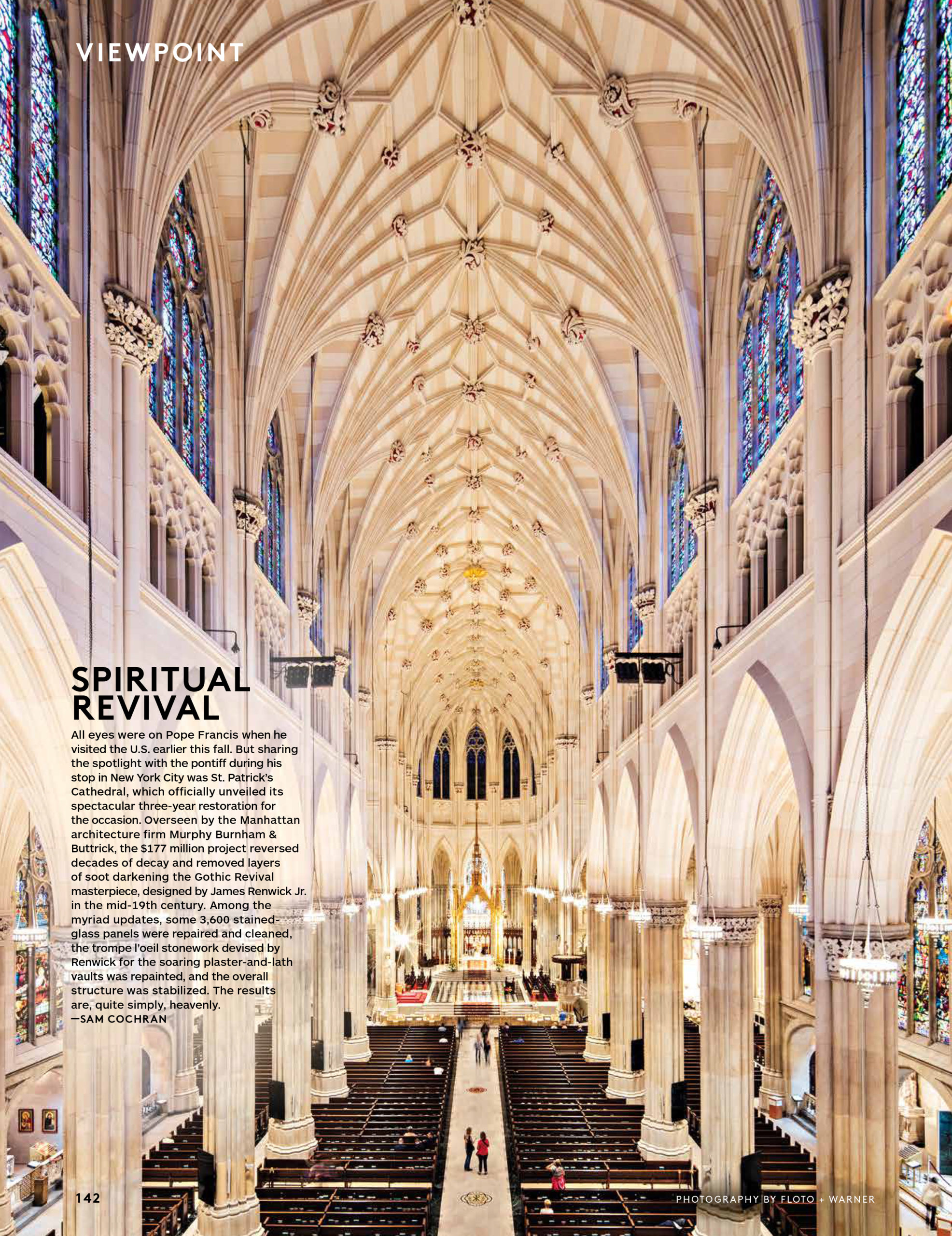
Photo Director: Michael Shome Features Editor: Sam Cochran
Photograher: Floto + Warner
How did this project come about?
This was a commission from the Photo Director at Architectural Digest – Michael Shome.
What type of direction did you get from the magazine? We work with Michael quite a bit, so he is familiar with how we work and see things.This gives us a bit of freedom with the approach.Our only directive was that this photograph would be featured as a full page vertical.
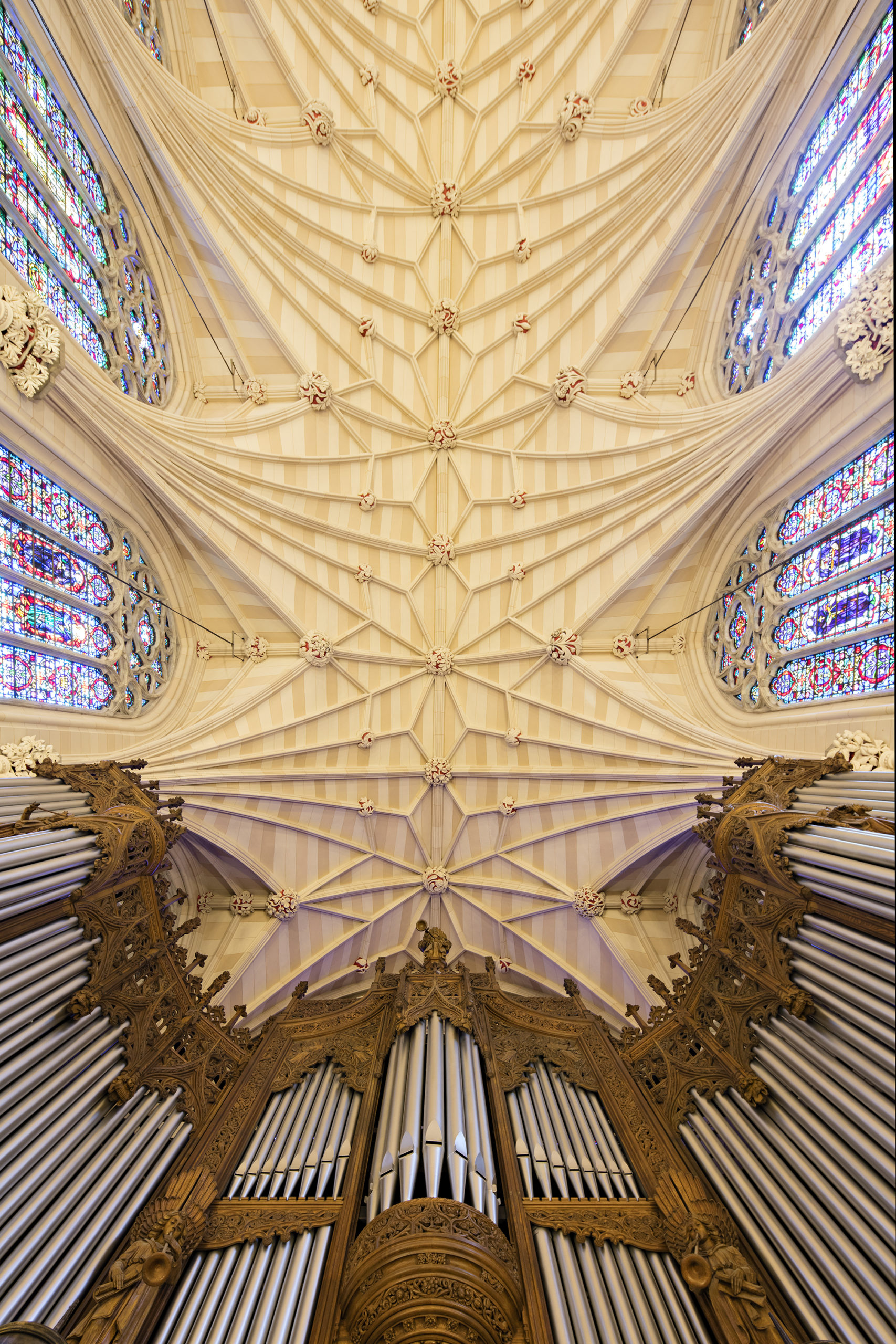
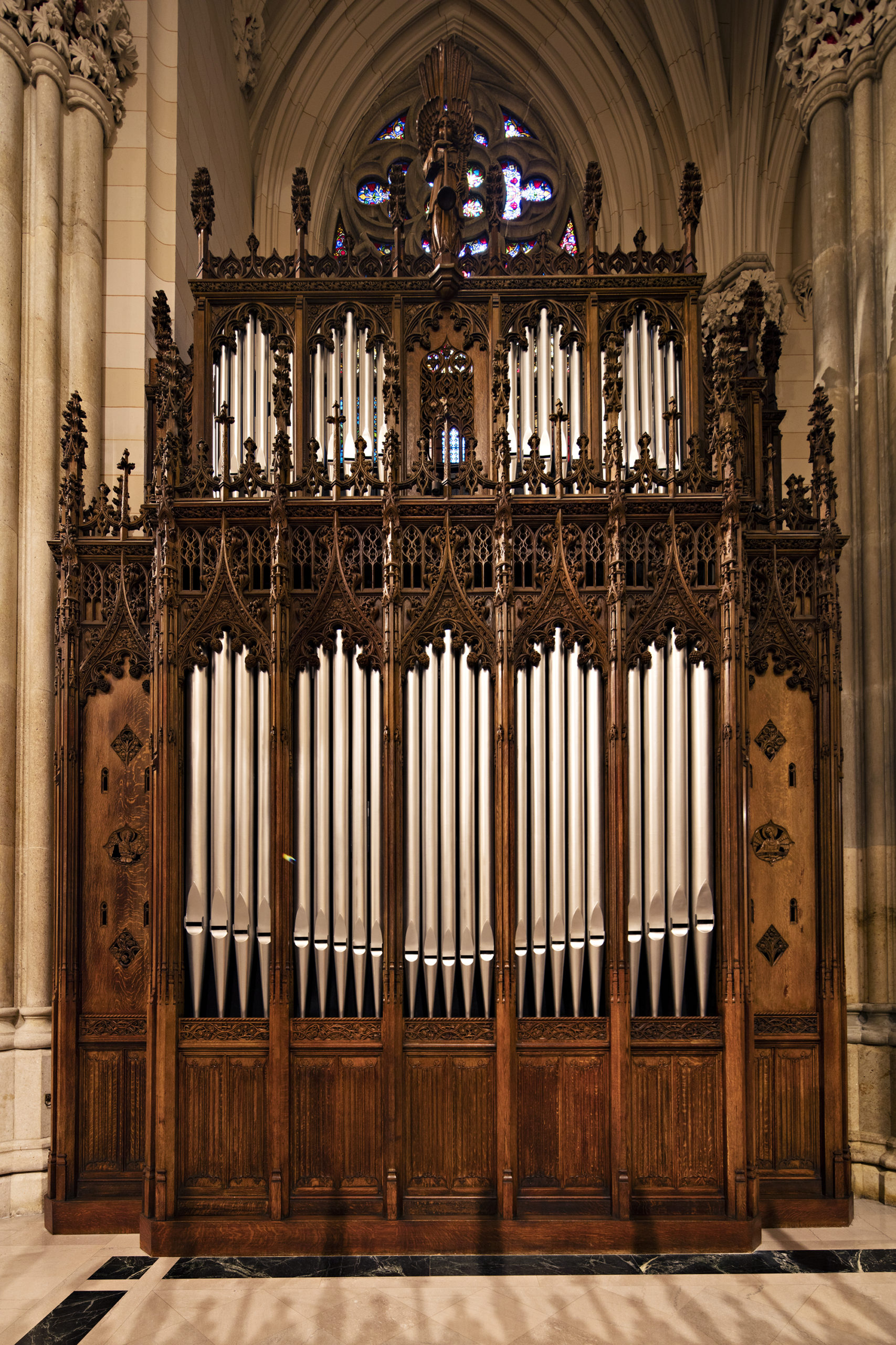
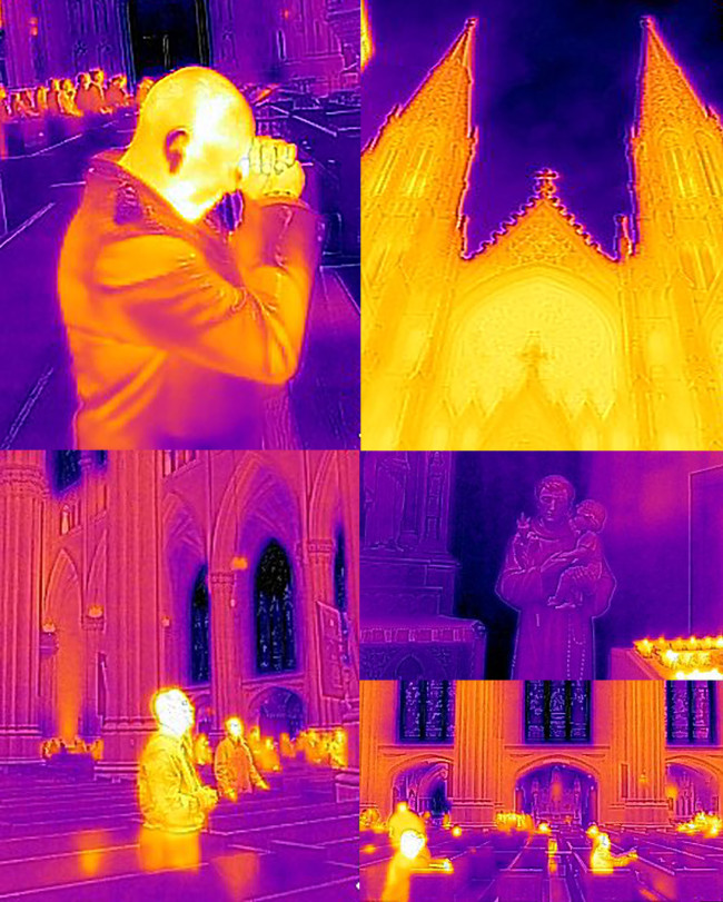
Where were you when you took this image? Our vantage point is from the Choir Balcony with the massive Gallery Organ – those pipes were amazing to see so close.We get to go in some really amazing places and see things you would normally never have access to. Crossing the velvet rope in such a historic place made us feel like kids again. We were also able to stand at the alter.They were pretty open to letting us roam free.
Did you always envision this shot to be taken up so high?
Absolutely.What could be better than a God’s eye view on the sacred geometry of the cathedral?
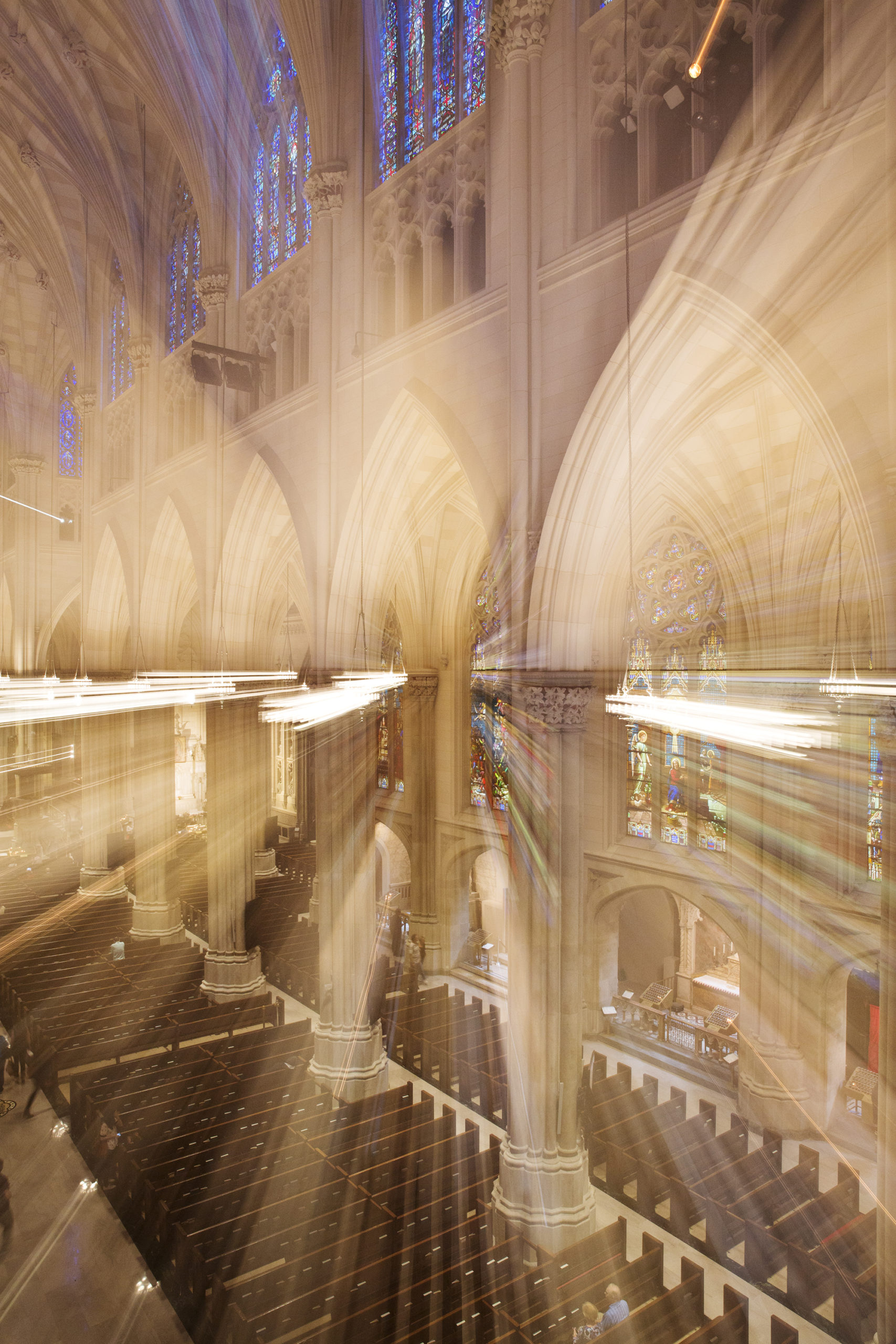
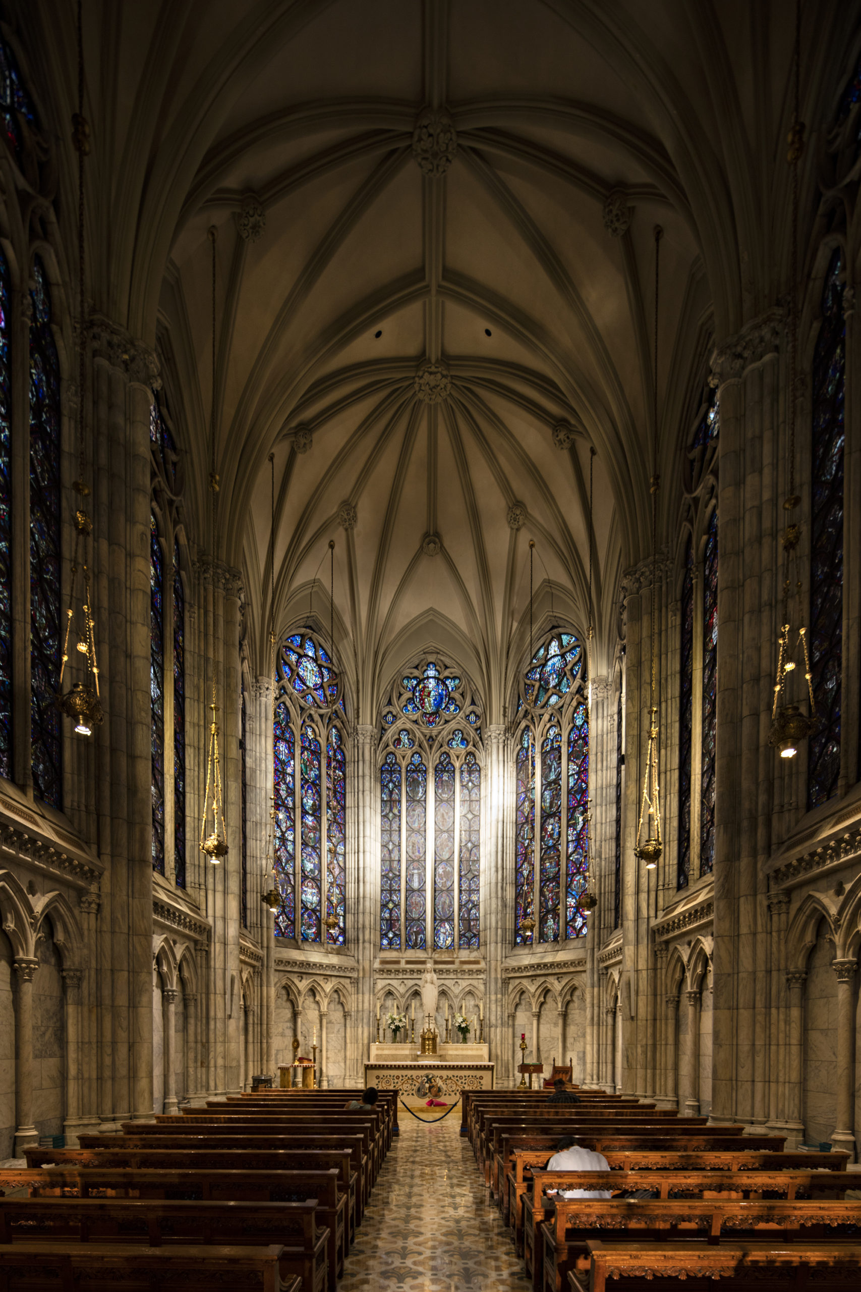
I’m guessing that was all natural light?
Yes, we used existing light – lighting or other changes to the location were not possible.We couldn’t disrupt the visitors. We did have to hurry though because mass was going to start and that takes a very long time.
Was it difficult to compose the image?
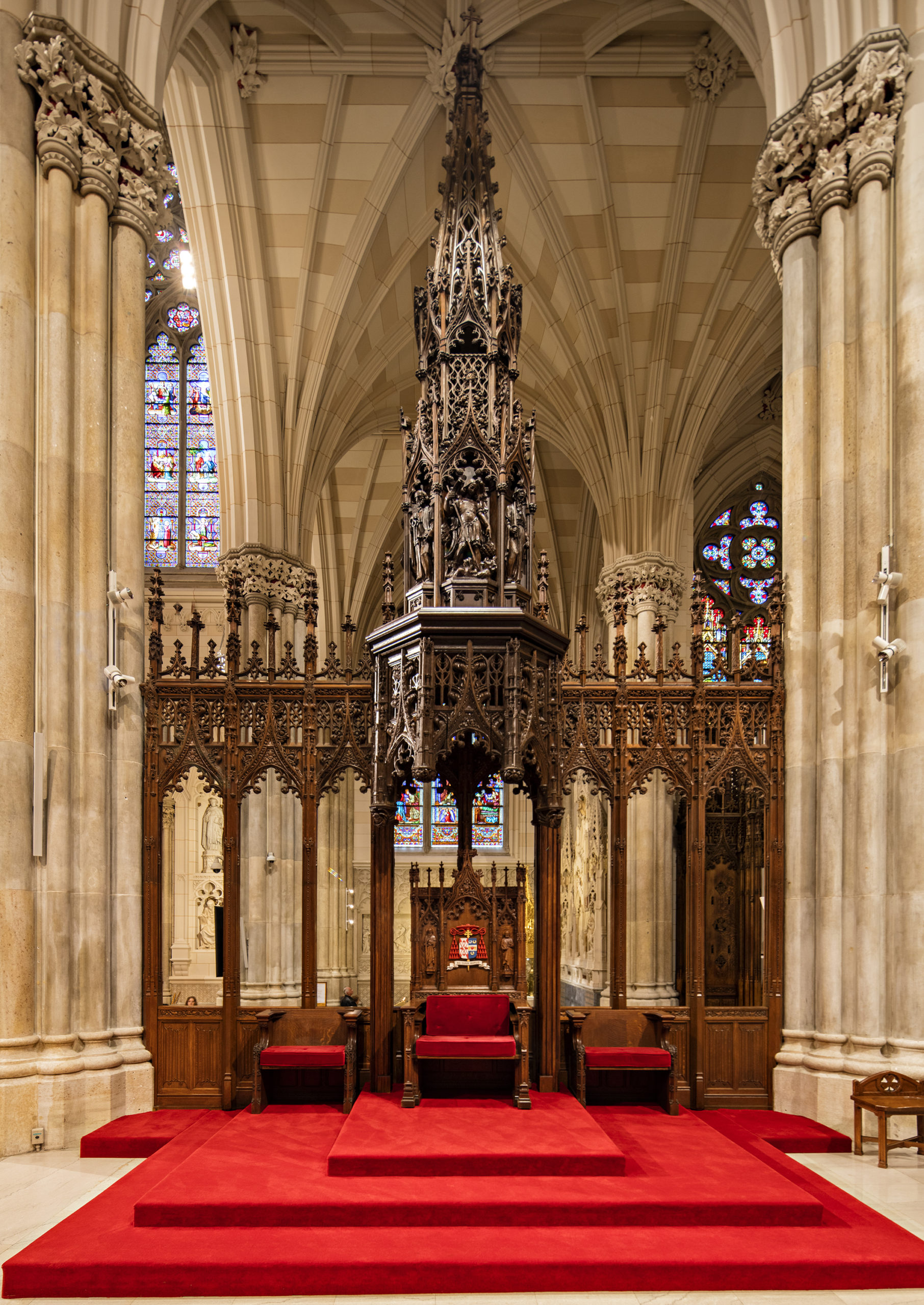
No.This was a pretty straight forward architectural approach. However we did experiment quite a bit.There were many beautiful views.
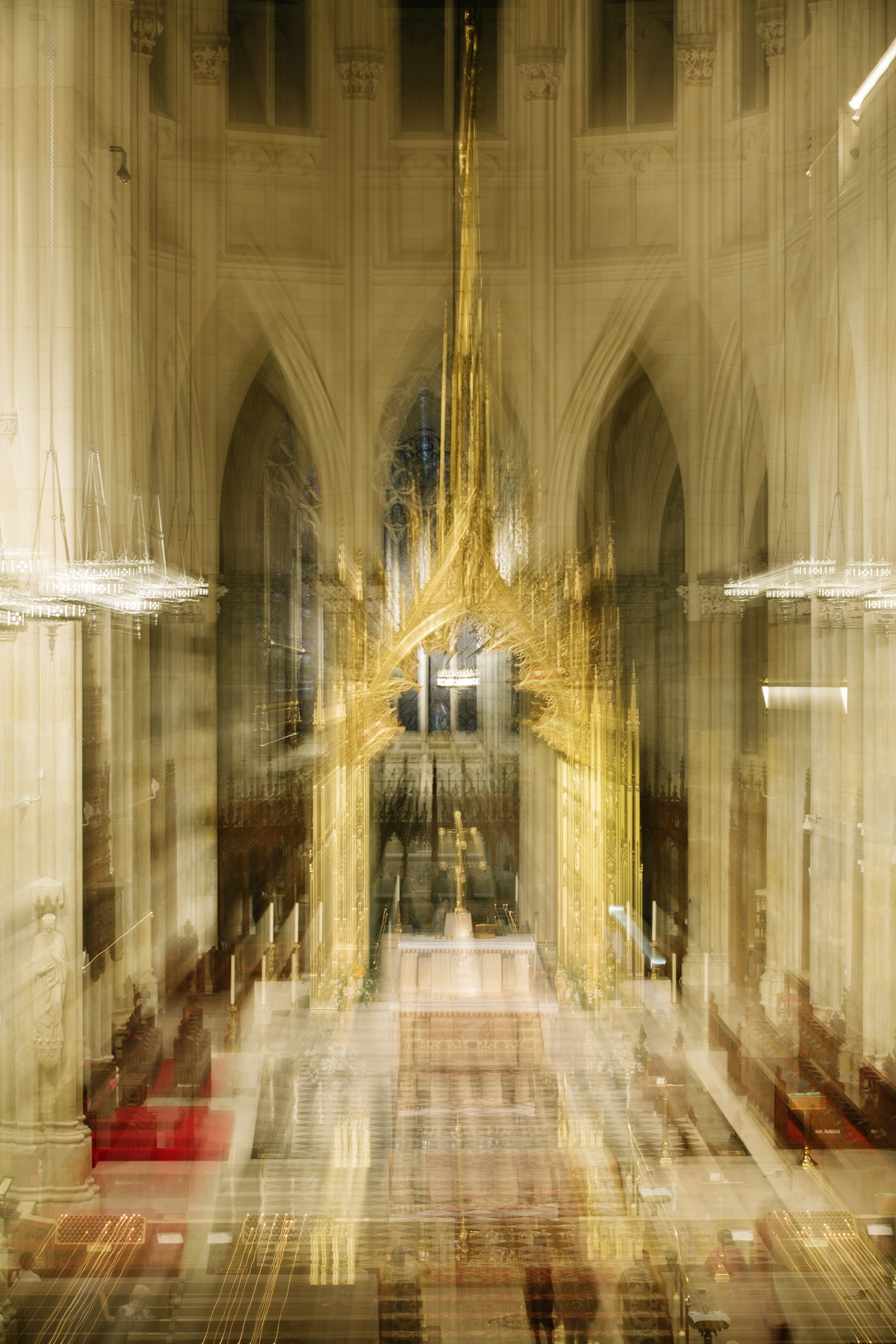
How did you achieve this technique of the people praying?
We included some off-topic experiments, we took with a thermal camera of people praying. We shot them with a Flir thermal camera, that we rented from Home Depot.
Who printed it?
I worked with Rikki Webber at Modern Postcard. She’s really great to work with.
Who edited the images? Jasmine DeFoore edited the images. She’s an amazing editor. I’m so happy I was able to work with her on this project. She also edited and designed my print books and website.
Who designed it?
I designed the layout of the promo but ran the final design by Jasmine DeFoore to make sure she approved.
How many did you make?
I wanted to do a small run of 100. The reaction to the promo has been really positive so I’m thinking about doing another run.
How many times a year do you send out promos?
Ideally I’d like to send out 3 or 4 small runs a year to a select client list.
How did this promo idea develop?
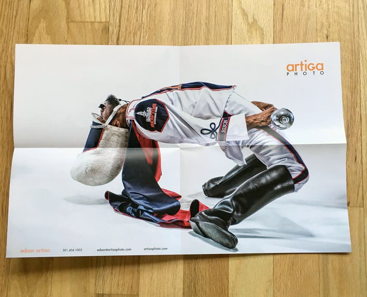
I shot this as a personal project; I love the history and tradition of black college marching bands, and wanted to approach photographing and lighting them as I would an athlete. My goal was to make them look like superheroes showing the passion and energy of these young men and women. I’ve been thrilled with the feedback so far, I think people really connect with that energy I captured.
How long has it taken you to go from coast to coast in Canada for this body of work, and do you add to it each year?
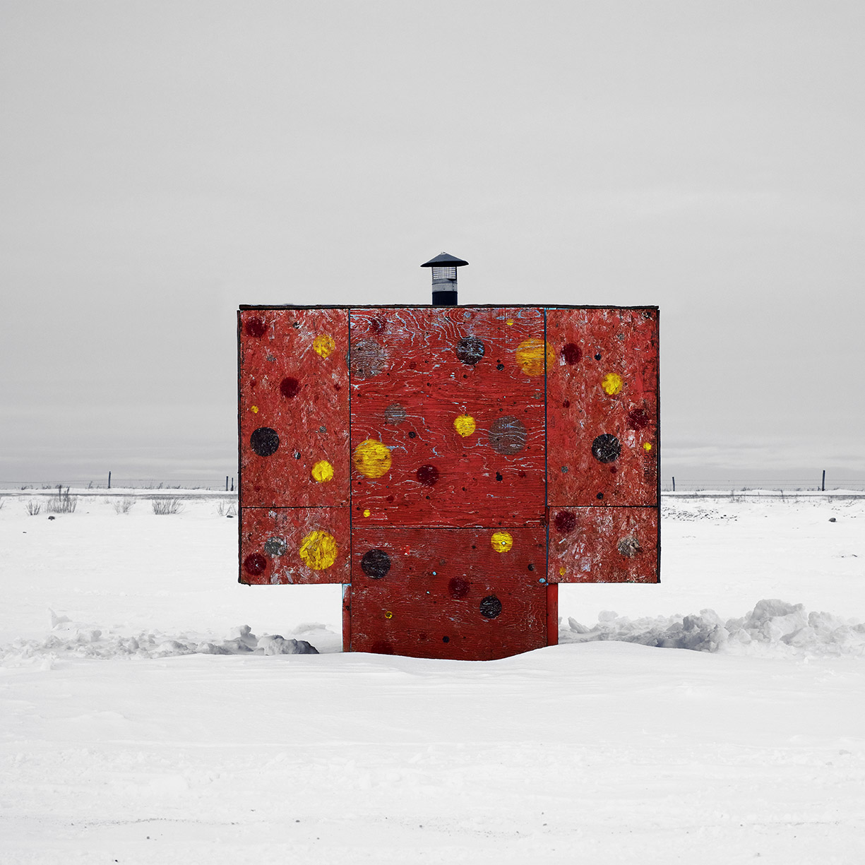
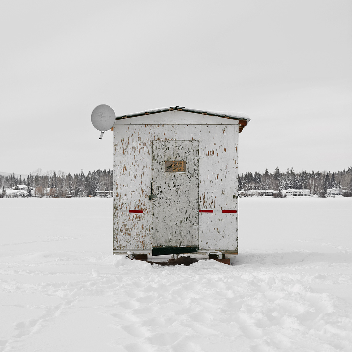
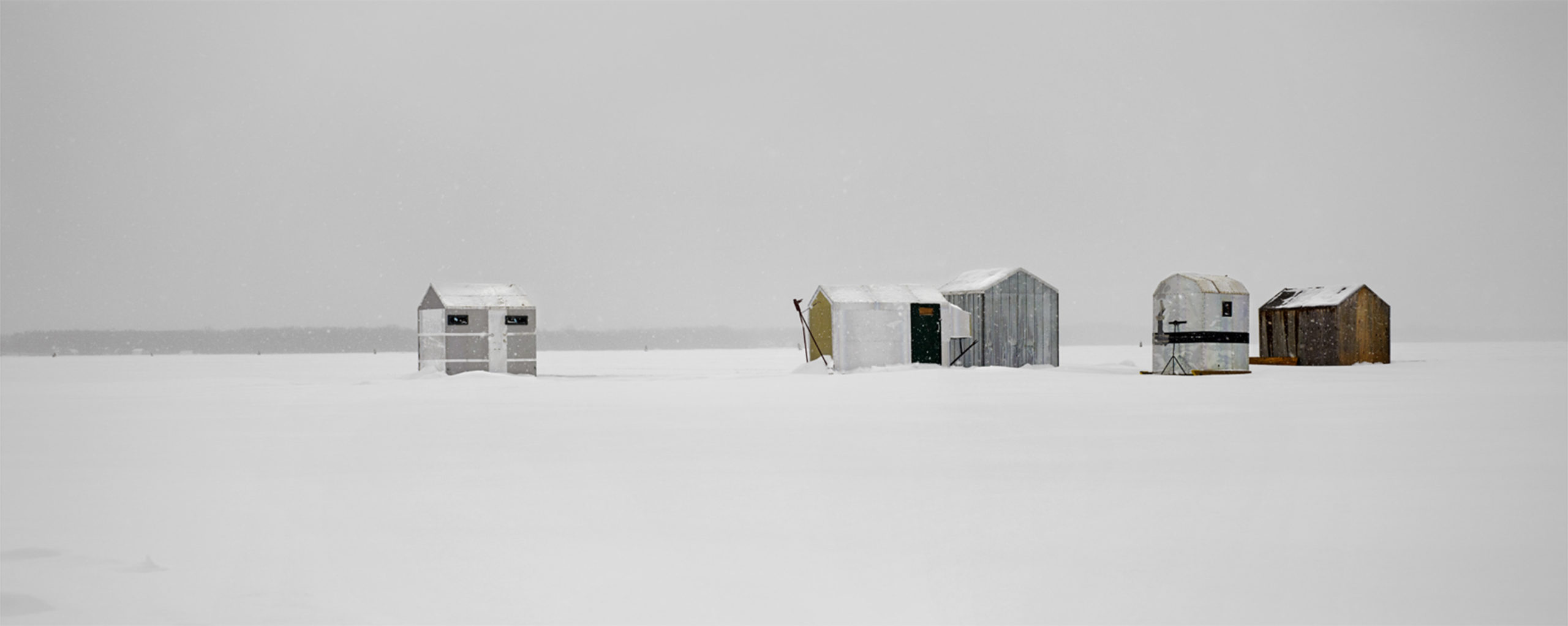
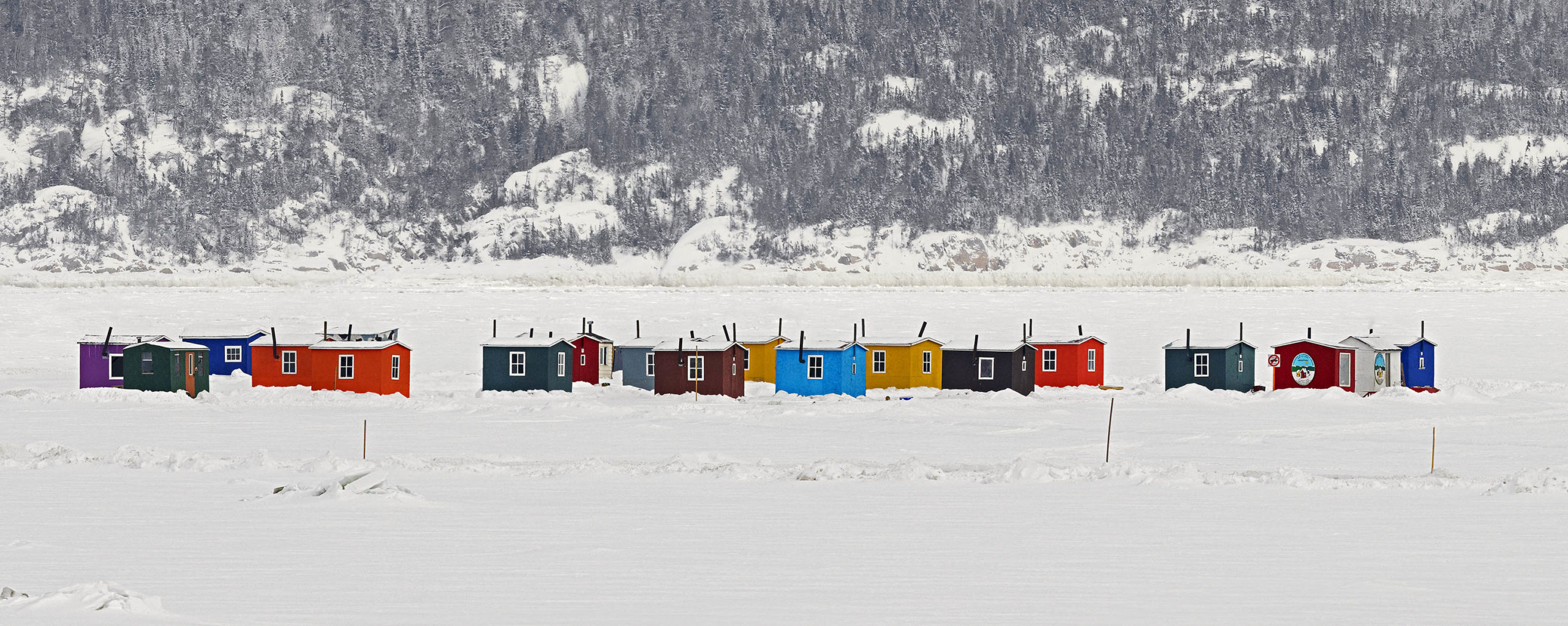
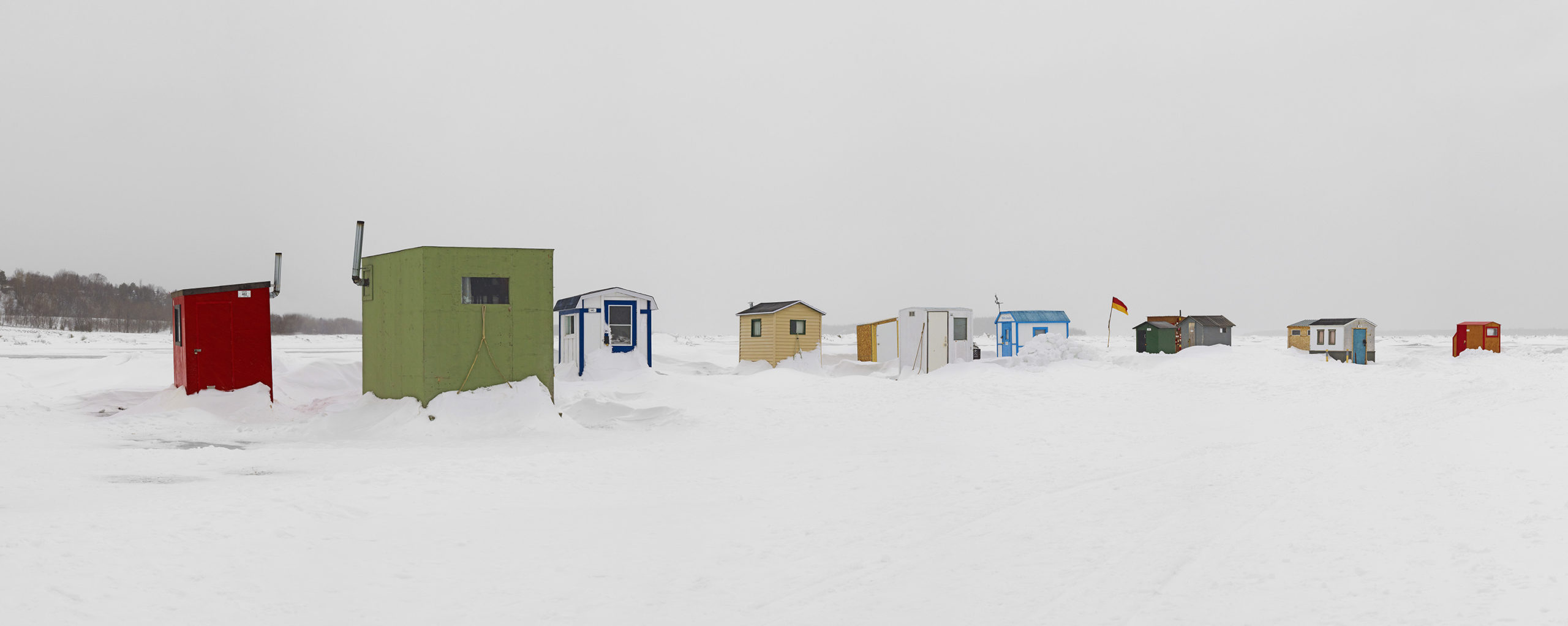
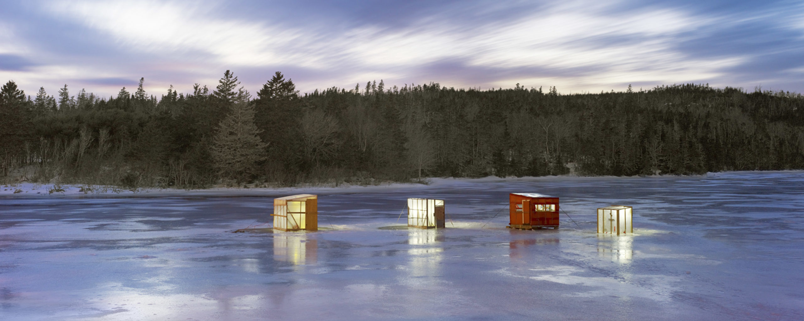
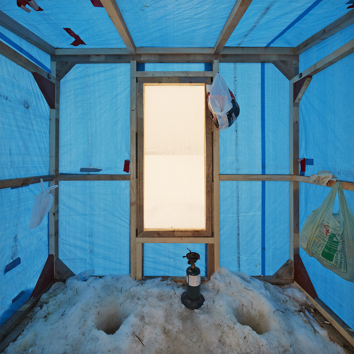
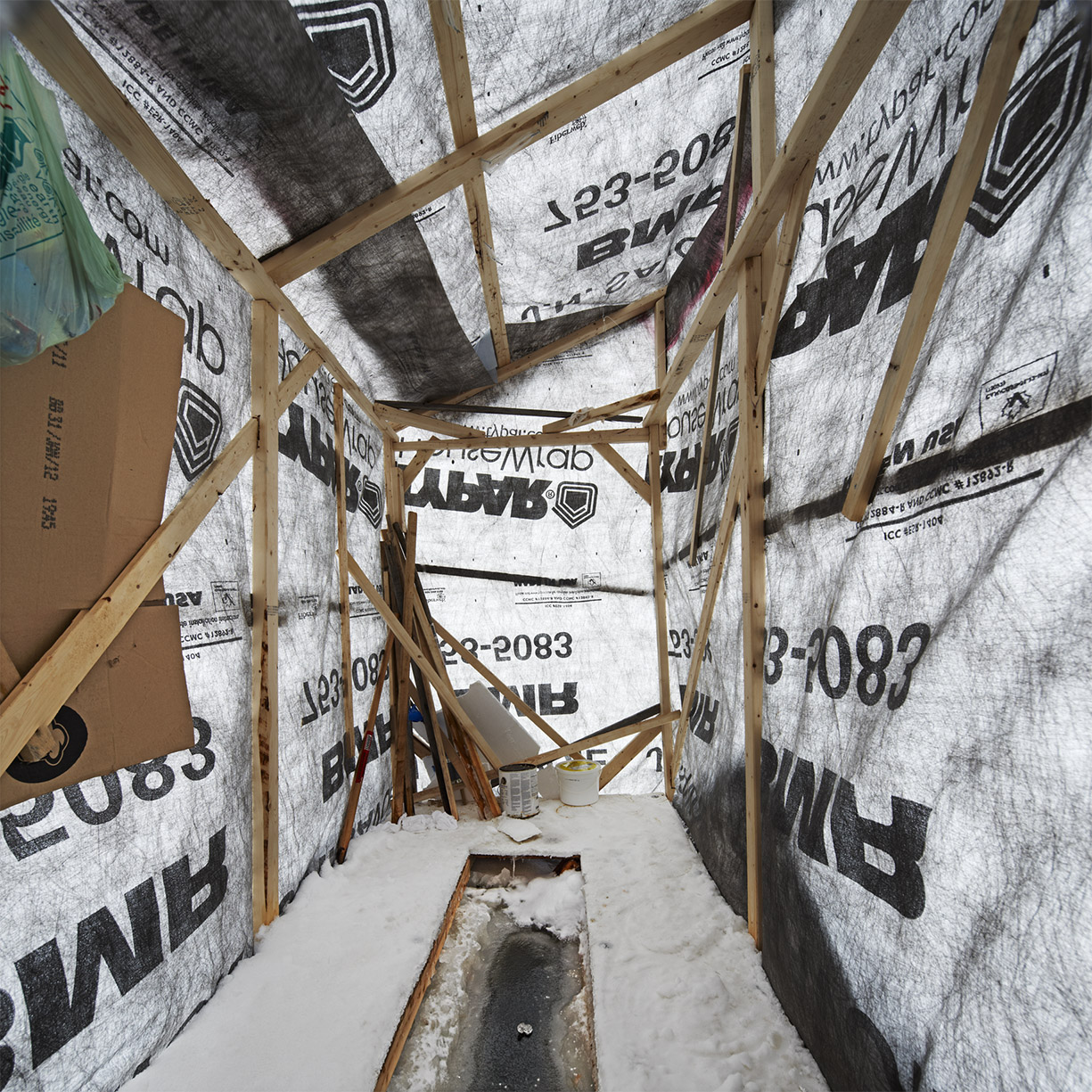
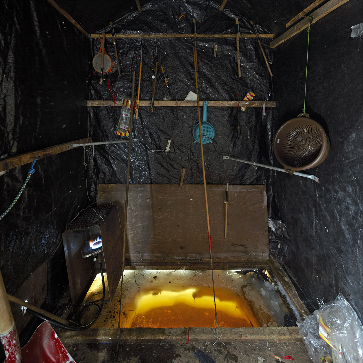
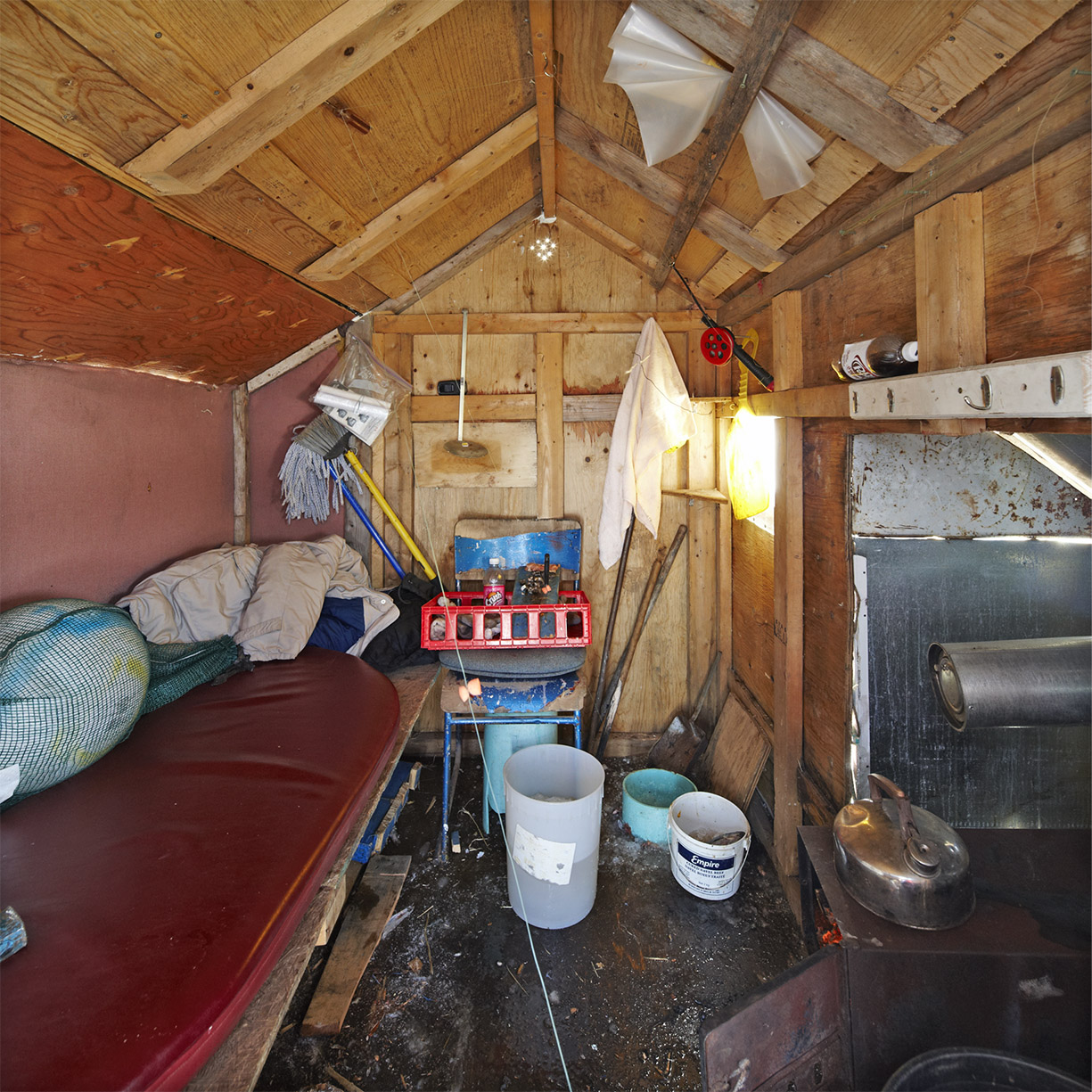
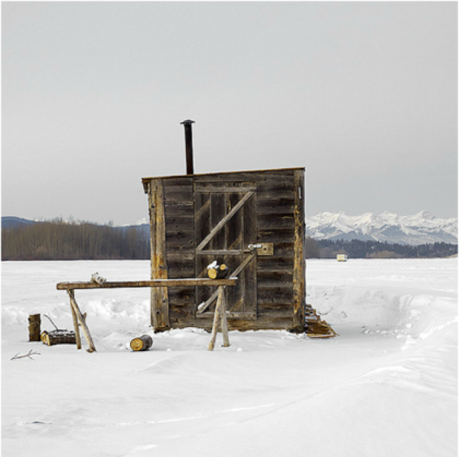
I knew there was a story to be told in 1991 when I was first introduced to the ice fishing community on Lake Timiskaming, bordering Ontario and Quebec. The idea percolated for many years and in winter 2006-2007 I decided to get out and investigate further. The logical starting point was just north of my home in Toronto, Lake Simcoe. It was an overcast, snowy day and there were many huts out on the newly formed ice. I set up my tripod and began to capture elevational views and 3/4 views, basically circling each hut from the same height in a style known as typological study, commonto my earlier bodies of work, Water Towers and Garbage Bins of Wassaga Beach. I returned several more times during different weather conditions and it became clear that overcast, snowy light was the best fit to describe the isolation within a square format. The following year I was in Prince Edward Island in February for an architectural interior shoot and I noticed an ice fishing village across the bay from my hotel. Surprised and delighted, I wondered if it was popular in every province, and that is when the coast to coast narrative began. I would need to travel to 10 provinces and search for locations while holding onto the overcast, snowy aesthetic for consistency. This would take years, as I was to discover. Out of 52 weeks, there are only 3 weeks of possible shooting in many locations given my restrictions for continuity. In 2010, I began to incorporate the landscape into large format panoramas talking about community and place. This series is entitled Ice Villages. It seems that every year I peel away another layer about the culture, the people, the regional architectural requirements that make ice fishing a quirky yet popular winter phenomenon.
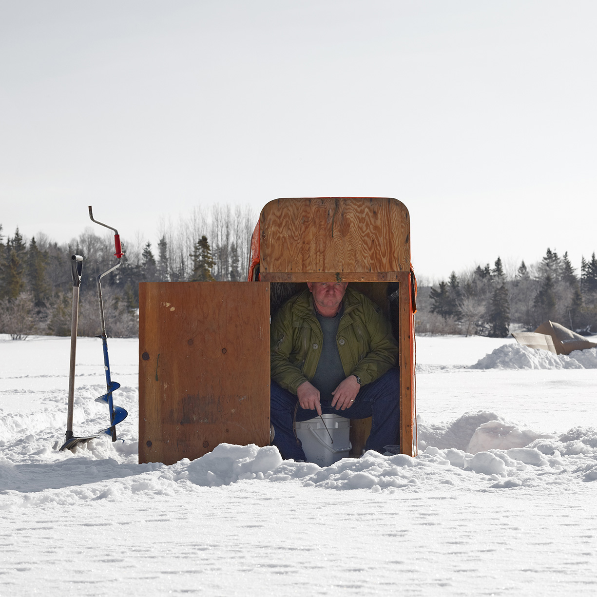
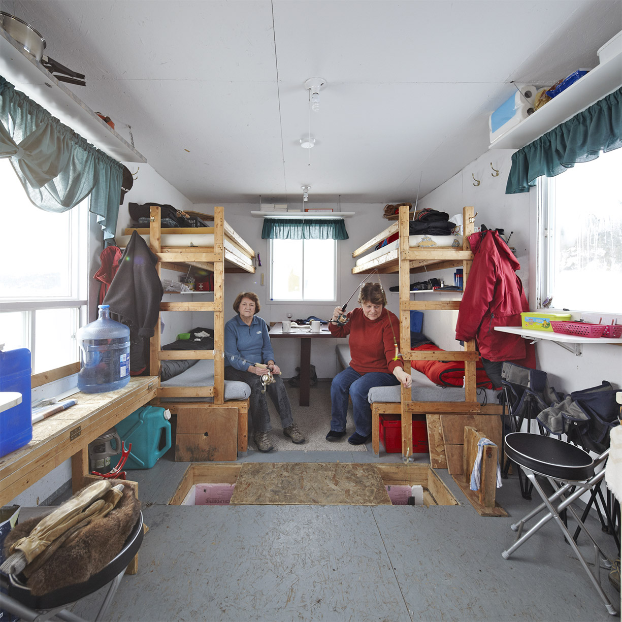
I know you are an architectural photographer, what drew you to the ice huts and do you shoot interiors?
For me, an ice fishing hut is the most fundamental expression of architecture. It is designed and built by the owner. It is transportable. It is shelter with a hole in the floor serving a common purpose. Yet with a similar list of design criteria each one is uniquely different; a testament to the owner’s personality. I shoot the interiors when possible, but it is more difficult than you would imagine.
How do you deal with the obstacle of limited space for the interiors? The limited space can be handled with wide angle lenses, however, my square format framing (from the exteriors) has challenges inside. I always try to include the augured hole(s) in the floor but sometimes they get cropped out. And then there is the issue of the fishermen inside, toasty and warm. These aren’t portraits and I would rather the huts be empty.
Is it difficult to be invited in for an interior? ( I’d imagine you’re happy to step into a 90 degree tiny room for a spell ) Actually going inside a heated hut is not ideal when you are bundled up and on the move. Its like a jogger at a red light: they don’t rest, but actually keep jogging on the spot. As well, the equipment doesn’t like the extremes of cold to hot and back again. Lots of sensitive electronics and optics that get condensation then frosty can lead to issues you don’t want to deal with. And of course there is no polite way to turn down a drink, which can easily move on to several. When I find an area with a good number of huts and the weather is overcast and snowy, I try to get as much done outside as possible. The next day might be sunny and then you’ve missed those opportunities. As the focus of this body of work is an architectural study, I am less interested in portraits and having people in the shots, especially the interiors. Also, the extreme wide angle lenses can stretch people at the edge of the frame in unflattering ways.
How long do you spend in one location? Do you have a snowmobile to get around?
The amount of time varies depending on the number of huts and the weather. I prefer to drive to locations for several reasons, the most important being the discovery of gems along the way. I also can carry my full kit of gear: lenses, a sled, additional boots and other bulky items. When flying everything has to be stripped down to regulation size and weight which results in compromise. I do fly to locations west. However, my starting point in Toronto allows me to drive to locations east. I’ve driven to Newfoundland twice which is 36 hours and includes an overnight ferry cutting through 6′ of ocean ice with lots of white out conditions along the way. A snowmobile would be helpful for some situations but hauling it around all the time would make me less agile and unable to navigate the backroads which often lead to wonderful surprises. So I walk a lot. Snowshoes and a sled with my gear pulled behind. Once I spot a location I will study the huts with binoculars to see if they are worthy of the possible hour long walk to get out. I keep to daylight hours, which in winter ends at 4:30pm. After that its easy to lose your orientation and find your way back off the ice, especially if the weather turns. Even the wind can reduce visibility with blowing snow, which, ironically, is what I search for. Google is not a reliable back up as cell service is often non existent or spotty.
Do you have a favorite hut or village that you’ve photographed?
I have many favorites but one that comes to mind is Ice Hut # 556, Ghost Lake, Alberta. The rocky mountains are in the background and the hut is like a log cabin, hand hewn timbers with a little smoke stack. Quintessential Canadian.
Aside from retouching yellow snow, do you do any additional work on the images?
When conditions are ideal you are 85% there: light snow, soft (distant) background, bright colours. Because I shoot digital, there are a million ways to process the files from the source data a raw camera file gives you. Grey and white and snow are very tricky to render what the eye sees. I tweak the saturation and contrast a bit, all part of the processing options. Remember Ansel Adams would play with processing temperatures to achieve greater detail in the shadows. Same principles apply: its about rendering a scene to what you experience in the moment, beyond what a basic average metered exposure will achieve. A fresh snowfall always covers up the often gritty surroundings of a clear day.
How much equipment do you bring along and it’s there any techniques you have for protecting gear from the elements and keeping your hands warm?
Those little hand warmer pouches in mittens are the only way to last any length of time. Fiddling with large format lenses, shutter releases, focusing knobs all require bare fingers for articulation. popping them back into a warm mitten brings frozen digits back to life. Otherwise, layered clothing. Walking distance in thick snow pulling a sled works up a sweat even at – 20 (celcius). Keeping all the heavy items on a sled allows you to be mobile and lighter than if you had a back pack, which would be unsafe in certain ice conditions. Its all about spreading the weight around.
Who printed it?
Modern Postcard printed the postcard
Who designed it?
Kerri Abrams was the designer.
Who edited the images?
My producer, Trevor Power, and myself.
How many did you make?
A little over 500.
How many times a year do you send out promos?
Vault magazines about twice a year, postcards closer to every 6 weeks.
How did this project come about?
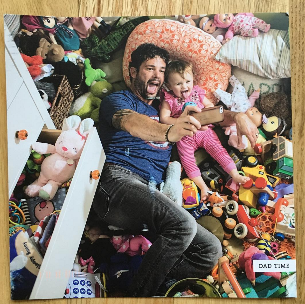
The #dadtime project actually started a couple of years ago more specifically as a hipster dads project, inspired partly by my surroundings and by my new role as a parent. The first image I made was the beach dad with the mermaid tail – it was an incredibly lo-fi production shot near my parent’s house in Minnesota, and is still one of my favorites within the more stylized genre of imagery from the series. From there we photographed a couple more pieces for the series and then I took a break from it. During that break, I shot an entire series on parenting in general with more of a documentary approach.
What inspired you to start this series?
Part of this project is truly inspired by my own husband and his role as primary caregiver for our two young sons. When I finally shot him for the series, I decided to take him to the grocery store, where he ends up several times a week doing all our shopping with the boys. The cover of the dad time promo and one of the inside spreads resulted from that shoot along with a handful of outtakes that I love. My youngest son cried the entire time for me to pick him up and the two of them threw goldfish on the floor – all of which could not have been more true to life.
Another image in the magazine features a dad with his baby sleeping on the couch together, with his older daughter waking him up. This was inspired by an iPhone image I shot of my husband in his pajamas looking exhausted with the kids sitting on top of him. Most of the more documentary moments I capture have also happened to me. One of the more recent images, for example, is of a dad juggling two toddlers at his desk – something I often do with my 2- and 4-year-olds when I’m in my home office if they are missing me during the day. As much as the project is inspiration from dads themselves, I consider many of the scenes to be self-portraiture with the dads playing me.
Are you planning to expand this body of work?
I started focusing primarily on the #dadtime project again this spring and have photographed probably a dozen or so different dads since then, with a lot more planned for 2016.
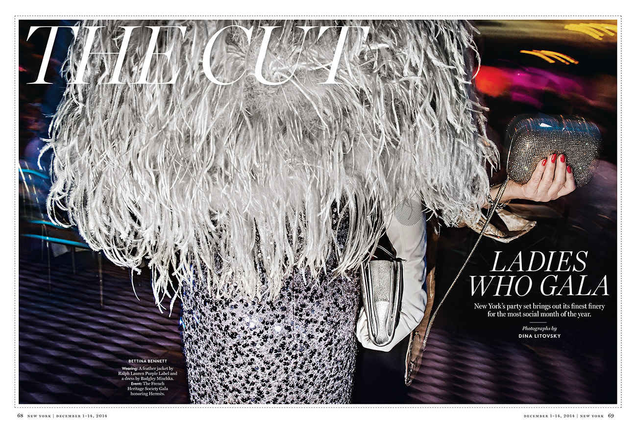
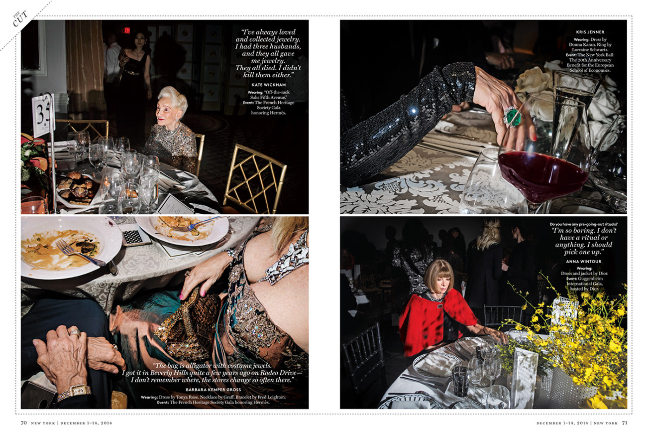
Director of Photography: Jody Quan Editor for Ladies who Gala: Roxanne Behr Editor for Gayle King: Marvin Orellana Photographer: Dina Litovsky
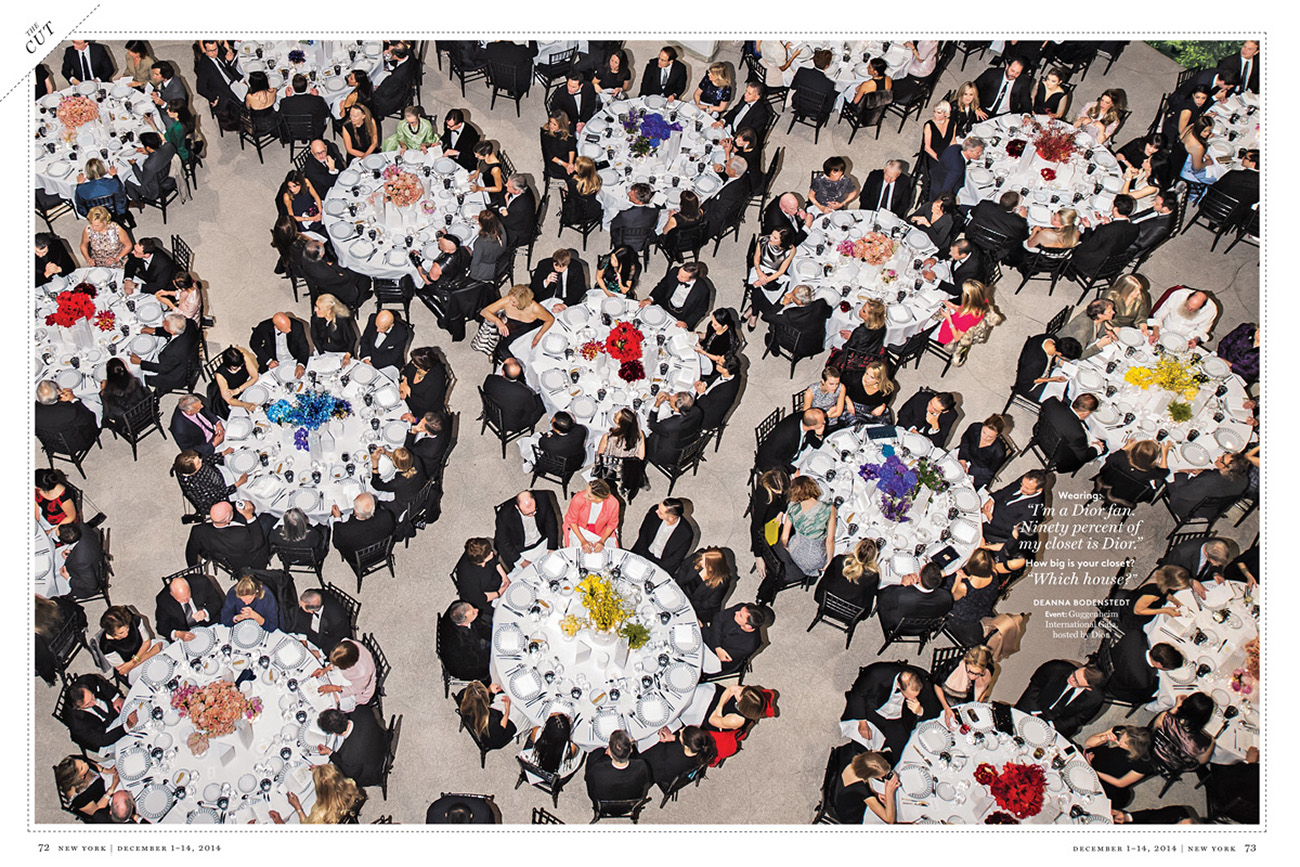
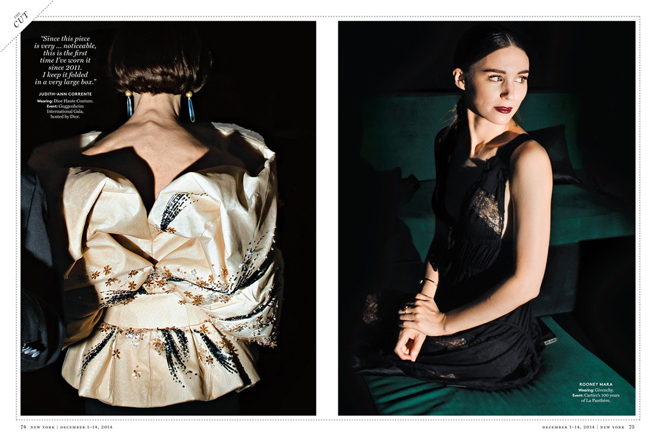
Heidi: How do you make yourself “invisible?” and when the subjects start to notice the camera, how do you deflect/deal or overcome this?
Dina: It’s impossible to make yourself invisible when working with flash in low-lit environment. The hardest thing is to avoid the subjects posing for the camera, since everyone assumes that’s the shot the photographer is looking for. One way to avoid is it wait on the side when other photographers gather take their shots – once they are done people tend to instantaneously relax and take off the game face – that’s when I snap a few images. Another way is to move in very quickly before the person realizes they are the subjects of the image, that works when they are distracted by being on the phone/talking with someone. It’s easier to shoot subjects in a crowd, people don’t think that I’m singling them out and just ignore the camera. The hardest image is of a person alone in their own space – I either need to be super fast or let them pose first for the camera and then once they think the shoot is done take one more photo.
Did you have an assistant and how much gear do you typically bring?
Usually I have an assistant to help me with the off-camera flash. That allows me to direct the light from many directions and it’s especially useful in large spaces when shooting crowds. Held in the right way, the flash isolates the subjects that I’m interested in while still preserving the ambiance of the space. I bring just minimal amount of gear – one lens, on camera transmitter and a flash.
What did you wear?
I always wear all black and most importantly, very comfortable boots.
What type of direction did you get from the magazine?
The editors wanted to feel the exclusivity and the decadence of the scene and of course see a lot of celebrities, but other than I had a lot of freedom to experiment. I was sending in the images after every few days to make sure that the story was on the right track. There were some adjustments done but we were on the same page from the beginning, which was great.
This event has a unique subculture, what elements were you trying to show without being ostentatious or was this the point?
In part the focus was on photographing the over-the-top jewels and the clothes, they were a big visual part of what was happening. But I was also interested in the interactions between the guests and their mannerisms.
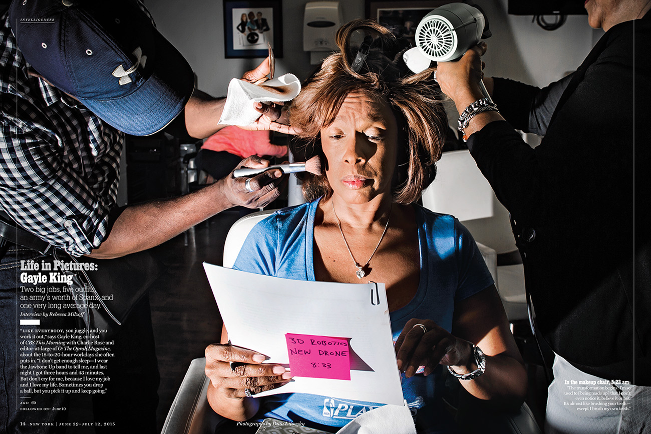
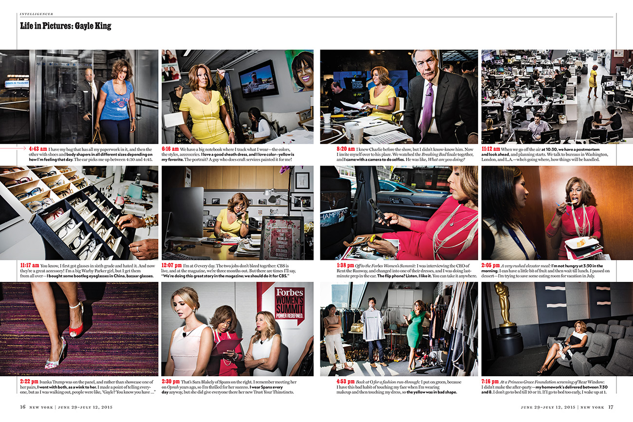
Gayle King Story
How hard was it to keep up with Gayle?
The hardest thing was waking up at 3am to make it Gayle’s place by 4:30 am. I am definitely not used to that so it wasn’t easy to get into work mode right away. Gayle goes into hair and makeup at every morning at 5am at CBS and doesn’t rest until 11pm in the evening. I found her energy contagious so other than that first hour in the morning the shoot was both challenging and invigorating.
Since you parallel her, what tricks to you have to stay engaged and working the entire time?
Most importantly I make sure to get a good night’s sleep, I need at least 7 hours a day to feel fully functional so with Gayle I was in bed by 9pm. I start out with an espresso but that’s all I need to get going, once I start shooting the adrenaline keeps me awake and alert so I can shoot all day without feeling tired.
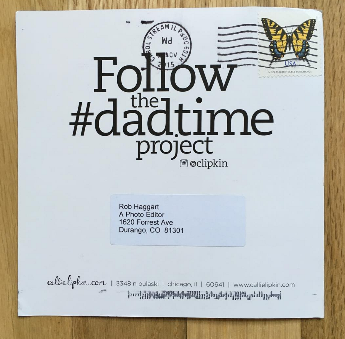
Who printed it? This booklet was printed by J.S. McCarthy Printers.
Who designed it? My studio manager and I designed it but we also got some key feedback from my studio mate Warren Corbitt of Primary & Co.
Who edited the images? I edited the images with the help of my studio manager.
How many did you make? We printed 750 and I sent out about 675, keeping the rest for leave-behinds.
How many times a year do you send out promos? Two print promos per year seems to be my sweet spot lately. I always want to make sure there’s enough super fresh work to share and creating that work obviously takes time. So does the editing and design process too!
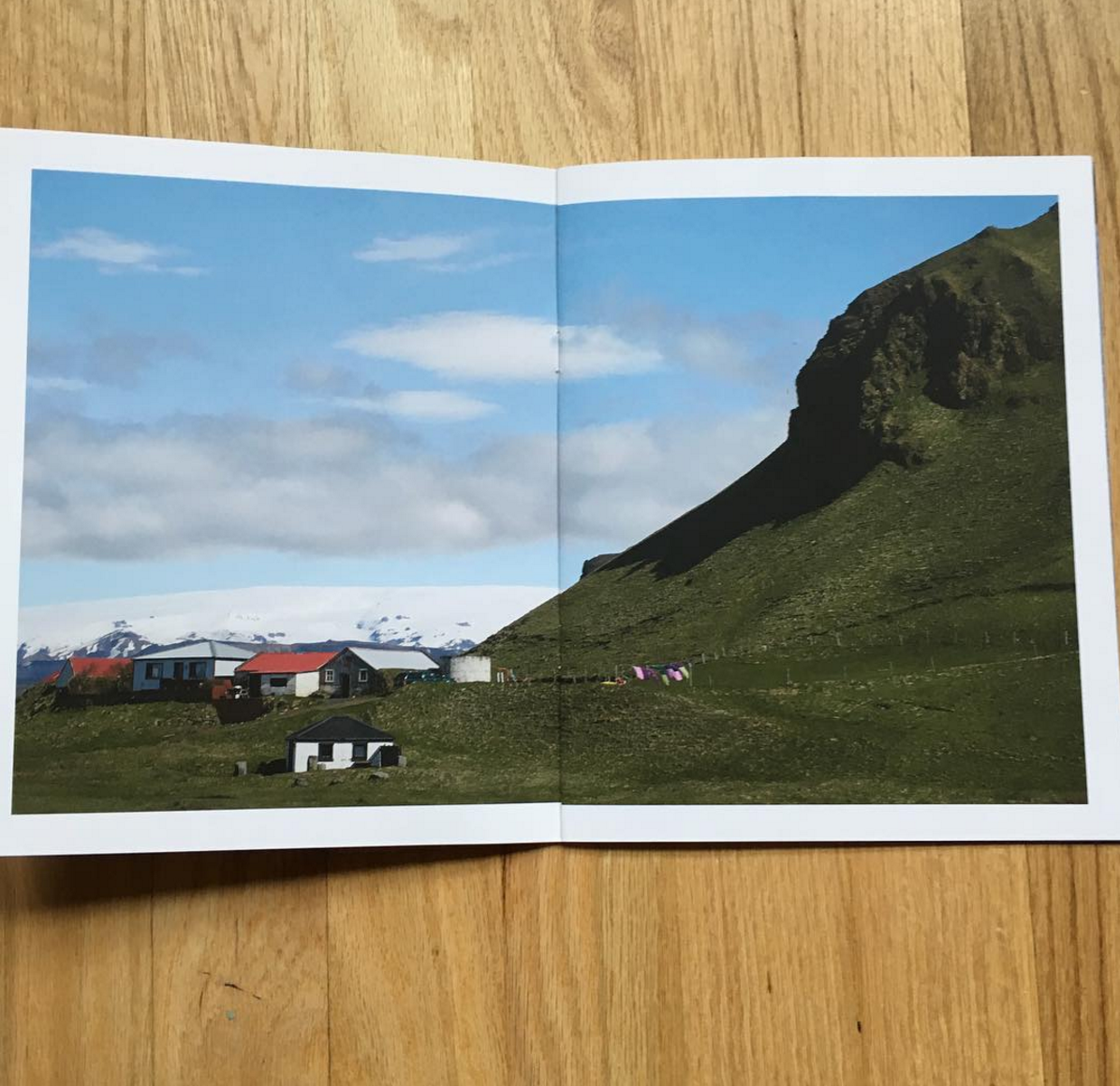
Did you shoot images specifically for this promo? This promo featured a lot of work that was shot specifically for it and none of it had been seen before. We started the layout with FPO images, some brand new and some that were much older, to begin to create a sense of place, style, palette, and season. Some of the newer images that made the final edit were ones that I shot while on vacation in Iceland this summer and a couple came from editorial assignments. The majority of the images were captured on two different test shoots that I produced with this piece specifically in mind.
Elevation Outdoors Editor-in-Chief/Photo Director: Doug Schnitzpahn Powder Director of Photography: David Reddick SKI/Skiing
Photography Director: Keri Bascetta Photographer:Liam Doran
What was your first paid editorial assignment?
It has been a while so I’m not totally sure, but I think it was a backcountry trip I shot for Powder Magazine. We got on the Durango-Silverton train and were dropped off in the middle of the Weminuche Wilderness. From there we would hike in six miles and climb a few thousand vertical, put in a base-camp and ski 14,000 foot peaks for a few days. When we got off the train, I had a fever of probably 102 and it was pouring rain. It was a brutal hike but I made it in, but my fever would’nt break for another 36 hours.
How many days a year do you travel?
I would guess about 150. I now have two young girls, Bergen 4 and Elsa 2, so being gone for long periods of time puts a lot of stress on the family. I am fortunate to have an amazing wife who very much supports my work and understands what it takes for me to achieve my photography goals.
For a shot like this there are no do overs. Are you stationary or also skiing?
During the shot I’m stationary of course but as a ski photographer you certainly have to be a very proficient skier.
How many locations did you scout for this cover shoot for Elevation Outdoors?
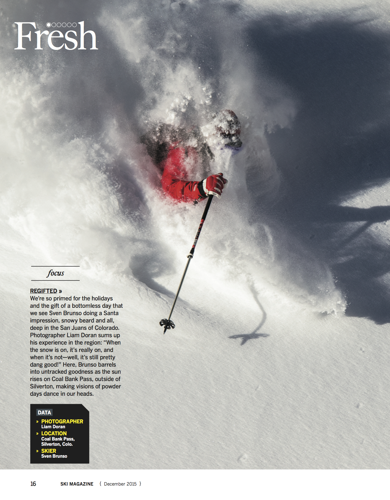
None really. The location is Coal Bank Pass which is between Durango and Silverton in southwest Colorado. My athlete Sven Brunso skis here regularly so he knew where the snow and light would be best. We were able to work about a 1,000 foot section of ridgeline from top to bottom and set up 8-10 different shots on the way down.
How long did it take you to skin up to this location.
( climbing skins are a tool that backcountry skiers use, to ascend the mountain ) We were moving pretty efficiently so I would guess about an hour maybe hour and a half.
How cold was it; does it affect your camera gear?
It was single digits when we left the car but as the sun came up it warmed to the low 20’s. I use a Canon 1DX and it has great battery life so the cold does not affect it really. I use Sigma lenses exclusively and they have never had any issues due to cold weather.
Where did you find the cover model, who is it?
Actually the athlete found me on this one. Sven Brunso called me up and invited me to come ski some of his favorite spots. We had a great shoot (this is our third cover together) and we continue to work together.
Since you’ve been doing this for so long, do you know you athletes limits?
I do…and they know mine!
For a fresh powder shots there are no do-overs. Do you train for ski season assignments since you are also carrying gear? Fitness is a huge part of being a successful ski and outdoor photographer. I will do some ski specific training during the lead up to ski season but more importantly I try to maintain a high level of fitness throughout the year. You can’t concentrate on photography if you are exhausted from your hike up the mountain, so I am sure to build plenty of athletic time into my workweek. The few days a year that I get to ride/ski/hike without my pack I feel super fast!
How can you tell it’s time to call the shoot to avoid injury?
Unfortunately injuries are part deal in ski photography. They can happen anytime but usually it happens at the end of the day when everyone is getting tired. I have had numerous broken bones, deep lacerations, two blown knees and other injuries. Most of the skiers I work with have had the same or worse.
Tell us about the “Fresh” image for SKI, how does your equipment perform in those conditions?
This image came from a shoot up on Coal Bank Pass. I had just received Sigma’s new 120-300 f2.8 lens and was looking to put it through the paces. Sven Brunso (the skier) and I got up well before sunrise and drove to a spot on the pass that Sven had previously scouted. The 120-300 is a big lens so I can’t get it super deep in to the backcountry. Luckily this shot was close to the road. For anyone wondering the lens is stunningly sharp and we got a Photo Annual cover in Mountain Magazine and this full page for SKI the very first time I shot it.
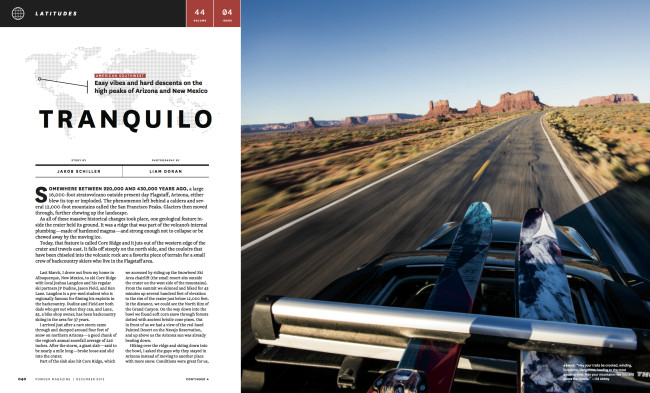
You had an interesting route to the Arizona Snowbowl, was that part of the Powder assignment to travel through Monument Valley?
Traveling through Monument Valley was not specifically part of the assignment but to get to Arizona Snowbowl from Breckenridge, CO this was the best route. We knew snow conditions would not be ideal and that the travel aspect of the story would be important and that’s what got me thinking about this shot. More specifically how to get an interesting shot that was not the cliché of looking down the road to the monuments.
How did you convince your wife that you needed to take her car instead of your truck?
Ha! Yes well convincing the wife to take her car was not too tough. I drive a Toyota Tacoma pickup truck and my skis and photo gear live in the bed while I’m on the road. To make this shot work from a storytelling perspective I would need to see the skis on top of the car. Since my wife’s car has ski racks it was a no brainer that I would need to take her car. By now she is pretty accustomed to my photo shenanigans and she was kind enough to acquiesce.
Who printed it? I had this promo printed by a family-owned business in Anaheim called, Quality Graphic Services. They work on projects ranging from books to posters. Between emailing and a face-to-face meeting, they were amazing to work with.
Who designed it?
The design was done by Shannon Ritchie. We worked on it for about 2 months. My aim was to make something that could be folded and kept as a collection of images, or hung on a wall. I selected 2 images that worked as posters, then built around those 2 with images that worked together
Who edited the images? I made the final edit, but had a lot of help from Shannon and my agent, Maren Levinson. As much of a struggle as it was, I really enjoyed the process. The final stages of editing consisted of removing photos as opposed to adding more. Once the images had enough room to breathe, it all fell into place and made sense.
How many did you make? I made 1000 and have sent out about 600 so far. With offset printing, the price difference between 500 and 1000 wasn’t much so I decided to go with more.
How many times a year do you send out promos? Every year has been different. It really depends on what kind of work I want to share and what I can afford. I try to send them at least twice a year.
If there is some sort of interesting backstory? I scrapped 3 other promo designs before committing to this one. I went back and forth between designing a promo focused on a specific body of work and a collection of my favorite images. I ended up going with a combination of personal and commissioned work made in 2015.
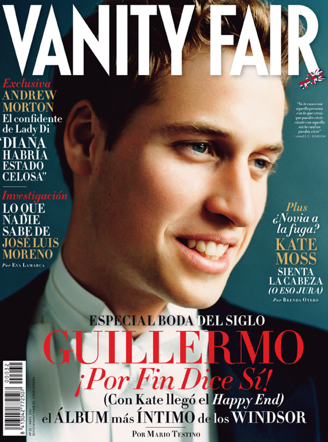
Editor: Lourdes Garzón Art director: María San Juan Graphic designer: Cristina González Vieco Photo Editor Mangaer: Beatriz Palomo Photo Editor: Sara Ocón
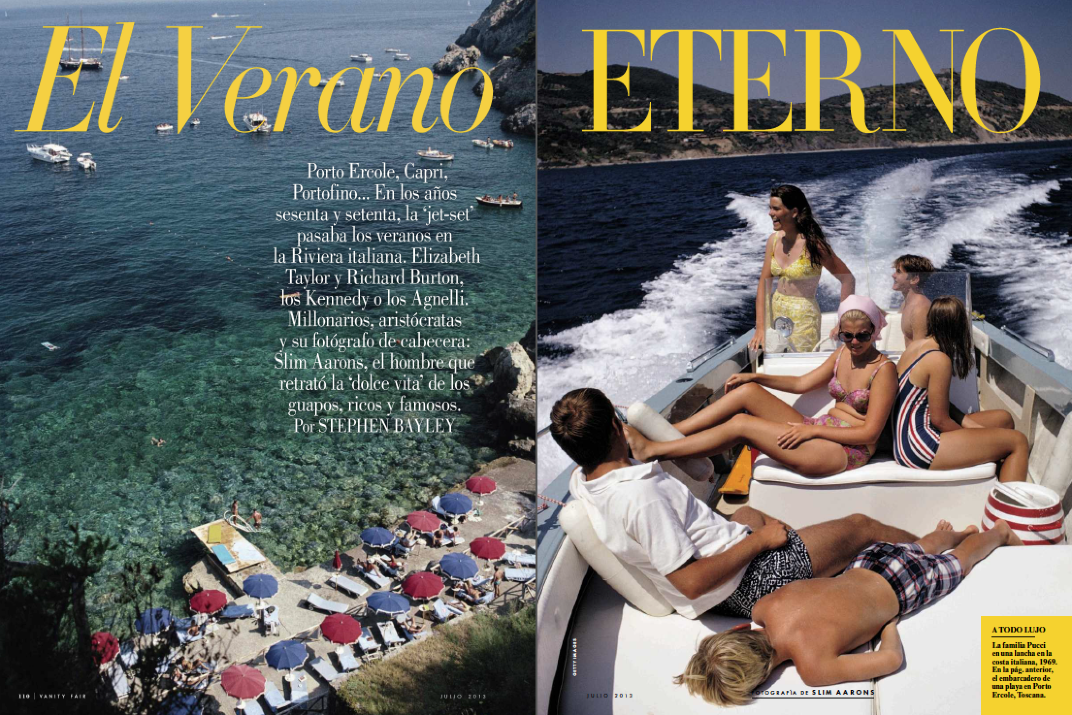
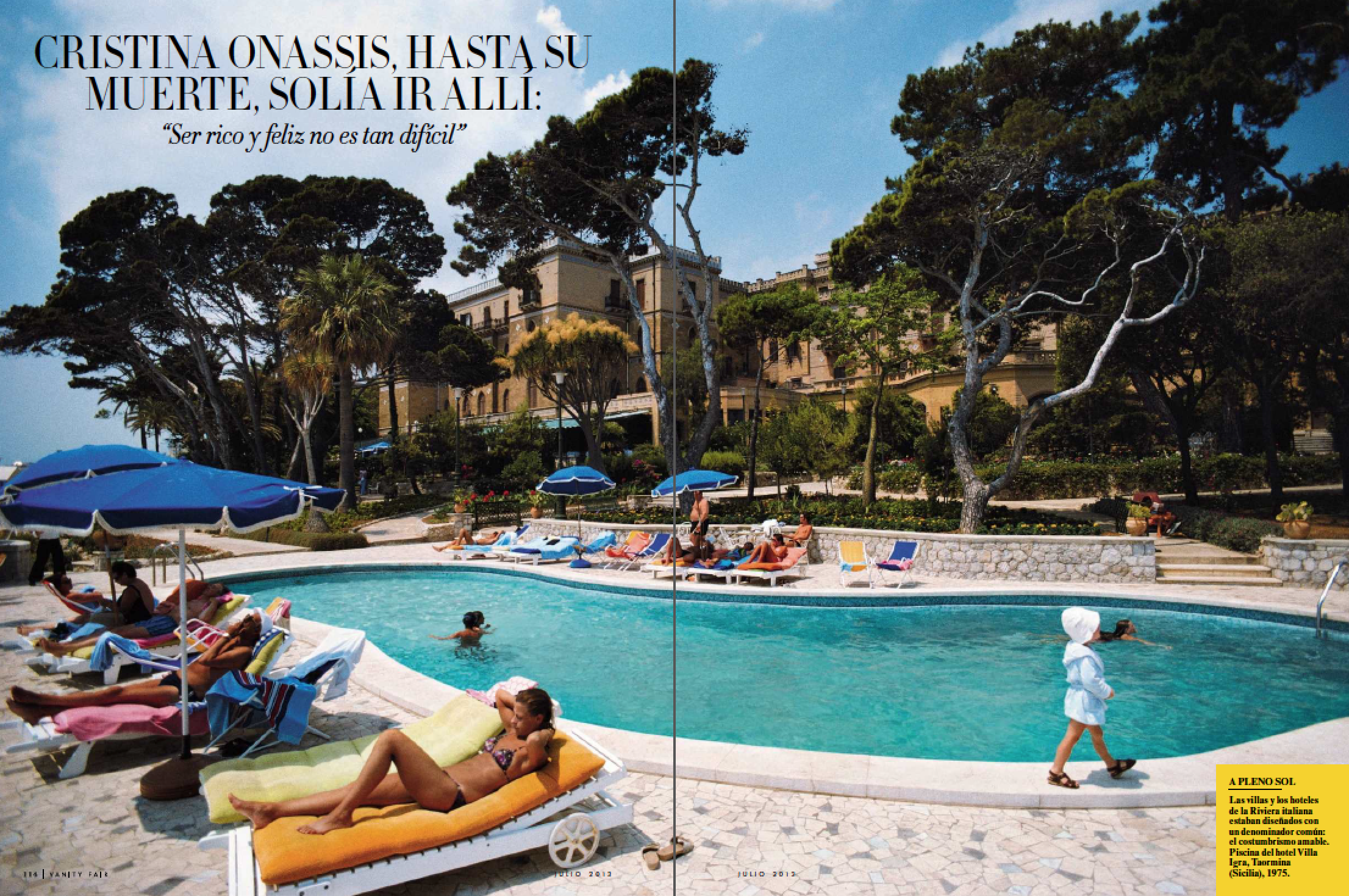
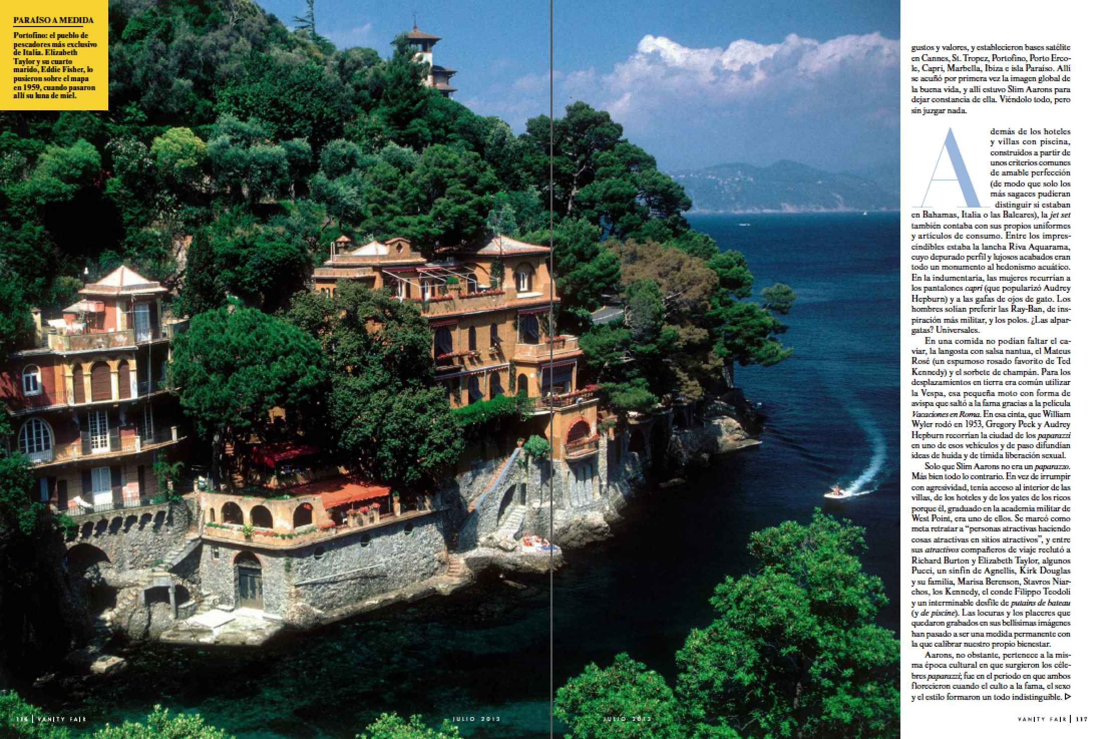
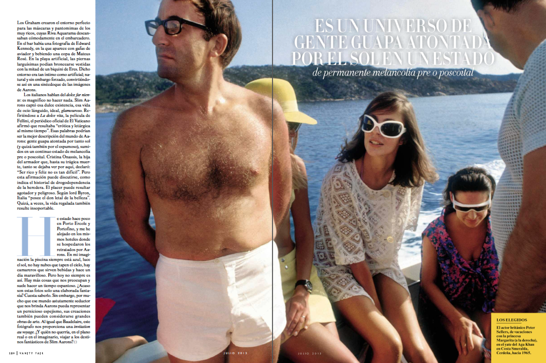
Heidi: How much of your photography is assigned? Beatriz: In Vanity Fair Spain aprox 20% of the photography is assigned. The rest of the content of the magazine is either syndicated from Condé Nast international titles, licensed by Condé Nast US archive, photo agencies, illustrators, photography archives, or other (film, music, fashion or beauty brands, personal archive from subjects that are interviewed, etc.)
What resources do you use to look for photographers? In Vanity Fair Spain photo edition department, we search among almost all archives, websites, agencies and photographers. Our daily work is to look for the best and most unseen photographs for our features. Web/Internet is the most used resource, as well as other magazines work (both our Condé Nast International titles and competitors) and our unique Condé Nast US archive.
How many promos do you typically get in any given week? I usually get between 50 and 80 in a week, many of them are not interesting for the magazine, but I love to receive good photo stories anyways, even if they are not what I am looking for the magazine I work for. I always try to save some time to review and see all the promos that I get (from photographers, from photo agencies, from illustrators, from representatives…). Even if the story is not related to the magazine I try to thank and send some feedback if I have liked the work (mostly in the times that I think ‘here is a very good photograph’). I truly think it is good to share this with photographers. If I would be -or when I was a photographer myself- on the other side, I would have liked to hear any feedback of my work (positive or negative, in my personal opinion, they both help).
(there is a Spanish phrase that says: always try to give what you would like to receive yourself).
Along with photo editing, I see you teach. What course do you teach and where? I am also collaborating as a jury for ‘Visa pour l’image, Perpignan Festival ‘ since 2014 and as a photographer’s portfolios viewer with PhotoEspaña (biggest Photography Festival in our country) in 2015.
The course I teach is ‘Photo edition in magazines’. I have given classes here to name a few:
Universidad Complutense de Madrid, a the Science of Communications University is where I taught in the 3rd year of Audiovisual Communications, documentation course.
This is also is where I studied my major/degree.


