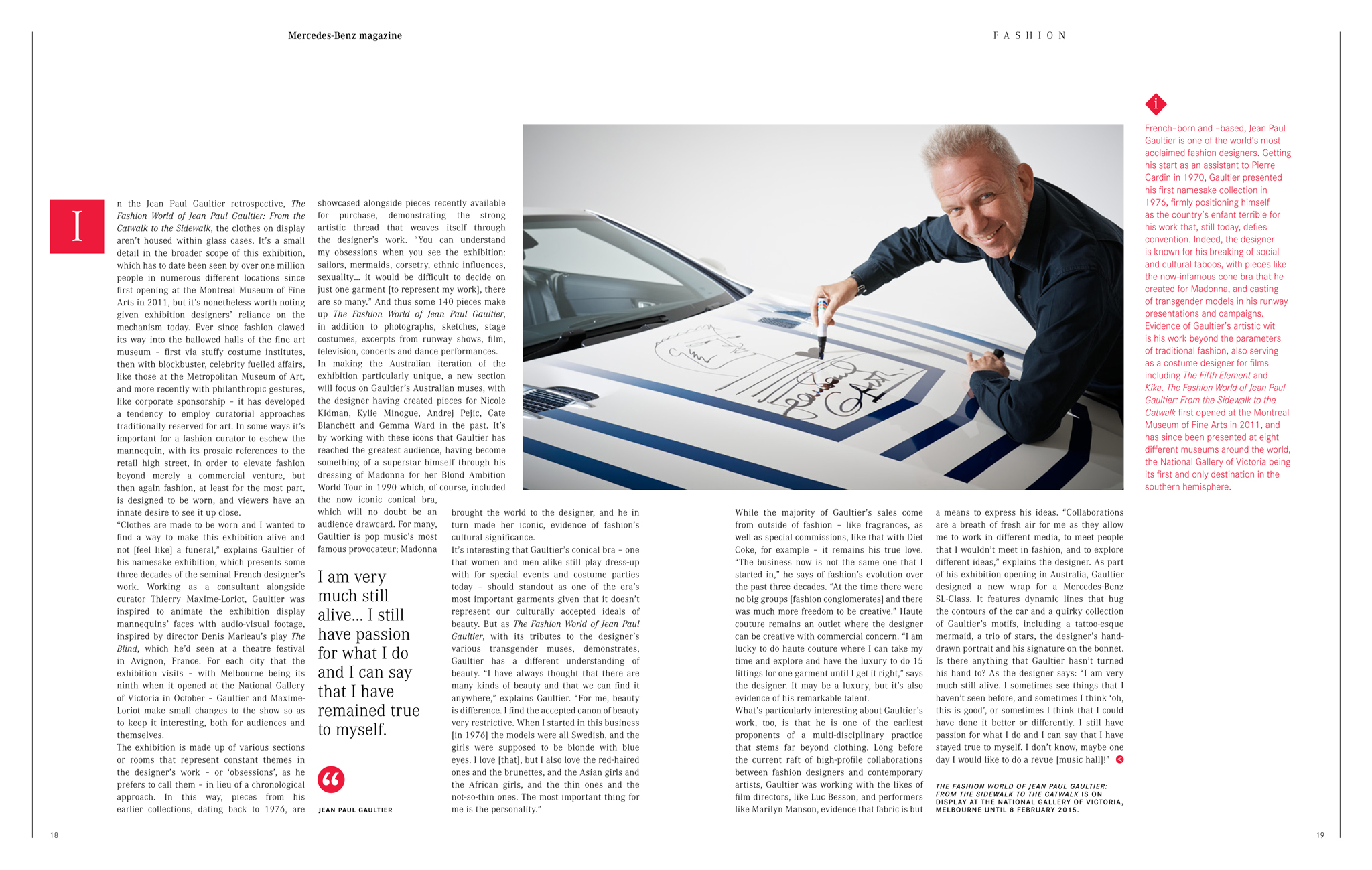
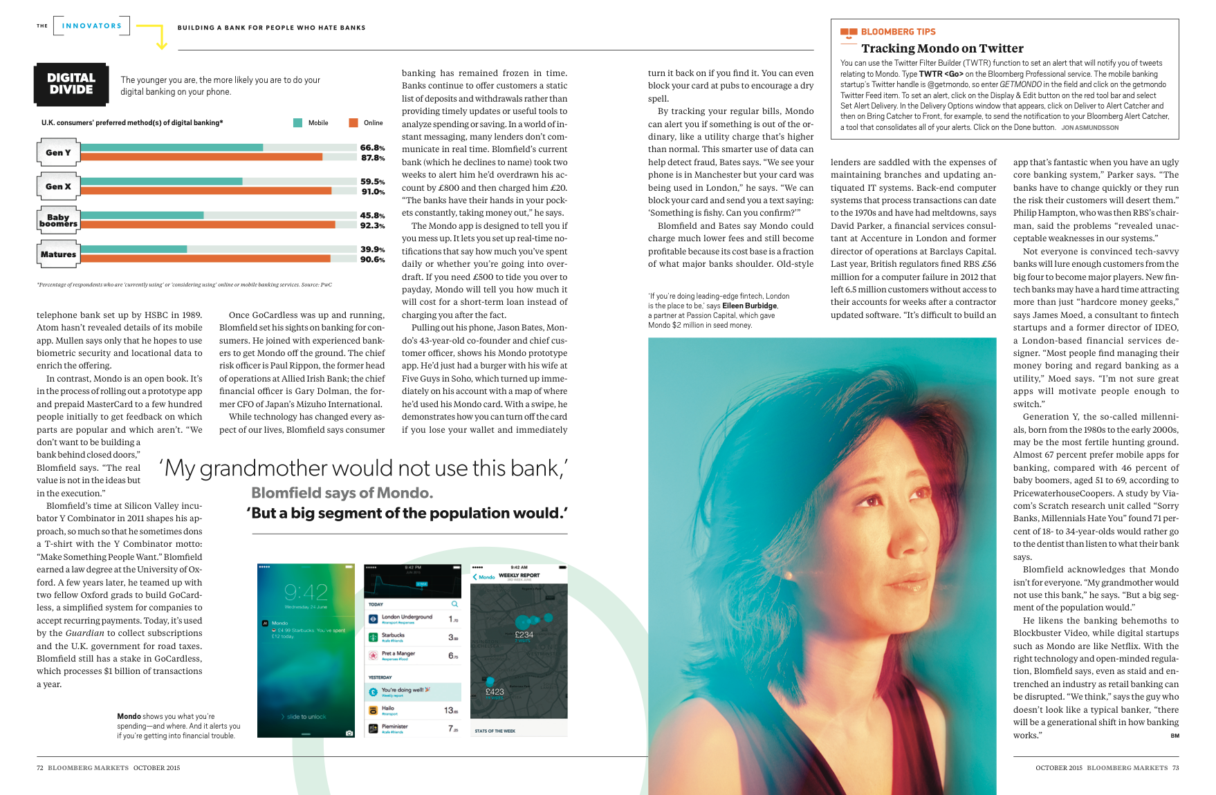
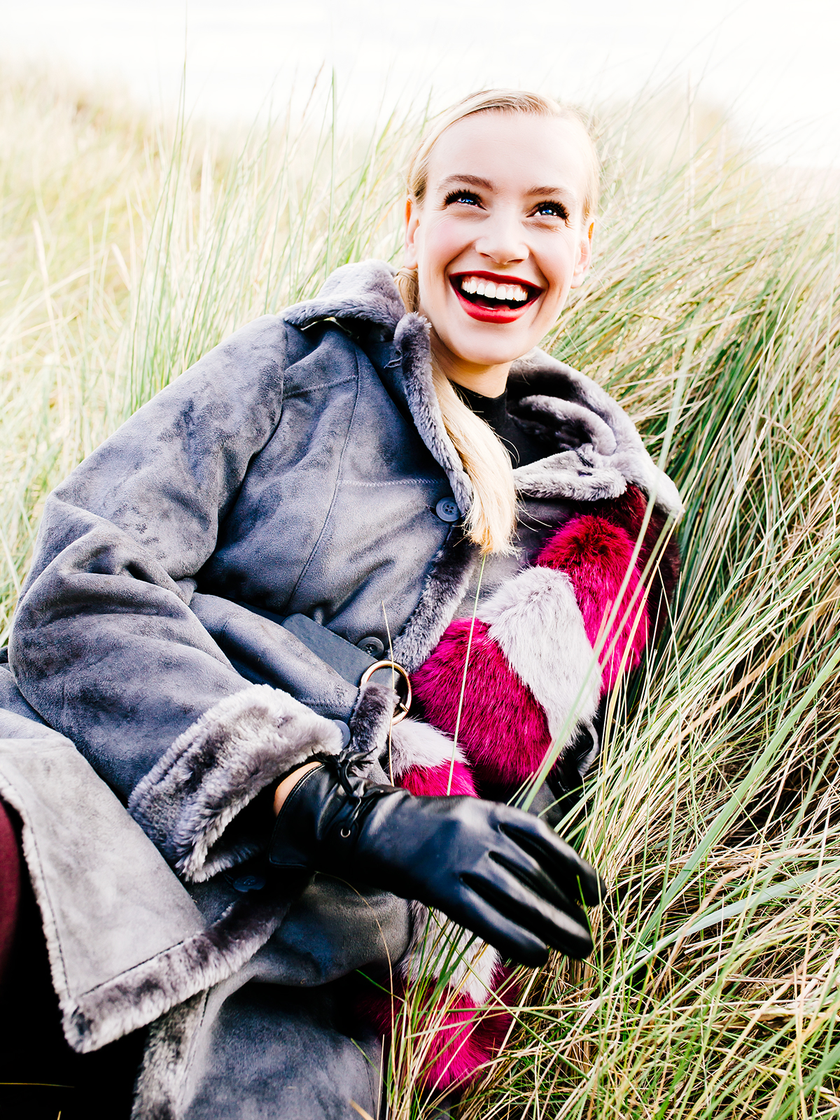
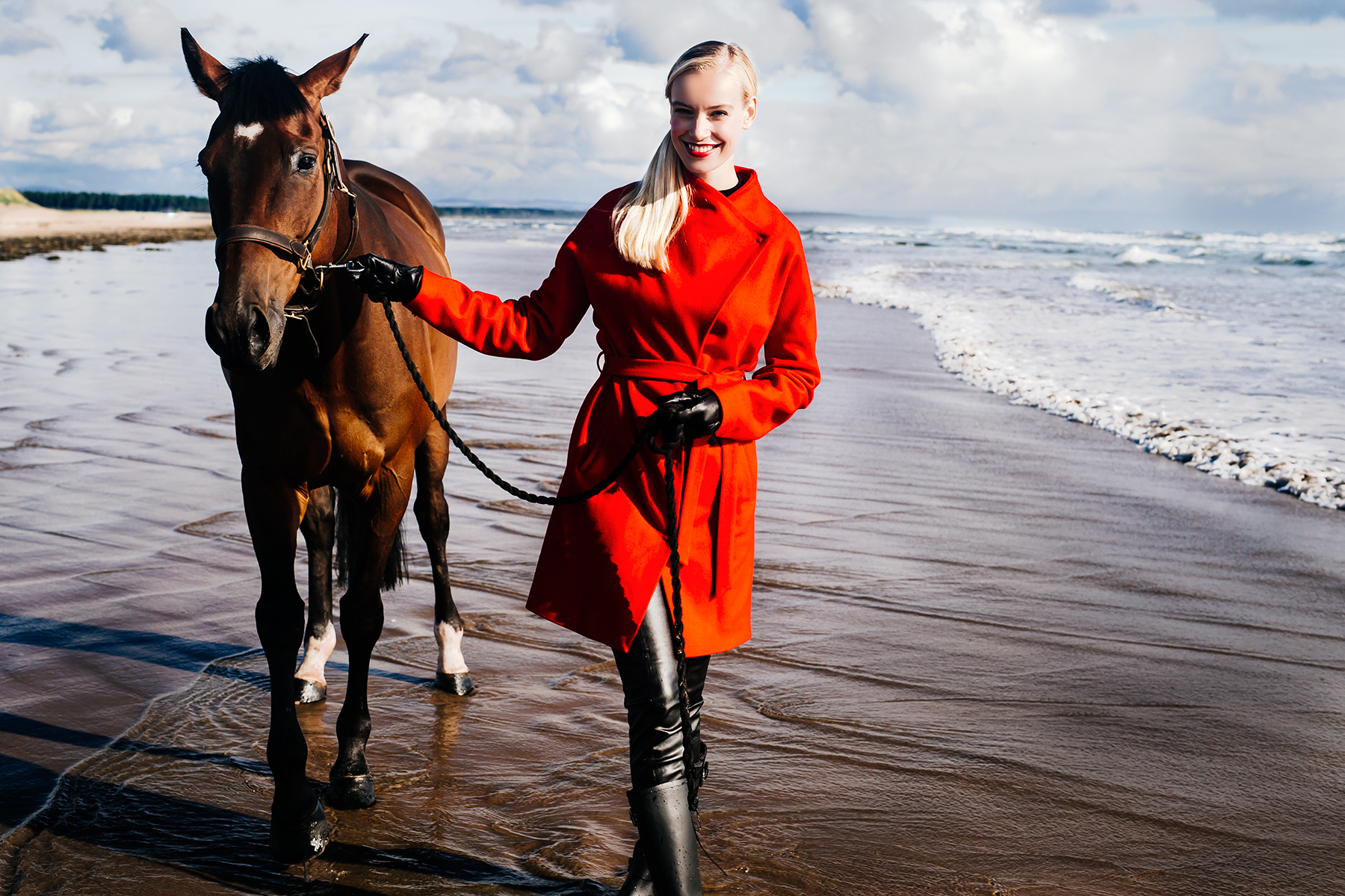
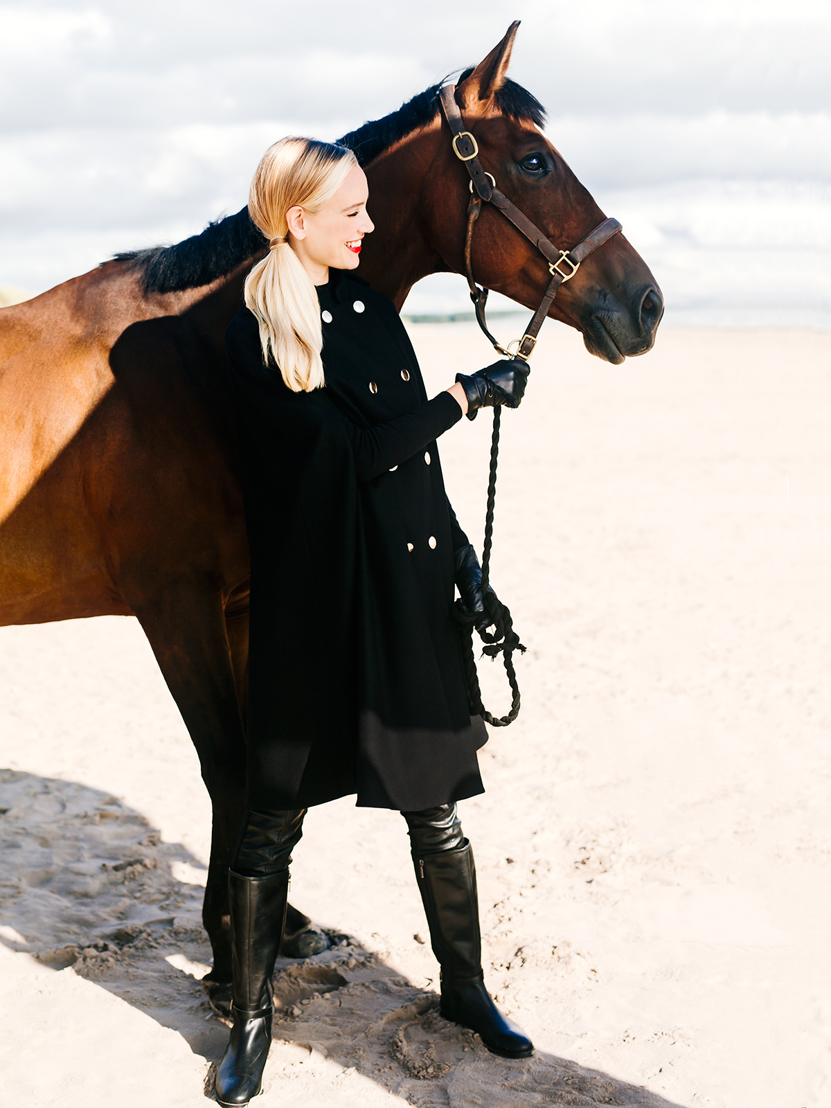
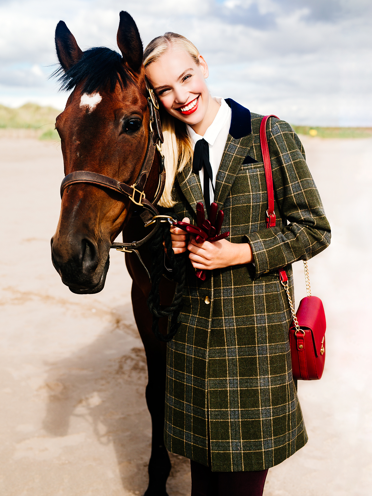
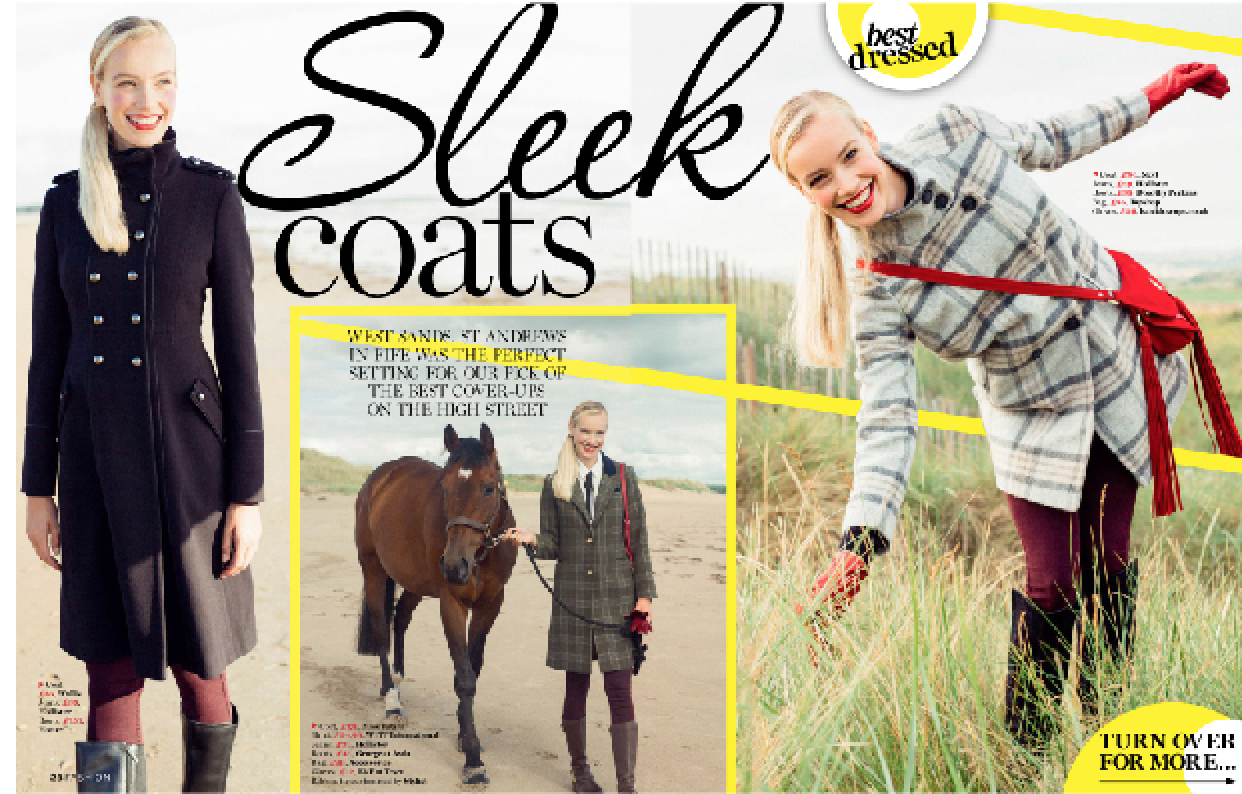
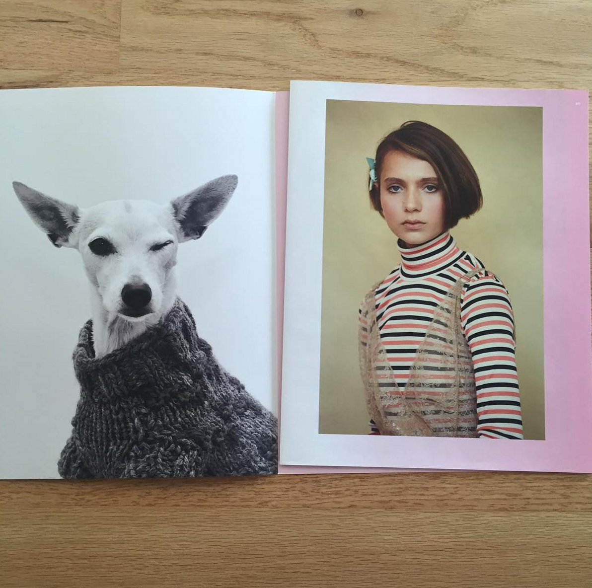
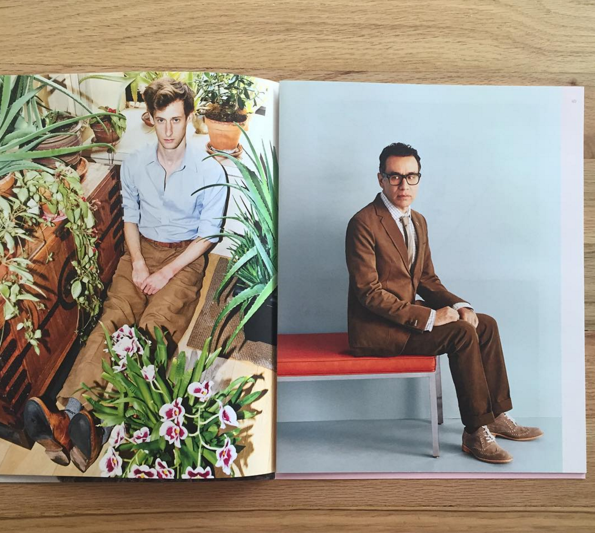
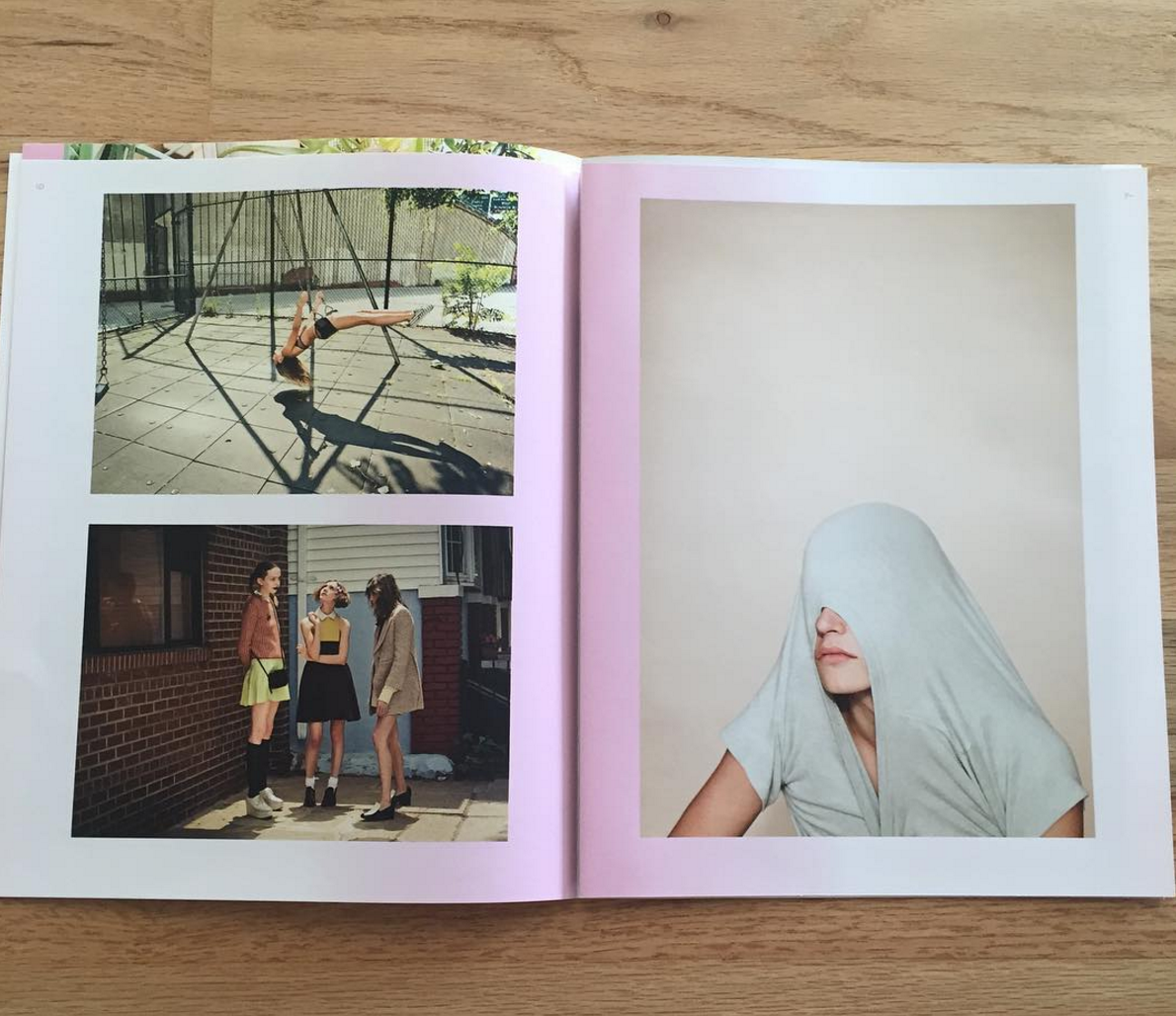
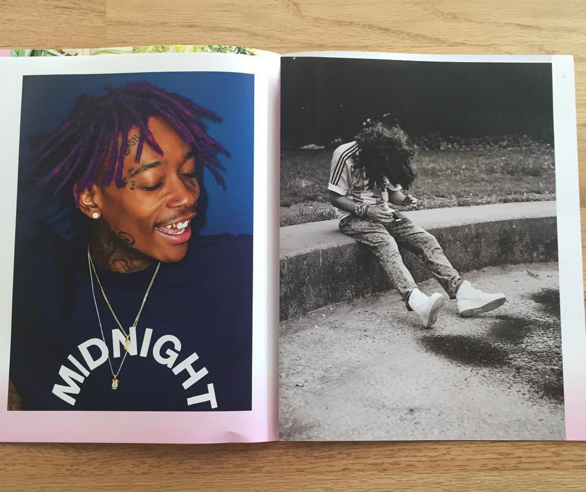
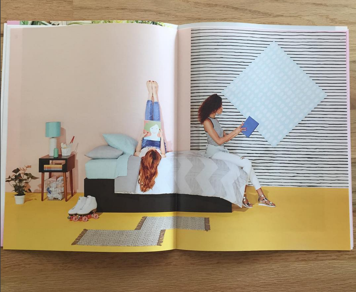
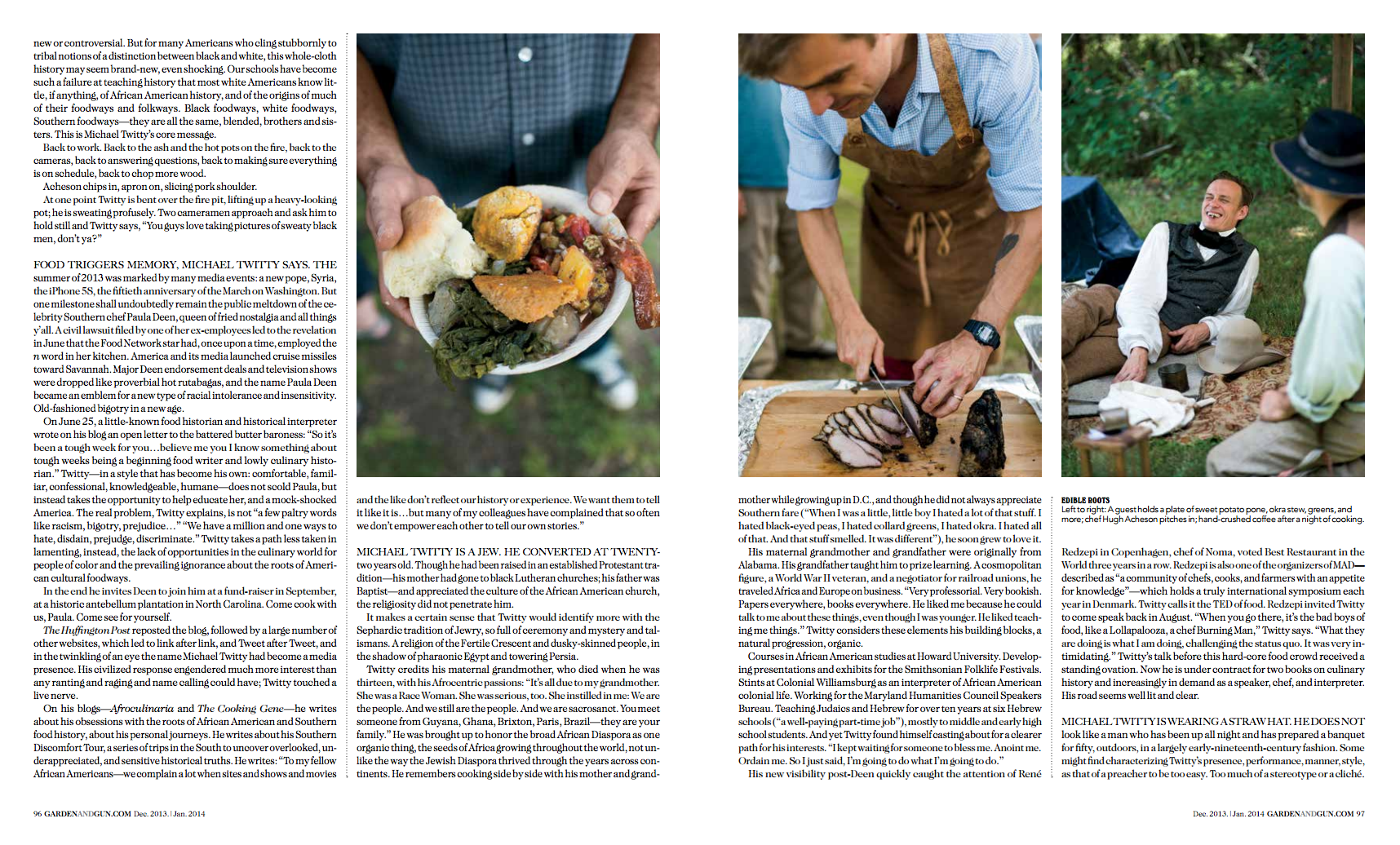
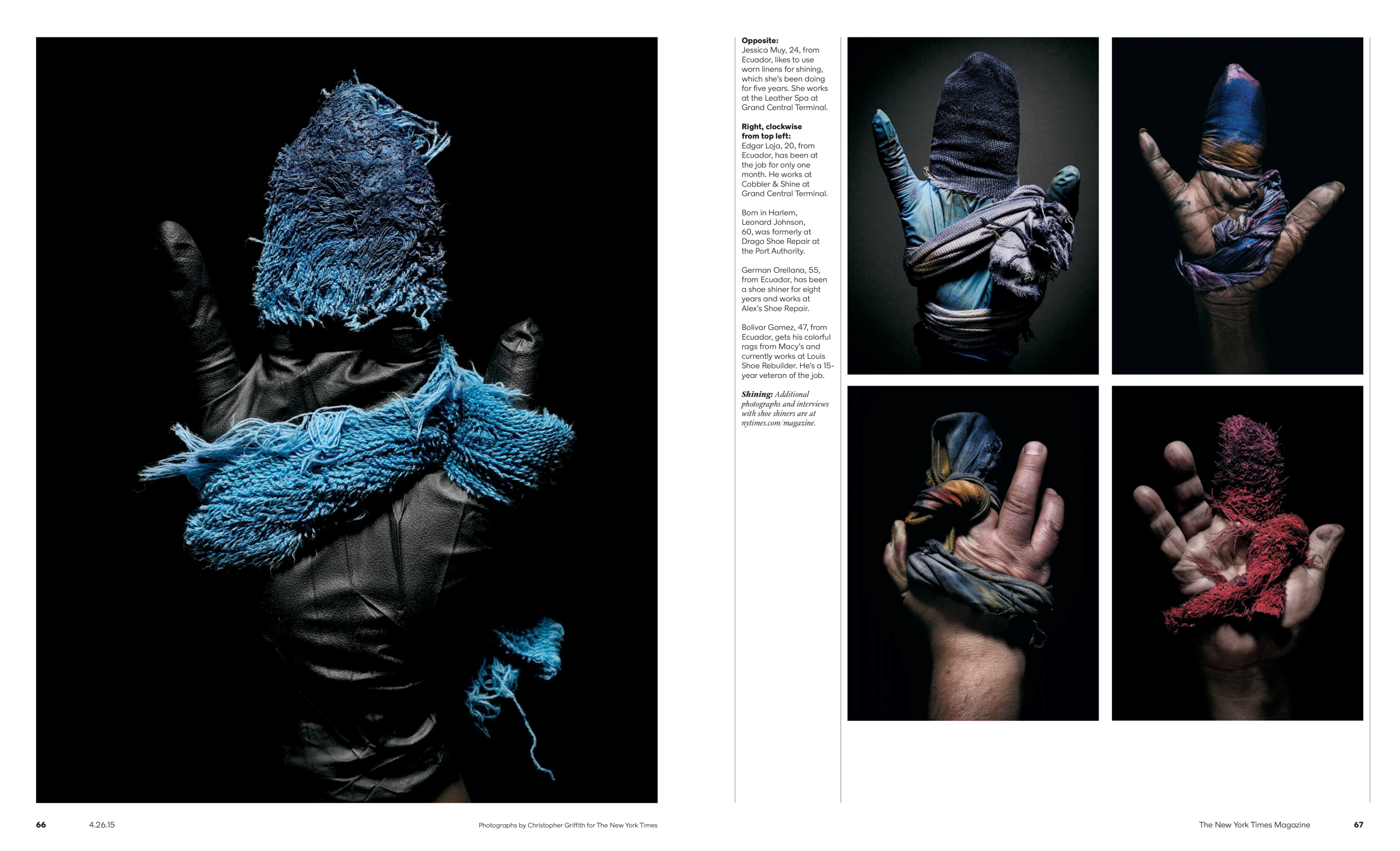
The Daily Edit – Mitch Feinberg: Marie Claire

unnamed

unnamed-1
unnamed-2

unnamed-3

unnamed-4

unnamed-5

Marie Claire

Market and Accessories Director: Kyle Anderson
Fashion Director: Nina Garcia
Editor and Chief: Anne Fulenwider
Photo Director: James Morris
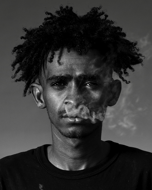
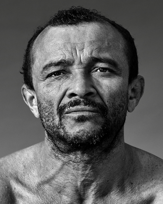
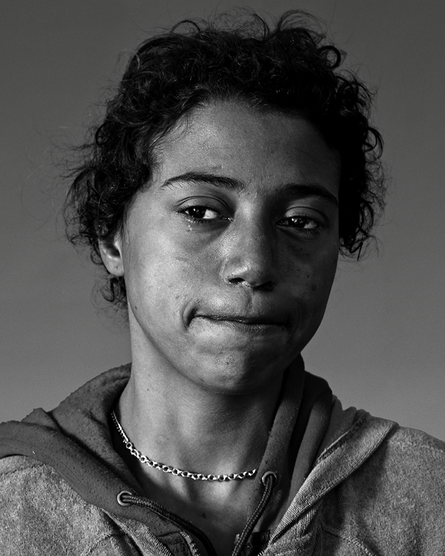
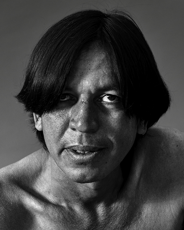
Photographer: Mitch Feinberg

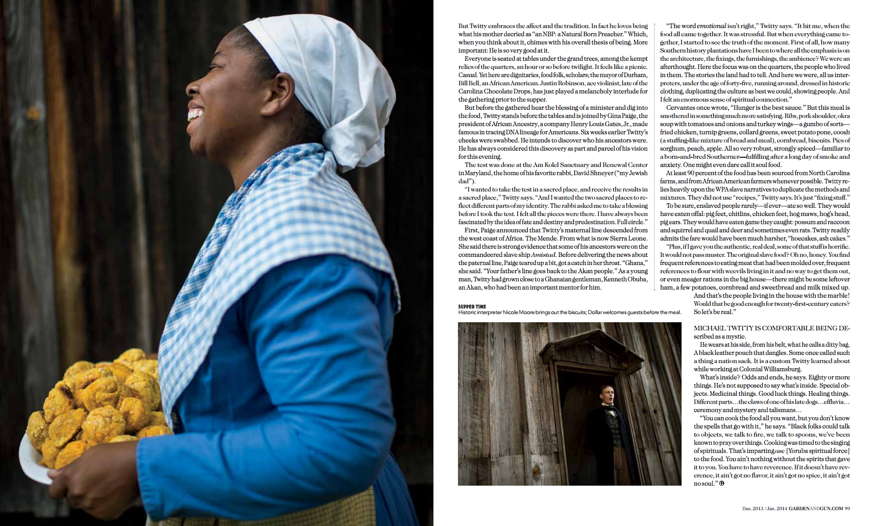
Heidi: How did this project evolve?
Mitch:
I have a wonderful relationship with Marie Claire. It is one of the few American fashion magazines that treat fashion still life pages as an opportunity to advance passionate editorial views on accessories and not simply as a vehicle to please advertisers. Their Market and Accessories Director Kyle Anderson, Fashion Director Nina Garcia and Editor and Chief Anne Fulenwider all take a direct interest in demanding that the pages are strong and fresh. For a still life photographer, this is a thrilling context in which to make new work.

Months before a final art due date, Kyle sends me jpegs of the next accessories story.  The story subject might be based on a color, a design direction, materials or a cultural reference. It’s usually my responsibility to come up with a visual solution, although occasionally he or someone else will have a few suggestions. I pitch just one idea, including swipes from industrial sites or stores that refer to the environments I want to create. I do not like to make drawings or send “finished” images — it is better to keep things loose so that I have room for spontaneity. Once I send the pitch everyone weighs in and we go from there.

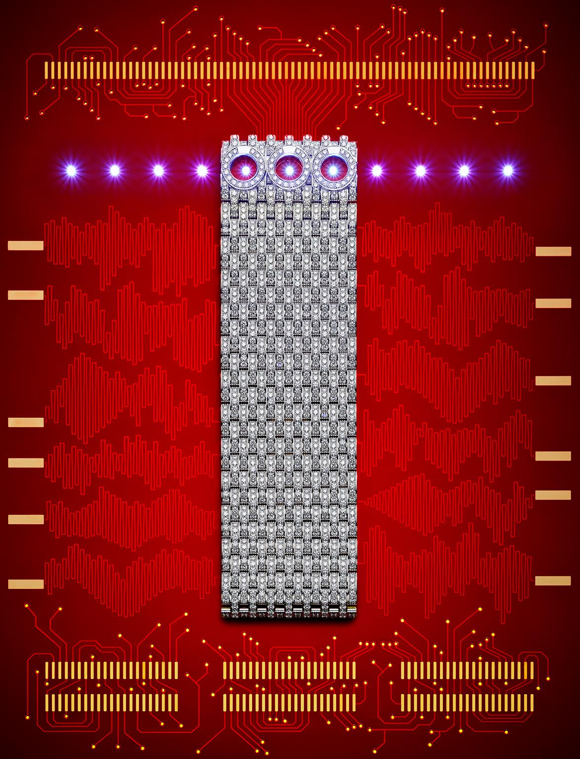
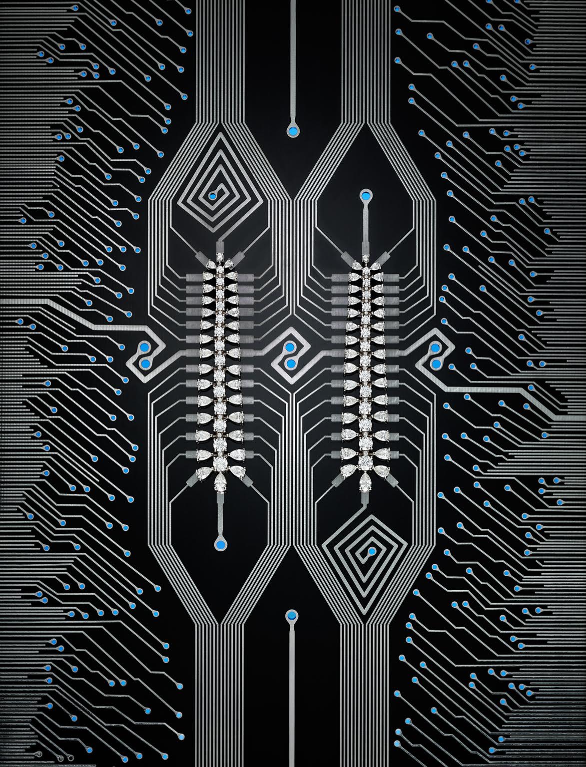
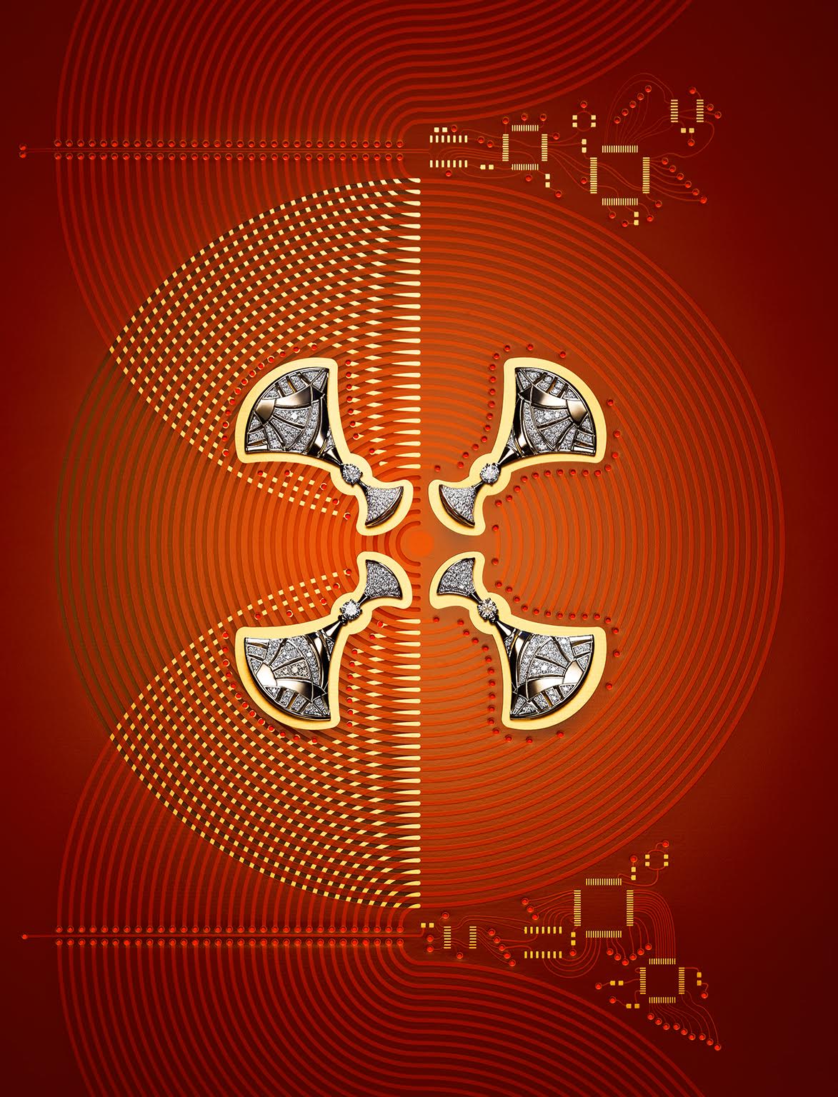
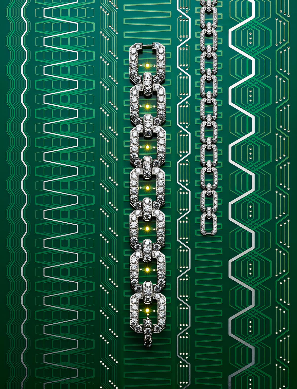
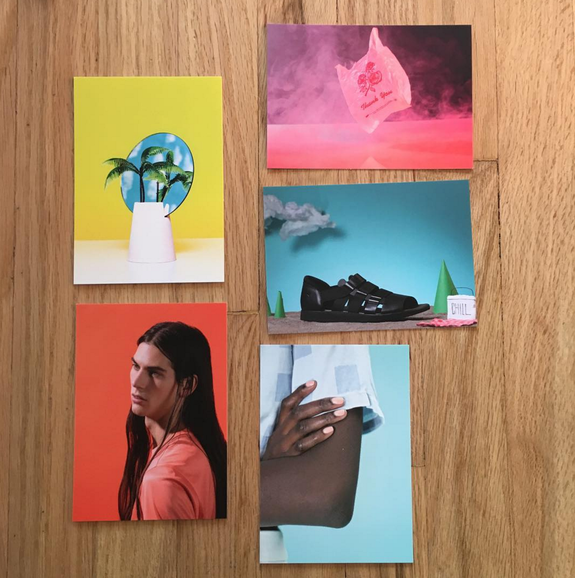
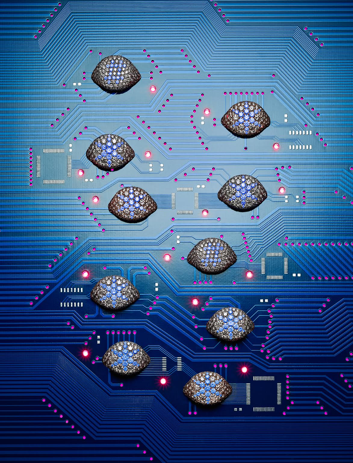
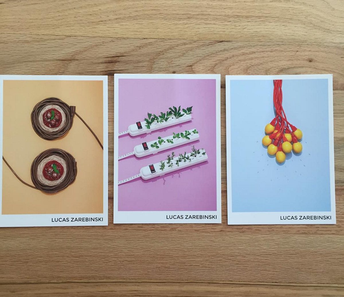
For the Haute Tech story, Kyle mentioned that he had a fine jewelry December story in search of an idea. Fine jewelry can be a tedious editorial subject because designs generally do not evolve much from year to year and diamonds are unforgiving in poor lighting conditions — a tough subject to make fresh.

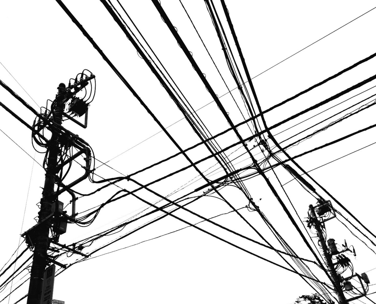
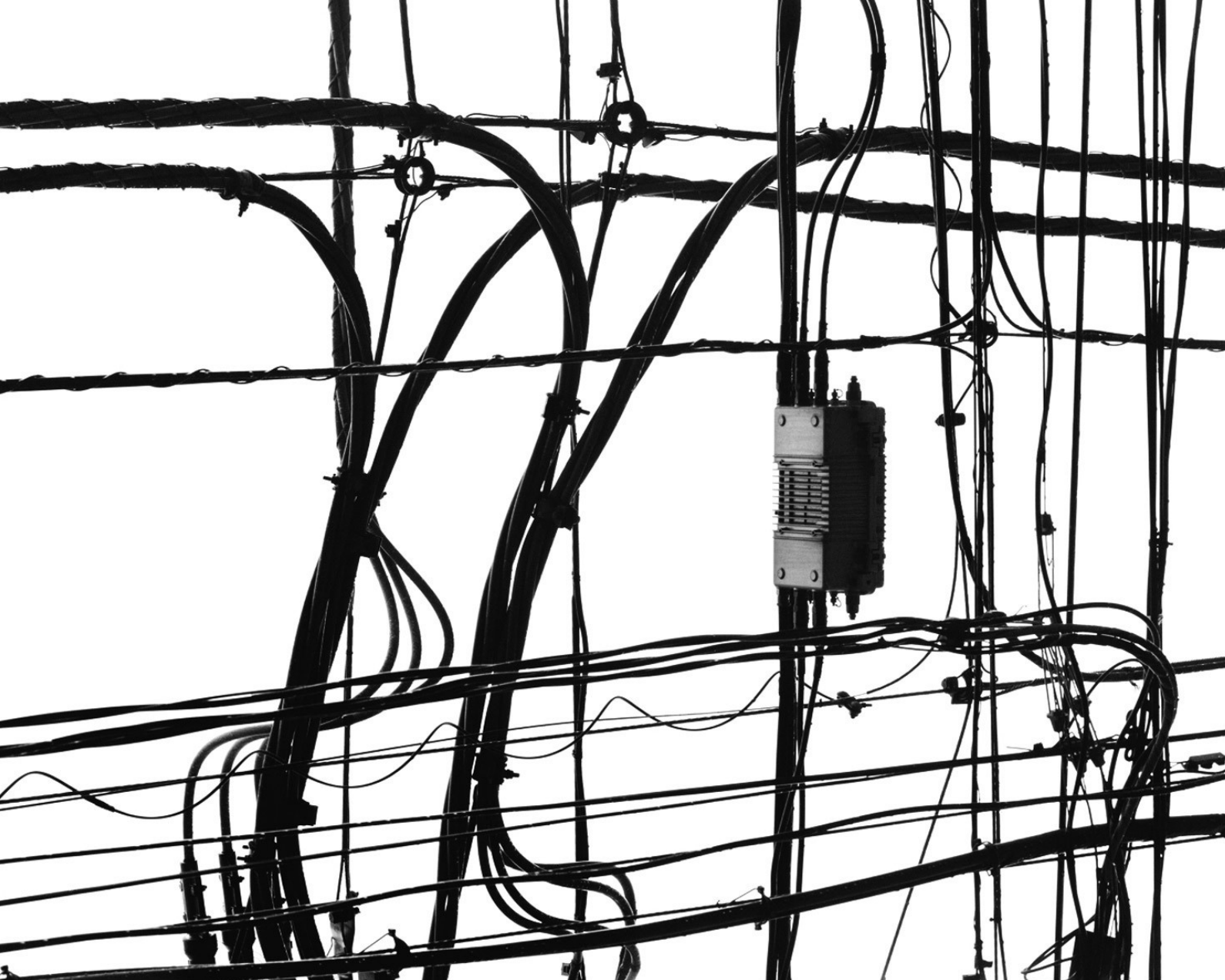
I have been involved with a couple of technology projects and developed an appreciation for a well-designed circuit board. Apple’s boards, in particular, are very fine, all black, with an absolute, maniacal fidelity to minimalism. I immediately thought of making boards that in some way reflected or enhanced the design direction of the jewelry. Kyle worked hard to find pieces that would mesh well with the concept — no animals or organic designs, for example.

How long did the project take and tell us about your process with the engineer?
The editors loved the idea and I got to work in July.  We all figured no one had done this, at least not at this scale. My original intention was to design and order the prototype boards myself. I spent a day or so learning the nomenclature and general design principles. I already knew that board design can be devilishly difficult in the details, but straightforward designs are fairly easily to execute. There is a very large community of amateur board designers associated with platforms like Arduino, as well as many foundries that specialize in prototyping. I downloaded one of the popular free software packages and set to work. I started with a good drawing I had already made in Photoshop for the first design – the black Chopard board. Then I hit an unexpected wall. Circuit board software is designed to make circuit boards, not pretty patterns. Duh. A user first builds a schematic with all the components and only then moves on to “routing”, finding the shortest, most efficient paths to lay the “wires” between all the components. Clearly, I was not going to easily figure out how to build a schematic that would allow me to “route” the wires in a predetermined pattern.

Help was needed. I spent a considerable amount of time on tech blogs and the Web looking for an engineer that had both an aesthetic view on the world and the technical skills required. I came across one man, a fellow in England named Saar Drimer, who had a circuit board design company called Boldport. He had gone so far as to write a program that allowed him to import illustrator files into a circuit board-friendly design environment. I emailed him almost immediately. He quickly understood my project. I had found my guy.

I’d imagine the sketches were fairly in-depth in order to create the final “working boards,” tell us about that exchange.
We encountered many technical difficulties. I had to visit the jewelers and carefully measure the dimensions so that the jewelry would fit perfectly into the designs. This was very difficult to figure out, as cutouts also had to be drawn up for the rings and earrings. The magazine was extraordinarily helpful in opening doors, and we were lucky none of the pieces were sold before the shoot. Saar started with my drawings but soon added his own special sauce, making the boards more credible. By the end, we were going back and forth with very rough drawings and he took it from there. It was a lot of work for him, as he also had to design and solder functioning boards with the LEDs. I was also lucky he had a very good foundry in the UK that was willing to work hard on the quality and color of the shadow masks (the non-metallic surface of the boards). We spent about six weeks start to finish. The shoot took just two days, up in my Connecticut studio. There is almost no retouching, just a little cleaning up. I’m old school, I like my images real. We both feel that we executed something new, perhaps opening the door to new designs with circuit boards as a functional, aesthetic material.

How do your ideas manifest?
I wish I knew. they just pop in unexpectedly. On a long walk, in the shower, at an exhibition, anywhere, really. I read a lot, I look at design blogs,  magazines, many non-photographic sources. Unless there is a specific request I stay away from my colleagues’ Websites; too many voices in a photographer’s head can be deafening.

What was your break, meaning how did you get started?  Everyone has a breakthrough project though we all see you as superstar out of the womb.
Thank you. I do not know if I was a superstar out of the womb; I’ve been told that I produced a lot of spit up in my early years. Unless you are Guy Bourdin, many years of work will be required before you find a strong voice. That might be daunting to hear, but I think the best photographers love the process of making photographs. Your voice will come, sometime soon, hopefully. In the meantime, I suggest you make images simply for the joy of it. I have always felt that way, even during the years when my career was uncertain. As in all creative endeavors, this is a tough business. Do it because you love it. Still life photography has always felt like the best way to express myself, I have enjoyed a lifetime exploring how that happens.

What is another creative outlet for you?
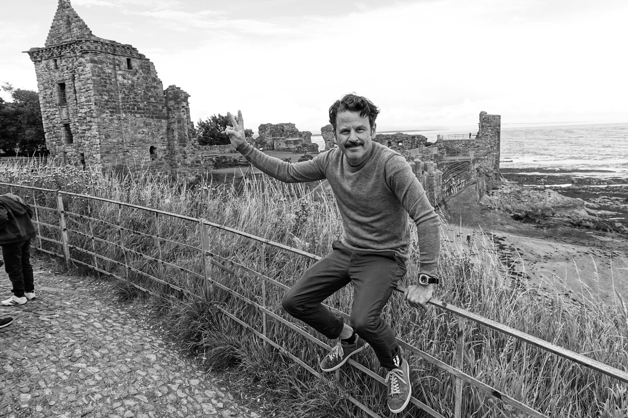
Three years ago my wife and I moved to a small farm in Connecticut. I have learned a lot about fencing (not the epee kind), black bears (don’t run), and wild turkeys (not happy when challenged). More than enough new outlets for a guy who spent 28 years in Paris.

The Daily Promo – Nathan Seabrook

Screen Shot 2015-11-28 at 2.57.39 PM Screen Shot 2015-11-28 at 2.57.31 PM


Nathan Seabrook

Who printed it?
4 x 6.com

Who designed it?
I did. The back is an image of the backdrop from the front image. So if the sweep had some subtle gradient it would be the same. The design formed once I had the images. I just kept it simple really.

Who edited the images?
On the shoot day stylist Chuck Luter and I knew the ones that worked, so that was the initial edit. After that i whittled it down myself.

How many did you make?
About 250 sets. There are different ones also. I printed 7 of the series so some people have different sets. Maybe you can play swapsies one day . Ha!

How many times a year do you send out promos?
Two or three times a year.

How did the idea come about?
The initial idea came from seeing a maintenance man painting a ledge in a park. He walked past me with paint covering his roller, his hand and going up his wrist. He had just dunked everything in a massive bucket of paint, he didn’t care! Awesome.

The Daily Edit – Cameron Davidson : New York City Aerials

CD_2014_0601_NYC_2631


Early evening aerial view of Times Square in the Manhattan, New York City.

CD_2014_0601_NYC_0080 copy

CD_2014_0601_NYC_0625

CD_2014_0601_NYC_1076


Aerial of the Williamsburg Bridge in the early morning, New York City, New York, USA

CD_2014_0601_NYC_2206
CD_2014_0601_NYC_2242
CD_2014_0601_NYC_2413
CD_2014_0601_NYC_2550

Aerial of Manhattan, New York City GPS DATA of shot location. LAT: LONG:

Aerial of Manhattan, New York City GPS DATA of shot location. LAT: LONG:

Aerial of Manhattan, New York City GPS DATA of shot location. LAT: LONG:

Aerial view of Midtown Manhattan and the Hudson River shoreline in the late afternoon.


Cameron Davidson


Heidi: How long is a typical aerial shoot?

Cameron: It depends upon the project and location.  When shooting over New York City or London, we plot out the times and sun path to maximize our shoot times or to catch the quality of light that the assignment calls for.  Usually about one and half to two hours.

Have you even been both pilot and photographer?
In my early days of aerial photography, right after I earned my pilots license, I would shoot and fly at the same time.  Problem was, for me, the altimeter tended to spin left, which meant I was descending.  I know two fixed wing pilots that are superb aerial photographers and also a Gyro pilot who have mastered the ability to fly and shoot at the same time.  If I was to try it again, I would shoot from an ultralight aircraft.

The key thing to remember about aerials, is, safety comes first.  I fly with a fairly elite group of pilots who know how to fly for the camera and primarily fly for the film industry.  There are a few photographers who have the same or higher level of experience that I have, all of us, are focused on flying safely.  My goal is always safety of the crew, client and myself. Since I am also a pilot, (although inactive at the moment) I know and speak the same language as the pilots flying the ship.  I tend to fly in turbine helicopters and often in twin-turbine ships.  There’s a lot of planning that goes into these flights and we always have a pre and post mission brief.  I never bring unnecessary people along for a joy ride.  That comes from the mantra of “more people equals more weight, more weight in the helicopter equals less power.”  Power is your friend.

What was the genesis for this body of work?
In early 2009, I was on assignment for Vanity Fair in New York City.  The shoot called for recreating the views from the cockpit of US Airways Flight 1549 that crash-landed into the Hudson River.  After I finished the shoot, we flew back to the heliport, I asked the pilot if we could schedule a second flight for sunset and into early evening.  His schedule was open, so we went for it.  I shot at sunset and since it was fall, dusk came quickly.  In 2009, DSLR cameras were not especially good at high ISO and low-light photography.  I decided to keep shooting and cranked the ISO up and see if I could create a usable image.  I did and it became a best seller for one of my stock agencies.

I’ve always been drawn to the intersection of mankind and water.  My work is fairly graphic and the hard lines with dark and light of the city is similar in form and tone to my aerial landscapes of marshes, river and settlements along watersheds.

So far, I’ve published six books and one iPad app on aerials.  My last book, Chesapeake, was a twenty-year love affair with the Chesapeake Bay Watershed that was the University of Virginia Press distributed.

My aerial assignment work is a mix of editorial, annual reports and advertising.  Earlier this year I shot a campaign for a automotive company.  The first shot was Manhattan from 9500 feet on a very cold 16 degree day.  The temperature in the cabin, at altitude, was minus three degrees.  Add about sixty knots of forward airspeed and we were a wee bit chilled.  The same project took me to the edge of the Everglades, where I shot as low at forty feet above the water. I’ve shot aerials in over thirty countries.

Discovery Channel assigned me to shoot shoot 360 immersive aerials for the Nik Wallenda walk websites his walk across the Grand Canyon and Chicago River.

That was very much a collaborative approach with their in-house graphics team, specialized software with quite a lot of testing and several pre-flight mission and weather briefs.  We had a half-hour window for these shots due to waiting for light to reach into into the canyons and before the winds picked up. I have flown for so long, that fear does not enter into my mindset.  I fly with good people in solid aircraft and everyone goes in with a safety first frame of mind.  I do say a prayer before every flight and ask for the safe return for all on board.


Is there a particular time of day you like to shoot these?
My favorite time of day to shoot is O’Dark early and O’Dark late.  I like working the edges of light.  The first and last light of the day is a challenge and a joy to work with: shadows hide and help create form with structure.  I rarely shoot aerials in the middle of the day.  I can only think of a couple of times in the past few years that I have.  One was in Haiti just after the January 2010 earthquake.  The only time I could schedule the helicopter was between NGO medical missions and that was 2:00 in the afternoon.  Recently I shot a series of B&W aerials of Manhattan in the middle of the day.  I wanted to embrace the hard cold light of late October.  I think it worked.

Are there scouting missions for project like this?
Sometimes, I scout by fixed wing.  Most often, I travel to the location and scout on the ground.  I take sun path plots, gps readings, look at shadow lengths and figure out the obstacles and opportunities.  I also use topographic maps plus satellite images via Google and Bing.

You’re a pioneer in this field, how did the love for aerial develop?
It came to me quite naturally.  I started off as a bird photographer.  I was working on a project for National Geographic Magazine in southern Maryland and I saw a Yellow Piper Cub behind a barn alongside a country road.  I asked the farmer who owned the Cub if he would fly me over the Heron Rookery I was photographing.  He did, for all of $15 to cover expenses.  I was hooked from that point forward.  It was the perfect viewpoint for how I like to shoot.  Graphic landscapes, targets of opportunities and hopefully, a unique image that challenges the viewer.

However, the real pioneers of aerial photography are William Garnett  and Bradford Washburn.  Mr. Washburn was also an explorer, and mountaineer.  He photographed remote mountain ranges in Alaska with an 8×10 camera at, 12,000 feet without oxygen.   I met Mr. Garnett and his wife a few years before he passed away.  In my office, I have a signed print of one of his favorite aerials, an image of Death Valley with rolling dunes and hard morning light. Mr. Garnett is considered by many, to be the grandfather of American aerial photography.


Screen Shot 2015-11-22 at 5.12.45 PM

Screen Shot 2015-11-22 at 5.12.56 PM

Screen Shot 2015-11-22 at 5.13.06 PM

Screen Shot 2015-11-22 at 5.13.14 PM

Screen Shot 2015-11-22 at 5.13.31 PM

Screen Shot 2015-11-22 at 5.13.40 PM

Screen Shot 2015-11-22 at 5.13.48 PM

Screen Shot 2015-11-22 at 5.13.55 PM

Screen Shot 2015-11-22 at 5.14.05 PM

Screen Shot 2015-11-22 at 5.14.13 PM

What has been the most surprising/innovative application for this type of imagery that you’ve seen?
Outside of books and magazine stories, I’ve started shooting images that were intended of the movie poster market.  Two of my New York City images have been made into the lead poster for the Spiderman movies. The U.S. Post Office chose an aerial of Blackwater Refuge from my Chesapeake Book project as the image to show marshes in the Earthscapes series of stamps.

Photograph by Cameron Davidson All Rights reserved/© Cameron Davidson Cameron@camerondavidson.com for usage.

Photograph by Cameron Davidson All Rights reserved/© Cameron Davidson Cameron@camerondavidson.com for usage.

Photograph by Cameron Davidson All Rights reserved/© Cameron Davidson Cameron@camerondavidson.com for usage.

Quadopter/Octacopters (drones) have brought a raft of new uses and some of them are incredibly exciting and useful.  Everything from tower safety inspections to mapping, to wildlife counts and of course, aerials from a slower and lower altitude, which I might add, is significantly safer than flying a helicopter at 200 feet.

I have a long relationship with the good folks at Corbis and you can see many of my aerials there.  Also, I launched my own stock library, titled, AerialStock.

The Daily Promo: JD White

Screen Shot 2015-11-22 at 7.26.44 PM
Screen Shot 2015-11-22 at 7.26.52 PM

JD White


Who printed it?
Moo.com

Who designed it?
My good friend Craig Wheat did my logo a while back but I designed the cards myself.

Who edited the images?
I edited these 5 down from my current 20 image printed portfolio.

How many did you make?
I made a short run of 20 cards for each image as this was my first go at a promo. Some people received all 5 cards, some got 3 and then I also sent out a few singles. There was 33 total recipients of the promo.

How many times a year do you send out promos?
I’m really not sure yet. This was my first run and it was very small so I’m curious to see what happens if I send out 400. I’d like to do at least 4 promos a year but doing 12 small runs sounds fun too!

What have you learned from sending out promos?
As I mentioned before, this was my first run at any sort of promo. I had sent out a few emails prior to these postcards but this was my first attempt at getting my name out there without taking much of a financial hit. The month before sending these out I decided to go freelance. So you can say this was my attempt at getting me out of the “ohh crap” moment and getting my hustle on. Shortly after sending these out, I got booked for a couple jobs with local agencies. None of them had received the promos yet. I do feel that getting the cards out there had something to do with getting these jobs. I have learned a lot from this first mailer, for example how they can reach a bigger audience just by sending one to Rob. Also, sending good photos and vibes out into the universe can never hurt.

The Daily Edit: Isamu Sawa: Mercedes Benz Magazine


06-07_CONTENTS.indd Merc_14-15_JPG-1 Merc_16-17_JPG-2 Merc_18-19_JPG-3
Mercedes Benz Magazine

(Australia & New Zealand)

Managing Editor: Sarah Lewis
Editor: Helen Kaiser
Art direction & Design: Glenn Moffatt
Hair & make-up: Blanka Dudas represented by Hart & Co
Retoucher: Aaron Foster @ Studio ADFX
Photographer: Isamu Sawa


Heidi: How did the SHOWSTOPPER JPG project come about?
Isamu: In October 2014, the famous French couturier was bringing his retrospective exhibition ‘The Fashion World of Jean Paul Gaultier: From the Sidewalk to the Catwalk’ to Melbourne Australia to be held at the National Gallery of Victoria. To coincide with the event, Mercedes Benz who was the Principal Partner of the exhibition wanted to run an editorial in their magazine and commission a photographer that could handle two disciplines; that of portraiture and automotive photography together. Collaborating with Mercedes Benz, Jean Paul Gaultier had created a unique one-off design of a Mercedes SL-Class exclusively for the exhibition and images were required of him and the car for the editorial.

Editor Helen Kaiser approached me and commissioned the photo shoot. Helen knew my capabilities as both a portrait and automotive photographer. She also knew that I was comfortable shooting high profile celebrities; we worked together previously when she entrusted me to photograph famous Australian actor Geoffrey Rush.An  ad campaign was realized by Clemenger BBDO Melbourne to promote the exhibition and I was subsequently commissioned to shoot that as well.

Have you shot for Merc Benz Magazine before?
Yes, a while ago though. If memory serves me right it would have been over 10 years ago when I was still shooting film.

What was the direction from the magazine?
The brief was to capture Jean Paul Gaultier with his uniquely designed Mercedes in the studio; covering off three to four different angles within a very limited time frame of no more than an hour.

Helen Kaiser initially sent me illustrations of the unique vehicle design by Jean Paul Gaultier with his signature stripes; we subsequently discussed shooting against a plain background due to the graphic nature of his design. The main issue however was the limited time allocated with the fashion designer. It would not have been possible to pre-light for multiple angles of the car together with the designer and achieve the sort of result that would do the story and publication justice. After a few days of brain storming I emailed Helen with the idea of shooting his portrait and the car separately…

“…in essence my idea based on the very limited time we have with JPG is to shoot him and the car separately and try to make up nice graphic images. So I suggest we do very graphic portraits of him and make up ‘double-exposed look’ collages of him around the car. I also like the idea of having him and the car in black and white apart from the blue stripes…I think this idea would make it more ‘editorial looking’ rather than looking like a typical advertising shot…”

 With the concept approved, we shot multiple angles of the car on the first day in the studio and concentrated on just the portraits of Jean Paul Gaultier the following day.

How difficult was it too keep the cyc clean and do they roll the car in?
Keeping the cyc clean was not an issue. We laid carpet down to avoid tire marks when driving the car into the studio and onto a revolving floor; once it was on the turntable it was quite easy to turn the car around for the specific angles we needed. The assistants wore protective plastic covers around their shoes when moving around the studio.

Is the car engine ever running at some point?
Yes but only when we initially drive the car in.

What is the biggest challenge with shooting a car, I’d imagine reflections? 
Reflections are ‘one’ of the main challenges when shooting cars in the studio. In this instance however we had the added difficulty of shooting a white car in a white studio; so the main challenge was to create enough light and shade in the bodywork to bring out the unique contours of the vehicle without losing definition against the background; at the same time highlighting the design created by Jean Paul Gaultier.

Was their any wardrobe direction for JPG?
We asked his management to bring some dark plain tops, ideally black and perhaps a jacket for some texture. We didn’t want to be too prescriptive; especially given his line of work, but emphasized that we needed something plain and dark for the ‘double’ exposure idea to work…


Isamu Sawa_JPG_signed print

I see you have a signed print. Do you often have people sign your prints?
A few days after the shoot I was printing out some proofs of the retouched images and had a wild idea about having them signed by Jean Paul Gaultier. With nothing to lose I contacted his personal assistant via email to see if there was any chance that I could have him sign a set of prints for my personal collection. She replied that, “in the ideal world it would be easy to organize” but she couldn’t promise anything as he had such a busy schedule including a talk and book signing that evening. She suggested trying to catch him at the book signing; which was easier said than done because the evening was booked out. I attended anyway and talked my way into the event and with the help of his personal assistant Jelka, managed to get one print signed. I waited for over two hours but it was worth it. The image hangs proudly in my studio.

I don’t often have prints signed especially these days when we hardly print anything but I do have a set of prints signed by famous Australian guitarist Tommy Emmanuel and a poster by one of Australia’s most famous bands Hunters & Collectors.

The Daily Promo: Fedele Studio

Screen Shot 2015-11-15 at 4.18.14 PM

Screen Shot 2015-11-15 at 4.17.39 PM

Screen Shot 2015-11-15 at 4.18.47 PM

Screen Shot 2015-11-15 at 4.18.53 PM

Screen Shot 2015-11-15 at 4.19.01 PM

Screen Shot 2015-11-15 at 4.19.07 PM

Fedelestudio.com

Who printed it?
John: Donoson Printing for the video carrier and Bender Graphics for the booklet insert.

Who designed it?
I designed the piece. I began my career as a designer/art director so I still dust off those skills every once in a while to create new feature marketing and promo pieces. My studio has moved into shooting both stills and motion content over the past few years so we needed a way to showcase all of our work in the most efficient and memorable way we could find. It was designed to display all of our content while also having maximum flexibility for future print runs to minimize additional design time in front of my computer –I’d rather be shooting! The branded carrier has only general info about us. The video player has a USB port so we can upload custom motion content, as needed. The still imagery booklet is then printed short run so we can then be as targeted as we want to specific prospects/clients.

Who edited the images?
I edited the images wanting to include a broad overview of our portfolio & reel on this first run.

How many did you make?
We created a run of 100. Given the ridiculously high expense of each mailer we chose to do a small test run first to see how recipients responded. We’re planning a much bigger run for 2016.

How many times a year do you send out promos?
We try to send smaller printed mailers out quarterly/bi-monthly. The more expensive ones like this go out about once a year. Any more and I’ll have to pick up a second job to finance it.

What type of reaction are you getting from the piece?
This is a fairly new technology so it’s been hilarious to see the initial responses. People walk into a portfolio meeting expecting our book and iPad, then see these sitting there waiting for them. “Where in the hell did you get this?”, has been heard more than a few times.

Sometimes the button that auto-plays the video is tripped while in the mail so we’ve heard from a few people that the package arrived and it was playing music. It’s unintentional but guaranteed they’ll open ours first.

The Daily Edit – ArtNews: Katherine McMahon


ARTnews_November
ArtNews

Creative Director/Designer: Artur Wandzel
Creative Editor: Katherine McMahon
Photographer: Katherine McMahon


Are all creative editors also photographers or is this a reflective of your large skill set?

For the most part, I’m a Photo Editor. I research, request and edit photos for the front of book and features each month, but I also try to contribute original photography as much as possible. Whenever there’s an opportunity to shoot original photography for the magazine or website, I try to set up a shoot. I’ll discuss concepts/ideas with my Editor in Chief Sarah Douglas, Creative Director Artur Wandzel and the editor or write of the piece. For this shoot, I worked closely with Hannah Ghorashi who wrote the feature. We discussed concepts together before and conducted the shoot/interview within the same 2 hour window. Jenny Kanavaros was the makeup artist for the shoot, and we discussed keeping it with neutral tones but a strong brow.

What is your role at ArtNews?
Essentially,  I’d say my role has elements of both being a Photo Editor and Staff Photographer.

You mentioned you were inspired by an image from her 1976 performance.
What’s your process for sourcing inspiration?
I find inspiration everywhere. I try to first think big picture but I also like to keep it simple. For this shoot, I re-watched ‘The Artist is Present,’ The documentary that chronicled her 2010 Retrospective at MoMA, and I always find inspiration in looking at old archival images. This image in particular really stuck with me:

MA


I wanted for us to try to emulate it in a different time and context. Our office is near the Flower District, so I handpicked a few long stemmed red roses the day of the shoot and brought them with me. Before I left dropped them in a vase with some flowers she already had on her kitchen table.

I love the Givenchy dress, it has look and feel of being a headmaster, what drew you to this look for her? I know you thumbed through her closet full of designer clothing.
It was surprisingly simple- Marina picked out the dress, and I loved it. She had so many beautiful outfits to choose from, but I personally loved the high contrast. It seemed bold and assertive in an understated way.

Marina Abramović is widely known for her performance art and clearly a trail blazer in that genre. How easy or hard was it to direct her?
It was a breeze directing her. With every shoot comes vastly different dynamics, like any other relationship or interaction in life. As a performance artist, she seems very aware of her physical presence and very comfortable in front of the camera. She has an intensity in her eyes and I found her to be very charismatic. This was a shoot where I took on a more passive role as the photographer. I tried to just let her do her thing.

ma2

Aside from the simple rose for a prop, you had a candle and matches, why was that?
I had a general idea but wasn’t totally sure what the lighting in her apartment would be like the day of the shoot. I also just like to have a few unconventional props on hand just in case, so I brought a few candles and matches as a potential lighting tool in the event that we wanted to try a few intimately lit images, and I thought it might be nice to incorporate an open flame into the image somehow. In the end, the natural light was too good to pass up and I think that a darkly lit setting for the images wouldn’t have served the story as well. In addition to the candles and matches, I brought two large bags worth of lighting equipment to the shoot and didn’t end up using any of it.

The Daily Promo: Andrew Kornylak

AK2015FallPromo1

AK2015FallPromo2

AK2015FallPromo3

AK2015FallPromo4

AK2015FallPromo5

AK2015FallPromo6

Andrew Kornylak

Who printed it?
Universal Printing in Durham, NC

Who designed it? Who edited the images?
Peter Dennen of Pedro+Jackie guided the edit and design of this piece.

How many did you make?
150

How many times a year do you send out promos?
I try to stick to e-promos once a month through Yodelist and a twice-yearly print promo.

How did this project come about?
The “Southern Climbers” portraits came from a personal series I shot during the 2014 season of the Triple Crown Bouldering Series. It’s the largest outdoor climbing competition in the country and spans three events over three months every autumn in the Southeast US. I’ve been competing in and shooting at these competitions since 1996, and it’s kind of a crossroads of the Southern climbing scene with big name international climbers who migrate through every year. I painted a series of backdrops that I could lug around the cliffs with a bunch of lights and a pile of film and digital cameras. I made portraits of hundreds of climbers, spectators, vendors, and a biker gang who showed up for the fellowship and free beer. Climber and photographer Erik Danielson was instrumental in making this big setup work and making the light sing every time.

Peter Dennen of Pedro+Jackie edited the project down to something that would fit in a 12-page booklet. We went with a very simple design. I proofed it using an inkjet printer myself and Universal Printing in Durham did a superb job matching these proofs to the final 4-color booklet.

The Daily Edit – GUP : Sebastian Palmer

Choque, 27, resident of Cracolândia; São Paulo, Brazil.

José Maria, 55, resident of Cracolândia; São Paulo, Brazil.
Ariane, 19, resident of Cracolândia; São Paulo, Brazil.
Moisés, 36, resident of Cracolândia; São Paulo, Brazil.
Patron Saint of Impossible Causes, Saint Rita de Cassia, is glued on the window overlooking the room; João, a kindergarten teacher has just become a grandfather. He has given up his home so that his daughter and grandchild have a better start in life.
GOD’; Lisene currently works as a manicurist in an up-market salon. Working 6 days a week she has been able to save enough money to buy 2 cows for her brother who lives in the countryside and looks after her child. One day she hopes to travel.
The orange cover of a book entitled “how to interpret your dreams” sits next to Kris; a single mother who lost all her savings due to fraud. Her sole income is from selling toys on the street corner.
Edvaldo; a cook, works 7 days a week. Last year he won a competition to train as a chef in Europe but was disqualified when it was discovered he didn’t have a high enough literacy level.
Tom Blomfield, founder + CEO of Mondo bank . Bloomberg Markets.
Baroness Denise Kingsmill, chairman of Mondo Bank. Bloomberg Markets.

Sebastian_Palmer_SPN_01

Sebastian_Palmer_SPN_03

GUP
Guide to Unique Photography

Photographer: Sebastian Palmer

Heidi: How did the instagram take over come about, are you invited?
Sebastian: Yes. I was invited by GUP

Do you shoot new content for this or does it come from your archives?
All the content came from my archives. I guess that It would have been interesting to shoot a new project specifically for the takeover but the call came in quite late and at the time I was bogged down with other work in London (so maybe a fresh / new series of images might not have been possible anyway)

Is there a print component to this?
Yes. I will be featured in their 10th Anniversary issue. GUP #47 – The Big Ten
(showcasing images not posted in the takeover)

How do you decide what you are going to post over the course of the 10 days?
I wanted to keep to showing just my personal work. So I decided to post a small selection from those projects based in Brazil along with images that might help to explain my surroundings or way of thinking.

You studied French, History, Economics and Sociology prior to becoming a photographer. What was your turning point to become an artist?
I don’t really see there being a turning point such just a coming back to. I was always artistic and from a really young age I was always doing something creative (drawing, painting, sculpture, guitar etc etc etc)

However, when I went to a new school at the age of 13 it all fell by the wayside (for numerous reasons) and as the years progressed I began to focus on subjects that were “going to get me a good degree and make me successful in later life”…. it just took me a while to realize that I had been following the wrong path (whilst at university) and that I needed to get back to what I had left behind all those years ago.

Is PROJECTS in your portfolio an expression that combines your previous studies and your current life as an artist
Possibly, maybe….. It’s a bit of a ‘chicken and egg’ scenario (which one came first)…. I’m not sure how much those subjects actually influenced my work. I see it more in reverse, I chose the subjects because they interested me to some degree.

Artist Statements

GHOSTS
[All images were shot on location in Cracolândia, São Paulo, Brasil]
Over the past 3 years I have been living with and photographing sections of Brazilian society that have been marginalised and discriminated against. It is my aim to create a body of work that raises awareness for vulnerable sections of society; to give them a voice and in doing so hope that measures can be taken to ensure that they live in dignity.
The latest chapter of my project focuses on crack-cocaine addicts.
I felt that shooting a portrait series of close up, black + white head shots was the best way to humanise my sitters – by minimising any distractions and allowing the viewer to come into direct face to face contact with them.
Although this subject matter has had a lot of exposure with Brazil hosting the World Cup, I believe that it has only worsened the situation by further dividing an already fractured society and reinforcing negative views and prejudices. Reportage style images often taken from a far and with no interaction have only helped to strengthen the “us” and “them” mentality.
Separate from us. Away from us. Far from us. Nothing to do with us.
In order to banish this misconception I needed to get as close to my subjects as possible.
To interact. To communicate. To participate. To let you look into their eyes and realise that they too are human beings; that they too are a part of this society in which we all belong.
Are we able to look at ourselves in the mirror and face uncomfortable truths?
HOPE
In this series I have been living in an illegally occupied building in downtown São Paulo, Brazil with some of the 70,000 people that migrate to the city every year in search of a better life.
Often arriving from the countryside with little or no money, no skills and high rates of illiteracy their journey is a tough one. They can not afford to pay for rent and the majority can not find employment. Those that do manage to find a job are underpaid and often work 7 days a week to make ends meet.
Yet despite these conditions and the hardships that they face, everyone that I encountered found the strength to carry on through hope. It is this theme that I wanted to explore.
I have used diptychs as a means to expand the narrative. Always using items found close to or belonging to the subject. These detail shots are clues so often overlooked and dismissed but that I see as fragments of information which help to complete the puzzle.
All images are shot in camera. I have made use of long shutter, deliberate camera movement and the placing of items in front of the lens in order to allow me to create an aesthetic quality and my interpretation of the subjects’ utopia.
SÃO PAULO NIGHTS
São Paulo Nights focuses on transgender prostitutes.
Transgender persons in Brazil are treated as 3rd class citizens. They are discriminated against on a daily basis and are marginalised by society.
They experience such injustices from an early age when they first appear to be different and as such many do not finish school.
Nonetheless, even those with an education still find it hard to find work. As a result, many turn to prostitution to make a living.
This, combined with the majority of societies fear, ignorance, hypocrisy and lack of education on the issues means transexuals are caught in an ongoing downward spiral of discrimination and marginalisation [being subject to violence, social exclusion, drug abuse, crime, exploitation and severe health risks].
Many of the photos were printed, then ‘tampered’ with (painted, etched, bleached, burnt etc) and then re-photographed in an attempt to portray not only Brazilian societies views + actions towards transgender persons but also the struggle and human injustices that they face on a daily basis.


Contact GUP here

Screen Shot 2015-11-01 at 5.00.18 PM

Screen Shot 2015-11-01 at 5.00.24 PM

Screen Shot 2015-11-01 at 5.00.29 PM

 Bloomberg Markets

What sort of direction did the magazine give you?
In the beginning I was sent through some reference shots of my own work so I could get a feel of what direction the magazine wanted to take the shoot.  However, although the style of the images looked similar they were all achieved by using different techniques and lighting setups. Also, they liked some elements from one shot and wanted to combine it with elements from another shot. So, we sat down and mapped out a rough plan of what we were going to shoot and how we were going to do it, with the understanding that things might change on the day.

Tell us how you used your creative freedom? Was it difficult to earn?
As mentioned above, nothing was set in stone, so to speak. Bloomberg understood that to achieve the look that they wanted we would have to experiment on the day. I like to see it as organized chaos. I set a starting point (a foundation) knowing that if I do steps 1+2 I will get a certain look. However, from there you can play around – get the subject to move more or less, move the camera, increase the number of flashes or their duration, play with shutter speeds etc etc etc – the possibilities are endless. Once you see the shots coming through you can decide to follow a certain path and push things in one direction or maybe dial it back and go another way.

No, I don’t think that it was difficult to earn. I think that it has more to do with the fact that Bloomberg were very open minded and willing to experiment. (something that I find a lot of the industry is scared to do these days by always playing it safe in the fear that they might upset what they believe their readers want to see)

Bloomberg is known for spectacular photography and creative leaps. Knowing this did you want to take some creative risks?
Of course. I think that it would be silly not to. On the day of the shoot we did try out many different things, some of which never made the final cut. However, there are always going to be constraints, such as time and money. Also, you have to be aware that you are working for a client and no matter how creative they are they still need to put together an issue where all of the photo pieces are going to tie together.

The Daily Promo: Tuan Lee

Tuan_Lee_Promo_4543


Tuan_Lee_Promo_4532 Tuan_Lee_Promo_4533 Tuan_Lee_Promo_4534 Tuan_Lee_Promo_4535 Tuan_Lee_Promo_4537 Tuan_Lee_Promo_4538 Tuan_Lee_Promo_4539 Tuan_Lee_Promo_4540 Tuan_Lee_Promo_4541 Tuan_Lee_Promo_4542

Tuan_Lee_Promo_4528


Tuan Lee


Who printed it?
I printed with Jennifer O’Neill at Marina Graphics. Very experienced and supportive throughout the entire process.

Who designed it?
David Hsia, a design director here in LA and happens to my buddy.

Who edited the images?
David and I did the final edit together, but I did consider some input from some consultants.

How many did you make?
I printed 500.

How many times a year do you send out promos?
I do one substantial promo like this piece once a year. Then I’ll send out single sheet promos as support and as new work gets created.

Tell us about the pacing of the promo.
Well, there is an easter egg built into the design of this promo. If you notice, its not blinded. Yes, it flips like a traditional book, but its also a series of double sided posters! And they keep their relationships together either way, sports or traditional fashion. (Although, there are two spreads that are exceptions.) That way my audience can select what they want. And we wanted to show how much thought and planning went into this. The hope is that it’s associated with how much thought and process I put into my work.

The Daily Edit – David Lopez: Have a Nice Day

Picture 032
Picture 032

have-a-nice-day-2

Picture 016

have-a-nice-day-4

Picture 014

Picture 031

wonderburger 001

have-a-nice-day-8


Have a Nice Day

Photographer: David Lopez


“Have a Nice Day” is framed around the fast food industry. How did you develop this idea and what were you wanting to express?
After high school just about all of my friends were working in the fast food industry while trying to pay for college. Like most people in that line of work their favorite topic of conversation was sharing fast food horror stories. One of my favorite stories was from an employee that had to deal with a customer that was so upset that his food was taking a little longer than expected that he punched out the window screen at the counter. He received his food shortly after because apparently the customer is always right, even when they throw a tantrum and destroy company property. My friends all shared this similar feeling of frustration and belittlement so years later I began trying to capture the feeling that my friends were describing. It just so happened that at the time I began to develop this idea a friend of mine was starting a magazine (Compound Butter) that was focused on junk food and was looking for collaborators. So the first two portraits I shot for Have a Nice Day were used for her magazine. I received a lot of positive feedback from my professors at Art Center so the project took off from there.


Screen Shot 2015-10-26 at 9.16.31 PM

Did you direct the workers ?
I try not to direct the workers much. I’m working very quickly when i’m shooting their portraits because they’re usually on their breaks and don’t want to deal with me. So I tend to pick a location beforehand and then let them inhabit the scene however they feel comfortable. At the very beginning of the project I was still getting comfortable approaching people so there were times that I spent up to an hour sitting in a restaurant waiting to get the courage to ask for a portrait. It’s been a great way to get me out of my comfort zone.

The images are graphic, have color pop, is that why you chose to shoot a doughnut; to have the color and graphic backbone get reinforced?
Yes! I’m glad you caught that because it’s something that’s very important to the project. From the very beginning I’ve been drawn to the relationship between the colorful environments juxtaposed against the unappreciated employees working behind the counter. It doesn’t matter what fast food restaurant I walk into I always feel like i’m being slapped in the face by this artificial experience that’s been manufactured to make me feel happy. It all goes back to the title of the project. I can’t imagine how frustrating it must be to constantly tell someone to have a nice day while you’re standing there having the worst day ever.

Did you drop the shake or was that a lucky find? What drew you to this, was it mix of graphic and organic shapes or more the “surprise” of a shake on the ground?
The shake on the floor was a lucky find or as my professor Ken Merfeld would say, “a gift from the photo gods.” I could’ve easily set up a shot like this but it’s really important for me to keep the project as honest and straight forward as possible. I may be the one documenting but at the end of the day I’m trying to tell the story of the under appreciated employee who has to go out clean up that mess.

How long did this body of work take?
I’ve been working on Have a Nice Day on and off for a year now. As a side project I’ve started collecting the receipts from the restaurants I photograph to have a written document that will explain why I’ve been gaining so much weight lately. My next project is going to have to involve some sort of physical exercise so I can even things out.

Will this be ongoing or a one-off for you?
This project is definitely something I plan on continuing. Especially right now while there is so much debate over minimum wage for fast food employees. New York and Los Angeles have raised the minimum wage up to $15 but many cities have yet to follow their lead. I’ve even begun to notice some restaurants implementing touch screens to replace wage earning humans. So this is a very crucial point for the narrative of the project that I need to document.

Did you give yourself a specific radius for the fast food places? 
I’m open to traveling as far as I have to for the right fast food restaurant. Right now I have my eye on a Del Taco that’s on the way to Las Vegas. Apparently it’s the first one that was opened so the design of the restaurant hasn’t been changed since 1964. There’s also a Taco Bell up north in Pacifica that’s been described as “the most beautiful Taco Bell in the world” it’s an isolated little lodge that sits right on the beach. I’ve seen some pictures on yelp and it has to be the strangest looking Taco Bell I have ever seen but I can’t wait to get up there. It’s also a good excuse to eat a cheesy gordita crunch with the sand in my toes.


The Daily Promo: Tom Hussey

Screen Shot 2015-10-25 at 4.53.29 PM

Screen Shot 2015-10-25 at 4.53.11 PM

Tom Hussey


Who printed it?
I printed the images in house on a really nice feeling Red River paper.

Who designed it?
The concept for the promo series came from my Producer, Patty Hudson and I.  The envelope design is by Craig Carl and the copy is by Diane Carl.

Who edited the images?
I did.

How many did you make?
 Each “Mini Promo” is limited to an edition printing of 450.

How many times a year do you send out promos?
We send things out twelve times a year of various types and various quantities.

Why did you choose to do a mini print? I enjoyed how something so small could have such a large impact.
As the size of the standard cubical shrinks in the ad agency world, we thought it would be good to send a Mini promo.  I thought if we sent a really nicely printed, and yet smaller size piece of art, it would offer the creatives an opportunity to have a Mini gallery of my work.  That’s what it’s all about . . . keeping my brand in front of creatives and giving them something special and beautiful to look at.

The Daily Edit – BEST: Steve Simko

Milou_Scotland_Beach_082015-2111-20150823

Milou_Scotland_Beach_082015-405-20150823 Milou_Scotland_Beach_082015-1030-20150823 Milou_Scotland_Beach_082015-1502-20150823
Milou_Scotland_Beach_082015-2946-20150823 Milou_Scotland_Beach_082015-3485-20150823 Milou_Scotland_Beach_082015-4215-20150823

Screen Shot 2015-10-19 at 5.18.28 PM

BEST


Fashion Director:
Wendy Rigg
Editor in Chief: Jane Ennis
Art Director: Owen Connolly
Photographer: Steven Simko


I know you like to golf, were you able to play while you were there?
Yes, actually, the opportunity to play St. Andrews was a major incentive to take the job (I’m a single handicap golfer). And on top of it, getting to shoot half a dozen fashion stories on location at the “Home of Golf” was beyond exciting – combining my two passions in one trip: photography and golf. I was lucky enough to have the opportunity to play St Andrews, The Old Course as well as Kingsbarns.

How did this project come about?
I had recently reconnected with a fashion editor from London on Instagram whom I met light years ago. She had grown up in St. Andrews and was inspired to shoot some fashion stories in her home town after attending The Open Championship. She must have noticed all my “likes” were of photos she posted from The Open (she was following Dustin Johnson) and put together that I liked golf…the rest is history.

What type of direction did you get from the magazine?
It was a great collaborative effort between myself and the editor of Best, a fashion weekly.  The idea was to juxtapose the stories/fashion and unique location. St. Andrews offered a variety of different backdrops. There’s a beautiful beach (West Sands Beach), which many have probably seen if they’ve watched The Open, spectacular fields and rolling countryside, and the town featured amazing historic ~15th century architecture. We also had the opportunity to shoot at the Cambo Estate that featured a stately home with stables and wild ponies.

What did the creative brief look like and where did the horse come from?
There were several creative briefs for the various shoots. For the one showcasing the horse – we were highlighting the winter coats within a “classic English seaside” setting. King, the retired race horse in the photos, was a last minute improvisation. He belonged to the editor’s niece and it ended up working out fabulously. While the model had never been around a horse and was one pretty scared Dutch girl, King was a sweetheart. When you put something like a horse into the mix, you just let them (the horse) do their thing, but you have to move fast!

Did you hire a local assistant?
No, I asked one of my local assistants to join me on the shoot. We’ve known each other for eight years and he’s assisted me on various jobs for the last four years. We have a great working relationship, and for a 4-day long shoot, it’s important to  have someone who’s knowledgable, has the ability to tackle problems that might arise, and help find solutions. Plus, he made a great golfing buddy.

Who produced the shoot for you?
The editor was the key person producing the shoot. While many aspects of the stories were a collaborative effort, including picking out the models, she really handled everything, from arranging talent (hair + make-up) and stylists/wardrobe to transportation and location. Mark Rigg of Links Golf Tours of St. Andrews was the anchor transportation. They are one of the premier golf tour companies in St. Andrews (think big Mercedes vans used to transport golfers). Upon arrival in St. Andrews our driver drove us onto the cart path on the 18th fairway of the Old Course and we took a snapshot in front on the R & A building (we look like deer caught in head lights) a dream come true for a golfer.

snapshots_scotland-9107

Milou_Scotland_Beach_082015-4665-20150823-Edit

IMG_2415

Did you prepare a carne for this gear list?
No carne was necessary but this is the gear we took with us …some of it stuffed in the golf travel bags :)

1- Canon 1DX 
2- Canon 5D MarkIII
3- Sony RX1R
4- (2) MacBook Pros
5- Digiplate Pro
6- Tripod
7- Sigma 50mm 1.4
8- Sigma 35mm 1.4
9- Canon 24-70mm 2.8
10- Canon 70-200mm 2.8
11- Profoto B2
12- TTL Air Remote
13- Sunbounce Sun Swatter (Black Net & White)
14- Westcott Bounce reflectors
15- ThinkTank Airport International V2.0
16- Crumpler Extravanganza
17- Tamrac Backpack

The Daily Promo: Meredith Jenks


Screen Shot 2015-10-18 at 9.36.45 AM Screen Shot 2015-10-18 at 9.36.54 AM Screen Shot 2015-10-18 at 9.37.00 AM Screen Shot 2015-10-18 at 9.37.05 AM Screen Shot 2015-10-18 at 9.37.11 AM Screen Shot 2015-10-18 at 9.37.17 AM Screen Shot 2015-10-18 at 9.37.23 AM Screen Shot 2015-10-18 at 9.37.28 AM Screen Shot 2015-10-18 at 9.37.33 AM Screen Shot 2015-10-18 at 9.37.39 AM Screen Shot 2015-10-18 at 9.37.44 AM
Meredith Jenks


Who printed it?

NOVA in Brooklyn. It’s nice because I can actually go to the press check. I’ve been printing my promos there for the last three years. Michael Artale is my contact, he is super patient and easy to work with.

Who designed it?
My studio mate Kristian Henson. He designed my promo last year too. I like working with him because I don’t feel shy telling him if something isn’t quite working and he takes my input and makes it even better.

Who edited the images?
Kristian and I worked on the edit together. I wanted to showcase some of my quieter work. People know me for poppy energetic photos so I wanted to show a bit of the other side in this piece.

How many did you make?
2000

How many times a year do you send out promos?
1 big piece a year and sometimes, additionally, I’ll send a postcard. My agency apostrophe makes a couple promo pieces a year as well.

Have you seen direct feedback from your promos?
Last year I did a poster and got direct feedback in that I was rewarded an ad job because the art buyer received my promo and had it on her wall. That client hired me 3 times over the course of last year so the cost of that promo was paid for many times over. It is scary to spend that much money on something not knowing whether anyone is going to look at it at all, but I definitely believe in the saying “you have to spend money to make money”.

The Daily Edit – Garden & Gun: Andrew Kornylak

Screen Shot 2015-10-12 at 10.00.15 AM

Screen Shot 2015-10-12 at 10.00.29 AM

Screen Shot 2015-10-12 at 10.00.35 AM

Screen Shot 2015-10-12 at 10.00.42 AM

Garden & Gun

Marshall Mckinney: Design Director
Maggie Kennedy: Director of Photography
Margaret Houston: Associate Photo Editor
Braxton Crim: Assistant Art Director
Photographer: Andrew Kornylak

Did you stay up with Michael for 24hrs cooking? Was that to honor something historical for the story
Twitty was cooking food in the way it would have been done by enslaved cooks on Antebellum plantations in the South. Roughly: Dig a huge pit, burn a fire down to coals and slow cook meats over a screen of sapling logs. This process starts in the afternoon, takes all night, and Twitty and a group of helpers would alternately chop wood, prep food, cook, and doze off by the light of the hot coals and oil lanterns. So there was a lot going on visually all night. I shot the interview with Twitty for the video a little after midnight I think, during some down time. In the morning the action really started. More food was cooked in kettles and pans. By mid-morning most of the food was cooked and had to be put together, and people started showing up for the feast.

How hard was it to stay awake, what was the biggest challenge?
It’s wasn’t hard to stay awake because there was so much going on and we wanted to take everything in. It was good to have Erik Danielson assisting on this shoot, we have a lot of fun. I recall there was good whiskey about.

Did you shoot the video and the stills?
Yes, I shot both the video and the stills, and edited the video as well.

How hard was it to shoot the video at night?
I had brought along a set of tungsten lights and we got lucky with a power source near the cooking area. Two floods made enough light to work for stills and video and the color temperatures worked well with the fire and gas lanterns so I just left those on all night. For the interview I bounced one of the floods off the interior of a canvas tent to light Twitty softly.

What type of direction did you get to from the magazine? were they on set with you?
They were not going to be on set. We knew writer would be there along with possibly a lot of press, bloggers, and maybe another video crew in the morning. That’s when we decided to make it a night mission. I had some conversations with Art Director Marshall McKinney where we visualized what it might sound and look like: slabs of meat over coals at night, singing and chopping wood, period cook wear, all tied together by Twitty’s deep insight and humor. Other than that: The unknown. Possibly chaos. I’ve done many features for Garden & Gun and I like that they trust me on these kinds of shoots because they are the most interesting. I also know that if I work hard at it, whatever I come back with, Marshall and their team will make it sing.

How did this story idea come about?
The M. Twitty story actually came about via Twitter. Michael Twitty reached out to one of our editors suggesting he had an interesting cultural event coming down the pike and was curious if it might be something we’d want to cover. With a little follow-up we discovered that Michael was a food historian and cook and that he’d be the centerpiece of a unique culinary experience wherein he’d recreate a plantation style fete (on the grounds of a former working plantation called Stageville in North Carolina) exactly how it might have been performed some 300 years earlier. In doing so, the narrative explored southern foodways and their direct connections to Africa and the Caribbean but also the skill, determination and time it takes to pull off a meal with the resources available in antebellum times.

Since it was a 24 hr shoot what other multi media elements did you want to incorporate knowing you’d have such rich content?
Because the cooking itself would take at least 24 hours we knew we had something special, an event that would unfold slowly and simmer and offer up a rare opportunity for the right photographer. Without a doubt my photography director, Maggie Kennedy and I knew motion would play a key role in the storytelling. A shoot like this is a blend of portraiture, reportage, food and motion. That’s a heavy skill-set but in the end the choice was easy. I’ve worked with Andrew Kornylack for a number of years and I knew this would be right in his wheel-house. Andrew is an adventurer, a climber, a traveller but most importantly a curious and gentle soul. This shoot wasn’t exactly hanging from the side of a cliff in Yosemite but it would be an adventure all the same. Plus, given the cultural and emotional sensitivities surrounding the event we wanted to have someone present who could engage in the proceedings and document them with a modicum of decorum. You know, fit in.

How hard was it to award this assignment, I’d imagine you need just the right person. What was it about Andrew that struck you?
In the end, Andrew came through brilliantly. He gave unto the event that which it required, everything he had. The photography answered all our needs and the motion work helped capture the essence of the experience. For example, what standing over an open-pit of coals latticed with water-soaked sapling branches bent under the weight of pork ribs looks and feels like at 3.30 in the morning when delirium starts setting in and the birds begin to chirp. He worked along Twitty hour by hour and served up compelling images and content that can only be described as a feast for the eyes and ears.

Did you have a sound person or did you handle all aspects of the video production.
I handled all the video and sound myself, with the help of Erik Danielson who is an excellent assistant and great with lighting. I did the video edit, working closely with Assistant Photo Editor Margaret Houston.

The Daily Promo – Kevin Arnold

Screen Shot 2015-10-11 at 8.52.27 PM Screen Shot 2015-10-11 at 8.52.36 PM Screen Shot 2015-10-11 at 8.52.44 PM Screen Shot 2015-10-11 at 8.52.49 PM

Kevin Arnold

Who printed it?
It was printed by Hemlock Printers in Vancouver.

Who designed it?
Peter Ladd, who’s is a partner in Pendo Creative in Vancouver. I also worked with them on creating my new identity and website last year as well as the little photo man.

Who edited the images?
The promo grew out of me wanting to use the inside image. Peter and I did an initial edit on the additional images, and then I looped in my wife, Brooke. She is my go-to editor for portfolios and promos. Not only does she have a great eye for editing, but she also understands who I am and what I’m about as a photographer (sometimes better than I do myself).  She is amazing at being very honest with me if an image just doesn’t cut it. I can’t say I’m always as amazing at taking that advice, but between us the edits usually balance out perfectly.

How many did you make?
We sent out 500 to a select list of people that I really want to work with. I might do a second run of another 500 because it was so well received.

How many times a year do you send out promos?
It’s not always consistent, but I try to get something out twice a year.

How did this promo develop?
This was a fun promo because the concept for the promo grew out of an image I wanted to use rather than the other way round. More typically, one would create a promo and then select the images for it. I shot the inside photo of my friend Shea sitting in a redwood, when we were working together in California last year. I’ve always really liked it personally, but it wasn’t until much later that I decided to include it in my portfolio. As soon as I did it started to really resonate with people. My rep, Cynthia Held, was on the road showing my book in New York and Chicago, and she called me up right after that trip to tell me how much people were responding to that particular image. I knew I wanted to put it out there more and also knew I wanted it to be bigger than a typical postcard image. Something people might hold onto for a bit. The other images used in the promo were shot while I was doing a series of personal work in Tofino, British Columbia, so it’s a very personal promo overall. In the past, I’ve usually shown more client work on my promos because they are going out to potential clients.  I love this new promo because it turns that idea on it’s head. I’m interested right now in showing work that truly reflects who I am, what I love to shoot, and where I’m headed. I want my potential clients to see that work up front because I want them to be inspired by it and then collaborate with me to create something in the same vein for the clients.

The Daily Promo: Isamu Sawa

Screen Shot 2015-09-17 at 12.51.34 PM Screen Shot 2015-09-17 at 12.51.39 PM Screen Shot 2015-09-17 at 12.51.46 PM Screen Shot 2015-09-17 at 12.52.00 PM

Invite is below  to his show here for this show: www.withoutwater.com.au

WITHOUTWATER_1

Isamu Sawa Photography

Who printed it?
It was printed by Bambra Press one of many generous sponsors for my recent solo exhibition “Without Water” and printed on paper supplied by K.W. Doggett both situated in Melbourne Australia.

Who designed it?
It was designed by Creative Director Derek Samuel who created all the collateral for the project including invites, exhibition banners and website (www.withoutwater.com.au)

Who edited the images?
I personally selected the images and subsequent layouts were created by Derek Samuel

How many did you make?
200. To coincide with a vast digital email marketing campaign to promote the exhibition, around 25 were sent out as special promotional invites with a bespoke ‘invite wrap’ to certain influential people such as bloggers, traditional and digital media outlets, editors of interior/lifestyle magazines and certain Instagrammers with particularly large following to generate publicity regarding the project/exhibtion. I wanted to send out something tangible and eye-catching with longevity that people could keep, pass around and leave on their coffee tables. The remaining copies were sold at the exhibition. The exhibition was a resounding success with tremendous media coverage, over 200 people on opening night and many Limited Edition prints sold.

How many times a year do you send out promos?
My agent Hart & Co and I send out digital mail-outs several times a year but this is the first time in many years that I decided to do a printed piece. Based on the amazing feedback I’ve received I will certainly be doing more in the near future.


The Daily Edit – The New York Times Magazine: Christopher Griffith

Screen Shot 2015-09-28 at 9.52.51 AM Screen Shot 2015-09-28 at 9.53.22 AM Screen Shot 2015-09-28 at 9.53.31 AM

The New York Times Magazine

Editor-in-Chief:  Jake Silverstein
Design Director: Gail Bichler
Art Director:  Matt Willey (designed the feature)
Director of Photography: Kathy Ryan
Audio interviews: Catrin Einhorn and Kristen Clark.
Produced by: Stacey Baker, Jon Huang, and Riely Clough.
Photographer: Christopher Griffith

see the online slide show here


Heidi: Did you travel to the shoe shiners or did they come to you?
Christopher: We developed a very small transportable studio that we brought with us to shoot in arguably the most cramped environment ever. Some of these places are quite small, so finding enough space proved challenging.

Who wrapped the cloth around their fingers? and do they have signature style of hand gestures/wrapping?
They all wrap their own hands and no two are really the same. They all have slightly differing techniques, differing types of rags and different approaches to giving the customer ‘the best shine in town.’

What a great moment to celebrate the craft.  How did the subjects react?
Some were very skeptical, frankly many thought we were insane but all agreed to be photographed…eventually.

The colors and the knots are so beautiful. Were those designed or came from their kits?
They are all from their personal kits. Nothing is designed but they all have different preferences for the type of cloth for the type of shine.
Spit Shine: very smooth, thin cotton sheet. Dull Shine: thick towel fabric. Who knew?

What was your creative direction from Stacey Baker?
Make it iconic? Make it beautiful? I think we all knew that it was a pretty unique project. I was never convinced it would even get published because this kind of photo essay is rare these days. I just wanted to make sure that I did the idea justice. Our benchmark was the image of miles Davis’ hand shot by Irving Penn.

Heidi: I know this was your brainchild, how did this idea come about?
Stacey: Last summer during work one day, I ran across the street to the Port Authority to have my boots shined. I climbed up into one of the chairs and a man named Lenny shined my shoes. We started talking, and he said he’d been shining shoes for decades. His hands were beautiful–the way he wrapped the cloth around his long, lean wrinkled fingers. They looked like sculptures. I asked him if I could take a picture (see attached). He showed me the various the cloths he uses to shine shoes, and some of them looked like works of art. I wondered if there was a photo essay there.


photo 1

What was it about Christopher Griffith’s work that made you choose him? What did you already know about his work that would make your idea come to life?

Christopher immediately came to mind for the project. The work of Christopher’s that I was most familiar with are his large monumental still life’s. They look like sculptures. I thought he might be a good fit. He was an absolute dream to work with and his pictures are remarkable.

Photo essays are such luxuries in any magazine, was this a difficult sell to the staff?
It actually wasn’t. As soon as I returned to the office, I ran the idea by our photo director, Kathy Ryan, who loved it. We then pitched it to our editor-in-chief Jake Silverstein, who gave it the green light. Jake is a huge fan of photography and what we do in the photo department. We were all blown away by Christopher’s pictures.

Here’s a full gallery images

1503_10_037 1503_12_043 1503_14_052 1503_17_007 1503_27_025 1503_42_248 1503_45_077 1503_48_106 1503_50_074 1503_52_1009