The Daily Promo: Isamu Sawa

Screen Shot 2015-09-17 at 12.51.34 PM Screen Shot 2015-09-17 at 12.51.39 PM Screen Shot 2015-09-17 at 12.51.46 PM Screen Shot 2015-09-17 at 12.52.00 PM

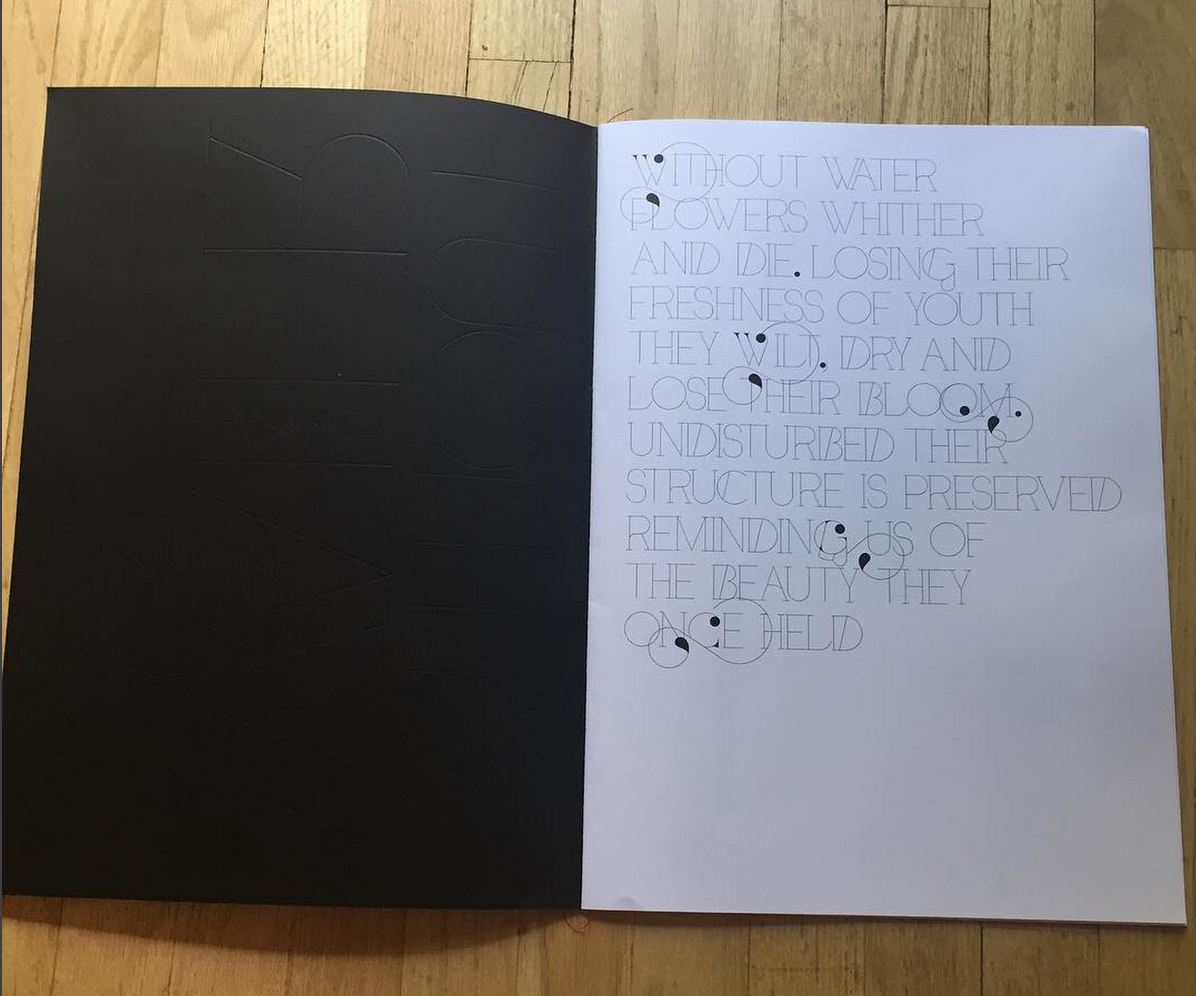
Invite is below  to his show here for this show: www.withoutwater.com.au

WITHOUTWATER_1

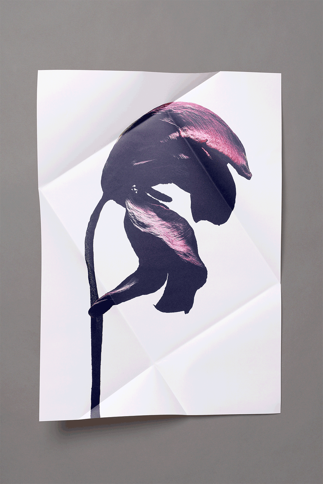
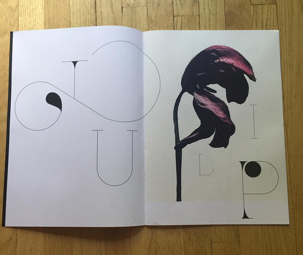
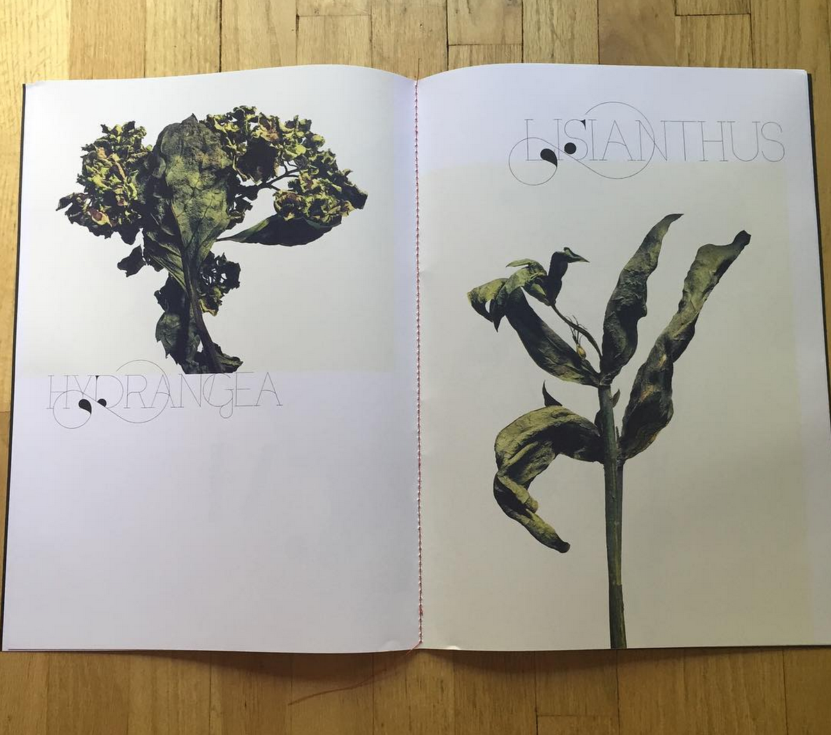
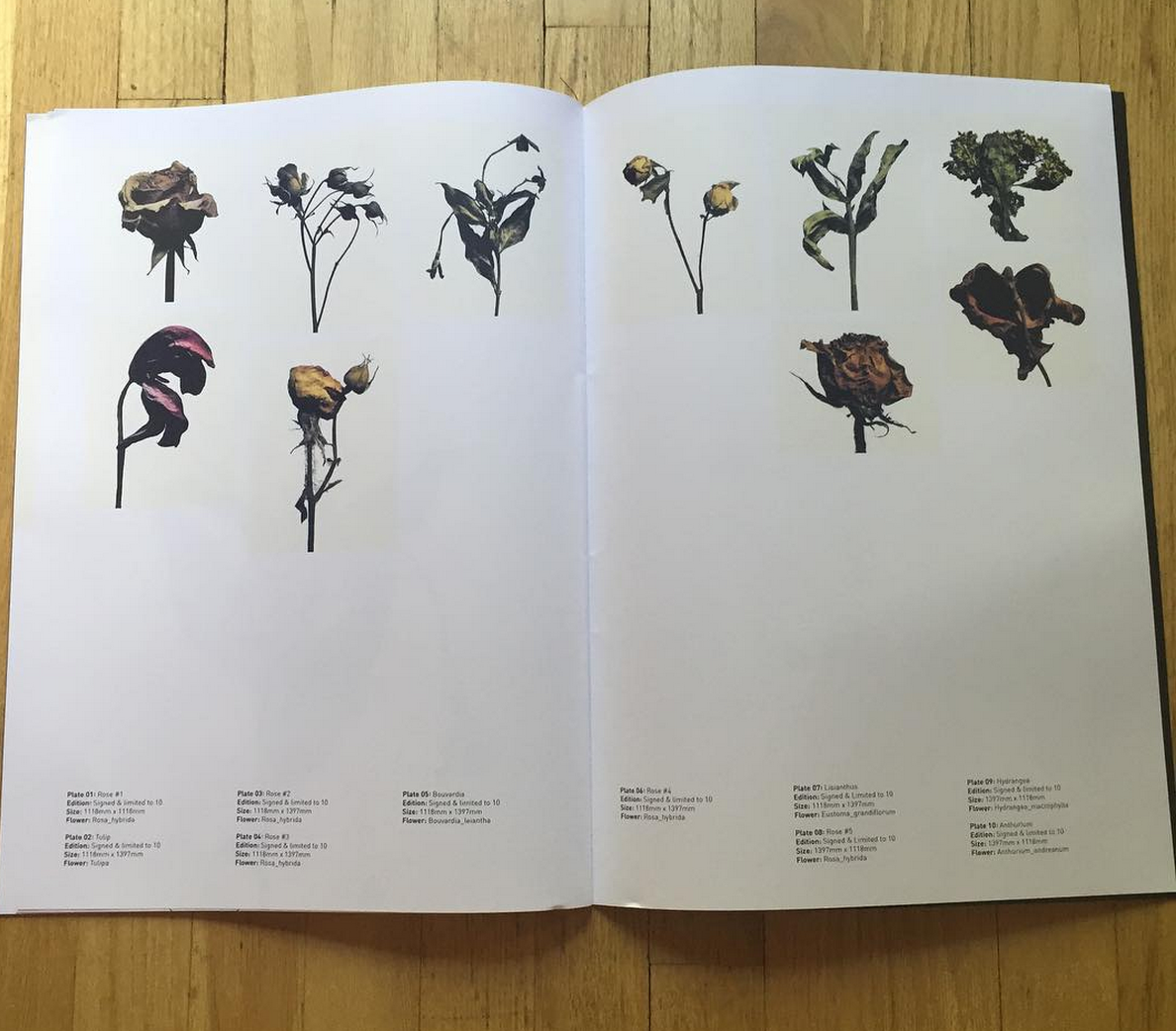
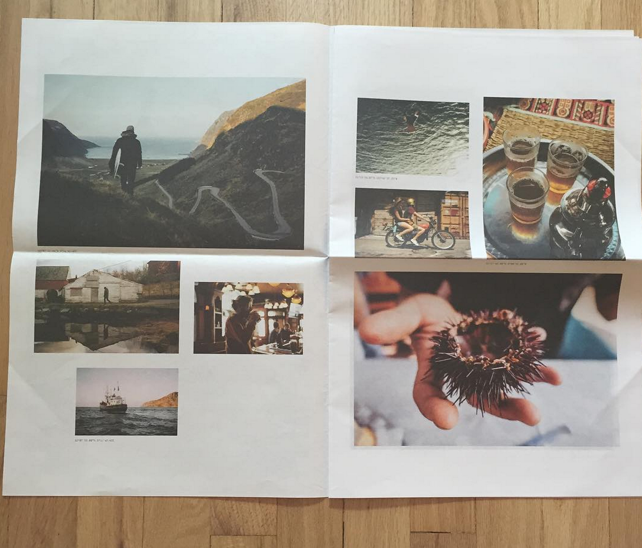
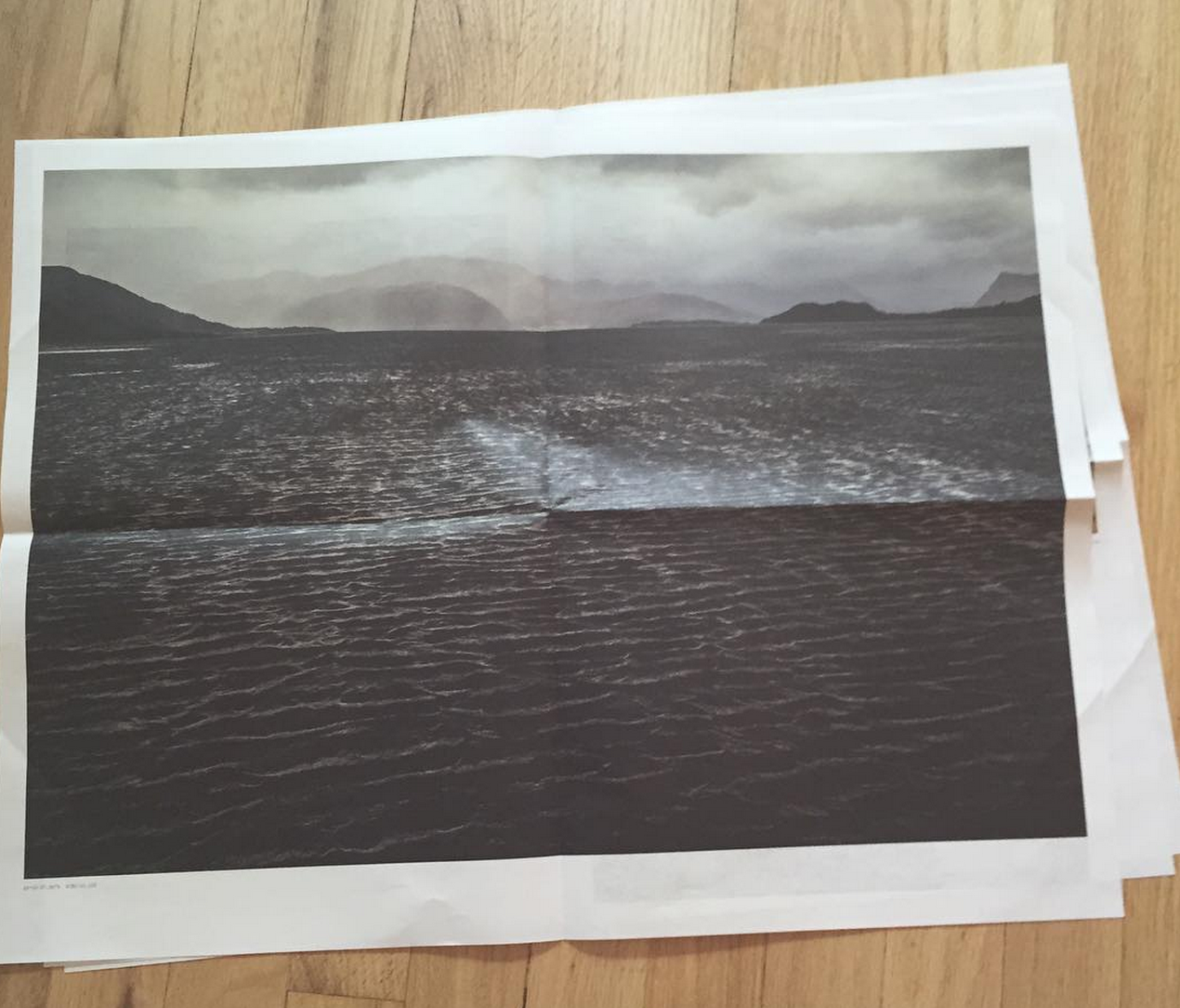
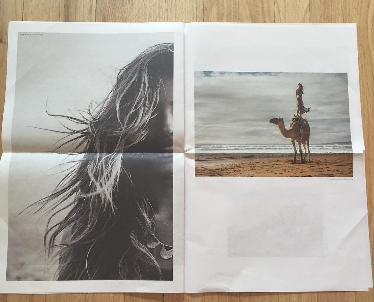
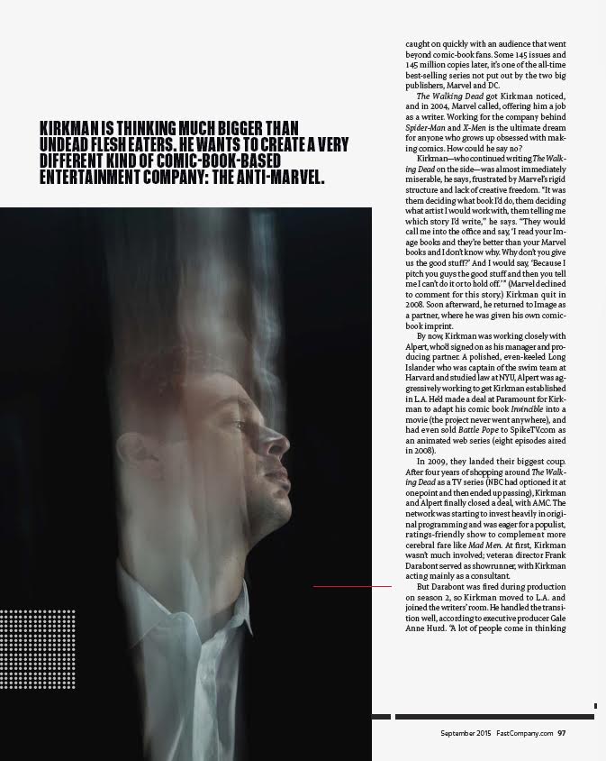
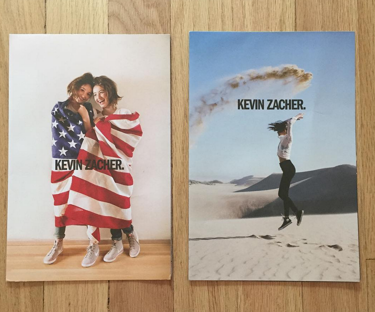
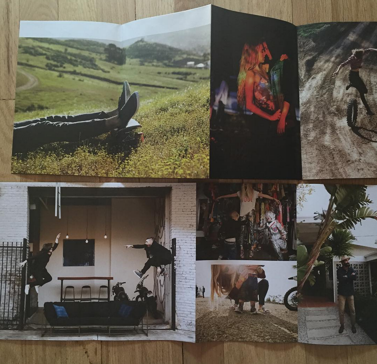
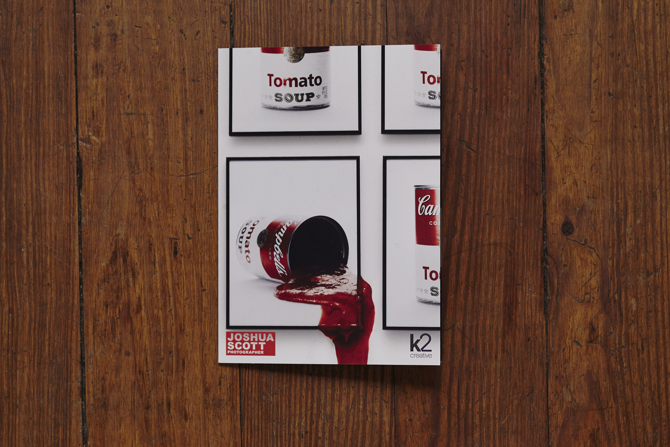
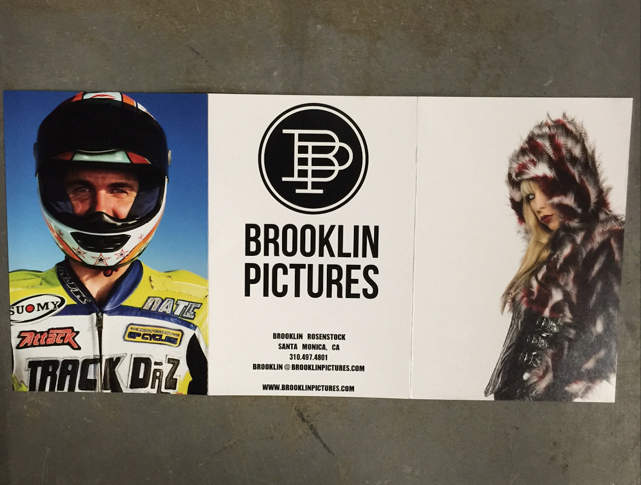
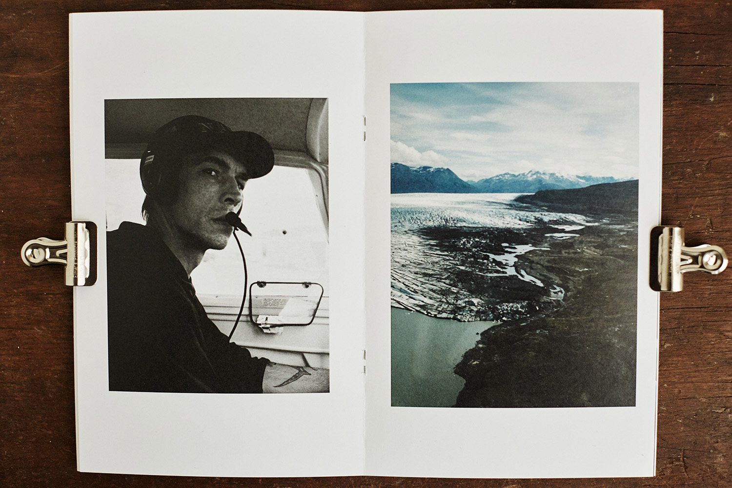
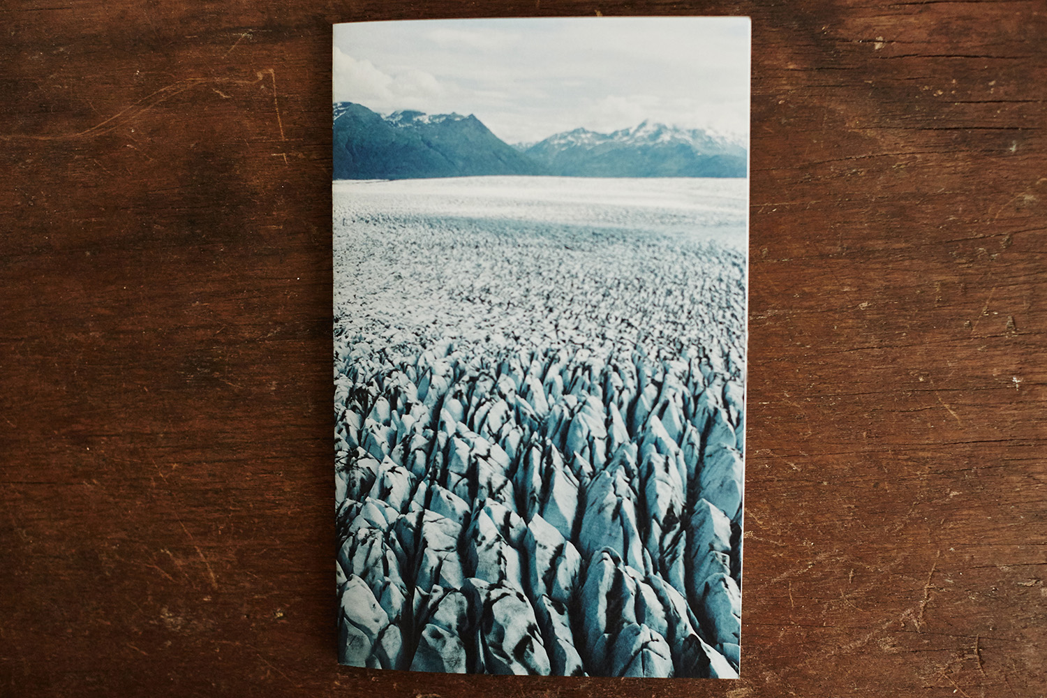
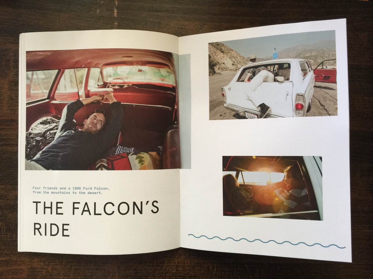
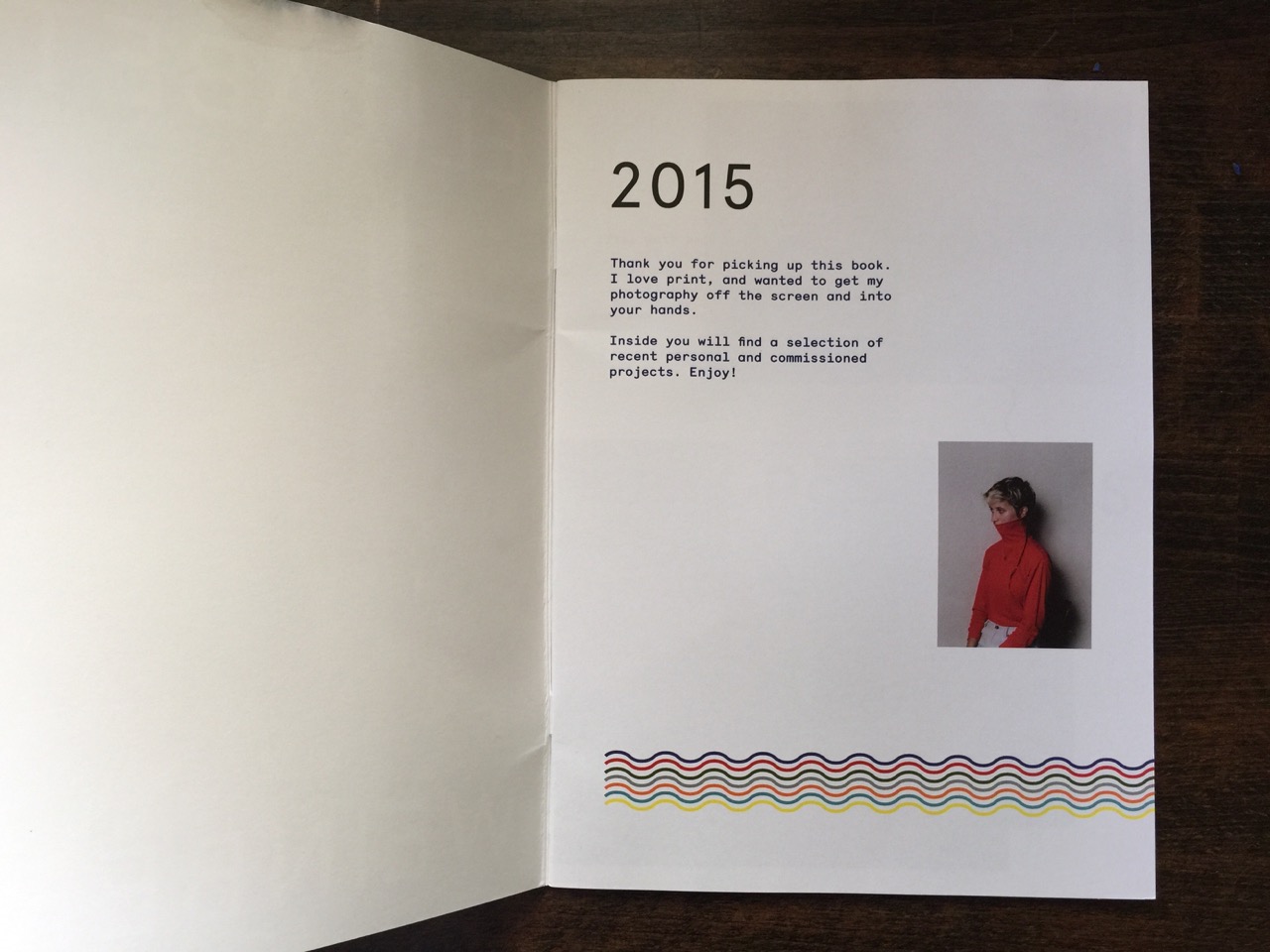
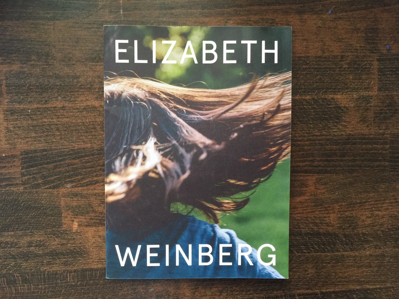
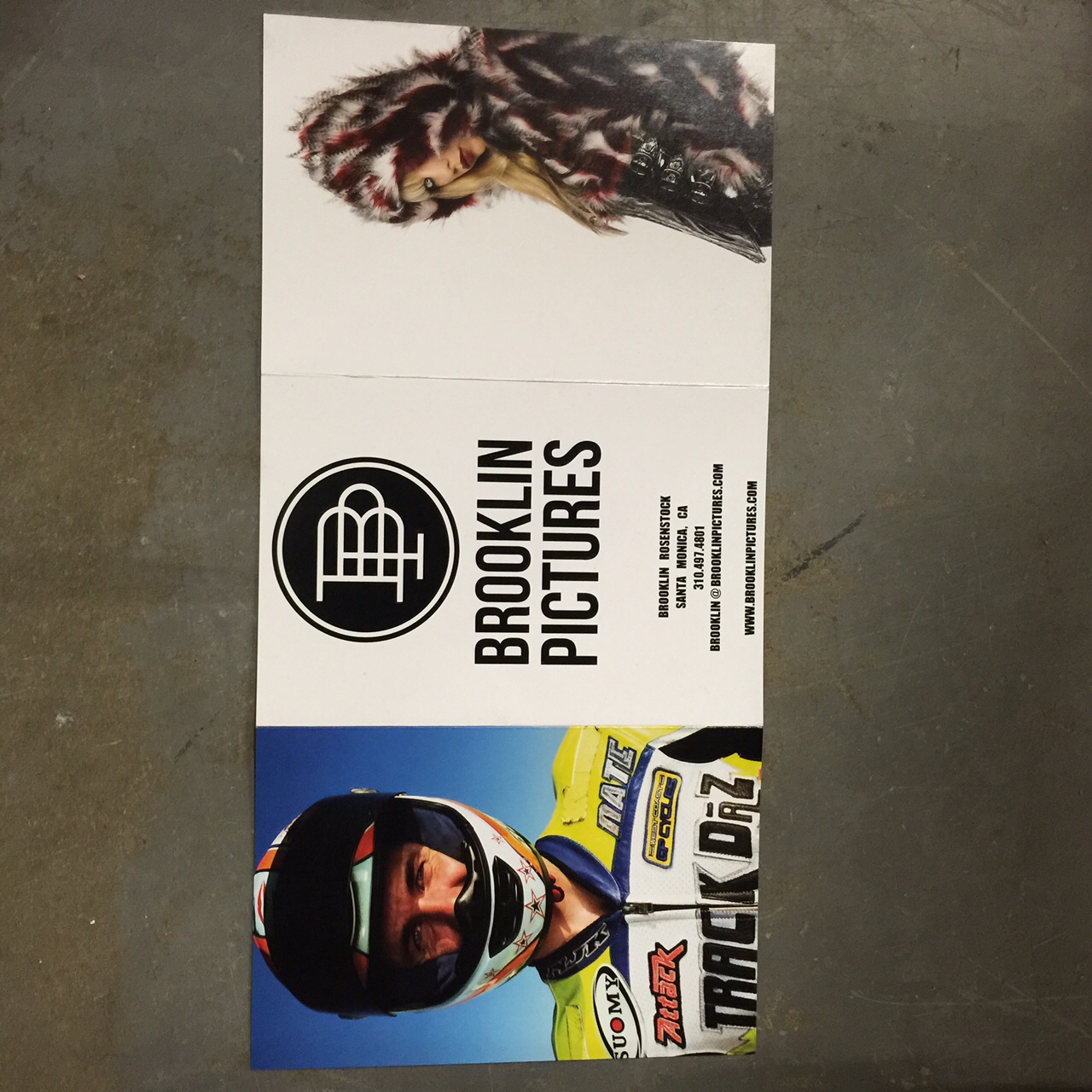
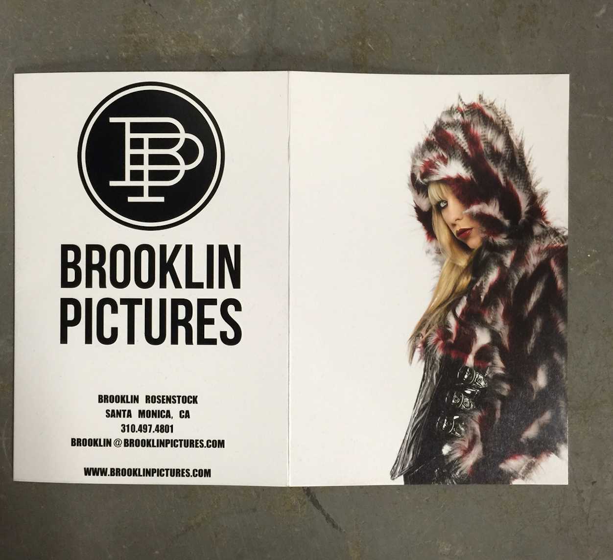
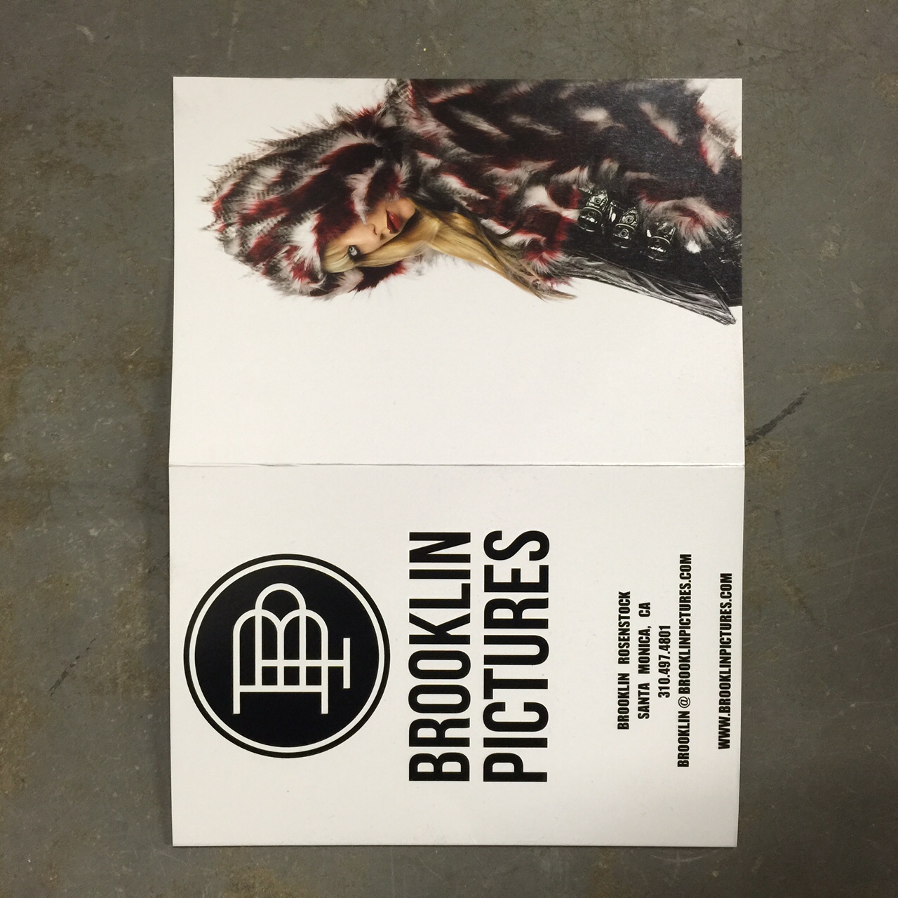
Isamu Sawa Photography

Who printed it?
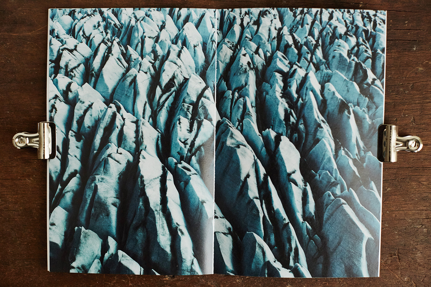
It was printed by Bambra Press one of many generous sponsors for my recent solo exhibition “Without Water” and printed on paper supplied by K.W. Doggett both situated in Melbourne Australia.

Who designed it?
It was designed by Creative Director Derek Samuel who created all the collateral for the project including invites, exhibition banners and website (www.withoutwater.com.au)

Who edited the images?
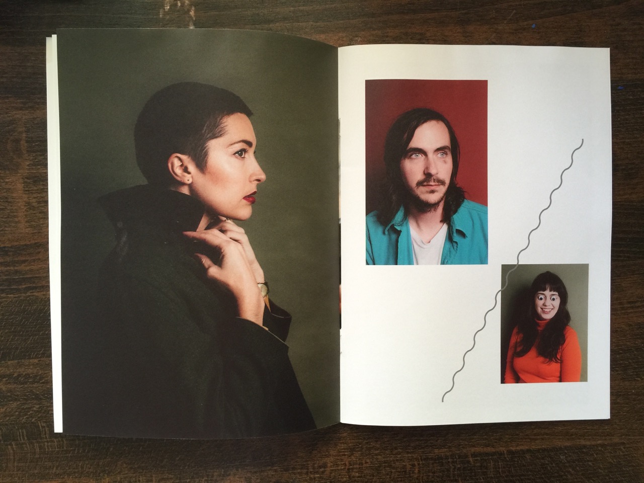
I personally selected the images and subsequent layouts were created by Derek Samuel

How many did you make?
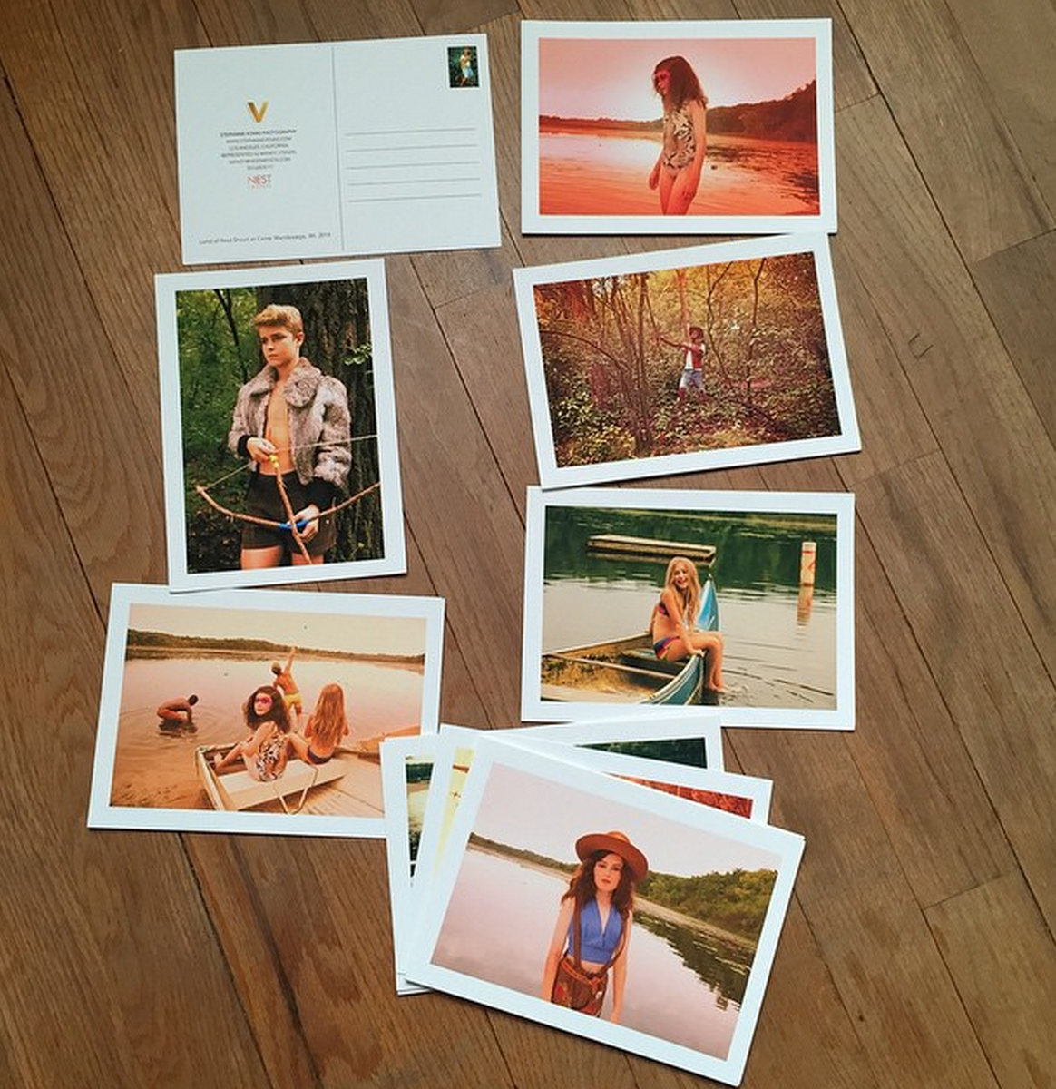
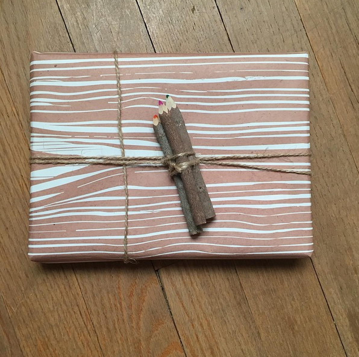
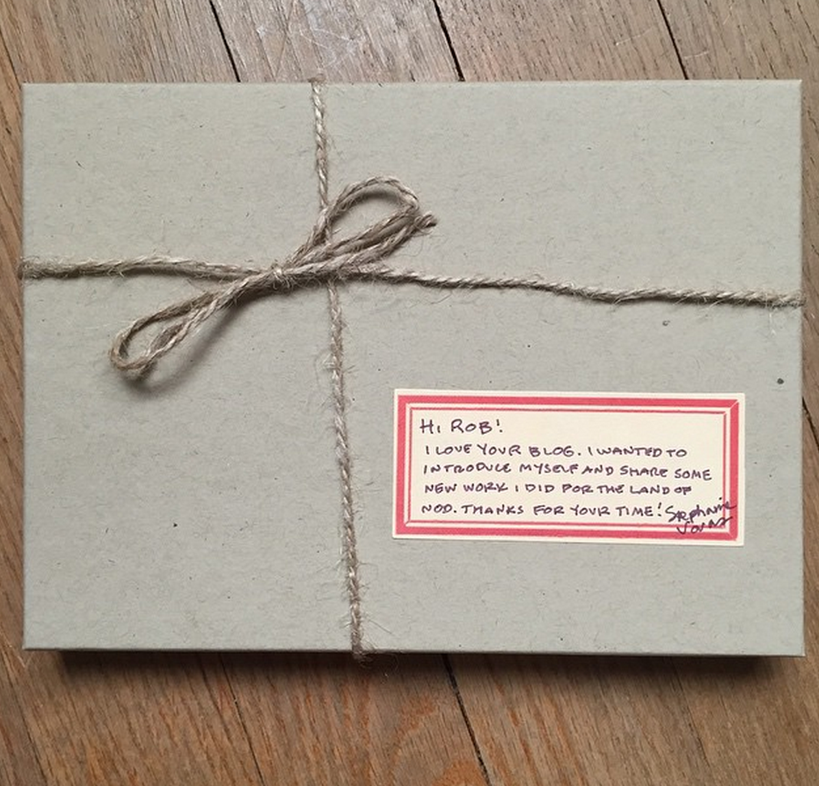
200. To coincide with a vast digital email marketing campaign to promote the exhibition, around 25 were sent out as special promotional invites with a bespoke ‘invite wrap’ to certain influential people such as bloggers, traditional and digital media outlets, editors of interior/lifestyle magazines and certain Instagrammers with particularly large following to generate publicity regarding the project/exhibtion. I wanted to send out something tangible and eye-catching with longevity that people could keep, pass around and leave on their coffee tables. The remaining copies were sold at the exhibition. The exhibition was a resounding success with tremendous media coverage, over 200 people on opening night and many Limited Edition prints sold.

How many times a year do you send out promos?
My agent Hart & Co and I send out digital mail-outs several times a year but this is the first time in many years that I decided to do a printed piece. Based on the amazing feedback I’ve received I will certainly be doing more in the near future.


The Daily Promo: Alexander Thompson

Screen Shot 2015-09-17 at 12.49.09 PM Screen Shot 2015-09-17 at 12.49.14 PM Screen Shot 2015-09-17 at 12.49.19 PM

 Alex Thompson 

Who printed it?
I had the photos printed at Samy’s Camera, here in Los Angeles. All of the images are printed on Fujicolor Professional matte photo paper. I cut small slits into the pages of the book in order to fit the photos in.

Who designed it?
I did all of the editing and design for the promo. Although, I initially got the idea from photographer Jody Rogac. In a video, she pulled out a similar looking book of Polaroids with the corners taped down. There were quite a few other differences but the basic idea of a DIY book filled with actual prints, as opposed to images printed directly on the paper, was based on her own. I knew I had to make a book myself in order to keep the spirit of the project alive.

How many did you make?
For this run, I only made 20 books, including the books I promised to those involved. I wanted to keep the recipients to a minimum in order to create a more exclusive feel and also, to show that those who received it, are important to my development as a photographer or inspire me in some way. Basically, I wanted this promo to come across as more personal than, say, a postcard would.

How many times a year do you send out promos?
Previously, I would send out a medium sized postcard every 3-4 months but I’m currently experimenting with monthly postcards and quarterly book promos, such as the Builders book. Possibly a Year-in-Review book too!

Tell us about how this project got started.
The project as a whole was inspired kind of out of nowhere. I was exploring many different possibilities for a personal project but nothing really stuck until I had the idea of shooting a model here in Los Angeles working on cars in his garage (he also rebuilds/sells classic BMWs). That never happened but it got the ball rolling and I started to reach out to any creators here in LA that I thought were interesting. One of the first to get back to me was Guy Okazaki who builds these really amazing surfboards in Venice. After working with him I reached out to my friends Andy and Kellen of Bicycle Coffee LA and got to shoot their roastmaster Mike making some of the best coffee here in LA. The third part of the series took quite some time to shoot because it was with probably one of the busiest bike shops in LA, Golden Saddle Cyclery. I worked with Woody, one of the owners of the shop, and photographed him building a touring bike from the ground up. Overall, it’s been a really fun experience and I’m excited to keep the project going. I have a lot of really cool ‘Builders’ lined up to work with and I can’t wait to learn about their processes.

Screen Shot 2015-09-17 at 12.49.27 PM

Alexander Thompson

The Daily Promo: Sam Kaplan

Screen Shot 2015-09-17 at 12.46.20 PM Screen Shot 2015-09-17 at 12.46.25 PM Screen Shot 2015-09-17 at 12.46.32 PM Screen Shot 2015-09-17 at 12.46.38 PM Screen Shot 2015-09-17 at 12.46.45 PM

Sam Kaplan

Who printed it?
Advanced Printing NYC

Who designed it?
I did.

Who edited the images?
I did. I shot the six main images knowing that they would be in the promo. Once I started designing the piece I realized I needed a front and back cover image. So we decided to shoot very simple remnants from the shoot.

How many did you make?
400

How many times a year do you send out promos?
I try to do two printed promos a year.

What inspired these beautiful images?
In the beginning of the summer I decided I wanted to do a promo to send out in the fall. I have always been fascinated with making patterns out of objects (especially food). Before this series I had focused on two-dimensional designs that sat on a surface. I wanted to find a way to make a pattern in three-dimensions. It was important to me capture each image in the series in one shot, with no compositing.

Who styled this and how many packets/or items did you purchase?
The cookie pit was the first one we did and I had Michelle Longo help source and style it. I think we bought every box of Lorna Doones in a 20-block radius around my studio. To construct the pit, we cut sheets lot of foamcore to create platforms for the cookies to sit on. The pyramid we built in a similar fashion. We did both separately over two long days.

For the sandwich images, I brought Brett Kurzweil on board. We had found a reference that we loved of a pyramid in a Confederate war memorial cemetery and used the dimensions of that to plan out our pyramid. Brett made dozens and dozens of each type of sandwich and I used them like (soft) bricks to build the pyramid on set. Again, foam-core was used to shore up the structure. It was a little over 3 feet tall. This took about 14 hours I think.

For the candy, I did both builds on my own during downtime at my studio over a period of a few weeks. I used a combination of foamcore and about 500 hot glue sticks.

The Daily Promo: James Worrell


Screen Shot 2015-08-26 at 3.26.05 PMScreen Shot 2015-09-04 at 9.19.04 AM

James Worrell

Who printed it?
The Card was printed at Modern Postcard.

Who designed it?
I designed it and edited the images with a little help from my Food Stylist, Brian Preston-Campbell and my agent Mary Dail at Big Leo.

How many did you make?
We printed 500, mailed out about 425, the rest are for leave behinds, etc.  An email campaign followed up the printed mailing about a week later.
unnamed-1
How many times a year do you send out promos?
This year I plan on doing three printed promo mailings in this format, last year I only did one and the year before that I did a couple with what I call a “special promo.” That was an involved piece that involved printing my logo on M&Ms and a small booklet.  For awhile people got tired of the printed promo but it seems to be having a resurgence, or maybe that’s just me.  The email promo is hated by most at this point and the printed piece seems so much more substantial.  I consistently promote myself, if anything, my biggest problem is that I get bored and do other things.   I am currently advertising for the second year in Atedge.com, they print five books each year, two books feature our ice cream shots.
Do you always work with the same stylist and do you set out with a plan for the promos?
I work with Brian a lot on various editorial and advertising jobs.  He does a lot of the ice cream you see on packages out there and always has funny stories to tell about the process.  We devised a scheme to test ice cream shots, promote them and take over the world of ice cream shooting.  The real story is that I have a loose plan of doing shoots with my favorite stylists and then promoting our work together.  It’s a way to combine creative forces and share the costs. It also is really great to work on a collaboration with a mind to promote as opposed to just sending out work that I was paid to do.  Of course, I have been paid to shoot ice cream, just not these.  And while I did all the shooting, retouching and layout design, Brian and I planned and did two separate shoots for this promo, and have plans for one more as a follow-up.  I have another shoot coming up soon with one of my favorite conceptual prop stylists for a winter promo as well.

The Daily Promo: Embry Rucker

Screen Shot 2015-08-09 at 4.53.54 PM Screen Shot 2015-08-09 at 4.54.00 PM Screen Shot 2015-08-09 at 4.54.05 PM Screen Shot 2015-08-09 at 4.54.11 PM Screen Shot 2015-08-09 at 4.54.15 PM Screen Shot 2015-08-09 at 4.54.21 PM Screen Shot 2015-08-09 at 4.54.26 PM

Embry Rucker


Who designed it?
I worked with Dustin Ortiz on the design. He has done a few newspaper catalogs and print jobs that I loved so his experience and skills were invaluable.

Who edited the images?
I had a collection of images I loved and wanted to include.  Dustin helped me cull the herd and pair images that I normally wouldn’t see together. I tend to associate images by  shoot.  It’s cool to see what fresh eyes see and think work well together.

How many did you make?
We mailed out 2500 and I think we printed 3,000 so we would have some to hand out and use to light fires with.

How many times a year do you send out promos?
I suppose everyone says ‘not often enough’ right? I probably send two realistically, but I think four is probably a good number. With the ‘mass’ mailing like this I’m less convinced it has much of an impact.  I prefer to stay in touch with my smaller select group of people I work with, have worked with, who I believe would be a good fit in the future. Something more personal, like the package I sent Rob with the zine, patches, stickers and note…

What was the most creative use of your promo and why the newsprint instead of the card?
No real back story other than just wanting to break away from the postcard, grind. I like the newspaper size it’s like a zine and it gives you a tactile experience. Here’s my Daughter using it for shade at the beach…lots of possibilities!

The Daily Promo – Blair Gable

Screen Shot 2015-08-09 at 4.49.25 PM Screen Shot 2015-08-09 at 4.49.32 PM Screen Shot 2015-08-09 at 4.49.39 PM Screen Shot 2015-08-09 at 4.49.43 PM Screen Shot 2015-08-09 at 4.49.49 PM Screen Shot 2015-08-09 at 4.49.57 PM

Blair Gable

Who printed it?
The books were printed by Photobook Canada – 40 copies. The postcards were printed by Vistaprint and the stickers were printed by Loudmouth Print House in Ottawa.

Who designed it?
The Gablehead, Blair Gable Photography, and Third Floor York logos were designed by Jason Harper at Strongvine Visual Communications. I designed the book and postcard myself – layout using Photo Mechanic and page design with Fundy Designer.

Who edited the images?
I edited the images myself, though I showed a pre-production book to close family and friends to see if there was anything missing.

How many did you make?
I send out packages to editors that I regularly work with at least once a year. This was my first time sending promo kits to a large number of new editors.

How many times a year do you send out promos?
I mostly shoot politics and portraits for my editorial clients and rarely have time to work on personal or self-assigned projects. I worked on a number of projects last year that I shot first and sold later, so I thought I would showcase that work in this particular promo package.

I like the title, did you write that and was impact the goal? 
I did write the title, it came from the topics of the projects, but I thought together they were compelling enough to make someone crack the book. So I guess the goal was to make it as enticing as possible, as quickly as possible.

The Daily Edit – Fast Company: Zach Gross

unnamed-2

unnamed

unnamed-1
Fast Company


Photo Director:
Sarah Filippi
Photo Editor: Annie Chia
Photographer: Zach Gross

Heidi: What type of direction did you get from the magazine?
Zach: Annie asked me to do something a little creepy and eerie: using double exposures and shutter dragging to distort/obscure their faces. She wanted the portraits of David and Robert to look a little unsettling like their television show, The Walking Dead.

What was your technique for this?
I used three strobes mixed with the ambient light coming down from a skylight in the studio, and a smoke machine to create a hazy atmosphere.

How much time did you have to do the portraits?
Because of their tight schedules, I had thirty minutes with each subject.

It’s so refreshing to see a different style of portrait that suits the content. Have you done this type of portrait before?
I’ve experimented with this type of technique before while photographing dancers and performance artists.  This time it was a bit different because the subjects were not performers. I had to direct them more and suspend their literal interpretations of a portrait, asking them to perform a little more then they were used to.

Did you do any testing for this?
I arrived at the studio early, and did some tests for about an hour to adjust the light and get the technique dialed in. I came to the studio with specific ideas and goals. I sketched out some ideas on paper to help visualize the shoot. During the process, details get adjusted and tweaked but it was good to have a blueprint.

The blurs seem to be directional, how did you do that?
The blurs are directional because both the subjects and I were moving. The shoot was a bit of a dance trying to find the convergence of all the elements: strobe light, natural light, smoke, and expression. A lot of exploring different compositions…it felt like choreography.

The Daily Promo: Kevin Zacher

Screen Shot 2015-08-09 at 4.48.21 PM Screen Shot 2015-08-09 at 4.48.33 PM Screen Shot 2015-08-09 at 4.48.43 PM Screen Shot 2015-08-09 at 4.48.50 PM

Kevin Zacher

Who printed it?
Source Print Media in LA.  I like to keep it local and in America.  We used a traditional litho process but with the new technology of UV inks and UV lamps. This allows the printer to not have any dry back issues in the uncoated stock which in turn keeps the colors more vibrant.  There is also less waste in this process.

Who designed it?
Eric Pfleeger who is a freelance art director in LA  and formerly in New York and Amsterdam doing the agency thing.  He’s done promos for Christa Renee, Amanda Marsalis, Karen Caruso, Justin Hollar and logos for Peter Bohler and Brian Stevens. He is currently working on a super cool top-secret book project with an entertainment artist.   He’s been doing all my promos for the last 2 years and has a great sense for simplicity and editing.   He did a mini book for me that I shipped a couple of years ago and it looked beautiful so I just kept going with him.

We wanted them to be more or less simple and utilitarian.  A promo that isn’t so much about the design, but the work, the ease of use and  the fun of a poster.  The fold is very specific, that is because I wanted the images to be upright almost no matter how you look at it.  If it’s completely folded you can sort of flip it like a magazine and the images will be right side up.  And then of course for those who are into posters we offer that.  Who doesn’t like a good poster.  All time best poster?  Farrah Fawcett in the one piece swim suit.  Don’t know it??   Look it up- you won’t be disappointed male for female.

Who edited the images?
A mix between myself and Eric Pfleeger.  Each promo is built from photographs from one specific shoot, not a montage of many shoots or images over time. I wanted to challenge myself to do a promo I was happy with from a limited amount of work.   Limited in that it’s not curated from anything I’ve done in the last year, but from a single shoot that might last a day or a week.  I shoot a lot, but it’s still a challenge to commit to so few images.    I will send Eric as broad an edit of a shoot as I can and he will whittle it down and put into 3 to 4 layouts for me to review.   I will then bounce back some images I don’t like or add ones that weren’t included and then we will battle it out until we are both happy.  I want him to be happy, because it’s not just about me.  It’s about the integrity and I want Eric to gain something for himself as well.

How many did you make?
4,250.  4,000 get shipped out and 175 go to my agent Anderson Hopkins for hand outs and I keep the rest to hand out and mail to awesome people as they come into my life like Rob Haggart!!!  If anyone wants one hit me up!

How many times a year do you send out promos?
This year I am doing 4.  Roughly every 3 months or when the timing and work seem right.  I’ve shipped two so far:  Vol. 1 and Vol. 2.  I would ship more if I didn’t think it was wasteful and that people aren’t already tired of getting promos.  I will fill in with some email promos here and there when the work calls for it.

The Daily Promo: Breungrega

BreunGrega_01 BreunGrega_02 BreunGrega_03 BreunGrega_04

Breungrega

Who printed it?
It was printed by Pinguindruck here in Berlin. They are specialised in printing all kinds of stuff for creatives.

Who designed it?
I did the designed by myself. But our logo was designed by Frauke Wiechmann & Vincent Kraft, graphic designer friends of ours.

As breungrega.com is a team of Martin Grega and me, David Breun, we have those half circles wich can be put together. We have this sheme on lots of our stuff for example also on our business cards. With the postcards i did the same you can put them together and then you have a full circle.

Who edited the images?
I edited the images with my business partner Martin.

How many did you make?
We made 1000 each.

How many times a year do you send out promos?
We are trying to send promo cards twice a year. I also have a couple of postcards with me all the time and i leave them as a addition to my business card. And its funny that you still see them a office tables if you visit the person the next time.

Did you purposely leave off your contact details on the promo to Rob? Your instragram friends were able to ID your team, you have fans!
Oh thanks, our US agent Tim Mitchell said that it’s a good strategy. I didnt do this on purpose, on the front our website & logo is printed with UV finish, so if you turn the postcard a bit you can see it. Next time i will write my full address and company name on the back, for sure! I attached some pictures where you can see the finish.

The 2 postcards are also trying to show our two aspects…one is the advertisement photography and the other one is editorial car photography. The 3 Porsche sports cars have never been on the location in Miami they only exist in the computer, they have been rendered, very common these days and a big change in car photography…the orange car is a Lancia Stratos prototype 1975, matte orange! This was an editorial shooting for ramp Magazine here in Germany and a completely hit & run shoot…the car wasn´t even registered neither had it working headlights…the owner just didn´t care he drove around the city the whole night with us…in the end he lost the ignition key…a shooting i will never forget…

The Daily Promo: Tim Tadder

Screen Shot 2015-07-24 at 10.43.16 AM Screen Shot 2015-07-24 at 10.43.23 AM
Tim Tadder

Who printed it?
This was printed by my friends at Marathon Press in Nebraska. Marathon caters to the wedding and portrait market mostly, but after meeting their CEO at a trade show I was impressed with their color reproduction. These images are very difficult to reproduce so I knew that Marathon was the place to do it. After a few bad experiences with some other vendors, I was super excited to have a new partner to help get our images noticed by industry creative.

Who designed it?
Cheryln Read a talented designer in San Francisco. She is designing all of our promos and managing the process of getting one out each month. She pulls images from out sight and comes up with creative solutions. She comes from an agency background so its helpful to have her make promos that people want to keep. I am not a big fan of creating waste, so I wanted to partner with someone who felt the same way. We have to send out mailers to remain relevant, and we hope the ones we do send out do not immediately go into the trash.

Who edited the images?
We edited the images in-house. I did have an amazing retoucher handle one image as the skin was particularly difficult for me to manage, but the rest were done by me.

How many did you make?
2500

How many times a year do you send out promos?
8 to 10 times a year.

I understand you had some printing issues. Tell us about that.
I used another popular vendor for mailers and I noticed the color becoming more and more incorrect with each mailer. The reproduction is critical and we would always buy proofs to ensure great color. Sometimes we would go three rounds of proofs (expensive) and then when we would receive our mailers the color would be off dramatically. Their response was that they do proofs on a digital press and the finals on an offset press and that a color shift was normal. They reviewed our concerns and came back to us saying that the shift was “Acceptable”.

My clients would never be happy with me telling them that the color shift in their images were “acceptable.” Thats when we set out to find a better printer and a better partner to help us. We don’t like when things are “acceptable” we strive for AMAZING and EXCEPTIONAL. Shocked that someone would treat a finished product that way!

The Daily Promo: Adam Cohen

Screen Shot 2015-07-24 at 10.09.56 AM Screen Shot 2015-07-24 at 10.10.01 AM Screen Shot 2015-07-24 at 10.10.06 AM Screen Shot 2015-07-24 at 10.10.12 AM Screen Shot 2015-07-24 at 10.10.18 AM
Adam Cohen

Who printed it?
I used a local printer, Minute Man Press, that actually is a franchise of a larger company.

Who designed it?
I did all the design and layout myself.

Who edited the images?
I also edited all the images. I believe both editing and designing projects are important practices that a photographer participates in. I look at these zines as how rappers look at “mixtapes”. It’s a smaller, looser project that releases before the album, or in my case, the book.

How many did you make?
100 + 10 Artist Copies.

How many times a year do you send out promos?
I wouldn’t necessarily call these “promos“. They are somewhere in between a book and a “zine” project. I generally make these when I’m interested in a smaller narrative that I want to explore for a shorter term. Additionally, these projects are functioning as “reportage” almost. In a sense, where I am publishing my own editorial projects. At some point, I’d rather break even with some of these projects and have complete control over the project than get payed a small fee by a publication and lose all authority over layout, edit, content, etc.

Tres De Mayo de 2015 , was a project I made about the Cinco De Mayo Celebration in the Pilsen/Little Village neighborhood of Chicago’s southwest side. There are subtle references throughout the project that I didn’t want to give away.

These are actually for sale on adamjasoncohen.bigcartel.com and each copy comes with a small 6×4″ digital C-Print.

The Daily Promo: Joshua Scott

Screen Wipes Promo 3

Screen Wipes Promo 4

Screen Wipes Promo 1

Eggs


Honey

Orange 2

Party Scene 1
Screen Wipes Promo 2


Joshua Scott


Who printed it?

The card was from Modern Postcard, www.modernpostcard.com and the screen wipes are from www.4allpromos.com.

Who designed it?

Yee Wong at 52kilo, www.52kilo.com

Who edited the images? Did it come with images?

I edited the images myself along with input from my agents Katie and Kristy at K2 Creative Management, www.k2creativemanagement.com

The screen wipes did not come with images. I shot all images.

How many did you make?

About 250. I think that was the minimum order allowed for the screen wipes.

How many times a year do you send out promos?

I try to send out physical promos about 4 times a year and intersperse an email promo between those mailings. So together I’m sending out about 8 pros a year. Depending on my available budget.

How did this idea develop?

This promo came out of my agent K2 Creative Management asking me to do a more involved unique physical promo piece. Before this I only ever send out postcards just because they are the most budget friendly. Sometimes the postage actually costs more than the printed card! Reluctantly I came up with a few ideas based on the end user receiving a product that they could actually use. That was important to me that the piece actually be a little useful.  Once we decided on what the physical item was going to be, the screen wipes, we came up with a few tag lines and I started to brainstorm image ideas that could relate to the product. This was the 1st time I actually shot images specifically for promo use. Before this I just used images I had shot for other jobs as just kind of an update of my work. I think actually shooting dedicated images for a promo concept really helped make this piece stand out and be a cohesive idea. Its good to have someone, my agent in this case,  pushing you to step it up.

Editor’s Note:
If you’d like to send promos for review I’d love to check them out:
21135 Colina Rd
Topagna CA
90290

The Daily Promo: Brooklin Pictures

Brooklin Pictures


Who printed it?

Modern Postcard

Who designed it?
I have been working with Peter Dennen of Pedro + Jackie, he has really helped me fine tune my images to create more of cohesive look/feel.  Between the two of us, we came up with the design for the promo.

Who edited the images?
Peter and I decided on the images to be used and I did all of the retouching.
How many did you make?
I had 300 printed.

How many times a year do you send out promos?
I try to send out 4 mailers p/year and then send out 3-6 email promos in between the gaps of the printed pieces.

The Daily Promo: Stephanie Vovas

Screen Shot 2015-05-31 at 9.11.11 PMScreen Shot 2015-05-31 at 9.10.52 PM
Screen Shot 2015-05-31 at 9.11.22 PMScreen Shot 2015-05-31 at 9.11.30 PM
Stephanie Vovas


Who designed it?
I designed it.

Who edited the images?
I did.

How many did you make?
It’s an ongoing campaign/process as I make them by hand, which takes some time. So I pop off a few every time I get a chance, and am sending them out gradually.

How many times a year do you send out promos?
This was my first time sending out a promo. I love printing them, bundling them up, and shipping them out. It’s like making a nice gift for someone you want to like you, and hoping they enjoy what they receive. I aim to send out a nice package 3 times a year from now on. I already have the next one designed in my head and I can’t wait to make it.

Where did you get the pencils and wood grain paper?
Pencils are from a local shop, and the paper and boxes are from Paper Source. Paper Source is full of cool stuff for making promos.

This promo stemmed from a very fun job, so I wanted to show it off in a nice little package. Michelle Kohanzo, the Creative Director of The Land of Nod hired me to make fine art photographs for their stores to sell. She was completely open creatively, and totally supportive to my team and I. It was a dream job working with her.  We got to shoot in Wisconsin, at a camp that has been many different things in the past, a speakeasy in prohibition days, a church camp, and a brothel! We got to stay overnight in the cabins there overlooking the lake. It rained and stormed a great deal on the shoot day but it all worked out great!

The Daily Promo – Sarah Lim

 unnamed-2

unnamed-1

unnamed-3

Sarah Lim


Who printed it?
Who designed it?

Who edited it?
The promo was printed, designed, edited, cut, glued and assembled 100% by me. I’m a maker of sorts (which is why I like to brand myself as a “Picture Maker”) and I hand make many of my own props and sets for shoots. If there’s something I’m looking for but I can’t buy it anywhere, I’ll just make it. I’ve done anything from cooking, sewing, building, screen printing, painting, hot-gluing – you name it, I have probably done it for a shoot or in life. I like working with my hands, so building and crafting are something that comes pretty naturally for me. I spend a lot of weekends at home with power tools and a glue gun.
How often to you send out promos?
The original idea for the promo was to make an old-school Valentine, but the downside of making everything by hand is it takes a lot of time.  So, I’m still in the process of sending some of them out!  But I think the message is universal, so I don’t think people will mind if they receive them post-Valentines day (I hope!) To date, I’ve probably sent out about 75, but have plans to send out about 200.
Did you also do the typography?
The typography is consistent with my branding (I also designed my logo out of a silhouette of my head);  Everything I do is hand made and hand-tailored for a specific subject or the client, so I’m really thoughtful of the “whole package” and how the design, layout, etc, all come into play for the final product. I also think people really like having an interactive experience, and getting mail with your name hand-lettered, adds to the interactivity of the promo.  The idea was to make the envelopes look kind of like a love letter (or I’m “in like with you”) and I really wanted them to pop when people saw them on their desks. I wanted to make something fun that people would want to share.
As a sidenote, a thaumatrope is considered to be the beginnings of motion pictures, and I’ve also recently began doing more motion and stop-motion type work. Just kind of another layer that helped personalize this promo for myself. I try to send out promos at least quarterly, and this year wanted to start thinking of at least one special, hand-made promo a year to send out, in addition to quarterly postcards.


The Daily Promo – Cody James

2015 Up In The Air Zine

Cody James


Who printed it?
QIS in Lower Manhattan.

Who designed it?
I designed the zine.

Who edited the images?
I designed the zine and edited the photos with the help of the creative eyes of a few friends.

How many did you make?
30

How many times a year do you send out promos?
This was my time making a zine like this. I am going to start making zines every few months. It’s great to see this process through and hold the finished product in your hands.

I was in Alaska last July and had the opportunity to trade photos for a flight with some local pilots. I’ve always had a huge interest in flight, nature, and storytelling. I feel like this was a great chance to combine all of these elements and put the content into a cohesive story. I’ve been wanting to make more physical objects of my work, and I chose to start with of some of my favorite photographs to date.

Did you add any text to the images/captions?
I didn’t add any text or captions to the images. I opened the zine with a quote by Socrates and let the images do the rest of the story telling. The quote was : Man must rise above the Earth—to the top of the atmosphere and beyond—for only thus will he fully understand the world in which he lives.”


The Daily Promo: Elizabeth Weinberg

unnamed-1 unnamed-2 unnamed-3 unnamed-4 unnamed-5 unnamed

Elizabeth Weinberg

Who printed it?
Smartpress in Chanhassen, MN. I have used them for several years.

Who designed it?
Me!

Who edited the images?
Me!

How many did you make?
650.

How many times a year do you send out promos?
I do at least one large mailer per year and fill in the gaps with some postcards.

 Tell me about your design process
At first the cover was just going to be just white with the title and no photo, as I always have a hard time editing for that one cover shot. I got the plain-covered hard proof back and then decided to instead use a photograph that would look good very cropped in. In the photo, the boy’s hair is flying, giving the viewer a sense of movement, but leaves the rest open to interpretation. It’s all about making the person holding the book want to open it up.

Once the images were laid out, I felt it looked a bit too plain, so I added a geometric element to guide the eye through each page. Each section of the booklet has its own line, and each line was a color that I decided would best represent the series of images. The different colored lines were all aligned chronologically on the first page of the book, sort of like a symbolic table of contents.


The Daily Promo – Rebecca Cabage


Screen Shot 2015-04-27 at 10.11.08 AM Screen Shot 2015-04-27 at 10.12.15 AM

Rebecca Cabage

Who printed it?
I had them printed at The Paper Chase Press,  they came highly recommended from a long time agent friend.

Who designed it?
I designed the promos myself.

I see you added a touch of gold to the promo.
Yes, the gold is to represent honey and it’s thick card stock, so the sides of the cards have gold on them.

Who edited the images?
I edited the images with the intent of it telling a good story, like an editorial piece would. I wanted a close up of the honeybee so that you could identify with, and personalize the bee. Each image after pulled back a little more until it ultimately reveals the full story of the beekeeper. Here’s the complete gallery and written story.

How many did you make?
I did a total of 180 cards, and sent them out in pairs of 3, so 60 total.

How many times a year do you send out promos?
This was my first batch of promos to go out. Prior to this year, I was working full time at a studio, as the Director of Bookings, and was shooting on weekends and in my off hours, and didn’t have time to pursue additional work. I’m now 100% percent focused and plan to send out promos 3 times a year.

I recall seeing a remarkable video at one of SPD’s Unsung Heroes;  Mathieu Young presented you.
It was a pleasant surprise to see that along with being a successful Director of Bookings, you were also a talented photographer with a deep interest in environmental awareness.