The Art of the Personal Project is a crucial element to let potential buyers see how you think creatively on your own. I am drawn to personal projects that have an interesting vision or that show something I have never seen before. In this thread, I’ll include a link to each personal project with the artist statement so you can see more of the project. Please note: This thread is not affiliated with any company; I’m just featuring projects that I find. Please DO NOT send me your work. I do not take submissions.
Today’s featured artist: Beth Galton
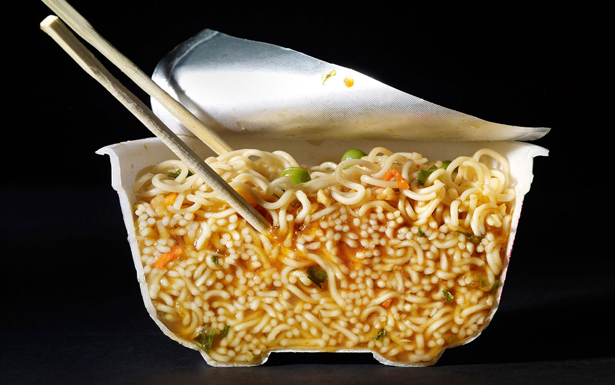
Cut Food
Classic food photography involves the right people with talent and taste. Choosing the props, preparing the food in an appealing way, and lighting it so that it’s appetizing and beautiful creates a successful image.
My training has been as a classic food photographer; understanding the need for creativity and collaboration between the food and prop stylist and myself to produce an appetizing and beautiful image. For an assignment, we are tasked to photograph the surface of the food occasionally taking a bite or piece out but rarely a cross section of a finished dish. The goal is to make it appetizing and beautiful- to make the viewer hungry or influence them to recreate the dish.
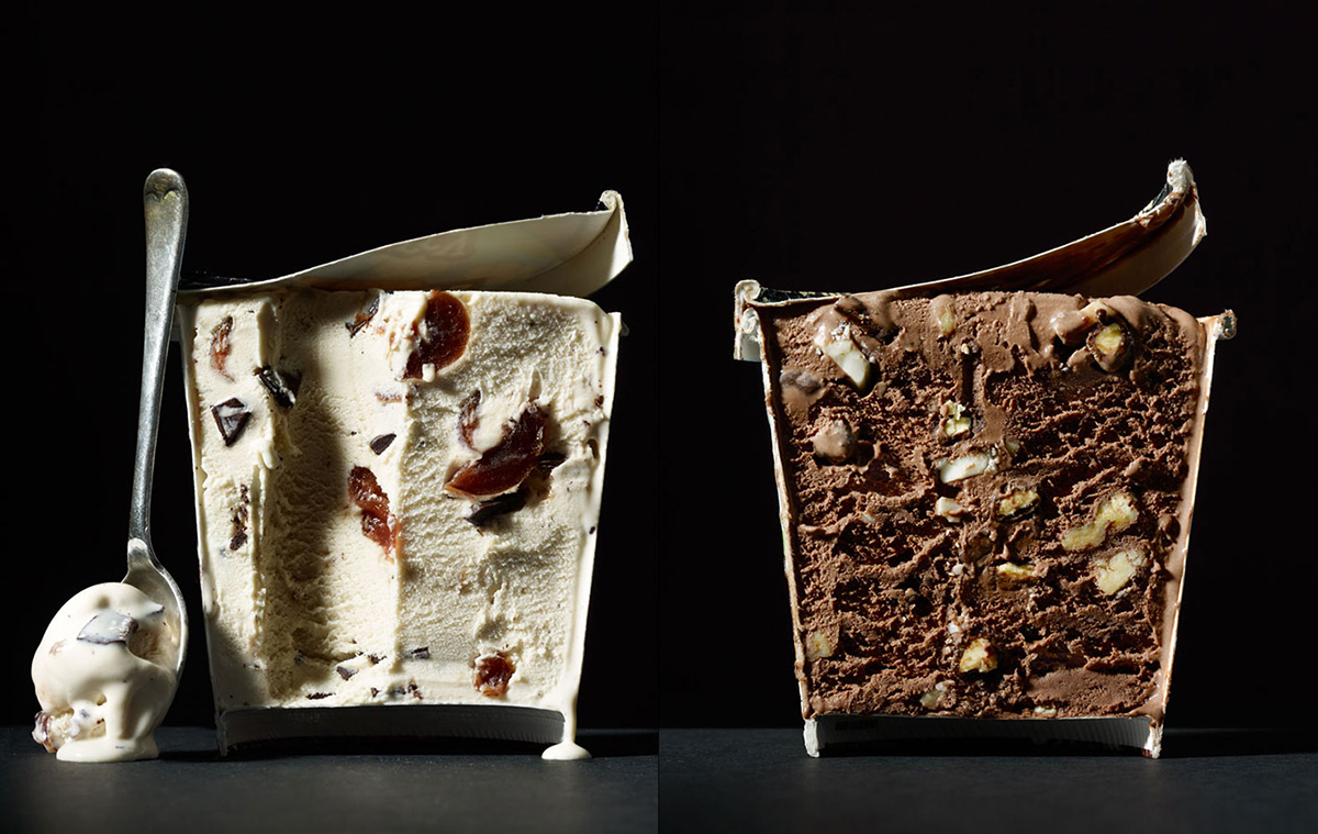
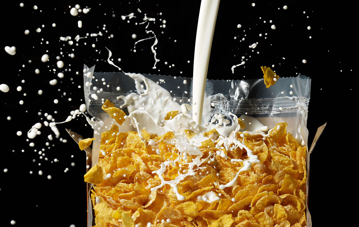
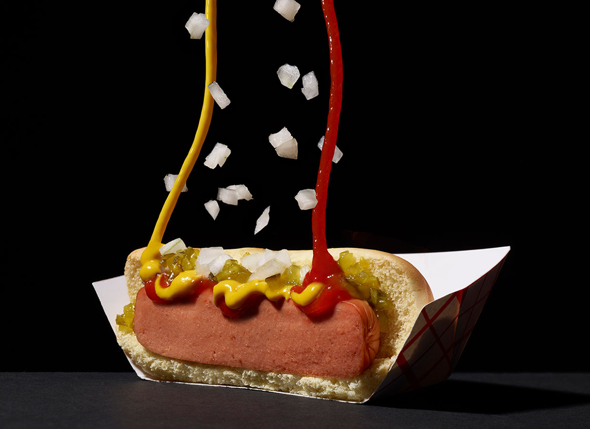
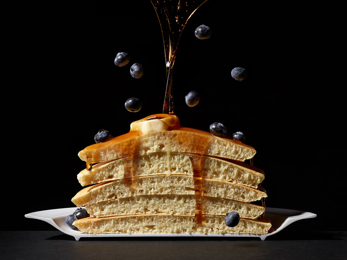
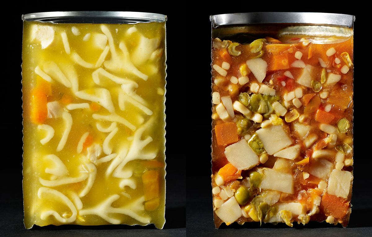
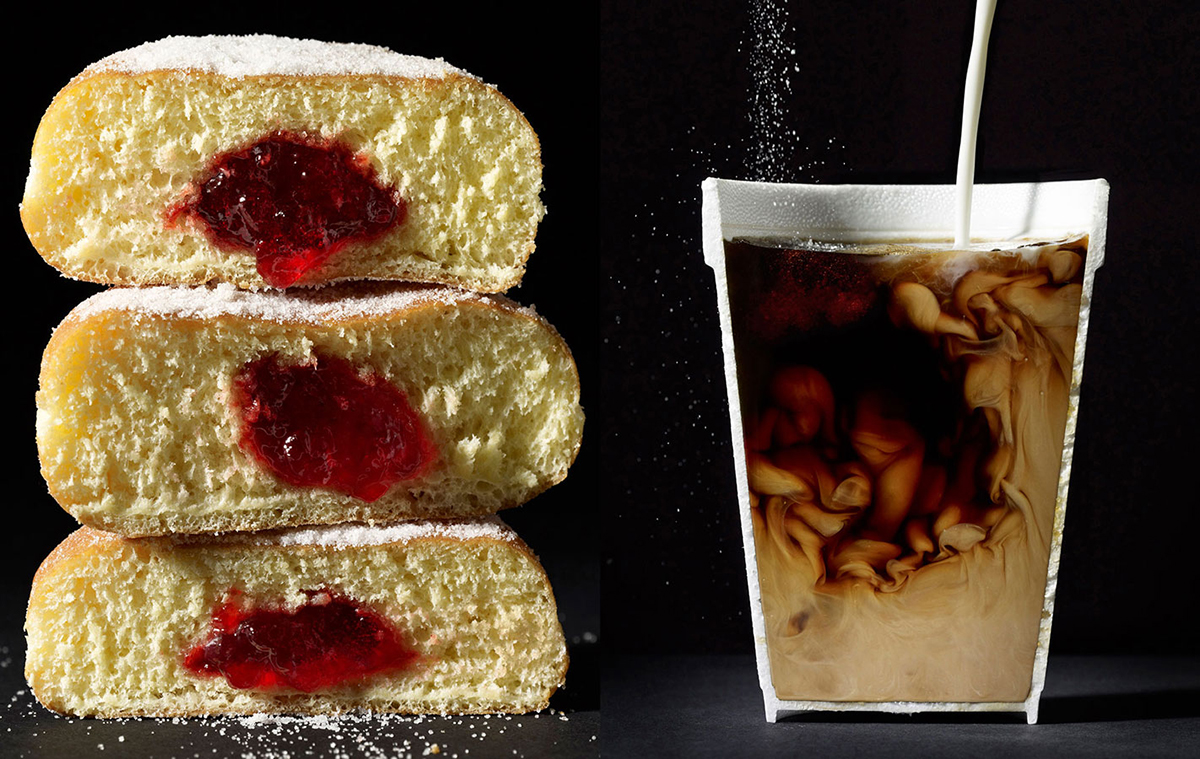
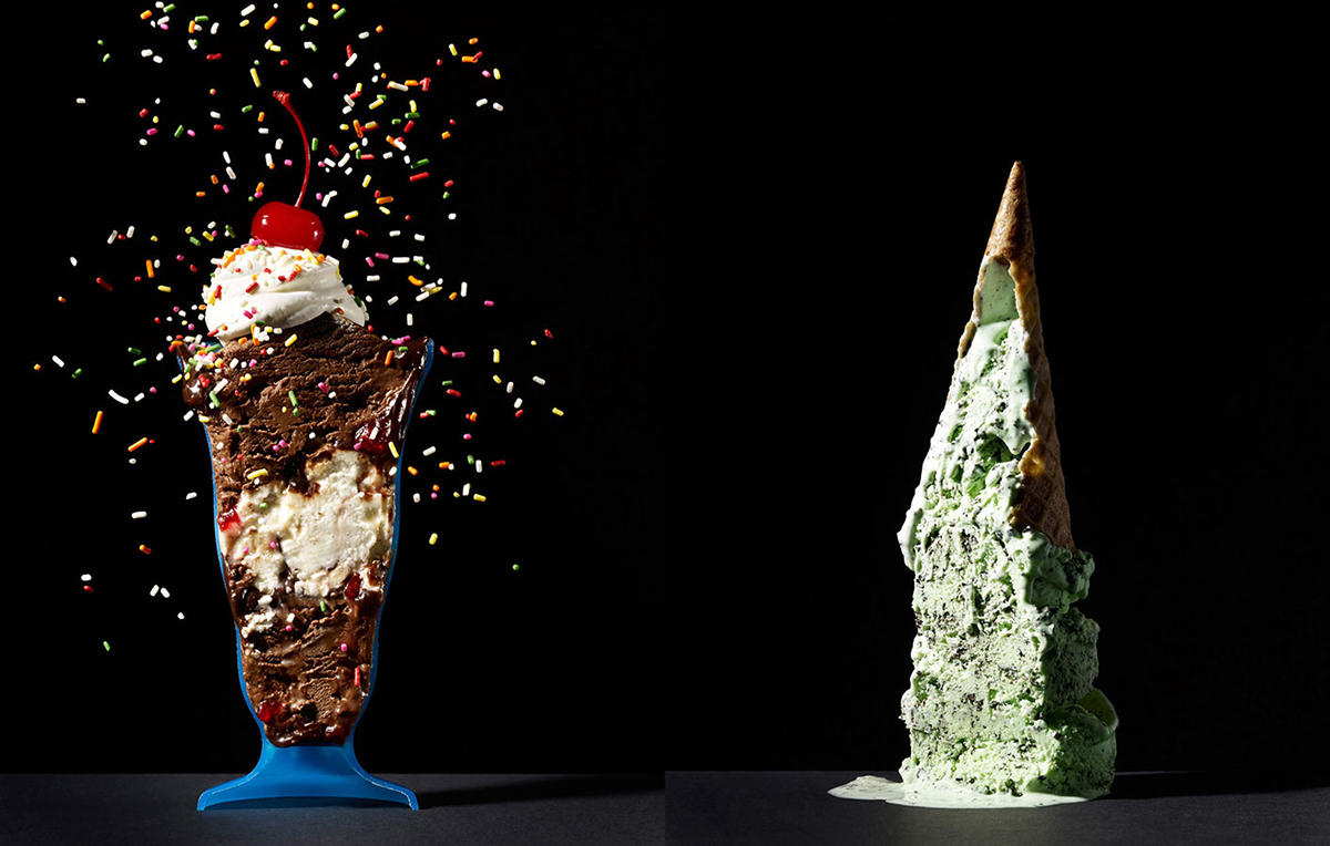
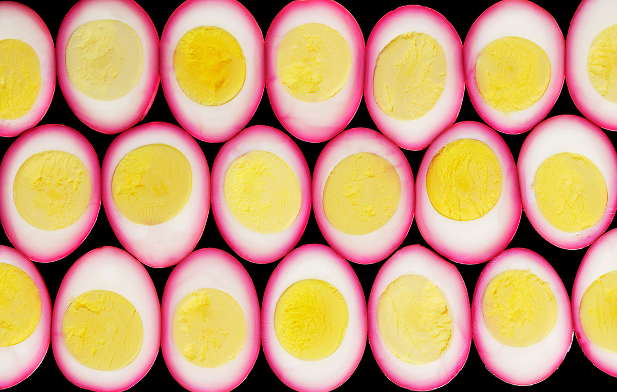
This series was inspired by an assignment in which we were asked to cut a burrito in half for a client. At first, I thought it unappealing but soon realized the potential for a whole new perspective for looking at food. Cross sections are not new- a cake half eaten shows it’s interior. When applied to food items which are unexpected yet commonplace, even easily recognized within our food vocabulary, we move past the simple appetite appeal we normally try to achieve and explore the interior worlds of these products. In collaboration with the food stylists, we chose subjects which we felt were iconic symbols within our Western food culture; classic items that many of us grew up eating. As we shot each subject, it became apparent that some images needed to live in pairs such as the soup cans and the pints of ice cream. Shown together they create a stronger statement about their symbolic nature.
After testing various options, I came to realize that placing these subjects against a black background with a singular hard light helps focus the viewer on the hard reality of each interior; the texture and surface quality allowing each subject to reveal its own unique world within. There is a pictorial quality harkening back to magicians with rabbits coming out of black hats. My premise was to create imagery which looks as if it is happening magically, but as real as possible. Our approach is very low-tech using gelatin, glue, Crisco, scissors, and saws while fabricating each object. When necessary, some compositing was utilized but my background is of capturing everything in camera on a single sheet of film. I wanted these images to look this way.
It is important to mention the collaborators involved in these images. Without them, these images would not exist. Food stylists: Charlotte Omnès and Michelle Gatton. Retouchers: Daniel Hurlburt and Ashlee Gray.
To see more of this project, click here
APE contributor Suzanne Sease currently works as a consultant for photographers and illustrators around the world. She has been involved in the photography and illustration advertising and in-house corporate industry for decades. After establishing the art-buying department at The Martin Agency, then working for Kaplan-Thaler, Capital One, Best Buy and numerous smaller agencies and companies, she decided to be a consultant in 1999. Follow her at @SuzanneSease. Instagram