
Winnie Au
Who printed it?
Kirkwood Printing – they’re a great place based a little outside of Boston, MA. They have been in the business forever and were really easy to work with. I previously have done a lot of digital printing/printing through the internet for my promos so it was nice to do something that involved person to person contact. I went to the press check, and I really enjoyed touring their space, seeing the CMYK plates, and meeting people who know their colors, machines and craft so well.
Who designed it?
Suzanne McKenzie. I was very lucky to have someone as talented as Suzanne working on my promo. We’ve known each other for many years, and I’ve done several shoots for her company Ablemade, so it was a natural fit to have her design something for me. She has an amazing vision and understands the type of people I am trying to reach, so it was great to have her insight and eye on both the edit and design.
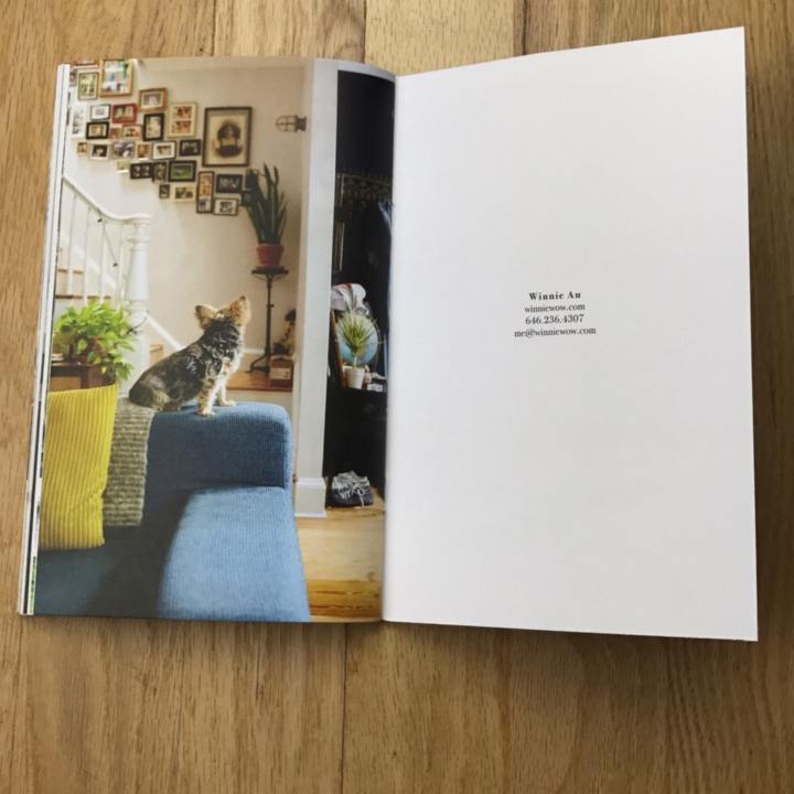
Tell me about the images?
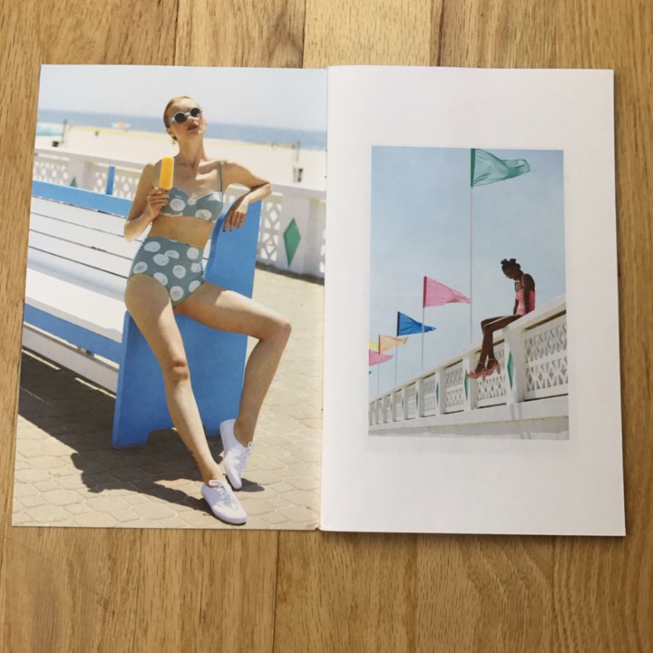
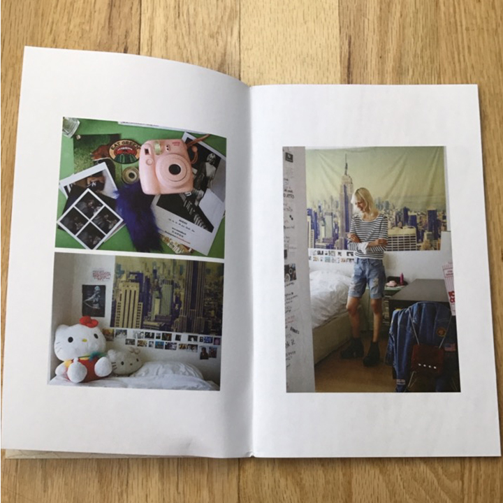
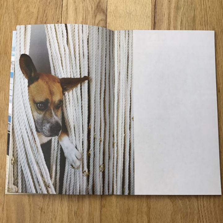
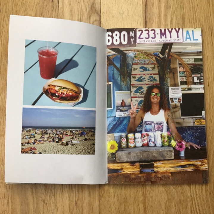
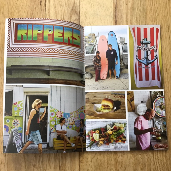
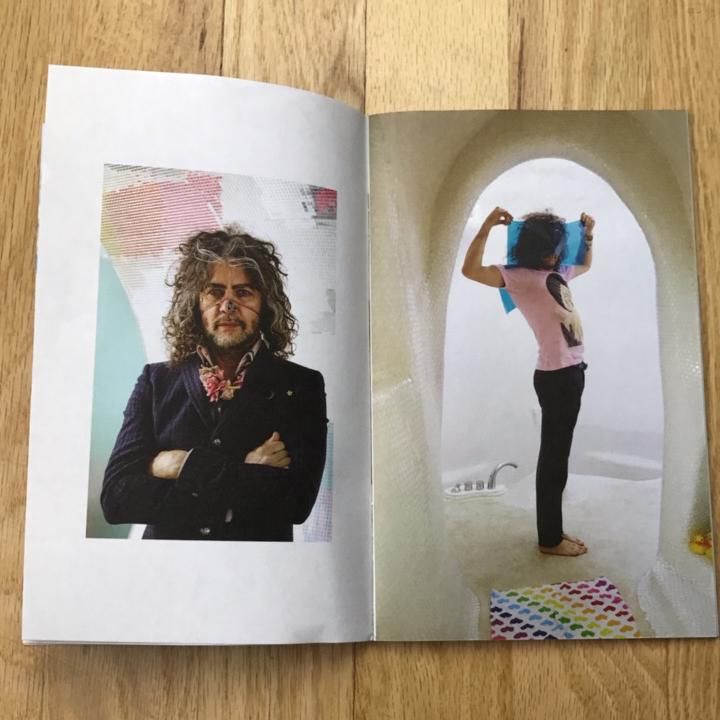
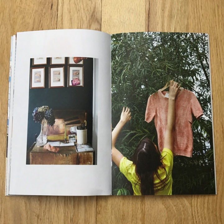
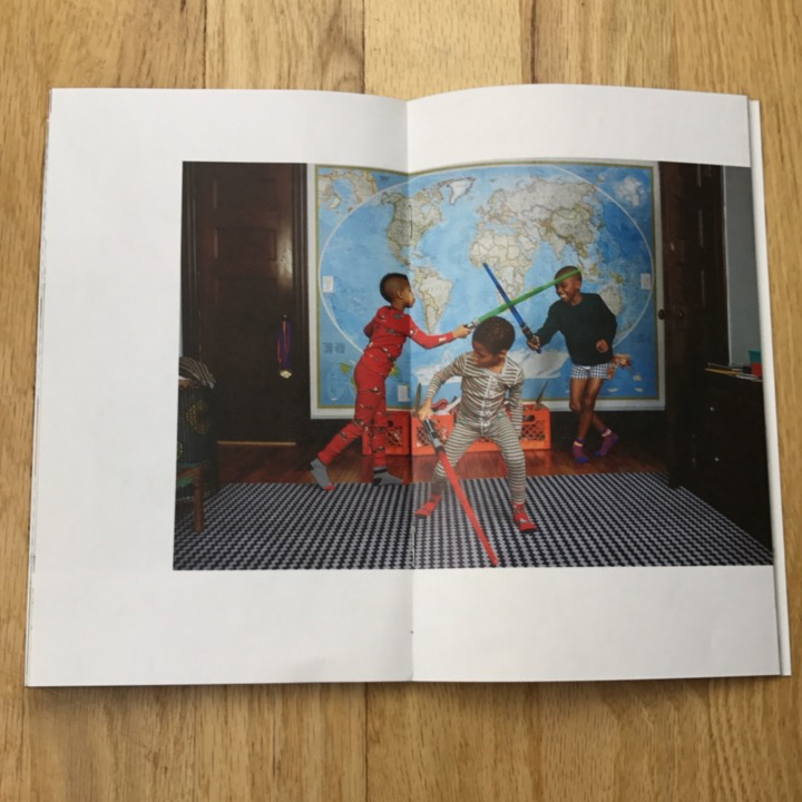
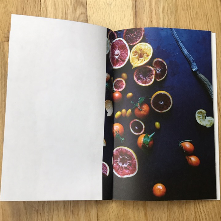
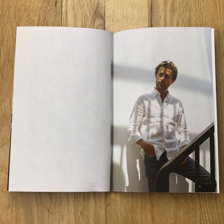
We spent a lot of time working on the edit of this zine. I do a lot of shoots of various subjects, which is generally a great thing, except when it comes time to edit. I think that a huge part of what defines you as a photographer comes down to your edit, especially in this age of digital photography where we tend to [as photographers] shoot way more frames than film photographers did. So sifting through the past year’s work to tell a coherent story can take some time. As my other photographer friends have advised me in the past, you have to only show work that you want to get. A lot of my work is environmental portraiture, so I wanted this zine to be a window into the lives of the people I am lucky enough to photograph, as well as showcase diversity of age, gender, and race. I always find my subjects and their lives/homes/workplaces to be inspiring, so hopefully, others who see the images in my zine will also find inspiration in them.
How many did you make?
An edition of 1000 – we mailed out 750 copies to art buyers, photo editors and to past/current/prospective clients. I retained the rest for my rep to hand out in person and for my own in-person meetings.
How many times a year do you send out promos?
Not enough! Usually, I manage to do 2 print promos a year – one larger mailer and then a more focused holiday mailer. And then I do email newsletters in between, more frequently throughout the year. I think the strategy of doing smaller mailers or postcards (vs a 52-page zine) more frequently could be effective, but I haven’t figured out how to make that work with my brain and schedule.
Do you think printed promos are effective for marketing your work?
Yes, definitely. I guess a huge part of me just enjoys printing things and so selfishly I like to tell myself that of course, it’s effective and worth the time and money.
But on a less emotional and more logical side, I think that if you can make print pieces that stand out, they are extremely effective. I know art buyers/editors do receive a lot of promos, but at the same time, I think people still enjoy receiving old-fashioned snail mail and packages that are thoughtfully executed. Hopefully, someone will keep it at their desk or on their shelf as a reference. But basically, if just one person gives you a job after seeing your promo or remembers your name who didn’t know it before, it all becomes worth it.
This year a few of the people I sent promos to did Instagram stories of the inside of it, which was a nice way to get instant feedback from the promo and know that it made it into my intended audience’s hands and that they were enjoying it. I think all marketing is still a numbers game. If you can reach someone via snail mail, great. If you can reach some via an email newsletter, also great. You really just need to be reaching people through various methods so that at the end of they day, they know you exist or are aware of your recent work.
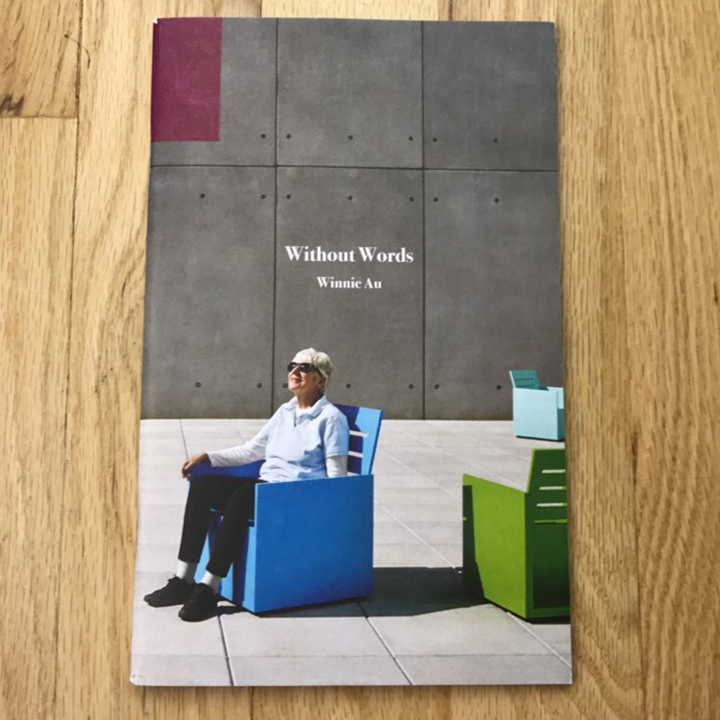
Tell me about the title?
The title “Without Words” is part of an ongoing theme in my print promos. The first zine promo I did was named “Wander Over With”. The second one I did was named “Way Over Where”.
The connecting thread is that each title loosely is an acrostic spelling out “WOW” in it (which refers back to my website winniewow.com, which happens to be a phonetic spelling of my full name, Winnie W Au). It’s a bit convoluted and I don’t think anyone will ever notice, but it helps me creatively to have this structure to work around when naming my promos. Or…is it a really effective subliminal message?! Ok, probably not, but one can hope.