Poll Closed, Thanks for voting.
I spent 3 hours ripping through and narrowing down the websites submitted for the photo consultation demo (read about it here) but instead of just picking a winner I decided to put it to a vote. As unscientific and ugly as a photographer popularity contest probably sounds to everyone it’s no better than me just choosing one from the 16 finalists (plus, I’m on a mission to test every blog add-on feature I can find).
This is a very strong group of photographers which in my mind will make the consultation even better for everyone. The advice given will be at a fairly high level so everyone from beginning to emerging photographers can get a little something out of it.
In an ideal world people would vote for photographers that have as much in common with their own style as possible so they can learn more, but this is the internet so let the popularity contest begin:
David Degner– Reportage, Photojournalism
Clay Stang– Commercial, Staged 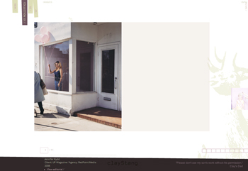
Brady Fontenot– Environmental Portraits, Hip
Nick Onken– Lifestyle
Jose Mandojana– Environmental Portraits, Athletes 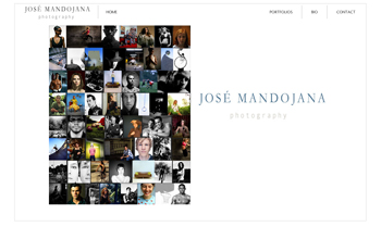
Robert Wright– Environmental Portraits, Modern Urban
Jeff Singer– Environmental and Studio Portraits 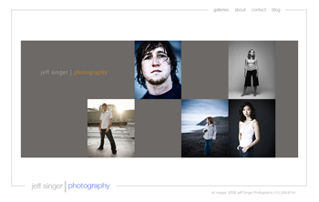
Noah Kalina– Hip and Cool, Surreal
Melissa Catanese– Modern Landscape, Fine Art 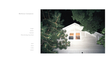
Kathy Quirk-Syvertsen– Lifestyle, Kids
Andrew Pinkham– Conceptual, Illustration
Jennifer Loeber– Environmental Portraits, Americana, Fine Art
Dustin Fenstermacher– Quirk, Modern Americana
Lisa Wyatt– Environmental Portrait, Lifestyle, Kids 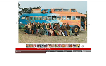
William Brinson– Food, Travel, Still-Life
Whit Richardson– Adventure, Action
Poll Closed
[poll=2]
48 Comments
Can we vote often?
I guess not – nice technology there Rob..is it recording my ip address or my MAC address; let me run upstairs to the kids computer and find out…
Looks like the page was having server load problems… must have been from me hitting the refresh over and over to see my standing.
Two votes so far… Thanks mom!!!
Jeff
So this basically boils down to whoever photographer can get most of his/her friends to vote for him/her? ;-)
anyone wanna place bets that someone from New York will win?
Anyone?
They all have style, but Dustin brings the content!
I have a crit…for free…enough with the massive popup browsers that occupy my entire screen. Oi vey, if you’re going to do that at least have the pics that big. Not just a 800 width pic surrounded by white space that takes up the whole monitor.
BTW: APE great choices. it was hard voting.
I guess David Degner’s work is most like mine (photo-journalism) but I’m wondering if the consultation is geared more toward
critiquing the website or the photos themselves?
(I feel I can pretty much guess what she’ll say
about the photos.)
Katia
[…] The wonderful and brilliant “A Photo Editor” (you’ll see why I’m kissing up below) decided to team up with photo consultant Leslie Burns-Dell’Acqua and do a “live” consultation with a photographer for purpose of posting the results on his blog. Much to my surprise, out of hundreds (thousands, millions maybe?) of photographers I was among the few he selected to get the consultation. However, there is one last step… the photographer is being selected by the public on his blog. […]
What’s with the lame adjectives? Didn’t you post a massive list of books to help communicate with non professionals about photography? Maybe it’s just me but I can’t find one example of Modern Urban in Melissa Catanese’s work. Also what’s the difference between Americana and Modern Americana? Can’t we just look at the images and decide for ourselves what the underlying impressions are of the submitted work? Is there such a category as Modern Quirk, or say Hip Landscape? If you are THE decider then we need to hold you to your own standards, do we not? I probably would have given the viewers the benefit of the doubt and skipped the overly general categorizations. I realize the effort you are trying to express but don’t think we ignore what you have previously ranted about. I personally do not. It is your blog and I respect that, but at least be consistent.
You know, we should all just consult with each other, the amount of experience that we share may actually outweigh anything anyone else could say…
It will take a while, but I am going to try to write about each of the “contestants” on my blog, what I see. It could be a sort of workshop experience.
voted for Noah, because he would beat me up if I didn’t
@ 9. Scott: Good point. I was trying to make it easy for people to vote without having to visit every single website. How about rural modern. I bought two books off that list so I’m working on my adjectives but I’ve always attached modern to anything I feel would challenge the editor’s tastes.
@10. Robert: Good idea. A group consultation would be awesome. I just need some more goddam cpu!
Jose Mandojana is a GENIUS!! His work is incredible!!
Go Jose! :)
I’m not just a fan of Jose’s, I’m also one of his models. I’m the nerd sitting and surrounded by toys, vhs tapes, and movie posters. And yes… Jose is amazingly talented. VOTE NOW!!
http://www.lisawyattphoto.com/ has to take that music off her site…..
http://www.robertnyman.com/2007/09/26/stop-playing-music-when-i-enter-your-web-site/
I love robert/ #10’s idea! I’d like to get more involved and feedback but am nervous to do it in a random, unsupervised way…
I laughed my ass on off on Noah’s project, “what happens in Vegas….” Great concept….. Nice work everyone!!!
love jose mandojana’s stuff!
There are 14 of us in a company that want to vote for our fav photographer. But your system is blocking us! Rob, can we email you?
We want to vote!
@16 Amen
A lot of this work is just superficial and downright soulless like too much of modern photography, no? I like some of it, but I voted for Jennifer Loebber because hers seemed the most consistently rich and thoughtful.
A comment on Clay Stang’s site: “Use Firefox instead of Safari”? …way to alienate a good chunk of the Mac users out there. (I use Firefox for its developing tools and Safari for its speed.)
And I’m sure there are others like me–if my popup blocker won’t let me open your site, I’m not going to take the time to “whitelist” it.
Jose, Great work! :)
Would someone vote for Pinkham for the love of God.
I used my vote up on myself.
I think I voted for Mr. Stang’s entry because I’m just concluding some research work for lecture notes on Edward Hopper and it has a similar viewer interaction.
NJR you’ll be happy to know that I voted for Mr. Pinkham.
Whose work I really enjoyed.
APE Rob, I definitely see your personal style tastes within this edit.
If anyone cares… My two faves, and it was hard to make a final cut, were Nick Onken and William Brinson.
Agreeing with a few others, I liked Clay Stang’s work but his website breaks too many rules that blocked my full enjoyment. Definitely need to think about fixing some of those issues, Clay, because your work is quite strong. :)
titaaays
Couldn’t agree with you more (#23) Elizabeth. The Programmer had a hell of a time trying to get the site to work properly on both Safari and Firefox. Believe me we tried. The programmer built the site for updatability ease, it’s as simple as me dropping an image into a folder. However this made it difficult to perform in every application on every computer, so we had to make a choice. I appreciate the feedback, and for next time will have to take this into stronger consideration
Thanks Chris, I hope you voted for me ;)
Still Lifers represent!!
VOTE 4 Melissa Catanese Wooot!
/\__/\
_____ ( ºoº )______
\ _____( . )______/ << tis a bat
o o
I hate to admit this, Pinkham was my fav and also seemed more established thus less in need of a free consult, so I voted with my #2. I guess i should have gone with the underdog over achiever. It’s funny on the flip side I identify with the current leader, Clay, the most and compare his with my own new work.
Everyone was awesome BTW, good edit Mr. APE!
Alan#33 I agree Pinkham seems to have it together that was my thought. But then I realized that I was only seeing his website and this is about a lot more than that. So I hope others don’t make the mistake of thinking people don’t need a consult be cause they have a great website.
Just wanted to thank you for giving me more photographer portfolios to look through. Great resource and so much talent out there.
MELISSa Cantanese!! Holla
Have to say I’m not wild about a lot of these photographs. Not bad work but a very commercially orientated group in my opinion. Some great photographs here and there but it all seems a little safe to me – would be nice to see at least one wild card; someone’s work that makes me think ‘wow, I’ve never seen that before!’
Will still vote though!
Noah’s work is differnt, quirky, always with a sense of humor. Surreal as you put it is an apt description.
Clay – you wrote:
“The programmer built the site for updatability ease, it’s as simple as me dropping an image into a folder. However this made it difficult to perform in every application on every computer, so we had to make a choice.”
I was really close to voting for you, but in the end was just too annoyed by the layout and navigational operability of your site so cast elsewhere. I imagine what works in a vote like this might also work in the PE world and would strongly advise that ease of use for visitors to your site should be way more important than ease of use for you. I sympathise with your wanting easy updatability though – my site is in dire need of updating and I haven’t got round to it yet because it is such a laborious process…
Robert
@34. I never meant to imply that anyone did’nt need it (consult), Pinkham may have needed it least. Hell, I need it, I’m working with one now. I think anyone that says they don’t is in denial or a super star. I have to agree with the crowd, Clays site nav is just goofy.
I just don’t get this whole thing. Let me get this straight — just because one guy can conjure up 255 to “vote” for his site means that his images are the most qualified? What if somone on this list was so busy doing work that he had no friends, or didn’t even care to get votes; that makes his work less qualified?
For me, I look to Rob to leadership in this blog; to provide an educated, qualified eye for the work — not to turn it over to a system of silly “voting”. I don’t know, maybe I”m missing something.
Or, could this be a simple way to generate web traffic for the blog? Better to stir up a flurry of voting, rather than to simply pick the most qualified work, right, if the goal is to generate hits?
One step foreward, two steps back. I don’t get it.
@ 41: Yes, you don’t get it. It’s a popularity contest. He won. Popular photographers also get more work. That part of the business is unfair as well. Get over it.
[…] Over on A Photo Editor there was a vote for a “virtual” consultation. One of the contestants was Melissa […]
there it is, right there at the beginning:
“but this is the internet so let the popularity contest begin:..”
why the surprise? do you think the process of handing out photo assignments is any different? photo editors frequently choose the popular or safe choice over one that might be better in some other sense, but not worth the risk to the editor’s reputation or job if something goes awry.
[…] Consultation Demo, Part 4 of 6. See the other parts here: (1), (2) and […]
[…] Consultation Demo, Part 5 of 6. See the other parts here: (1), (2), (3) and […]
[…] Consultation Demo, Part 6 of 6. See the other parts here: (1), (2), (3), (4) and […]
Comments are closed for this article!