Creative Director: Marshall McKinney
Heidi: In our last interview in 2008 you had just taken the helm at Garden & Gun, a national magazine about a regional lifestyle – fast forward to 2024, tell us about this magnificent, long run as Creative Director.
Marshall: It all began in April of 2008 for me at G&G. What a run. Sixteen years! That’s like ten plus six years. That’s like 5,843.88 days according to Siri. This means I’ve lumbered through 192 weeks of closings (that’s 3.68 years of deadlines for those still doing the math). Can you believe it? Nope, neither can I. So many long days and nights sussing out and sorting through big ideas, prose, pictures and sketches to build a print brand unlike any other. Then, we were a small scrappy crew of misfits. Seriously, like eight of us. Some with no magazine experience at all. Didn’t matter. Within us burned the intangibles: heart, drive, determination, spirit, resourcefulness and f@#ing energy to burn, baby! Today, the foot is still hard on the gas and without a doubt, the brand, driven by the passions and minds of its people, is hurtling headlong into a bold new future. Unfortunately, this is where I get off. August, 2024. Adios.
T’was a thrill ride. In my professional career, I never thought I’d be so blessed as to work with the finest, sharpest minds in all of “Magazine-dom,” both internally and externally. I’ve watched interns come up through the ranks to become some of the best writers, editors, and photo editors in the business. I’ve seen editors and art directors go on to become VPs. Watched publishing prophets hail the coming of the iPad only to see it snuffed out like some ole Camel Light. To be sure, I’ve seen it all. Done it all. Er, won it all, #athankyouverymuchg&g. And, I wouldn’t change or trade a damn thing.
G&G’s success is, and always will be, directly connected to the creativity, fire and gusto that resonates in the youthful souls of the folks who bring it to life. Each person I interacted with there, young or old, was a remarkable teacher and I am grateful for the experiences shared and learned.
So, now that I’m slowly gliding into this next phase of my professional life, and can take a breath, if only for a minute, I have the luxury of hindsight. Thus, I’ve agreed to tackle a few questions from APE. An exit interview if you will. Buckle up. Here goes
What are your three favorite covers and why?
I not picking these covers on technical acumen or whiz-bang execution but rather on the “feels and vibes” and times associated with the experiences shared while nabbing them. I thrive in that space where ideas are manifested and sketched over morning coffee—together—before jumping in the car or on a plane to get them in the can. I adore all my photographers and I’m 100% sure I dig 98% of my covers. There are outliers but like red-headed children we tolerate them all the same—even when they do look a little kooky and act funny.
I only partner up on covers with people I trust. I know them on a personal level and usually we have a deep rapport. Heck, all my lensmen are brilliant, empathic, whip-smart artists, technicians and masters at their craft. So again, I’m only picking these three covers through gauzy reflection, and like children, I don’t really have a “favorite” or three favs but here goes:
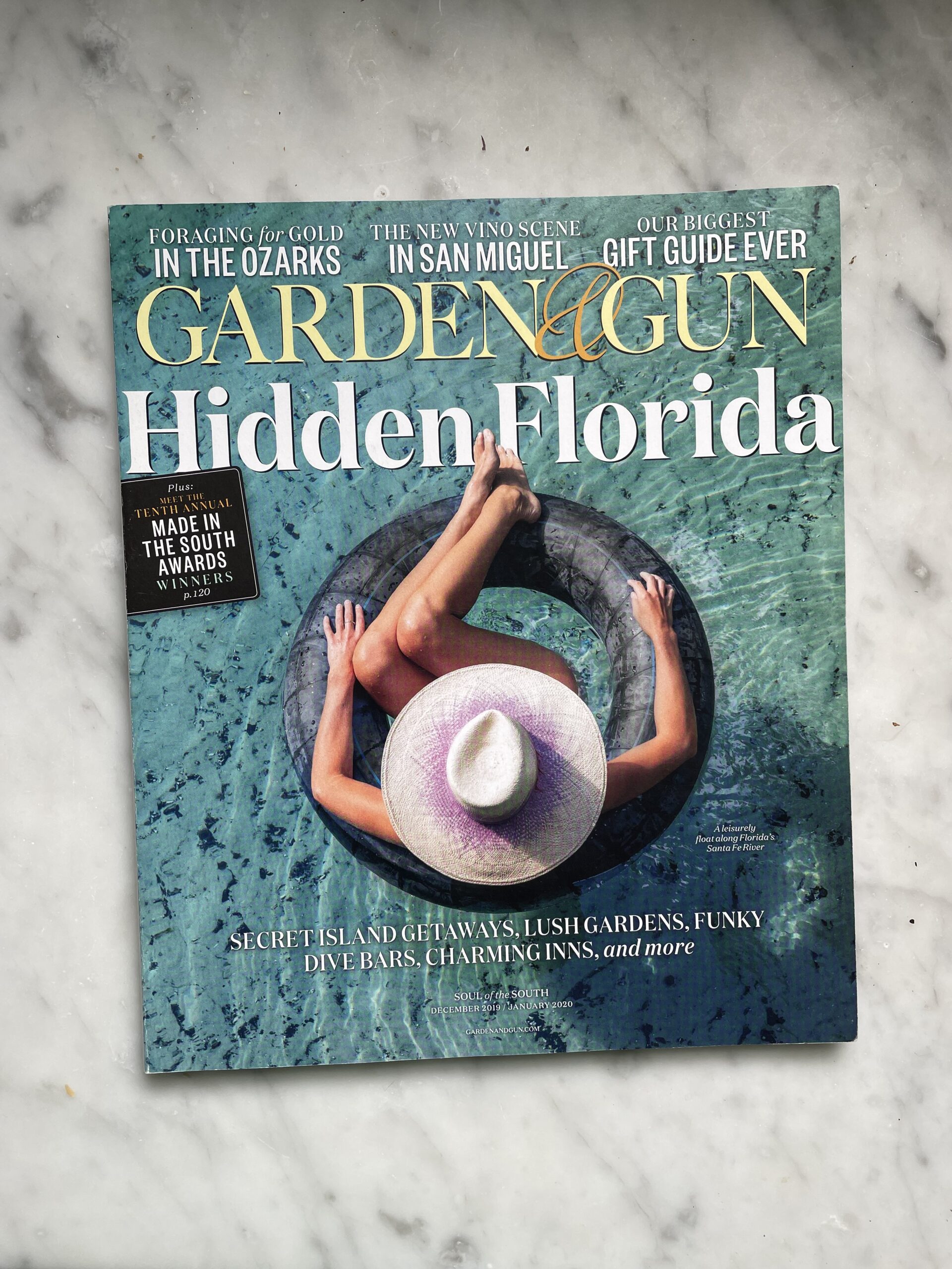
1. Dec 2019 – Jan 2020 Photographed by Gately Ben Williams
Keep it stripped down when you can.
This cover shoot was quite simply a fun trip with one of my best friends, Gately Ben Williams and his new, lovely and talented bride (and one-time co-worker of mine), Hunter. The idea was to take a road trip down to the Santa Fe river in Florida and get something that felt warm for a winter issue.
My mind, where covers are concerned, always leans toward the graphic and composed. If that happens to come off “arty” occasionally, well, so be it. My intention is not to be “arty” which I associate with fey, contrite or, worse yet, cute. Finally, my experience with newsstand covers is simple: don’t fuck around trying to be something you’re not. Be definitive. Be uniquely yourself and true to brand. Always and in all ways.
I want my G&G covers to be two things: direct and filled with as much subtext as possible. Meaning, the image has to hit on the reader’s senses (taste, smell, sound, etc). Get them to feel the coolness of the water for example or stop for a moment to reflect on the sounds they might have heard the last time they went tubing. I want to trigger a memory of, say, spending time with their spouse in their younger years at some watering hole of their own. Maybe it gets them to reflect on their own daughters growing up? The point is, subtext to me is leveraging the power of the form.
We are busy people living busy lives. As a creative director a big part of my job is to choreograph moments that give pause in the service of sparking fantasy or aspirations. So, back to Florida. After a long day of trying a number of ideas, which rendered shots that were great but perhaps too sexy or pinup-ish, at dusk I went back to the original sketch, the first big idea. You don’t ever have the luxury of time on a cover shoot. Making the manufactured feel authentic is an art unto itself. In order to pull that off, I highly recommend sketching out your ideas long beforehand.
On this day there were a bunch of kids in the springs splashing and playing along a dock, not the best situation for what I wanted the image to communicate, solitude and stillness. But, as the day waned, they slowly—mercifully—left the area. That’s when Ben and I were able to move to the end of the dock and shoot down on Hunter.
I love this image for a lot of reasons. One, Ben and Hunter gave me so much of their energy throughout the day. They gave me so many variations that could be used in the interior of the magazine, and that’s something I value. Two, everything we do as creatives, at its best, is a partnership predicated on balance and trust. I trusted Ben to give me a number of stellar solutions and, in turn, he trusted me and gave his all to my sketched idea. Three, the image is graphic. It plays with repetition of form. It’s tranquil and calm which lends to the narrative I wanted to achieve. The water is clear. The image has essence and to my eye it’s a catalyst for subtextual think. That being: I could use some stillness. I could use a vacation in warm waters. I’d love to be somewhere fun with my wife and daughter. Finally, this image reminds me of all the cocktails and conversation that flowed with these two lovebirds after we wrapped the shoot. Truly, it was a wonderful couple days work all around.
I’ve taken on many a cover mission like this with shooters including: Rob (and Lisa) Howard, Michael Turek, Brie Williams, David McClister, Robby Klein and others. All mega talented, affable, easy spirits that are a joy to behold and work alongside especially when it’s a stripped down scenario like this and not some big ass production.
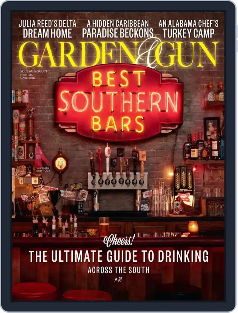
2. Feb/March 2019
Throw the kitchen sink at it whenever you gotta and just build the damn thing.
What you see here is a bar we built in The Voorhes studio by some of the most baller, open, gracious, energetic and creative people in the business. Adam and wife Robin, assisted by the incomparable, Nicki Longoria took a sketch I made and ran with it a hundred times farther than I could have ever hoped. We had a custom neon sign made. We had working beer taps. We had a stuffed squirrel drunk on Miller Lite. This was devised at a time in publishing when covers needed that extra wink in order move the needle on digital newsstands—talking to you Apple. So of course I wanted everything to be analog and made of hand whenever and wherever possible.
Could we have shot this in some cool bar somewhere? Mmmmm, maybe? With that comes a whole host of other problems which I won’t go into now. Trust me, they are many. This to me felt like the only solution and it all started with a sign maker and the energy and can-do spirit Adam and team brought to solving the conundrum.
I’m not sure what’s in the water down there in Texas but if you head that way knock on The Voorhees or Darren Braun or Fredrick Broden’s door. No telling what you might find going on behind it.
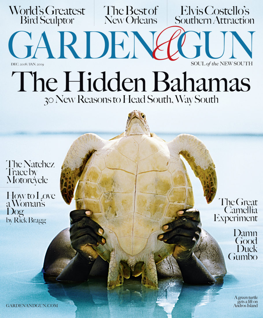
3. Dec 2008 / Jan 2009.
This cover by Andy Anderson was a revelatory moment for me. Affably nicknamed, “Turtle Junk,” after the New York Times wrote a review—a positive one!—of our brand, it was the impetus that got my head screwed on tight as to how best to feature and approach subjects on G&G’s coves. It’s so singular and unique. It’s composed. It’s direct. It’s awash in story, cultural richness and wonder. It’s simple and in that way it’s elegant and timeless. Mostly though, it wasn’t until I put eyes on the image that I knew how we were going to visually stand apart.
Up until that moment G&G was kind of wobbly, like a newborn giraffe, the way a lot of new launches are in the beginning. It took seeing that image for me to begin to understand what the brand was telling me it wanted to be. For better or worse I’m not one to immediately suggest what I think any brand should be. I have instincts but I ain’t no Mussolini. I like to listen to the market and the material, then I like to react to what I think they’re suggesting to me. I can’t stand it when people march in on their high-horse talking so much shit about what they think this or that is. I’d rather saunter in on a turtle’s back—that way they never see you coming—and build something beautiful and solidly stable, together.
Further, where covers are concerned, were it not for the talents and eye of photographers Peter Frank Edwards, Squire Fox, David McClister, Andrew Kornylack, Johnny Autry, Brie Williams, Brent Humphreys, Amy Dickerson, Jim Herrington and Dan Winters G&G wouldn’t be here today. Truly, it’s all about the company you keep and they are the finest.

Do you have a favorite spread?
That’s impossible for me to answer. Not because I like so many but rather I have so few. Still, I’ll give you one I like a lot. It’s pretty simple but I just dig it.
Here’s the backstory: We asked Dan Winters to shoot musician, James McMurtry for us down in Texas. I spoke with Dan on the phone about how much I liked James’ music and about what he meant to me as a blue-collar genre-bender out there pounding stages night after night after night. I told him I felt a kinship with him. Perhaps Dan felt the same way because almost an hour had passed and we still hadn’t spoken about the shoot. Of course that didn’t matter to me because, well, Dan’s the man as they say. And I tend to agree.
Couple weeks later the images arrive in classic Winter’s style. Stoic. Iconic. Proud. Singular. Then, it occurred to me, oh shit, I gotta figure out what the fuck to do for the design. It was late in the cycle. I needed to turn this one around fast. Yet, I couldn’t. I felt helpless. I just wasn’t locking in on something worthy or original. It was torture.
I’m thinking to myself, this guy Winters is best buddies with all the great art directors and editors across the land. What the hell can I do that he’s never seen before? Am I even capable of hitting a high-taste level that honors a hardworking man like, James McMurtry? Oh, shit.
After an excruciating battle with self-doubt and worry, while sipping a couple of bourbons, it’s 1 a.m. and I’m still sitting at my desk in the office twiddling my thumbs. Part of the problem might have rested with the edit team. Maybe they were feeling the same way about the headline as I did about the design? They didn’t seem to have much cooking yet or, maybe they did and it just felt flat? Dunno, can’t remember. The one recollection I do have was that I put on McMurtry’s version of a tune called, Choctaw Bingo. I cranked that motherfucker up as loud as my i-mac would go and I stood up and danced. Right there in the middle of my office, which I shared with Maggie Kennedy, my photo editor, I shook my ass. Then, thoroughly awash in spirit, I cranked out a giant “J” with a guitar’s sound hole in the middle along with some filigree that felt a bit like McMurtry’s hair blowing in the breeze. With that I yee-hawed and went home to bed.
The next day I showed it to Sid Evans, my editor at the time, thinking he’d blow it apart because there was no definitive headline. Instead, he looked at it and nodded. Print it. We did. Not that we had a lot of other options because we were out of time and my hangover was setting in pretty good.
What would you tell anyone getting into the magazine business today?
To would be publishers:The sweet spot is somewhere between a mass newsstand magazine and a coffee table book. Do something deliberate and focused and beautiful. Do it on the best stock you can afford, no more than four times a year. Believe in your dream. Never give up. Don’t let obstacles stop you. Then, I’d advise them to buy a lottery ticket every couple weeks.
To journalists and editors: Tell the truth. Your currency and value is in your candor. Be your authentic self and find your own voice. Also, learn to think like an art director.
To photographers whom I fucking adore!: My best advice is to study a few masters, really lock in on them. Learn how to compose images that are graphic and expressive. Play. Write. Sketch. Work to become a natural born salesman, philosopher, psychologist and light-hound. Become proficient in the language of the trade. And, when you sense a trust building with an art director or fellow creative lean in and partner up. It’s amazing how far you can go, together. Lastly, pay close attention to all the others on the periphery of your craft. Explore the subtleties of make-up, watch what the stylists are doing and why, educate yourself on food propping and styling and acquire skill in interiors, exteriors, portraiture, reportage and more. Give yourself a wide base of knowledge then slowly tighten the focus on what you find the most interesting. NEVER STOP. NEVER GIVE UP.
What would you tell your younger self?
To my younger self I’d just say this: Stay resilient, hombre. Trust the process. Stay true to yourself and to those who are offering you their hard-earned knowledge. Make those folks an ally. While acumen can get you to the doorstep it’s experience, resolve and connection that’s going to define you and carry you across the threshold. Hold on tight Bubba! It’s gonna be a weird and bumpy ride.
No comment yet, add your voice below!