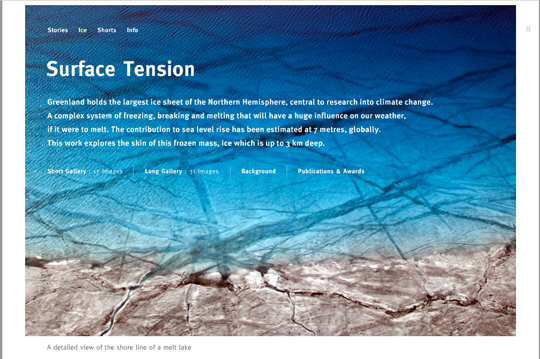
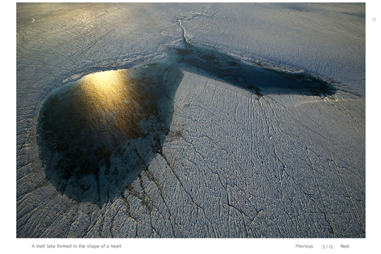
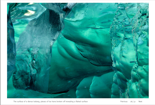
This photo story called “Surface Tension” (see it here) by Nick Cobbing submitted on Photo Rank (here) is the kind of thing that absolutely sings off the monitor. It doesn’t hurt that Nick has the perfect interface on his website for viewing a photo story (intuitive, simple and the controls disappear off the screen or hide in the corners). I can look at photos like this all day on my computer. Way to go Nick.
- Posted on
- By rhaggart
- In Photographers


11 Comments
gosh, that’s some lovely work…
Great Images! Smooth and Clean site. Good job. I was impressed that there was not a delay between viewing the large images.
Really nice colours on those pictures, almost looks inviting for a swim…
Thank you for showing this. This seems to be the big theme this year for beautiful, frightening work, but a few of these, such as 1, 10, and 15 in the short gallery, transcend beyond even the overall power of the project.
The screengrabs print really clean at 8×10″ too. Looking good all framed up on my wall.
(only kidding)
This is some amazing work Nick has. I’ve just got all the other picture editors here huddling around admiring his work. Sweet stuff!!
One thing that strikes me about the overall design of the Ice chapter is that it’s presented as a “journalist” would present it, instead of how a conventional photographer might. This, to me, would instill confidence that certainly he could be hired, sight unseen, for any story like this.
You see so many photographer’s websites, where there’s absolutely no context for how the images were shot. If I was in Rob’s old job, trying to hire a photographer for a story like this, I’d certainly have more confidence in a photographer like this Nick Cobbing.
I’m sure there are internal dialogues always going on inside the head of a picture editor that’s about to hire someone, sight unseen, that they’ve never met, for an important story. “Can they pull it off? Will they flake out? Will they bring back truly great images? (Will they fight with the writer?)”.
I think a good lesson, in the overall design to this site, is that it inspires confidence. It ain’t Flickr. It’s a professional approach. The guy is going to bring home the bacon. Furthermore, when you read his well-written Bio and FAQ, you further get the sense that he lives his passion, and his heart will truly be in the project. That alone has got to count for something.
Compliments to Mr. Cobbing for a job well done. (But where is his Contributor photo…?)
Lovely, indeed. And proper captions!!!!!!!!! Yippee.
My dear colleague Paola Brivio, Geo “senior” photo editor”, noticed that 2007 was the year of ice and glacier photography, so she proposed the picture of Nick Cobbing featured in Photo Rank and published right away in Geo. Eveybody liked it. Then Time included him in the photographer’s of the year pages so we are very happy for him. We also liked Noorderlicht story: http://www.capefarewell.com/content/press-images-2007.php, great pictures and interesting subject.
We loved other icebergs by Camille Seaman: http://www.camilleseaman.com/Artist.asp?ArtistID=3258&Akey=WX679BJN
Yeah, I loved Camille’s work as well. Check out the Men’s Journal on newsstands now. Managed to get 5 pages (6th went to goddam advertising and a spread got chopped, bloody hell) of her work in before the door hit me in the ass.
Add to it the fact that upon seeing Nick’s work in PDN’s self promotion awards, I emailed to request to see more work. He delivered an incredible portfolio to my office (within an hour) and the prints had printed on them not to be scared to hang them up, shuffle them about and share and enjoy them. Within the week I had shown them to a number of colleagues and friends in the industry.
He is an amazing photographer with the right attitude, as a result he has been the subject of a number of discussions among my photo friends and editors and hopefully more commissions.
Comments are closed for this article!