A new 8 part miniseries where Ottawa Photographer Tony Fouhse takes us through his new project, from the first photo to the book launch. Tony is an internationally exhibited and collected photographer who was formerly a full time editorial/commercial photographer. These posts originally appeared in his newsletter HYPO which you can subscribe to here to see more of his work visit his website here.
This mini-series, The Anatomy of a Project, began nine weeks ago with a post about the genesis of my current project, “The Garden”. The subsequent posts were (with one exception) about the wiggly path the project took, from creating the photographs to the struggle to edit and sequence the images into a cohesive whole, from laying out the book to the method of its launch.
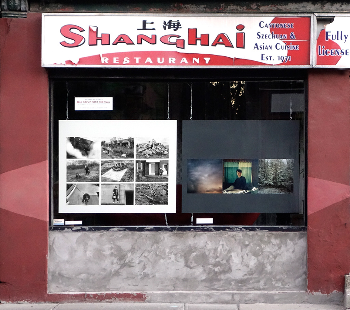
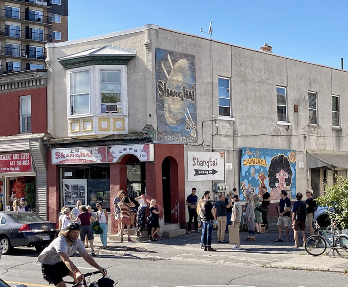
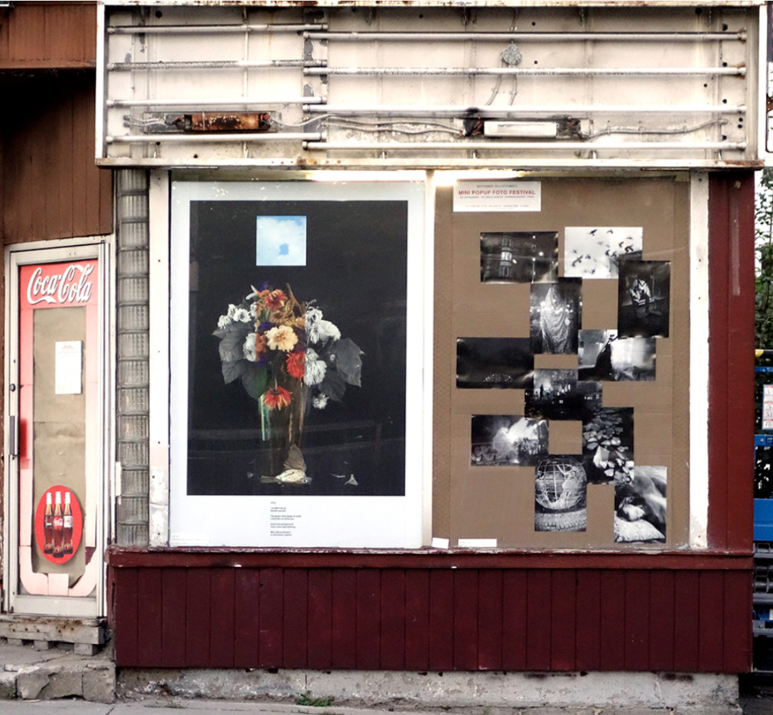
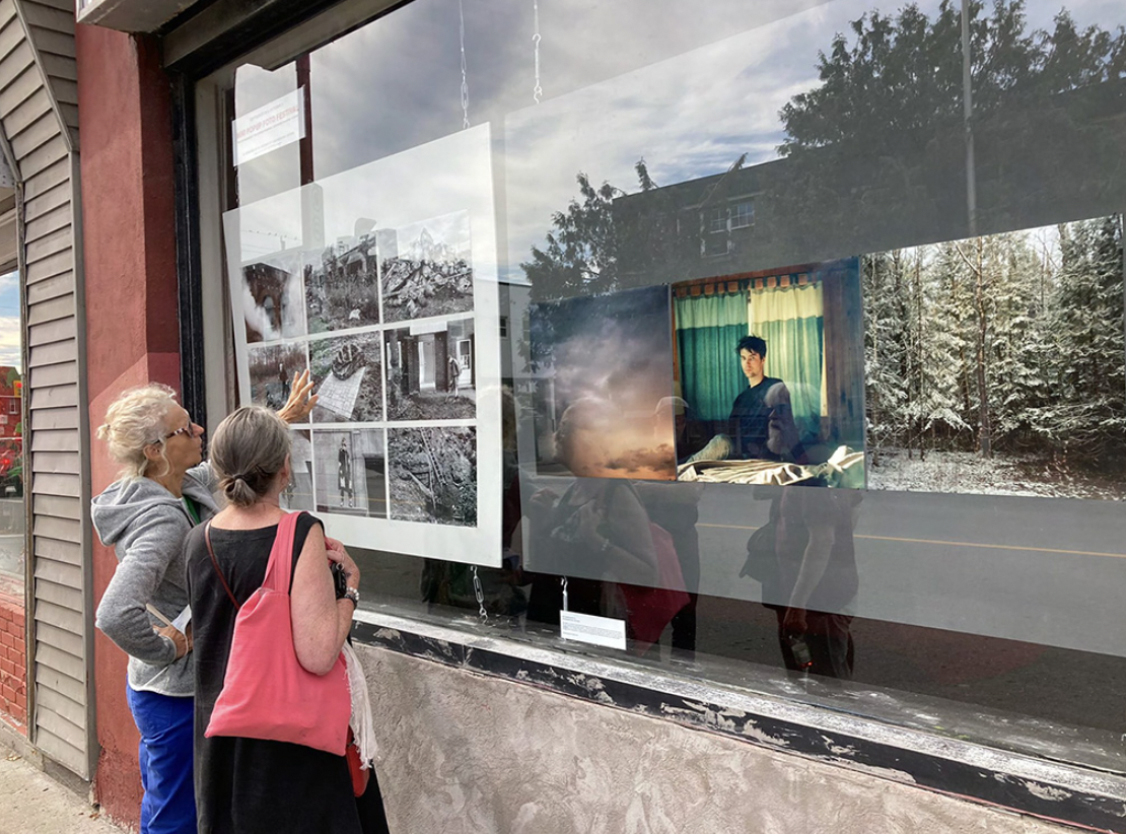
Now I’ve reached the end. “The Garden” was officially launched this past Sunday at a Mini Popup Foto Festival.
I’d planned on concluding this mini-series by writing about that event. But upon reflection realize there’s no real point to that. The end should be the end.
Ending any mini-series is tricky. Do you wrap everything up in a nice package that explains everything that’s come before? Do you end on an enigmatic note, leave it up to the audience to make their own conclusions? For me, in this case, the end calls for rumination rather than description.
What is “the end” anyway?
Does everything just stop? How much do you want (or need) to reflect on the path that brought you to the end? Where do you go from here?
Let me answer those questions . . .
No, everything doesn’t just stop (obviously).
Reflection is good, it illuminates the path forward (unless you dwell, fixate, on the past).
The last question, where do you go from here?, is the trickiest. Do you repeat yourself because what you did was popular? Do you repeat yourself because that’s all you know? Do you repeat yourself because you’re afraid of failure? Do you do something different, informed by what you’ve just done? Do you do something different because it’s a big, multidimensional world? Do you do something different because you’re curious? Or what?
I can only speak for myself. Me, I use the camera as a tool of discovery. I don’t want to impose my “systems” on what I’m photographing. Sure, I have a history and certain ways of looking, thinking, and framing things. But I work hard to ensure the “subject” I’m photographing has some say. I want to meet the world halfway, want to approach the object of my attention (and interest), in a way that allows room for those people, places or things to come to me too. Therein lies discovery.
And I’ve always thought (believed) that discovery, moving forward, embracing risk and failure, was the whole point of being a conscious, alive person.
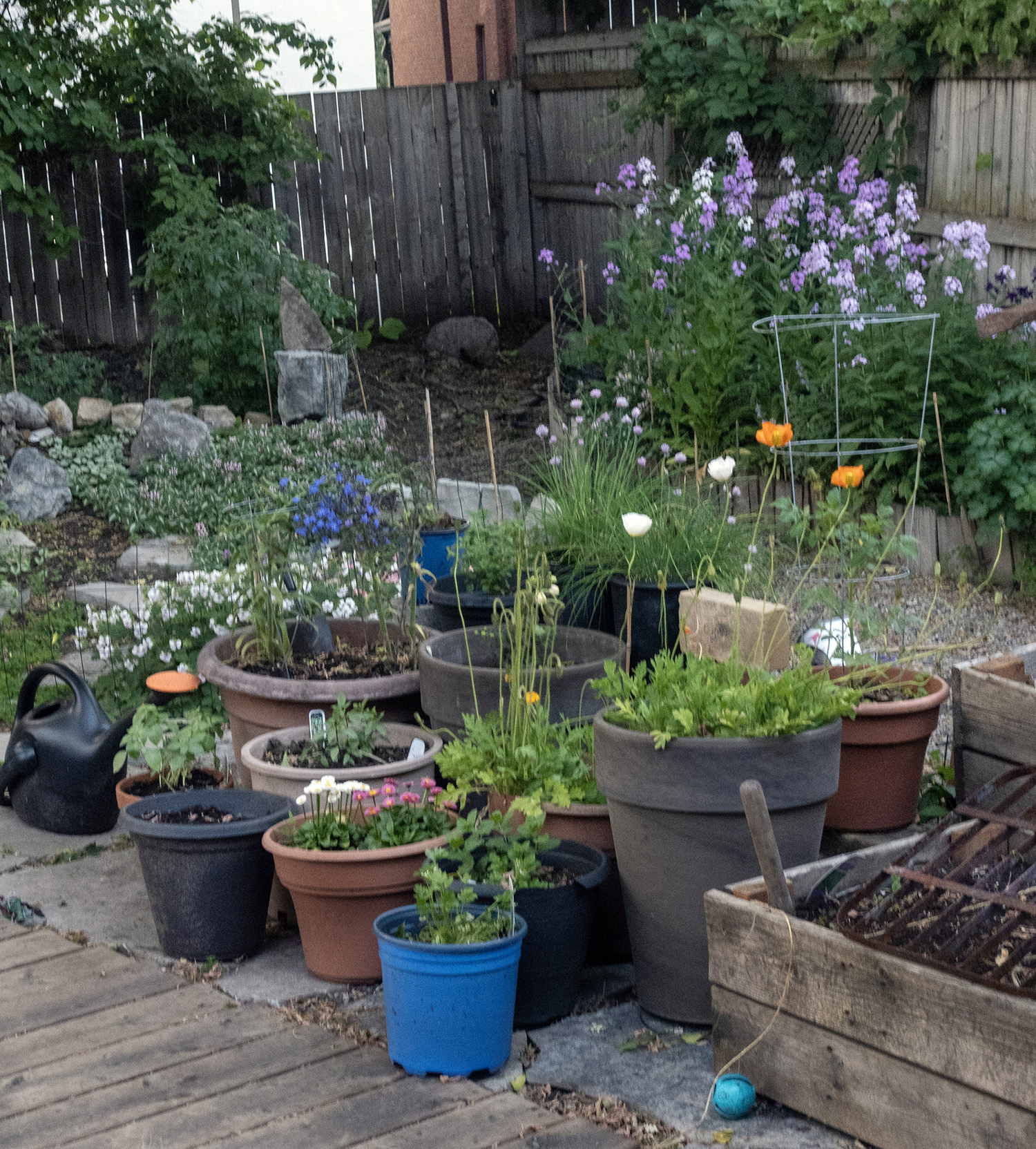
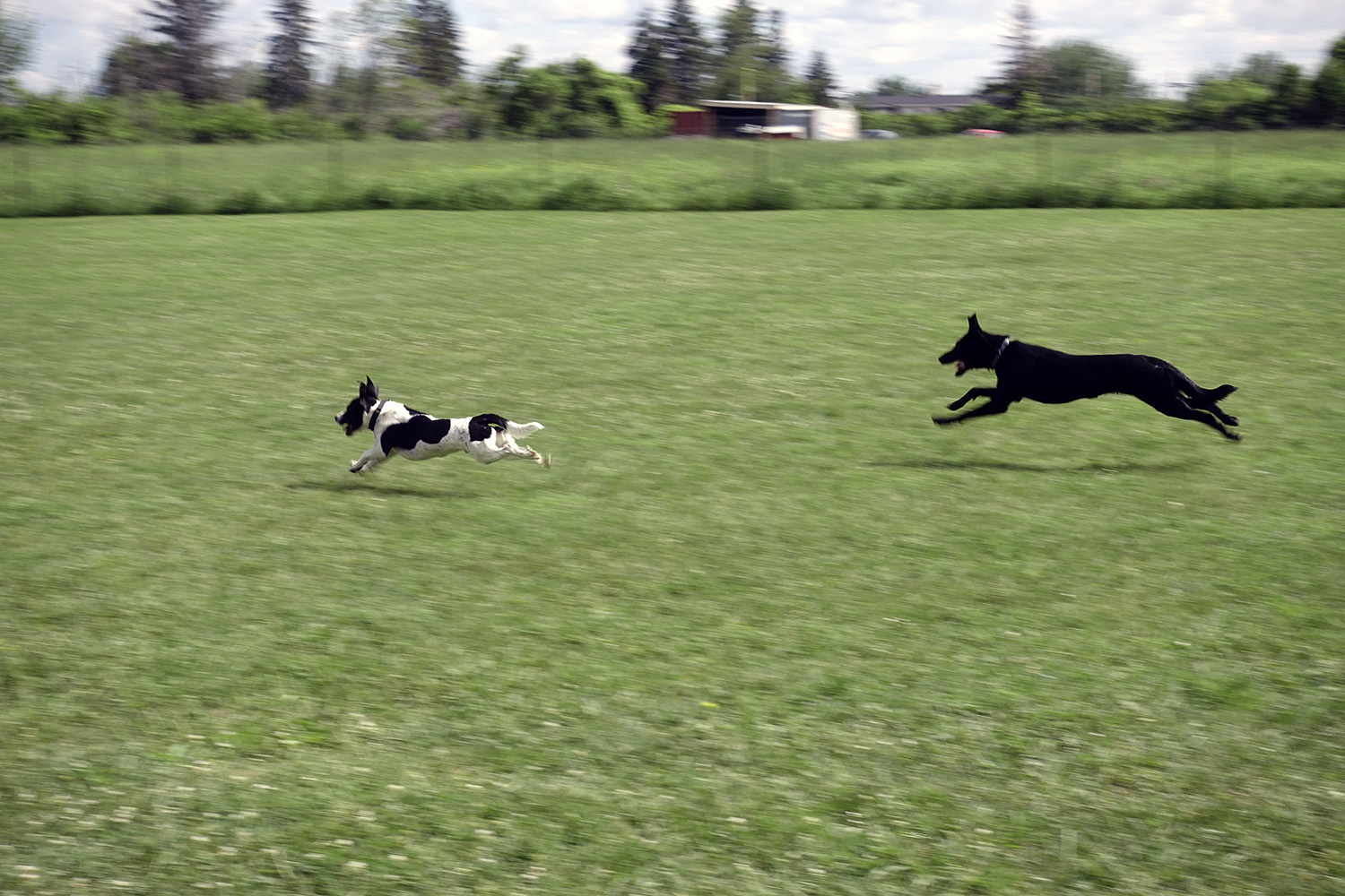
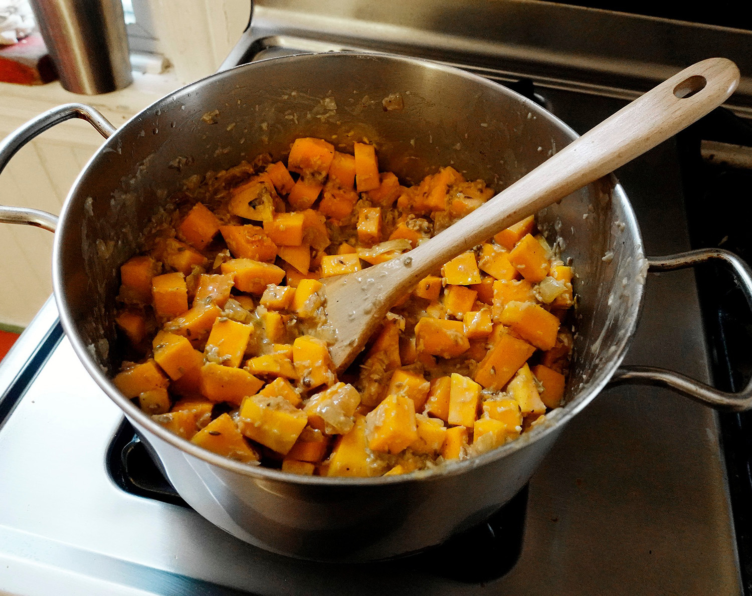
Now I’m going to step away from my camera until I’m ready to pick it up again. That might be a few weeks, might be a year. Who knows? (Who cares?) I’ll continue to garden, walk my dogs, shop for food and cook it, read, look, think.
When I do resume I’m pretty sure I’ll be looking for something different, looking at the world from a modified perspective. What, and how, that may be is to be determined. But I’m not worried.
I know that sooner or later something will grab me. And that will be a beginning.
My gardenWalking my dogs, Tim and EllieMaking West African squash and groundnut stew
There will be a short gap in these posts about the process behind “The Garden”. This week’s article was supposed to be about the book launch, which was scheduled to happen the third week of May. But circumstances changed (as they tend to do), and the launch won’t be happening until June 3rd.
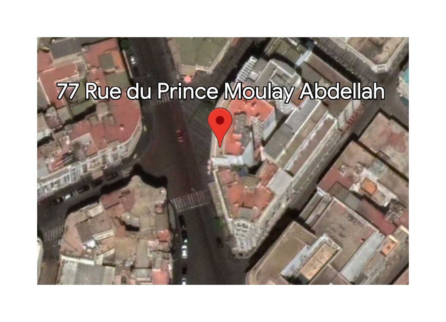
So this week I’m going to briefly write about another project I recently finished: “77 rue du Prince Moulay Abdellah.” A project that had a very different genesis, and followed a different process than “The Garden.”
After all, there’s more than one way to do a photo project.
Of course we all have our aesthetic proclivities, areas of interest and ways of working. Nothing wrong with that. But there’s always wiggle room, always (if you stop to think about it) ways to allow the subject, and your relationship to it, to seep into the process. If your subject is a round peg but all you’ve got is a square hole, and you just jam that peg into that hole, it’ll never feel or fit right.
So what are the differences between the making of the “The Garden” and “77 rue du Prince Moulay Abdellah”?
In a nutshell . . .
With “The Garden” I had an idea and set about to photograph it.
My approach was quite considered (in a fluid way). I knew (loosely) what and how I’d need to photograph to make the project “work”. Over a period of several months I shot almost a thousand photos. The subject matter was quite diverse.
Then I spent several more months editing it all down to 51 images, which were woven into a complex sequence akin to a fairy tale. Months after that “The Garden” will finally appear on my website and as a book.
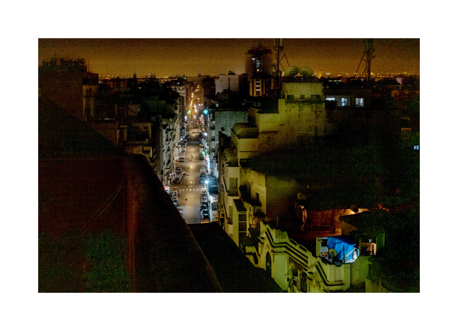
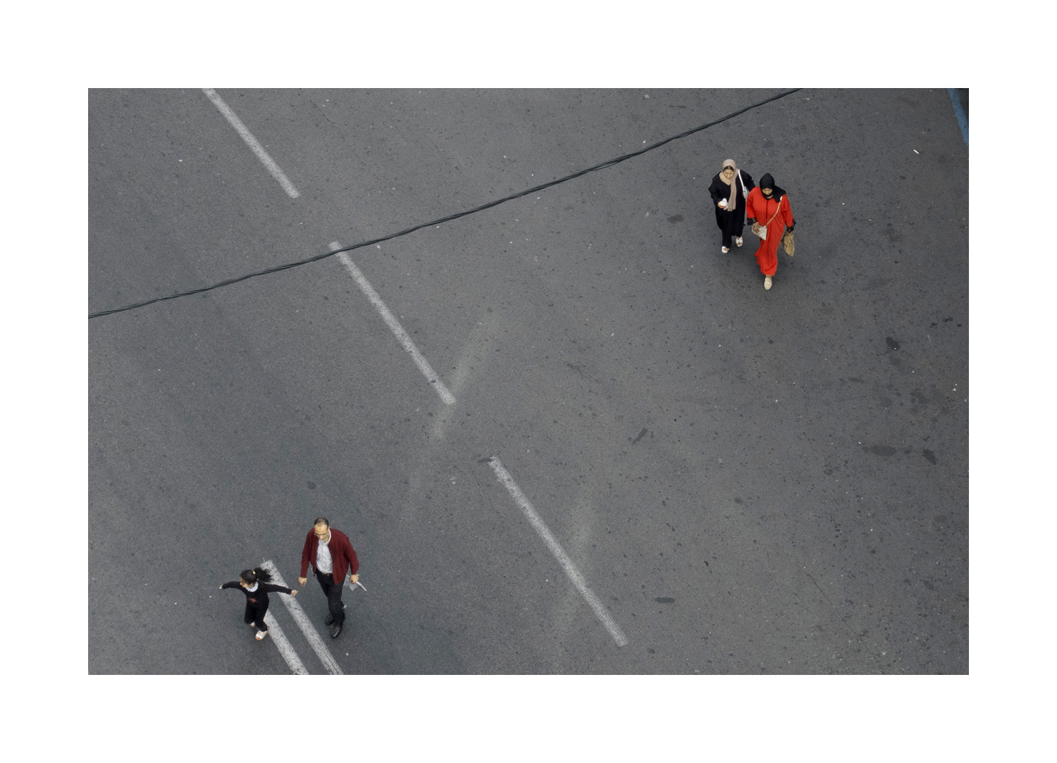
On the other hand, “77 rue du Prince Moulay Abdellah” was a reaction to specific circumstances.
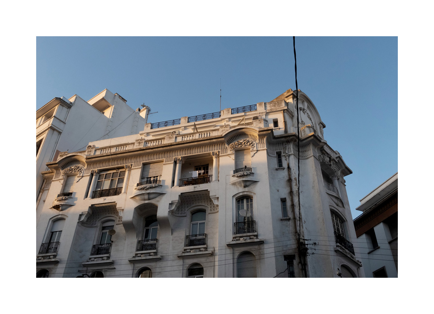
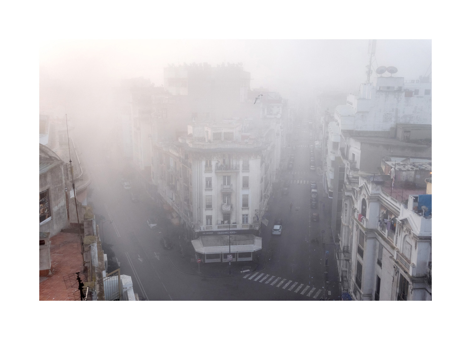
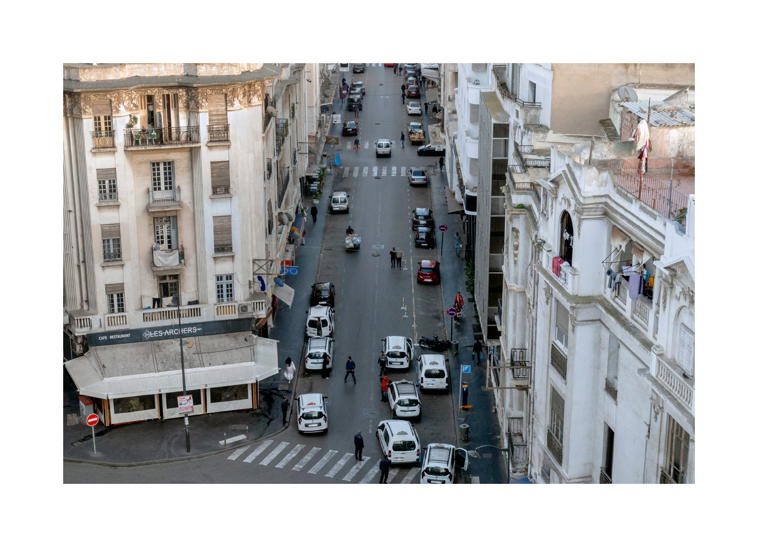
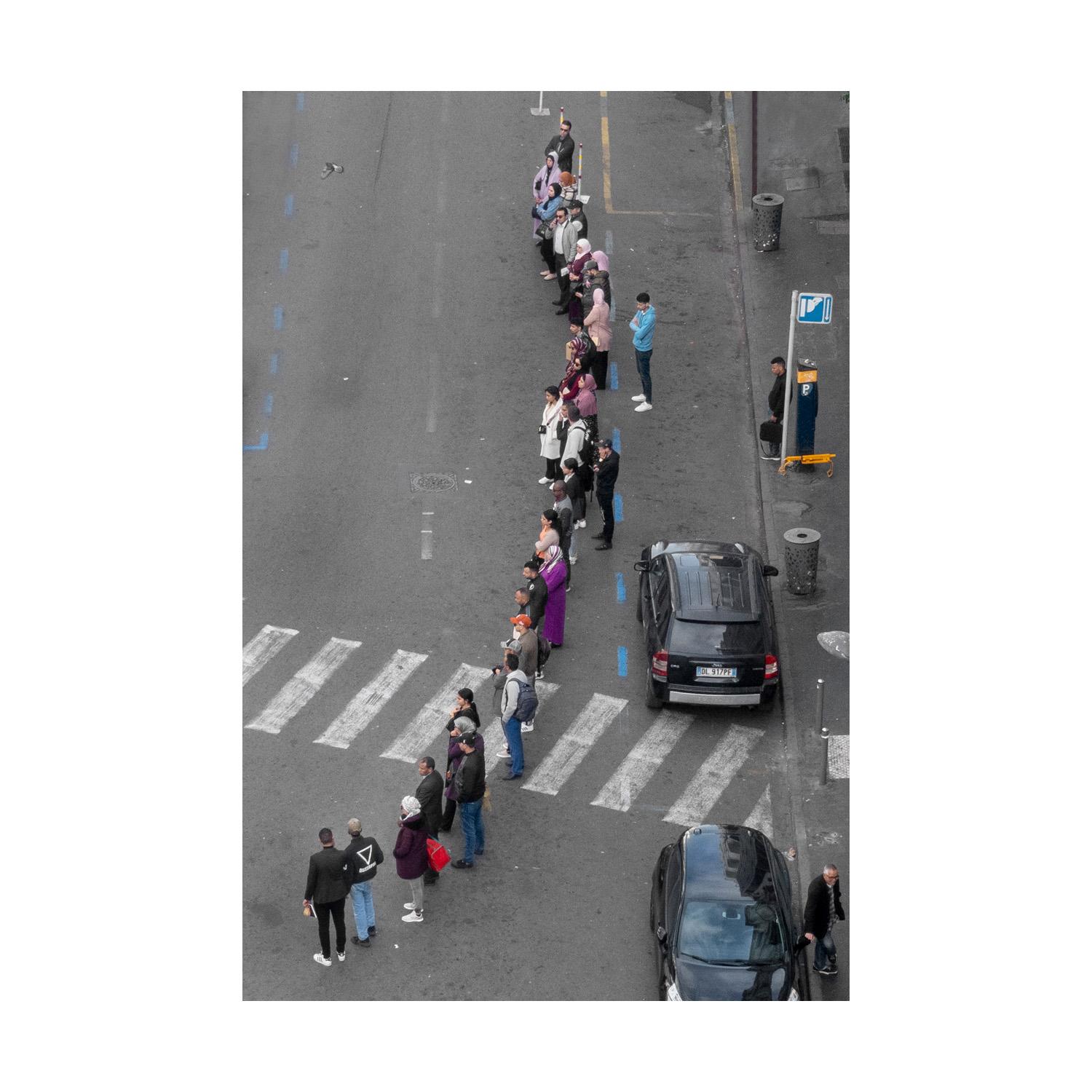
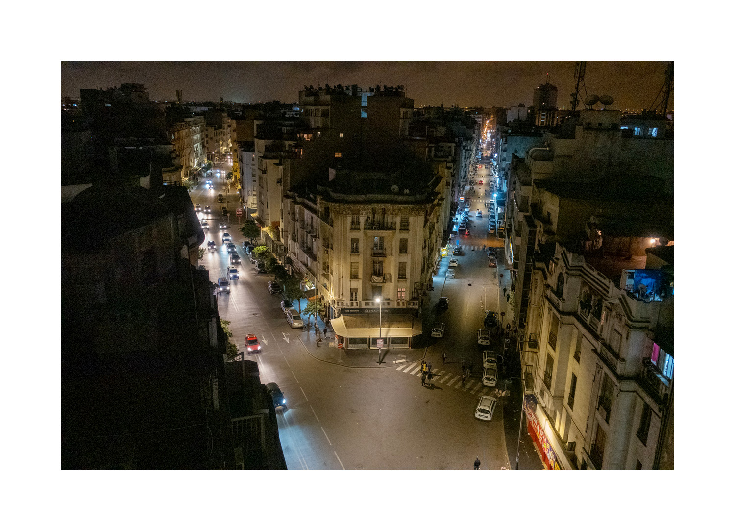
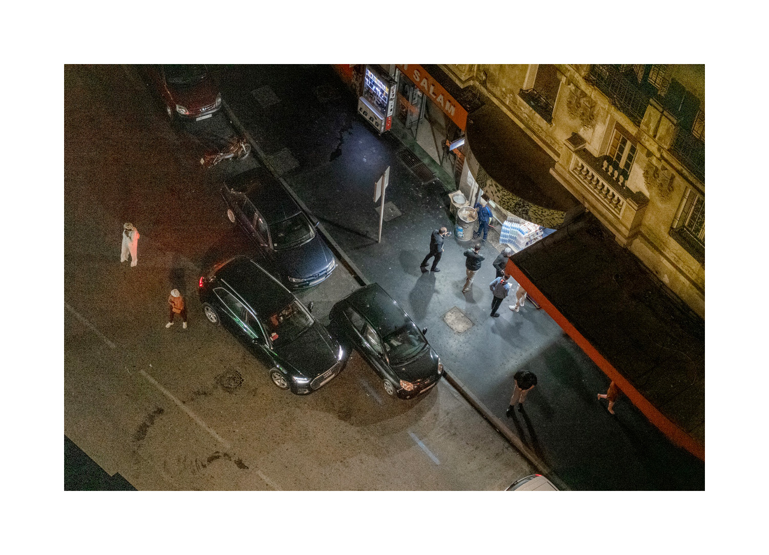
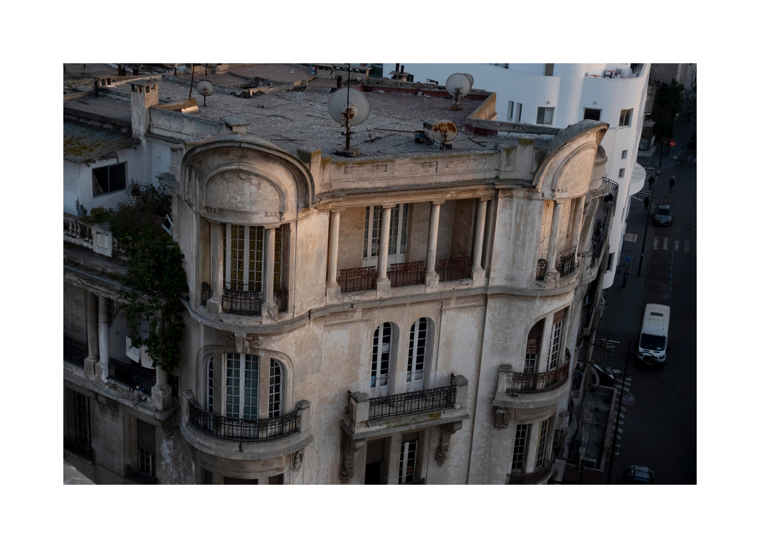
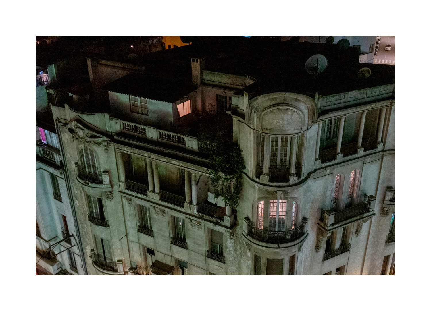
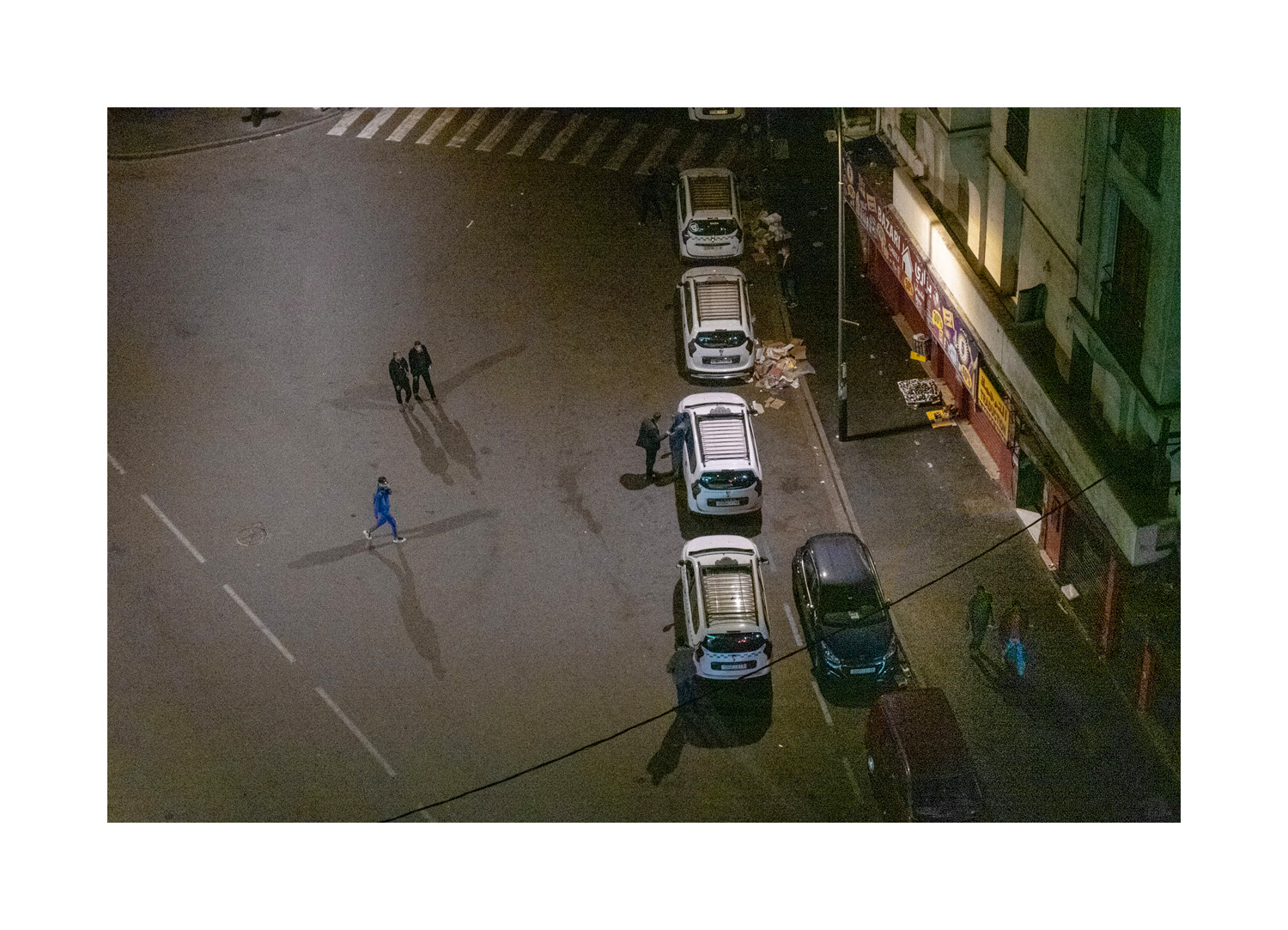
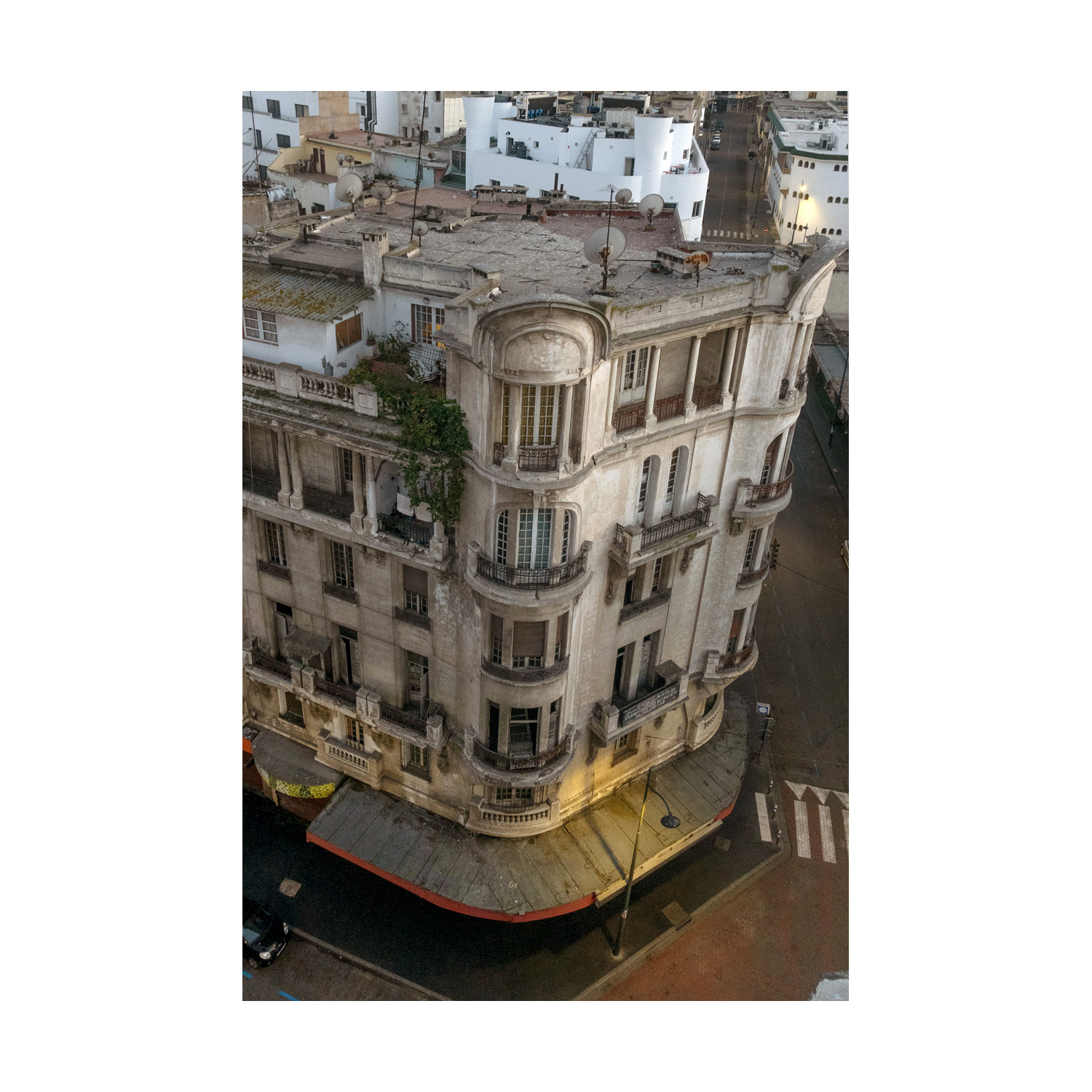
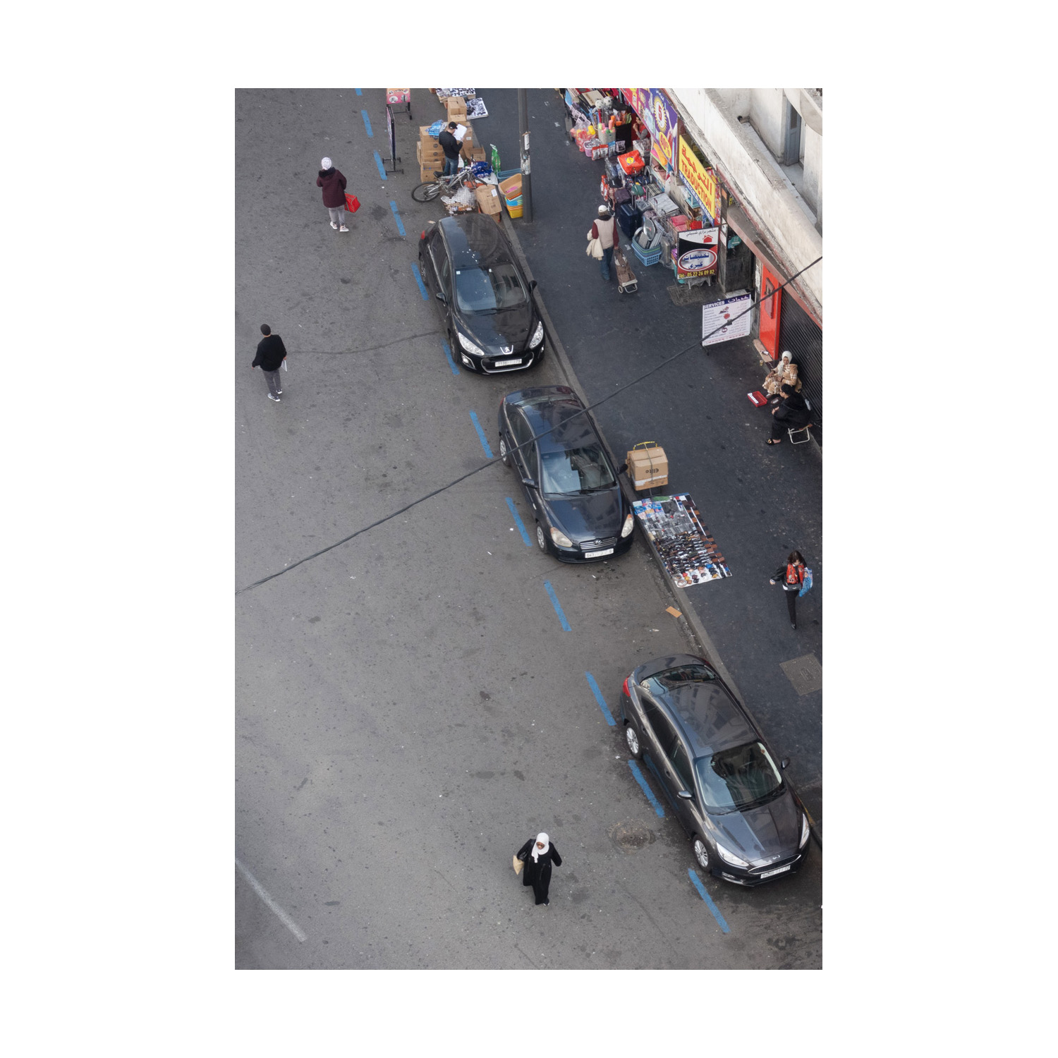
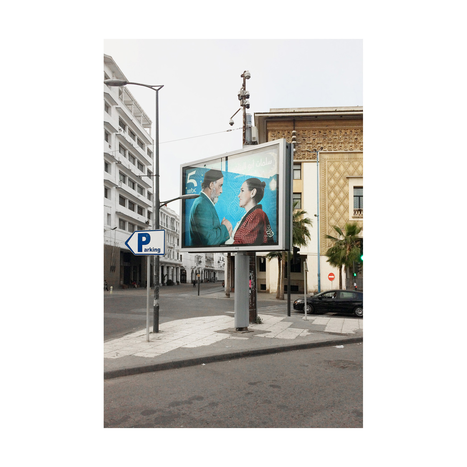
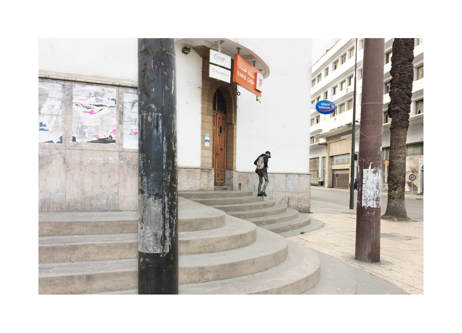
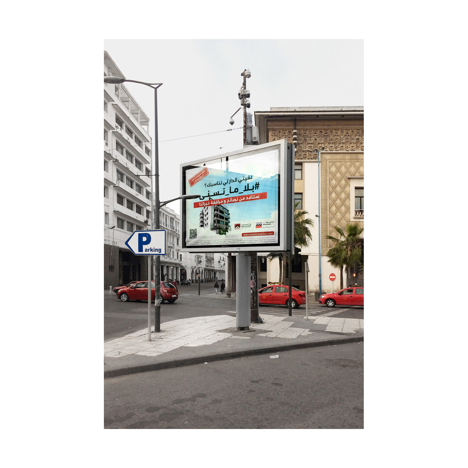
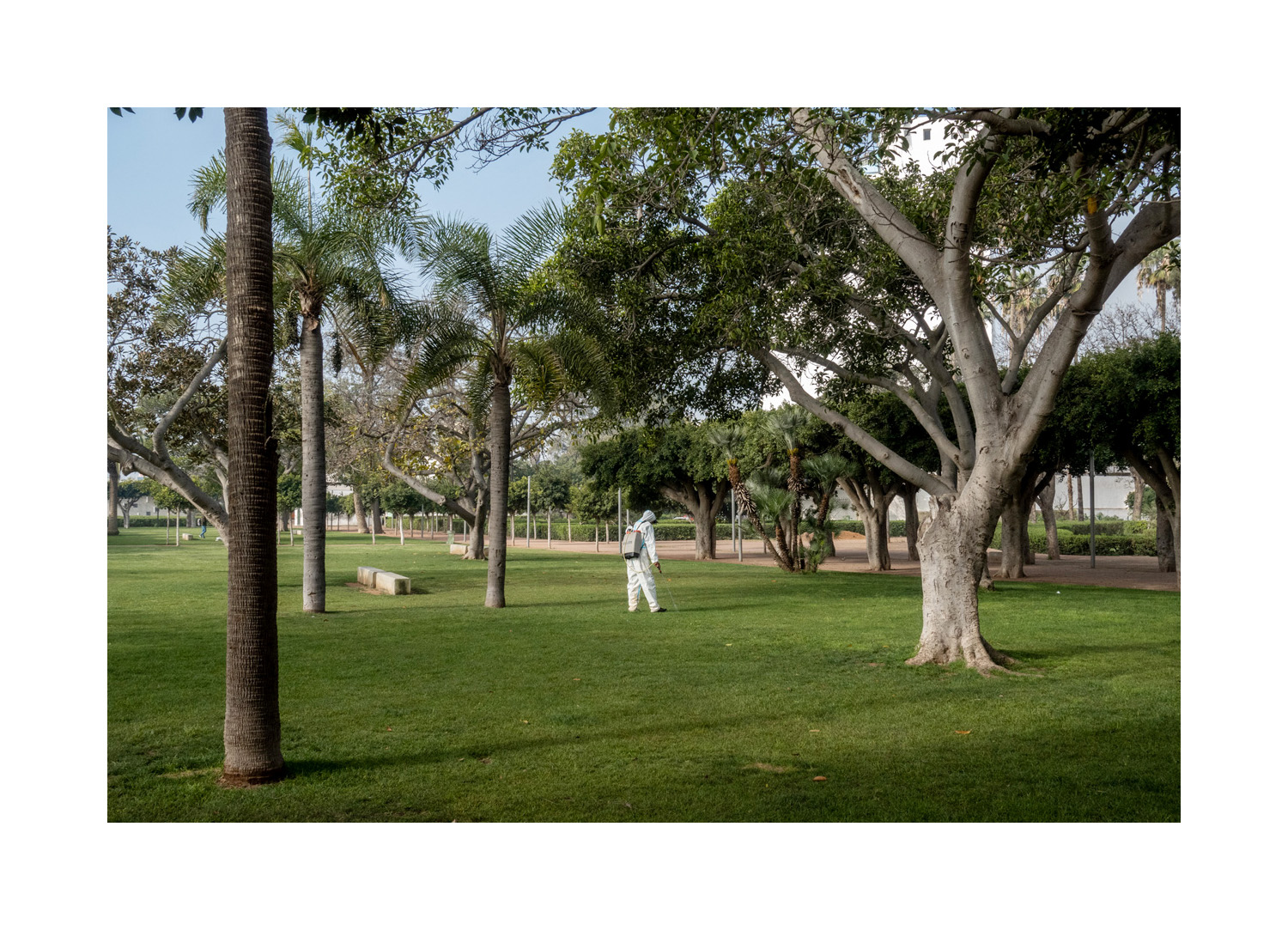
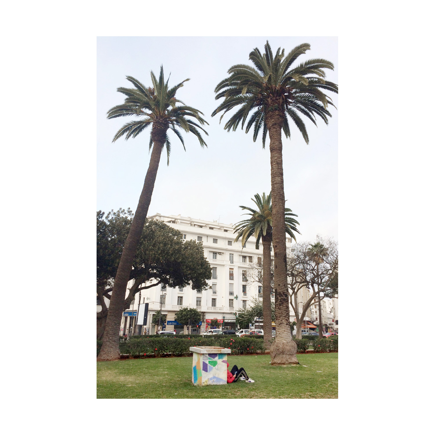
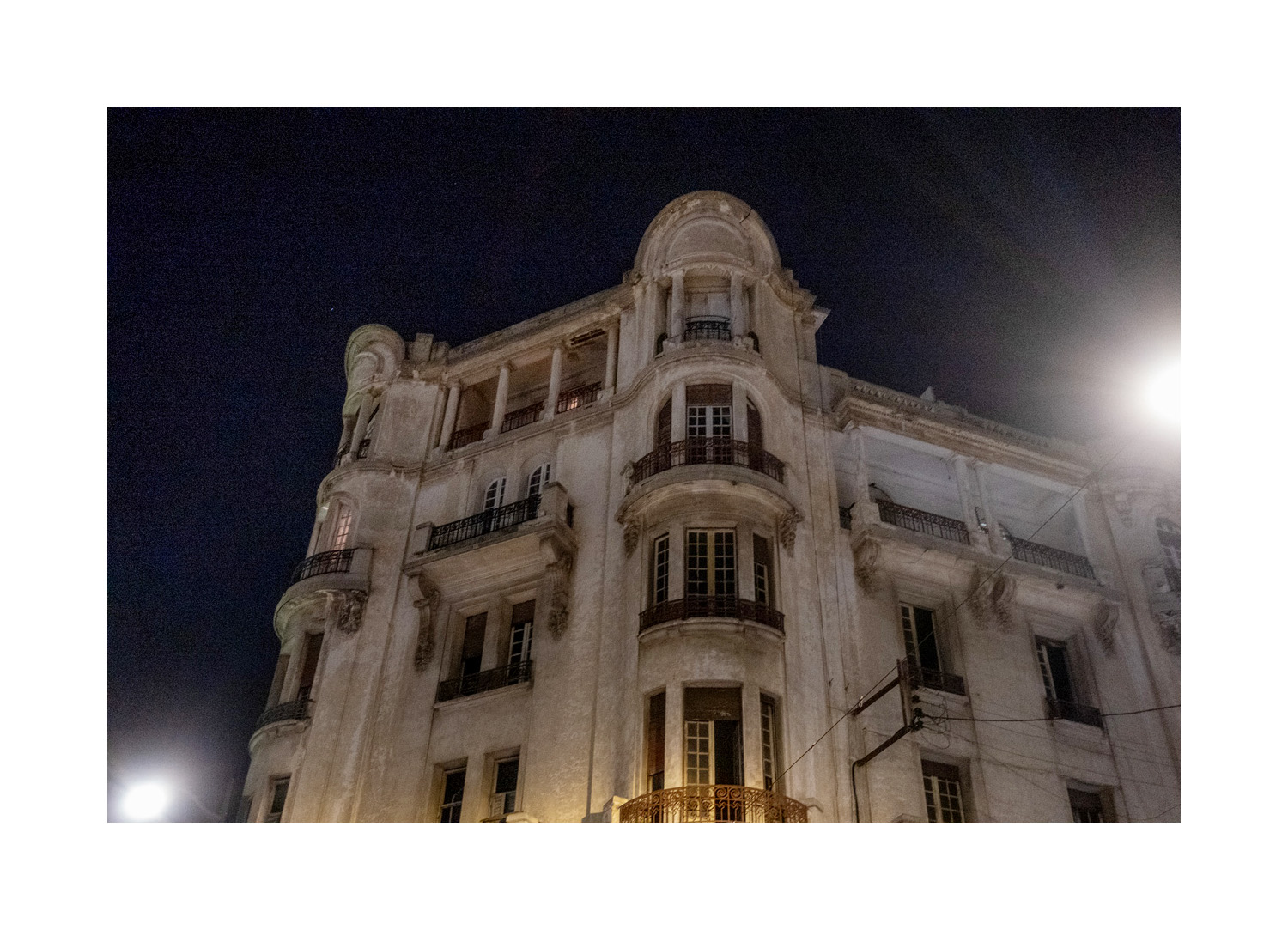
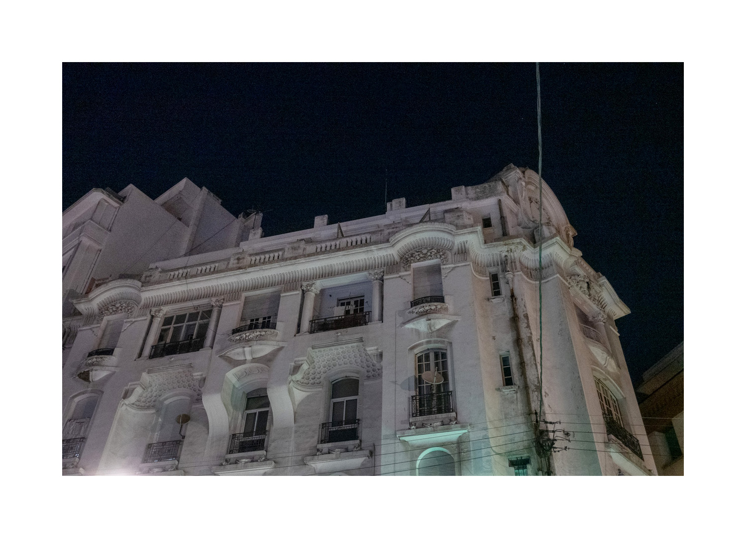
March of this year I found myself in an apartment in Casablanca, Morocco. For reasons I won’t go into here, that situation caused me a certain amount of existential angst; I felt alien and removed. It was that combination of place and feeling that led to the project.
“77 rue du Prince Moulay Abdellah” was conceived, shot, post-produced and sequenced very quickly. I photographed (on and off) for 3 days, mostly from one specific vantage point. The post production and sequencing took another week. I published the complete project (in my newsletter) the day after it was finished. Ten days in total, start to finish. Done.
(If you want further details, Andrew Molitor (one of the most interesting (and iconoclastic) photo critics writing these days) published a very insightful critique/analysis of the project. You can read it here. As well, I want to thank Rob for publishing the complete project here. I asked him if we should just show a few of the images and provide a link to the project. He responded, “We’re running all the photos. It’s always worth experimenting.”)
_______________________
I don’t travel to seek out the sights. I travel to just be wherever I am.
I’ll walk to the edge of the place, to neighbourhoods and industrial areas. I’ll sit and look and feel. I might think.
Photography doesn’t have much of a role in this endeavour. In fact, it often impedes, distracts, restricts. It often insists on a pro forma reaction.
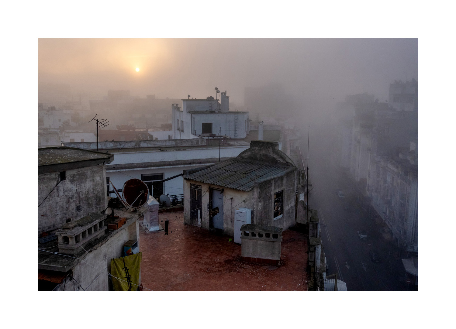
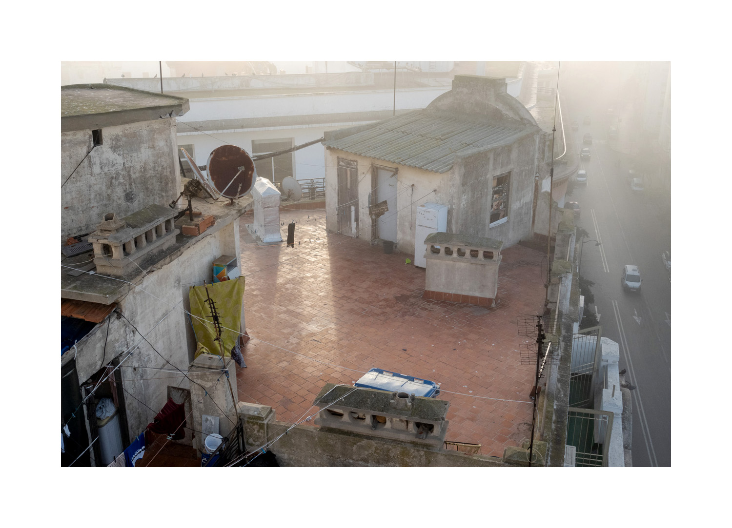
But in Casablanca I found myself in a situation where a project fell into my lap or, more accurately, my brain. It seemed right. It has hardly anything to do with Morocco.
I became obsessed with the apartment where I was staying. 77 rue du Prince Moulay Abdellah, the 7th floor.
A terrace runs its length, it has views to the south and the west that completely occupied me. I only left the building to get food.
A new 8 part miniseries where Ottawa Photographer Tony Fouhse takes us through his new project, from the first photo to the book launch. Tony is an internationally exhibited and collected photographer who was formerly a full time editorial/commercial photographer. These posts originally appeared in his newsletter HYPO which you can subscribe to here to see more of his work visit his website here.
Anatomy Of A Project
Episode Nº 7: Photobook Design
Okay, photobook design? What do I know?
Not a lot, really. I’m a photographer, not a designer. But I have spent some time thinking about placing photographs on the pages of books, and how the decisions you make can (will) either help or hinder the work.
So, necessarily, what follows is broad strokes and a few examples from personal experience, followed by some general thoughts . . .
__________________
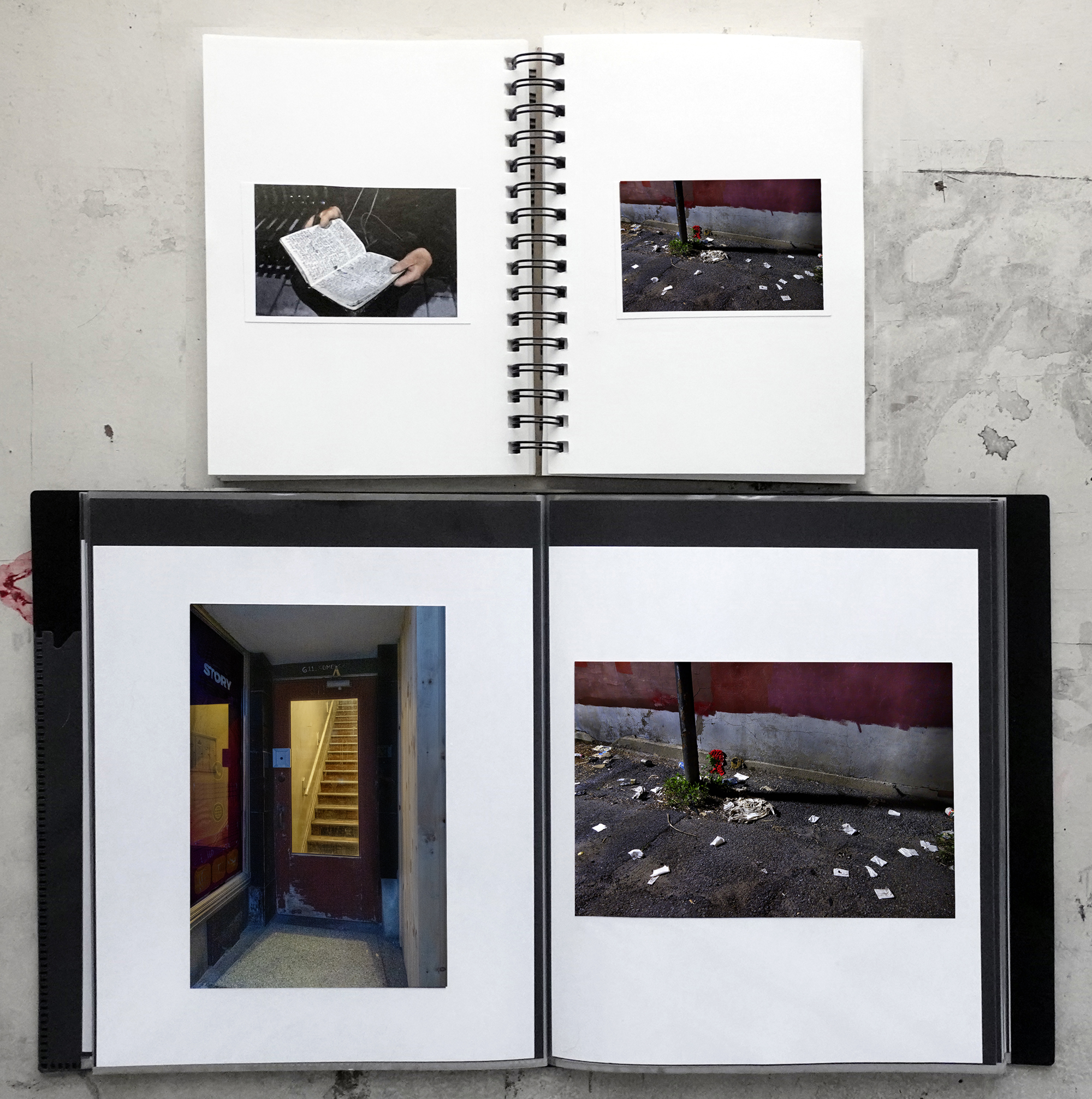
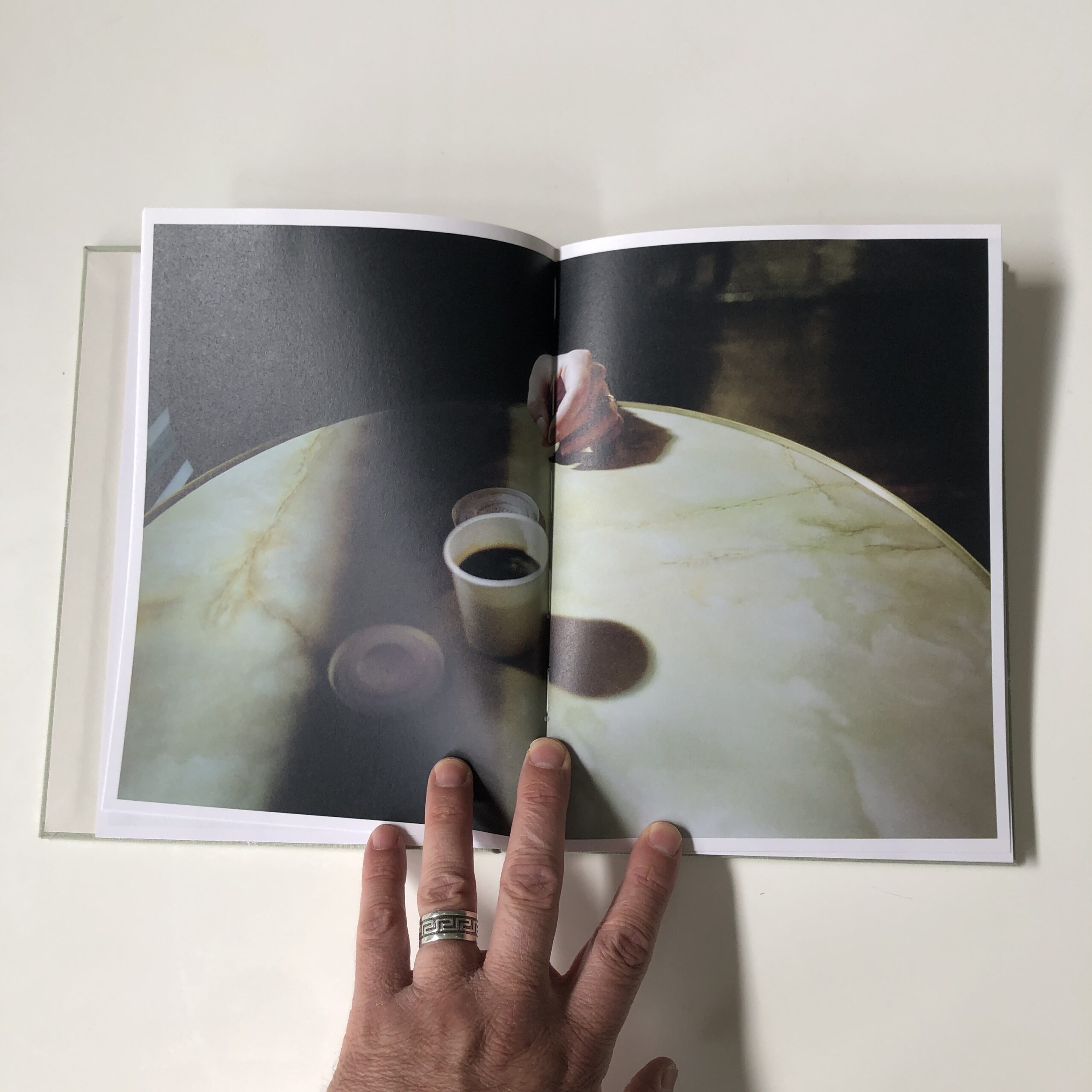
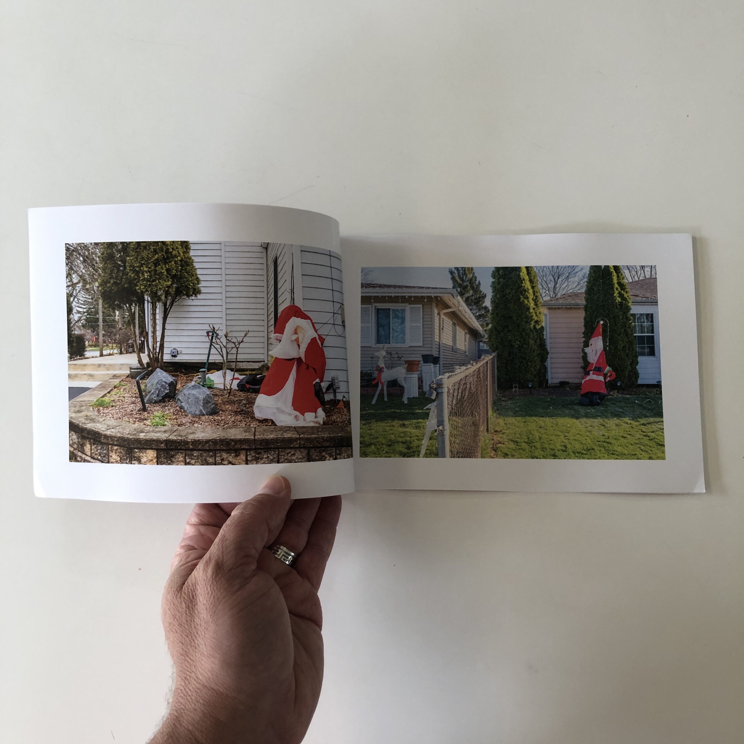
All through the sequence and dummy process of The Garden I’d been using my go-to approach. That’d be: all photos the same size, one photo per page, all the photos in the same position, some blank pages, minimal text.
Here’s a pic of the first dummy (top) and the final dummy of The Garden.
There’s a danger to using a standard, template-style layout when you’re in the initial stages of placing the images in the dummy. Change becomes more difficult when you’re used to looking at something in a specific way. (Also applies to life.) But what if there’s a better way to get your idea, the idea of the photographs, across in the book? (What if there’s a better way to live your life?)
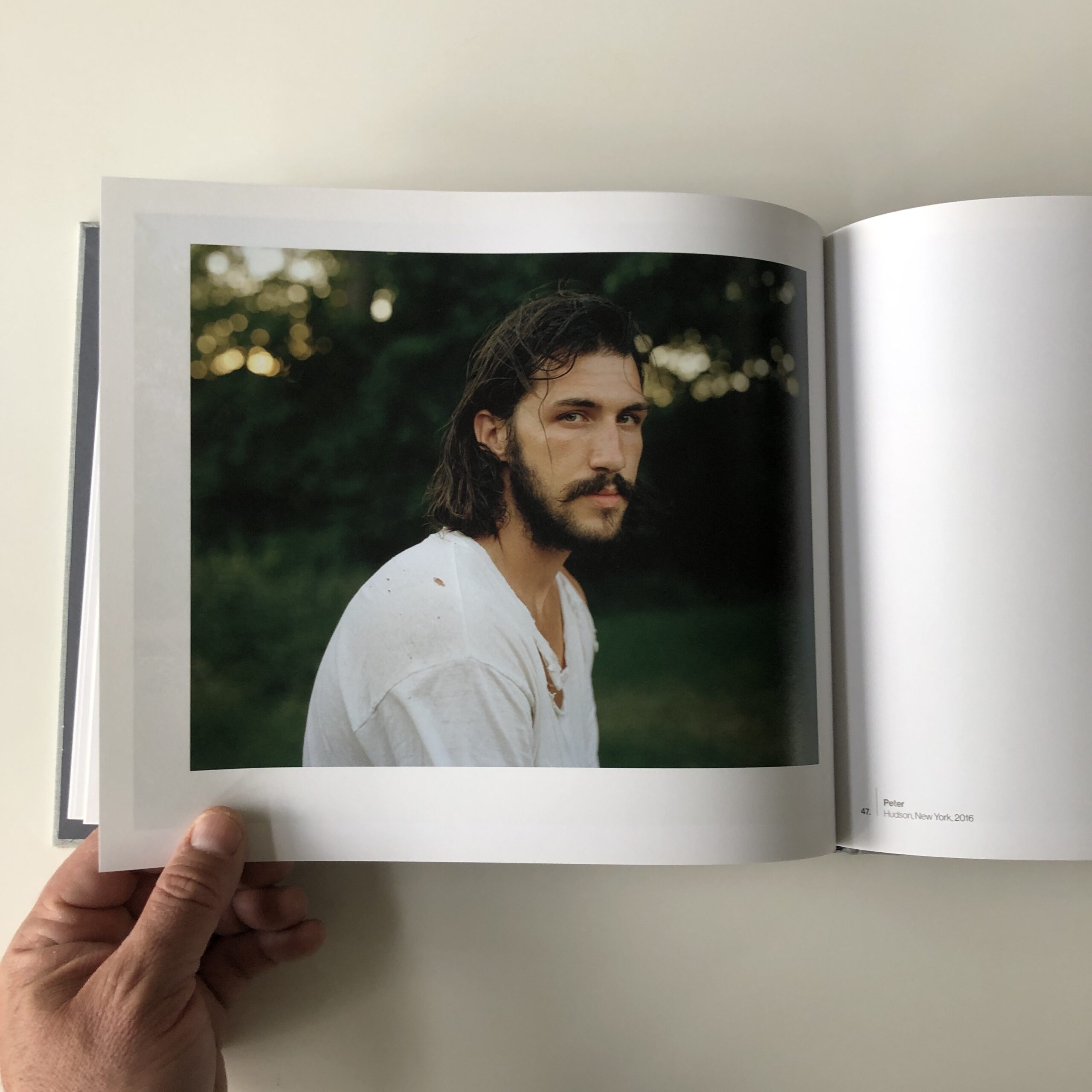
I’ve seen this happen quite a few times when I’ve been involved (directly or peripherally) in the making of other photographers’ photobooks. Fortunately, in all of those cases some kind of intervention happened, things got shook up and the book became better.
We’d been working on her sequence of photos for a while and were using, for ease and convenience (two things which may well be counterproductive to getting the most out of art and life) a straightforward approach to their layout.
And then, well . . . I’ll let Souki tell you . . .
Hakim Benchekroun helped me choose the book size. He designed the cover, and the poem inside (which I then moved a little) and he suggested, at the time, my classical layout wasn’t the best option. He tried tweaking the pictures’ position a little – some above the middle line, some below, all the same size – which didn’t work – and our collaboration then stopped. (But he had inseminated the idea a better layout was possible)
During a workshop, Zoopark Publishing Collective offered a layout very close to the one I ended up using, with 3 sizes for the pictures, creating a rhythm, and a different sequence. (They explained how layout and sequence play on one another.) Their sequence was more thematically straightforward (around the pandemic). They also showed us how to use InDesign, giving me the freedom to tweak their design and sequence, to what I wanted. :) – which I did, after the workshop was over.
Then for the “poster”. I was having a beer with my friend Melanie Yvon and complaining how hard it was to find a designer in tune with what I was trying to express. She drew it, right then and there. (Did I tweak it afterwards, too? Of course.)
Alexis Logie then designed the flap to put the poster in, suggested the book be sewn rather than glued etc.
Took a village. All the mistakes are mine.
This layout, for me, suits the look, feel and intention of Souki’s work. There’s meant to be a sense of dislocation in the sequence of images, and the jarring design heightens this feeling.
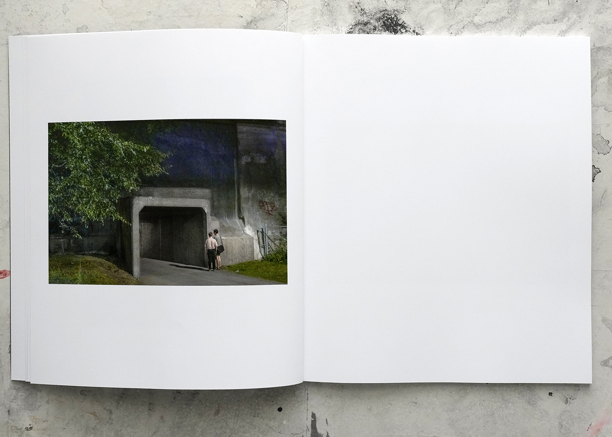
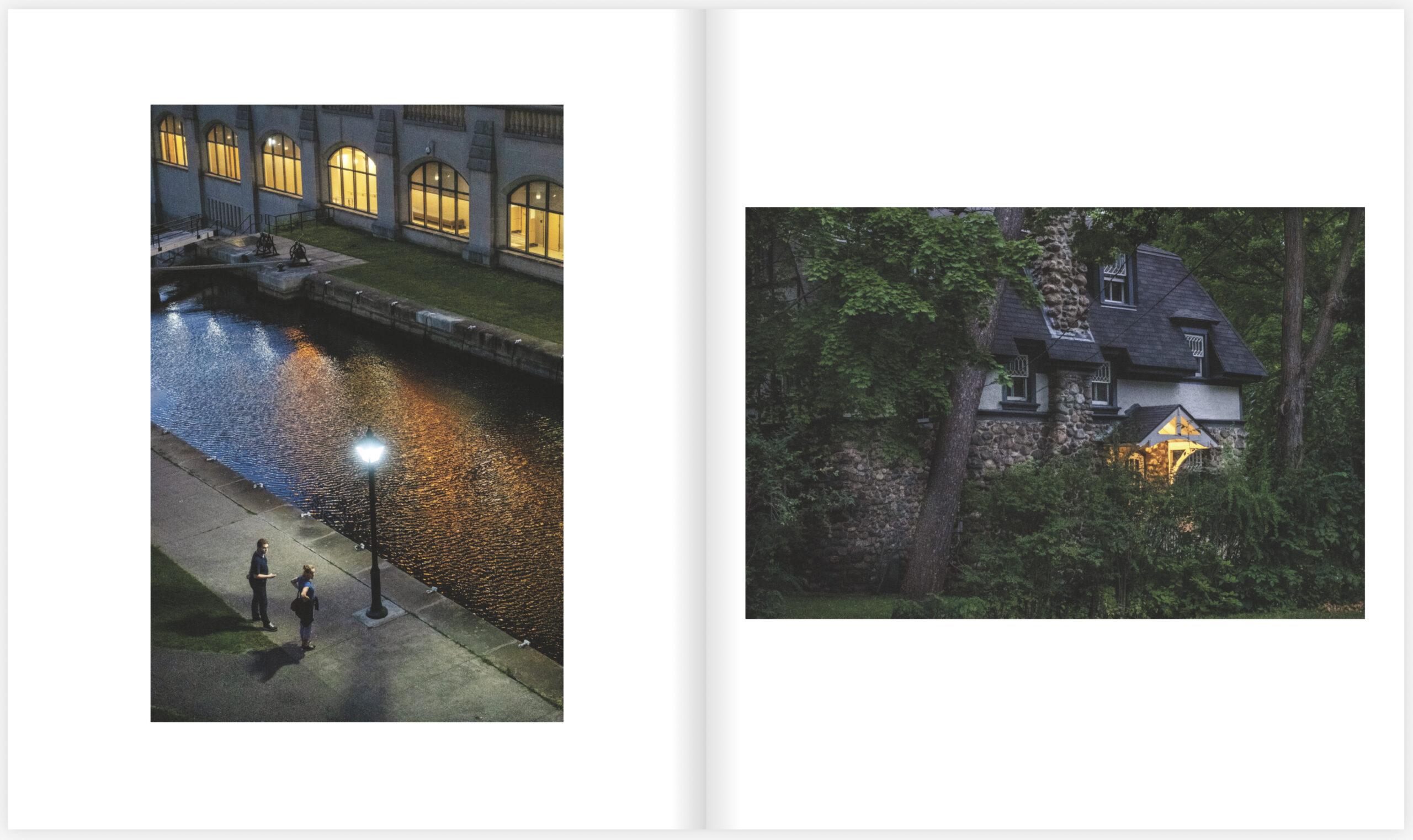
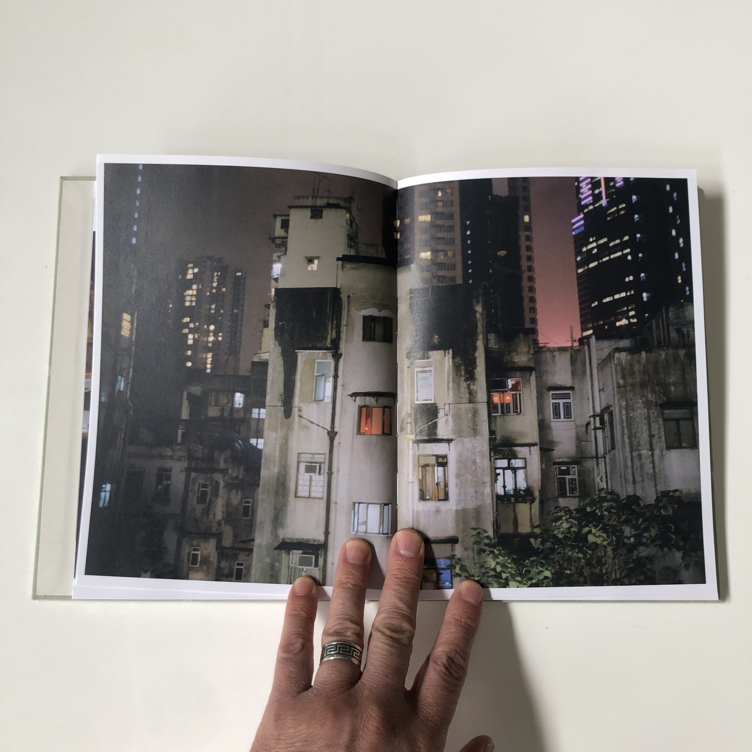
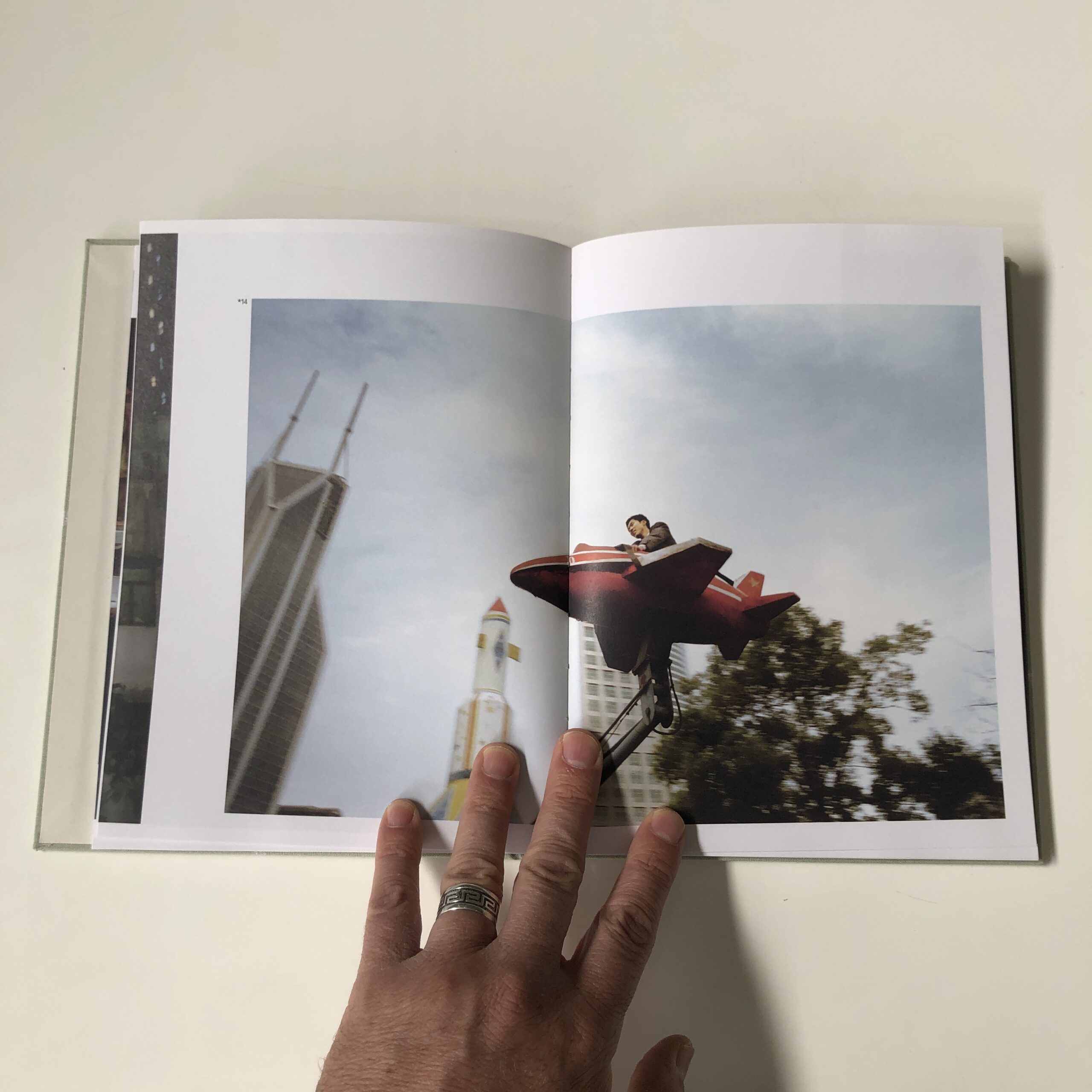
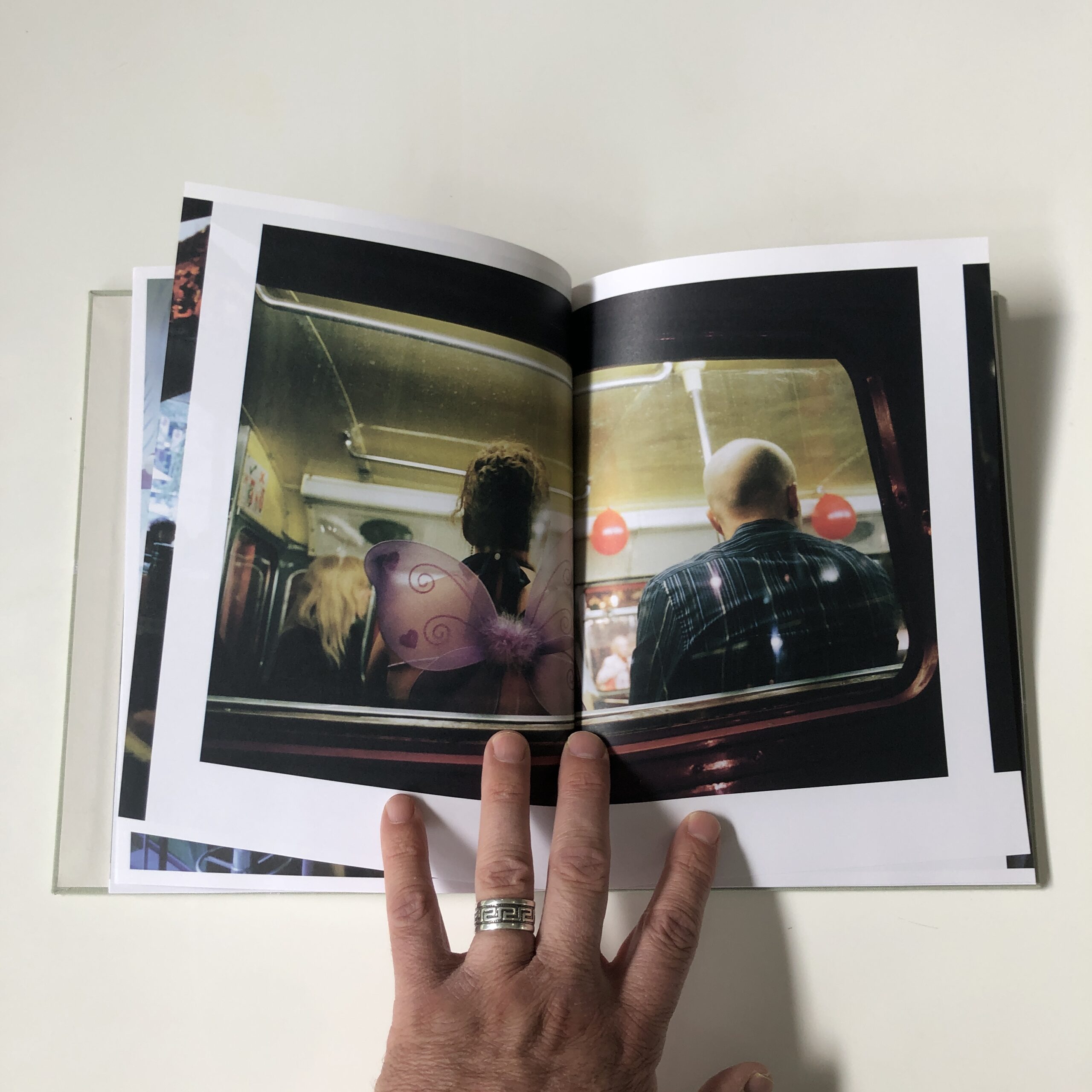
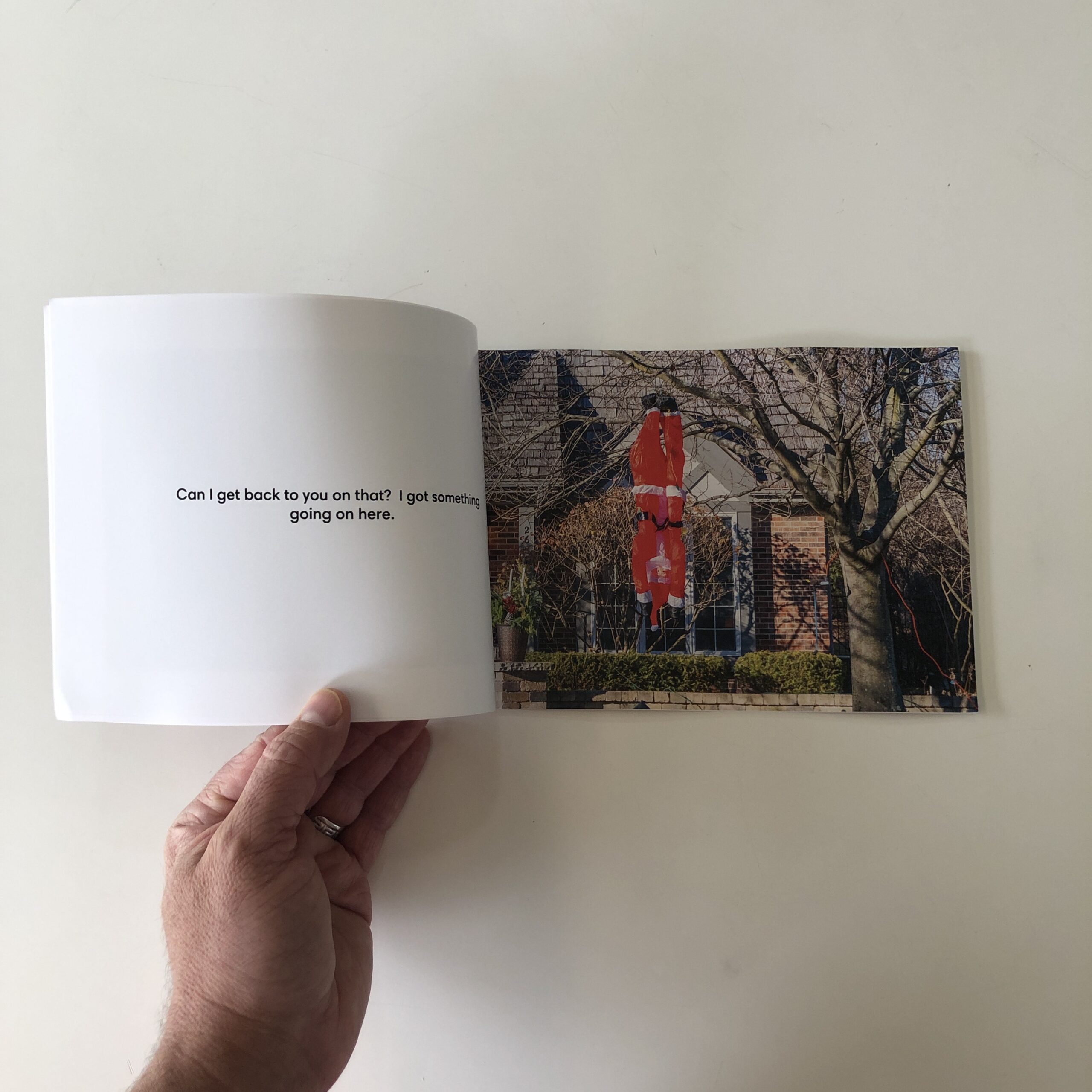
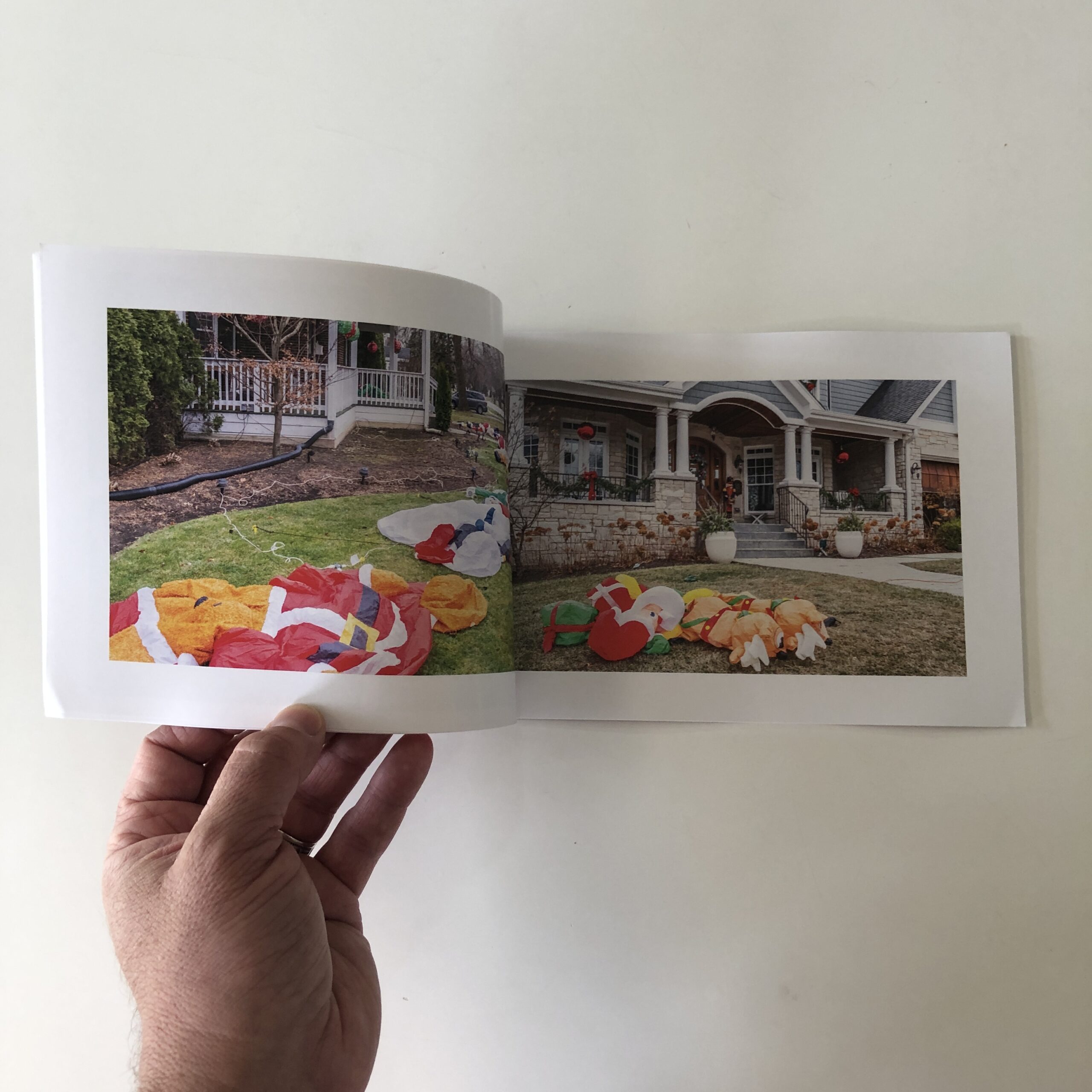
On the other hand, my book (The Garden) is meant to be episodic, cinematic, and kind of straightforward. A trip through a city in some strange twilight. The work wants a straightforward flow, where each photo has the same weight as the others.
Here’s the opening sequence to The Garden, the introduction to that trip . . .
I might be using backward logic to justify my choices. I don’t know. But I do know that I put a lot of thought into how I wanted these photos to appear in the book. In the end, if you’ve thought about it and it feels right, well . . . there you go. The trick is to consider the components and the idea, and to explore possibilities before you come to a conclusion.
Finally, some random thoughts and opinions. (Bear in mind: I’m a photographer, not a designer.)
In certain cases the flair that’s put into the physical object enhances the feeling and reading of the work. But throwing money at super-cool binding, different paper stocks, making the book complicated to open and look at should only be used if it serves a purpose (other than seducing photobook fetishists). All those extra bells and whistles add a lot to production costs. So if you want your book to make money you’ll have to charge a lot for it which, paradoxically, reduces the pool of potential buyers.
Me, I like my books to be affordable and to make money. So they’re typically simple in their design and manufacture (but not, if I may be immodest, simple in their content). I want them to be more utilitarian than luxurious, an approach that suits my ethos. (I’ve published 5 books and a bunch of zines, all have turned a profit, all but one is sold out.)
Where I live (Canada) the cost of shipping doubles if the package weighs more than 500 grams. Since most of my sales are to the USA and Europe, and because shipping is expensive, I take this into account when I’m designing my books. I make sure they weigh, packaged, less than 500 grams. You might want to do a bit of research into shipping costs, and design your book with that in mind.
I do short runs on digital presses, I know I can sell 200 books without spending a year of my life being a photobook salesperson (or having boxes of unsold books in my basement), so that’s (usually) the number of books I print.
__________________
Last week’s episode of Anatomy of a Project was about hype. That would have been the perfect context to hype my book. Typically, I forgot to do that.
(During the process of producing and selling your book you’ll forget stuff, your big plan will get messed up. Don’t worry, just roll with it, keep going. That’s the way stuff gets done.)
So allow me to hype my book by showing you a couple of ways I’m hyping my book . . .
FOR SALE
This was a note I included at the end of a recent newsletter . . .
The Garden is available for pre-sale. It’ll ship end of May.
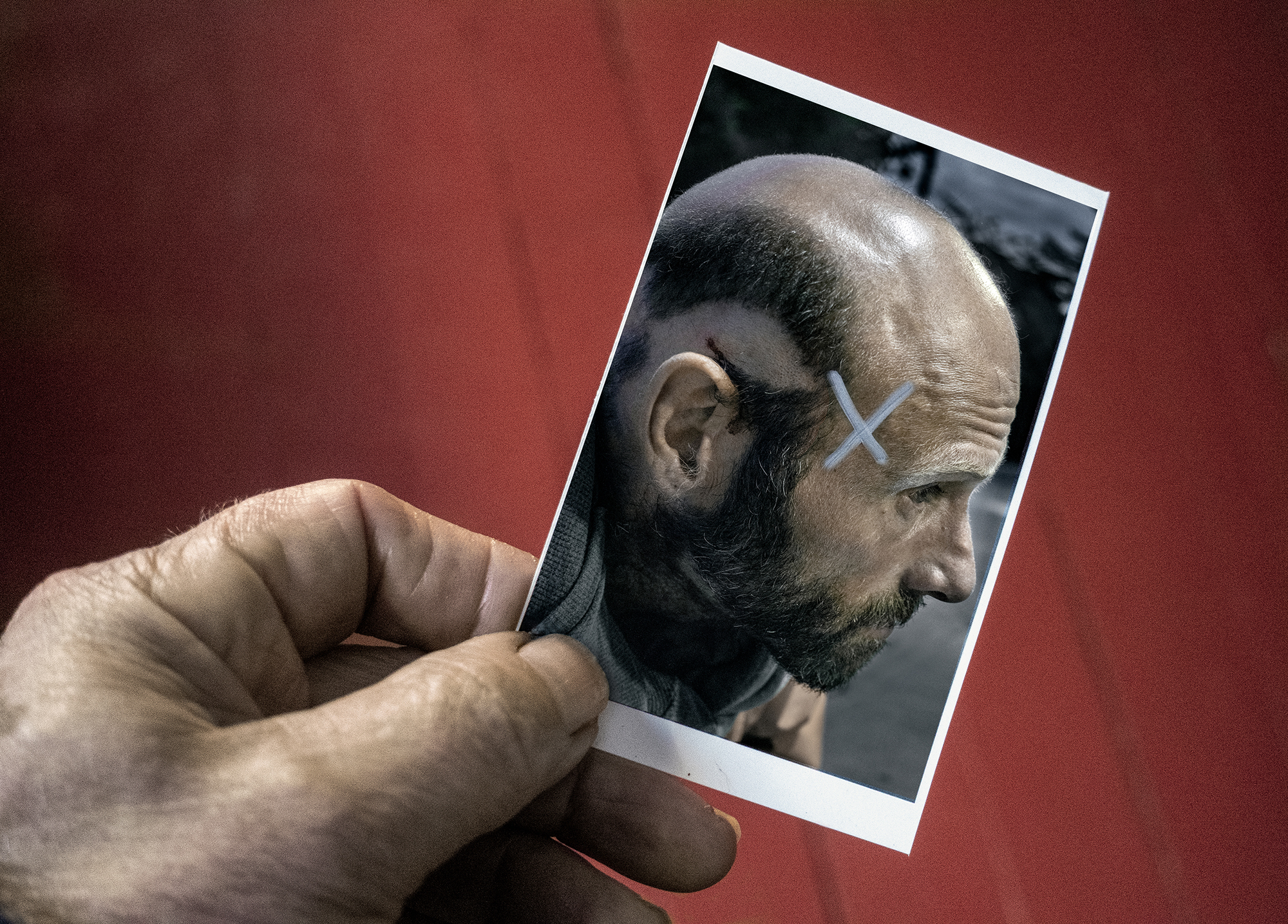
All pre-orders come with a swell, small work print, complete with pin holes (I stuck these on my editing board) and, if you’re lucky, weird markings and annotations I used to remind myself how I wanted to post-produce the final files.
Get your copy here. Support my practice and this newsletter. You know you want to.
REACTIONS
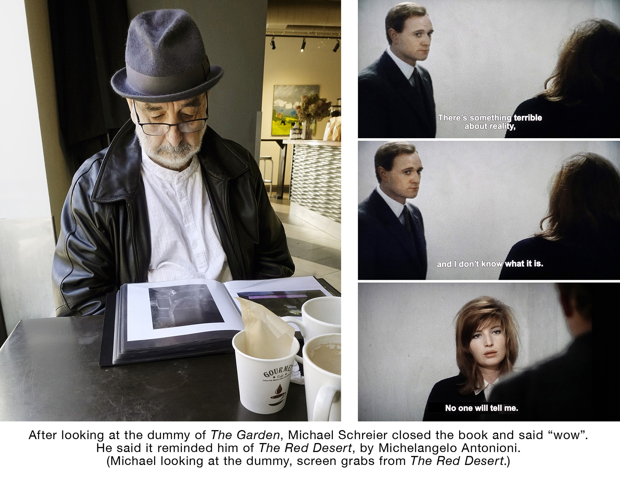
I’d take photos when I was showing the dummy of The Garden to people whose opinions I respect. I’d note their reactions, what they said. The aim was to use these photos and words on social media. Here’s one of those encounters.
A new 8 part miniseries where Ottawa Photographer Tony Fouhse takes us through his new project, from the first photo to the book launch. Tony is an internationally exhibited and collected photographer who was formerly a full time editorial/commercial photographer. These posts originally appeared in his newsletter HYPO which you can subscribe to here to see more of his work visit his website here.
In the past I’ve always written (and posted) about my projects as they were in progress. I’d post lots of photos, write about my ambitions for the work, my approach and process, and (mostly) about how confused I was.
That seems to make people feel closer, more engaged with the work when it finally appears.(Not that that’s the reason I do it. The reason I do it is so I better understand what I’m doing, what I’m working towards,)
But I’ve kept this new project (The Garden) pretty much to myself, only written about it tangentially, only posted the occasional picture.
Now, though, it’s pretty much done. The edit and sequence finalized, the dummy made, the final post production of the files complete. All that remains is the hype and the launch. But the thing is essentially ready to release.
And when I release it, I’ll want to “move product”. By that I mean I’ll want people to see and be engaged with the work, and buy the book.
So I’ve been wondering: How do you move product?
Of course there’s not any one way that’s best, there are many paths. There’s the seduce-the-powers-that-be option (not my style). There’s the pay-to-play option (I refuse to participate). And the spend-the-next-year-or-two-promoting-the-work option (I’d rather work on something new).
So perhaps a better way to phrase the question is: What’s the best way for me to move product?
I asked my newsletter readers some questions about this matter. Here are the questions, along with their answers . . .
1/ Would you feel more involved with a project (and more likely to buy the resulting book) if images and other details were shared as the project evolved?
One person said they would not feel more involved but might buy a book anyway. The rest were very interested in the process, said that that engagement made them feel attached to the project and more likely to buy the book.
2/ Does it make any sense to post the complete project on my website and/or send it around for some free hype a few months before offering the book for sale?
One person thought posting the complete project made sense. All the other respondents thought it would be better to show an extract of the book. But there was a variety of opinion as to how much to show. Some thought a couple of pictures and short text would be enough. Others wanted to see “more than a teaser” so they could figure out whether it tickled their fancy (or not).
3/ Is there an optimum month to release a book?
Almost everyone said it didn’t matter. A few respondents were quite sure September was best, but May was also good.
I would have asked “What’s a good way to launch a book, especially if, like me, you want to operate as much as possible outside the Academy and Gallery System”? But I already know the answer to that question . . .
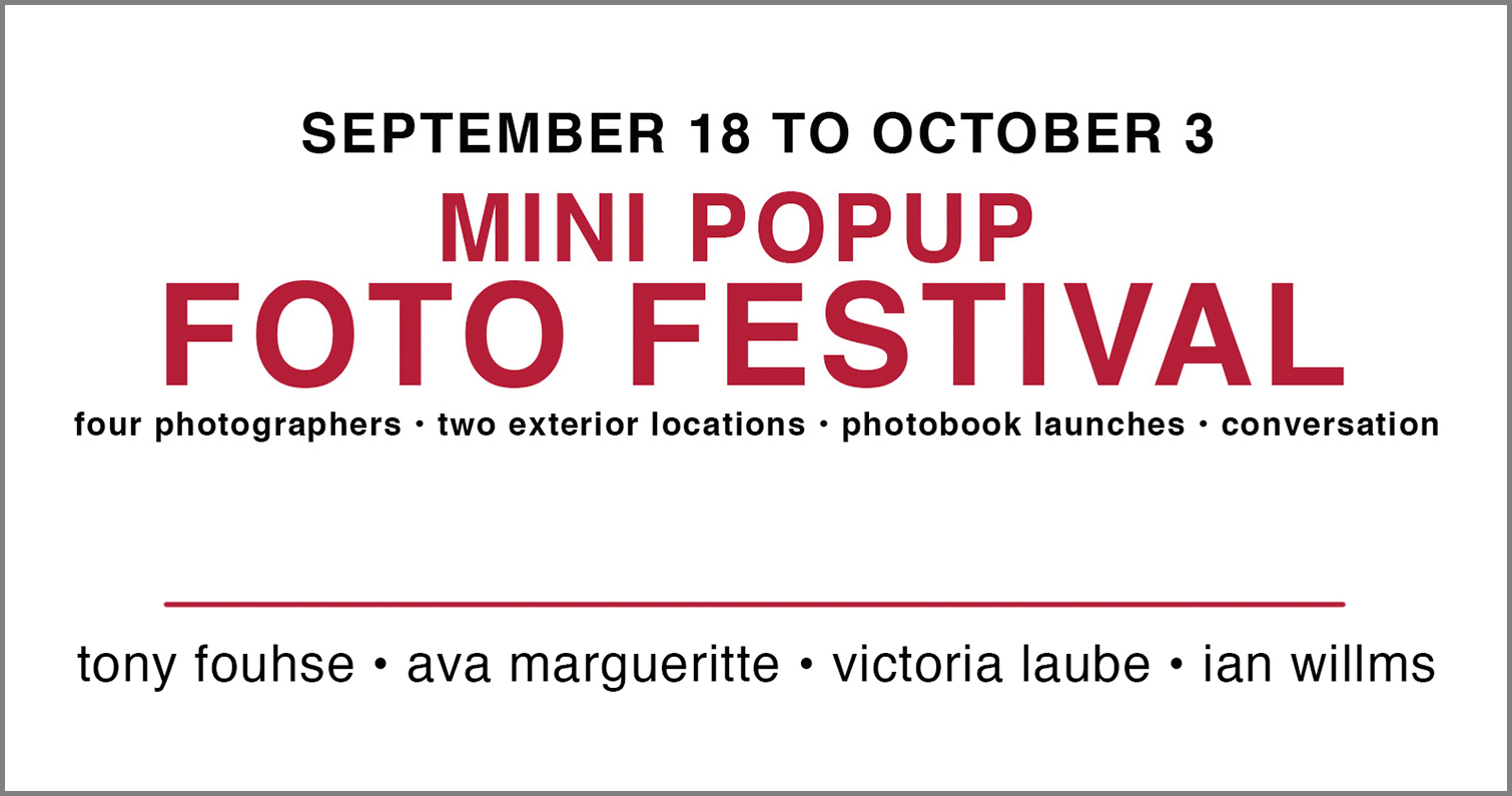
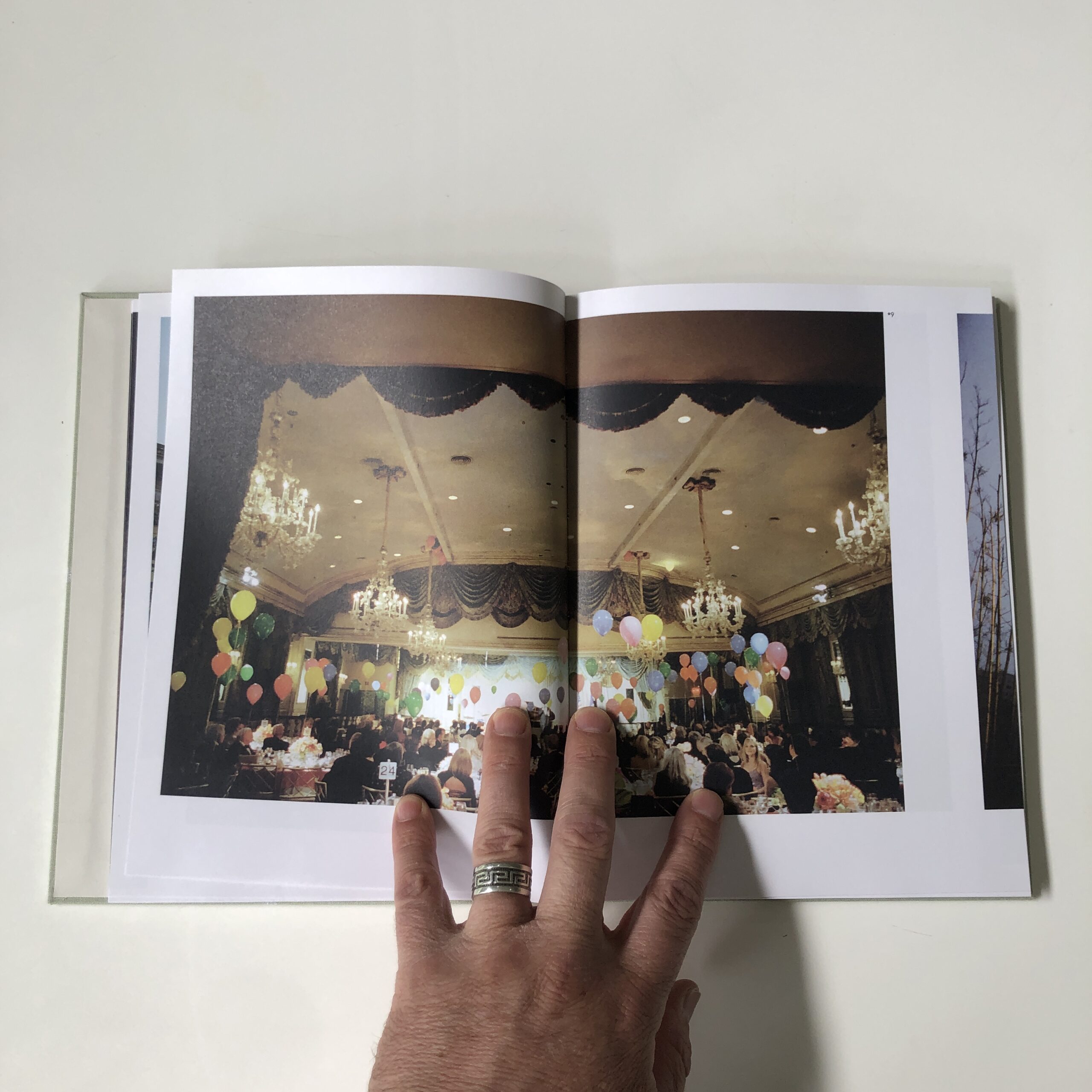
My most recent book (Endless Plain) was launched a year and a half ago. I knew some local photographers (whose work I respect) who were also launching books around that time. We banded together, arranged to exhibit our work in two exterior locations, had an opening/book launch and a few other events. Turned the thing into a Mini Popup Foto Festival.
Involving more photographers in a launch makes sense. Each brings their own group of people – and a greater buzz is created.
Because Victoria, Ian, Ava and I were working outside official channels (the academy/ white cube system) we were able to pull the whole thing together in just over a month. Lots of people attended the opening, we sold a bunch of books and, bonus – during the two weeks the photos were on display many passers-by stopped to look at, think about and discuss the pictures, I’d call the whole thing a success.
A new 8 part miniseries where Ottawa Photographer Tony Fouhse takes us through his new project, from the first photo to the book launch. Tony is an internationally exhibited and collected photographer who was formerly a full time editorial/commercial photographer. These posts originally appeared in his newsletter HYPO which you can subscribe to here to see more of his work visit his website here.
Except for designing the book and launching it, my latest project is finished. Even though it’s now February (ed note: when this was written) I’m not planning on launching the book until May.
Even so, time has a way of passing and before you know it, well . . . the time has come (and gone). So I thought I’d peck away at some of the tasks that need to be seen to before the event.
First thing, I need to give it a title. I don’t like the titles I assign to my work to be too explanatory or prescriptive, I want them to only point in a general direction. Getting that right can be tricky.
I’d been thinking about what to call this project for a few weeks (maybe more). I made a list of title ideas, but they all seemed wrong. Then, out of the blue a title that feels really right just popped into my head. I’m pretty sure that that’s because the front-of-the-brain thinking I’d been doing set up a chain of back-of-the-brain events. My subconscious was chewing away on the problem all by itself. And that often leads to better, less mediated, and maybe even more pure, results.
Of course, it (the title) had to pass the front-of-the-brain test to make sure it actually works. And it does.
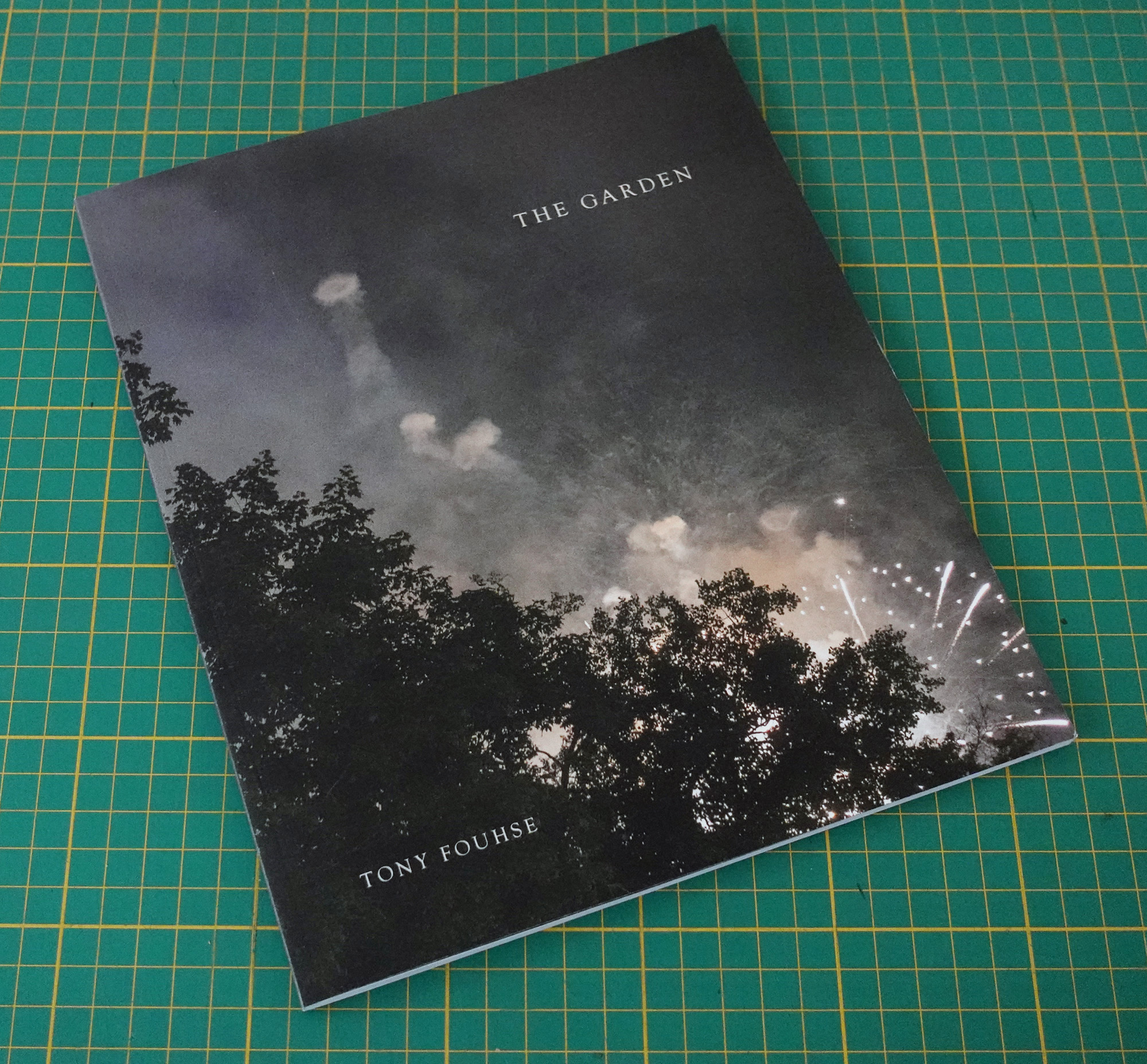
The Garden.
Now I had the title it was time to design the cover.
I enlisted good friend, mentor to many, and ace designer Michael Tardioli to do the designing. (I’d been showing him the project as I was working on it so he had a good sense of its tone.) He dropped by the other day, we drank some coffee, chewed the fat, and then he got down to the task at hand.
It’s so much fun to take a back seat to someone who knows and respects my work. I watched Michael, seemingly effortlessly, whipping the cover into shape. No drama. He asked a few questions, tried a few permutations, finessed some finishing touches and there you have it. Plain and simple, just the way I like it.
Finally, I needed to write a Project Statement.
Anyone who knows me knows how much I dislike Artist Statements that use art-speak and attach all kinds of meaning to the work. In my opinion that kind of Statement is most often wishful thinking and/or an attempt to direct (fool) the viewer. If the work is any good I figure folks will arrive at their own conclusion just by looking at it.
So I have to put my money where my mouth is, don’t I?
When I was nearing the end of sequencing The Garden I made a list of words and phrases that (for me) defined the work. I thought that would be useful to fine-tune the sequence. (And it was.)
I pulled that list up on the screen, referenced it, and the statement pretty much wrote itself.
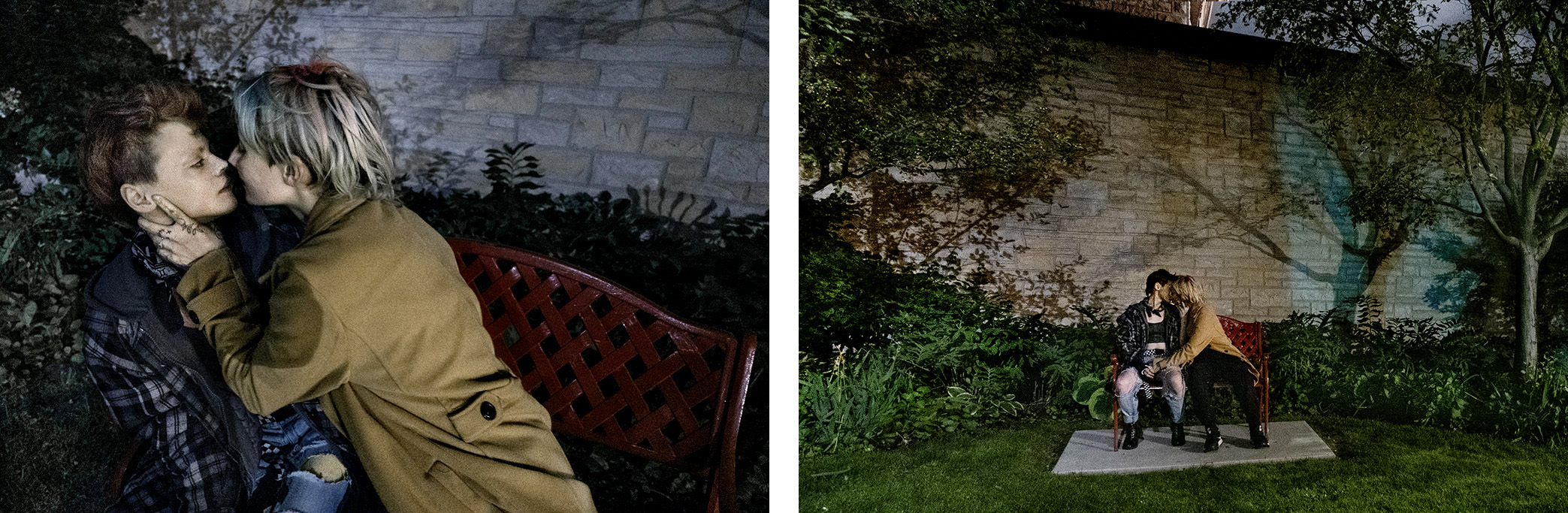
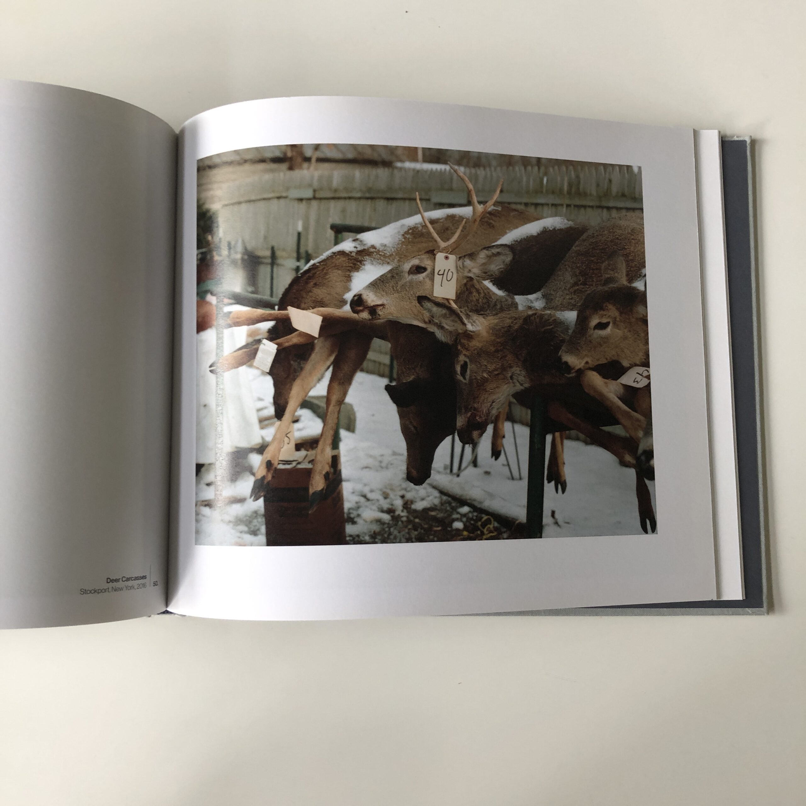
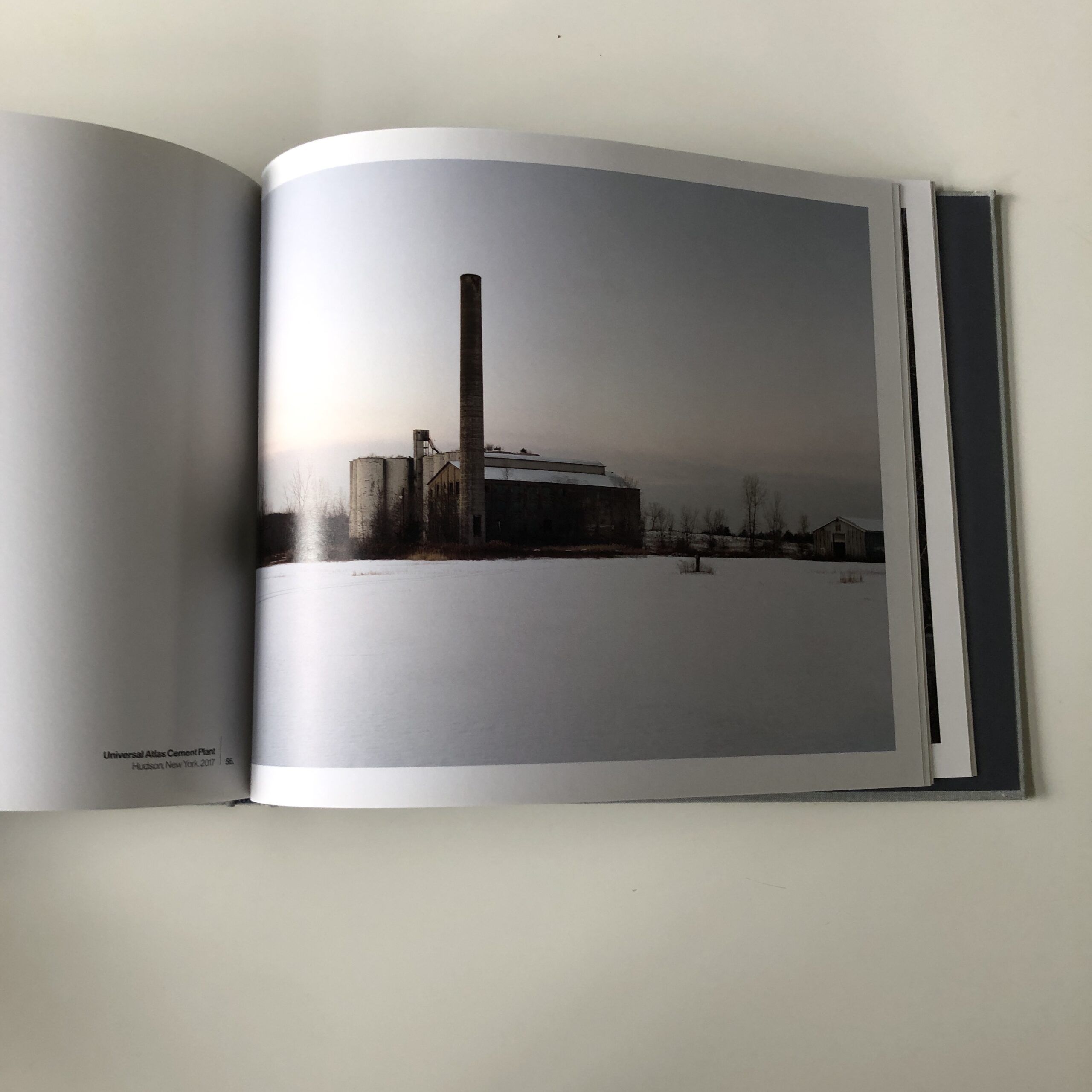
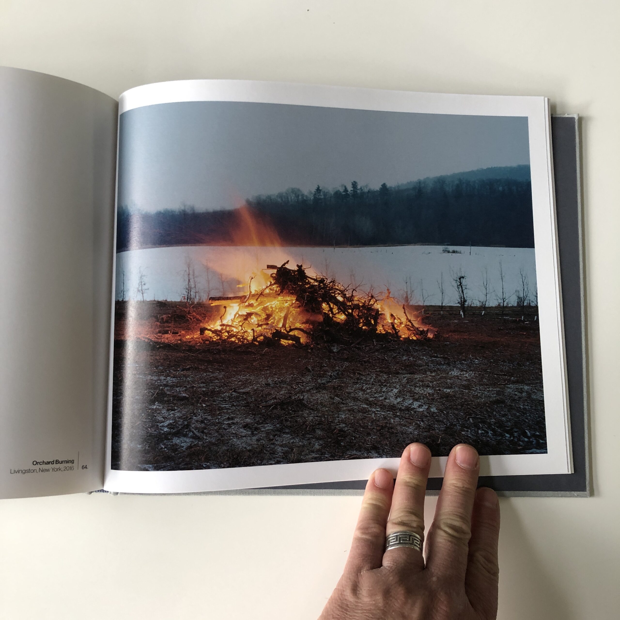
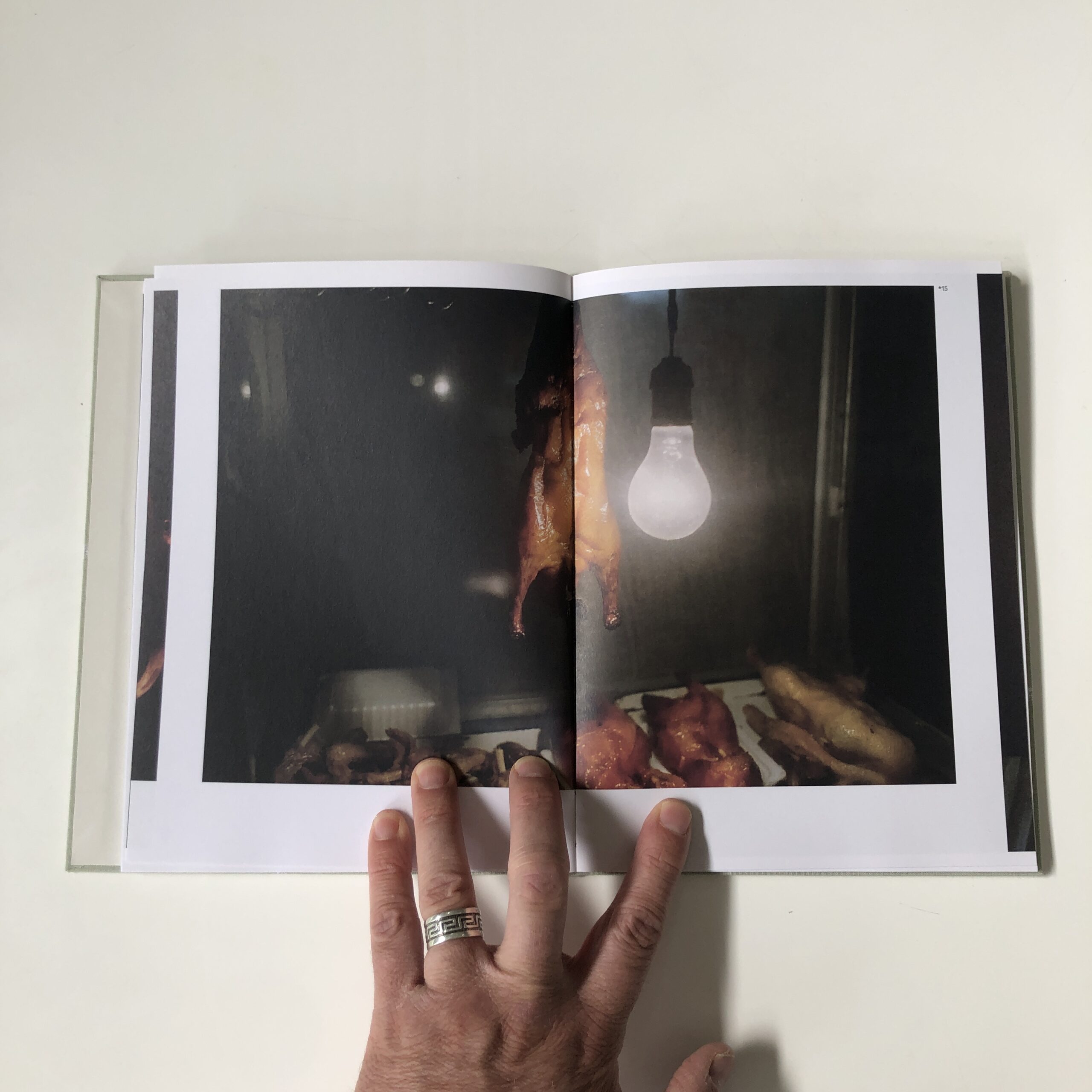
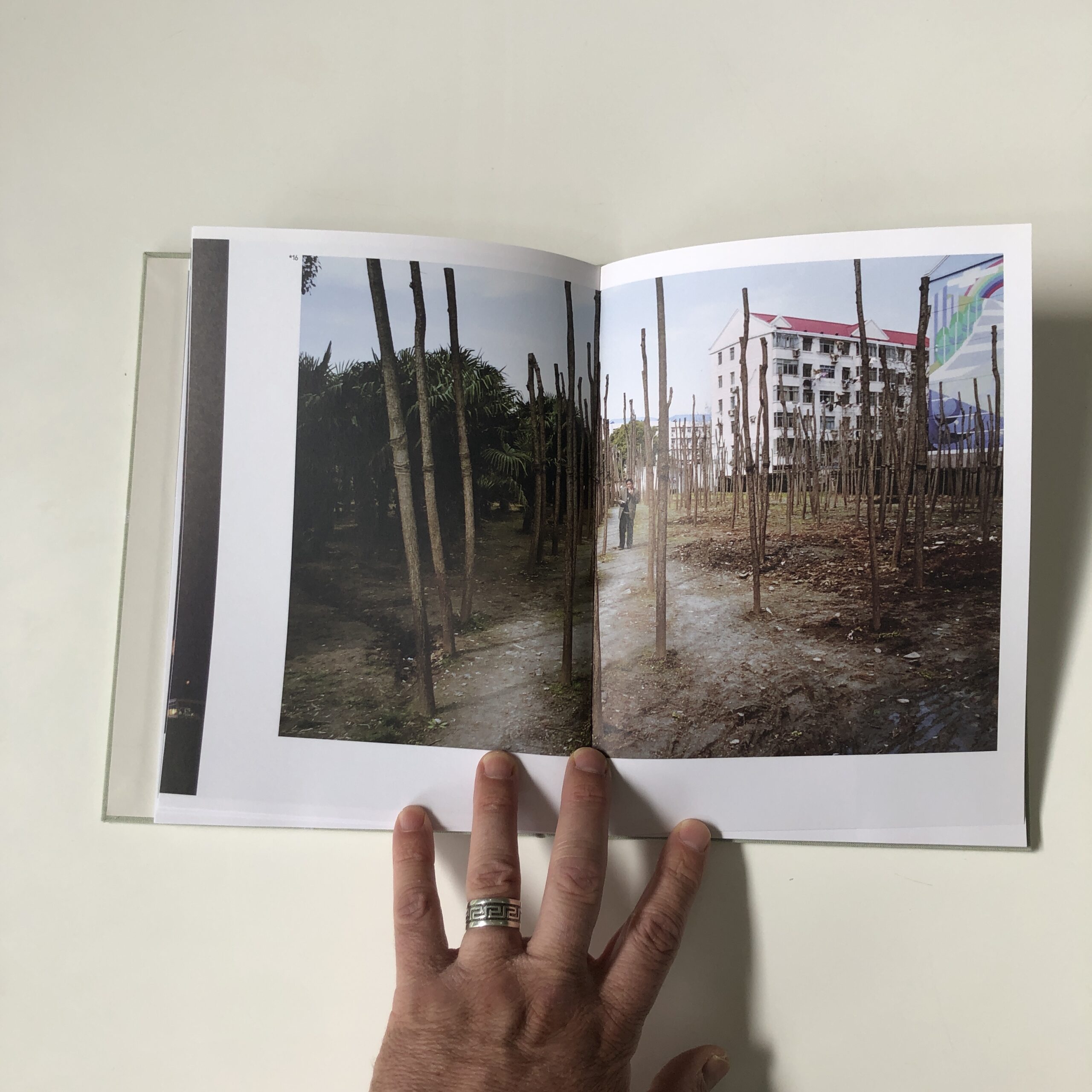
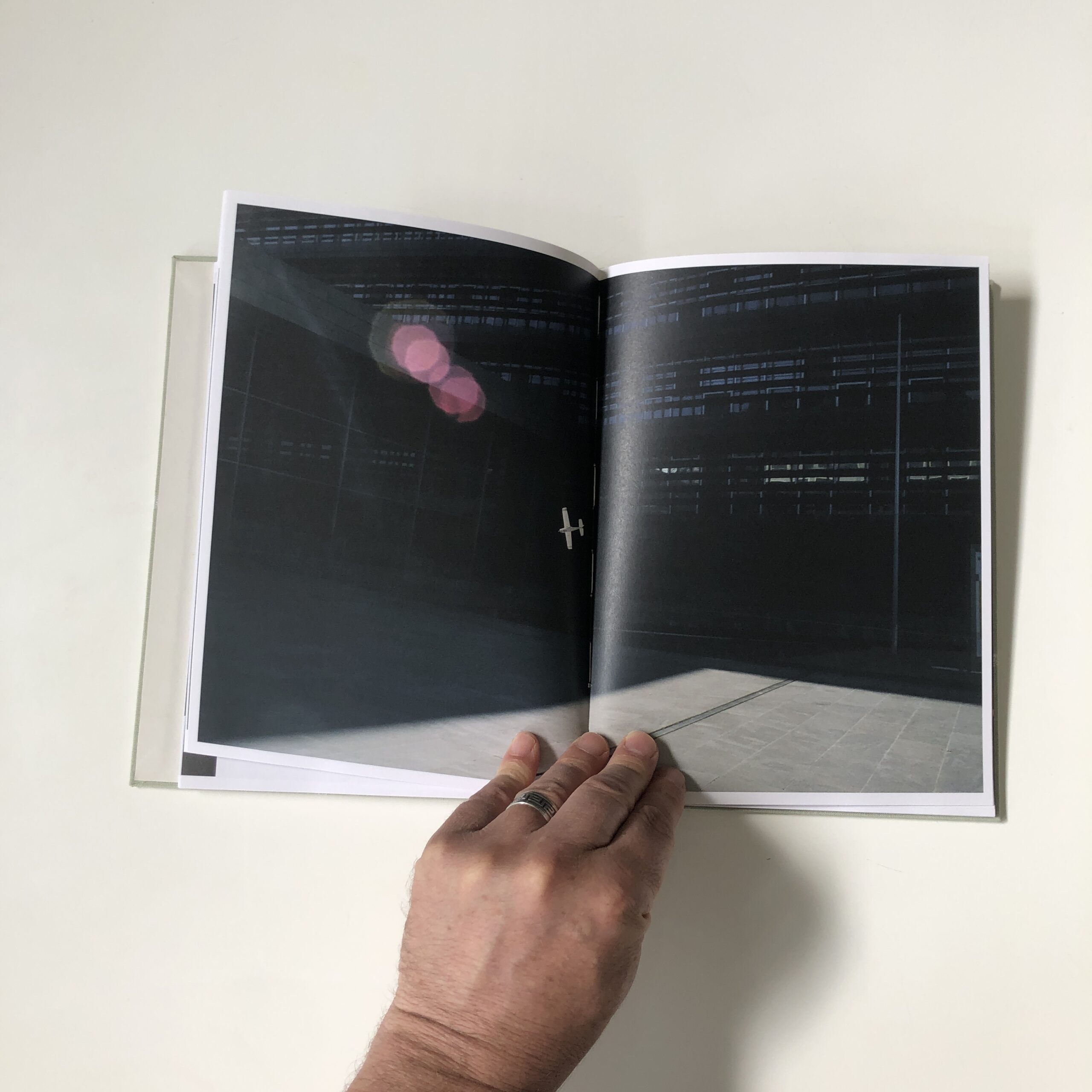
The Garden is the third in my series of projects that are speculative (fiction), rather than fact-based (documentary).
Episodic, impressionistic, mysterious, The Garden is drawn from the streets. A fairy tale or maybe just a trip. The protagonist makes their way through a city in some strange twilight. There is destruction, decay, loneliness and, in the end, an encounter. Is this the garden? Where is the comfort?
A new 8 part miniseries where Ottawa Photographer Tony Fouhse takes us through his new project, from the first photo to the book launch. Tony is an internationally exhibited and collected photographer who was formerly a full time editorial/commercial photographer. These posts originally appeared in his newsletter HYPO which you can subscribe to here to see more of his work visit his website here.
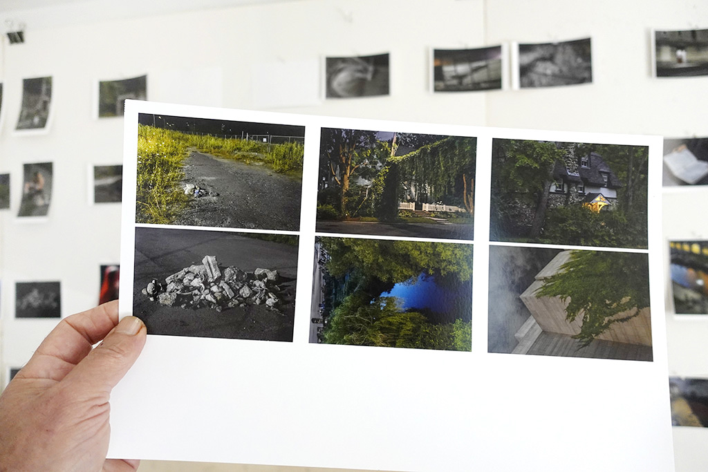
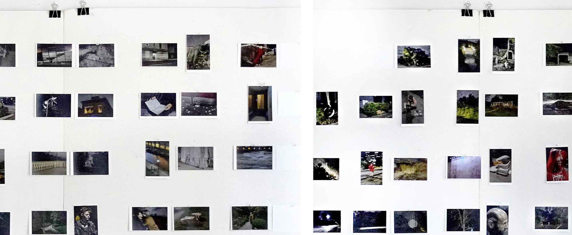
I made a mini-dummy of the first “final” edit of the project. Showed it to some folks whose opinions I respect. Asked them to pick it apart. And like the good friends they are, they delivered. This sucker needed some changes.
So I made another set of small work prints and pinned them to the big editing board in my studio. (Time to get real.)
Taking the feedback I had received into consideration, over the next 2 or 3 weeks I made dozens of (mostly) small changes. Eventually I arrived at an almost final version of my project. Yes, it was better. Time to make a size-as dummy. This will facilitate (and lead to) the final tweaks to the sequence.
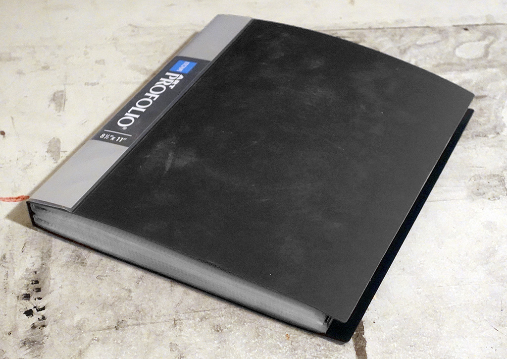
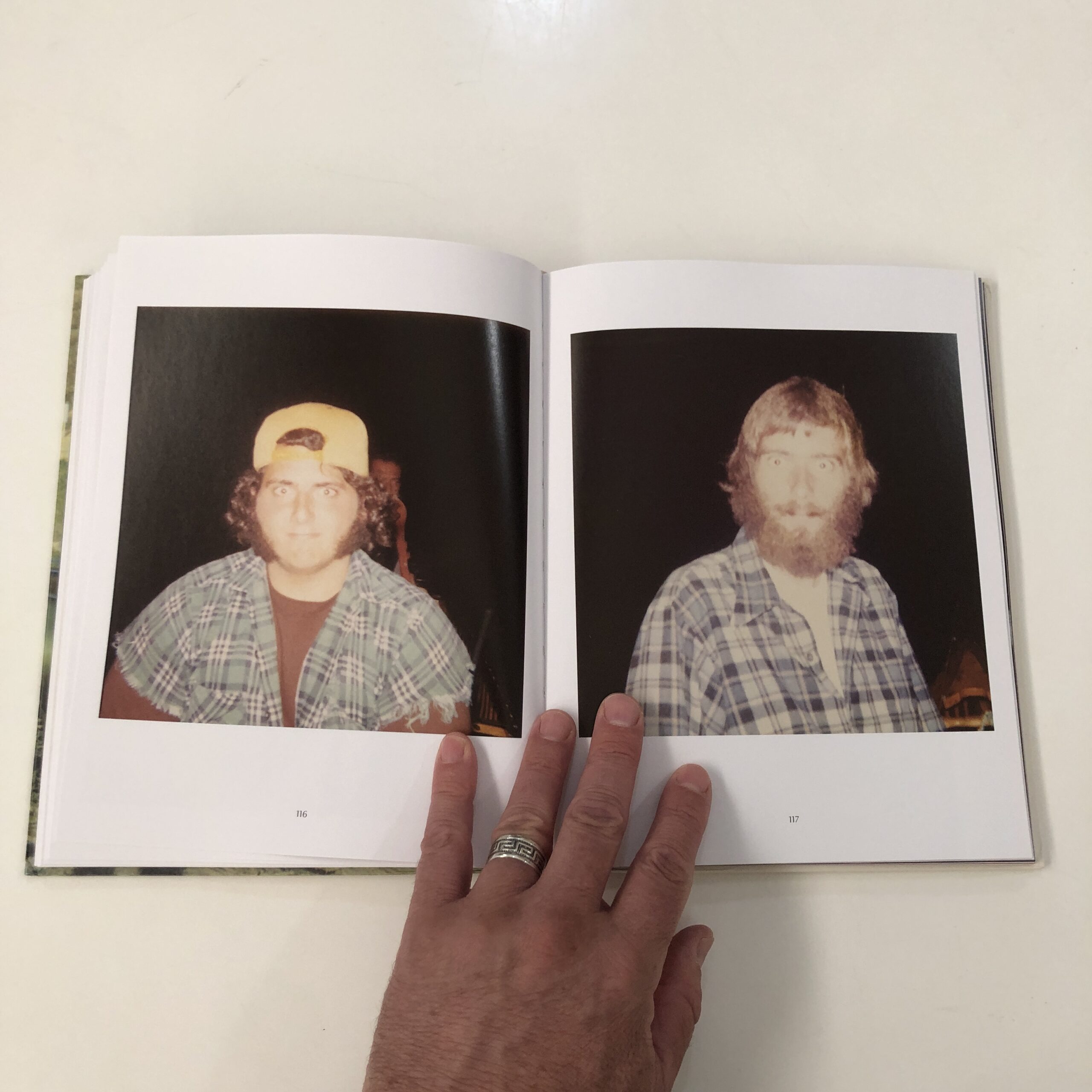
I made size-as prints and stuck them into an Itoya Art Portfolio. At this stage I always use the Itoya because it’s cheap (12 bux). It also has acetate sleeves that make it easy to change the order of the images and/or to swap out photos that don’t work.
I showed it to friends, neighbours and colleagues. Many of them pointed to the same 2 or 3 photos, said they felt wrong. No surprise there, even at this late date I was still trying to use images that didn’t really work (because I wanted them to work).
So I took out those photos, added three different (more useful) ones (that were already in my Possible Selects folder). And, lo and behold, this new version made better sense.
There was also a lot of comment (criticism) along the lines of, “There’s something wrong with the ending, it’s awkward.”
Yes, that final sequence had bothered me all along. I was hoping it would work, but seeing the whole project in the dummy really drove home the fact that the feel and pacing of ending needed a rethink.
So, with a better (different) idea of what the final sequence needed, I combed through every single photo I’d taken for the project. I was looking for something. I knew it was in there somewhere, all I had to do was recognize it.
I pulled out 5 or 6 previously rejected photos, and different versions of some of the images I had used. After making work prints of these “new” photos I began to rework, reimagine and refine the ending. After a few days of frustration and exasperation, I finally figured it out.
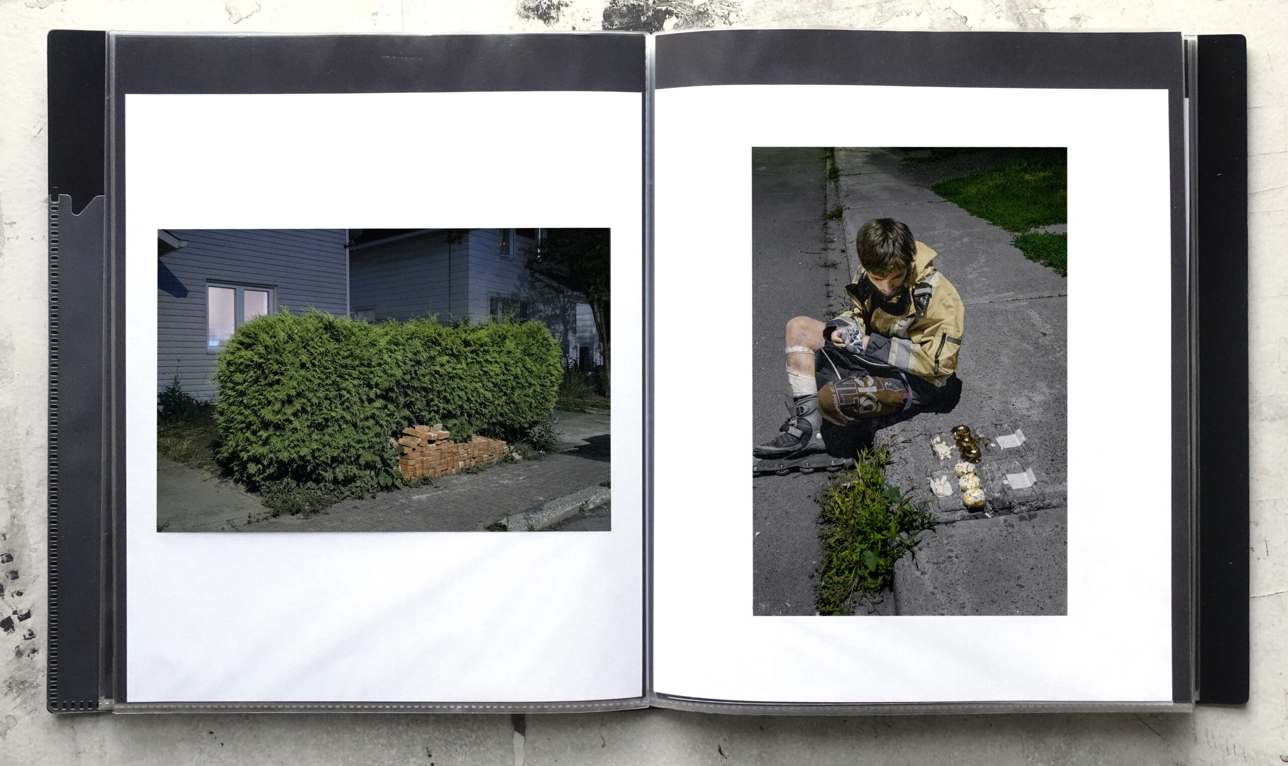
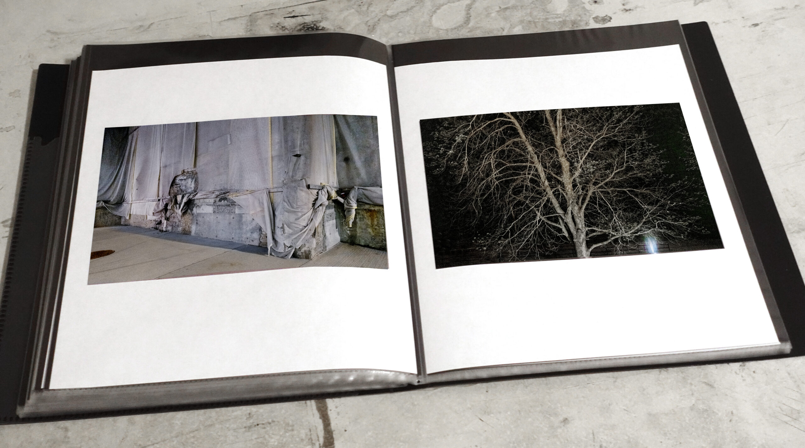
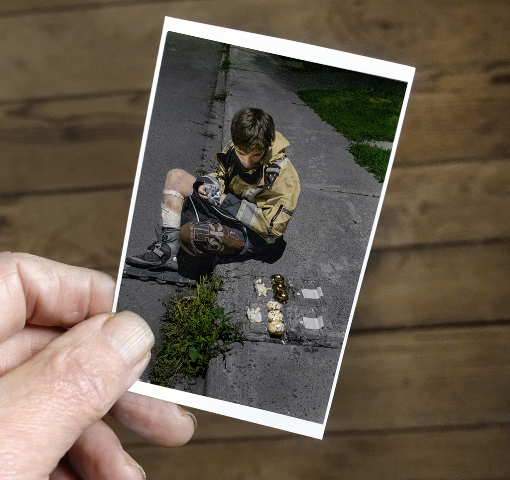
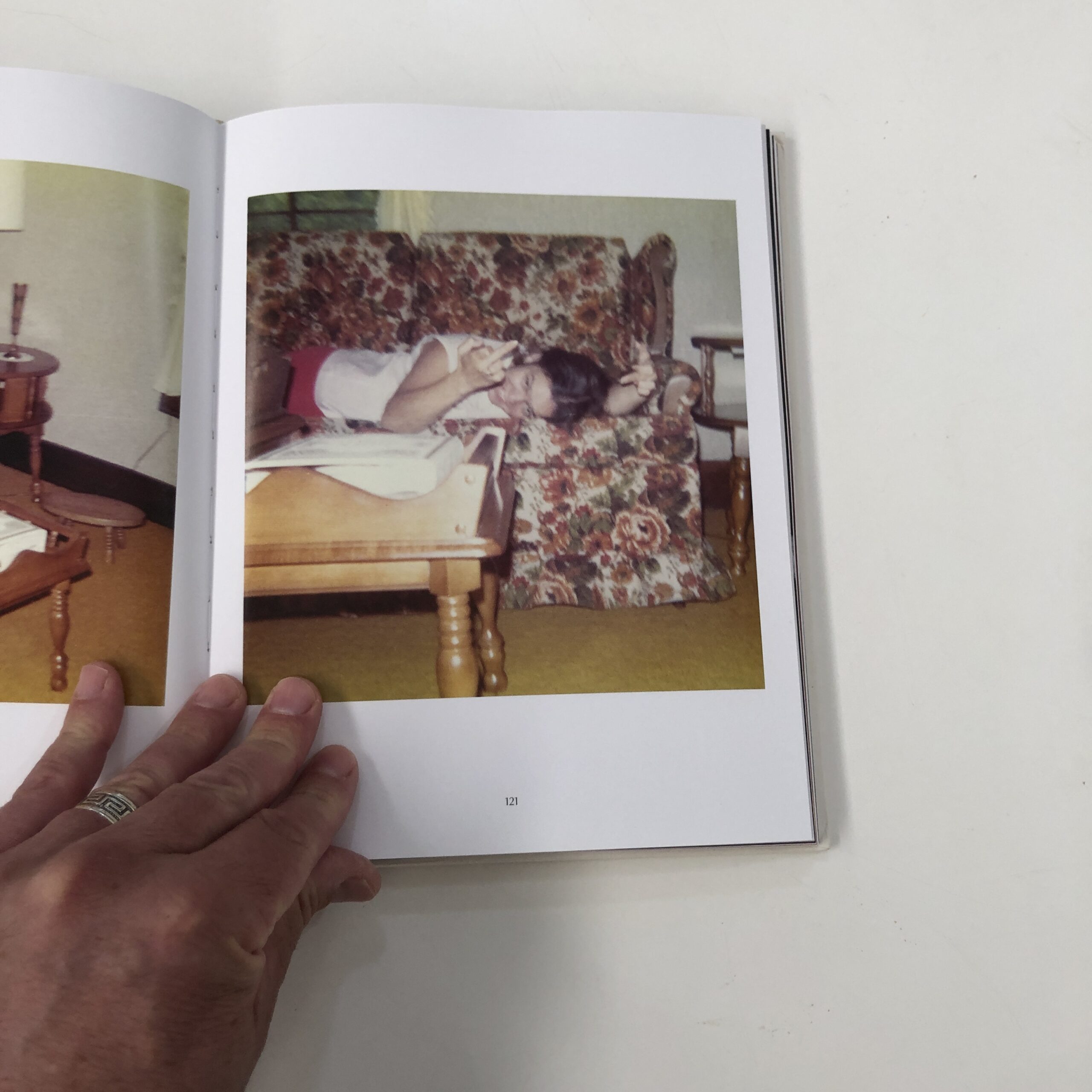
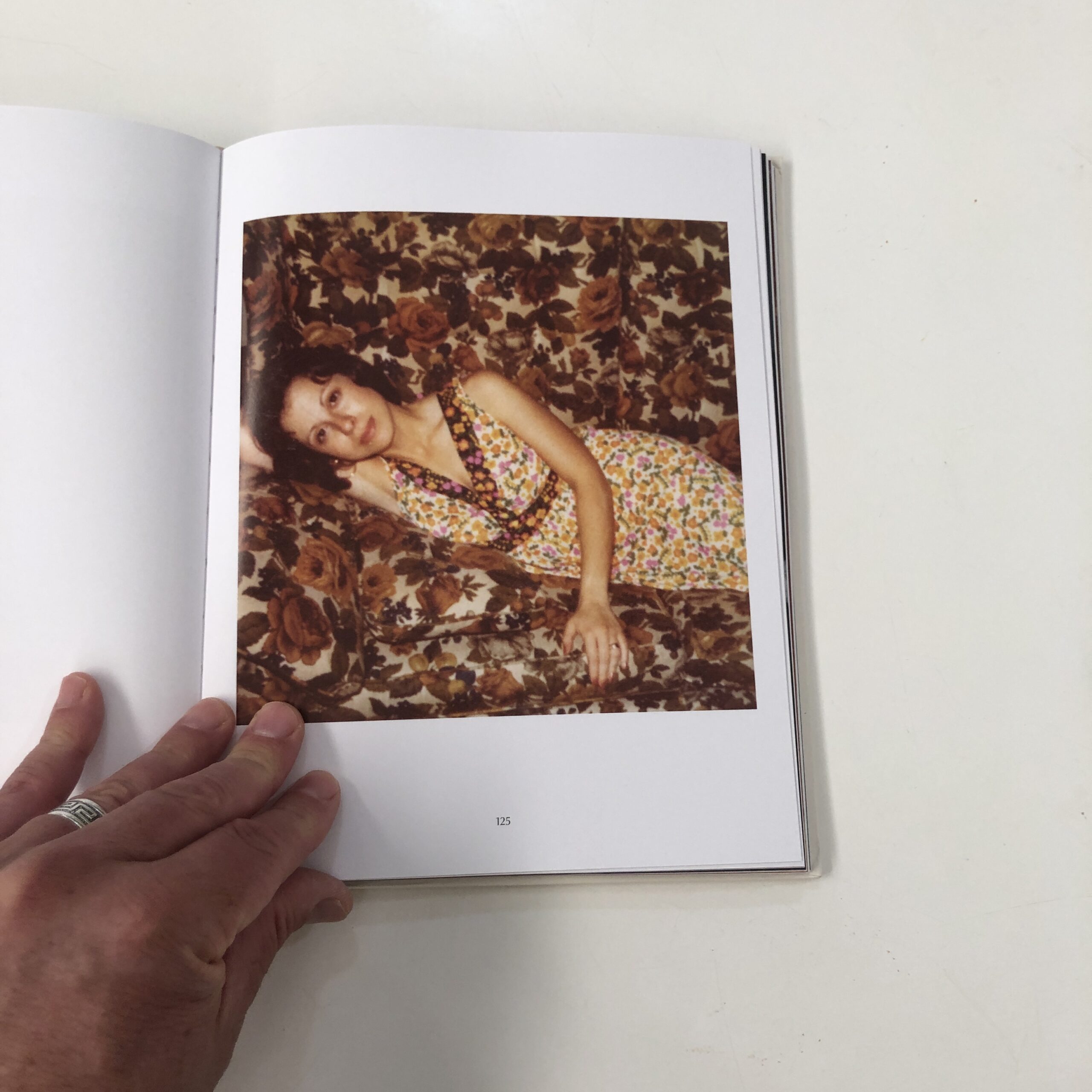
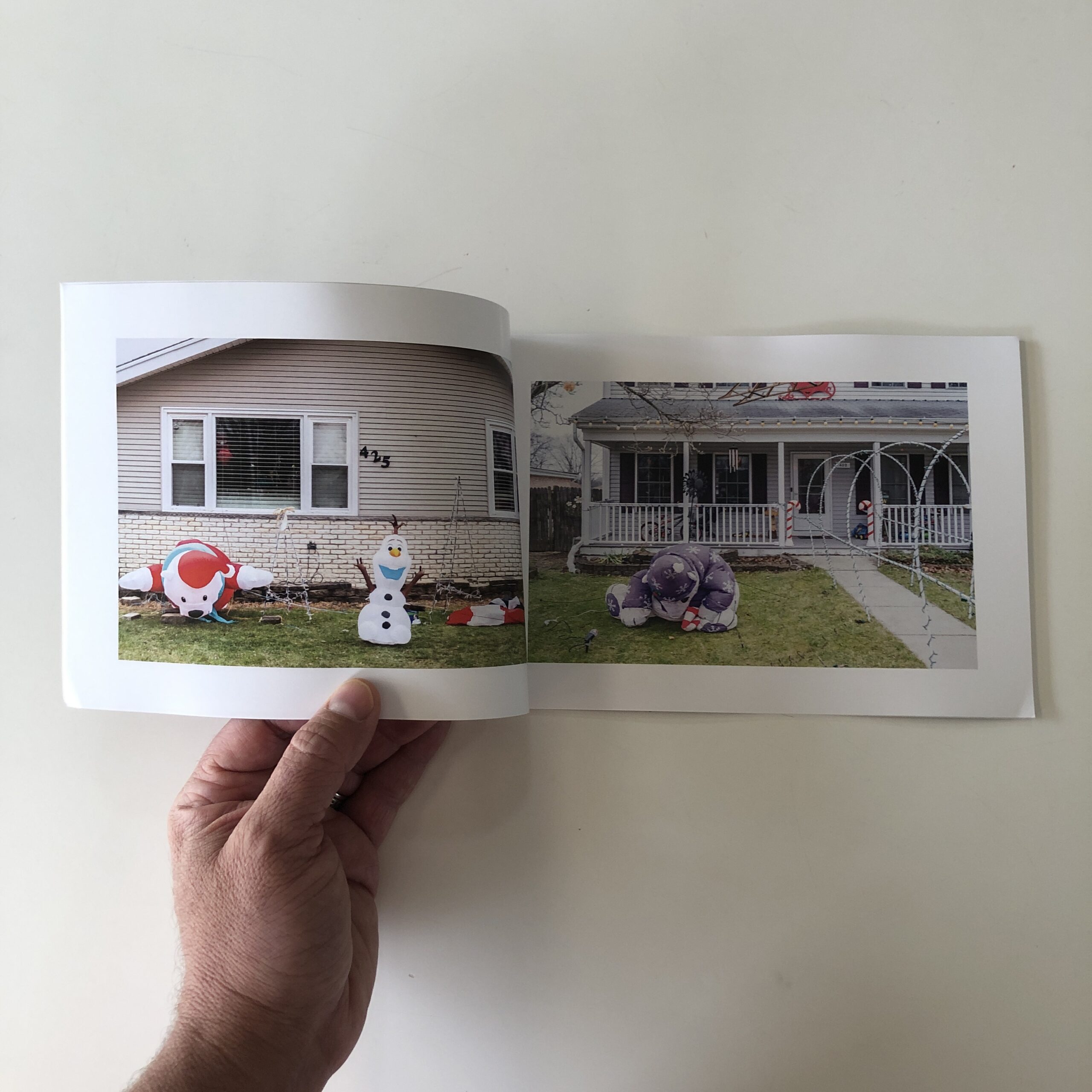
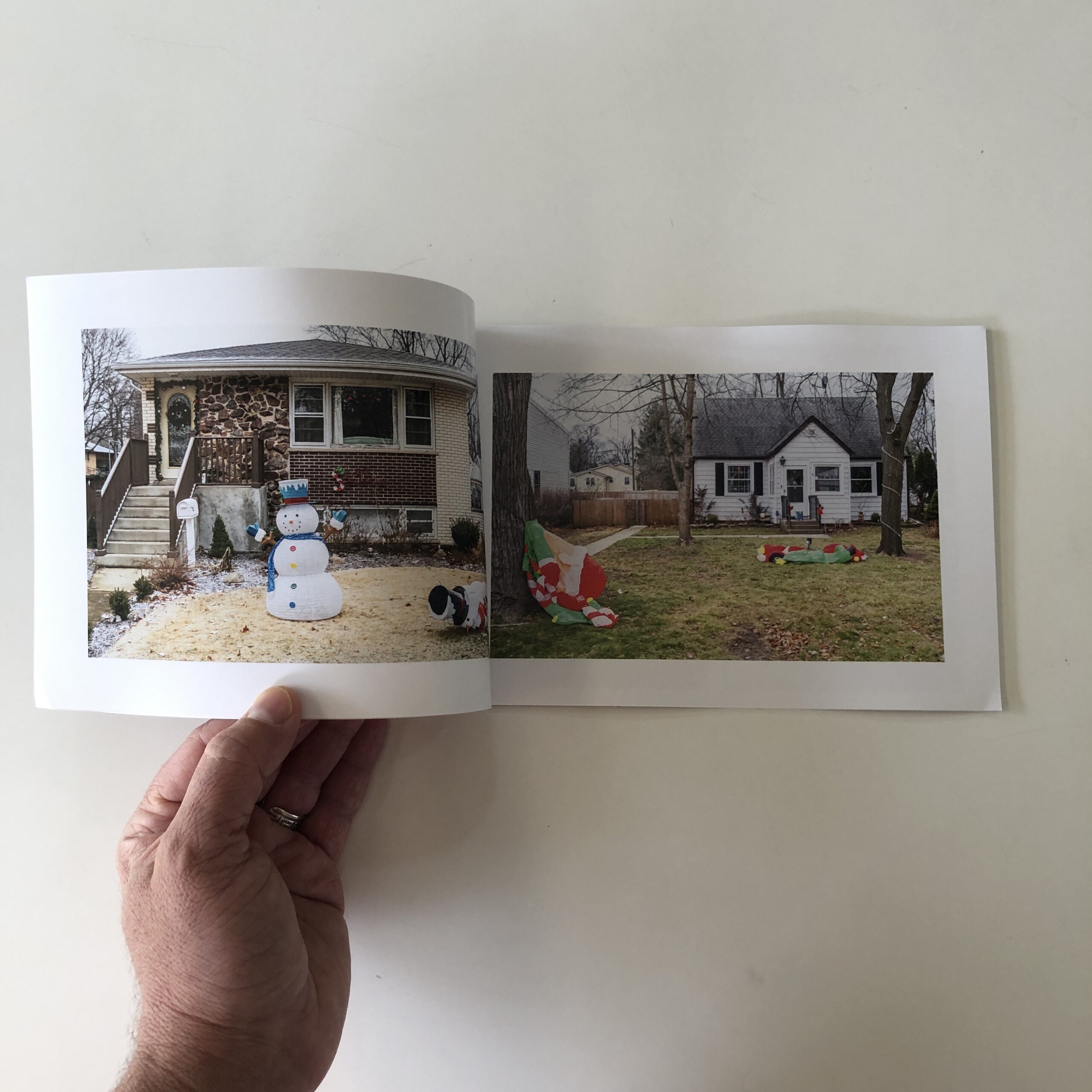
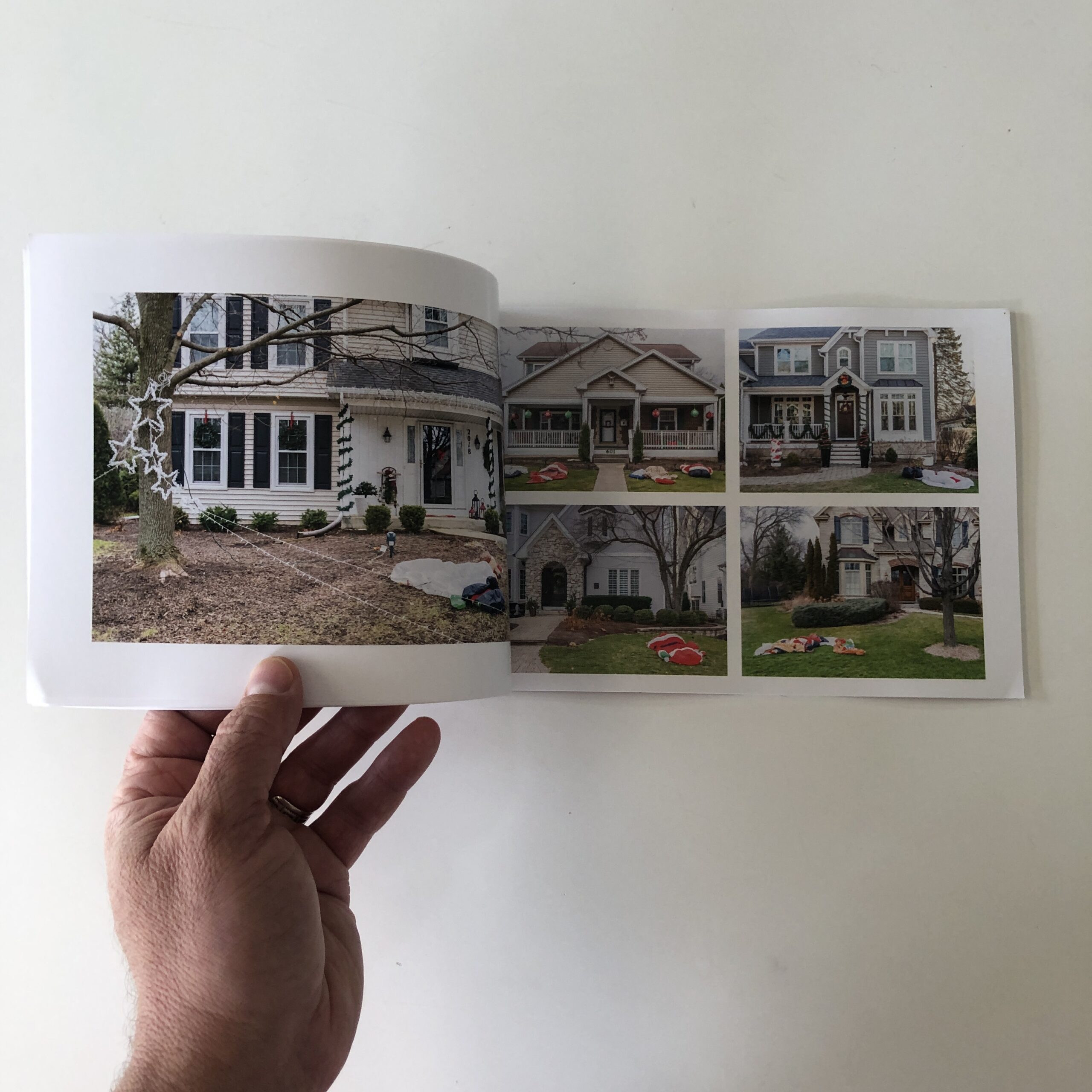
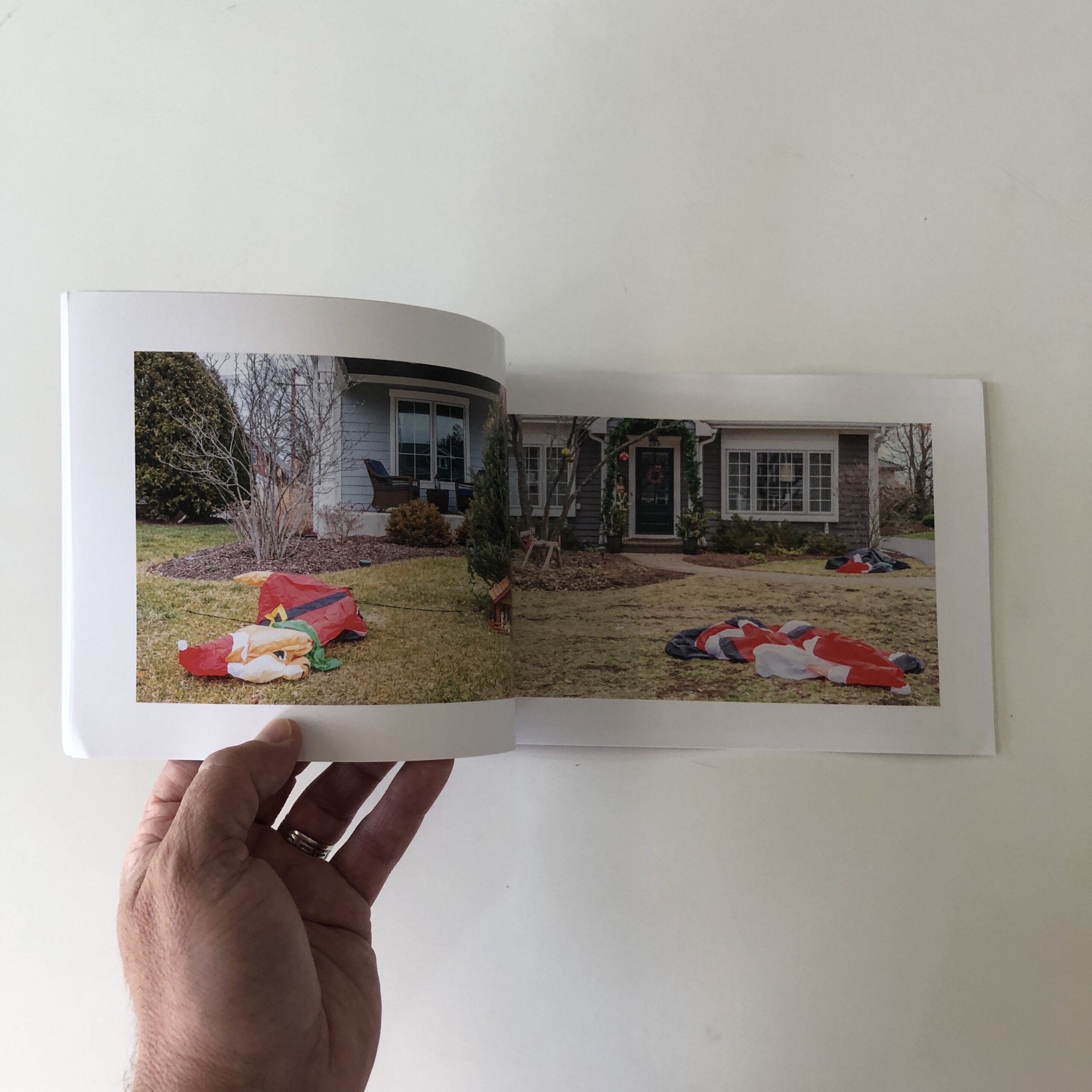
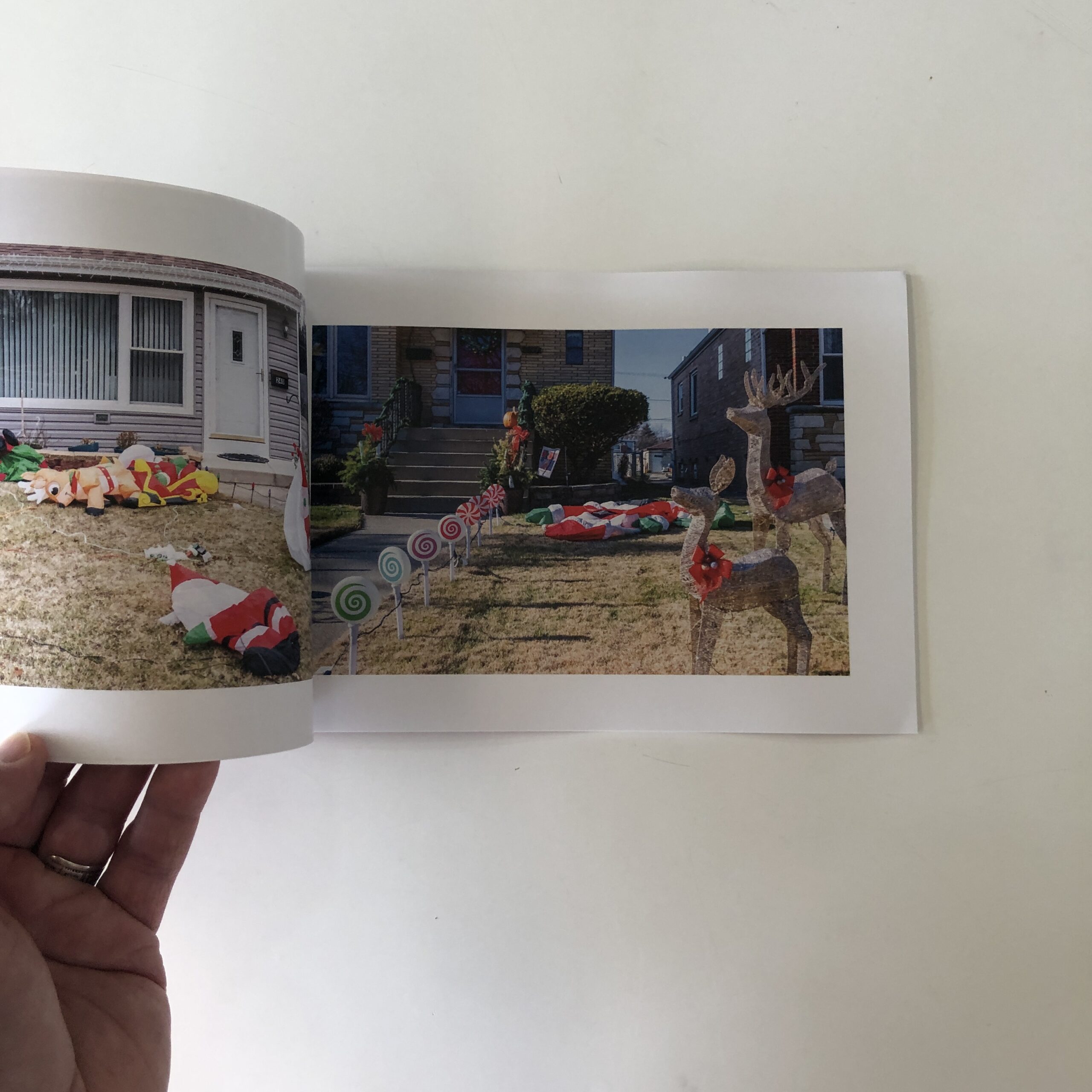
I made three changes. First, I used a different version of one of the originally included photos. Below is the removed photo (left) next to the image that replaced it. The removed photo might be a “better” shot, I don’t know. But I do know the photo on the right better suits the sequence.
Then I swapped a photo for a completely different one. Finally, and this will tell you how slow and stubborn I can be, I… well let me back up a bit…
I have a few weird obsessions / compulsions / rules. One of them is I want my photobooks to end with one photo on the left-hand page. Another has to do with numbers – there are “good” numbers and “bad” numbers. These obsessions are, maybe, odd. I don’t know. But they exist in my head and are quite powerful.
As it stood, the book contained 50 photos (a “good” number), and ended with a single image on the left-hand page (also “good”). Problem was . . . the ending wasn’t working.
If I ended with a double spread the book would not only have 51 photos (a “bad” number), it would also end with a photo on a right hand page (also “bad”).
My rules made it inconceivable (impossible!) for me to consider using 51 images, and it never even occurred to me to end the book with a double page spread.
I spent days struggling to make the thing work within these nonsensical constraints.
Finally I realized I was being a complete idiot.
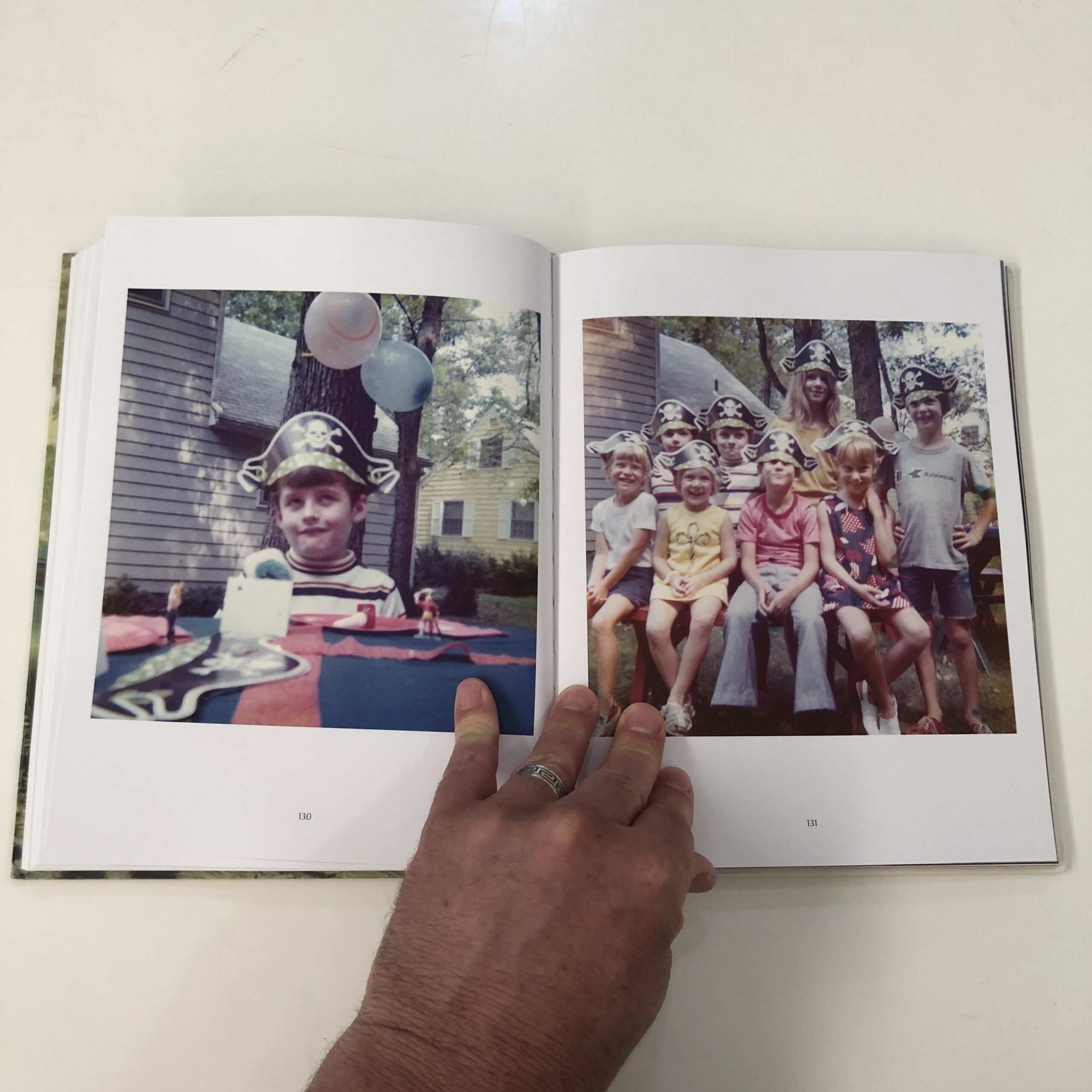
The sequence/book now contains 51 photos and ends with a double page spread. I broke two of my stupid rules and the whole thing is better for it.
A new 8 part miniseries where Ottawa Photographer Tony Fouhse takes us through his new project, from the first photo to the book launch. Tony is an internationally exhibited and collected photographer who was formerly a full time editorial/commercial photographer. These posts originally appeared in his newsletter HYPO which you can subscribe to here to see more of his work visit his website here.
Anatomy Of A Project
Episode Nº 3: Anatomy Of An Edit
After a couple of months diligently (obsessively) working on this project my vague notions of what I was working towards became more refined, more focused and selective. There were lots of photos in my Possible Selects folder. It felt like I was getting a handle on the thing, like something was happening.
It was time, I thought, to have a concerted look at where I had been, what I had done. So I decided to sit down and spend some time rooting through the images I’d gathered. Just to get a feel for them, a sense of what I might be doing.
In my head I called it a Fast Preliminary Edit. It’s not even an edit really, I told myself, I’ll just dick around with the photos. My only ambition was to begin to figure out ways the photographs might add up.
The big question on my mind, as I sat down to study the photographs was: Would the photographs support my initial idea. (My initial idea was, I wanted to photograph a lullaby, whatever that means.) And if they wouldn’t, well . . . what had I photographed?
In other words, I was setting out to discover what I’d actually done. And discovery, for me, is the most exciting thing about photography.
I knew from the get-go that sequencing this project, uncovering what I had done, was going to be complicated. The images are not exactly cohesive; there are so many possible permutations that finding a (the) thread was going to be vexing. (Sequencing a series of portraits that all look more or less the same, or a bunch of landscapes that are quite uniform is much easier. Not only that, I would say it’s also less important than the complicated weaving of images that projects like this require.)
But anyway . . . No pressure, I told myself, don’t get hung up, have fun.
Sure.
Let’s get going . . .
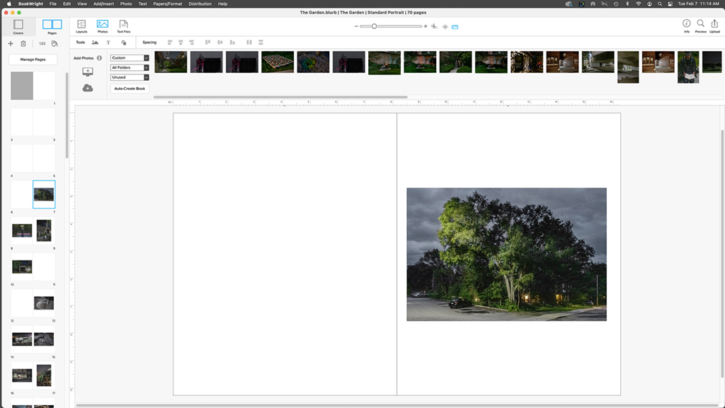
First thing I did was I loaded all my Possible Selects into Bookwright. (The free software Blurb provides for laying out books, kind of like a lite version of InDesign). I use Bookwright for the preliminary sequencing of all my projects . . . it’s super easy to use and allows fast sequence changes, page shuffling and so on. It’s most convenient for this process.
When I begin preliminary edits I like to keep the time working with the images very short. I don’t want to spend hours sitting there perplexed, staring at the photos. I start fast, make snap decisions. Might spend 10 or 15 minutes working on it. Then I leave my computer and get on with my life.
I always have a quick look first thing in the morning, while I’m still a bit dopey. That’s a good time. Then I’ll have a few more quick looks throughout the day, make some changes. I never save any of these early iterations because there’s nothing worth saving. I’m only groping, trying to get a feel.
The first few days of this were quite depressing, I felt powerless in the face of the photos. But, like I say, I made snap decisions, put some photos in some order, looked at the result . . . and despaired. What kind of dog’s breakfast is this, I asked myself. And more than once I thought, What’s the point anyway? Nobody cares.
That went on for about a week, then things changed. I saw that the photos weren’t going to support my initial idea, that that idea was too prescriptive, too narrow. Instead I began to see (the pictures showed me) what I had done. The way I saw it, I had photographed a fairy tale. With that new premise I began to see how I could shape and sharpen the photos to a point.
That revelation caused my initial ambition (or rather, non-ambition) for this edit to change. I could see a way forward, it seemed I had enough photos to actually make something of this. The Fast Preliminary Edit turned into work-this-through-and-arrive-at- a-conclusion. I no longer cared that nobody cares. I cared now, and that was (is) enough.
The following week was kind of intense, the stakes had been raised. Many hard decisions were made and unmade. Order arrived at and abandoned. Second, third, fourth and fifth thoughts. Whole sections of the edit shuffled.
I did my darndest to not get hung up, not to gum up my brain-flow. Fluidity is important. And anyway, it’s not the end of the world. (Is it?)
Finally I arrived at (or maybe approached) some kind of conclusion, more than just the bones of the thing, there was some flesh on it too. Not a perfect body, but good enough to show to a few people.
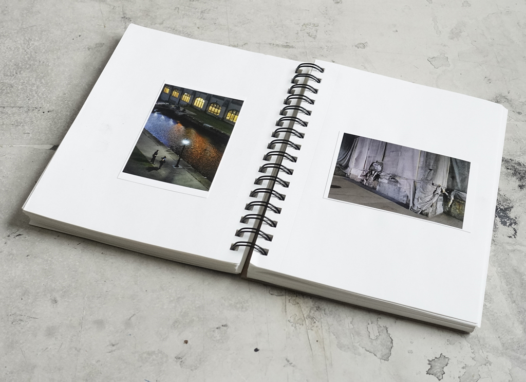
Now I’m going to make small work prints, stick ‘em in a book. The transition from the virtual (computer) to the sensual (real photos on real pages) shows the sequence, the turns and spreads, in a completely new way.
And this new way of seeing the work will show me all kinds of mistakes and stupidities. I’ll carry this book (dummy) around, show it to people I respect and ask them to be critical (as opposed to nice).
After all, this is just the first iteration, there will be many, many more before this is done.
Notes:
– I began photographing for this project June 1, 2022, took the final photo July 27. Total number of images 987.
– There are 152 images in my Possible Selects folder.
– At this point there are 46 photos in the final sequence.
– I initially use Blurb software but I don’t use Blurb for the actual printing. I use local printers.
A new 8 part miniseries where Ottawa Photographer Tony Fouhse takes us through his new project, from the first photo to the book launch. Tony is an internationally exhibited and collected photographer who was formerly a full time editorial/commercial photographer. These posts originally appeared in his newsletter HYPO which you can subscribe to here to see more of his work visit his website here.
Anatomy Of A Project
Episode Nº 2: Whittle It Down, Add It Up
A while ago I was driving from San Francisco to Pleasanton, California, for a photo shoot. Just past Castro Valley I pulled over to take a leak and there, on the side of the rolling hills, was a herd of grazing cows. A pastoral scene, the light was beautiful. My assistant asked if I was going to photograph it. I replied, “What would I do with a photo like that?”.
A photo of that bucolic scene would be useless to me. I mean, I see it and appreciate it, but it’s not how I see things (if you know what I mean). But why would I want to take (or make) a photo just because it conforms to some standard definition of Beautiful, or Nice Light, or Wow?
Sure, that might rob me of some simple joy . . . the joy of producing a generic, crowd- pleasing photo. But I find no joy in that. What satisfies me is creating images that show, illuminate and propound my biases, the way I see my world.
Pleasanton, CaliforniaPleasanton, California
What I like to do is generate a pile of pictures that show me permutations of the idea or concept I’m working on. I’m not interested in photographing the same thing the same way over and over. I want complexity and options so that, when it comes to the edit/ sequence, I can whittle that pile down, add it up and arrive at some conclusion. That’s what I like to do with photos.
Of course the taking of the photos, the time spent out in the world looking, feeling, thinking and being open is integral to the process. And it gets me out of the house, which is another reason I photograph. I enjoy the activity.
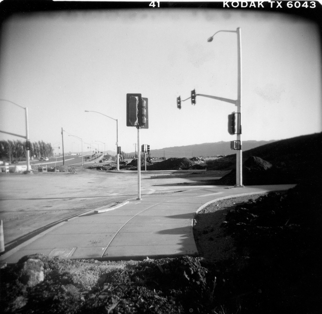
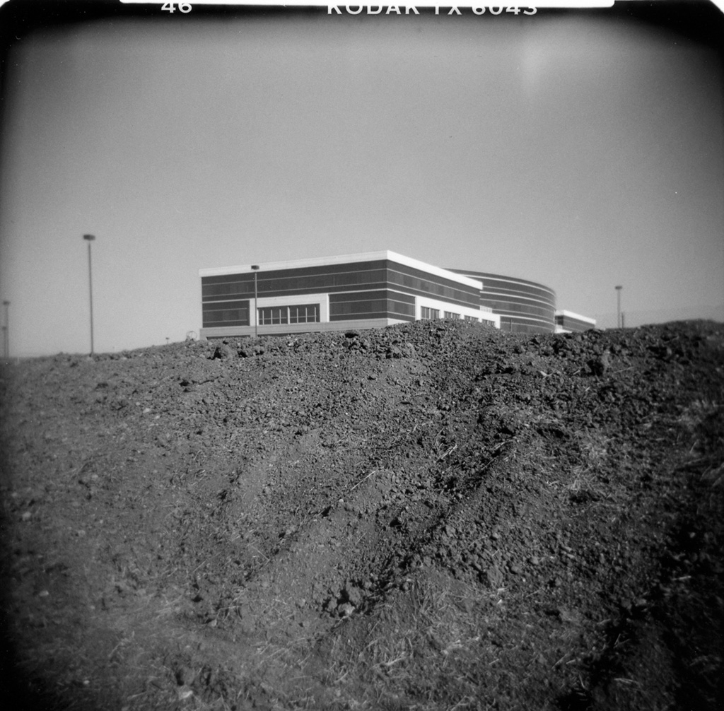
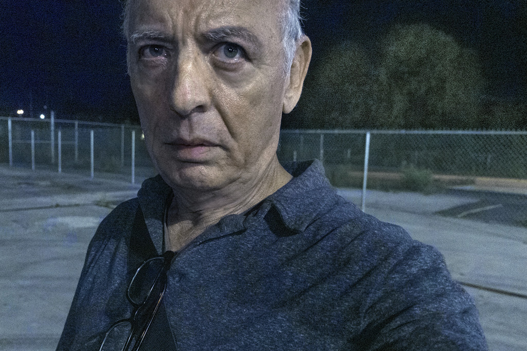
I’ve been out eleven nights now working on this new thing and I’ve got 76 pix in a folder called Possible Selects . . .
Me, at nightPossible selects
Occasionally I root through those, put them in little 4 or 5 photo sequences to see what I’ve done, what I’m doing. I look for possibilities and for flukes that add up in unexpected ways. And what I’m seeing (as usual) is that some of my initial ambitions for this project are less sure. Conversely, things that I never imagined are presenting themselves and showing me a way forward.
A new 8 part miniseries where Ottawa Photographer Tony Fouhse takes us through his new project, from the first photo to the book launch. Tony is an internationally exhibited and collected photographer who was formerly a full time editorial/commercial photographer. These posts originally appeared in his newsletter HYPO which you can subscribe to here to see more of his work visit his website here.
I’ve begun a new project and, well, I guess that’s what I’m going to write about . . . the process, thought patterns, tribulations and progress as the project progresses. I do this because writing about the work in progress, as it’s in progress, helps me understand what I might be trying to do.
There are two ways my projects begin . . .
One: I become interested in learning about some location and/or demographic and set about photographing it. I like to allow the camera and the subject matter to lead the way . . . I follow along and ponder.
Two: I snap a certain number of photos for social media. 99.9% of those photos mean almost nothing to me. But every so often I end up with an image that, for some mysterious reason, ignites my imagination. It shows me a possibility I feel I might pursue. That’s the case with my new project.
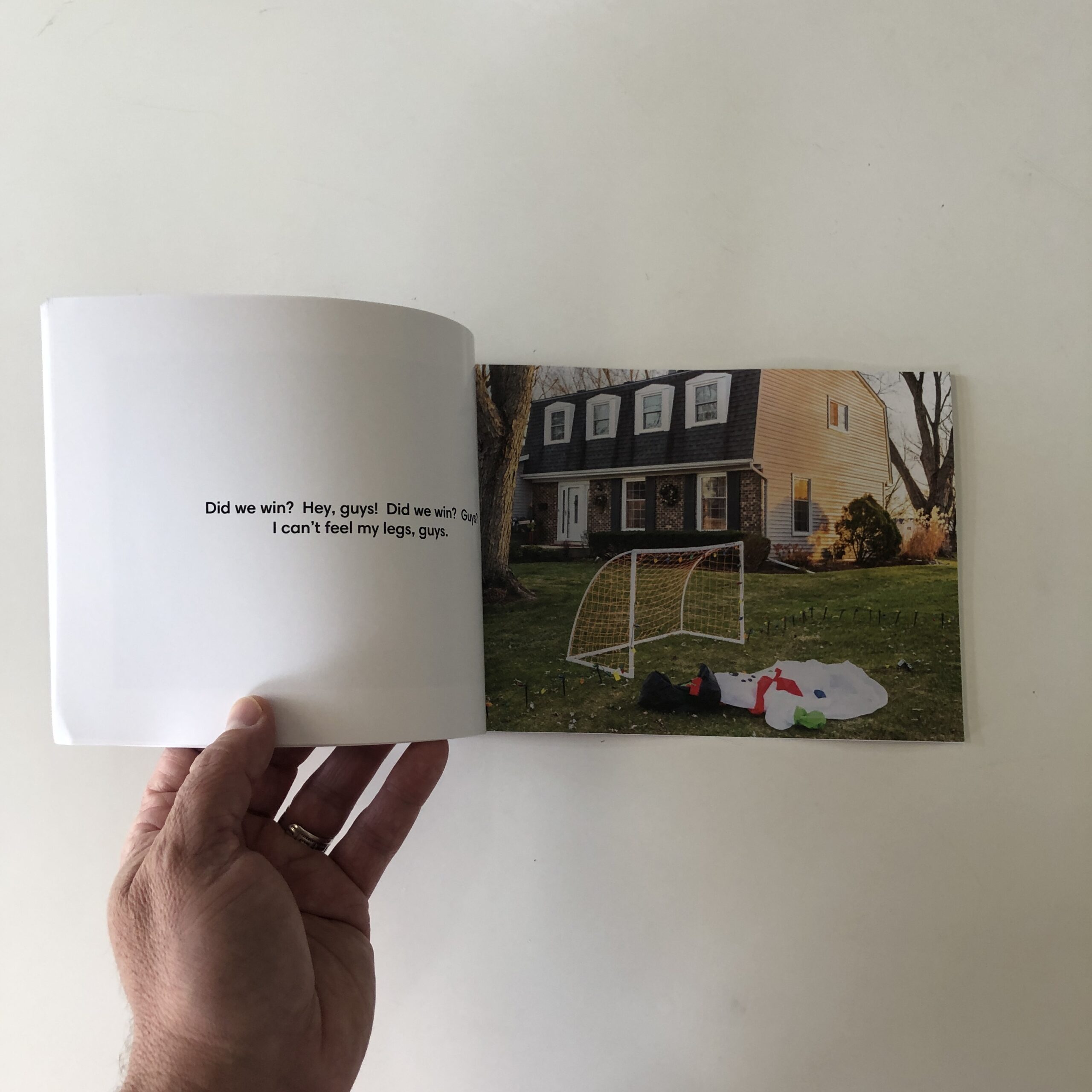
Here’s the photo that was the genesis of this new project . . .
Late on June 8th I had a look out the front door before I went to bed. There was a car pulled over up the road, lights left on illuminating my neighbour’s Iris. Thought it’d make swell, easy social media viewing so I snapped a few pix.
Next day, when I loaded it into my computer I was somehow affected. I thought of the mysteries that happen when the sunlight disappears and the city is only illuminated by artificial light. I thought about The Coast, by Sohrab Hura; I thought
about Grand Circle Diego, by Cyril Costilhes. Not that I wanted my photos to look like theirs, direct-flash-after- dark is not for me. But the feel of that photo of the irises somehow reminded me of their work.
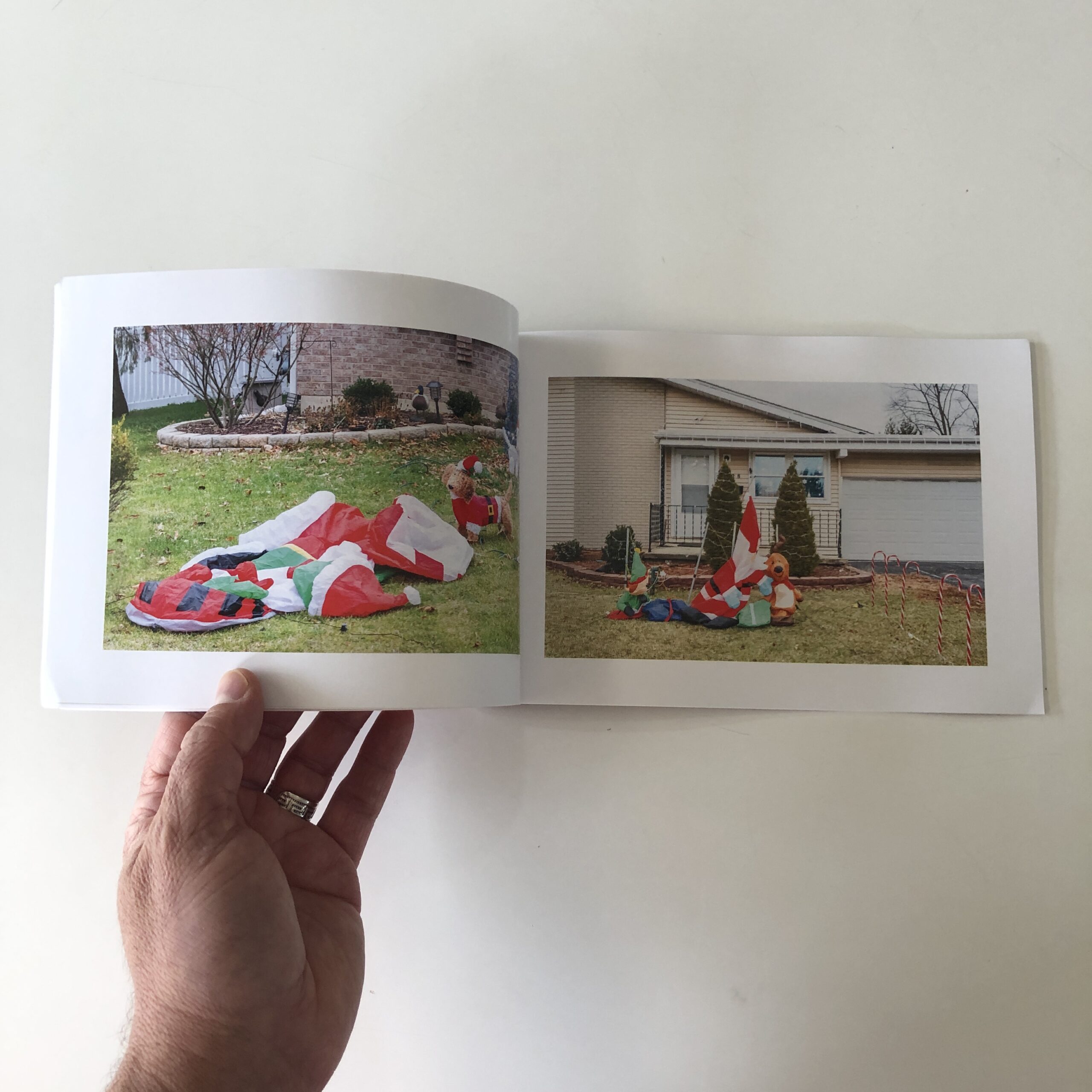
I didn’t stop to wonder why this particular photo had that effect, I just surrendered to the magic, trusted my instinct. The next night I wandered the streets looking for the next (or at least another) picture that might be informed by what I had seen in that photo. And wouldn’t you know it . . . I ended up with five I thought might be useful. (Useful is the word I use when working on projects to describe the images I set out to generate. Whether they are “Good” or Bad” doesn’t, at this point, enter into the equation.)
Here are a couple . . .
I have no idea if these will end up in the final edit, at this point all I’m trying to do is find possibilities. Each new possibility is a signpost pointing some way forward. As the signposts accrue I get a little bit lost (which I like) and the whole thing becomes more complicated (which I like).
When I’m working on a project I don’t shoot from a list, don’t have some predetermined template. I want to use the camera to discover. Matthew Genitempo states the process very eloquently. He says, “I just wait to see what the pictures are doing, and then I follow that. And once I can see what direction I’m intuitively heading in, then I begin to imagine the entire project.”
These are early days. I’m sure there will be twists, wrong turns and discoveries as this thing unrolls. I’m just beginning to see, nothing is written in stone.
And that first photo, the one that started me on this path? I’m pretty sure it has served its purpose and I will find no other use for it.
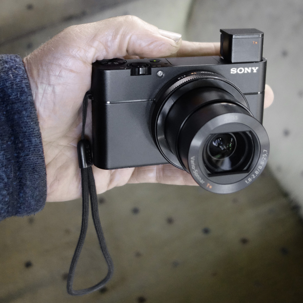
TECHNICAL NOTES
For the nerds out there . . . All pix shot after dark using available light only.
SONY RX100 V point and shoot (on manual), ISO usually at 3200. Typical exposure between 1/4th and 1/60, f/2.8, handheld.
I’ll leave you with that bit of camera porn.
If you have the time and inclination you can follow along as I work this thing out.
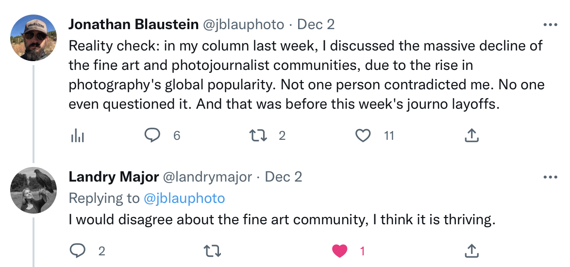
A month ago, I reported on impending, slow-burn-end of the photo world.
No one made a sound.
A week later, I tweeted that I reported on the death of the photo word, and no one had made a sound.
The tweet got a small response.
Andrew Molitor wrote a response-blog-post, and an artist named Landry Major challenged my assertion, saying the fine art photo world was thriving, but admitted she had not read my article.
All in all, not a lot of ruffled feathers for such a grand pronouncement.
Secretly, I think a lot of people have been harboring these thoughts.
I traveled to four photo festivals this year, in San Francisco, San Diego, Chicago and New Orleans, and my observations finally came into focus in the weeks before PhotoNOLA.
So I spoke to some friends and colleagues, in person, or on the phone, to gauge their reaction.
Everyone agreed.
Let’s unpack the details.
(Trust me, this is VERY difficult to write.)
I went to Review Santa Fe in 2009 and 2010, as a photographer.
It made my career.
The first year, I took notes on the 99 other photographers, because I was so “Johnny Tryhard,” and therefore I remember the group well.
Some talented, emerging and mid-career artists, editorial photographers, and photojournalists were all together, and many have gone on to massive careers.
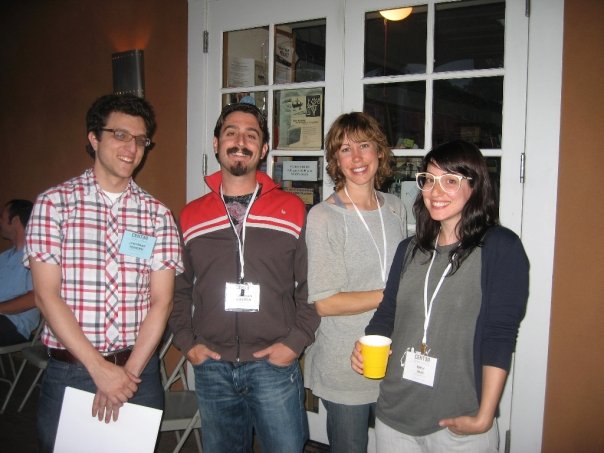
JB with Emily Shur and Jon Feinstein at RSF in 2009.
Nearly everyone there was a trained, working artist, photojournalist, professor, editorial photographer, or perhaps a commercial photographer.
Easily, 90% or more were working pros.
There certainly might have been a few hobbyists, or lightly-trained, career-change photographers, but none that I recall.
That was 13.5 years ago.
I’ve since attended 30+ festivals, both as a photographer and as a reviewer.
The proof is in the pudding, as I’ve written scores of articles about these portfolio reviews over the years, all published here on APE.
Of all the festivals I attended, only the New York Times review was free, so it was the most diverse and international. By far! But it was also super-difficult to get accepted, so it’s not a viable option for most people.
Every other festival was run by non-profit, artist-founded, artist-run organizations. (Sorry, I did go to one by the Art Academy of SF, and they’re a for-profit school.)
In Houston, San Diego, San Francisco, LA, Santa Fe, New Orleans, Chicago, Denver, and Portland, the trend was so slow that I never noticed it.
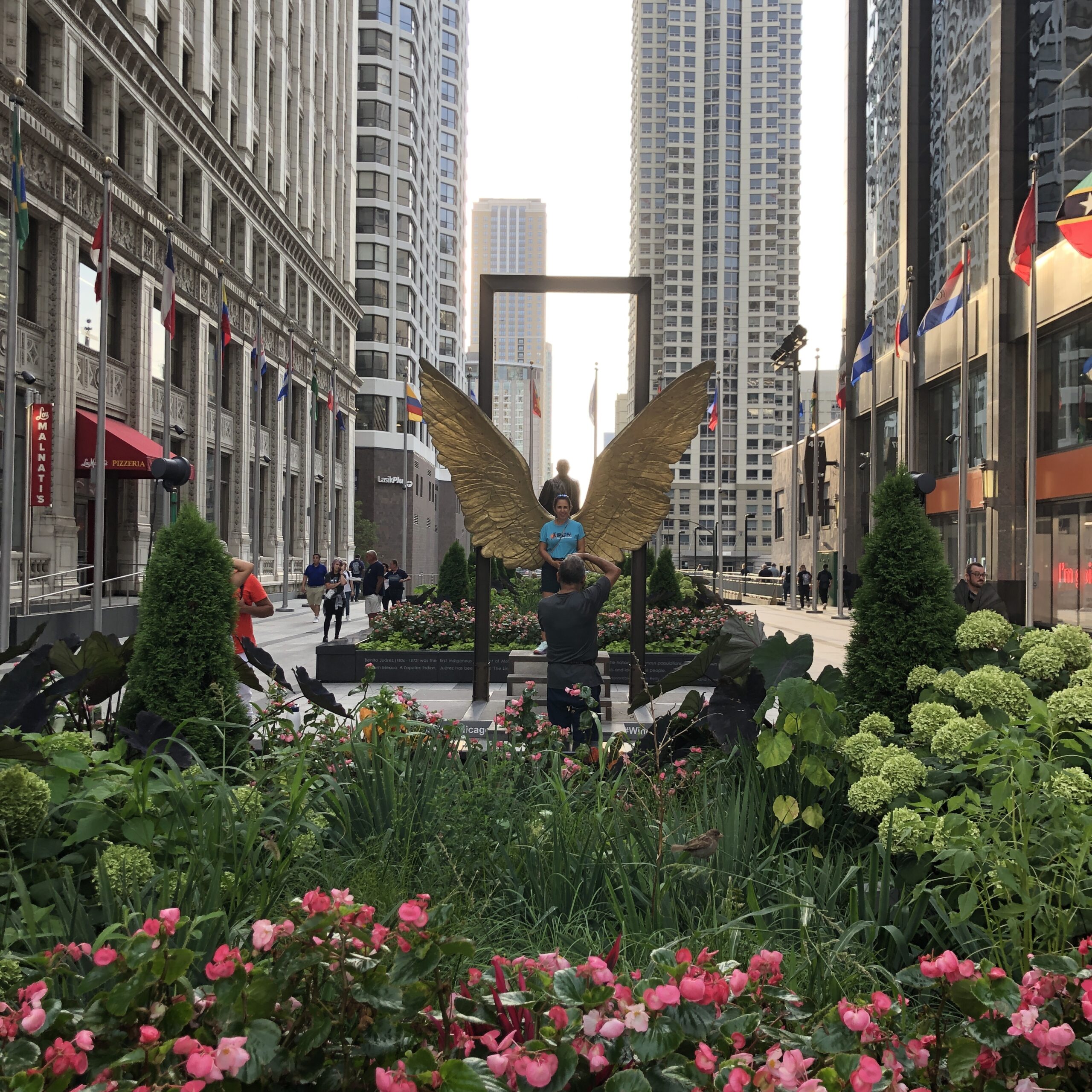
A photo of someone taking a photo of someone in front of the angel wings, Chicago, 2022
Mea Culpa.
I missed the story of the slow disappearance of the professionals, replaced by hobbyists.
But in 2022, Post-Pandemic, it was impossible not to see the pattern.
This year, the vast majority of photographers I saw at the portfolio review table were coming from retirement, as a long-time hobby, or rekindling the passion after many years, hoping to change careers.
I’ve previously written that I had such a hard time remembering work from the PhotoAlliance review, I only featured two artists.
You still meet a few full-time professional artists, or busy freelance journalists, and their work is normally better, so it stands out quickly. There are plenty of professional educators still on the scene, as professors are under pressure to exhibit and publish, for tenure.
The educators also have stable jobs, and some schools provide professional development funds, so stipends are available for the professors.
And their work also tends to be of a MUCH higher caliber.
Post-pandemic, though, the majority were coming to the festivals now, (which are expensive, in a world with inflation, and concentrated resources,) ready to get in on the action, without realizing how little action was left.
One post-retirement-artist even told me they were ready to level up to a solo show now, because they had done the group-show thing, so now it was time.
(Like ticking boxes off a list.)
And I am not being ageist here.
Please allow me explain further.
The shift was gradual, but when I attended the festivals as an artist, (in 2009, 2010, 2012 and 2016,) I always made more money than I spent.
Eventually.
The marketing budget worked, because whether I sold prints to collectors out of the box, on the spot, sometime later on, or ended up with shows that sold work, it always panned out.
There was a professional artist/journalist class, of trained experts who’d gone to school, and put in decades of time.
There were also enough opportunities and resources to support those artists, journalists, and editorial photographers.
Now, (as I’ve previously written,) the gallery/newspaper/magazine/ad buy infrastructure is a fraction of what it was, chopped year by year, so of course the opportunities will have lessened commensurately.
Simultaneously, over those 13.5 years, the products of the photo world, glossy art on pretty white walls, or sleek photos on the home pages of the NYT or the Washington Post, were very visible markers of success.
And making pictures is fun!
So of course, with the photo world incessantly promoting itself, and photography getting ever easier from better digital cameras and phones, it makes sense people who put their passion aside, due to life obligations, would want to come join the party.
Who wouldn’t?
And year by year, I treated each person at the review table the same, and tried to honor and help motivate folks who were new to giving their heart to their art.
No matter the age.
Many of my consulting clients have come from this cohort, and I’ve busted my butt, and had a great creative relationship, with each of them.
But now the portfolio review community is made up primarily of people who have financial means, and many are willing to pay $35,000-$50,000 to publish a photo book, OUT OF POCKET, because it’s a marker of status and success.
(Also, because it’s a tremendous feeling of accomplishment.)
As I wrote a month ago, photography is now everyone’s passion.
It’s a visual language that belongs to THE WORLD.
Nothing has been so democratized; not even music.
A medium once dependent on cryptic chemicals, and tricky, expensive, mechanical cameras, is now fully point-and-shoot brilliant.
From Leica monochromes to great iPhones, it’s not hard to make a “professional” looking photo.
So we can cheer that our love now belongs to everyone, and we can also mourn that so many professionals have left the field.
To be clear, I’m not saying festivals don’t belong anymore.
But at PhotoNOLA two weeks ago, of the 9 official reviews I did, only two photographers seemed to be full-time professionals: both educators there to promote their personal work.
2 out of 9.
So I asked my colleagues, and they agreed:
Perhaps the model needs to be tweaked a bit, to accommodate the new reality?
As I said, the NYT runs free reviews, because they can.
But Filter Photo, in Chicago, has active relationships with local art schools, so you can always count on 5 or 6 students coming to the review table. The schools buy reviews in blocks, (or perhaps trade for sponsorships,) so the up-and-coming, committed students attend for free.
(That’s also a great way to keep it diverse, but I’ve only seen it done at Filter.)
I believe it’s important to note the demographic shift, and ask if perhaps there are other ways we as a global photo community can support regular, working-stiff artists, teachers, and freelance journalists?
We need to make sure there is still a photo world for the next generation to enter.
Maybe festivals can increase their emphasis on low-cost education and exhibitions, and make the high-cost portfolio review elements a smaller part of the overall financial reality?
Or perhaps some of the non-profits can start adding more and more next-generation artists to their boards and advisory committees?
Because I hung out with a handful of 20-somethings this year, in San Diego, Chicago and New Orleans, and I can legitimately vouch for Gen Z.
JB with Liv, (from London,) in the French Quarter, NOLA, Dec 2022. (Photo by Bayley Mizelle)
They are coming to save the world, with their empathy, multi-talents, and their Internet-charged brains.
I’m here for it.
But outside of the handful of students at Filter, none of the younger generation I met were at the festivals to be reviewed, as “paying customers.”
We can welcome later-in-life artists, and career-change photographers, and support their exciting, creative journeys.
And I have.
But given what I saw on the road in 2022, if they’re now the majority of the festival community, (and the ones primarily paying-to-play,) I believe it needs to be acknowledged.
Saying “Beetlejuice” three times can be scary.
But I said it.
So let’s move on.
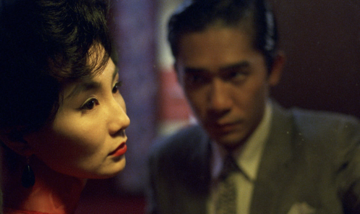
image courtesy of IFC Center
I’m in an awkward position, as I’ve already told you I quit, but Rob’s allowing me to wrap up the column here in an elegant way.
I’ve got to share the best work I saw at Filter, and PhotoNOLA, so that’s two more articles.
And I’m sitting on a sizable submission-book-stack.
At first, I thought I’d try to cram 20 mini-reviews into two articles.
Little pods of information.
But that doesn’t feel right.
It wouldn’t allow me to honor the photographers who trusted me with their books. (Their artistic babies.)
No.
So I’m announcing today that I’ll start a personal blog, in the next two months, so I can properly review every book that was sent my way.
It’s only fair, and after all, I love to write.
I promise to provide full details before I wrap up here, (and on social media,) and I’ll do a quick book review today, too, as a show of good faith.
Because I’d like to state one thing very clearly: I love the global photography community, and it’s been an honor to have such a visible platform here for so long.
If just a few of you come over and read the book reviews, (or whatever else I write about,) that’s cool with me.
I guess it will be my hobby from now on, since I’ll be doing it for free.
For myself. As art.
Even though there are only 3 columns left here, (after today,) I always keep it real.
I went to the book stack, and looked for the oldest submission.
Of course it’s perfect for today, because that’s how the column-magic has always worked, over the years.
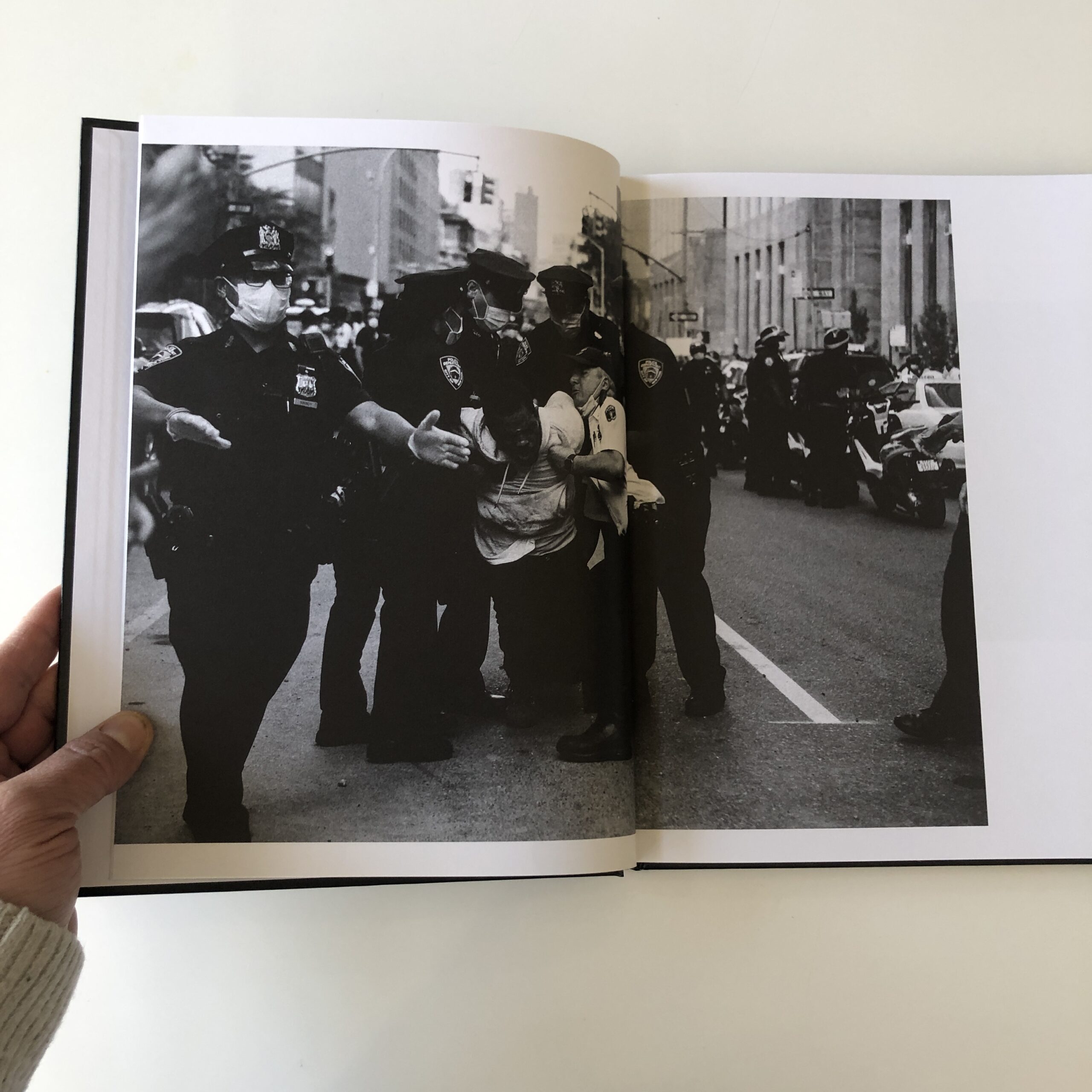
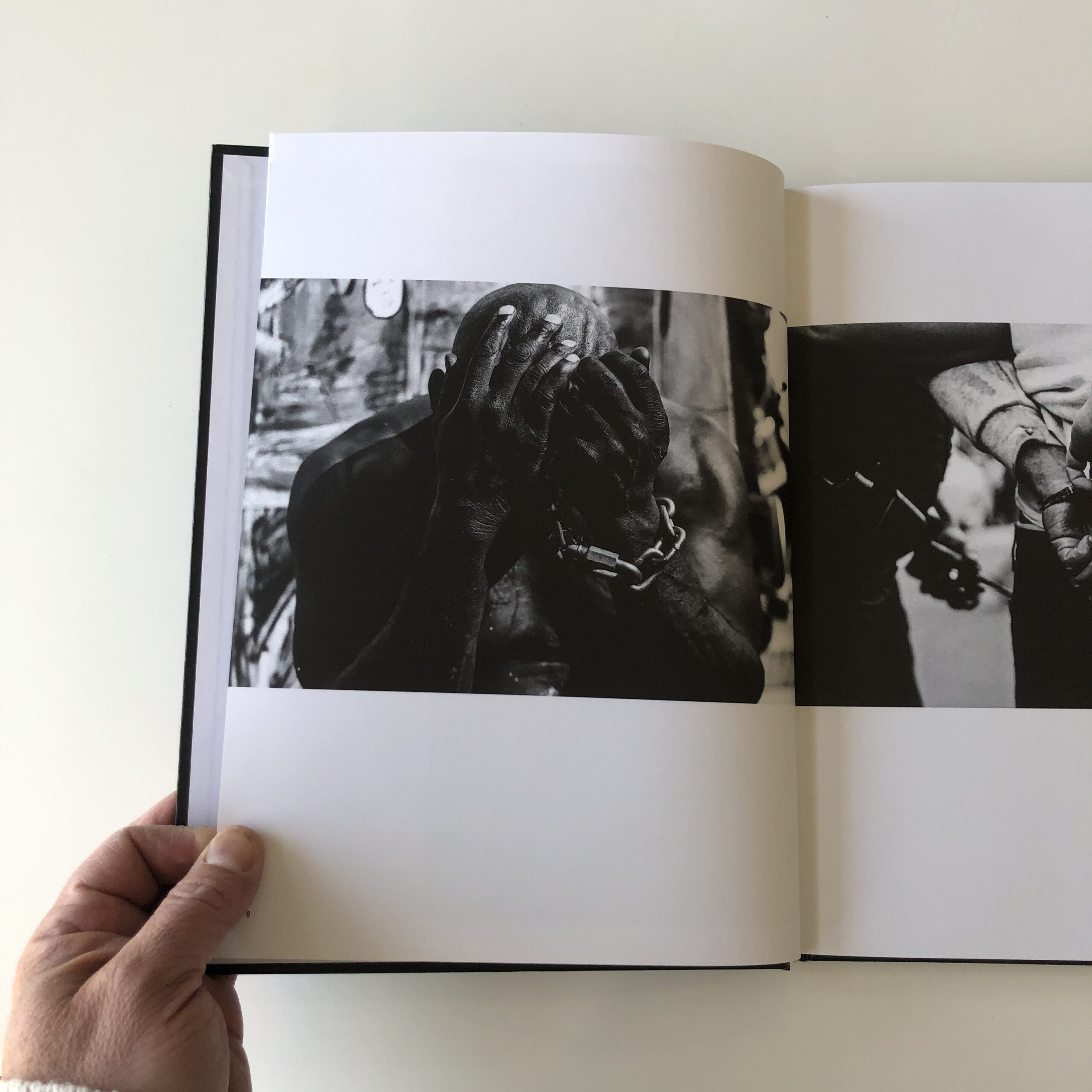
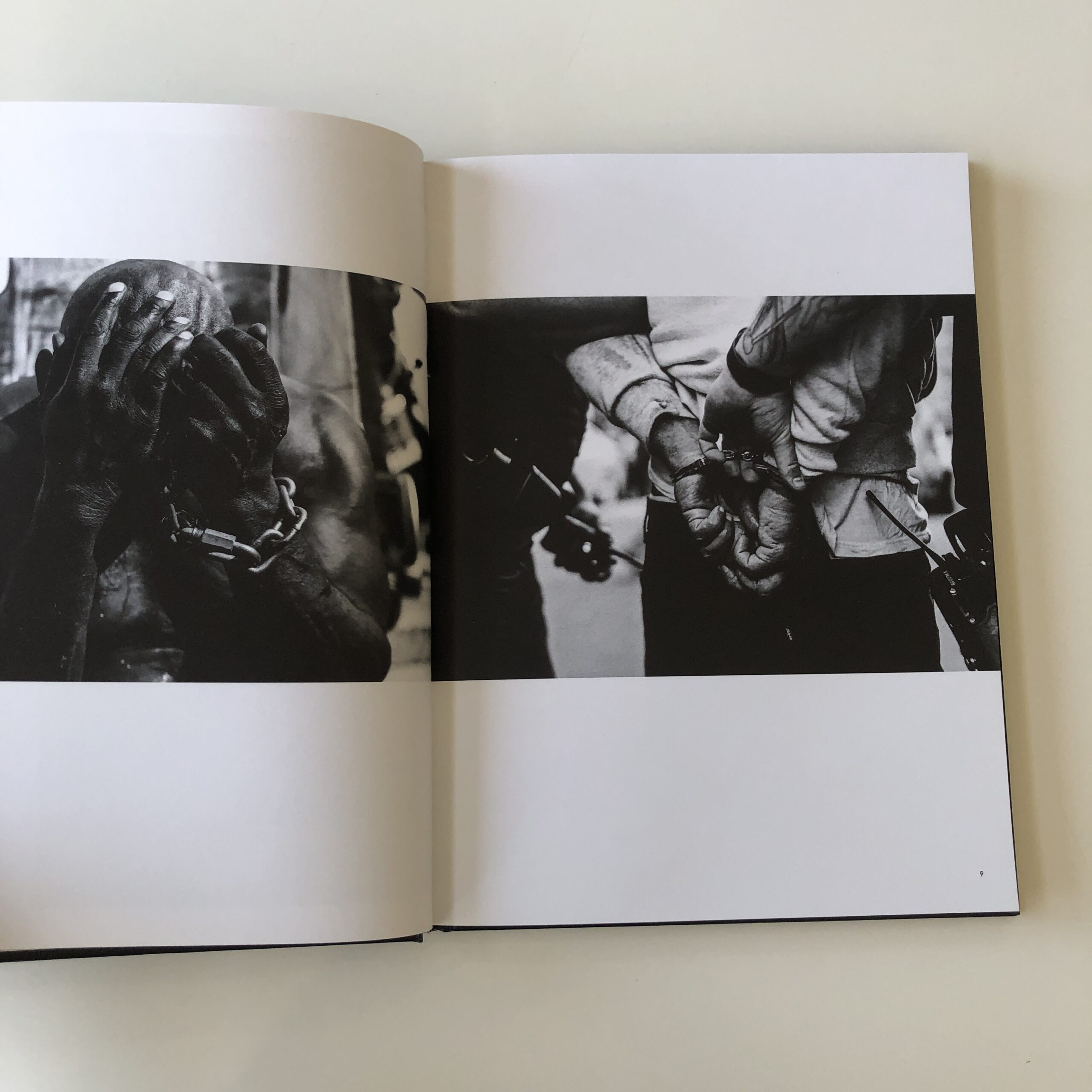
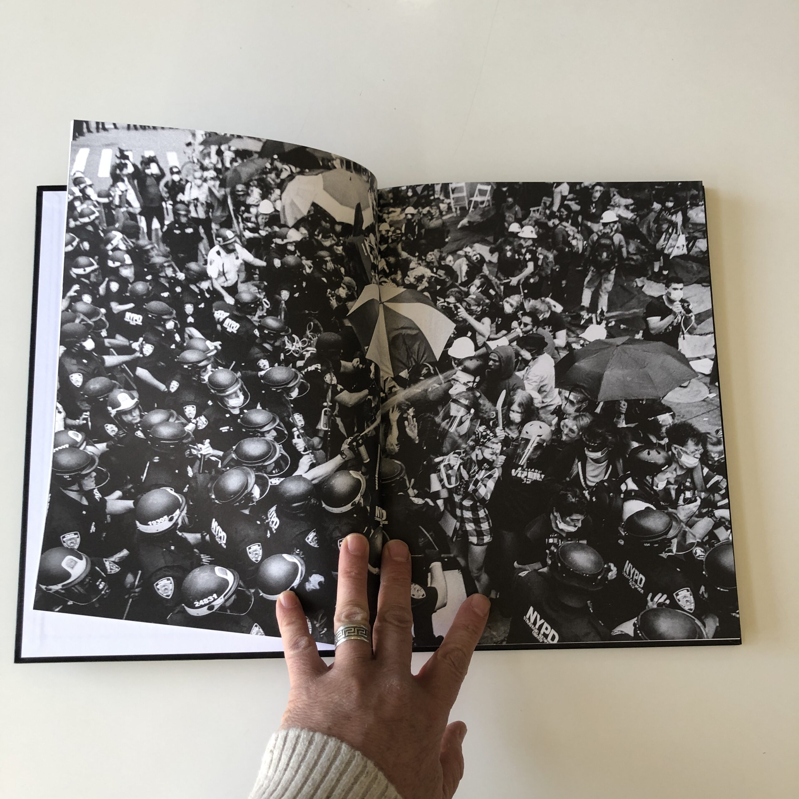
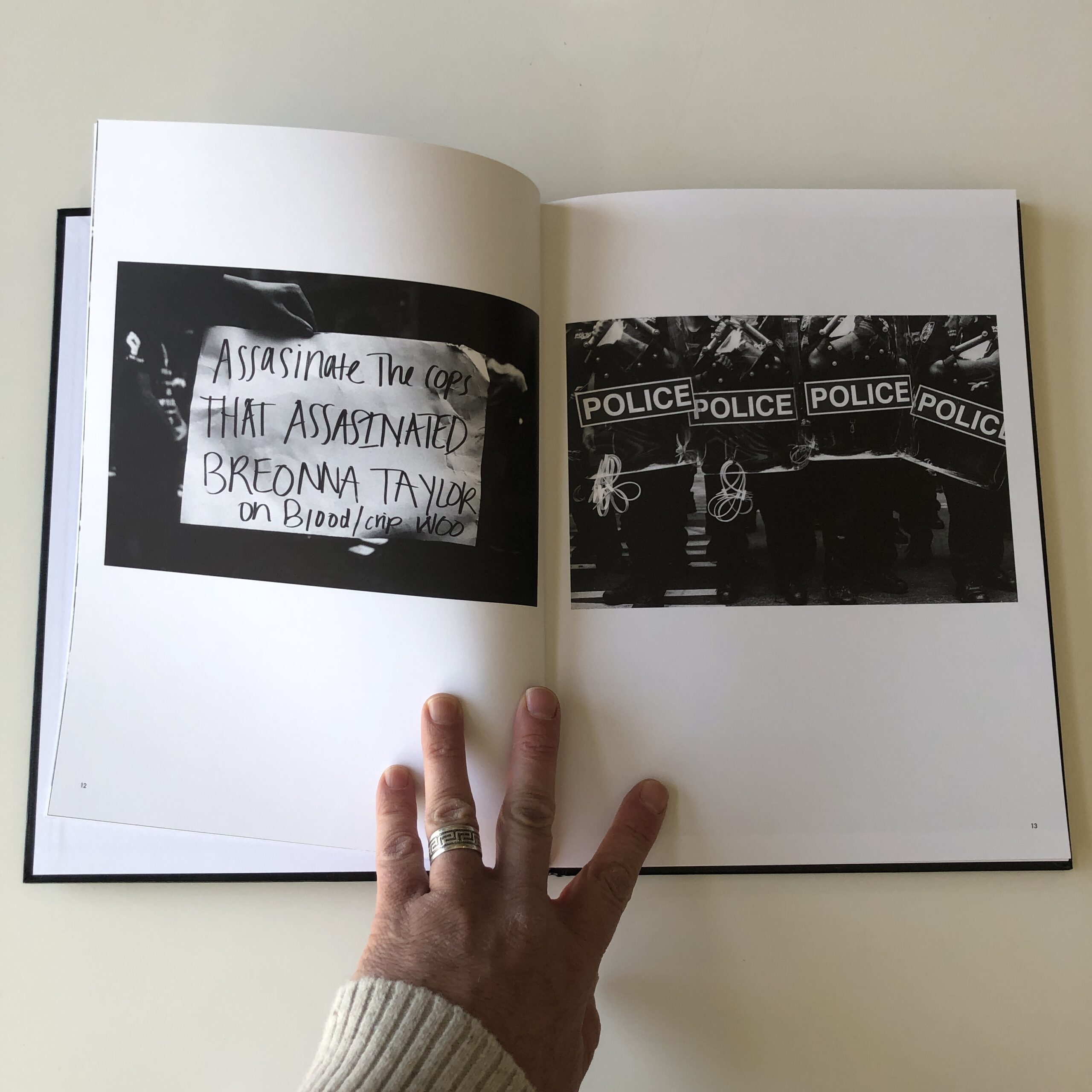
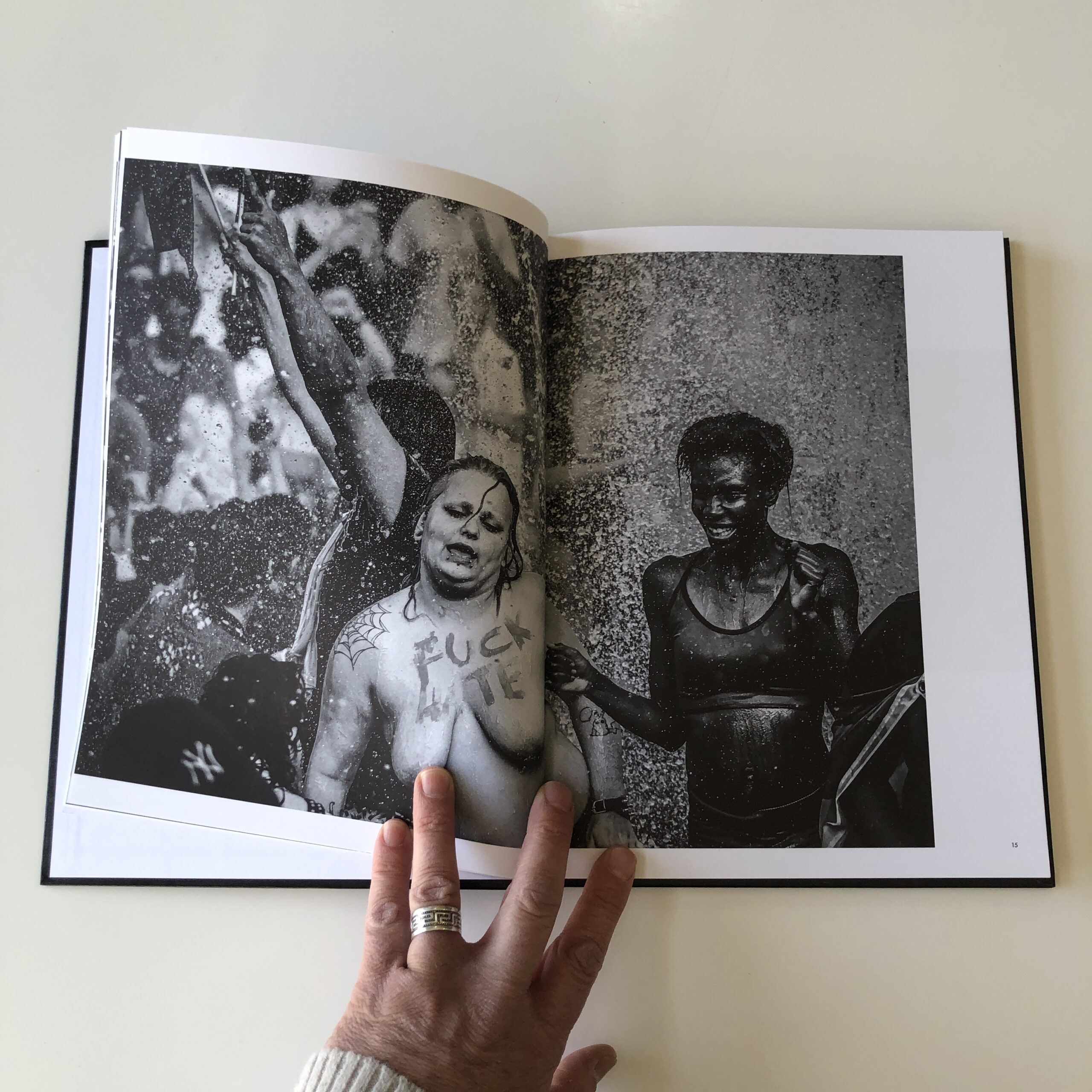
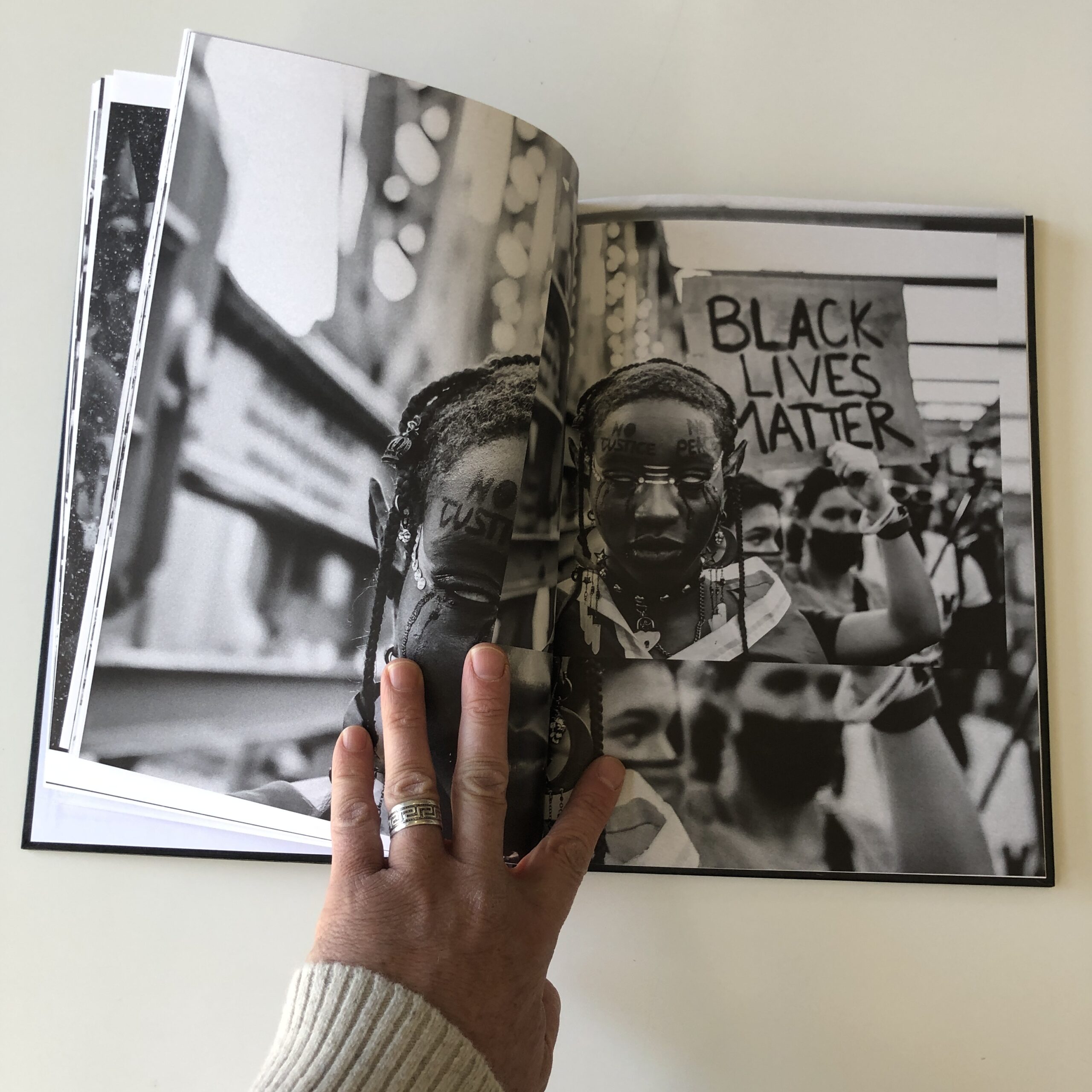
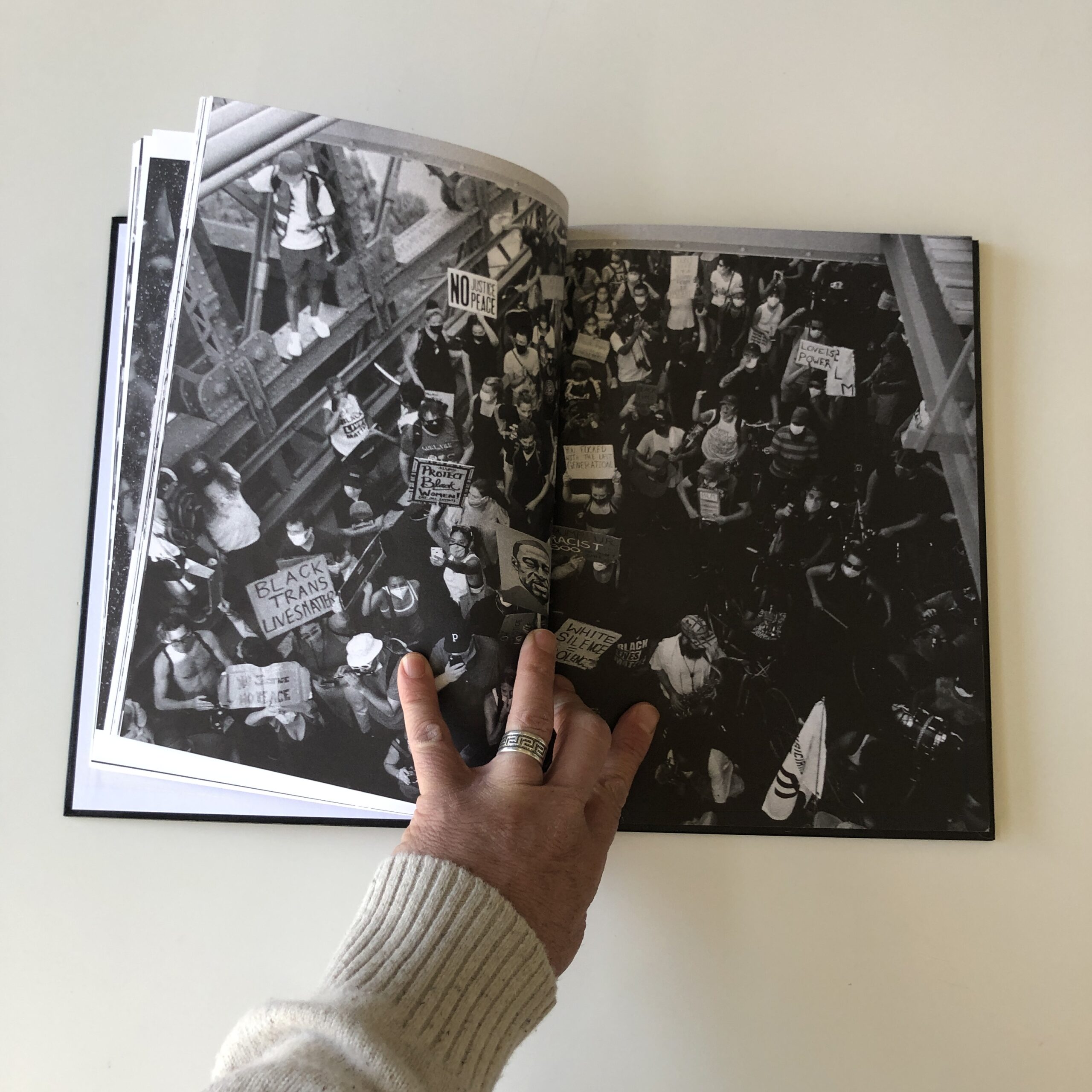
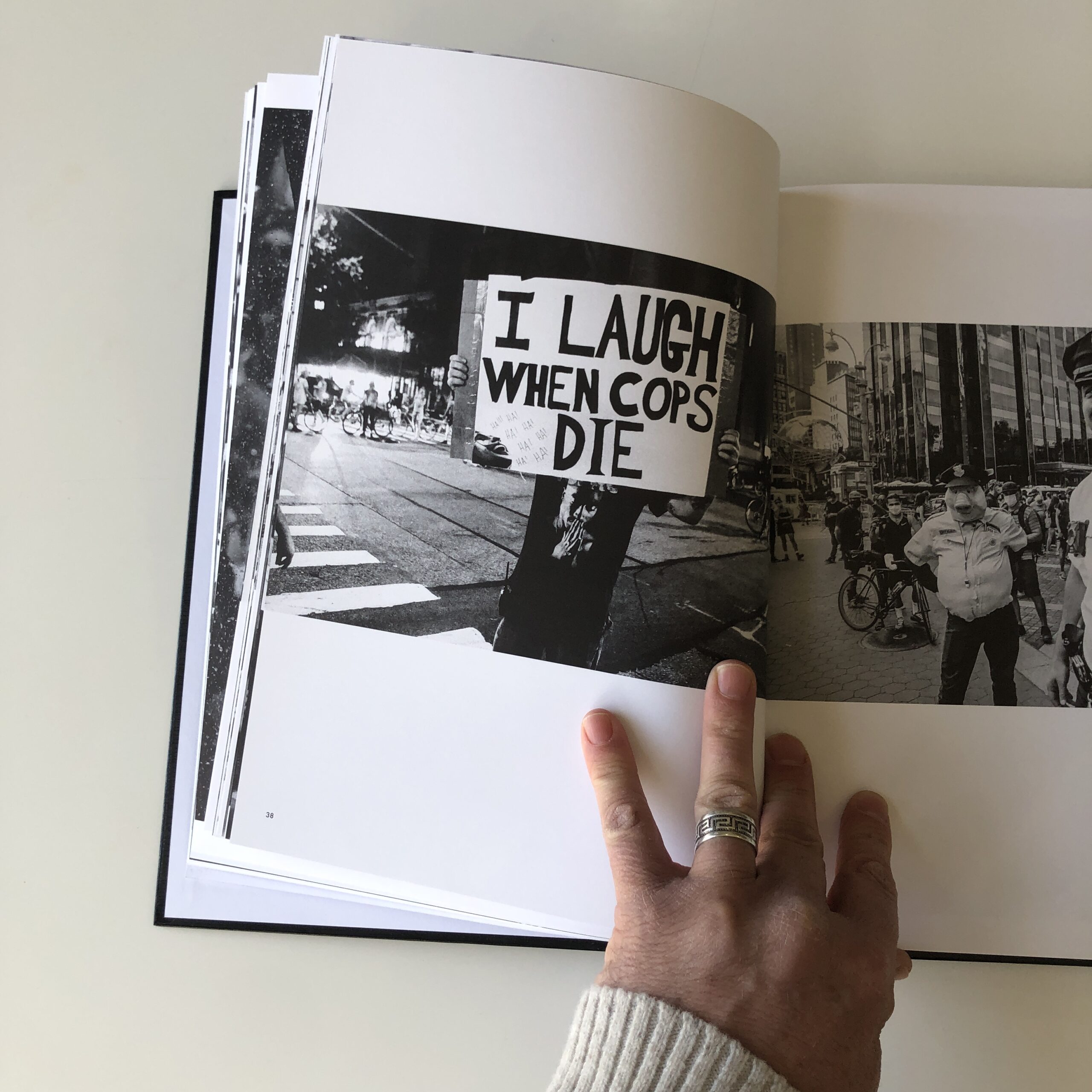
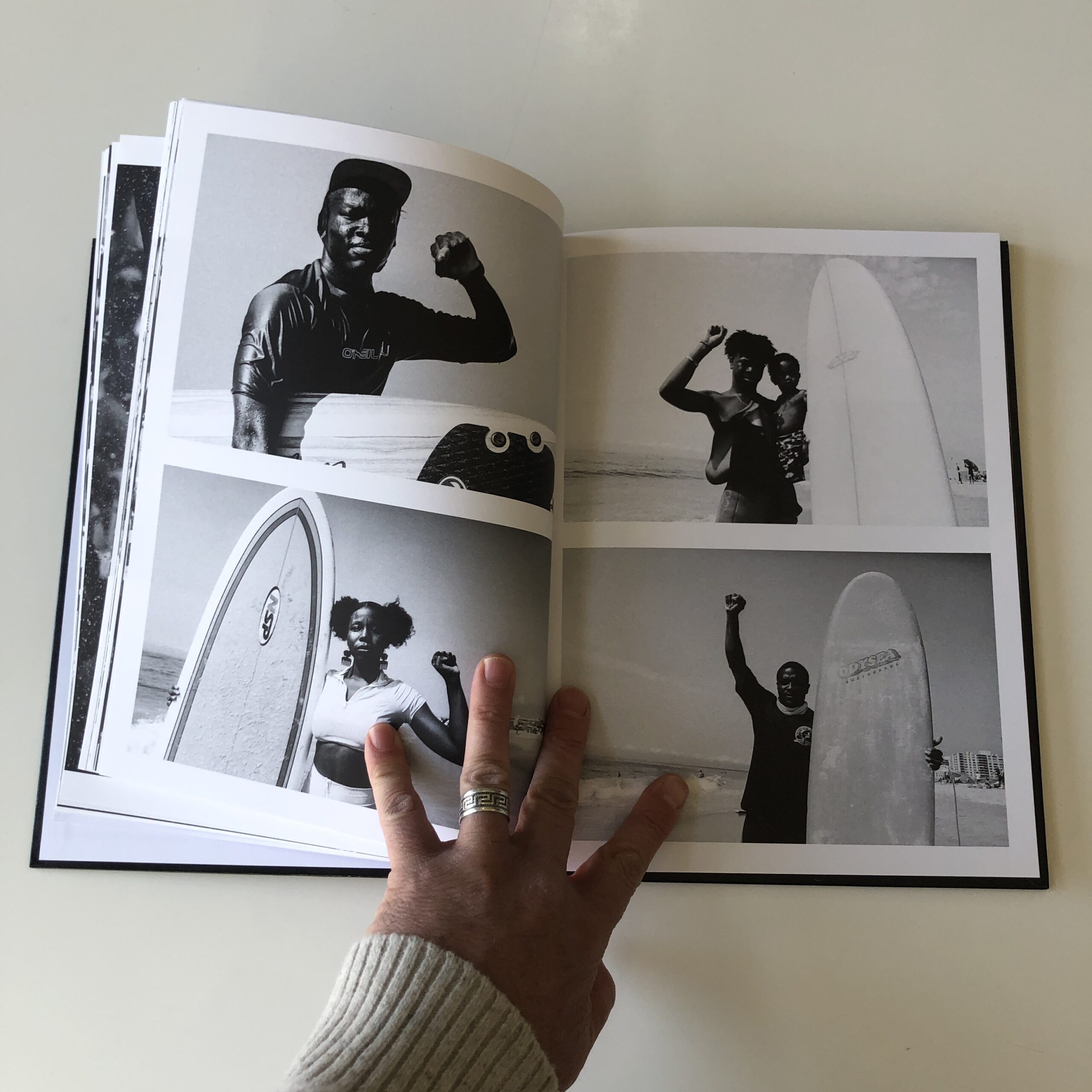
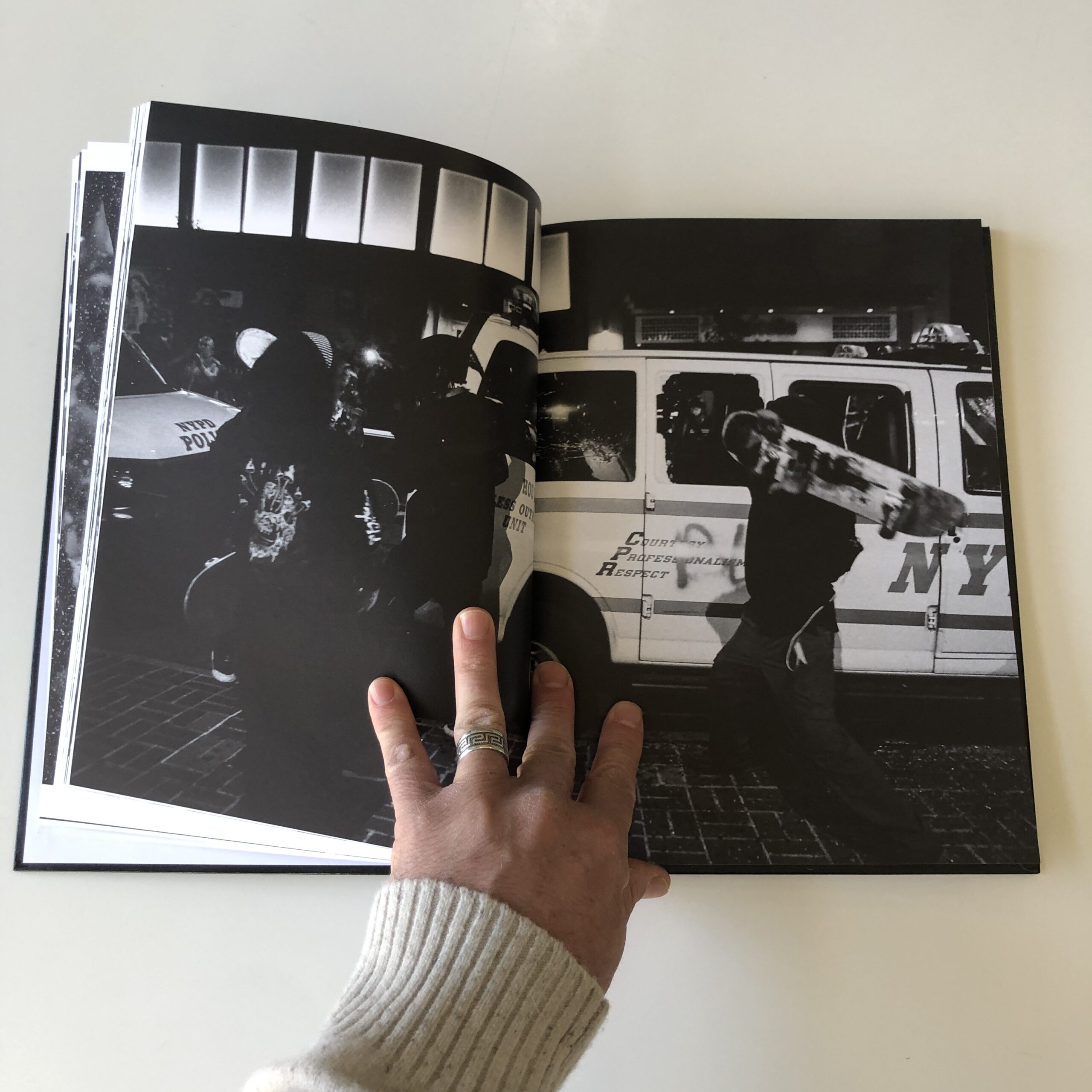
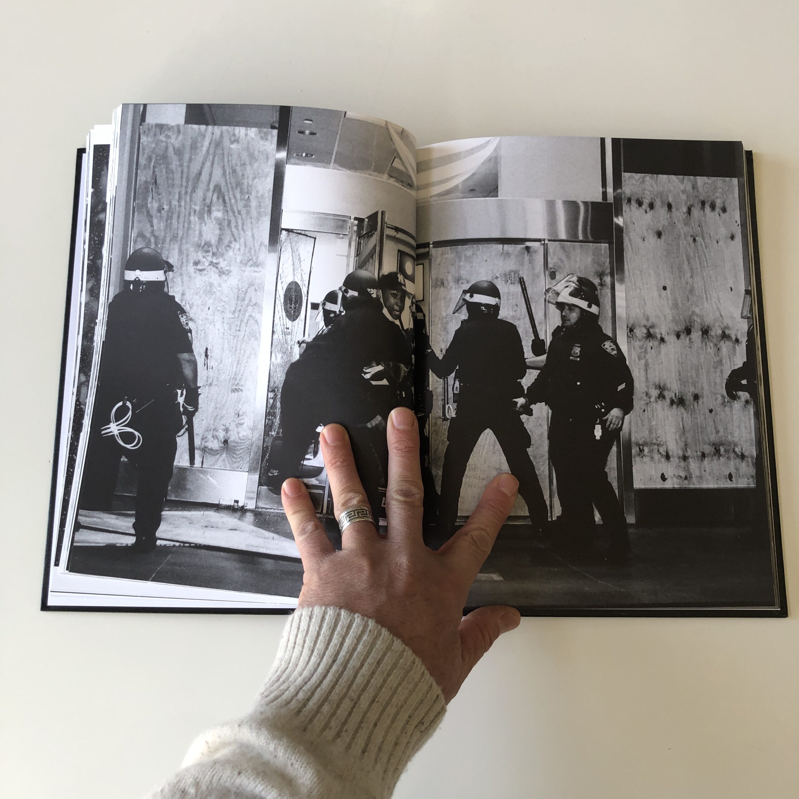
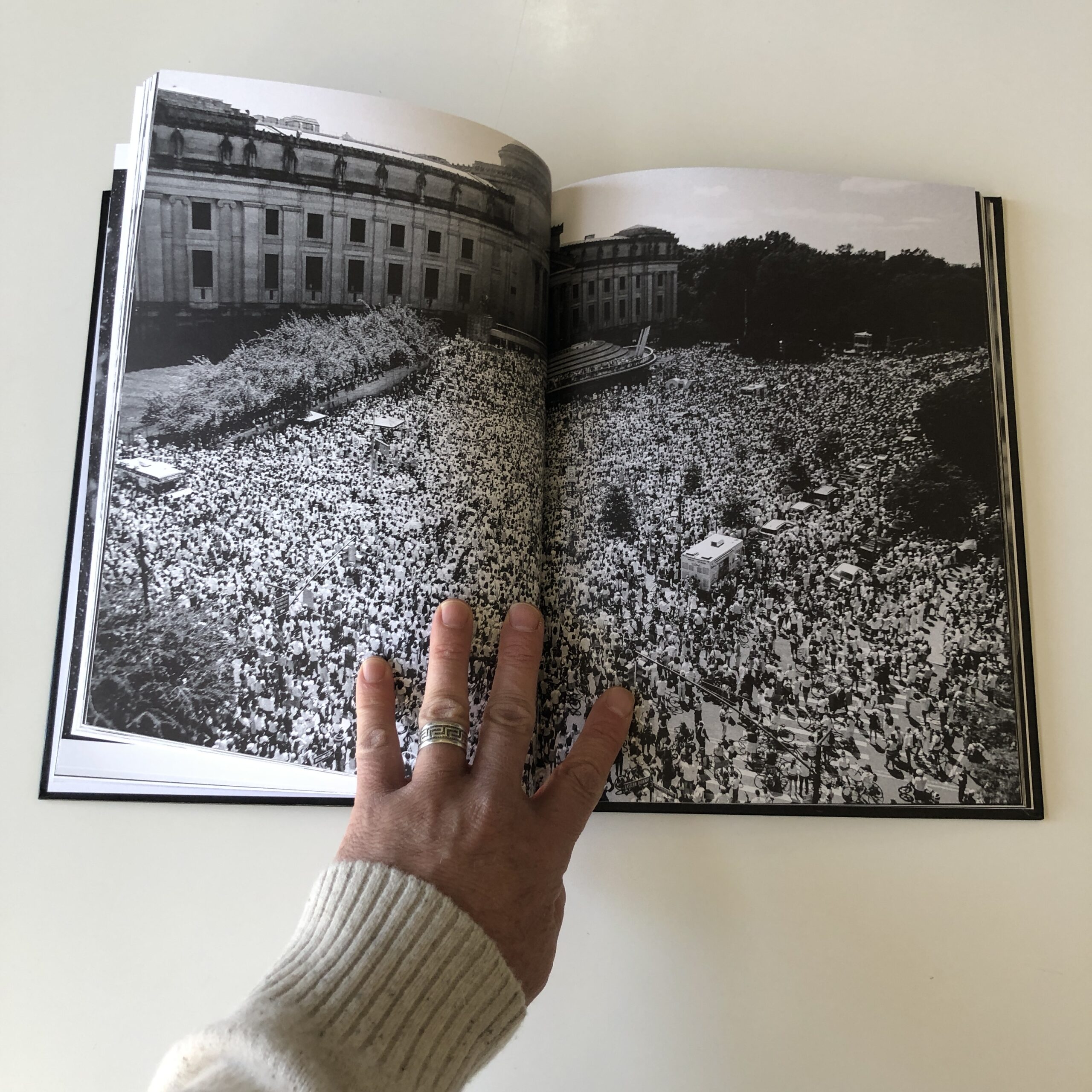
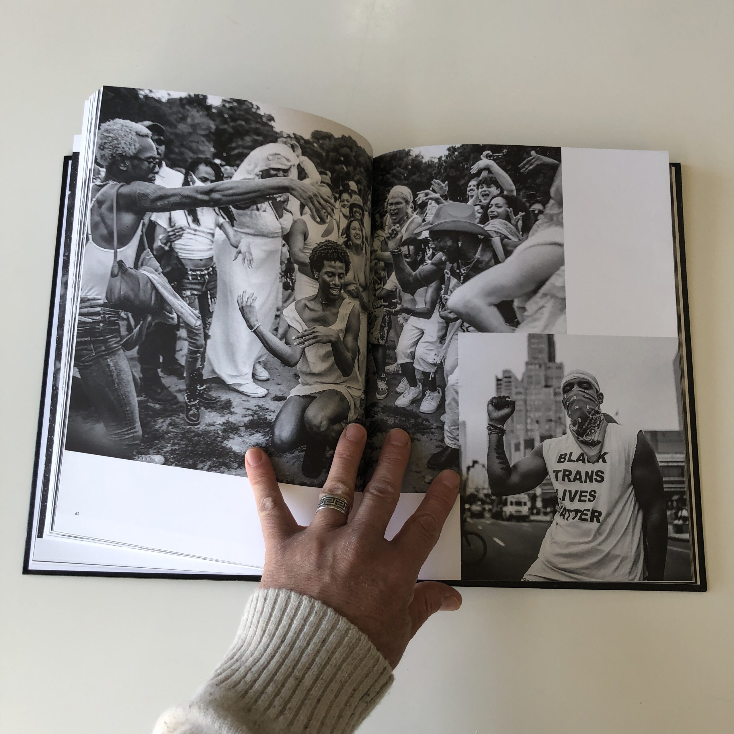
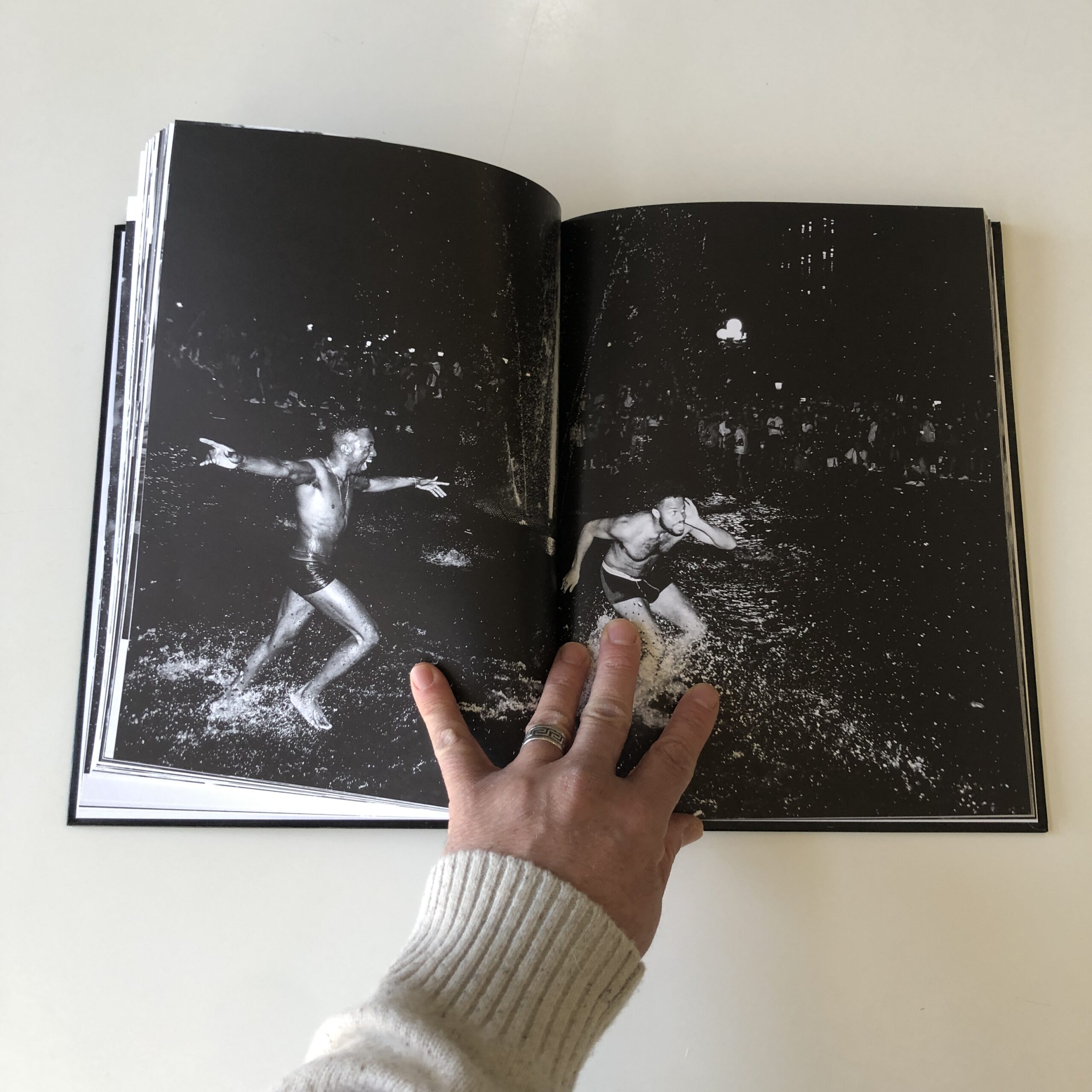
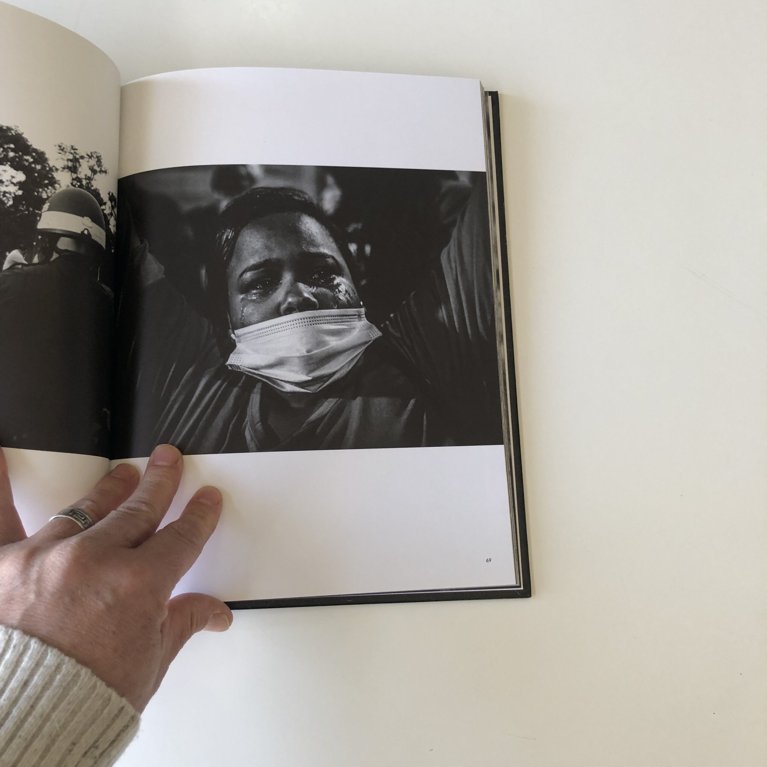
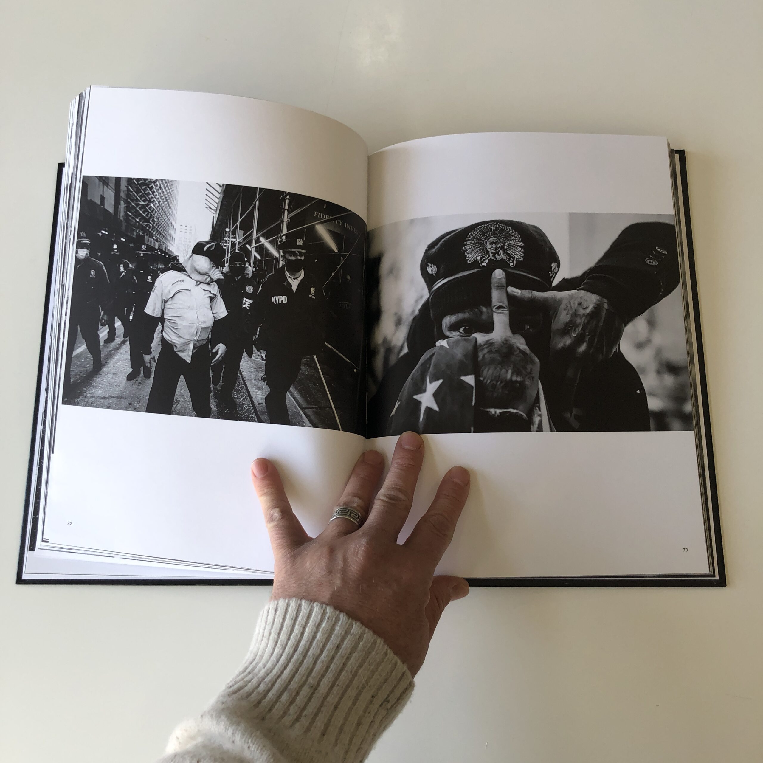
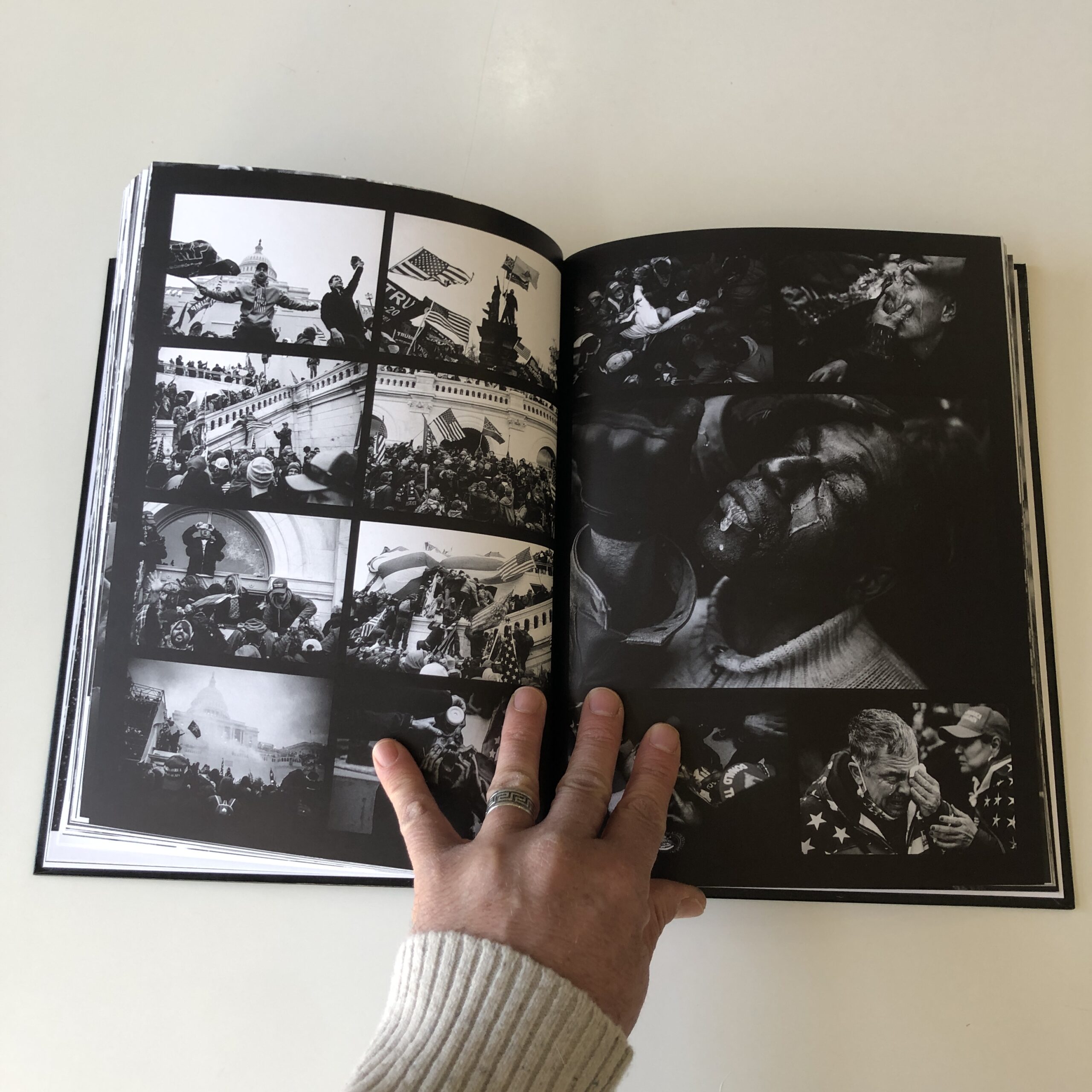
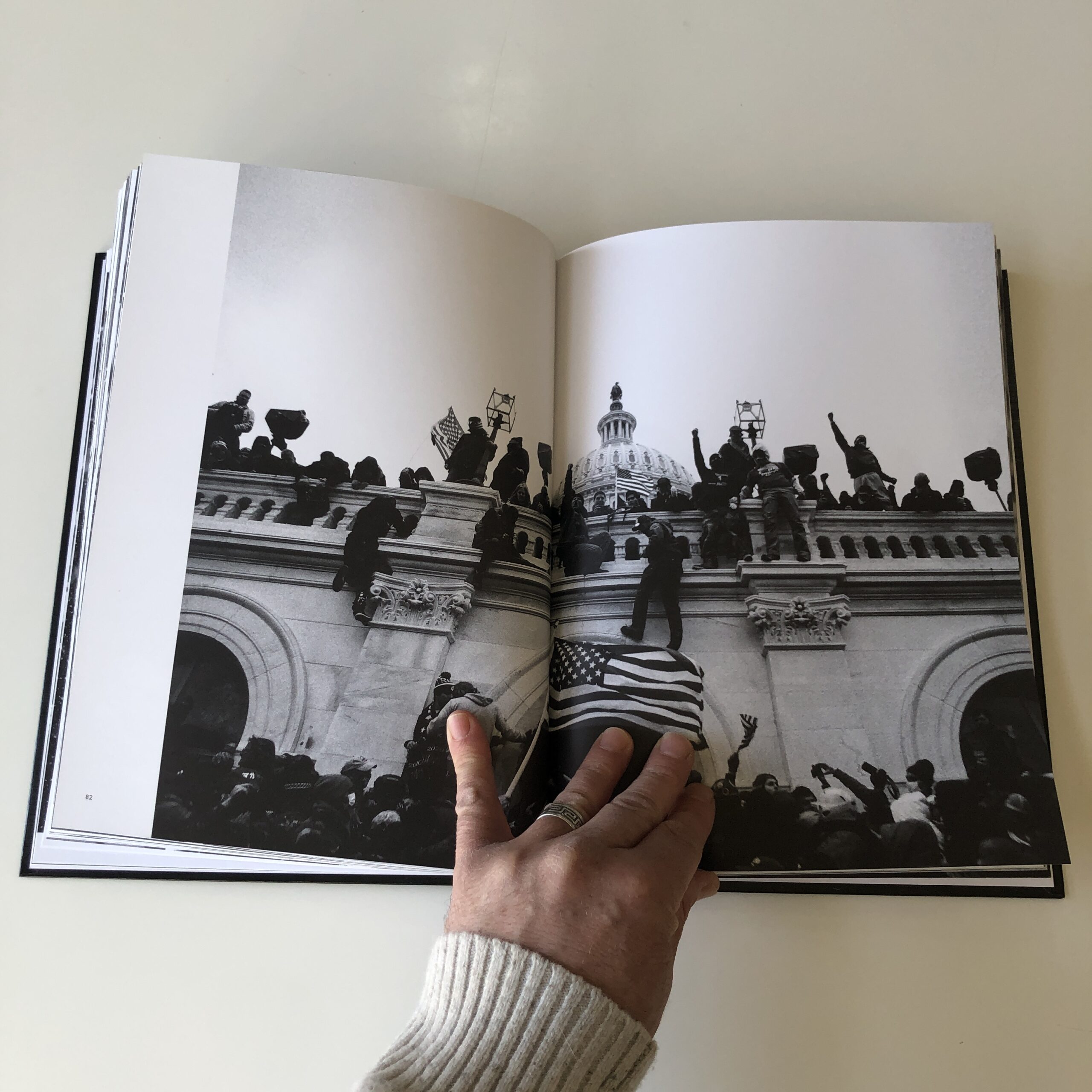
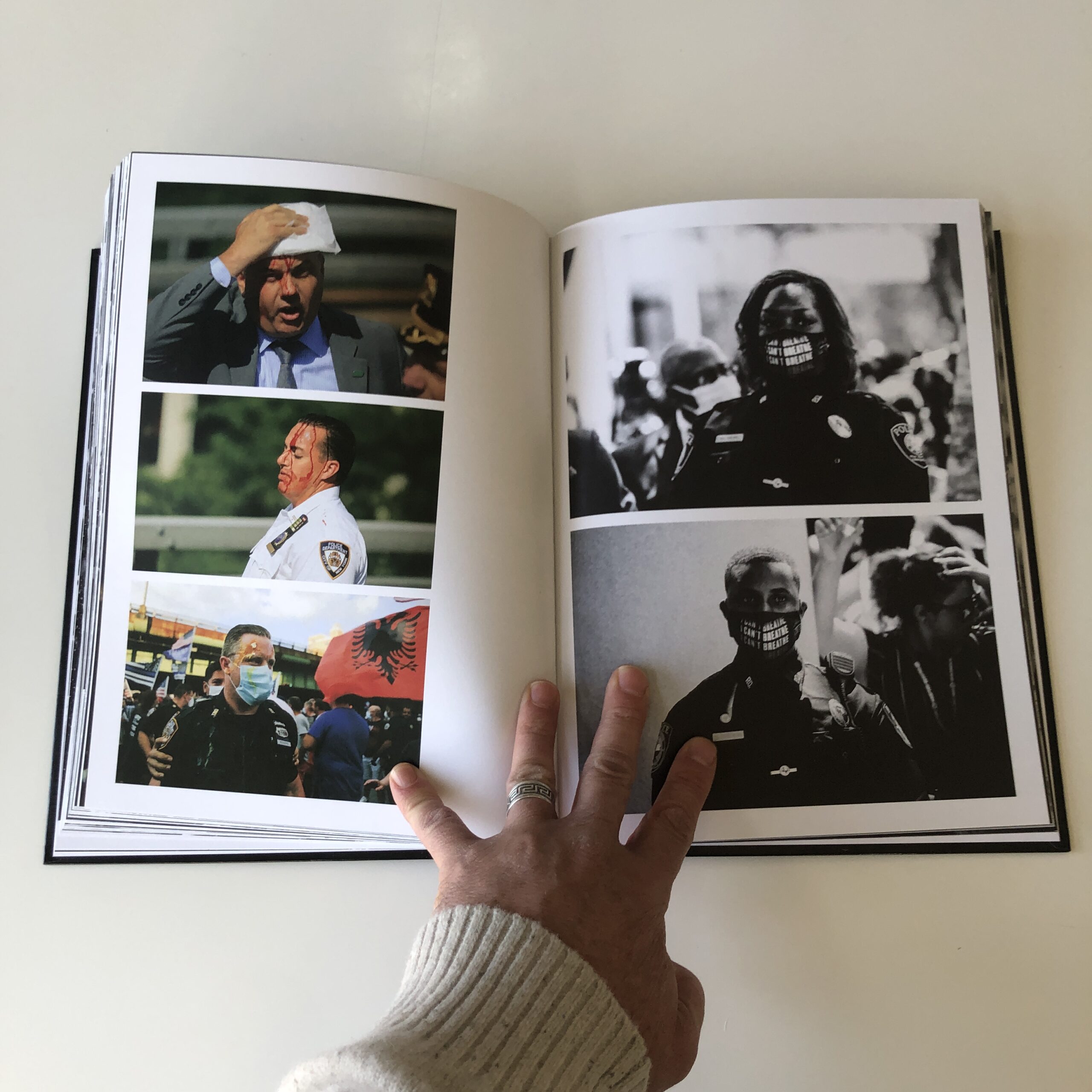
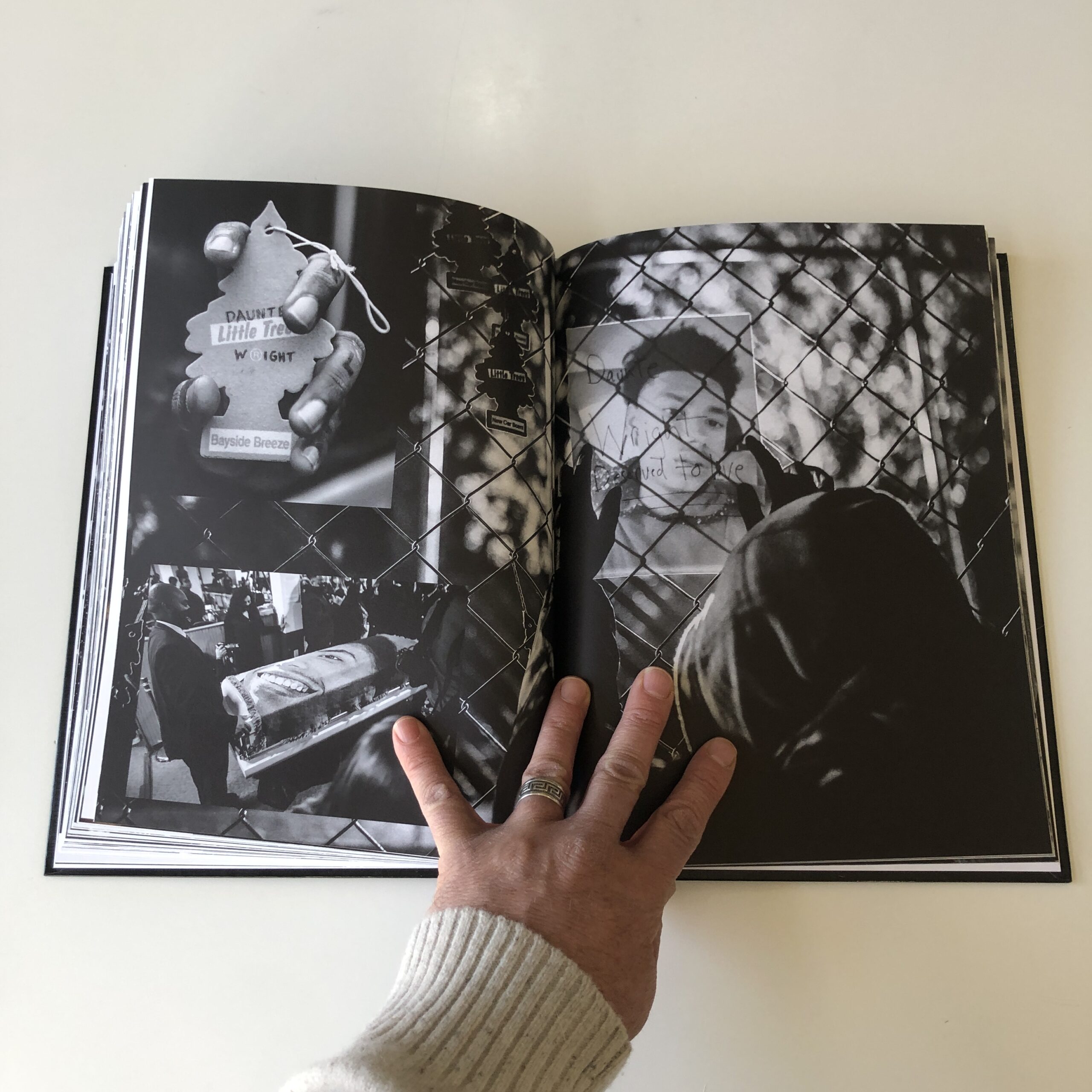
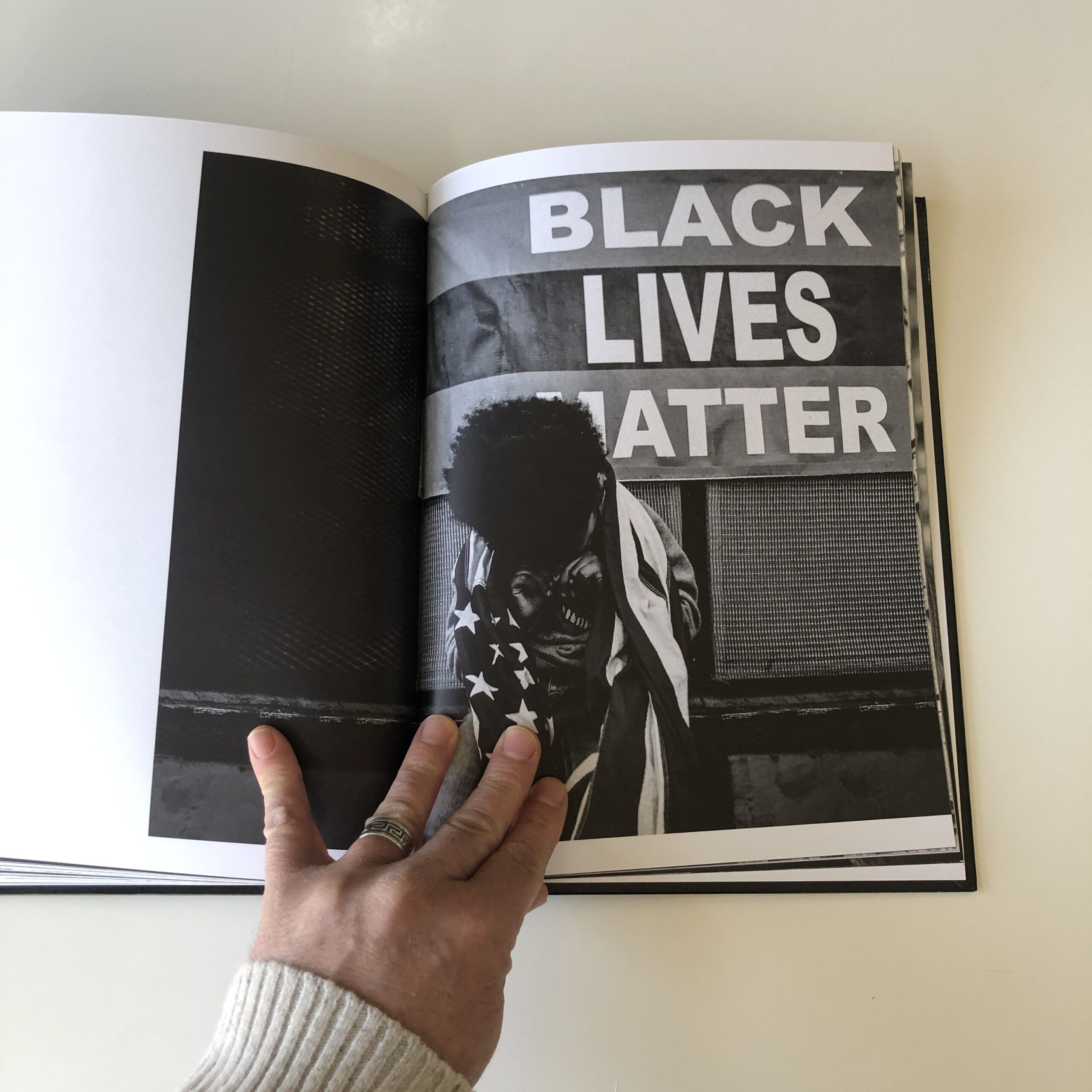
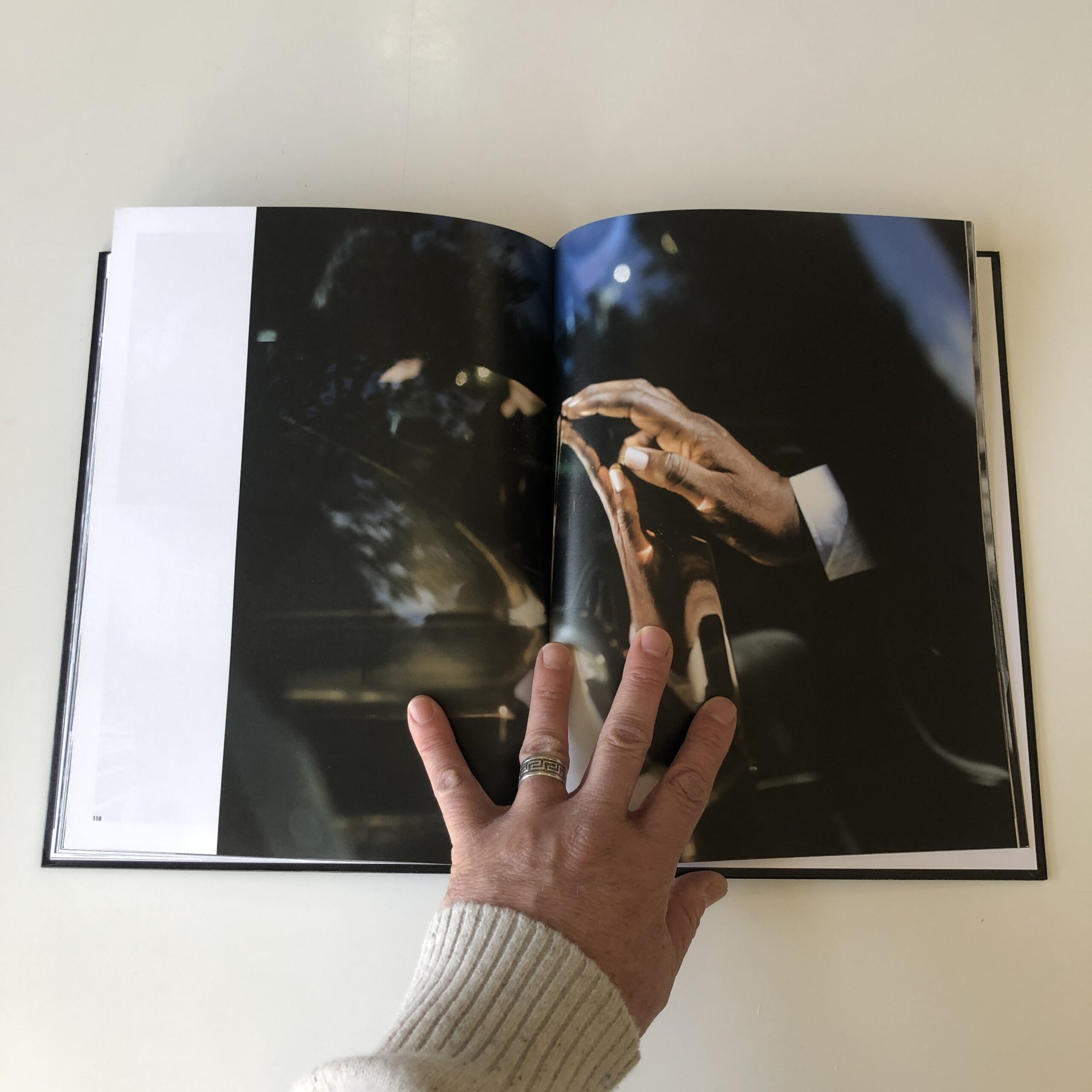
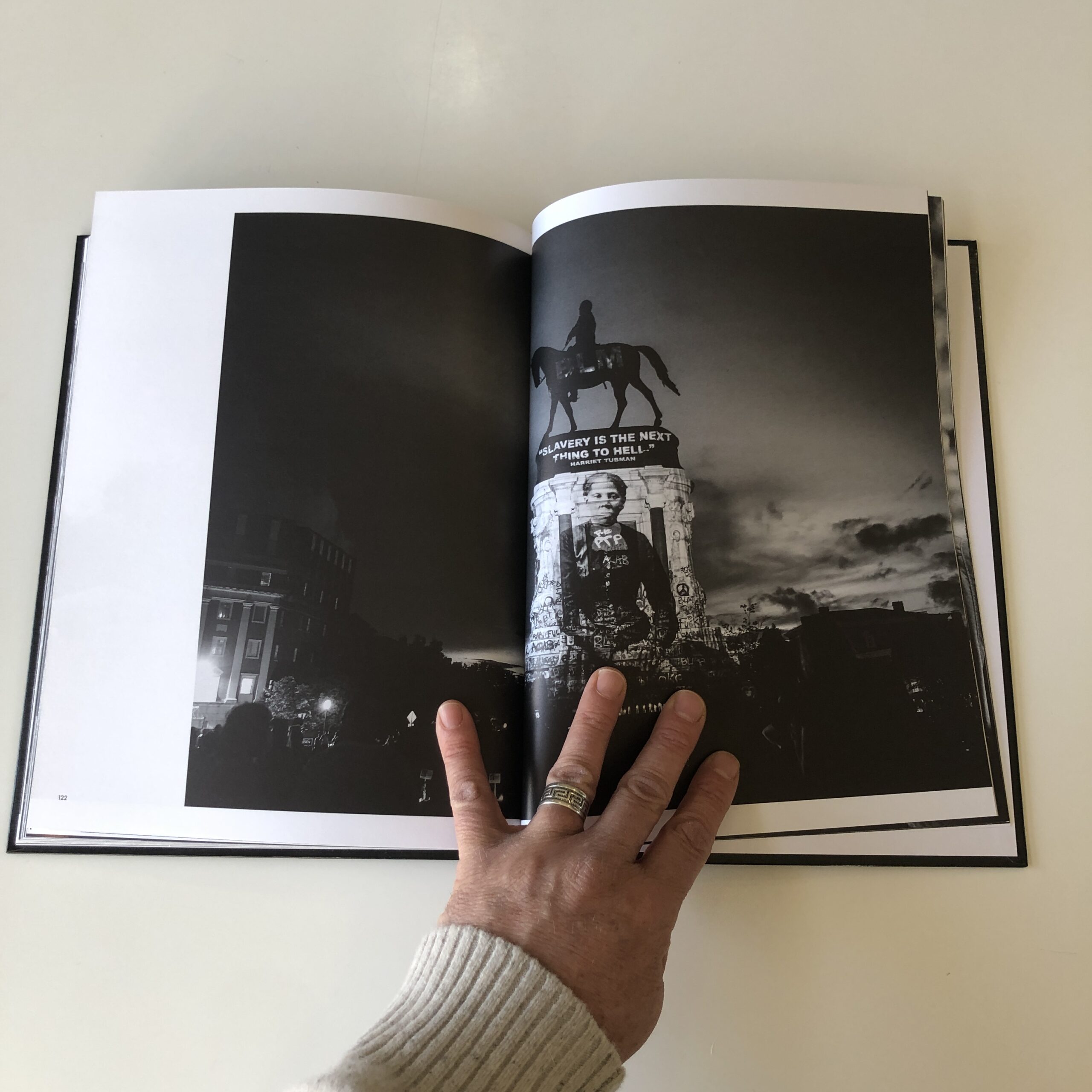
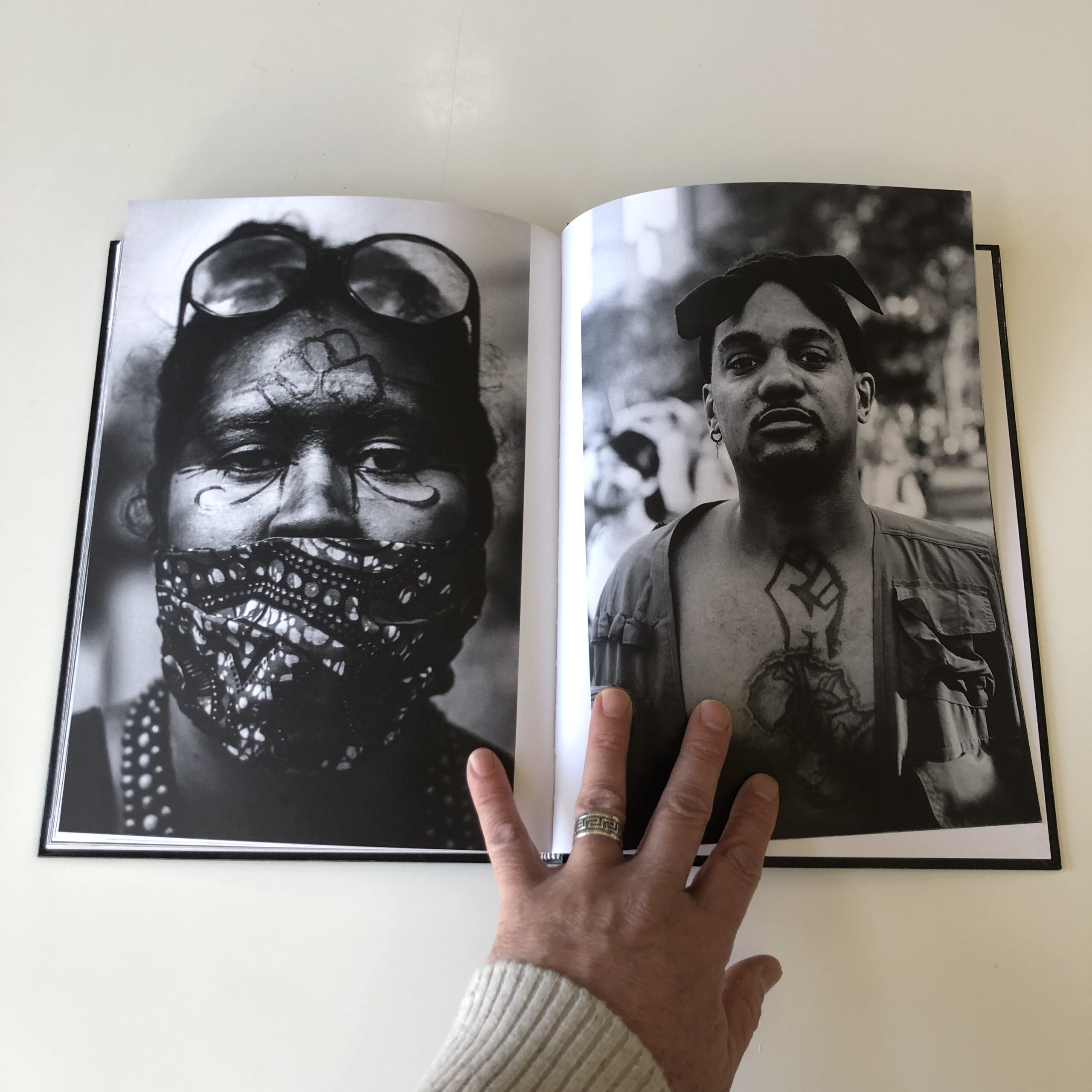
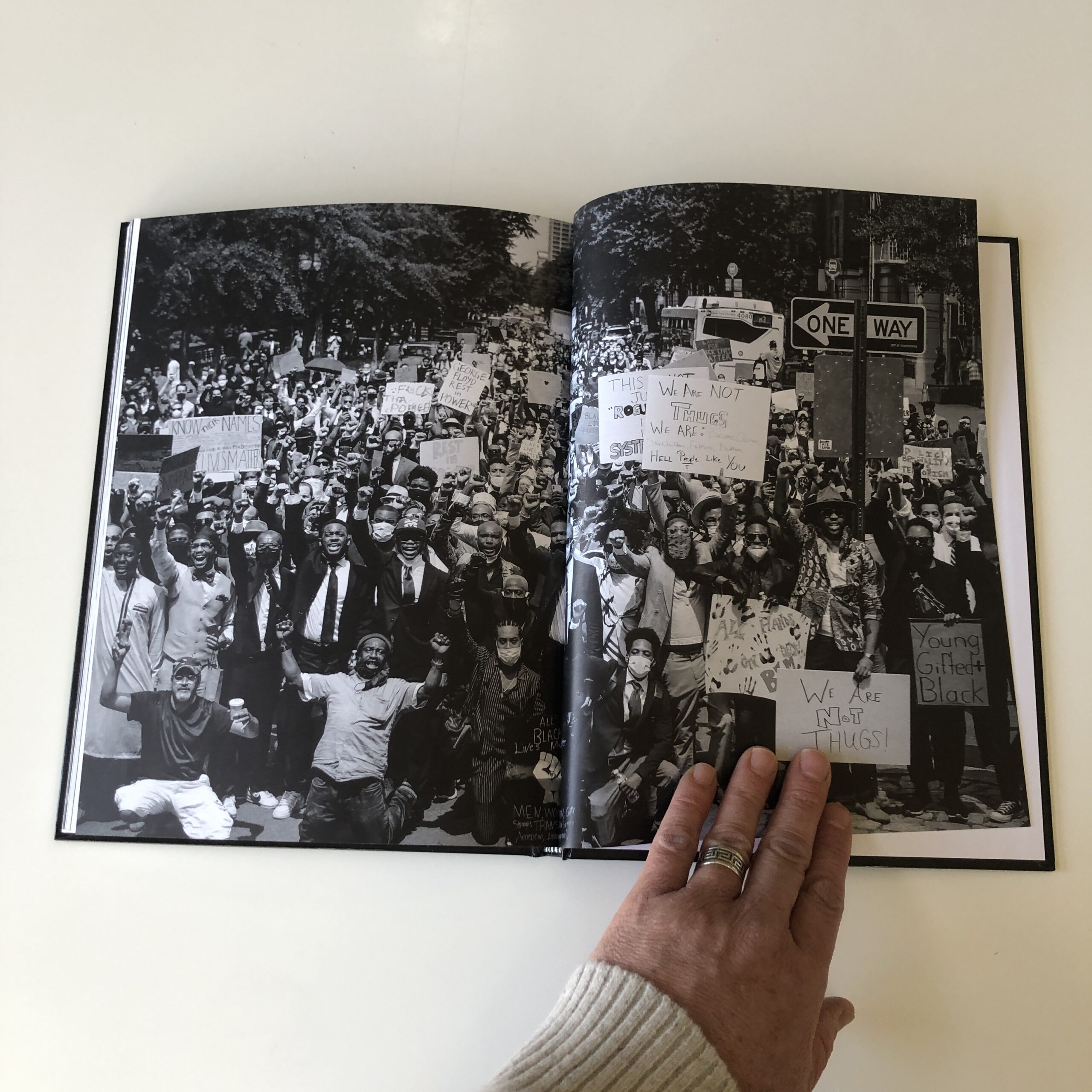
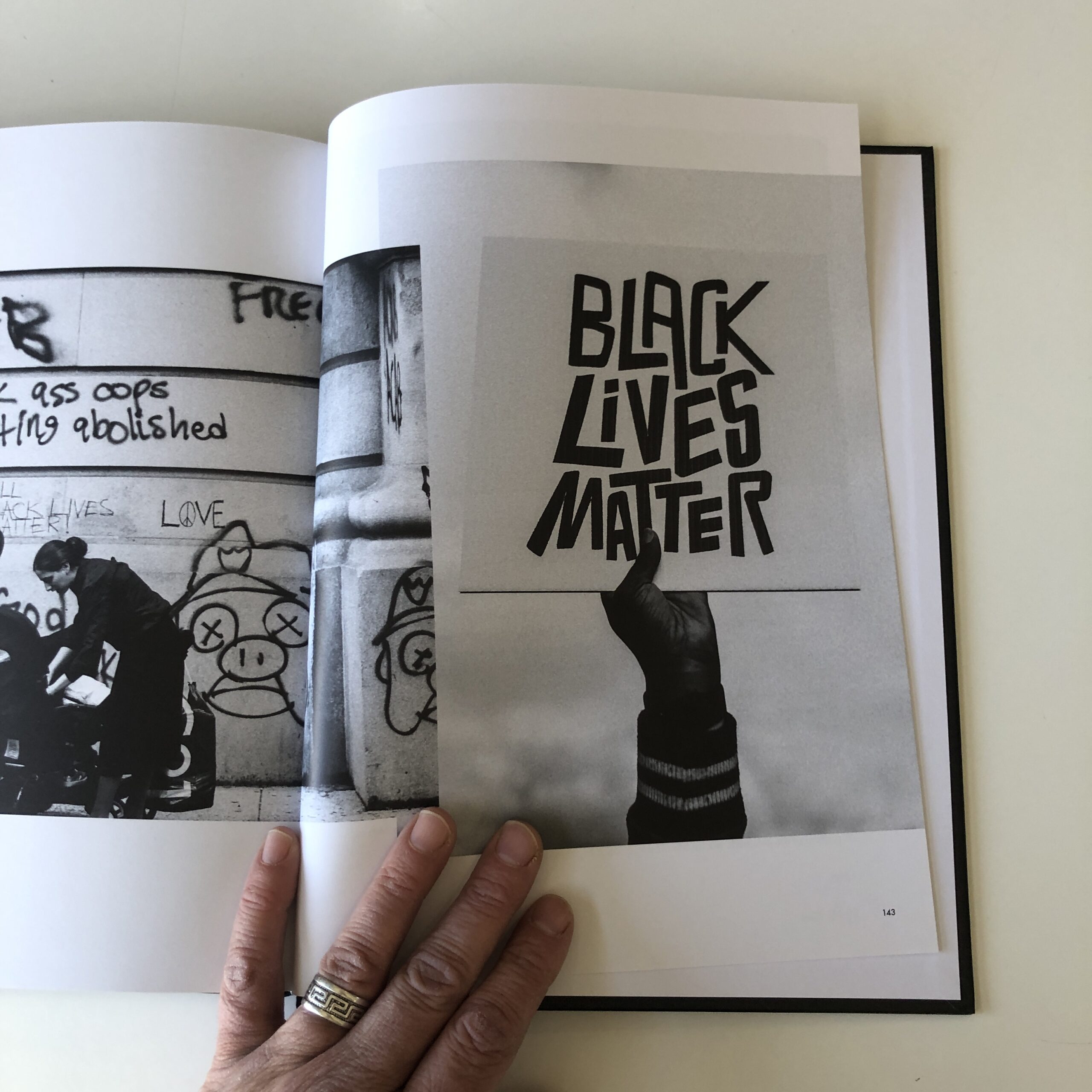
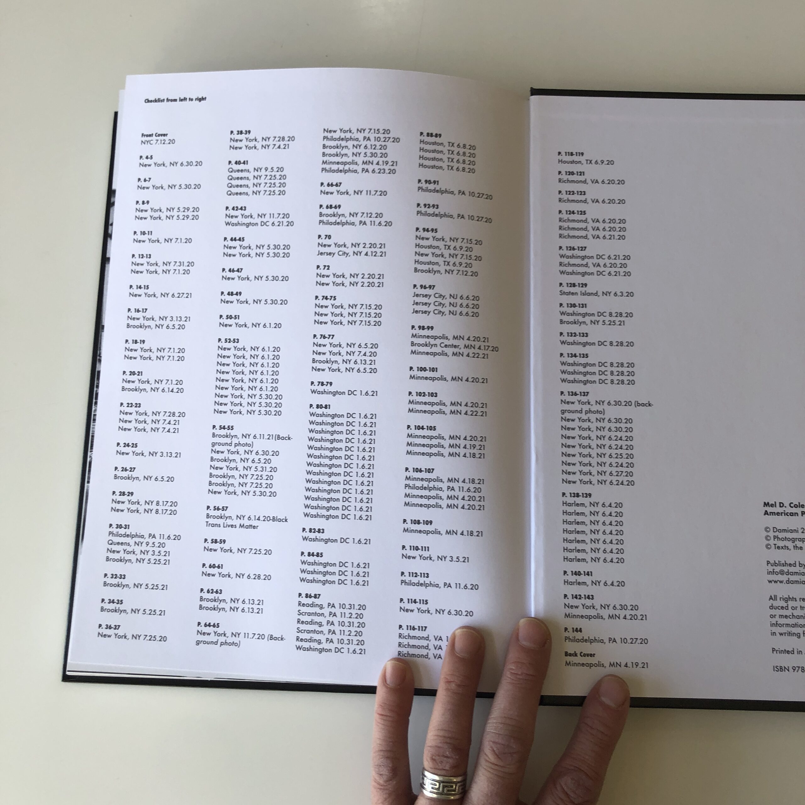
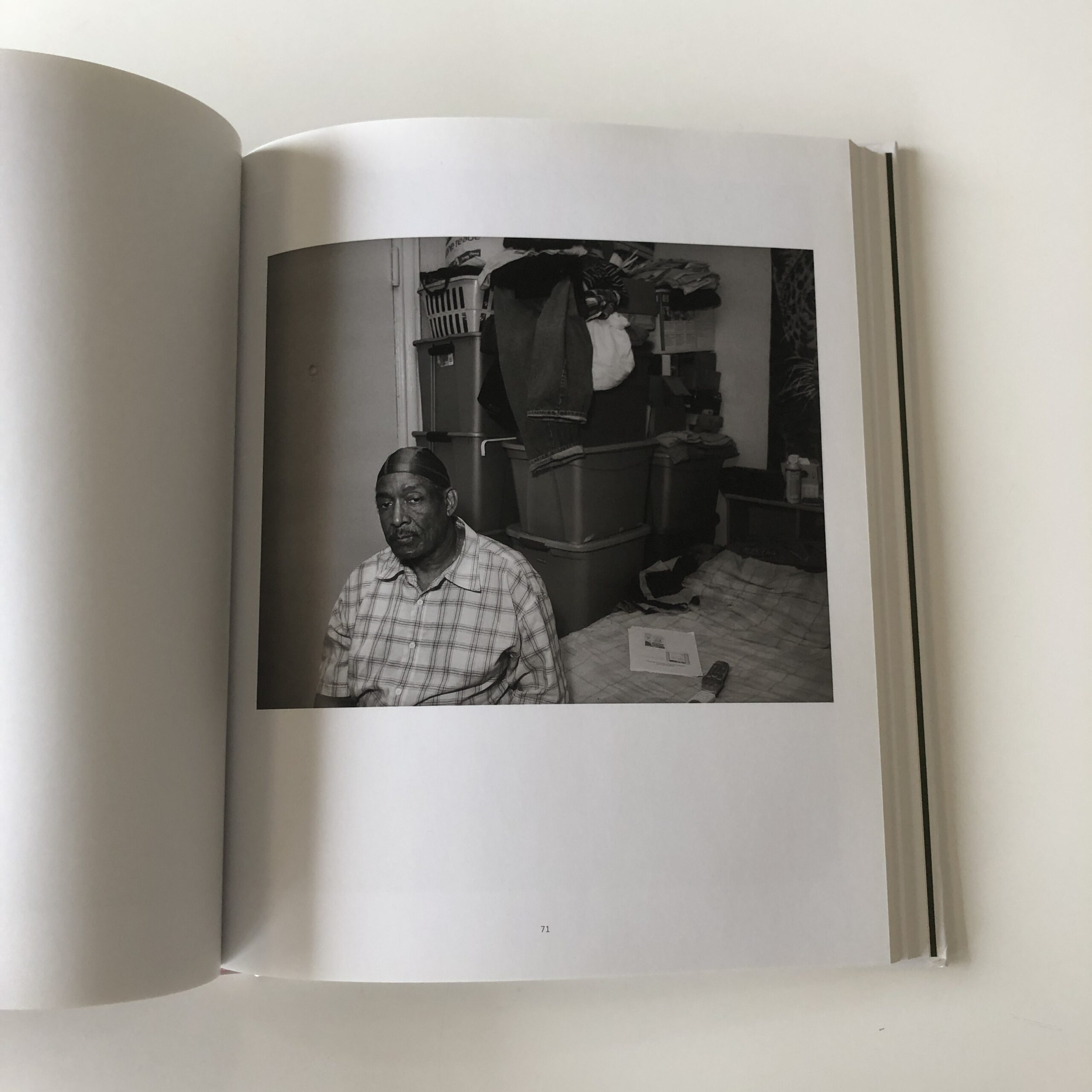
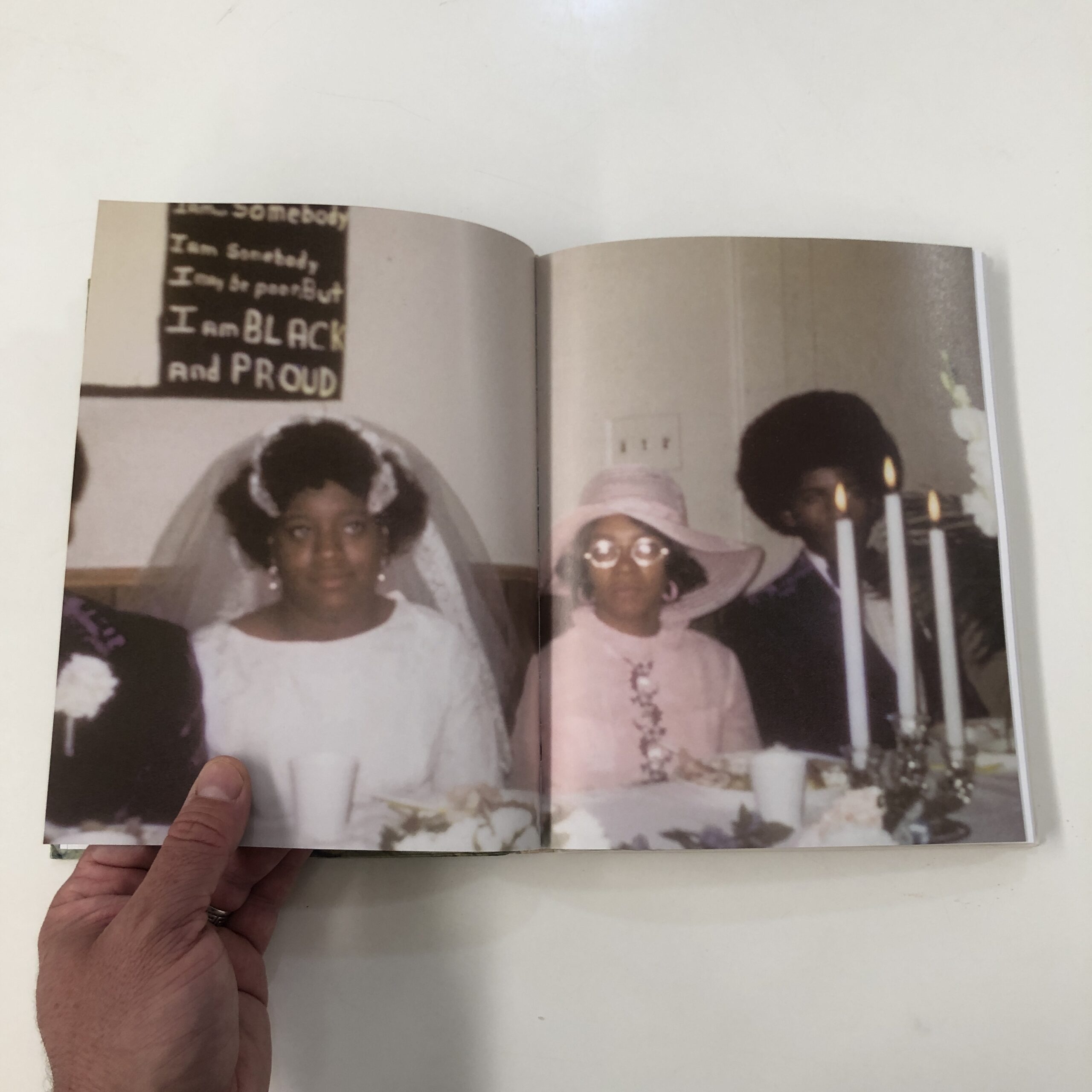
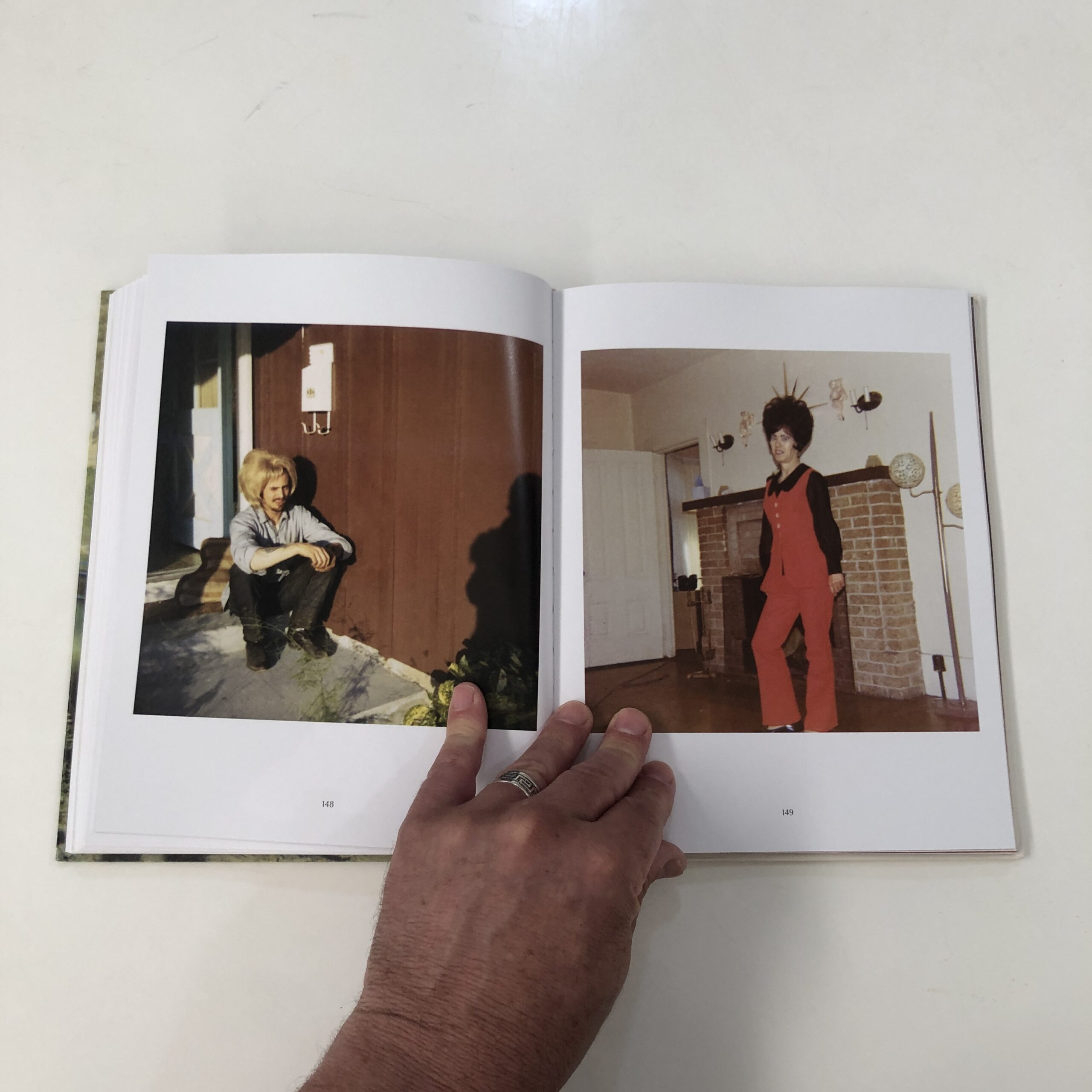
“American Protest: Photographs 2020-2021,” by Mel D. Cole, was published by Damiani, and arrived in Nov of 2021.
January 6th, which is featured in the book, was still fresh, and these days, we wonder if the endgame is coming?
But man, does this book pack a punch.
The intros tell us that Mel D. Cole is, and has always been an independent journalist, and the end notes say that funding was provided by the Black Photographers’ Fund. (Which he created.)
Damiani is an expensive publisher, so clearly a lot of people came together to enable this creative vision.
It’s pretty much the best case scenario for how the photo world can support working pros. (As I wrote above.)
But it’s also a great example of how I’ve tried to promote diversity of culture, vision and perspective here, over nearly 13 years.
New Orleans, Dec 2022
This book is clearly the product of the combination of talent, grit, bravery, timing, community support, and the brilliance of the photographic medium.
History was preserved.
Art was made.
Perspective was offered.
It’s badass!
I saw no designer credits, so I’m assuming Mel D. Cole did it himself, and it grabs you from the first second.
Black men in handcuffs, but rendered in such a way that you think… Shackles… Slavery.
(The reference is not to be missed.)
That the book ends with raised firsts and Black Lives Matter signs held high, tells you what you need to know about call backs, structure, and progression.
The pictures are amazing, and speak for themselves.
Period.
But just as I found myself about to skip ahead, (because there are a lot of pictures, and the structure was getting repetitive,) BAM!!!
He drops a color photo on us, the first, of a blood-stained Philly cop in his bright blue uniform.
Shocking!
Seriously, it jolted me back into the present moment.
And that use of occasional color popped up again, a few times, always to smart effect.
This is just a terrific book.
Top class.
The critic in me will point out that I don’t love the font choice in the intro text, (including one by Jamie Lee Curtis,) and I particularly dug the honest, casual, loving, thank you page.
Today’s book is a great example of why I’d like to see the global photography community organize a bit, to make sure the life-long art voices, those countless creators who committed to the path, and continue to stick it out…
We need to maintain a system that supports these photographers.
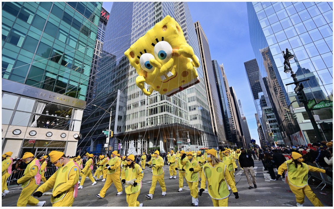
Can you imagine if someone dreamed up Thanksgiving, from scratch, in 2022?
Macy’s Thanksgiving Day Parade, courtesy of the Today Show/ James Devaney/ Getty Images
—Scene:
Ted: I’ve had an idea-gumbo cooking in my mental kitchen for a few weeks now, let me tell you.
Brad: Really, Ted?
Ted: Yes, Brad, really.
Brad: Are you just going to tease me? If I want to get teased, Ted, I can walk down to Janet’s cubicle, and she’ll do it gladly.
Ted: Wait, what? Janet’s been flirting with you? Damn, boy! Look at you!
Yes, Ted, I even bought a just in case she flirts with me again.
Brad: (Pause.) Listen, Ted, I’m busy. Don’t you have a great idea? Isn’t that why you came over here?
Ted: Yeah, sorry, Brad. Totally. So, I’ve been thinking. Hallmark is not happy with their quarterlies, and we have to give them something good to keep the account.
What if we create a new holiday around gratitude? You know, giving thanks? I mean, what demo could possibly object to giving thanks?
Ted: So then I thought, why not make it historical? How about we combine the giving-thanks part with honoring the founding of America?
Brad: I’m still listening.
Ted: OK, Brad. So who do we have to thank for the founding of America?
Brad: The crazy English fucks who sailed out into an empty, cold Ocean, and an unknown world, just to get away from England?
Ted: No, silly. We don’t thank THEM. Anyone can honor the Pilgrims. I mean, sure, we’ll mention them a little. But we’re going to thank the Native Americans who gave us the Continent, so we could found our new nation.
Let’s thank the them!
Brad: (Silence.) (Stares daggers at Ted.) Say what now, Ted? Say what?
You want us to make a holiday around thanking the people upon whom our American ancestors committed Genocide?
Do you hear yourself, Ted?
Ted: Yeah, yeah, sorry, Brad. You’re right. What was I thinking? I gotta stop eating that last edible right before bed.
It’s not doing me any favors.
—End Scene:
Sure, Thanksgiving is batshit, but giving thanks IS a great idea.
I’m grateful for you, the audience of people who have read my musings here for the last 11 years.
And I’m beyond thankful for my lovely, amazing, supportive, incredible family. (As I’ve said, this column is older than my daughter, and she’s jealous.)
I’m also thankful to all the great artists who’ve made work that’s inspired me these many years.
Just the other day, for example, my son, (who’s 15,) wanted to show my daughter (10) his favorite childhood film: “Wallace and Gromit: The Curse of the Were-Rabbit.”
Such a brilliant movie!
(If you haven’t seen it, please do. I swear, it’s not just for kids. )
We all remembered every line, and Amelie was smitten, as it’s a perfect film.
Plus, the claymation is sooooooo laborious, the technical mastery is evident, without taking you out of the narrative.
There’s an old expression: They don’t make them like this anymore.
And in this case they actually can’t.
Peter Sallis, the voice actor who played Wallace, passed away in 2017 at the age of 96.
(RIP Wallace!)
Whether you’re an artist/critic like me, or just a “normie,” the biggest artistic touchstones will always represent a certain phase of your life.
An era.
Or an inflection point?
That’s what great art does for culture, and for our lives.
11 years ago, (in a story I shared too recently to re-tell,) I discovered a pure writing style for this column.
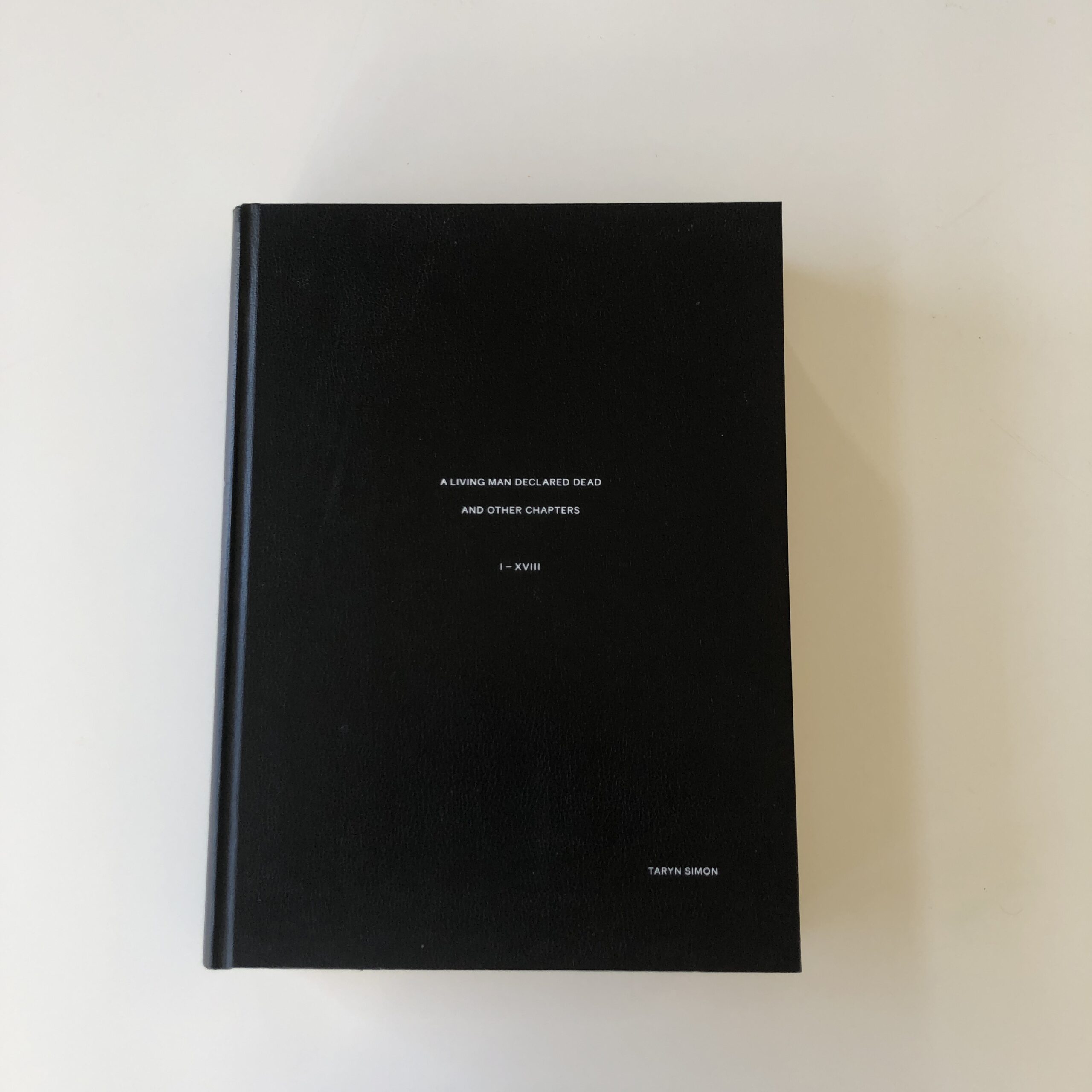
It was Thanksgiving, and after the night-time-drama, I woke up the next day and reviewed a massive Taryn Simon book, published by a start-up in London called MACK.
It’s easily the biggest, thickest book I own, and I’m not sure I reopened it again before this morning.
Which means it’s time for a re-review, as this book, (like Wallace and Gromit,) is proper genius.
And just like W&G, they don’t make them like this anymore.
Seriously.
In an age of rampant inflation, I can’t imagine a publisher making a book this expensive to create.
(Unless it was a super-small-batch, limited edition.)
Not only that, I don’t think an artist working with these ideas and scope would do this project as “fine art photography” in 2022.
Let that sink in for a moment.
The book is amazing because the idea is amazing, and thoroughly executed.
But it’s also so bleak I had to stop at Chapter 12.
Ms. Simon has basically put human nature on display, by telling disturbing stories via human family networks.
Each tale is a thread in a metaphor-tapestry that depicts a cynical, nihilistic view of PEOPLE.
Off the top of my head, (though I did just look at the book,) we’ve got a litany of family horror stories:
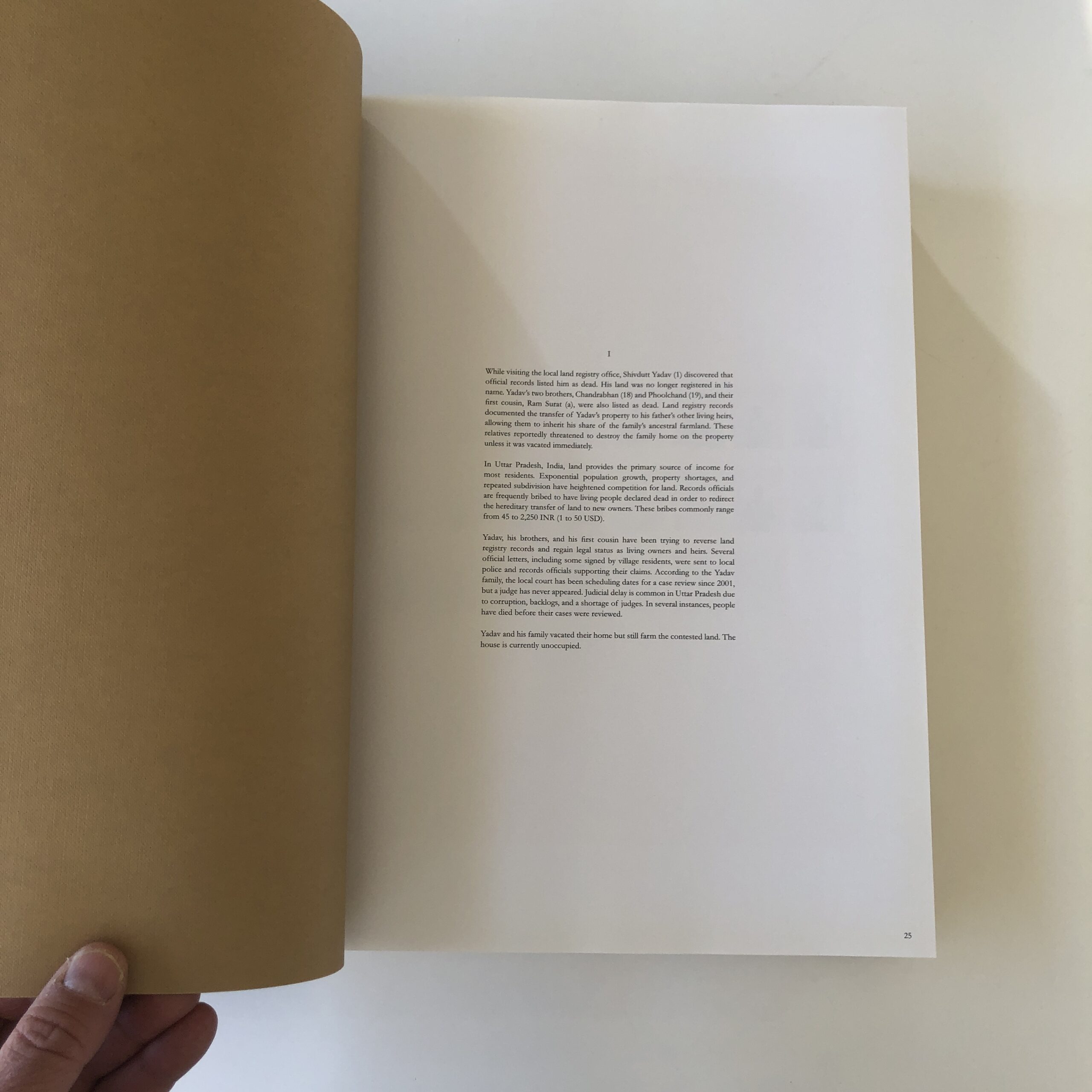
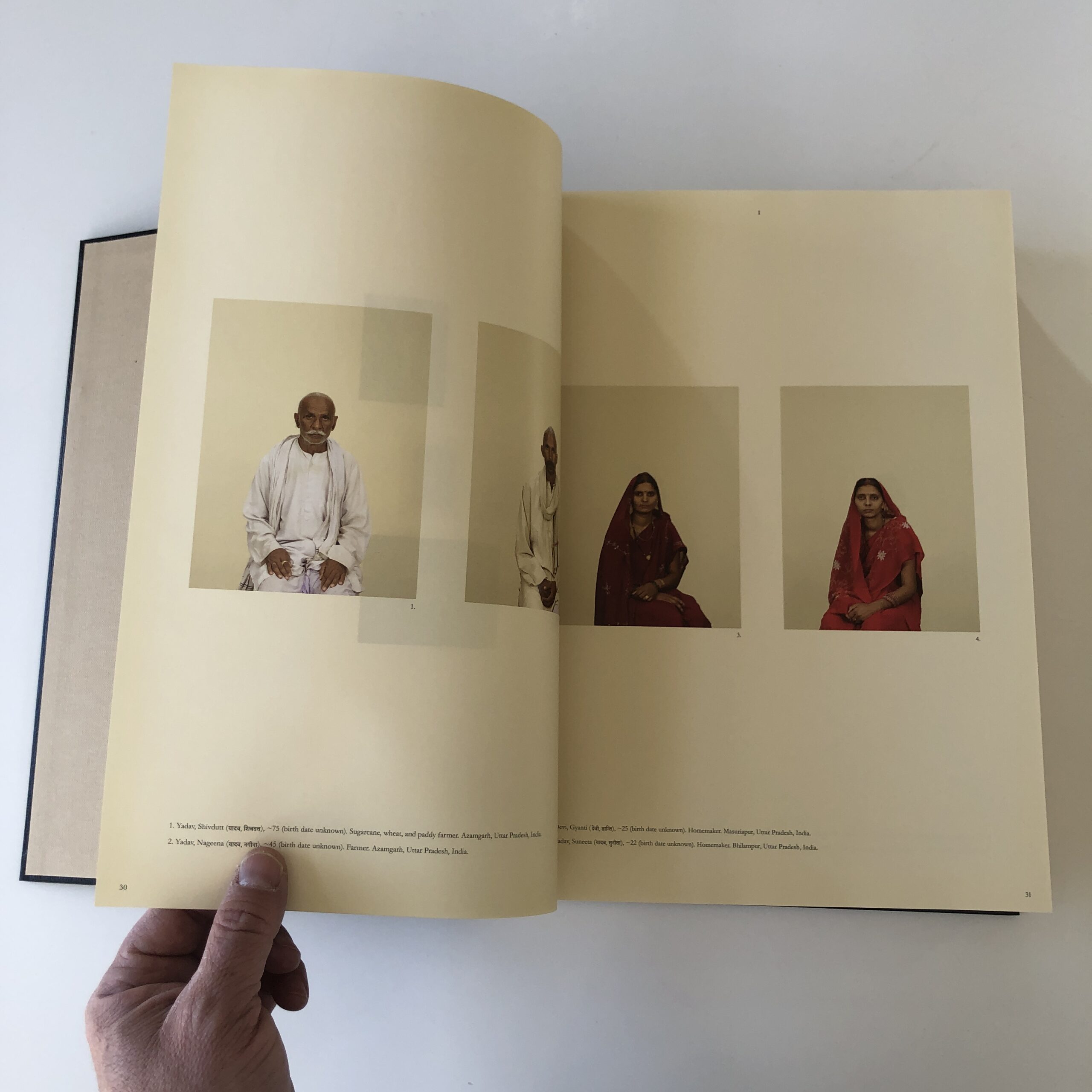
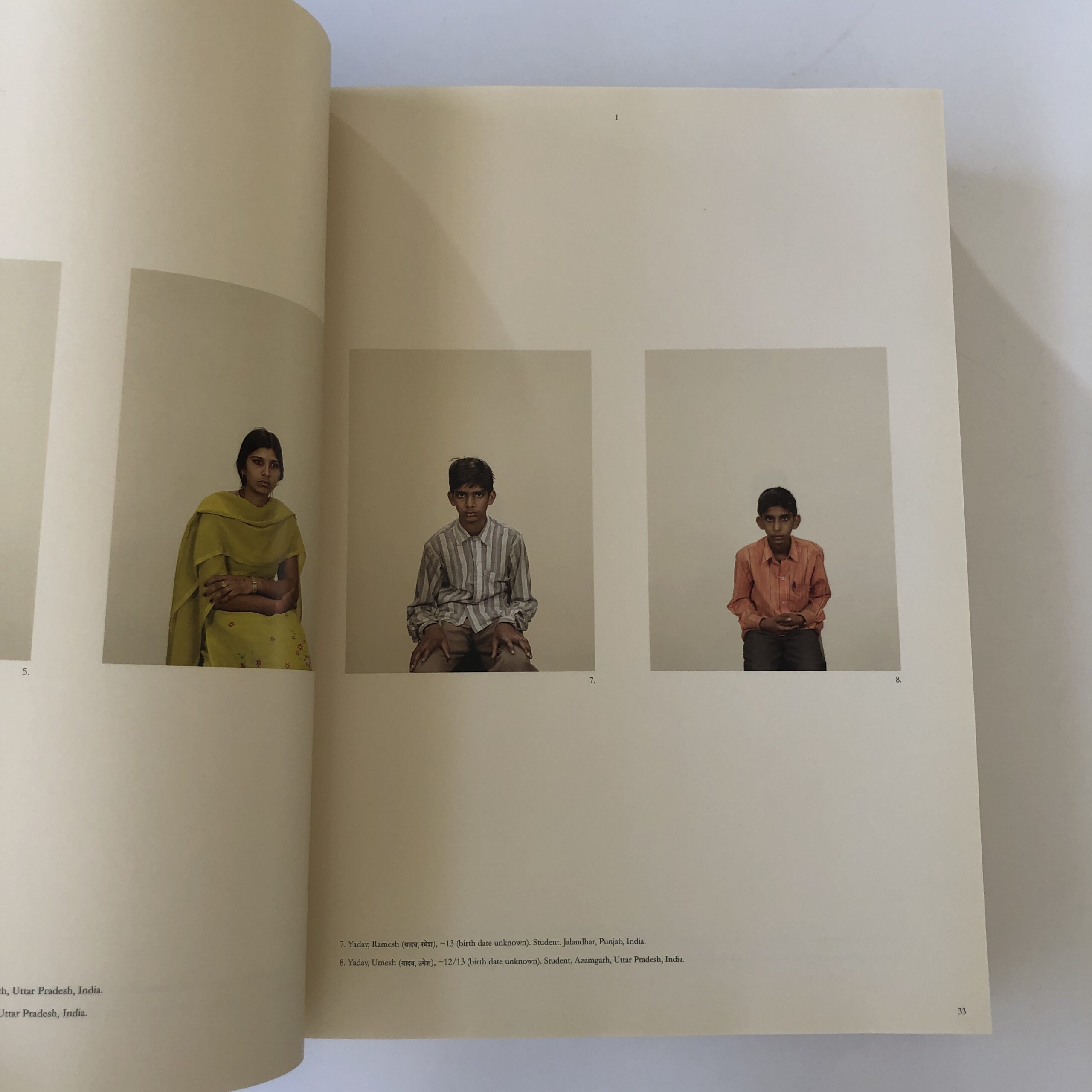
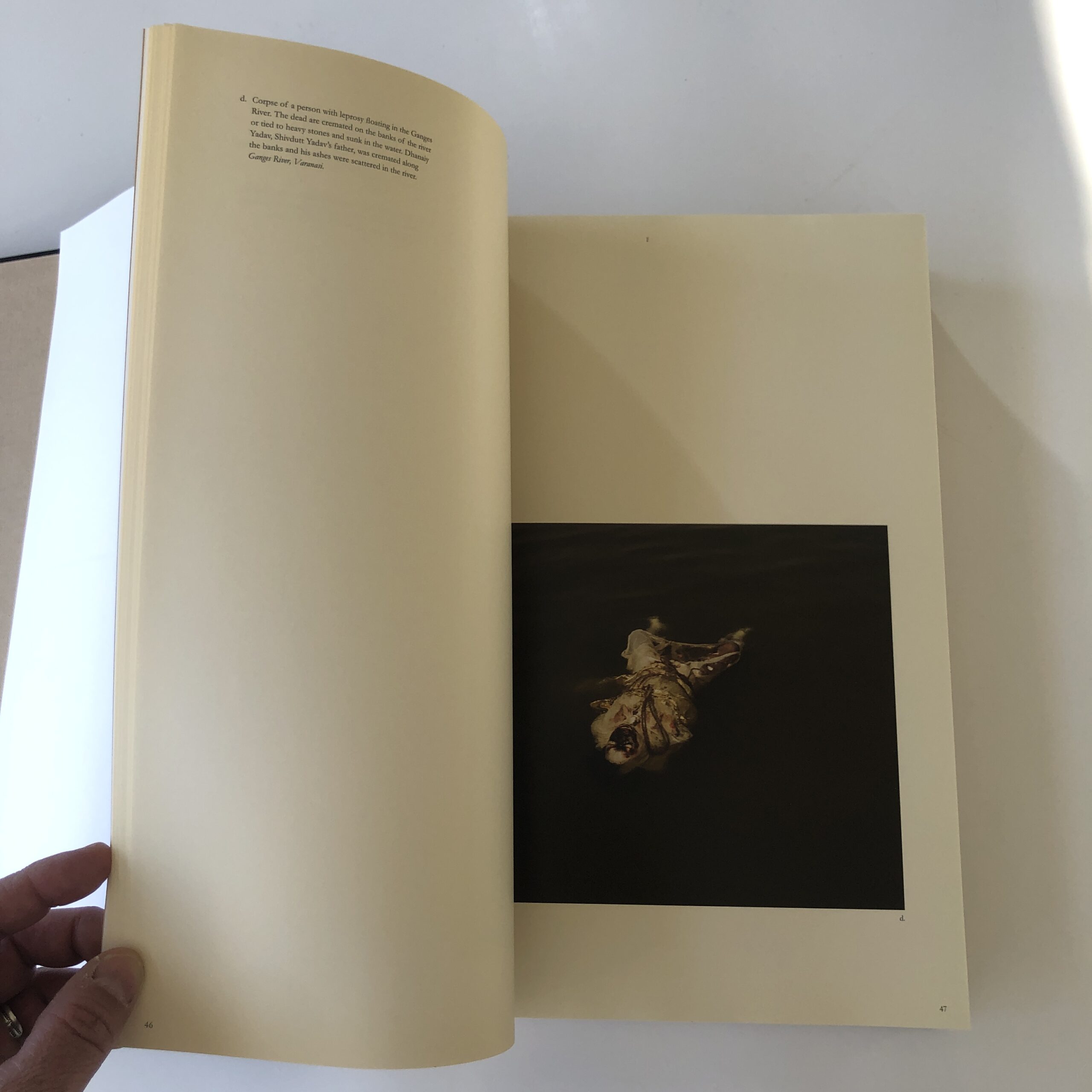
A South Asian Indian family that declared some members dead to steal inheritance.
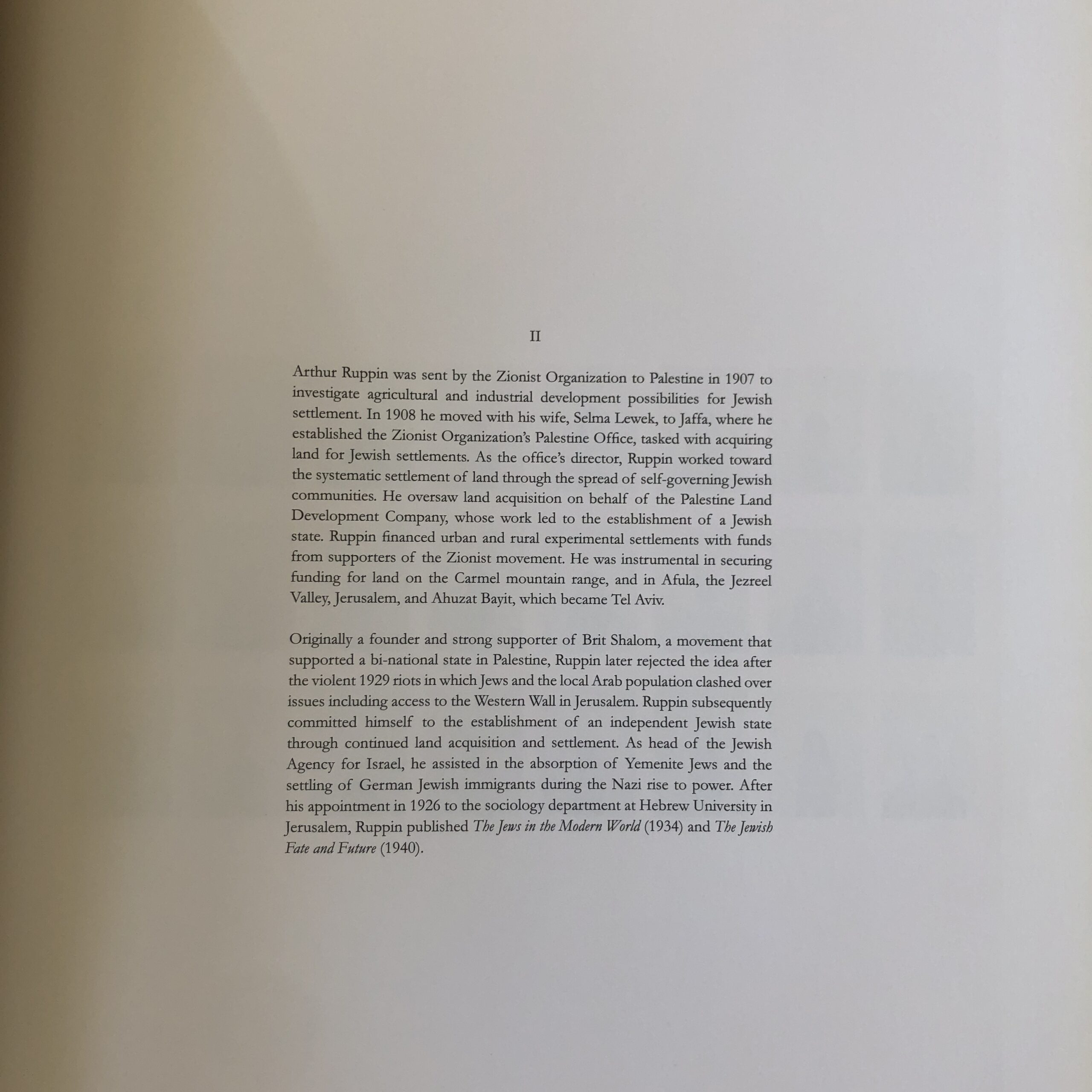
Zionists who successfully colonized Israel.
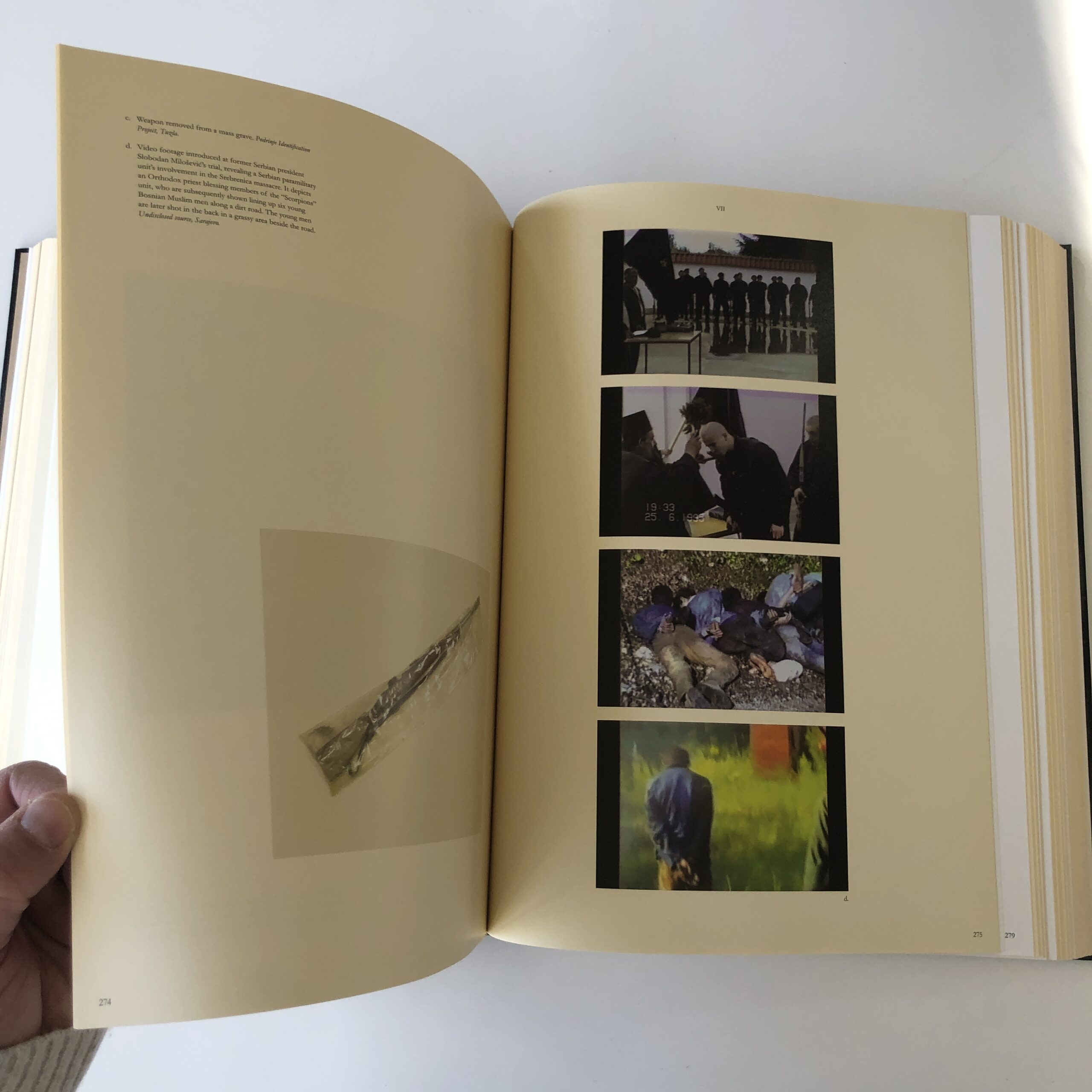
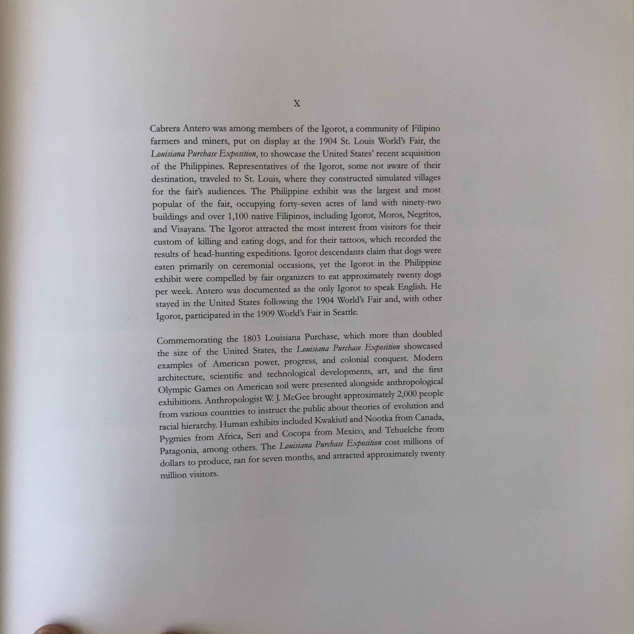
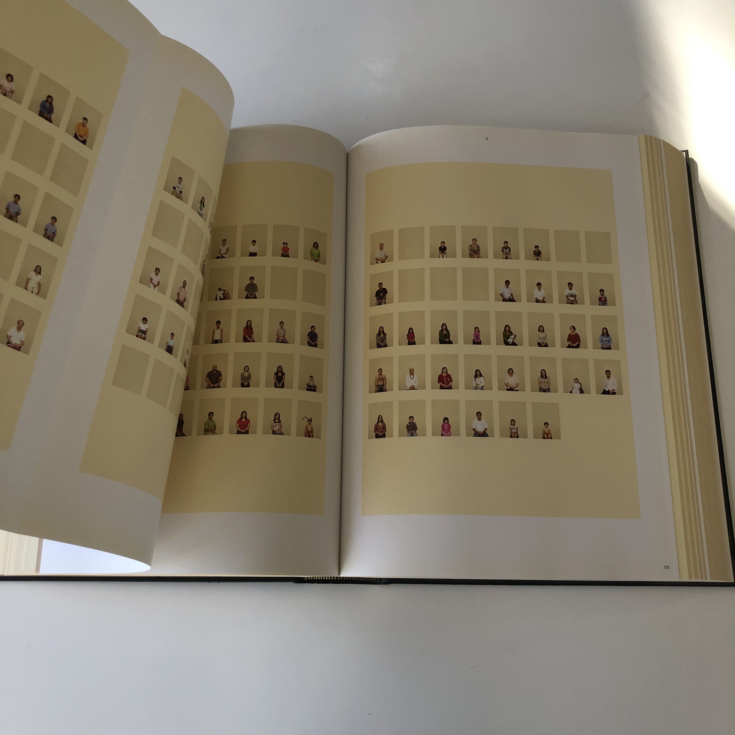
Filipino tribal people paraded as zoo animals at a World’s Fair 1O0+ years ago.
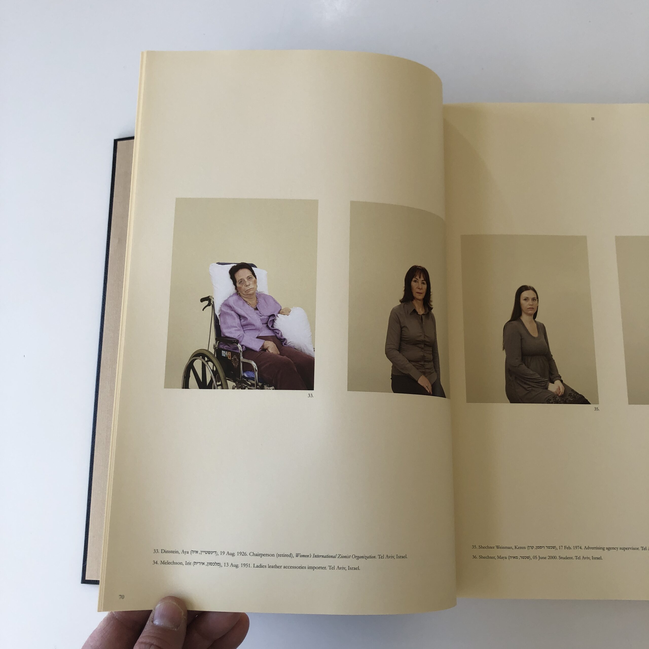
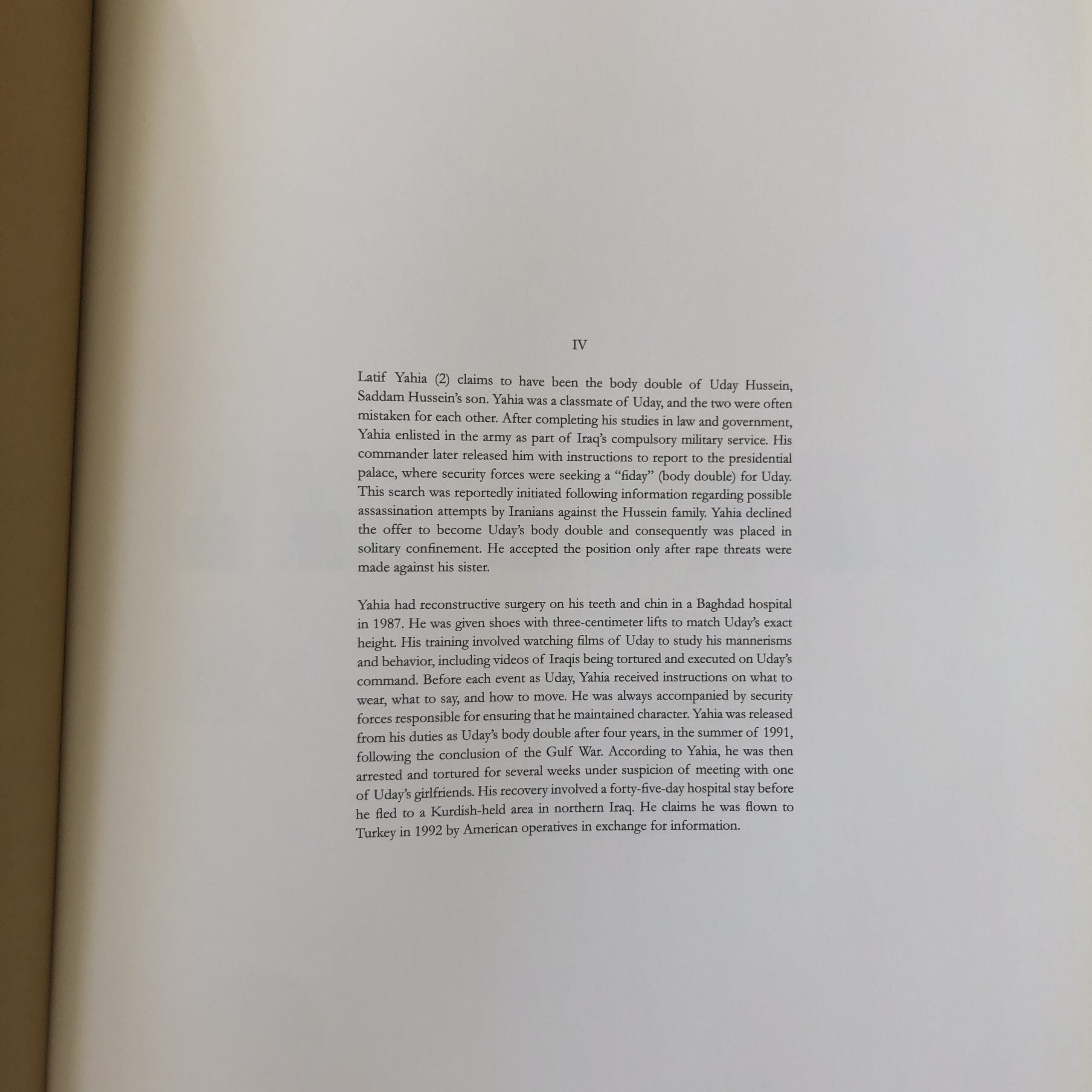
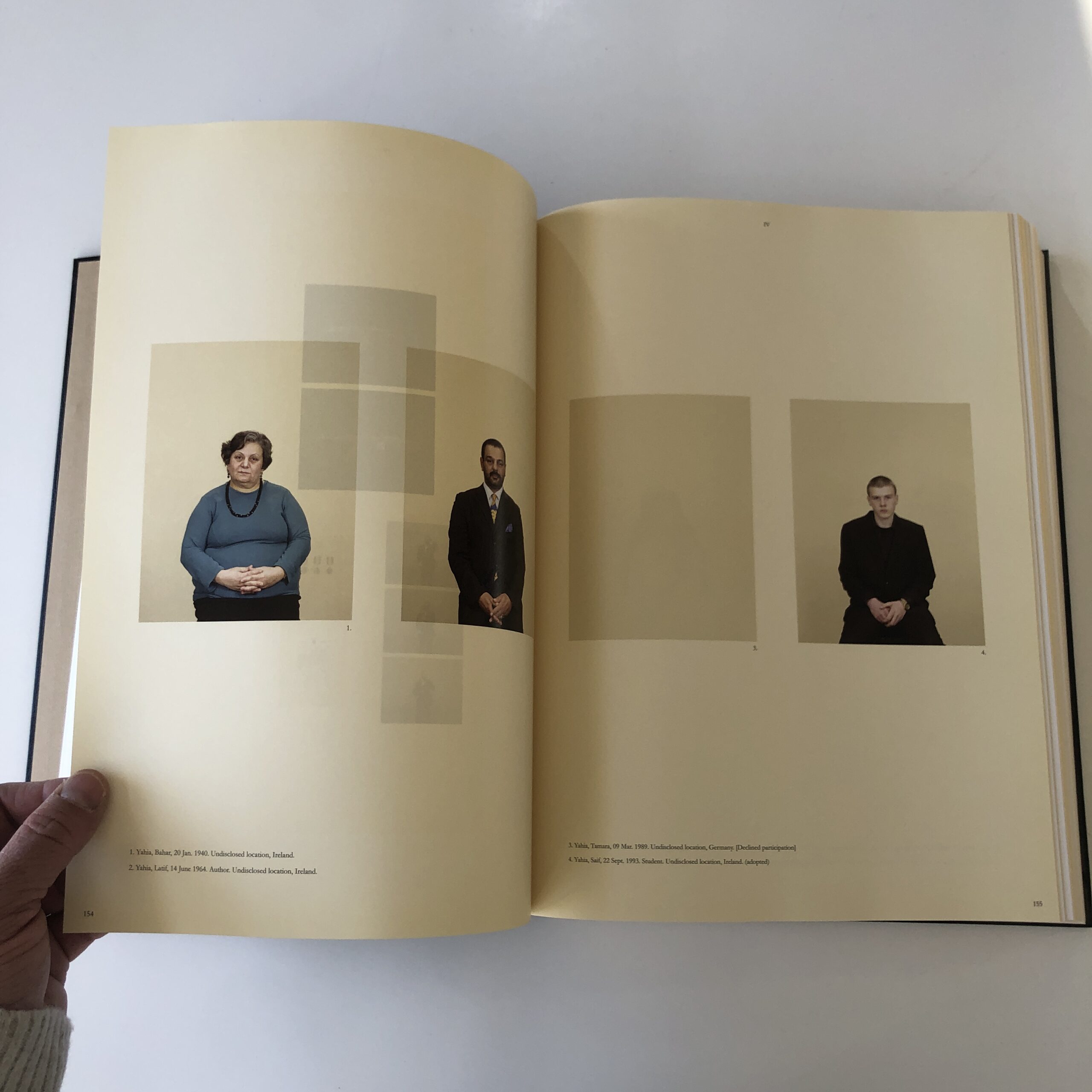
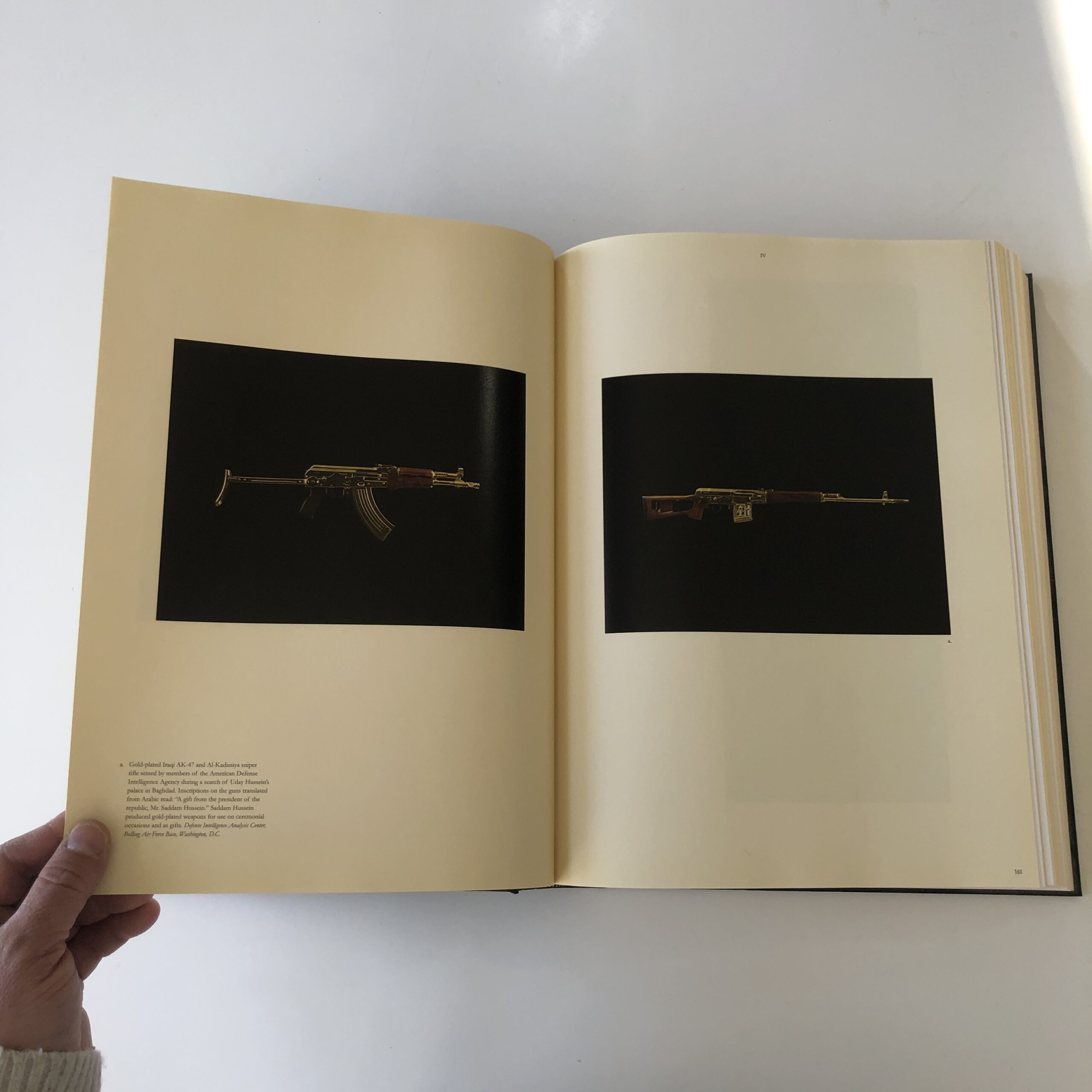
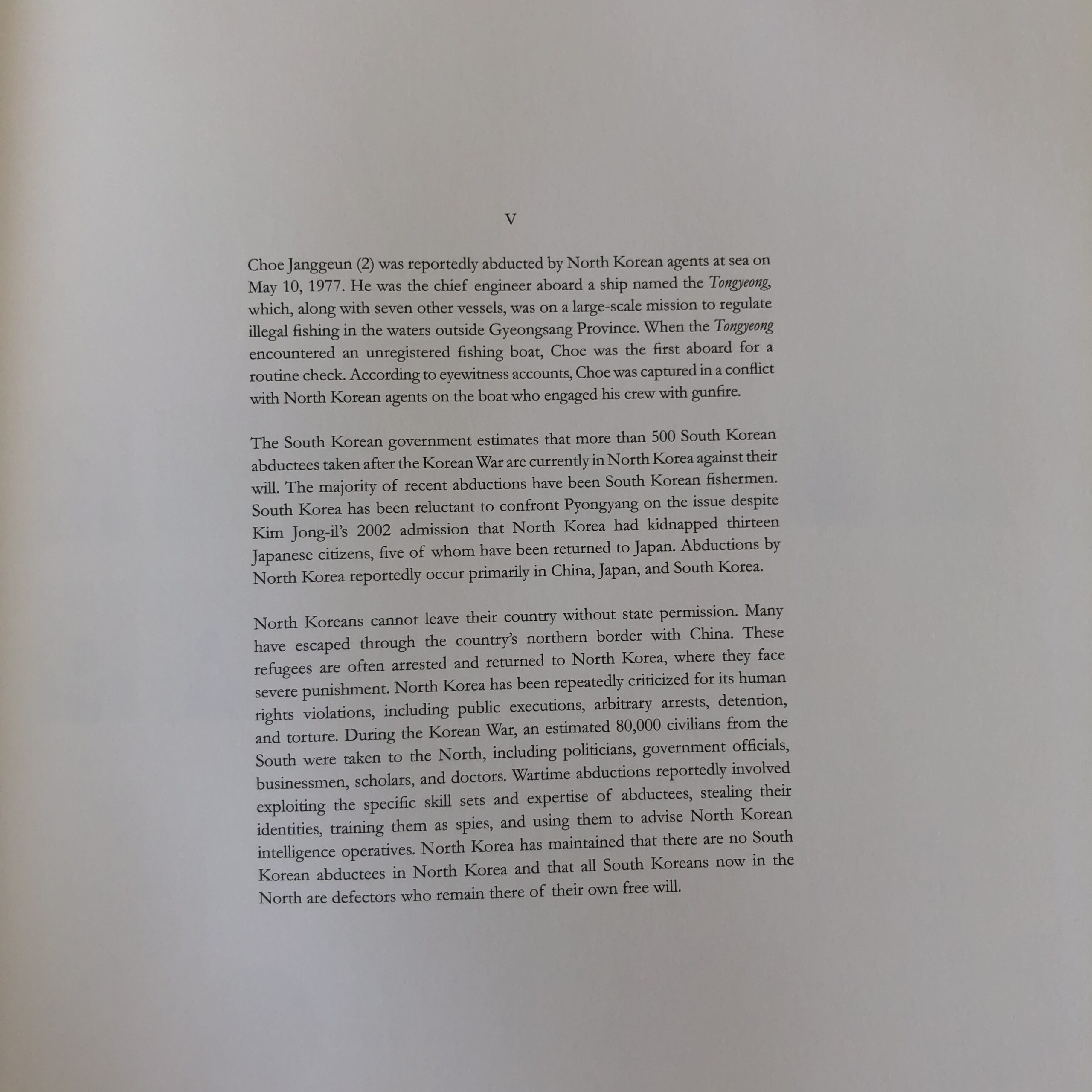
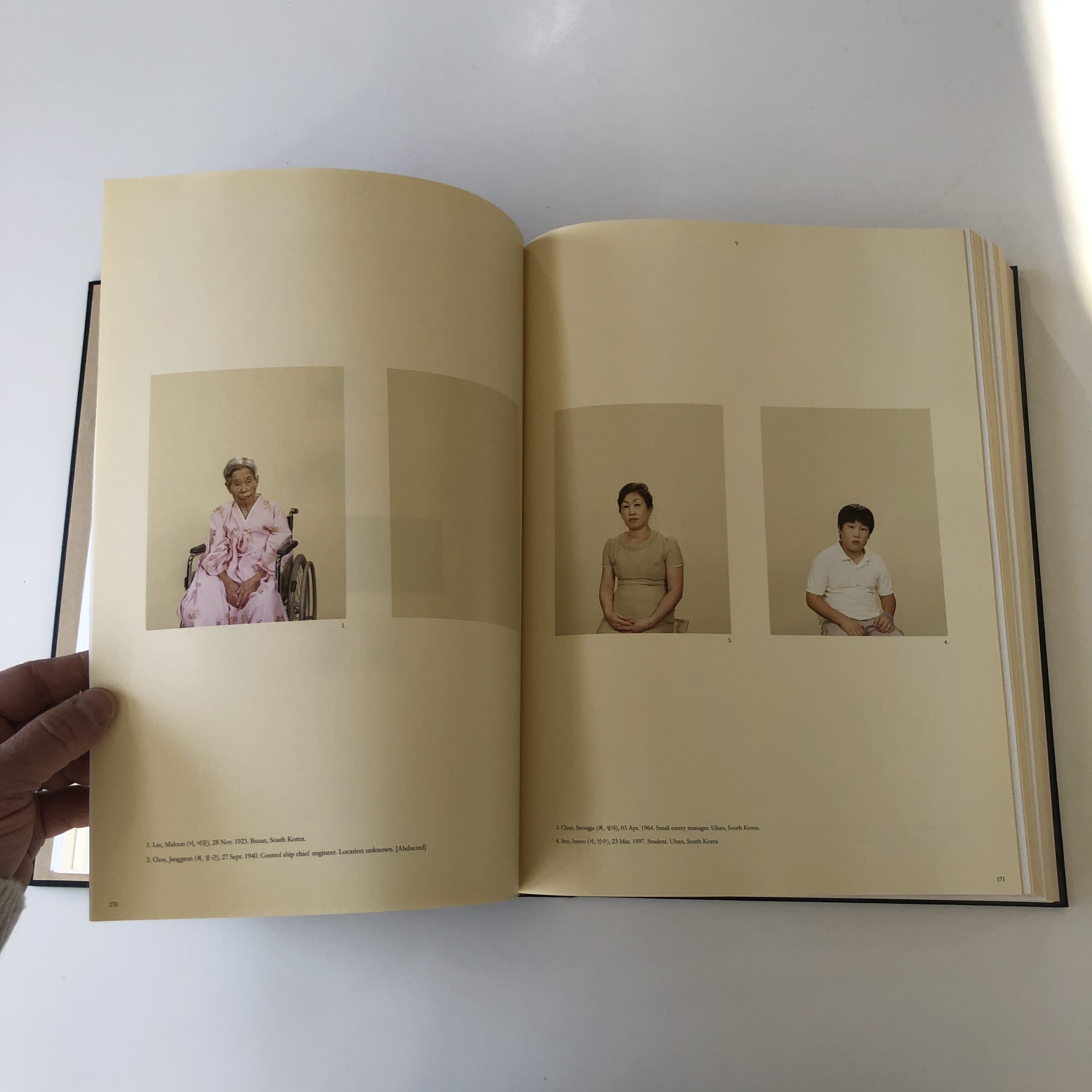
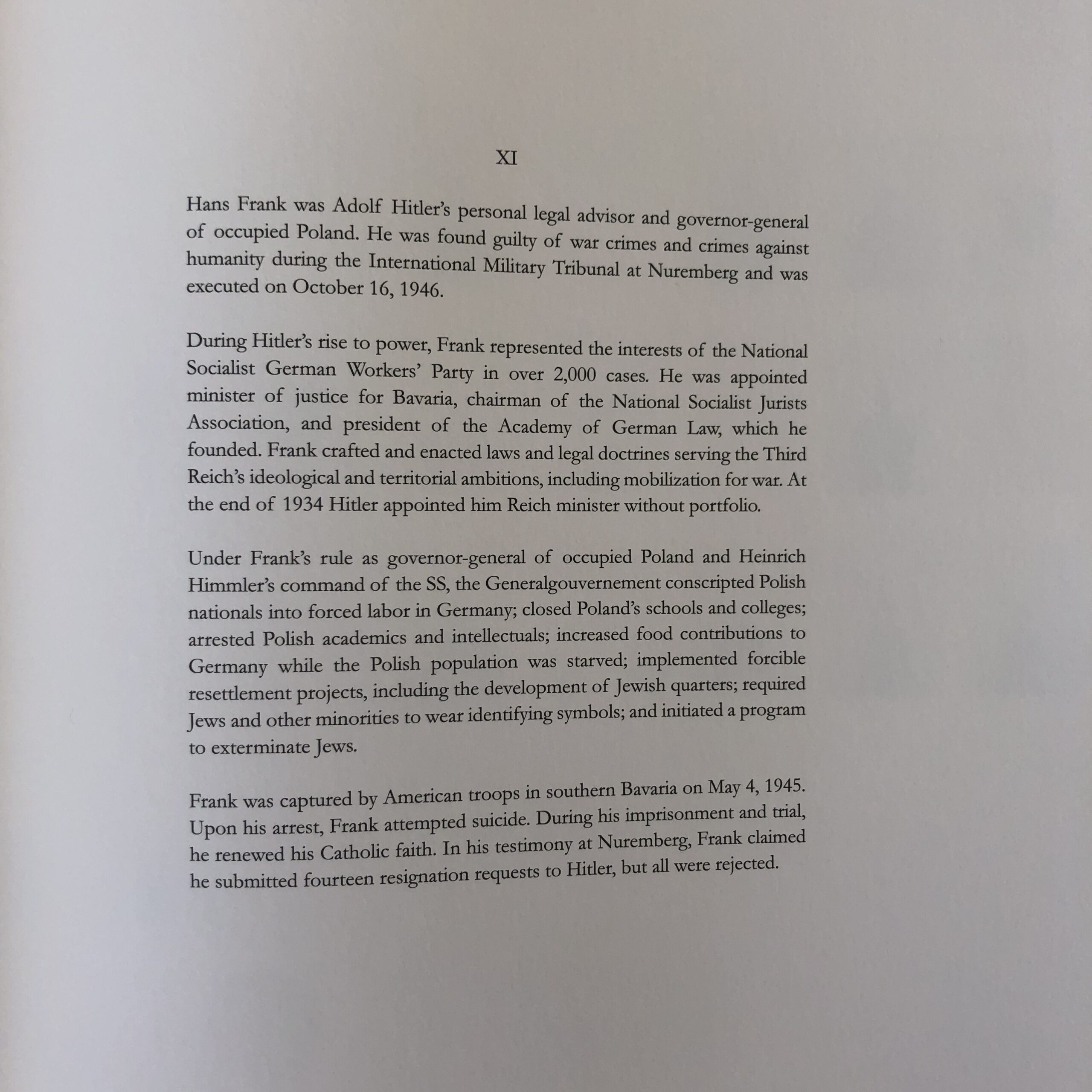
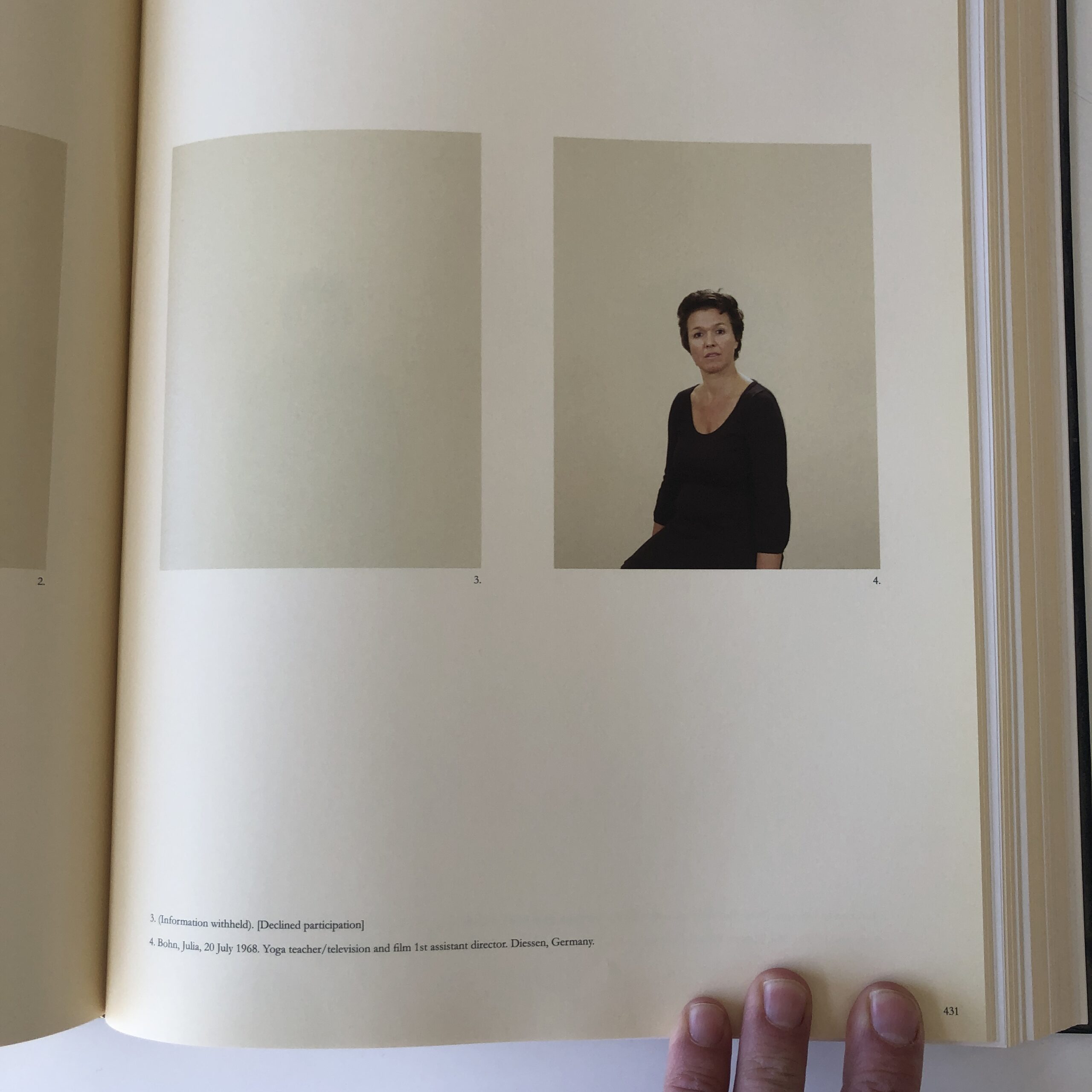
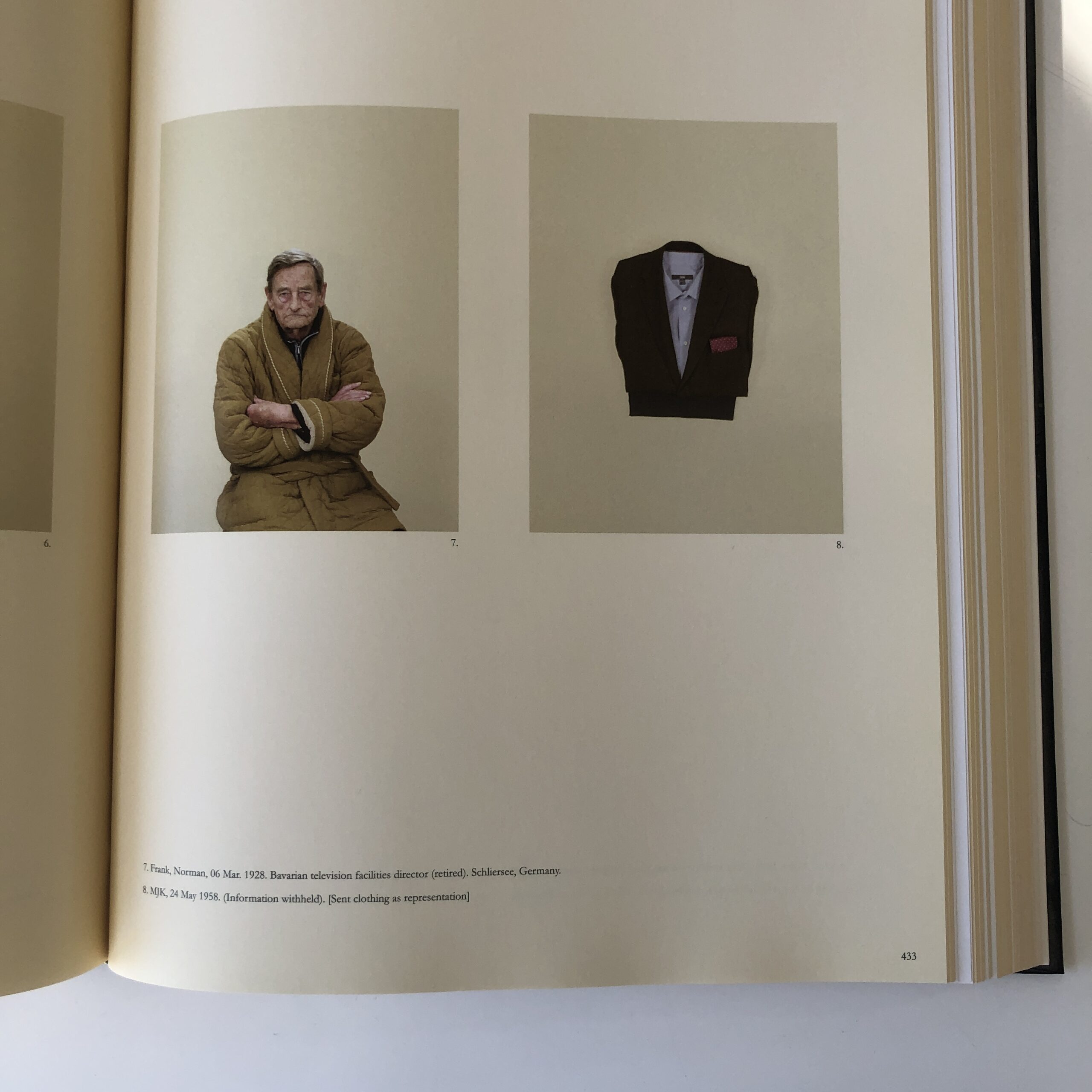
Saddam Hussein’s sadistic son’s tortured body double, Hitler’s legal advisor, Scottish thalidomide sufferers, a fisherman kidnapped by North Korean secret agents, Brazilian blood feud murderers, and Bosnian massacre victims.
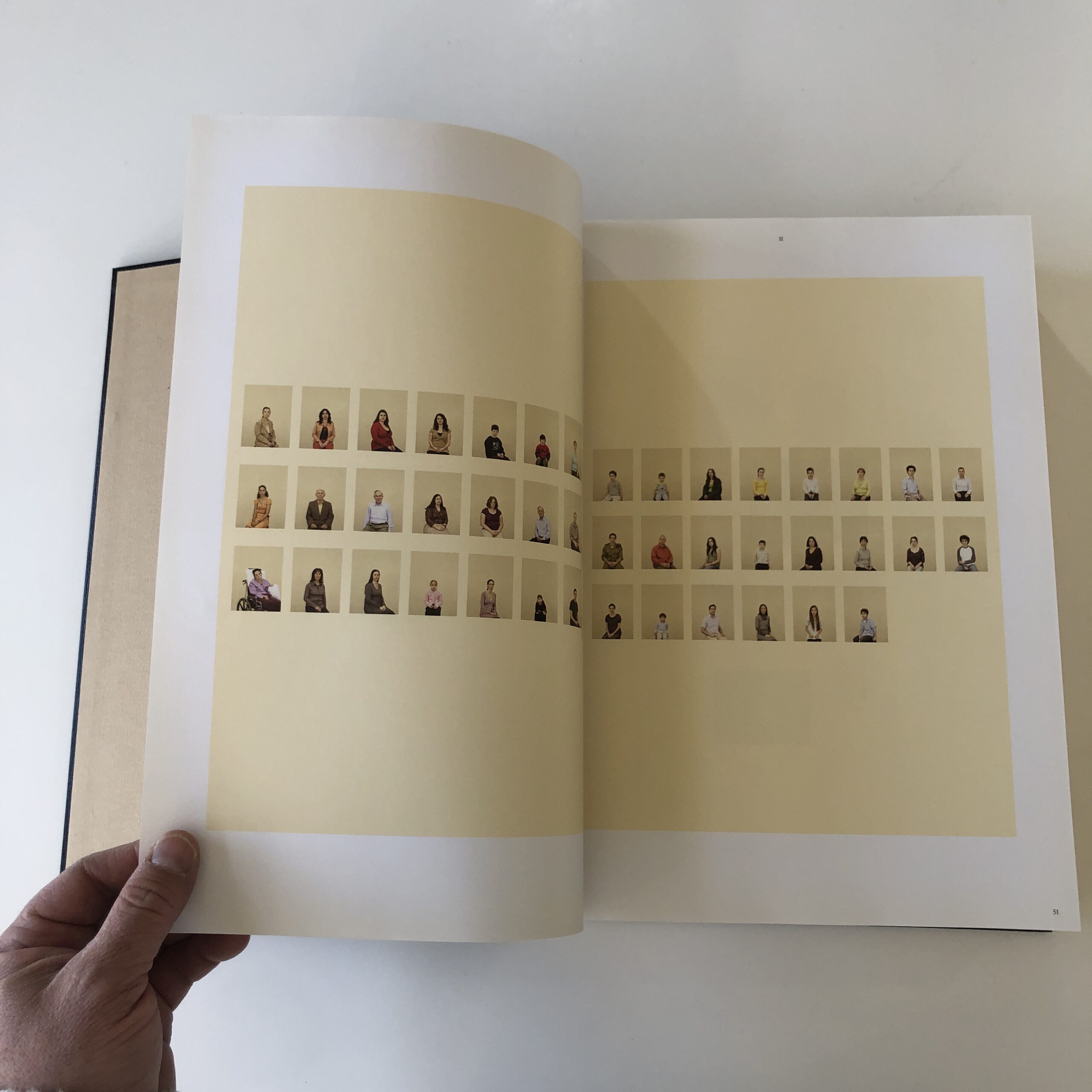
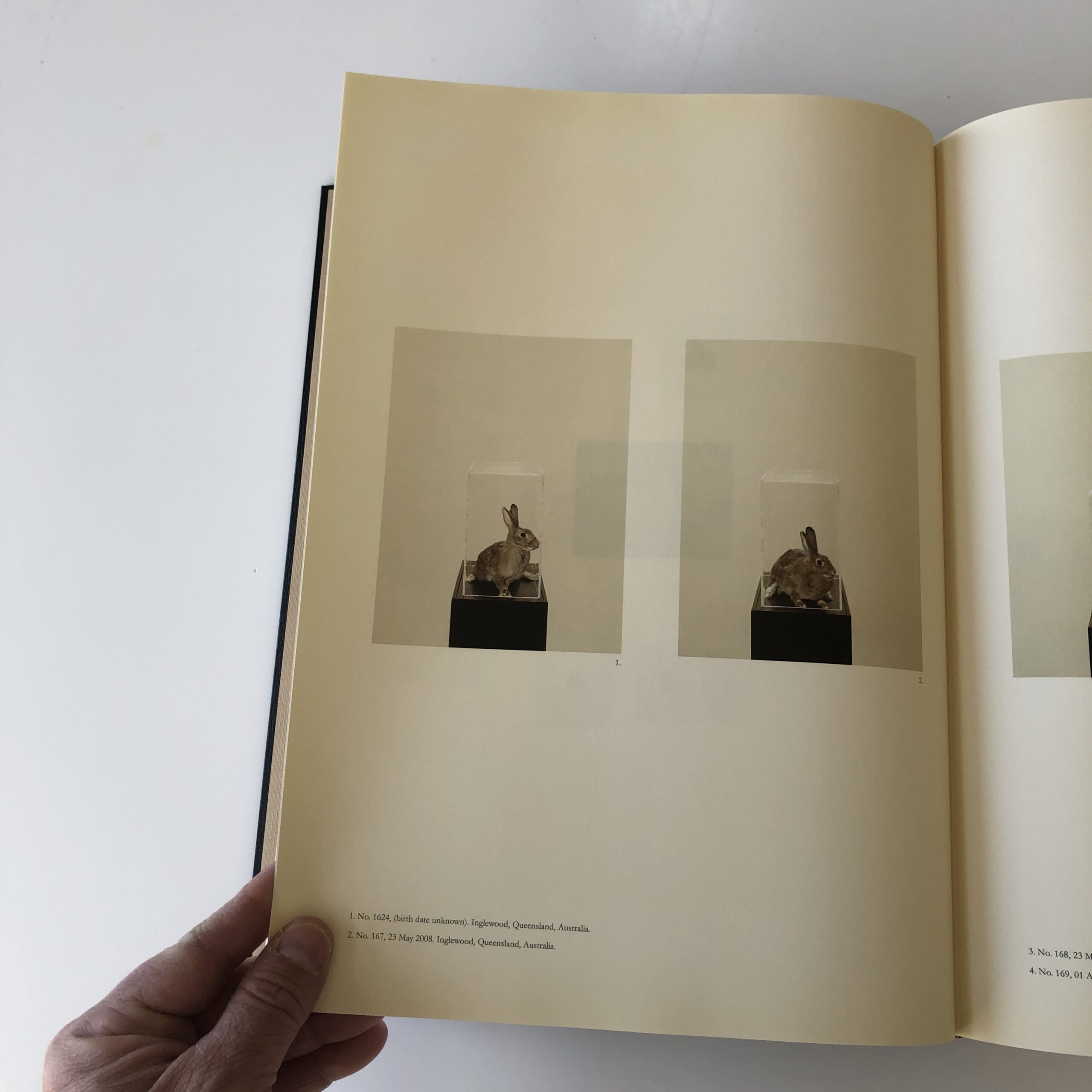
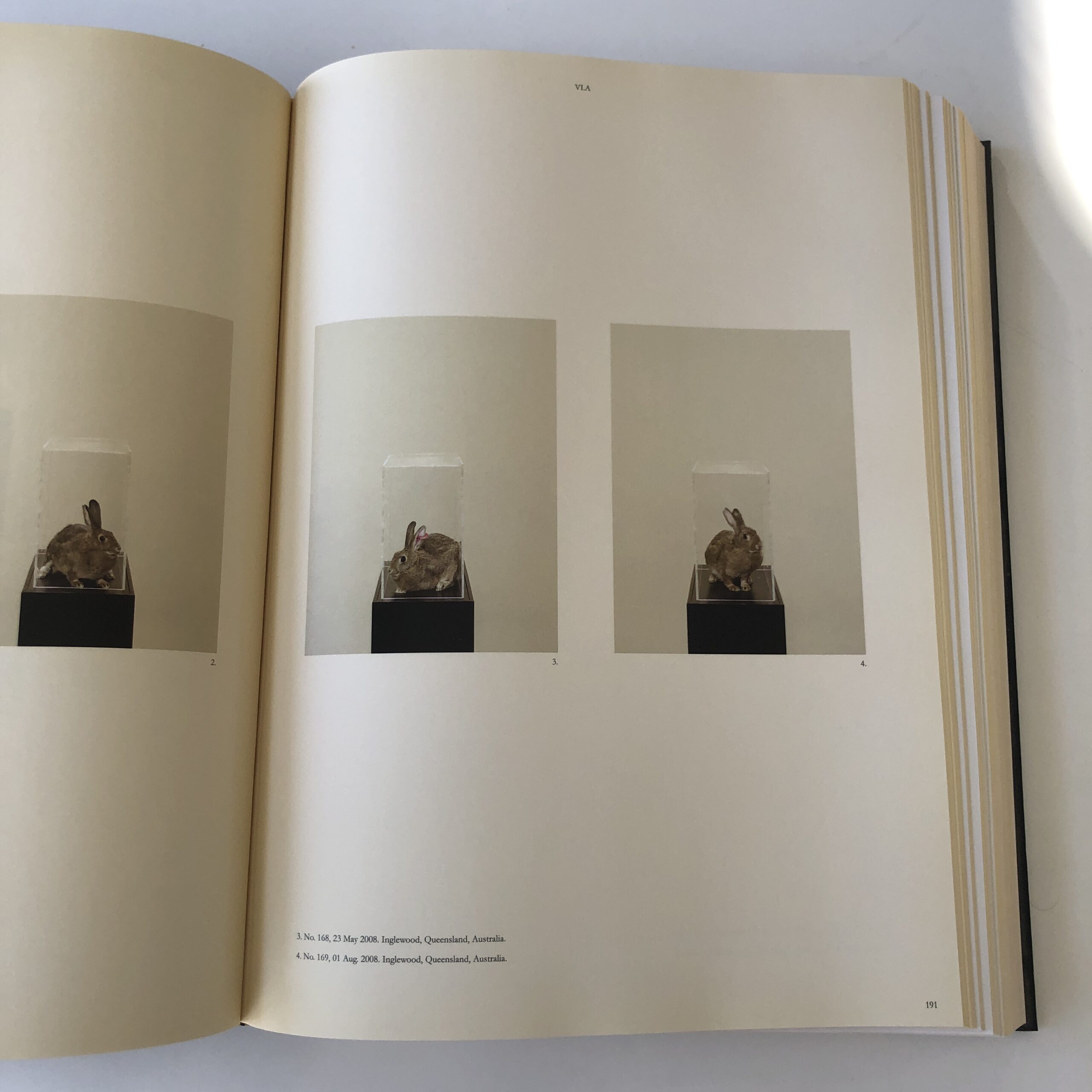
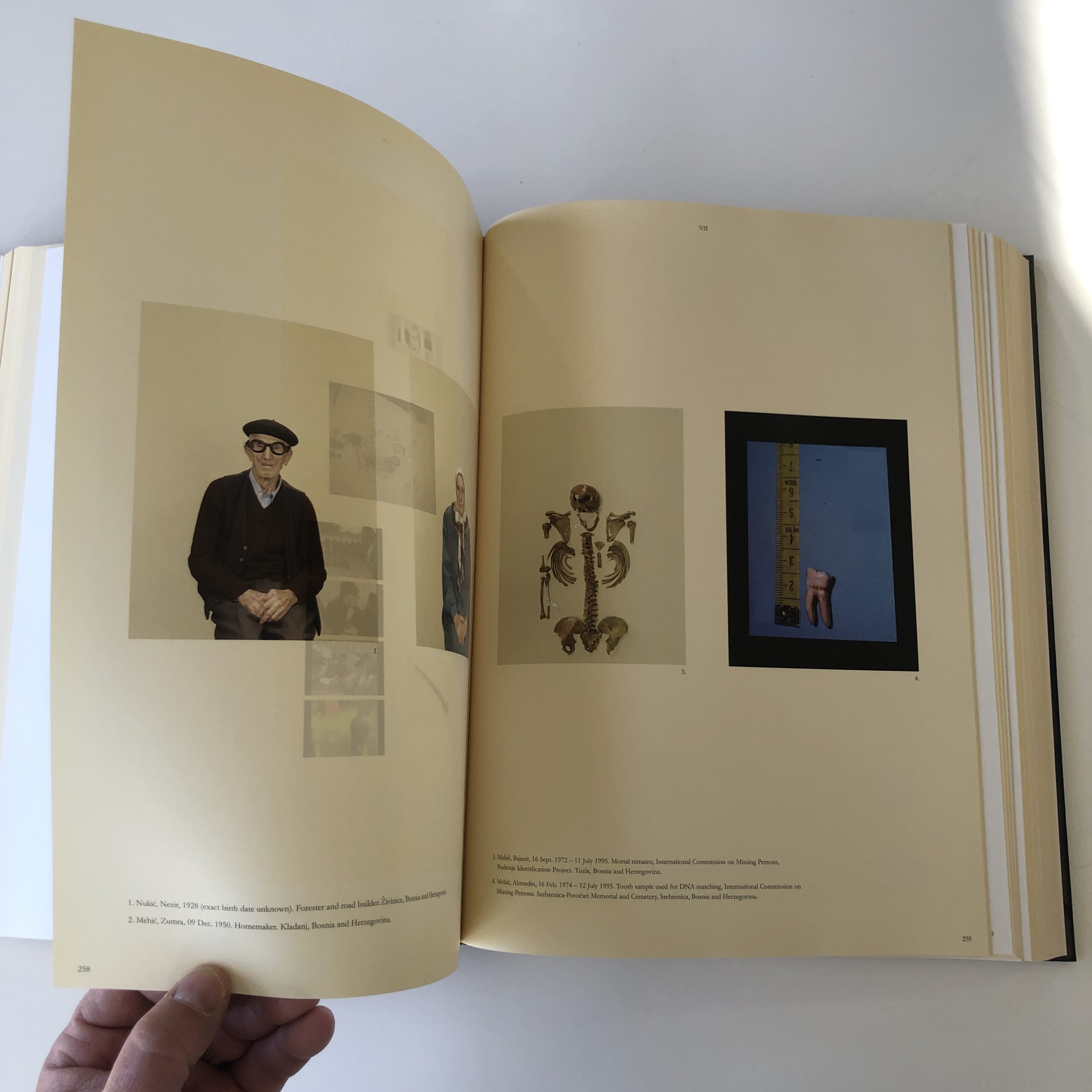
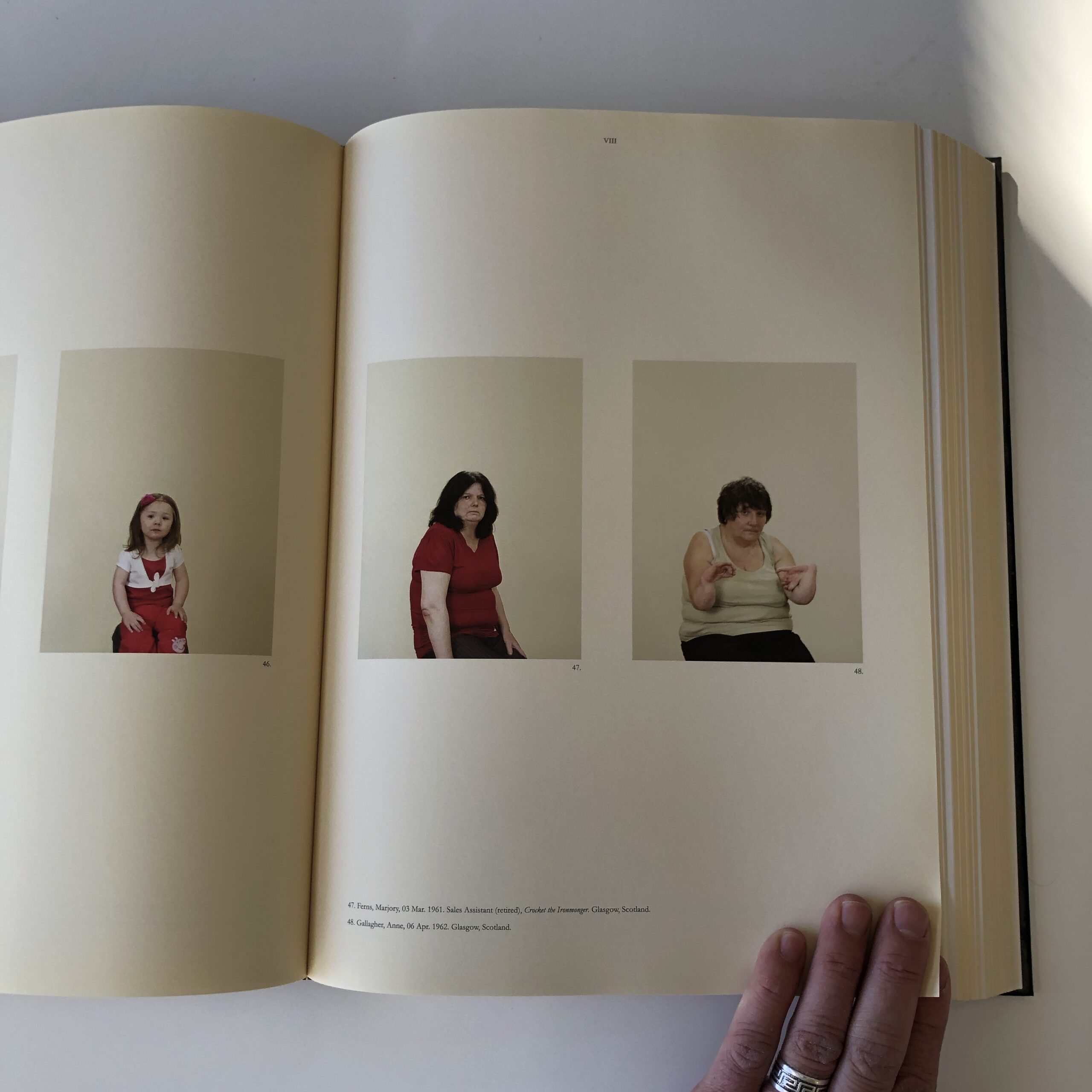
Ms. Simon photographed teeth and bone fragments to represent some of the people, (killed in Srebrenica) as each family member in the book sits for a straight, typological portrait, unless they were unavailable for a host of difficult reasons. (Like fear of kidnapping.)
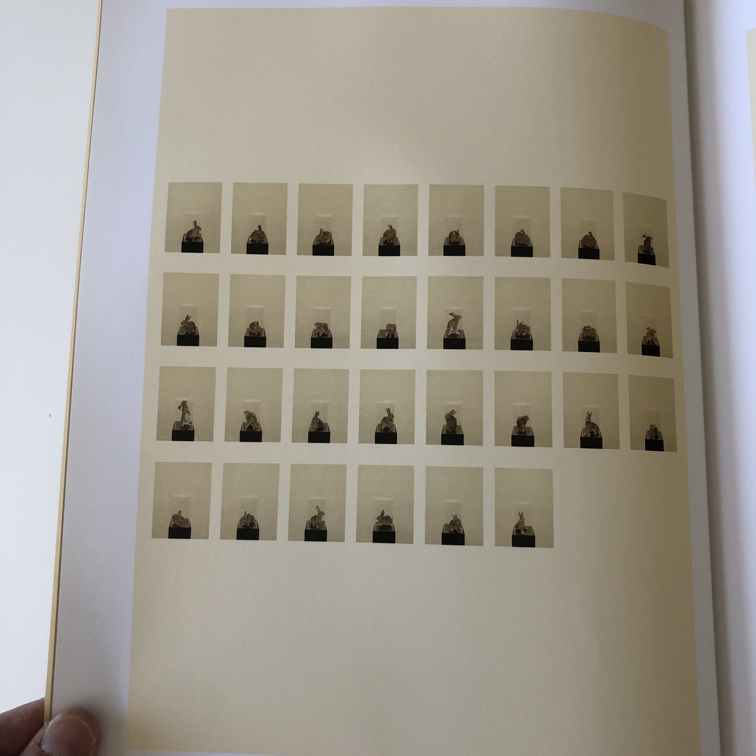
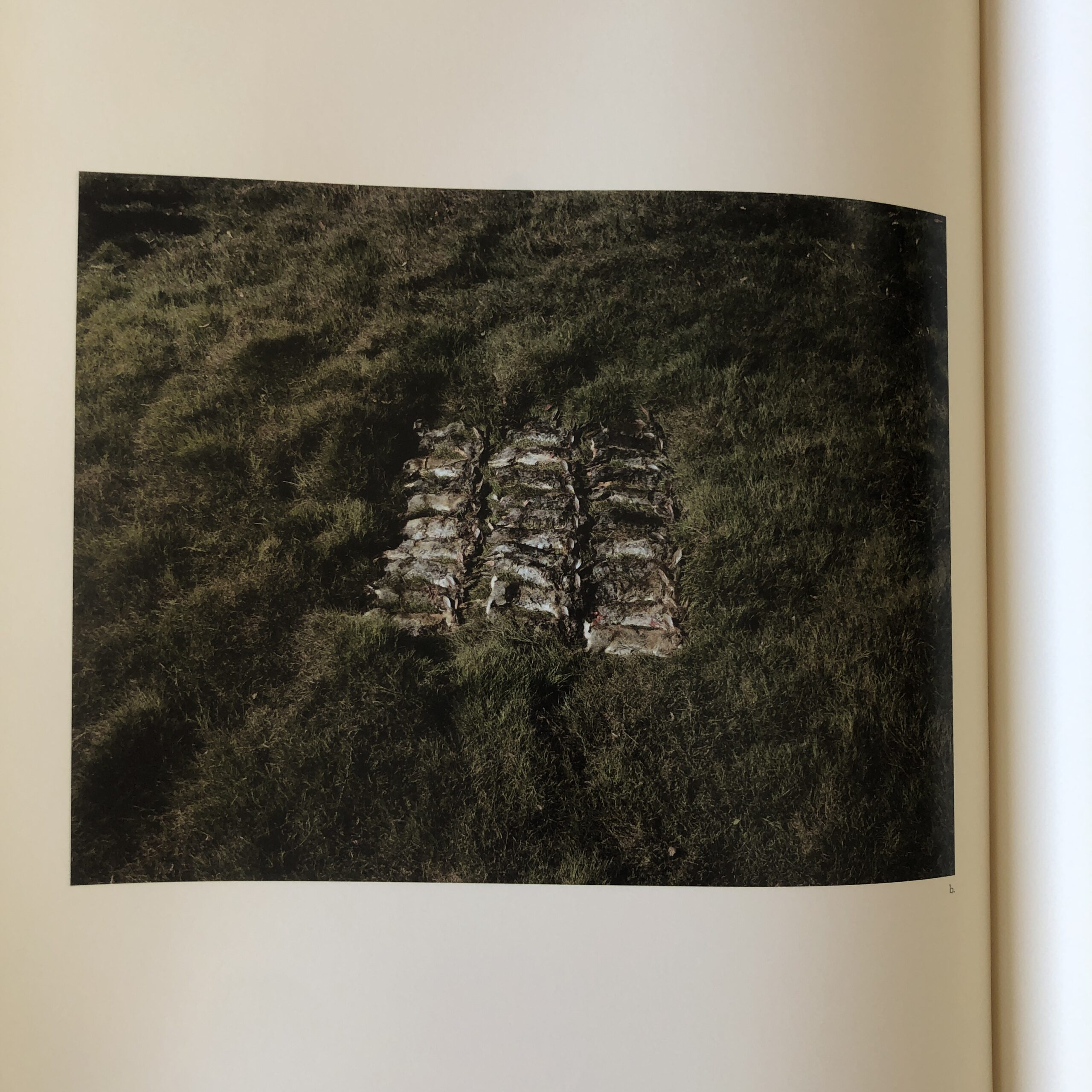
But worst of all, more horrifying than all the humans, is the chapter about lab rabbits in Australia, who are raised to be testing victims of viral warfare, as the government in Oz tries to wipe out rabbits, (which are non-native,) and were intentionally introduced by humans.
There is a photo of rabbits shot dead in a mass grave, and if you HAVE ever seen “The Curse of the Were-Rabbit,” you’ll know why my brain melted at the connection.
(Like I said, 12 Chapters was enough for one sitting.)
That the book exists is a miracle, given its scope.
But how did she even get the project done?
In 2022, I can’t fathom how much money was spent to travel the globe like this.
The research, the time making the pictures.
The assistants.
The film costs, the hotel rooms, the global fixers.
The printing, the editing.
All of it.
Coming in the late aughts, on the heels of Gursky, Struth, Simon and Demand making SERIOUS money selling their over-sized prints, I can just about understand the level of collector-support necessary to raise the MILLIONS of dollars.
Maybe.
But now?
In 2022?
As art, in culture? No way.
Done now, this would definitely be financed by Netflix or Amazon Prime.
The story would be told with photos, sure. But also video, podcasts, Patreon private parties, what have you.
“Photography” has seen too much of a decline in resources and attention, as a sub-species of culture, and too big a leap in importance in mass culture.
Magazines are gone, or minimized. Blogs folded. Newspapers are a fraction the size. Many galleries have contracted or shut. And NFT’s were not the magic-golden-bullet some promised.
While the “photography” industry was shrinking over the last 11 years, the impact of Photography has never been greater.
I mention this today, because unfortunately, I was proven right about something insidious, and we’re going to talk about it.
In the past two weeks, we also saw a cultural firestorm lit by my nemesis: Kyrie Irving.
As my family, (and Twitter,) can attest, for the past couple of years, I’ve been telling anyone who would listen that the Brooklyn Nets point guard was probably Bipolar, certainly narcissistic, and happy to torch any NBA team dumb enough to pay him tens of millions of dollars.
I was shouted down by everyone, who insisted the Brooklyn Nets would win so many titles, it would be worth appeasing an asshole.
Fast-forward to 2022, and the Nets, (for whom I’ve rooted since I was a boy,) a team mired in decades of mostly-losing, temporarily became the most hated team on Earth.
After two years of drama that would make Kurt Sutter blush, only then did things amp up a notch.
Kyrie Irving, (who by now has caused numerous controversies since I first went public with my critique,) promoted a virulently antisemitic film playing on Amazon Prime, and then he doubled down on his transgression.
He refused to apologize, while he gave a massive cultural boost to dangerous, antisemitic theories, which denigrated Jews, and then smugly claimed, “I cannot be antisemitic if I know where I come from,” which was code for:
Black people are the real Jews, and therefore can’t be antisemitic, because the people claiming to be Jews are actually imposter slave-masters.
It’s not like it’s any crazier than theories about the Rapture, but that is one dangerous, hateful, insane ideology.
My man Kyrie has dogged the media for years, calling us pawns, and worse, so now that he came after me as Jew too, I went full boycott.
Fuck that guy.
(Though I did watch Wednesday night’s drubbing of the cross-town rival NY Knicks, because the Nets finally suspended Kyrie Irving.)
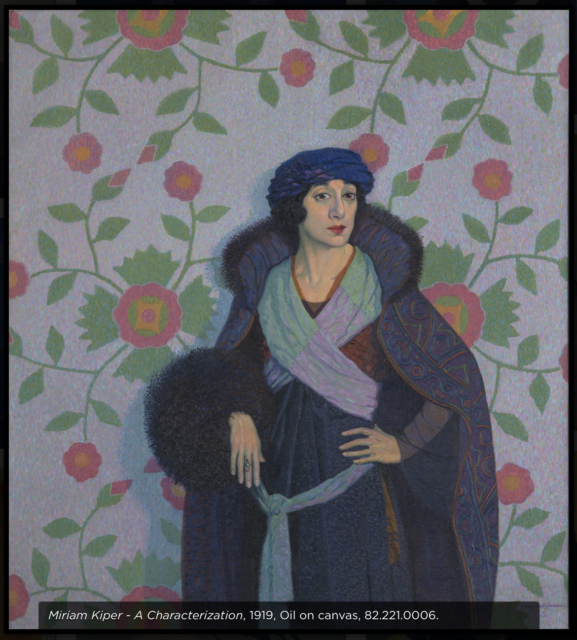
Antisemitism is everywhere now, unfortunately, but it felt really scary when I called out art for antisemitism, for the first time, last September.
I saw a painting by Raymond Johnson, at the UNM Art Museum, a characterization of a Jewish woman from 1919, and it set off a weird Spider Sense in my head.
(Not a good one.)
Suggesting that such an ancient prejudice might accidentally show up in the uber-liberal art world, under the cover of “we didn’t realize it,” seemed a bit of a reach.
A month later, I had the same feeling at the Art Institute of Chicago, from a David Hockney painting.
If you want to make fun of rich collectors, sure go ahead. But when you title the painting in such a way that is has a Jewish name associated, it becomes a trope.
And yet again, in March 2022, at the San Francisco Art Institute, I told you all about Diego Rivera using a “trope” in one of his murals.
He put the short, hook-nosed Jew at the literal center of a Capitalist cabal.
(Doesn’t get more trope-y than than.)
So now that Kanye has gone full Ye, Deathcon 3 to the Jews, and Kyrie went full bigot, do you believe me now?
Here’s the deal.
Hating people because of the color of their skin, religion, gender, choice of romantic partners, the pronoun with which they choose to be addressed…
All these forms of judgmental hatred are lame.
They’re wrong.
Bad.
Terrible.
You dig?
Israeli Jews shouldn’t hate Palestinians any more than some faction of Black Hebrew Israelites should hate American Jews.
It’s the most uncool thing a person can do.
This morning, trying to find some writing inspiration, I noticed a book on my shelf that I’d never truly considered. A book given to me in a swag-bag at a portfolio review years ago, (so it wasn’t an official submission,) and who knows why I haven’t reviewed it before?
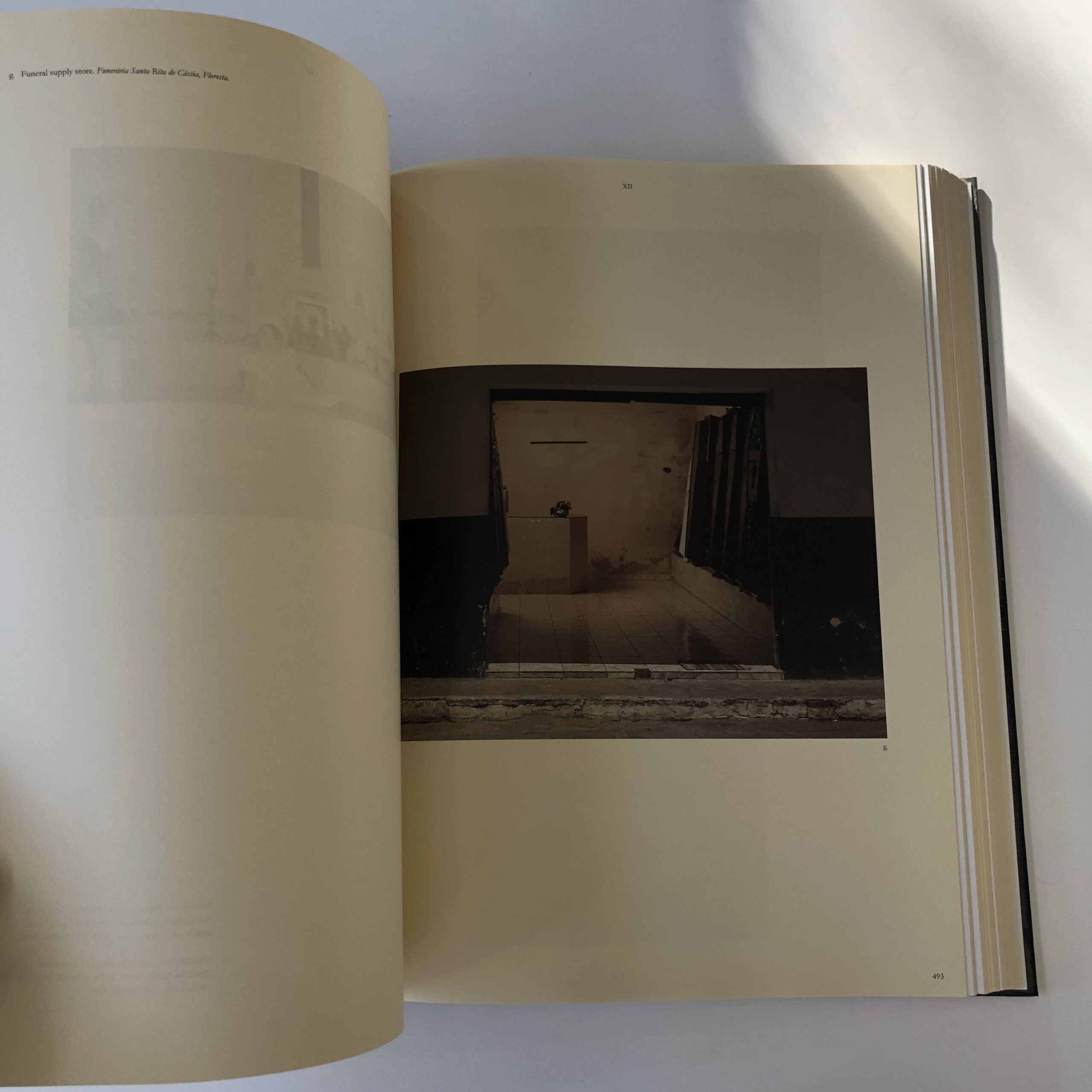
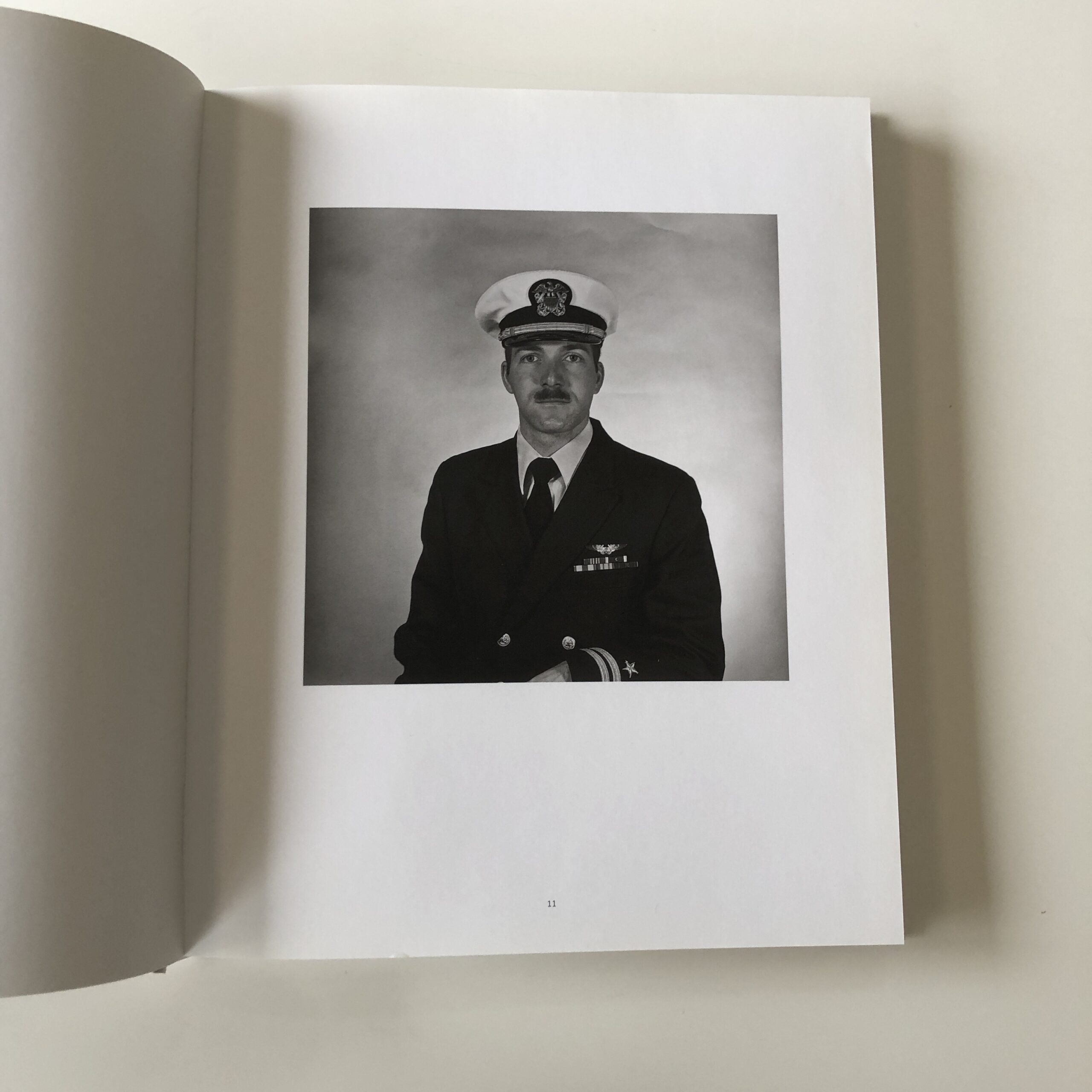
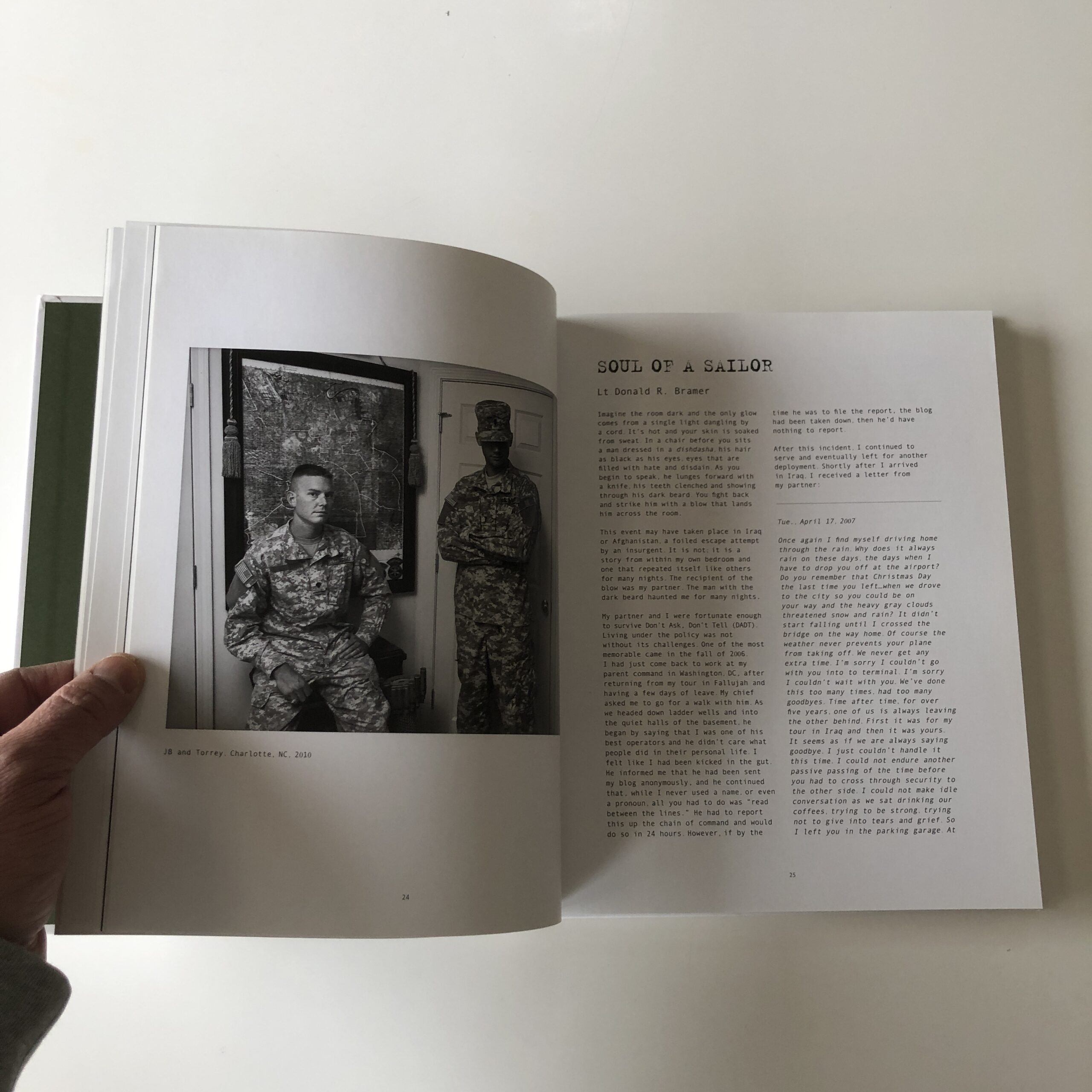
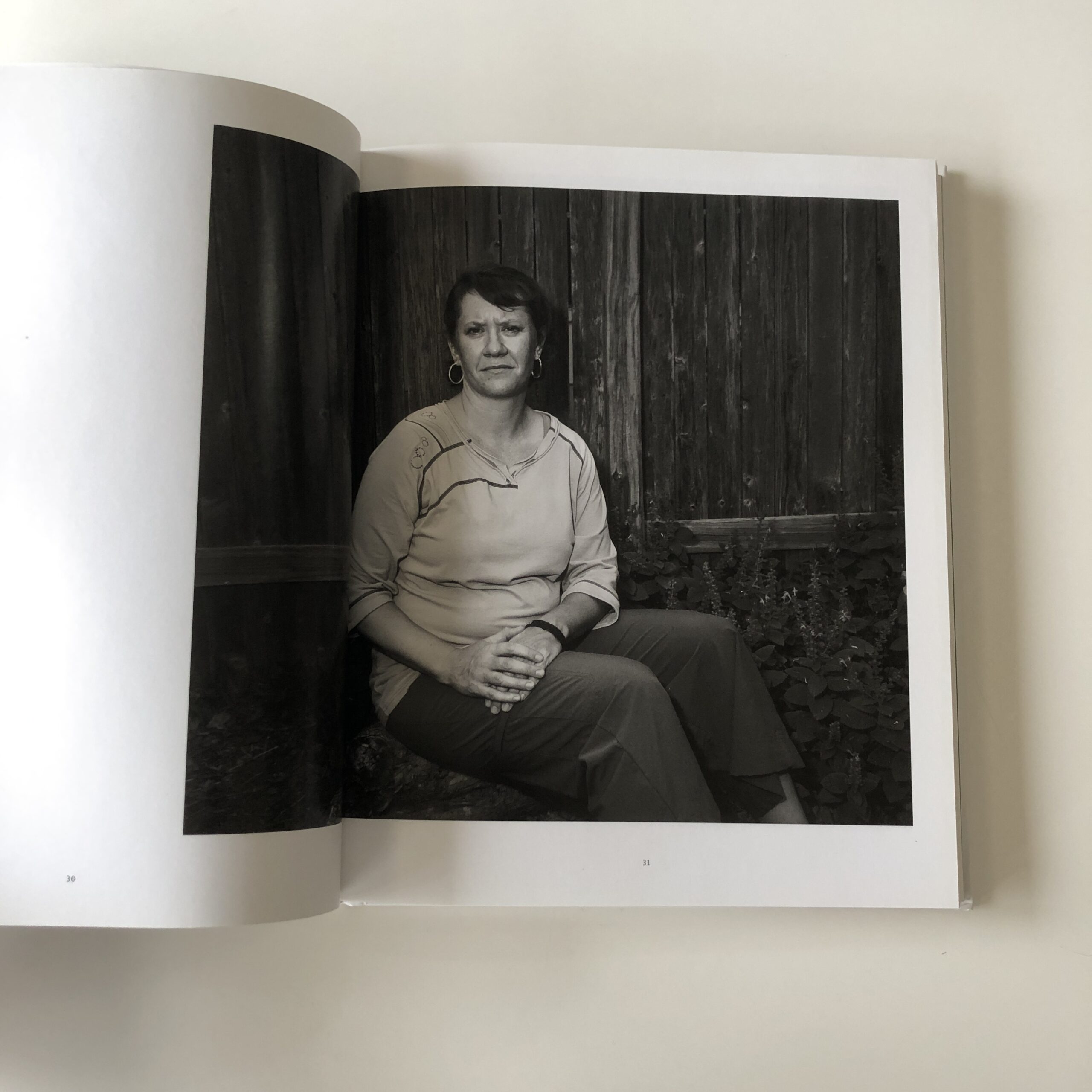
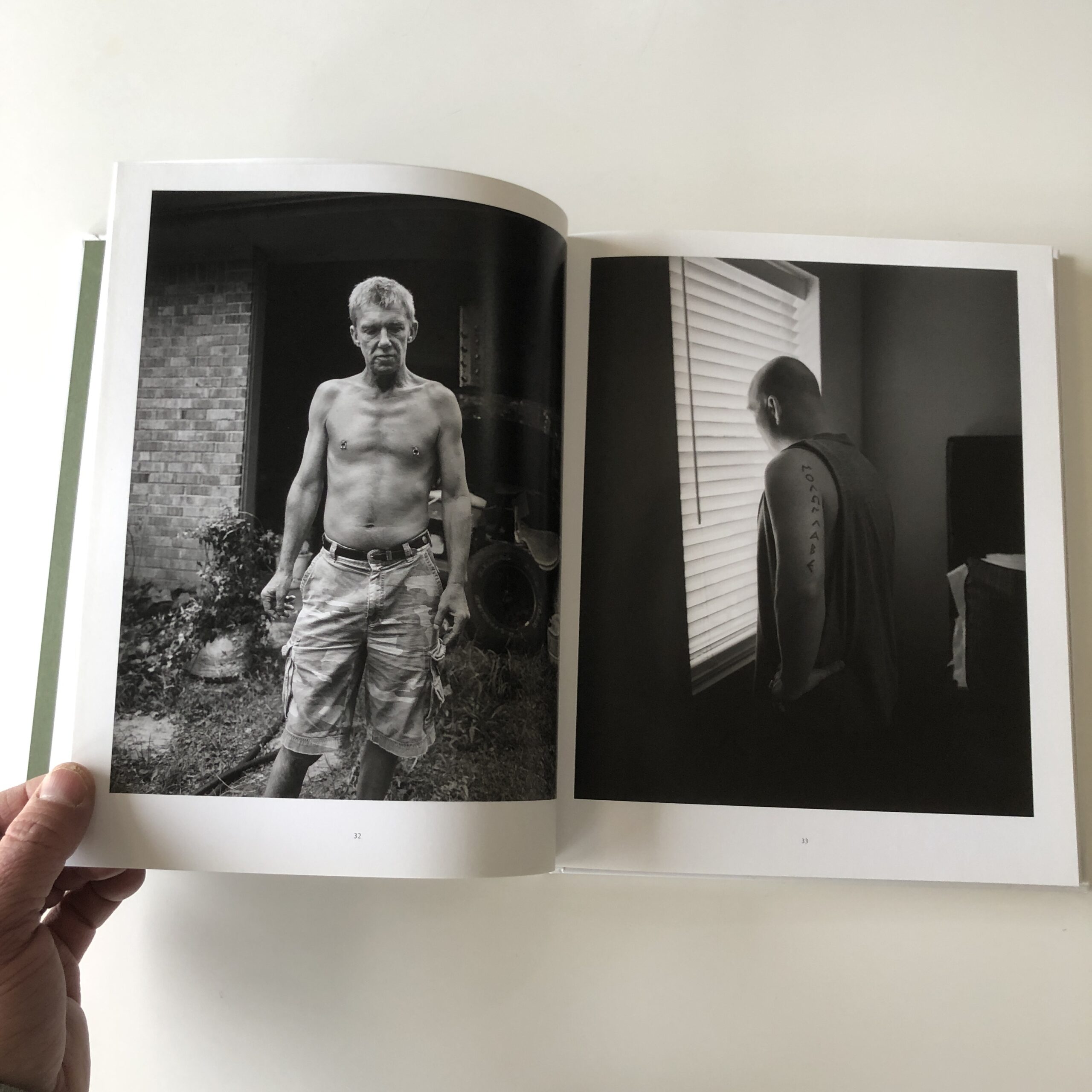
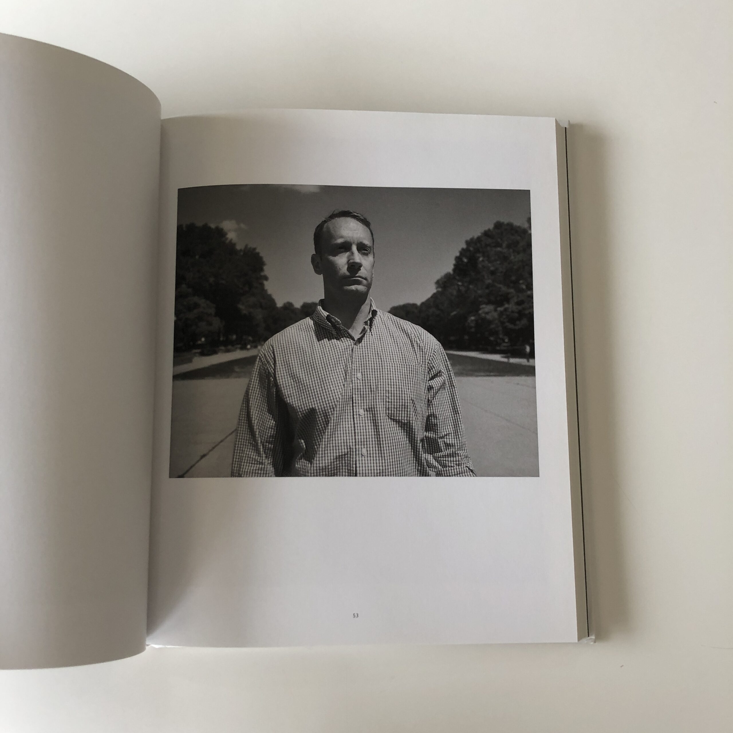
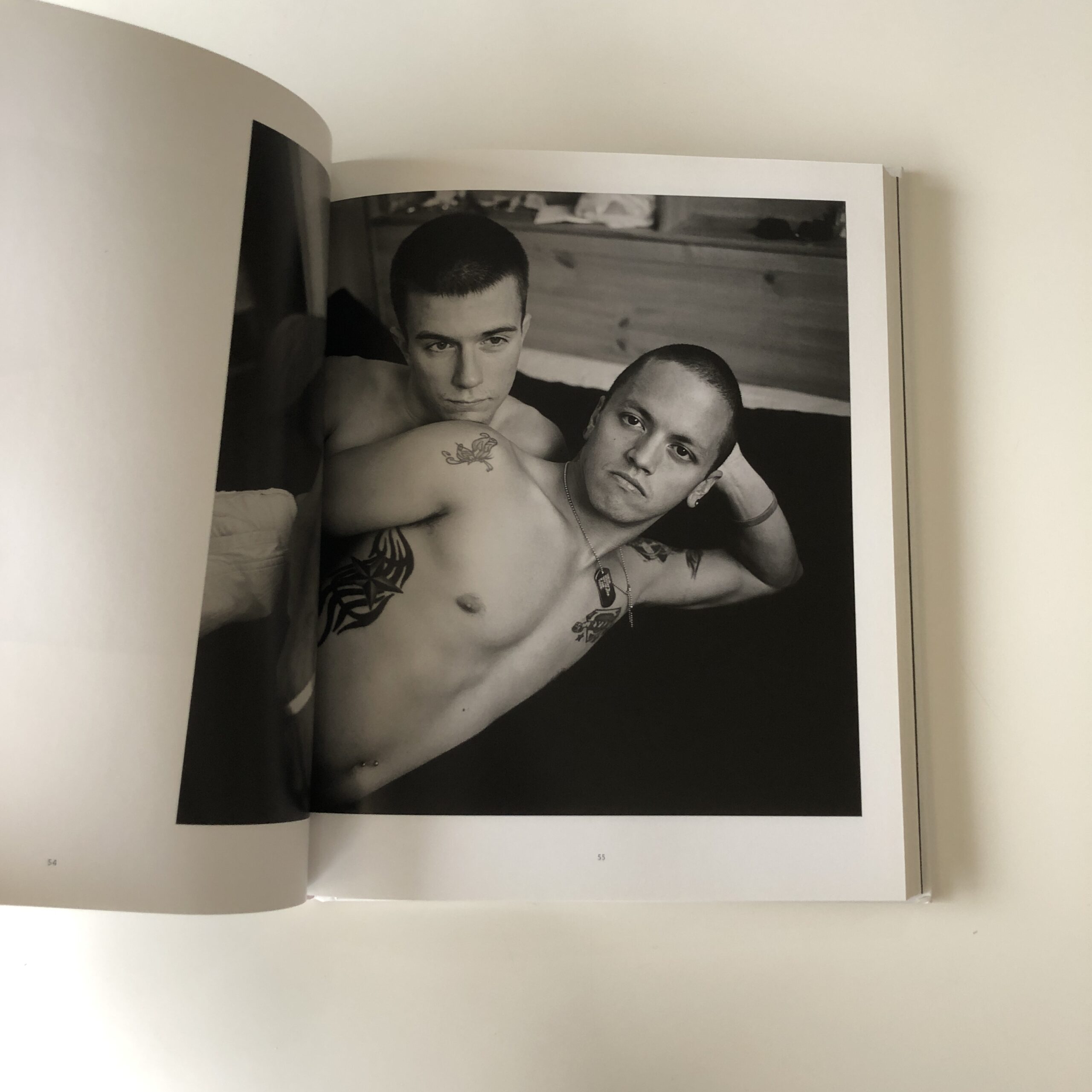
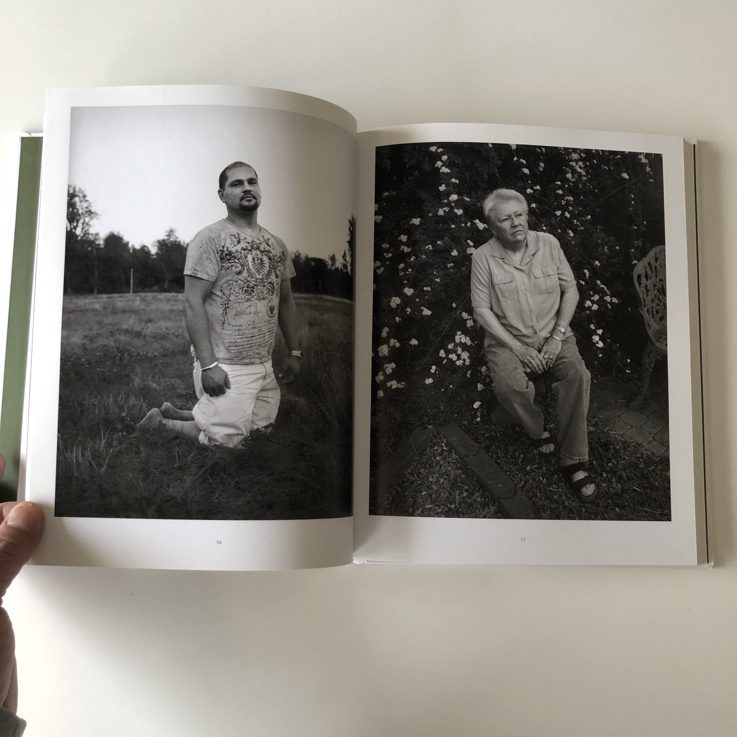
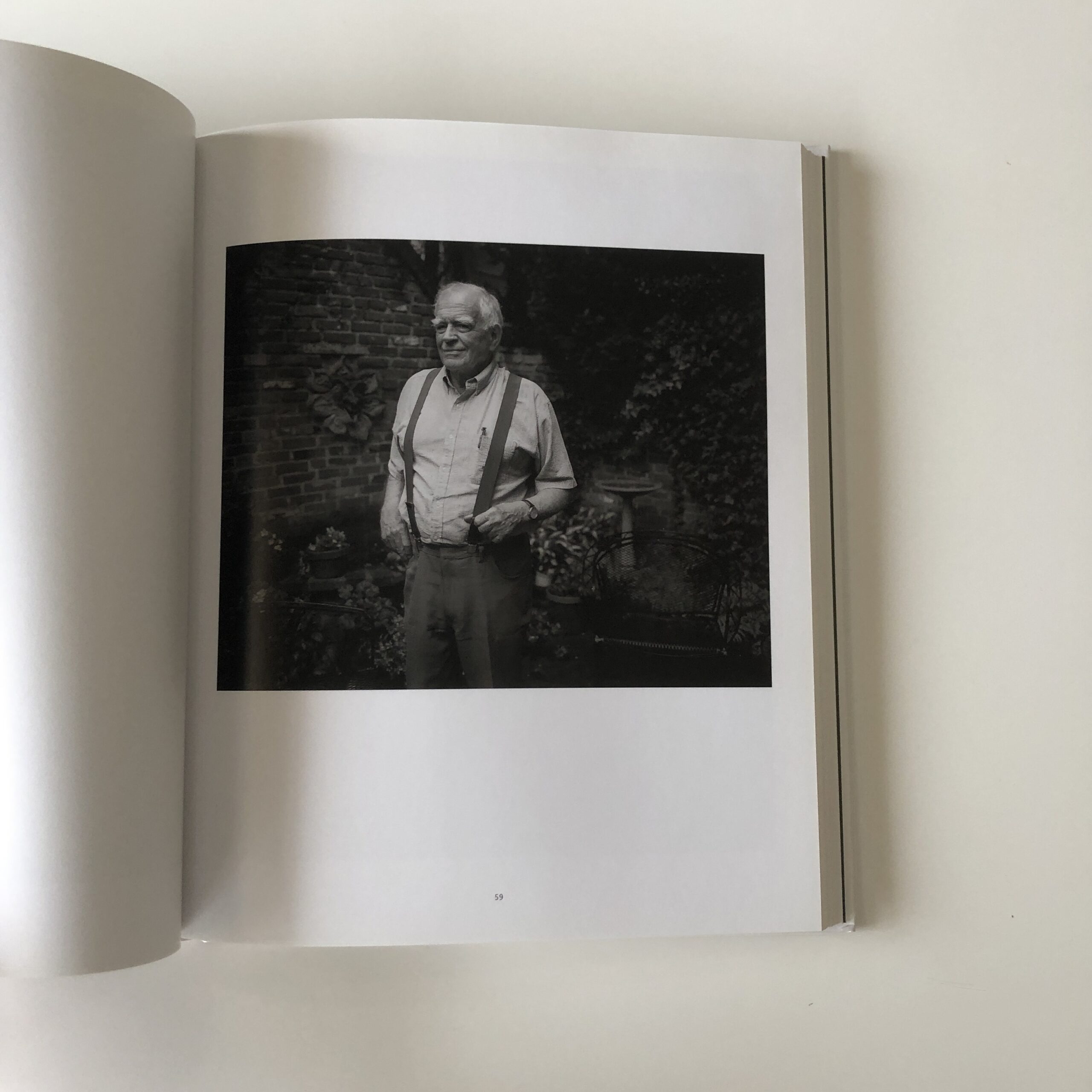
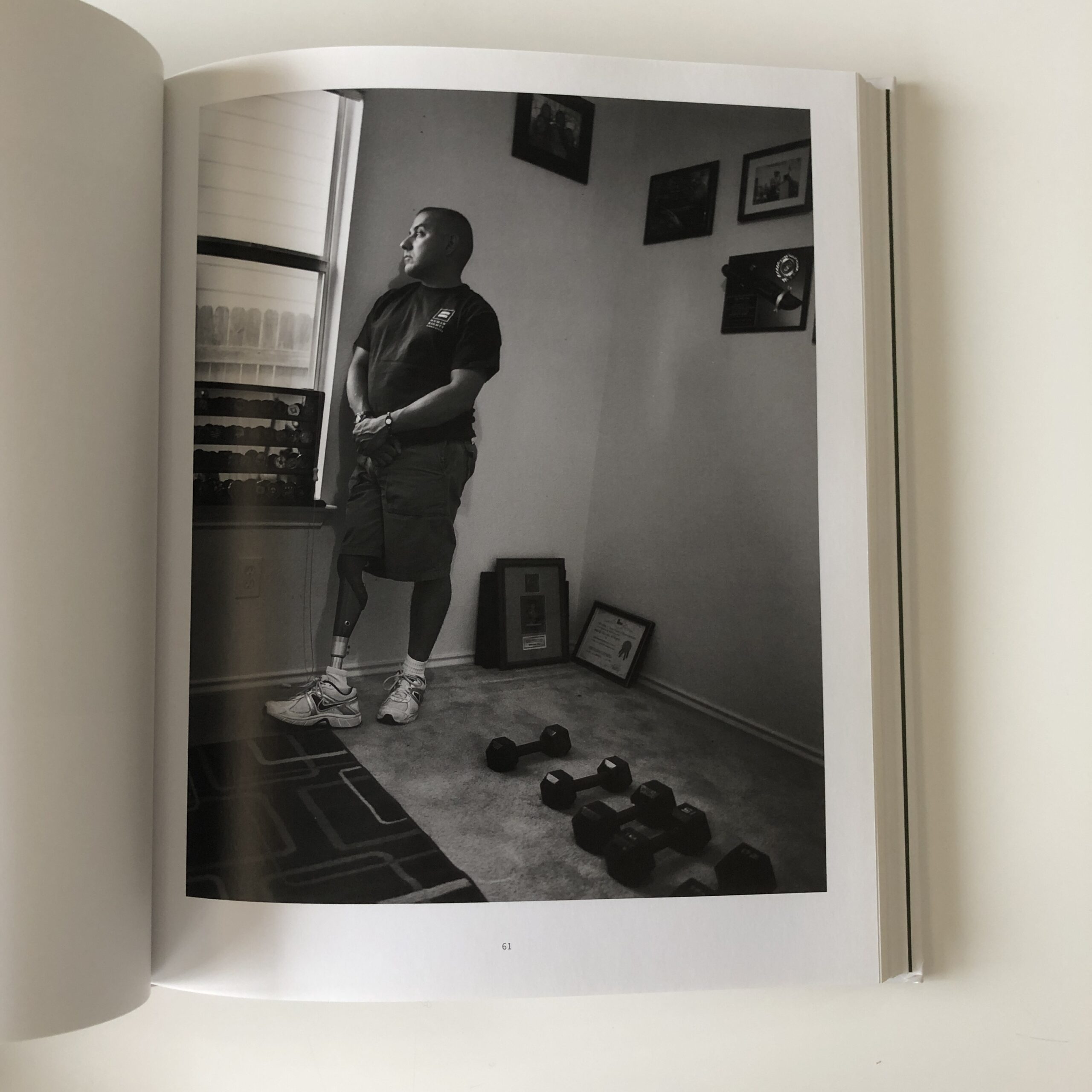
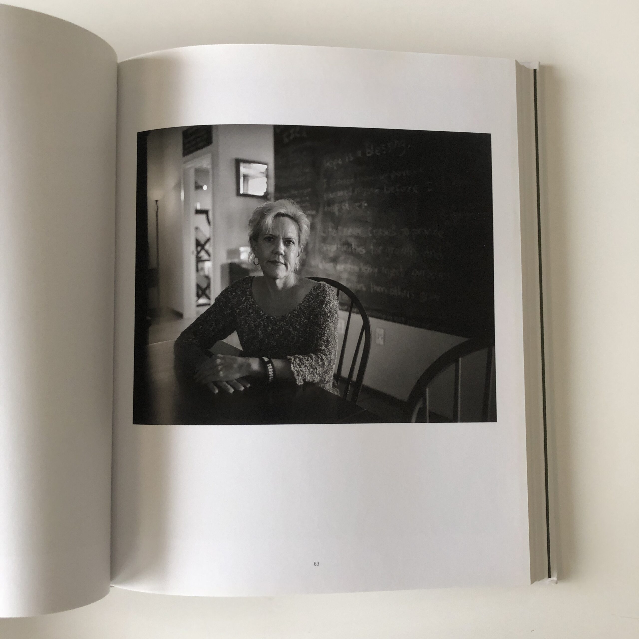
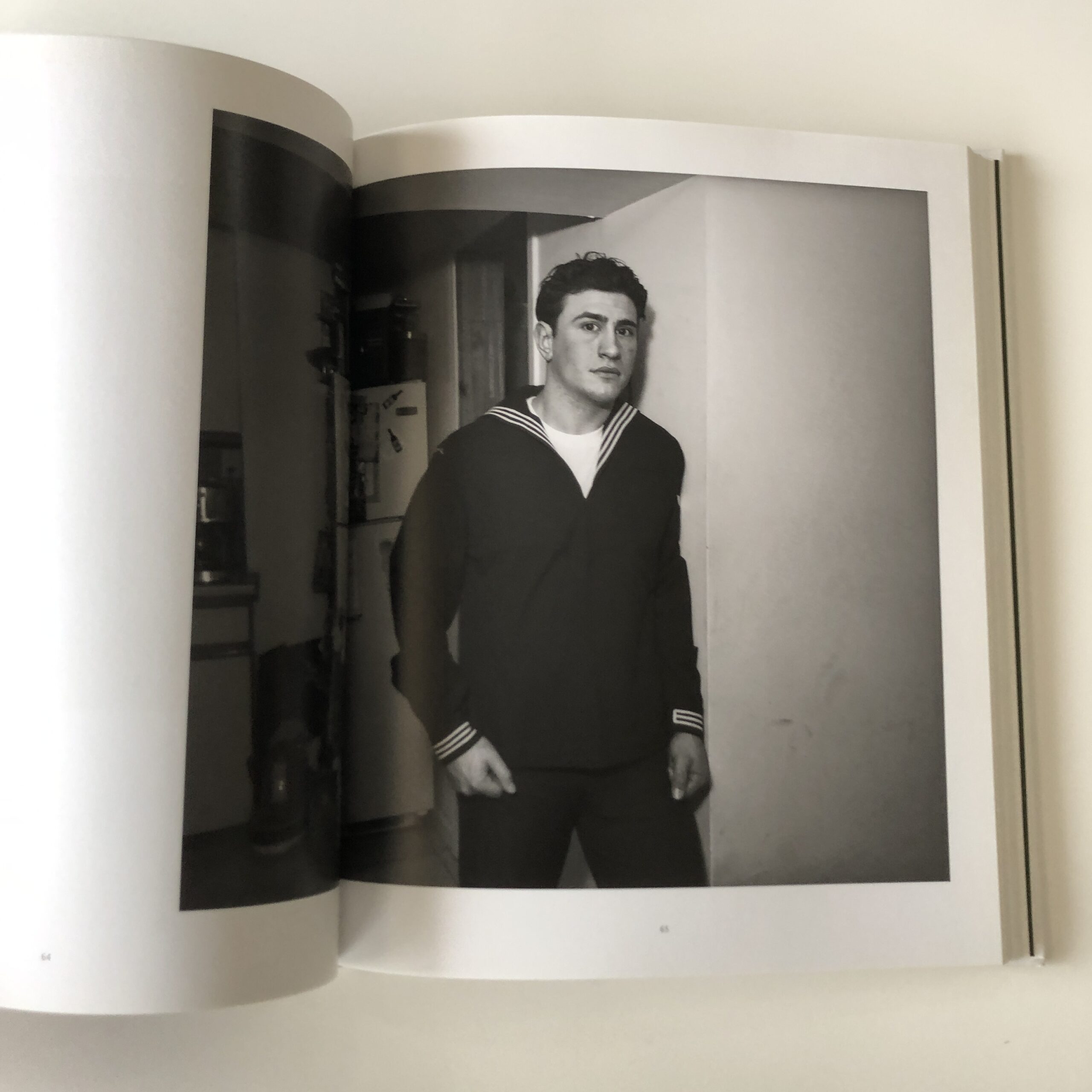
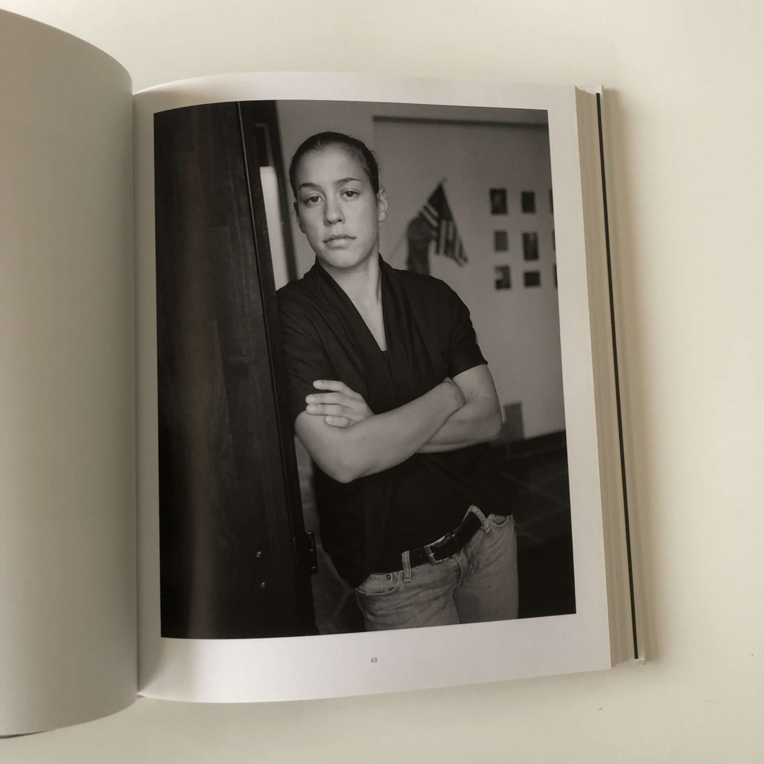
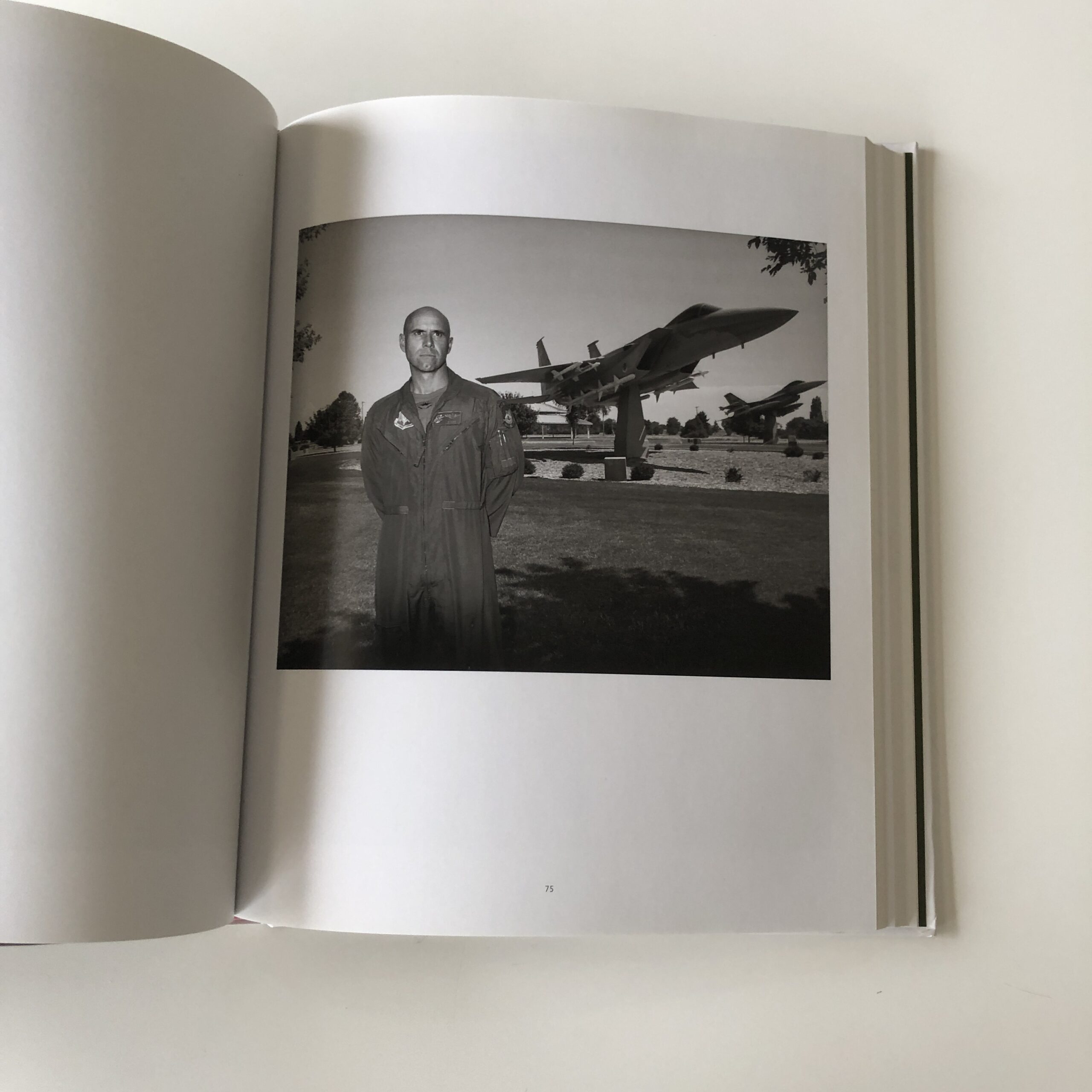
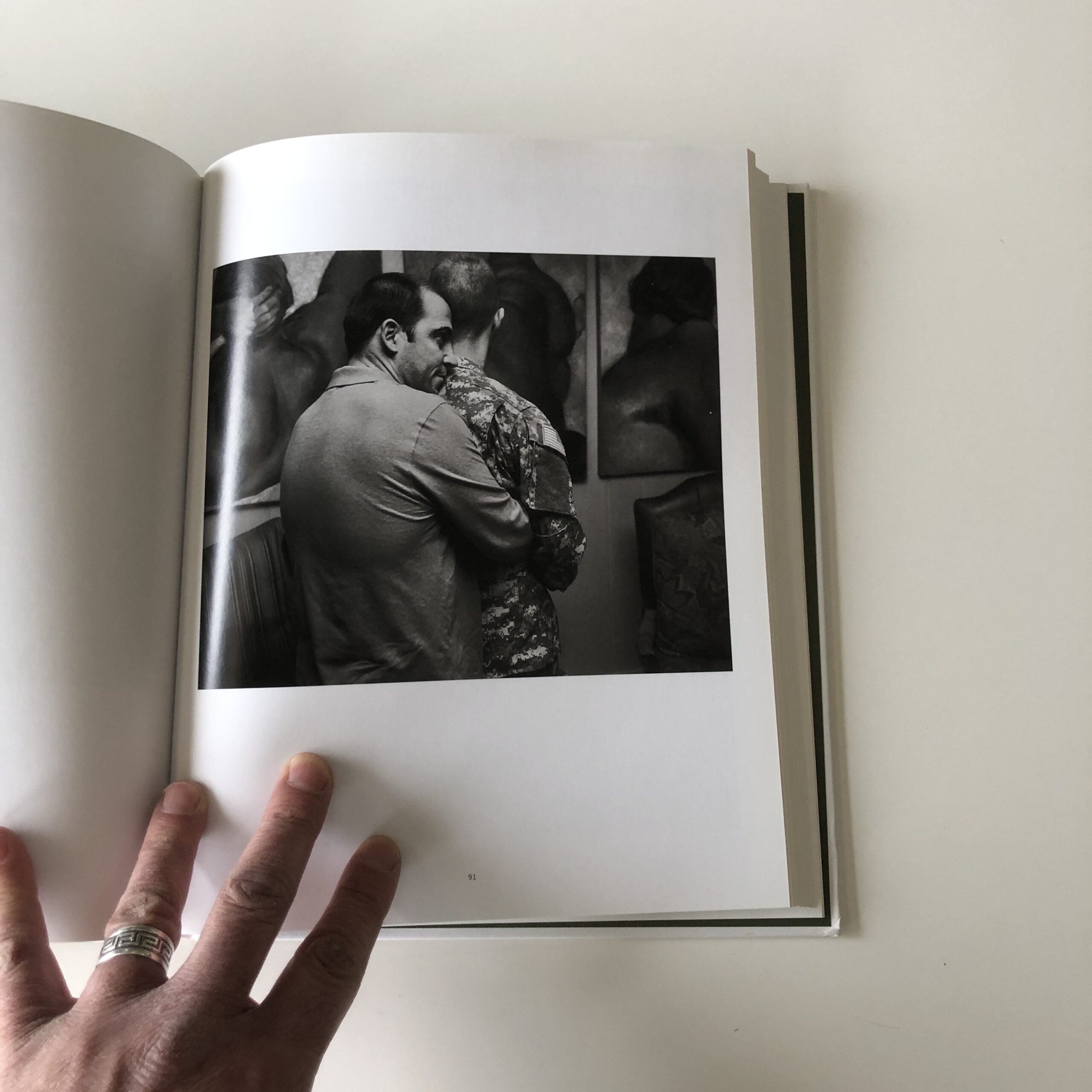
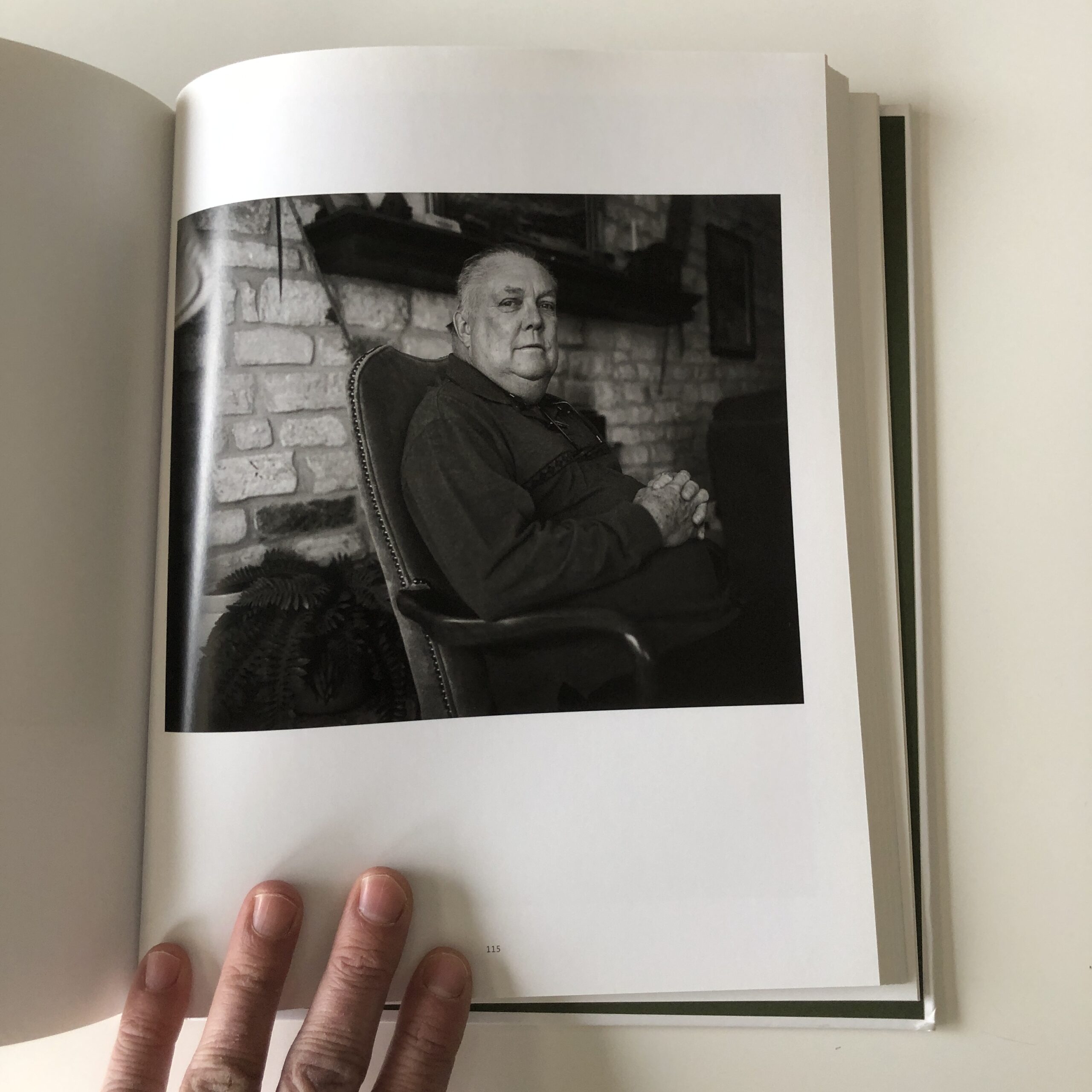
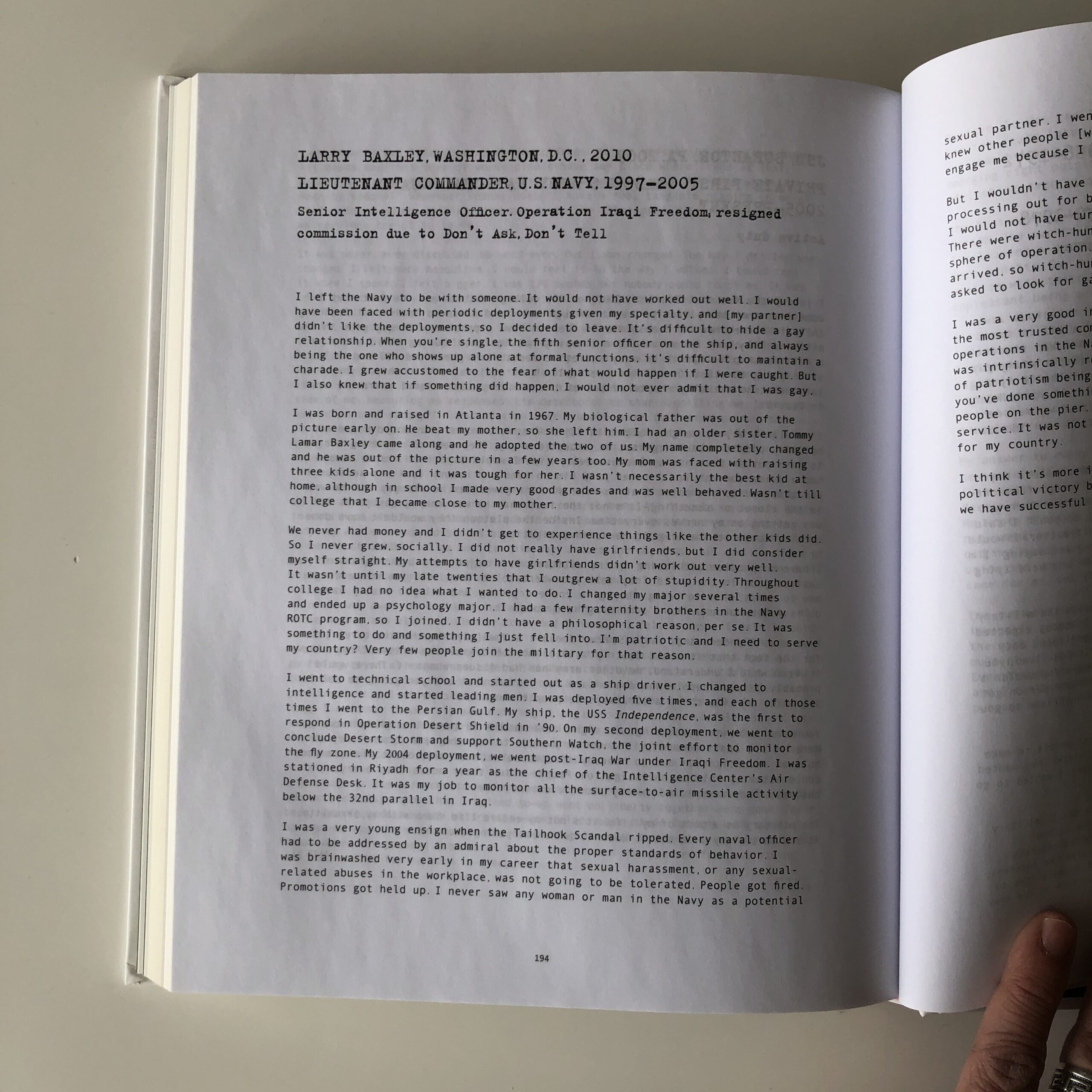
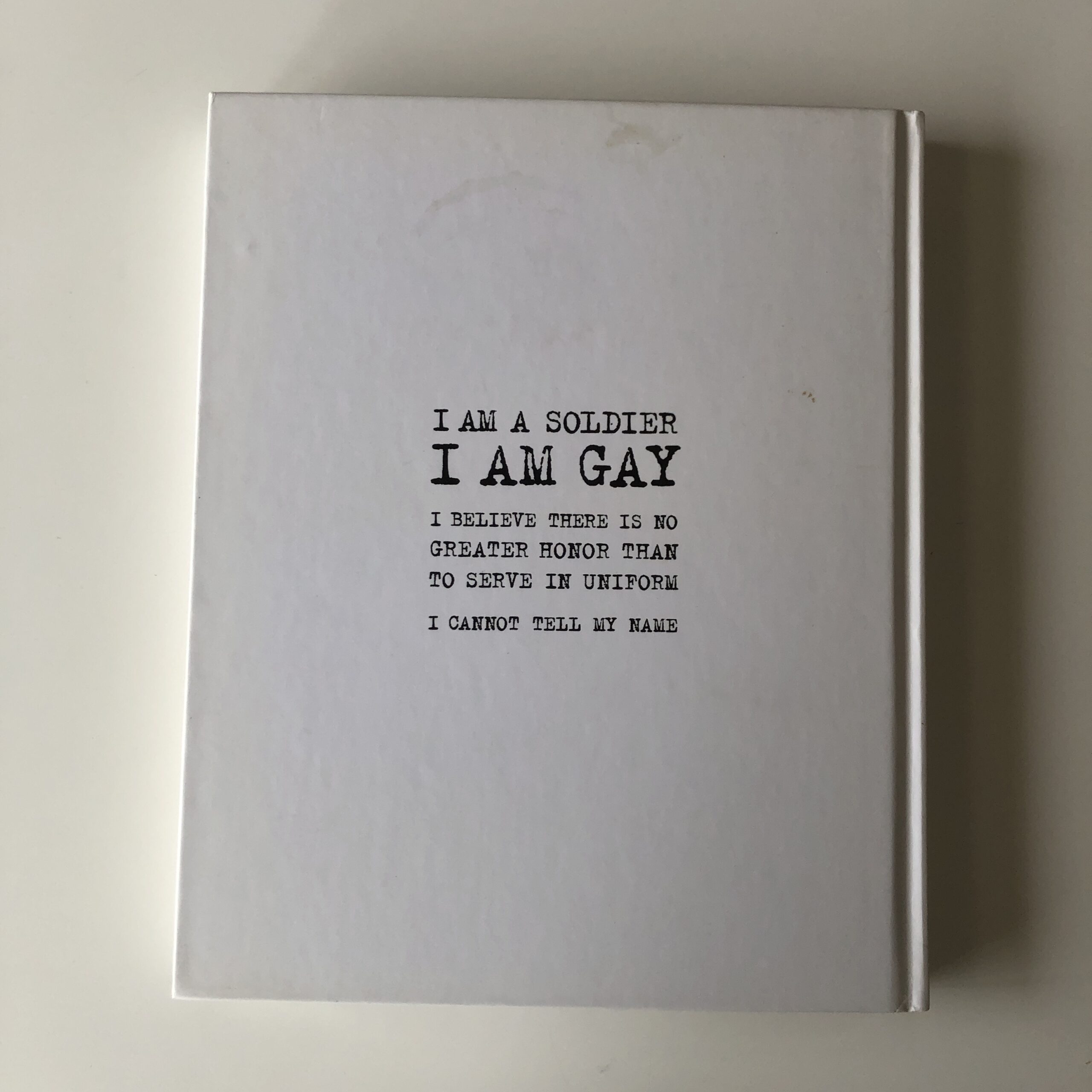
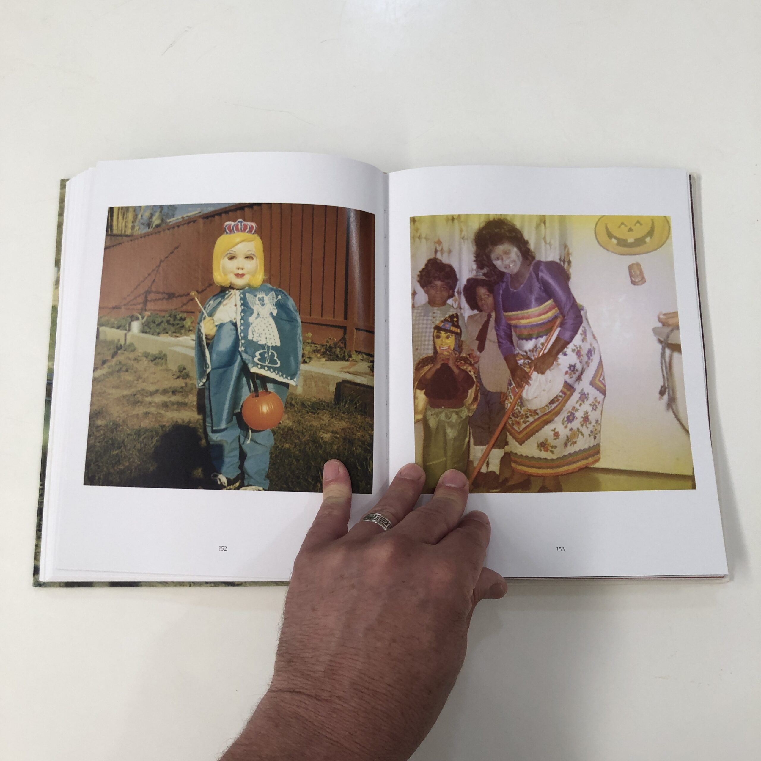
“Gays in Military: Photographs and Interviews,” by Vincent Cianni, was published by Daylight, back in 2014.
It contains the requisite, well-written essays, and a host of interview material, but I’m not going to delve into that today. With this much to read, and the density of captured experience, I’d say it’s more a book to be picked up and experienced, bit by bit.
(It’s not a book for one sitting.)
Vincent photographed a series of men and women who were emotionally tortured, during their time as American soldiers, as warriors.
For being gay.
During the 1990’s, Bill Clinton, Don’t Ask Don’t Tell fiasco, countless gay Americans served, but had to keep their private lives secret.
Or for many, have no private lives at all. In order to do their jobs, so many people had to give up the right to privacy, to a partner, or to happiness.
That is some nasty-ass discrimination right there, and thankfully the policy was done away with.
Everyone photographed in this book suffered while protecting us. Think on that.
But policies improve, and sometimes, our lives improve, when times are good.
Let’s all do our part to battle intolerance, and discrimination.
In the words of those gentle philosophers, Bill and Ted:
When I was growing up, Mike Tyson was the baddest dude around.
(Bar none.)
I watched the Buster Douglas fight live on HBO, and was witness to the dethroning of the king.
At the time, my brain could not fathom Mike Tyson getting his ass kicked, but there it was.
Courtesy of Boxingnewsonline.net
These days, boxing is not nearly as important.
Instead, MMA is the most popular combat sport around.
Everyone loves the UFC, which has great rivalries, amazing athletes, and a warrior-code-of-respect thing going that feels appropriate for the 21st Century.
(True story: a boxing-fan-relative recently told me he doesn’t watch the UFC, because he thinks it’s “gay,” as the fighters hug each other, and behave nicely in the cage, once the fight is over.)
But MMA didn’t even exist 30 years ago, and when it first began, guys from different, traditional martial arts battled it out, with the Gracies, (and their Brazilian Jiu Jitsu,) proving supreme.
These days, every fighter more or less shares the same style of striking and kicking from Muay Thai, grappling from wrestling, and submissions and ground work from BJJ.
(So not only do cultural tastes change, but entire sports can too.)
Like boxing, professional wrestling has gone through phases of popularity here in America.
Apparently, it’s huge again, (the WWE,) but I don’t follow it at all.
I know Dwayne “The Rock” Johnson and John Cena became legit movie stars, and extremely charismatic actors, having started as pro wrestlers.
(And I know The Rock’s daughter is now wrestling, but I learned that from Twitter.)
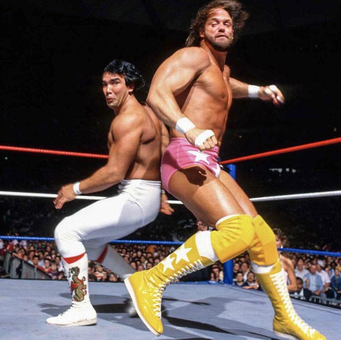
When I was a kid, in the same 80’s Tyson dominated, Hulk Hogan, Randy “Macho Man” Savage, and Andre the Giant were massive cultural stars, with crossover films and the rest.
Ricky “The Dragon” Steamboat and Randy “Macho Man” Savage in 1987, courtesy of ESPN and the WWE
(You knew I was going to drop a clip of ATG in “The Princess Bride” right here, didn’t you?)
That said, back then, I didn’t know much about the previous generation of stars.
Nor had I ever considered attending a match.
For whatever reason, my taste in pro wrestling leaned towards “guilty pleasure” in middle school, and I couldn’t tell you the last time I watched even a minute of it.
So Jonathan Blaustein: not a fan.
Jonathan Panes, however, was a massive fan.
How is that important?
I’ll tell you.
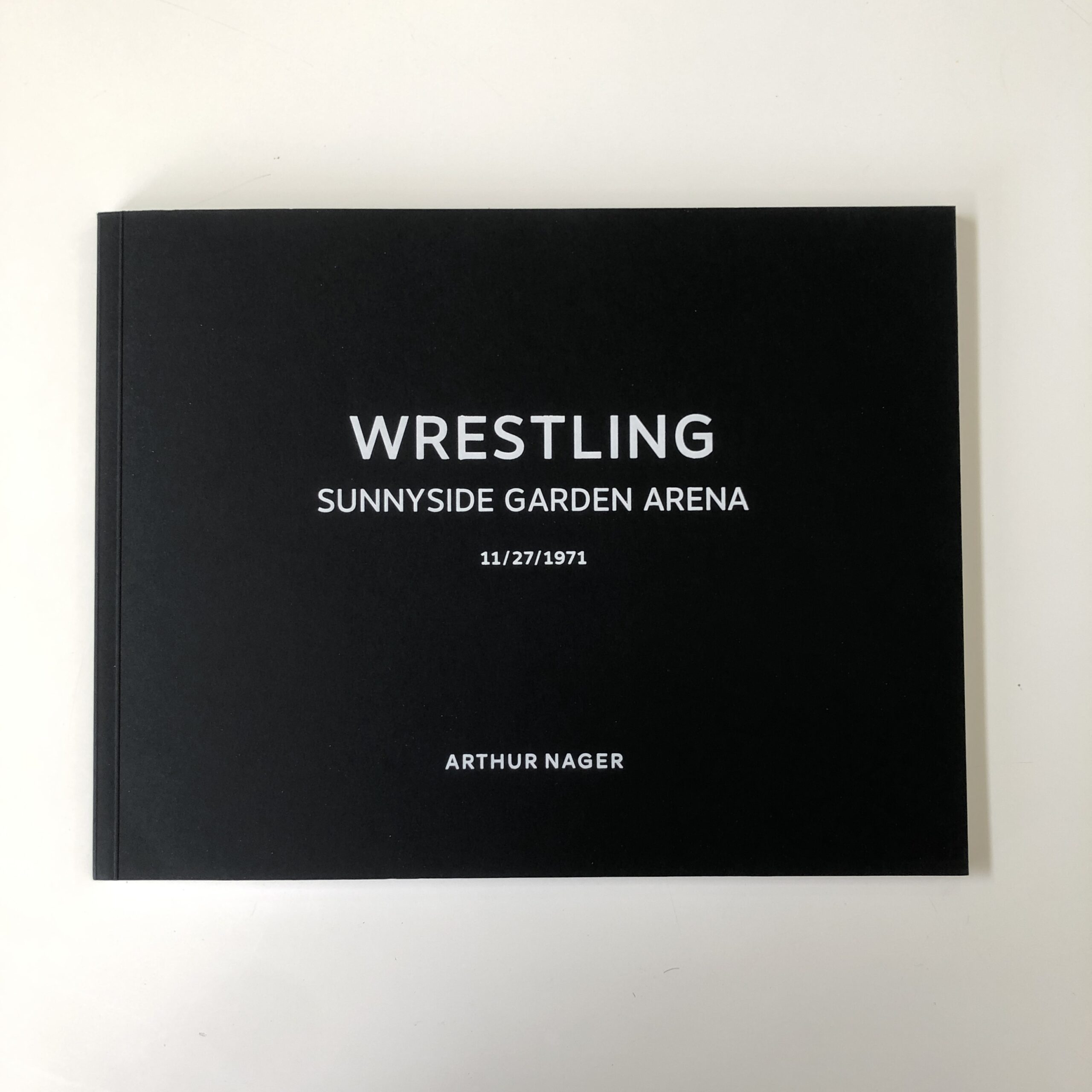
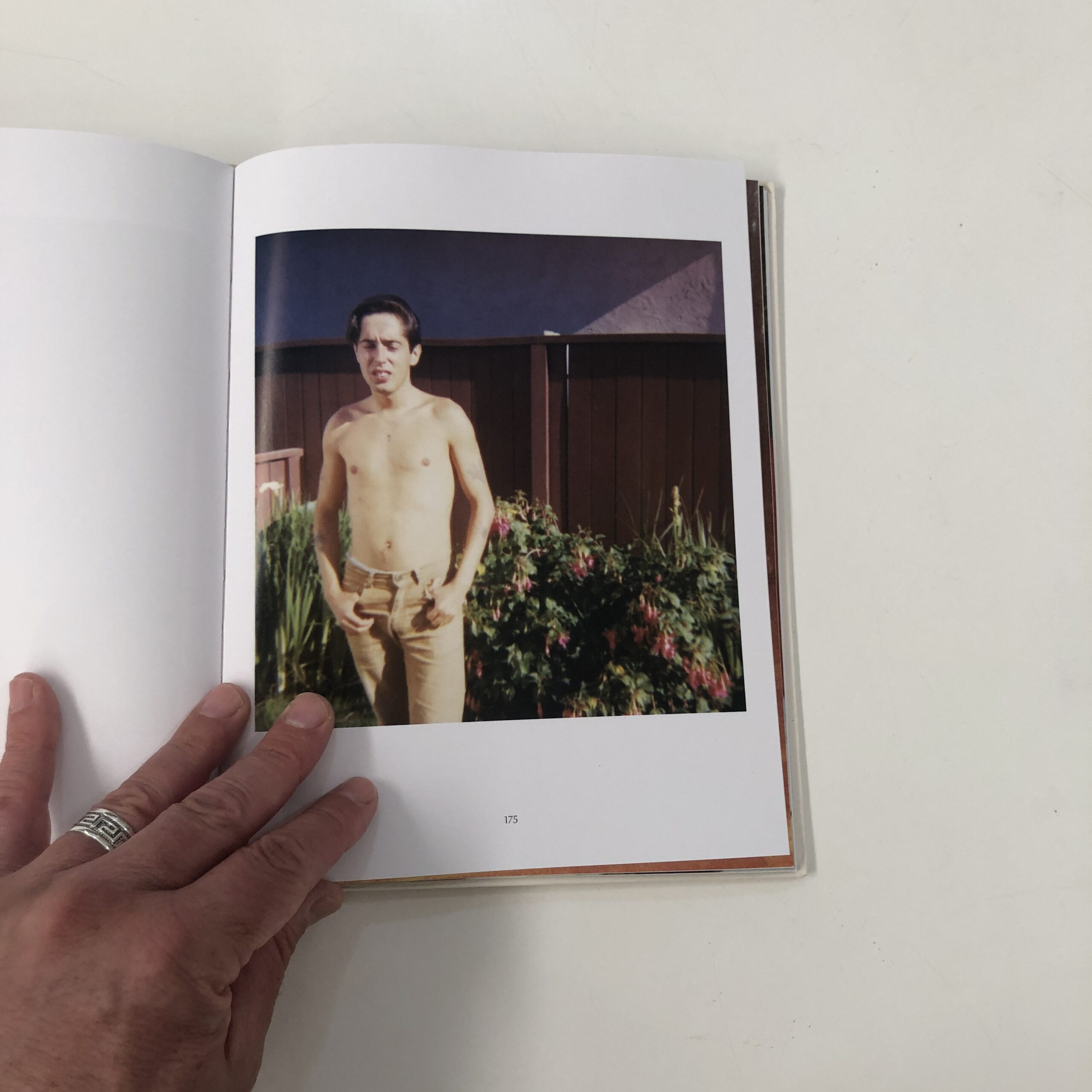
Last October, Arthur Nager sent me a book, but that’s long enough ago that I was clueless when I opened it up today.
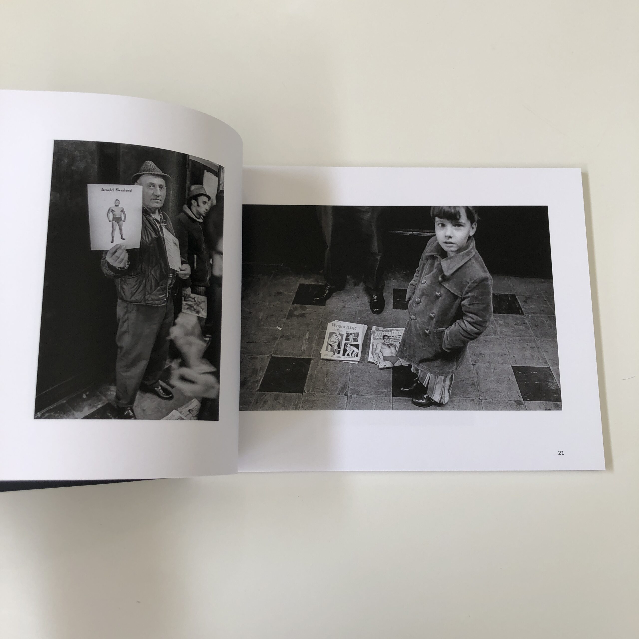
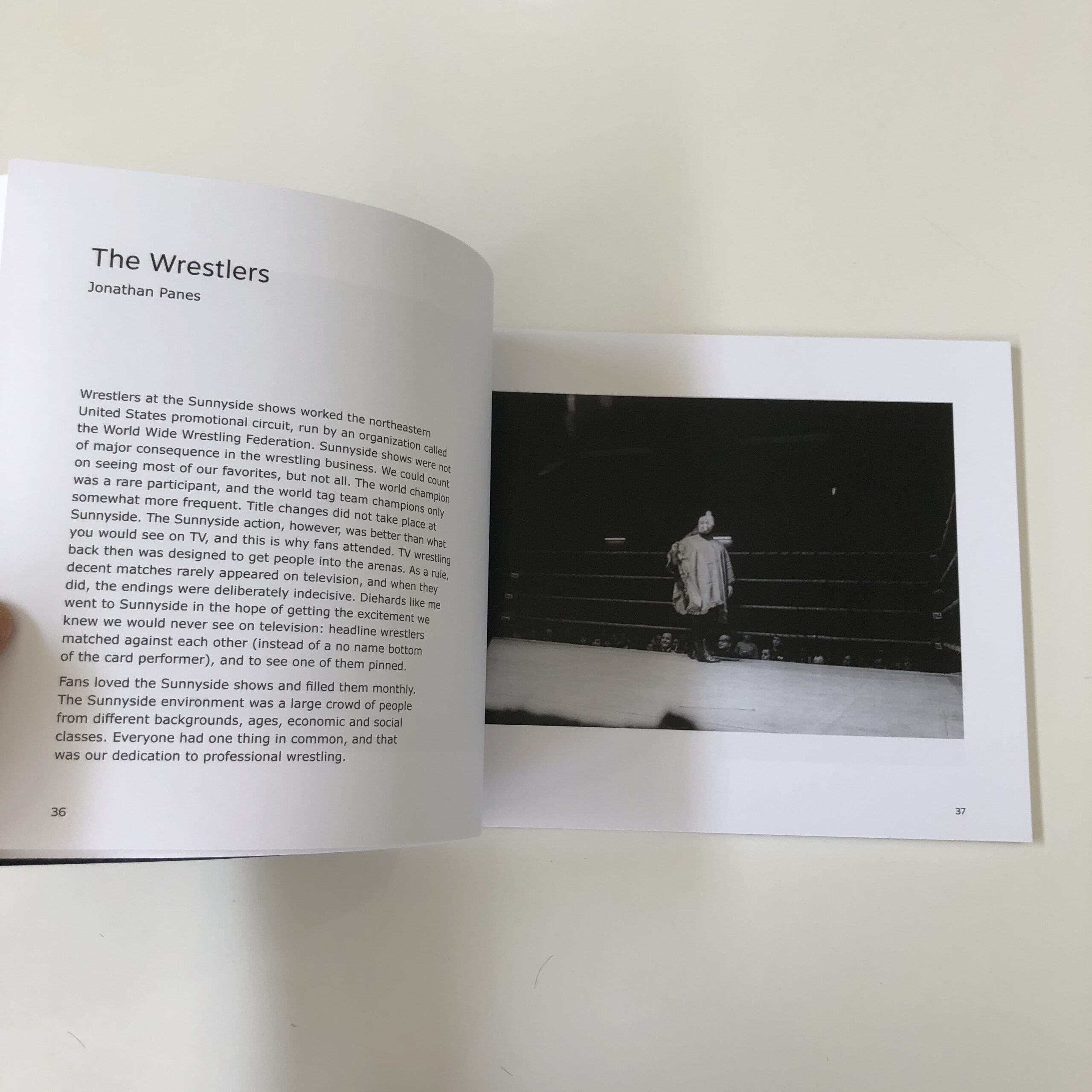
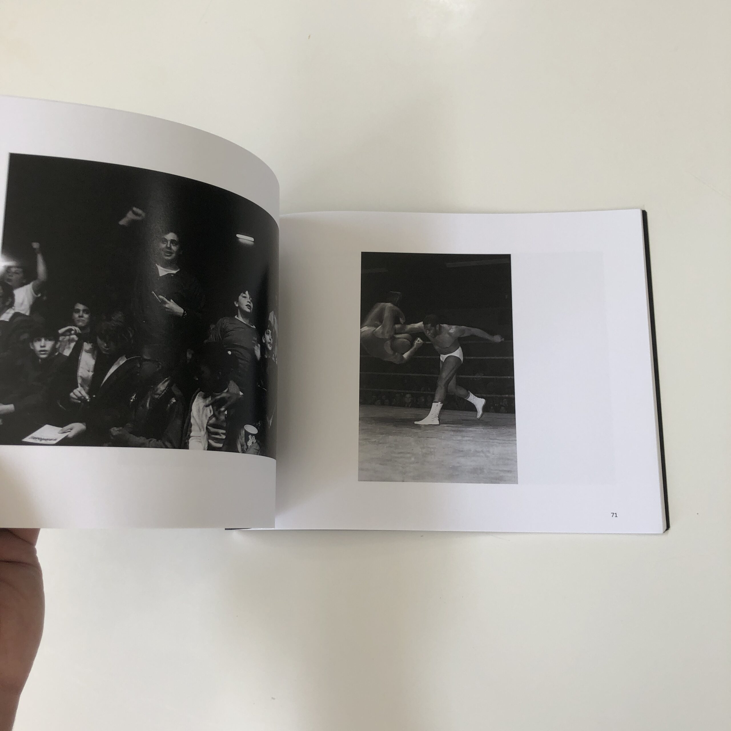
Rarely has a photo book stated its intent more clearly from the cover.
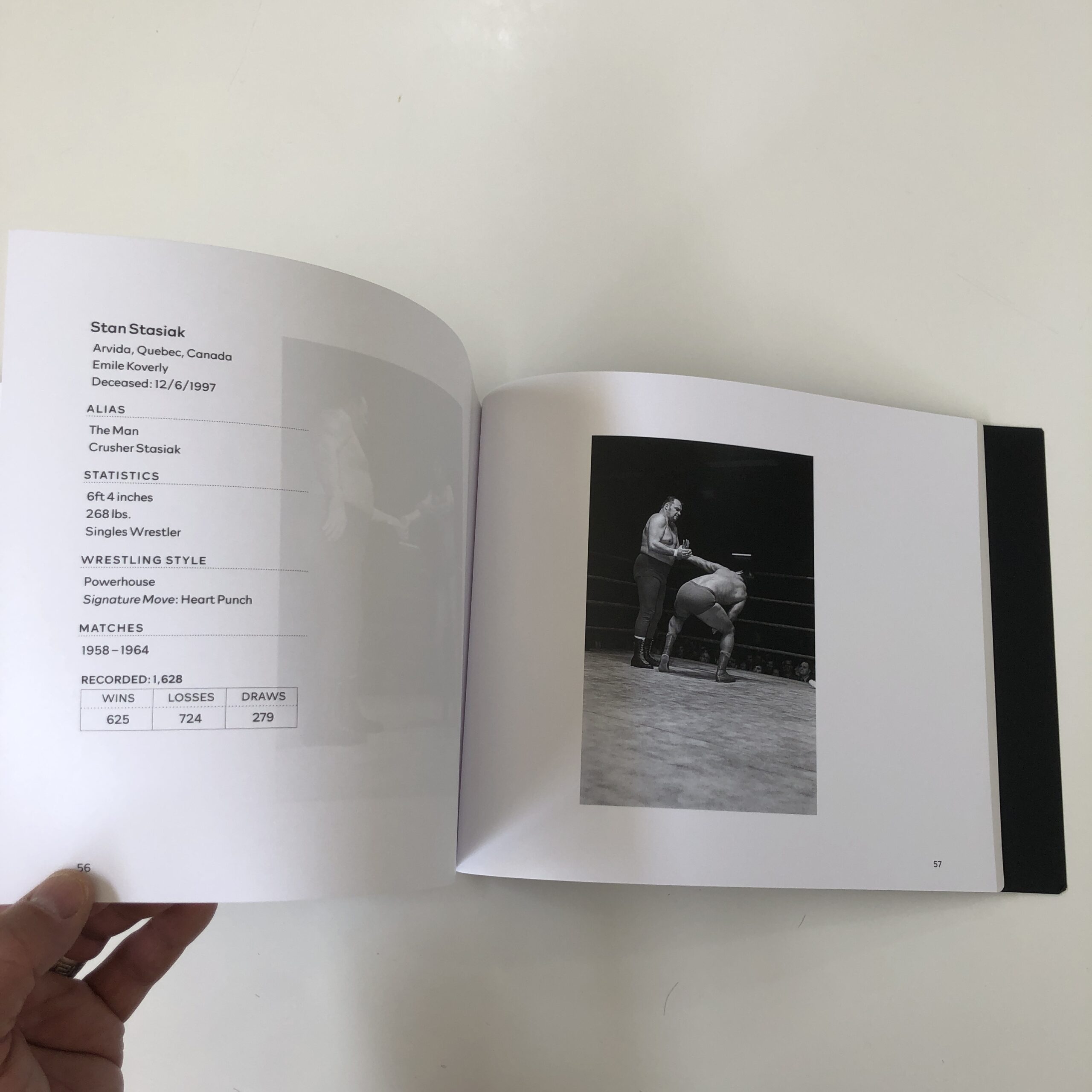
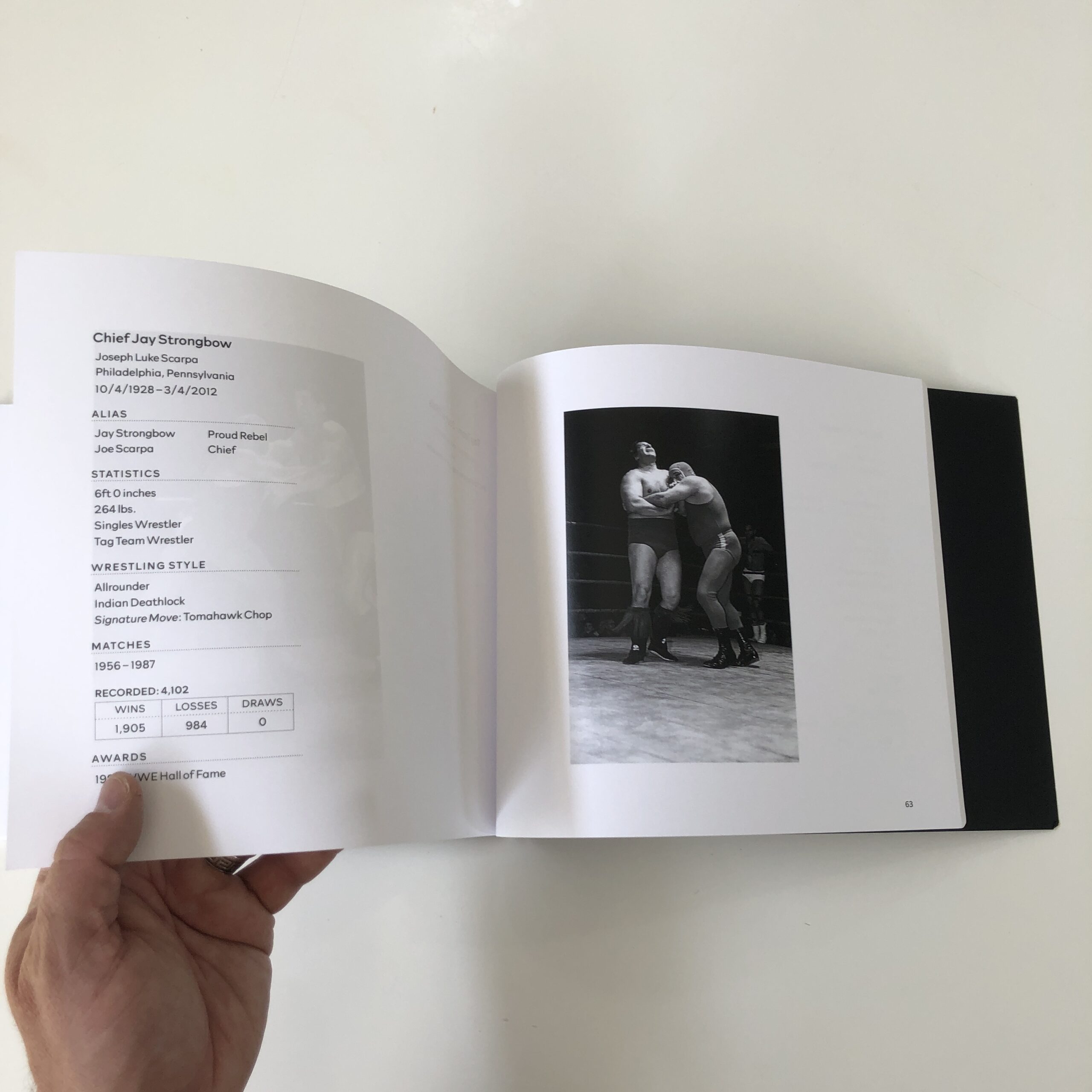
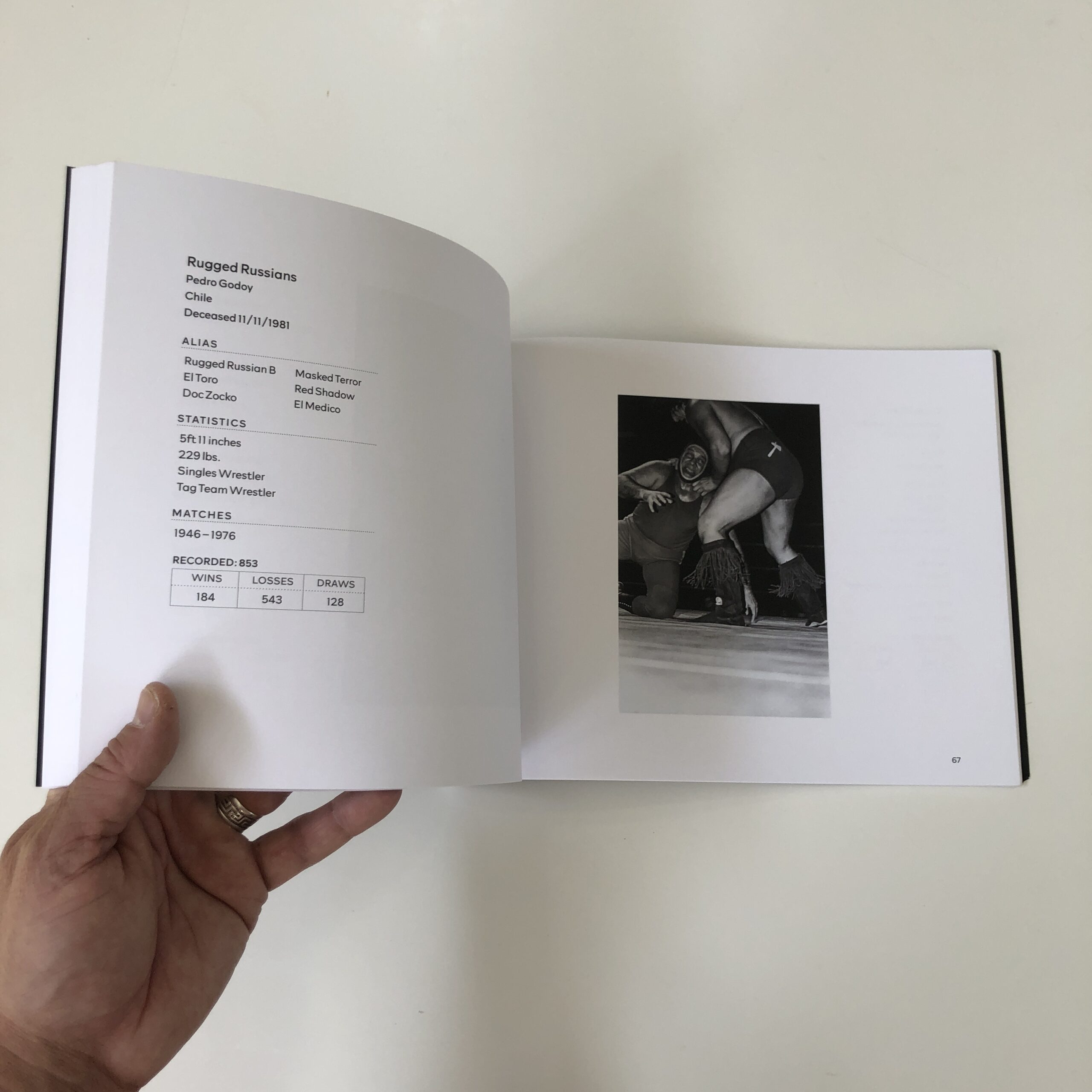
We see:
“Wrestling
Sunnyside Garden Arena
11/27/1971”
I mean, really?
What else could the book be about?
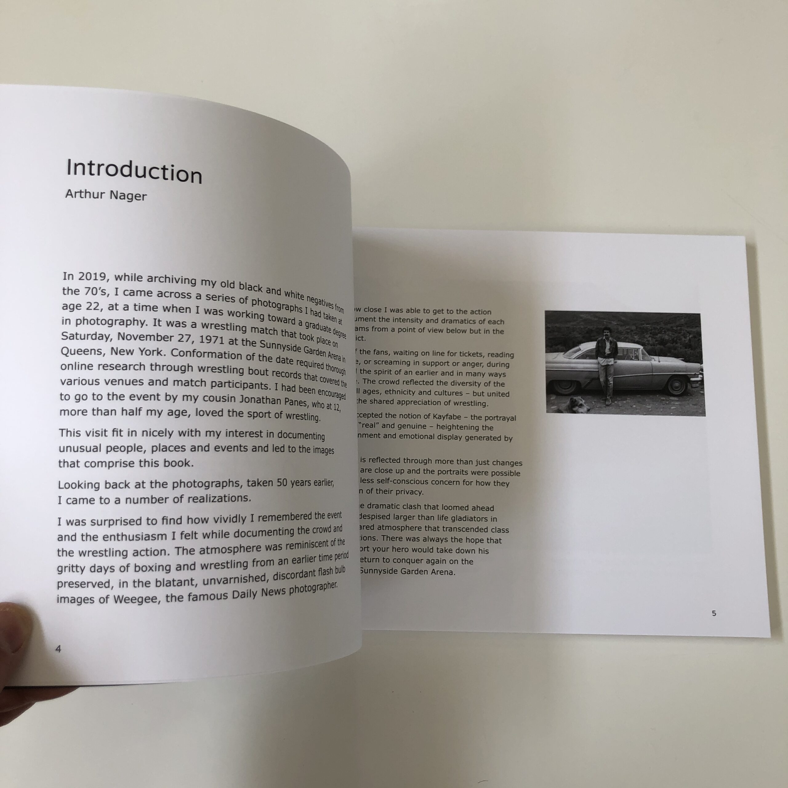
It’s a self-published affair, and I enjoyed it quite a bit, but did find myself torn out of the narrative a few times, due to quirks I’ll comment on, and then move forward.
There were too many essays at the jump, so I got impatient, and started skipping ahead to the photos, before coming back.
(I was curious, given the cover’s premise.)
And I’ve been in copy-editing mode lately for a client, (apologies for the typo last week, but I fixed it after the email went out,) so I caught a couple of mistakes in this one, including one sentence that was completely repeated in separate essays by Jonathan Panes.
And the term “Sunnyside Garden Arena” was utilized three times in a row, at one point, which my brain also noticed.
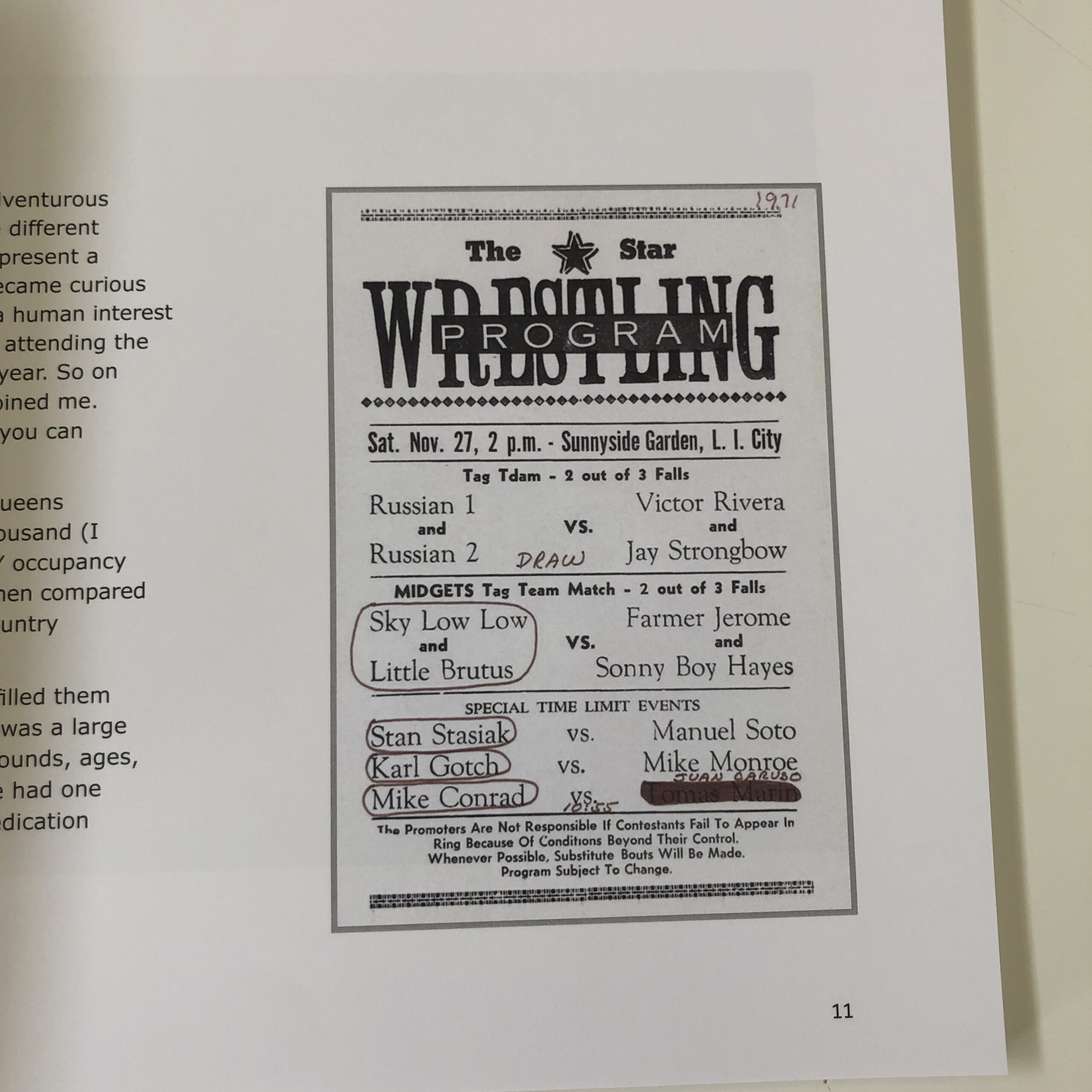
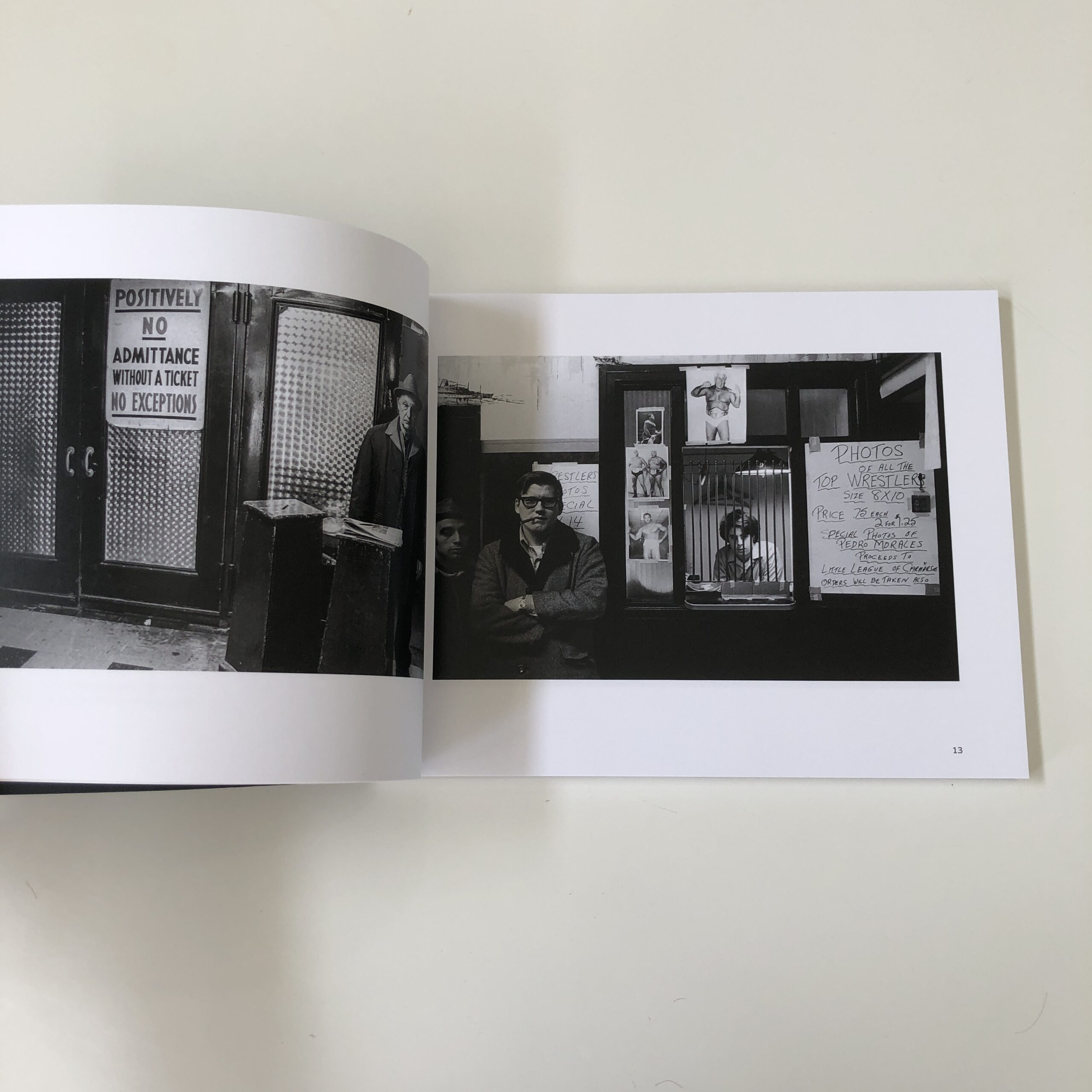
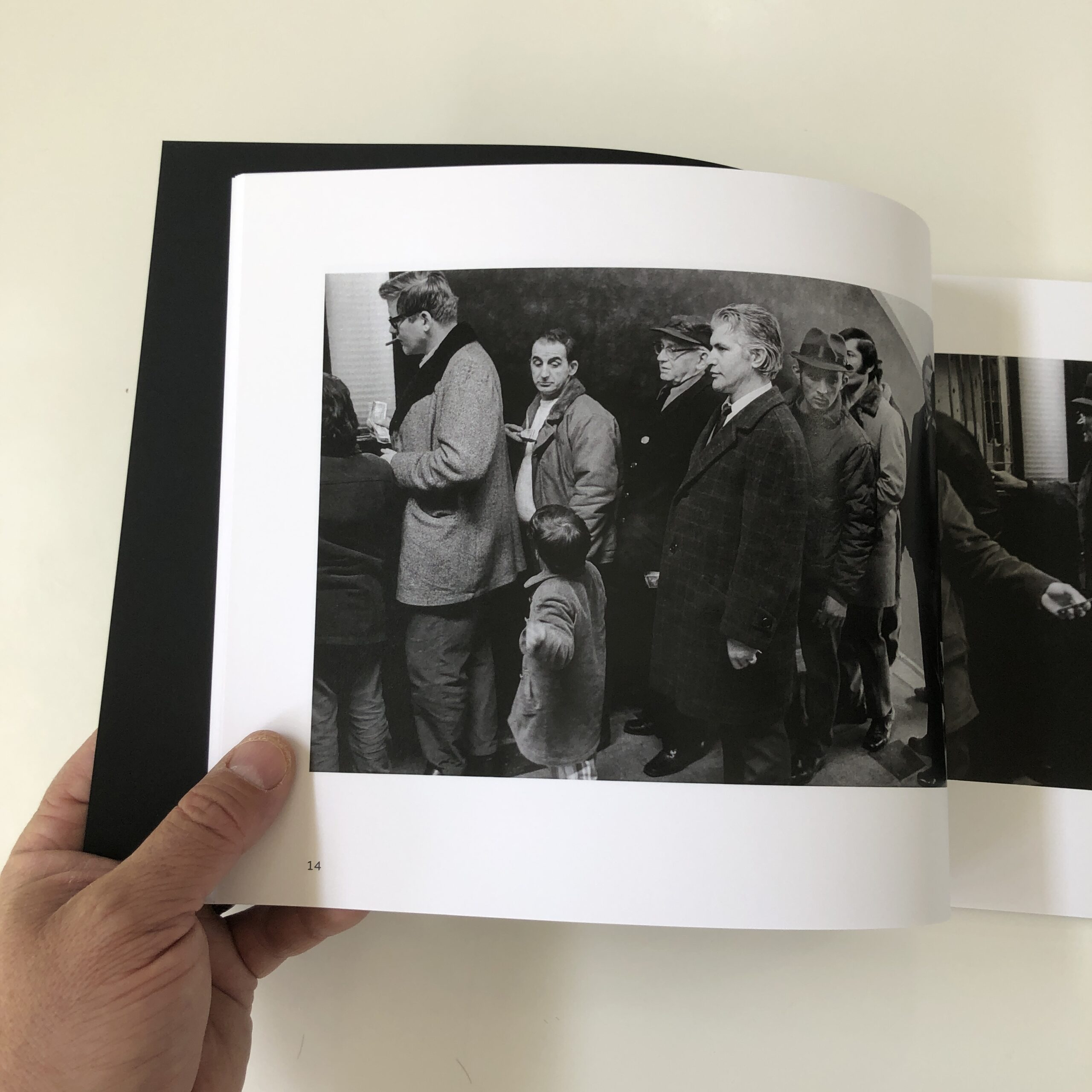
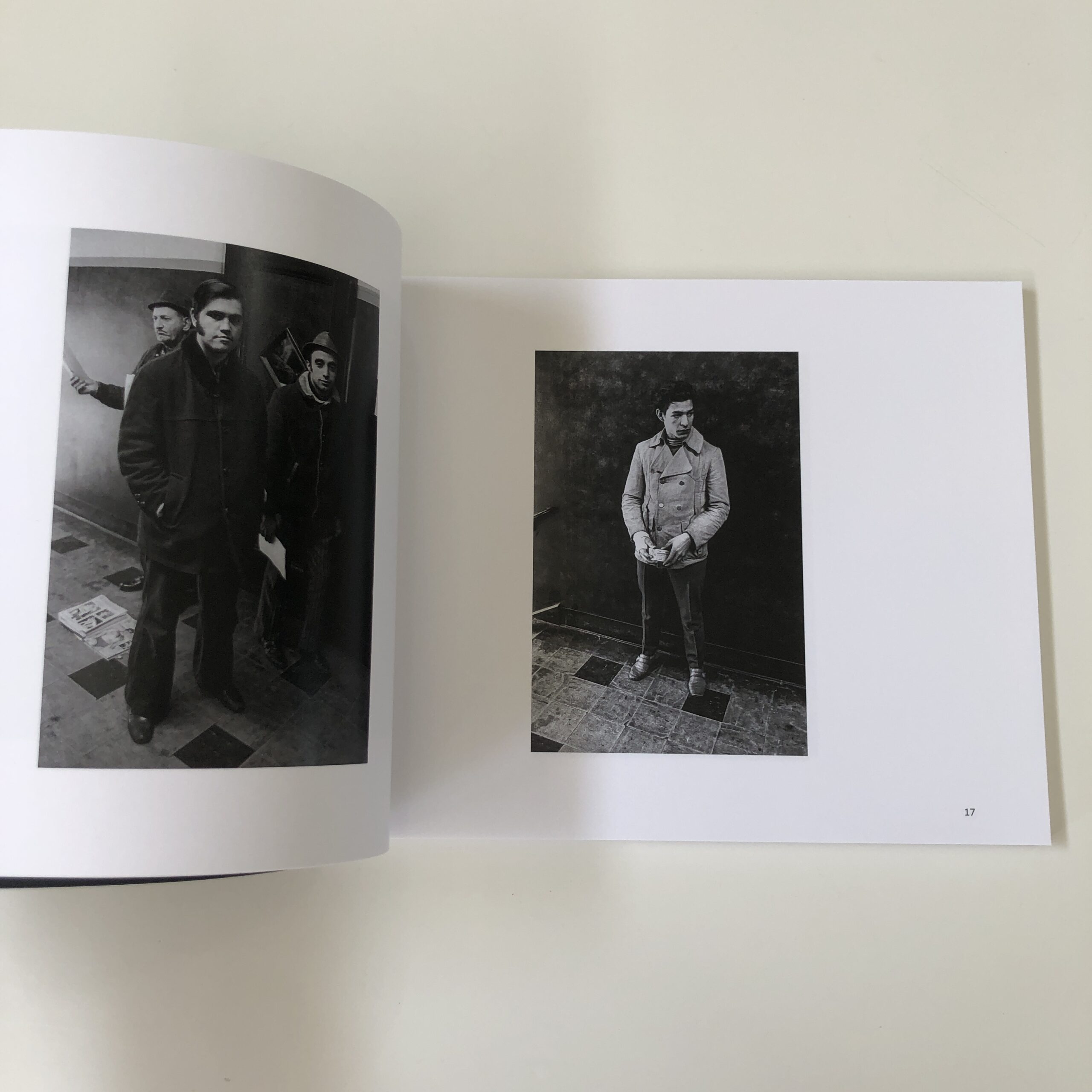
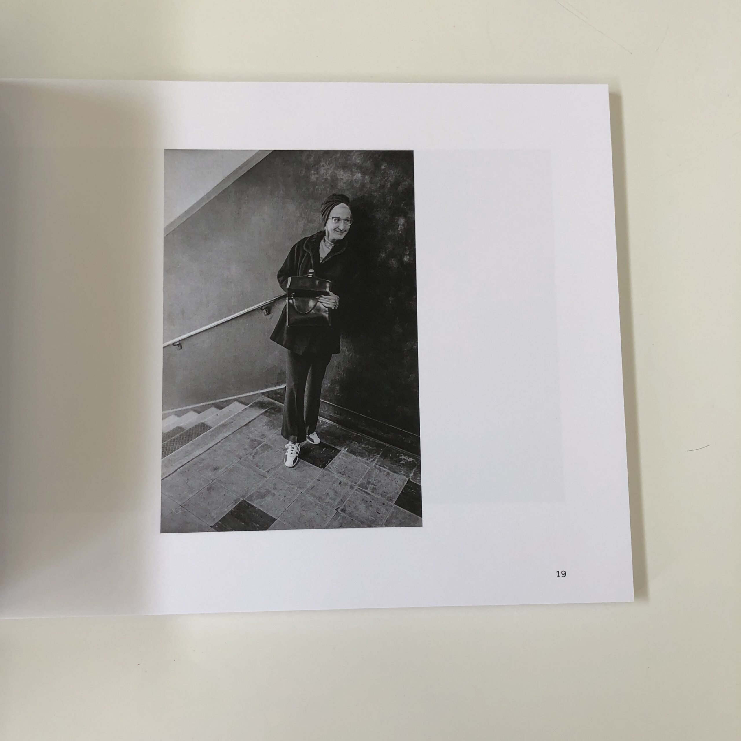
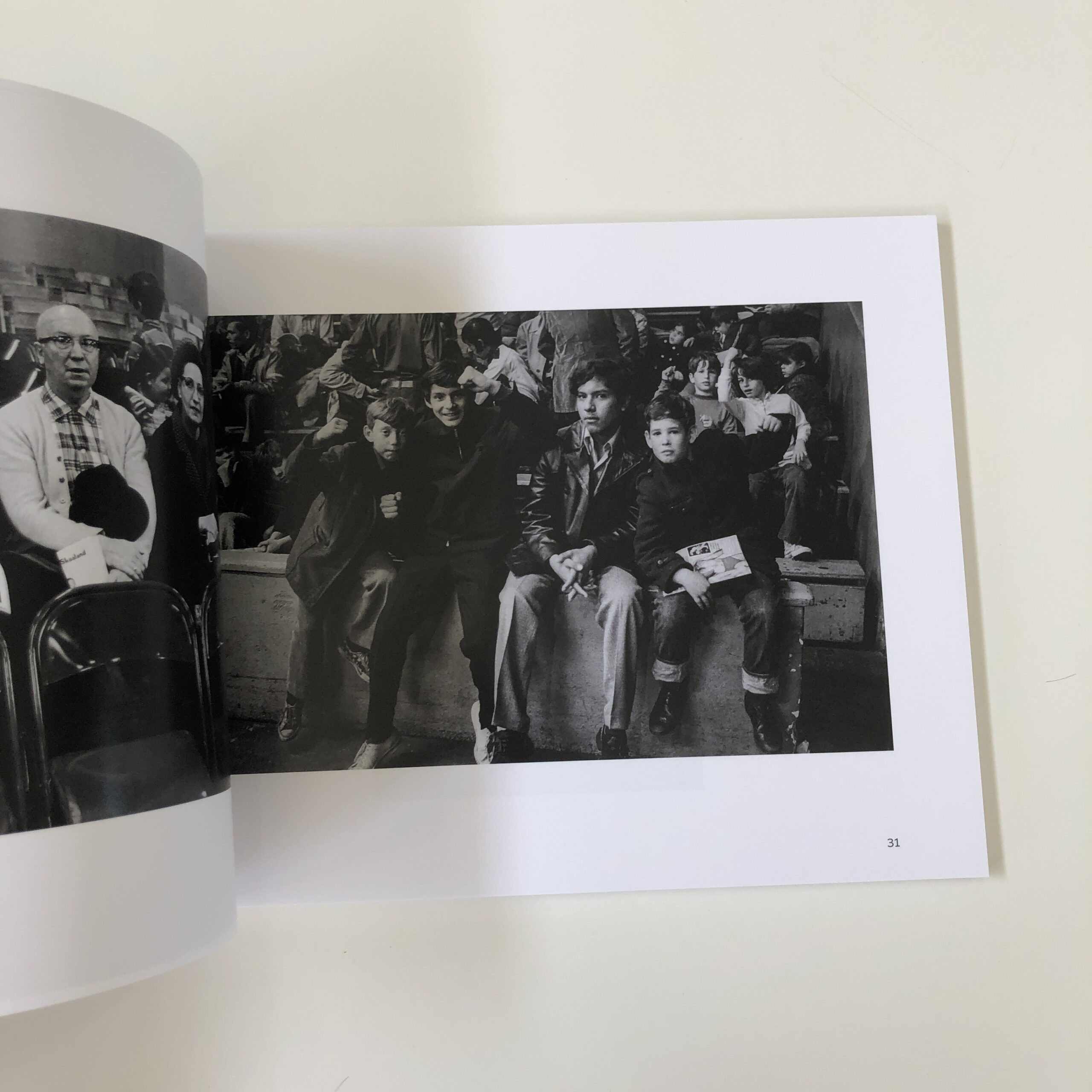
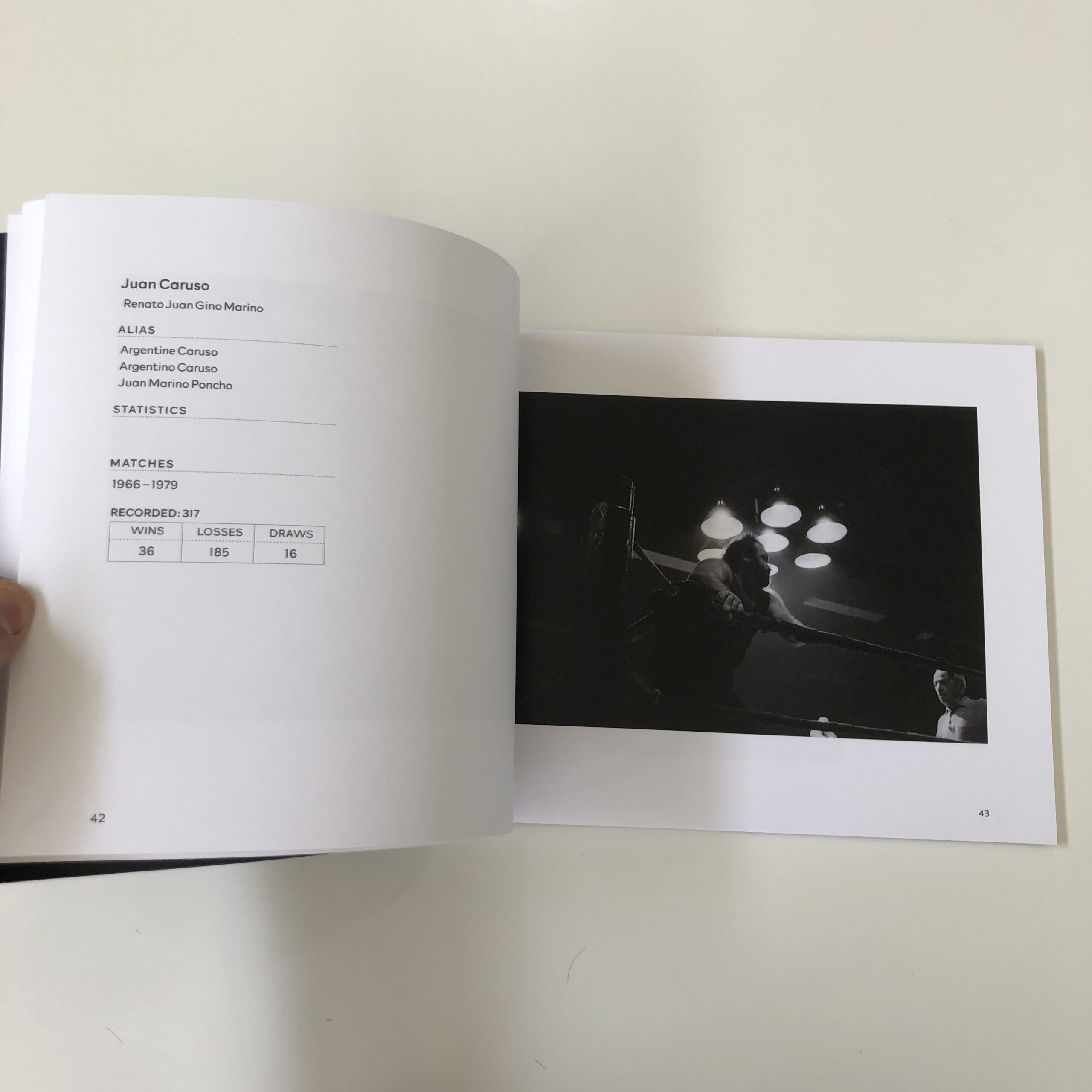
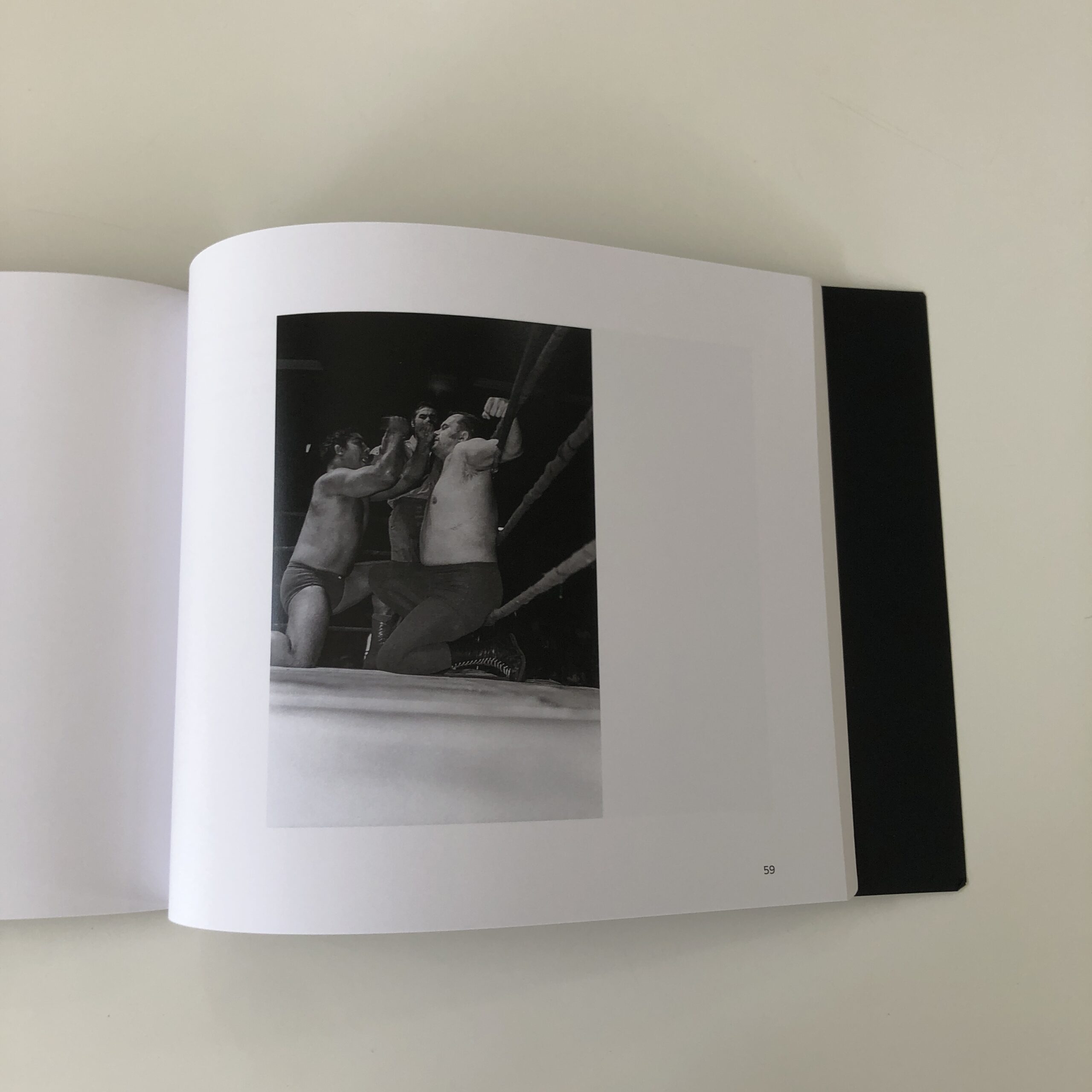
The motivation behind the project was a bit random, in that Jonathan Panes, the wresting fan, invited his older cousin, Arthur Nager, the photographer and art school student, (who couldn’t have cared less about wrestling, but wanted to photograph somewhere interesting,) to the wrestling matches at the (since razed) Sunnyside Garden Arena in Long Island City, Queens.
One day in the fall of 1971.
The fight-hall had been one of a string throughout NYC, we learn, now all gone, as the size was just right for boxing and pro wrestling, but not lucrative enough to survive into the 21st C.
Mike Silver, a boxing expert, (and friend of the photographer,) writes an essay for the book, and when he calls Arthur “Artie,” I could almost hear roar of the crowd and smell the cigars on a day out in Queens:
“Artie, go get me a beer, wouldya? I’ll get ya back the 10 cents next week, I promise! Be a sport, would ya pal?”
But back to the book.
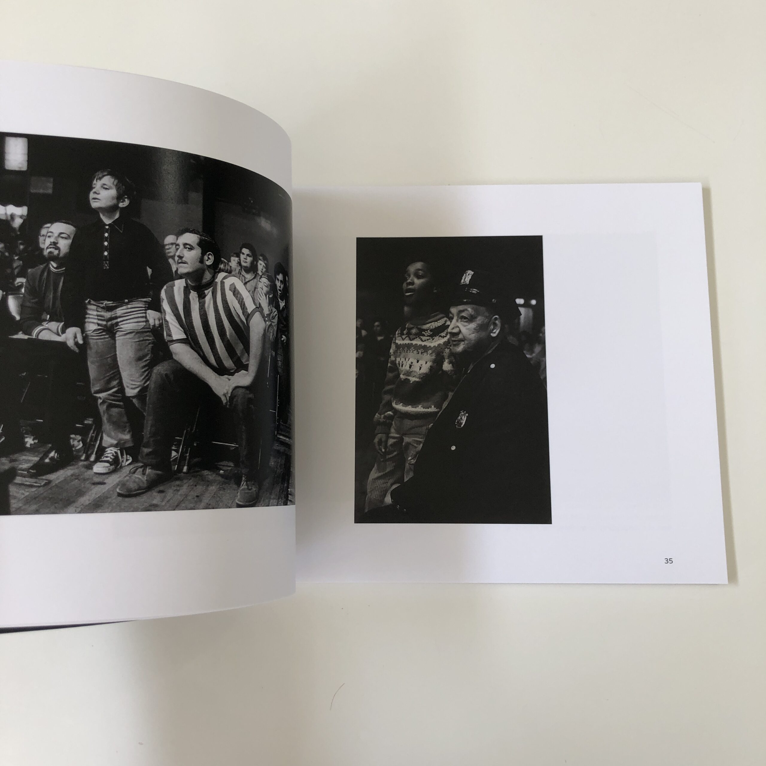
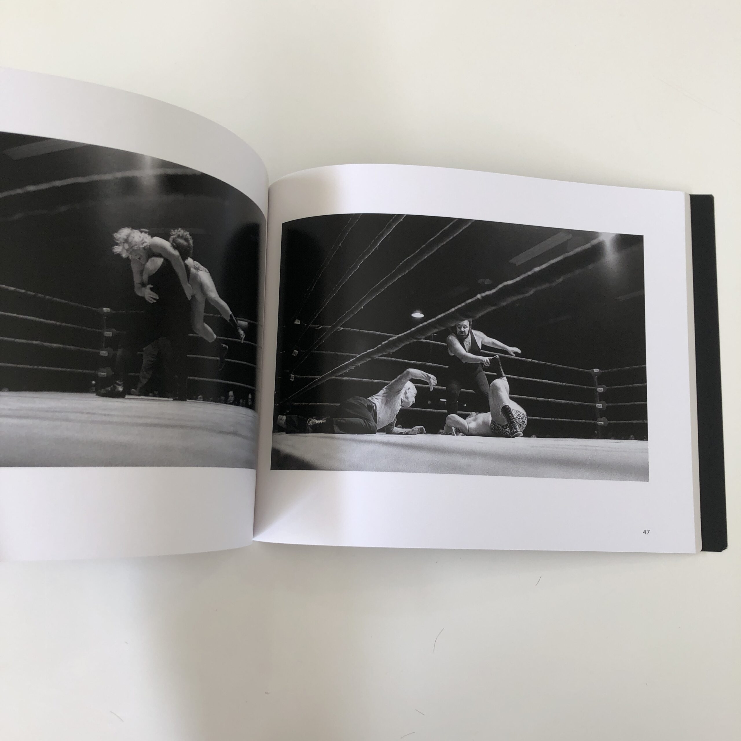
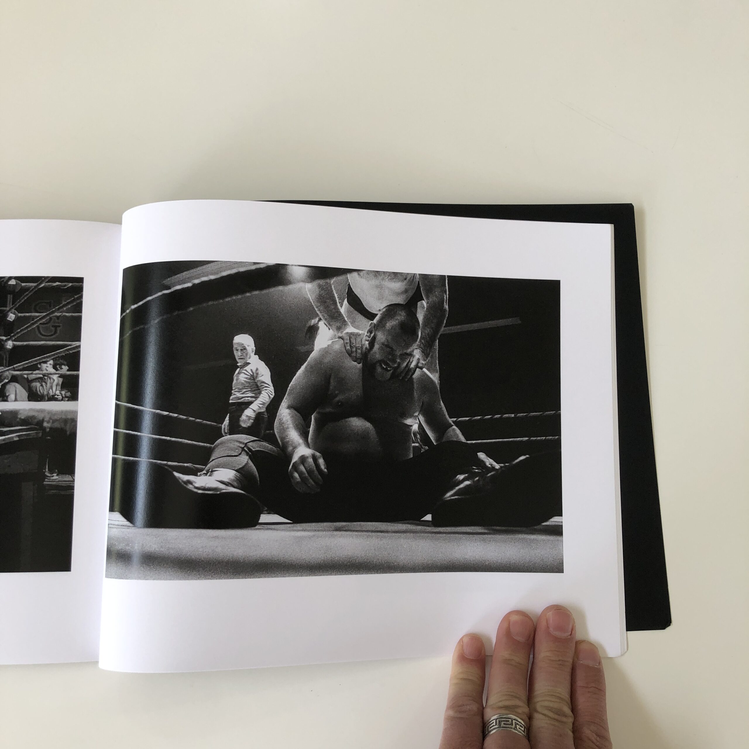
The photos are fun. For sure.
How could they not be?
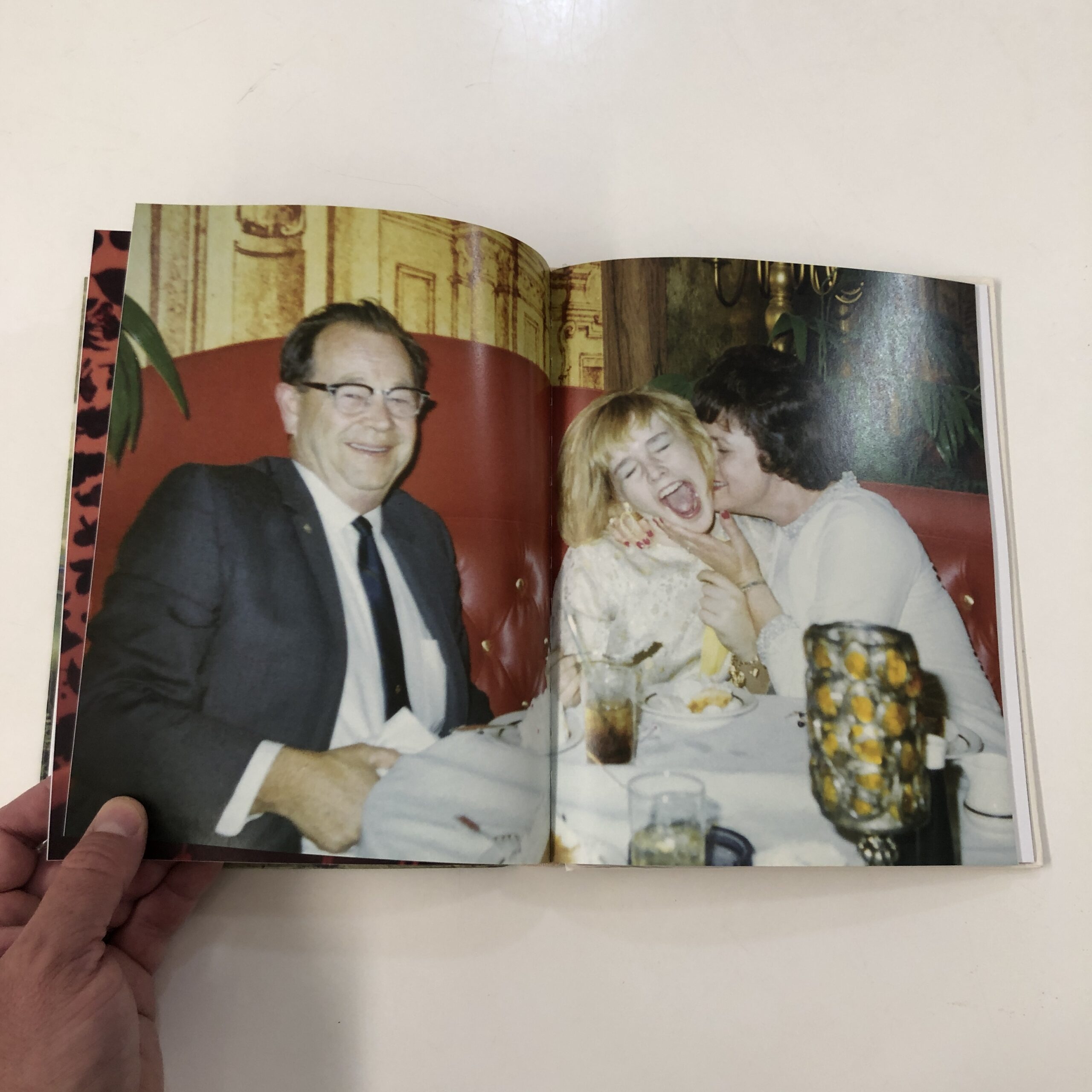
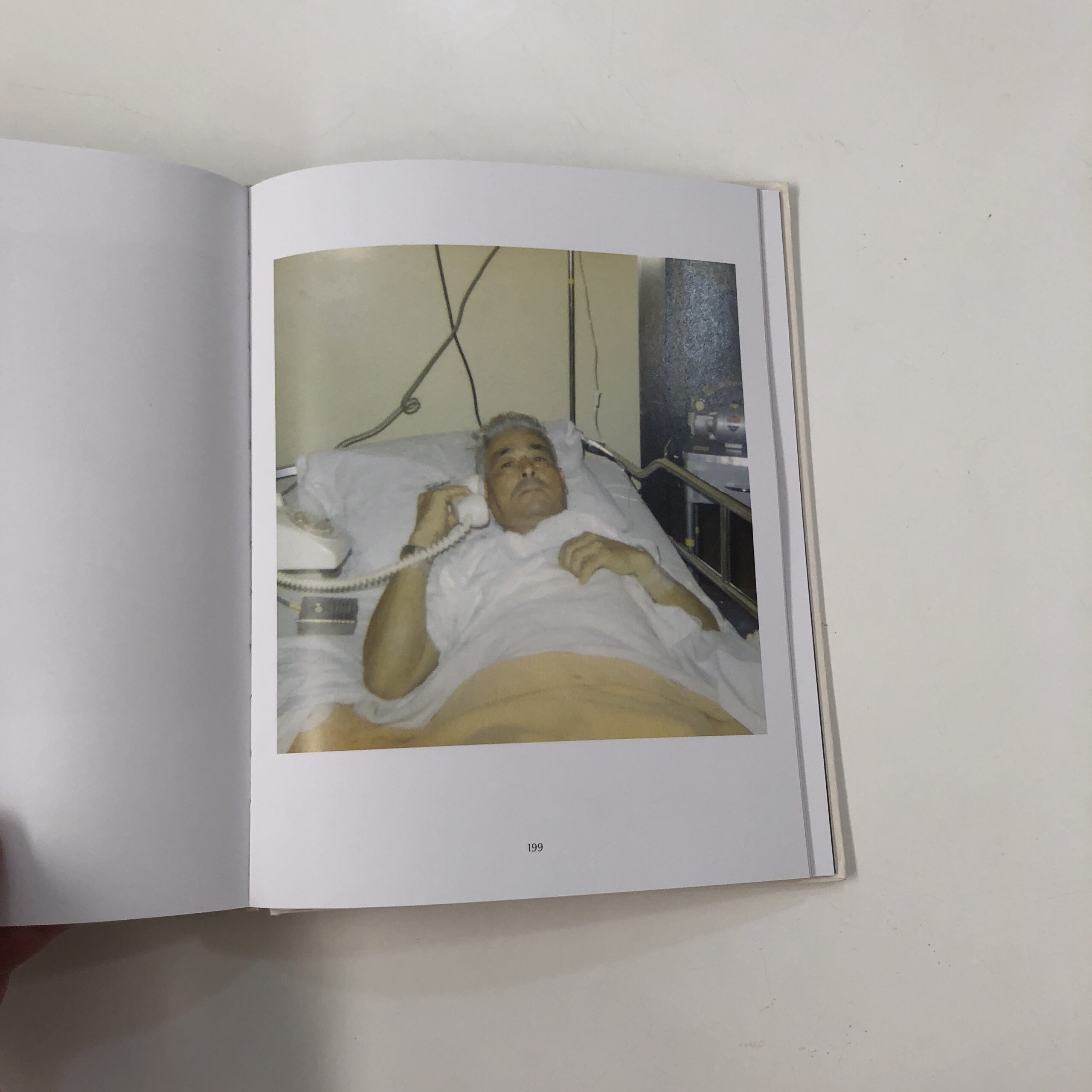
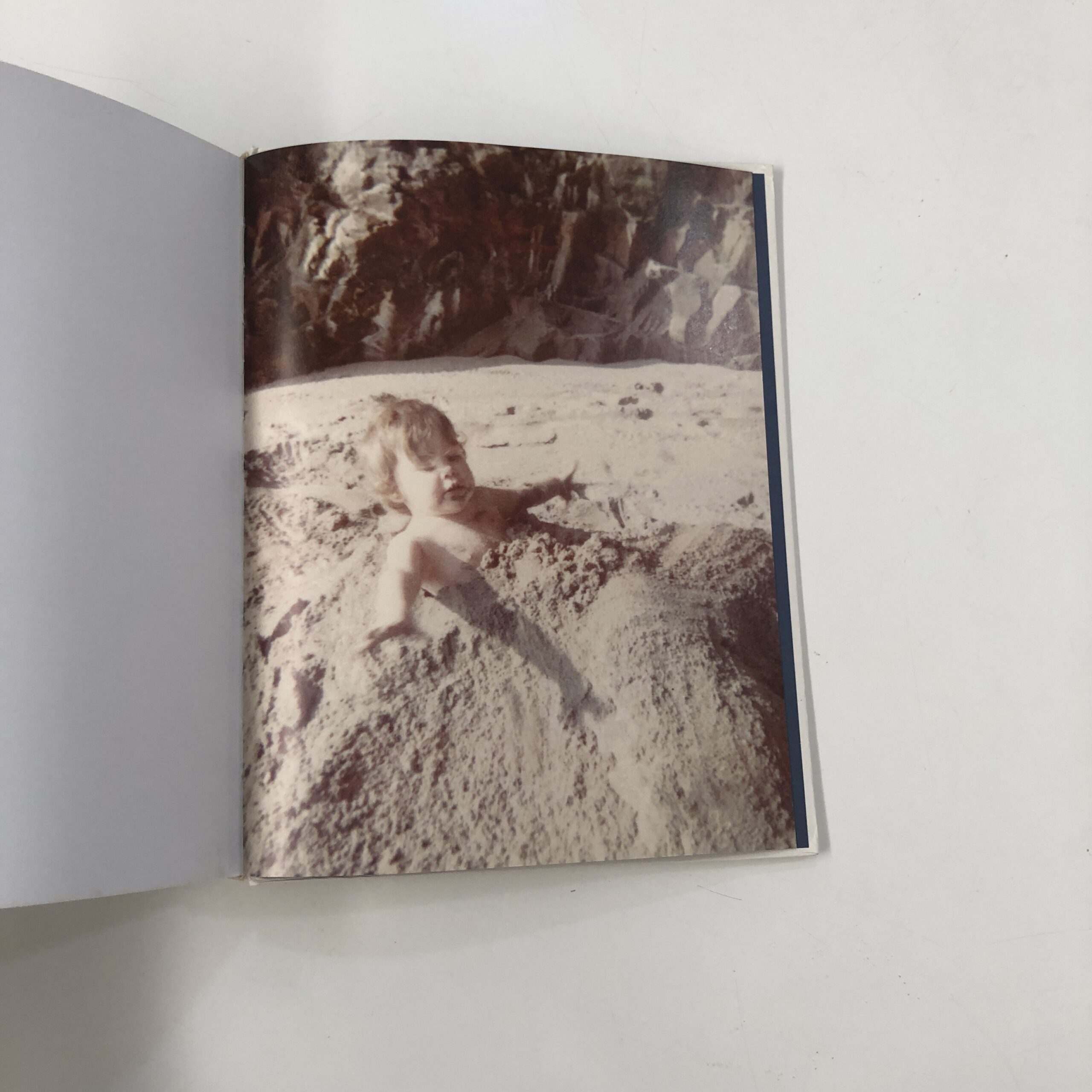
I just wrote about this recently, (with the Michael Lesy book,) but we all know that putting negatives in a box and waiting 50 years is a tried and true way to end up with fascinating photographs.
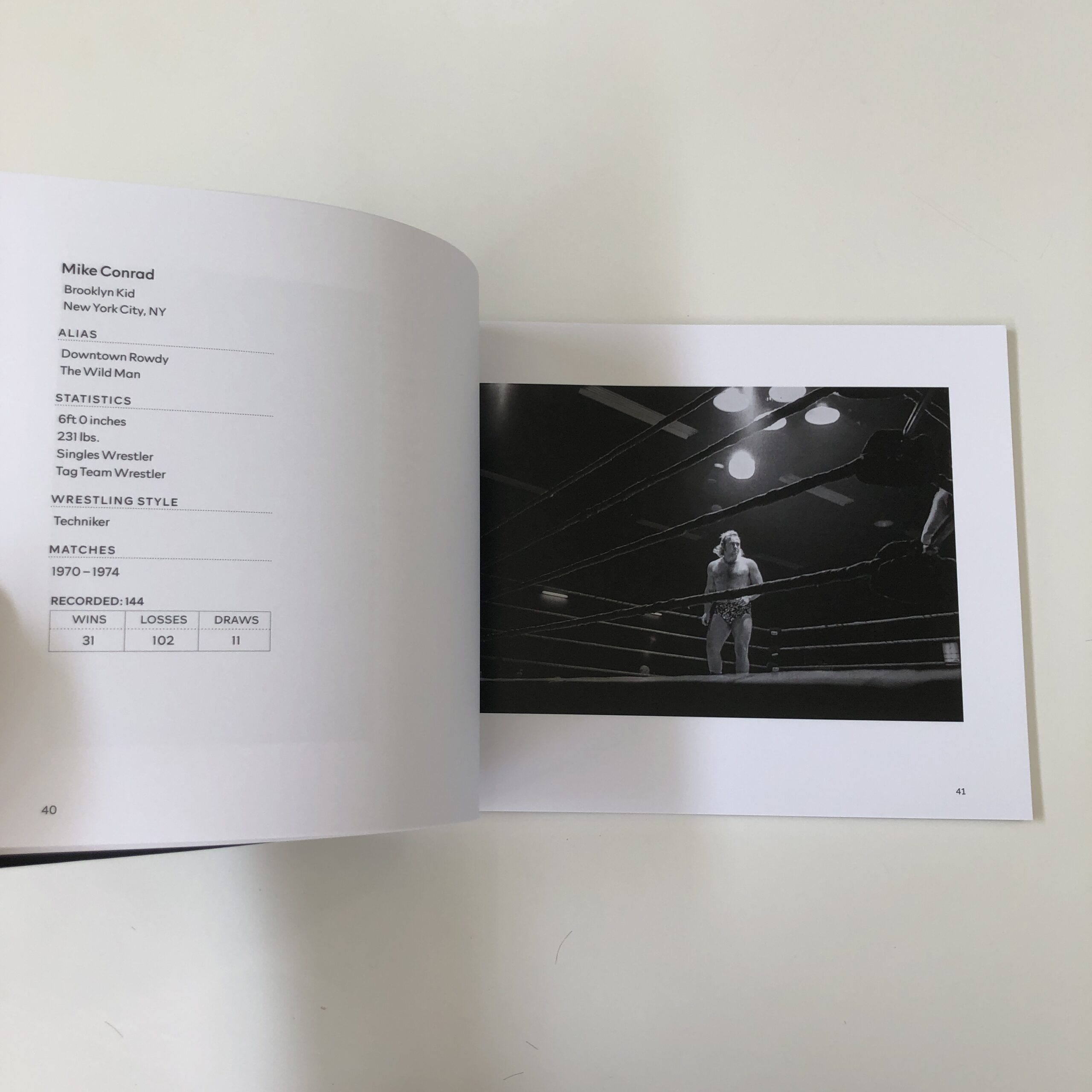
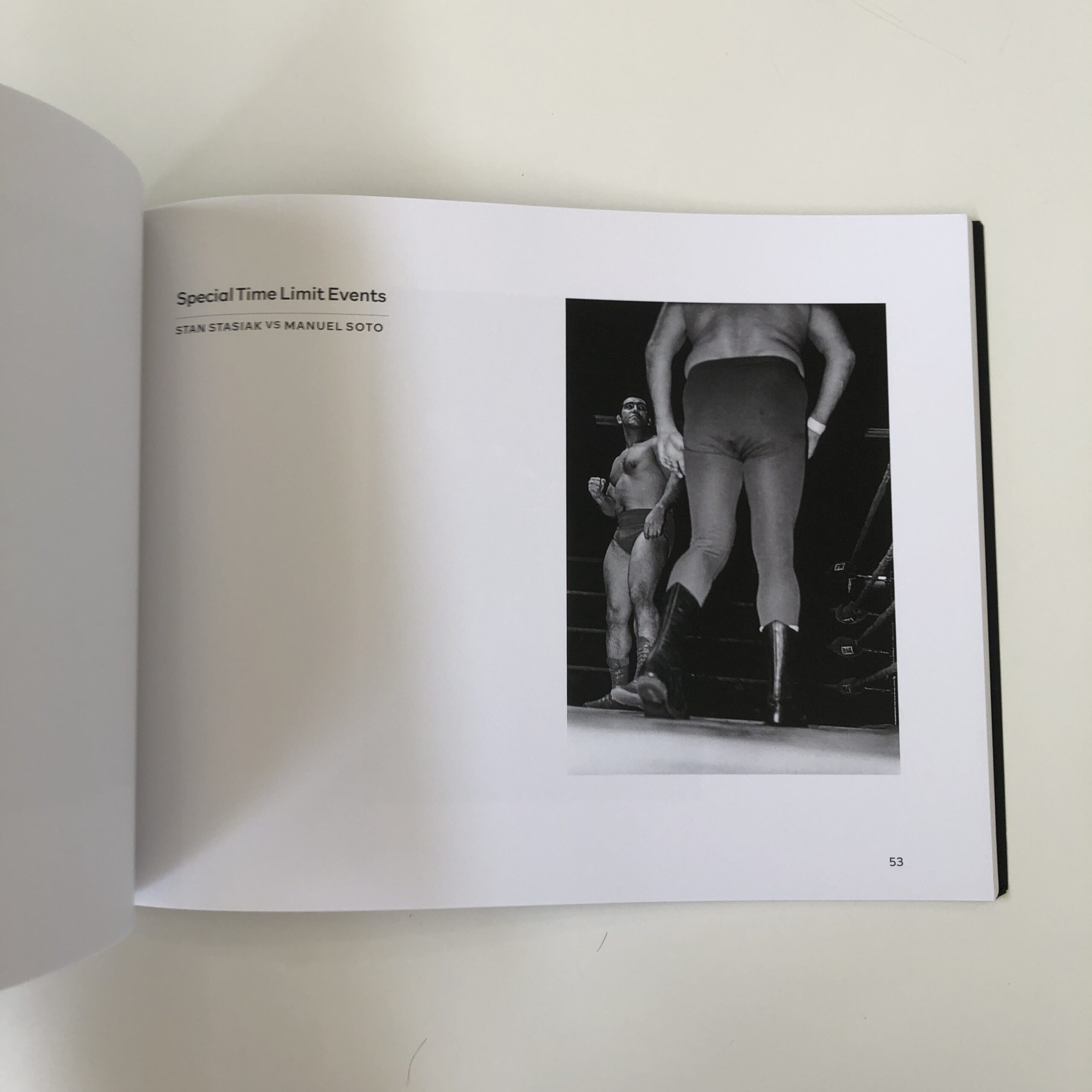
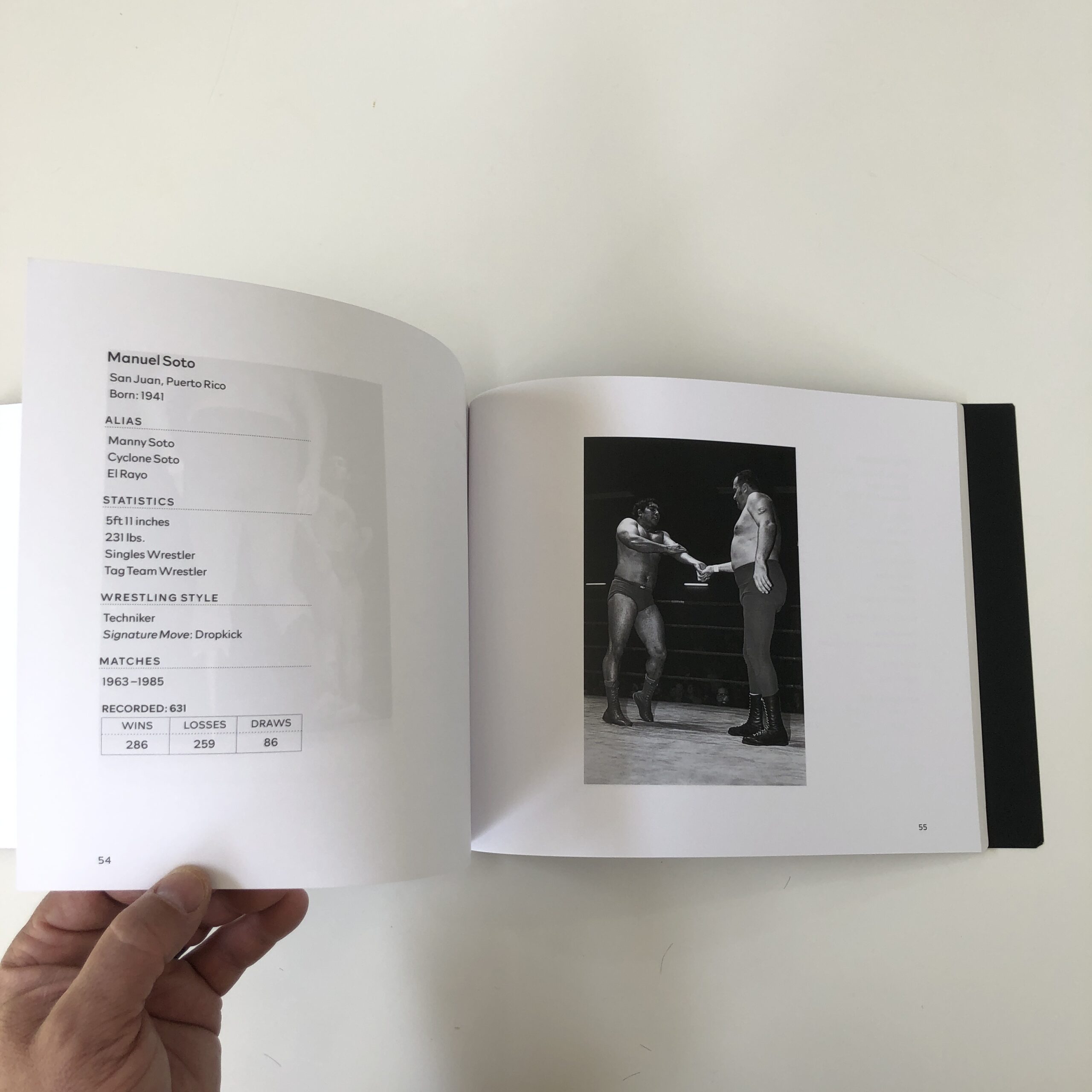
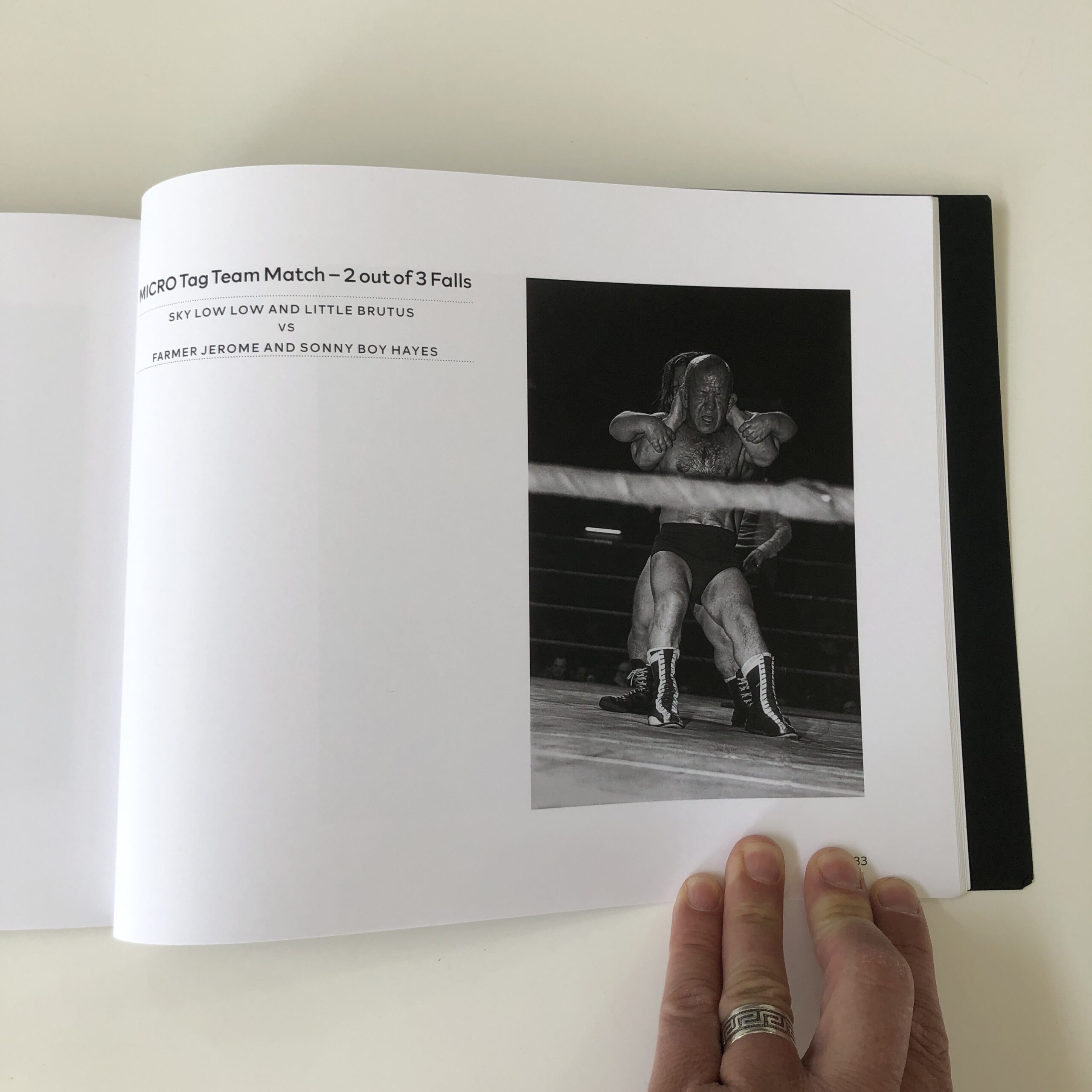
Design-wise, though, I loved it when the second half of the book breaks sections down by wrestling match, featuring stats and info about each wrestler.
So clever.
The less said about the little-people wresting photos the better, but I’m not sure if I’d have included or excluded them, had it been me?
(Is that a cop out? On the one hand, the photos are offensive to modern tastes. On the other, they’re quite compelling, and make sense in context of the era. Tough call.)
But they made the decision to include them, and that’s on them.
If you’d like to submit a book for potential review, please email me at jonathanblaustein@gmail.com. We are particularly interested in books by artists of color, and female photographers, so we may maintain a balanced program. And please be advised, we currently have a significant backlog of books for review.
Change is most often thrust upon us, as few embrace it willingly.
(Only after the fact, when we reap the spoils, do we begrudgingly admit it was worth the effort.)
That said, change has come to this column, and I’m all for it.
I’ll still be writing for you twice a month here, (which got slightly lost in my announcement last week,) but I went with the hubbub, because the week in, week out endeavor, over the past 11 years, helped define my life.
No lie.
But now it’s time for something new.
I can (occasionally) be as reluctant to change as the next person, but when we enter a new life phase, we see things differently.
Growing older, experiencing more life, and hopefully acquiring (some) wisdom means we’re able to attack the same problems with different solutions.
Or acquire different opinions from what came before.
And that last bit is motivating today’s column.
I was talking with a client the other day, and referred to my un-reviewable book.
The one book I’ve picked up, time and again, but put down.
Each time, I shake my head and say, “No, not today. I don’t see how to tell this in a way that’s not offensive.”
And so I’d set the book back on the shelf, only to pick it up six months, or a year later.
Frankly, I’ve grabbed it three times in the last month, but think today, for whatever reason, I’ve finally cracked the code.
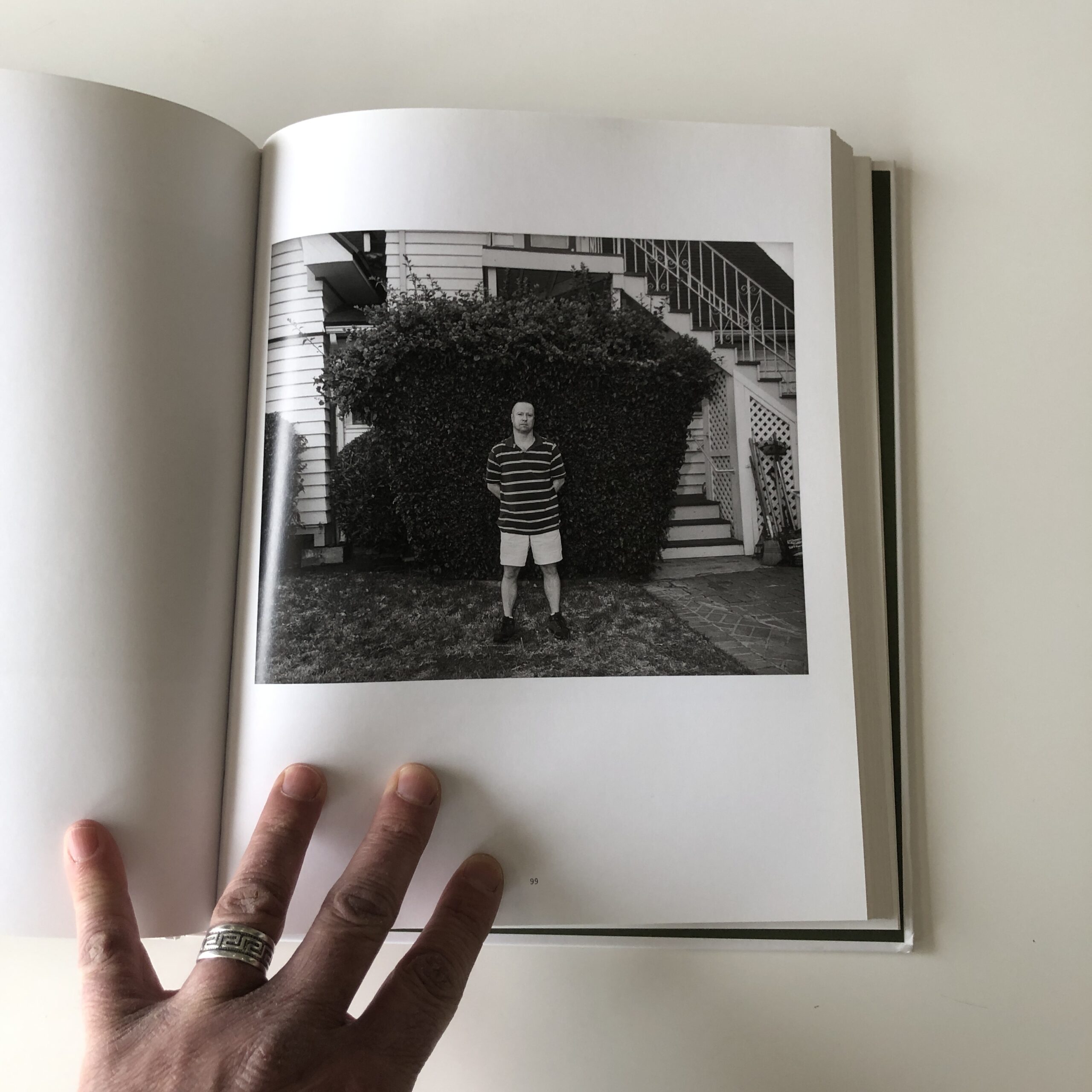
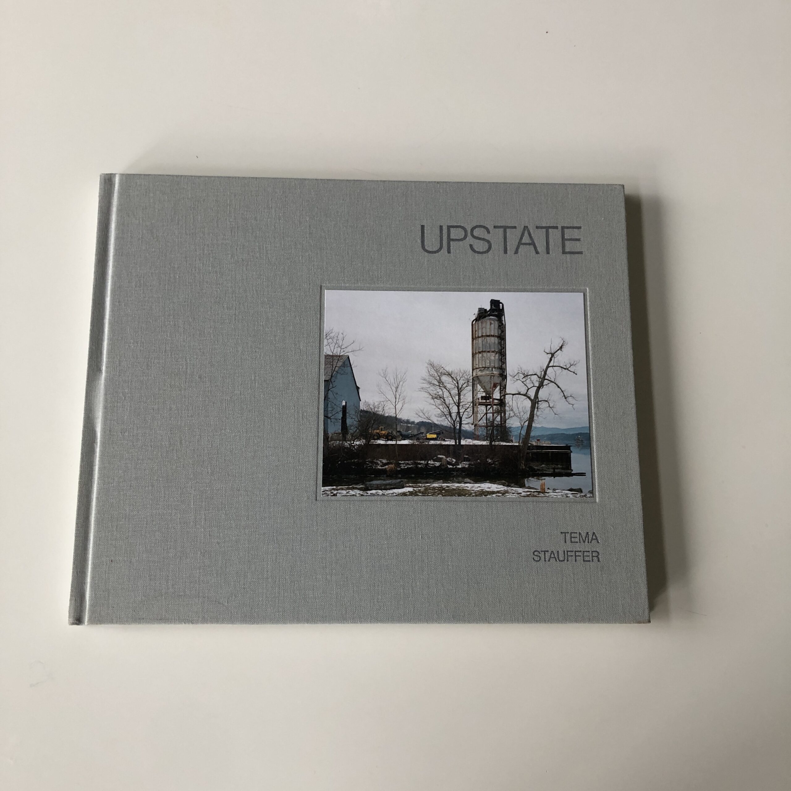
“Upstate,” by Tema Stauffer, published by Daylight in 2018, turned up in the mail three or four years ago.
As you already know, (having reading this far,) up until now, I’ve had a hard time expressing my thoughts about “Upstate.”
I don’t hate this book.
Not at all.
(Not even a little.)
But it is hard to write about, because I don’t like it that much either.
A few weeks ago, I discussed the idea that sometimes the established, expected format of a book, (essay, plates, essay) can do it a disservice.
(If the creative team takes no chances.)
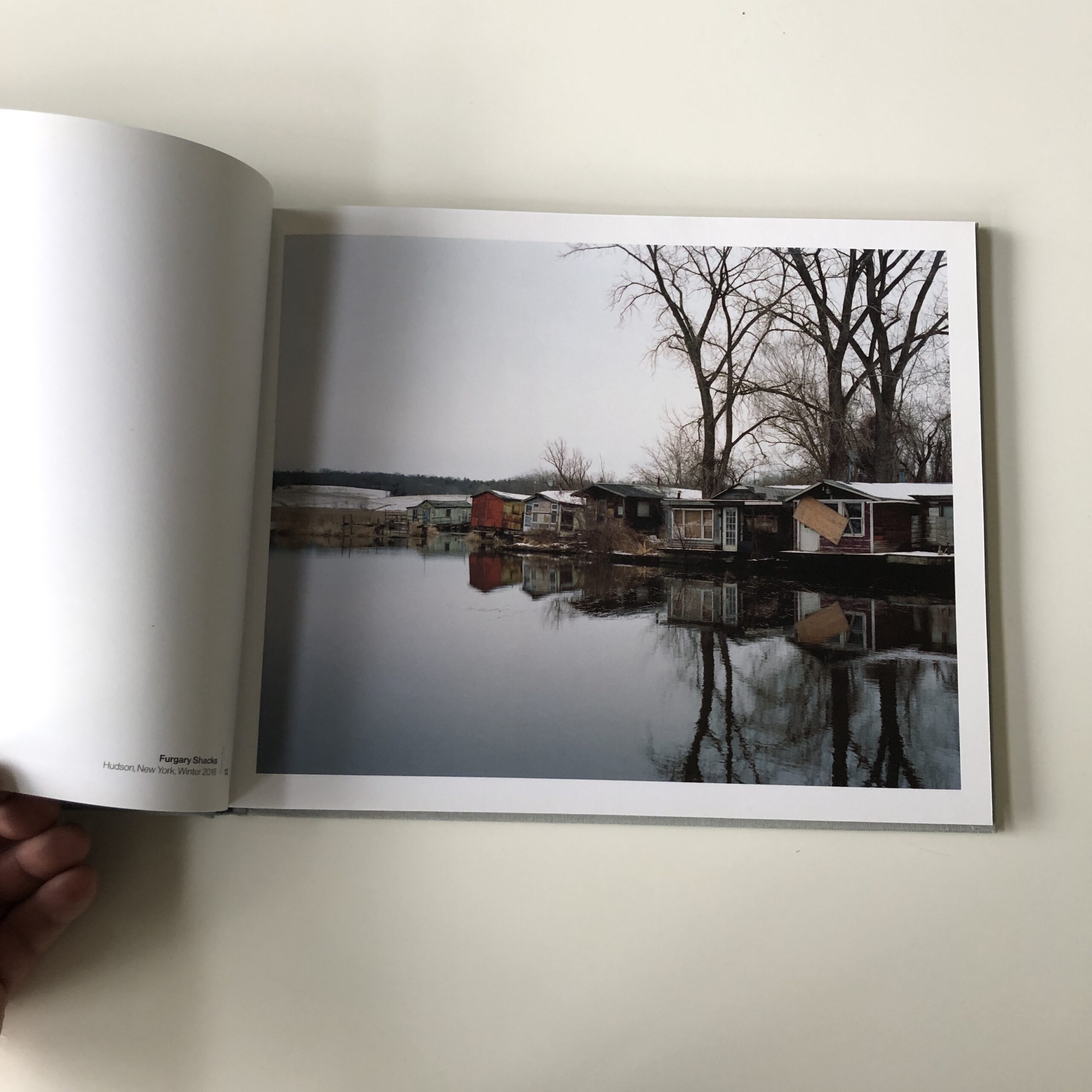
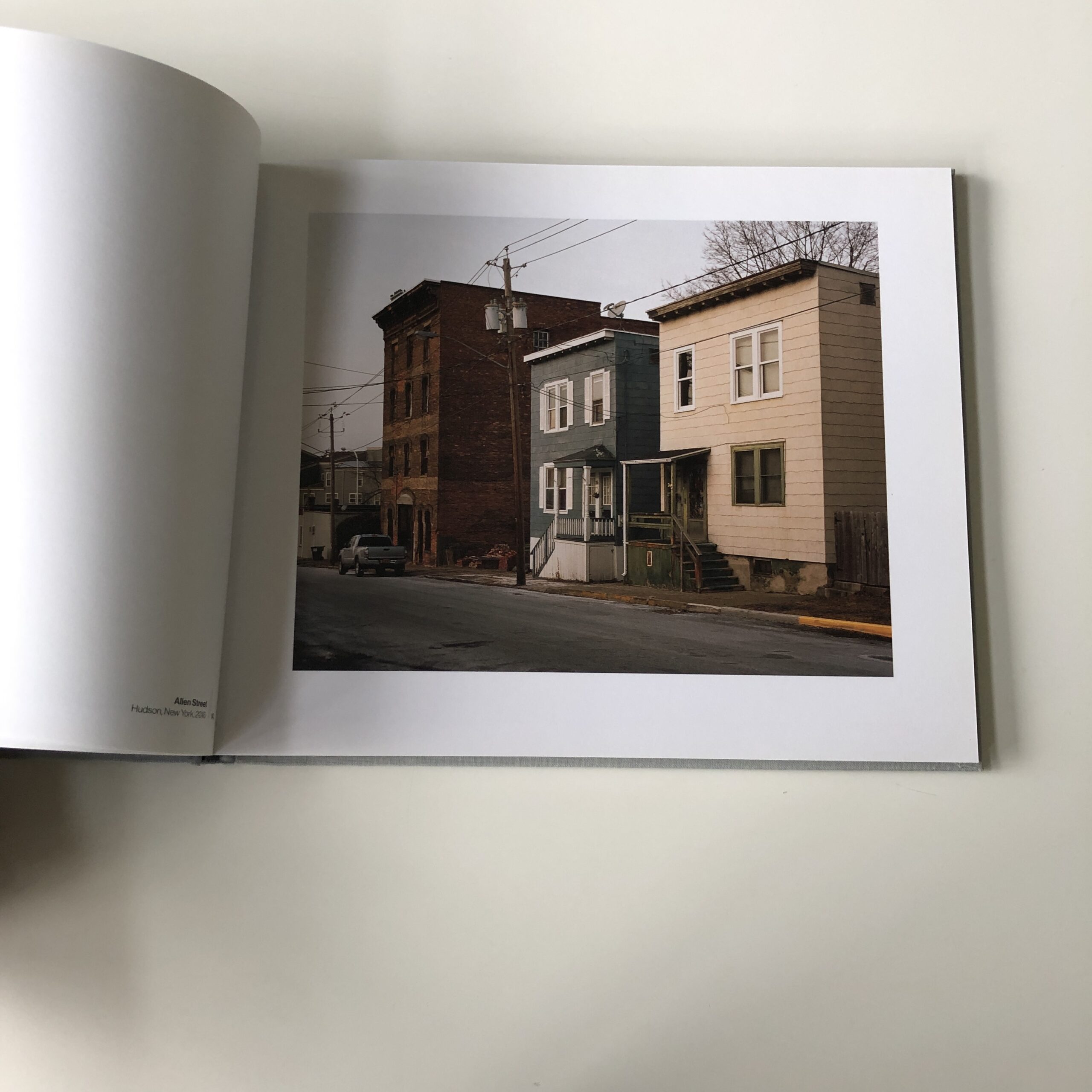
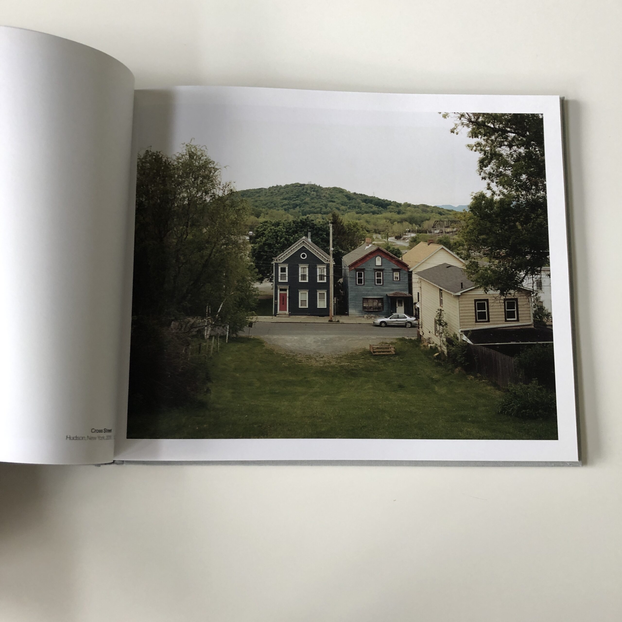
And for me, these cultural landscape images speak to that even-steven, middle of the road, well-established, Alec-Soth-shooting-style we’ve come to know so well over the last 15 years.
Plus, the poverty reminds me of so many Appalachian books I’ve seen before, or just rural poverty porn in general.
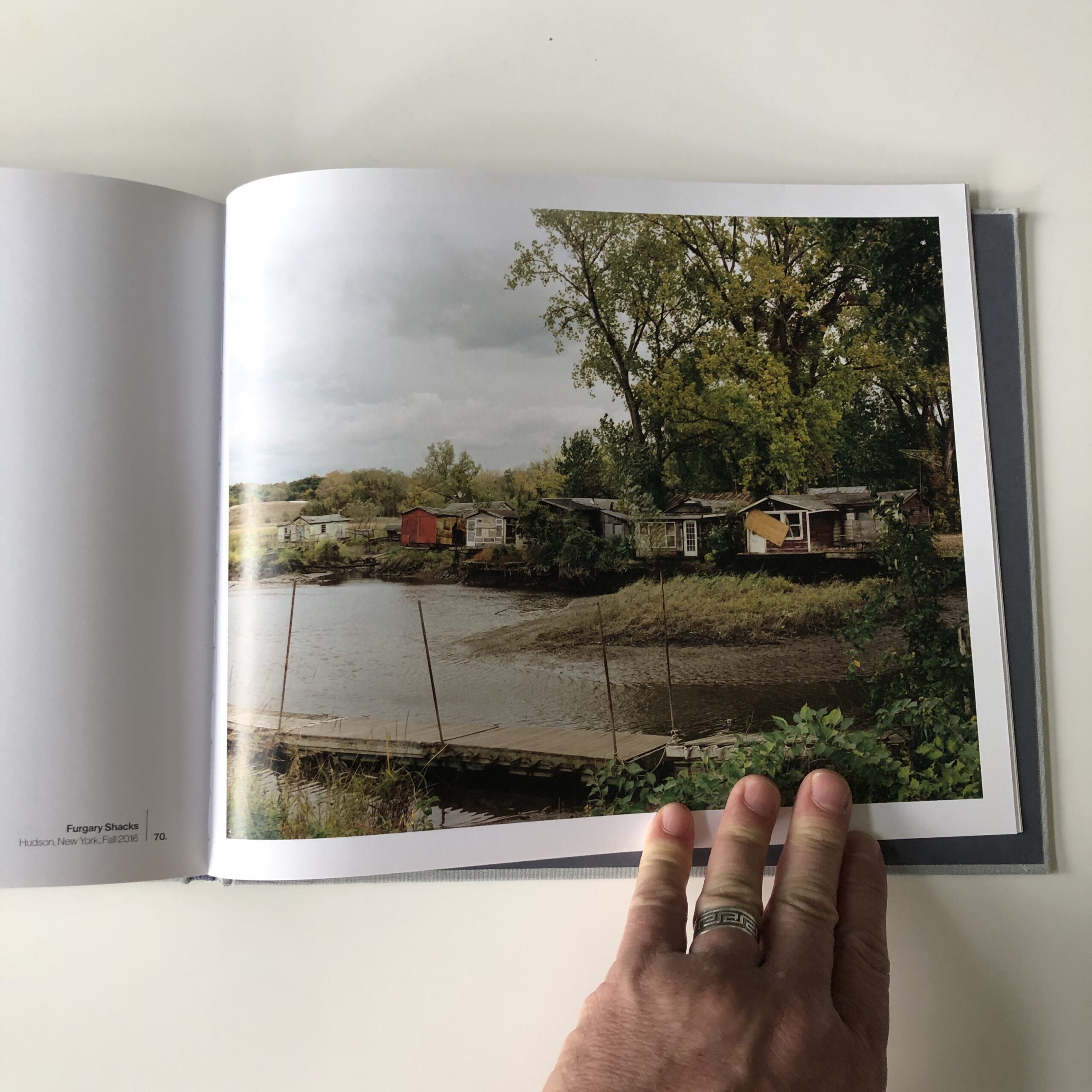
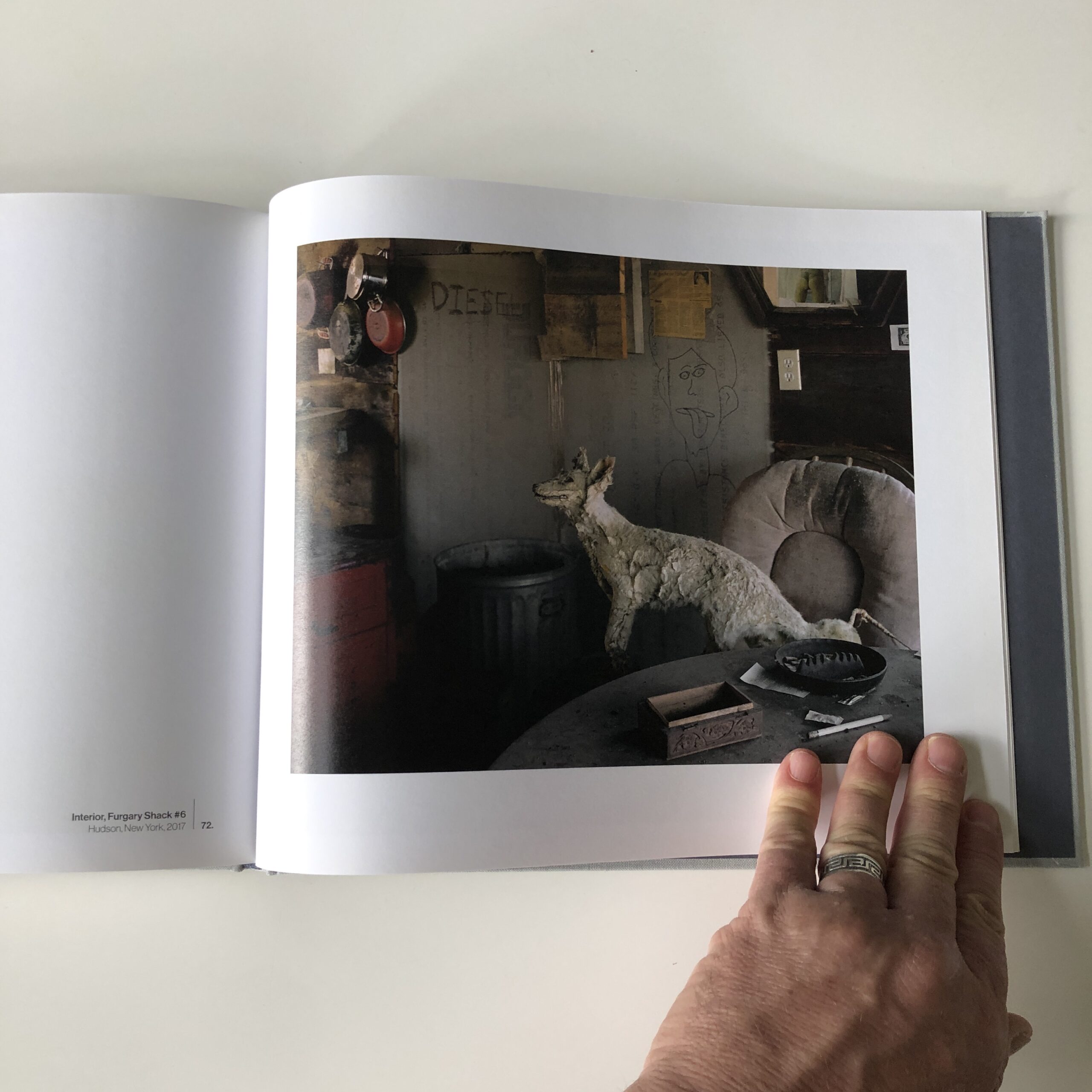
(In this case, we’re seeing Hudson, New York.)
Yet I’m certain some of you will like the photographs a lot. Maybe even love the book.
(Art is subjective.)
For me, a book that is conventional, and reminiscent of so many other projects in its design, shooting style, and subject matter becomes, somewhat by definition, average.
Nice.
Fine.
More than acceptable.
Perfectly competent.
But it’s not memorable.
And historically, whether reviewing a book, or writing about portfolios from a festival, I like things to be distinctive.
To stick in my mind.
This book never did, until it finally did, for being something of a cautionary tale.
So there you have it.
Since this is an edgy take, I’m sure some of you will disagree with me.
If you’d like to submit a book for potential review, please email me at jonathanblaustein@gmail.com. We are particularly interested in books by artists of color, and female photographers, so we may maintain a balanced program. And please be advised, we currently have a significant backlog of books for review.
I’ve sat on the news for a while, waiting for the right time to drop it.
(And today is the day.)
I should say, straight off, that I won’t be going away entirely.
You’ll still get to read my rambling, discursive musings every other week, here at APE.
But on October 7th, 11 years after I began writing for you each Friday, the streak will be snapped.
The photo industry is not remotely what it was, when I began the column in 2011, and change is a healthy and natural part of life. (Especially as this blog is supported by neither subscription fees nor ads.)
It is what it is, but I must admit, after living under the yoke of a weekly deadline for this long, I’m excited to see what it’s like without the structure.
So after today, only five (weekly) columns left.
It all began when I was on the hustle, during The Great Recession.
In the late spring of 2010, Rob Haggart put out a call for images of the cataclysmic economy on APE, (a colleague was looking for photos for a story,) so I sent him a project I had.
Gas station grocery shelf, Antonito, CO, 2009
I was psyched Rob replied, liking the pics, so I told him I was about to attend two big photo festivals, back to back, and as a burgeoning blogger, perhaps I could report on them from the field for APE?
He agreed to publish my articles, and liked the work, so he then offered to pay my expenses on a trip to NYC, to cover the PDN Photo Plus Expo for the blog.
(As you might image, I was blown away, and jumped at the chance.)
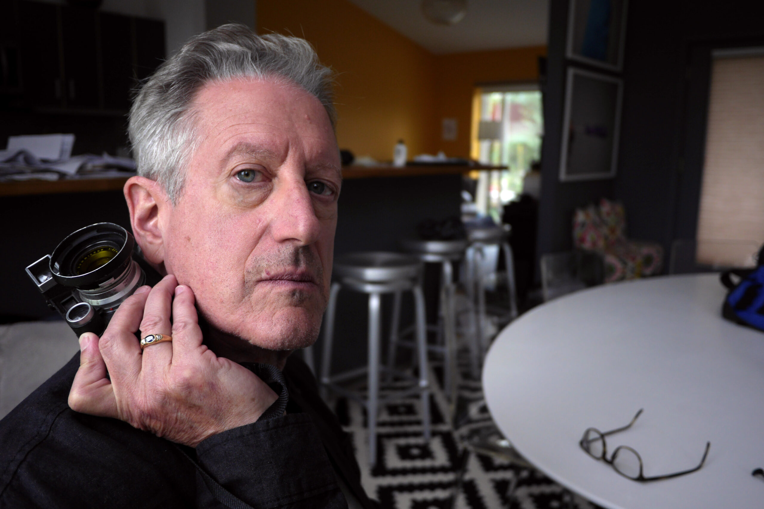
A guy I knew on Twitter, Richard Bram, told me he’d be there too, so we agreed to meet up in the cavernous Jacob Javits Center on the West side of Manhattan.
We connected, and I found Richard charming, knowledgable, agreeable, and just fun and easy to be around.
In the end, I mentioned Richard in the article, and so began a long and fruitful friendship.
He’s been featured in more articles than anyone else, as off the top of my head, I recall a festival in Houston, museum visits in Brooklyn and London, eating in a little Ramen shop in the East Village, and a fish and chips joint on the Thames in 2019.
Fish and Chips, Limehouse, London, 2019
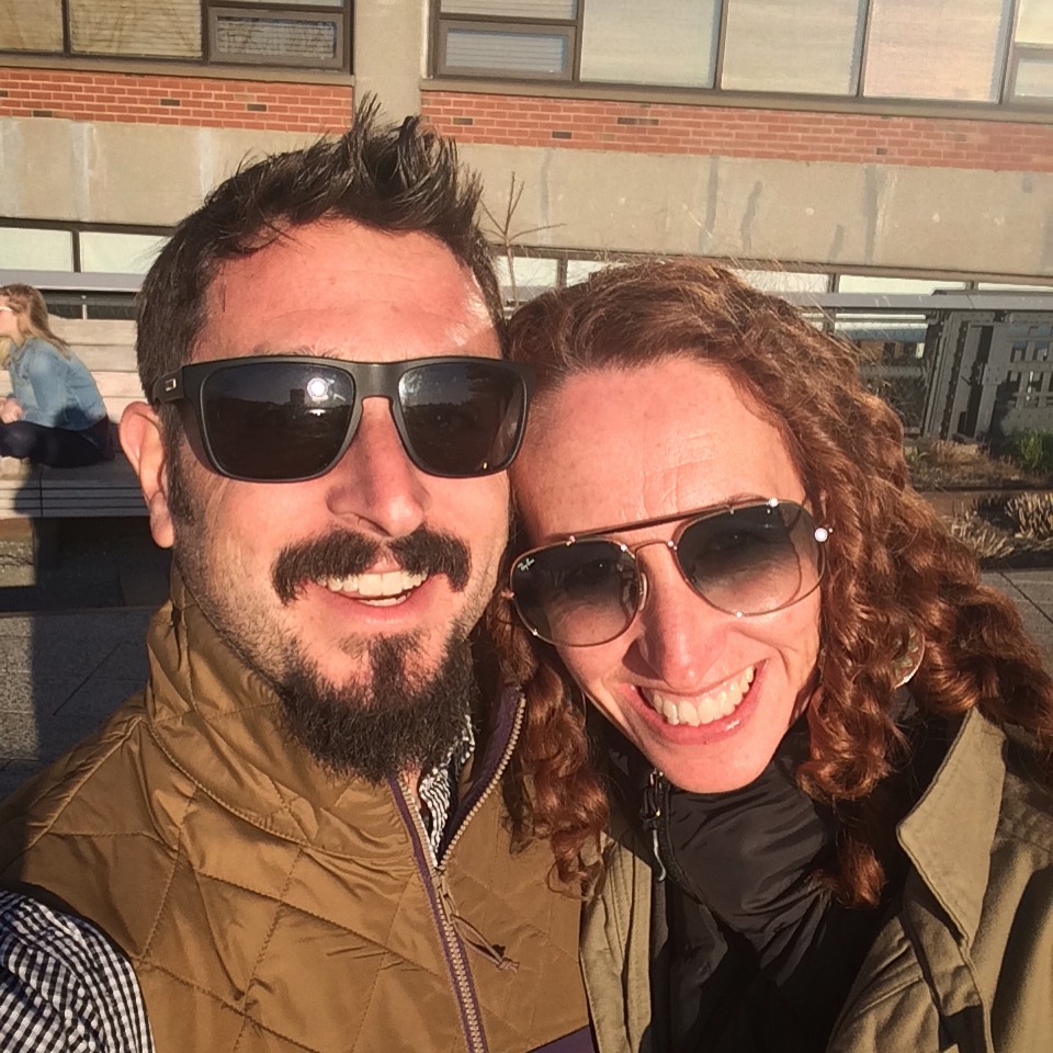
And wouldn’t you know it, but for the first time ever, Richard came to visit last Friday, and stayed the night here at our place.
The timing was perfect.
I’ll be in New Jersey next week for my first major photo/writing gig for a big-time, international publication.
(I can’t share details yet.)
As such, I’ve spent weeks checking my gear, ordering new equipment, and building a battle plan to be the mobile, nimble, 21st Century digital journalist on the go.
So of course Richard and I would end up testing equipment, talking endlessly about the intricacies of fill flash, and geeking out as hard as we could.
Richard admitted he’d been in the theater growing up, with parents who acted in local community productions.
He also has a distinguished face, and knows how to use it.
Therefore, Richard modeled while I switched cameras and lenses, tested out my lighting kits, and did a deep dive into a different type of photography.
(Most of the time, I think myself more artist than photographer, but I’ve shot my share of weddings, headshots, passport photos, graduation pics, etc.)
Here are a few of my favorites.
Richard was there with me at the beginning, in 2010, and was here at the end too, in 2022.
{Ed note: To reiterate, this is the end of an era, not my time here as a writer. You’ll still get me 2x a month.}
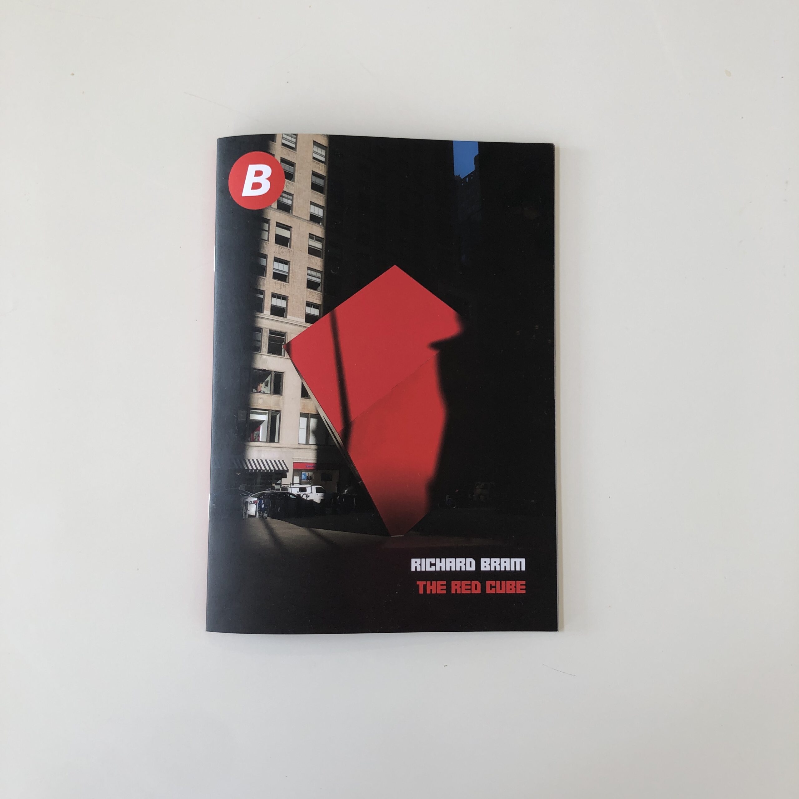
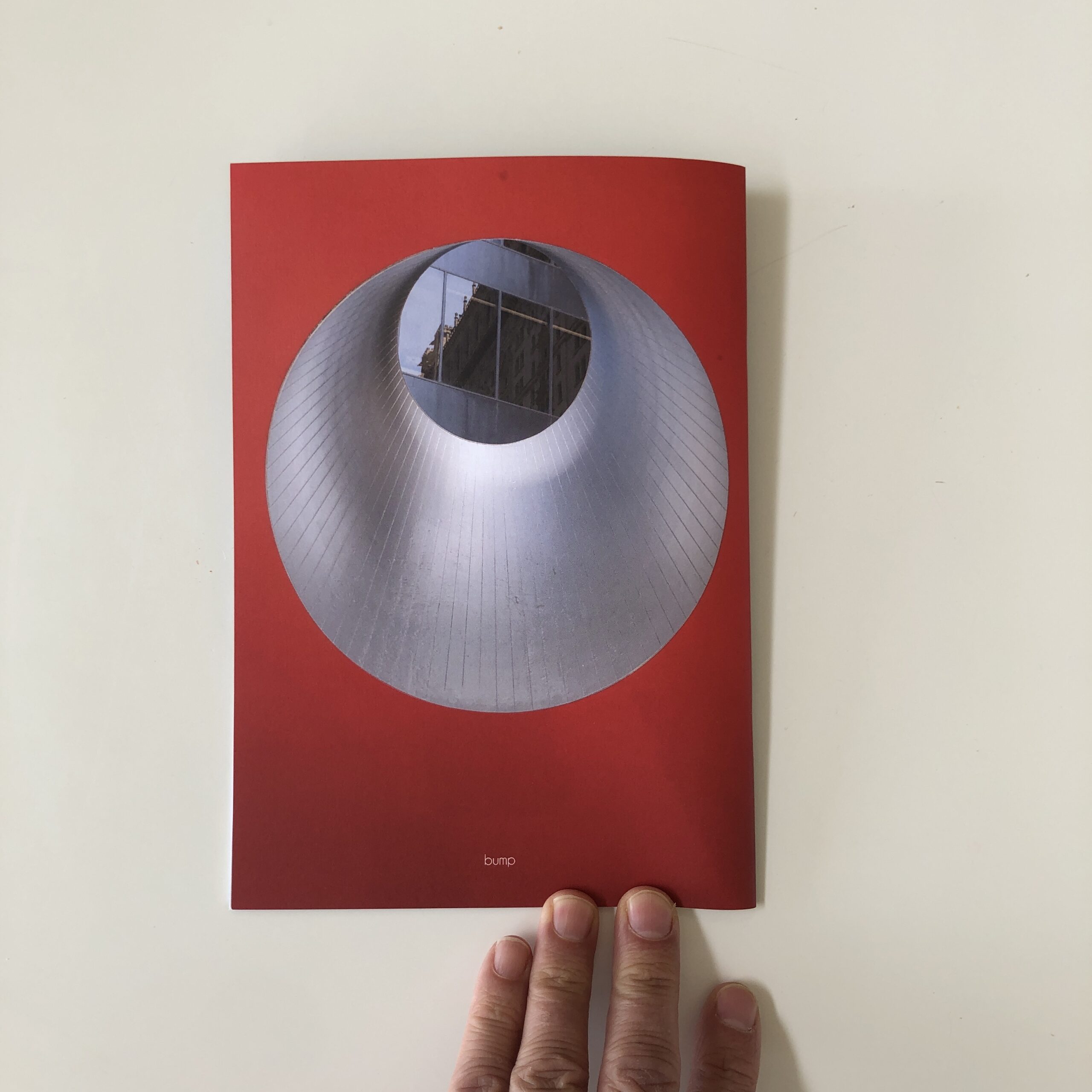
As gifts, Richard brought a lovely woodblock print he’d made in Oaxaca this winter, and a ‘zine that came out last year.
Normally, I look at submissions in the order they arrive, but have made exceptions over the years, (including with Nancy Baron’s ‘zine recently,) so we’re going to check it out, but keep it brief.
(Since I dropped some big news on you at the outset, we’ll go short and summery today.)
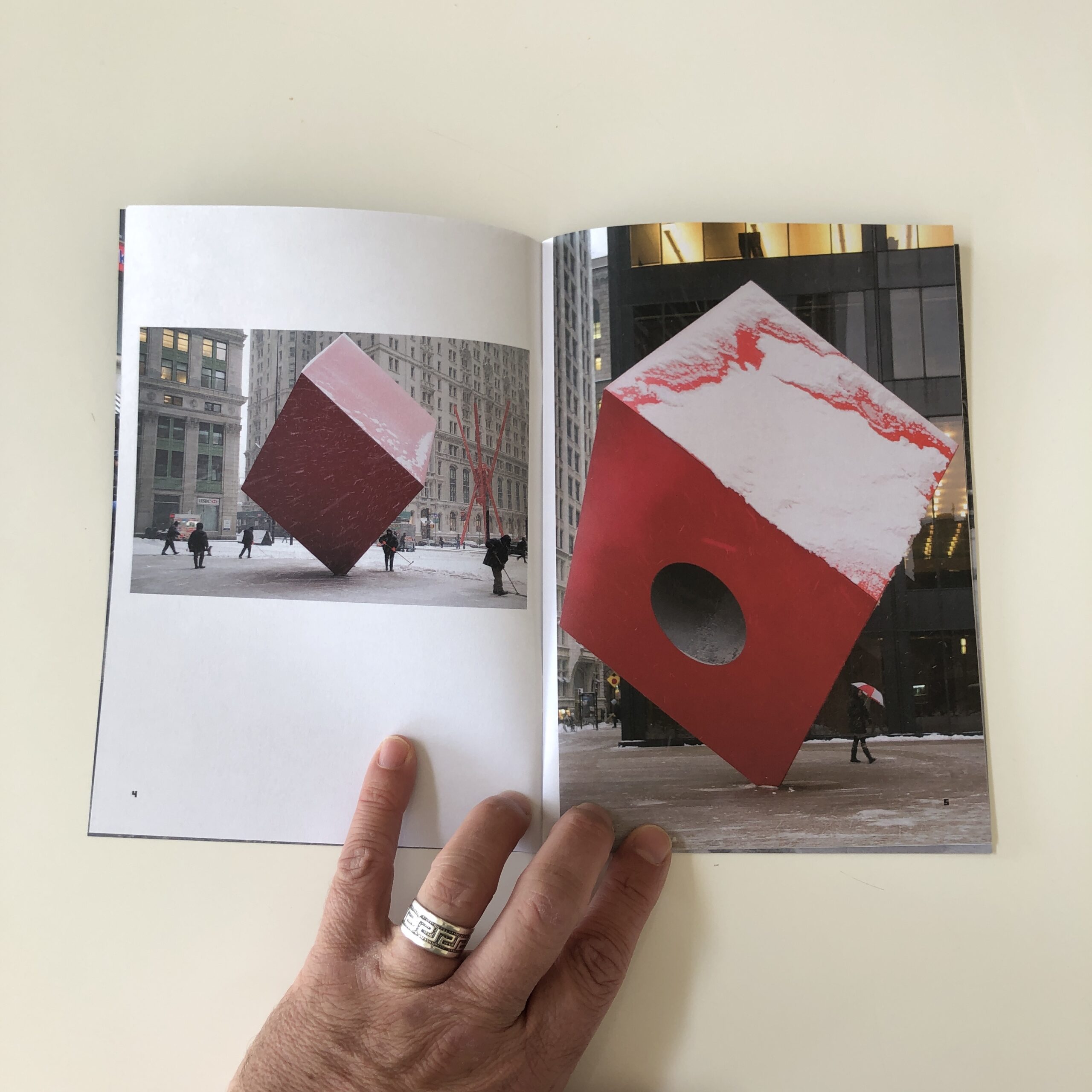
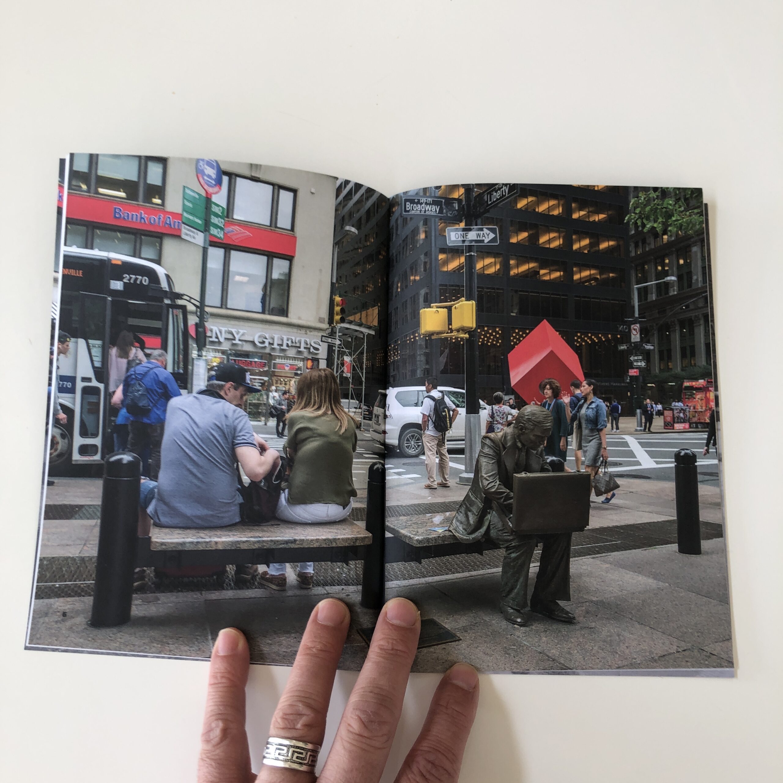
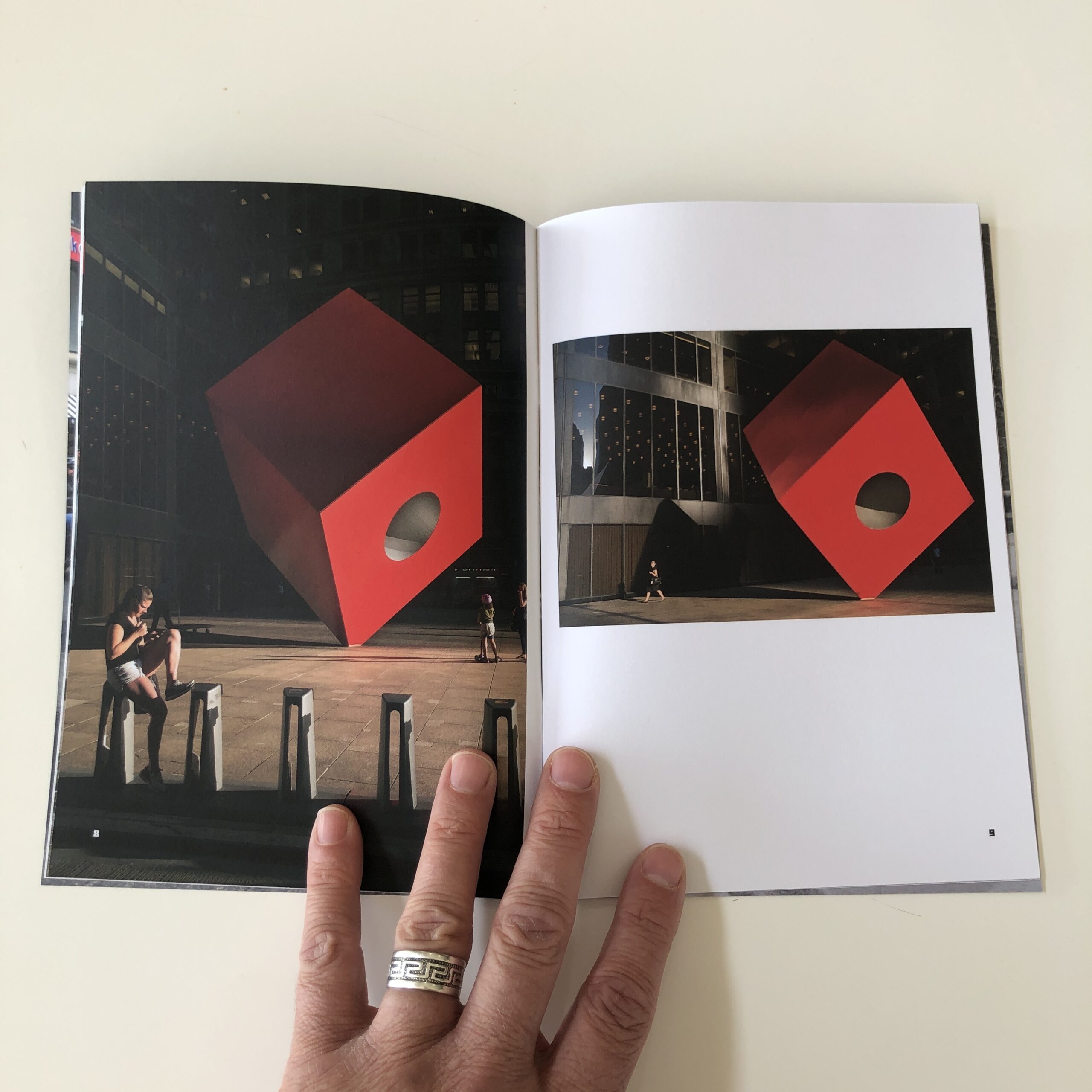
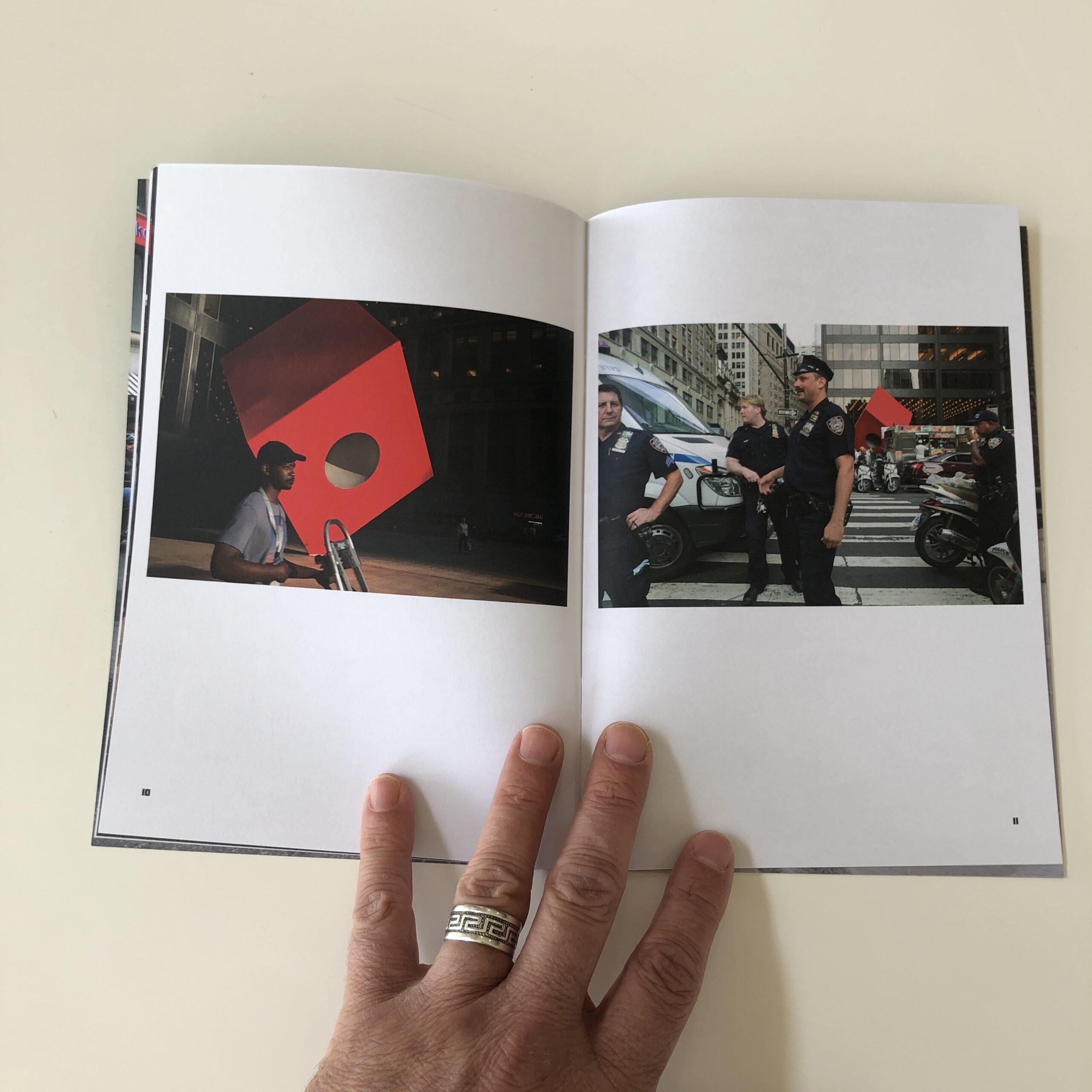
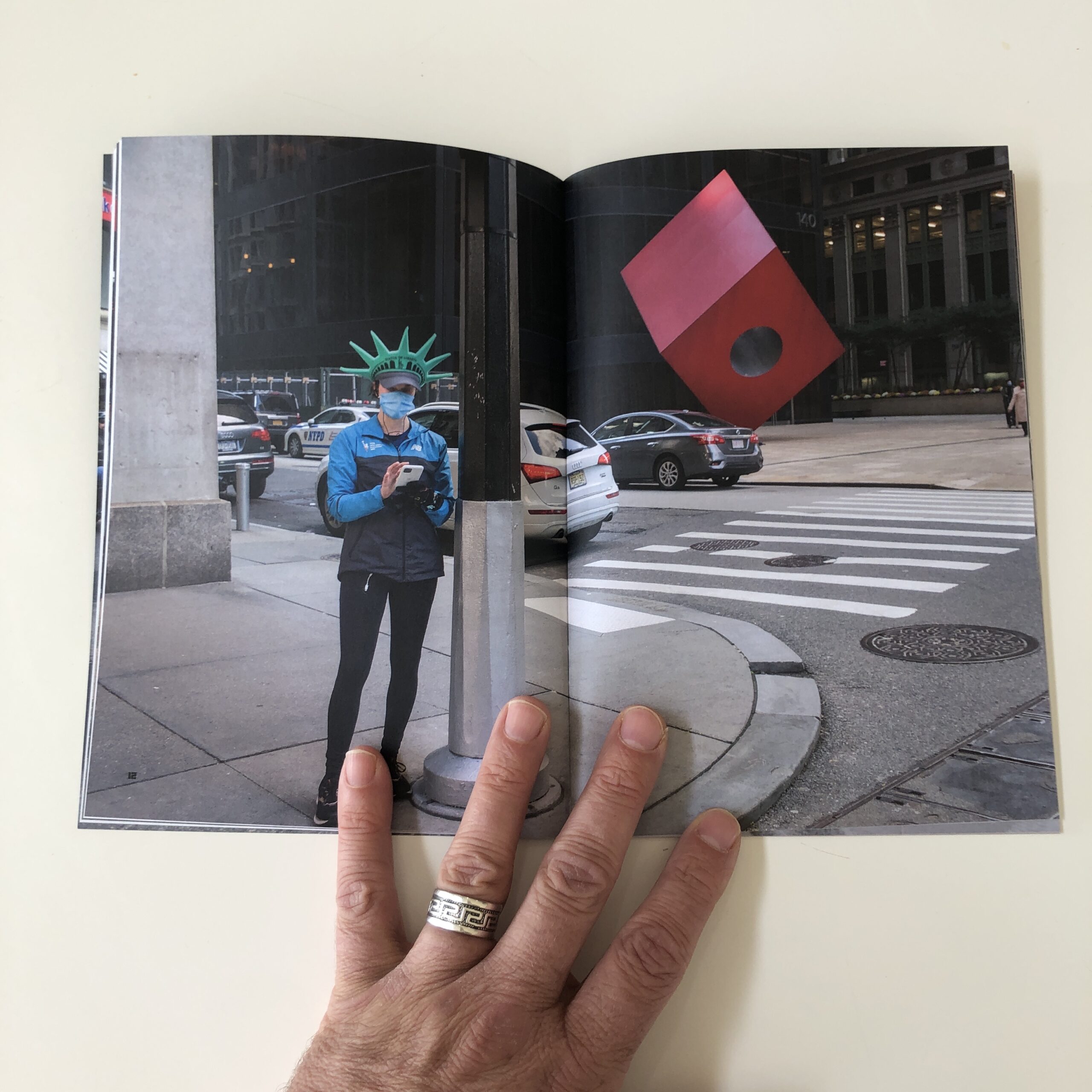
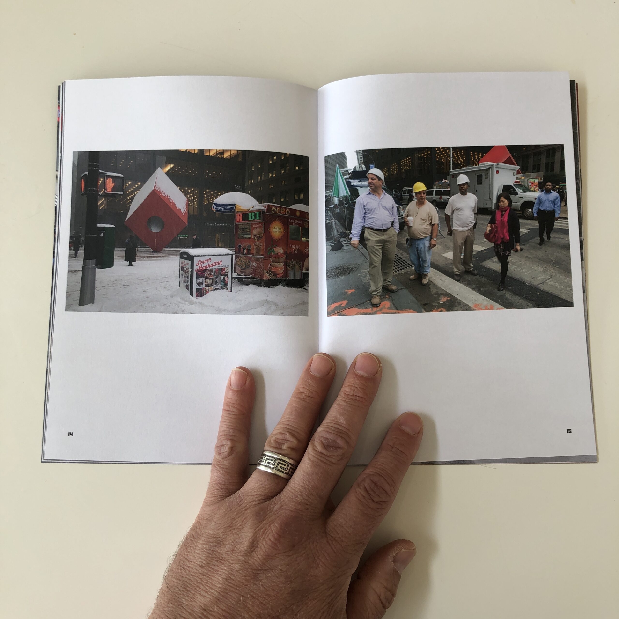
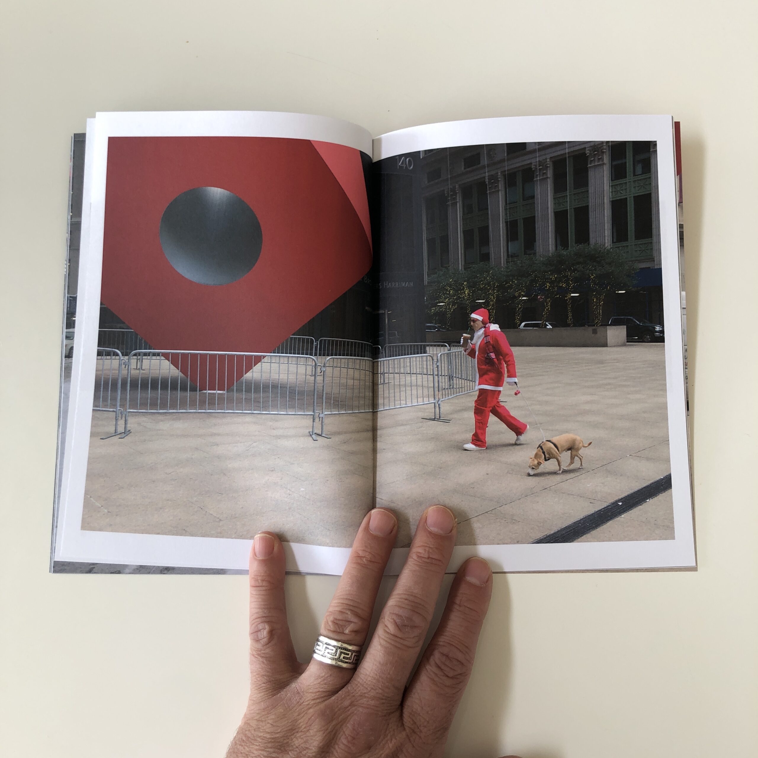
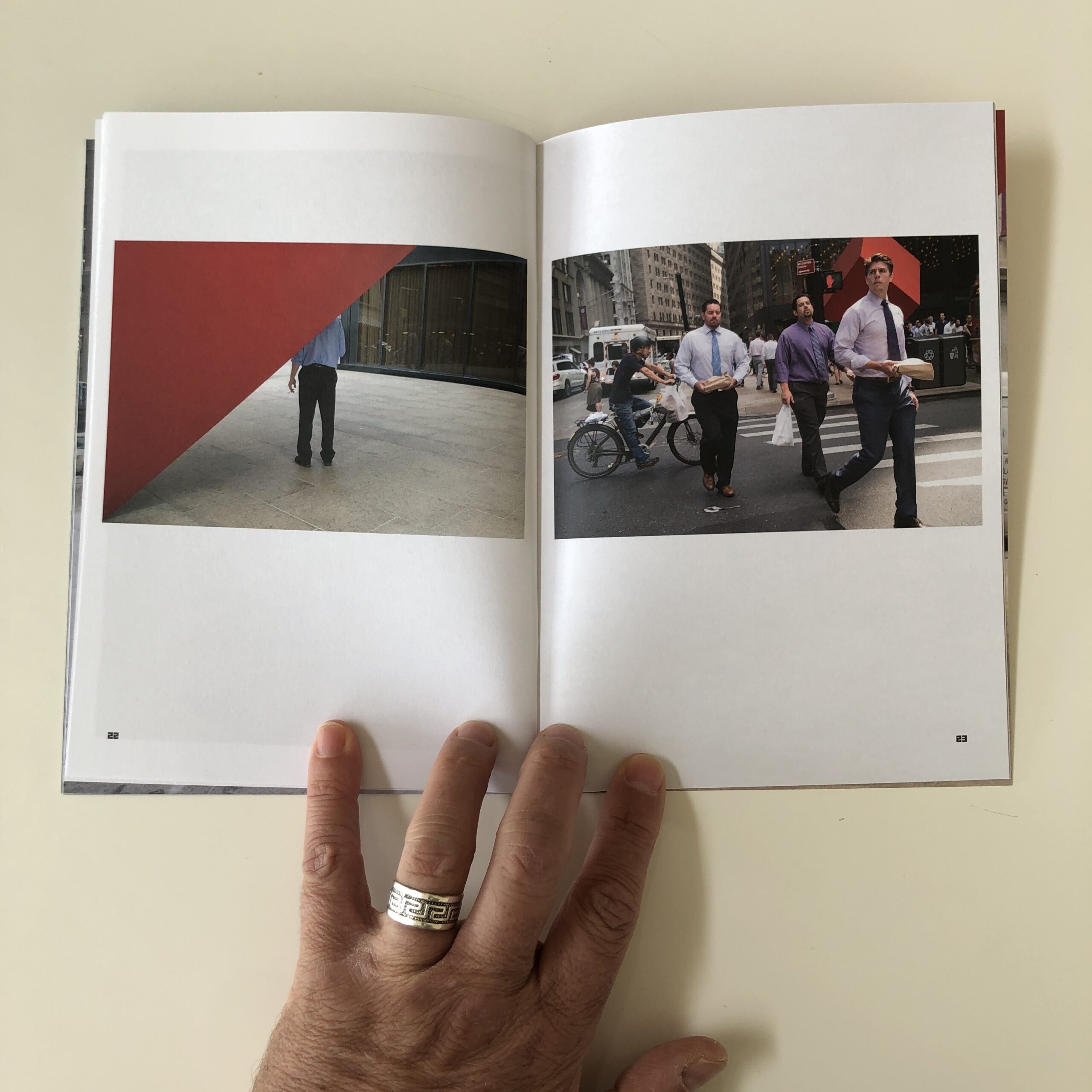
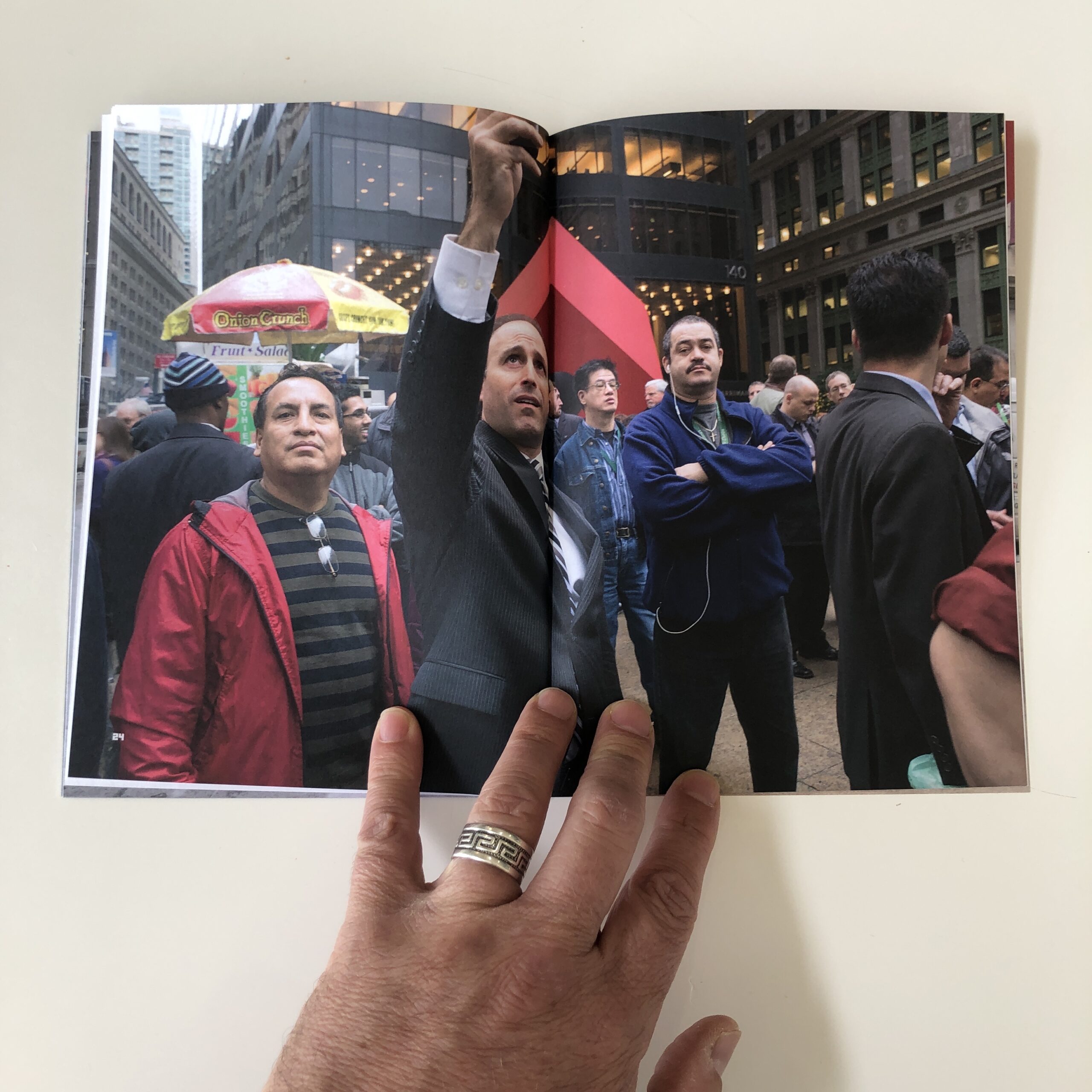
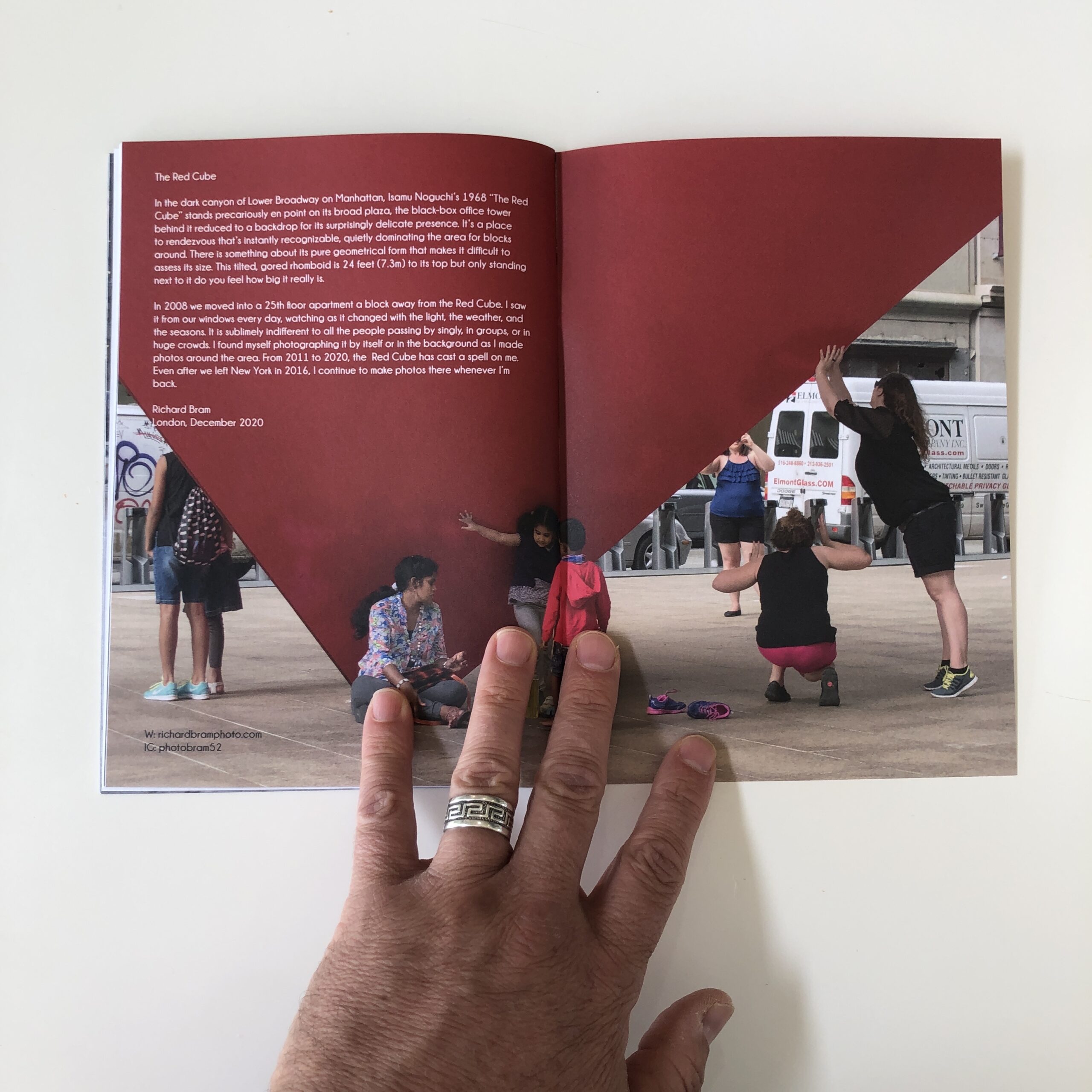
The ‘zine is called “The Red Cube,” was was published in 2021 by Bump Books.
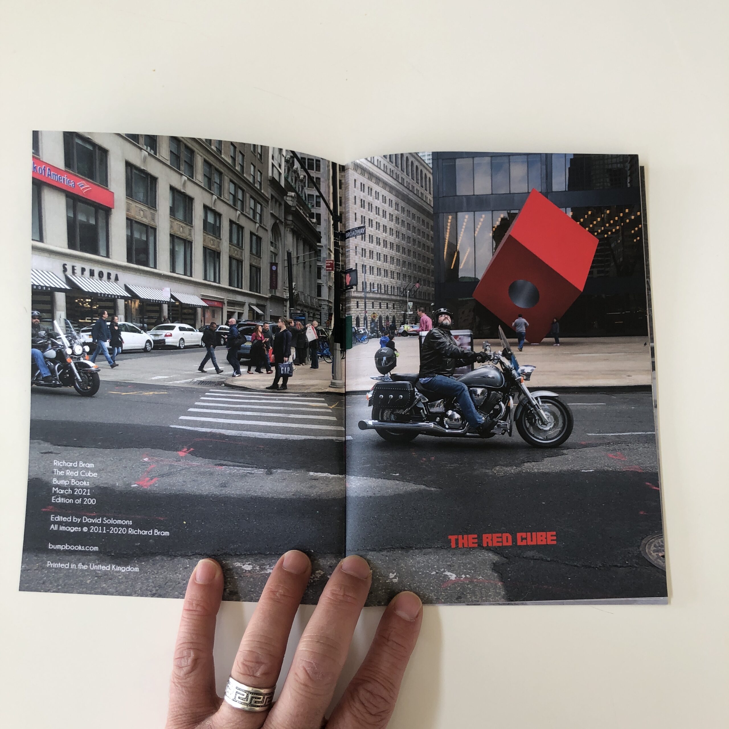
It features many looks at Isamu Noguchi’s classic sculpture in Lower Manhattan, which was a block away from where Richard and his wife lived during their New York years. (In between stints in London, but in case it’s not clear, Richard is American.)
The ‘zine, too, (with that big red cube in the background,) spans an era, between 2011-2020.
There’s not much to say about this that the photos below won’t show.
It’s a series of street photographs in the Financial District of NYC, and feels like a love letter to the city, now that he’s moved on.
New York has been featured more times in this column than any other locale.
I’ve covered countless NYC gallery and museum exhibitions over the years, hit the High Line, eaten at the cronut shop, dodged snowflakes the week before Superstorm Sandy, gorged on pizza, and done a 6 year stint at the NYT, all during the time of this weekly column.
Me and Jessie on the High Line, 2018
I had a daughter, got two dogs, built a career, saved my wife from the ravages of clinical depression, made countless friends, lost some too, was a college Art Department Chair, traveled the US, blogged for The New Yorker, and learned more about the world, my craft, my community, and myself, than I ever could have imagined.
So I hope you enjoy this last 6-week run, (including today,) before I retire the weekly-columnist-mantle.
I appreciate all the time and energy you’ve given us over the years, and the opportunity Rob has provided.
It’s August 11th, (high summer some places,) and my kids just went back to school.
My daughter is in 5th grade, and when I began this column, in September of 2011, she wasn’t born yet.
(It’s been a wild ride.)
Over the course of my time here, (week in, week out,) I’ve had the chance to travel to some pretty amazing places, and report back to you.
Beyond Derby, London and Amsterdam, all my city reports have come from here in the good old US of A.
Hotel room view, Amsterdam, Feb 2020Taking a selfie in a room full of people talking selfies in the Eric Gyamfi exhibition, Foam, Amsterdam, Feb 2020
Off the top of my head, since 2011, I’ve written about Austin, Albuquerque, Carmel, Chicago, Dallas, Denver, Houston, LA, Marfa, Monterey, New Jersey, New Orleans, NYC, Portland, Santa Fe, San Diego, San Francisco, Taos, Tucson, and Washington, DC.
I’m a lucky guy.
As of now, I’m supposed to visit NJ, Chicago and New Orleans later this year.
Lake Michigan, Chicago, Oct 2021The French Quarter, New Orleans, Dec 2021
So we’ll have plenty more travel content in 2022-3, with the attendant gallery, museum, restaurant reviews, etc.
It’s a far cry from pandemic lockdown, thank goodness, when so many people just stayed home.
(Including me.)
Traveling, visiting new ports of call, seeing new cities, tasting new foods…
Few things are better for our personal (and brain) development.
Doing new things makes new neural pathways in your brain, and every moment in a new travel environment counts as doing something new.
(Yes, that was 4 uses of new in one sentence.)
But getting to truly see the world, put my eyes on China and Japan, Australia and Brazil?
Egypt and India?
I mean, to see all of it?
I can’t even imagine.
Yet that’s the feeling I got, when I put down today’s book.
That I’d just taken a wild, elegant, extremely well-seen and well-crafted journey around world in the 21st Century.
The work felt current, fresh, edgy, and smart, with great technique.
But let me back up a second…
I found two boxes at the bottom of the pile today, from March 2021.
Somehow, they’d been skipped, so of course they’re both vaulted to the top of the pile.
The first of them was called “Ibidem,” by Giovanni Del Brenna; seemingly self-published with a professional team.
But I’ll flip the script, for once, and share a bit of info from the back of the book.
One essay, by Carole Naggar was dated 2011, and I thought, that’s odd?
Why publish an essay written so long ago?
Then the copyright on the next page said 2012.
Yet my initial impressions were the book was super current and of the moment, and it was submitted in 2021?
Strange.
In an excellent footnote section at the end, the artist writes he was born in Genoa, Italy, (but never lived there,) raised in Brazil in a French school, and has lived in many other places.
It seems he comes honestly by his Sofia Coppola/”Lost in Translation,” globetrotting, “In the Mood for Love”/Wong Kar-wai, seen-it-all before, and I know the best noodle shop in 30 cities vibe.
“In the Mood for Love,” image courtesy of RogerEbert.com“In the Mood for Love,” courtesy of The Criterion Collection and the NY Times
Saying how all cities are alike in some ways.
I love it.
As I turned the page, page after page, the photographs were standout.
The edit jumps at you, like a bored dog seeking affection.
Lots of dynamic use of color and light, with emotional energy.
Inspiring stuff.
And the design was on point too, with photos bleeding onto subsequent spreads, with smaller spreads mixed within, so you’re changing paper sizes constantly. While each spread connects to the next through fabulous color, and repeating motifs, like flying fish.
The photos challenge our sense of perception, with lots of figure/ground manipulations, use of repeating patterns, and then optical illusions like advertisements or painted buildings.
Just standout.
The design and photographs also wrong-foot us by reclaiming the gutter space, where most artists fear to tread.
(I mean, it’s literally called the gutter.)
Again and again, the gutter creates a symmetrical split, with vital info right there over the seam.
Scandalous!
I found the book to be flawless, right up until the end.
Page after page of nodding my head, saying, “Yes, that’s just right!”
And then towards the back, there was one image, of some guy in a jacket and tie in the light and shadow of a doorway, and it broke the spell.
Like, every single other photo I loved, but then why this guy?
Right afterwards, there were two traditional-type-explanatory-essays, and I felt they, too, were unnecessary.
(The pictures spoke for themselves, meaning-wise.)
I recognized photographs being made in Japan and China, Italy and France, but clearly there were many more locations I couldn’t place. The excellent thumb-nail index, at the end, tells us the book records travels from 2002-8, in those places, plus London, New York, Berlin, Hong Kong, and a host of other locations.
(In fairness, I did pick out a sleeping London banker on a train, and could recognize NYC on my second viewing.)
I kept saying to myself, as I looked, “Is that Italy, France, or somewhere else entirely?”
How do these things feel chic and generic, yet universal?
Which gorgeous city are we seeing in this photo?
Does it even matter?
With the index and footnotes, we get just the right bit of context, if we MUST know which city we were seeing, or what his travels were like, where his brother lived, all from the artist’s own perspective.
Ending there, followed by an insert in French and Italian, the book sticks the landing.
And last page credits Del Brenna, Teun van der Heijden, and Fred Ritchin as editors, and Heijdens Karwei for the design, so major kudos on this one.
If you’d like to submit a book for potential review, please email me at jonathanblaustein@gmail.com. We are particularly interested in books by artists of color, and female photographers, so we may maintain a balanced program. And please be advised, we currently have a significant backlog of books for review.
I was (mostly) unaware he existed until this year, when Amazon Prime dropped an easily-bingeable series, called “Reacher.”
At some point, I’d heard Tom Cruise starred in a movie or two called Reacher, and that a global fan base was pissed off about it, given how little he resembled the character.
Courtesy of Imdb.com
I’m mentioning it today, because a few weeks ago, I noticed a stack of soft-cover Reacher books on a new friend’s shelf.
He lent me one, and after I devoured it, he passed along 5 more.
I’m about to start the final book, so I have a better understanding of how this character, (and the extensive #1 best-selling book series Lee Child wrote based upon him,) could occupy such a powerful spot in the collective imagination of millions of people.
It’s easy to see why people rejected Tom Cruise.
(Despite the fact he’s since become an actual super-hero, jumping out of planes and climbing the Burj Khalifa w/o a net.)
Jack Reacher is 6’5″, 250 lbs, and that fact is repeated again and again.
(In one book, they even call him Bigfoot and The Incredible Hulk.)
Courtesy of jack-reacher.fandom.com
His sheer size makes him attractive, as he’s a true badass, in all the important ways.
(Great at hand-to-hand combat, weapons trained, you name it.)
Beyond that, Reacher is always the smartest guy in the room, and the wisest.
It’s part Sherlock Holmes, (with all the great deductive reasoning,) part Mr. Wolf from “Pulp Fiction,” (able to fix any jam, and dispose of any body,) and part Batman, minus the cape and extreme wealth. (Reacher is basically a vagrant.)
The character just roams the world, (like David Carradine in “Kung Fu,”) helping people, free of charge, based upon a moral code he learned in the US Army. (Where he was a Major as a top-level MP.)
Interestingly, Lee Child is an Englishman, (born in Coventry,) so near as I can tell, he came up with the archetype of a Wild West gunslinger meets UFC champion, and sends him into one, violent, dramatic, insane-but-slightly plausible situation after another.
And people just can’t get enough.
Because they want to be Jack Reacher.
The want to have it all.
Be the biggest, the strongest, the smartest, the wisest, the most honorable, and to always get the girl.
Reacher owns nothing but a tooth-brush, and goes when and where he pleases.
He can take out seven bikers all by himself, and is therefore the embodiment of the type of American power most people see as slipping into the dustbin of history.
So there’s also a wistful nostalgia about the whole thing.
If Dirty Harry captured the American id of the crazy 70’s, Reacher is just right for the 2020’s, as he kicks ass, but also treats people with respect.
(Were you to meet Reacher in real life, you would feel seen, and understood.)
I mention all this today, having just put down a photo book.
The submission came in a year ago, so I had no idea what was inside the box, and was therefore surprised to see “Snapshots 1971-77” by Michael Lesy, published by Blast Books in New York.
(I reviewed another of his books a few years ago, which also featured images from a historical archive.)
That appears to be his thing, sifting through archives, (as we learn in the opening essay,) so this fits neatly into Michael Lesy’s life obsession.
He confirms this in the essay, but also drops an interesting theory on us:
“Looked at individually, as visual documents, they reveal- or allude to- the hopes, fears, and desires of the people who made them. Sometimes snapshots tell the truth, sometimes they lie, and sometimes they do both.
Looked at in large numbers- in batches of a dozen or a hundred or a thousand- they line up lie bits of colored glass in a kaleidoscope and form patterns… patterns of shared belief, patterns of shared meaning.”
I took that to mean if you glance at archives out of the corner of your eye, and digest image after image, you get a sense of a culture.
A place in time.
(And we’ve all heard the clichés about how to make a photograph meaningful: put it in a box for 40 or 50 years.)
The book features a host of snapshots scrounged from garbage dumpster; the outtakes of a San Francisco photo lab in the early-mid 70’s, but there are also some images from a photo lab in Cleveland.
(Not the tidiest premise, mixing them both up, but hey, you get what you get.)
I came away with a few impressions.
First off, Damn!, have Instagram filters, and the ease of cell-phone-camera operation, made regular people better at photography.
We’ve got a lot of bad crops, blurry images, and downright strange compositions overall.
The fashion is great, (as it is in all old pictures,) but mostly we see celebrations, or human gatherings.
Birthdays, weddings, confirmations, funerals, and drinking with one’s buddies.
There are a few images that would have been described as “racy” at the time, and one in which a topless, awkward woman is juxtaposed against a photo of a painting of a clown, which I thought was unnecessarily mean.
Overall, though, the book is fun.
It was a funky, crazy, powerful, illogical time, the 70’s, and I was reminded of “Airplane,” which mocked the whole era.
Just the other day, I encouraged my daughter to read a book alongside me, and we found “Deenie,” by Judy Blume, on a shelf in a closet.
It was written in 1973, and I was aghast at how much culture has changed.
Everyone was named Midge.
It was acceptable to insult people based upon appearances.
And there were words used that aren’t even in the dictionary anymore. (Have you ever heard of Klunk?)
I’m not sure I learned too much more about 1970’s America, looking at today’s photo book, but then again, I lived through it.
So maybe it’s important, that books like this explain the past to the future.
All those Gen Z kids need to know what it looked like back then, to understand where the world was, and where it’s going.
If you’d like to submit a book for potential review, please email me at jonathanblaustein@gmail.com. We are particularly interested in books by artists of color, and female photographers, so we may maintain a balanced program. And please be advised, we currently have a significant backlog of books for review.
I published Jim Ferguson’s work in the column a while back.
(Probably five years ago, if I had to guess.)
I met Jim at the Filter Photo Festival in Chicago, but had already heard of him, as he was buddies with my client Allen.
I always encourage artists to build out their friend and peer network, (especially at festivals,) because no matter how much we cross our fingers and hope the gallerist/curator/publisher/editor across the table will give you your “big break,” as often as not, it’s your friends who hook you up.
(Anyone who’s gone to art school knows this is true, and of course it’s not like I invented the concept.)
Art education is literally built upon the idea that other peoples’ informed opinions help you grow.
Of course, knowing whom to trust is a learning process, and occasionally we all have to tune out the noise and listen to our internal compass.
But 9 times out of 10, if your peer network is telling you the same thing, that means something.
So when Allen said he and Jim did that for each other, and were in critique groups together, I took that as a good sign.
By the time I met Jim, I expected to like his work, and in fact I did.
He showed me a series of urban, abstracted (but not abstract) images he made that reflected his “compromised” vision.
As I recall, Jim had little-to-no depth perception, so his photographs flattened out the picture plane, to the point a viewer could sense how that type of vision might affect a person.
Most of his photos were black and white, and the compositions and tonality were also strong, so it was easy for me to include him in one of my lengthy, rambling articles featuring the best work I saw at Filter that year.
Images courtesy of jimfphoto.com
I’m pretty sure I bumped into Jim once or twice again in Chicago, but wouldn’t bet my life on it.
Regardless, I was impressed by the man, and his talent, but I meet more than a hundred photographers each year, (due to my regular travels on the festival circuit,) and that was that.
Not-quite-a-year ago, I noticed a book come in the mail, with Jim’s return address, so I chucked it in the submission pile with the rest of the books, and didn’t give it another thought.
Not long thereafter, (probably a month or two,) Allen reached out to tell me Jim had been diagnosed with an aggressive form of cancer, and was very ill.
The end was imminent, Allen wrote, and then he followed up a day or two later to tell me Jim had passed away.
It caught me off guard, because within a year or so, I’d also learned of the passing of two artists I’d reviewed at festivals: Paula Riff and Nicholas Fedak.
Everyone dies.
I get it.
But I have a near-photographic memory, (for faces as well,) so I remember almost everyone I’ve met in the photo world over the past 13 years.
(Since I attended my first portfolio review in 2009.)
And up until that point, everyone was still around, as far as I knew.
They say things come in threes.
I get it.
This, however, was no fun at all.
And as soon as Allen told me about Jim’s death, I realized eventually, I’d need to open the book package and see what lay inside.
Today is that day.
Two days ago, here in Taos, the season changed.
It went from high summer to late summer, and it happens every freaking year, right around now.
The light shifts, and if you didn’t live here, (and weren’t a photographer,) you might not notice.
But the temperature changes subtly as well, so you need a long-sleeve shirt and sweat-pants in the mornings, and an extra blanket at night.
My daughter actually grabbed a fleece jacket this morning, when she woke up, and I didn’t blame her.
While much of America basks in pure-summer-frivolity, at the end of July here, I start thinking about winter.
It’s strange, I admit, but then again, my next-door-neighbor still has lights on a Christmas tree, inside his insanely-expensive-but-abandoned barn, so things just work differently in New Mexico.
(I’m not in Jersey anymore, that’s for sure.)
Frankly, if Jim hadn’t passed away, I’m not sure I’d be reviewing this book.
It’s a self-published, Blurb-book-type offering, called “Deflated Xmas,” and inside it has the subtitle: Ohhh, the plasticity!
The pictures read like point-and-shoot-pics, (more likely from a cell phone,) and given the rigorous craftsmanship of Jim’s previous work, I was taken aback.
This doesn’t seem like a serious art project, but it is fascinating as a cultural artifact, without question.
(Where I live, houses don’t look like this.)
And no one has inflatable Santas.
Nor reindeers, Olafs, or Abominable Snow Men.
But in Chicago, (or perhaps the Greater MidWest,) they’re obviously popular, because Jim was able to fill a small book with images of sad, wilted, nearly-dead Santas.
What stands for celebration, joy, and seasonal good cheer, when they’re inflated, reads as garbage when they’re crumpled on the brown, dead grass.
(Though more than one image featured a verdant lawn, so I guess Sad Santa sat out there for a while.)
True story: I had an inflatable Elmo balloon in my “Party City is the Devil” exhibition at the Harwood Museum of Art, here in Taos, in 2019.
(It closed one month before Covid was discovered in Wuhan.)
One night, a new janitor walked through my show, decided Elmo must be trash, (despite the accompanying placard, and the fact he was tethered to the wall,) so he cut the ribbon and threw it away.
The museum called me the next day, mortified, and they actually went to Santa Fe to get a replacement.
Deflated Elmo was so pathetic, the janitor could not conceive of him as art, so tossed him in the bin.
And that’s what this book feels like.
It’s a well-observed take on a strange-ass phenomenon, one I definitely have not seen before.
(Which makes it review-worthy.)
I don’t know the circumstances under which this book was made, and I can’t ask Jim Ferguson.
I feel like he’d be psyched to have it reviewed, and perhaps he used this little side-project as a distraction, while his body betrayed him.
I guess we’ll never know.
But this summer has felt like an inflection point, where big changes are afoot, even beyond the calendar ticking from high to late summer.
And no one really knows what’s up ahead, do they?
See you next week, and I hope you’re enjoying some relaxation, or vacation, should you have the chance to take it down a notch.
If you’d like to submit a book for potential review, please email me at jonathanblaustein@gmail.com. We are particularly interested in books by artists of color, and female photographers, so we may maintain a balanced program. And please be advised, we currently have a significant backlog of books for review.