A new 8 part miniseries where Ottawa Photographer Tony Fouhse takes us through his new project, from the first photo to the book launch. Tony is an internationally exhibited and collected photographer who was formerly a full time editorial/commercial photographer. These posts originally appeared in his newsletter HYPO which you can subscribe to here to see more of his work visit his website here.
To pre-order Tony’s book go here.
Anatomy Of A Project
Episode Nº 7: Photobook Design
Okay, photobook design? What do I know?
Not a lot, really. I’m a photographer, not a designer. But I have spent some time thinking about placing photographs on the pages of books, and how the decisions you make can (will) either help or hinder the work.
So, necessarily, what follows is broad strokes and a few examples from personal experience, followed by some general thoughts . . .
__________________
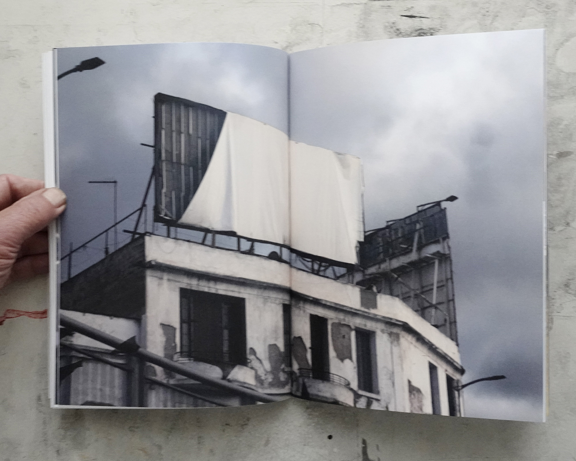
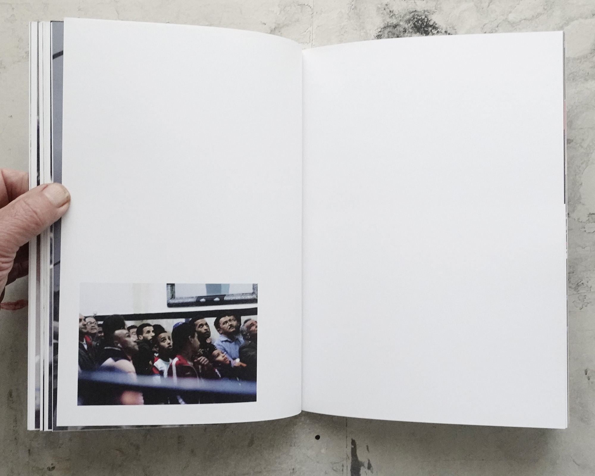
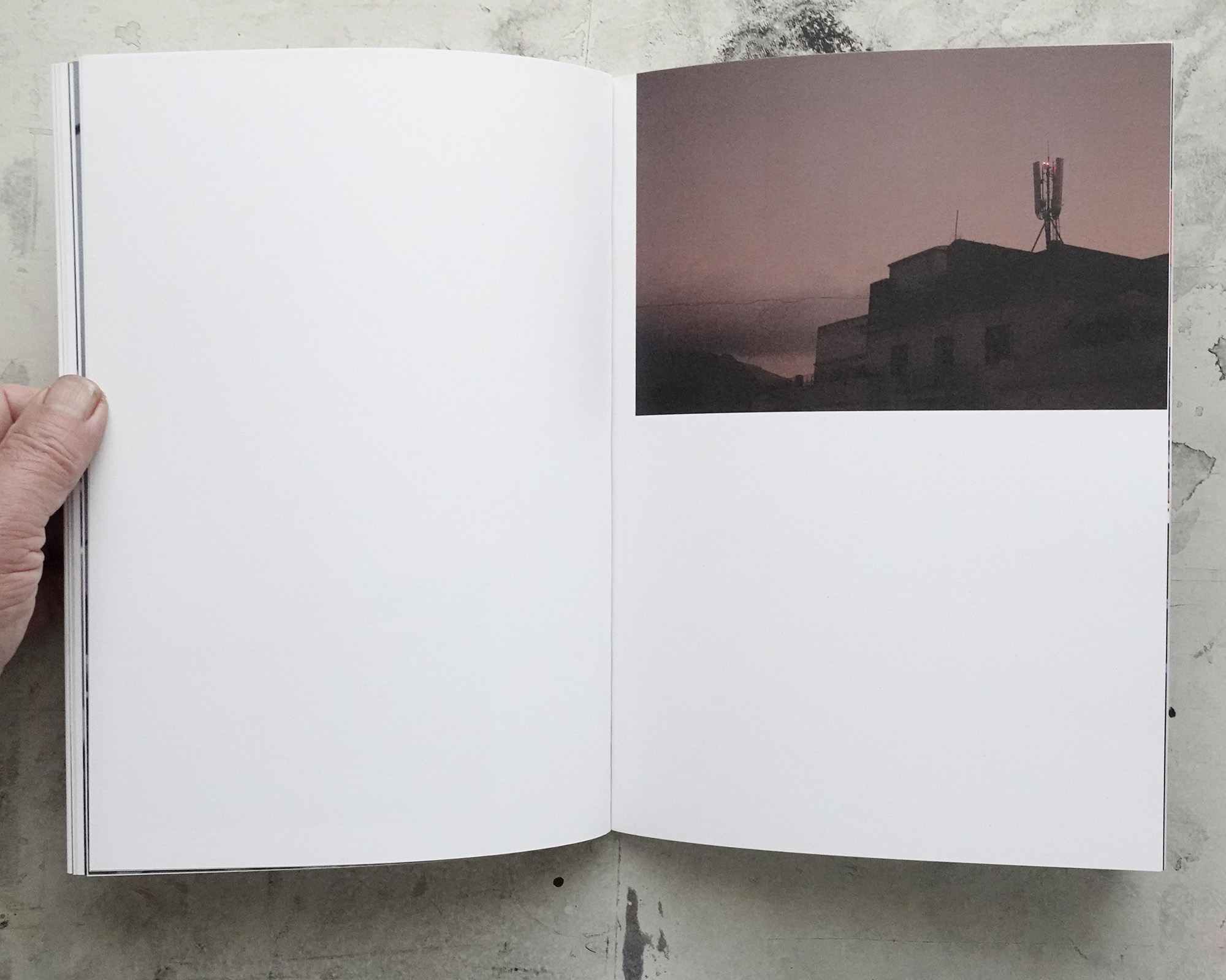
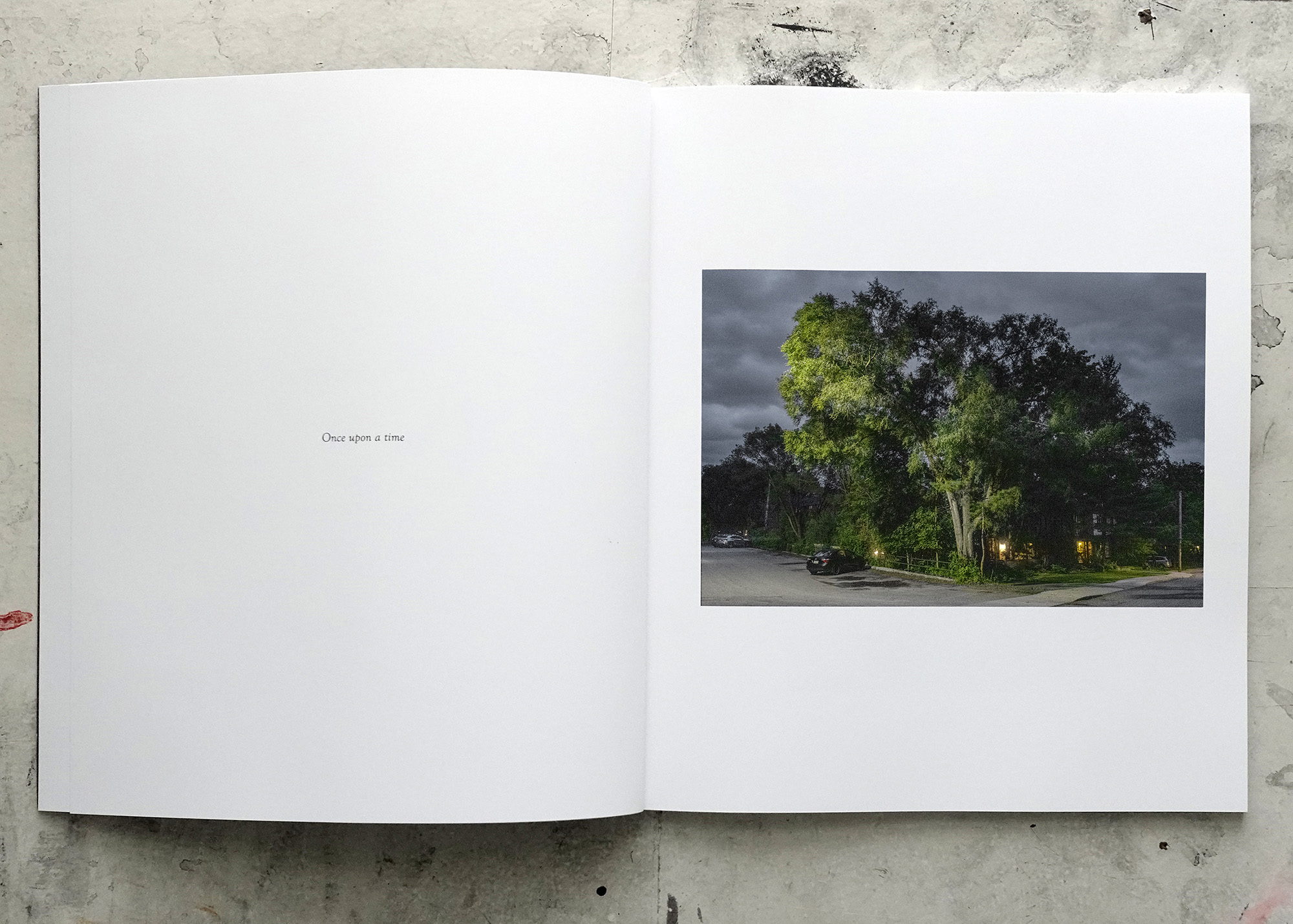
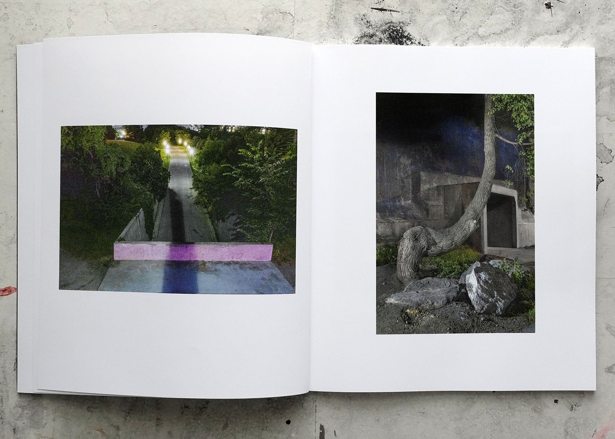
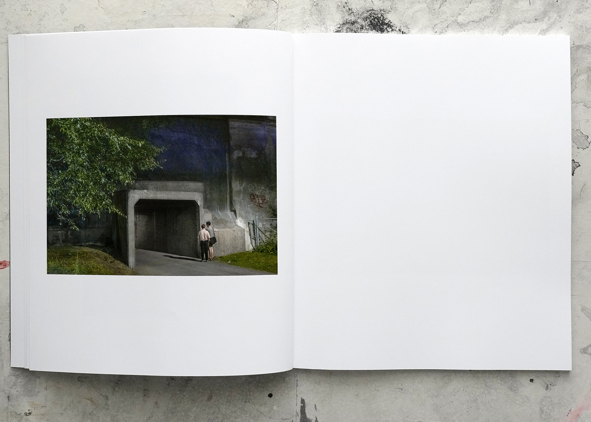
All through the sequence and dummy process of The Garden I’d been using my go-to approach. That’d be: all photos the same size, one photo per page, all the photos in the same position, some blank pages, minimal text.
Here’s a pic of the first dummy (top) and the final dummy of The Garden.
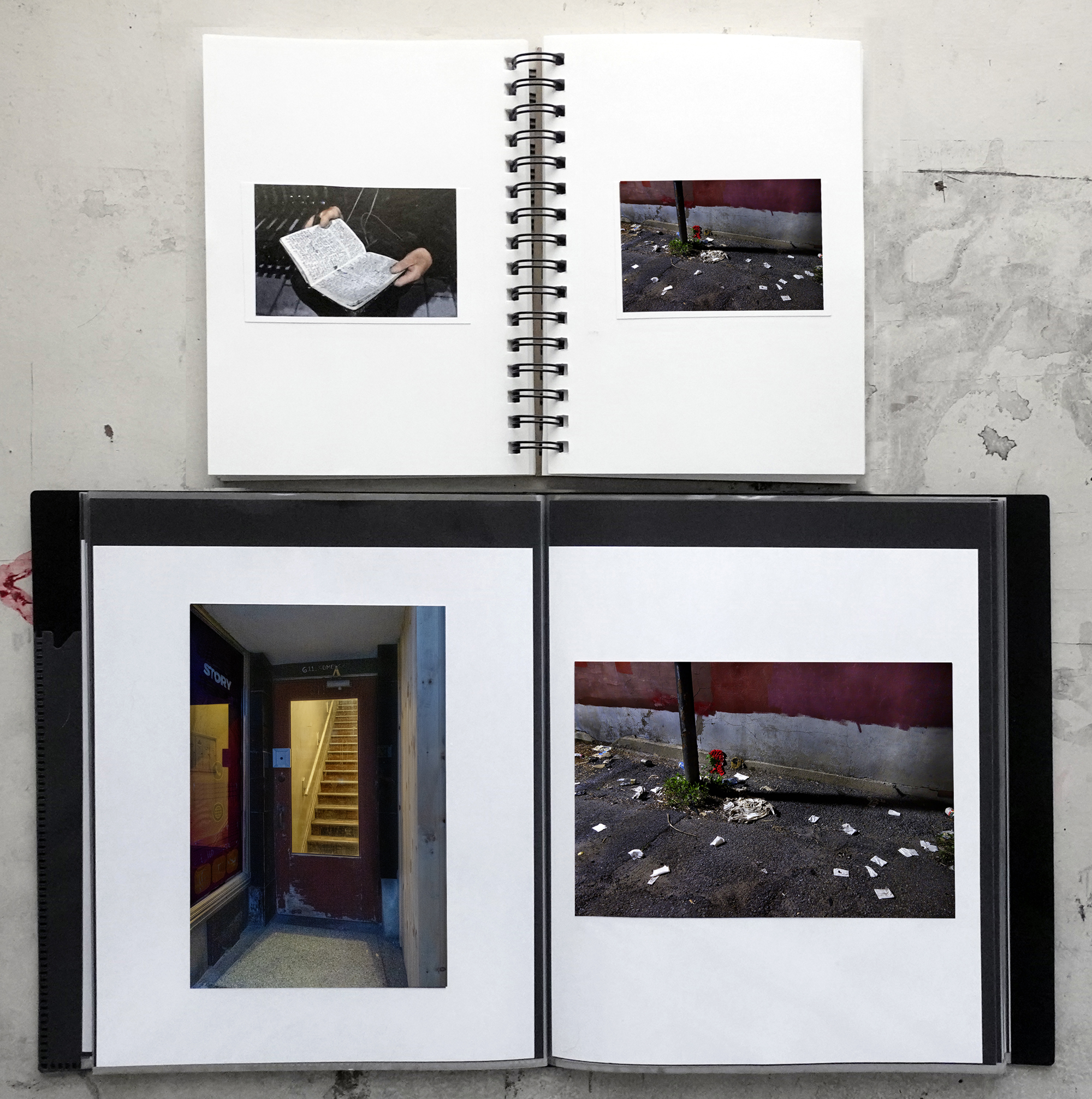
There’s a danger to using a standard, template-style layout when you’re in the initial stages of placing the images in the dummy. Change becomes more difficult when you’re used to looking at something in a specific way. (Also applies to life.) But what if there’s a better way to get your idea, the idea of the photographs, across in the book? (What if there’s a better way to live your life?)
I’ve seen this happen quite a few times when I’ve been involved (directly or peripherally) in the making of other photographers’ photobooks. Fortunately, in all of those cases some kind of intervention happened, things got shook up and the book became better.
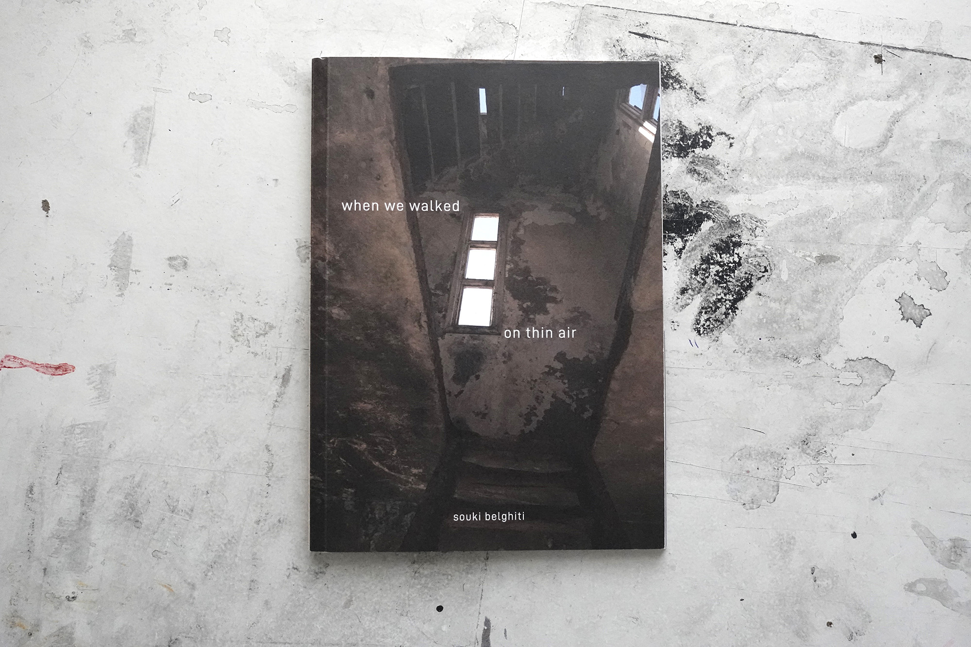
Case in point: when we walked on thin air, by Souki Belghiti. (I’ve been mentoring Souki, who lives in Casablanca, Morocco, for two years.)
We’d been working on her sequence of photos for a while and were using, for ease and convenience (two things which may well be counterproductive to getting the most out of art and life) a straightforward approach to their layout.
And then, well . . . I’ll let Souki tell you . . .
Hakim Benchekroun helped me choose the book size. He designed the cover, and the poem inside (which I then moved a little) and he suggested, at the time, my classical layout wasn’t the best option. He tried tweaking the pictures’ position a little – some above the middle line, some below, all the same size – which didn’t work – and our collaboration then stopped. (But he had inseminated the idea a better layout was possible)
During a workshop, Zoopark Publishing Collective offered a layout very close to the one I ended up using, with 3 sizes for the pictures, creating a rhythm, and a different sequence. (They explained how layout and sequence play on one another.) Their sequence was more thematically straightforward (around the pandemic). They also showed us how to use InDesign, giving me the freedom to tweak their design and sequence, to what I wanted. :) – which I did, after the workshop was over.
Then for the “poster”. I was having a beer with my friend Melanie Yvon and complaining how hard it was to find a designer in tune with what I was trying to express. She drew it, right then and there. (Did I tweak it afterwards, too? Of course.)
Alexis Logie then designed the flap to put the poster in, suggested the book be sewn rather than glued etc.
Took a village. All the mistakes are mine.

This layout, for me, suits the look, feel and intention of Souki’s work. There’s meant to be a sense of dislocation in the sequence of images, and the jarring design heightens this feeling.
On the other hand, my book (The Garden) is meant to be episodic, cinematic, and kind of straightforward. A trip through a city in some strange twilight. The work wants a straightforward flow, where each photo has the same weight as the others.
Here’s the opening sequence to The Garden, the introduction to that trip . . .
I might be using backward logic to justify my choices. I don’t know. But I do know that I put a lot of thought into how I wanted these photos to appear in the book. In the end, if you’ve thought about it and it feels right, well . . . there you go. The trick is to consider the components and the idea, and to explore possibilities before you come to a conclusion.
Finally, some random thoughts and opinions. (Bear in mind: I’m a photographer, not a designer.)
In certain cases the flair that’s put into the physical object enhances the feeling and reading of the work. But throwing money at super-cool binding, different paper stocks, making the book complicated to open and look at should only be used if it serves a purpose (other than seducing photobook fetishists). All those extra bells and whistles add a lot to production costs. So if you want your book to make money you’ll have to charge a lot for it which, paradoxically, reduces the pool of potential buyers.
Me, I like my books to be affordable and to make money. So they’re typically simple in their design and manufacture (but not, if I may be immodest, simple in their content). I want them to be more utilitarian than luxurious, an approach that suits my ethos. (I’ve published 5 books and a bunch of zines, all have turned a profit, all but one is sold out.)
Where I live (Canada) the cost of shipping doubles if the package weighs more than 500 grams. Since most of my sales are to the USA and Europe, and because shipping is expensive, I take this into account when I’m designing my books. I make sure they weigh, packaged, less than 500 grams. You might want to do a bit of research into shipping costs, and design your book with that in mind.
I do short runs on digital presses, I know I can sell 200 books without spending a year of my life being a photobook salesperson (or having boxes of unsold books in my basement), so that’s (usually) the number of books I print.
__________________
Last week’s episode of Anatomy of a Project was about hype. That would have been the perfect context to hype my book. Typically, I forgot to do that.
(During the process of producing and selling your book you’ll forget stuff, your big plan will get messed up. Don’t worry, just roll with it, keep going. That’s the way stuff gets done.)
So allow me to hype my book by showing you a couple of ways I’m hyping my book . . .
FOR SALE
This was a note I included at the end of a recent newsletter . . .
The Garden is available for pre-sale. It’ll ship end of May.
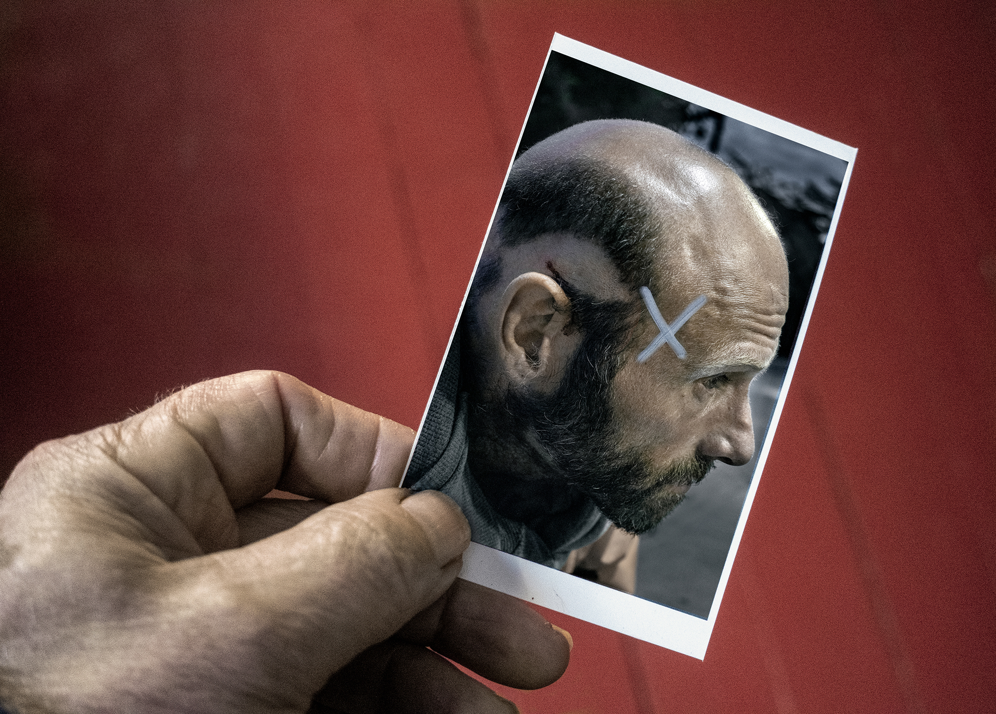
All pre-orders come with a swell, small work print, complete with pin holes (I stuck these on my editing board) and, if you’re lucky, weird markings and annotations I used to remind myself how I wanted to post-produce the final files.
Get your copy here. Support my practice and this newsletter. You know you want to.
REACTIONS
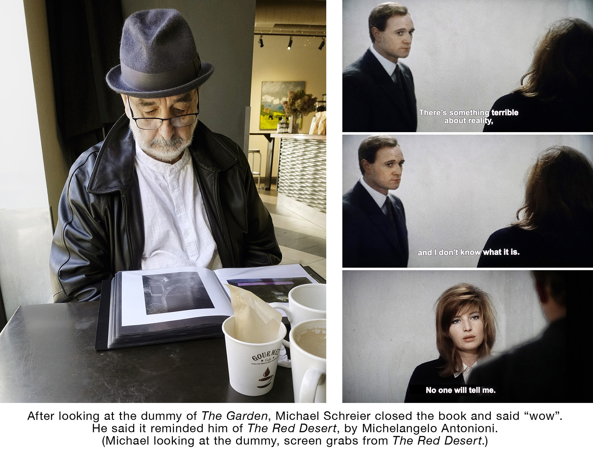
I’d take photos when I was showing the dummy of The Garden to people whose opinions I respect. I’d note their reactions, what they said. The aim was to use these photos and words on social media. Here’s one of those encounters.