
I’ve watched a lot of TV, over the years.
Like, a lot.
Growing up in the 70’s and 80’s, there was a time when options were limited, and everyone watched more-or-less the same stuff.
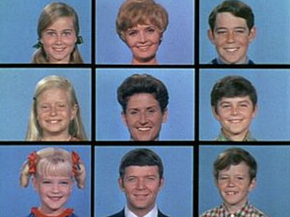
I can’t tell you how many re-runs of “The Brady Bunch,” “The Addams Family,” or “The Munsters” I saw back in the day, even though I didn’t particularly love any of those shows.
There were 3 channels, and you watched what was on.
That was that.
Then came cable, and I still remember the box we had back in Jersey, with these oblong buttons you depressed, to switch among 35 options, which made me feel like a King choosing which outfit to wear, from a closet filled with thousands of fine suits.
“Oh Manfred, please hand me the gray Armani with the super-thin pinstripes. No, you idiot, not THAT gray Armani with the super-thin pinstripes! The other one!”
Later in life, when we were poaching limited cable in Brooklyn, or dealing with 4 channels from a rooftop antenna when we first moved back to New Mexico, Jessie and I occasionally watched awful stuff, as there were so few choices.
At one point, I’m embarassed to admit, we even watched “The Biggest Loser,” NBC’s fat-shaming reality show that I would certainly unsee, if only I could.

A few years ago, in a life including Dish satellite TV, but before we had any streaming services, I remember checking out the Fox sitcom “The Last Man on Earth,” starring the always brilliant Will Forte. (Dude can be funny without even talking, which is tough.)
I was intrigued from the jump, as the idea of only one person left on the planet, who could then raid all the grocery stores, drink all the vodka, and blow shit up in the middle of the street, was watchable, at first.
Then, Kristin Schaal came along, because apparently, he wasn’t REALLY the only person left alive, after a pandemic virus wiped out nearly all of humanity. (Too soon?)
She is funny as hell, and brilliant, but was definitely playing an annoying character on the show. Then more people popped up, proving the title was a lie, and once January Jones joined the cast, who is easy-on-the-eyes, but not-so-good-at-acting, (outside of her robotic Betty Draper days,) I was done.
It had become an ensemble cast, with all the regular-people-talking-to-other-people problems, and Will Forte was not enough to hold my attention.
I switched the channel, and never looked back.
“Tension creates attention,” is one of my new catch-phrases, and surprises are good, but you also have to want to engage with something, because hate-watching only works for so long.
(I mention this, while currently on a family binge of “Survivor” reruns, because my kids like it, and some days I want to poke my eyes out because the show is so terrible.)
Why am I on about all of this? When did this become a TV criticism column?
Funny you should ask.
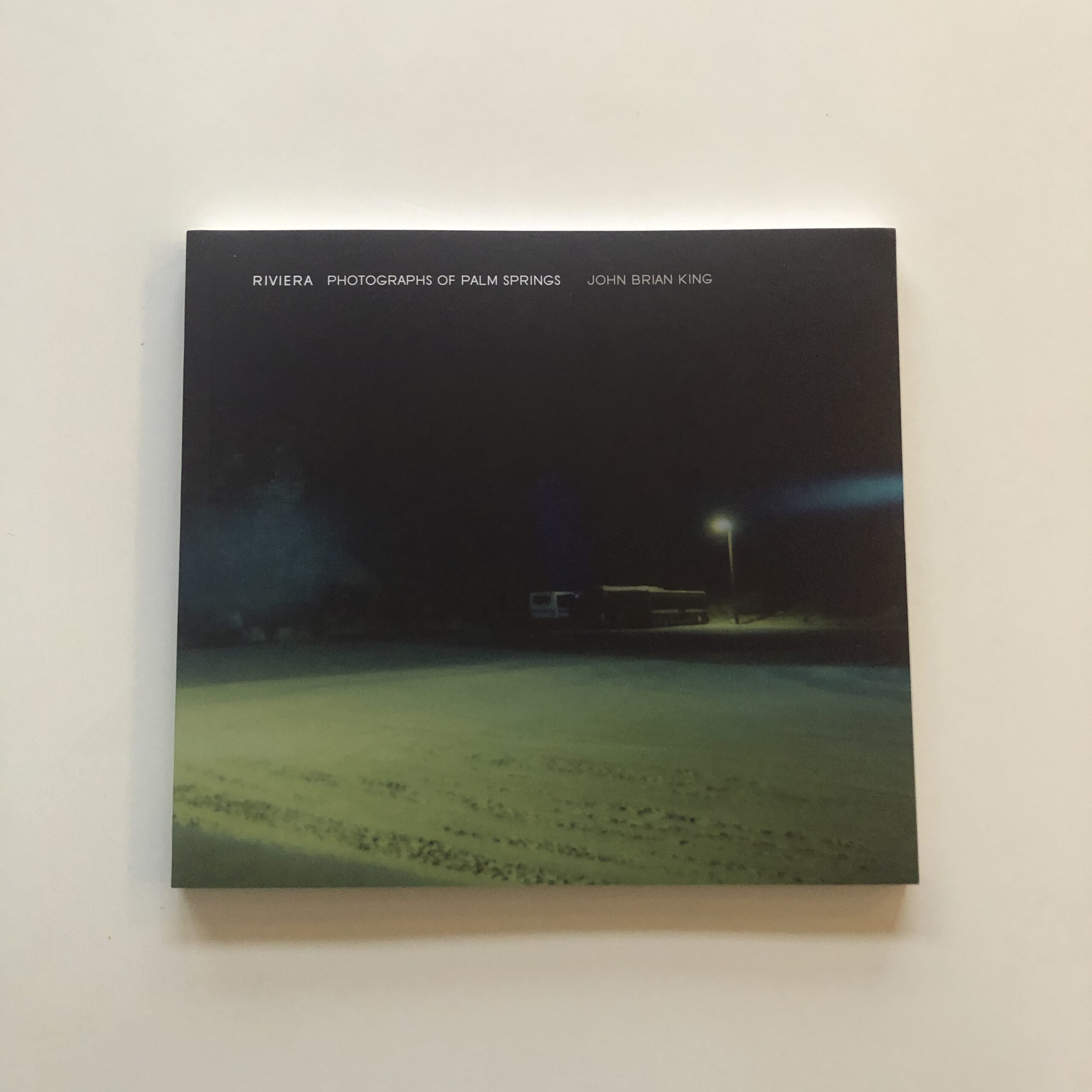
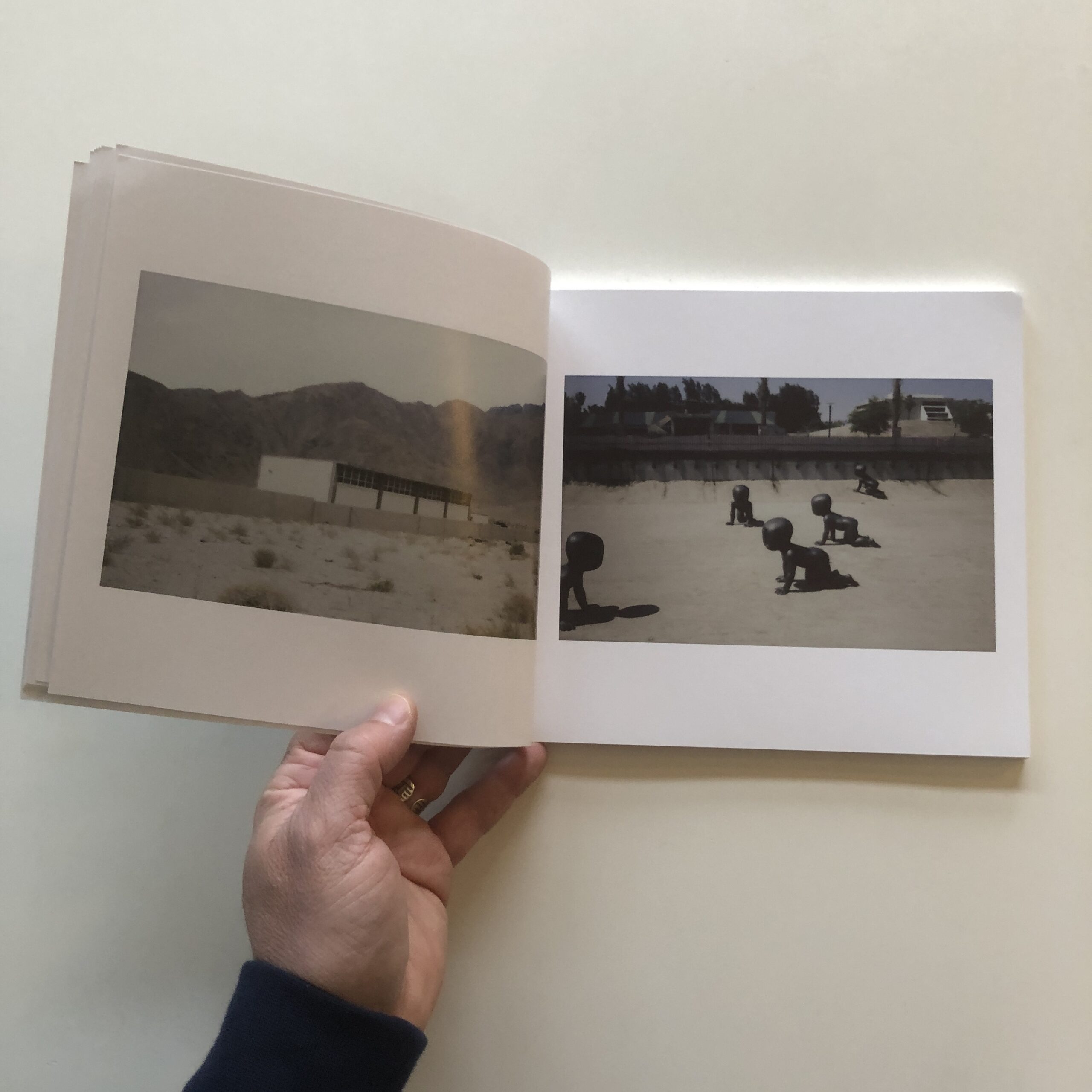
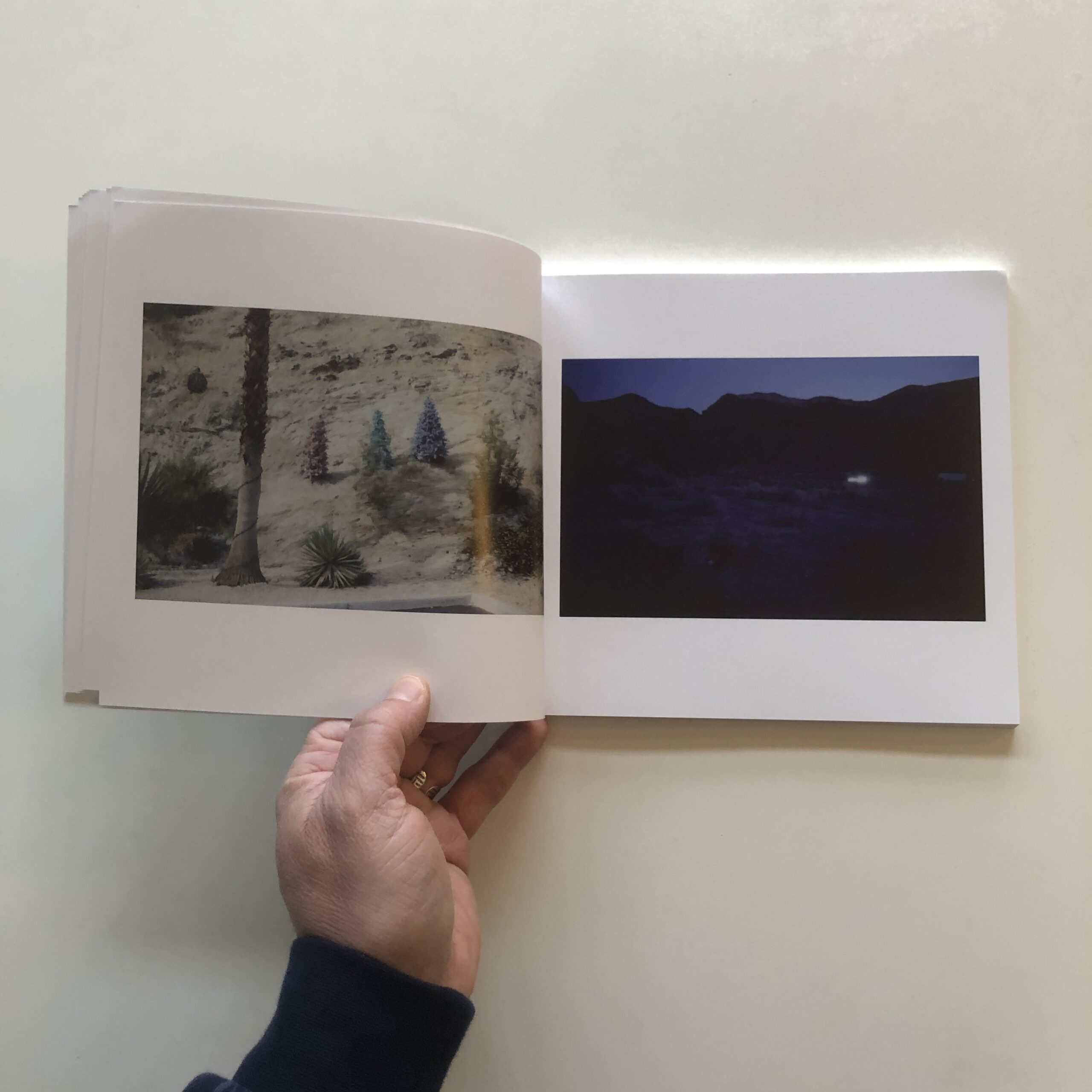
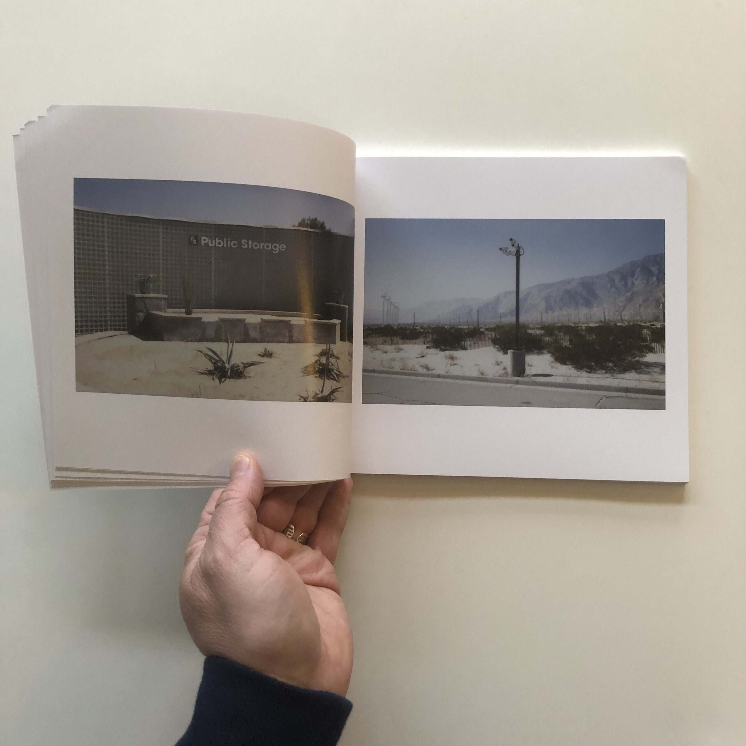
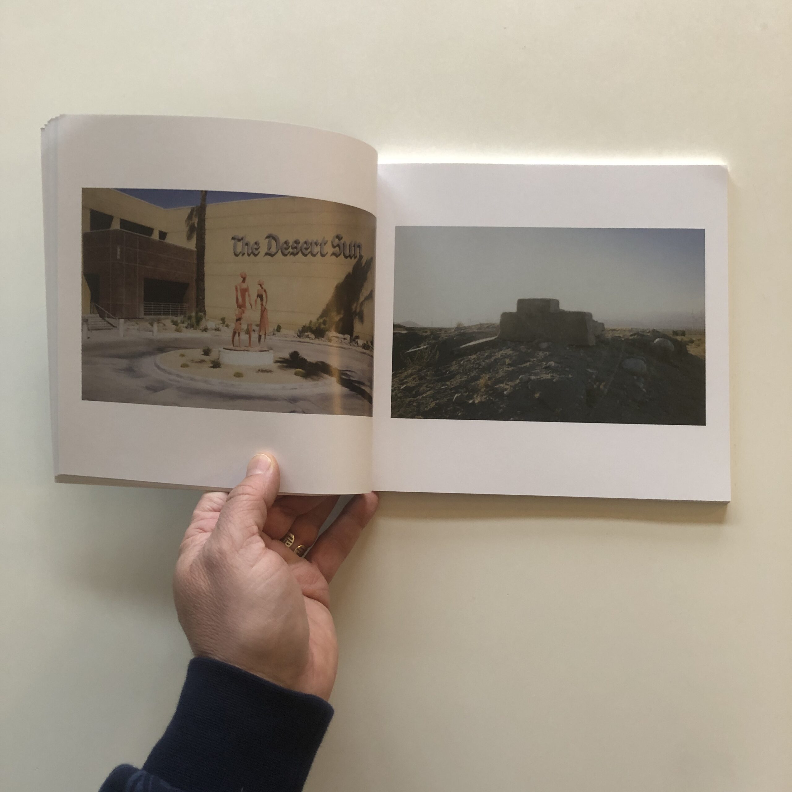
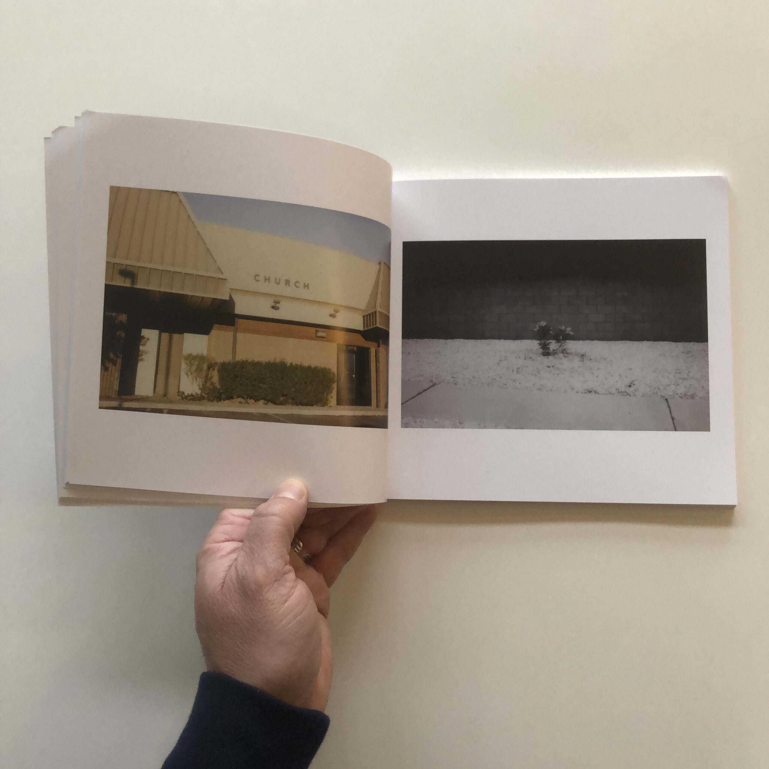
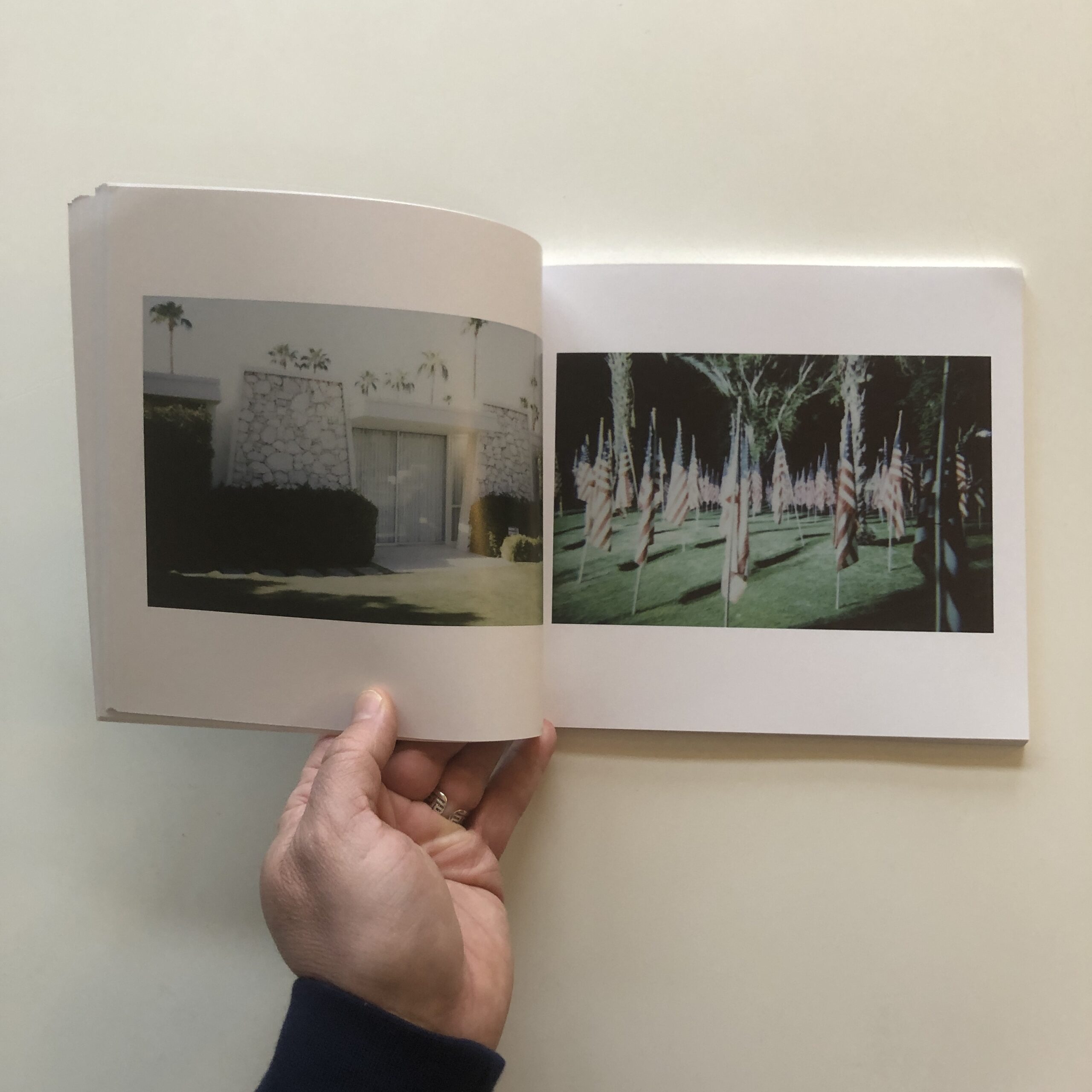
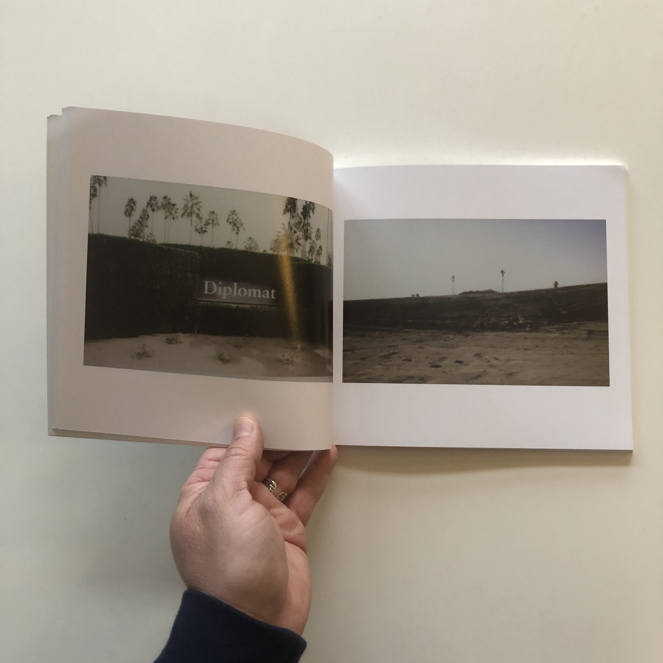
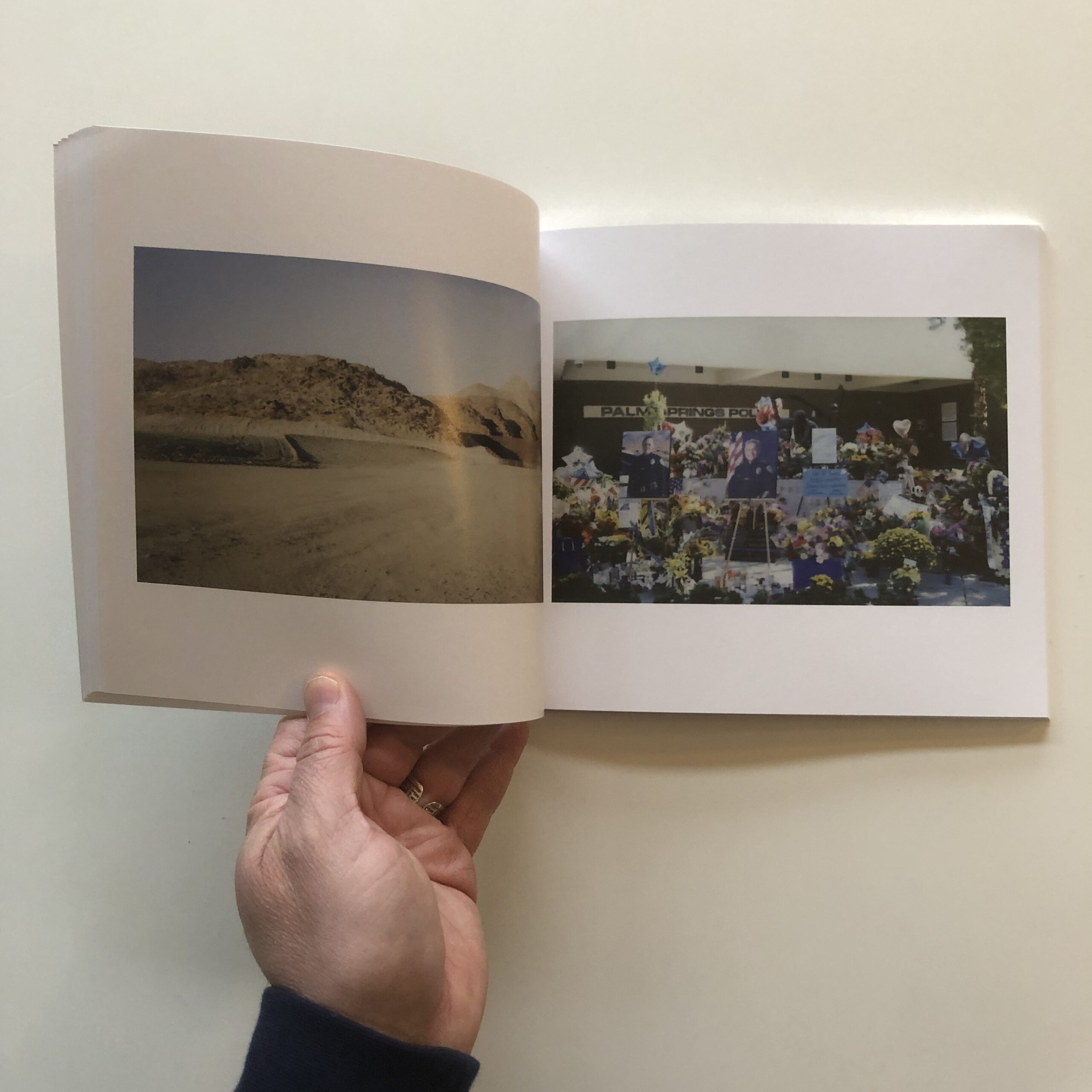
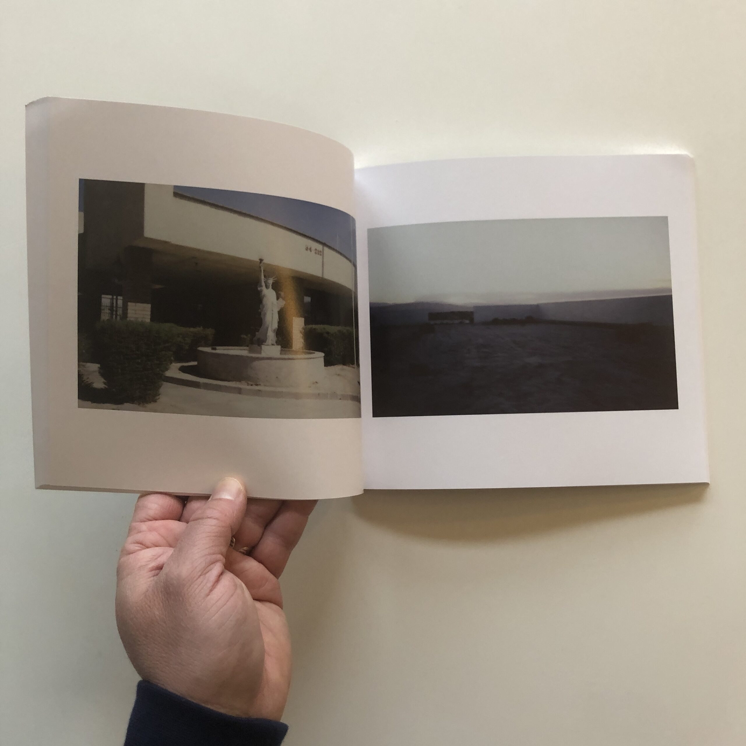
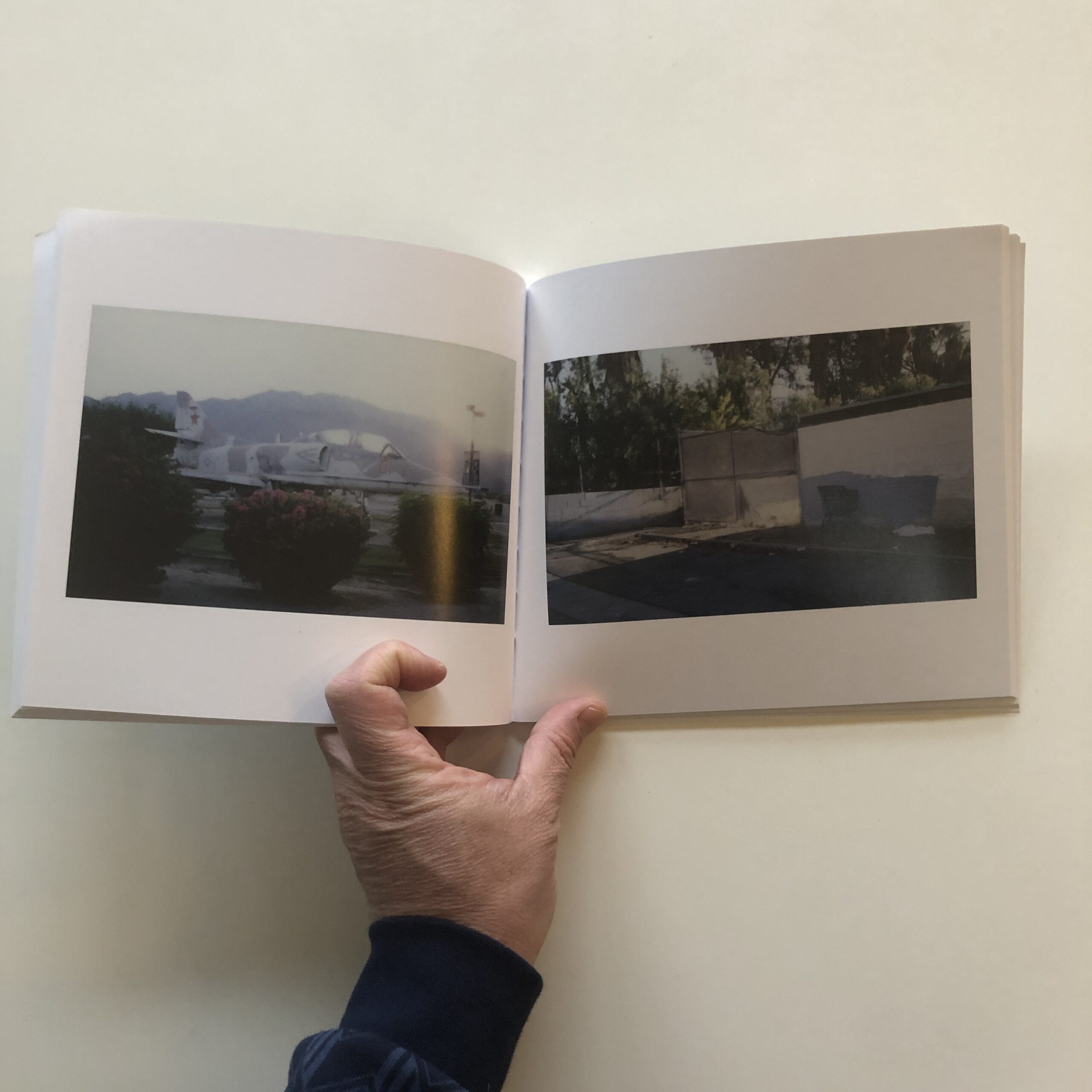
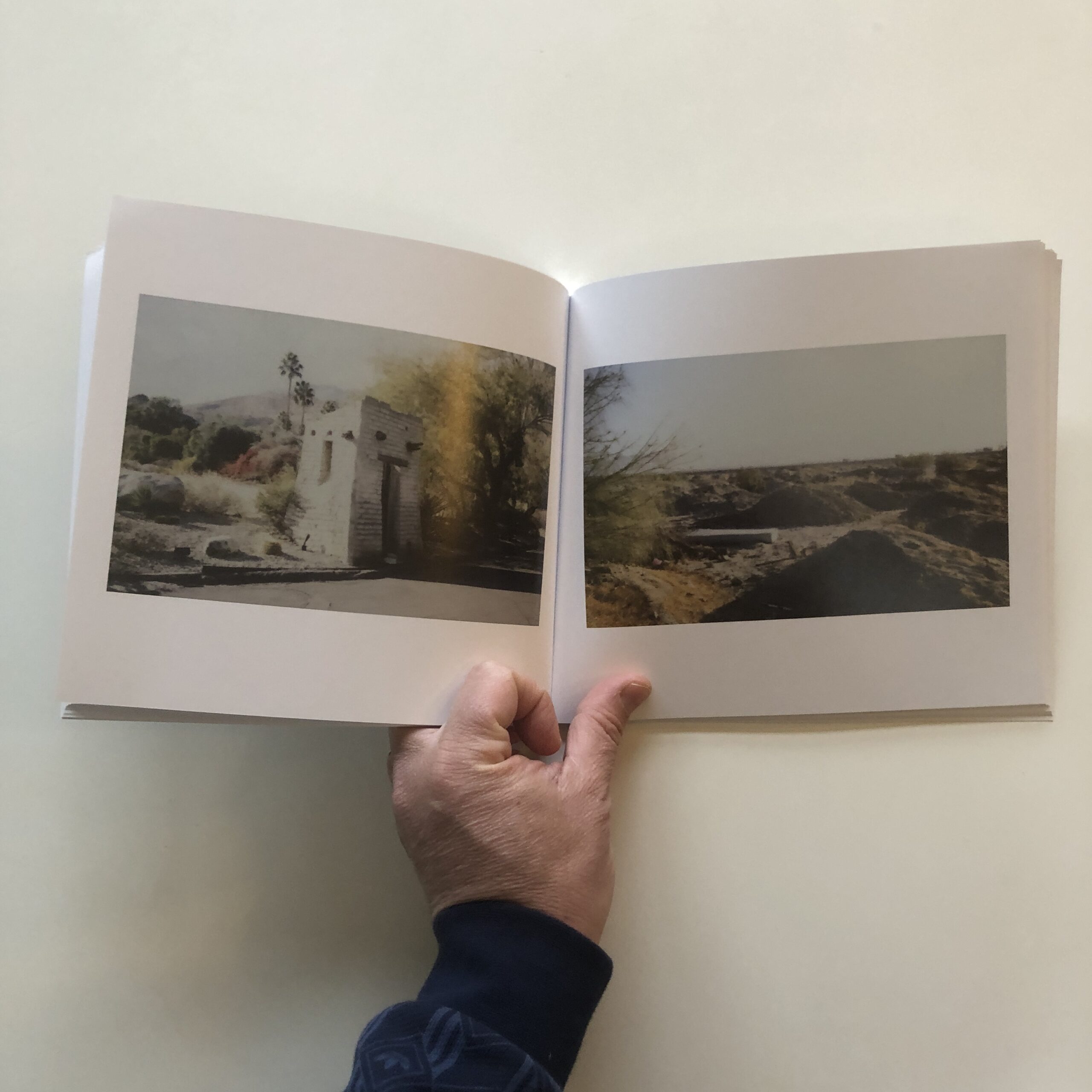
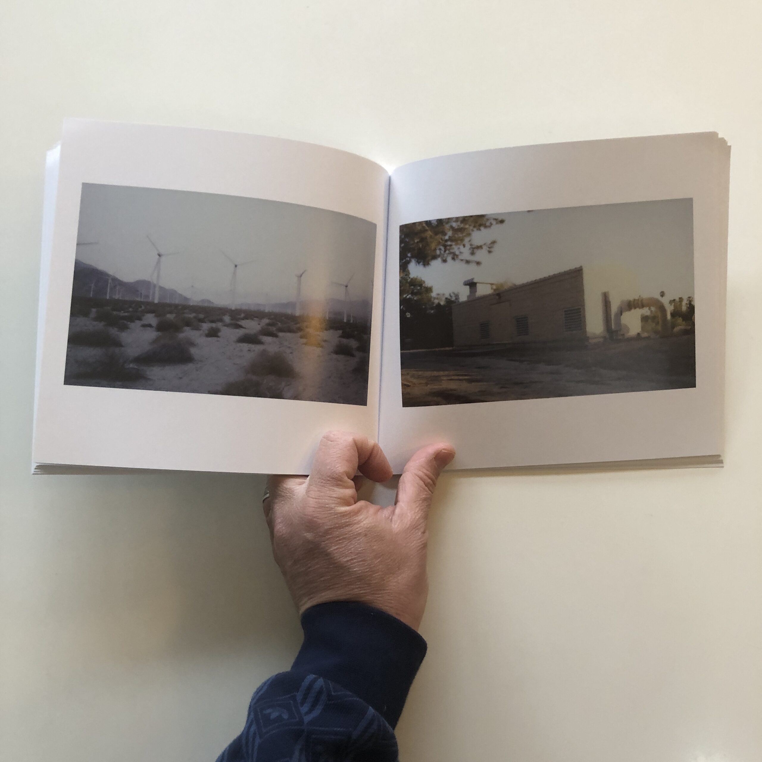
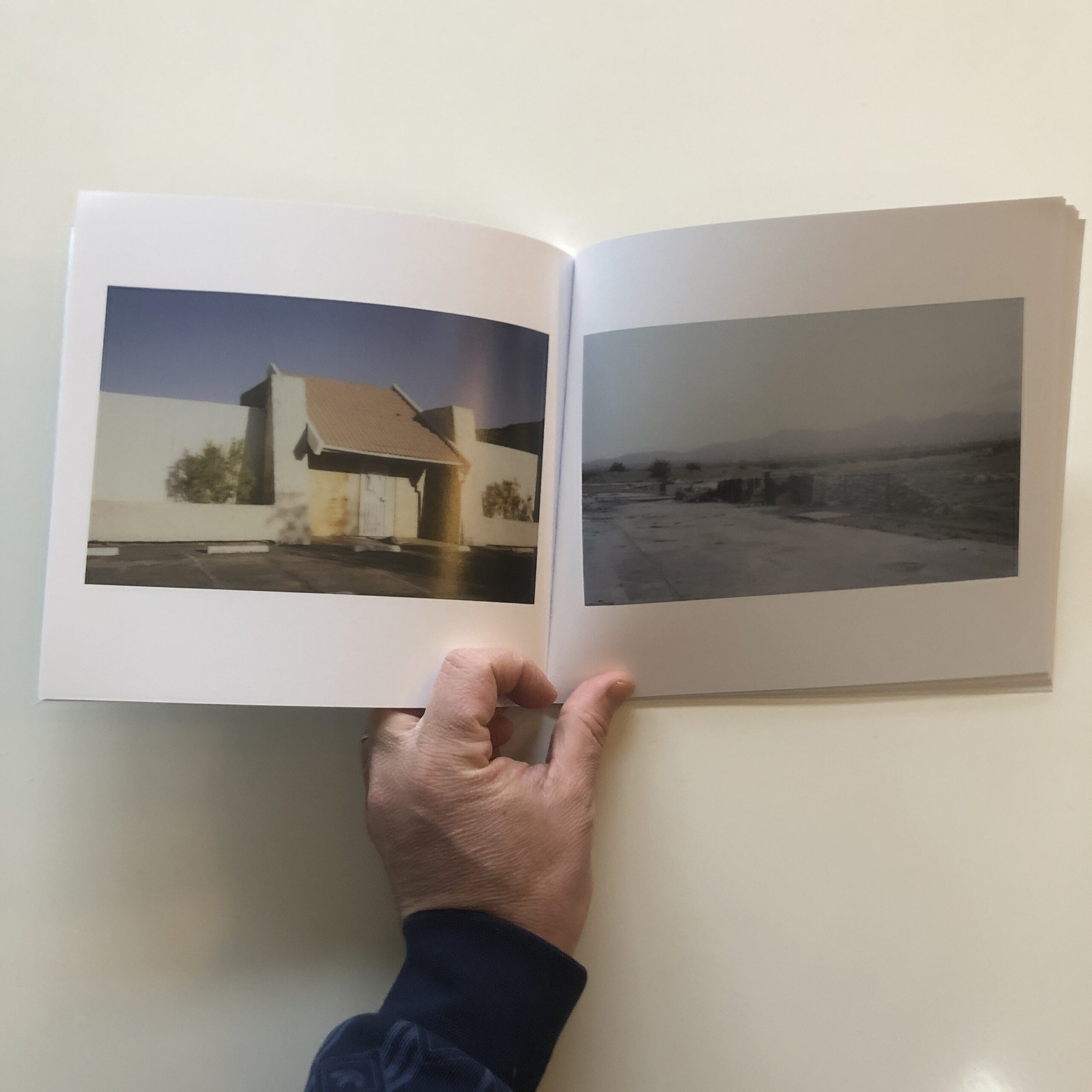
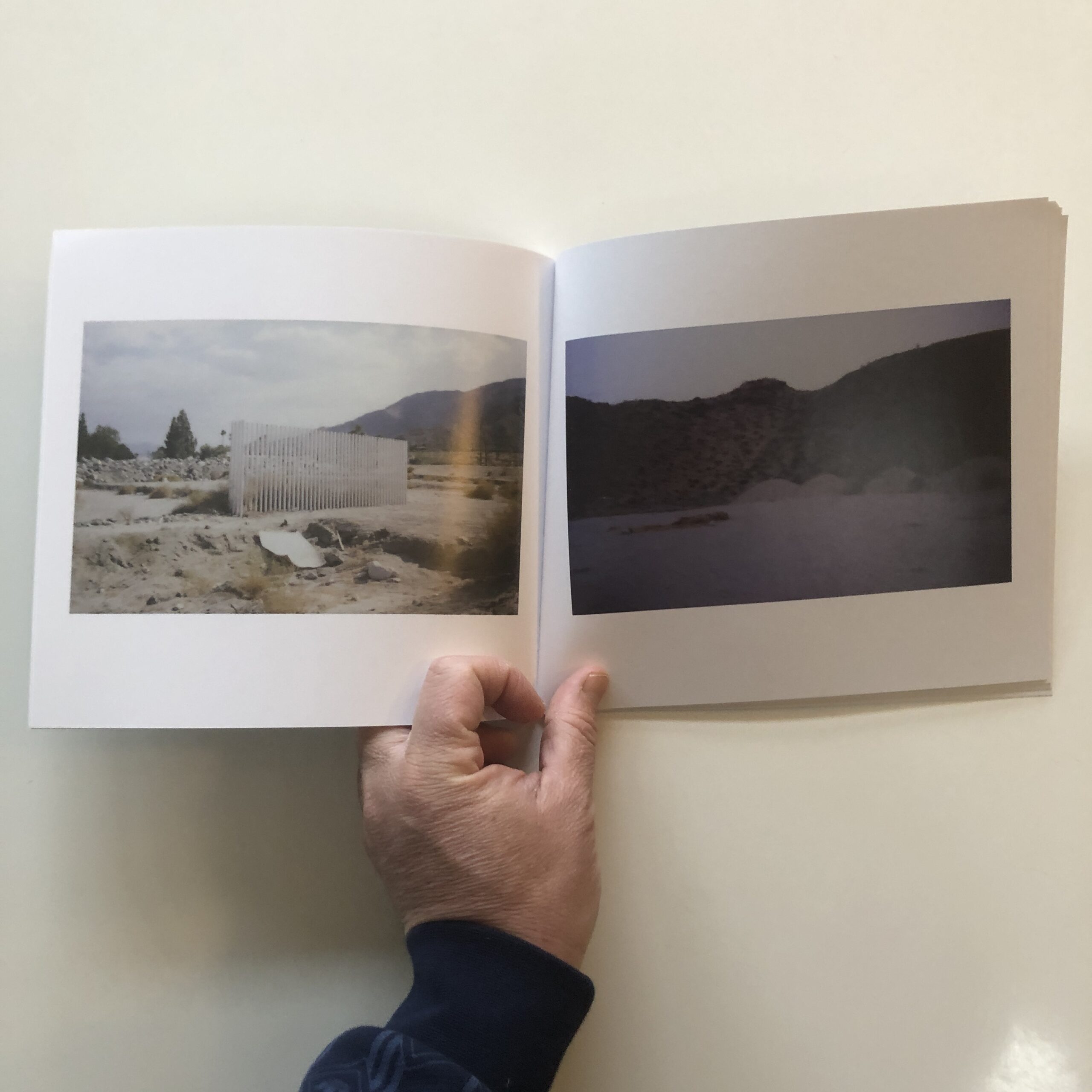
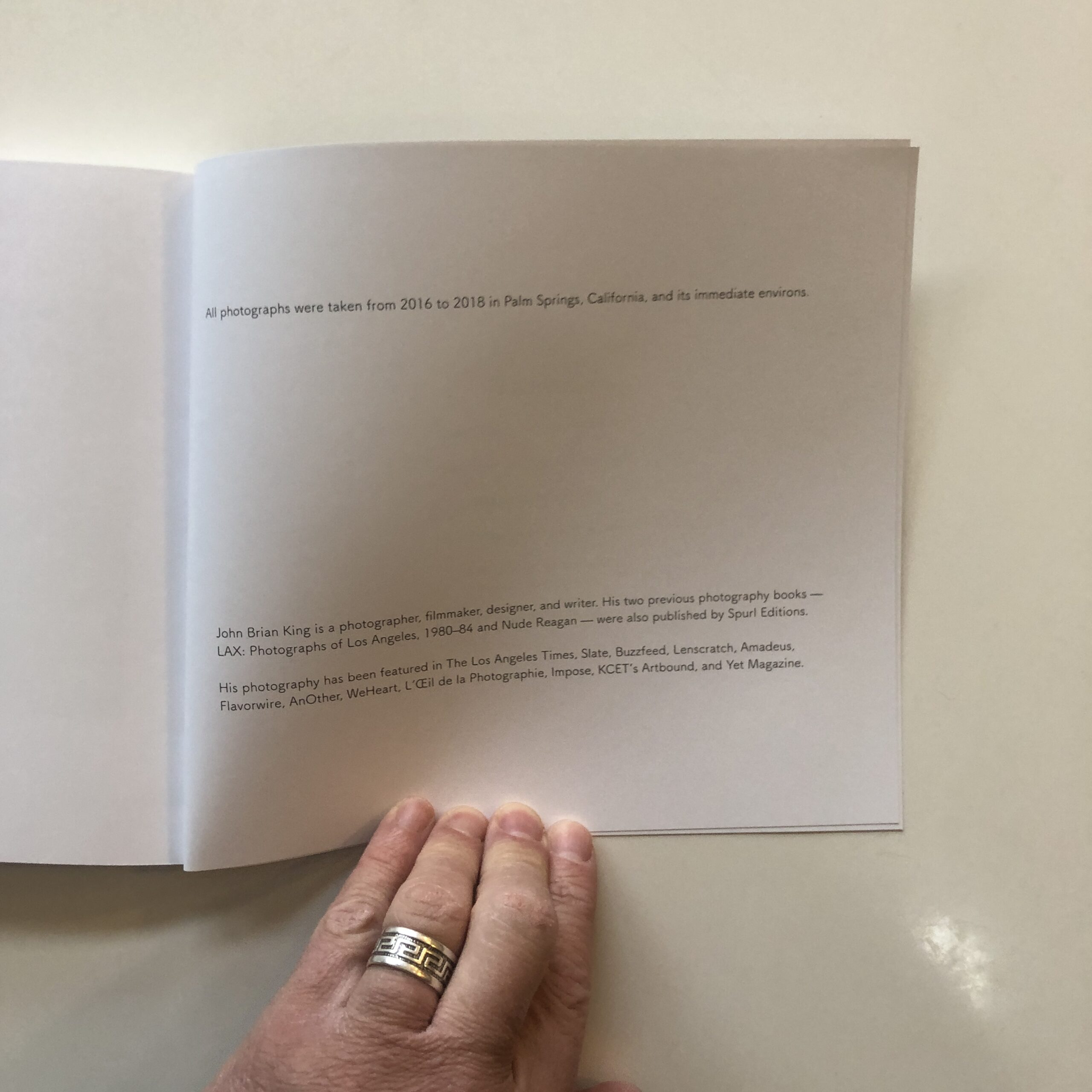
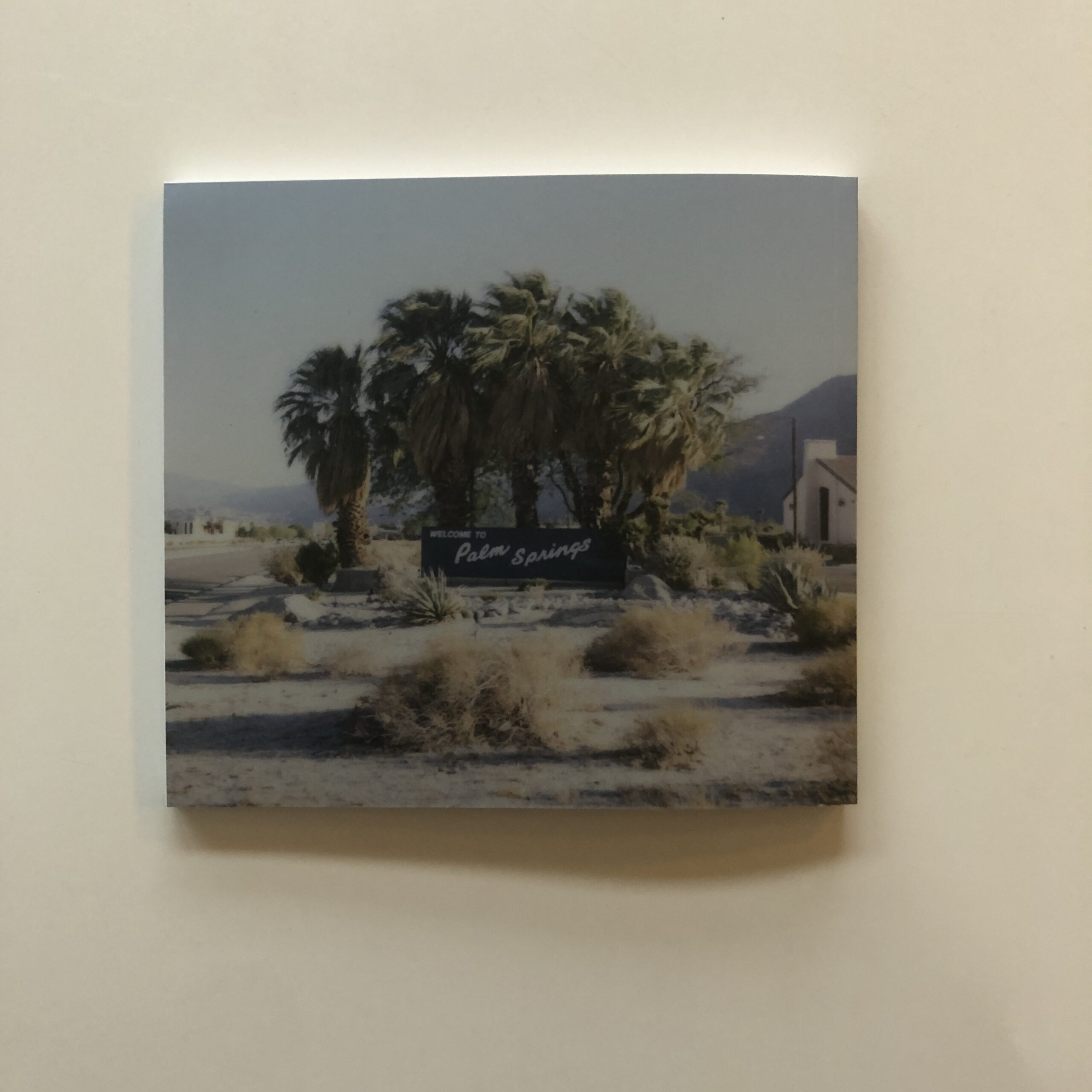
I just finished looking at “Riviera: Photographs of Palm Springs,” by John Brian King, which was published by Spurl Editions in #2020.
I’ve told you it takes me forever to get through the book stack these days, and this one arrived last June, so it came in at a time when streets were empty, anger and fear were high, and it felt like Voldemort might really kill us all in the end.
I think John wrote to me, and I almost remember saying the book looked intriguing, and from the jump, I can see why it would have caught my eye.
We’re now in a trilogy of SoCal photo book reviews, and the last is the most flawed, though also the most compelling from a small sample.
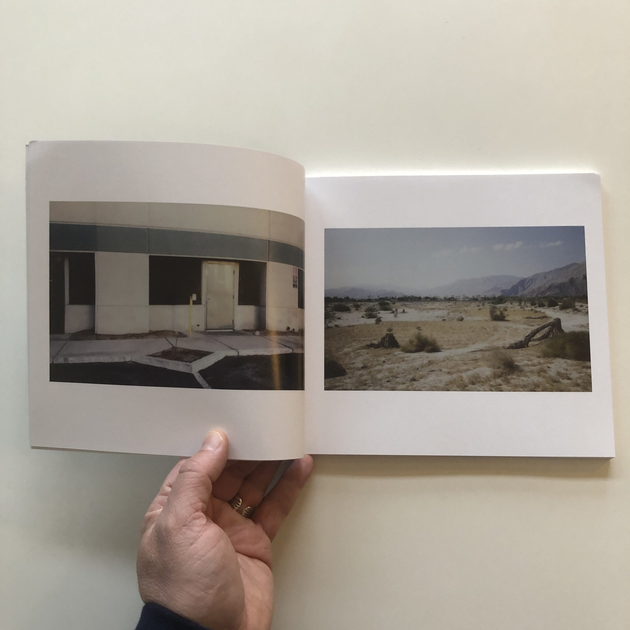
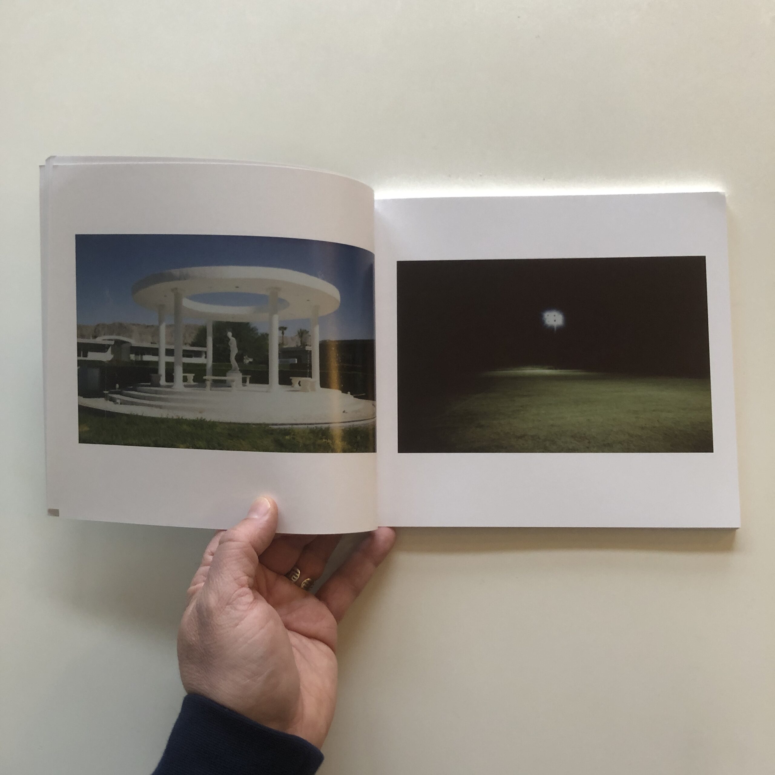
The photographs are moody, and soft focus, with a subdued, pastel color palette, and a smattering of images that make me think of UFO’s and aliens, which will always get my attention.
However.
There are so many photos of an empty landscape, with no people, and it really does feel like humanity has been wiped away.
Post-apocalyptic for sure.
But the design features two photographs opposite each other, in the same size, page after page.
And there are a lot of pages.
(In fairness, on second viewing, I noticed that very rarely, they incorporated only one photo per spread, instead of two.)
I work with people on producing photo books these days, and am always discussing the idea that monotony will cause a viewer to lose focus.
Attention will drift, and boredom will creep in, when you come to expect, and then KNOW, what is coming next.
Good design will play with scale, and location on the page. Or mix in tension breakers, and unexpected motifs.
Maybe slip text into the mix, instead of only photos.
It’s important, IMO, to consider a viewer’s attention span, if you want to make a great book, because otherwise people will begin to flip through the pages, and you’ve lost them.
So today, I wanted to write about this book as a teachable moment.
The art is good, and the aesthetic is consistent, but I barely forced myself to make it until the end. (Which is more than I can say for that Will Forte show.)
Some of you might like this book, and that’s cool. I don’t want to be a hater.
But if you’re considering making a book yourself, (or a catalog, or a ‘zine,) please don’t be afraid to mix it up.
Play with your design, or hire someone who knows what they’re doing.
Because being creative doesn’t end when you click the shutter, make your photo edit, or finalize your color correction.
Design is a creative enterprise as well, and is so crucial to the book-making process, even if you think you can do it yourself.
To purchase “Riviera: Photographs of Palm Springs” click here


If you’d like to submit a book for potential review, please contact me directly at jonathanblaustein@gmail.com. We are particularly interested in books by women, and artists of color, so we may maintain a balanced program.
2 Comments
Style and design always matter, whether in cars, fashion, buildings, whatever… When it comes to presenting photographs, it always comes down to whether it enhances or detracts from the overall viewing experience. My favorite recent photography book had one photo on the right hand side from start to finish, lot’s of ’em. Never got tired, never got bored- they were simply that good, and I certainly didn’t want anything interrupting, distracting or getting in the way. Likewise, I’ve gotten bored with with the same style layout rather quickly when the photographs themselves were lacking. Yes, good, innovative design can heighten the visual, sensory enjoyment, particularly when it adds revelatory information or levels of insight not within the photographs themselves. But it should always be in service to, not on equal par with the subject matter itself (not saying you suggest otherwise).
I’ve just seen one too many examples, in both galleries and books, where someone decided to ‘spice things up’ and exercise their creative ingenuity with some kind of erratically graphic presentation, often in huge disservice to the photographs themselves, or… because the photographs themselves were somewhat lacking.
I’m kind of angry I spent so much time watching TV in my youth, and still too much in my young adult years when I knew better. But we all need downtime.. I suppose. I wish I had spent my time growing/learning instead of consuming generic product. Though I guess it’s turned out OK. Empty landscapes, really that IS the Brady Bunch, and soft moralising.. from days of yore..
Comments are closed for this article!