Sports Illustrated
Director of Photography: Marguerite Schropp Lucarelii
Photo Editor: Abby Nicolas
Photographer: Jeffery Salter
Heidi: You’ve been a long time contributor to SI, what made this project different?
Jeffery: I have always received commissions from Sports Illustrated for assignments which involved trust. That’s creative images that require me to establish that trust very quickly with the professional athlete. When I was on staff at the magazine my beat was hang out with the athlete at home, in the barbershop or even in the nightclub to capture their life off the field. Now I do covers for the magazine which involve a concept, mood and energy.
What type of direction did you get from the magazine?
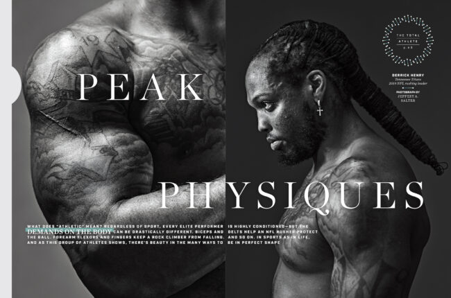
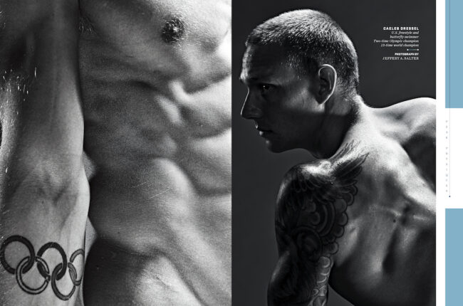
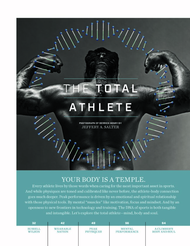
This feature “Total Athlete” also was about trust. The players were willing to discard the uniform and gear to display their physiques. They trusted that I would make them look powerful. It was an honor and a challenge. Normally I bring in a lot of lights, modifiers, effects and even a haze machine to help bring on the drama. I was asked to keep the images poetic and strong. I still used a lot of gear….tho! But controlled them so they simply built layers of shadow and highlights to create texture and drama. More Chiaroscuro and less snap, crackle pop!It was a rare opportunity to show what’s the force or engine underneath the athletes uniform. A snapshot to capture the strength in a frozen moment.
How did covid affect your production or creative process?
Having a COVID safe production was and is top of mind when working on set with an top athlete or even being commissioned to do a small portrait of mom and pop business owner. For this set – it was mainly one trusted photo assistant who also is strict about maintaining social distance – off the set and on set. I used a longish lens to do the portraits to keep my distance – which wasn’t problem because the athletes – Derrick Henry and Caeleb Dressel are huge. Since it was more of a collaboration being me and the athlete I did let them take a look at the laptop – I would stand six feet away – so they could spot check their form
Why black and white?
We wanted to keep the focus on the muscles – sinewy and powerful – combined with perfect form. Black and white combined with light and shadow allowed us to create images which helped us achieve both of those goals.


