New York Magazine
Photo Director: Jody Quon
Associate Photo Editor: Stella Blackmon
Senior Photo Editor: Marvin Orellana
Photographer: Joe Lingeman
Heidi: You have a variety of color pallets within your work, is this bright poppy a new direction for you?
Joe: I’ve had a few commissions recently where the subject matter really called for super poppy color. I guess I started going in this direction as I transitioned to shooting entirely digital and working more in the studio. In the studio, where you have to make a decision about every variable in the frame (light, color, etc.), you’re less tethered to reality. I’m less interested in replicating “real” light or color than I am in amplifying that artifice of the studio. What I ultimately want is to make pictures that are fun to look at, and sometimes exaggerating the color is a way to get there.
Did you have a food stylist?
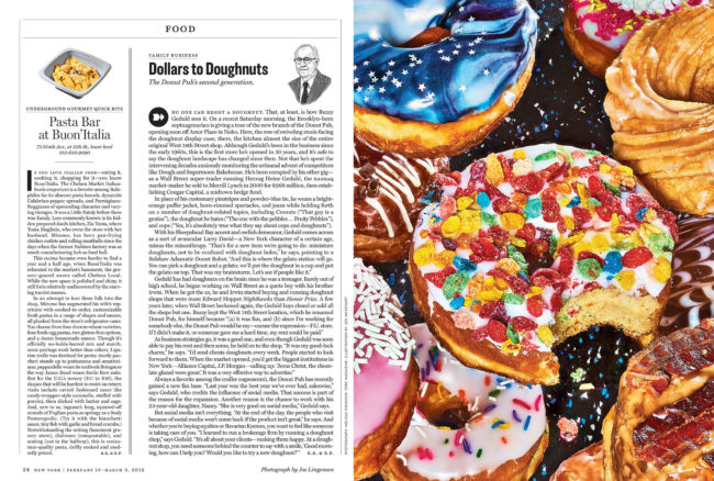
Nope. Stella Blackmon, the photo editor, dropped off three dozen doughnuts to the studio and let me play.
Nope. Stella Blackmon, the photo editor, dropped off three dozen doughnuts to the studio and let me play.
If styling your own, what drives your style?
I love how NYC coffee carts display their food and I’ve also been really inspired by NYC deli graphics–where you’ll see stock images of Pepsi cups and bagel sandwiches and doughnuts cut-and-pasted on top of each other over clashing digital backgrounds. They’re super engaging and attention-demanding, all about abundance, but set against this filthy urban backdrop. I wanted this image to have that kind of trashy-cornucopia feeling–kitschy and irresistibly delicious at the same time. The background is a piece of rubber matting – the kind you’d see on the floor of the weight room at your gym. The Donut Pub looks and feels like a diner inside and the pattern had a “Saved-by-the-Bell” quality that had an echo of formica flecks and candy sprinkles that felt like it would fit in that world.
I love how NYC coffee carts display their food and I’ve also been really inspired by NYC deli graphics–where you’ll see stock images of Pepsi cups and bagel sandwiches and doughnuts cut-and-pasted on top of each other over clashing digital backgrounds. They’re super engaging and attention-demanding, all about abundance, but set against this filthy urban backdrop. I wanted this image to have that kind of trashy-cornucopia feeling–kitschy and irresistibly delicious at the same time. The background is a piece of rubber matting – the kind you’d see on the floor of the weight room at your gym. The Donut Pub looks and feels like a diner inside and the pattern had a “Saved-by-the-Bell” quality that had an echo of formica flecks and candy sprinkles that felt like it would fit in that world.
Why those particular doughnuts?
Of the whole bunch, these were the most over-the-top. The Donut Pub makes outrageously decadent doughnuts and these felt like the right ones to show. They’re very special doughnuts. I did a few options with different doughnuts as the hero. This was my favorite and theirs too.
Of the whole bunch, these were the most over-the-top. The Donut Pub makes outrageously decadent doughnuts and these felt like the right ones to show. They’re very special doughnuts. I did a few options with different doughnuts as the hero. This was my favorite and theirs too.
What type of direction did you get from the magazine?
Honestly, not much on this particular image. There wasn’t a creative brief or anything. We talked over the phone and hashed out some ideas, but they really trusted me on this one. I had taken a picture of some cake slices the week prior and posted it on instagram and they called it out in their email to me. The direction of that image felt like an obvious way to go for this image.
Honestly, not much on this particular image. There wasn’t a creative brief or anything. We talked over the phone and hashed out some ideas, but they really trusted me on this one. I had taken a picture of some cake slices the week prior and posted it on instagram and they called it out in their email to me. The direction of that image felt like an obvious way to go for this image.
What do you look for in your compositions?
For me, composition is all about creating energy in the frame. Even if the subject is basically centered, the frame needs to have some asymmetry or some interesting use of color or space that creates tension. The image has to feel alive. I also want there to be a moment where you question what you’re looking at. You recognize it instantly as a doughnut, but it’s not a normal doughnut–it’s familiar and foreign at the same time. Maybe that’s not an issue of composition, per se, but a general attitude about image making.
For me, composition is all about creating energy in the frame. Even if the subject is basically centered, the frame needs to have some asymmetry or some interesting use of color or space that creates tension. The image has to feel alive. I also want there to be a moment where you question what you’re looking at. You recognize it instantly as a doughnut, but it’s not a normal doughnut–it’s familiar and foreign at the same time. Maybe that’s not an issue of composition, per se, but a general attitude about image making.

2 Comments
Thanks so much for continuing this blog and this series. Love being introduced to working photographers who are getting noticed.
Omg those doughnuts looks so yummy, great photo.
Comments are closed for this article!