By Andrew Souders, Wonderful Machine
Each month, we analyze a recent cost estimate, contract, or purchase order and present it in the form of a Pricing & Negotiating article. Redacting the names of the photographer and client allows us to share useful information that would otherwise be confidential. You can learn more about how we can help you with Pricing & Negotiating on the Consulting Services page of our website.
Concept: Short-form video content for a household product brand’s social media campaign.
Location: Eastern US metro area.
Client: Global consumer goods company.
Agency: Dedicated creative division within a global advertising network, working exclusively on behalf of the brand.
Director: Product and Brand Narrative Specialist.
Licensing: Copyright transfer (work made for hire).
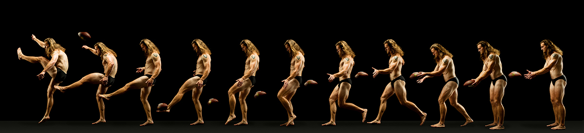
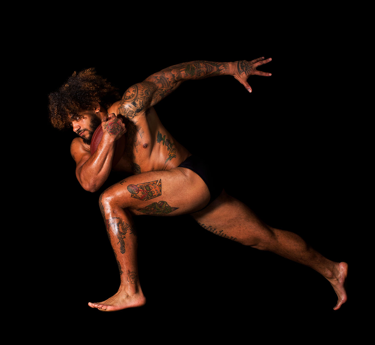
I recently worked with a director to develop a competitive bid for a social media motion campaign for a well-known CPG (Consumer Packaged Goods) brand. The creative brief called for a series of playful and visually engaging product videos blending various content, physical gags, and clever prop builds to highlight the brand’s hero product. The agency was seeking a team that could elevate the product conceptually while executing with polish and impact on a fast-paced schedule.
The scope included one primary shoot day in a studio setting, preceded by multiple set-build days and a dedicated pre-light day. Expected deliverables included five unique video assets (ranging from 6 to 15 seconds each). The brand would use the content across its web channels, organic social platforms and in paid social media campaigns.
Because this project was part of a closed bid process with a stated budget ceiling rather than a more flexible estimate or negotiation, we were working against a firm deadline and in competition with other vendors. That meant ensuring the numbers were precise, costs were well defined, and that the bid was ready to withstand both agency scrutiny and internal brand approvals.
Bid vs. Estimate
Since this was a firm bid, not an estimate, we shaped our approach accordingly. Unlike a conventional estimate, in which final costs can be accounted for during invoicing to reflect actual expenses, a firm bid must be submitted with a locked bottom line. The agency’s bidding platform required fully itemized pricing to make it easy for them to compare bids.
That meant we needed to add in enough budget wiggle room to stay flexible while remaining competitive. Our goal was to create a competitive submission while still supporting the production’s creative ambition. We made sure the bid clearly identified agency/client responsibilities (including final editing, talent releases, talent payment, and production insurance).
Fees
We proposed a Creative Fee of $22,500, plus $6,000 for pre-production fees to cover the director’s creative development, pre-production, set-building, pre-light, and oversight throughout the process. The agency wanted the project to be a work made for hire, making the client the copyright holder. Pricing work-for-hire is tricky because creative and licensing fees for photographers are usually proportional to the usage. If the usage is infinite, you can’t charge the client an infinite amount of money for that use. So you have to imagine what the maximum practical use is and price it based on that.
The other consideration when pricing video is that while still photographers have historically retained their copyright and charged a fee based on the extent of the licensing agreement, film and video directors have historically charged a project fee (often tied to a “day rate”) in exchange for a transfer of copyright. So, regardless of any theoretical value we might dream up, we always have to consider the value that other photographers/directors (or their agents) would assign to the project.
We grounded our number in precedent: a similar campaign for another consumer brand (also structured as work-for-hire) had landed at the same $22,500 fee for a one-day shoot. The fees also reflected the directors’ intent to keep the costs competitive without sacrificing quality. With much of the budget going toward studio rental, set builds, specialty camera kit/rigs, and a robust crew, the goal was to secure the award and ensure the creative could be executed properly, even if it meant keeping the creative fee leaner than it might be under a typical licensing/usage-based model.
Crew
The crew was scaled to support the full technical and creative needs, including high-speed camera work, motion control, and practical rigging effects. Crew positions included Director of Photography, Assistant Camera, DIT, key grip, swing, and production support roles.
We included seven producer days and three days for a dedicated on-set production coordinator, providing support across prep, pre-light, and the shoot itself for communication between creative and technical departments throughout the schedule.
Equipment
Given the creative camera techniques called for in the treatment, including slow-motion style gags and macro product shots, we included a healthy budget for two full camera packages, including a Red Vista Vision Raptor and a Phantom high-speed camera, a range of lenses, and a motion control system. Additional budget for the DIT’s workstation and monitors, lighting and grip rentals, AC kit fees, storage media, and contingency for other supplies and expendables brought our estimated equipment costs to $39,450.
Styling & Set Build
While the shoot was limited to hands-only talent, the styling and art departments still played an important role. Art direction required the build of multiple stylized environments: a custom interior, tabletop setups, and a monochromatic seamless background. The most complex element involved a rigged creative gag that would require prototyping and practical effects planning.
To support this, the bid included several dedicated art department crew members, rigging, and a staging fee to cover testing and prep work. It also allocated additional budget for painting and restoring a studio cyc wall and other surfaces to match the brand palette. While none of the builds were overly complex in isolation, success would rely on thoughtful coordination among set, styling, and performance, all working in service of quick, inventive storytelling.
The budget included a professional manicurist to ensure a clean, consistent, and camera-ready appearance across all scenes involving talent. Wardrobe and HMU were intentionally excluded — the concept called for bare arms and neutral skin tones to keep the focus on the product and set design.
Casting & Talent
The project called for three non-union, non-recognizable hand talent to be featured performing simple product interactions throughout the footage. Our bid included a $4,000 casting fee, which covered coordination and prep for a video-based casting process led by an external casting agent. We planned to make talent selections via casting decks and pre-recorded submissions shared with the agency for review and approval.
While the director was going to manage the casting, the agency wanted to pay the talent directly. We noted this division of responsibility in the bid details to prevent any overlap or budget conflicts.
Locations
The shoot would take place in a rented studio in the same building as the directors’ workspace. This was a convenient, cost-effective option that allowed for coordination during prep and shoot days. The studio featured a full cyc wall, sufficient square footage for custom set builds and rigging, and easy access for art department and gear delivery. While it was not the directors’ primary studio, its availability and proximity made it an ideal choice. A dedicated prelight day was also added to finalize technical and lighting setups ahead of the shoot.
Meals
Catering and craft services were included to support a full-day shoot with client, crew, and talent present, with additional budget padding to accommodate a longer 12-hour day and some basic meal options for crew on prep and pre-light days.
Miscellaneous
The bid included $1,000 to cover shipping, messenger services, and minor incidentals, as well as a separate $386 fee to account for the 0.25% platform fee charged by the agency’s bid submission portal. Production insurance was to be provided directly by the agency, so we chose not to include this as a passthrough expense in our bid.
Post-Production
We noted in the bid that the client’s in-house team would handle all post-production, but that the directors would consult during the early stages of the edit. This collaboration ensures they can offer feedback and maintain consistency with their creative vision, specifically regarding shot selection, pacing, and tone. The agency was keen for us to include this for continuity of tone and the creative integrity of the final work.
Because the agency wanted the majority of control of post-production editing, we kept our post budget minimal. We included a $1,000 fee for video processing, delivery, and archiving, as well as three days’ worth of post-production management, oversight, and consulting at $1,500 per day to account for the director’s time reviewing and providing feedback on the first round of agency edits.
Results
The project was officially awarded to the director shortly after our bid submission and internal review. The agency noted they were particularly moved by the thoughtful budget structuring alongside a treatment the directors put together to show their intended visual approach. They also emphasized that the pricing clarity and confidence we presented were key factors in their recommendation to the client. Pre-production scheduling kicked off immediately, and the campaign launched at the end of the year across the brand’s social channels.
Follow our Consultants @wonderful_at_work.
Further Reading
Read more articles about Pricing & Negotiating on our blog.
Specialty: Still Life/Product Photography