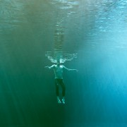
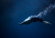
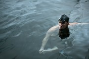
Still Images in Great Advertising- Tom Nagy

Still Images In Great Advertising, is a column where Suzanne Sease discovers great advertising images and then speaks with the photographers about it.

I wanted to finish my series of my favorites from CA Photo Annual with the work of Tom Nagy and his award winning campaign for Swiss. One of things I love about this campaign is how many ads they did which is something we don’t see that much anymore.


Suzanne: Tell me a little more about this campaign. How many concepts were there and I see in the “Making of” it required a lot of crew and some plane to plane communication.

Tom: The art director Swen Murath saw the personal series I did 3 years ago and wanted me to shoot the whole campaign exactly this way. At the end, we produced approximately 20 ads within 10 days of production. The key to get the shots we wanted was the incredible support we received from the airport authority in Zurich and the fact that we got the time we needed to produce the right quality. We had the green card to do almost whatever we wanted on the entire airport. It was a little bit like playing God. We have been on the runway, getting rid of 30 disturbing carts in the shot was just a call. We rerouted flights, moved around on cherry-picker, moved a lot of planes. Overall a photographers dream….

Suzanne: I like “Making of” verses behind the scenes because you show more technical aspects which I think is nice. Tell me more about that and also what’s it like to make snow in Los Angeles?

Tom: It was great to make snow in downtown LA. Many pedestrians came closer and touched the snow and asked us if it was really snow. Some of these people had never touched snow before. We have had a lot of fun making jokes with these guys. The fake snow we used is absolutely amazing. It has all features real snow has. You can make snowballs which look absolutely authentic. Just the cold is missing. One thing I really love on my job, is to create my own world which often is a little bit “ better than life “

Suzanne: I see when you are doing personal projects, you like to shoot more people in the images. Do you wish clients would consider for more projects with people because you are good with landscapes and people.

Tom: I prefer to have people in my pictures and I´m always happy when clients book me for projects where people are involved. Shooting pure landscapes is a big luxury less and less clients go for it.

Suzanne: What is so nice about your advertising work is that you are hired to large campaigns not just one ad. Do you like to be a part of the collaboration process?

Tom: I always try to be as involved as possible in every detail of the concept. Pushing for the locations, talents and other details I´d like to see in my pictures is important to get the results I´d like to deliver. I´m always grateful when creatives ask me for my input to what could be an exciting approach for a campaign.

Note: Content for Still Images In Great Advertising is found. Submissions are not accepted.

Born in Germany, Tom started with photography at the age of 15, when his father gave him his old Minolta camera. After highschool he opened his first studio and has been assisting for 5 years before he went to Hamburg and officially started his career.

During the last 15 years he traveled around the world for his global clients. He won numerous awards like ADC, AOP, PDN, ONE SHOW, GRAPHYS, COMMUNICATION ARTS, BFF, LÜRZERS 200 BEST and many others. His work has been shown in several group and single exhibitions. He has given lectures in several different universitys and has been the chairman for the BFF, the association of german photographers.

He is member of ADC New York AOP in London and BFF in Germany.

APE contributor Suzanne Sease currently works as a consultant for photographers and illustrators around the world. She has been involved in the photography and illustration industry since the mid 80s, after founding the art buying department at The Martin Agency then working for Kaplan-Thaler, Capital One, Best Buy and numerous smaller agencies and companies. She has a new Twitter fed with helpful marketing information.  Follow her@SuzanneSease.

Still Images in Great Advertising- Erik Almas

Still Images In Great Advertising, is a column where Suzanne Sease discovers great advertising images and then speaks with the photographers about it.

As I search for great ads for this column, I was intrigued when I stumbled across this campaign for Absolut Vodka. This recent campaign goes back to the roots of the classic campaign from years ago and away from the recent “In an Absolut World”. What I found even more intriguing is this was shot by Erik Almas. In Erik’s recent work, it is taking a new challenge; a new direction and I think a better one.


Suzanne: Looking at your website, I feel as if you are evolving in style and production. You are shooting more bold colors and higher production. It is so important for a photographer to grow and push out of their comfort zone. Would you say this is true about your work?

Erik: It’s very important for photographers to grow. I think that if you don’t challenge yourself somehow in the pictures you take you will very quickly become irrelevant in today’s increasingly visual and restless culture.

I feel I evolve visually but within that progress also stay quite faithful to my photographic voice and esthetic. What I have found, and this is probably what you are responding to, is that I’m now more frequently asked to apply my style to subject matters that is not necessarily in my portfolio.

Suzanne: When I look at this campaign, I see images from a casino, a campaign with a shield and several others that tell the art director that you could work well with props and retouching. Would you agree with that and why you were a candidate to shoot this campaign?

Erik: I’m sure an art director could see the translation of the Union Pacific shield standing tall in a landscape to the Absolut Vodka bottle doing the same but I don’t think this parallel were the reason I got hired to do this Absoult campaign.

The creative team on Absolute came from a different perspective and approach… In the great tradition of the Absolut campaigns these images are also executed with actual sets built around the bottle. The crew at NewDeal Studios started with a 1 liter bottle and scaled everything around it so that the bottle would feel over sized. These grand spaces we see in these pictures are actually not more than 4×4 feet in size…. I don’t know the full story behind choosing the photographer but know the creatives at TBWA/Chiat/Day were looking for someone to bring life to the sets more so than lighting the bottle perfectly. This led them to look beyond still life photographers to someone that could bring a landscape atmosphere and esthetic to the sets.

Through my agent I got introduced to the agency and we were the ones that, proud, lucky and honored, got the job and got to be a part of the Absolut Advertising Campaign.

Suzanne: I was talking to another well-known photographer and he said the best projects that took him out of his comfort zone, created the best results. Since this campaign is so different for you, would you agree with that statement?

Erik: In general I think repeating oneself will rarely be considered great in our own eyes. Photographers, or any artist for that matter, always seek new ways to express one. In this quest the best work will then always be found outside of our comfort zone… So yes I would agree with that.

The measure of these being better or not though I’ll leave to others…

Suzanne: Can you tell me about this campaign and all the elements to it that were later composited to this campaign?

Erik: Got tons of great feedback when the campaign was released. A lot of curiosity of how it was done and a good amount of comments were suggesting CGI and different elements being put together.

It’s great that the Absolut team went for building sets as it ensured the bottle being the real thing and completely integrated into the environment.

As described above these images were pretty much done in camera. The image of the bottle being unveiled from the wrapping paper is as captured but for wire removal and simple darkroom work and for the other 2 images the shot glasses is the only composite element.

CREDIT:

Advertising Agency: TBWA\Cheat\Day, New York, USA
Global Creative Director: Sue Anderson
Creative Director: Hoj Jomehri
Associate Creative Director: Kevin Kaminishi
Senior Copywriter: Madeleine Di Gangi
Senior Art Producer: Julia Menassa
Account Director: Hugo Murray
Account Supervisor: Jessica Beck
Photographer: Erik Almås
CGI (Glasses): HacJob
Producer: Stuart Hart
Props: New Deal Studios

Note: Content for Still Images In Great Advertising is found. Submissions are not accepted.

Restless, driven, always pushing himself toward new means of technical and aesthetic expression, Erik has made a name for himself creating award-winning imagery for esteemed clients such as: American Airlines, Dodge Ram, Absolut Vodka, Hyatt Hotels & Resorts, Intercontinental Hotel Group, Microsoft, Puma, Spanish Tourism, The Ritz-Carlton, The United States Postal Service, and Union Pacific.

Having been introduced to digital technologies in the latter part of his academia, Almås quickly discovered this equipment was the future to brining the old-fashioned qualities of film characteristics and darkroom techniques to his images. By embracing Photoshop, he had access to a creative tool that continues to evolve as a key part in the extension of his style. This embrace ensures that every client continues to receive bespoke images that are a true representation of a photographic vision – a vision always steeped in down-to-earth sensibilities influences by his childhood in Norway, fed by a love of world travel and practices in his day-to-day.

In addition to commercial assignments, Erik brings his sought after sensibilities of art and beauty into creative collaborations for fashion, travel and fine art.

APE contributor Suzanne Sease currently works as a consultant for photographers and illustrators around the world. She has been involved in the photography and illustration industry since the mid 80s, after founding the art buying department at The Martin Agency then working for Kaplan-Thaler, Capital One, Best Buy and numerous smaller agencies and companies. She has a new Twitter fed with helpful marketing information.  Follow her@SuzanneSease.

Still Images in Great Advertising- Erik Madigan Heck

Still Images In Great Advertising, is a column where Suzanne Sease discovers great advertising images and then speaks with the photographers about it.

I stumbled across Erik Madigan Heck’s work while looking for great work for this column and I am thrilled I did. When I read Erik’s bio, I was shocked to see what he has accomplished before turning 30. He just received the ICP Infinity award in the applied fashion category. If you check out his work you can see why: www.maisondesprit.com. He is represented by Stockland-Martel (NA) and Wefolk (Europe). Today we are featuring his print campaign for ETRO.

Suzanne: I read in your bio that you love to mix the influences of photography and illustration and this campaign really showcases that. What was your inspiration with this campaign?

For this particular campaign I was looking a lot at Matisse’s later works, and thinking about his use of body positioning, as well as furthering my own interest in the use of frontal primary colors. I’m interested in how reducing colors to block forms creates a sense of flatness, which is more akin to illustration than to photography.

Suzanne: Looking at your work you present the work that is true to your vision and talent. Some clients pull you back while others allow you to showcase your vision, therefore the campaigns stand out. So many artists are scared to show work that is “safer” what is your advice to them?

Safety only comes when one is scared of being uncomfortable, and work should always come from a place of discomfort- otherwise you’re not creating, you’re simply regurgitating.

Suzanne: You got your MFA from Parsons in 2009 and you have all this work created including Neiman-Marcus hiring you in 2012 to shoot their Art of Fashion portfolio and short films. I believe this is because you stayed true to your vision. What was it like to be the youngest photographer that Neiman Marcus ever hired for this legendary campaign?

It was extraordinary to work with a company of this scale and reach, and to work with such a legendary creative director such as Georgia Christensen. I felt very honored, and also felt that I had something original to offer Neiman Marcus- that resonated with what they needed as a brand to differentiate their idea of luxury from the rest of the market.

Suzanne: I love looking at personal work and I was intrigued by “Undercover” What is this story about? And as you can see it creates a dialogue with a buyer. This is why I feel showing your vision in personal work is so important. What are your thoughts on this subject?

Undercover is a Japanese brand actually, its designed by Jun Takahashi, and this was something I created to really push the boundaries of my own idea of high fashion merging with streetwear. It came from a place of referencing photo history with Weegee’s newspaper photographs, as well as bringing in overt political issues such as race and cross continental misunderstandings of what the term “street” even means today. Streetwear has been appropriated by high fashion, and I wanted to bring something raw back to it, but that also was still staged and not based in reality.

Suzanne added to above: I am thrilled that I thought the project was a personal one when in fact it was client assignment. Brilliant.

Suzanne: How do you continue to push your vision while keeping your work so fresh and energetic?

I’m constantly searching for that balance, I tend to do a lot of research in the history of both photography and painting, while also looking a lot to contemporary music, and especially electronic and subversive music cultures. A lot of my work is actually influenced as much by experimental music as it is by art history.

Note: Content for Still Images In Great Advertising is found. Submissions are not accepted.

Erik Madigan Heck was born in Excelsior in 1983, to Croatian and Northern Irish parents. He earned his MFA in Photography and Film Related Studies from Parsons School of Design in New York in 2009- where he currently lives and works. Heck is a continuing guest lecturer in both the graduate and undergraduate programs at The School of Visual Arts in New York, and is the creative director of the semi-annual art journalNomenus Quarterly 

Heck’s advertising and editorial clients include Levis, BMW, Neiman Marcus, Eres, Vanity Fair, W Magazine, The New York Times Magazine, TIME, Le Monde, The New Yorker, amongst many others. His fashion clients include Ann Demeulemeester, Haider Ackermann, Giambattista Valli, Kenzo, Mary Katrantzou, and The Row. 

In 2012 Erik Madigan Heck was a recipient of “The Shot” award, and named as one of the top 6 “exhilarating new talents” by W Magazine and the International Center of Photography. In 2011 he received both the Forbes Magazine 30 under 30 Award, as well as the PDN 30 Award. Heck was also nominated for the prestigious ICP Infinity award in the applied fashion category. Heck is also a past National Scholastic Gold Medal recipient.

APE contributor Suzanne Sease currently works as a consultant for photographers and illustrators around the world. She has been involved in the photography and illustration industry since the mid 80s, after founding the art buying department at The Martin Agency then working for Kaplan-Thaler, Capital One, Best Buy and numerous smaller agencies and companies. She has a new Twitter fed with helpful marketing information.  Follow her@SuzanneSease.

Still Images in Great Advertising- Cade Martin

Still Images In Great Advertising, is a column where Suzanne Sease discovers great advertising images and then speaks with the photographers about it.

Cade Martin has been a long time client of mine and I have been more than thrilled at his continuing success and growth.  This latest campaign is with Starbucks and their TAZO tea brand which came to him through his agents at Greenhouse Reps.

Suzanne:  I see you finessing this style and growing the technique.  Is this because this creative team allowed you to push the envelope more than some past projects?

Working with the Starbucks creative team was an amazing experience. They were collaborative as well as super supportive of anything I wanted to try, and gave the time and space to push it a little bit further and experiment.  For this project I pulled together a team with a lot of feature film experience, which helped take it in the direction I wanted.

Suzanne: Where did you shoot this campaign?  It is so etherial.  But some of that I think is your lighting and technique that you have taken further.

We shot the entire campaign over three days in LA, two days were at Greystone Mansion (a Tudor-style estate where films like There Will Be Blood and The Prestige were filmed) and one day was at the Huntington Botanical Gardens.

We had a number of scenarios and the two locations were perfect in that they allowed us multiple looks that were all completely different.

Suzanne: What are your plans to continue to grow this style of shooting?  It is nice to be known for a unique style but if you don’t push and grow you get pigeon holed.

It’s an interesting question and I’ve faced the pigeon holing at every step of my career. When I first started I worked on a couple of projects for National Geographic & Discovery Channel and I was considered a reportage photographer. I then worked on corporate portraits and I was known as the corporate guy. I did a book project for a ballet company so I was then the dance guy.  I know it’s human nature to want to classify someone but I’d love to be considered just a photographer.  I honestly love the range of the projects that I work on and I think I’m able to draw on each and every one of these different experiences to bring something to a project that maybe wasn’t considered.

Suzanne:  I know that it is wonderful to be doing National and International assignments, but you still love your local clients and the work they do.  How to get the message to local advertising community that you still love their projects, too.

I live in DC, am raising my family in DC and I truly love working in DC. It really is a neat city, an international city, and there is a ton of amazing work being created here – projects large & small and I love being a part of it.   I’ve been very fortunate to have a list of local clients that I love working with and truly enjoy the collaborative nature of our work.  It’s like family.  Photography for me is not just about the grand and faraway – but often, it’s the joy of bringing a new look – or discovering a hidden secret – in your very own backyard.

Note: Content for Still Images In Great Advertising is found. Submissions are not accepted.

Cade Martin is an award-winning photographer for advertising, corporate and fashion clients worldwide. His meticulous attention to detail helps shape an environment that echoes the real world, but with a heightened emotional focus. Specializing in people and location photography, Martin has worked for clients including Tommy Hilfiger, Coors Brewing Company, Zurich, America’s Next Top Model, Discovery Channel, Karla Colletto, IBM, Verizon, Marriott International, Grey Goose, National Geographic Society, Starbucks and other companies and creative agencies.

APE contributor Suzanne Sease currently works as a consultant for photographers and illustrators around the world. She has been involved in the photography and illustration industry since the mid 80s, after founding the art buying department at The Martin Agency then working for Kaplan-Thaler, Capital One, Best Buy and numerous smaller agencies and companies. She has a new Twitter fed with helpful marketing information.  Follow her@SuzanneSease.

Still Images in Great Advertising- Jason Madara

Still Images In Great Advertising, is a column where Suzanne Sease discovers great advertising images and then speaks with the photographers about it.

Suzanne: Since my father was an architect, I have always had a love for architecture. I grew up in an older neighborhood in Baltimore with houses from 1880’s so I have loved incredible details in interiors. I think that is why I was so attached to this advertising campaign for ABC Carpet & Home. The colors, the details and the lighting are amazing and then it draws you in and see the carpets on the floor. I think this is an elegant campaign and I reached out to Carol Alda at Bernstein & Andriulli about the project and to reach out to Jason Madara the photographer on the campaign.

Suzanne: I look at your interior work a lot but I wonder if you were considered for this project because of the portraits in interiors that you did for GQ and the woman sitting in the chair with the pink curtains. What are your thoughts on what got the art directors eye?

Jason: I recently asked the art director at ABC, Angela Gruszka, that very question, and because I do shoot everything, I was curious as to what portion of my portfolio appealed to her for this project. She said she wanted a photographer with a good sense of light, depth and dimension to balance the wild kaleidoscopes of color she wanted to create in the ads. There wasn’t just one image in my book that spoke to her – she trusted me to create something beautiful and memorable out of essentially empty rooms. She wanted the final images to be painterly: rich in color and mood.

Suzanne: I read in your bio that you were raised in a visual arts family, does that help you when you are shooting an interior or a figure in an interior? Do you look at the entire scene and how it plays visually?

Jason: My upbringing has absolutely inspired me and the work that I do, and how I approach each job. My father has been in the music business for the past 50 years, and music has always been in my life and a huge inspiration for how I see the world. My mother comes from a broadcast production background and she taught me about the business side of commercial art. Because of this I started out having a good understanding of how to manage a production from A-Z. My stepfather comes from the fine art and commercial side of advertising. He taught me about contemporary photography, and opened up a world I never knew or learned in school. Because of these three people I learned how to be conceptual, how to be inspired and how to put it all together. It was truly the perfect storm!

So to answer your question, yes, when I approach an interior or a person in an interior, I look to what I learned through my years of living in other countries, studying contemporary art, traveling, and inspirations way beyond photography. For the ABC project, I wanted the light and color to play off each other, and to create an image that felt more like a painting.

Suzanne: Tell me about the rooms that you shot. Where are they and how much additional prep did you all have to do before the shoot?

Jason: When ABC contacted me about this job, they showed me scout images of an old house located in Hudson, NY. They also provided examples of the rugs they wanted to shoot there. We talked about the quality of light and looked at some of my work for the direction, mood and feel of how we would do it.

Apparently no one had lived there for years, but the last tenant had painted all the walls the colors that you see today. After years of decay it started to break apart. Amazingly, we didn’t do any prep aside from a tech scout the day we arrived. Angela Gruszka from ABC had a solid idea of which colors she wanted in each room and the rest was about the balance of natural light vs. artificial light, composition, and approach to showcase the rugs, but also showcase the environment – it was a delicate balance of everything. I didn’t want one particular image to be my favorite – I wanted to love all of them, but for different reasons.

We shot for two days and did four shots a day, starting with one key light. I just slowly added light by light until we got to a place we all loved. After the shoot, I flew back to San Francisco and started the post-production with my retoucher, Rebecca Bausher of Pixel Chick. We retouched the images individually over the next six months as they launched the ads, making sure that each image was exactly like the one before in quality, color, balance, and mood.

Suzanne: I love that you have multiple categories that most folks wouldn’t put on one website but they all work together well. It seems like the Europeans can do it so it nice to see you doing it here in the States. What advice can you give to photographers who want to work multiple categories but people say don’t do it.

Jason: I get this question a lot, and it seems to be a scary thing for most – the idea of showing different kinds of work in one portfolio. I never understood why so many in the industry advise photographers to only focus on one thing. There seems to be the perception in the domestic market that clients need the security of knowing their photographer is a specialized “portrait guy” or landscape shooter. I believe this is shifting. I think most photographers want to and do shoot many types of subject matter – they just aren’t marketing it all. It becomes their personal work. I think the key to making the multiple categories work is creating a consistent visual identity. There should be a continuity in the quality of light, color, and mood, no matter what you’re shooting. I’ve spent the last 15 years playing with and developing that cohesion. Portrait, landscape, interior, still life- I never really saw the difference. Every image is about light and composition, it doesn’t matter what it is. The goal for me is to keep the mood and color the same.

The advice I have for other photographers is simple: if you love something, then do it. Just don’t change who you are because the subject or environment changes – try to keep the same vision for whatever it is you photograph.

Note: Content for Still Images In Great Advertising is found. Submissions are not accepted.

Raised in Los Angeles by a music, film, and a visual arts family, Jason Madara’s cinematic vision of the world was instilled long before he ever picked up a camera. Growing up as a silent observer on sets and in studios, the world in front of him was in a constant state of storytelling: high in raw emotion and drama. As a photographer, Madara continues to capture moments as performances – alive and visceral in their stillness.

Formally trained at the Brooks Institute in Santa Barbara and professionally practiced across the globe, Madara’s deft balance of lightness and darkness brings beauty and tension to glimpses both ordinary and extraordinary. Madara credits the depth of emotion in his work to his wife and daughter, who constantly inspire him to unveil the complex sweetness, fragility, and power of the human state and natural environment.

APE contributor Suzanne Sease currently works as a consultant for photographers and illustrators around the world. She has been involved in the photography and illustration industry since the mid 80s, after founding the art buying department at The Martin Agency then working for Kaplan-Thaler, Capital One, Best Buy and numerous smaller agencies and companies. She has a new Twitter fed with helpful marketing information.  Follow her@SuzanneSease.

Still Images in Great Advertising- Philip Rostron

Still Images In Great Advertising, is a column where Suzanne Sease discovers great advertising images and then speaks with the photographers about it.


I came across this ad for Mercedes Benz shot by Philip Rostron instilproductions.com and thought this was the perfect ad to feature this week. Happy Holidays to all and safe travels. Here’s to 2013! May it brings you all things great!

Suzanne: I was surprised you were able to get Santa Claus as the talent for this campaign. So I would assume you are on the nice list?

Does blackmail disqualify me from the nice list? I may have persuaded Mr. Claus to participate in the campaign through, shall we say, unorthodox methods involving a black envelope – the contents of which will remain undisclosed, but, would put Santa on the naughty list.

Suzanne: I was an art buyer for Mercedes and the cost consultants were really tough. How were able to get them to approve talent coming from The North Pole?

Thankfully Mr. Claus was able to take care of his own airfare. We just had to pay for the fuel… 75lbs of oats, 50lbs of apples, and 25lbs of carrots.

Suzanne: Besides having a animal wrangler, did you have to hire a special clean up person?

We were able to convince Santa to spare a couple of elves. It’s a little known fact that elves are equally good with a poop scoop as they are with their tools. It did require some tough negotiating though, seeing as it is their busiest time of year. I didn’t want to pull out the black envelope again in fear of being placed permanently on the naughty list; instead, I bribed him with rum and eggnog and double chocolate chunk cookies.

Suzanne: I see Rudolph was not at the shoot, was this because Santa wanted him to rest for the Big Night since he does guide the sleigh?

I don’t want to ‘claus’ alarm here, but I overheard Donner and Blitzer snickering about Rudolph getting injured while training for the 2013 Reindeer Games. I hear Rudolph takes the games very seriously, almost as seriously as leader of the sleigh. When I approached Santa to inquire about Rudolph’s condition, his publicist, Mrs. Claus, was quick to deny the rumors saying the reindeer still like to laugh and call him names.

Suzanne: Were you surprised that Santa was able to leave the workshop so close to the holidays? Do you think this is because he has all his elves working on all the gifts? I would assume he had to check in with them several times during the shoot?

I’ll simply say, I hope he has a good long distance plan.

Suzanne: Did Santa have special requests for craft services?

Mrs. Claus has him on a strict diet. He has to slim down if he’s going to fit down all of those chimneys. I may have slipped him a cookie or two… Mrs. Claus was busy dispelling the injured Rudolf rumours that had started to take flight.

Suzanne: I see on your website that you have done a lot of award winning ads, do you think this helped you secure such famous talent who doesn’t like to seen out in public?

The black envelope aside, it would be nice to think that my previous work and reputation also played a part in securing Mr. Claus’ appearance. I’m thankful of the creative ideas that are brought in to us from prestigious clients and visionary art directors and I’m as excited as a kid on Christmas morning to be able to actualize these ideas.

Suzanne: I think we should add on the question about Santa being on set with you that he had Hanukkah Harry supervising the elves!

Supposedly, Santa has Hanukkah Harry on elf supervising duties. It wasn’t his first choice, but the Easter Bunny and Tooth Fairy were both unavailable. I think
the majority of Santa’s phone calls were to check up on Harry rather than the elves. Harry keeps feeding the elves potato pancakes and those delicious deep fried donuts filled with jelly and tossed in icing sugar. It’s having a major effect on productivity, elves aren’t accustomed to all those fats and sugars, you know. I also overheard that Harry is distracting the elves by making them learn the lyrics to Ma’oz Tzur. Santa had to send Mrs. Claus back to the North Pole to relieve Hanukkah Harry and get the elves back on schedule.

Note: Content for Still Images In Great Advertising is found. Submissions are not accepted.

Philip Rostron, photographer and digital imager, is one of the leading commercial photographers at the forefront of the industry. Starting his career in his native country, England, Philip soon moved to Canada where he founded the Toronto- based production studio Instil Productions. Through his renowned creativity and backed by a dedicated team of imagers, assistants and producers, Philip and his company have developed a strong reputation across North America and Europe.

Praised for his collaborative approach and problem solving abilities, Philip delivers quality and exciting results that raise the bar for industry standards. With countless awards from Cannes Lions, D&AD Global, Communication Arts, New York Art Director Club, Marketing, London International’s and Clio. Philip’s work has been showcased in Lürzer’s Archive 200 Best photographers Worldwide for the past three years. Some of his clients include: Coca-Cola, General Motors, Mercedes-Benz, Molson Breweries, Olympus, Rogers, Sony, Tim Horton’s and World Wildlife Fund.

APE contributor Suzanne Sease currently works as a consultant for photographers and illustrators around the world. She has been involved in the photography and illustration industry since the mid 80s, after founding the art buying department at The Martin Agency then working for Kaplan-Thaler, Capital One, Best Buy and numerous smaller agencies and companies. She has a new Twitter fed with helpful marketing information.  Follow her@SuzanneSease.

Still Images in Great Advertising- John Huet

Still Images In Great Advertising, is a column where Suzanne Sease discovers great advertising images and then speaks with the photographers about it.

The theme for the next couple of posts for this column is winners in the 2012 Communication Arts Photography issue. If you promote yourself wisely in there, it can have great results for your career.  I was pleased to see John Huet and the work he did for Playtex and Mazda as winners in this years book.  I had the pleasure of hiring John on a campaign for Wrangler Jeans and we were extremely pleased with the results.  And I think that is why John has had a long respected career.

Suzanne:  John, you have been a consistent photographer and you continue to challenge yourself in how you shoot.  What is your secret to take risks while striking that balance on staying true to yourself?

John: There are no secrets, just common sense. A look or style can get you a lot of work or awards, but the industry is always hungry for something new. A good photographer is always evolving.  You need to evolve and grow, not conform or adapt. If you are following a trend, you will always be doing that, following. There are constantly new techniques and equipment being developed that open doors in the medium. The key is to try new things, but see where your work fits into those techniques. If it doesn’t fit, move on. If you try to make it fit, it will feel forced, and your work will suffer. If you can find a path in a certain technique to accent your own style that is still unique to you, then your work is evolving.

Suzanne:  You have so many repeat clients.  In an industry that has no loyalty, what is your secret?

John: The best people to ask would be the people who hire me. Most people will tell you it’s a matter of personal chemistry or a social connection. These things are important, but they are not the number one factor. By thinking these are the most important aspects of getting hired, you create an excuse for yourself when you don’t get hired. It is easier to say. “that person has a personal relationship with the client,” or “that person doesn’t like my work” rather than saying, “My work wasn’t right for the job.”

Loyalty is really the wrong way to look at it. Things are always changing. Clients, brands, agencies, looks, creative directors, everything is always in flux. Clients are going to go with what’s right for their project. If they move on to another photographer, it doesn’t mean they’re not loyal. The bottom line is – produce good work, build good relationships, and don’t be a dick.

Suzanne:  I remember when we were considering you for the Wrangler project, it was your personal work that sealed the deal.  What are your thoughts about the importance of showing personal work?

John: There is no line between professional and personal work for me. I just shoot with the focus of mastering my craft and progressing my style. Doesn’t matter if I am shooting with my iPhone or shooting my niece’s Promenade, I approach the work as an opportunity to practice and learn something. I think the biggest advantage of “personal work,” is to utilize the time explore and perfect new techniques. The end result might be a body of images that you can use to show a side of your work that clients may not have known you for, thus opening up more opportunities.

Suzanne:  I remember when working with you, you were so pleasant.  I think that is a huge part of your long career and success, do you agree?

John: Yes, no one wants to work with someone who is a difficult, especially now. There are a lot of great photographers out there, and if you are difficult to work with, the client may find it’s just easier for them to find someone new. Clients have a hundred different problems to worry about, you don’t want to be one of them.  That doesn’t mean that you don’t have an opinion or that you don’t contribute to the creative dialogue.  It just means that you keep the bigger picture in perspective.

Suzanne:  You have a very successful career.  What would you tell a young photographer just starting out today about relationships, professionalism, vision and what would you have maybe done differently?

John: I wouldn’t have done anything differently. It’s easy to say, if I did X, I could have gotten this job or been considered for that gig. Every pitfall and shortcoming that I’ve experienced has shaped my work and my career into what it is today. I am thankful for that, not regretful.

As for advice. What gets lost these days is that what we do is a craft.  As a craftsman, you can’t look at what you do as work. You have to look at what you do as an extension of who you are. Thus, your work is a part of you. So you have to be proud of what you do and do it because it is an expression of who you are, not because it’s something you’ve seen someone else do or it’s something that you think will be the next big trend.

Put as much time and effort into your work as you can. Then do more. It’s common with digital photography for people to say “anyone can be a photographer.” This is true. Anyone can go out, buy a camera, take a picture and be a photographer. Just like anyone can go out buy a football, throw the football and be considered a quarterback. It’s the person who dedicates the time and effort into throwing that football accurately, constantly, and uniformly that becomes the professional rather then the weekend warrior who plays pickup games at the park.

Note: Content for Still Images In Great Advertising is found. Submissions are not accepted.

On the court, in the rink, on the links or in the water, John captures the intensity of both athletic performance and the intimate athletic portrait with ease.  Dedicated to his craft, John is inexhaustible in his drive to reveal his subject in an unexpected manner.  From his published work including Soul of the Game, Images and Voices of Street Basketball, and The Fire Within, the official commemorative book of the 2002 Olympic Games, to his commercial photography campaigns for the world’s most noted athletic brands and sports-related products, John has captured the indomitable spirit of athleticism at all levels. Unsurprisingly his twenty-plus year, award-winning career extends far beyond sports. At ease with his subjects, a rapport is established, defenses diminish and time constraints have little impact. John reveals his subject, and his photography showcases the essence, emotional intensity and dignity of simply being human.

He lives with his wife and two children in Manchester, MA and is represented by Marilyn Cadenbach.

APE contributor Suzanne Sease currently works as a consultant for photographers and illustrators around the world. She has been involved in the photography and illustration industry since the mid 80s, after founding the art buying department at The Martin Agency then working for Kaplan-Thaler, Capital One, Best Buy and numerous smaller agencies and companies. She has a new Twitter fed with helpful marketing information.  Follow her@SuzanneSease.


Still Images in Great Advertising- Thomas Mangold

Still Images In Great Advertising, is a column where Suzanne Sease discovers great advertising images and then speaks with the photographers about it.

When doing research for this blog post I go to many sources from adsoftheworld.comadforum.com, Facebook to blogs.  I found this campaign in adsoftheworld.com and was so pleased to see a great campaign was done in the US for JWT.   I always like to see still life images as the focus of an advertising campaign as well.  I reached out to Susanne Bransch, agent for Thomas Mangold to ask them questions on the campaign.


Suzanne:  When I look at Thomas’ work, I see a lot of humor. I think this is what got him this campaign.  How much input did Thomas have on the expressions of the coffee cups?

Susanne: Working on campaigns like these is always teamwork.  In this case between the agency, JWT, the illustrator of the cups, and Thomas. For all the artists involved in creating images like these, the most important thing is good communication and creative synchronization about what the image has to express, and which kind of illustration style will support that.

Suzanne:  Thomas is based in Germany I and love that the American office of JWT hired a still life photographer.  Tell me about the selection process and how you all got in to the bidding process?

Susanne: We were approached by the agency because of Thomas’ portfolio.  Originally, they wanted to shoot everything, but Thomas submitted a treatment that incorporated CGI, including some preliminary tests.  That treatment was what won him the job and allowed agency and client to easily visualize and have confidence in Thomas’s approach.

Suzanne:  Thomas uses a lot of computer manipulation with his images.  Has that been his specialty or an area that has become his specialty and therefore getting more American campaigns?

Susanne: Computer generated imagery (CGI) has become very popular in the past 10 years, not only in the U.S. Thomas started working with these techniques from the beginning – directly after his graduation in photo design – and it has become his specialty.  It enables him to advance past pure photography and create images beyond realism that nonetheless feel real at the same time.  We’ve seen the demand for computer-generated images continues to rise in both the U.S. and worldwide.

Suzanne:  Did Thomas shoot this campaign here in the States, did the agency come to him or was it done over the Internet?

Susanne: Thomas is always very flexible with his work and with the clients.  He works via the Internet, phone or personally depending on the demands of the job. In this case it was a mixture – he shot the backgrounds in Germany, then the cups in New York, and did the post-production back in Germany.

Suzanne:  What advice would you give to someone who specializes in still life photography?  Mine would be to do something special that is truly your own.

Susanne: Definitely! Reinvent your style at least every 6 months. Work on personal projects and compare your work with what is already out there. How special is your vision? Why should somebody hire you? And last but not least, love what you are doing: that’s the only way to do a good job.

Note: Content for Still Images In Great Advertising is found. Submissions are not accepted.

Thomas Mangold lives in Dortmund, Germany, and has been working as a freelance photographer and photographic designer since 2001. his work marries the real and the possible. his photographic design extends from subtle modifications of the images he has created right through to virtual three-dimensional photographic structures that are generated on the computer. his digital skills are valued by agencies like TBWA, Abbott Mead Vickers/BBDO, Kempertrautmann and Euro/RSCG, while his customers include Playstation, Audi, Bridgestone, Shiseido and Sony. In the editorial area he works for clients like Big, Dazed & Confused, Geo and Wallpaper.

Twenty years ago BRANSCH was founded by Susanne Bransch in Düsseldorf, Germany. Having previously worked as an Account Executive, Producer and Art Buyer in the advertising industry, she held the vision of an agency that represented young photographic talent beyond regional borders – a truly innovative approach to the German market. After its creation, it took little time before BRANSCH photographers were successfully working for leading advertising agencies, blue chip companies and popular print magazines, both nationally and internationally. After moving to Hamburg, Germany, in 1998, BRANSCH increasingly expanded its presence on the global stage, officially arriving in the United States in 1999 with the establishment of a New York City office. Today BRANSCH represents 30 international photographers. Because of their individual and unique modes of artistic expression blended with the utmost technical skill, BRANSCH photographers and illustrators are the first choice of many clients when it comes to brand and image campaigns and editorial projects around the globe.

APE contributor Suzanne Sease currently works as a consultant for photographers and illustrators around the world. She has been involved in the photography and illustration industry since the mid 80s, after founding the art buying department at The Martin Agency then working for Kaplan-Thaler, Capital One, Best Buy and numerous smaller agencies and companies. She has a new Twitter fed with helpful marketing information.  Follow her@SuzanneSease.

Still Images in Great Advertising- Saverio Truglia

Still Images In Great Advertising, is a column where Suzanne Sease discovers great advertising images and then speaks with the photographers about it.

As I continue to showcase my favorite advertising winners in this year’s Communication Arts Photography annual, I wanted to showcase the ad by Saverio Truglia for Pan Am accessories campaign.  I was not aware of his work so while doing my research for this blog, it was nice to see his work and how he was chosen for this campaign and others.  I think that is one of the main reasons I am doing this column; I want to show photographers how important some award shows can be for your career.  It is up to you to make sure you do what you can to market it beyond just being in the annuals.


Suzanne:  When I go to your site, it is hard to figure out what is self assigned and what is assignment.  What do you use for inspiration when you are testing for your portfolio?

Saverio: You’re right. I showcase mostly either self-assigned work or redirections of client work. I don’t differentiate the two on my site. All my best images comes from the same passion so if client work is great, then I share it in the same place. My inspiration for shooting for myself is driven by my personal curiosity in the moment. There’s a lot in life that inspires me to check it out more closely. Making pictures for myself usually starts with seeing something in the physical world I want to investigate and repurpose. Like an out of place situation, the way light strikes a surface, or meeting somebody extraordinary. Making personal work is important to honing my instincts. Testing can also be a launching pad to experiment and try new approaches at pushing my comfort zone. I’ll always gravitate to shooting people and I find the camera to still be an incredible access point into people’s lives. When they know my curiosity is authentic and pure, I get invited into homes, businesses and bedrooms. It’s kind of uncanny how they participate and it always leaves me with a story to tell about the experience, not just the pictures. I usually write about it on my blog. When clients reference my personal work as inspiration for their own projects, it often leads to successful campaigns.

Suzanne:  The interesting thing about this winning image is that it is a combination of your period work but with a fashion flare.  Tell me about this campaign and how much you were a part of the concept to final process?

Saverio: I love working with period styling because of the rich back-story it gives. It conveys details about a character’s circumstance. Fashion isn’t something I’m known for but if the character needs to be dressed well to convey what’s happening to her, then fashion is my back-story and I’m totally into it.
There were no layouts so the creative director contacted me early to share his ideas and to get my spin. He races vintage motorcycles so was tossing around ideas of speed, Pan Am as emblem for the golden age of travel, and something about escape. I brought the idea that modern travel is full of inconvenience and that maybe we could play with the idea of getting f’d at the airport. We had access to vintage transportation like cars, motorcycles, a biplane, etc. It was kind of awesome. I fell in love with this blue Porsche laying about the airport hanger. Its shape was so satisfying to me. So I built a story around this girl who is trying frantically to catch her flight but gets stopped along the way. The afternoon sun was right and I added some light to pop all the surfaces. That month I was into shooting everything from above so I brought a ladder and looking down found all these delicious lines and triangles to play with. The concept that this girl parks her Porsche on the runway and won’t admit defeat made her into this spoiled, space age brat which was appealing to me.

Suzanne:  I was inspired to read your bio because I wanted to see where you grew up.  I was convinced either Europe or South America, so I was pleasantly surprised by the Northeast.  With that being said, where does this inter Euro vision come?  Being brought up on Italian food?

Saverio: My family came from Italy after WWII and settled in coastal New Hampshire where I grew up. My grandfather was a brick mason. He loved geometry. My father had a themed seafood restaurant called the Pirates Cove and Peg Leg Lounge. It was exactly as you imagine. My mother bred very elegant Morgan show horses. As a kid I was obsessed with the slickness of European bike racing and both parents encouraged me to study art early on. I suppose it all got mixed into the soup. My grandmother did most of the Italian cooking.

Suzanne:  While I see the sophistication of European work but with an Americana theme, how do you strike that balance?

Saverio: I’m an American. In fact I live in Chicago and love the bombastic history of this city. Like a lot of Americans I struggle with saying too much. I’m very conscious of it and always remind myself that more is not always more and restraint can speak volumes. So it’s true too when I’m working. My work probably looks American because of my environment and the people and places I can shoot. I gravitate towards the visual abundance of this country but I get pleasure from simplicity, economy and spaciousness. There’s wisdom in economy. I could describe my work as combining both a warm and cool aesthetic. So the sparse coolness may be the European traits you see, and the warm is my American tendency to show it all. It’s like having the devil and an angel sitting on my shoulders whispering in my ear.

Suzanne:  You seem to be able to keep your work with the subtleness that makes it more humorous.  What advice can you give to people who want to shoot humor but not pushing it too far?

Saverio: In photography, punch lines aren’t funny. That’s my advice. Personally I think tragedy can be funny. Not tragedy like everyone is going to die, but a poignant unfulfilled expectation. Farce can also be funny. You can call it black humor when the combination of farce and tragedy rub against each other. I happen to see all photographs as narratives so I naturally make work with an arc and timing to them. Richard Pryor had great timing. I guess I’ve developed a self-awareness or just gut instinct that has me choose where on the narrative arc my picture should exist and just how much information to offer the viewer. It’s important that they get what I ask but to discover it on their own. I call it a gestalt. It’s a great word to look up. My stories present its parts like in a circle, but some large pieces of the circle are never drawn. We automatically fill the gap with our minds to come to the conclusion. It’s actually super interactive because nobody completes the circle in the exactly same way but everyone arrives at a similar conclusion.

Note: Content for Still Images In Great Advertising is found. Submissions are not accepted.

Born on the Atlantic northeast and raised on Italian cooking, Saverio makes Chicago his home with his wife. A competitive cyclist, theater lover, an inspired cook and an equipped home improver; new experiences and challenges motivate his problem solving creativity. His images reflect life’s contrasting moments and represent a world swirling with joy and tension, black humor and light, all organized with thoughtful styling and a singular point of view. Saverio is best known for beautiful concept driven images, off-beat portraits and narrative work that is relatable and universal.  Saverio is commissioned for advertising campaigns and editorial productions worldwide.

APE contributor Suzanne Sease currently works as a consultant for photographers and illustrators around the world. She has been involved in the photography and illustration industry since the mid 80s, after founding the art buying department at The Martin Agency then working for Kaplan-Thaler, Capital One, Best Buy and numerous smaller agencies and companies. She has a new Twitter fed with helpful marketing information.  Follow her @SuzanneSease.


Still Images in Great Advertising- Simon Harsent

Still Images In Great Advertising, is a column where Suzanne Seasediscovers great advertising images and then speaks with the photographers about it.

I am trying to do a series for this column featuring some of the winner’s from this year’s Communication Arts Photography Annual, so I reached out to Simon Harsent.  One of the things I love about Simon’s work is that his assignment work is an inspiration of the work in his galleries that are a combination of assignment and personal work.

Suzanne:  How did this beautiful project come about when you don’t have any underwater images on your current website?

Simon: I had just finished shooting a personal series called “Into the Abyss” which was originally meant for a group show I was involved with late last year.
I had an idea to shoot women completely consumed by water whilst I was shooting another ongoing project of the ocean, the idea with “Into the Abyss” was to have her falling gracfully though water and seemingly into an Abyss, the final exhibition.  I collaborated with my father who is a Poet who wrote a piece for it and I also had a video installation playing on multiple screens.

Around the same time I was shooting “Into the Abyss”, I got a call from Noah Regan who was the Creative Director at the Ad Agency The Monkeys. He was working on The Ship Song Project and asked me if I was interested in doing the poster for it.

The Ship Son Project is a re-recording of a Nick Cave song of the same name by various famous Australian and International musicians, it’s a celebration at what goes on behind the scenes at one of the worlds most recognizable buildings.

The Opera House structure was said to have been inspired by Sail’s, so that was the starting point for the poster idea, the original idea was just to shoot the Sydney Opera House. In a split level shot and the words The Ship Song Project were to be made up of discarded things floating under the water such as barrels, ropes and bits of timber. When Noah was showing me the idea I talked to him about the “Into the Abyss” exhibition I was working on and suggested we do something similar to the girl under the water. I liked the idea of having the women in the water to represent a Siren and the bubbles that trail her would act almost as the hull of a ship emphasizing and playing on the sails of the Opera House structure. Luckily Noah loved the suggestion.

I’ve known Noah for a long time and have always done great work, most recently we worked on a Charity project for Guide Dogs for the Blind. We shot four print ads and directed four TV spots. With clients like Noah, I’m lucky enough to be asked to be involved at quite an early stage on a lot of projects. I like the collaborative process and trust that happens when working this way.

Suzanne: I love that the Opera House is in the background.  What were the challenges in getting this shot?

Simon: Shooting the Opera House was quite a tricky shot, the easy way to do it would have been to shoot the water level and the opera house as two shots but I wanted it to include the water level in the shot of the Opera house so I could use the whole portion of that shot. I try to shoot as few elements as possible when doing multiple comp shots I feel the little eccentricities that happen when you do stuff like this add to the realism. The area that the Opera House is seen from is called Circular Quay and it is the where all the harbor ferries pull into port so the water traffic is very busy plus there are quit a few bull sharks in the harbor so getting in the water wasn’t really an option, I ended up shooting it off the back of a water taxi, I had to lie down on the deck between the back of the boat and where the engines are attached. I had my Canon 1Dlll in an Aqua Tech underwater housing and I just held the camera half in the water while I was shooting, the most challenging thing was the chop of the water, the swell combined with the passing boats made it quite a challenge to get the perfect shot.

Suzanne: Was doing the work for World Wildlife Federation the inspiration for your fine art show: Melt?  The campaign and the show were the same year.

Simon: No it was the other way round. I had already completed Melt, when some friends of mine were working on the WWF Campaign. They had this idea for the ghost effect when they saw my shots from Melt and asked if I would be interested in working on the campaign, obviously I jumped at the chance. For the Iceberg ad we used an image that I had taken when I was shooting Melt and the other three images were shot specifically for the Campaign.

It happens quite often that people will see something in my personal work they would like to re-create for an ad. I think that is why it’s so important to show personal work on your website.

To be honest ultimately for me it’s about my personal work, if I didn’t do commercial work I’d still be a photographer (just a very broke one). I love photography it’s much more than a job to me, it’s who I am and the commercial work finances the personal work. But the personal work has and will always be the most important aspect of what I do.

To be able to do a project like Melt was amazing but I only could have done it with the freedom to produce the images I did because it was self-financed. That’s one of the reasons I do commercial work but also I like the discipline and the creative collaboration that comes with producing commercial work. I like the problem solving aspect and working as a team it’s very different to how I do my personal work, which is quite often by myself or with very little crew.

Suzanne: You have continued to do work for charitable organizations like World Wildlife Federation and it continues to win high honor awards.  How has that client been in getting advertising campaigns?

Simon: As far as getting other commissions from the work I do for charity I really don’t think it differs from other work that is on my website or in my portfolio.
The recognition at award shows is nice, I’ve never been really sure if it directly effects future commissions but it does help to keep your name out there and acts as a form of endorsement to a certain extent.

I think advertising photographers are far more likely to get more work from shooting an ad that wins awards for the idea rather than the photograph alone.
Years ago I shot an ad that won the Grand Prix at Cannes my phone didn’t stop ringing for ages, I’ve never had the same effect after winning a photography award, I think mostly Art Directors are interested in the idea and that you as a photographer understand ideas and can make them better.

I think it’s important to do charity work if you can, apart from the feel good factor quite often it can be less restrictive so the creative product is often better than everyday advertising. There is a freedom that you get with charity work that you don’t normally get with other advertising work. Having said that I don’t really look at in any different way to regular advertising, the main aim for me is always to do something I would be proud to put in my portfolio which hopefully leads to new work.

Suzanne:  The work in your assignment gallery has a diverse selection of ads you have done.  While the other galleries are definite examples of the inspiration to the ad work but some ads are so different than that work.  Are you at a level in your career that you can use your assignment work for a selection of great ads and the galleries are images that are what you want to show?

Simon: To be honest I’ve always done that, maybe to my detriment at times, I could make both my portfolio and website more centered but I try to put in my portfolio and website what I love to shoot and ads that I’m proud of regardless of whether they are a still life a landscape or portrait. Part of what I like doing with advertising is creating a look that is specific to the job in question and as the industry goes in and out of phases and trends, you as a photographer find yourself moving with them.

I think if you are showing ads then you should show the better ones ultimately Art Directors and to a certain extent Art Buyers are looking at the quality of ads you are working on as well as the quality of photography. I know some people will show an ad just because it’s a big brand but I’m not like that. I think people want to be inspired when they look at your work which is why my website is more centered on personal work and projects.

Having said that my website is due a massive update. I’ve been so busy I haven’t had a chance to update it for over a year, I also find it very time consuming. I put a lot (probably too much) of thought into it and how people will look at it and how I want them to experience my work.

The reality is that I enjoy shooting a variety of things.  I’m not the type of photographer who just shoots one thing, I started my career in London as a still life photographer because that’s what I fell into and over the years I have now progressed into what I do now. But I’ve always loved to shoot a variety of things, it’s one of the reasons I like doing advertising work. You do get the opportunity to work on different types of projects and tackle them in different ways.

My intention has always been to approach advertising work in the most artistic way I can, and try when I can to approach it in the same way I would if it was a personal project but the most important thing in advertising is the idea. What I need to do is find the best way to communicate that idea and if possible enhance the idea with the photograph.

I do find that in some cases, like that of the Ship Song and the WWF, that Art Directors can get inspiration from my personal stuff. I’m lucky in the fact lot of my clients are people I have worked with for years so they know me quite well and trust me to bring something to their idea. Being in the business as long as I have I you understand what the creatives have had to go through to get it this far. When you understand the amount of presentations, rounds of revisions and the general struggle they have gone through to get the campaign this far you realize that they are handing over and trusting you with months of hard work. That can be quite a responsibility and needs to be treated that way.

Suzanne:  Do you think moving to Australia was the best thing you did for your career?  Because when you moved to New York you had a great body of work and you have been very successful since.

Simon: To a certain extent yes I do. I think it was a great springboard and I still spend a bit of time there every year. I’m part of a collective with four other photographers in Sydney. We do joint exhibitions and have just released an App on iTunes. I really like the interaction that brings with other photographers. Photography can be quite a lonely pursuit at times so it’s good to have people to bounce ideas off of.

I also love the carefree attitude of the Aussies and quite often the work that comes out of there is good creative work such as the WWF and the Ship Song. But moving to NY in 97 for me was the best thing I ever did for my career. It was also the hardest and still throws up challenges. It was like starting over, it really didn’t matter what I had done before I got to NY, it is a tough town and I had a bit of a shock when I got here for lots of different reasons. First, because I realized I was a small fish in a very large pond and second I didn’t realize how specialized photographers were here. There aren’t just Still Lifers there are Still Lifers who specialize in liquid, Still Lifers who specialize in pours, watches etc. etc. The same with landscapes, cars, portraits they were all broken down to such a micro levels of specialization. I found it quite amazing coming from a place where one day you would be shooting a car and the next day a nude. So at the start a lot of my portfolio would just confuse people and it took a while for people to understand what I was about. It took a lot of hard work to adjust at the time but also it taught me the most important lesson I’ve ever learnt, that I could never take anything in my career for granted. I realized then that it was going to take a lot of hard work to have a successful career in the US, but like a friend on mine says “if it was easy everybody would be doing it”

A lot of that has changed now the market has change dramatically. I think ad agencies are embracing diversity in peoples work these days. The thing about New York was the amount of talented photographers and the level of photographers you compete against are the best of the best, which is true now more than ever. When I first moved to NY mostly you would be competing against photographers based in either NY or North America. But these days as a NY based photographer you are not just up against local photographers you are up against everybody from around the world who has an agent here and some that don’t. That and the fact it’s a lot easier to be a photographer these days means the ad agencies have a much bigger pond to fish from so you have to be incredibly focused on your career. I guess it’s a good thing I’m enjoying it more than ever right now. Mostly thanks to Canon, digital changed everything for me it reinvented my enthusiasm in photography again. I used to shoot a lot of large format black and white but when I got into digital it was like being a kid again and discovering something for the first time. I do miss my 8×10 and 4×5 cameras and I recently did a shoot with the 20×24 Polaroid camera which was amazing but digital really helped me discover a whole new side of my work.

Note: Content for Still Images In Great Advertising is found. Submissions are not accepted.

Simon Harsent was Born in Aylesbury, a small market town in England, where his passion for photography grabbed him from an early age. He enrolled to study the subject at Watford College and, after graduating, he went on to assist some of London’s top photographers. In order to pursue his passion further, he left London and with it another great love – Chelsea Football Club – when he moved to Australia in 1988. From Australia then ten years later on to New York along the way he has received numerous national and international awards and been featured in a host of  magazines and books (Cannes Lions, One Show, Clio, D&AD, London International, Australia’s first Cannes Grand Prix, Archive, Campaign Brief, Creativity, Communication Arts, Capture, Graphis, Photo, the D&AD Art Direction book and Photo District News).

Currently dividing his time between New York and Sydney, Harsent continues to work on award-winning campaigns for some of the world’s top advertising agencies and designers while working on gallery projects such as his 2009 collection, Melt.

APE contributor Suzanne Sease currently works as a consultant for photographers and illustrators around the world. She has been involved in the photography and illustration industry since the mid 80s, after founding the art buying department at The Martin Agency then working for Kaplan-Thaler, Capital One, Best Buy and numerous smaller agencies and companies.

Still Images in Great Advertising- David Stuart

Still Images In Great Advertising, is a column where Suzanne Seasediscovers great advertising images and then speaks with the photographers about it.


I got my Communication Arts Photography Annual back in August and immediately sat down to review the winners.  I went through and tagged the ads that I wanted to feature for this blog column.  When I closed my copy, it reminded me of many of my art directors who had done the same thing at The Martin Agency.  It still holds true today that getting in to the Communication Art Photography Annual has clout.  Anyone who gets in needs to use it in their marketing to potential clients “As seen on page 90 of the CA Photo Annual”.  This weeks post is from David Stuart and his agents VISU about the beautiful campaign for the agency, Three and CPA Global.

Suzanne:  David when I go to your site, I see the EarthJustice series with the man in the Hazmat suit enjoying a lake, fishing and feeding sheep.  Do you think that campaign helped you land this one?

David: The art director at Three commented that she really liked the series, so it probably did help land the CPA Global campaign.

Suzanne:  Can you tell us about this campaign and how much input you had on “Don’t Waste Talent” and did you replace the plough horse with a racehorse?

David: The client is legal services company, and the concept is to illustrate people and a horse doing work they’re overqualified for in an absurd way. The concepts were solid when they were handed off to me, and the racehorse was already part of the original concept, but there was a lot of room for artistic license. The final racehorse image ended up having a very different feel from the original agency comp.

Suzanne:  You get hired for humorous advertising and it affords you to take it from subtle to right out there.  Are you a funny person?

David: I’ve told I’m funny looking, does that count?

Suzanne: Do you have a lot of input with creative folks when in the negotiation phase?

David: As far as creative input, it really depends on the client and the agency, for the HAZMAT Suit series, I had a quite a bit of creative input in regards to the individual image concepts. For the CPA Global pieces it was more locked down.  I do a lot of research for each shoot and I’m a pretty obsessive person so every concept is thoroughly planned out before I step on the set. With that being said I do leave room for spontaneity.

Suzanne:  On that note, how is the scuba diving rockabilly band going?

David: Hmmm, every time we go diving, all the instruments get ruined by the salt water, so we’ve decided to keep the diving and the music separate. I have, however been itching to do some underwater photography and although they don’t make underwater housings for guitars, fortunately they do for cameras.

Suzanne:  I love that you are based in Atlanta (some talented folks there). What is your advice for photographers who want to live where they want while having an International career?

David: Atlanta’s a great place to live and work, plus we have an international airport here, so it makes it easy to get around. As far as living where ever you want, and having a career in commercial photography, it really boils down to 2 things; 1. Having a style that’s unique enough that they’re willing to fly you in for.  2. Getting your work in front of the eyes of the person that does the hiring.

Suzanne:  So, have you and VISU gotten many calls from the art directors with the tagged pages?

David: The response has been really good, and I’ve talked to quite a few art directors who’ve seen the image in the CA photo annual.

Note: Content for Still Images In Great Advertising is found. Submissions are not accepted.

About David: As one of Luerzer’s Archive’s 200 Best Advertising Photographers Worldwide, David’s work has been featured in PDN, Communication Arts, Luerzer’s Archive, Picture, Digital Photo Pro, After Capture, and the F-Stop. David regularly works with clients like, Puma, Girl Scouts, New Balance, Coca-Cola, Mercedes-Benz, United Way, Simmons, BBDO, ESPN Magazine, Forbes, Sony Records, American Airlines, CPA Global, Three and Richards Group.

About VISU: From the newest CGI Energizer Bunnies to the latest Hilton Worldwide Stills & Video Campaign,  VISU is a synonym for trusted partner.  Through steadfast commitment to our clients, VISU continually facilitates the most elegant combination of creativity and innovation while embracing  advancing technologies to promote solutions tailor-made for today’s media culture. With VISU it is more than photography, motion CGI or creative retouching — It’s about the experience of working with a VISU team. For information about David Stuart’s work please contact Blake Pearson at (212) 518-3222 x700 or blake@visu.co.

APE contributor Suzanne Sease currently works as a consultant for photographers and illustrators around the world. She has been involved in the photography and illustration industry since the mid 80s, after founding the art buying department at The Martin Agency then working for Kaplan-Thaler, Capital One, Best Buy and numerous smaller agencies and companies.

Still Images in Great Advertising- Michael Nager

Still Images In Great Advertising, is a column where Suzanne Sease discovers great advertising images and then speaks with the photographers about it.

I have always been a fan of landscape photography.  I have found that most the times when an agency shows a beautiful scenic they add people.  I think that is why I think I like this campaign so much, it is about the beautiful scenery.  This campaign is by Michael Nager who is represented by Tim Mitchell. Michael just informed Tim that the Victorinox Campaign won an IPA honorable mention. Victorinox wants to shoot 6 more stories – once again all over the world starting in Oct./Nov. 2012.


Suzanne:  I went to Tim’s site and saw a lot of the landscape images with people but on his site he shows the images that are more pure scenics.  Tim, have you found that the US market wants to see people in the landscapes?

Tim: Seeing people within a landscape is especially important in today’s advertising.  I was drawn to Michael’s work, not only for his ability to shoot epic landscapes, but also because he can include people organically within the scene. A perfect example is the woman looking out to Half Dome in Yosemite.  She’s front and center but doesn’t overpower the mystical quality of Michael’s epic landscape.

Suzanne:  And with being said, it is refreshing to see this campaign showing these landscape and scenics without.  How was Michael considered for this campaign?

Tim: Both Michael and I show an equal number of landscapes with and without people.  Either way, you can’t miss the delicate nuances in Michael’s work and how applicable his eye was for this dream assignment.

Suzanne: Did they have very specific locations in mind or was Michael a part of the concepting process?

Tim: Shooting the original locations is a very important part of the “True Story” campaign. For example, the shrimp boat story – a galveston shrimp fisherman prevented himself from drowning by cutting his net (with his Victorinox Knife) that was holding him under water. Victorinox collected stories their customers sent in over the years and now they use these stories for their ongoing “True Story” campaign.

For this reason it was super important to fly out to Galveston, charter a shrimp boat, helicopter and shoot on the authentic location. So, to answer your question, the locations were predetermined but Michael was free to find the best way to form a campaign with ONE look through out the whole campaign.

Suzanne: Did Michael do all the location scouting?

Tim: He was working very closely with scouts from all over the world – Iceland, New York, Galveston Bay, Death Valley, Portland, Hawaii, Tokyo, Hong Kong and Zurich.

Suzanne: With the vast array of locations, how much time did Michael have to get this project completed?

Tim: Preparation Time was two weeks – shooting around the world including traveling, tech scout and shooting 27 days.

Suzanne: With security being so tight, how did you all get the airport clearance?

Tim: People at JFK were very, very nice and interested in the project – cooperative and transparent from the first moment. They did their best to make this happen with short notice.  Michael discussed his creative wish list according to time and perspective and the coordinators at JFK figured out a perfect time according to the gate occupancy rate. They also checked with Government officials and after we were granted a green light everything went very fast. After 12 days of endless phone and person to person work, Michael got the permission for shooting 2 hours from a helicopter hovering over busy JFK.

Michael Nager is from a small Austrian village close to Graz on the countryside. He is the winner of several awards including the town of Berlin Art scholarship, PDN Photo Award for landscape photography in 2008 and National Geographic US Award for “best landscape photography”. He is represented in the US by Tim Mitchell.

Note: Content for Still Images In Great Advertising is found. Submissions are not accepted.

APE contributor Suzanne Sease currently works as a consultant for photographers and illustrators around the world. She has been involved in the photography and illustration industry since the mid 80s, after founding the art buying department at The Martin Agency then working for Kaplan-Thaler, Capital One, Best Buy and numerous smaller agencies and companies.

Still Images in Great Advertising- Todd Wright with Cindy Hicks

Still Images In Great Advertising, is a column where Suzanne Sease discovers great advertising images and then speaks with the photographers about it.

I look at adsoftheworld.com to see what great ads are out there so it was really exciting to see an ad from not only my former ad agency but produced by my former co-worker, Cindy Hicks.  Cindy has left the agency world to be a freelance producer (Cindyhicks.RVA@gmail.com ). And another nice element to this series of ads is that is our local photographer, Todd Wright, shot them here in Richmond, VA.  Okay, so a little hometown pride this week.

(The Stock Shot from Getty)

Suzanne:  Cindy, it is so refreshing to see the agency shooting a National campaign in our local market.  How did you decide that Todd was the right photographer?  And how come the agency shot it locally?

Cindy: These ads were the brain child of Mike Lear & Dustin Artz, we initially looked into using actual paparazzi images, of course that came with a host of issues, releases, etc.  Most stock agencies would not touch it. (One of our images is a stock image from Getty).  So when we arrived at the fact we would shoot it, there was no reason not to do it here.  Richmond is a great city for shooting & when you know all the places & locations it is easy to visualize.  With Modelogic/Wilhelmina based here, I knew Stacie could find the right people.  Randy O’Neil; our underwear model, I knew would be perfect, the right personality to pull off the faux celebrity attitude, when you know the talent they are more than a headshot.

Todd, is great with working with the creatives. He & Dustin had worked on a previous Mentos ad, he got what their vision was right away and really has an eye for elevating the paparazzi style & mix in just enough fashion.  Todd also puts together a great team, Peg Crowder his producer & I work very well together.

Suzanne:  Todd, when you saw the comps for this campaign, what were your first thoughts on how to execute the rawness of the paparazzi style of these ads?

Todd: I initially used the same magazines for inspiration that Dustin and Mike were using for the concepts.  It was great trying to get in the mindset of capturing something that was fleeting….of course I had the luxury of shooting it again and again.

I just took each scene and tried to envision how paparazzi would approach it.  For the “Guy Who Forgot His Pants” I used a 300mm lens and shot from quite a ways down the street to get that long lens look.  I did the same for the “Streaking”.  For the “Wardrobe Malfunction” I stood on a step stool, so I had a slight angle down like I was shooting from the Paparazzi bleacher on the red carpet.  I don’t know if I am cut out to be Paparazzi, but it was a blast playing pretend for the day.

Suzanne: How do you do a casting like this when certain body parts are so crucial to the ads?

Cindy: I worked on the casting with Stacie, and the art director gave some very specific direction (“enormo boobs”) for our nip slip image! Stacie also was integral in this process, having worked with her since the start of Modelogic, you can have short hand conversations, which will get us the perfect talent with out all the back & forth.  Plus we pull this together in about a week.

Todd: We used Modelogic, an East Coast local talent agency that I have a lot of experience with to cast, so I had worked with 2 of the 3 talents that I shot.  So I had a pretty good idea of how they would work for each ad, based on my history shooting them.  The “Streaking” was an actor that I had never worked with before, but that’s where having a history and trust level with a talent agency is very important.  They basically convinced me that he would be great and he was even better than that!  The entire crew was crying with laughter every time he made his run through the frame….he must have been working on his dialogue for days even though it was a print concept. He was hilarious!

Suzanne:  Todd, what were the challenges for you to create the naturalness of these ads?

Todd: I think it is a challenge to make an image look “caught”, while in reality it is a very carefully thought out production.  But in the end it is having all the right people involved, it is such a collaborative thing.  I mean, every one on set is SO talented….that it just comes together and of course, there again, is the luxury of saying lets do it “one more time” which really means 15 more times.

Suzanne: Cindy, while you were the agency Art Producer, were you also the producer or did Todd take care of that?

Cindy: It is co-producing, I tend to be very hands on & Todd & Co. understands that, so we make a good team.  Todd/ Peg et.al button up all the locations, permits, wardrobe, talent extras and all the parts that making shooting a good experience (good assistants & better food!)  It is good working with people you have known for a long time. We had a sketchy weather day, Todd being cautious (exactly what we need) was unsure about calling the day of, I, a bit more of a gambler said, lets do it, we ended up with the perfect mix of real (lovely misting rain on the soccer shot) Looked great & we wrapped before the deluge.

Suzanne: Cindy, you have worked with photographers and producers all over the country.  Seeing what works and what doesn’t, this must be a very exciting time for you as a producer?

Cindy: What I adore (and loathe at times) is we are in very changing times, speed is not the same as it was 10, even 5 years ago, everything is we need it yesterday!  But you adapt, love that about evolution!   Budgets for the most part have gone the way of the dinosaurs, but that creates the opportunity to be nimble and often that pays off in really great ads.  Yes, I really miss big budgets, but good work really just requires knowing how to pull it off.  I have to say, I was not a fan of these ads, until we shot them.  I told that to Mike & Dustin on the shoot!  With my background in all parts of the photo world (read my bio! hire me!) it is fun to pull off good work, fast & within the budget & if you like it better than the comps, it is a win all the way around.

Note: Content for Still Images In Great Advertising is found. Submissions are not accepted.

Todd Wright has been shooting stills for about 15 years for clients like Seiko, Wal-Mart, AOL, DuPont, Chase Bank and has recently started directing TV spots.  Prior to that he was a tugboat deckhand, bartender, waiter, hotdog cart vendor, auto detailer, airline ticket delivery driver, bank teller, foam insulation installer, telephone marketer, construction worker and many more that he’s long since forgotten.

Cindy Hicks is a photographer, producer, consultant, curator all around awesome get stuff done gal. 15 years as an art producer, the next chapter has yet to be written, but it is shaping up like a hybrid. Whether you need a producer with a photographer’s head or a photographer with a producer’s head. An art producer with a photographer’s eye who will shoot straight about your book and I have seen thousands of books & hundreds of thousands of mailers. Or maybe you need an adjunct studio manager to help you with those estimates. I see this as an organic process. I will be what each job needs me to be. Now a little of how I got here: After cracking opening a 126 film canister & developing it in a tray at age 11, my ties with photography have never wavered. From a high school internship at a the local newspaper that led to a job with them, to a BFA in Communications arts and design, I have done editorial, corporate, advertising, ran a custom darkroom (with a dip & dunk E-6 line!) Studio Manager, Producer, and my own Production / Prop styling company (propiratzi) and all that before 15 years with one of the top Advertising agencies as a senior art producer. In a word: dé•brouil•lard
Pronunciation: (dā brOO-yar’), [key] —adj., n., pl. -brouil•lardsPronunciation: (-brOO-yar’). [key] French.—adj.  Skilled at adapting to any situation; resourceful. —n. a resourceful person who can act independently or cope with any development. Cindy Hicks : Producer – 804.426.8140Cindyhicks.RVA@gmail.com Tumblr for now : http://cindyhicksphotography.tumblr.com or This if it works: http://cindyhickspix.posterous.com/ and of course twitter https://twitter.com/chicksRVA

APE contributor Suzanne Sease currently works as a consultant for photographers and illustrators around the world. She has been involved in the photography and illustration industry since the mid 80s, after founding the art buying department at The Martin Agency then working for Kaplan-Thaler, Capital One, Best Buy and numerous smaller agencies and companies.


Still Images in Great Advertising- Pino Gomes

Still Images In Great Advertising, is a column where Suzanne Sease discovers great advertising images and then speaks with the photographers about it.

Imagine working on a campaign that takes you around the World, promotes your work in gallery showings and wants to print a book for your work, that is the campaign that Pino Gomes is working on.  Pino has been working on the Gc luxury watch campaign for two years now and project keeps going.


Suzanne:  How did this project come about for you?  How were you chosen?

PINO: I had worked with Cindy Livingstone (CEO of GUESS and GC Watches) once in Switzerland. She gave an interview for Open Magazine and the editor asked me to shoot a portrait to accompany the article. She liked the images I had shot of her so when the SMART LUXURY MOMENTS project started to take a shape, she suggested my name to the creative team and to Paul Marciano, Founder and iconic art director of GUESS and GC. First I was chosen to shoot only in Switzerland representing the country on the International project, but the imagery motivated Mr. Marciano and Ms. Livingstone to hire me for the entire International tour.

Suzanne: How are the subject chosen and their profession?

PINO: We are seeking people who love what they do and have recognition in their fields. The rising stars become an ambassador of GC Smart Luxury Watches and promote their work while becoming a part of a remarkable marketing concept. Normally the distributors all over the world suggest some of their national personalities to our team and we decide the ones that seem to be more appropriate to the brand and to the concept. Decisions are always a team effort and are apart of my vision, which is a very important step on the process.

Suzanne: Do you have a lot of freedom when you go to photograph the talent and their professions?  Is the art director on set with you?

PINO: The best part of my work right now is that I have the freedom to photograph people according to a visual language that I created myself. Nevertheless I have the overview of Paul Marciano and the talents of our creative team on everything, but I know that they trust me. The art director is not on set but they would see everything shot afterwards and give me their feedback.

Suzanne:  What cities has this campaign been presented? And besides the gallery shows and upcoming book, where else are they showing your work?

PINO: So far we have shot in Basel, Jeddah, Dubai, New York, Amsterdam, Paris, Brussels, Istanbul, Moscow, Tokyo, Bangkok, Kuala Lumpur, Singapore, Seoul, Panama City, Barcelona, Casablanca, Tel Aviv and Bali. And at the moment I am leaving next week to London, Milan and Cairo amongst other places in the future.
The imagery expresses the emotional signature of the brand and it will be used for art shows, coffee table book and later on to advertising.

Suzanne:  The work on your website is very different than the work for Gc, how did you convince them to hire you?  Did you do a test?

PINO: As I said before, although the work on my homepage was different than what I am doing now for GC Smart Luxury, I believe they hired about me because of a variety of reasons. I like to think that part of this decision was based on the imagery itself; the images I have made in Switzerland were decisive while on the exhibition at Baselworld 2011. I have heard from Paul Marciano and Cindy Livingstone that they would like to send me around the world instead of selecting in each country a different photographer. Taking this direction they would create a stronger visual signature for the brand. And I guess that I also represent what the project mainly is about, love for what I do.

Note: Content for Still Images In Great Advertising is found. Submissions are not accepted.

Pino Gomes draws inspiration from his experiences as actor and make-up artist for his fashion photographs and portraits.  Originally from Rio de Janeiro, he studied acting and marketing and developed his skills as make-up artist, in a few years collaborating at the biggest television company in Brazil. He lived part of his adulthood in Zurich, Switzerland, and is currently based in New York City, Pino Gomes is an upcoming talent in the photography field. He worked for brands such as VOGUE, Playboy, Rolling Stones, GQ, GC Watches, GUESS, CK FREE, Lush Magazine amongst others.

APE contributor Suzanne Sease currently works as a consultant for photographers and illustrators around the world. She has been involved in the photography and illustration industry since the mid 80s, after founding the art buying department at The Martin Agency then working for Kaplan-Thaler, Capital One, Best Buy and numerous smaller agencies and companies.


Still Images in Great Advertising- Peter Schafrick

Still Images In Great Advertising, is a column where Suzanne Sease discovers great advertising images and then speaks with the photographers about it.

I had the pleasure of working with Peter Schafrick of Toronto and his amazing still motion of a liquidity product.  I say it this way because he captures everything from smoke to paint to coffee to dirt to, well vodka.  He has stayed true to his love of the work and the advertising world has taken notice. He has been able to create great campaigns that stop the viewer to take a closer look.

Suzanne:  Absolut is one of those campaigns that every artists wants.  Did you reach out to the agency or did they find you?

Peter: To be honest, I’ve worked with the agency before, and have known the art buyer, Julia Menassa, for a number of years. She actually gave me one of my first breaks when she was at Cossette in Toronto, and I was just starting to shoot for agencies. My rep, Charlie Holtz at Ray Brown Productions, also has a long-standing relationship with Julia. Charlie and I are in regular contact with most of the art buyers in New York. Charlie is very skilled at maintaining these relationships, and I regularly send out promos to agencies as well. I believe this combination makes it easier for an art buyer to recommend me to creative director. All I can hope is my work then resonates with the creatives and client.

Suzanne:  I know you add so much to the creative process and I would assume with a client like Absolut they let you have a lot of creative license.  How much did they get involved in the shape of the pour?

Peter: For this project, the creative director, Jin Park, actually has the pour and splash sketched out, so we actually had something to work towards. I find these days that by the time an agency shows me a layout, it’s already been tweaked and massaged dozens of times, and because the client signed off on it there’s not as much creative license remaining. Having said that, the unpredictability of liquid pouring and splashing does allow me to push the envelope. So while on set my crew and I will first aim for the specs as dictated in the brief and as discussed beforehand with the creatives, I still love to try different things on set in hopes we capture something more unique and beautiful that could find it’s way into the final image.

Suzanne:  I think what separates you from other liquid shooters is the subject matter that you shoot.  How do you find your inspiration for what to shoot for you own work?

Peter: I’m typically inspired by different types of liquids, and the unique characteristics of liquids. So I tend to latch on to a specific liquid I would like to shoot, them match it to an object. Sometimes just watching my kids play in the bath or in the pool inspires me to experiment with launching liquid in different ways.

Suzanne:  What advice can you give to an artist in the photographic medium in finding their art that has a purpose in advertising?

Peter: I firmly believe that part of our role as photographers is to inspire creatives at agencies, so in turn they can inspire their clients. And as an artist, one must create compelling work that comes from what you are passionate about creating. When you love to do something, you tend to do it well, and that makes it easier to put out there and promote.

Note: Content for Still Images In Great Advertising is found. Submissions are not accepted.

Peter is a specialist within the world of commercial photography, shooting mainly product with an emphasis on liquids. He is represented in the US by Ray Brown, in Canada by Arlene Reps and in Europe by Rockenfeller & Göbels.

APE contributor Suzanne Sease currently works as a consultant for photographers and illustrators around the world. She has been involved in the photography and illustration industry since the mid 80s, after founding the art buying department at The Martin Agency then working for Kaplan-Thaler, Capital One, Best Buy and numerous smaller agencies and companies.

Still Images in Great Advertising- Vincent Dixon

Still Images In Great Advertising, is a column where Suzanne Sease discovers great advertising images and then speaks with the photographers about it.

I had the honor to attend the Lucie Awards the year Vincent Dixon won for his amazing ad campaign for Unicef.  When I was an art buyer, I was very familiar with Vincent but never had the pleasure of working with him.  I went to his website and was pleasantly surprised at the commercial produced work for large clients while giving back for public service campaigns like the Unicef campaign and The Foundation Abbe Pierre.  I don’t know the specifics of the campaign but they usually ask for reduced fees to get the message out.  And this campaign is so thought provoking that depicting the tragedy of Haiti, that I am sure it took more than just shooting.

AD: Mathias Laurent et Grégoire Lauzon,
Copy Writer: Pierre Clavaud
Art Buyer: Laurence Namhias
Creative Director: Chris Garbutt

Suzanne:  Vincent, how did you get involved in this campaign and how much legwork did Unicef do prior to your arrival?

Vincent : Hi Suzanne, I shot this campaign for Unicef in France. I was contacted by Laurence Namhias, the head art buyer at Ogilvy & Mather, Paris and Matthias Laurent who did the creative.

To be honest we pretty much did everything ourselves. I went with Jonathan Orenstein, a photo assistant, who is great in these types of situations and Matthias came from Paris. We shot this over five days about six weeks after the earthquake. We weren’t sure what we would be faced with when we got to Haiti.  We knew we needed a stark image of the destruction to really make the concept powerful but were not sure what would be there to shoot. I was worried before getting to Haiti that everything would be cleaned up in the six weeks since the earthquake and that we wouldn’t be able to get background plates, that unfortunately was not the case. Porte Au Prince was basically flattened and since almost all government buildings including hospitals were destroyed there were no government services and tent cities everywhere.

My agent in Paris, Florence, found us a place to stay with a friend’s father who lived in the hills above Porte Au Prince and he drove us around and acted as a guide for us. Mathias, the art director had a friend who worked for an NGO in Porte Au Prince and he helped us find the school and get permission to shoot the kids. We organized everything on the ground and that is one of the reasons I gave myself five days to shoot it, we didn’t know what to expect. If necessary we would have stayed longer.

We drove down to Porte Au Prince every morning at around 5 am and shot pretty much all day. The photo is a composite of different background elements and the school portrait. We also shot other plates as Matthias also wanted elements for additional Unicef projects including wrapping a school in Paris and having a mural outside the Parisian school of Haitian children waiting to get into school.

Working there was so moving, one of the ruins we shot was a flattened school with notebooks and report cards in the rubble. Everywhere you would find personal items like old photos, Music LPs and you never know what became of the people who lived in those buildings. Yet every day by about 8 am people were setting up market stalls in the rubble and getting on with their lives.

Suzanne:  How has the campaign had an impact on the rebuilding of Haiti?  Have donations continued to come in for Haiti after won the awards?

Vincent: Yes the campaign raised a lot of funds and awareness for UNICEF who were really happy with the results. It ran just as schools reopened after the summer holidays in France. This was about six months after the earthquake which was probably out of a lot of peoples thoughts by then so it was effective putting the relief efforts (which still continue) back in the public consciousness.

Suzanne:  What are your thoughts on doing work for NGO’s (non governmental organization) where concepts are different from your work?  A lot of the campaigns you are hired to produce have a subtle comical twist while this work does not.  What are your thoughts on that?

Vincent: I really love doing work like this on many different levels, there are so many social and environmental issues that we need to be reminded about and often the story telling abilities of advertising are very effective for this. Photographically it is really refreshing for me and you always hope that the campaign will be effective. Quiet often we have little or no money but everyone helps and that is great. I really like the human aspects of these campaigns, for example the kids on the school wrap are happy despite the destruction, which I think was an important thing to say too. There is hope and education is the long-term solution for Haiti which has so many problems.

Note: Content for Still Images In Great Advertising is found. Submissions are not accepted.

Vincent Dixon is represented by Brite Productions in the US.

Irish born Vincent Dixon moved to Paris, France in his early 20’s where he discovered his true passion, photography. Shortly after starting his professional career, he was quickly awarded some of the top campaigns in Europe such as Absolut Europe & Perrier. Those highly visible campaigns, among others, quickly gained him notoriety throughout Europe and North America. An early champion of digital imaging, Vincent embraced the developing technology and quickly made it an integral tool in his work.

APE contributor Suzanne Sease currently works as a consultant for photographers and illustrators around the world. She has been involved in the photography and illustration industry since the mid 80s, after founding the art buying department at The Martin Agency then working for Kaplan-Thaler, Capital One, Best Buy and numerous smaller agencies and companies..

Still Images in Great Advertising- Michael Muller

Still Images In Great Advertising, is a column where Suzanne Sease discovers great advertising images and then speaks with the photographers about it.

This week I’m talking with Michael Muller.


Suzanne: Do you think these images were the reason you were hired for this poster?

Michael: No those photos were taken years ago and when I shoot posters these days it’s due primarily to my relationships with the studios or a particular actor or director.  At this point in my career they hire me for the work I do and the style I bring, not to a particular image that is right for a particular poster.  They will use those types of images for mood boards or ref images but in the case of battleship it was not the case.  In fact the water dripping from the actors came up on the set of the shoot, NOT in the design portion!  It was actually kind of funny because a few of the big wigs from the studio etc didn’t think Rhianna would want to get all wet and she actually turned out to be the one who wanted to do it most and pushed for it on the shoot!  We had to wait until the end of the shoot to do that shot or they would have had to go back to hair and makeup for hours to get made back up.  As for the lighting, I have a wide range of lighting techniques in my arsenal and depending on the film and mood I want to set for a project determines the lighting I will use.  On most shoots I do 4-6 different lighting set ups on each job which gives them a wide variety of looks to work with for different uses.

Suzanne:  This one poster is very different than the others for this movie but I think more artistic and successful.  Did you talk them into this piece?

Yes there is a certain “talking into” that takes place when your adding water or fire to a shot.  It isn’t really talking into but more getting them to trust the process and that it will most likely work for the project.  There are occasions were it does not work  but without trying one never knows so I always push to try shots like this.  I also liked the idea of water dripping down the face since the film centered around the ocean and how do you say that without shoving it down the viewers face? I like to do things in subtle ways as much as possible, and water is such an amazing substance to work with no matter what the use.

Suzanne:  I love the way you push your work.  If there is something you are intrigued by you put it out there. i.e. Sharks and underwater, eagle study, under water study of materials and body to the motorcycle riders.  What advice would you give to photographers to show their personal work that still reflects the work they want to be hired for?

It is interesting because take movie posters for example, I wanted to shoot these 6 years ago or something and tried for years asking peoples advice on how to break into them and got so many suggestions such as “shoot on white that’s what they want to see” or “ask your actor friends” as well as many others and none of those worked.  What no one suggested was to “Go down to Hollywood Blvd and spend 3 months documenting those freaks that hang out in front of the Chinese Theatre in costumes and pose with tourist for 5$ and do a Gallery show on them. Get Batman smoking crack in a back alley and a storm trooper having a smoke break etc. Then get a big actor to buy a print and hang it on his wall and when the head of marketing from one of the studios comes over to go over a film he’s doing he will see it and hire you on the spot for the biggest movie of the year for that studio” do that Michael and you will get into Movie posters!!  That is what did happen and that was just following my gut/heart and shooting something I thought was cool.

AS for sharks etc, I am passionate about those and as a photographer I shoot anything I am passionate about. If you fall into the trap of only picking up your camera for work or a paycheck your going to find yourself screwed and or compromising as an artist.  Those things are what keep my fire going, keeps me smiling and I LOVE the challenge especially of shooting things in different ways then have been done before.  That is what led to the patent I have on the most powerful underwater strobe lights in the World!  Yes A patent, made something new that didn’t exist before that is allowing me to shoot things in ways NEVER done before!  it’s truly inspiring to me and makes me long to shoot more and more even after 27 years of doing this!!!

Suzanne: Please tell me more about your Kids Clicking Kids mission?

It is where we bring photography into Hospitals with the Art of Elysium and watch kids enjoy and use the medium. Watching smiles come on these kids faces that are in so much pain and get a momentary escape is priceless.  There are so many people and animals out there that need help and if everyone did something no matter how small this World would be such a better place.  I think that most people just assume someone else is going to do it or they are “too Busy” keeping up with the Jones and chasing the all mighty dollar and don’t realize the real pay off is in giving.  The most powerful result from a photo I have ever taken comes from not a photo but giving that experience away to someone else.  You get so much more back from that than any billboard that only feeds the ego or the pocket book.

Suzanne:  I really appreciate that you don’t have a bio on your website but more about the charities that are very important to you.  You really seem to be involved in multiple of charities.  That alone would want me to hire you.  Tell me more about your philosophy of giving back.

I work with many charities and always give prints when called upon for ones that I don’t work with.  I was just made a Global Advocate of the United Nations which I work with in a very active way.  I just went with the UN to Africa to highlight Malaria.  My images help tell the stories of these people that have pretty much been put in a corner of the World and forgotten about.  They feel invisible and by taking their picture they no longer are invisible but there is proof they are HERE and they EXIST!!  I work with many Ocean Org such as Sea Sheperds and recently have teamed up with Philippe Costeau and his Earth Eco org that helps educate children about our planet and oceans!

http://www.variety.com/article/VR1118054204
http://www.nothingbutnets.net/
http://www.earthecho.org/
http://www.seashepherd.org/events/sea-no-evil-art-show-august-29-2009.html
http://hellogiggles.com/item-of-the-day-368

Note: Content for Still Images In Great Advertising is found. Submissions are not accepted.

Michael is represented by Stockland Martel.

APE contributor Suzanne Sease currently works as a consultant for photographers and illustrators around the world. She has been involved in the photography and illustration industry since the mid 80s, after founding the art buying department at The Martin Agency then working for Kaplan-Thaler, Capital One, Best Buy and numerous smaller agencies and companies..