Co-founder & Creative Director: Christina Labey
Co-founder & Production Manager: Jason Burstein
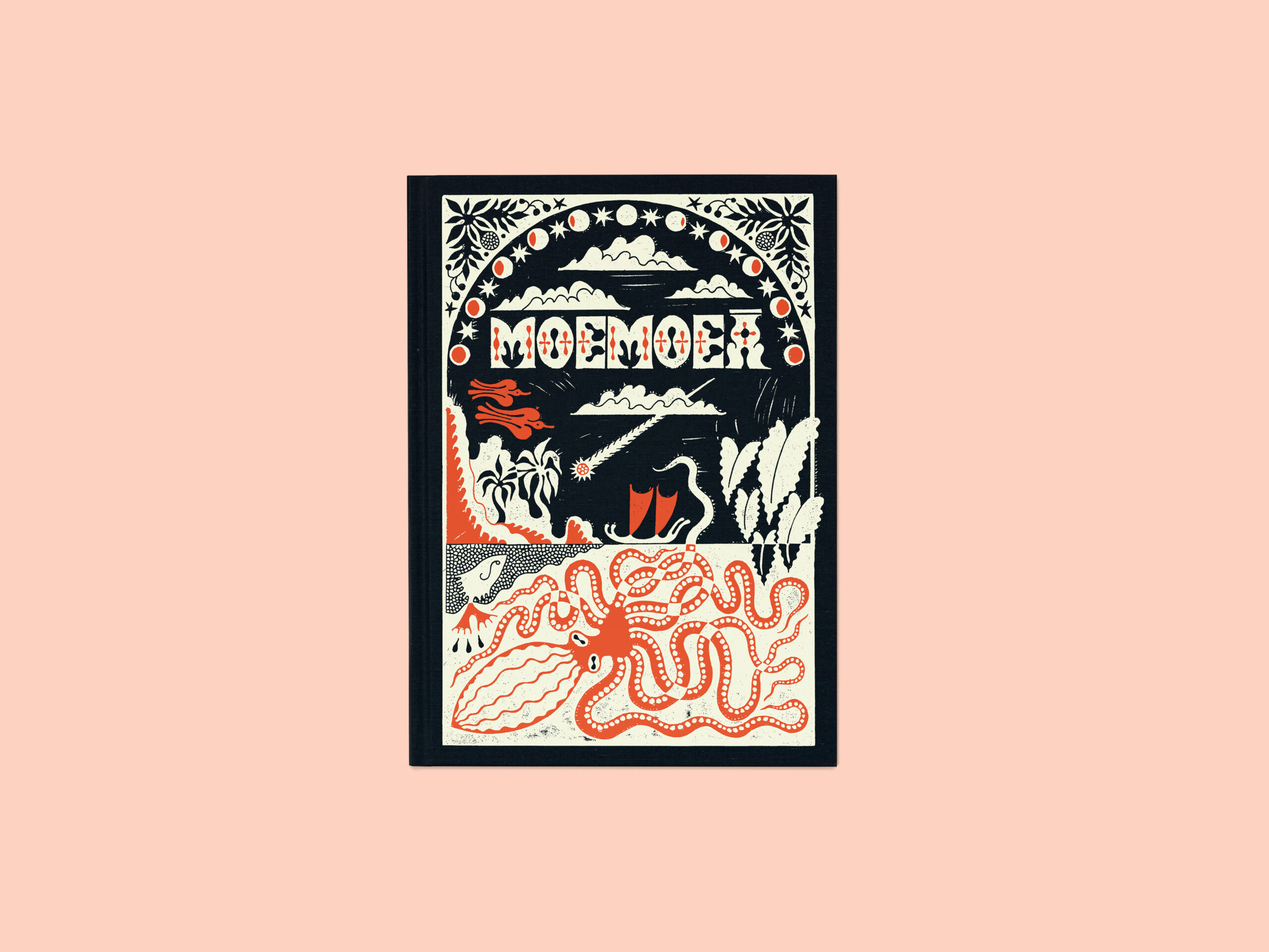
Heidi: You recently published a gorgeous book Moemoeā by Brendan George Ko, along with photography the book included unique type design, illustration, and an essay. What was the essence of creative direction as the photography honors sharing Polynesian knowledge of celestial navigation.
Christina and Jason: When we start a project, I always ask the artist to provide their inspiration as a point of departure for my research rabbit hole on the creative direction. One of Brendan’s inspirations for making this project was a book called Vikings of the Sunrise by Te Rangi Hiroa, so when we started the project I bought a beautiful hardcover copy on eBay. We used the lettering and illustrations from this as a point of departure, alongside a haul books and ephemera we’d recently bought at a used bookshop in Hawaii.
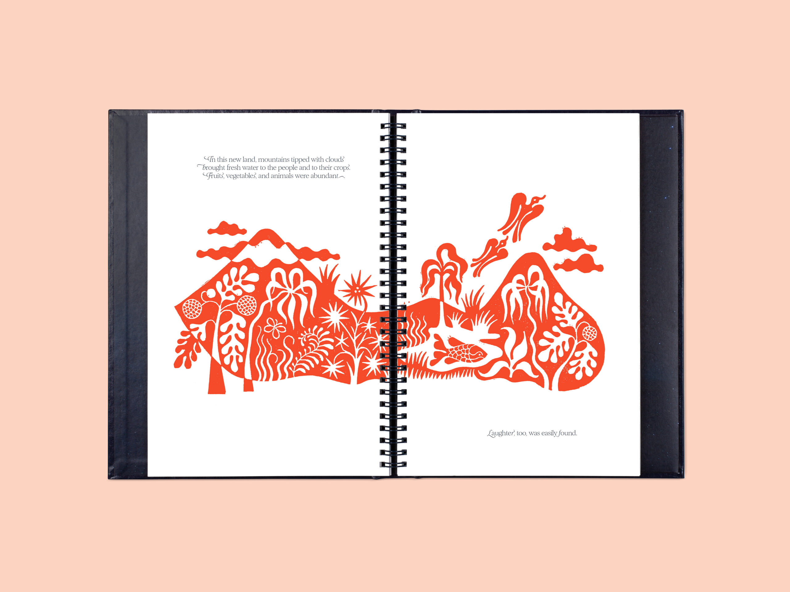
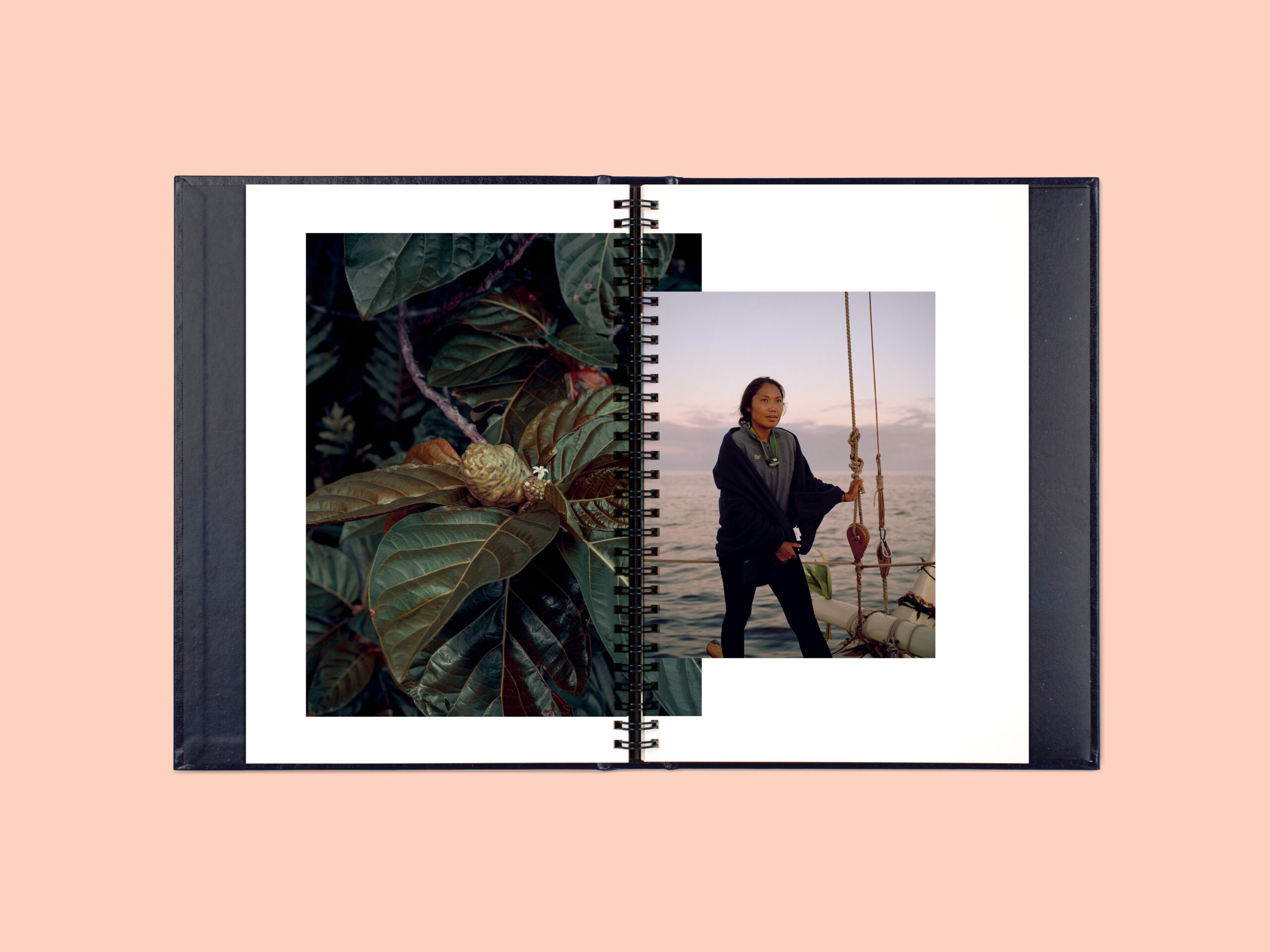
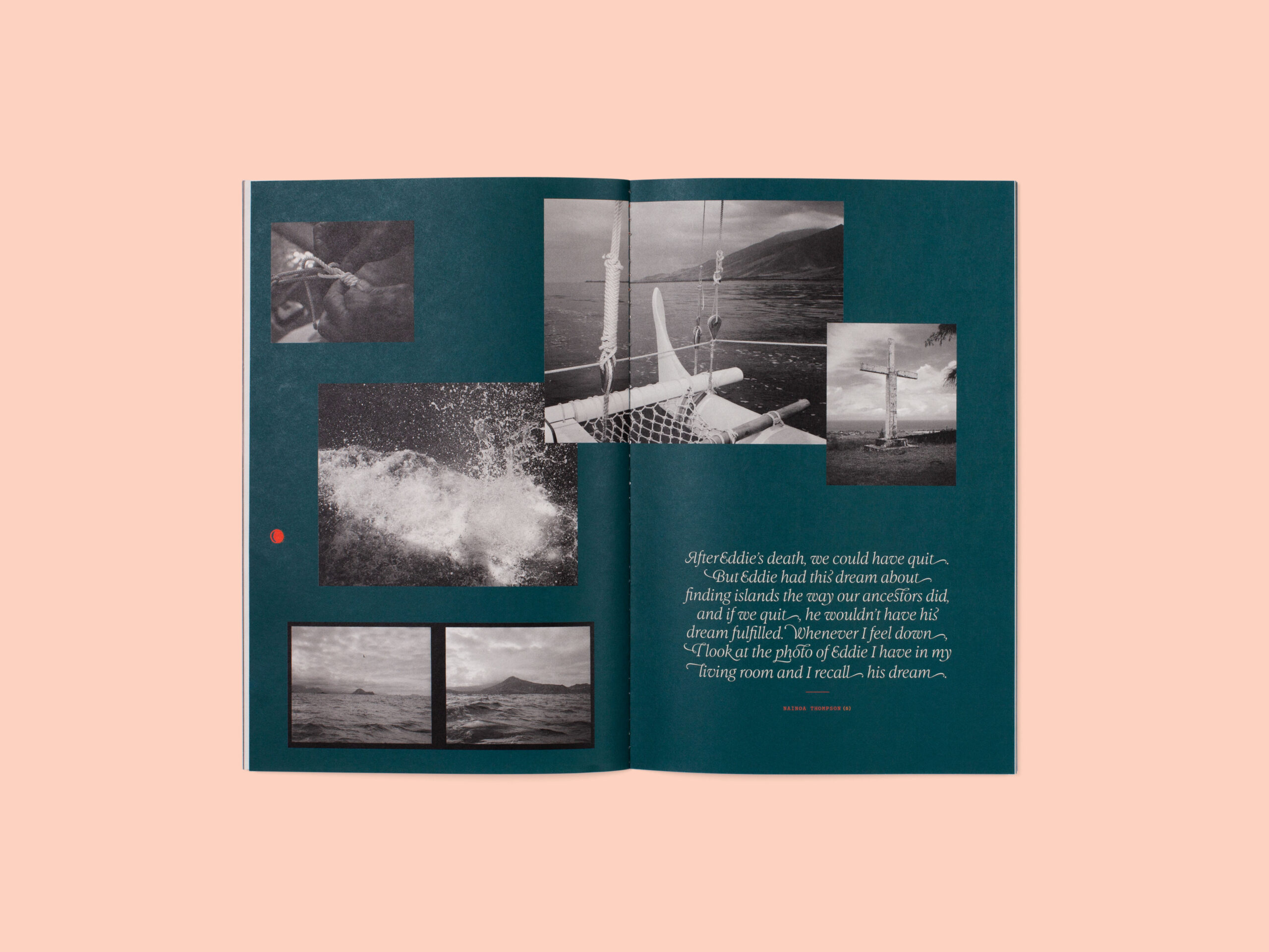
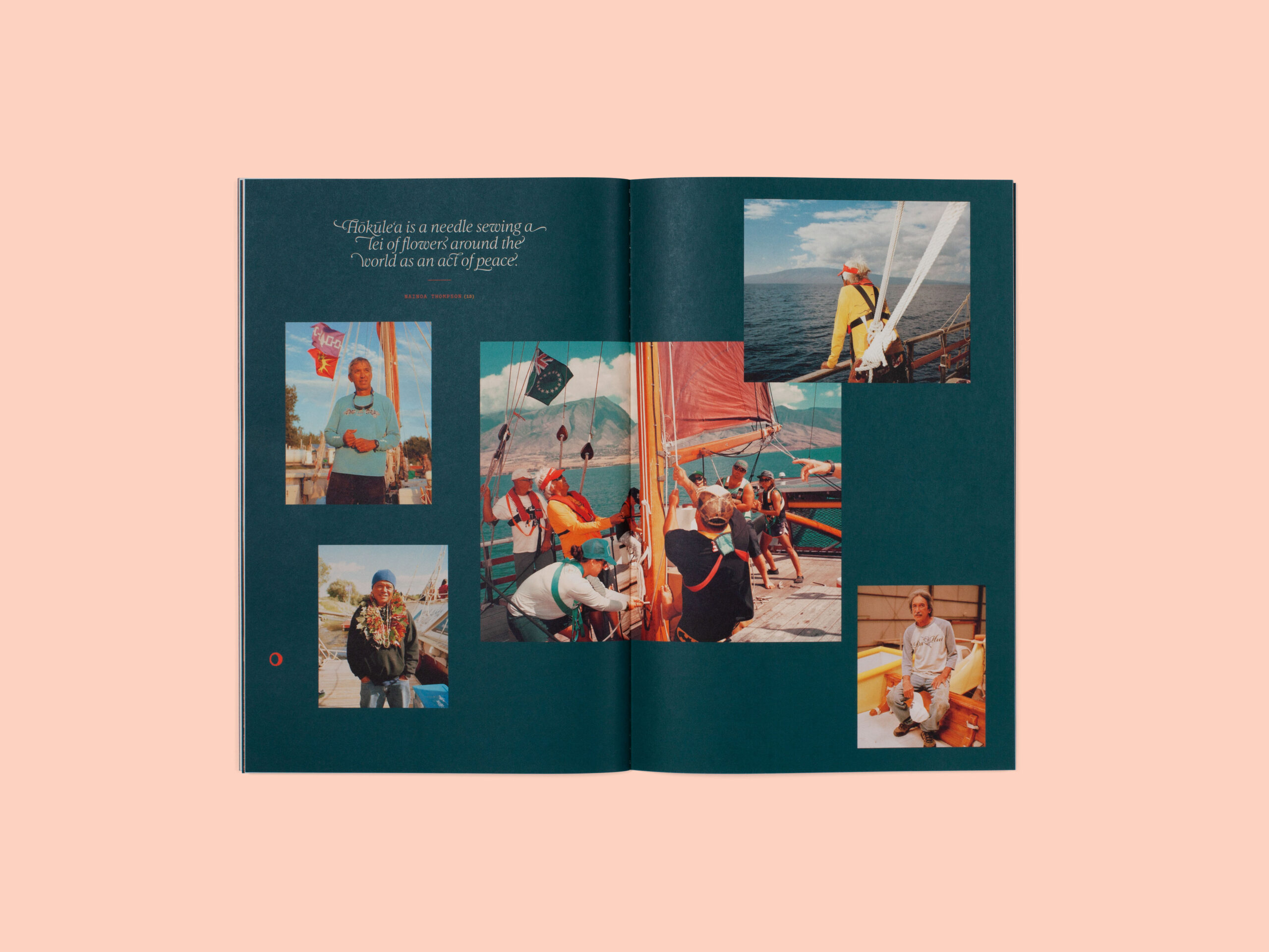
Our designer Elana Schlenker brilliantly suggested that we commission Sophy Hollington—who uses linocut, a relief printmaking process—to create the lettering and illustrations throughout. The geometric patterns on the covers of The Spell and The Story were inspired by Hawaiian tapa designs, a form of printmaking typically made from hand-carved bamboo stamps. In The Story booklet, instead of page numbers we used the phases of the moon to illustrate the passage of time through the book as a nod to celestial navigation and tracking time though natural elements. The illustrations are set in a vibrant vermilion that echoes the color of Hōkūle‘a’s sails and Hawaii’s iron-rich volcanic soil.
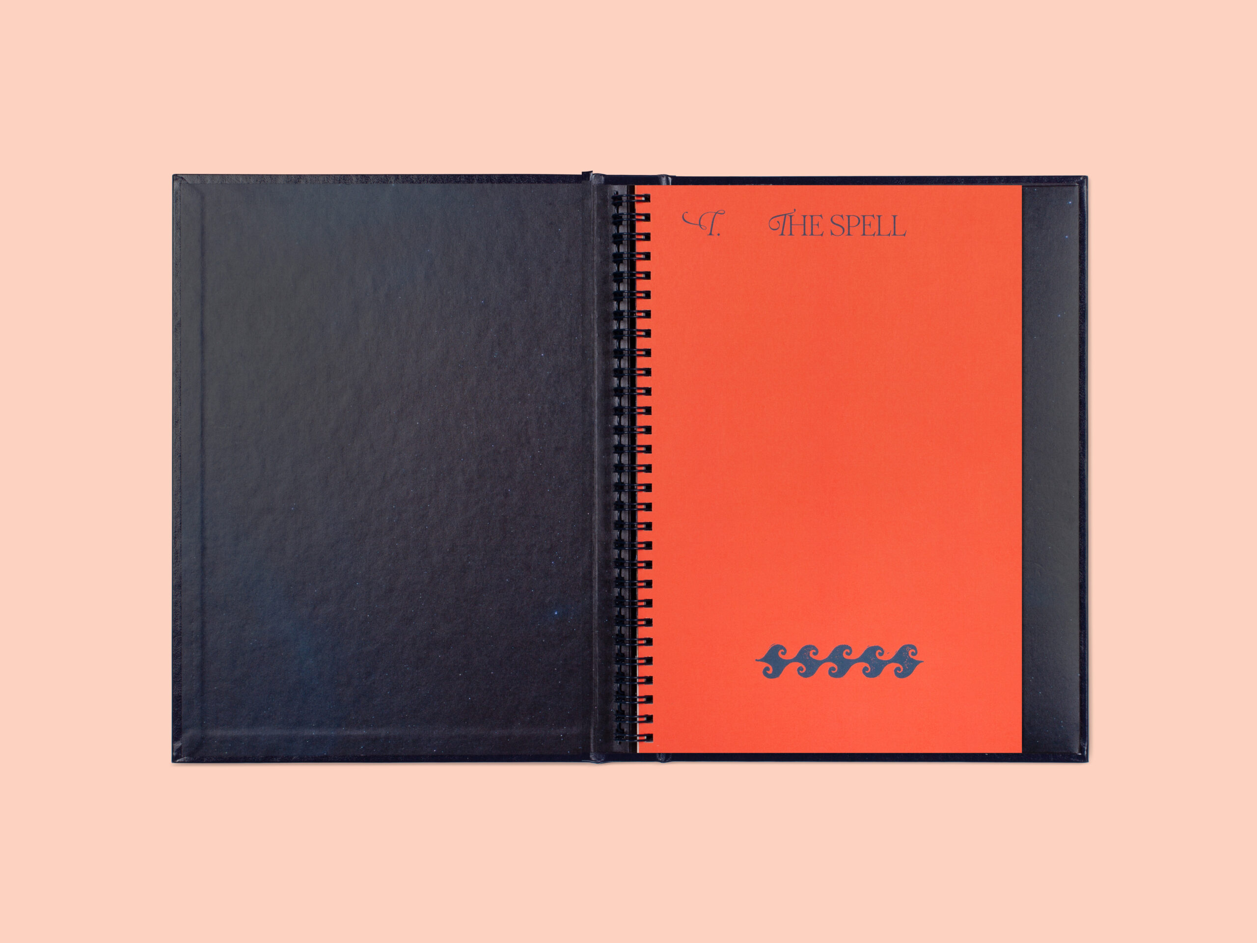
The book includes a wire bound and a singer sewn booklet. Why did you choose these particular binding styles for the two parts The Story and The Spell? From the start, we knew the book would have a hardcover case but wanted to something that felt unique to the project, so we chose to wire bind The Spell to give the feeling of a nautical logbook. Practically, we wanted an option that would lay flat and allow us to occasionally insert iridescent paper stock to emulate the sheen of the ocean’s surface or the night sky.
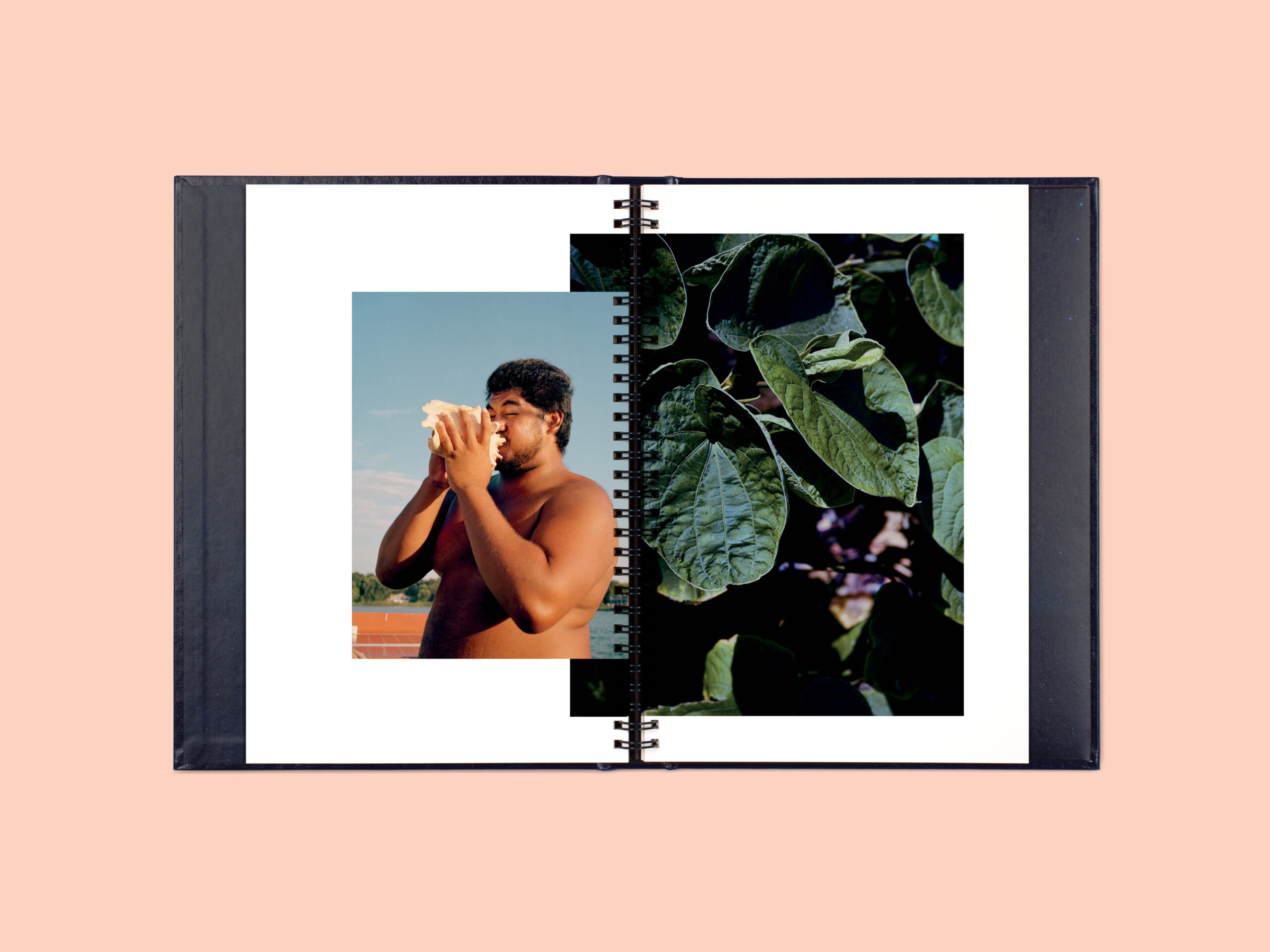
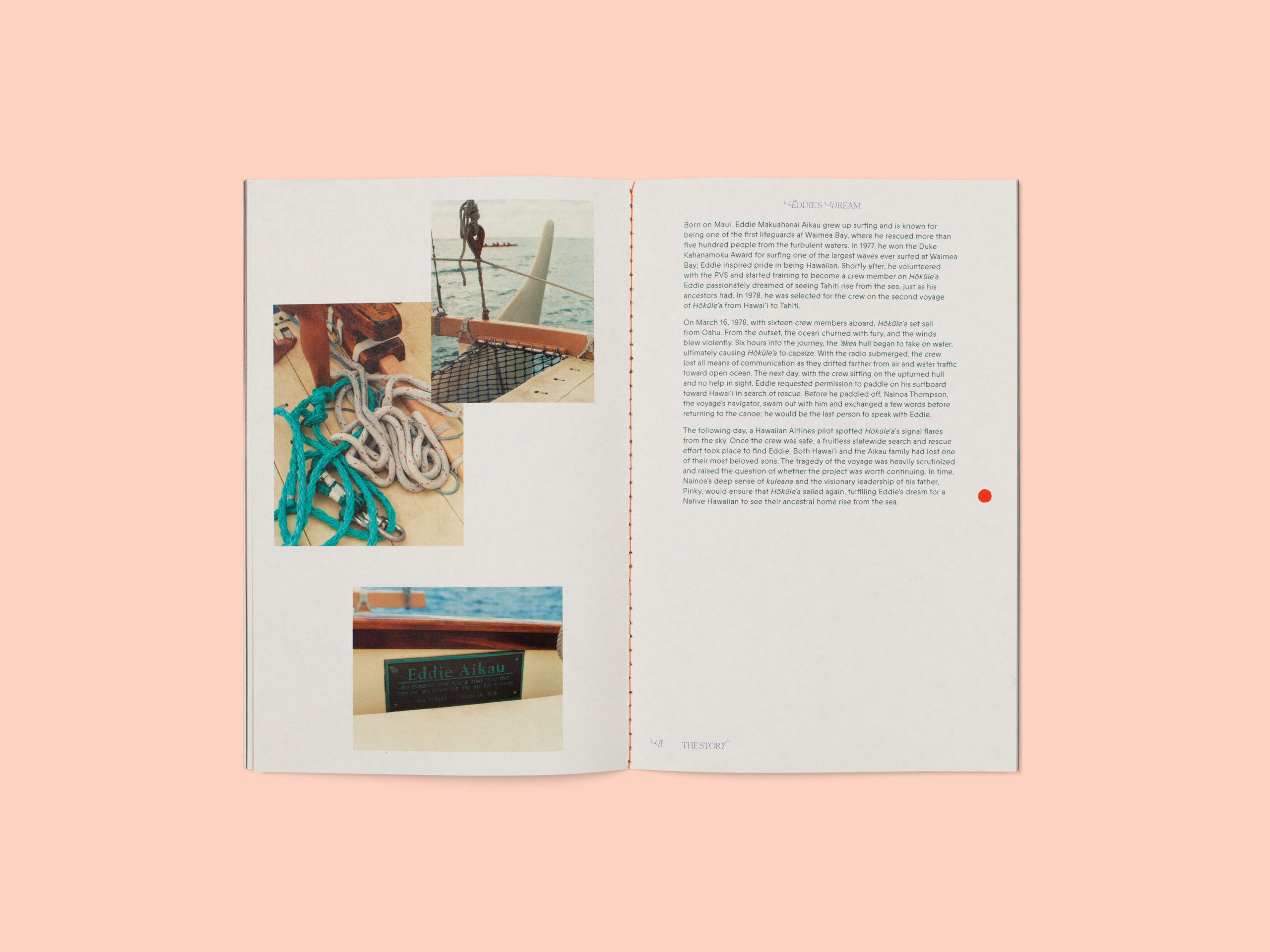
For The Story, the booklet reminds me of a small field guide or scrapbook that provides an objective and historical account after The Spell, which is more of an experiential book. The singer sewn binding allowed us to bring some color into the binding edge and the center spread, it also recalls the color and stitching of Hōkūle‘a’s sail which appear as the opening image.
Roughly, how many books do you create and print annually since you are a bespoke studio honoring craft?
We publish two or three artist books each year in addition to Mercuria, an experimental magazine that explores art and science in chapter form. We typically release one book with an artist we haven’t published before, this takes form in a more ambitious, research-based project that includes significant text and custom design elements. The other books are usually something a little more informal, little to no text, and experimental from one of the artists on our publishing roster.
We went on a bit of a hiatus during the pandemic, it was ideal for reflection and research, but not so great for connecting with our artists, editors, and designers. There is something irreplaceable about in-person design meetings, creative brainstorming, pulling out all the material swatches, and reviewing proofs and prototypes together.
In retrospect, the long pause was beneficial because I allowed myself to embrace the fact that I work slowly. I put a lot of time and thought into each project, when there are a lot of events I feel the pressure to launch new things, but once you publish something it’s forever. Our books will outlive us in libraries and collections, so it’s important that I feel happy with it, and most importantly that it represents the artist’s project in the best possible way. This was the case with Moemoeā, which slowed pace during the pandemic and ultimately took an extra two years because we wanted to commission an essay to include historical and cultural context, we also added a lot of extra production embellishments. In the end, I’m so happy we waited until it felt completely right.
Same Sum is a lovely interactive book full of surprises, what were the challenges with the unique shuffling of the sequences?
It was a really strange experience to try and sequence a book that would also be sequenced by both the reader and by chance as every shuffle and flip-though is bound to be different. It started with the initial edit, narrowing it down to 120 photographs from 400. I find that as an editor you become really familiar with a photographer’s patterns, compositions, and motifs, you start to see how they experience the world through their camera and then present that to the reader. The edit embraces the patterns I find in Peters photographs and lay the groundwork for the reader to make their own connections between images. For example, many images have a central circle or strong angles in the composition, certain pops of color that resonate, a repeated spiral theme, or very similar images made moments apart that occur several times on different panels of the book. It seems random, but it was very considered.
The challenge came when we started to print proofs and prototypes, after I finished a sequence we would immediately print and bind it because it wasn’t possible to experience it on screen, no matter how much we mocked it up to mimic the real thing. We went through five or six rounds of sequencing this way: revise, print, bind, flip, repeat. When we were on press with the final, there were still surprises that popped up from the fact that one book was bound on the left, the other on the right, which shuffled the images further and blew our mind a bit.
What inspired this type of book?
When Peter pitched this project to me, it included 400+ photographs culled from his daily life that were both mundane and magical. He’d experimented with different ways of installing them and was curious if we could make a book from the project. When we begin a new book, the artist fills out a questionnaire—brilliantly created by our long-time collaborator Liz Sales for I Write Artist Statements—so we can identify the themes at the heart of the project before putting together a design proposal. In describing the project, he said “I’ve never been able to effectively lay out the entire deck, extras are always left in small bundles on the table, so while every picture is tangibly together the contents of all pictures are not visible. In this way, the project feels like an epic deck of cards that can never be fully dealt.”
From that moment, I knew I wanted to nod to magic tricks and a card deck, there is a certain sleight of hand that goes into framing and photographing. I also liked how he described the process as a cycle of practice and playing feeding off one another, this made me think of spiral binding and the double-bound format was inspired in part by Amber Gambler by Dylan Nelson.
We published Peter’s debut monograph Half Wild, so I knew this could be a more playful sequel since our audience was already familiar with his work. I also knew that he would be open to experiment with format so long as it doesn’t distract from the heart of the project or the photographs—a principle that is important in all of our publications.
How does the digital age intersect with your work?
The digital age is what makes this all possible, from the Indigo (our digital offset press, which allows us to print books essentially on demand) to social media for sharing our projects or collaborating remotely with artists and contributors. But it does feel like the hours are spent on the screen are endless and never enough, from answering emails, designing books, researching projects, and documenting our work (studio photography and a lot of retouching). We have an amazing team, but we are also still a small studio, so we are hands-on with all aspects!
I think this affects our personal life in that we are drawn to activities that don’t revolve around the screen, our weekends or travels revolve around being immersed in nature or the studio. Our personal studio practices have also evolved away from digital; our foundation is in photography and even though we both shoot film, there is so much time spent on screen from scanning and retouching to designing books or installation ideas. We find ourselves exploring other more tactile and meditative mediums—woodworking for Jason, watercolor and natural pigments for myself—and also thinking about how they can intersect with photography, for example experimenting with custom frames, different materials, and installation ideas.
How has your own artistic background informed your practices at Conveyor Studio?
In a way, my personal practice and my Conveyor Studio practice are so interwoven that it’s sometimes hard to distinguish, they continue to constantly inform one another. When we opened the studio I was just starting the MFA Photography program at Parsons and only beginning to find the direction of my own art practice. Simultaneously, we started experimenting with publishing and started Conveyor magazine, it was my first experience with editing and curating yet it felt really natural. This idea of arranging started to trickle into my personal work which takes form in installations and artist books that mix of images and text, curated from archives and my own writing and photographs. Whenever I start a new project, I inherently think about it in book format, from scale to tactile and temporal experience.
It happens with research topics too, at some point I became very interested in both science and the metaphysical, so naturally the themes for each issue of Conveyor magazine began to reflect similar topics like Alchemy and Time Travel. This continues even further with Mercuria, which explores art and science and is mercurial in format. I wanted the ability to play with the design and format of each booklet, not fit each issue into the same mold. The next volume is going to have the theme of Botany, which is currently a main focus in my own research. I like to think that if I’m going into it with a lot of passion and excitement, it will reflect and spread to the readers.
I also find that design commissions and our publishing projects, even though they aren’t explicitly my personal work, for experimentation and collaborations that are inspiring. I’m lucky in that I get to choose both my design clients and the projects we publish, and usually there is some kind of overlap in areas of research or interest so that I both learn something from their work and can also bring a uniquely, informed element to their book.
As artists, what compelled you to have a studio that celebrates print?
Jason trained as a darkroom and digital printer at Lightwork while studying at Syracuse. He has an extensive knowledge of color management, this combined with his family’s longstanding history in book design and production in the New York City area, started to carve a clear path toward print. In addition to photography, I studied graphic design and art history, which all lend quite well to publishing.
We started Conveyor Studio in a small annex in the book printing and binding factory in Hoboken, New Jersey. Initially, we were just tapping the resources available to us and dove headfirst into printing, publishing, and even curating exhibitions in the space. In the beginning, it was as much about building a community of artists as it was a love of print, and amazingly those things have just continued to grow together over the last decade.