
New York Magazine
Design Director: Thomas Alberty
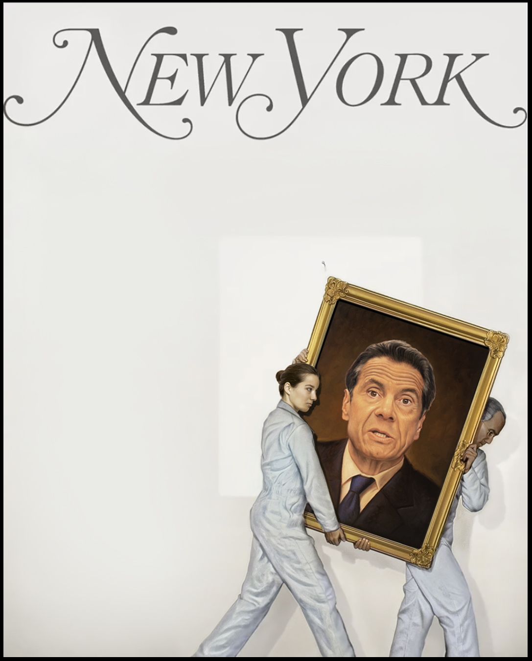
Illustrator: Tim O’Brien
Heidi: Were you aware they were not going to run cover lines or was that a surprise and a testament to the power of art?
I initially worked up a very quick comp, which was e-mailed back with a size adjustment and some minimal type. I don’t really focus on type unless a client has a ton of type to deal with and needs me to know, to provide more area for it. I do think that minimal type with a strong visual can make a cover more powerful, but a clever tag also adds to the art at times. A story has to be fully understood, so universally known to be able to run without type. I do not know the decision making in this instance but am glad it ran without type, of course.
How did this idea come about?
The prompt was that Cuomo may be leaving, and it is the end of a dynasty. The initial sketch had a Mario Cuomo element. Quickly it became about a resignation that already will have happened, so that was likely a more significant point to cover as a cover story. Had the story started a resignation, perhaps this image might not have happened. It is a story of leaving, of ending, of removal, of vanishing. Visual analogies based on this premise would have been a starting point. Removing a portrait from a wall meant as an honor is quite a demotion. Naturally, a formal portrait would have a full upper torso involved, but to get Cuomo’s head bigger for a quick audience read, it had to come in closer.
How much iteration did you do from your first sketch?
This was a fast-paced situation, so it was pretty streamlined. Usually, a client needs to see a few approaches, but when something is fluid, and a quick sketch starts the conversation, we needed to build a boat while paddling.
Is this your first time working on a dynamic political situation/assignment?
No, I’ve been an illustrator for over 30 years. I’ve done covers for New York Magazine for a few decades now and many covers of magazines, most notably over 30 time covers, including the Bin Laden X cover and the Trump underwater series.
How does photography influence your work? or what other creative outlets do you have aside from your illustration work?
As a student, to get photo-reference, I was trained as a photographer. I really don’t follow other realist illustrators, though I admire and respect their work. I tend to look for problem solvers and those with the ability to create evocative, poignant moments. This is often photography. Robert Frank was an early influence. To be very honest, working with talented art directors has taught me so much about image placement and how to pare down an idea to essential elements. I’m always a student.
Is your work space quiet or filled with the news and music in the background?
If I am doing sketches or reading a manuscript, I need the silence of music without words. However, once I start doing the final art, I often listen to the news as it is happening, or listen to music or binge-watch things I’ve seen before, so I don’t have to look at the screen.
Tell us about your collaborations
As for collaboration, several years ago, I had a mid-career retrospective of my work at a local university. It was a nice honor, but in doing its curation, I began to really recognize that almost all of the work came from a talented art director who reached out. Some of the ideas were mine, some were from all these creators, and I really could see just how much of my career highlights is owed to working with others. I get to take a few bows here and there, but it is a collaboration that is the key to my longevity. These client platforms raise the art to a level that makes the pieces more meaningful. A TIME or New York Magazine logo drives home the poignancy.
For this project, I worked with New York Magazine’s Design Director, Thomas Alberty.