
The Red Cat and Other Stories
Photographer: Ritesh Uttamchandani
Heidi: Your images were recently in Shifting City, an exhibition that has been adapted in nine cities across the world that are considered ‘arrival cities’. The Red Cat and Other Stories had some of the same images, tell us about the cross over.
Ritesh: Kaiwan Mehta, the curator, gave us a brief related to the Arrived In City. In very simple words: A city where everything is kinda there, for whatever it is you wish to achieve or do; all you have to do is show up. I realized that my work on the city isn’t just looking at that aspect but I have also been chronicling the rapid expansion of the city, both in physical and mental terms. It evoked memories of the time I moved, and the mental jolt I got on seeing the socio-cultural differences. It made me think of all the conversations I have had with people I know that have shifted along with the city.
For curation I did a mammoth archive dive. I pulled out all my iphone images that went into the book, all the rejects that didn’t make it to the book and tossed them around. Over repeated edits and since I am one of those photographers who makes photos everyday, I added the new material made in the month and half leading up to the show. Final stage edit was done jointly with Kaiwan. One of my biggest takeaways, apart from many others, is his use of variants of a single image, akin to repetition. I always thought that repetition was simply a tool in writing, a figure of speech, but when done with images its quite fantastic!
What did you hope the viewer felt?
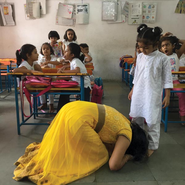
The ultimate goal of my work is empathy and introspection. And they both work in tandem. Of course, I can’t really control what people feel so some viewers found it largely entertaining, some found the pictures to be a celebration of the absolute banal and hence very relatable. Most importantly I wanted people to read the photos and enquire within instead of expecting simplified captions. The whole series also aspires to incite curiosity. Life in the city is so hard, we barely get time to reflect or be curious about anything besides the fulfillment of one’s basic needs.
Were all the images in the book and the show shot with your iphone? if so why?
in 2014 I began using the phone camera extensively, in the square format. In the process, I learnt that am a very different photographer on the phone and it began impacting the way I deal with the city and country. The phone camera is the camera of today, our generation, and what better way to chronicle and display a lived-in experience of my spaces. The phone allowed me to have a citizen like eye instead of being all professional about it.
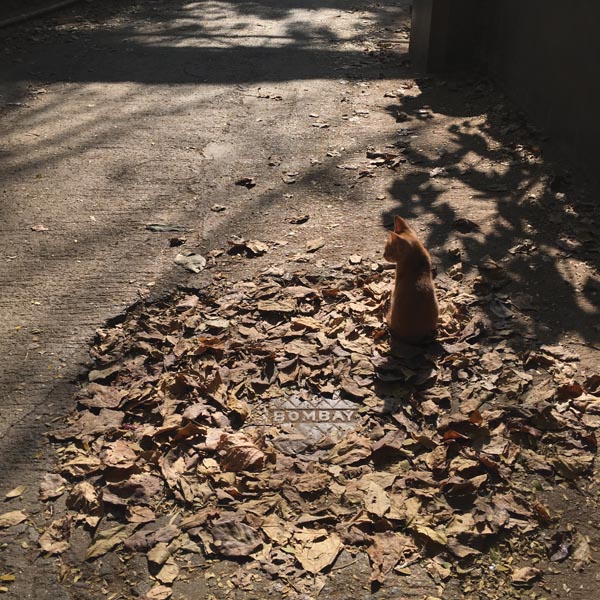
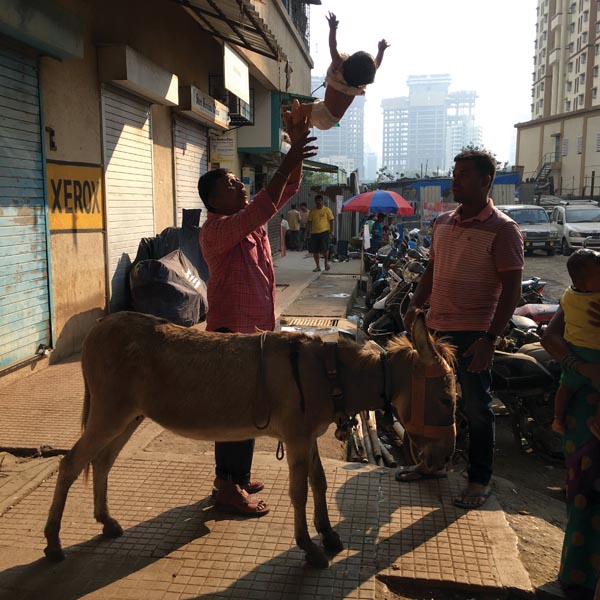
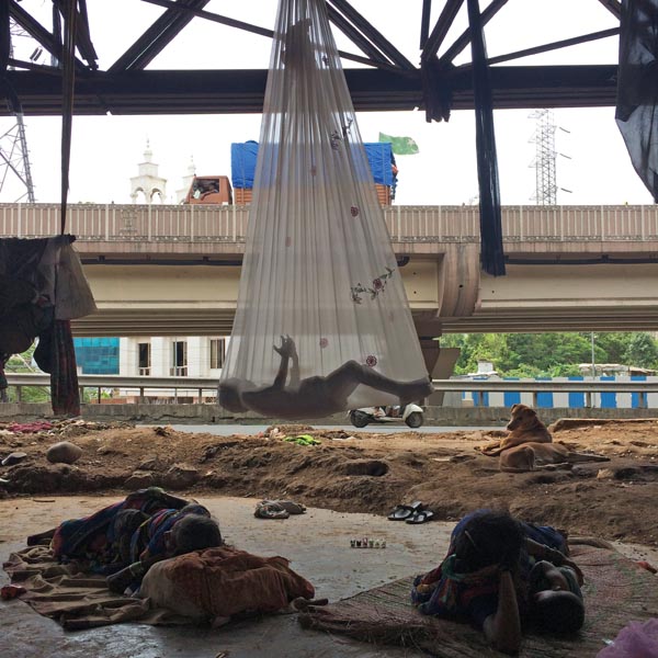
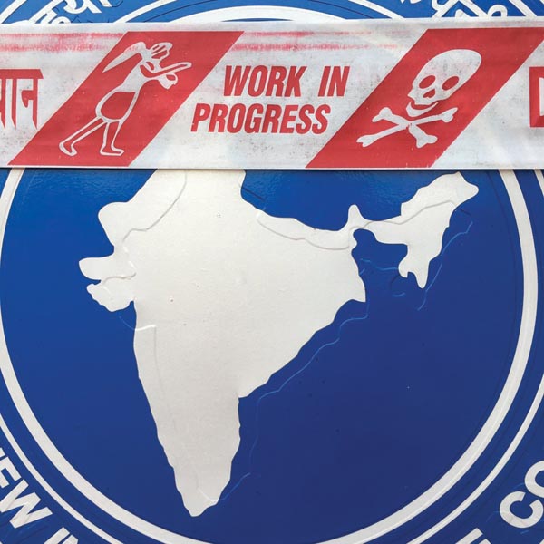
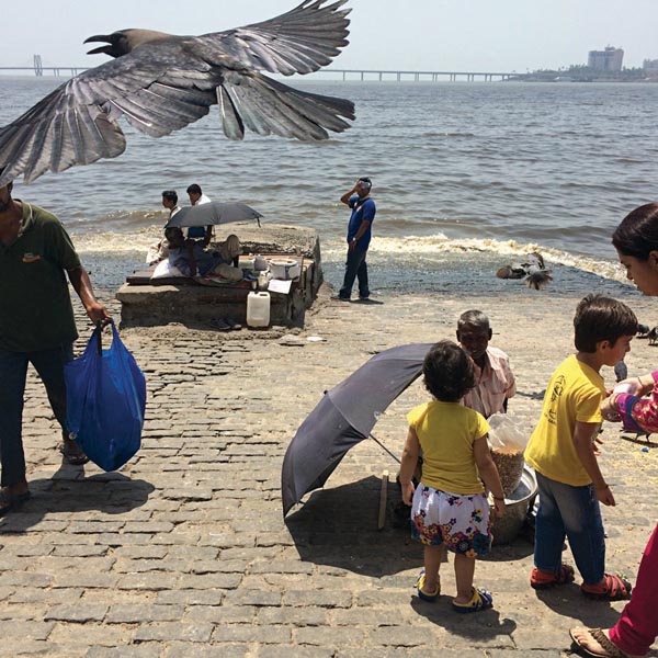
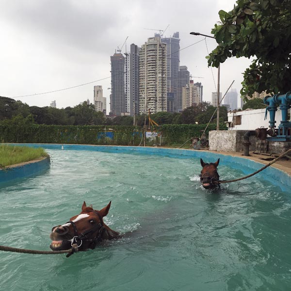
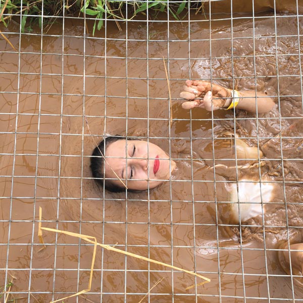
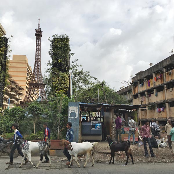
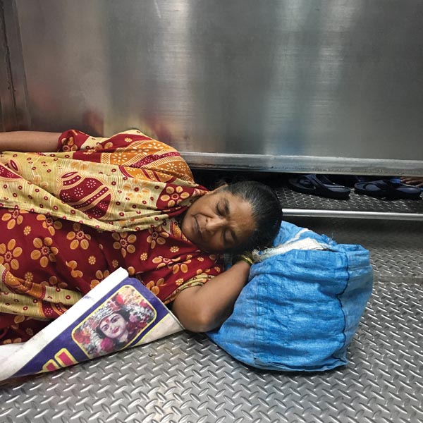
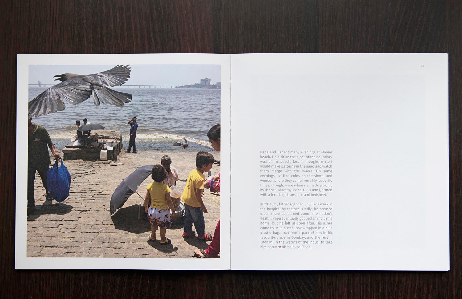
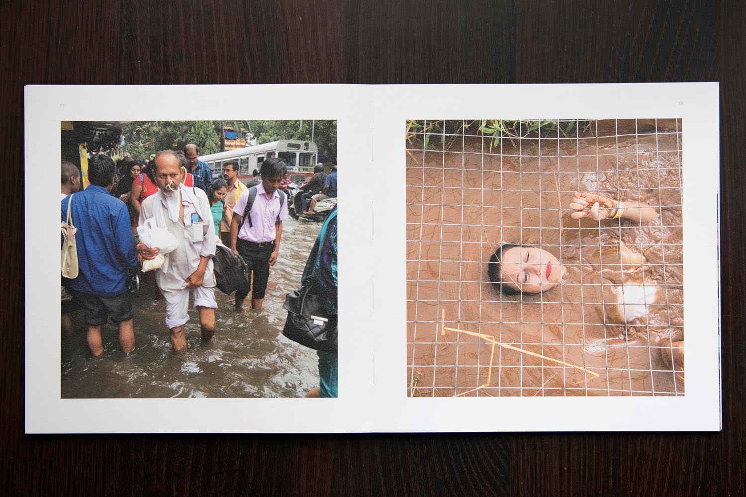
It’s true the work is serious and heavy at times, but just like life, I am very drawn towards a certain irony in images. And India, gets a short stick on that end. People have for years photographed it in extreme ways, too much colour, too beautiful, or too poor, too tough a place. I am quite fatigued by the cliched images of lovers on Marine Drive, crowds at the Gateway, south Bombay charm etc. Landscapes so imposing that everything else in the photograph is elevated too. As a response to this tedium, I self-published a photo book last year called The Red Cat and Other Stories in which I linked a Sindhi fable my mother told me when I was younger and my way of seeing the city which I feel now, after all these years of carrying multiple and confusing burdens of influences, is inspired more by these little fables and folk stories. My goal was to create the most un-Bombay book on the island city as I can. Hence I focus largely on the suburbs, arriving at a balance of sorts in terms of representation of class and landscape.
How long did the book take to shoot?
The book took four years, from conception on a May afternoon in 2014, till going to press in May of 2018.
Tell us about the title
The book was initially titled Ghar, meaning home, and as it developed I felt the title didn’t do justice. There are 16 stories of grit, of survival, of successes and failures that lead up to the Red Cat fable at the end of the book, where the protagonist is a young 17 year old, hence The Red Cat and Other Stories.
What font is in the title of the book?
The font is specially designed by Sabeena Karnik, who merged the handwriting styles of my 2 elder sisters Shirley and Sonia and for my name I used a font called Metropolis. If not for my sisters I would not be in a position to pursue my dreams. If not for my parents, and my father’s dogged fight to live in Bombay, we’d be in some small town and I’d probably have a corporate job. The book is an ode to that very fact that we are never self made. Everything is a collective effort and it is true for a city like ours. No one can fulfill their dreams on their own, everybody needs a Red Cat.
How did you decide on that binding?
The binding was a last minute decision fueled by an accident. The printer, sent me the final dummy and after one day the cover began to drift away from the book, exposing its spine. At first I got mad but then I was drawn to its bareness. I anyways wanted the book to have some elements that are like a lot of the city’s structures. How often do we come across a beautiful building or a home and when we go to its side we see a chaotic network of pipes and wires. I also wanted a sense of fragility, like some of our inter-personal relationships, one wrong word or action that is misinterpreted brings to collapse years of knowing someone. It happens with all of us.
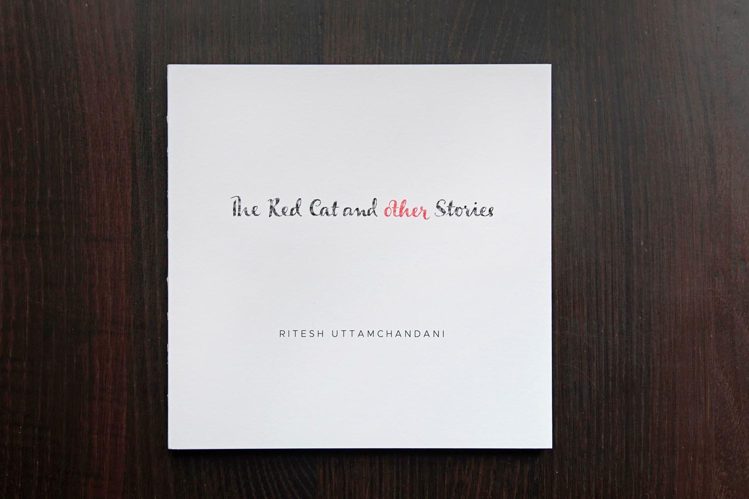
No image on the book cover, why?
For the cover too, I kept it simple. I don’t want a reader to know this is a photobook. Its simply a book with photos and text! So, because of its whiteness, if you leave the book on a coffee table, there are bound to be stains, handle it roughly and it threatens to come apart. A day before printing, I reduced the paper weight from 130 gsm to 100 as well, for I wanted a certain see through to happen. Sacrilege, felt my photographer friends and the process co-ordinator at Pragati Offset. But if you hold up certain pages against a source of light, two images merge to make a third. Like life, many things happen at once, overlapping. The printer thought am being stupid or just cutting costs, but trust me, it only looks fragile, it is pretty sturdy.
Over the last year, I came across many readers who have done interesting things with it. One man wrapped it in a beautiful hand-spun cloth from his village and kept it in his safe as a gift for 4 year old son when he turns 18. Some others have refused to let go of the bubble wrap envelope that I had used to pack it. Some have simply kept it locked inside their cupboards instead of their bookshelves. Some books are beautifully personalized by food, pickle or tea stains.
How did the book push you creatively?
The book tested my patience at all levels. Whether it was design, production or tracking of couriers. At every stage, it demanded patience of ginormous amounts! I taught myself the basics of Indesign, binding, understanding page counts to minimize wastage etc etc. As a photographer I lead a pretty sheltered life. Chasing stories, getting published and drawing a salary. And when one is doing news pictures for a long time, a false sense of superiority or a strange unreasonable dismissal of anything but news pictures had set in. So, self publishing a book, in India, when one is freelance, is like harakiri for such thoughts as well! Every step is twice as tough without institutional backing.
With regards to narrative, I knew the things I wanted to avoid. So it simply became a process of exclusion. I revisited several places to better some of the photos, one place I visited seven different times spread across two years. I was no longer chasing the perfect light, or form or anything that makes a photograph come across more dramatic than it already is. I had about 98 versions of Ghar till I abandoned that narrative and changed its name followed by 40 odd versions of The Red Cat and Other Stories. I showed the book to some photographers but I found their feedback limiting
How did you decide about the text and was there a through line in all the interviews?
I was pretty sure about having text in the book; it simply shaped up as I went along. The layout for the spreads was also quite fun. If one sits and puts together all the text columns of the book on a single page, they resemble a city skyline. The gap between some words is more, some less, for a reason. Like houses in the city, some have a single room, some have 2 room houses and so on. To the uninitiated it might seem like one giant mistake.
Why are some words in red in the text?
In addition, There are some words in red ink though that one has to join up and construct a sentence which is the last line of the Red Cat fable. This allowed me two things, one that I can keep the story open ended if the viewer does not wish to join the words. Second, its a game of sorts and you can involve kids too. A lot of photobooks alienate kids and senior citizens. They don’t set out to, but the chunky design and/or choice of topic manages to. For the same reason, I junked the hardcover and made a semi soft cover which allowed me to make gatefolds that contain short, succinct and often suggestive captions for the images. This way, you don’t have to go all the way back to some Index page. Stay with the narration and simply open the gatefold to know more.
How has your perspective of the city changed?
Change is too severe a word. Its just transformed a bit for the better. Made me a whole lot more sensitive than I was towards it. I think, that is a really good thing for its very easy to fall prey to extreme emotions here.