Wired
Design Director: Ivylise Simones
Photography Director: Anna Goldwater Alexander
Photo Editor: Amy Silverman
Art Director: Ben Bours
Photographer: Nik Mirus
Heidi: Tell us about the sets.
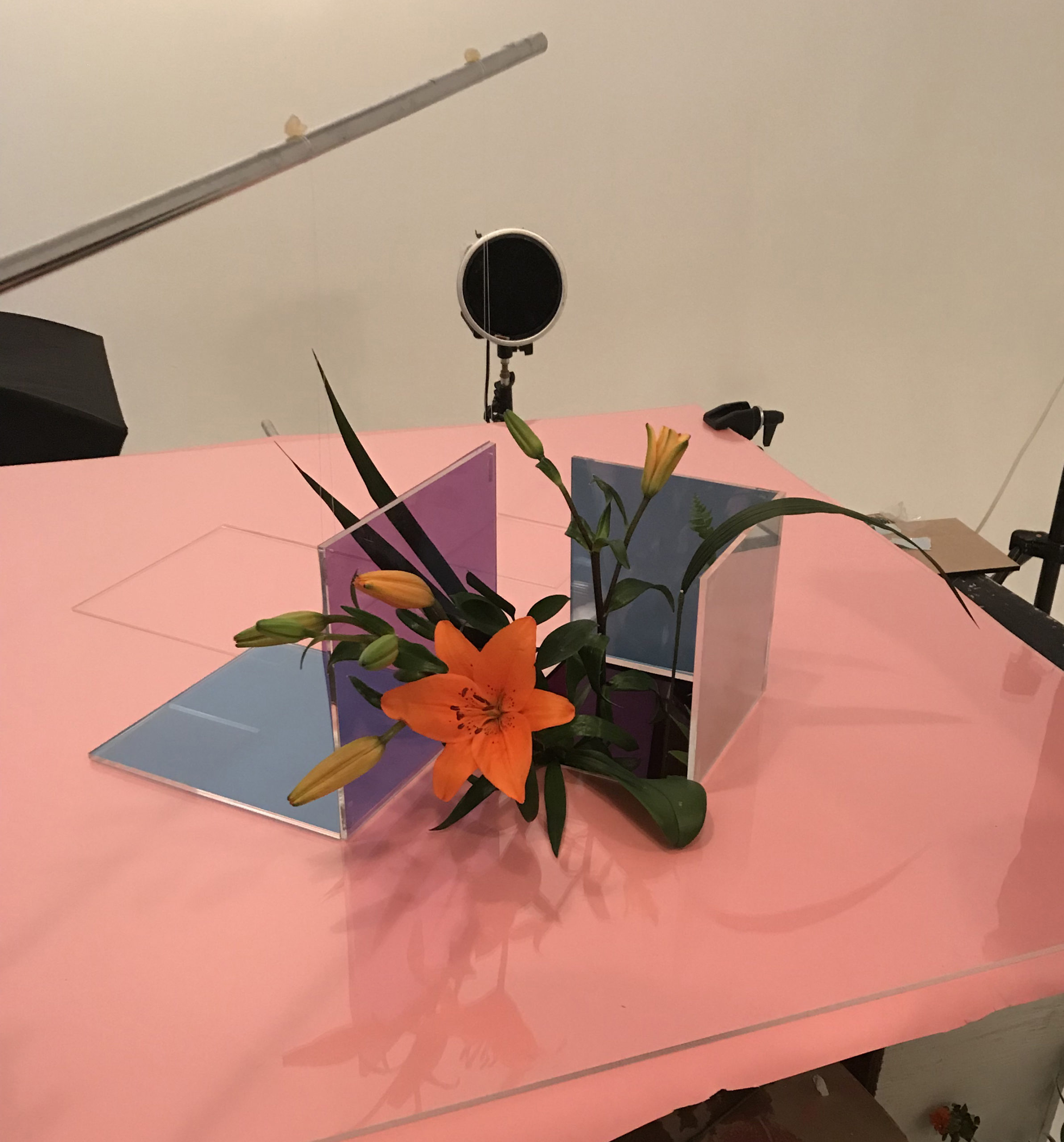
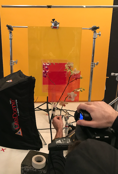
Amy:The sets were made from pieces of plexiglass with colored paper or gels placed on them. We worked with a flat sheet of plexi with various colors of paper under it and then they placed the squares that were upright for each individual shot
What was the evolution of this idea, did it start one way and then evolve?
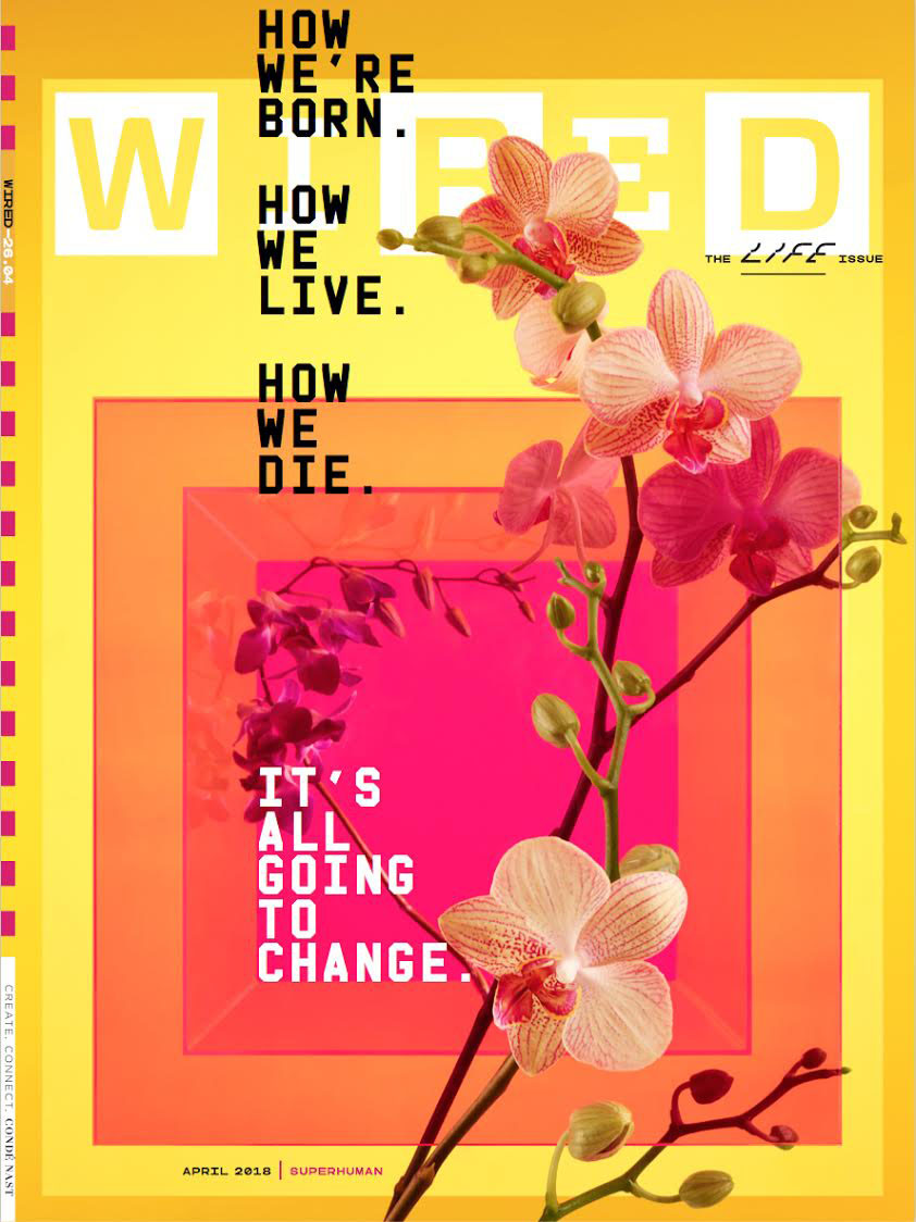
We started with a few different ideas- and i have to say this is one of the most collaborative issues I’ve ever worked on. We knew we were doing a special “life issue” broken down into various stages of one’s life (but including pre-birth and post-death). So the art department met a lot to talk about various ideas that were photo based and illustration based. We all brought ideas to the meetings with reference photos from different artists and across different styles. Eventually, art directors Ben Bours and Mike Ley put together a beautiful presentation for our editors that went through 3 different possible approaches we had agreed on. We called them Organic, Cellular, and Discovery and Decline. Each treatment had its own fonts and artists and colors associated with it. All focused on progression and stages and metamorphosis. When you are thinking about life and death it’s hard to avoid well worn metaphors so we decided to embrace them. Eventually we decided we wanted to use a photographic approach, our “organic” treatment. Our creative director, David Moretti, who left WIRED right as we were shooting, was excited about using flowers as a way to show the stages.
How long did they take to build?
We shot the cover plus the four chapter openers over two days. the cover taking most of one of those days. So to place the flowers and the evolving structure took only a couple hours for each shot because we had sketched it out and had a very clear idea of how each page would look.
How did you decide on what flowers to use?
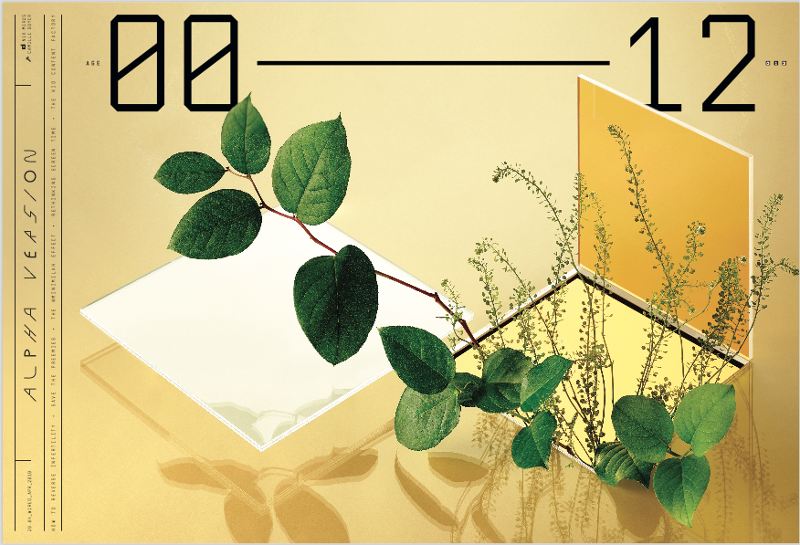
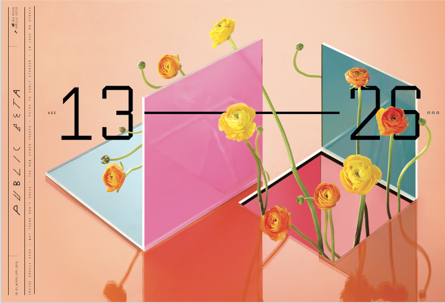
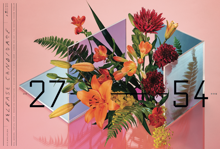
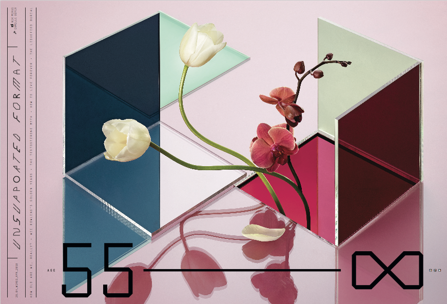
Flowers were chosen for each stage of life based on their shape and color and the state of their flowering. We wanted it to feel like it was becoming more lush and complex as it went through the stages and then becoming more pared down in the final stage. The first stage 00-12 was elemental/simple shapes and not a lot of colors- no flowers, just hints of buds. 13-26 we really wanted to be about these simple flowers beginning to bloom- as well as the colors being bright and vibrant. 27-54 we wanted to be the most complex- referencing fullness of life and social networks- we brought in the most flowers here making it more lush, overflowing, bursting forth with more saturated colors. 55-death and beyond we wanted to circle back around to less complex shapes and colors and to bring in the idea of decline. We also grafted an orchid onto a tulip as a nod to science and the extended possibilities afforded to us through science and technology.
The cover was an encapsulation of this idea of progress/evolution/layers. We were trying to contain all of the chapter openers into one idea. The orchid felt like a natural choice here- with it’s intricate/complex shapes and as a reference to vitality. We wanted it to feel very alive and moving its way through different layers.
What direction did you give to the photographer?
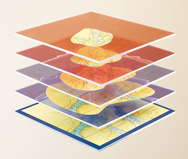
As soon as we decided to go the photographic route, we got the photographer on board to bring his ideas into it. Nik had shot for WIRED once before and we loved his approach. He had a previous project that we looked at because it combined materials that felt futuristic with something that is somewhat timeless- maps. We went to him with the idea of the organic (flowers) and the use of the layers of plexi or some material that spoke to structure and technology. There were many discussions back and forth with sketches and reference pictures. We knew we wanted certain elements- transparency, layers, playing with optical illusions. We knew we wanted to use real flowers and build most of the effects in studio so that you see real shadows and reflections. We also knew we wanted the evolution to occur on various levels- so the changes are happening with the plexi structure that becomes more complex throughout, the colors loosely going from light to dark/summer to winter, and the placement of the text on the page moving as well. Nik has a set designer that he works with very closely, Camille Boyer, who was in all the meetings and had great ideas about how we could create shapes with the plexi and what kinds of flowers we might use. Especially for the cover- Camille suggested using a box with a layer of plexi in front of it that we could shoot into creating a really nice depth and the super vibrant colors.