There are more photo-books out there than ever before.
The market has proliferated, with the advent of crowdfunding, and publishers who will make you a book if you’ll pay their fee.
So if you’re planning on joining the crowd, I’d recommend you ask yourself a few questions first.
Why do I think my work needs to exist in book form?
Who is the potential audience?
Why will it be necessary for people to buy it?
Occasionally, I like to get you guys thinking about the reasons behind this photo-book industry I cover each week. By now, my tastes are well established, if broad.
One week, I’m praising pictures from the 19th Century, and the high quality of the packaging in which they’re presented. The next week, I’ll big up a little ‘zine that looks like it was made by some very talented teen-agers.
Any type of book can be excellent, if it gets the right balance of content, form, and intentionality. And I’ve interviewed several artists who prefer books, for their permanence, to exhibitions, which are ephemeral.
I love a good show, myself, because it allows scale to become a far more valuable element. Just as people go to the movies to see things on the “really” big screen, I like that in museums, I can see paintings that are 40 feet long, or photographs 8 feet high.
The book’s strength, in addition to longevity, is that it’s intimate. You control the experience in a more personal way. No pushy crowds. No bumping into people in the elevator. No dirty looks from the uptight gallery staff.
You can turn the pages backwards and forwards. Skip ahead. Or dash back to a favorite picture.
But in general, photo-books are linear narratives. The viewer will pick it up, start at the beginning, and carry on through to the end.
Therefore, what you do or don’t tell someone at the outset determines the context in which they understand your work. Some books want you to guess what’s going on, (like last week’s offering,) others ask you to read dense, academic essays before you even get to peek at a pic.
If I’m thinking about these things as a reviewer, I expect you to consider them before you spend the money to make a book.
What are you trying to say, and to whom are you speaking?
Given what I know of Anthony Hernandez’s work, I was a little surprised with what turned up in the mail the other day. The folks at MACK, in London, were kind enough to send me a copy of Mr. Hernandez’s new book, “Forever.”
I reviewed his excellent Amon Carter Museum exhibition, “Discarded,” last year, and was lucky enough to interview him a few months later about his retrospective at SFMOMA. (Since closed.)
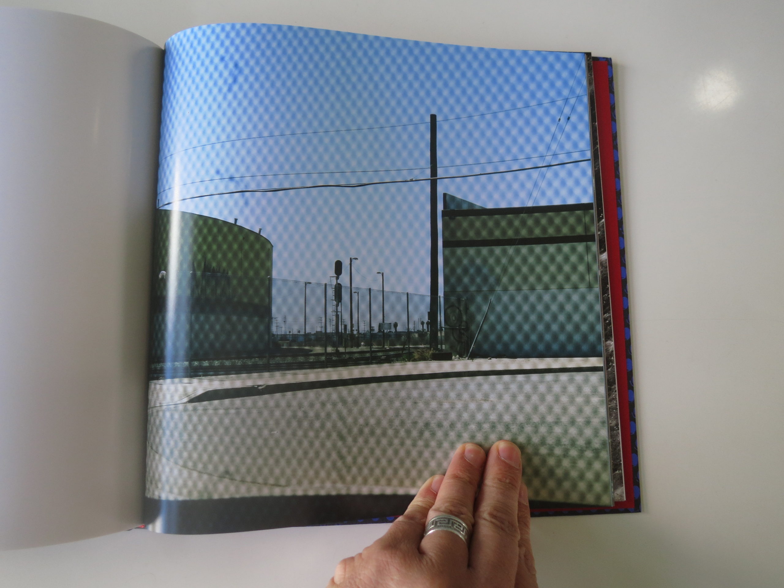
He grew up in Boyle Heights, Los Angeles, and has been making some pretty smart, considered, and at times beautiful photographs in and around LA for most of his life.
Much of his career has focused on examining the secret haunts and hidey-holes of the city’s homeless community, and the bleak public spaces left for those without Maybachs and mansions in Beverly Hills.
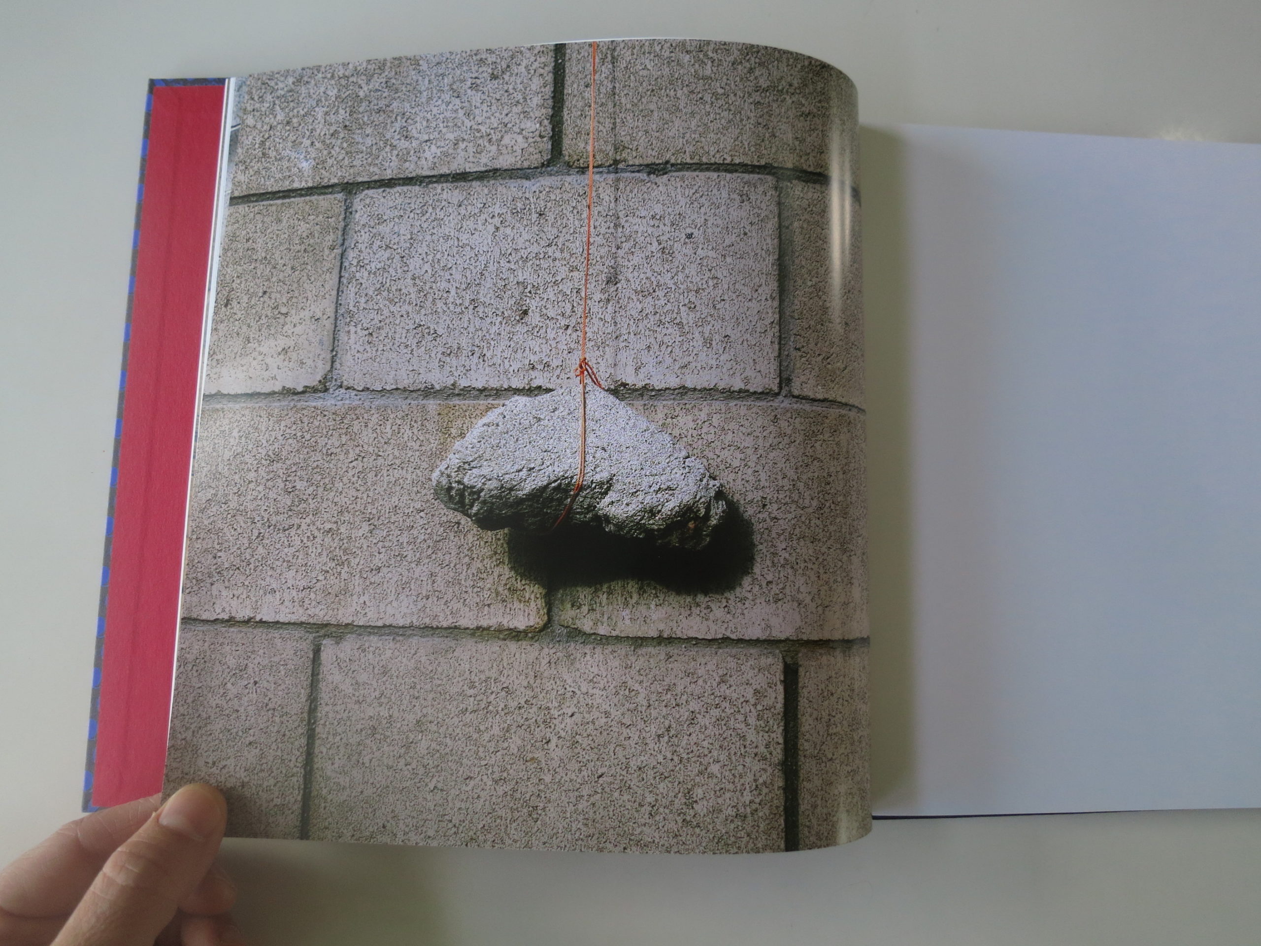
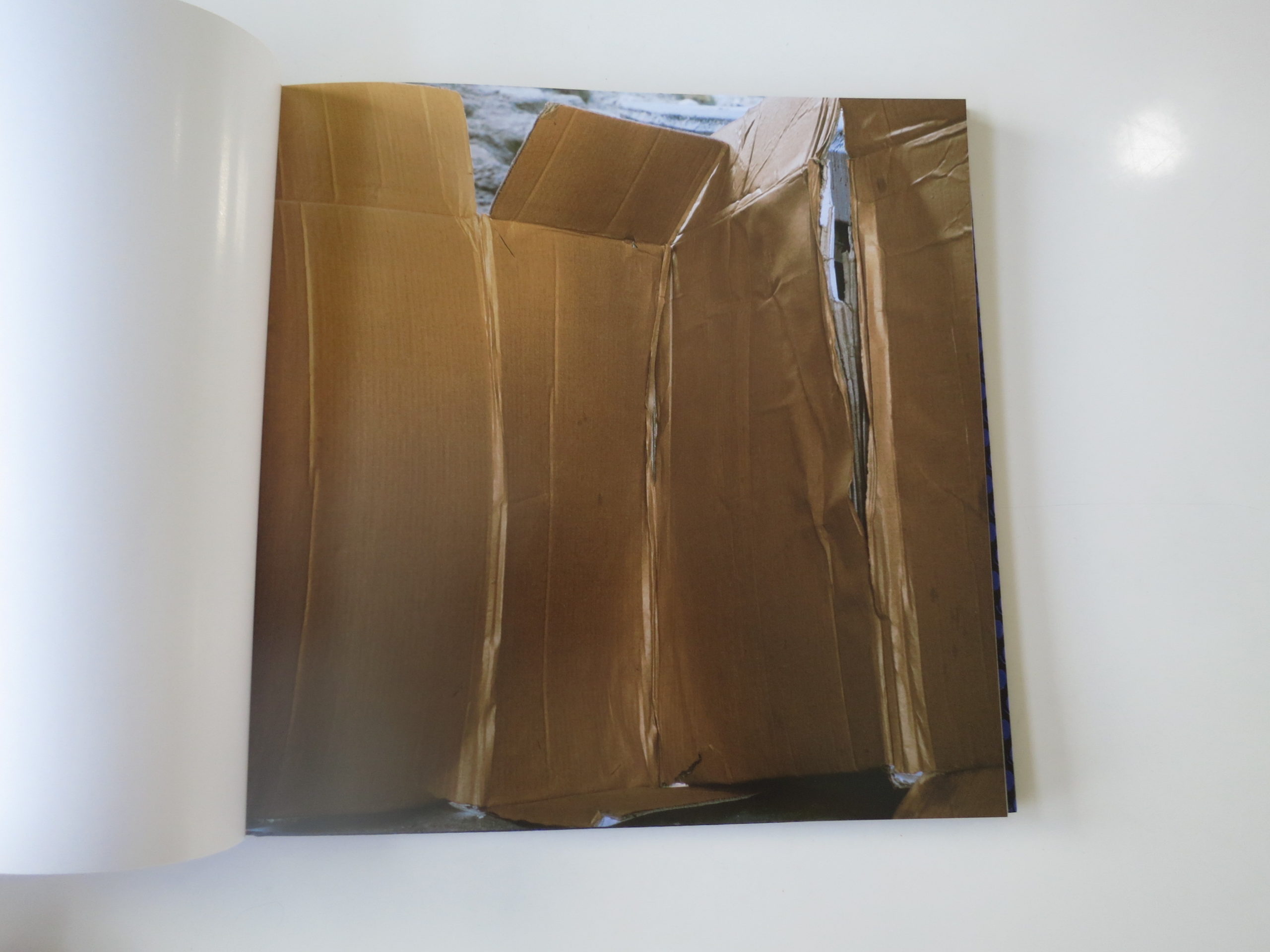
“Forever,” I learned, is a project in which he visited homeless encampments, boxes and jimmy-rigged shelters, and laid down where people sleep. Or where they catch a few minutes of rest, in the midst of the stress-horror-show that is life on the street.
Then he photographed from that vantage point.
I was entranced, as he said, “If you stop, and start thinking about, where I am? How can I be sitting here, or laying down on this bed, you won’t be out there. You won’t be making those pictures.”
I think it’s vital to know that about the photographs, to truly appreciate them. Some are too dry, or too reminiscent of things I’ve seen before, but others are absolutely perfect.
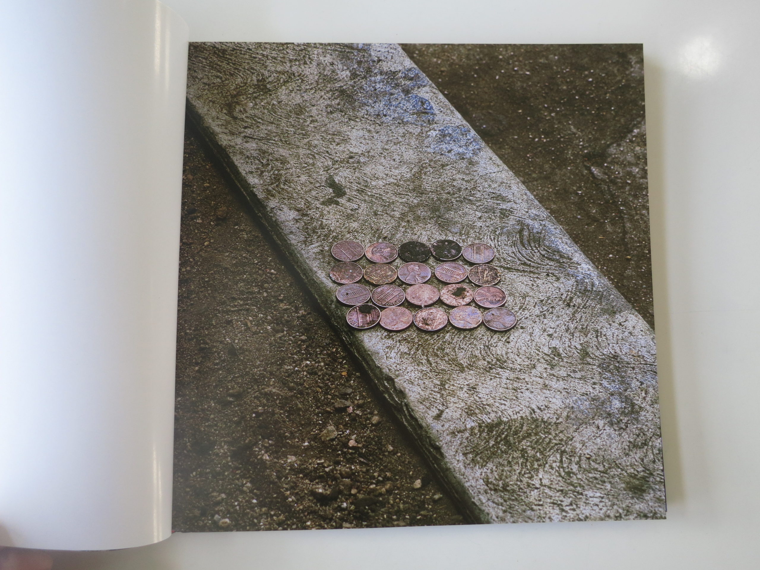
Like the twenty, beat-up, sad-looking copper pennies in perfect rows, sitting atop a thin strip of curb, set against the less-shiny brown of the pebbly dirt.
I think it’s amazing, visually. You can sense how deeply he stared at it. And then, you think, why would anyone living on the street leave money like that?
Are pennies now that worthless?
Or was the place tucked-away-enough they considered it safe?
Maybe they took off in a hurry, or were too high to remember the change?
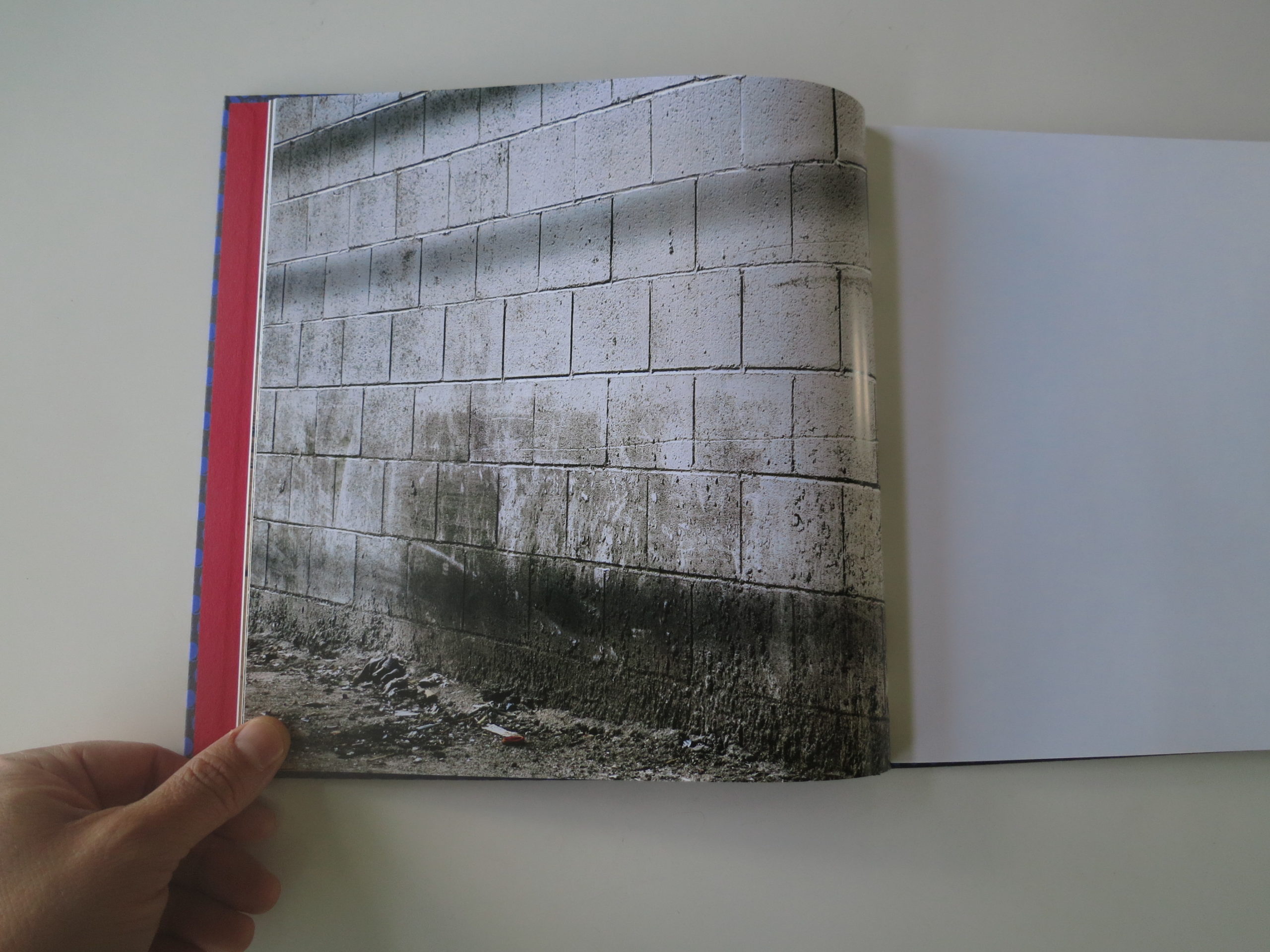
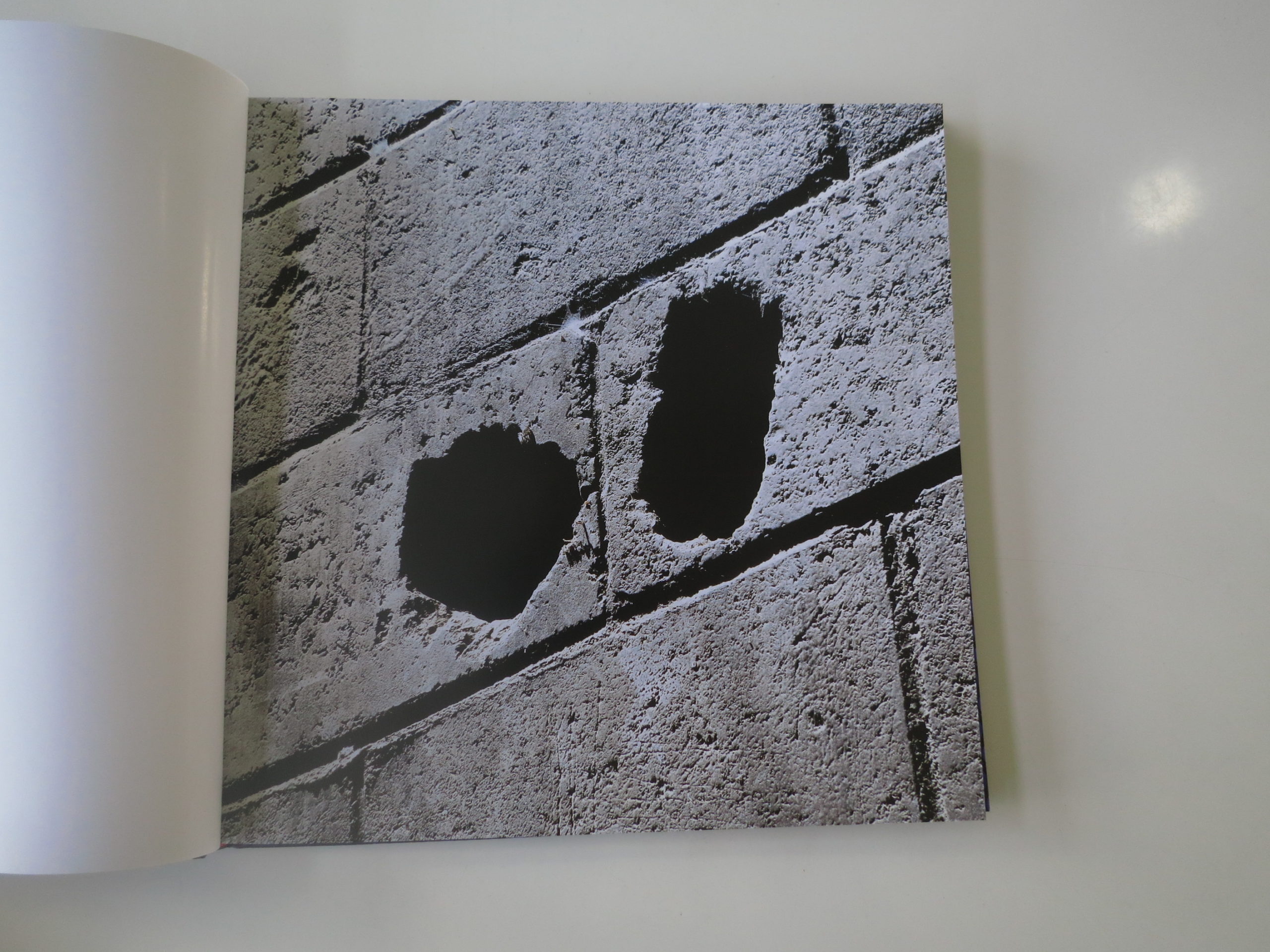
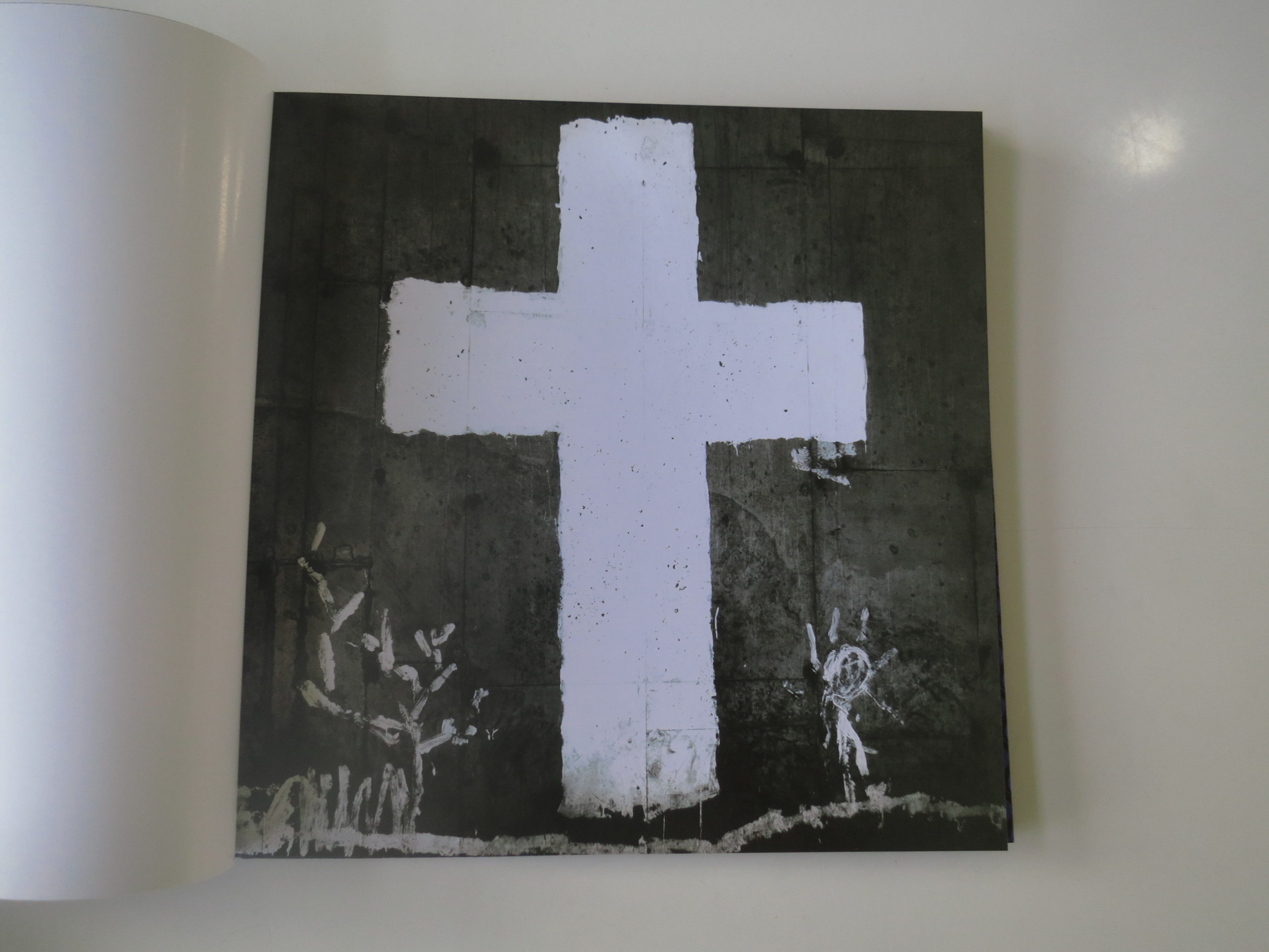
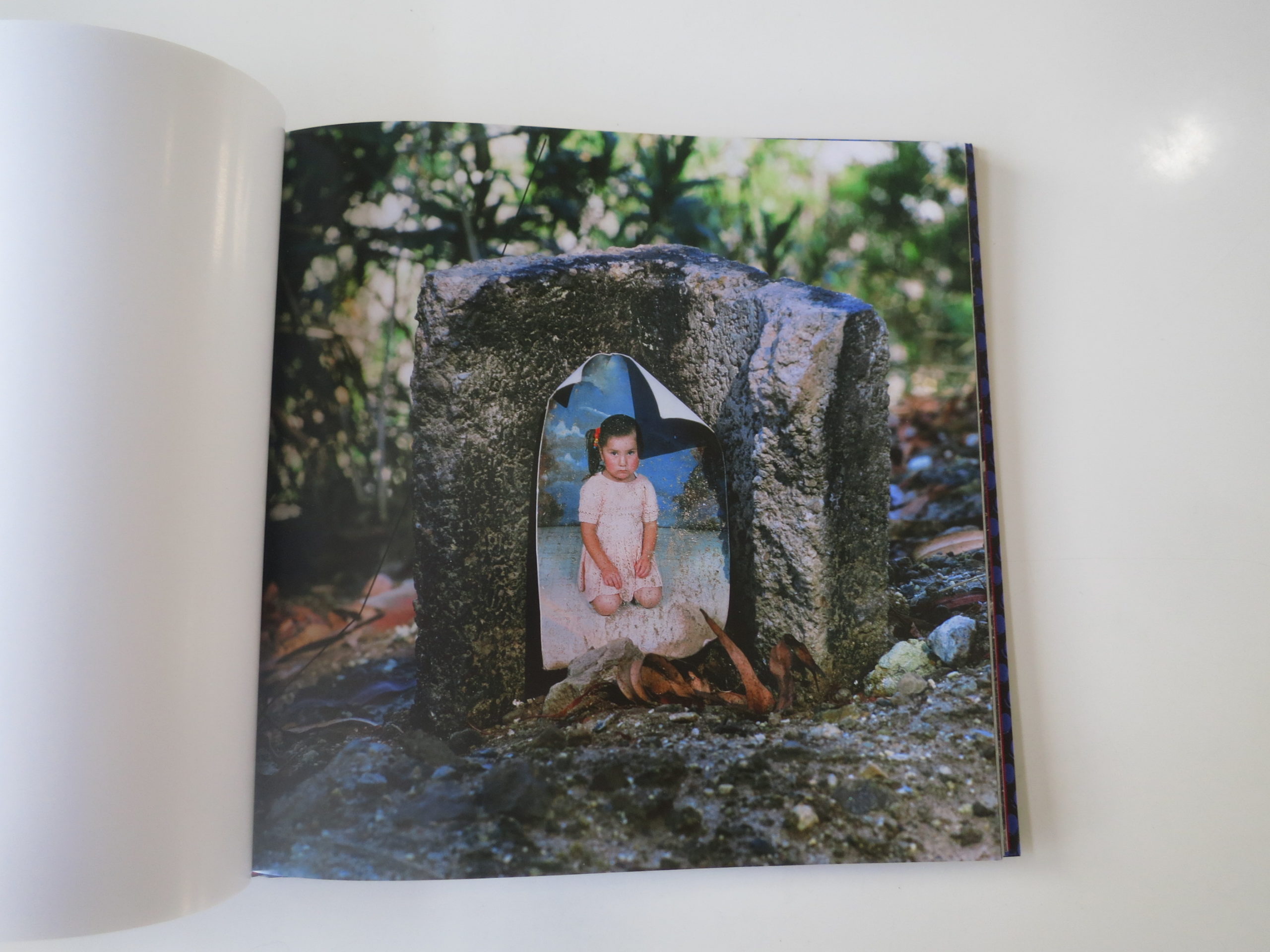
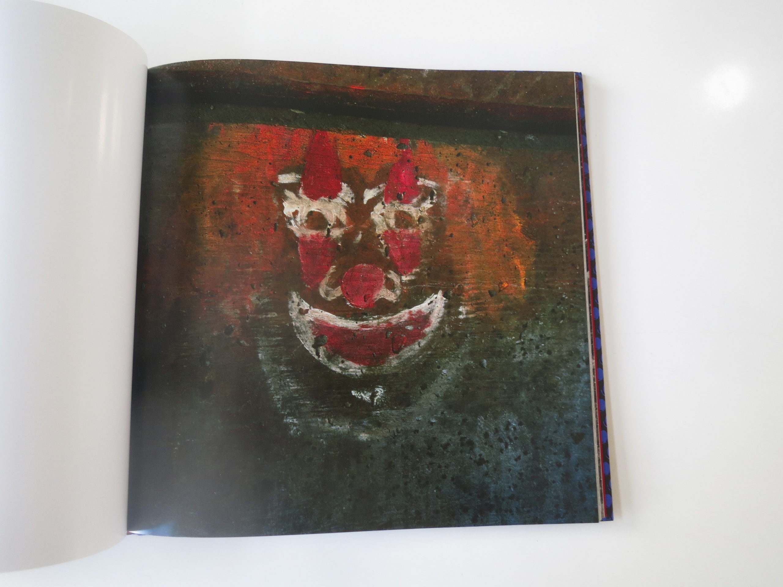
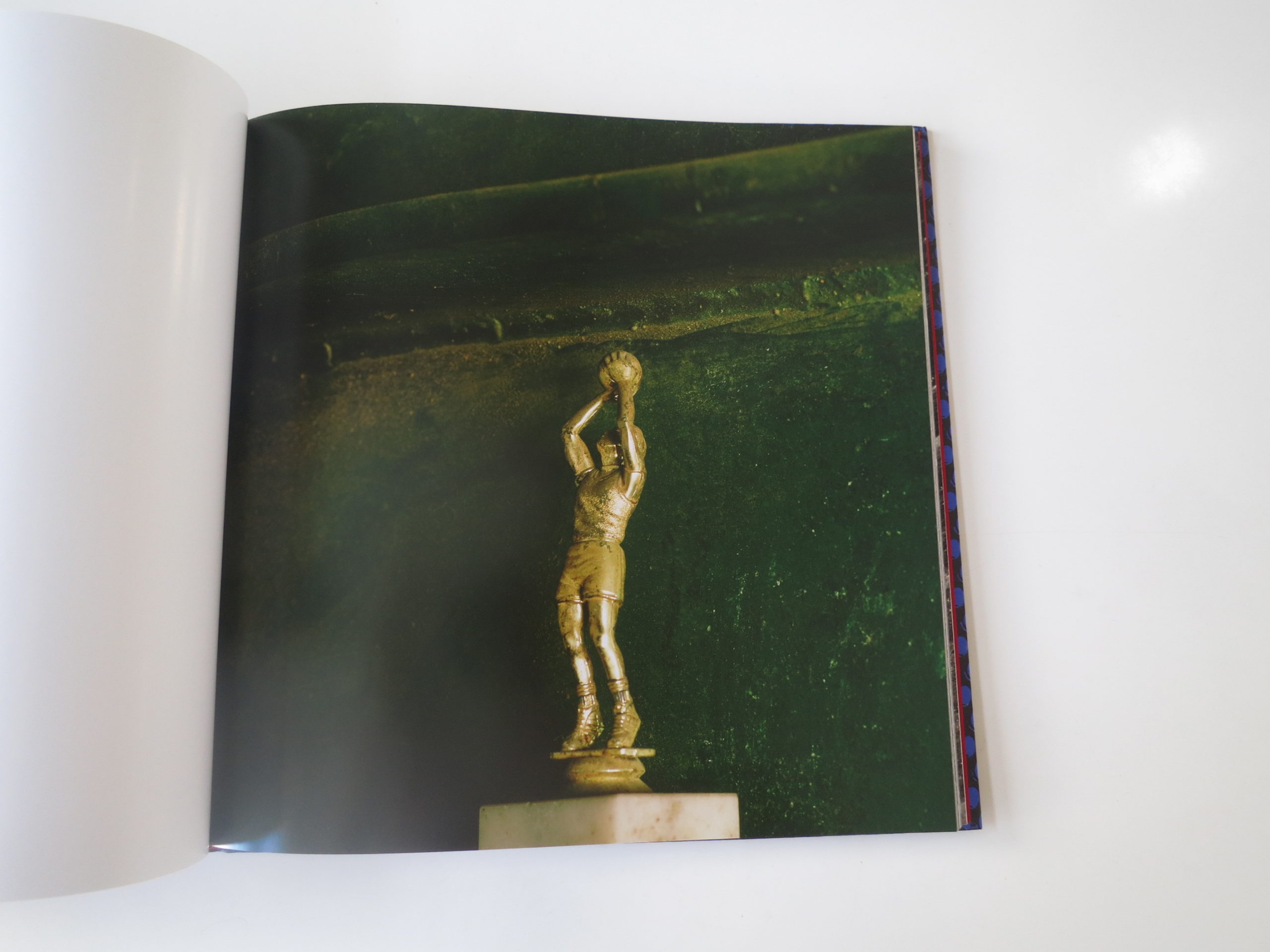
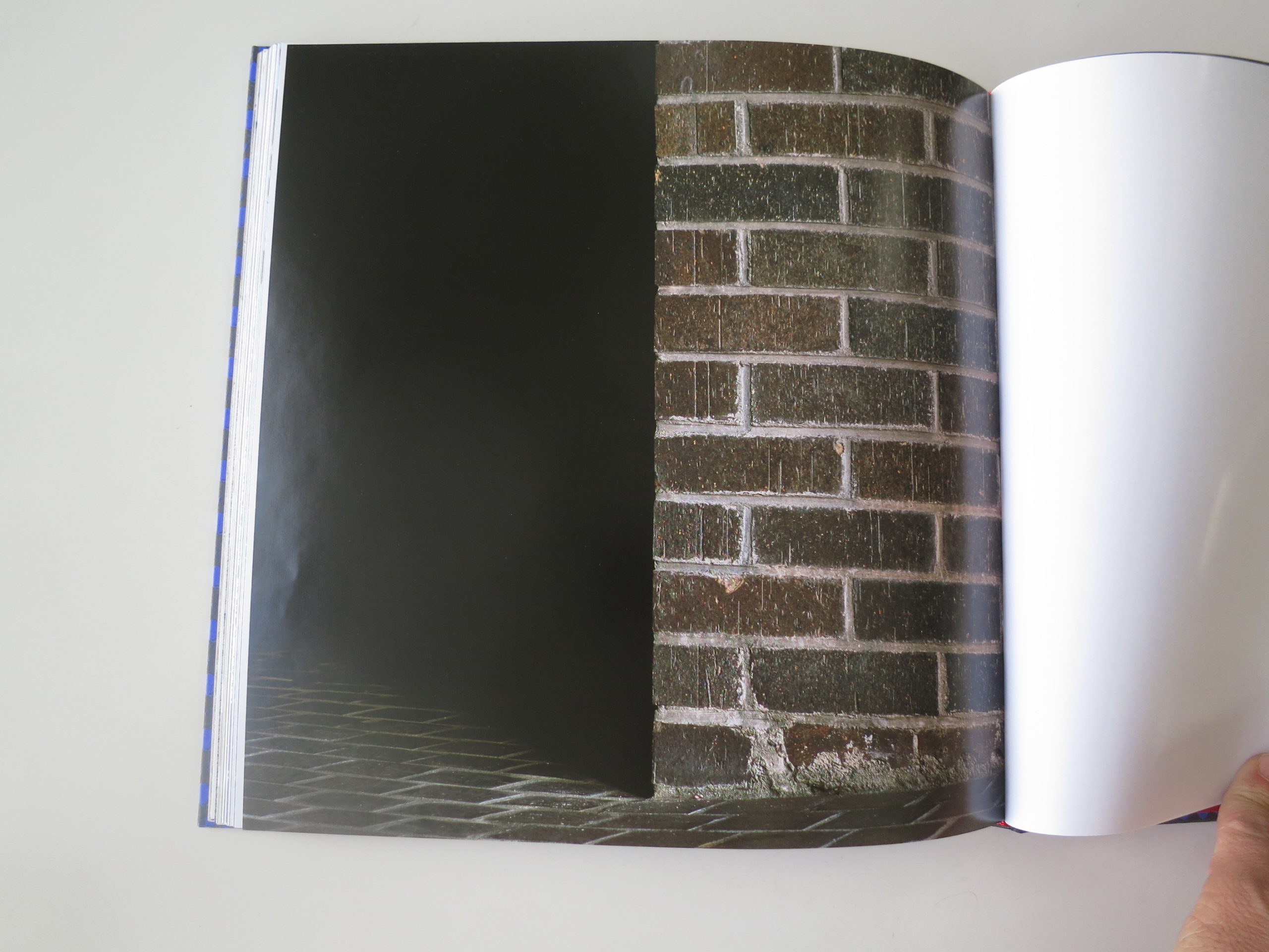
It’s only one picture, and there are seven or eight I thought were that mesmerizing. Like the matchbook. The brick wall. The concrete block wall. (He does walls well.)
And, most of all, the curled, slightly faded portrait of a weepy-looking young girl. A studio portrait, made somewhere, by someone.
It’s taped or glued to the front of a hollowed-out concrete block. Presumably, in this context, it’s the first thing someone sees after they wake up, and the last vision before closing their eyes at night.
The picture is screaming in my ear: This is the last place I’d ever want to end up. The worst spot in the world. Alone, sleeping on rocks, thinking of the daughter I left behind.
Or maybe she’s dead? And the grief drove her father or mother insane?
The book is set up in such a way that it’s difficult (or impossible) to acquire this context, before looking at the pictures. I suspect it’s intended for art world people, who already know what his work is about.
They bring the knowledge with them, as I did. And I think MACK figured the book buyers would be cool with it. No didactic description necessary.
We can agree to disagree.
There’s only a bit that really hints at it, in the book’s closing essay by Judith Freeman. She uses a style in which the narrative and interview bits are jumbled together, distinguished only by font style.
Her words say, “To find a bed or chair, a place you can sit, look out from their point of view.” As it shades towards inscrutable, on first reading, I’d say they’re still assuming people will know what’s going on.
There is nothing wrong with making a book for art collectors and photo geeks. Most established photo book publishers are definitely going for just that market.
But, setting aside one’s preference for knowing versus guessing, I think it’s a very cool book. The best pictures are almost perfect examples of the anti-aesthetic.
Of ugly beauty.
I know from our interview that Mr. Hernandez was friends with Lewis Baltz, (RIP,) who was a genuine master at that skill. Composing so well within ugliness, mastering tone and texture, amid garbage and industrial spaces, that beauty emerged despite itself.
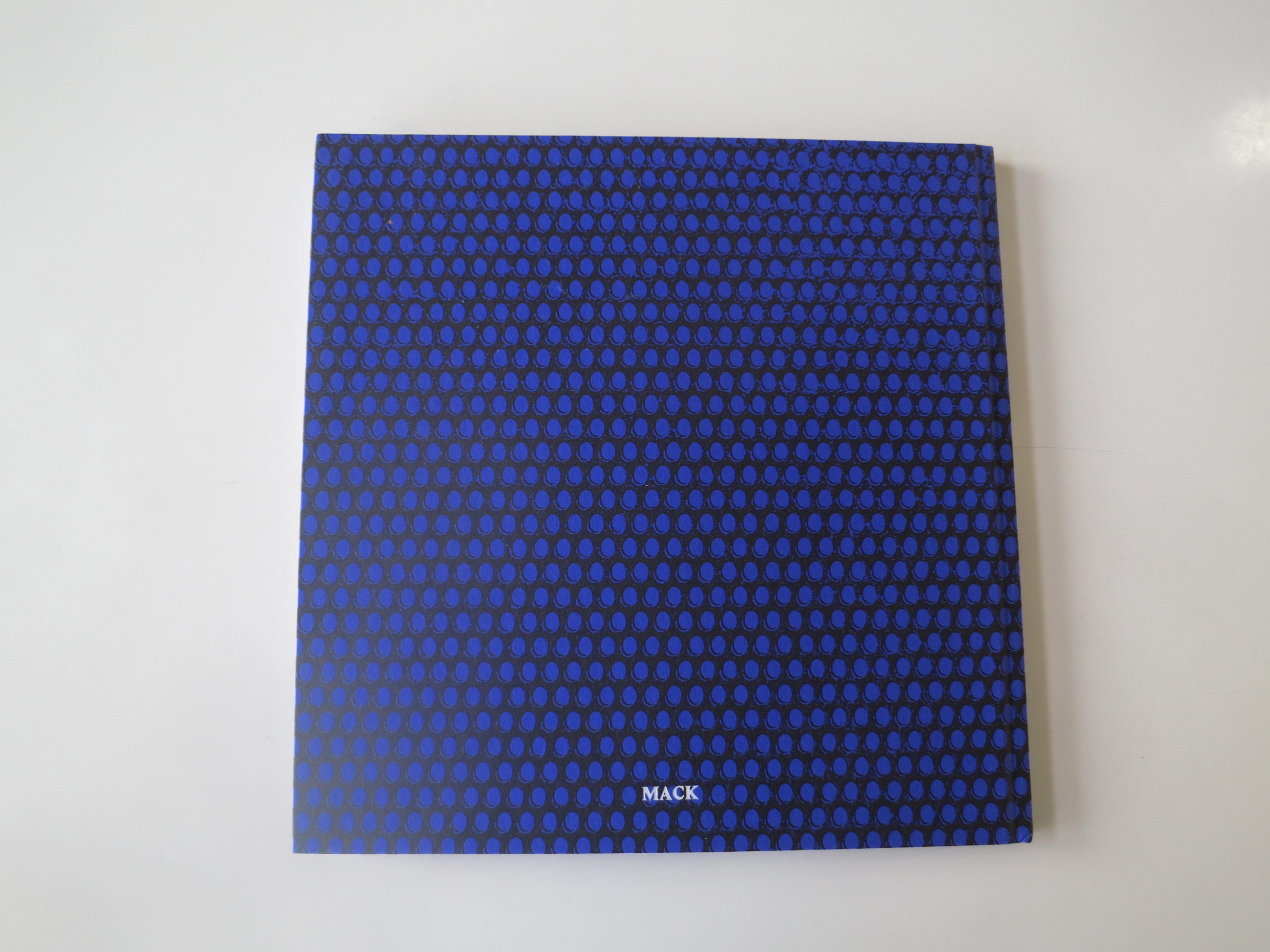
Design-wise, I have to give a shout out to the patterned purple cover followed by a rich, red, inside-cover paper . It’s pretty gorgeous, and makes me think of tailors on Saville Row with a taste for the naughty.
It’s a pretty interesting contrast to the glumness inside, and hearkens back to earlier in this article. Every choice you make, when you build your book, reflects your intention.
MACK, as a publisher, tries to make art objects. They don’t see books as information dissemination vehicles, but rather art itself. And art objects, unlike opinion columnists, need not explain themselves.
Bottom Line: Cool, well-designed, but slightly inscrutable take on homelessness
To purchase “Forever,” click here


If you’d like to submit a book for review, please email me at jonathanblaustein@gmail.com
1 Comment
Books and exhibitions, two very different animals, both having their particular strengths. Exhibits let the work shine! Can’t say how many times I’ve seen a photo online, said… meh- and then been blown away experiencing it in person. Although book reproduction can also vary tremendously, narrative helps keep it together, and keeps you going back to it- and (when one has the means) a book’s design and presentation can also become part of that overall experience.
I now am fortunate enough to have my share of photo books where I’m no longer lusting for every new model- unless it presents something new, something strong, something worth getting to know in a unique, personal way.
I find the work of Anthony Hernandez somewhat hit or miss these days, but I’ll be forever enthralled by his earlier B&W street “scenics” of LA.
Comments are closed for this article!