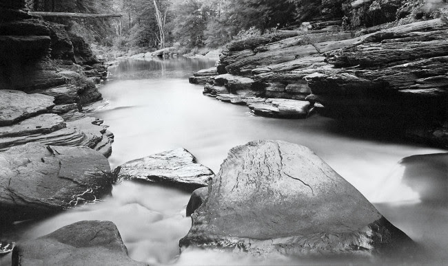
I had the good fortune of sitting down with legendary creative Douglas Busch who has an inspirational punch list of achievements. Doug is well known for his large BW photographic work shot with a cameras he designed and built under de Golden Busch banner : the finale being the world’s largest portable camera, “The SuperLarge™.” His photographic Silver Chloride and Amidol contact print work ranges from 8×10 to 40×60 presenting an imperfect world with the most graceful and honest eye. He still mixes his own chemistry from the 1900’s.
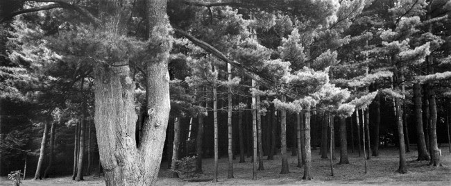
Little Rocky Glenn, PA 1982
You were an assistant to Al Weber, Morley Baer, and Ansel Adams, looking back what their biggest impact on you as a creative?
Al Weber taught me the basics from the Zone System, exposing film to the finished mounted photograph. Ansel taught me to see the beauty in all things, and Morley taught me about architectural photography and equipment. Al also taught me how to be a descent human being; to give all you have to help and teach people.
While working with those three you had developed a patent for a print washer only using a cup of water an hour, tell us about that.
This was the beginning of my concern for preserving and not wasting water. The planet will run out of water if we continue down the path we are on.
How much of a catalyst was The Mono Lake project for your sustainability work? I know the book was celebrated with a grand exhibition in 1979 that shared awareness about the water diversions to LA.
I saw that Mono Lake was being drained by LA, and I saw an opportunity to have an impact as a water advocate, a photographer and then later in my life as an architect Designer. Mono Lake lead me down the path to sustainability, healthy housing and draught tolerant landscaping. I am now working on a self watering vertical hydroponic herb and vegetable growing system for the home; www.theFarminaBox.com
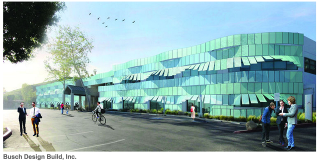
Your architecture firm recently presented a solar panel project to Malibu City Council which would be the first artful construction of a functional and sustainable building, is that right?
Yes, the project has a promising outlook to convert ugly solar into ART. The design and structural skeleton for these very cool new panels from Switzerland seem to oscillate as you move past the building and then curve up like a wave and turn into awnings for the windows giving the feeling of the rolling movement of the waves because the panels are tilted up at various angles to create a wave-like effect. The panels seem to move like the rhythm of the ocean. This is as much an ART piece as it is a functional net zero building. This approach to Solar has never been done before…ART and solar functionality…net zero.
How did this idea develop?
I’ve been in several meeting in that building and noticed the windows were hot to the touch, about 120 degrees and most offices had their blinds drawn to avoid the heat. This seemed like a great opportunity for Malibu to be a maverick in sustainability and forward thinking architectural design. “Malibu” as a brand has always tried to stay in the forefront of a wonderful living environment for their population while protecting the ocean and land. The hope being, Schools and other communities would come to see it as a work of art producing power, and protecting the environment choosing to go down an aesthetic path rather than most solar panel projects which are incredibly ugly and a blight on the environment. The solar system will reduce air conditioning costs and energy usage by protecting the façade from the heat of the sun. It will also be an educational tool for students to participate and see how the futurecan and should be for them through monitors showing the production and use of the sun’s power by us (including waste and vampire energy consumption).
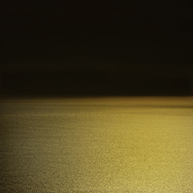
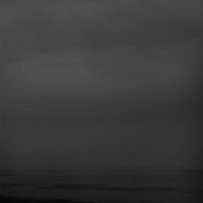
One of the many things that stood out for me was the clarity and remarkable detail of just your proofs for the Zuma and Dark Zuma personal photographic project. Are you using one of your own SuperLarge™ lenses?
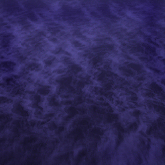
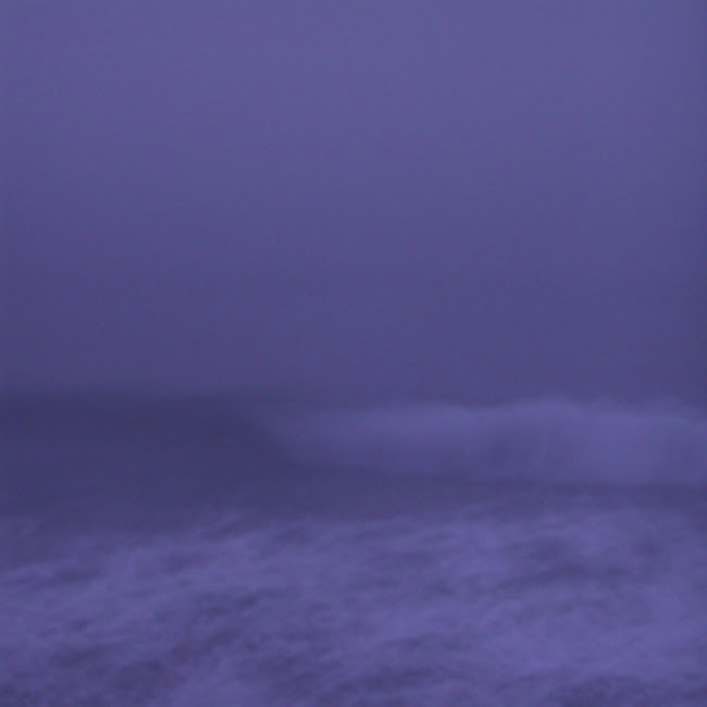
I shoot everything from 35mm to 12×20. This project has been going on for years. I started with the “Silent Waves” in the early 2000’s. Then in the last several years photographing Zuma as I walk my dogs on Zuma/Broad Beach.
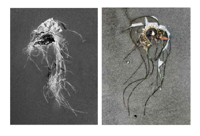
Silent Waves Project
At some point you mentioned losing your visual eye and gravitated towards architecture, sustainability, healthy detoxing housing, and organic vertical gardening. What’s your best advice for anyone who feels they are in that same position?
I was making the same photographs. Different subjects but the same metaphor. I moved to Malibu to push my vision going from black and white contact prints to Color. The Silent Waves series has been shown and sold all over the world. They are the complete opposite of my prior 35 years of work. Color and a purposeful lack of detail, a 180 degree turn, just color as emotion. It did free up the vision but on my terms not what is popular and/or hip. I still tend to photograph very subtle images, not beat the viewer over the head; bringing them into a more intimate serene place.
You have an interesting idea for the printing of this book, tell us about it.
The idea for Zuma and Dark Zuma is to have some of the images in color, and then some of them in black and white using a blue filter. They take on an abstract nature when shot in black and white and become wonderful organic solitary personal images.
What’s the difference between your eye for photography and your eye for 3D architectural or sculptural work?
With photography you making decisions about what to include in the frame and what not to include in the frame, it’s all right there for you, with architecture and 3D design, it’s all begins visually in your head, goes to paper, then is built. It is a very rewarding process. Add in the sustainable net zero and detoxing healthy elements it is the way the future housing should be for all.
Is it hard to edit you own work?
Well there’s the editing part and then the sequencing. I like to put my work up on a wall and begin to make my selects, walking by daily and removing images as they no longer affect me emotionally. My friend Sally Mann says it best, “location, location, location” in Real Estate holds the same meaning in photography– edit edit, edit. I also have some curators who often assist me in my editing and see other paths the imagery can go. Once I finish that process I may revisit some of the images I’ve pulled out simply to bridging images in a sequence for a show or book.
How hard is it for you to divide your eye between observational architectural work and fine art?
It’s fairly easy because I’m looking at things differently. My own design work calls on my architectural skills looking at details, traffic patterns, space volumns, and structure. Did I mention DETAILS. It’s invisioned as a holistic space and then I deconstruct it to every detail and then reassemble it, while the fine art is more of an expression of daily life and the found environment and the feelings that are aroused when I feel the place .
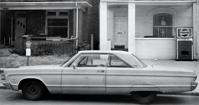
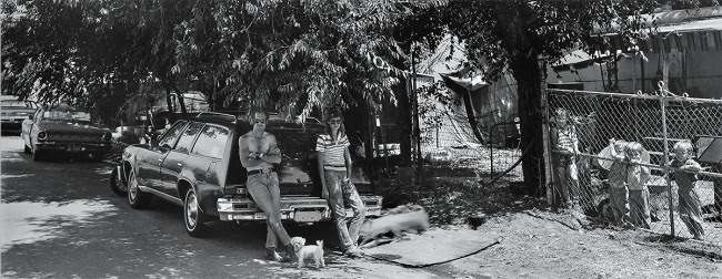
Car & Pepsi Machine 1986
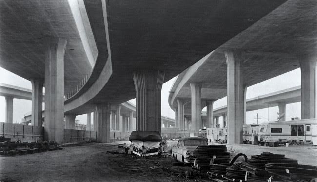
Imperial Highway 1993
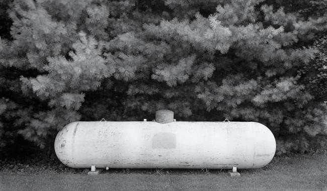
Propane Tank 1987
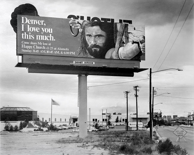
Denver I love you this much 1986
Black Forest 1981
Your book “In Plain Sight” is a wonderful early career retrospective of your work and exquisitely printed with a Japanese linen embossed cover, tri-tone printing and a dull and gloss varnish.
Yes. The book was designed by the talented book designer, Bill Sosin in Chicago and won the “Best book of the year from a small publisher” and each image had a gloss varnish in the blacks, along with a dull varnish surrounding the image which gives the white separation from the page. The images hold their integrity down to the finest detail.
One of the many wonderful things about my chats with Douglas is his true sincerity and his quite creative force that shines but never boasts; he simply shares what’s right in front of all us through his talented eye. His new book could include a collaboration with an lovely 87 years young female poet whose never expressed herself via images before. His architecture project is moving forward to next level meetings and hopefully will be approved by next month.

7 Comments
Beautifully told. The genius continues. Thank you for sharing.
I’ve followed Doug’s work — in all areas — for decades now. Doug is a practical artist who has refused to be confined or labeled. As James Terrell said, “Terrific ideas are cheap. As an artist you have to manifest them. You don’t get to count the things you haven’t done.” Doug’s terrific ideas always have a way of becoming real.
Great article, I wanted more.
I’ve had the distinct pleasure of knowing Doug for years.
His eye, his immense talent in visual arts and architecture, and his ongoing concern for the welfare of this planet never cease to amaze me.
His ability to mold art and practicality seamlessly is a gift that I’m glad he shares with all of us.
I’ve known Doug when he was this very individual, unique “kid” at Bloom School in Rockford, IL. Being his teacher I became sensitive to his ideas especially in the creative arts and class discussions.
From the start, he was his own “persona”.
We’ve kept in contact via e-mail where he would share some of his amazing ideas and they are still being “born”!
I have some of his beautifully photographed books showing his brilliance and love for large and small things in our world.
Thanks for all you do and have done!
Fondly,
Shirley
Doug’s work speaks for itself. The clarity and simplicity understate the commitment to the journey. I know something of his journey as a person and see the same commitment to keep it clear and simple. Though the journey may not have been either. Vision is one thing, the commitment makes it real! Thank you DB.
I’ve had the honor of meeting this most extraordinarily creative, forward-thinking and productive artist, and as one of his architectural clients I feel most privileged to be served by his genius. I can also vouch for his enormous compassion and caring, which of course comes through in his work. Thank you for an excellent article here, and may Doug continue to enlighten the world with his brilliance.
I am real lucky to have Doug as a friend.
He gave me very strong inspire always as a photographer.
Thank you Doug.
Take care and stay healthy.
KAZU
Comments are closed for this article!