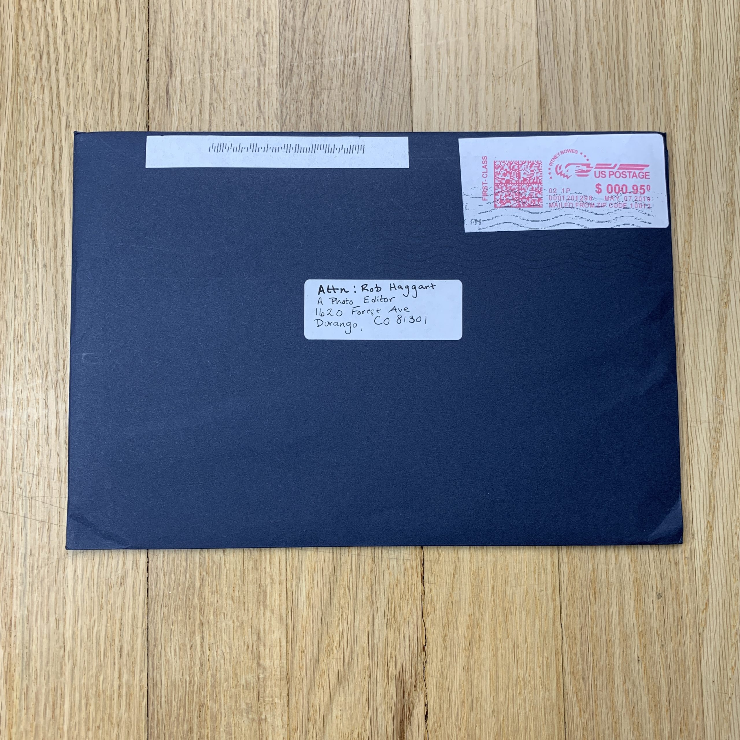
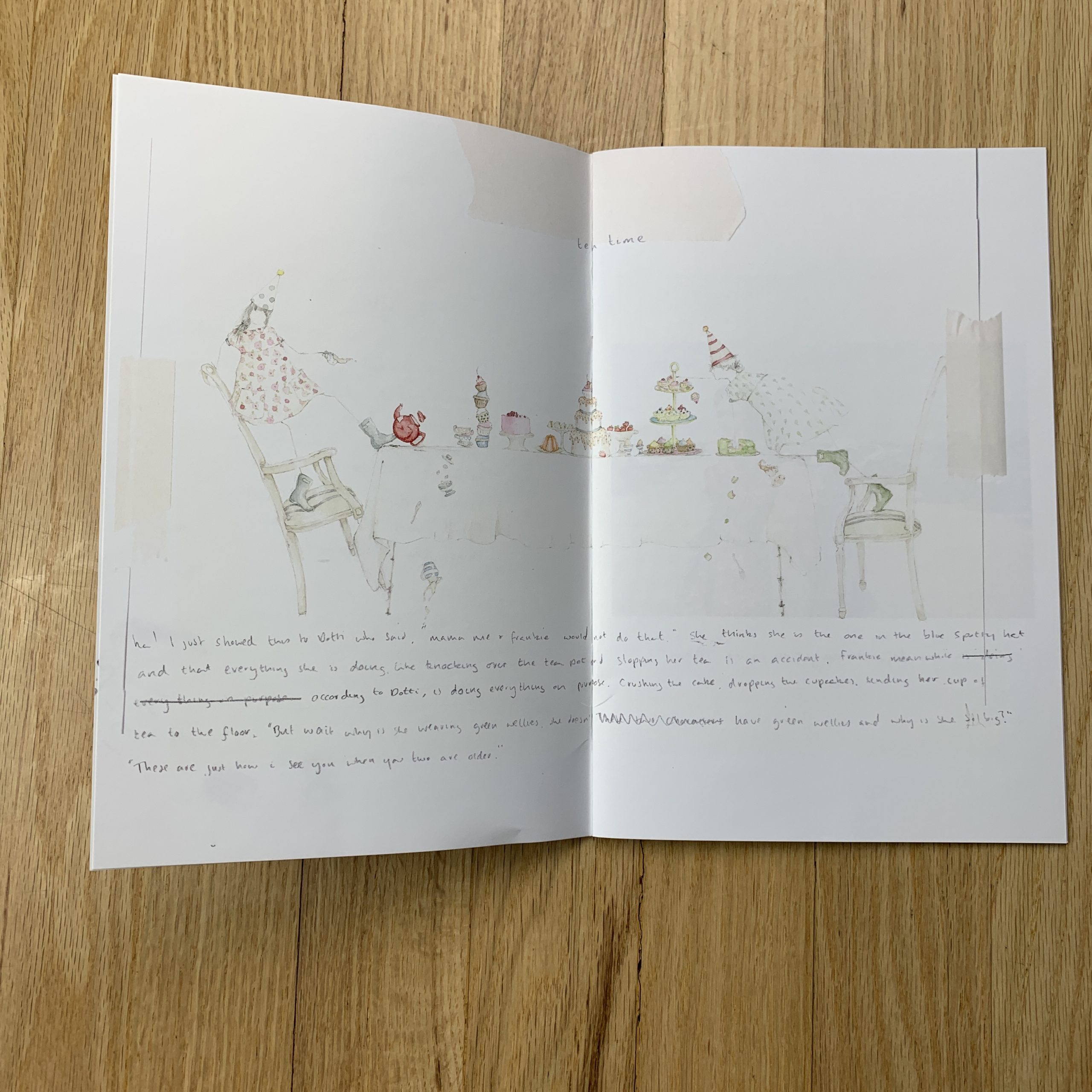
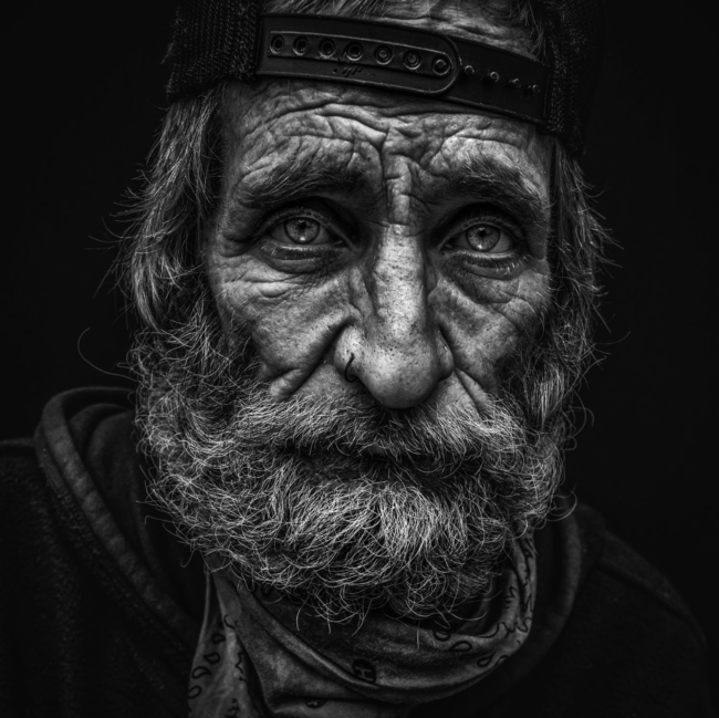
Who designed it?
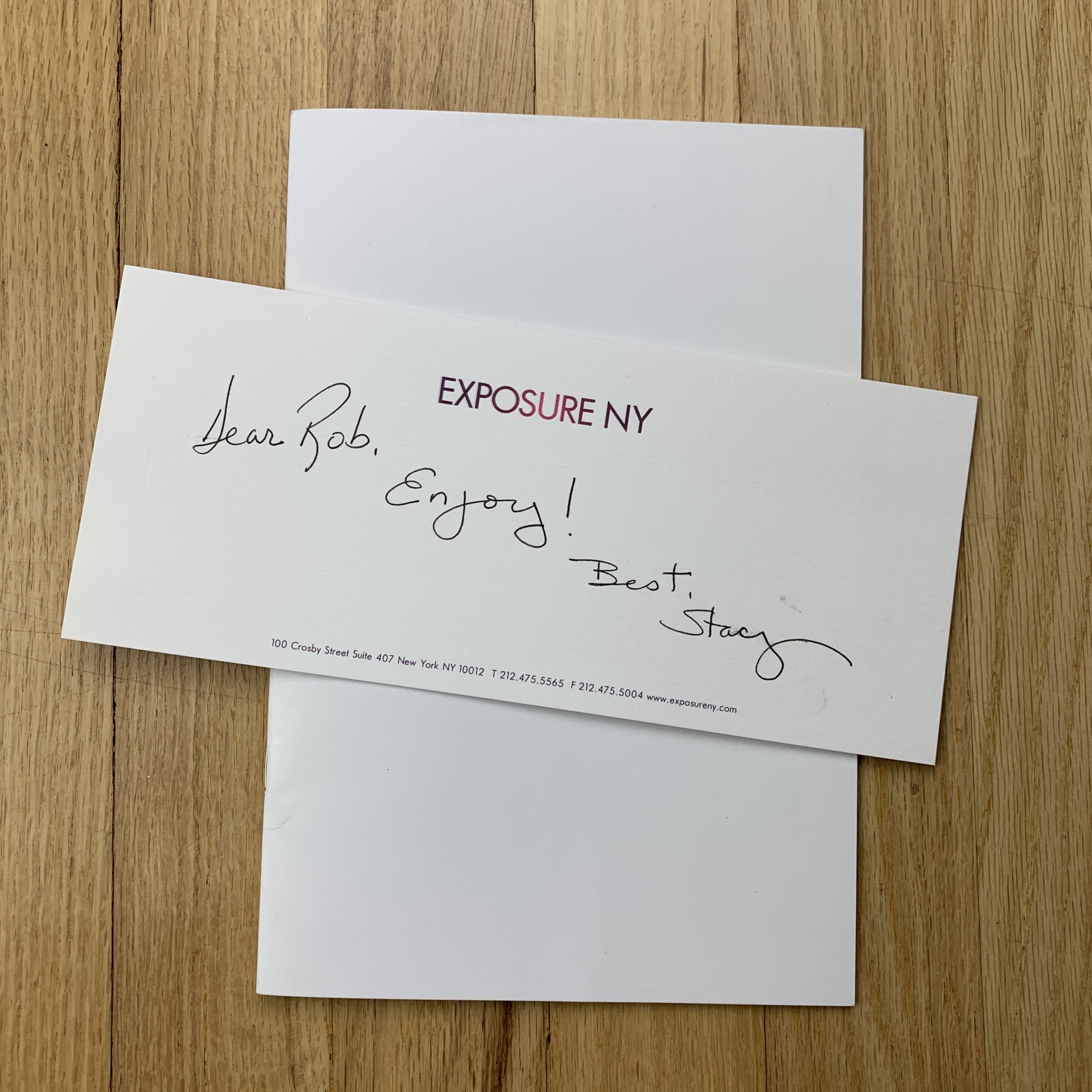
I did, it is half the fun of it. I really love the process of seeing how all the writing, drawings and photos can make a story.
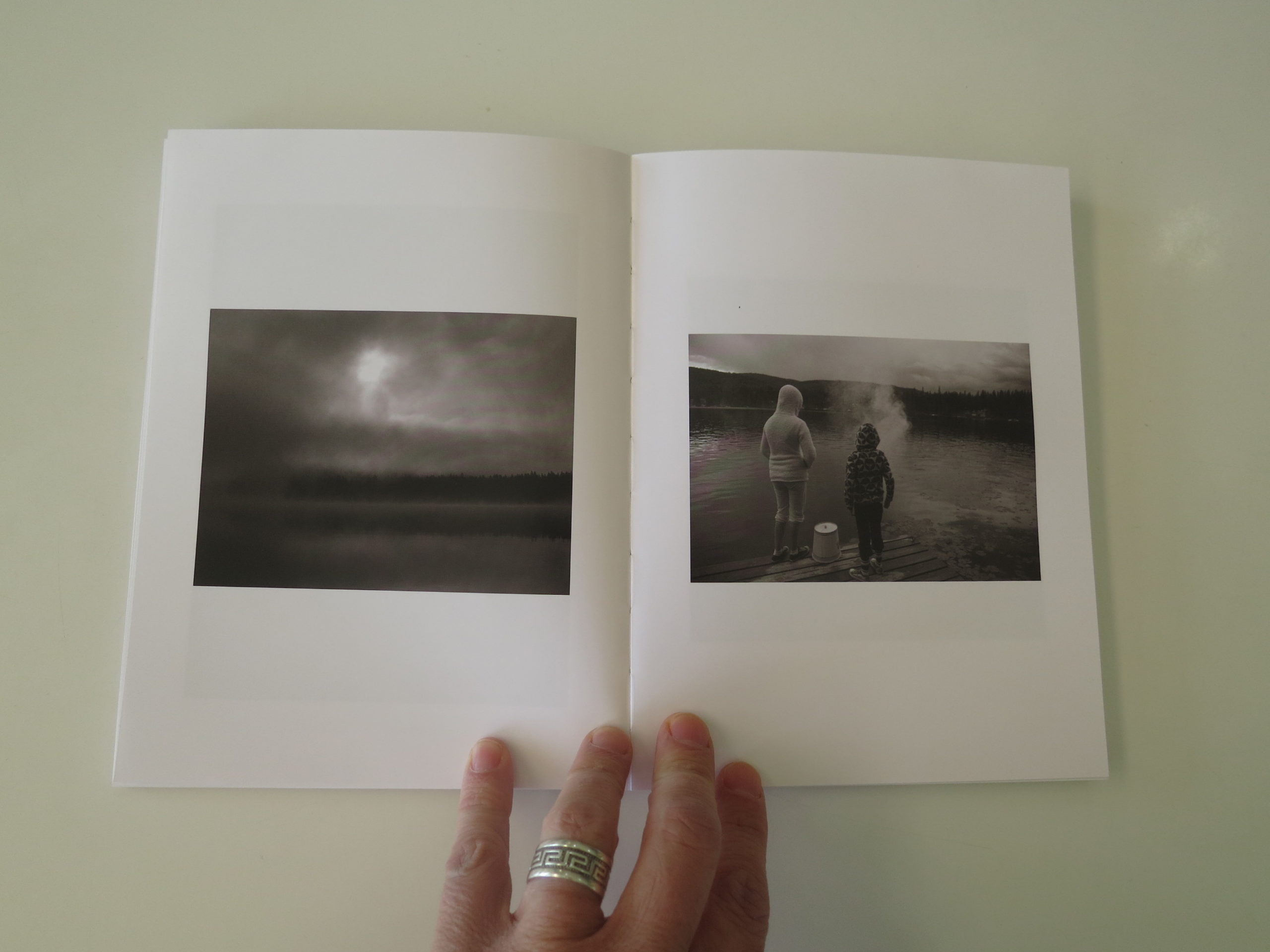
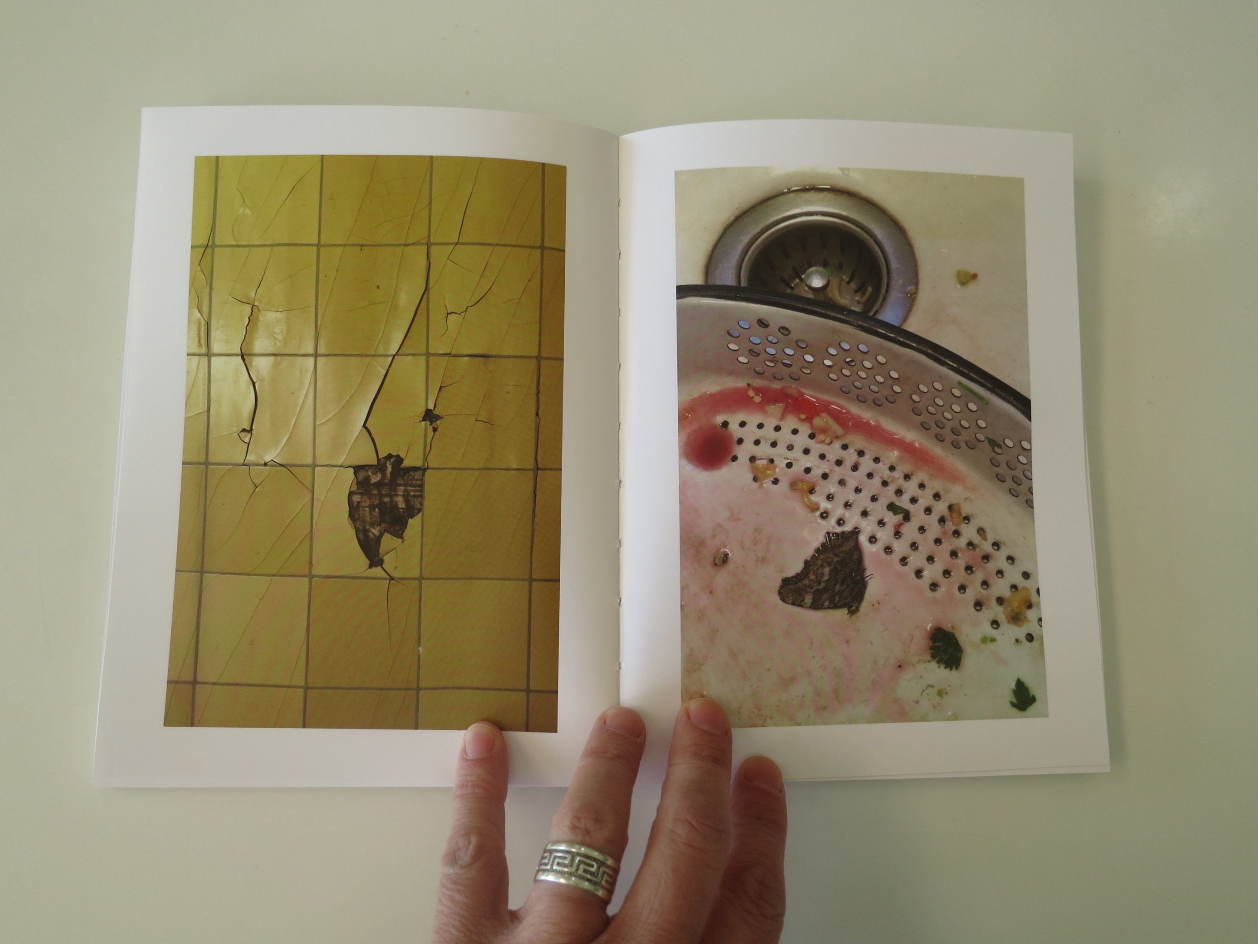
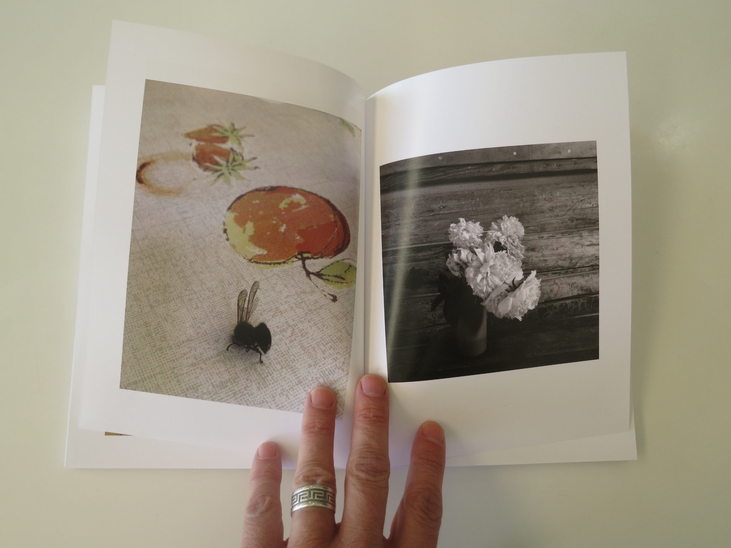
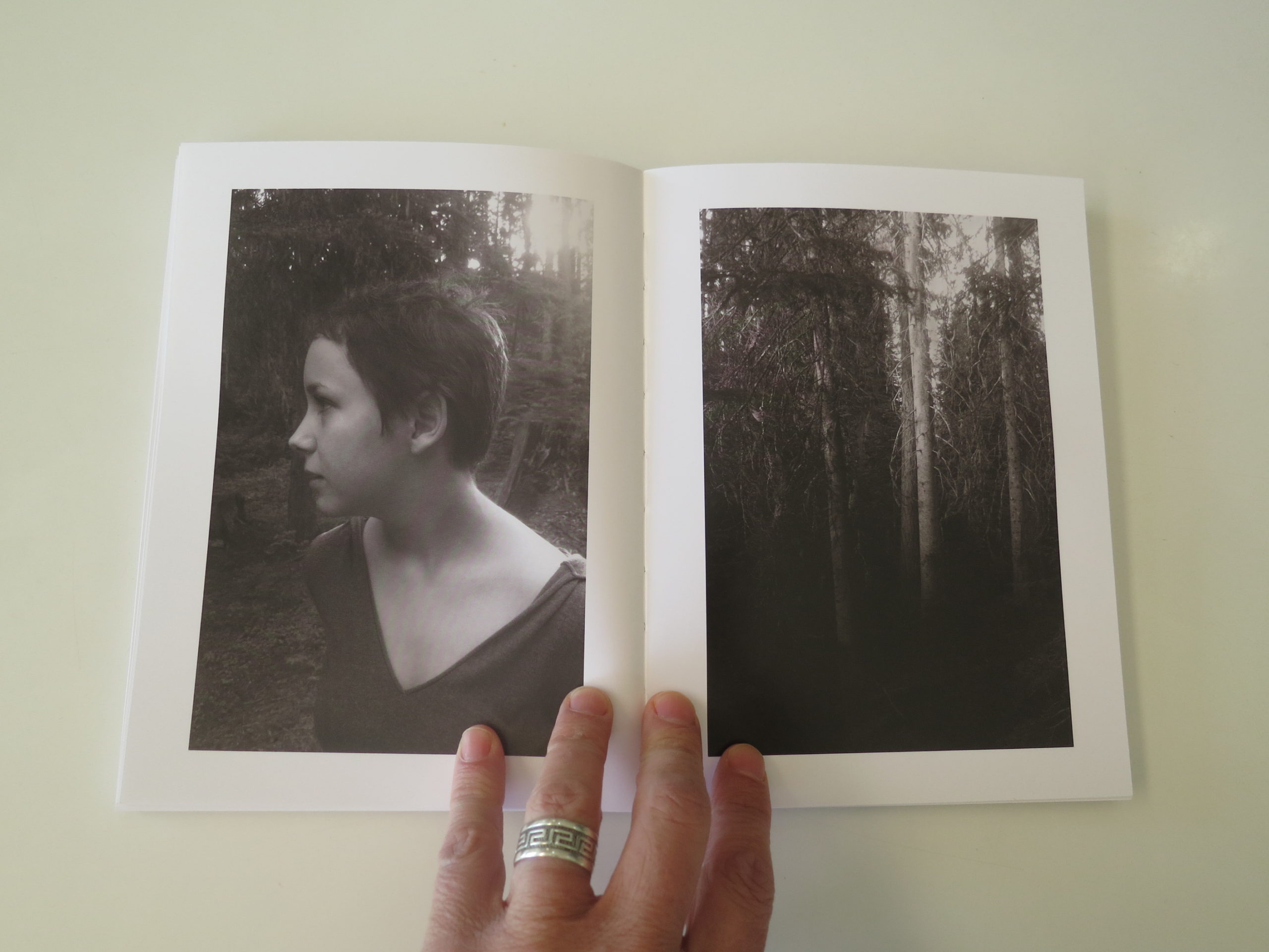
Tell me about the images?
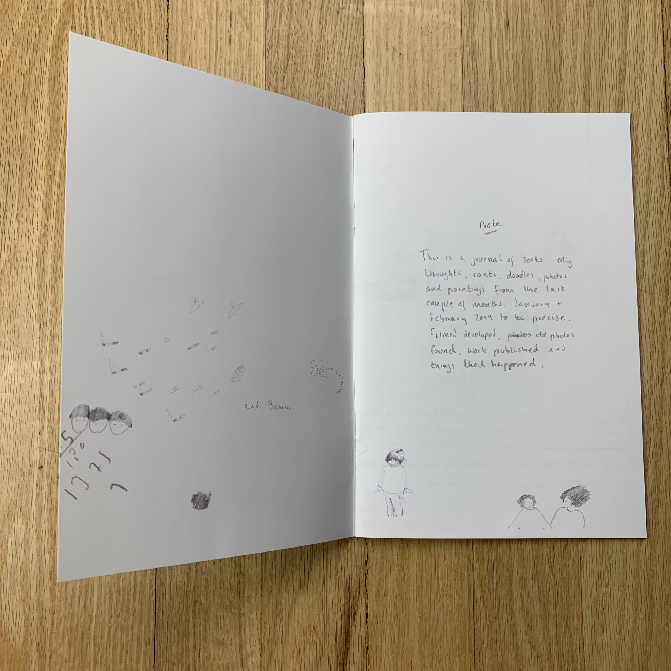
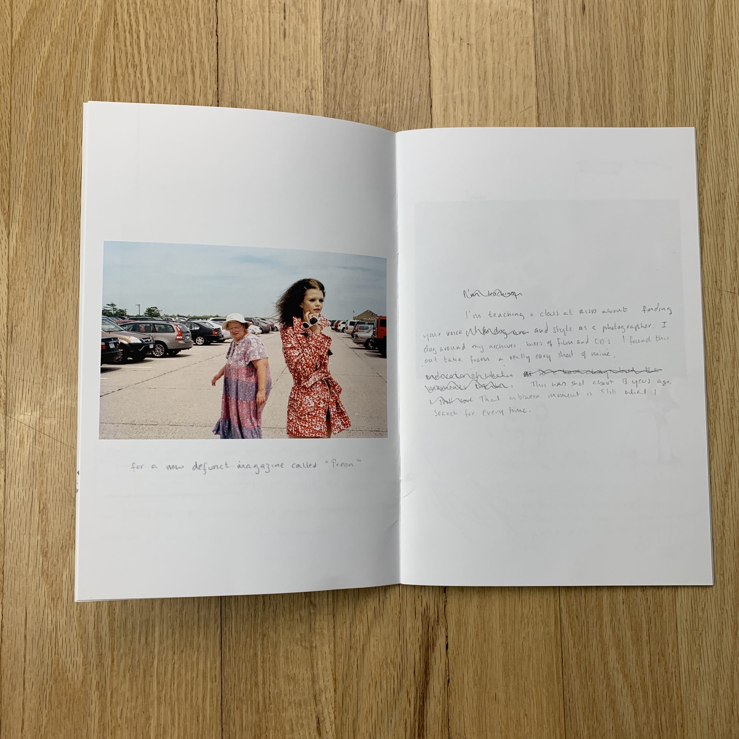
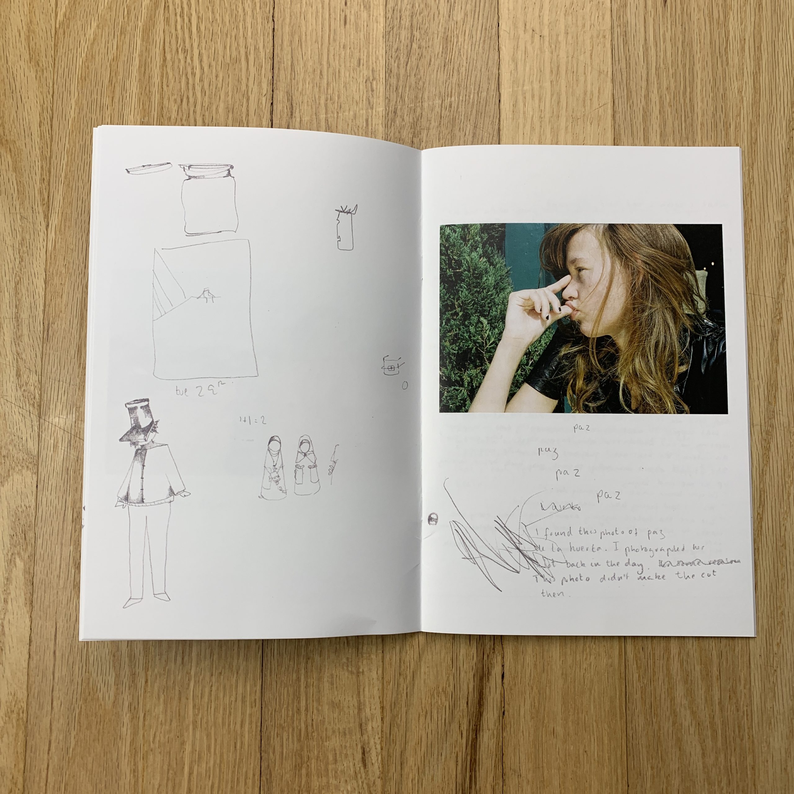
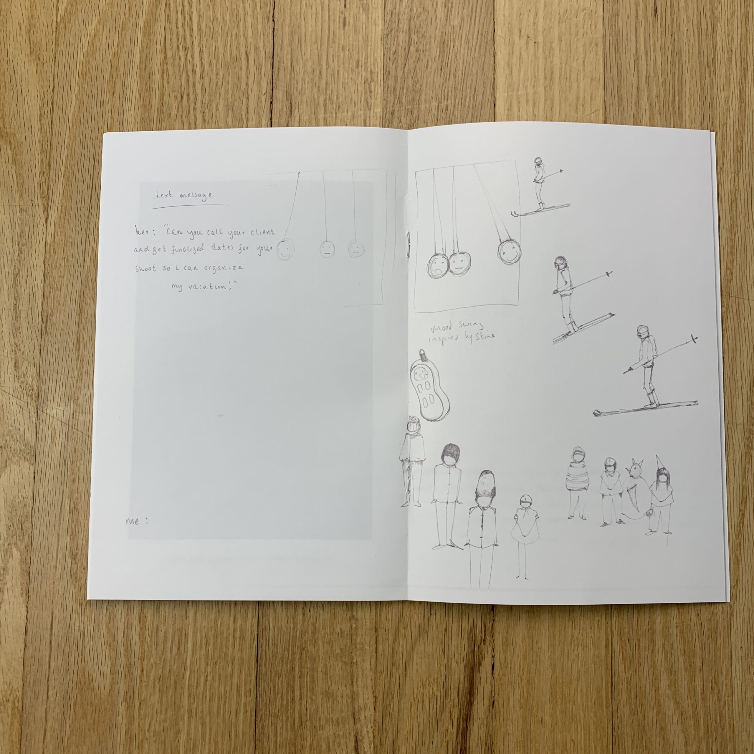
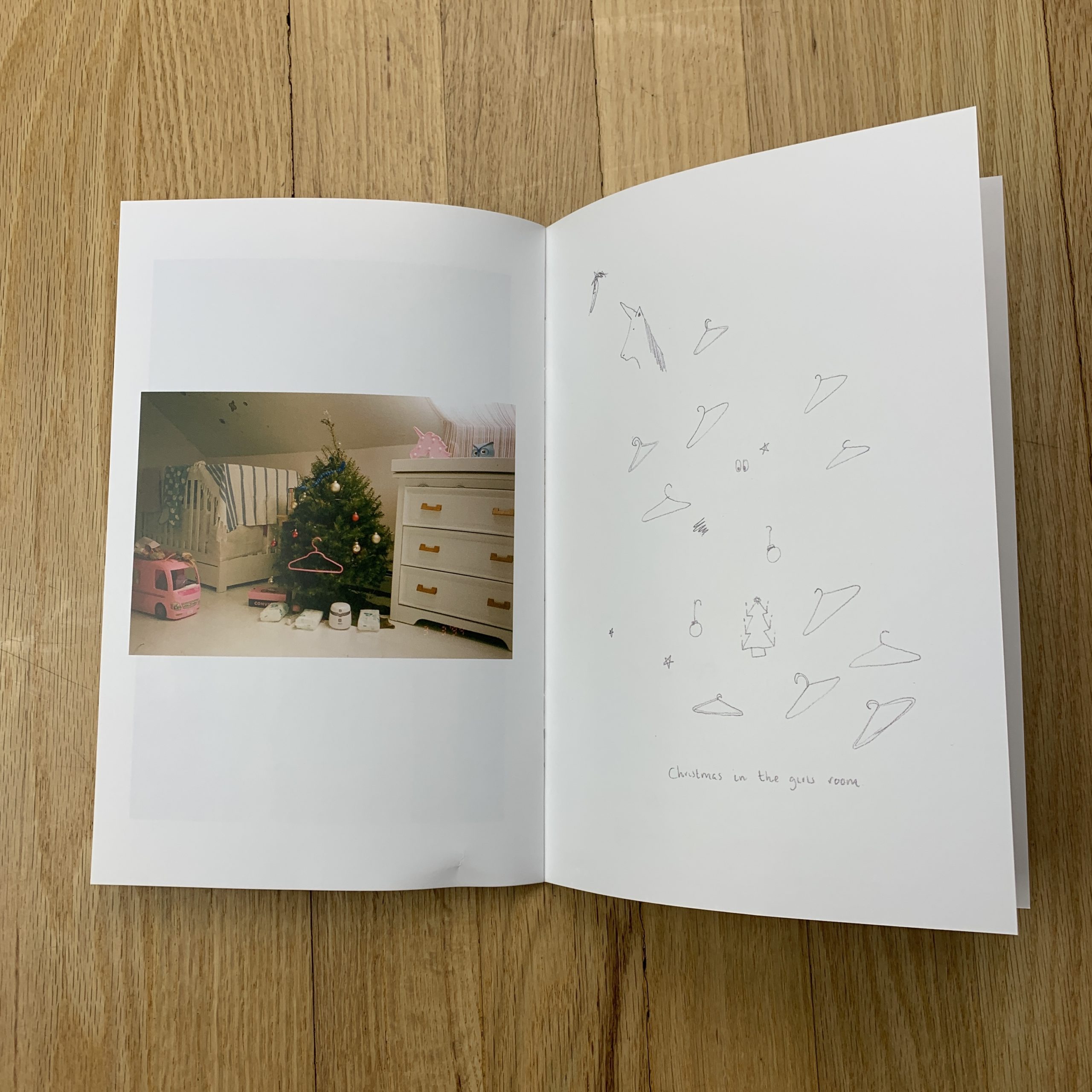
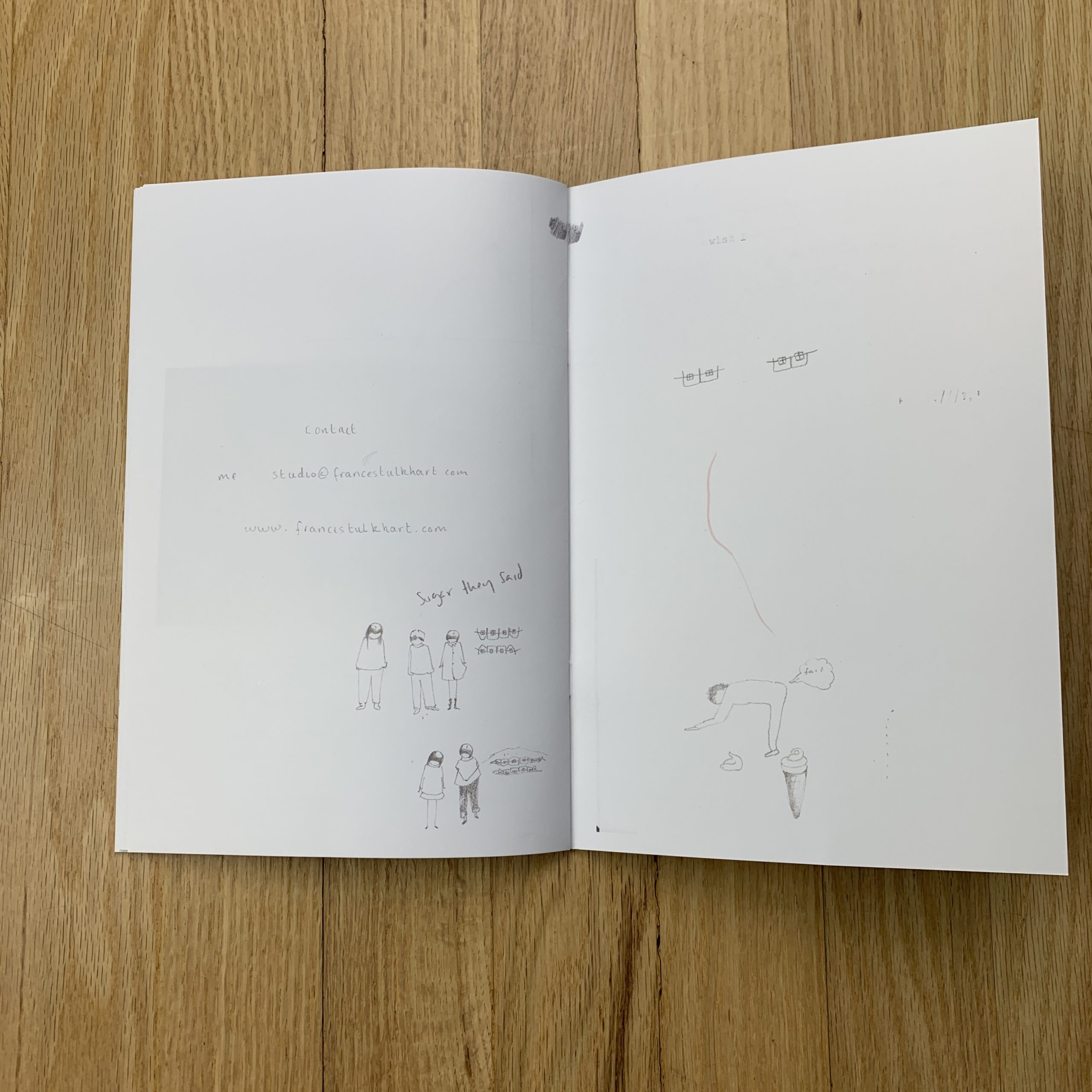
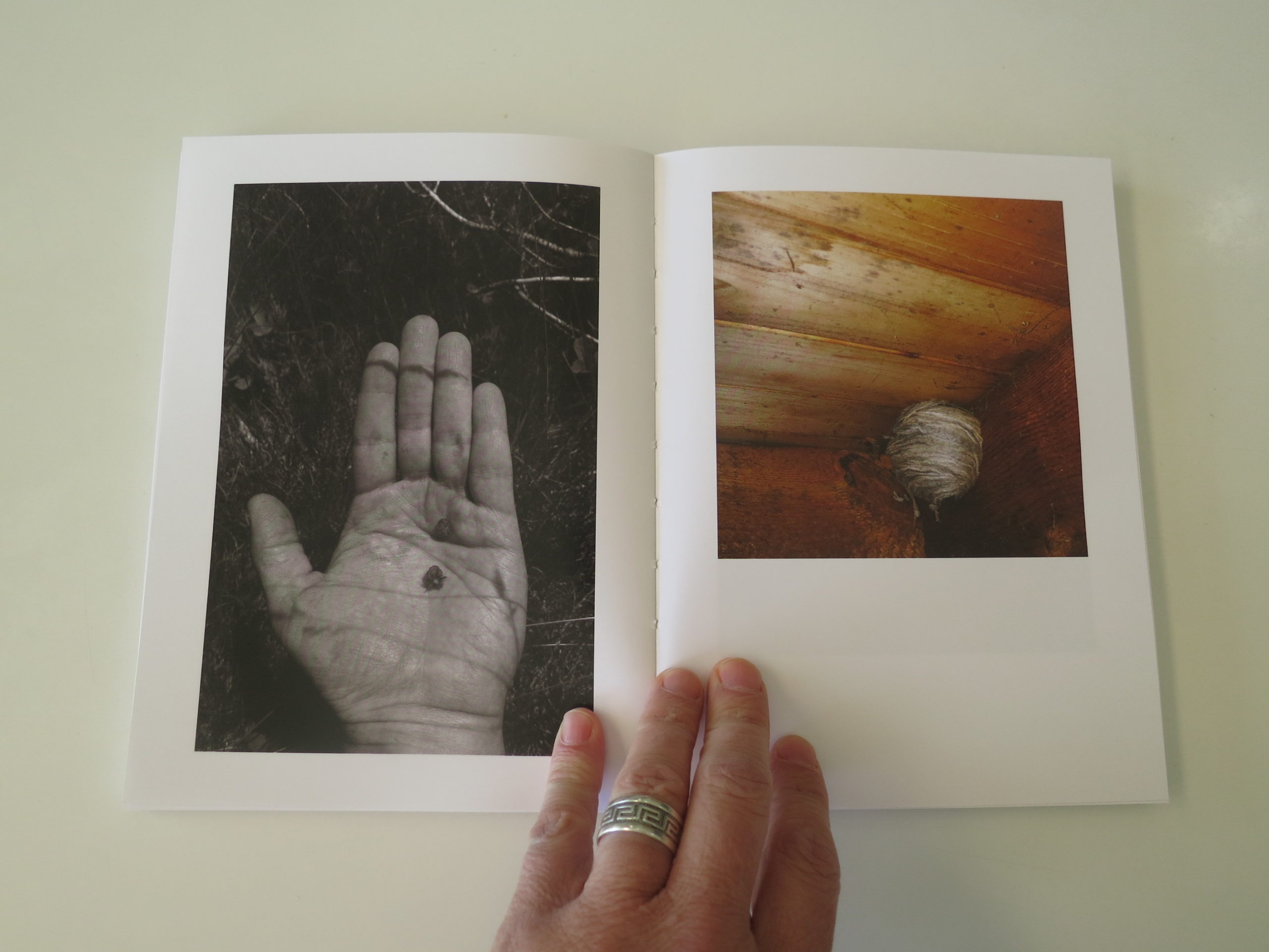
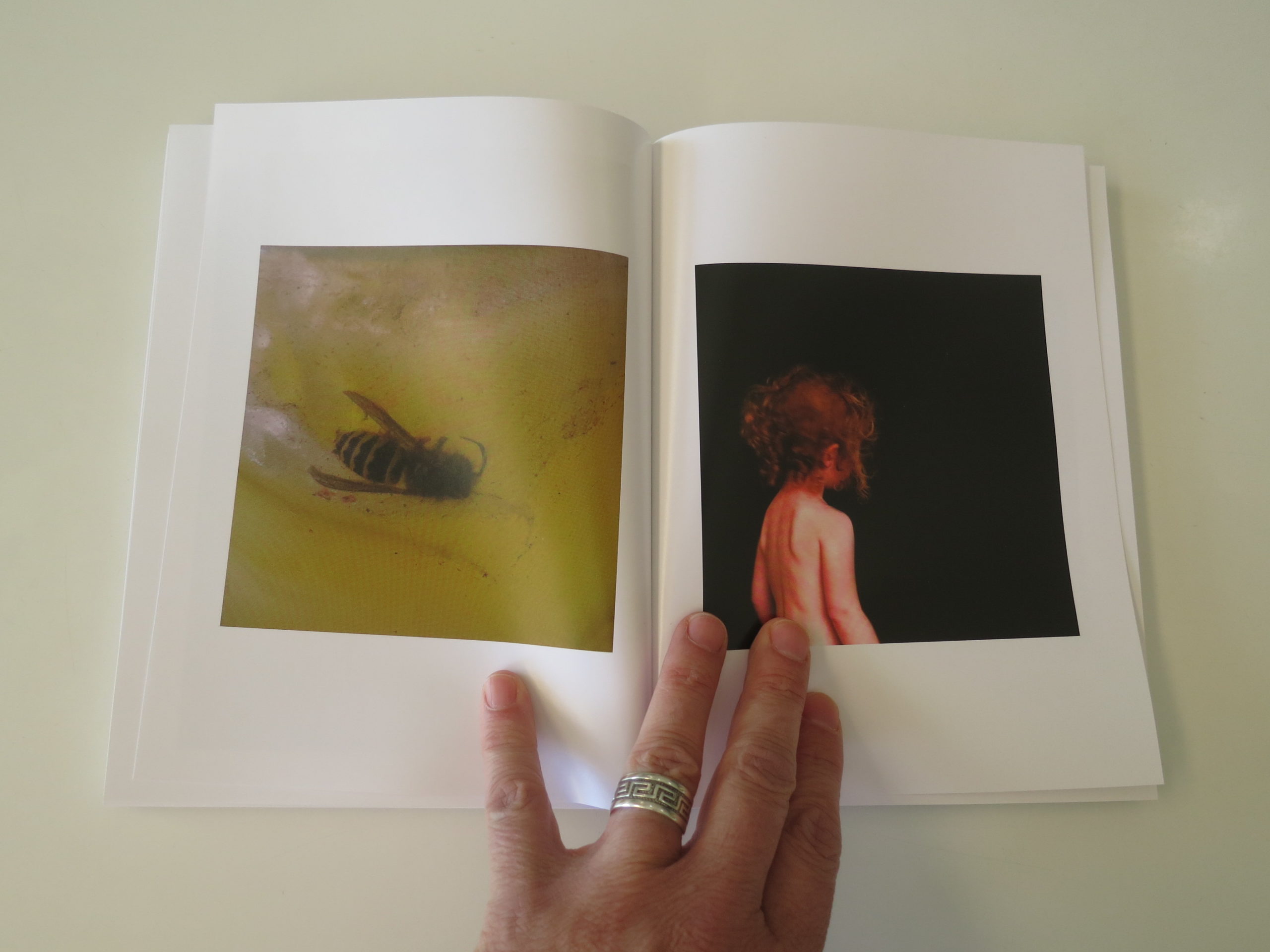
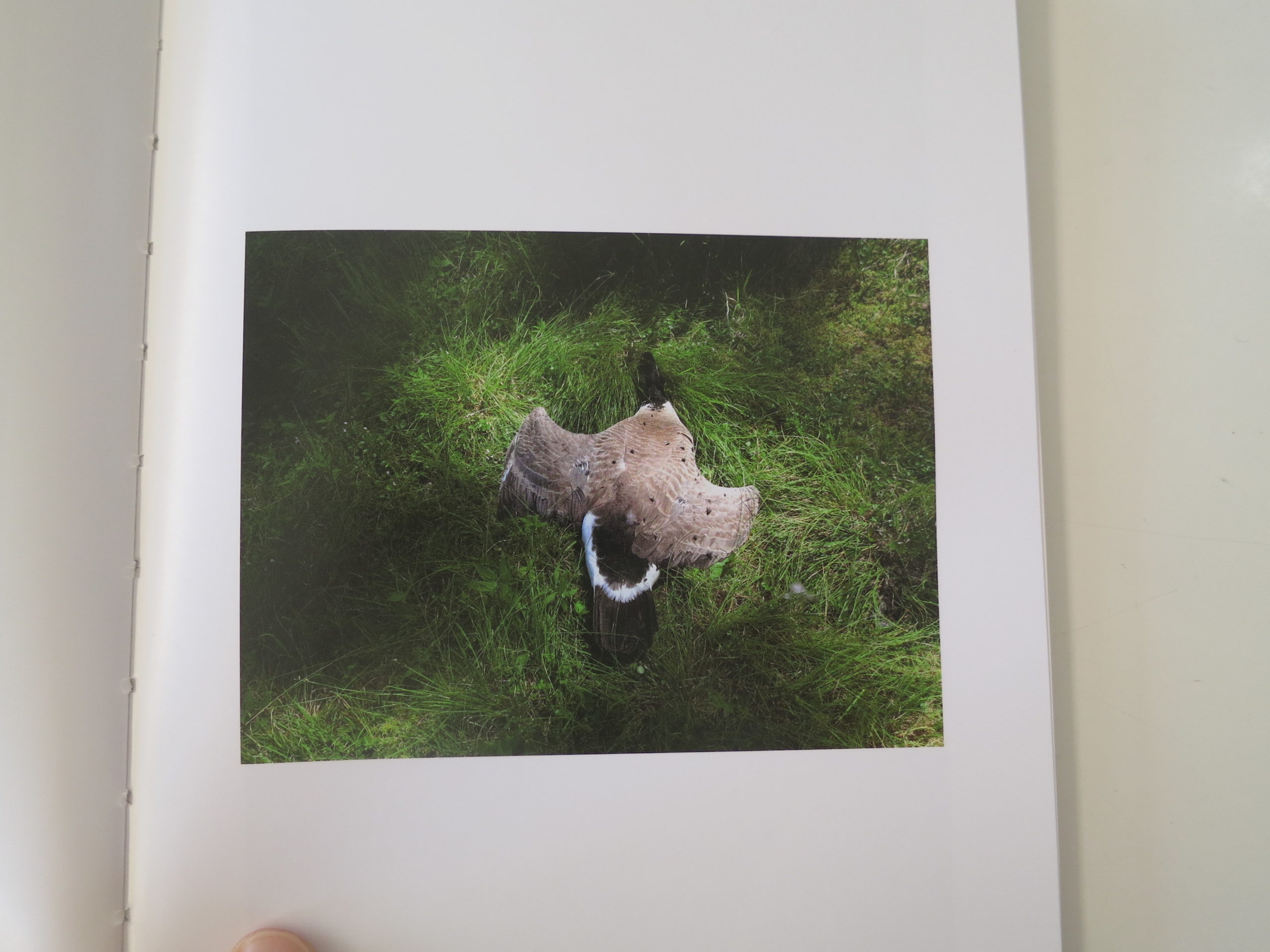
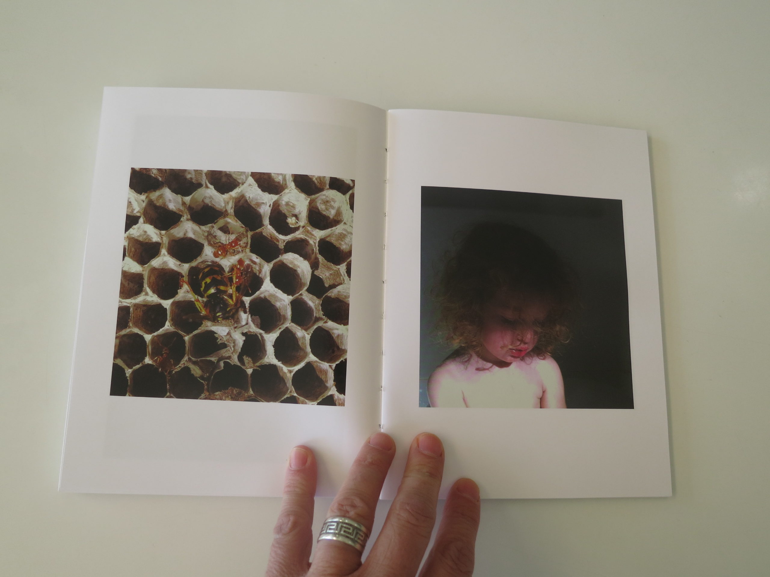
This project started in the New Year. I initially wanted to make a zine and then it turned into a journal of sorts. Every two months the plan is to bring a new one out. The images in each zine/journal, shall we call it a zournal, are relevant to those two month. So this one is January and February. Photos I got back from the developer, doodles I did, work that was published, thoughts, all things that happened in those two months. I can cheat a little too. Like for instance there are two images in there that are from years ago but because I was teaching a class at RISD in January and was doing research for it I was allowed to use the images I was going to show my class as examples!
How many did you make?
I made 100 for now but might do another run. I’m also thinking about selling them so might need to print up a lot more.
How many times a year do you send out promos?
The plan will be to send out a new promo 6 times this year, every couple of months.
Do you think printed promos are effective for marketing your work?
This is the first time I have done a printed promo but the feed back i’m getting is that people are amazed and thankful to be actually holding and feeling something in their hand as opposed to staring at work on a screen. I’ll let you know at the end of the year how effective it was in getting me work!! Effectivness aside though, just doing them is enjoyable, I have so much fun working on them. It’s like a puzzle trying to figure out how my work all fits together. I re designed my website and made a book last year that was about 150 pages which is where I first realized how much I loved designing the book as much as doing the art that went in it. Also what is nice is that unlike instagram, which I use as a promotional platform, once I send these babies out into the world I have no idea if they will be seen and or appreciated. I let go of them, not worrying about likes or dislikes.
The Art of the Personal Project is a crucial element to let potential buyers see how you think creatively on your own. I am drawn to personal projects that have an interesting vision or that show something I have never seen before. In this thread, I’ll include a link to each personal project with the artist statement so you can see more of the project. Please note: This thread is not affiliated with any company; I’m just featuring projects that I find. Please DO NOT send me your work. I do not take submissions.
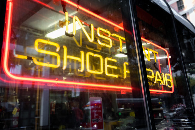
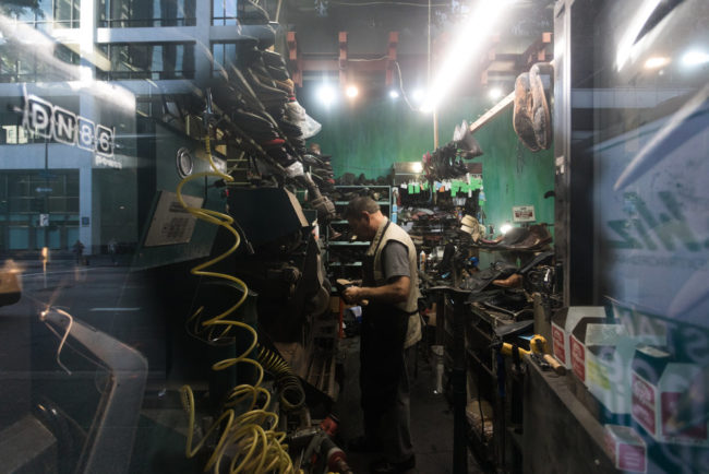
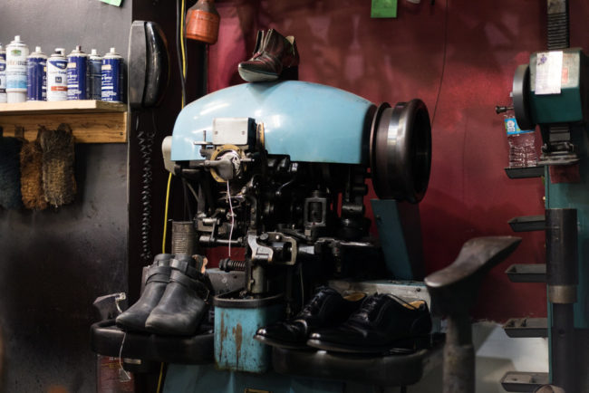
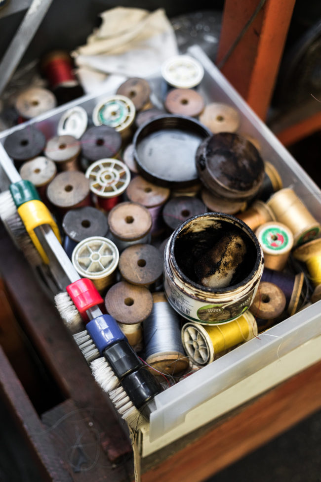
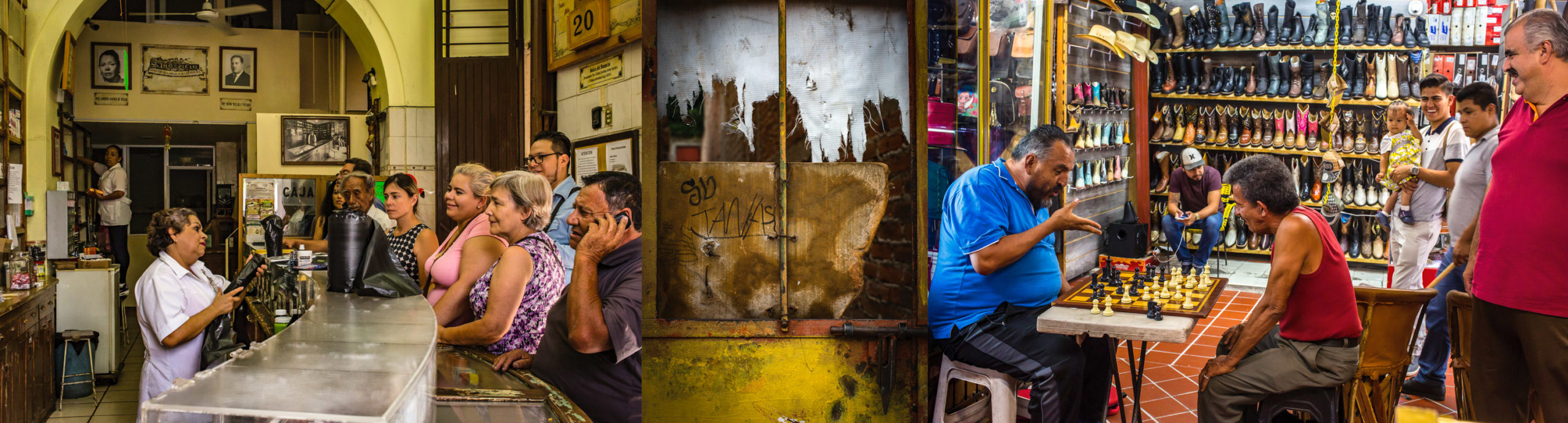
A shoemaker once told me we have to take care of our shoes, they protect our feet, our feet carries our body that carries our head….
There was nothing else about his story, but he taught me the value of craftsmanship and dedicating a lifetime to making sure people protect their heads…
APE contributor Suzanne Sease currently works as a consultant for photographers and illustrators around the world. She has been involved in the photography and illustration industry since the mid 80s. After establishing the art buying department at The Martin Agency, then working for Kaplan-Thaler, Capital One, Best Buy and numerous smaller agencies and companies, she decided to be a consultant in 1999. She has a new Twitter feed with helpful marketing information because she believes that marketing should be driven by brand and not by specialty. Follow her at @SuzanneSease. Instagram
Success is more than a matter of your talent. It’s also a matter of doing a better job presenting it. And that is what I do with decades of agency and in-house experience.
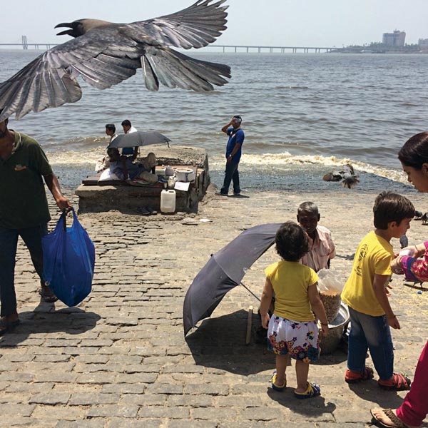
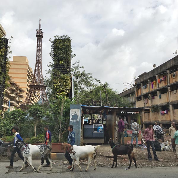
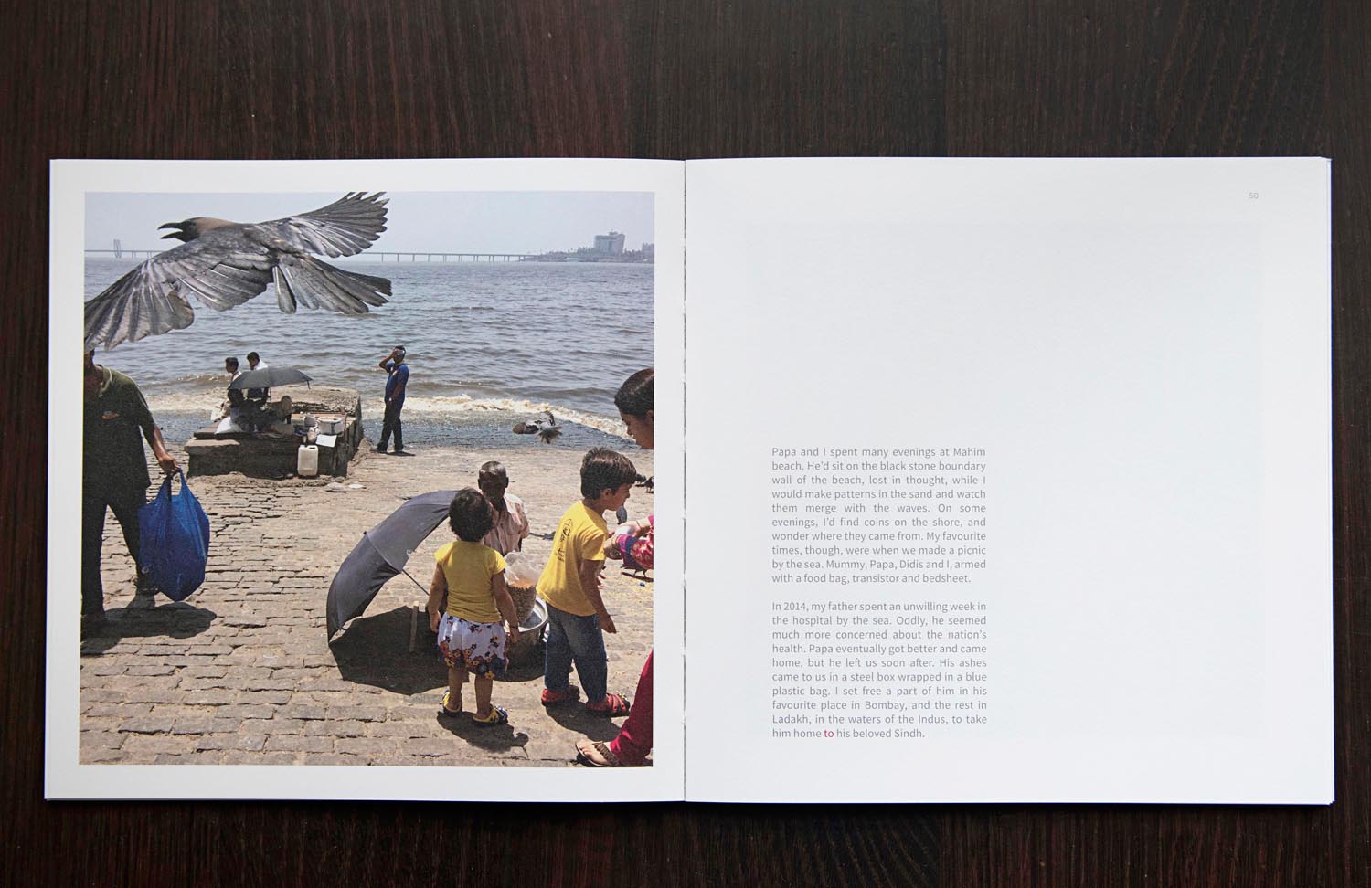
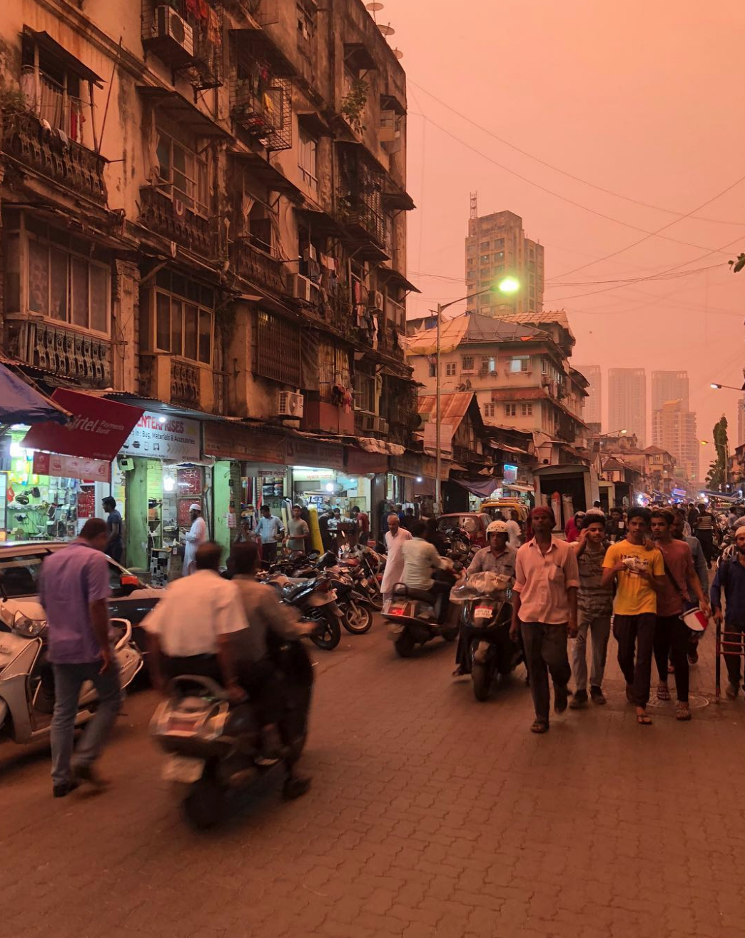
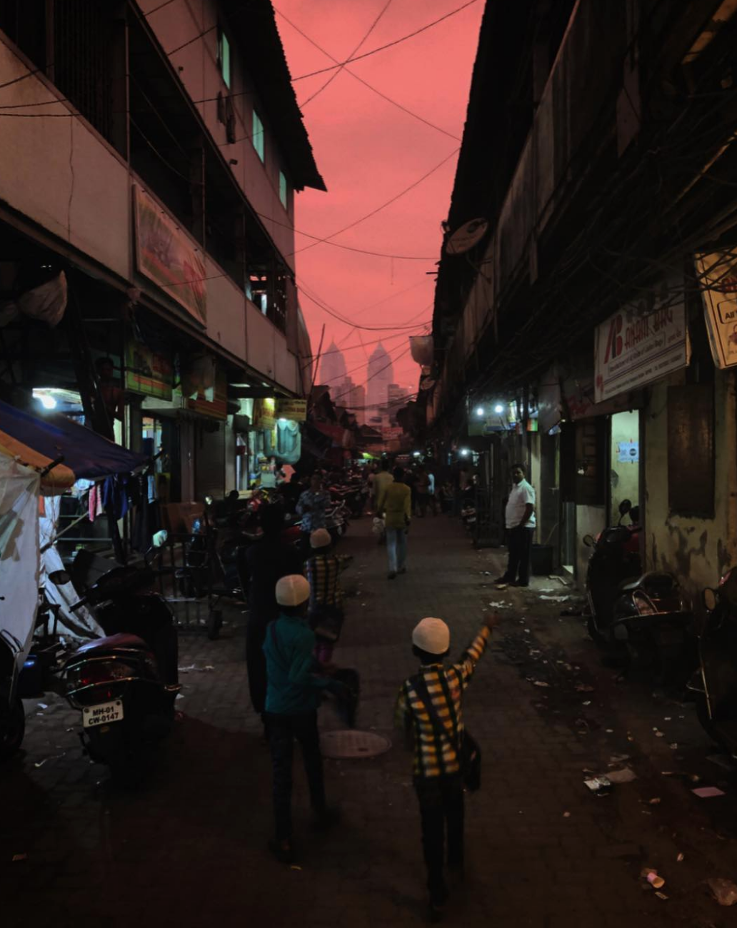
Warning signs of falling debris during repairs at the New India Assurance Building, an Insurance firm.Mahim beach on a Sunday afternoon. A place where I spent many evenings of my childhood.
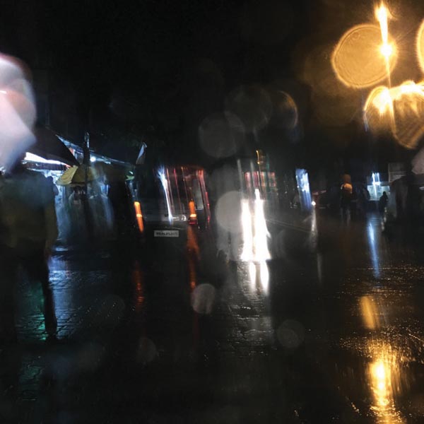
Flashes of light on a rain soaked street that reminiscent of walking hand in hand in the rain with my mother.
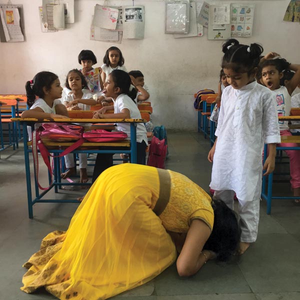
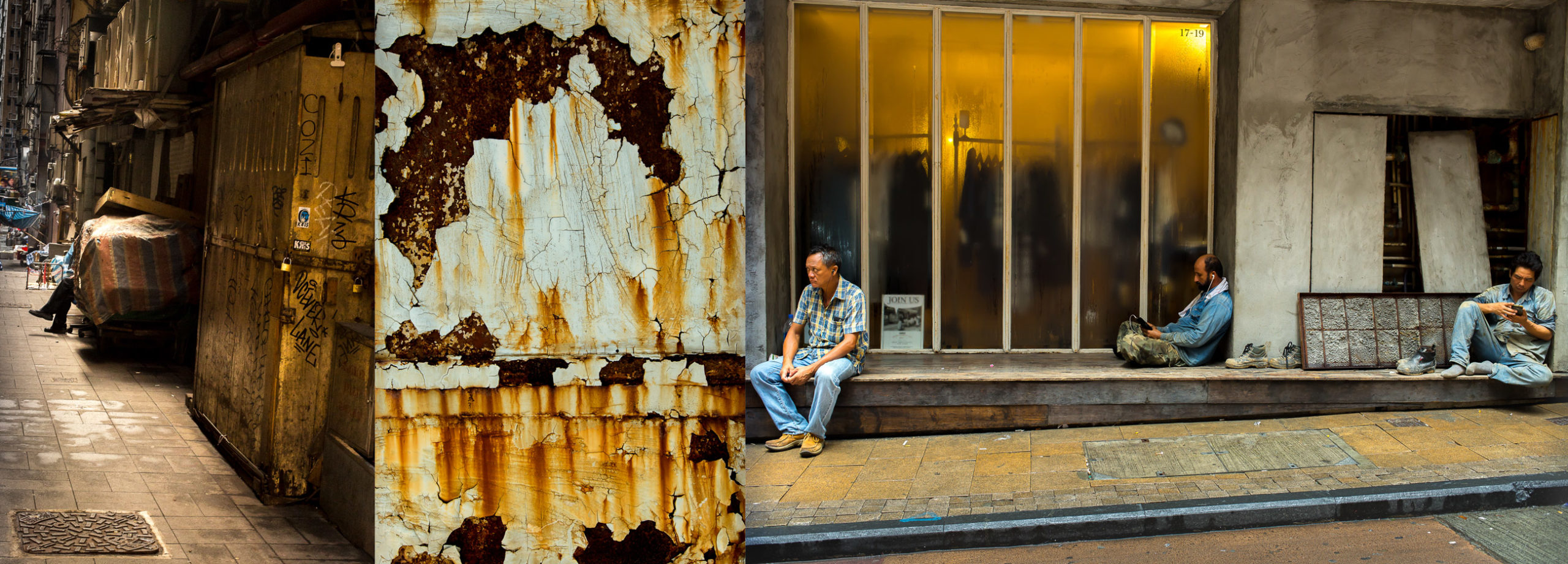
Heidi: Your images were recently in Shifting City, an exhibition that has been adapted in nine cities across the world that are considered ‘arrival cities’. The Red Cat and Other Stories had some of the same images, tell us about the cross over.
Ritesh: Kaiwan Mehta, the curator, gave us a brief related to the Arrived In City. In very simple words: A city where everything is kinda there, for whatever it is you wish to achieve or do; all you have to do is show up. I realized that my work on the city isn’t just looking at that aspect but I have also been chronicling the rapid expansion of the city, both in physical and mental terms. It evoked memories of the time I moved, and the mental jolt I got on seeing the socio-cultural differences. It made me think of all the conversations I have had with people I know that have shifted along with the city.
For curation I did a mammoth archive dive. I pulled out all my iphone images that went into the book, all the rejects that didn’t make it to the book and tossed them around. Over repeated edits and since I am one of those photographers who makes photos everyday, I added the new material made in the month and half leading up to the show. Final stage edit was done jointly with Kaiwan. One of my biggest takeaways, apart from many others, is his use of variants of a single image, akin to repetition. I always thought that repetition was simply a tool in writing, a figure of speech, but when done with images its quite fantastic!
What did you hope the viewer felt? The ultimate goal of my work is empathy and introspection. And they both work in tandem. Of course, I can’t really control what people feel so some viewers found it largely entertaining, some found the pictures to be a celebration of the absolute banal and hence very relatable. Most importantly I wanted people to read the photos and enquire within instead of expecting simplified captions. The whole series also aspires to incite curiosity. Life in the city is so hard, we barely get time to reflect or be curious about anything besides the fulfillment of one’s basic needs.
Were all the images in the book and the show shot with your iphone? if so why?
in 2014 I began using the phone camera extensively, in the square format. In the process, I learnt that am a very different photographer on the phone and it began impacting the way I deal with the city and country. The phone camera is the camera of today, our generation, and what better way to chronicle and display a lived-in experience of my spaces. The phone allowed me to have a citizen like eye instead of being all professional about it.
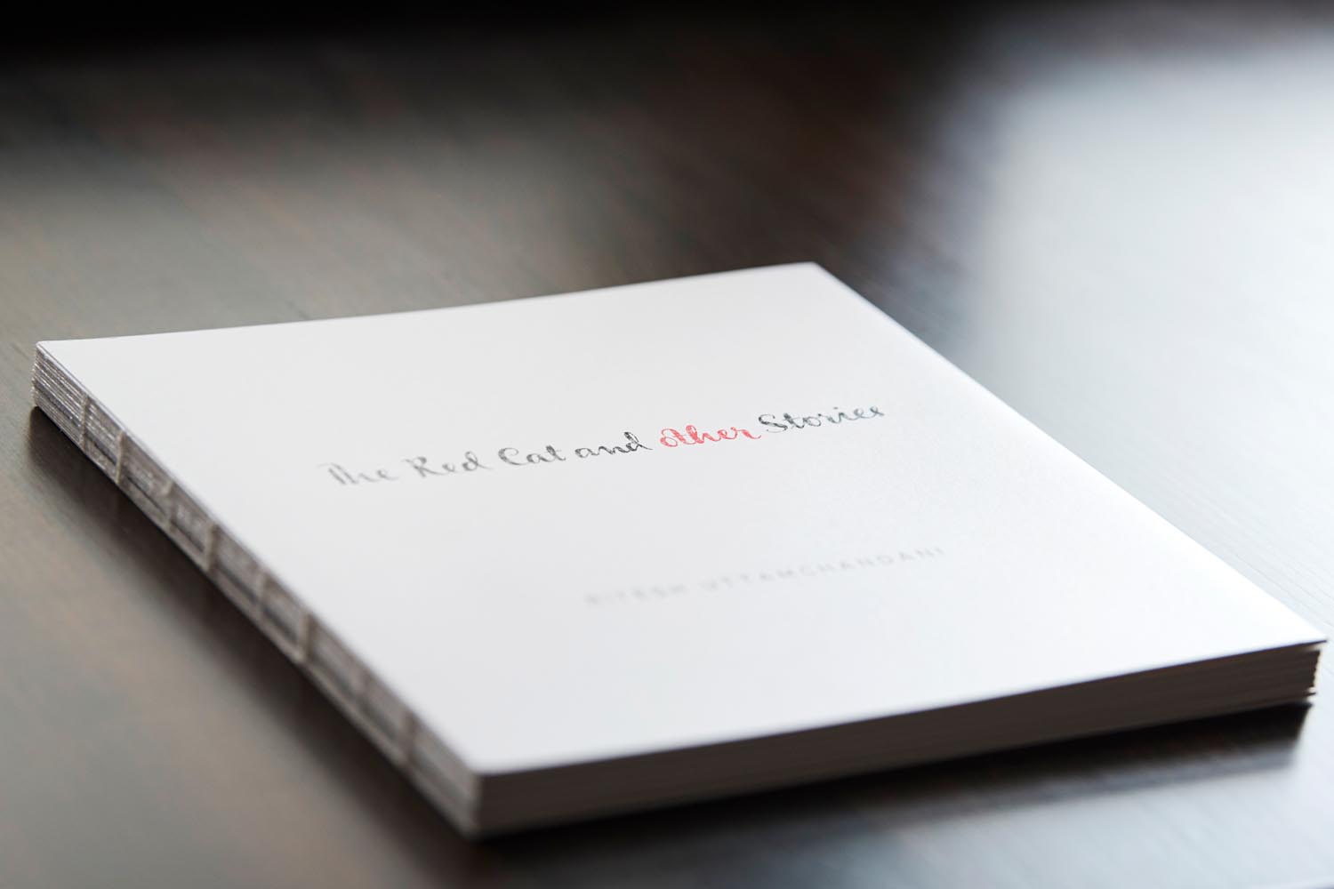
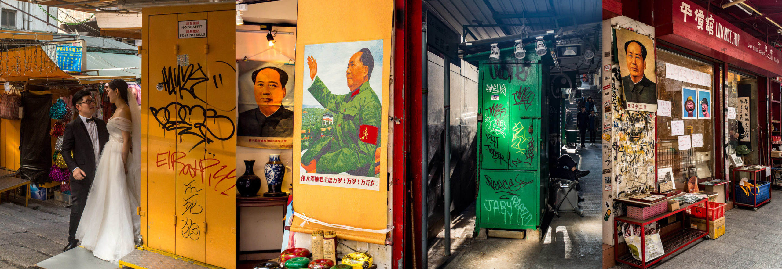
It’s true the work is serious and heavy at times, but just like life, I am very drawn towards a certain irony in images. And India, gets a short stick on that end. People have for years photographed it in extreme ways, too much colour, too beautiful, or too poor, too tough a place. I am quite fatigued by the cliched images of lovers on Marine Drive, crowds at the Gateway, south Bombay charm etc. Landscapes so imposing that everything else in the photograph is elevated too. As a response to this tedium, I self-published a photo book last year called The Red Cat and Other Stories in which I linked a Sindhi fable my mother told me when I was younger and my way of seeing the city which I feel now, after all these years of carrying multiple and confusing burdens of influences, is inspired more by these little fables and folk stories. My goal was to create the most un-Bombay book on the island city as I can. Hence I focus largely on the suburbs, arriving at a balance of sorts in terms of representation of class and landscape.
How long did the book take to shoot?
The book took four years, from conception on a May afternoon in 2014, till going to press in May of 2018.
Tell us about the title
The book was initially titled Ghar, meaning home, and as it developed I felt the title didn’t do justice. There are 16 stories of grit, of survival, of successes and failures that lead up to the Red Cat fable at the end of the book, where the protagonist is a young 17 year old, hence The Red Cat and Other Stories.
What font is in the title of the book?
The font is specially designed by Sabeena Karnik, who merged the handwriting styles of my 2 elder sisters Shirley and Sonia and for my name I used a font called Metropolis. If not for my sisters I would not be in a position to pursue my dreams. If not for my parents, and my father’s dogged fight to live in Bombay, we’d be in some small town and I’d probably have a corporate job. The book is an ode to that very fact that we are never self made. Everything is a collective effort and it is true for a city like ours. No one can fulfill their dreams on their own, everybody needs a Red Cat.
How did you decide on that binding?
The binding was a last minute decision fueled by an accident. The printer, sent me the final dummy and after one day the cover began to drift away from the book, exposing its spine. At first I got mad but then I was drawn to its bareness. I anyways wanted the book to have some elements that are like a lot of the city’s structures. How often do we come across a beautiful building or a home and when we go to its side we see a chaotic network of pipes and wires. I also wanted a sense of fragility, like some of our inter-personal relationships, one wrong word or action that is misinterpreted brings to collapse years of knowing someone. It happens with all of us.
No image on the book cover, why?
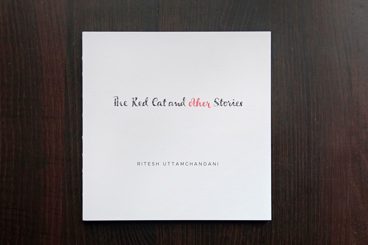
For the cover too, I kept it simple. I don’t want a reader to know this is a photobook. Its simply a book with photos and text! So, because of its whiteness, if you leave the book on a coffee table, there are bound to be stains, handle it roughly and it threatens to come apart. A day before printing, I reduced the paper weight from 130 gsm to 100 as well, for I wanted a certain see through to happen. Sacrilege, felt my photographer friends and the process co-ordinator at Pragati Offset. But if you hold up certain pages against a source of light, two images merge to make a third. Like life, many things happen at once, overlapping. The printer thought am being stupid or just cutting costs, but trust me, it only looks fragile, it is pretty sturdy.
Over the last year, I came across many readers who have done interesting things with it. One man wrapped it in a beautiful hand-spun cloth from his village and kept it in his safe as a gift for 4 year old son when he turns 18. Some others have refused to let go of the bubble wrap envelope that I had used to pack it. Some have simply kept it locked inside their cupboards instead of their bookshelves. Some books are beautifully personalized by food, pickle or tea stains.
How did the book push you creatively?
The book tested my patience at all levels. Whether it was design, production or tracking of couriers. At every stage, it demanded patience of ginormous amounts! I taught myself the basics of Indesign, binding, understanding page counts to minimize wastage etc etc. As a photographer I lead a pretty sheltered life. Chasing stories, getting published and drawing a salary. And when one is doing news pictures for a long time, a false sense of superiority or a strange unreasonable dismissal of anything but news pictures had set in. So, self publishing a book, in India, when one is freelance, is like harakiri for such thoughts as well! Every step is twice as tough without institutional backing.
With regards to narrative, I knew the things I wanted to avoid. So it simply became a process of exclusion. I revisited several places to better some of the photos, one place I visited seven different times spread across two years. I was no longer chasing the perfect light, or form or anything that makes a photograph come across more dramatic than it already is. I had about 98 versions of Ghar till I abandoned that narrative and changed its name followed by 40 odd versions of The Red Cat and Other Stories. I showed the book to some photographers but I found their feedback limiting
How did you decide about the text and was there a through line in all the interviews?
I was pretty sure about having text in the book; it simply shaped up as I went along. The layout for the spreads was also quite fun. If one sits and puts together all the text columns of the book on a single page, they resemble a city skyline. The gap between some words is more, some less, for a reason. Like houses in the city, some have a single room, some have 2 room houses and so on. To the uninitiated it might seem like one giant mistake.
Why are some words in red in the text?
In addition, There are some words in red ink though that one has to join up and construct a sentence which is the last line of the Red Cat fable. This allowed me two things, one that I can keep the story open ended if the viewer does not wish to join the words. Second, its a game of sorts and you can involve kids too. A lot of photobooks alienate kids and senior citizens. They don’t set out to, but the chunky design and/or choice of topic manages to. For the same reason, I junked the hardcover and made a semi soft cover which allowed me to make gatefolds that contain short, succinct and often suggestive captions for the images. This way, you don’t have to go all the way back to some Index page. Stay with the narration and simply open the gatefold to know more.
How has your perspective of the city changed?
Change is too severe a word. Its just transformed a bit for the better. Made me a whole lot more sensitive than I was towards it. I think, that is a really good thing for its very easy to fall prey to extreme emotions here.
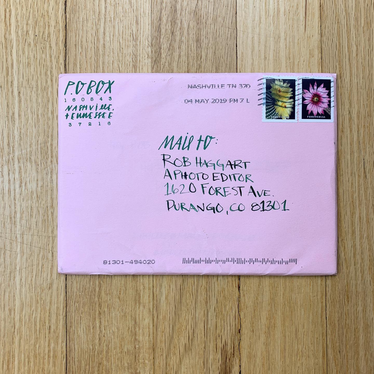
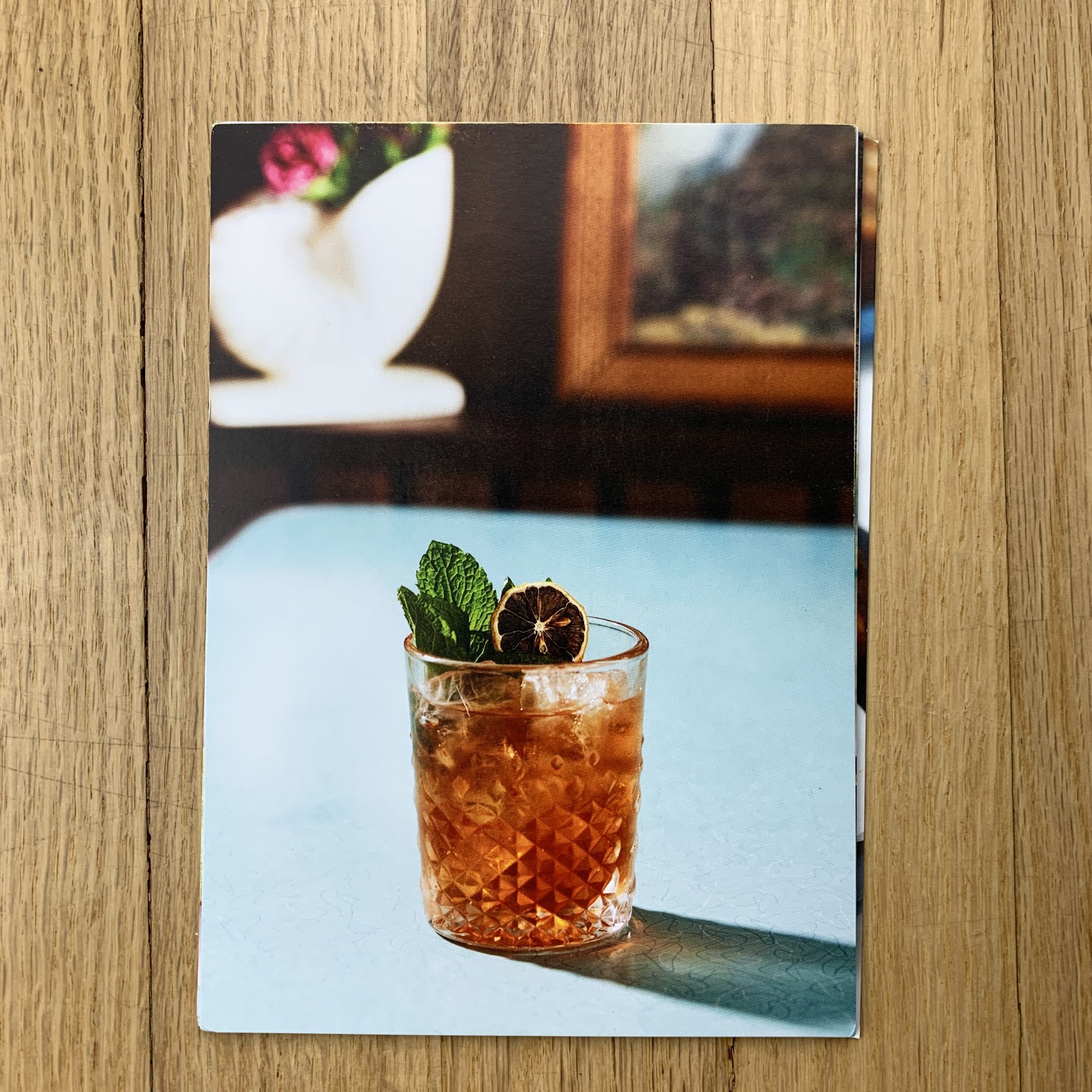
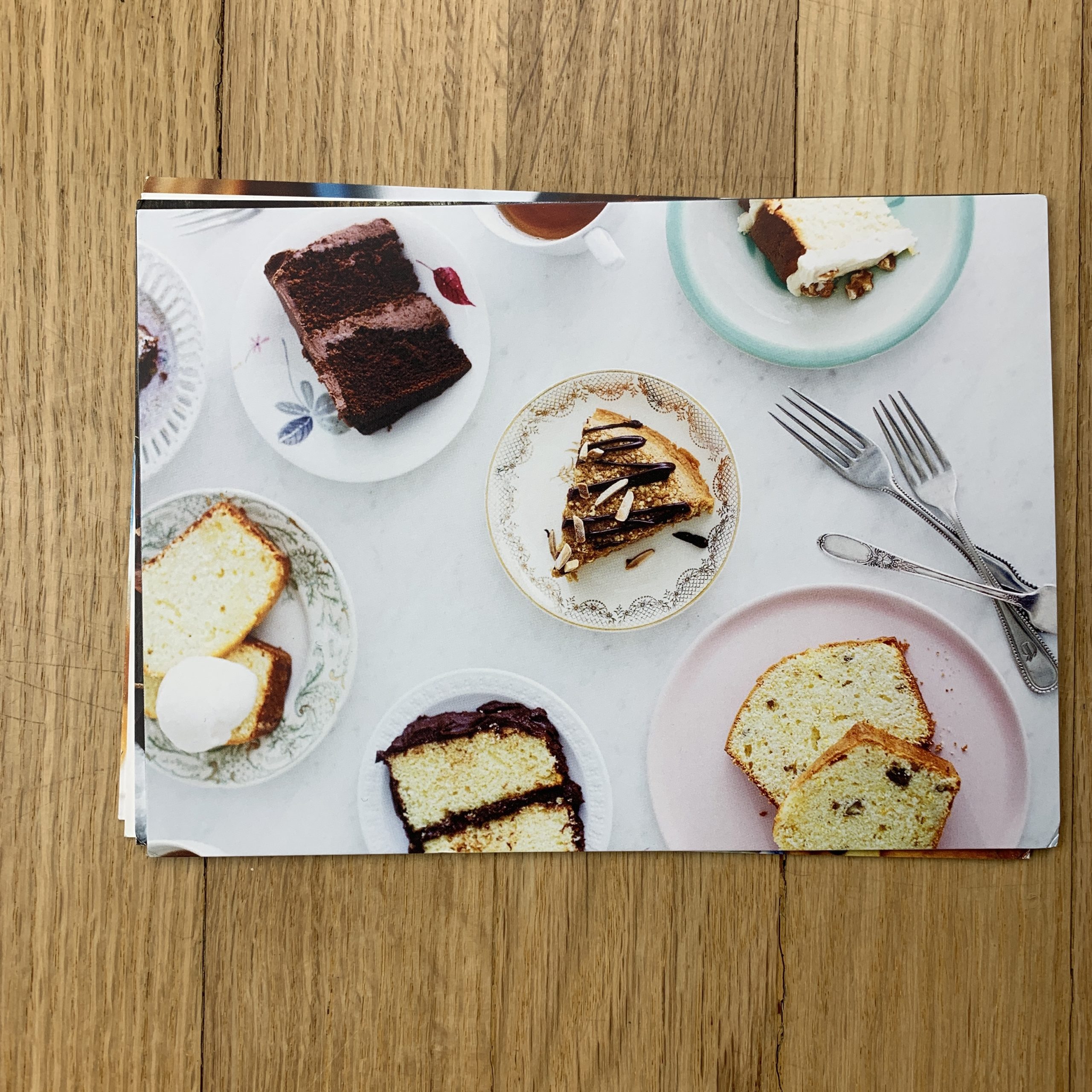
Tell me about the images?
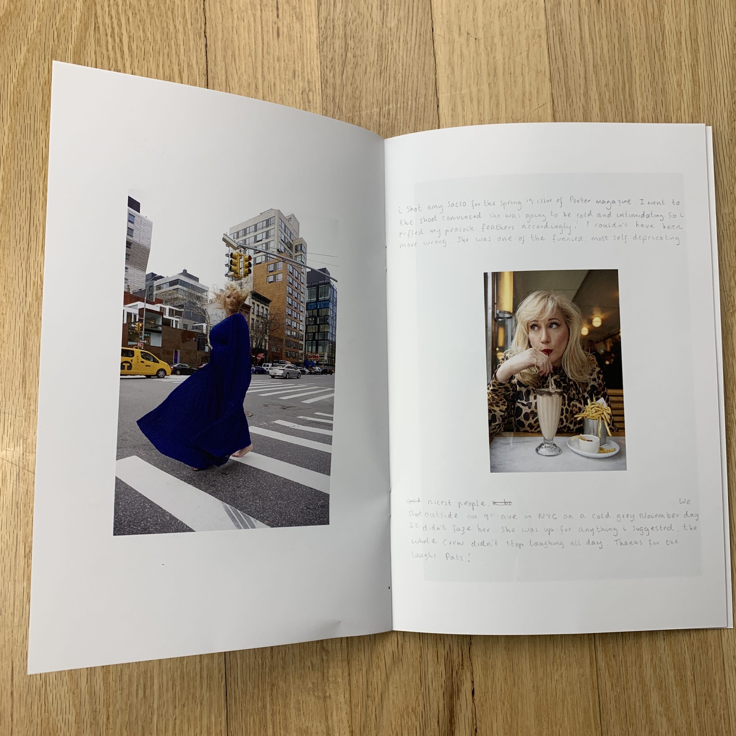
The images I chose are from a whole range of my clients…editorial, cookbook & advertising.
I tried to pick images that could mix and match to give a sense of my overall style of work and be able to tailor to who I would be sending them too.
The Cocktail is from a bar in called Pearl Diver and was a part of a cover story for Nashville Lifestyles.
The slices of cake are from the cookbook Everyday Little Cakes.
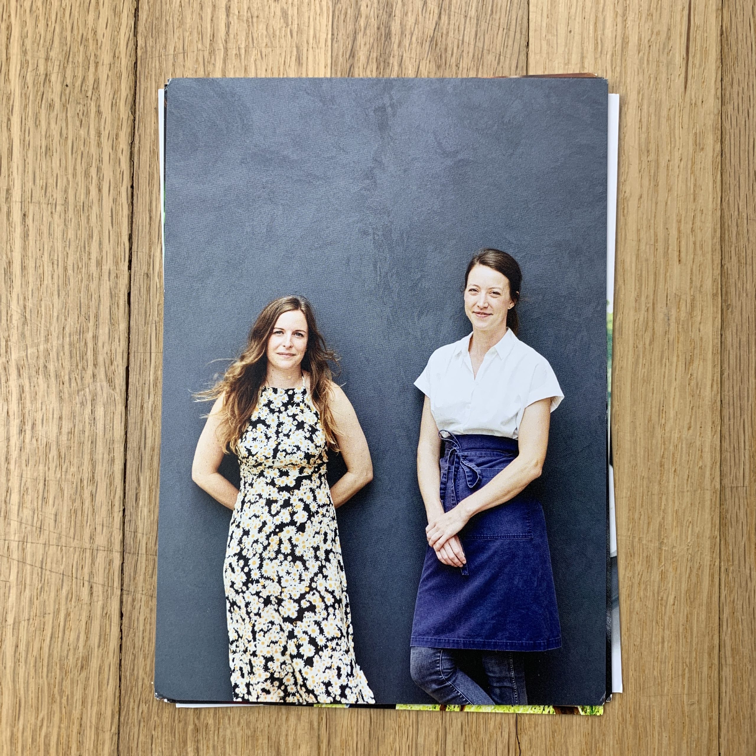
The first portrait is of the sommelier & executive chef of Henrietta Red. I have been working with them since before the opened the restaurant and I really wanted to include women who are doing amazing in the restaurant industry.
The knife is from a cutlery company, Hammer Stahl, that is based out of Tennessee.
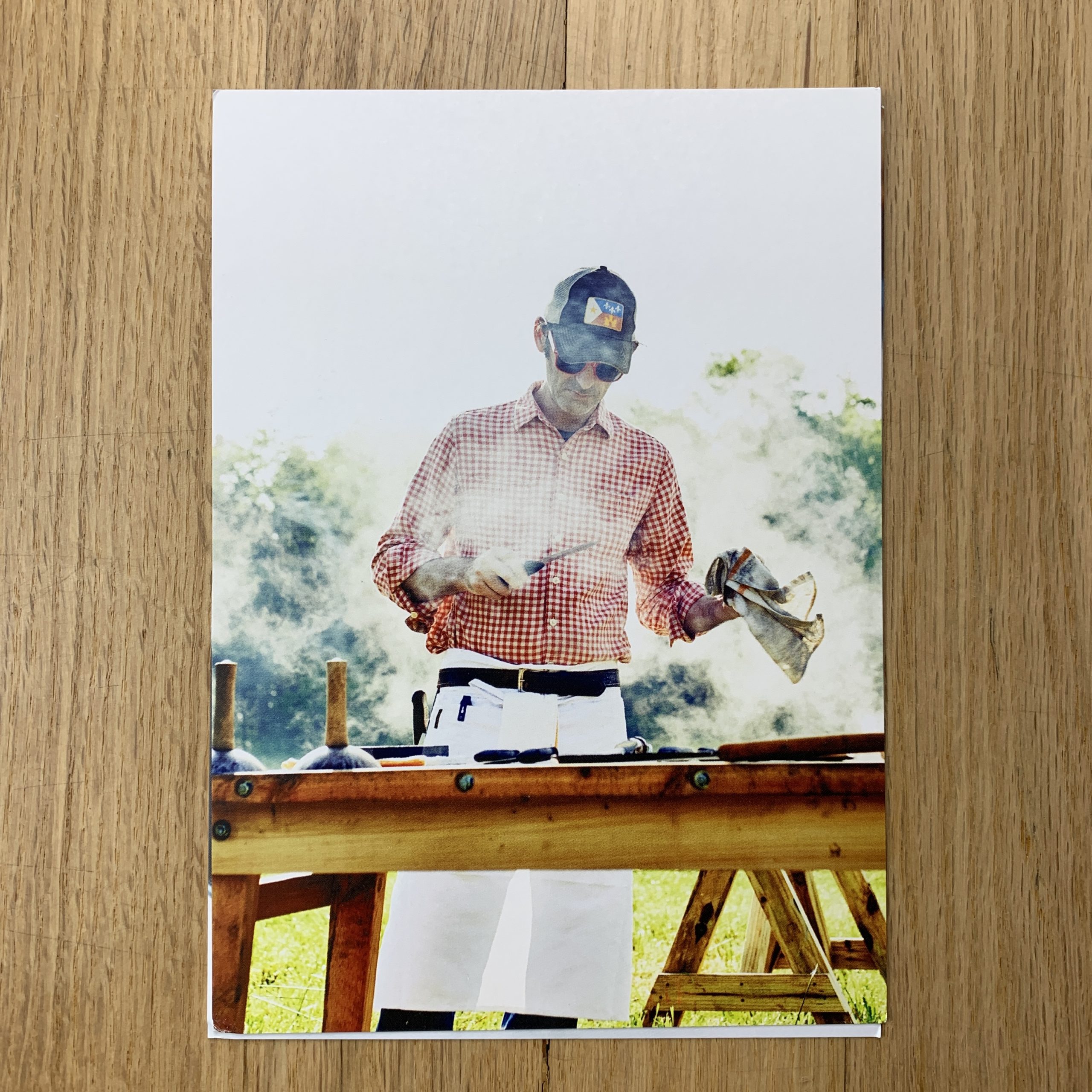
The next portrait is one of my absolute favorite images. It is from a shoot I did for The Local Palette on a group doing traditional Cajun boucherie. It was a great experience and seeing the entire animal being used was amazing.
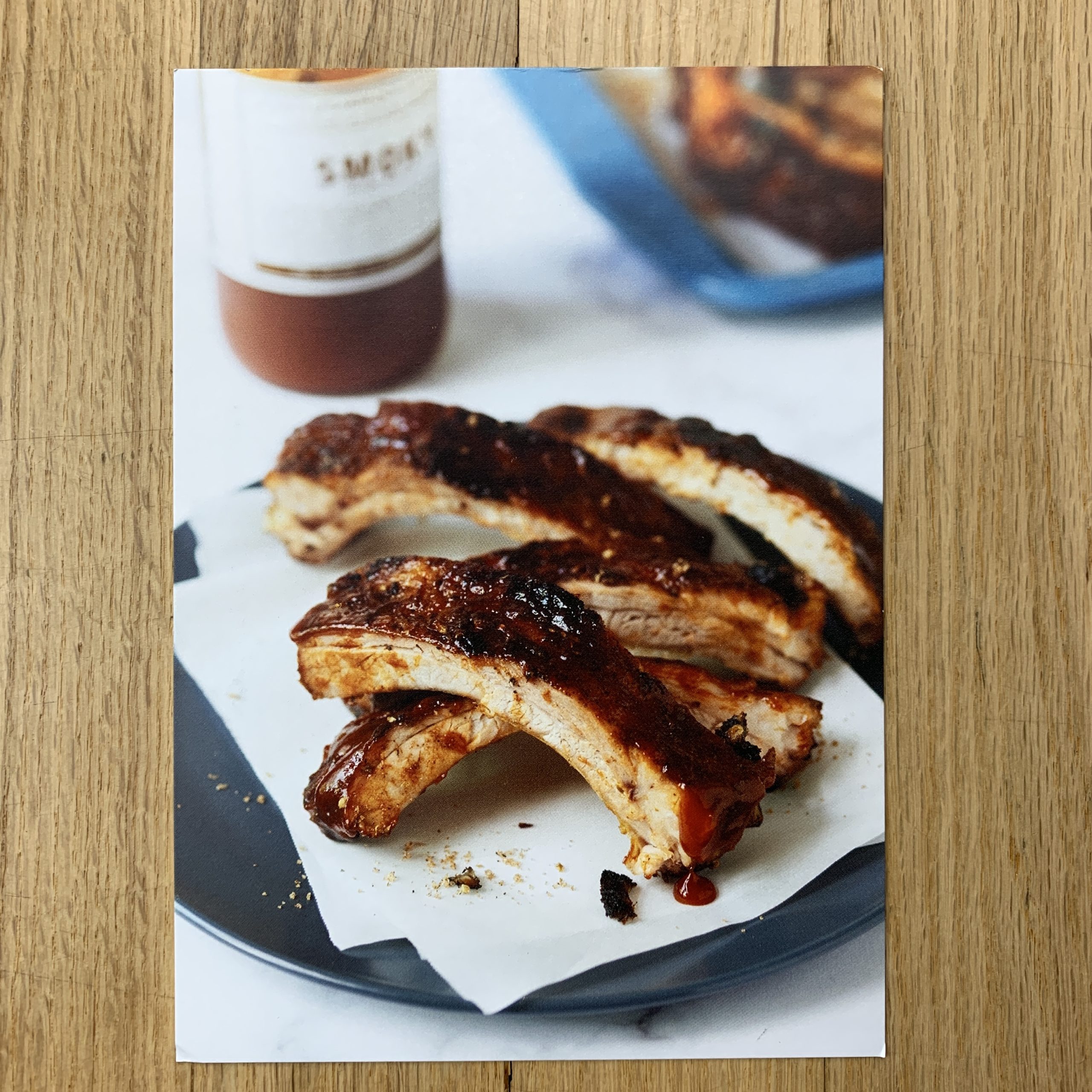
The ribs were from a recipe shoot for Parade magazine.
How many did you make?
50 of each image and I send them out in sets of 3.
How many times a year do you send out promos?
This was the first time I have sent out promos in a while but I will do this twice a year.
Do you think printed promos are effective for marketing your work?
Yes! I think having something tangible can make all the difference in the world. I was able to get hired by a publication that was on the top of my wish list for new clients because of these promos. We are so used to looking at things on screens these days that being able to hold something physical is still special. I always notice when doing portfolio reviews or handing a promo to someone their reaction to it is much greater than just looking at the same image on a screen.
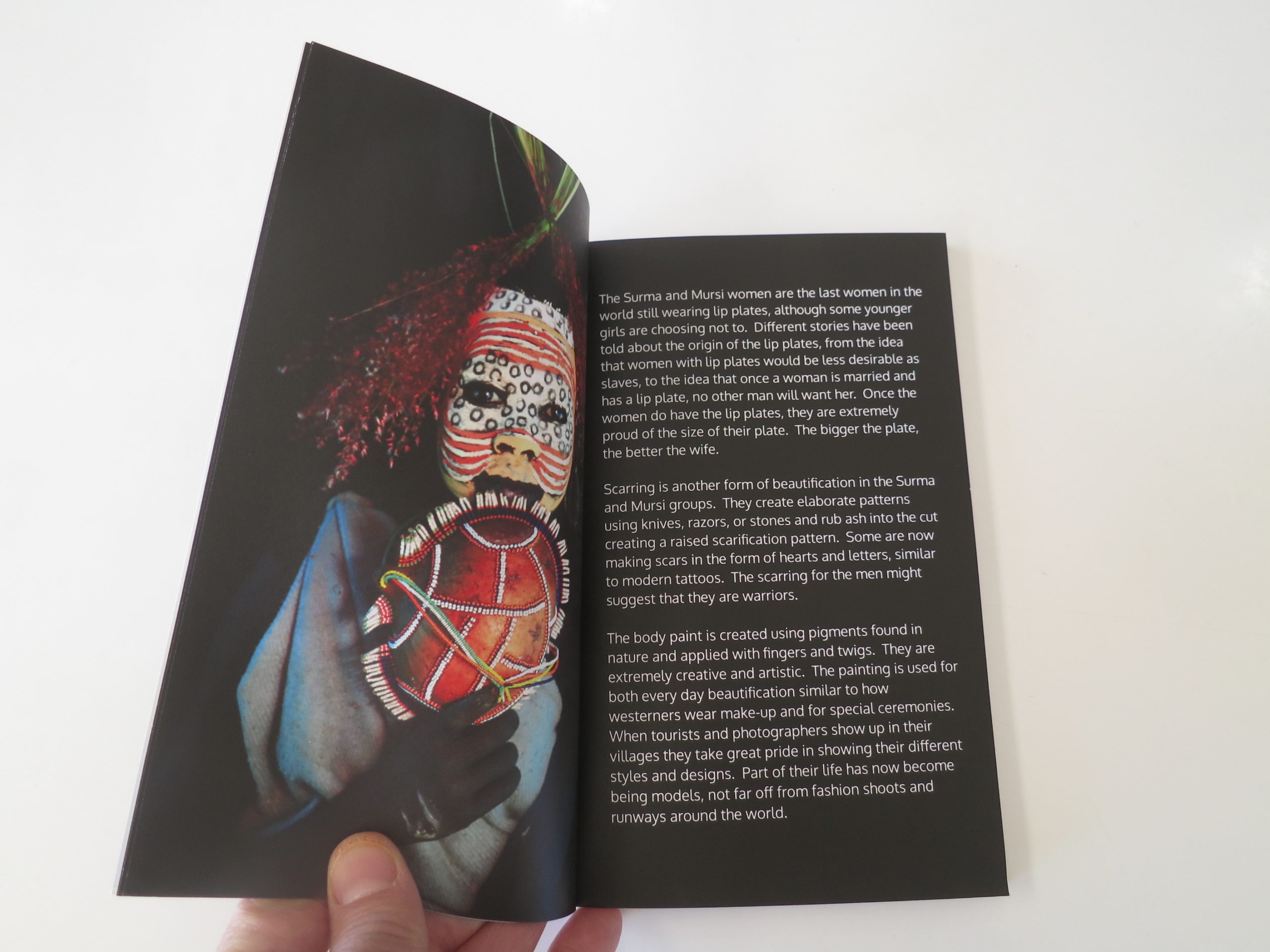
They’re people, of Muslim descent, who are getting royally screwed in China these days.
According to reports, as many as 1 million Uighurs are locked up in re-education camps, in Western China, where they’re forced to eat pork and renounce their God.
Happy times!
Seriously, as far as dark humor goes, when I was discussing the Uighur situation with friends in London, I joked that at least they weren’t getting discriminated against, really.
China will re-educate anybody!
(And of course I’m joking.)
The story got a bit of press last month, as I recall reading an editorial or two about the situation. In one article, (maybe in the Guardian?) it mentioned they were using surveillance tech, and digital tracking, to follow people by their routine.
Meaning, any deviation from your normal physical travel route, or usual digital activity, and they would have reason to be suspicious of you.
While Sartre suggested that Hell is other people, the Chinese are using tech to turn your regular routine into a form of prison, if not outright torture.
Welcome to 2019!
(Cue the creepy music. Maybe low-tone piano, with a lumbering pace?)
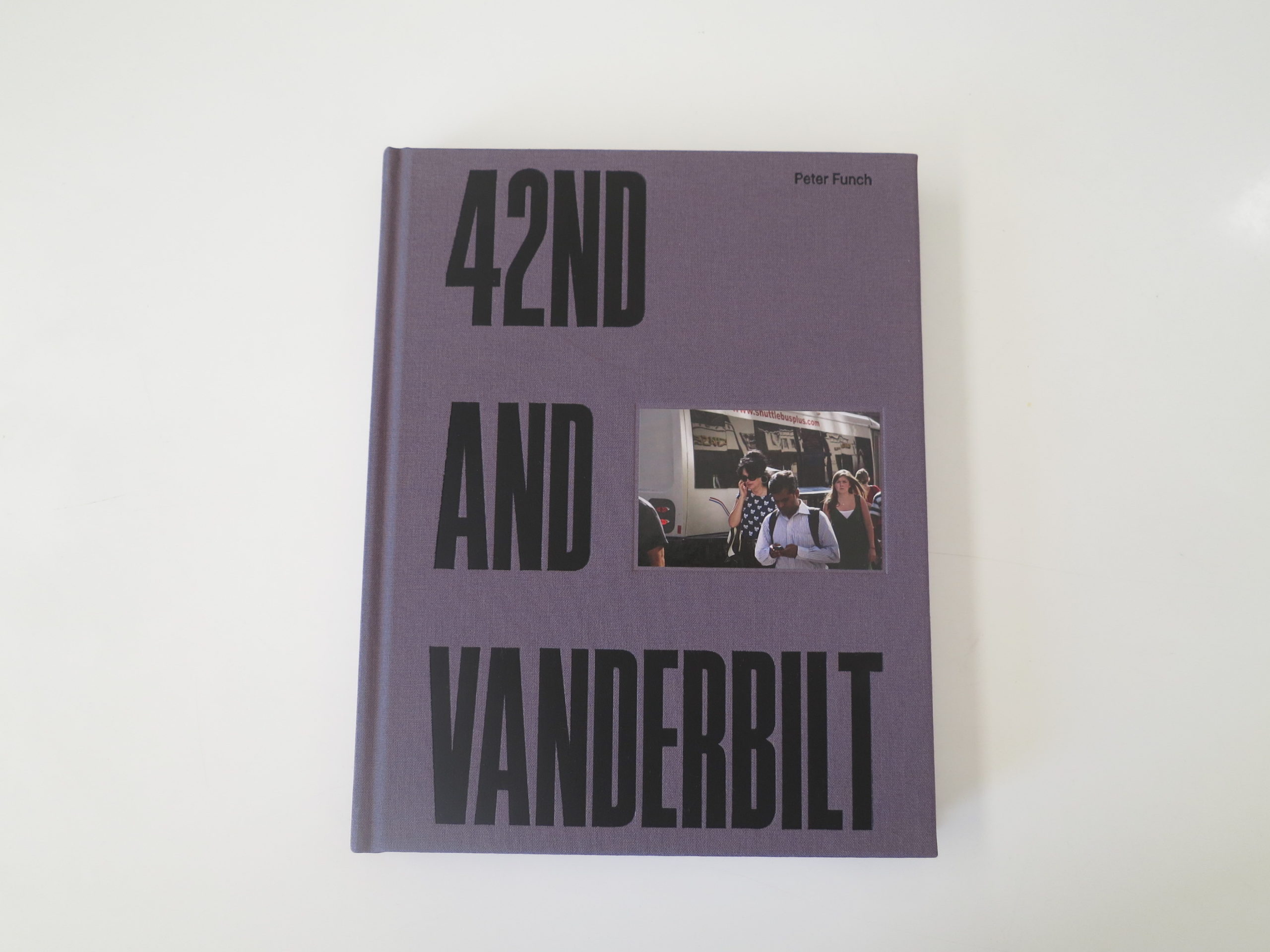
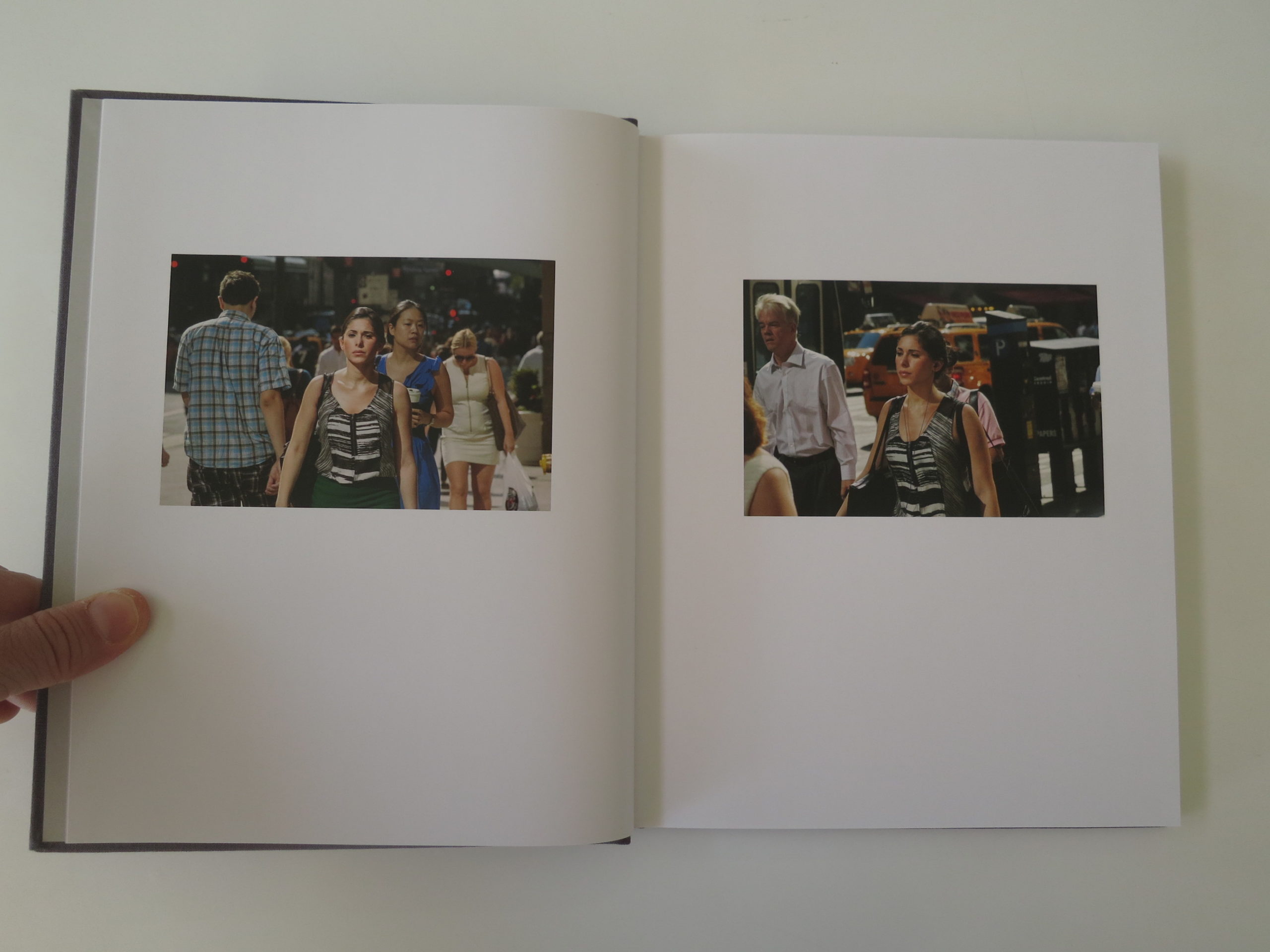
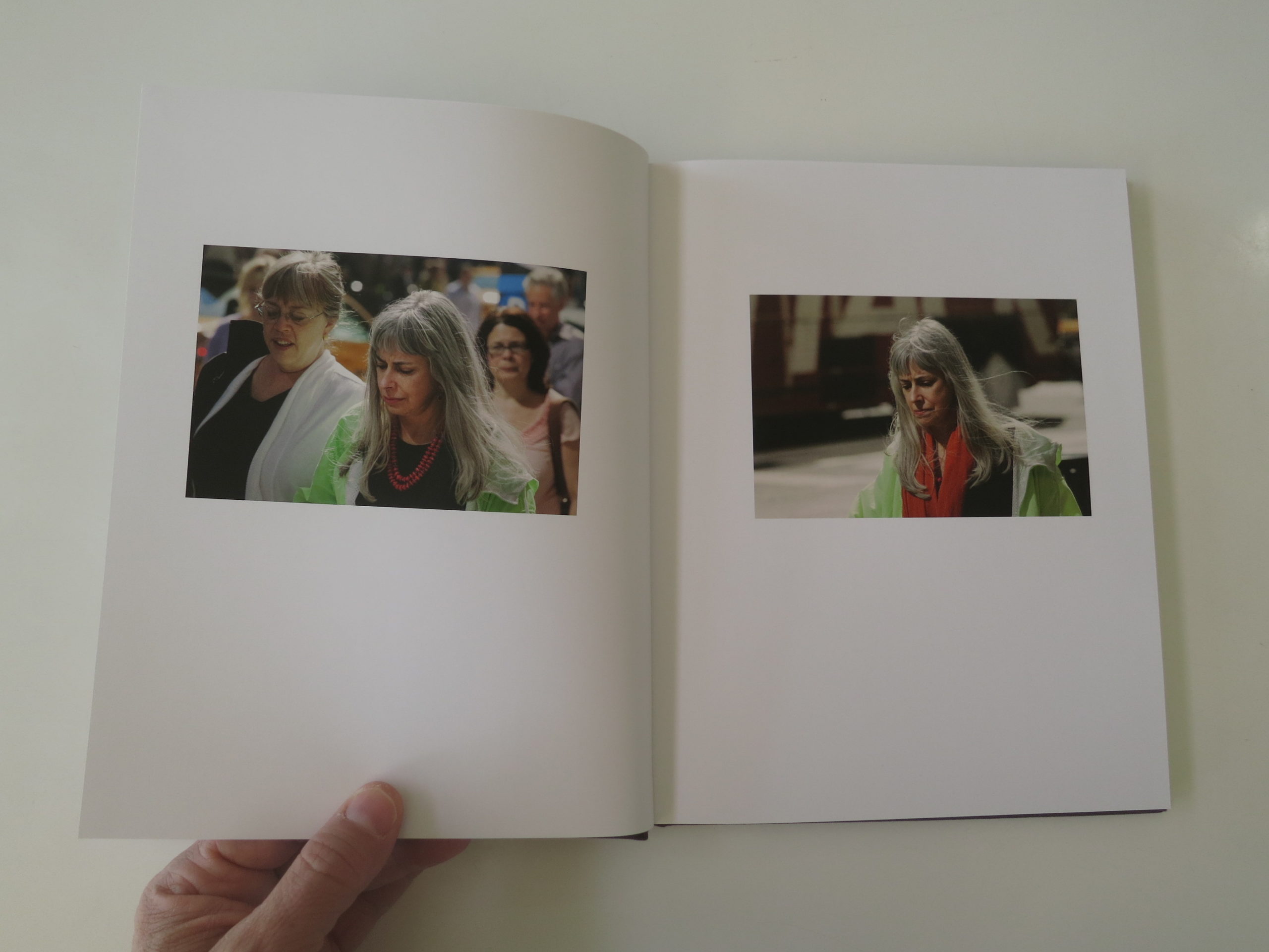
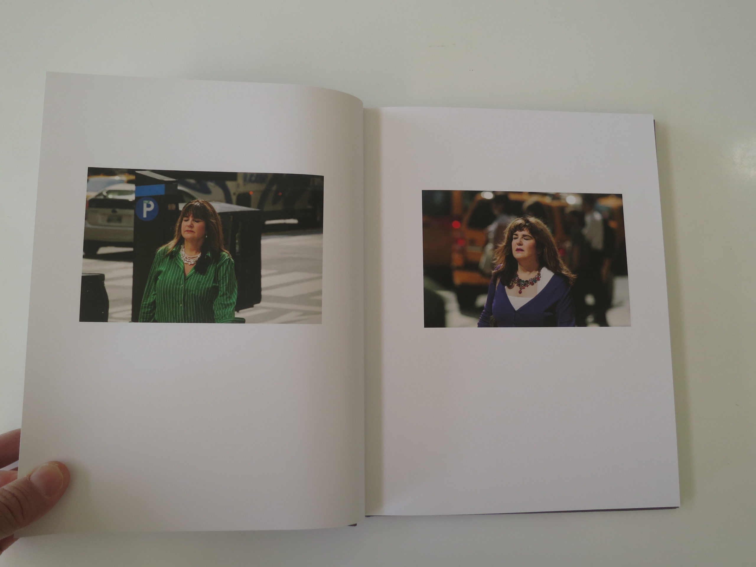
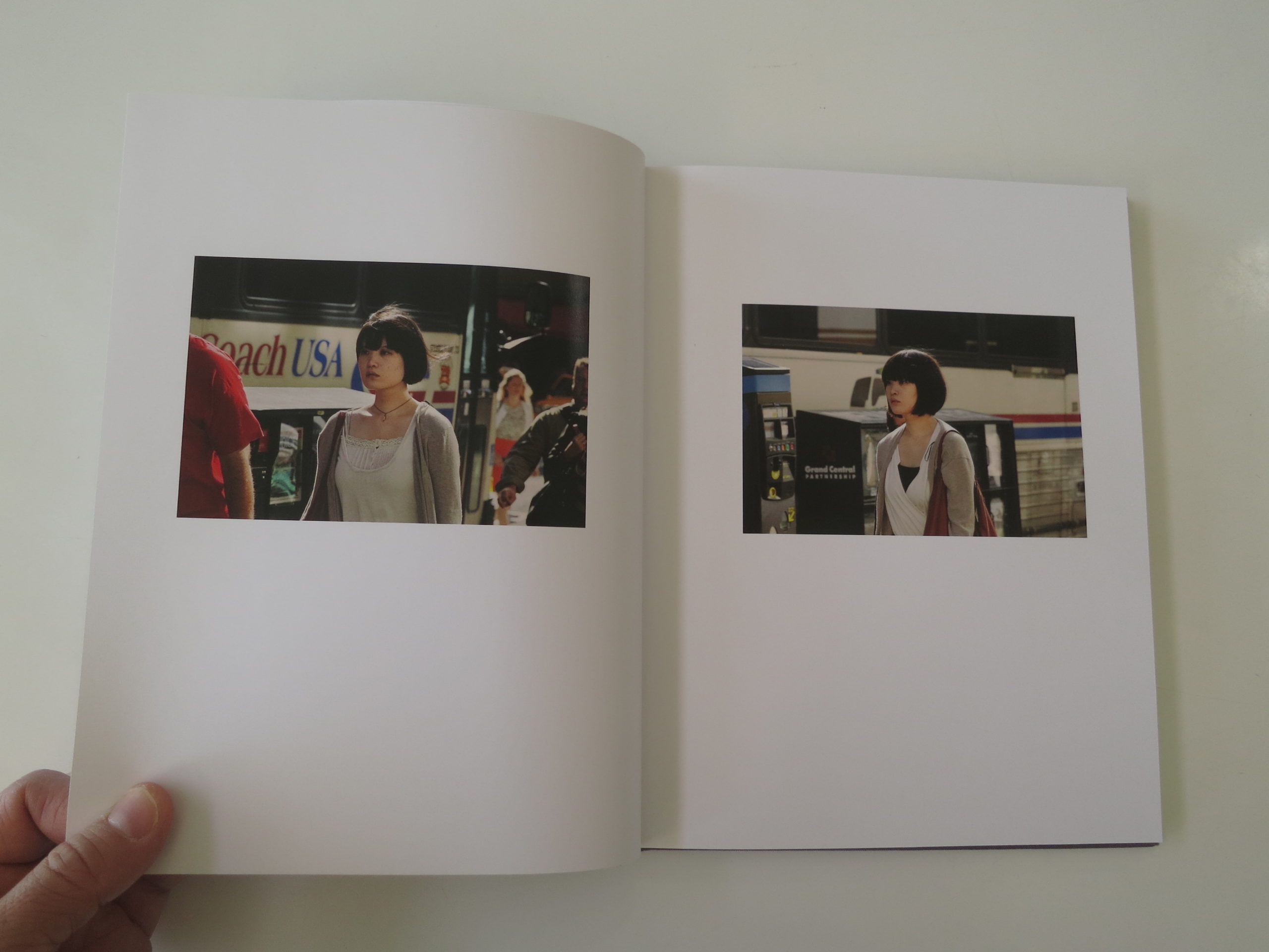
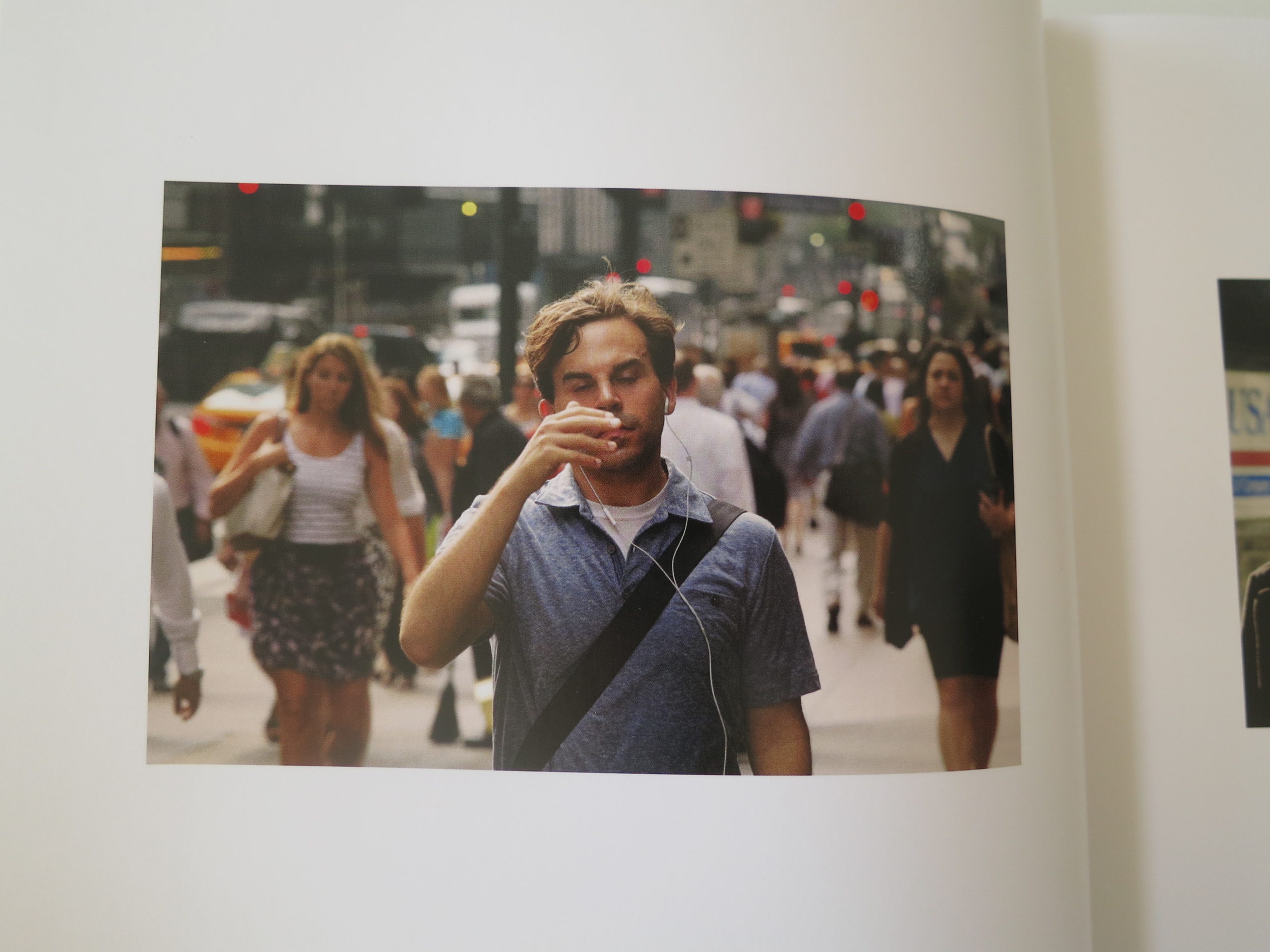
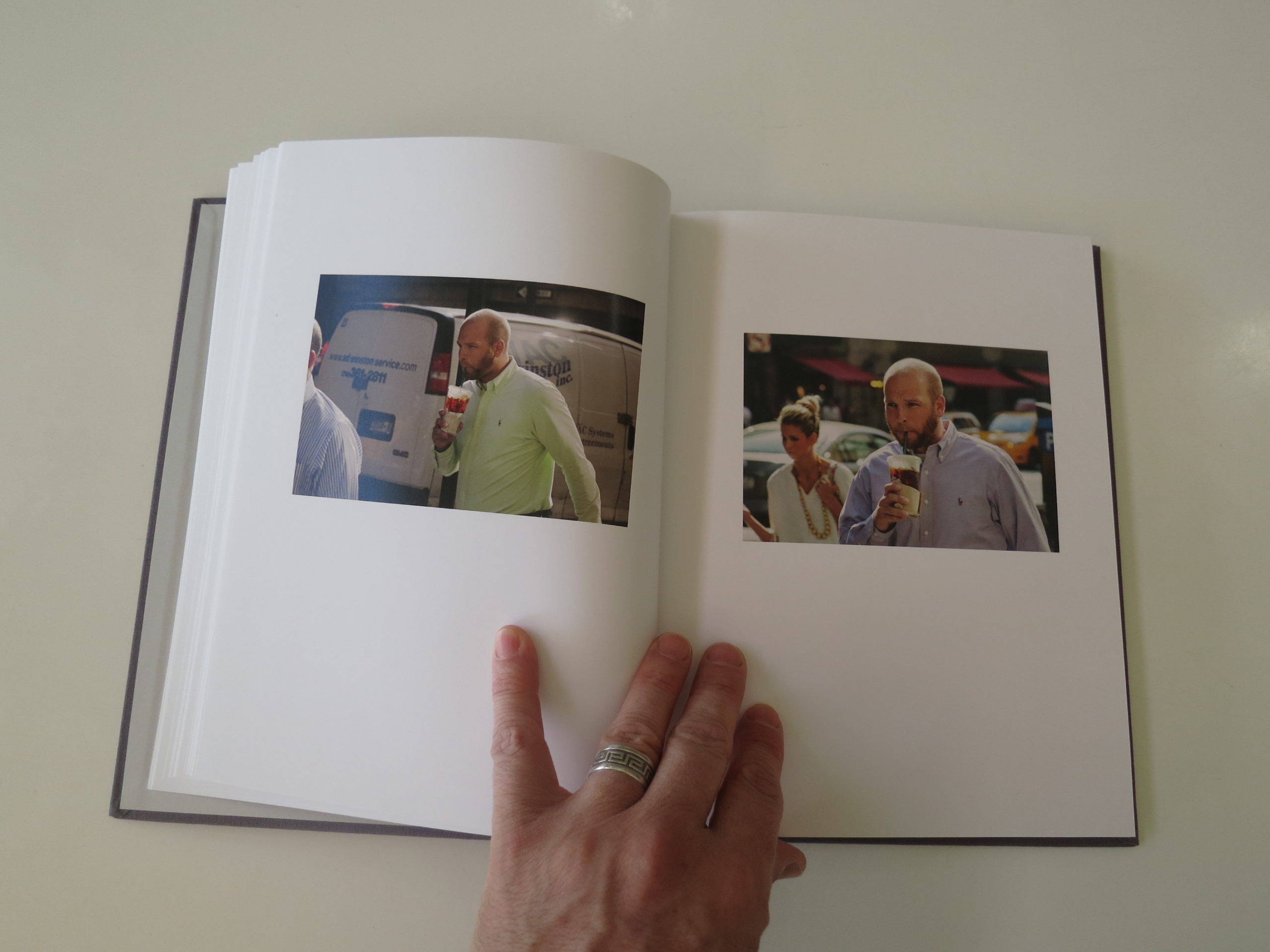
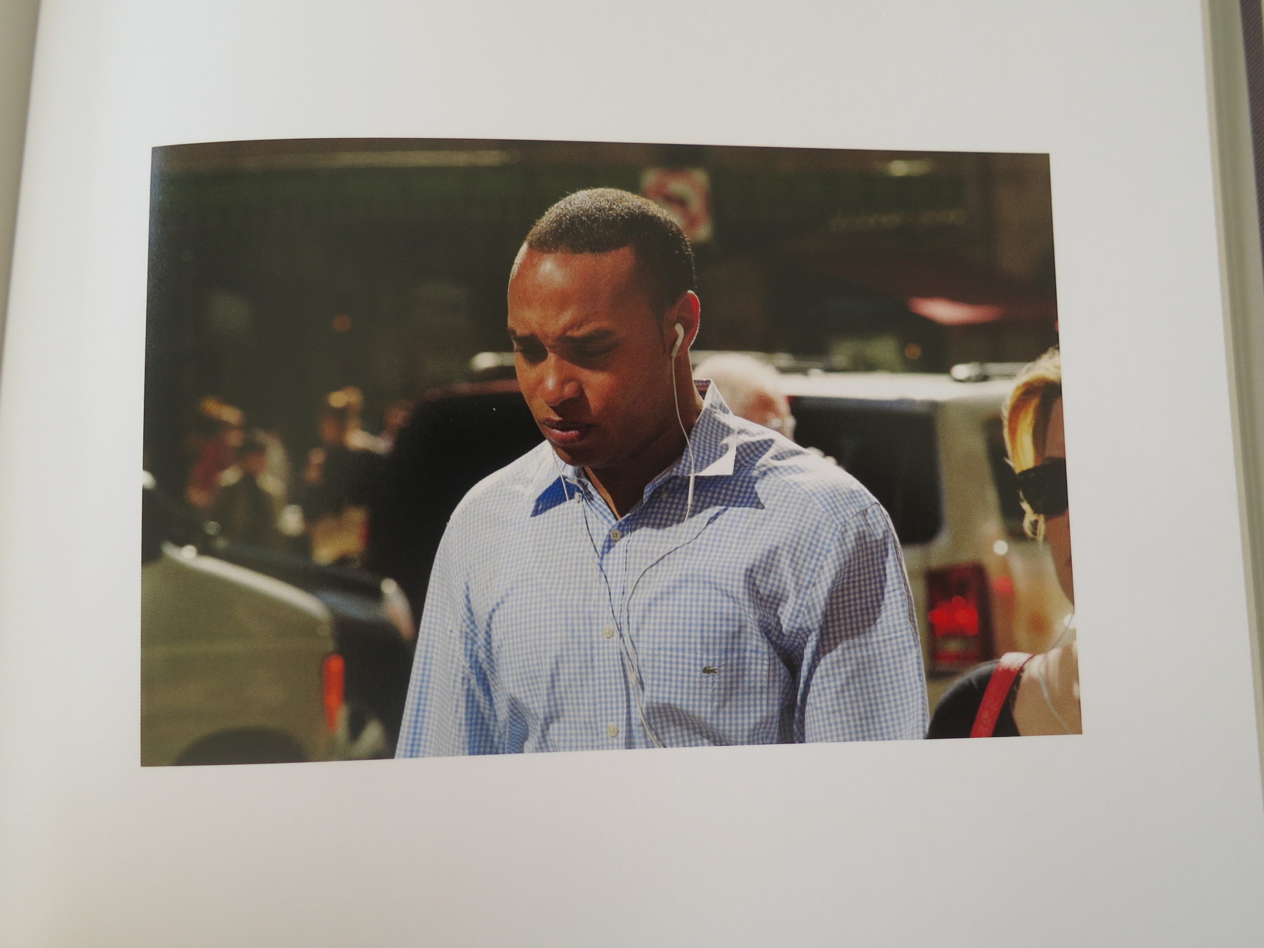
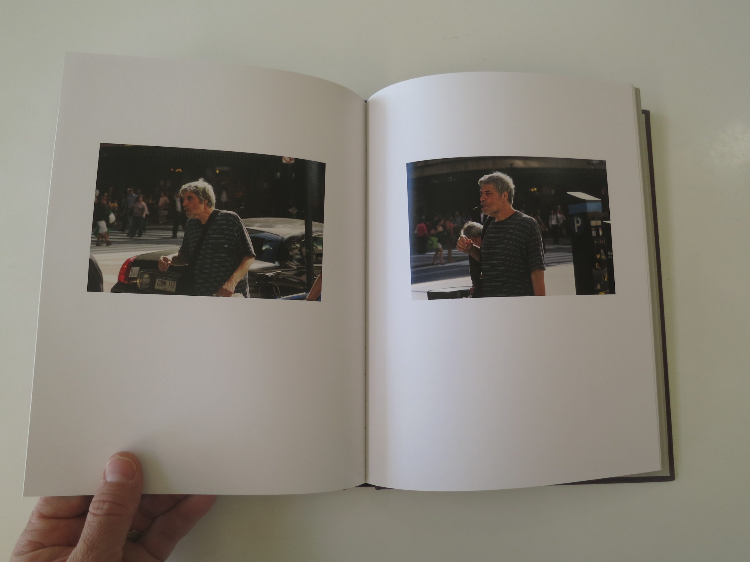
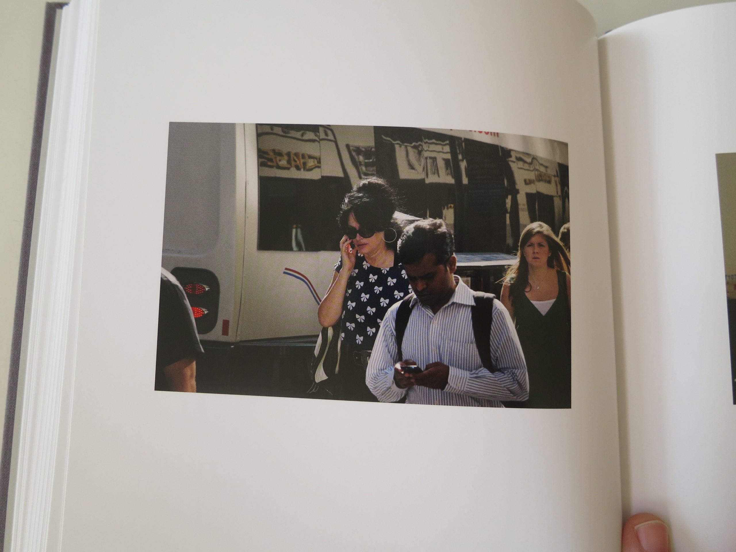
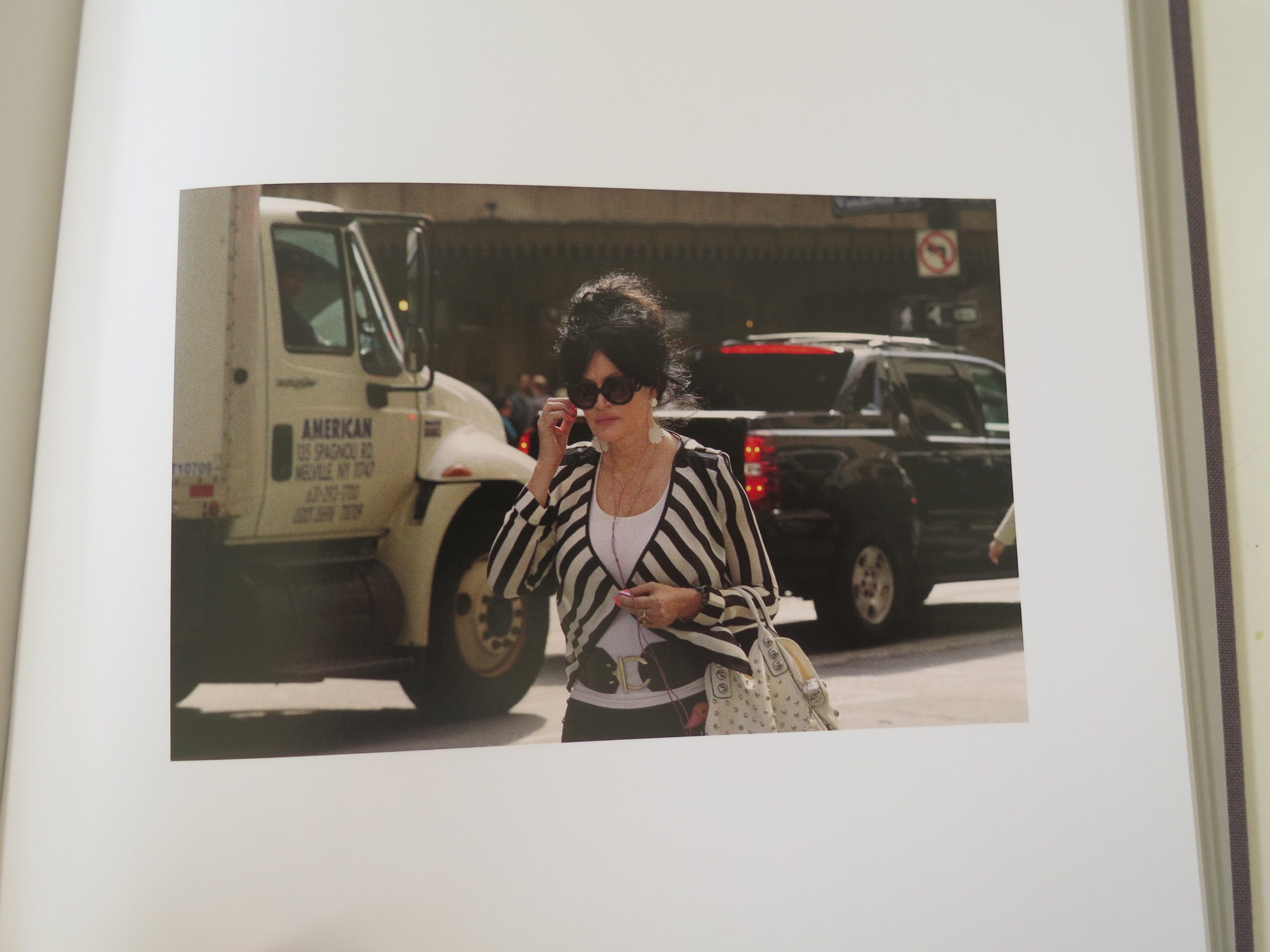
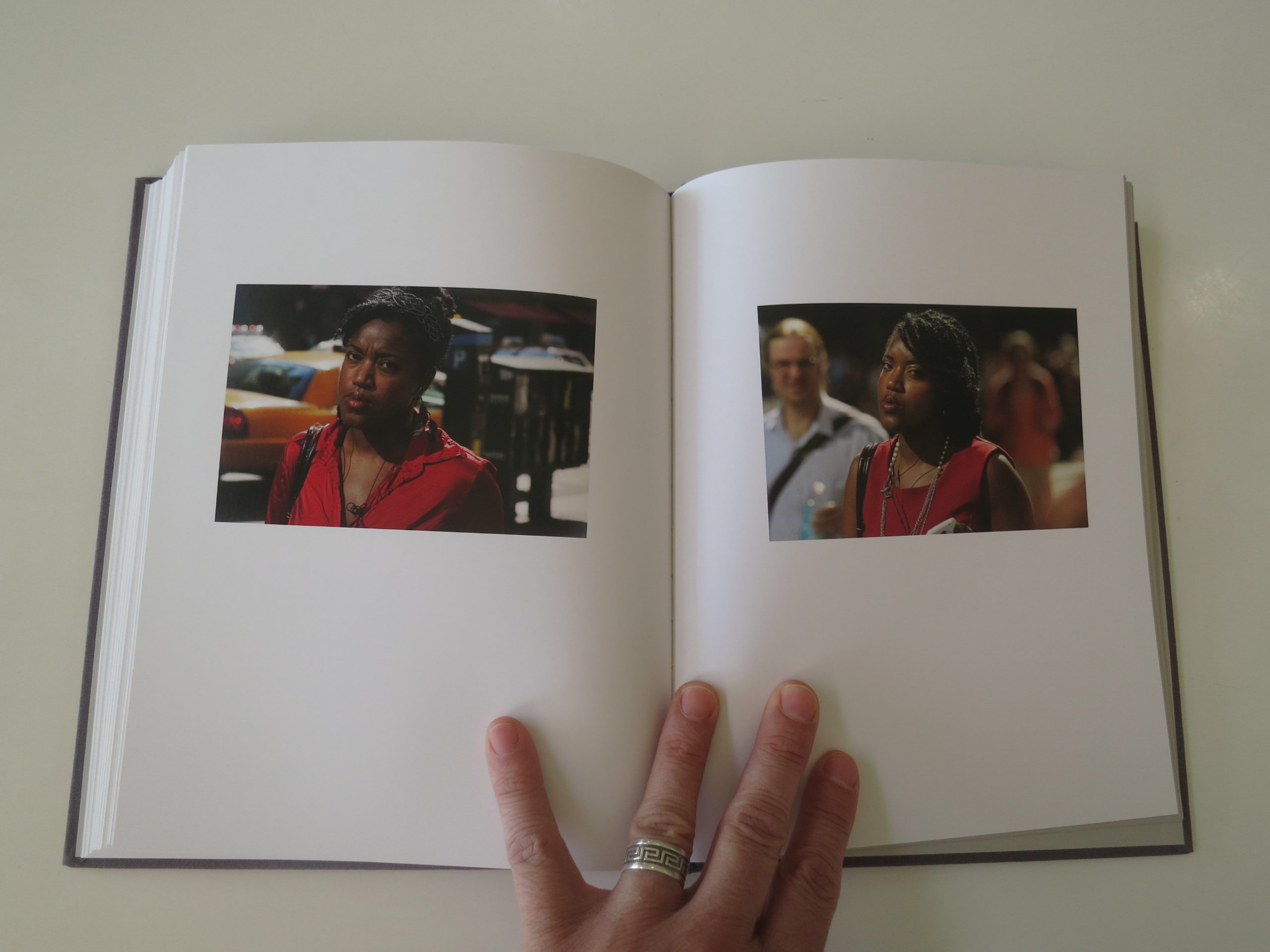
I’m thinking of this today, having just put down “42nd and Vanderbilt,” a superb book by Peter Funch, which came in last year from TBW Books. (But was published in 2017.)
I told you guys that in the midst of a crazy summer, filled with travel and adventure, there might come a time when I’d lean back on a book review, just to catch my breath.
To create an interval, of even a week, in which I can let my experiences settle into memories, and then decide which ones are worth sharing. (Because everything feels intense and fraught with meaning, when you’re on the road and in the moment.)
So a few minutes ago, I was on the floor stretching, when this book caught my eye on the shelf, still wrapped in plastic. Paul Schiek, a friend of the column, and publisher of TBW Books in Oakland, has been kind to send books over the years, and I haven’t had the chance to review them all.
This one, apparently, was shelved without being perused.
(My apologies.)
We’ll rectify the indignity today though, while also highlighting an amazing project that I’m glad to know about.
I mentioned previously that I’m coming out with my first book this year, and just wrote a statement about how I’m always going on about context, when I write for you.
What do you need to know to understand a book?
Well, this one cuts to the heart of it like the evil dude in Indiana Jones and the Temple of Doom. (Sorry for conjuring that visual.)
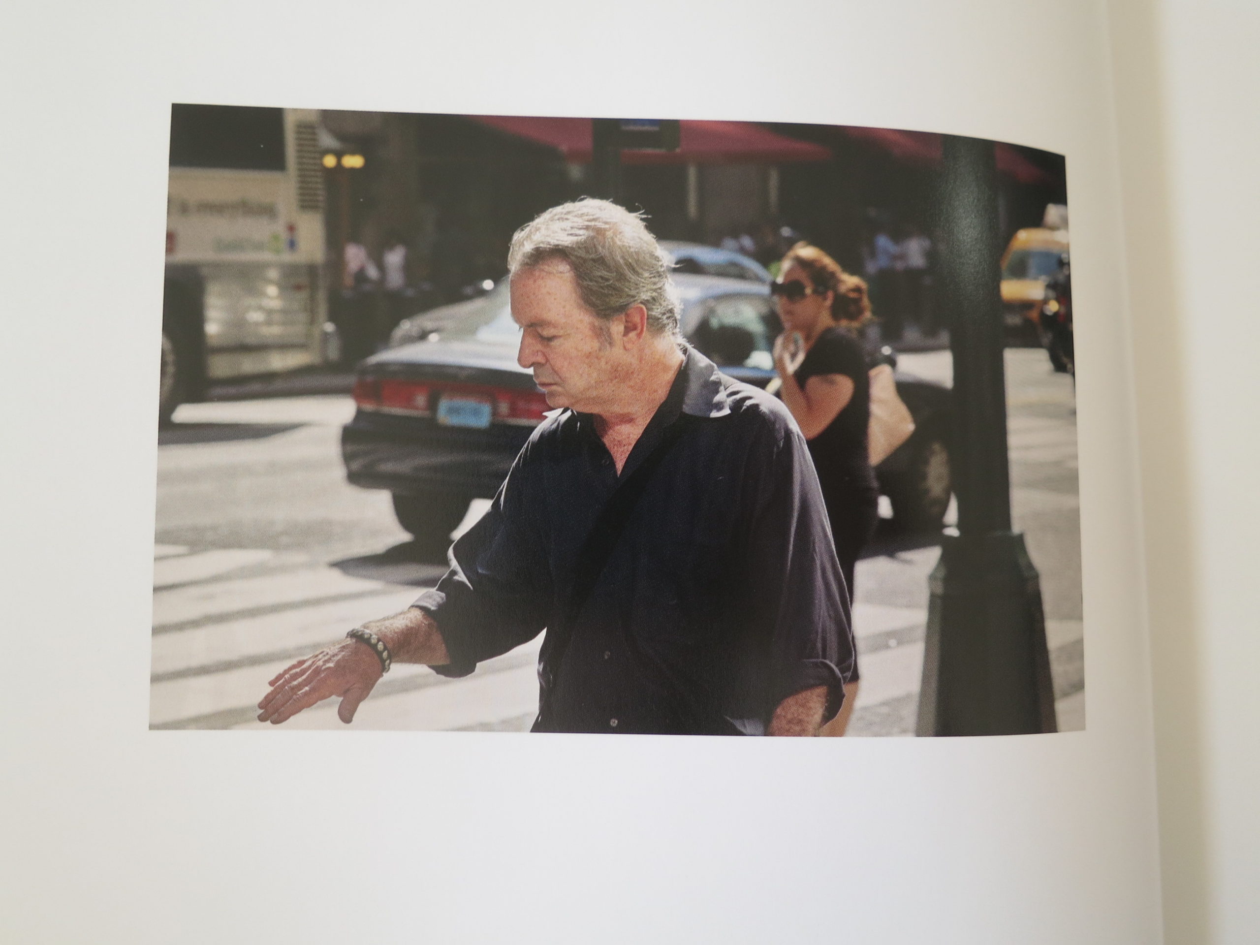
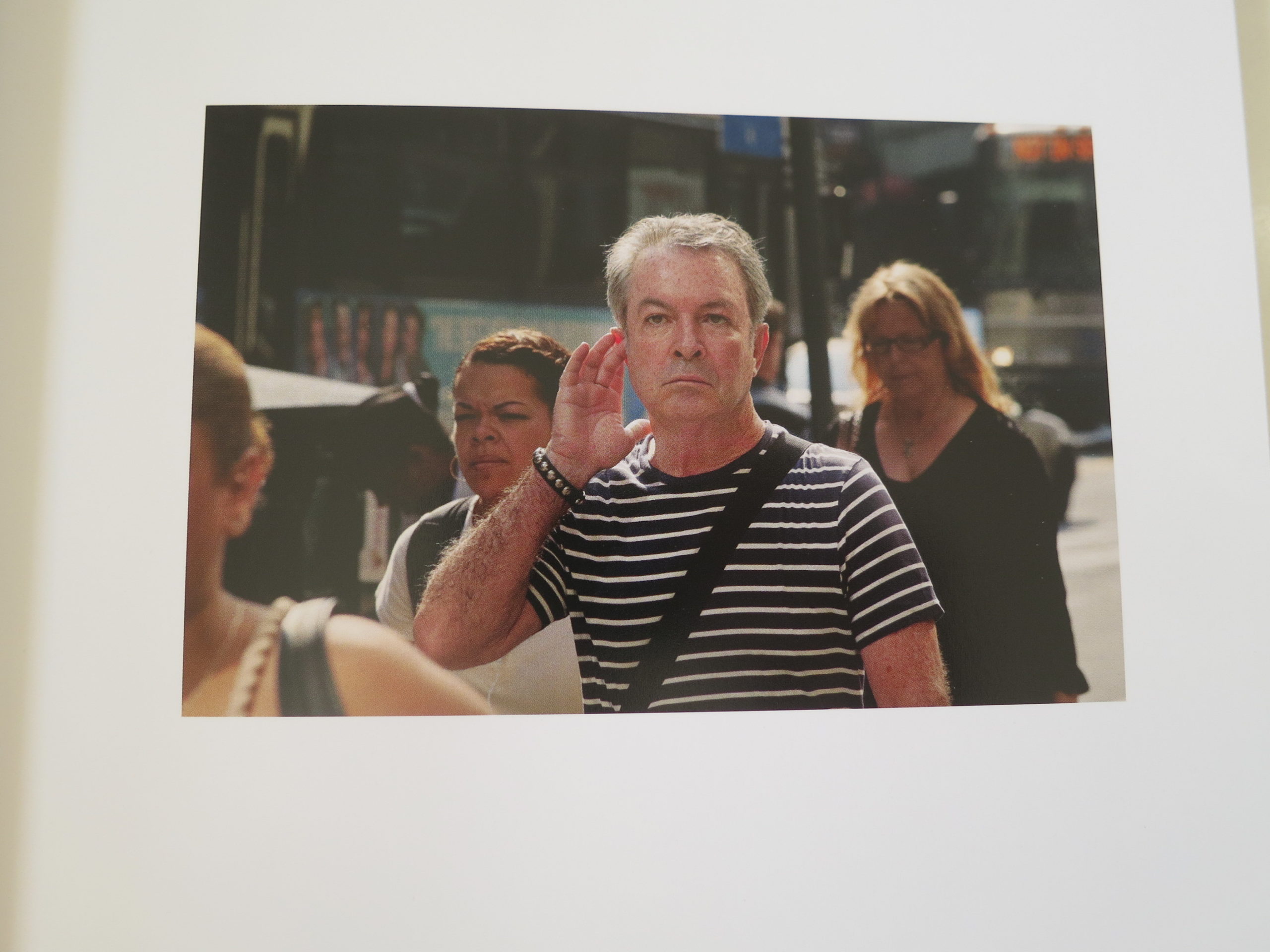
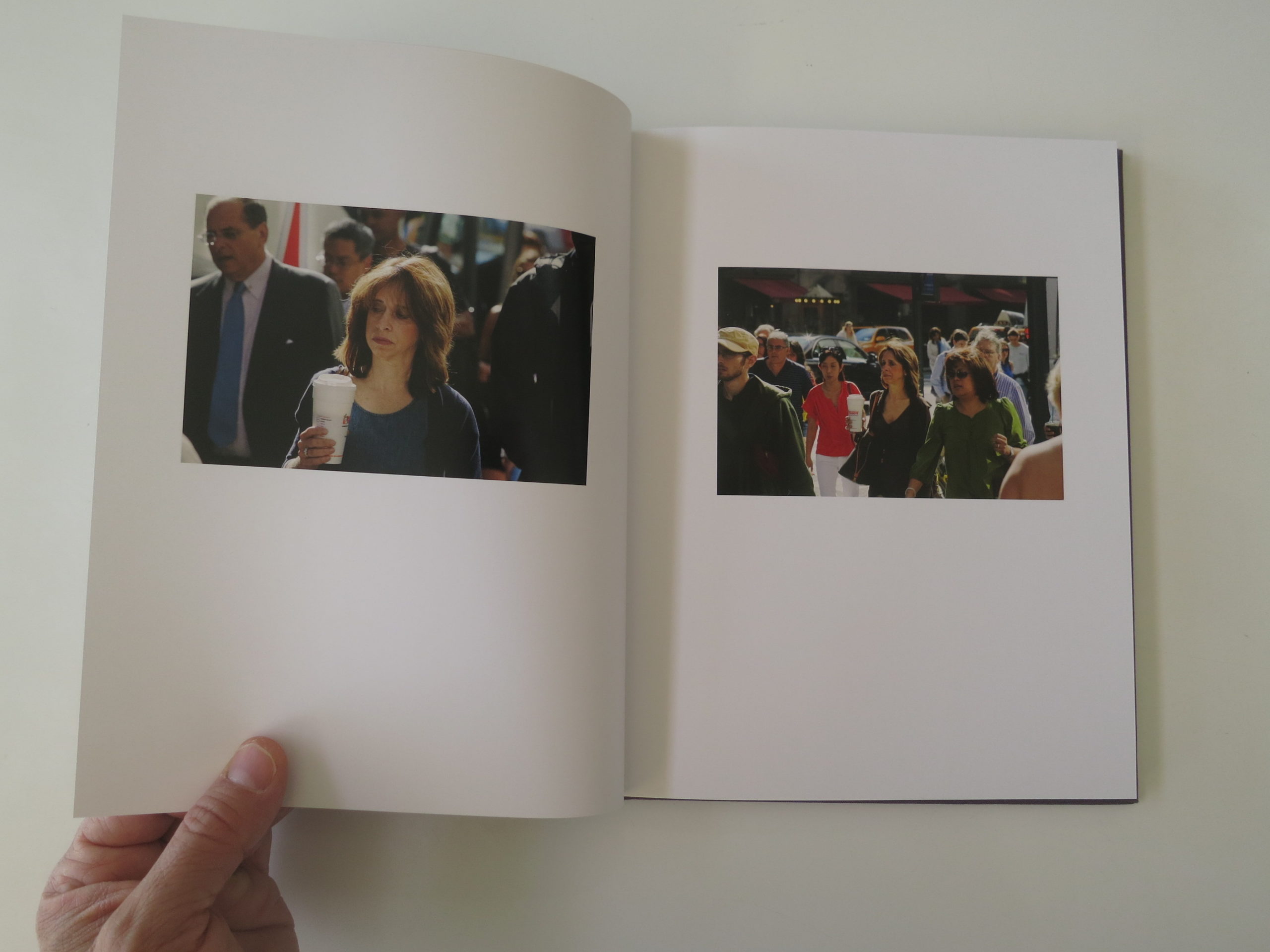
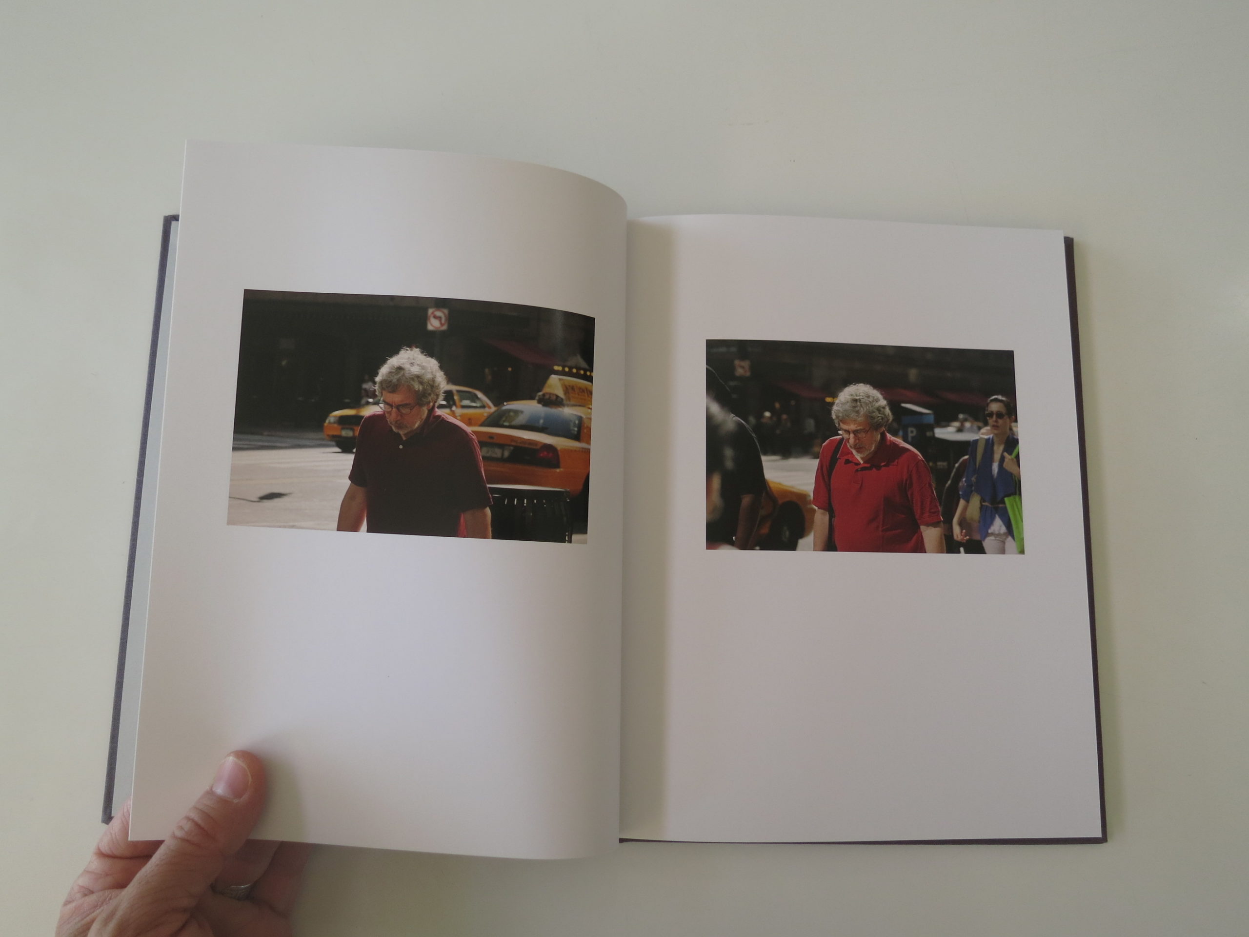
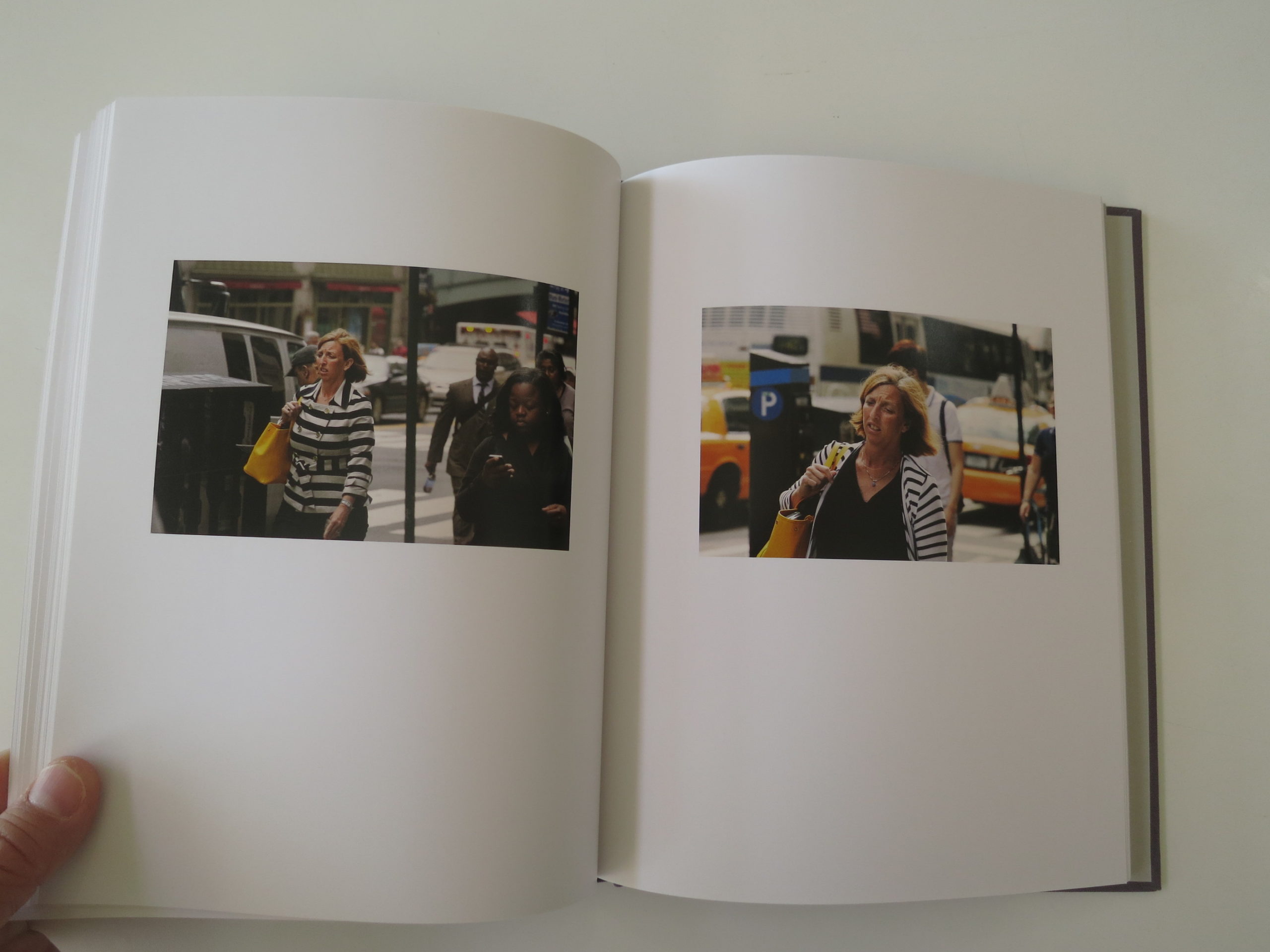
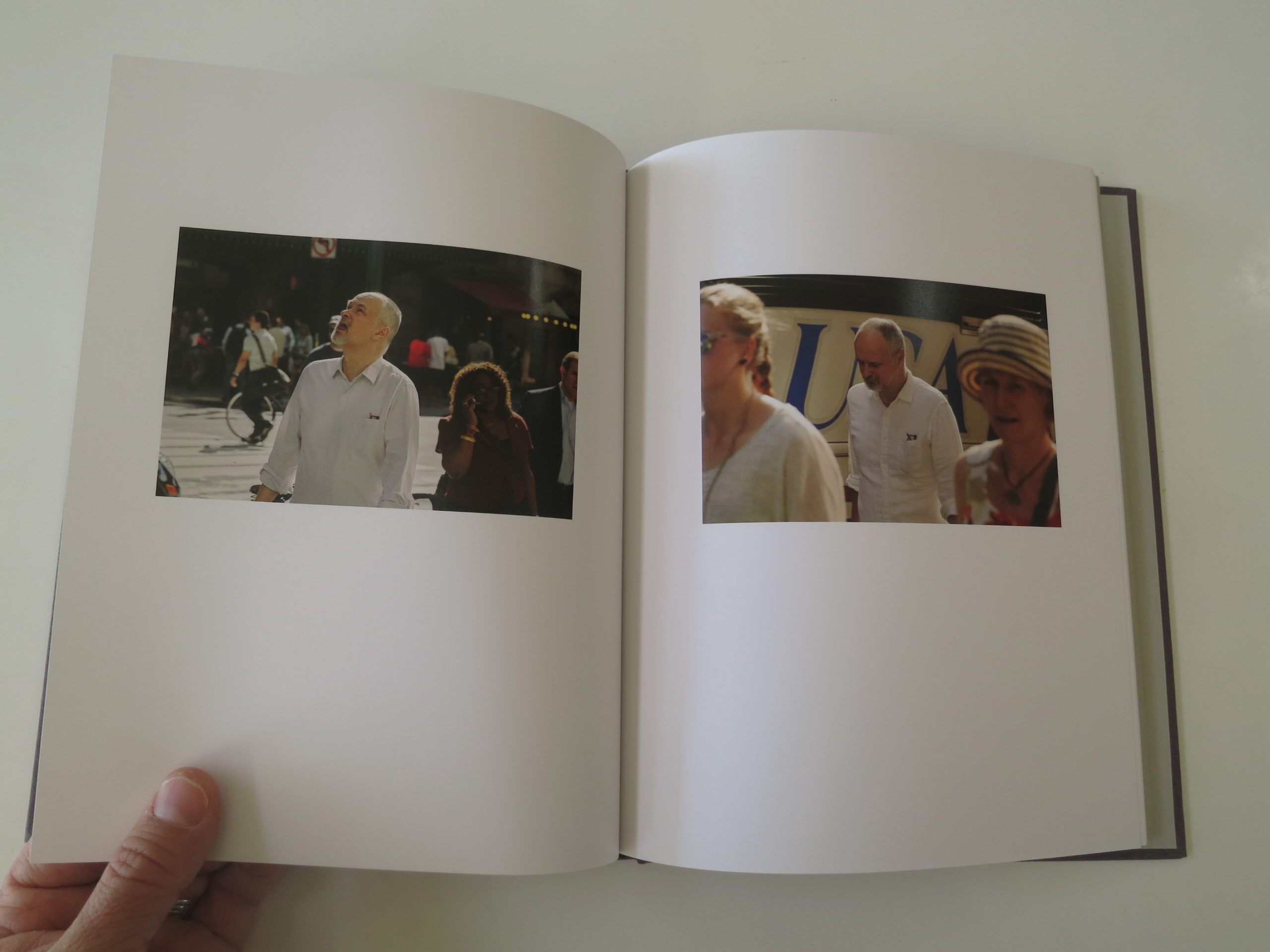
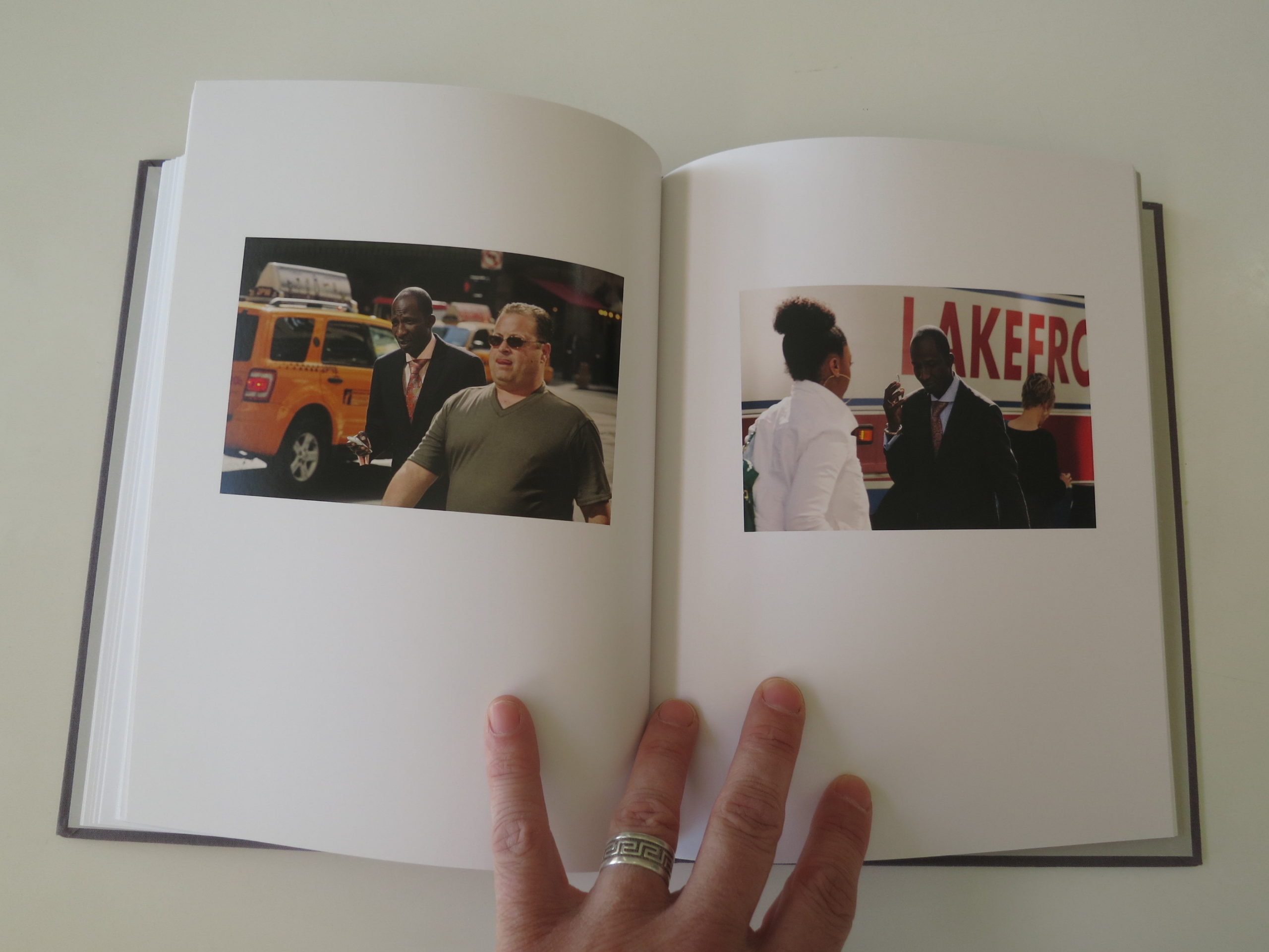
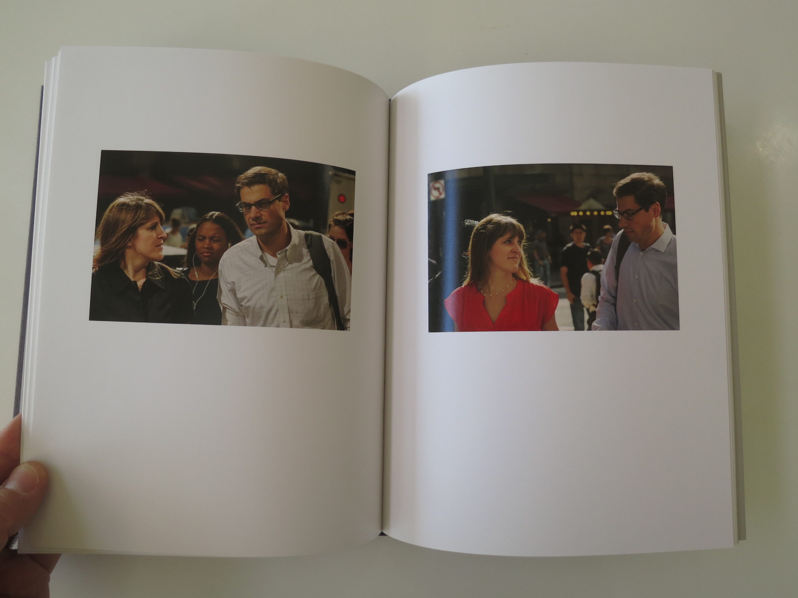
The book opens with a short statement: “Between 8:30 am and 9:30 am, from 2007 to 2016, at the southern corner of 42nd St and Vanderbilt Avenue in New York City.”
In other words, you don’t need to know anything more than that.
When I first hear 42nd St, I think Times Square.
Midtown.
All the tourist hustle.
But immediately, it becomes clear this is not a story about tourists. Given that I wrote last month about NYC becoming a global city for outsiders, this book presents a series of images that is as old school as it gets.
Shit, it makes me think of Old New York in the best possible way.
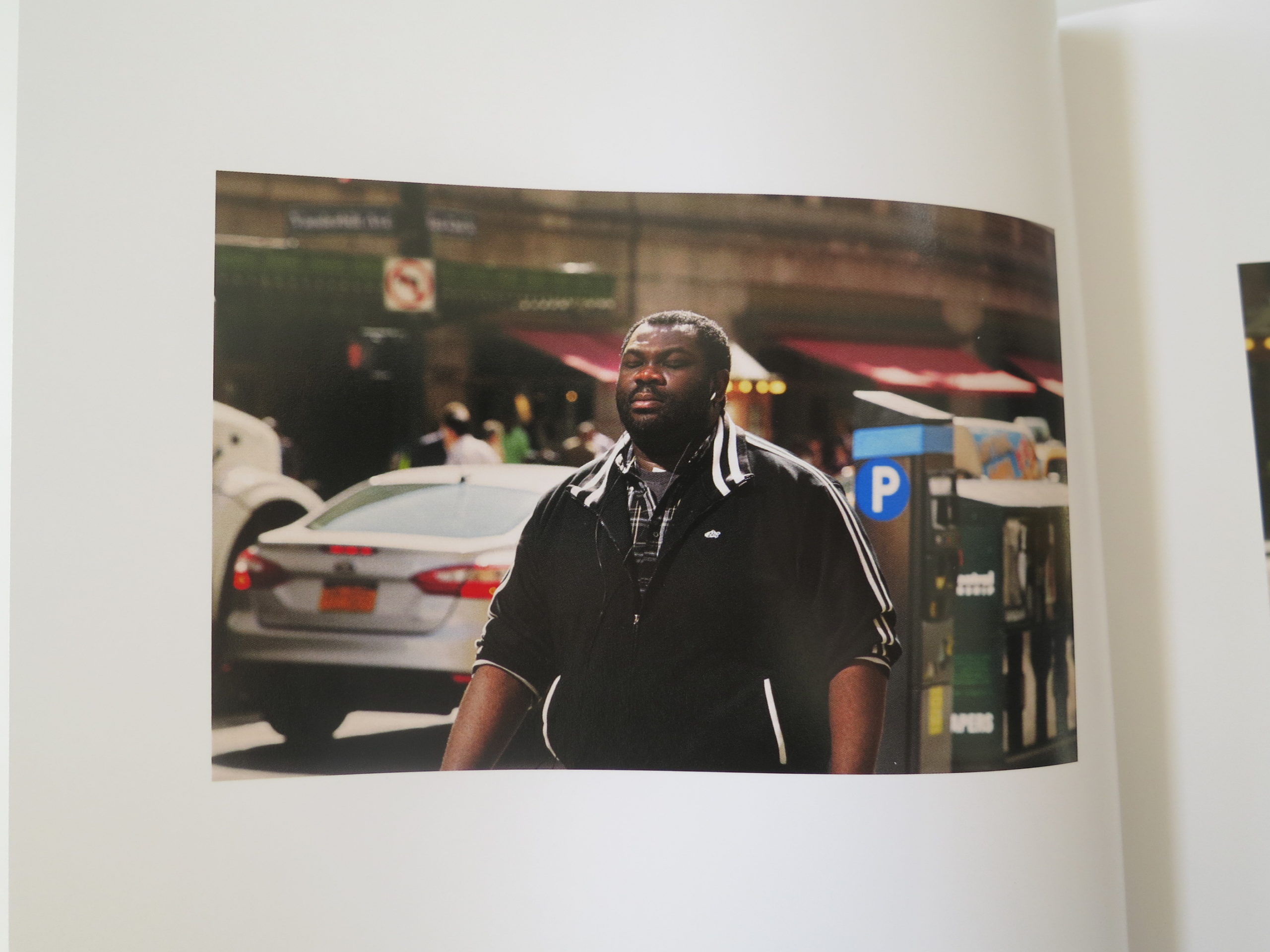
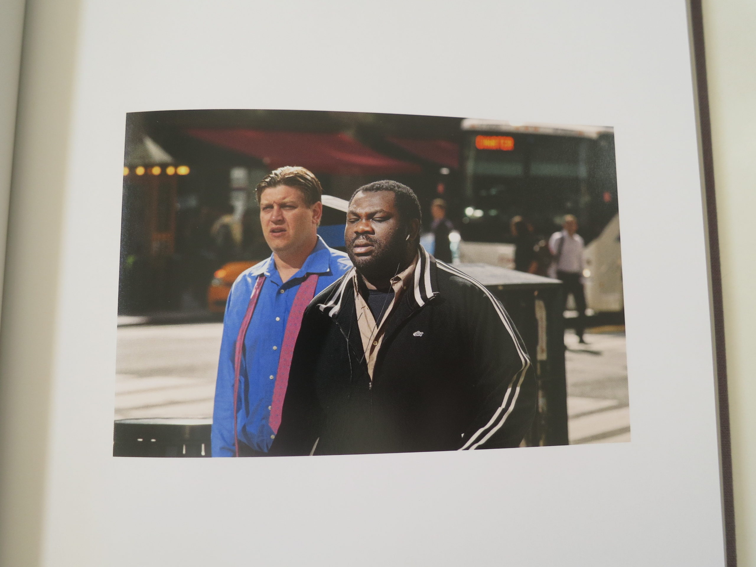
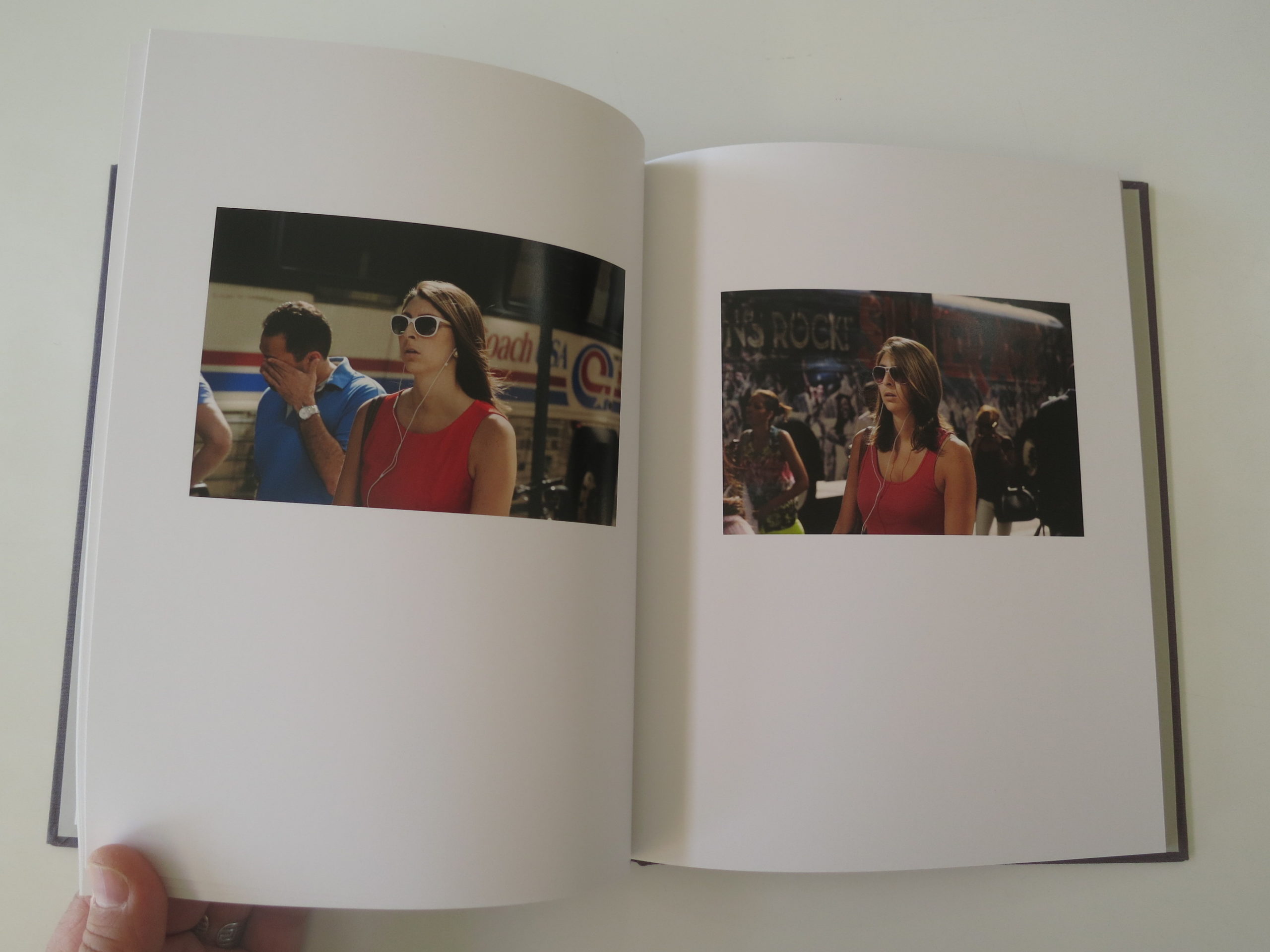
Because right away, you notice that people are repeating. With ever so slight differences.
Clothing choice.
Wind in the hair.
These people are on their morning commute!
Commuters!
I love it.
But where?
New York City is famous for a grid, and the Avenues along 42nd Street are numbered.
Where’s Vanderbilt?
I thought about it for a minute or two, and though it should have been obvious, it was not. So finally I opened up Apple Maps. (I’ve been breaking my no-research rule more often lately.)
Of course, Vanderbilt runs alongside Grand Central Station!
Not only are these people commuters, they might not even be New Yorkers. Because the photographer brilliantly stationed himself right next to the biggest transport hub in the city.
(I didn’t know Vanderbilt, because as a Jersey Boy, I’ve always used Penn Station. The trains from NJ don’t go to Grand Central.)
These pictures are so damn good.
The book is like Where’s Waldo mixed with William Christenberry, with a touch of Paul Graham thrown in for good measure.
Just fantastic.
And perfect for an early summer’s day.
I wonder if the streets of New York smell like garbage yet?
Bottom Line: Amazing, conceptual NYC street portraits that play with time
The Art of the Personal Project is a crucial element to let potential buyers see how you think creatively on your own. I am drawn to personal projects that have an interesting vision or that show something I have never seen before. In this thread, I’ll include a link to each personal project with the artist statement so you can see more of the project. Please note: This thread is not affiliated with any company; I’m just featuring projects that I find. Please DO NOT send me your work. I do not take submissions.
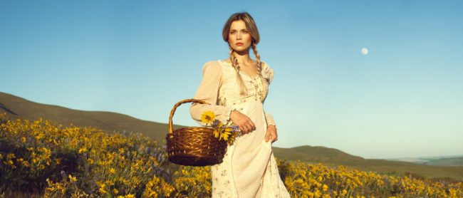
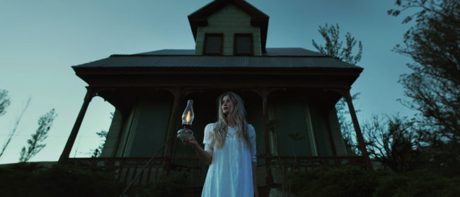
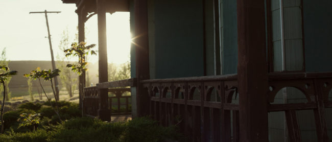
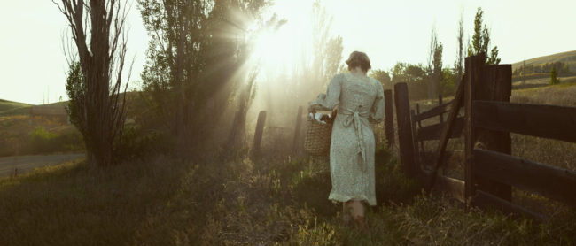
Growing up as a kid in suburban New England, there was always something enchanting about the west. Stories of entrepreneurial pioneers leaving everything they knew and heading out into unchartered territory read like epic fairytales–the great American quest into the vast unknown, with trials and tests around every corner, and insurmountable obstacles overcome by singular resolve, spontaneous ingenuity and some good old fashioned luck.
I think like most Americans, I have a tendency to romanticize our history. I am often confronted by a sense of nostalgia for times gone by—a compelling ache for experiences I did not experience and never will. This nostalgia has been an ever present theme in my life since childhood, and as an adult has manifested in my work—first as a historic preservationist and then as a photographer. It inspires in me an insatiable need to preserve that which is lost, whether through the restoration of a house or the creation of a visual narrative—ensuring that its memory is honored and lives on.
But nostalgia is a funny thing. It is a non-experience, an artifice of memory, and like the great American fables of the west, and it glosses over the day-to-day minutia and trivializes the mundane. But there is beauty in the quiet moments interspersed between the pivotal plot points. Beauty in the last rays of sun hitting your face as you pick fresh flowers for your table; in the dust filtering the light as you pull today’s laundry off the line; in the warped and weathered wood of the front porch railing; and in the cool night air settling in as you check your herd before turning in for the night. This series seeks to marry the romantic idealism in my mind’s construct of the era with the mundane day-to-day life of the pioneer by creating a cinematic visual narrative.
The series in part is inspired by the location itself. The Dalles Mountain Ranch, located in the rolling hills of the Columbia River along the historic Oregon Trail, was settled in the 1860s. The land proved to be harsh and unsuitable for farming, forcing the settlers to ranch cattle rather than harvest crops. It was eventually lost in the Great Depression and subsequently whittled away parcel by parcel until eventually purchased by the state and designated as a preserve. The ranch is an archetype of the fate of American ranching and now stands as a melancholic relic of an irretrievable time long since past.
APE contributor Suzanne Sease currently works as a consultant for photographers and illustrators around the world. She has been involved in the photography and illustration industry since the mid 80s. After establishing the art buying department at The Martin Agency, then working for Kaplan-Thaler, Capital One, Best Buy and numerous smaller agencies and companies, she decided to be a consultant in 1999. She has a new Twitter feed with helpful marketing information because she believes that marketing should be driven by brand and not by specialty. Follow her at @SuzanneSease. Instagram
Success is more than a matter of your talent. It’s also a matter of doing a better job presenting it. And that is what I do with decades of agency and in-house experience.
Concept: Environmental portraits of employees in six cities
Licensing: Unlimited regional use of up to nine images for one year from first use.
Photographer: Portraiture specialist
Agency: Medium in size, based in the South
Client: Technology company
Here is the estimate:
Creative/Licensing Fees: The goal was to capture environmental portraits of nine employees in front of various landmarks within six different cities. Three of the cities would focus on just one employee, and the photographer would capture two employees in each of the other three cities. All of the locations were within driving distance of one another. Upward pressure was placed on the fee due to the unlimited use requested; however, we were able to limit the licensing to regional placement for just one year. The geographic reach was even more limited, with each image being advertised only within the city where the photo shoot took place. Considering this, I priced the first six images at $2,000 each, and the three photos of employees in the same location at $1,000 each. I then added $1,250/day as a creative fee for each of the six shoot days, which brought me to $22,500. It conveniently broke down to $2,500/image. I often increase the creative fee closer to $2,500-$5,000/day, but the nature of the project and my inclination to a tight budget made me err on the side of caution.
Pre-Production: I included five pre-pro days for the photographer to line up the project or for a producer to help with pre-pro work. It included three days to work with scouts in each location and two additional days to line up crew and make travel arrangements.
Assistants: I anticipated that the photographer would bring a first assistant (who would double as a tech) and a second assistant for the entirety of the trip/shoot.
Hair/Makeup Stylist: While the talent would be asked to arrive camera ready, we included a stylist for each of the six shoot days to help with touchups and manage light wardrobe adjustments as well.
Equipment: I included $500/day for a basic grip/lighting package that the photographer would bring, rather than renting.
Mileage, Parking, Misc: I included $100/day in mileage and $50/day in miscellaneous expenses for each day, then rounded down a bit.
Meals for Crew, Per Diems: This included $50/day for the photographer, first assistant, and second assistant — covering each of their travel/shoot days. I added $30/day for lunch to cover the hair/makeup stylist. We anticipated half-day shoots at most, which is why we didn’t initially include catering.
Lodging: I anticipated $250/night for two rooms, for six nights.
Location Scouting, Location Expenses, Permits: I included two and a half days per city for each of six cities. It was a challenge to estimate, and I initially anticipated at least three different scouts would be involved — each of which could cover multiple locations, but we could have potentially needed a scout in each of the six cities depending on availabilities and the demands of the areas. They would have to make recommendations from their files, scout the location in person, pull permits, negotiate location fees if necessary, and potentially be on-set if needed. I felt 15 days total would cover the task collectively. I included $250 per city for miscellaneous expenses like mileage and meals that the scouts would likely incur. I included $500/city for permits and marked additional location fees as TBD because we wouldn’t know of any additional costs until specific locations were dialed in. Some public spaces might only require a permit, but other “recognizable” landmarks may need a location fee or a necessary payment to acquire a release. Other locations might not demand any permit depending on the local film office guidelines but could require a space for staging. I felt that the expenses we included were a good start based on the initial project description; however, we anticipated that we’d have to re-address this as the scope of the project solidified.
First Edit for Client Review: I included $1,000 to account for the photographers time to go through the assets each day and compile web galleries for the agency to review.
Color Correction, File Cleanup, and Delivery: I included $100/image for basic post-production.
Results: The photographer was awarded the project.
Hindsight: Initially, we discussed a relatively lean production level with the art buyer, assuming each day would likely be a half day and the client/agency contacts on site would be minimal. We ultimately received a lengthy list of attendees, and it became clear that they needed a higher level of production on-site. The photographer, therefore, brought on production assistants in each city to be dedicated to client services.
If you have any questions, or if you need help estimating or producing a project, please give us a call at 610 260 0200 or reach out. We’re available to help with any pricing and negotiating needs—from small stock sales to large ad campaigns.
Creative Director: Sebastian Bland Editor: Olivia Squire
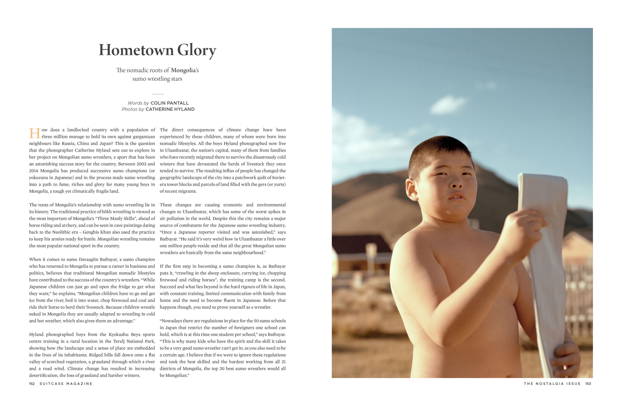
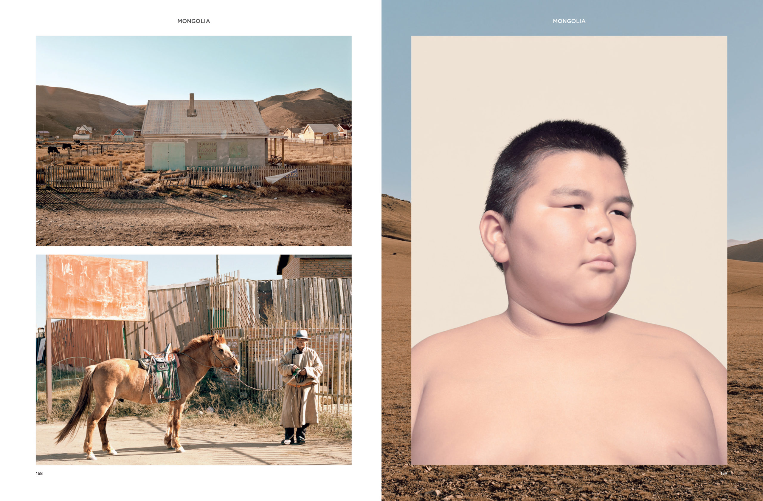
Photographer: Catherine Hyland
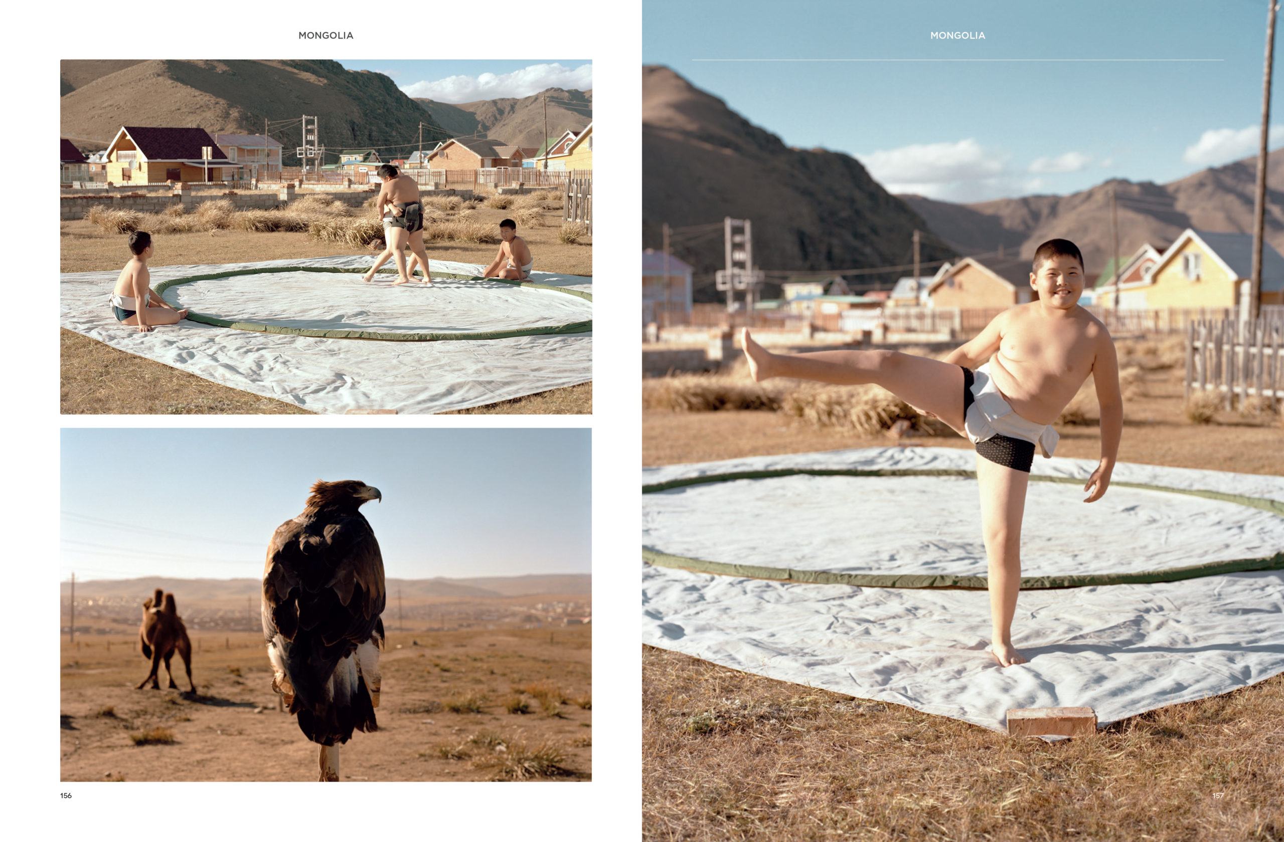
Heidi: What were some of the challenges with the shoot?
Catherine: One of the challenges was aligning energy and the personality I wanted to capture, this becomes difficult with a communication barrier at play and a middle aged translator interpreting my direction. What they’re feeling becomes a mystery. You can’t communicate to say – I’m a nice person and I want to make you look good! So that whole thing is totally cut off. Who knows what we would have made if we were able to have a laugh together.
I know you had a turning point with this project. Tell us how that came about.
Getting out of Ulaanbaatar immediately opened up new possibilities. “Ideally, you don’t really want to be doing things impulsively,” Catherine says. “But at the same time I think that’s when some of the best work gets made. When we were trying to get the older sumos together in the gym, it was actually very stale compared to the rest of the work we made.”
Do you have a journal or a way of keeping track of your story ideas? Can you describe your process for crafting something that feels the creative pursuit? Yes, I have a journal that I use to keep track of my ideas. I also do quite extensive research into projects before they are undertaken, sometimes I will have been researching projects for a few years before they come into fruition.
Did the images come before the film you did with We Transfer? They were shot at exactly the same time, on the same trip. I went out there specifically to make this personal project on The Rise of the Mongolians which was funded by WePresent/WeTransfer.
How did you gain acceptance into the community in order to make the work? On this particular trip we had fixers who helped translate and introduce me to a mixture of people in the Sumo community.
How long were you there? 2 weeks
Was this the first time you were working with Suitcase? No, they had previously published my project ‘Wait-And-See Pudding with Patience Sauce’, shot in on the island of Nevis in the Caribbean.
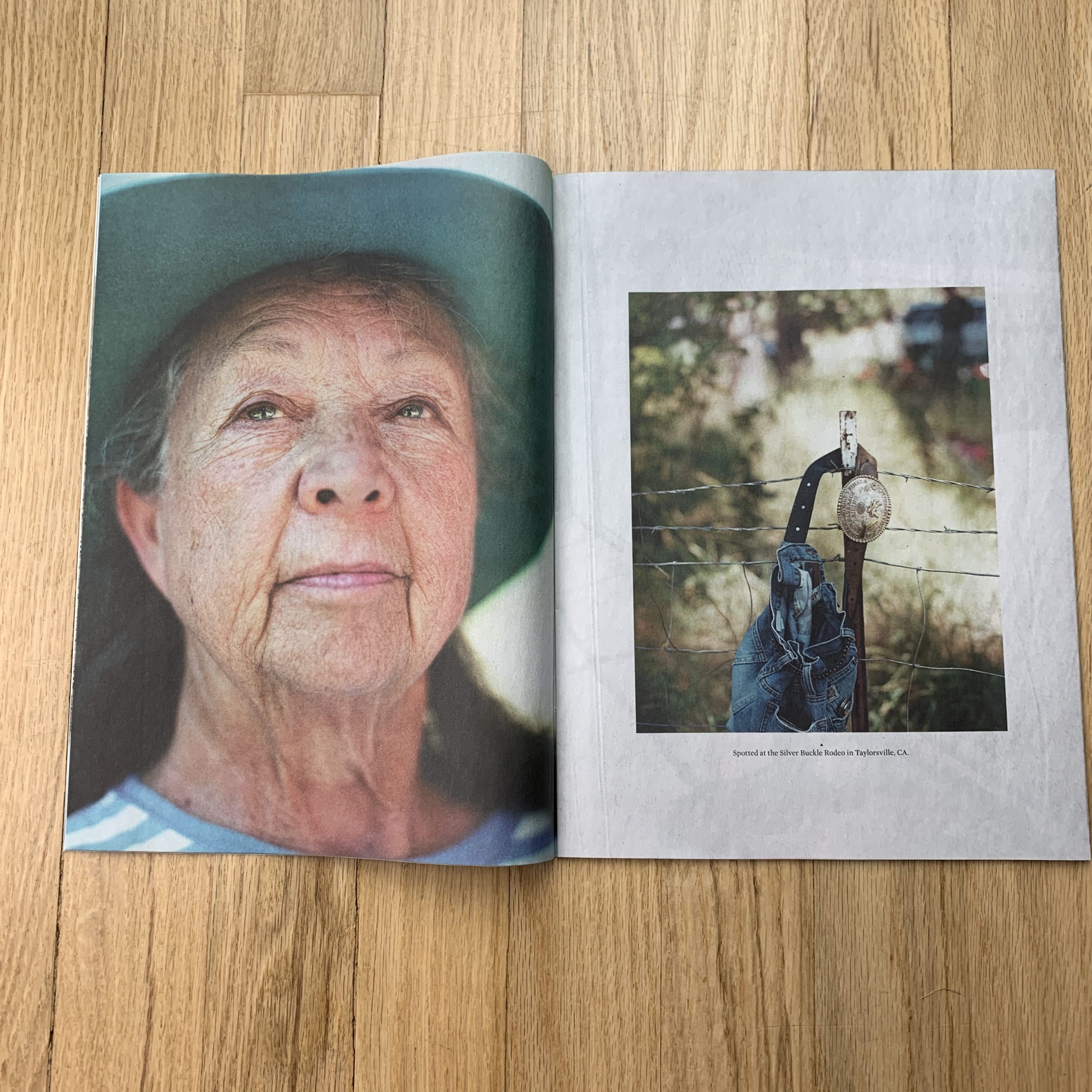
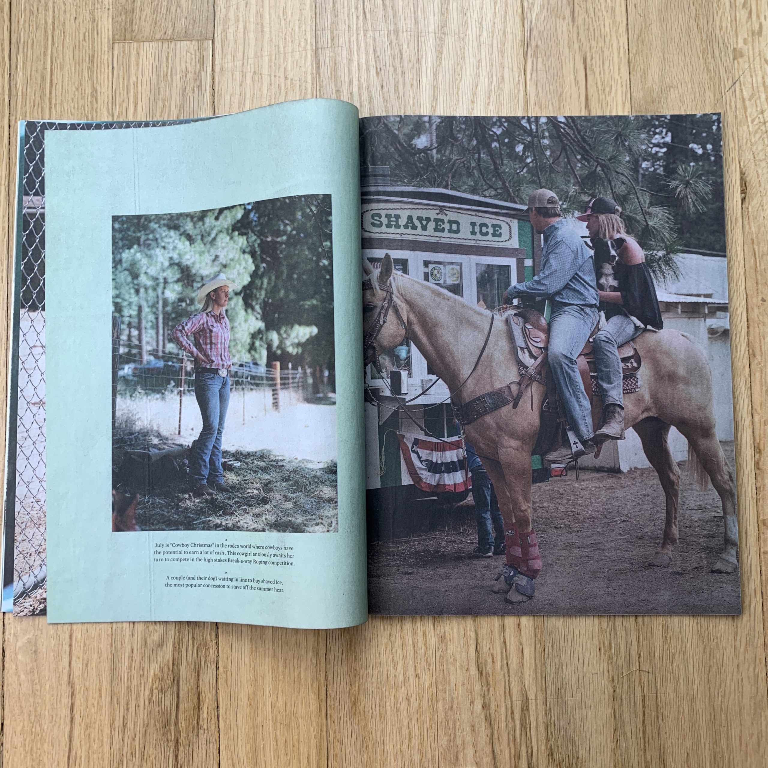
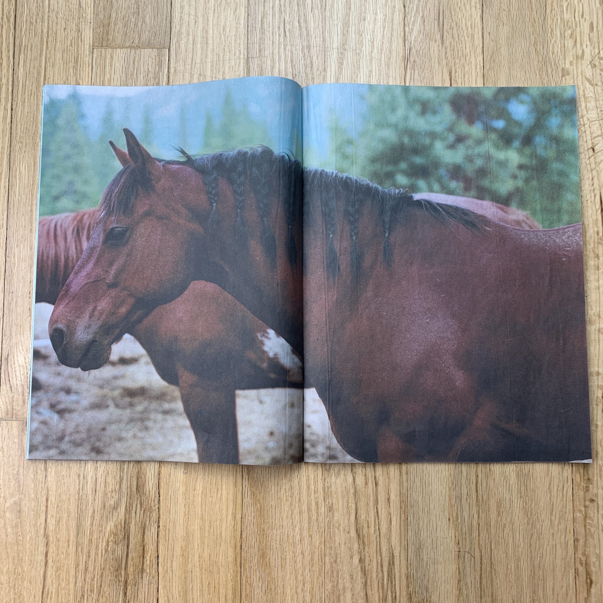
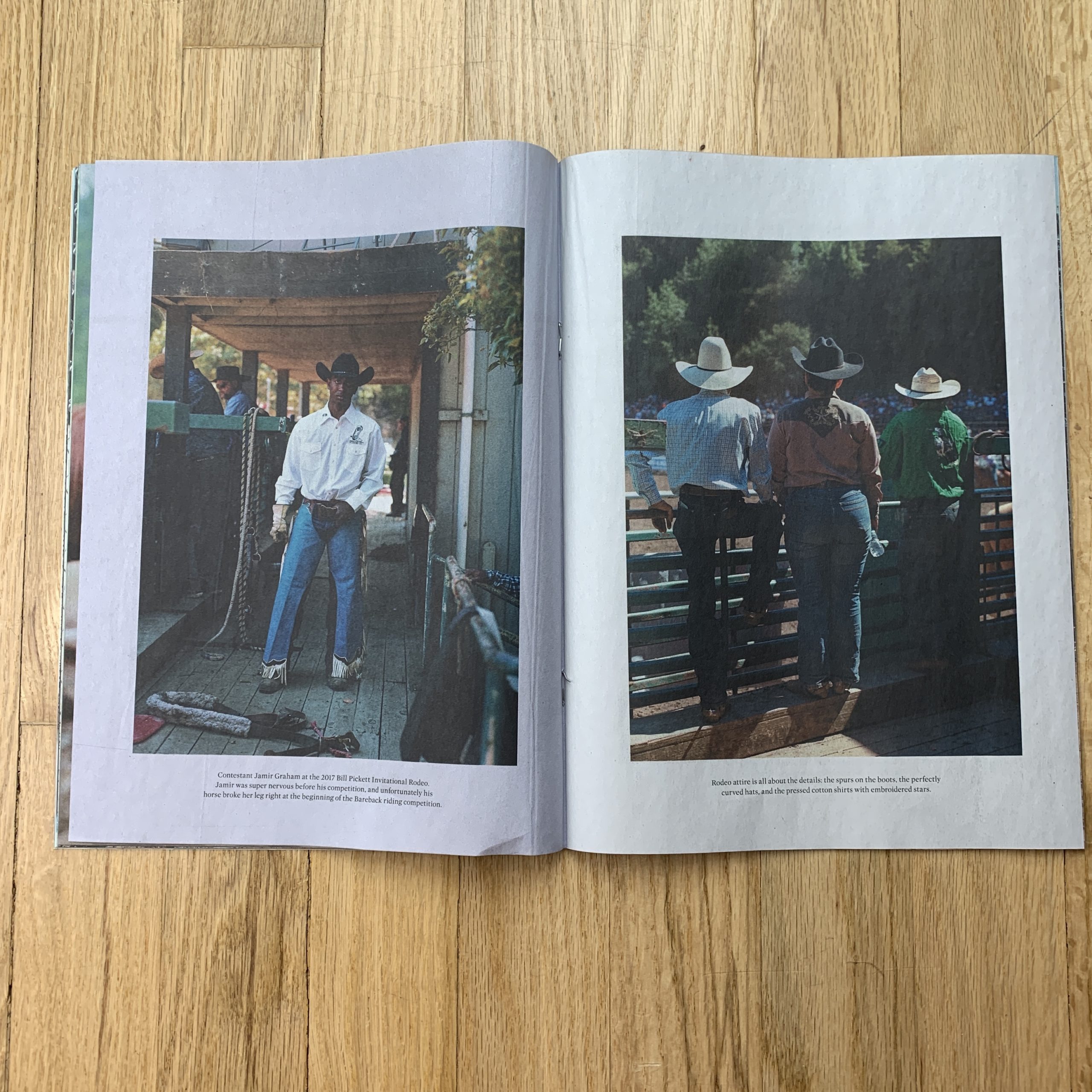
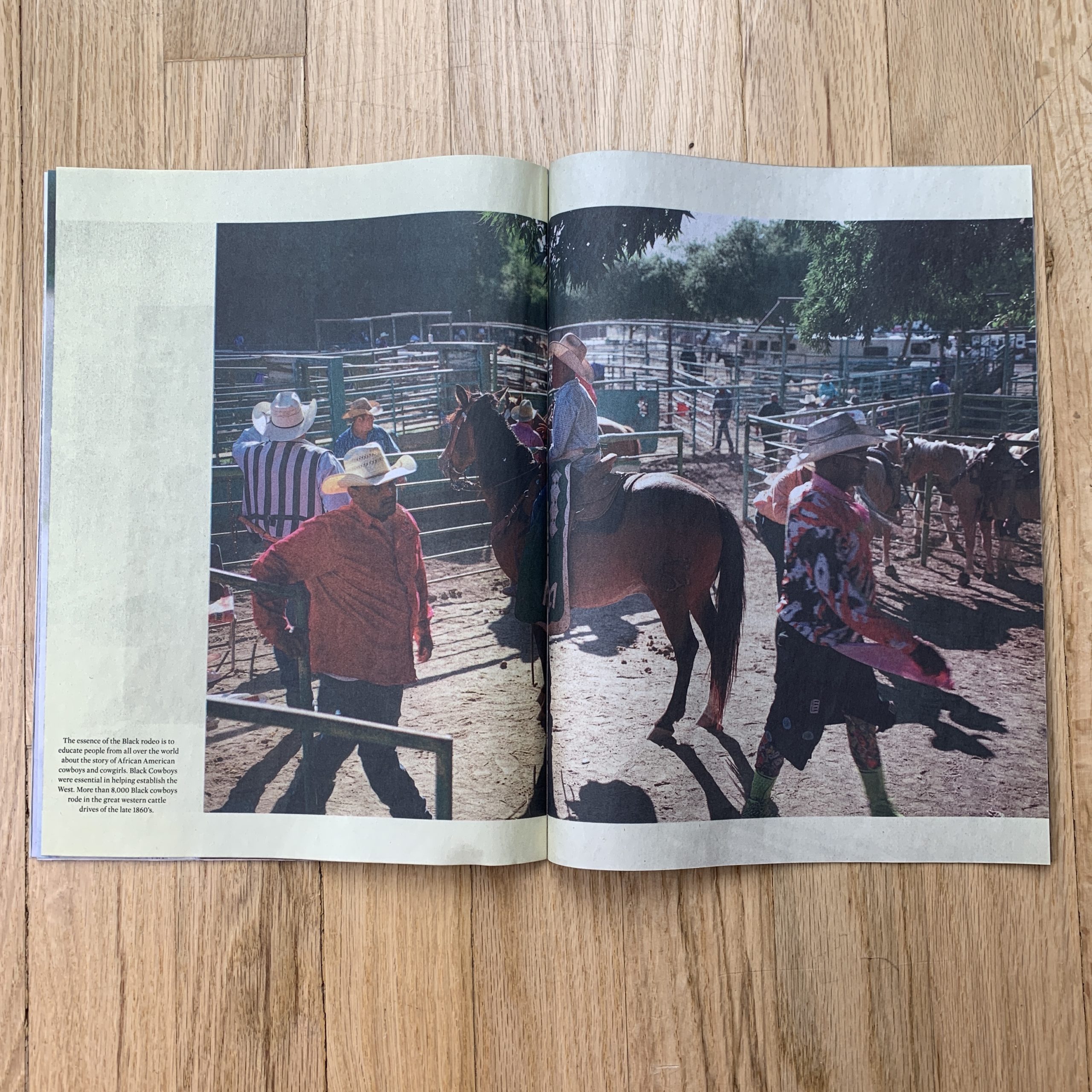
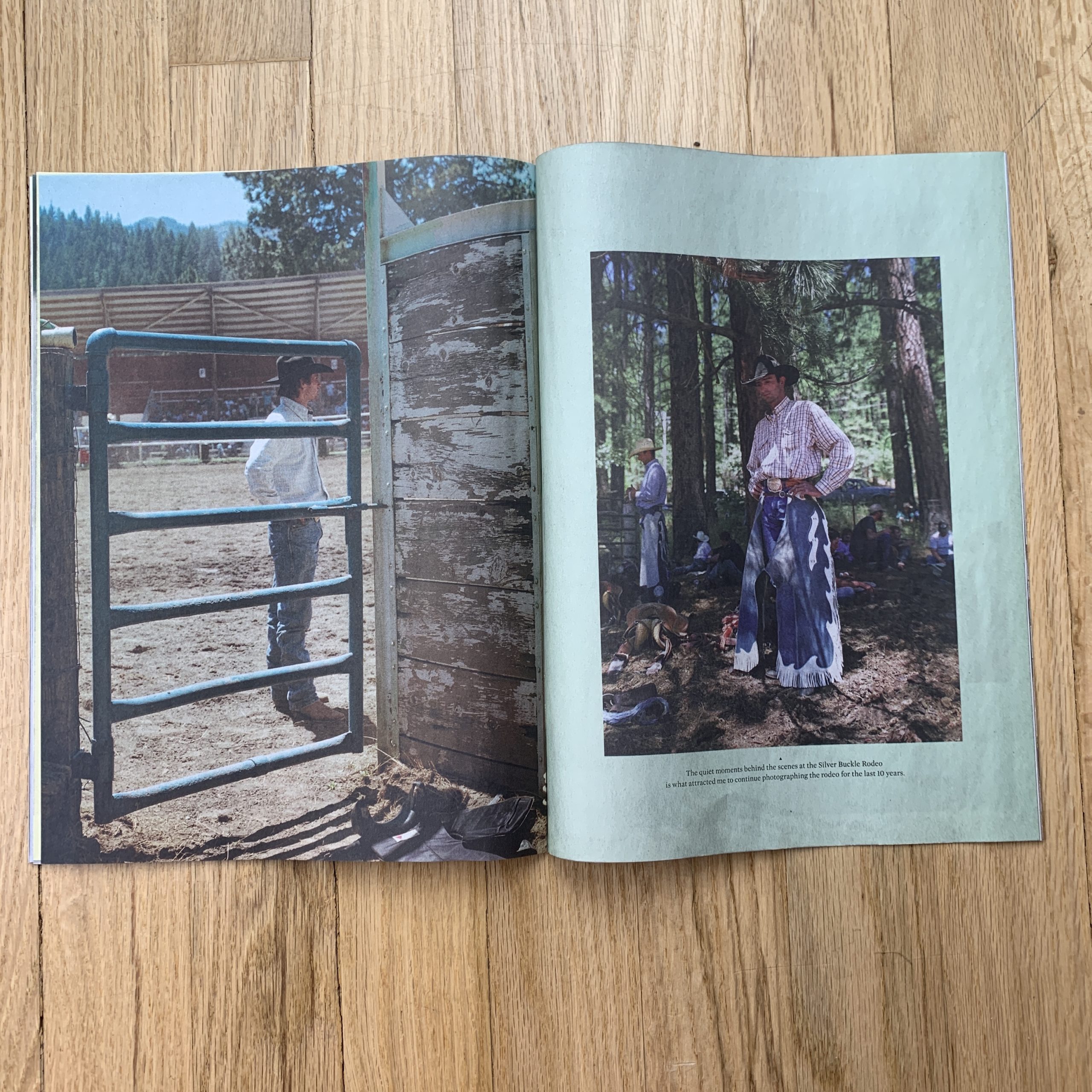
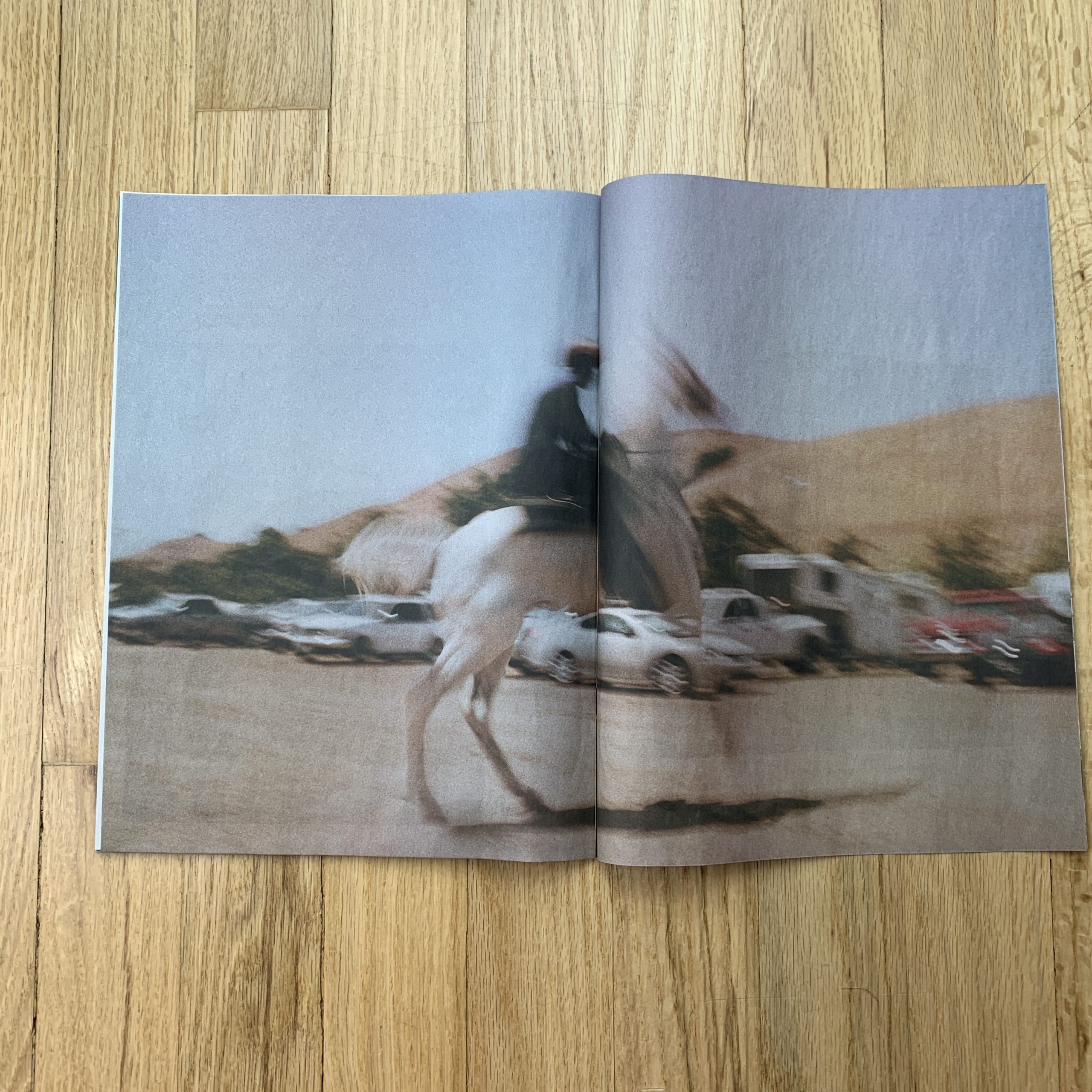
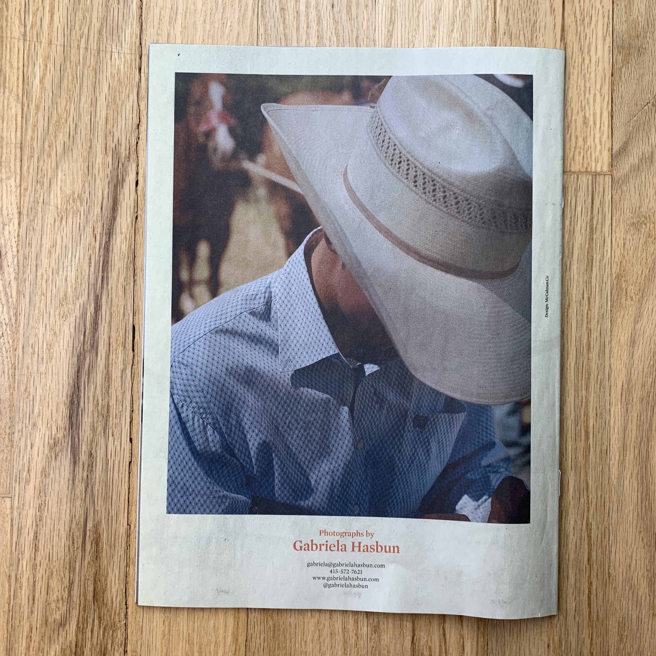
Tell me about the images?
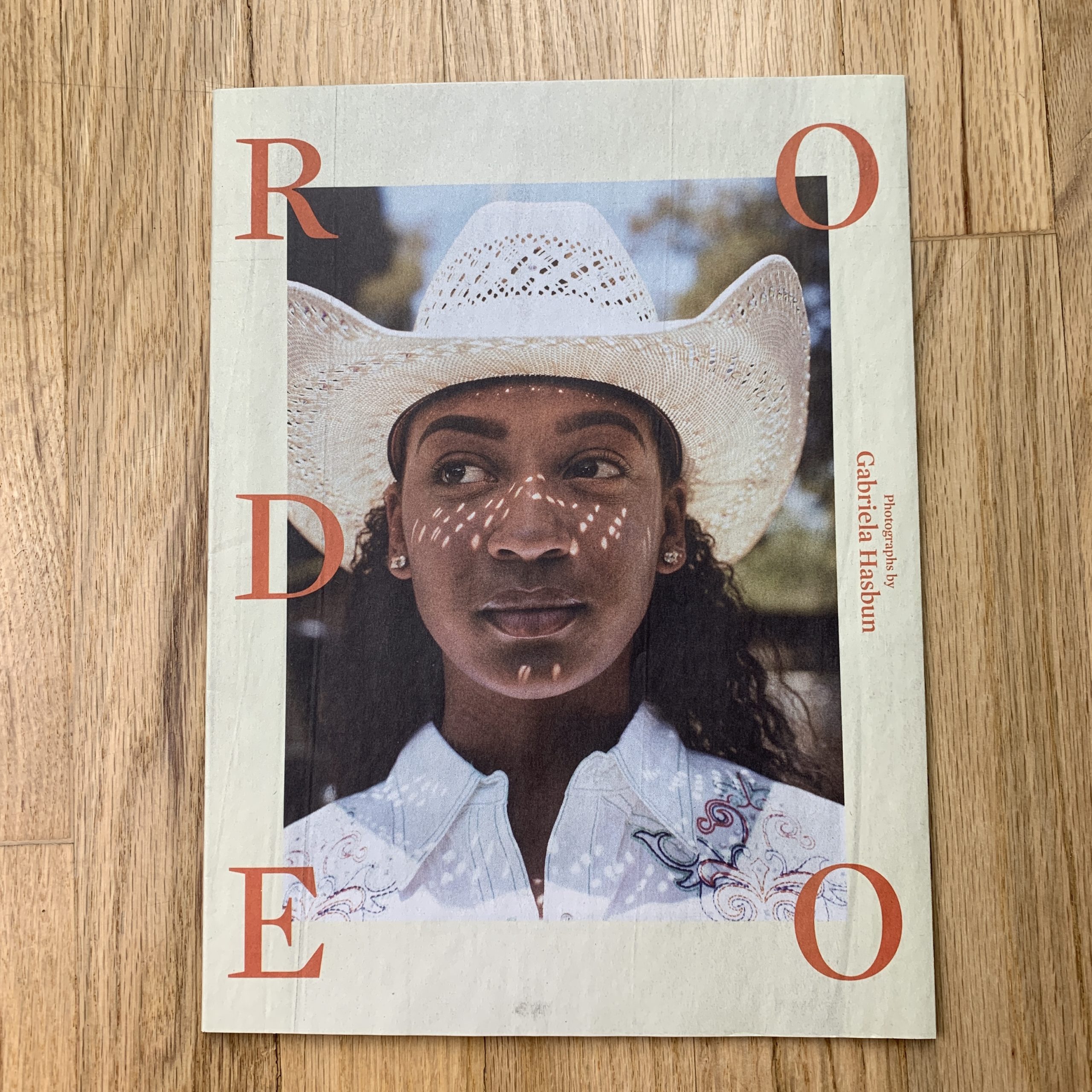
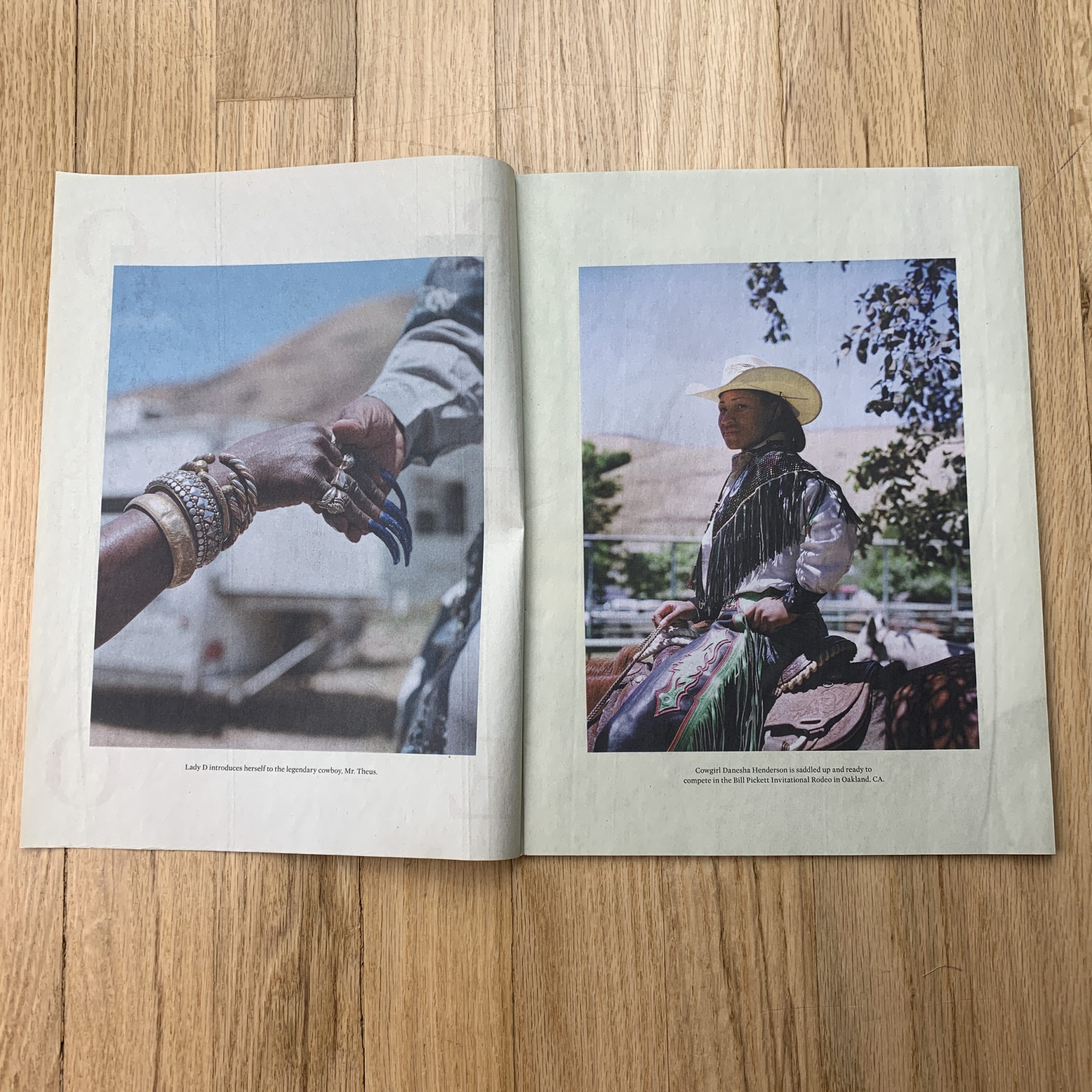
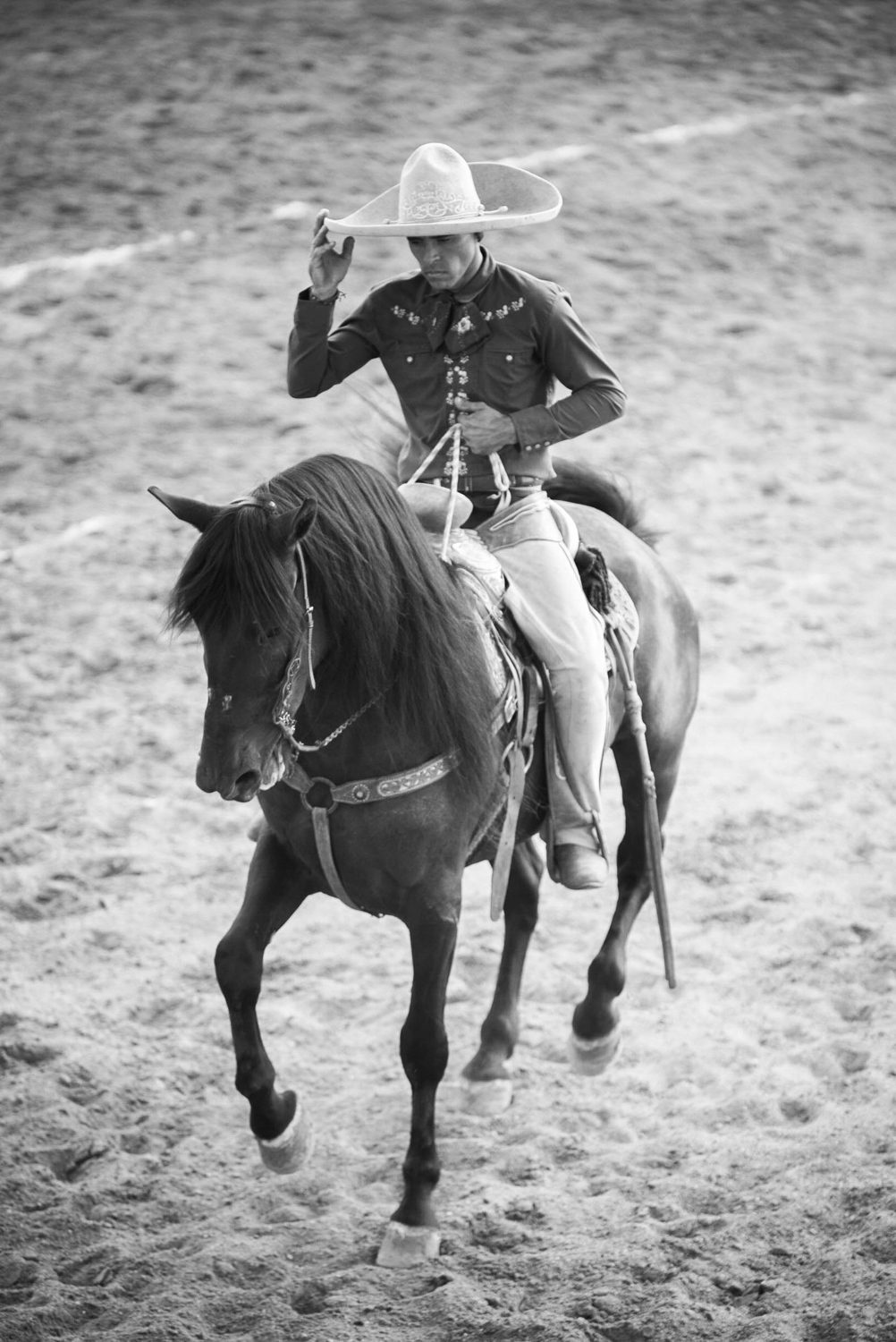
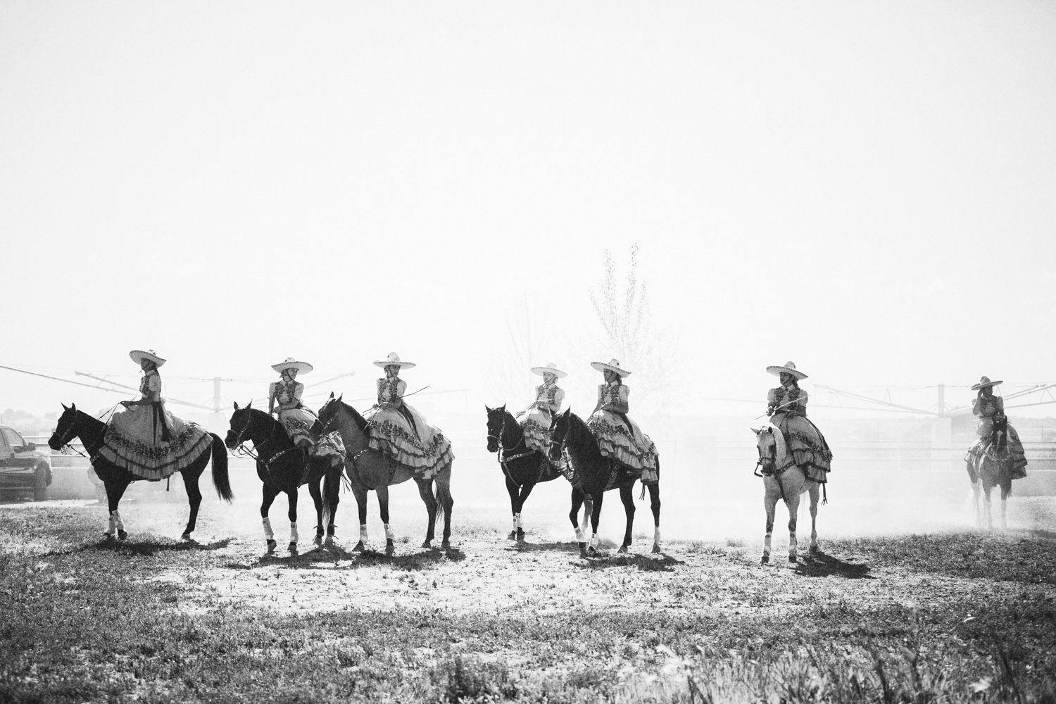
The images are from two rodeos in California that I’ve been documenting on and off for the past ten years. One is the Bill Pickett Rodeo (an all-black rodeo) in Oakland, CA and the other is the Silver Buckle Rodeo in Taylorsville, CA. I attended my first rodeo back in 2007 in Oakland and the following year I took my RZ and that was that. All of the series is shot on film. I fell in love with the people, the fashion, the horses, and the landscape.
I love learning about this part of American culture that is so foreign to me. I am a fly on the wall with my favorite camera and a couple of lenses and nothing else. It’s majestic. With this promo, I wanted to create something that editors would keep or pin to their walls. I knew it was time to share work I am deeply connected to, especially personal work of mine they might not see me share regularly.
How many did you make?
1000 printed copies
How many times a year do you send out promos?
Once a year
Do you think printed promos are effective for marketing your work?
I think art departments are quite overwhelmed with email outreach these days so I’m hoping it’s nice for them to receive a thoughtfully designed and edited zine.
My father always said, American politics acts like a pendulum.
It swings to the left and right, at its edges, but seems to course correct before going too far in either direction.
In general, I agree with him.
But my Dad also said that Trump would be removed from office within his first year. (He was sure of it.) As did my brilliant, former graduate-school professor, and he has a PhD.
Each went so far as to pick out a 3 month window during which Trump would go down in 2017.
Honestly, though, I never believed it.
Not for a second.
I countered that no matter how guilty Trump was, no matter how obvious the crime, Republicans would always have to fold en masse for Trump to go down, and I didn’t see it happening.
No matter what.
“If the Republicans won’t turn on him, they can’t convict him in the Senate,” I said, “which means he can do whatever the fuck he pleases.”
Countries that support one-party rule are not democracies, nor republics. They’re autocracies, or communist entities, or totalitarian states.
A healthy America needs two healthy political parties.
These days, it’s hard not to wonder if our system will withstand the Trump years?
Part II
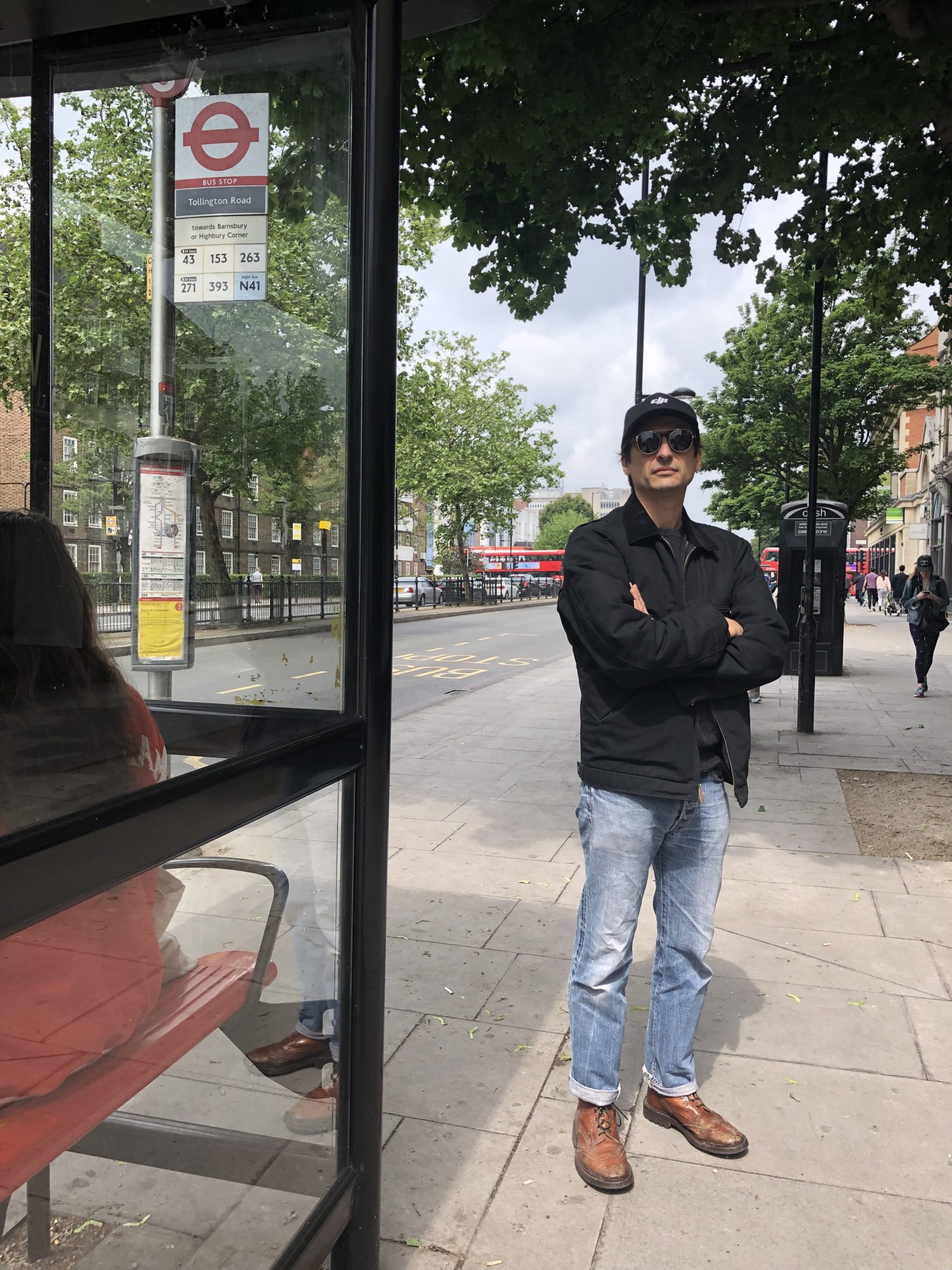
I stayed with my buddy Hugo in London last week. (He made appearances in the column in 2012 and ’13.) Hugo will turn up in the London stories, for sure, though his black Porsche has been sold, I’m afraid.
“Hugo at the bus stop”
As soon as we got to discussing American politics, (Hugo grew up in NYC, but has lived in England since 2007,) he just kept talking about “Divide and Conquer,” shaking his head.
Like, could you Americans be so stupid as to fall for this shit again?
He and I commiserated, as when we were at Pratt, in the early aughts, Post-Modern theory was all the rage then as well. Identity politics were a part of it, but back then, it was more Derrida-heavy.
Like, “Nobody can say anything about anything, because all language is a loaded construct. Every single word can be deconstructed, so nothing means anything in the end.”
These days, it’s been taken a step further, to become: “Nobody can say anything about anything that is outside their personal construct of: gender, class, social status, sexual orientation, race, age, etc.”
Strategically, “Divide and Conquer” works, which is why some rich folks dispatched Steve Bannon over to Europe to organize the far right groups, and simultaneously attack European Unity.
(If you’ve been reading the news, it’s been working. Beyond Italy and Germany and France, even in England, Nigel Farage’s new Brexit Party is thriving.)
But in the American left, and especially in media and the arts, identity politics taken to this extreme is literally succumbing to a divide and conquer strategy.
I’ve written about this stay-in-your-lane-ism for several years, and was perhaps early in identifying it. So let me be the first to say, I think the wave may be cresting.
These ideas were so out there, so front-and-center at Photolucida last month, I expect that we might see a restoration of balance, with respect to any room for concepts of Universalism, or General Humanism, within the photo community.
(Has the shark been jumped?)
At the reviews, multiple photographers showed up at my table near tears, or having recently been in tears, as their work had been attacked for being improper, based upon who they were.
I really don’t know how many people I met who told me their photographs had been considered controversial because they weren’t of a certain ethnic or racial group, or class, so they should not be commenting outside their lane.
Lots of hurt feelings, that’s for sure.
Part III
Why ask these questions?
Why go here today?
Well, we’ve found ourselves in Part 1 of The Best Work I Saw at Photolucida, but we’ve done it in a round-about way.
Rather than do a book review, or show you jpegs of portfolios, we’re going to take a short look at three books that ended up in my bag during the week.
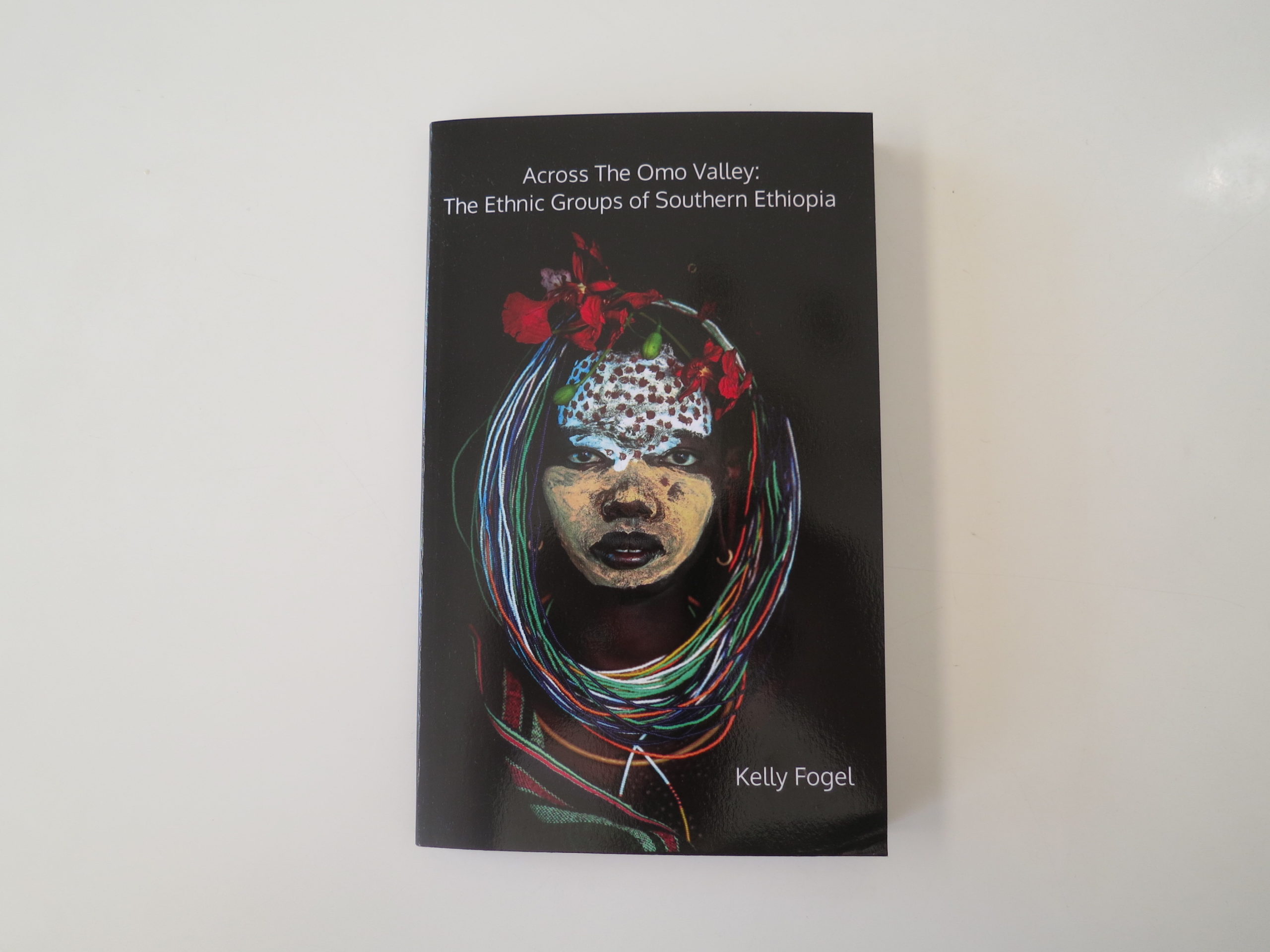
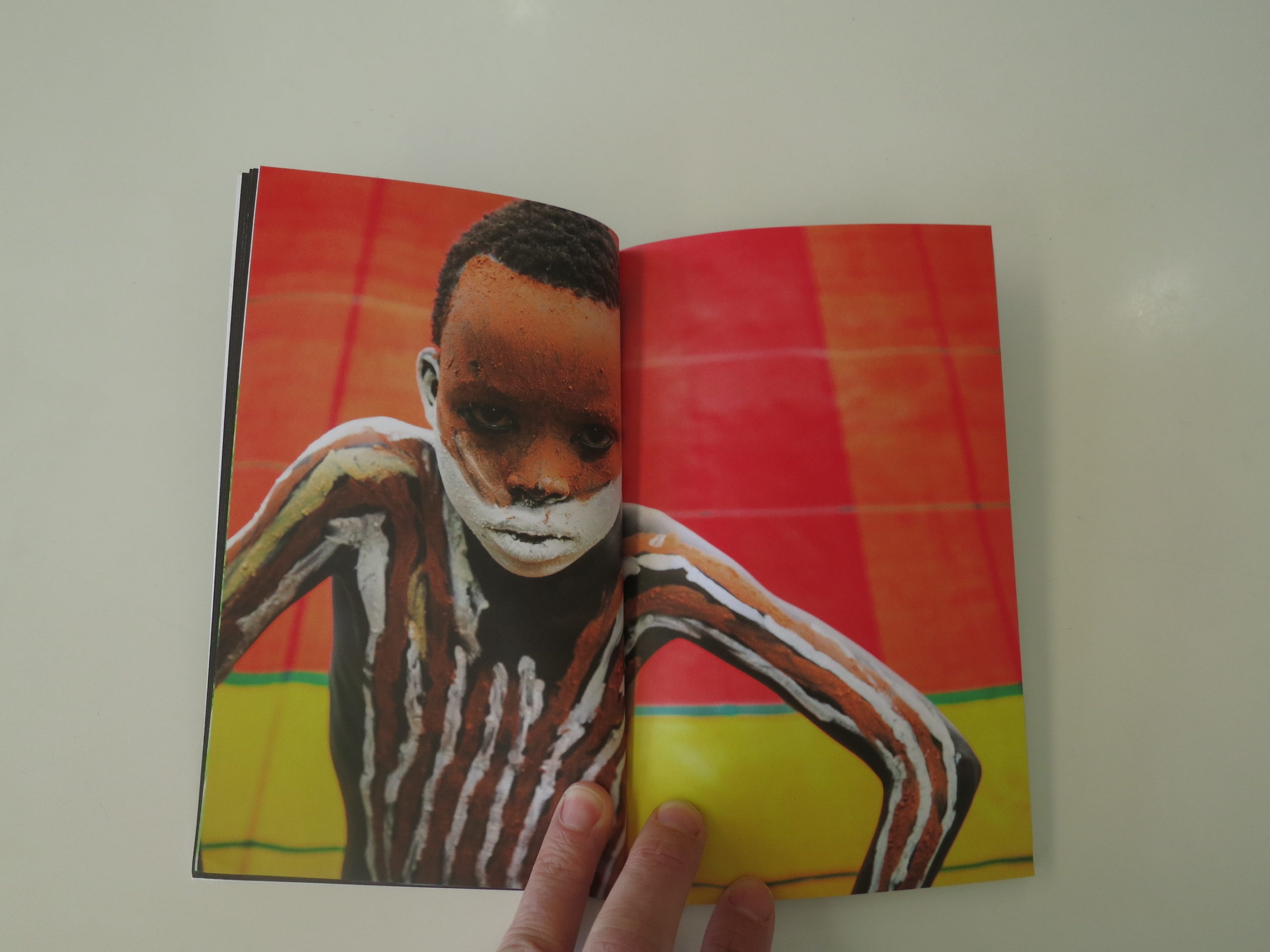
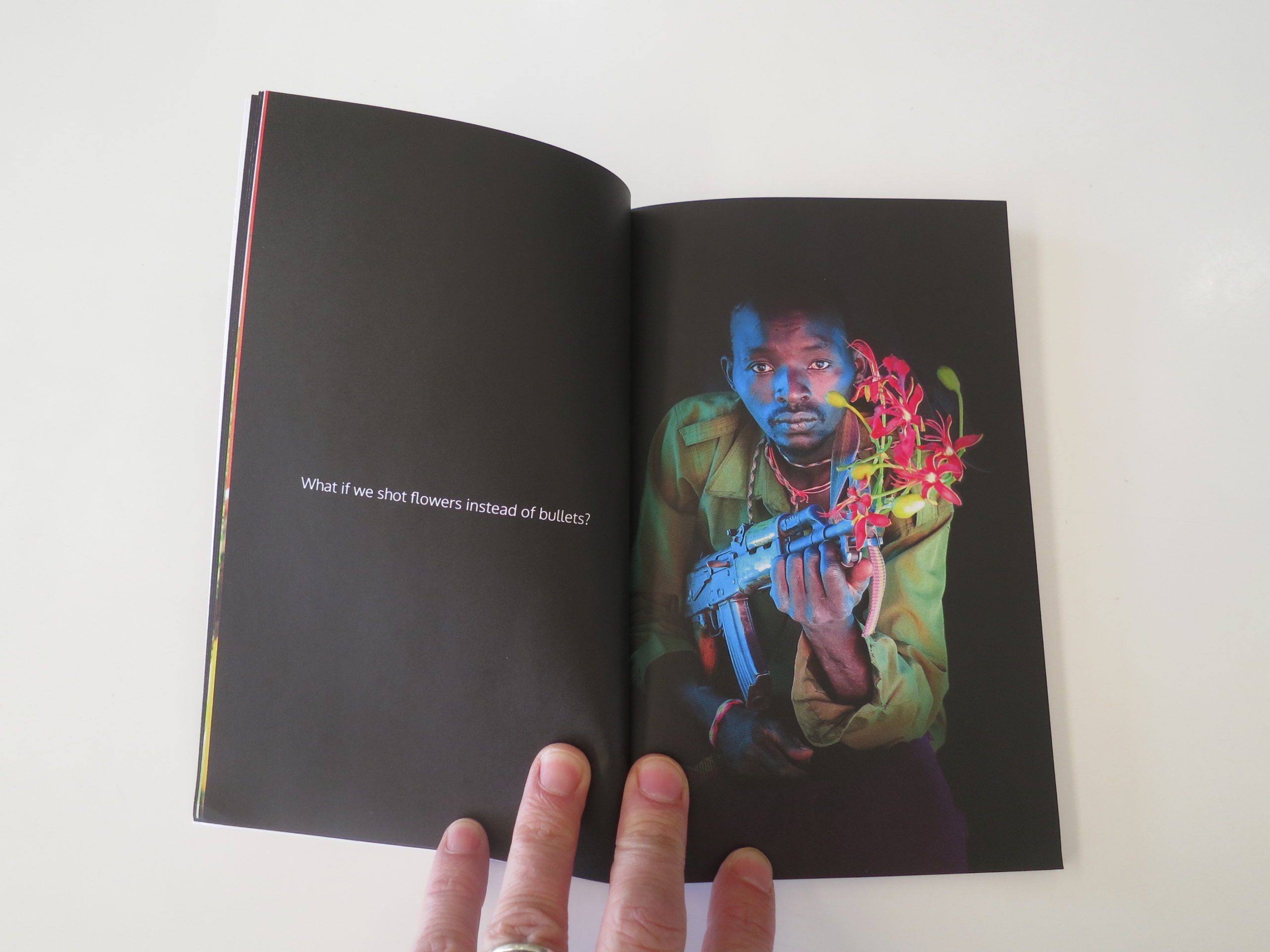
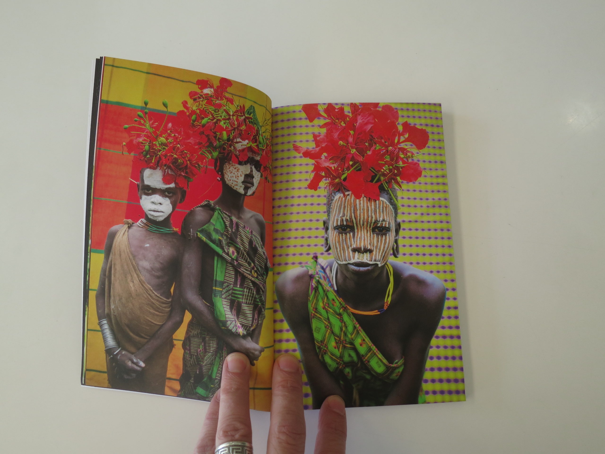
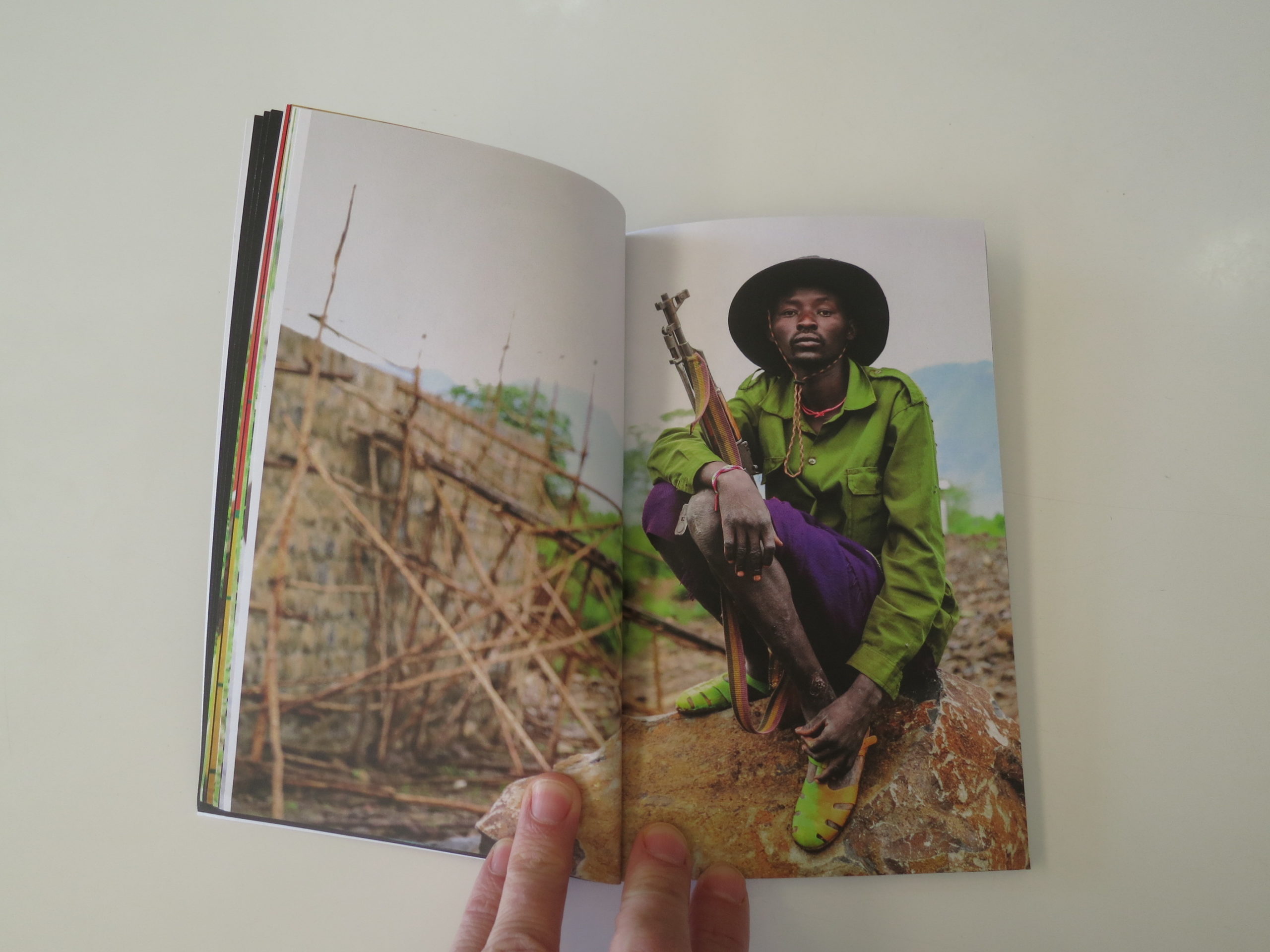
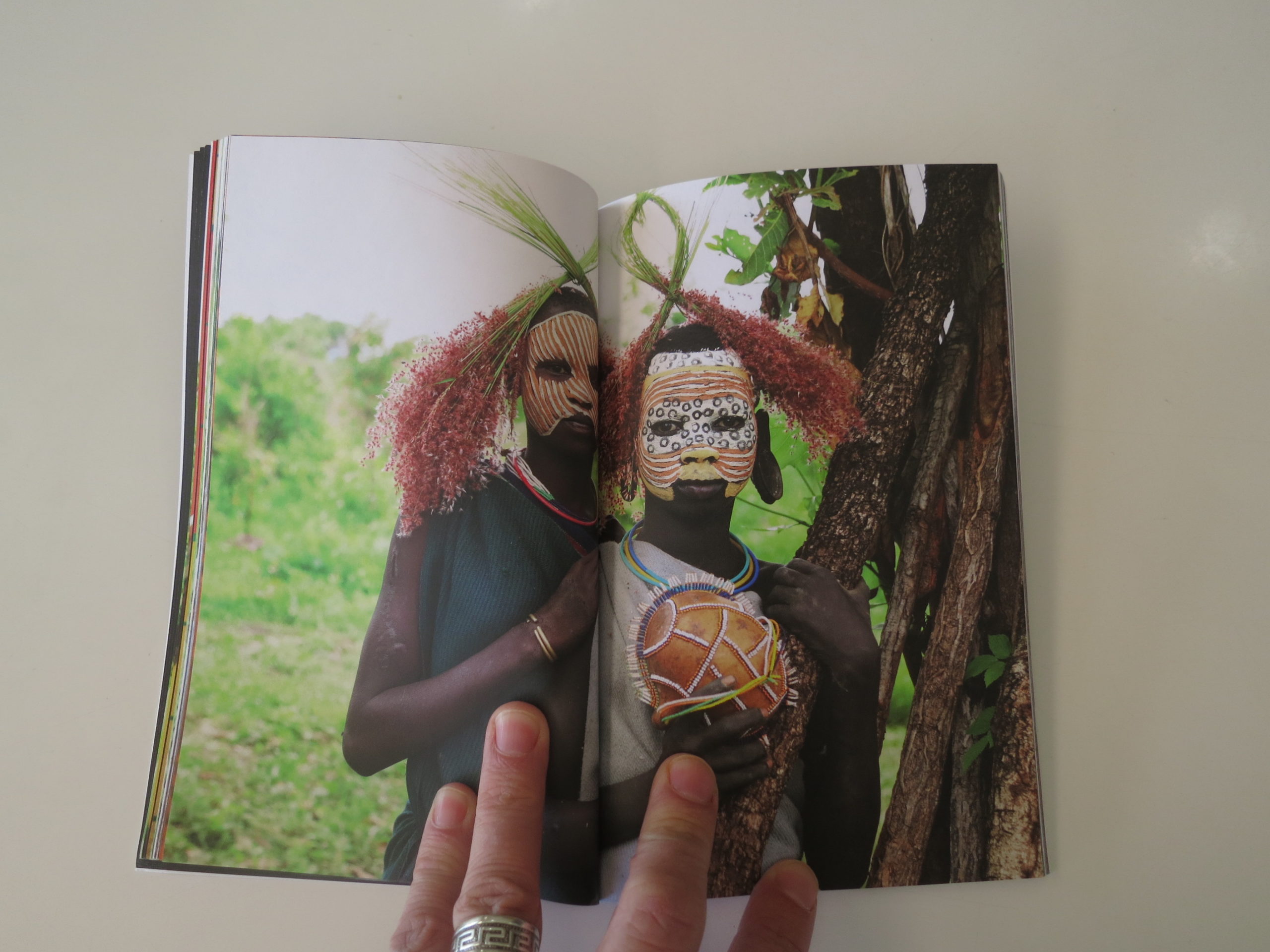
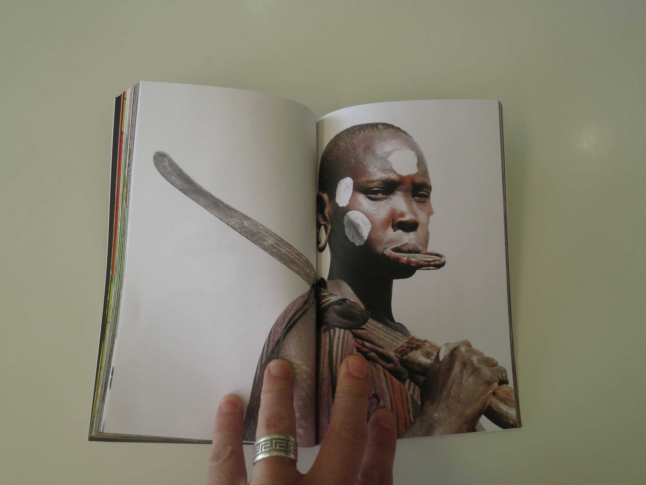
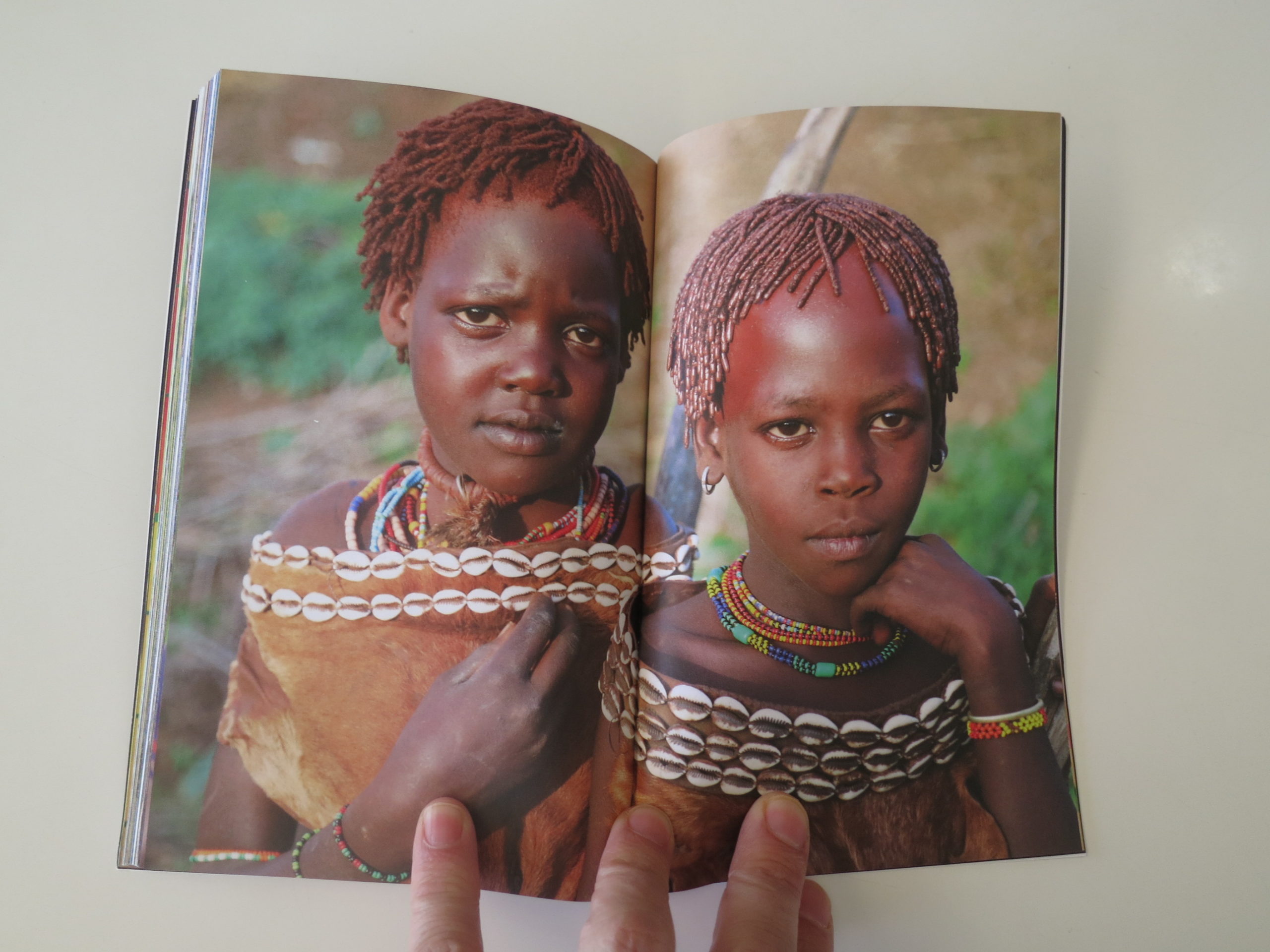
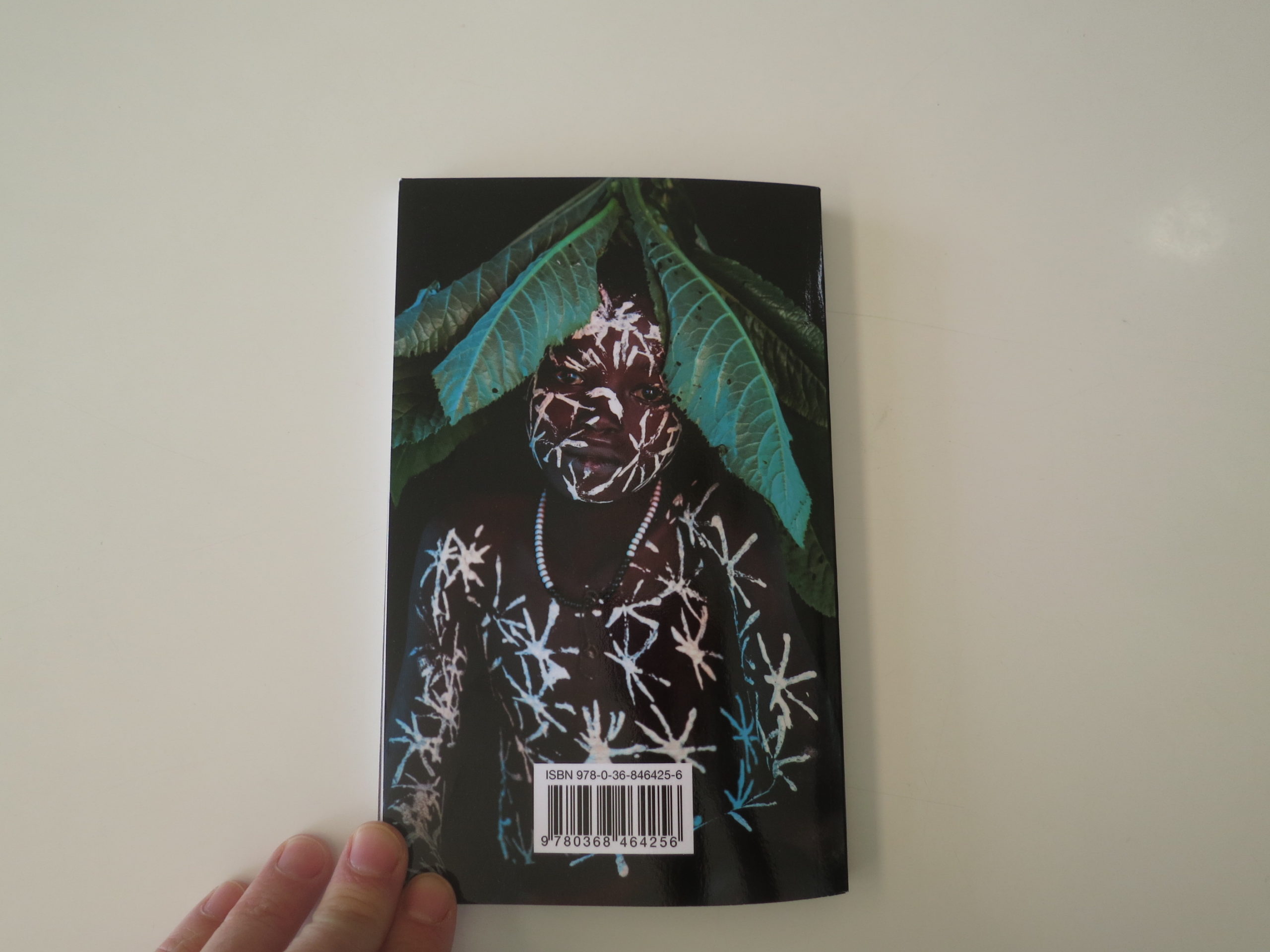
The first is “Across the Omo Valley: The Ethnic Groups of Southern Ethiopia,” which I was given during a review by Kelly Fogel.
Now, Kelly was obviously white, and seemed to be a young Jewish-American woman from LA. (She later added that she’s blonde.) Kelly sat down to show me photographs from Africa that seemed to hybridize fashion and art into hip, stylish documents.
I liked the photographs right away, on merit, but could see where the problem was.
Which Kelly quickly confirmed.
She said something along the lines of “What is a white, blonde female photographer from California allowed to shoot these days?”
It’s a paraphrase, yes, but I heard some version of that sentiment again and again. In each case, I assured the photographer that I was open-minded, and willing to consider their work in the context they presented to me.
(I got a lot of smiles of relief each time I said that.)
Ideas flow in cycles, just like politics, and life itself.
I agreed to show Kelly’s work here on APE immediately, but it wasn’t until this morning that I re-discovered she’d slipped me a slim book, and I’m happy to share it with you here. The text pages confirm that Kelly works with organizations, and teaches teens.
Now that I think about it, both of the other books I’ll show today were slipped to me by friends, one old and one new, and they both made it into the same little bag I raided this morning, looking for a story to write.
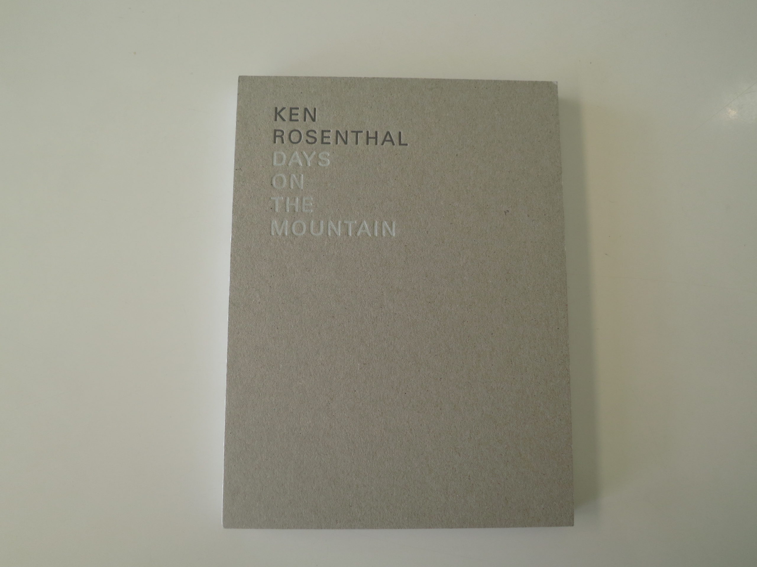
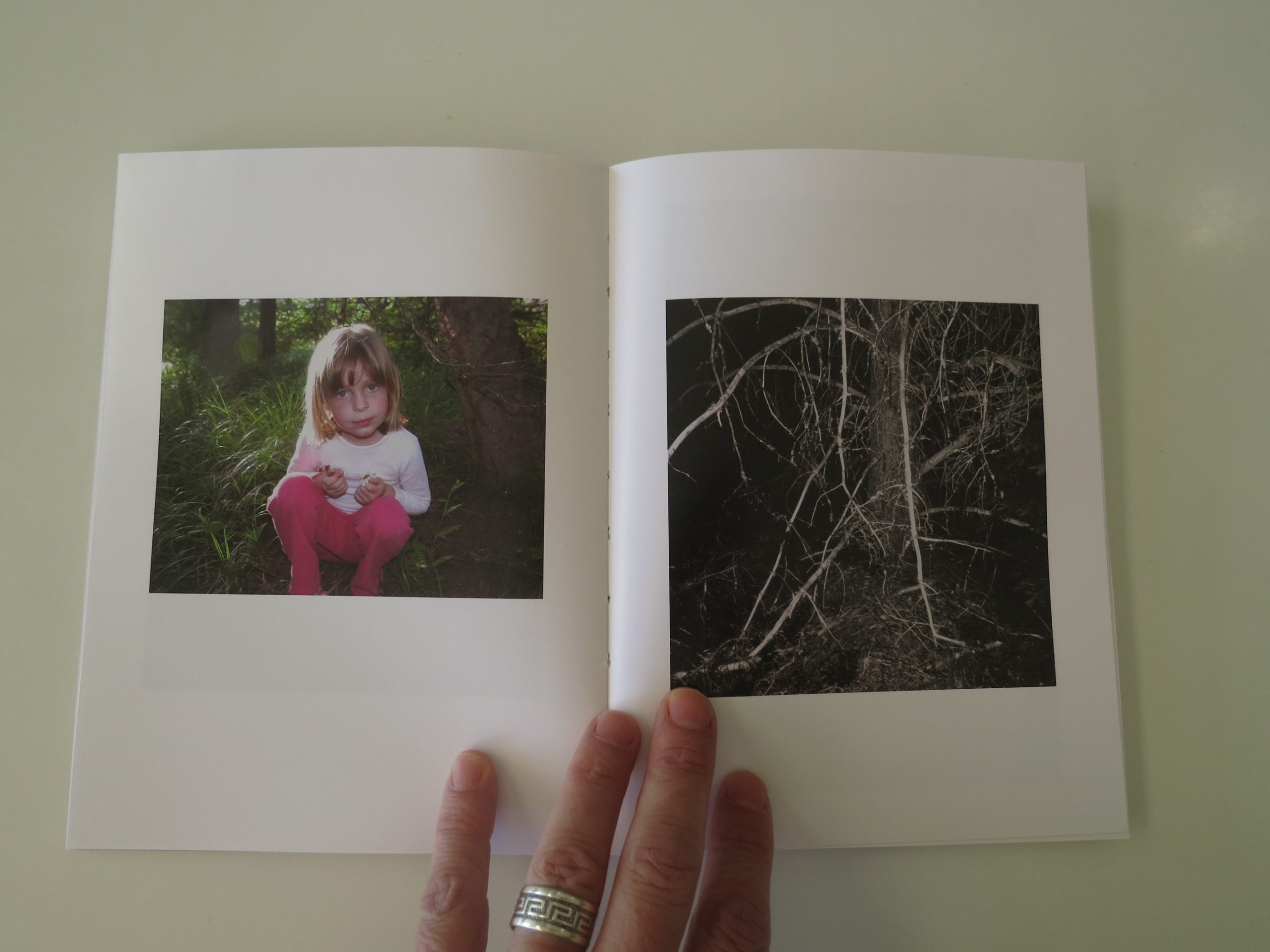
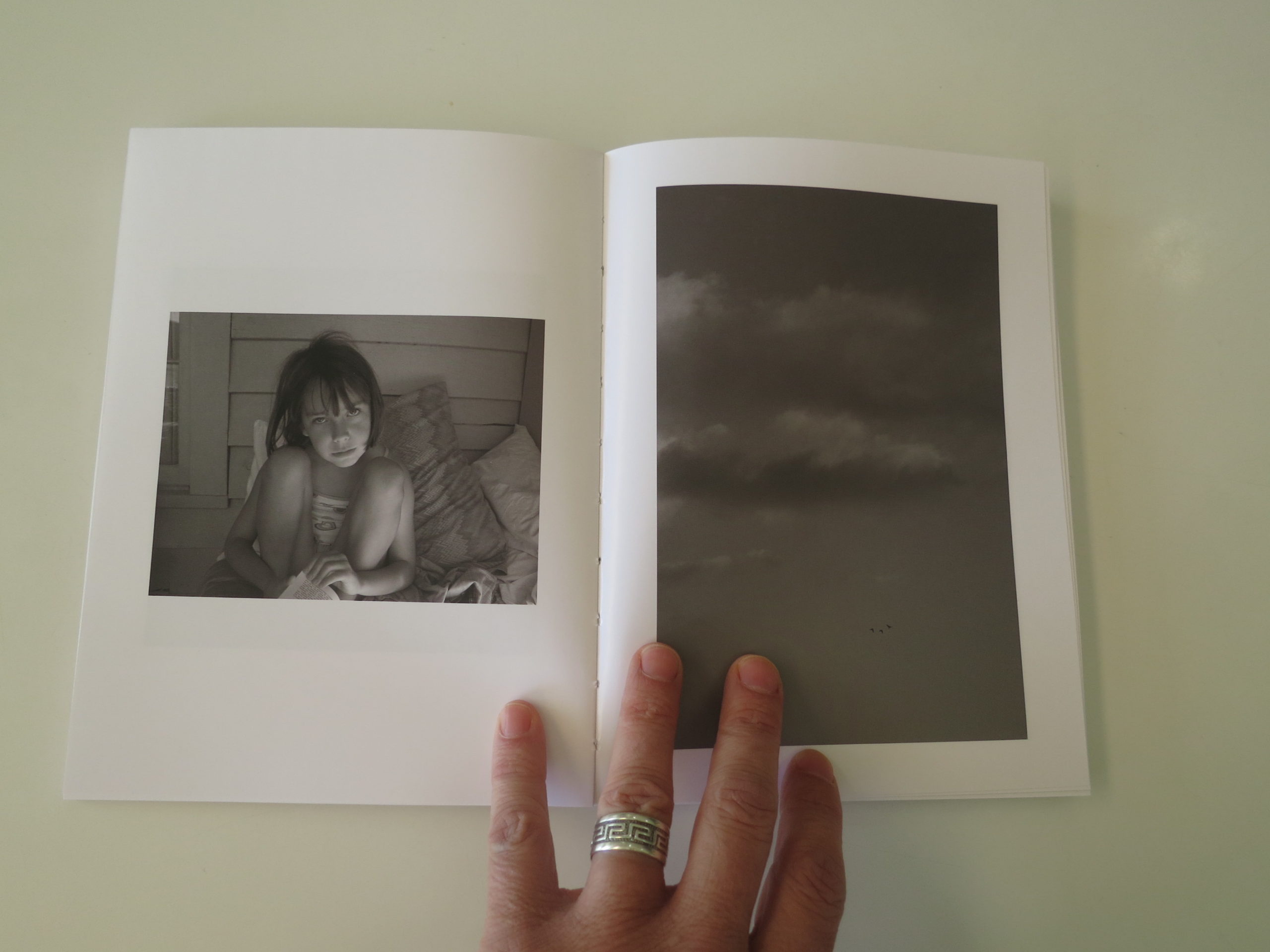
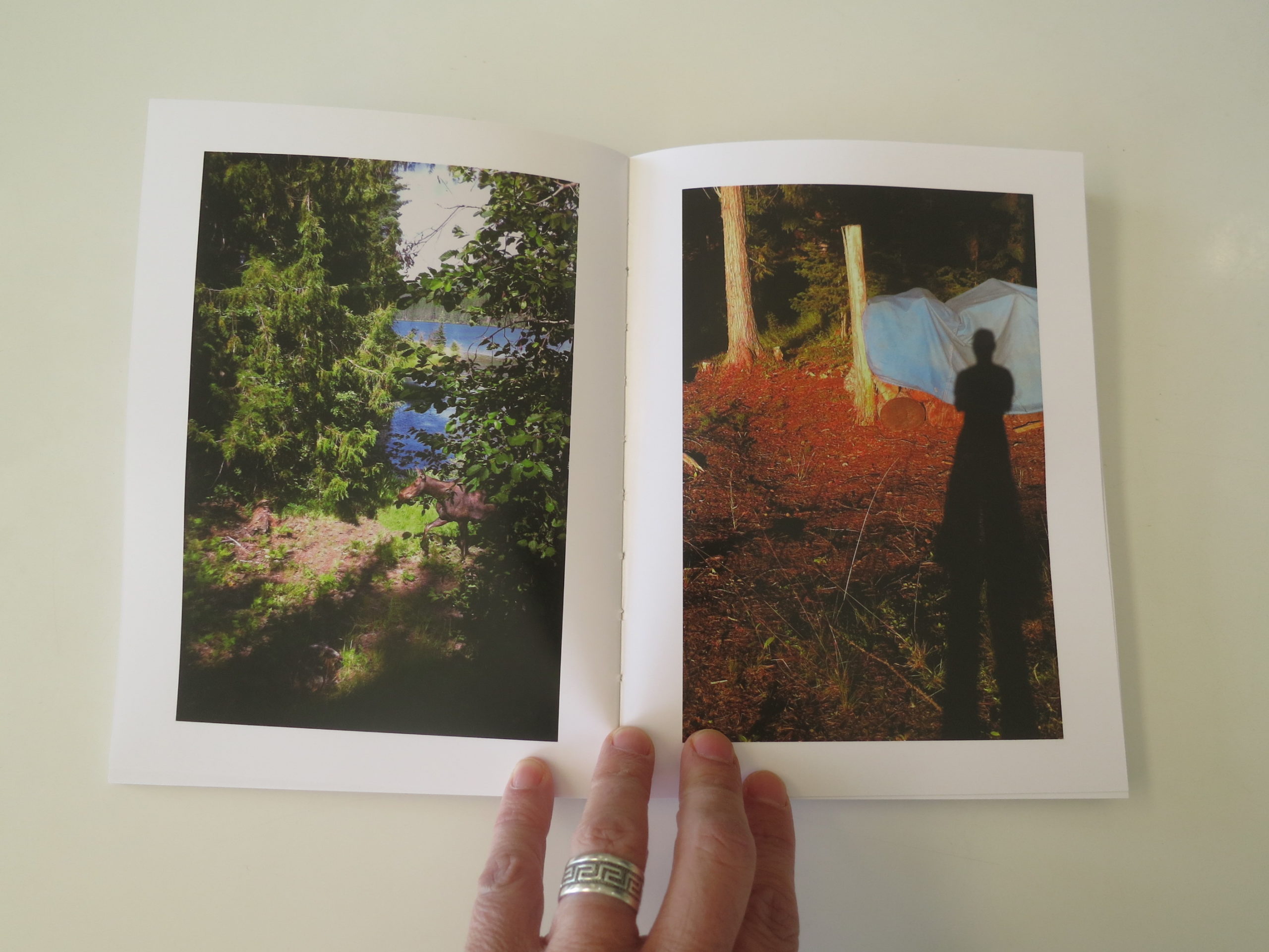
First off: “Days on the Mountain,” by Ken Rosenthal, published by Dark Spring Press in Tucson.
Ken, like Hugo, has made appearances in the column before, as he was with me on that legendary, (and scary as Hell) meth-town-pit-stop in Van Horn, Texas on the way to Marfa.
We’ve been doing these stories here for 9 years now, and I’m lucky to have had friends who pop up now and again over time.
With Ken, though, I haven’t seen much of him the last few years. You’ll have to trust me that he’s been dealing with some really difficult family issues. The kind of shit you wouldn’t wish on your worst enemy.
He’s also a guy I helped get out of a mugging in Tucson back in 2010, and he recently had his next-door-neighbor accidentally shoot a shotgun shell through his wall, right above where his young daughter sleeps.
In other words, luck is not always kind to Ken.
But he’s also a very successful artist with gallery representation, exhibitions, books, you name it.
All the trappings of success.
So when he gave this book to me, I teared up as I flipped through it.
The work was just so different from what I was used to seeing from him. It’s raw, and personal in a way that stripped back artifice.
It’s as close as a diary-for-sanity as I’ve seen, (given that I know him,) and the beauty of the book felt sweeter to me, knowing it was well-earned.
Bugs and bats and bees and trees.
Nature and forest and summer in Washington as salvation.
Not a bad way to kick off the post-Memorial Day weekend summer season.
But I like to keep it real, so rather than end typically happy, like Hollywood would, I’m going to finish up with a Hollywood story, but not the one you’re expecting.
On the first morning of the festival, at the first reviewer breakfast, I had a date to meet and chat with Alison Nordstrom, and she kept a seat open for me as a result.
Next to my reserved seat was a young guy I hadn’t met yet: Gregory Eddi Jones, an artist, writer, educator and publisher based in Philly.
He got his MFA at the Visual Studies Workshop, and was a part of a Rochester-NY-educated crew that I’m just learning exists in the wide Photo Land.
Greg and I hung out a few times, and I got to see some of his new work, which is currently being exhibited at the Foam Talent exhibition in London.
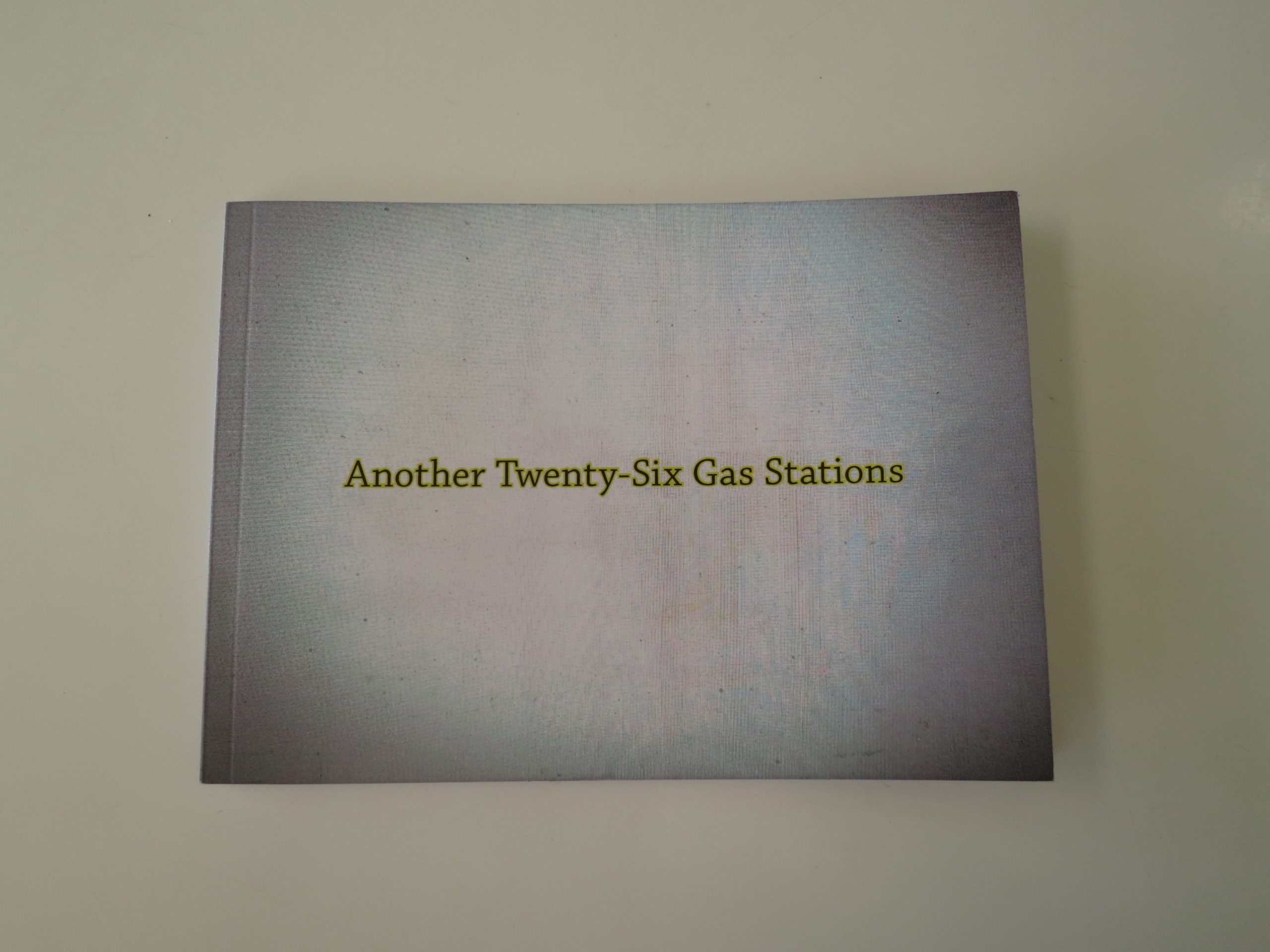
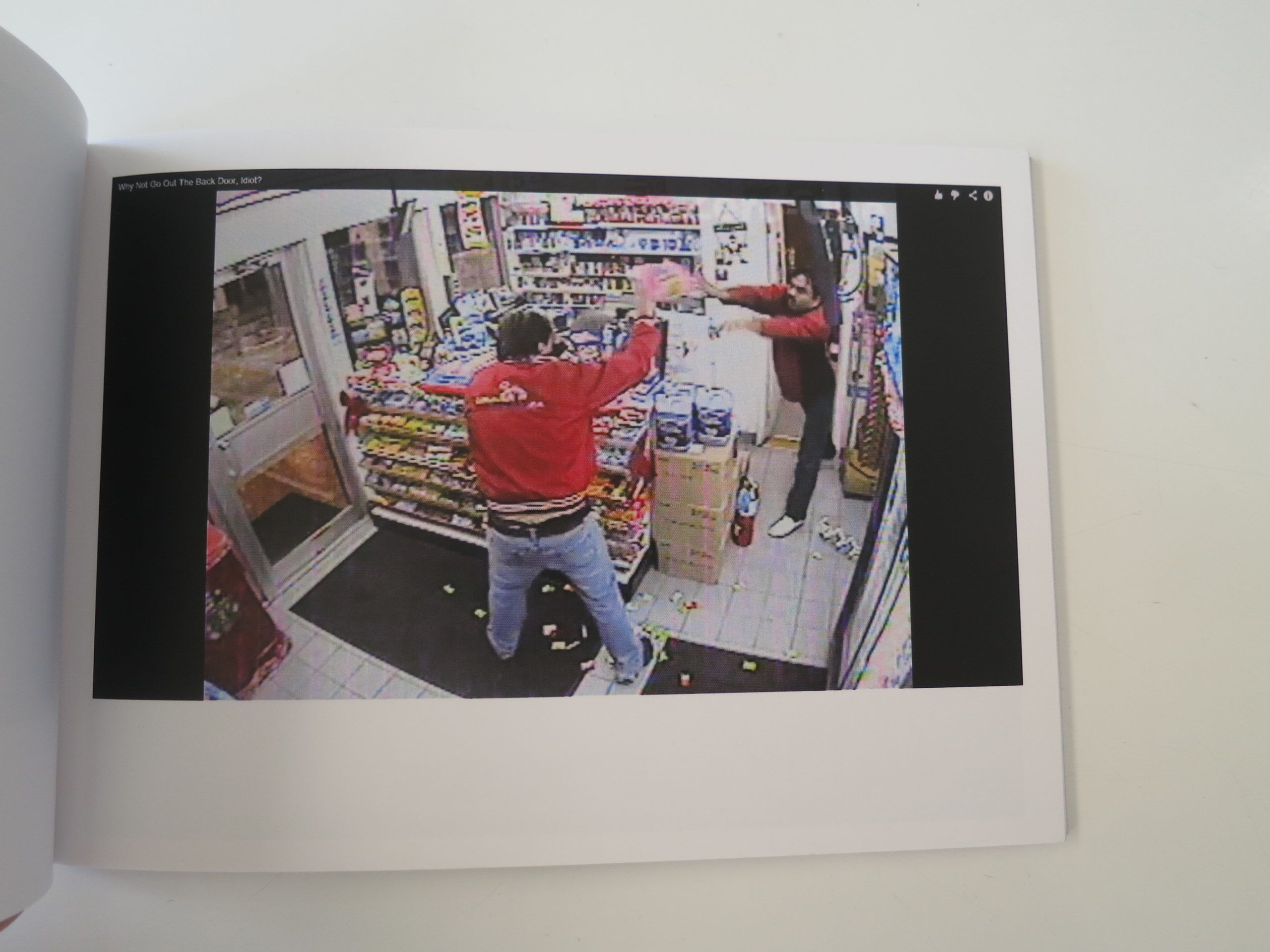
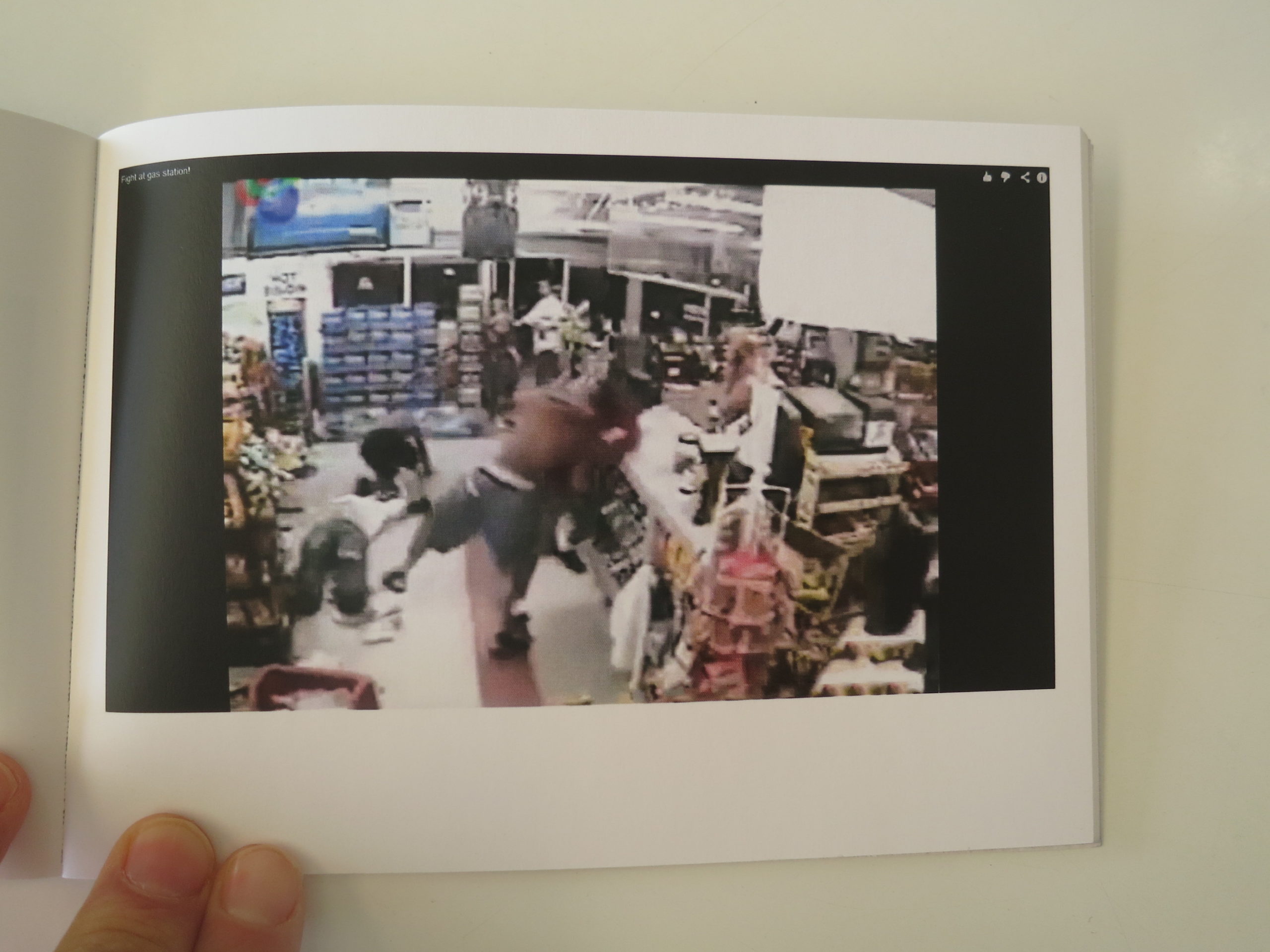
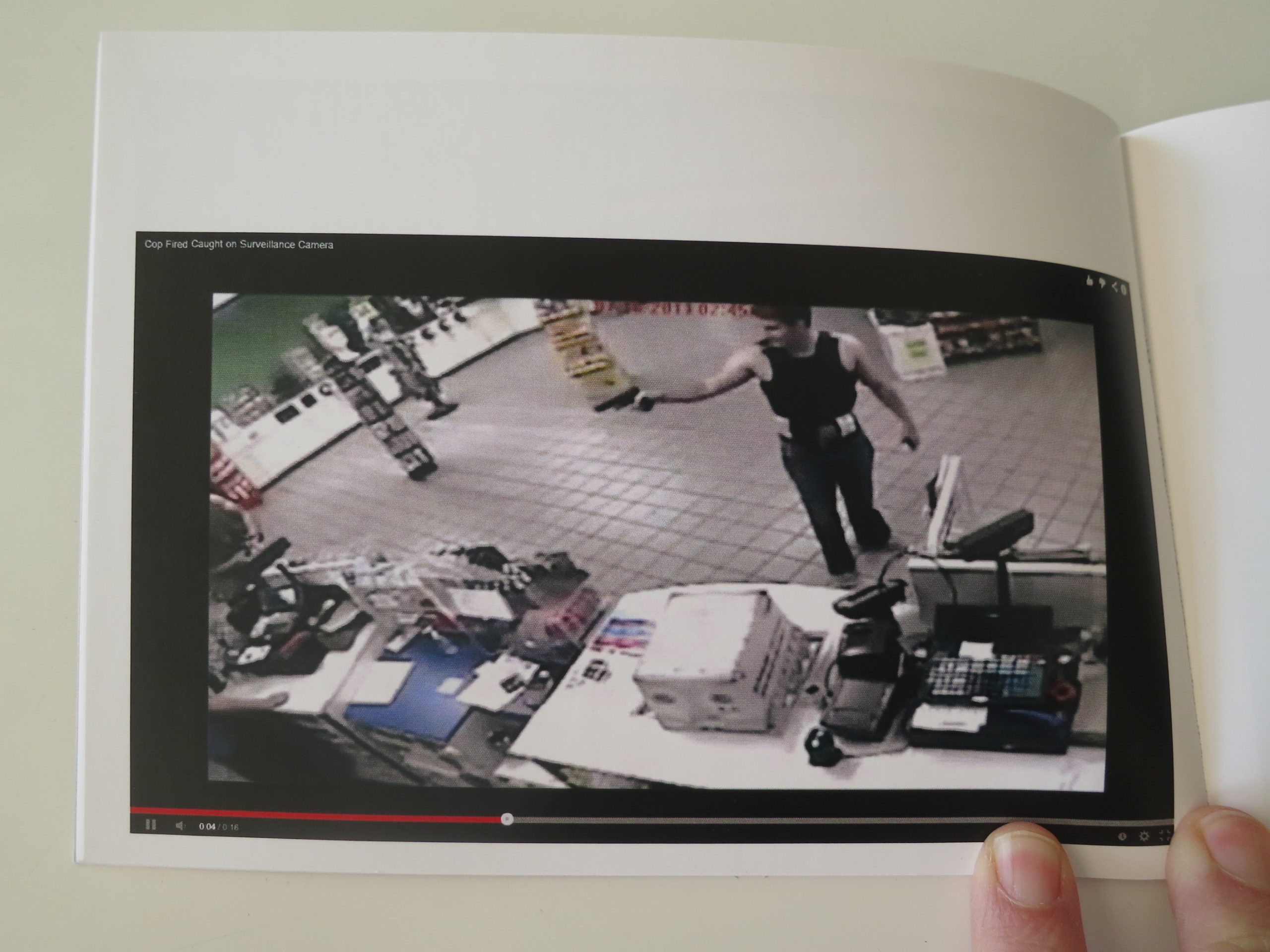
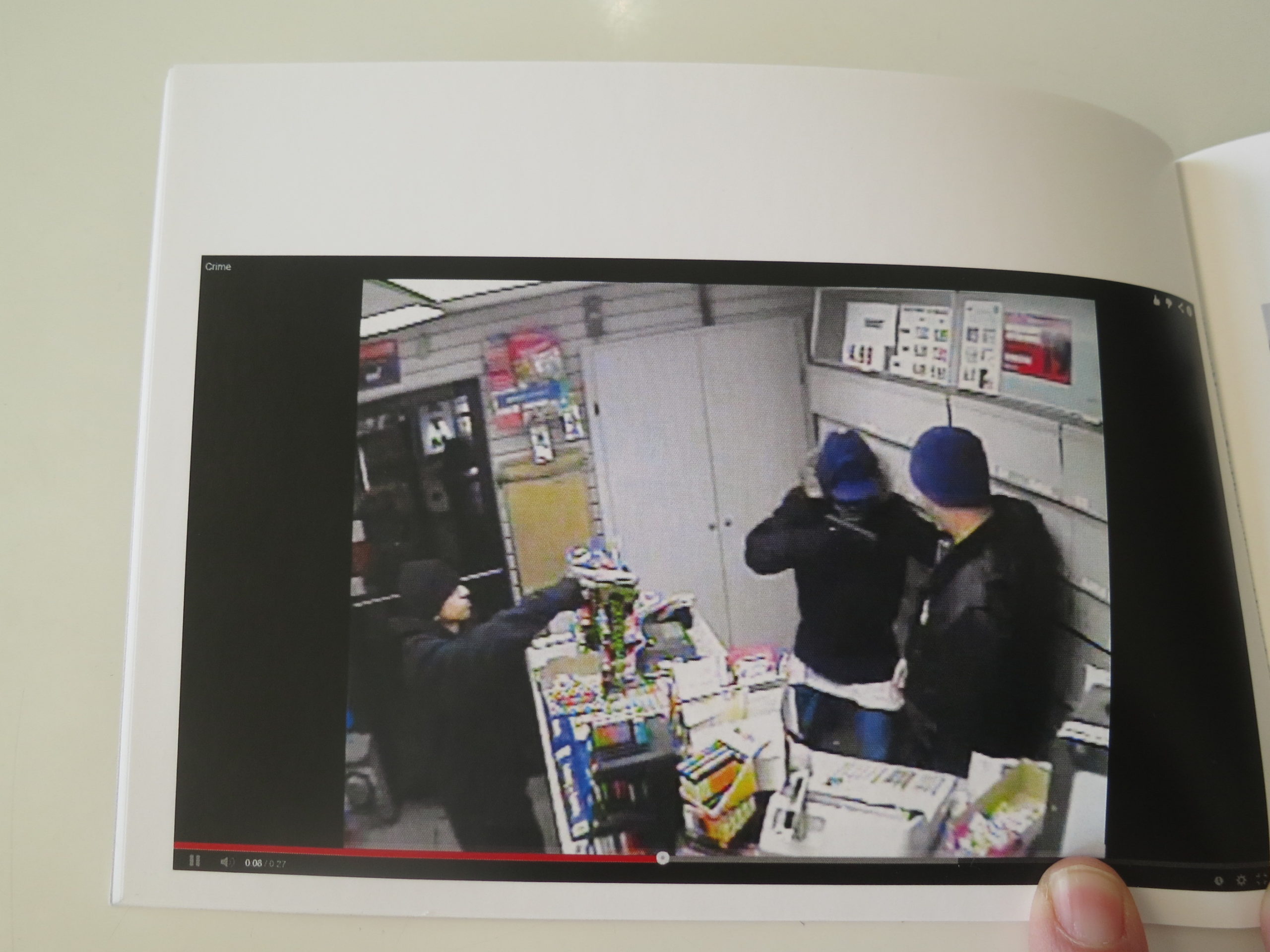
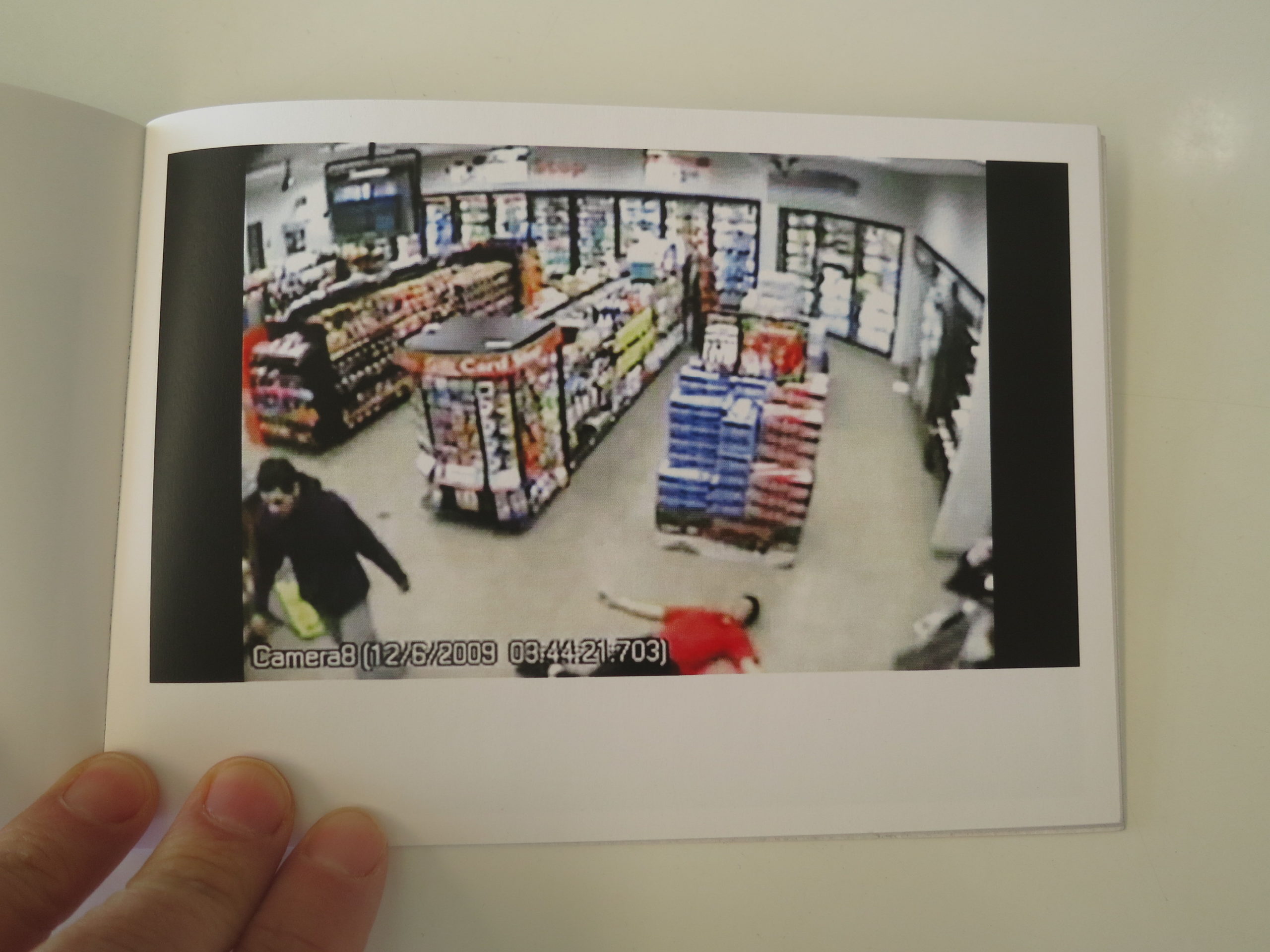
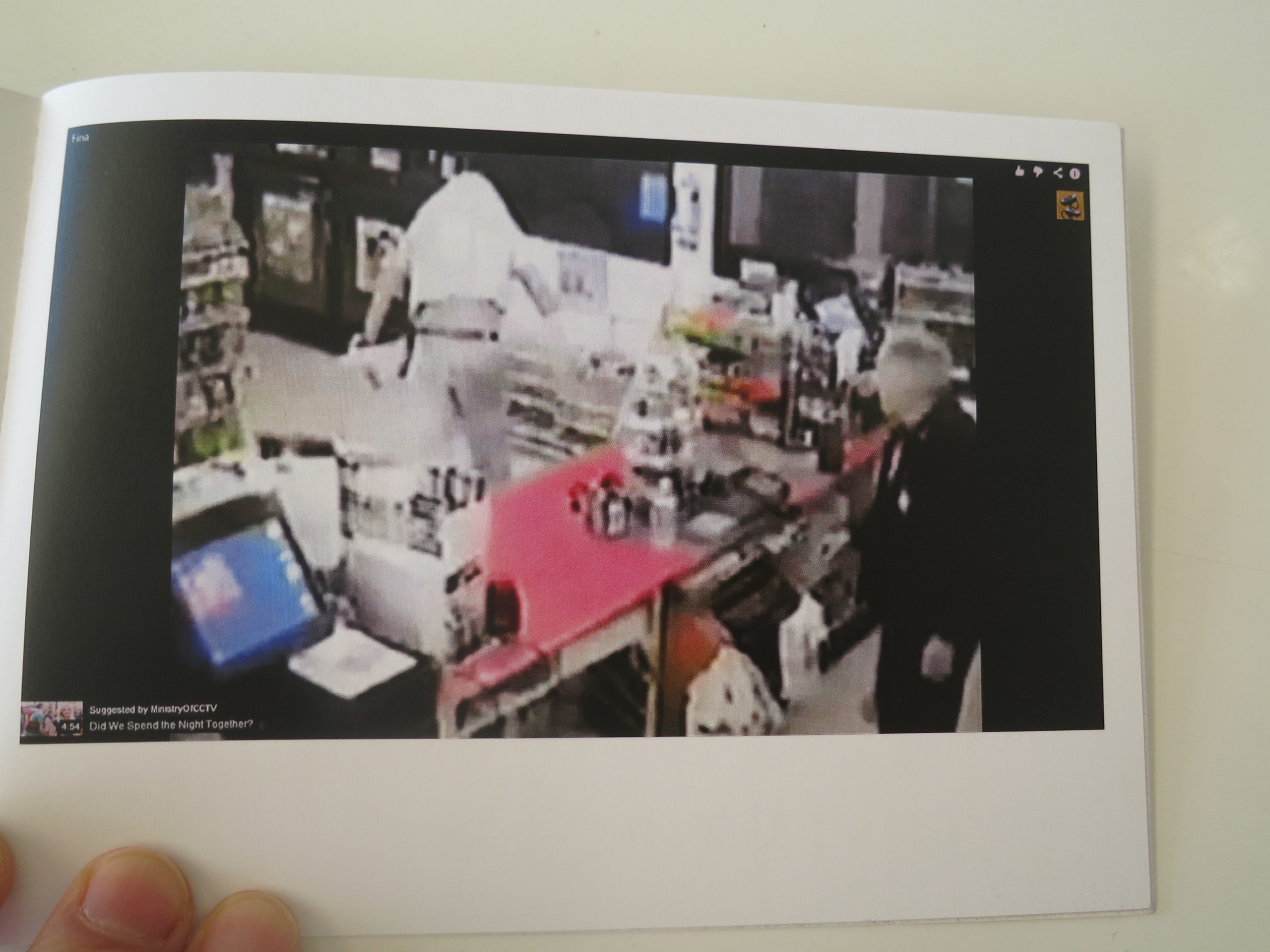
In Portland, on the last morning of the event, just as people were departing, Greg gave me a copy of his 2014 book “Another Twenty-Six Gas Stations.”
(Pause.)
OK. Did you have your judgmental thoughts yet?
About how nobody can possibly bring anything new to Ed Ruscha’s classic-LA concept?
Are you done?
Because I had the thought, and I saw it flash before a few peoples’ eyes when I described the book to them too.
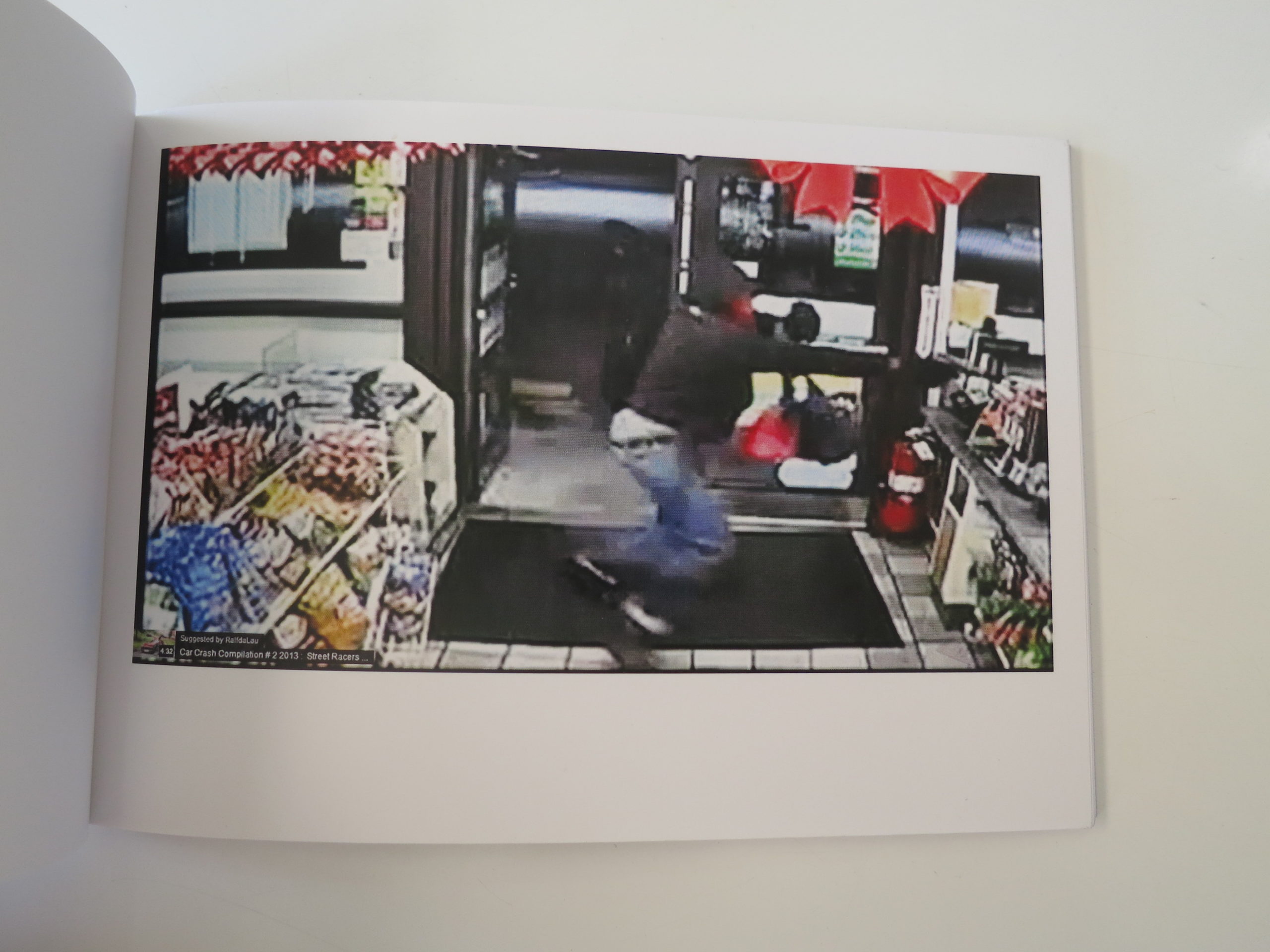
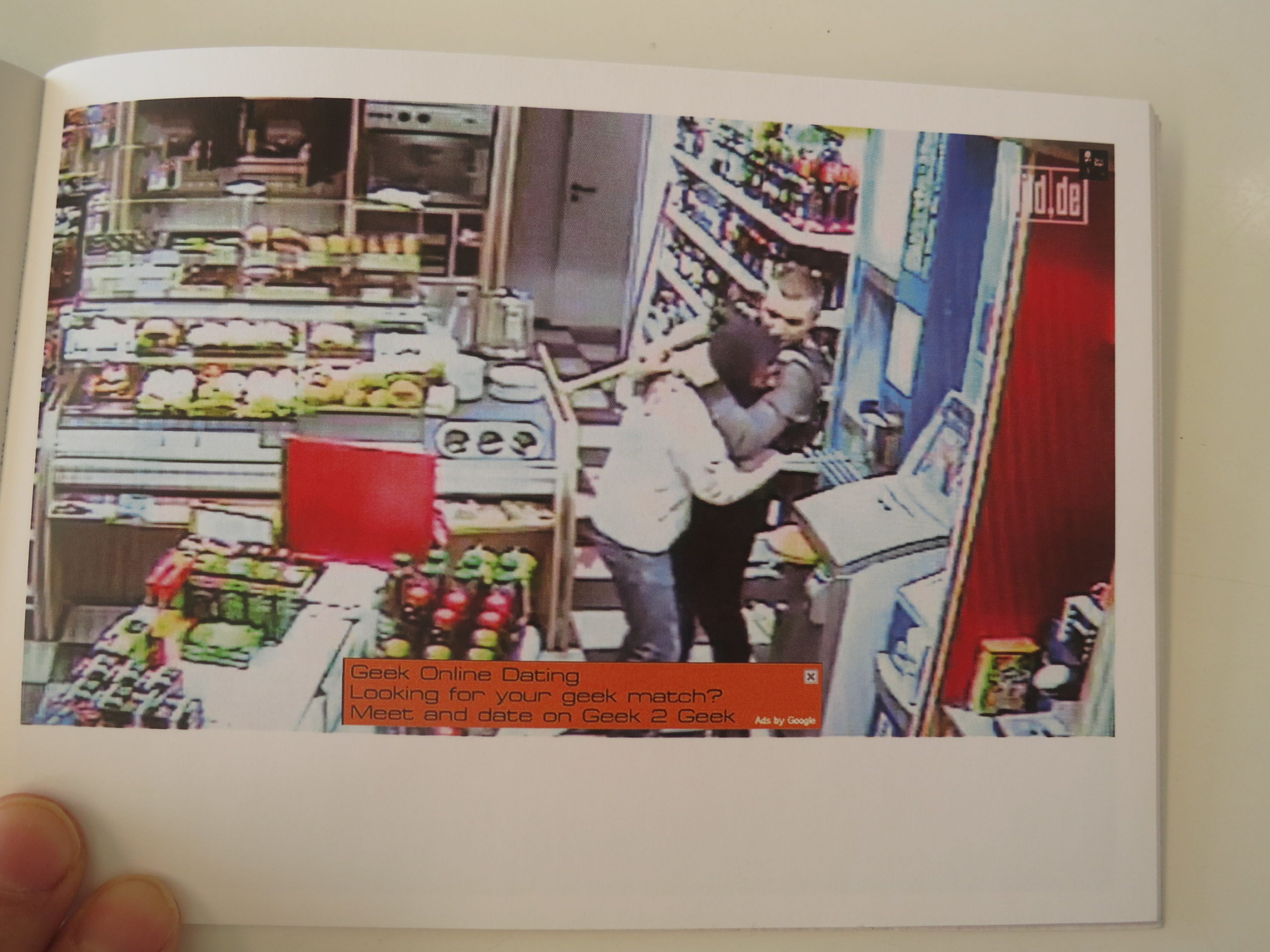
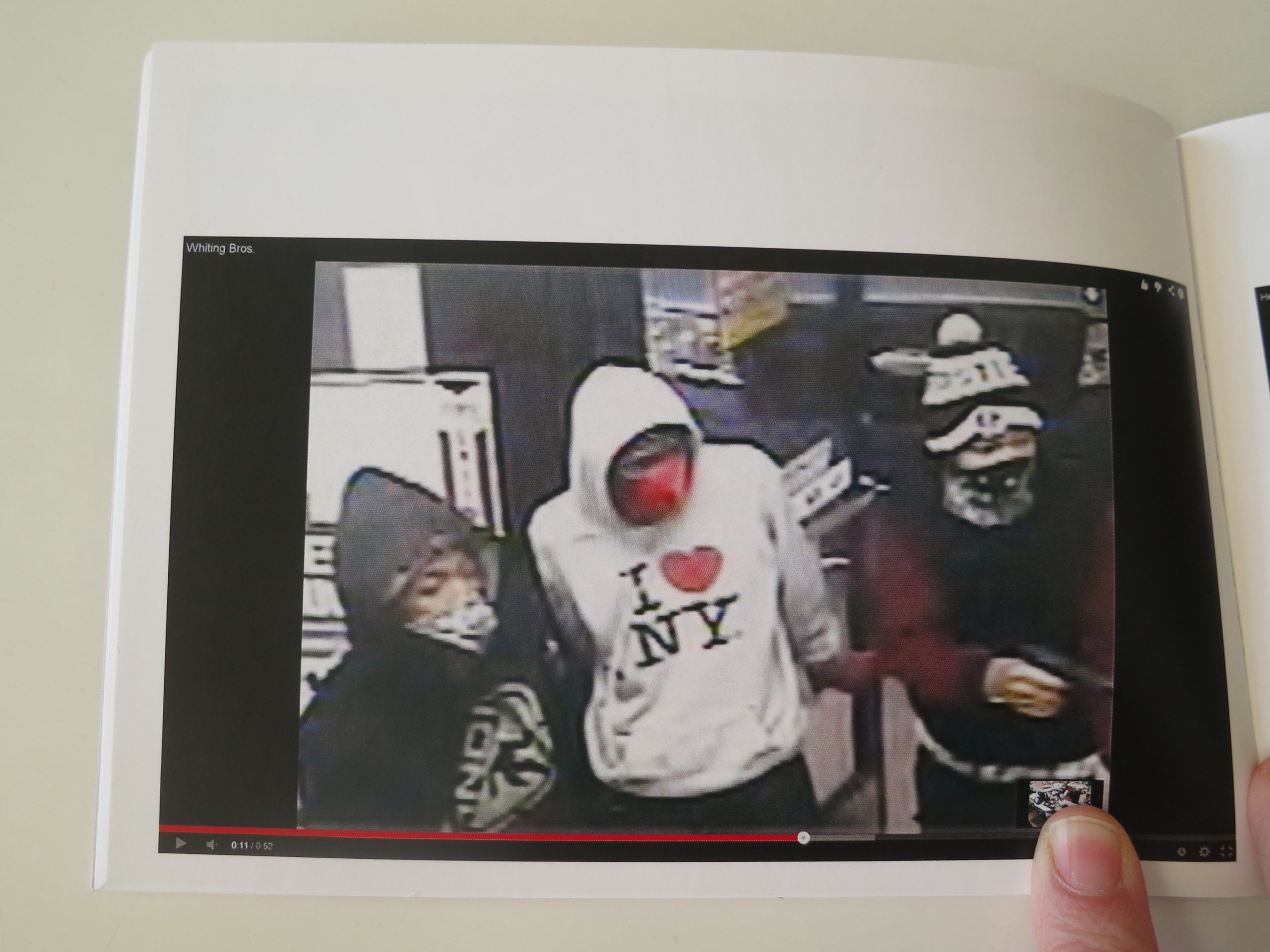
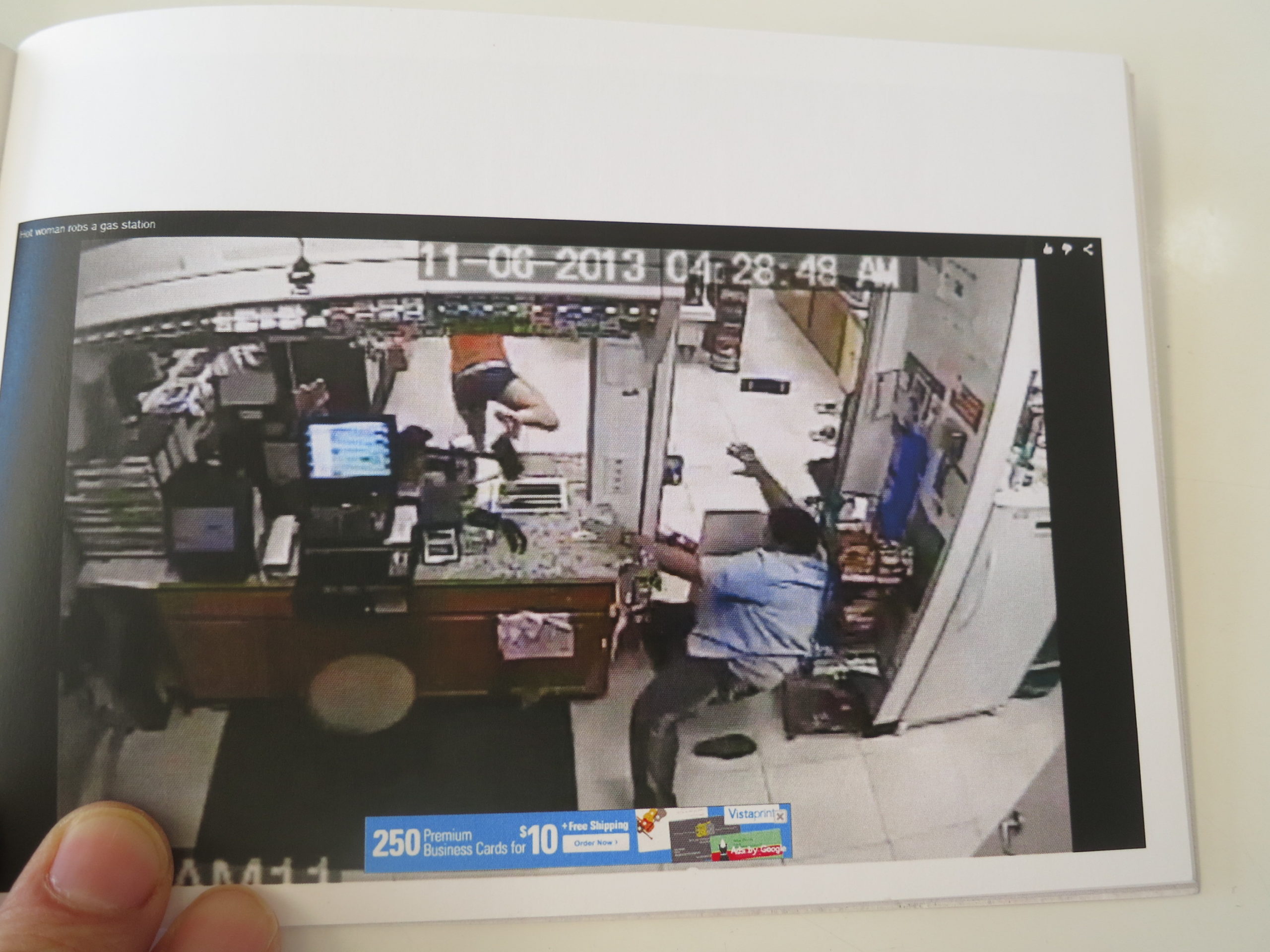
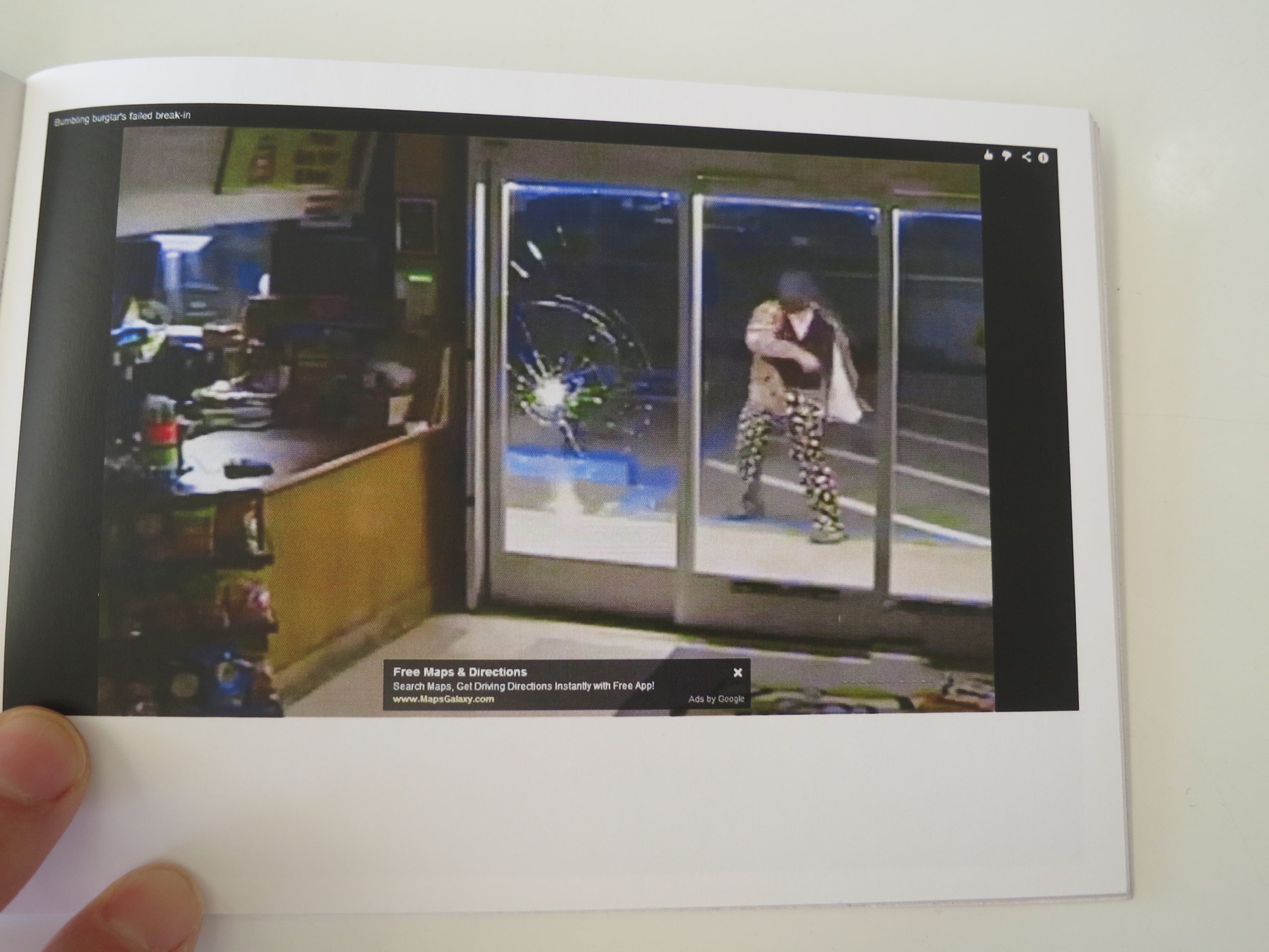
But…these are screenshots from gas station surveillance video feeds broadcast online.
The mayhem and horror predate the Trump era, obviously, because the project is 5 years old. Yet it feels so NOW, so of the moment, so “Cops” on Molly laced with fentanyl.
The Art of the Personal Project is a crucial element to let potential buyers see how you think creatively on your own. I am drawn to personal projects that have an interesting vision or that show something I have never seen before. In this thread, I’ll include a link to each personal project with the artist statement so you can see more of the project. Please note: This thread is not affiliated with any company; I’m just featuring projects that I find. Please DO NOT send me your work. I do not take submissions.
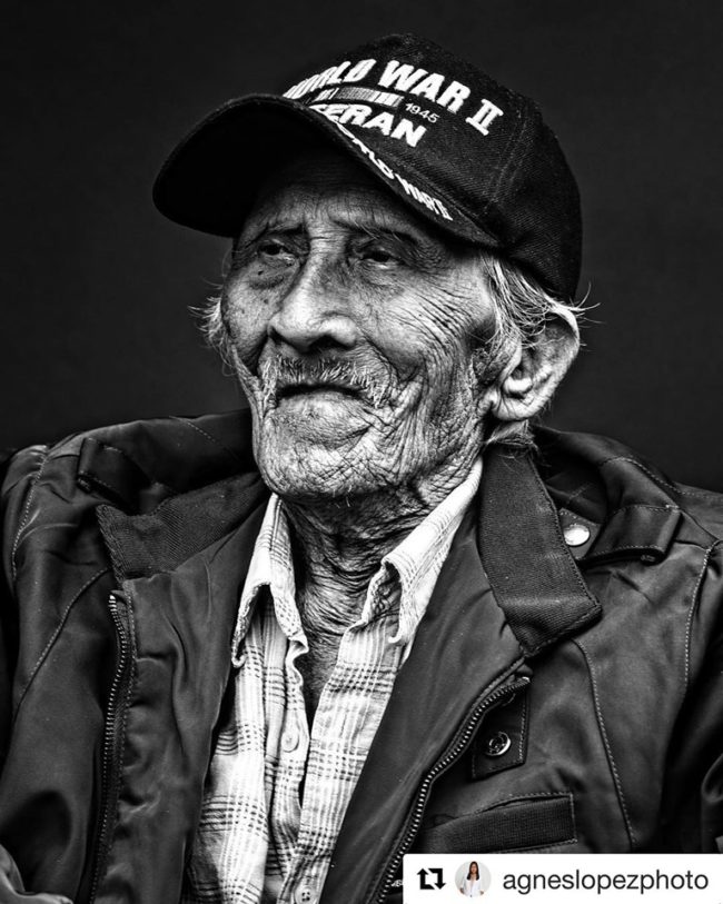
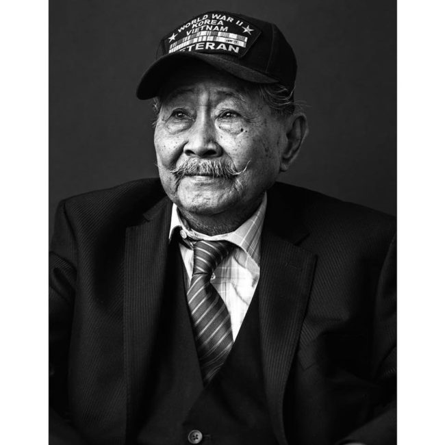
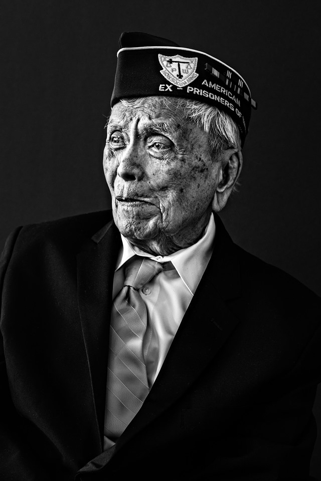
This past Monday we celebrated Memorial Day and it is such a honor to feature these Fallen Heroes. #neverforget
A recap from when this project was first posted. Let’s honor these men who recently passed.
From the artist:
“Creating portraits for this ongoing project has been an incredible experience, though days like Memorial Day make me sad when I find out that more of the people I have photographed are no longer with us.
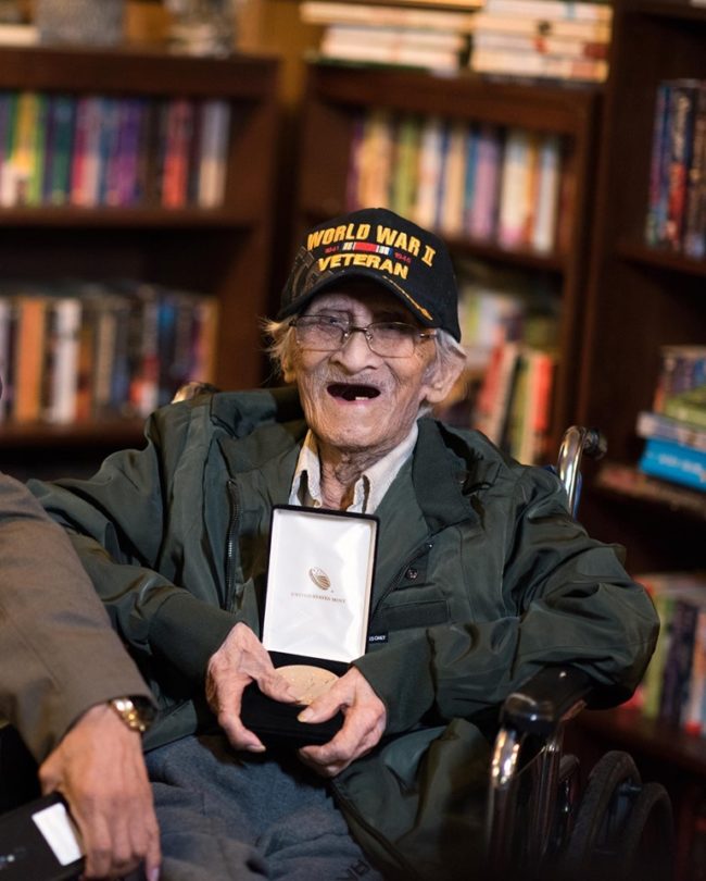
Emilio Teodoro passed away on Saturday, May 25th. It was an honor to meet and photograph him. I will always remember the smile on his face when he received the Congressional Gold Medal. Mr. Teodoro was a 99-year-old Filipino-American WWII veteran who finally received his award after more than 70 years of waiting for his service to be recognized.
His story, like many of the FilVets I met, is one of perseverance, sacrifice, and dedication to family and country.
Mariano Aquisap was a veteran of three wars who received his Congressional Gold Medal in March, 2018. I shared his portrait on Veterans Day last year because the ceremony where he was honored was so emotional and cathartic. Mr. Aquisap passed away in April.
Flaviano Diala, was a Bataan Death March Survivor and Filipino World War II veteran who passed away in January.
Unfortunately, the brave veterans who are still here are not likely to be with us much longer. My hope is that their fight won’t be forgotten and that more people will learn about the sacrifices made by the Filipino-American people during the war and afterwards.
The Faces to Remember Project was recently on display at the Florida School of the Arts in Palatka, Florida and at the Riverside Fine Arts Series in Jacksonville, Florida. Additional shows in the Northeast Florida region will be announced soon.
Agnes Lopez is an editorial and food photographer with a home base in Jacksonville, Florida’s historic Riverside-Avondale neighborhood.
Agnes traverses the Southeastern US and beyond with her camera in search of inspiration in the form of exceptional meals, her subjects ranging from the fine cuisine of award-winning restaurants to food trucks and their street fare.
Her work appears regularly in the pages of food and lifestyle publications across the US.
She is available for assignments worldwide.
APE contributor Suzanne Sease currently works as a consultant for photographers and illustrators around the world. She has been involved in the photography and illustration industry since the mid 80s. After establishing the art buying department at The Martin Agency, then working for Kaplan-Thaler, Capital One, Best Buy and numerous smaller agencies and companies, she decided to be a consultant in 1999. She has a new Twitter feed with helpful marketing information because she believes that marketing should be driven by brand and not by specialty. Follow her at @SuzanneSease. Instagram
Success is more than a matter of your talent. It’s also a matter of doing a better job presenting it. And that is what I do with decades of agency and in-house experience.
AP 1: I never look at mailers.
AP 2: I look at every single mailer.
AP 3: I got a bottle of tequila!
All joking aside, Heather Elder has an awesome podcast you should be checking out called “Dear Art Producer” where she’s asking the questions all professional photographers and reps want to hear the answer to. If you’ve been in this business long enough most of it is pretty reassuring stuff that we already know: some read every email, some look at every promo, some don’t. There is no magic bullet and you keep all channels open and active to reach them. There are a few surprises too like a mixed bag on use of instagram and that motion is not coming out of the broadcast department as much as in the past and they are looking for photographers who can do it all fast and loose (cheap).
Give it a listen and drop a comment if you find anything surprising. Looking forward to more of these.
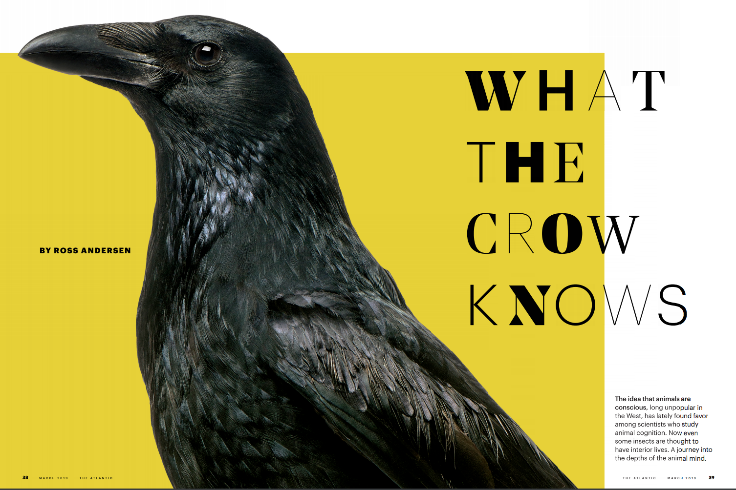
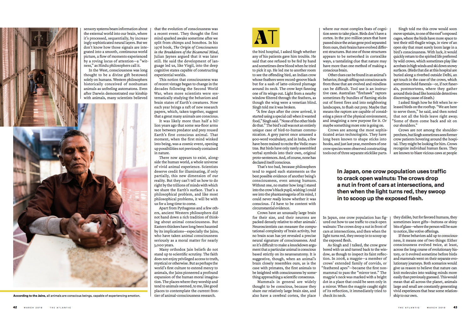
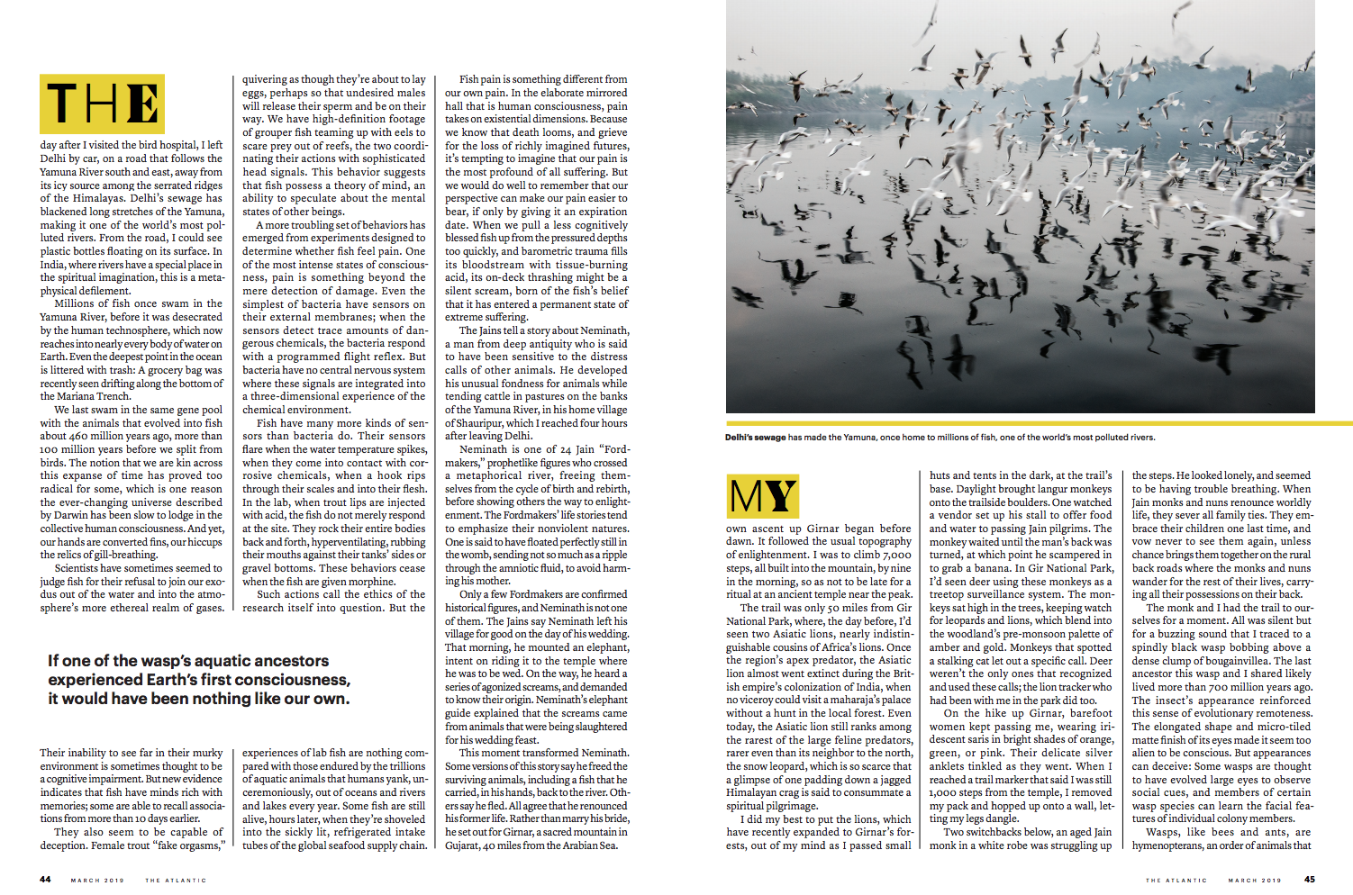
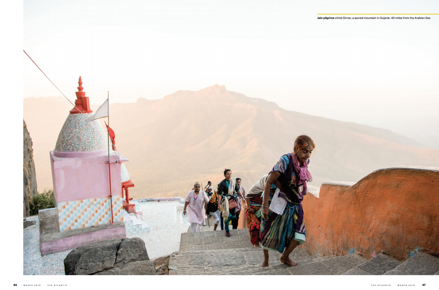
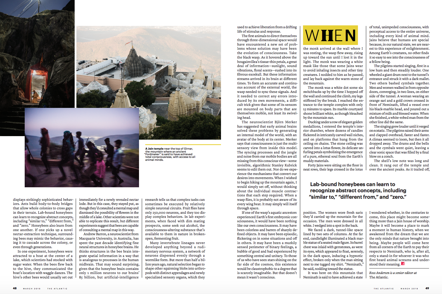
Art Director: Arsh Raziuddin Photographer:Hashim Badani Writer: Ross Anderson
Heidi: The Atlantic discovered your work via instagram rather than a site. Tell us how you use the app and how it’s moved your work forward? Hashim: As we have witnessed, Instagram and Twitter have been powerful tools in letting one take control of their narrative. I use my feed to post a blend of my work which alters between documentary and fashion. It lets me blur lines. I use Instagram stories to document or voice my opinion on the everyday while I curate my post to lend itself to a larger cumulative narrative on how I perceive and experience the world.
How do you curate your feed?
It doesn’t follow a pattern. It might vary between something as whimsical as a play of colour to something more relevant as participating in a larger discourse we might be collectively encountering. I also use it to create short fiction stories on Bombay.
How did this project push you creatively?
It was a unique editorial project to be a part of. Mainly because the narrative moved so fluidly between places, science, faith and Ross’s (the author) own experiences. That was the challenge and joy of it. Arsh had a certain vision that should brought to the table too. All in all It pushed me to look at the space we inhabit beyond our everyday perspective.
Why do you use long form captions on some of your images?
An image can be read in a number of ways. I completely enjoy the process of creating make-believe scenarios around them. The text is a way of doing so. A series I really enjoy working on is called #makingupmanto. Manto was a prolific author who lived briefly in pre-partitioned Bombay. I wander the same streets of Bombay that he might have and imagine different scenarios he might have found himself in. Sometimes I add contemporary references. In a way, the captions to these images are a projection of my concerns on the current political landscape.
Things had to change. And still, nothing changed. It seemed like the saffron skies were here to stay. Manto packed the last of his bags, said his goodbyes. Kadar, the watchman at Mohmadi Mansion was his last farewell .Teary eyed, he told Kadar of his predicament-this was never home. Kadar didn’t care. He had dozed off. Manto disappeared into the crowd.
Lost in the music, Manto made his way to Madanpura. It was one of the few areas in Bombay where life started early. The morning azaan wend its way around streets tread by children headed to the madrasa, before heading to Christ Church or St Agnes school. Mill workers heaved in clusters toward New Great Eastern Spinning & Weaving Mills. In the early hours, the sky had turned a pale pink, the kind before a storm. Safiya would be awake any minute. He picked up the pace (continued as instagram highlight).
How does each genre of photography point back to one another ( portrait to street photography, fashion to photojournalism?)
I have never thought about photography in genres. It has always been more a byproduct of my curiosity and my need to tell a story. For now, I lean on photography to do so but I am open to exploring other mediums as well.
What was it about Hashim’s work that awarded him the project? Arsh: We thought Hashim was the perfect person for this piece. I wanted someone familiar with Delhi who has a versatile background. Hashim seems to have experience with portraiture, fashion, street photography, and photojournalism. He has a great way of using textures and colors and I knew it would play into the animals and birds well.
What type of direction did you give him?
I gave Hashim a list of shots that I would like and updated him on lines of the piece that were the most important. It was hard to capture everything, especially because much of the piece was not focused on Jain’s themselves but on the animal mind and treatment of animals.
Did the writer travel with him?
No, the writer was based in Washington DC. He did help with the shot list, though. He visited earlier that year.
It took me 23 hours to get home from London yesterday.
No lie.
It was a walk to a train to a walk to a plane to a walk to a plane to a walk to a train to a walk to a 4.5 hour car ride.
And it was so, so, worth it.
So very, very worth it. (Trust me, the stories will be crazy!)
But London will have to wait for a bit, as I’ll likely intersperse some of those articles with the pieces we’ll be doing soon about the Best Work I Saw at the Photolucida Festival in Portland.
Not today, though.
Today, rather than drop you into London, May 2019, where about 30% of my brain still seems to reside, I want to think back, just a few weeks, to my odyssey of a trip in Portland.
Seeing the East Coast, West Coast, and then Europe in 6 six weeks is not really something I could have planned.
It just happened.
Each city has its own particular flavor, its special brand of cool, and while London may be my favorite global megapolis at the moment, Portland is a proper little, boutique city in comparison.
I flew in to Portland from Albuquerque, (via Phoenix,) and almost immediately I knew I was “there.”
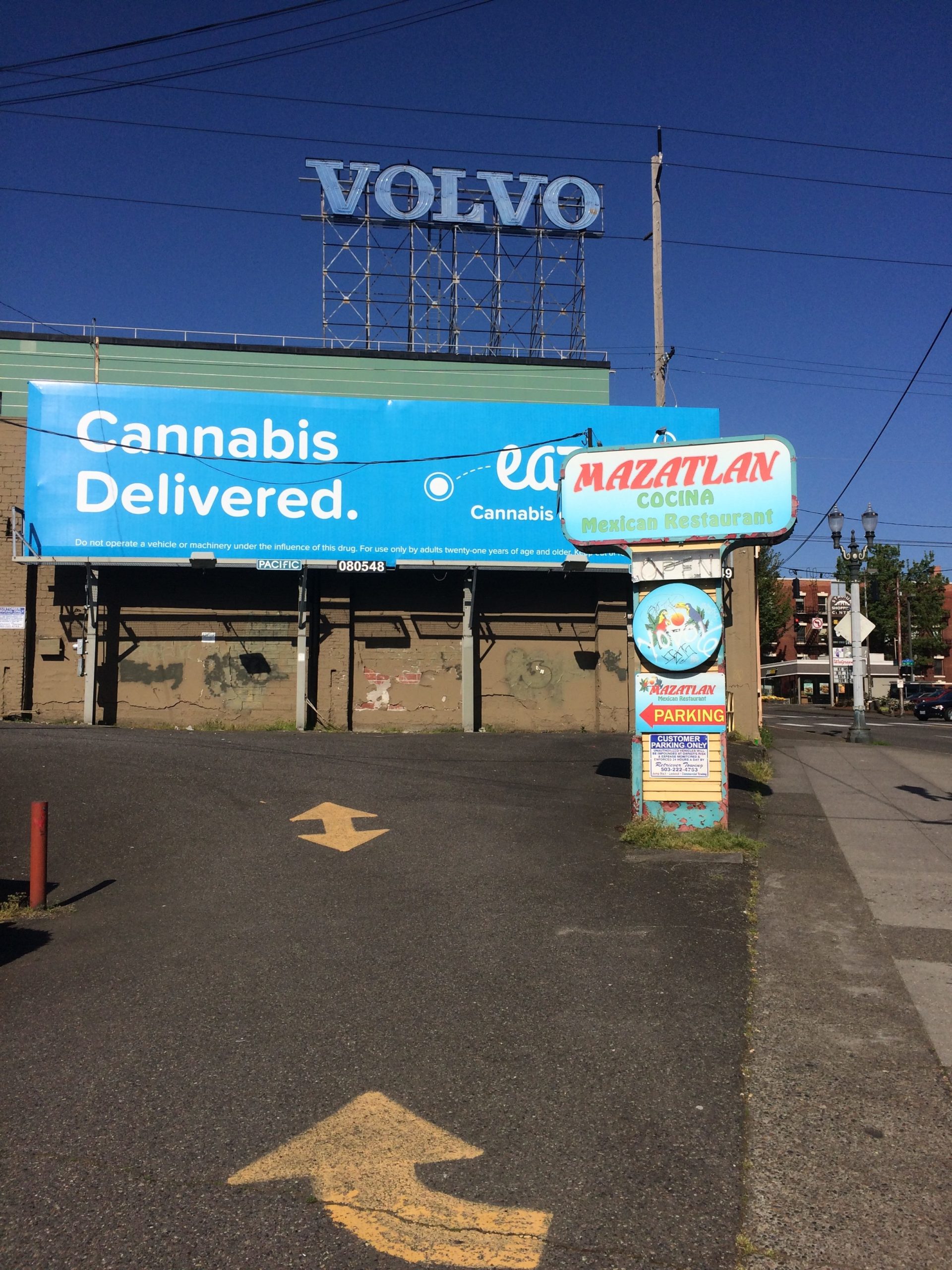
Walk out the offramp, there was a Columbia outerwear store, a Pendleton blanket stand, an “Only in Oregon” wine shop, and so many cute locally owned restaurants you could blind-fold yourself, spin around, point at any of them, and it would likely be good.
(Vietnamese? Thai? Pizza? Deli? And so on.)
Returning home, I noticed a sign that said that the law required all stores to charge the same prices in the airport as they do in-town. So my amazing Pad See Yew noodles were only 8 bucks, and I saw bottles of water for sale for $1.25.
It’s the kind of thing they might mock on “Portlandia,” but really, what’s not to like?
Mostly, I think that’s my take away from Portland.
What’s not to like?
Separate your preconceived notions about twee, or meet-cutes, or whatever Carrie and Fred might have mocked, and I thought Portland was rad in just about every way.
I admit, though, I was a bit disoriented at first. Coming into the city from the airport.
Like any good city should, you can grab a train right there, (light rail in this case,) that will bring you right into the heart of town for something like $2.50, in 45 or 50 minutes.
All the way along, through, we were in tight corridors. And everything was green and lush!
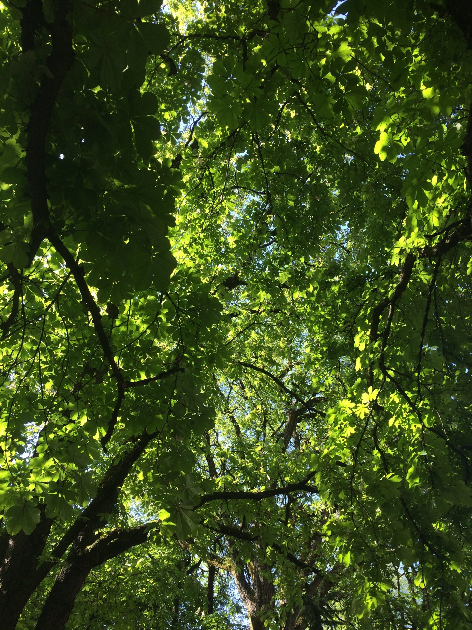
Tree canopy
Train tracks cut into ravines. Or buildings pressed in on either side.
Always pressing.
I couldn’t get a sense of where I was?
It felt like the route was pinched in.
Claustrophobic.
It was weird, which was a word I heard like 573 times during the week I was in Portland.
Weird, weird, weird. (Fedora stores and steam-punk style and Satan bars.)
By the time the train found the city proper, the buildings had crept even closer, and the entire train corridor and street were seemingly 40 feet wide.
I could barely breathe.
If I were Rodney Dangerfield, and had a collar to loosen, I would have done so in just that moment.
Gulp.
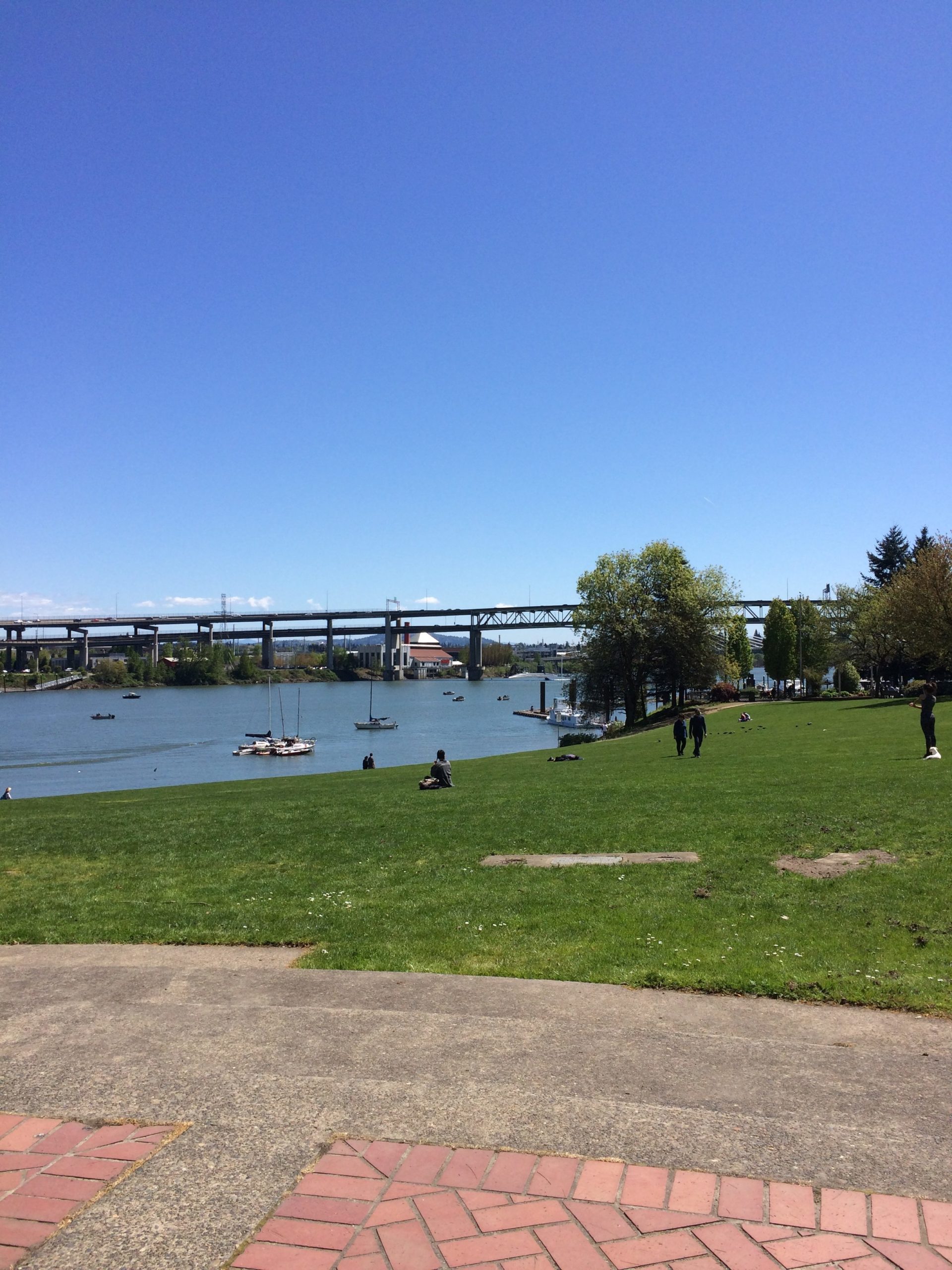
But then, and only then, did the train pass the basketball arena, make a sharp bank to the Southwest, and cross the Willamette River on a multi-purpose bridge.
Steel Bridge
Whoosh!
All of a sudden, your eye is torn in two directions at once.
The cute, shiny downtown in the glowy-evening-light, set against some green hills to the Southwest, and then, off to the North, on the East bank of the river, a huge working tanker ship at an old industrial shipping dock, right there in the heart of the city.
They literally sit opposite each other.
The working, worn, and maybe-less-than-shabby-chic part of Portland, the timber town that still has logs floating in the river, to the trendy, foodie, hipster, cultured, amazing, progressive city it’s become.
But as soon as that big open view was there, it was gone.
Poof.
And we were back in the congested feeling again, on the other side of the river.
I’m not sure this is correct from above, but I felt like downtown Portland was a blanket you’ve thrown on the ground, and it folds in weird ways.
When you’re in the folds, you can’t see the blanket. (If you’re a small spider, for example.)
But my first full day, after my first session reviewing at the festival, I went on a long walk with my good friend Heather, heading back to the river to cross at the Steel Bridge, before making it back on one of the more southern bridges, which was high enough for the first big view.
Mt. Hood.
Covered in snow, conical and majestic, looming to the East.
That helped a little.
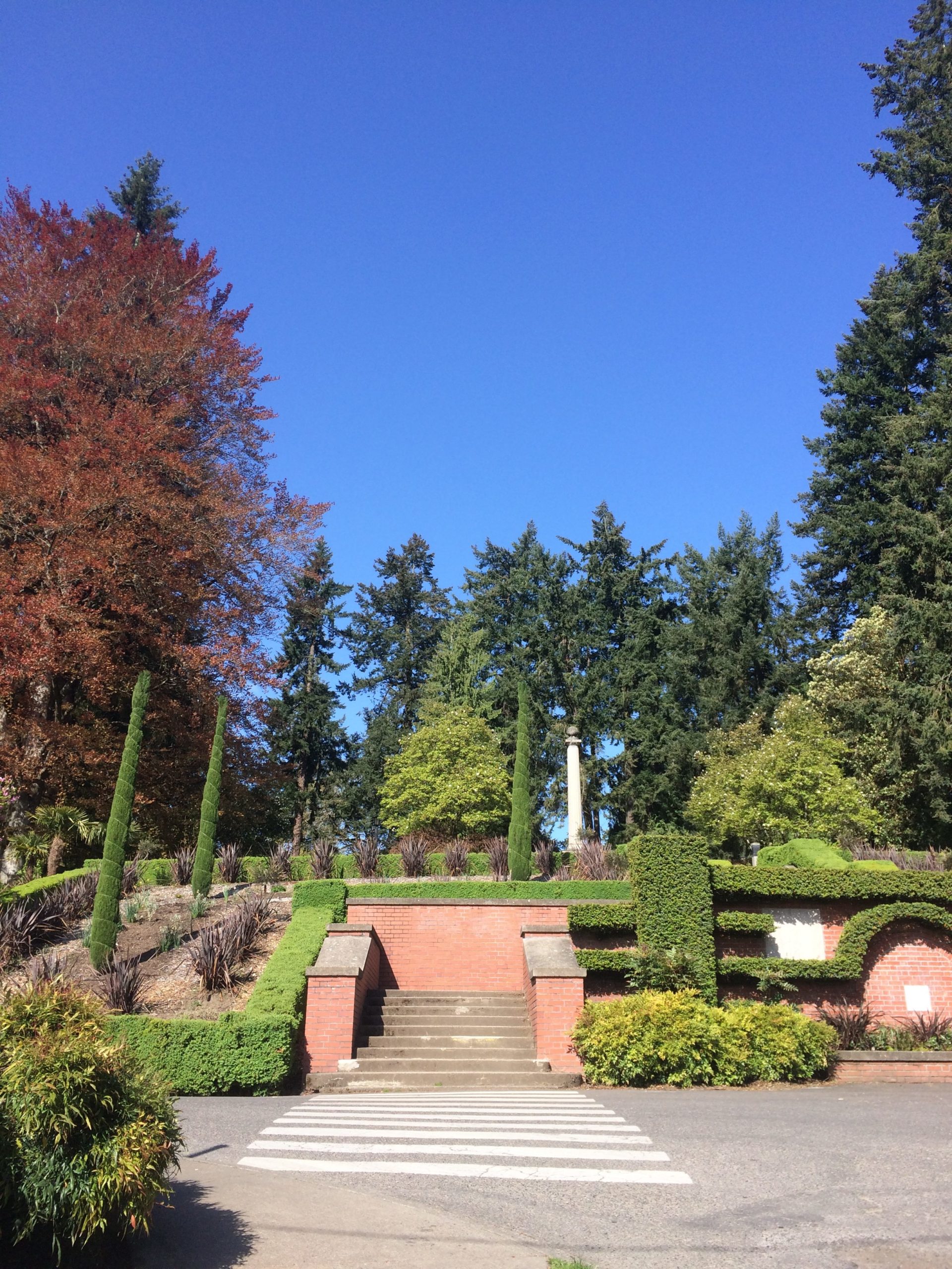
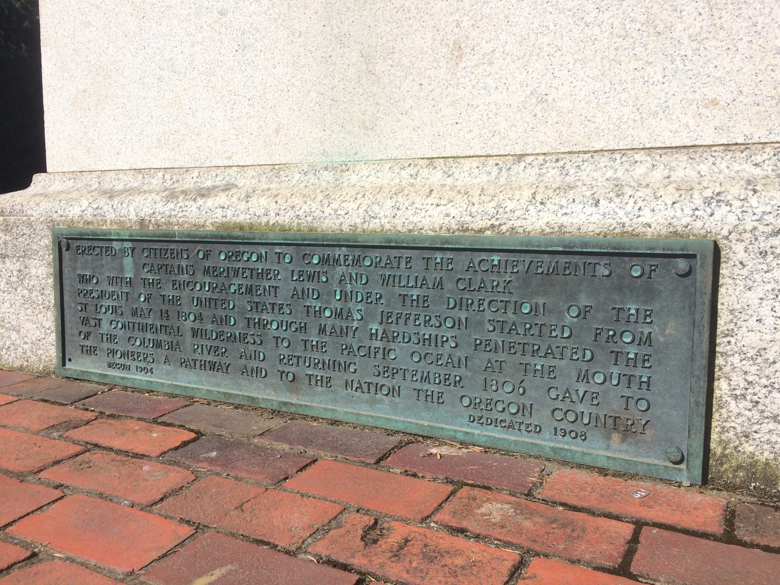
It wasn’t until the next day, though, when I climbed the biggest hill I could find to Washington Park, and then jumped on a statue pedestal to get higher, that I felt like I could breathe.
I caught a big vantage, oriented myself in space in a new town, and then things settled in nicely, vibe-wise.
Truth be told, Mary Jane is legal in Portland, as it is in Colorado, and I went to a cool dispensary called Serra, with a buddy, and picked up a little something for the off hours. (The place was both stylish and reasonably priced, and the staff was nice. Thumbs up for sure.)
Walking to Washington Park
As my Park Walk was free time, after I did my Lewis-and-clark-like survey from a peak, I dropped a bit deeper into the park, and was immediately surrounded by 100+ft tall trees.
Entrance to Washington ParkDoing my Lewis and Clark impression, I bump into a statue in their honorView from the Pedestal
So beautiful.
But once I turned another corner, I saw a swing set, up the way.
Nobody was there, nor was anyone even around.
Noticing swing sets was more a parent-move than stoner-sensation, but soon I was there, partaking in public, (maybe a no-no, but again, no one was even around,) and then I set my stuff down.
And started swinging.
Above me, the sky was purple-blue, and the trees were touching its belly like they were tickling a new dog.
Up, I pumped the legs.
UP.
Soon, I was as high as I could go, and then I leaned back and stared up at those trees as the motion made my belly feel like Free Fall at Great Adventure in Jersey circa 1996.
For a moment, I wasn’t a Dad.
Or a portfolio reviewer.
I wasn’t a writer.
Or an artist.
I wasn’t a Democrat.
Or a martial artist.
I was a kid on a swing set, truly, humbly amazed at the beauty of the sky, and the trees, and the flowers around me.
All the while, hoping that I wouldn’t let go, or lose my grip, or vomit all over myself.
(No vomits in Portland, but I did have a proper incident in London. We’ll get to that another time.)
After playing, I headed back down the hill into downtown, and everywhere, there are clusters of street food stalls.
One after the other. With infrastructure and everything.
I’m not sure I’ve seen a street food culture like that anywhere in the US, and again: what’s not to like?
There is much more to tell, including clueing you guys in on some of the places I ate and drank, (including one bar you will NOT believe I went to,) but those will come in future articles.
I promise.
Rather, as I’ve been all praise so far, I want to keep it real and point out that Portland, too-nice or not, is far from perfect.
No place is.
Public green on the Willamette River
The stereotype of the “Portland Street Dude” that you have in your head is very real, as is the “Portland Street Dude with Pitbull,” a difficult subset of the culture.
So many gaunt, sad-looking white guys with obvious drug problems, and no proper home.
The homelessness crisis is not quite as dramatic as it is in California, but it is pretty damn obvious in Portland too.
Really, it made me think, as I’ve pieced my West Coast travel together in the past few years, that there is a permanent street class now that rivals what we saw in all those photographs of the Great Depression.
It’s a hard fact, and one that California, Oregon, and (probably) Washington will have to grapple with heavily in the coming decade.
Not to leave you on a downer, but I’m pretty jet lagged at the moment, and just dropped 1500 words on you, so I think we’ll call it a day.
PS: I got a shiny new iPhone in Portland, so as of my London trip, we’ll have 4k video and much improved photographic technology on these articles going forward.
The Art of the Personal Project is a crucial element to let potential buyers see how you think creatively on your own. I am drawn to personal projects that have an interesting vision or that show something I have never seen before. In this thread, I’ll include a link to each personal project with the artist statement so you can see more of the project. Please note: This thread is not affiliated with any company; I’m just featuring projects that I find. Please DO NOT send me your work. I do not take submissions.
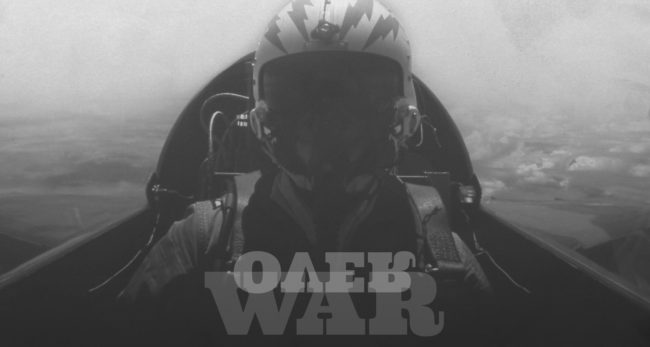
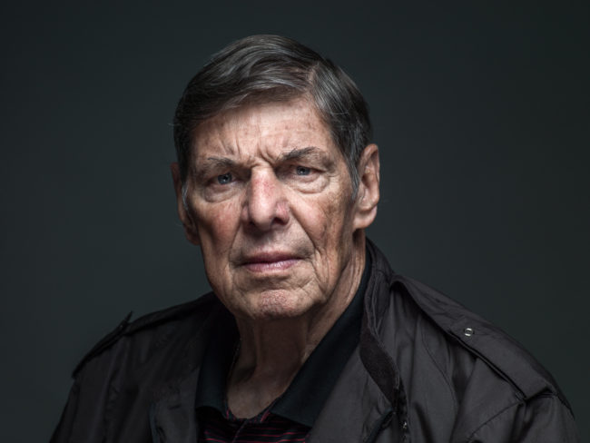
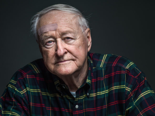
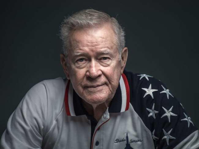
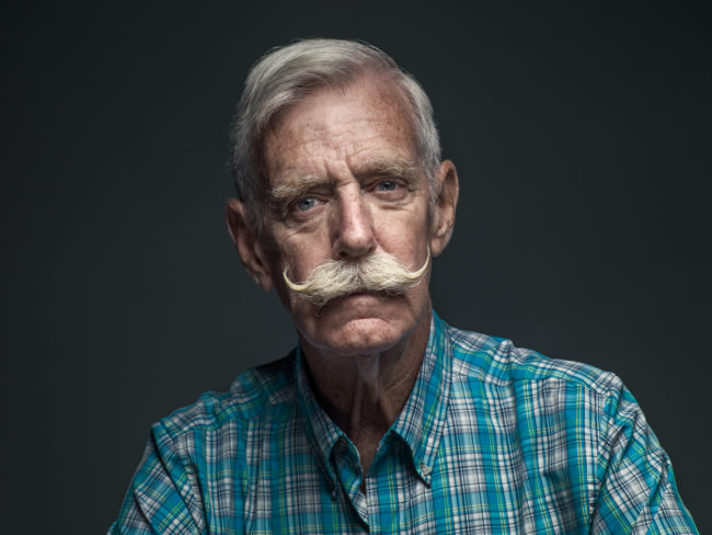
I WAS 7 WHEN THE VIETNAM WAR ENDED. I know what I do, as most my age, from movies and documentaries. And most of what I encountered was about the ground troops, rarely about the pilots.
So when an opportunity arose to attend a reunion of F-105 Thunderchief pilots in San Antonio, I jumped at the chance. These reunions are where the Thunderchief pilots have maintained their shared past and let one another into all that they have been and done in the years since. And owing to special circumstances, they welcomed us in—just me and a small crew.
As a photographer, I have always been comfortable learning through the lens, looking for what needs to be communicated in the architecture and life in faces. I have used a similar approach before, renting space and setting up a booth. I like to go to the source for these group portrait projects, embed myself in the space and community they share. Here we set up in a conference room and would pull each pilot aside during breaks in their conversations. Over the course of three days, I observed lives reconnecting and experiences being relived. As they talked to each other, and then later through our interviews, I heard the things said echoed in what I saw through my lens—brotherhood, support, joy, pain, pride and life.
Once jet-fueled cowboys, they are still walking with a swagger born of knowing themselves. Among these F-105 Thunderchief fighter pilots, there are no secrets. They all know who they are. And by capturing their faces to accompany their stories, I hope more people can know who they are. It was such an honor.
While I have many personal projects under my belt, I can say that Over War has been one of the most in-depth thus far; evolving from what I had envisioned as a series of Air Force pilot portraits to a project that – fifty years later -ultimately gives voice to these men who had a unique vantage point on the Vietnam war – an airborne perspective as they flew over the conflict below, the result of true dedication of time, energy, resource and heart by so many.
If you would like to download a PDF of the promo for this project, click here
APE contributor Suzanne Sease currently works as a consultant for photographers and illustrators around the world. She has been involved in the photography and illustration industry since the mid 80s. After establishing the art buying department at The Martin Agency, then working for Kaplan-Thaler, Capital One, Best Buy and numerous smaller agencies and companies, she decided to be a consultant in 1999. Her Twitter feed is branded with helpful marketing information because she believes that marketing should be driven by brand and not by specialty. Follow her at @SuzanneSease. Instagram
Success is more than a matter of your talent. It’s also a matter of doing a better job presenting it. And that is what I do with decades of agency and in-house experience.
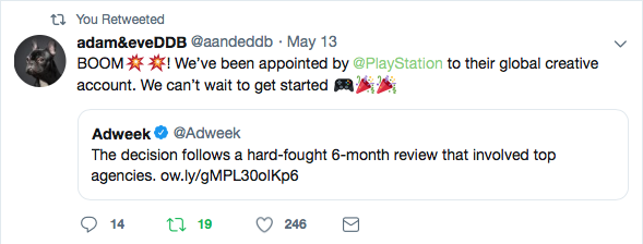
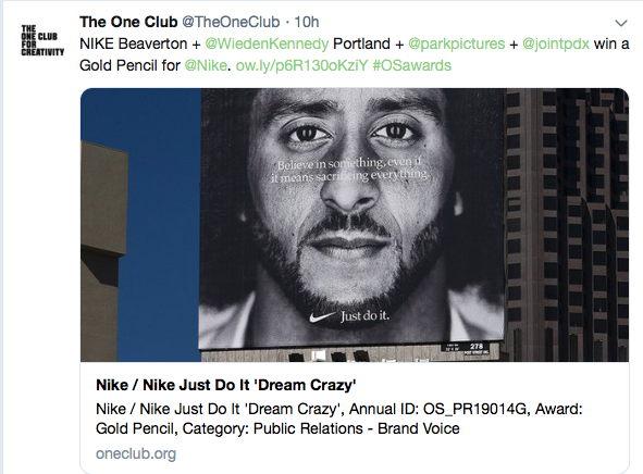
The other week I got a twitter notification, adam&eveDDB had a huge win as they were awarded AOR for Playstation. It was also tweeted by Adweek.
It was on Adweek on line, but many times you need a subscription to read the articles on account wins or articles of interest. This huge win was not featured on their landing page but within the sub-categories. So it was hard to find.
If you congratulate Adam&eveDDB on this win, you stand out among your peers.
I have positioned my Twitter account to only follow accounts of agencies, trades, advertising experts and others who offer value to forward valuable information to my clients. You can create a separate Twitter account just for your marketing research. This allows you to focus on personal emails verses a large list of email blasts. Instead of relying on another company to have accurate clients/brands listed, your separate business Twitter research account only follows the companies you want to work for, allowing your marketing to be more accurate to your work and their needs. Stand out.
If you take a few minutes from time to time, you can see so much that would be valuable in your marketing in “What’s happening?” For example, a One Show Pencil is an honor for an agency to win, so I follow the The One Club. On Friday, one of the gold winners was in their tweets:
In todays market you have to stand out above your competition, and reaching out to agencies and companies you admire will do just that.
APE contributor Suzanne Sease currently works as a consultant for photographers and illustrators around the world. She has been involved in the photography and illustration industry since the mid 80s. After establishing the art buying department at The Martin Agency, then working for Kaplan-Thaler, Capital One, Best Buy and numerous smaller agencies and companies, she decided to be a consultant in 1999. She has a new Twitter feed with helpful marketing information because she believes that marketing should be driven by brand and not by specialty. Follow her at @SuzanneSease. Instagram
Success is more than a matter of your talent. It’s also a matter of doing a better job presenting it. And that is what I do with decades of agency and in-house experience.
It’s counting down the minutes until I need to pull out of my driveway tomorrow.
(Tick tock.)
It’s an early departure to drive 5 hours to Denver, fly to Charlotte, change planes, and then end up in London on Thursday morning.
(If everything goes as it should.)
I’d by lying if I said I was back to normal after the NYC/NJ and Portland double-double.
I’m not normal at all.
But, (and this is a big BUT,) every now and again, being jet-lagged can be a good thing. Like my wife said, right now, for me, it’s the equivalent of hair of the dog.
Since I already feel like that, I should be able to get a lot more accomplished. (If I don’t sleep, so what? I’ll sleep for a week when I get home.)
If I get hungover, so what?
I won’t drink again for months.
London and more await, but first I have to get through SO MANY THINGS on my To-Do list, then pack, and then wake up before dawn too drive over the Rocky Mountains.
The likelihood of the sun being in my eyes as I drive East over La Veta Pass tomorrow? 100%!
All that hustle to get to Denver, because the flights were 1/3 the price of flying out of Albuquerque, which is two hours closer to my house.
$500 vs $1500?
One is doable, the other is not. (Editor’s note: I did pay to upgrade my seats later today, as they were going to put me in the middle, near the toilet, with no overhead bin space.)
So Denver International Airport it was.
The Mile High city.
Home of the Broncos and the Denver Nuggets.
A boom-town for sure, but are they all, these days? The good ones, I mean?
It is one thing I’ve begun to notice, as I’ve traveled around the past year or two. It seems like Denver, San Diego, LA, San Francisco, Oakland, Portland and NYC are all booming.
People flock to places like Denver because of the confluence of economic opportunity, world class leisure activities, high-end-bougie-lifestyle, like-minded politics, clean air, (for now,) and (at this point) we have to mention legal marijuana too.
Denver just grows and grows. (Higher and Higher.)
Ask anyone who’s been around the Rocky Mountain West the last 25 years, and miles of what were once open prairie or farms, all along the I-25 corridor, have become suburbs to the point that distinct cities have nearly merged.
The Colorado Springs-Denver-Boulder-Ft.Collins metropolitan area is massive, with a serious population, and it’s nearly seamless in 2019.
(Nearly. There are still a few pockets in between, and even in places like Boulder, farms still maintain micro-pockets, like Gunbarrel.)
I was last up in Denver in late March, as you may know, because I wrote about my exploits here. It was a travel piece, sure, but it also set up the premise of today’s article.
In order to visit a few friends, I drove up to Denver to attend the open portfolio night at the Month of Photography 2019, which took place in downtown Denver on a Saturday night.
I parked in a spot that while convenient to the hotel bars, seemed like it would feel sketchy by the end of the night, and sure enough, I was griping my pocket knife like it was a Hattori Hanzu sword.
But that was the end of the night.
I turned up at the space, and after heading up the stairs, I met a very large crowd. The event was definitely well attended, but there was little of the pushing and shoving that you get in other cities. (Maybe none? I’m not sure anyone pushed or shoved at all.)
Almost immediately, after saying hi to a lot of people, I decided to look at the work seriously, and I met Stephanie Burchett, who reminded me we’d hung out at an after party at Medium in San Diego last October.
(For the record, as I learned the other week in Portland, I always remember a person’s name, work, face, or the circumstances under which we met. Sometimes some of the above, but always one.)
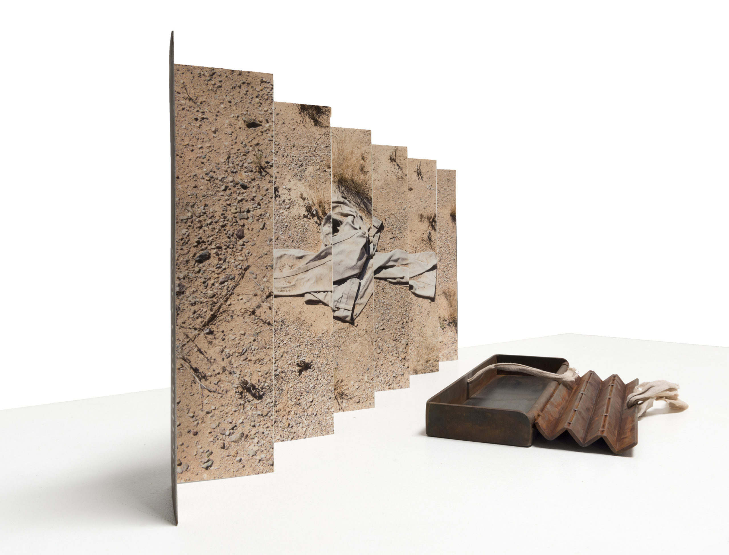
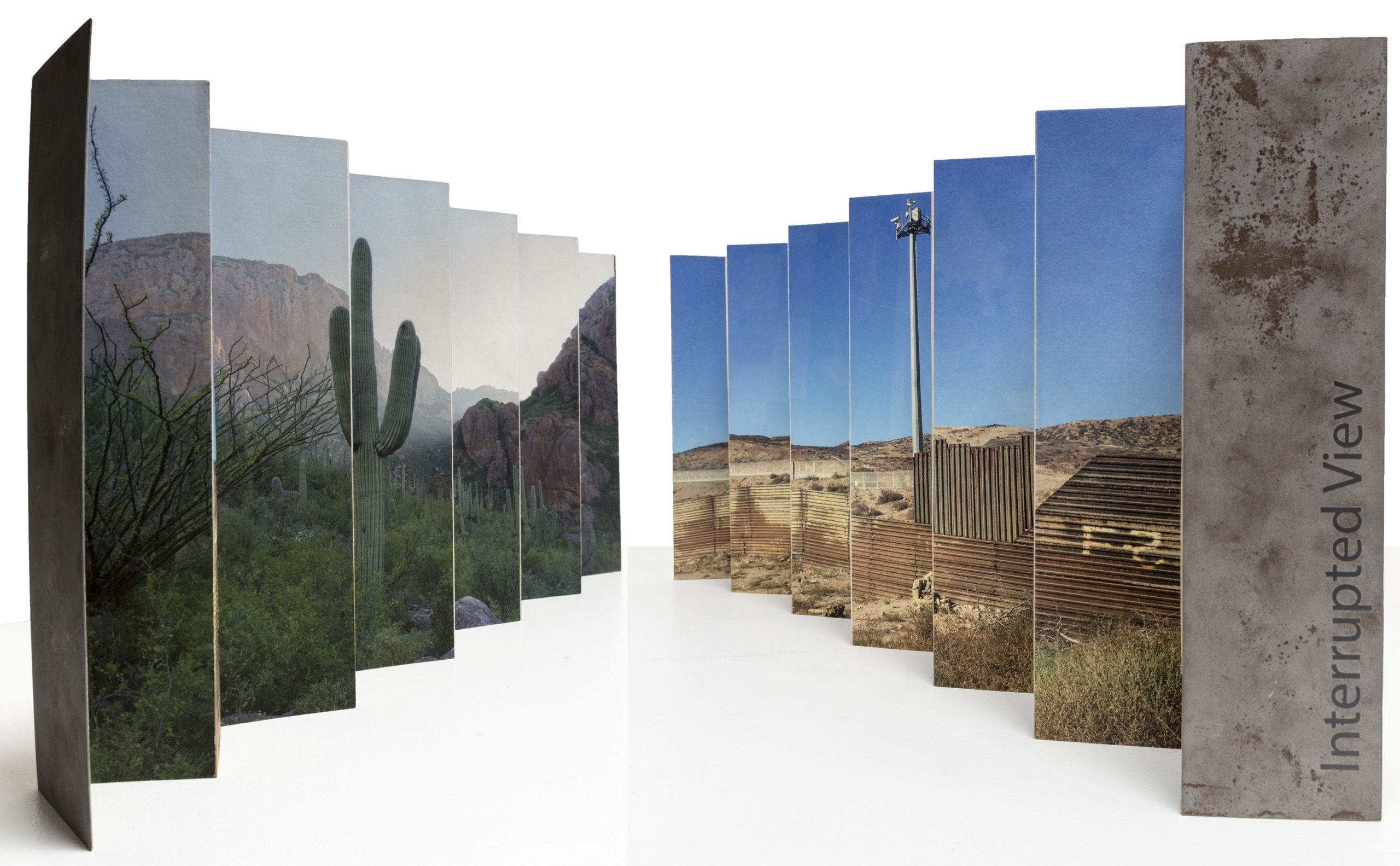
Stephanie had recently graduated from an MFA program in Tucson, and was displaying a small fabrication of images on both sides of the border wall.
I asked if it was a mockup, and she seemed surprised, even though she admitted she made large scale installation in grad school.
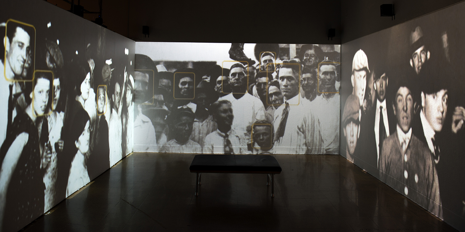
It was only meant to be what it was, she said. And I kind of like that, as its intent makes it weird and a little sad. Throw in the video-still she showed me from a grad school show, in which she facial recognition tagged white people in lynching photos, and I knew there was material in Denver to publish.
I told Stephanie that if I could find even a few more people to feature, I’d do an article. Then it became a game and a race, because my friends had worked all day, and wanted to leave to party.
Needless to say, there were enough people, or there would be no article.
So rather than go in order, which we never do anyway, I’ll tell you about Ellen Friedlander.
Ellen was one of those few people who stick in my mind, because these days, I try to publish as much work as I can. Very rarely, I’ll say no to someone, and then think about it afterwards, because I feel like perhaps I should have given them the benefit of the doubt.
Ellen qualifies, as I met her at Medium in October as well, (small circuit, the portfolio reviews,) and we spent the entire 20 minutes, or most of it, doing critical feedback. I spent so much time telling her how to improve that I didn’t really get to evaluate her work properly.
Well, here Ellen was, and with her daughter and sister to boot! I got to tell all three that I regretted not helping her, and then I offered to publish her work on the spot.
There was a very happy woman before me, it’s true, but she also said that the critique had been very helpful, and that her new work had grown as a result.
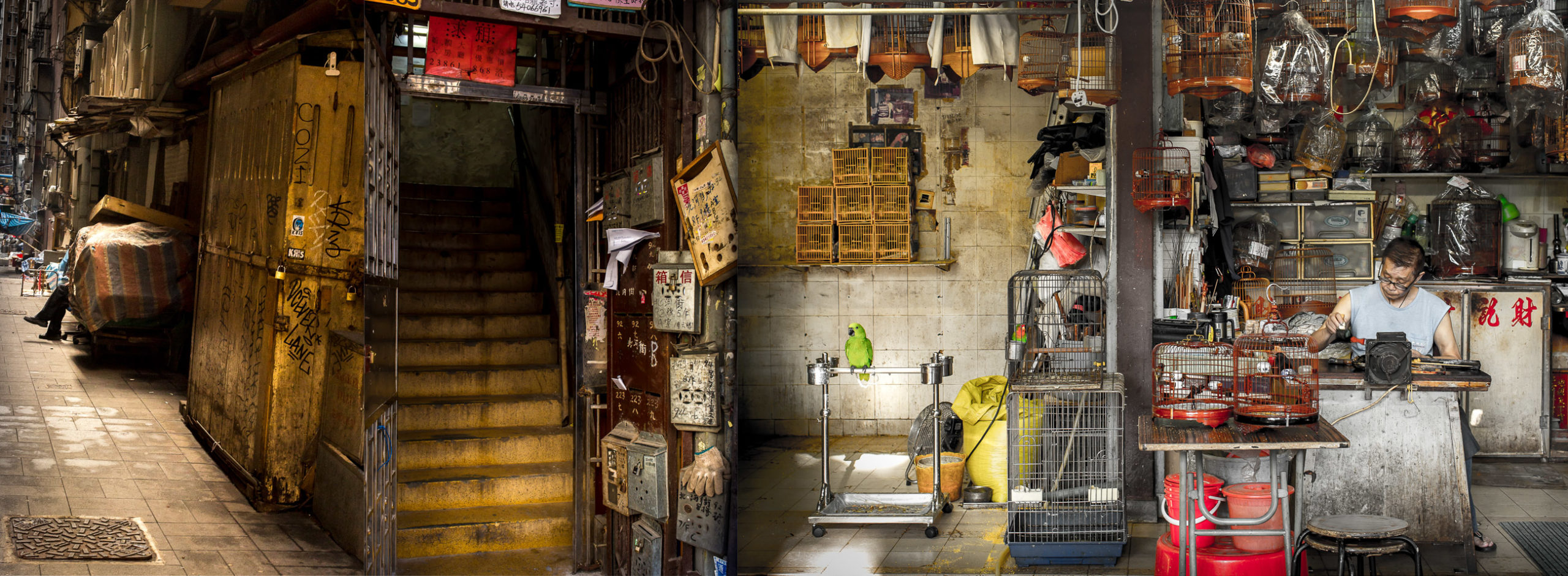
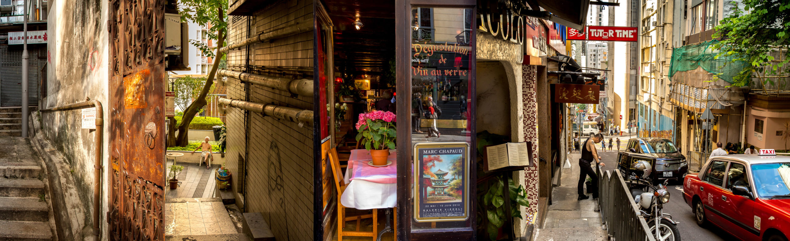
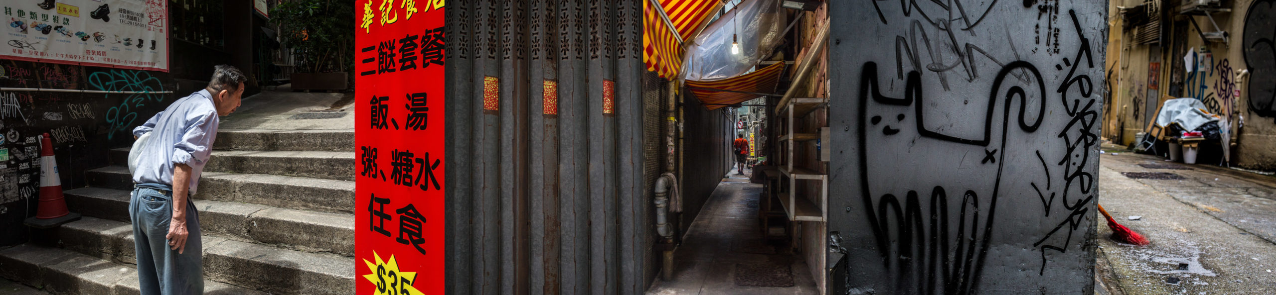
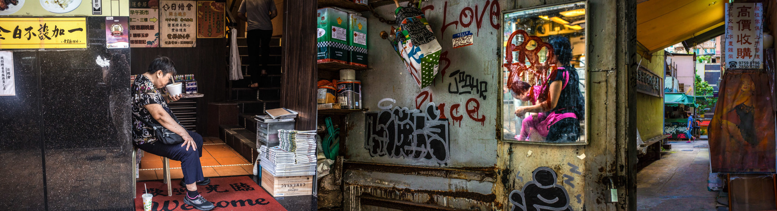
A win win for sure. As to the pictures, they’re street photography horizontal composites, as Ellen spent years living in Hong Kong, and traveling the world.
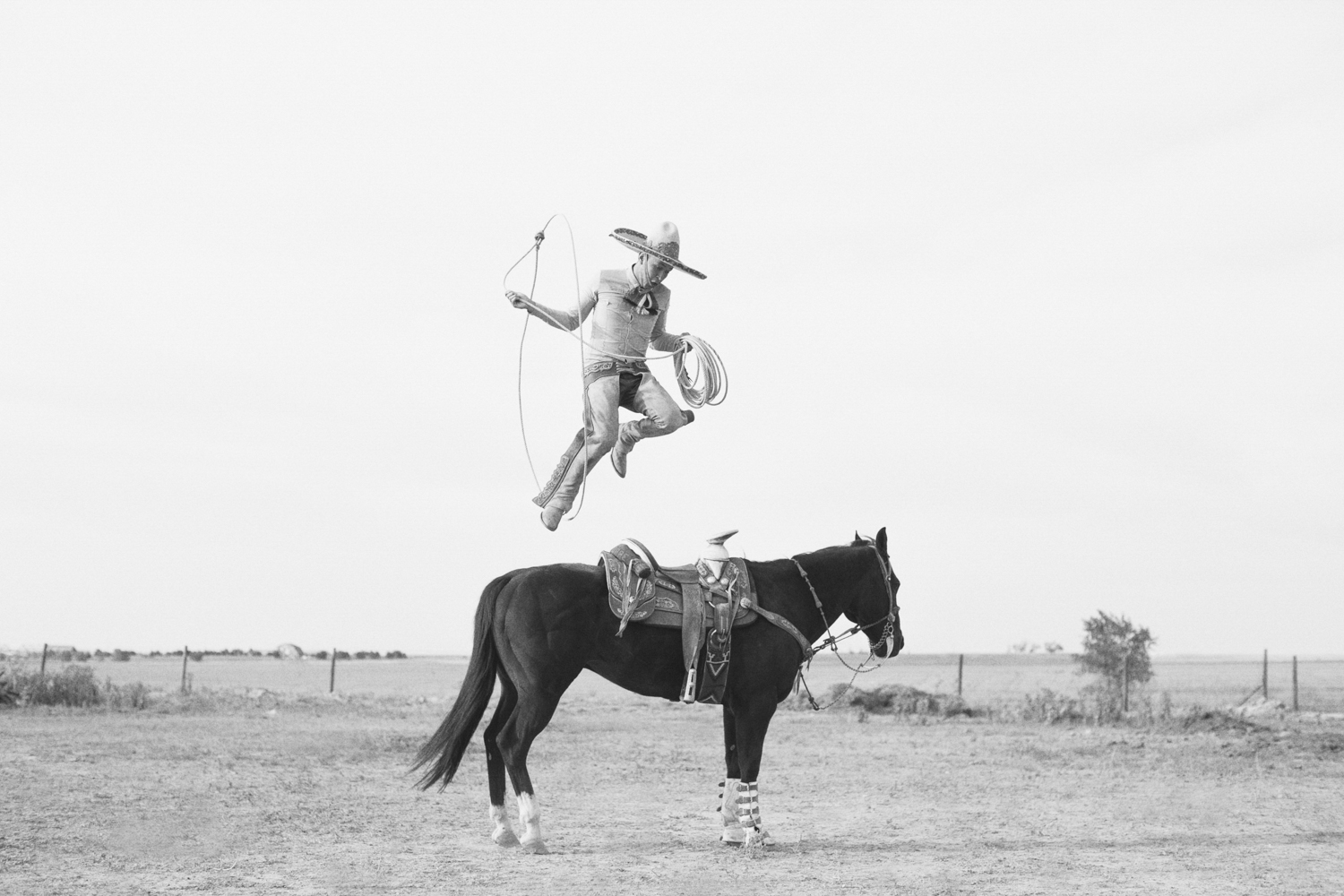
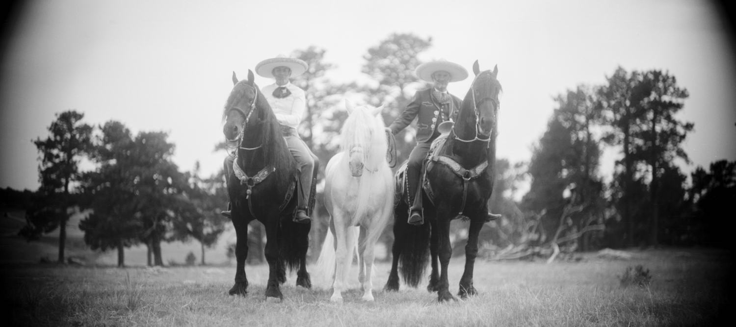
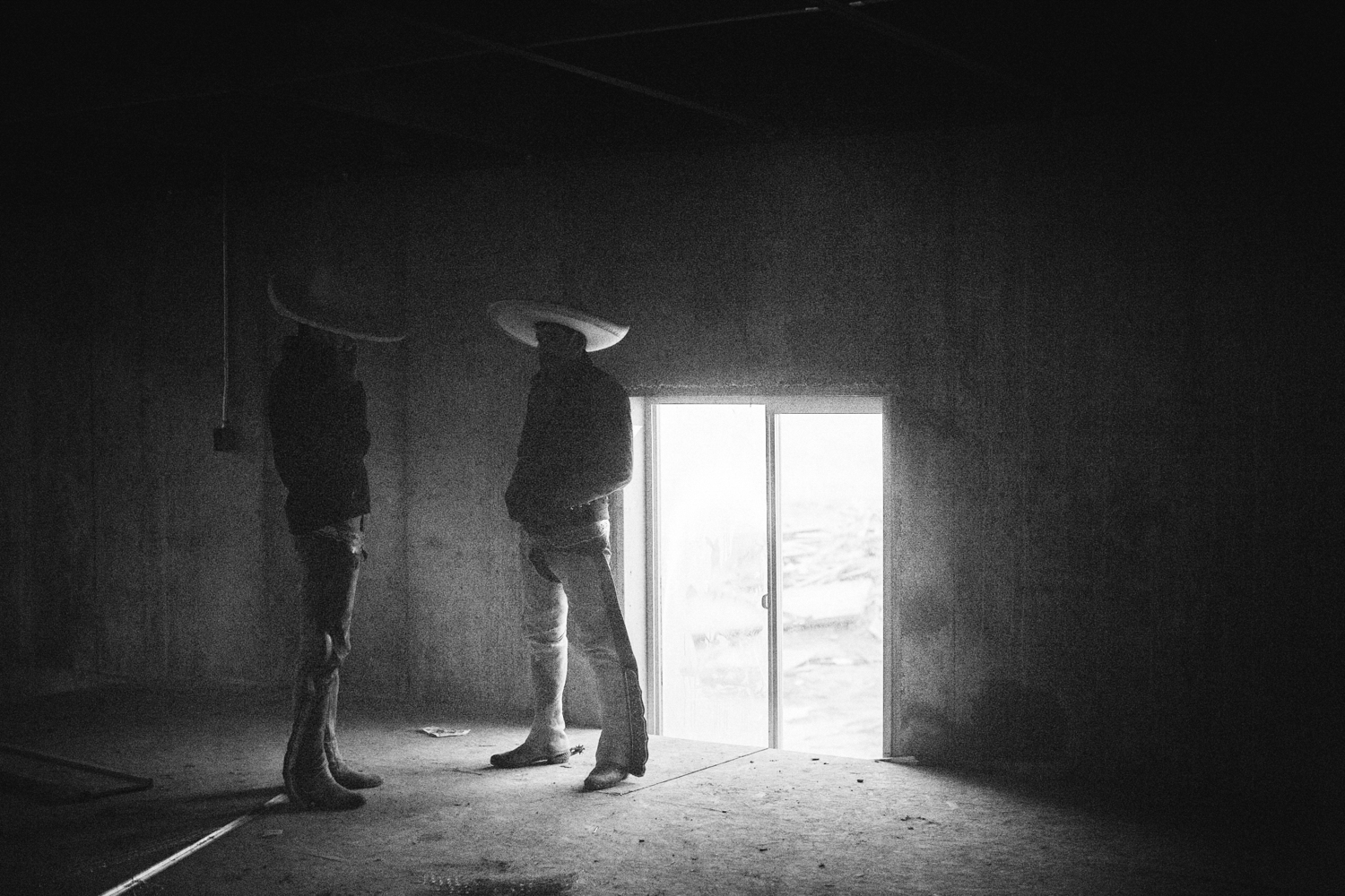
Chris Sessions was a good sport about my smash-and-grab approach. My friend and colleague, Jennifer Murray, the Executive Director of Filter Photo told me I needed to see his stuff, and within ONE photograph, I knew we were good to go.
Chris is doing a long-term personal project on Charros, Mexican horse riders in the greater Denver area. The image of the dude hovering in air may be one of the best individual photographs I’ve ever seen at a review.
A lot of what I saw that night was not to my taste, which is not uncommon in non-juried reviews. The community spirit and vitality are as important as anything. But it does mean that the good work jumps right out.
Especially when the light/color/sky leap off of an indoor table, at night, under artificial lighting conditions.
I saw the images, told him who I was, and said I’d like to show them just for how beautiful they were.
Aren’t they?
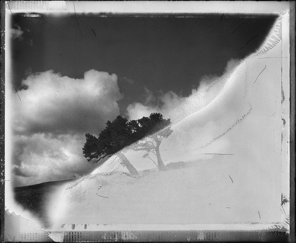
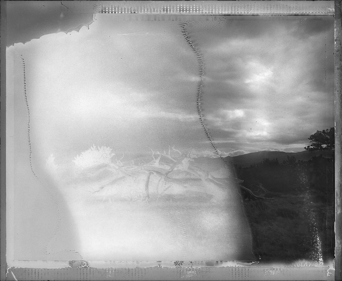
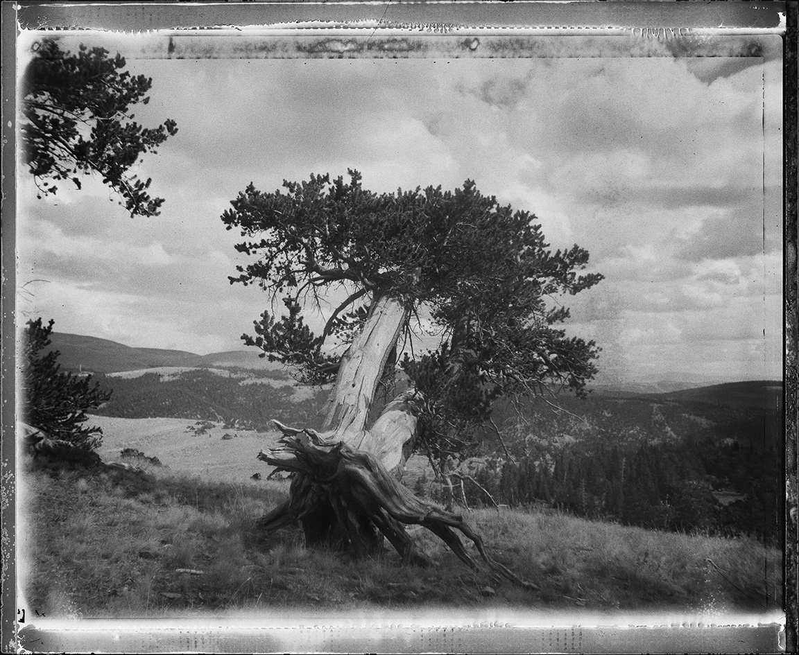
Speaking of beauty, I thought Angela Faris Belt poetic landscapes were also gorgeous. Exquisite.
But then I learned they depict ancient, endangered Bristlecone Pines, and she photographed with expired Polaroid film.
Normally I’d write more, but sometimes it isn’t necessary.
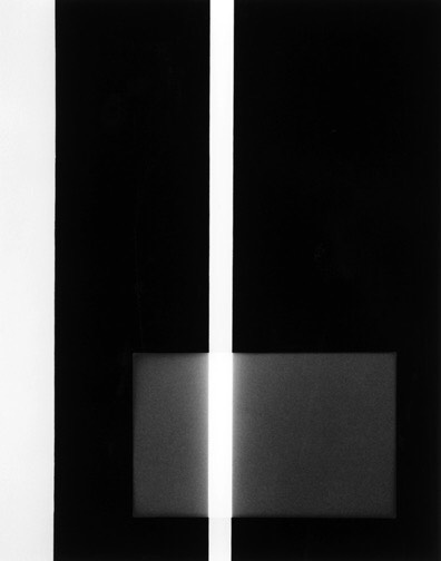
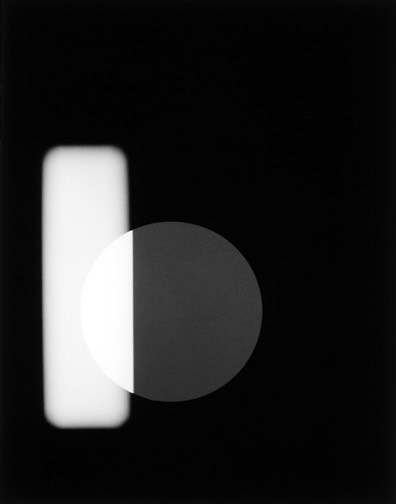
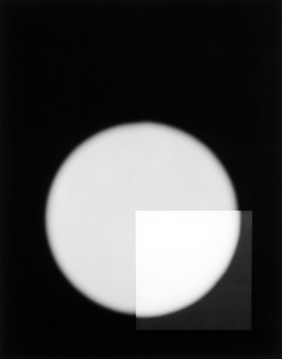
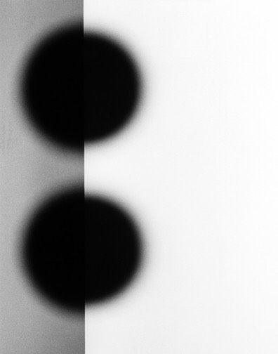
It’s funny how sometimes you need to travel to see people from back home. (Not far, in this case.) I went up to Philip V. Augustin’s table like a shark, as he’s a Santa Fe guy, and I’ve seen his work many times over the years.
I wanted to look at some of his perfect gelatin silver prints, made of real light shapes in the studio. Coincidentally, I saw a few on the wall, framed, at Obscura Gallery in Santa Fe last Thursday, and they were really sharp.
Last, but not least, (as I often say,) we have Carl Bower, who I met on the portfolio review circuit 9 years ago, and probably hadn’t seen in 6 or 7 years.
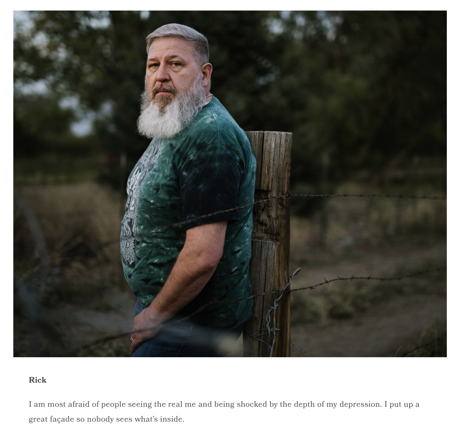
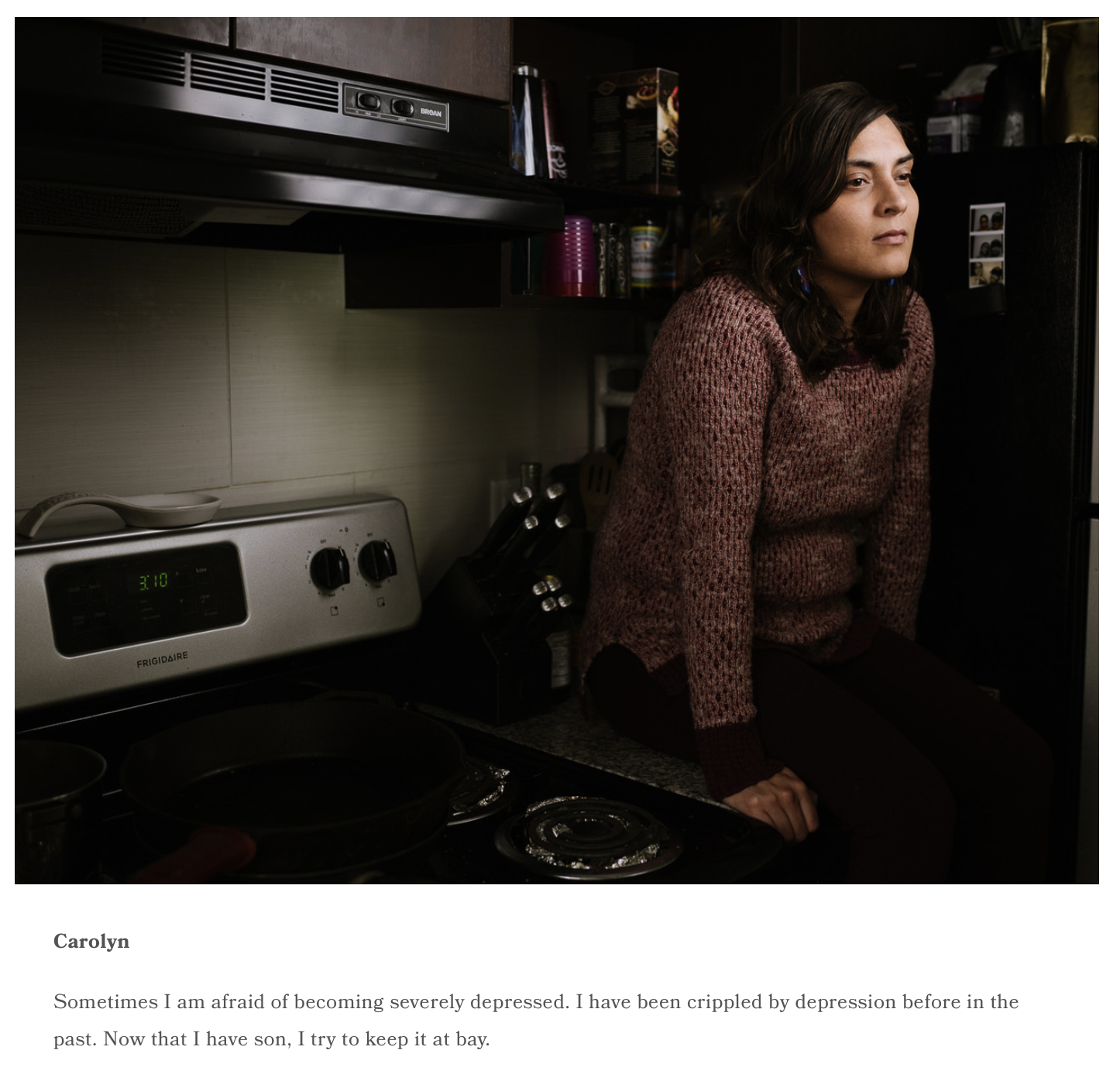
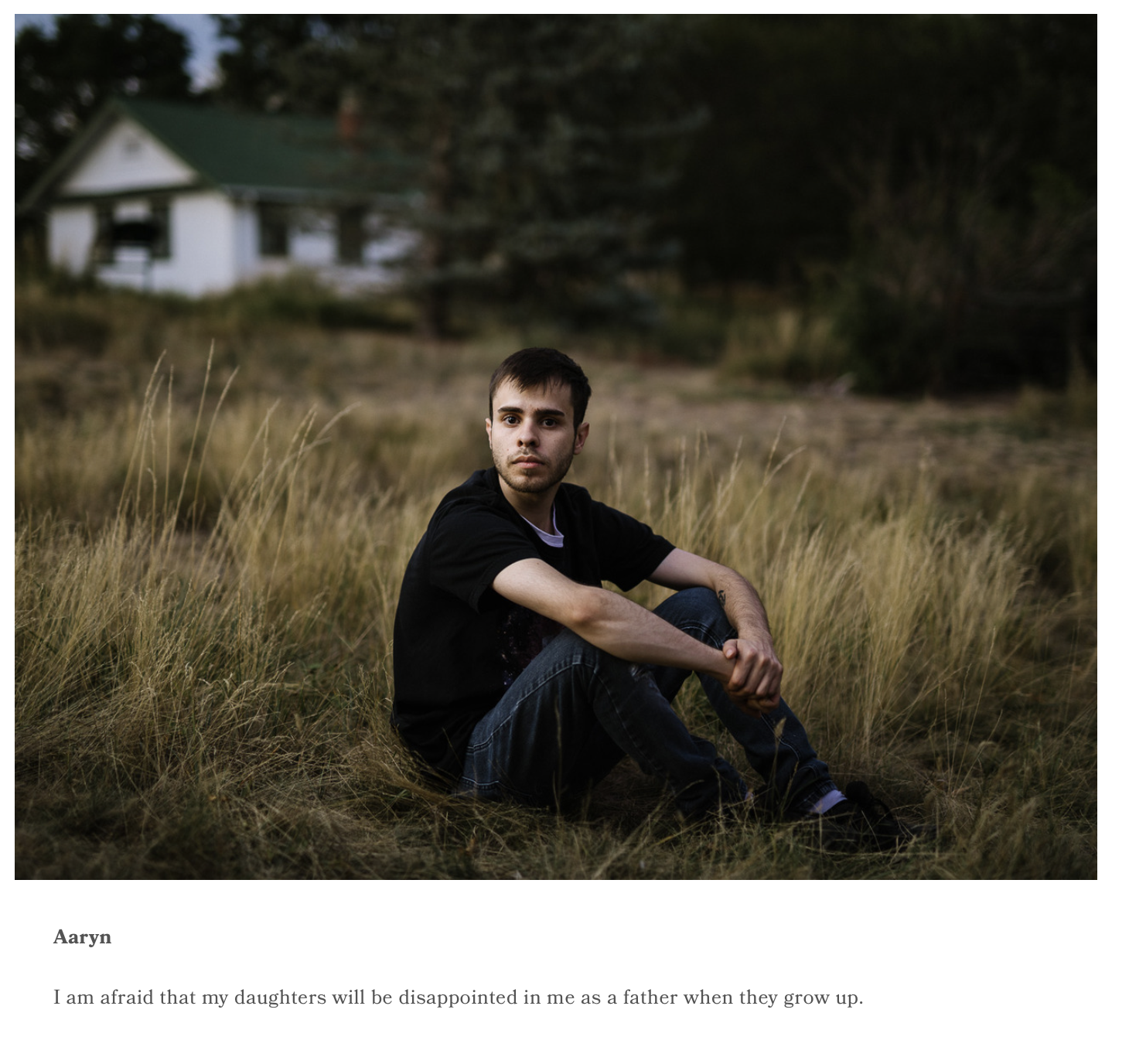
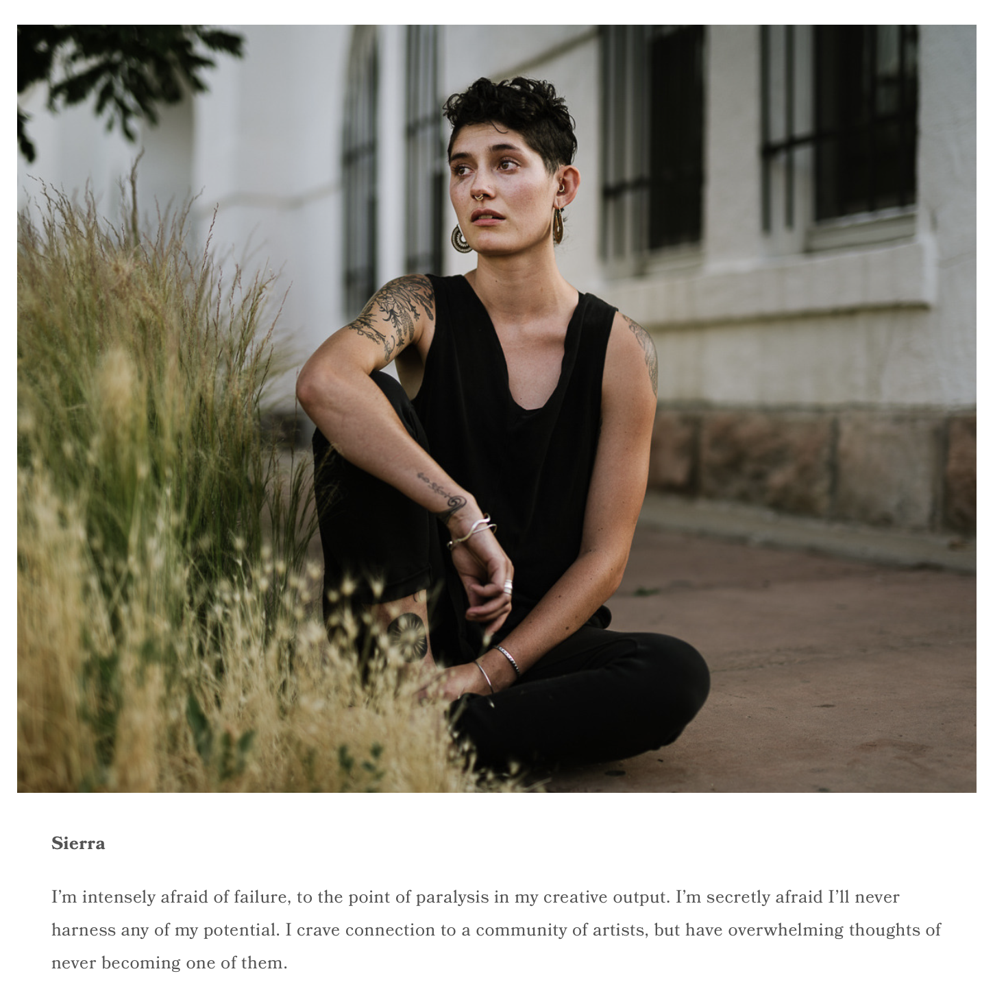
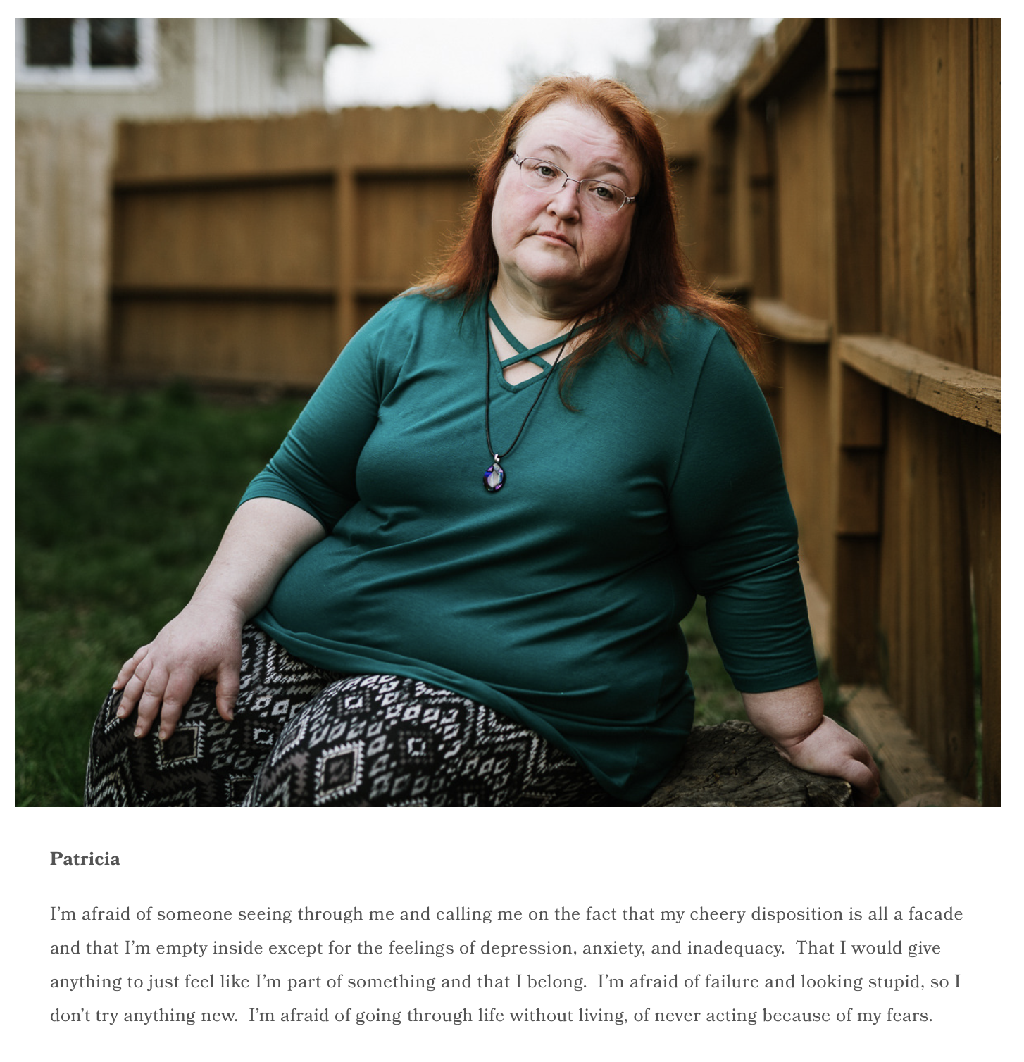
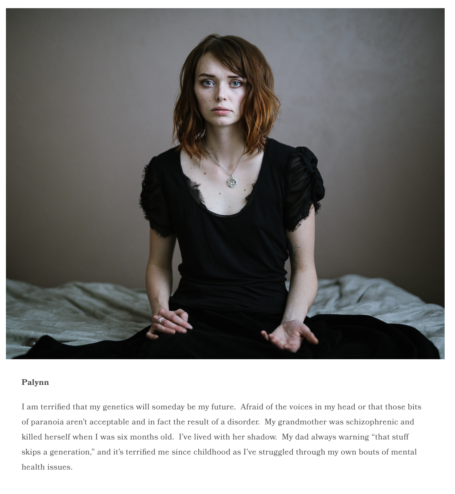
I’d known Carl for his work about beauty pageants in Colombia, but this work was very different. The images were presented with text on the white background, as Carl was asking people to discuss their Private Fears, as he used his art to combat the same.
The Art of the Personal Project is a crucial element to let potential buyers see how you think creatively on your own. I am drawn to personal projects that have an interesting vision or that show something I have never seen before. In this thread, I’ll include a link to each personal project with the artist statement so you can see more of the project. Please note: This thread is not affiliated with any company; I’m just featuring projects that I find. Please DO NOT send me your work. I do not take submissions.
To purchase prints on this and other projects, click here
APE contributor Suzanne Sease currently works as a consultant for photographers and illustrators around the world. She has been involved in the photography and illustration industry since the mid 80s. After establishing the art buying department at The Martin Agency, then working for Kaplan-Thaler, Capital One, Best Buy and numerous smaller agencies and companies, she decided to be a consultant in 1999. She has a new Twitter feed with helpful marketing information because she believes that marketing should be driven by brand and not by specialty. Follow her at @SuzanneSease. Instagram


