Heidi: Your father mentions that Kashmir is India’s open wound, is that what drew you to that area? Avani: I have been traveling to Kashmir with my father during the making of the film. All my life I have seen my fathers images and made sense of the world and our history but Kashmir became my first hand experience. Something I had never had. After the film was completed, I stayed on in Kashmir and over time, Kashmir and the people of Kashmir became very close to my heart. That is why I keep going back (and that is why I am sharing a few images from Kashmir)
You mentioned you had to be a filmmaker and not a daughter during the creation of Your 55 minute documentary Raghu Rai, An Unframed Portrait. When you look at your father’s work, are you viewing as a daughter, as a photographer, do those roles blend for you? The film is about that conflict. Me as a daughter and a photographer, and him as the father or the photographer. During the making of the film I faced many challenges. There were times where id feel that my father wanted to give me all the knowledge in the past 50 years – keeping in mind his likes as well as his dislikes. At the same time he also wanted me to be my own person. There were times that I walked into his space like a daughter and expected answers from a photographer. That never worked. But when I look at his work, which is also the photo history of our times – I view it only as a photographer. That is my responsibility. I learnt to do that over the 7 years I observed my father through my viewfinder. It was a process.
As time has passed can you flow more easily between daughter and artist? The film made me realize many things. our conversations no longer ended in an argument. There is respect between the two of us and dignity in our differences. I can now go back home to my parents and feel like a daughter without as much pressure I would have everytime he came in front of me to pick up my camera and shoot.
Do you remember when you first understood your father’s body of work and the impact of those photos? Tell us about that. Even after making the film I don’t think I have seen his complete body of work. But it’s all a process. Images that are timeless have something new for you to understand every time one views them. The first few photographs that I saw of my father was of the buried child in Bhopal.
Tell us about the ending image to your documentary. That photograph (at the end of the film) was taken a couple of months before I finished filming. It just came to me. It wasn’t planned but when I did take that – I knew how my film was going to end after 6 years of trying to make it. This was taken in the Delhi at the river during winter. The bird in the image is a migratory bird that only comes during that season.
How did you creatively blossom after the making of this film? I felt like I had a clean slate. I had said what I had to about my lineage and I could start all over without being judged. It opened my mind, it cleared a lot of things. I knew better what I liked and disliked, where my father and I were similar and different and we started to respect that. (please watch my film soon J
What kind of gravity comes with being Raghu Rai’s daughter? Is it internal, external? I started to make the film because of this identity crisis. I often fought with my father when I didn’t like something, but I didn’t always know what I did like. It took time and effort as I worked on the film – to get to know myself better. And when I feel I do – I don’t need to prove to anyone anymore. It’s a good feeling.
I made this film because I love my father deeply but I didn’t understand him enough. After I made it – I love him even more and I am happy to be me. Whoever knew me knew me for being his daughter. But after making this film and through the years they acknowledge my work and that is a blessing.
In your debut show: Ground Zero what questions of the heart were you trying to answer? I am still working on the project. I feel like it’s a never ending project. I try to answer questions of stereotypes, the ideas of Kashmir (as the Indian media reports it) and the women and children of a conflict state which is also the most militarized land on earth.
Congratulations on your Getty Reportage inclusion. Is that image from Ground Zero and all done in camera? Thank you! Yes.
What are your thoughts on how being a woman behind the camera opened up different emotions from your subject… do you feel it would have been different if you were a man? There are places where women aren’t allowed and there are places where men aren’t allowed. Being a woman – I was able to walk into the lives of the people I want to connect with – my current project being on women and children. If I were a man I would probably not be able to do that in a Muslim state (Kashmir) especially, at least not so easily. For most of history woman photographers were fewer than men- I don’t like this idea. It is very important to view the world from a woman’s perspective. Men documenting the world can never be a wholesome experience when you haven’t seen a woman’s.
Who Printed it?
I had it printed at Capital Printing in Austin, Texas. They were extremely helpful and thorough during the proofing process. We probably printed 5 or 6 versions before we were happy with it. They were very patient with me to make sure we got the color just right.
Who Designed it?
At first, I thought I would design it myself. I have a (limited) graphic design background but I felt I was too close my own work to be able to have a compelling perspective. I decided I wanted to have fresh eyes on it. So I hired a designer, Jennifer James Wright. (jenniferjameswright.com) I met her when I was asked to photograph her in Austin last year. She’s worked for Weiden + Kennedy, and designed for Kinfolk and Broccoli Magazine. Not only is she just a lovely person to be around, she is just so talented. I didn’t think she would have time to design the promo for me, but she said yes immediately.
We had several meetings about the book before the design process started. We poured over paper options, fonts, zines, etc. She was very thoughtful and considered about how it would feel in your hands. Her attention to detail is exactly why I wanted her to design it.
I wanted to let her run with it but I did give her a few jumping-off points. The main one being I wanted the type treatments to be as important as the images themselves. I wanted it to feel like a story you’d see in the 90s Fabian Baron era of Bazaar magazine. And I wanted her to flex her aesthetic and talents. Really I feel like this promo is as much about my work as it is about Jennifer’s. A true collaboration which makes my heart sing.
Tell me about the images?
Narrowing down the images was probably the hardest part. I wanted it to feel cohesive, so I had to decide, do I show lifestyle? Do I show portraiture? Do I show fashion? Can they all live in the same book? Ultimately, the answer was no. So I leaned towards portraiture and fashion. This seemed to make the most sense given how we wanted to use the type treatments. I knew I wanted to show commissioned work but truthfully I prefer most of my personal projects over my commissioned work for the obvious reasons that you have no limitations and can feel free to play and experiment. So it’s a good mix of both.
How many did you make?
I had 100 books made. And I sent them out to very specific clients that I want to work with.
How many times a year do you send out promos?
With an agent, I probably have sent out promos every few months. But they were more paired down versions like according style promos. Which aren’t that exciting to me. So I thought about what if I were someone who gets promos regularly and what would fun to receive? What would stop them from throwing it in the trash? That’s when I decided to I wanted to start making more thoughtful versions. One that shows my love of design as much as my love of photography. And maybe, even one they would leave on their coffee table. It was so much fun to make this with Jennifer, that she and I talked about doing these 2x a year and each version will be based on a theme.
Do you think Printed Promos are effective for marketing your work?
Without a doubt. I think social media is very important too but your work can get lost in the scroll. People are perusing so fast, who knows if they are seeing your work. But with a printed book, I think it shows a level of care and commitment to your work. And nothing can really replace the tactile feeling of holding a printed book. Which is 100 times more satisfying than looking at your phone.
So I started there, and through Jörg’s then-coveted blogroll, I began to follow certain other people, learning about their lives and art.
Blake Andrews had a blog back then, as did our Rob Haggart, and Bryan Formhals. (Brian Ulrich too.) It wasn’t just men, though, as I remember blogs by Elizabeth Fleming and Liz Kuball, among others.
I joined the club in 2009, with a little collaborative blog based in New Mexico called Flash Flood. (We had to change the name when a weirdo in Boston threatened to sue us.)
Regardless, it was a world of ideas and opinions, in a much longer form than the social media that would soon replace it. But blogs were cool enough that big players, like Time Magazine and the New York Times, felt compelled to get in on the game, and both of their offerings have since gone away.
We’re still here, though.
(And we have long memories.)
I mention this, because while I was standing in the middle of the open portfolio walk at Photolucida a few months ago, in the Portland Art Museum, I happened to see Andy Adams, of Flak Photo, talking to a guy who I soon realized was Blake Andrews.
As I approached and said Hello, (Andy and I go way back,) we formed a triangle of old-school, white-guy-photo-bloggers that had historical weight.
Immediately, I challenged Blake, (whom I’d never met,) for some of the difficult, troll-ish comments he used to leave here in the column, in the years when such ball-busting and strife were common.
He was surprised that I remembered, and even more surprised and offended that it was the first thing I brought up when we met.
I was mostly teasing, and laughing about it too, but at the same time, it was nostalgic. Ten years starts to feel like a long time, and the internet and the way we communicate are so different from the way they were.
The festivals have stuck around, in much the same format, though, and it’s because they work so well.
Photolucida, which might benefit from being biennial, really does take over part of the city, and has massive participation from locals and the out-of-towners who fly in. Between their association with the Portland Art Museum, and the legendary Blue Sky Gallery, having parties at such places makes the official events feel more special.
(And remember, I go to a lot of these.)
I think I ruffled Blake’s feathers, for reminding him of the all times he gave me grief back in the day, but I really was just joking around, and after reminding him of that, I excused myself.
As it happened, I saw a colleague who’d staked out a good spot to chill, and after we talked for an hour or so, he invited me to join him and another colleague at a Death Metal concert the next night.
A big part of my job lately has been to live through cool things so I can write about them, (like a proper travel writer,) so I immediately said yes, and was excited for a new opportunity.
Then I went home, went to bed, reviewed 12 portfolios the next day, went to a fun reviewer party at a local brew-pub, and then it was time to go.
The bar was called Dante’s, and yes, it was reminiscent of Hell. (But in a good way?) From the second we got within 100 feet of the place, I knew I was in for something new.
It was just so fucking loud.
My companions offered me ear plugs, which were beyond necessary, and I put them in with gusto.
Inside Dante’s.
Honestly, this entire sub-culture seemed to revolve around ear plugs, and not being able to hear shit, because I watched the ease with which the bouncers used hand signals, instead of talking.
I’m still not entirely sure if this was Death Metal or Hardcore, because a music-nerd friend insisted it was the latter.
I get that, as I could see a lot of California punk in the band’s movements. (Like the Red Hot Chili Peppers on meth.)
We were there to see “Integrity,” which came out of the Baltimore-DC 90’s hardcore scene, I was told, and the lead singer may now live in Belgium, and he may be a Satan Worshipper.
I’m not clear on the latter, (as I heard it both ways,) and the truth is, I spent a bunch of time on the patio, smoking weed, talking to people, and soaking up the difference.
Were there a lot of scary-looking, big, white-supremacist-type people?
Yes.
You bet there were.
And then, all of a sudden, the crowd parted like one of Moses’ tricks, and I saw the shaved-headed, scary-looking-white-guy-bouncers taking out a bunch of fighting, skin-head-looking dudes.
I turned to my colleague and said, “How much you want to bet those guys were white supremacists?”
“They were totally white supremacists,” he replied.
So a few minutes later, once things had calmed down, I asked one of the bouncers.
“No, they weren’t white supremacists,” he said. “They’re the guys that fight the white supremacists. This was two different gangs that fight white supremacists, and they don’t like each other.”
“Like Antifa?” I asked?
“No,” he said. “Not at all. Antifa is a whole different crowd.”
“Fair enough,” I said, and walked back to my companions.
At the end of the night, I bought a drink for the Integrity guitarist, and after that last shot, I started chatting up the security again.
One guy looked genuinely menacing, and ready to blow.
He was so fired up.
“I can’t believe those assholes came into my house and fucked with my guys. I can’t believe it! They should know better. I’ve got enough guns downstairs for each of my guys to have two a piece. I’m going to go out and find those fuckers. I know where they hang out. And I’m gonna fuck them up.”
At that point, I realized it might be a good time for me to leave.
So we did.
I promised you guys that weird shit happened in Portland, and now I hope you believe me.
But my main reason for being there was to view portfolios and share them with you here.
So let’s get to it.
The artists, as usual, are in no particular order, but these portfolios represent some of the Best Work I saw at Photolucida.
I’m going to start with Caren Winnall, because in my mind, she represents the best case scenario from what can come from the portfolio review process.
We first met at Filter in Chicago a few years ago, as she was beginning on her fine art photography adventure. Her work was fairly rudimentary, but she told me she’d had success in her first career in finance, and was dealing with grief from heavy loss.
I chose to focus on the few things that were working well in her images, (her use of the color red in particular,) and offered her as much positive reenforcement and empathy as I could.
From there, Caren did workshops, and studied with good people in the photo community, and built the equivalent of a graduate school education, a bit a time. (I believe we met one more time, as her work evolved, but my brain is too fried to be sure.)
Fast forward to April, and the same woman came to my table, showing me nakedly raw, honest, heartfelt self-portraits, made with a sharp lens, a high resolution camera, and significantly improved skills.
These images were so striking, for me, and her improvement so remarkable, that I’m pretty sure I teared up a bit. (I did, right Caren?) I’m certain you’ll love them.
To break that tension, next, we’ll look at Ira Wagner’s images, as he too was a late-in-life career shift artist. Ira went back to school and got his MFA at Hartford, so now he’s teaching in my old stomping grounds at Monmouth University in Long Branch, at the Jersey Shore.
(Ira, did you eat at Rockafellers yet?)
These photographs were made of twin houses in the greater Philly area, and represent a little sociological look into the human condition.
These double-row houses force people to share space, and the way they choose to utilize it differently is obviously visually engaging, but also allows us to think about our own personal taste and foibles.
Heather Binns had one of the most interesting personal narratives I heard, with respect to the origin of her project. Apparently, she moved to the Portland area a while back, and only then found that her Great-Grandmother had lived and died there.
She discovered that her ancestor was buried in a massive mausoleum, and went for a visit. Only then did she learn about the massive facility, in which so many people’s corpses were laid to rest, above ground. (It’s 8 floors, with 7 miles of corridors, and contains 70-75,000 dead people.)
So she began spending time there, photographing the oddity. Maybe we should have saved this one for a Halloween article, but of course the images are lovely, rather than creepy.
Now that I think about it, perhaps Sam Scoggins had the wildest story. Sam’s an Englishman, from Bristol, who was trained as a filmmaker, but now lives in Upstate New York.
A few years ago, he got turned on to a weirdo-bar scene in his local area, and thought it was interesting. When I asked him about how his work fit, in a world where insider visions are so heavily favored over outsider stories, he had quite the answer.
Apparently, a recent medical condition had changed his sexuality. His preferences were different, his self-identification was different, and he shared that this community had completely embraced him as one of their own, even if he didn’t look the same as they do.
Love it!
Cecilia Borgenstam was one of the photographers I alluded to, in earlier pieces, as she showed me these images shot in Golden Gate Park in San Francisco.
Cecilia is Swedish, originally, is art school trained, and runs with the Richard Misrach crew. So when I first saw them, I kind of assumed that they were sculptural-type images, in which she’d manipulated the scene.
With the sad, almost Nordic light, I slowly began to wonder if they weren’t artful documents, which in fact they are. Given the homeless problem in the city, (of which I’ve written many times before,) these images reflect relics of people sleeping out, unexposed, living in this micro-version of nature in a now unaffordable city.
She admitted she’d gotten a hard time, as some folks believe you can’t photograph such things unless you’re homeless yourself. (But can still afford a camera?) I felt that the tragic tone of the pictures spoke volumes, and were more likely to create empathy in others. (And Cecilia stressed that whenever she sells work, a portion of the proceeds are donated to the Larkin Street Youth Services.)
We’ll end with Philip Sager, if for no other reason than it keeps the San Francisco connection alive. (And I’ll be there in a couple of weeks, so it’s on my mind at the moment.)
With all these insane personal narratives, perhaps Philip’s trumps them all, as like Caren and Ira, he too had a successful first career, (and still does,) as a cardiologist. Why is that so interesting, you may ask?
Because one night in the event, I heard and saw an ambulance come screaming up the Benson Hotel. I looked down from my window, and then thought, “It’s a huge hotel. What are the odds it’s someone I know?”
And then I went to bed.
Turns out, Ann Jastrab, a friend and colleague, had an allergic reaction, and almost died. Then, the hospital sent her home prematurely, she almost died again, and was only saved by Dr. Philip’s brave and timely intervention. (He’s one of Ann’s students.)
Crazy stuff.
As to the photographs, Philip also has built up his education, step by step, and showed me work of reflection images in SF. While it’s normally a trope I’d recommend avoiding, in a Post-Lee-Friedlander world, these are so lovely.
The way they capture the architecture and vibe of SF, (beautiful but with visible grit,) reminded me that it’s possible to breathe new life into almost any trope.
The Art of the Personal Project is a crucial element to let potential buyers see how you think creatively on your own. I am drawn to personal projects that have an interesting vision or that show something I have never seen before. In this thread, I’ll include a link to each personal project with the artist statement so you can see more of the project. Please note: This thread is not affiliated with any company; I’m just featuring projects that I find. Please DO NOT send me your work. I do not take submissions.
A photograph can take on many meanings once it’s viewed, but as I point the camera, my aim is to explore the subject in order to learn something more. I may not have any connection at the start, but once I begin, something essential starts to emerge, and it may not be what I expected. That discovery process fuels my work. Learning and especially exploring new environments are a huge draw for me.
I was hired to do stills and B-roll for a documentary film, “Leh Wi Tok” (Let Us Talk, 2011) examining the role of radio broadcasting in the post-war rebuilding of Sierra Leone, west Africa. The subjects of the portraits seen here existed far from my known experience at the time. Across the world, a different culture, and one shredded by an 11-year civil war. That war left over 50,000 dead, and countless wounded and traumatized. What would I see in these people?
Every chance I got between responsibilities to the filming, I gravitated toward making these images as a more complete way to connect and understand the people around me, even through the language and cultural differences. And they were willing to connect. I became more and more fascinated as the people revealed themselves to me in unmasked moments. Plus, I learned better through this project that I put people at ease naturally, and allow their essence to come through.
The way this personal project went down was definitely an evolution from my earlier work. I picked up the camera as a skateboarding teenager. It was fun to participate in the action as a skater and at the same time be an observer with a bit of distance. From those early days of more action, still life scenes and commercial/still work, I’d say I’ve come a long way in embracing the personal connection I can make with people.
Giving voice to the voiceless is what the radio journalists of Sierra Leone do. We try to understand war, factions, killing, and what Sierra Leone went through, and still do, all these years on, but on the ground, the real power for me was in the strength and resilience of the people I met. For instance, one man had been a member of a specialized military group (the Kamajor were a bit like the Jedi, who believed they had mystical powers and that the bullets would go around them). Now he turns his skill to empowering the citizens through broadcasting, which he finds is still a dangerous business, equally powerful. Another man lost his arm to a combatant who had been his neighbor before the war. But he truly found forgiveness, and they are living side by side again.
These are not uncommon stories. Everywhere I looked, the people weren’t revealing devastation, even the ones with missing limbs and missing families. There was a rich sense that each person contained the breadth of human experience within them. As we all do. Love, peace, forgiveness, humanity and connection. I am grateful the people allowed me to reflect that immense spirit and share it with others.
APE contributor Suzanne Sease currently works as a consultant for photographers and illustrators around the world. She has been involved in the photography and illustration industry since the mid 80s. After establishing the art buying department at The Martin Agency, then working for Kaplan-Thaler, Capital One, Best Buy and numerous smaller agencies and companies, she decided to be a consultant in 1999. She has a new Twitter feed with helpful marketing information because she believes that marketing should be driven by brand and not by specialty. Follow her at @SuzanneSease. Instagram
Success is more than a matter of your talent. It’s also a matter of doing a better job presenting it. And that is what I do with decades of agency and in-house experience.
Heidi: Tell us why this project was different for you? Joe: This assignment really combined everything I love about shooting for editorial clients. It was commissioned by the editor and designer Robert Priest so I knew that care would be taken in how the images would be used and that the process would be collaborative every step of the way. I was also excited about the subject matter, despite not being a true follower of sports. I felt that photographing women for a soccer magazine that primarily focuses on global soccer stars who are generally male, this was a nice chance to add to the coverage of one of the most successful teams playing the game today. It dovetailed nicely into conversations about inclusion and representation, which I care about greatly in the context of being someone who contributes to media the way I do.
What did you know about Priest+Grace the legendary design duo prior to this project? I’ve known about Robert Priest for many years, all the way back to when I was a contributor to Conde Nast Portfolio magazine, where he was the design director. I also did assignments for O (The Oprah Magazine) when he was the design director there. I have great respect for and reverence to his legacy as well as his ability to stay on the cutting edge of innovative design. I think if you love working in magazines, you know about Robert.
When a publication like 8by8 is so exquisitely designed what type of responsibility do you feel?
It’s really such a treat to know that the photography is meant to live side by side with amazing type and design elements made by the best designers in the business. I do feel a responsibility for my images to hold up to that great design, so they can be on equal footing and complement one another. My absolute favorite thing about shooting for magazines is seeing how my images pair with strong design, especially on a cover shoot.
Tell us about the gravity of working with such an important group of women that push beyond the normal cover subject? Truthfully, these are the types of shoots I live for. Anyone who is redefining norms, pushing boundaries, challenging expectations, is in my opinion the perfect cover subject. I want to look back on the work I do and feel like I was capturing my subjects at pivotal moments in their lives and careers. I knew the back story of the pressure these women have faced as favorites going into the World Cup. They face a discriminatory pay scale and are scrutinized in ways that I think the male players aren’t. In my eyes they are heroes as well as athletes and I wanted to my images to reflect that.
Most cover shoots come with layers of styling, h/m, how did the lack of these both inspire and intimidate you? It was refreshing. I loved that they were being photographed in their battle armor, it seemed to give them a sense of purpose on the shoot. Robert and I agreed that we would not ask them to pose or interact with a ball, I didn’t want to mine the typical imagery we’ve all seen of athletes in their uniforms performing.
This is your second portrait gallery of powerful women, how are you approaching these projects and what is on your mind leading up to these? I take it very, very seriously and I’m acutely aware that my (male) voice is not the obvious choice to represent all subjects. I’m very excited to see that diversity in photography is being honored and encouraged and I am extremely humbled if I am asked to take on a story like this. I think I may have been called for each of these portfolios as someone who has photographed many people, men and women, who are making an impact in the world. It’s not every day that I am asked to do that and I don’t take it lightly. I know that I have to come through with images that are thoughtful, representative of the story, and can live on as a historic document of the strides being made by women in 2019.
How do you hope women in particular respond to these galleries? In a few words what is your message? I hope all viewers can see that I’m truly looking to make honest and inspiring portraits, not as a male point of view, but as a proxy for anyone who is inspired by leaders and athletes. I especially think about what it might feel like for girls or young women to see these subjects celebrated in the same light as their male counterparts (by a male photographer) and hope that my voice can be lent, at times, to equalize the way in which subjects are photographed. I would hope that many more female photographers can be similarly tasked with documenting male subjects, as opposed to photography being divided into gender specific assigning.
What was the direction from the magazine? Robert initially said he was interested in some of the color direction my work had been taking, so that was a jumping off point for me to experiment with traditional studio lighting as well as some setups with a stronger color voice.
Tell us about the set conversation during the image making? We were extremely rushed for time so there were only a handful of opportunities to talk to the players during the session. But I did get to have a few laughs with some of them, it was early in the year and I think the excitement for what lay ahead for them at the World Cup was palpable.
How do you feel about community within the photo industry?
I hope it comes through that I am a believer in diversity of perspectives in photography and that I actively seek out conversation with other photographers on these matters. It’s not lost on me how isolating a freelance career can be so I make it a point to doing outreach to a group of peers so we can discuss the important changes happening, or that need to happen in our industry.
Who printed it? Mixam – Catalog/Magazine/Booklet, 7×10, 28 sides, Stapled, 100lb paper Uncoated. Print and paper quality are big factors to me, so before I started this process I ordered their free sample pack. I’ve collected several different packs from other printers, and for the price point that I was going for and the option for smaller quantities, I felt like this was a perfect fit. Their customer service is awesome too. I had 2 books that were flawed and they were quick to respond with options for refund or reprinting. I opted for reprinting, it was dispatched immediately and delivered within a week.
Who designed it?
I worked closely with Creative Consultant Mara Serdans. She went through all the images on my website and I also sent her a large selection from my archive. I wanted the promo to be a snippet of what I shoot, so we decided to showcase 15-25 images from food and still life. Once we finalized the images and flow, I worked with a good friend of mine who is an amazing graphic designer & photographer, Jennifer Chong of JChongStudio, to design the layout.
Tell me about the images?
I’ve been wanting to do a more in-depth promo for a long time and to follow up with the promo I sent earlier this year. The idea behind it is to have a mini portfolio that doesn’t cost a lot to print or send and travels easily if I’m on the road. I use them as leave-behinds at meetings or send to clients that I really want to shoot for if we’ve already established a relationship. The images themselves are from all sorts of shoots ranging from personal test shoots to client work.
How many did you make?
I did 30 for the first printing – I wanted to see how my images looked on paper before doing a big order. I’ll be ordering more for sure! People have really enjoyed it so far.
How many times a year do you send out promos?
Not as much as I should! And to be honest, this one and the postcard I sent earlier this year was the result of being really slow with work. I needed to try something different with my marketing. I haven’t seen a direct correlation of getting connections or work from my promos, but work has definitely picked up! Eventually, I’d like to be sending at least 2-4 postcards and 1 larger promo per year to be getting my work consistently in front of people. Along with that, I’m working in email promos about every 3 months.
Do you think printed promos are effective for marketing your work?
I hope so! I mean it’s kind of a shot in the dark hoping that the promo actually gets delivered & opened, wondering if they even like it or if it just gets tossed. This is my first year sending printed promos, so I’m still figuring out who should be on my list. If anything, it’s made me take a close look at my work and to really think about who I want to be shooting for.
Ever since “Reservoir Dogs,” which blew my mind as a youth, it’s been clear that non-linear narrative is the coolest.
(Harvey Keitel, why can’t there be more of you?)
As a result of that film’s success, we’re living in a different world, cinematically speaking, if not a different Universe.
It begs an important question: are we allowed to go see the new Quentin Tarantino movie?
Is it ethically appropriate?
QT came out and apologized/admitted that he knew about Harvey Weinstein’s predatory, (sorry, rapist) behavior.
Plus, his most-recent film, “The Hateful Eight” was by far his worst.
And I just remembered Uma Thurman also said Quentin Tarantino got her massively injured on “Kill Bill.”
(Pause.)
That settles it. I’m not going to see his new movie in the theater. Tarantino gets an only-for-free-on-Netflix-or-Amazon-Prime ban from now on.
Honestly, he was probably my favorite filmmaker, (as of two years ago,) and I once taught a class on cinematic tension by leading with the opening scene in “Inglorious Basterds.”
Wait a second.
Am I writing film criticism while introducing a travel piece?
Boris reminds me of a hybrid of George W. Bush and Donald Trump, which is not a flattering comparison at all.
He is a good segue, though, as Boris used to be Mayor of London. And now I can jump right back into the city, and move this article along.
Part 2: Historical Paintings
Just now, going through my iCloud, I was reminded that by pulling 18-hour-days for a week, I really did do a lot of cool stuff in London. We’ve got a full-travel column today, and we still won’t be halfway through the trip yet.
So let’s get on with it.
Friday morning, after the Martin Parr show, I went upstairs into the rest of the National Portrait Gallery.
There are lots of busts and paintings of old dead people in this museum, if I’m being honest, and some of them were really cool.
Of course I was personally invested in the section on the founding of the America, because how couldn’t I be?
I loved the bit about George Washington being “the son of a planter who became an inspirational leader of the American people.”
It was condescending in spirit, if accurate in fact.
Reading the text, in the context of the room, I suddenly understood “their” side of the history.
“Some of our people established a colony, and they got too big for their britches when we tried to tax them to pay for their own defense. We were too broke to defend our entire global empire, so we decided to keep India and cut the provincial ingrates loose.”
(Or something like that.)
And now, in 2019, the fact that George Washington was a slave-owner gets as much press as the fact that he founded our nation. (It is a hard fact to over-look.)
Nearby, “The Death of the Earl of Chatham,” by John Singleton Copley, was also magnificent. His dead gray pallor, compared to the pink cheeks of the dudes next to him, chills me here in New Mexico, six weeks later. (Or maybe I just need to turn off the fan?)
In a separate wing, where there were images of more-recent famous people, I liked the portrait of the Beatles next to one of the Stones. You can’t blame them for doing that, can you?
From there, I headed back out into the streets, (giving up the blessed free wifi,) and walked around a bit.
As I was heading down the road, off Leicester Square, a flyer caught my eye for a screening for a new Korean film. I was in the mood to be observant, so I went inside to see what the theater was about.
Short version: there was an art gallery inside the Korean Cultural Centre, with an exhibition featuring 19th Century-Style Korean Minhwa genre paintings, done mostly by contemporary artists.
After a long chat with the woman up front, (who was just on contract to sit there the length of the show,) and after reading the paperwork, we determined that perhaps one was vintage?
Really, though, it didn’t matter. The detail of some of the realistic ones was the same kind of time travel I’d just felt up the street at the NPG, but instead of being in 17th Century England, I was in 19th Century Korea.
And as for the funky animal paintings, dragons and tigers and magpies, if you don’t like these, you’re DEAD INSIDE.
DEAD INSIDE.
Part 3: The Eating tour of London
I lost a lot of weight in London.
I walked 60 miles, if my iPhone is to be believed, and given that I was mostly going on adrenaline and caffeine, (and maybe some gummy bears,) I didn’t eat often, but when I ate, I ate properly.
Friday morning, I ran out the door, coffee only, and never had much of a bite.
Eventually, I crossed the Thames, on my way to Tate Modern, and along the South bank of the river, came upon a street food corridor.
I gave it a good look, eyeing up options for the way back, as I was pretty sure I would be ready after my next art mission.
I noted there were four or five different countries’ versions of pita-wrapped-food.
Who had the best, I wondered?
There was someone from Greece, and Syria or was it Lebanon?, and somewhere else, and then the Afghan place.
Walking by, some Italian ladies offered me a taste of truffle sauce ravioli. Sure, why not?
What’s not to like?
An hour later, famished, I admit I took another free ravioli, walking the other way, knowing full well I wasn’t going to eat there.
Was that terrible of me? Sample abuse?
Walking back, it was clear there was a line at the Afghan place, 2 Lads Kitchen. That was enough for me.
I ordered the marinated chicken pita, noted that he had a few to make before mine, and got up close to watch him work. (Forgive me that I don’t remember his name, though I’m sure he told me.)
The chicken was marinated 24 hours in a yogurt-paste, like tandoori. And it was cooking slowly.
Slowly.
In a few minutes, he began to build one sandwich, then another. First, he put down yogurt, and fresh vegetables, and grilled potato.
His hands moved slowly. One thing at at time. One cut at a time.
The London bros waiting for their food were patient too.
Everyone was patient.
Because I was nice, I know I got extra chicken, and he put the pickled red chiles in my wrap, one at a time, where he told the other guys they could do it themselves.
I was surprised that the squeeze-bottle sauce, which looked like green chile sauce, was really a cilantro chutney. It was clear that Afghanistan’s proximity to India meant this food was hybridized, but I’ll tell you one thing, it was delicious.
And very fresh.
I did my work, and hit the city, but later in the day, having taken the tube to the Holloway Road in London, I went for a walk to stretch my legs, and got my stomach ready for the evening.
Hugo and I walked up the road to Sambal Shiok, a Malaysian joint he said was top of the charts great. We’d likely have to wait in line, but he said it would be worth it.
Luckily, we got in right away, but were wedged in tight, super-duper tight, between other people on either side. (It was a bit much, but we decided to go with the flow.)
The host and wait staff were English hipster, but Hugo said the owners and people in the kitchen were from Malaysia, so the food was authentic, and we’d be good to go.
I heard a lot of American English in London, much more than I remembered from previous visits, but maybe it’s because the exchange rate is so good at the moment? (Seriously. Get on that.)
As it happened, the young American woman sitting directly to our right was rather annoying, and we had a hard time tuning her out.
Luckily, the food came quickly.
We had poached shrimp, lychee and sambal lettuce cups that were as good as that sounds.
And fried chicken fingers with peanut sauce that managed to be crunchy, soft, moist and elegant at the same time. Just writing it, I don’t know how they defied physics.
Later, the chicken and tofu skin Laksa was rich, smoky, fish-sauce tasting. Simply perfect.
But we bailed before finishing it, and the restaurant didn’t have takeout boxes, (bad for the environment,) so we chose to leave it behind.
On we walked, on a huge tour of Islington, and Hugo kept telling me about this Mongol place he wanted to take me. Where the chefs hang out. 90’s Rock playing in the background.
It was started by an alumnus of Fergus Henderson’s place, St. John. (The nose to tail stuff.)
He said they have this special type of oven. In the Mongol place.
I had the fried artichokes, which I liked, but didn’t love, and Hugo had the squid ink bread with quail egg and cod roe. I tried it, and we agreed it was like Greek taramasalata.
It hurt my head trying to figure out how that was Mongol food. (Maybe the gummy bears didn’t help?)
It wasn’t until Sunday, walking through Hackney, that I figured out the oven in the restaurant was called a Mangal.
Not Mongol.
And the restaurant was called Black Axe Mangal, which now made sense.
It’s a Turkish oven, not Mongol.
(I’m normally bright, but clearly, I was slow off the line on this one.)
Hugo loved the food at Black Axe Mangal, but for me it was just pretty good.
Probably I was too full from the Malaysian joint, and if I’d ordered differently, I might have been happier.
Walking back after dinner.
Part 4: The Only New Mexican food in England
Now that I think about it, I barely ate anything on Saturday. (No wonder I food-crashed at Photo London.)
Somehow, though, when I got home to Hugo’s from the fair, I decided to make a proper New Mexican meal. (Or at least as proper as I could make it, under the circumstances.)
Cooking in Hugo’s kitchen.
Will I get arrested for admitting I brought dried chiles into the country? Is that even illegal?
I stashed some powdered and dried red and green chiles, though the latter are always best frozen, and it works in a pinch if you’re traveling. (That the green chiles are not really meant to be dried means that our food wasn’t purely authentic.)
But I did the best I could under the circumstances.
Chile Rubbed, Blackened Chicken
For the chicken, I used two good, large, skin-on chicken breasts that were delivered from the farm, along with some produce.
Coat each side with a healthy amount of salt and cracked black pepper.
In a separate bowl, throw together 4 kinds of chile, (or as many as you feel like,) oregano, thyme, and cumin.
Then coat on each side of the chicken, and let sit for 20-30 minutes. (Or up to over-night, depending on how long you have.)
Chile-rubbed chicken, resting
Next, mince an onion, shallot, or leek, and caramelize it in a cast iron pan, cooking it slowly, and salting it to taste.
Remove from pan.
After 20-30 minutes, add some more olive oil to the skillet,
and then sear the chicken on each side, removing when it’s golden brown, but NOT cooked though.
Let the chicken rest for a few minutes on a cutting board, then slice it into 1/2 inch pieces.
Add the onion/leek/shallot back to the pan, and then add the chicken back, and stir a few times until the chicken is cooked through.
Add the juice of one lime.
Toss the chicken around the skillet, and then remove to a platter.
Proper (or improvised) Green Chile Sauce
In one pan, sautée some minced garlic in olive oil until it lightly browns, and season with salt.
Then, in a good skillet/sauce pan make a roux with cold butter, flour and salt. (Turn them around in the pan so they don’t burn.)
When it’s mushy and brown, add your roasted, peeled and seeded New Mexico Green Chile. (It’s available all over NM, beginning in a few weeks, through October.)
Or maybe you have some in your freezer left over from last year?
If you have to do what I did at Hugo’s house, reconstitute dried NM green chile in warm water for 20 minutes, then drain it, and add salt and lemon or lime juice.
After adding the chile to the pan, add water, chicken or veggie stock, and salt, more lime juice, and the sautéed garlic into the pan as well.
Keep cooking and seasoning until it tastes good, first by bringing to a boil, and then simmering to cook it as long as you’d like.
I like to add more lime juice, a touch of sherry vinegar, and a dash of orange juice too. Fresh oregano is also great.
(At Hugo’s, I went with a more British, autumnal theme, and used apple juice and apple cider vinegar.)
We had everything fajita style, with shredded English Cheddar, fresh tortillas from Waitrose, the Green Chile sauce smothered over the top, and chips and home made guacamole on the side.
NM in England Guacamole
2 ripe avocados
A few cherry tomatoes, diced
One big garlic clove, minced
Lemon or Lime juice (preferably both)
Salt
Pepper
Cilantro
Feel free to use any part of the recipe this summer.
The Art of the Personal Project is a crucial element to let potential buyers see how you think creatively on your own. I am drawn to personal projects that have an interesting vision or that show something I have never seen before. In this thread, I’ll include a link to each personal project with the artist statement so you can see more of the project. Please note: This thread is not affiliated with any company; I’m just featuring projects that I find. Please DO NOT send me your work. I do not take submissions.
As an immigrant, Kris Davidson’s personal work considers the American experience. She’s recently embarked on a new project that will touch ever state in the union. The American Imagination: Myths, Tall Tales and Legends in the United States is a writing and photography project that seeks to contextualize stories from each of the American states as an entry point to looking at modern American culture. Stories — in particular, myths, tall tales and legends that incorporate elements of the fantastical and surreal — all contain fragments of truth, holding the history, fears, hopes and aspirations of a people. The fantastical elements of a culturally held story allows for heady hyperbole in celebrating triumphs, while also providing a buffering analgesic effect in making sense of dark tragedies.
APE contributor Suzanne Sease currently works as a consultant for photographers and illustrators around the world. She has been involved in the photography and illustration industry since the mid 80s. After establishing the art buying department at The Martin Agency, then working for Kaplan-Thaler, Capital One, Best Buy and numerous smaller agencies and companies, she decided to be a consultant in 1999. She has a new Twitter feed with helpful marketing information because she believes that marketing should be driven by brand and not by specialty. Follow her at @SuzanneSease. Instagram
Success is more than a matter of your talent. It’s also a matter of doing a better job presenting it. And that is what I do with decades of agency and in-house experience.
Heidi: How did this project come about?
Abhishek: I had recently watched the classic ‘Days of heaven‘. Its visual style, colour palette and the beautiful use of the golden hour light, especially for the landscape shots, inspired me to work on this project. It sparked the idea of shooting a fashion story in a setup which has a natural and raw energy.
What was the direction for the work?
My idea was to bring the characters alive in an uneventful, humdrum summer setup and let the characters be a part of the surroundings. With no defined relationship between the characters, I wanted it to have a free-of-ties feel.
Did you pitch this idea or did they ask you to submit?
I submitted them the story for a possible publication.
How much personal work do you do?
I do it as often as I can between the commercial projects.
Why did you choose this location?
For the look and feel I had in mind for the story, I needed a place which has a rural, countryside vibe and natural empty spaces, giving the characters an opportunity to be as close to the nature as possible. I always had it in mind to include elemental landscape shots to emphasize the summer vibe and complement the styling.
Tell us about combining landscape and fashion.
Landscape photography is very close to my heart. One of the things which drew me towards photography was the excitement of capturing a vista to stir the emotions of the viewer. Fashion I believe is a way of expression, emoting through styles. When combined with a landscape, whether it is to complement or juxtapose the fashion element, together it works seamlessly to bring out the intended emotions.
Who printed it?
MagCloud. I like that you can order just one copy for a few bucks to get a feel for it and see how everything looks before ordering the rest. I’m sure other places out there do this, too, but I’ve always been happy with them. I’m thinking of using Newspaper Club for Q2, keeping the design similar but having a different sort of format/paper for each one.
Who designed it?
So my pals over at GRIP did a little brand overhaul for me about a year and a half ago. That’s where the logo, color choices, typefaces, and icons come from. I did the edit/layout/design of the piece itself.
Tell me about the images?
They’re from a couple of favorite client projects from Q1, as well as some personal projects. I mostly work in the food/beverage world, so there are some from a library of images made for a new restaurant, a project for a smaller fast-casual restaurant chain’s rebrand here in Chicago, which was a collaboration with an agency, and some fun food-related personal projects.
How many did you make?
I did 50 for this first round. I’d like to do more for the next round. I sent them to some previous/current clients, some friends, some agencies and industry people I thought might like them and sent out a little blast on Instagram for anyone who wanted a copy, just for fun. I have a handful left if anyone wants one!
How many times a year do you send out promos?
Building off of the quarterly report idea, I’m going to shoot for four this year. It’s been kind of wonderful breaking the year down into four parts, kind of checking in on what client work I’ve shot, what personal projects I’ve worked on and asking questions like, who have I connected with, have I traveled much, what would I like to include in that next “report” etc. in three month chunks. For me, it’s made thinking about the whole year seem a little more manageable.
Do you think printed promos are effective for marketing your work?
I hope so! Like everything, be it a printed piece, an email, an Instagram post, you send stuff out into the world and hope people like it, but you mostly never know, even if they do. I have had a handful of people reach out, as they are hyped on receiving something in the mail. I really do think there is something kind of wonderful about holding something tangible. In the past, I’ve frequently made little zines from trips just for myself and am now applying it to my work. You have something that sits on the shelf that you can grab and flip through, rather than just a bunch of digital photos buried in the archive.
After 5 solid years of book reviews, I figured you were ready for something different in the column, and Rob agreed, so here we are.
At this point, I’d say a thank you is in order, to him and to you, because I’ve never gotten so much positive feedback, over a period of time, since I began the column.
Always, though, there’s a hater.
And I wouldn’t be an internet writer, born of and from the digi-verse, if I didn’t at least acknowledge the shade. (On Facebook, of all places.) Even better, I’ve got a story about confronting an old troll in person, in Portland, that I’ll share in an upcoming piece.
As to this (admittedly slight) criticism, a Facebook friend I don’t know asked when I’d be writing about photography and photo books again?
It’s only one person, and I don’t mean to over-invest in the critique, but I do have an answer to the question.
I’ll delve deeper into Photo London today, and I also saw the Martin Parr show, and an exhibition of British photojournalism at the OXO tower, put on by the British Press Photographers Association.
The Offprint Fair at Tate Modern was on the docket as well, where I presumed there would be gobs of photo-books. (Not exactly.)
The plain truth is that the photography I saw, in person, was far from the most interesting art I saw in London.
I know this is a photo blog, because I’ve been writing here for 9 years.
But this column has evolved, and as much photography as I discuss, (most of the year,) it’s important to note that the medium was not doing it for me, compared to other things I saw, ate, and experienced.
So pivoting to travel writing, here in Summer 2019, is as much about being honest about what is earth-shaking out there, IMO, as it is about keeping it fresh on a long-haul column. (And again, we’ll discuss photography today.)
The architecture in London, (yes, that history again,) is so beautiful that it’s hard to put into words. Or capture on screen.
Walking the Thames riverfront feels meta and actual at the same time, like people say about the Seine in Paris, only with more grit.
Just last night, watching the latest episode of Luther Season 5, (Idris Elba has to be the next Bond,) I paused the screen, recognizing I’d stood in that exact spot, on the Embankment, just across the street from Somerset House last month.
Except on screen, there was a dead body hanging from a noose, wearing a scary mask that replicated the face of a psycho killer.
(England goes dark, when it goes dark.)
I was there at Somerset House, in Central London, to visit Photo London on three consecutive days, and I used it as something of a hub. (Wifi, bathrooms, friends to talk to.)
Given that I had press access, which was free, (Thanks, Photo London,) it allowed me to have a much deeper and broader experience than I would have otherwise. (Though no free lecture tickets means I can’t write about them. Nudge, nudge.)
So let’s break it down by day, as each experience was so different.
Part 2: Thursday at Photo London
View at Somerset House
As I said last week, I bumped into almost no one the entire weekend.
Which means I was really able to key in on the work to a far-greater-degree than I did at AIPAD.
My first move, that Thursday, was to look around the pavilion, and see if any art attracted my interest. (At that point, I was still scanning the room a bit, for people, before giving up entirely.)
Definitely some cool work by Richard Mosse, Andreas Serrano, Paul Graham, and David Goldblatt. (But nothing I hadn’t seen before.)
I know I said these fairs are more for collectors and dealers than artists and journalists, but when I tab up all the things I saw at Photo London, the good, the bad, the interesting and the tacky, there was quite a lot on display.
Models with big cats? Ouch.
I was searching for inspiration on this trip, though, (Thanks, cousin Mike,) and I didn’t get much at Photo London.
After the pavilion, I went into the West Wing, looking for the Discovery section, which was tucked away in the labyrinth. (There was a photo book fair in the East Wing that was always hard to walk through, due to crowds.)
There were emerging galleries from all over Europe in Discovery, (located on a hidden Mezzanine that was always hard to find,) and a lot of weird, construction-based work. Nothing that made me crazy, though I did photograph a few things for you guys on a Saturday return.
One weird fact: there were human sized-niches in the Discovery section, and I saw two gallery workers emerge from them, as if they had been powered down, at a standing rest. (I guess they were.) Creepy and cool simultaneously.
Scott implored me to spend some time with the very-tall postcard exhibition, into which lots of artists had been invited, and he was right.
There was some strange, really odd work, (including preggo nudes,) and some of the groupings were really interesting.
Last thought for Thursday: I was fortunate to interview Stephen Shore during my 6 year run at the NYT Lens blog, (more on that later,) and he’s a super-nice guy. I’ve traded emails with him once or twice since.
So it’s hard to admit that Scott and I saw a show of his big iPhone work, blown up large, and it wasn’t very good. He told me, a few years ago, that his Instagram feed was his primary artistic medium these days.
I believe these photos derive from that phase, and I know that not every project can be a hit, nor one creative phase as fertile as another.
But if I were Mr. Shore, I’d switch it up again.
Part 3: Friday at Photo London
Bathroom View, Somerset House
My morning was packed, with things that will come up another time, but once I finally arrived at Photo London, (Wifi and Bathroom pit-stop) I mostly wanted to talk with my Portland buddy Gregory Eddi Jones, and meet his wife Stephanie.
I wanted to get out of there quickly, though, as Hugo and I were meant to meet up, so we could head back into town to see “The Warriors,” which was playing at a revival theater in Leicester Square.
But we got to talking, and before you know it, some guy came up and asked us if we wanted a chip for a free drink.
A negroni or something else with Campari.
(I forget.)
I’m all for a free drink, and like I said, we got to talking, so of course I got home too late for the movie.
It led to an eating tour of North London, though, which combined with my Afghan lunch was one to remember. (We’ll get there too.)
Part 4: Saturday at Photo London (AKA Holy Shit what a coincidence)
Richard photographing in front of the Pavilion
Here’s where things got interesting.
I met my dear friend Richard Bram, quite by accident, as his message popped up as soon as my phone was live again, when I arrived at Somerset House on Saturday afternoon. We had a date for Tuesday, (again, more to tell,) but Richard was there, and I was there, so we made a plan to meet up.
I was a bit of a grump, because I needed some water, and likely some food, but Richard was kind enough to let me unwind, and then he bought me a fresh squeezed grapefruit juice to help with the blood sugar.
(Thanks, buddy. What a mensch.)
Richard is one of my favorite people to look at art with, because he’s very smart, knows a lot, but also isn’t pushy with his opinions.
We breezed through some galleries with not-so-impressive stuff, and then, again in the West Wing, encountered a full, private gallery room filled with 19th Century gems.
Julia Margaret Cameron. Gustave Le Gray. Charles Negre.
The woman behind the counter, Paula Hershkowitz turned out to be the proprietor, and she said she ran a private dealership with her husband Robert. (In Sussex and London.)
That she was the only nice, interested dealer I met might have been because she was THAT nice, that I didn’t try hard enough to engage the others, or that it’s just the way these things go.
But after we ogled her wares for a while, she told us there was a big Roger Fenton show, in the bowels of the basement, that her gallery had arranged.
If we could find it.
It took a while, as we stumbled through the Discovery section again, and also bumped into the dumb Gavin Turk Instagram egg and the boring Stephen Shore show.
Then, thankfully, we found it.
And it was breathtaking, to stay the least.
(Not inspiring, though, because I’ve seen versions of this work many times before.)
Setting aside that standard, these were amazing photographs.
I think part of the genius, beyond the patina of age, is that the best 19th Century artists were experimenting with a truly new medium.
They were making it up as they went along, and that’s the juice I think photography lacks, these days.
It’s descriptive, and expressive, but it’s not radical in any way.
(Even that photo that just came out, of the dead Salvadoran Dad with his dead daughter clinging to his body, won’t really change anything, will it?)
Richard told me a story about one of the famous manor houses featured, and how the wall of glass was almost scandalously extravagant for the time.
Also, he recounted how a statue in one photograph had been moved, during a public infrastructure project, and how the affected courtyard’s Feng Shui was forever off.
We were chatting, enjoying ourselves immensely, when a guard came over and asked us to be quiet, as there was a talk going on in an adjacent gallery.
We had no idea about it, as Richard is my witness.
But sure enough, once we shut our traps and went to explore, we found it was a one-on-one discussion between Josh Haner, NYT Pulitzer Prize winning photographer, and Meaghan Looram, who is now the Director of Photography.
Right in front of me, stood the guy who saw “The Value of a Dollar” at a portfolio review in 2010, and offered to publish it in the New York Times Lens blog.
As a result, it went viral, and made my career.
And there he was, talking to the woman who I’m told decided to shut, or “hiatus” the New York Times Lens blog, 9 years later, thereby relieving me of my duties at the Gray Lady after 6 years and 50+ articles.
There they were.
Right in front of me.
Talking to each other.
I was stunned.
Richard asked me what was up, as I was clearly shaken, and if I wanted to talk about it. I suggested we keep our voices down, as it was sensitive information, and it likely wasn’t the right place to discuss it.
I was upset, as the whole affair was still fresh, and there are details I’ve not made public.
So we decided to get the Hell out of there, after we took a second to look at Josh’s photographs.
The truth is, he’s gotten a lot of credit for his global drone work, video in particular.
His drone videos are tight, for sure, but these landscape pictures, (which I know are supposed to make me care about climate change,) failed to move me, or seem distinctive in any way.
They’re too boring, and maybe no images can do this anymore anyway? (But sometimes they can. Ask Ed Burtynsky.)
As Richard and I were leaving, (because I was afraid I might let my emotions get the best of me,) who was standing in front of me on the stairway landing, looking me in the eye, but Whitney Richardson, who was the NYT Lens blog producer, halfway through my run.
The beginning, middle and end were all there in one room, and you’d have to be a proper idiot to miss the significance.
It was my chance to say goodbye to a phase in my life, and move on.
Whitney said she was now an event producer for the NYT, living in Islington, (where I was staying,) and that life was great. In fact, she’d produced the talk for Photo London.
That was her gig now.
It was a bit much, at the end of a very long day, (in which I missed that crucial train,) and I admitted to her I was hurt at how it went down, and that it seemed like too strange a coincidence for me to handle.
I didn’t want to express anger, nor be rude, so I wished her well, congratulated her on her new job, asked her to give my regards to Josh.
Then I left, shaking my head.
The truth is, I worked with 5 producers during my experience with Lens. They all get promoted to the good jobs, and those people make lots of money, with great benefits, and new opportunities.
They have a chain of command to go to, when things go wrong. There are union reps, and all sorts of systems in place.
But organizations like the New York Times, (or in this case, we’ll just say The New York Times,) also run on freelancers, who get paid next to nothing, have no benefits, no opportunities for advancement, and no chain of command.
As I’ve said before, my time working for the NYT benefitted me immensely, and I learned a lot.
I’m truly grateful.
But there was never a moment that I wasn’t aware of the two-tiered system. It was clear, again and again, that we were second class citizens.
The byline was the same, so to the outside world, I looked like one of them. (Before they took bylines off the home page.)
My byline said I worked for the New York Times.
But I was always disposable, with 1000 people lined up behind me to do the job for little pay.
Every time I tried to make a new connection, or ask for a new opportunity, I was told the same thing.
No.
So when I hear that blogs are closing there, political cartoons are disappearing, and perhaps other organizations are doing a better job in general, I’m not surprised.
My experience with the New York Times company was purely transactional, and they paid me more with cultural currency than hard cash.
(They could, so they did, because that’s how Capitalism works.)
And when they were done with me, I got not nary a thank you, nor even a “Good Job.”
I’m too classy to drop the details here, but it was very unpleasant.
So that’s how I wrapped up my Photo London experience.
Not fun, but highly cathartic.
(And again, those Roger Fentons.)
Thank you, Photo London, and I hope I can make it back next year. I know I got in for free, but I can honestly say the experience is worth whatever they’re charging.
The Art of the Personal Project is a crucial element to let potential buyers see how you think creatively on your own. I am drawn to personal projects that have an interesting vision or that show something I have never seen before. In this thread, I’ll include a link to each personal project with the artist statement so you can see more of the project. Please note: This thread is not affiliated with any company; I’m just featuring projects that I find. Please DO NOT send me your work. I do not take submissions.
It’s been three years since I first discovered #vanlife and two years since my VanLife project was first featured on A Photo Editor. In those three years I have met some incredible humans and have heard some inspiring journeys. People from all over the world who have made the decision to down-size and simplify their lives while trying to minimize their footprint on this planet—finding more economical ways to live, creative ways to utilize space, and building a stronger, tighter-knit, community. This has become a lifestyle that fills them with love and purpose.
My fiancé and I have dabbled into the van life culture to experience it for ourselves and, although, this is not a lifestyle that fits our goals and needs, there is much we have adapted into our own rhythm. We’re more of Overlanding adventurists and have been able to incorporate the “tiny-living” mindset on our own adventures. We still dream of owning our own van someday, albeit, for shorter, less permanent travels. Until then, we’ll continue to admire and romanticize of those who are living “the dream.”
APE contributor Suzanne Sease currently works as a consultant for photographers and illustrators around the world. She has been involved in the photography and illustration industry since the mid 80s. After establishing the art buying department at The Martin Agency, then working for Kaplan-Thaler, Capital One, Best Buy and numerous smaller agencies and companies, she decided to be a consultant in 1999. She has a new Twitter feed with helpful marketing information because she believes that marketing should be driven by brand and not by specialty. Follow her at @SuzanneSease. Instagram
Success is more than a matter of your talent. It’s also a matter of doing a better job presenting it. And that is what I do with decades of agency and in-house experience.
Concept: Lifestyle images of real people going about their day while wearing the brand’s apparel
Licensing: Web Collateral and Web Advertising use of up to 30 images for one year
Photographer: Lifestyle and portrait specialist
Agency: Medium in size, based in the Northeast
Client: Large clothing manufacturer
Here is the estimate:
Creative/Licensing Fees: Five models would be photographed over three shoot days in different cities, resulting in 30 total images (six images per subject). The usage was limited in duration to one year and limited in exposure to web ads and placement on the brand’s website. It was clear in our conversations that they’d likely use one hero shot of each talent for web ads, and the rest would land in a gallery on their website. For each subject, I decided the first image would be worth $1,500, the second image $750, the third $500, and the remaining ones $250. That amounted to $3,500, which I then multiplied by five to account for the number of subjects, arriving at a total of $17,500. Separately, I included a creative fee of $5,000 per shoot day. While I typically combine the creative and licensing fees, in this instance I decided to break it out. In addition to the photographer being accustomed to pricing this way, he was bringing something unique to the project, and I wanted to make sure the value of the contribution was detailed. Specifically, the photographer had recently completed a long-term personal project that resulted in a library of talent that they’d ultimately rely on for casting (more on that later).
Pre-Production Day(s): There would be a fair amount of travel coordination and crew to line up. I decided three days would be appropriate for the photographer to line everything up.
Travel Day(s): The shoot would take place consecutively over the course of a week, with a day of travel before, after, and between each shoot day.
Casting Coordination Day(s): The photographer had amassed a huge library of talent with whom he collaborated and developed relationships with while working on a personal long-term project, and he planned to rely on that network to find talent for the this production. That was, in fact, the main reason he was being considered for the project. We included two days of casting coordination for each city, allowing the photographer to reach out to talent prospects, fill them in on the project, gauge interest, present them to the agency and coordinate bookings.
Assistants: The photographer planned to travel with his first and second assistant, and I included the appropriate amount of travel and shoot days for each.
Hair/Makeup Stylist Day(s): We included one local stylist per day for each of the three cities.
Talent Fee(s): We decided $2,000 per person was appropriate to offer to models, and this fee was in line with rates we previously paid when working with “real people” talent.
Location Fee(s)/Permits: While this was a bit of an unknown, we included $300 per subject to account for location fees and/or permits. Because it was initially unclear if we’d be shooting in their workplace or out on the street, I wanted to make sure that at least a few hundred dollars would be available to cover permitting for each subject.
Equipment: I included $1,000 per shoot day for the photographer’s own camera, grip, and lighting gear.
Airfare: This was based on research for one-way flights to each of the cities and then back home for the photographer and his two assistants.
Lodging: I based this on six nights, at $350 per night, for three rooms/people.
Per Diems: I included $75 per person per day for the photographer and his assistants to cover meals while traveling.
Van Rentals: This included transportation and fuel for two days in each city.
Lunch/Craft: We were initially told by the agency we wouldn’t need to include catering but instead should budget for craft and a light lunch. I included $35/person.
Parking, Expendables, Misc.: I included $500 per shoot day to account for these items and other unexpected items.
First Edit for Client Review: This was based on $500 per shoot day. The fee covered the photographer’s time to do an initial pass of all the images and generate a web gallery for the agency to make selects from.
Retouching: This was based on $150 per image, which I anticipated would cover an hour of retouching for each subject.
Feedback: Even though the client requested a “lean and mean” shoot at first, it soon became clear that they wanted a higher level of production for the project. We added a wardrobe stylist and a producer, both of whom would travel with the team. Considering the addition of a producer, we decided to forgo the pre-pro days for the photographer and assign the logistical tasks to the producer. Additionally, a digital tech was requested, which we added as well. Instead of hiring another person to play to role of digital tech and budgeting for their travel, we decided that the first assistant would pull double duty. That meant we had to increase their rate, as well as travel expenses, accordingly. We were also asked to break out an option for two years of usage, which I priced at 50% of the one year rate for both the photographer’s licensing fees and the talent fees. Lastly, the client requested that production insurance be included, and we based this on approximately 2% of the production expenses. At this point we had a better understanding of the client’s budget (around 130k), which we kept in mind and were fortunately able to stay within as well. Here was the revised estimate:
Here was the revised estimate:
Results: The photographer was awarded the project.
If you have any questions, or if you need help estimating or producing a project, please give us a call at 610 260 0200 or reach out. We’re available to help with any and all pricing and negotiating needs—from small stock sales to large ad campaigns.
Heidi: Tell us how the Kalki images came about? Was this a personal project?
Colston: I have worked with Kalki in the past; we have a close working relationship. She gives me a lot of space when we work together. She wanted to be photographed with her short hair and I was in town so we set up a shoot. She is someone that always gives to the project fearlessly. Yes, I would term it a personal project .
How do you know when a personal project is worth pursuing? do you have a journal of ideas?
I find inspiration in cinema and travel. Yes, I do maintain a journal with thoughts or images from my iphone (for light I might see reflections or locations. Even thoughts in note format and sometimes in the form of embarrassing sketches.
You have a category called The Boys are Alright. tell us about that category and specifically the BappiLaheri images.
Since I shoot a lot of commercial and fashion work it can be predictable or part of a season trend, so I’m always looking for something I could photograph that is outside of that. This for me turned in to the “Boys are Alright” specifically men I have met with strong personalities or unique sense of style. Bappi Laheri for example, I had the opportunity to shoot a portrait of him for RollingStone INDIA. I was so amazed by his warmth and humor that I requested that we shoot a few more portraits for which he obliged he even let me into his recording studio which was in a time warp of sorts in the 80’s. It’s not often that I have the opportunity to get such close access, when I do, I make it a point to shoot a series for myself as a personal project, that could potentially be part of a book.
I know you’ve photographed Gaurav before, what was the most interesting or different about this shoot? Gaurav is dynamic and interesting as a person , he has a unique dress sense and personality, he also loves to be photograph so it s always fun and exciting working with him. However, this shoot was with you and Vogue India acknowledging his commitment to sustainability as well as his new fragrance launch; I knew it would get us different images from the other images I have made of him, as we had a strong narrative and direction.
Are you always shooting several different formats, if so why?
About the formats, I’m mostly a medium format person. I love what the large sensor can do to my image in terms of color texture and depth in an image, however that said, I love the flexibility a 35mm format gives me so I almost always shoot both formats, start with the medium format (Phase one IQ3 101 Trichromatic on P1Xf platform w / Schneider optics) I work around a few structured images, then shift to 35 mm and give my subject a bit of freedom to move because the 35 mm is faster to work with (I work on the Sony alpha A7R3 with g master optics & Zeiss optics), I also try and shoot some film when time permits that purely for the love of the medium and the intimacy the emulsion can have on the image.
How you straddle the Indian and the US market?
India the US and European markets are different and diverse markets I find keeping a focus on my people work has helped. In India I shoot a lot of fashion and celebrity /actors / cricketers / sportsperson the US market and Europe I normally get the calls for celebrity or location work. I find keep a balance on the kind of work is important. I think the key differences between the Indian and US market is that in India the agencies want the photographer to have a diverse style of work in his book, in the US I think it is critical to have a focused style and direction.
Do you have two different books that you share for those two markets?
Yes, I have two different presentations for Indian and international clients as they are two very different markets. In India the trend is for commercial large scale projects, with experience and a diversity in photographic style. While I think international markets want a defined voice and grammar in the visual direction. I am now looking strongly for an agent / agency in the US market to help bridge the markets.
You shoot both ad and editorial, what do you enjoy the most about your editorial work?
Yes I shoot Both commercial projects and Editorial , however Editorial is what drives me and keeps me alive creatively I enjoy it the most , I love shooting fashion stories more than anything. I find it to be creatively more satisfying , it is important to find a Creative Director and a fashion Director that understand your style and sensibility so that they can use your talent and
that in turn makes for an amazing fashion story or Editorial , its the freedom to visualize , imagine and create is what excites me the most about editorials .
How do you promote yourself? I find the most effective way is to showcase your work in the right manner , I prefer to always print a book of my work to show creative directors , I also have my social media channels active showing my new work. I also follow interesting talent to work with on social media , Fashion directors , Creative Directors , stylist , Make up artiste , I see their perspective and mail them for a meeting , share with them my book and look at possibilities on upcoming projects .
Who printed it?
After moving to Klitmøller, a small village on the northwestern coast of Denmark, I wanted to try working with a local printer. He had to dust off his old machines to make me happy, because as so many other printers he persisted in trying to convince me to do it digitally. But nothing beats the smell of real ink on paper.
Who designed it?
I collaborated with graphic designer Troels Schwarz of Superschwarz (www.superschwarz.dk), who is also a friend. We came up with a simple, almost minimal design and used the same weight of paper for the cover and pages. Folding the cover makes it thicker which makes the design work well. The visible stitching and loose stitching thread completes it. It’s basically just one kind of paper, a thread, and ink. The paper is uncoated, warm toned which I think sits especially well with the black and white images.
Tell me about the images?
They’re a mix of old and new, commercial and personal work. Curating the images was important to me. Some of the images are from personal projects in Indiana more than ten years ago, some are from cycling event Paris-Roubaix 2013 and some from recent commercial work for Adidas. The promo also has images from European refugee camps; a pro bono project collaboration with UEFA Foundation for Children. My photographic approach is documentary and I wanted to make this evident in the promo by showing a wide selection of my work, in a narrow style.
How many did you make?
350 pieces.
How many times a year do you send out promos?
Not too often. To be honest, I do it when I feel like it. Less than yearly.
Do you think printed promos are effective for marketing your work?
Yes. This time around, my agent (www.unit.nl) sent out around 50 pieces and so far I’ve sent out around 150 pieces, half for existing clients with a personal, written note, and half to art buyers, direct clients and agencies I would like to work with in the future. This is ongoing, I send out the promos regularly when I’ve identified new potential clients or people that I would like to reach out to.
I’m not sure if I do, but when I got in the car to drive to Denver last month, on the first leg of my journey to London, I was feeling good.
A big adventure just up ahead, I thought.
Maybe it will even be smooth?
Two miles later, though, the tire pressure light came on in Jessie’s car. (She insisted I take it, as it has some assisted driving features that can help on mountain roads.)
Shit, I thought.
Just what I need.
I hope it’s not an omen.
I called her up and asked about it, and she reminded me it happened 10 days ago, and she’d gotten it fixed, supposedly.
Must be a slow leak.
Sorry, she said, but maybe get a little air in it on the way up.
I’d already forgotten my Benadryl to sleep on the plane, so that would make two stops, on top of the 4.5 hour drive.
(It was beginning to feel like a smooth trip might be just outside my grasp.)
But I bopped my head to some great hip hop music, driving across the Rockies, and even made a video to show Hugo, of the car moving through the Great Wild West while some good music ran in the background.
(You knew it was gonna be Old Town Road, right?)
By the North side of Pueblo, (the end of New Mexico-infused Colorado,) I knew it was time to stop in the not-so-aptly-named town of Eden.
Dusty and dry, this version of Eden.
With 18 wheelers coming at you faster-than-they-should-be-going, from every direction.
There was a truck stop there, I remembered, maybe a Loves, and surely they’d have a place to get air. I went inside to use the restroom, and buy some caffeinated drink to get quarters to use in the air machine.
That done, I drove the car from one parking spot to another, right next to the pressurized air, and got myself organized.
I pulled off each tire cap, and put them in a really obvious place, one per tire.
I took a deep breath.
Then I popped the quarters, and began testing my tires, quickly and efficiently, because you know that Damn machine is only gonna give you one minute of air, if you’re lucky.
Now, did I still manage to knock over a tire cap and have to go searching, just barely avoiding hands and knees?
Yes. Yes I did.
But it was only when I got everything together, started up the car, and began to drive away that I noticed there were people living in the car parked next to me.
They’d been in there the whole time.
Watching me, all dressed up for my big European adventure, dancing around the Subaru, quick and business-like, trying to make my plane.
The whole time, I was secretly thinking of the infused edibles I was about to buy down the hill at Strawberry Fields. (I ended up with rice crispy treats. They were delicious.)
All that while, some nameless people were in their car, not four feet away, living in a completely different America.
Right there at Loves.
In the middle of Eden.
Part 2. The arrival
I lost my watch and sunglasses at the security check in Denver, or much more likely they were stolen.
Either way, that was the bad thing that ended up happening, omen-wise.
It sucked, but then I was over it.
And Hugo handed me a nicer pair of sunglasses as soon as I walked in his door, in North London. (Plus, the watch was too fancy for me anyway.)
Other than getting jacked at the airport, I don’t think one bad thing happened to me the entire time I was in England. (Unless you count one crucially missed train connection, and a middle-of-the-night-silent-vomit excursion. But we’ll get to that.)
From the moment I arrived in Heathrow, I had the opposite of an omen. As I stood there in the security line, I noticed a pair of adult, identical twins in matching outfits, a very skinny seven foot tall white guy, an orthodox Jewish family, a wealthy Indian woman with a large and exposed midriff, and a Slavic woman wearing a tacky princess T-shirt.
It was all absurd, in a good way, and I thought, this trip is going to turn out well.
I just know it.
After clearing security, and learning the officer was a Chelsea fan, I walked the long journey in endless tunnels to get to the London Underground, which comes directly into the terminals. (Though two separate trains service the airport, so make sure you get on the right one when you head back at the end of your visit.)
The Piccadilly Line runs right into the city, and it just so happened that’s the line I needed to get to Holloway, in North London. So there was one last hour-plus train ride up ahead, but at least it would be direct.
The London public transportation system is lauded, and even New York Magazine just did a piece ogling London and Paris for the breath and variety of efficient options in their overall metropolitan areas.
In this case, I spent 50 pounds on an Oyster card, which covered every local train, (overground and underground,) and bus I took for 6 days. (And I spanked that system.)
It is easily the best transportation money I’ve spent in my life.
There wasn’t even much of an overground when I was last in London in 2013, I was told, and now it’s a thriving thing. They build and build their public infrastructure, over in London, and as an American living in car culture, I was supremely jealous.
The cranes were everywhere, too.
I recently speculated that perhaps all cool cities are undergoing a boom these days?
London certainly did its part to confirm the theory.
The city is going off, so let’s get into it.
Part 3. Visiting Photo London
Like any decent traveler who just slept on a plane, I wanted a nice hot shower once I got to Hugo’s. (After he’d handed me a coffee made with some non-dairy chocolate milk.)
Once clean, I sat down, and we caught up, as I hadn’t seen him since we hit up the Morgan Library together, and walked around New York, back in 2017.
It was a nice morning, and I was ready to stretch my legs, so it was time to head back to the underground to find Somerset House, where Photo London was being held.
I jumped off the train at Covent Garden, and as Hugo said to just roll down to the river, and I’d find it, that’s exactly what I determined to do.
I remember visiting the area 6 years ago, and that there was lots of shopping about. Back then, Russian was everywhere, and not surprisingly, it was all about Chinese tourism in 2019, and I’m not sure I heard any Russian at all.
There’s a big outdoor/indoor market and restaurant area there, and I saw my first Shake Shack, though it wouldn’t be the last. There was an Apple Store there too.
But true to the directions, I headed “down,” which in this case was South, and soon I found the sprawling Somerset House complex, which I was told was the first public building in London.
Apparently, it was once the Hall of Records, and the home of the Navy as well.
Shit has a long history in England, and it gets me every time. Plus, people do seem fond of recounting that history, (when they know it,) so the conversation seems to come up a lot.
Somerset House is built around a central courtyard, and a large-scale tent structure was constructed in the middle, to house the Photo London pavilion.
There was a pop up Negroni bar in the courtyard as well, and a cafe just for the event, but part of what makes the entire complex interesting is that there are cafes and tea houses among offices and galleries.
It’s a very cool and beautiful spot to hold a photography fair.
Hard to top.
I was afforded the opportunity of press access, and might possibly have been tipped off to the wifi codes, (unless you buy a local SIM card, your American phone only works with wifi,) so in the end I visited Photo London on Thursday, Friday and Saturday.
Given that we’re already at the end of this piece, I’ll write a direct review of the art viewing experience another time, as I took a ton of photos of the exhibitions, and they sprawled over multiple floors of this ancient, overwhelmingly big space.
Instead, I’ll wrap up with some general impressions.
When I was at AIPAD in New York, and Photolucida in Portland, I seemed to know almost everyone. Really, I was amazed at the degree to which I’ve encountered so much of the American photo community, between art and journalism.
Here, though, I knew almost nobody. Everywhere I went, each face was new. And I was totally anonymous.
To be clear, I’m not complaining.
Rather, it’s obvious that once you get outside your own country, even if its one as big and important as America, you realize the world is much, much bigger than you really consider on a daily basis.
It is also an art fair, and those are not really made for artists and journalists. Dealers are trying to meet and sell to collectors, and tourists can pay 30 pounds for a proper day of art viewing, coffee drinking, and lecture-attending.
So I checked it out, made some mental notes to look further as the weekend evolved, and set off to find my buddy, who was showing his work with Euqinom Gallery from San Francisco.
I had made plans to meet my friend scott b davis, and we go back a long ways. He was featured here on that Marfa trip, I’ve written many an article about his Medium Festival of Photography, and he’s teaching at my retreat this summer as well.
It was a nice counterbalance to being in a foreign country among strangers, so we left Photo London to grab a pizza at Franco Manca, which I now know is one of the big Italian chain successes that crushed Jaime Oliver’s restaurant business.
(It went into foreclosure while I was in town, but apparently Jamie himself is still worth half a billion dollars, so no worries on his end.)
I had a solid, fresh pizza Margherita, and scott got a special, with local organic vegetables. I think my pizza was 6 pounds, which is a screaming deal, and we had plenty of space and time.
After that, we chose to stretch our legs, and walk off the pizza, and found ourselves in nearby Trafalgar Square. I walked him into my favorite church, St Martin-in-the-Fields, where I heard a concert rehearsal 6 years ago that made me cry.
The National Portrait Gallery and the National Gallery are there, next to each other, and both are free to enter. You know me by now, and great free art is one of my favorite things in the world, so off we went.
I was due at the NPG in the morning to hear Martin Parr speak about his show “Only Human,” and I’m going to review that one in a dedicated article later this summer.
Instead, we went into the National Gallery and wandered among some of the true masterpieces of Post-Renaissance painting.
Here an El Greco, there a Caravaggio.
Why, do you like this Rembrandt?
Yes, I do.
But this Velasquez is nice as well.
I can’t stress enough how wonderful it is to be able to do something like that. A casual visit to such a beautiful place, for free, chatting with a friend among the heights of human history.
There’s much more to the story, but I think we’re done for today.
I’ll share some highlights from the National Gallery with you here.
Last thought. If your museum still has a Sackler Room, it’s probably time to get on that. Those folks have caused too much misery. See you next week!
The Art of the Personal Project is a crucial element to let potential buyers see how you think creatively on your own. I am drawn to personal projects that have an interesting vision or that show something I have never seen before. In this thread, I’ll include a link to each personal project with the artist statement so you can see more of the project. Please note: This thread is not affiliated with any company; I’m just featuring projects that I find. Please DO NOT send me your work. I do not take submissions.
“Heartland is a project that actually started as a documentary news assignment for the Daily Telegraph UK. It was as an outside-in spotlight on Rural America shortly after the 2016 election and eventually turned into a personal project as I came back of my accord to build the project into a more in-depth piece. The photos take place primarily in and around Wallace County, Kansas, which has a population of fewer than 1,500 people and is consistently one of the most overwhelmingly Republican counties in the nation.
The project eventually took hold for me and became a personal exploration of external factors on internal notions. I wanted the images to consider the relationship between rural communities and their surroundings, as well as the juxtaposition of isolation vs. desolation. At times these areas feel nostalgic – like a world left behind. At other times, the community feels vibrant and completely relevant in today’s world.”
APE contributor Suzanne Sease currently works as a consultant for photographers and illustrators around the world. She has been involved in the photography and illustration industry since the mid 80s. After establishing the art buying department at The Martin Agency, then working for Kaplan-Thaler, Capital One, Best Buy and numerous smaller agencies and companies, she decided to be a consultant in 1999. She has a new Twitter feed with helpful marketing information because she believes that marketing should be driven by brand and not by specialty. Follow her at @SuzanneSease. Instagram
Success is more than a matter of your talent. It’s also a matter of doing a better job presenting it. And that is what I do with decades of agency and in-house experience.
Creative Director: Heidi Volpe Assistant Photo Editor: Jay Modi Photographer: Rohan Hande Prop Stylist: Aditi Dugar Styled by Sage and Saffron Cooked by: Aliakbar Baldiwala and Akshat Agarwal Hand Model: Mythili Zatakia Food Editor: Sonal Ved
Heidi: I know you did some research on old master paintings after we discussed the concept for our OTT food shoot. What did you watch and what did you learn?
Rohan: I found this video lecture by John Walsh, the Director Emeritus of the J. Paul Getty Museum, L.A. and since these are historical artworks, understanding the narrative and motives by a specialist in Dutch paintings is better than a subjective approach. I learned a lot from Pieter Claesz’s composition and light.
How did that research translate into the final image?
The window light and textures, along with the opulence was replicated. Surrealist elements were also added to push the OTT narrative.
How difficult was the post as we had only one hand model?
It was quite straightforward to be honest. Much like a collage, it was cut and paste. The tricky bit was getting the correct hand gestures during the shoot.
Were you concerned the lights would start to deteriorate the food?
Since we were working with flash and not consistent lighting, I wasn’t worried. Some of the food had to be made “camera friendly” to draw attention and maybe a couple of them were taken back to the kitchen to “redecorate”. However, we weren’t working with any cold items, that could melt.
We knew you were the perfect person for this assignment bc of your expertise in collage/photo illustration, where did you first start experimenting with this technique and why?
Why, thank you! I started looking into this process when I was studying commercial photography. I wasn’t aware of this process until I met students from graphic design and illustration. It was a mix of that and happy accident where the model stood between 2 lights meant to light the background and ended up looking like this (tenacity_3).
Someone might have mentioned “collage” and that was it. This turned into mixed media very quickly. I found collages to be an exciting process to break out and translate my ideas and emotions in more than 1 way. And honestly, it was just a lot of fun trying out new and exciting process:
in bits
in static
into the jazz age 1 and 2
You have great range in your work, how do you know when to execute straight forward photography vs the collage? and is all the collage done digitally?
I try not to separate the 2 processes. By nature the collages always come in later. So any photographs made can work with the narrative. Sometimes I have found photographs made 3-4 years ago, so give me a narrative element. However, that’s rare. Most collages are made with photographs I’ve made in the same time period, for example “Japan Waiting”. I do have a lot of digital collages, but not everything is digital. It comes down to which method would be most beneficial for the artwork, for example Drips. I cannot predict how the paint is going to drip and blot.
How has your personal travel influenced your work?
“Japan Waiting” and “Japan Cabs” are the best examples of explore this topic. I’ve been there twice and both times, I’ve come back with a new perspective. “Japan Cabs” happened because of the classic car models, they fully uniformed drivers and the automatic doors. The collages weren’t planned, but once reviewing all the images, it was the only way to tell a story about the taxis in the city. During this year’s visit I saw a lot of people waiting..patiently. Initially shot as a photographic series of I think around 40 images, where the Japanese who wouldn’t cross a red light even if the street was 6 feet wide, “Japan Waiting” in turn because a response to “Japan Cabs”. To me it became a series on patience.
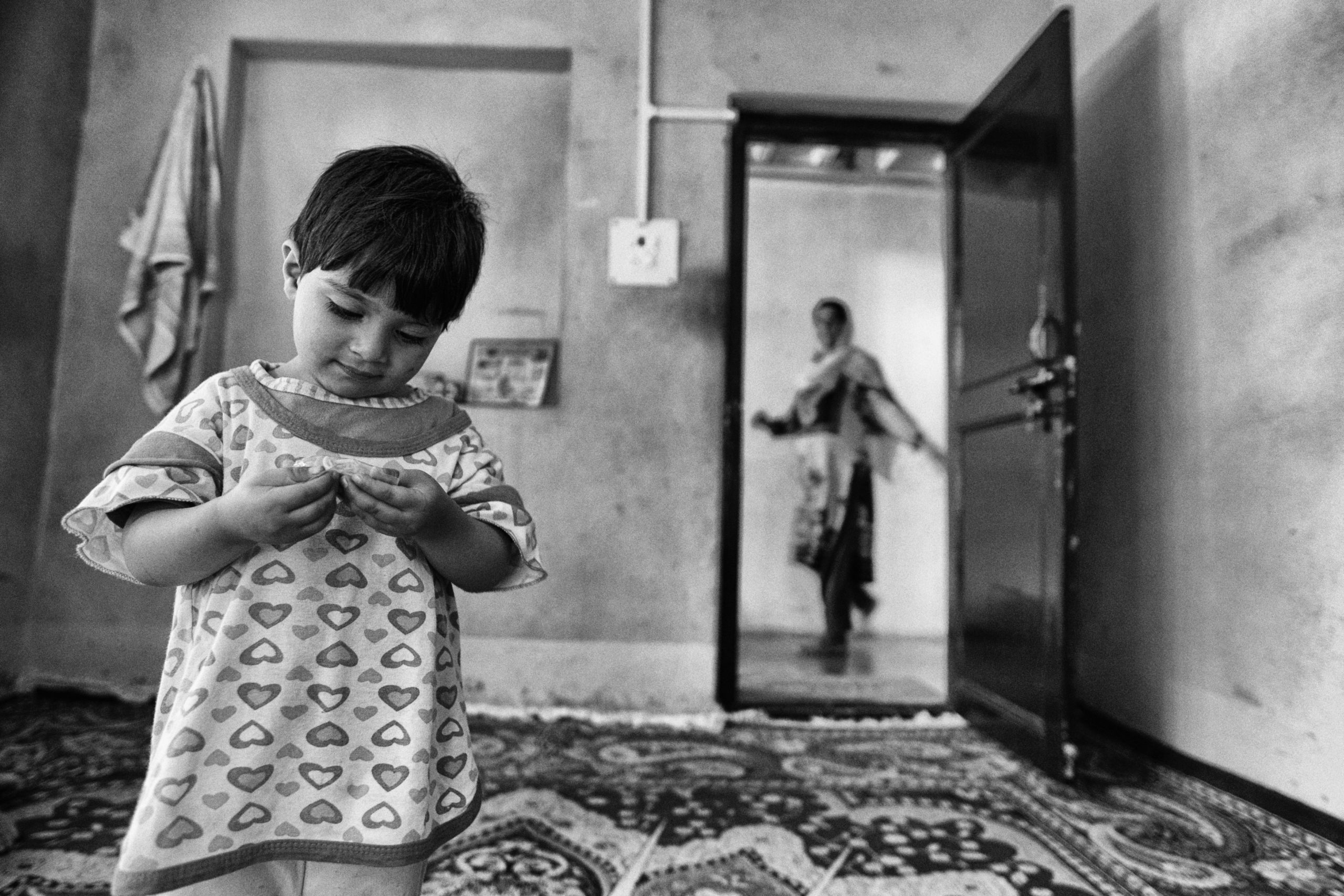
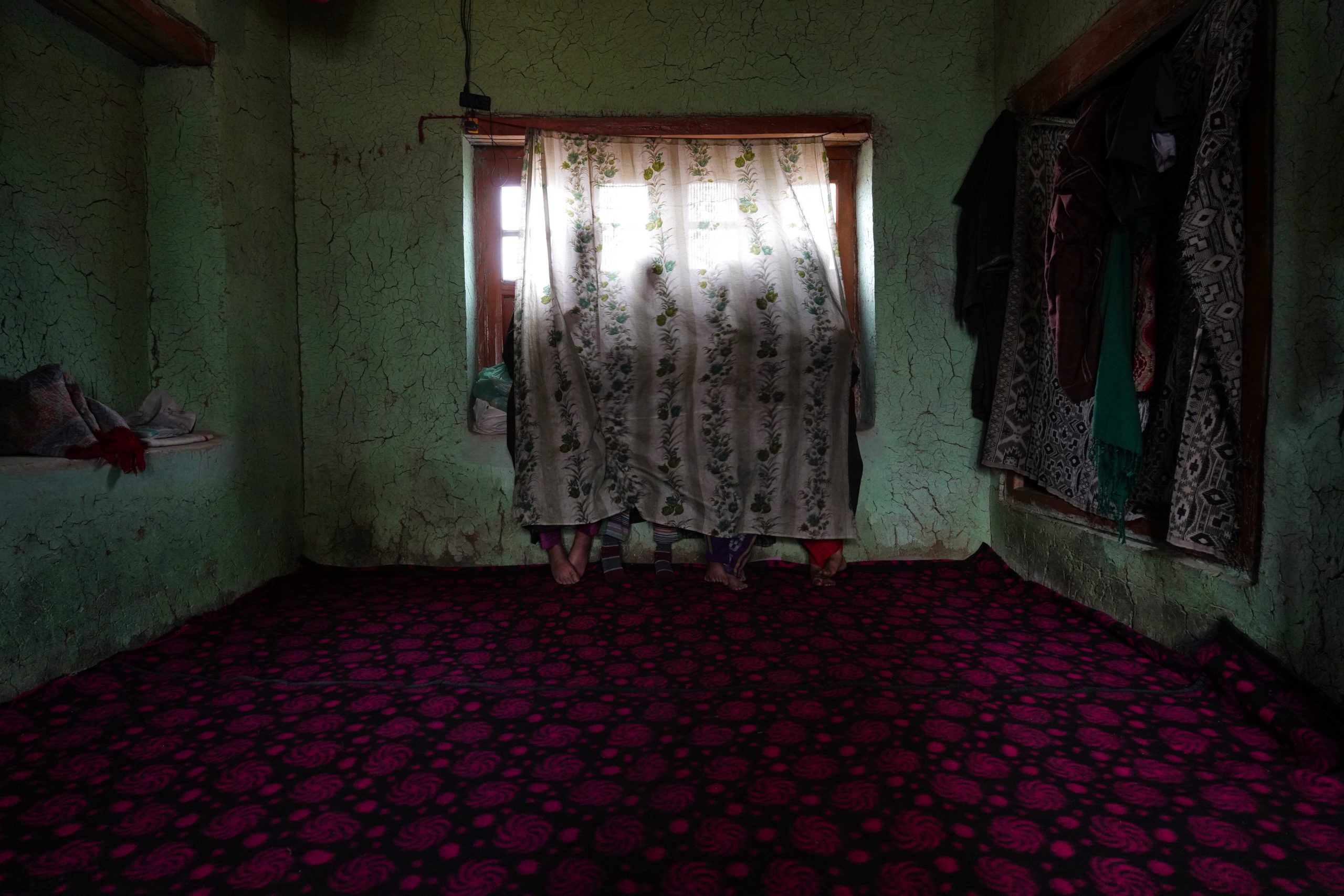
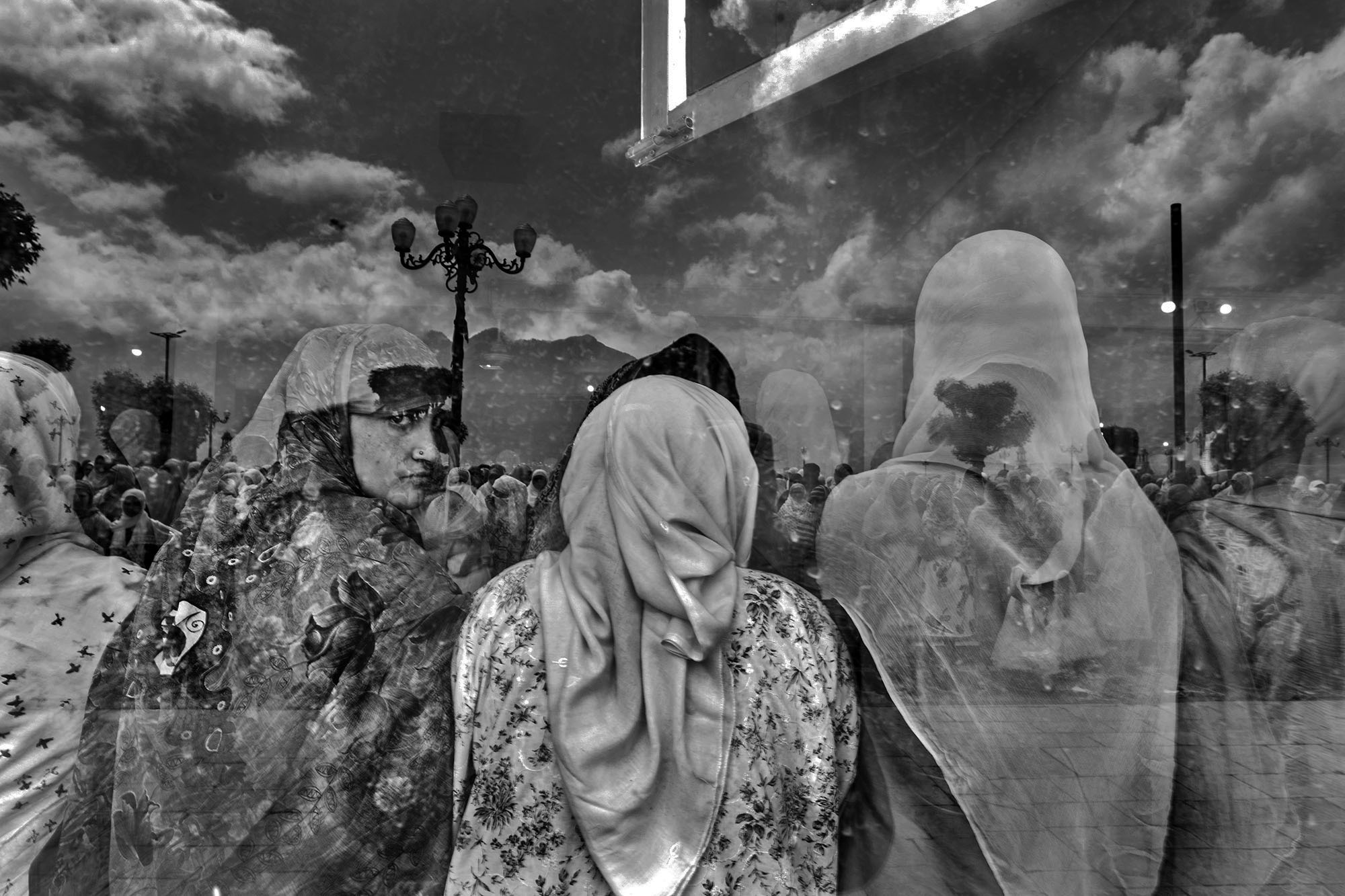
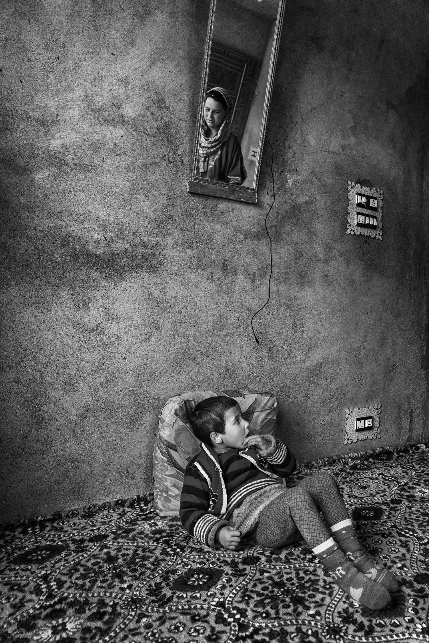
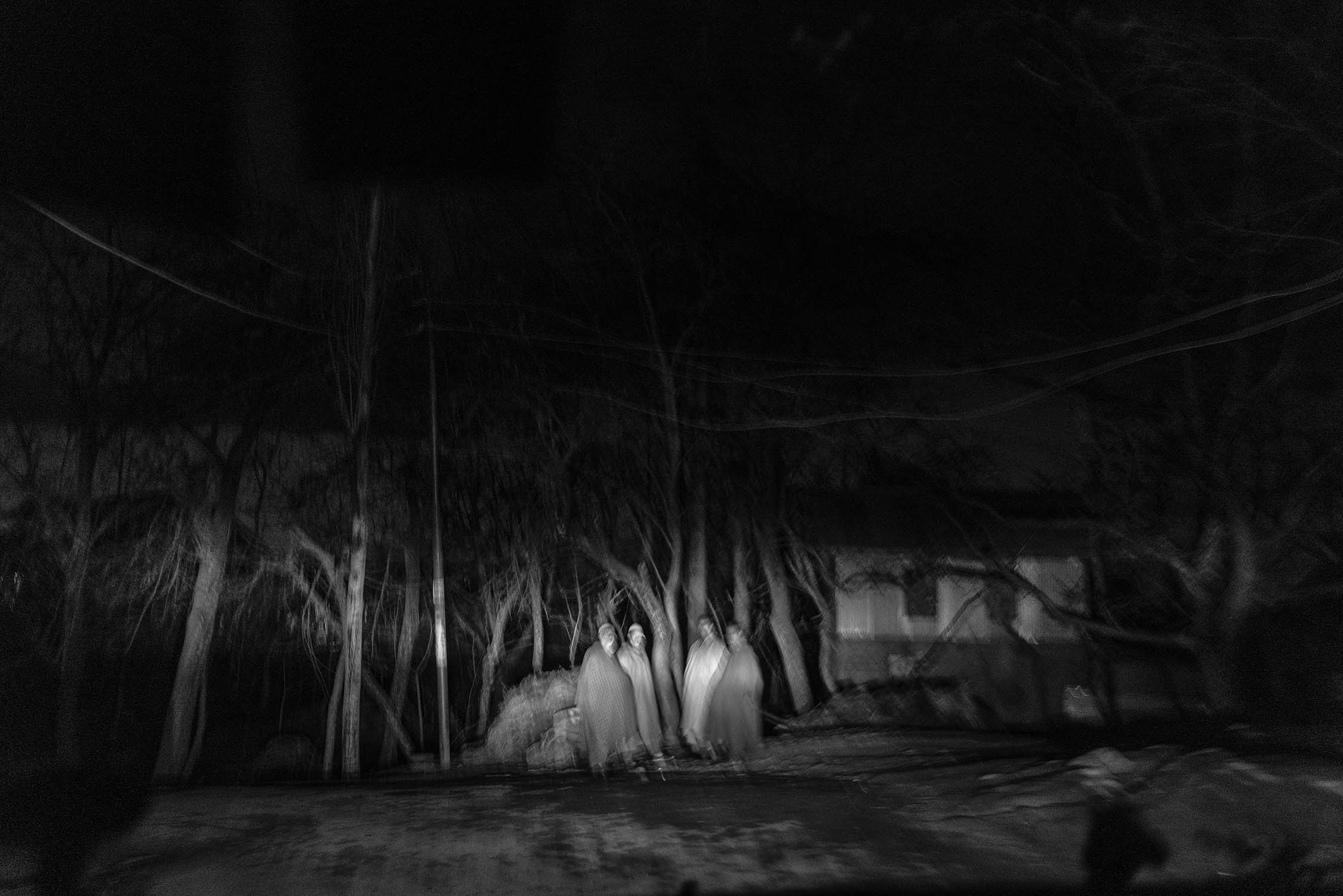

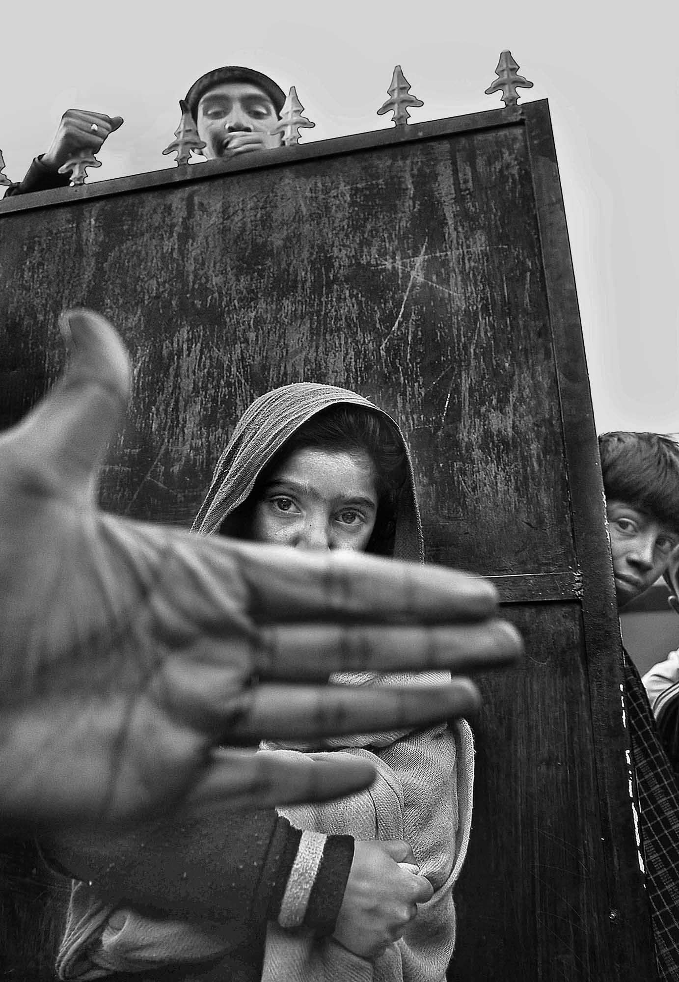

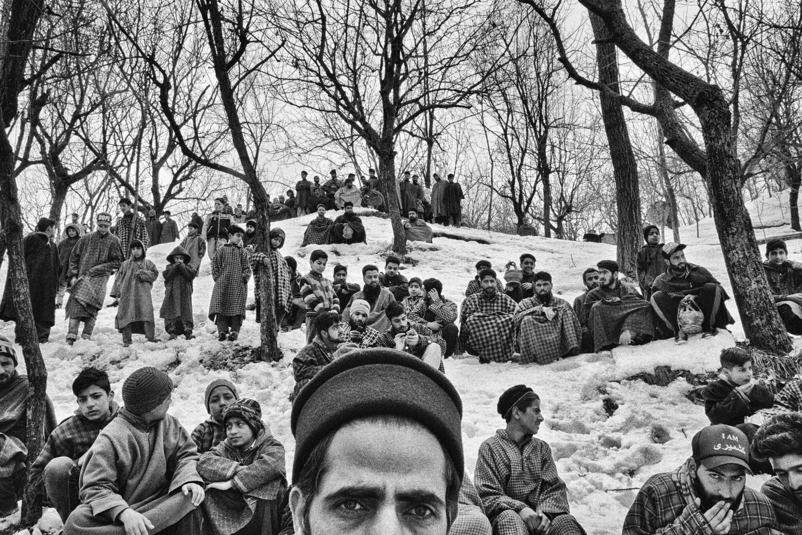
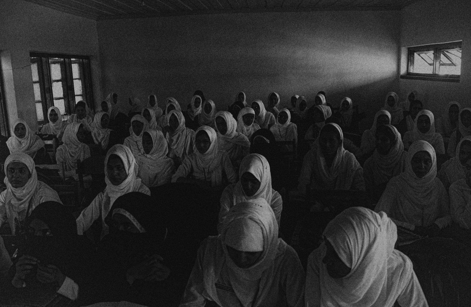
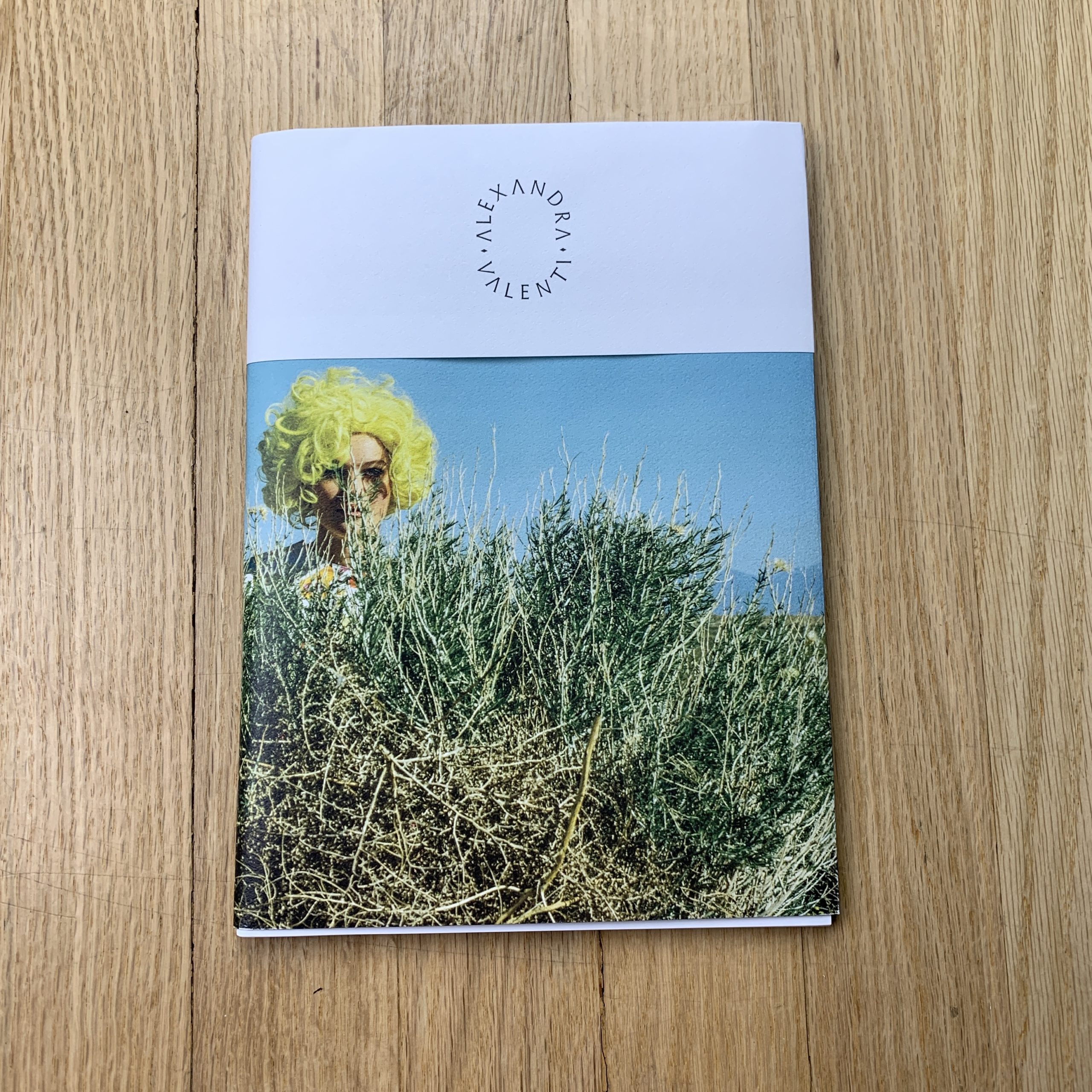
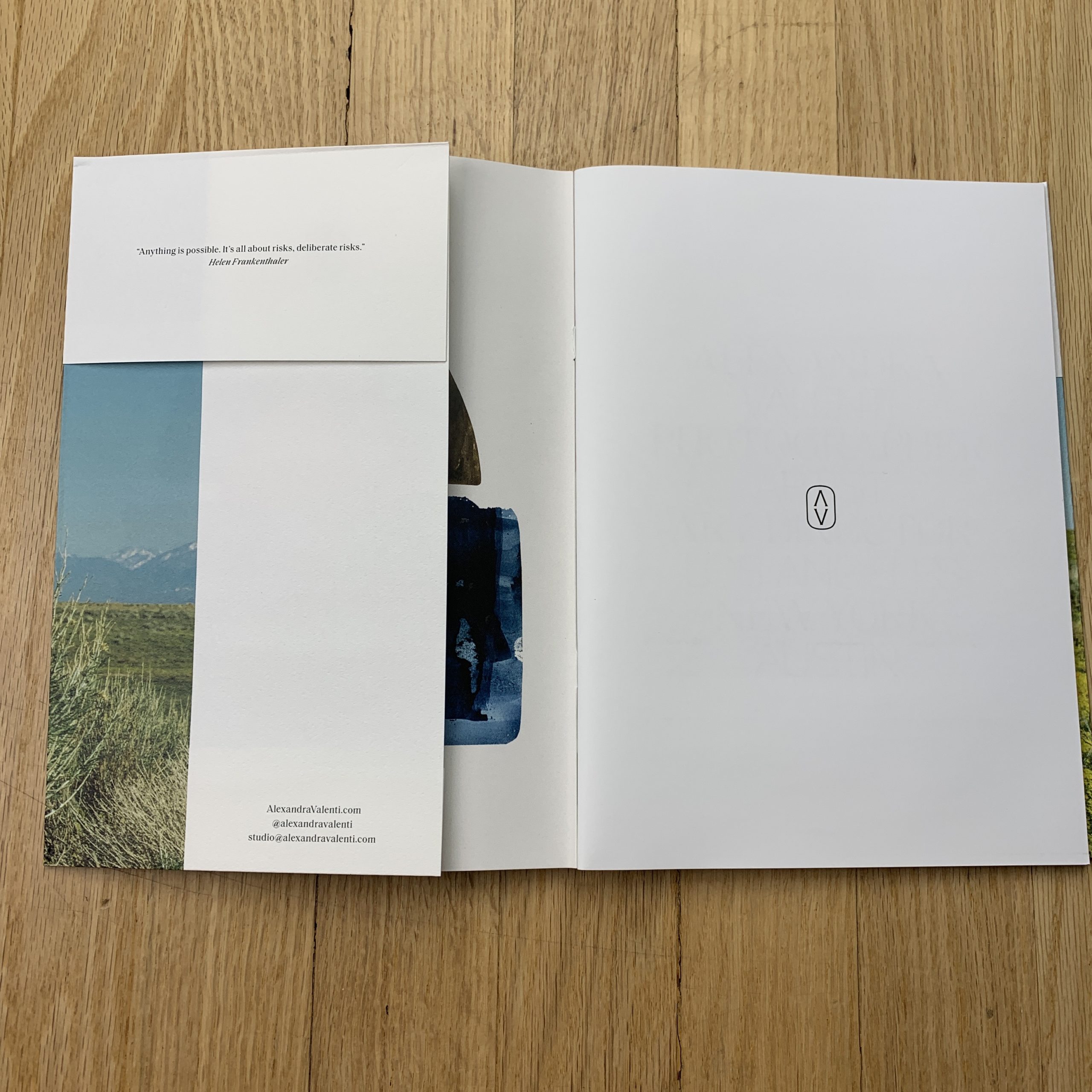

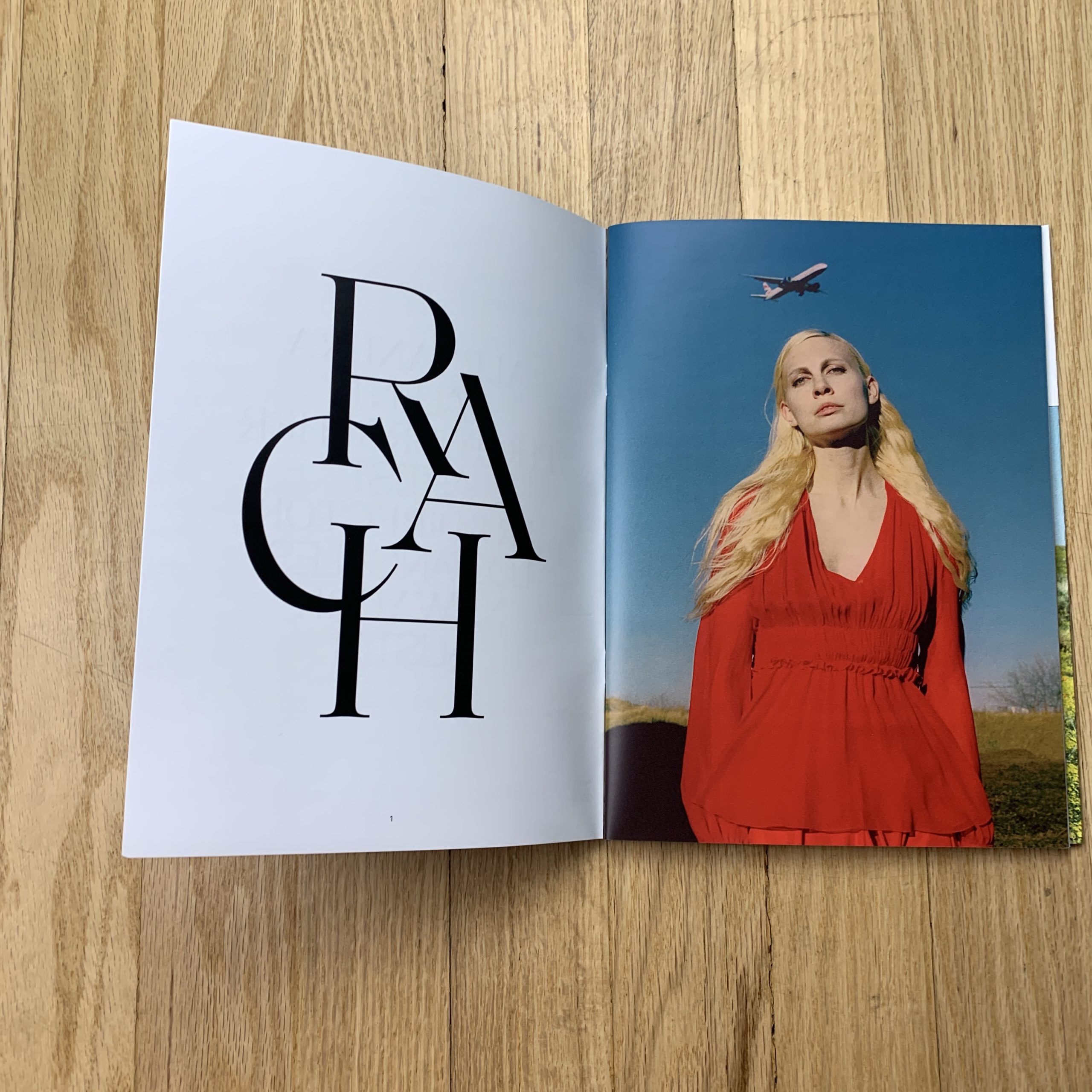
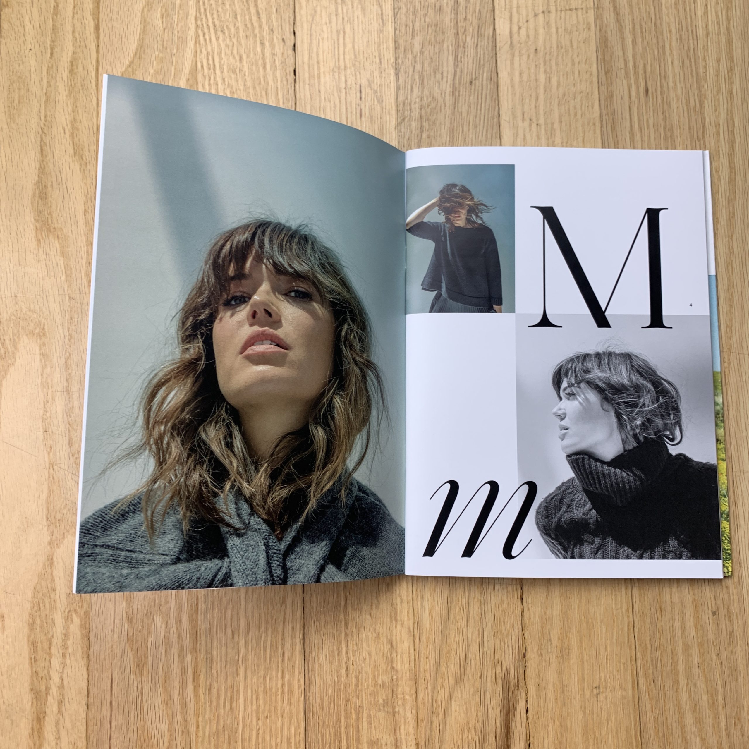
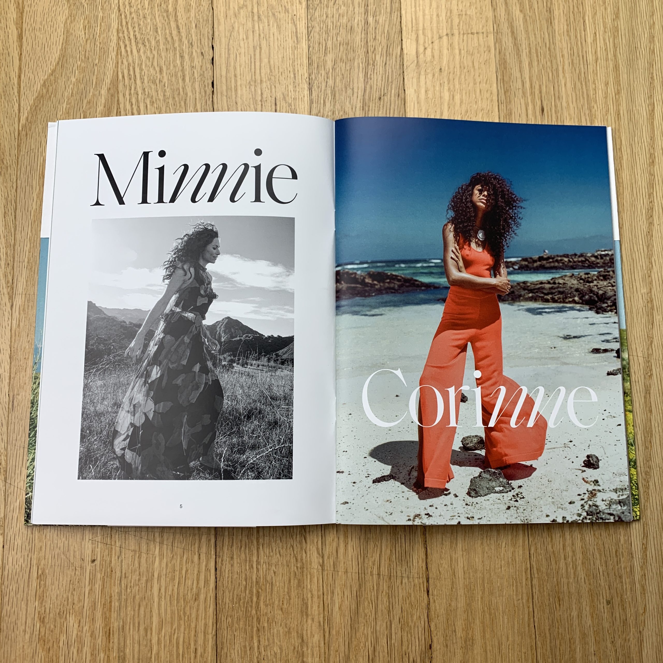
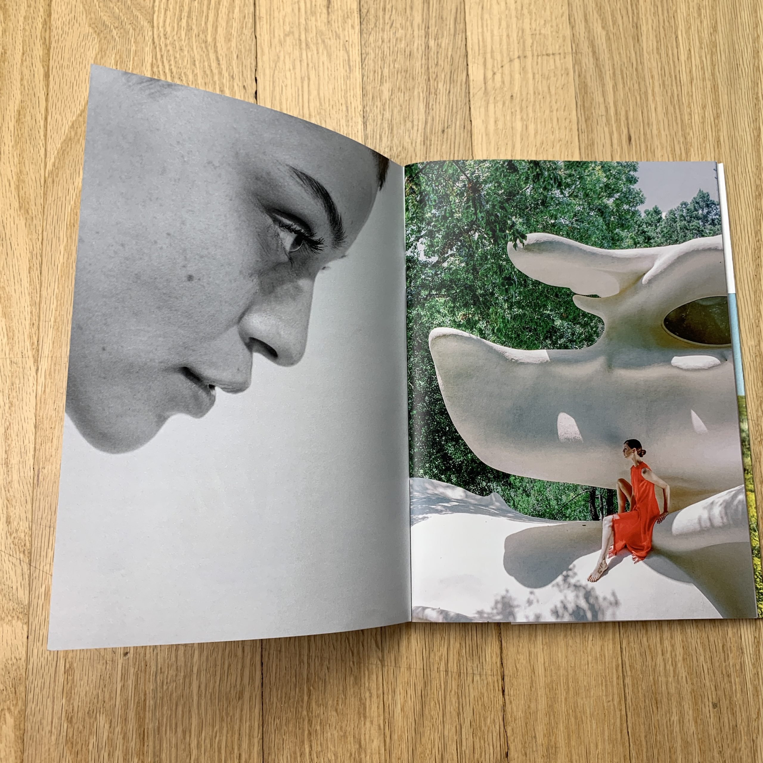
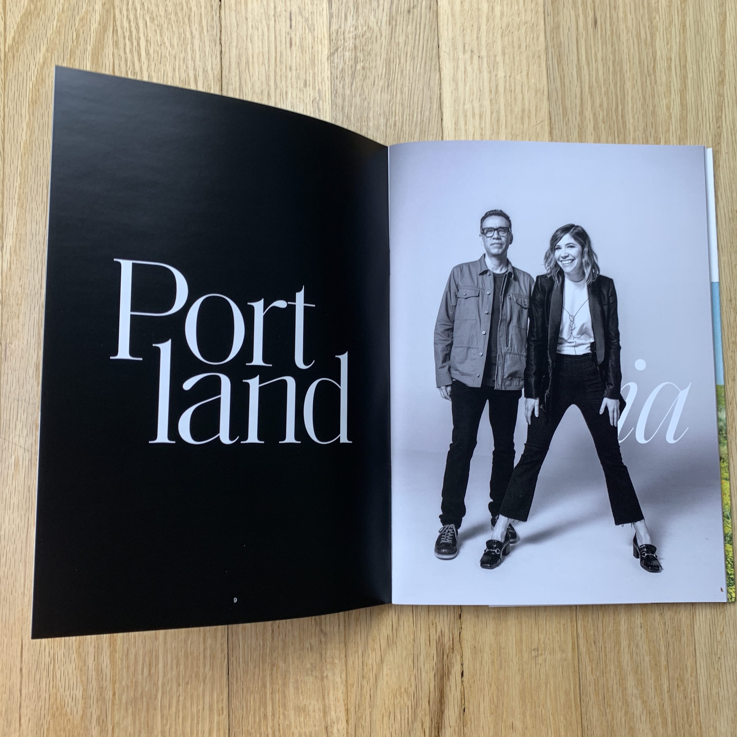
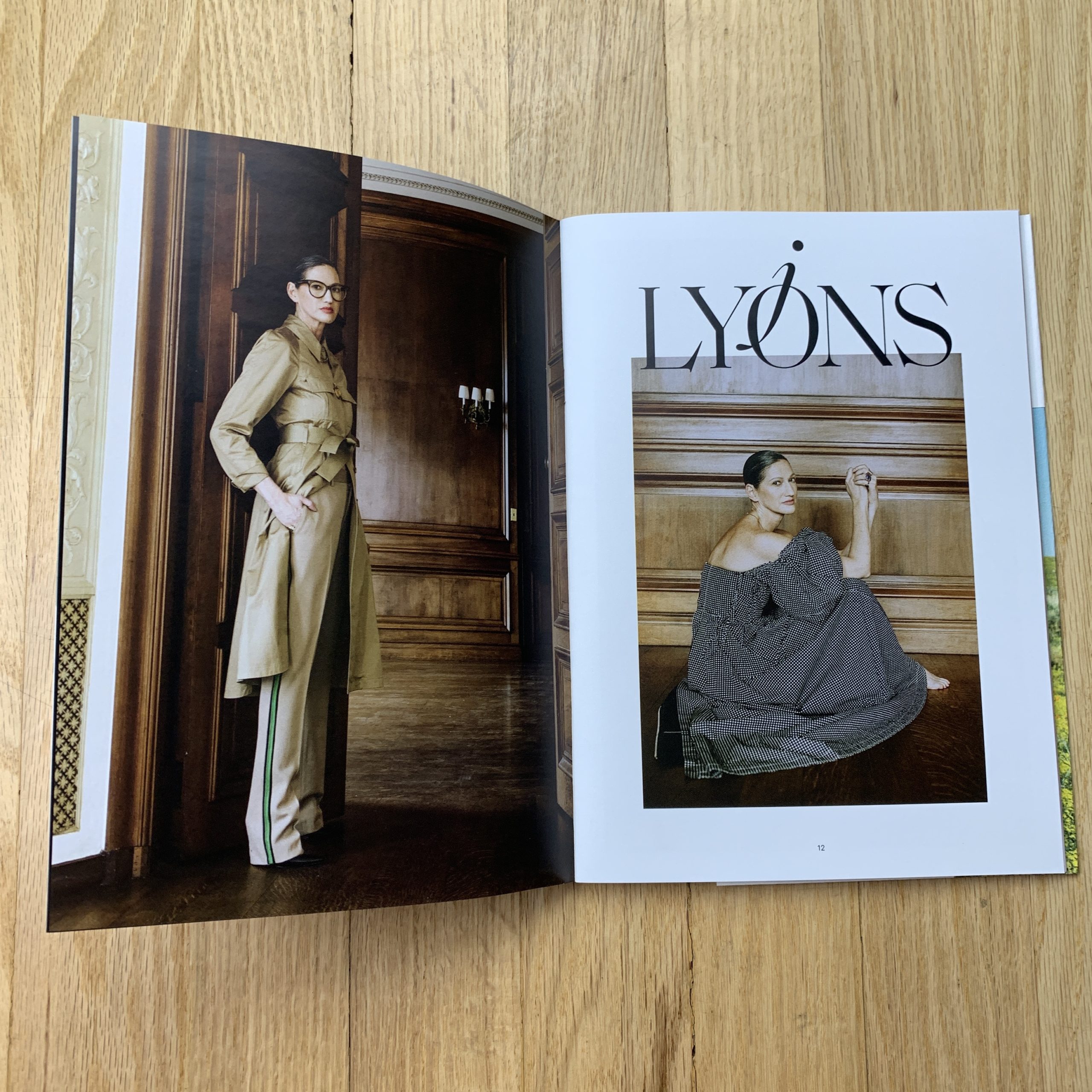
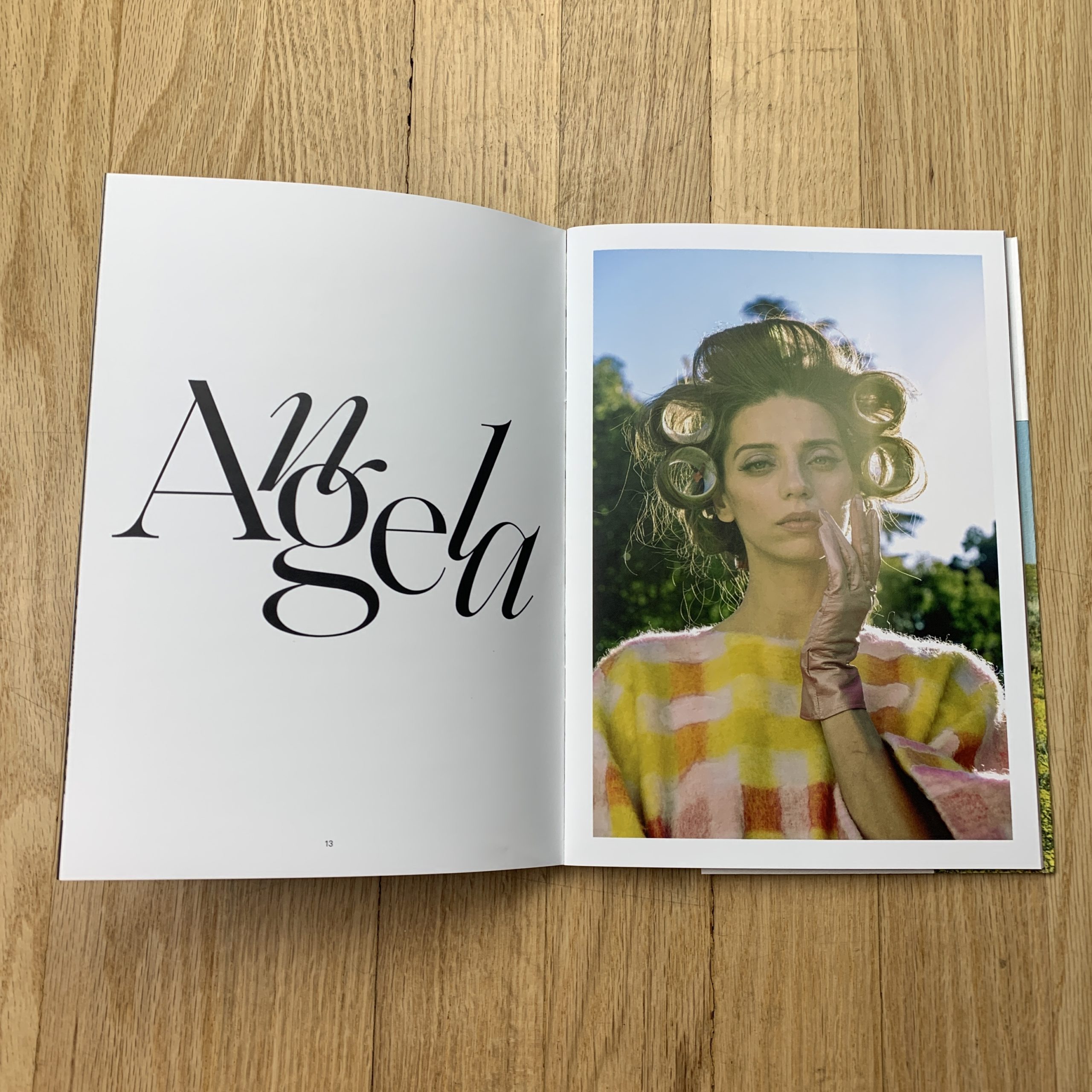

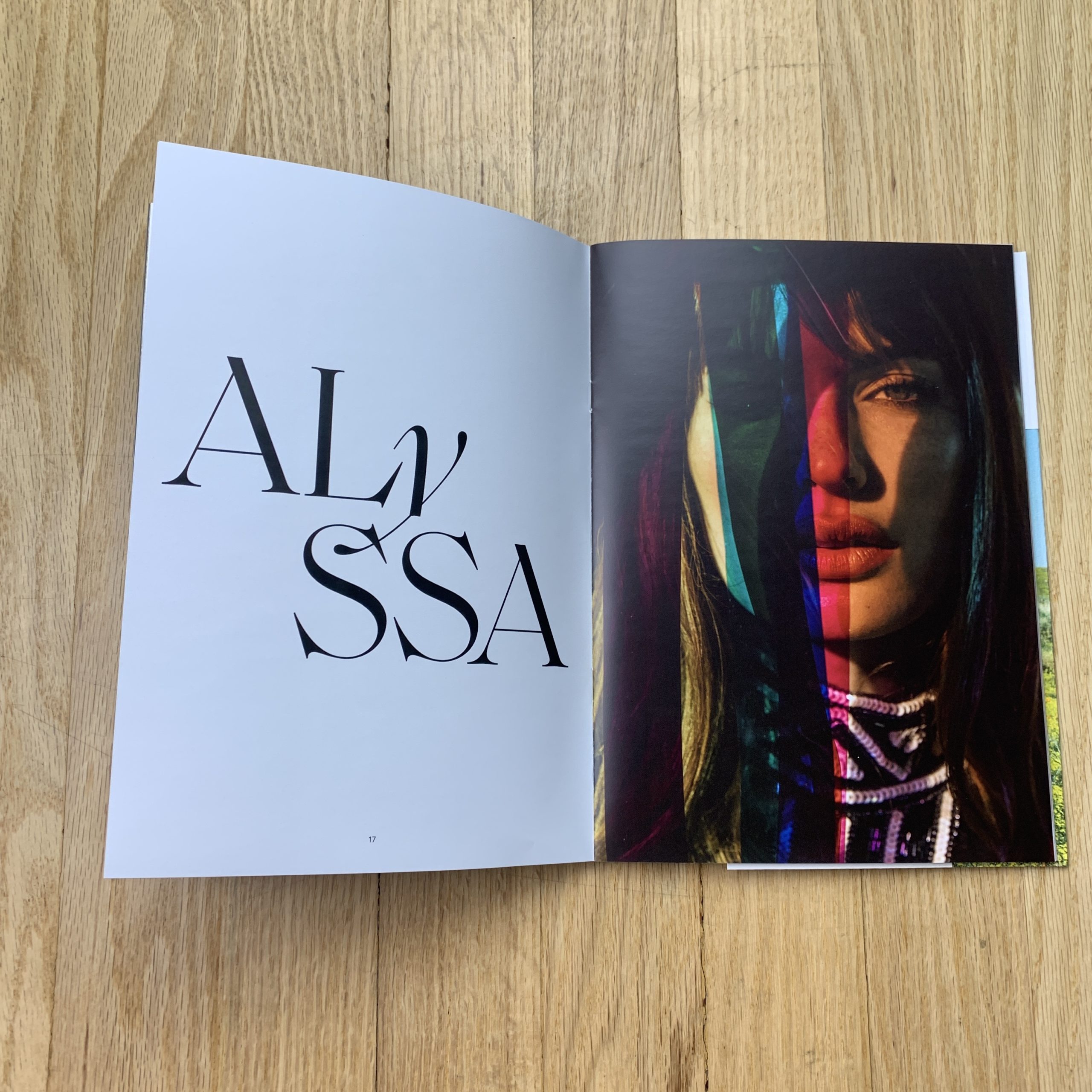
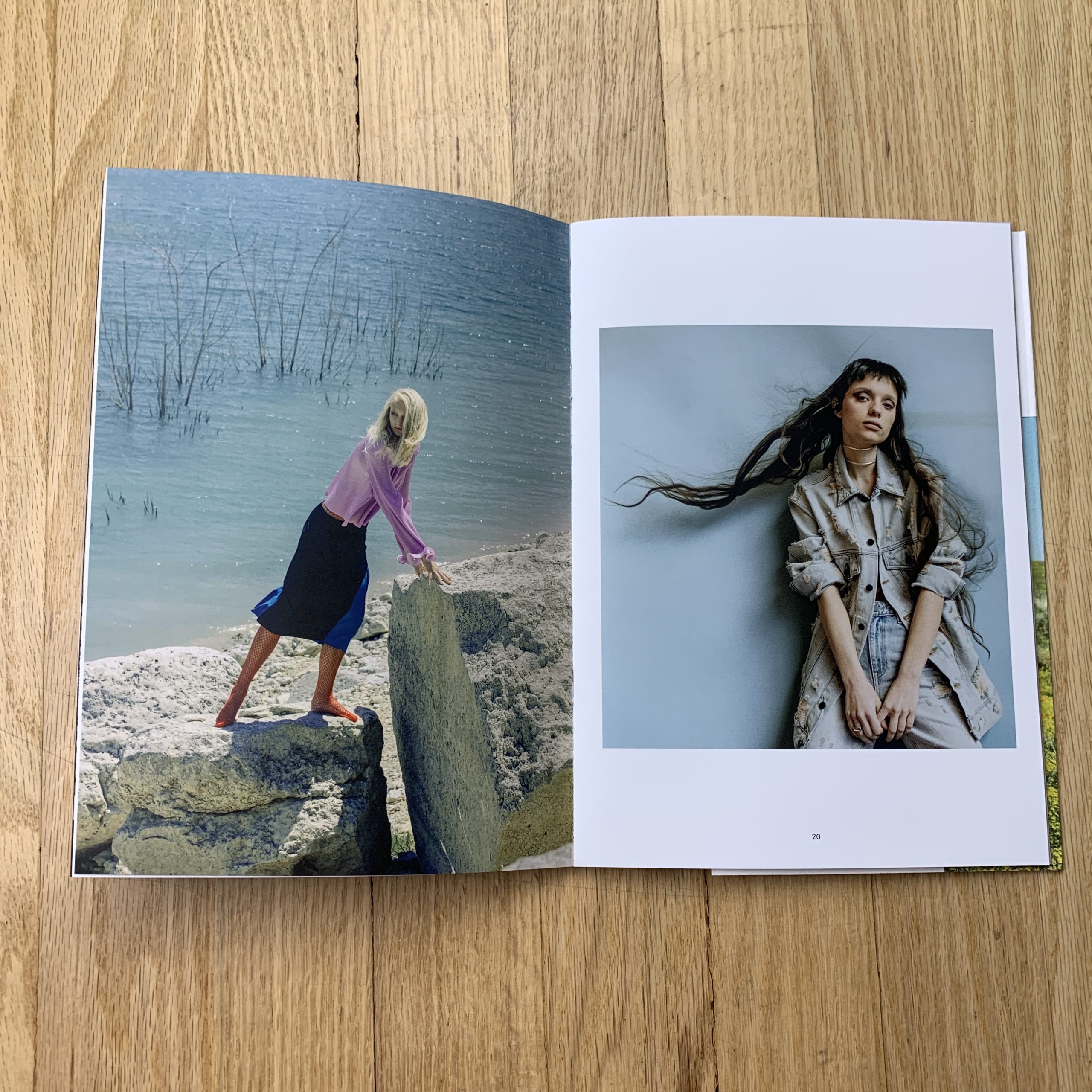
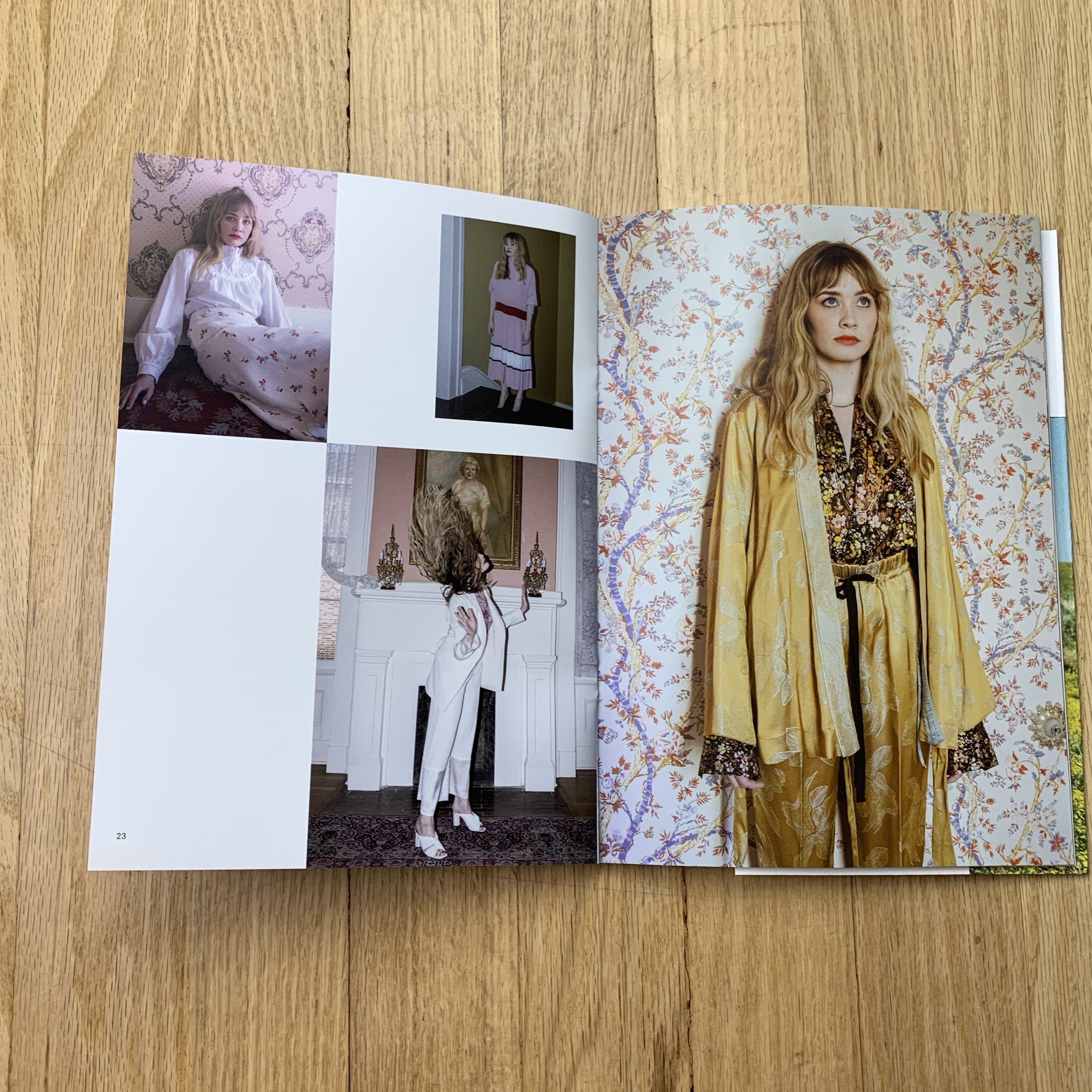

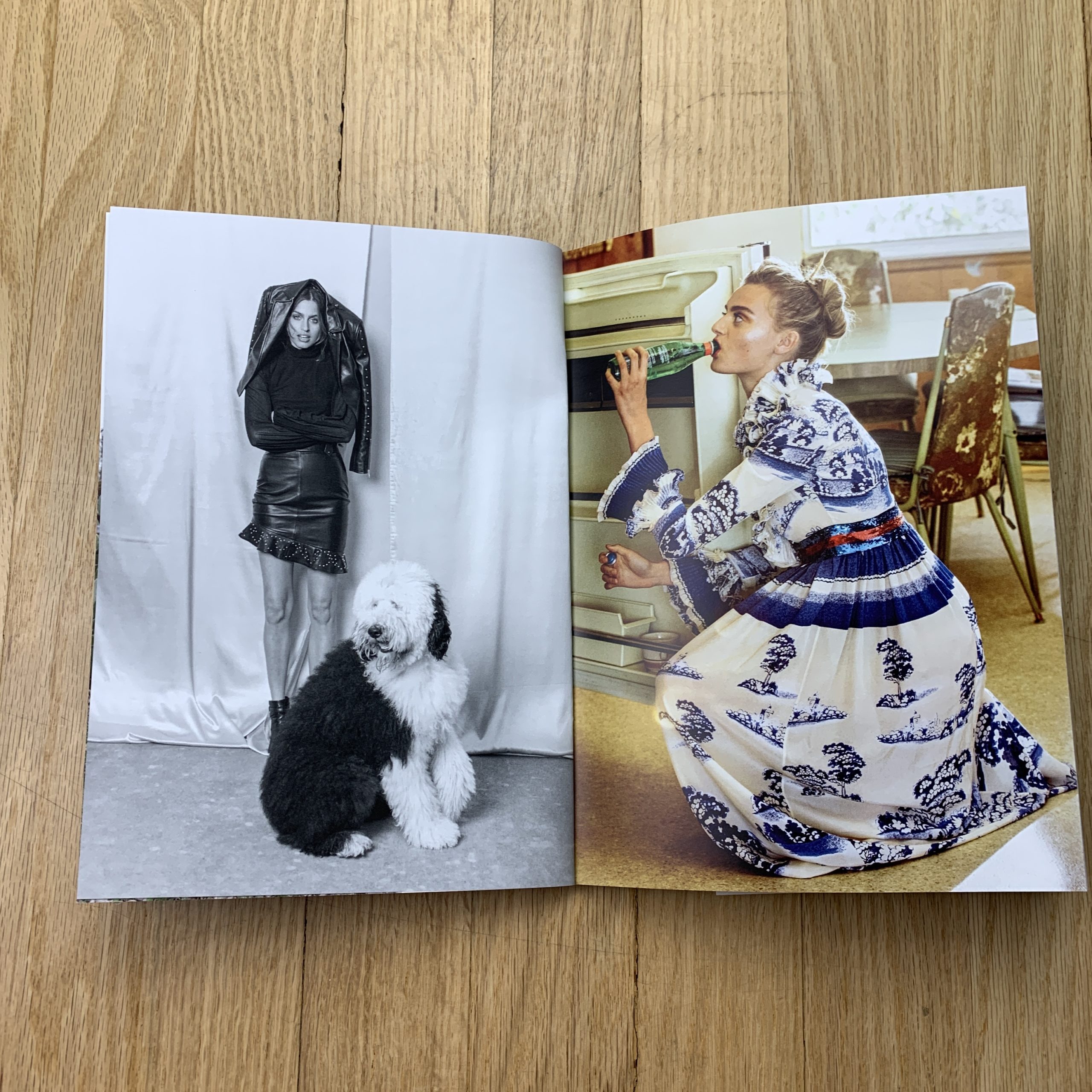
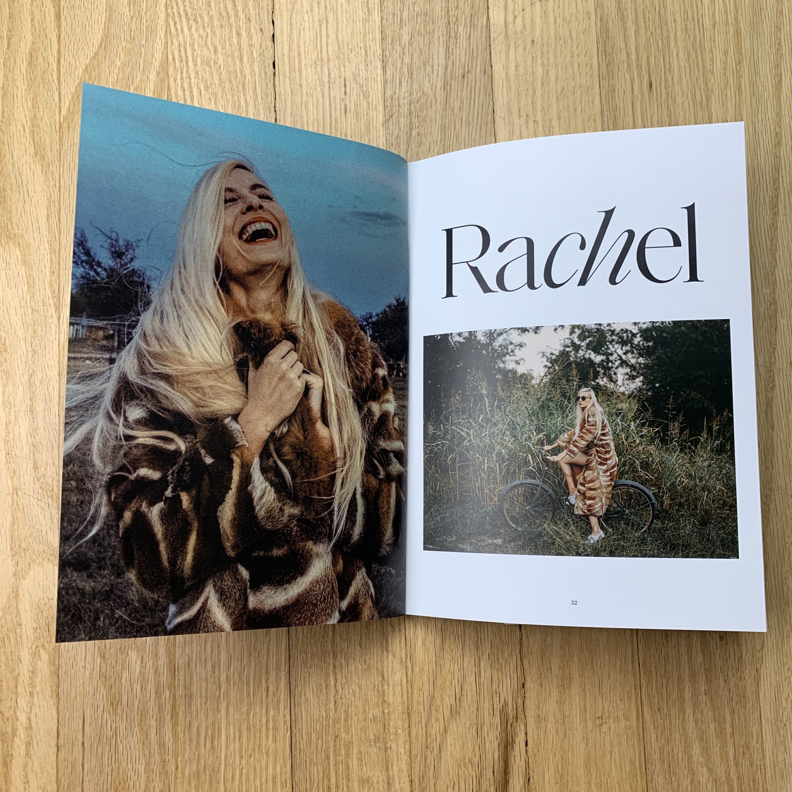
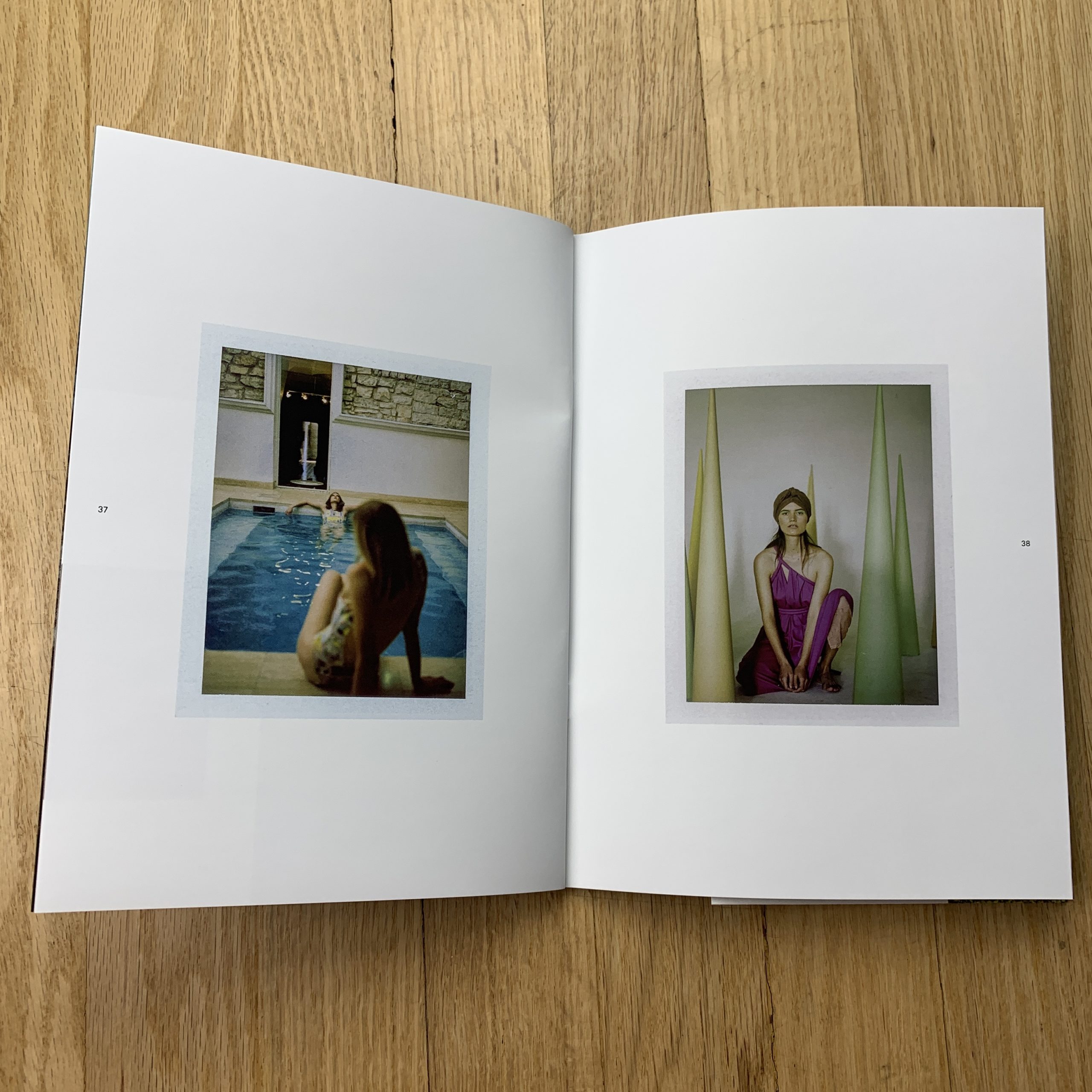
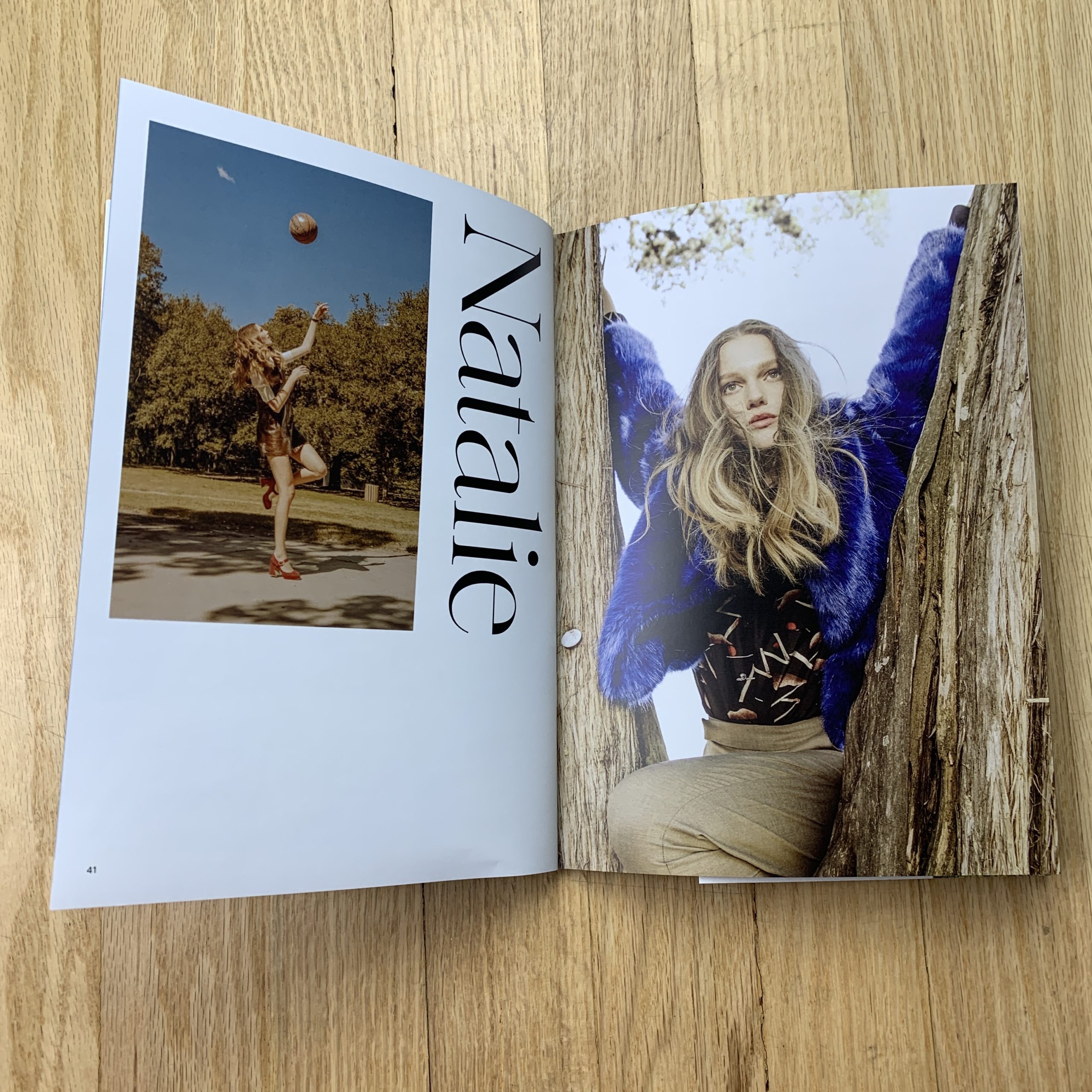
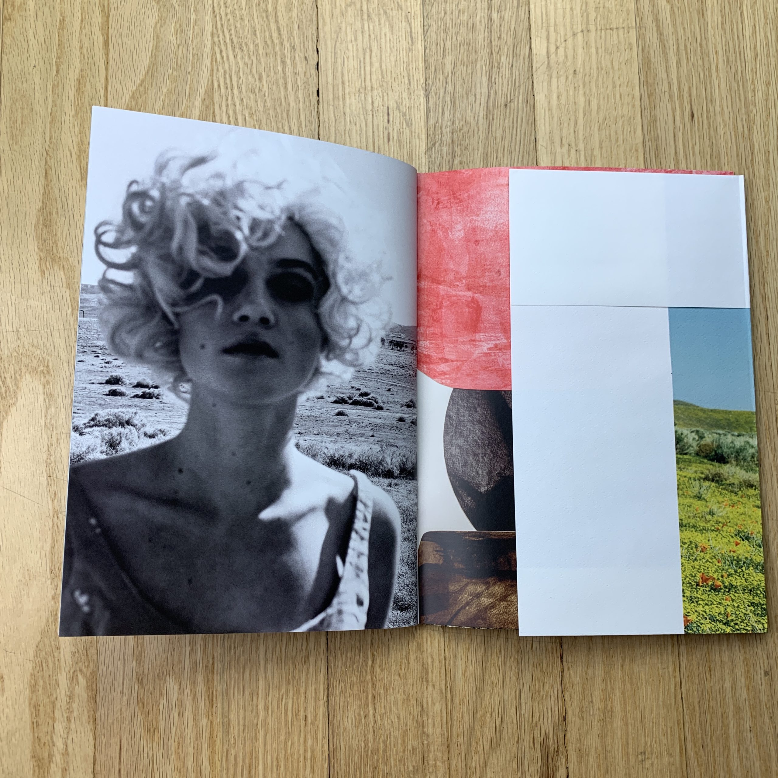


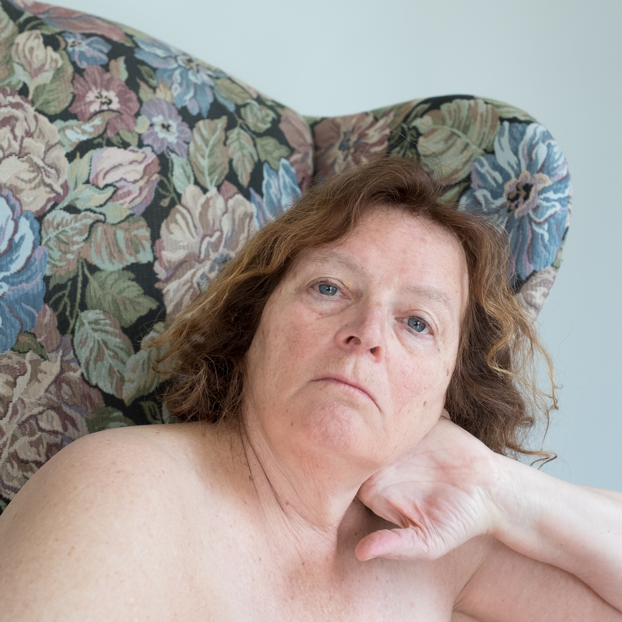

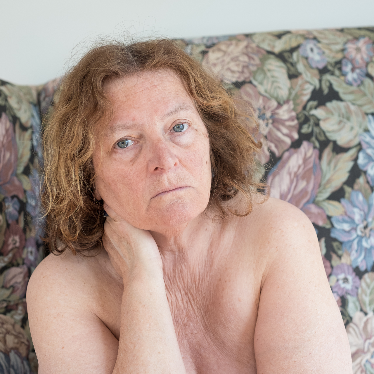
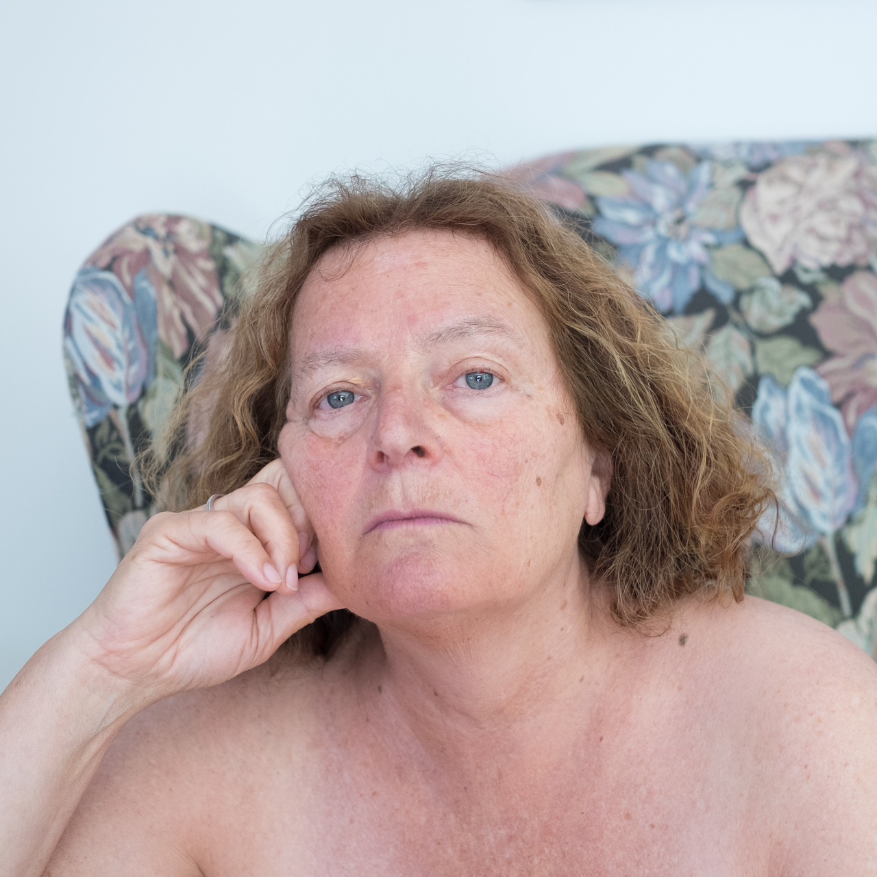
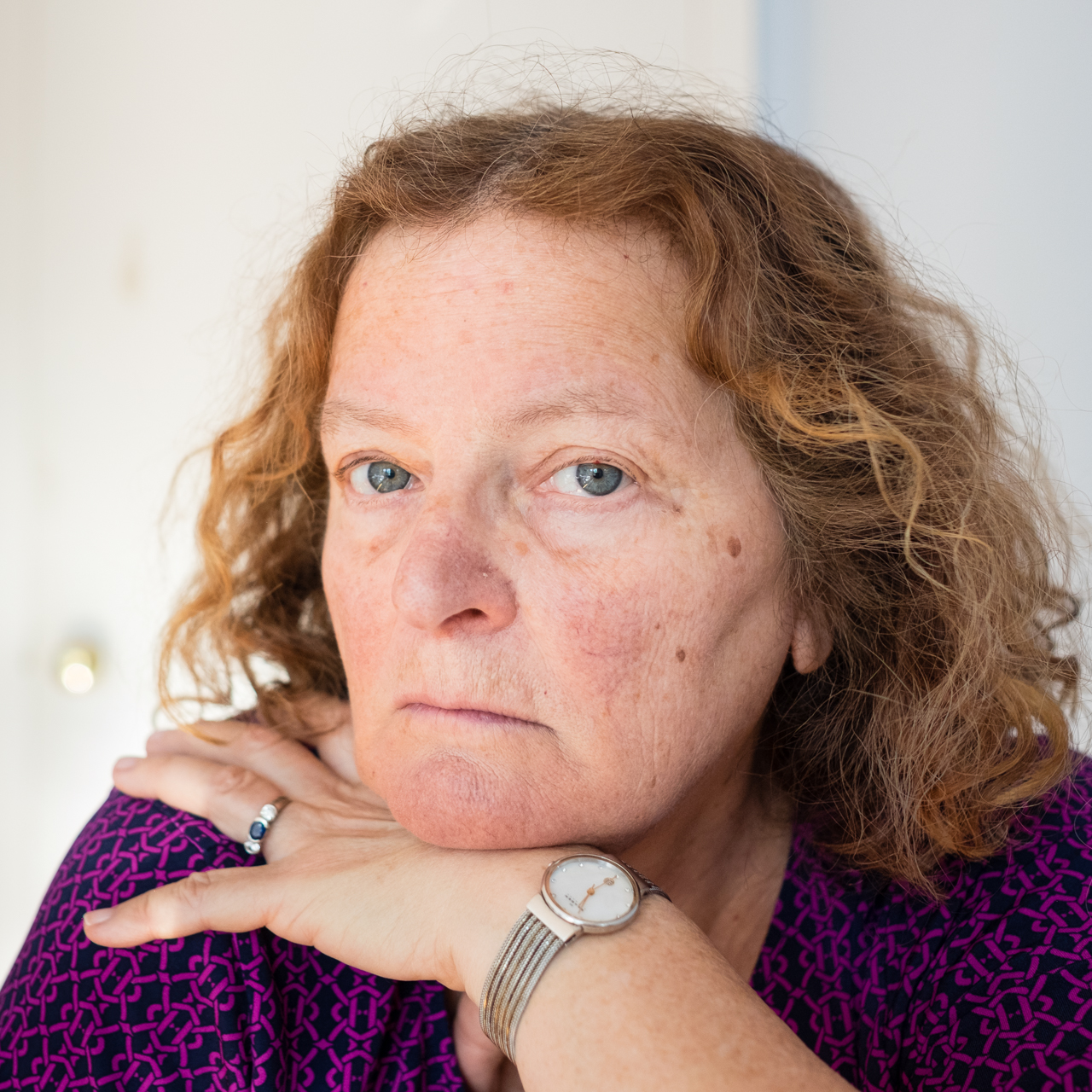

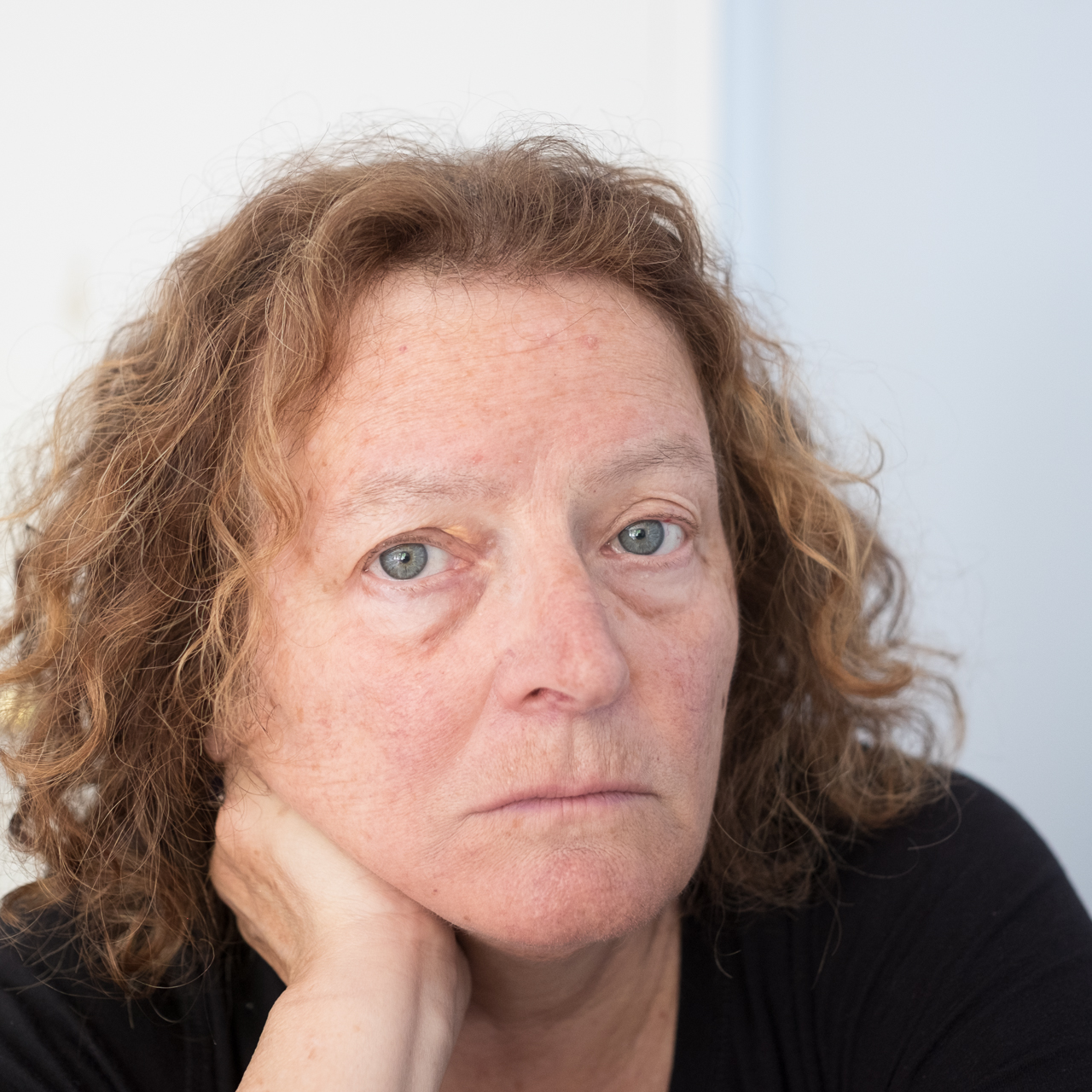
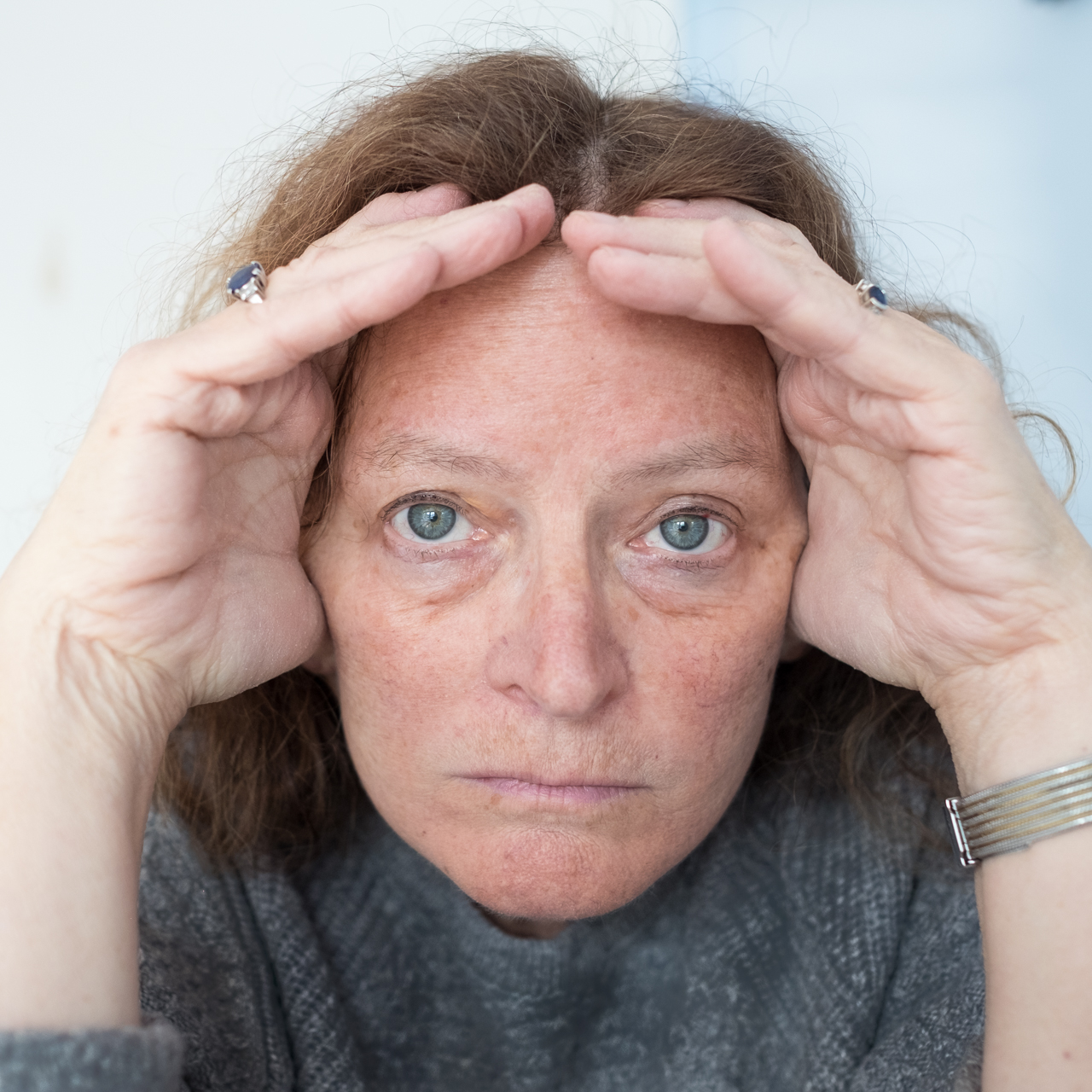

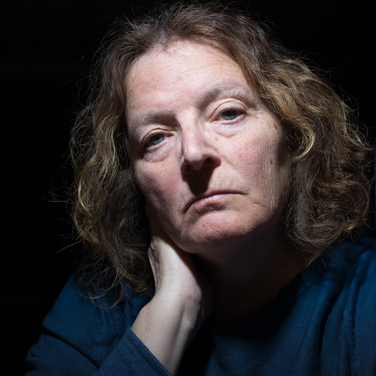
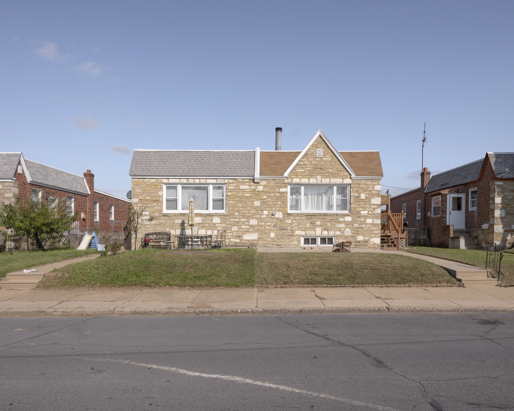
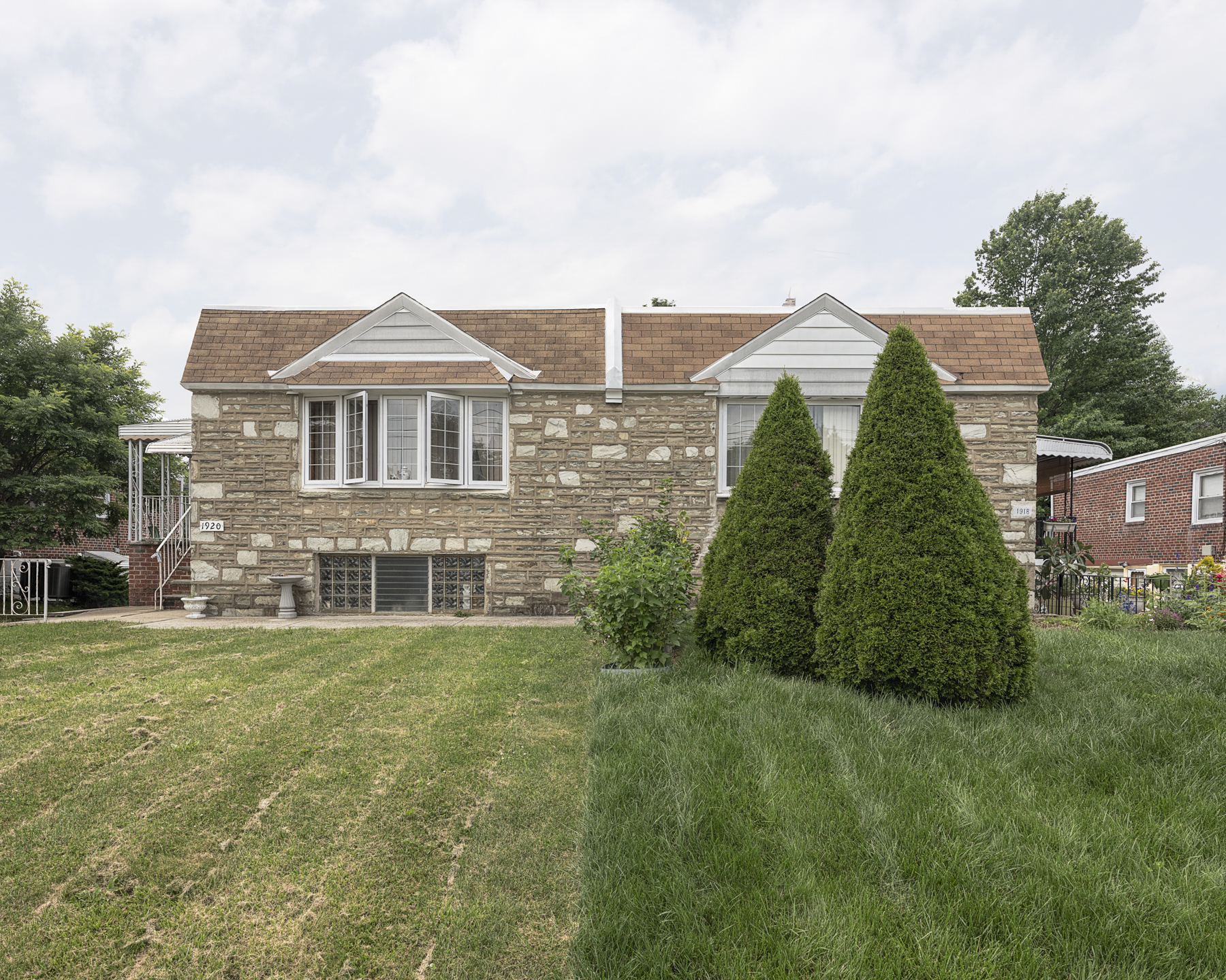
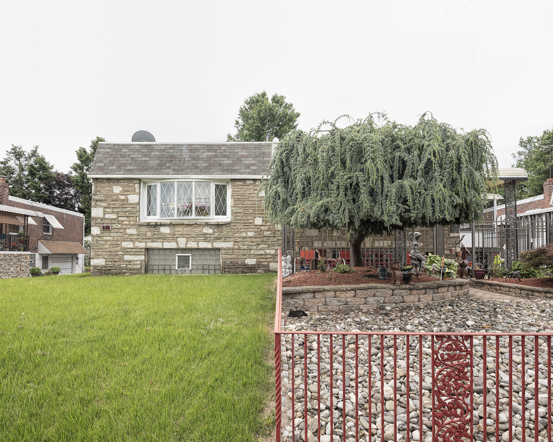
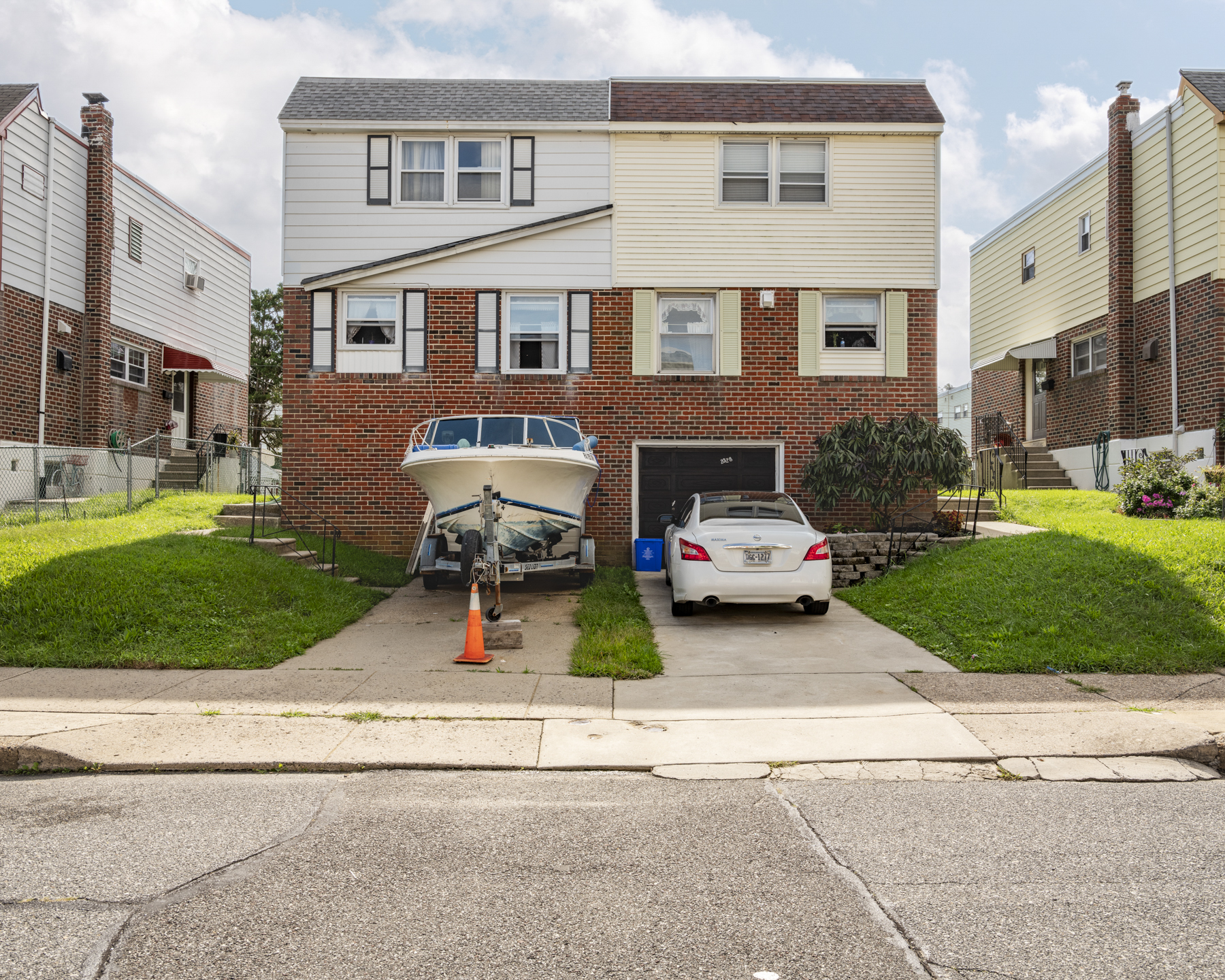
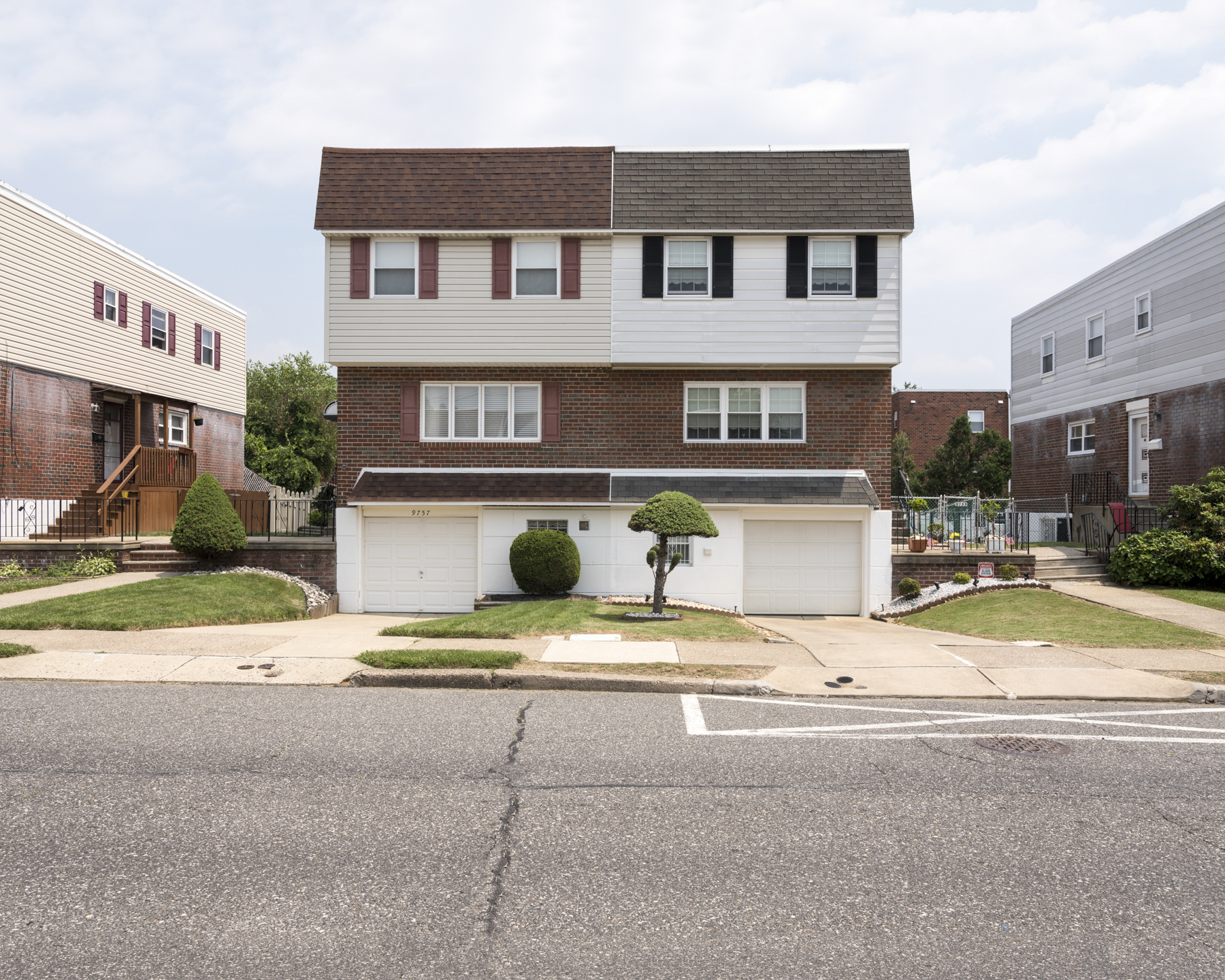
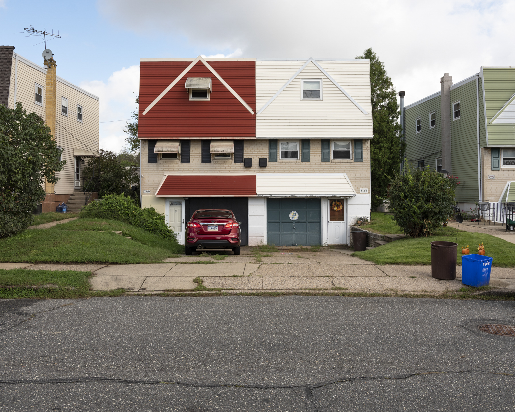

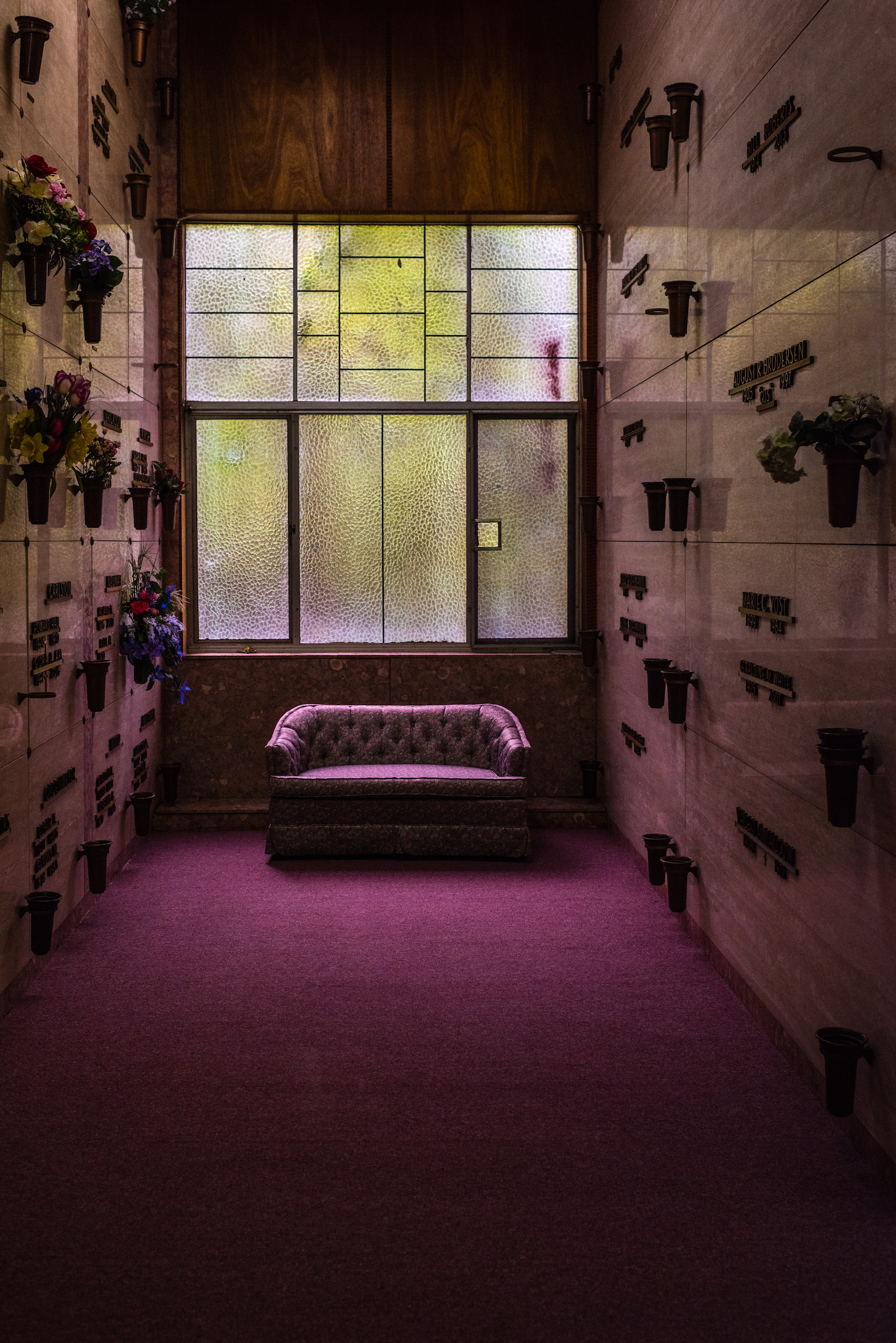
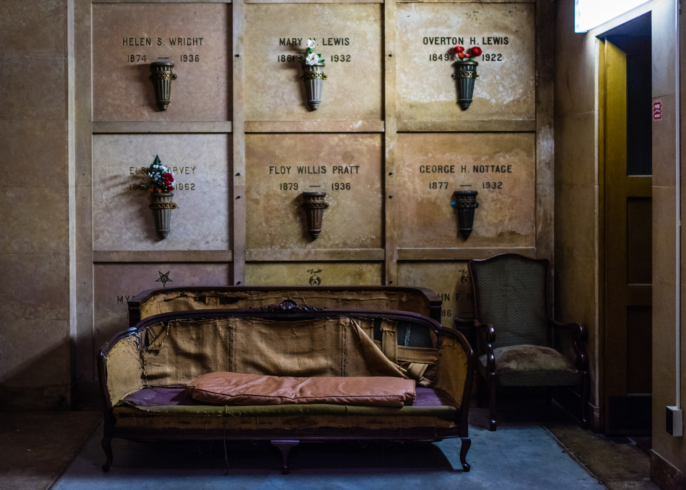

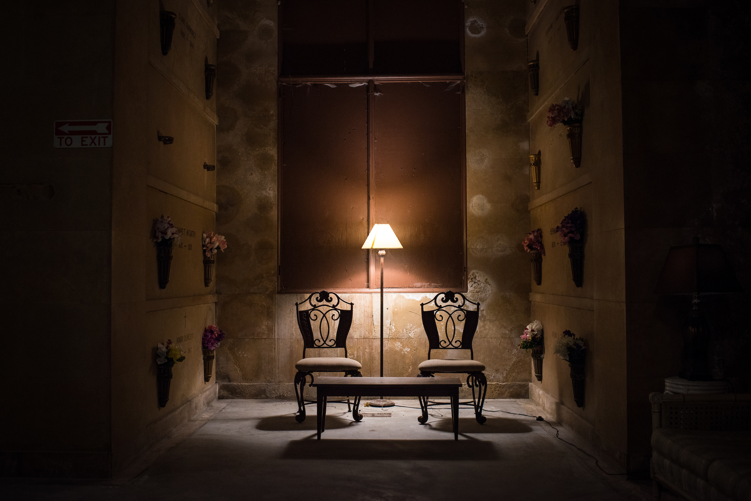
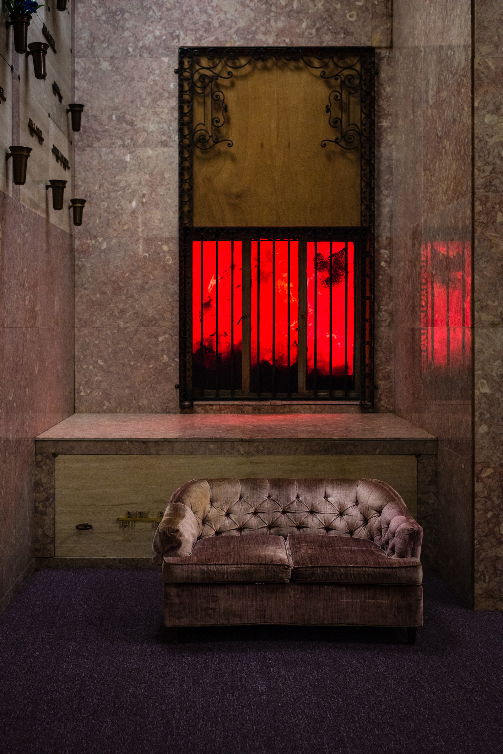
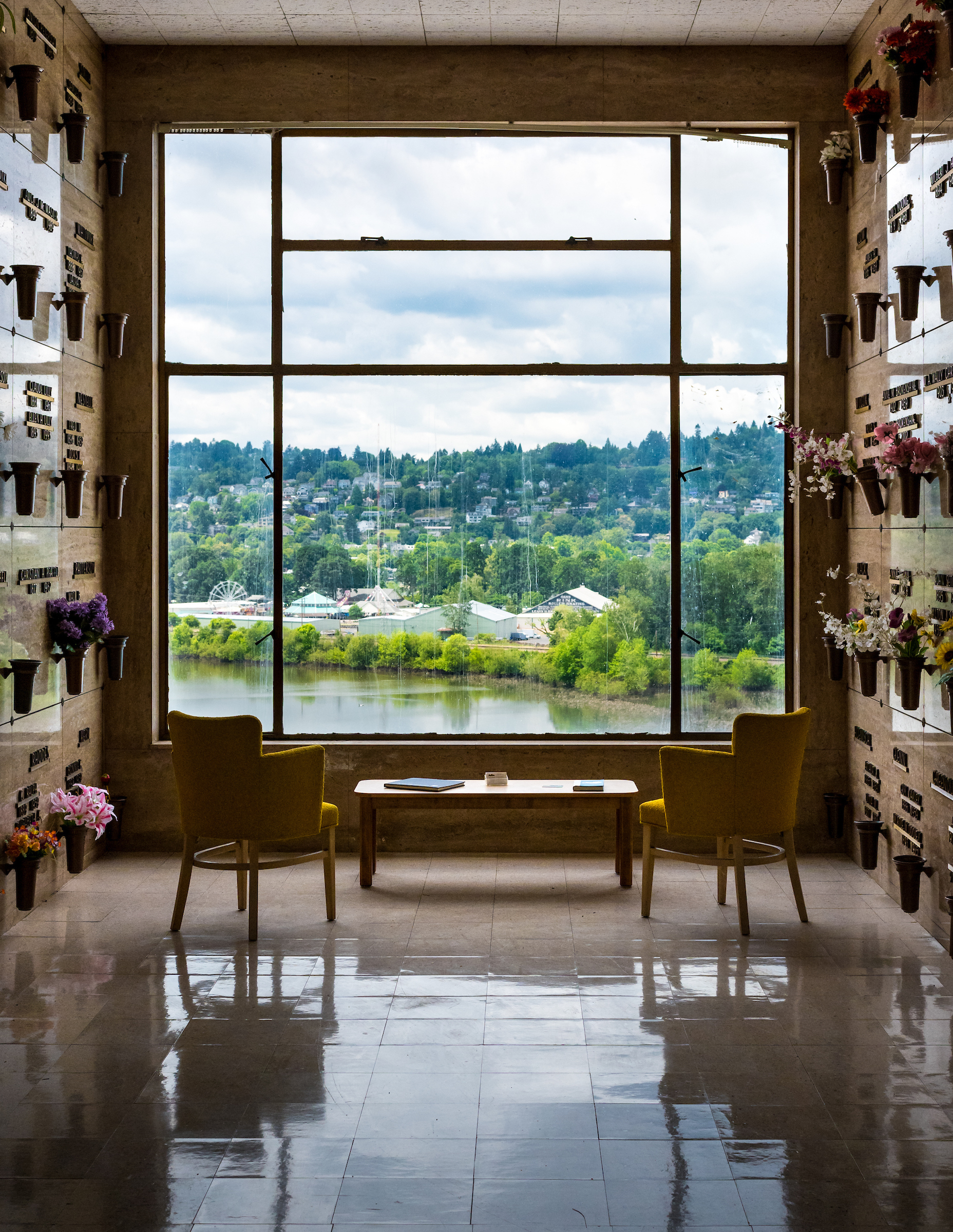
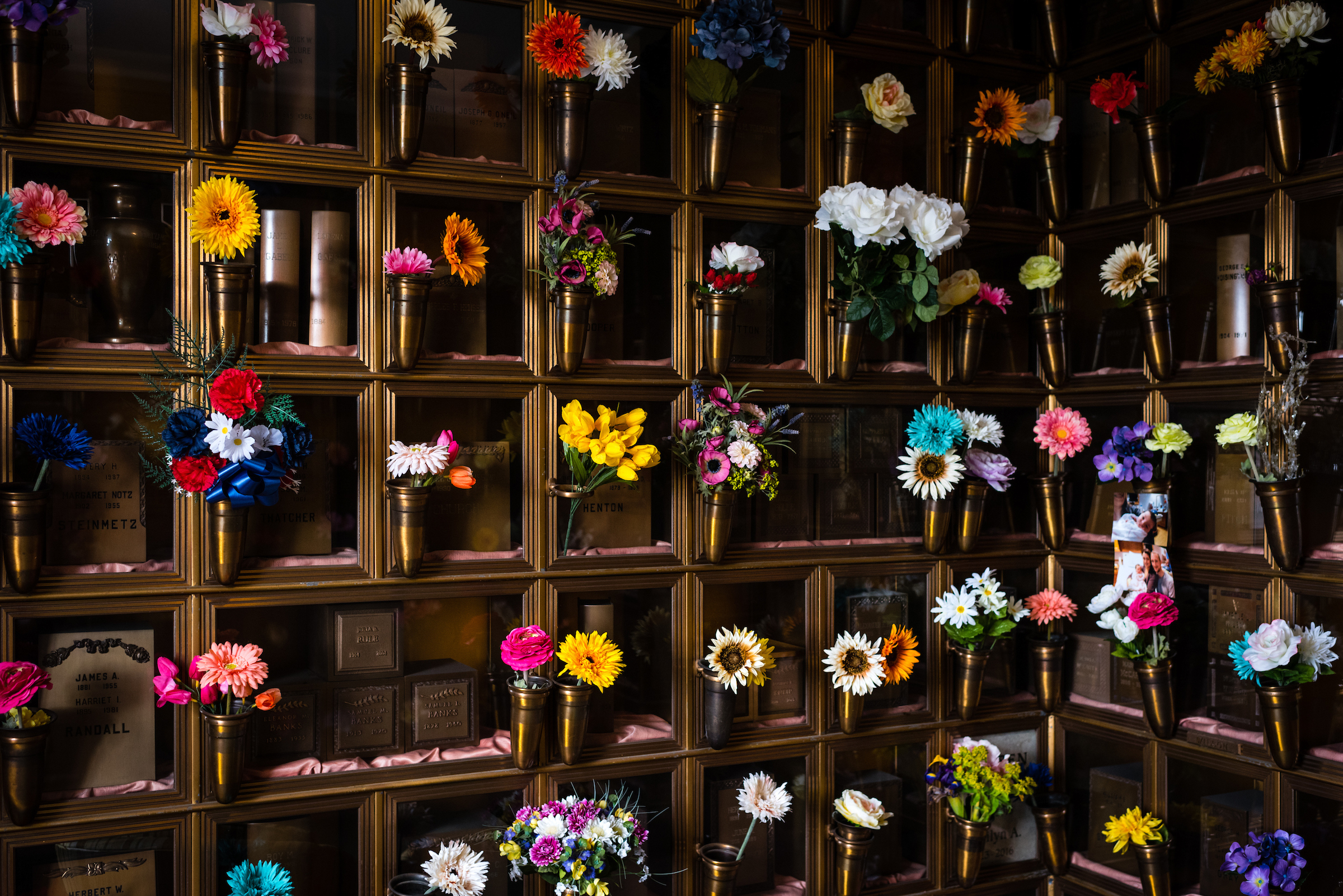
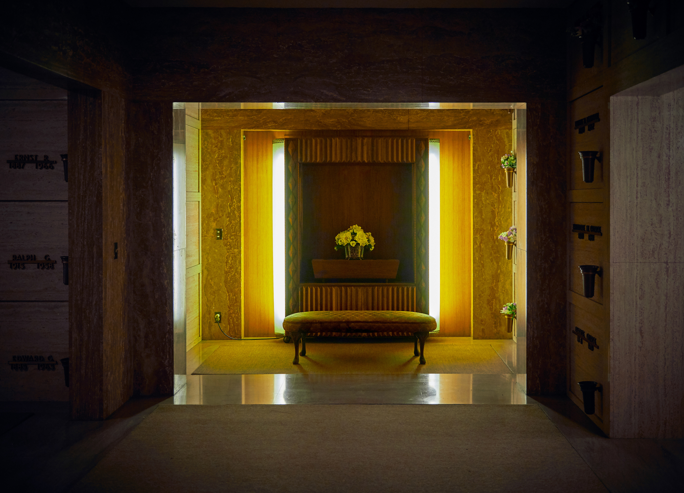

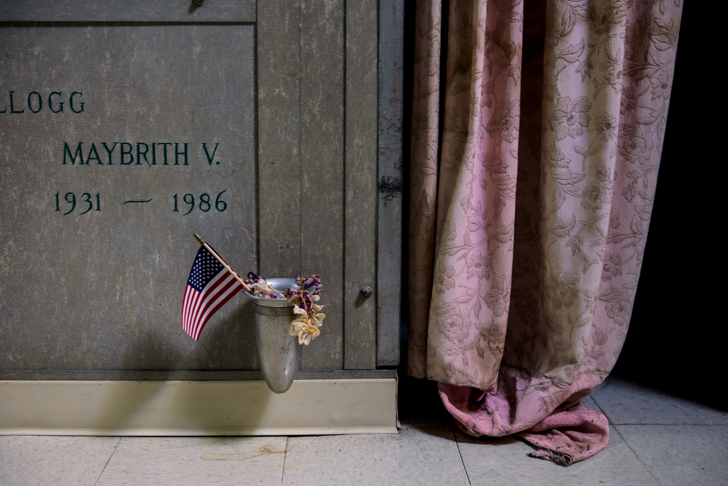
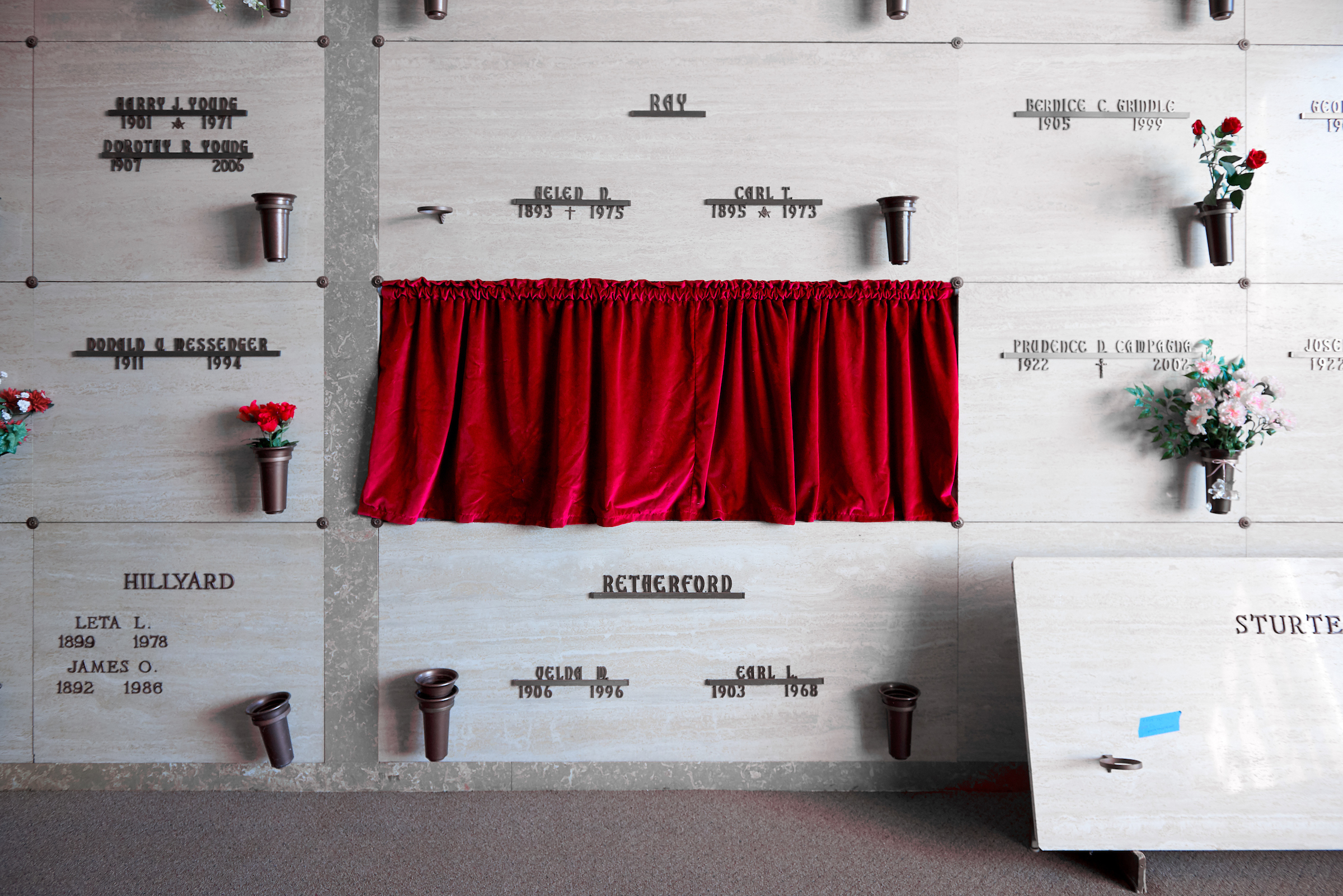
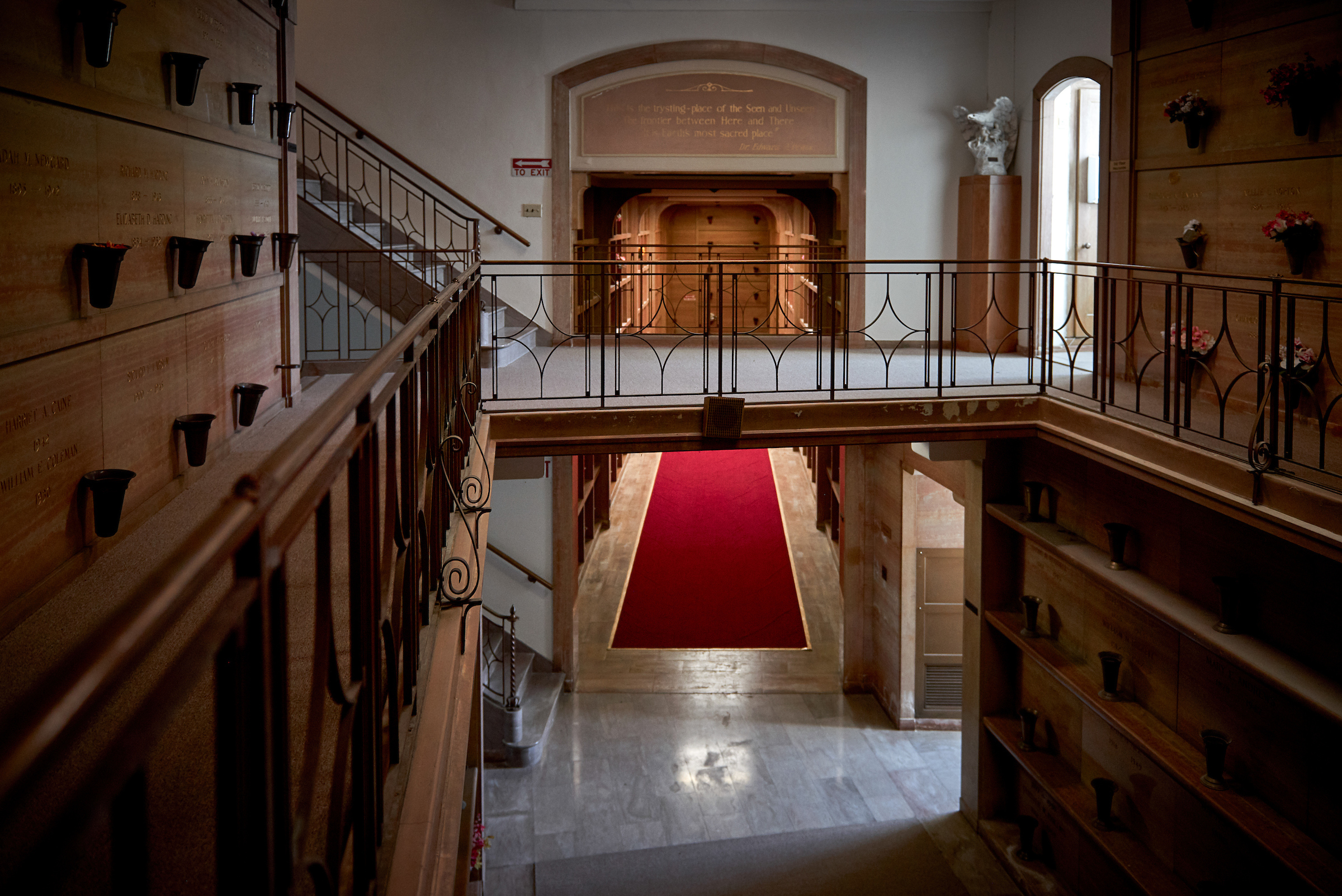
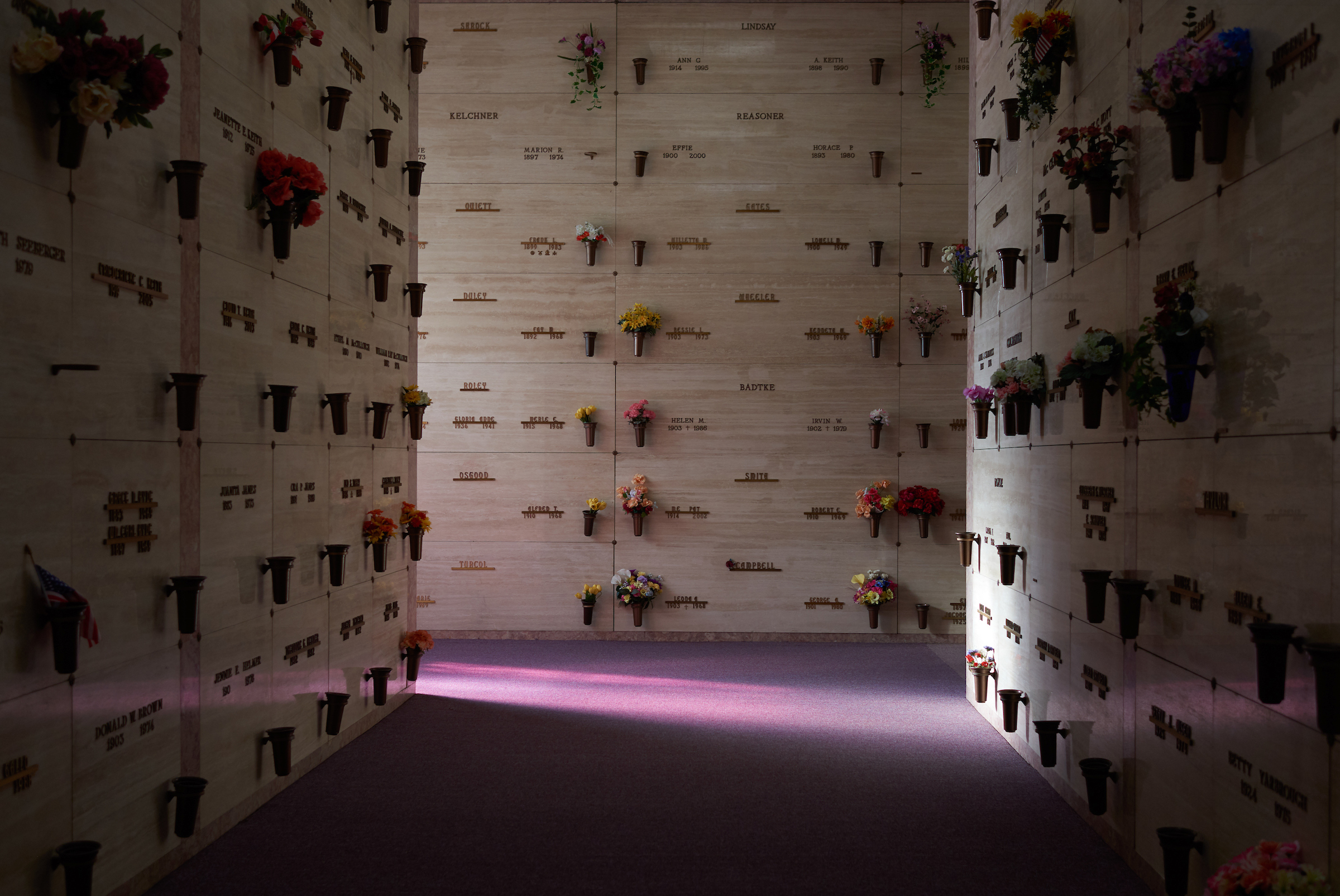
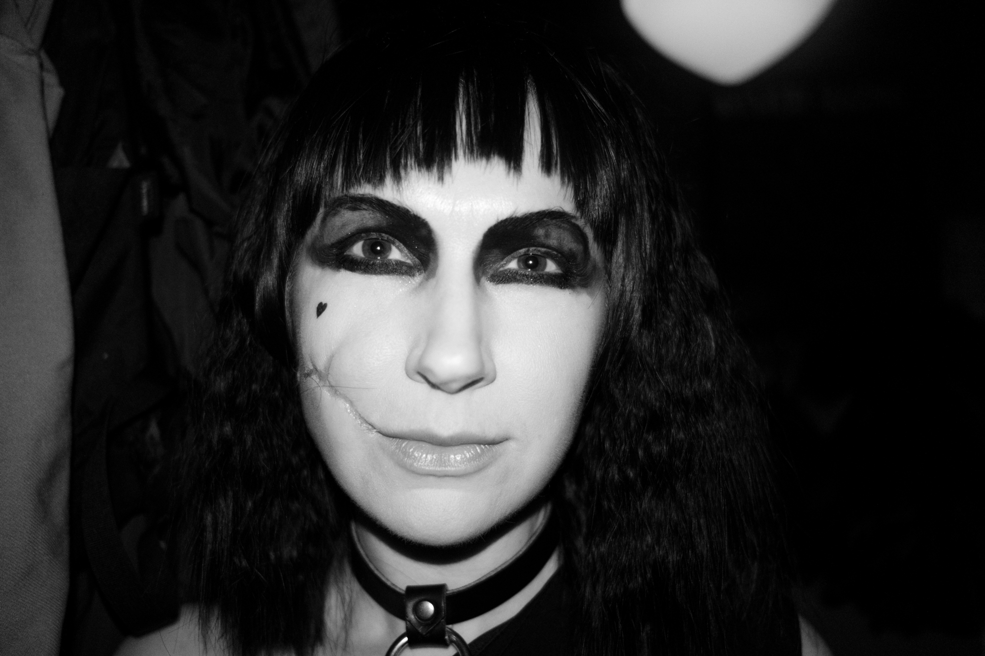

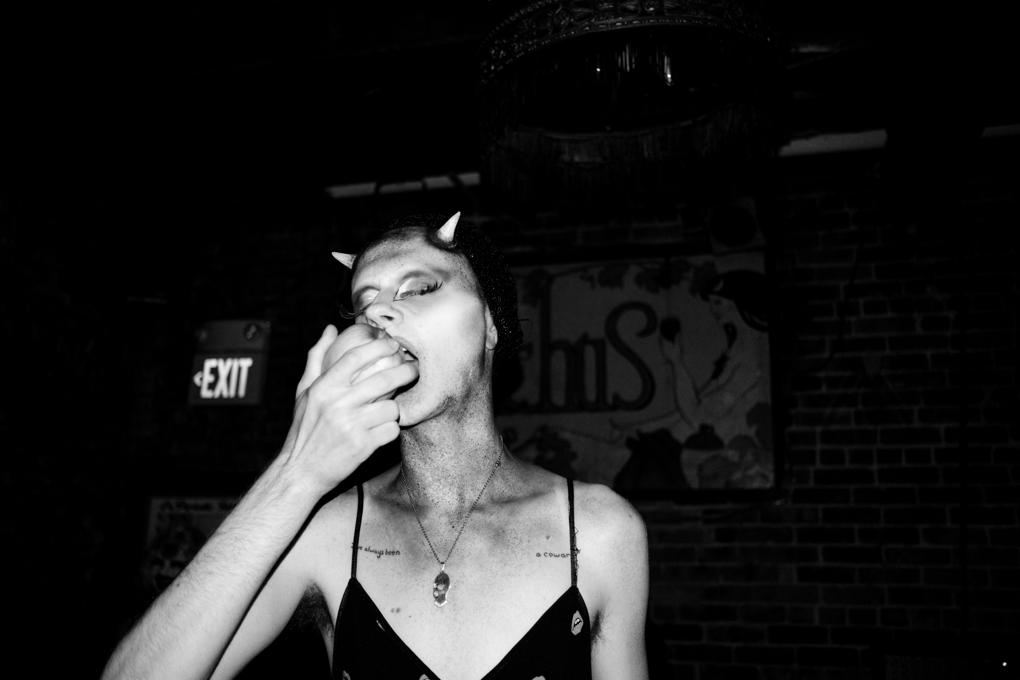
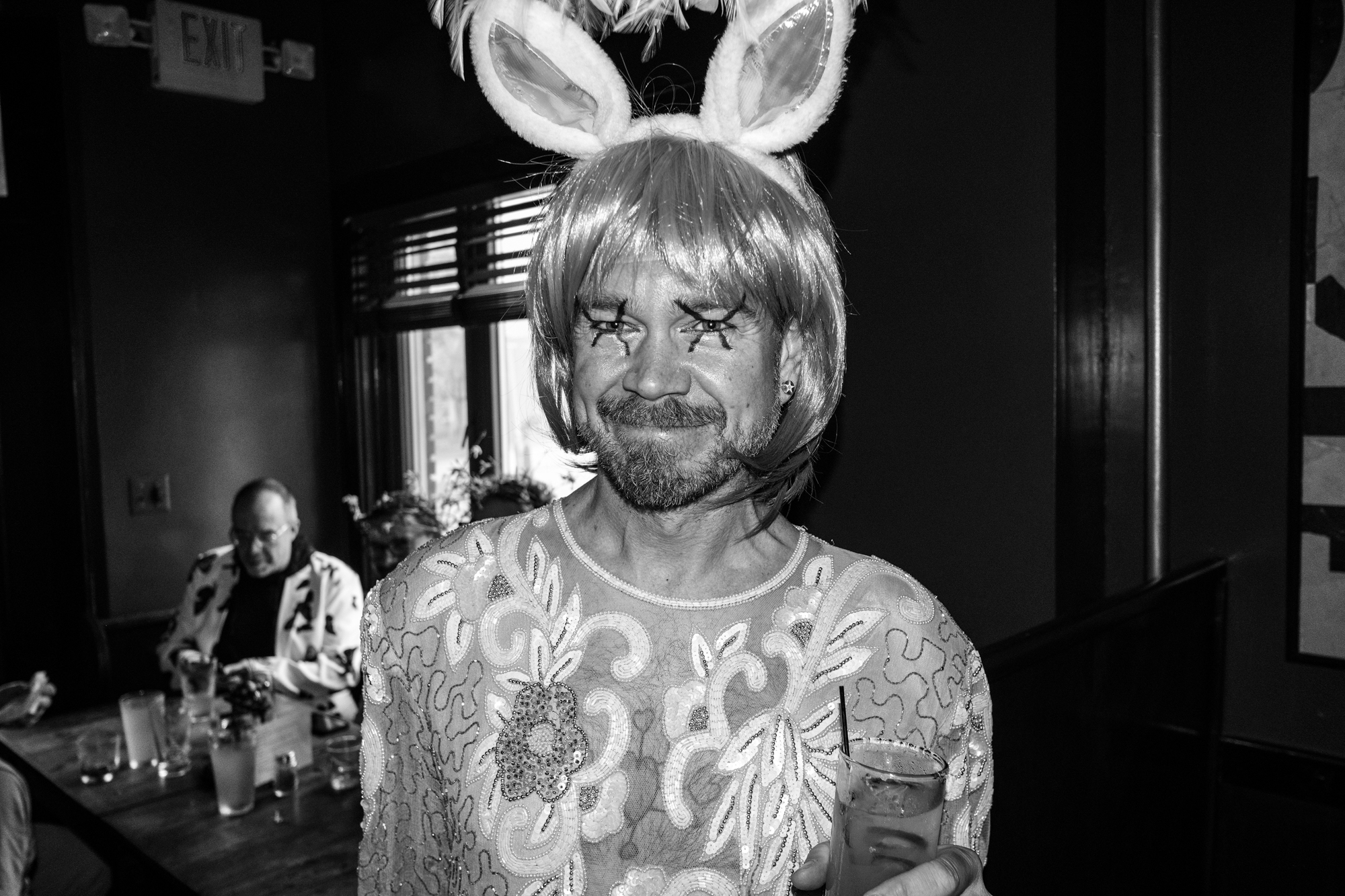
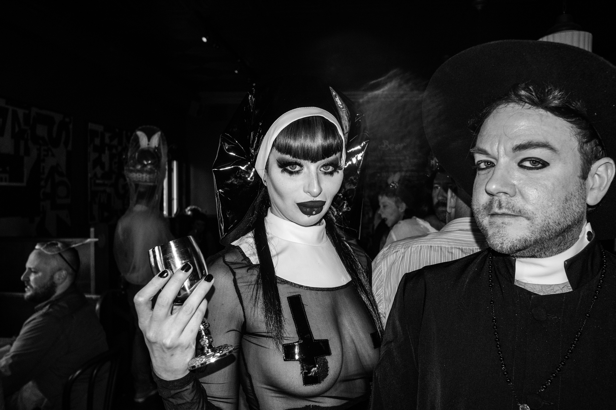
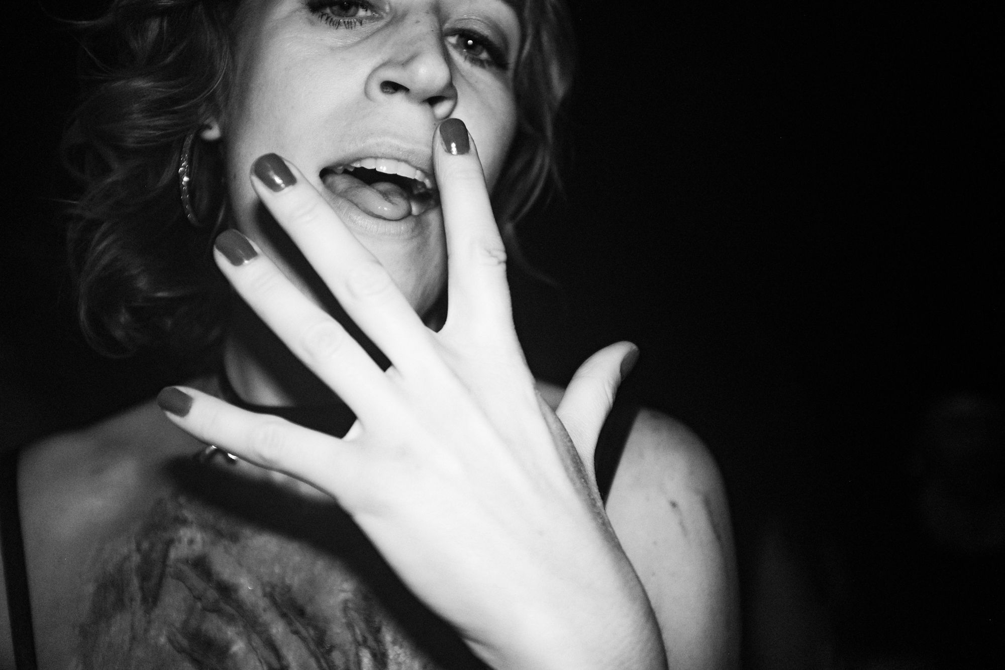
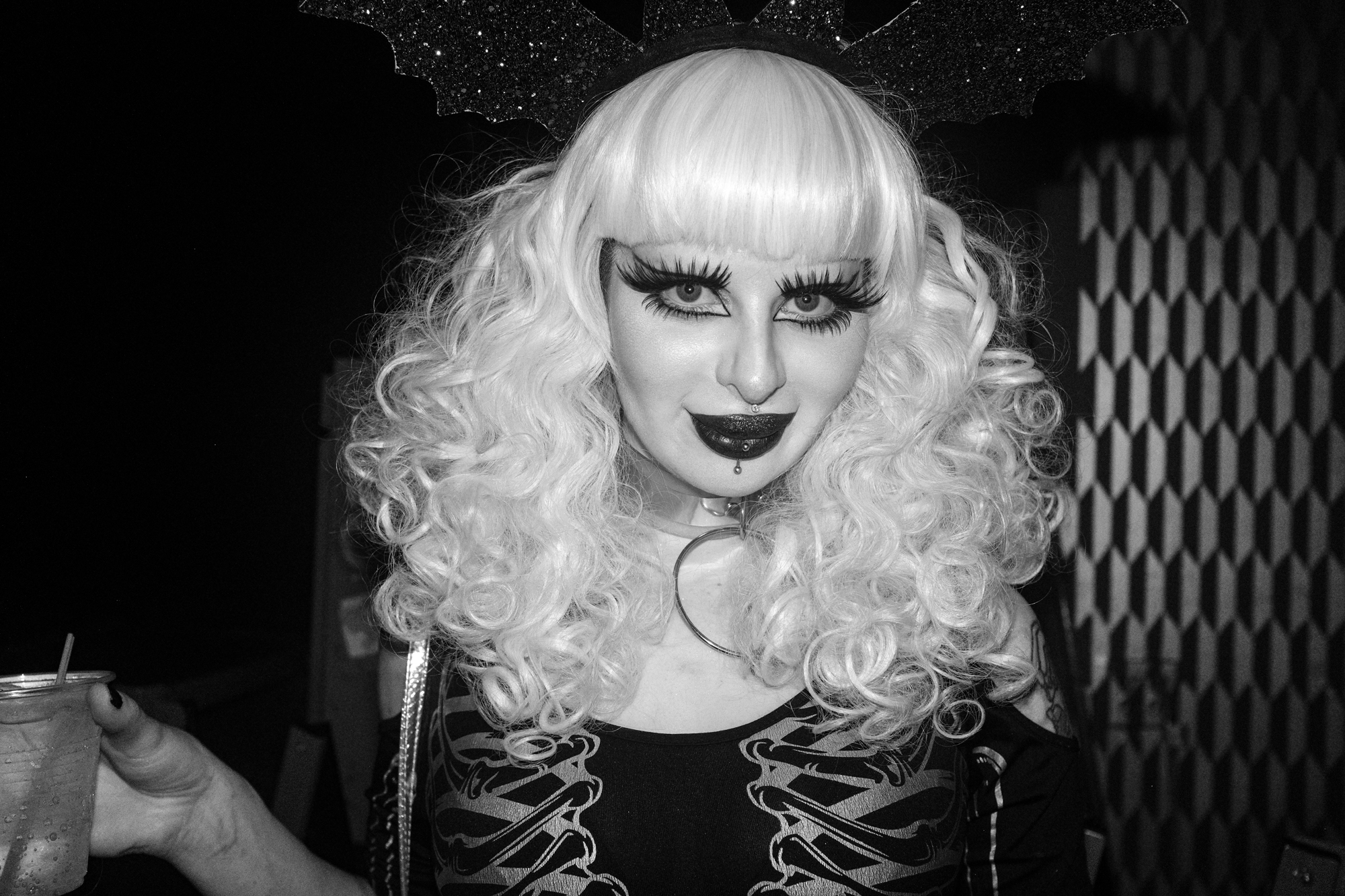
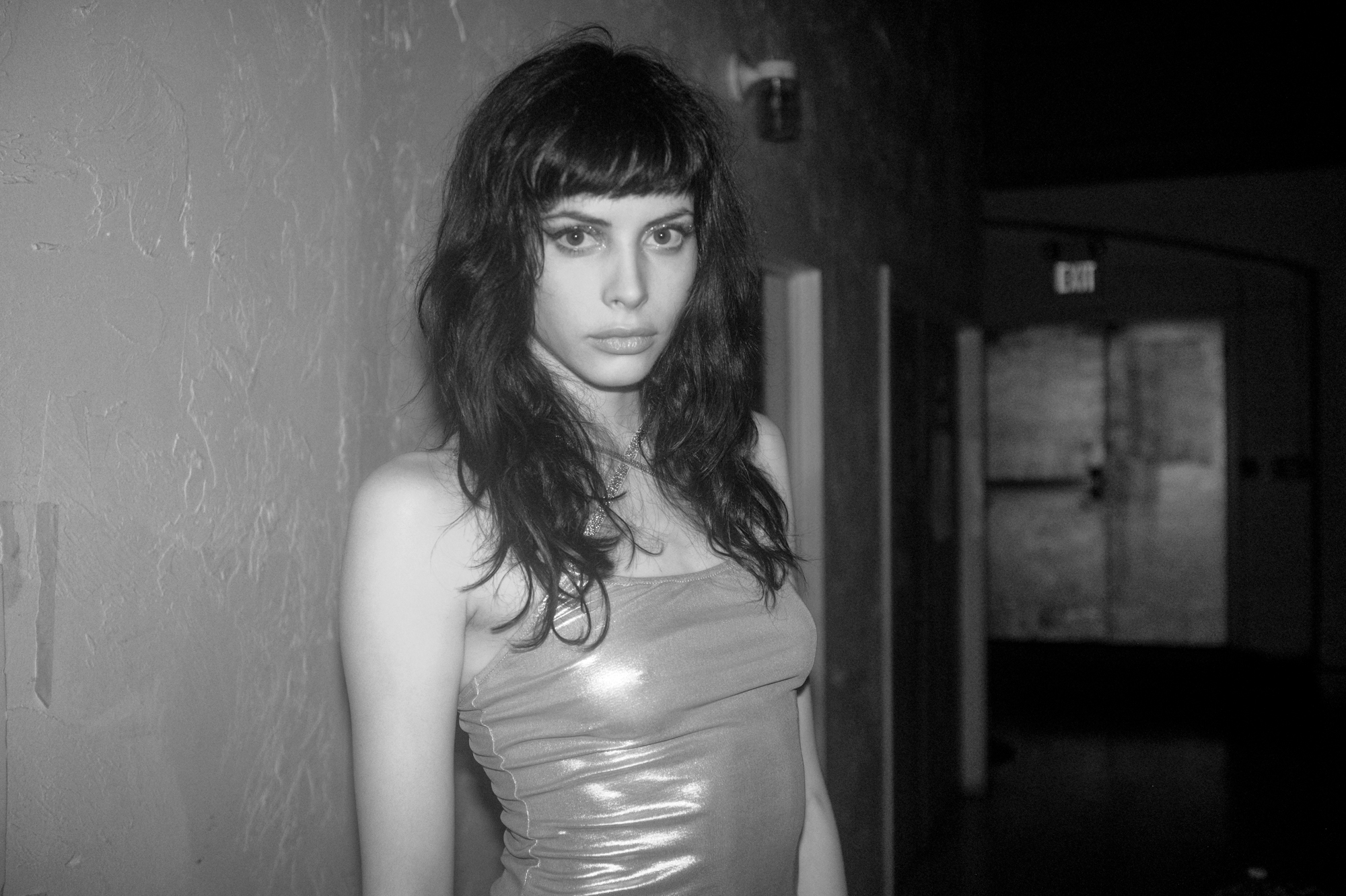
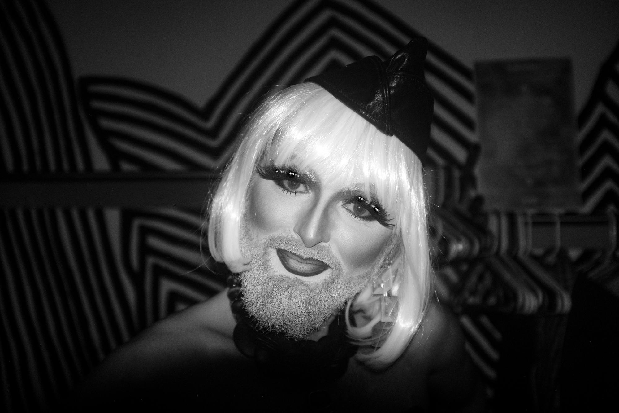
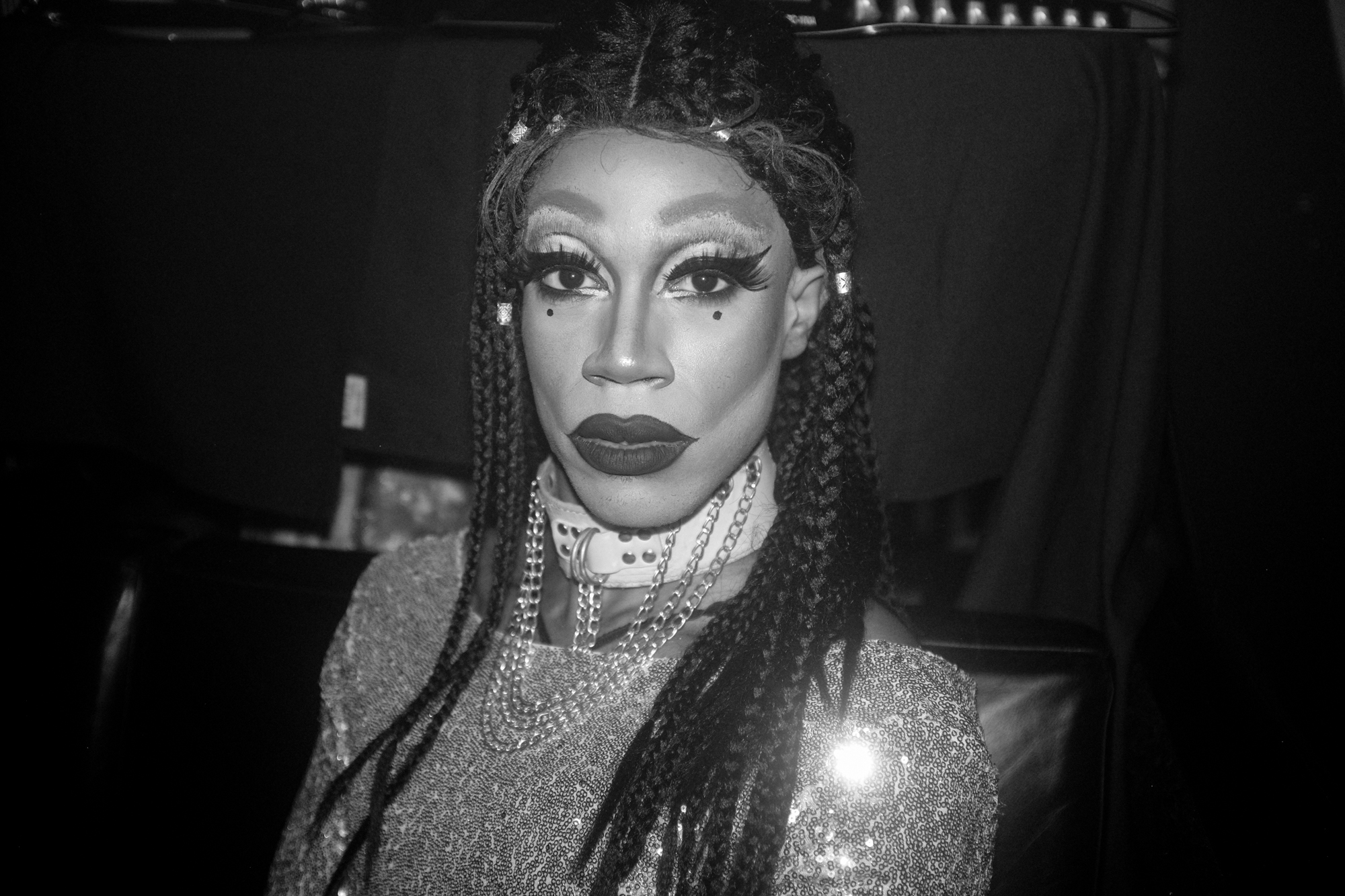

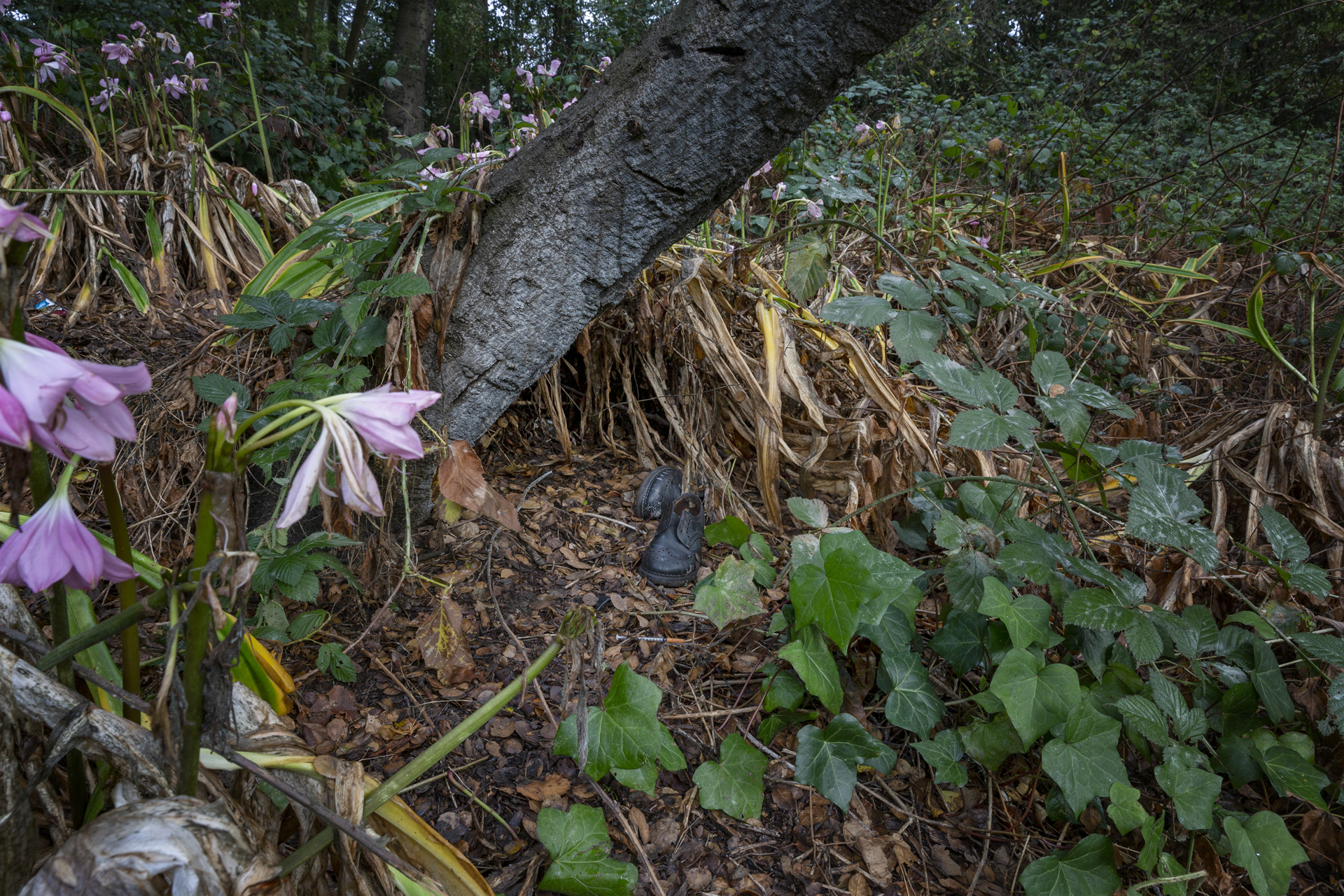

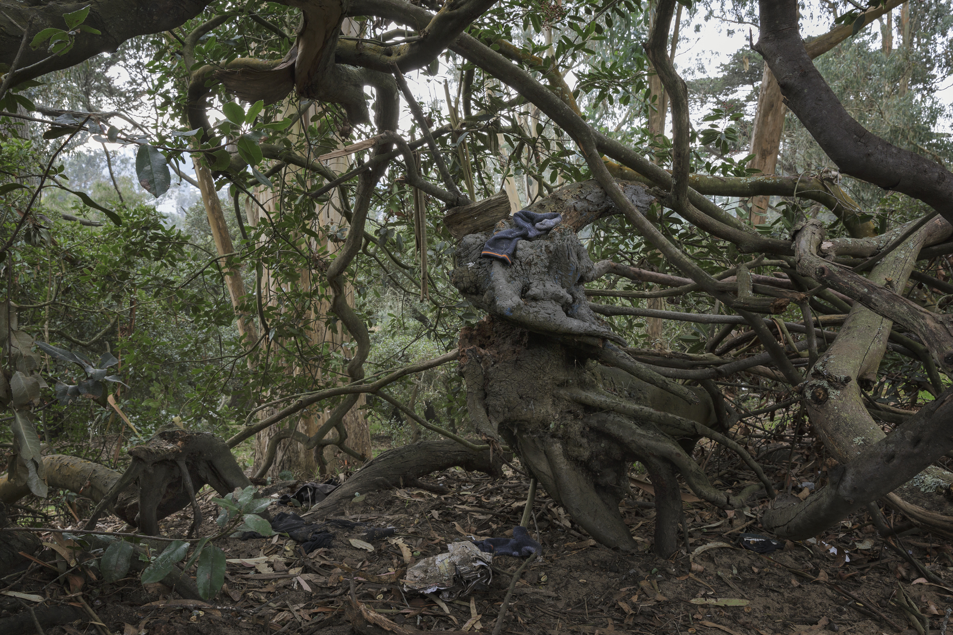
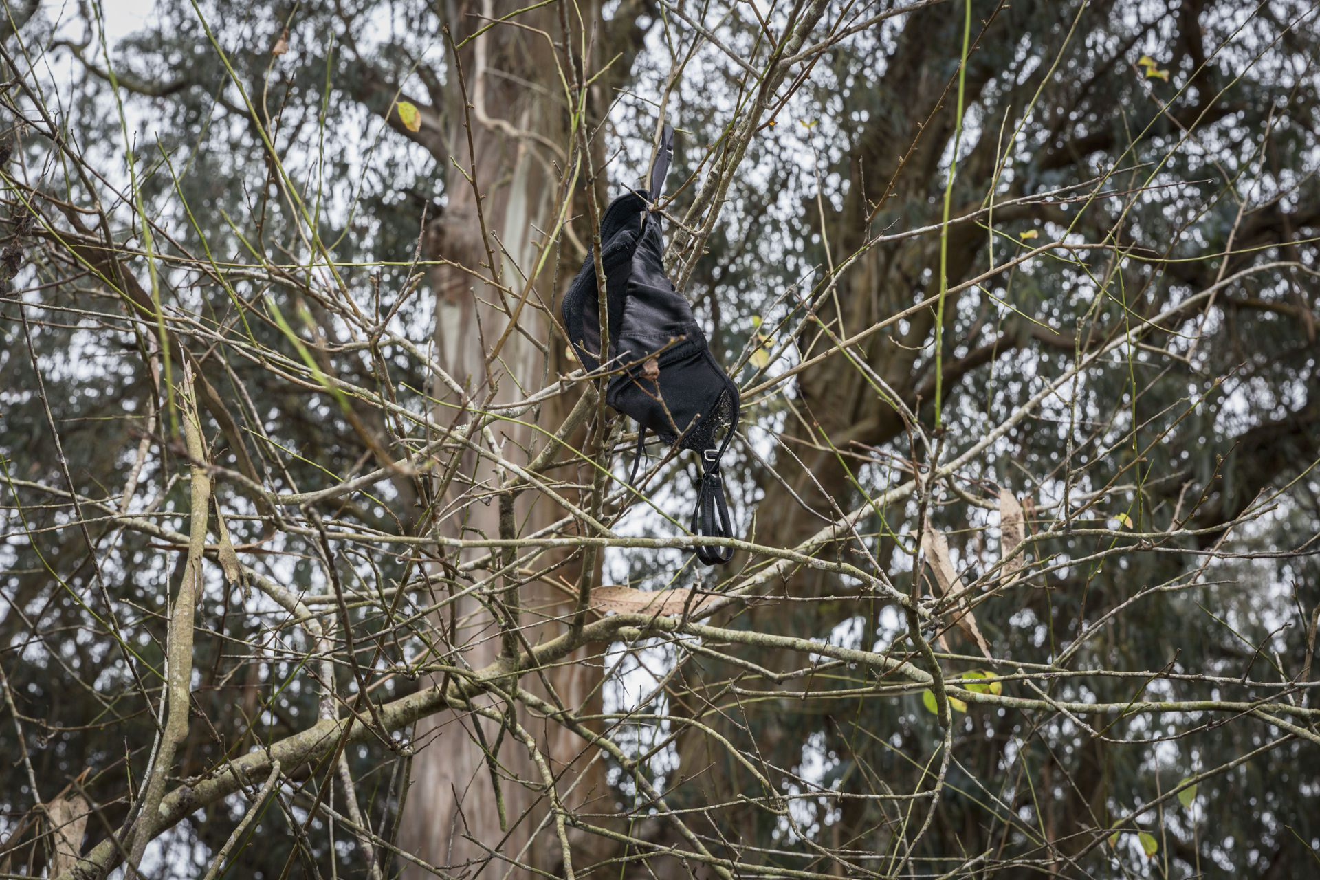
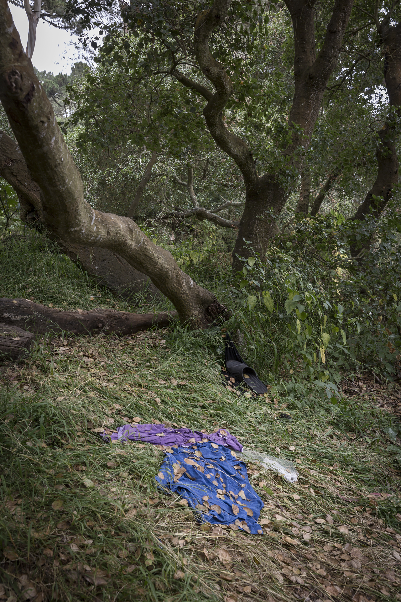
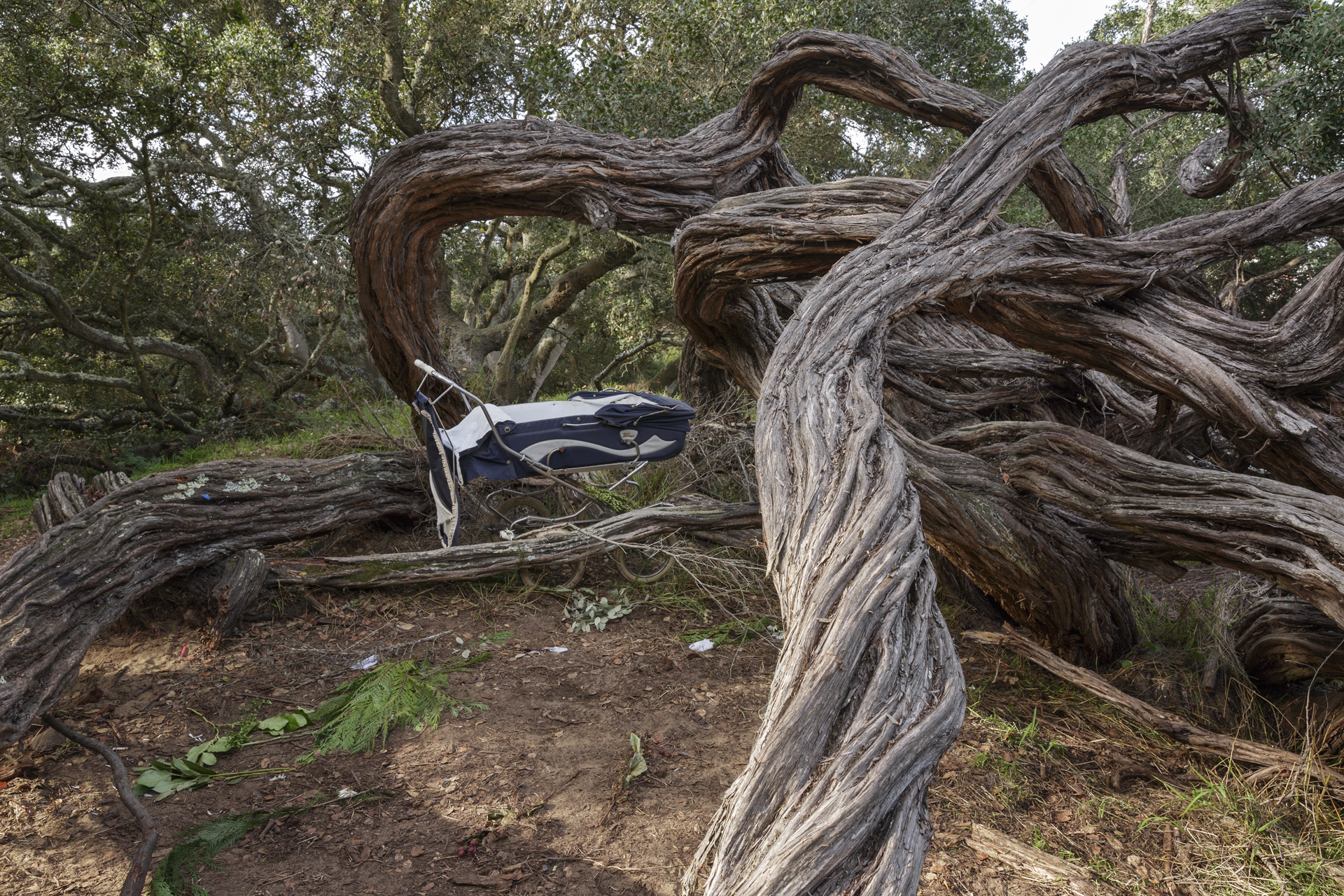
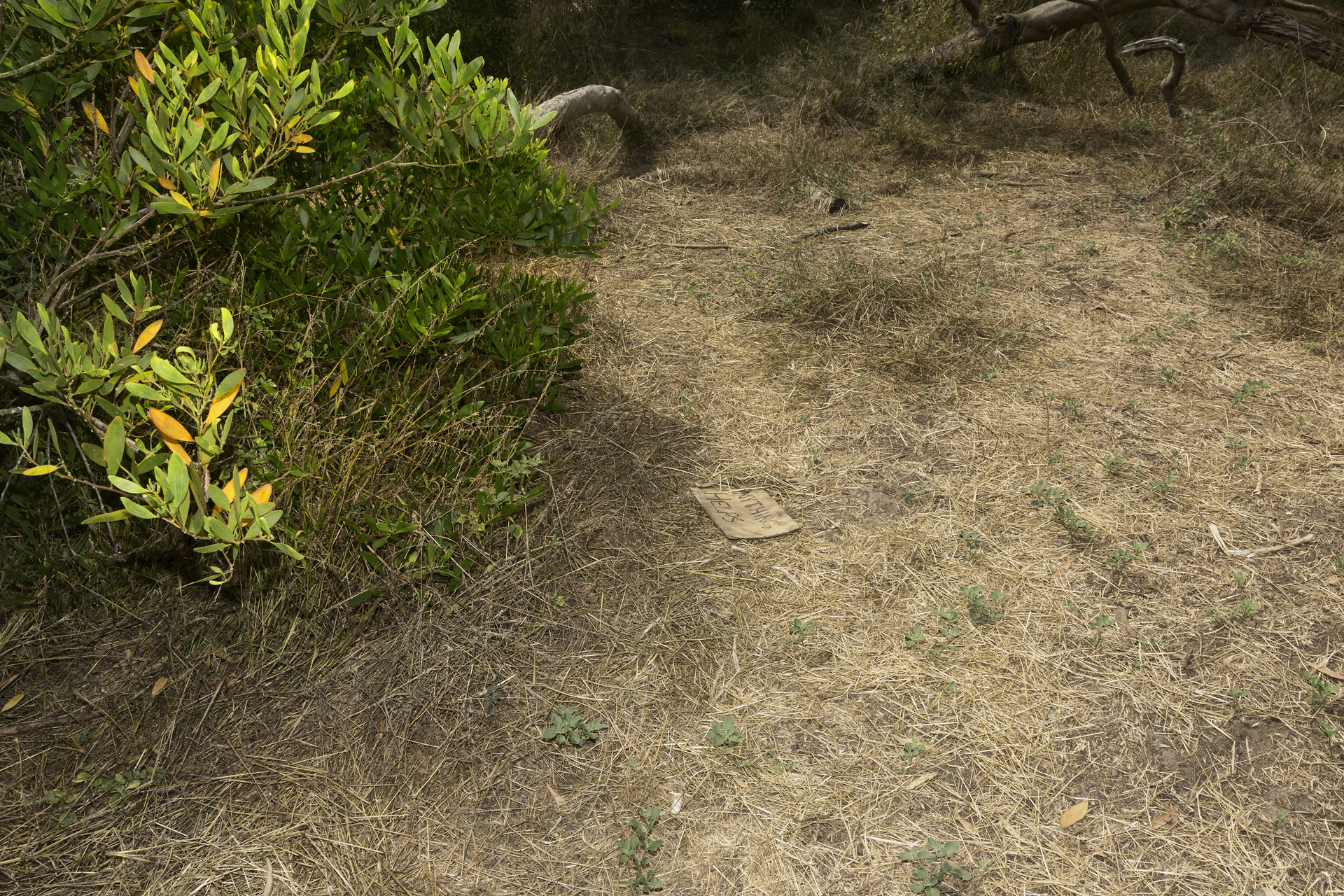
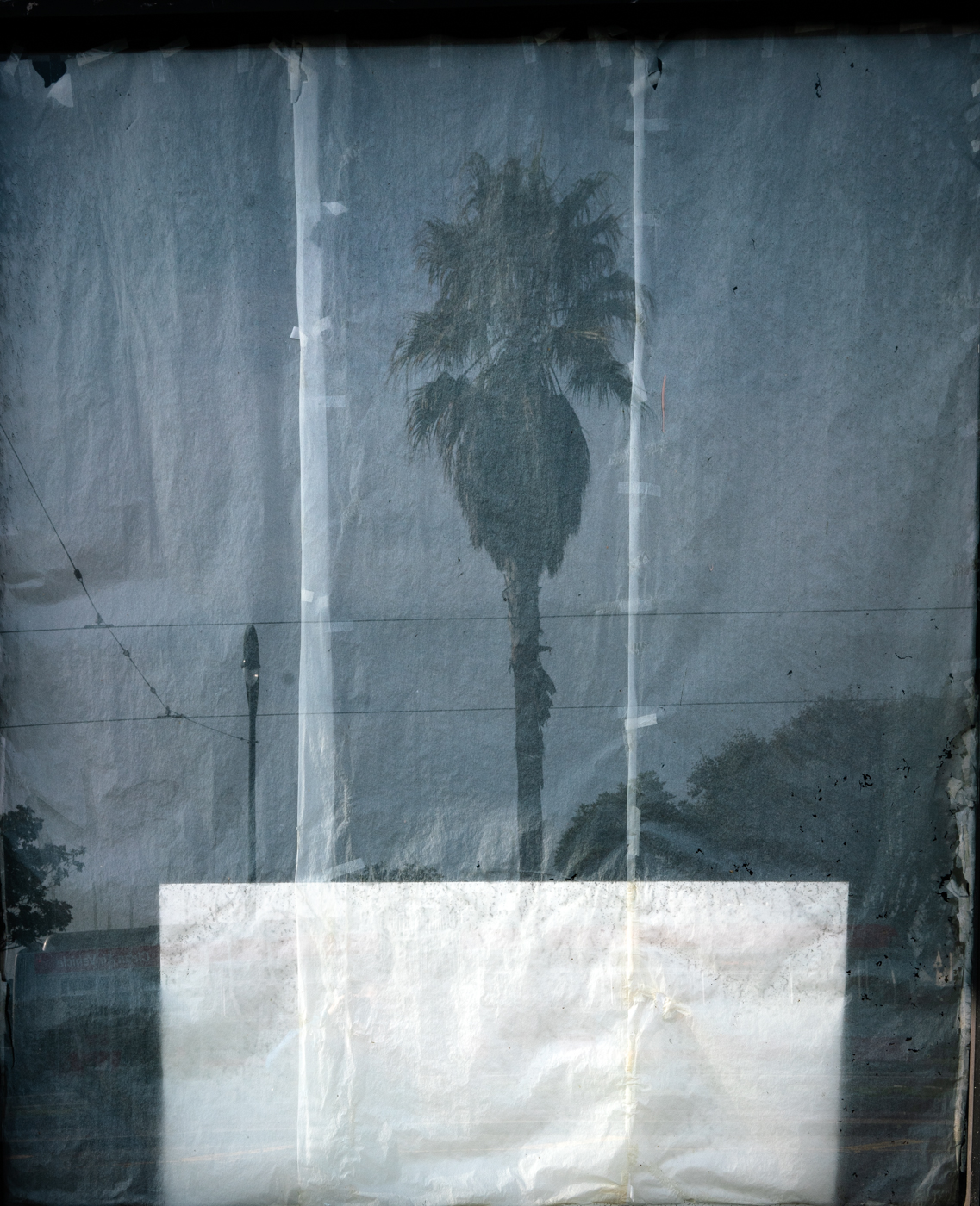

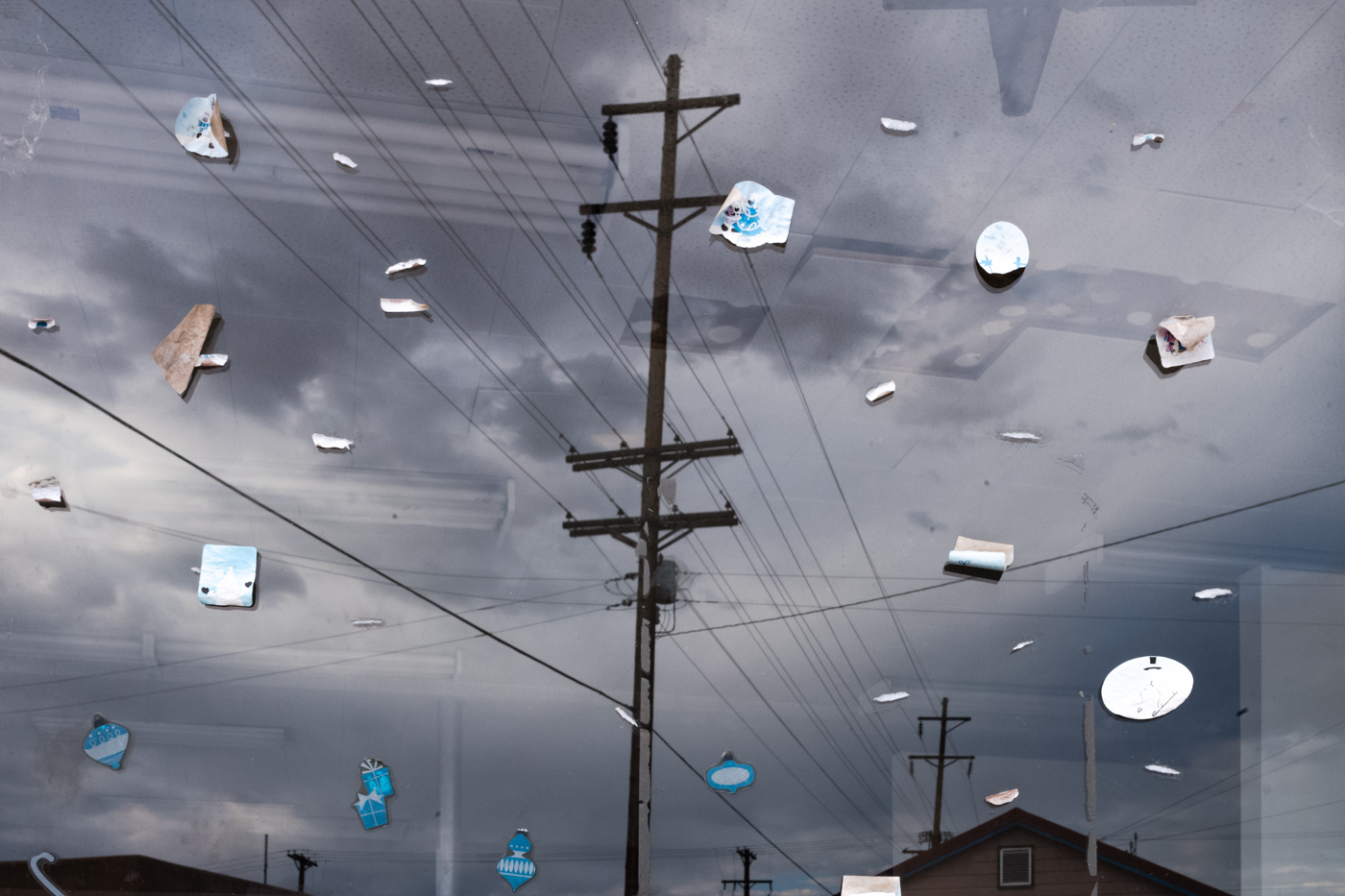

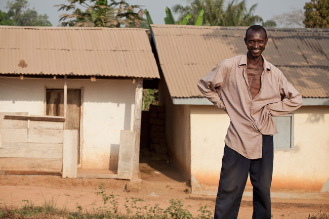
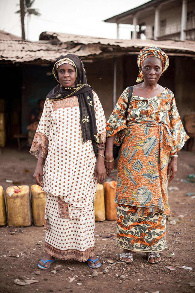
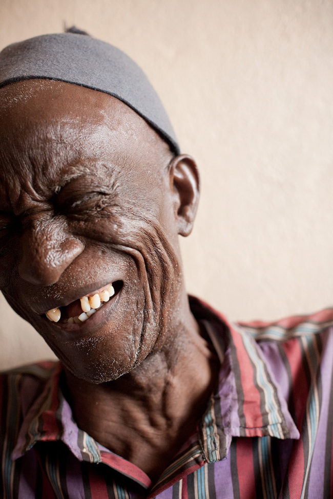
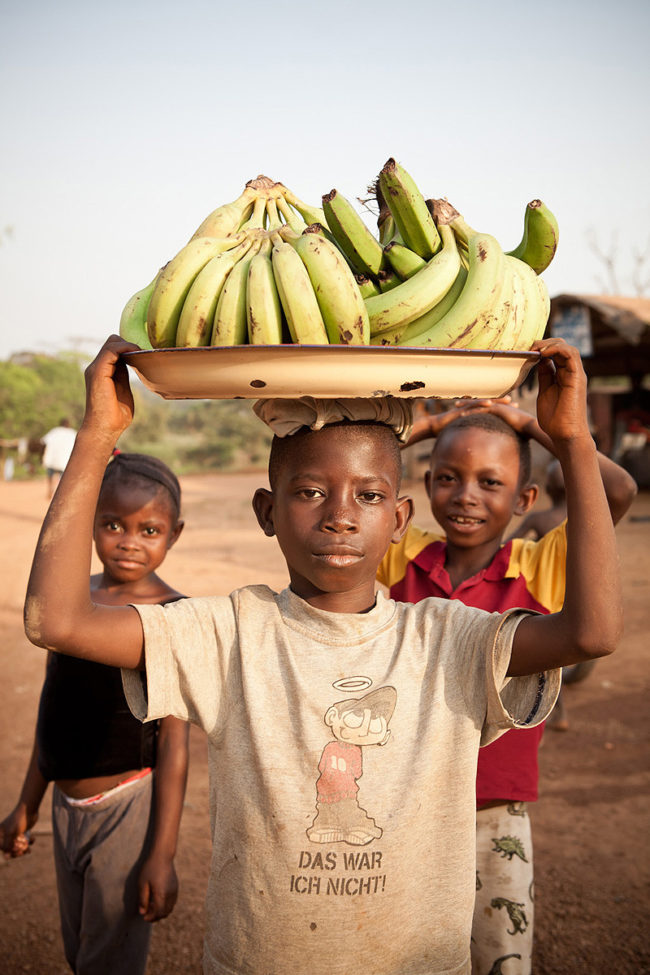
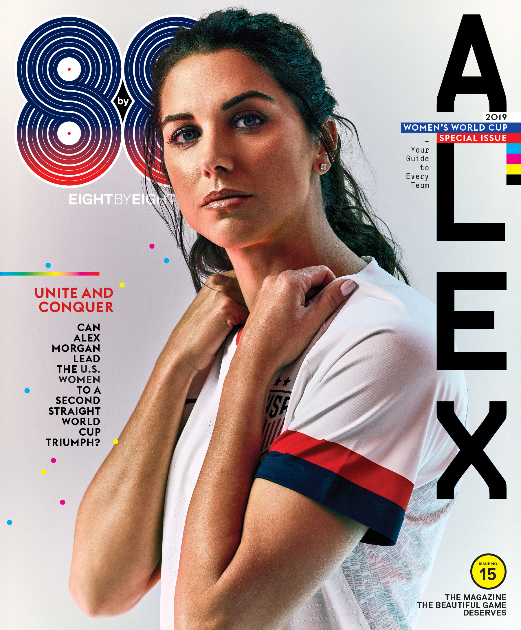

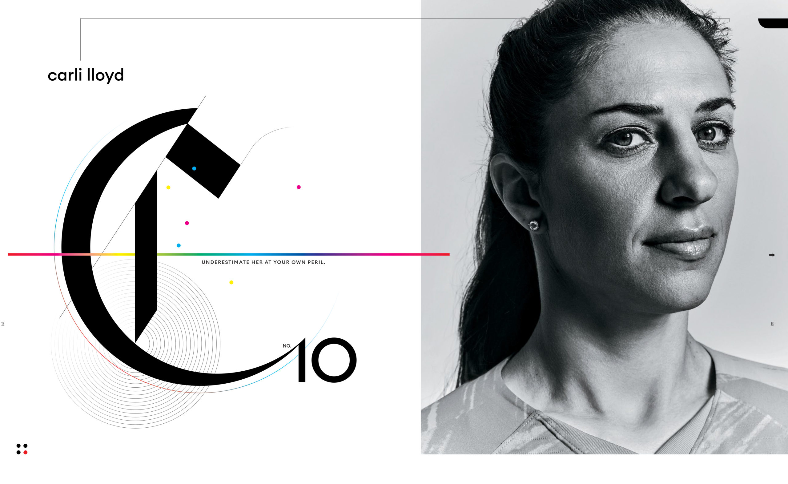
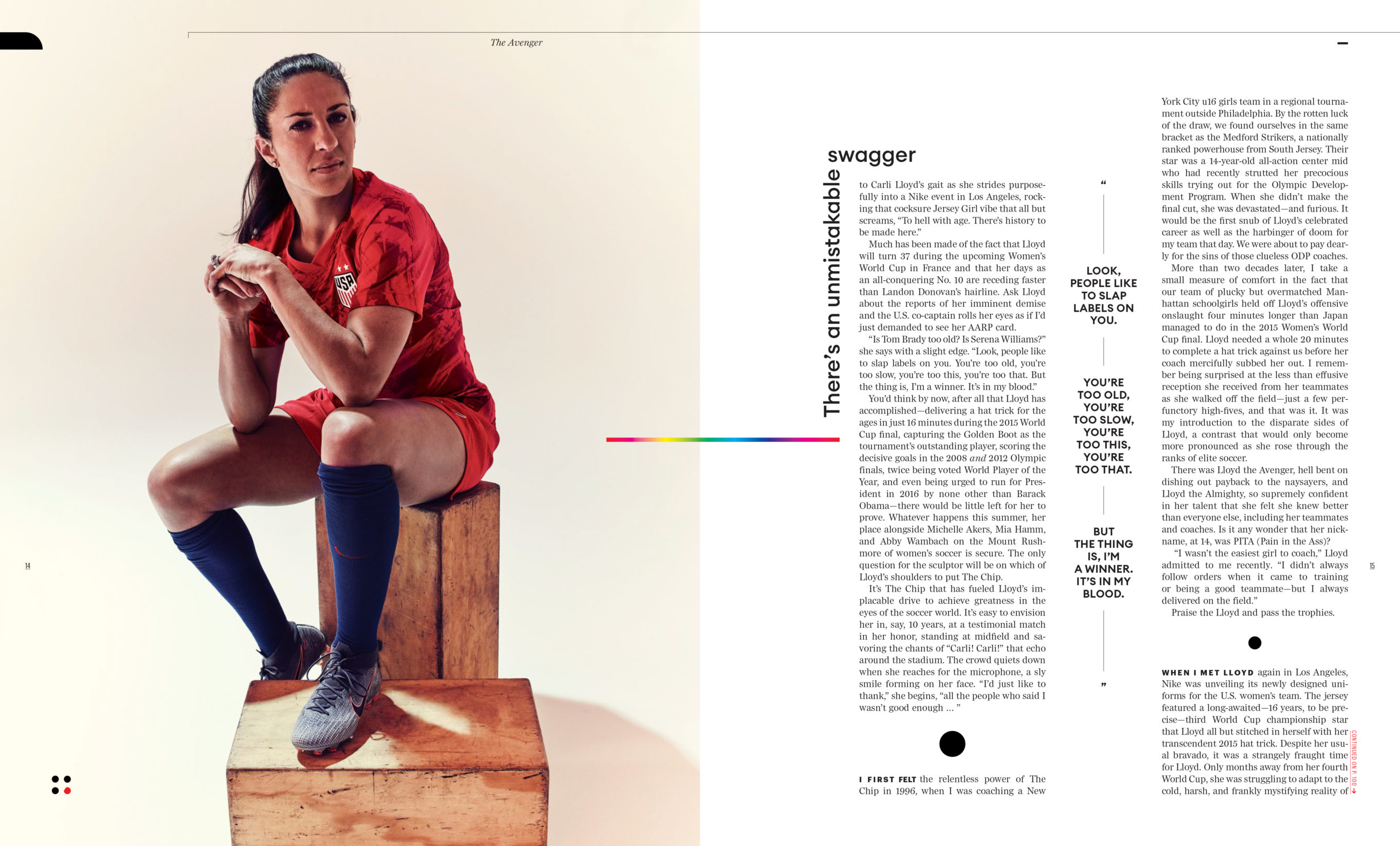
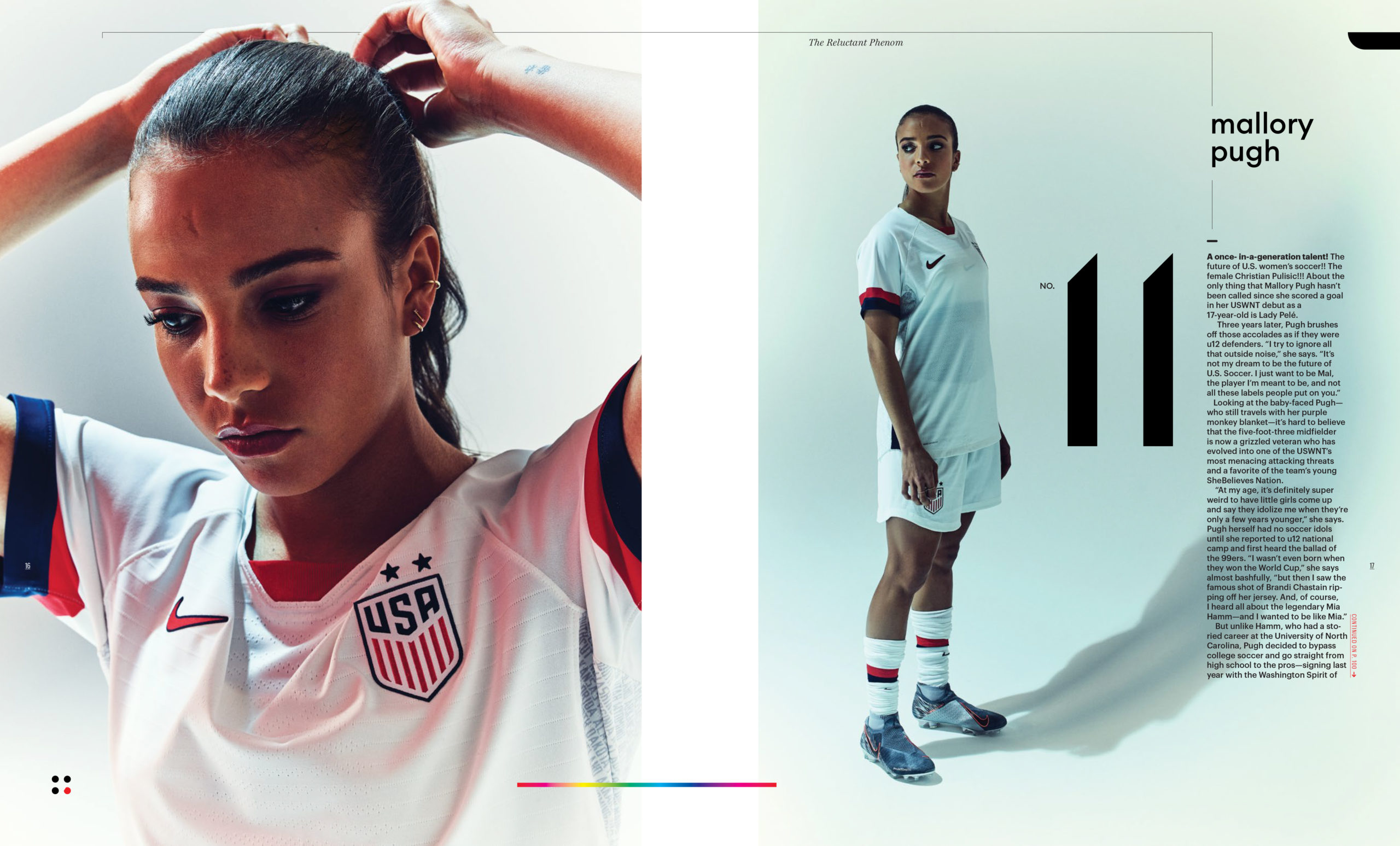
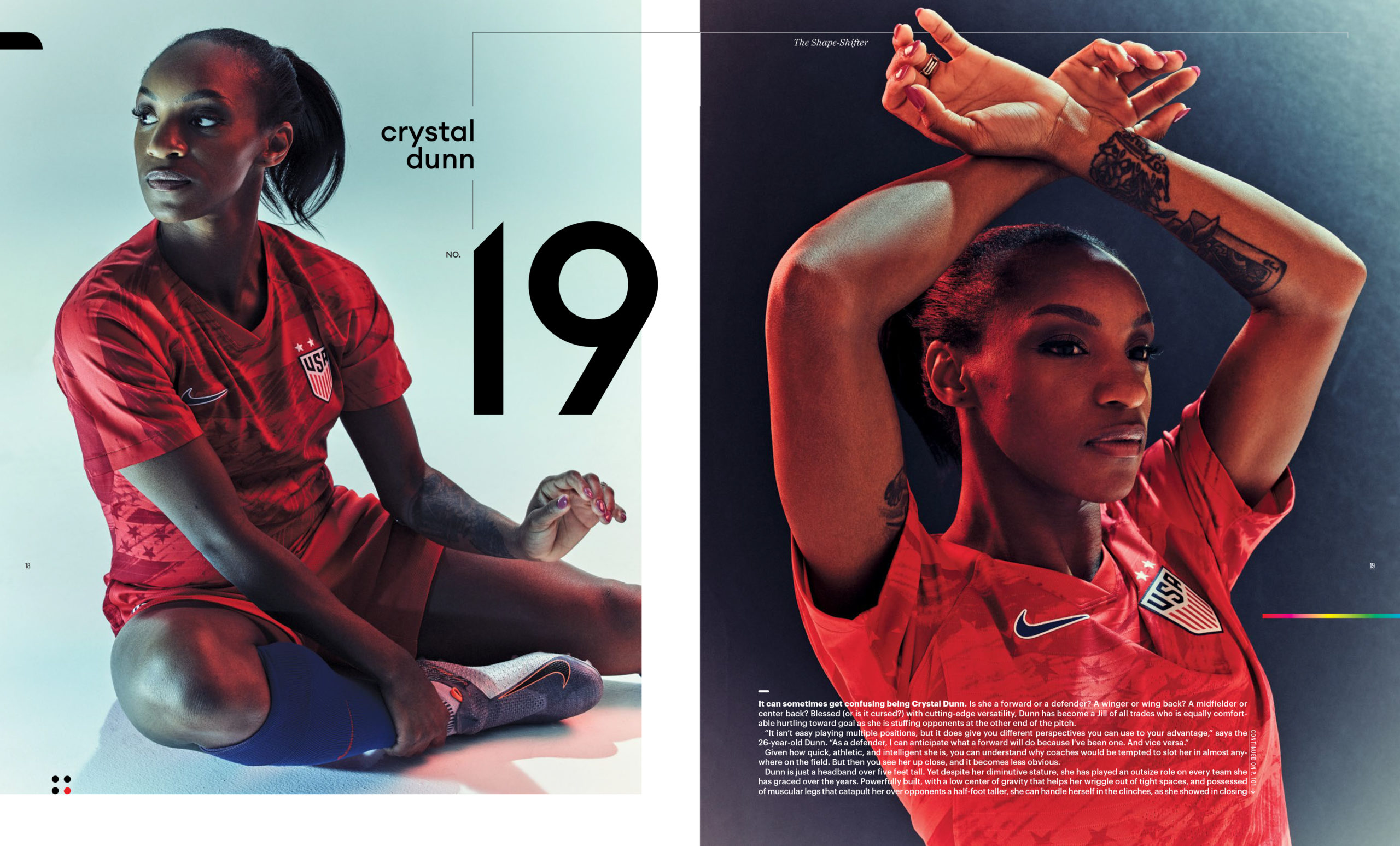
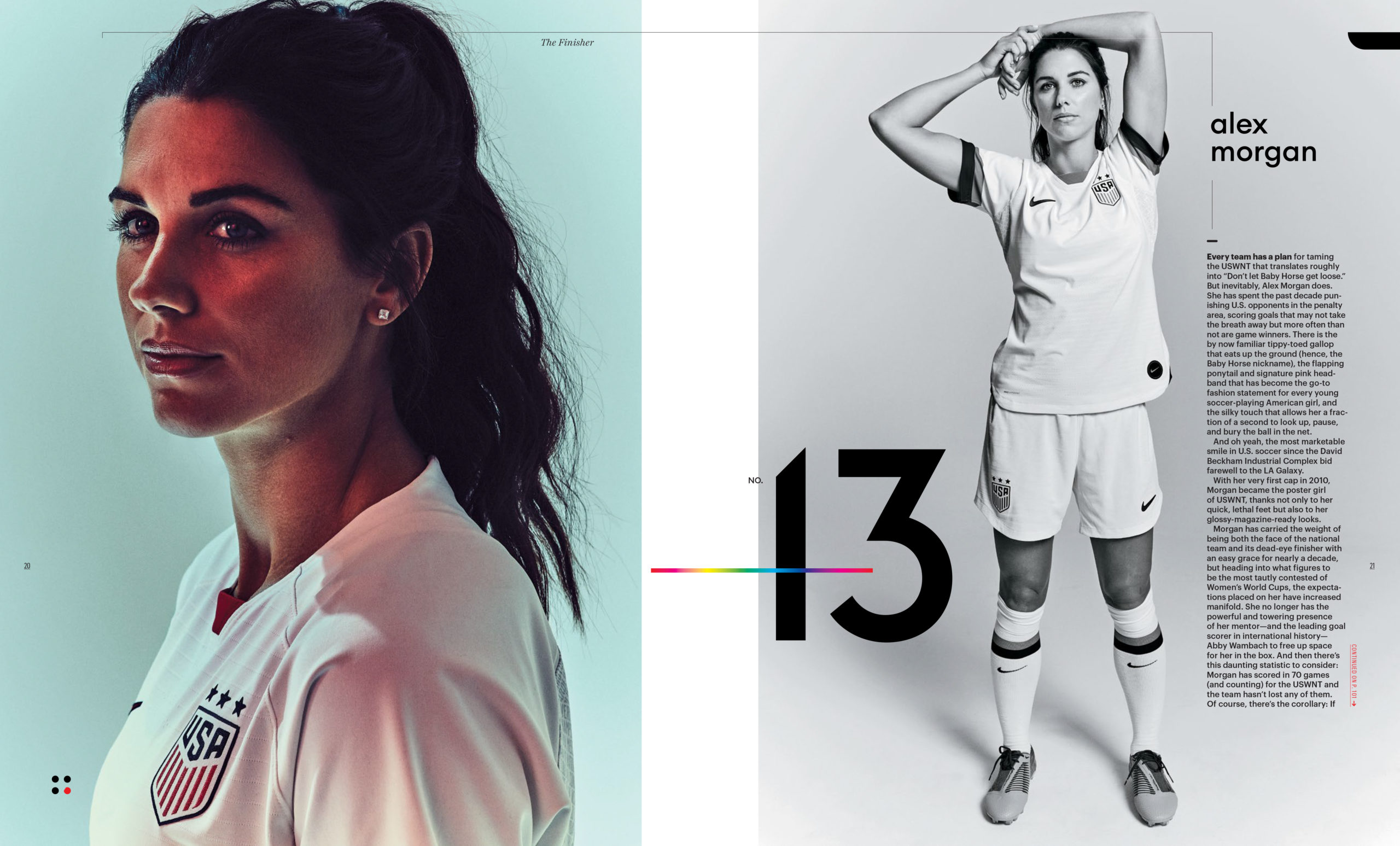
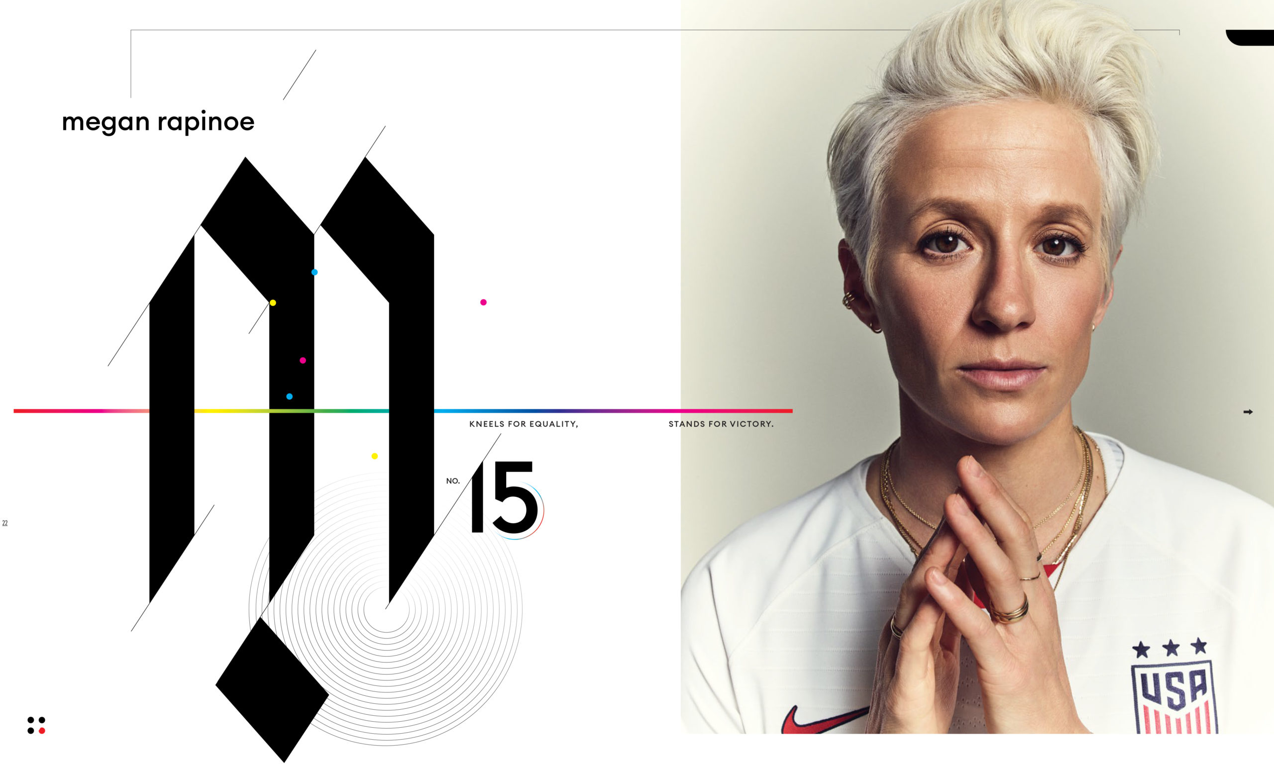
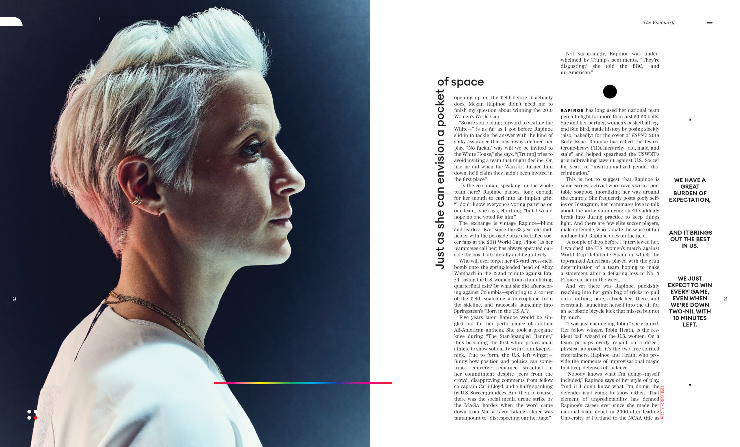


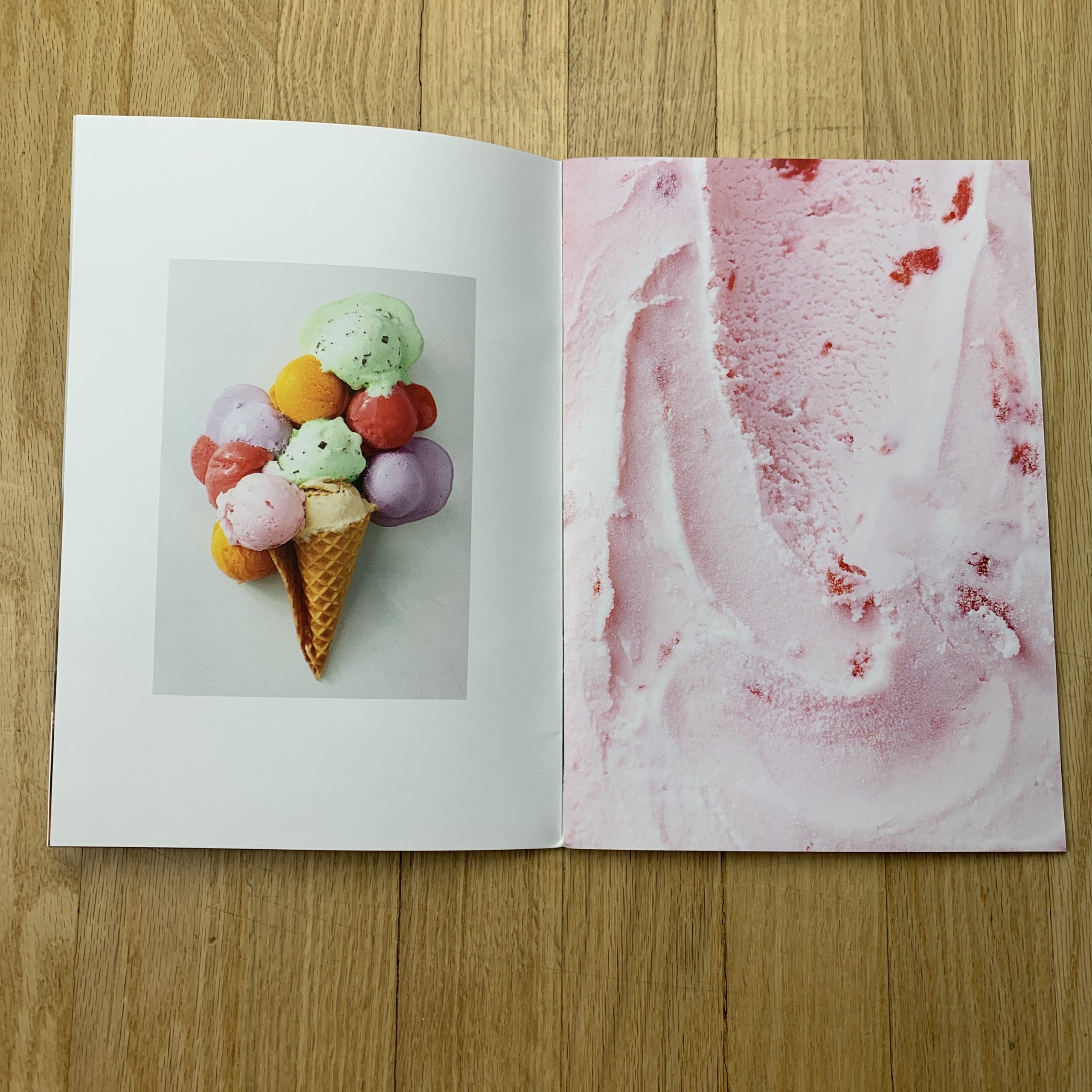
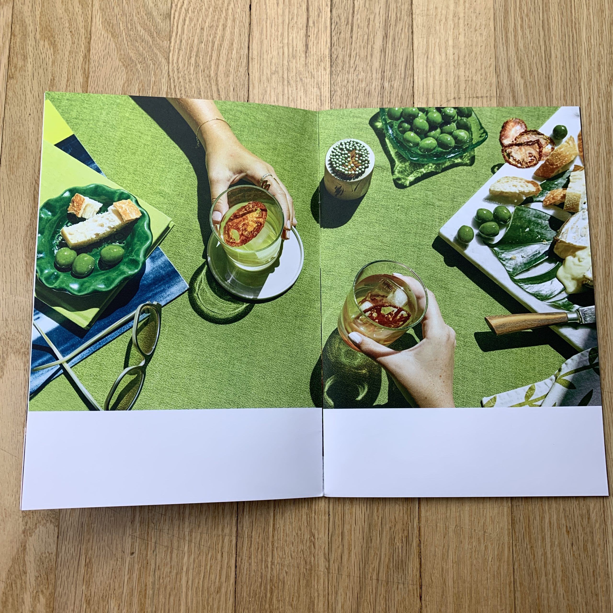
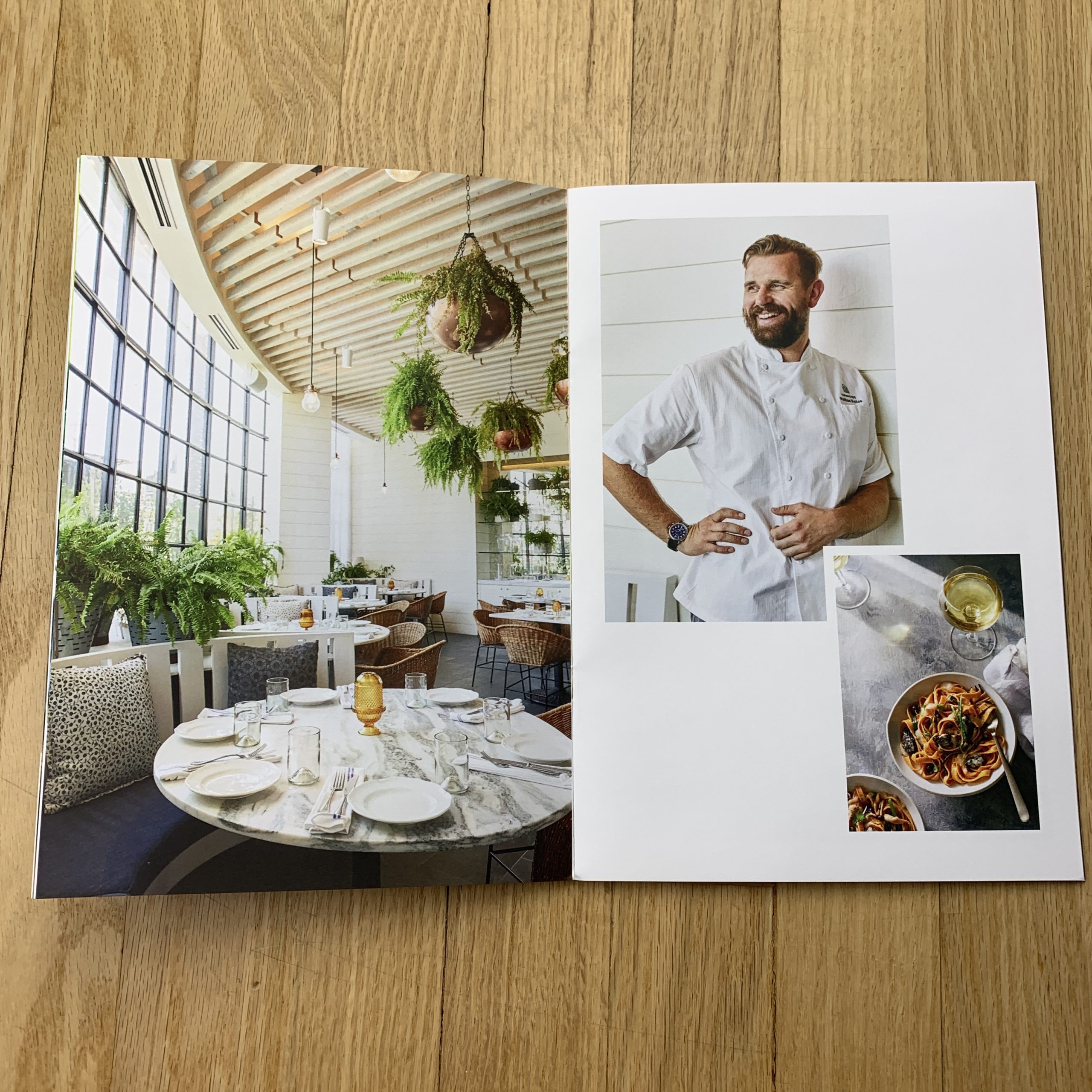
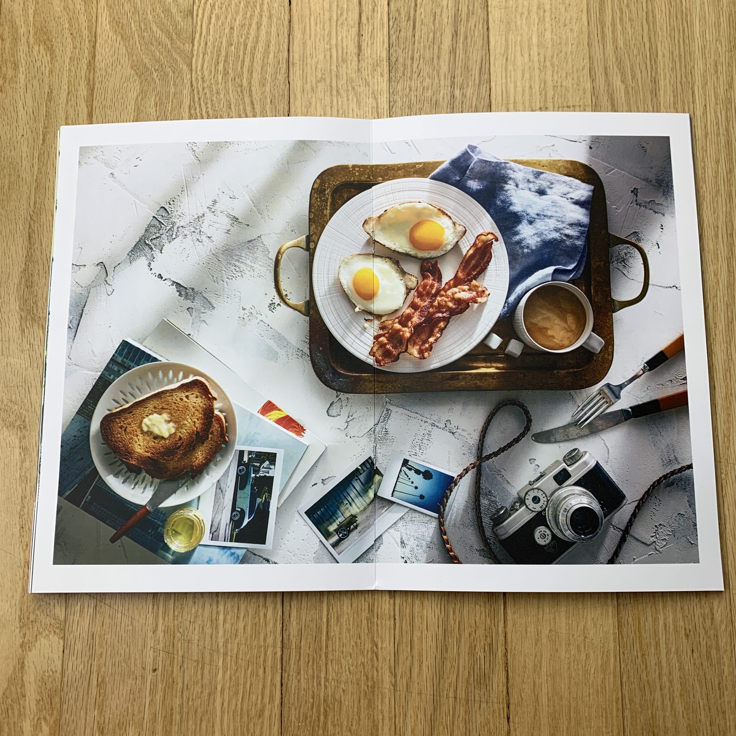
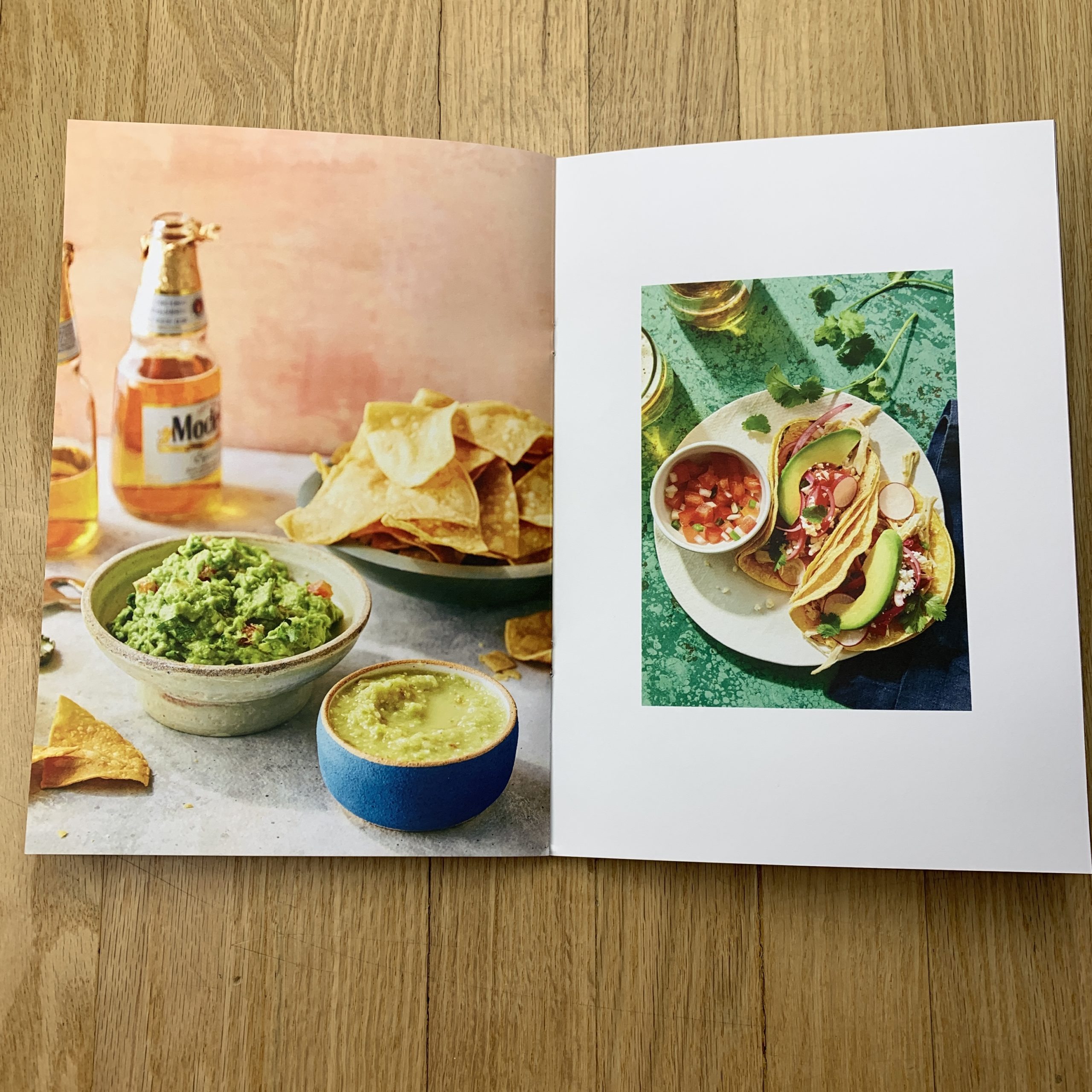
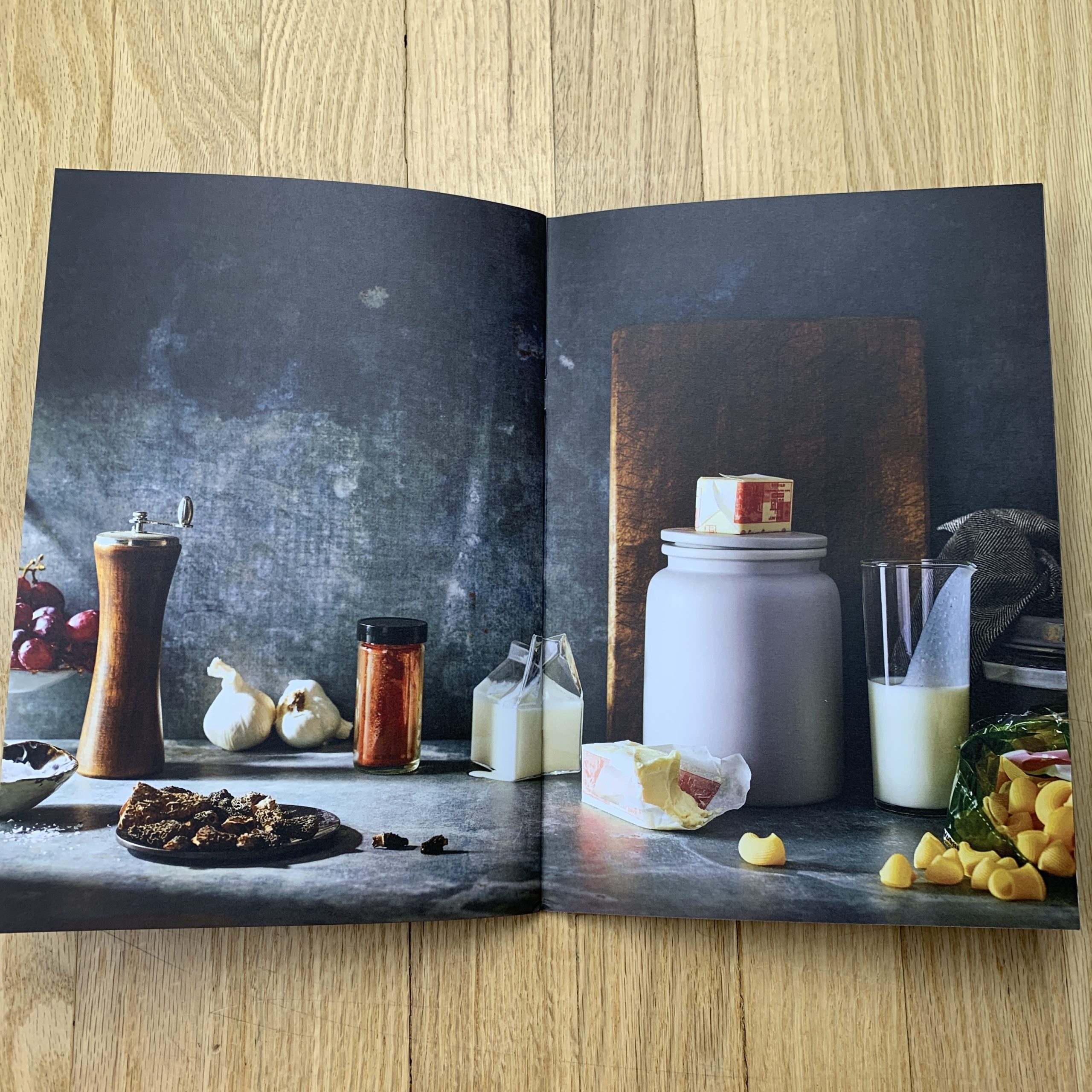


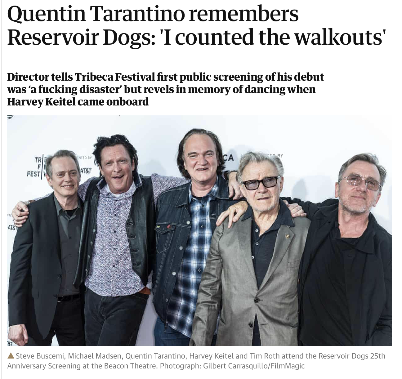
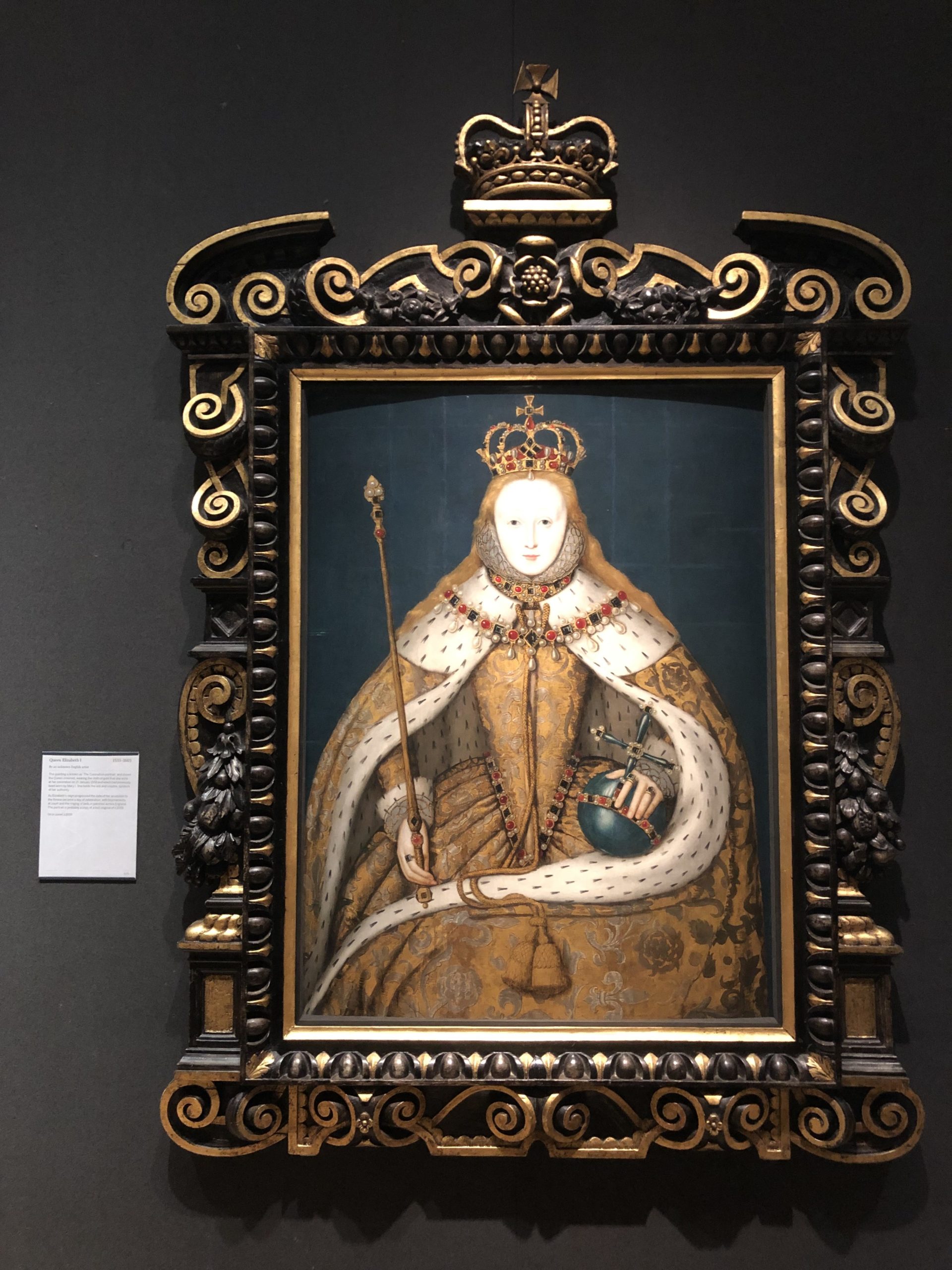


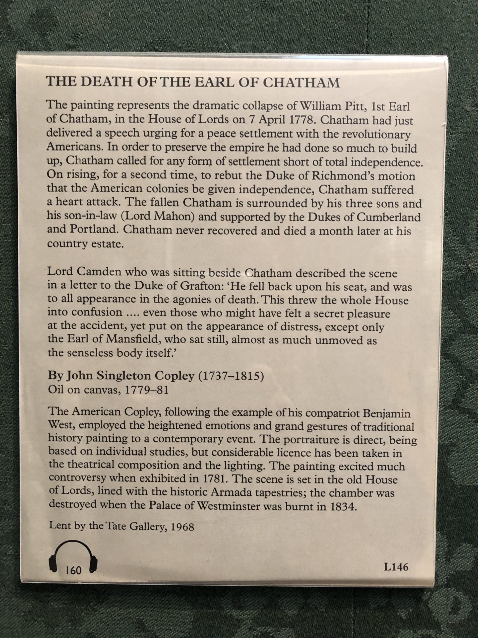
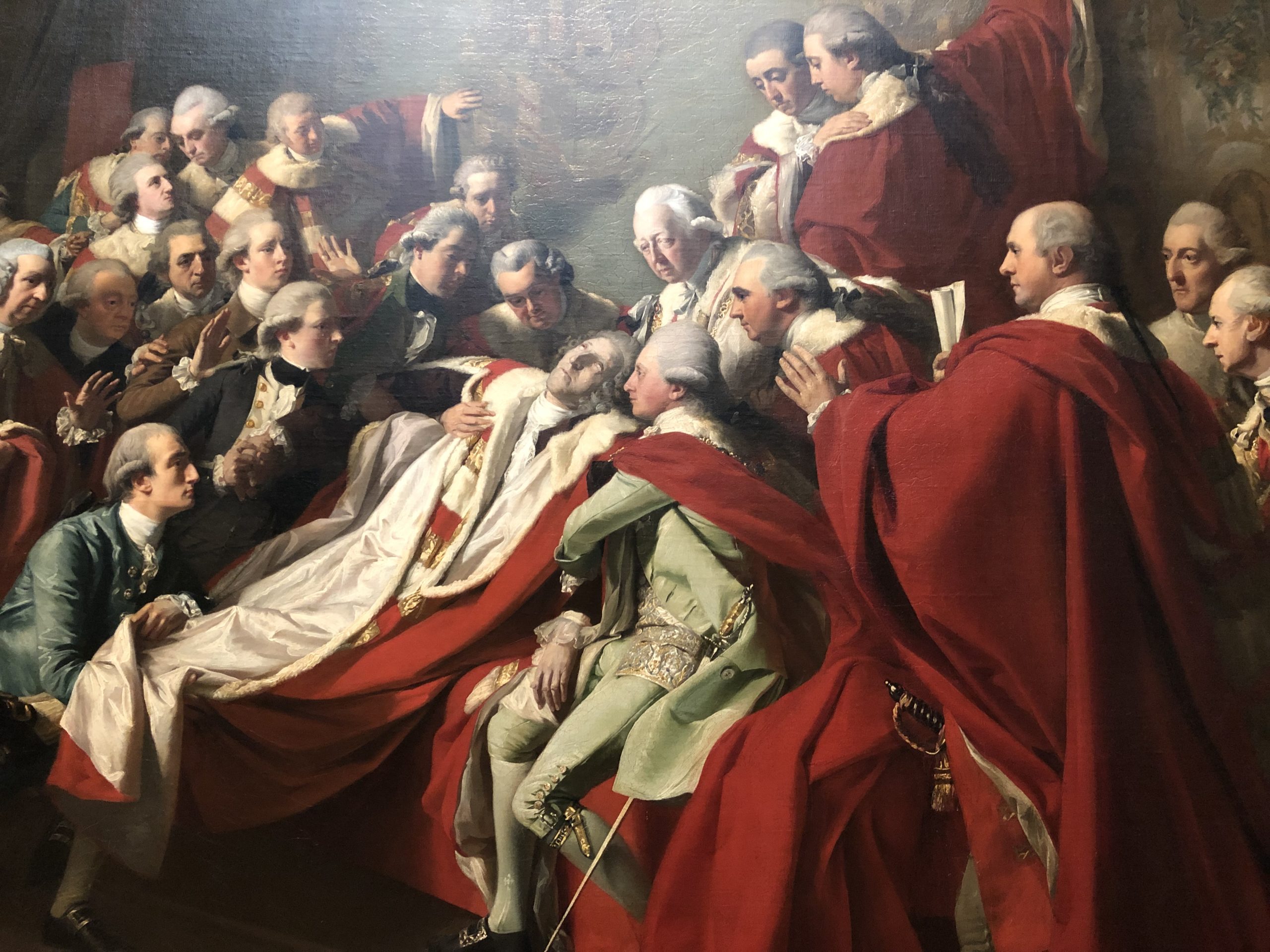
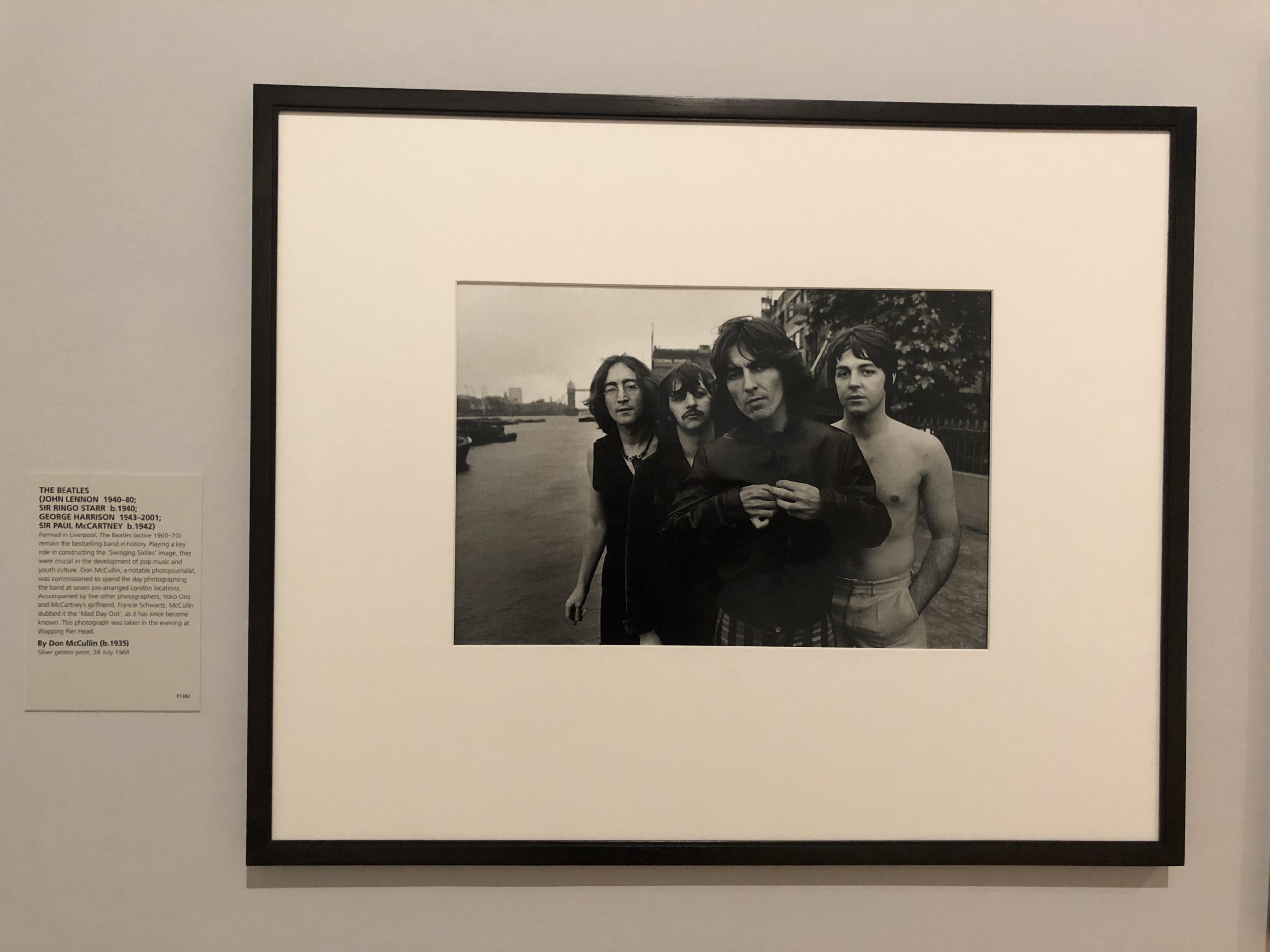


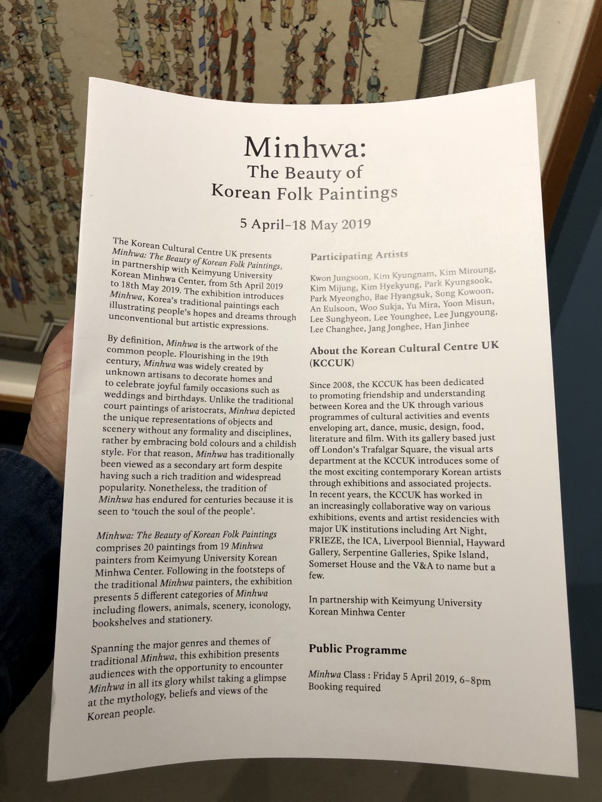
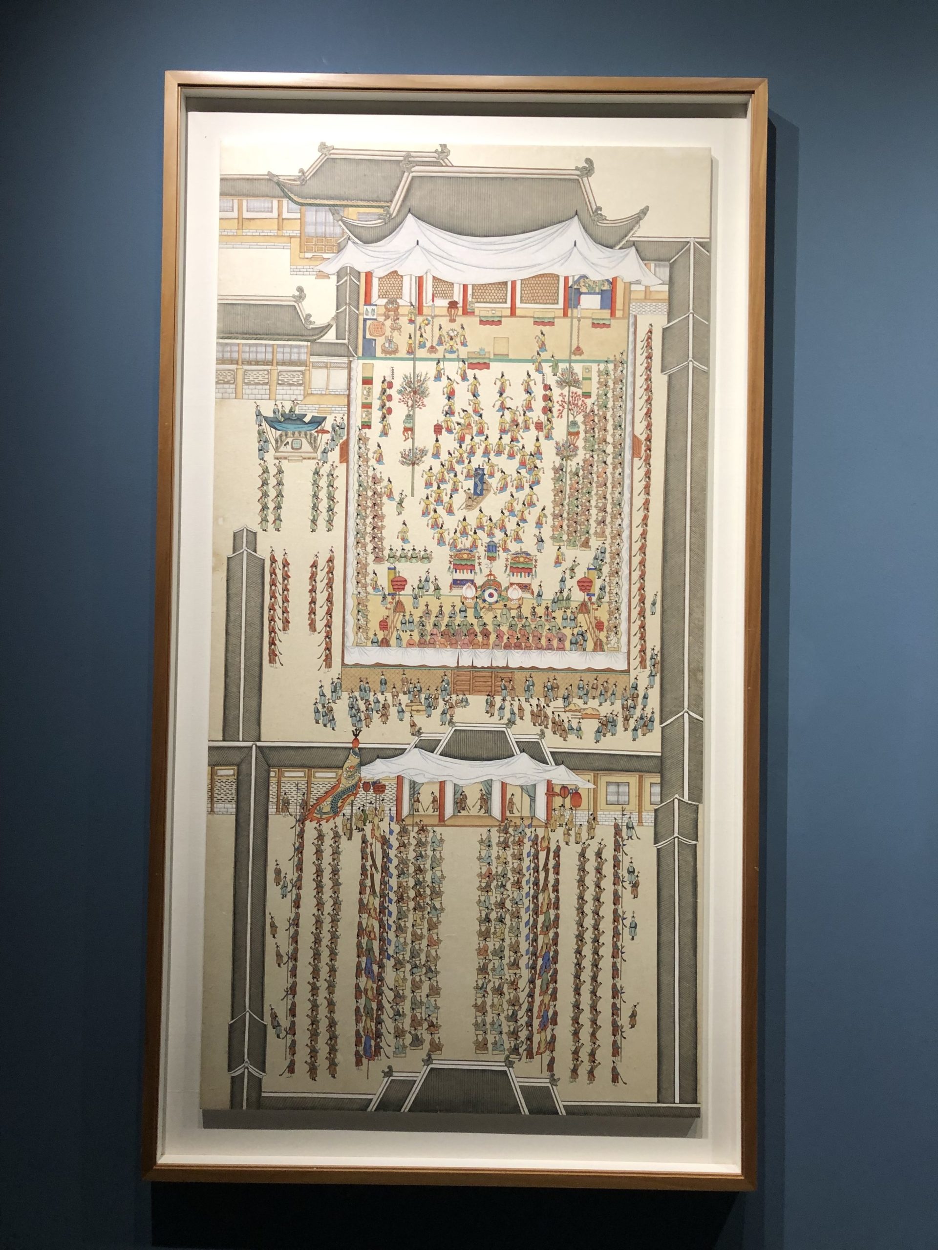
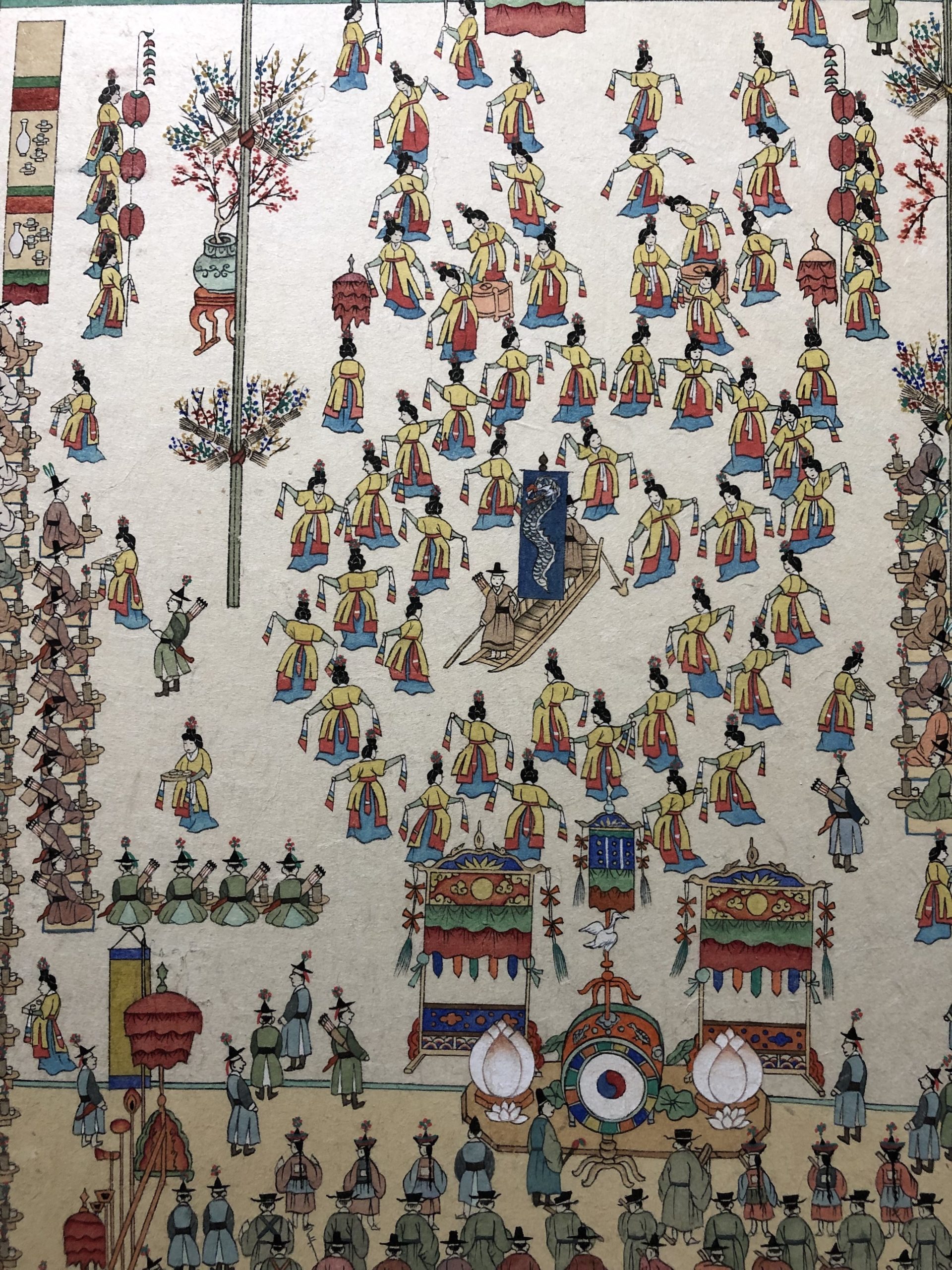
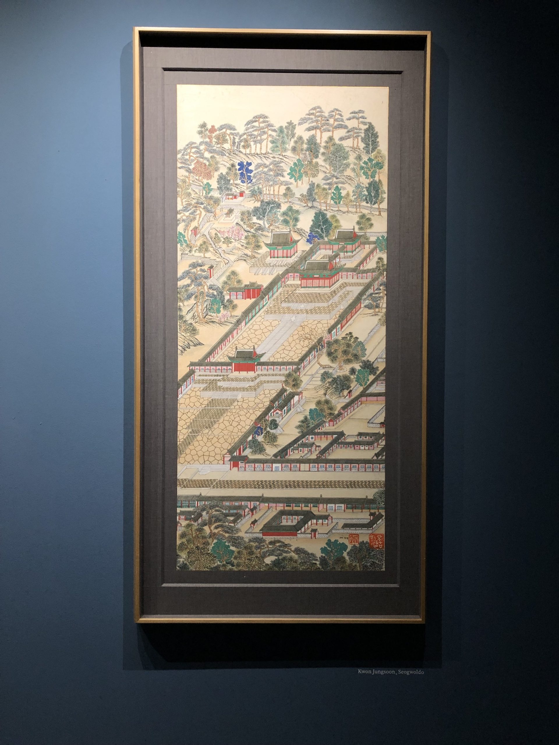
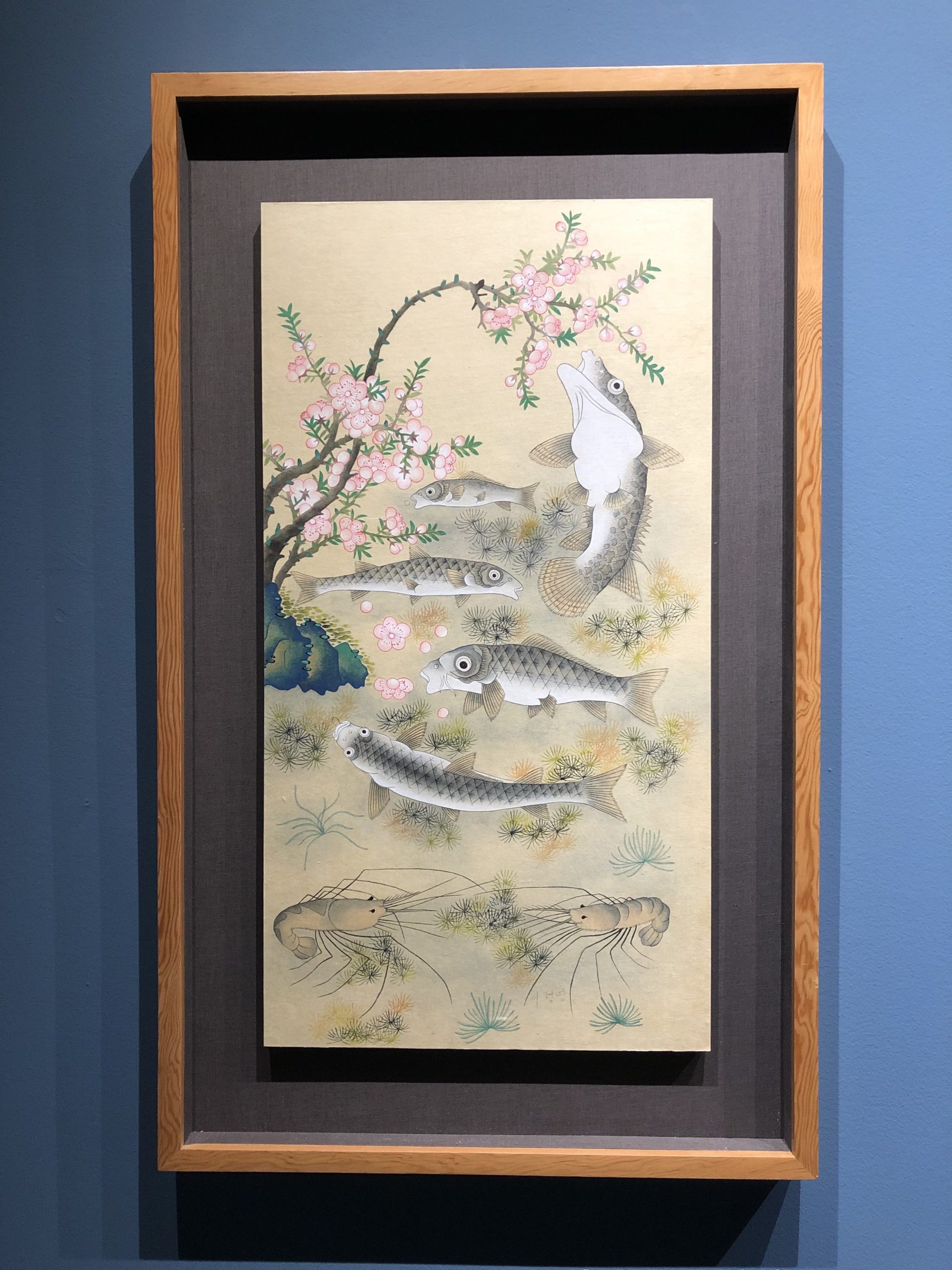
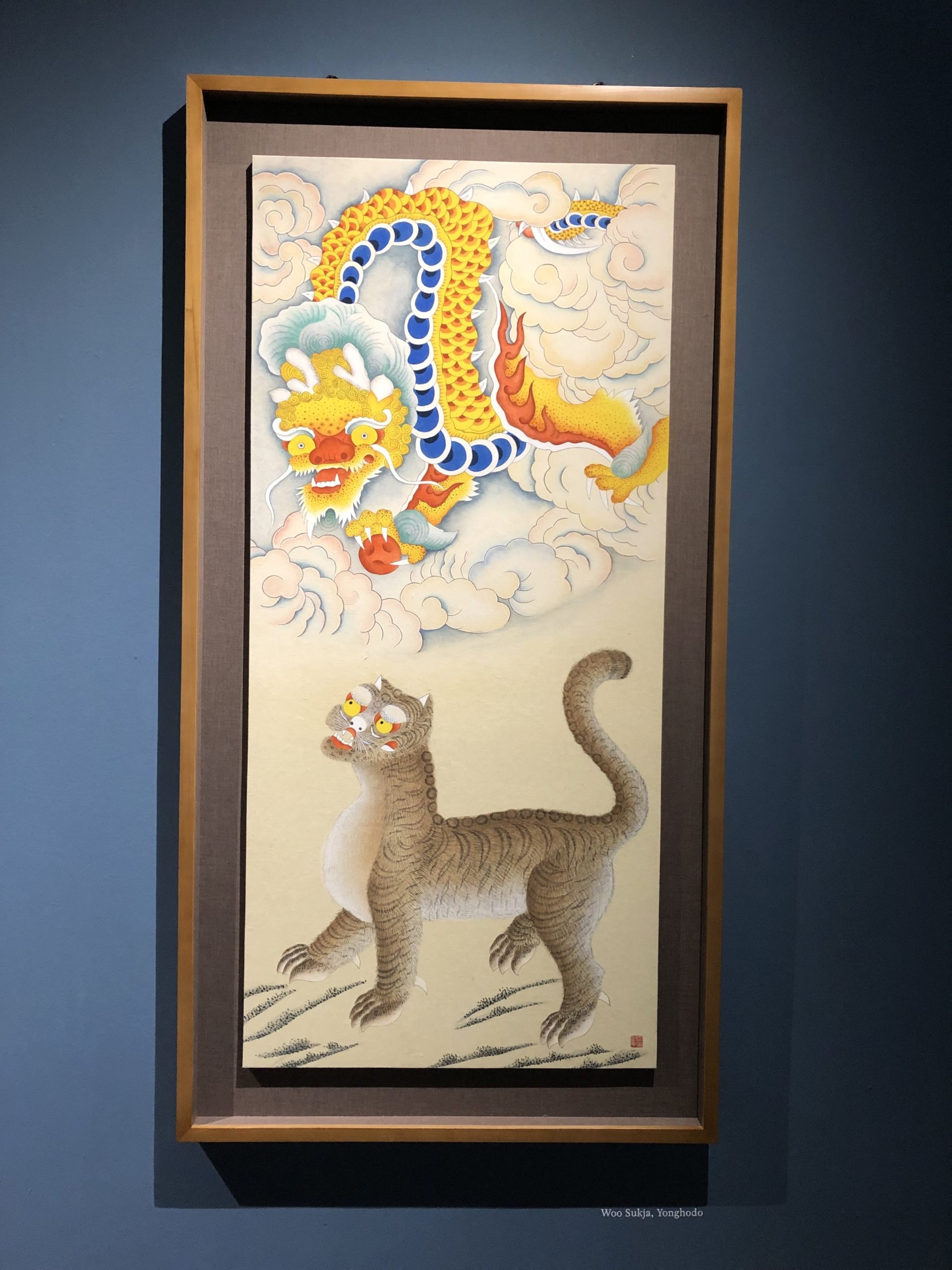
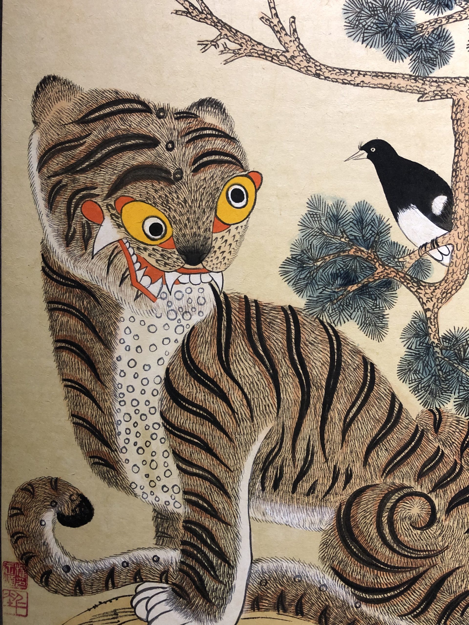
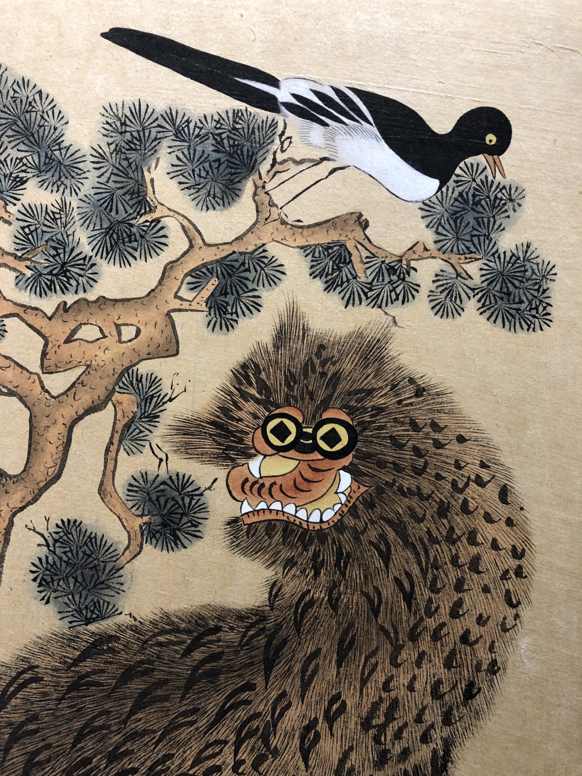
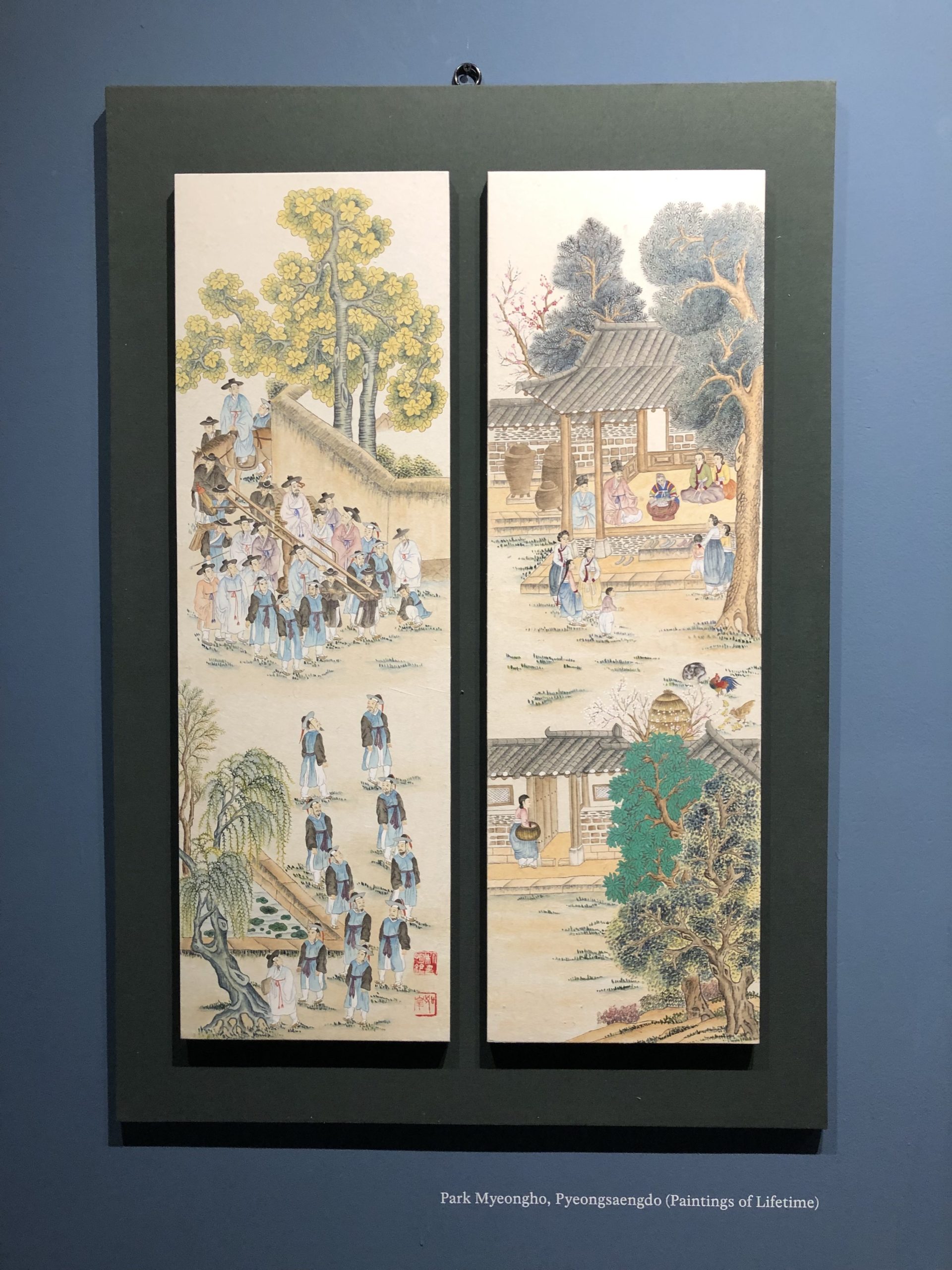


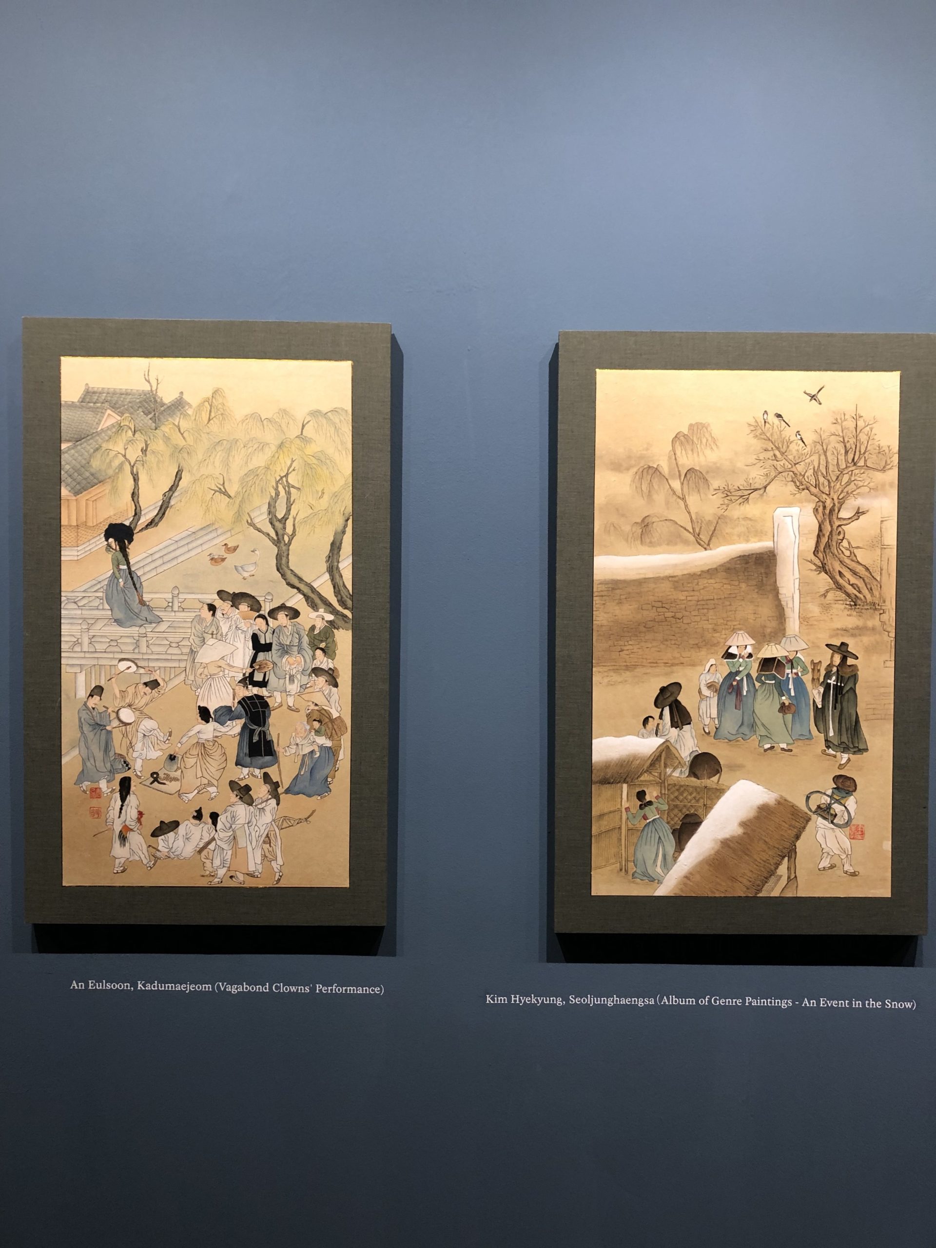
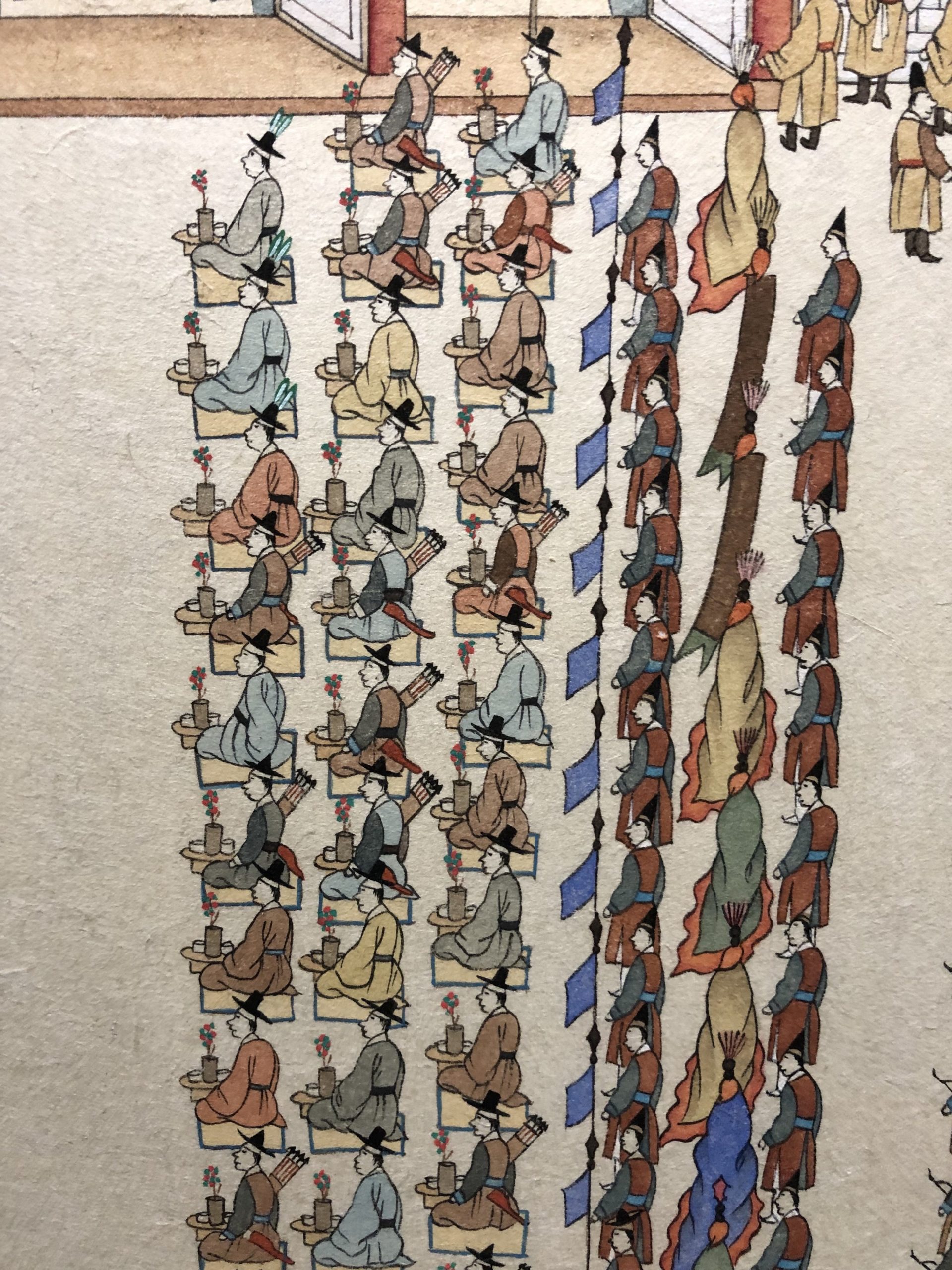
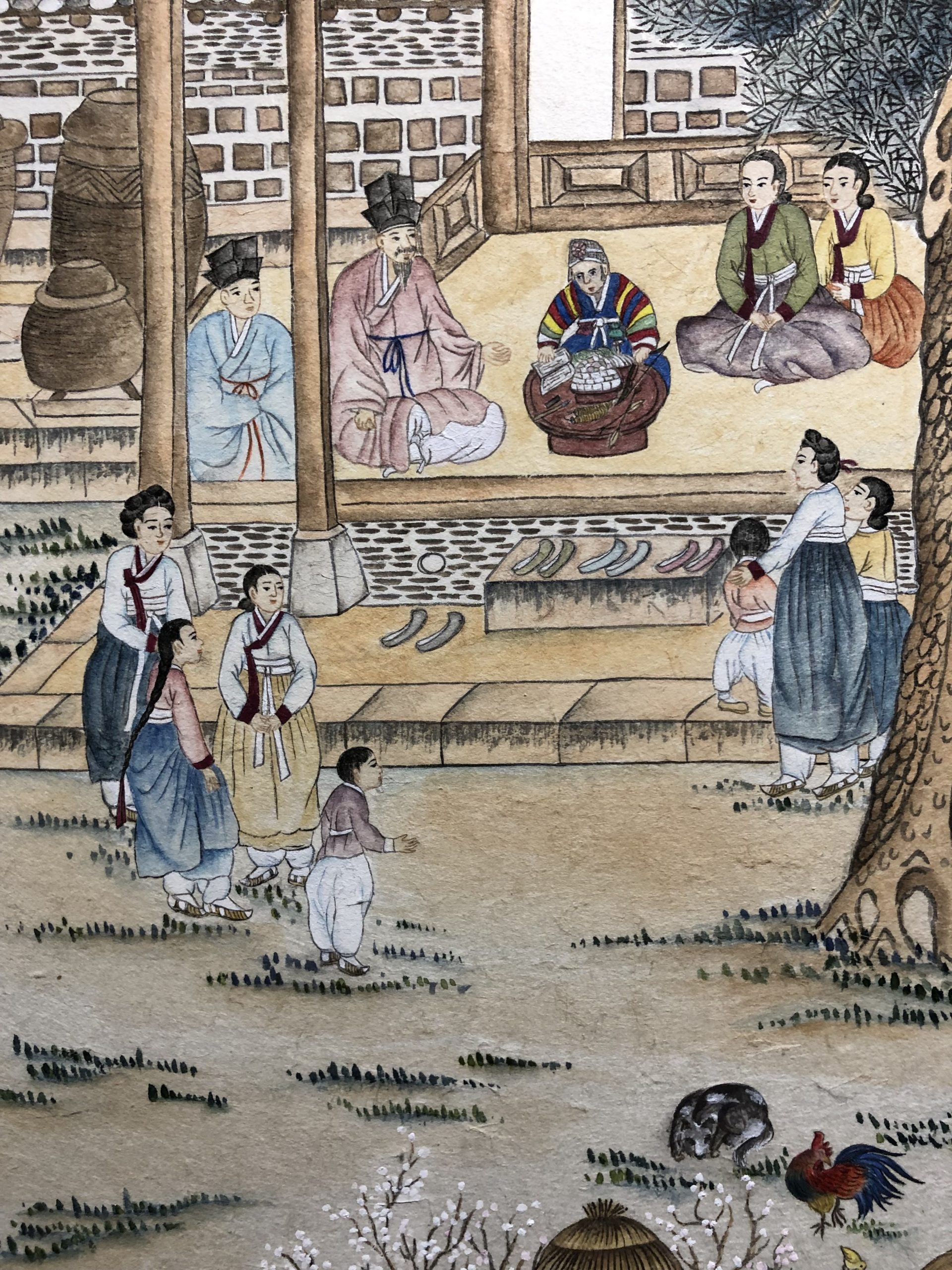
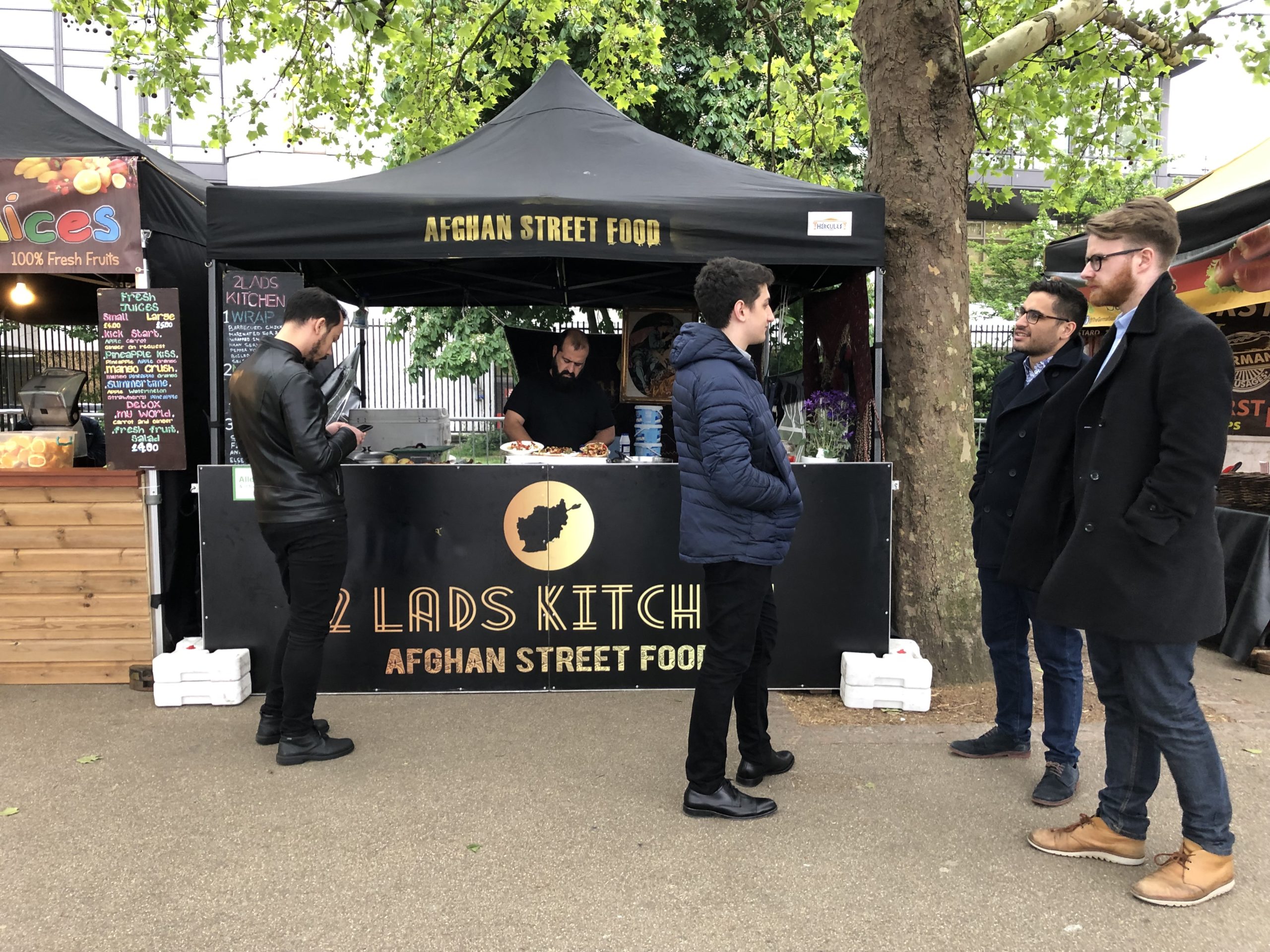
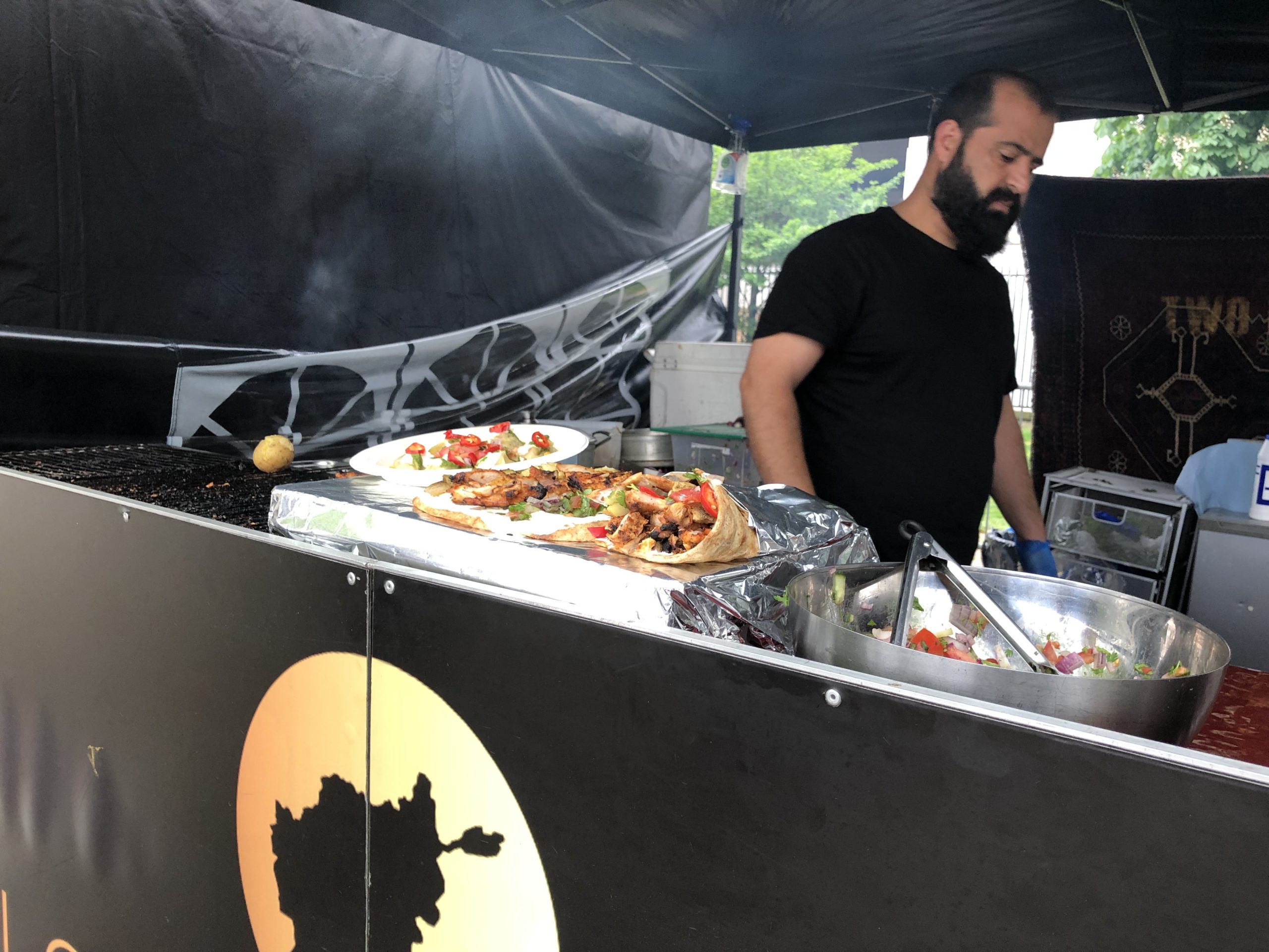

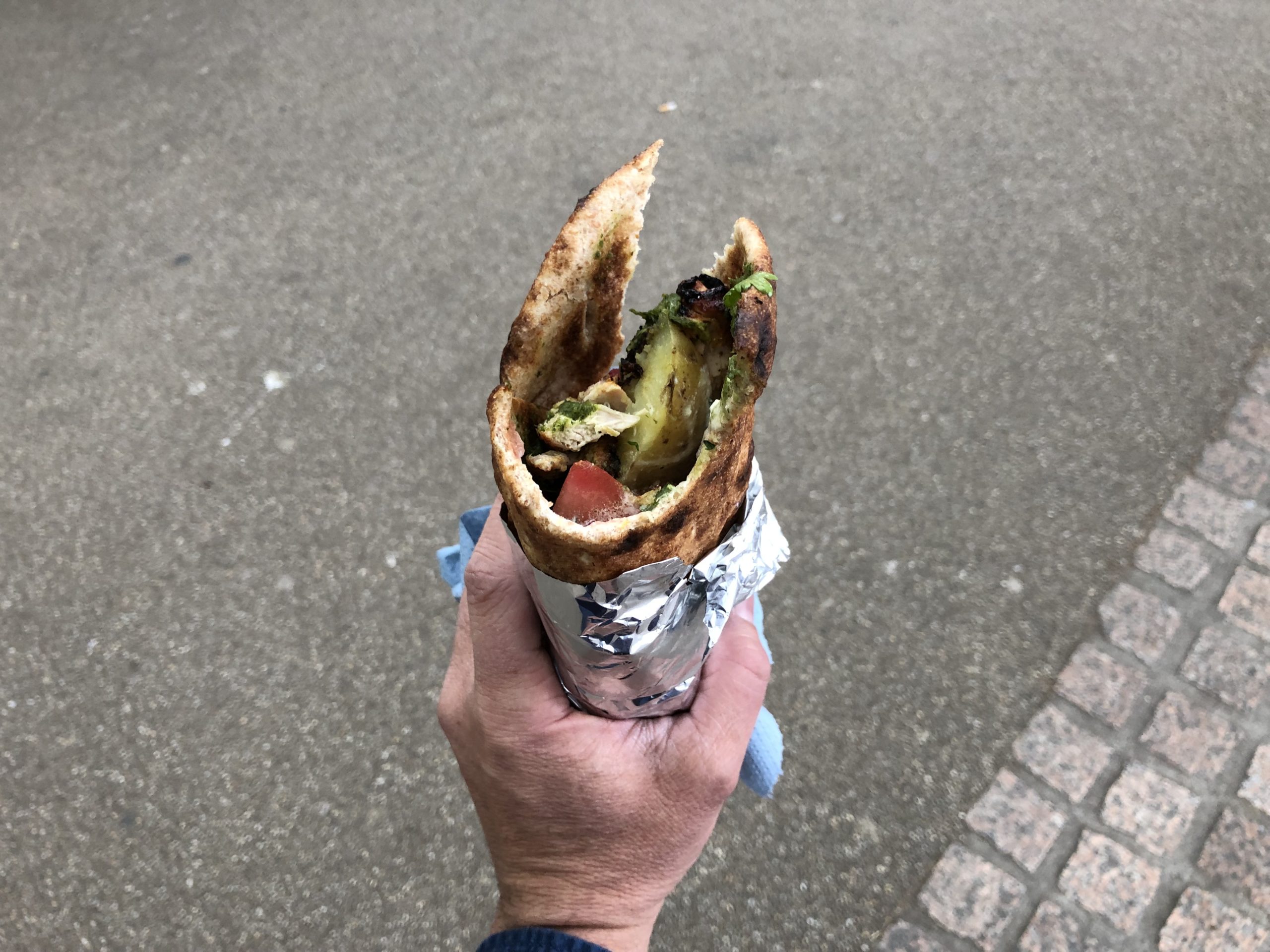
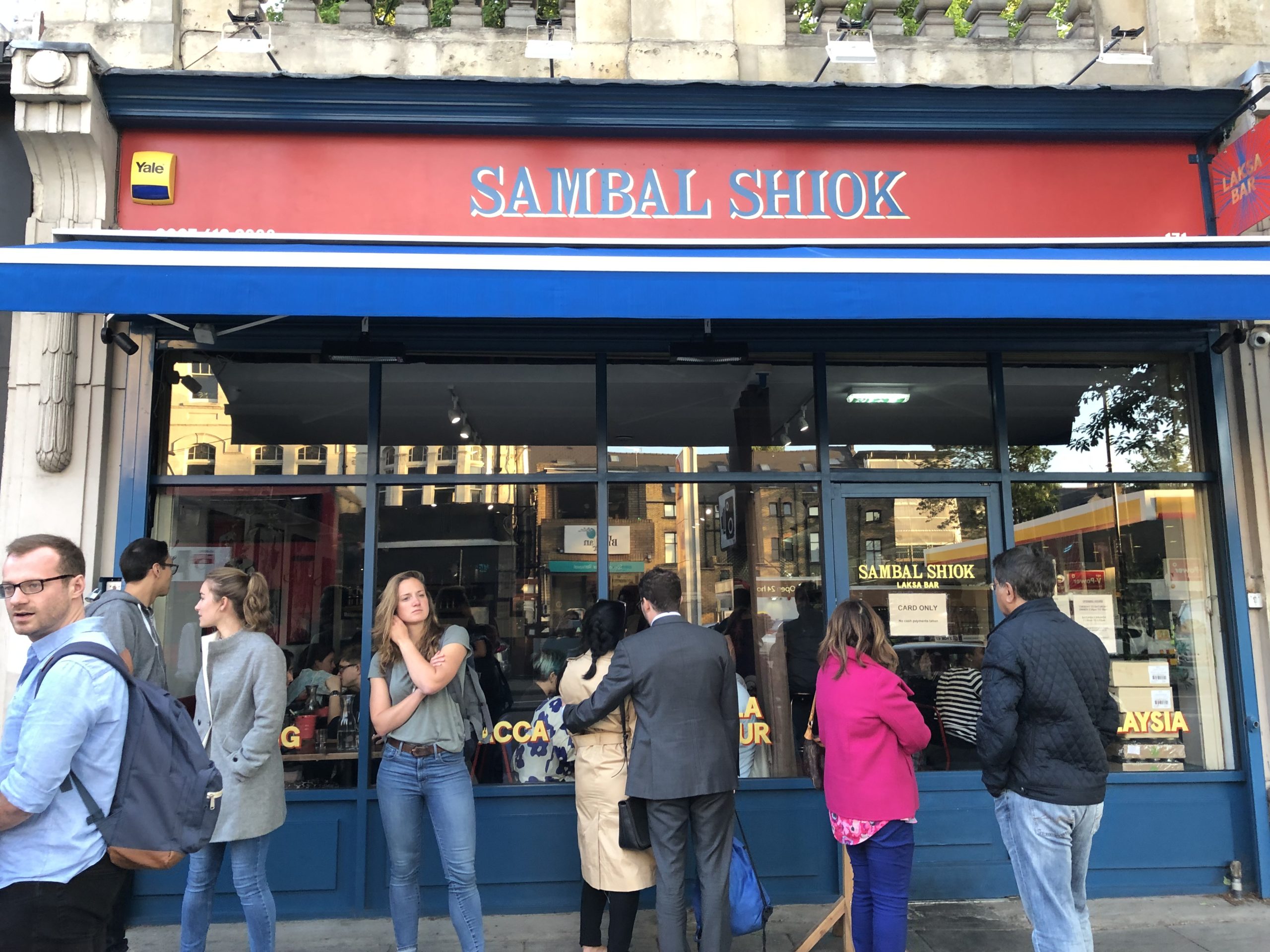

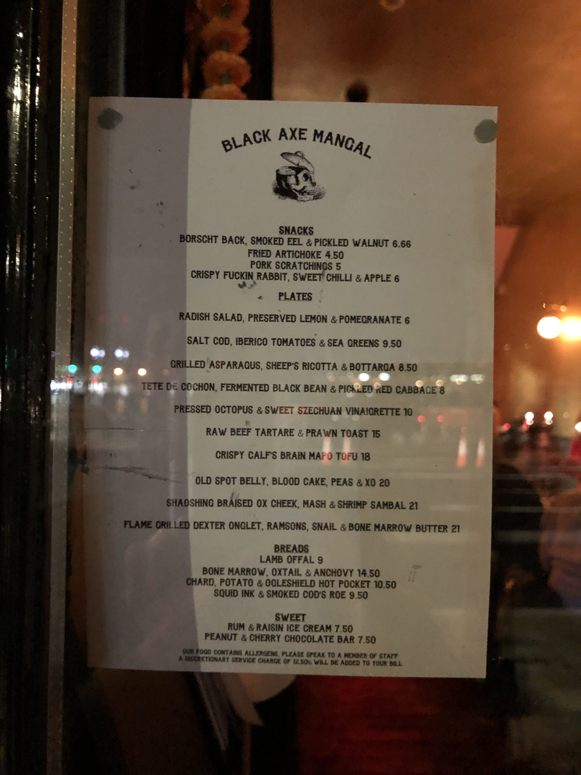

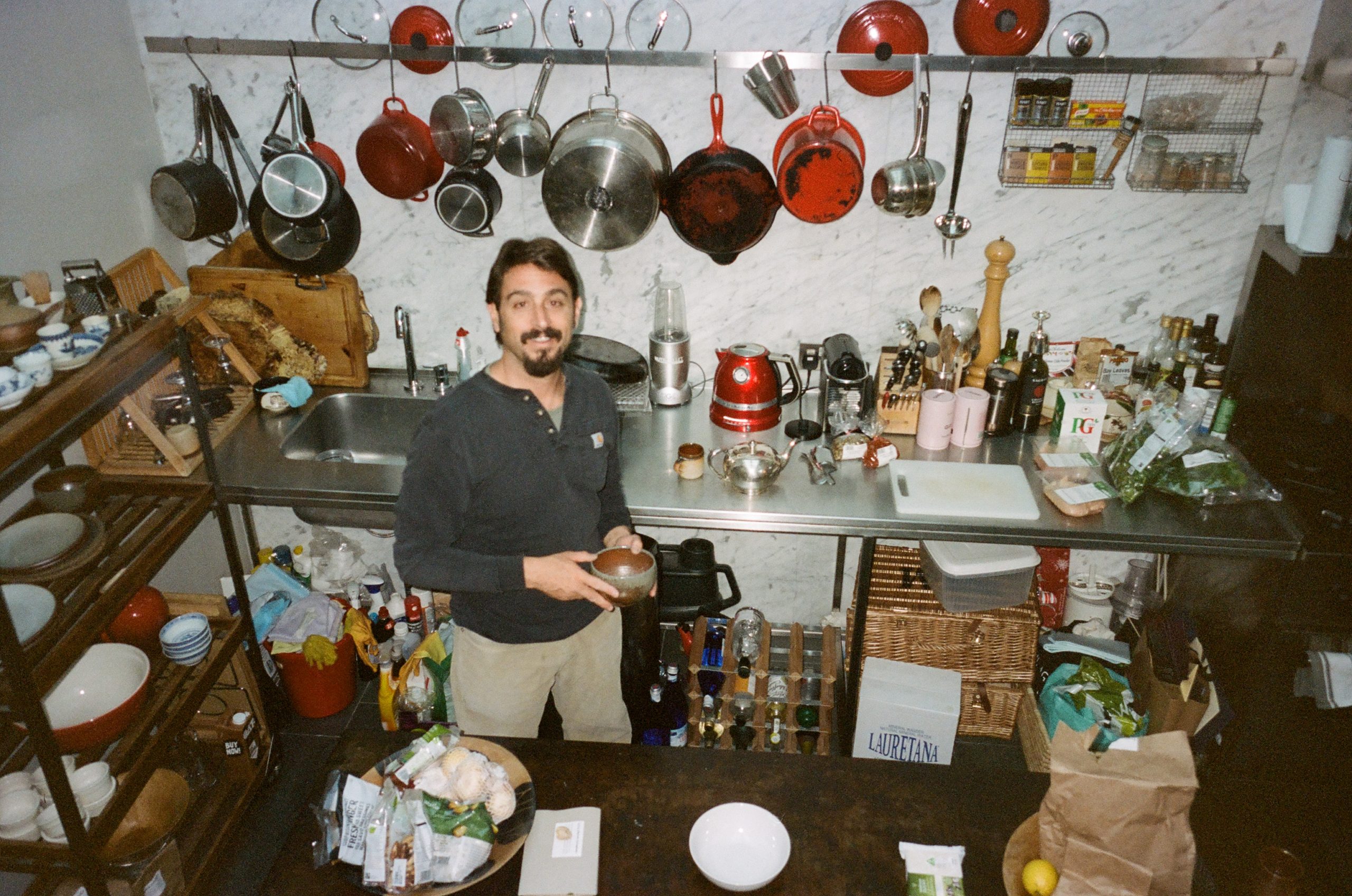
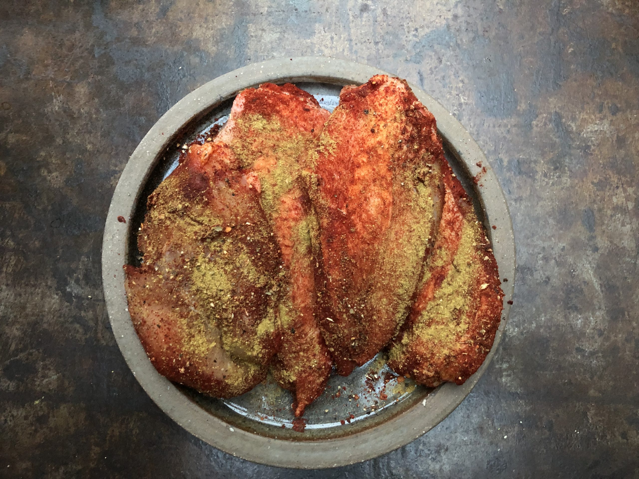
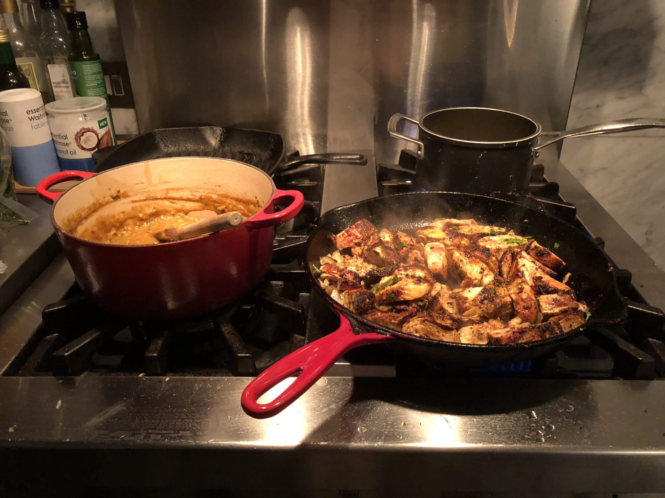
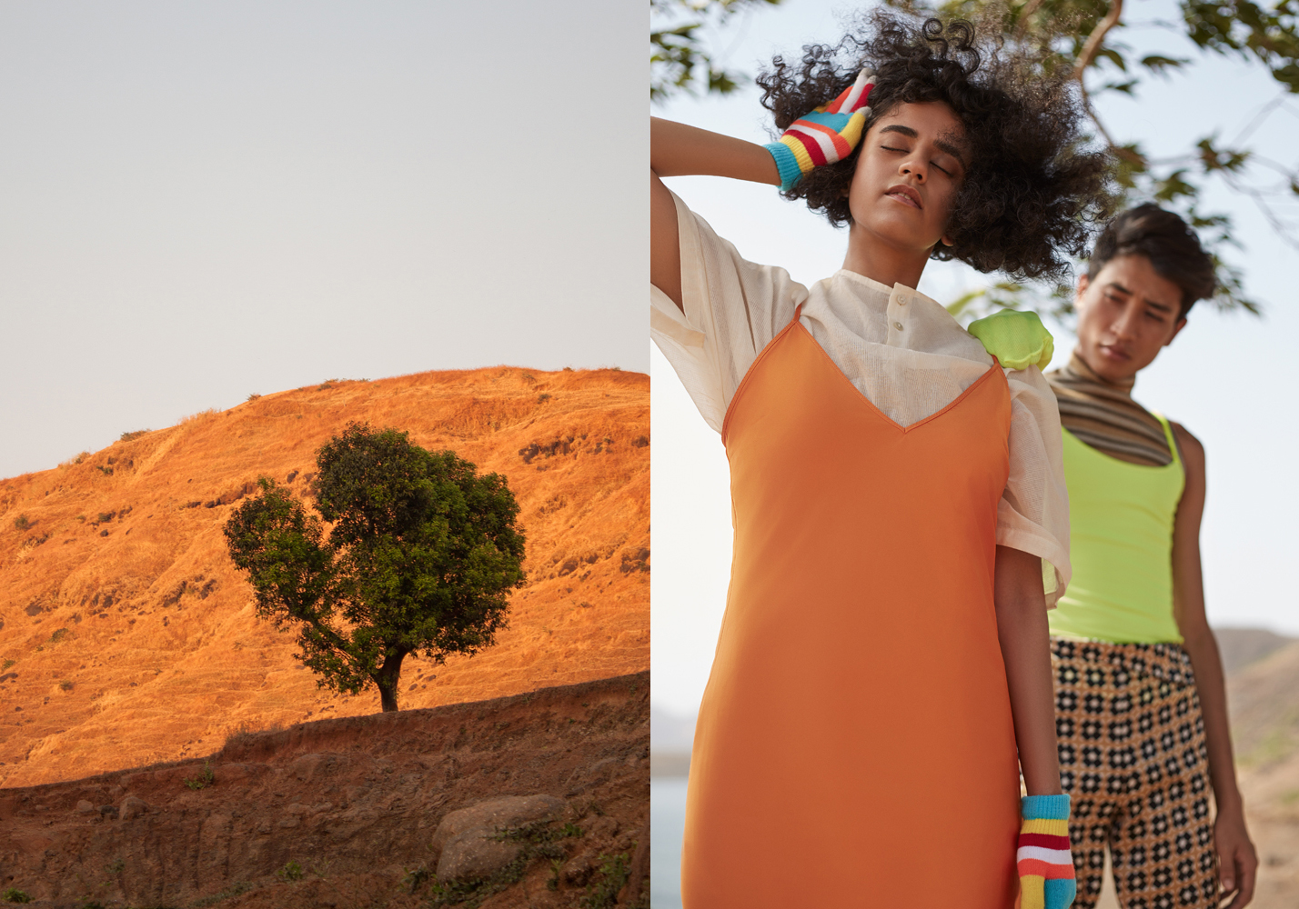
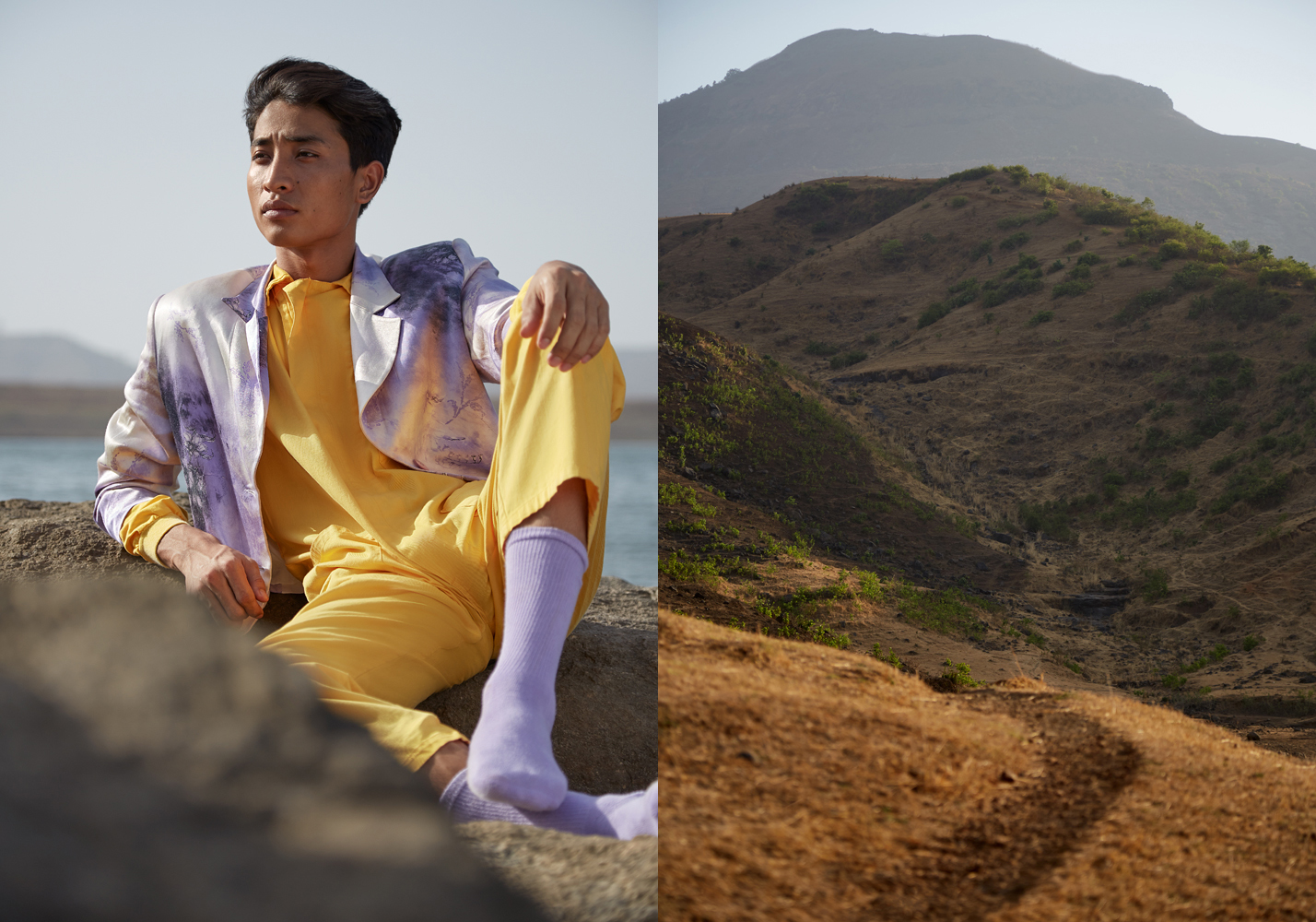
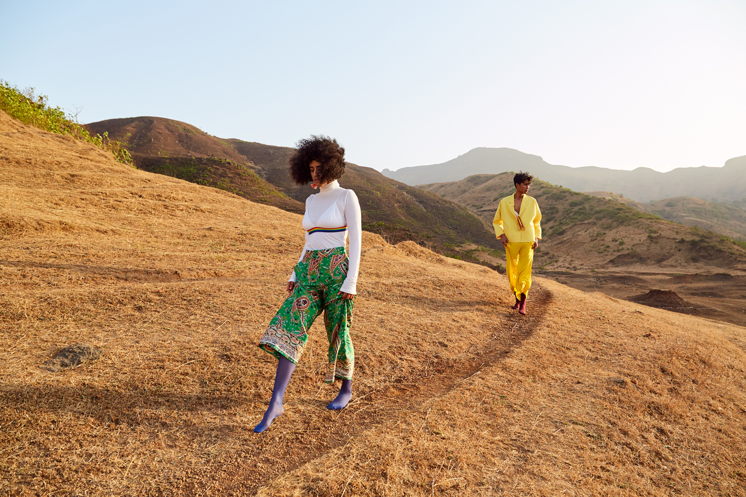
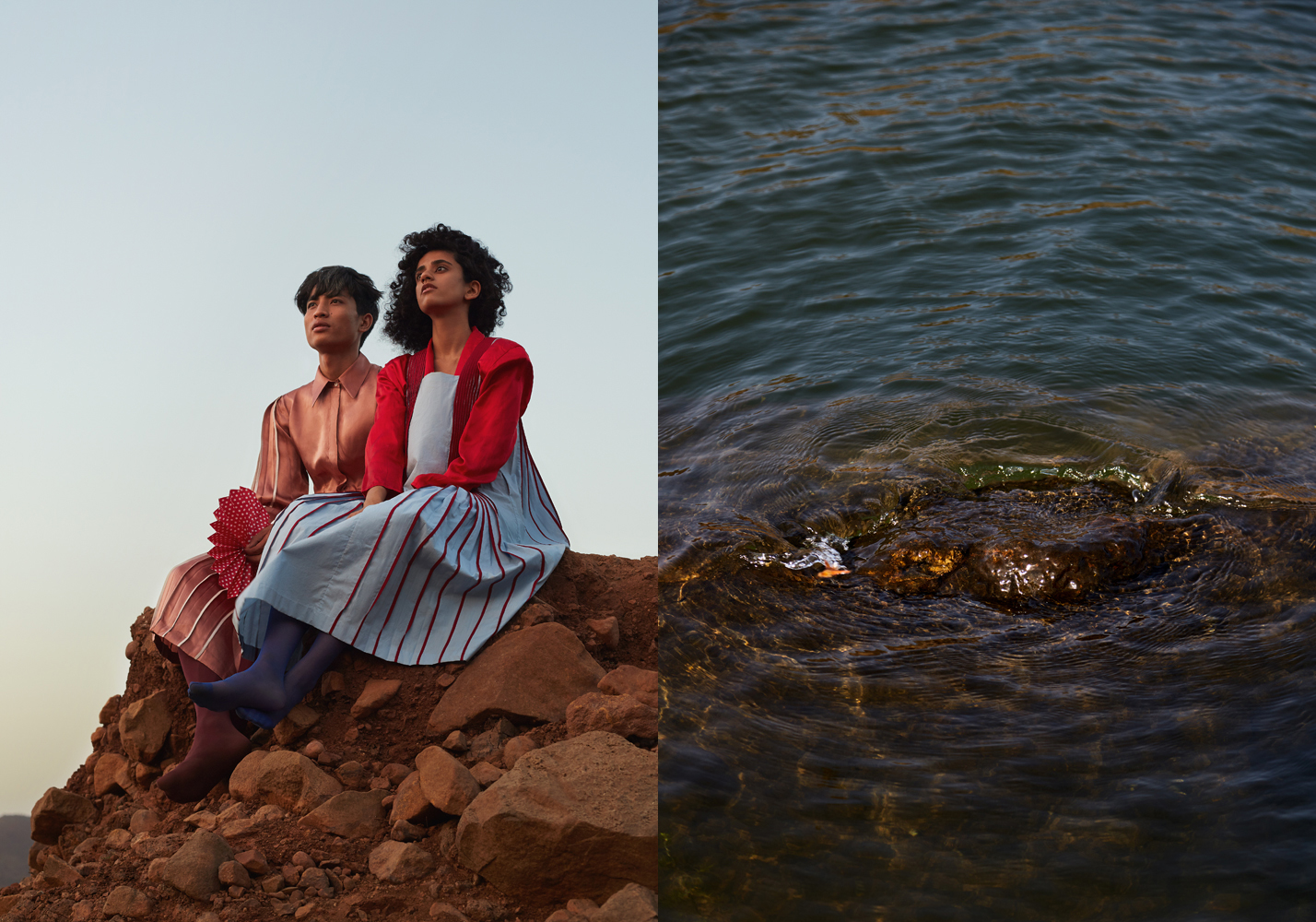
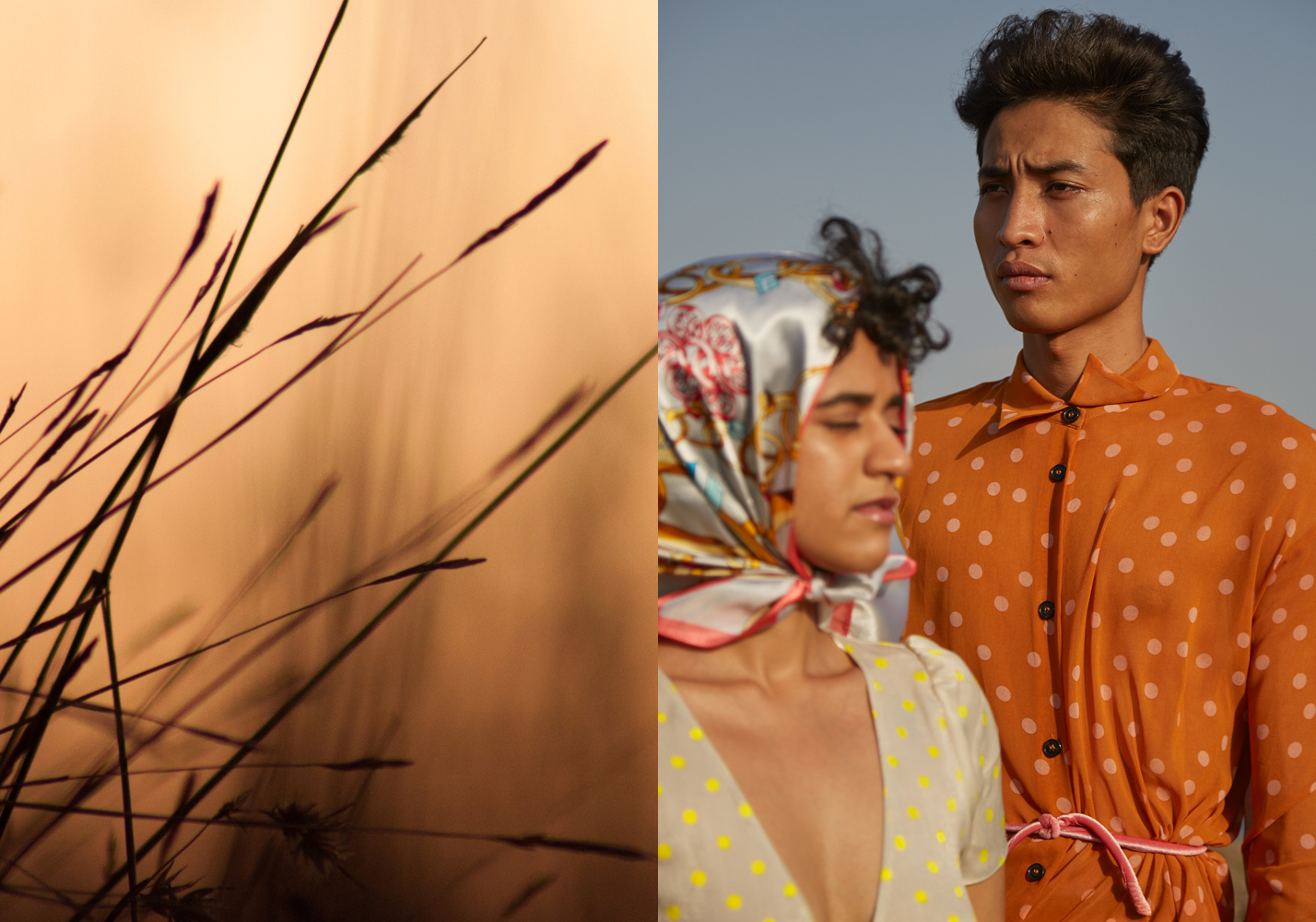

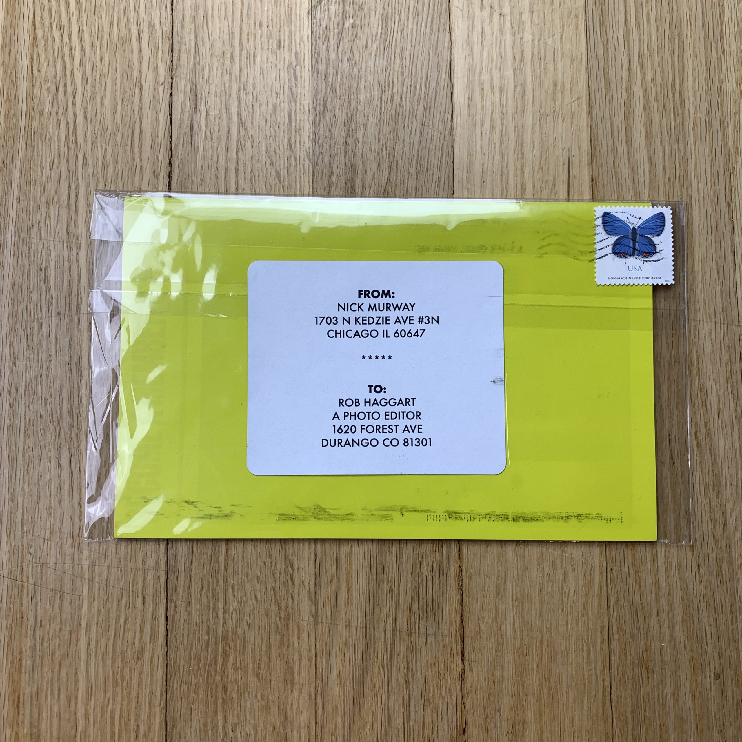
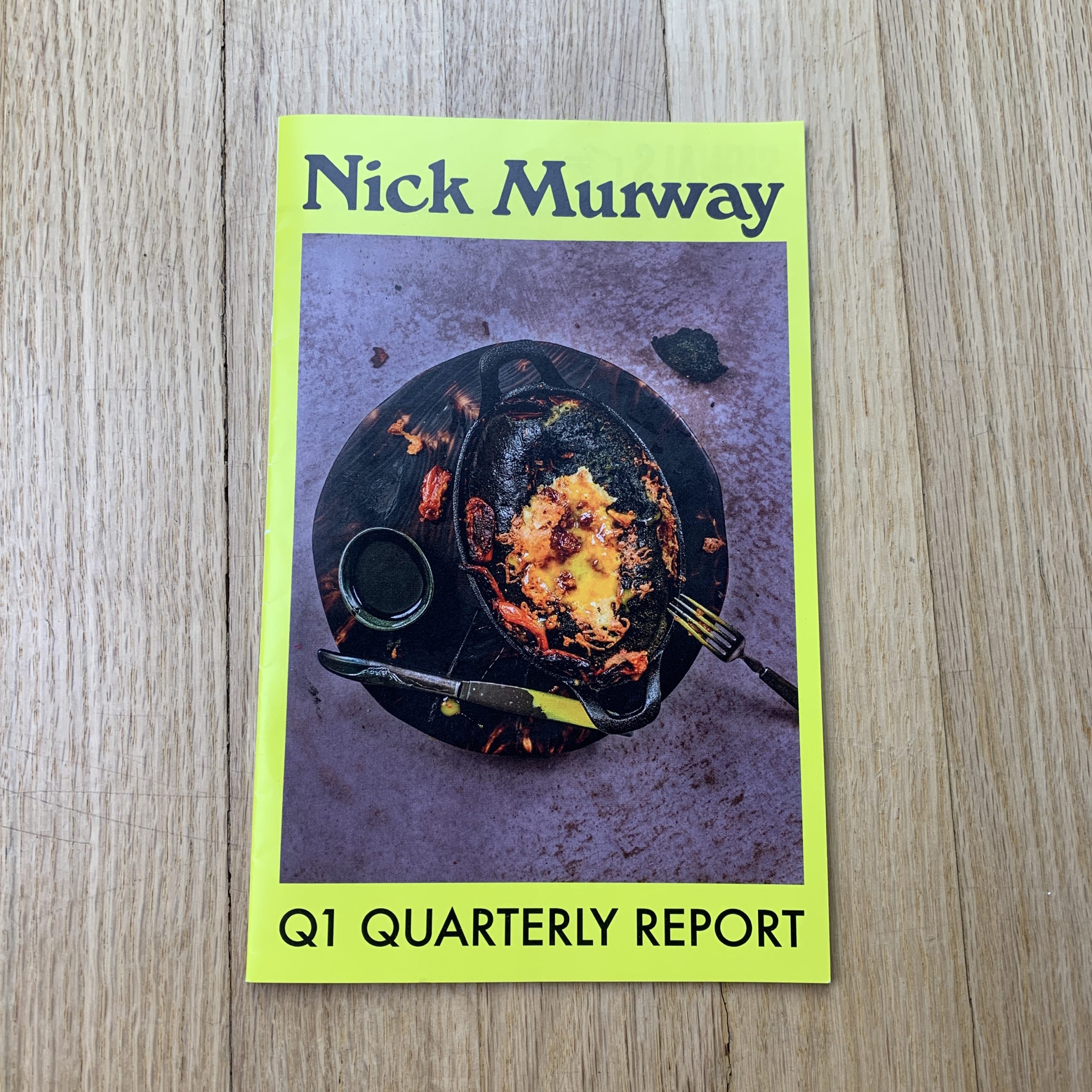
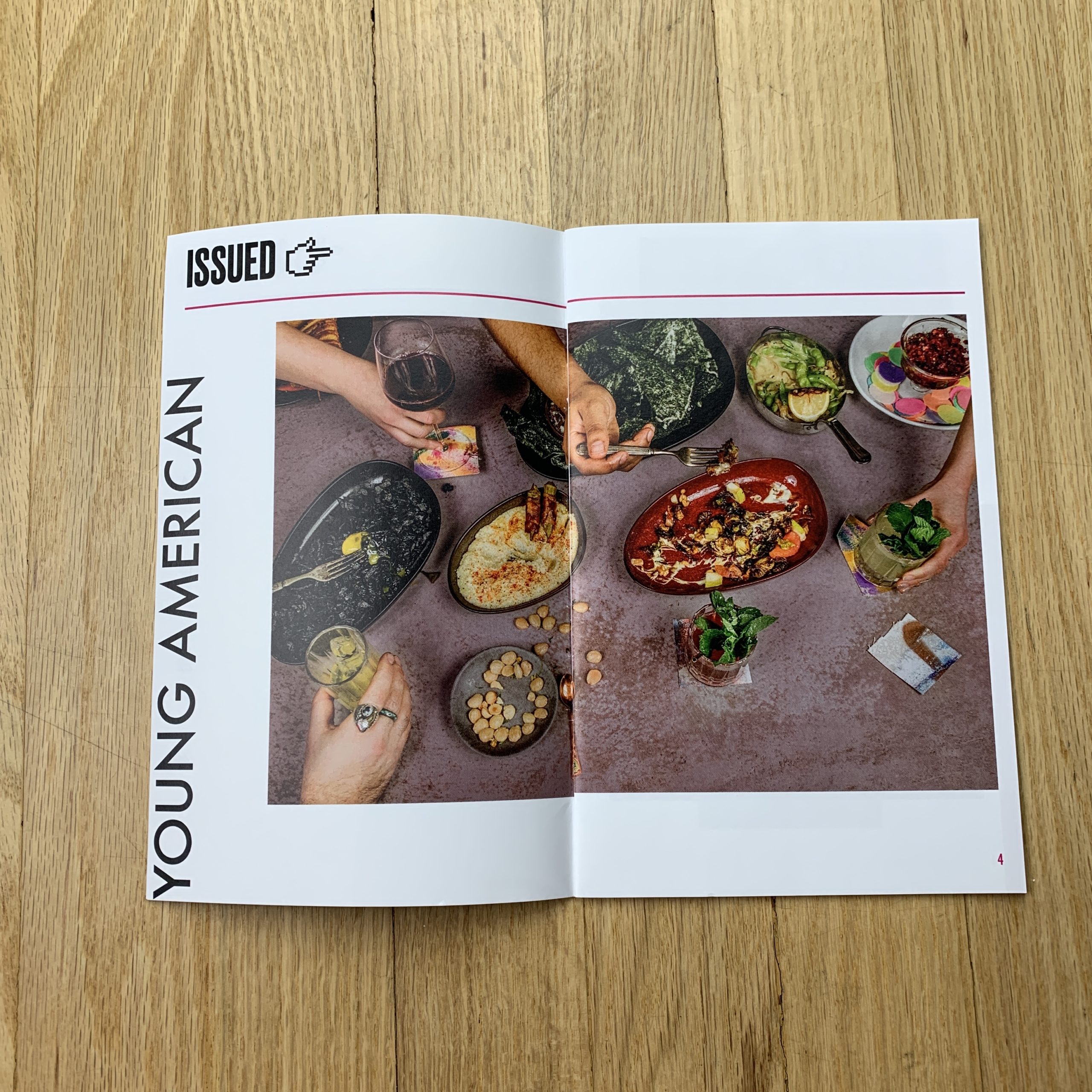
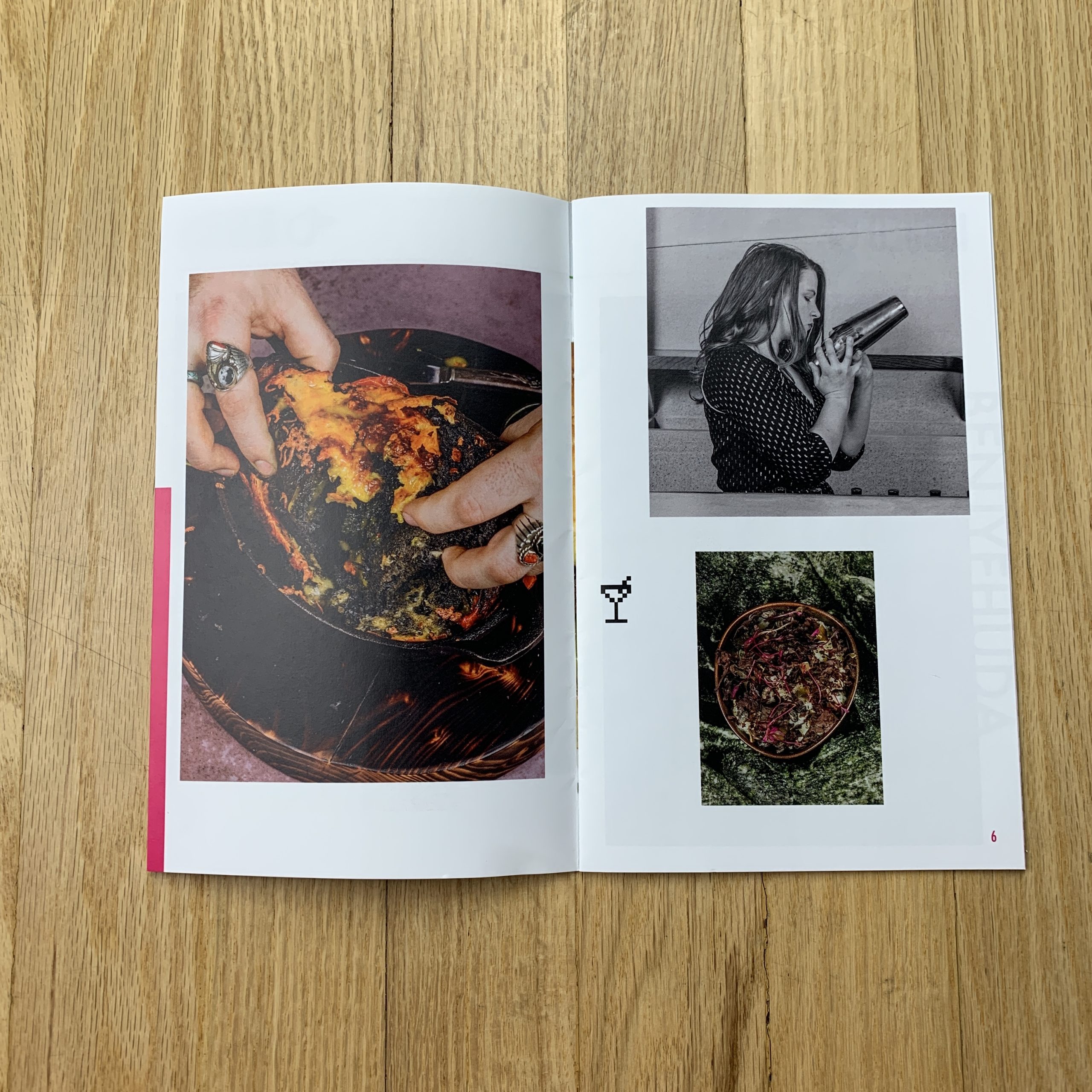


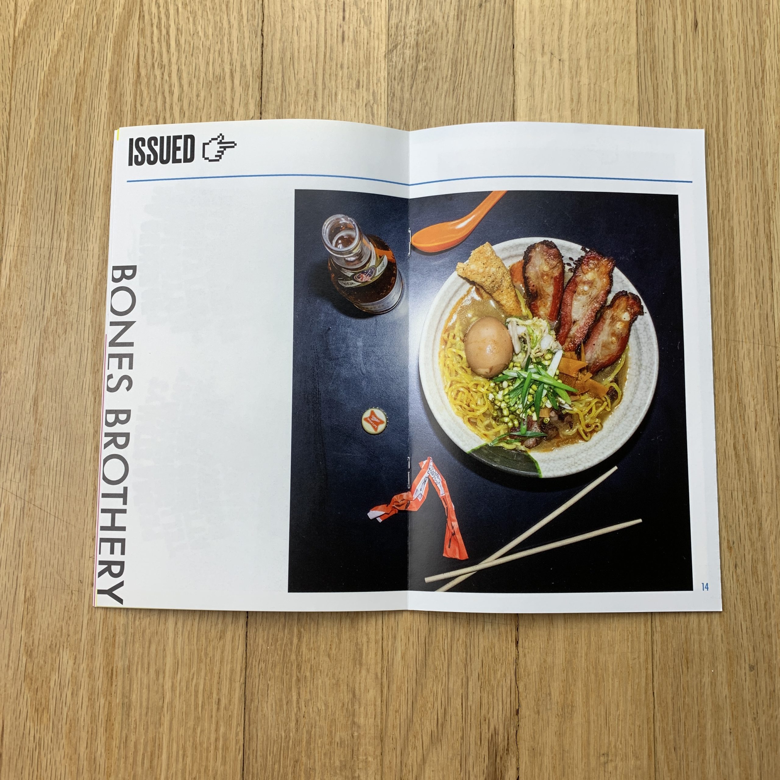
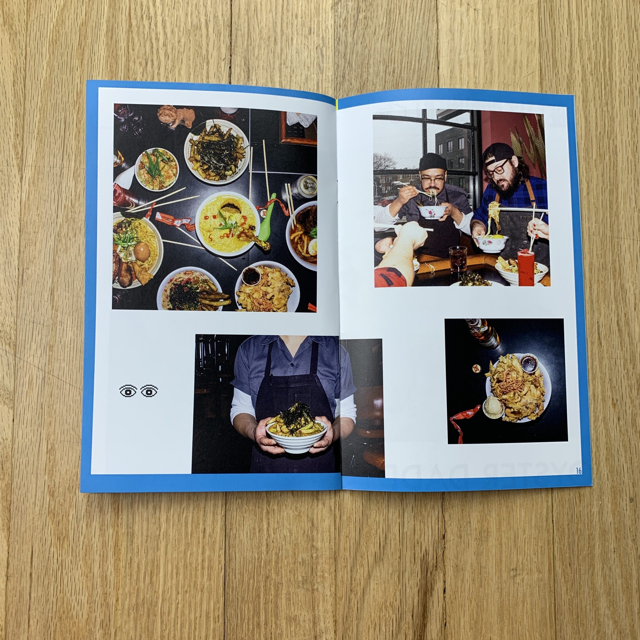

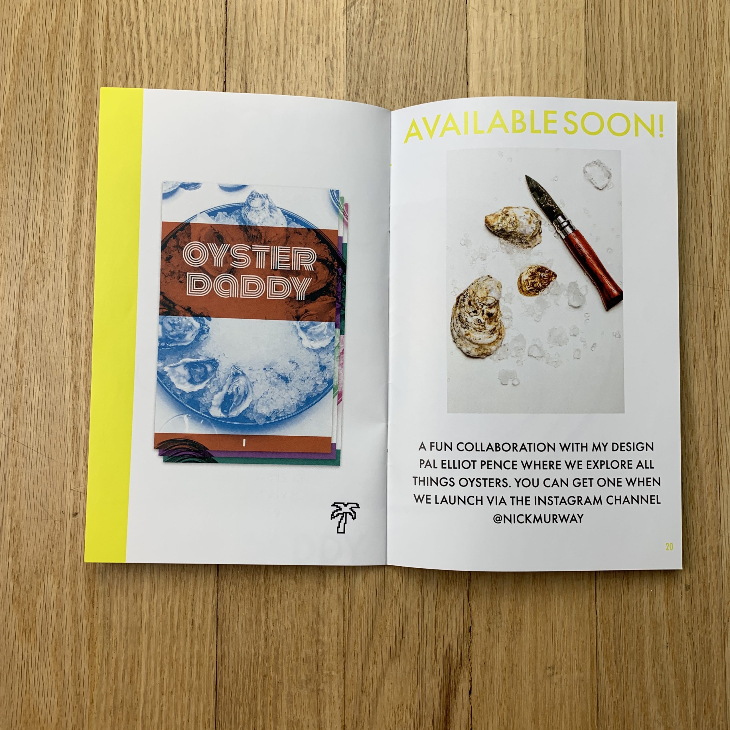
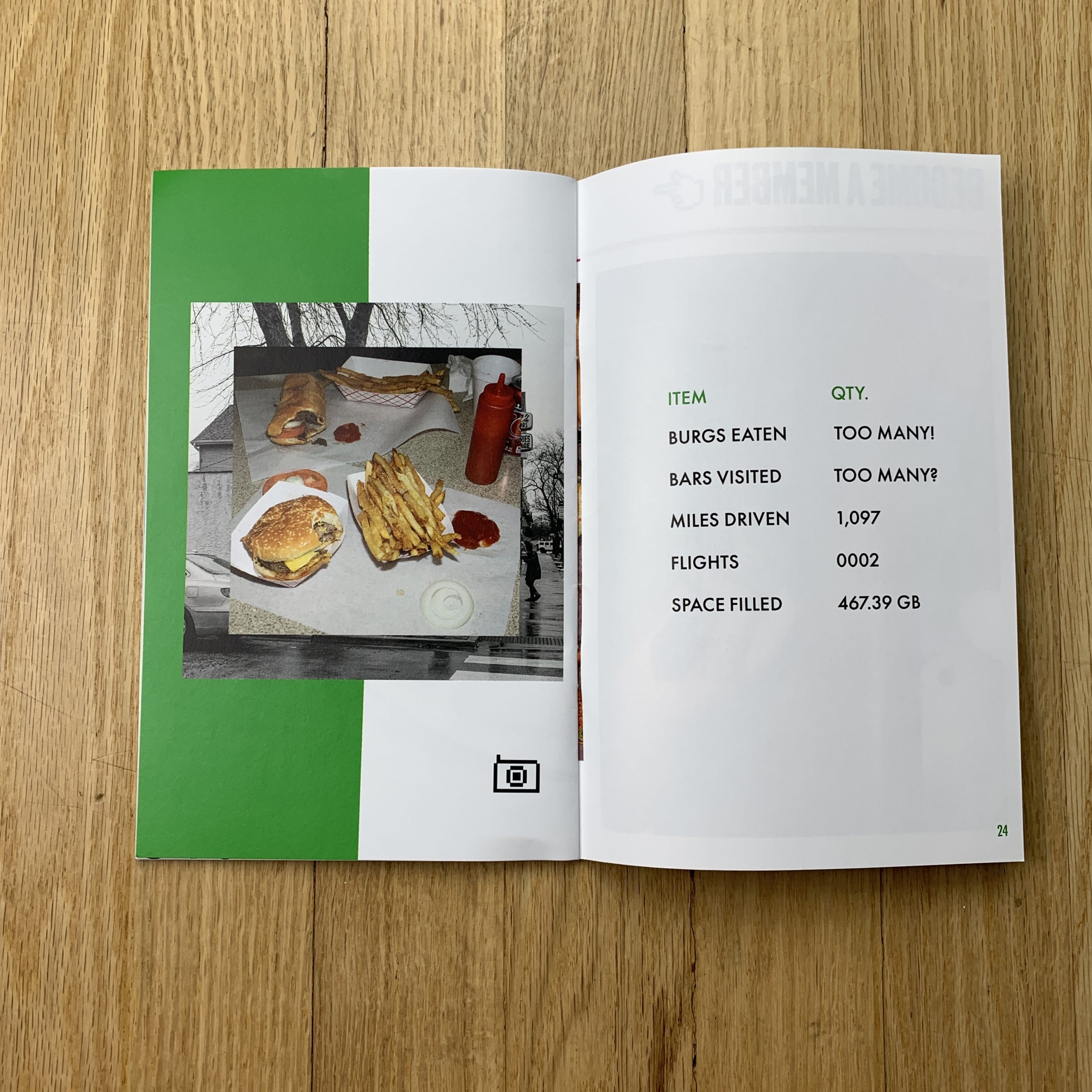

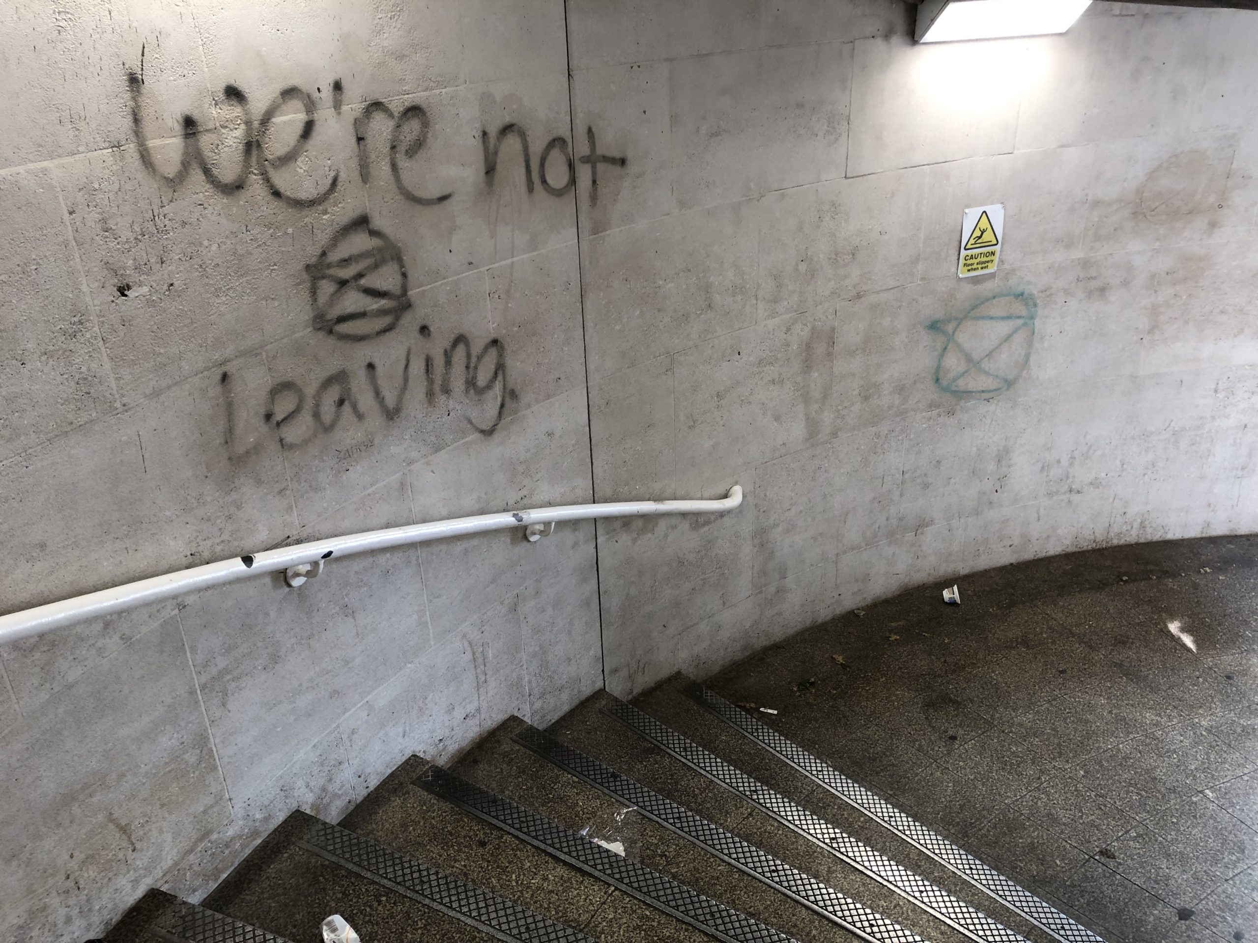
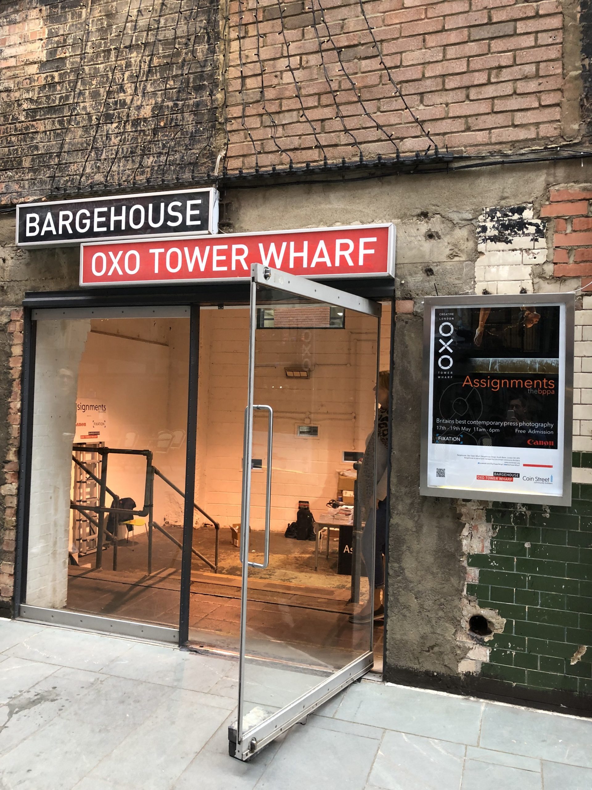
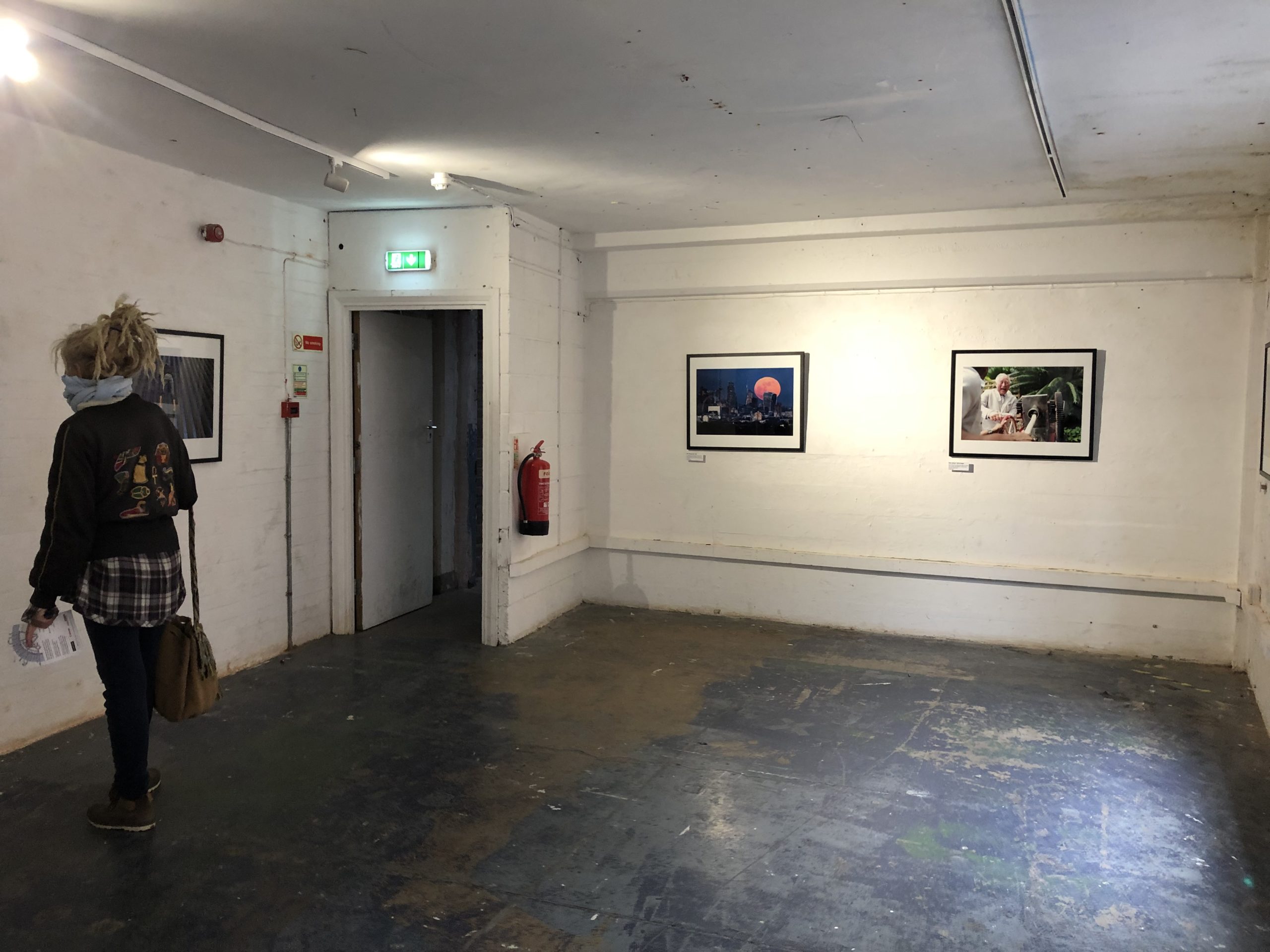
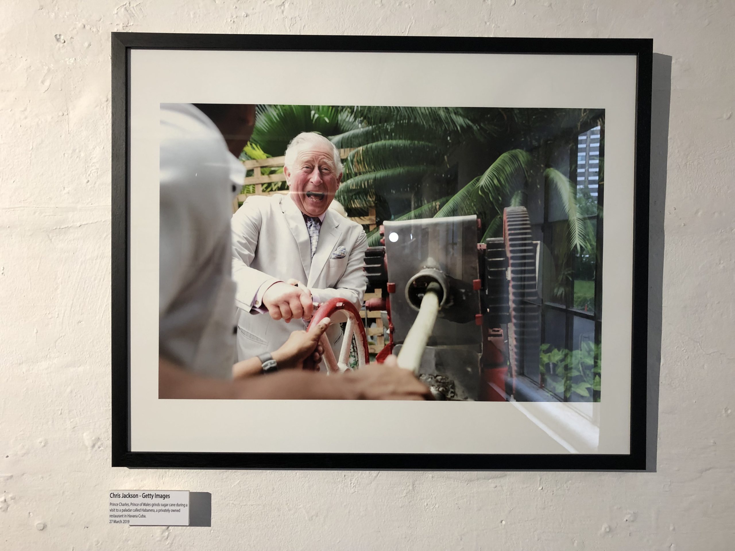

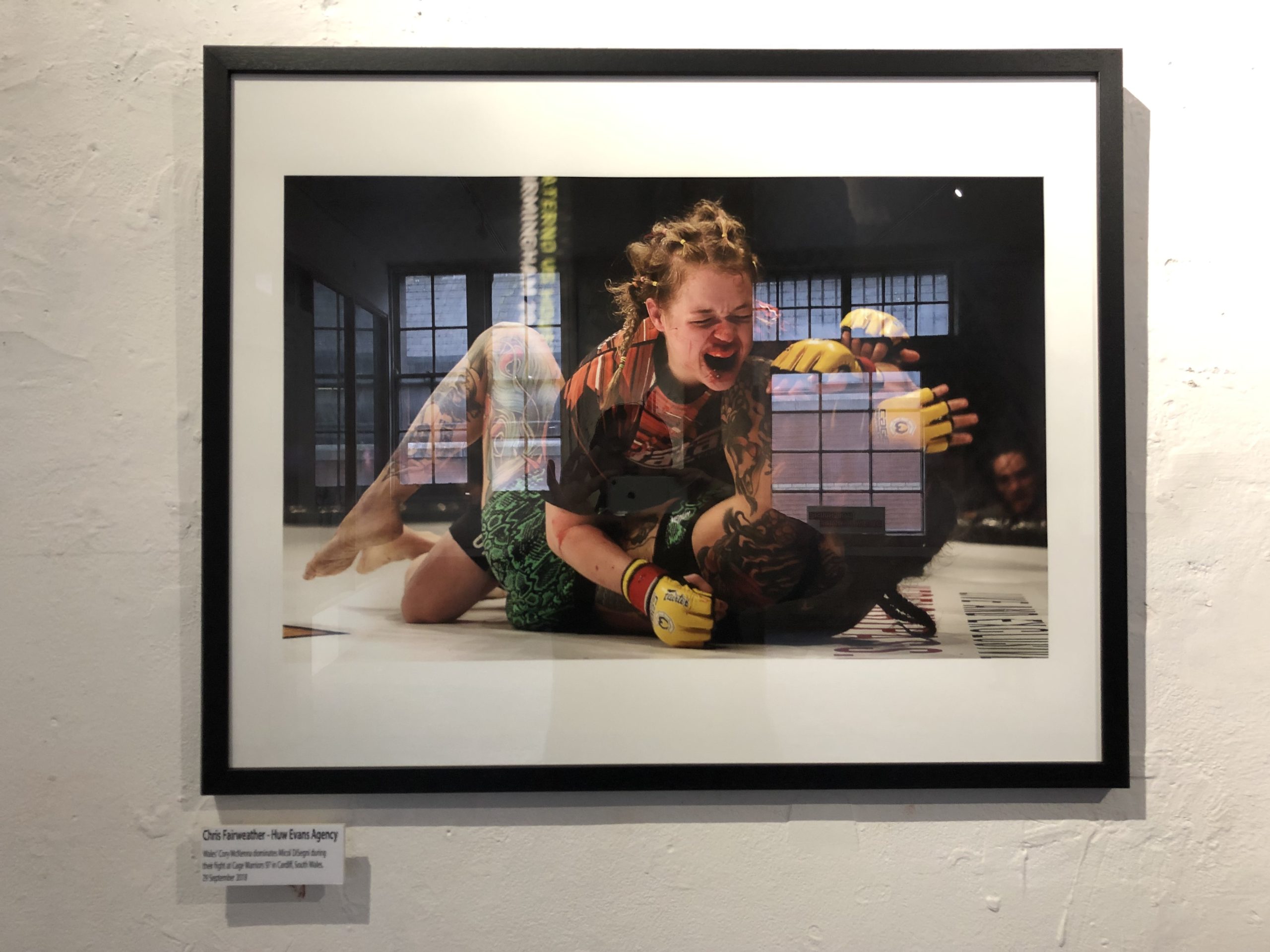
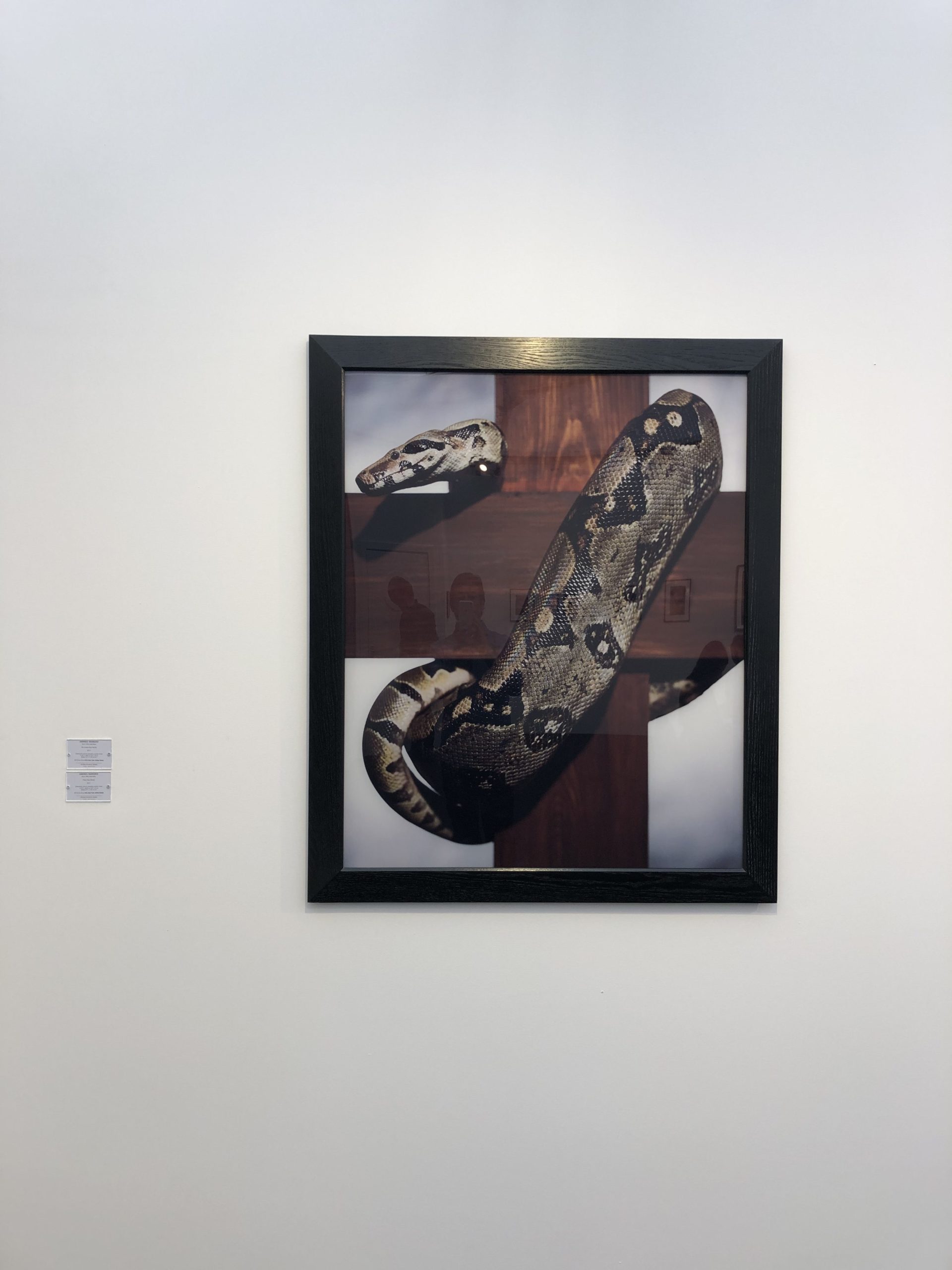
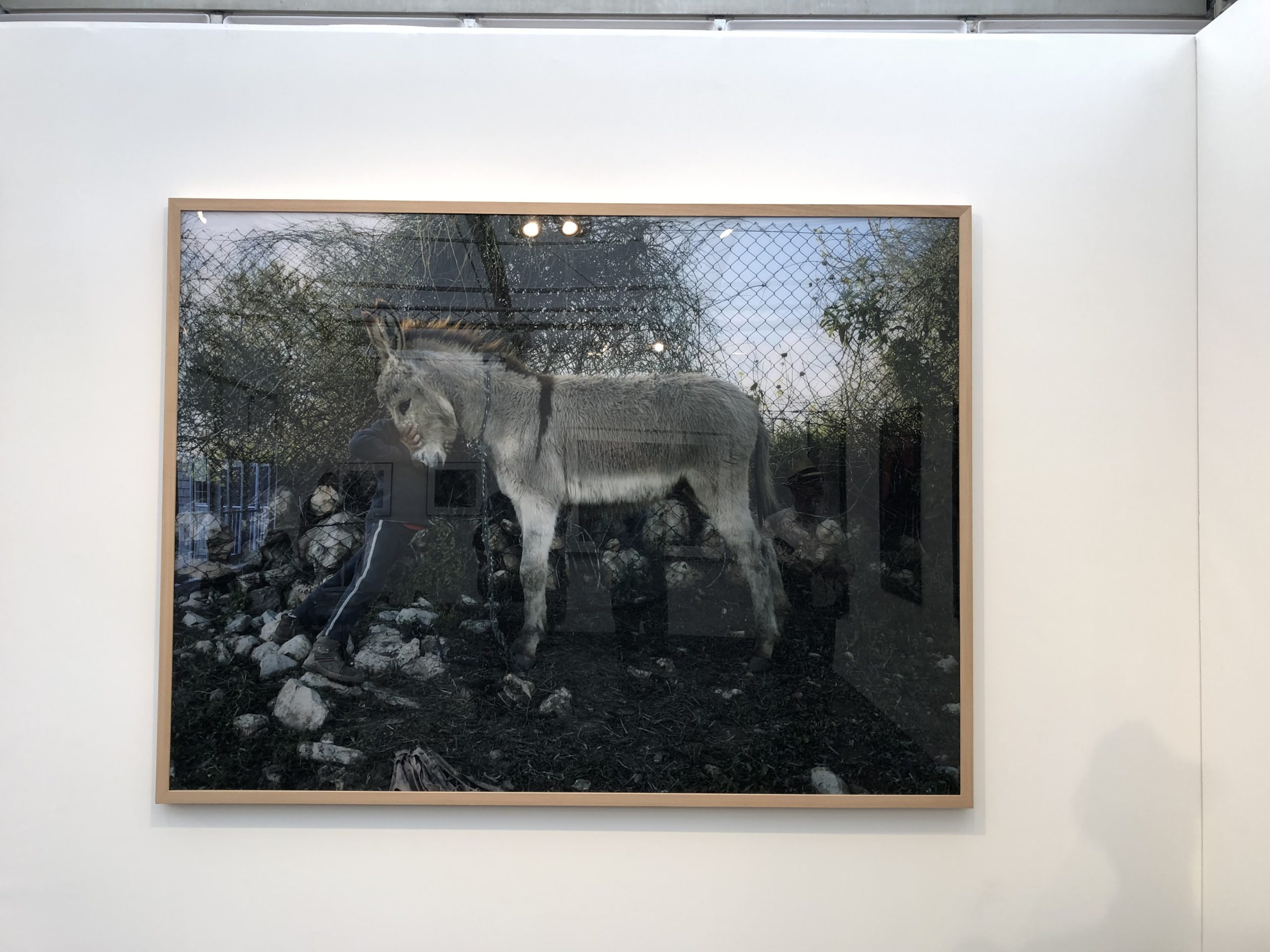
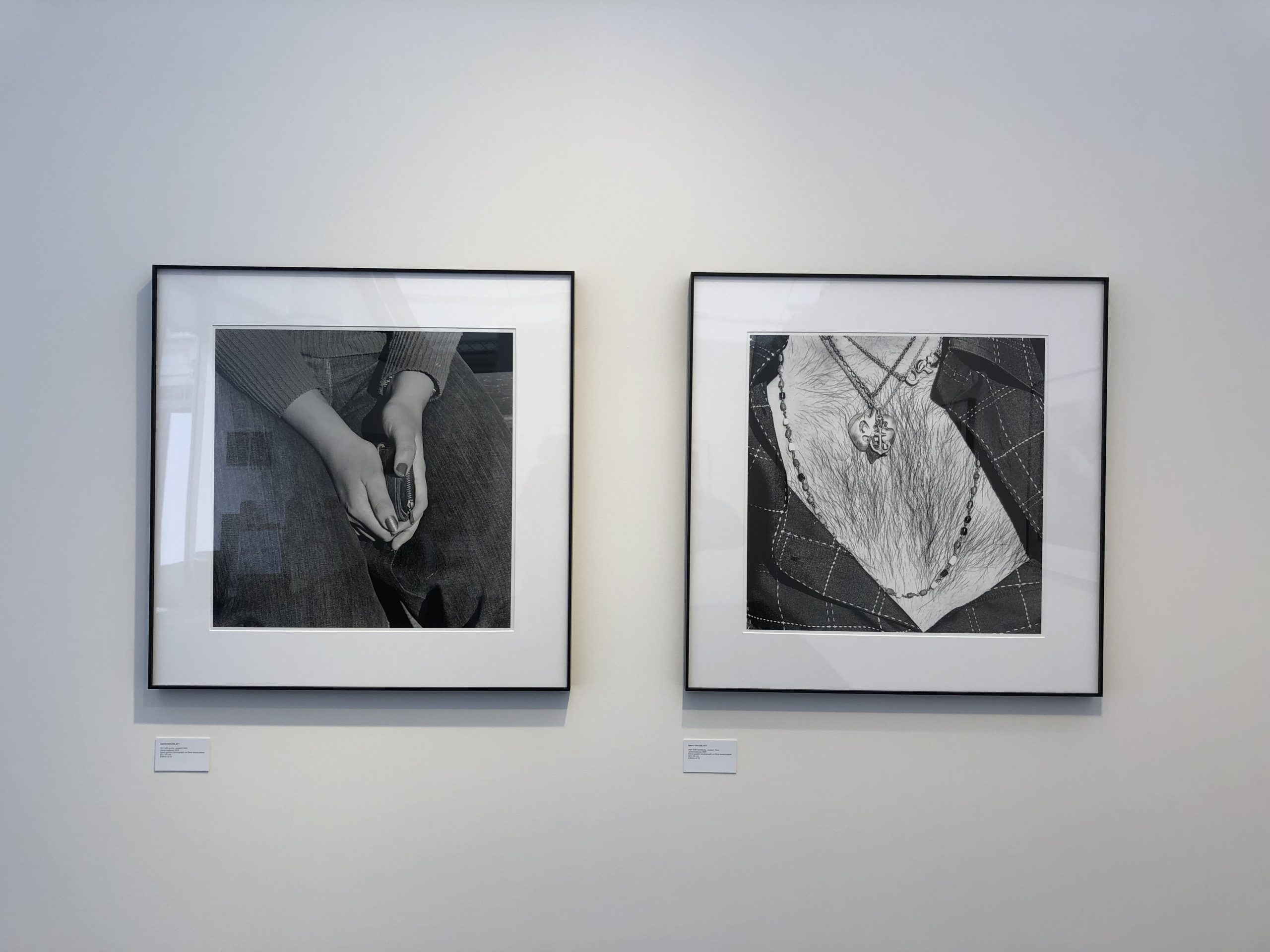

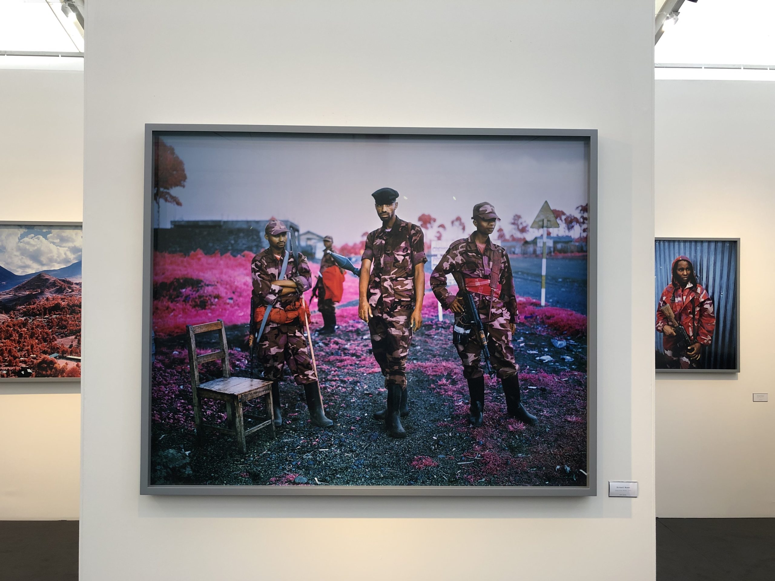
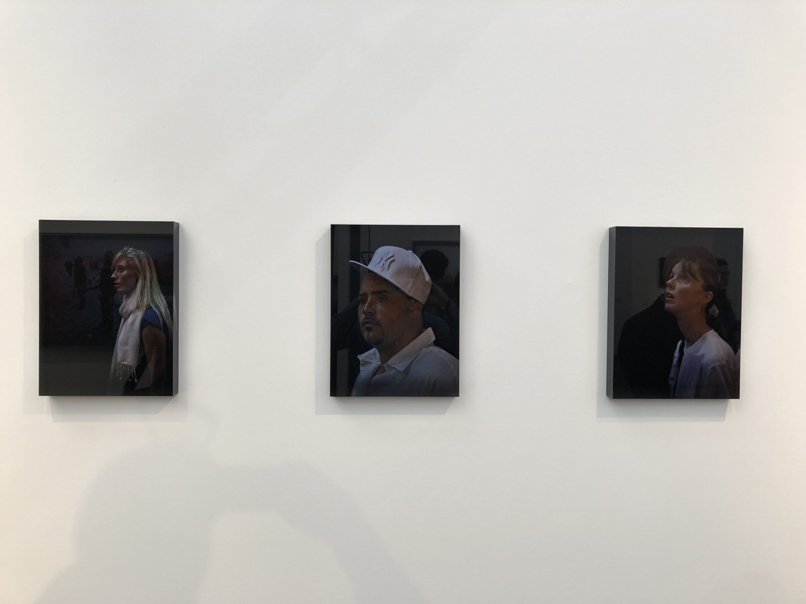
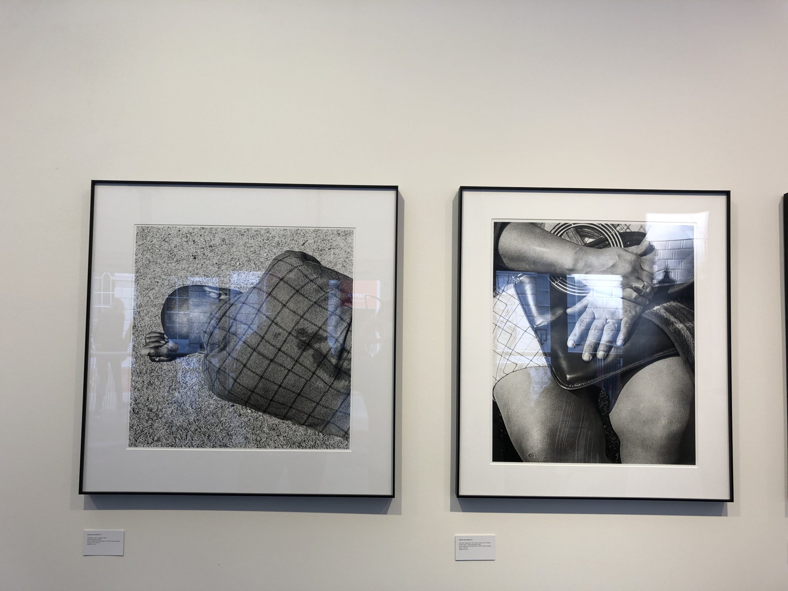
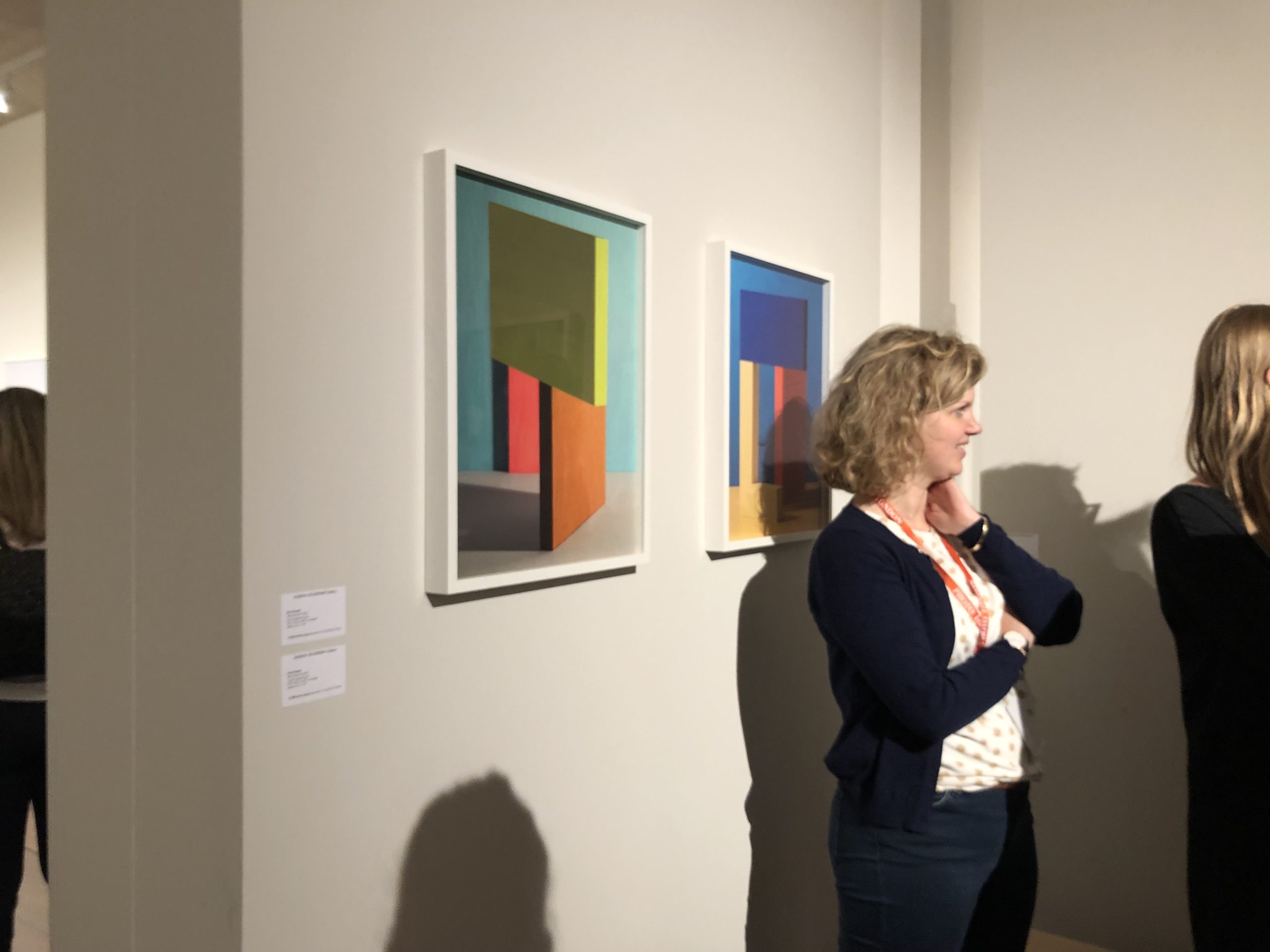
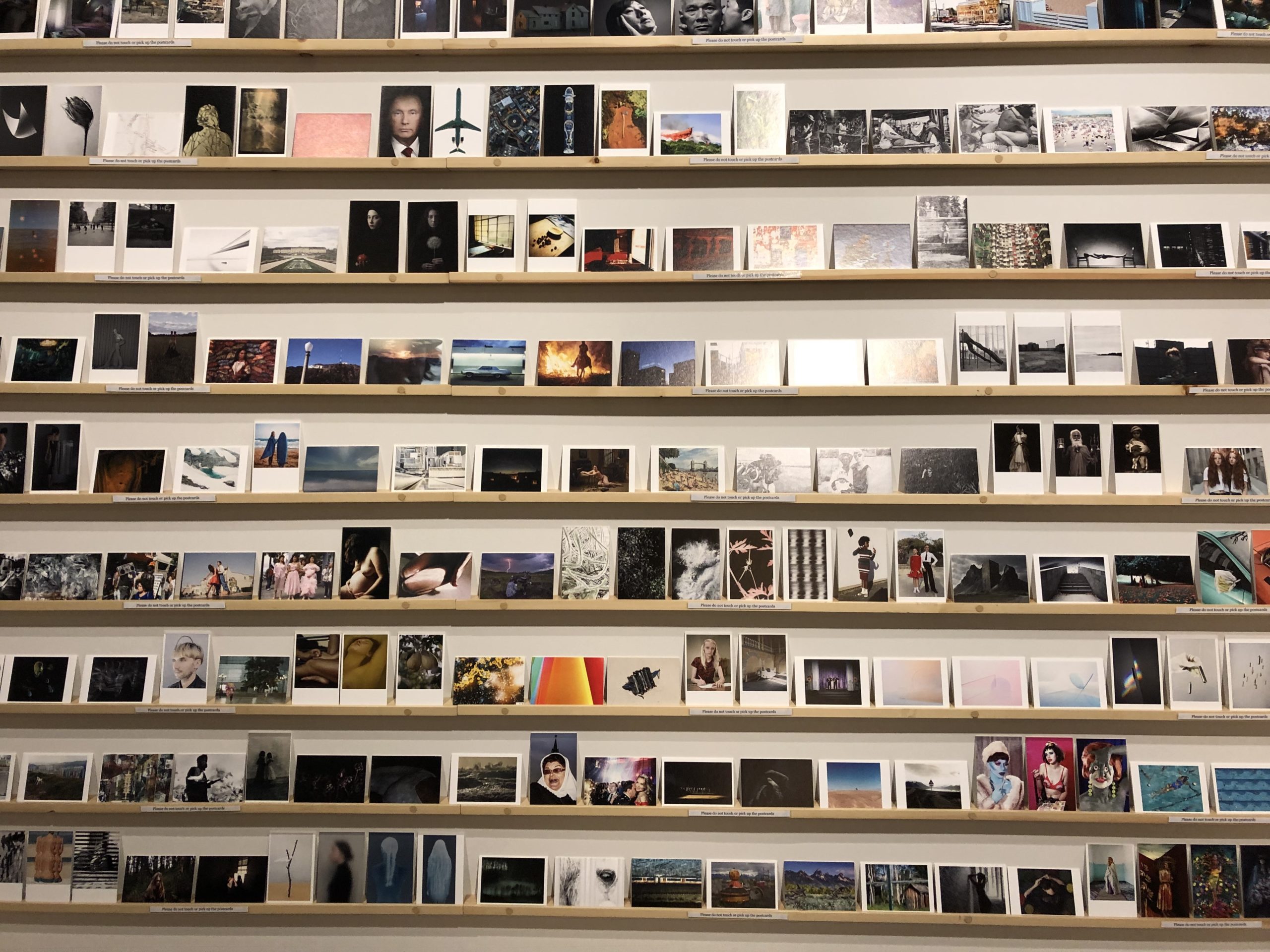
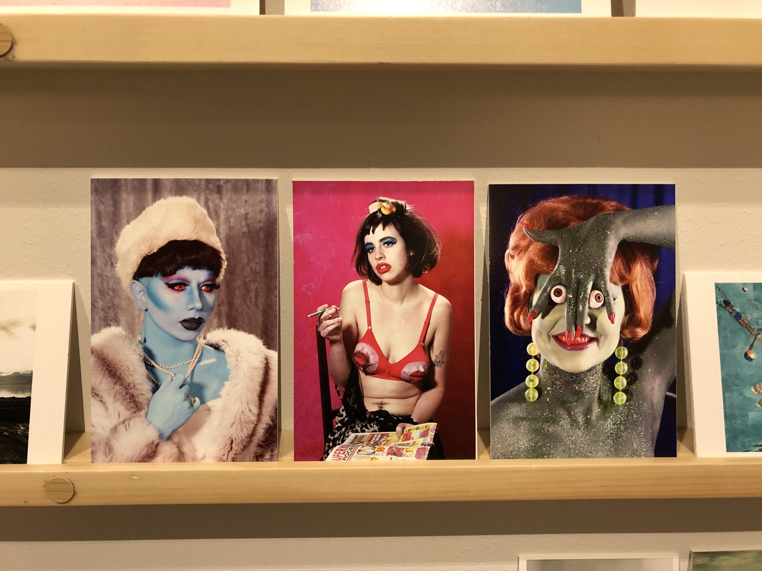
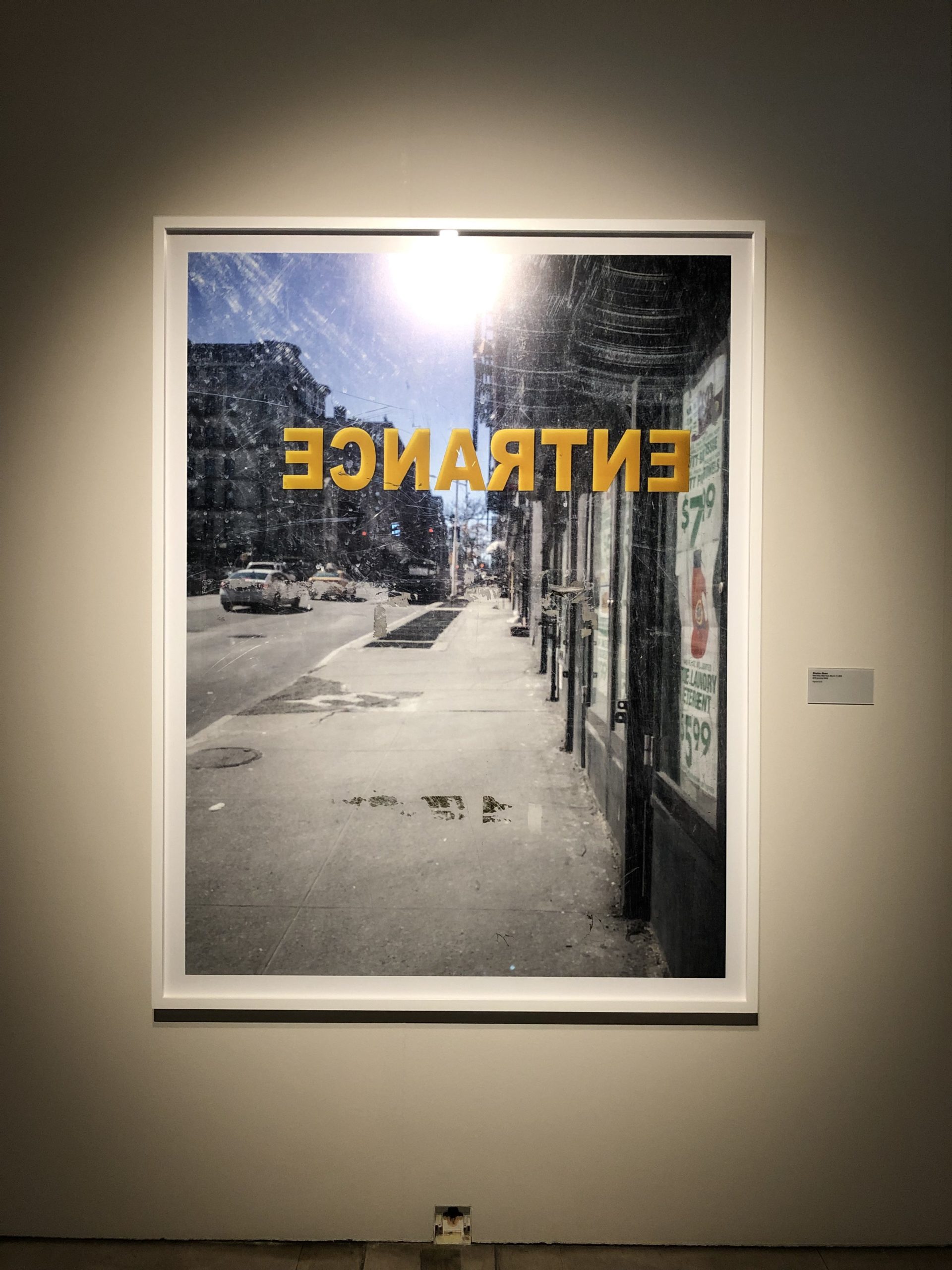
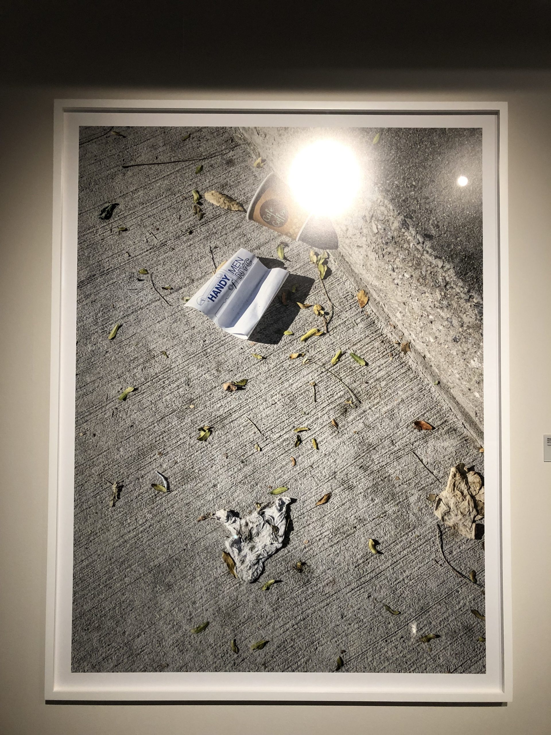
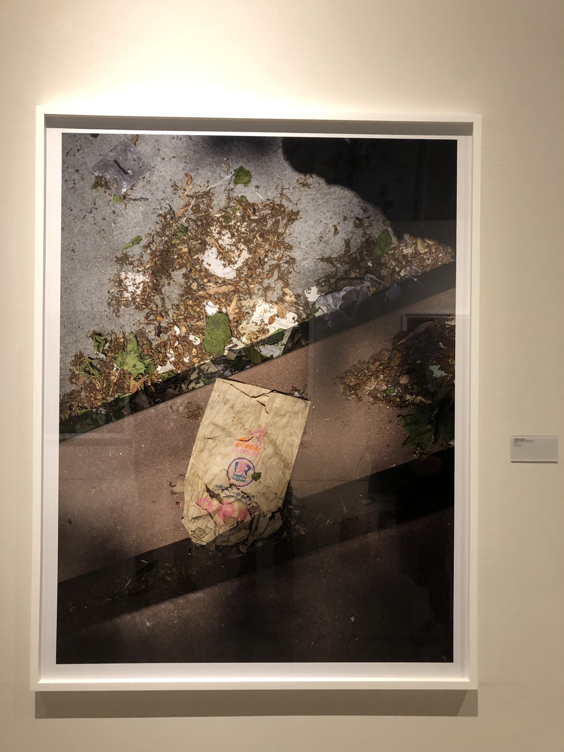


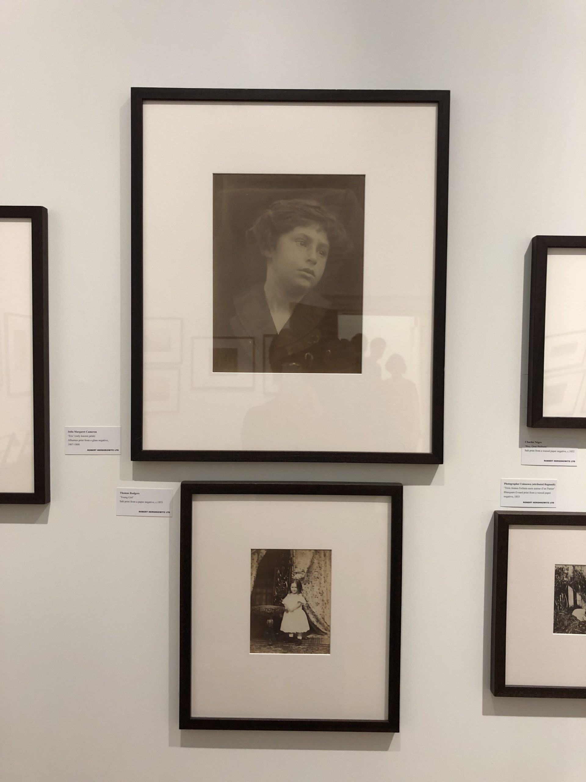
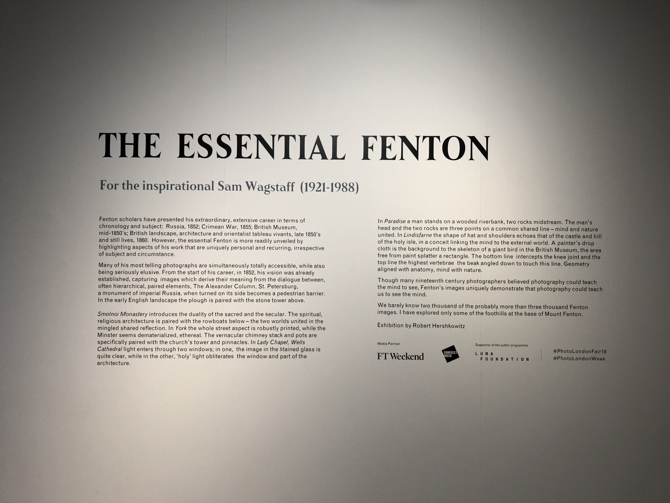
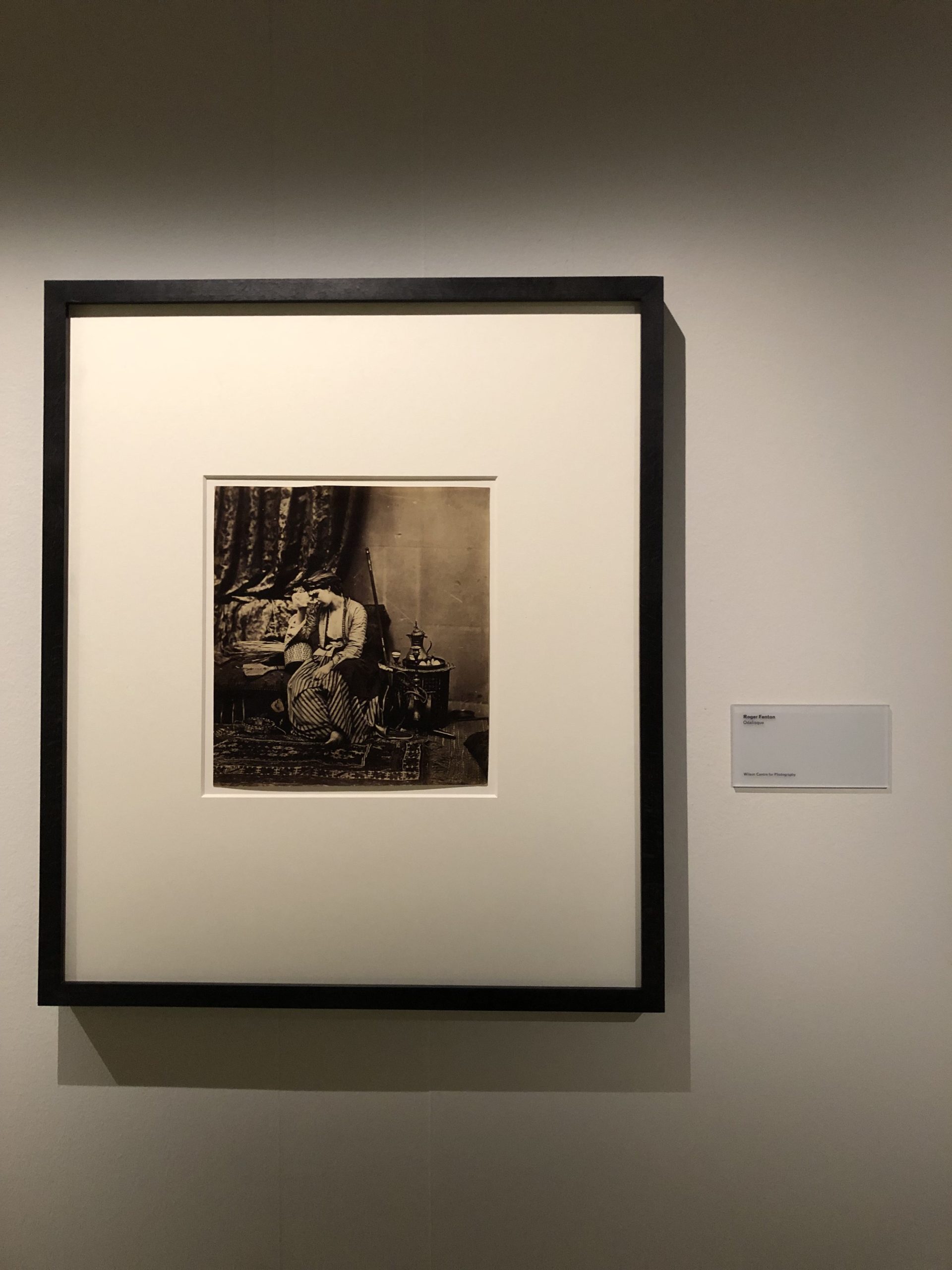
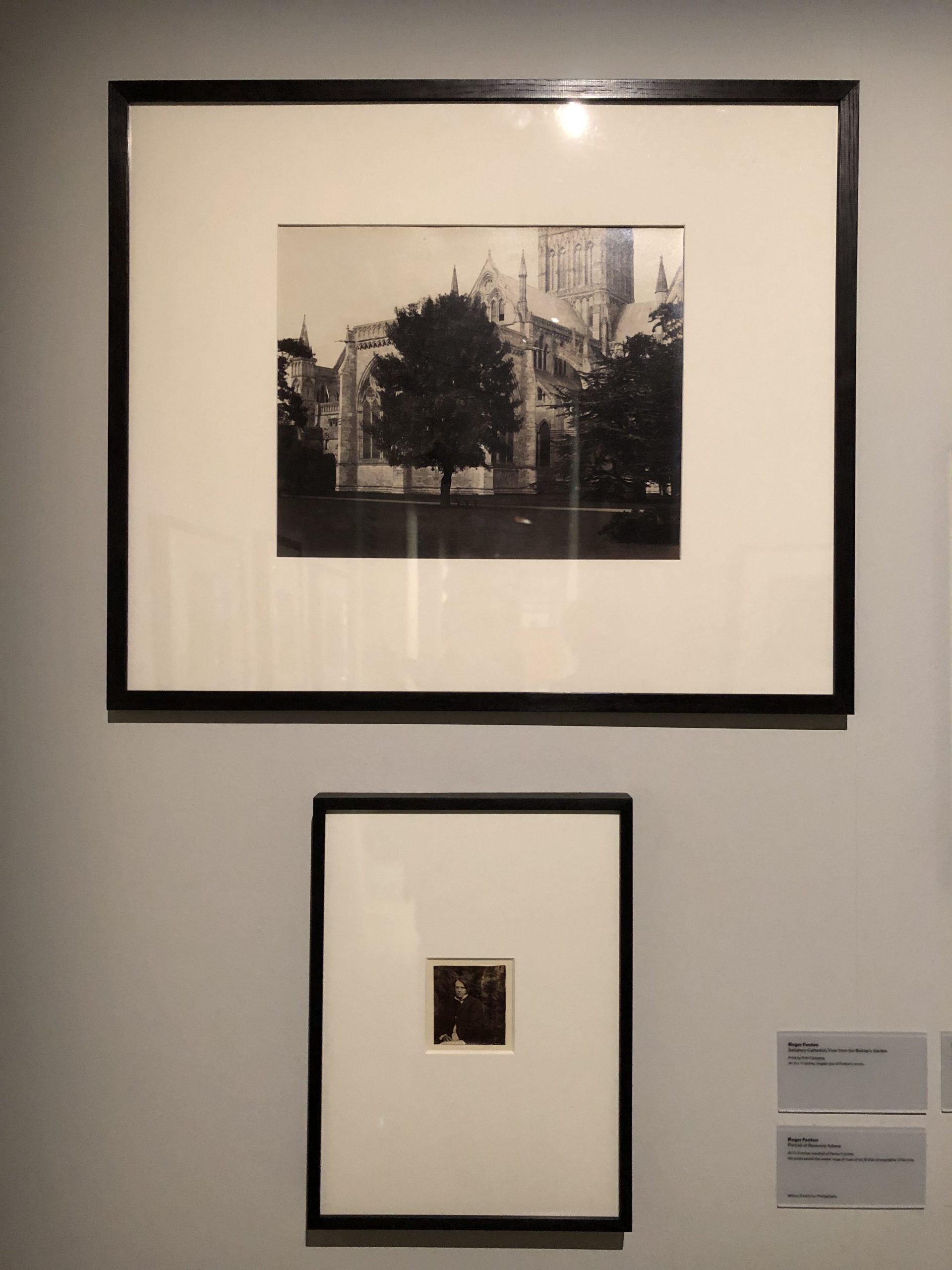
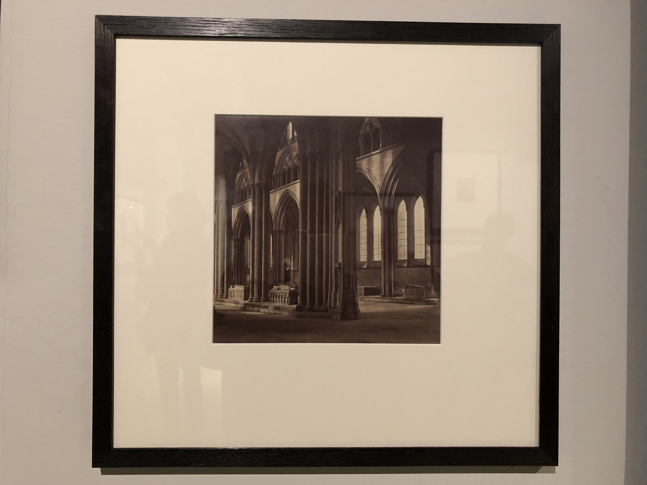
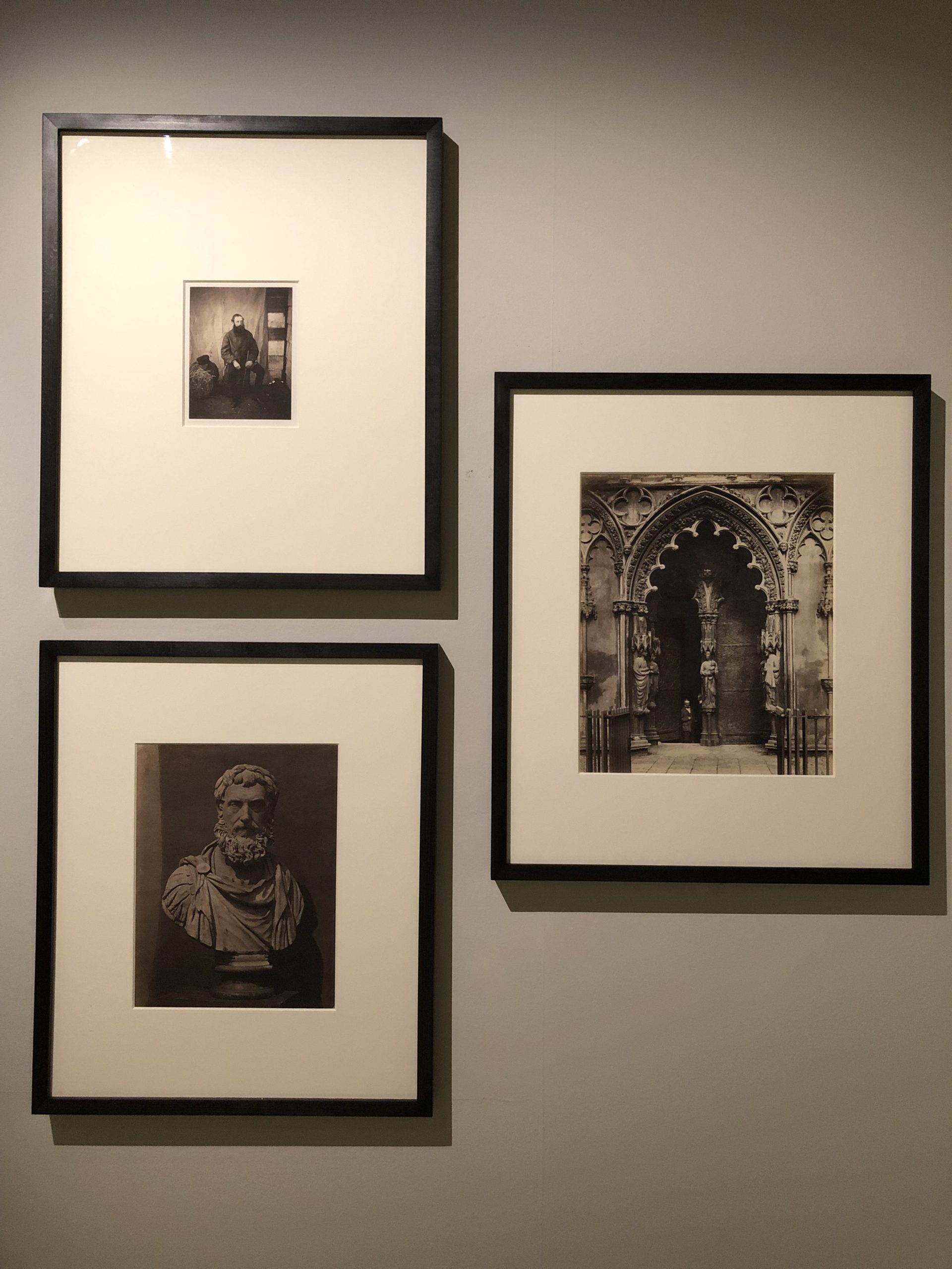
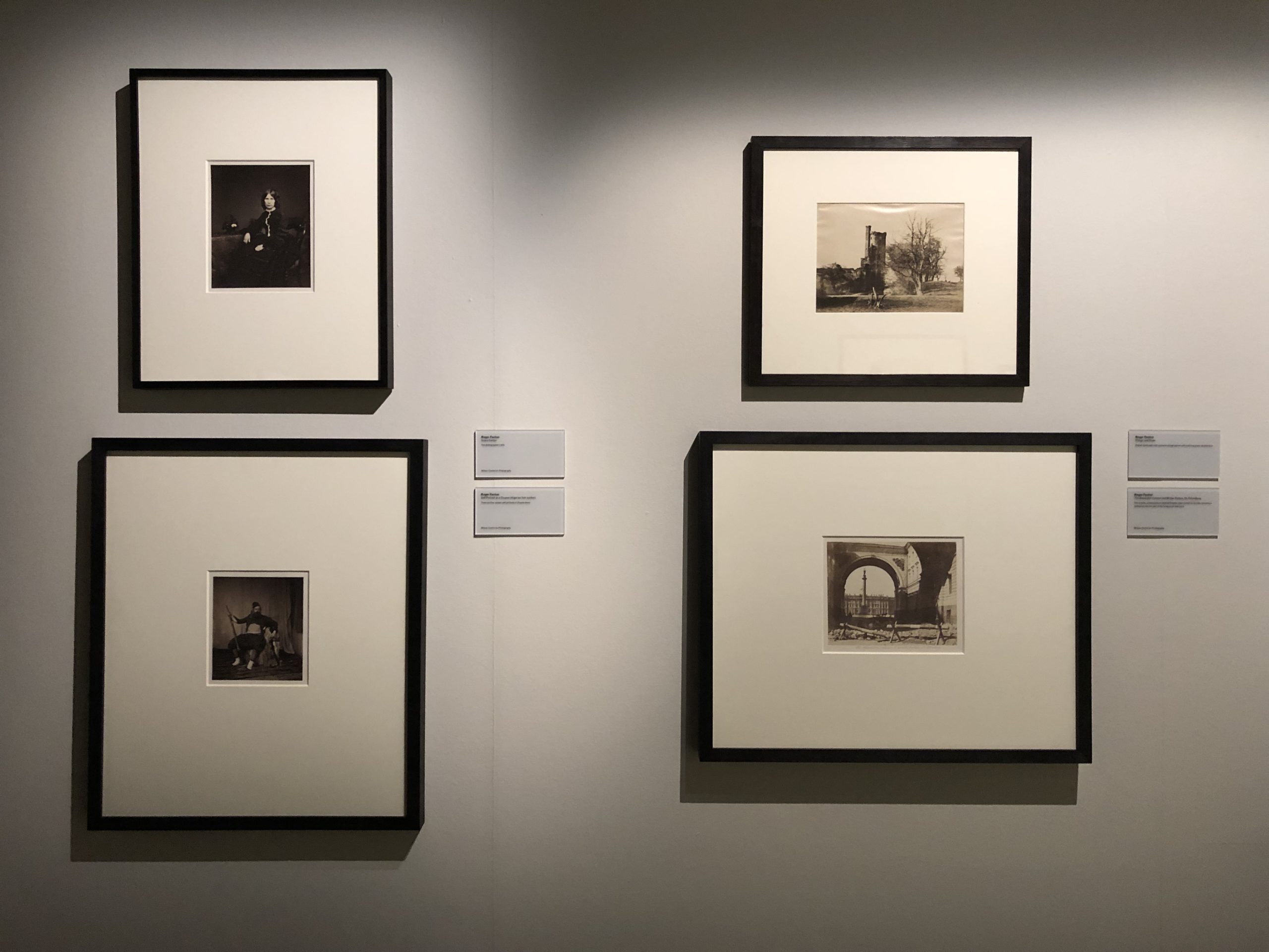
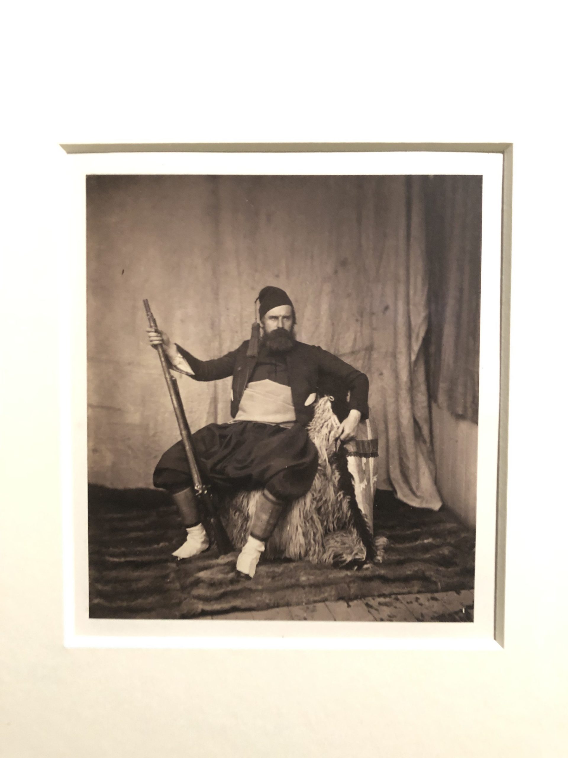
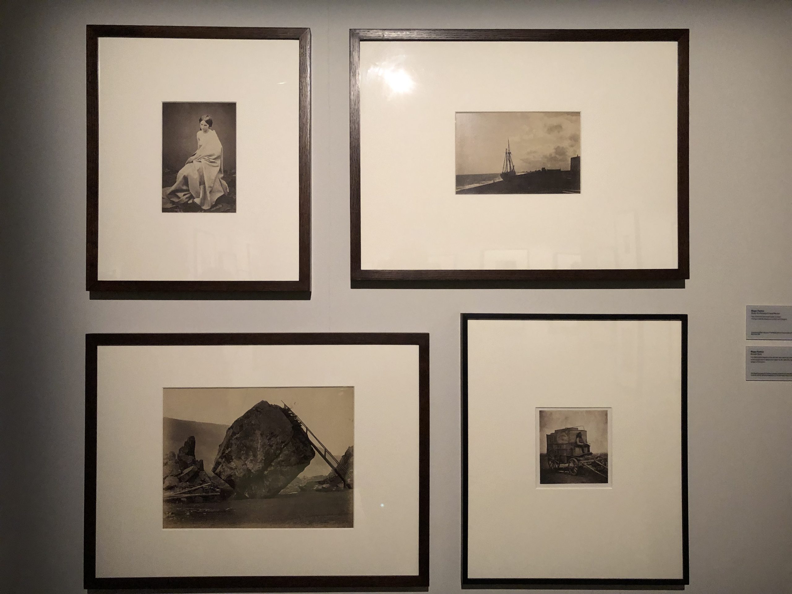
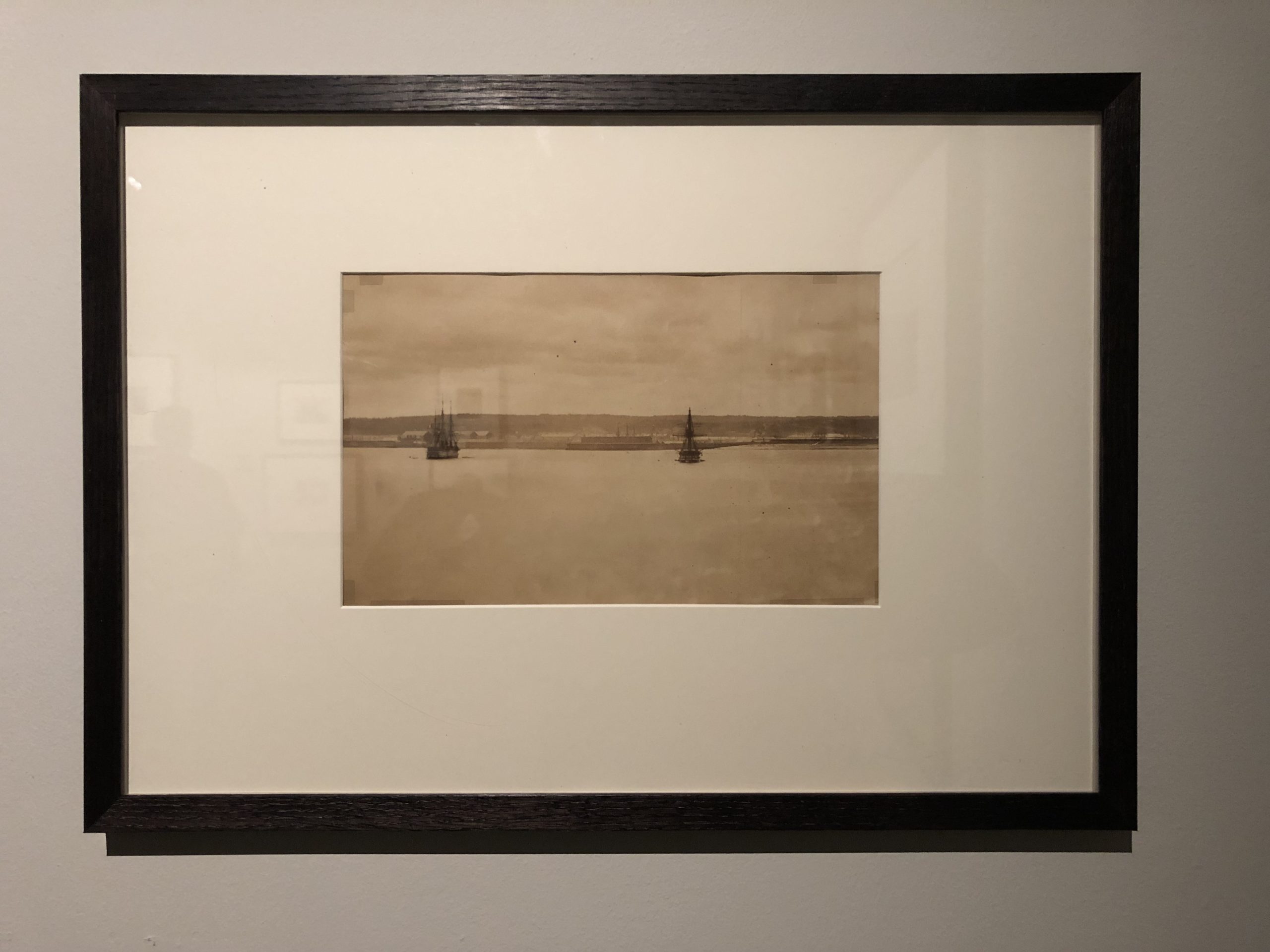
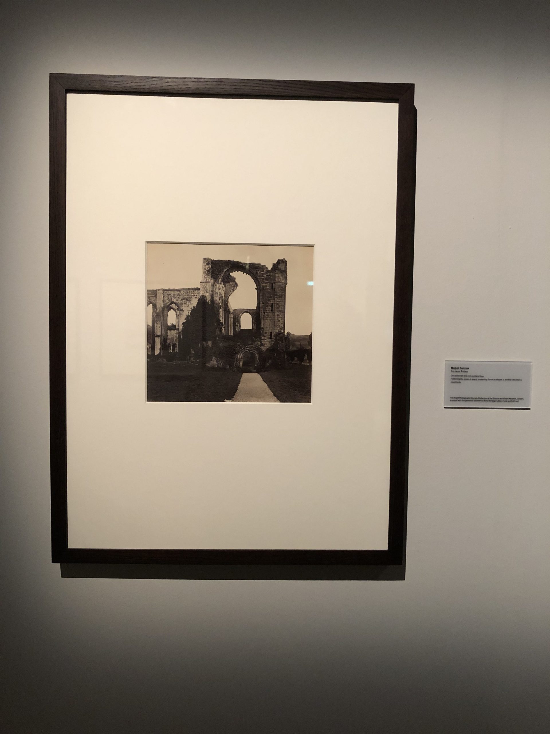
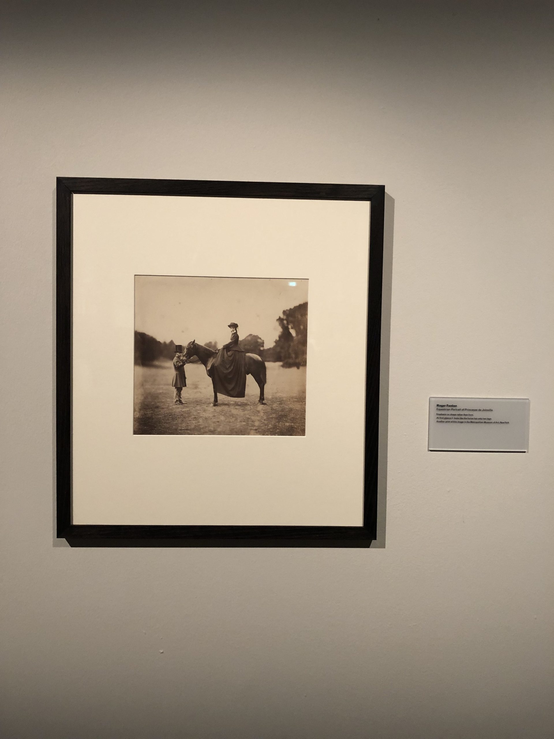
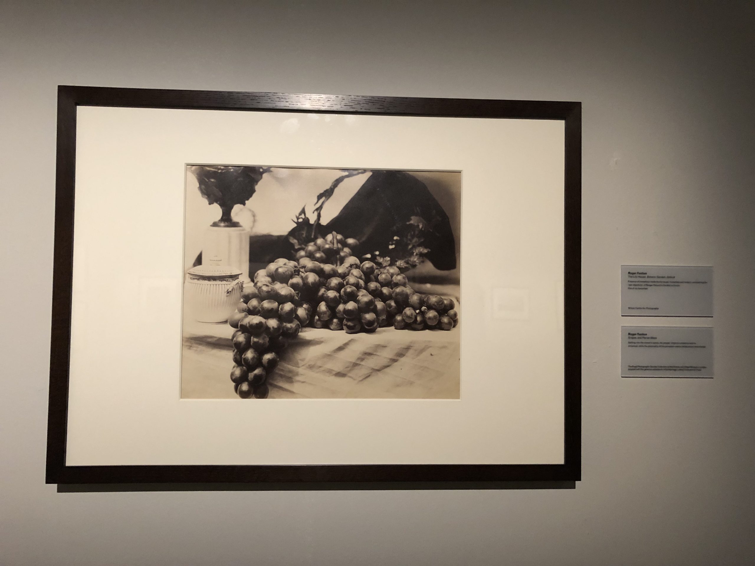
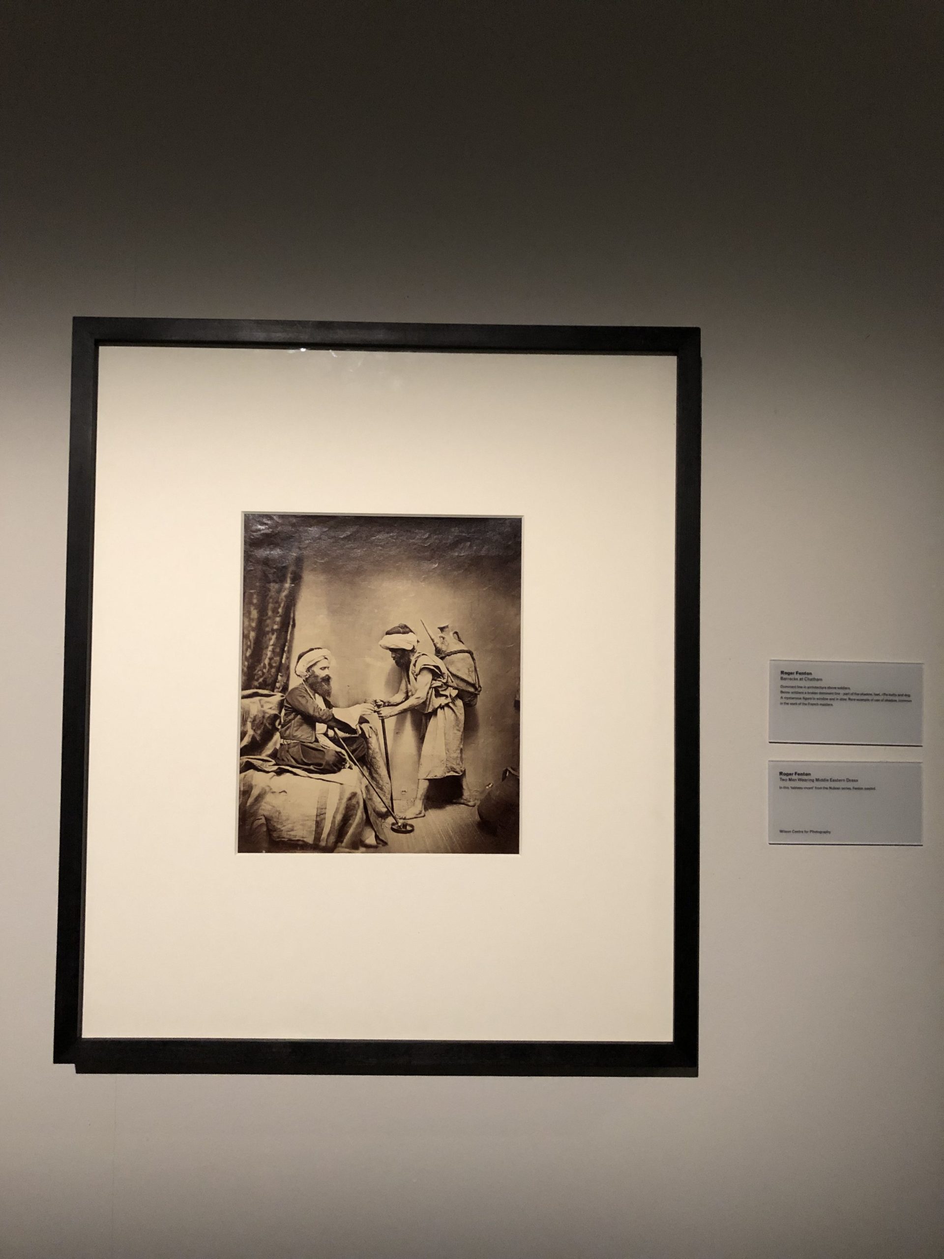
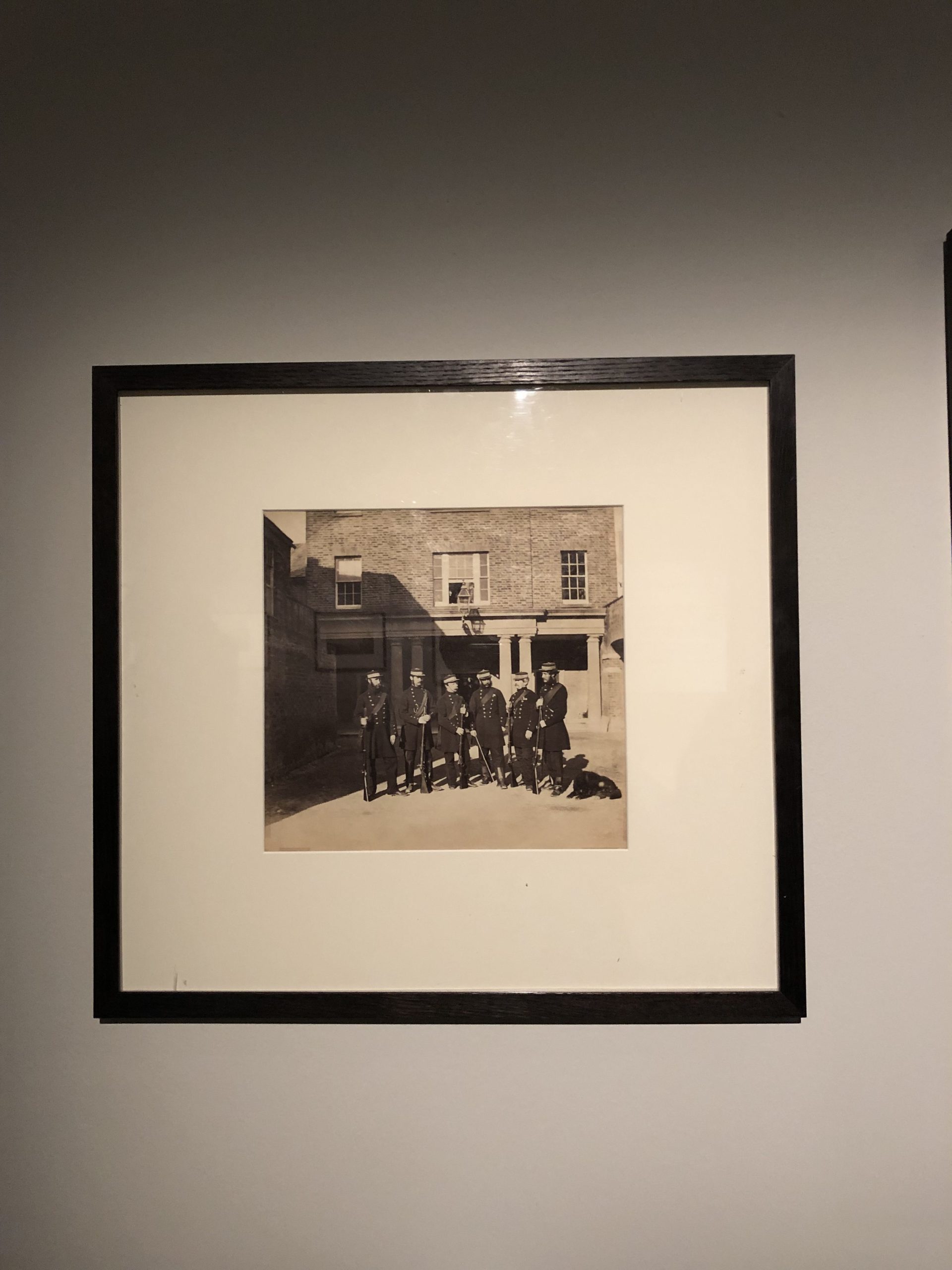

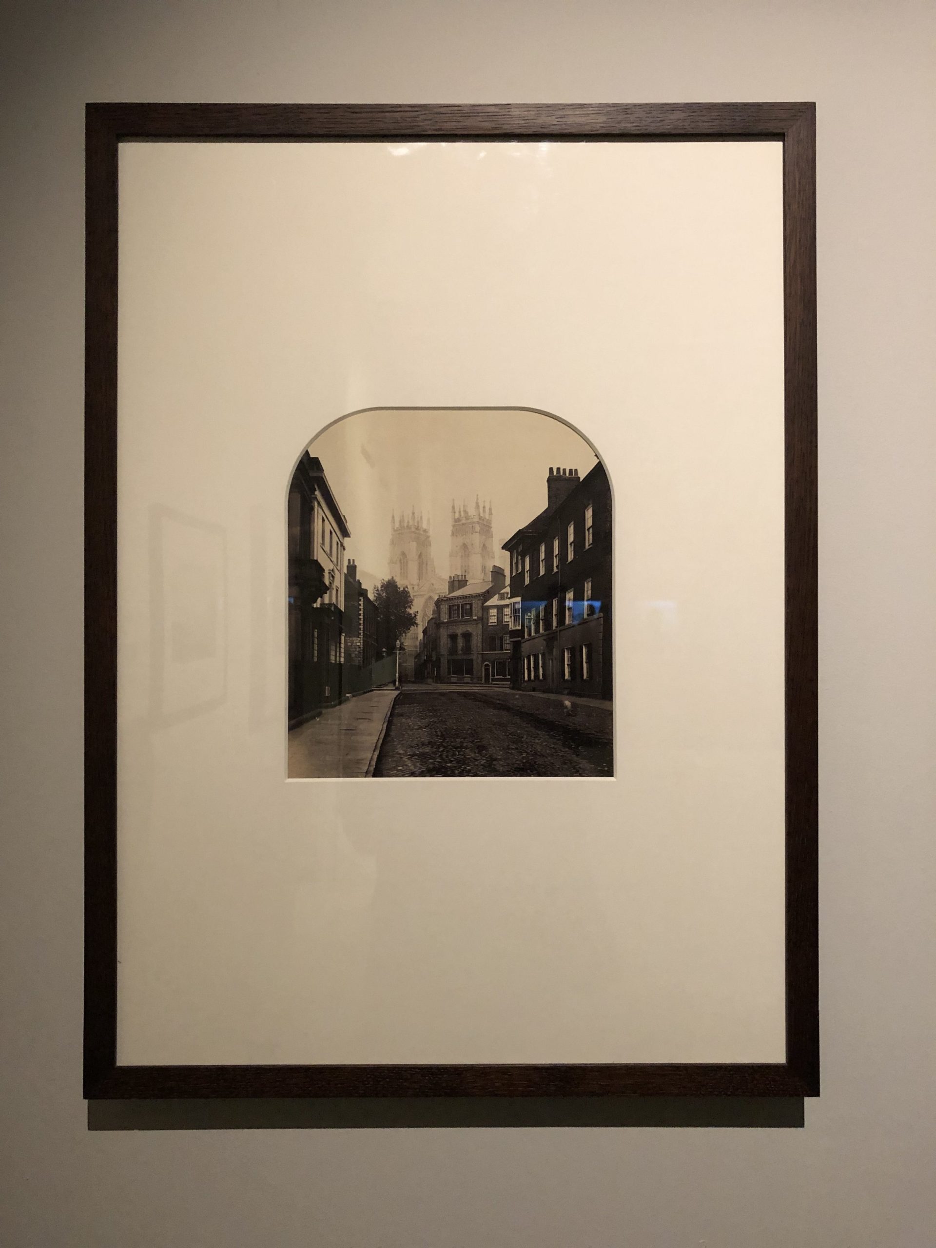

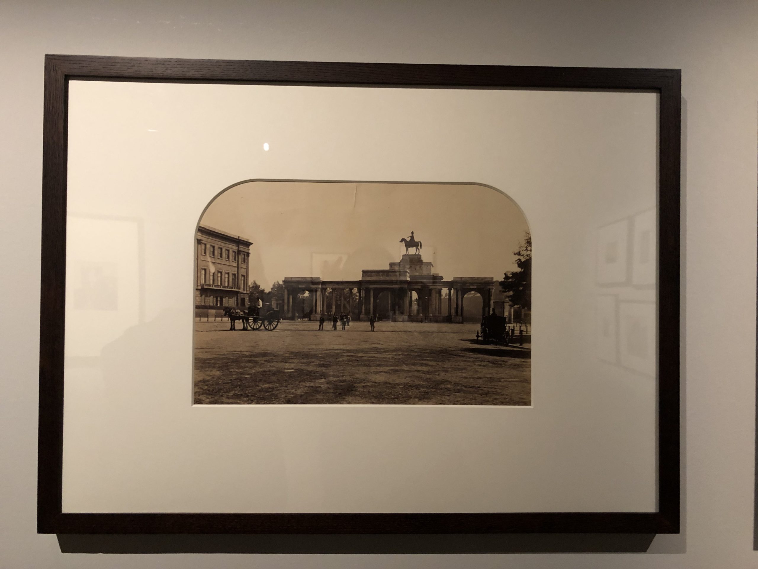
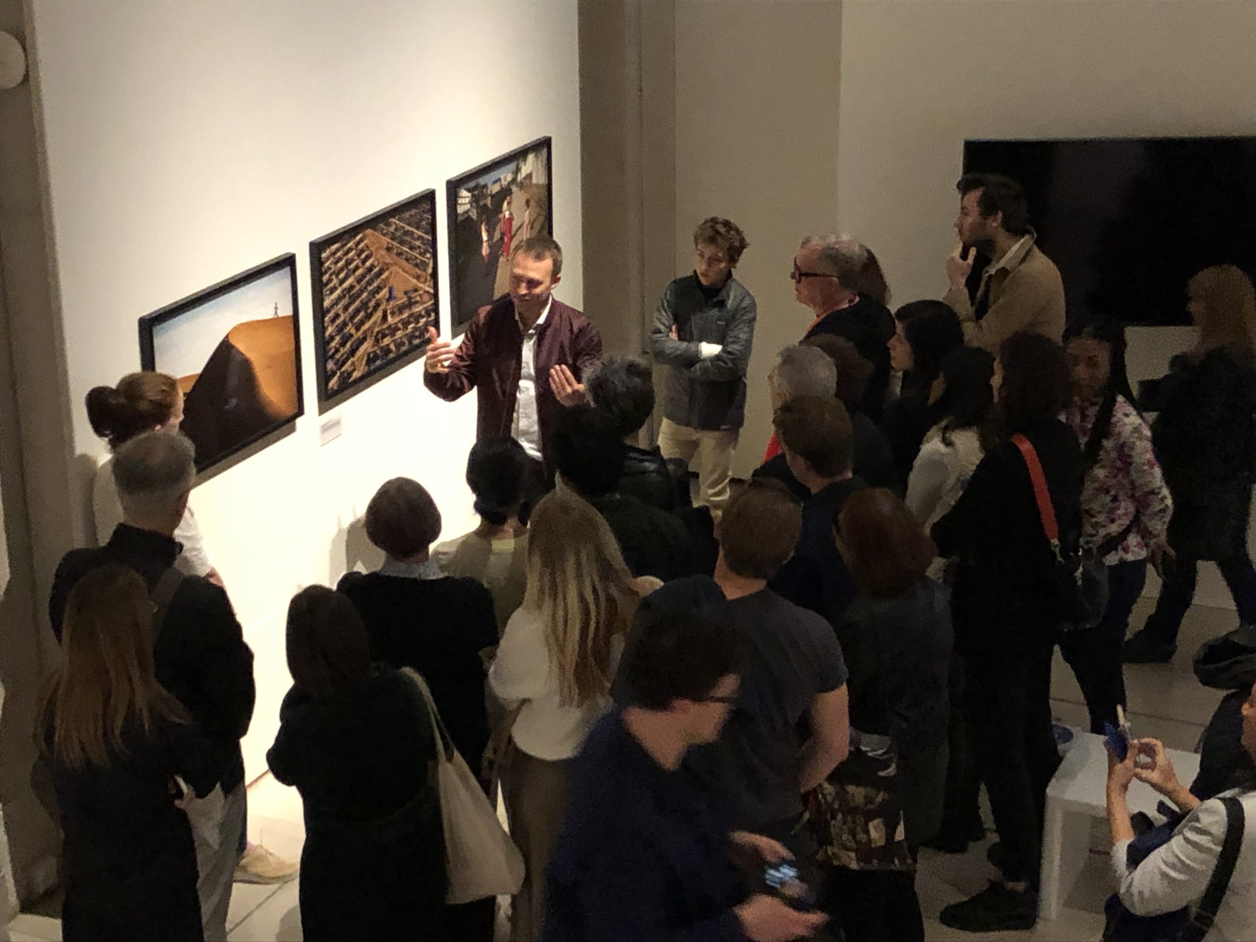
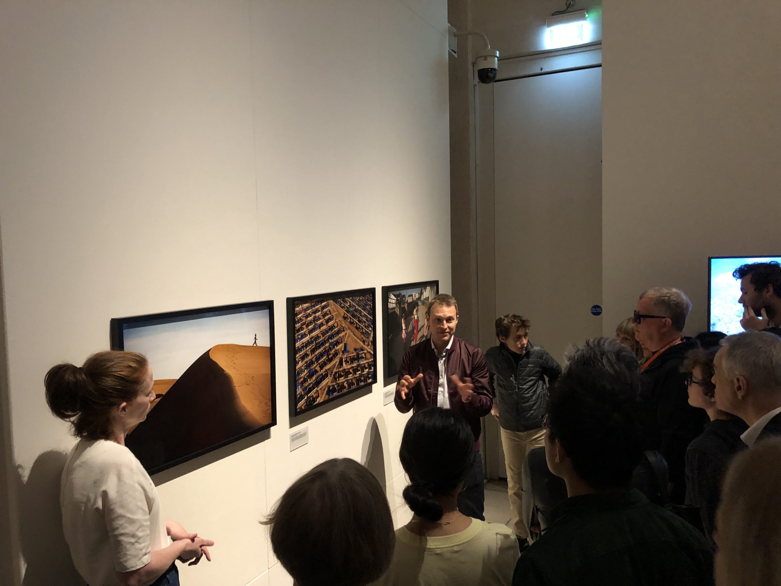
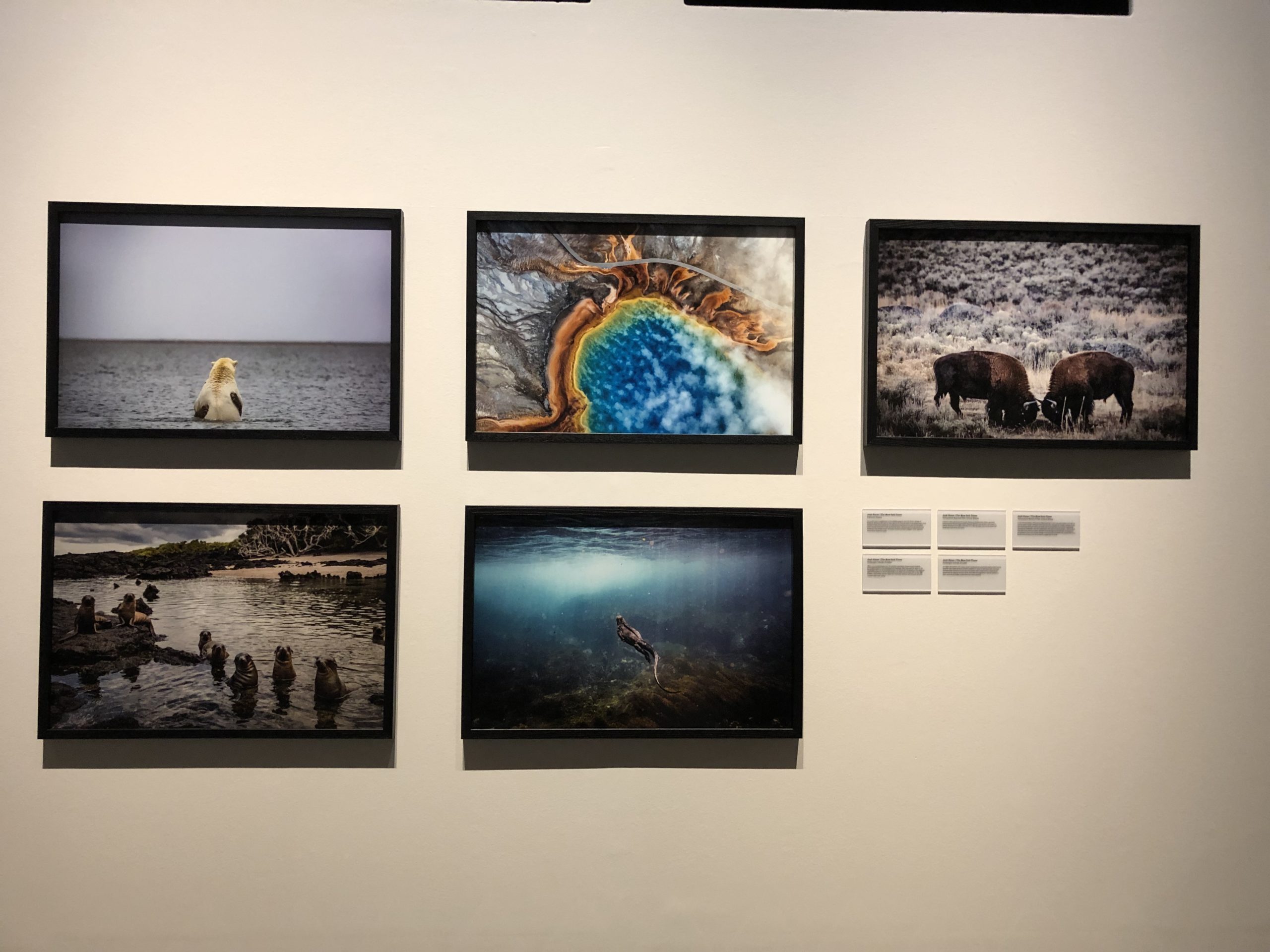
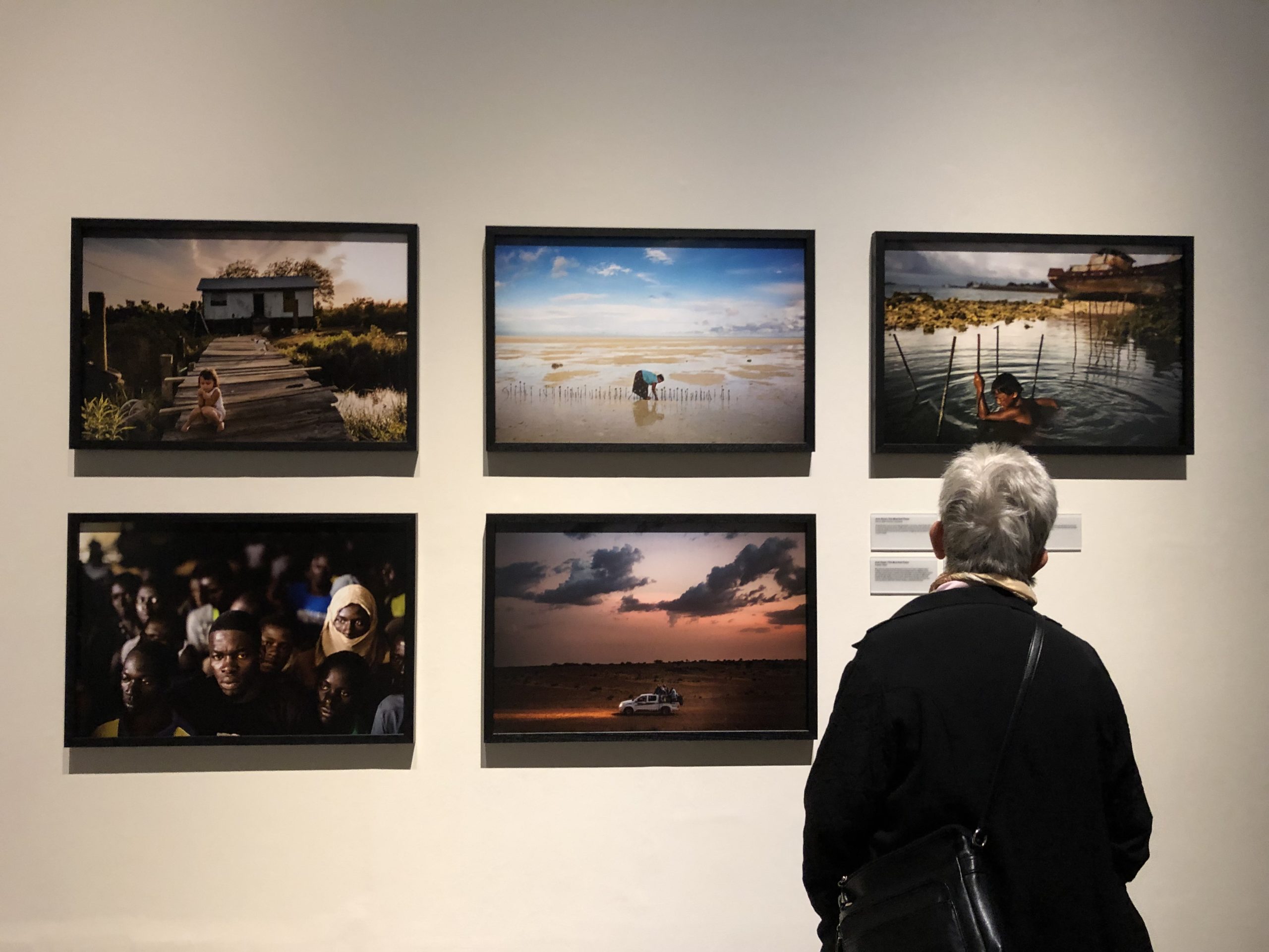
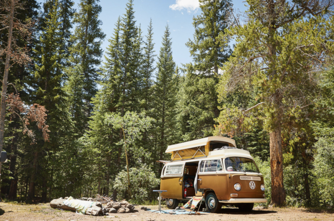
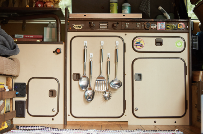
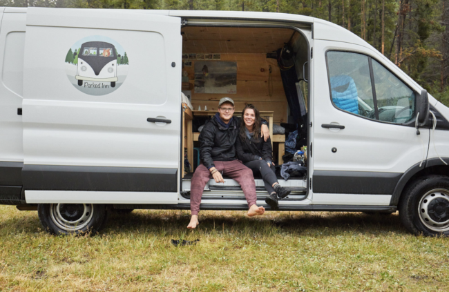
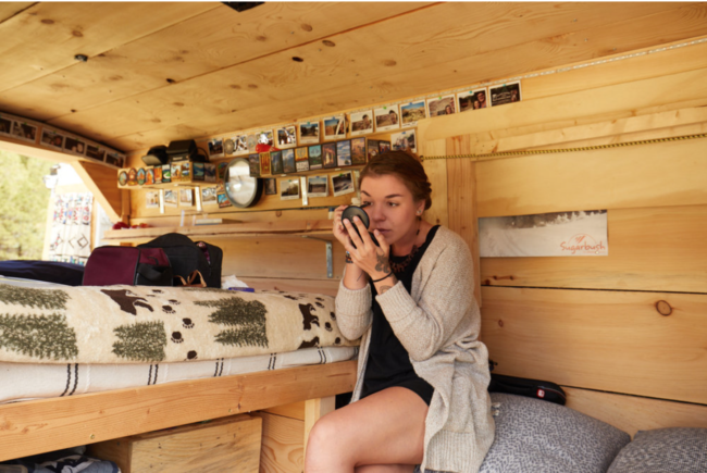
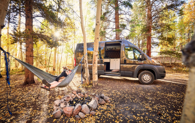


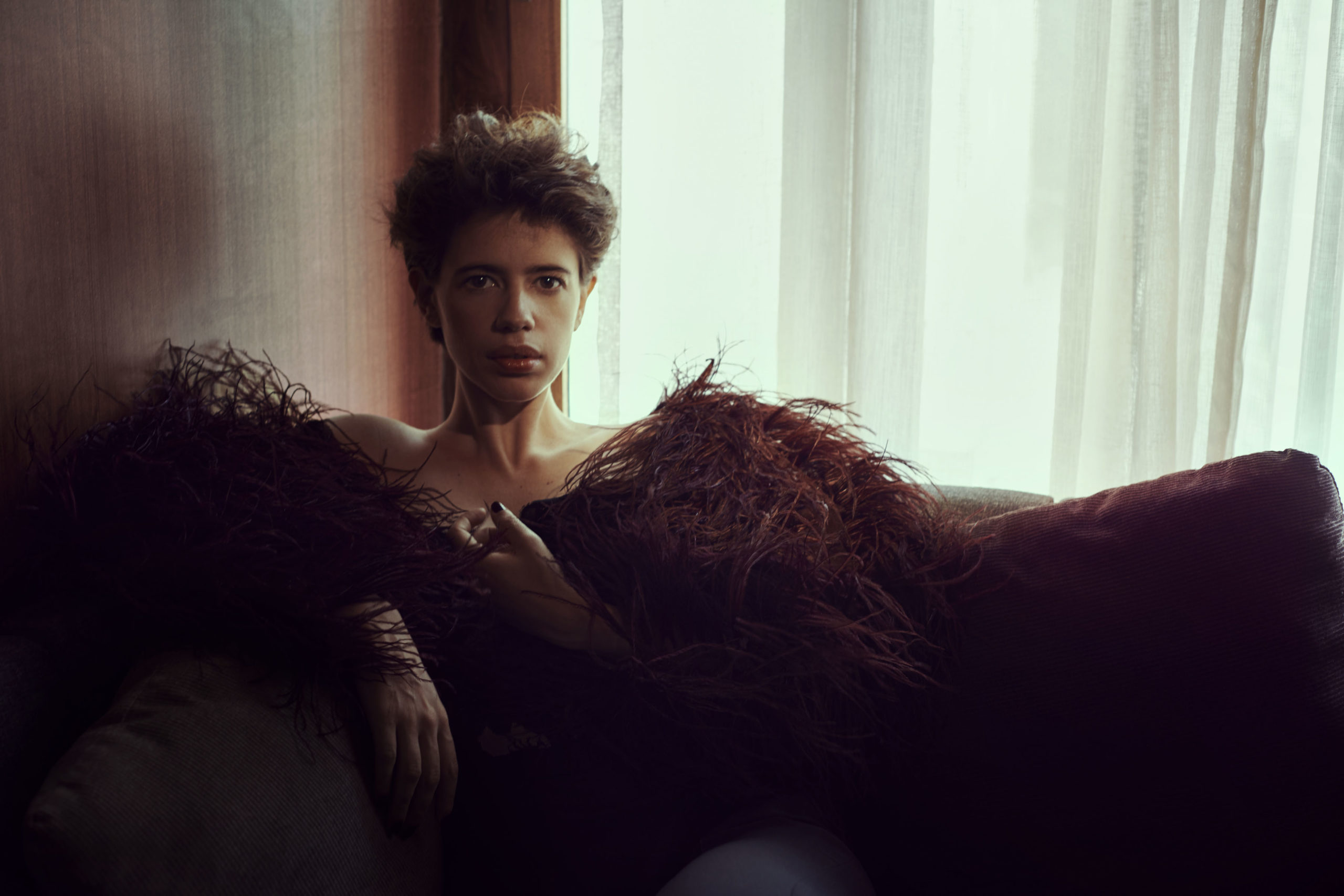
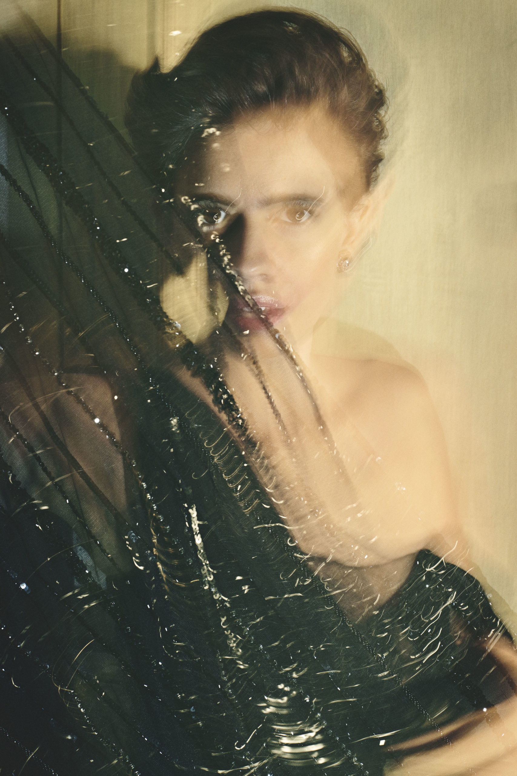

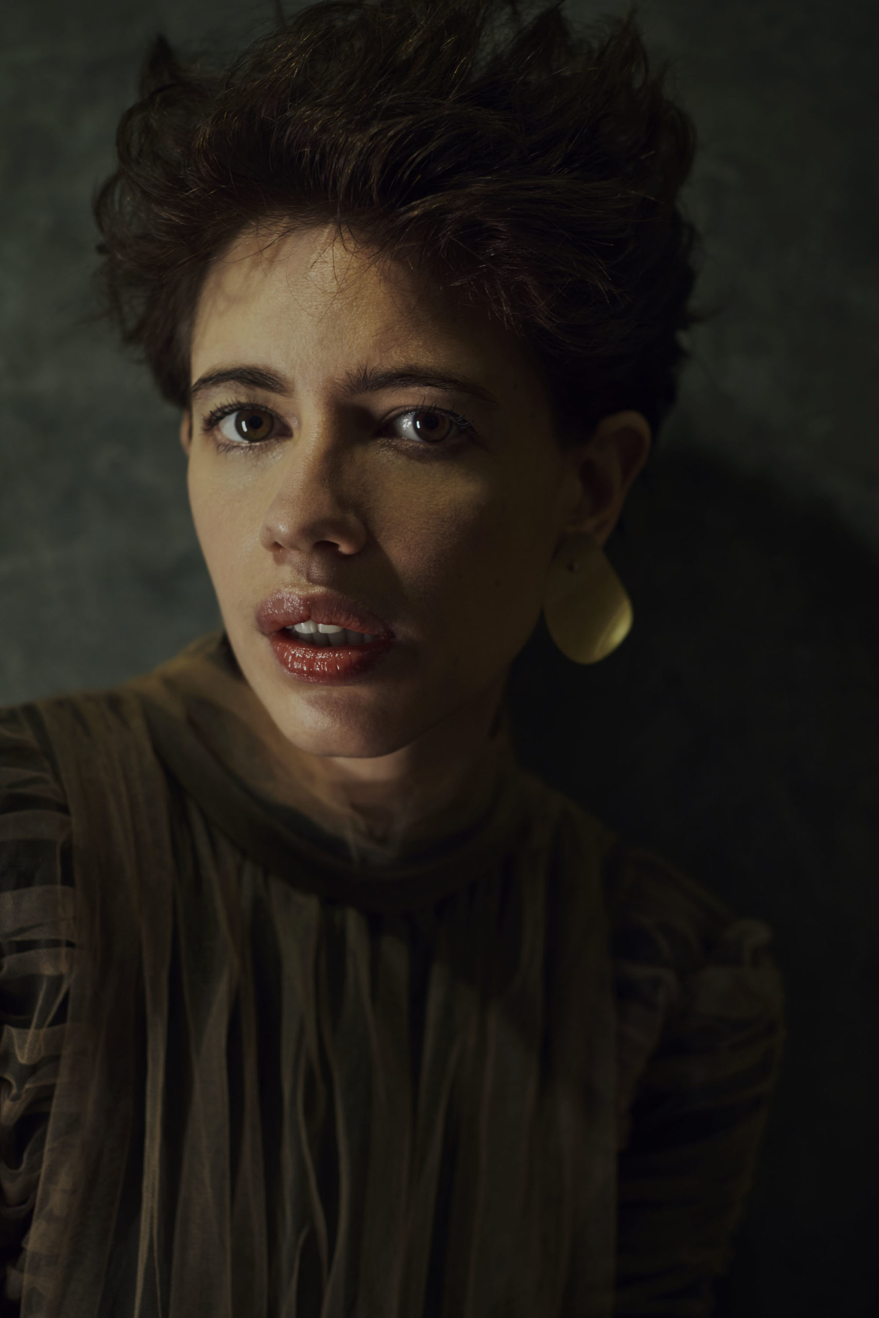


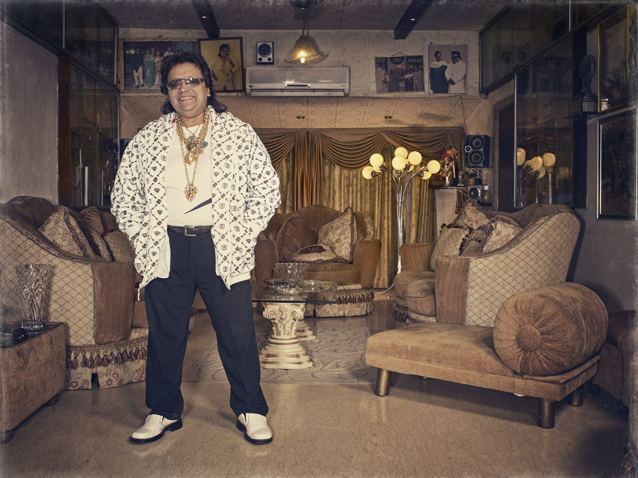

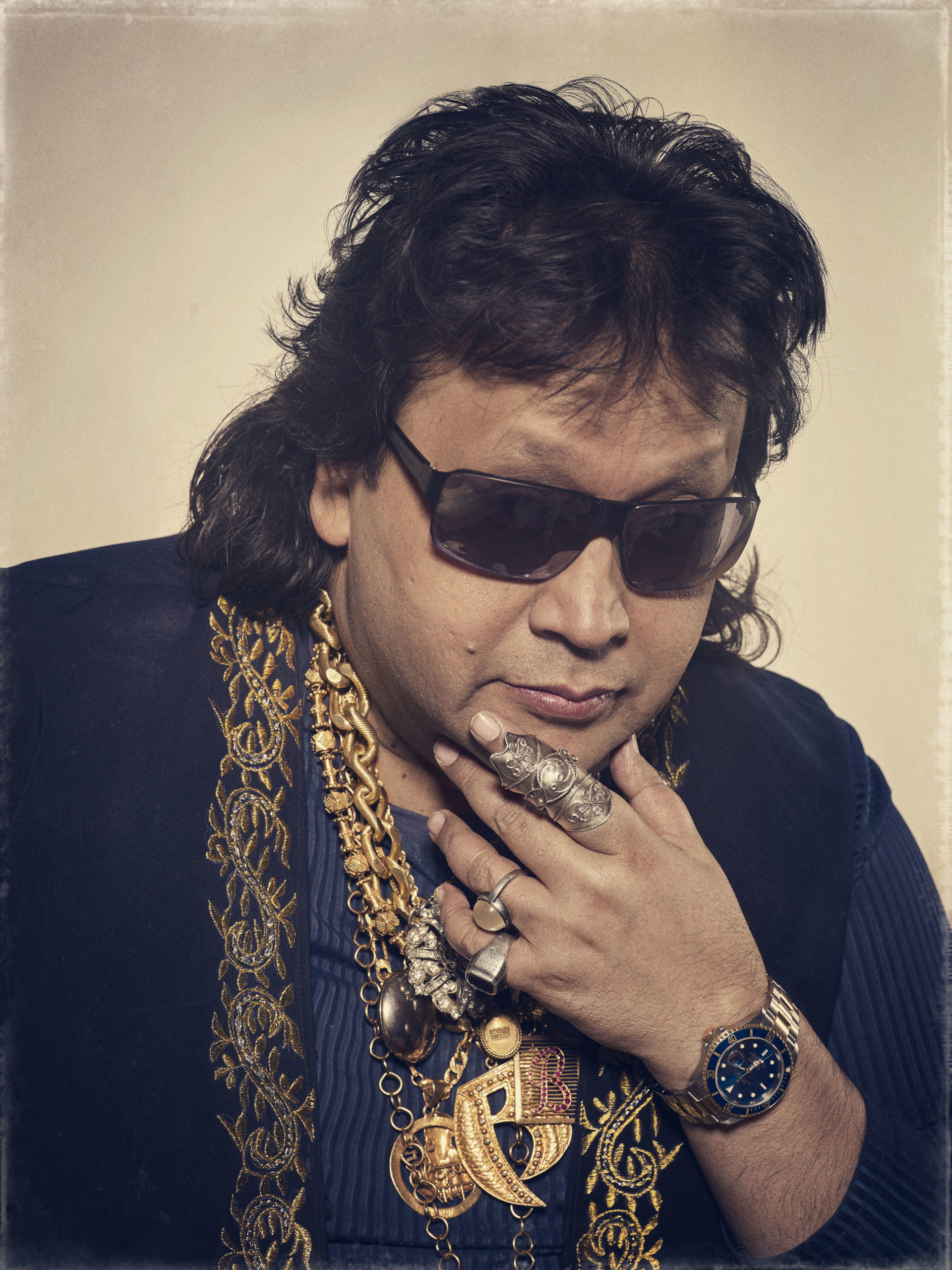
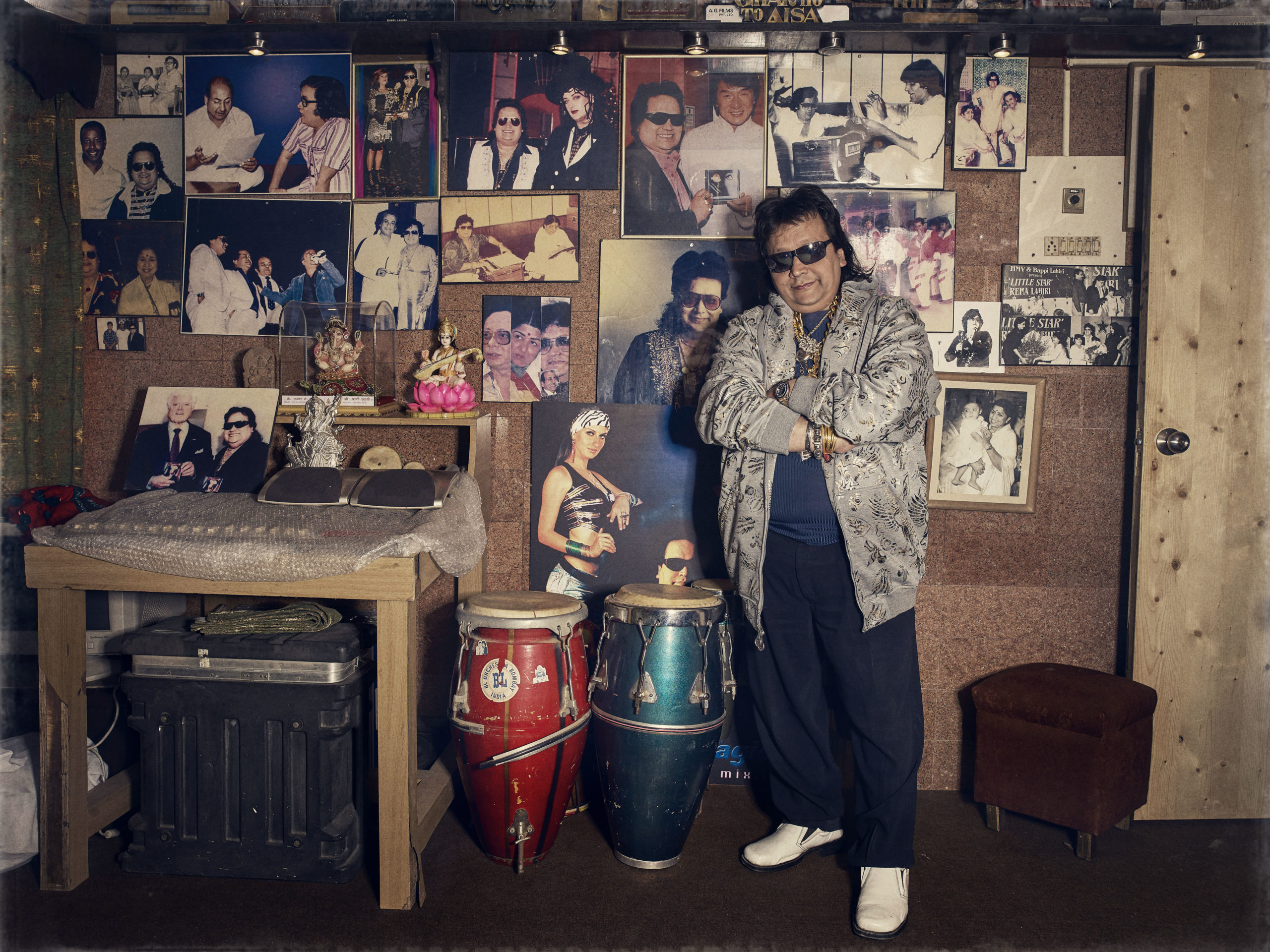
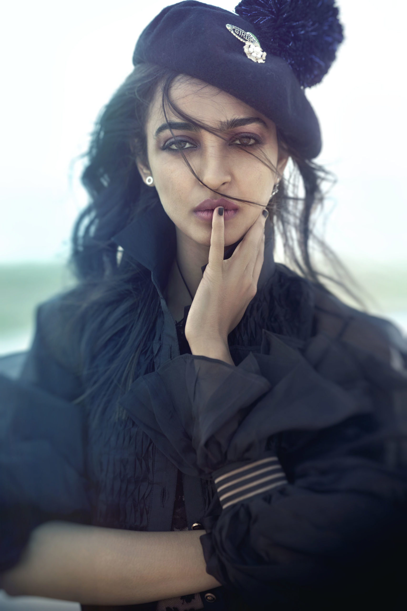
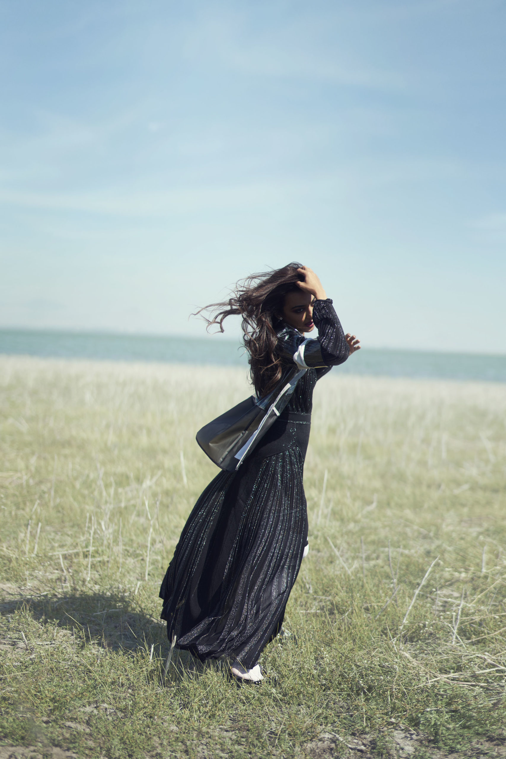
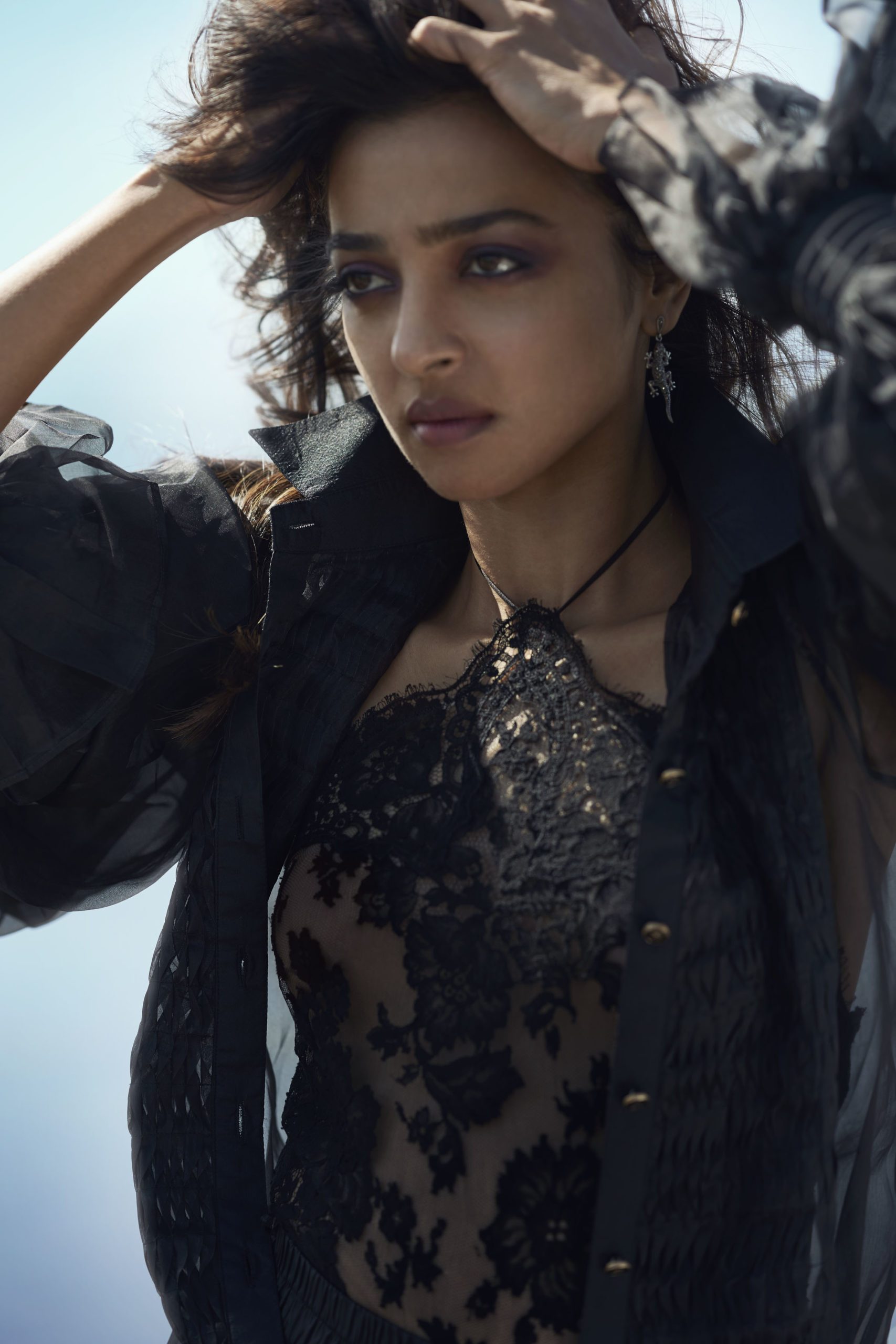


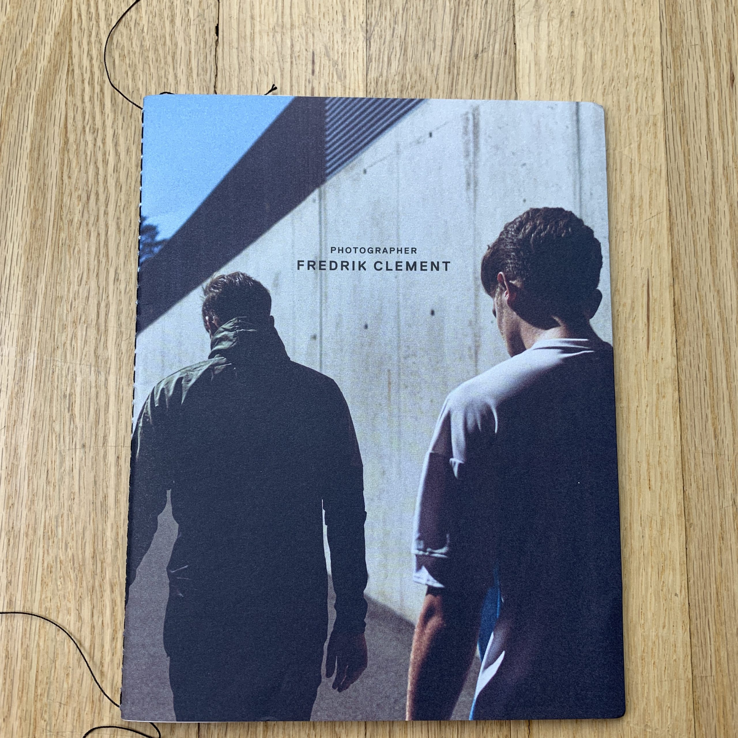
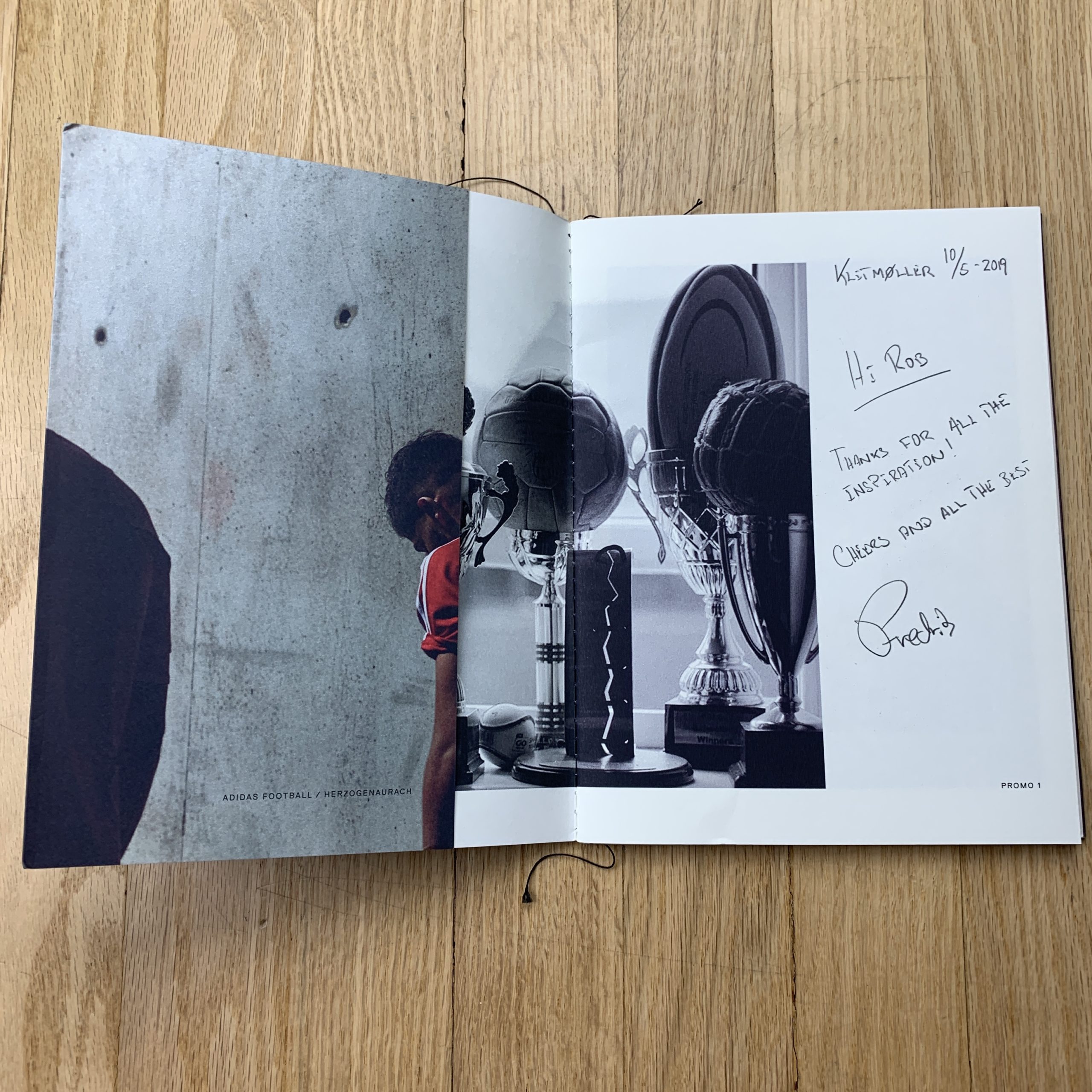
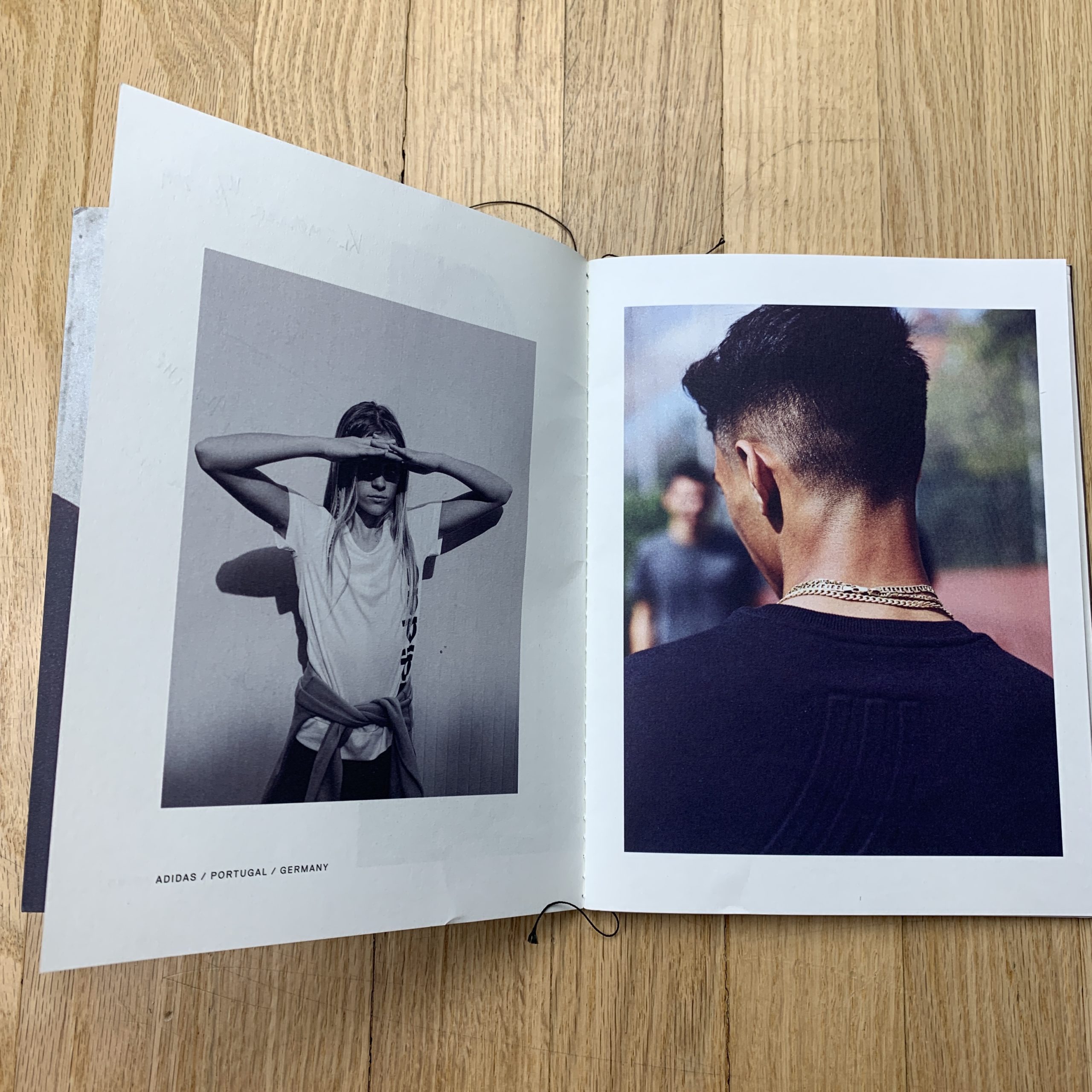

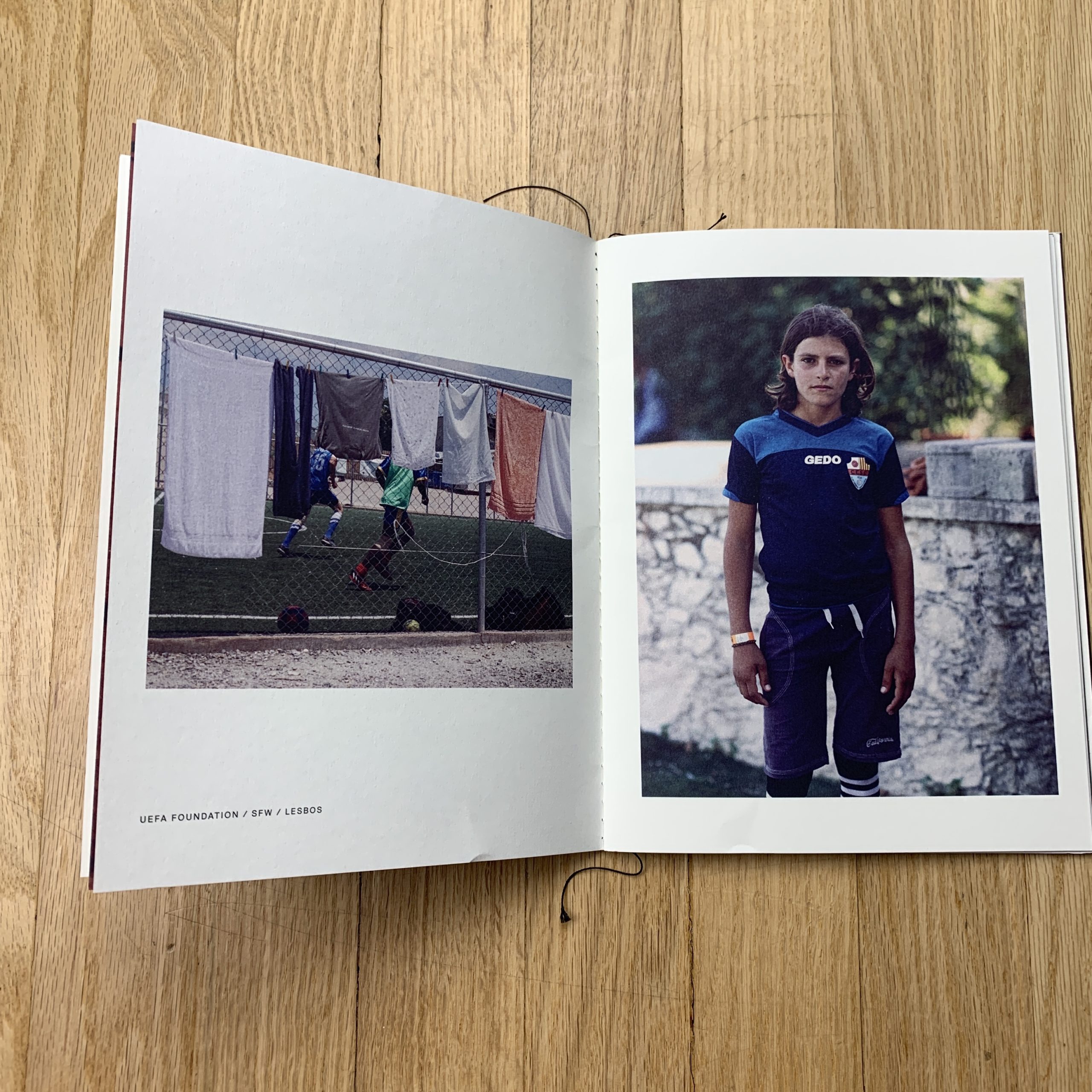


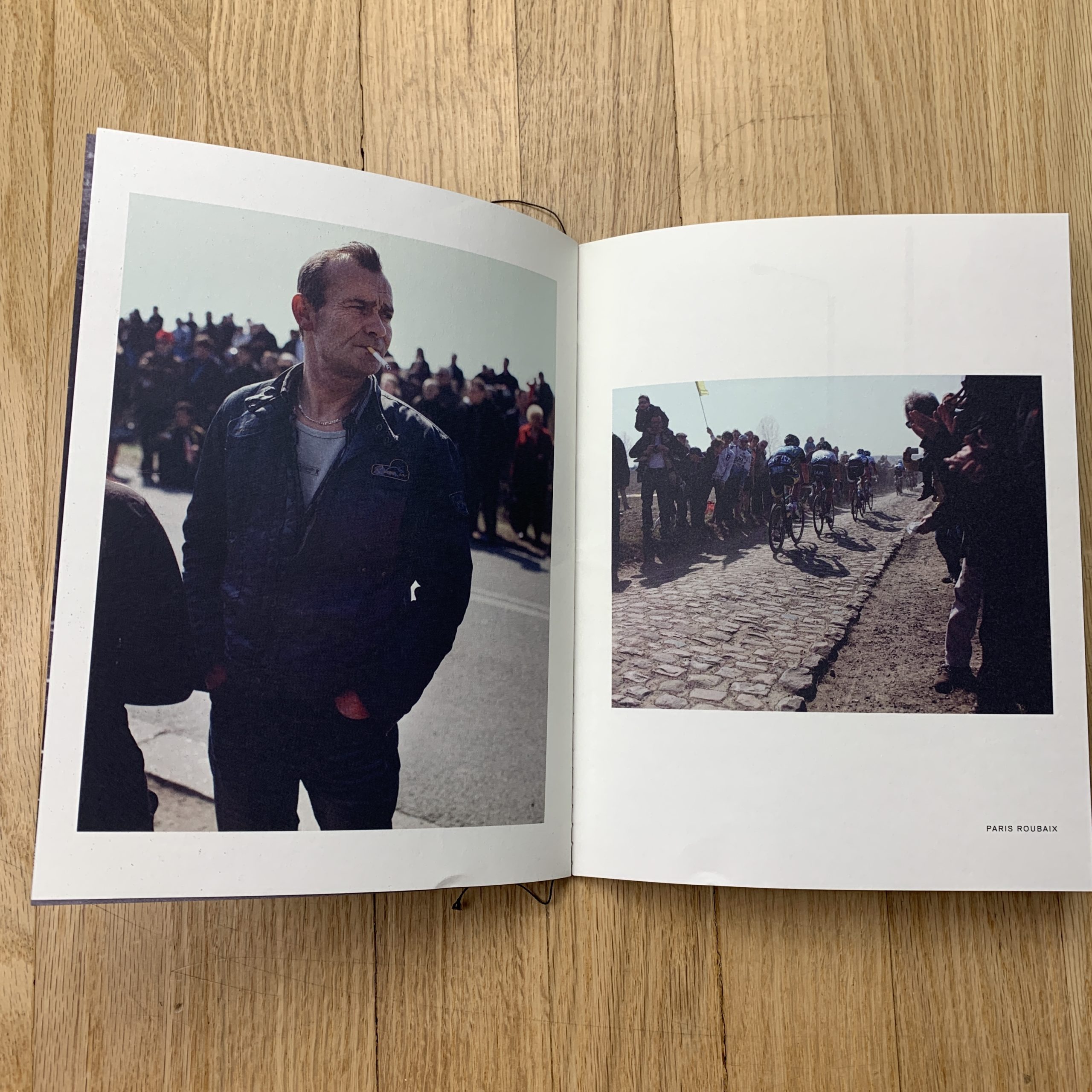
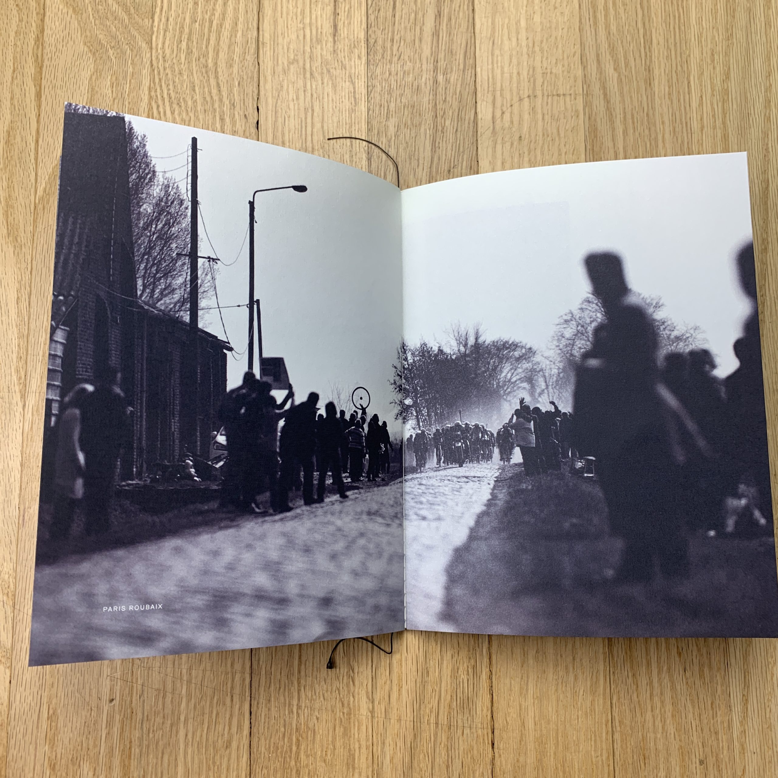


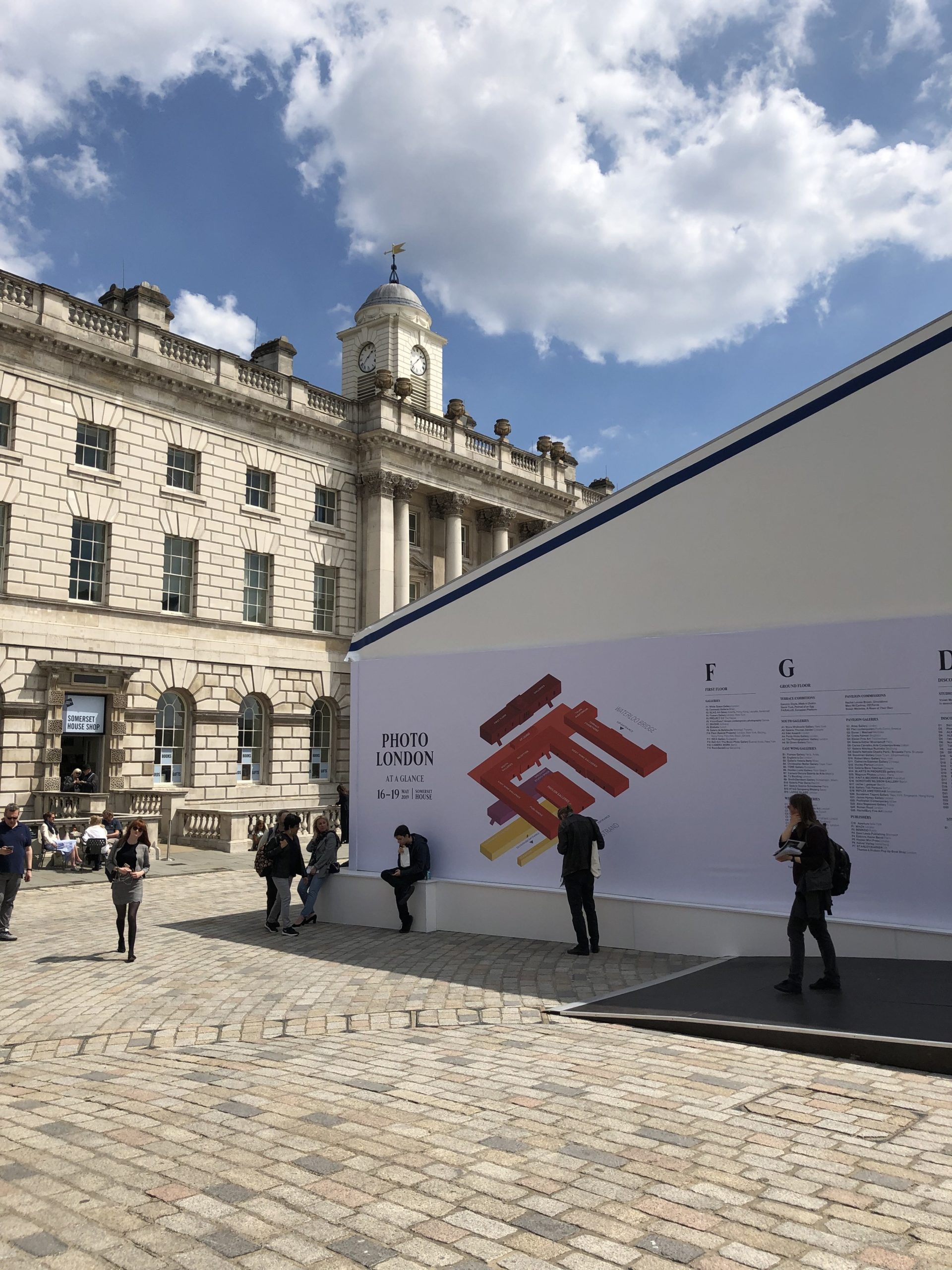
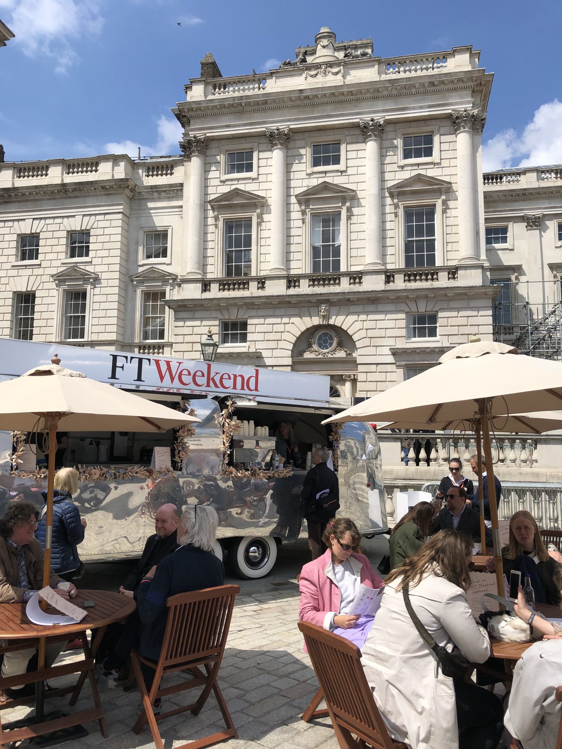


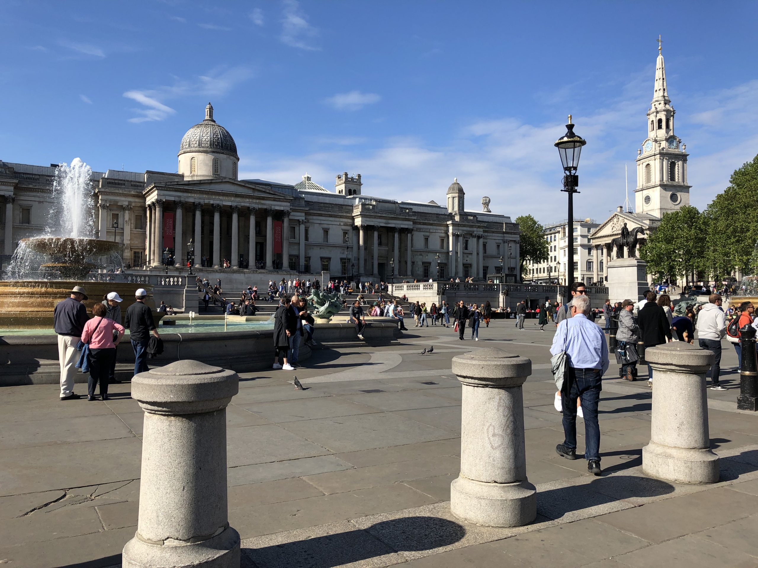
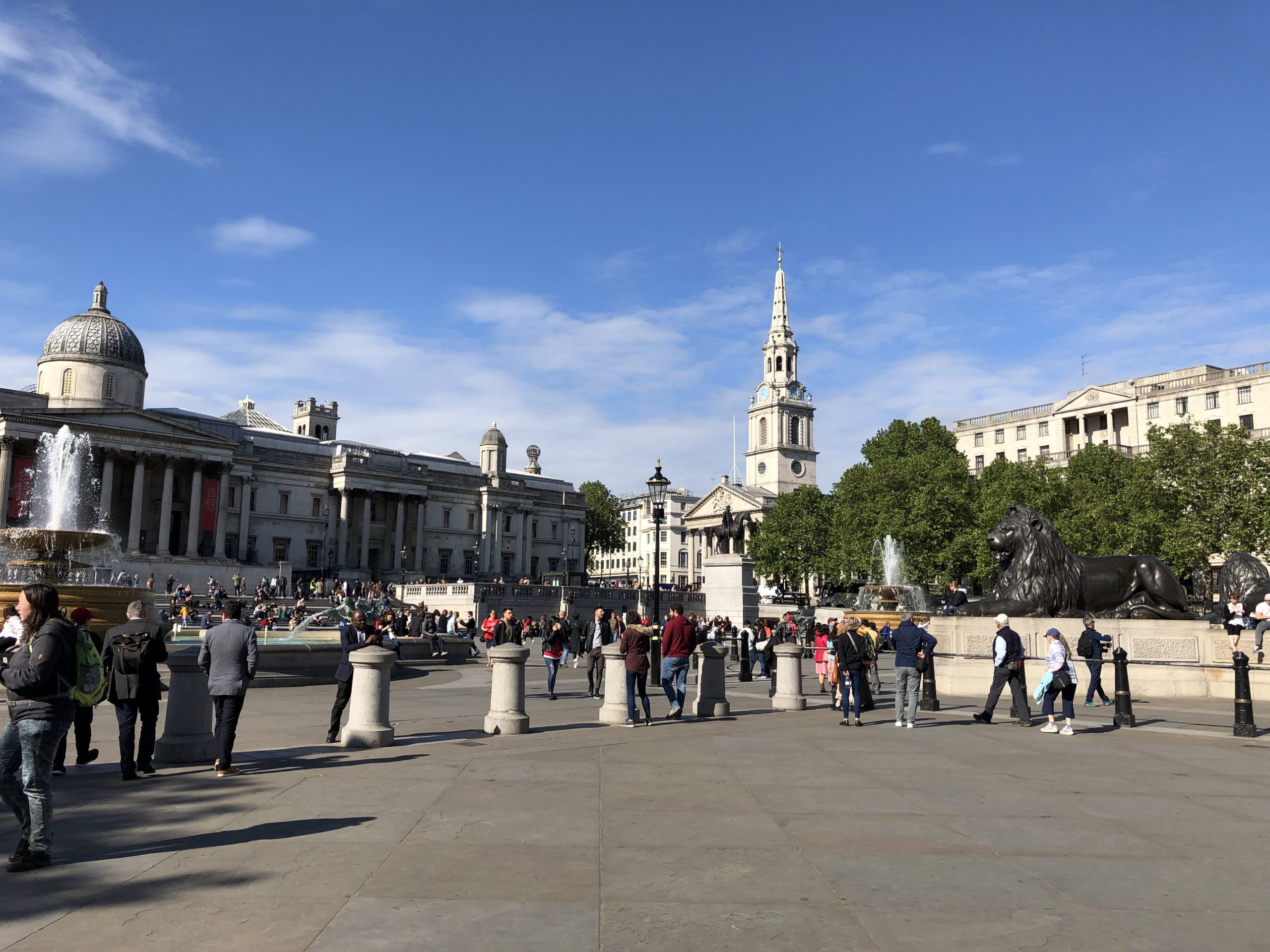


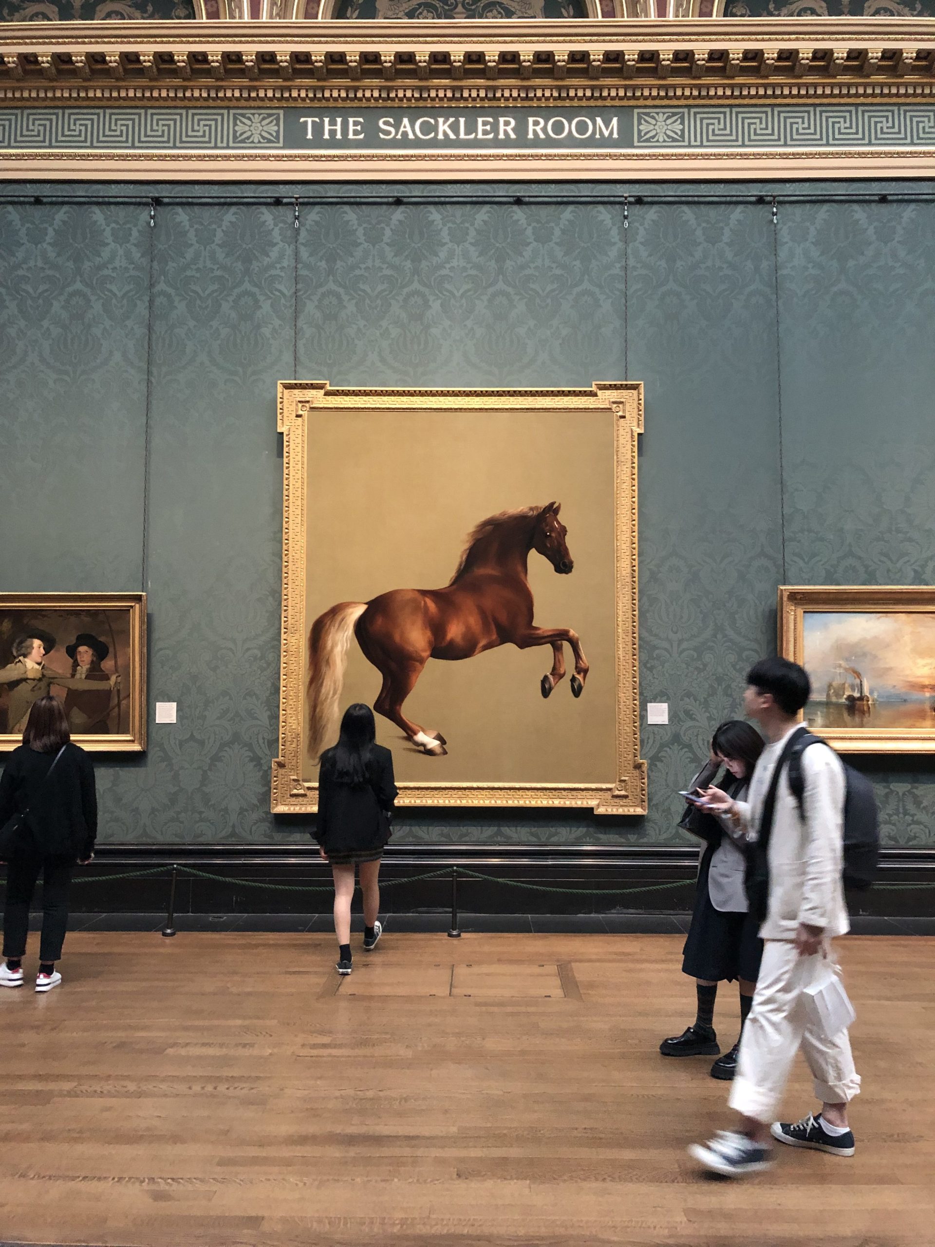
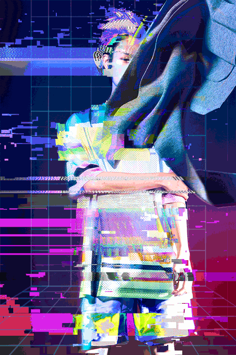
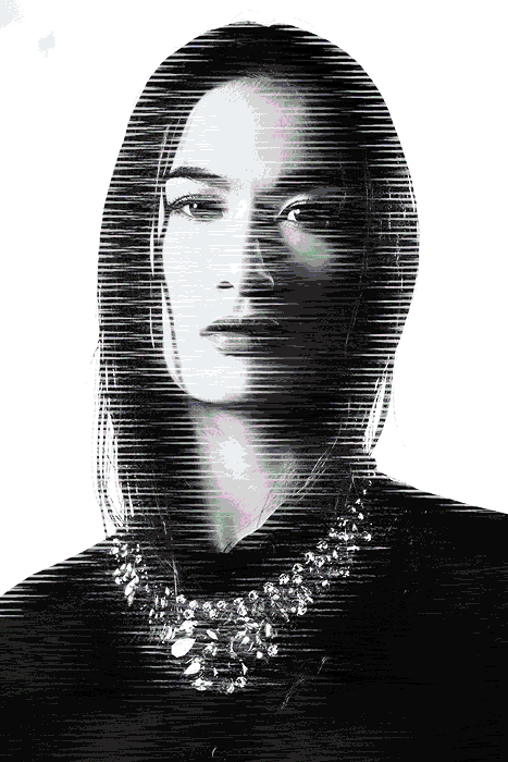
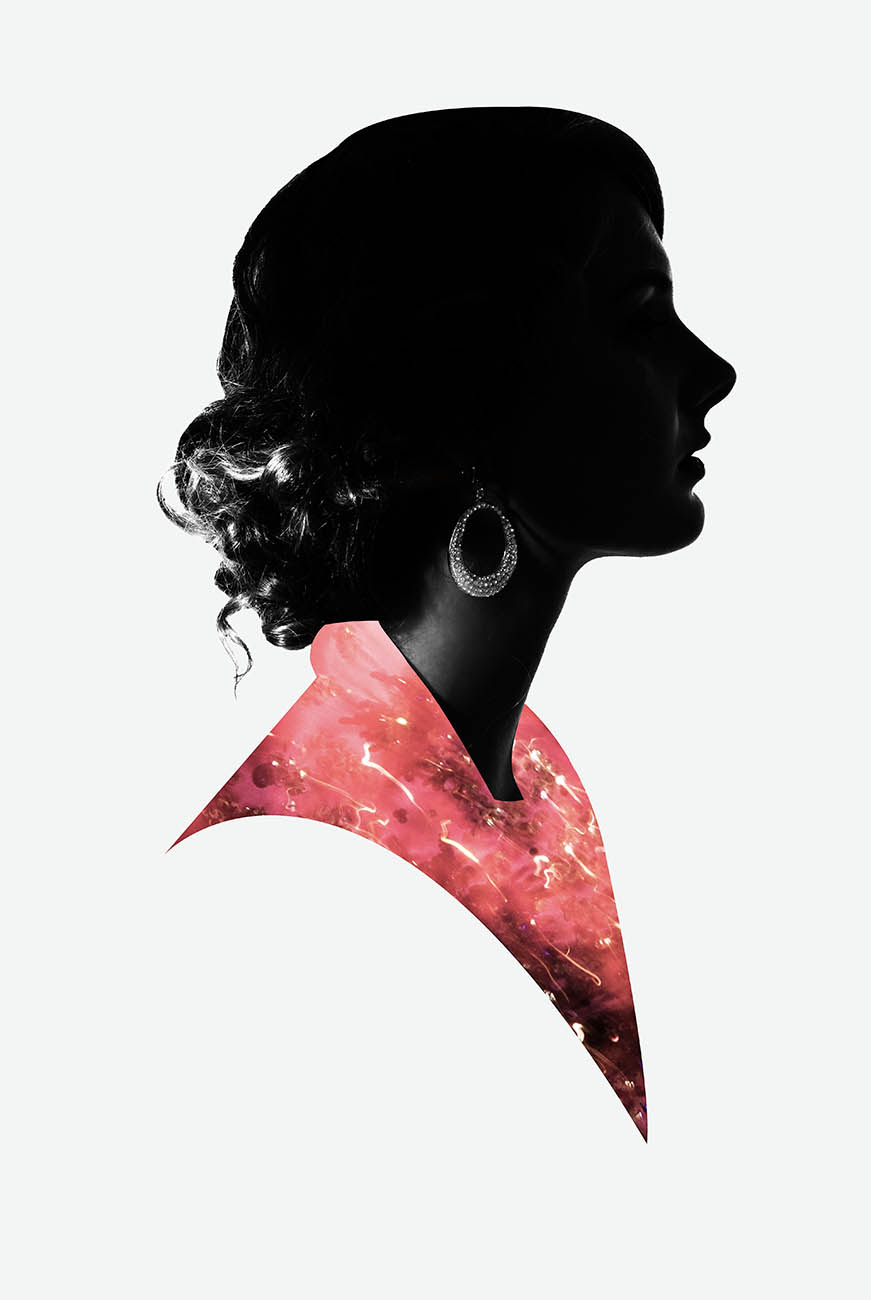
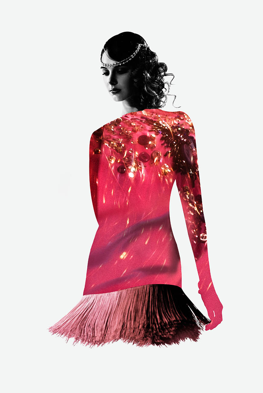


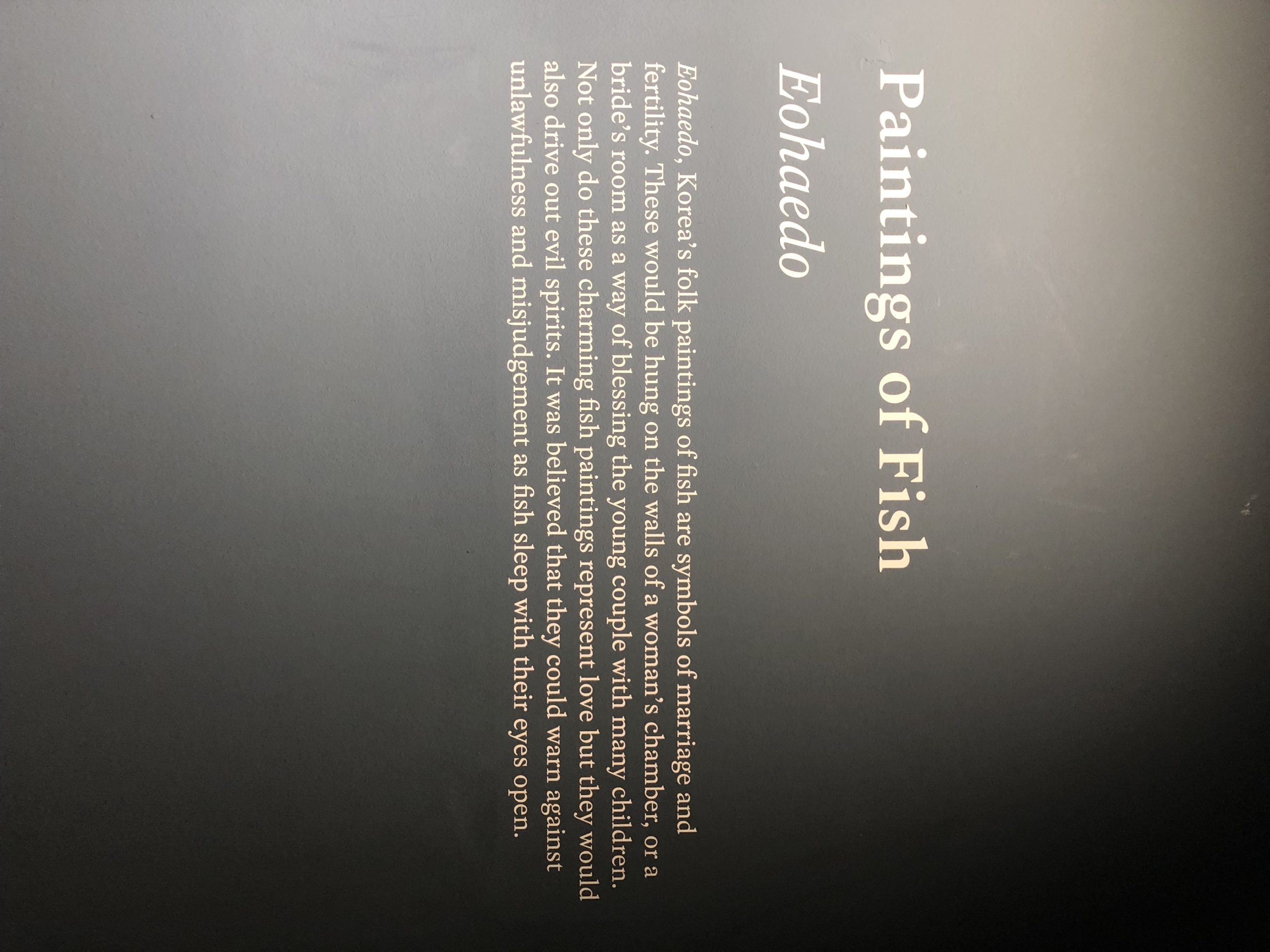
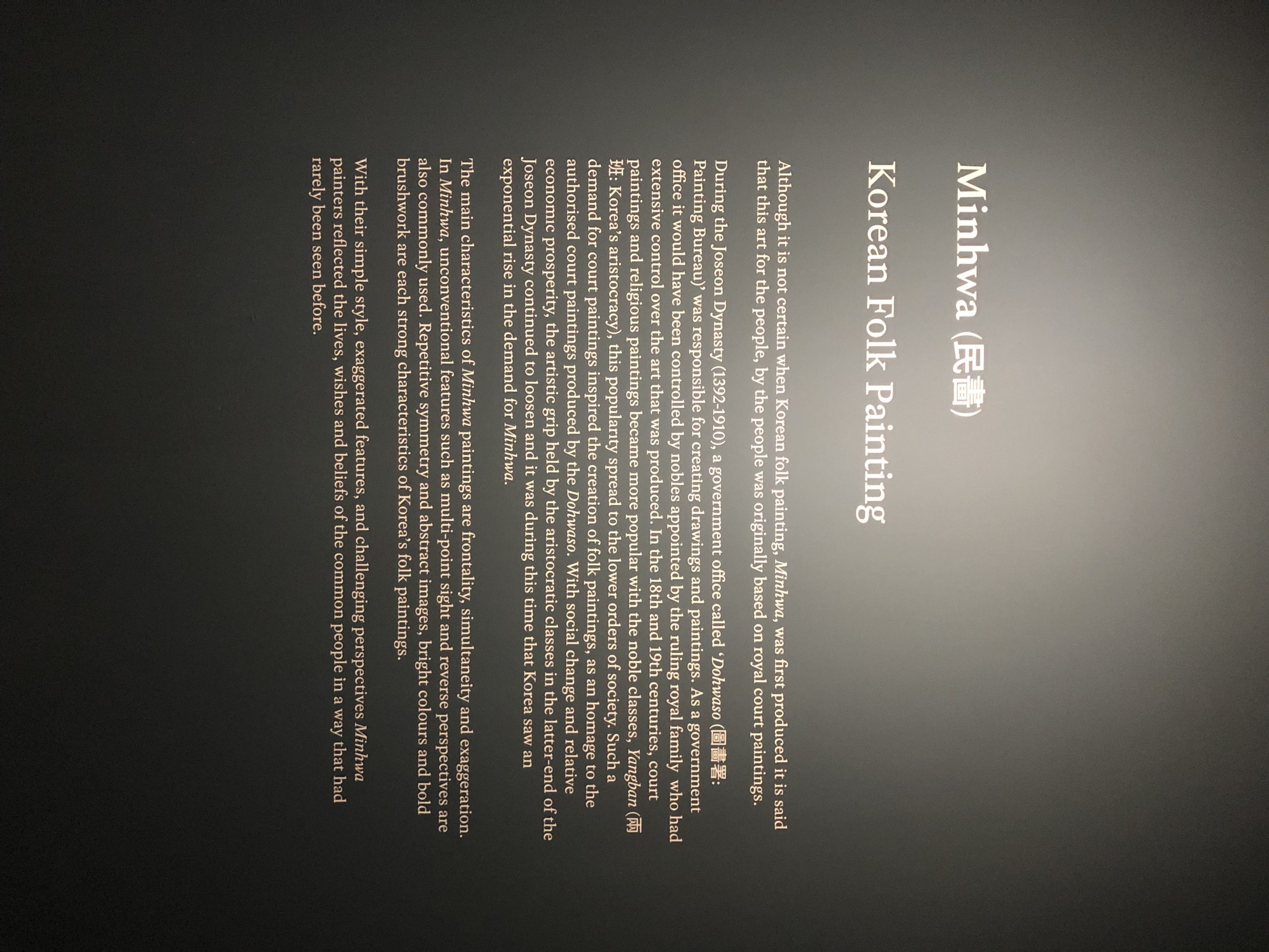
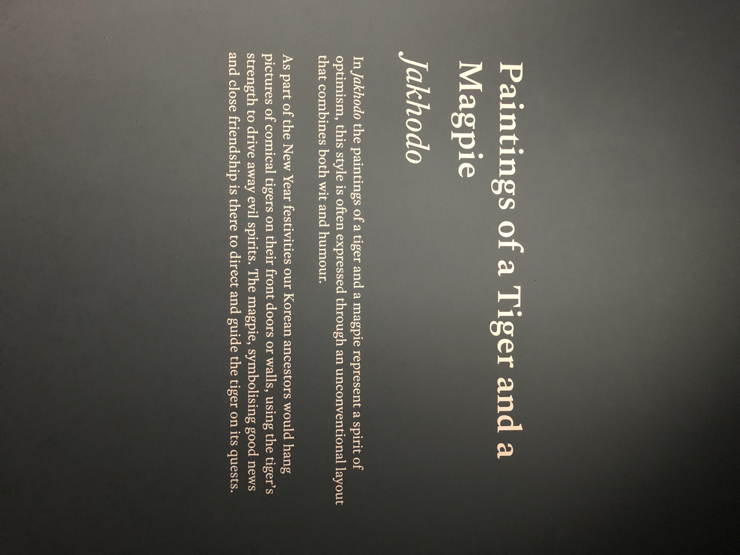
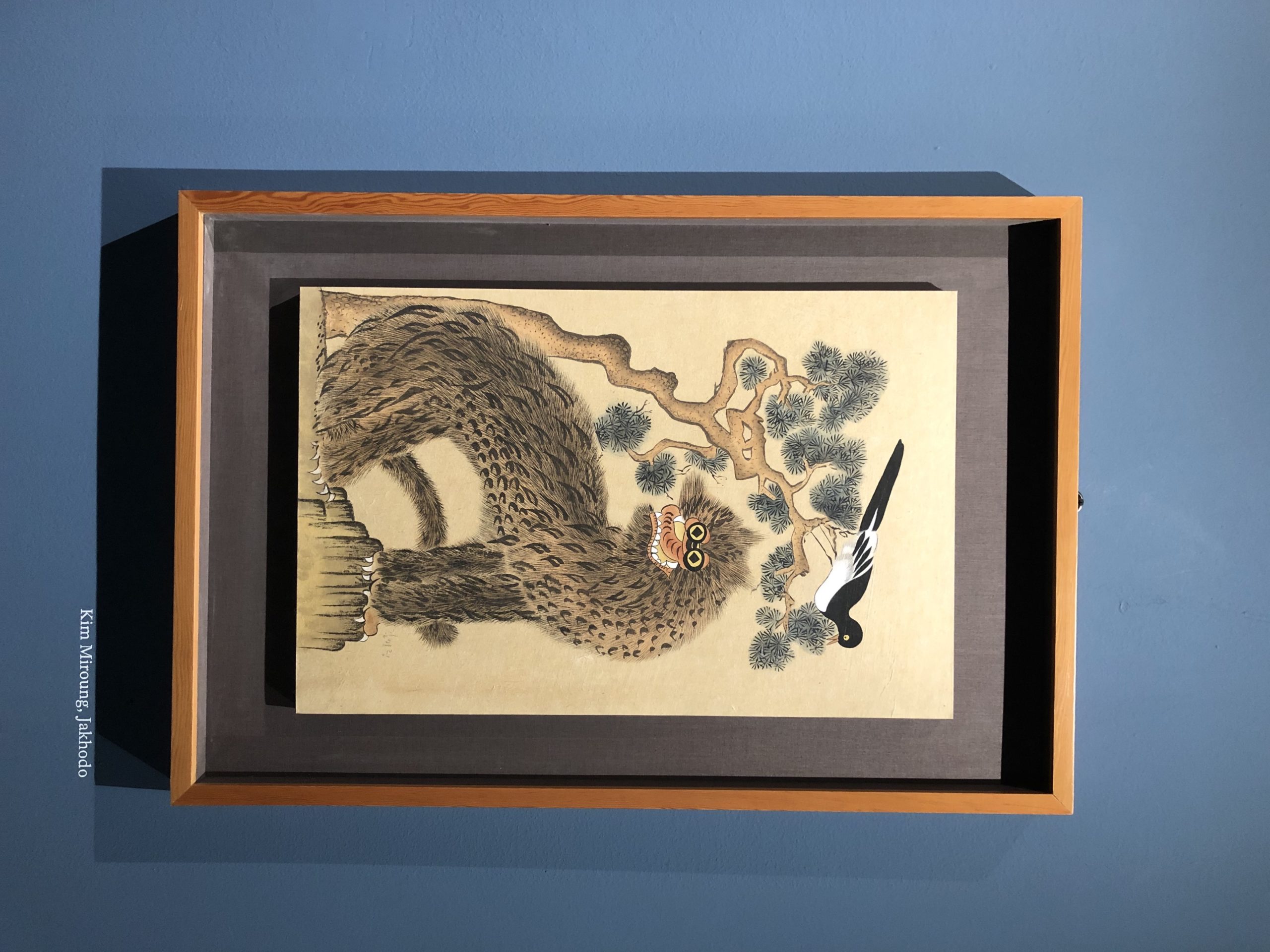
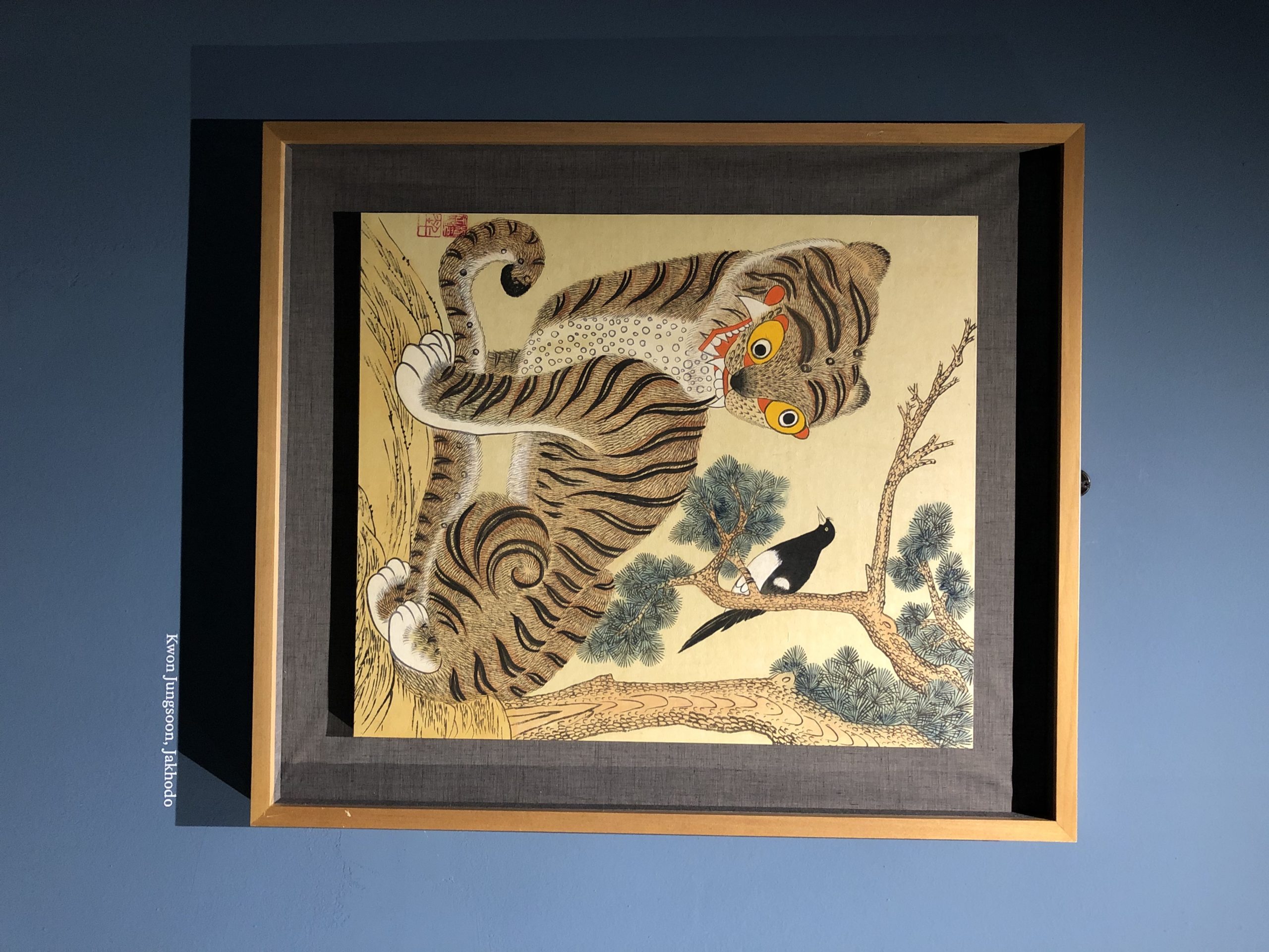
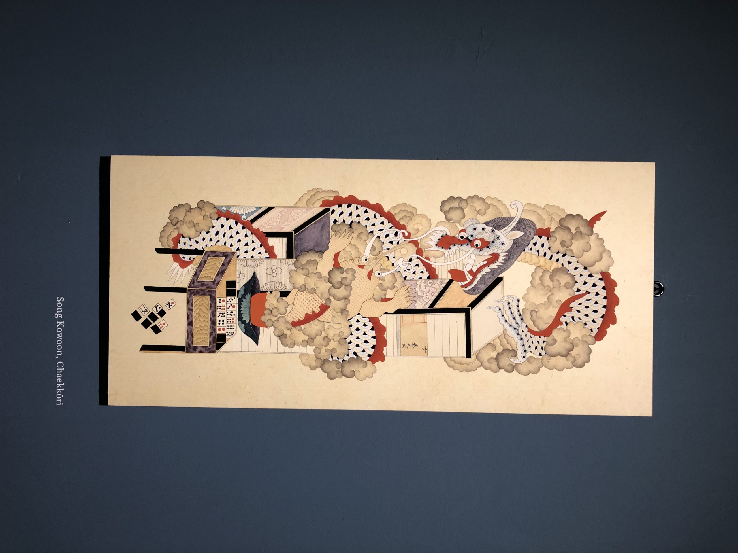
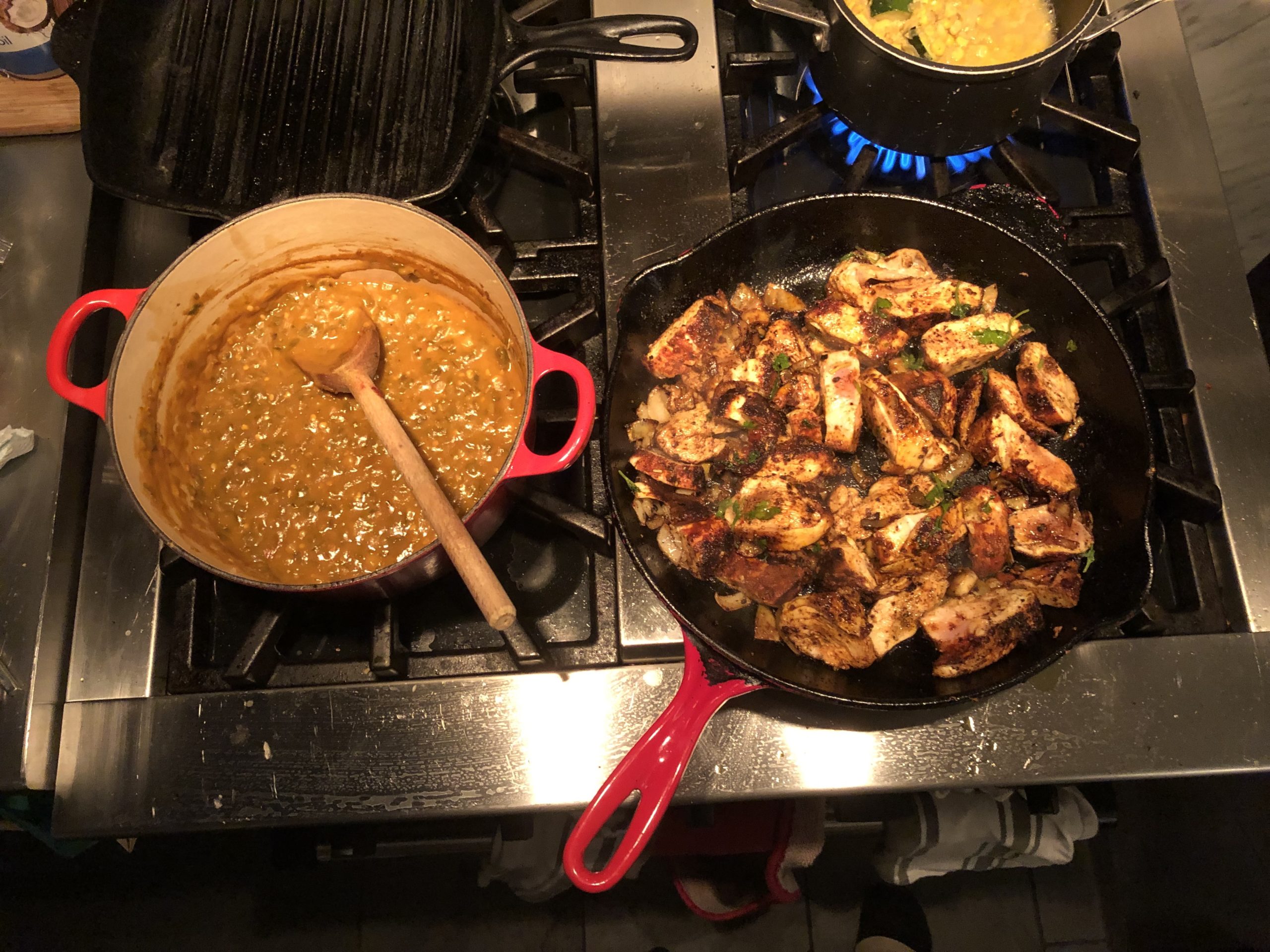