The Art of the Personal Project: Aaron M. Conway

The Art of the Personal Project is a crucial element to let potential buyers see how you think creatively on your own.  I am drawn to personal projects that have an interesting vision or that show something I have never seen before.  In this thread, I’ll include a link to each personal project with the artist statement so you can see more of the project. Please note: This thread is not affiliated with any company; I’m just featuring projects that I find.  Please DO NOT send me your work.  I do not take submissions.


Today’s featured artist:  Aaron M. Conway

When capturing a portrait I want to make sure the subject’s personality comes through. I want the viewer to feel that they have some connection with the subject and understand their story. Sometimes that is with a smile or it’s a stare. It’s the creator’s job to bring the subjects true self out sometimes in just a short period of time.

When approaching this project I knew I needed to take the familiar subject of youth boxing and make it my own. I wanted to create a series of portraits of these boxers that they would be proud of. That shows their dedication and intensity. Along with highlighting the organization that helps these athletes grow both physically and mentally.

As I sat across from these kids I kept asking for their “Fight face”. Within the first few images I realized that everything was lining up. None of us had ever met before and they were able to take the focus they learn from their coaches and apply it to the photo. We moved throughout the gym capturing all aspects of their training to create this series of images.

We have now started the printing process and will be delivering large format prints to each of the kids. This is an important part of my process; I enjoy holding the photograph and not just viewing on a screen.  Now they can have something tangible from the photo-shoot versus something that could fade away in our digital world.


To see more of this project, click here.

APE contributor Suzanne Sease currently works as a consultant for photographers and illustrators around the world. She has been involved in the photography and illustration industry since the mid 80s.  After establishing the art buying department at The Martin Agency, then working for Kaplan-Thaler, Capital One, Best Buy and numerous smaller agencies and companies, she decided to be a consultant in 1999. She has a new Twitter feed with helpful marketing information because she believes that marketing should be driven by brand and not by specialty.  Follow her at @SuzanneSeaseInstagram

Success is more than a matter of your talent. It’s also a matter of doing a better job presenting it.  And that is what I do with decades of agency and in-house experience.


The Daily Edit – Emmy Magazine: Ian Spanier


Emmy Magazine

Photo Editor: Rose Cefalu
Creative Director: Rich Bleiweiss
Photographer: Ian Spanier

Heidi: Actors are notoriously busy, how many set ups did you do and in what time frame?
Ian: We shot 5 sets in a few hours, (4 looks). Tom was actually surprised we did so much so quickly! I could have pushed for more but everyone liked what we did so we wrapped it up after the last set. I do always however approach celebrity shoots anticipating I’ll have only two minutes.

How many images ran?
Tom Payne, actor and our subject, formerly of The Walking Dead and newly staring in Fox’s Prodigal Son was being featured in the “In The Mix” section of EMMY Magazine. The article is always a one-pager, but I love to give my clients options. Tom was really easy to work with, and liked the first set up, so we were able to do a few different sets. I’m a big proponent of going in with a plan, so by being able to move from one set to the next quickly I was able to maximize my time with him.

Was your direction the same for the existing portraits?
The other assignment was actually quite different. For that one I was photographing a number of students, who wrote screenplays for a TV show called Killing Eve. They would actually be composited into a final image in post. For that assignment we had two set ups for each subject to get through. Nine subjects in total, so it was a full morning. It was going to run in the same issue, so I did not want to do the same lighting. Since this was a last minute add on to that shoot, it was a good challenge.

Tell us about your “safe” portraits and has too many options ever backfired in some way with the client?
I often cover the “safe” portraits, which is something I developed over my years of shooting for magazines. I feel that I’m very good at looking at a magazine and understanding the “voice” of the magazine. Providing a set up that feels like the look of the magazine, even if it’s not exactly “my” look. I don’t mind it as I both love the challenge and always tweak a bit to make my stamp on it. That chameleon skill (as I’d call it) is both a blessing and a curse. It can confuse some potential clients. I like to think it’s an asset however, as I’m confident I can shoot the dark, moody image as well as the bright, beautiful lit image. I love to have many lighting solutions, you never know what the next request will be! In this case, we nailed the cleaner look, and Tom was open to playing around a bit. I did one final set that played more off his TV show- where Tom plays a crime-solving son of a notorious serial killer who has a unique ability to break down the crimes he solves. His character consults with his father ala Hannibal Lecter/Clarice Starling. At the time, only a trailer was available, so I had to extrapolate a lot. I love any chance on an assignment where I get the opportunity to be a little more creative and try some new things.


The Daily Promo – Amos Morgan

Amos Morgan

Who printed it?
DCG One https://www.dcgone.com/

Who designed it?
Chaun Osburn https://madebychaun.com/

Chaun and I have known each other for many years and he was on the design team that did the branding for my business. We’re both huge fans of music and appreciate vinyl records so for this project we came up with the idea to create a promo pieced based on that format. I’ve always been fascinated by the design/copy/imagery that record jackets and liner notes feature, and have spent hours pouring over those details while I’m listening to the music. Using that as inspiration, it was really important for the images and text to have a thematic arc similar to how the tracks are arranged on many albums. Chaun’s design creates such a wonderful home for the images and brings the feeling of an album’s liner notes to life.

Tell me about the images?
The images are from a mix of personal test shoots and commercial jobs.

How many did you make?
300

How many times a year do you send out promos?
Large promos (like this) every 1-2 years and small “postcard” promos 2-3 times a year.

Do you think printed promos are effective for marketing your work?
For me, printed promos are very effective. I’m pretty selective with who I send them to as I prefer a targeted marketing strategy vs. a large scale “blanket” approach. This allows me to tailor the promo to an audience I believe will appreciate the selected work. Then the printed piece at the very least allows for a conversation starter when following up and I often receive compliments that it was nice having something tangible to hold and look through.

This Week in Photography: East of the Mississippi


Part 1: The Intro

I was wondering what to write about this morning.

No strong pull in any direction. (Which is rare.)

So I dropped into a kneeling-Japanese-meditation-pose I learned in Aikido.

I calmed my mind, focused on my breathing, and at first, tried to figure out what my psyche was interested in. The last few stories from London? A new book from the pile? Anything about Chicago?

But I quieted those thoughts, because why else meditate?

After a few minutes, I opened my eyes, and the first thing I saw was a book I’d considered for review twice before.

Each time, it didn’t connect.

So of course I picked it up, and fell in love, as it’s perfect for today. (But we’ll get to that.)


Part 2: The Album

A month ago or so, I wrote about synchronicity, so of course that was the first thing I thought after re-discovering today’s book.

Synchronicity.

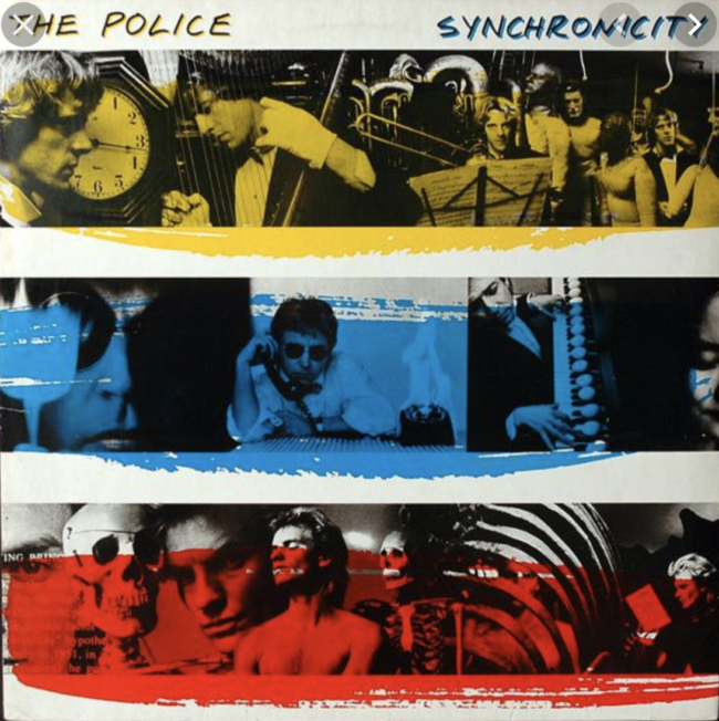
My mind jumped to “Synchronicity,” the album by The Police from somewhere around 1984. (Summer ’83, apparently.)

It was their biggest pop culture breakthrough, and as a kid, (I would have been 9,) I remember it as melodic, with a big anthem song.

Which was it?
(“Every Breath You Take.”)

So I go to Spotify and put on the album. (Or its digital playlist equivalent.)

What did all of America go gaga for in 1983, I asked myself?
What’s the story here?

Right away, it was clear the lyrics and energy in the music were dystopic. Some songs were downright dissonant, which goes against the band’s traditionally excellent harmonics.

And really, that title.

Synchronicity.

It implies synthesis, like connections are a good thing. But the songs were disturbing, and really, I couldn’t connect the dots at all.

It made no sense.
None.

WTF?

So I picked up my phone, and sure enough, the Spotify was stuck on Shuffle Play.

I couldn’t turn it off.

The AI broke, so I wasn’t getting the flow the band intended. Even so, the songs were almost universally creepy, disturbing or violent, even though the melodies were often pleasant.

This was the biggest album in America in #1983, and made The Police briefly the biggest band in the world? (Before they walked away on top.)

What does that all mean?

I decided to go down a rabbit hole for you.

I did some digging, found a lyrics website, hit up Wikipedia and Youtube, some other places, and got info from The Police’s official website as well.

I also listened to the album again, in sequence, manually advancing the titles so I could get the intention, while reading the lyrics.

“Synchronicity I,” the first song, speaks directly to the Jungian principles by which the album was inspired. Carl Jung wrote a book called “Synchronicity: An Acausal Connecting Principle,” and Sting read it. He was also into “The Roots of Coincidence” by Arthur Koestler, as The Police named their previous album, “Ghost in the Machine” after one of his novels as well.

Synchronicity was Jung’s theory that events otherwise deemed coincidental might in fact have meaningful connections.

So the album opens by referencing those ideas directly, in a song called “Synchronicity I.”

“A connecting principle
Linked to the invisible
Almost imperceptible
Something inexpressible
Science insusceptible
Logic so inflexible
Causally connectable
Nothing is invincible”

We feel you, Sting.

The next song, “Walking in Your Footsteps,” is about dinosaurs, and our relationship to extinction.

“Hey there mighty brontosaurus
Don’t you have a lesson for us
You thought your rule would always last
There were no lessons in your past”

Extinction talk.

In 1983!
Ahead of its time!

Oh, and I should mention the album cover was shot by Duane Michals, (who gave the best lecture I’ve ever seen at the Medium Photo Festival in 2014,) in which Sting posed with dinosaur bones.


The “coincidences” mount.

In “Oh My God,” Sting writes,

“Everyone I know is lonely
And God is so far away
And my heart belongs to no one
So now sometimes I pray

Take the space between us
And fill it up some way
Take the space between us
And fill it up”

Totally prescient, as far as our empty digital connections supplanting IRL experience in #2019.

In ‘Mother,’ maybe the less said the better, as Andy Summers screeches about a Mother like he’s Norman Bates.

(Freaky AF, as the kids say.)

Then in Miss Gradenko, Sting wails,

“Is anybody alive in here?
Is anybody alive in here?
Is anybody at all in here?
Nobody but us in here
Nobody but us!”

This is one messed-up piece of art, that somehow got packaged as pop music for the masses.

I need to take a break.

The #1983 vibe is feeling a bit too much like our current moment. They were living under the constant threat of nuclear annihilation, due to the Cold War, and we’ve got Trump and climate change.

So.
Let’s talk about the backstory.

Sting, according to Wikipedia, only became a musician due to “happenstance.” He grew up near the shipyards in Northeast England in Northumberland, (and was headed towards that career,) but once saw the queen, who waved at him, and that gave him the courage to turn his back on convention and become a creative person.

He worked his way up, and got married before he was famous, as the three man band laid down hits in their first four albums. (“Zenyatta Mondatta” was always my favorite.)

But by the time The Police made “Synchronicity,” their their final album, Sting was going through a nasty divorce, as he’d taken up with Trudie Styler.

Also, the band supposedly HATED each other.

While “Synchronicity” was made on the island of Montserrat, the three musicians, Sting, Andy Summers and Stuart Copeland, were literally recording in separate rooms.

Separate rooms!

And fistfights were reported as well.

On The Police’s official website, for heavens sake, Stuart Copeland admitted “The whole album was recorded in an unbelievably bad atmosphere.”

In the music video (for MTV,) the three band members are almost always 10-20 feet apart, lip-synching on radically different platforms, and Sting looks like a dead ringer for Billy Idol.

Synchronicity indeed.

Just to add another layer of meaning, Sting wrote some of “Synchronicity” in Jamaica, in a house called Goldeneye, sitting at the same desk where Ian Fleming wrote James Bond.

After Miss Gradenko comes “Synchronicity II,” a song about a tired worn-out-sap who’s about to snap from family, factory work and traffic, all juxtaposed by the rising of an actual monster in a Scottish loch.

Next comes “Every Breath You Take,” which is the most obvious stalker song to ever become a mainstream hit.

“Every breath you take ,and every move you make
Every bond you break, every step you take, I’ll be watching you,”

And it only gets more specific from there. Lots of watching you, and you belong to me.

How was this song ever considered pop music material?

Sting himself later said, “I think it’s a nasty little song, really rather evil. It’s about jealousy and surveillance and ownership.”

Then in order we have “King of Pain,” and “Wrapped Around Your Finger,” (we get it,) and “Tea in the Sahara,” which ends with women burning in the desert with cups of sand.

Finally, there’s “Murder By Numbers,” which is about becoming a serial killer.

Dark, dark, dark stuff.
Horrifying, really.

And the only reason I’m writing any of this is because I saw a book when I opened my eyes from meditation, and took it as a “sign,” which led to a creative rabbit hole, which led to this column.


Part 3: The Book

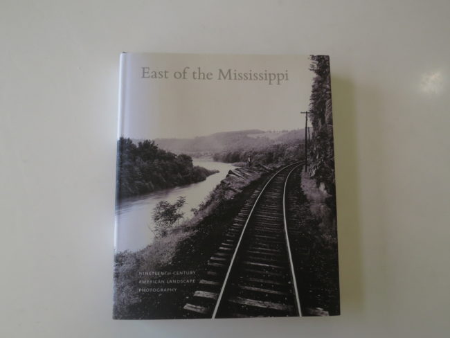
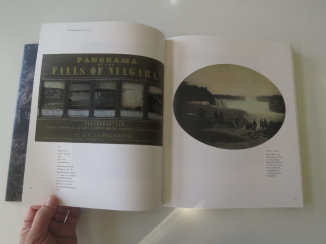
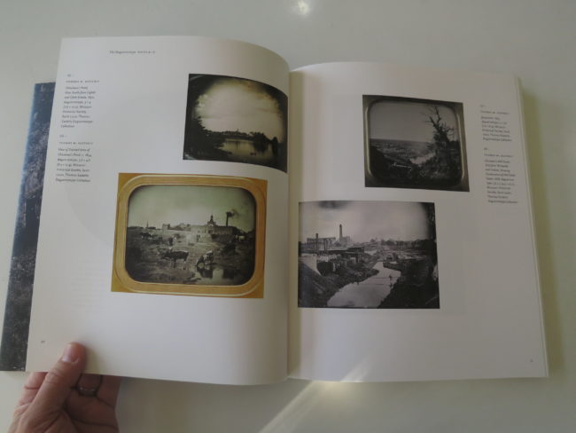
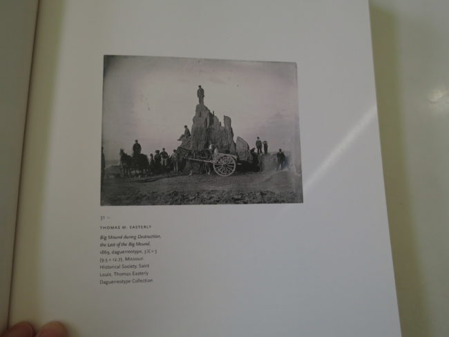
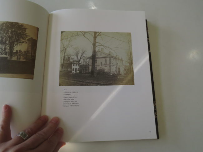
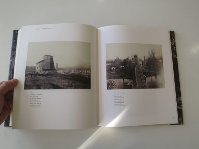
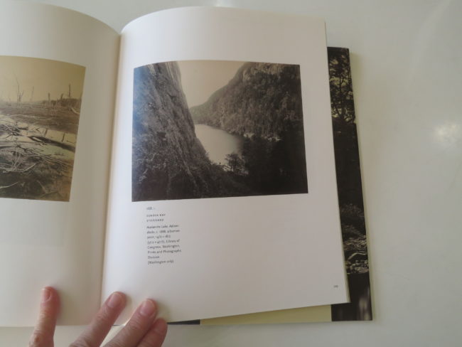
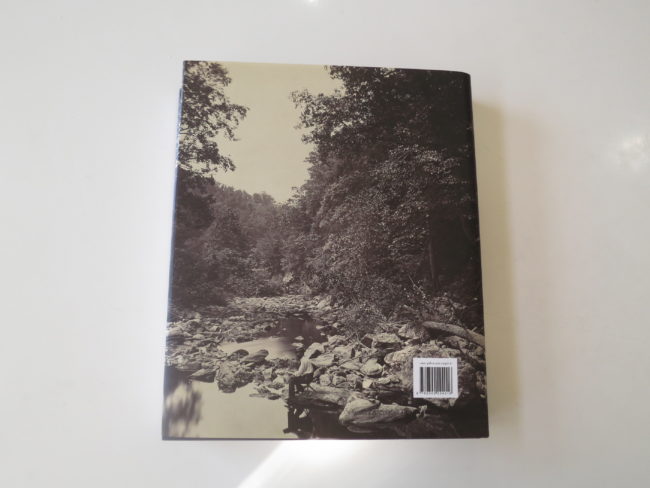
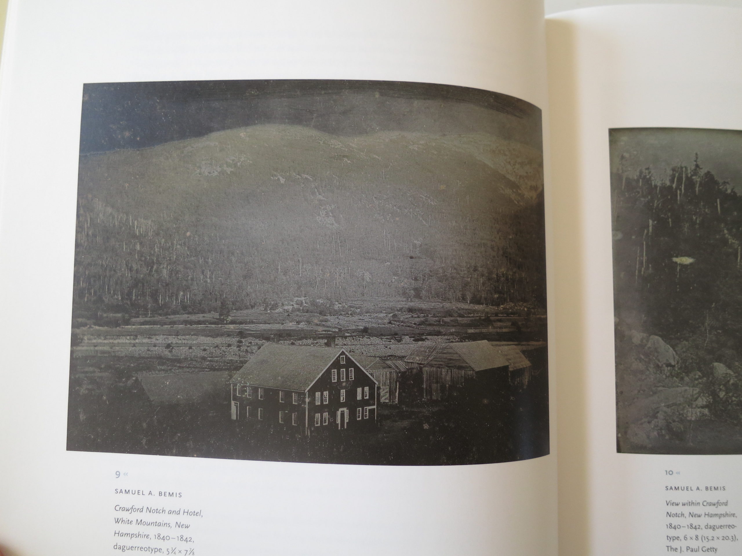
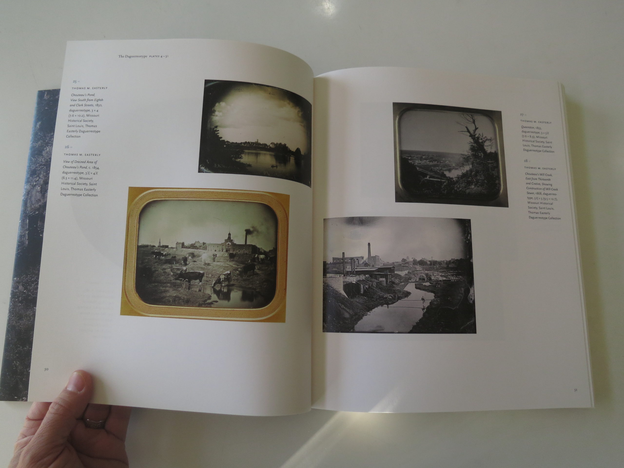
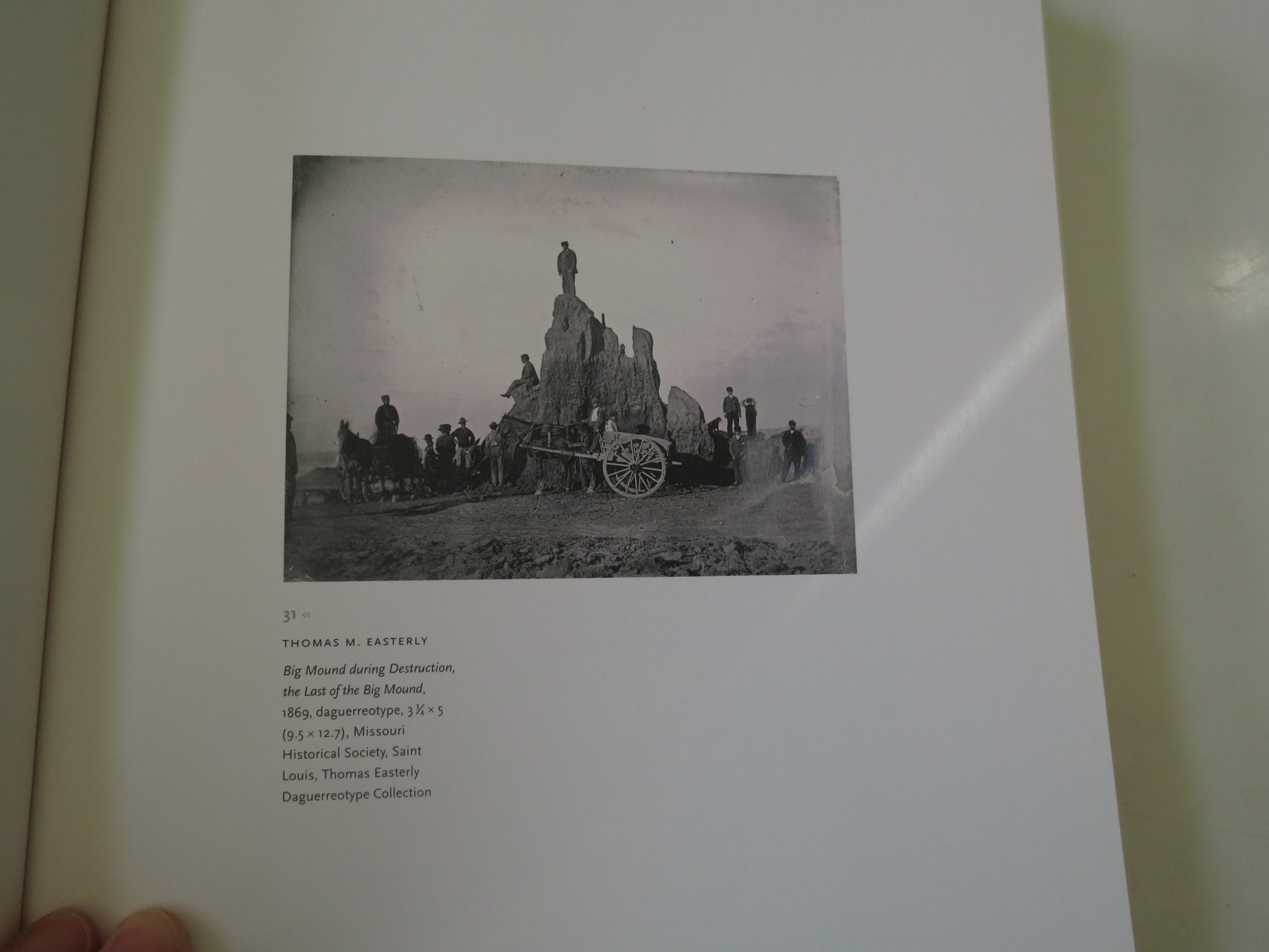
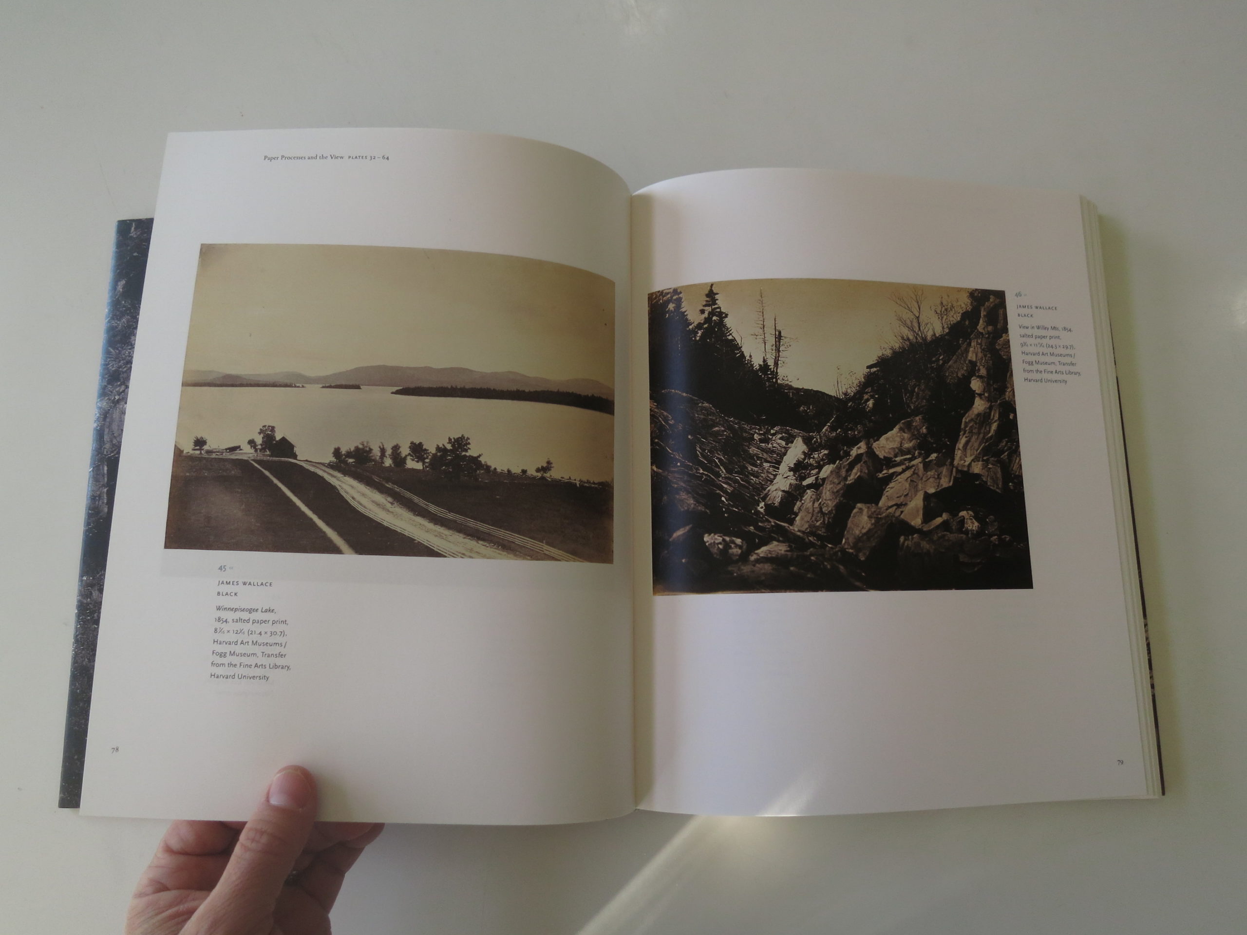
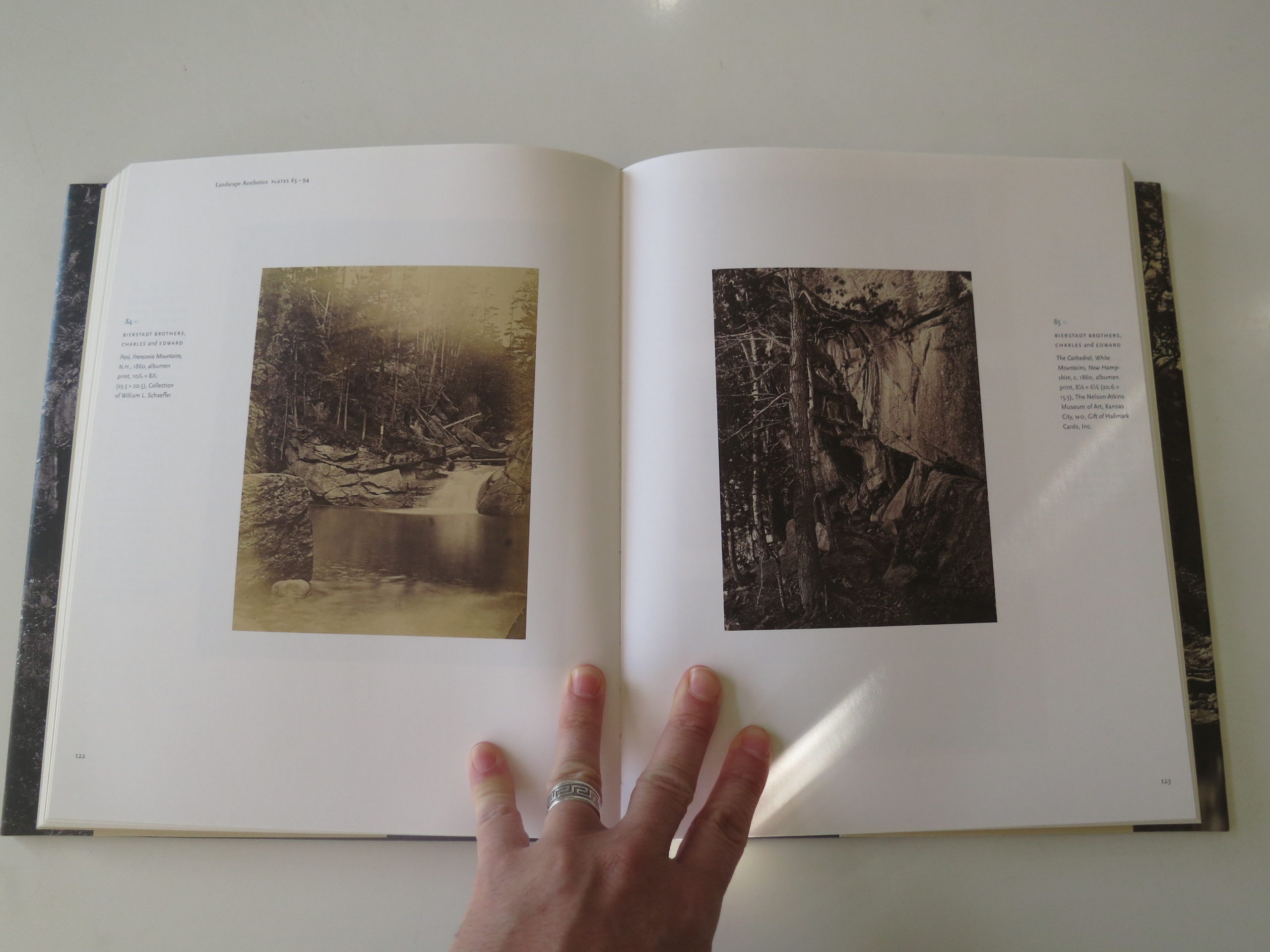
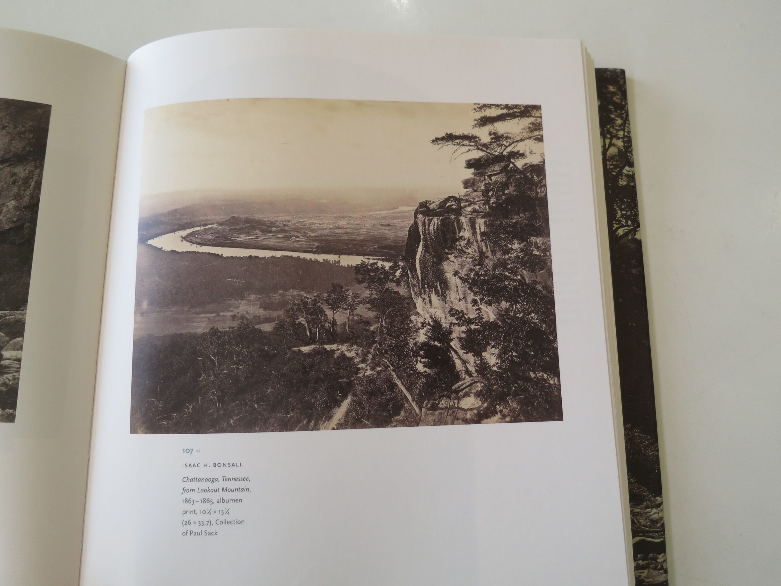
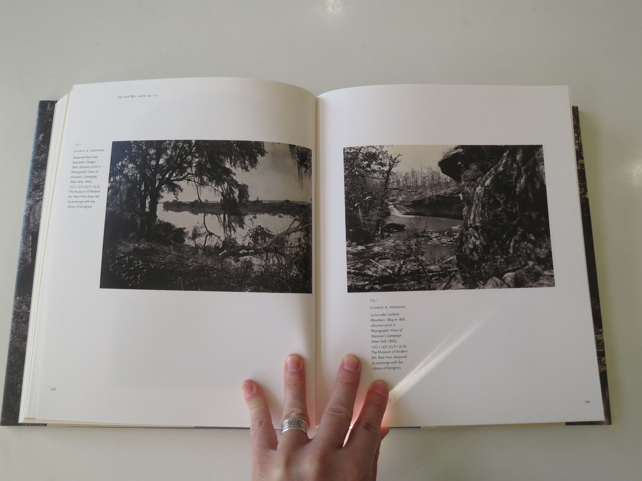
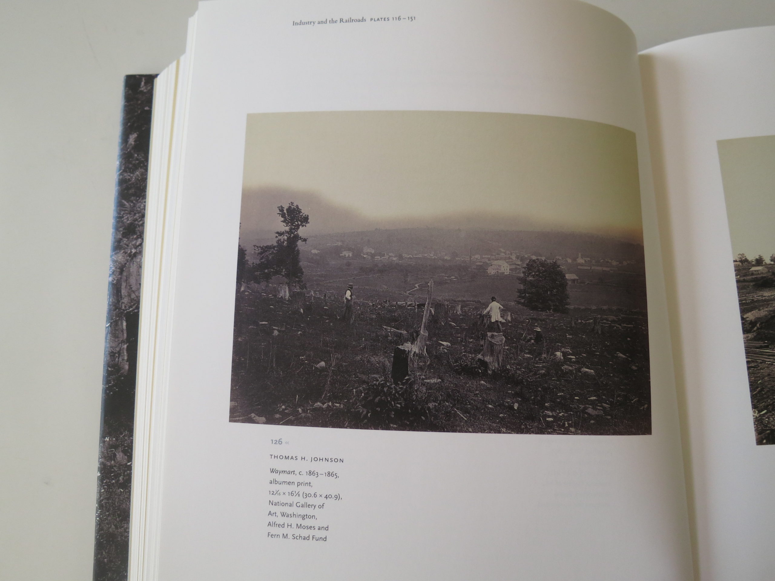
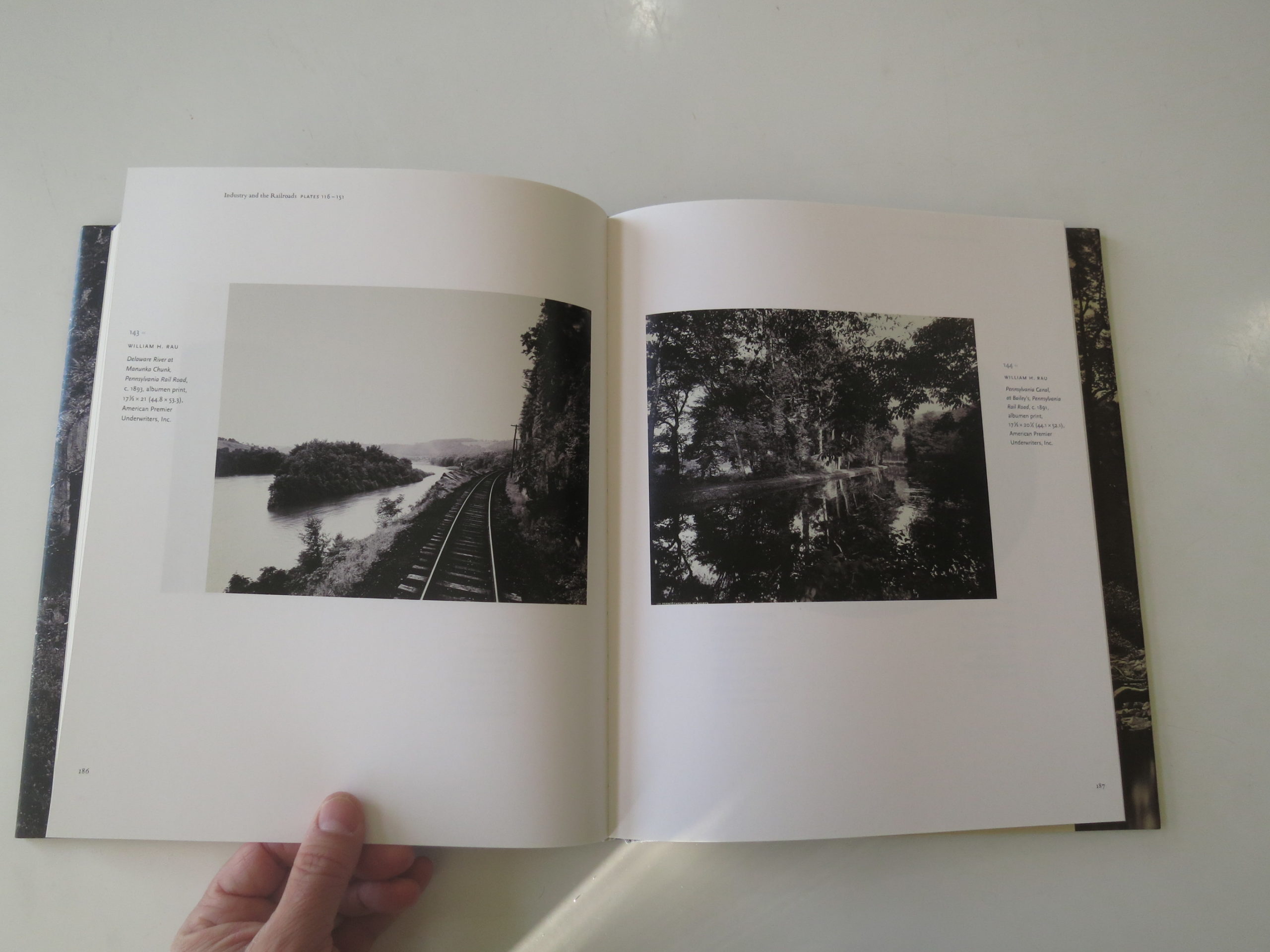
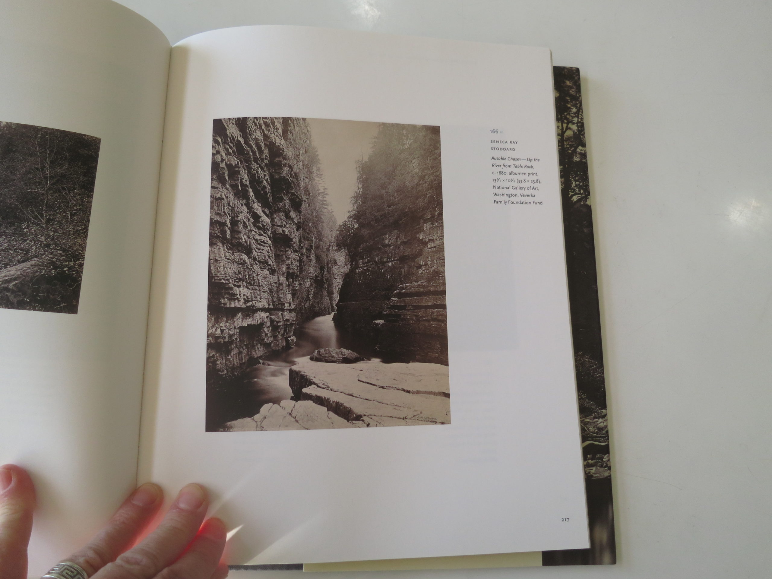
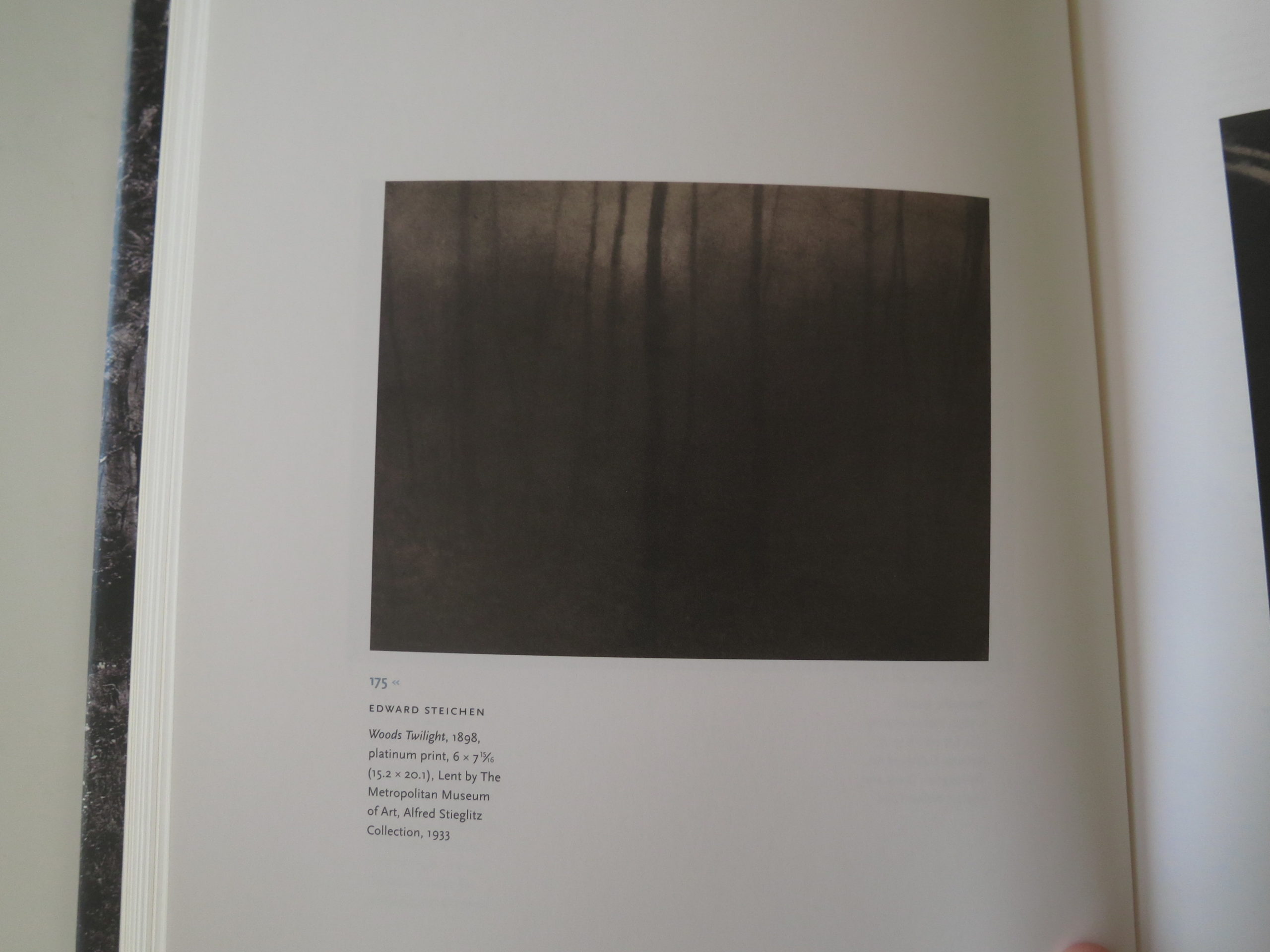
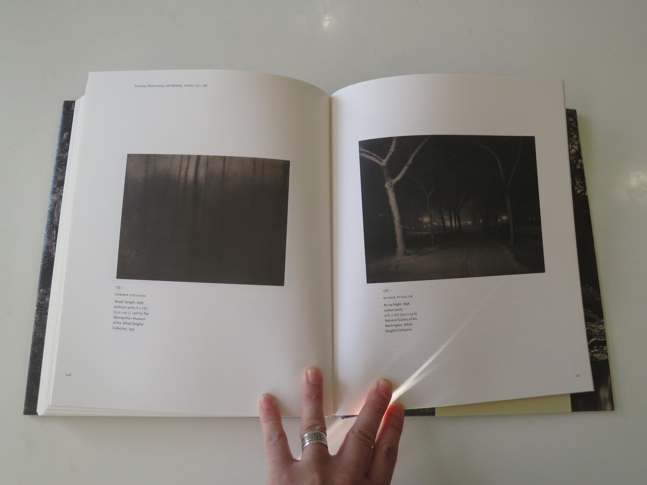
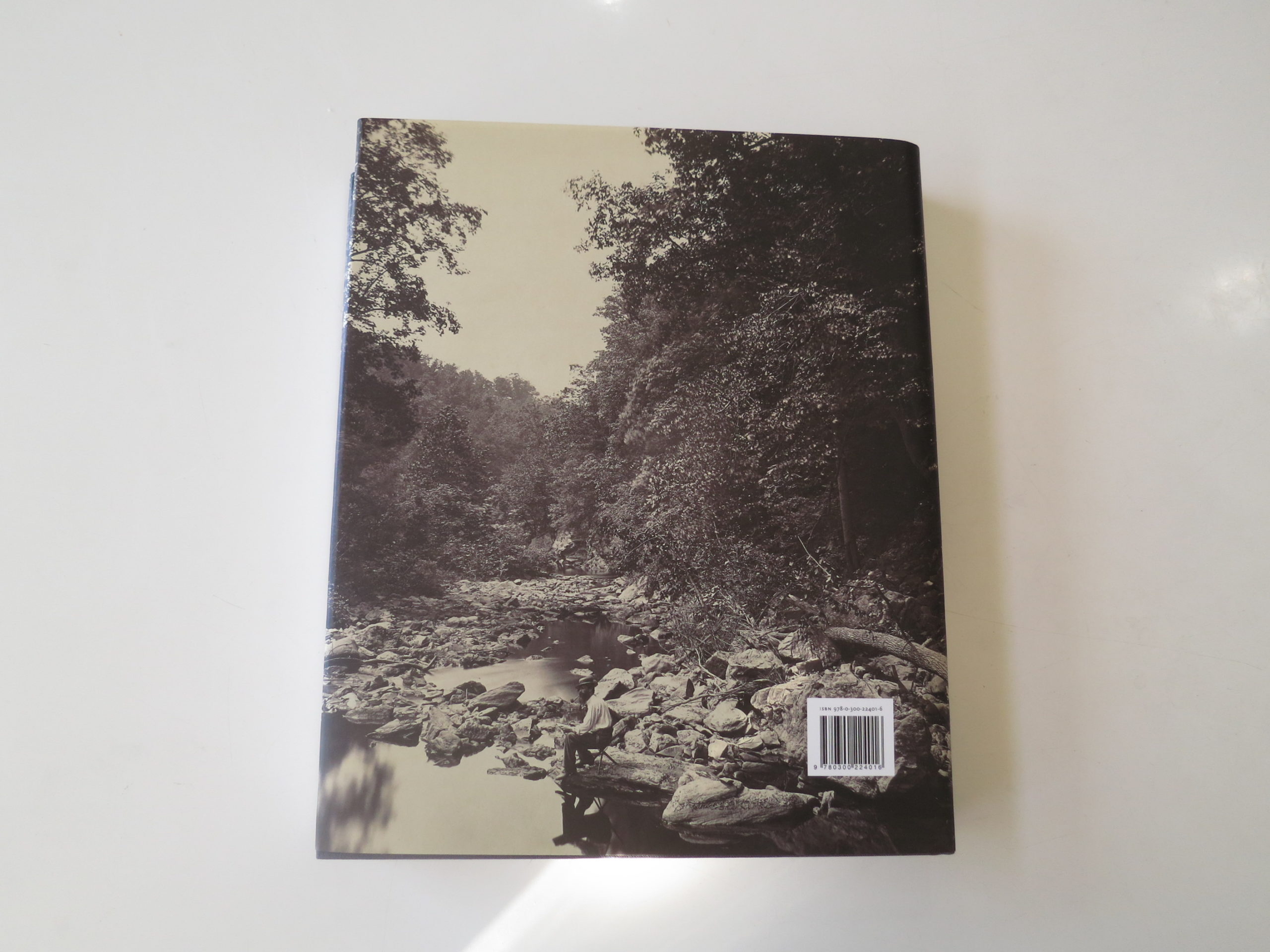
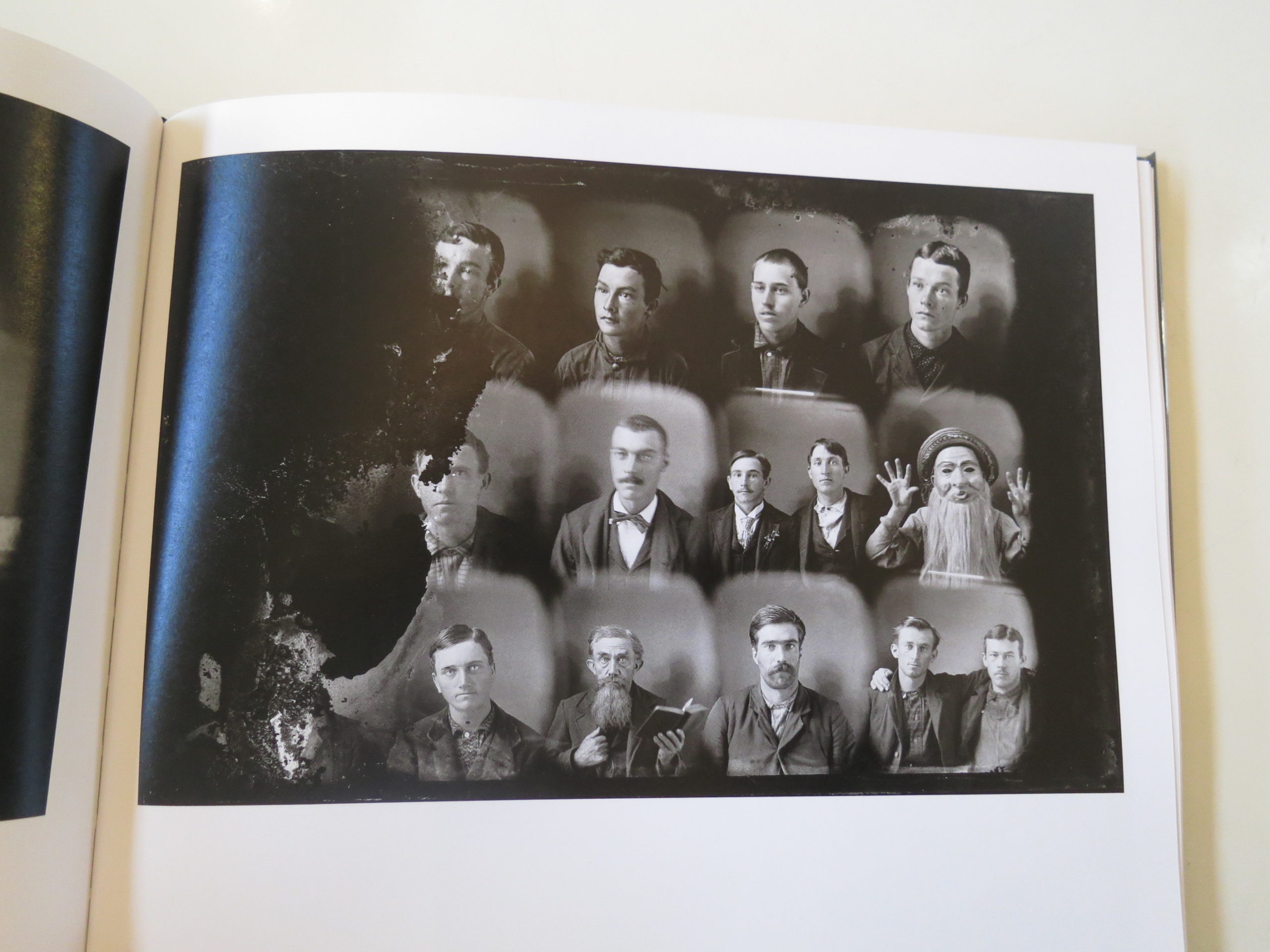
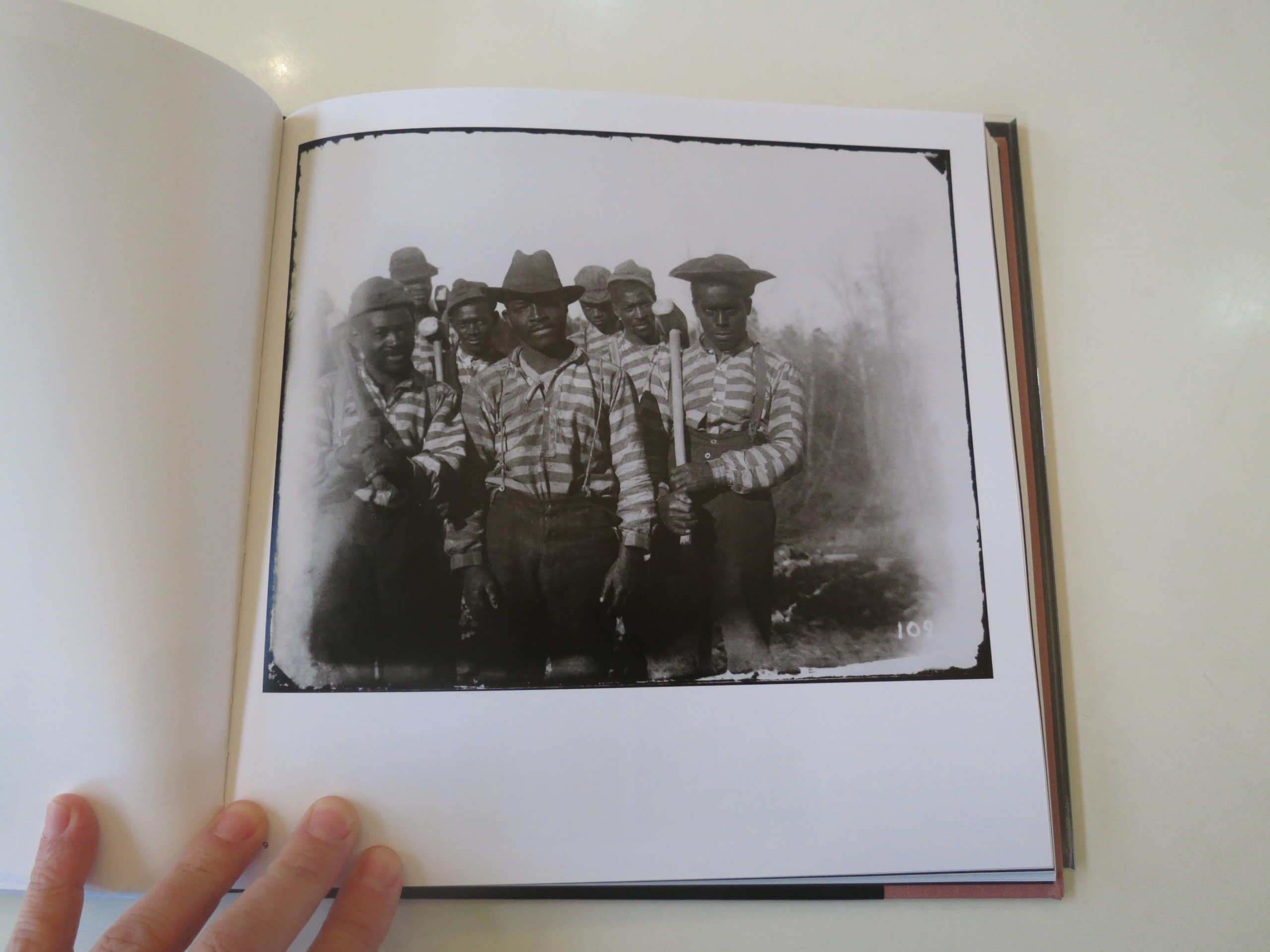
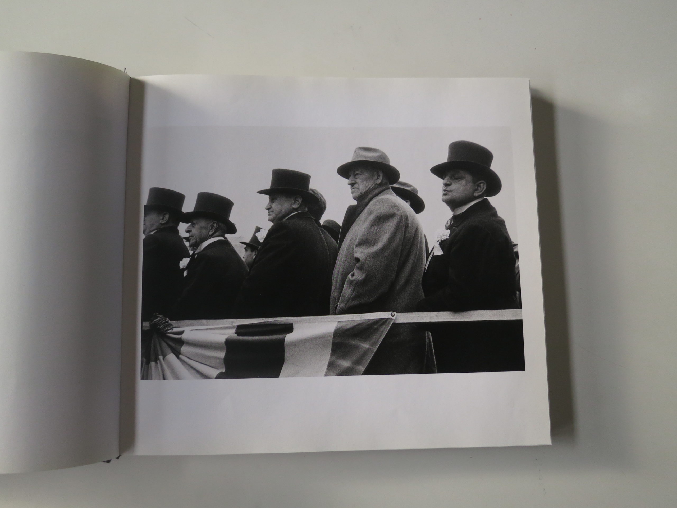
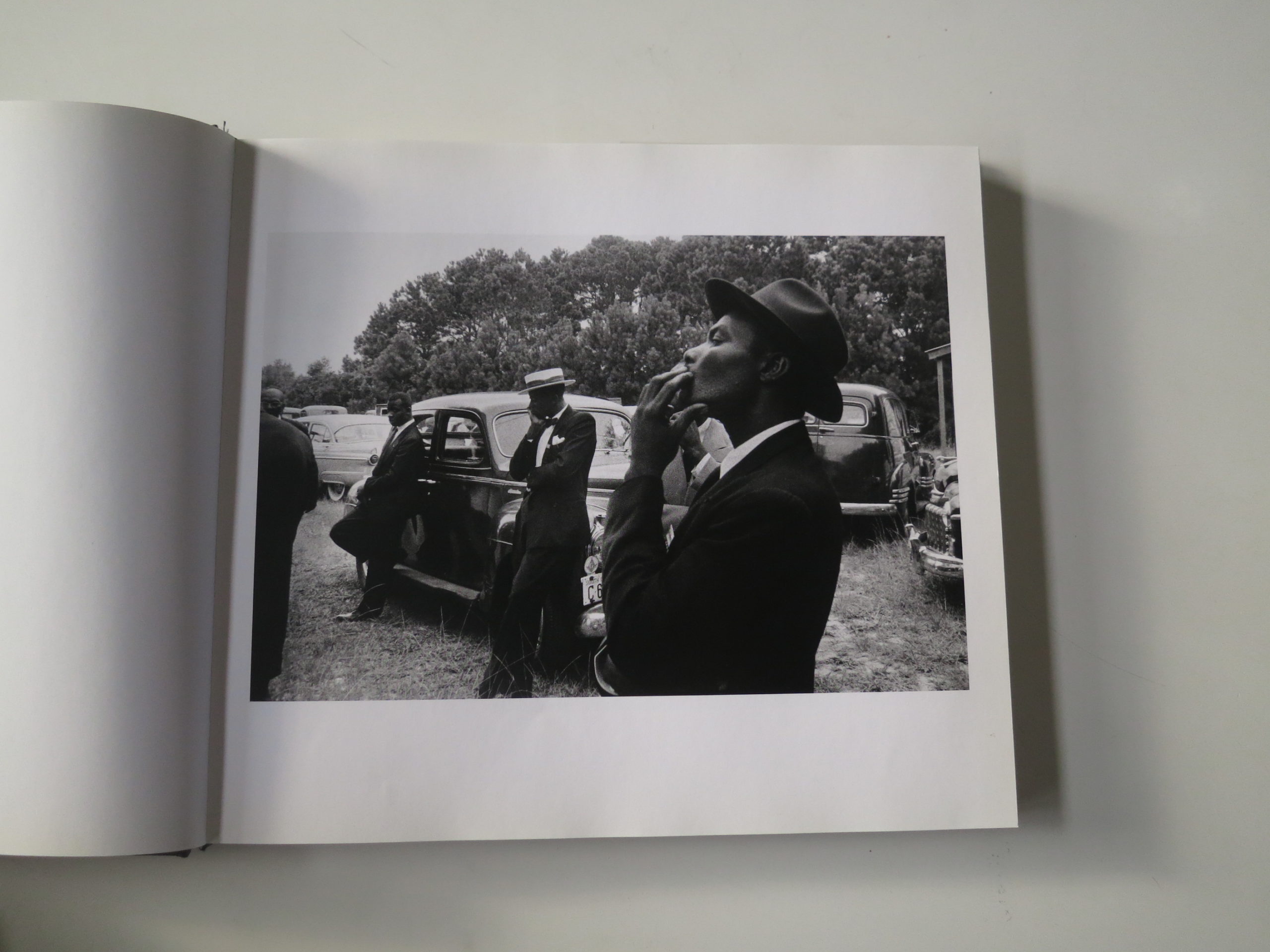
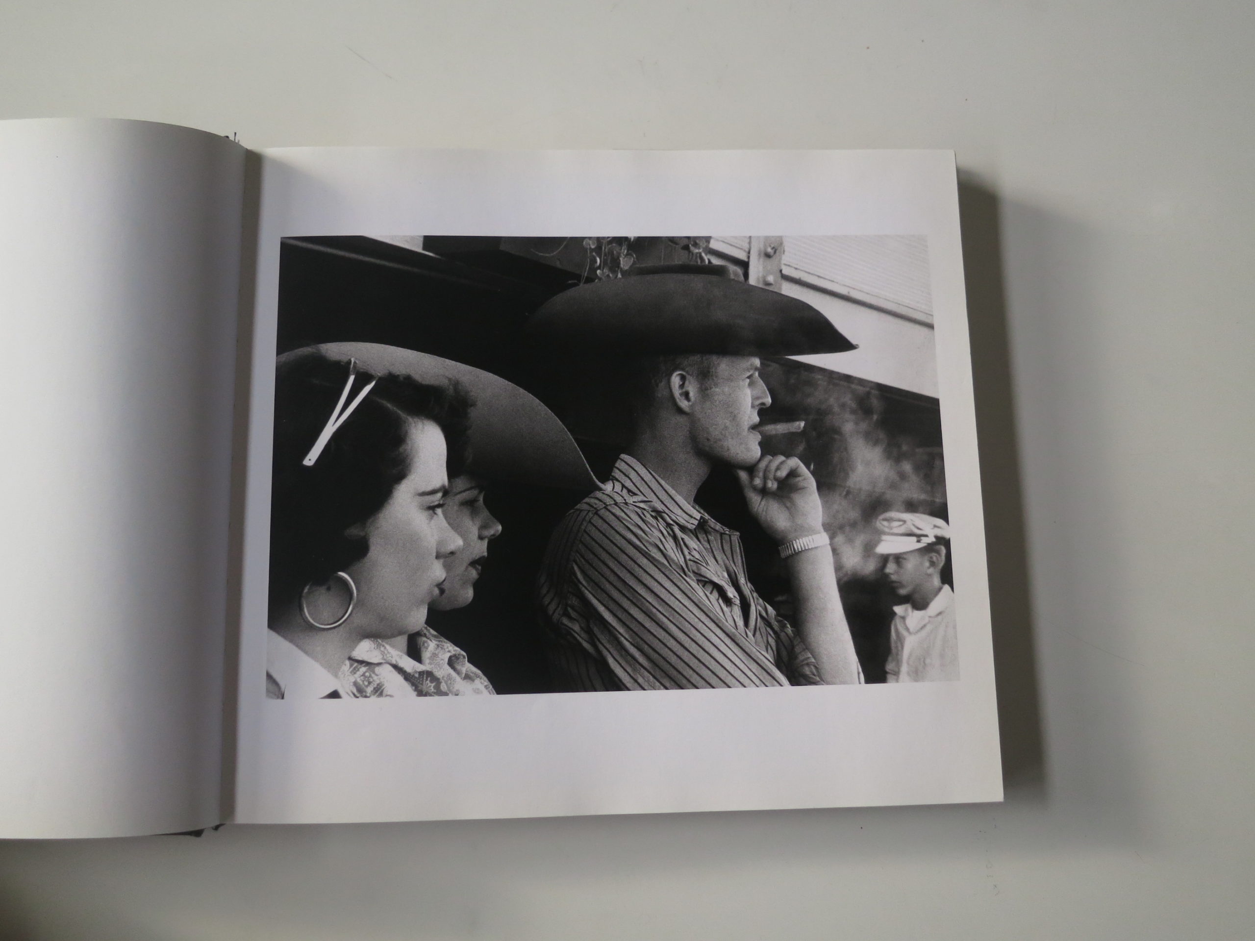
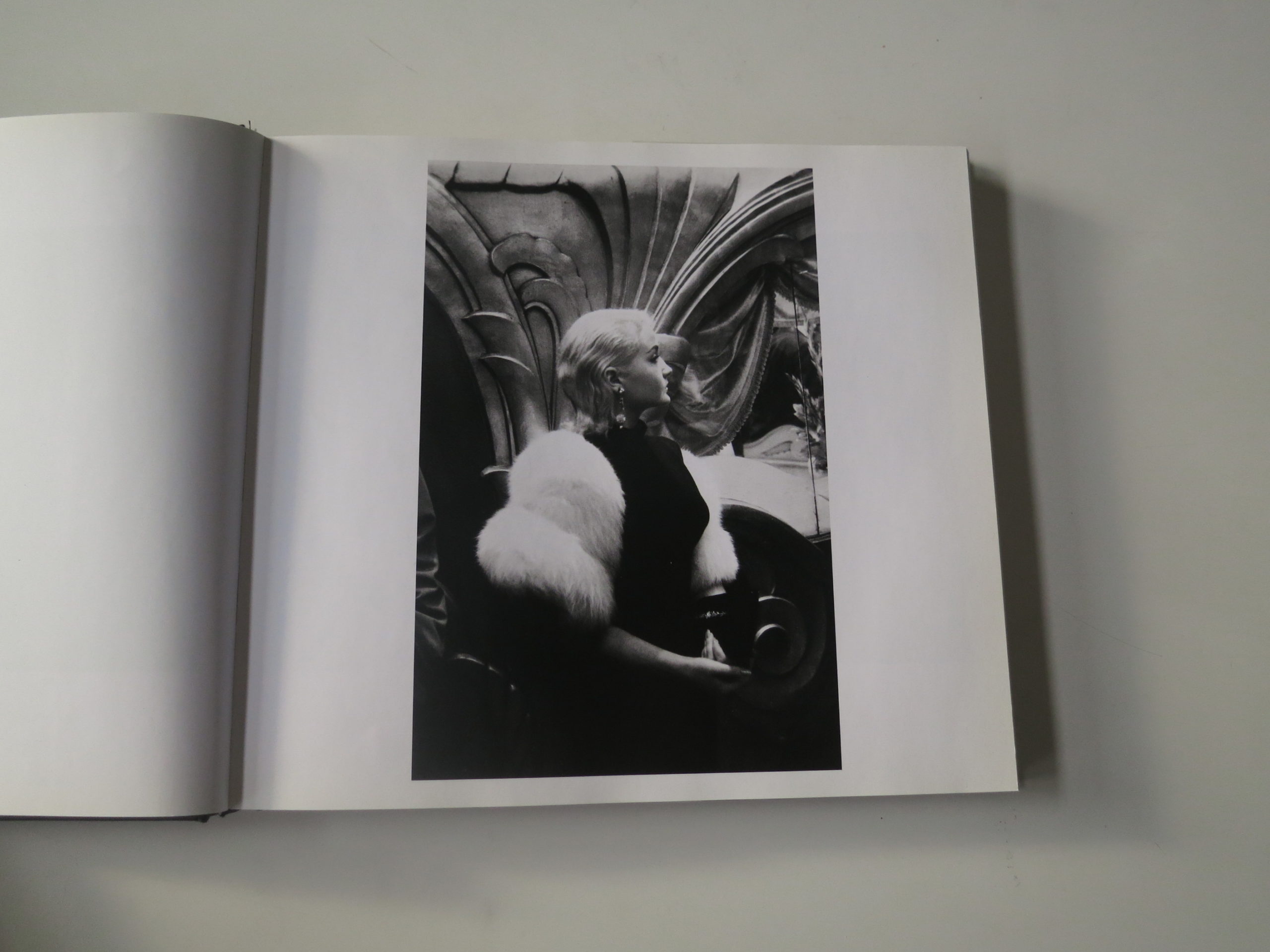
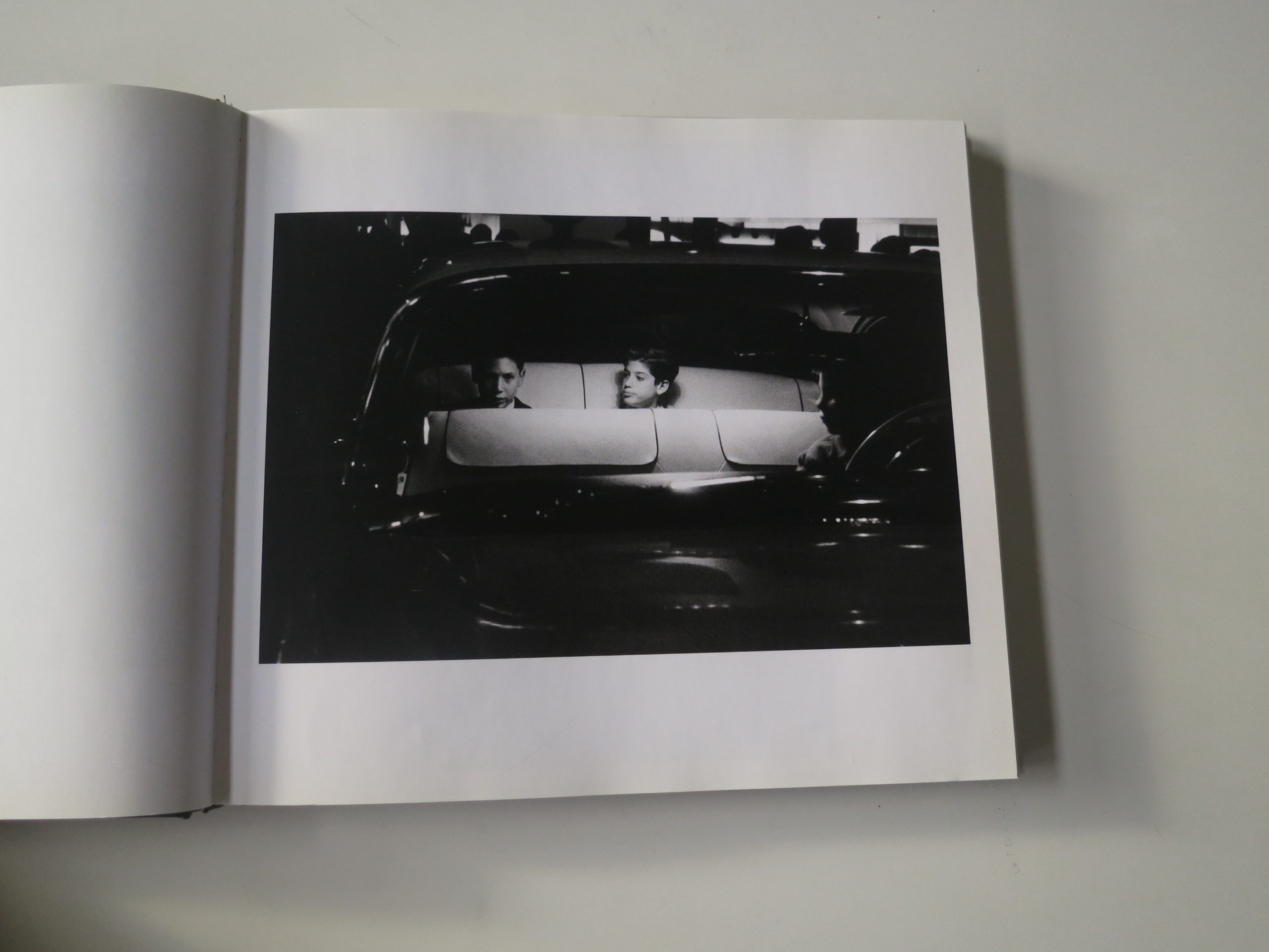
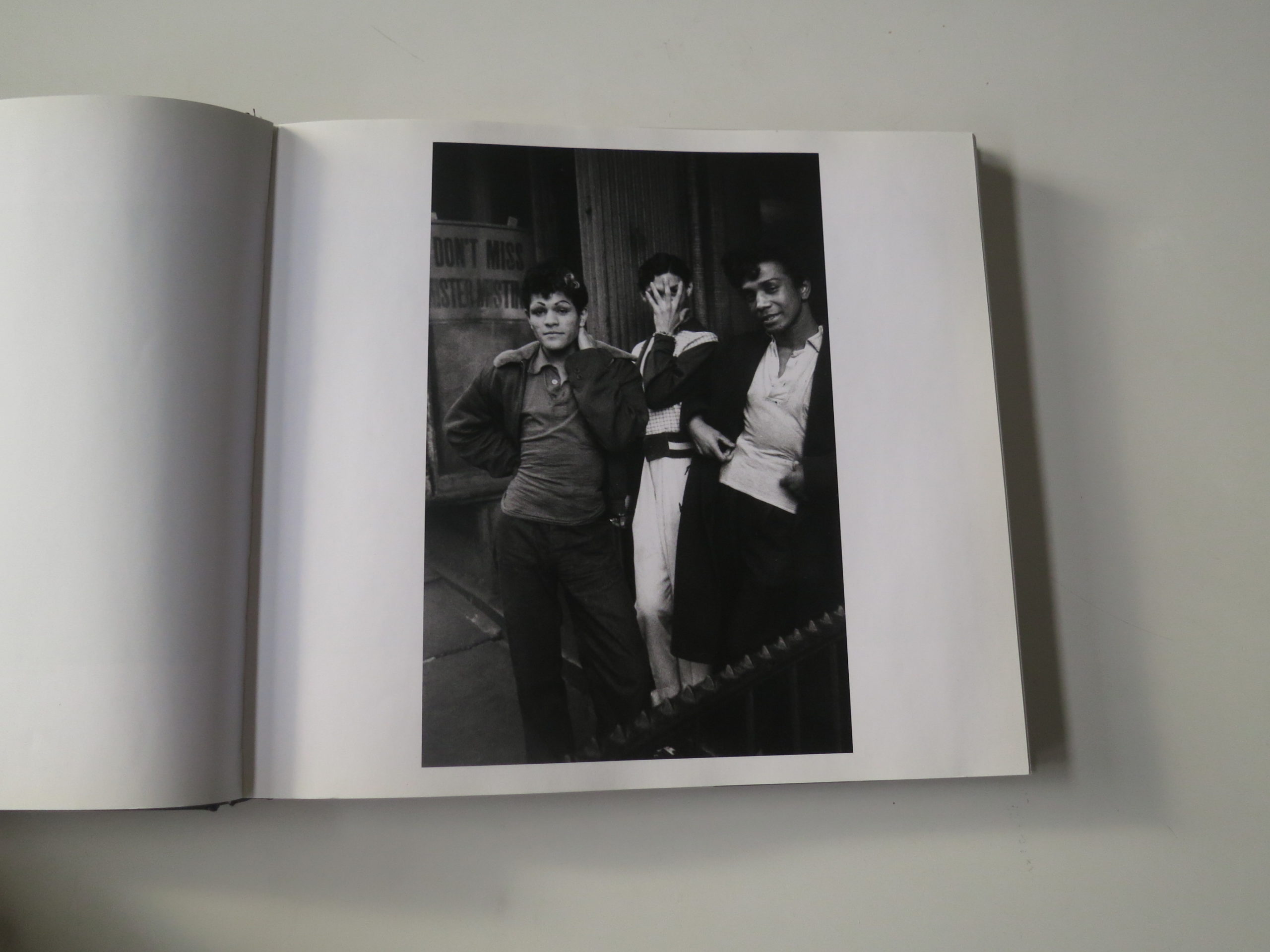
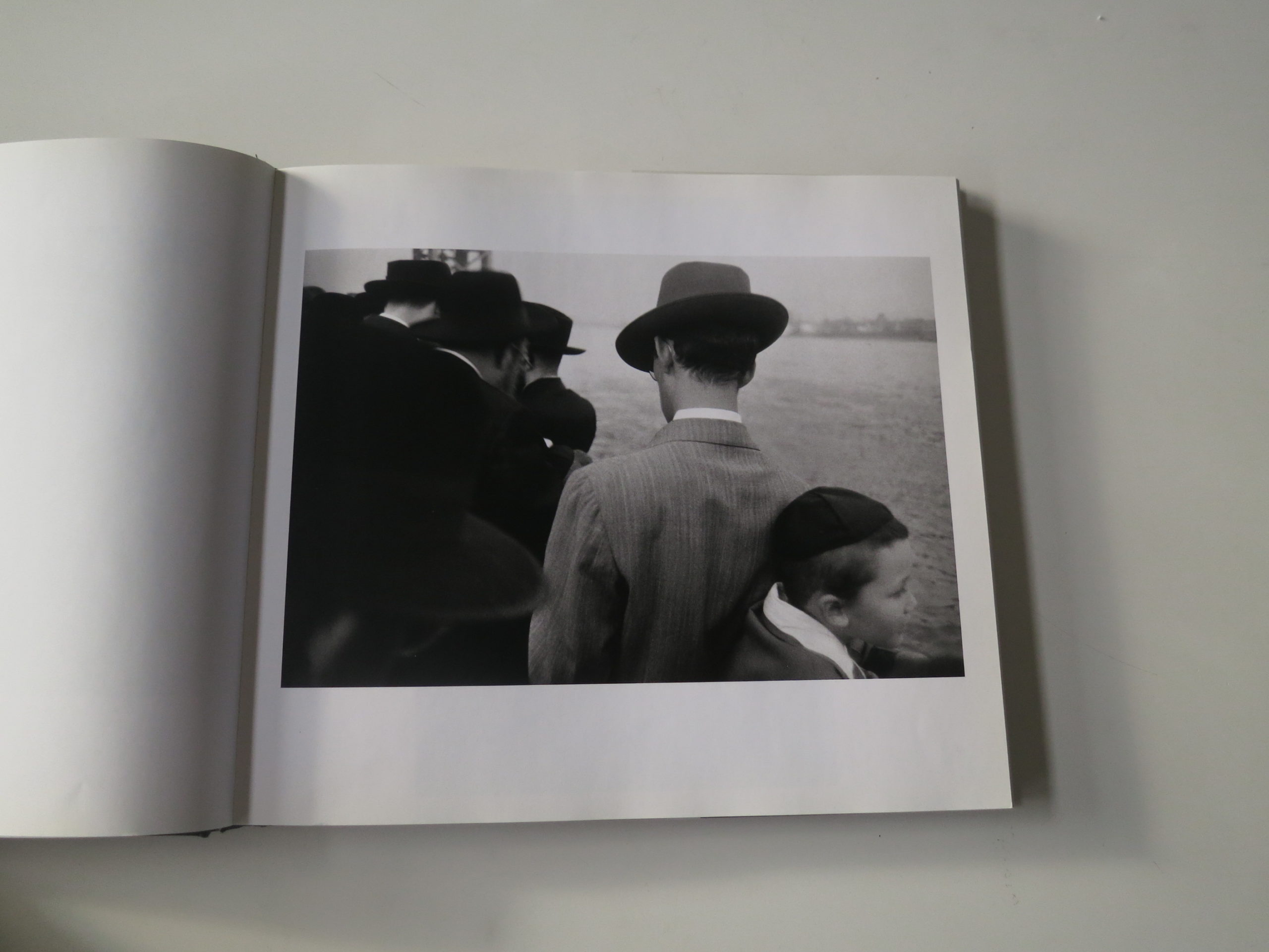
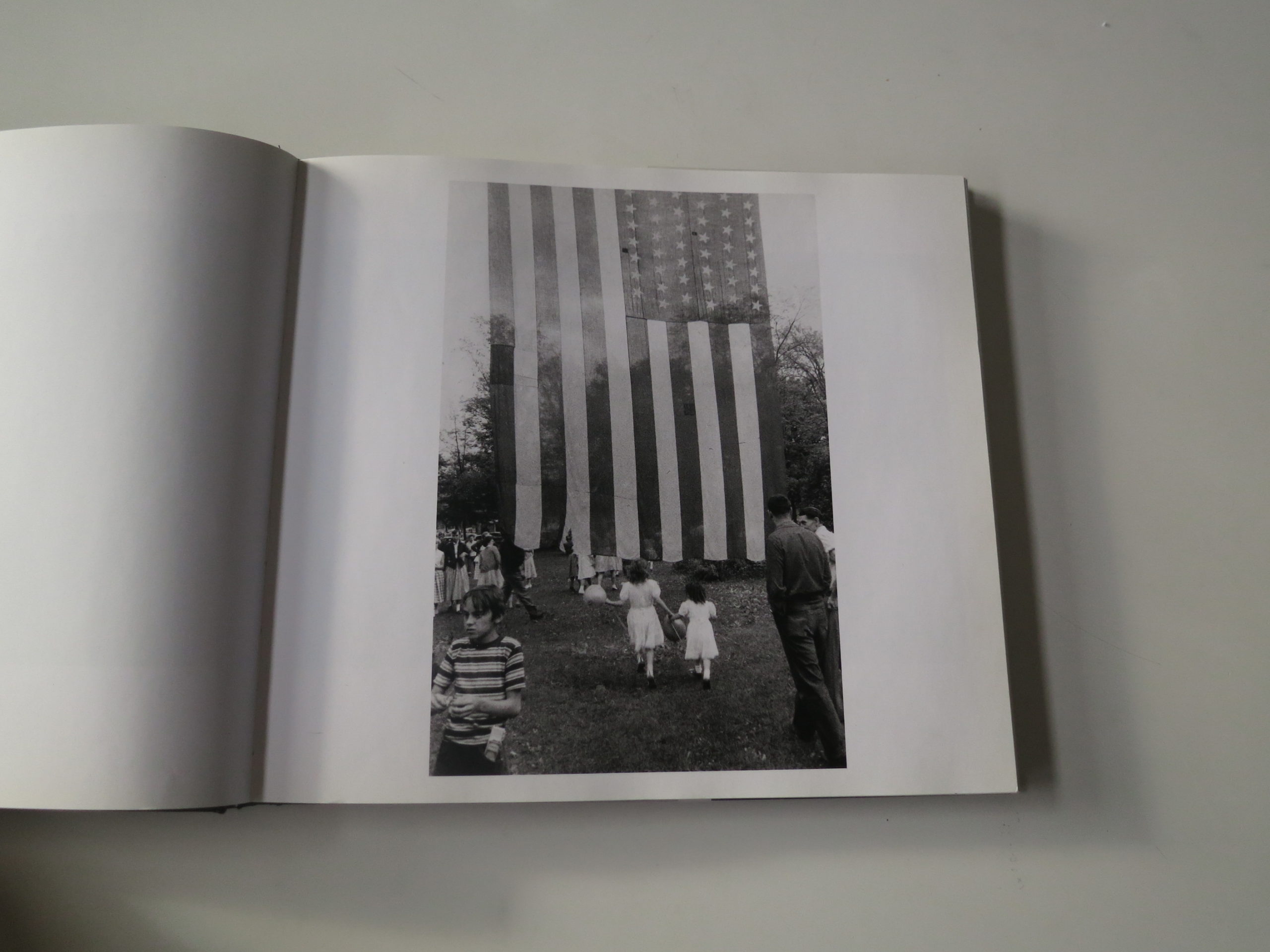
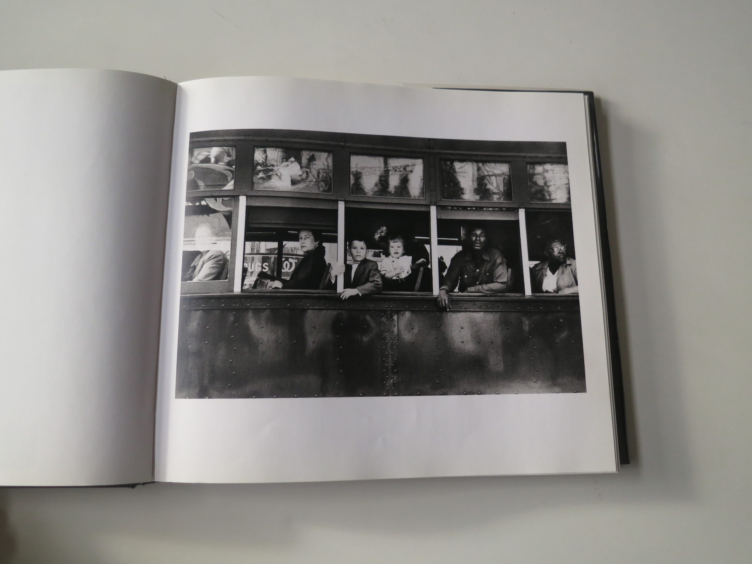
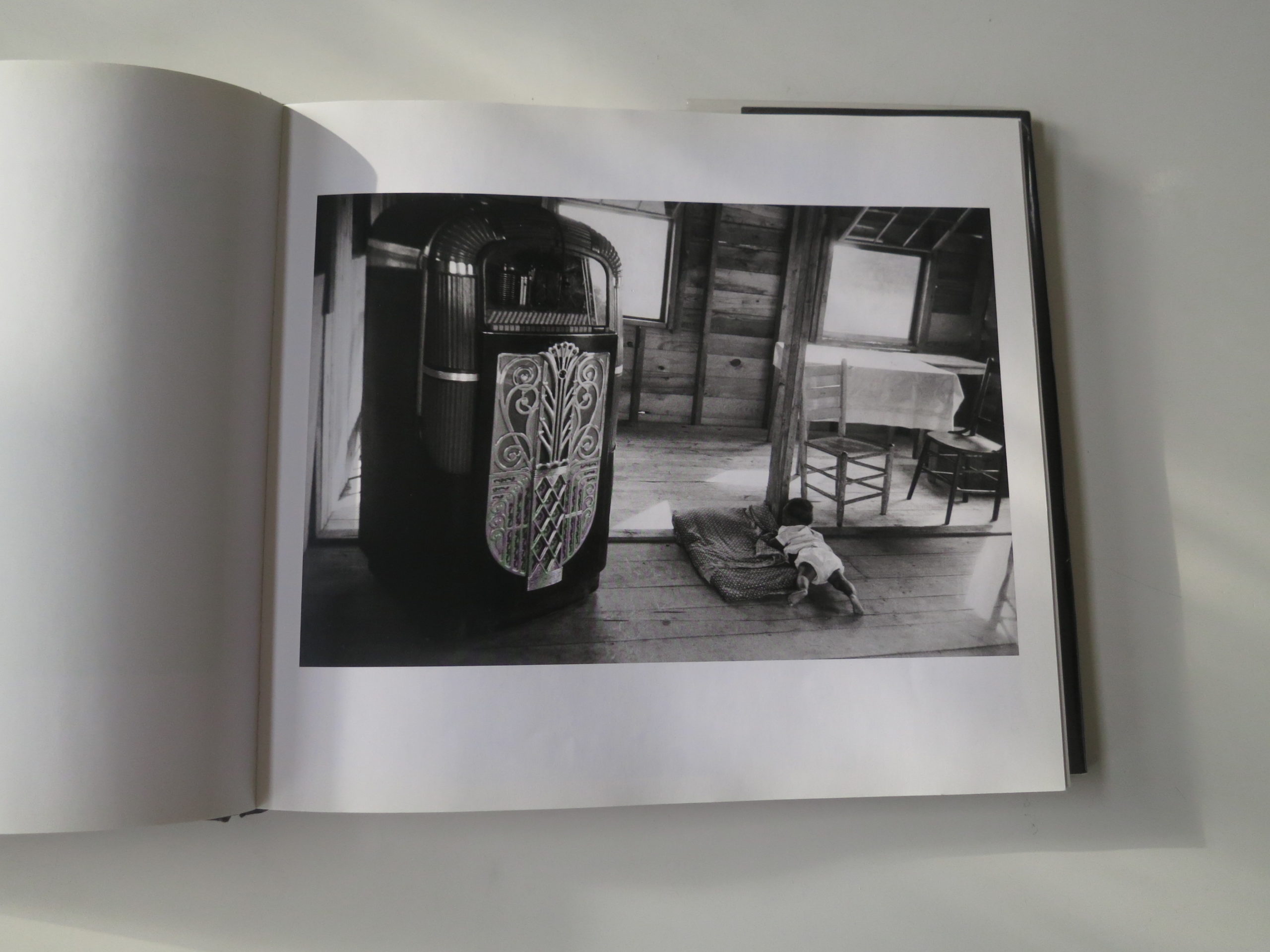
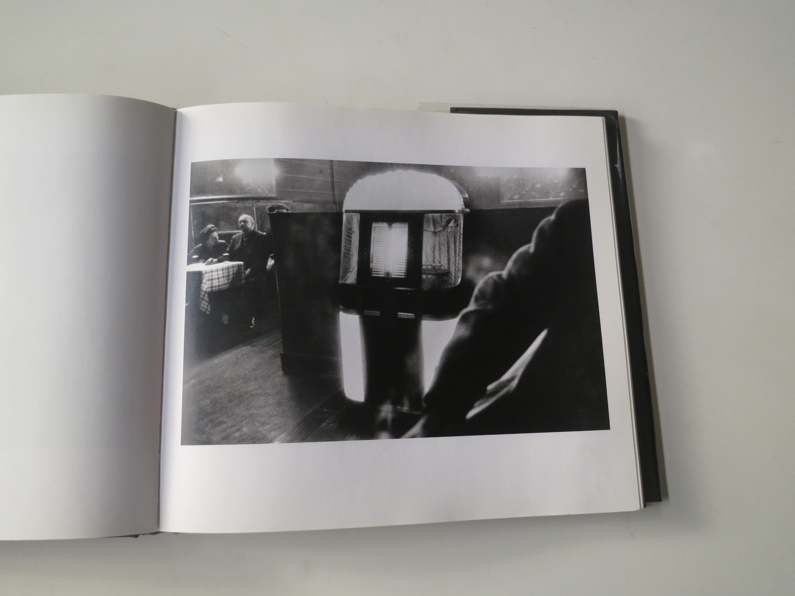
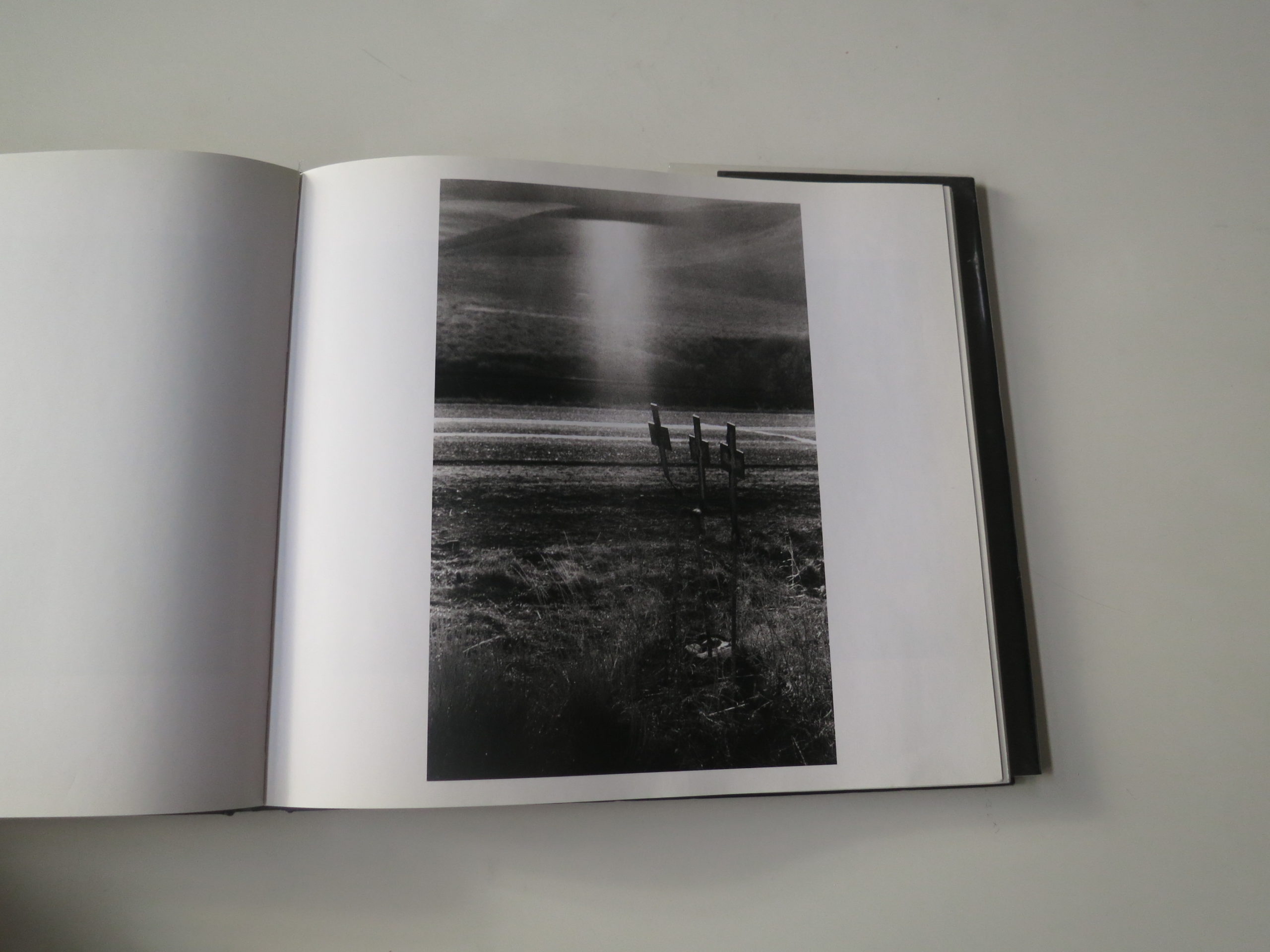
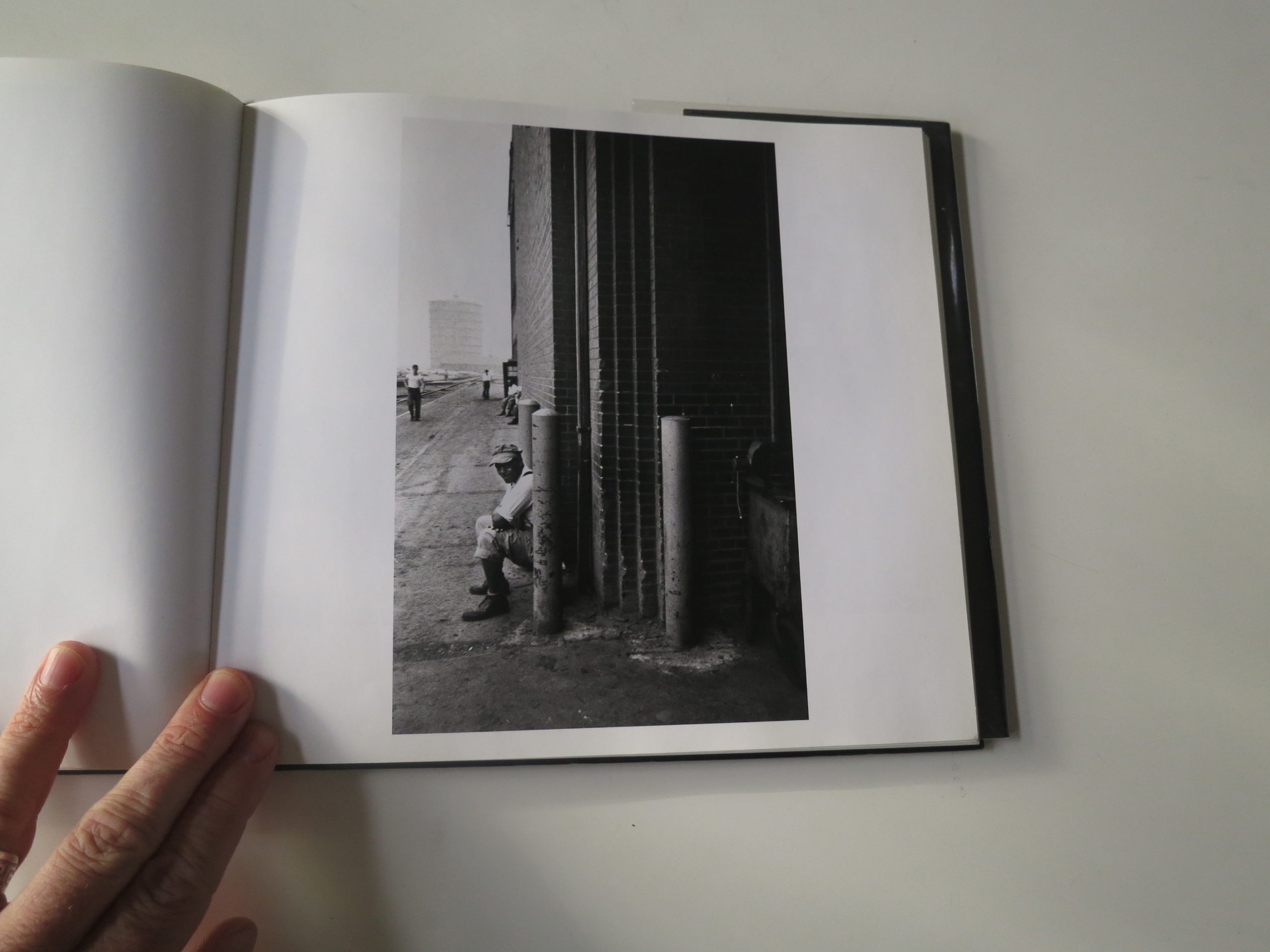
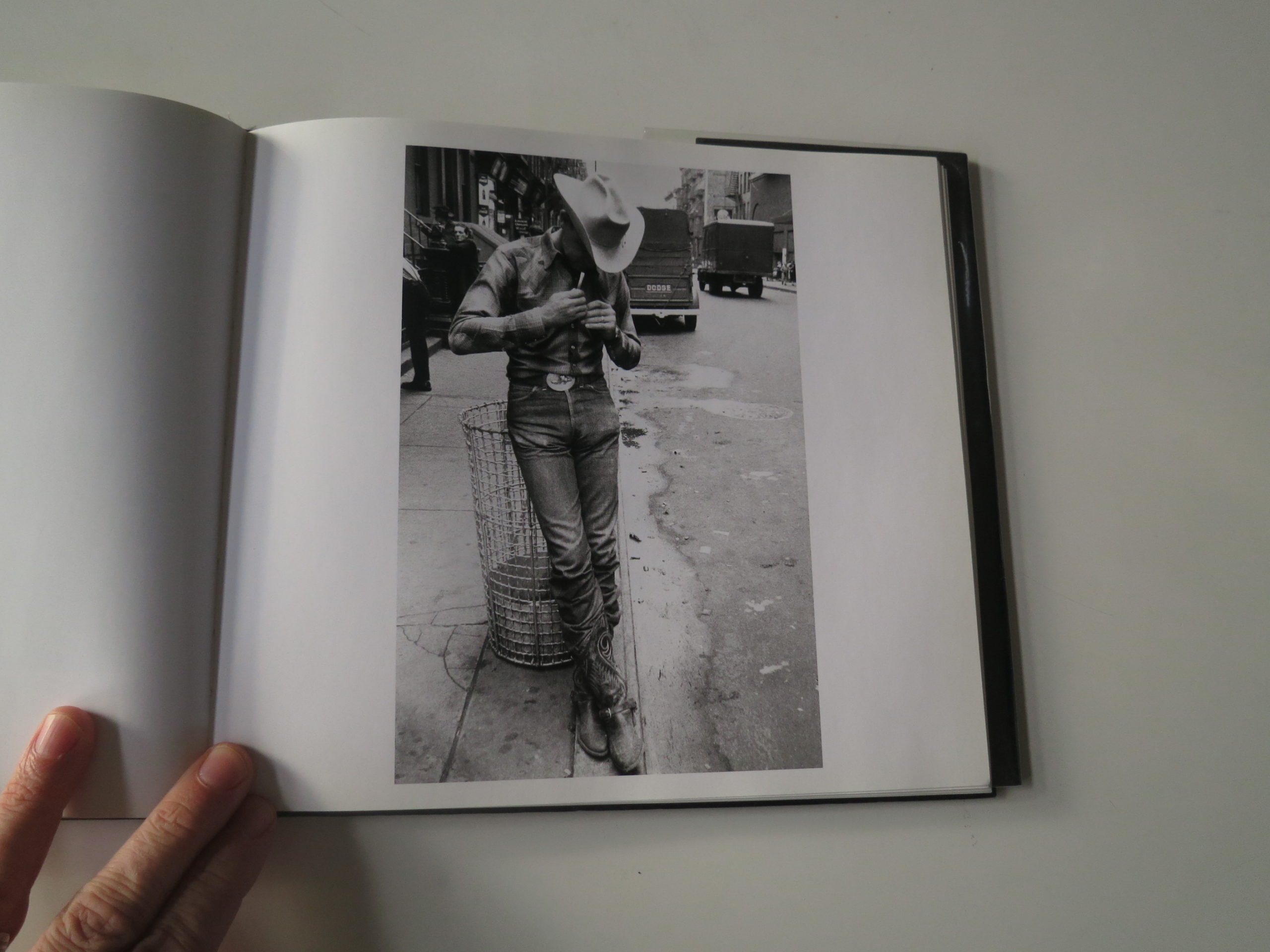
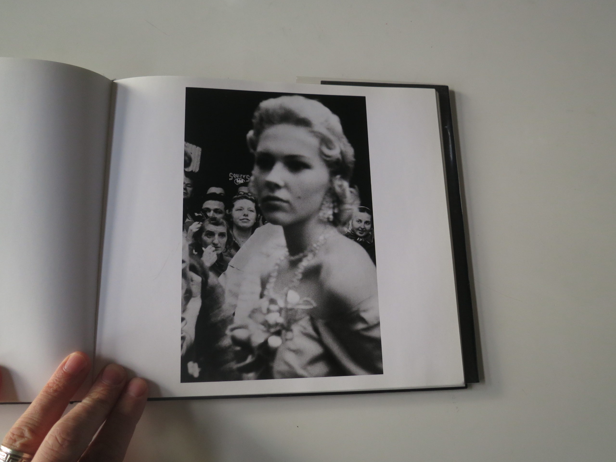
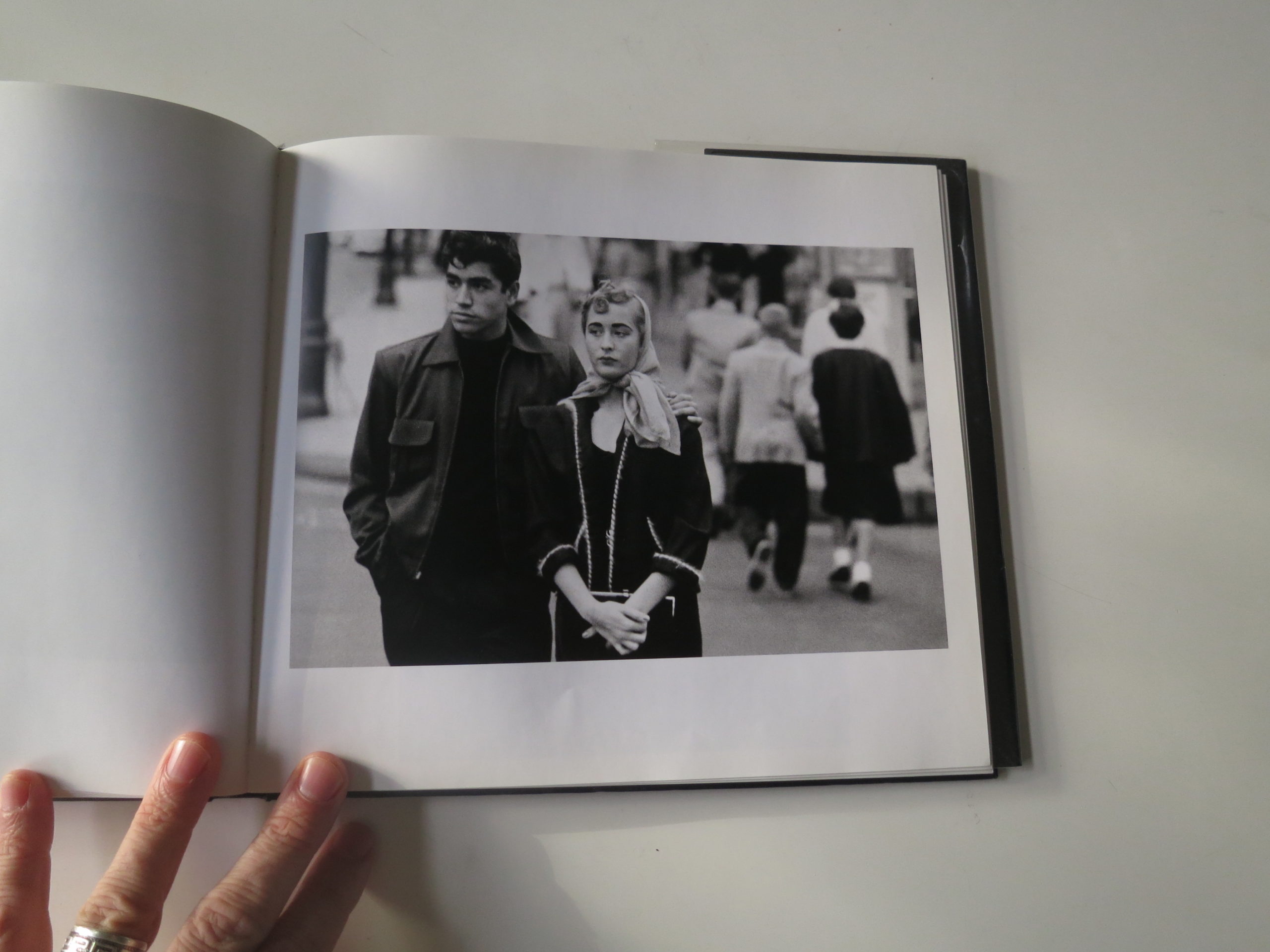
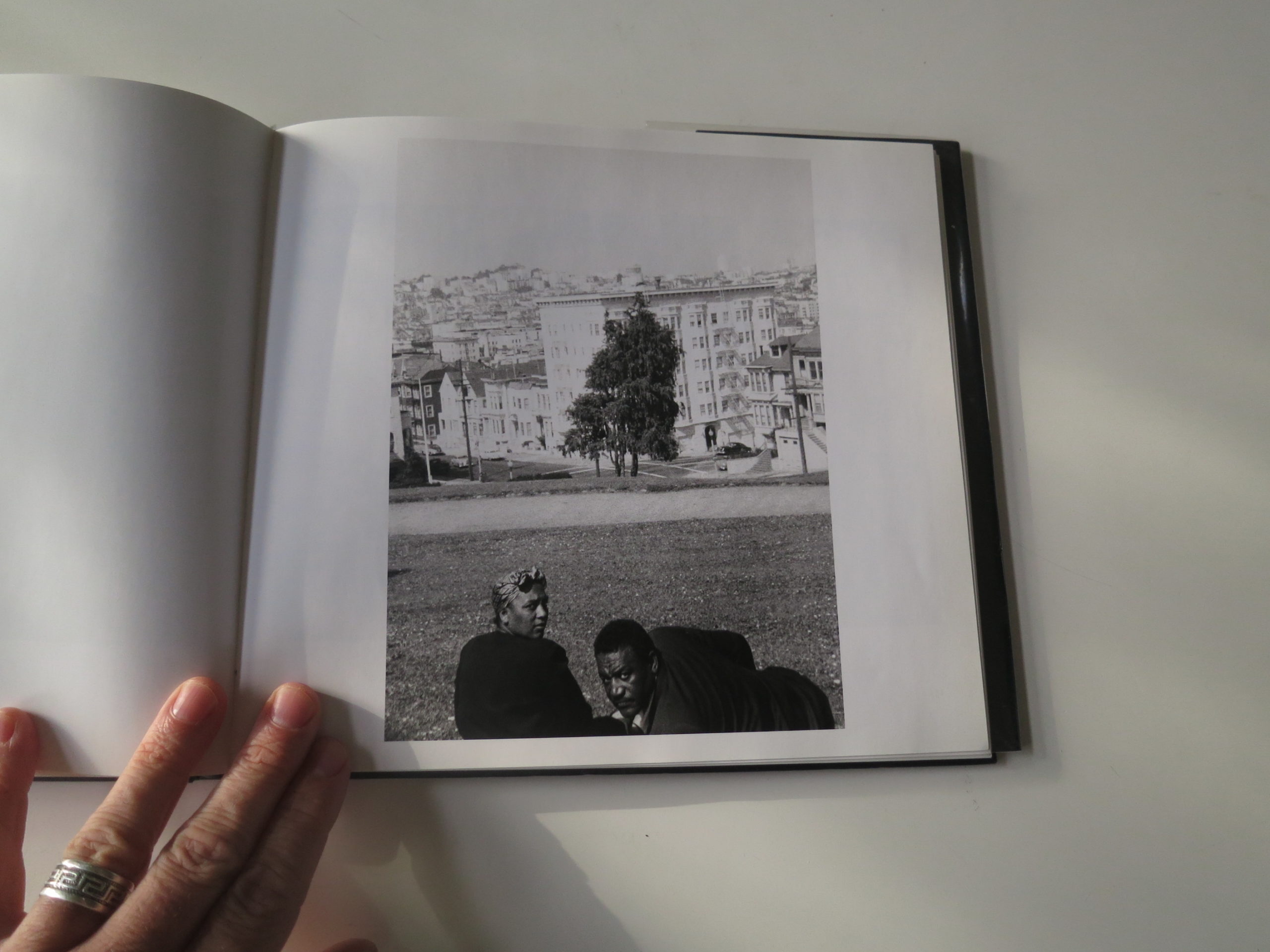
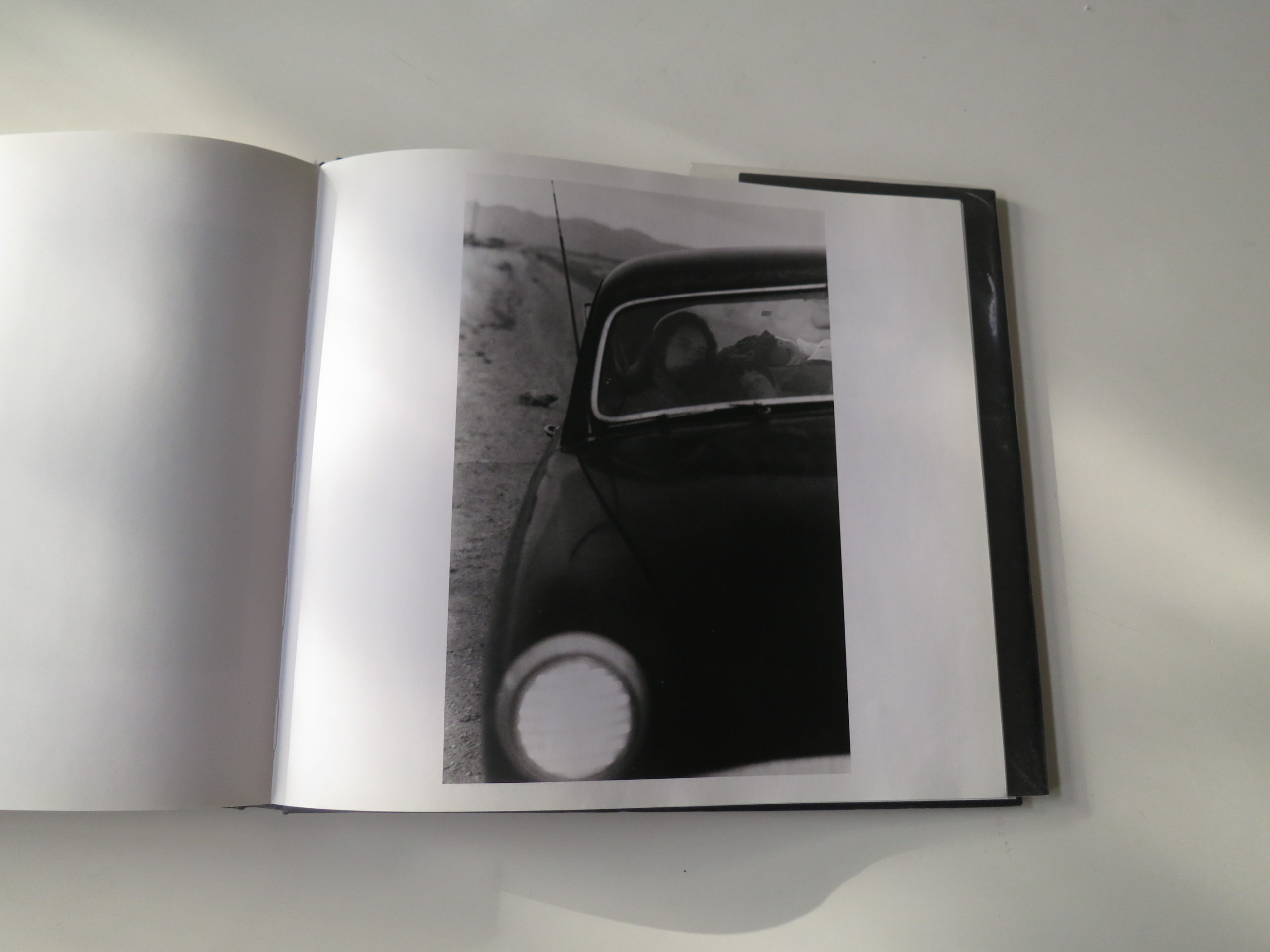
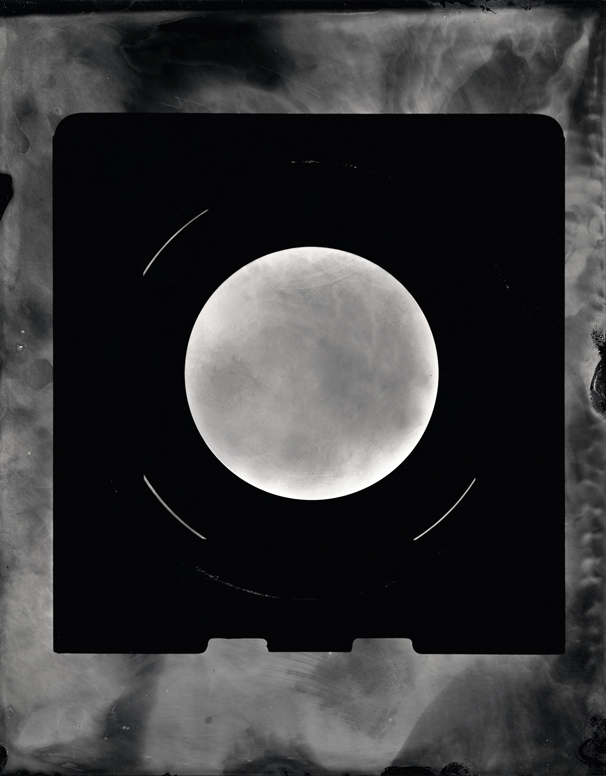
It was a trove of photographs from the 19th Century that captured my attention today, in “East of the Mississippi,’ an amazing photobook that turned up in the mail a couple of years ago.

It was published by Yale University Press, for an exhibition mounted by the National Galley of Art, that I eventually saw at the New Orleans Museum of Art at Photo Nola in 2017.

Why didn’t I like this book before?
Why didn’t I write about the show?

What changed?

Well, I changed.

And the day, the year, the light, the circumstance.

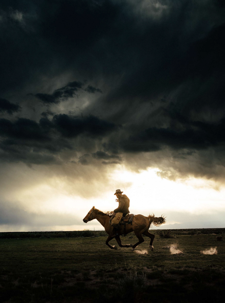
Perhaps I’d grown so accustomed to the Western landscape, living in the heart of the American West this last decade and a half.

Big vistas, big mountains.

GRANDIOSITY!!!

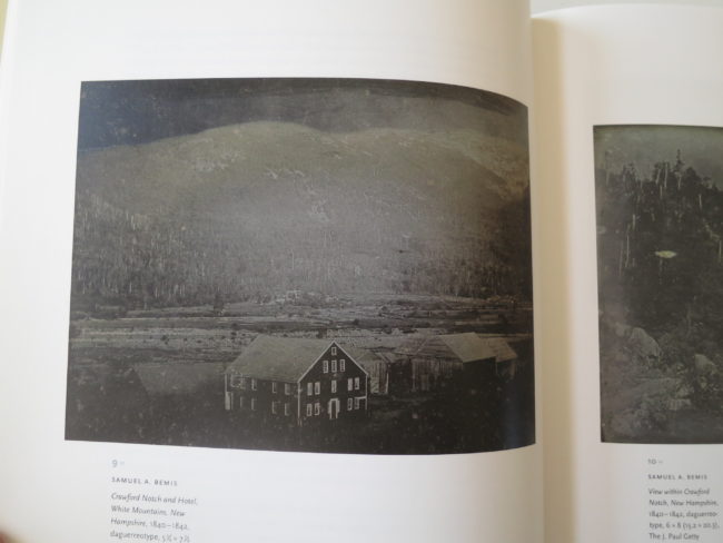
East of the Mississippi, they’ve got small mountains and clustered landscapes.

Claustrophobic spaces.
Hollers.

Not nearly as dramatic, or dynamic.

Much more subtle.

Perhaps the equivalent of a cool Bordeaux, in lieu of a bold Ribera del Duero?

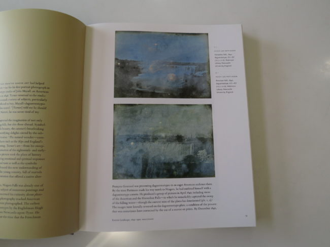
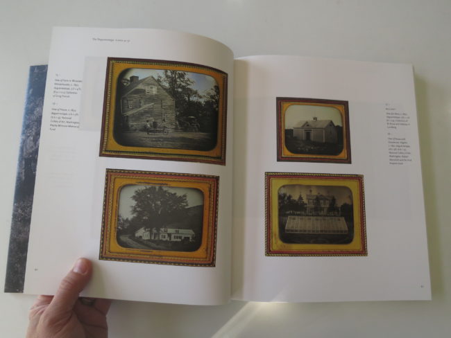
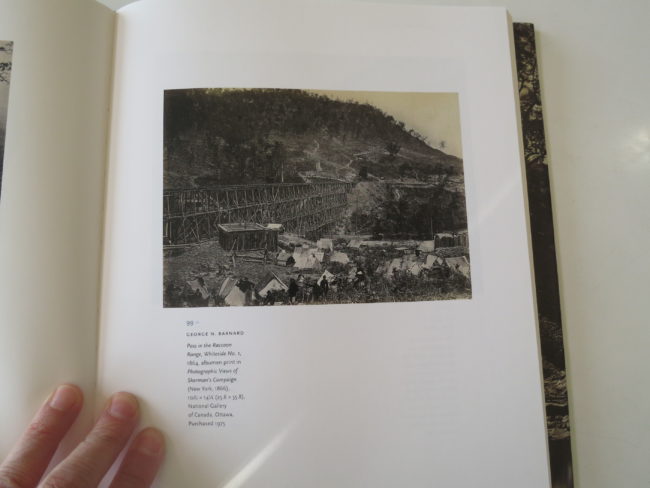
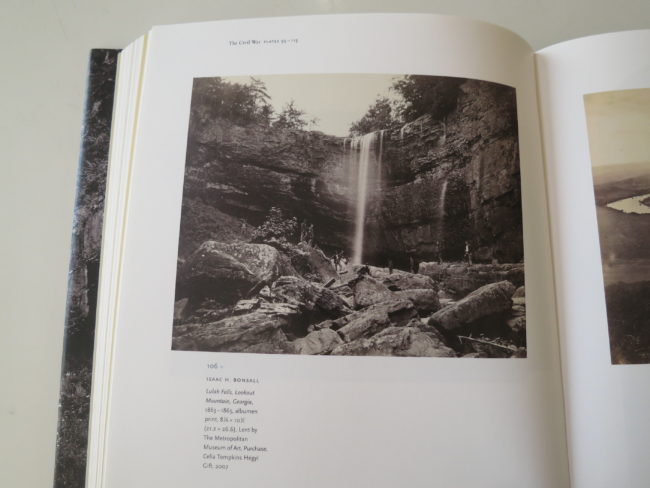
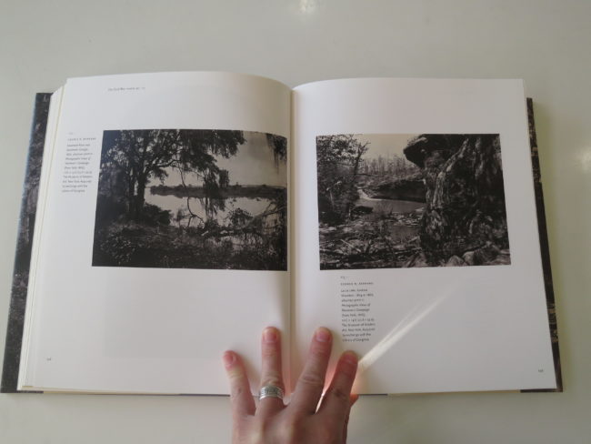
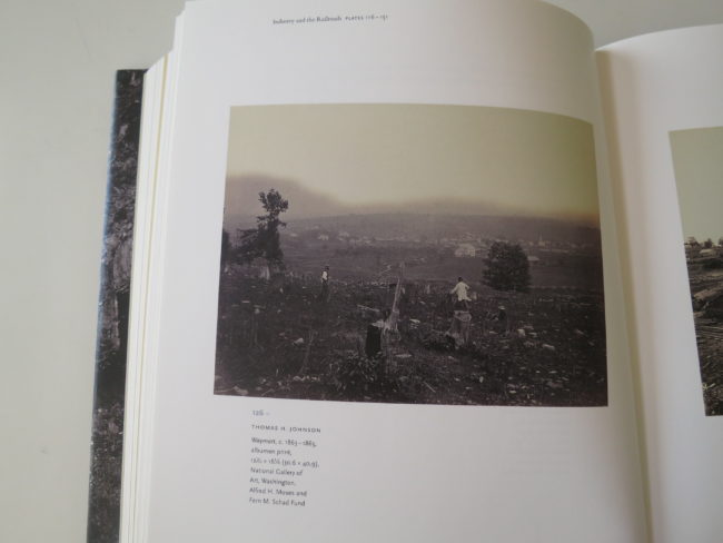
There is also a lot in this book that feels historical, or at least done by “lesser” photographers. Men (because let’s be clear, it’s nearly if not all men,) made work that was preserved for us, and on this viewing, I found it all interesting, historically.

(If not brilliant.)

And just as I found myself mentally comparing to Roger Fenton and Gustave LeGray and Carleton Watkins, as opposed to the more regular-guy-work in the book, I’d turn a page and something would jump, done by a clear talent.

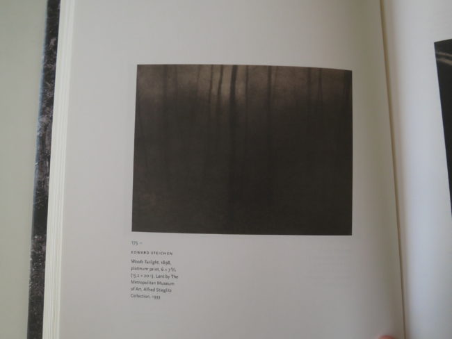
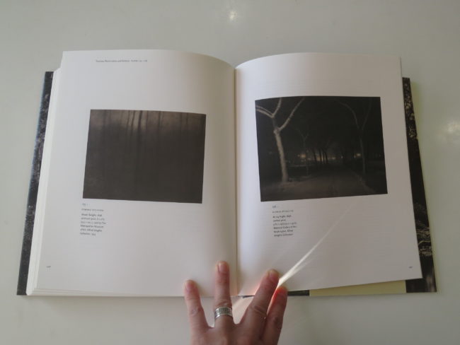
George Barnard, one of my favorites, emerged. Or the Bierstadt Brothers. Timothy O’Sullivan, Arthur Dow, Steichen and Stieglitz.

The more talented photographers, or at least the images that had the most gravitas, would elevate the experience. It got me excited, as a viewer, waiting for the killer stuff within the edit.

(In this way, I was introduced to Isaac Bonsall, and Thomas Johnson, whom I didn’t know.)

But the landscape is varied, too, from the Deep South through the Midwest and New England.

So many lovely ones, amid the plenty.

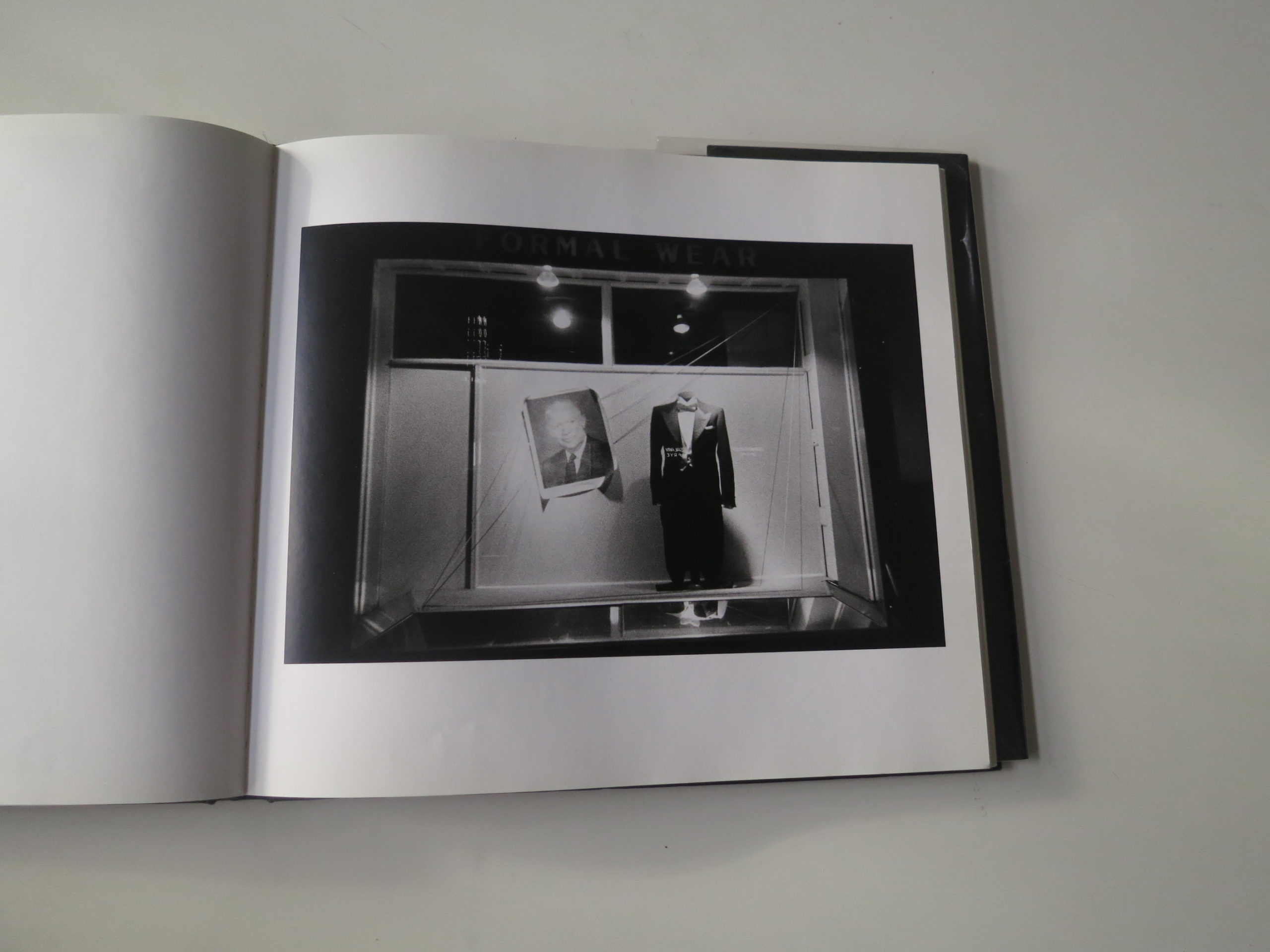
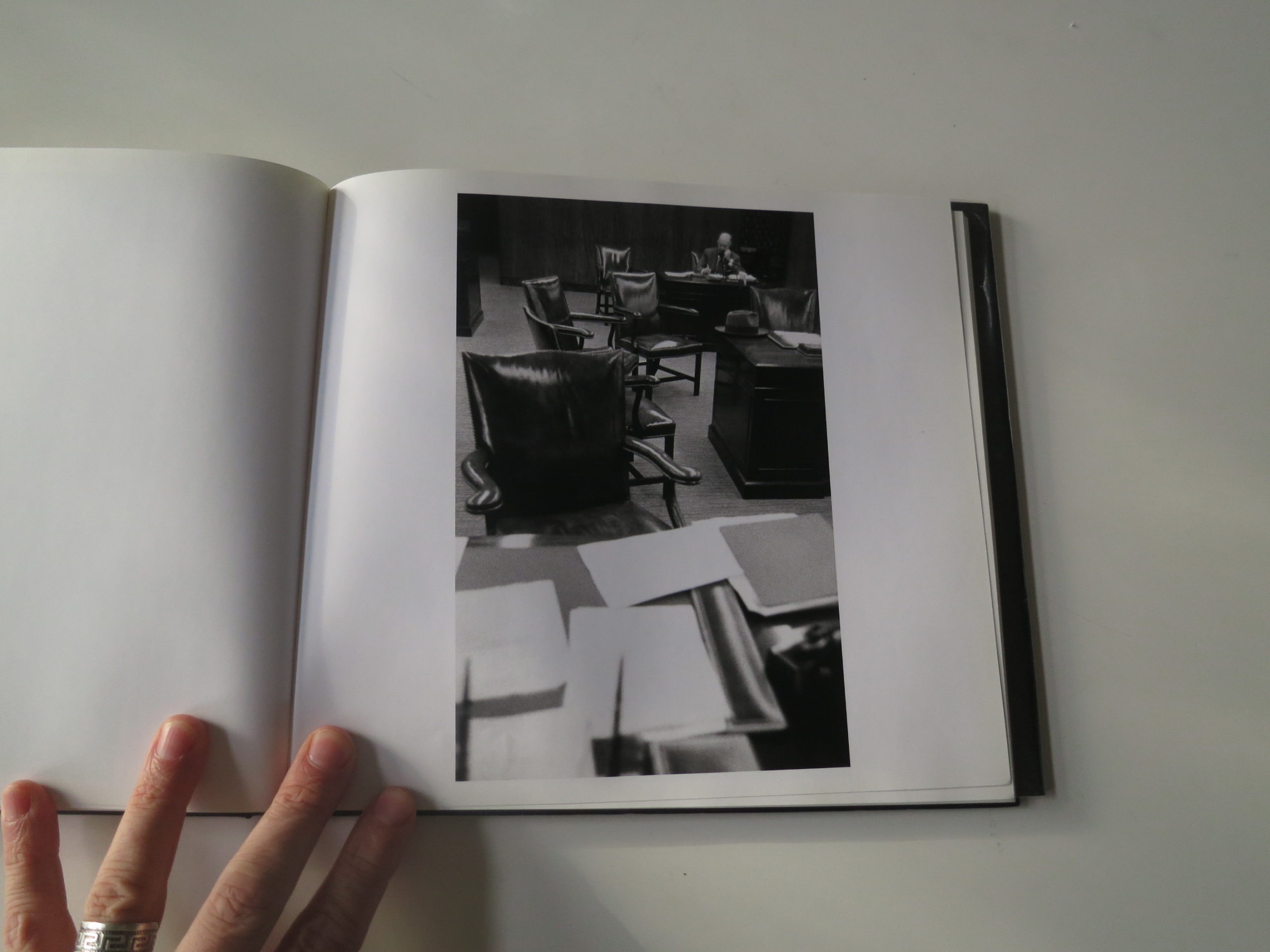
There are train tracks and bridges, steam ships and water falls.

Men of industry, and beasts of burden.

All dead.

It really is the perfect book for today, as it reminds us that time marches on, and no one knows what’s coming.

The people in these albumen prints could no more imagine #1983 or #2019 than we can the 2050’s.

And as for synchronicity?

Taos is finally a trendy tourist destination again; really popular, with its Instagram-ready landscape, and non-American charm.

How did I know we hit the big time again?

Sting played here over Labor Day weekend.

I heard it was off the hook.

Bottom line: Exquisite exhibition catalogue documenting half of the past of America

To purchase “East of the Mississippi” click here


The Art of the Personal Project: David Bean

The Art of the Personal Project is a crucial element to let potential buyers see how you think creatively on your own.  I am drawn to personal projects that have an interesting vision or that show something I have never seen before.  In this thread, I’ll include a link to each personal project with the artist statement so you can see more of the project. Please note: This thread is not affiliated with any company; I’m just featuring projects that I find.  Please DO NOT send me your work.  I do not take submissions.


Today’s featured artist:   David Bean

“I’d trade all my tomorrows for one single yesterday.”
― Kris Kristofferson

Nostalgia is a funny thing. No matter how old we are all, of us look back on our younger days with a certain sense of longing. They’re the “good old days” even if they really weren’t.

We don’t want to go back to the painful parts of our past, but we sometimes dream about revisiting the culture and environment; the music, fashion, sounds and smells that were a part of our upbringing.

I’ve lived in over 30 towns and cities, in 11 states and went to 6 different high schools. I’ve lived on hippie communes in the country and tiny apartments in the city. My memories of the past are varied and diverse. I often find myself longing to go back to South Florida in the late 80’s/early 90’s. Even though I was young, lonely and lost during that period, there’s a magic to that era for me that I can’t escape.

One day I had the idea to revisit the past through a series of photo shoots that captured the lives of youth/young adults in the U.S. over the course of 4 decades; the 1960’s, 1970’s, 1980’s & 1990’s. My goal was not to just create a homage to these periods, but to make the photos look as if they were shot in their respective times.

I tried my best to keep all of the props authentic, even down to the Coke and McDonalds products used. I searched out and bought items online from eBay and when not available I printed out replicas and made them myself.

All photos were taken with a Canon 5D Mark IV and Profoto B1 and/or A1’s. I didn’t want to “cheat” and use film for these shoots. I wanted to show that I could re-create time periods using modern technology.

To see more of this project, click here.

APE contributor Suzanne Sease currently works as a consultant for photographers and illustrators around the world. She has been involved in the photography and illustration industry since the mid 80s.  After establishing the art buying department at The Martin Agency, then working for Kaplan-Thaler, Capital One, Best Buy and numerous smaller agencies and companies, she decided to be a consultant in 1999. She has a new Twitter feed with helpful marketing information because she believes that marketing should be driven by brand and not by specialty.  Follow her at @SuzanneSeaseInstagram

Success is more than a matter of your talent. It’s also a matter of doing a better job presenting it.  And that is what I do with decades of agency and in-house experience.


The Daily Edit – The New York Times: Jessica Pons

The New York Times


Photographer: Jessica Pons
Editor: Crista Chapman
See the interactive piece here


Heidi: How did you decide which vendors were going to be shot?
Jessica: I didn’t have specific vendors in mind, instead, there were specific locations in LA where I knew vendors posted up. Some of the locations I wandered to were MacArthur Park, the Piñata District and Boyle Heights, where I walked around, approaching vendors more so intuitively. There were, however, a few vendors who were scouted through East LA Community Corporation, an organization that advocates for economic and social justice in Boyle Heights and East Los Angeles. The writer on this story, Tim Arango, had interviewed a few of the vendors who had played a key role in legalizing street vending so for those individuals I reached out to directly.

How did this idea come about?
The idea emerged after Los Angeles finally legalized street vendors, which have long been a fixture of immigrant life in LA even as they operated illegally and were subject to periodic crackdowns. NYT editor Crista Chapman wrote me that their aim was to do a story that wraps in a few threads: the history of food vendors; immigration; food culture; and street life in a city that is dominated by the automobile.

What was the photo direction?
Visually speaking, the photos had to be shot vertically to fit the specific slideshow. My approach was to try to encapsulate  the culture of street vending the best I could; I looked for moments, details, wider landscapes and of course portraits.

How did you interact with them, where they receptive?
For the most part, vendors were happy with the news that they were no longer outlawed so they were very welcoming and open to sharing their stories with me. I think being able to communicate with them in Spanish helped build trust a little easier. There were a few who hesitated sharing their names due to the current political climate, which is completely understandable. But for the most part, vendors showed a desire to speak up about this issue as they felt justified in their stance. They know deep down they have dignified jobs, and make food with passion, some even following the foot steps of their ancestors who were street vendors back in their homelands.

The Daily Promo – Kennett Mohrman

Kennett Mohrman

Who printed it?
Right off the bat, I knew I wanted to print this on newsprint. We came across Newspaper Club – they specialize in newsprint in tabloid sizing. It was a great option for a small run as well. And, I was able to print one to start as proof and nit-pick color etc. I was so pleased with the results.

Who designed it?
Luckily, I’m married to a Creative Director – Lizzy Sonenfeld (@lizz_zzz_y). We’ve worked together for a long time, so the process is really collaborative and natural. I knew I wanted to marry colorful graphic images with strong player portraits and she did a great job of working it all in together.

Tell me about the images?
I went out to Minnesota with a buddy for this tournament, looking forward to capturing both action photos and portraits. It’s the largest pond hockey tournament in the US so I knew there would be a ton of character. We set up a scrappy portrait tent directly on the ice (it was below 0°F most of the weekend), and capturing the portraits as players were coming off the ice was the real highlight. The small details – frosted beards and eyelashes and subtle expressions – were so much fun to capture.

How many did you make?
We printed 200 newspapers, and made 150 hand-addressed packages with postcards.

How many times a year do you send out promos?
Honestly, this is my first one, and I’m already planning the next. It’s been an awesome challenge to myself creatively, and really rewarding to get these into people hands to open up conversations.

Do you think printed promos are effective for marketing your work?
I was skeptical going into this, but it’s been really effective. Doing a small batch and sharing with relevant people/agencies was the key for me. So much more effective than cold calls/email blasts. I’ve already landed a couple of jobs because of the work too so I’m very stoked with the results! It’s been great to see people hold tangible printed work in their hands and respond to it with honest critical feedback.

This Week in Photography: The Archive of Hugh Mangum


“They said I’m the most presidential except for possibly Abe Lincoln when he wore the hat–that was tough to beat. Honest Abe, when he wore that hat, that was tough to beat. But I can’t do that, that hat wouldn’t work for me. But I can’t do that…Yeah, I have better hair than he did. But honest Abe was tough to beat.”

President Donald Trump, the other day, #2019


I remember in the height of the Great Recession, when I just couldn’t wait for 2009 to end. “Come on, January. Let’s go 2010! Bring, it,” I thought.

Now, I don’t need to get into the particulars, but 2010 kicked my ass too. Maybe even harder than ’09.

Afterwards, I thought that “Be careful what you wish for” cliché might have something to it.

I bring this up, because honestly, who knows where all this is headed?

Donald Trump was caught red-handed, doing the one thing the entire Mueller investigation was trying to prove, under the assumption that such behavior was a priori impeachable, but they never found the smoking gun.

This time, Trump and his minions were caught together, plus a cover-up-secret-server? And then, just hours after I initially wrote this, he goes on TV to invite the Chinese government to investigate the Bidens too?

I’ve done this column for 8 years solid now, (Happy Anniversary, yay!) and I truly don’t know where this story lands anymore.

But I began the column with Trump essentially doing stand-up-comedy.

Right? He’s doing a bit?

Like Rodney Dangerfield (RIP) in “Caddyshack,” or Joe Pesci in “Goodfellas?”

That hat, it’s tough to beat. Tough to beat. Honest Abe was tough to beat in that hat.

Good Ol’ Abe.

How is that not funny, and yet with the fate of the free world hinging on this man’s behavior, (Did you read about his idea for alligator and snake moats?) maybe we all just need to laugh, or at least catch our breath for a second?

Break a pattern?

In my case, I remember when Rob set me free to do the travel and cultural criticism pieces I’ve since written over the last six months.

It was liberating.

I’d done book reviews for a few years solid, and wanted to see what would happen if I went out there for you, to eat and drink and look and investigate.

Sitting on the couch flipping through books had gotten stale, but then, after six months of pinging around the world, (East Coast, West Coast, Europe, West Coast, East Coast, Mid-West) my head is more fried than my daughter’s skin this summer when she went to the pool with a friend who didn’t have her re-apply her sunscreen properly.

(Very, very fried.)

So today, while trying to process a president doing stand-up-comedy about the millinery choices of Abe Lincoln, I thought, man, it sure would be nice to pick up a book here in my house.

To do something different.

Instead of crunching my previous experiences into an article, I’d rather read and engage with an existing story in book form.

To look at someone else’s narrative, and see what I can learn.

“Photos: Day or Night, The Archive of Hugh Mangum,” edited by Sarah Stacke, was published last year by Red Hook Editions. It seems straightforward enough, as the book exists to present the digitized, preserved history of a notable Southern photographer who died too young in 1922. (44, RIP)

Sarah Stacke edited the book, wrote one essay, and interviewed Mr. Mangum’s granddaughter, Martha Sumler, at the end of the volume as well. (And shot her portrait.)

During his lifetime, at the end of the 19th and beginning of the 20th centuries, Hugh Mangum had a darkroom in an old tobacco barn at his family’s country property outside Durham, North Carolina. He also spent time in the city-home as a youth, in Durham, and according to one of the essays, the block was fairly integrated.

Whatever the reason, Hugh Mangum defied the mores of the South in which he was raised by photographing African American and white people, and his interracial practice would have been rare for the time.

Plus, the photographs in here are badass. I mean, like totally good. In some cases, showing me things I still can’t make sense of.

Really, when was the last time I saw something photographic that defied reality in the way Trump’s opening quote does?

(See, I always bring it back around in a book review.)

Mangum sold his prints cheaply, so that his regular-people-clients could afford them. He kept costs down by splitting glass plates into multiple exposures.

Let’s jump to page 38.

There are 15 narratives on one plate.

We’re interested in the middle row.

A woman stares at the camera, severe, in a white high-neck-top and a stylish hat that cascades dark flowers. In the background, below her, to her right, a man, who looks like a Peaky Blinder minus the trademark hat, is staring daggers through the camera.

In the second frame, she looks down and away in a new hat, and he’s in the same spot, eyes just off the camera’s center.

Then, frame three, BOOM, he’s up front, looking right through us, and she’s just off his left shoulder, her face in her left hand, the two of them looking like they just robbed a train and were about to go have sex and then spend a few dollars at the casino afterwards.

Then, he’s next to her, and in an instant, in frame five, he’s receded into the background again, and she owns the frame.

This time, no hat.

If it were a fashion shoot for W magazine, you’d think it was progressive. Or film stills from a German avant garde movie that inspired the guy who inspired the guy who inspired Wim Wenders.

My point is, these photographs exist, and they’re amazing, but they don’t make sense in any way.

Who were they, and what the hell were they doing in that studio?

They’re phantoms out of time.
Like us.

(#2019 feels like it’s ten or fifteen years mashed up into one.)

There are many other such pictures here, images that would captivate, by themselves. Together, they make for the kind of book that will reward upon multiple viewings.

But then, in the end, things get really interesting.

In the closing essay, Martha Sumler admits that as a youth, she and her friends used to throw Hugh Mangum’s glass plates at trees, smashing them to bits.

“I believe all of us regret destroying them,” she said.

Totally caught me off guard.

And then, just when I got over that one, Sarah Stacke asks Ms. Sumler about the rumor that Hugh Mangum had shot naked photographs of local wealthy women?

Say what now?

(Out of nowhere, like it’s the most natural way to end a book.)

“SS: There is this rumor that Hugh made nude images of prominent women in Durham. What do you know about that?

MS: The information came to me from my mother. She told me there were nude pictures of prominent women in Durham… Some of the relatives still had pictures, and that was fine, but she didn’t want the glass plate negatives to get out, so she destroyed them…

SS: So much mystery.

MS: There is. And a lot of things we will never know.”

I’m not sure I can adequately explain how little I expected to read those things in a book like this. One that presents a bit of history, and recontextualizes a fine, almost awkwardly good group of pictures.

This book was made in 2018, and I believe it took six years or so to make. A true labor of love.

No matter.
It’s #2019 through and through.

Bottom Line: Weird, super-interesting book of historical photos from the South

To purchase “Photos: Day or Night” click here


The Art of the Personal Project: Spencer Humphrey

The Art of the Personal Project is a crucial element to let potential buyers see how you think creatively on your own.  I am drawn to personal projects that have an interesting vision or that show something I have never seen before.  In this thread, I’ll include a link to each personal project with the artist statement so you can see more of the project. Please note: This thread is not affiliated with any company; I’m just featuring projects that I find.  Please DO NOT send me your work.  I do not take submissions.


Today’s featured artist:  Spencer Humphrey

The goal of my photography is to notify the observer of a world that exists outside of their microcosm. For me the ultimate compliment comes in the form of the question “where is that?” I am currently measuring success by my ability to subtly guide the reader into a world right under their nose that they did not know existed.

In keeping with my theme of awareness, I have currently dedicated a large amount of my focus to stories based in the south. In the words of the famous Andre 3000 quote “the South got something to say.” And I feel that message is often muted and relegated to white noise preventing the masses, even southerners, from realizing all the South has to say from a visual perspective.

Continuing with my goal to help observers discover the same beauty and inspiration in their own back yard that some travel across the world to find. I chose the rodeo as a back drop to alert my audience of the unique, overlooked imagery and culture right in our own backyard that is entertaining and inspiring, yet offers a glimpse of life’s disappointments and triumphs. My rodeo images ultimately serve as a reminder that despite our differences there are many common emotional highs and lows that weave us all together in the human experience.

To see more of this project, click here.

APE contributor Suzanne Sease currently works as a consultant for photographers and illustrators around the world. She has been involved in the photography and illustration industry since the mid 80s.  After establishing the art buying department at The Martin Agency, then working for Kaplan-Thaler, Capital One, Best Buy and numerous smaller agencies and companies, she decided to be a consultant in 1999. She has a new Twitter feed with helpful marketing information because she believes that marketing should be driven by brand and not by specialty.  Follow her at @SuzanneSeaseInstagram

Success is more than a matter of your talent. It’s also a matter of doing a better job presenting it.  And that is what I do with decades of agency and in-house experience.


Pricing & Negotiating: Product Interaction Shots for Beverage Brand

Craig Oppenheimer, Wonderful Machine

Concept: Professional talent interacting with various beverages in a residential property

Licensing: Collateral use of up to five images for one year

Photographer: Food/beverage and portraiture specialist

Agency: Mid-sized, PR-oriented, based in the Northeast

Client: Beverage brand

Here is the estimate:

Creative/Licensing Fees: We learned early on that the goal of this project was primarily to create content for social media, and there was also the possibility of the images living on the client’s website and being used for other collateral purposes. They only needed five shots and were willing to limit the usage duration to one year. These restrictions put downward pressure on the fee, as did the photographer’s limited experience working on commercial productions. I felt that each image was worth $500-$750, and on top of that I wanted to add $2-3k for the photographer’s creative fee. I ultimately decided that $5,000 was appropriate for a combined creative/licensing fee given the factors.

Photographer Scout Day: I included one day for the photographer to go see the location and do a walkthrough with the team. Typically I’d include a fee closer to $1,000, but I had a feeling the budget would be tight on this project, and the photographer was willing to go with a $500 fee for this.

Assistants: The first assistant would double as the photographer’s digital tech, and we included a second assistant as well for the one shoot day.

Producer: I included five days for a producer to help pull the project together and handle all bookings and logistical elements.

Hair/Makeup Stylist: I included one stylist to help prep the five talent we anticipated booking.

Wardrobe/Prop Styling: While I often break out these roles, I felt that given the minimal number of talent, a stylist could help arrange both of these elements, depending on the creative direction. I included appropriate shopping and return time for one stylist along with an assistant. I also included $500 per talent for wardrobe, and based on a conversation with the art producer at the agency I marked props as TBD which would be dependent on the final creative direction and location provisions.

Location Scouting and Location Fees: I included three days for a scout to help find a location and to be the liaison to the homeowner on the shoot, and I marked the location fee at $3,500. Additionally, I included $500 to cover floor protection and cleaning supplies.

Casting and Talent: As a cost-saving measure, we’d cast from cards rather than hold a live casting. Oftentimes I’d charge $500-$1,000 to handle this process, but we waived it and integrated the work into the producer’s time. I included $1,800 per talent based on a rate of $1,500+20% agency fee.

Equipment: This covered the photographer’s camera bodies, lenses, lighting, and grip equipment.

Catering: This was based on $65 per person for a light breakfast and lunch.

Production RV: I marked this as TBD, as it’s nice to have for a production like this, but the location could also serve as a staging area. We planned to discuss the potential need or lack thereof after we had a sense of what the location options were.

Post Production: I included $300 for the photographer to do an initial edit and provide a gallery of content for the agency/client to consider, and $100 per image for basic color correction, file cleanup, and delivery.

Mileage, Parking, Additional Meals, Misc.: I included $500 to cover transportation and miscellaneous unforeseen expenses that might arise during the production.

Feedback: After submitting the estimate, we were told that they had a $25k budget, and we were asked to revise based on this. Fortunately, the agency was willing to handle location scouting as well as retouching, and we compiled a revised estimate based on this. In addition to addressing those items, we also marked the scout day for the photographer as TBD and reduced a day for the producer. While we couldn’t quite get down to $25k, we felt that dropping it to under $30k would still be in the ballpark. Here was the revised estimate:

Results: The photographer was awarded the project. During the pre-pro process, the agency requested two additional talent to match an updated shot list, which impacted talent fees, wardrobe costs, catering, and a few other misc. expenses. Additionally, after the agency chose a location and had a conversation with the prop stylist, they approved additional shopping days and prop costs. In total, they approved nearly $10k of overages.

If you have any questions, or if you need help estimating or producing a project, please give us a call at 610.260.0200 or reach out. We’re available to help with any pricing and negotiating needs, from small stock sales to large ad campaigns.

The Daily Edit – Forest Woodward

Forest Woodward

Heidi: How did that experience and film making push you forward now that we’re 4 years out?
Forest: The making of that film with my father (The Important Places) has shaped and continues to shape me in ways that I am still working to understand. When we pushed our boats off into that river, it was November of 2013. It was supposed to be a 28 day trip. Little did I know, I’d never really get off the river, and I mean that in the best way. The currents of that journey, the experience of going that deep into the canyons and into our family history with my father…well, I guess I could have guessed that I wouldn’t just be able to step off that raft and forget about it. It was an experience that has fueled a curiosity in my work relating to time, to family, to aging and to our relationships to one another and the natural world. The making of that film taught me a lot about listening, about humility, about giving things their due time. I continue to trip over my own ego and desire to be somewhere further downstream from where I am. That film reminds me, both in my work and professional life, to watch the currents, pay attention to the people and landscape around me, a reminder that when I am able to do that, there is a certain ability to flow, not to fight or flail, or grasp or desire what’s beyond reach, but rather to appreciate being right where we are. It all passes soon enough. I saw that then in the way my dad looks at the canyon walls, and at me. But it is also all enough, I learned that from him too, to appreciate it, soak it in, and care for the people around you.

What advice would you give your younger self?
Do good work. Be kind to the people around you, and to yourself. Balance your idealism with healthy doses of action. Embrace failure and continually seek opportunities to learn – in whatever form or medium they might take. Question societal definitions of success. Make your own. Surround yourself with good people. And be one, as much as you can. Watch, listen, and when the time is right, act with conviction. Be willing to adapt, to flex, to see from different angles, but don’t ever give up on the unique point of view that makes you you.

Since you wrote the film are you also being hired as a writer for stories you are shooting? 
I have kept my writing mostly personal. I’ll do some script writing on films I work on, and share some snippets here and there on instagram or my site but by and large I’ve reserved that part of my creative process for self reflection and more personal explorations. Maybe I’ll try writing something longer than an instagram caption one of these days. I have a vague notion of doing a book of short fictional stories based on people I’ve met and places I’ve visited, a project for another decade though I think.

Images from Future Stewards
Tell us how you earn trust in order to stand next to a human being?
I think trust is built over time and there’s no shortcut around that really. I look at the creation of an image as an exchange, a relationship. It can take place over years, or it can take place in a thousandth of a second. Sometimes there is an understanding and trust that is implicit in a meeting, understood in the grip of a hand or the meeting of eyes. Sometimes it is there, for whatever reason, whatever past events led me and that person to that place in time – sometimes it adds up to an implicit trust. I try not to take advantage of or to force that though, and try to steer myself towards projects where I am allowed the time to build understanding and trust between myself and my subjects.How do you deal with “the hurry”?
I try not to. I try to create and cultivate situations and scenarios where “hurry” is the furthest thing from anyone’s mind. As humans we’re very perceptive to other people’s energy, and that sense of “hurry” or “busyness” comes through in imagery I think.  I used to be a lot more frantic about “getting the shot”. Now days I see a lot of shots, and know I can’t get them all, and that chasing each shot often makes it so you don’t get any of them. I think patience is an underrated skill, and like any skill, it takes practice. If I’m feeling hurried I know my subject is probably feeling that too, so I stop, try to step back, reset.

Creative Director: Marshall McKinney | Photo Director: Maggie Bret Kennedy

What are some parallels you can draw from the allure of the west and the south as eluded to in this Garden&Gun story?

I grew up in North Carolina, in Southern Appalachia – just south of Great Smoky Mountains National Park, but from age 12-17 my family lived in a very rural town (100 people, no phone lines or internet) in the North Cascades of Washington State, and during my early twenties I spent 7 formative summers in Missoula Montana. I think the tie between west and east is twofold for me – landscape and people. The people in rural Montana and Washington remind me in a lot of ways of the folks in rural Montana – they’re the first to stop and help you if you’re broken down on the side of the road, humble, quiet, knowledgeable of the landscape around them and in most cases with a deep appreciation of family and community. The thread that connects the landscapes for me is the rivers – and the wild country you can access by moving through them. A lot of folks don’t think this exists in the South – but in some ways it’s even more wild, more nuanced than the west, with incredibly diverse and rich ecosystems that are often best accessed by waterway or by taking a couple extra turns down unmarked dirt roads.

Was travel always a big part of your life?
I grew up homeschooled and learned at an early age that my family was not what the world would call “normal.” Looking back I see that as a badge of honor, but growing up I eschewed it, wanted nothing more than to be able to blend in. I became a bit of a chameleon at an early age. The way our parents raised us was with the idea of experiential education – so lots of time spent traveling, both in and out of the country – and interacting with folks of all different ages and walks of life. As a young man I continued following those same threads – majoring in sociology and Spanish in college in hopes of moving more fluidly through diverse communities and social settings. I continued to travel widely and eventually decided to swing the pendulum as far away from the town of 100 people where I lived as possible – living in New York City for 5 years.

Images from Children of the Rising Sea


The Daily Promo – Jennifer Causey

Jennifer Causey

Who printed it?
Print West in Woodinville, Washington

Who designed it?
Kaela Rawson
We worked together to create something that showcased the photos but also had a sense of design and aesthetic. I worked with some prop stylist friends to get feedback and help me choose and pace the imagery.

Tell me about the images?
The images are a combination of test shoots and assignments. I wanted to showcase some shots that don’t really get a chance to be seen. I started looking at some of my recent work to see what I was drawn to. The images that stood out seemed to have a similar color story and feel. The cover image was actually a last-minute addition. It came from a test shoot I did with prop stylist, Audrey Davis. I was looking at a final draft of the promo while I was editing this shoot and I liked how it looked with the yellow font we had chosen to use, so I went with it.

How many did you make?
I printed 1000

How many times a year do you send out promos?
1 to 2

Do you think printed promos are effective for marketing your work?
Yes, I think it is nice to have something tangible to catch people’s eye and to hold on to, and to hopefully make them remember you for future assignments.

This Week in Photography Books: Robert Frank


My wife told me an awful story last night.

(Prepare yourself, it’s a tough one.)

Apparently, one of the kids in my daughter’s 2nd grade class gave a note to two of her best friends that read: I’m going to kill you.

They told the teacher, as you might expect, but it turns out the boy’s mom is co-workers with one of the victim’s mother.

So the perpetrator’s parent approached the victim’s mother at work, called her a “Snitch,” and started a physical altercation.

Now, the aggrieved mother told my wife, when the little boy, (who wasn’t suspended,) walks by the girls he threatened, he also whispers “Snitch” each time.

In 2nd grade.

In a charter school constantly ranked one of the best in the New Mexico.

Welcome to America in #2019!

This morning, trying to unwind from an overwhelmingly busy trip to Chicago, (a string of 18 hour days with zero downtime,) I put on “Next of Kin,” a silly-looking, late-80’s action film set in the same city.

It starred Patrick Swayze, (RIP,) rocking a mullet-ponytail, (of course,) and a thick Appalachian accent. It also featured Bill Paxton (RIP) and Liam Neeson playing “Hillbillies,” and a very young Ben Stiller as an Italian mobster.

Say what now?

Honestly, it’s no surprise we all miss the “seeming” innocence of the 80’s and 90’s.

I’m not done with the movie yet, as I took a break to write for you, but the Italian Mafia plays a central role, and we can thank them for the culture of “Omertà” that evolved into the 21st Century’s “No Snitchin’.”

How on Earth did “tattletale” become the worst thing a person can be? Worse than rapist, or killer, or thief? I mean, sure, we learn in kindergarten that “no one likes a tattletale,” but how many parents out there say “Go tell the teacher?”

I know I do.

Another word for “Snitch” or “tattletale” is “whistleblower.”

Right?

And sure enough, our pathological narcissist of a President may have finally managed to kick off an impeachment trial, because someone came forward to share that he, like the Mafia Don he appears to be, leaned on a foreign government to get dirt on Ol’ Joe Biden.

No one likes to hear “I told you so,” but honestly, I called him a Mafia-like-thug in this column so many years ago I don’t even remember when I first said it.

How did we get here?

And where is here?

2019 is so fucking confusing that sometimes I don’t even know what month it is, as I feel like I was just in London, (4 months ago,) or California, (2 months ago,) but if you told me it was December right now, I might not argue with you.

The NYT, my former employer, published an op-ed this week that confirmed this sense of perpetual confusion plays right into Trump’s hands, as the more unsettled people feel, the more likely they are to vote conservatively.

Which means there’s a strong chance that DJT is courting all this chaos ON PURPOSE.

All because 40% of the American population, nearly entirely white, wishes we could just go back to the 1950’s. That mythical time when non-ethnic, hat-wearing, square-jawed White Guys went out into the world each day to their office or factory job, and came home to a cooked dinner, served by their subservient, non-working wives, who kept their mouths shut, and did what they were told.

“Alice, why I oughta!”

That’s right.
The 50’s.

Sock hops and drive ins and juke boxes. Greasers and varsity jackets and pork chops and Coca Cola.

Mickey Mantle and Johnny Unitas.
Be like Ike.

This is what Trump means about Make America Great Again.

Let’s build a fucking time machine, out of a DeLorean big enough to fit 40% of America, and let’s all go back to a time when you didn’t have to acknowledge or respect other cultures.

When Thai Food was only in Thailand.

When 16 year old Swedish girls stayed in Sweden, and did what they were told.

When date rape was acceptable, and rampant pollution had not yet ruined America’s environment enough to draw regulatory blowback.

Make America Great Again?

No thanks.

Things may be royally insane these days, with our incels and our AR-15s and our Brexit and our Kardashians.

But I’d take it over a repressive, patriarchal monoculture each and every time.

You know who else was critical of the 50’s, while still managing to capture the best it had to offer?

That’s right.

Robert Frank. (RIP.)

Given the title of the column, you probably knew I was going to get here eventually. But still, in honor of Jack Kerouac, who wrote the introduction to the never-famous-enough-to-be-too-famous masterpiece, “The Americans,” I thought I’d push my stream of consciousness skills as far as they can go.

(Hey Andy Adams, still think Blake Andrews is the most brilliant photo blogger out there?)

As anyone reading this likely knows, Robert Frank, that once-a-century-genius, passed away recently. And though I’ve had the honor to meet and interview many of photography’s legends in my 10 years as a journalist, I never met or spoke to the man.

Hell, I don’t think I was ever within a few miles of him at any given time, though friends and colleagues did know him, and I send them my condolences.

But really, Robert Frank, Swiss Jew turned proper American, and his seminal book named after all of us, belonged to everyone.

Show me a trained photographer who never saw the book, or never cared for it. I dare you! Because we all know, no such person exists.

Each and every human being who ever picked up a camera in earnest, and then devoted him or herself to the craft, found this book to be an inspiration.

And rightly so.

Robert Frank, in the middle of the middle decade of the 20th Century, that decade now considered our heyday, came across the Atlantic Ocean and showed us who we were.

He used a camera, instead of a pen, to create a rambling visual poem, (as Kerouac correctly nailed,) that wove together a story about a newborn Superpower, one that used symbols in such a specific way that it took years for anyone else to have the guts to take back the American Flag, the crucifix, and the jukebox.

Because he owned them.
He made them his, and he made them sing.

Power brokers and fat cats.
Lonely workers and nobodies.
Trans people and cowboys.
African-American nursemaids and their lilly-white charges.

It was all in there.

TV screens and shotgun shacks.
Dancehalls and Drive-ins.

Death and despair.
Life and love.

It’s all there.

As a student, nothing impacted me more, as my final project for Photo 1 at UNM, called “Ten Hours to Vegas,” aped his style so strongly that I’m lucky I got out alive.

As a professor, I used the book to teach sequencing, as the transition from covered car to covered body, and rich banker in an office full of chairs followed by a worker squeezing his ass onto a narrow curb, will never be improved upon.

Those combinations are perfect, and help anyone and everyone understand how photographs can work together to strengthen each other.

I would not be the person I am today, nor the artist, had I not encountered it back in the 90’s, that decade the Millennials and Gen Z’ers are looking to as a model of a different kind of American Ideal.

Friends and Nirvana.
Pulp Fiction and Biggie Smalls.
Michael Jordan and Beavis and Butthead.

Yeah, I guess things weren’t so bad back then. But no matter what, unless you stumble on a wormhole, or a souped-up DeLorean, there’s no returning to the past.

Onward we go, instead.

So in honor of Robert Frank’s passing, I hope we all have the chance to do something important, like he did, because Lord knows the world needs all the help it can get.

Bottom Line: The best of the best, in honor of America


The Art of the Personal Project: Max Hirshfeld

The Art of the Personal Project is a crucial element to let potential buyers see how you think creatively on your own.  I am drawn to personal projects that have an interesting vision or that show something I have never seen before.  In this thread, I’ll include a link to each personal project with the artist statement so you can see more of the project. Please note: This thread is not affiliated with any company; I’m just featuring projects that I find.  Please DO NOT send me your work.  I do not take submissions.


Today’s featured artist:  Max Hirshfeld

As many countries are reassessing their responses to mass immigration, Max Hirshfeld, one of the great American photographers working today, delves deep into the visual memory of the Holocaust—a subject difficult to grasp and almost impossible to document—to share the story of his parents’ enduring love in a time of war.

Max’s parents, Polish Jews who survived the Holocaust raised him in a small city in Alabama, where life in the South of the 1950s and 1960s was quiet and mostly idyllic. But lurking under the surface was a remarkable yet tension-filled history that fully revealed itself only after he had a family of his own. Max knew the outer perimeters of his parent’s story – the challenges of being Jewish in a place that increasingly alienated them, their individual trajectories as they moved through adulthood, and their chance meeting and secret romance in the Polish ghetto.

But it took a pilgrimage to Poland with his mother in 1993 (and the discovery of post-war letters between his parents) to more fully acquaint him with the depths of their tragedies and the exceptional love story that sustained them throughout separation until they were reunited in the USA in 1949.

Though Sweet Noise: Love in Wartime (Damiani – October 2019) features events that began seventy-five years ago, the material is eerily timely.  As Eastern Europe grapples with this horrific legacy, and many countries are reassessing their responses to mass immigration, those in a position to bear witness need a supportive environment wherein art and language serve to remind the world what can occur when hatred and the concept of ethnic cleansing are given free rein.


To see more of this project, click here.

APE contributor Suzanne Sease currently works as a consultant for photographers and illustrators around the world. She has been involved in the photography and illustration industry since the mid 80s.  After establishing the art buying department at The Martin Agency, then working for Kaplan-Thaler, Capital One, Best Buy and numerous smaller agencies and companies, she decided to be a consultant in 1999. She has a new Twitter feed with helpful marketing information because she believes that marketing should be driven by brand and not by specialty.  Follow her at @SuzanneSeaseInstagram

Success is more than a matter of your talent. It’s also a matter of doing a better job presenting it.  And that is what I do with decades of agency and in-house experience.


The Daily Edit – Gmaro Magazine: Claudia Goetzelmann

Front and Back covers Issue 15

Front and Back covers Issue 15


Front and Back covers Issue 18

Front and Back covers Issue 18


Gmaro Magazine

Photographer + Art Direction: Claudia Goetzelmann
Stylist: Zoe Joeright

Heidi: How did it come about to shoot front/back covers?
Claudia: Gmaro Magazine had contacted me awhile back about publishing some editorials with them as they feel my style aligns with the magazine. I send them a couple of editorials I had recently shot. They fell in love with the Desert Dweller Story and chose to make it front and back covers.

How often have you had the front and back covers?
I’ve published four for the magazine so far.

Where was this shot?
Joshua Tree. I love the desert and always enjoy shooting there as it makes such a great backdrop – setting and light. The location is actually the stylists home and the two vintage trailers are part of her property.

What was the photo direction from the magazine?
When Zoe (stylist) shared with me her vintage trailers I was hooked. We wanted to embrace what the location had to offer – desert vintage vibe with modern/ current looking models. The story feels very current Joshua Tree to me.

Where was the clothing sourced from?
80% of all the clothing we shot was pulled from stores in the Joshua Tree area.
We also wanted to support and feature local stores.

The Daily Promo – Chris Loupos

Chris Loupos

Who printed it?
My promo was printed at Casa Papel (casapapel.com) in Philadelphia. It was honestly not easy to realize this promo. I went through quite a few meetings with printers before I met with Casa Papel and even with them, it took quite a bit of back and forth before we got it perfected. Not really their fault, it’s just funny how hard it is to recreate something that was so common in the early 1900s. Other places had offered to print it on paper stock backing or other materials to get it “close” but I didn’t want to cut any corners. It was very important to me to have them be as authentic as we could make them to how they used to be. There were more steps in the process than you probably would imagine.

Who designed it?
I kind of had a cheat code here in my back pocket because my younger brother Michael (dribbble.com/mikeydoesit) is a talented graphic designer in Philadelphia so he and I had been talking about this for a while before we decided to try and actually do it. I bought probably 15 vintage cabinet cards at thrift stores as examples to work off of as well as some images of them from the web and he took them and made a TON of custom logos with my name and photo business on the front and back that would kind of be an homage to that style. I originally was going to do 5 or 10 different backs, but once we started really trying to print it, we realized that could never happen logistically. It was hard to choose the final design, there were a bunch of good options and I struggled a bit with the final decision but I’m really happy with how they turned out.

Tell me about the image and the card itself?
The image is of a model named Rebekah Marine (@rebekahmarine) who I’ve had an on-going working relationship with over the past few years. I just had an idea for a shoot with a sort of vintage feel to it and wanted to shoot with some peacock feathers and maybe a fascinator veil so I bought them both and we did a shoot together at a studio in Philadelphia. It wasn’t planned that this image was going to be a promo for me at all. I just liked the image. When my retoucher Nick (nicksilver.studio) sent it back to me and we talked about it I just thought this was an image that would make a perfect updated version of a cabinet card. It has that timeless feel to it. I could’ve gone black and white like they used to be, but my work is mostly based in color and I wanted to stay true to what I mostly do. And to add a little twist to make it my own as well.

How many did you make?
I printed around 75 of them with Rebekah on them and a couple individual ones for people that have been important to me in the photo business to give as personal gifts. They were NOT cheap to produce and I know people probably say this with promos, but I truly mean it when I say that I only sent these out to clients I really would want to work with and whose work I really really admire. I am not sure if most of the world, even the photo world, has any idea what a cabinet card is but my hope is that some of the real photography nerds like me will recognize it right away when they see it and those are the kind of people I want to work with the most.

How many times a year do you send out promos?
I don’t usually send promos, honestly. It’s been a while. I’ve spoken to a lot of photo editors I’ve worked with over the years and most of them say its a mixed bag on how effective they are. I didn’t want to do postcard mailers. I wanted to create something different and something unique. Something that someone might pin on their wall, put on their desk or at the very least remember when they’re trying to hire new photographers. I have to credit my brother for going the extra mile with some suggestions for complementary elements that ultimately brought the whole project together and highlighted what was most important, which was the cards.

Do you think printed promos are effective for marketing your work?
I’ve never directly gotten a job from one that I can recall, but I also have only sent out a couple. I’ve never sent out postcards. I find them to be impersonal and that’s not really me. In the past, I’ve created a zine with a mustache/beard photo series and accompanied it with custom made mustache wax in metal tins we custom branded and designed and now this cabinet card. I have an idea for the next one but we will see if I can actually follow through with it once the body of work is finished. It’s percolating though.

I’m endlessly fascinated with the world of photography. It’s one of the only jobs in the world where you want to work more than you do, if you love it like I do anyway. I think it’s becoming so hard to get anyone to stop and pay attention to you in the scrolling era, and with promos my goal is to make something unique that isn’t run of the mill and commonplace. I wanted people to be able to hold this in their hand, feel the letterpress, look at the gold etching on the edges and honestly just appreciate the work that went into making it. I think we succeeded and I’m happy people are appreciating them, I hope some prospective clients feel the same way.

The Best Work I Saw at Photolucida: Part 6


I didn’t sleep well last night.

Not at all.

I woke up, imagining it was nearly 6, and waited for the alarm to go off.

When it didn’t, I finally looked at the clock, and it was 3:15 in the morning.

Ouch.
Oof.
Barf.

All told, I was up from 2:45-4:45am, which is atypical for me. I even found myself doing Qi Gong exercises by the light of the moon, at 4am, trying to will myself to get tired again.

It didn’t work.

Why am I telling you this? (Silly question. I get personal each week.)

Well, I’m trying to establish my right to keep the intro short and sweet today. As it stands, I’ve got to be up at 5am tomorrow to drive to Albuquerque and fly out to Chicago for the Filter Photo Festival. (One of my favorite cities, and festivals, anywhere.)

This means I’ll have a whole new set of portfolios to show you in the coming months, as I’ll be reviewing work for a few days in Chicago. (And partying my face off. Man, do they know how to have a good time there.)

But it also means that we’ve got to end our series on Photolucida, the stellar festival I attended back in April, up in the Pac Northwest in Portland.

When I began this series, “The Best Work I Saw at Photolucida,” I told you there was so much good work, I’d be writing about it for months.

And so I have.

Never have I ever done a 7 part series on a festival before, but between 5 portfolio articles, and two stories about books I picked up, it’s exactly what’s happened.

And while it’s never taken me this long to wrap up a series before, there’s a first time for everything.

Kudos to the Photolucida team for bringing together so many talented photographers. But Chicago beckons, so it’s time to put this baby to bed. (And hopefully I’ll follow. Damn do I need a nap.)

As always, the artists are in no particular order, and I hope you enjoy the work below.

Let’s begin with Alexis Pike, if only because her work is fun, and as I’m both grumpy and nauseated from exhaustion, fun sounds good to me.

Alexis showed me her project, (also a book by Ain’t Bad,) featuring work about the cult of Evil Knievel. That name might not mean anything to all the millennials out there, (truth,) but the now-dead daredevil was the biggest thing going back in the 70’s. (Yes, I feel old today.)

Alexis is from Idaho, and teaches in Montana, where Evil’s demographic still runs deep. Killer stuff. (No pun intended.)

Now things are going to get a little gloomy. First, let’s look at the work of Hillary Clements Atiyeh, who showed me a very heavy project. Apparently, her (now) ex-husband was in a small plane crash, and and suffered serious injuries.

She helped nurse him back to health, before they divorced, and these photographs document their difficult journey. One imagines the art also served as a major stress release valve for Hillary, as we all know that art is among the best ways to express our emotions in a healthy, controlled way.

Super-poignant stuff.

And let’s get the other super-heavy project out of the way now too. Joe Wallace and I had a review together, and he brought along a project about people suffering from Alzheimer’s.

It’s a disease that affects so many people, but I don’t think it gets the same recognition in media as cancer does now, or perhaps AIDS did back in the 80’s and 90’s. But with the baby boomer generation rapidly aging, caring for the (potentially) millions of dementia sufferers will soon be a nationwide problem.

Powerful art, for sure.

On a political, but also weighty note, we’ll move on to Rich Frishman, whom I first met at Photo NOLA back in 2017. While Rich then showed me a series of Americana-themed images that have since gone on to success, this time, he dove into the belly of racism in America.

He photographed places that are seminal in the racist history of America, (how’s that for a not-proud subject,) and along with Jeanine Michna-Bales’ photos about the Underground Railroad, (which we’ve published a couple of times before,) they serve as a good example of the way visual history can supplement the written word, when it comes to proper preservation.

An official Texas Historic Landmark, the Goliad Hanging Tree is a symbol of justice, Texas-style.
The newly freed African Americans of the Shiloh Community established a school for their children shortly after the Civil War. The one-room building was demolished in the late 1800’s and classes were held at the Shiloh Baptist Church.
The United States government has recently begun fortifying the border between the US and Mexico. This new gate actually separates American farmers from their croplands just to the south, still in the United States.
Built in 1930, Hamtramck Stadium was home to the Negro National League Detroit Stars in 1930-1931 and again in 1933. The field was also home to the Detroit Wolves of the Negro East-West League in 1932, and to the Negro American League Detroit Stars in 1937.
Houston Negro Hospital School of Nursing, built in 1931, now stands abandoned along with the hospital with which it once was associated.
Palimpsest of bricks closing the former entrance for “Colored People” at the Saenger Theatre in Hattiesburg, Mississippi.
The first Mississippi state field secretary for the National Association for the Advancement of Colored People (NAACP), Medgar Evers was shot in the back in the carport of his humble home in Jackson, Mississippi, shortly after midnight on June 12, 1963. He died less than a hour later at a nearby hospital.
During the Freedom Summer of 1964 three civil rights activists were jailed briefly in the small Neshoba County jail on trumped up charges. When Mickey Shwerner, Andrew Goodman and James Chaney were released that night, they were followed by Ku Klux Klan members tipped off by the sheriff’s office. They were forced off the road en route to their office in Meridian, taken to this remote backroads location and bludgeoned to death. Their bodies were later found in an earthen dam.
During the first half of the 20th century, the small community of Idlewild was known as “The Black Eden.” It was one of the few resorts in the country where African-Americans were allowed to vacation and purchase property, before discrimination was outlawed in 1964 through the Civil Rights Act of 1964.

Richard Andrew Sharum, from Dallas, had some photographs of Cuba, and hoped that they might distinguish themselves from all the other projects shot in Cuba. (One of our Antidote students this summer also tried to claim a “different” version of Cuba, but I’m not sure it’s possible at the moment.)

As he’s a photojournalist who covers a variety of stories, Richard asked if I’d agree to look at more work online, to see if something else was appropriate for this article, and I agreed.

He sent me this very powerful project about homeless school children in Texas, and I gave him an immediate yes. (Not hard to see why, right?)

I may have my professional writer’s card taken away for using the word “Americana” twice in the same article, but since the first instance referred to an article from nearly 2 years ago, I’m going to risk it.

It’s the best way I can think of to describe Lisa Guerrero’s excellent little group of pictures, given that I’m down 10 or 15 IQ points at the moment. (Even with the coffee. There is not enough coffee in the world to make me feel better right now.)

But these pictures did put a smile on my face. It’s not that they’re glib, or overly lighthearted, but a few weeks ago I admitted that I still try hard to love this country, and pictures like this seem to channel the absurdist-yet-earnest take on the USA that I try to share, in my better moods.

Finally, we’ll finish with Rebecca Hackemann, who is English, but is a professor in Kansas. (Bet she has a hard time getting a proper fish and chips there. Hope she likes barbecue.)

As to the work, it was conceptual, and 3D/sculptural, including a stereoscopic project, and these tintype photograms featuring antiquated technology. At first, I didn’t think it would reproduce well here, but once I saw her jpegs, I realized they were well worth showing. Hope you enjoy them, and see you next week.


The Art of the Personal Project: Kate Woodman

The Art of the Personal Project is a crucial element to let potential buyers see how you think creatively on your own.  I am drawn to personal projects that have an interesting vision or that show something I have never seen before.  In this thread, I’ll include a link to each personal project with the artist statement so you can see more of the project. Please note: This thread is not affiliated with any company; I’m just featuring projects that I find.  Please DO NOT send me your work.  I do not take submissions.


Today’s featured artist: Kate Woodman 

When I was a kid, my mom told me I could be or do anything I imagined.

I underwent various phases of imagined identities—adventuring archaelogist a la Indiana Jones, and apprentice to Leonardo DaVinci, to name a few–but before long, reality struck and I found myself in an office crunching numbers. Not that being an engineer and designing buildings isn’t a fulfilling career—it often even requires imagination—but gone were the days of building medieval castles in my head, replaced with the very real tasks of writing field reports and running computer analyses for seismic strength.

At what point does our imagination give way to reality? When do we lose that childlike sense of wonder and resign ourselves to our inevitable fates? More importantly, what happens to us when it does?

When I transitioned to full time photographer three years ago, I approached my job as any pragmatic adult would. How would I work within the parameters of the real world? Was there a formula for creating the “right” image?    How could I fit into the industry mold, ensuring commercial success and financial stability?

But I realized one day that my love for photography was not predicated on career viability; rather it is rooted in the idea of limitless imagination. You see in photography, imagination is everything. Your creativity is not bound by the laws of the universe, and whatever you can imagine, you can (with a little creative problem solving and some Photoshop know-how) create.

With that in mind, I embarked on a project in an attempt to honor that creative reawakening that photography has inspired—and continues to inspire—in me. “Imaginarium” is a photo series that explores the surreal creativity of children, untainted by the burden of reality. Accompanied by text from my supremely talented friend and author Nicole McKeon, this series serves as reminder to us all that those with their heads in the clouds rise above the rest.

To see more of this project, click here.

APE contributor Suzanne Sease currently works as a consultant for photographers and illustrators around the world. She has been involved in the photography and illustration industry since the mid 80s.  After establishing the art buying department at The Martin Agency, then working for Kaplan-Thaler, Capital One, Best Buy and numerous smaller agencies and companies, she decided to be a consultant in 1999. She has a new Twitter feed with helpful marketing information because she believes that marketing should be driven by brand and not by specialty.  Follow her at @SuzanneSeaseInstagram

Success is more than a matter of your talent. It’s also a matter of doing a better job presenting it.  And that is what I do with decades of agency and in-house experience.