In honor of those who fought, served in the military and for Veteran’s Day (yes that was Monday but Thursdays are my day to post)
The Art of the Personal Project is a crucial element to let potential buyers see how you think creatively on your own. I am drawn to personal projects that have an interesting vision or that show something I have never seen before. In this thread, I’ll include a link to each personal project with the artist statement so you can see more of the project. Please note: This thread is not affiliated with any company; I’m just featuring projects that I find. Please DO NOT send me your work. I do not take submissions.
To many, Veteran’s Day is a day of remembrance; it is a day to embrace and experience to the fullest extent the freedoms and opportunities afforded to us by the sacrifice of many. To some however, it is a day of grief and loss, a reminder of the hole that no amount of patriotic pride can fill.
I wanted to capture that grief in my project War Widow, which documents the life of a woman as she learns of and copes with the death of her husband. War Widow deals more specifically with those moments of isolation—where she is alone with her denial, vulnerability, loneliness and even a bit of madness.
We often see those who have lost someone putting on a brave face in public, setting aside their own agony for the sake of other’s discomfort and being praised for their “strength”. This leaves no room for grief except in extreme isolation, which further compounds the feeling that you are on your own.
War Widow is meant to challenge the expectation and veneration of stoicism after suffering loss to normalize and destigmatize grief as a very human process and show that though we all may be suffering by ourselves, we are not suffering alone.
APE contributor Suzanne Sease currently works as a consultant for photographers and illustrators around the world. She has been involved in the photography and illustration industry since the mid 80s. After establishing the art buying department at The Martin Agency, then working for Kaplan-Thaler, Capital One, Best Buy and numerous smaller agencies and companies, she decided to be a consultant in 1999. She has a new Twitter feed with helpful marketing information because she believes that marketing should be driven by brand and not by specialty. Follow her at @SuzanneSease. Instagram
Success is more than a matter of your talent. It’s also a matter of doing a better job presenting it. And that is what I do with decades of agency and in-house experience.
Photo Editor: Aleksandar Tomovic
Photographer:Stan Evans
Heidi: What was the photo direction? Stan: Taylor Hatala is a dancer who’s worked with some of the best in the biz. She’s toured with Janet Jackson, and been featured on The Ellen DeGeneres Show. I wanted to get inside her head and show that motion but also the stillness of maturing. I figured every time she gets off a plane, someone is probably asking her to move on the spot. I wondered if we could show her expression of dance through light painting? The concept would give her a break “per se” from performing and it would be a new challenge as an artist for both of us.
For Niles Fitch (This is Us), it was more of exploration of attitude and maturing. He’s got a great smile that he can knock that out of the park in frame or two so that was easy. He’d played a darker roll in a pretty intense episode of Law and Order so I asked him to go there at times to show a range of his skills. We discussed some older actors like Idris Elba, Denzel Washington, Shameik Moore John Boyega and I asked him how he sees himself in 5-10 years? We got into a good vibe as he projected his own future. It was cool to see that side of him and he had so many good outtakes.
How did you interact with the subjects? I think the biggest thing is letting subjects know you are on their team and today I am here to try and shoot the best photos I can. I’m here to represent them (and myself) well and achieve the common goal. You have Publicists, Managers and Parents all looking out for their kids’ welfare. If you get them to understand “help me help you” things get elevated. Hopefully then you can keep everyone happy and walk out with a couple images that are magic.
These subjects are transitions from kids to young adults, how did you approach the portrait to illustrate that transition? With both subjects I asked them about how they wanted to be perceived. How do you see yourself in the future? I know, as a teenager there are a lot of people telling what to do and how to do it so talking to them from a place of mutual respect is important. These kids have achieved a lot in a short time and keeping if fun with a bit of room for them to improvise was key.
Tell us about the background I went to a workshop presented By Kwaku Alston and Arri at their headquarters in Burbank. I chatted a bit with Kwaku about how he’d been using the Skypanels and some of the techs at Arri.
A bit later this editorial came up and unfortunately we didn’t have the budget to really get a bunch of skypanels. I went to Samy’s on a Sunday in LA looking for some cheap continuous light options to rent or buy just to come up with some ambient effects and found this Savage RGB LIGHT Painter for about $150.
I read the manual that evening sent my assistant Seth Mower some reference photos and I think our shoot was on Tues. I had some ideas for patterns I wanted to try and the wand was programmable so we tried to key in colors that would accentuate the fashion styling.
All the motion and color is in camera and I simply removed some of Seth’s shadows and background elements (as we were in a really tight space) It’s a lot of old school camera film tricks like second curtain sync, adjusting flash and continuous lighting ratios and having our subject Taylor stand really still. We worked really hard to have a high budget impression with some low budget tricks and I’m really happy with the results.
Who printed it?
I’m really particular about color and paper quality, and since each postcard is basically a 5 x 7 art print that I hope the recipients will keep, I went the labor-intensive route and printed the promos in my home studio. I used an Epson Stylus Pro 3880 and Moab entrada rag bright 300 gsm double-sided paper. I took turns with my wife, Jeanée (who is also my studio manager and creative collaborator), printing, sealing, and slicing the 17 x 22-inch sheets.
Who designed it?
Jeanée makes my marketing materials; she taught herself basic graphic design and photo editing. The vellum envelopes are from JAM Paper. My brother-in-law Seth Kelly of Helmet Studio designed my logo and website.
Tell me about the images.
We chose 10 images — mostly portraits related by color, lighting, and mood — and custom picked 3 for each recipient. That way, we can remind people of photos they liked before or show them something new that’s relevant to what they’re looking for. Here’s what we sent you: 1) The woman in the orange coat is my former Brooklyn neighbor Amanda Smith, an artist and vintage clothing enthusiast I shot in my home studio. 2) On the sofa is the model/actress/media heiress Lydia Hearst with her collection of horror memorabilia, shot for a “Domino” magazine Halloween story. 3) Starting as a personal project, I photographed the Atlanta fiber artist Sonya Yong James over a year while she worked on a huge sculpture commissioned by the U.S. Embassy in Mauritania. I shared the images with some editors and ended up publishing some in “The Atlantan” and “Uppercase” magazines to illustrate stories about Sonya.
How many did you make?
We made about 200 packets, with half going to editorial outlets and half to advertising agencies and entertainment companies.
How many times a year do you send out promos?
This was my first physical mailing in a few years. I plan to do them twice a year and monitor the impact. I may also make a book for a small number of recipients who are most aligned with my style.
Do you think promos are effective for marketing your work?
I don’t know yet whether physical promos are more effective than e-mails. The last time I sent physical mailers, which was a few years ago, I outsourced postcards and did not write anything personal to the recipients. The response rate was close to zero. This time, I printed the cards myself, presented them as little art pieces, and hand-wrote everyone a note. I’ve had a couple of enthusiastic replies.
I think that whether I’m emailing someone images or snail-mailing them prints, what I say is just as important as what I send. For example, referencing a conversation we had during a portfolio review is more impactful than just saying “here’s some new work.”
I spoke to some students the other week, as they came to my museum exhibition.
I tend to lecture the way I write, (off the cuff, spontaneous,) and soon found myself pointing to one of the photographs on the wall.
“People think artists work by themselves, as individuals,” I said. “They envision the lone wolf, quiet in the studio, but that’s not the way it works.”
“Just to get this print on the wall,” I continued, “takes an entire team of people. It requires tons of help.
No one does it alone.”
Now, you know this column is getting strange when I start quoting myself, (be forewarned,) but the message is important, and I’m going to lean into it today for a few reasons.
The biggest of them, (and the one driving today’s column,) is that I just launched a Kickstarter campaign for “Extinction Party,” my very first photo book, which will be published by Yoffy Press in Atlanta.
(Assuming we raise the needed funds.)
You, our audience, come here each week to see photographs, and read my musings about art, politics, food, travel, pop culture, sports, or whatever else is on my mind at a given time.
(Again with the stream of consciousness.)
So I’m here to ask you, directly, if you’d please be willing to help support me, (and my team,) as we’re hoping make an important book that symbolizes how human behavior is leading to planetary destruction.
For the hundreds of columns I’ve written here, this will be my first book, and I’d like to think all the practice critiquing will make it special.
(We also have an original essay by “Crazy Rich Asians” author Kevin Kwan, an expert on over-consumption.)
The project required so much work from other people, including my publisher, Jennifer Yoffy, who edited and proposed the book when she came to ski in Taos last February.
People often wonder how a book gets made, or what to search for in a publisher, and I recommend working with someone you respect and trust. So many people want that first book, it can lead to ethical or financial compromises, and I encourage people to look out for that.
I’ve known Jennifer a long while, and she mentioned several times over the preceding year that she was open to publishing my work, once I had the right idea.
While many artists want a book for each project, I waited 10 years, deciding, (after some great advice from Dewi Lewis,) that I should not make a book until I felt compelled.
Until the idea was strong enough to build the proper motivation.
When Jennifer first came here, I told her I had the raw material for a book, but was too close to make the edit, as there were too many connections for me to focus.
So when she asked to take a stab at editing for me after dinner, (but before we’d agreed to work together,) I said “Yes, please.”
I can’t stress enough, we all need colleagues, friends and collaborators who get what we’re doing. (The age of begging powerful people to take pity on you is over.)
It’s DIY, these days, and having learned a thing or two about team-building, with Antidote, I am starting to get the hang of things.
Work with people you like, appreciate and respect, of course, but don’t forget to look for complementary skill sets.
Can your teammates do things for you that you can’t do yourself?
In my case, my publisher is a master-marketer, a great editor, and has experience executing her vision, so it’s a good fit.
As for my designer, it was my best friend Caleb Cain Marcus, who’s also helped me develop and build our Antidote programming.
Oddly, we met less than 4 years ago, (at a photography festival,) but I’ve found that many of my closest friends are not my oldest friends.
The more we get know ourselves, the better our judgement can be, with respect to choosing friends and colleagues wisely.
In order to make a book, you need help with the making, and these days, with the funding.
As much as I feared having to ask the global photo community for help, (as I’m doing now,) I always tell you that getting out of your comfort zone makes you stronger.
And this about as far out of my zone as I can get, at the end of #2019, the busiest year of my career.
If you’d please be willing to help with our pre-sale and buy a book, a print, or just make a small donation, I’d be very grateful.
Part 2: The Perfect Partner
I’ve mentioned Caleb here many times, and at first, I reviewed his books without knowing him at all.
(He’s super-talented as an artist, digital guru, master-printer, book designer, and editor.)
Eventually, once we became good friends, I reviewed another of his books here, but then, I added a disclaimer.
So I found it amusing last week, when I was raiding my book pile, (which I wrote about in the column,) and came across a package, from early 2019, sent by a PR agent who normally submits good stuff.
I tore open the envelope, and wouldn’t you know it, but Caleb’s recent Damiani book, “A Line in the Sky” slipped out, along with a note asking me to consider another review.
Though we’re super-close, Caleb never mentioned the book had been sent, nor did he ask for a write-up.
He never even checked in to see what I thought.
And then, looking at it, I wondered how to review it, since I’d need to be open about our friendship, but also, I wasn’t sure the book was entirely necessary.
Unlike me, Caleb has made a book for each project, (more or less,) which means he’s many books into his publishing career, and doesn’t have to use crowdfunding to publish them.
Eventually, most established publishers will provide funding, when they’ve worked with an artist multiple times, and have a proven track record of selling the books.
I also helped Caleb a bit on this one, provoking him to think about how to approach the writing.
Looking through the book, nearly a year later, I was struck by the raw, tranquil beauty of the images. A rift in blue, a set of skies torn asunder by gold leaf.
Though there is a nice dance among the rectangles, from page to page, the repetition of form, and the very-slight subtlety, made me think the work would be more powerful as an exhibition.
I could see myself surrounded by the images, like in the Agnes Martin gallery at the Harwood Museum here in town. (It’s octagonal, and all her paintings are slight variations on a theme.)
He opens the book with a lovely poem, which is cool, as he studied poetry years ago, but wasn’t using that skill set lately.
And in the end, a brief, super-clear statement of intent, discussing the sundering of America in the Trump era.
As a metaphor, I love it.
But then, I know Caleb and his life.
I’m aware that only a few months after this quiet, personal book came out, his own life was ripped in two, when someone in his family developed a serious illness.
Context is key, as I always say, and I found it creepy that I could only understand the book, now, as the calm before the storm.
Even if it was meant to represent the chaos.
(Life was easy for him, when this book came out, compared to now.)
“A Line in the Sky” is certainly worth showing here, as it’s a beautiful, sad little object, and also demonstrates the range of Caleb’s talents.
I’m lucky to have him as a friend, and a charter member of my “art” team.
Part 3: Supporting your community
It wouldn’t be my column if I only made it about me and my buddy.
Having to blatantly self-promote is so hard, given that I try to collaborate, and help out my photo community whenever possible.
It’s the reason I made Antidote a group teaching endeavor, rather than naming it after me, and trying to do it all myself. (Again, doesn’t work.)
So last night, even though I was launching the Kickstarter today, and was tired to the bone, I went to a fundraiser at the UNM Art Museum in Albuquerque.
I even gave them some money, even though I need raise so much myself.
It was important to squeeze it in, as the museum’s new Director, Arif Khan, wrote me a personal email, asking if I’d come support the institution.
Not only that, but the event was on behalf of the new Diversity and Equity fund, which he recently launched with curator Mary Statzer, and the first recipient was photographer Jess Dugan, who was in town for the night.
The UNM Art Museum has been exhibiting her major traveling exhibition, “To Survive on this Shore,” which was done in collaboration with her partner, Vanessa Fabbre, who’s trained as a social worker. (Like my wife.)
They interviewed and photographed 88 (if I remember right,) older transgender or gender nonconforming people, in particular many who identify as Trans.
In order to be down with the proper nomenclature, I asked Jess how she identified, and she told me “non-binary” or “queer,” and that she did not primarily use the pronouns they/them.
But one of the images being acquired, from a separate series, heavily implied that Jess has had gender-related chest reconstruction surgery, so the entire subject is personal for her, as well as political.
Arif gave a lecture in which he projected certain statistics about the paucity of women, and people of color, who are represented in museum collections.
The numbers were stark.
Then he asked people to support the fund, and put up a goal that was only slightly higher than we need to make our book.
I felt a pang of guilt for asking people to support my work right now, as a Jewish-American man, given my demographic is the one that’s supposed to have all the opportunities already.
I quickly shook off that line of thinking, though, as I work hard each week to support other people, and my photographs, with their strong environmental commentary, bear messages that also need to be disseminated.
But hearing from students and faculty, and listening to flamenco guitar played by one of Jess’s trans photo subjects, everyone was so proud to be a part of an endeavor that was righting an obvious wrong.
The energy in the room was deeply positive, and made me glad to have driven five hours to spend two at a museum fundraiser.
As I told someone last night, Northern New Mexico is one big community, from Taos to ABQ. Hell, our Colorado cousins come down a lot too, so maybe it’s one big Rocky Mountain happy place.
The truth is, I need other people for guidance, and conversation. For inspiration, and challenge.
We all do.
So if you don’t want to support my Kickstarter, I’ll certainly understand.
Hopefully, though, you’ll go out of your way to help someone this week, and then they might help you back.
The Art of the Personal Project is a crucial element to let potential buyers see how you think creatively on your own. I am drawn to personal projects that have an interesting vision or that show something I have never seen before. In this thread, I’ll include a link to each personal project with the artist statement so you can see more of the project. Please note: This thread is not affiliated with any company; I’m just featuring projects that I find. Please DO NOT send me your work. I do not take submissions.
Like many people who make a living in photography most of my work involves carefully planned images, that are being made to achieve a set goal for a client. Given my choice though I love to just go into a situation and capture what’s happening in front of me and telling a story, sometimes long stories and sometimes short stories. For this project it was a short story spending a single day with my Grandmother (Mom-mom) as she prepared a large family meal for our family, in these images she is in her early 90’s and it is one of the last large family meals she would prepare for my family before she passed. Mom-mom had quite a life, she spent her childhood in an orphanage in Philadelphia after her mother passed away shortly after arriving in the United states from Italy. After leaving the orphanage in her teens with her older sister she worked as a hair stylist and then sold tickets on the boardwalk in Wildwood New Jersey until her late 80’s, never slowing down while raising her two children. Being Italian cooking was constant in her life, bringing food from the old country to new generations of family. This meal fed 4 generations of family, passing that food culture forward. Mom-mom cooked simple meals of red sauce and pasta with few ingredients but mixed to perfection. I’m incredibly grateful I was able to capture this day when I could and only wish I had more time to spend with Mom-mo. All the recipes for the dinner I have posted on my website, dougphoto.com
APE contributor Suzanne Sease currently works as a consultant for photographers and illustrators around the world. She has been involved in the photography and illustration industry since the mid 80s. After establishing the art buying department at The Martin Agency, then working for Kaplan-Thaler, Capital One, Best Buy and numerous smaller agencies and companies, she decided to be a consultant in 1999. She has a new Twitter feed with helpful marketing information because she believes that marketing should be driven by brand and not by specialty. Follow her at @SuzanneSease. Instagram
Success is more than a matter of your talent. It’s also a matter of doing a better job presenting it. And that is what I do with decades of agency and in-house experience.
Sourcebooks, Photography Directories, Listings… What are the differences between them, and which one will give me the highest return on investment? You asked, so I did the research.
I interviewed dozens of photographers and directory agents and conclude that there are no best or worst. Your genre of photography, location, target market, how you prefer to interact, and of course your marketing budget will collectively determine which one (or more) of these resources is right for you. This review will help you decide which resources are best for your business.
The most important thing to know is, the more you put into it, the more you get out of it. As with all of your marketing efforts, you have to be consistent, you have to be the squeaky wheel, and you have to be patient.
The majority of these source books and directories are by invitation or selective review, and I do not recommend them for photographers who do not yet have commercial or editorial experience.
Below you will find an abbreviated version of my full report which is available to my clients or subscribe to my newsletter to receive a download. Numbers and costs are based on research completed in October 2019.
THEESTABLISHMENT
WORKBOOK is one of the oldest and perhaps most well-known bi-annual print directories for photographers and illustrators. Their hefty books are ubiquitous at most ad agencies and Workbook is known for great customer service and ROI. ”We are still relevant to creative buyers after 41 years. The Workbook is the most recognizable direct mail pieces in the world.” BORN: 1978COST: Between $2000 (website) –$7500 (Pro tier includes a 2-page spread in spring and fall books as well as online and free portfolio presentations). Current number of photographers: 321
Best for (IMO/In My Opinion): Advertising photographers interested in print and online marketing support willing to update their work regularly.
LEBOOK is another one of the print originals, born in Paris in 1982, expanding to New York (1995) and further in Europe (1999) to include film, photography and other production and event resources. I actually purchased my one and only source book listing in Le Book as a photographer in 2007. Le Book still publishes directories annually in four markets but their business model seems to be more focused on events and production. BORN: 1982COST: $110/mo. Current number of photographers: 126 in the U.S. (more internationally).
Best for (IMO): Fashion Photographers in larger markets.
AT–EDGE is a series of print publications (5 books/year) sent to agencies and major brands in the U.S. By invitation only, AtEdge limits their roster to 150 artists so that they can promote and provide their members with individual attention. “We focus on the most innovative photographers, directors and CGI/post-production studios and always make your image the hero. The AtEdge marketing program sets the bar for talent on our digital platforms, in our books, and at our exclusive industry events. Creatives know and love us for that reason.”BORN: 2003COST: $8340/year (includes a spread in all 5 sourcebooks, a web portfolio, consulting, and one face-to-face portfolio event with 4-6 senior-level creatives.) Number of photographers/directors: 150.
Best for (IMO): Advertising photographers wanting a more personalized collaboration.
THEDISRUPTORS
WONDERFULMACHINE began as a photography collective and has expanded into a global online-only directory of photographers in more than 40 countries. In my opinion, Wonderful Machine is one of the few directories that has an intentional foot in the editorial and reportage space (not solely focused on advertising agencies and direct-to-brand.) They also do a lot of production. ”We take a personalized approach when marketing, estimating, and producing for our photographers. We have a lot of photographers that have been with us for many years, lasting relationships. We enjoy seeing their careers grow.” BORN: 2010 (as a directory) COST: $192-$240/month (listing only.) Number of artists: 595.
Best for (IMO): Photographers wanting more global and editorial reach with the availability of a full suite of services like bidding and production.
FOUNDARTISTS is an online and print directory known as one of the best in design and user experience. It’s also one of the more affordable options. Found is unique in that it hosts portfolios showings without the artists in attendance. If you are an introvert, this might be your jam. Found Artists print curated sourcebooks twice per year (100 artists per book) and “Decks” (unbound) six times per year (50 artists per deck). ”We’re unique in our team and passion as well as our price point. We know what it takes to market our artists and we’ve built rapport with clients over time and in doing so many portfolio reviews.” BORN: 2016COST: $40/month (does not include portfolio reviews nor placement in print books) up to $3995/year. Current number of photographers: ~700.
Best for (IMO): Advertising photographers needing flexibility with their marketing budgets, wanting help with bids, less interested in or unable to attend in-person reviews.
BOULEVARD Artists is (more than) an online directory of photographers created by the founders of Fotoworks. They host in-person portfolio reviews several times per year in multiple cities. Although you do not have to be a BLVD Artist to attend some of these reviews, their members receive priority and discounts. ”We see ourselves more as a roster than a directory, we host portfolio reviews and focus on personal relationships.” BORN: 2014COST: $1399/year or $4200/year for Select members, buy up to $6950 to include 3 portfolio review events. Number of photographers: ~40.
Best for (IMO): Advertising photographers & directors willing to hustle their physical portfolios, travel to meetings, and make face-to-face connections.
PRODUCTIONPARADISE is one of the most internationally recognized online resources for finding photographers, stylists, producers and almost every category of production service you could hope to discover in 55 directories around the globe. ”We are unique in our reach and have the highest number of email subscribers out of all of the online photo directories (over 200K).” BORN: 2002COST: $2-$5K/year for photographers (less for stylists and other production resources, prices are determined by profession and location.) Number of photographers: ~500 in North America & the Caribbean (more internationally, supporting over 2500 creative businesses worldwide.)
Best for (IMO): Photographers wanting broader online reach and promotion.
THENEWPIONEERS
KOMYOON is a digital directory offering services and tools for professional artists & the people who hire them. The app and soon to be desktop version allow artists to customize a searchable digital profile. Paid membership includes profile curation, portfolio/website reviews, spotlights on social media and access to varied in-person events. ”Our commitment to better unify our industry is aimed at addressing current pay for play models and making it easier for decision makers to find and track artists. We provide an affordable, useful solution that works fairly for qualified commercial artists of all levels.” BORN: 2019COST: Free up to $3450 (4 tiers). Current number of artists: 265
Best for (IMO): Advertising photographers with zero to large marketing budgets who enjoy the social media model/experience of sharing their work, and are willing to stay active and update their content.
PHOTOPOLITIC began as a production services company in 2012 and expanded into its current online directory model in 2017. More than a photographer directory, PhotoPolitic is rapidly forming as an all-in-one stop for promotion, production, consulting, marketing, design, and soon to be direct casting model. PhotoPolitic is unique in many ways but notably in its mission to connect photographers to each other with a members-only discussion group and fireside chat style events. ”Our website is state of the art in functionality and speed. We make it easy for art buyers to find new photographers. Artists who join PhotoPolitic are side by side with some of the top photographers in the world.” BORN: 2017 (as a directory) COST: $900/year (going up to $1200 in 2020). Current number of photographers: 272 (limited to 25 photographers per category per major market)
Best for (IMO): Advertising photographers interested in community and more direct support.
The companies that I researched for this blog are the most well known in the space of promoting commercial/advertising photographers. I’ve discovered numerous other artist directories and listings in addition to the ones included here. There are many resources that blur or dilate the lines of what might be considered a directory, some that are free and many that are niche. So as not to overwhelm here, I will be posting future blogs to share what I have learned about these additional resources. Please sign up for my newsletter to be notified.
***
Pro-tips before spending your money:
1. Prepare and ask lots of questions. This is not a vending machine. Make sure to get a phone call or face to face meeting with a rep or salesperson before deciding to commit to a listing. Consider the professional background, experience, and vibe of the people you speak with. Some of these agents may be representing you and your work to potential clients in the future or advising you on your career and portfolio, make sure it’s a great fit. Take your time.
2. Look at the caliber of other artists in each directory that you are considering. They should be as good as or better than you. Call or email several artists using the same directories you are considering who are in your same genre and/or location and ask about their experience. Ask yourself if there are a lot of competing artists in the same directory, that can be a good or bad thing.
3. Define your goals and expectations. Different directories have different resources available to photographers. Some are more hands-on than others. Decide if you want to drop and run or if you are the type of artist who prefers a bit of handholding. Know if you are willing to attend reviews and if it’s realistic in your schedule and budget to travel and also update/submit/print new work regularly.
4. Know your budget. Some directories might start cheap, but ROI usually grows with “buy-ups” (buying in to email or print promotions, portfolio reviews, editing services, etc.) A sourcebook or directory should never consume your entire marketing budget.
5. Ask for a discount (politely). Most of these directories have discounts available, it can’t hurt to ask!
Still confused about which directories to choose? Shoot me an email or jump on my calendar here.
Hey, #ImRootingForYou!
V.
Never miss a blog or event, sign up for my newsletter here.
Get inspired, keep up with my pro-tips, and meet some of my favorite clients and artists: follow me on Instagram @amyvcooper.
Frank has been a friend of the blog for sometime now. Our first of eight posts with him was in 2009, we’re excited for Frank’s new book, Volume 3 published by teNeues.
Heidi: Why did you want to pull this body of work together? Frank: It all started with a conversation with David and Nicholas Fahey. They asked me what was my plan for all of my personal and published work I had created over the past 34 years. I went home and put together four bodies of work I wanted to share and realized that they all went together seamlessly. My portraits went with my David Bowie work that connected to my journals that lead me to my drawing and collage work. I felt after seeing this it was time to make a book that was reflected how I see.
How do you see your earlier work now that you’ve had distance on it? I see the simple act of failure and growth, to not be afraid to go outside the box of what is comfortable. I can look back and say I could have done better or I will never be that person again or see that way again which is good. I accepted and kept myself from fixing or changing older work because I feel in the moment they were true to who i was at that time, I think that’s important.
Has your “eye” changed and what are the benefits of time as one looks their at life’s work? I would say it’s part of my life’s work and because of what I have seen and done there is so much further I will go. I am at about 75% of understanding where it is I’m going and what I’m still trying to say and create. At 59 I am still open to trying different and new things that scare me, this is very exciting and l look forward to my failures as much as my success in the years I have left.
December 5th: Fahey Klein show December 7th: Gallery Talk November 7th: Art Center College of Design Talk
Who printed it?
I printed at Mixam. I really wanted to do a unique print piece but those get costly quickly. I used Mixam and hand-trimmed pages for something a little unexpected. They have a nice paper quality without breaking the bank.
Who designed it?
I designed the promo. I worked as a designer and art director before shifting to photography. After helping other photographer friends work on their promo, I figured it was time for me to work on my own (it’s always harder to design for yourself)! The designer in me wanted to explore fun paper, textures and printing options but ultimately those end up being costly. I focused on highlighting my photography while also mixing in some playful typography.
Tell me about the images?
This is the first promo piece I’ve done that wasn’t a simple one-sided postcard and I wanted to show the breadth of my work while also maintaining a good flow. With the help of friends and family, I selected a mix of personal projects and client work to showcase.
How many did you make?
I printed 50, but once I send these out I will print more. I wanted to see how the initial run would look and feel before printing more.
How many times a year do you send out promos?
This is my first time sending something other than a postcard, My goal for the new year is to send out a printed promo 2-3 times a year.
Do you think printed promos are effective for marketing your work?
While I haven’t gotten a specific job from the piece I can say that the printed promo has attracted potential clients which I’d say is a win! I think a nice printed piece can stand out through the noise of our busy inboxes – and I appreciate and enjoy having a printed piece to showcase my work.
I sat in the back of an SUV outside a weed shop across the Colorado State line, listening to a plot synopsis of the original Rambo movie while a very cool bud-tender smoked a joint.
I saw a huge, black cow walking along the side of the road, by itself, and then a little later, a white dog the size of a bear trotted along the highway in the opposite direction. (Also alone.)
My daughter kept changing her mind, unsure whether her costume was too scary, or not scary enough.
A colleague told me she knew a person who might have become a serial killer, under different circumstances.
One of my best friends called, (as a surprise,) and since we only talk once or twice a year, and he’s famously hard to get a hold of, I’ve nicknamed him “the Ghost.”
Struggling, I looked through four books and pondered numerous anecdotes in my mind, trying to decide what to write for you.
To get in the mood, I put on “Garvey’s Ghost,” by Burning Spear, and only after a minute or two did I make the connection to the holiday.
BOO! (Did I scare you?)
The truth is, there’s something about the quality of light this time of year that lends itself to getting the willies.
The creeps.
The heebie-jeebies.
(I could do this all day.)
On Sunday, I was on the Eastern side of the Rocky Mountains, in the village of Chacon, where there were so many abandoned adobe structures, (including multi-story homes, which I had not seen before,) that I thought some zombies were going to pop up and eat my face off.
While I was in Colorado today, on the Western side of the mountains, I stopped at a little lake park that is so small and local it doesn’t have a sign.
Mile marker only.
Mile marker 12
There were geese and gulls sitting atop the rapidly freezing lake, as it was barely above 10 degrees F.
WestNorthSouthWest
One year dying so a new one can be born.
I drove by ghost structures on the way home, hollowed out dreams from someone’s Wild West adventure.
Ghost house
Like I said before, it’s been a strange Halloween, and I haven’t even gotten to the book.
Searching for inspiration, I went to the bookshelf, looking for gifts from over the years that I never thought to write about.
One caught my eye, as I had no idea what it was from the spine, which is called, “Nothing but the Clouds Unchanged,” published by the Getty Museum, (Getty Publications) in 2015.
If you know how much I love California, (and this museum in particular,) it gives me no pleasure to have to wish them well with the fire that takes its name from the amazing, hilltop institution on the north side of LA, just above the 405.
I’ve visited many times, and know some excellent people who work there.
Today’s column, therefore, is in their honor.
The subtitle for this book, (and the Getty Research Institute show on which it was based,) is “Artists in World War I,” another historical period in which great technological upheaval led to massive global disturbance.
One hundred years ago, we got a big fat lesson on what can happen when violent forces are unleashed that get so big, like these fires, that they can no longer be controlled. Given the chess pieces moving around the board now, and the hyper-cunning, (Putin,) intractability, (Xi,) and instability (Trump) of the players, we can only hope the world averts the worst this time around.
But for all the deep-dive articles I’ve done over the last six months, all the intricate travel tales and hardcore analysis, I kind of feel like this book just doesn’t need it.
If you can’t figure out why it’s right for a Halloween and Dia de los Muertos week, then go watch “Coco,” and come back to me. We’ll talk about whether you cried or not, and if you have a soul.
Night night.
Don’t let the bedbugs bite.
Bottom Line: Creepy-cool academic publication about art from World War I
If you’d like to submit a book for potential review, please email me directly at jonathanblaustein@gmail.com. We are interested in presenting books from as wide a range of perspectives as possible.
The Art of the Personal Project is a crucial element to let potential buyers see how you think creatively on your own. I am drawn to personal projects that have an interesting vision or that show something I have never seen before. In this thread, I’ll include a link to each personal project with the artist statement so you can see more of the project. Please note: This thread is not affiliated with any company; I’m just featuring projects that I find. Please DO NOT send me your work. I do not take submissions.
This is a personal project that I have featured before and shows the importance of personal projects. You can order this beautiful book here
Stormy weather is a metaphor for our daily lives; and the faith of those who overcome adversity is the reason I’ve spent the past several years documenting severe weather. My passion for photographing storms in the Plains comes from witnessing and experiencing life in real time—nothing focuses the mind and human resolve more than a tornado riding along the horizon.
As climate change intensifies, I want to photograph the grandeur and fierce beauty of nature. I’m inspired by the small towns, the people, and the experiences that come with driving the back roads in the center of America. This is a place of adversity and resilience, and FIERCE BEAUTY: Storms of the Great Plains is my record of the road trips that gave me insight into a profoundly spiritual landscape.
Luck and perseverance are bookends to photographing and chasing storms on the Great Plains. Standing in gale-force winds, under rain, pelting hail, and lightning strikes, you feel a lot of adrenaline pumping as cumulonimbus clouds metastasize, spreading out over miles of land and rising tens of thousands of feet into the lower stratosphere. Weeks of long days often end in frustration as one storm collides with another, each undercutting the next one; and a more than 600-mile chase day ends in a dreary drive very late at night to a dark motel in a prairie town where even the fast-food franchises are closed. Batteries need to be recharged, lenses cleaned, and images downloaded to a laptop, as well as backed up. Then comes sleep—sometimes restless, other times instant, deep, and far too short before the morning weather briefing.
As a photographer, your vision is always evolving. What you see and how you see it are part of you, so I take notes no matter how tired I am, and then wake up early to walk the streets of the towns I might never see again. Exploring is not about the trip, but about the journey, and about looking inward.
If I have one goal, it is to capture the essence, the light, and the grandeur of the Great Plains on a two-dimensional, flat sheet of paper. The image at Wolf Point, Montana, which begins the essay “The Revelation of a Fierce Beauty,” happened in a moment of serendipity—one of our group had lost his wallet in some tall grass, and we traced it sixty miles west to our last location on the previous day. As some of the others searched along the ground, I looked out to the landscape of shadows and light, with white cotton-puff clouds hovering over the undulating green land. It was the Great Plains in a single photograph, and I knew it was an important image for the book. It was serene, vast, and in its mix of textures it personified what I felt about being in a place that wraps its arms around you and doesn’t let go.
In photographing storms, my interest is in a specific moment when a storm’s structure—its architecture—and the light, color, and texture of the clouds are revealed. In order to capture these moments, the photographs in this book were made with a series of high-resolution “full frame” digital cameras: I used a mixture of Sony, Nikon, and Canon cameras, with sensors ranging from 22 to 42 megapixels.
I used a variety of extreme wide-angle lenses, ranging from a 10 mm Voigtlander to a 14–24 mm Nikkor and a 16–35 mm Sony GM; as well as intermediate focal-length lenses, and telephotos as long as 300 mm. The technology of lenses and digital sensors is rapidly evolving, and I have become agnostic in the era of digital cameras. Wherever the ground appears in a photograph, I particularly wanted to show its texture, as it usually occupies just a sliver at the bottom of the photographs, but is so important to the scale. I like to travel with as little gear as possible, often using just two cameras, each with a “dedicated” lens so there is no risk of getting water or dust on the sensor under what are often very trying conditions. At times, just standing upright against the wind is an exercise in futility.
I electronically “processed” all of the images in this book using Adobe’s Lightroom program, reproducing the image the way it appeared at the moment of capture, but adjusting the clarity and contrast to emphasize the details that are lost when photographing through strong downpours of rain and hail. Often, the delicate character, the mood, and the soul of a photograph are lost during processing, so I come back to images months, sometimes years, later and look at them again. Many of these images were made very quickly, within only a few minutes, before high outflow winds, strong downdrafts, and large hail made photography dangerous.
I want to capture something that brings you into the photograph. There is a tendency in the age of video to shoot time-lapses of storms. Although motion—especially motion over time—can be interesting, I am more concerned with capturing the subtle beauty of one particular moment, so that it can be studied. Storms are exquisite structures of transformation, and what I love about them is that they change rapidly from second to second as the storm goes through its life cycle. At times, I have to remind myself to photograph, as a large part of the experience for me is standing at the edge of a field of wheat, listening to the wind, and watching the storm. Storms on the Great Plains are a uniquely American landscape, and they need to be listened to and watched, as well as photographed.
APE contributor Suzanne Sease currently works as a consultant for photographers and illustrators around the world. She has been involved in the photography and illustration industry since the mid 80s. After establishing the art buying department at The Martin Agency, then working for Kaplan-Thaler, Capital One, Best Buy and numerous smaller agencies and companies, she decided to be a consultant in 1999. She has a new Twitter feed with helpful marketing information because she believes that marketing should be driven by brand and not by specialty. Follow her at @SuzanneSease. Instagram
Success is more than a matter of your talent. It’s also a matter of doing a better job presenting it. And that is what I do with decades of agency and in-house experience.
Concept: Still life images of produce, architectural images, and group portraits of employees
Licensing: Unlimited use of up to 83 images in perpetuity
Photographer: Food and portrait specialist
Agency: Small, based in the Northeast
Client: Grocery store and produce distributor
Here is the estimate:
Creative/Licensing Fees: The project had four components consisting of 1) still life images of food items against a solid background, 2) interior architectural images, 3) exterior aerial architectural images, and 4) environmental group portraits of employees, which would be captured over two days at two facilities/markets. Overall, they were hoping to end up with 50 product shots, 20 exterior architectural images, 7 aerial exterior architectural images, and 6 group shots, and they requested unlimited use of these images in perpetuity. The client only had one major market for customers in which they’d be advertising, and despite the request for unlimited use, the images were most likely to be used for collateral purposes. As much as I’d prefer to come up with a tiered pricing model, I had a feeling that based on previous projects with similar clients, we’d be looking at a couple of hundred dollars per image if we were lucky. I initially thought that a fee somewhere between $6-8k per day would be appropriate given the limited exposure. While I first suggested a creative/licensing fee of $16,000 to the photographer, we decided to come down slightly to $14,000, which we thought would be palatable on both ends.
Tech/Scout and Pre-Production Days: We anticipated that the photographer would scout both locations prior to the shoot on a single day. Also, I included a pre-pro day to account for the photographer’s time to help line up the crew and correspond with the agency about the details/logistics.
Assistant: The photographer wanted a lean crew to be as nimble as possible, especially because we anticipated working in a tight environment. We therefore included just one assistant for both shoot days.
Food Styling: We included a stylist for two days to account for one prep day and one shoot day, as all of the food images would be captured on just one of the two days, and we included an assistant for the stylist on the single shoot day as well. The client told us that they would provide all of the food items, and even though the stylist wouldn’t have to shop for food, their prep day accounted for product intake and organization.
Drone Operator: The photographer planned to outsource the aerial exterior architectural images to a drone operator, and they would capture the content on just one of the two shoot days. We included $1,500, which we anticipated would cover the operator and their equipment.
Equipment: I included $1,000/day to cover basic camera, lighting, and grip equipment, all owned by the photographer.
Mileage, Parking, Misc: I included $250/day for miscellaneous expenses that might arise, mainly as a buffer to account for unforeseen expenses.
First Edit for Client Review: This was based on $500/day and included the photographer’s time to batch edit all of the content and create web galleries for the client to review.
Color Correction, File Cleanup, and Delivery: I typically include at least $50-$100/image for basic post-processing, but since we wanted to keep the expenses to a minimum, we went with $25/image for the light post-production work. Overall, that totaled just over $2k, and I felt this was reasonable for the photographer’s time.
Feedback: We were asked to separate the project into two different proposals while making a few updates. First, they reduced the number of still life product shots from 50 to 25. Also, rather than shooting still life images of the products on location, they were interested in capturing that content at the photographer’s studio. This was a direction that the photographer suggested and hoped they would want to go in, and she was willing to integrate a discount into her fee and charge a very modest studio/equipment fee to steer them this way. Additionally, they would be bringing all of the prepped and organized products to the studio, so a food stylist would not need a prep day. As for the architectural images, they were willing to do without the drone content, and overall they were hoping we could find ways to come down collectively. We accomplished that by dropping the photographer’s fee a bit in consideration of the reduced shot count and by making a few tweaks to the expenses. Here were the estimates:
Results: The photographer was awarded the project.
If you have any questions or if you need help estimating or producing a project, please give us a call at 1 610 260 0200 or reach out. We’re available to help with any pricing & negotiating needs—from small stock sales to large ad campaigns.
Art Director: Christos Hannides Photographer:Jose Mandojana
Heidi: How long have you been shooting for the magazine, was this your first assignment with the publishing company? Jose: I had worked for Hemispheres a few times ( also ‘lnk Publishing’ ) over the years, but this was my first assignment for American Way. The best part about landing this cover story, was that shortly after wrapping the shoot, they reached out again to see if I could work on their November cover story as well. I truly enjoyed working on this style of shoot that incorporates a lot of portraiture mixed with travel/lifestyle. I also loved working with their creative team throughout the process.
Did you send them promos? I have kept in touch via email with Jessie Adler (PD) at Ink. She actually referred me to her colleagues for this particular San Diego cover story. (Thx Jessie!!!)
What was the photo direction? The American Way cover stories follow a formula. There are always 5 locals (for the city mentioned) featured in the story, so I needed to make environmental portraits of all 5. The creative direction is that really any of those 5 could potentially end up on the cover. Aside from the portraits, there are travel elements that each of those locals mention in the text that also need photography.
How many locations did you shoot?
For this particular story I actually traveled to Encinitas first to photograph surfer Rob Machado. I had to photograph him before the rest of the story was finalized because he was headed to Indonesia and the window to photograph him was small. For that portion I photographed a donut shop, a fashion boutique, and then headed to Seaside beach to meet Rob. I kept it simple with one Profoto light and just tried to keep the images authentic to who he is. He’s a legend in the surf world, and I was thrilled to meet him because I grow up in Hawaii loving the sport.
A week after photographing Rob, I traveled to San Diego and was joined their by Christos Hannides – AD from Ink Publishing. He travels to all cover shoots to assure that they have a variety of cover options to work with. We had a great time roaming the city over three days and photographing the other four locals mentioned in the text.
Who printed it?
I went back to Overnight Prints for this current series of postcards, a vendor I used many times in previous years, mainly due to ease since I had their templates already set up on my computer. I like their price (they have special offers several times a year), but I wish they offered proofs. I used Smartpress earlier this year for a book of work, as well as another run of postcards. They do offer proofs (at a small price). Their overall pricing was competitive, and the quality of their work was strong, but it was not an easy process for my designer (more so on the book than on the cards).
Who designed it?
I typically do the editing, the initial layouts, and the copy to start with, then pass it on to a professional designer to fine-tune the layouts, type, and color (if necessary). I have always worked with Gina R Binkley/ Altar Ego Design for all of my design needs.
Tell me about the images?
I started this postcard series earlier this year, mixing in current/new work with archival work. Since they are postcards, I try and select images that are strong enough to stand alone; and that someone might want to send/share with a friend (or tack on their wall at work). Photos, like music, are meant to be shared, and I hope these postcards will be used/shared in some form/fashion.
How many did you make?
300 – 500; going mainly to previous clients in the music industry (label, pr, mgmt) and editorial.
How many times a year do you send out promos?
Once a quarter.
Do you think printed promos are effective for marketing your work?
I do absolutely; email blasts are a good way to keep your name in front of clients; but I love the possibilities of printed pieces – there are so many ways you can show your work with a printed piece, tailoring it to a specific personal project, crafting a series, etc. It’s another way to show how you see, how you feel and approach things, etc. I’ll use another music reference, in that promos to me are like releasing a new album of work (or with these postcards – a series of singles that will ultimately make up a collection). And like musicians, we as photographers are continually moving forward, honing our craft, exploring new themes and issues, changing/evolving – our promos and work should reflect this as well.
If you’re not pushing yourself into uncomfortable territory, then you’re stagnant. Shake it up.
Have you ever gotten a job directly from a printed promo?
I’m often wrong about expectations when I share my work (that’s why I try and have none). When I sent out the promo book earlier this year that I mentioned, I sent several to an ad agency that I had worked with on a commercial spot several years ago. I sent it simply because I liked the team at the agency a lot, and because I knew that they were fans of some of the musicians pictured in the book. Several weeks after they received it, I got a call from them to bid on another commercial spot – and won the job.
I gave her applause, enjoying her pride, as the rainbow soles perfectly matched the colors in her bedroom.
She’s seven now, and I remember telling you about changing her diaper, back in 2012. How uncomfortable I was, looking at her little body, as our son was born earlier, and his anatomy was far more natural for me.
My children are at the age where it feels like time is speeding up, and given how crazy #2019 has been, I’m trying to figure out how to slow it down.
So I pay more attention as I sing her to sleep at night. I make sure to notice when her hair catches the sun just so, and it glows like a messianic halo, absolutely perfect.
Though I no longer visit my therapist on a regular basis, I did see him on Monday, for the first time in a year, and he encouraged me to do whatever it took to appreciate what I’ve got. (Like most people, I’m constantly looking forward to what I want to achieve, have, or make.)
“This is the best it’s ever going to get,” he said, but he meant it in a good way.
I live in a safe place, have my material needs covered, and am surrounded by loving family in a beautiful environment, so I understood his message.
We also discussed how hard it is, under the cultural/political/macroeconomic conditions in #2019, to keep perspective.
It’s a part of DJT’s genius, the ability to sow confusion and anxiety on a daily basis, whether he’s denigrating the history of lynching, ignoring the existence of the US Constitution, or insulting people directly on Twitter.
What’s a person to do?
Part 2: Idyllic Austria
Learning how to see past the noise, and develop a deeper appreciation for one’s blessings, is not easy. Frankly, I don’t have it figured out just yet.
But I’m certain that giving thanks, expressing that appreciation openly, and working hard to live in the present are methods that will help get me there.
(For example, I can thank you all for reading each week. Thanks so much!)
We also turn to art for inspiration, as things that actively engage our minds, (rather than helping shut them down, like so much popular entertainment,) allow us to think and learn.
If you suspect this is all leading up to a photo book review, you’re mostly right, as we’re going to look at 2 books again today.
I’ll say right here, though, that it won’t be a weekly occurrence. I am trying to stay out of my comfort zone, as a writer, and keep this column fresh, but this is not a new format, doing two books at a time.
(Just an opportunity to discuss connections.)
In this case, two books were shipped in from Schilt Publishing in Holland late last year, and it doesn’t take much creativity to see how they work together.
The first is called “I Am Waldviertel,” and we’ll start here because I looked at it first.
The Dutch artist, Carla Kogelman, began spending time in a pastoral, mountain setting outside Vienna, Austria, in 2012. It started, as many projects do, somewhat randomly, but as she was embraced by the locals in the village of Merkenbrechts, it became a long-term investigation.
Especially after one family invited her to stay with them, and their daughters became main characters in the narrative Ms. Kogelman was building. The story, not surprisingly, is based around following the neighborhood children over the years, (and some summer visitors,) as they frolic and play.
It is meant to be a representation of the idyllic nature of childhood in nature, and as one who grew up in the woods, and is raising my children on a horse farm, there was much I could relate to.
The insides of the front and back covers are in color, and feature flower imagery, but the rest of the book is in black and white, and I must say, I found it a bit of a miss. The world is so colorful, and color communicates joy, and other emotions, so there were several places where I felt color would have helped. (Especially as the book is too long, though I make that comment on the regular.)
I was also a little disconcerted by some of the photos of young girls, topless, as the #MeToo era has made me, (and all of us, frankly,) much more aware of how the camera objectifies the female form.
I’m not going to photograph those images for you, as it doesn’t feel right, though to be clear there is nothing inherently sexual about them. These are art portraits, so the penetrating gaze we often see, which seems informed by fashion photography, allows even the young people to appear older and wiser than they likely were.
From the jump, I didn’t love this work, but as the book evolved, I became aware that the passage of time, so important to its conceit, was starting to influence my emotions. And by the time one of the family’s daughters is getting ready for prom, and the young women are wearing bikinis instead of going without shirts, I had definitely begun thinking of how quickly my children were growing.
Finally, I put the book down, and went back into my daughter’s room to raise her blinds. (We use the sun for heat as much as possible.)
I looked up, and saw photographs of her on the wall, at 2 and 3 years old.
I stopped dead in my tracks, froze for a minute, looking deeply, and promised myself I’d work even harder to appreciate every moment I have with my children while they’re here in my daily life.
We talk about college enough as it is.
Time to slam on the emergency brake, before it’s too late.
Part 3: The Other Side of the Coin
I’m not sure I’ve quoted my therapist in this column before, but today I’m going to do it twice.
I had told him it was important to me to slow down, and learn to see past the normal stresses, (taxes, credit card debt, traffic,) so I could revel in my good fortune, and try not to lose my cool over little things.
How could I do it?
He mentioned that the desire to seek guidance was really another way of describing prayer. (Like many a Post-Enlightenment intellectual, I believe in a spiritual world, but am uncomfortable with direct religious concepts like prayer.)
“There are two types of prayer,” he said. “Asking for help, and giving thanks. That’s it.”
It was a fairly seismic pronouncement, because it broke the world down in such a binary, yet respectful and powerful way.
And then he reminded me of all the refugees in the world, living under the most precarious of circumstances.
So of course, the other book today, “136 – I Am Rohingya,” by Saiful Huq Omi, could not be more appropriate for such a conversation.
(These two books were meant to be paired.)
One offers an idealized vision of what children’s lives are “supposed” to be like, frolicking in water, playing games, living in a stable society, while the other dives directly into the WORST CASE SCENARIO.
The artist is from Bangladesh, and spent ten years immersed in the plight of the Rohingya, an Islamic minority group primarily based in nearby Myanmar, where they have been the subject of genocidal persecution.
This book, which follows their diaspora, is not for the faint of heart, as between the imagery, and the explicit captions at the end, all of the worst human behaviors are discussed openly.
Gang rape, mutilation, torture, murder, and death from poverty and medical neglect.
Even things that seem innocuous, visually, like a few wooden boats on the water, we later learn represent people were lost to sea, almost immediately after the photograph was taken.
There are other images complemented by captions saying this person was raped the day before, died the next day, or simply disappeared, never to be heard from again.
Photographically, I found this book far more compelling than the first, and I did not bemoan the lack of color here. The contrasty, textured photos are visceral, and I believe the photographer made the right choice, stylistically.
The pairings are smart too, and many resonated, like the diptych of the man with water beads on his back, next to the man who’s spine is so evident, from illness and/or malnutrition, that it’s no surprise to read he died shortly thereafter.
An artist statement at the back suggests Mr. Omi suffered through this process, as he was threatened with extreme violence, and nearly died, as a result of the danger of sharing stories that powerful people would prefer be suppressed.
And then, I wondered, does documentary work like this make a difference in a world of unlimited, mind-numbing content?
When the Trumps, Putins, Erdogans, and Xis of the world are so intent on using propaganda, confusion, and secrecy to keep us in the dark, hiding realities of life inside Uighur concentration camps, or Kurdish extermination operations, I guess it’s a silly question to ask.
Especially as developing empathy with those less fortunate, and hopefully doing what we can to alleviate their suffering, helps make us healthier and happier as well.
Bottom Line: Two books, from one publisher, that explore extremes of the human condition
If you’d like to submit a book for potential review, please email me directly at jonathanblaustein@gmail.com. We are interested in presenting books from as wide a range of perspectives as possible.
The Art of the Personal Project is a crucial element to let potential buyers see how you think creatively on your own. I am drawn to personal projects that have an interesting vision or that show something I have never seen before. In this thread, I’ll include a link to each personal project with the artist statement so you can see more of the project. Please note: This thread is not affiliated with any company; I’m just featuring projects that I find. Please DO NOT send me your work. I do not take submissions.
While in SoHo, I saw a group sitting on these cool looking bikes. I asked to take their photo, which they obliged, and then told me: “watch this.” They stood in front of their bikes to stop traffic on Prince and Mercer and a rider named Obloxkz whipped down the block doing a wheelie and then quickly leaned back far enough to drag his free hand on the ground. This was my introduction to bike life.
Since that day, I have been interested in these bikers and have learned more what draws them to it. Biking gives them a sense of community, which they described as “bikes bring bonds.” While they are swerving through traffic in New York, and sometimes shutting down the streets during rideouts, they have formed a large community centered around riding, wheelies and swerving.
With Swerve Kings, I aim to capture these riders through portraits and in action to try to convey the feeling I first got when Obloxkz flew past me that first day in SoHo.
APE contributor Suzanne Sease currently works as a consultant for photographers and illustrators around the world. She has been involved in the photography and illustration industry since the mid 80s. After establishing the art buying department at The Martin Agency, then working for Kaplan-Thaler, Capital One, Best Buy and numerous smaller agencies and companies, she decided to be a consultant in 1999. She has a new Twitter feed with helpful marketing information because she believes that marketing should be driven by brand and not by specialty. Follow her at @SuzanneSease. Instagram
Success is more than a matter of your talent. It’s also a matter of doing a better job presenting it. And that is what I do with decades of agency and in-house experience.
Heidi: How did you direct the women of the Commonwealth Games in order to capture their power, grace and strength? What was the conversation on set like? I had the distinct advantage that they were all athletes of the highest standards, in peak physical form. So the power, the grace, the strength, all of it was already a given. I just had to find a way to bring it out at that given moment in time.
It helped that they were not used to being photographed, so there were no preconceived notions about how to pose or be in front of a camera. It helped that I spoke the same local language as some of them did, so that helped ease the situation and break the ice. And then, I asked them to imagine to recreate or re enact, what they would do when they’re actually competing. That was, I suppose, the only challenge – to get them into that mindset – to get their ‘game-faces’ on, as it were. Even though I was shooting against a seamless black cloth backdrop, I wanted their faces to reflect that certain intensity and single-minded focus that only athletes are capable of.
The simplicity of the styling, the props is lovely and felt like portrait photography in its purest form. Did you also have simple production? I photographed this series of portraits across different cities, over a period of a few weeks. So the first priority was to keep the whole setup not only simple and travel friendly, but consistent, so I could essentially set it up and recreate the same lighting situation anywhere. Some of it was shot in a daylight studio with the backdrop placed next to a window, and sometimes the setup was done out in the open and a light tent created around it to cheat window light.
I often feel when resources are low creatively is high, does or did that that surface for you? It is definitely true – you’re forced to think on your feet when resources are low or limited. And sometimes, that is when you come up with the best of ideas. Having said that, I don’t think that this shoot necessarily needed a lot of resources in the first place. I always imagined it to be as pared down as it turned out.
Where were these portraits shot and how long was each session? They were shot across different parts of the country – some in a studio, one in a hotel lawn, one by a poolside, one on a terrace….and they all lasted anywhere between 20 mins to an hour, at the most.
Who printed it?
I had chromogenic prints made at a local lab, my assistant Leah Rom hand sew the belly bands from an Italian imported ribbon, and write notes to each person I was sending the package to and added super fun ChromoDepth glasses for a color 3D effect. So it was really a blend of a few things I love: photos, textures, and op-art!
Who designed it?
I designed it with a love of real photographic paper and a touch of nostalgia for 3D viewing.
Tell me about the images?
These photographs are all new work inspired by the experimental photography I’ve been doing in the analog, color darkroom called Movement Artifact as well as a book I photographed last year of the Blaschka Glass Plants and Flowers. There is a fun little Wired Article about my artwork that tells a bit about the project. The Blashka Glass Plants taught me so much about light and form, I’m excited to be bringing these ideas to commercial product clients. For the package, I added one print from my art series, so people could get a sense of my color palate. With my commercial work, I’ve been teasing out how to play with light, color, and form in ways that reference this fine art project as well as a deep technical dive into glass photography and what I discovered. It’s been fun to beautifully draw out a product for a client with these tools. I adore visual problem solving for clients’ needs and by drawing on my rich knowledge of art, light, form and art history I am building a fun, pop-fantasy, still life world.
How many did you make?
I made 50 of this promo. I keep my physical outreach pretty low volume so as not to make a lot of garbage. By targeting people I really want to work with I’m doing my best to balance outreach and environmental awareness.
How many times a year do you send out promos?
About twice a year.
Do you think printed promos are effective for marketing your work?
What my promos do for me is put the work I feel is adding something strong to the visual dialog in a physical form and in front of people I think are working on great projects. It’s more of the idea “action begets action” and less “I want this outcome to happen right now”. My business practice includes a kind of self-awareness about what I’m putting into the world and what I’m asking for. Being generous is a part of that ideology. I make great work for very aligned clients. Having a fun promo that’s closer to sending them a little game then a plea for work is what I’m aiming for.
If there’s one thing I learned from surfing, which I’m obsessed with, it’s to get out into the water no matter how you feel or if the conditions are not perfect. There are almost always waves that teach you something about your form and approach — and it’s crazy fun. For example, last night after a long day in the studio I popped out to Malibu for a sunset surf. We had some fun little sets (waves) in the crimson fade, and then suddenly I realized it was totally dark and the moonlight was sparkling on the water. In the blackness, it was hard to read what the size of the waves was coming towards the three of us still surfing. I decided to paddle into one that looked small and uneventful. Then I found myself on a perfectly arching wave, tucked right into the pocket, then gaining speed along the face. Because it was so dark, all I could see was a thin line of silver moonlight on the deep black face of the wave, and we rolled together all the way to the shore. Who knew such a majestic wave was to be experienced in such darkness, more about the feeling of the movement then seeing it and controlling it. By showing up, and sticking with it I felt an incredible belonging to the ocean and the activity I adore. By bringing a sense of curiosity and play to all processes I undertake, I learn from each new experience — and I treat sending out packages to folks the same way. Let’s have a good time with these cool projects we get to make!
I wrote recently, in my eulogy to Robert Frank, that MAGA is really one more expression of the desire to return to the 1950’s.
It’s easy to mock that desire, (and I did,) because it so easily connects to a whiter, more racist and sexist America.
If we were to try to understand it on less nefarious terms, we might agree people associate the 50’s with American dominance, and a more naive, safer, more small-town version of ourselves.
(Before Walmart and the Malls killed small-town shopping districts. Oh wait, I said I’d stay positive.)
Last week, I wrote about #1983, and it came about in the most fascinating, subconscious way.
But the more I thought about it this week, the more the connection made sense. 1983 was a year before a presidential election, with a Republican president who’d begun a massive rightward shift for this country.
As the fall of the Berlin Wall was still years away, the end-of-the-world fear of pending nuclear war, after decades of Cold War, was real.
The Apocalypse was in, as “War Games” came out around then, and then “The Terminator.” (1983 and ’84, respectively.)
My point is that it’s easy to pick a time, as perhaps some people are now doing with the 90’s, and think that life was easier then.
If we were to peg each decade that was once held up as the ur-decade, (like the 60’s) we’d see there was plenty of drama, strife and difficulty too.
Part 2: West Coast Style
I write about photography here each week, (or most weeks these days,) and sometimes I admit to getting bored of it. In my current work, I’ve begun to experiment with sculpture as a way of extending my creativity in other directions.
But in order to keep up a column that is about photography these many years, I find it fun to create mini-themes, and let them play out naturally.
(It always happens best that way.)
So the last three weeks, we’ve had Robert Frank’s photographs from the 1950’s, Hugh Mangum’s images from the early 20th Century, all that 19th Century work from last week, and now…
1972-74.
That’s right: the early 70’s.
If we’re looking for parallels to now, there are none better.
The Nixon years.
I was born in 1974, so technically I was alive when Nixon stepped down, but it’s not in my frame-of-reference. I remember TV and pop culture from about 1977 on. (Close Encounters was ’77, I just checked.)
But this mini-era came just after the raging 60’s, and represents the heart of the Vietnam War.
It was chaotic to the extreme.
Dudes wore beards. (Sound familiar?)
A criminal president got busted, and it was so egregious that his own party finally broke, so he resigned, living in ignominy for a few decades, before being re-embraced shortly before he died.
Clint Eastwood’s Dirty Harry was the big thing going, Charles Bronson terrorized the bad guys, and Steve McQueen was still on the scene too.
A rough-and-tumble America was fighting the Cold War, pointed straight towards a political catastrophe of epic proportions.
Yeah, I think we can all agree it’s a relevant phase to contemplate, RIGHT NOW.
How convenient that when I looked at my bookshelf, I noticed “Boardwalk Minus 40,” by Mike Mandel, published as a part of Subscription Series #5 by TBW Books in Oakland. It happened to be filed a foot or so away from “Sweetheart Roller Skating Rink” by Bill Yates, published by Fall Line Press in Atlanta. (Which Bill gave me when he came through Taos this summer.)
I grabbed Mike Mandel’s book first, and recognized some of the images from a show I’d seen of his work at SFMOMA in Spring 2017. (And I later realized I’d reviewed the Subscription series as well.)
The pictures were made around the Santa Cruz boardwalk in 1974, and it’s kind of dry, compared to some of the other work from that show. The pictures are mostly in black and white, but there are two color images that really pop, early on.
Including one featuring a perfect, vintage Pepsi can.
I once spent a long while contemplating William Eggleston’s Coca-Cola red in a show at Pier 24, but Pepsi is a totally different reference.
Pepsi?
We’re Number 2, not Number 1!
The depiction of a place-in-time feels generic, and outside the palm trees, I’m not sure what places me in California.
Is that the point?
That California was generic?
The pictures feel a little like they’re leering, and it’s something I see more clearly now, in #2019, with my 12 year old son calling out sexism on TV and media with regularity.
(They see it so easily, the young, and yet the ideals were so hard won.)
Then it gets a step beyond, as a young woman leans over to show off her breasts, and we see her nipples. Then more, as two images shows men performing or simulating cunnilingus.
It’s important to remember the artist was young at the time, and even today, people photograph sex and nudity. But it’s hard not to see this book through today’s “woke” lens as well.
As to the pictures, they owe a debt to Garry Winogrand, and Henry Wessel, (RIP,) and it makes a lot of sense. In the end text, Mike Mandel admits that as he made conceptual work at SFAI with visiting professor Robert Heinecken, his main professors, Linda Connor and the aforementioned Wessel, would not graduate him with his MFA in 1974.
So he went to Santa Cruz, leaned into a “for fun” project he’d been messing around with, and shot this series of pictures on the boardwalk, seemingly with a 35mm camera.
It was done as an “I’ll show you,” or a spite project, and it worked, because they gave him his degree. I can see why the sex photos, in that era, would have given the work an extra-edgy feel, as “Deep Throat” and “Debbie Does Dallas” came out in ’72 and ’78 respectively.
Mike Mandel’s end-notes close with a Larry David joke, (if you can believe it,) but to me, pulling these photos out, 40 years later, does justice to the aging process, rather than their inherent strengths.
Part 3: Florida Kids
With “Sweetheart Roller Skating Rink,” though, we have an equally compelling backstory. Bill Yates had just graduated from University of Southern Florida, after a stint in the Navy, and was soon headed to RISD for an MFA, to study with Harry Callahan and Aaron Siskind.
He’s roaming around Florida in 1972, looking for something to photograph, and stumbles upon the Sweetheart Roller Skating Rink in a rural spot outside Orlando. He asks to photograph the place, and the owner invites him back at night, when things are hopping.
Thus began a 7-month-deep-dive into 1973 for Bill, where he came back again and again. Everything was shot with a super-crisp medium format set-up, and I think that repeated engagement, plus the extra photo juice from the bigger negative, makes these pictures more memorable.
That the two books were so close on the book shelf was coincidental, but they have so much in common. The West Coast and East Coast versions of sleepy communities about to be eaten by much larger capitalist forces.
(Silicon Valley and Disney World.)
As to the photographs, like Mike Mandel’s antecedents were clear, here the imprint of Diane Arbus is ever-present, nowhere more so than the photo, on page 76 of the wall-eyed young woman and her less-than-intelligent-looking boyfriend.
But that’s a time-jump, so let’s take a step back.
The book opens with a very 50’s feel to it. Some greaser hair, the old signage, and there’s that Pepsi logo.
Pepsi binding the two books together?
So strange.
It’s only bit-by-bit that the 70’s-era-hair and clothing make an impression, versus the more Southern, rural feel we get out of the locals.
These pictures are awesome, and make me think of some working class images from Northern England.
The kids smoking.
The world-weariness in the eyes.
The book also has a bit more flesh-ogling than I think you’d see today. However, there’s a photo: a guy, kissing a girl, mad-dogs the crap out of the photographer, so it’s almost like he gets his comeuppance.
Though he trained with some amazing people, (as did Mike Mandel, who’s had a long career as an artist and academic,) Bill Yates went into a career as a commercial photographer.
He more or less pulled these pictures out of a box, 40 years later, and quickly ended up with this book, and a big solo show at the Ogden Museum of Art in New Orleans.
It’s a killer project, and it comes out favorably in comparison “Boardwalk Minus 40.”
But comparing and contrasting, saying which is better, is such a 20th Century concept, man.
Now is the age of win-win, and collaboration, so I’ll just say these two books make quite the pairing, and help give us visual reminders that America, and the world, have lived through tough times before.
Photography stops time and saves it for future generations.
So I suppose these last few columns have been my attempt, (subconsciously,) to remind myself, and all of you, that the arc of history is long.
Bottom Line: two cool books showing two Americas in the early 70s
Bottom Line: two cool books showing two Americas in the early 70s
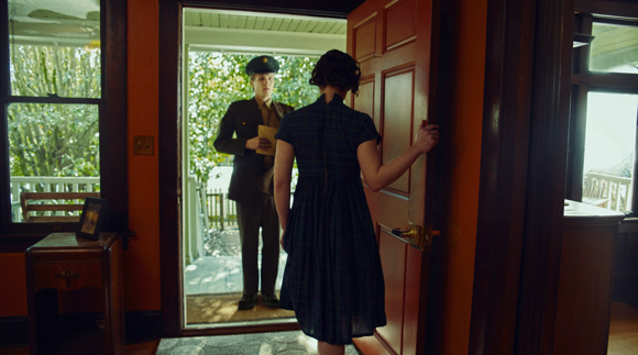
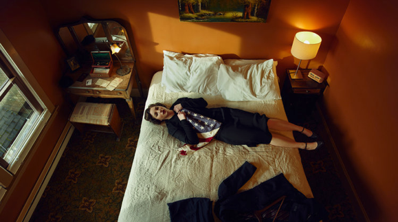
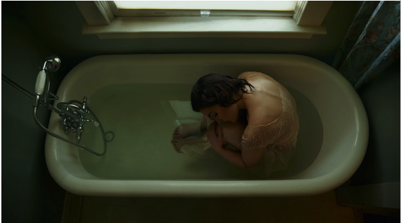
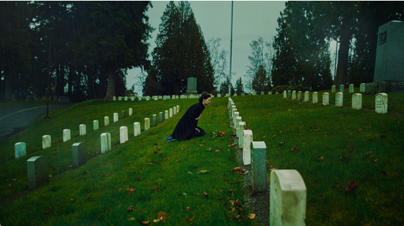
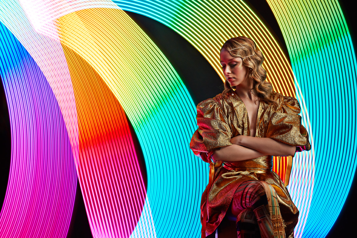
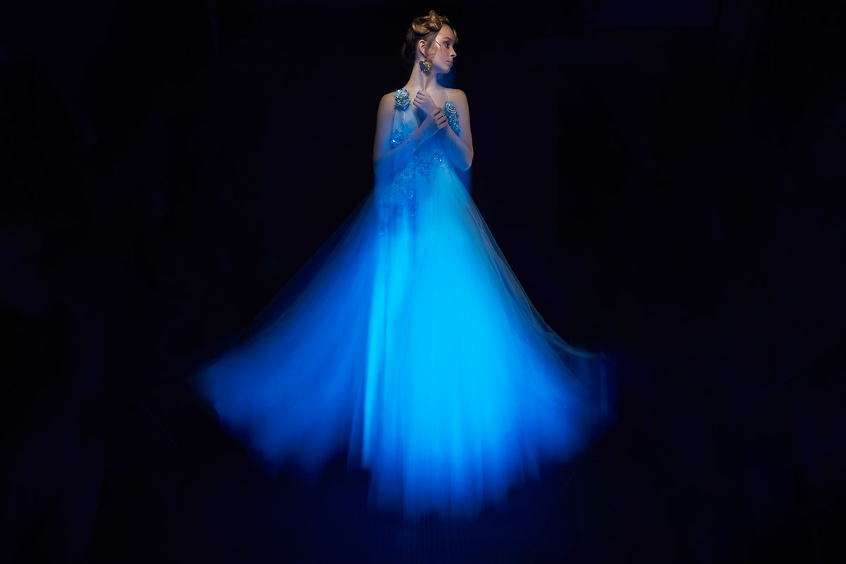


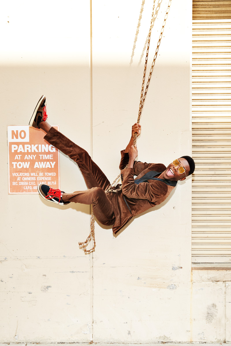


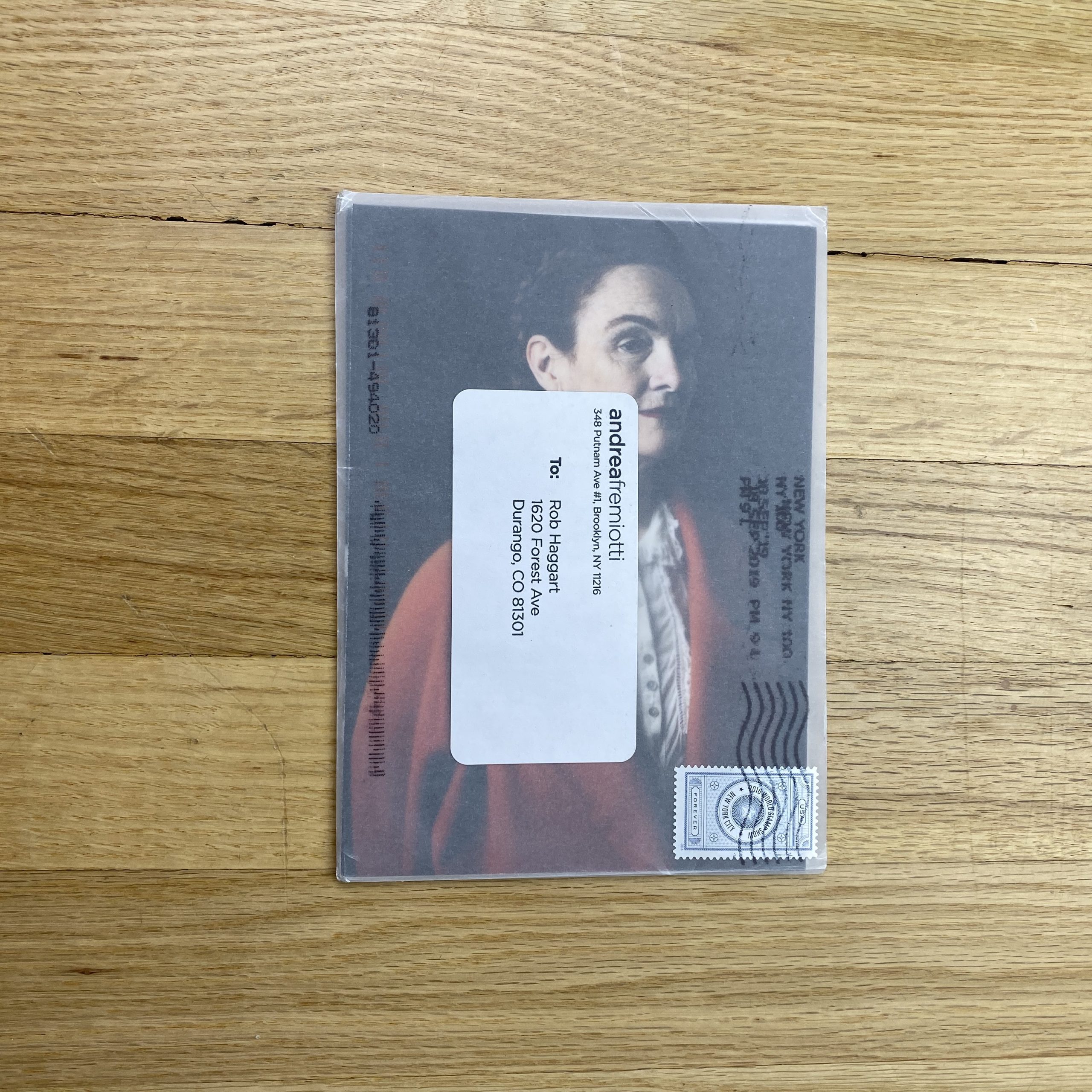
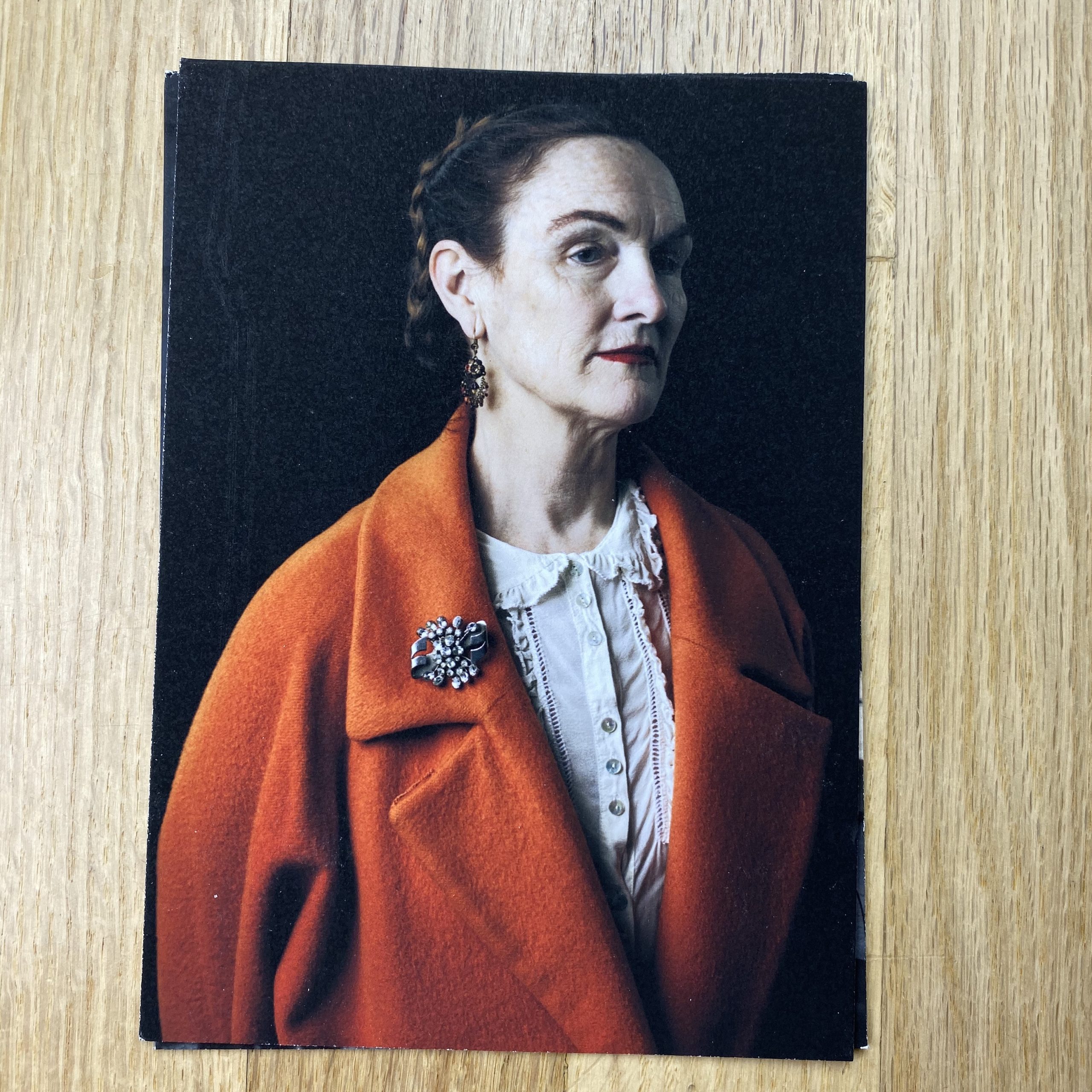
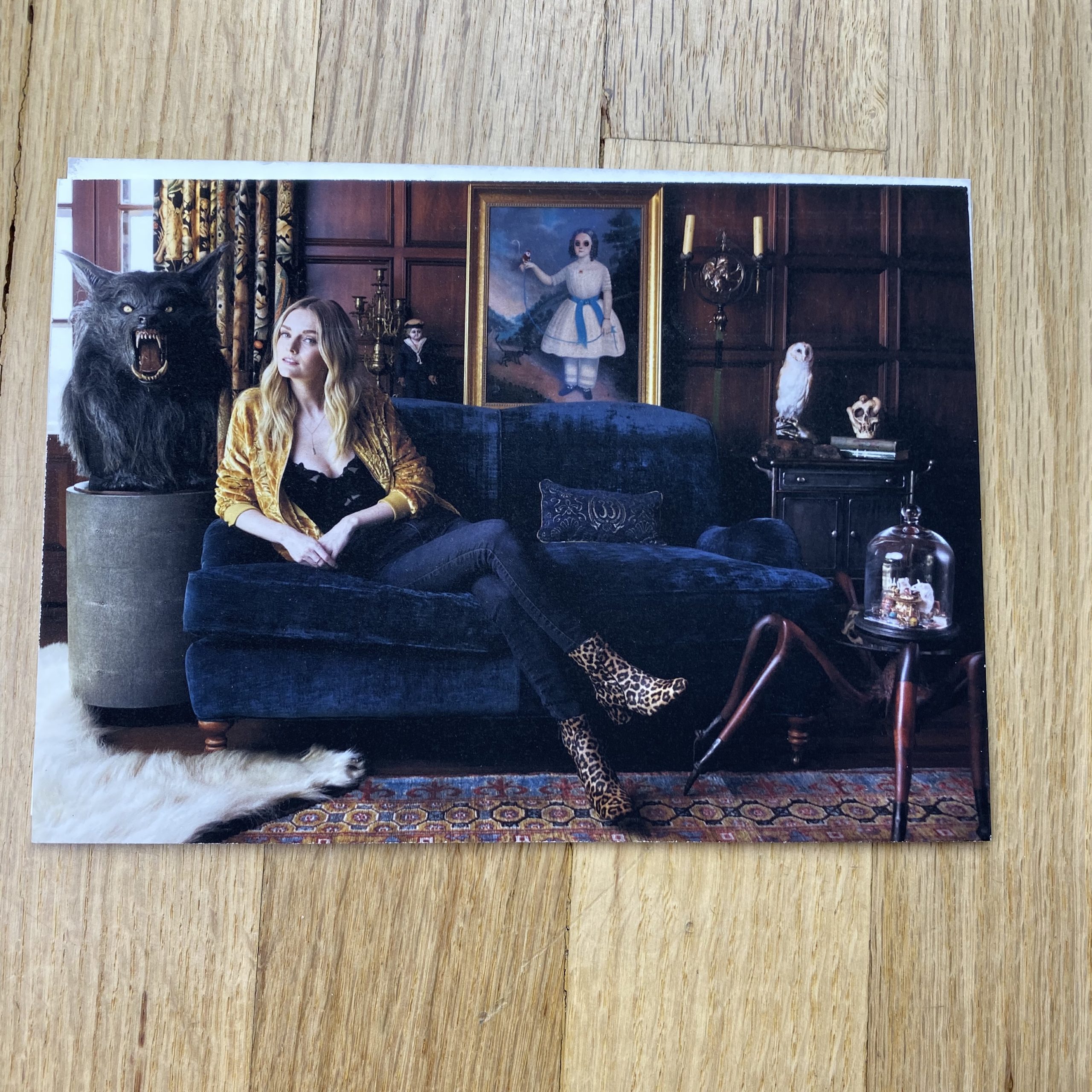
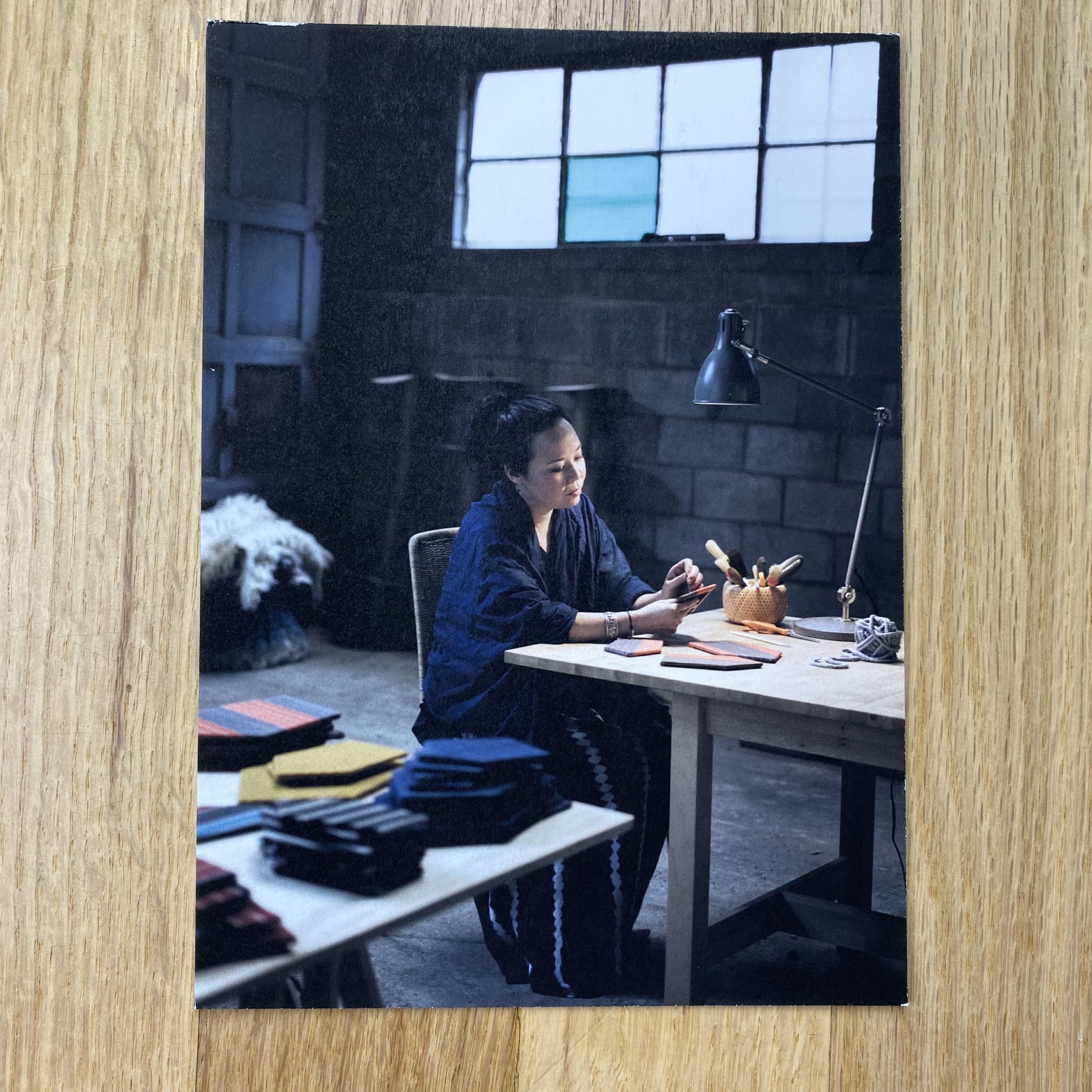


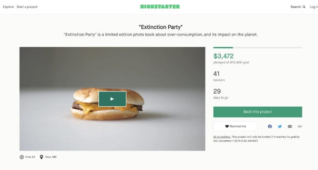

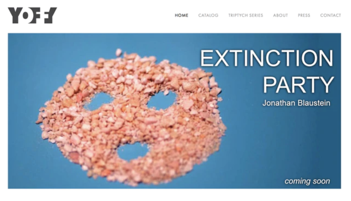
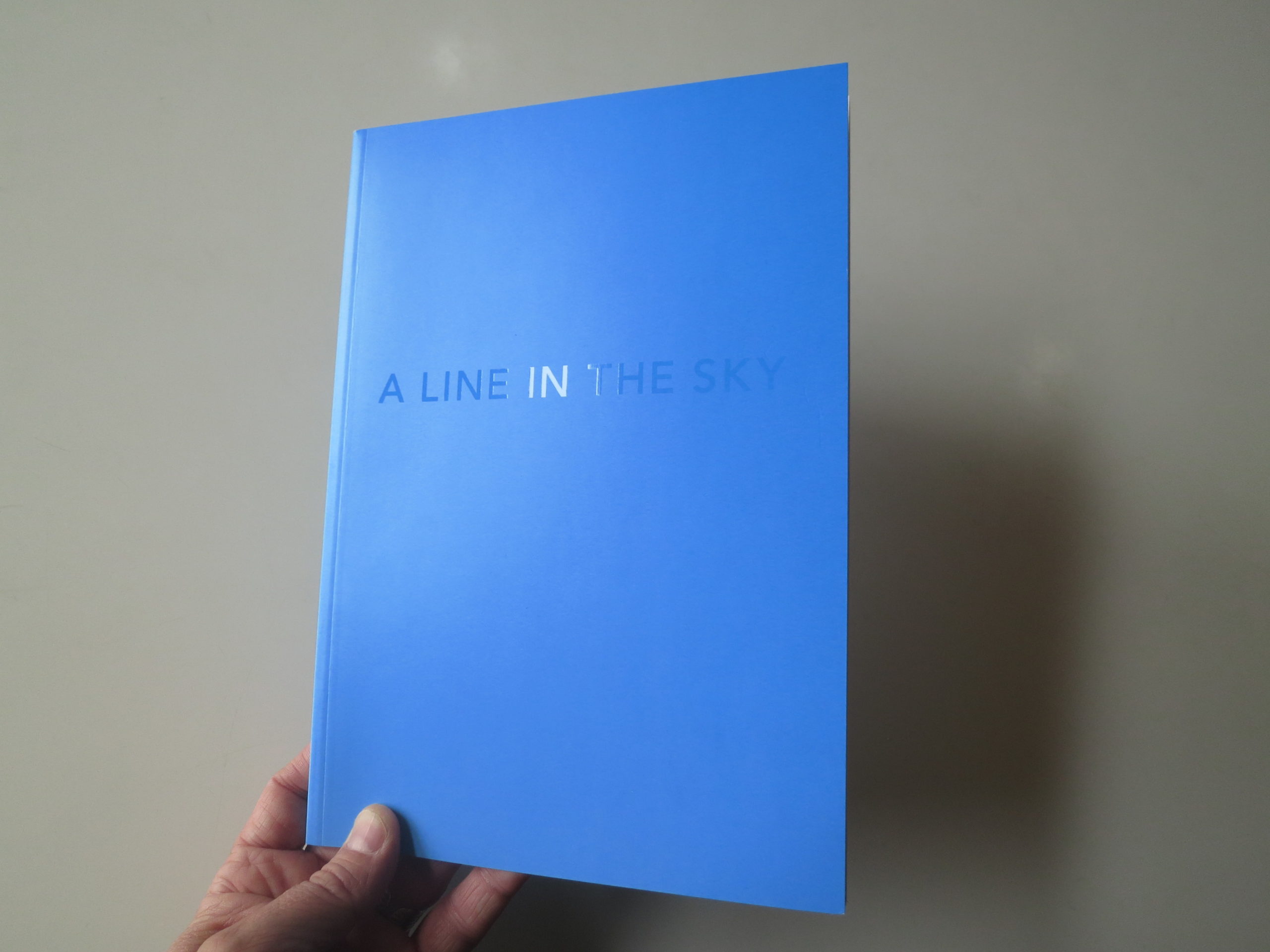

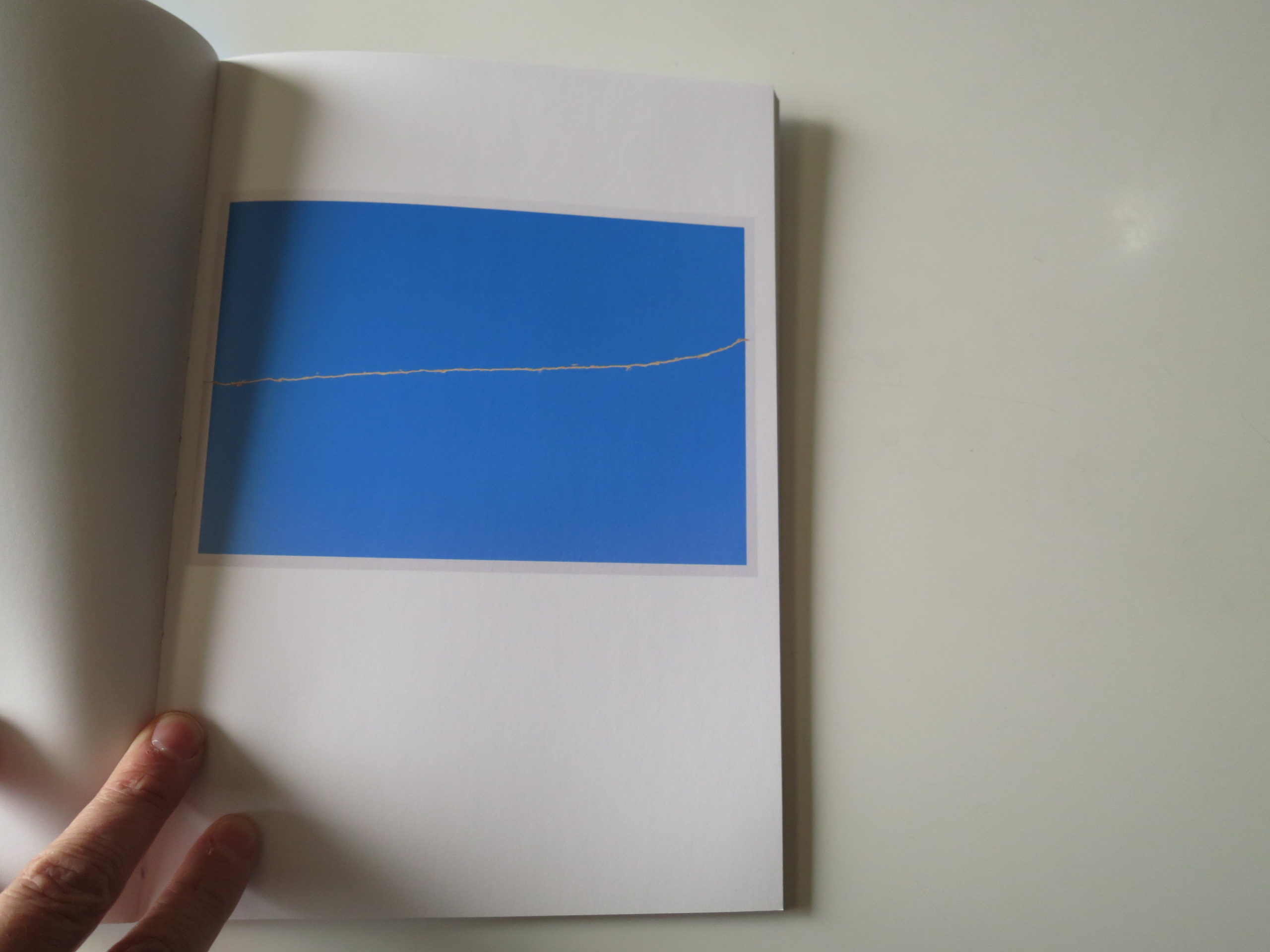
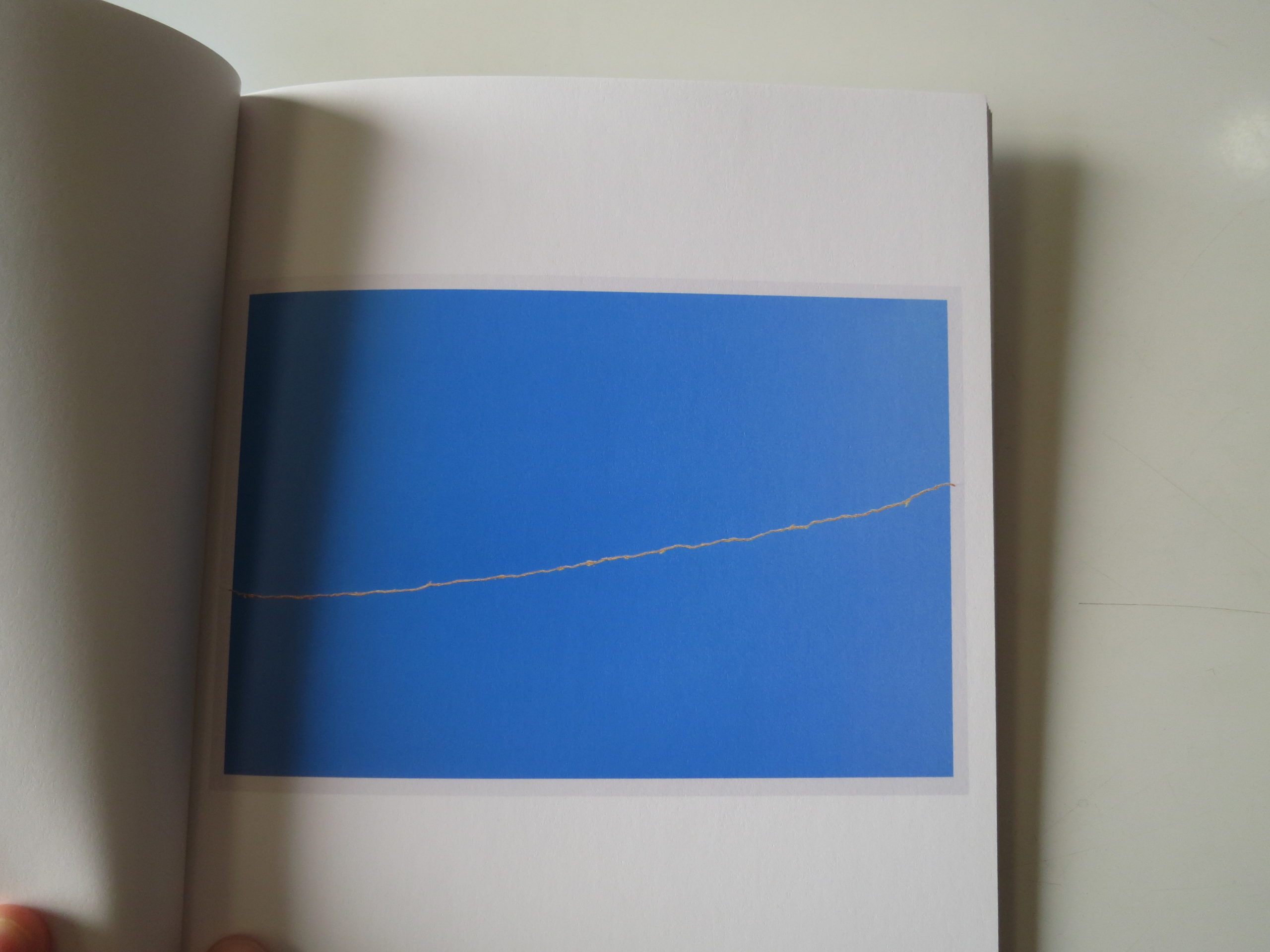
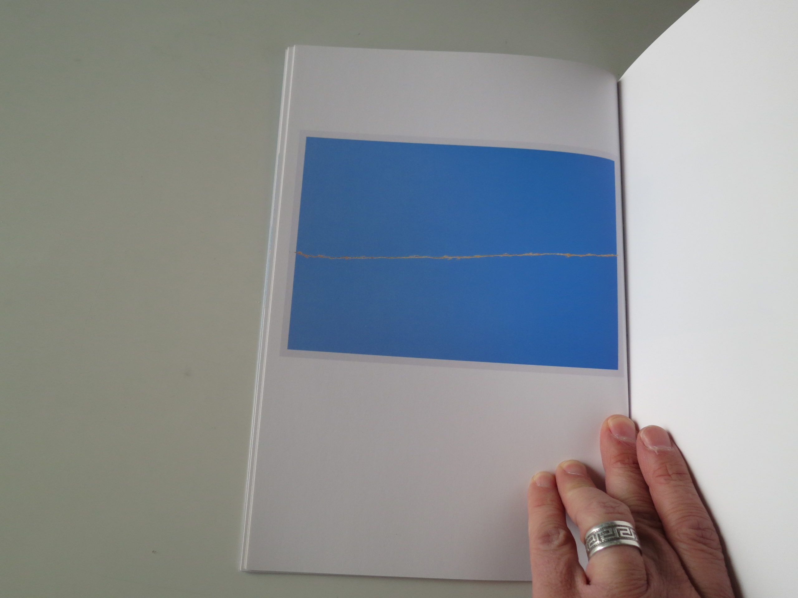
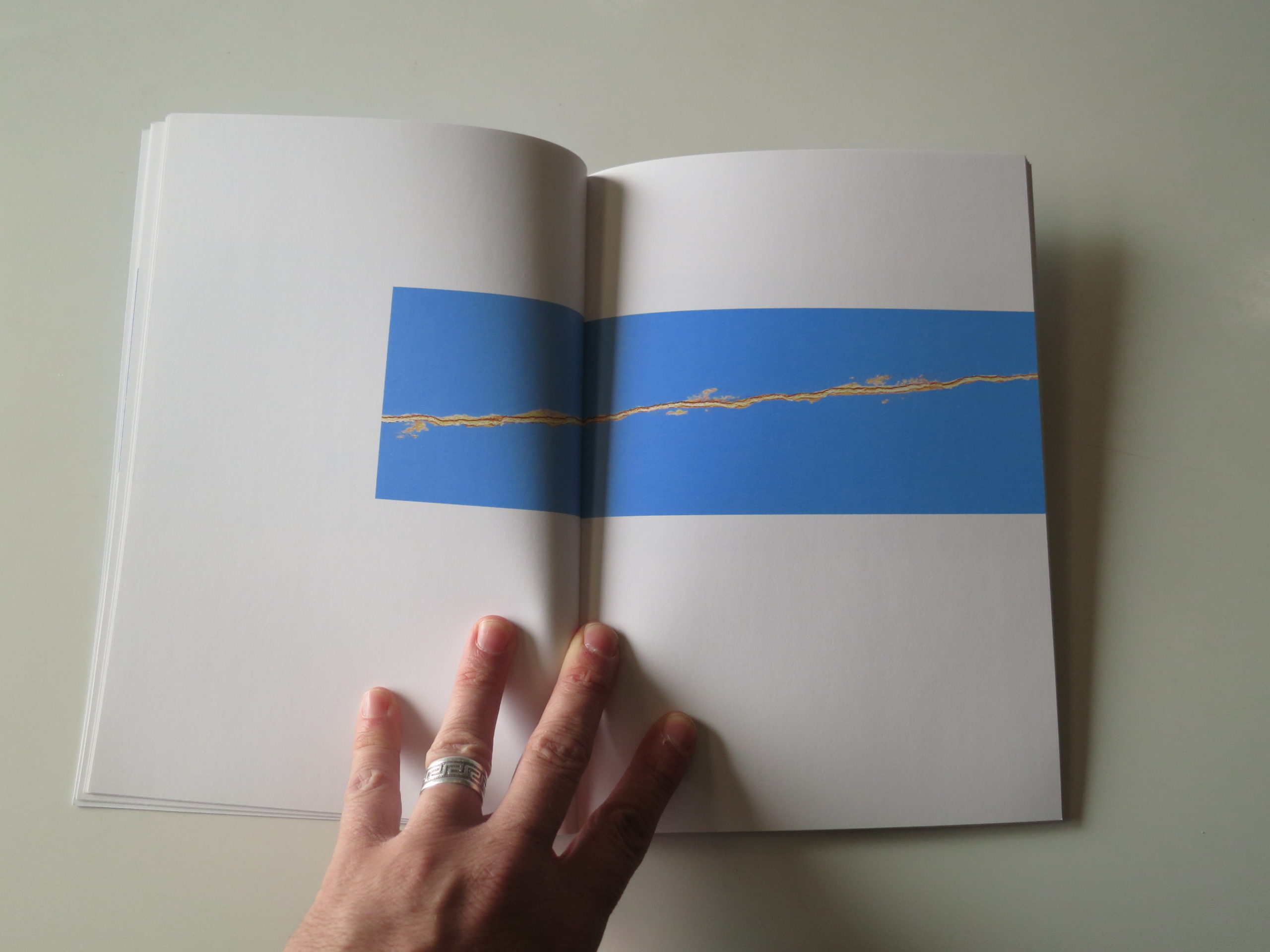

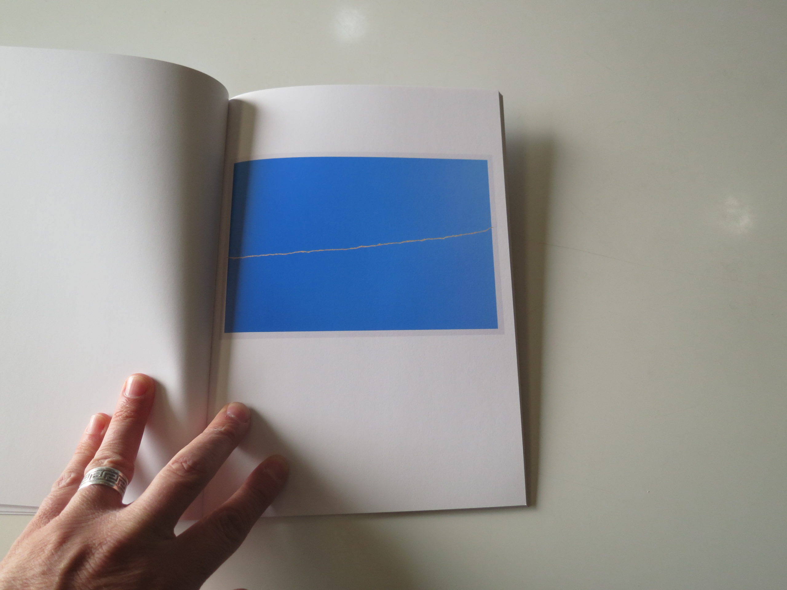

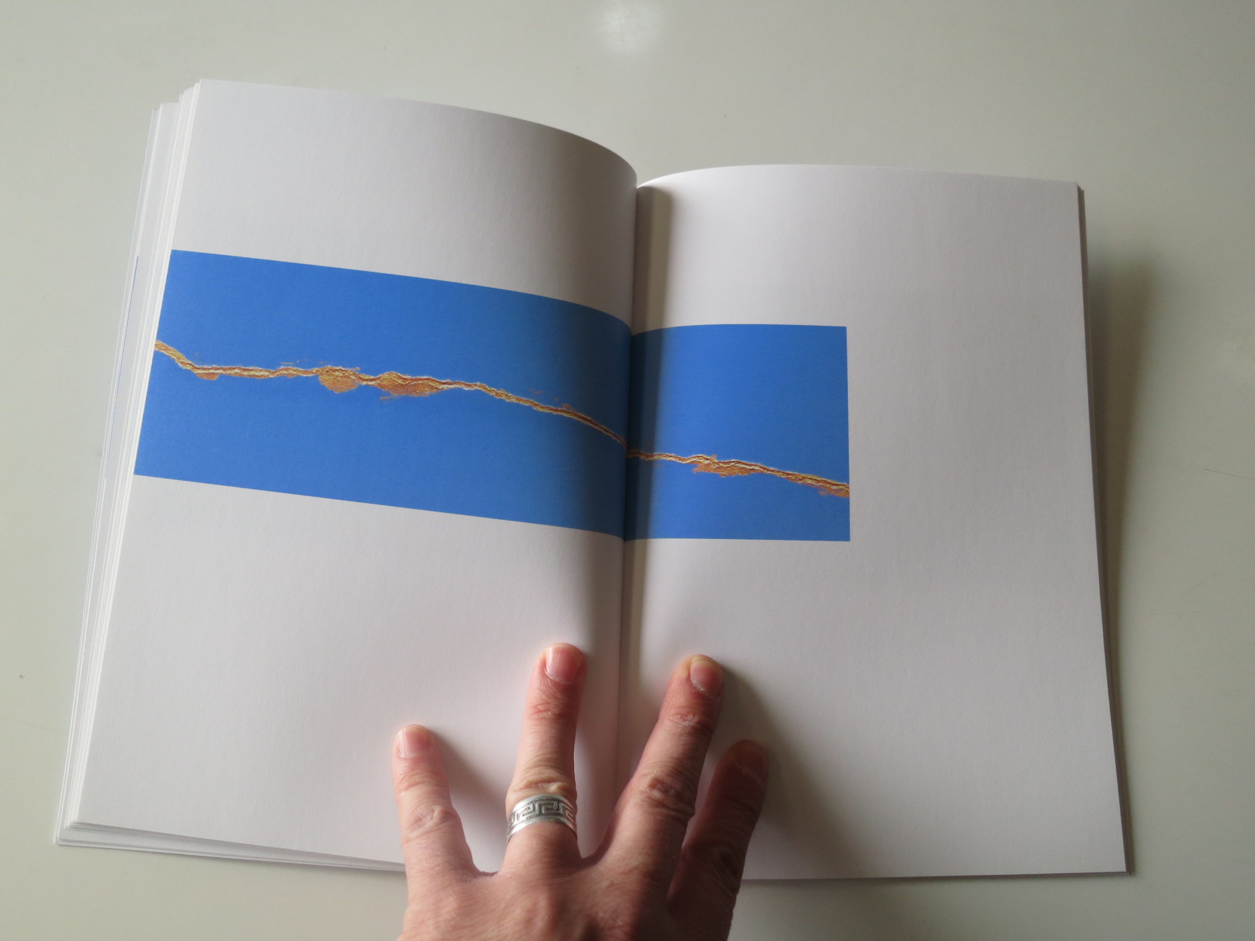

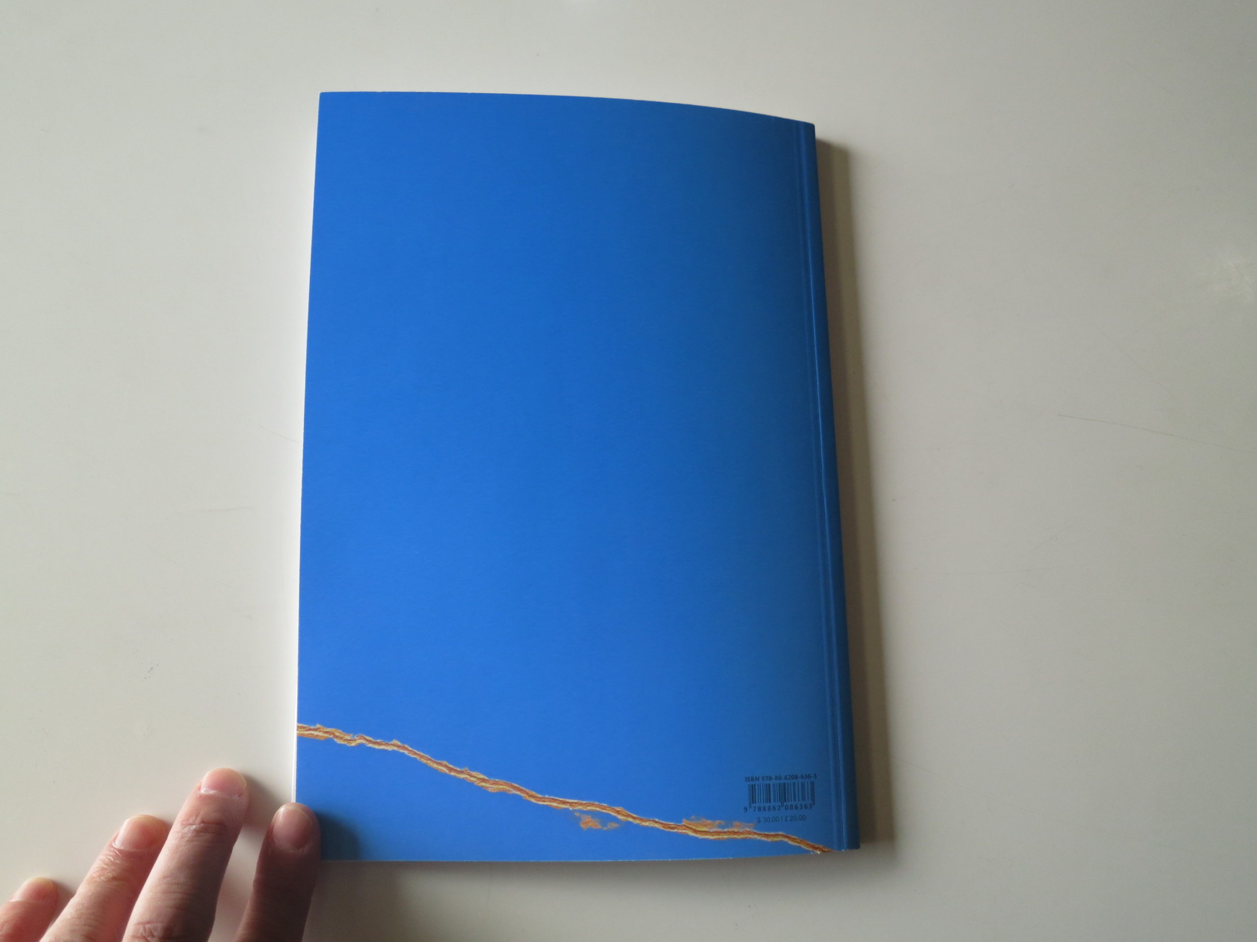
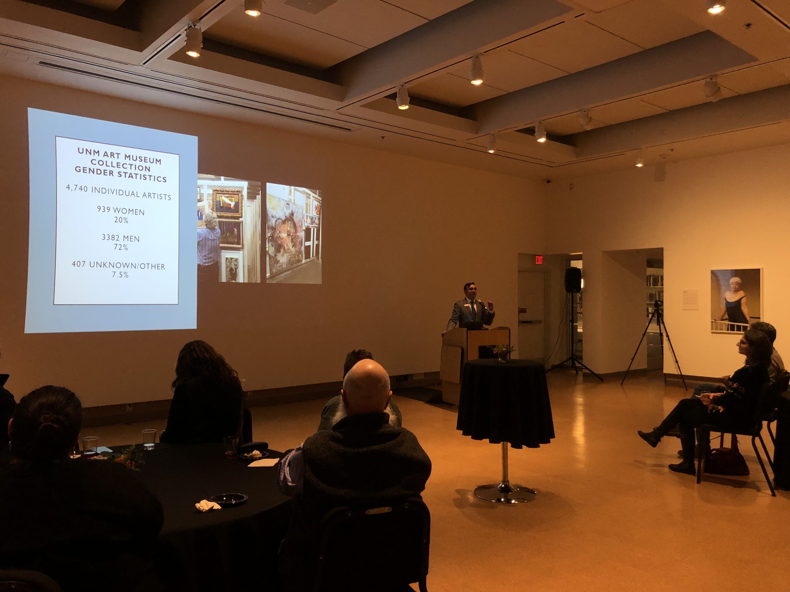
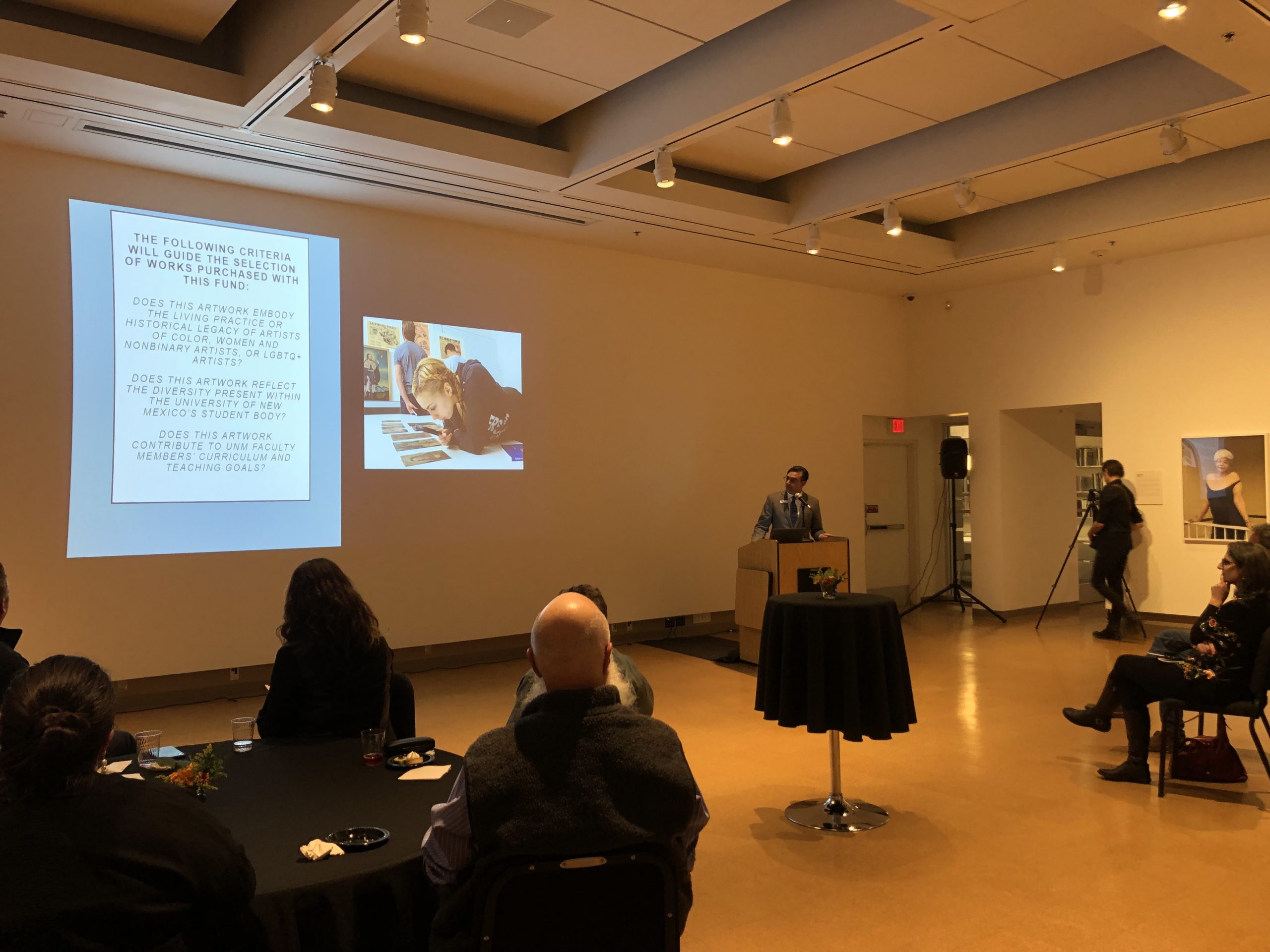

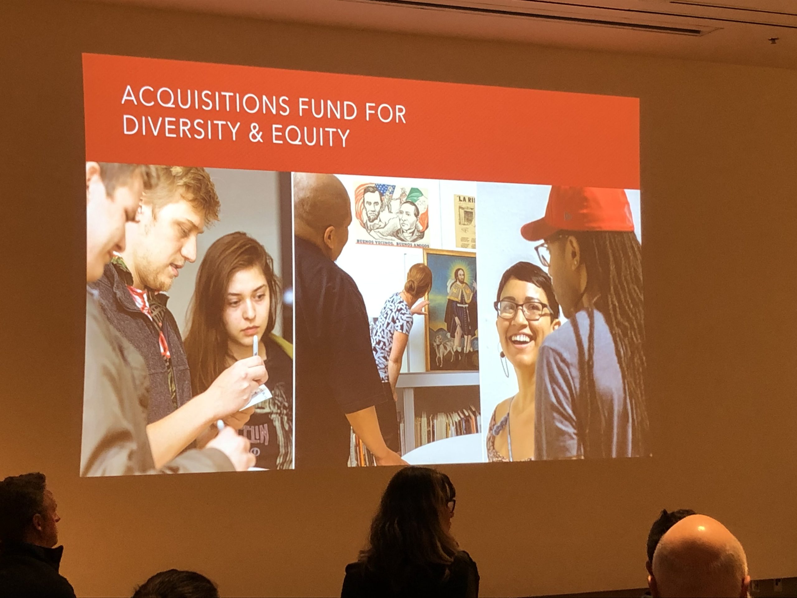
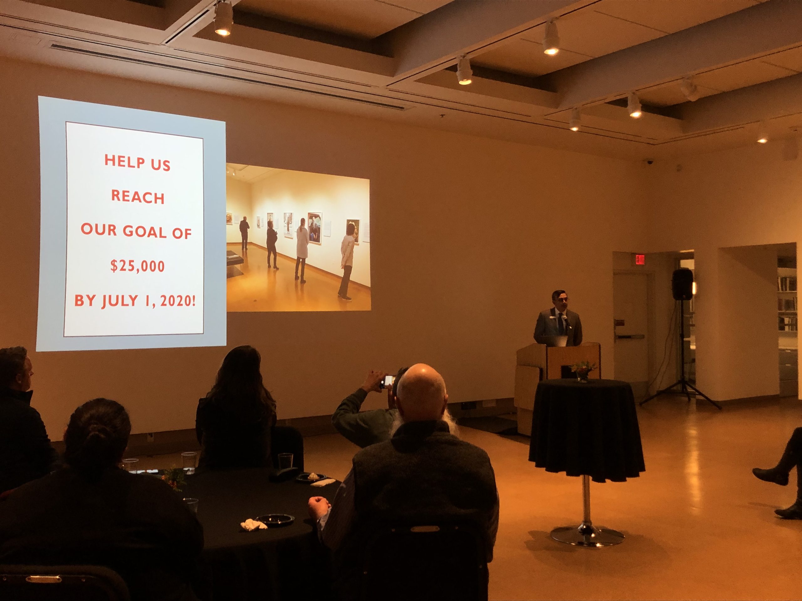
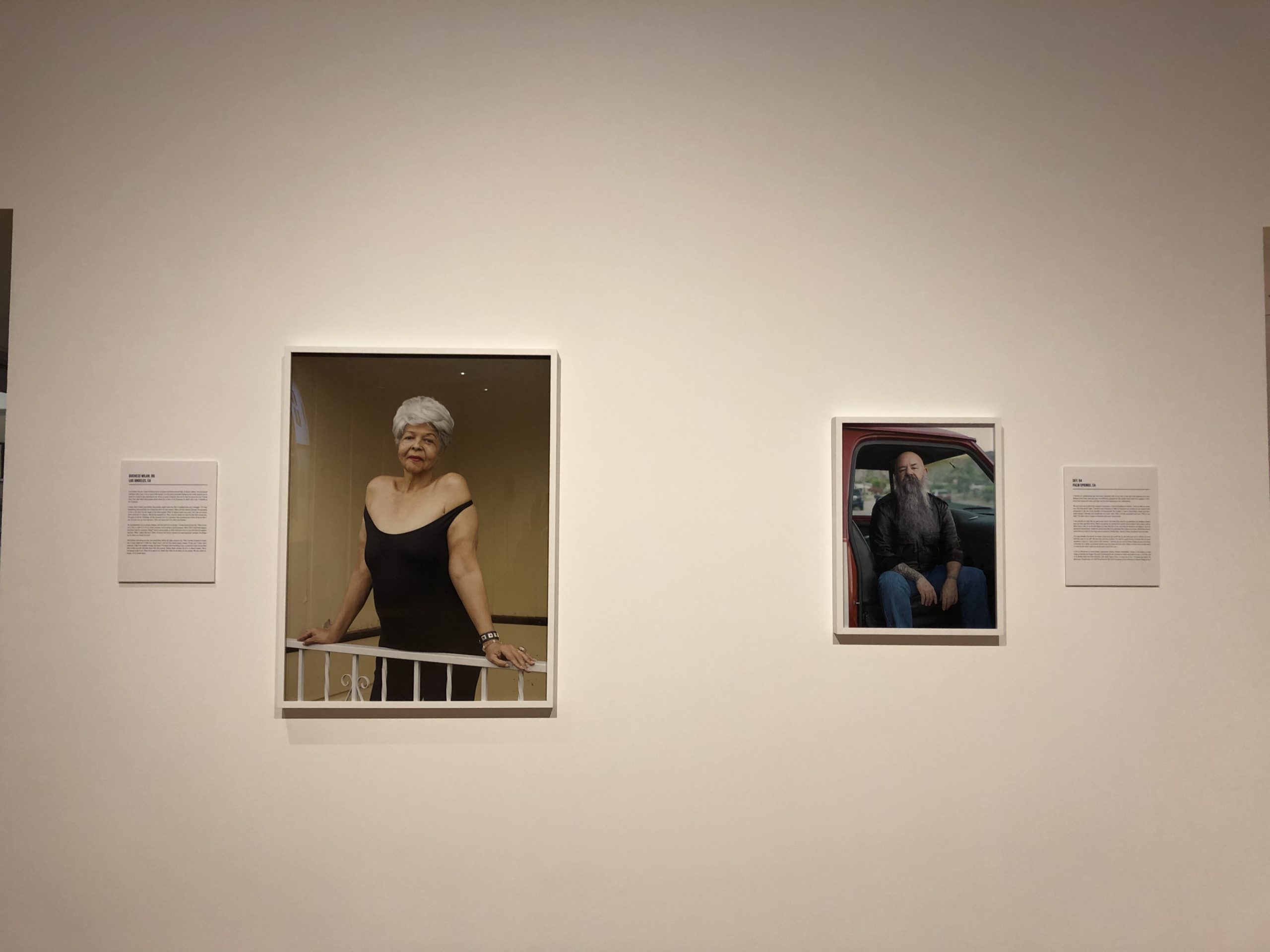

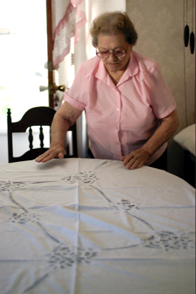
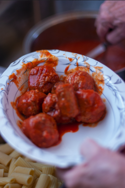
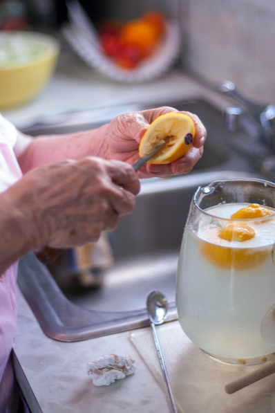
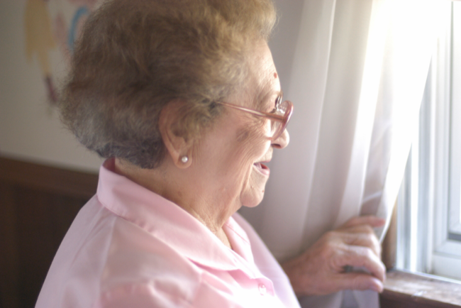


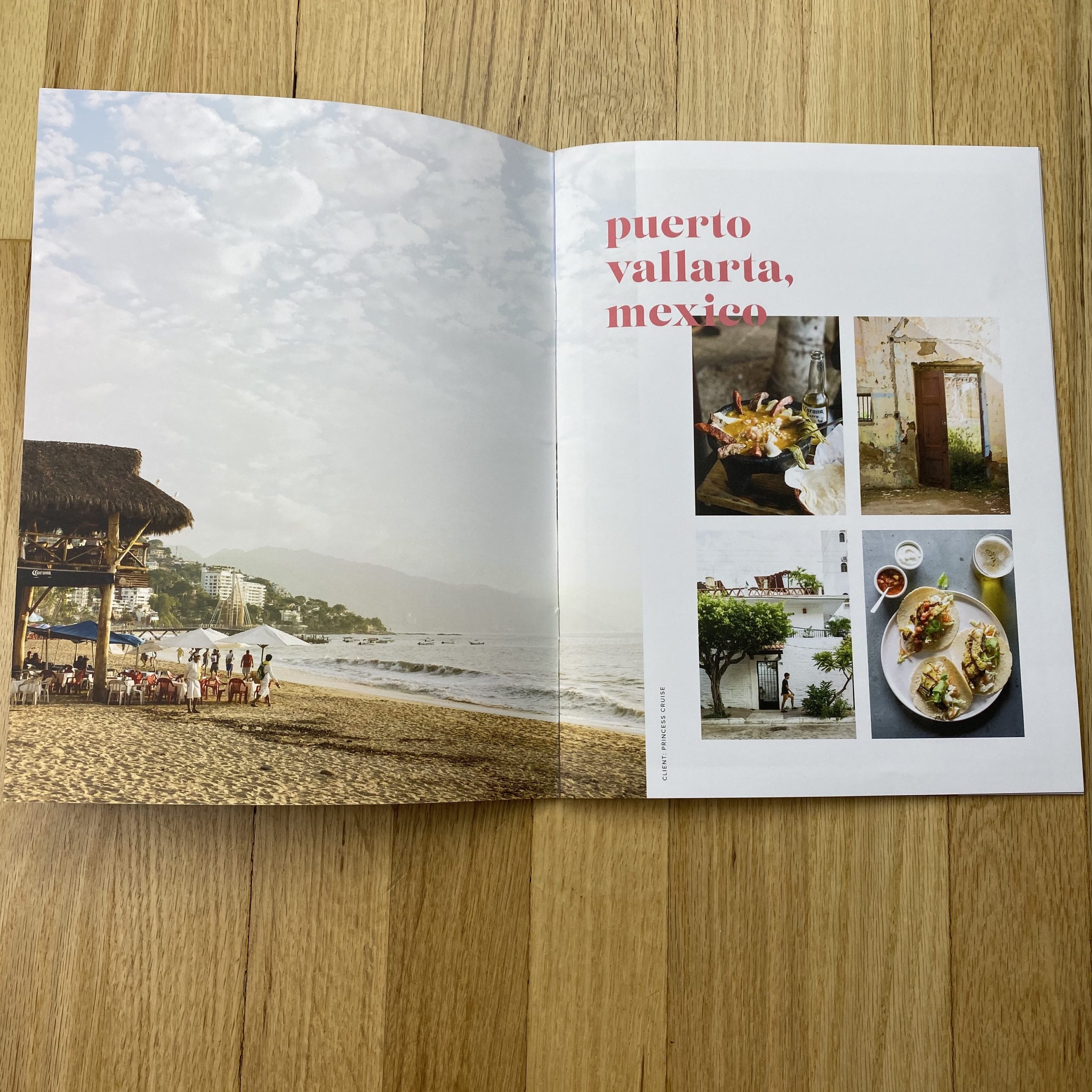

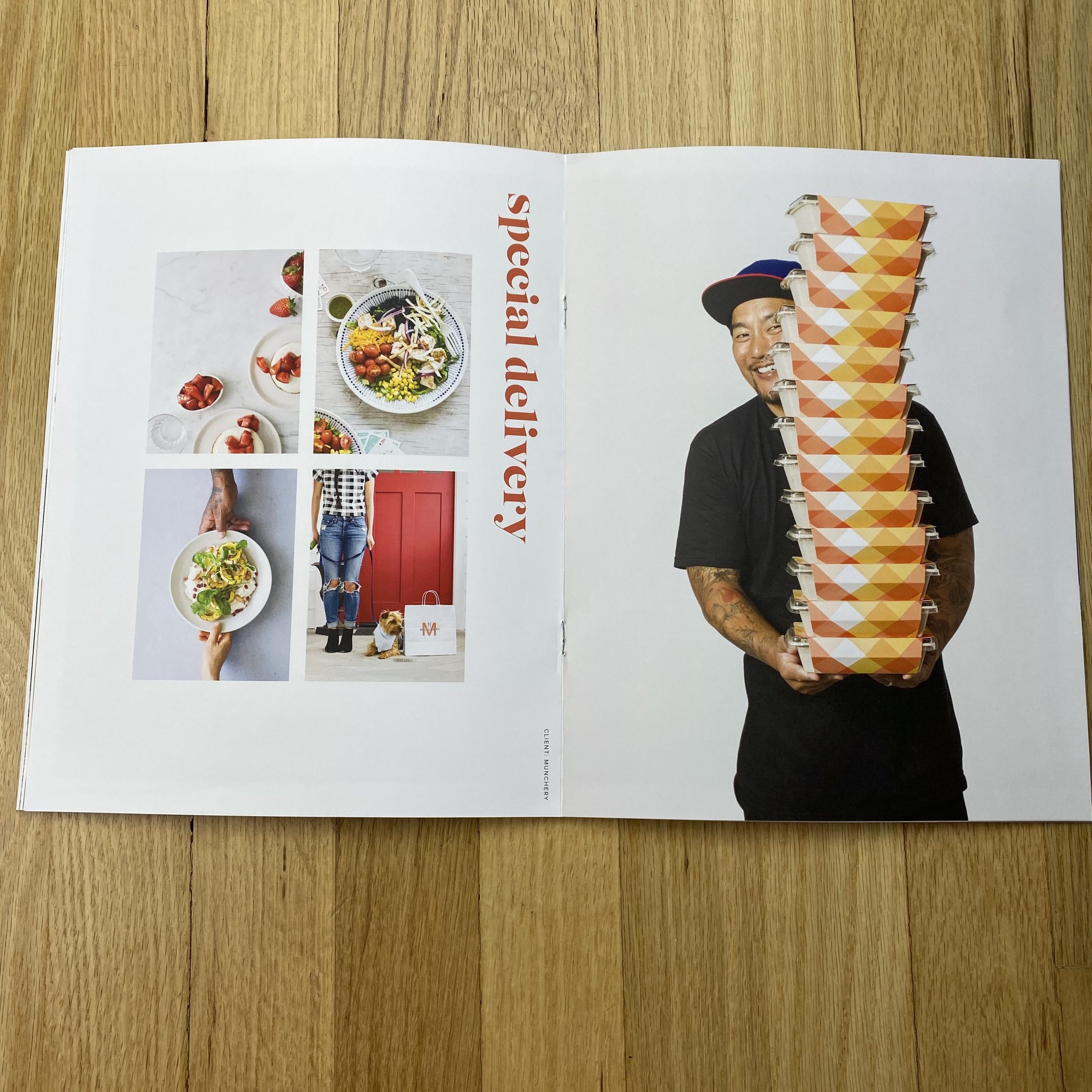

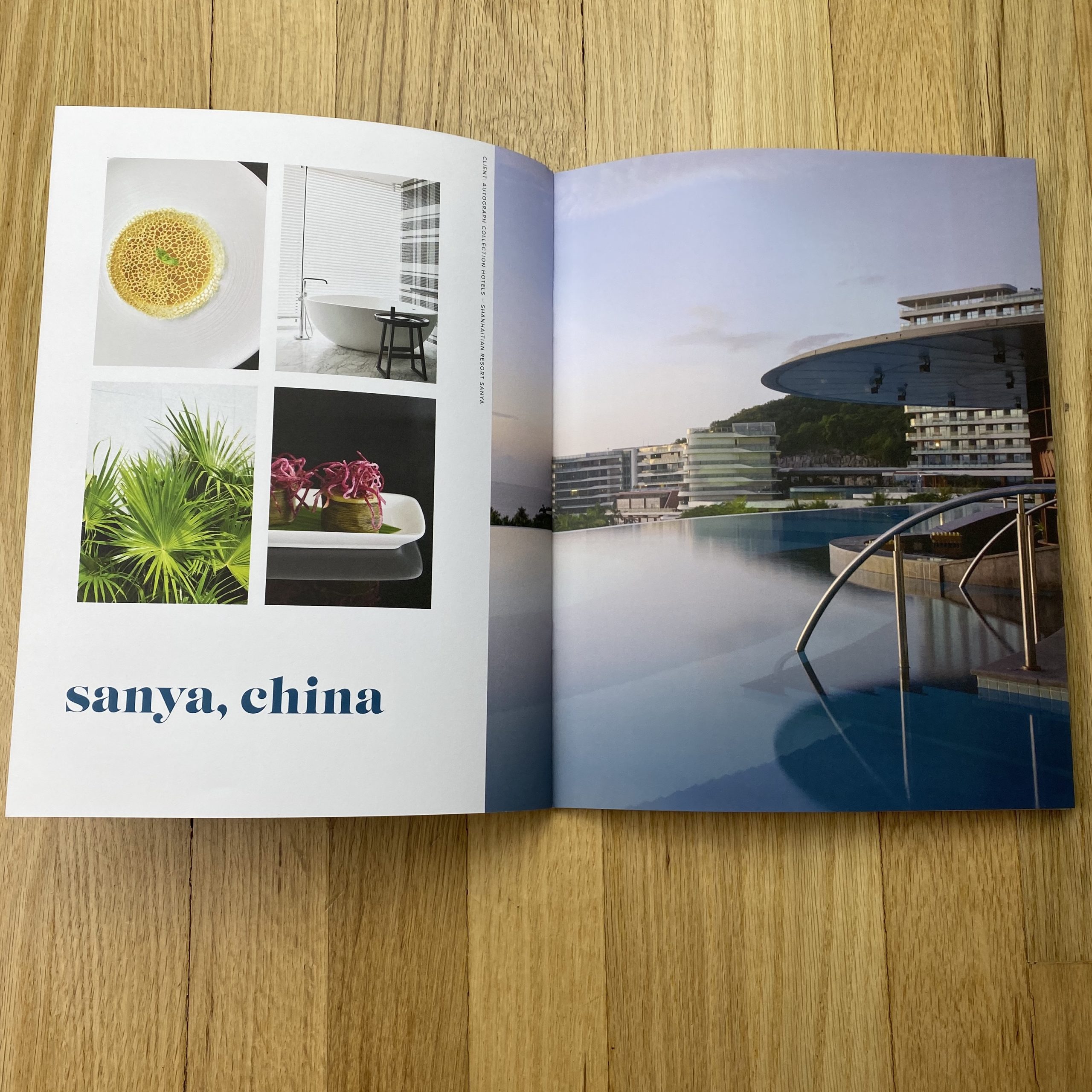


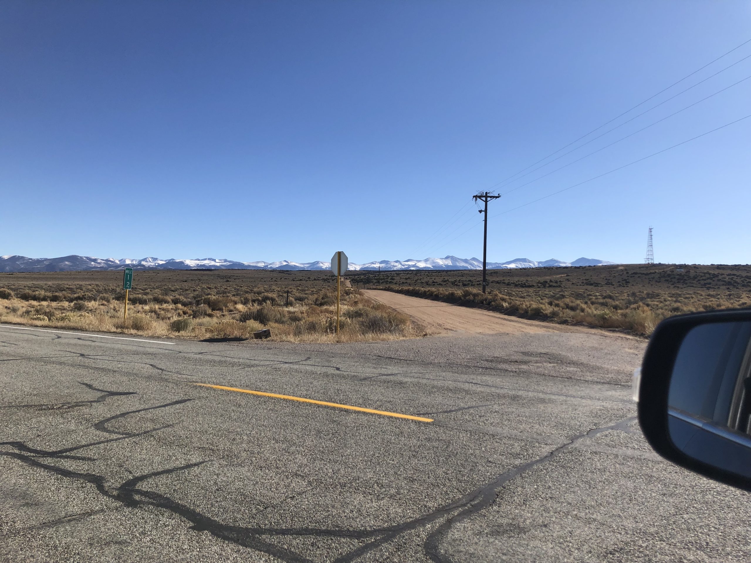
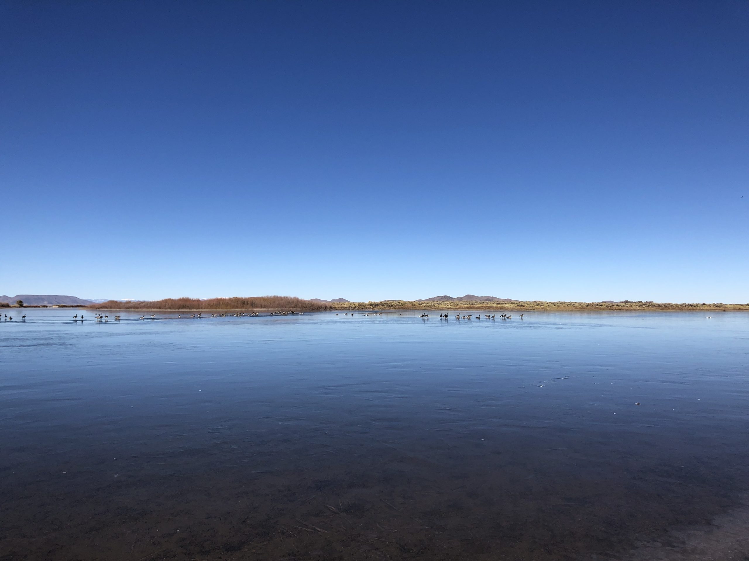

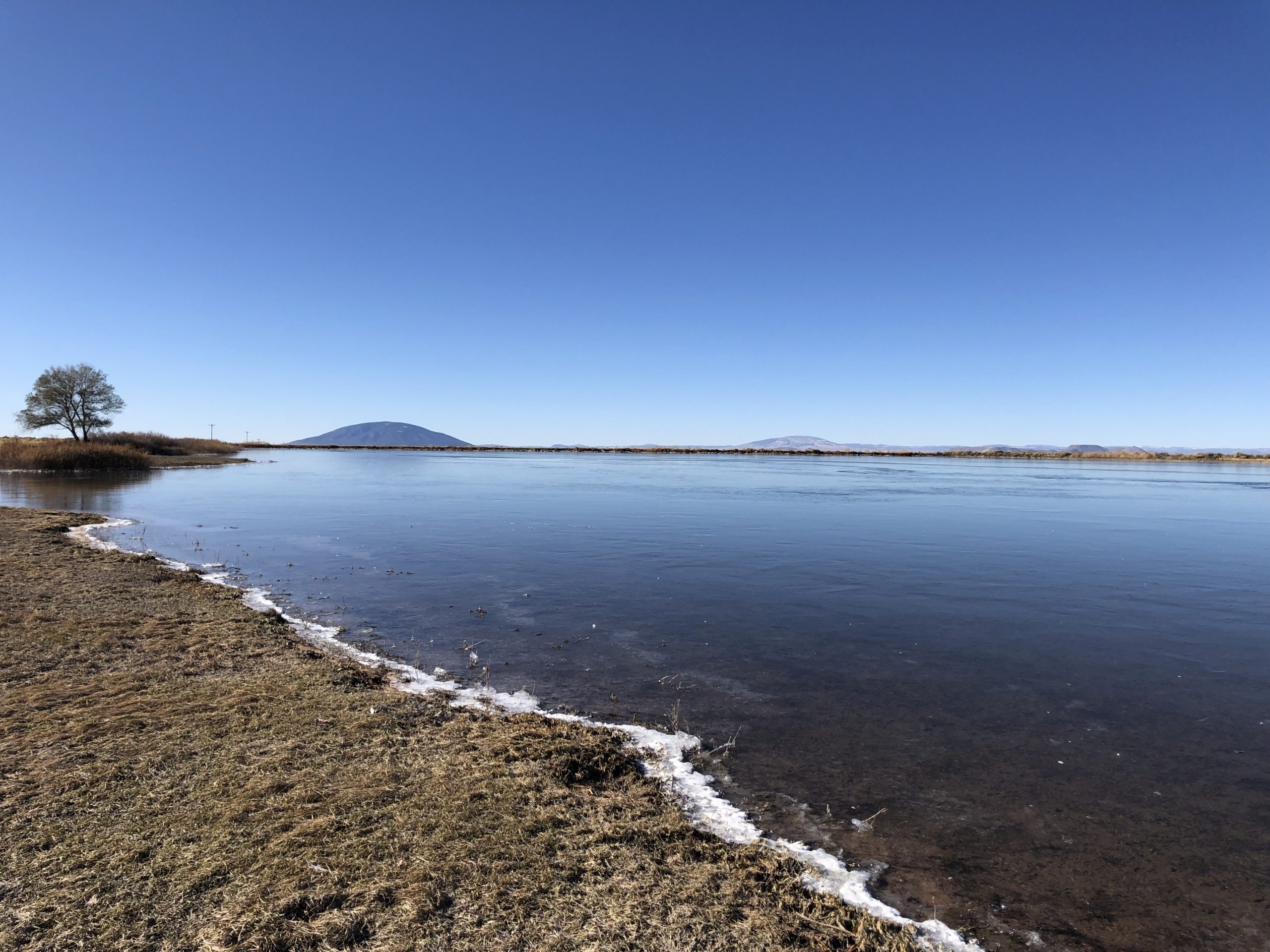

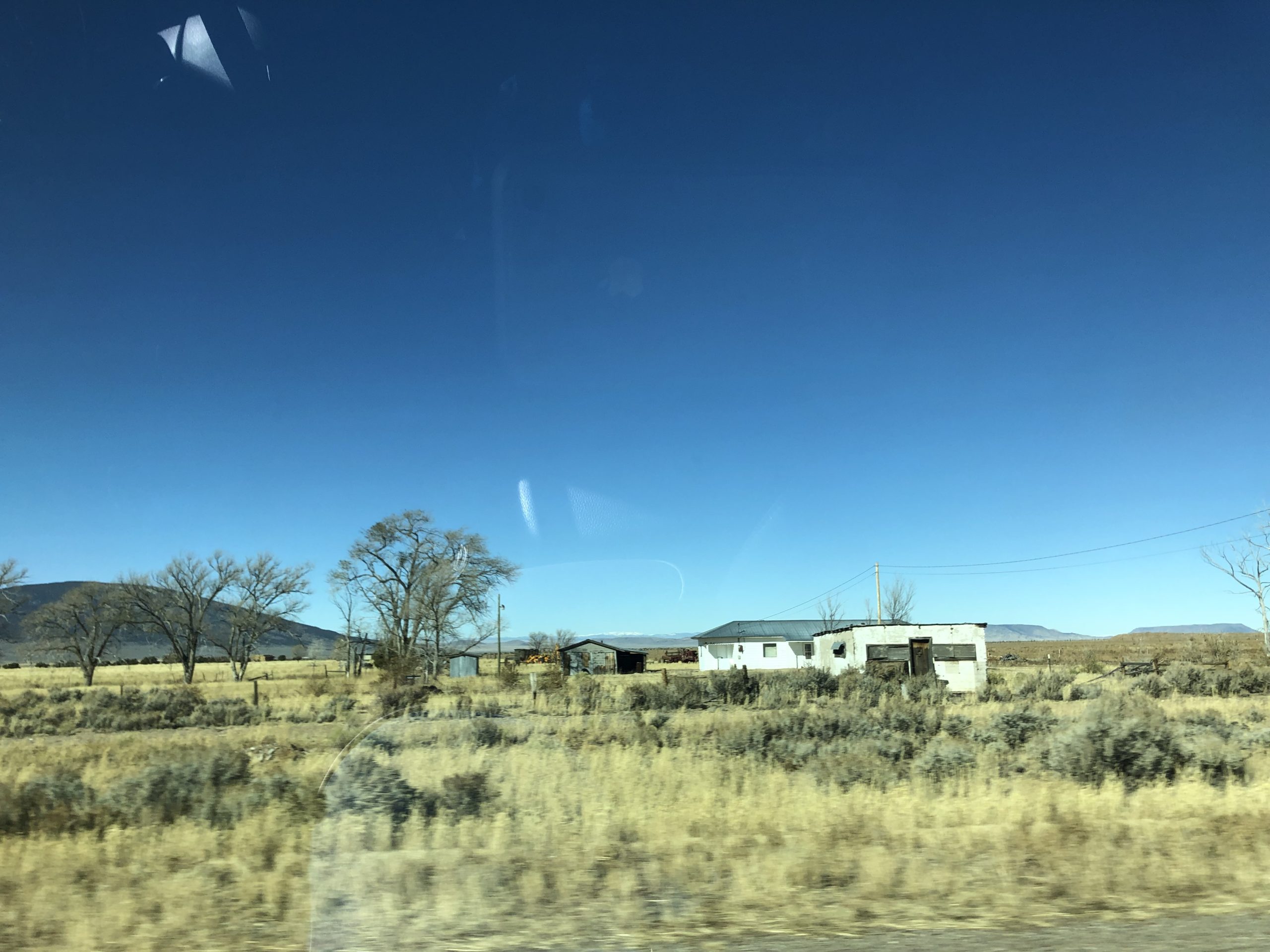
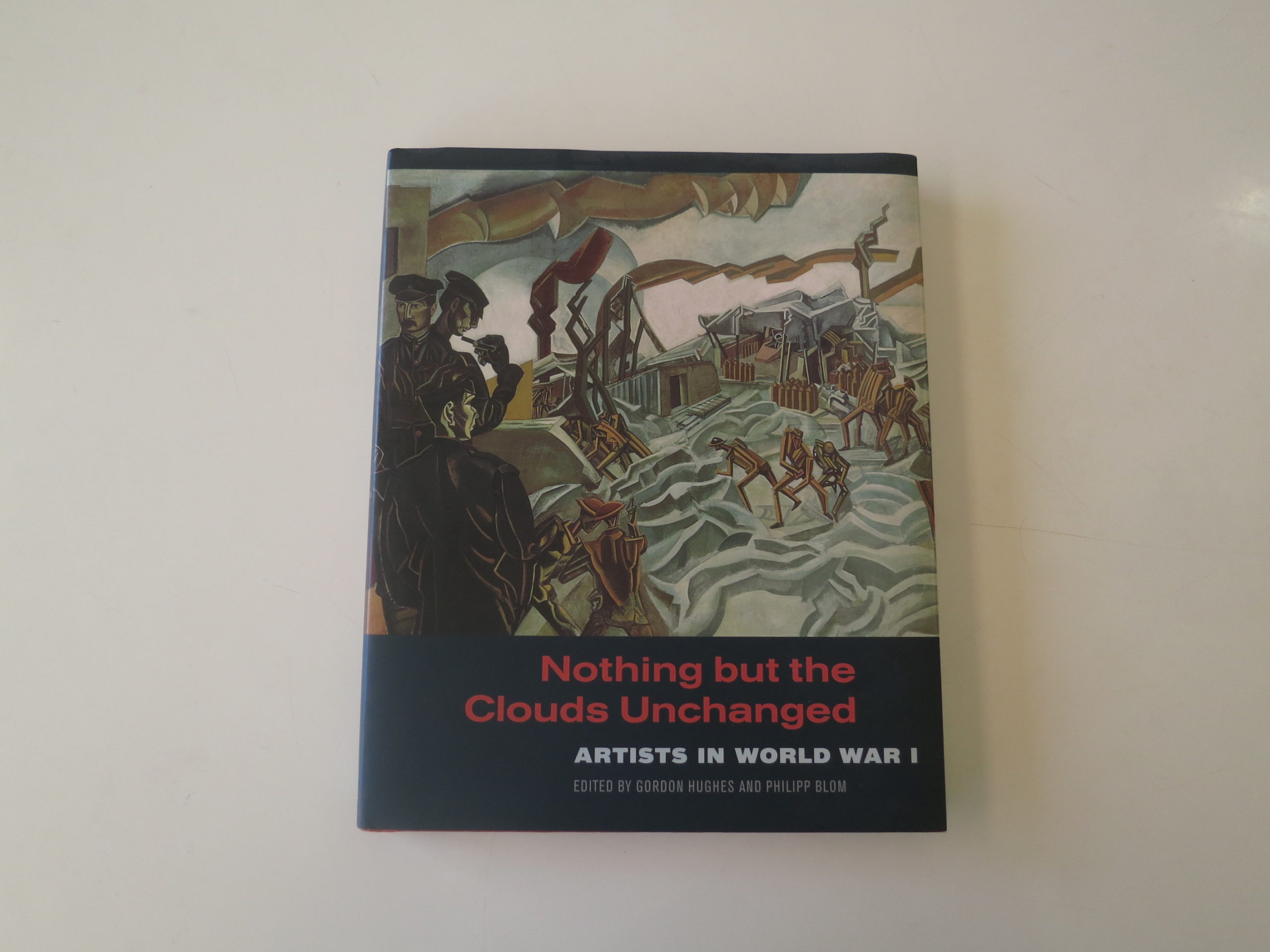
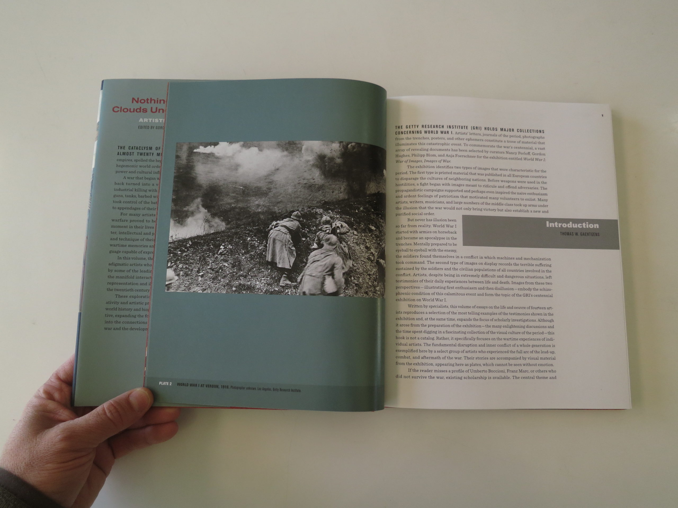
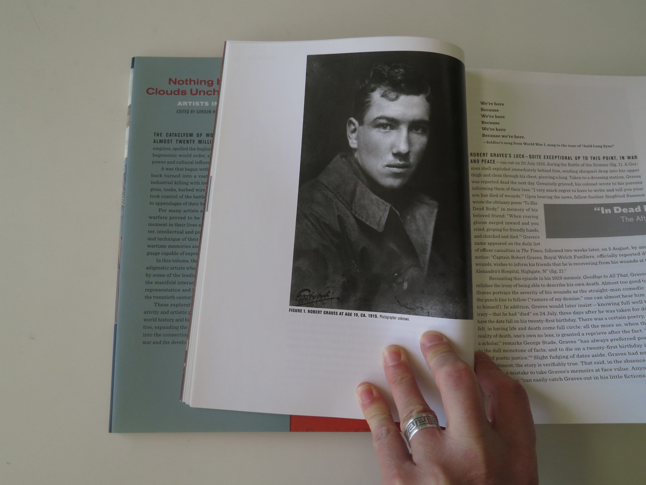
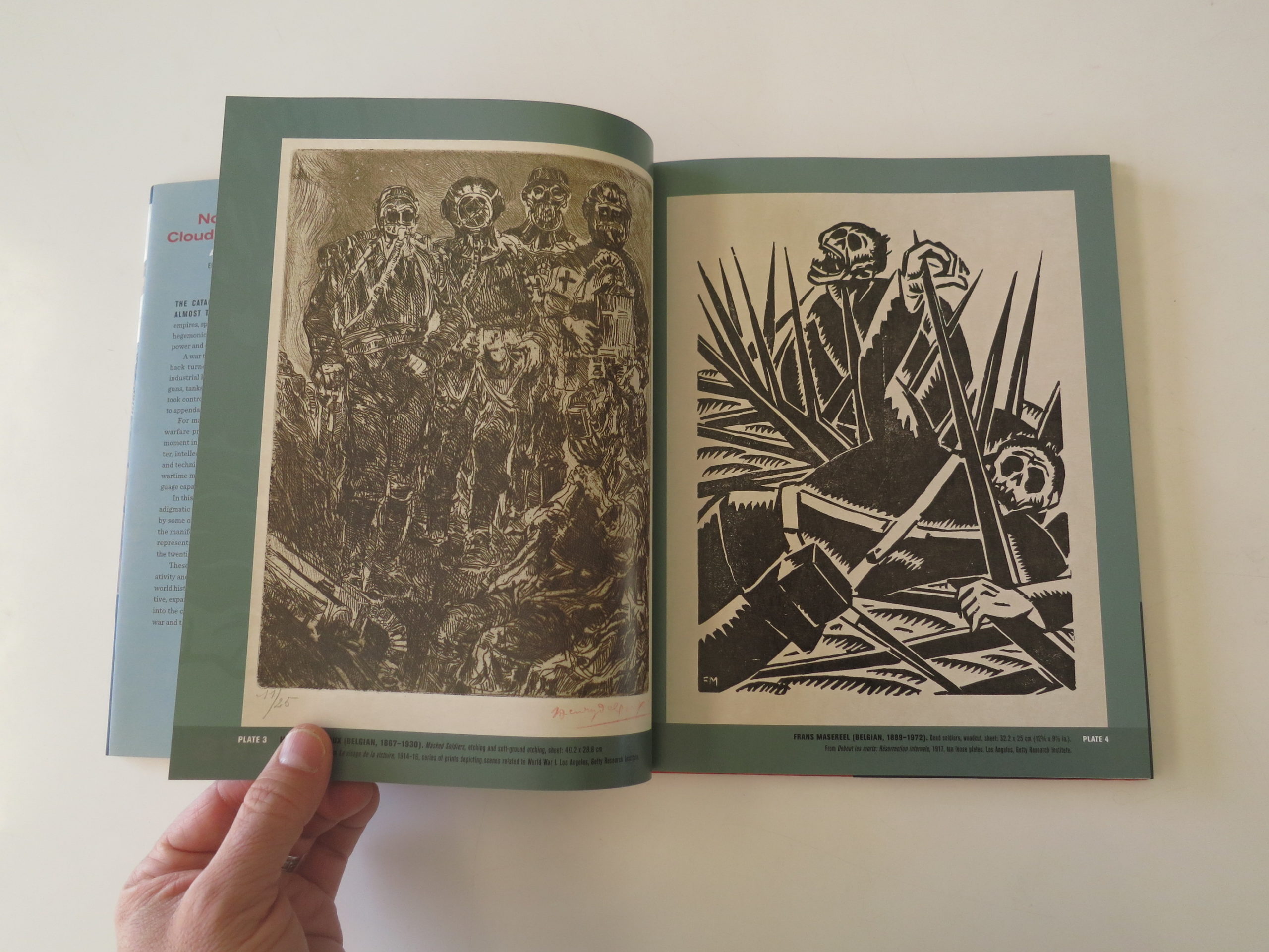
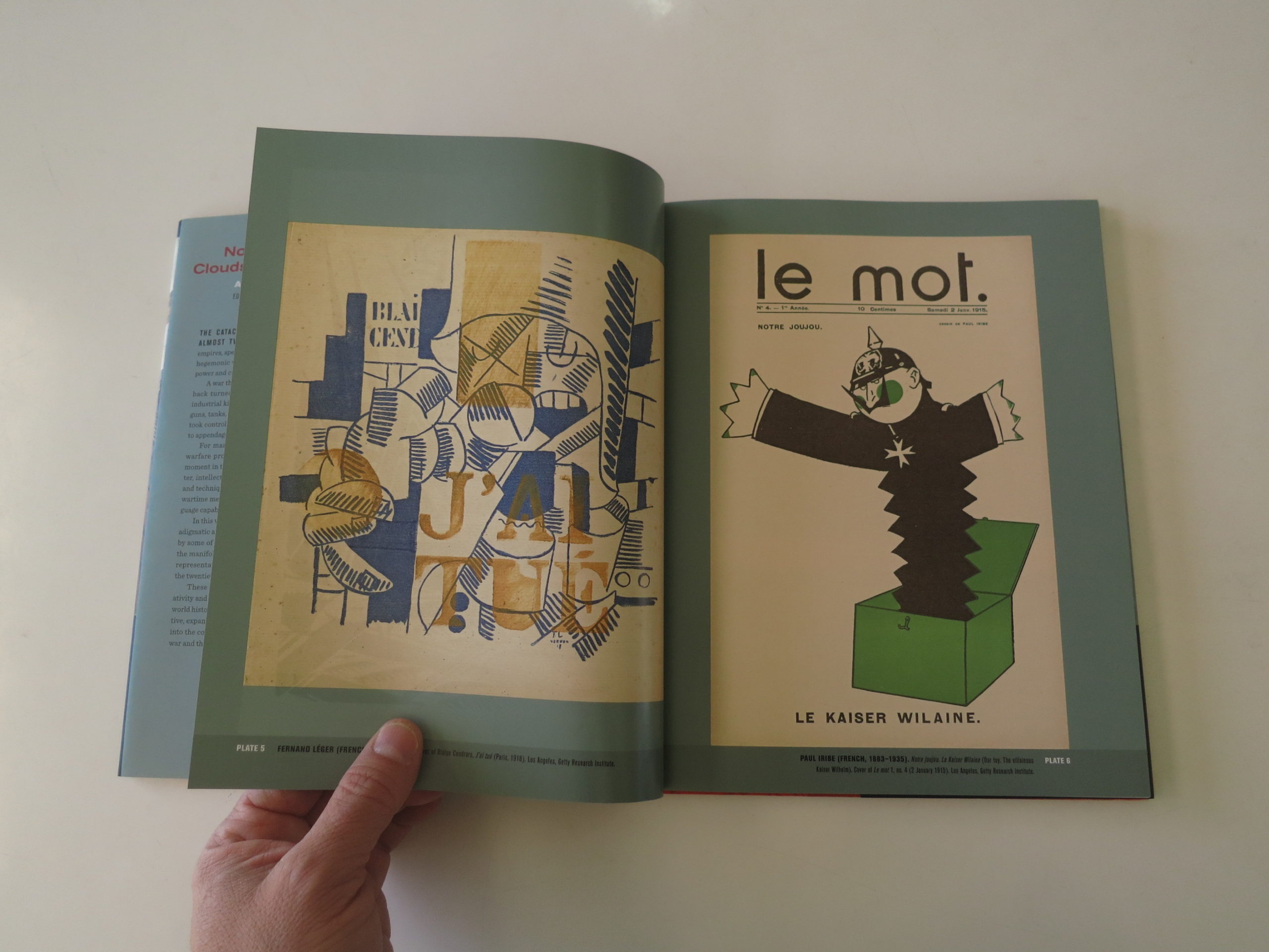
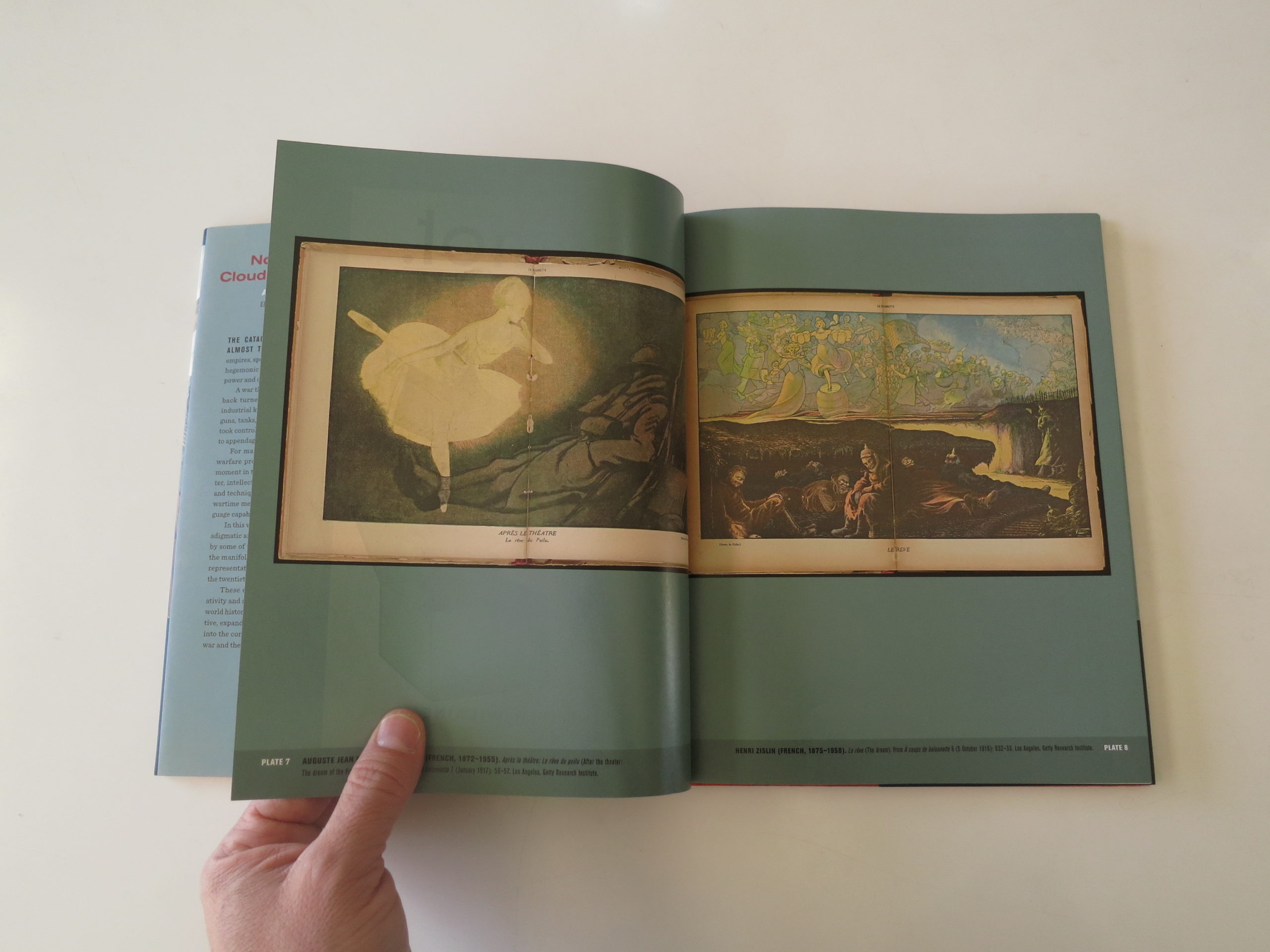
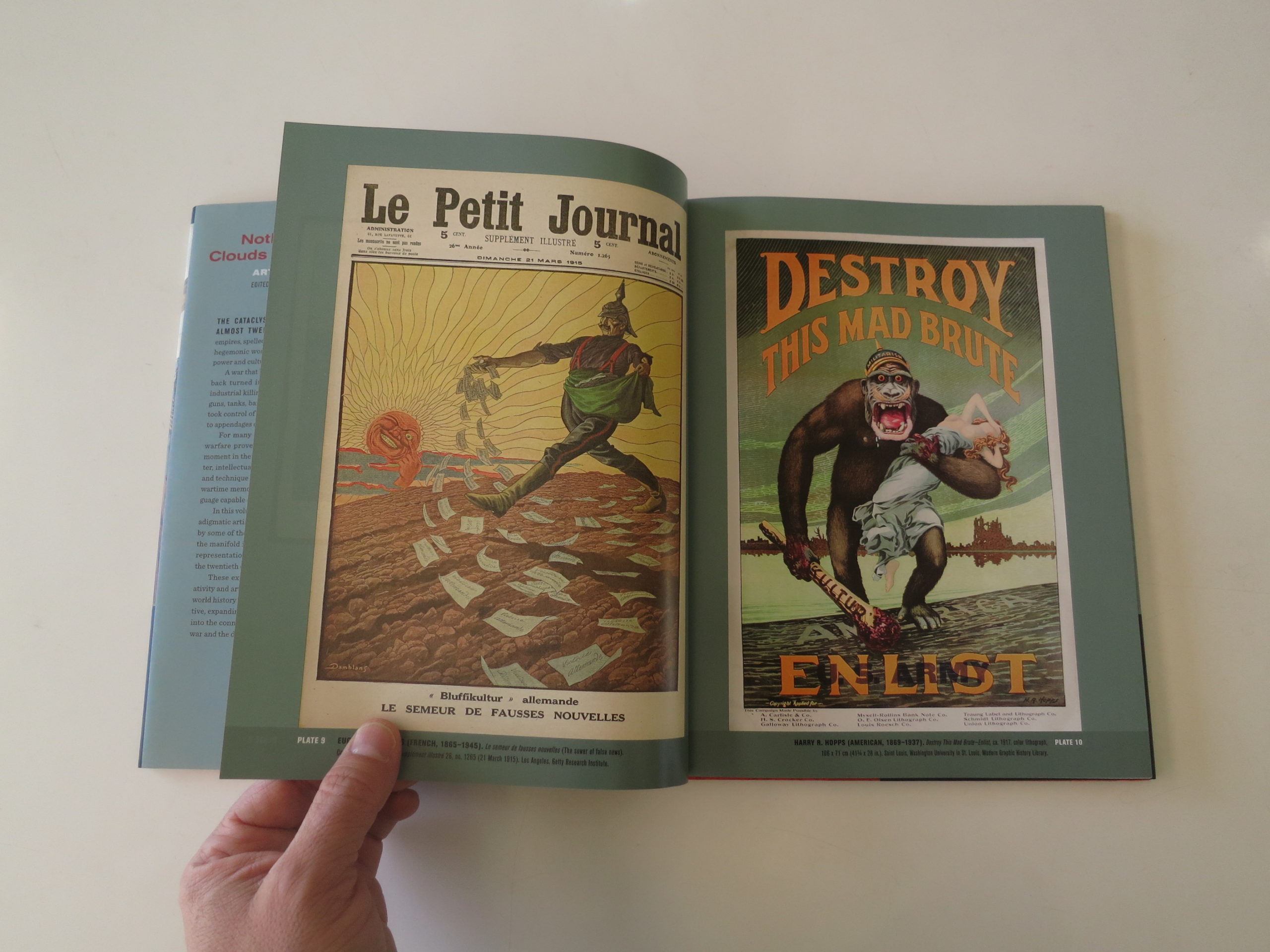
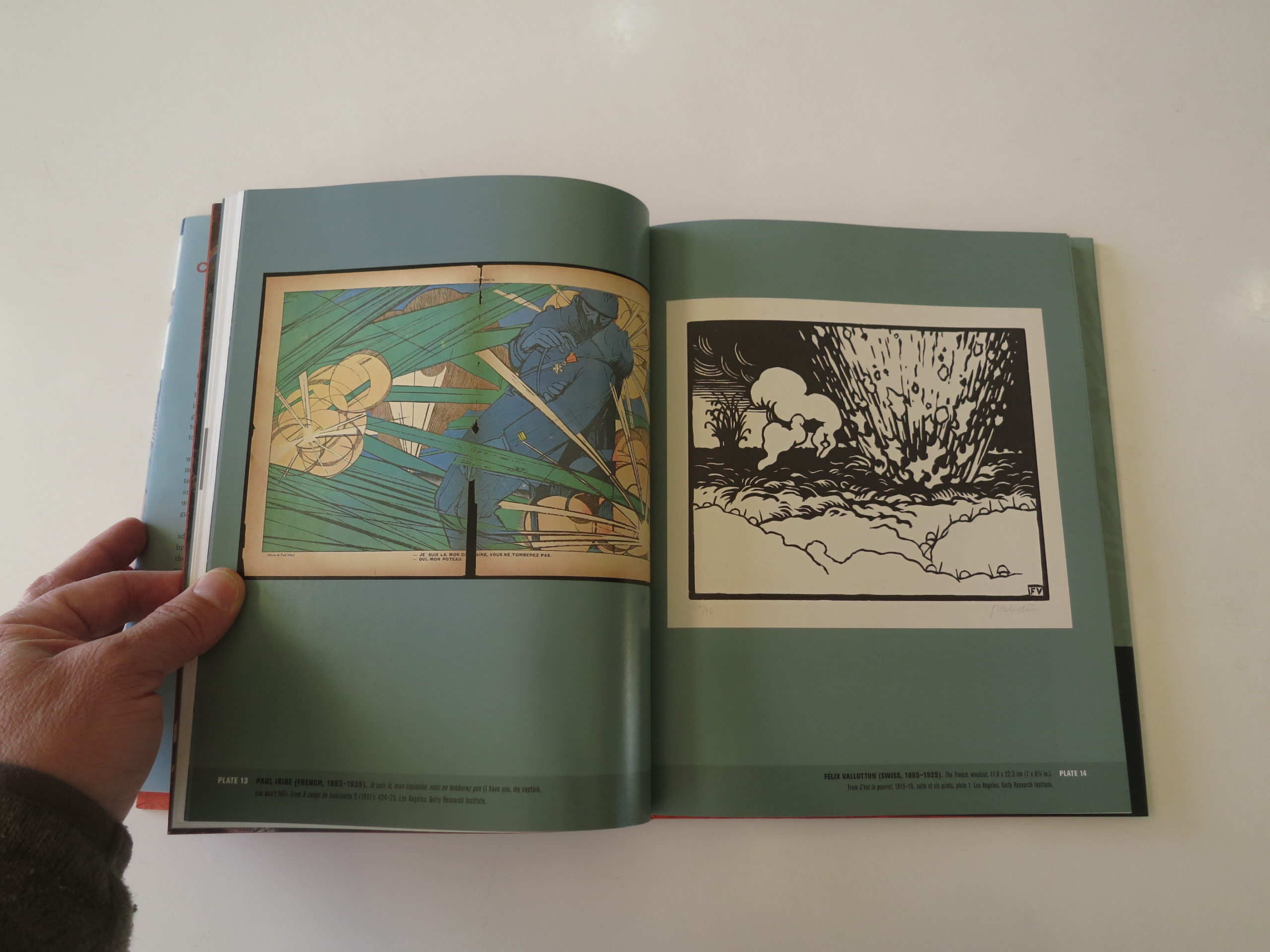
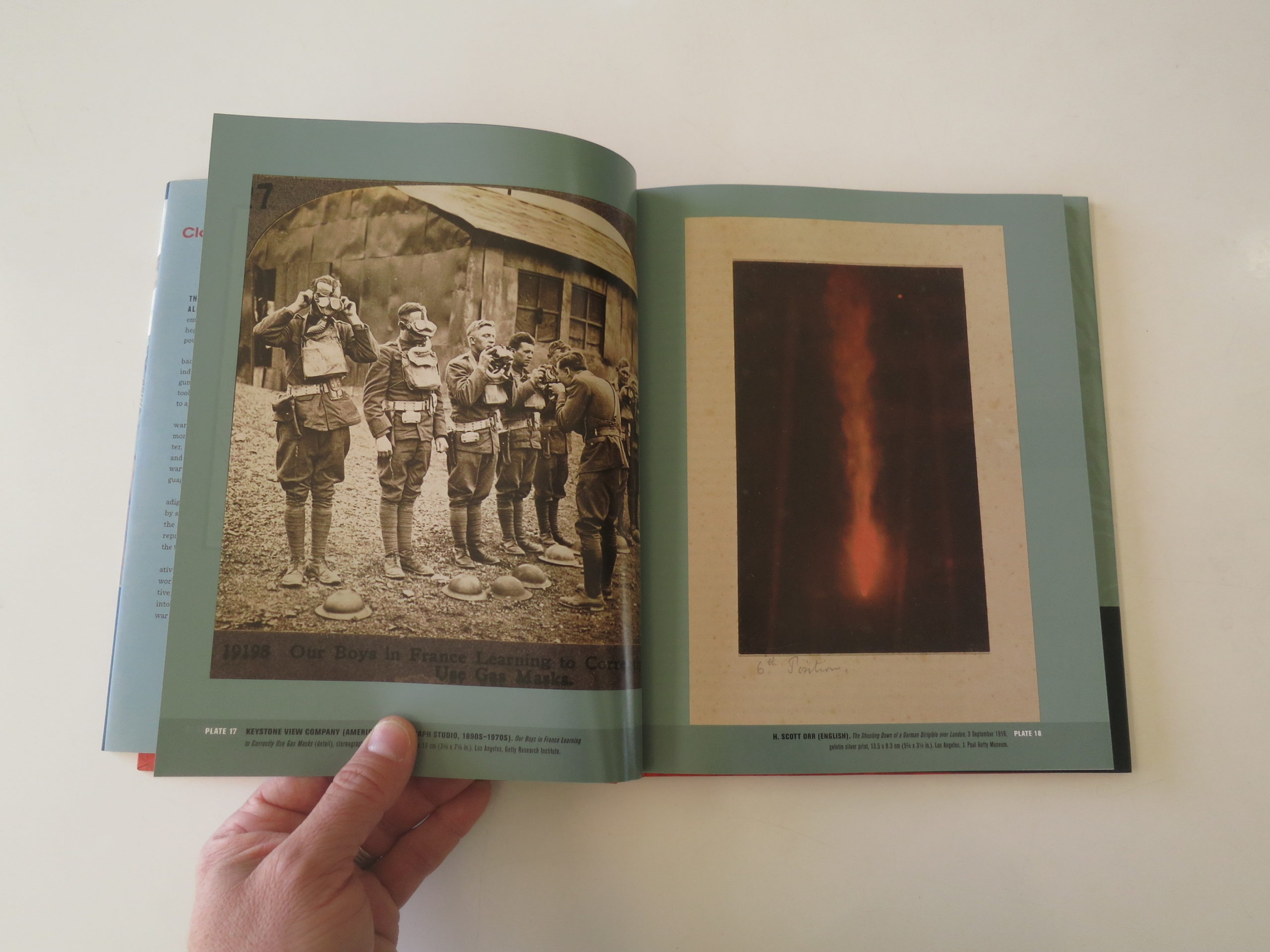
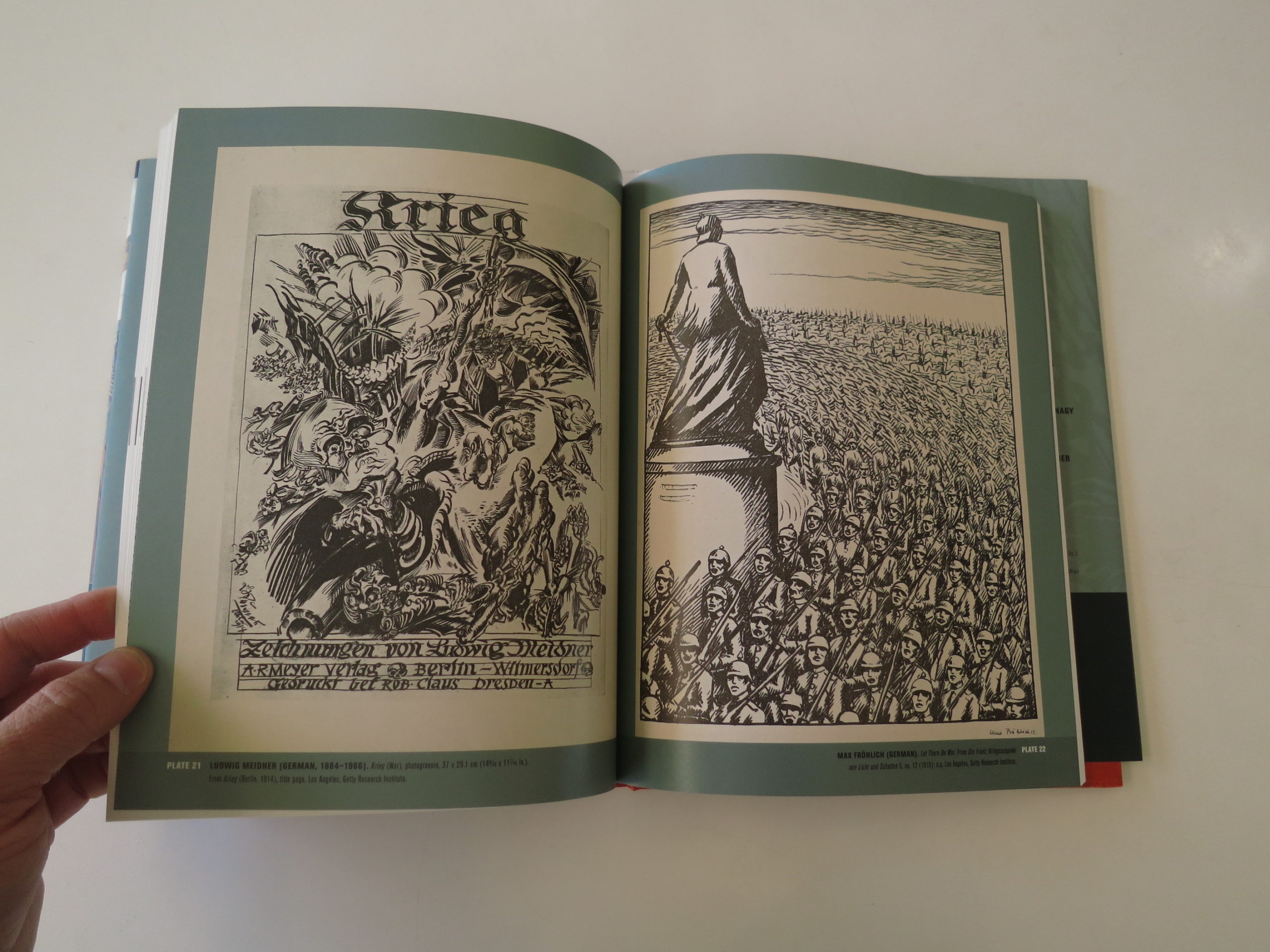
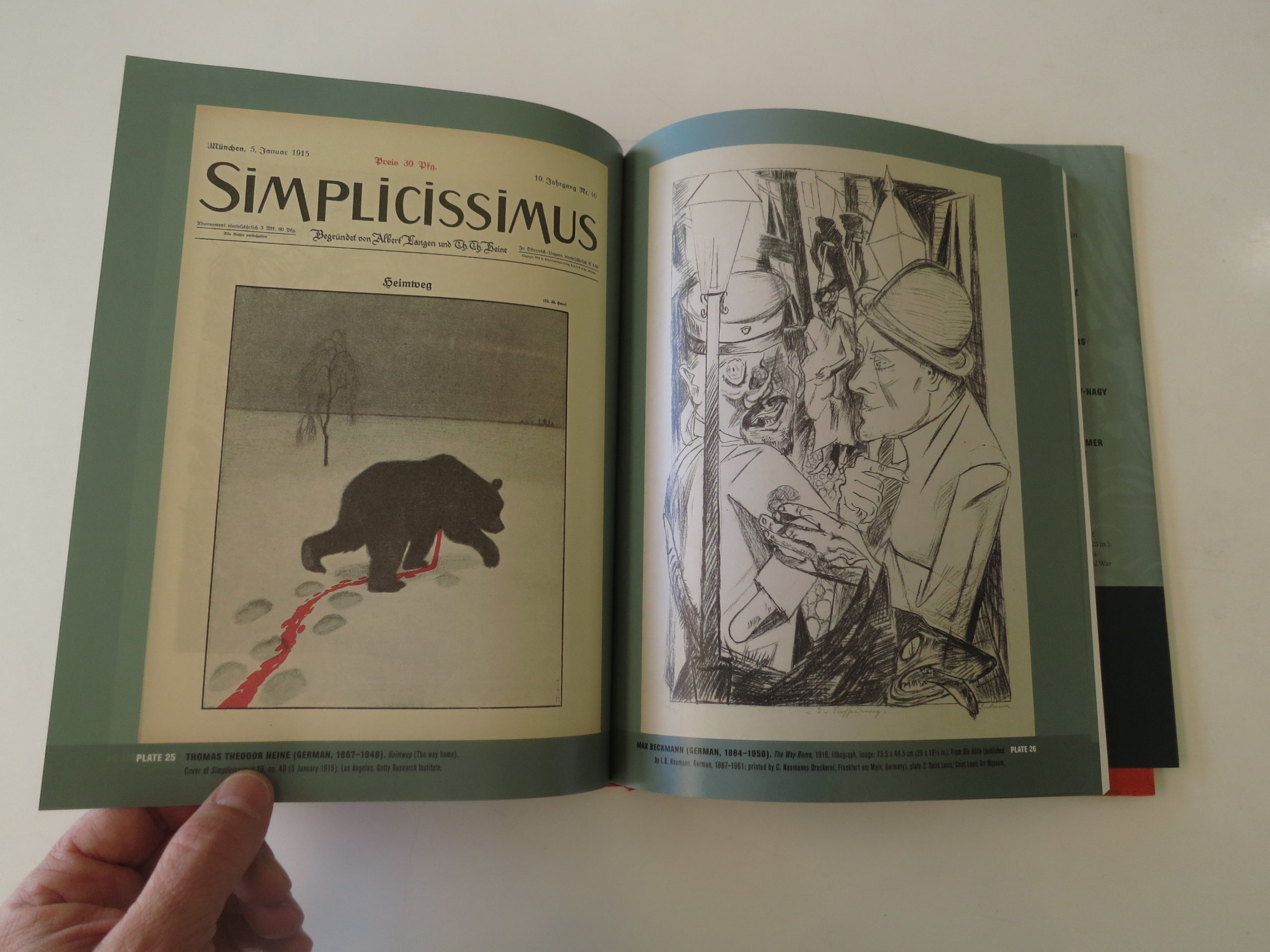
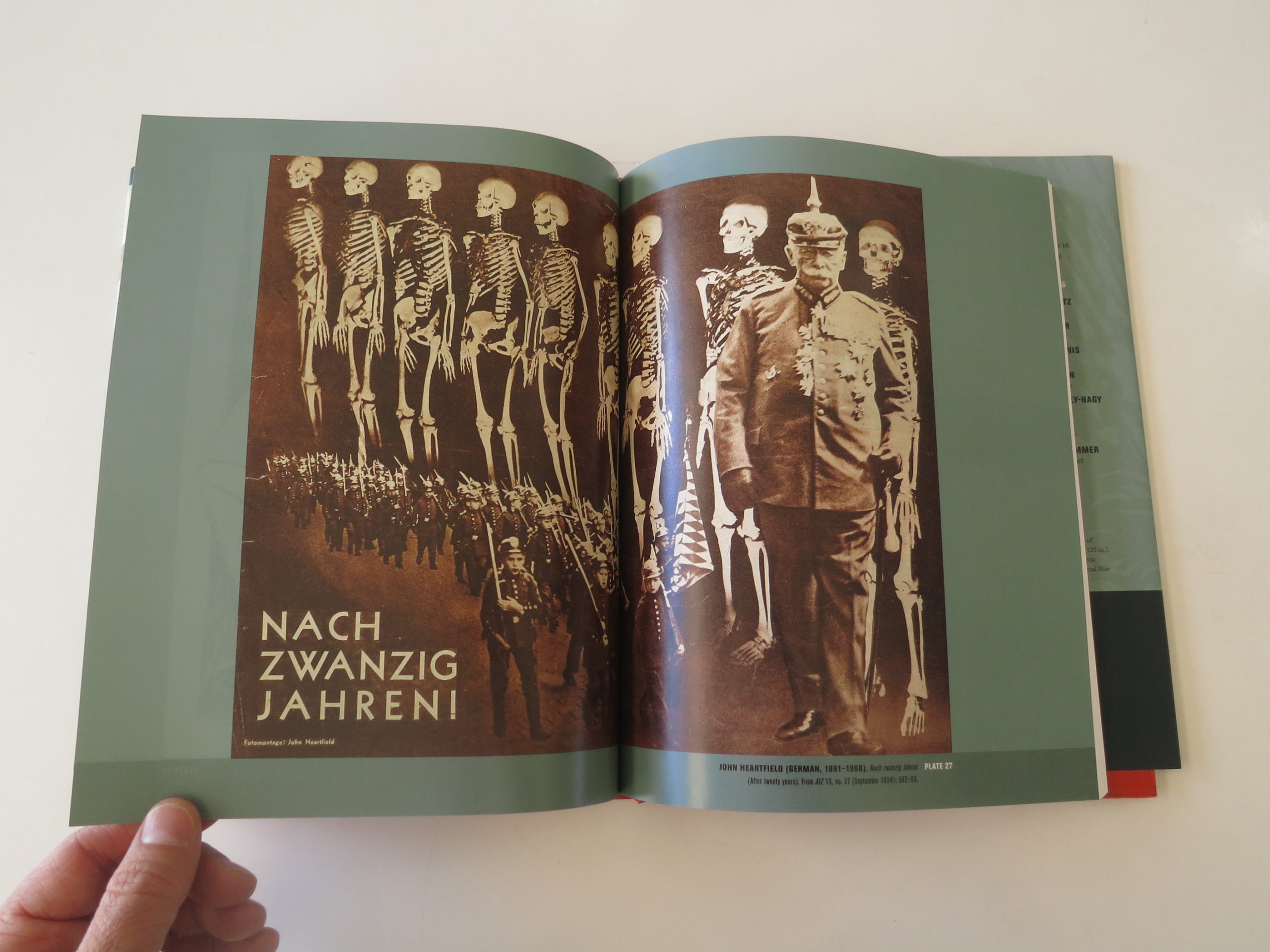
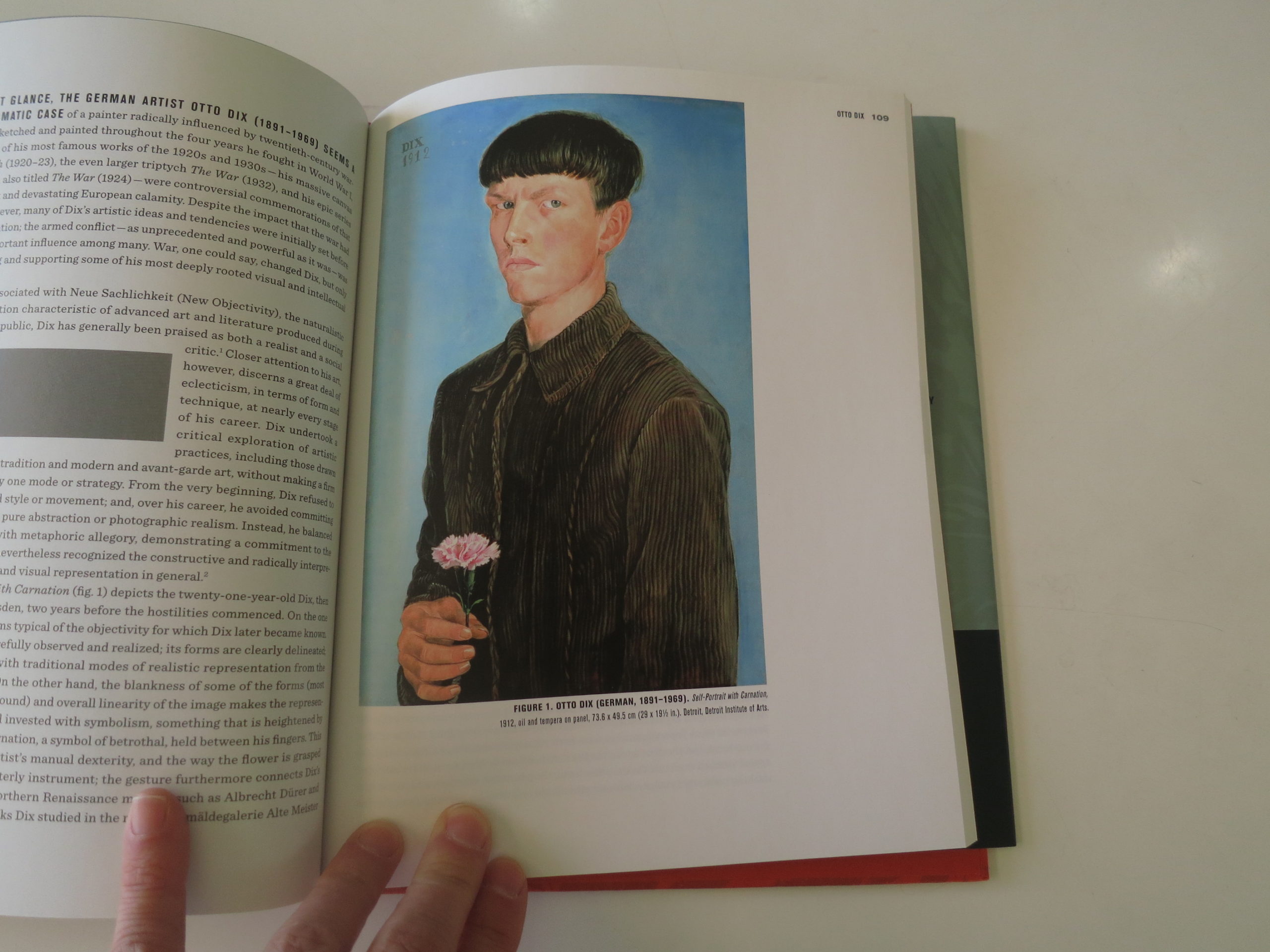
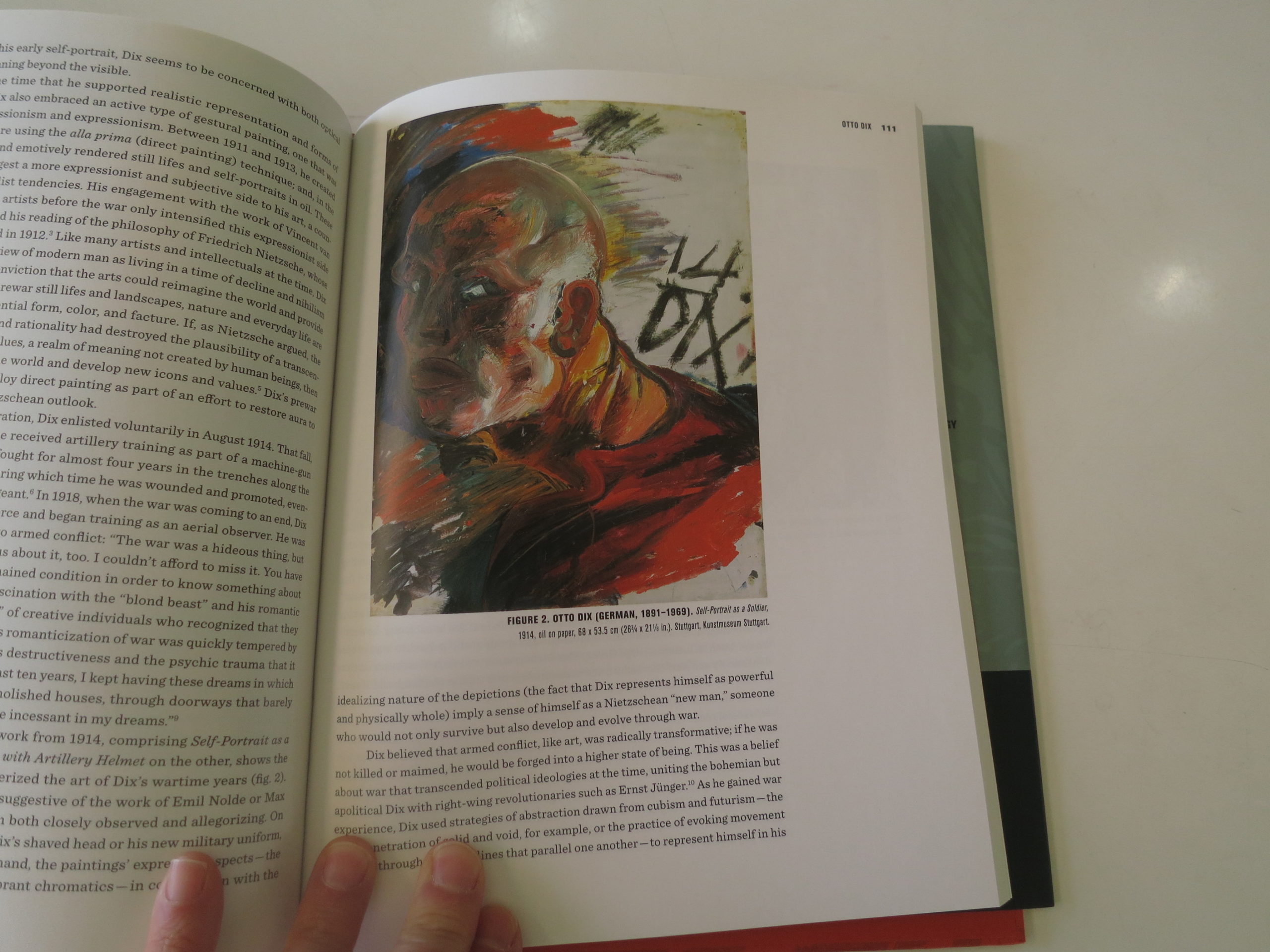
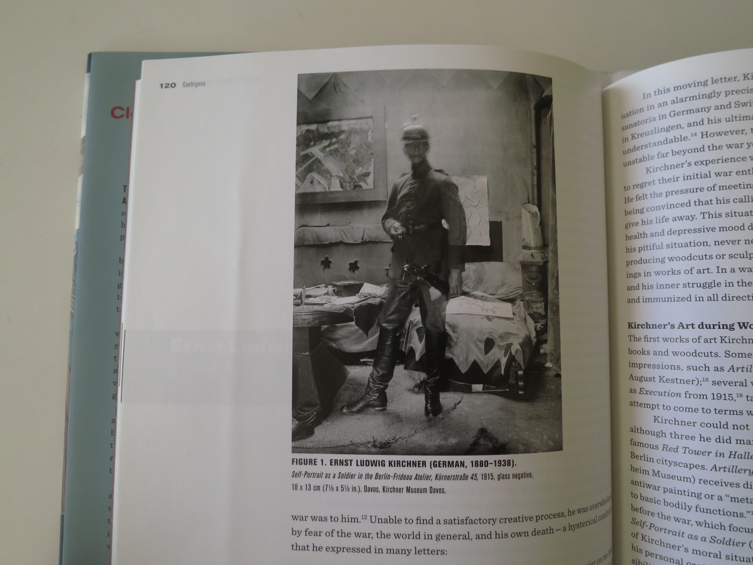
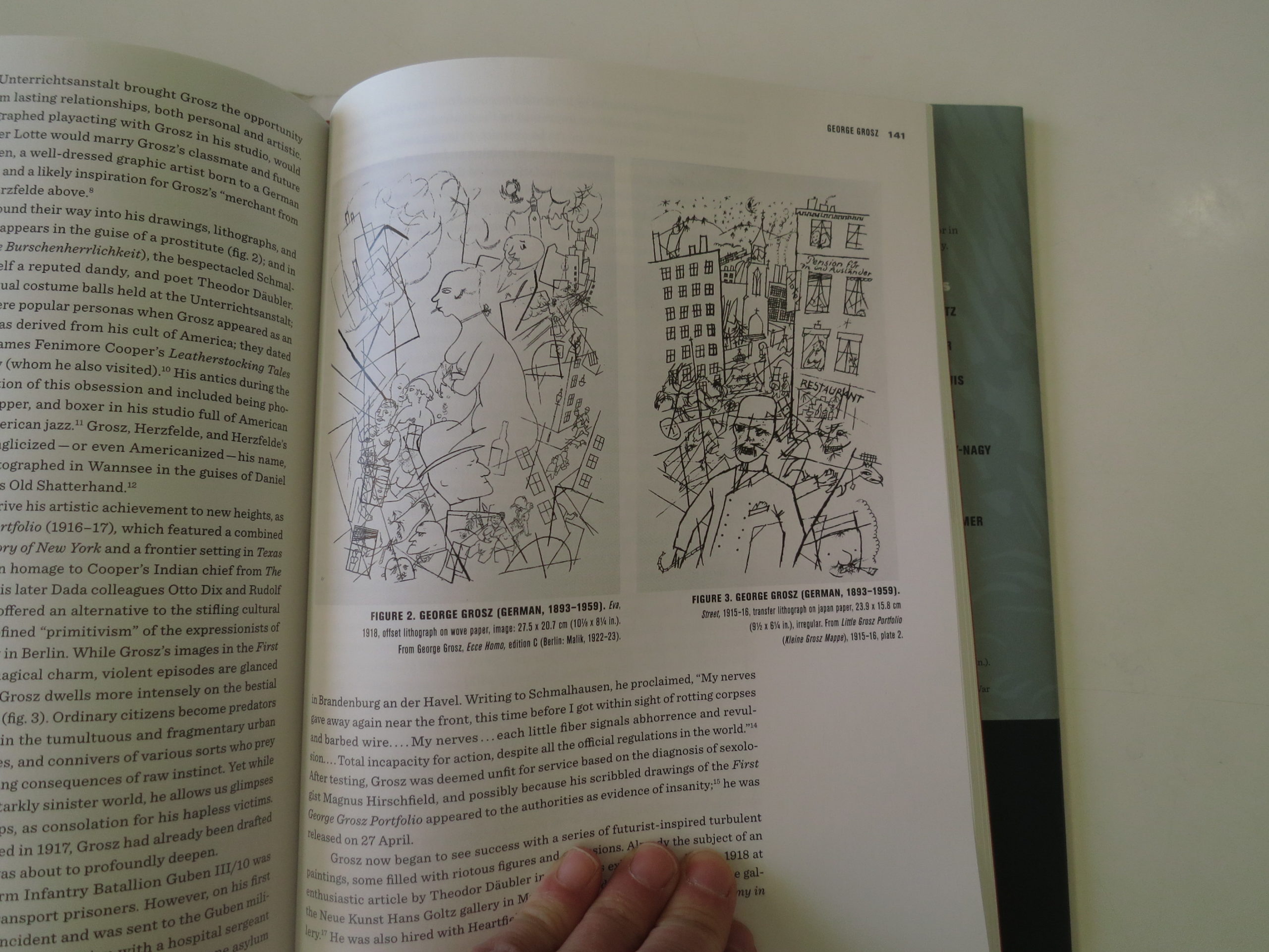
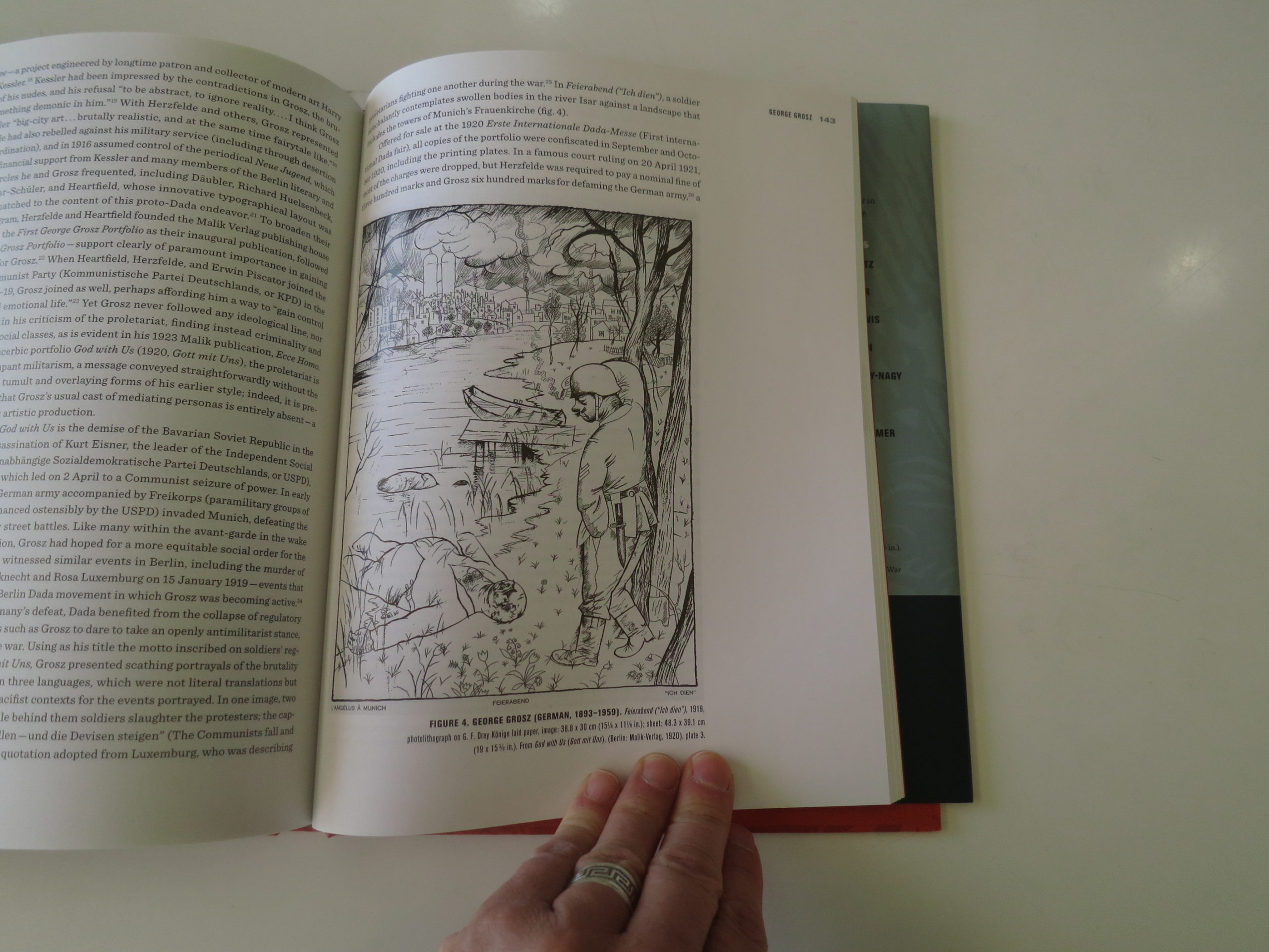
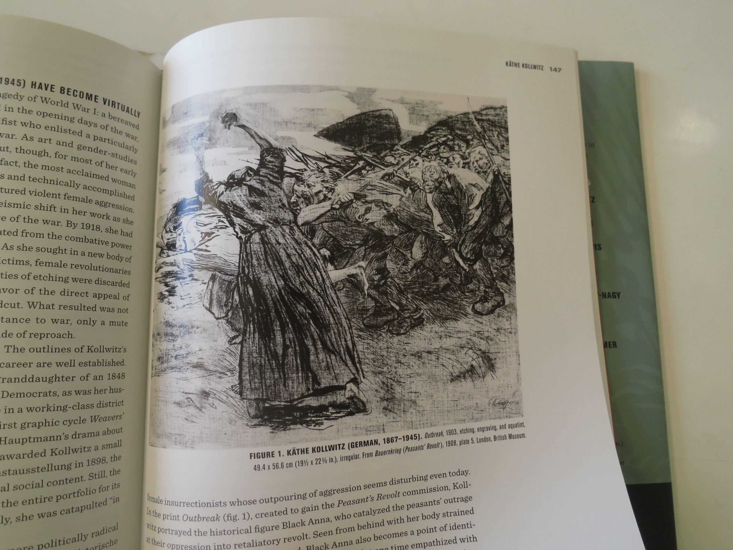

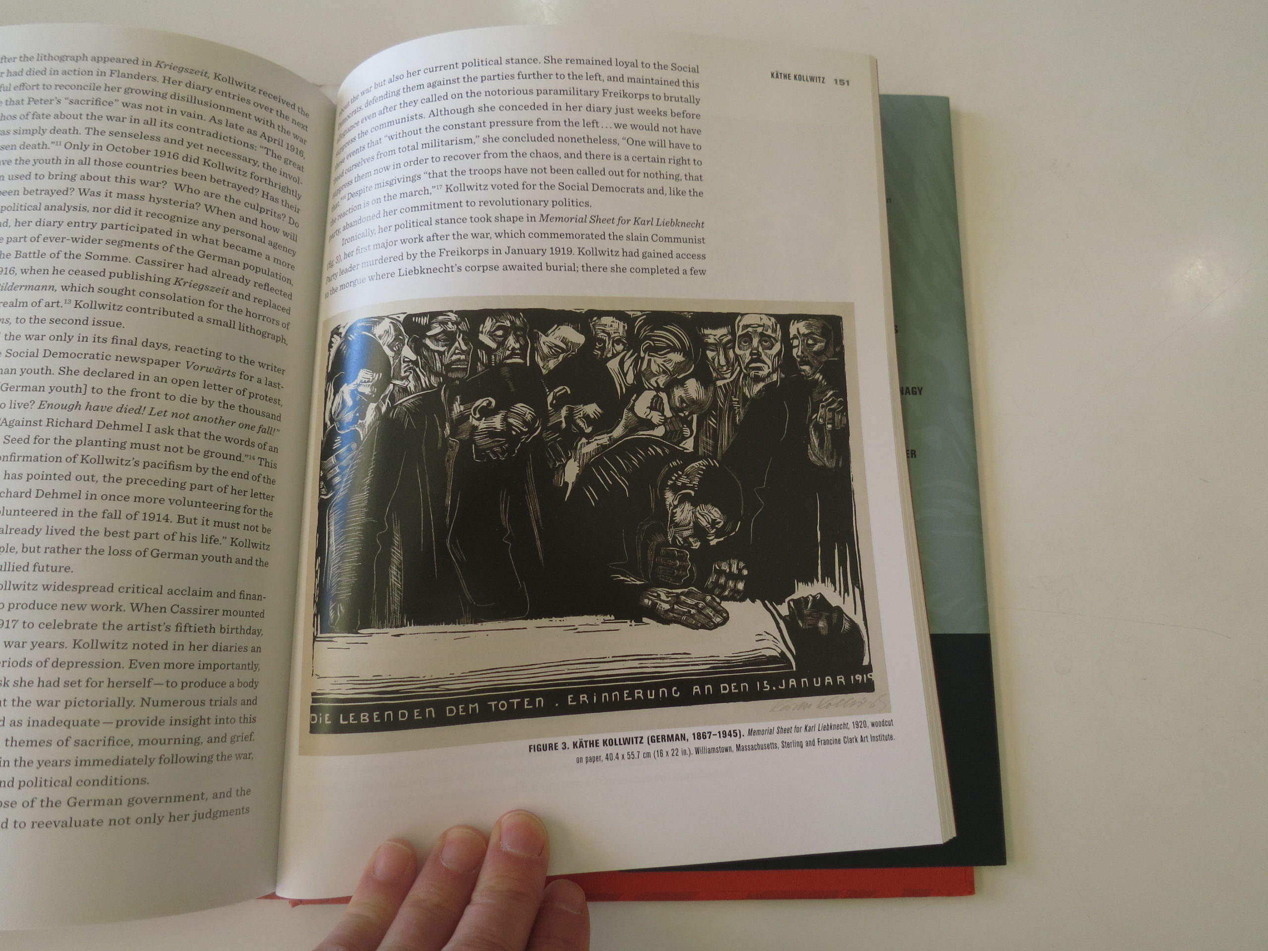
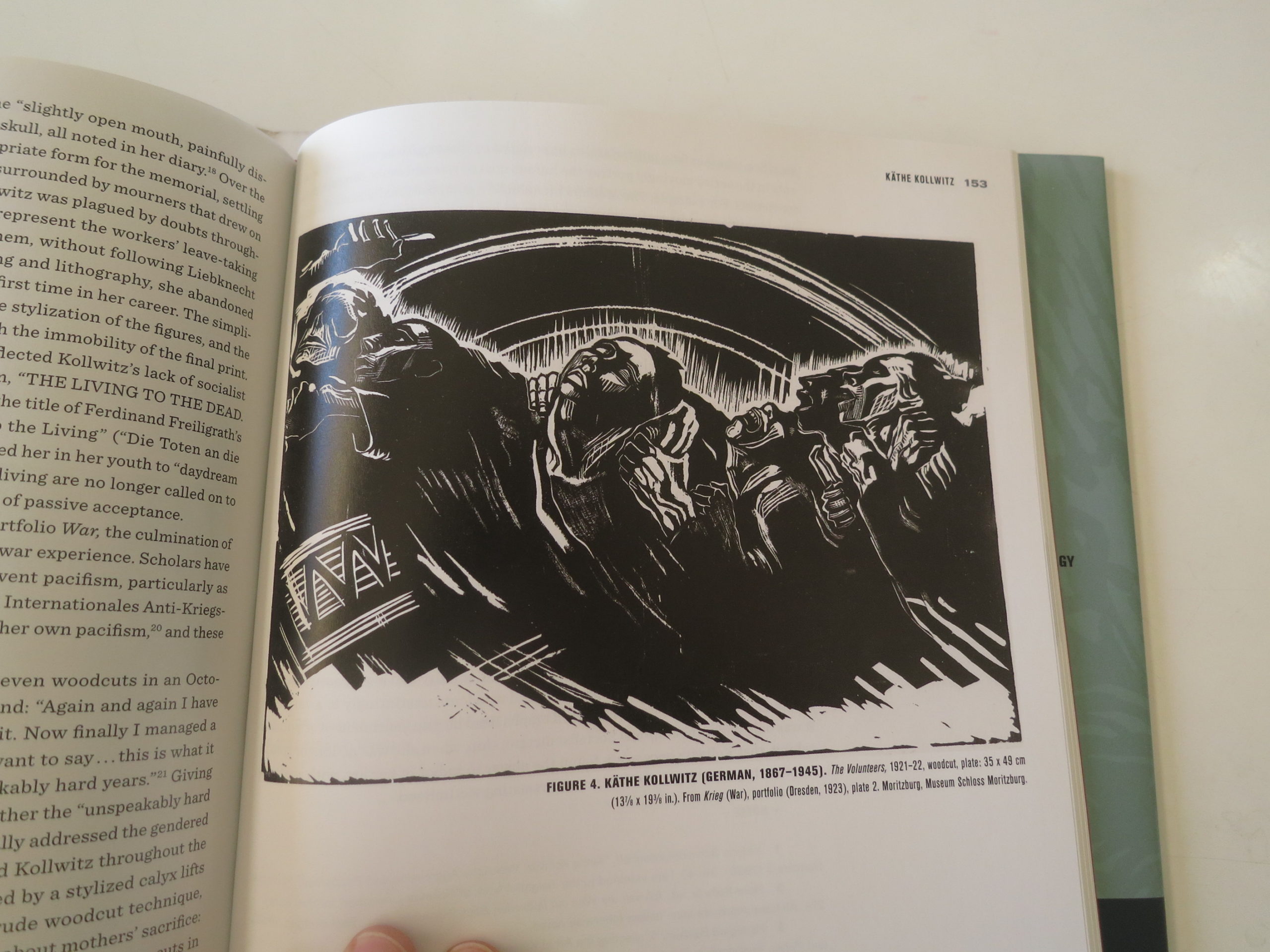

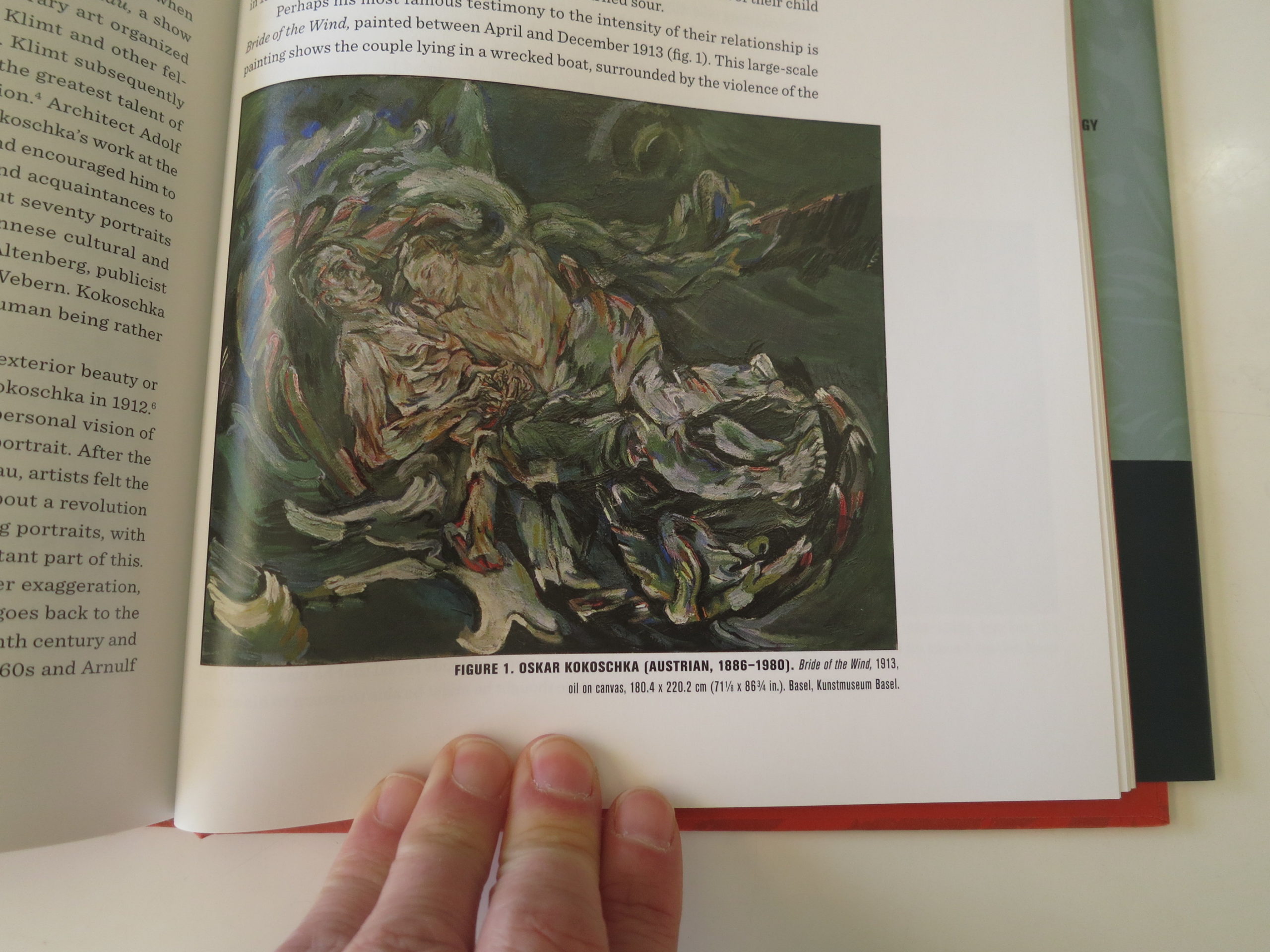
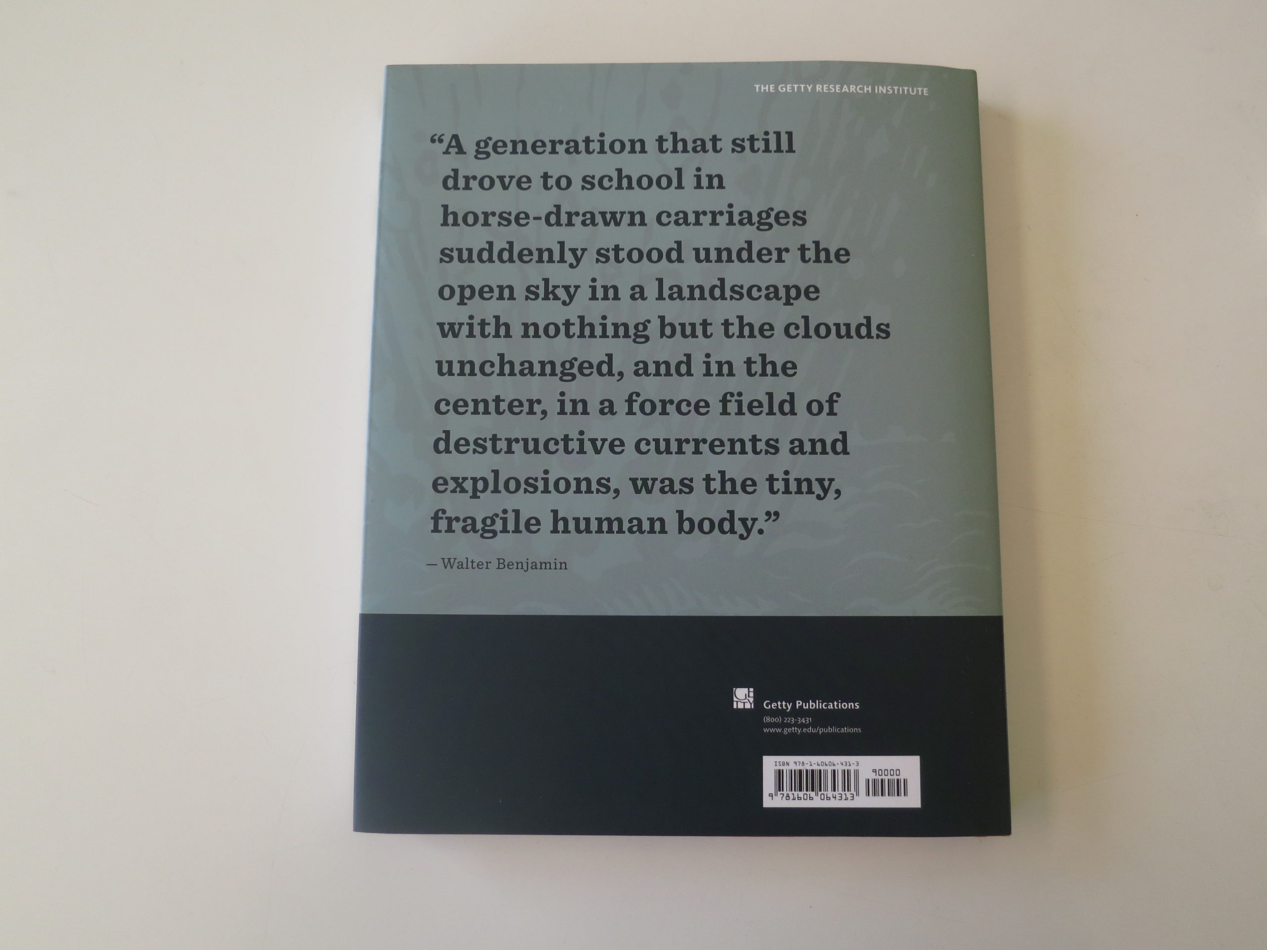
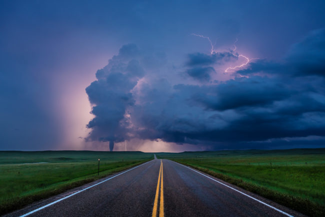
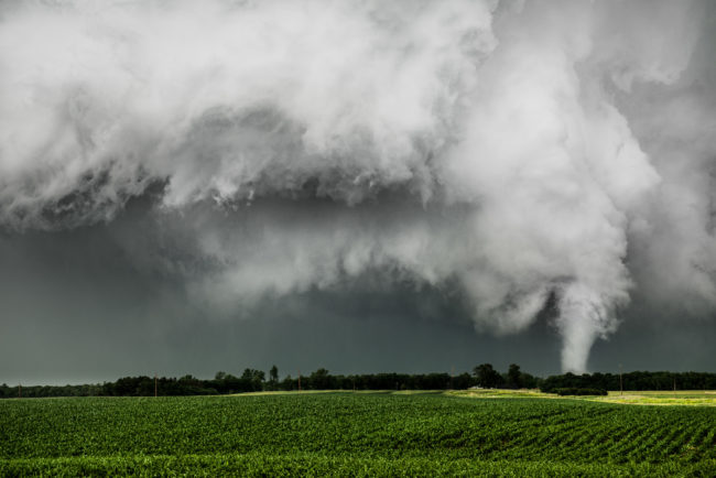
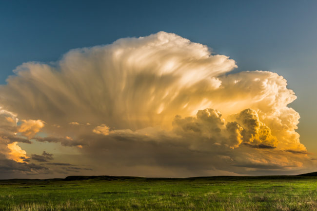
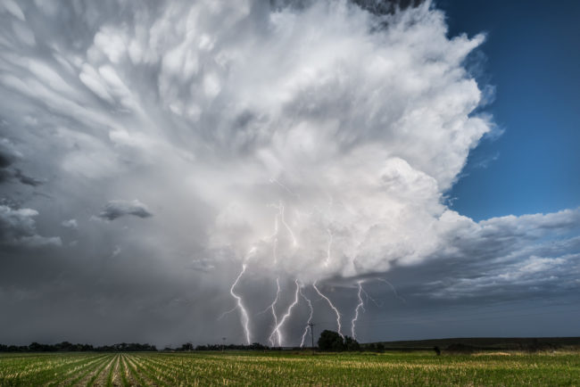


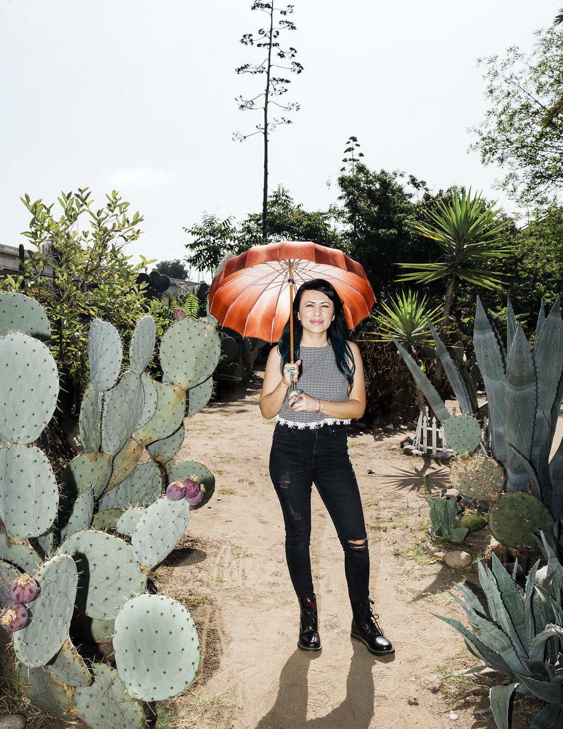
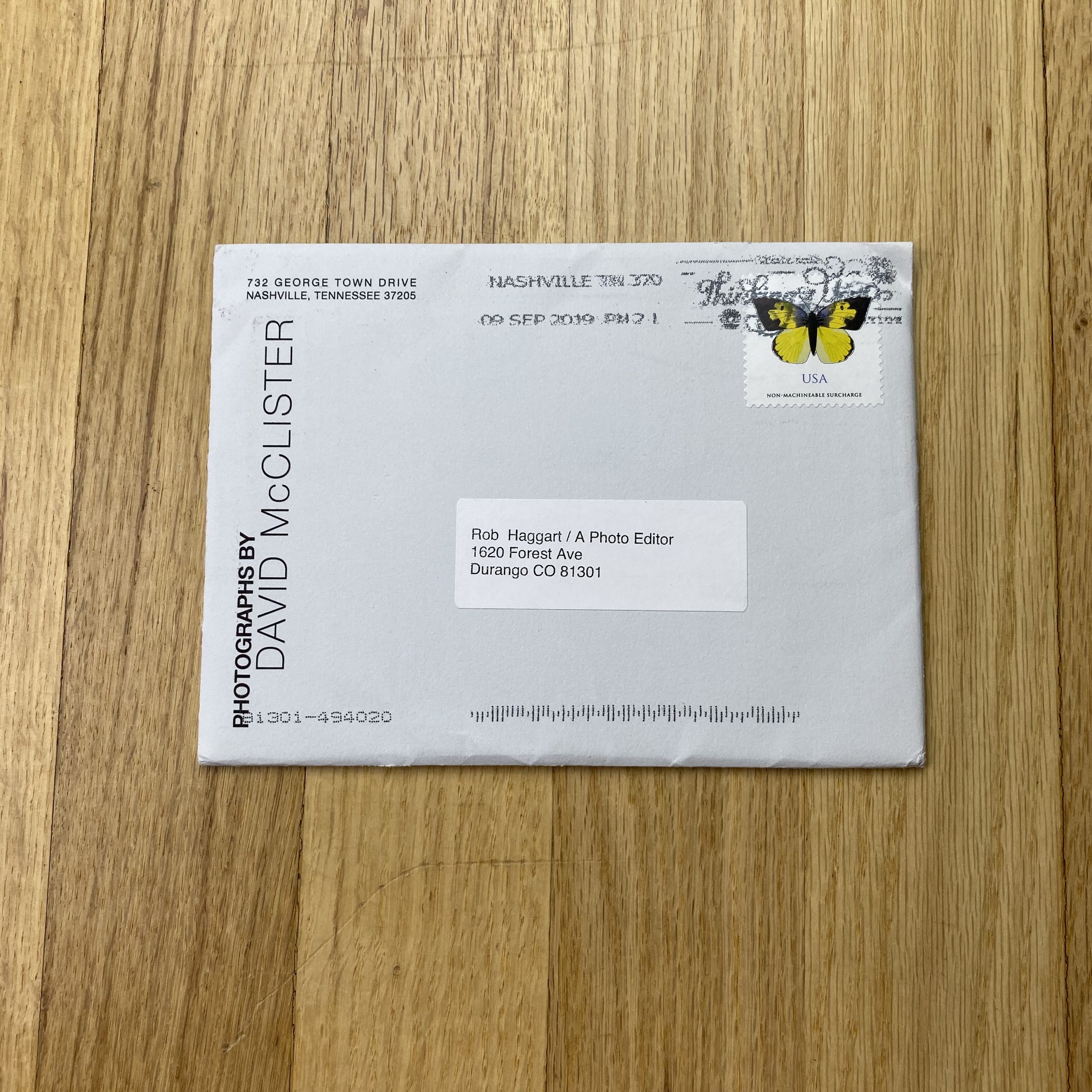
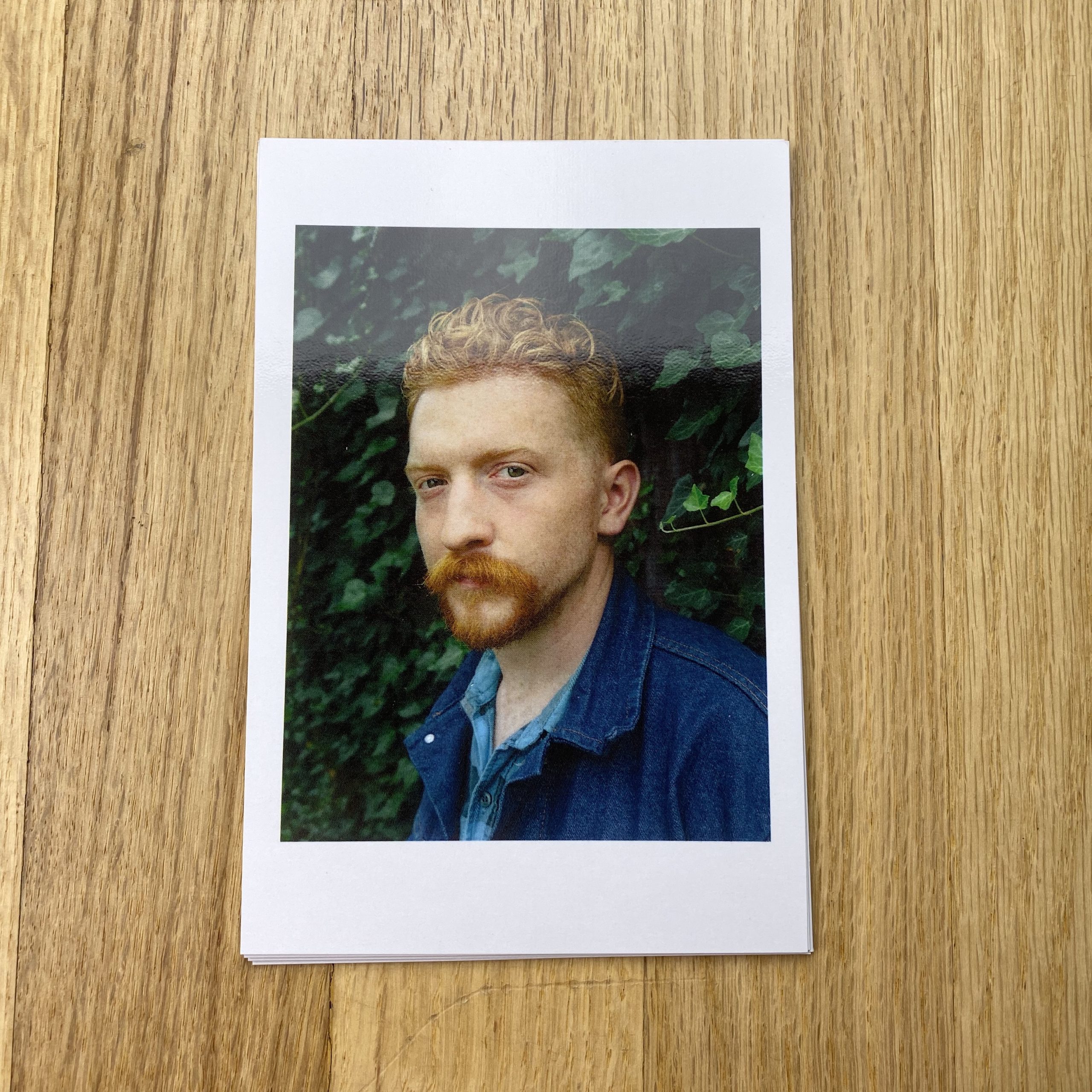
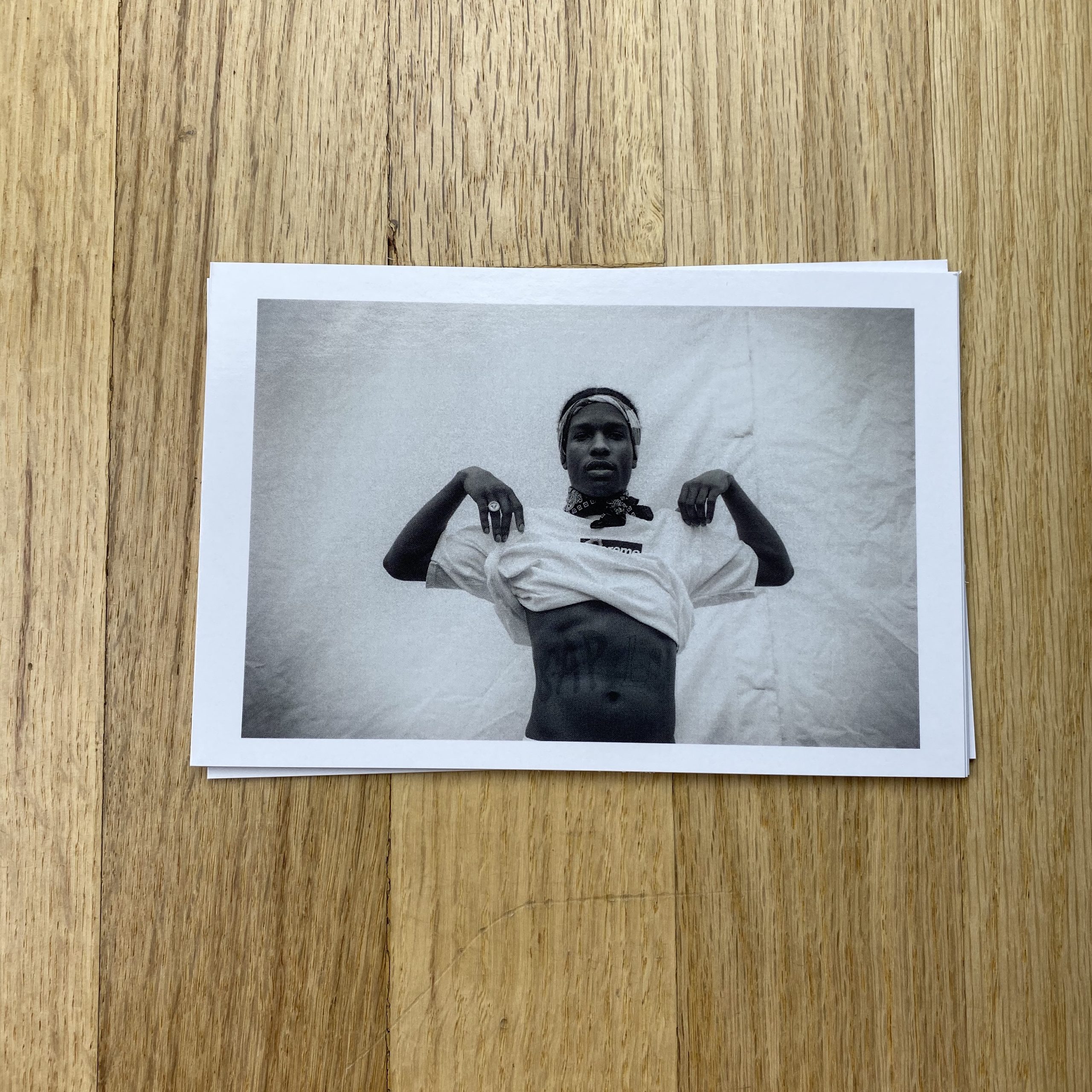
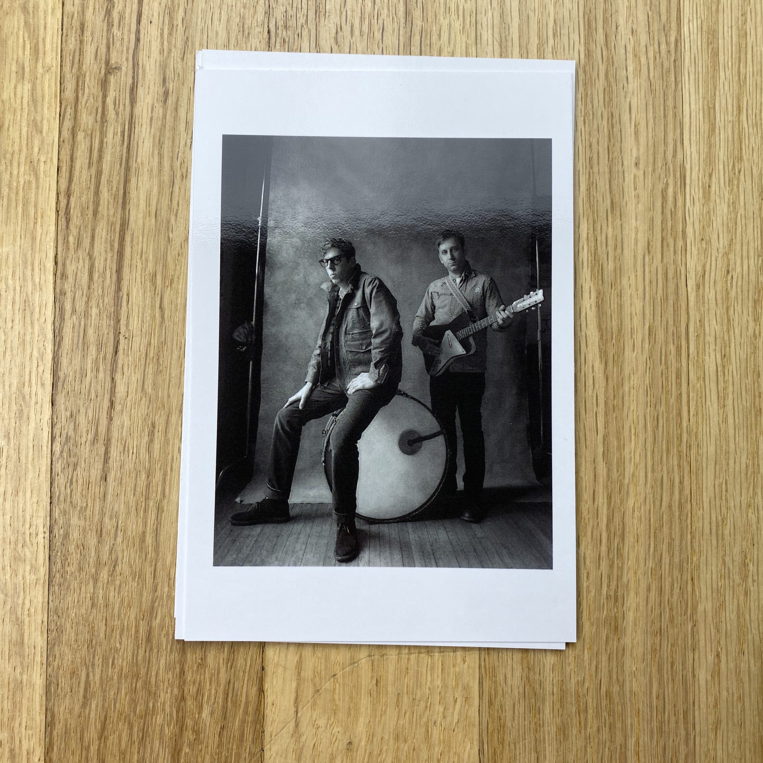
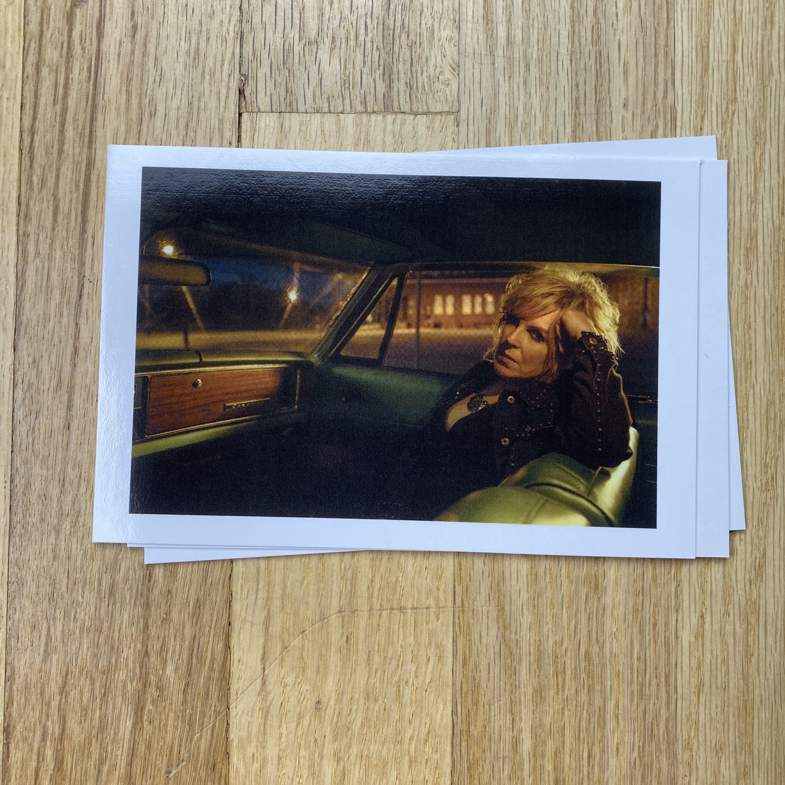
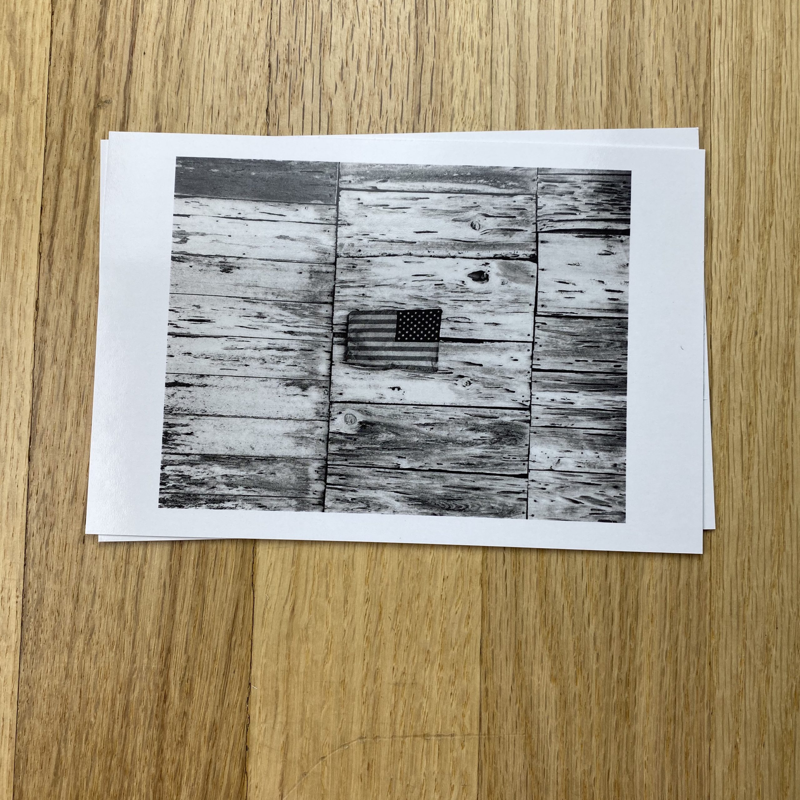
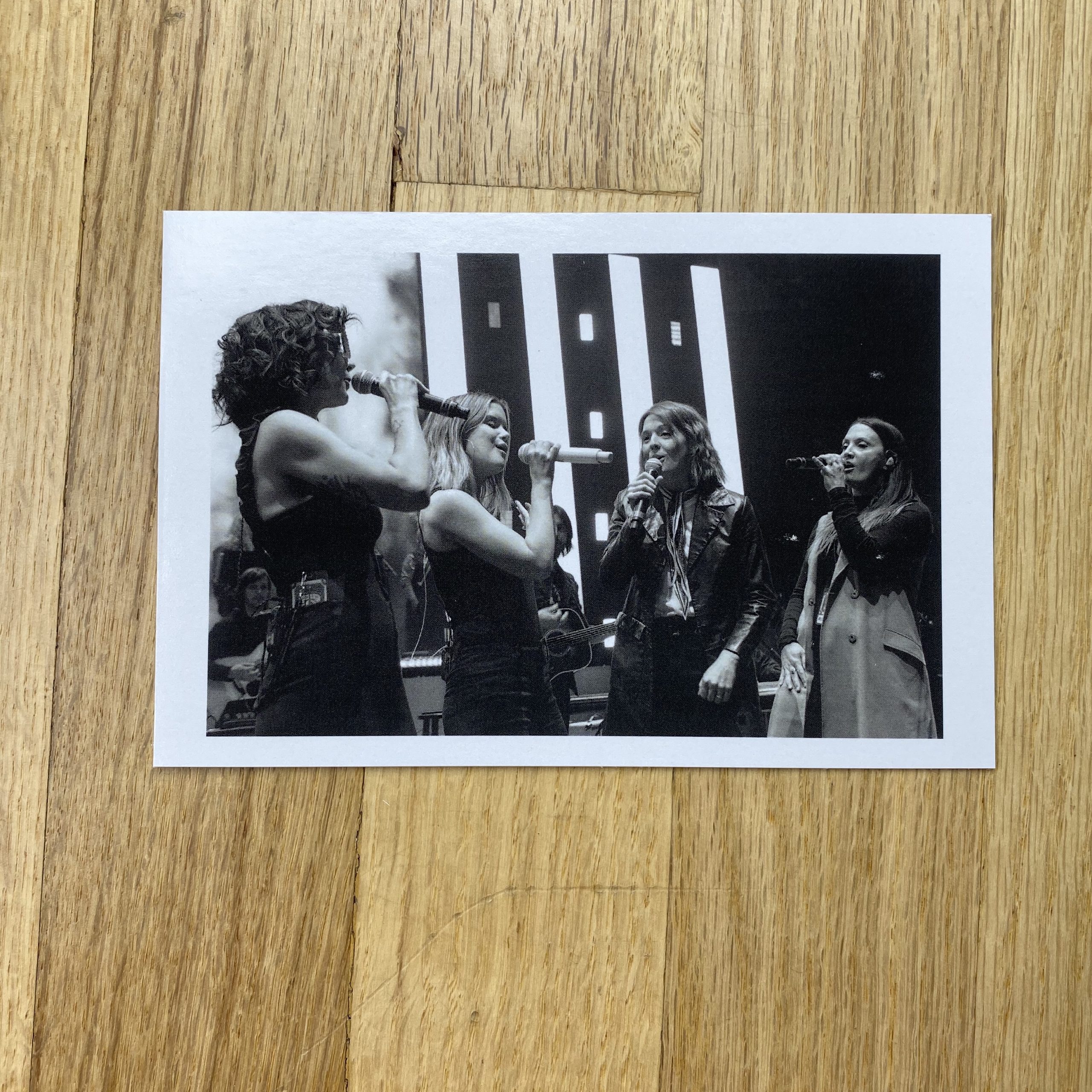

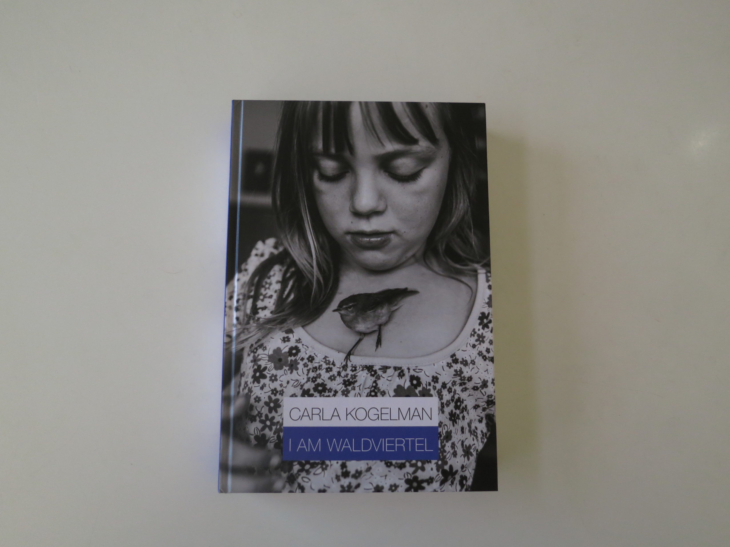
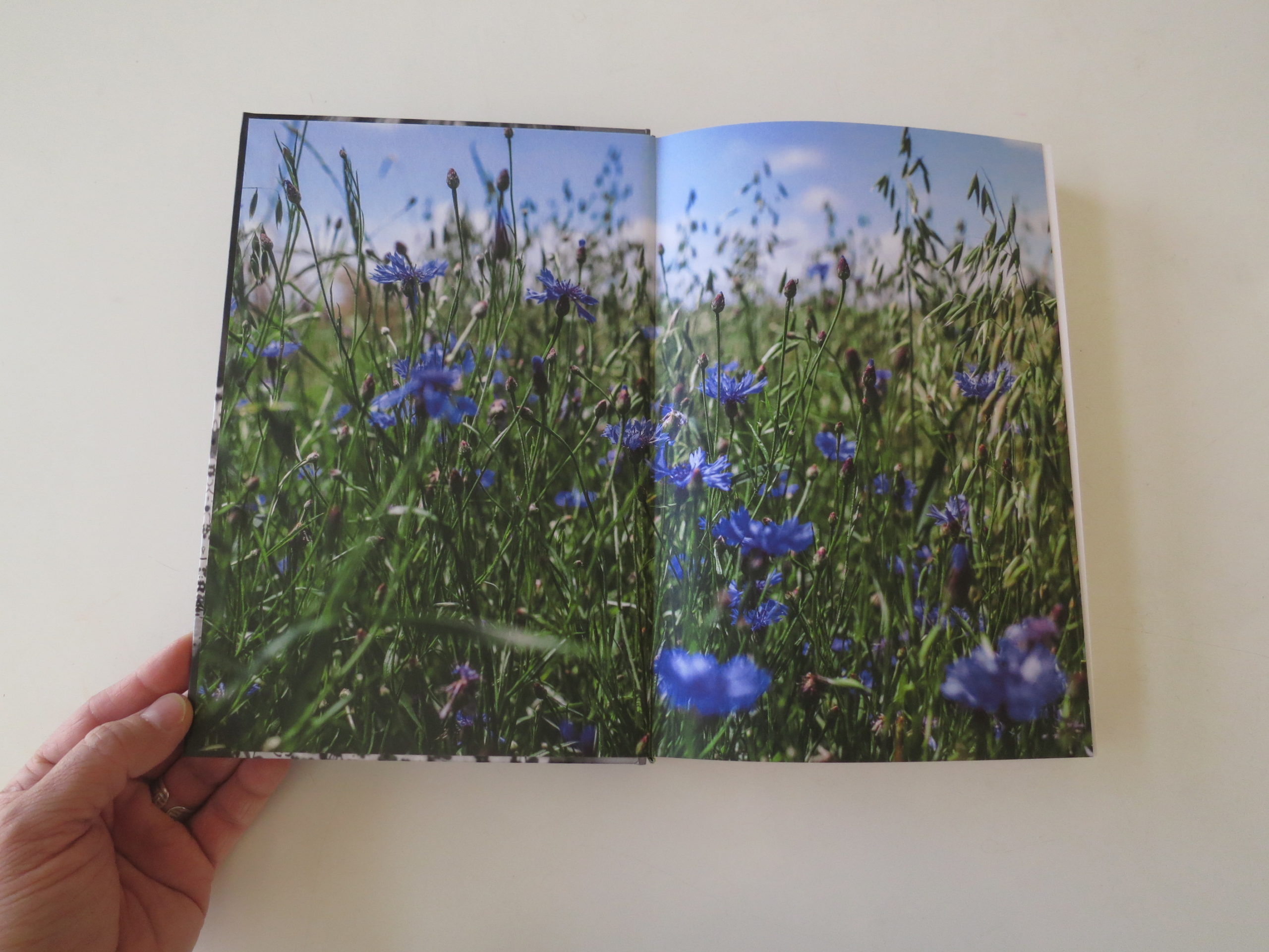
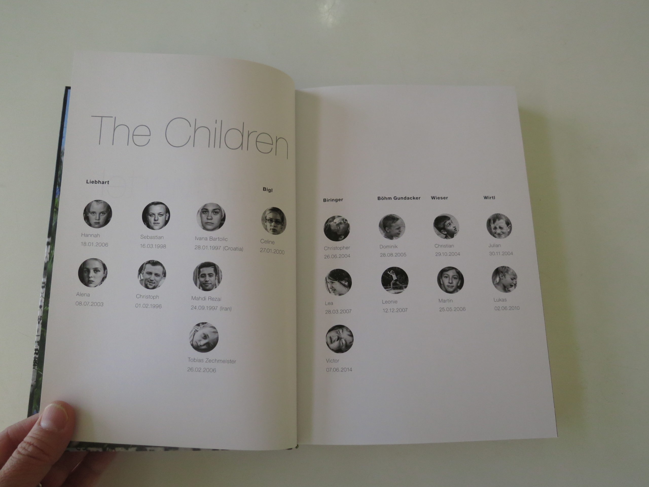
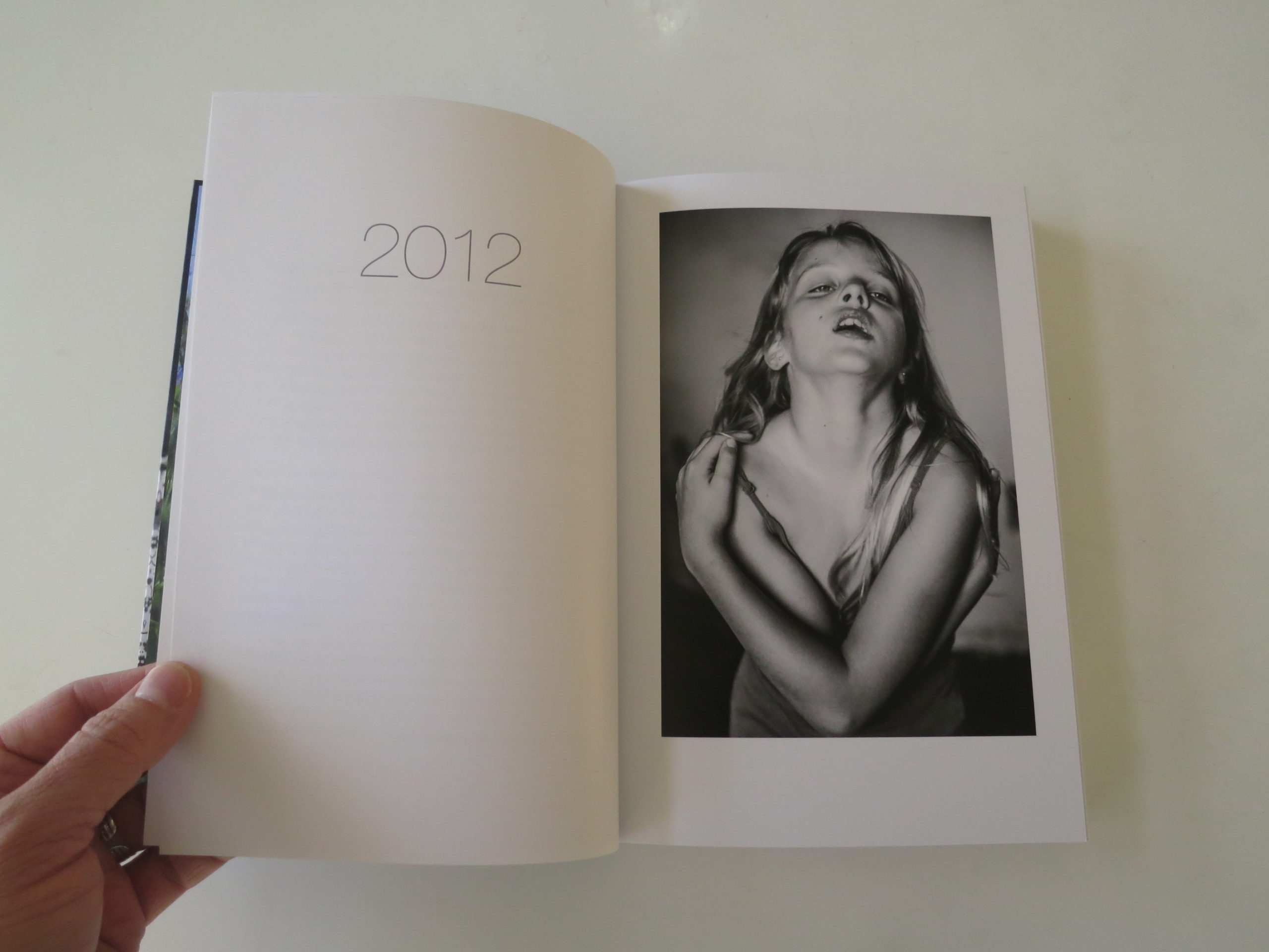
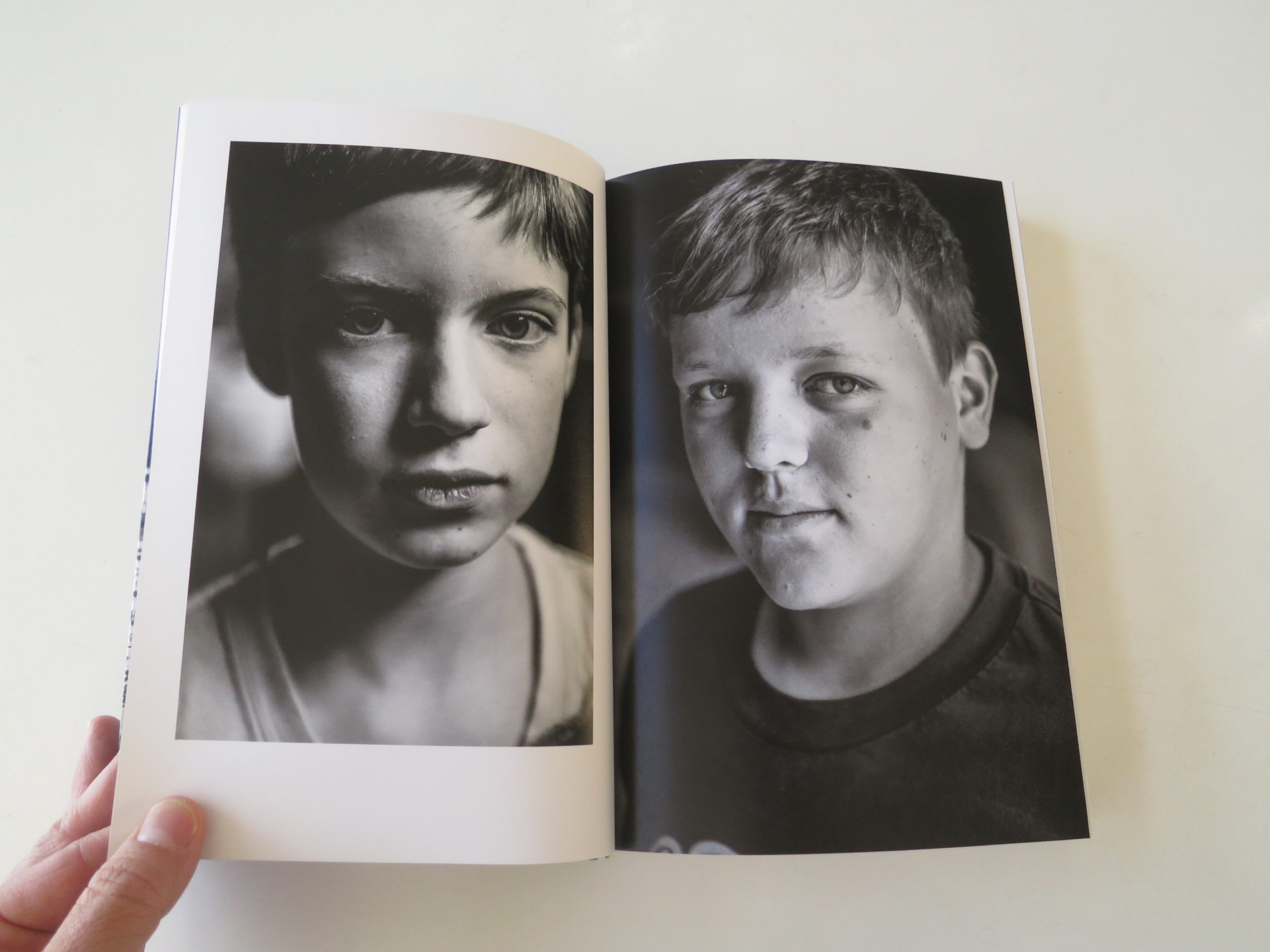
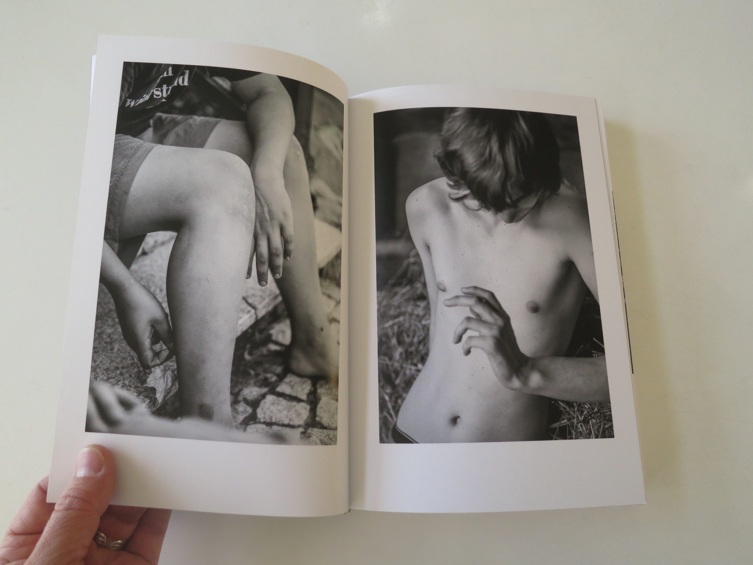
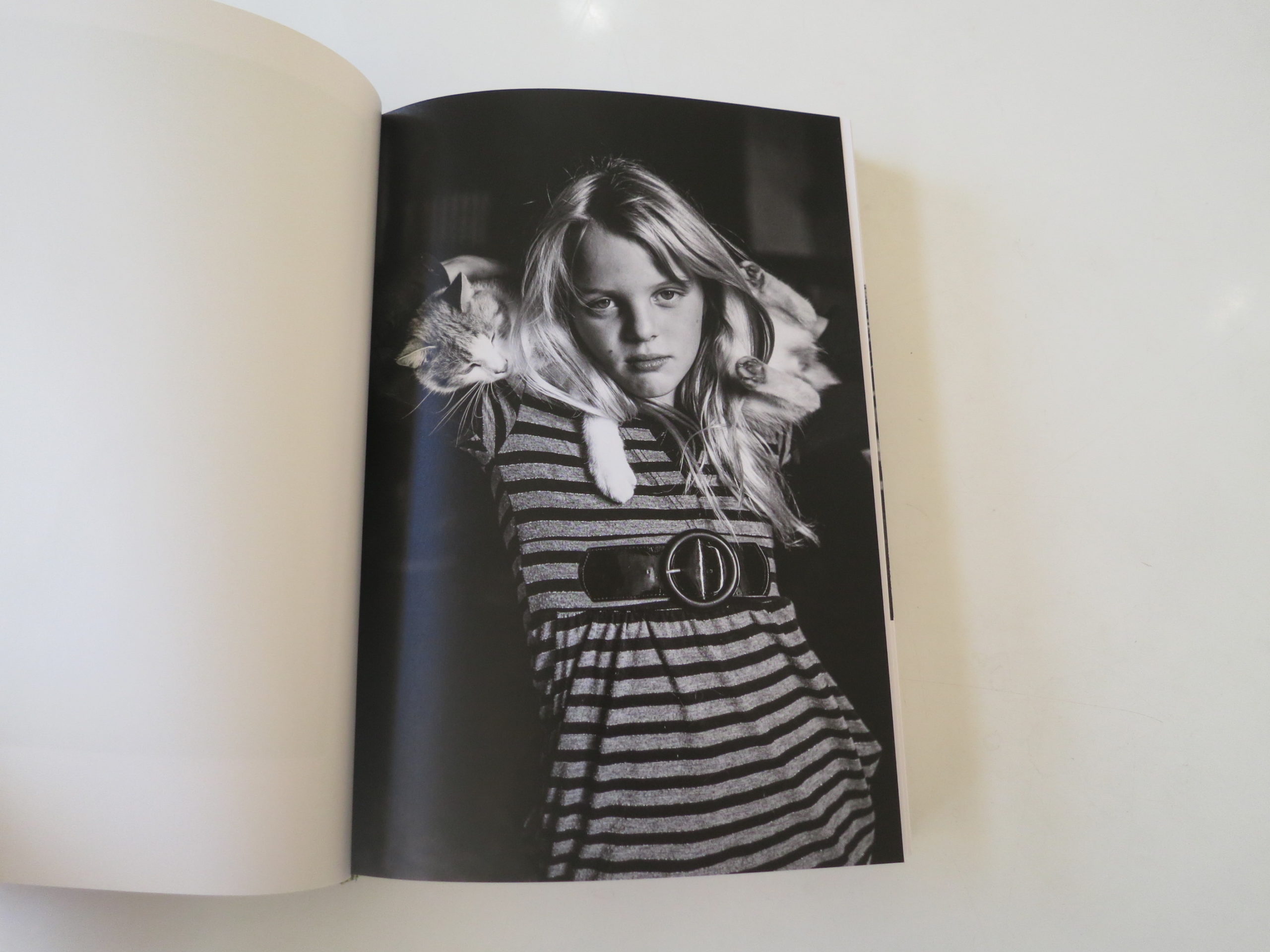
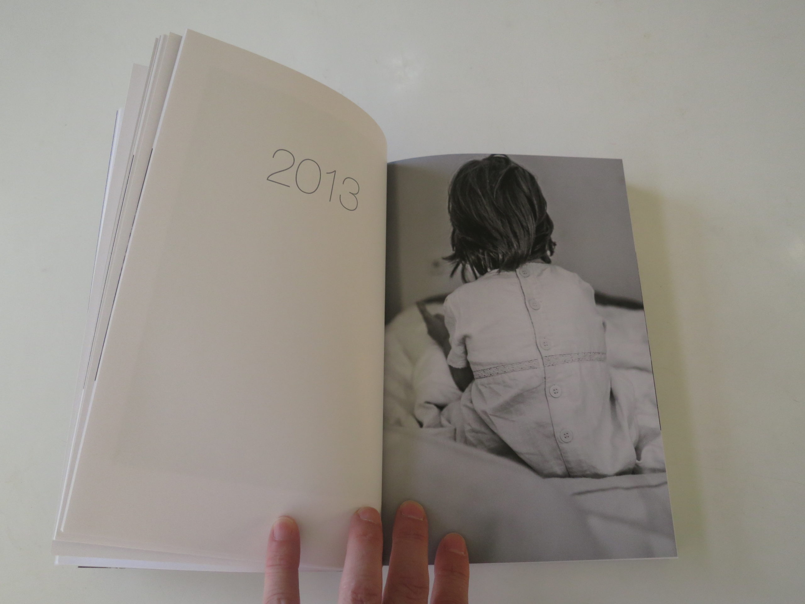
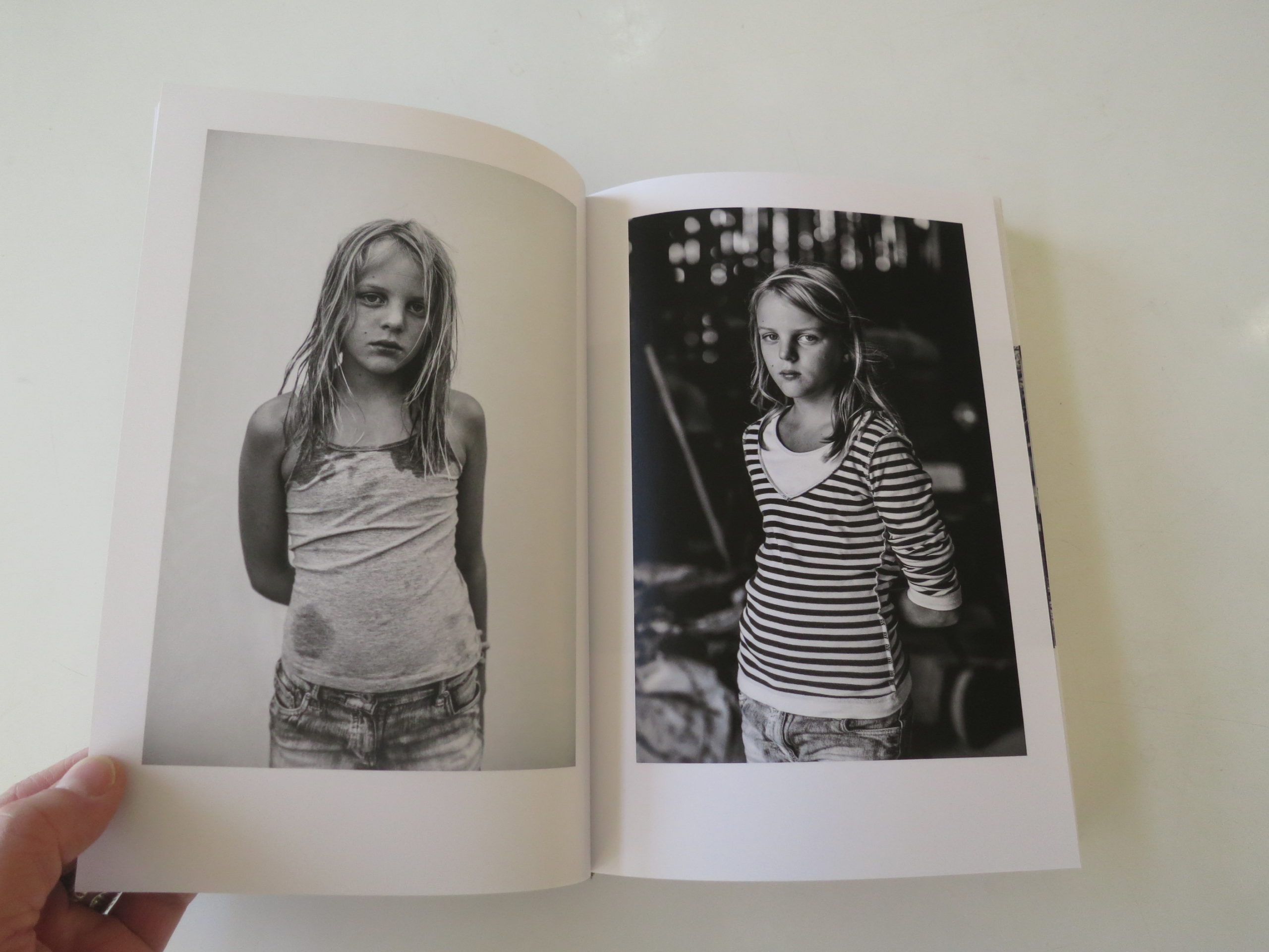

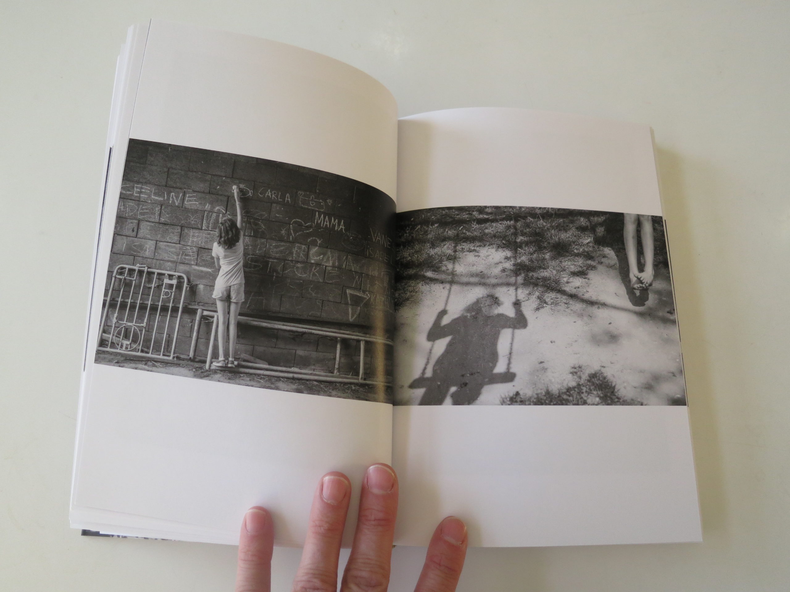
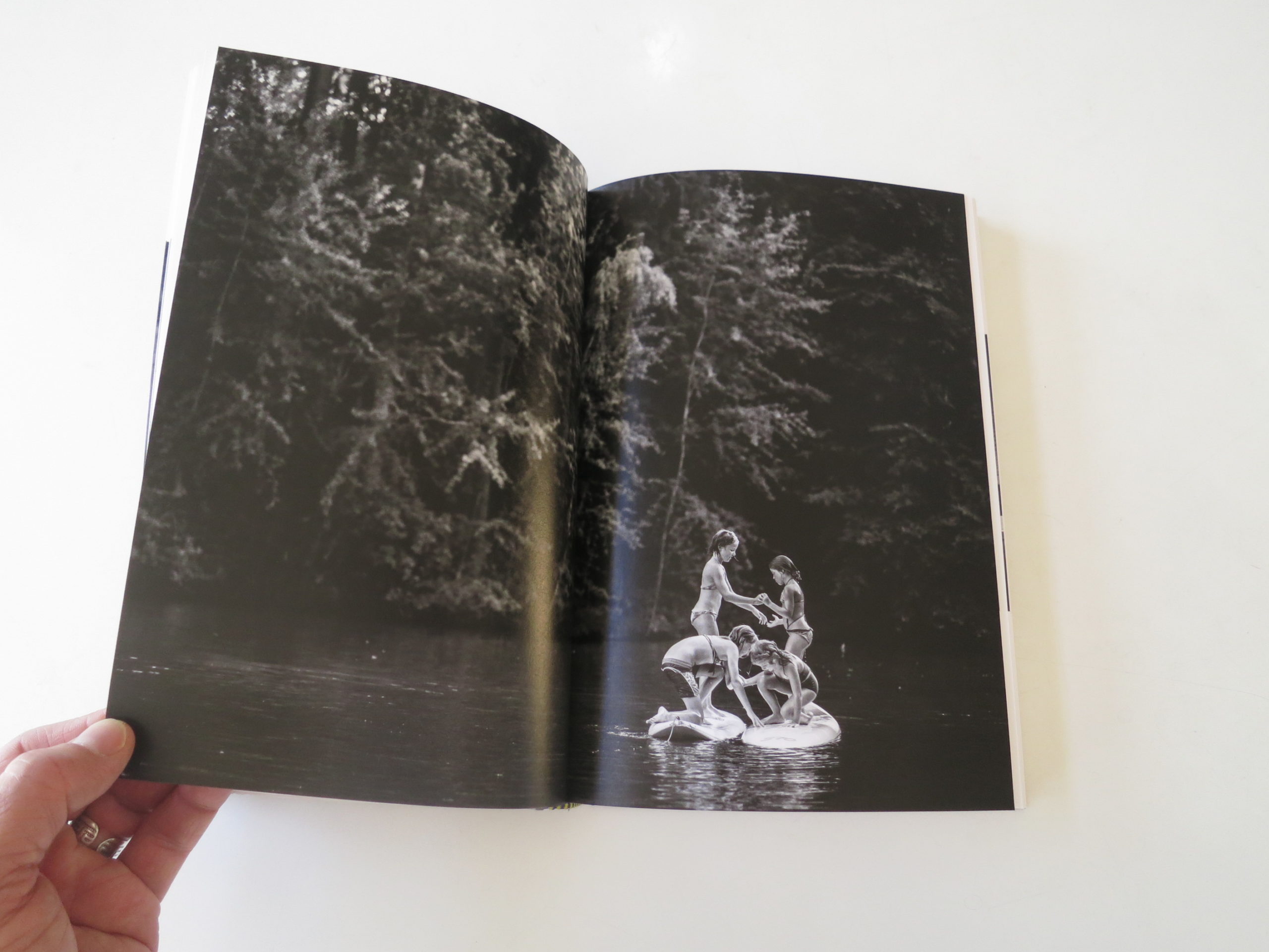
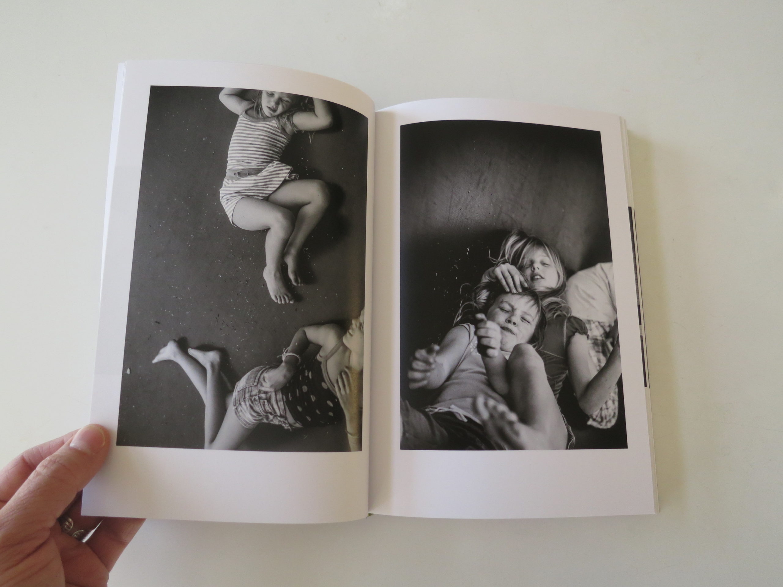
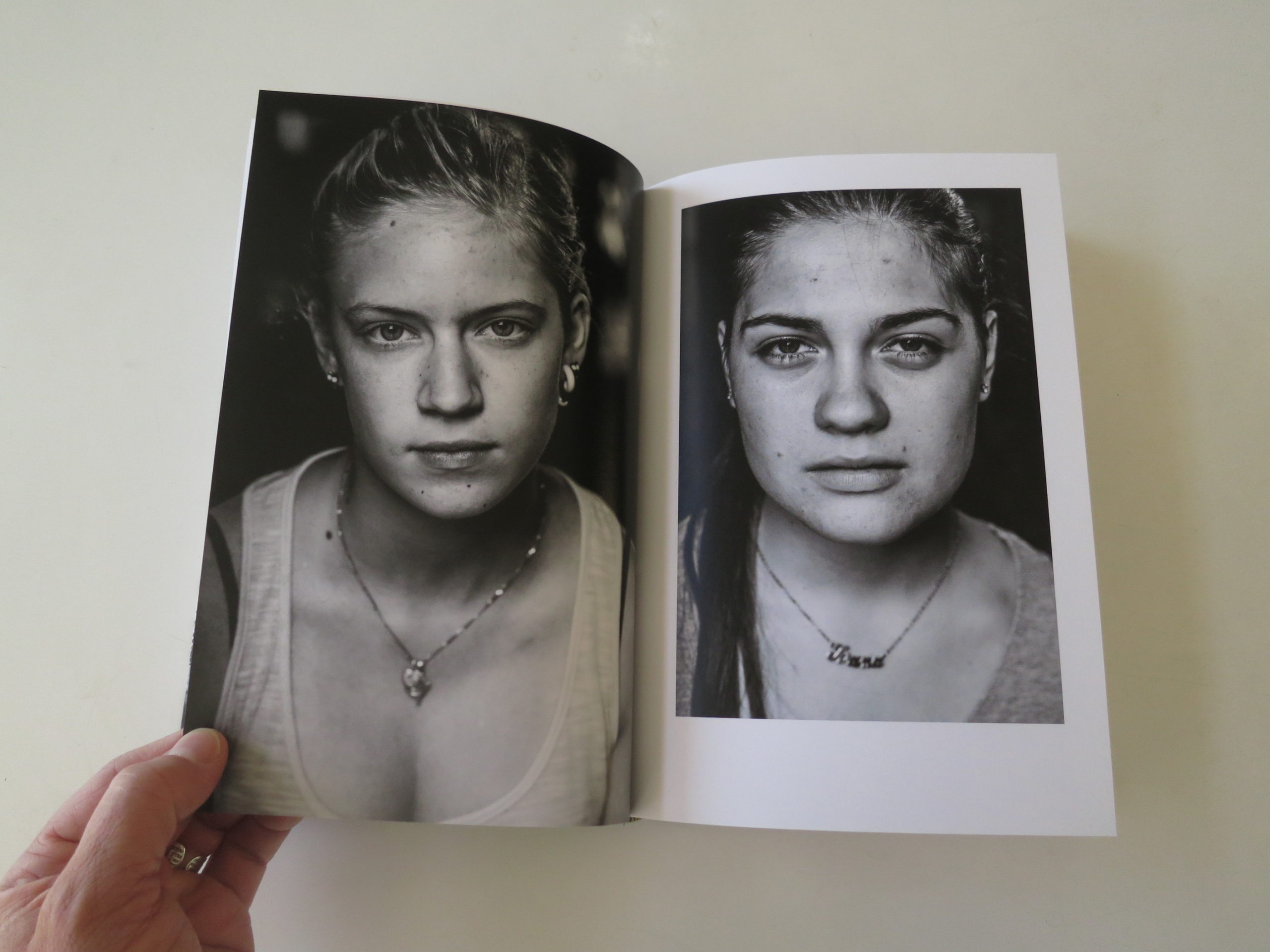
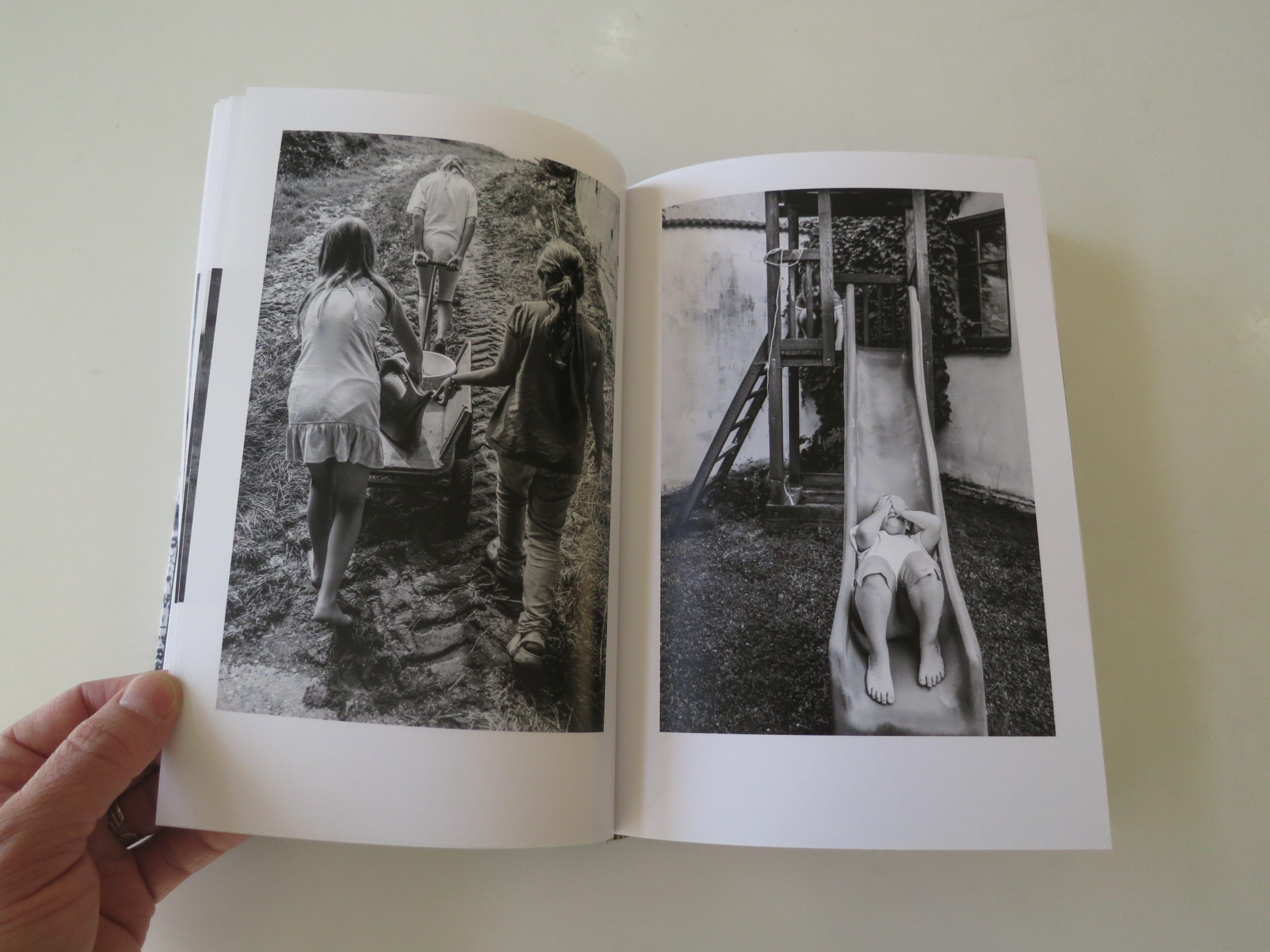

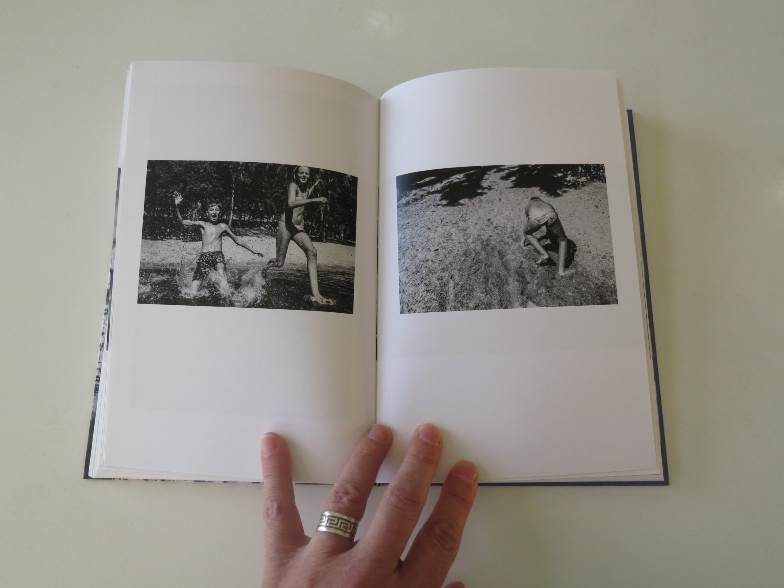
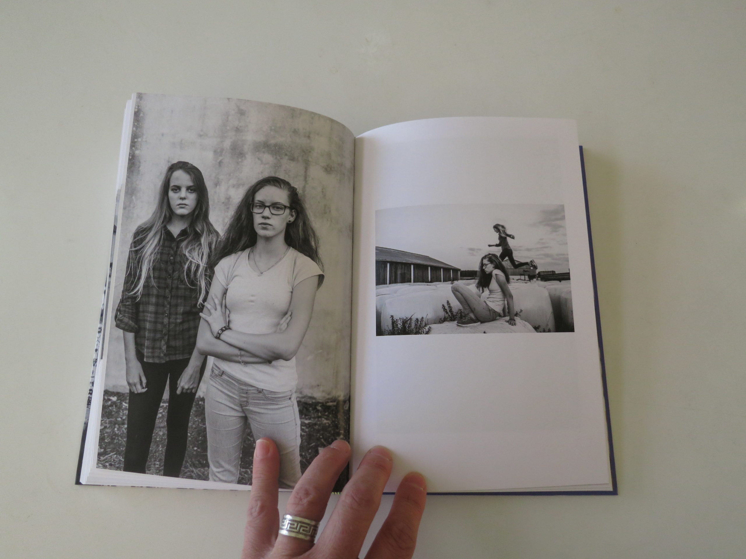
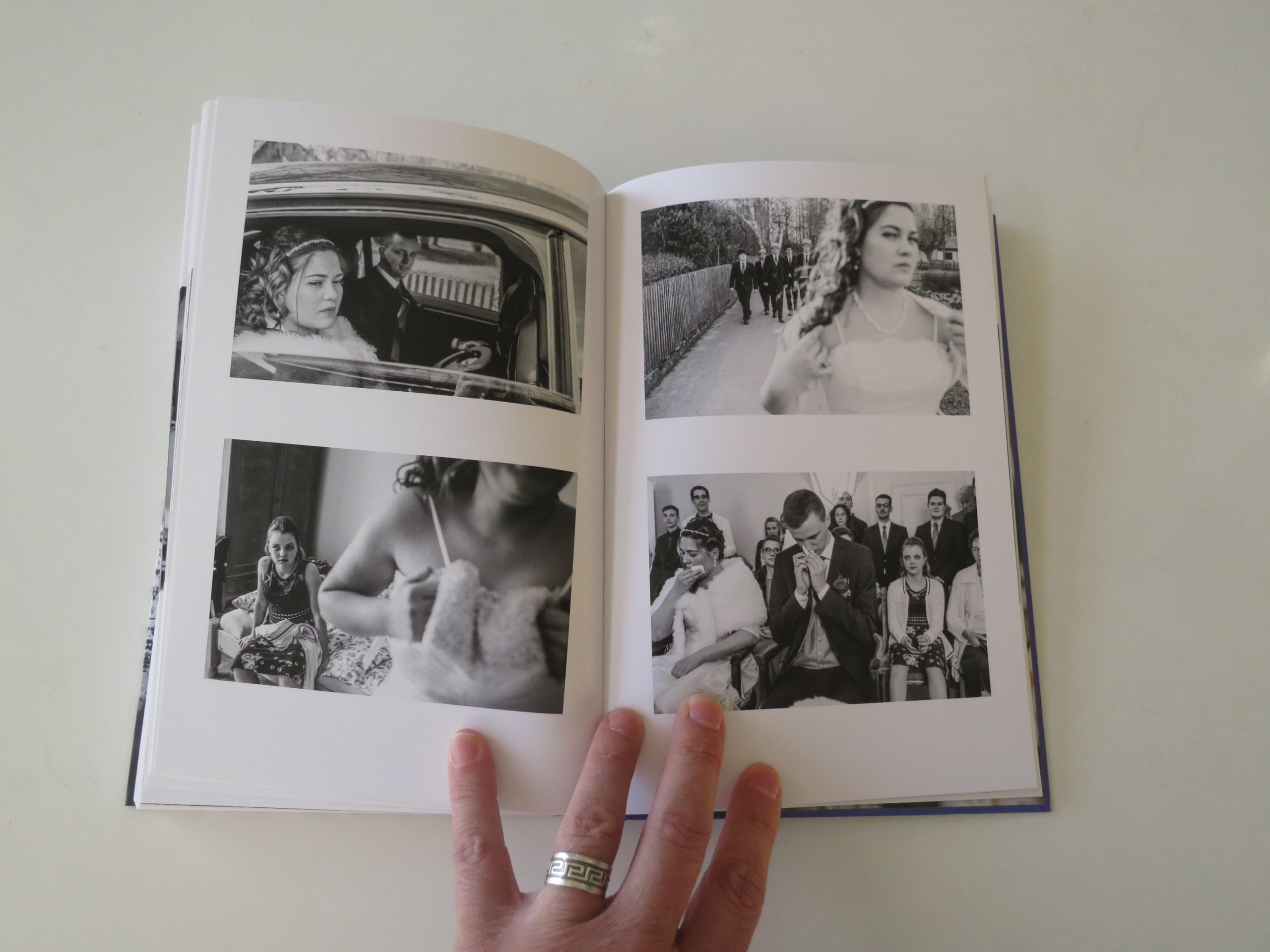
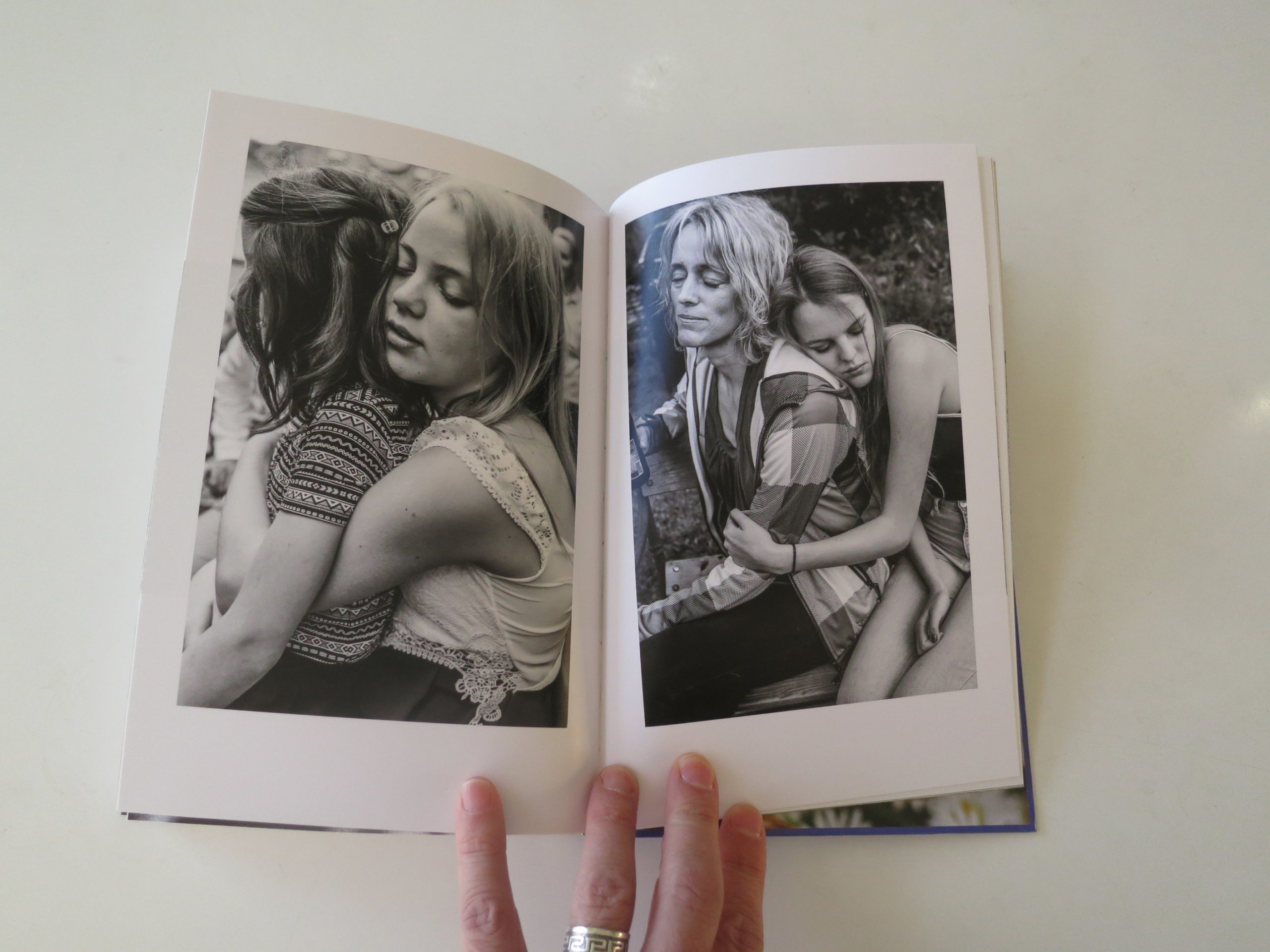
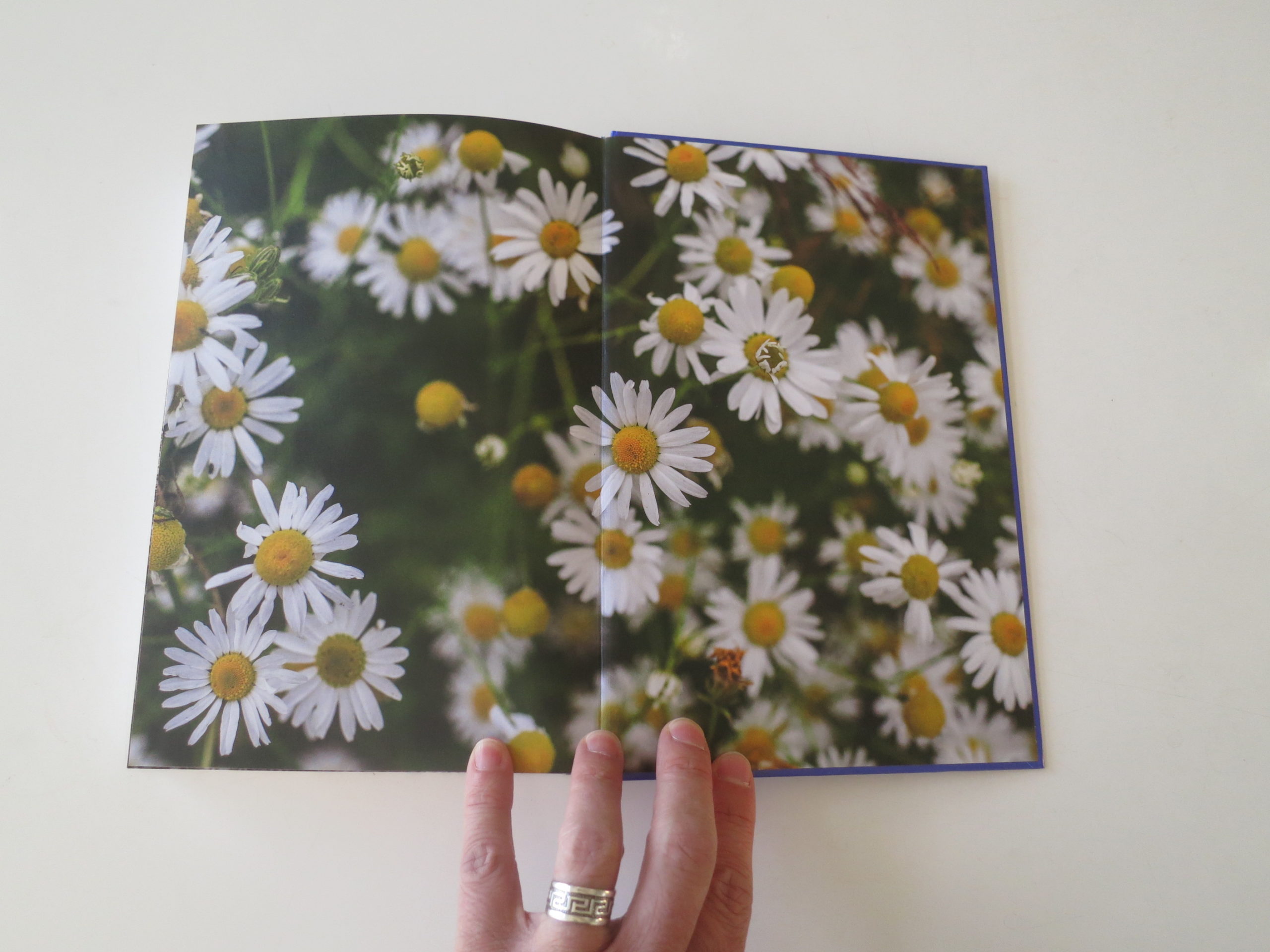
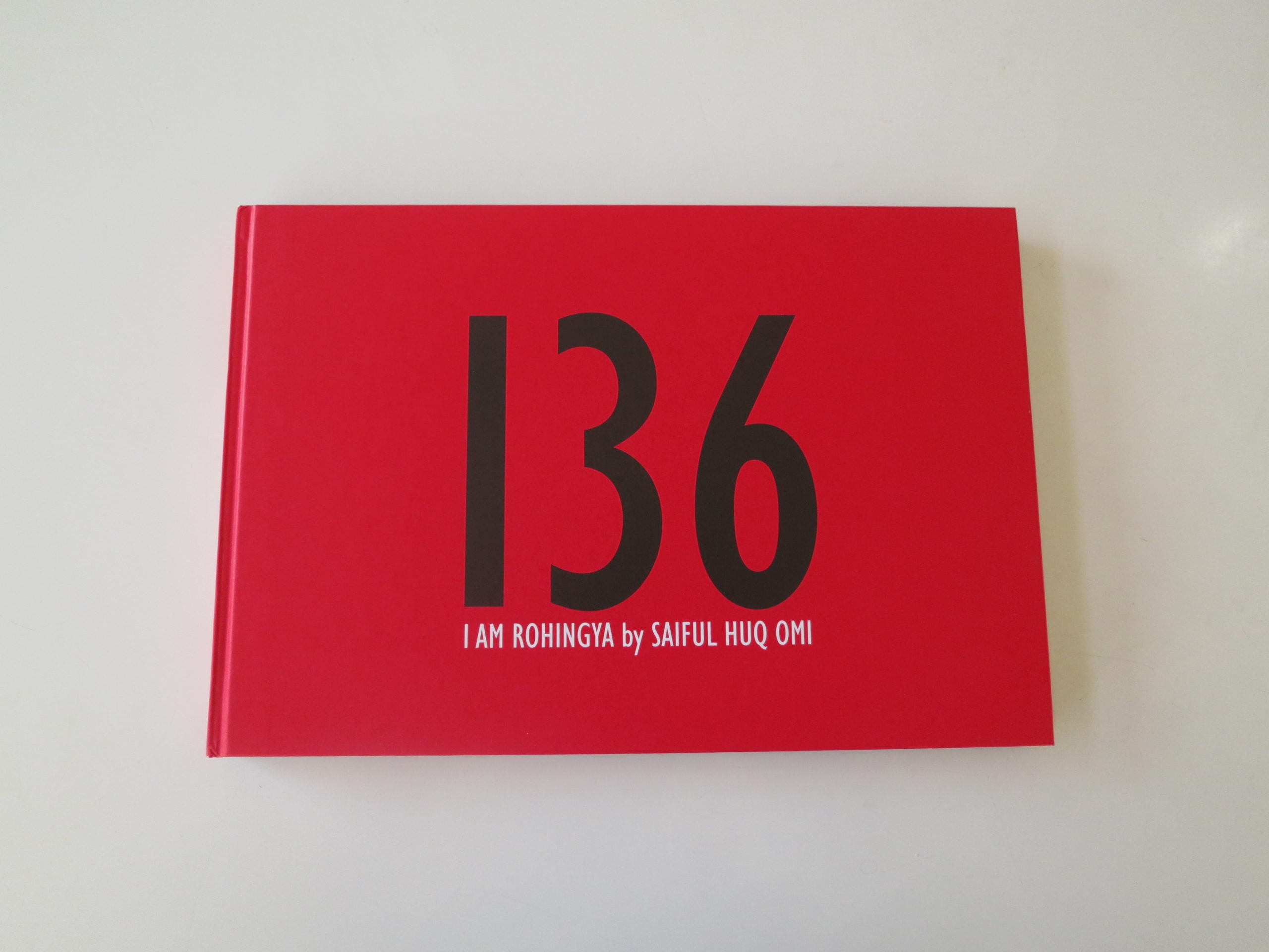
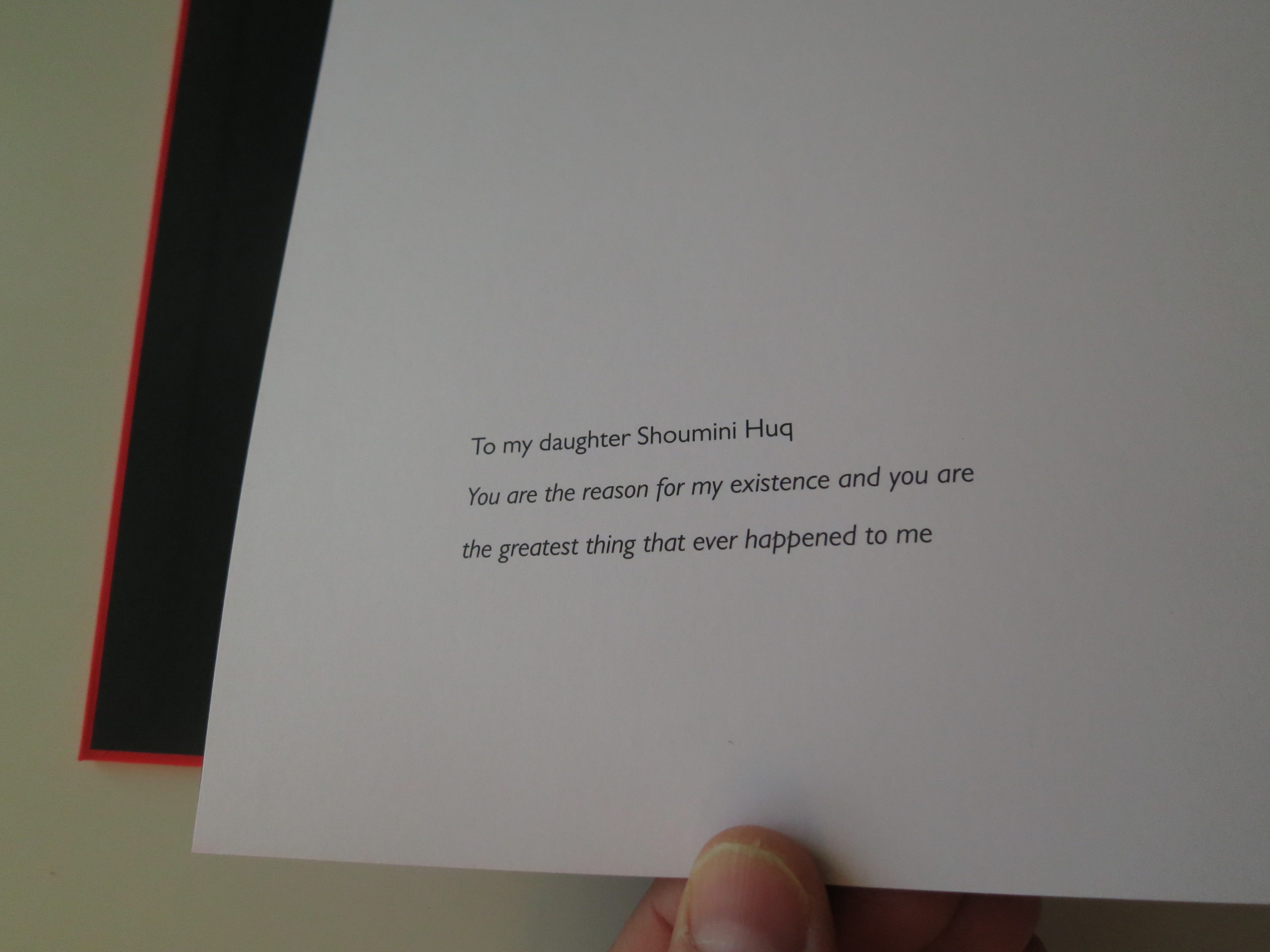
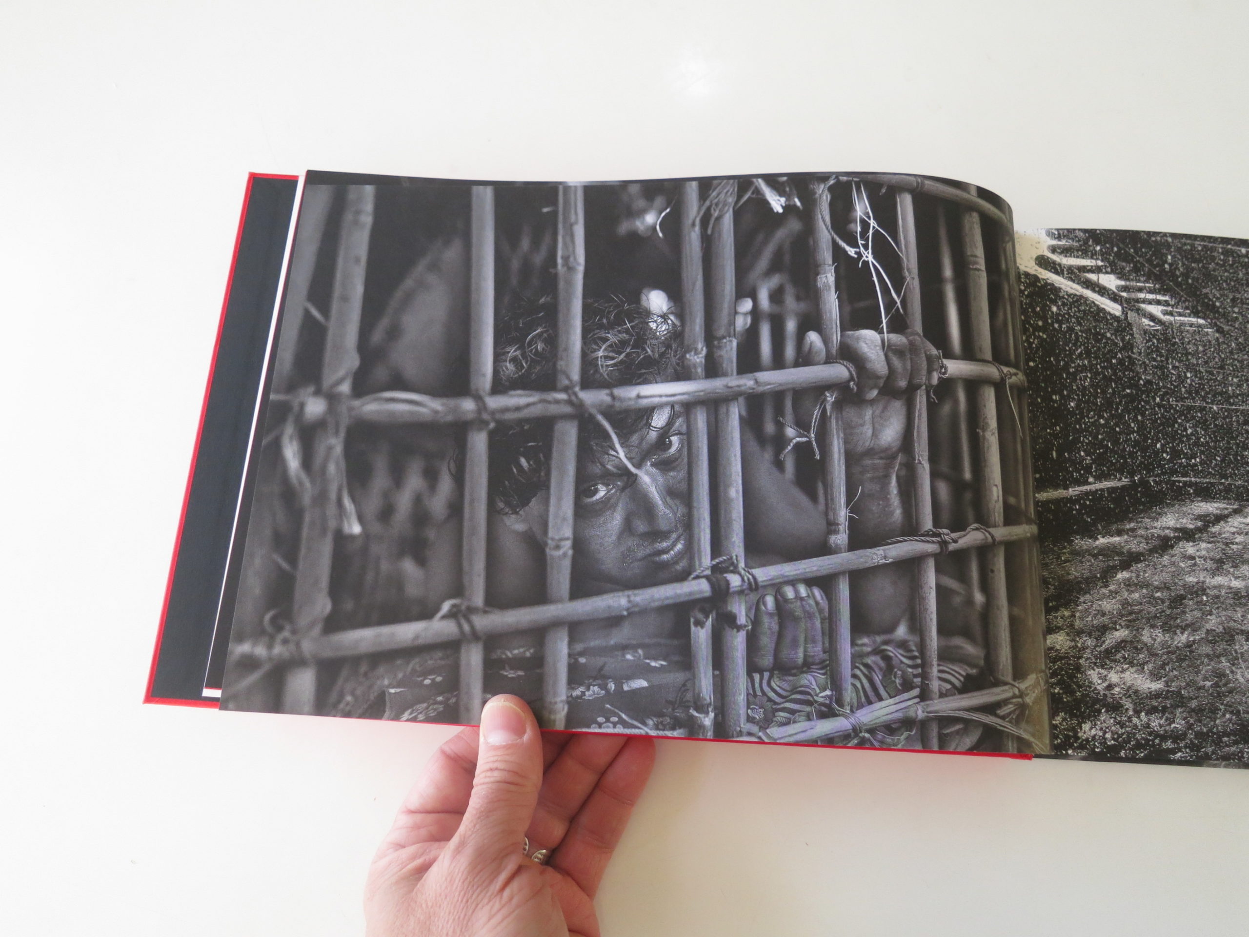
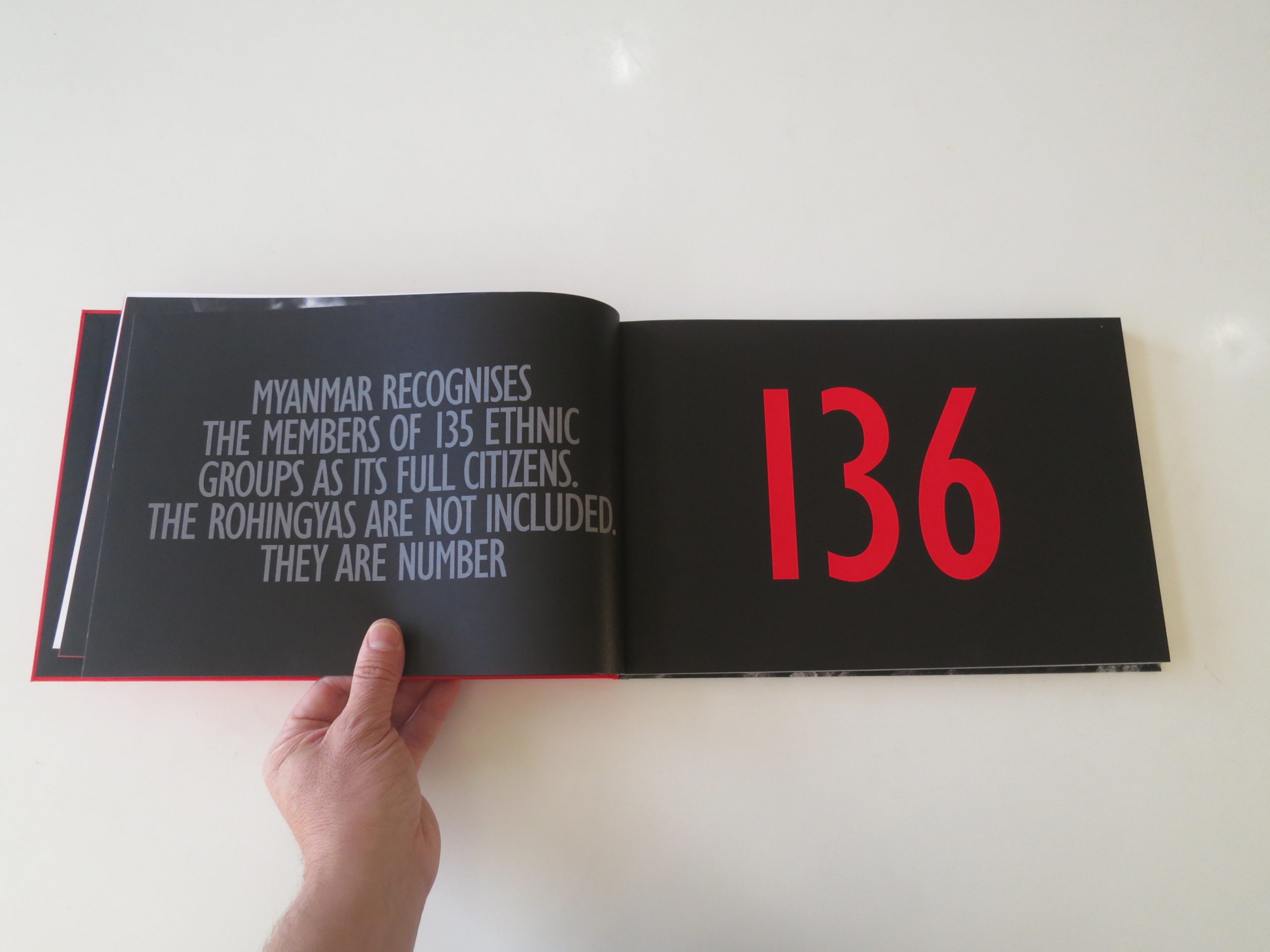
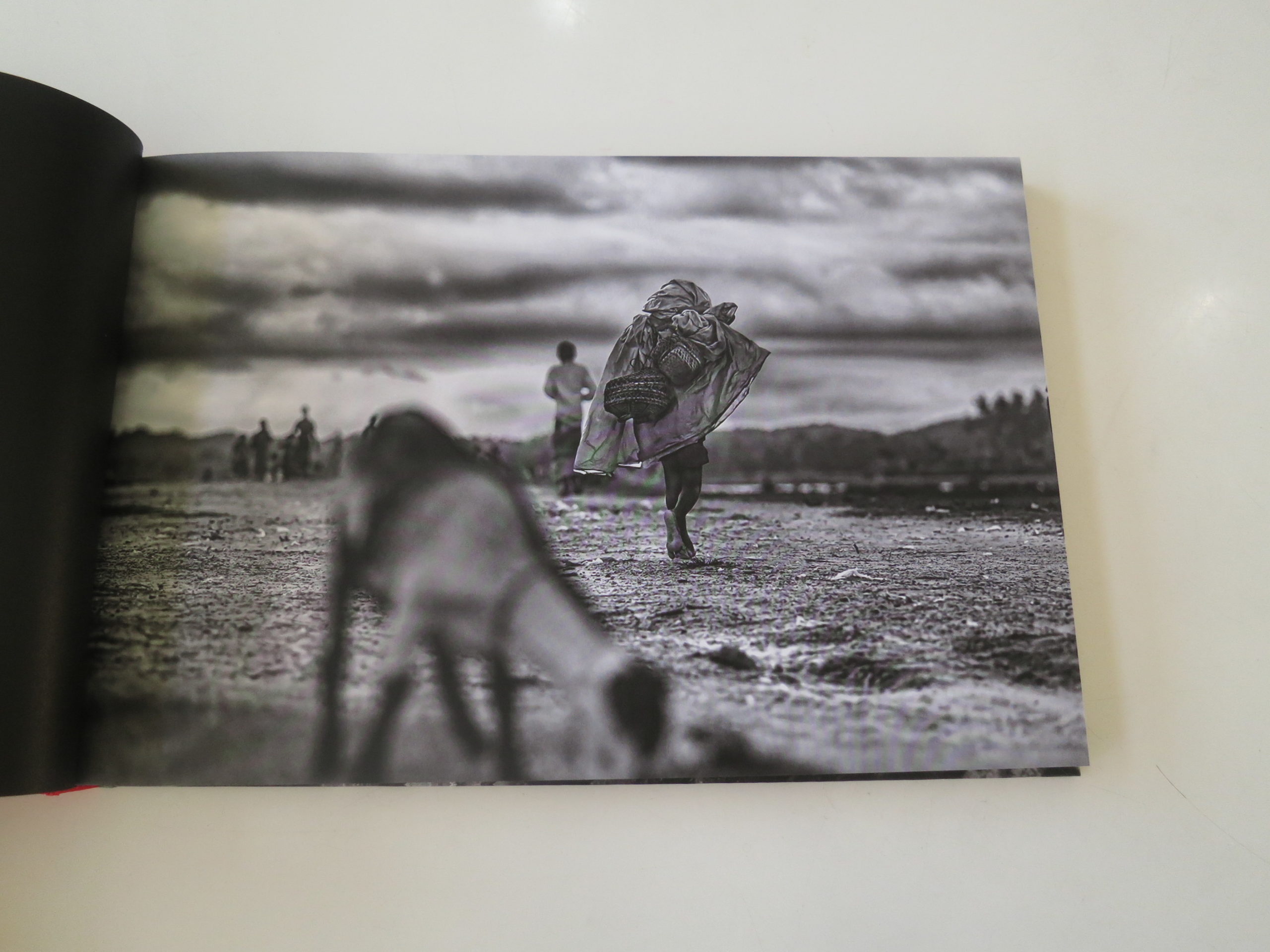
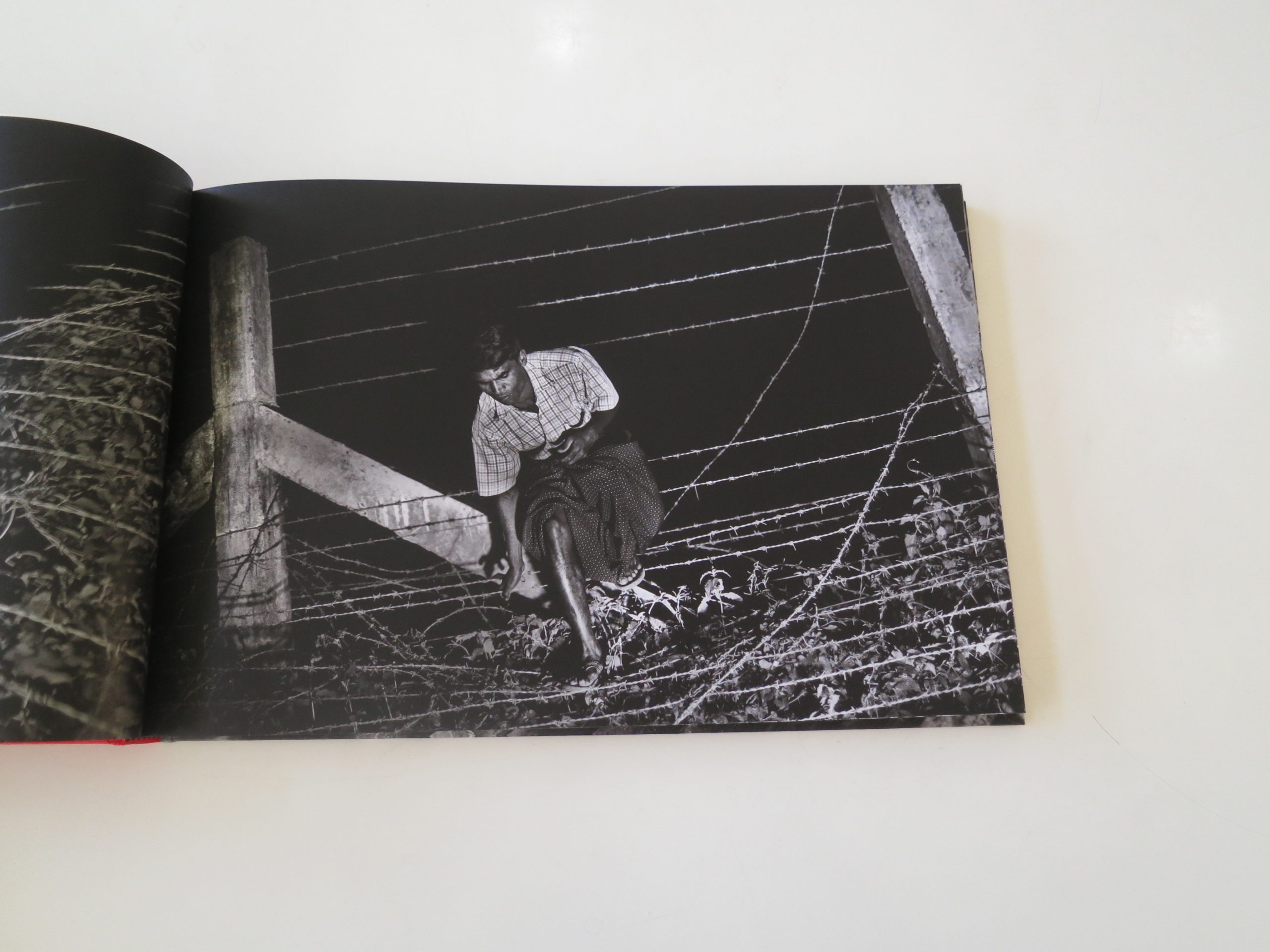
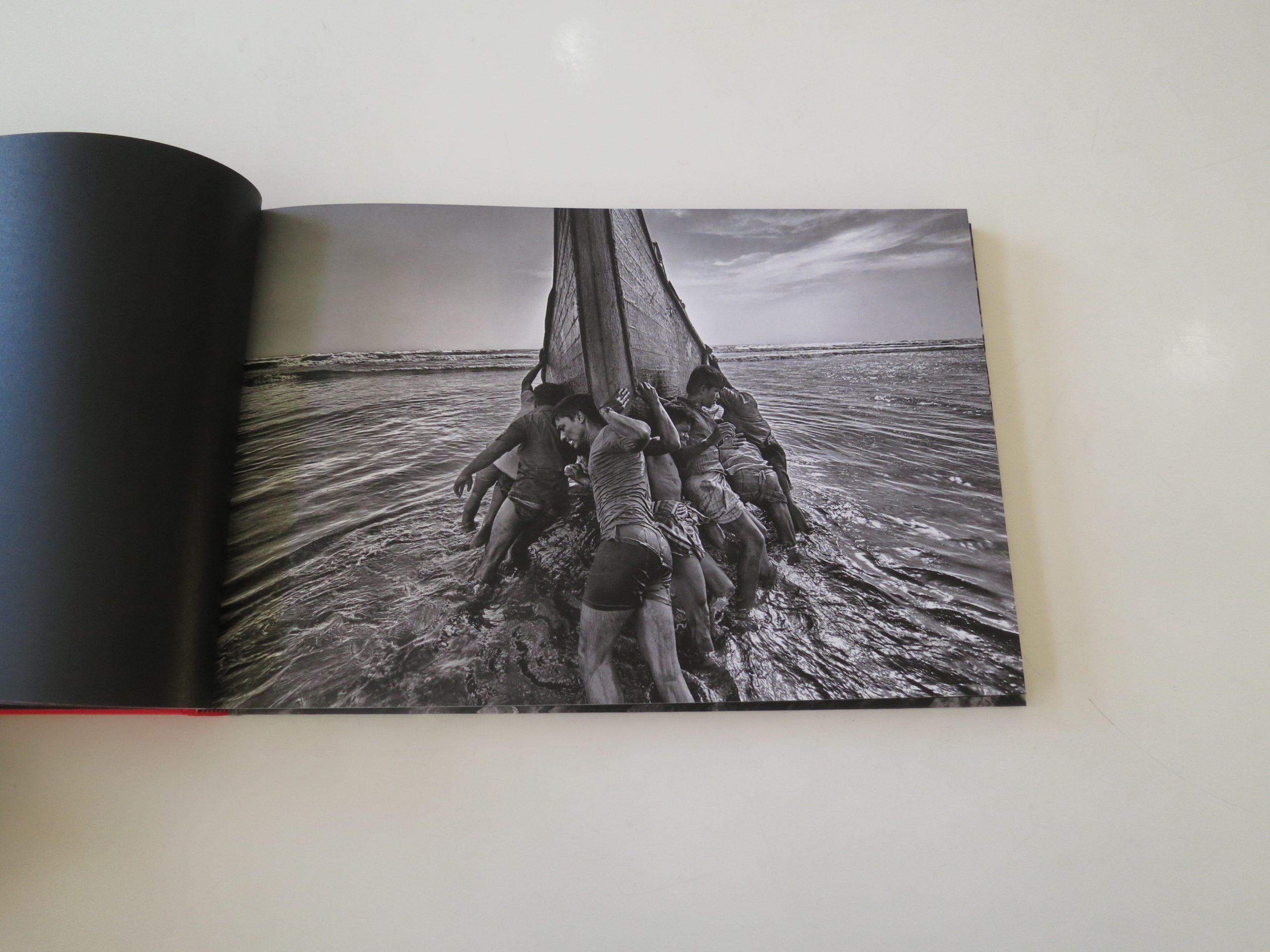
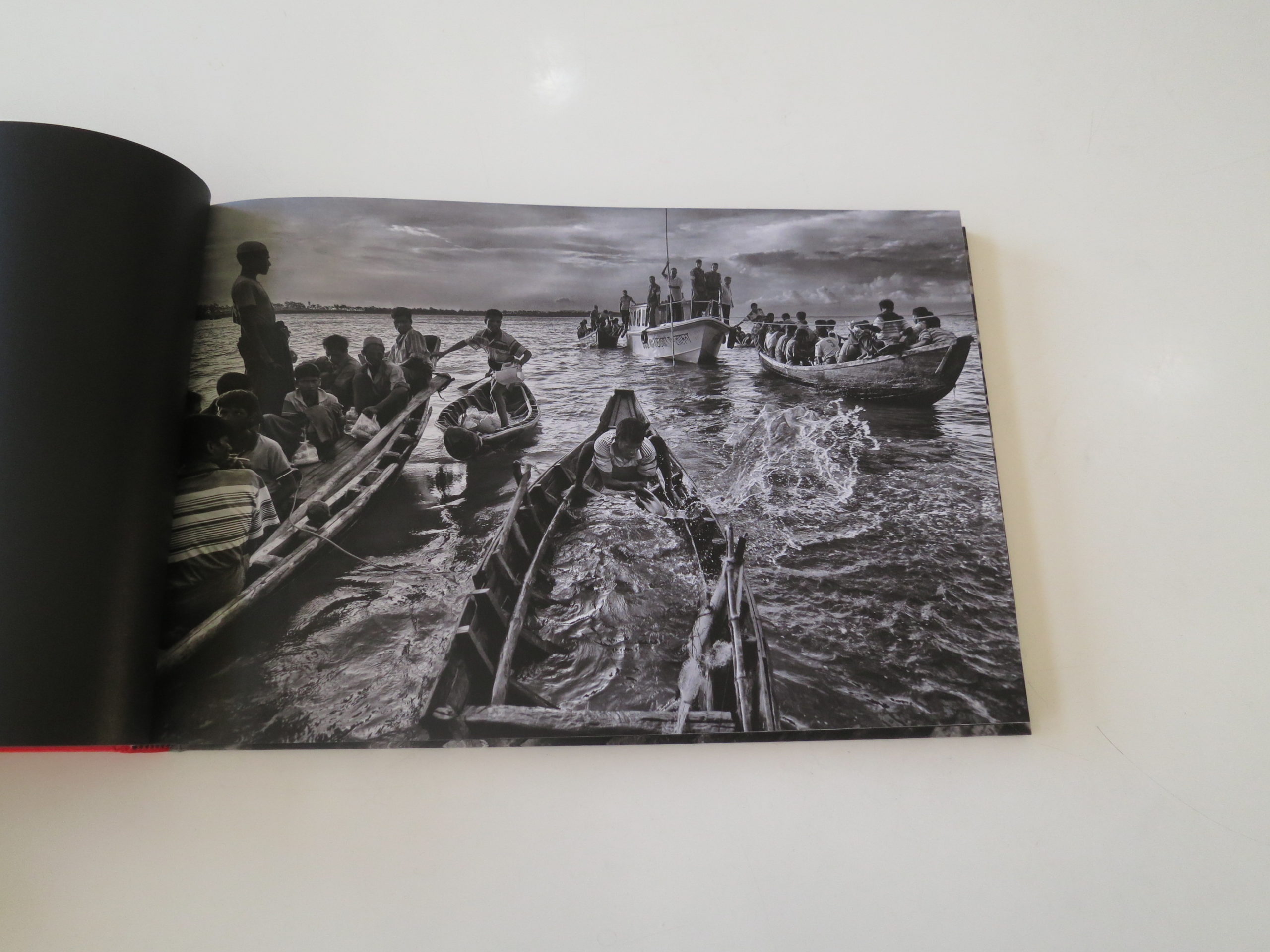
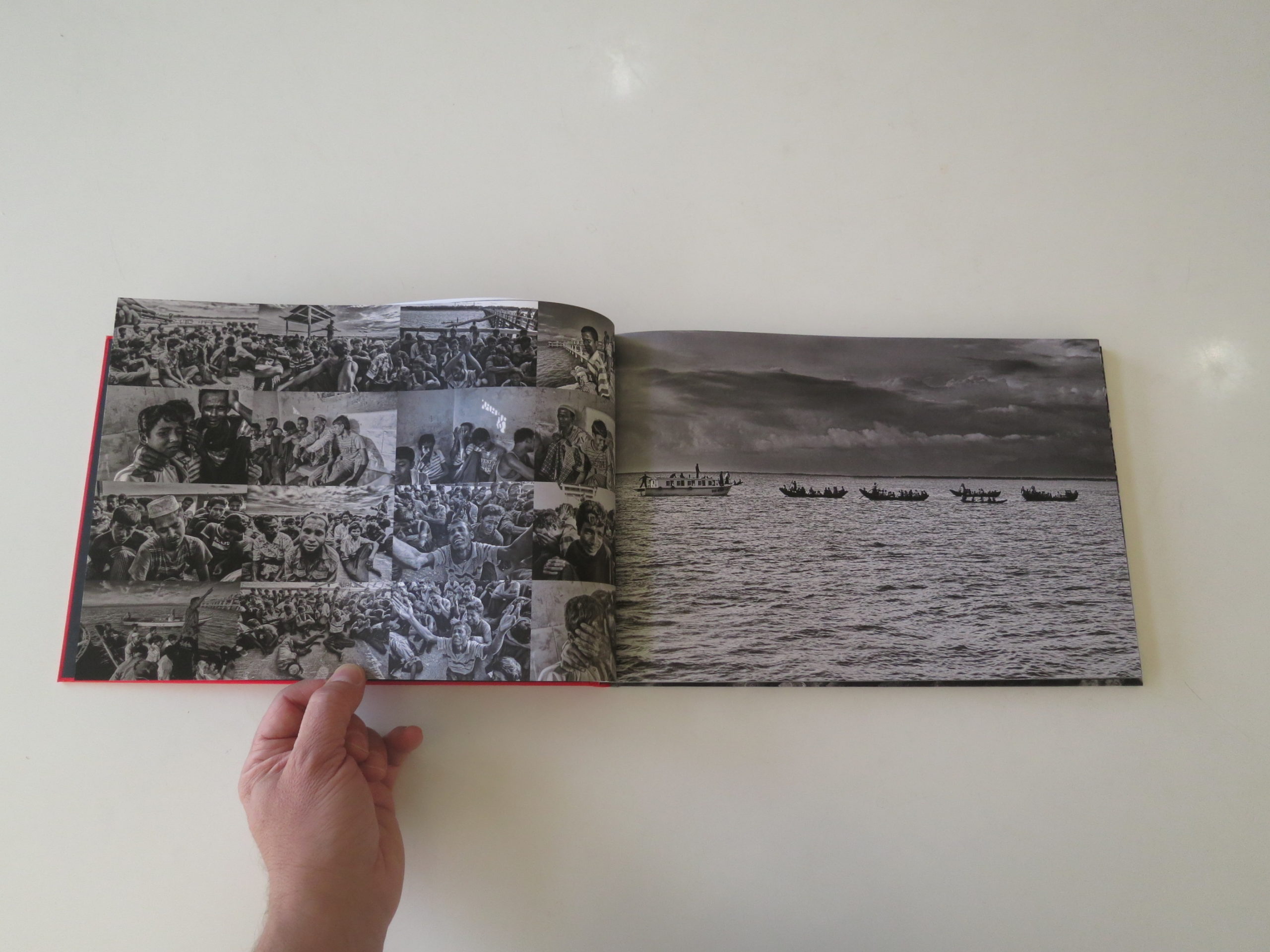
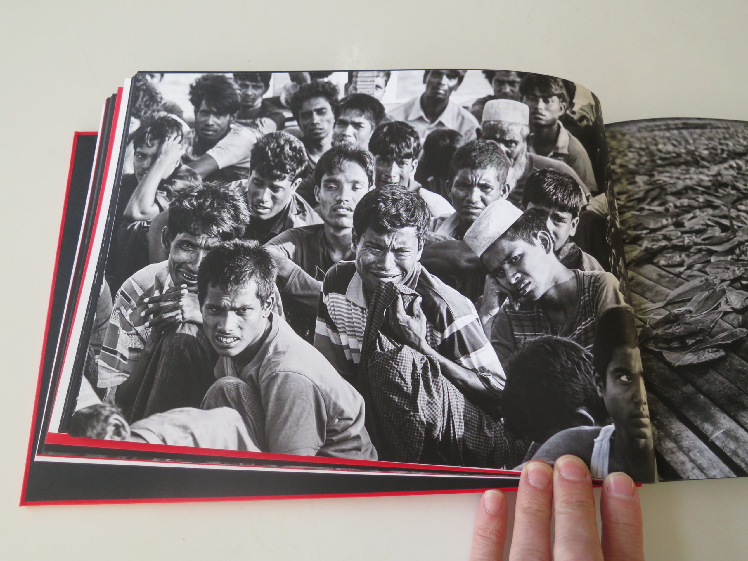
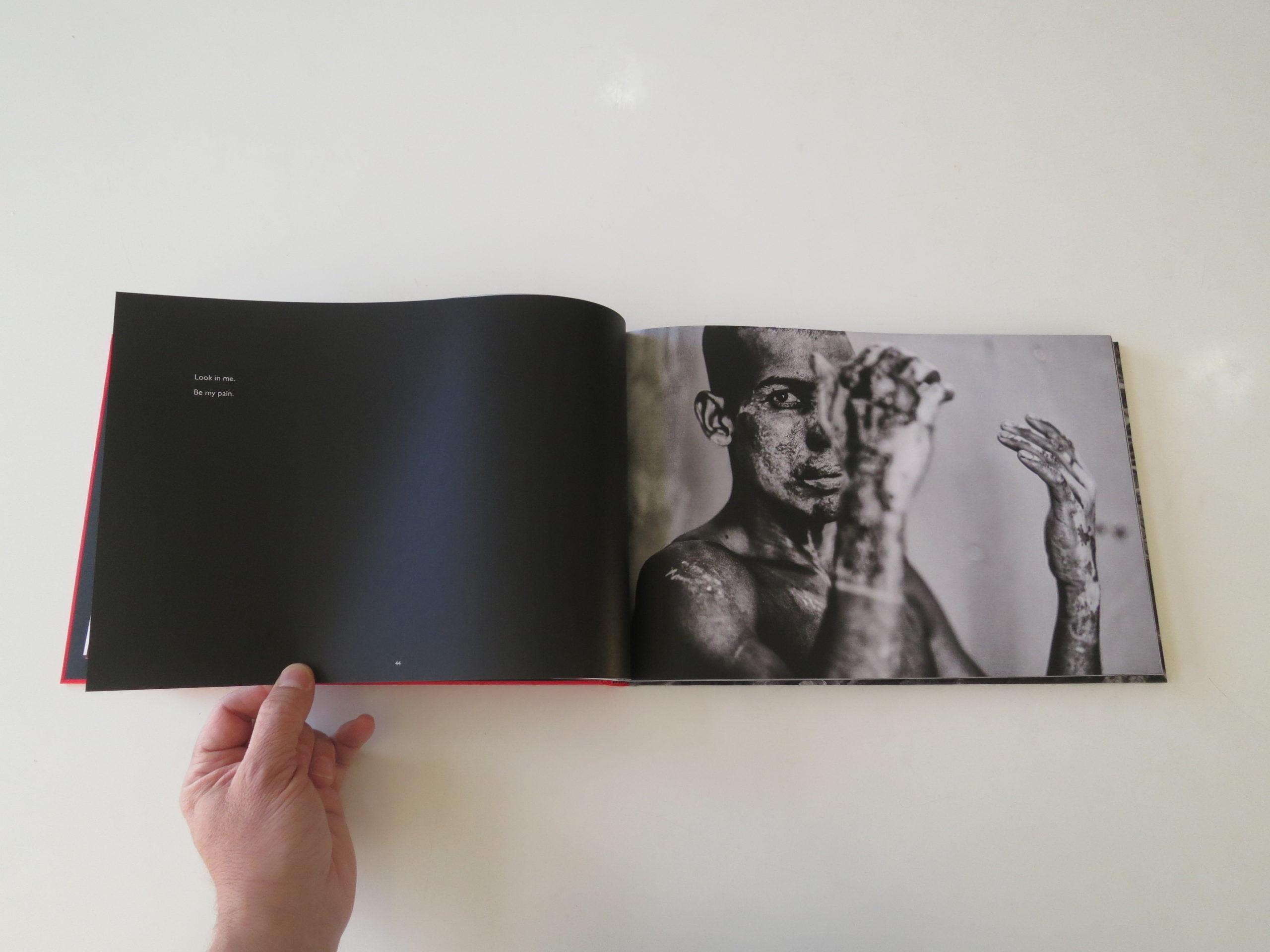
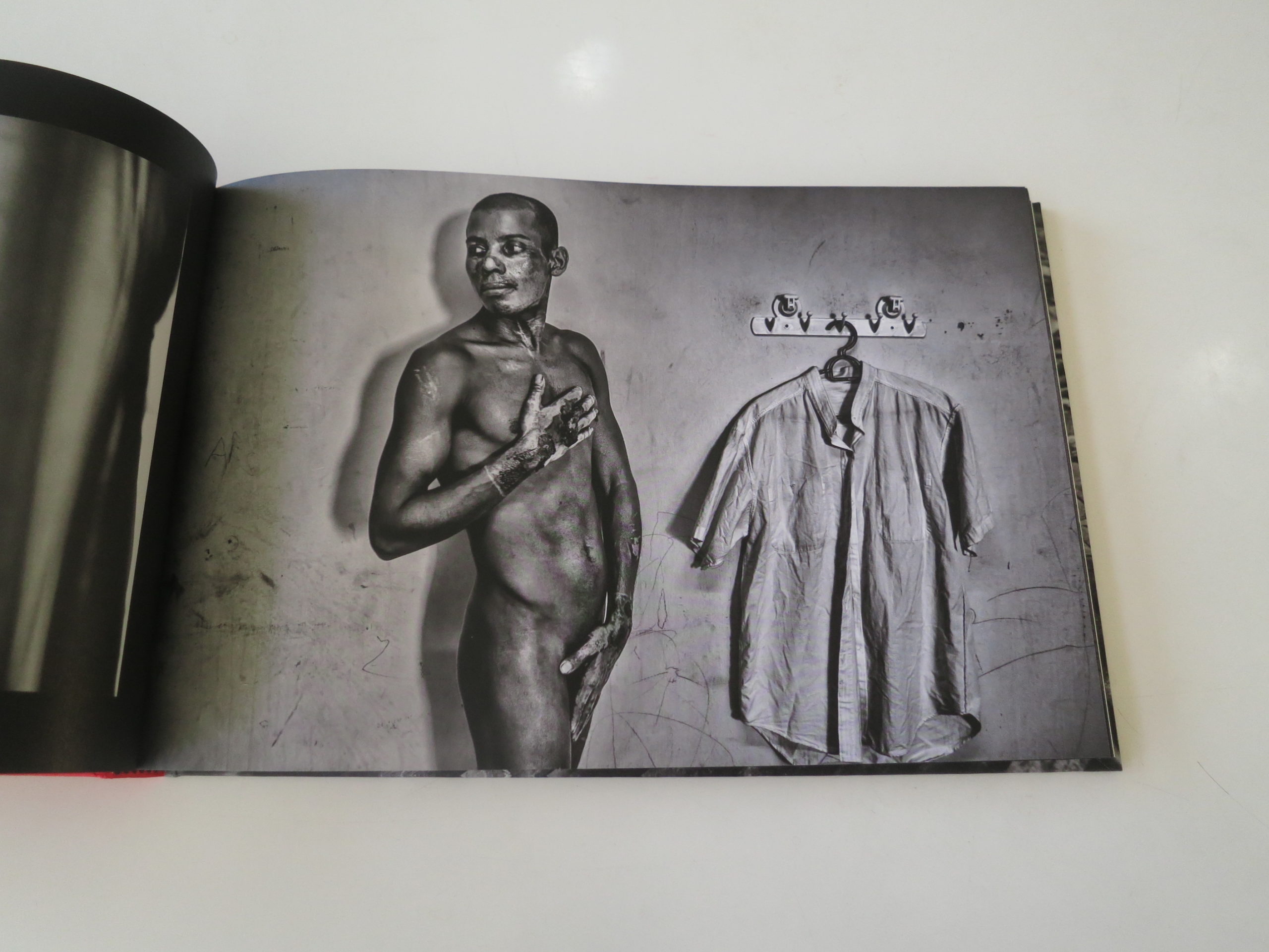
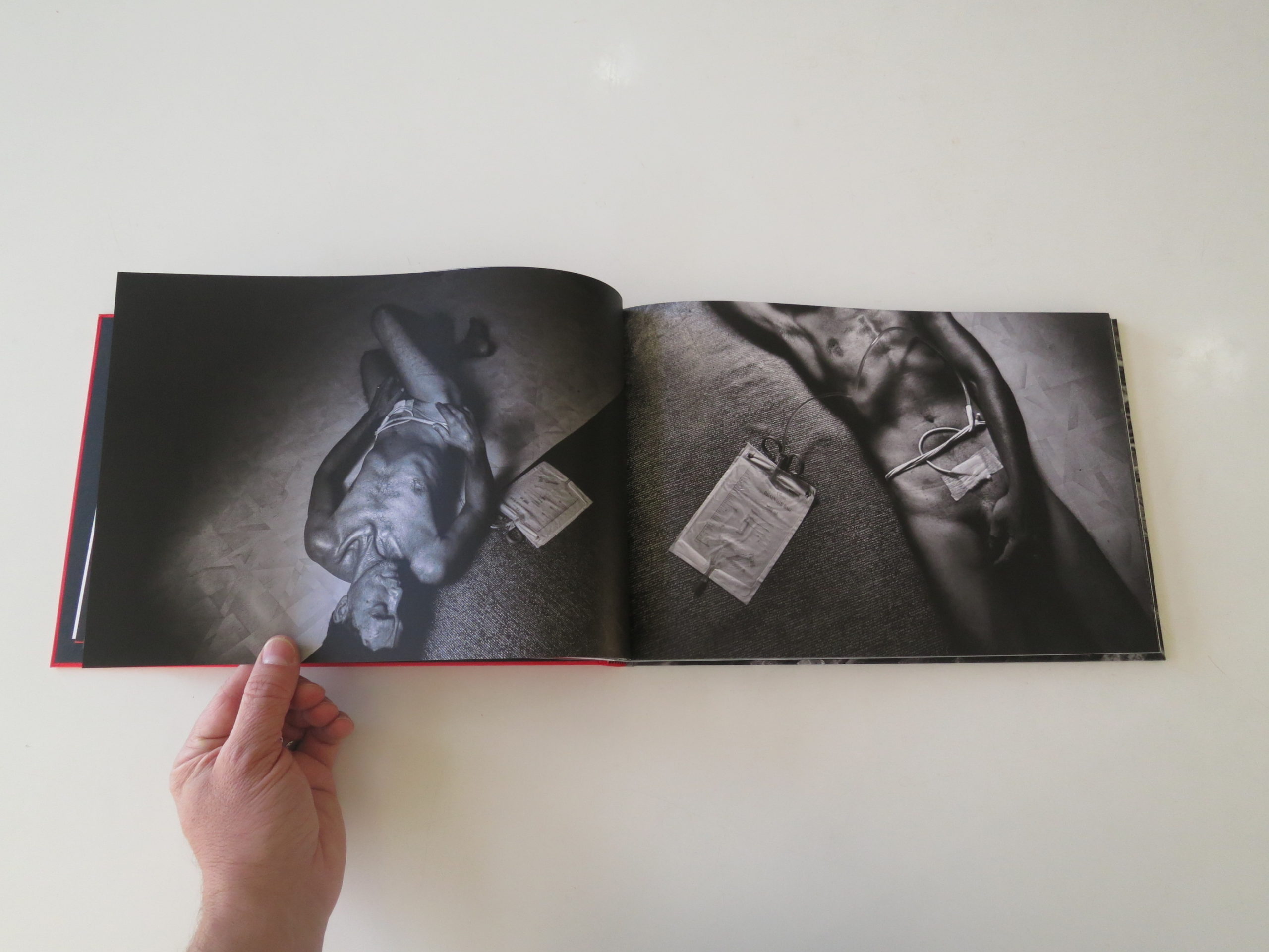

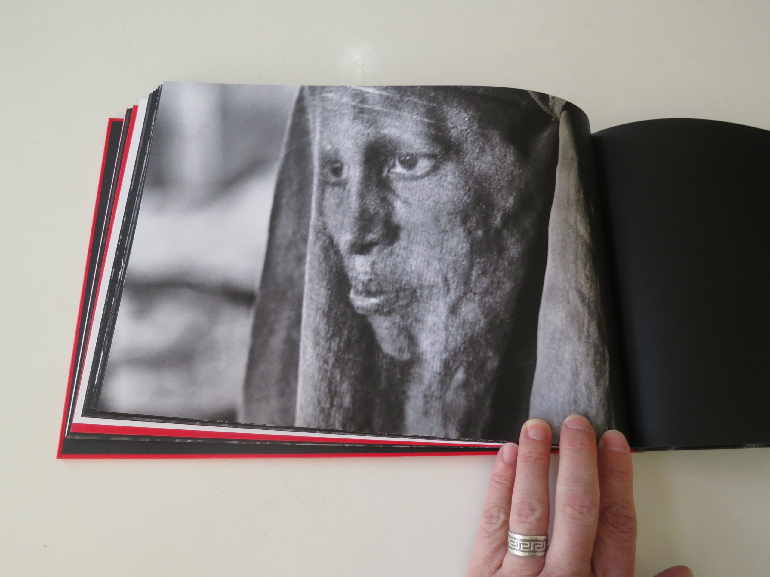
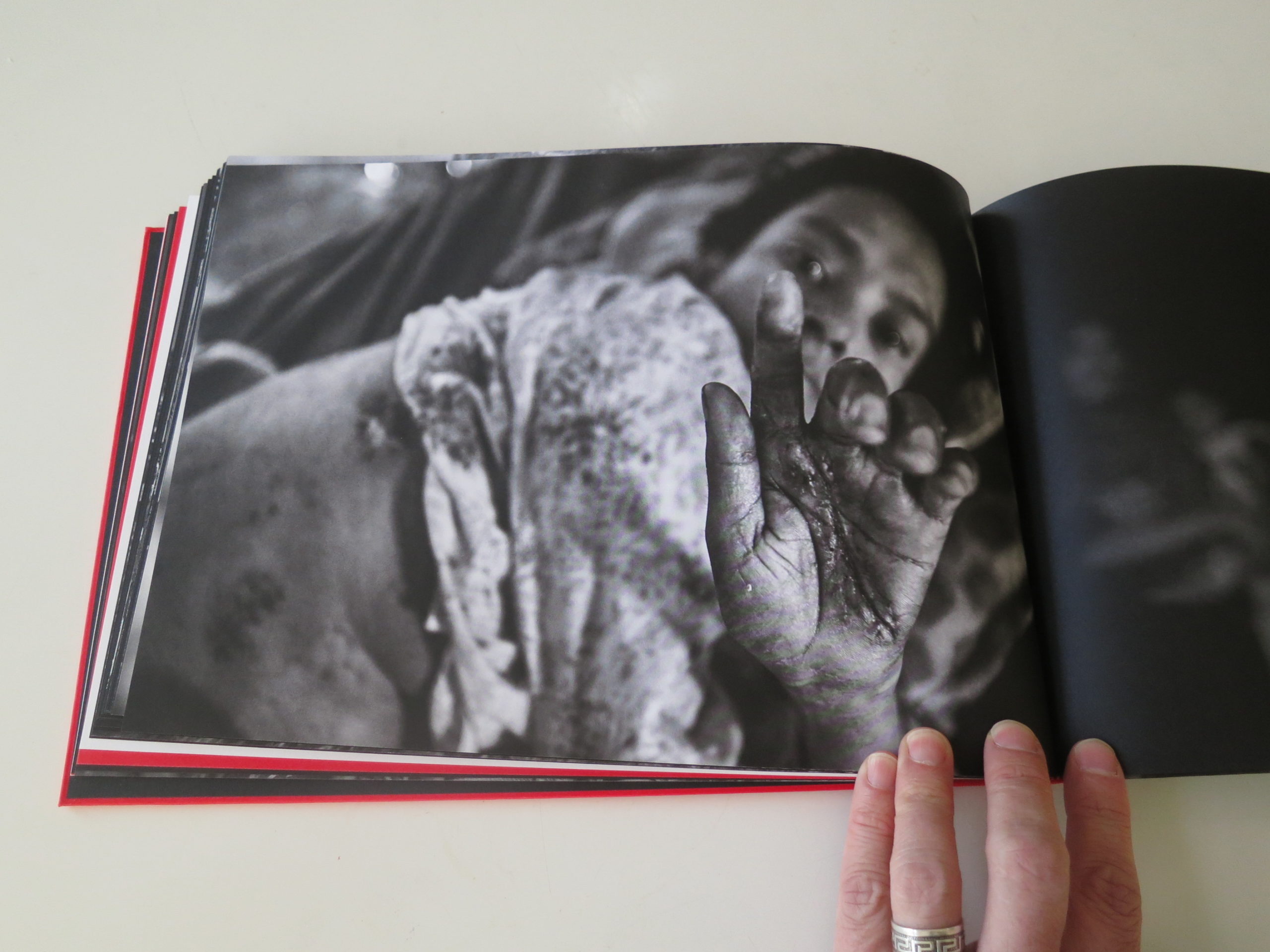
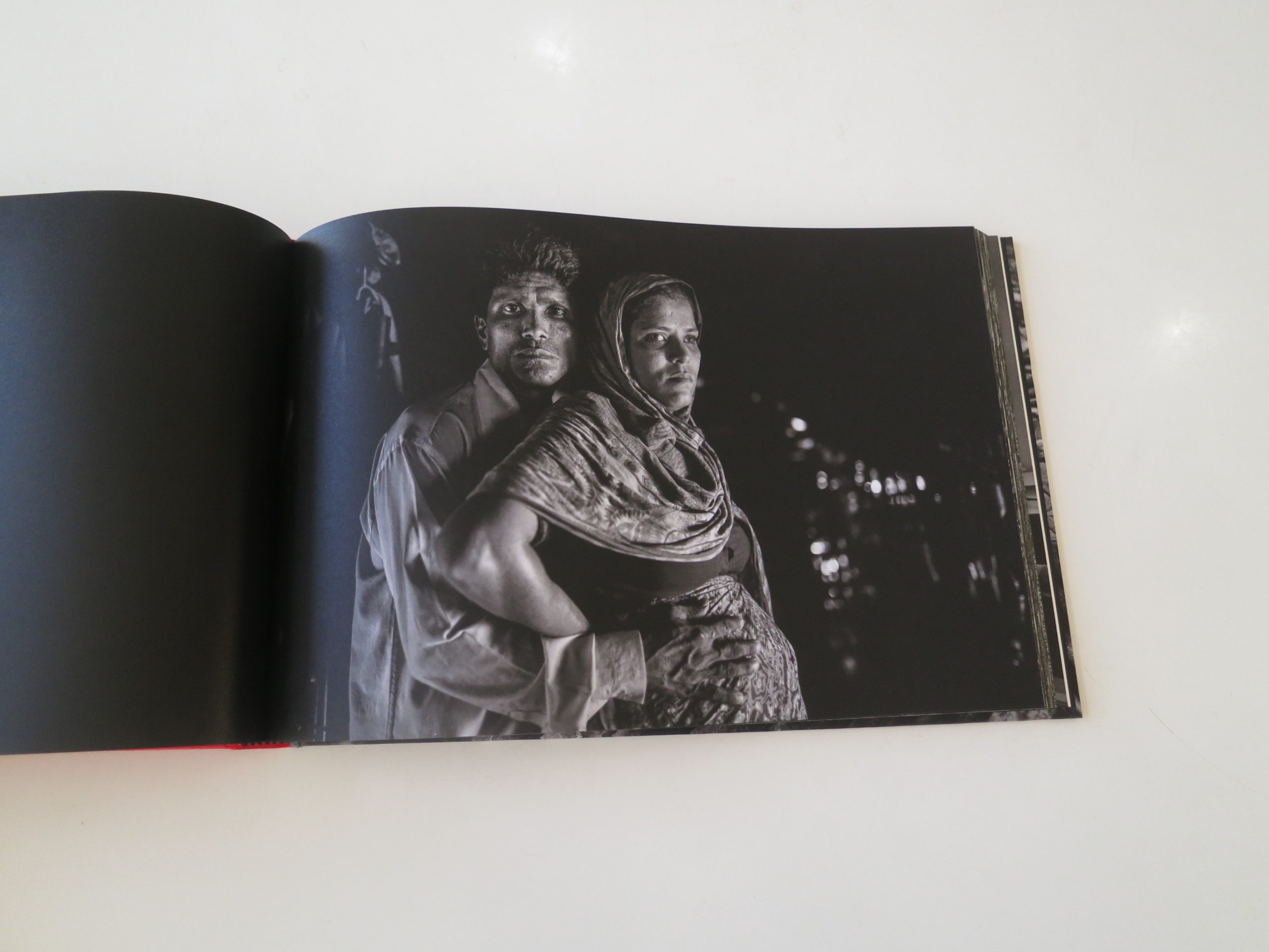
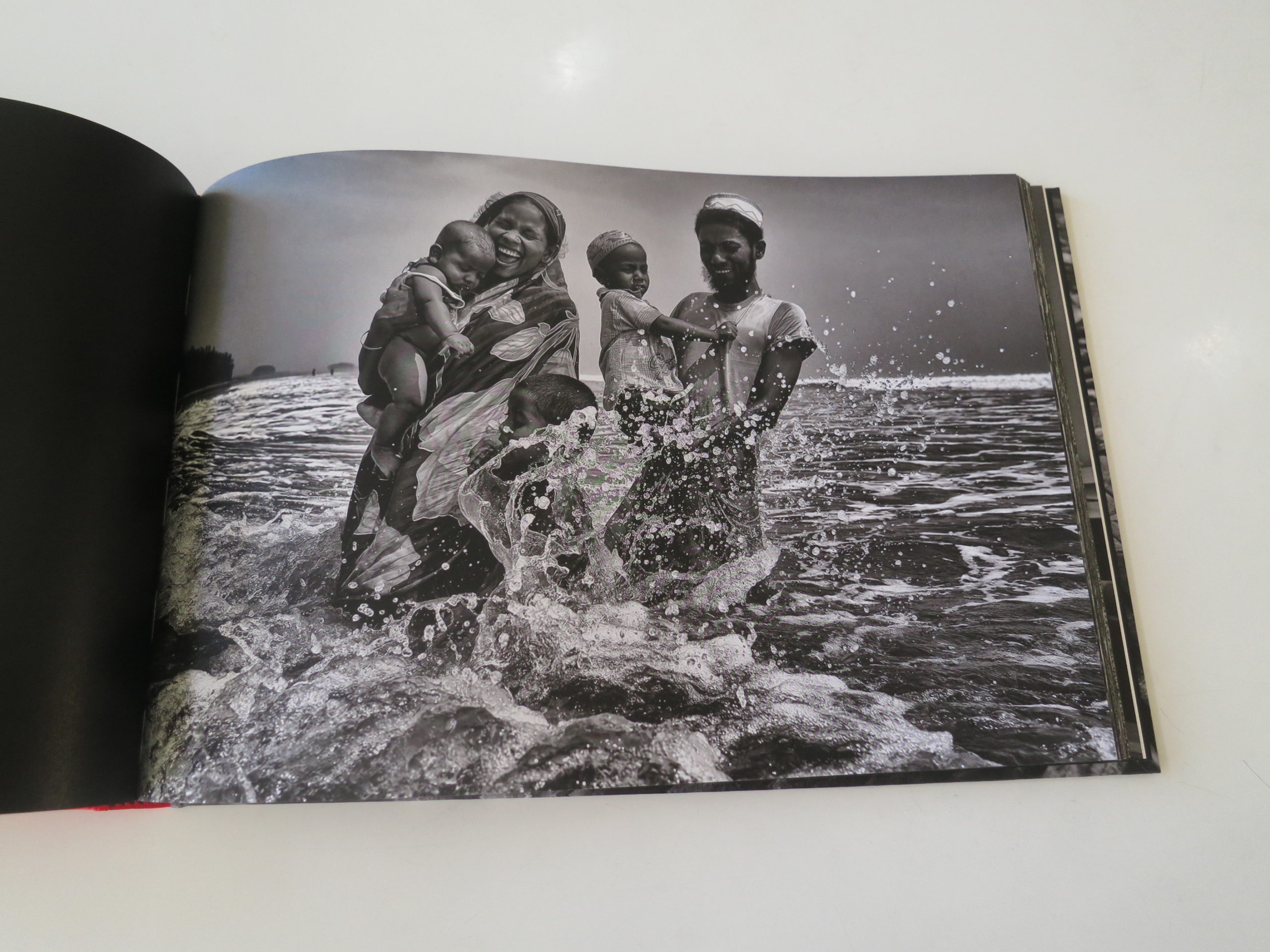
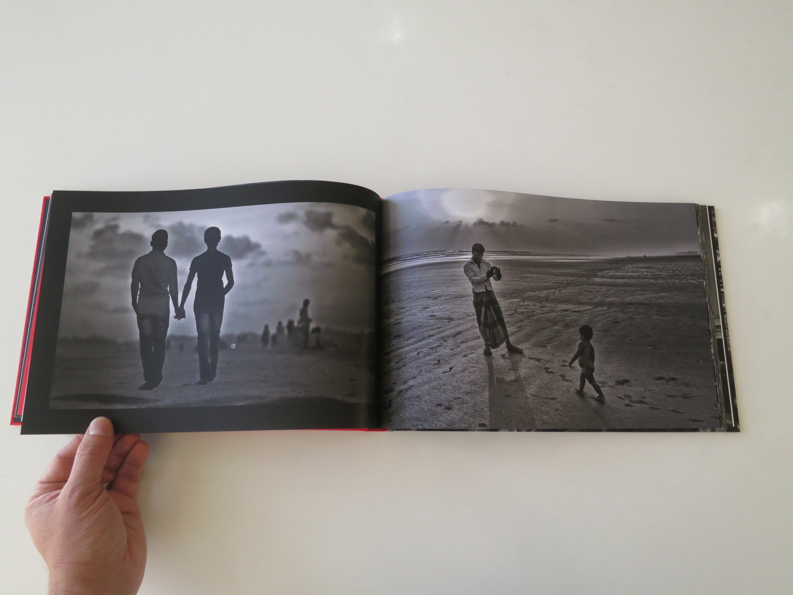
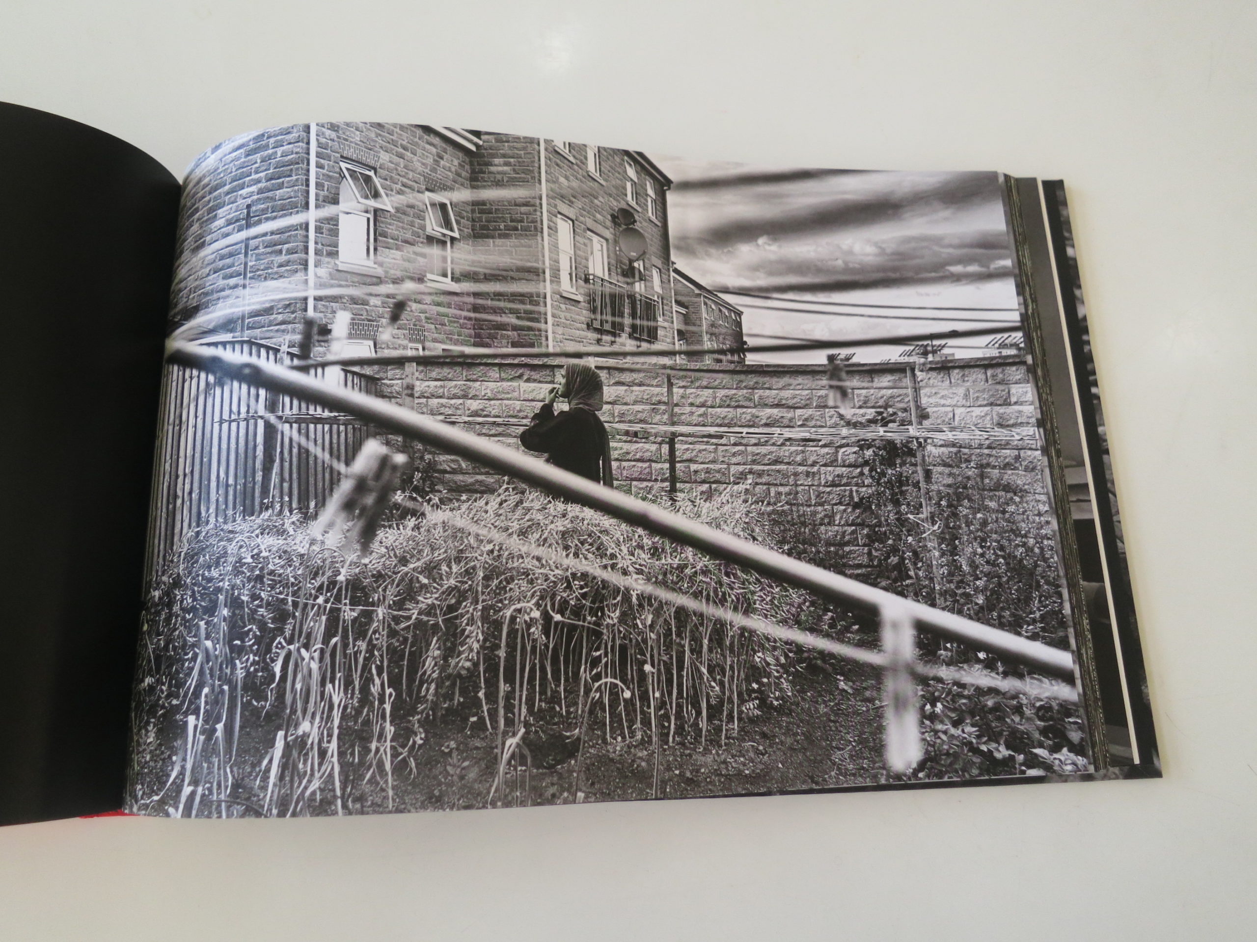
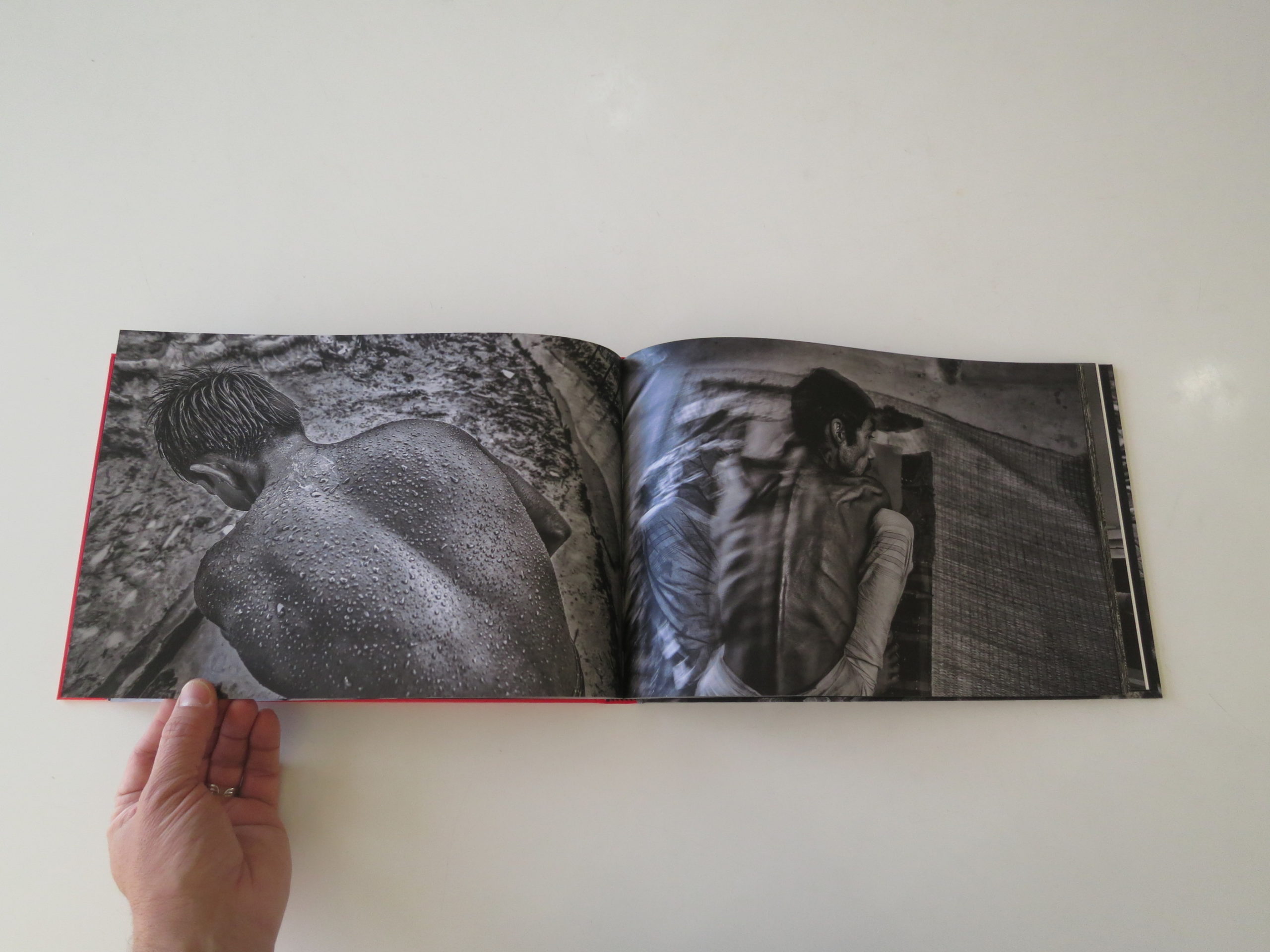
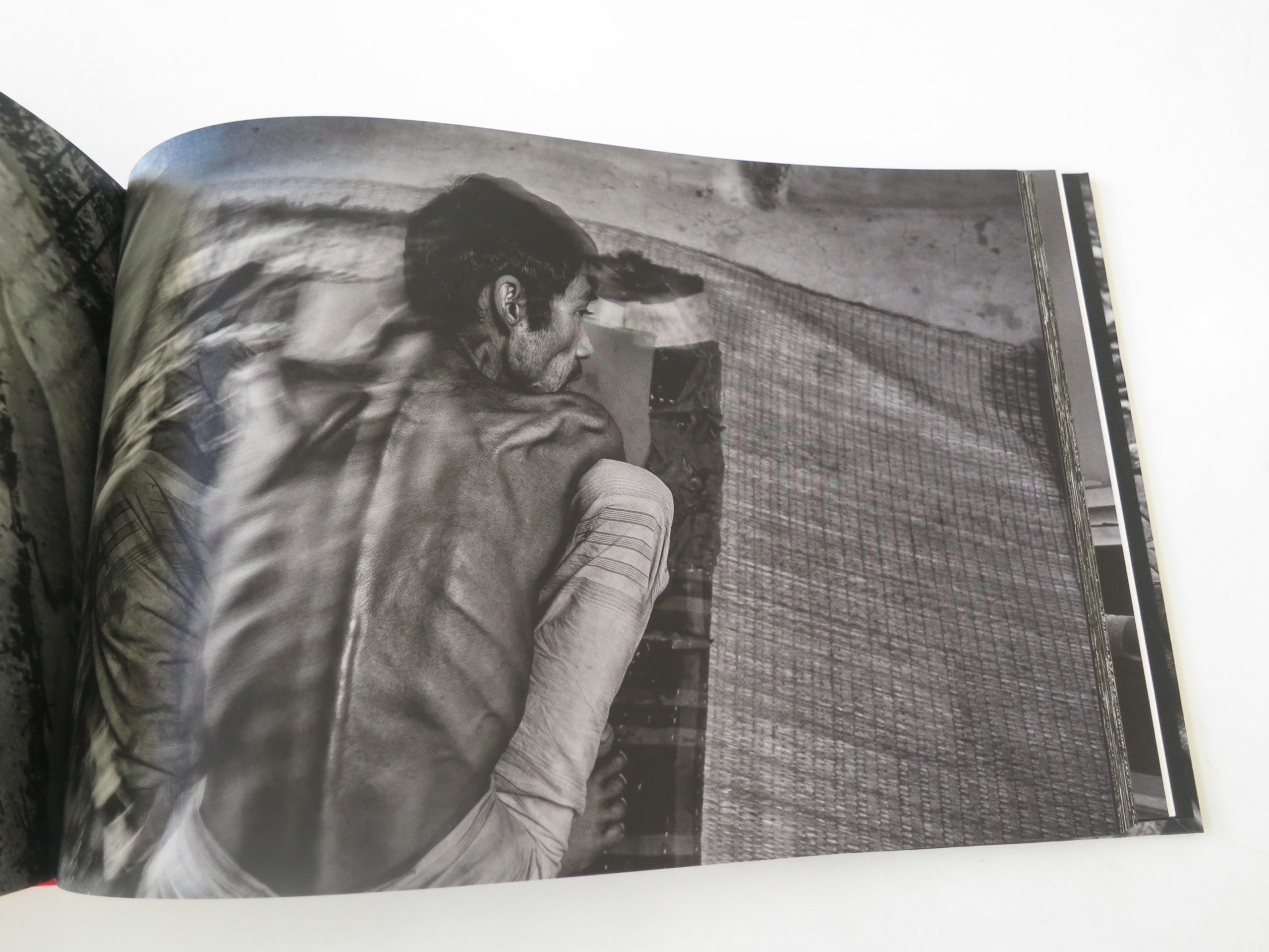
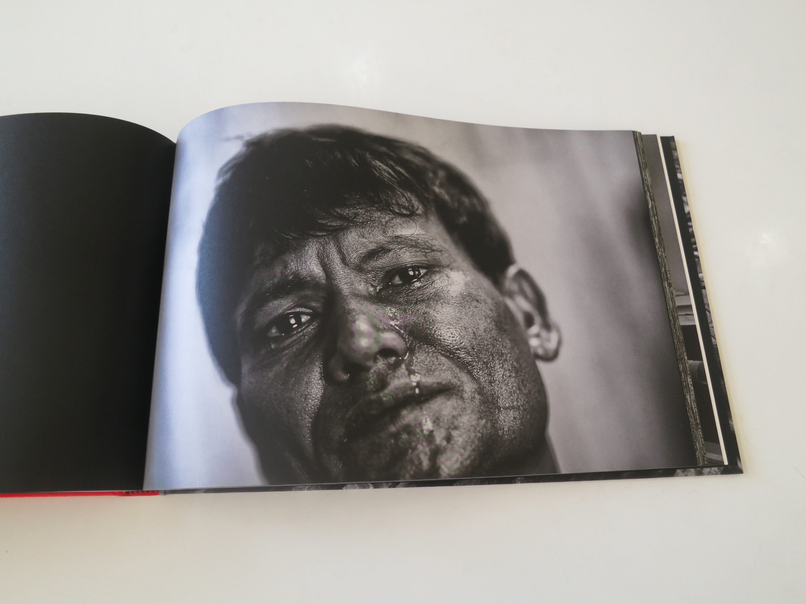

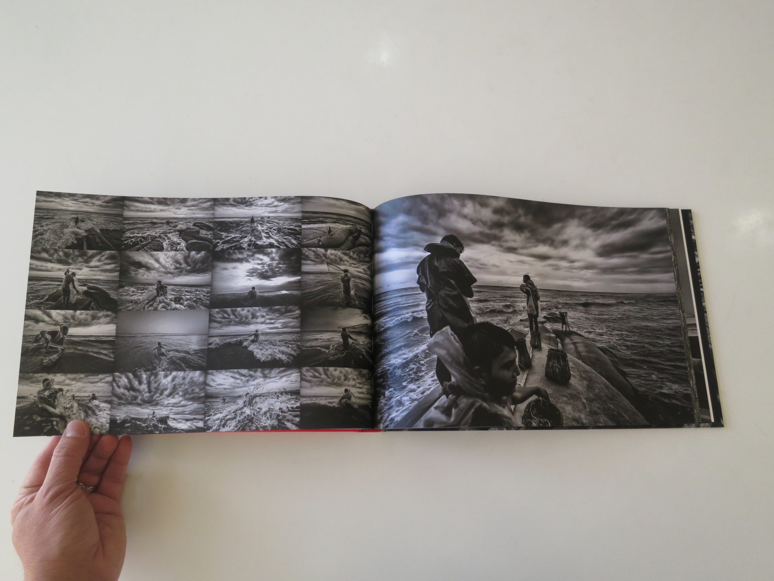
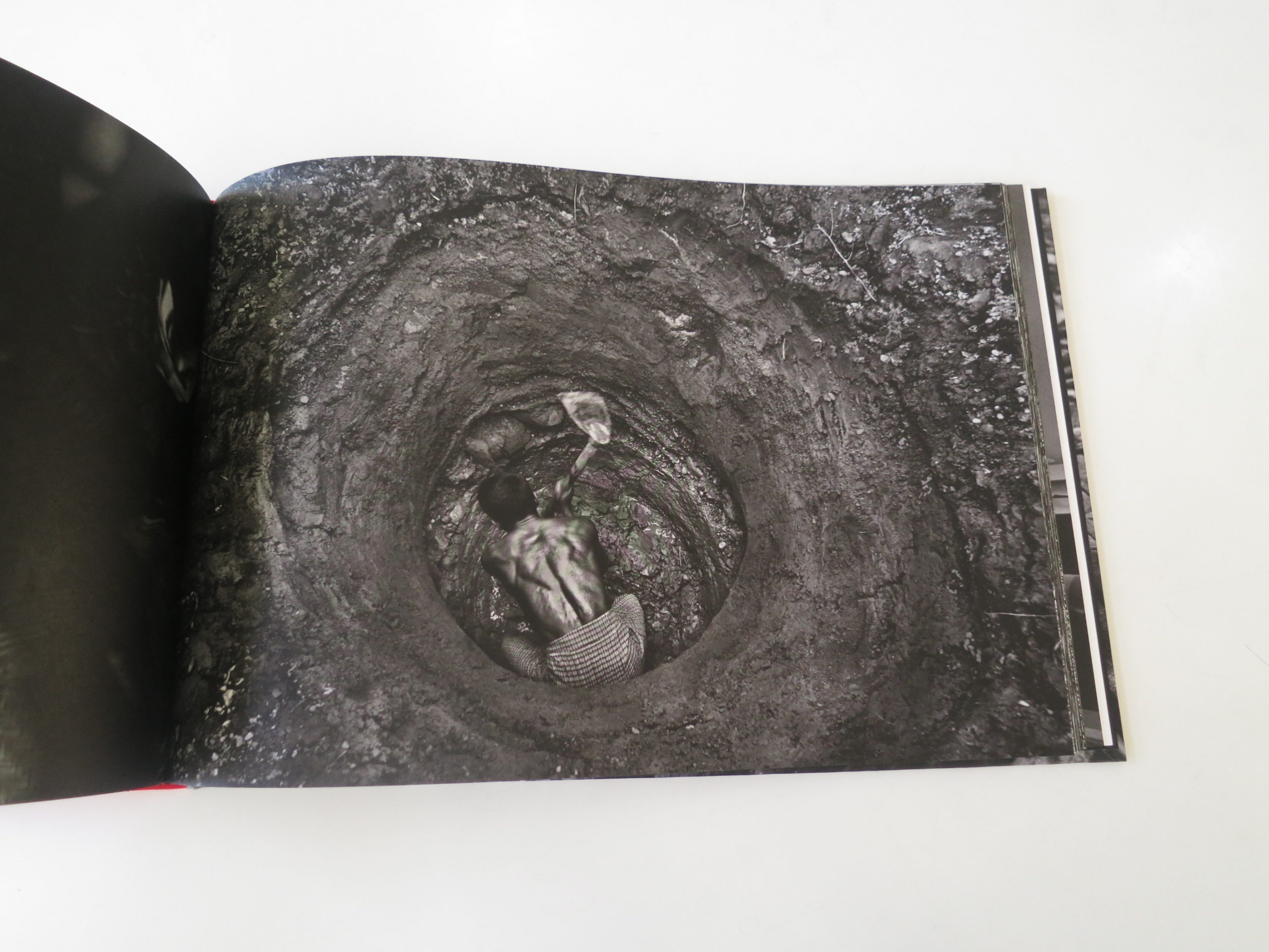
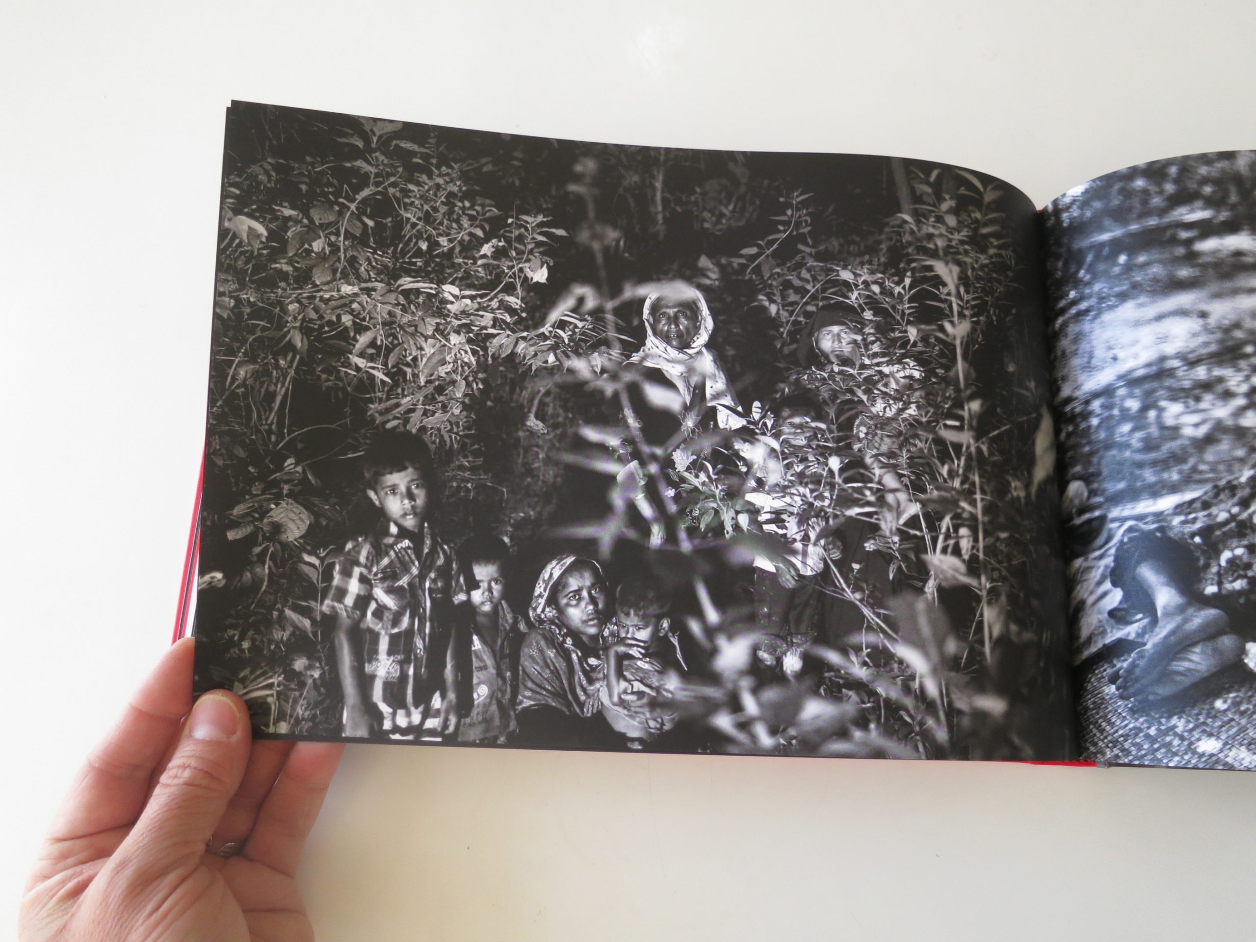
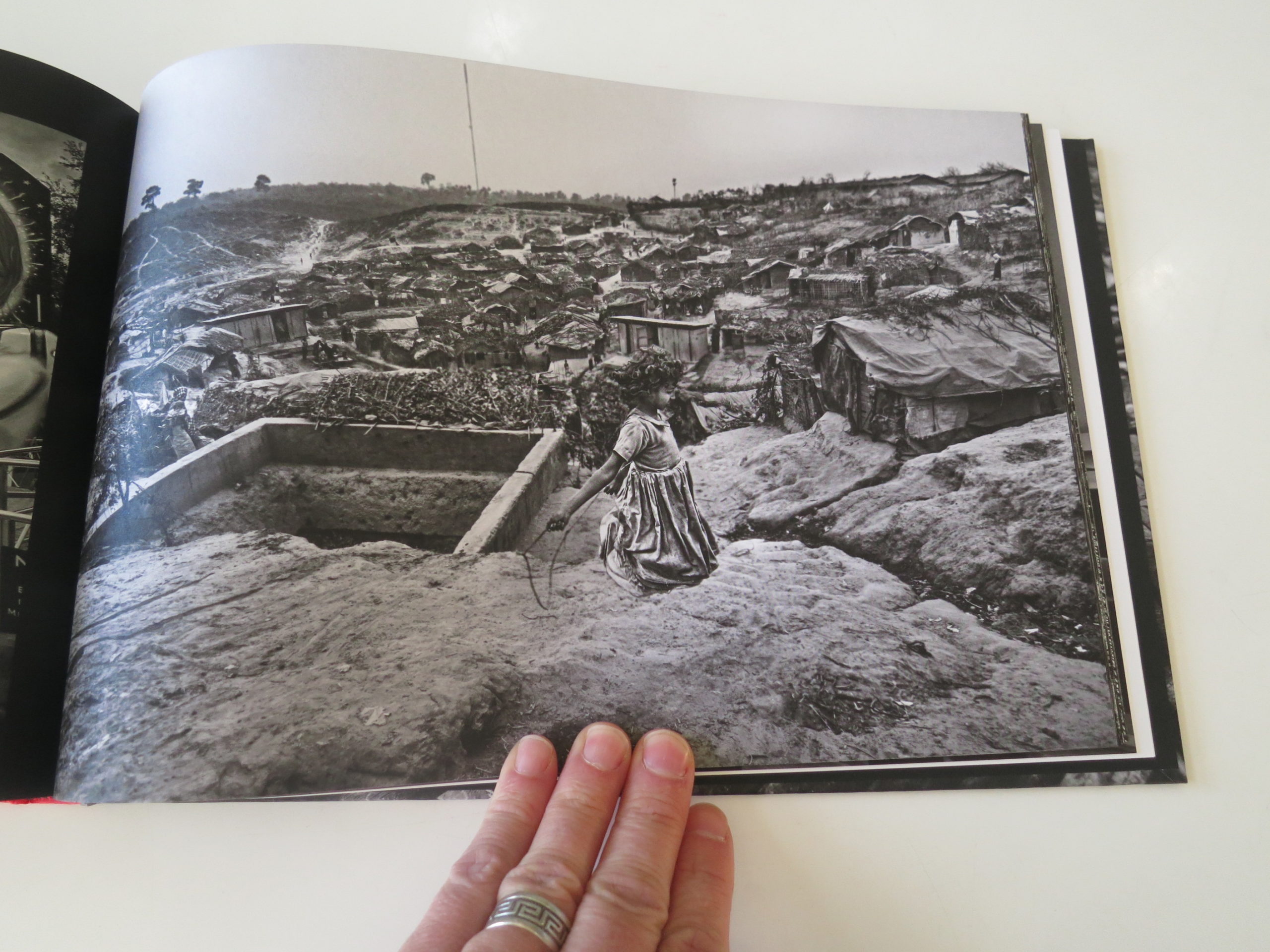


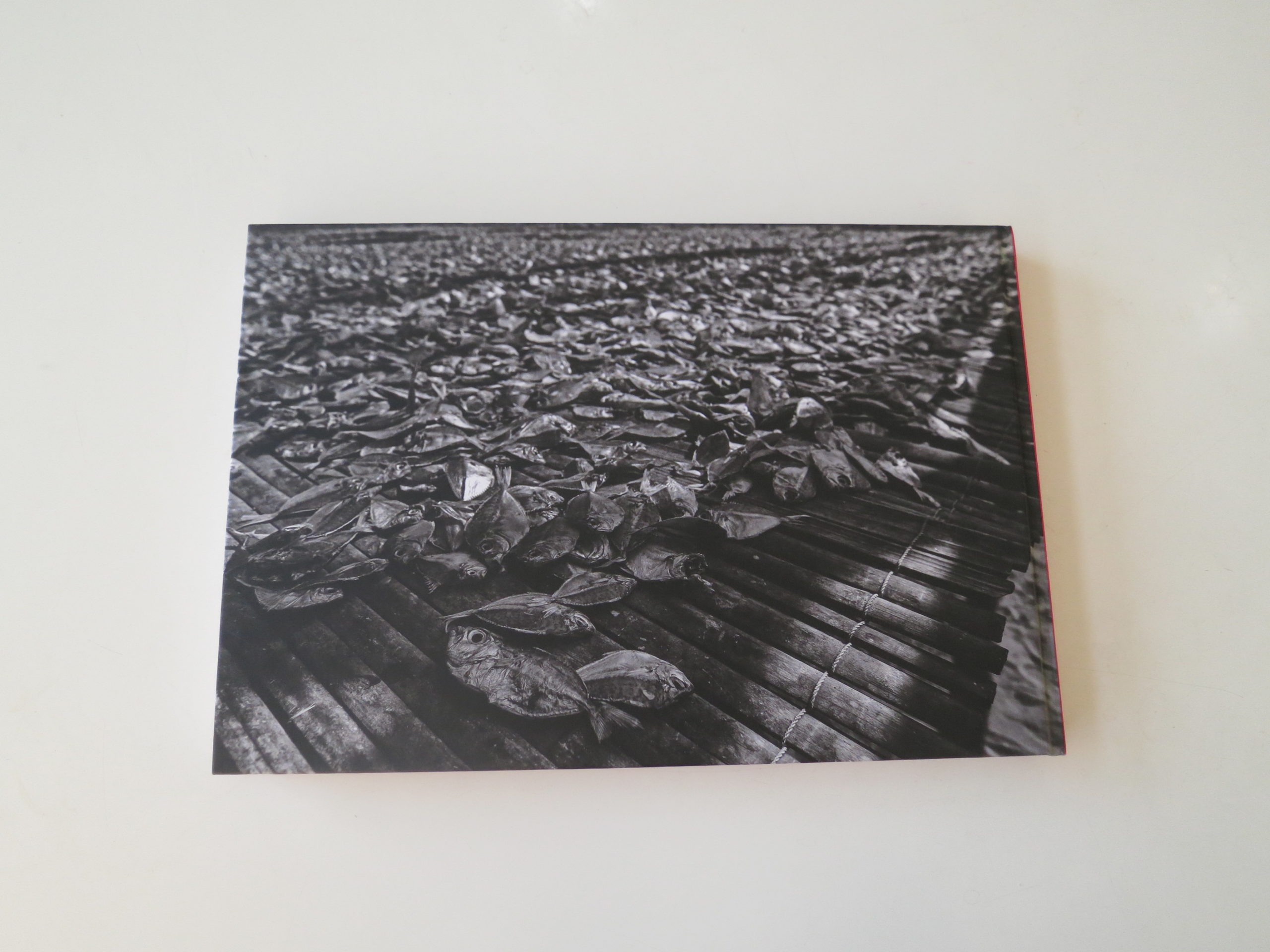
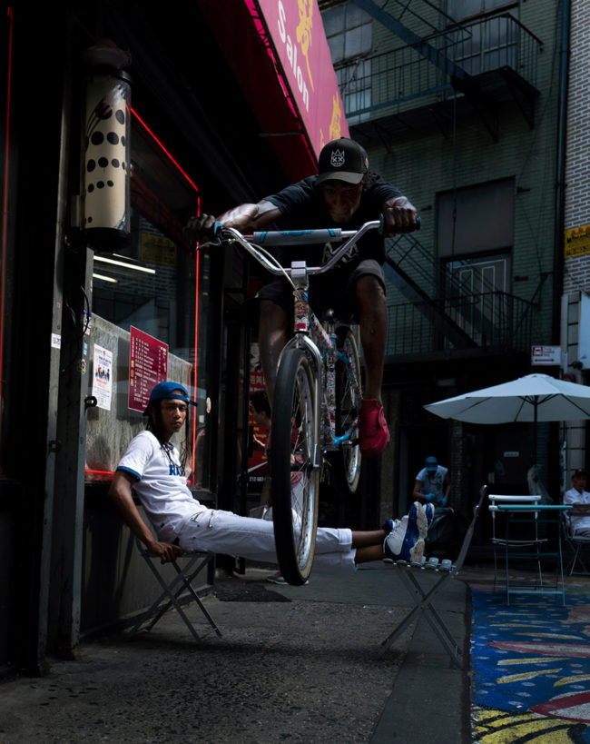
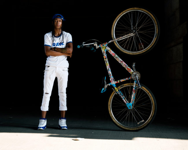
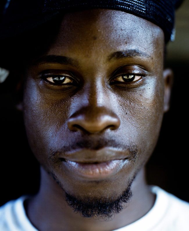


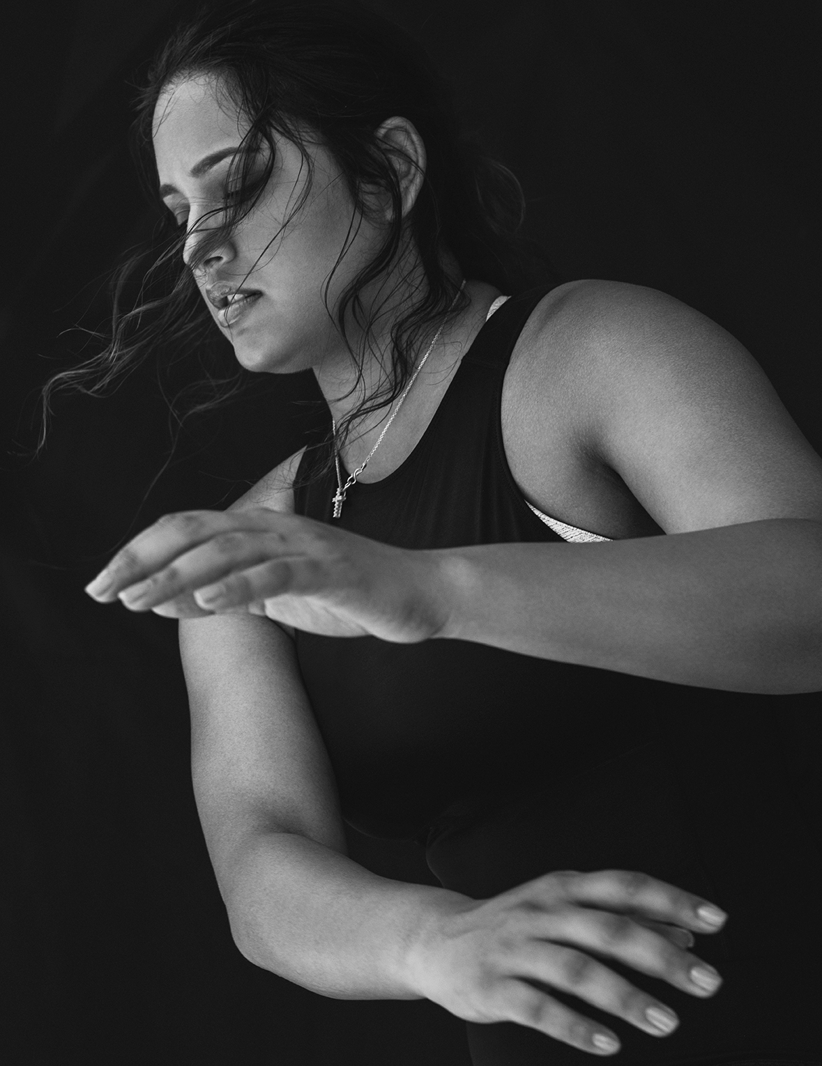
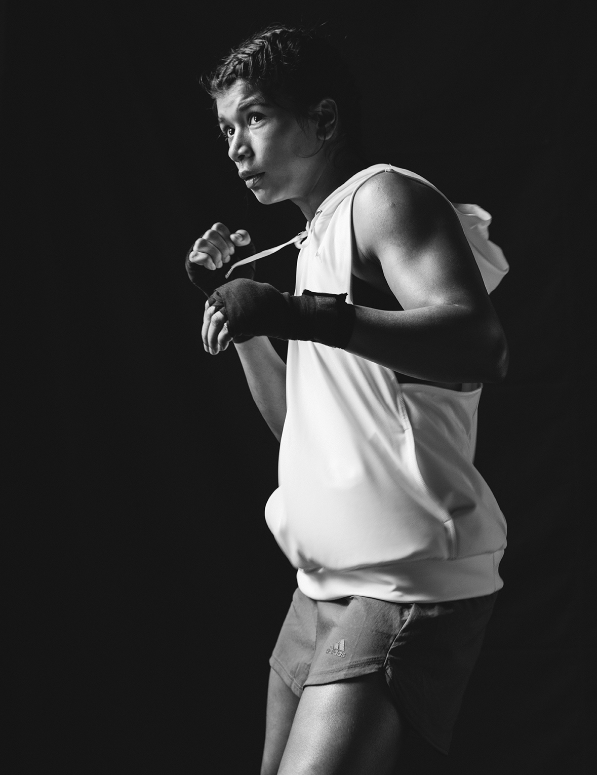
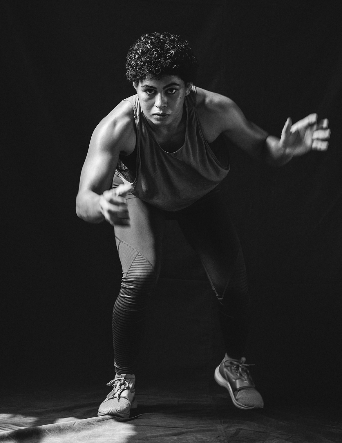
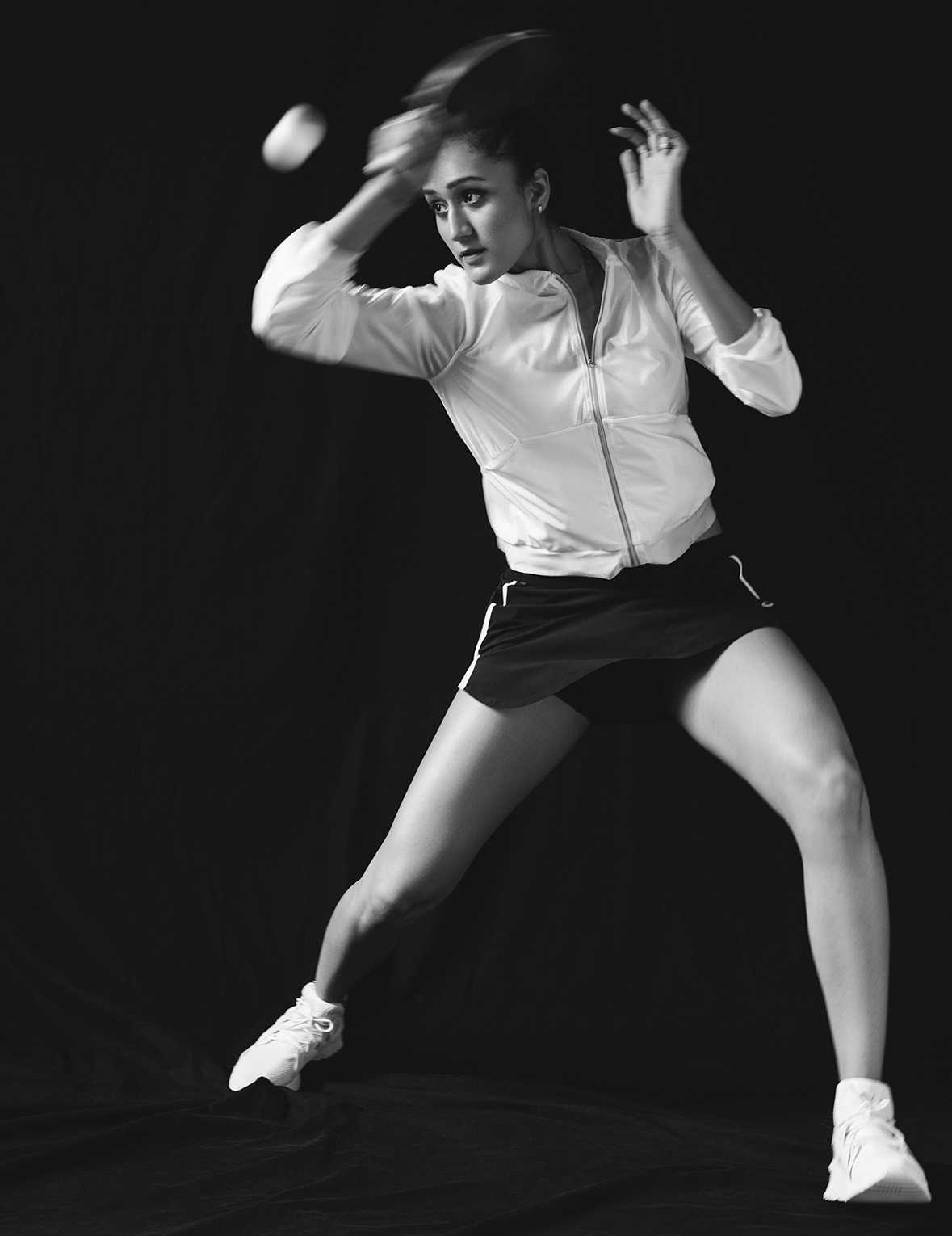
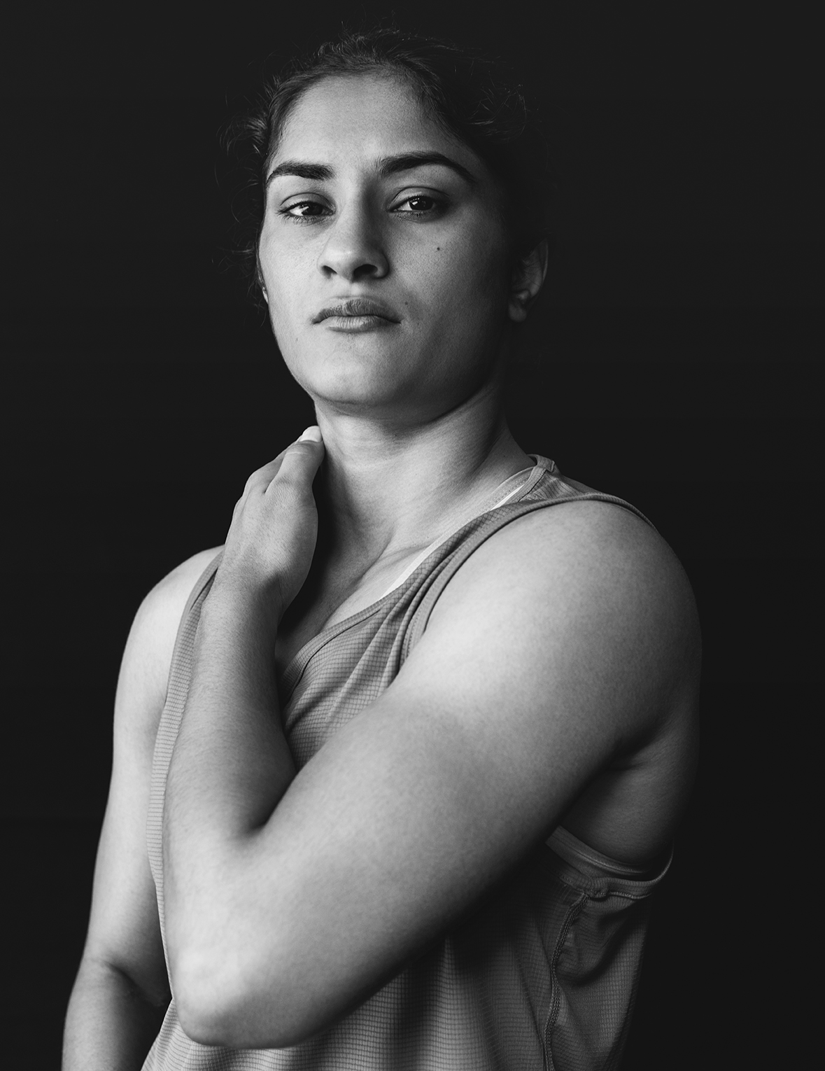
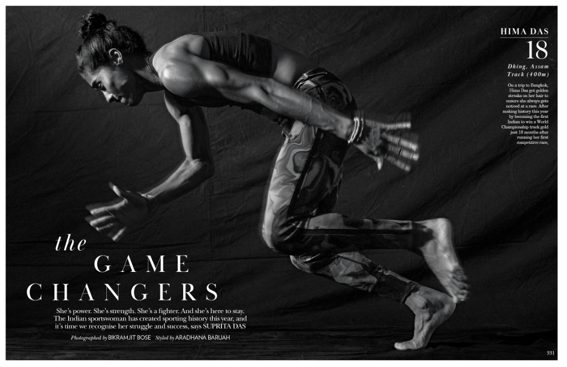
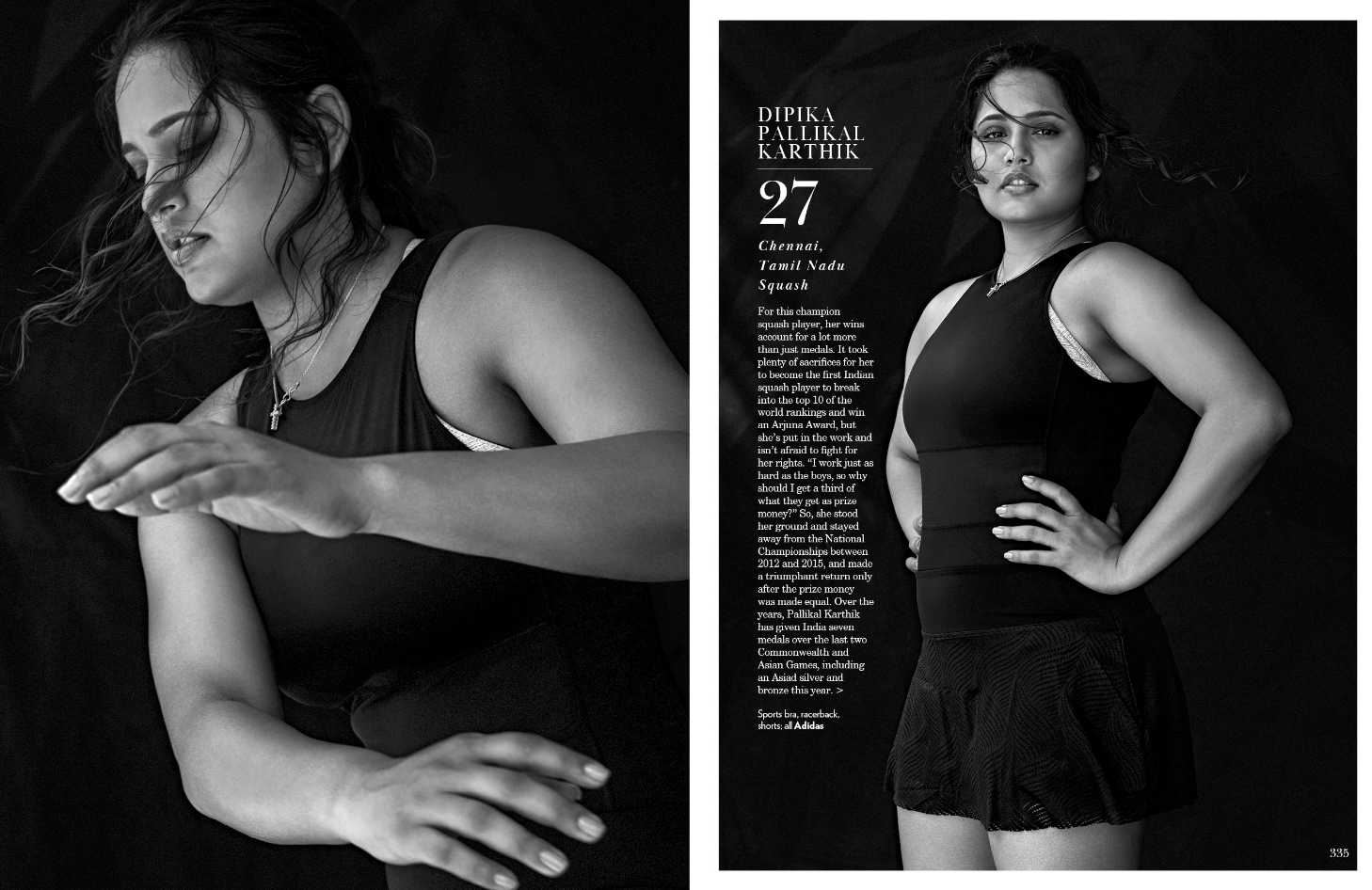
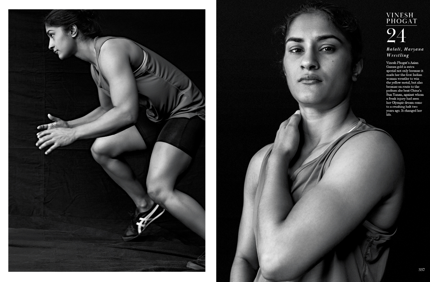

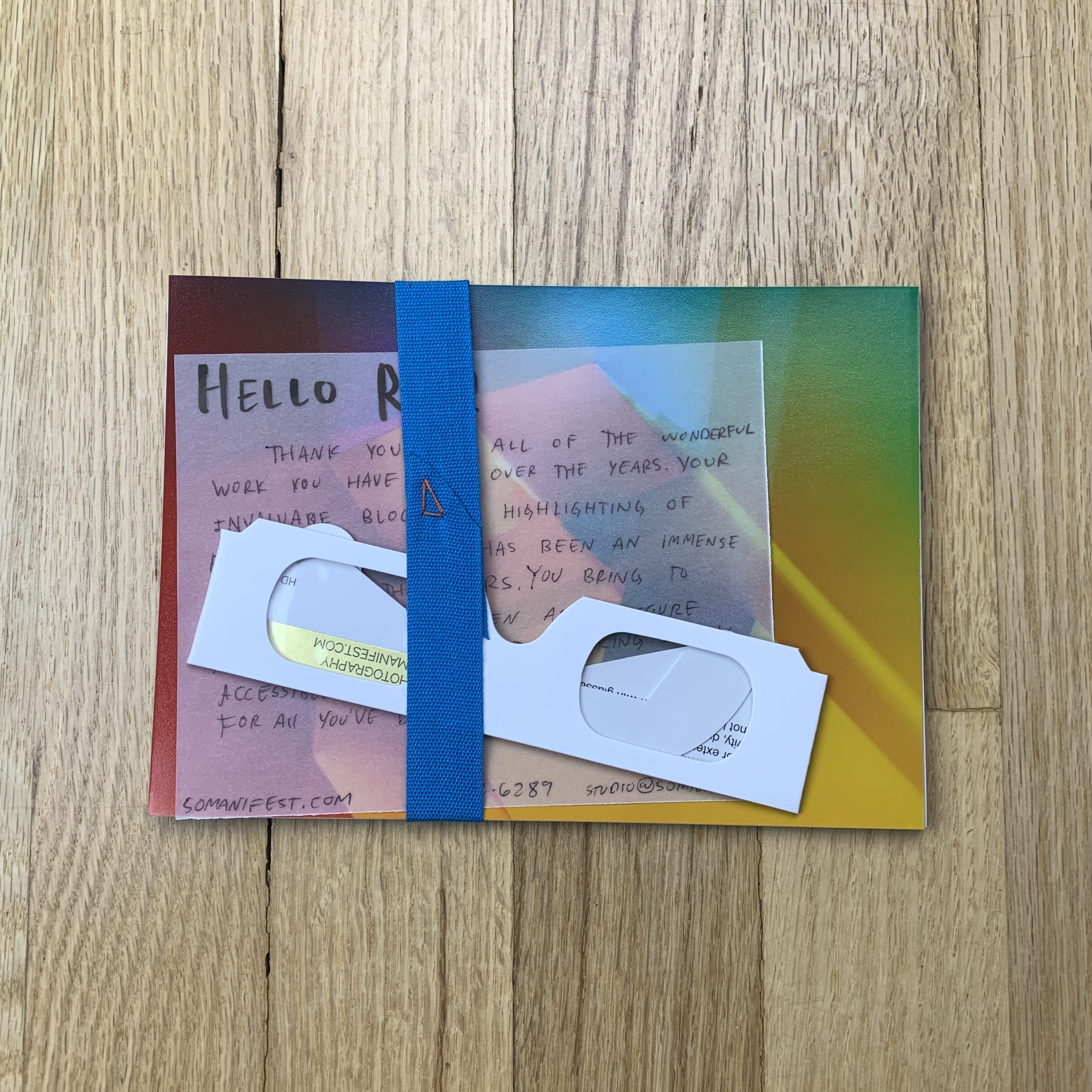
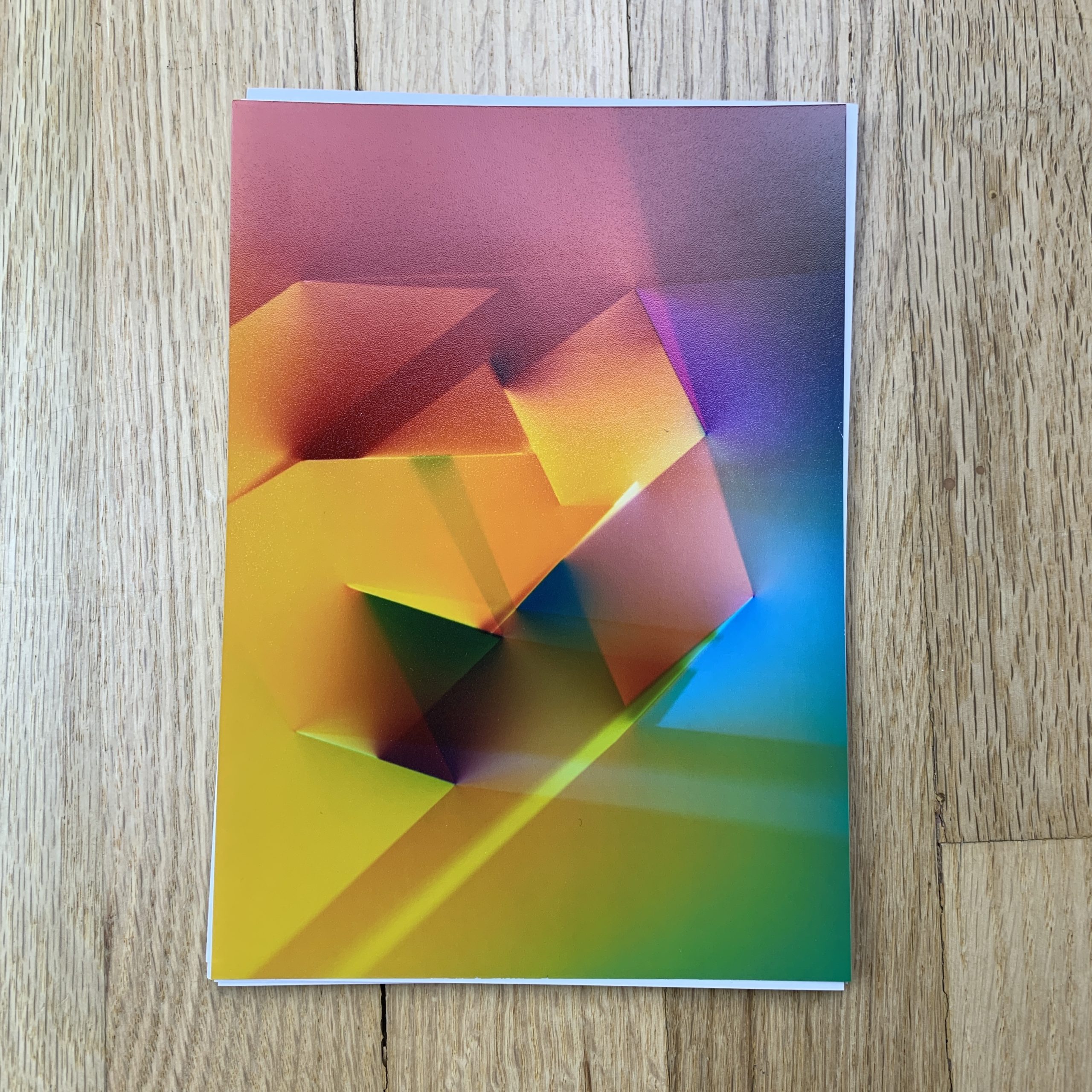

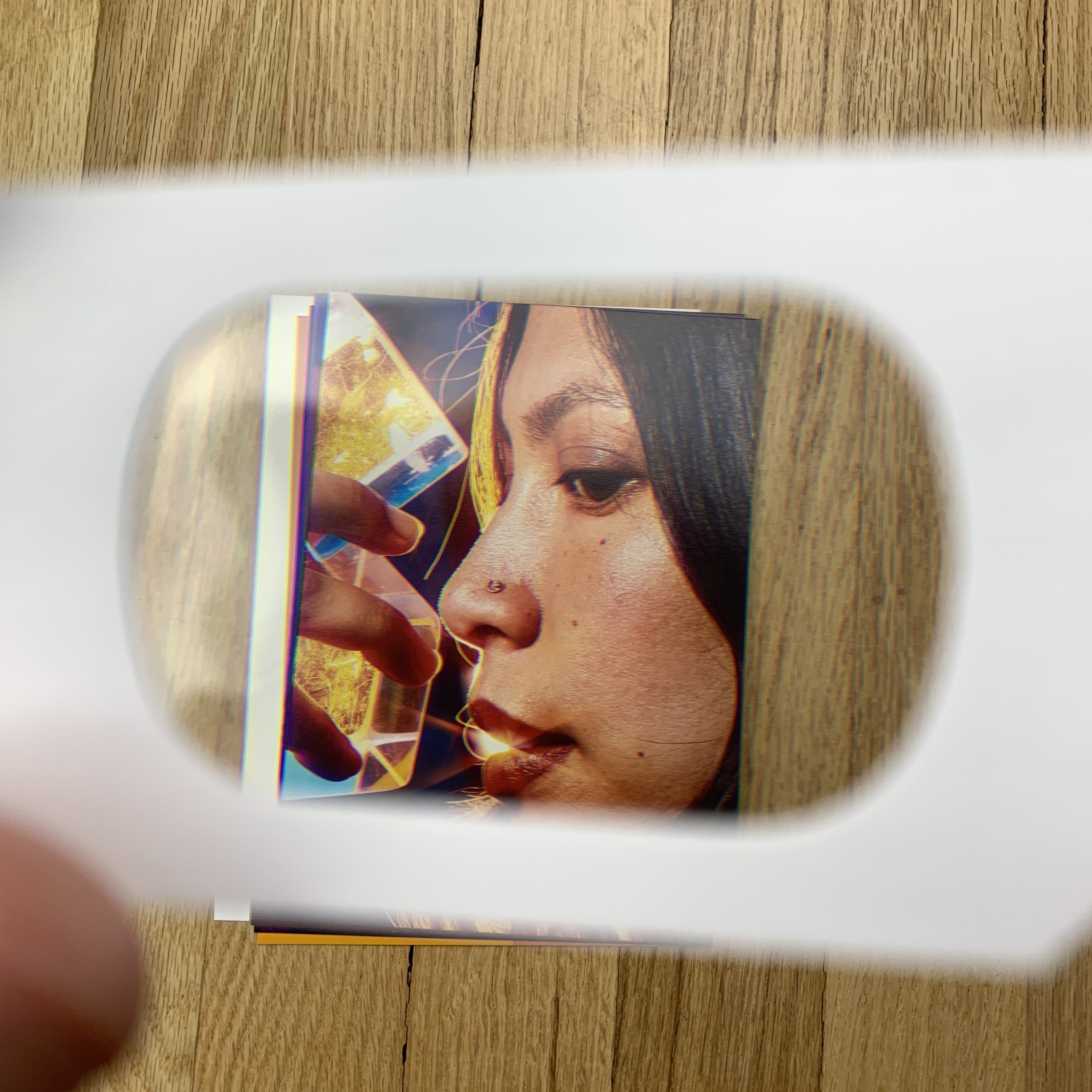

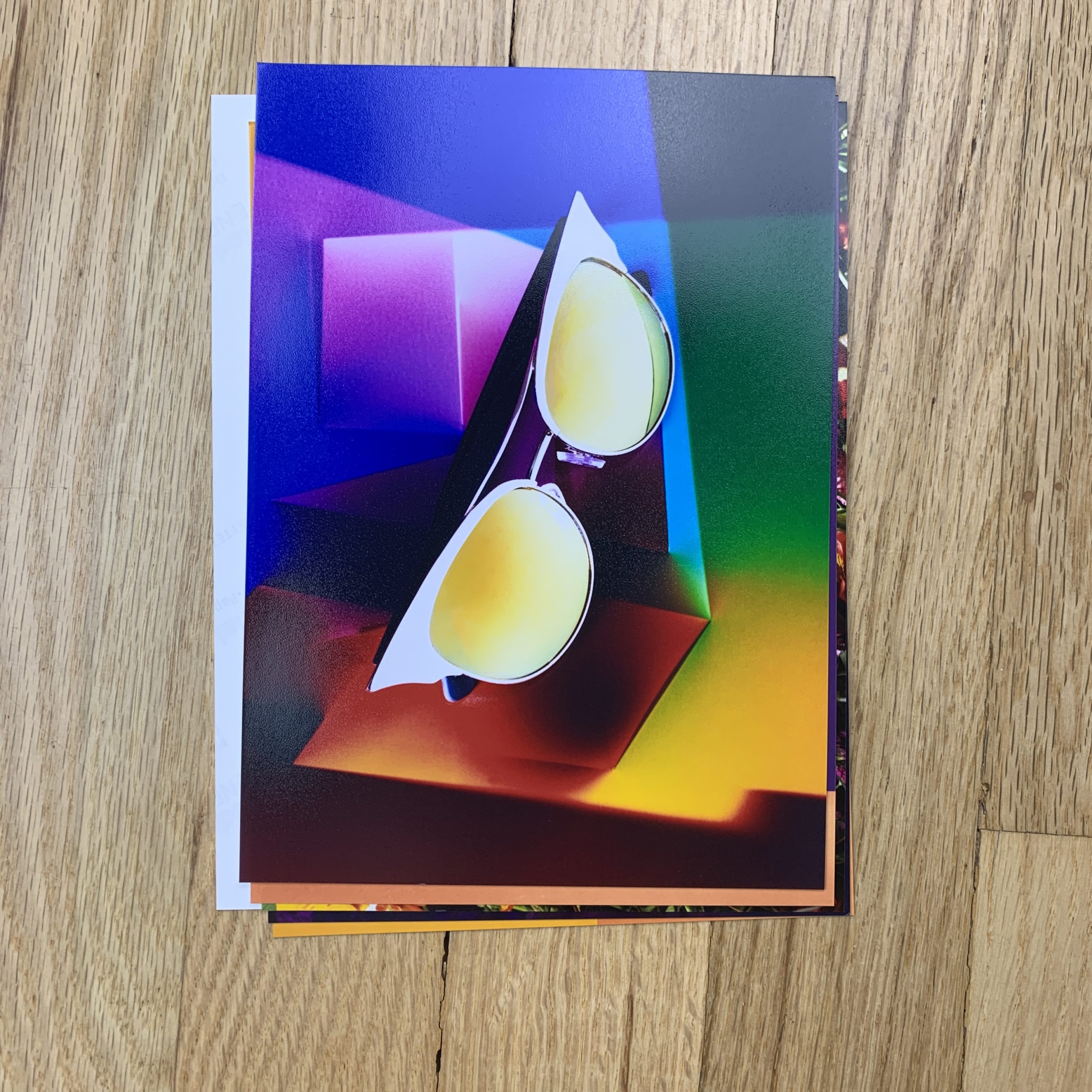
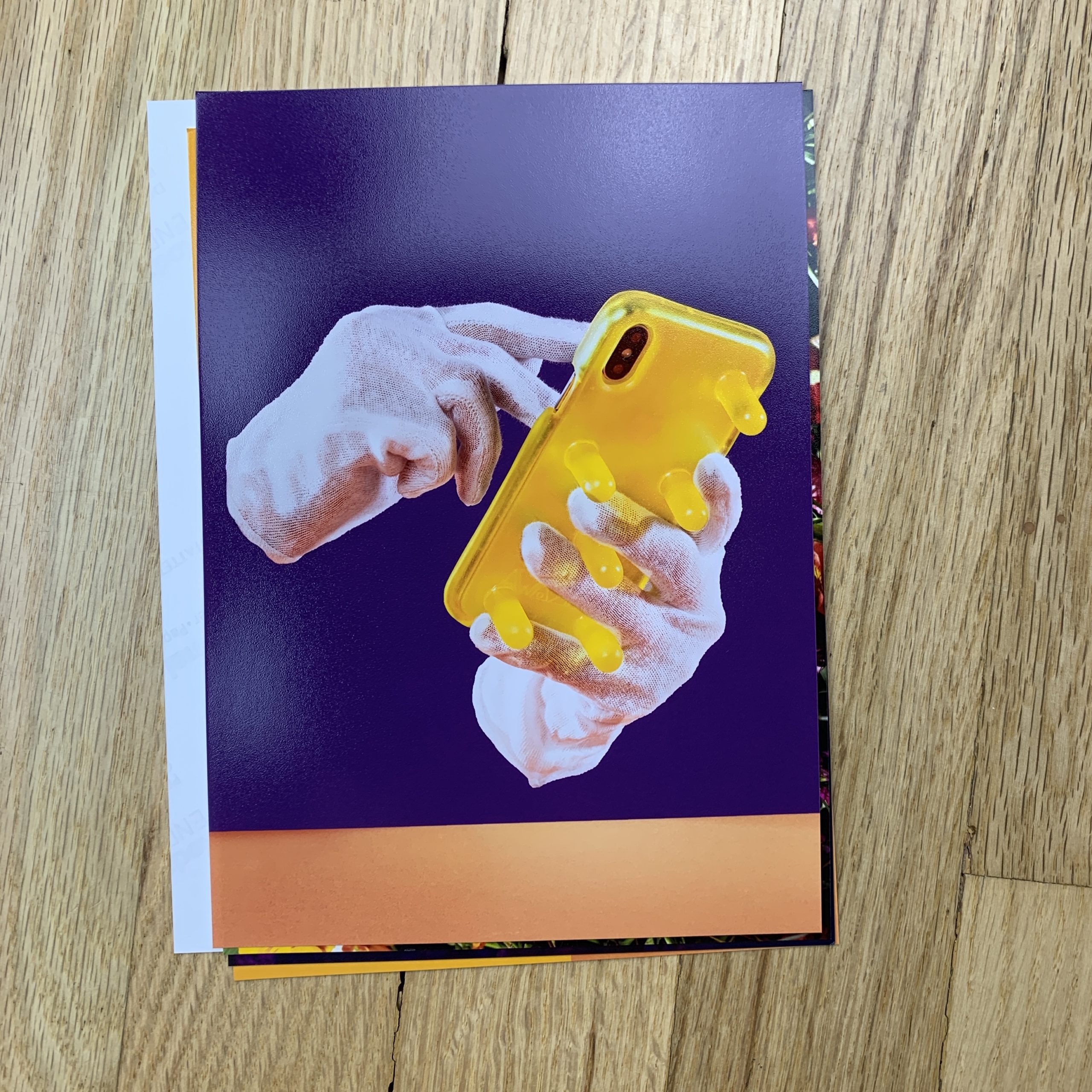
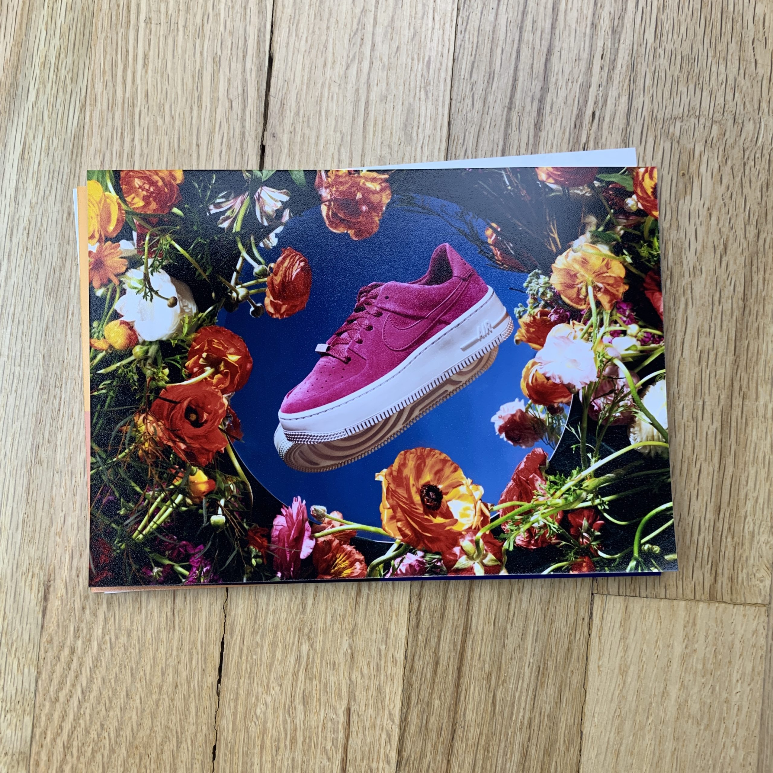
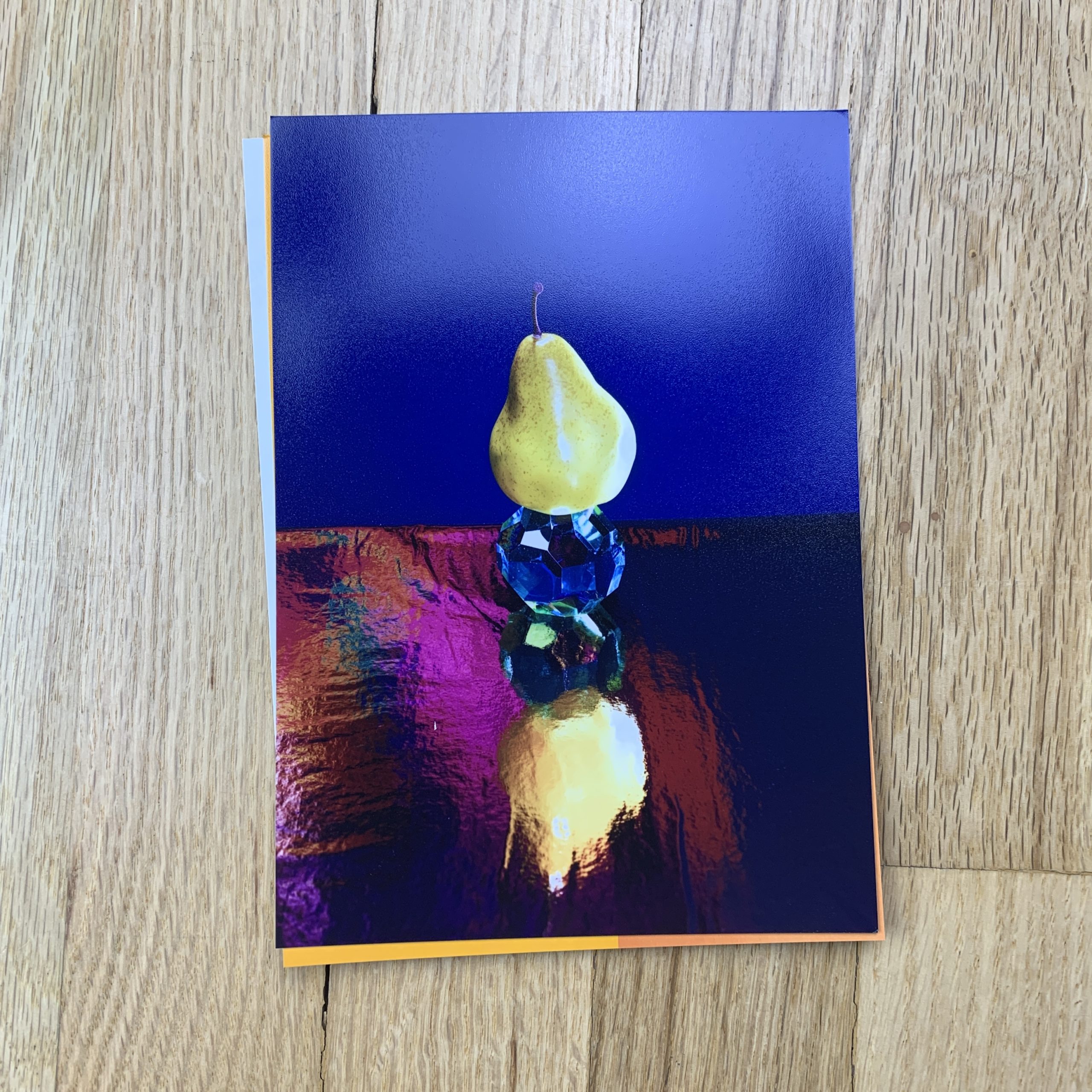
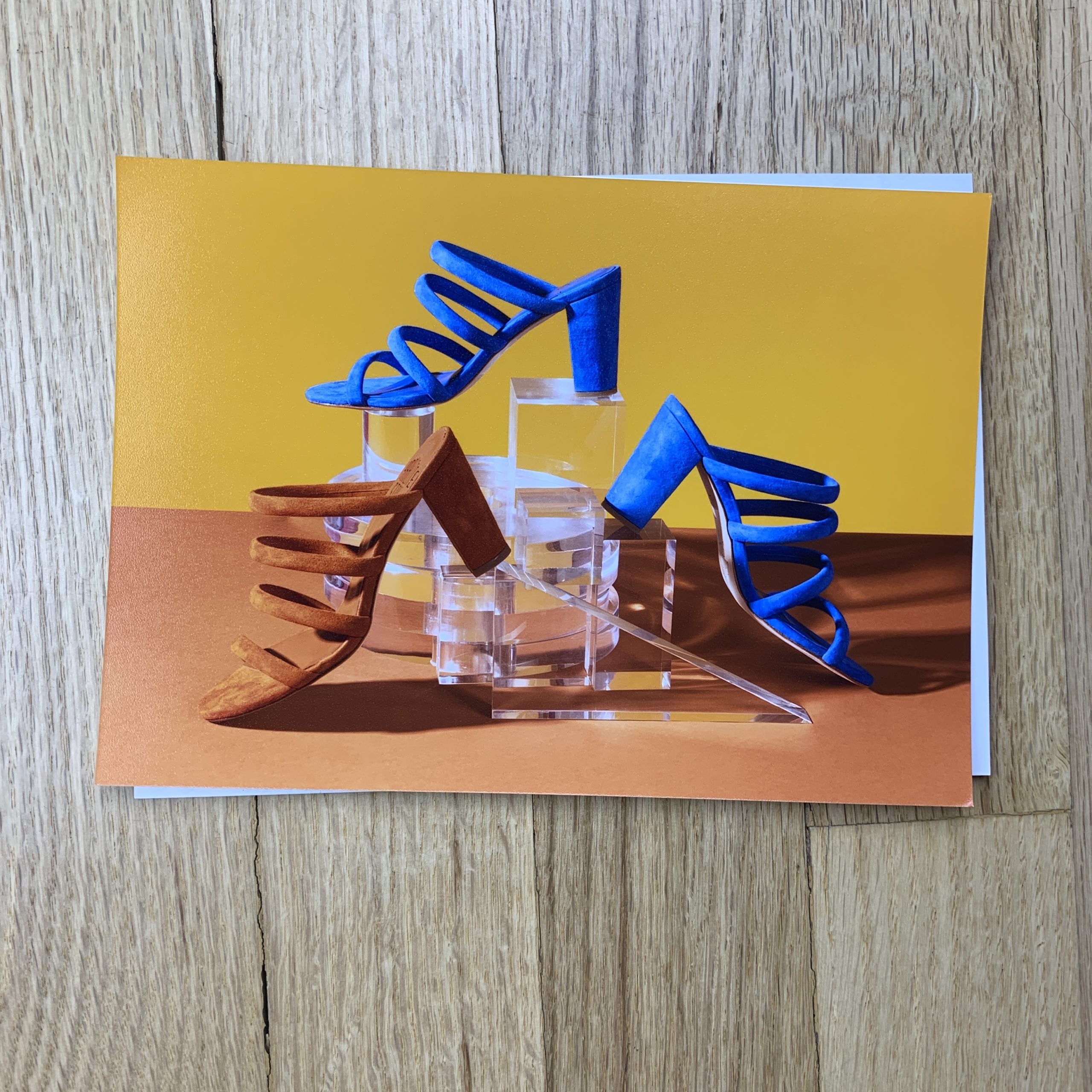


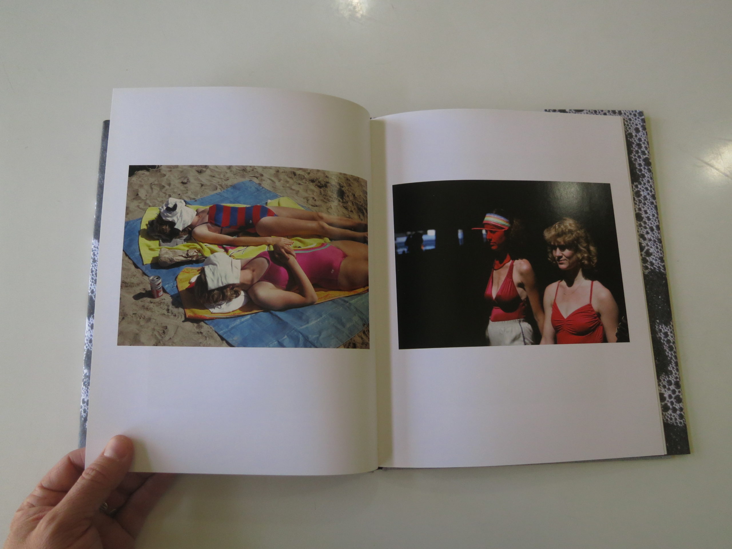
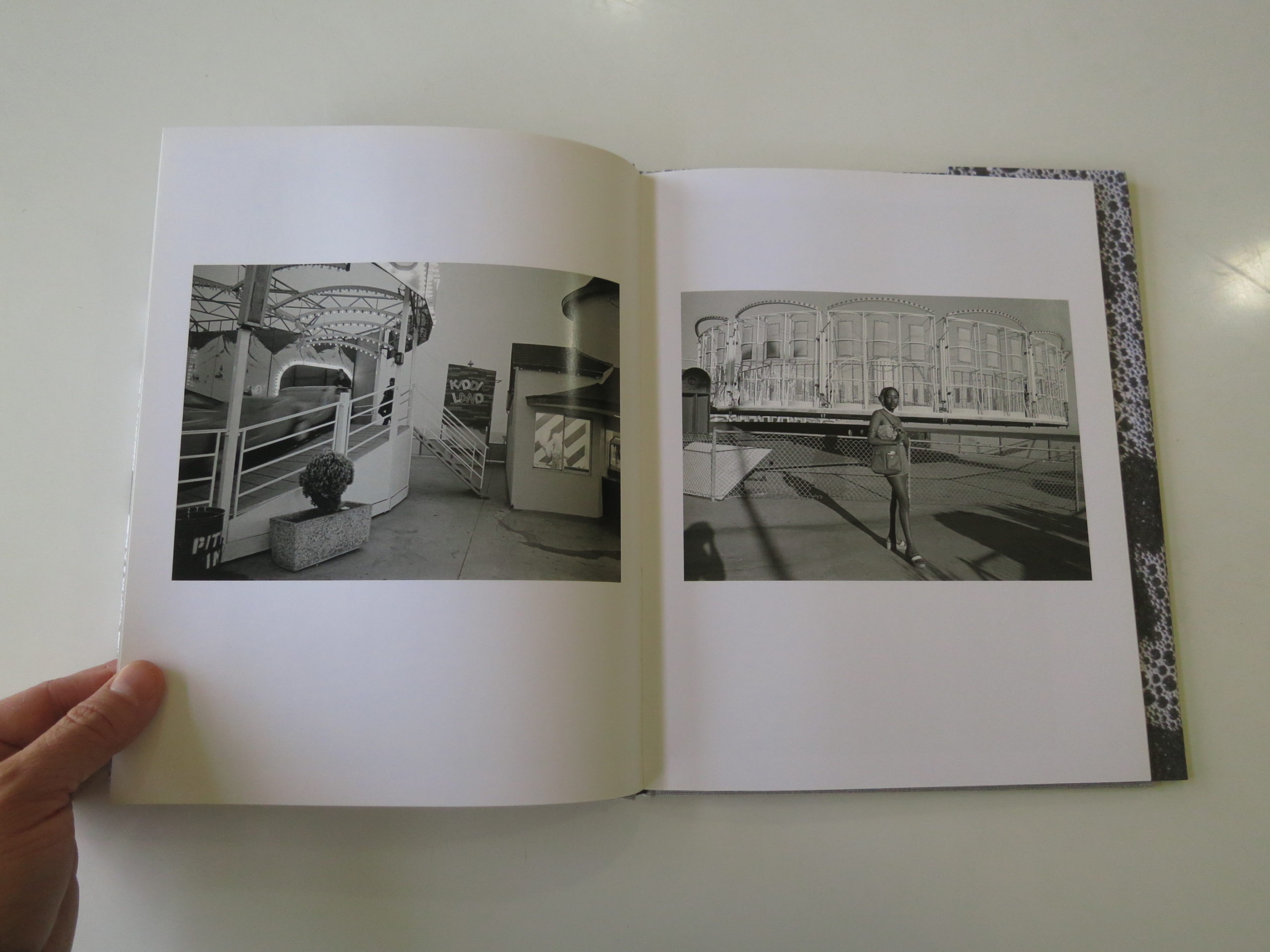
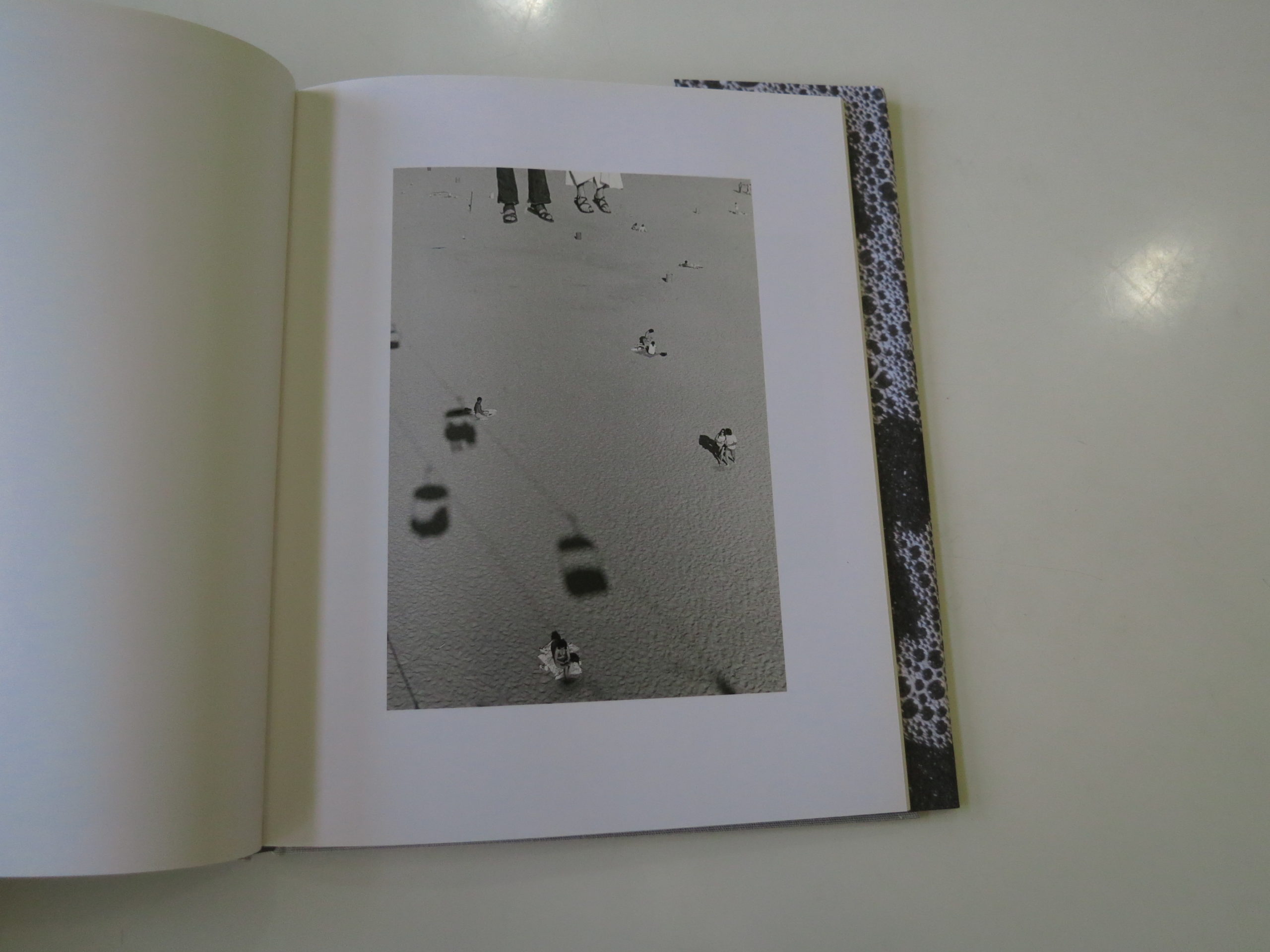
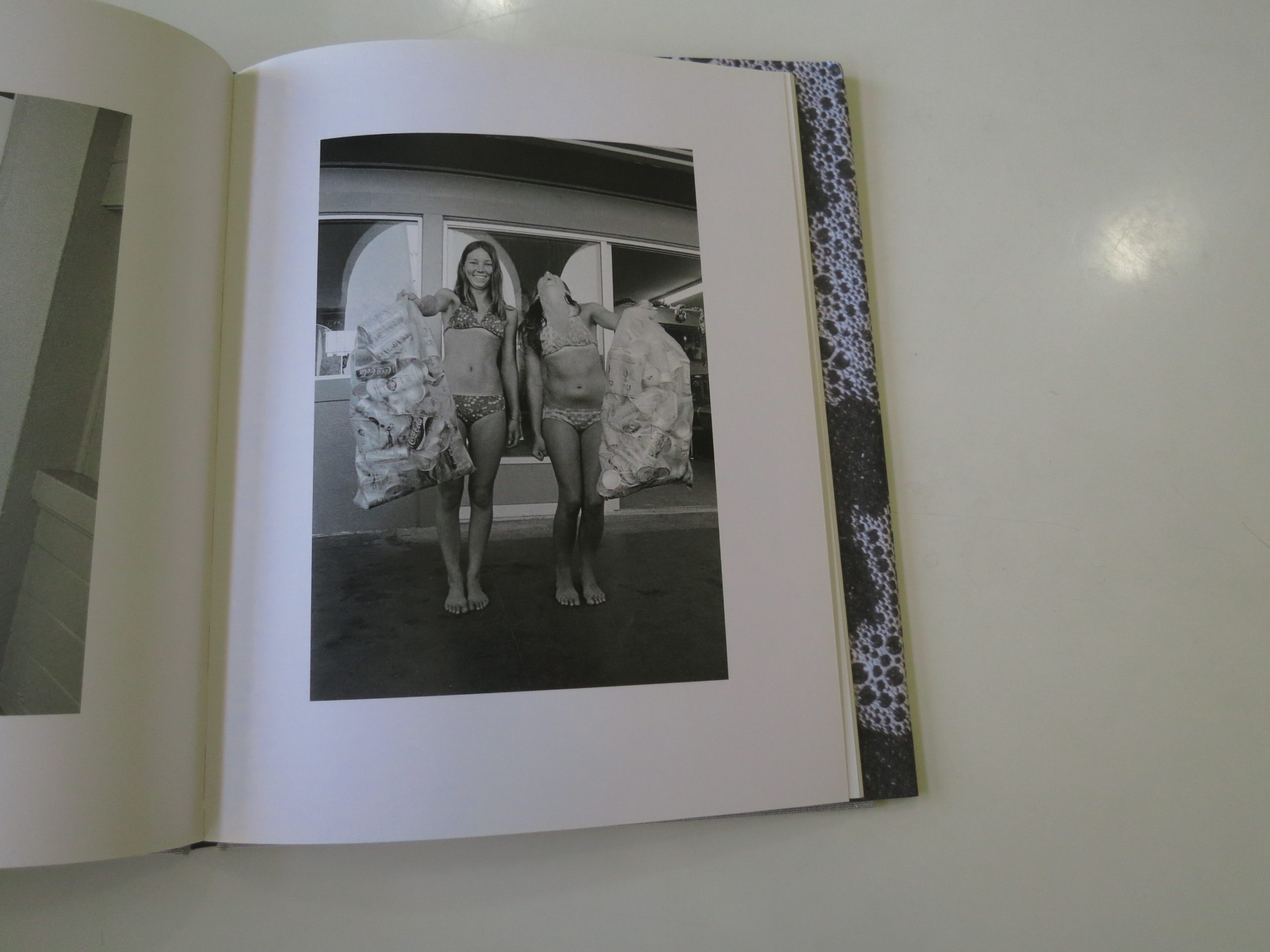

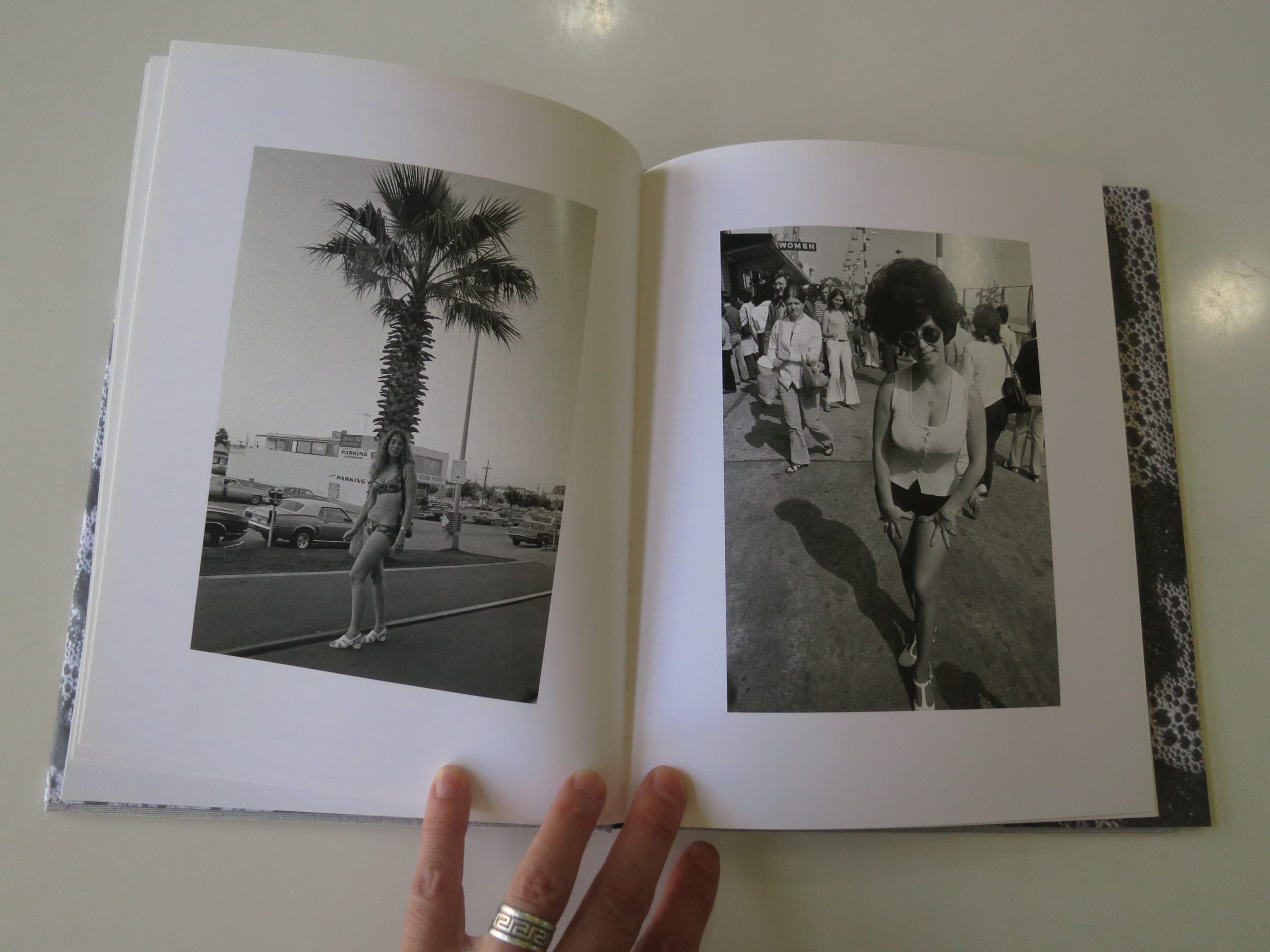
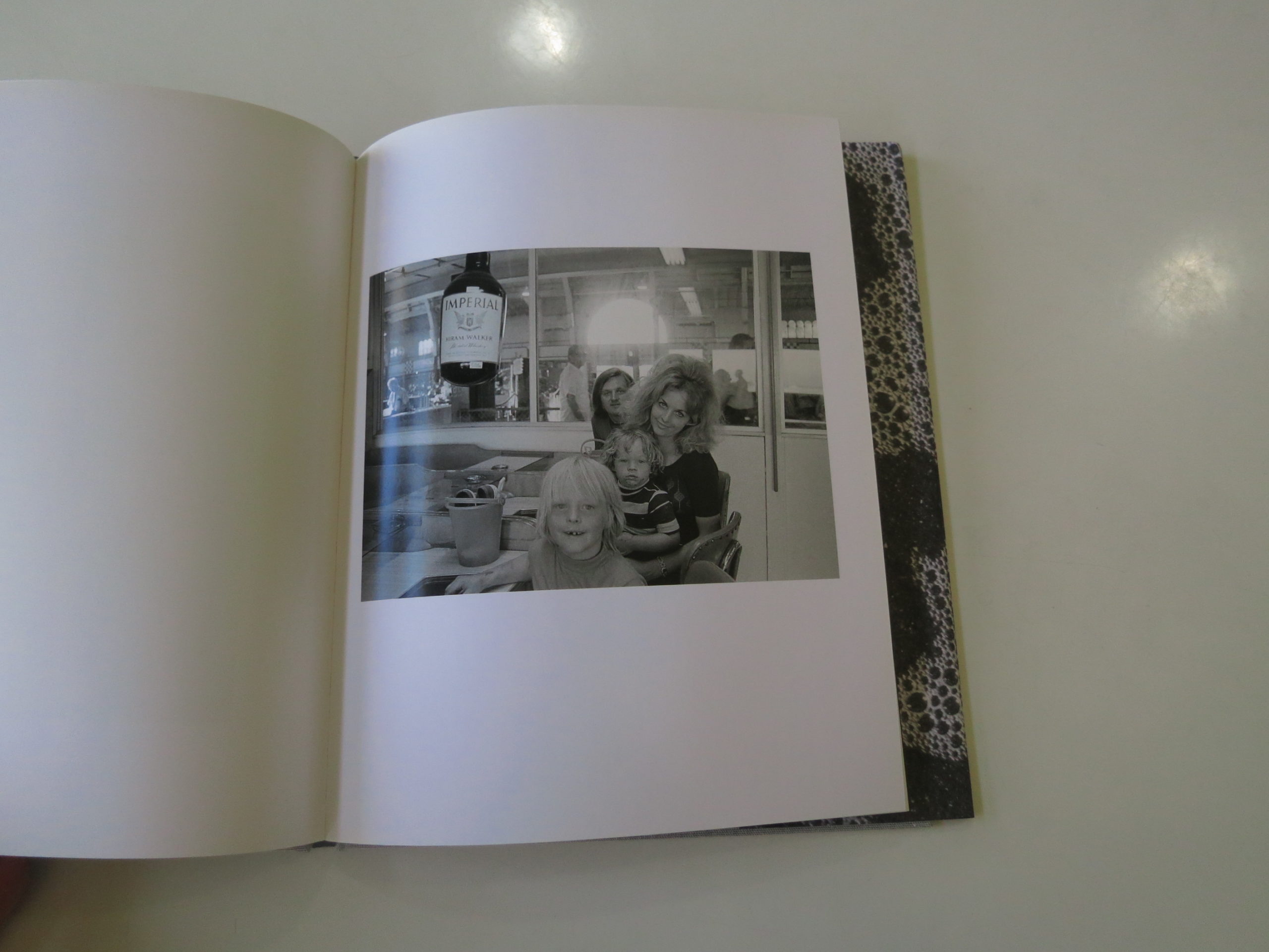
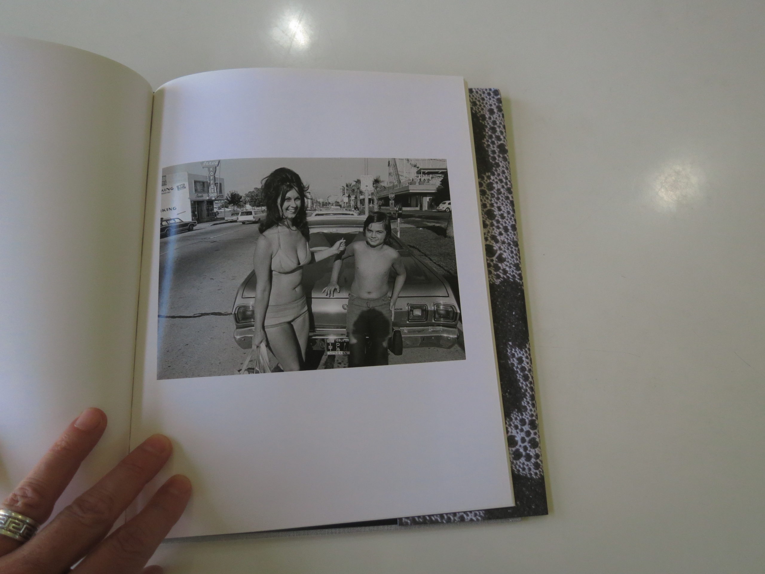
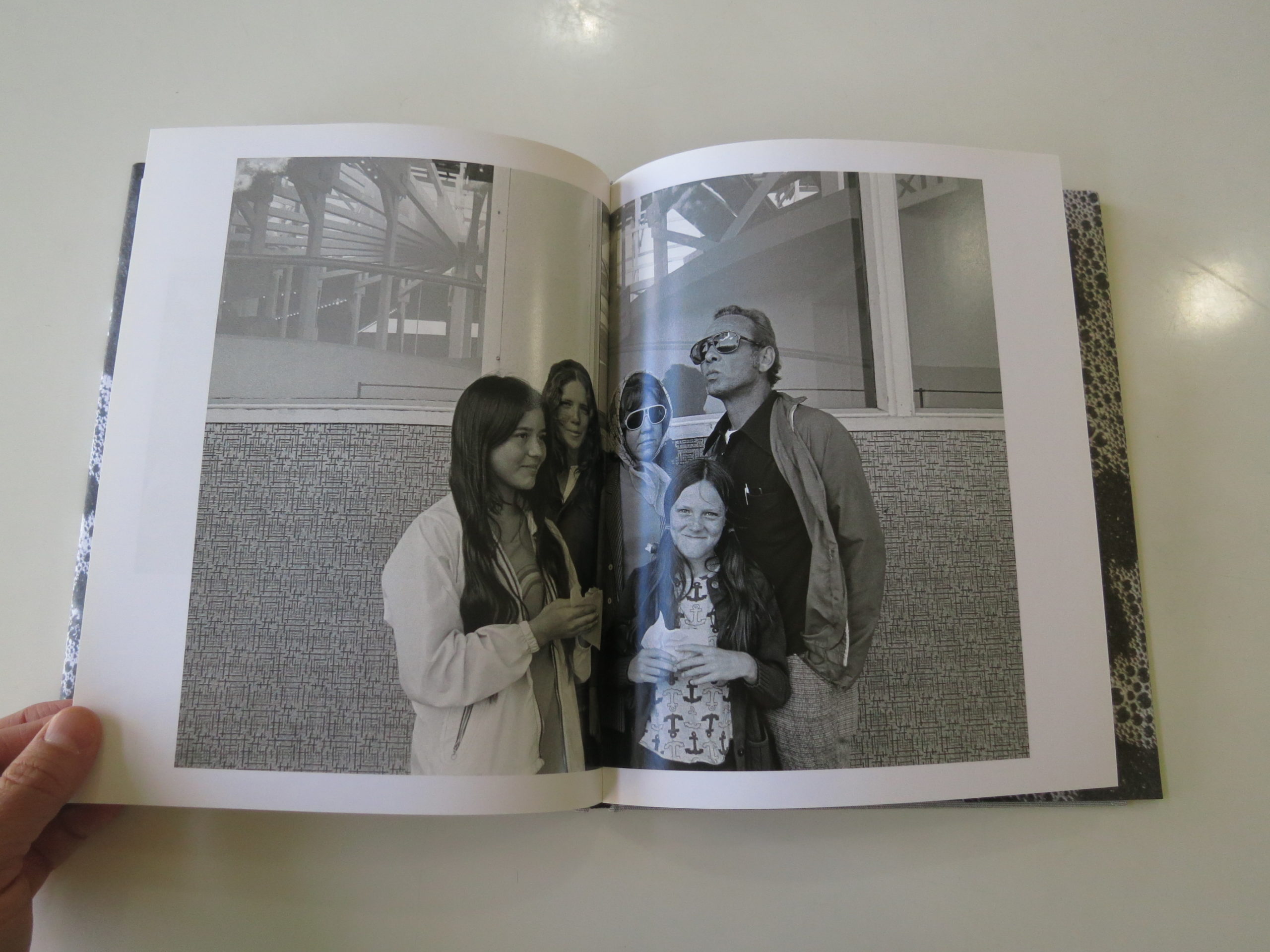

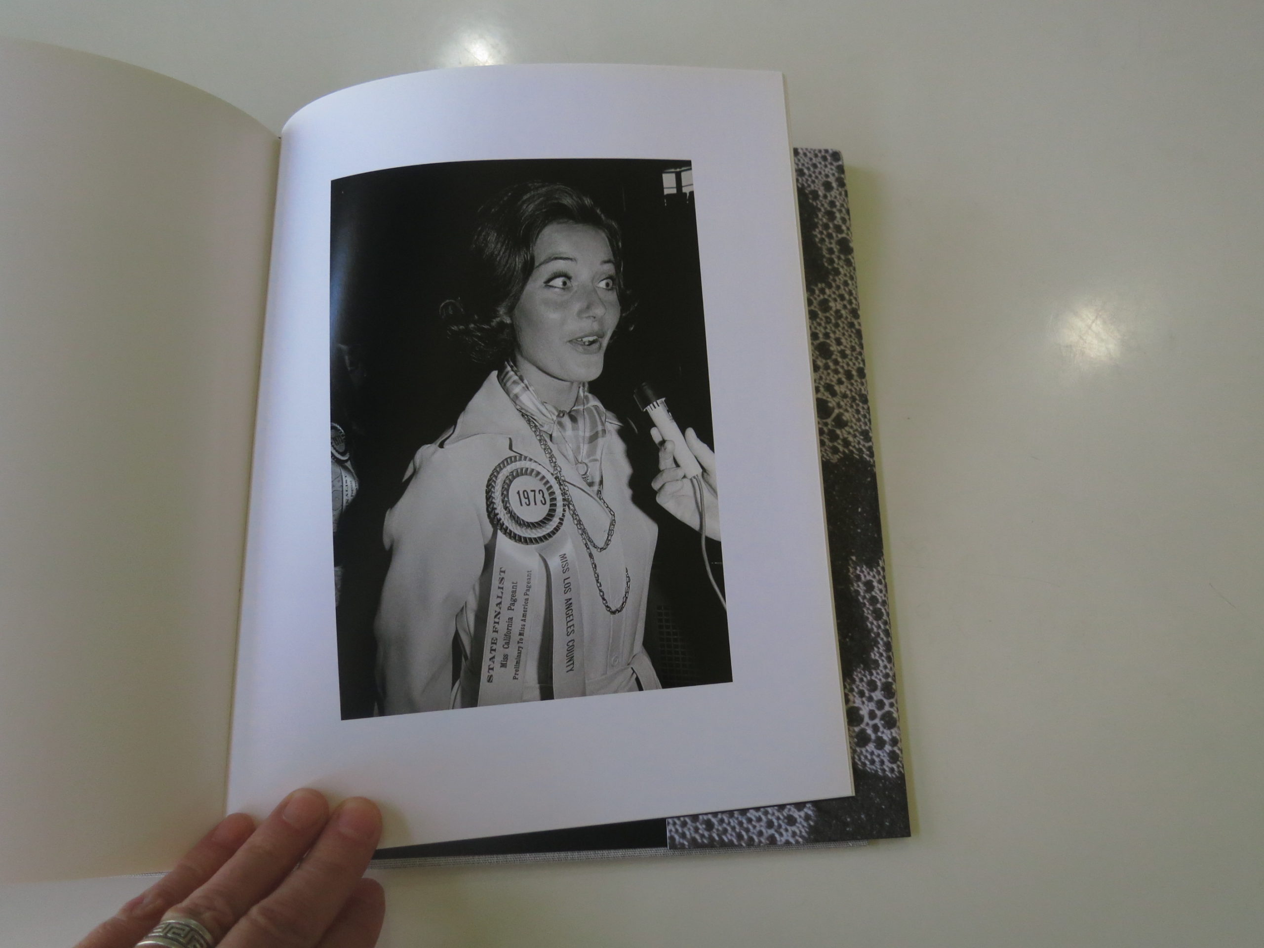


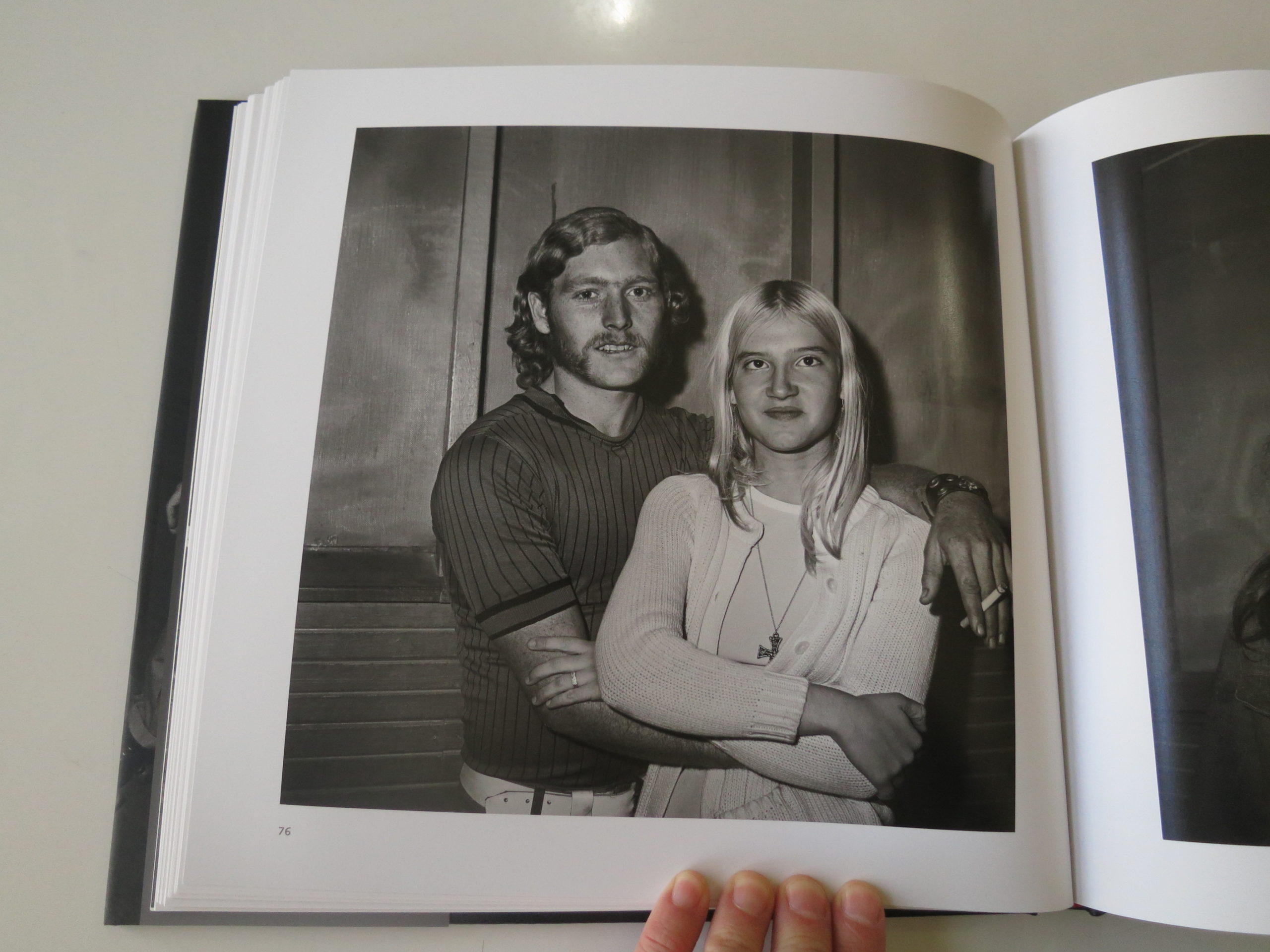
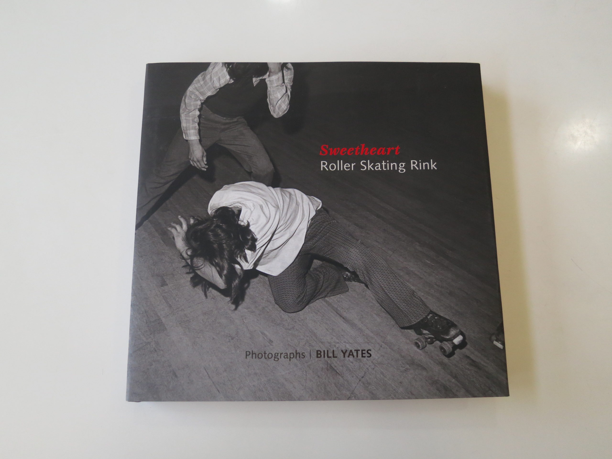
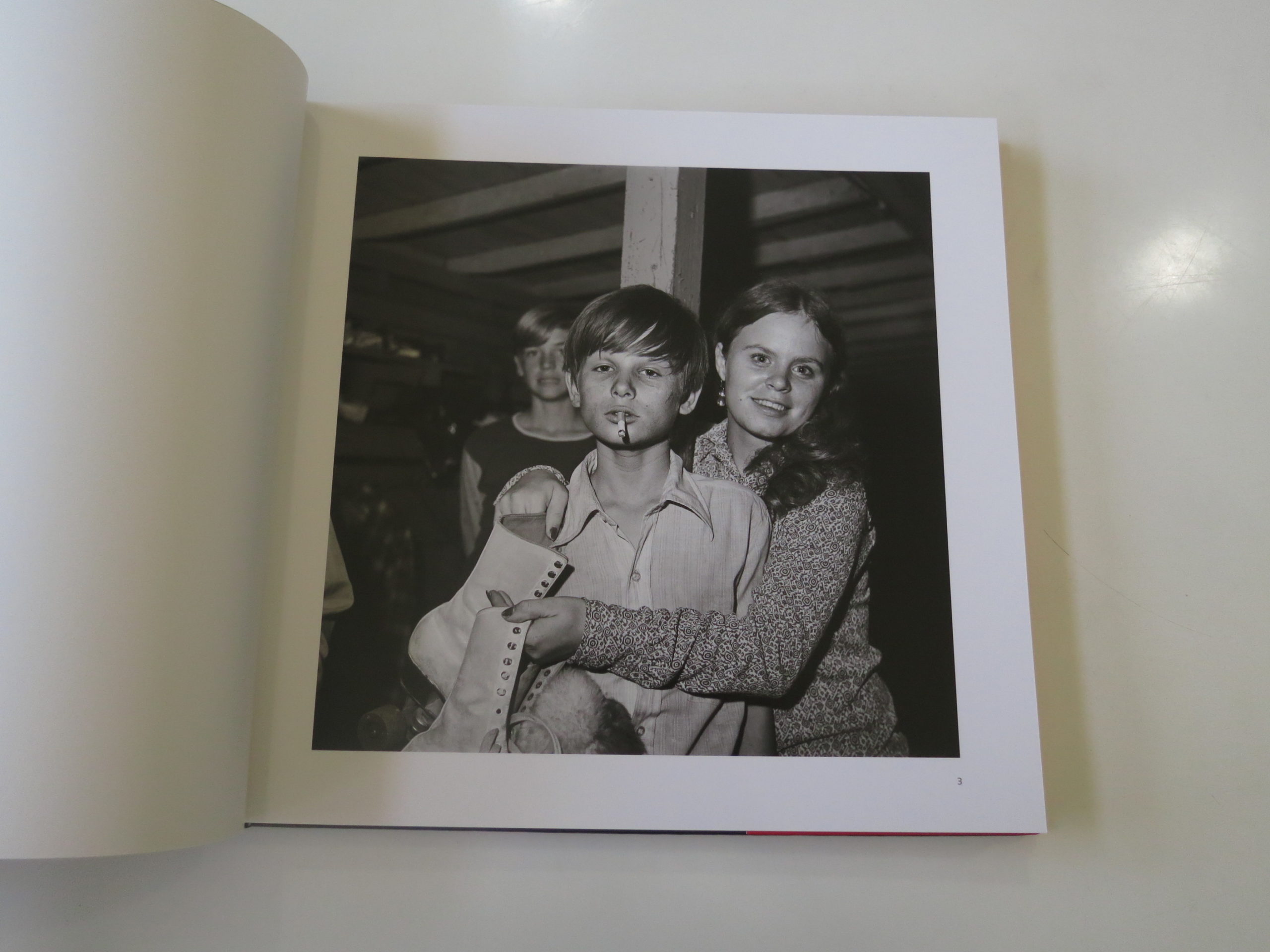
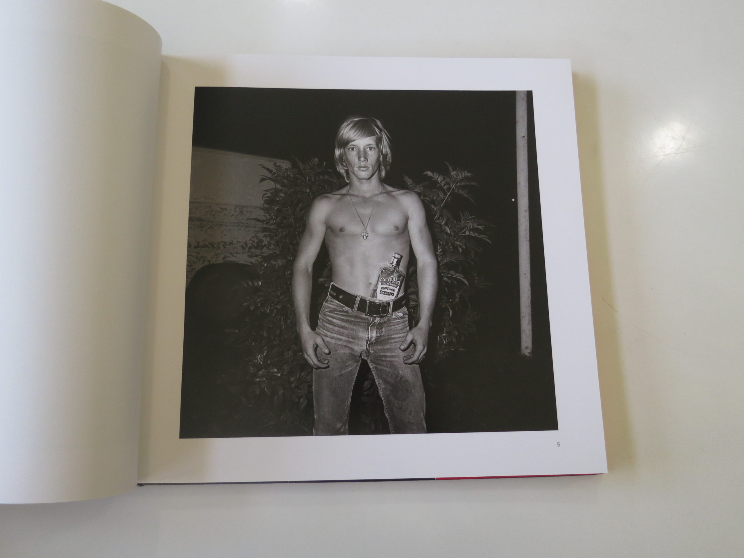
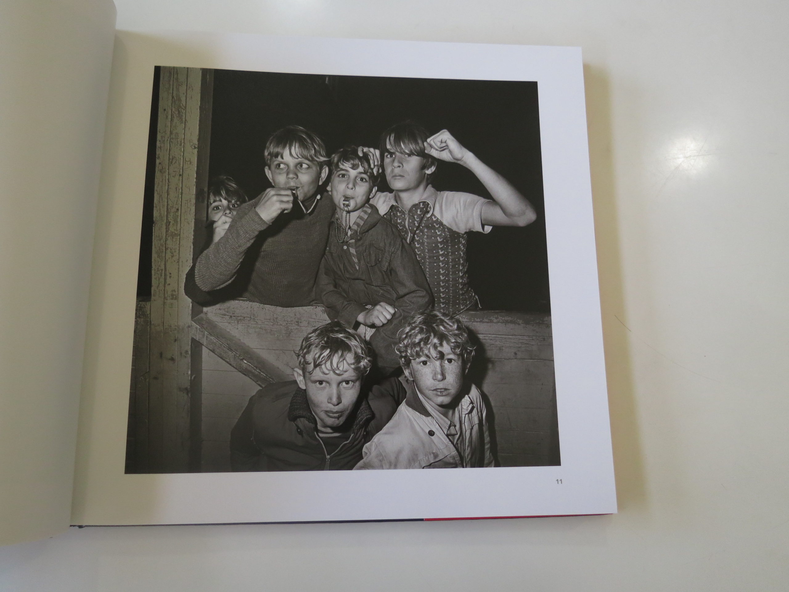
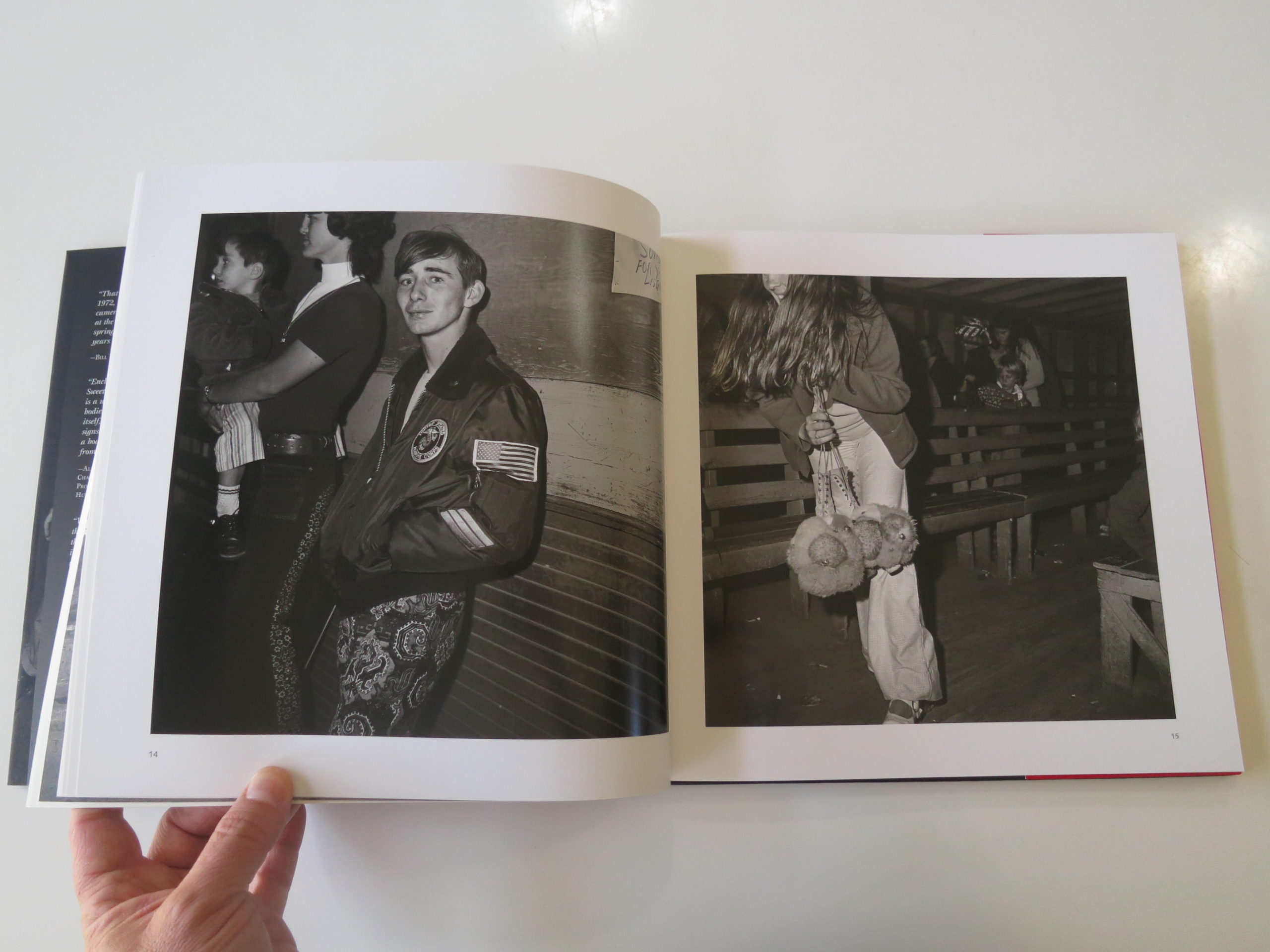

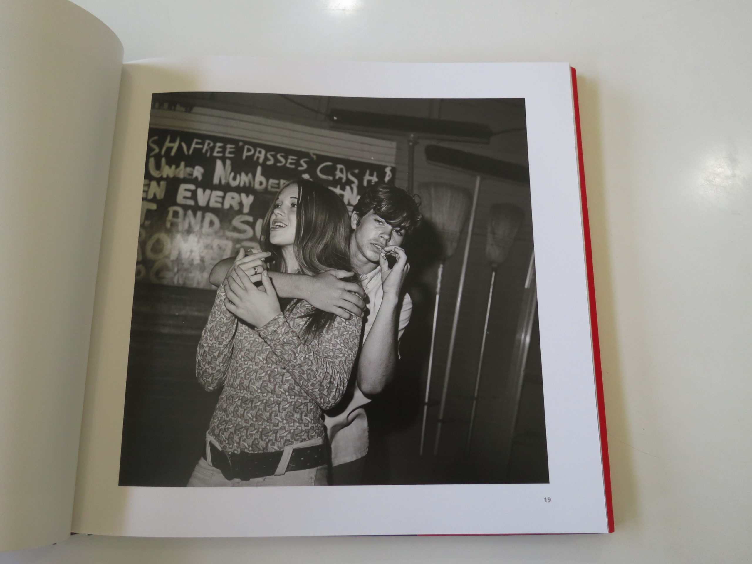
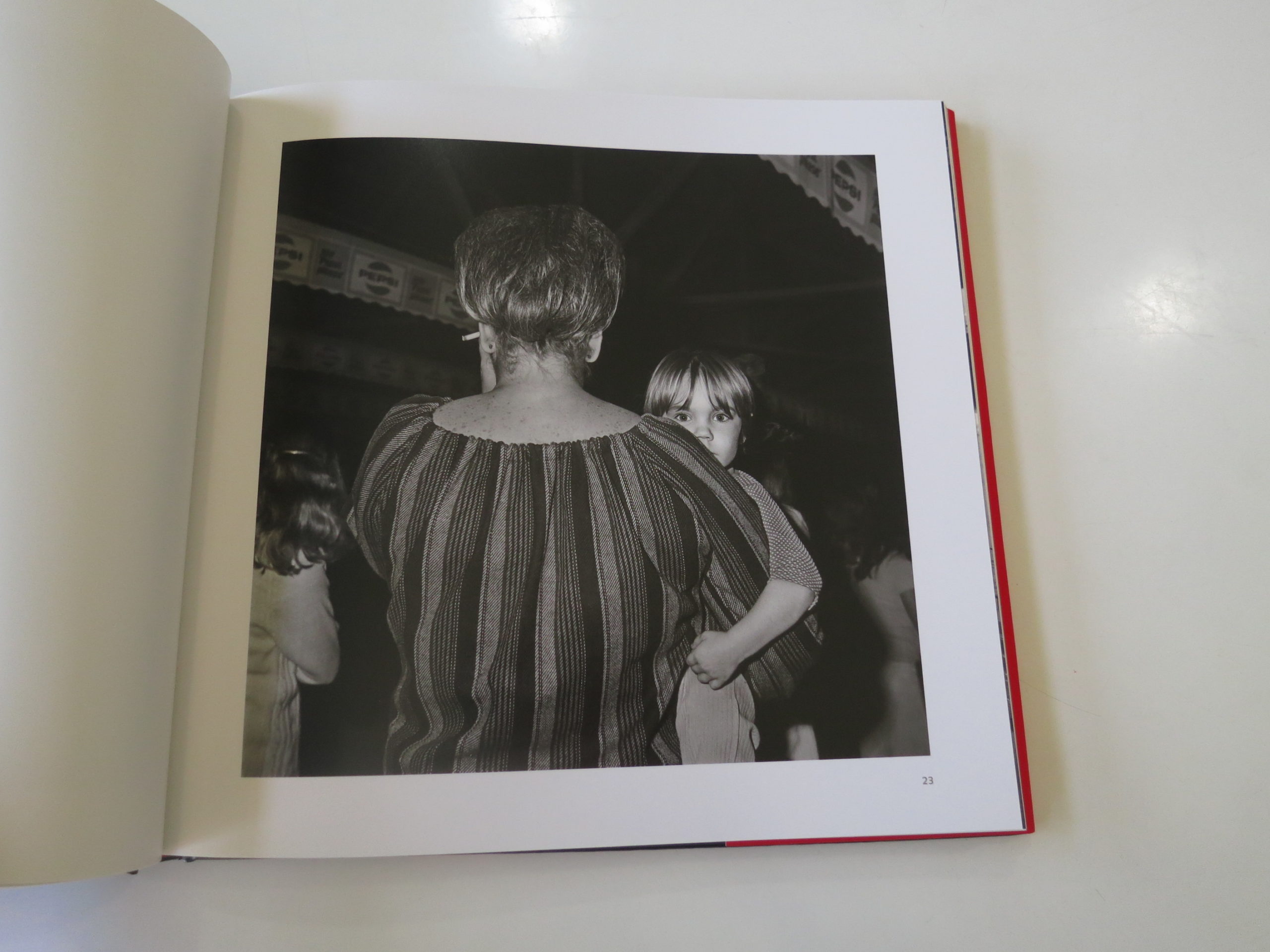
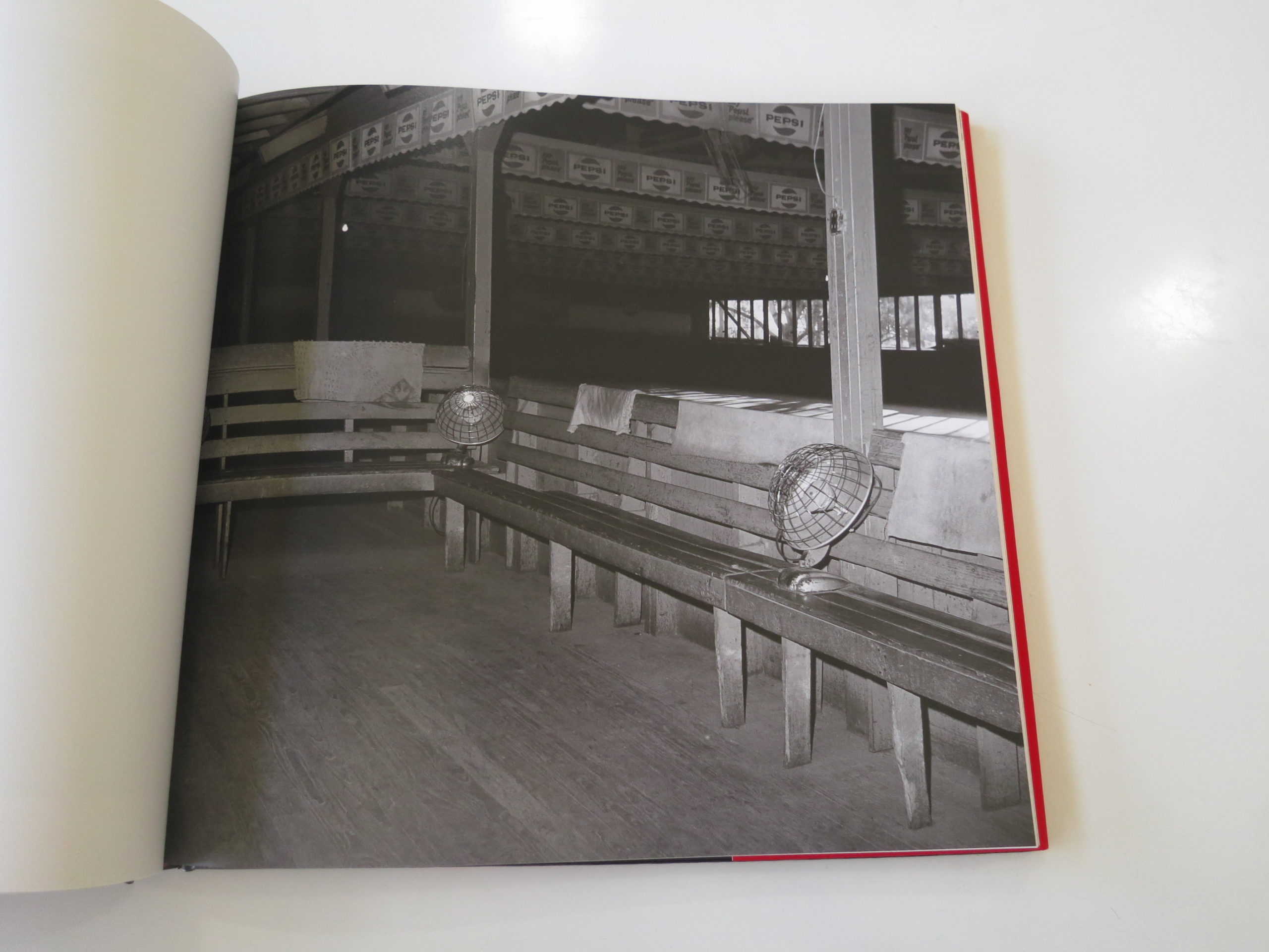
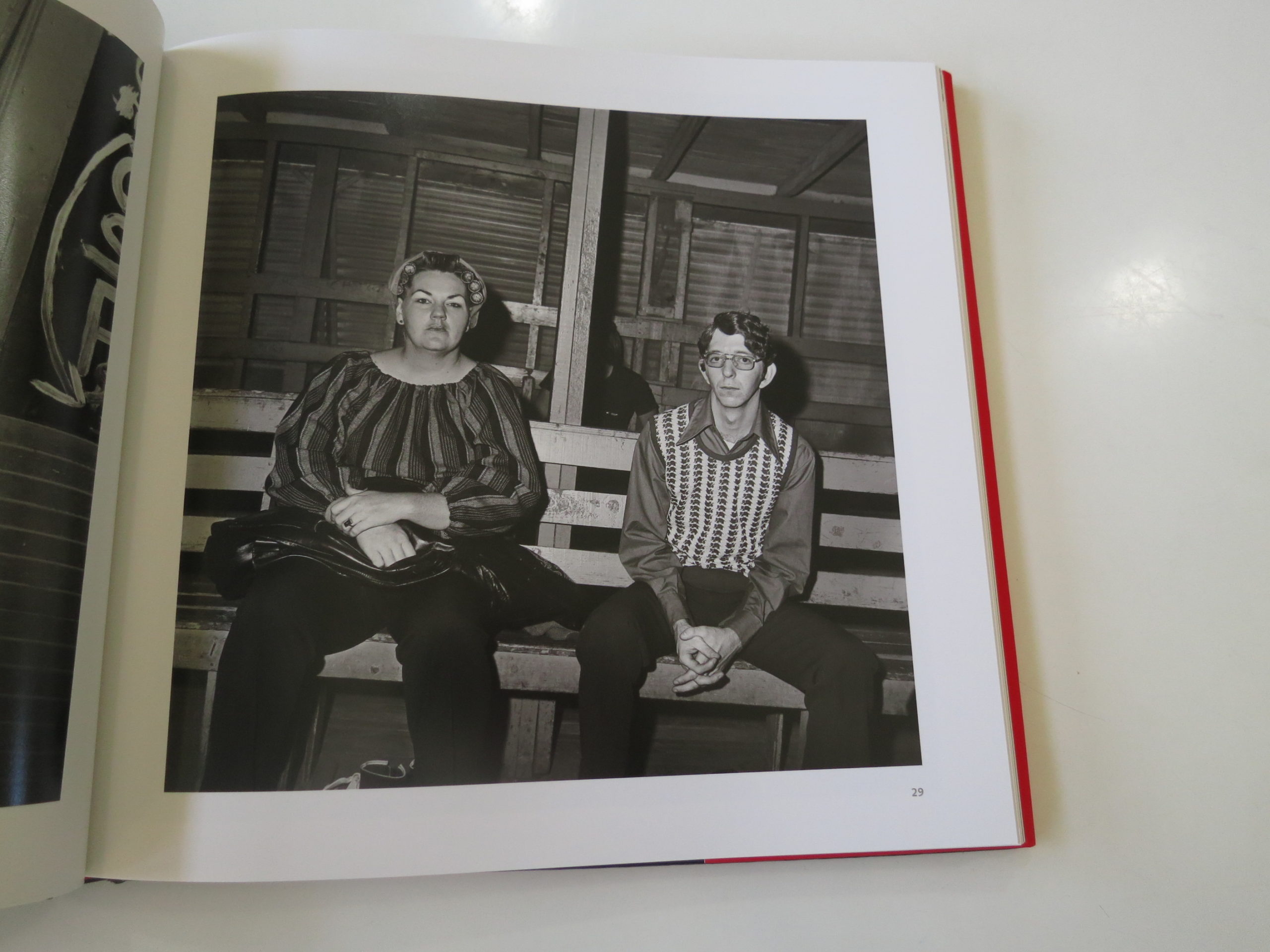
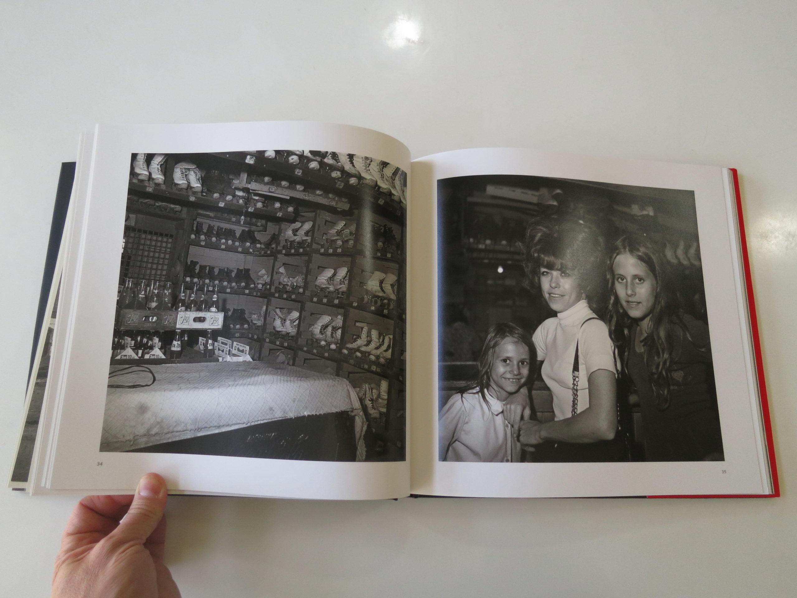
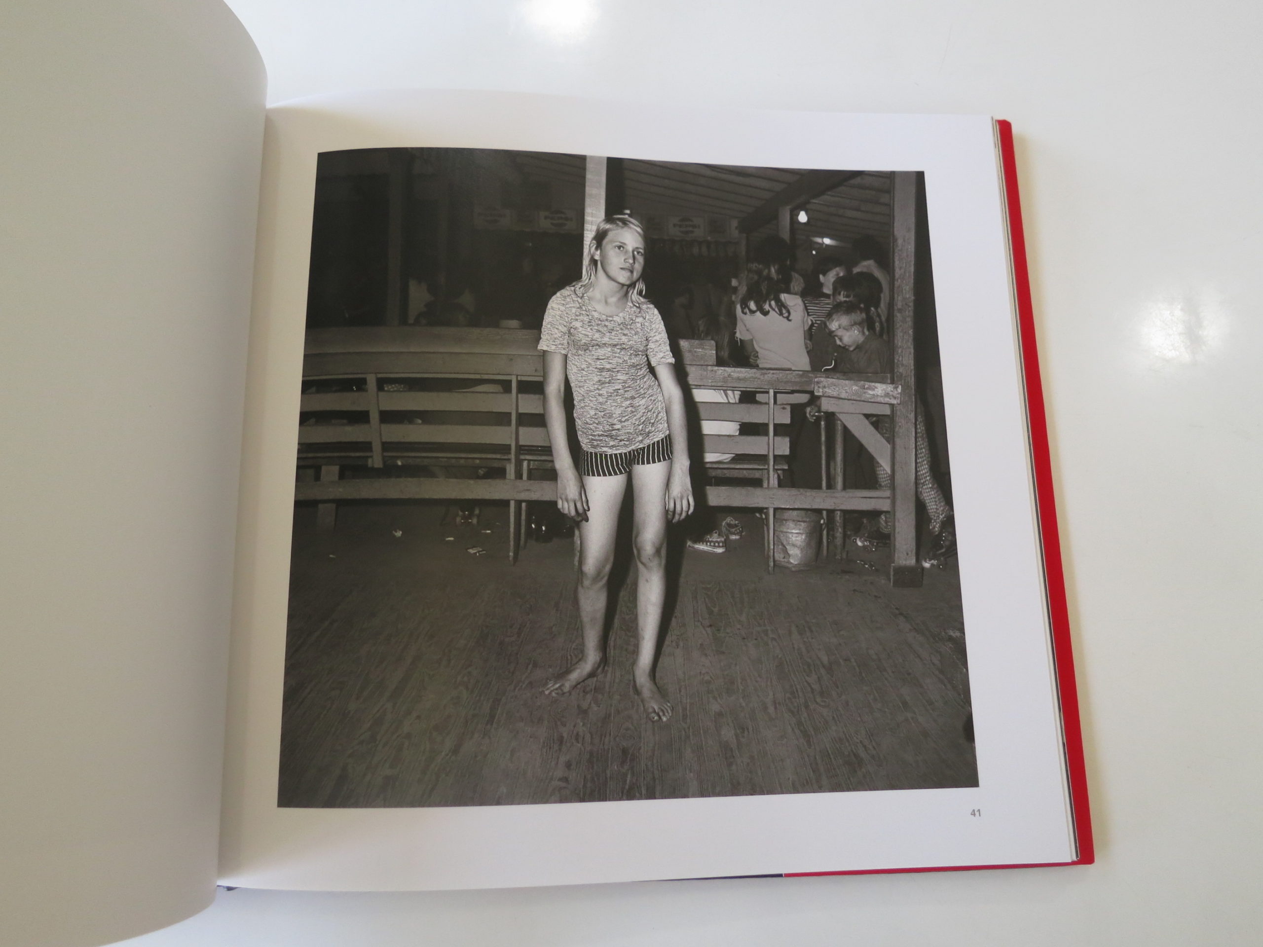

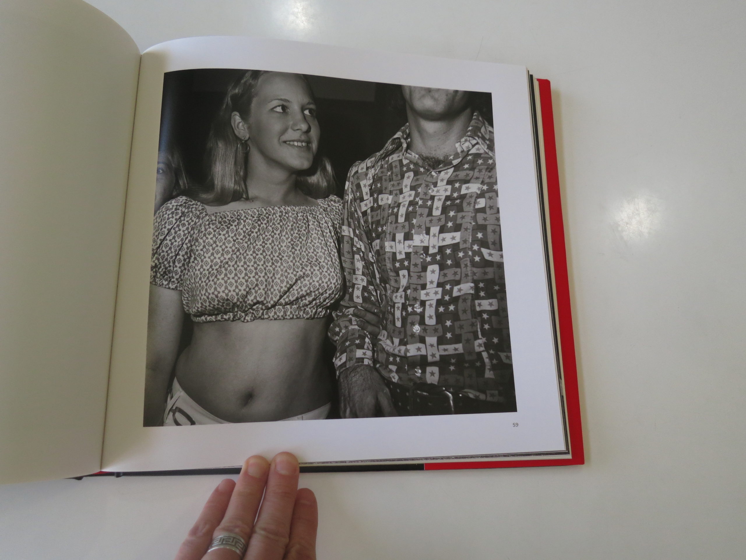
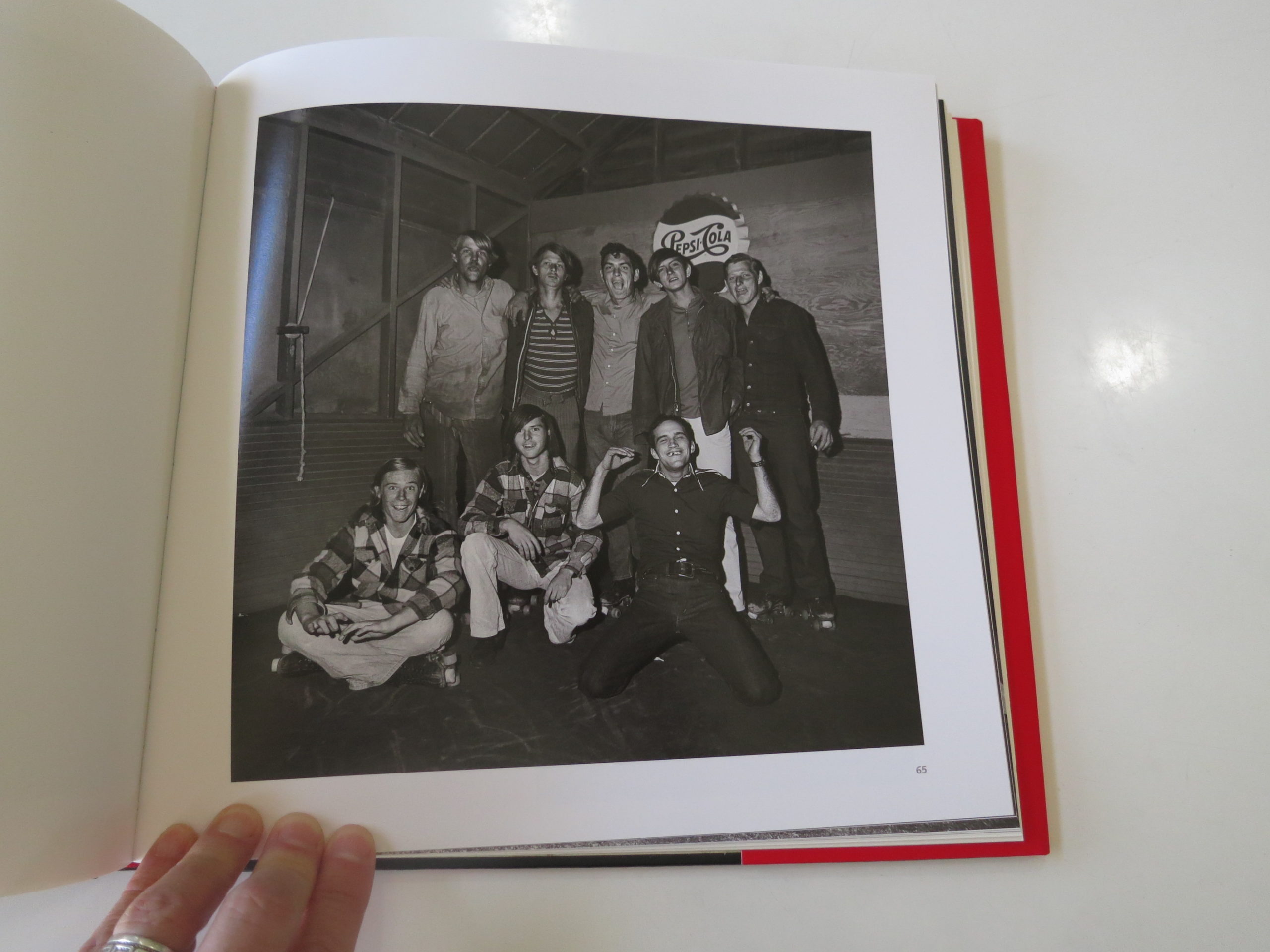
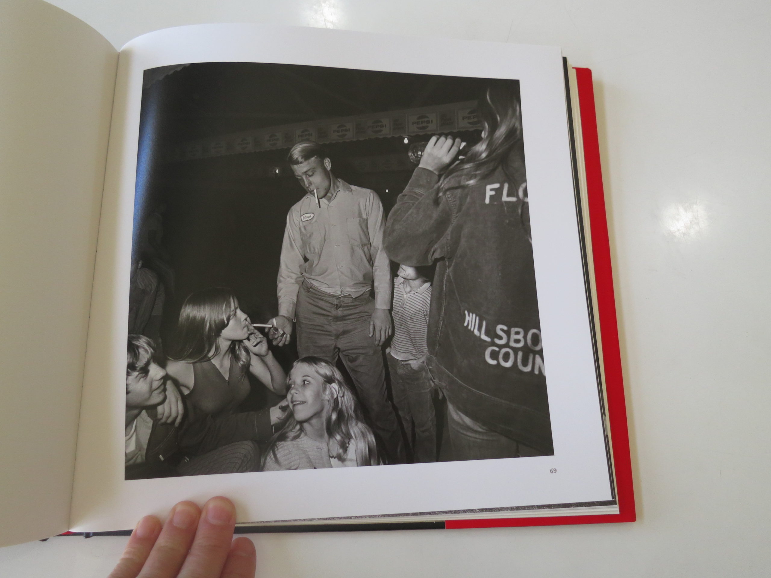
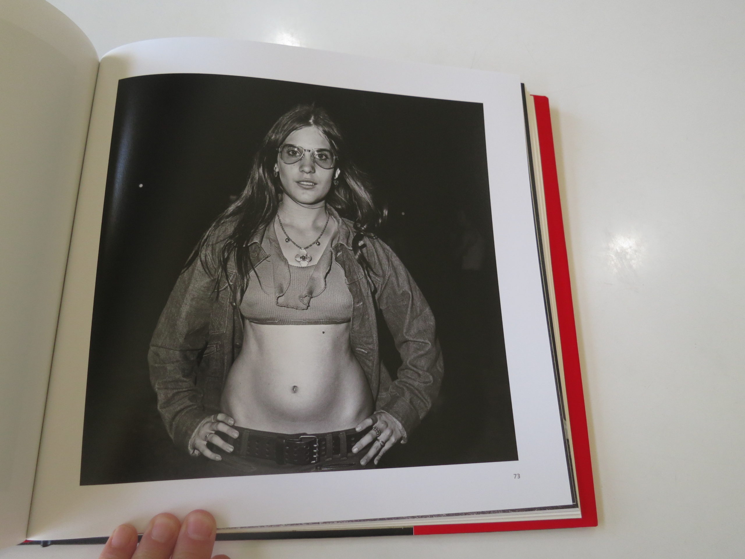
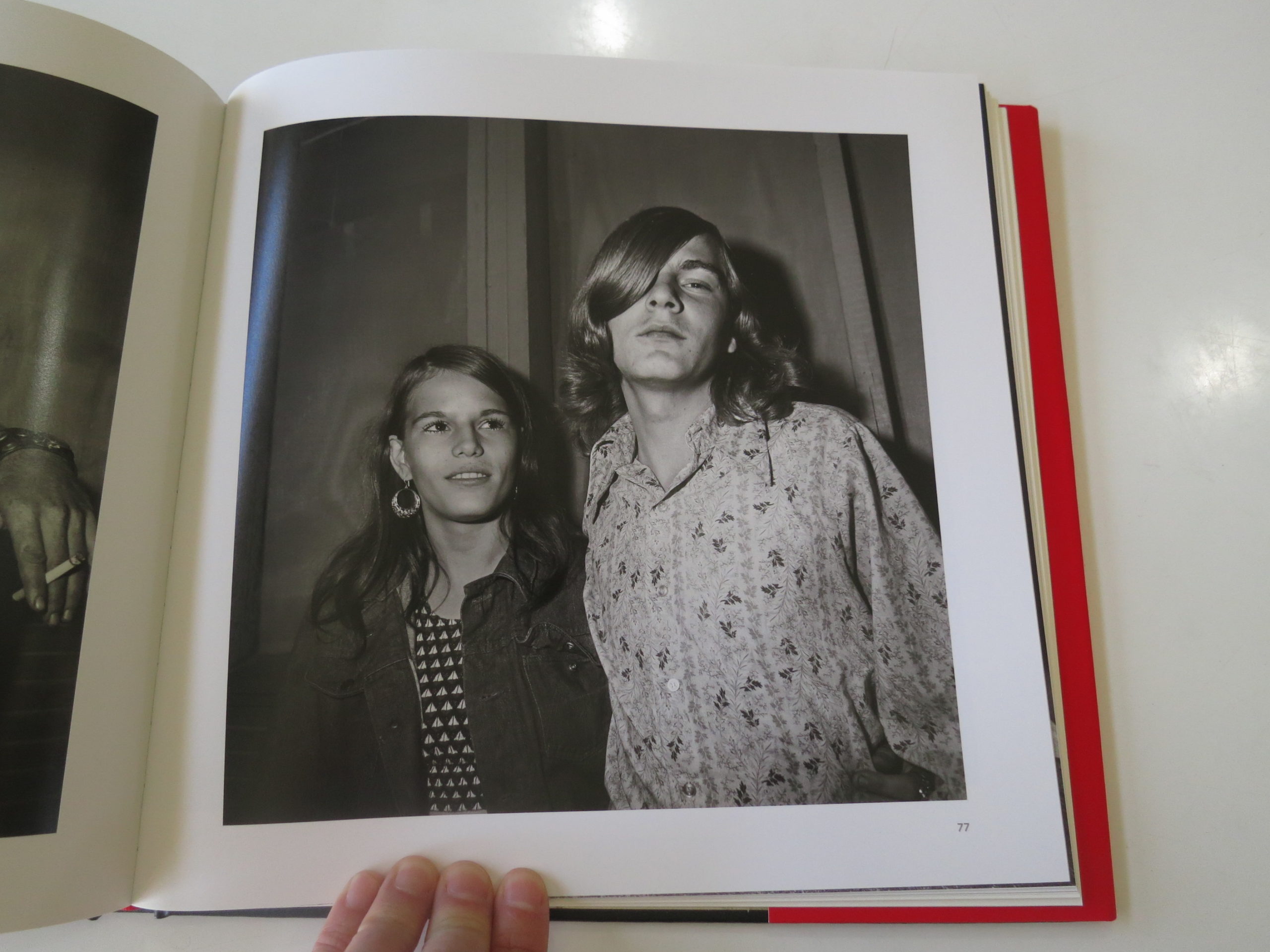
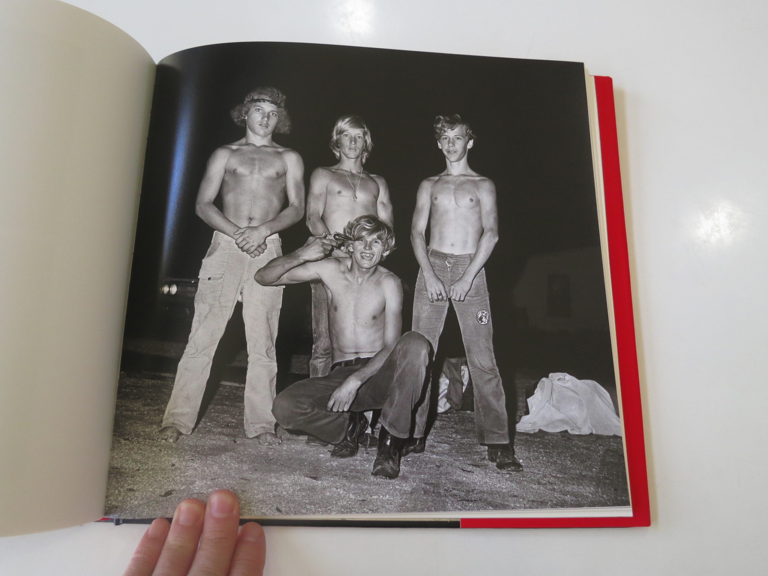
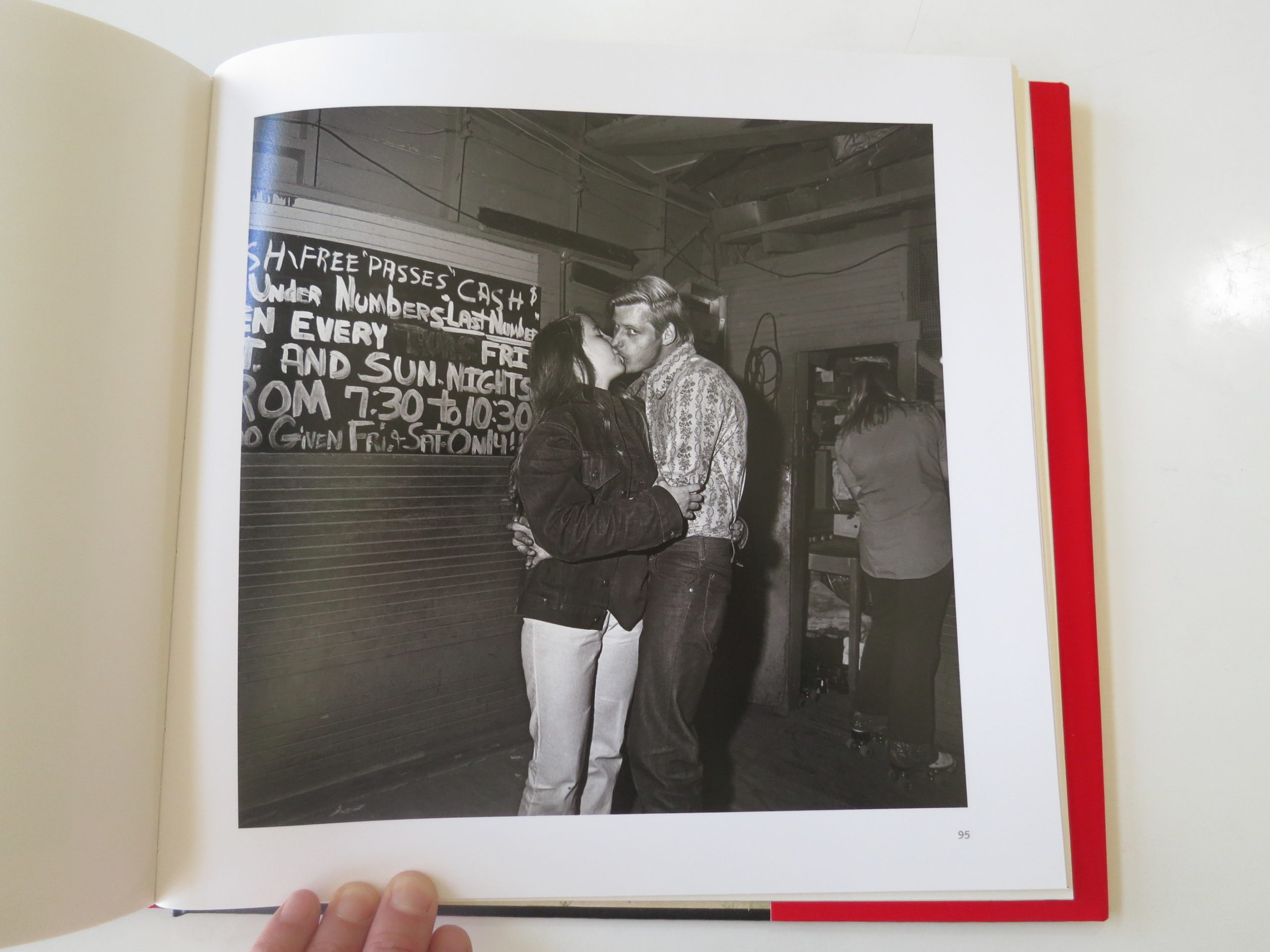
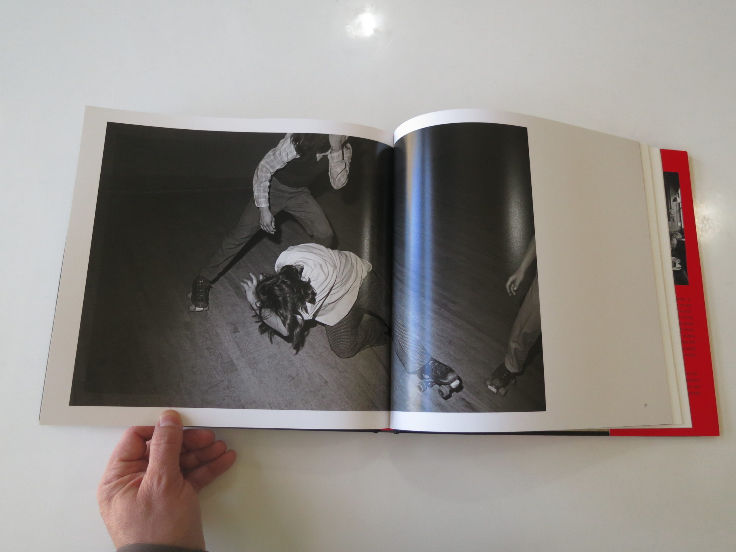