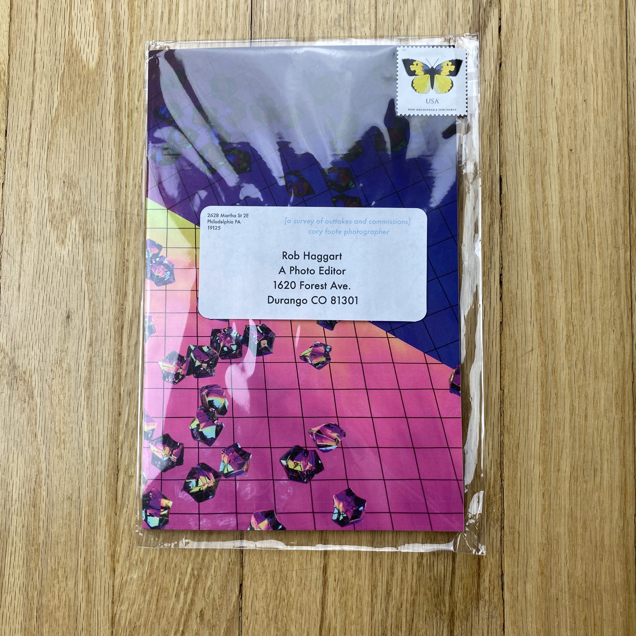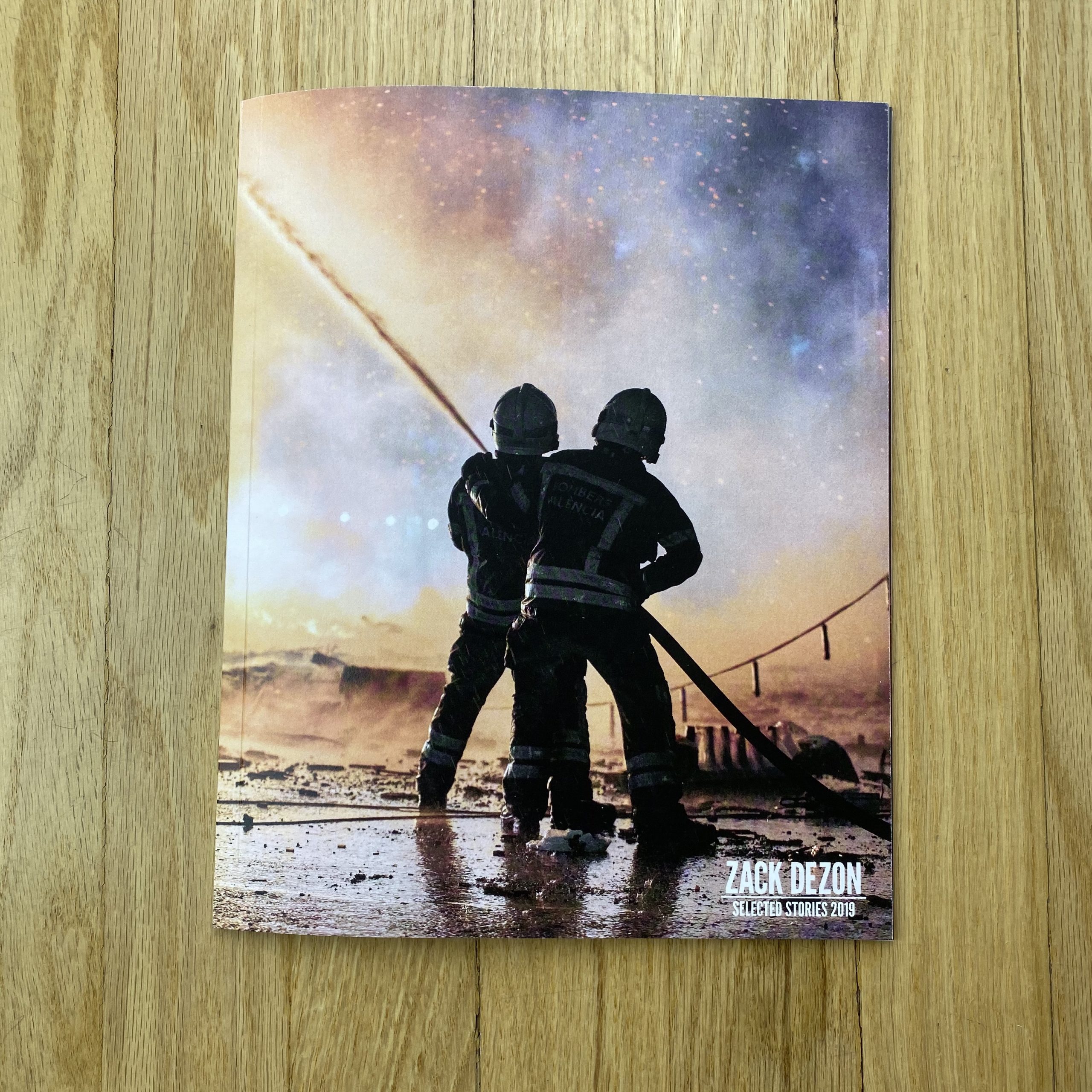


Kelly Allison
Who printed it?
Graphic Arts Studio, https://www.gasink.net/, a suburban print shop on the west side of Chicago. They’ve been printing my promos for years and I’m always so happy with their color.
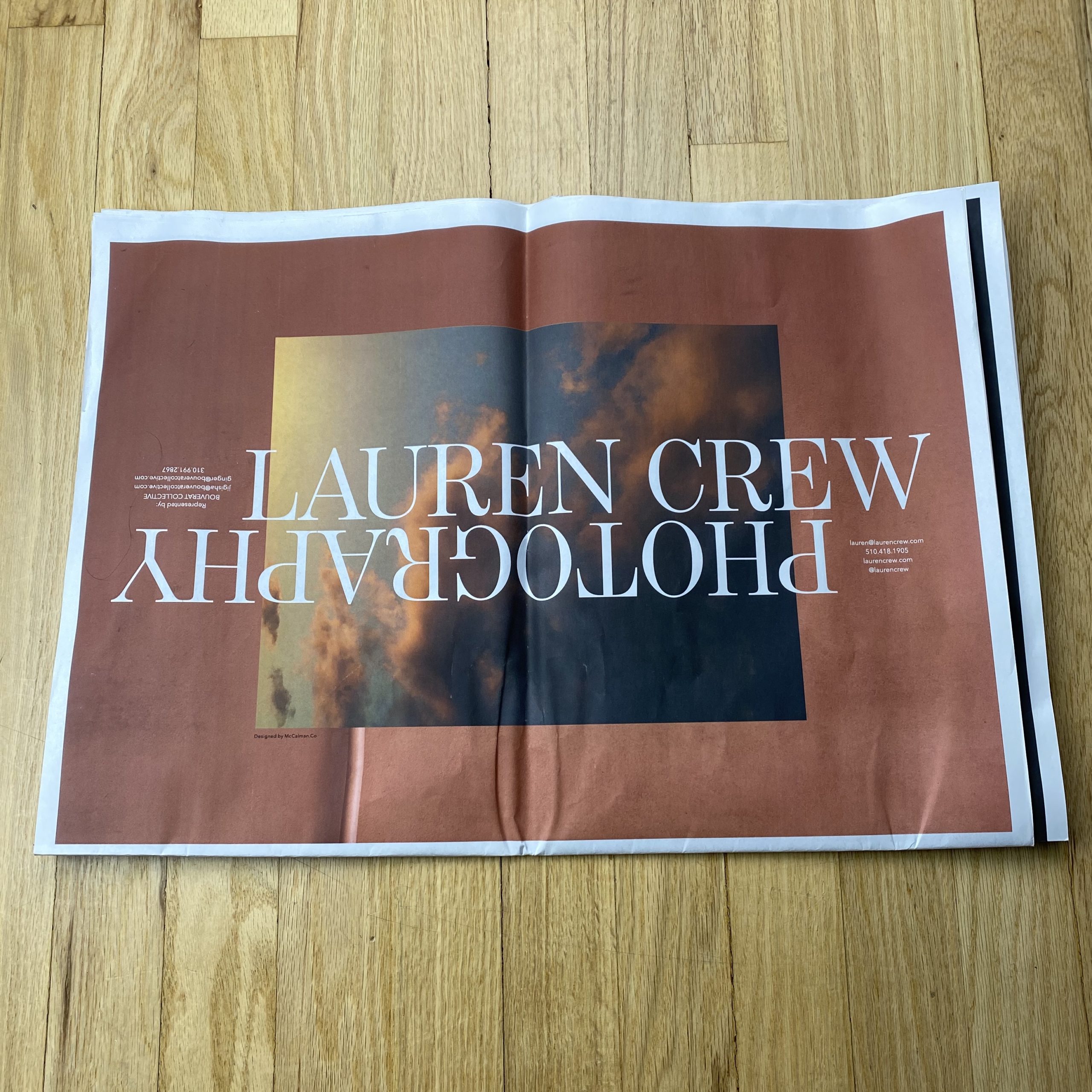
Who designed it?
The piece was both art directed and designed by my friends at Letterform, a Chicago graphic design firm, http://www.letterform.net/. They’re also the ones who created my entire business system, so it helps to have them a part of the conversation from the ground up. Since Letterform starts with a deep understanding of the end goal, we can align to make sure our content both relates to and expounds upon my studio’s brand voice.
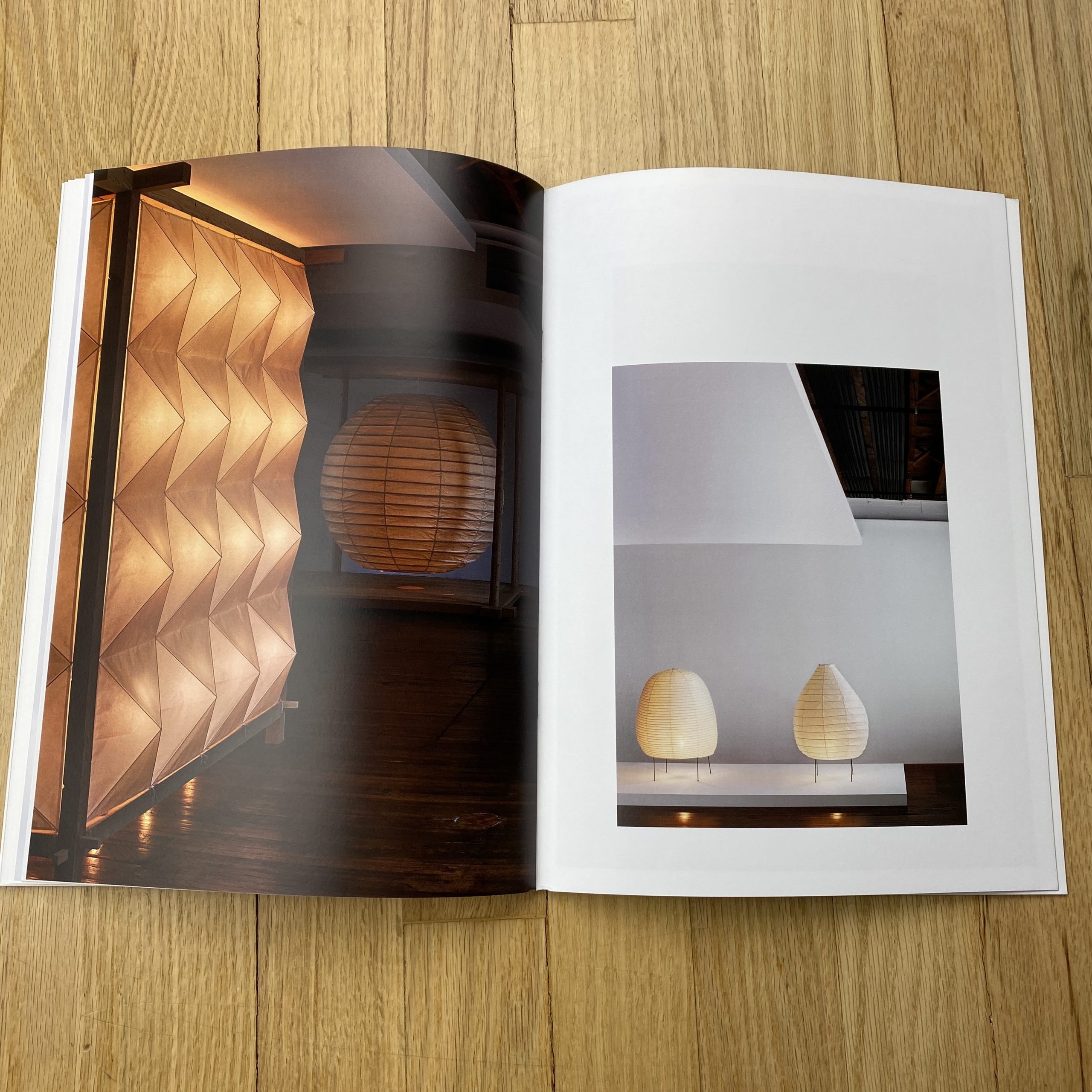
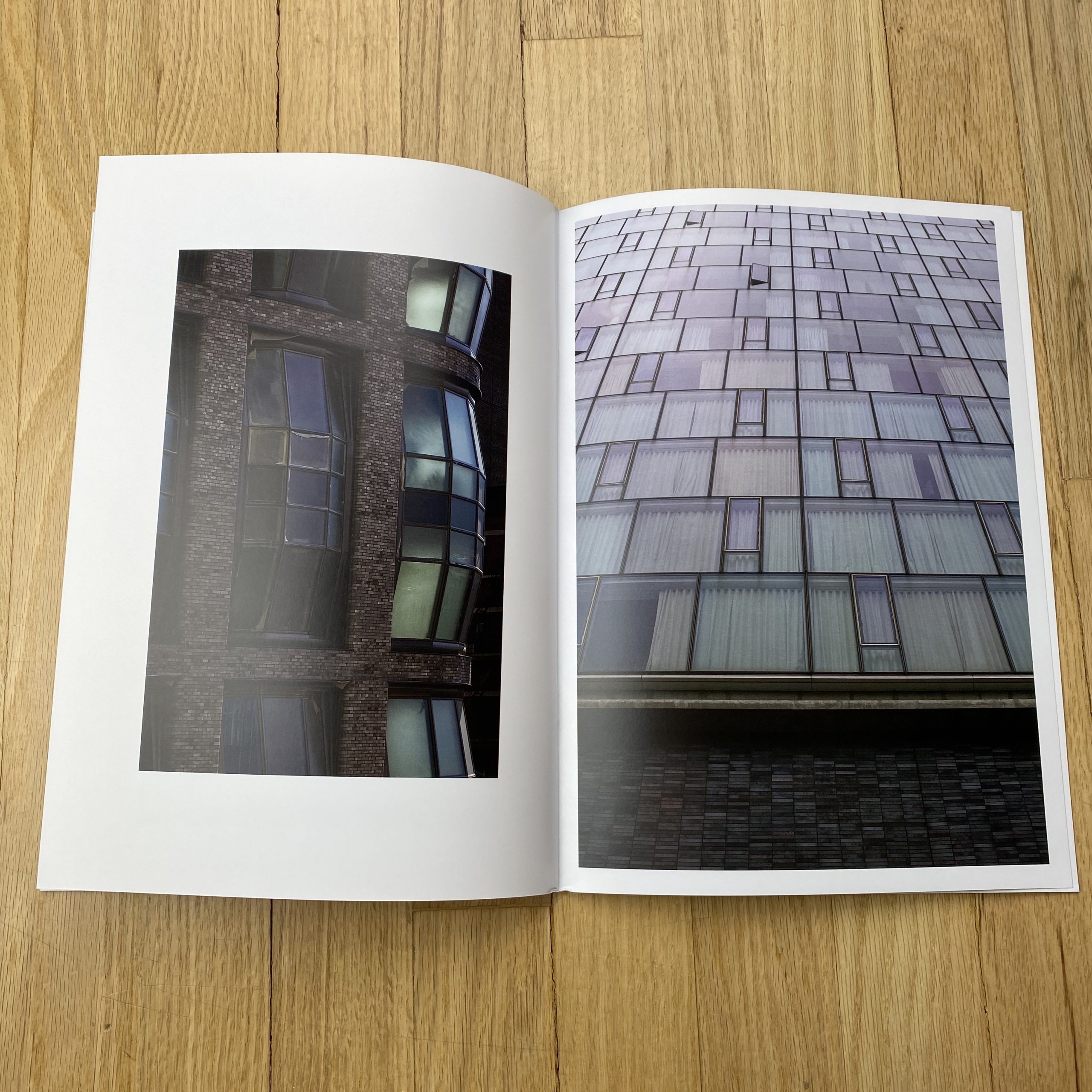
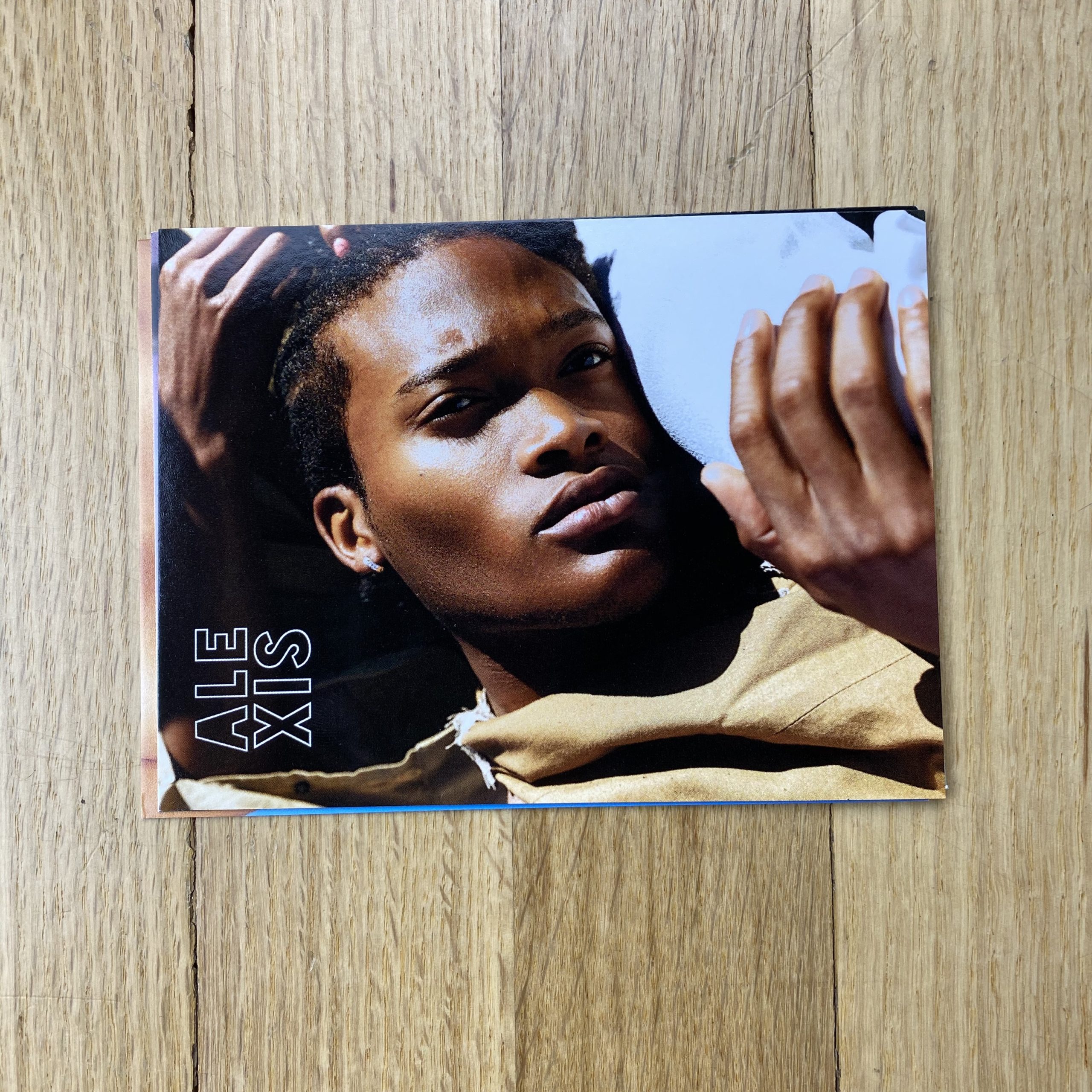
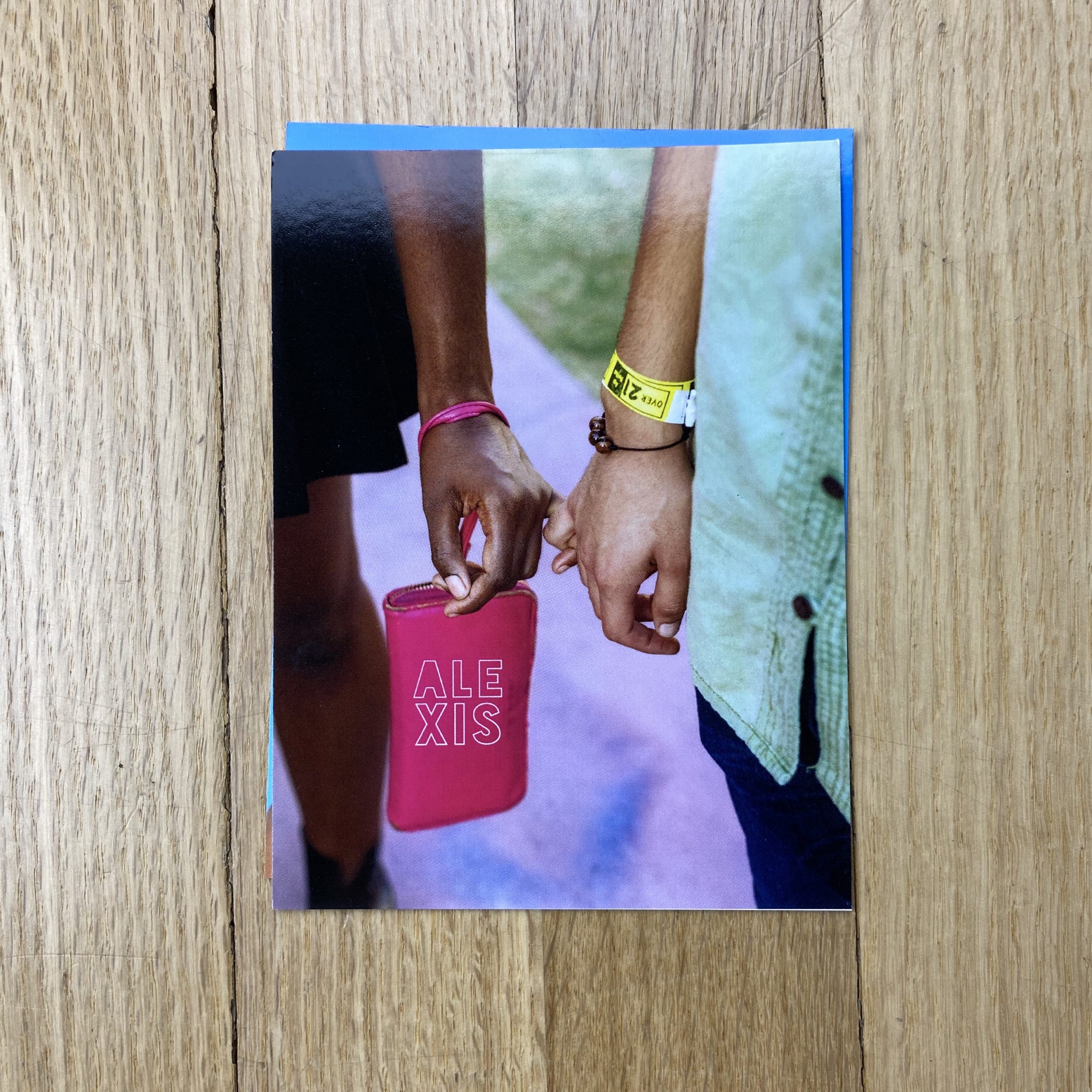
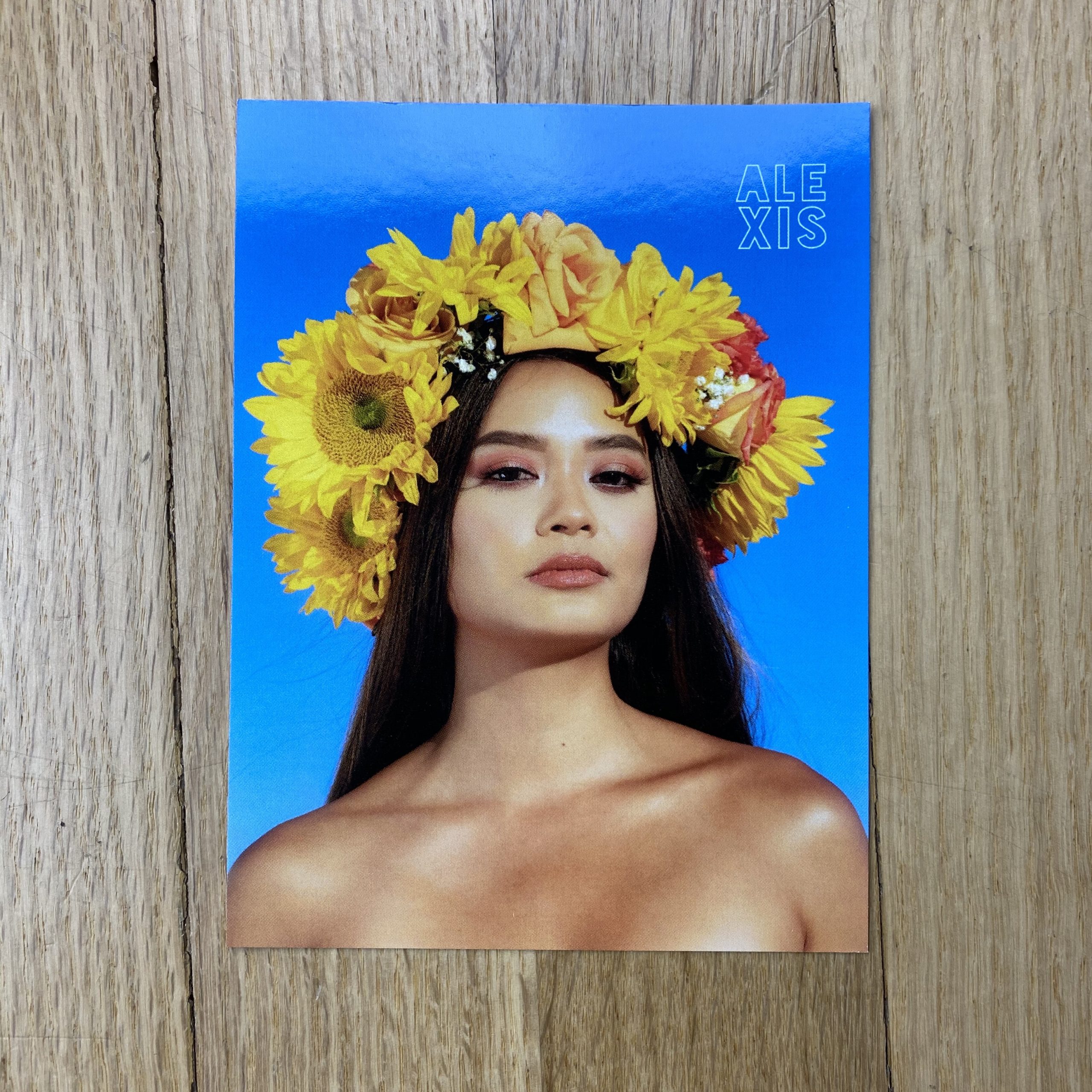
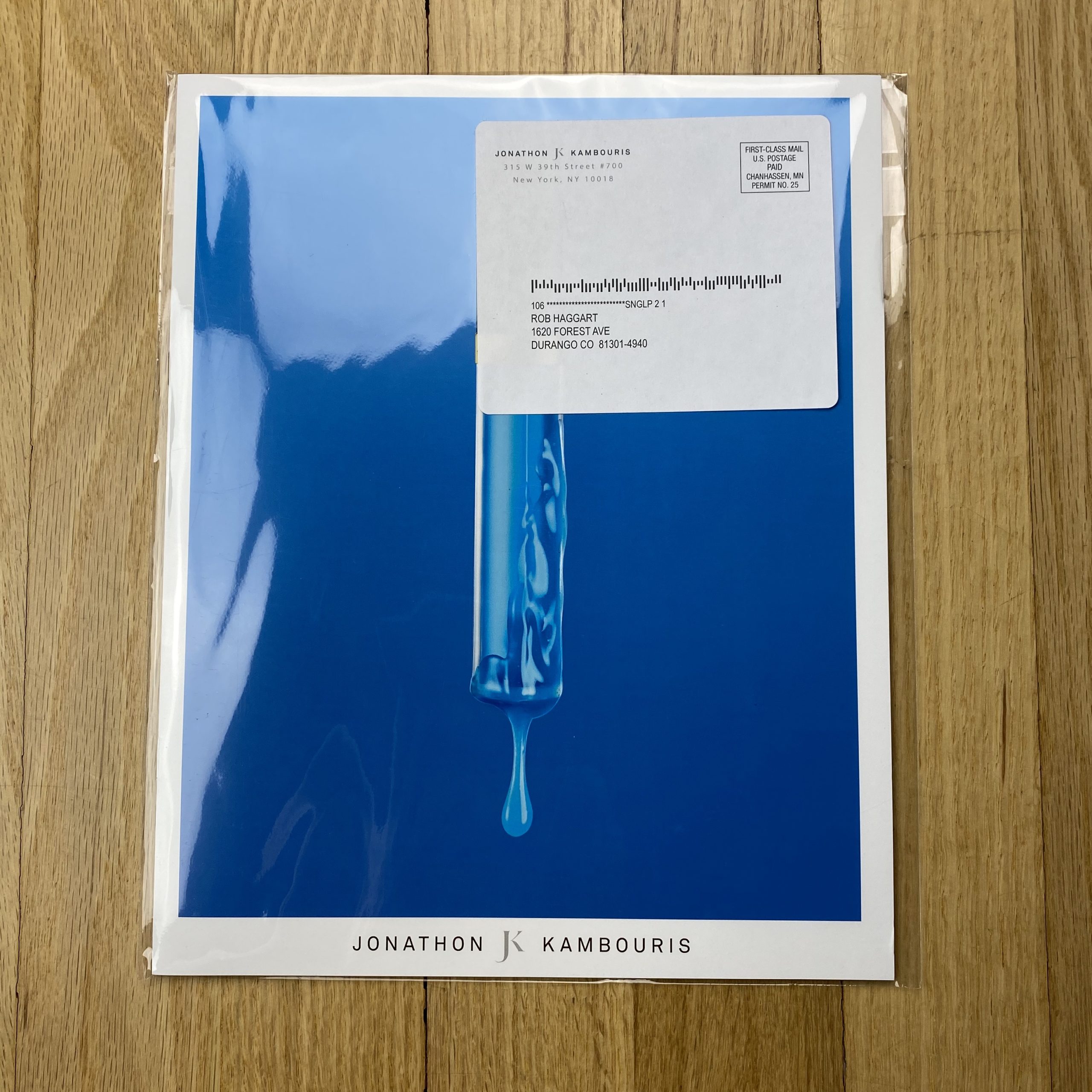
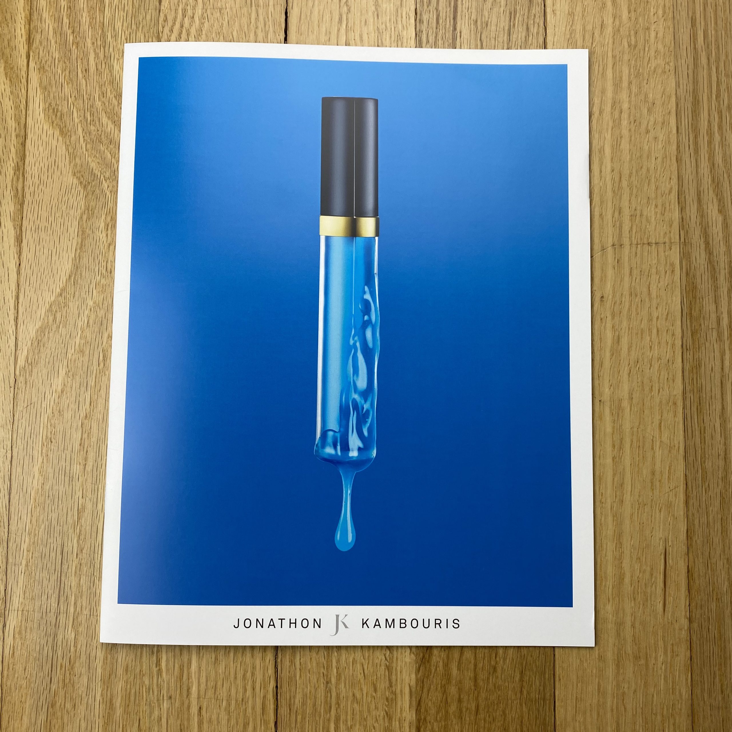
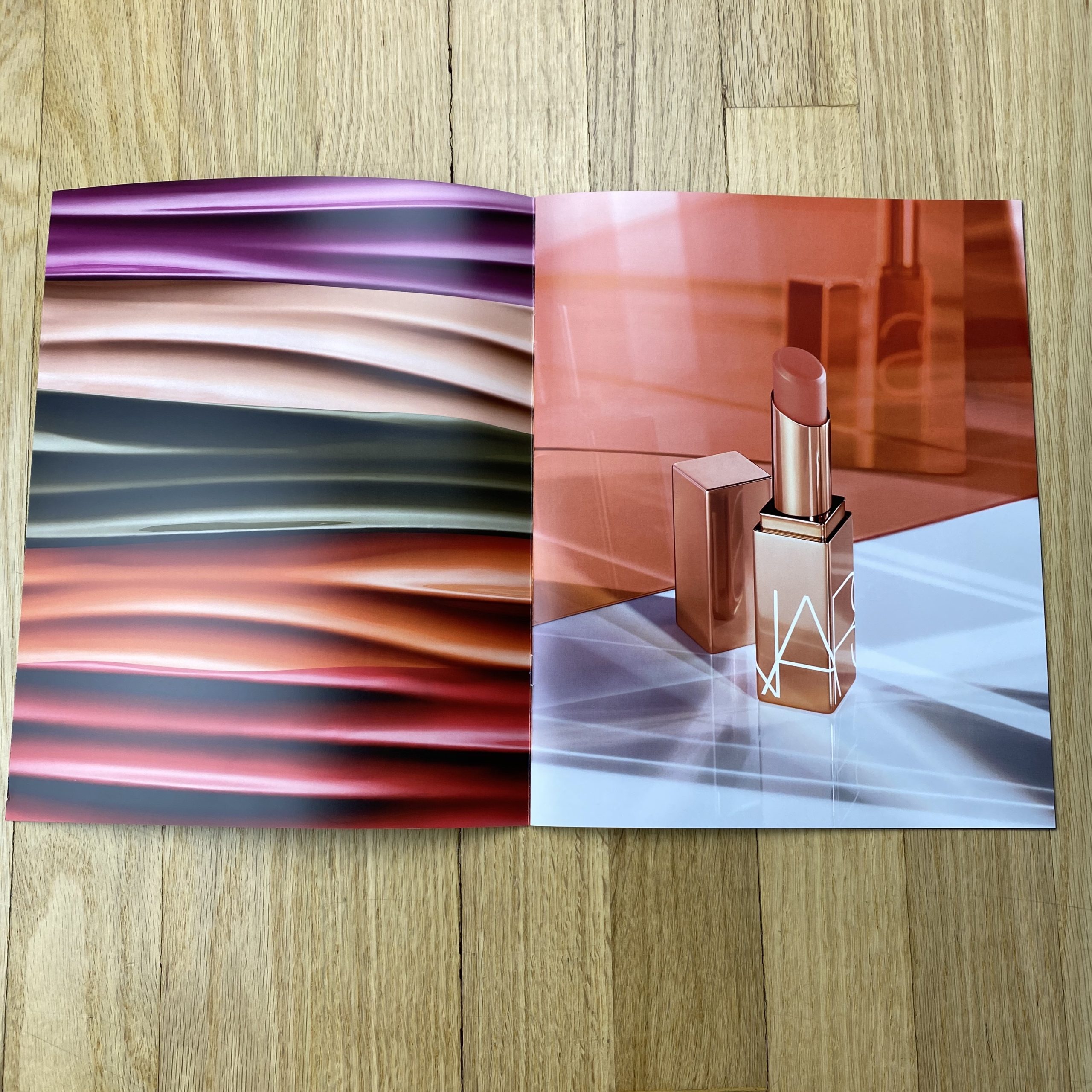
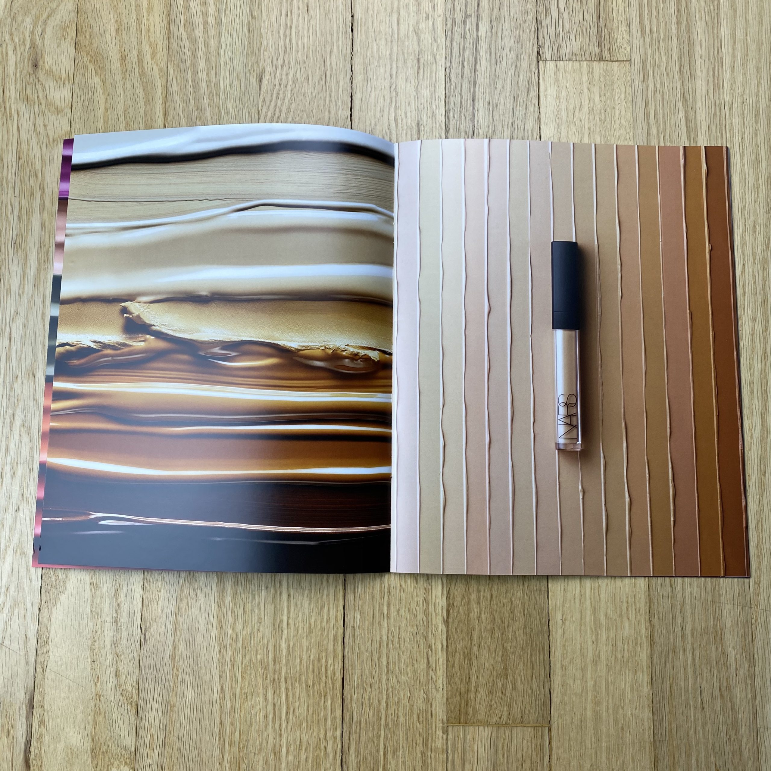
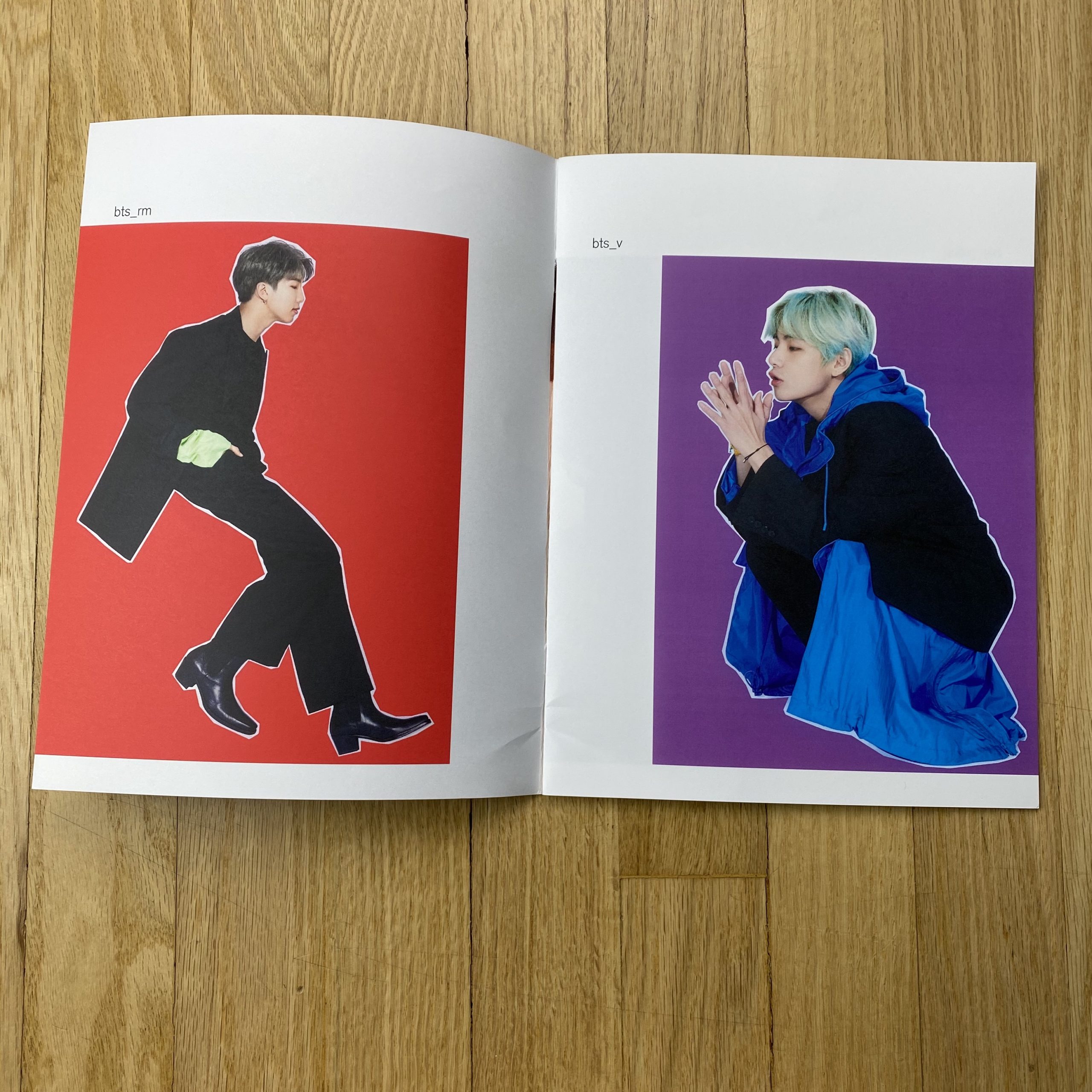
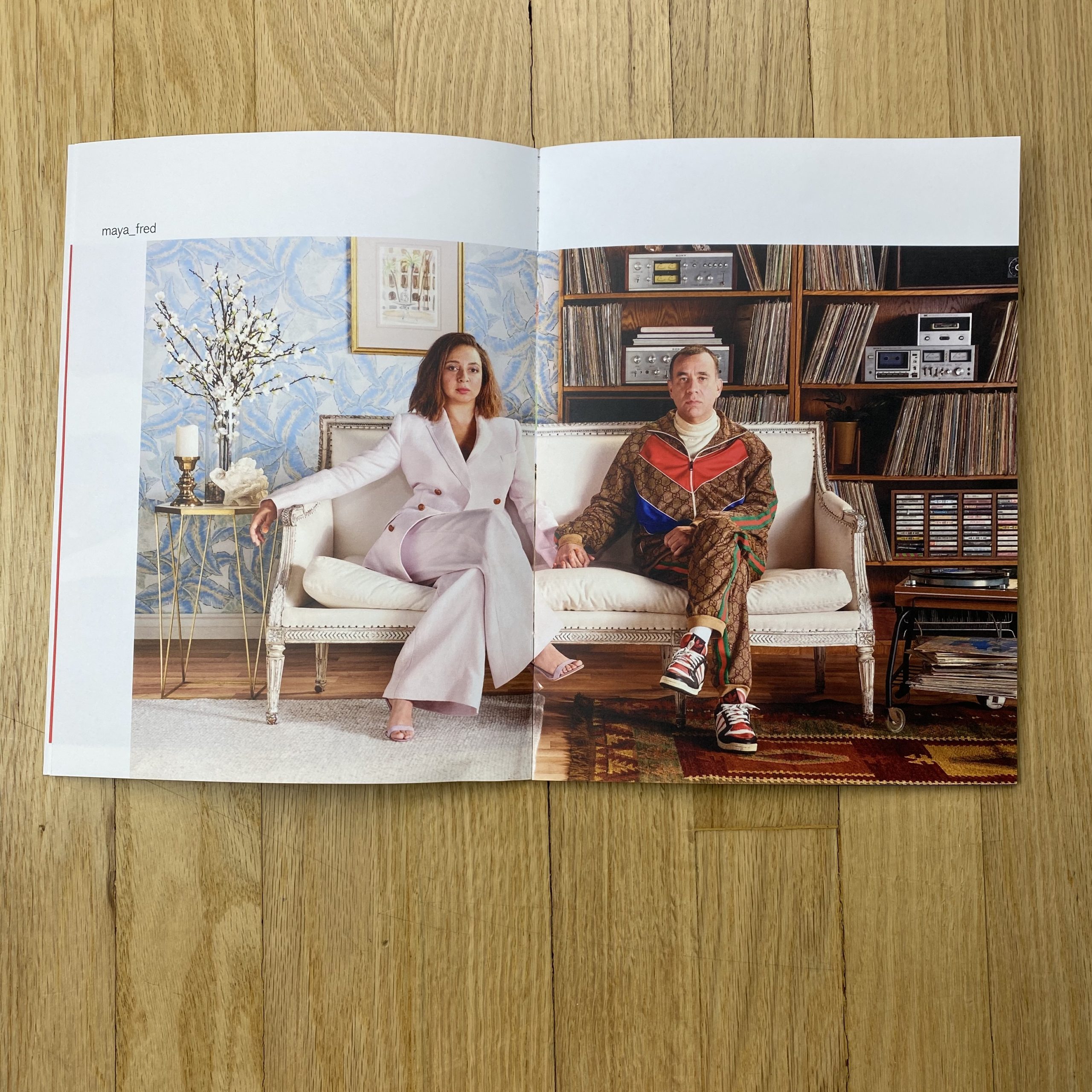
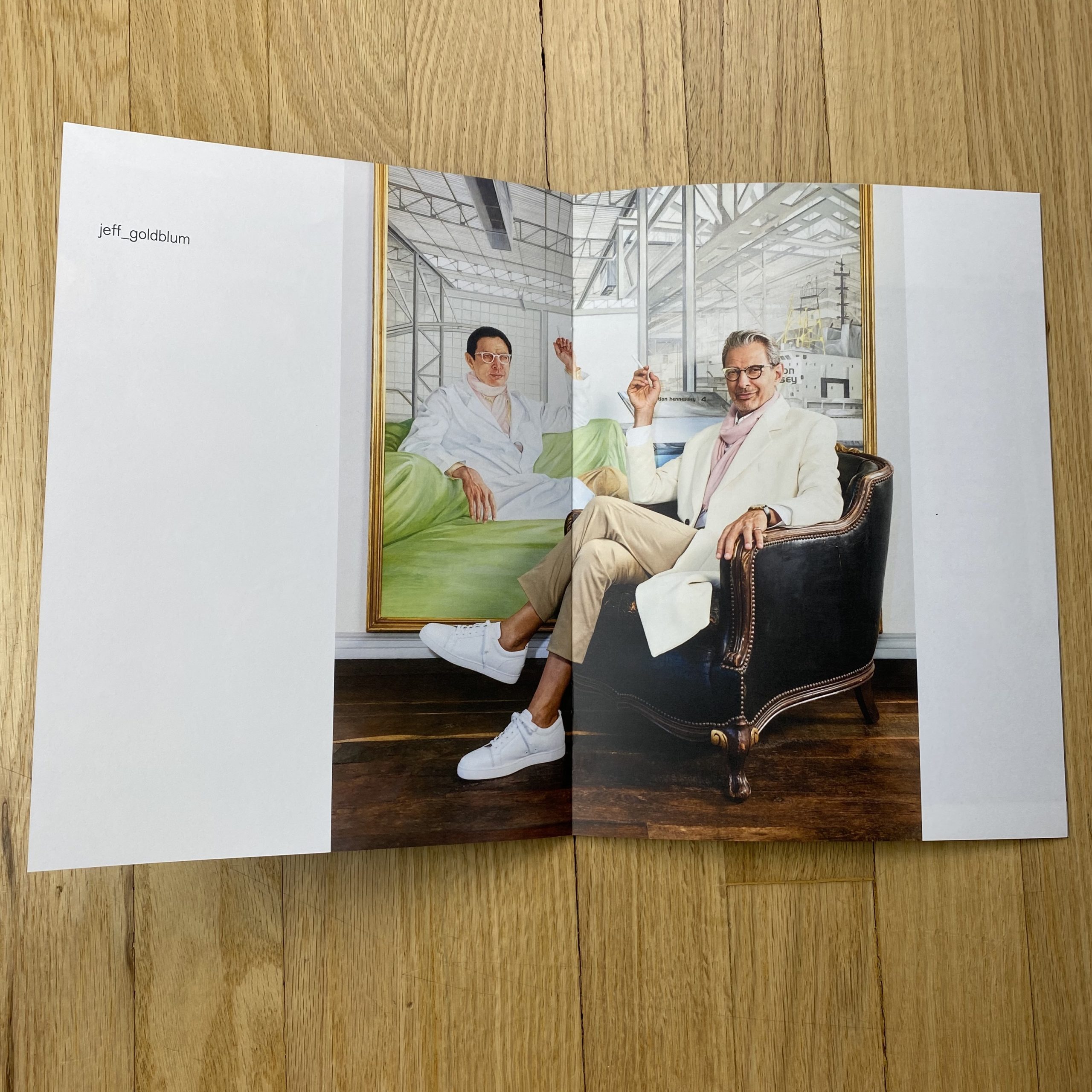
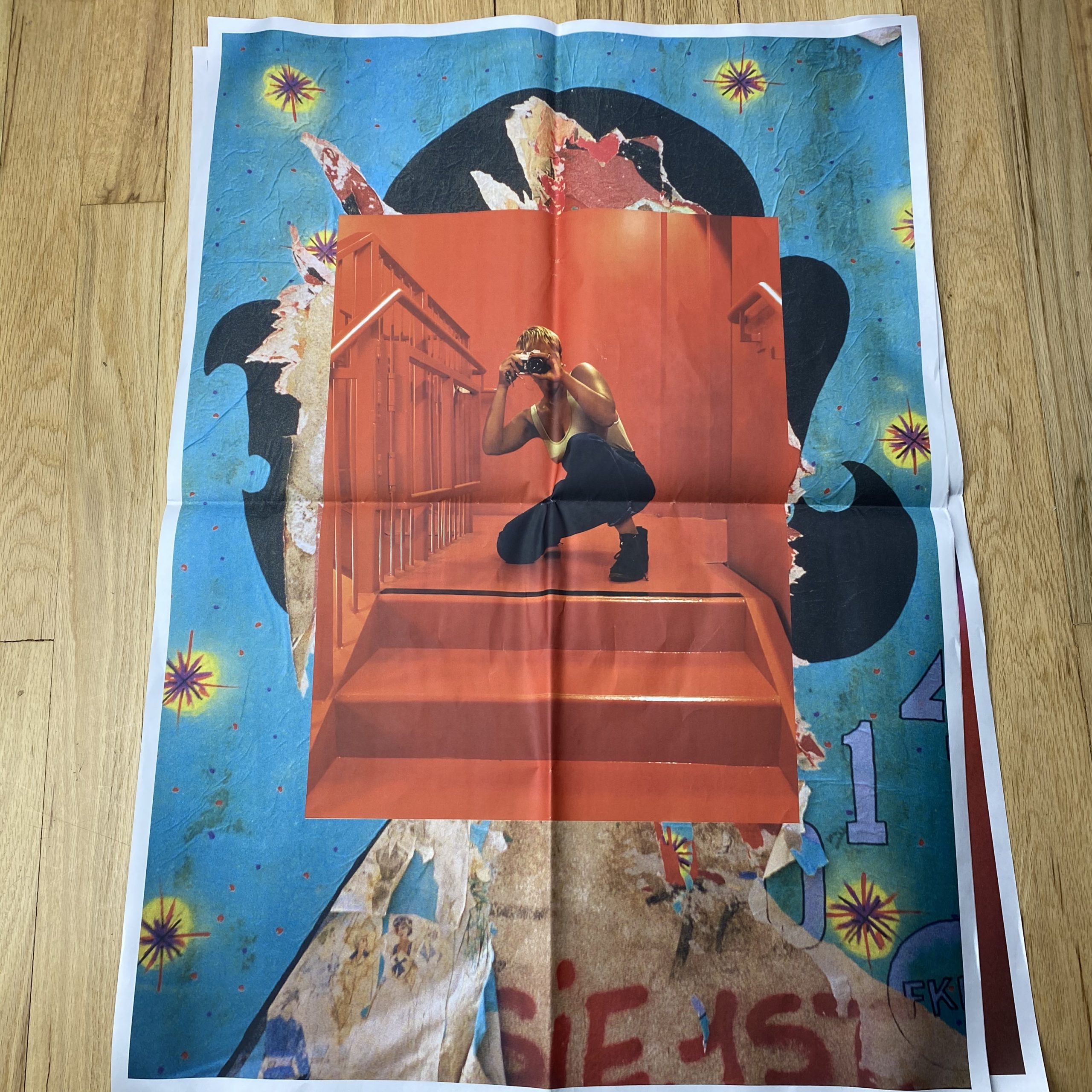
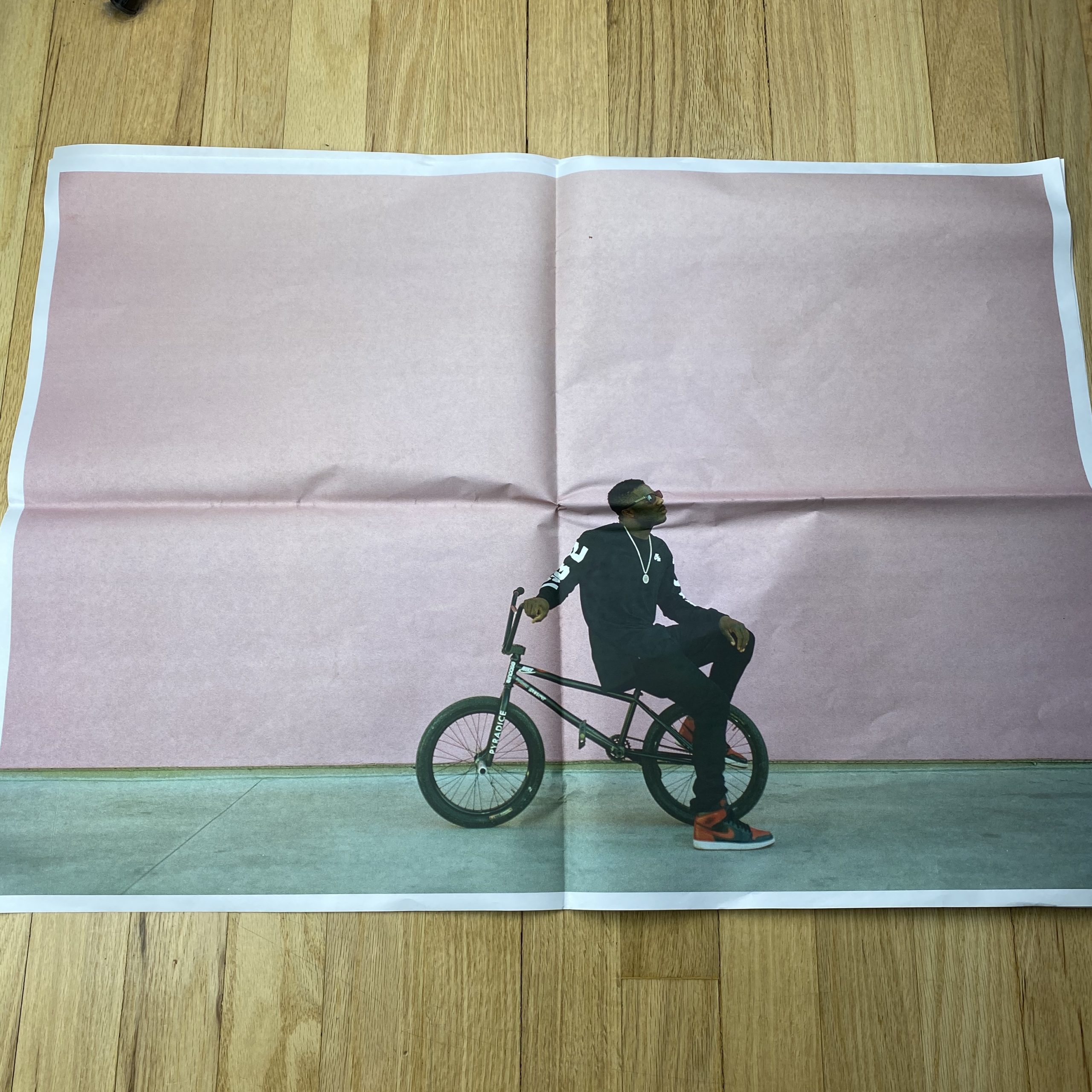
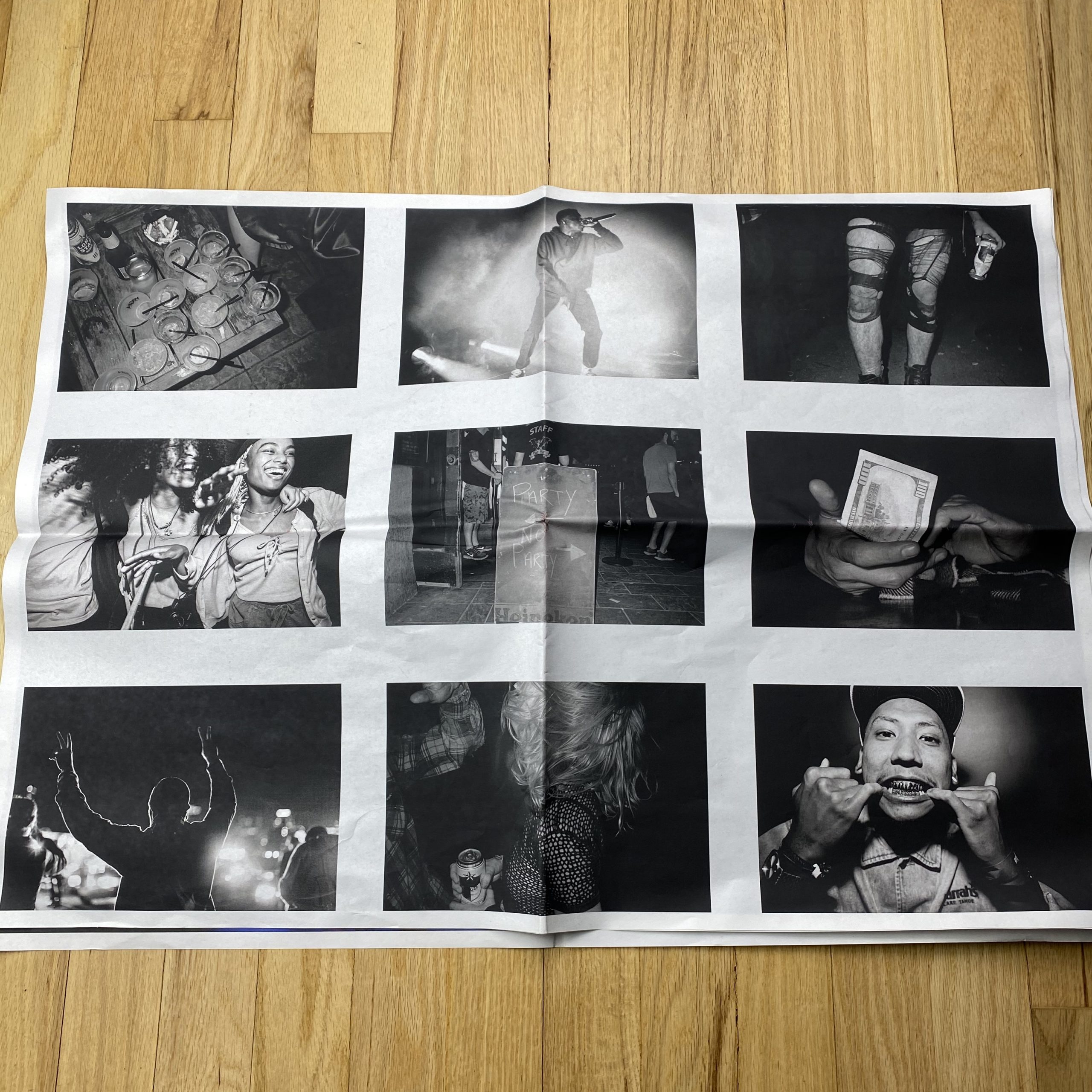
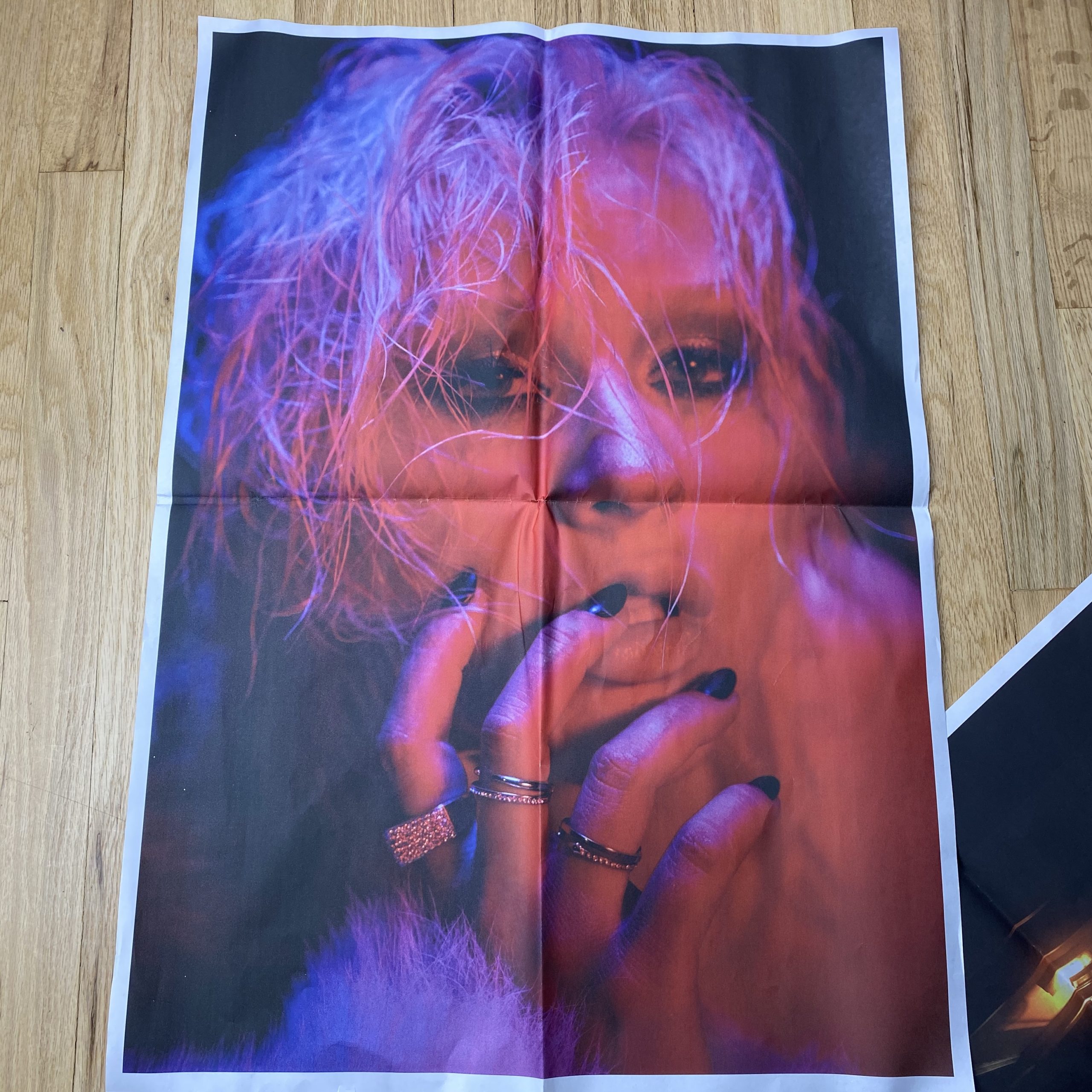
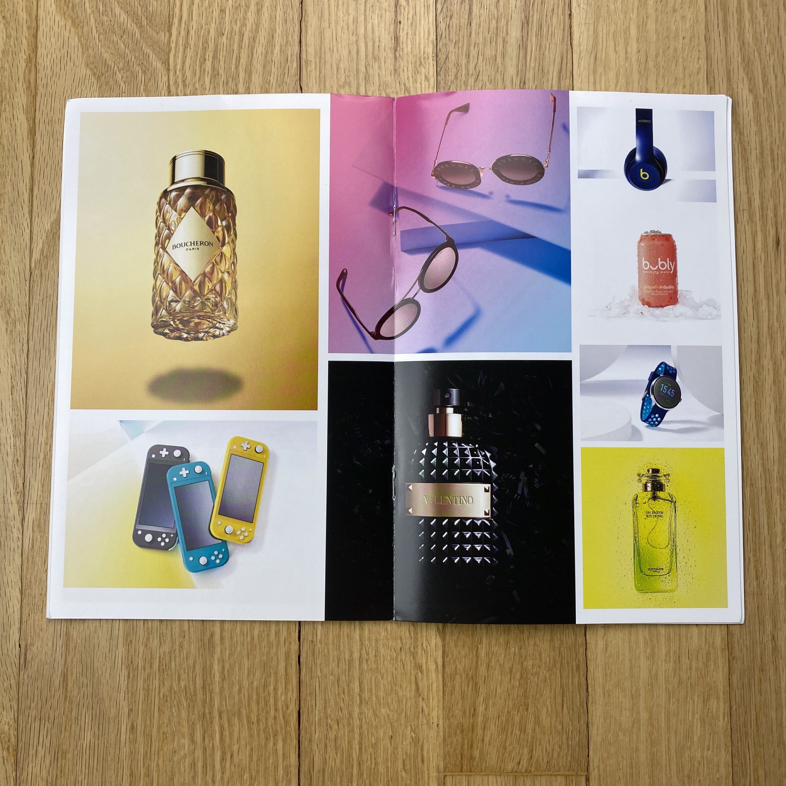
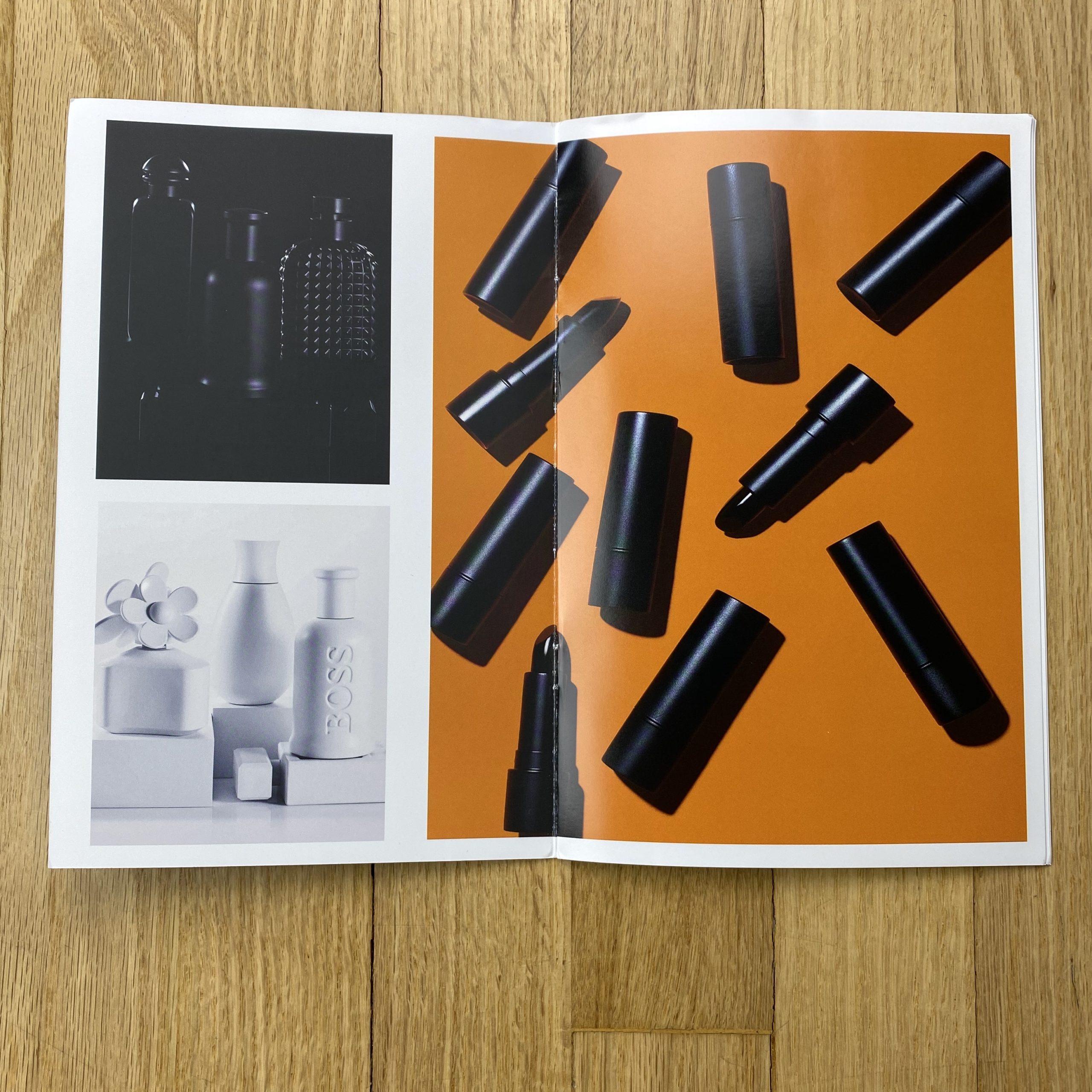
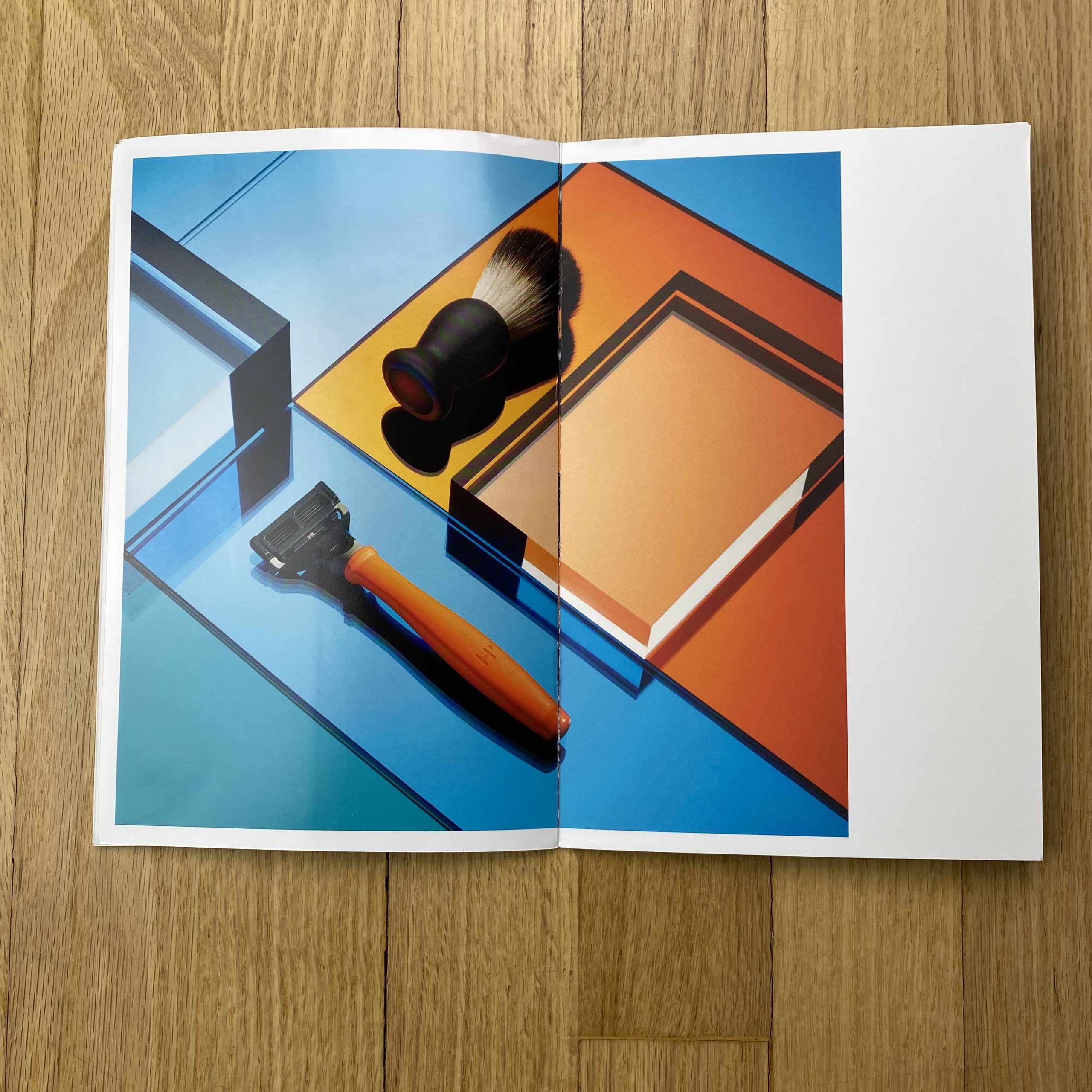
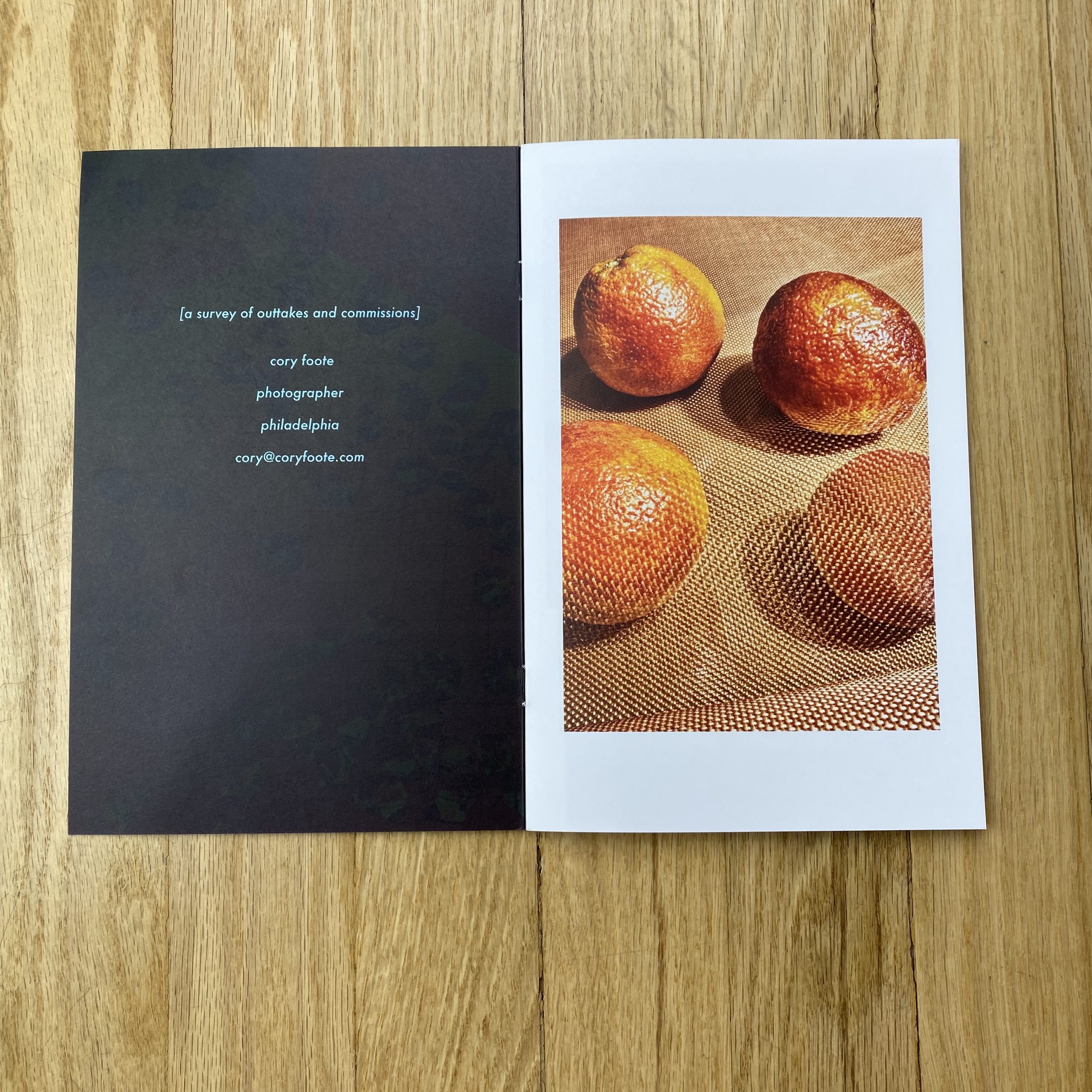
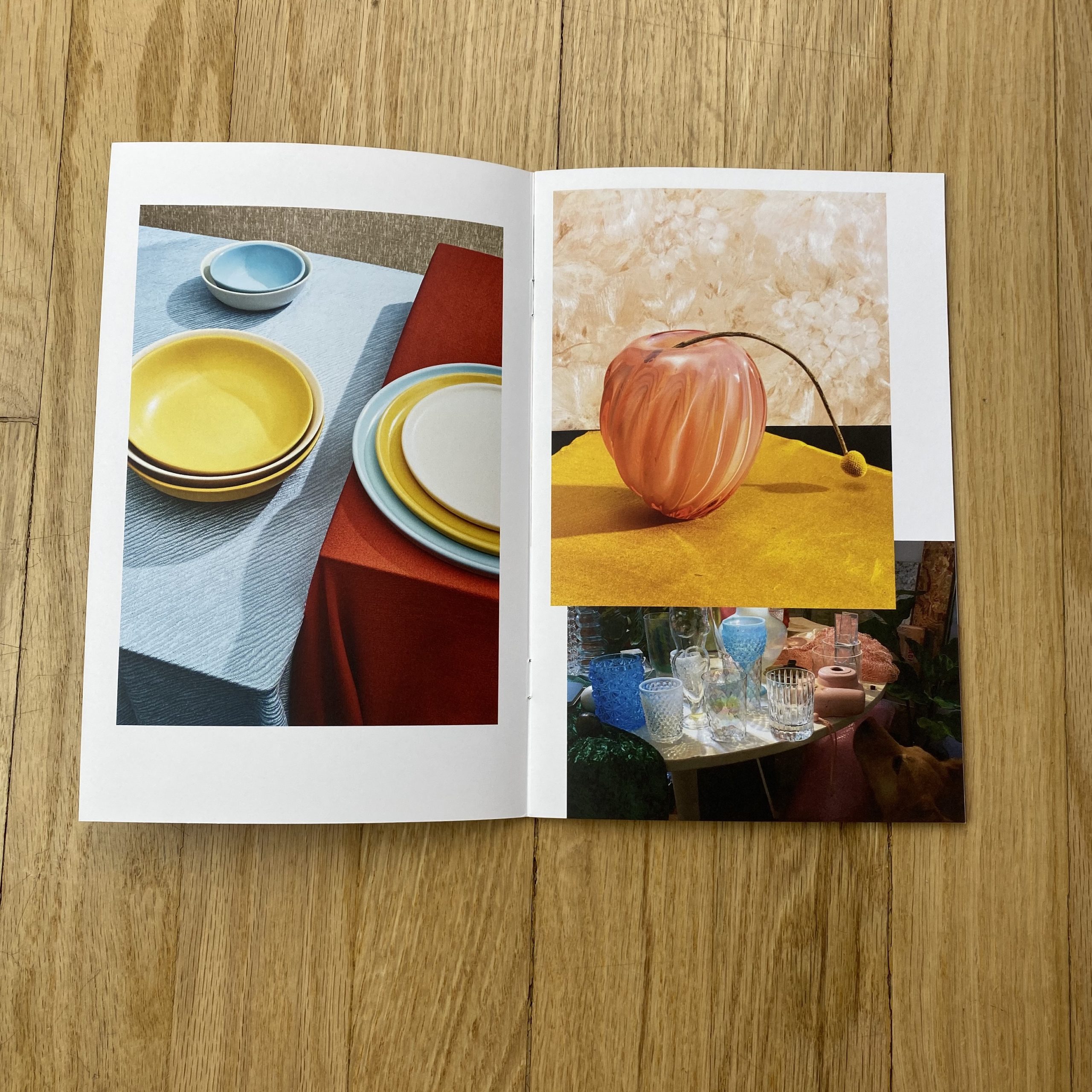
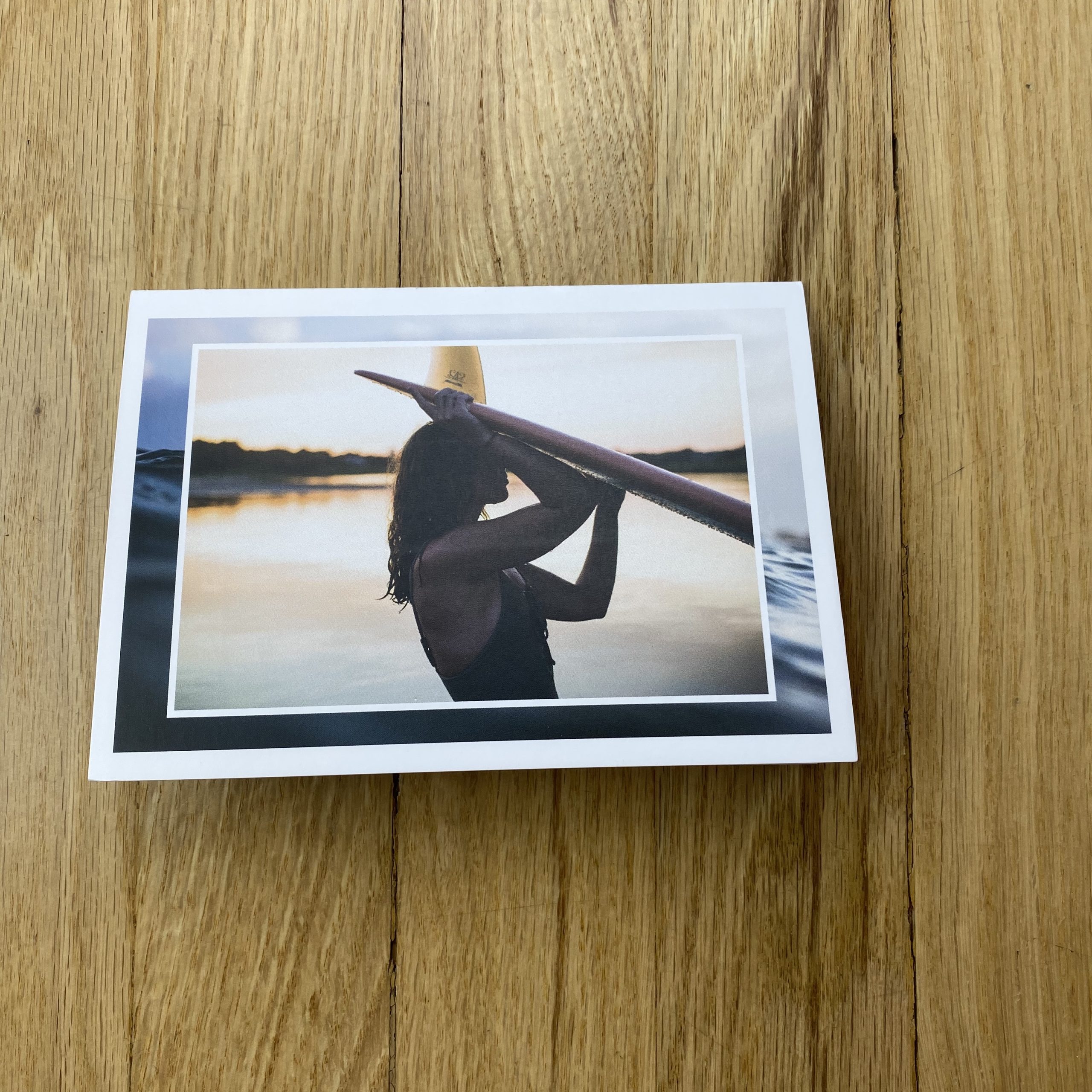
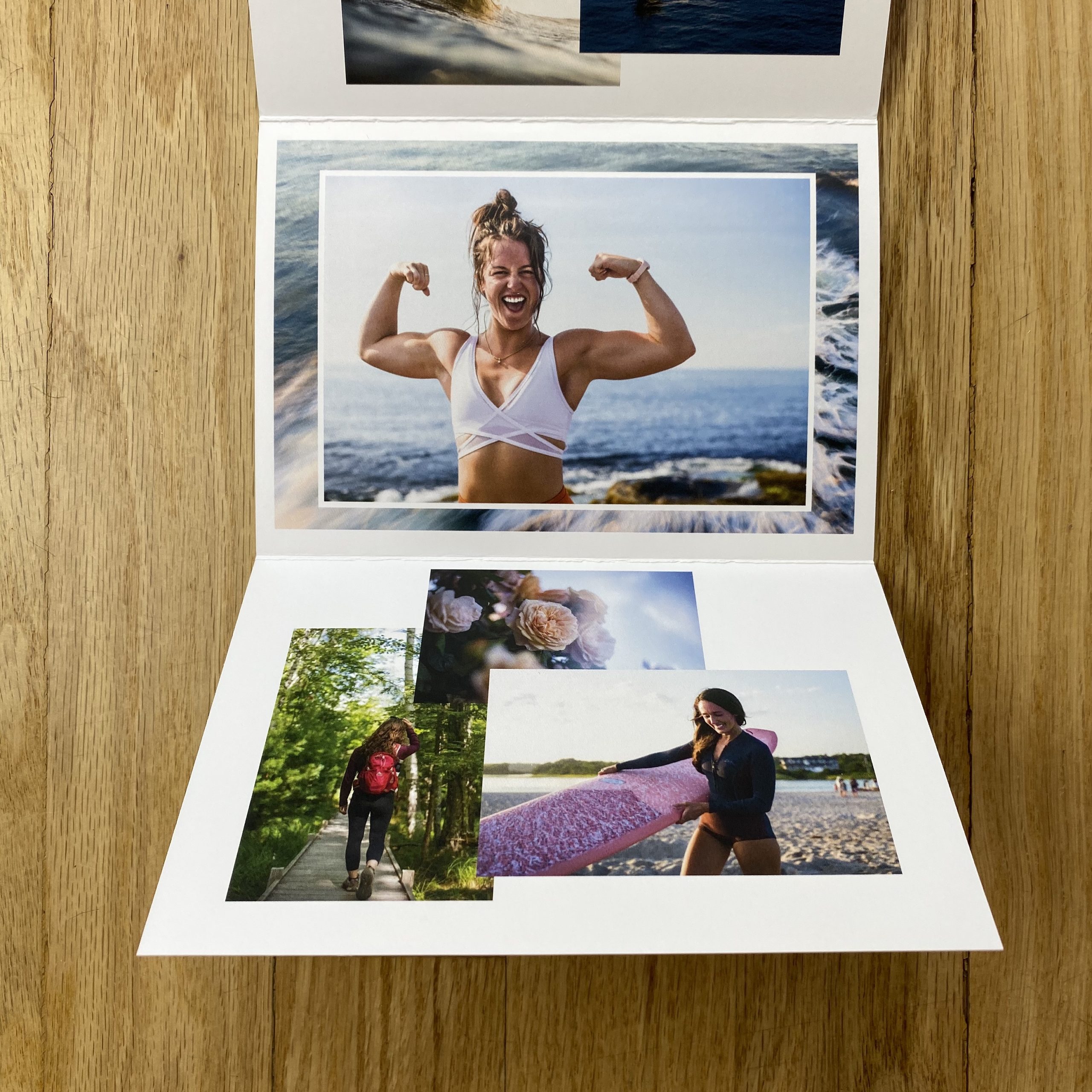
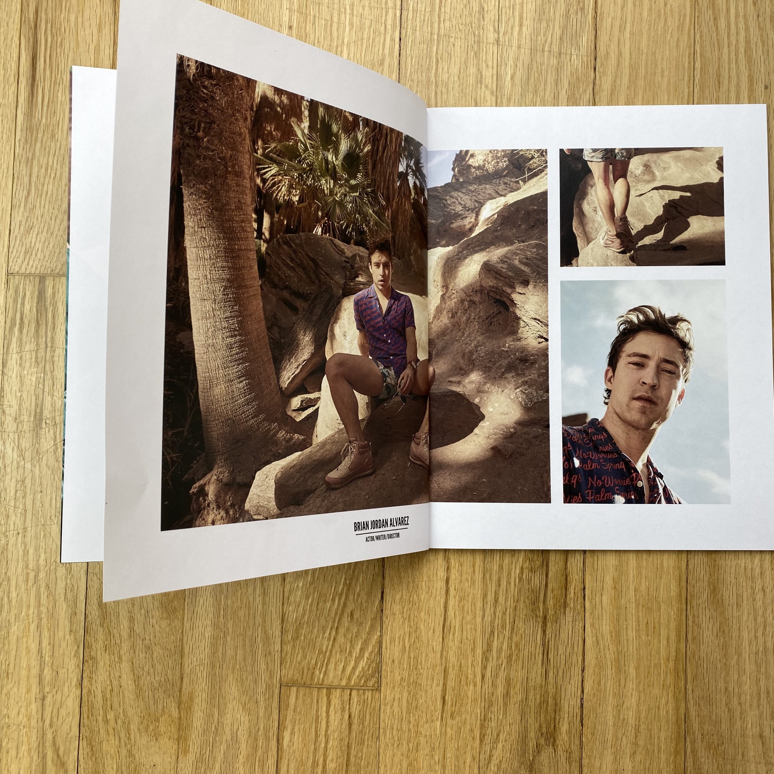
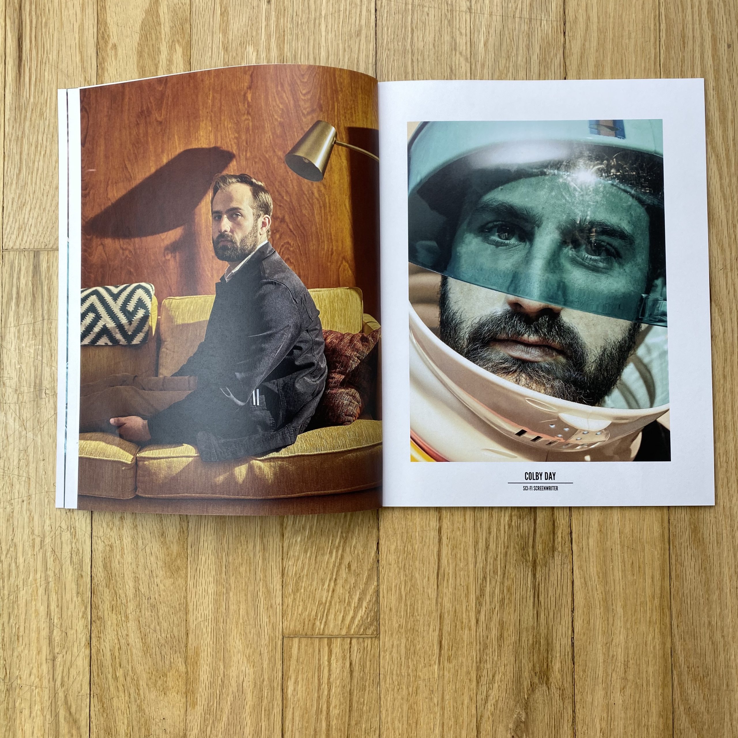
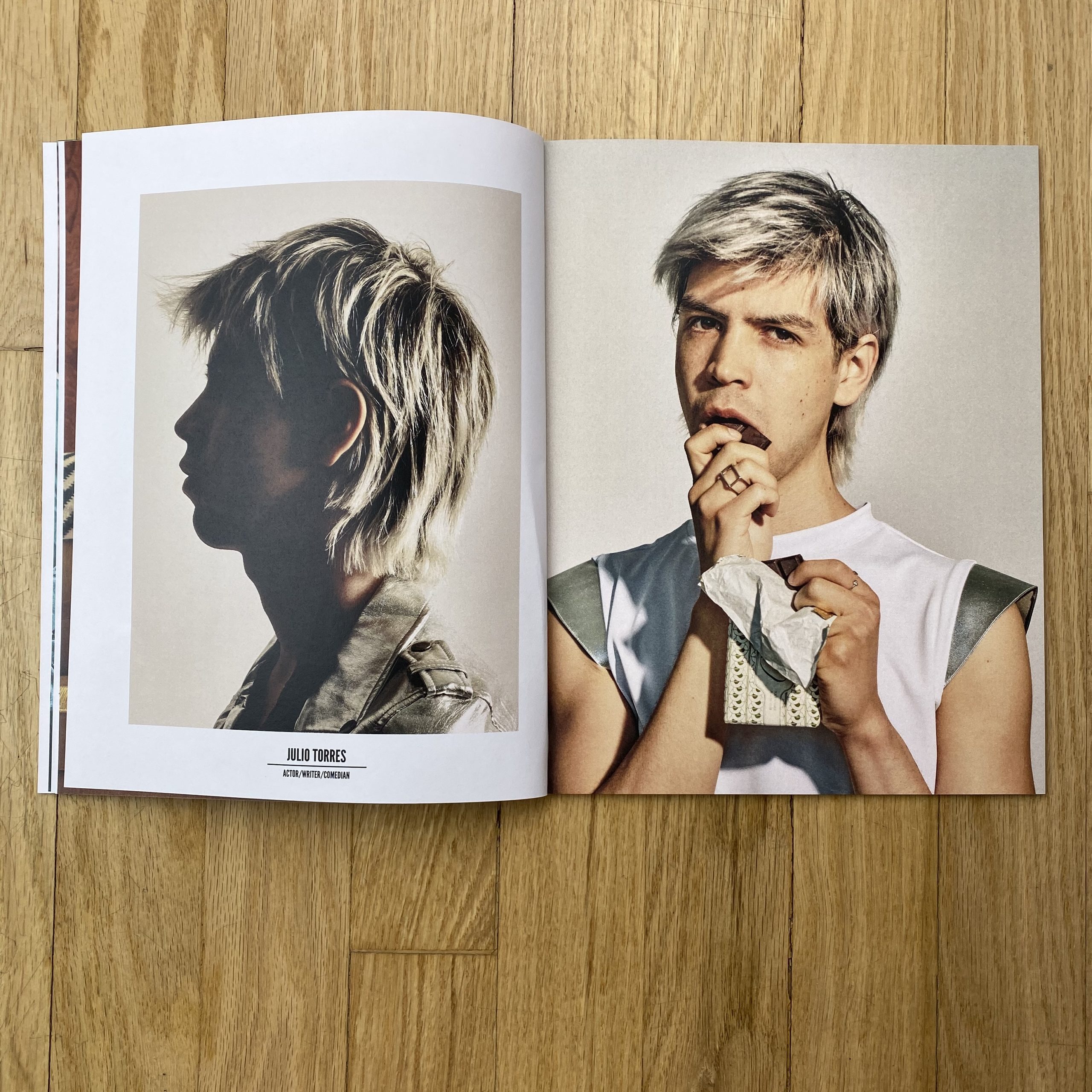
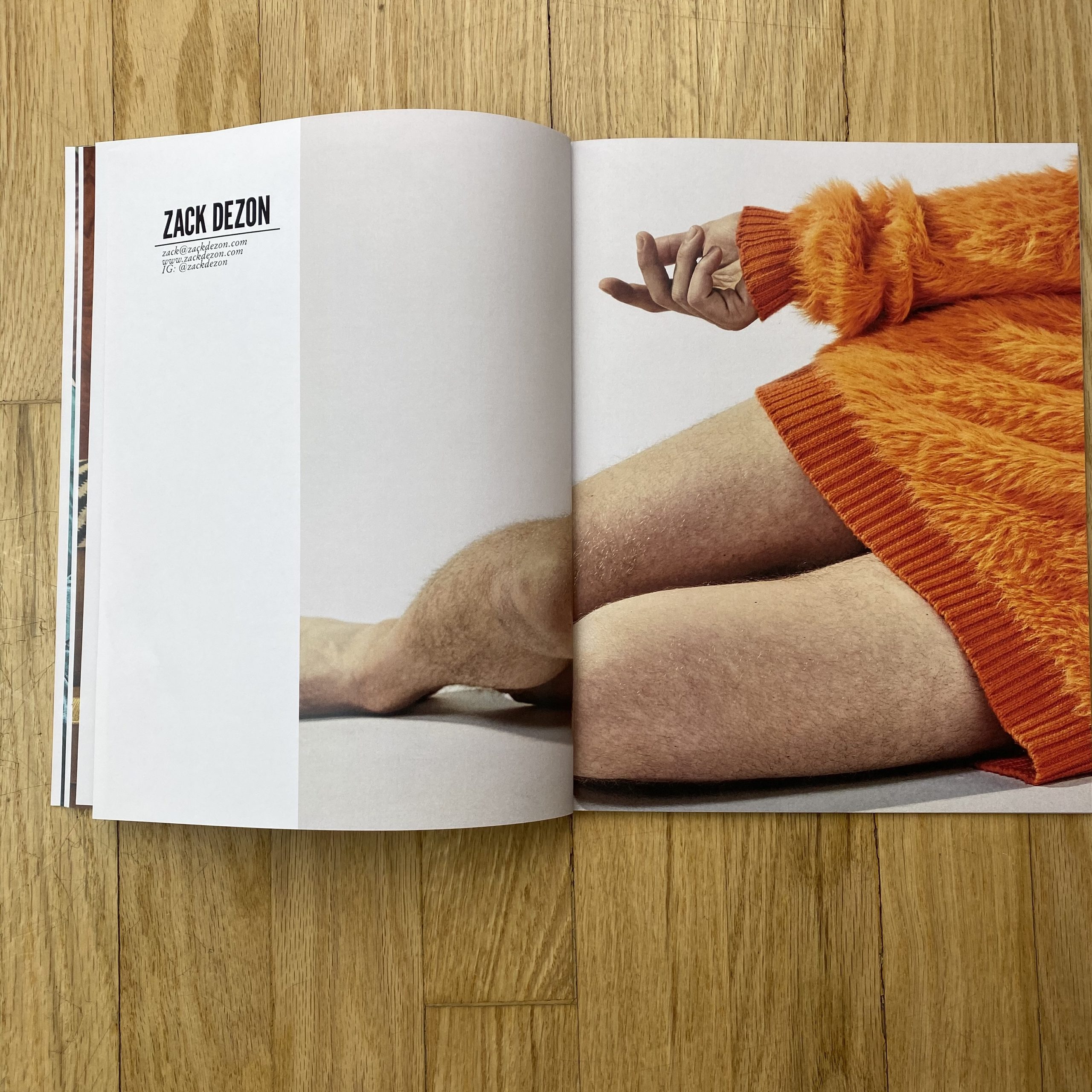
Tell me about the images?
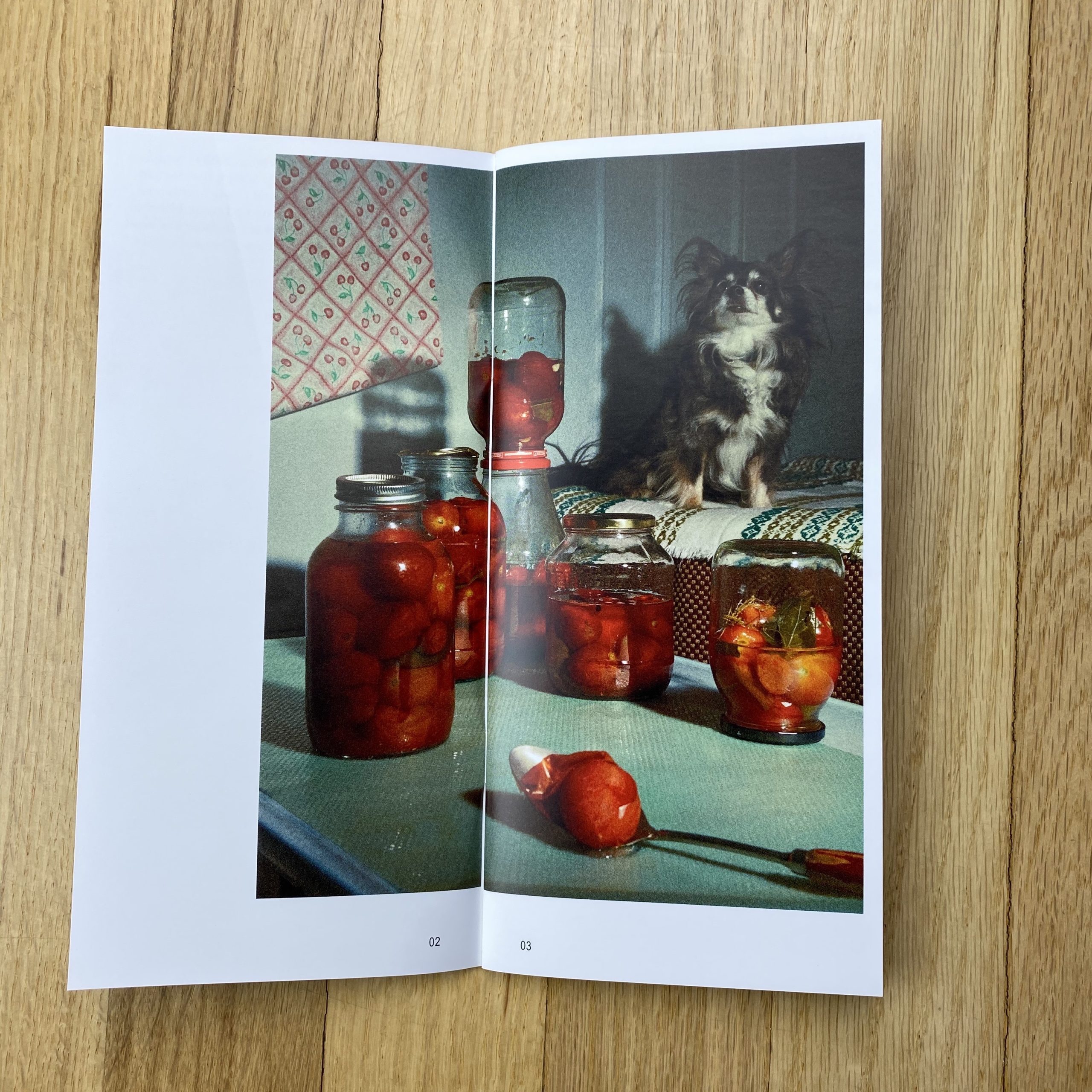
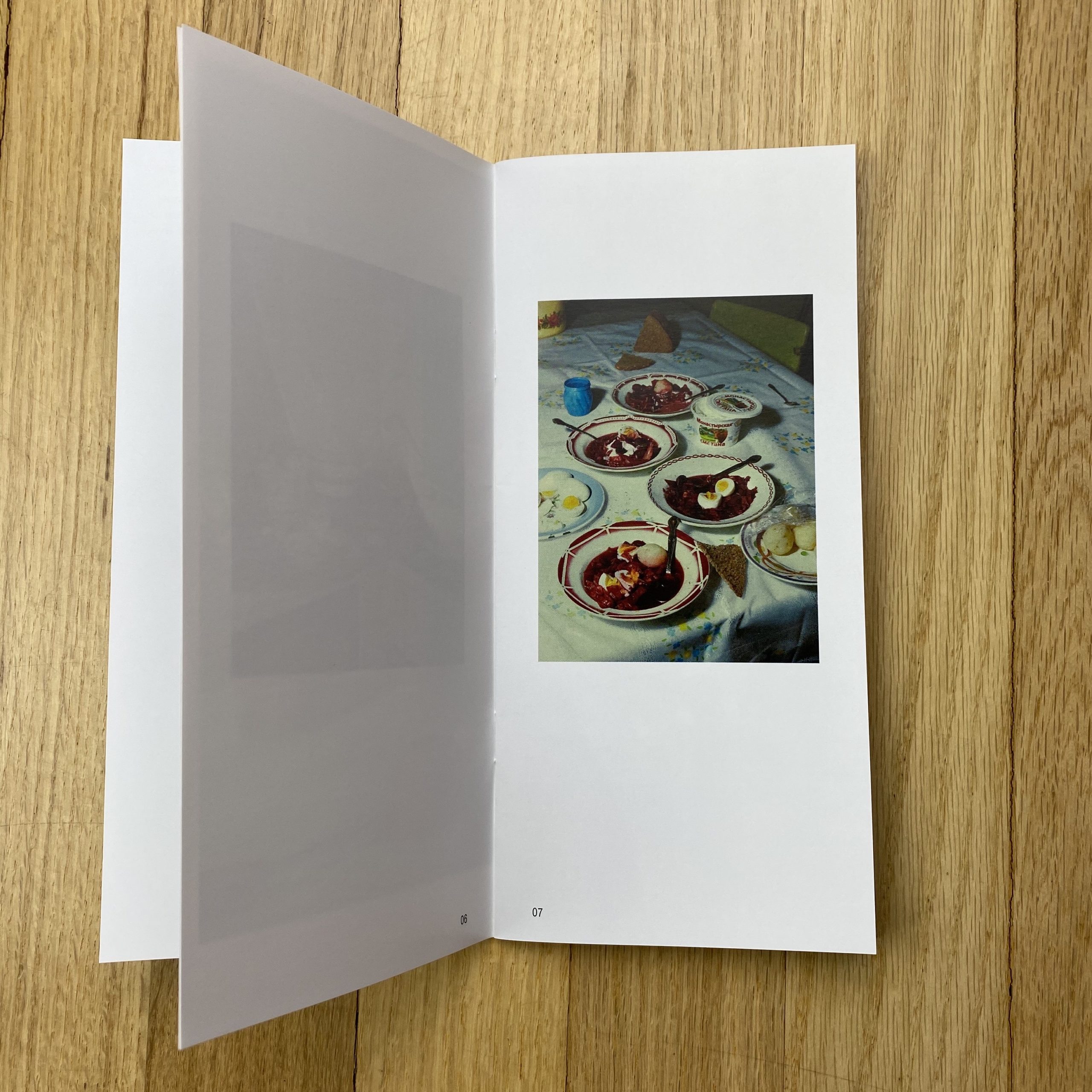
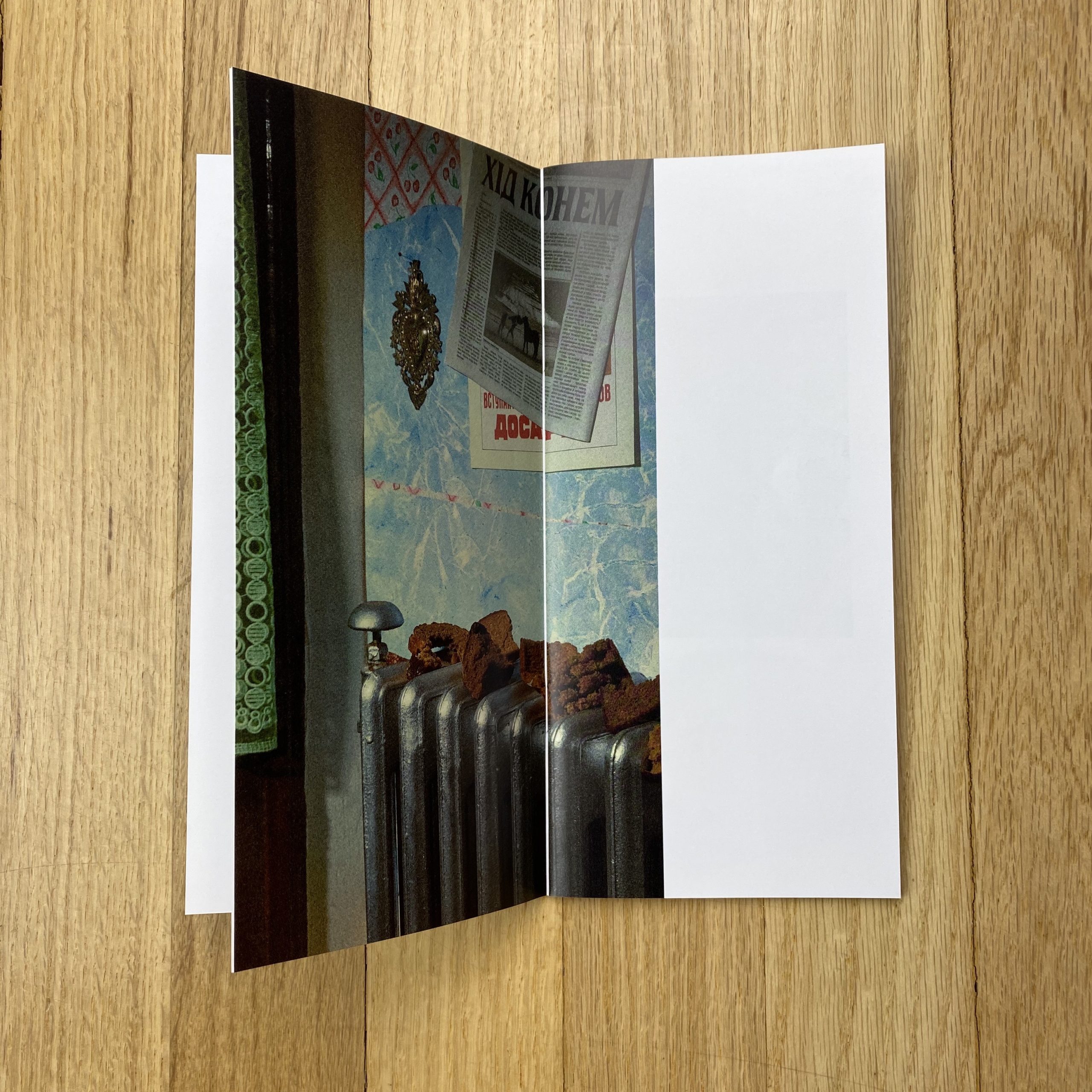
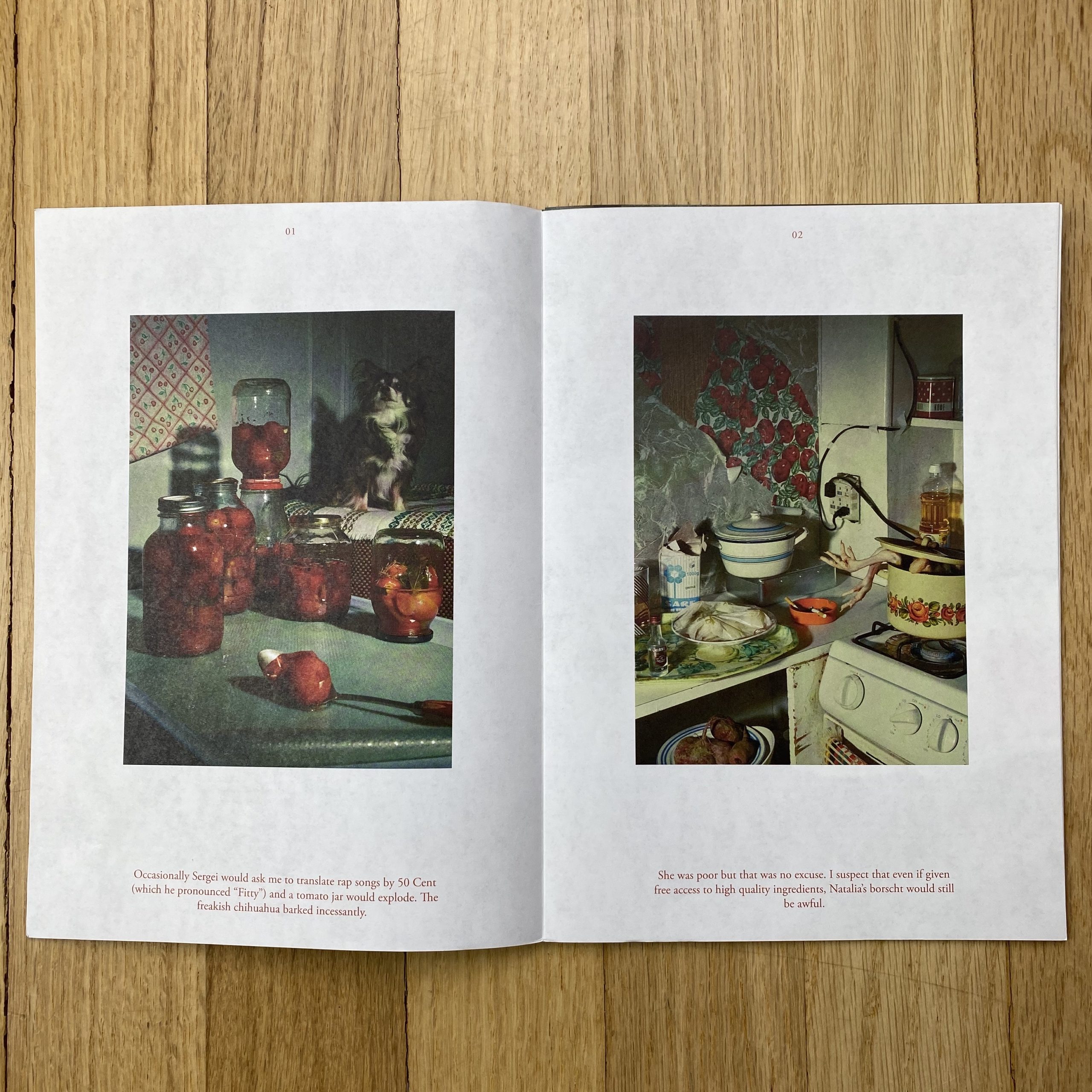
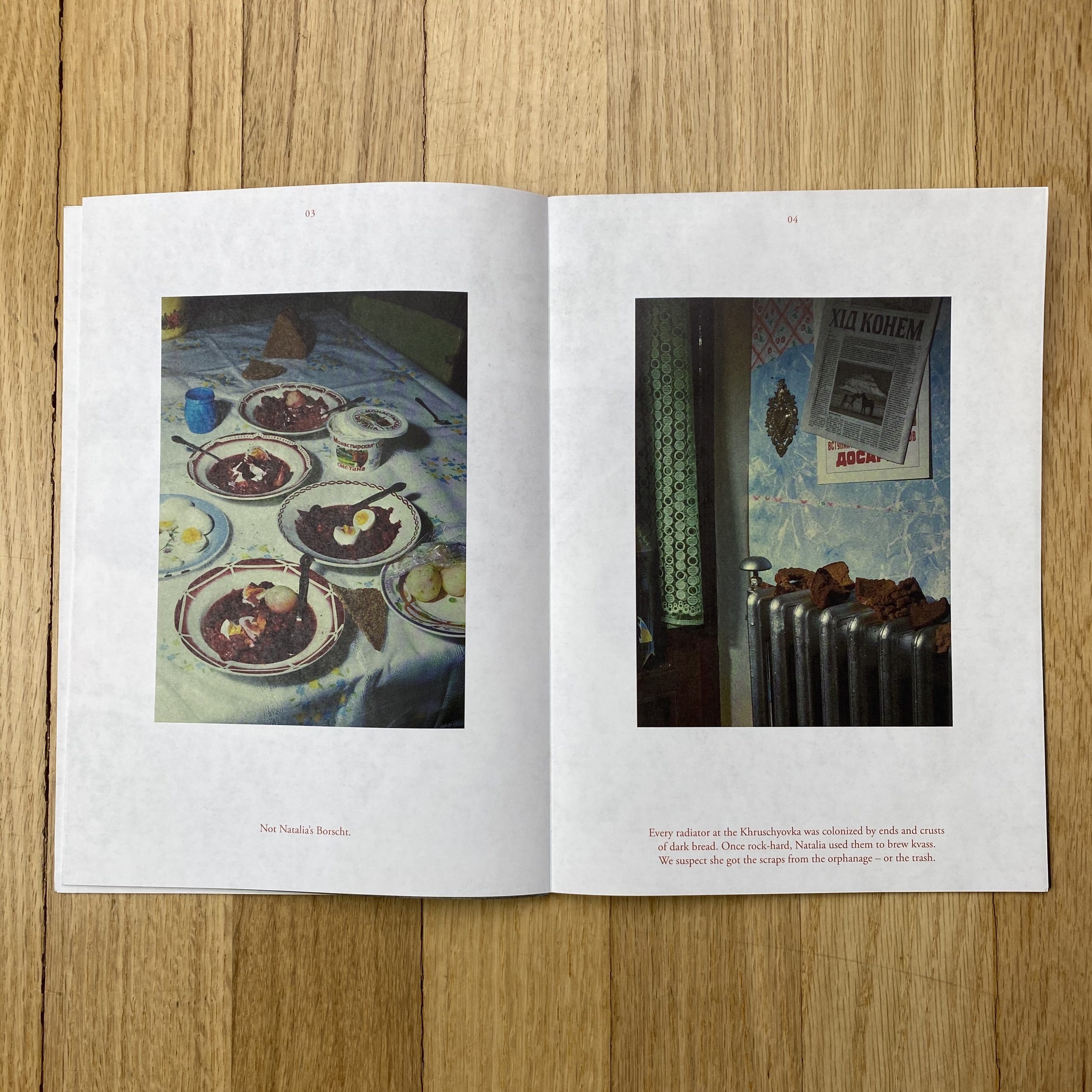
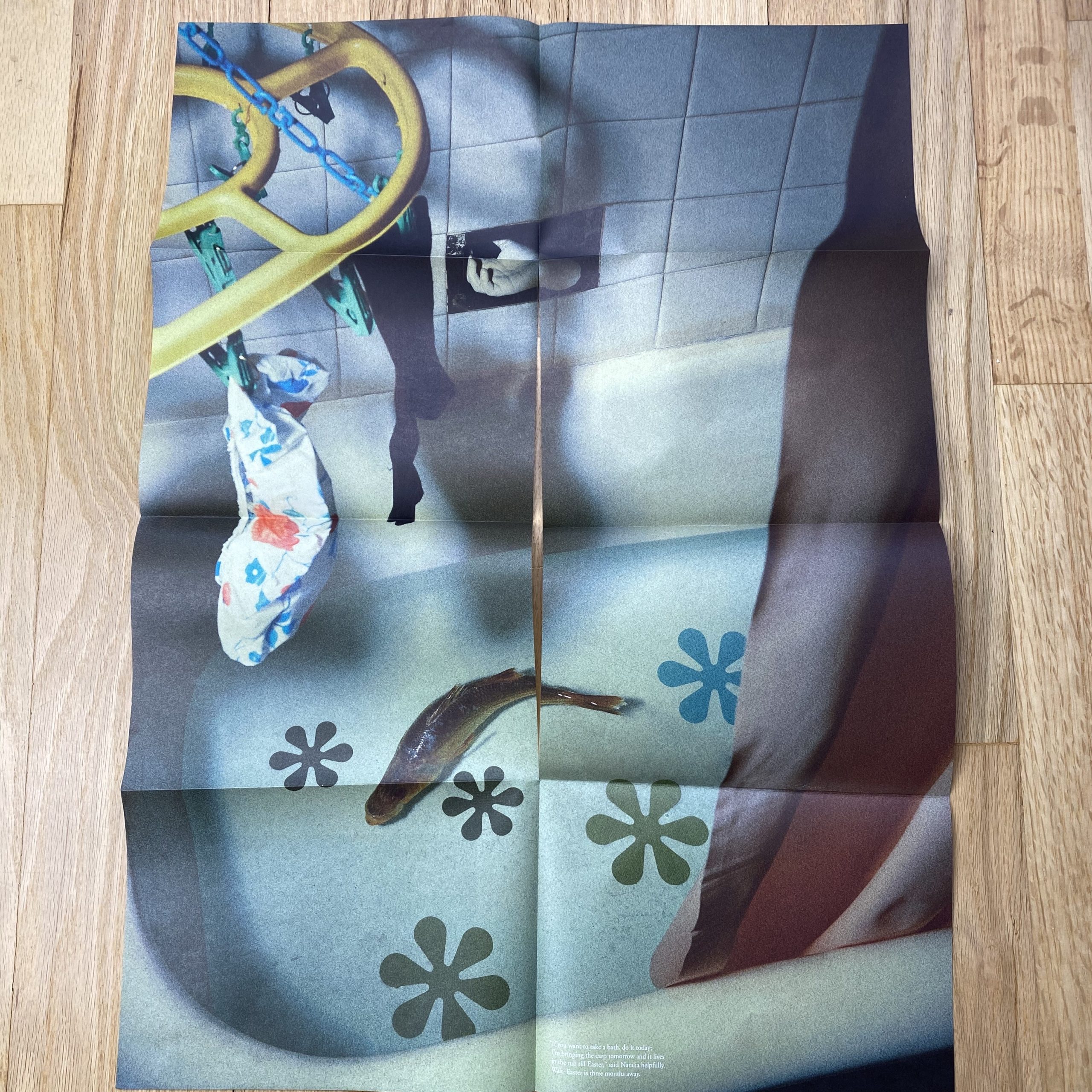
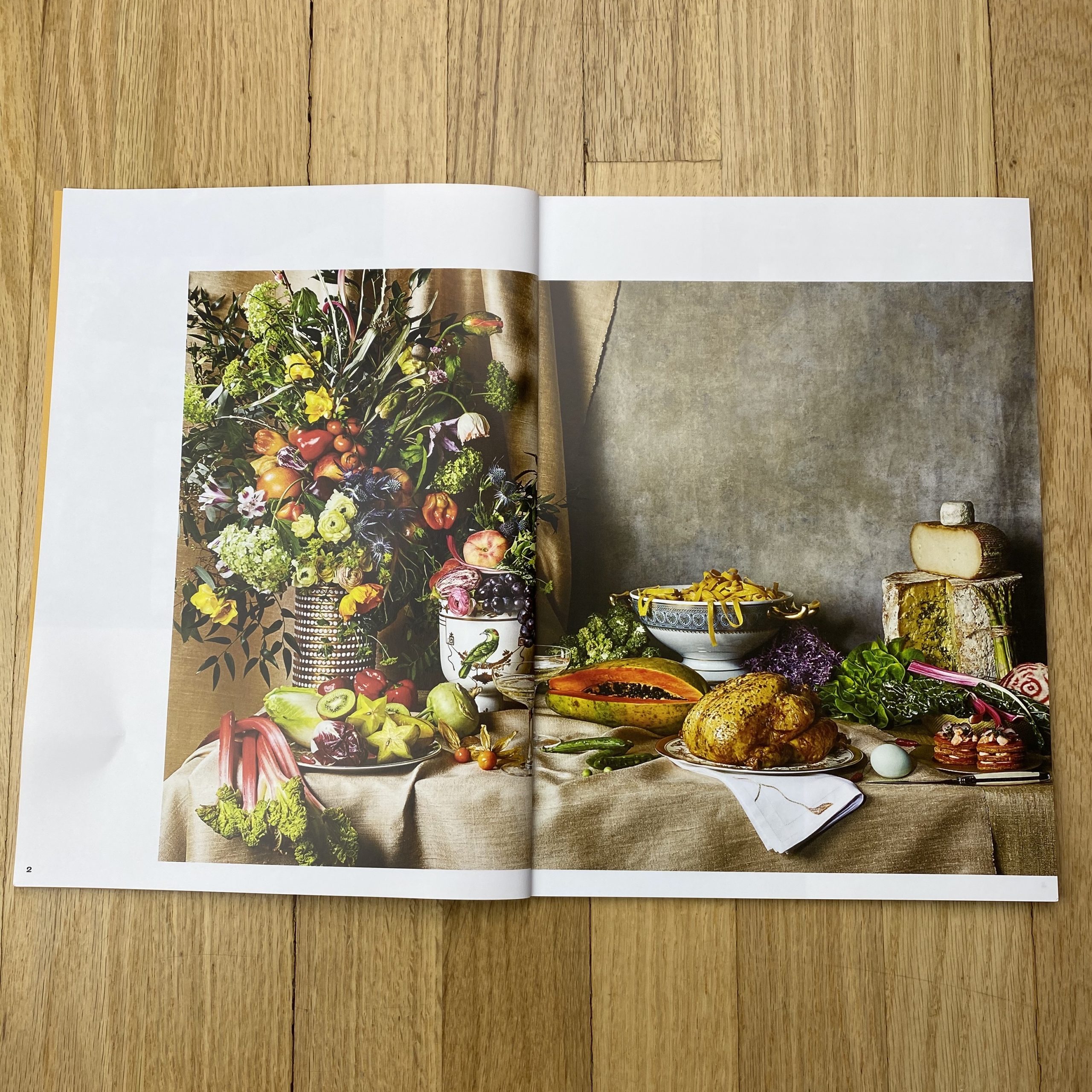
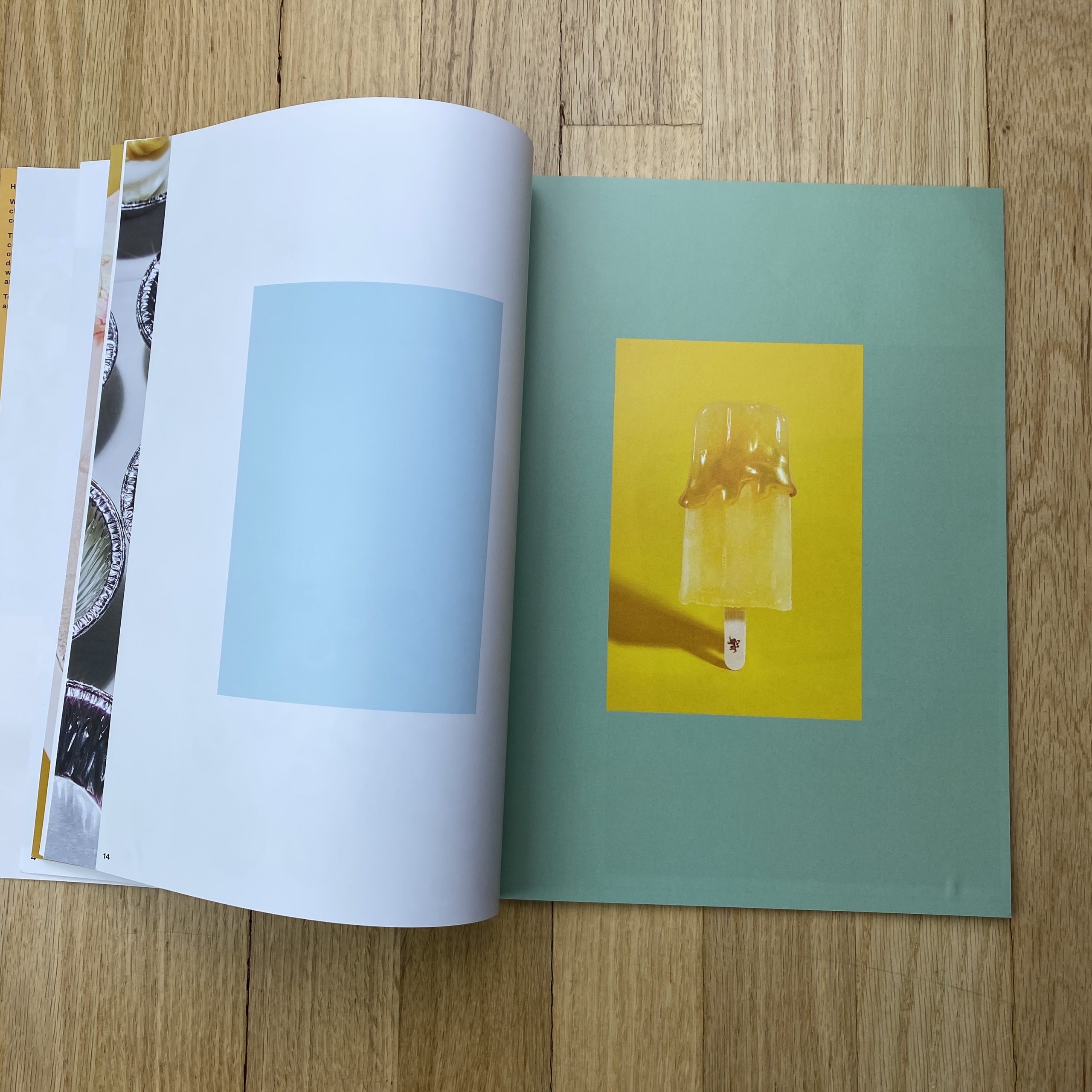
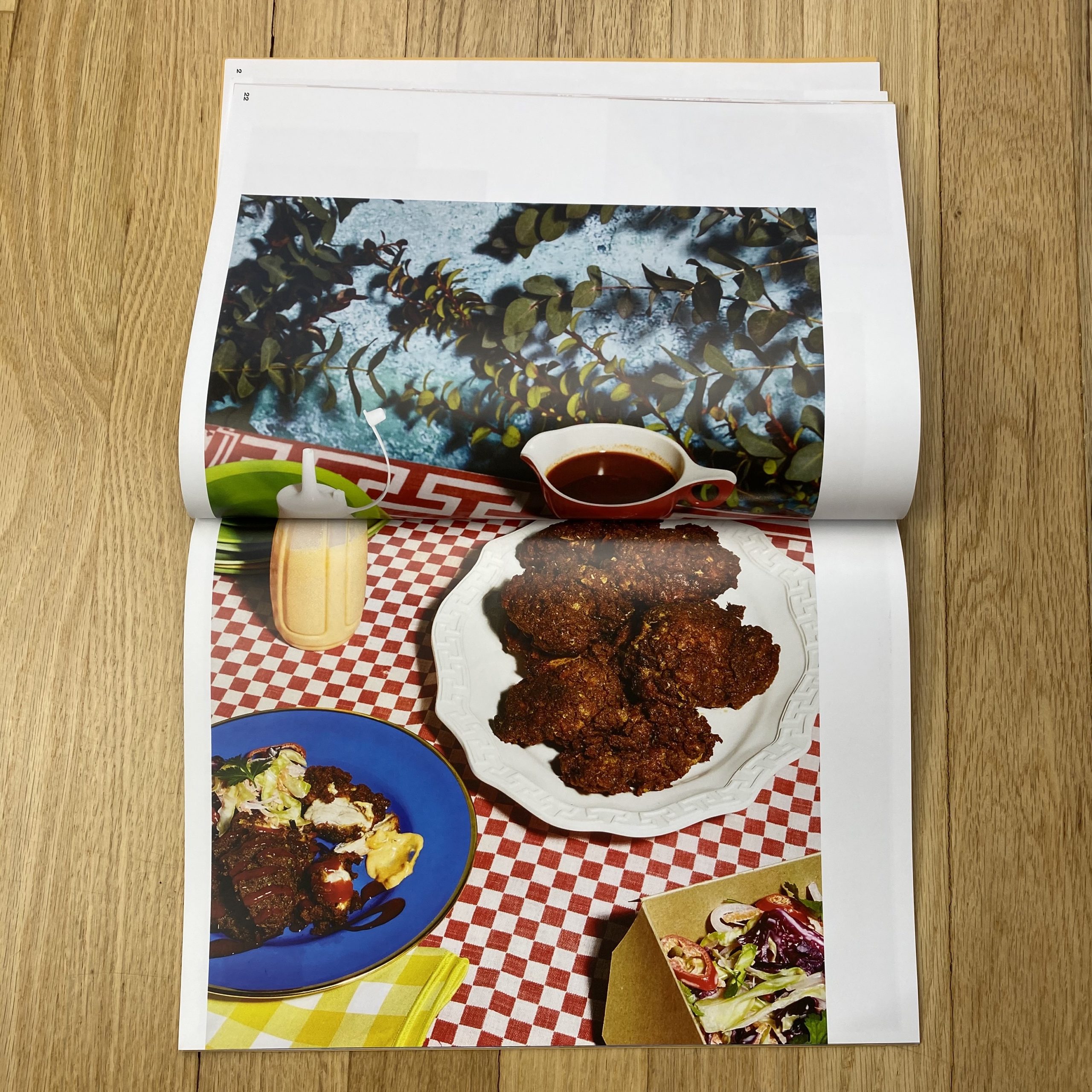
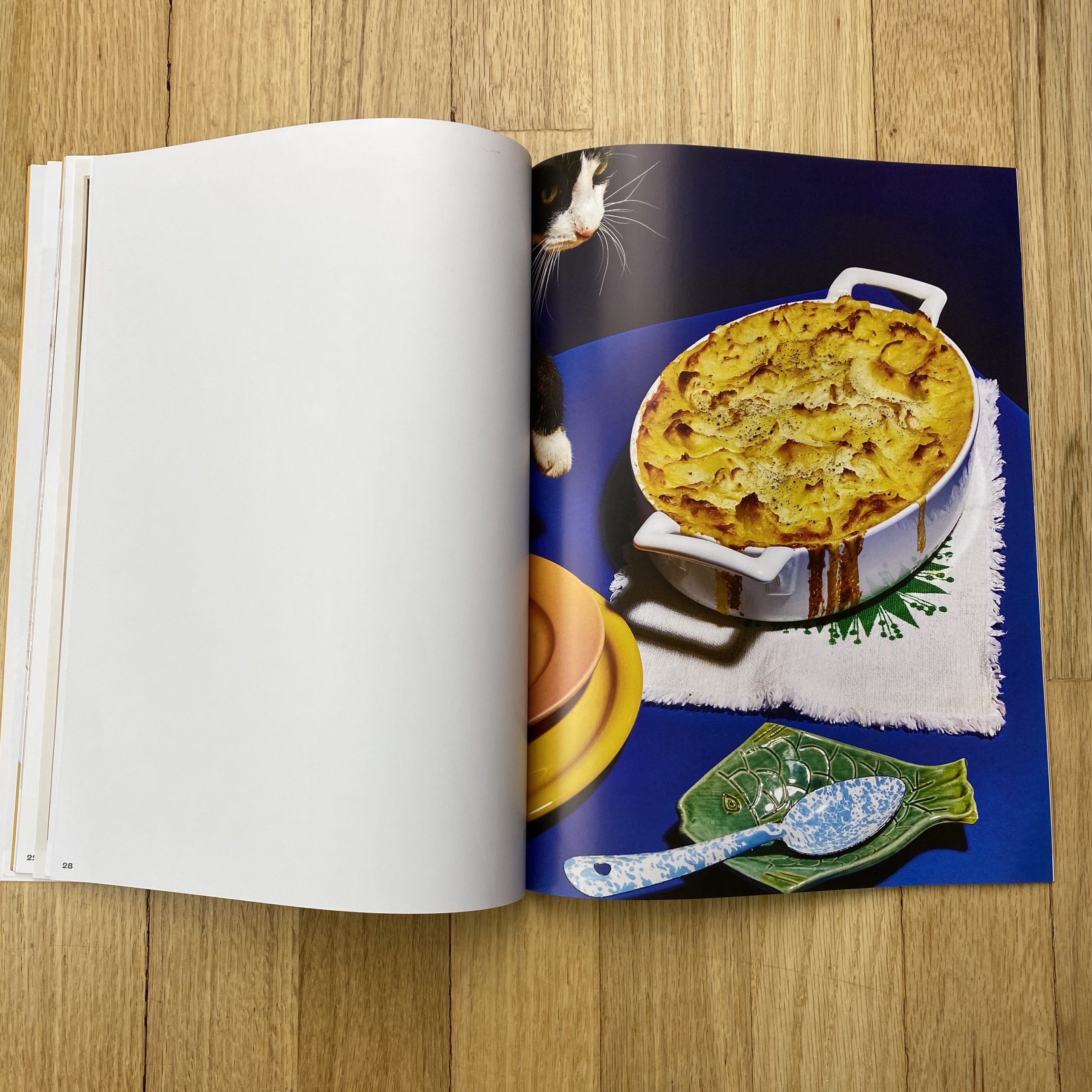
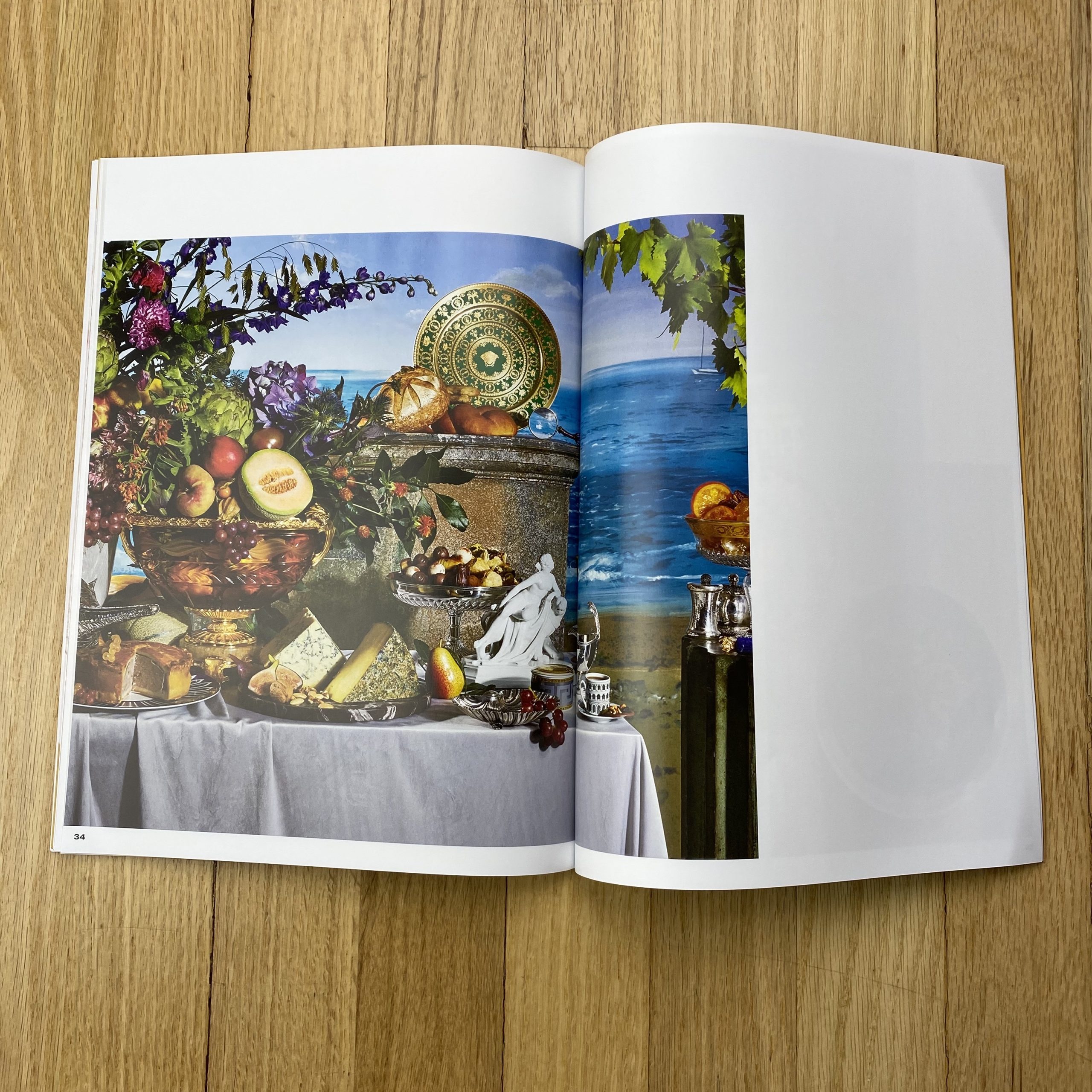
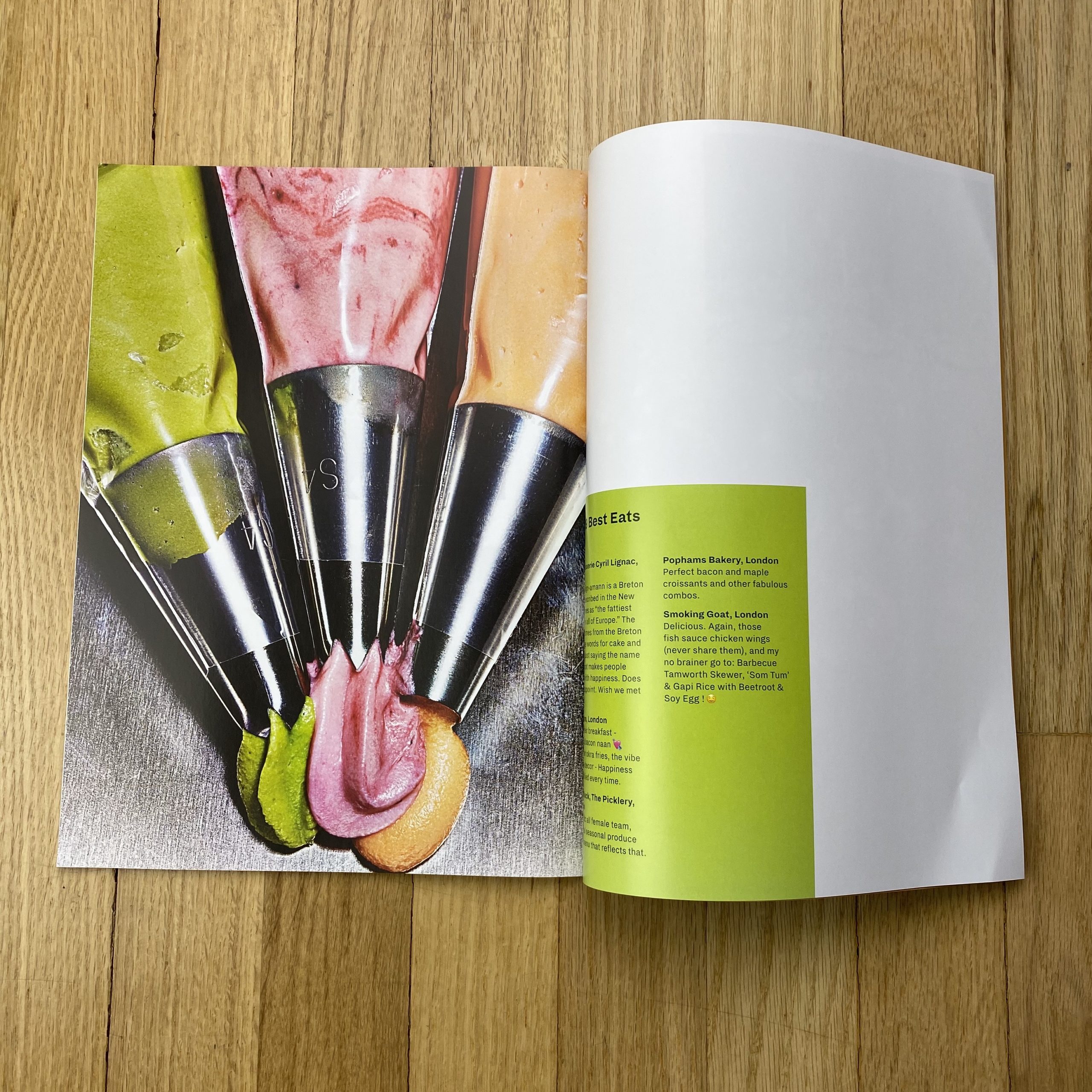
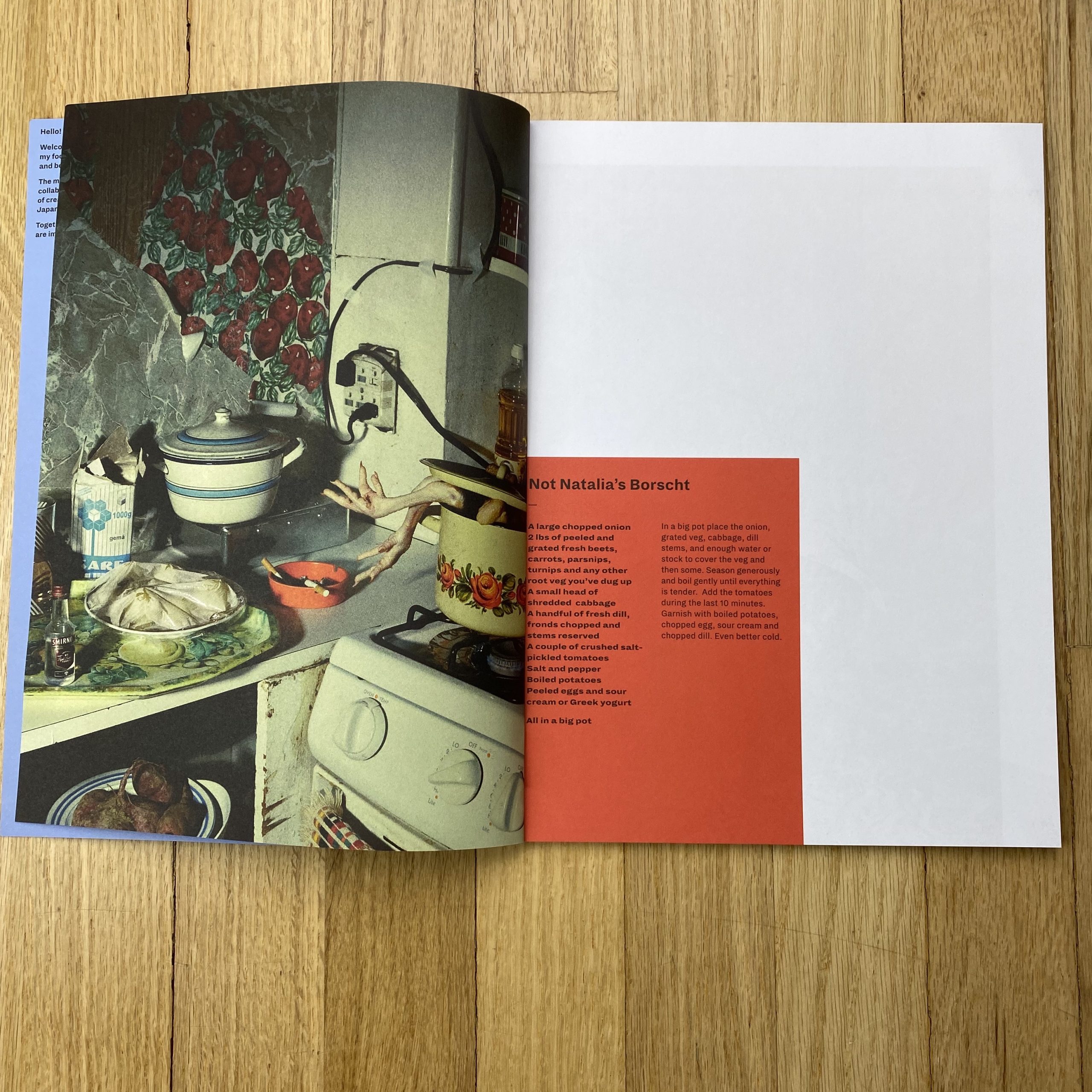
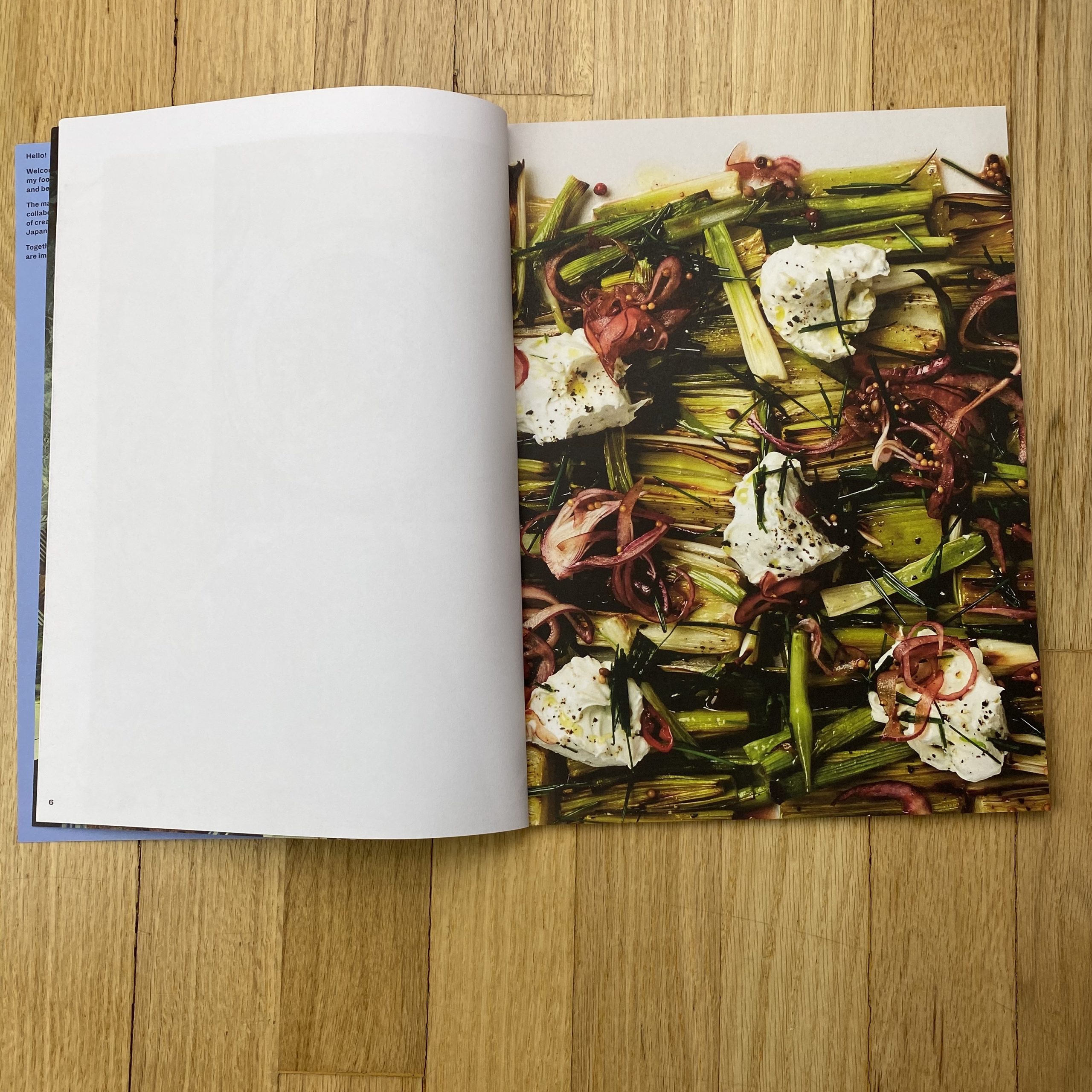
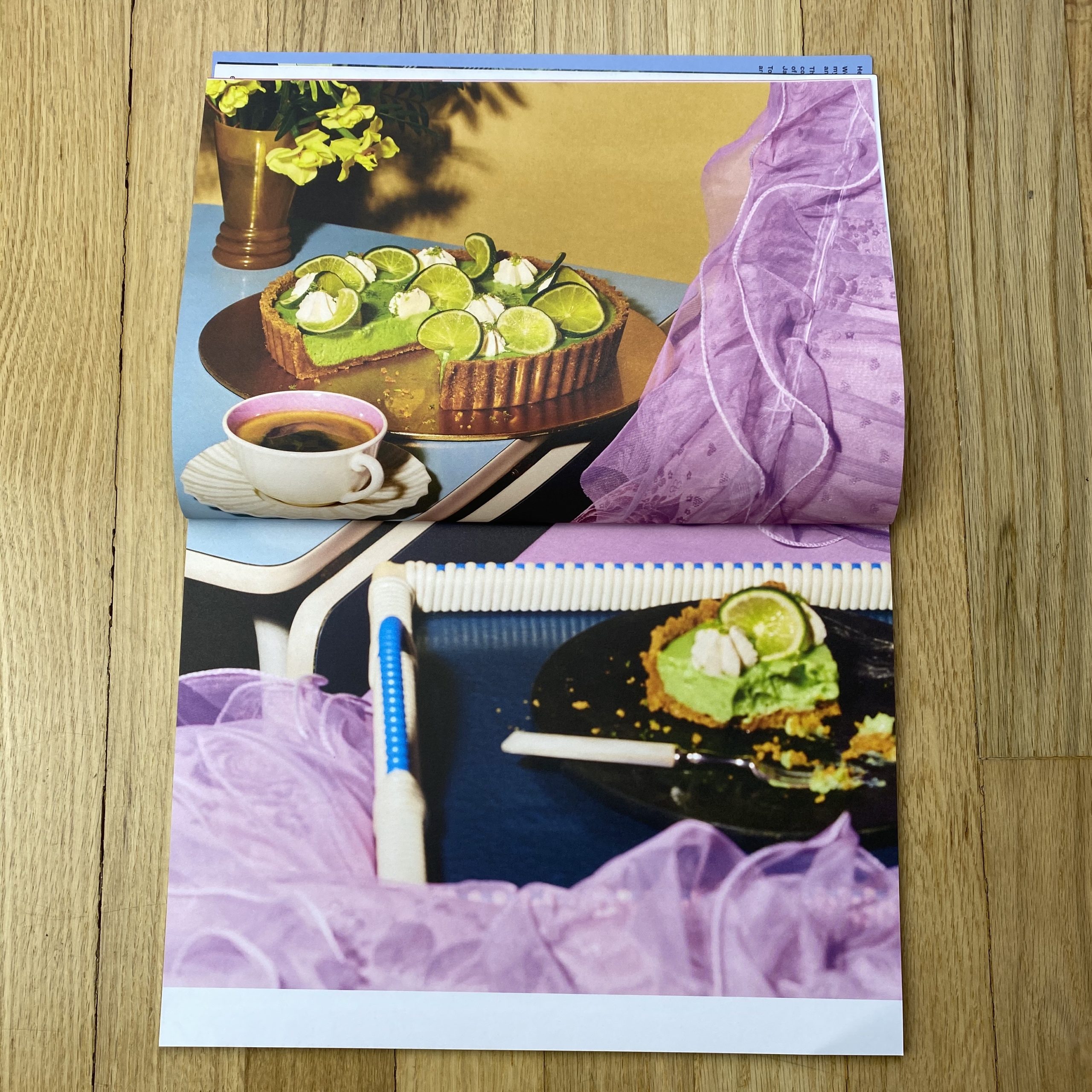
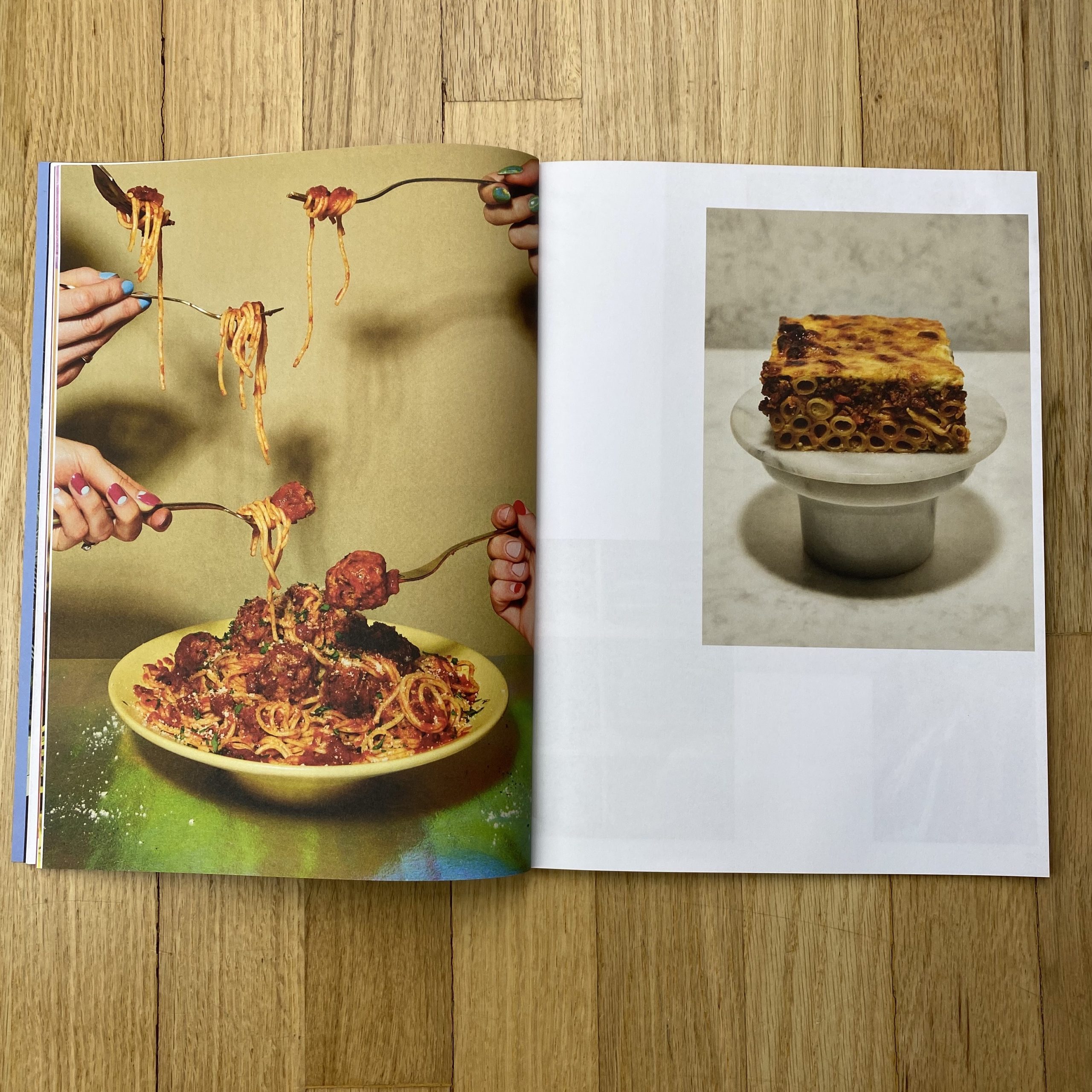
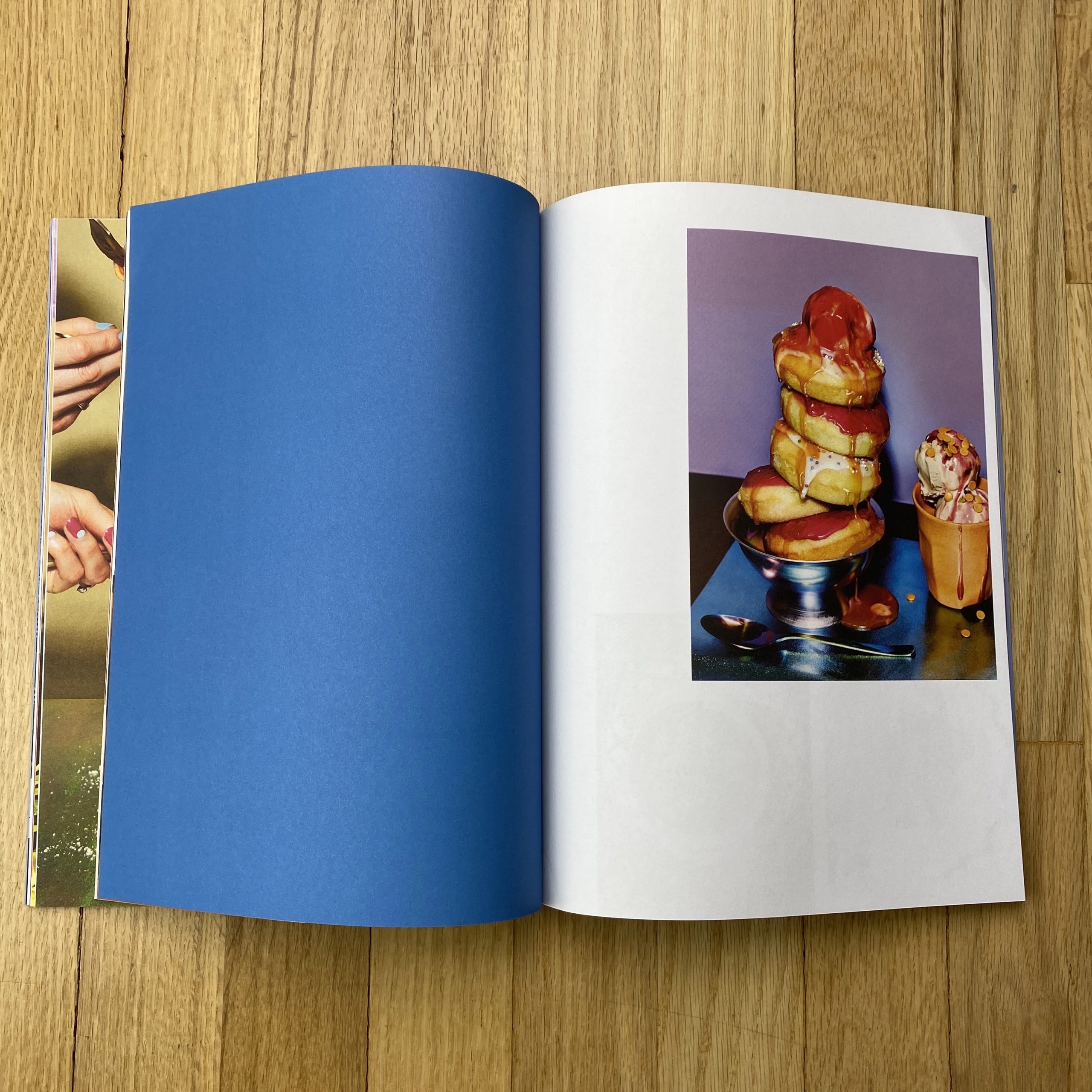
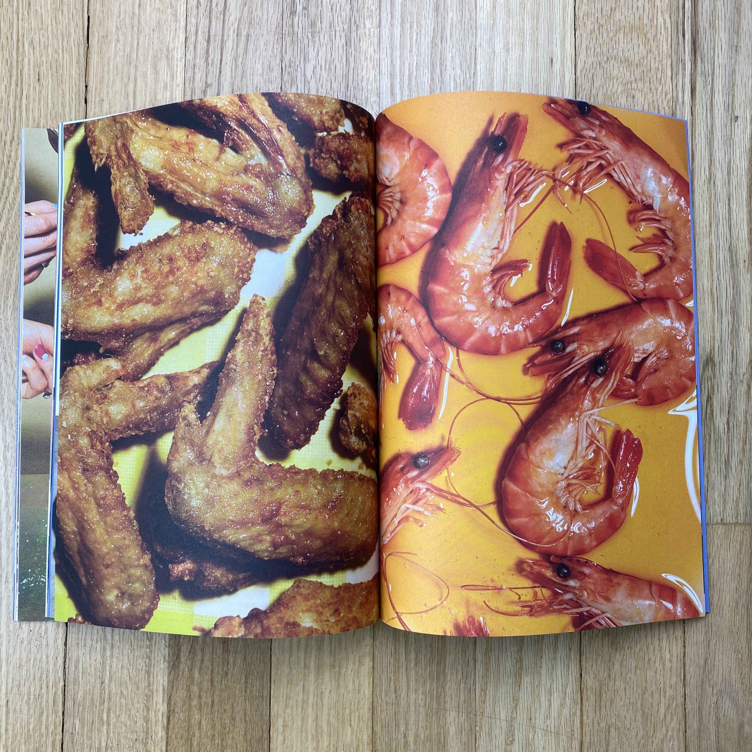
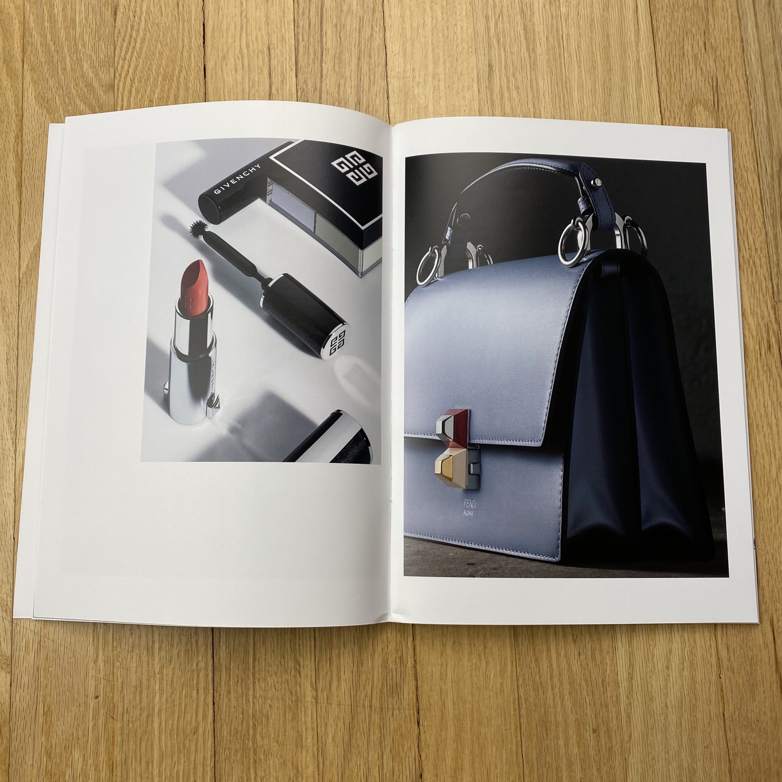
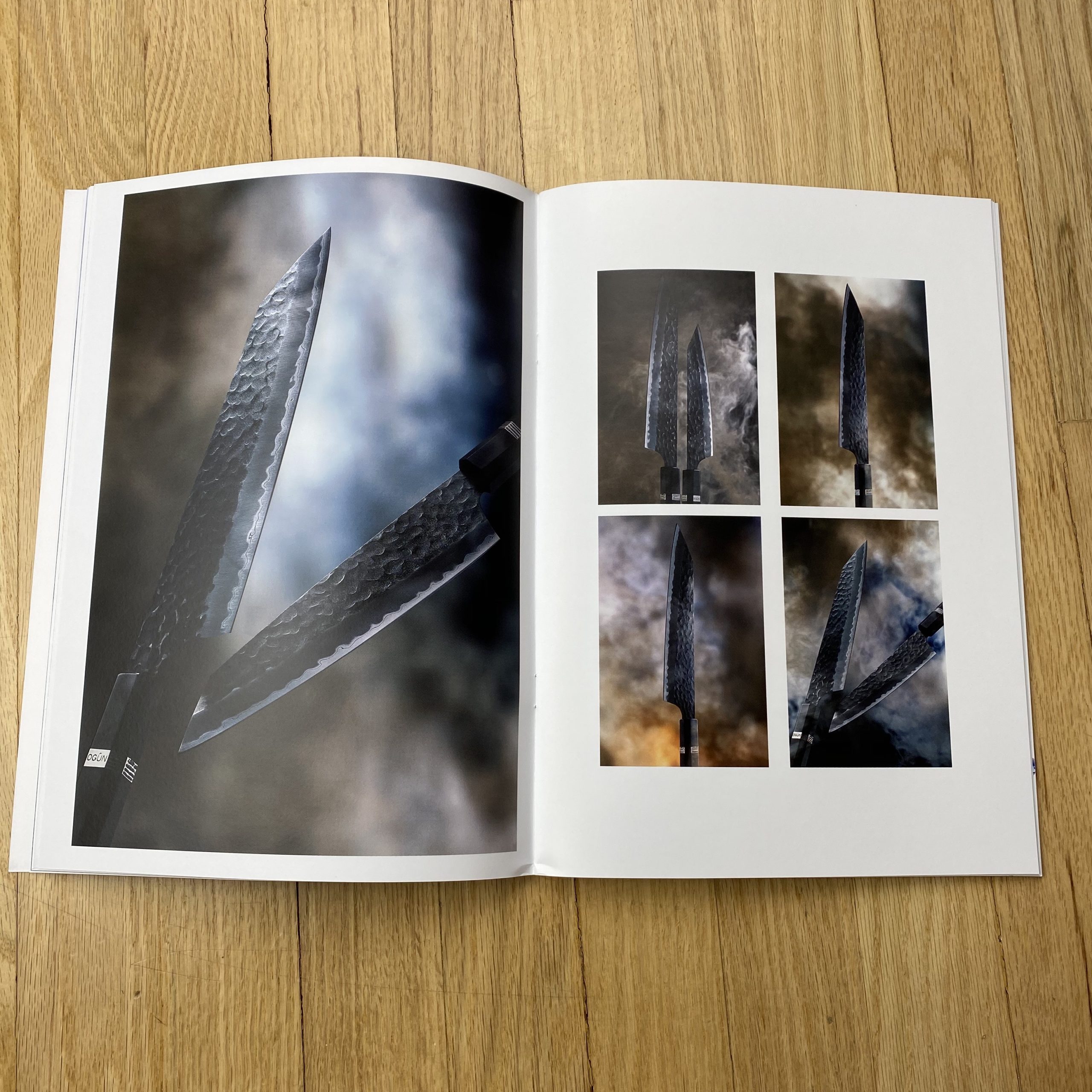
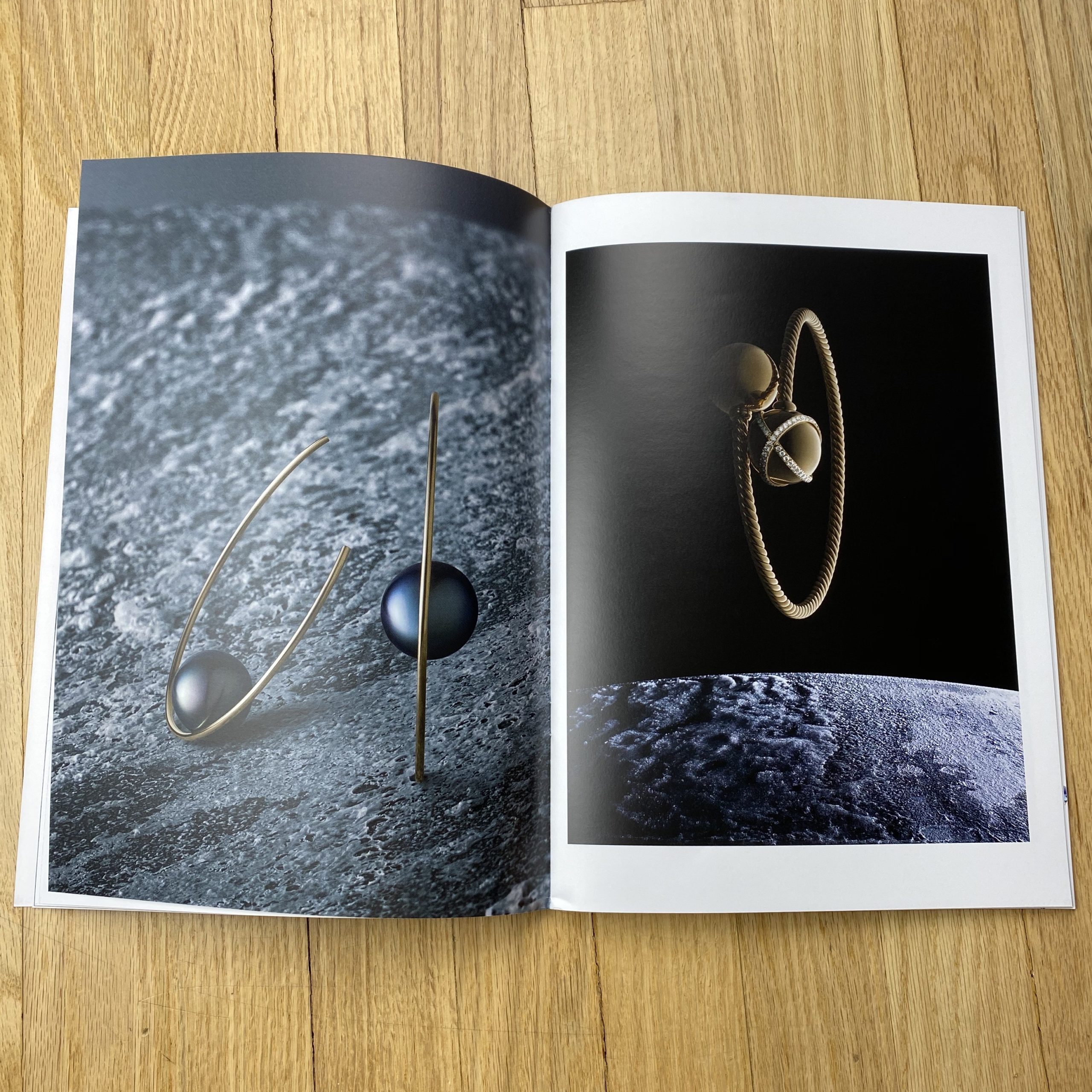
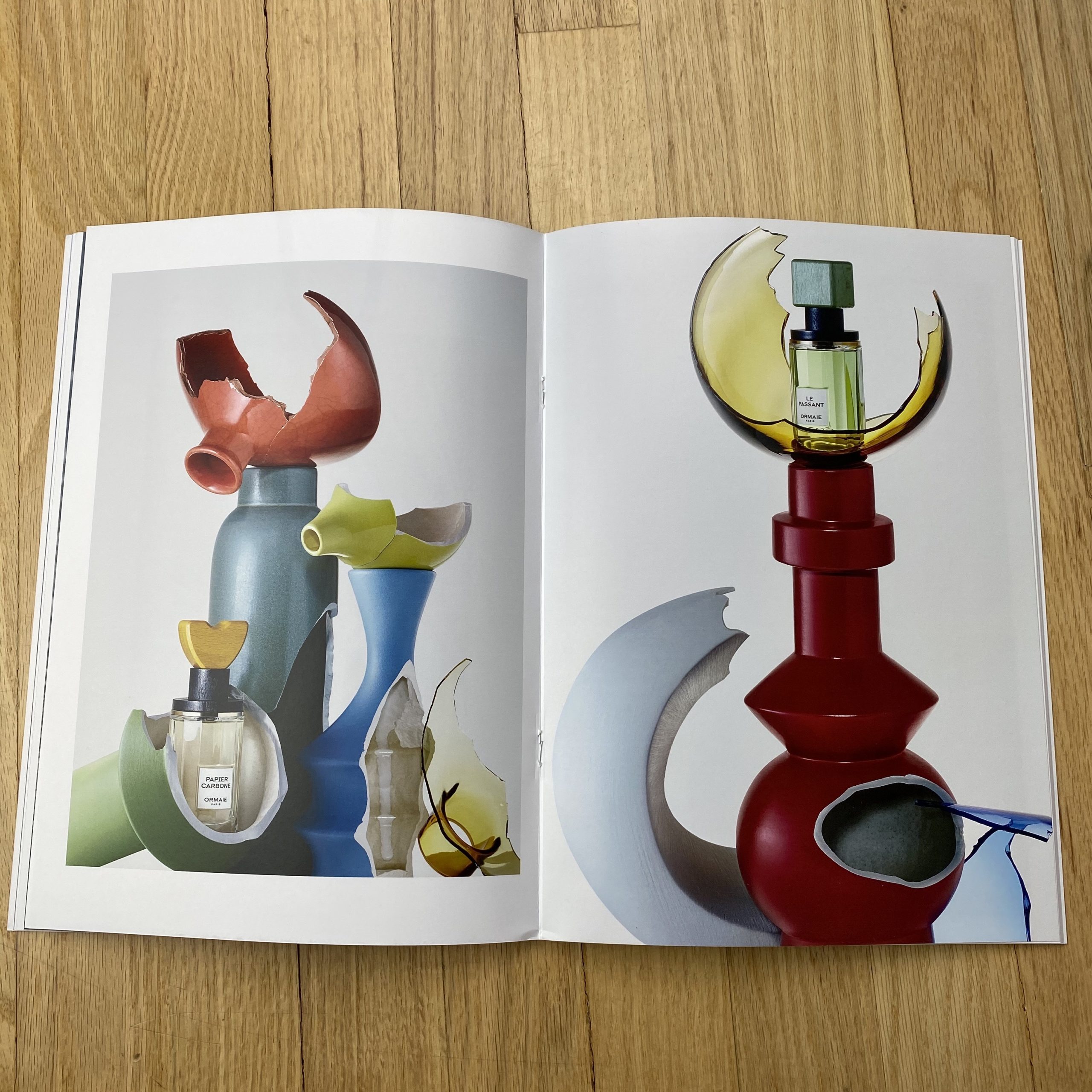
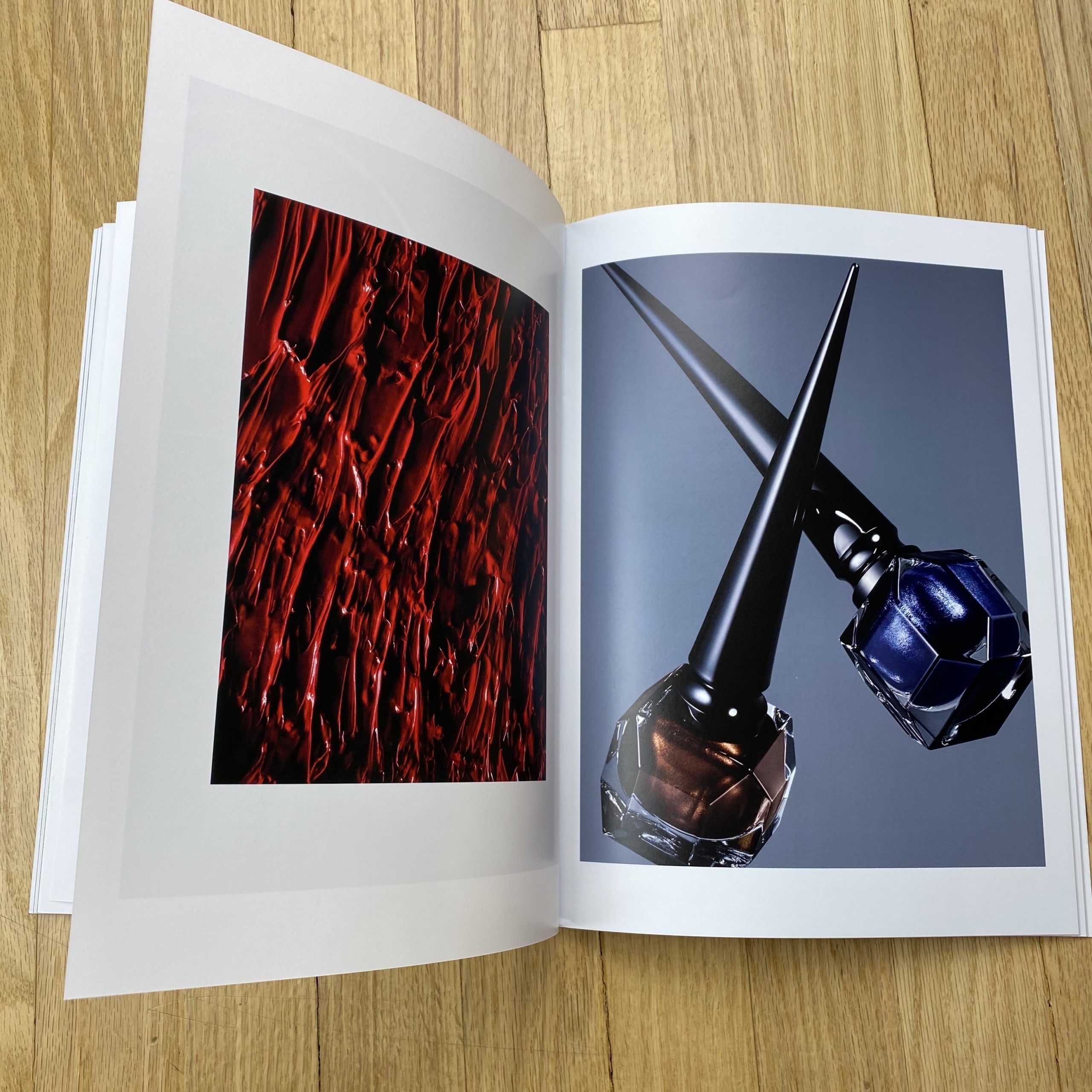
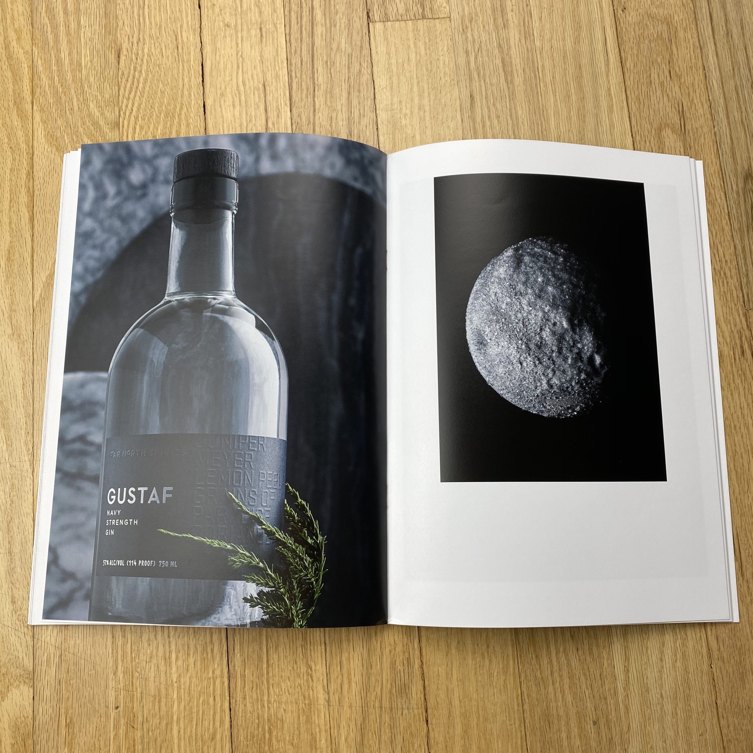
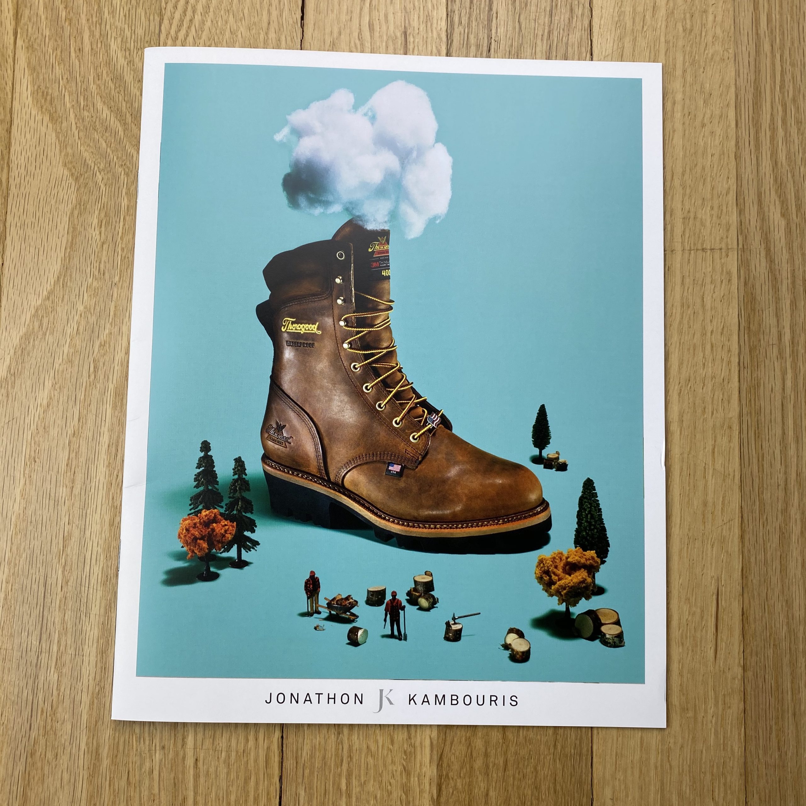
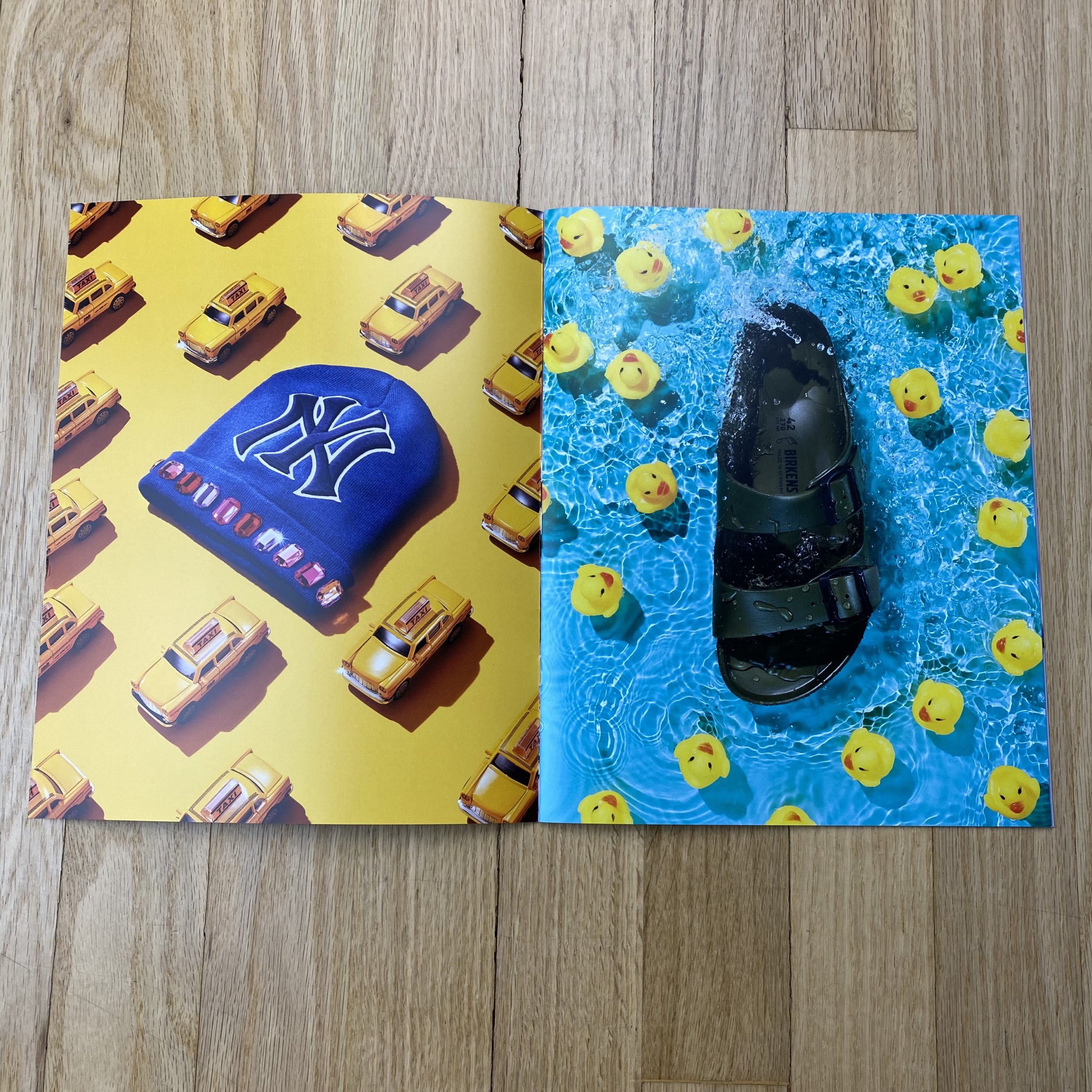
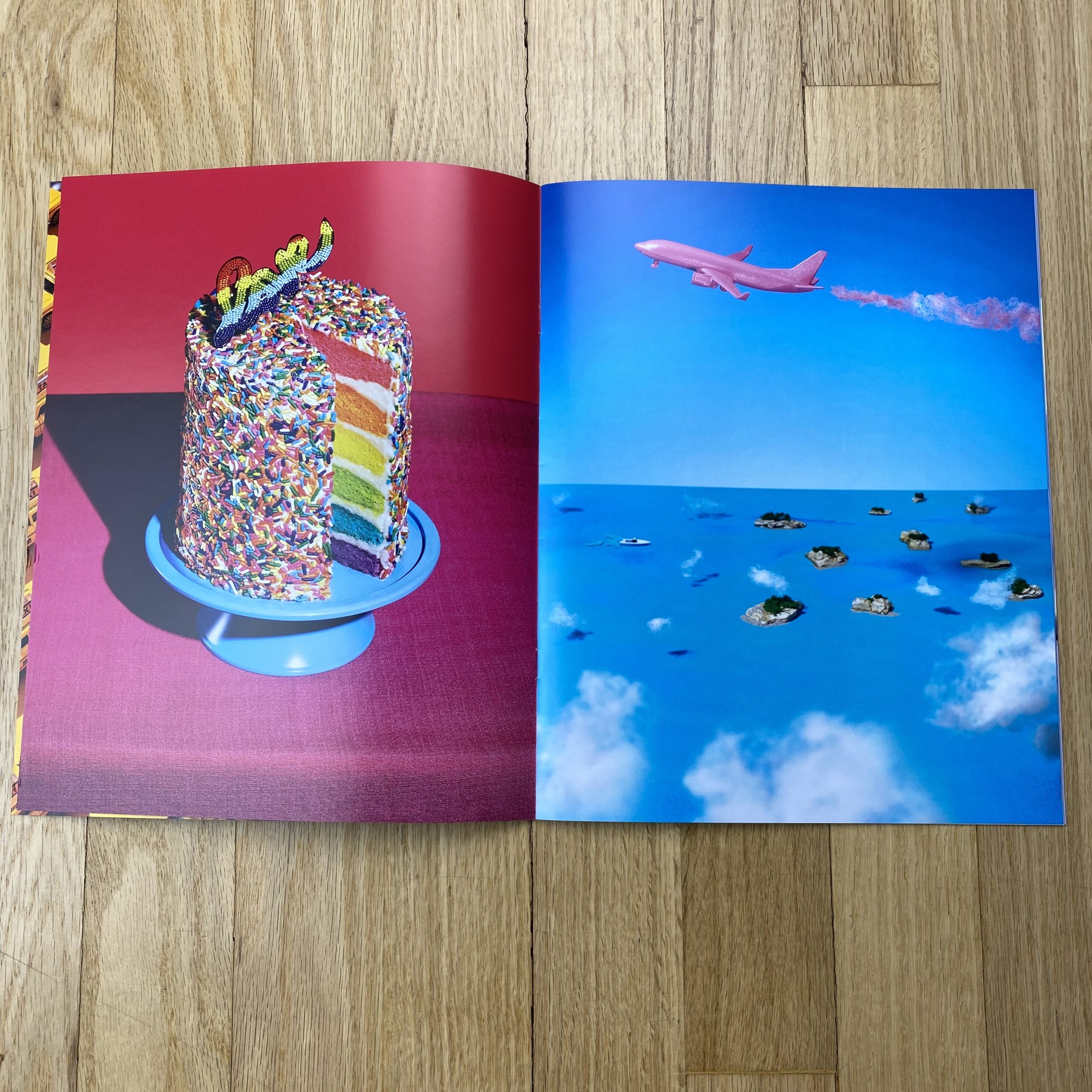
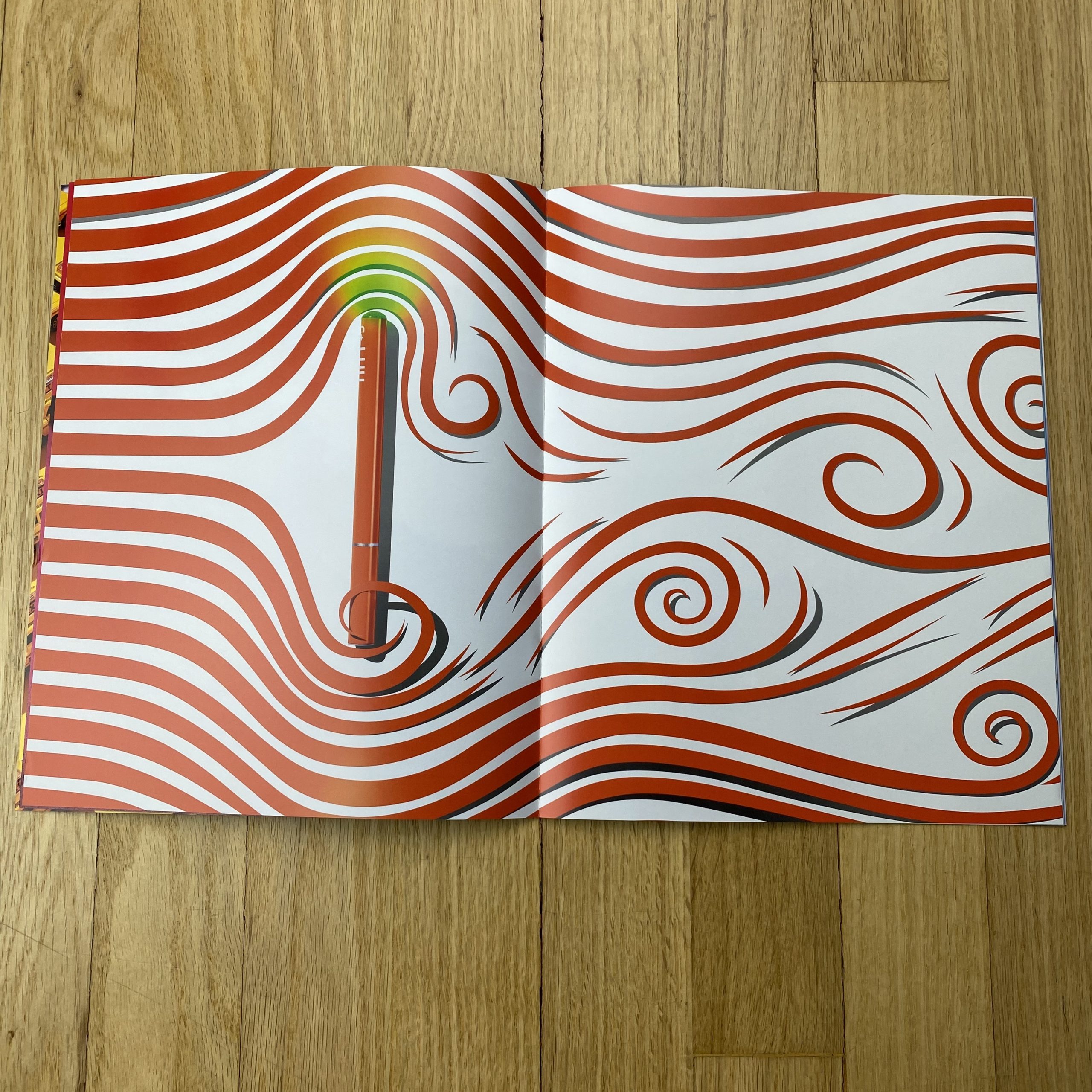
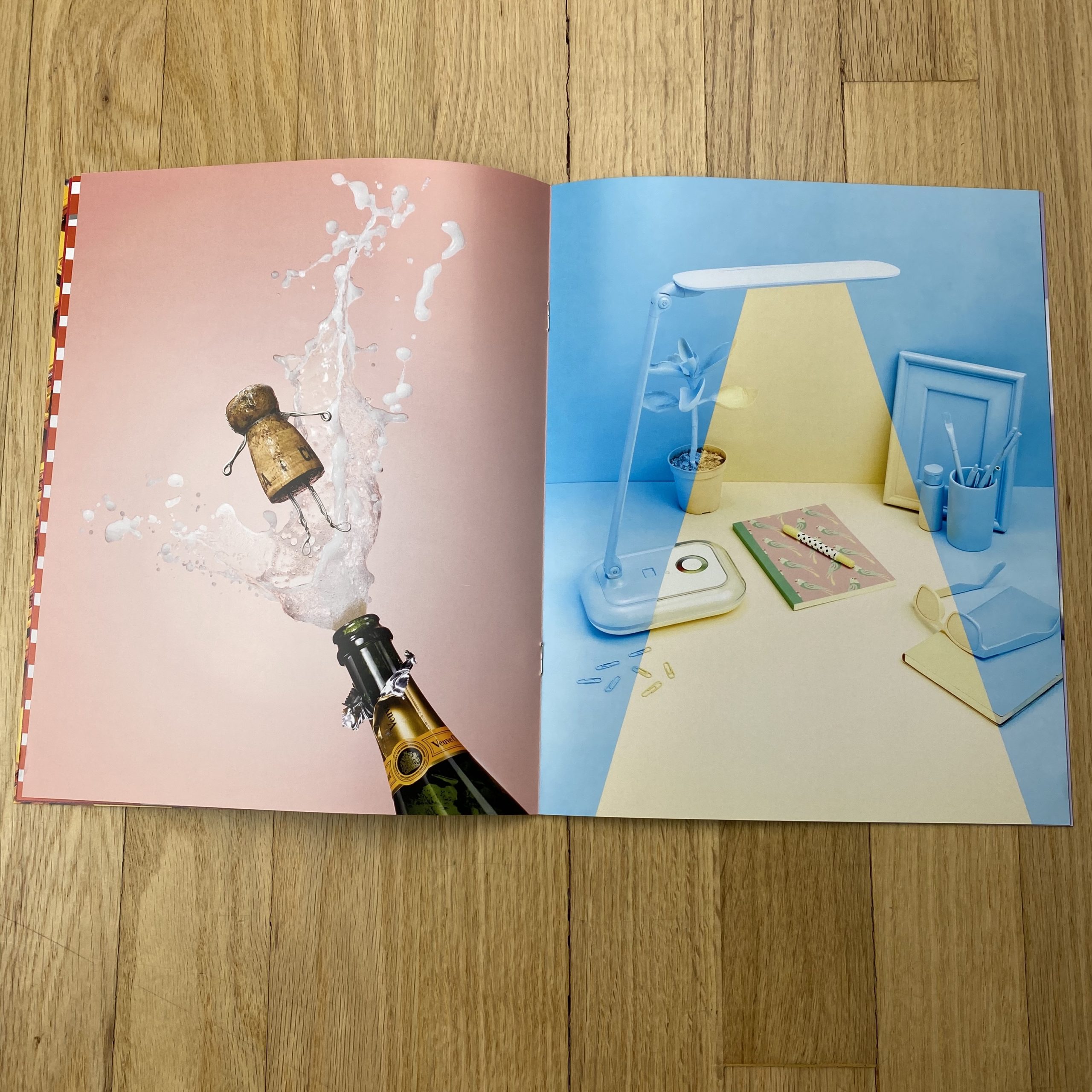
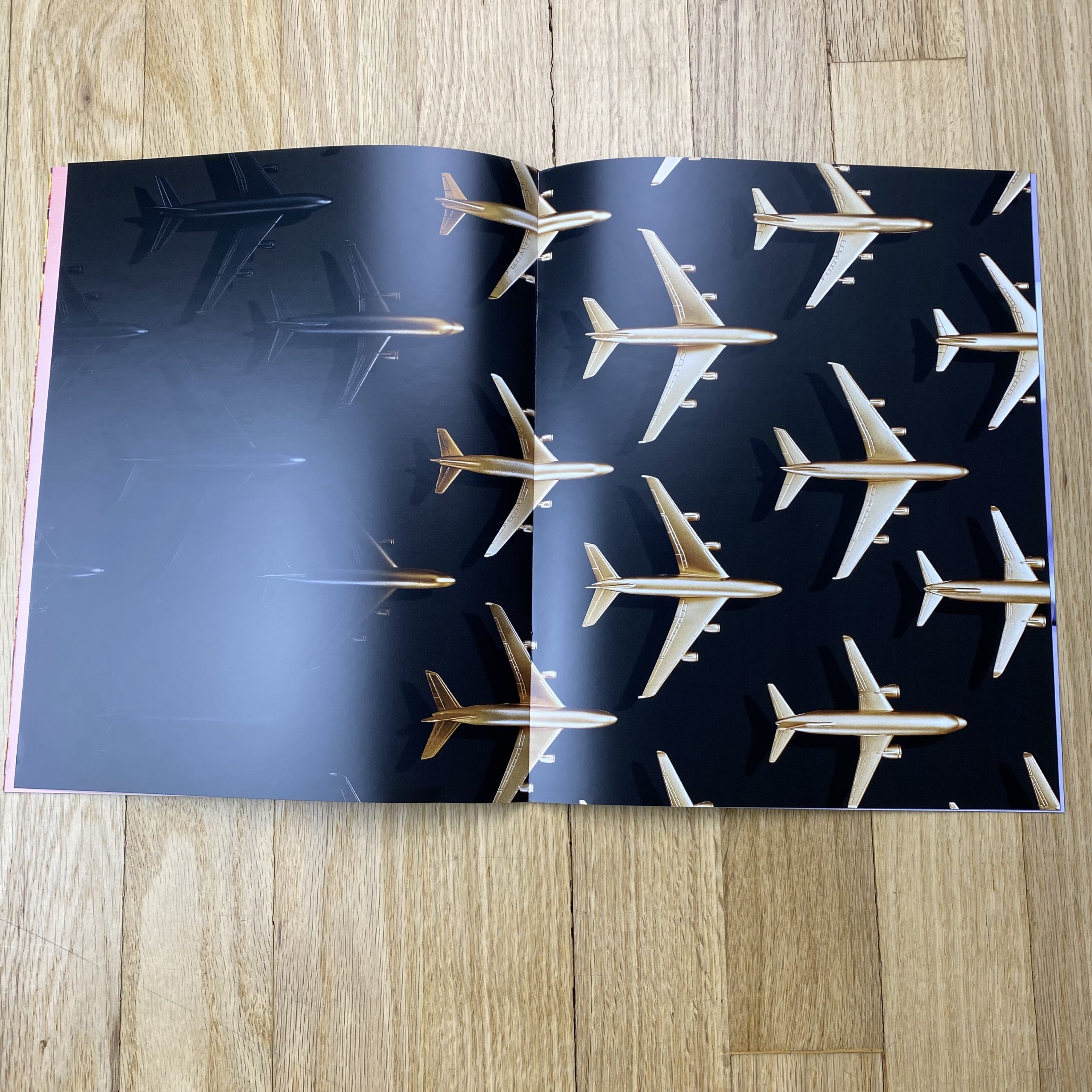
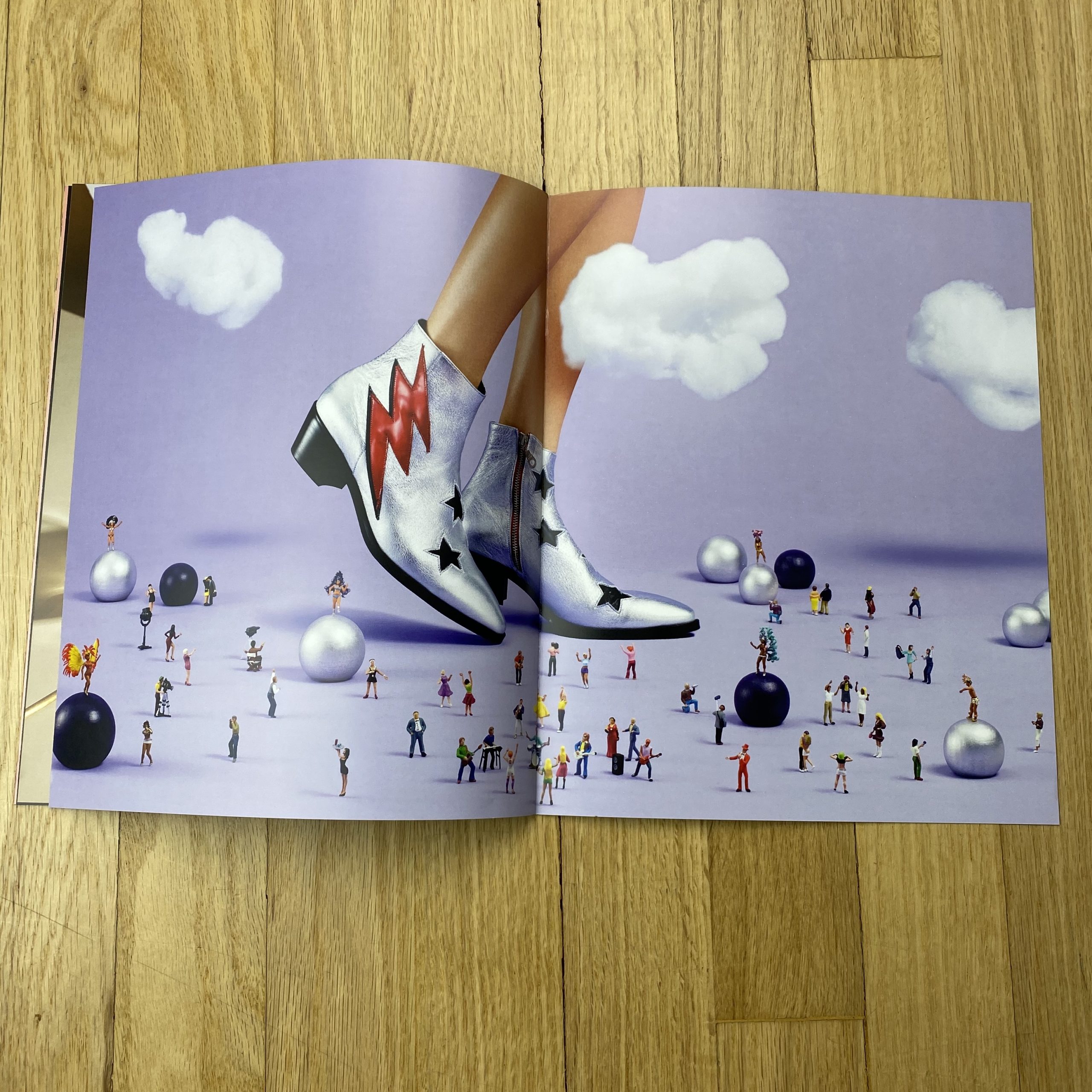
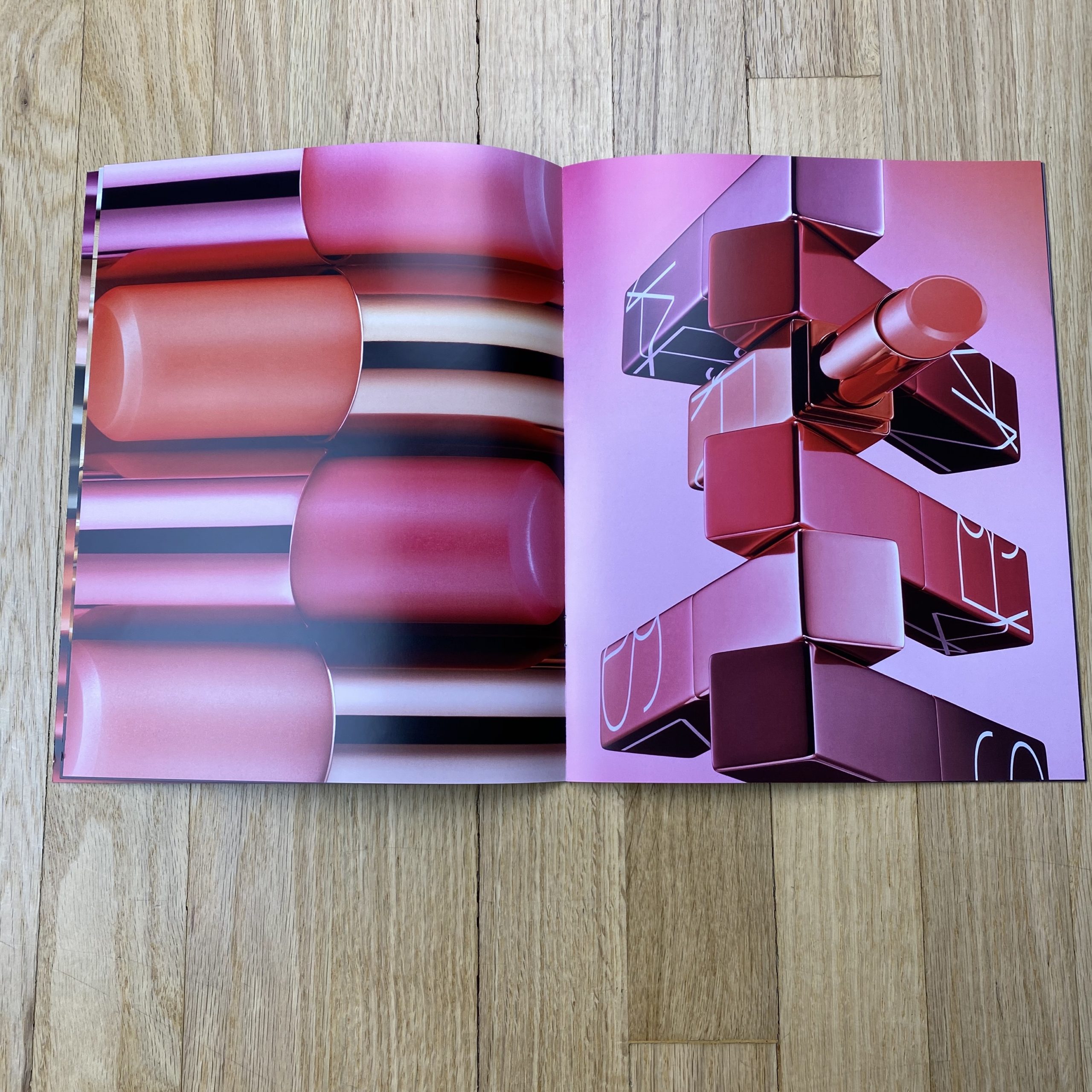
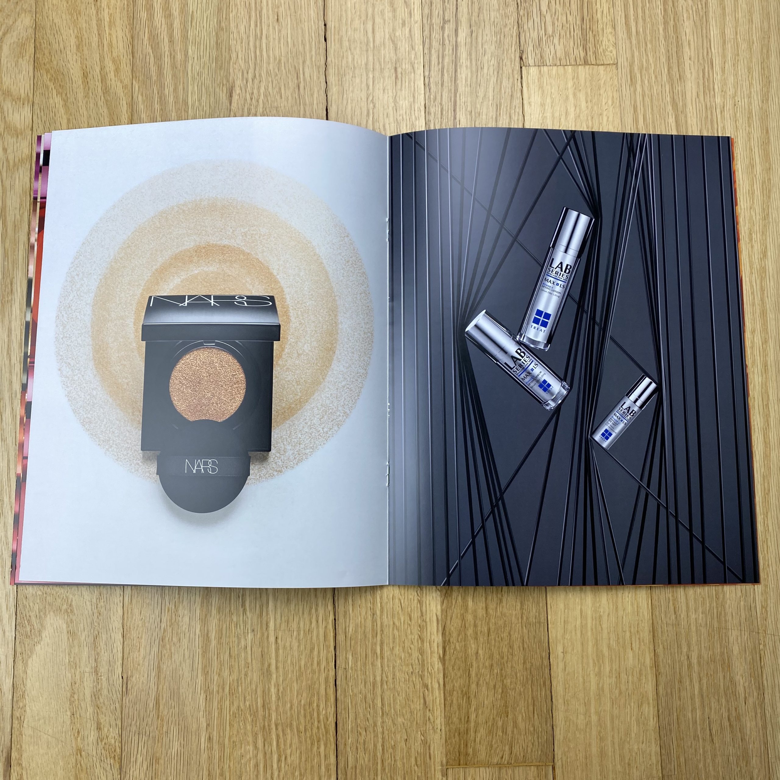
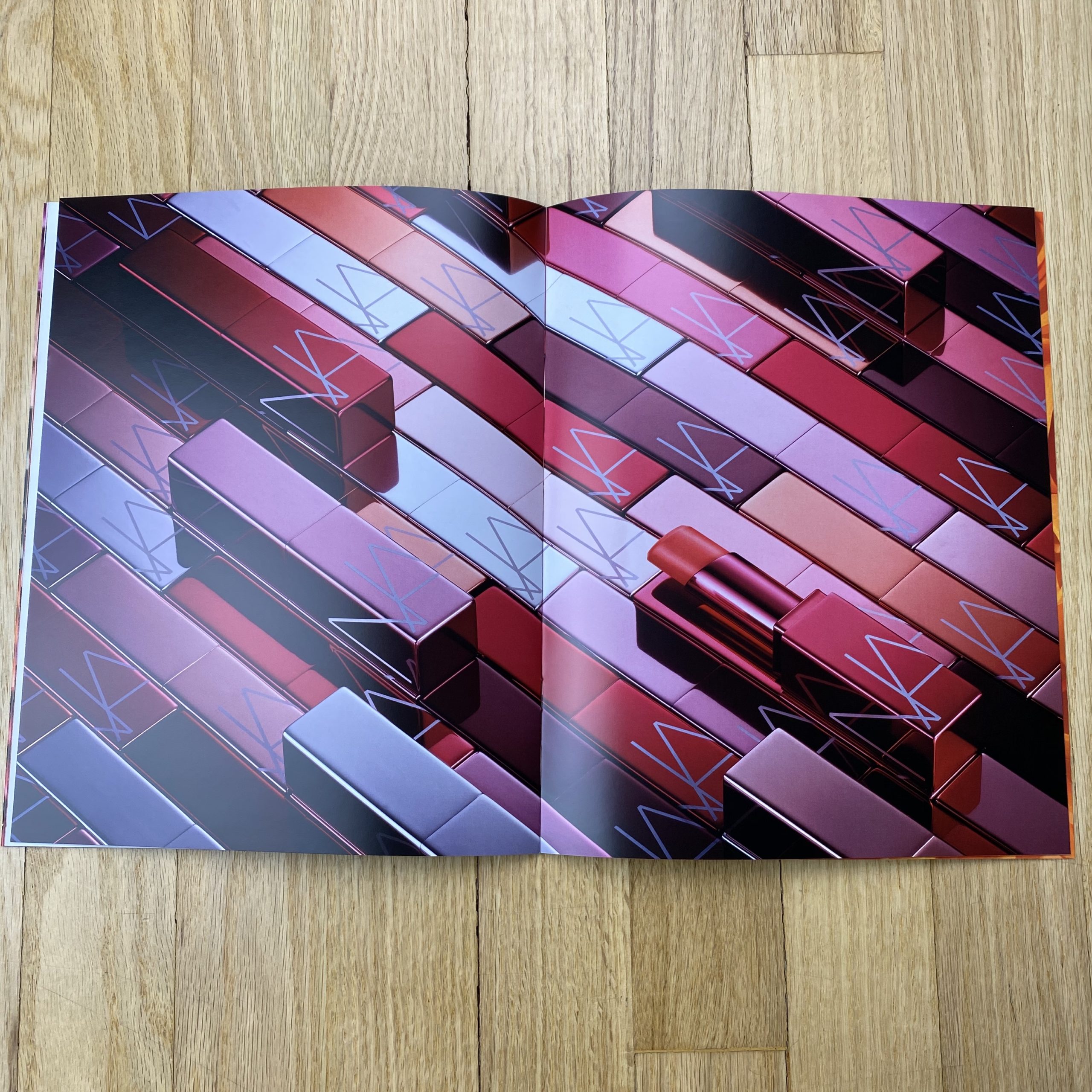
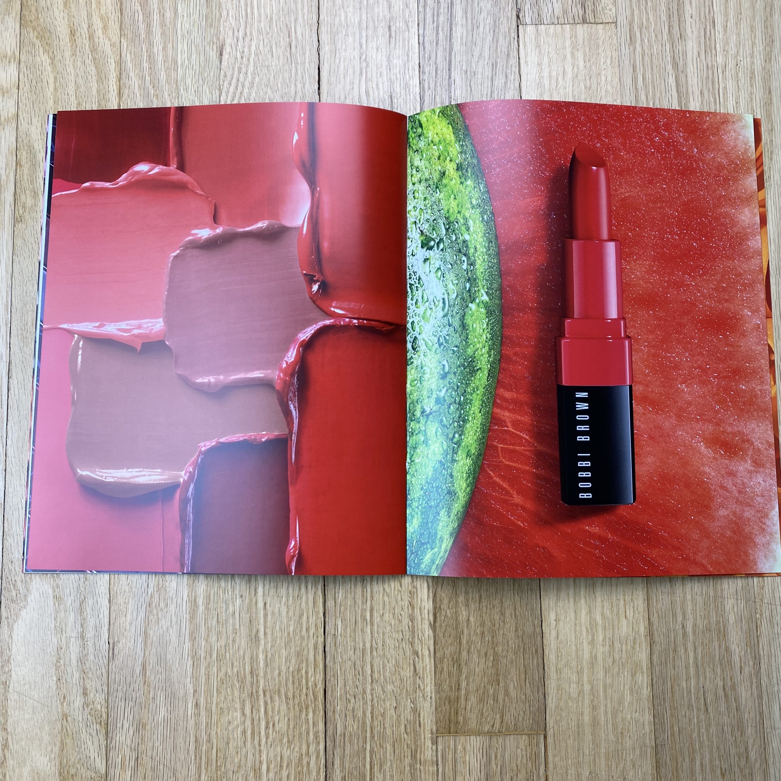
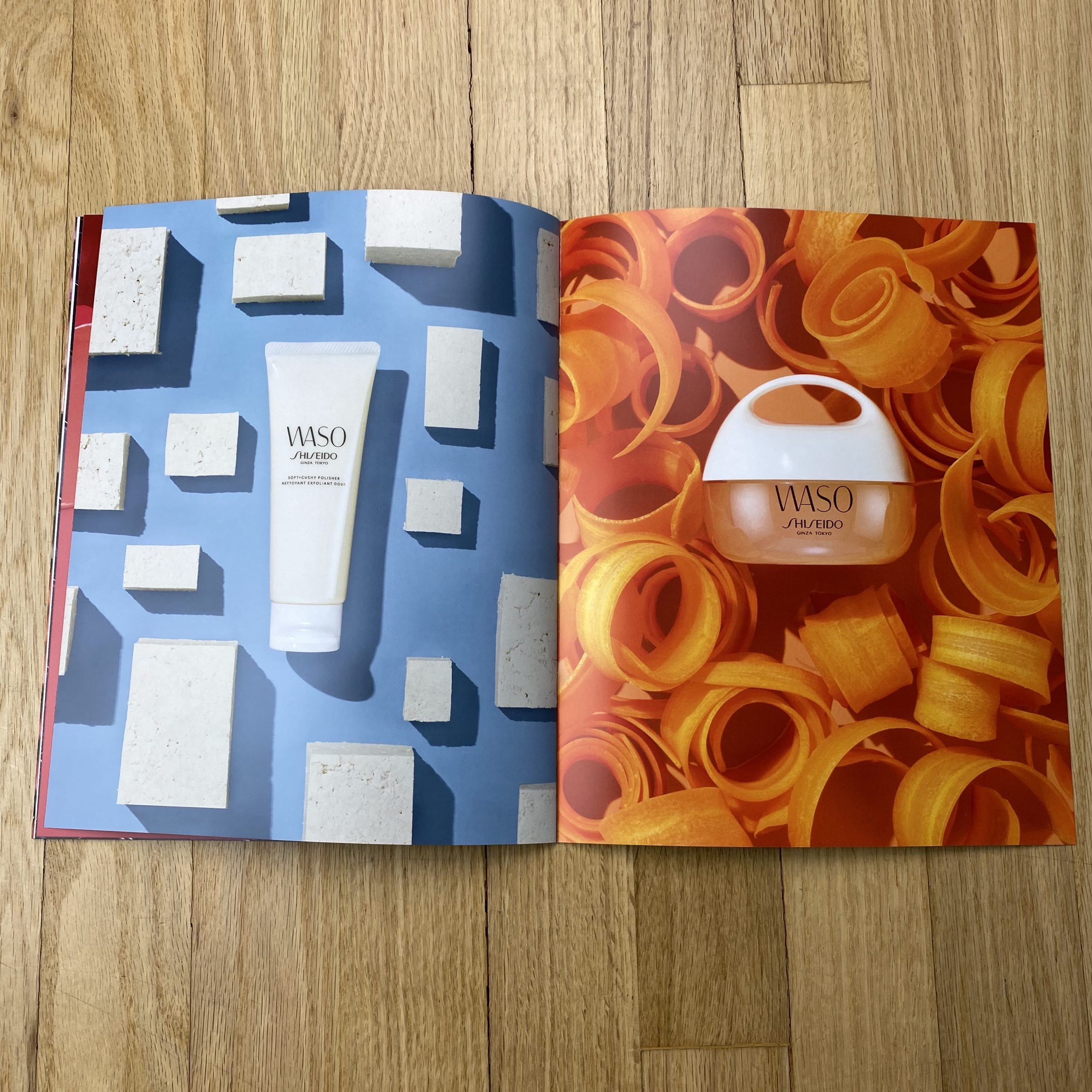
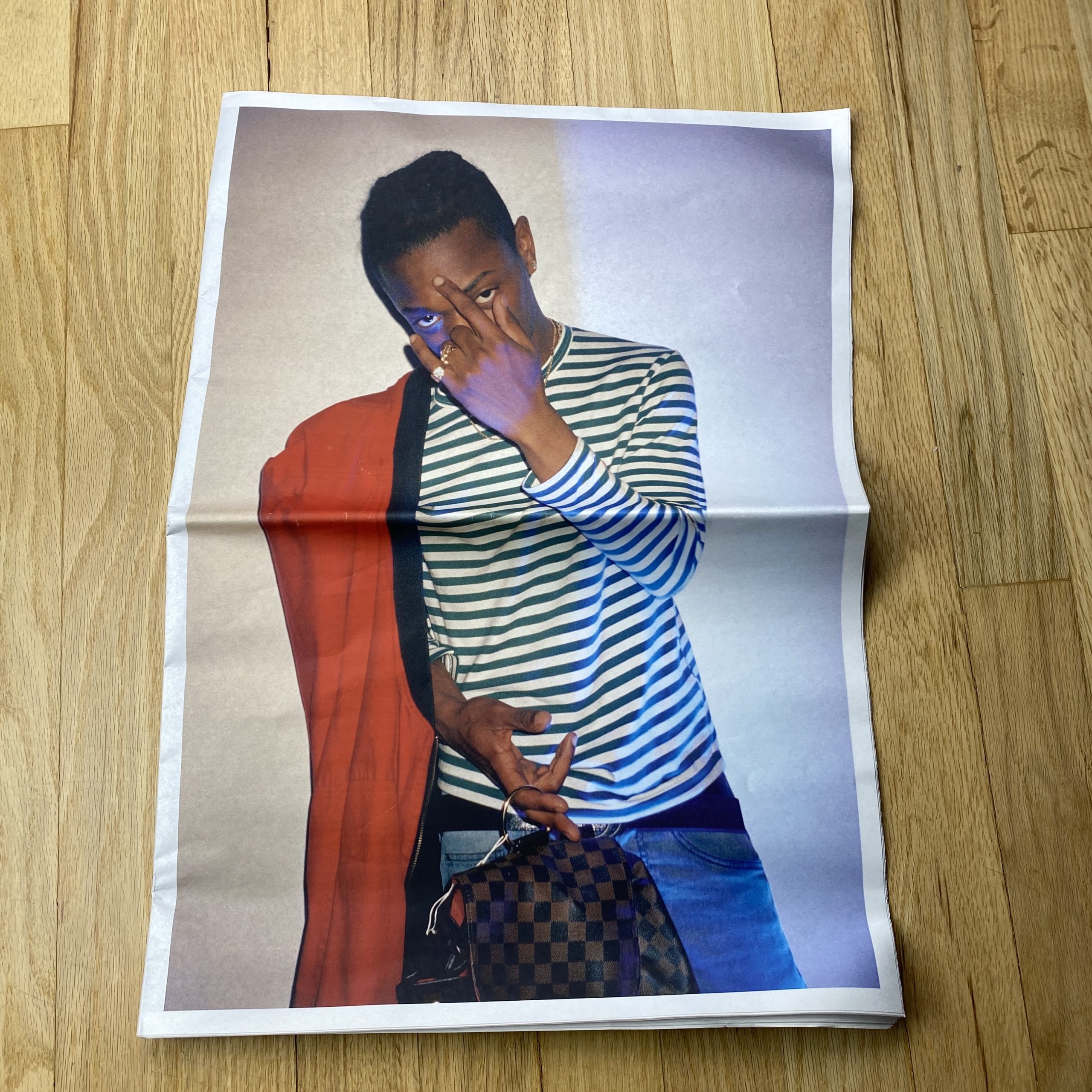
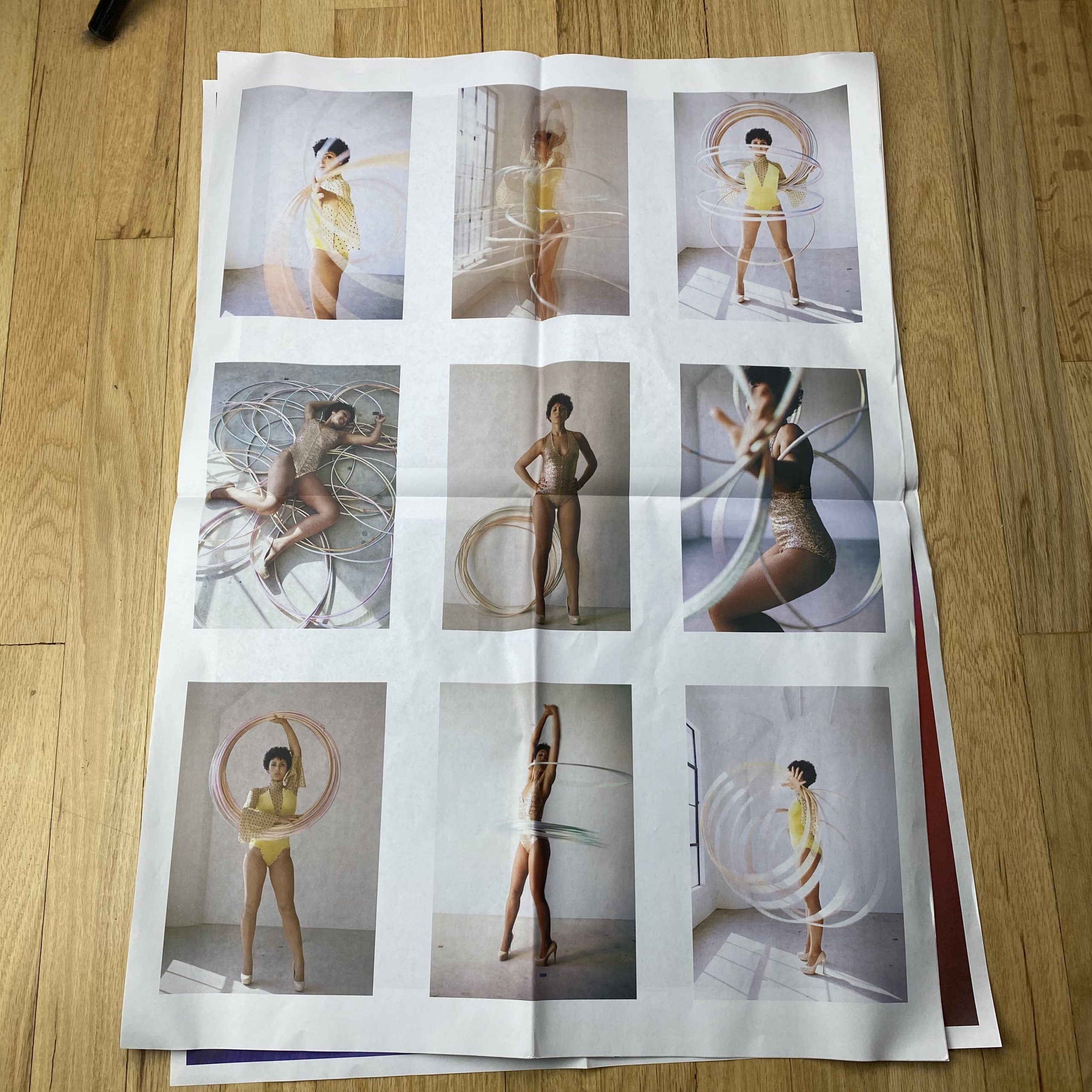
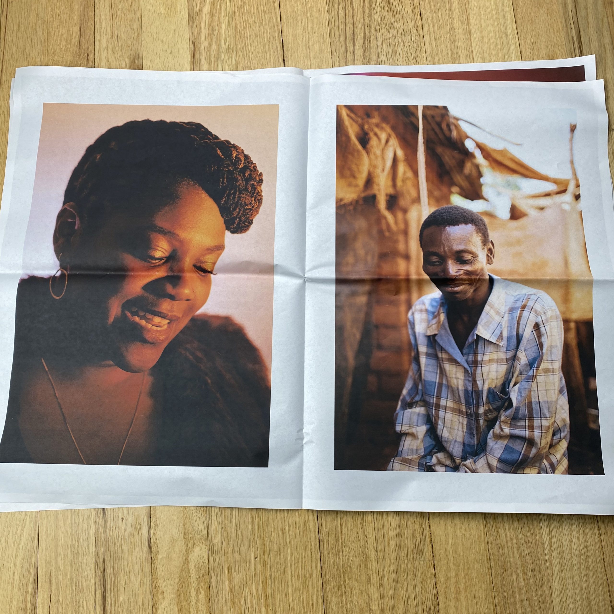
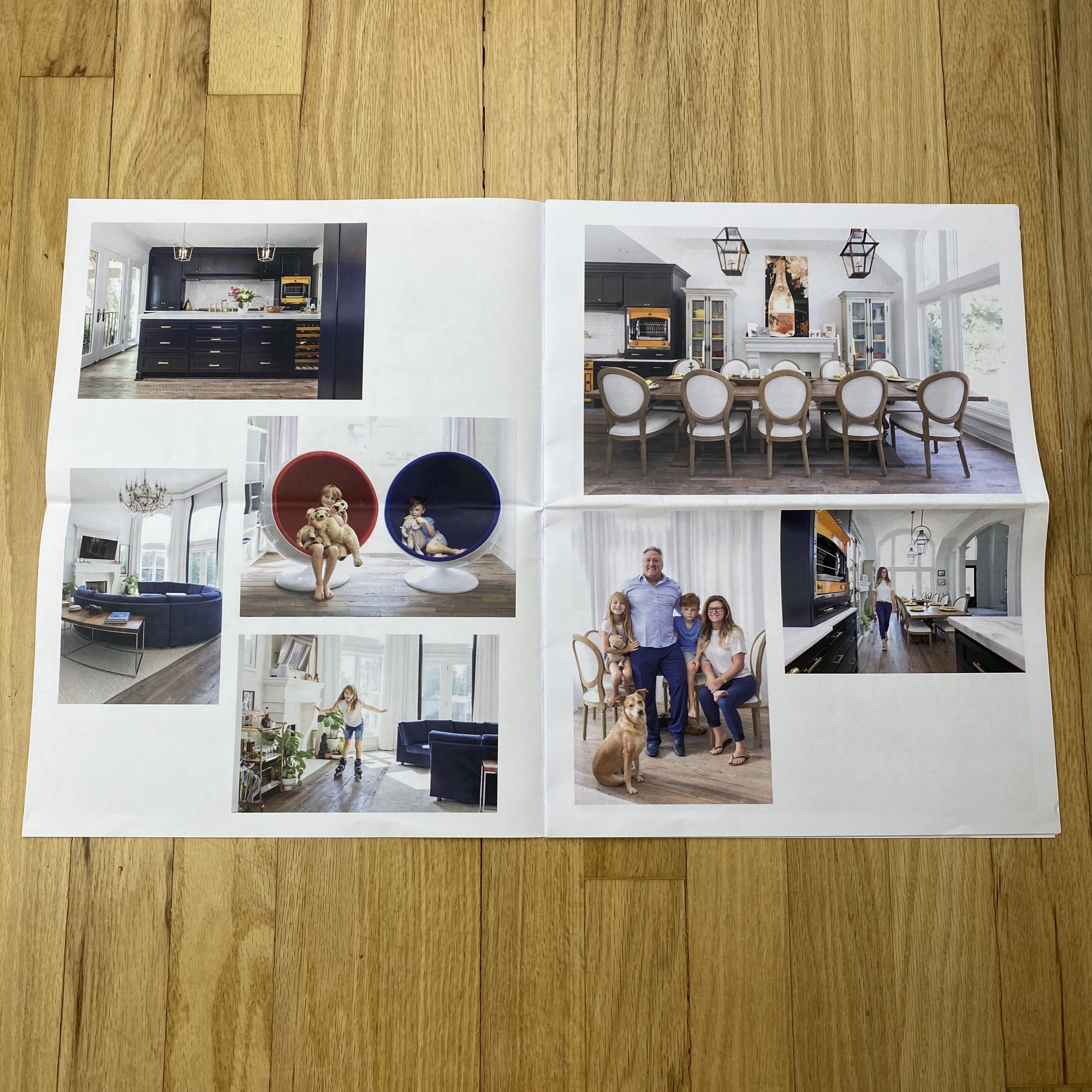
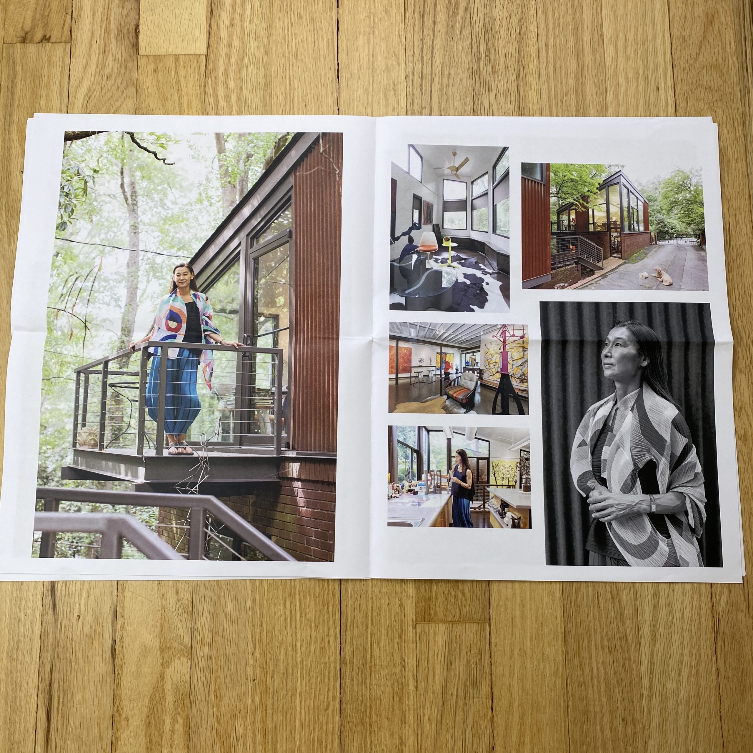
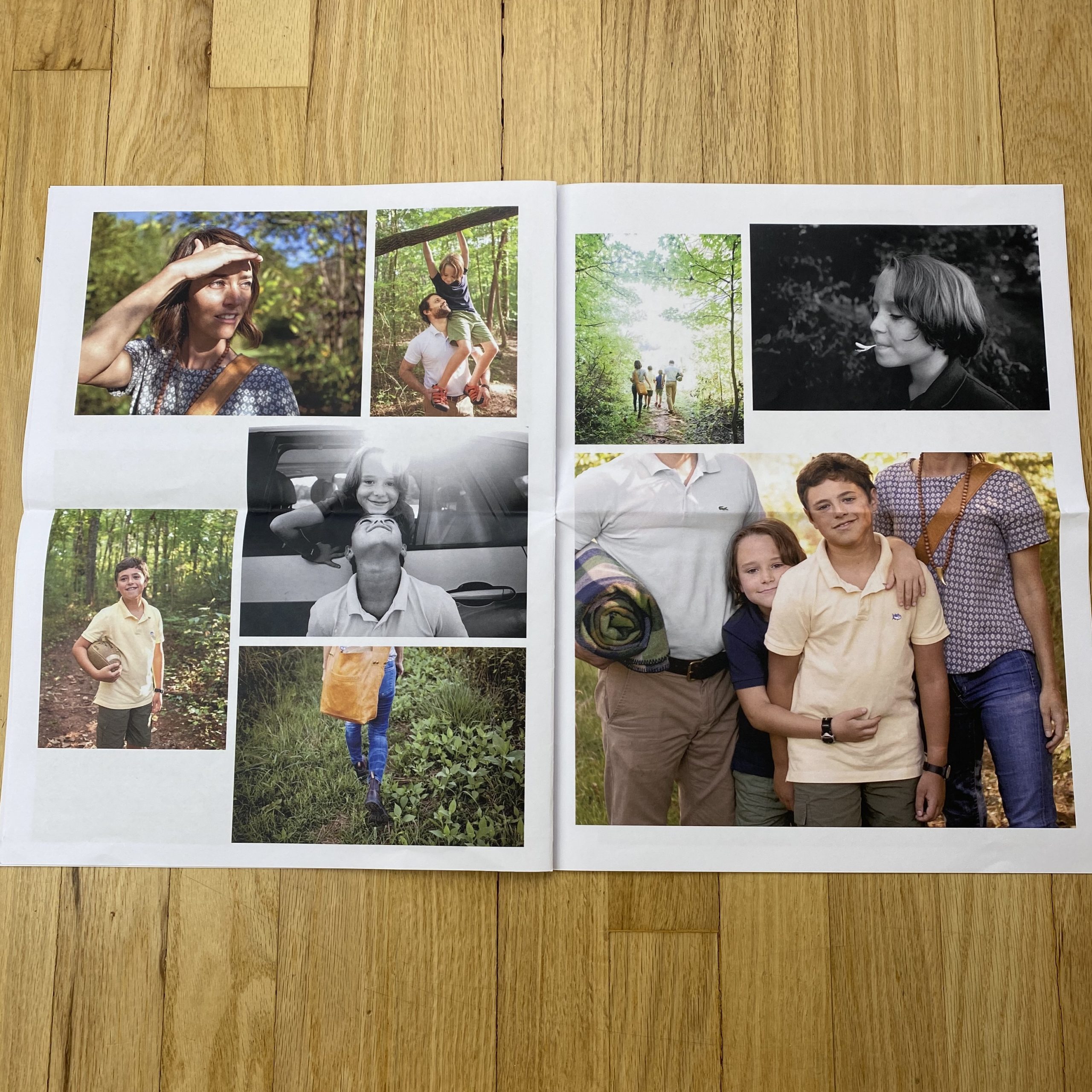
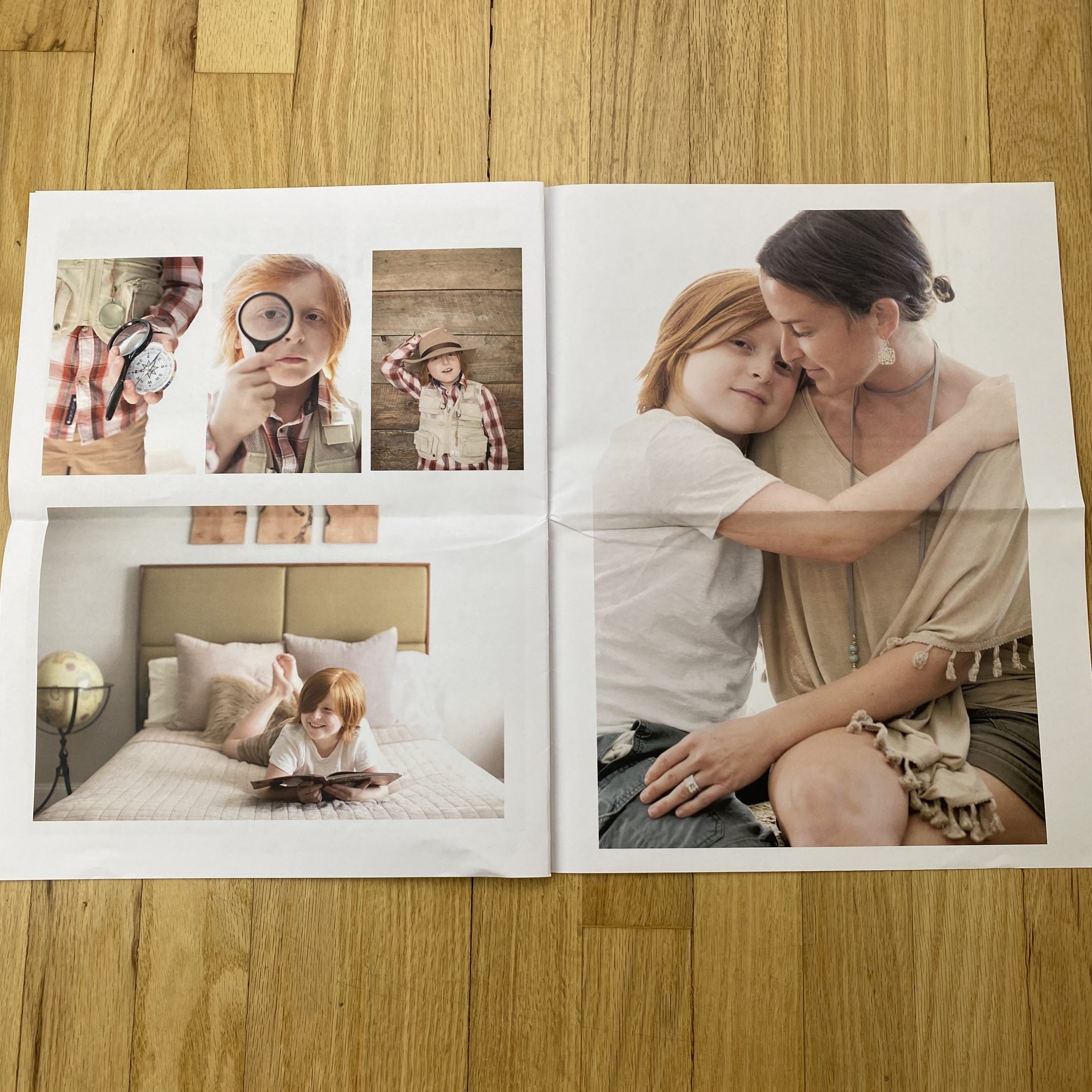
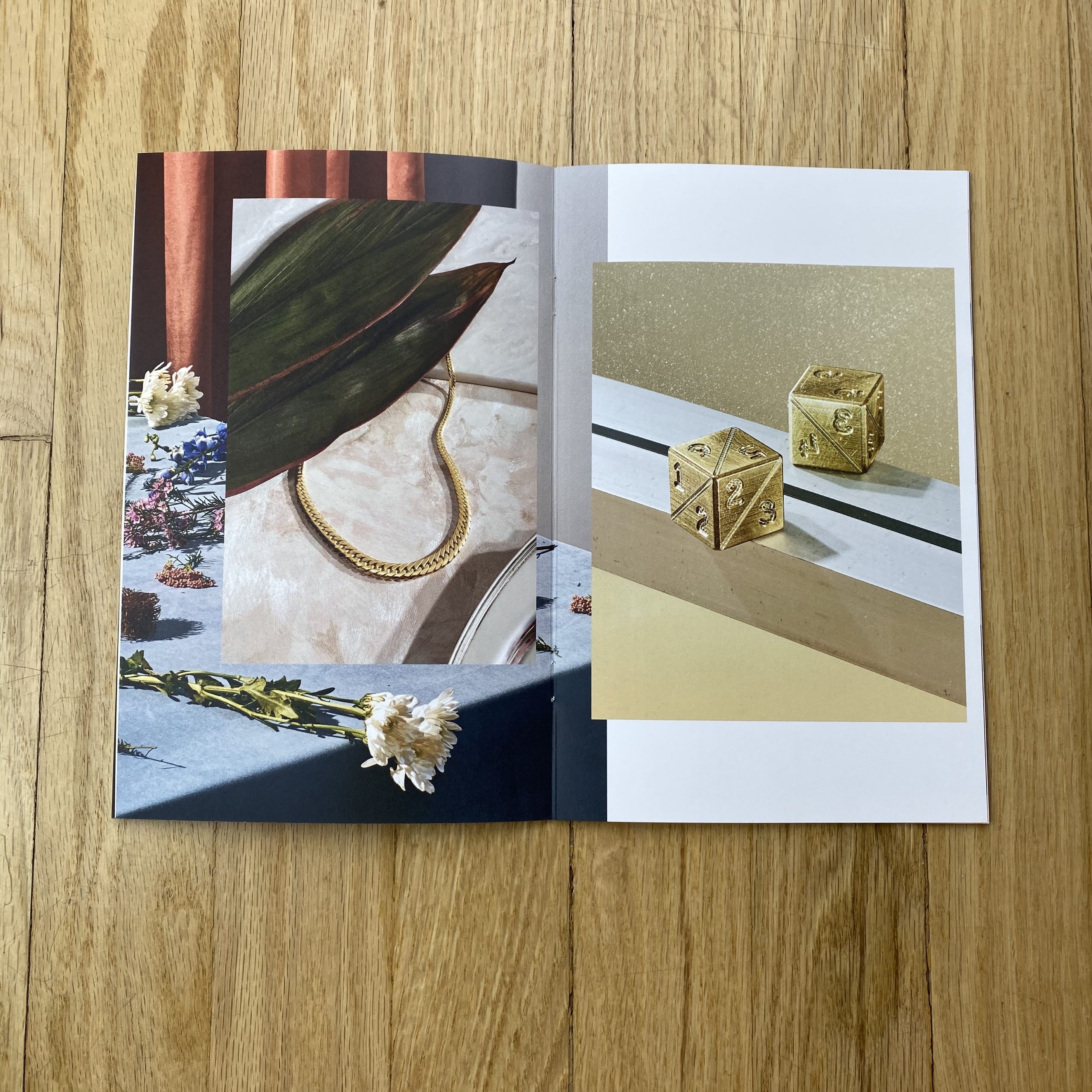
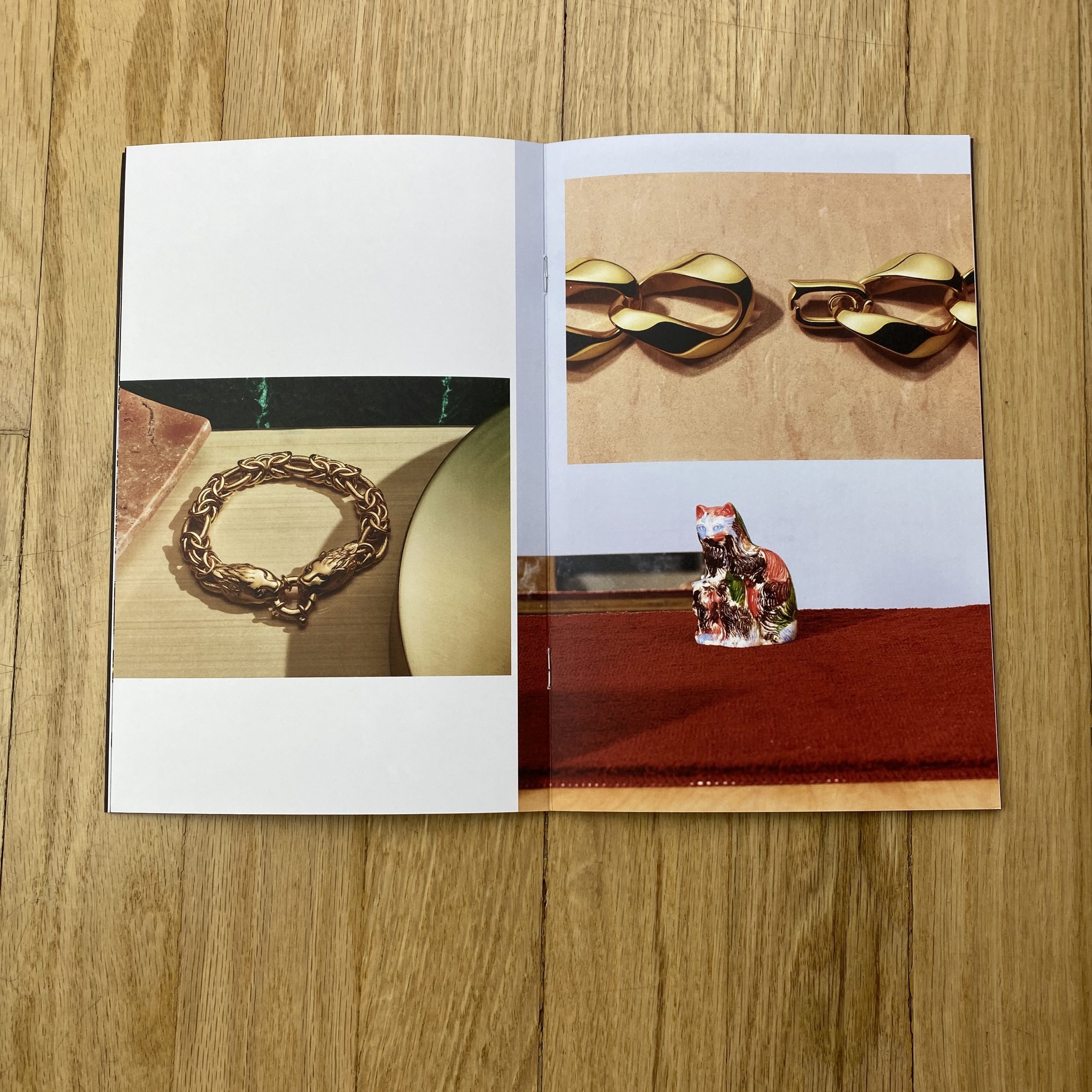
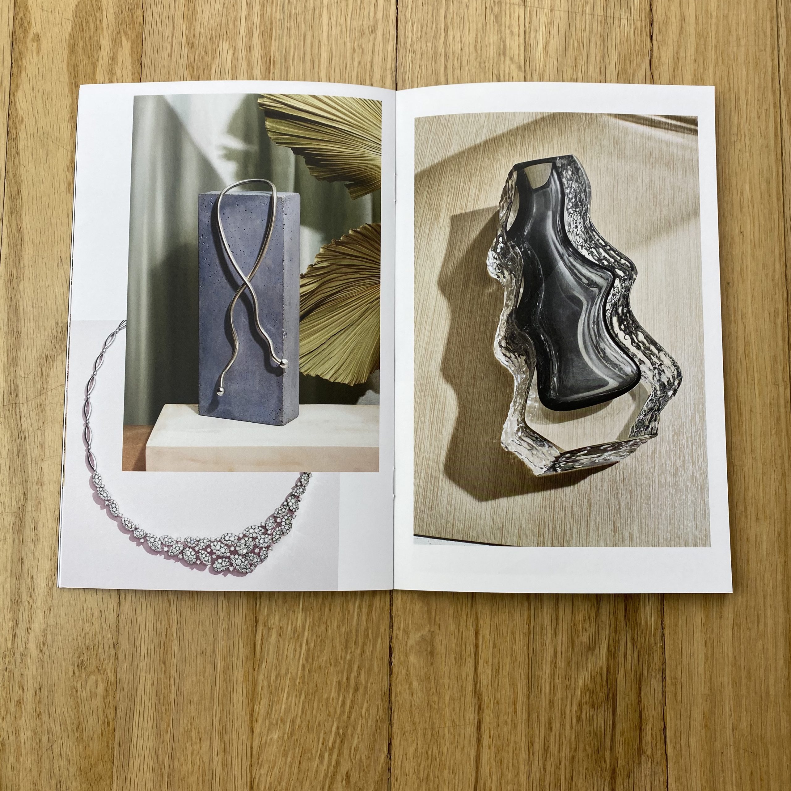
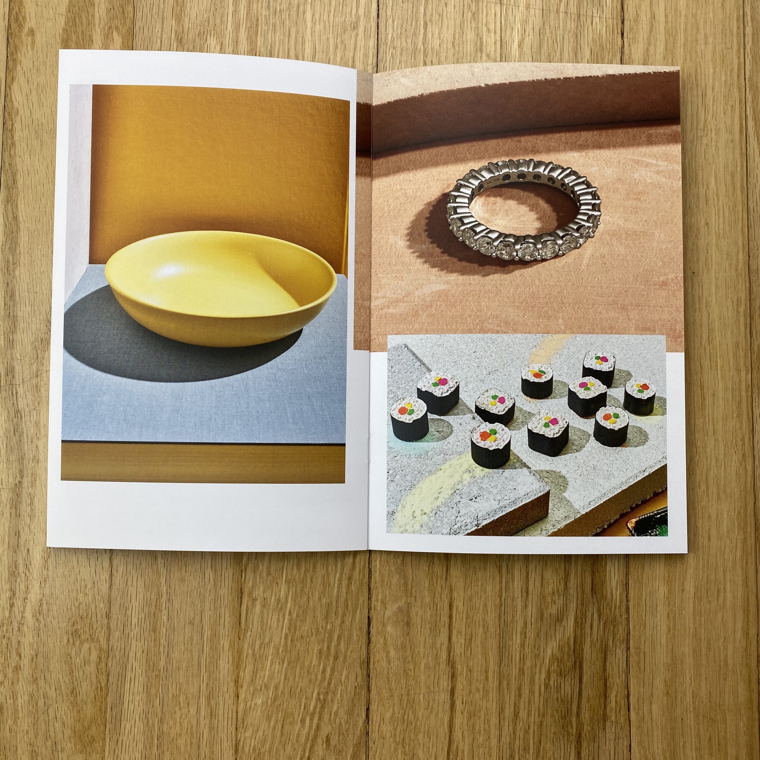
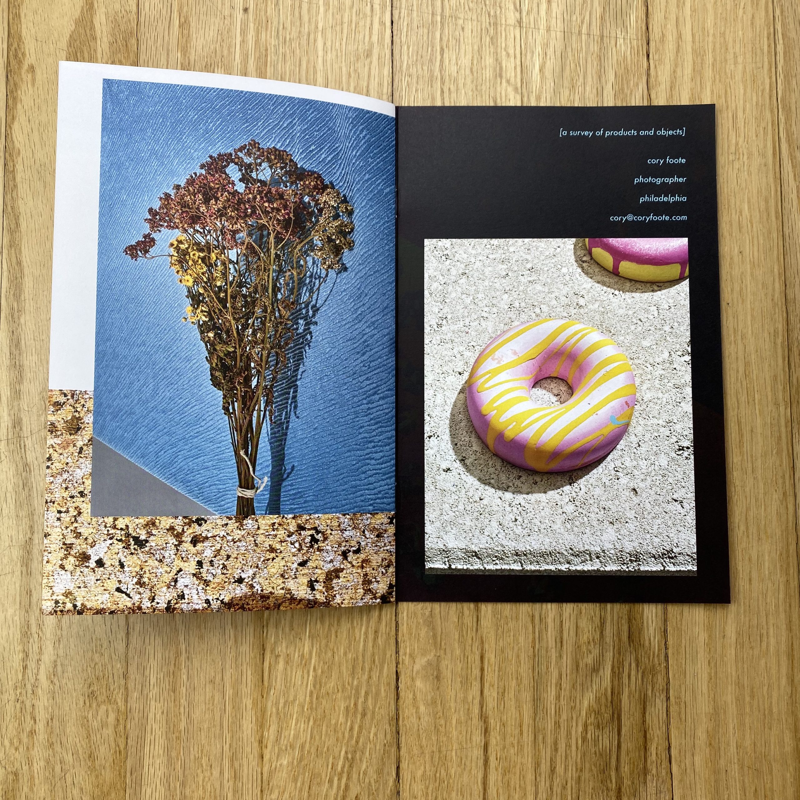
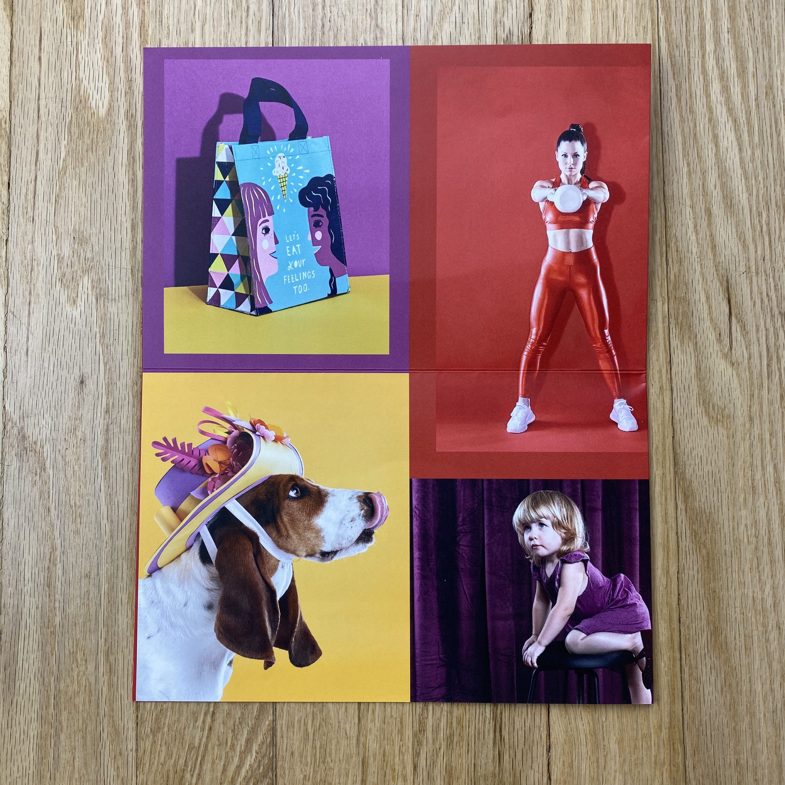
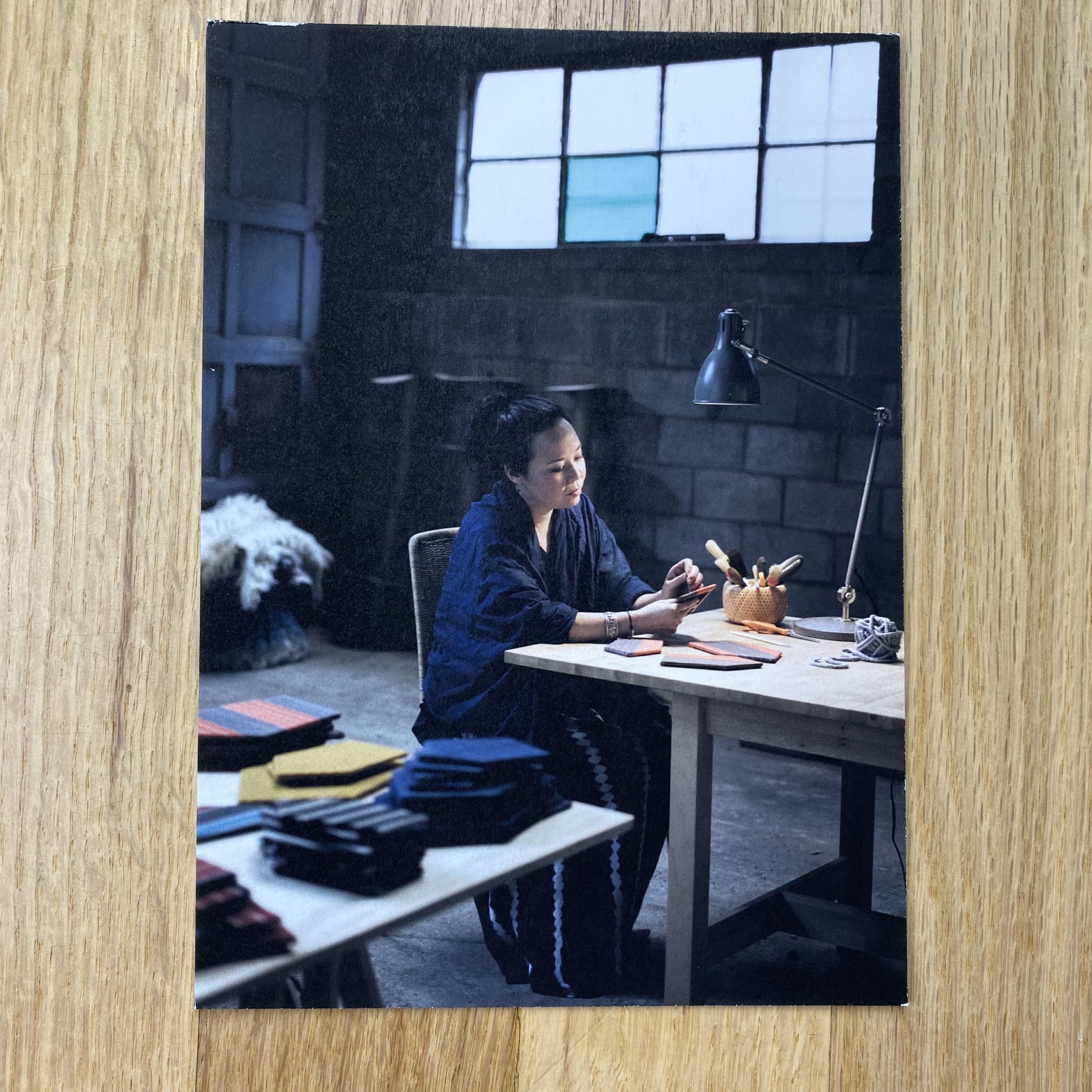
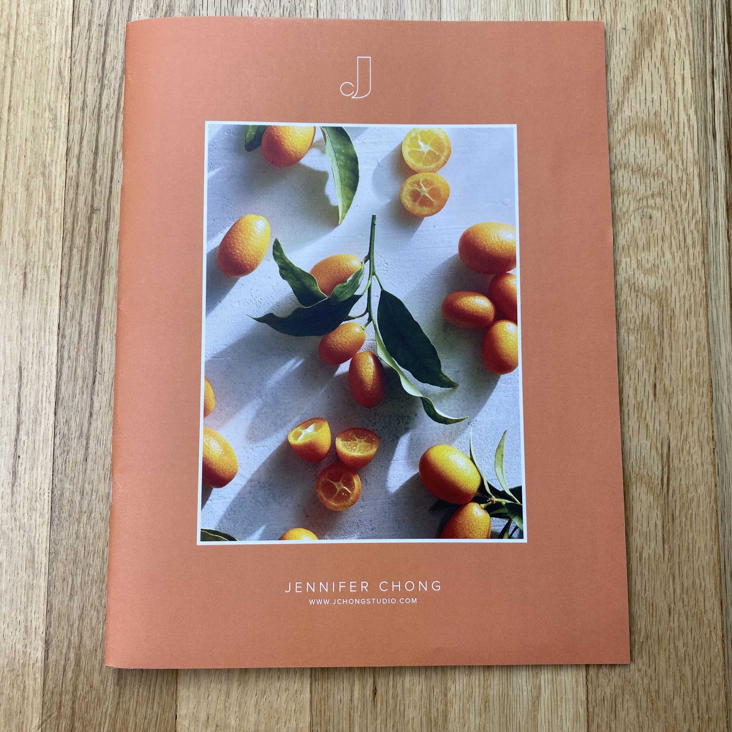
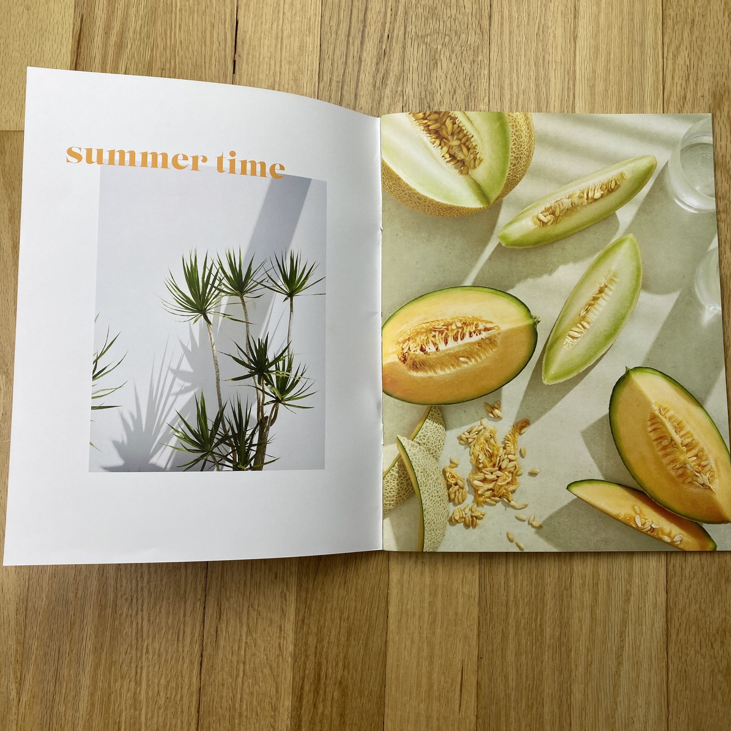
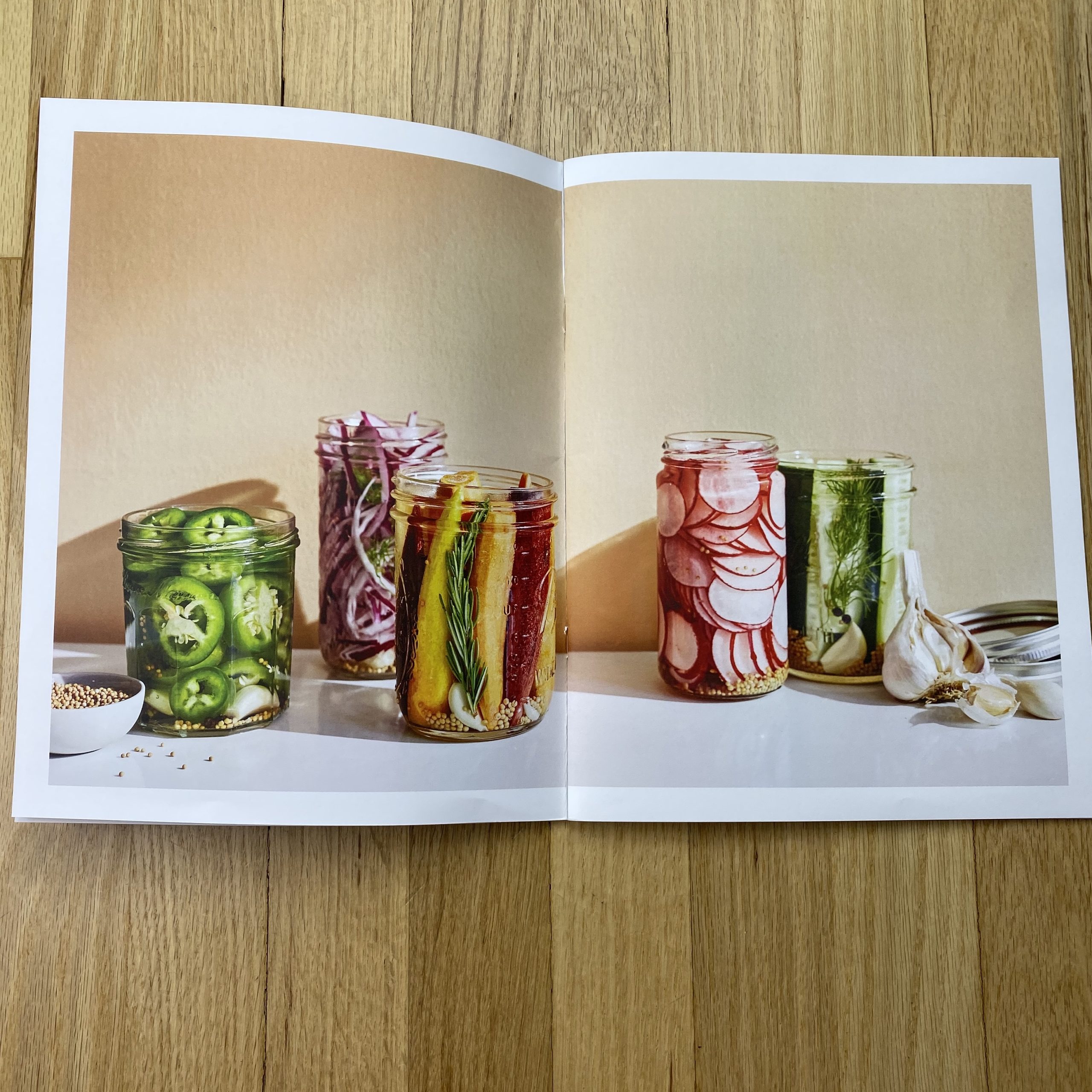
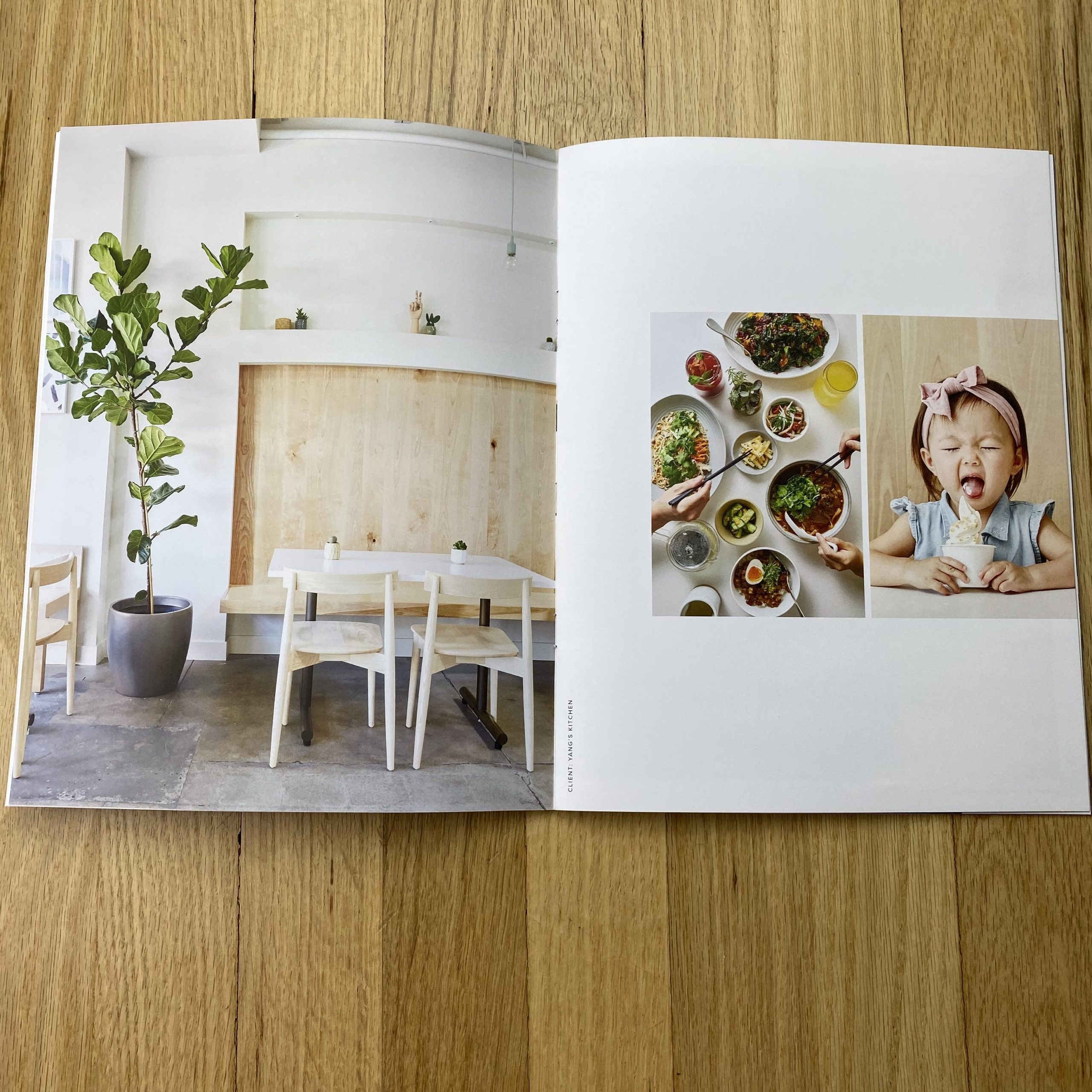
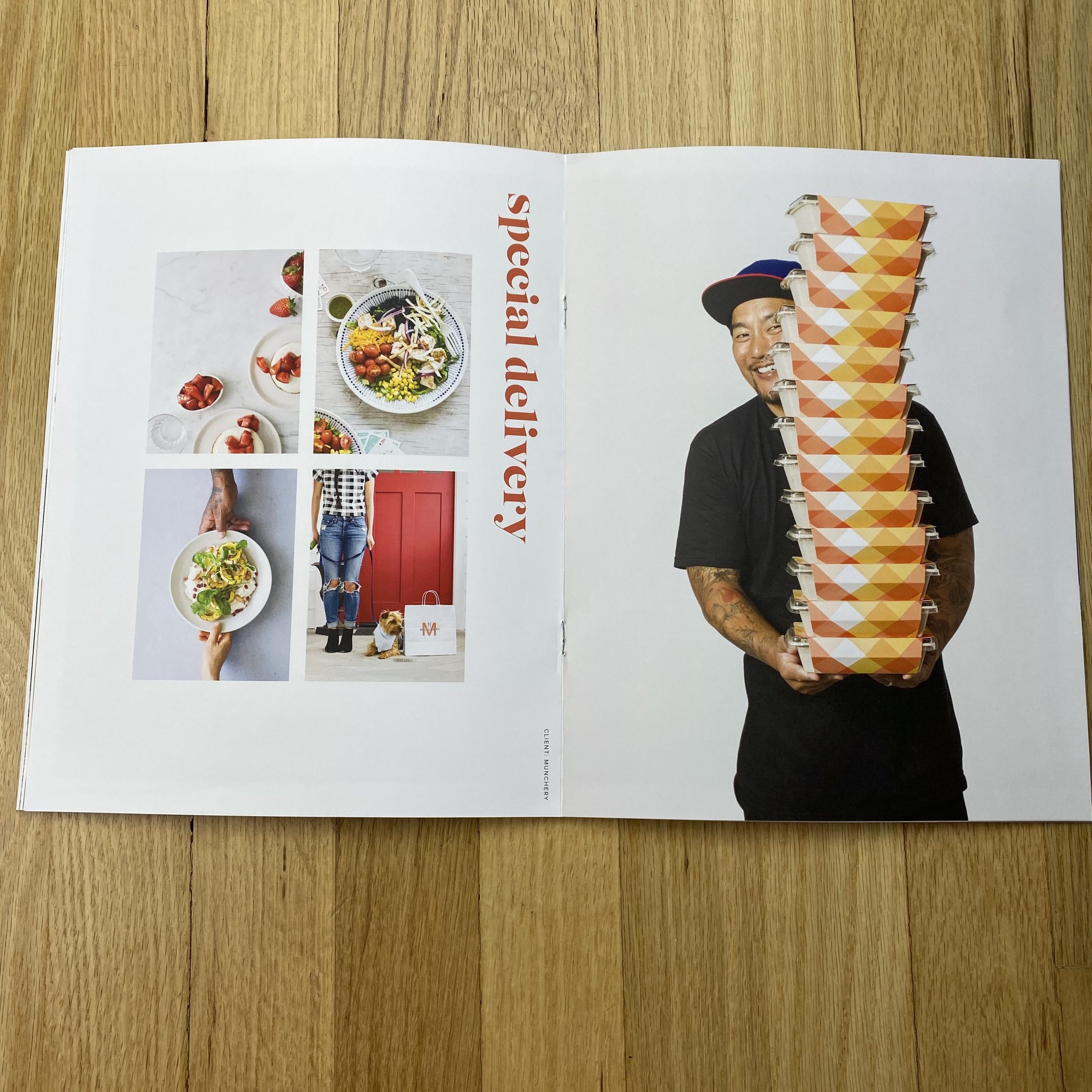
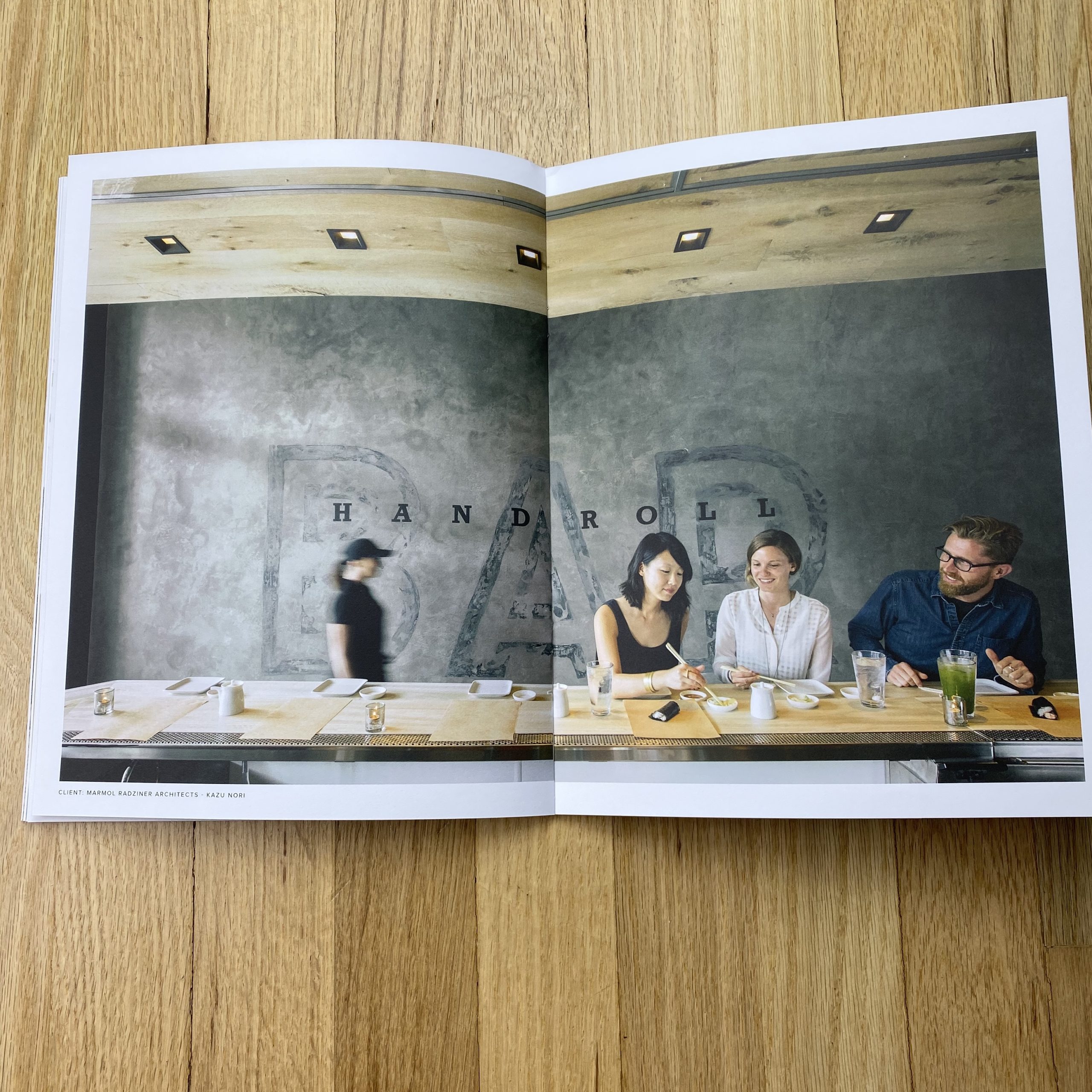
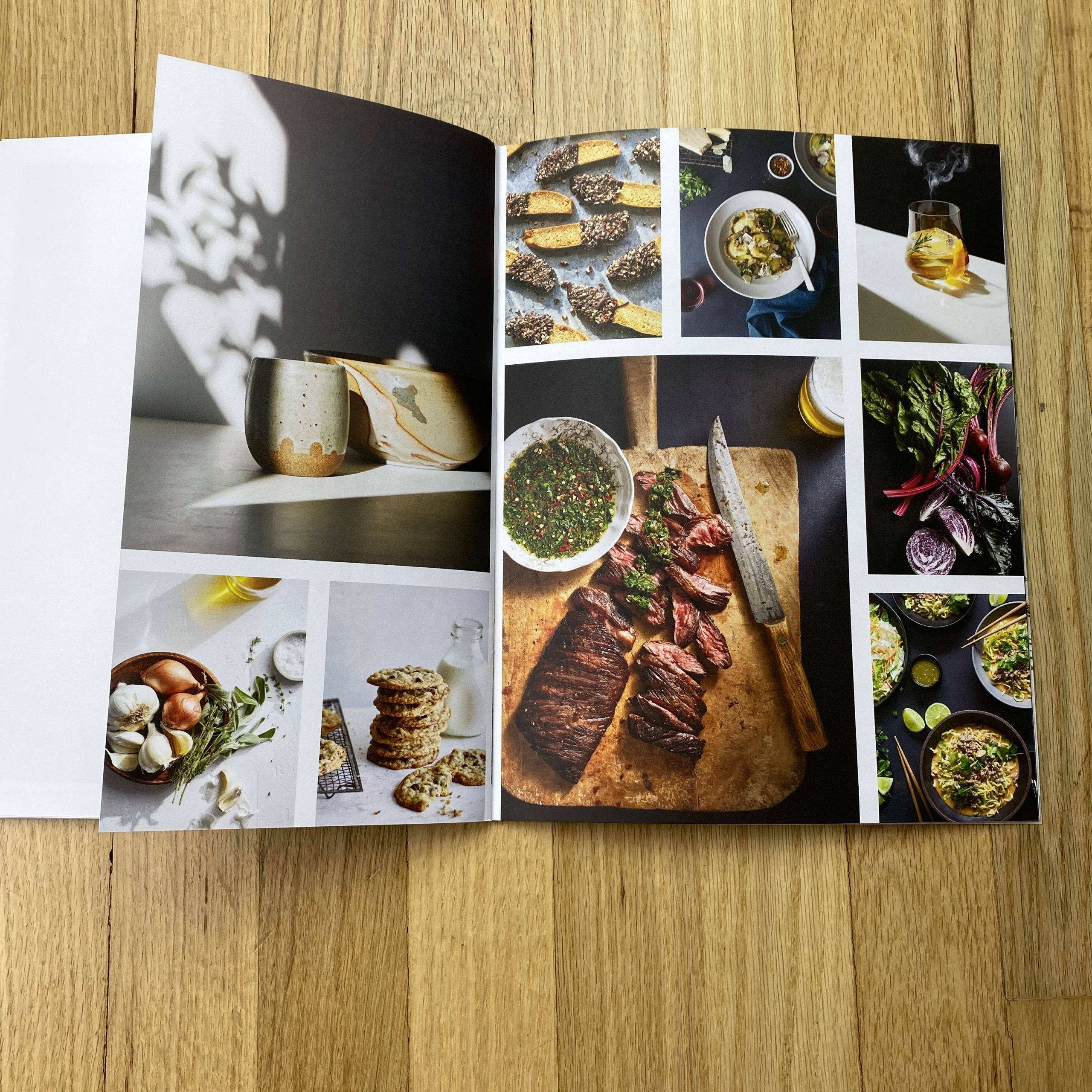
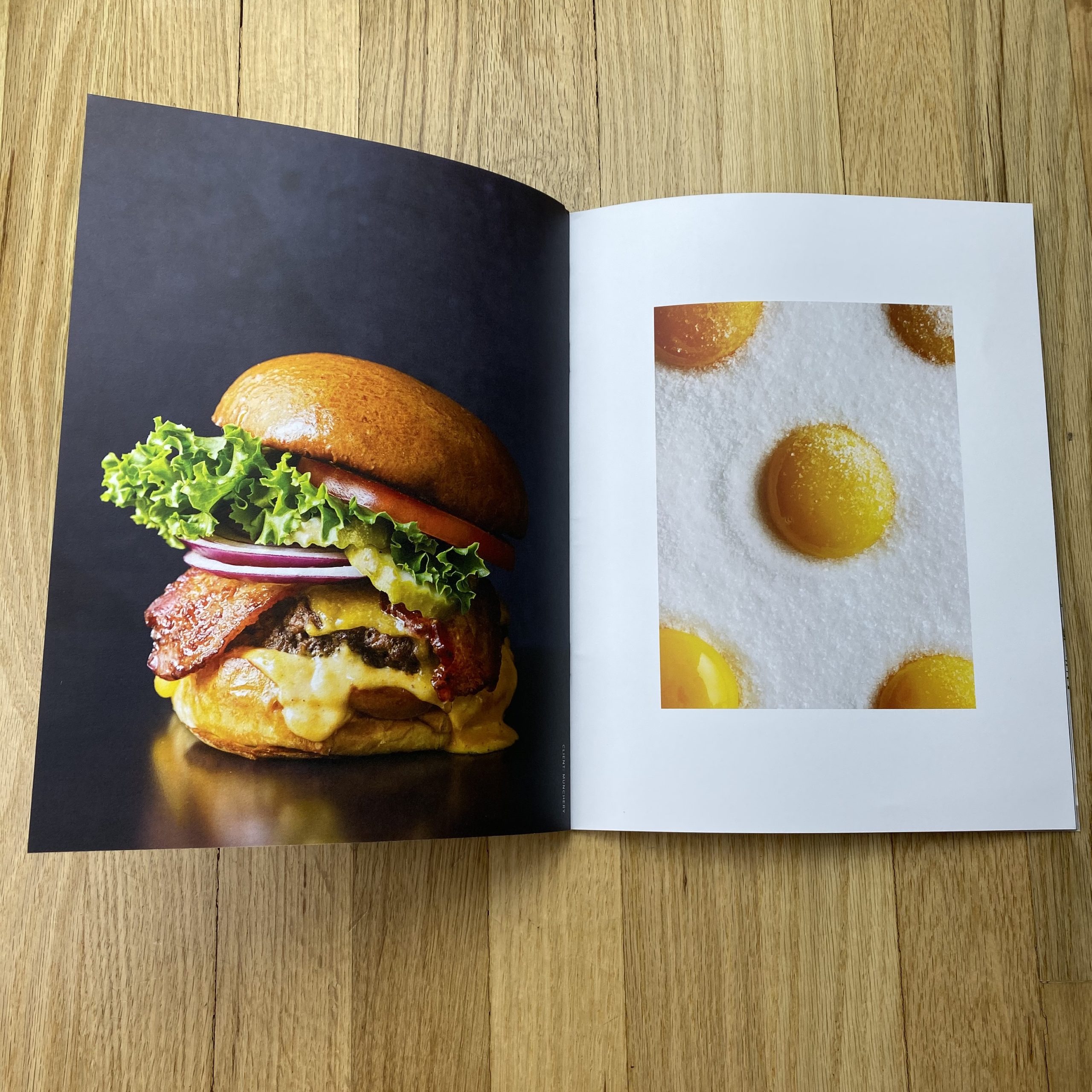
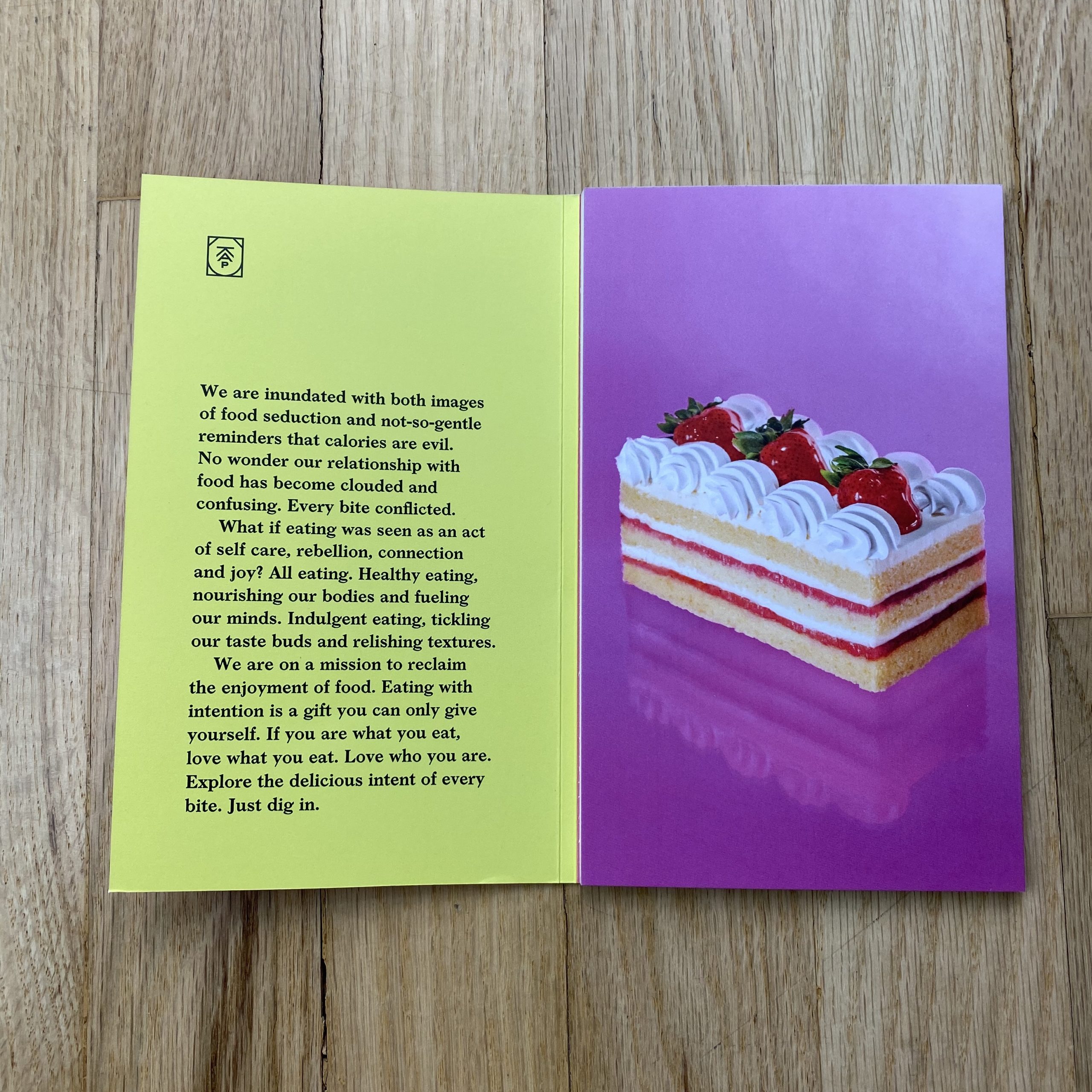
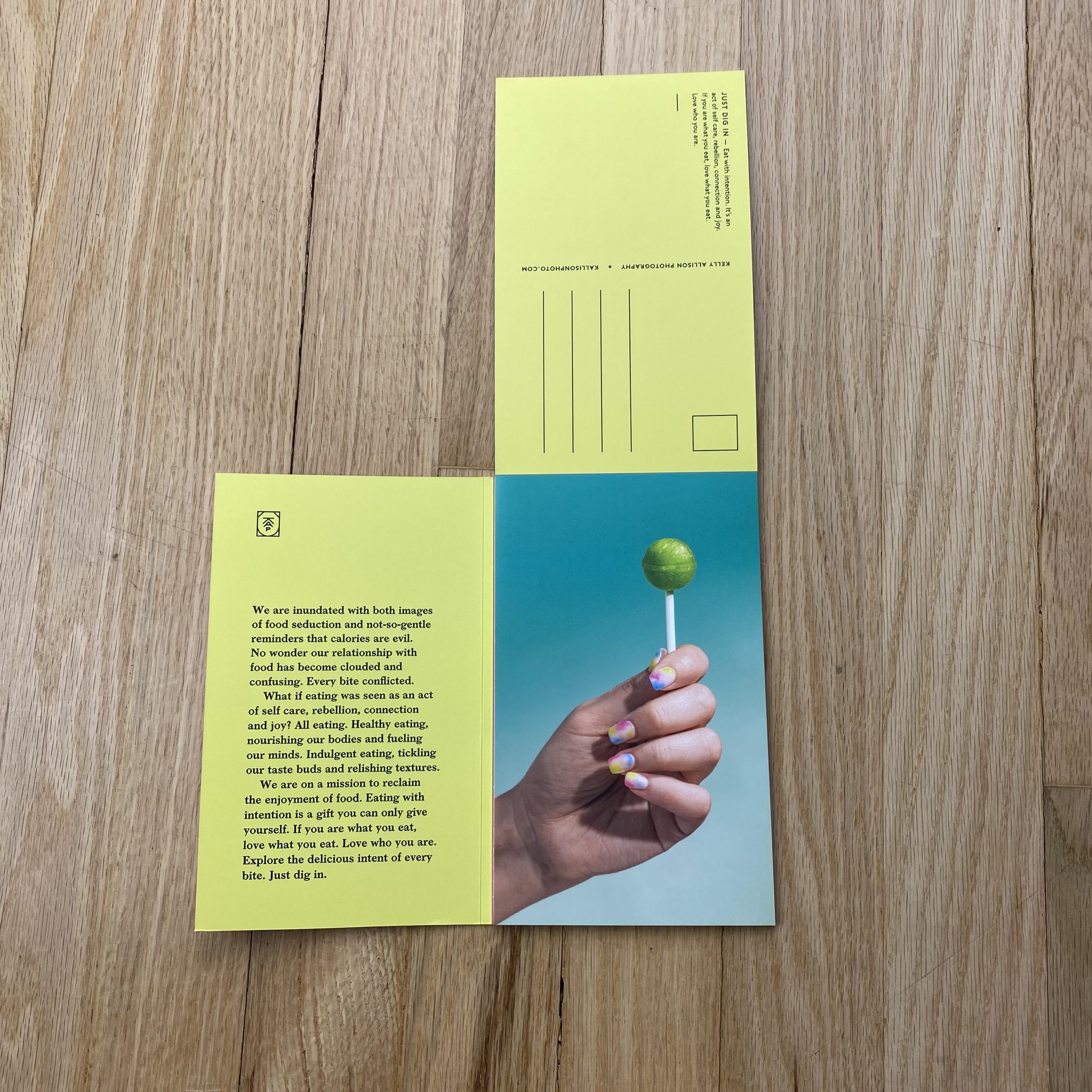
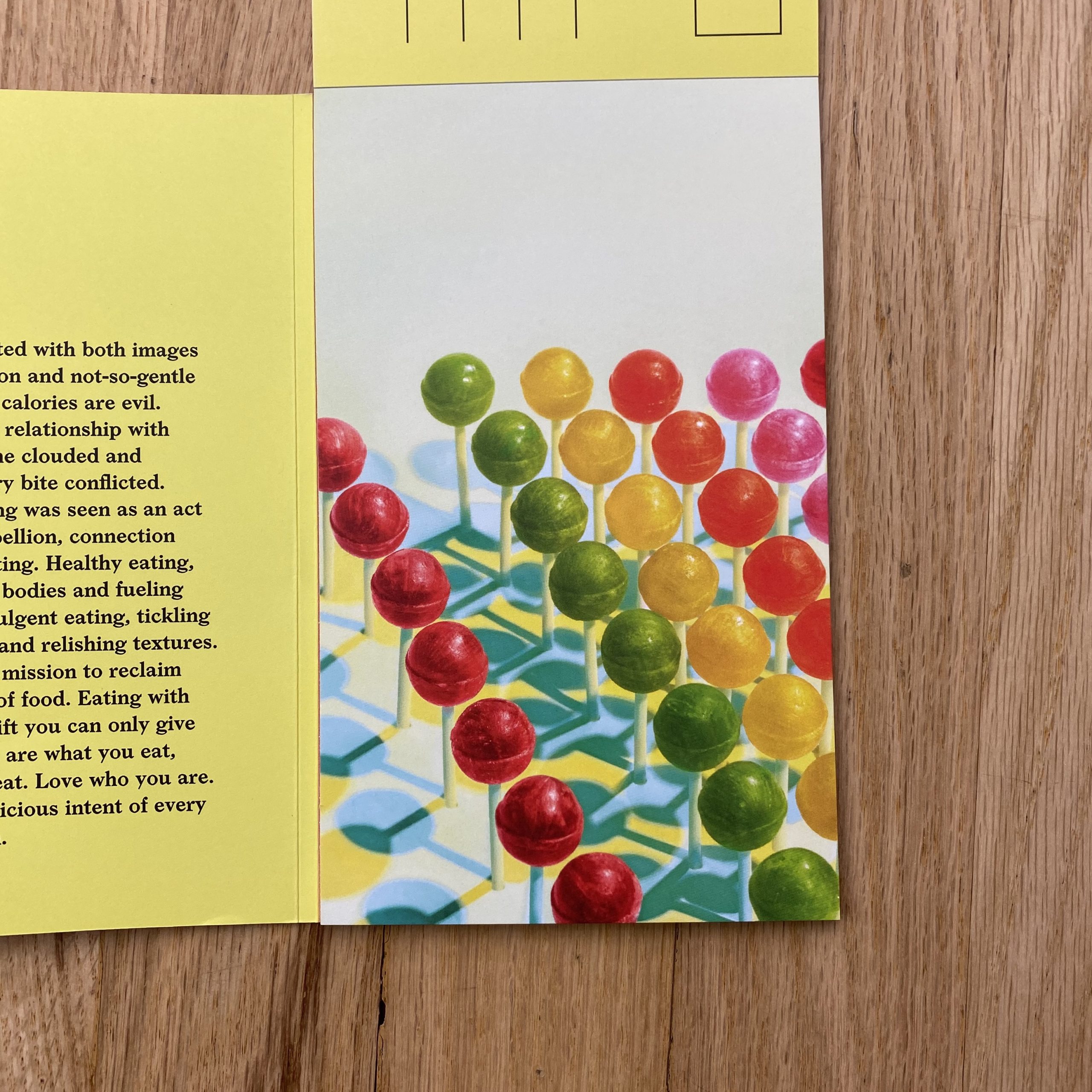
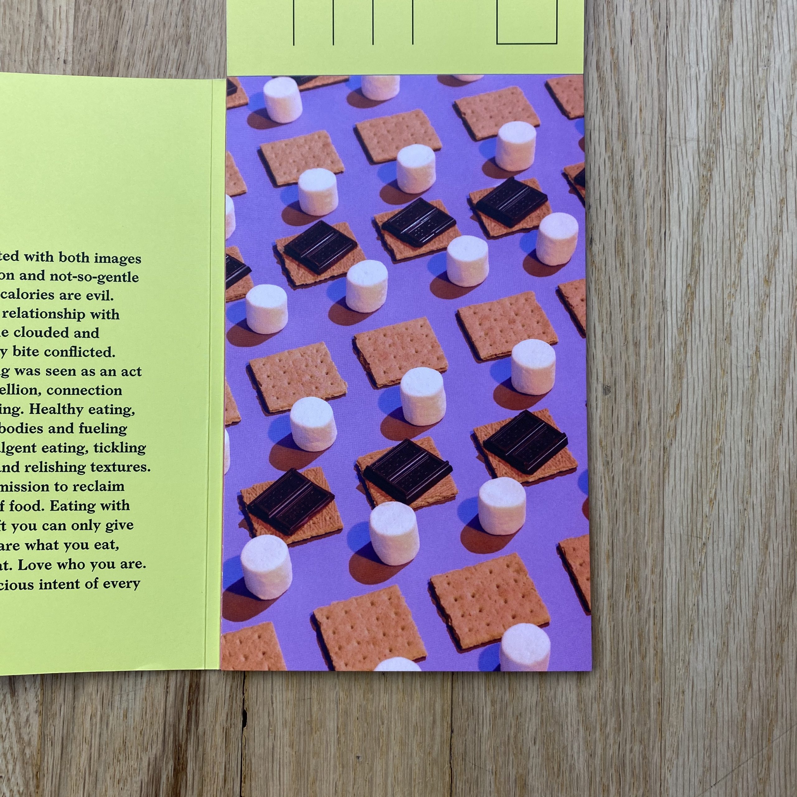
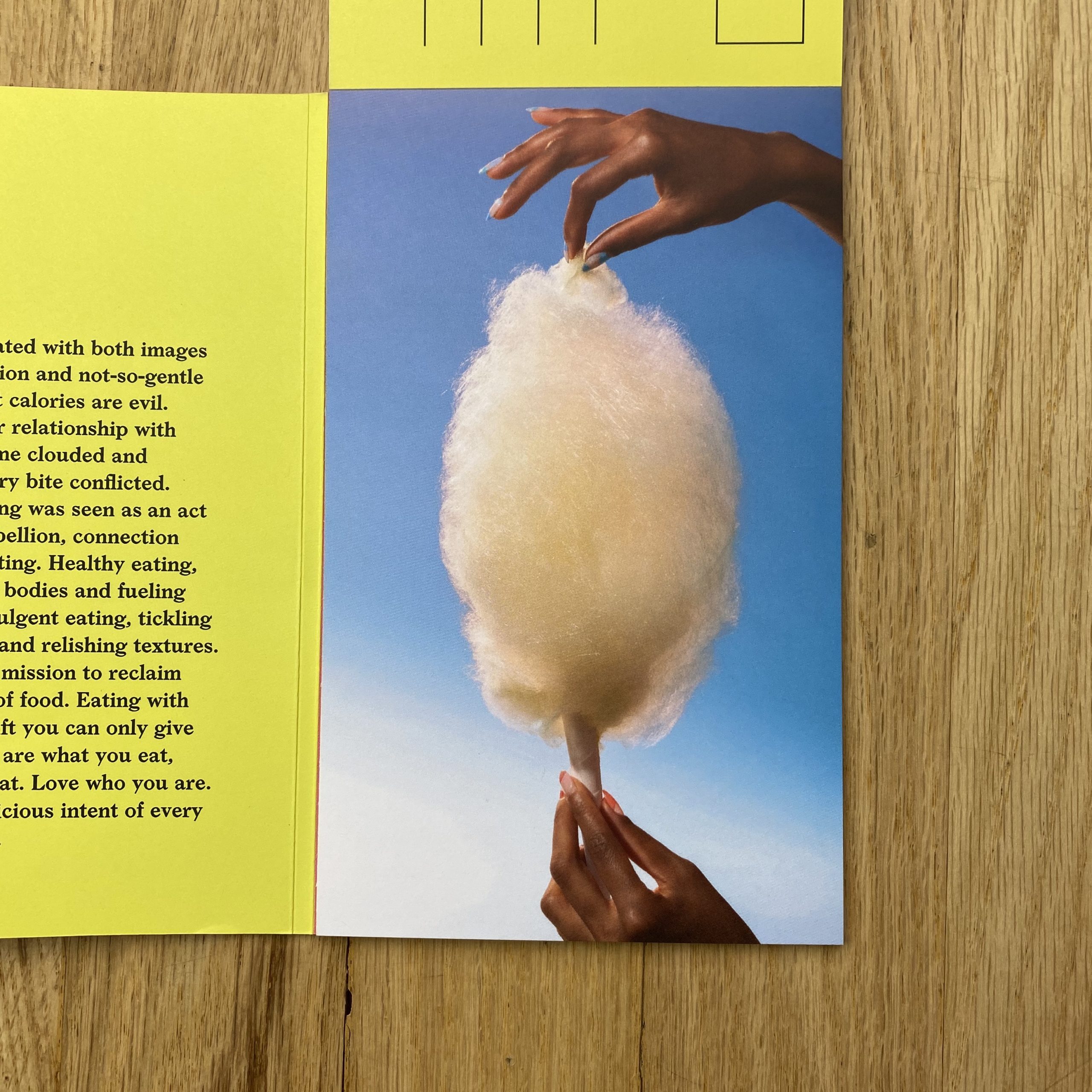
The inspiration behind Just Dig In stems from my experience of societal notions around food consumption as being duplicitous at best. Within our highly digital culture there’s an increased propensity to spend time ingesting images of rich, delicious, and seemingly ‘naughty’ food. Meanwhile we’re barraged with messages (often subversive or subliminal) that tout the importance of unrealistic body expectations, and food becomes evil. Food should bring enjoyment, energy, and nourishment for the soul and the body. Yet for many people in the US, especially women and girls, every interaction with food comes with a whole host of physical, emotional, and stress responses. The advertising world has a great amount of influence on how we relate to food as a culture. I see it as our communal responsibility to reclaim the beauty and power of food on all levels, and to promote messages of positivity around food and food enjoyment.
Our aim in developing this collection was to challenge the idea that food in any form is bad, as long as it adds goodness to the human experience. We wanted to create a collection of images that responsibly gives permission to the viewer to enjoy the experience of their taste buds, while sharing a message that ‘guilty’ pleasure doesn’t need to be so.
How many did you make?
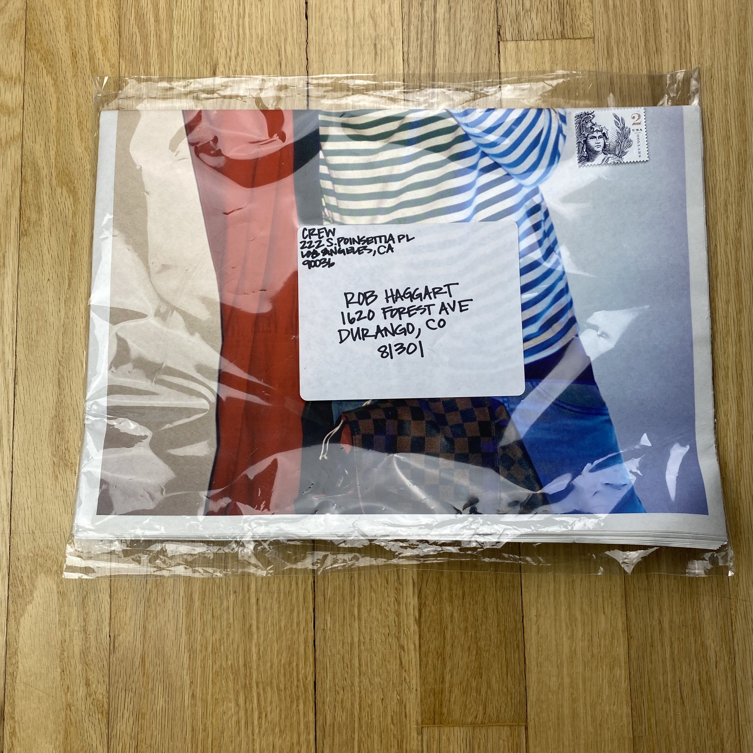
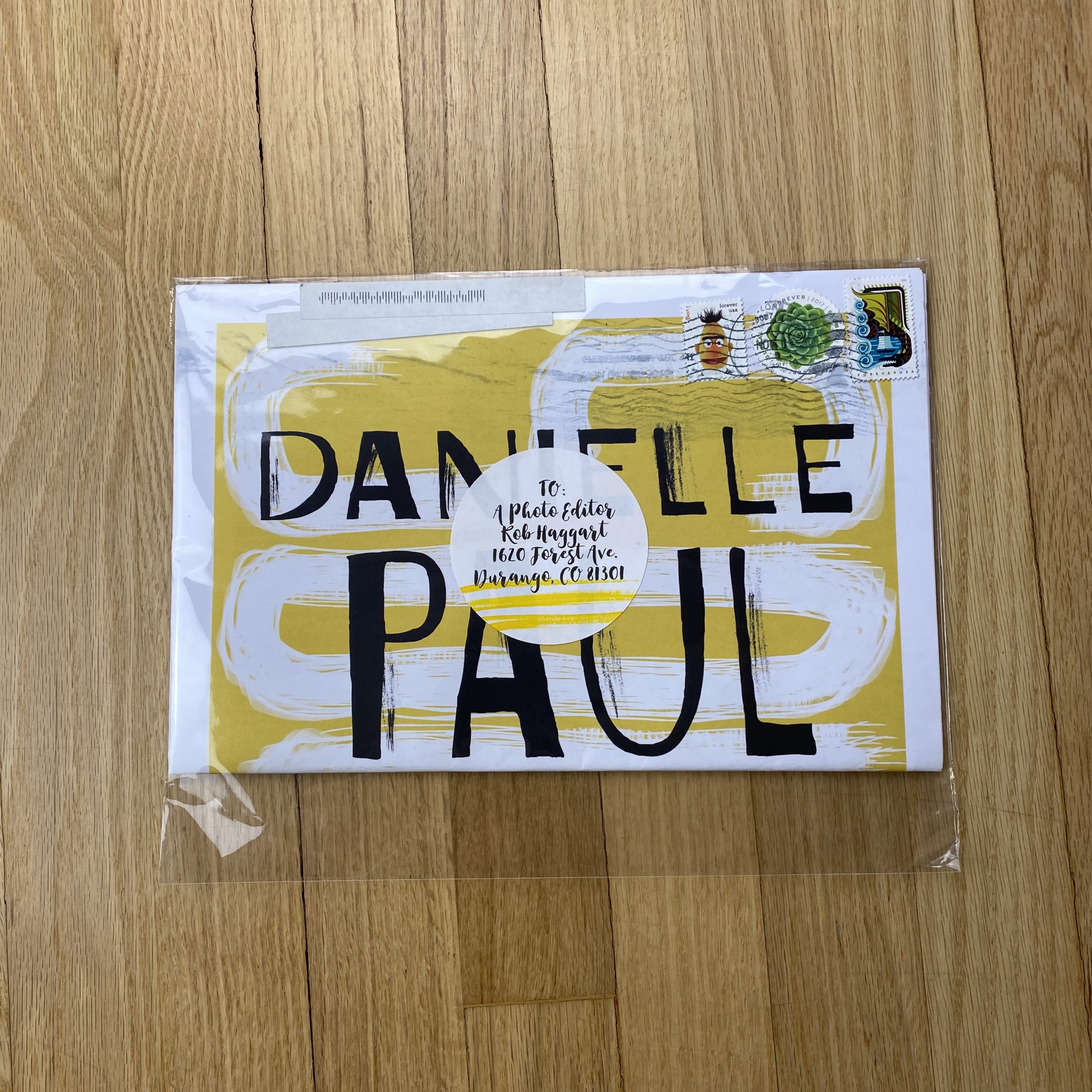
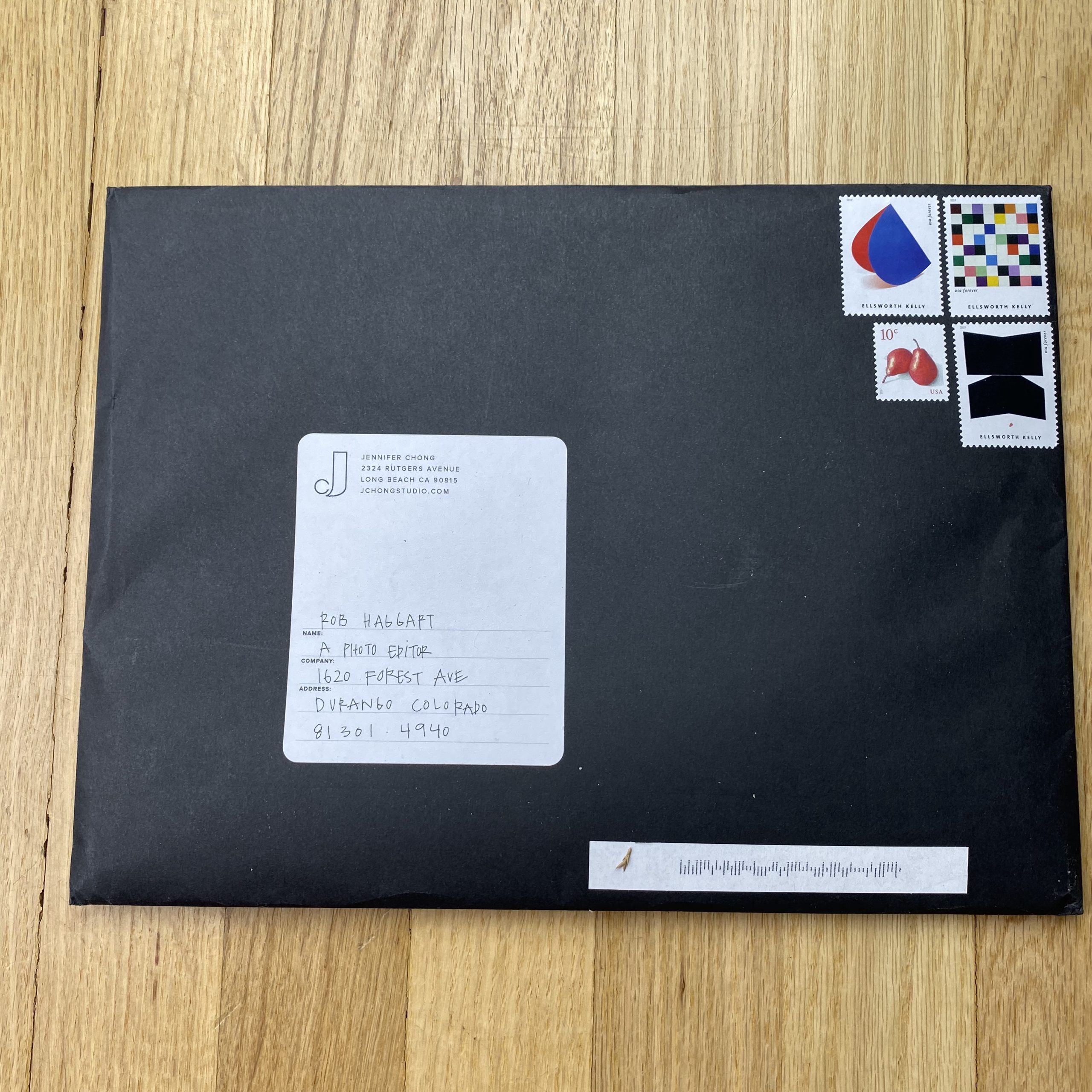
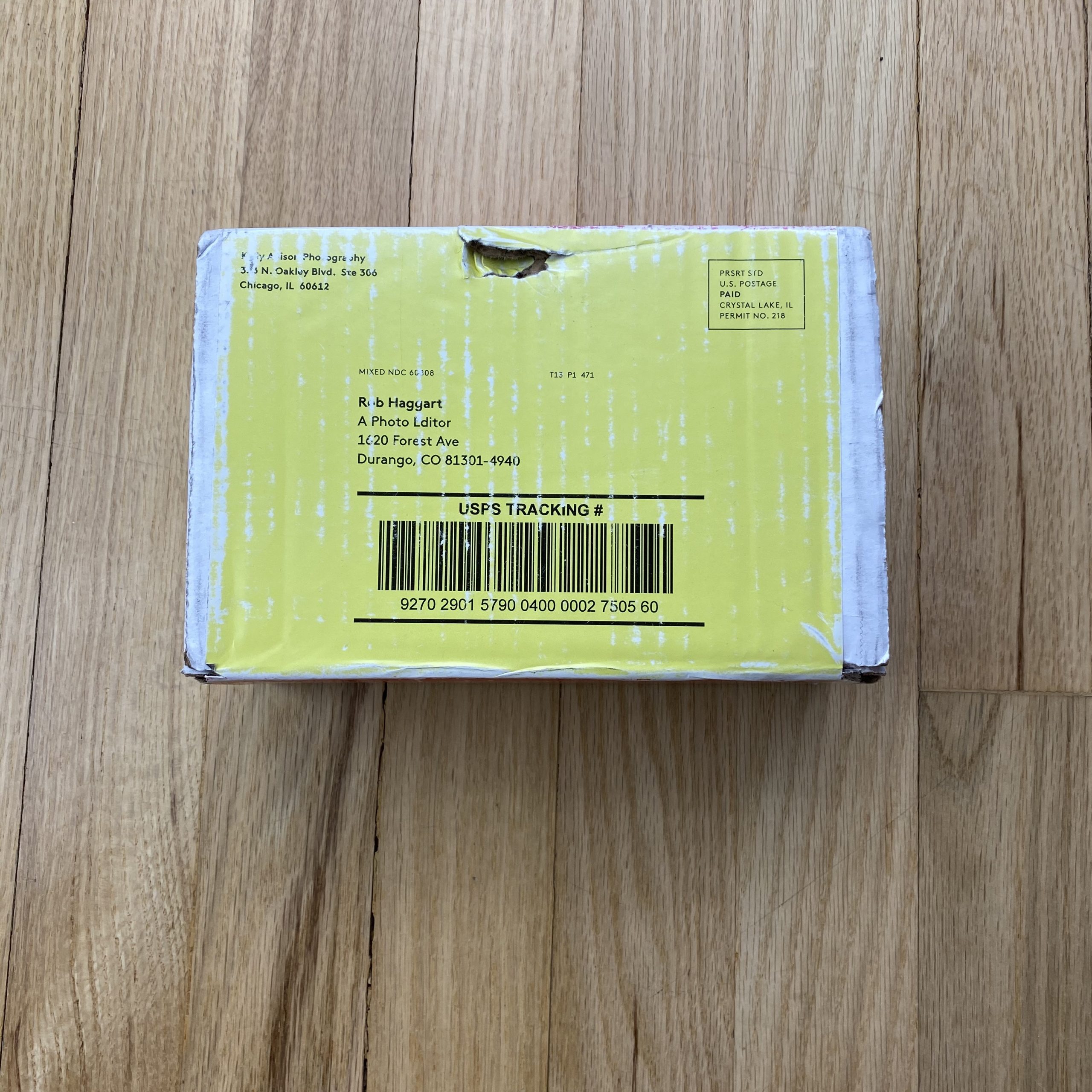
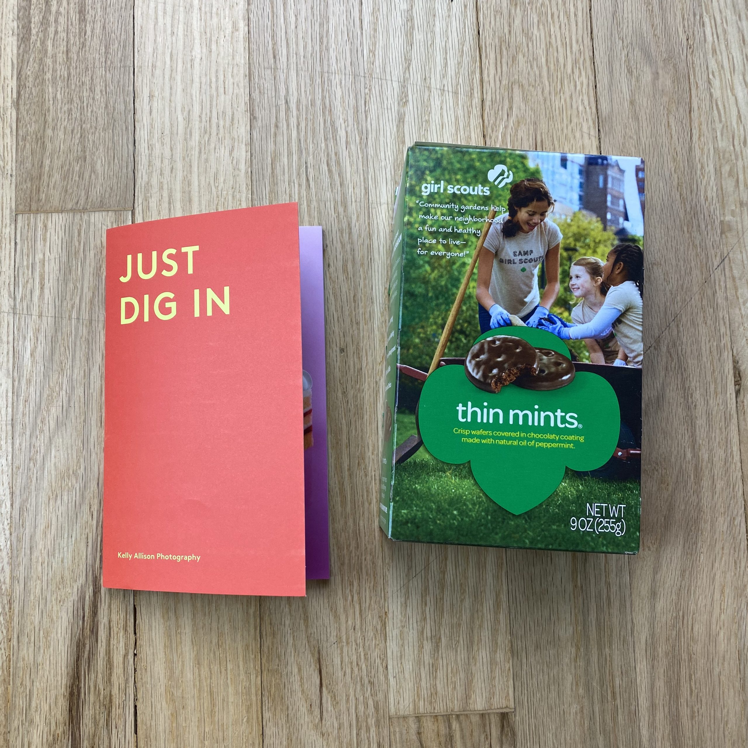
There were 1,000 booklets produced in total, 500 of which were sent (like yours) with a box of Girl Scout Thin Mint cookies. For the past few years I’ve been inspired to send Girl Scout cookies with my promos for a couple of reasons: With so many amazing promotional pieces hitting the desks of creatives each day, it’s often hard to stand out. By aligning with a strong brand that’s deeply rooted in nostalgia, I’m pinning my name to an immediately recognizable entity (and one which happens to be one of those ‘guilty’ pleasure) in the hopes of creating a longer lasting impression. More importantly, the iconic nature of the annual cookie release gives me a great opportunity to support local troops in my neighborhood, and give back to an organization that is actively changing the way that girls see themselves and their potential. I believe strongly in the positioning of the Girl Scouts organization and their messages of solidarity, community, global citizenship, and sisterhood.
We have another 500 pieces (sans cookies) that were scheduled to ship at the end of March, but instead we are patiently awaiting a safer time to send them.
How many times a year do you send out promos?
I send one promo each year, usually in the spring or fall.
Do you think printed promos are effective for marketing your work?
Absolutely. There is something powerful about the tactile experience of a well-designed and beautifully executed printed piece, especially when thoughtfully produced and well-strategized. With a mutual desire to both showcase my work and also limit our environmental footprint, we always try to create pieces that serve a useful purpose. I want each promo to live longer than a quick peruse, and toss into a pile (if you’re lucky) or the recycling bin. Timing also matters when planning to send a physical promo – if it’s a time of increased mail, like around the winter holidays, there may be more pieces that never reach their intended recipient, or get buried and overlooked. Despite the possible obstacles of sending promotional pieces, I’m confident that the benefit far outweighs the negative. There’s no way to accurately account for the impact of an individual promo, but we have definitely heard many stories (even years later) of clients who hire us because our promo ended up in their hands.