
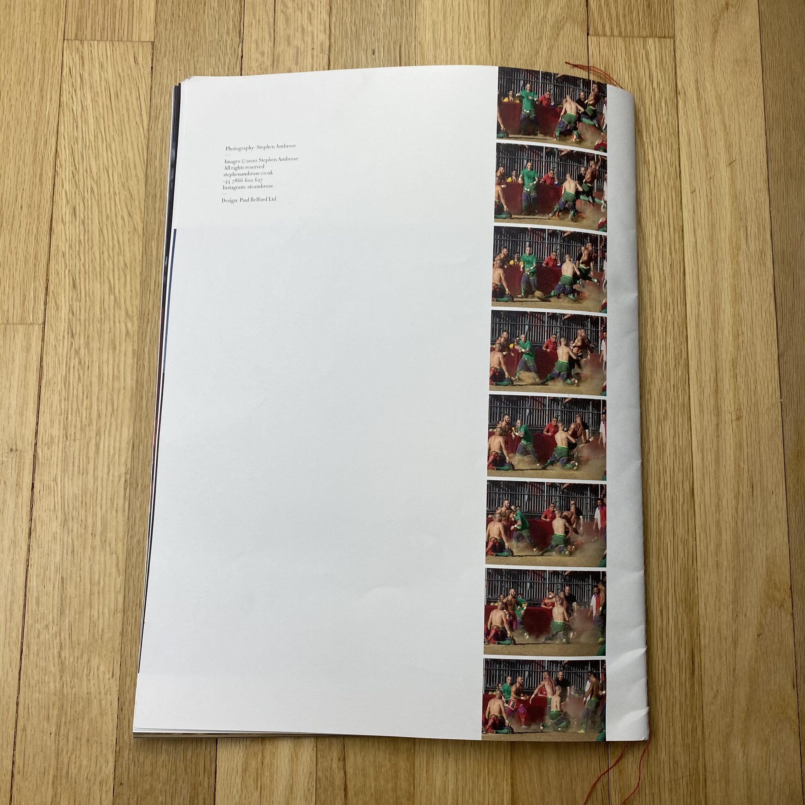
Who printed it?
It was printed by Push Print London.
The book was printed on the fuji jet press using a process that gives a wider gamut of colours than litho.
Format: 28pp self-cover.
Size: 396 X 297mm portrait.
Printing: 4 colour throughout wide gamut Jet press both sides.
Materials: Fedrigoni Arcoprint Milk 150gsm.
Finishing: Centre singer sew x 4 thread colours
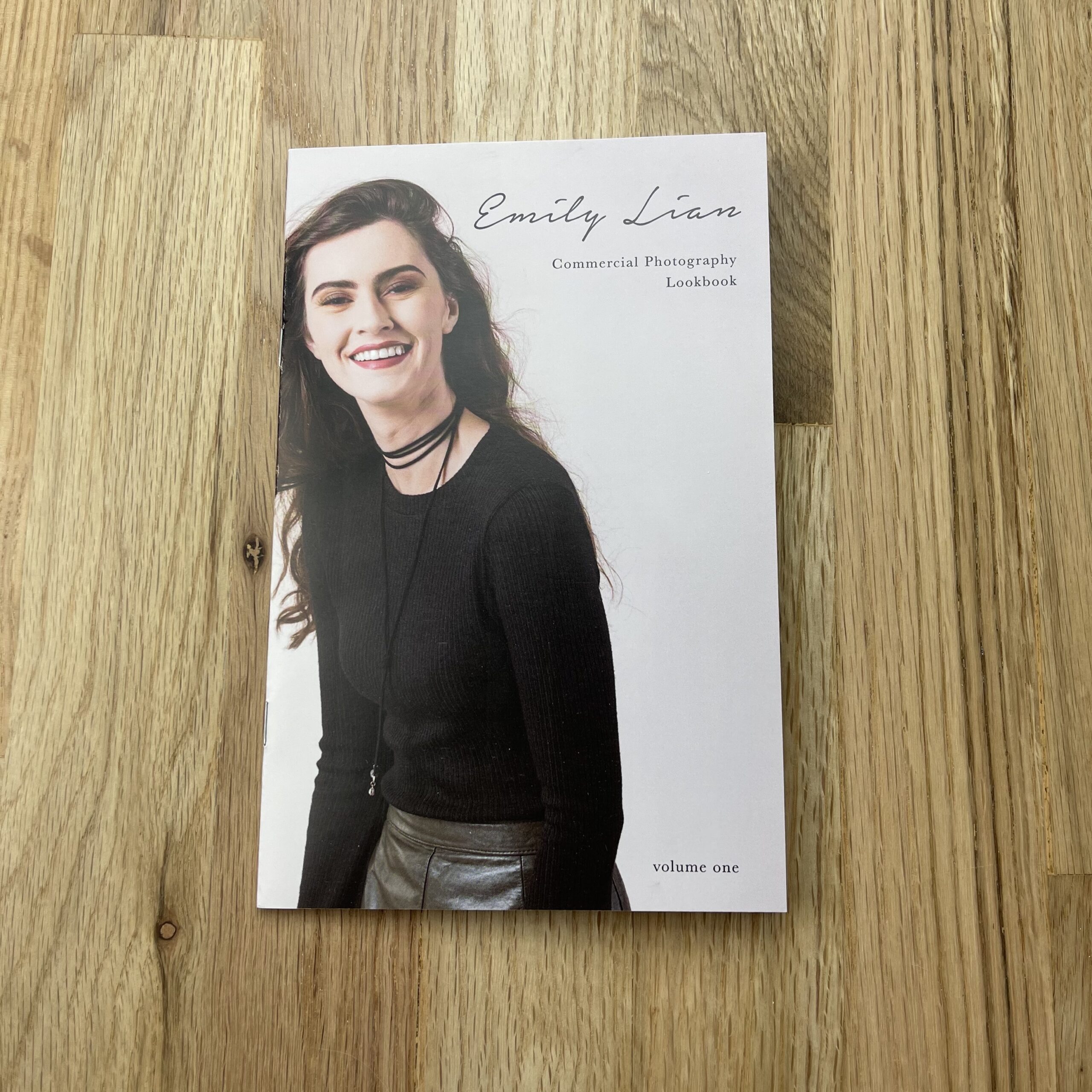
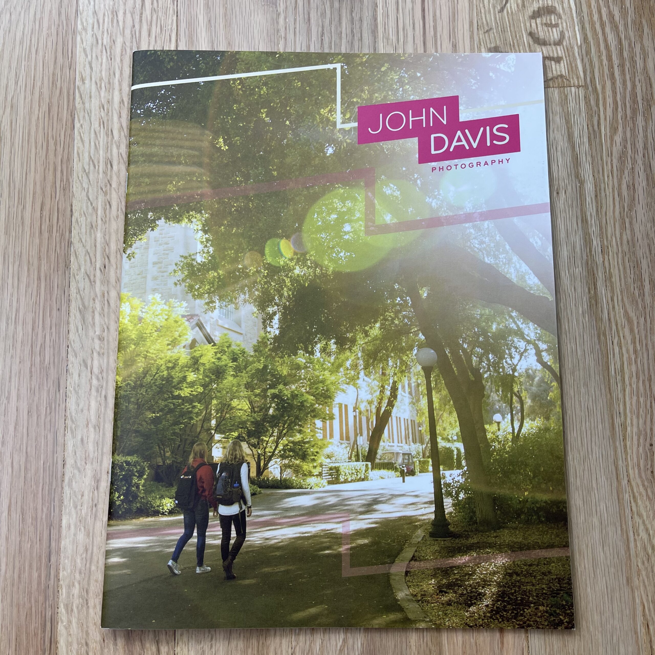
Who designed it?
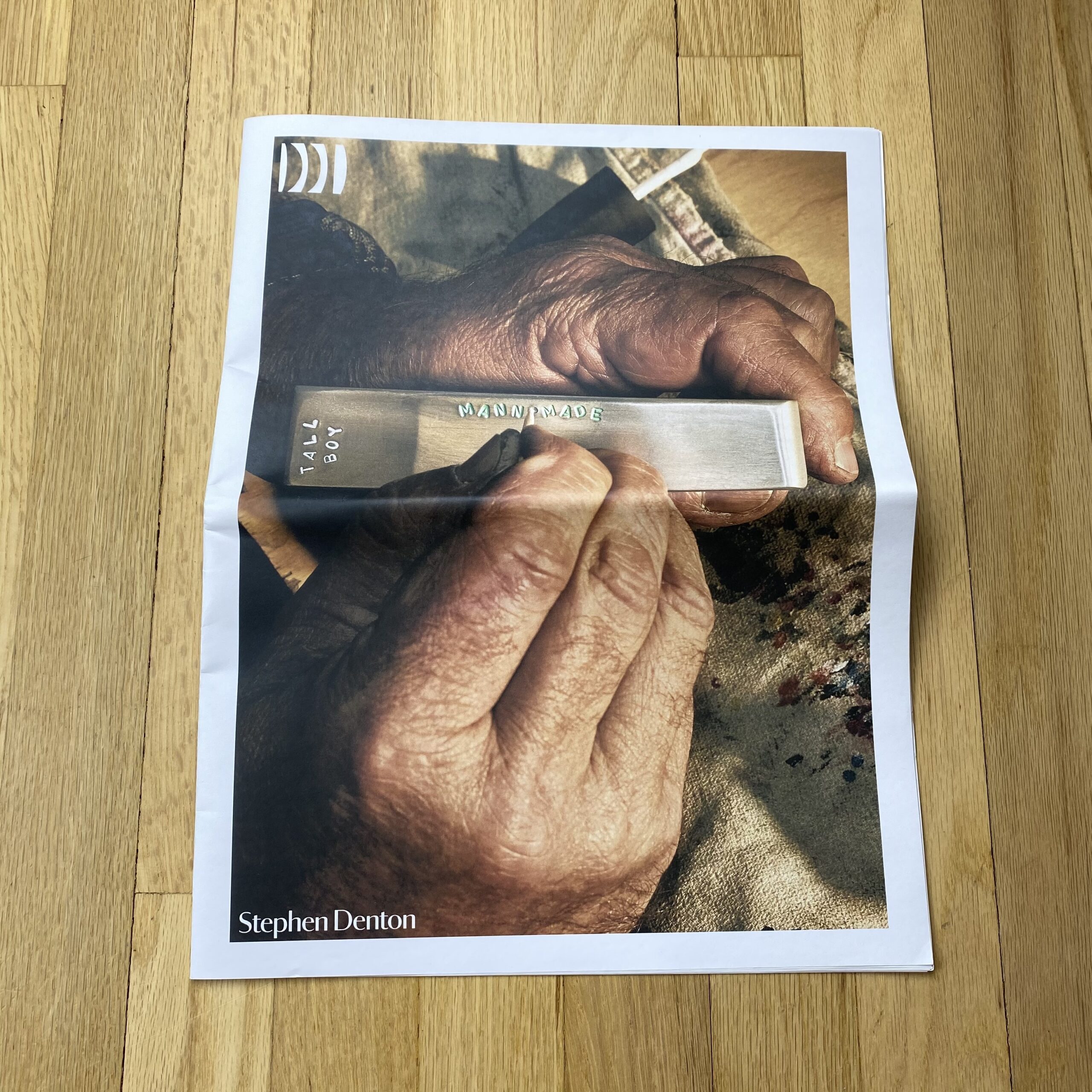
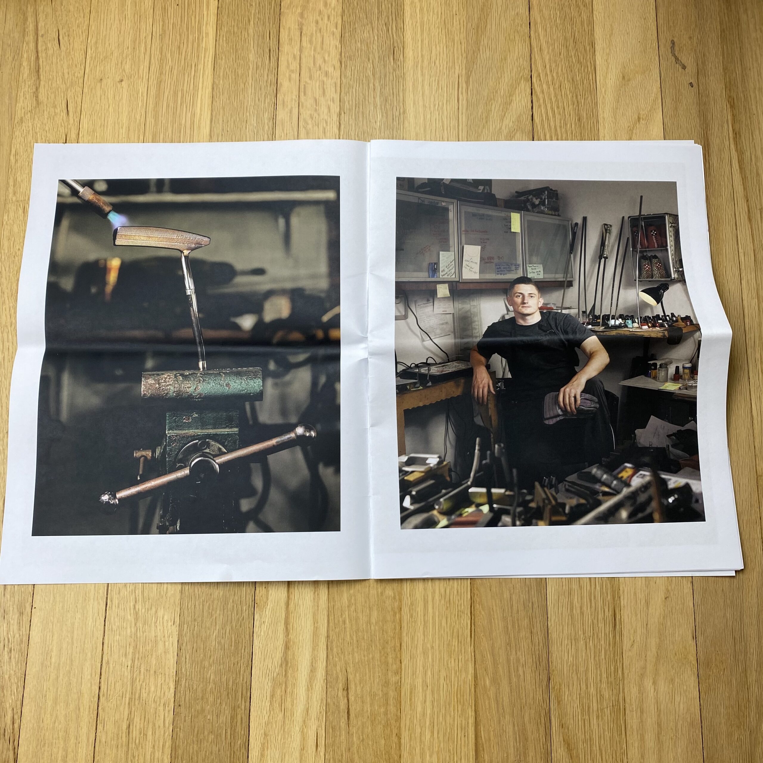
Paul Belford at Paul Belford Limited
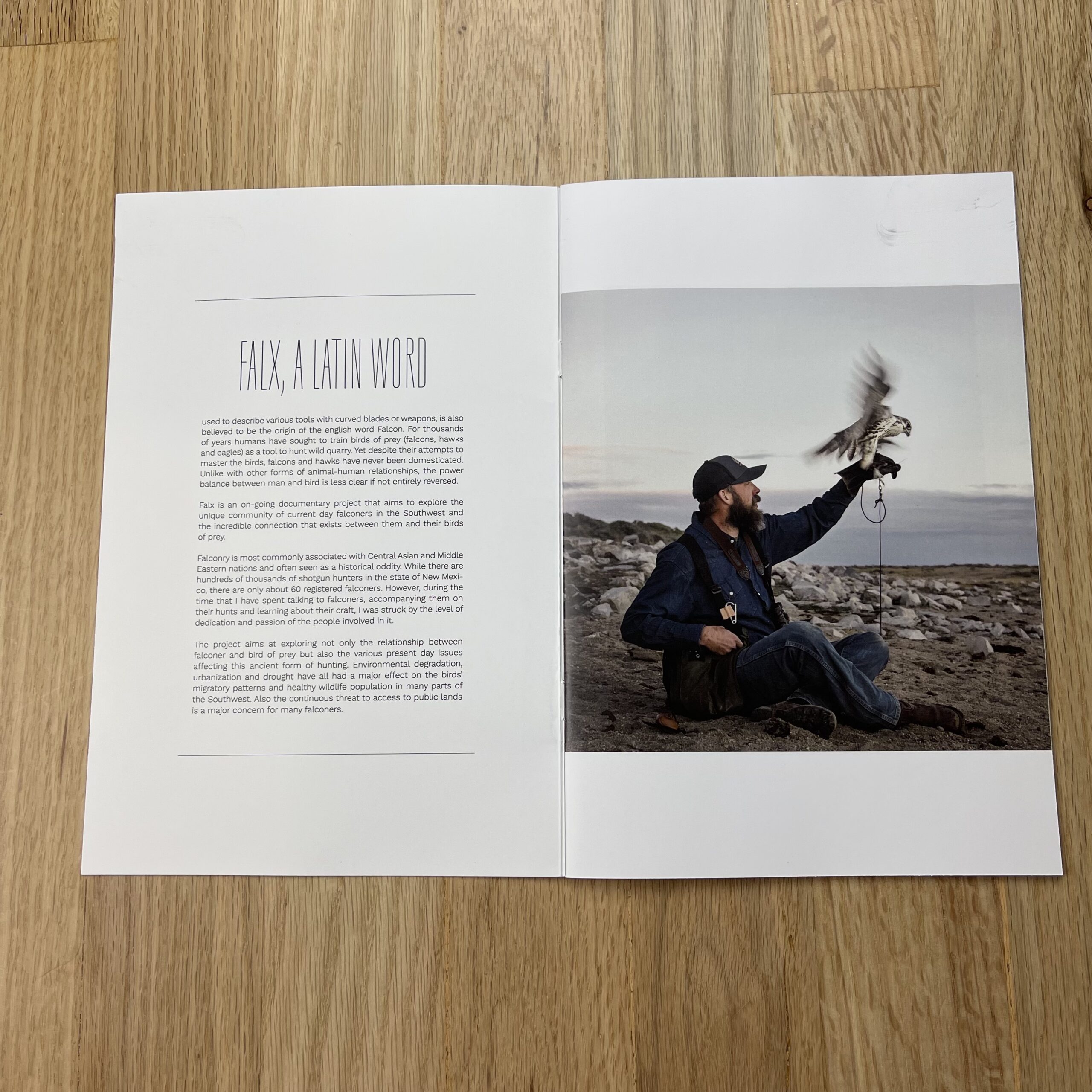
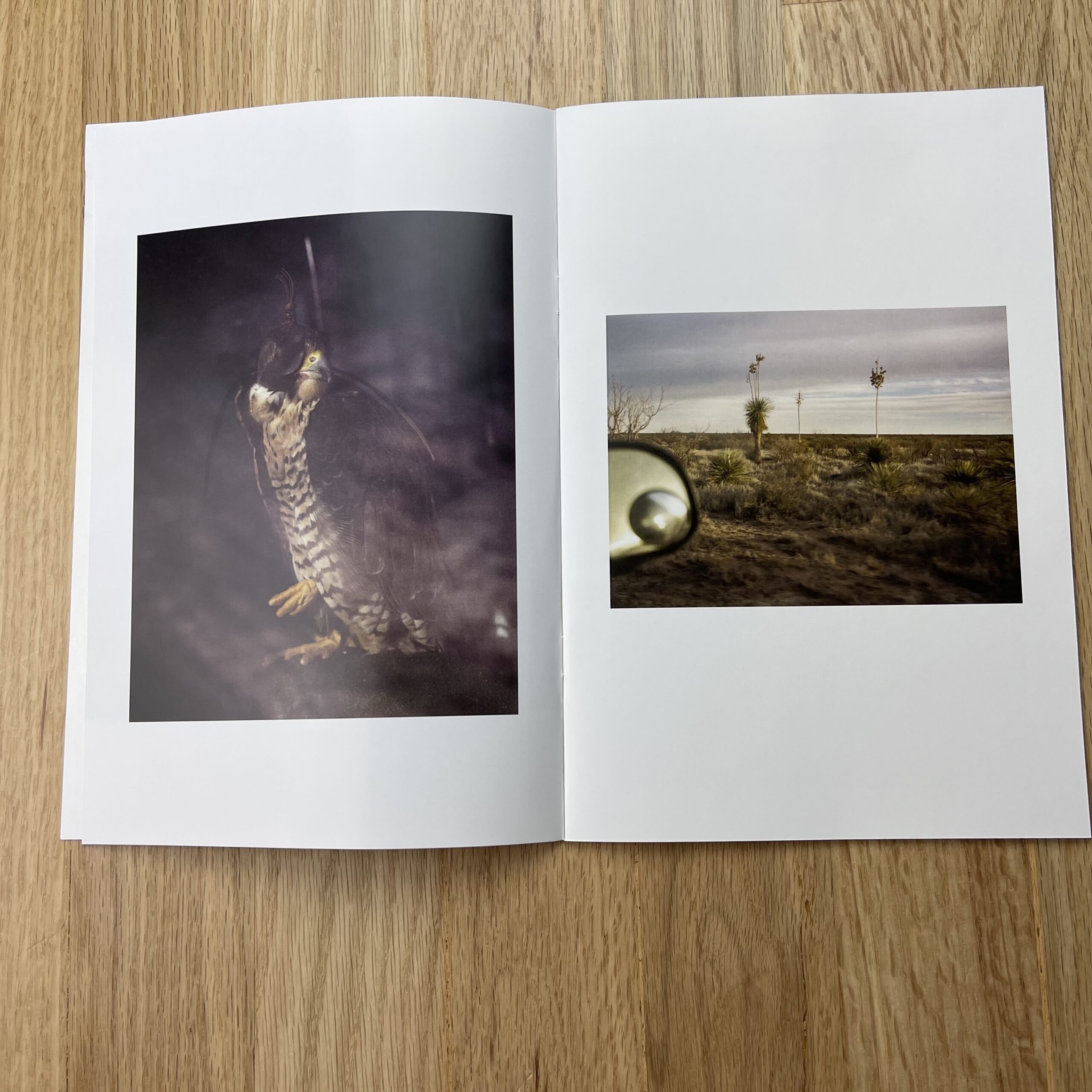
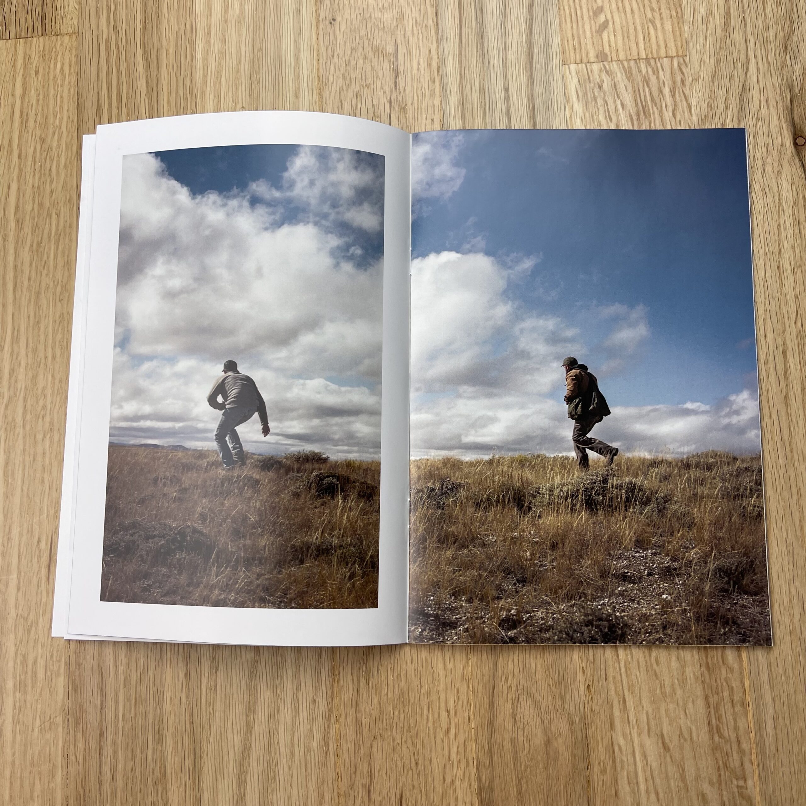
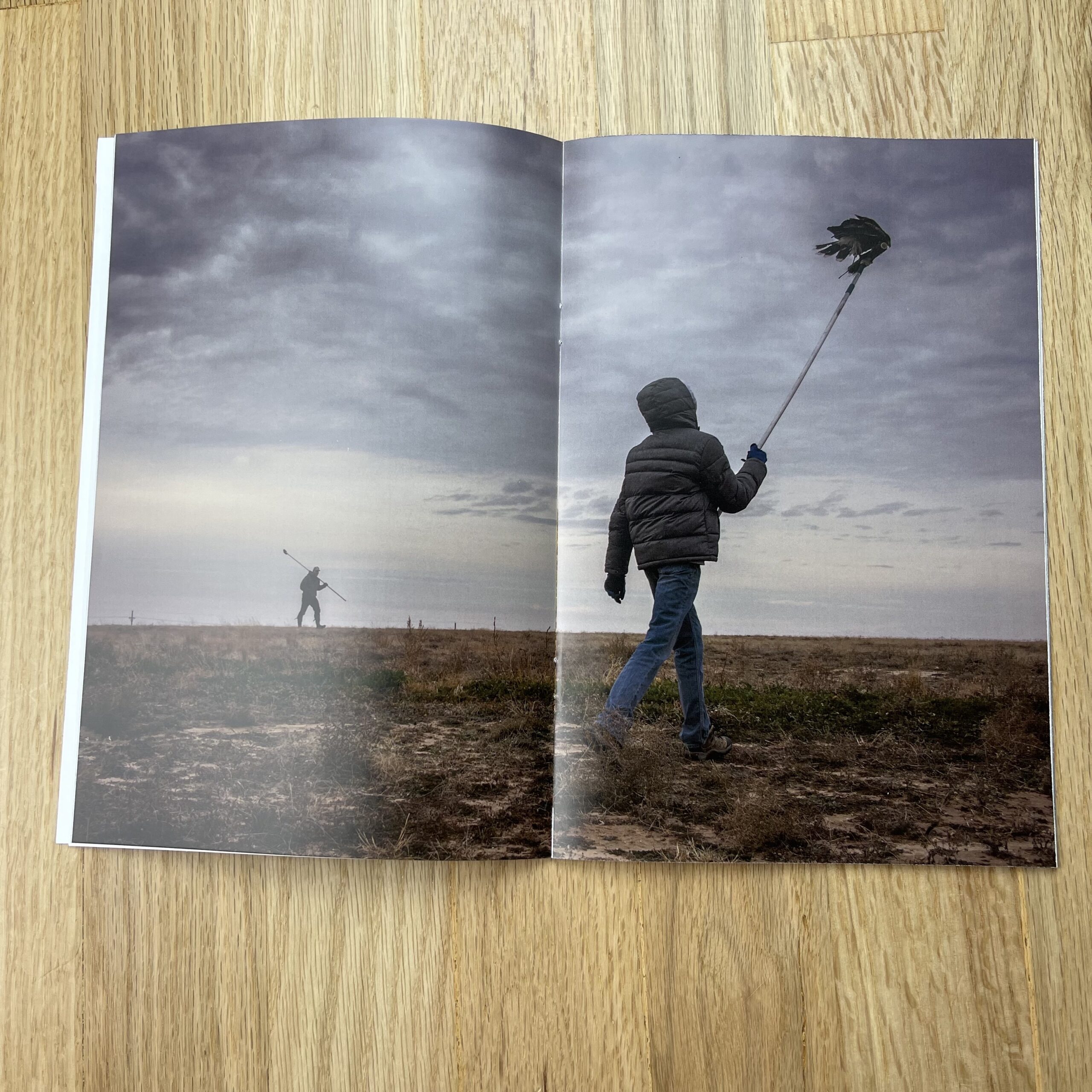
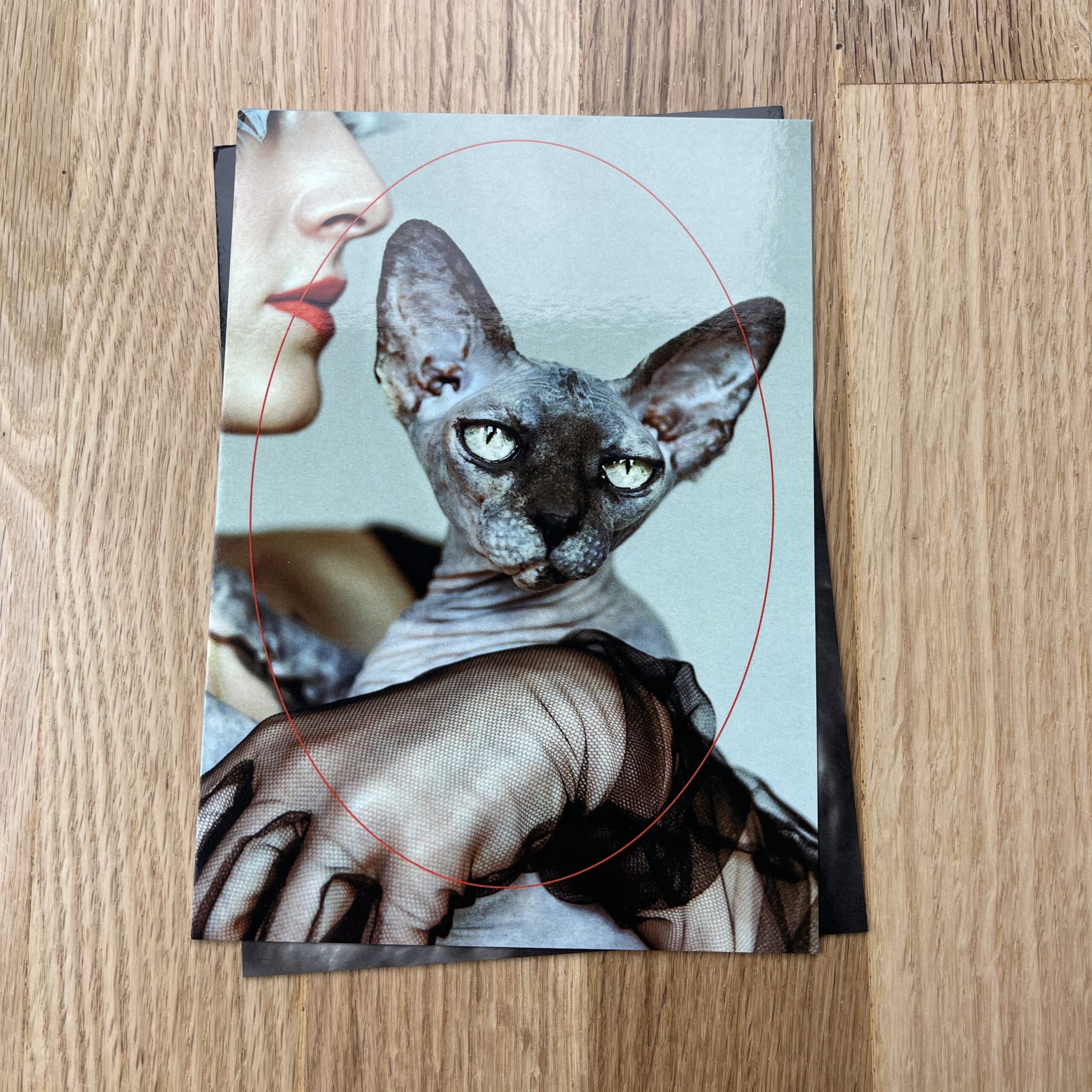
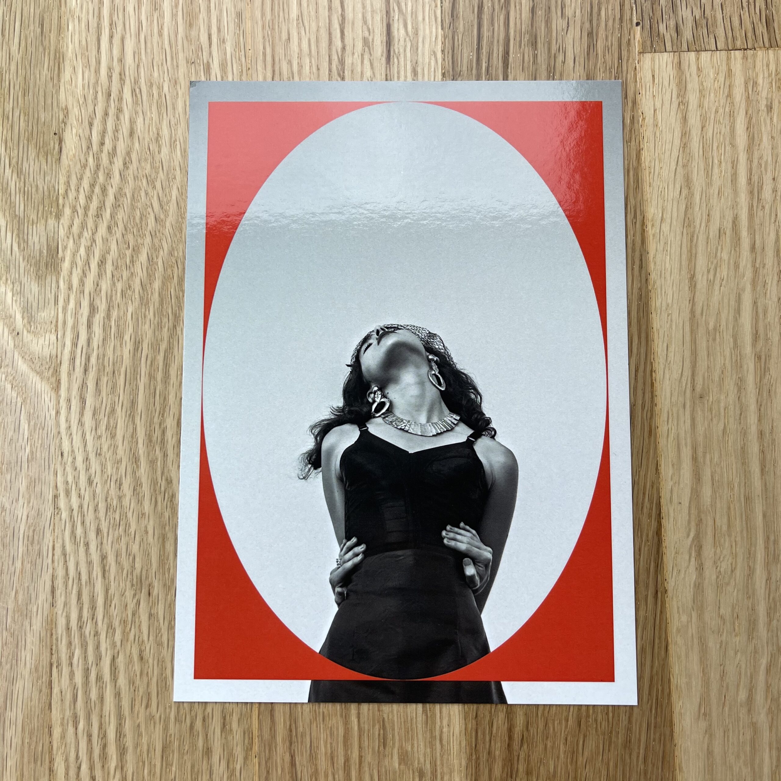
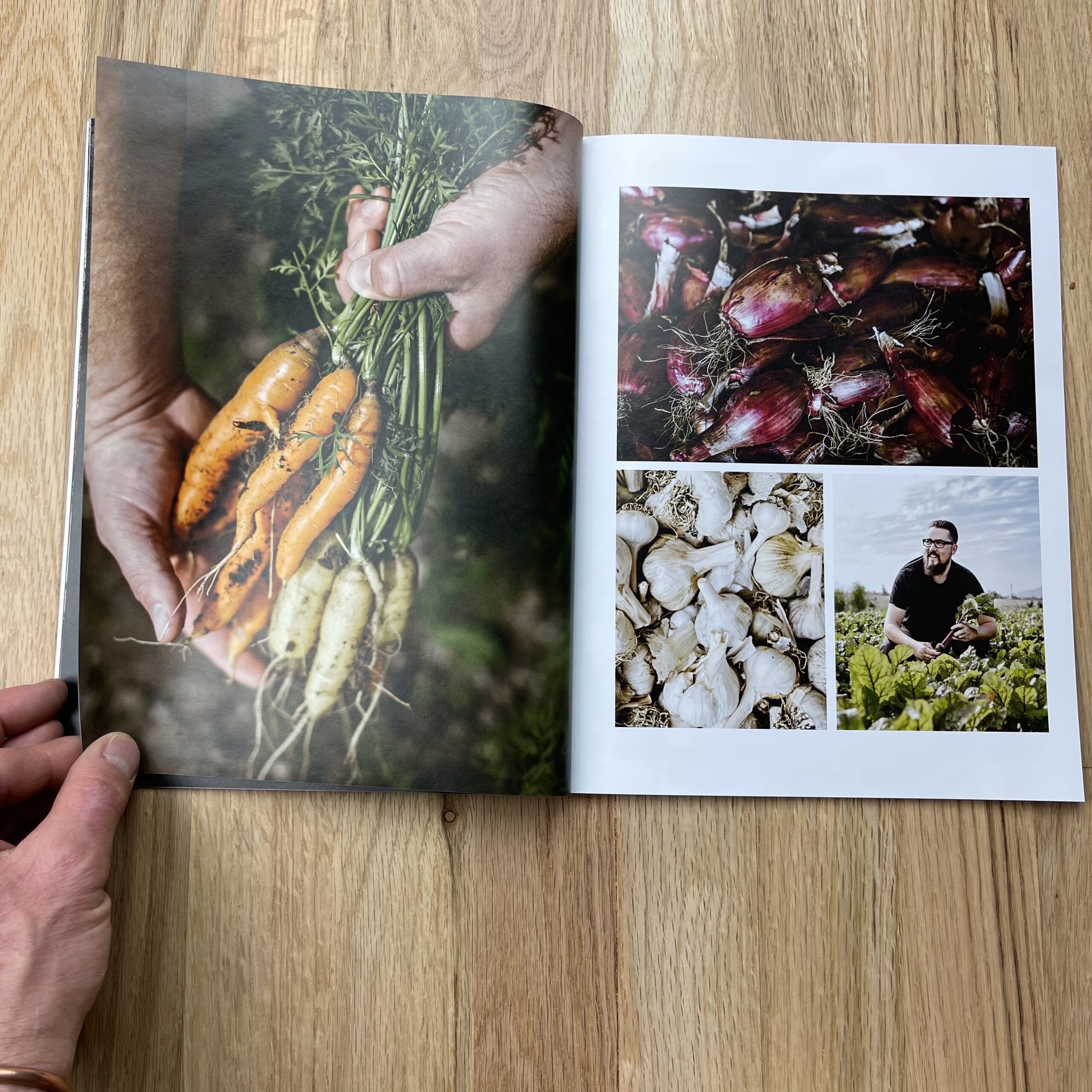
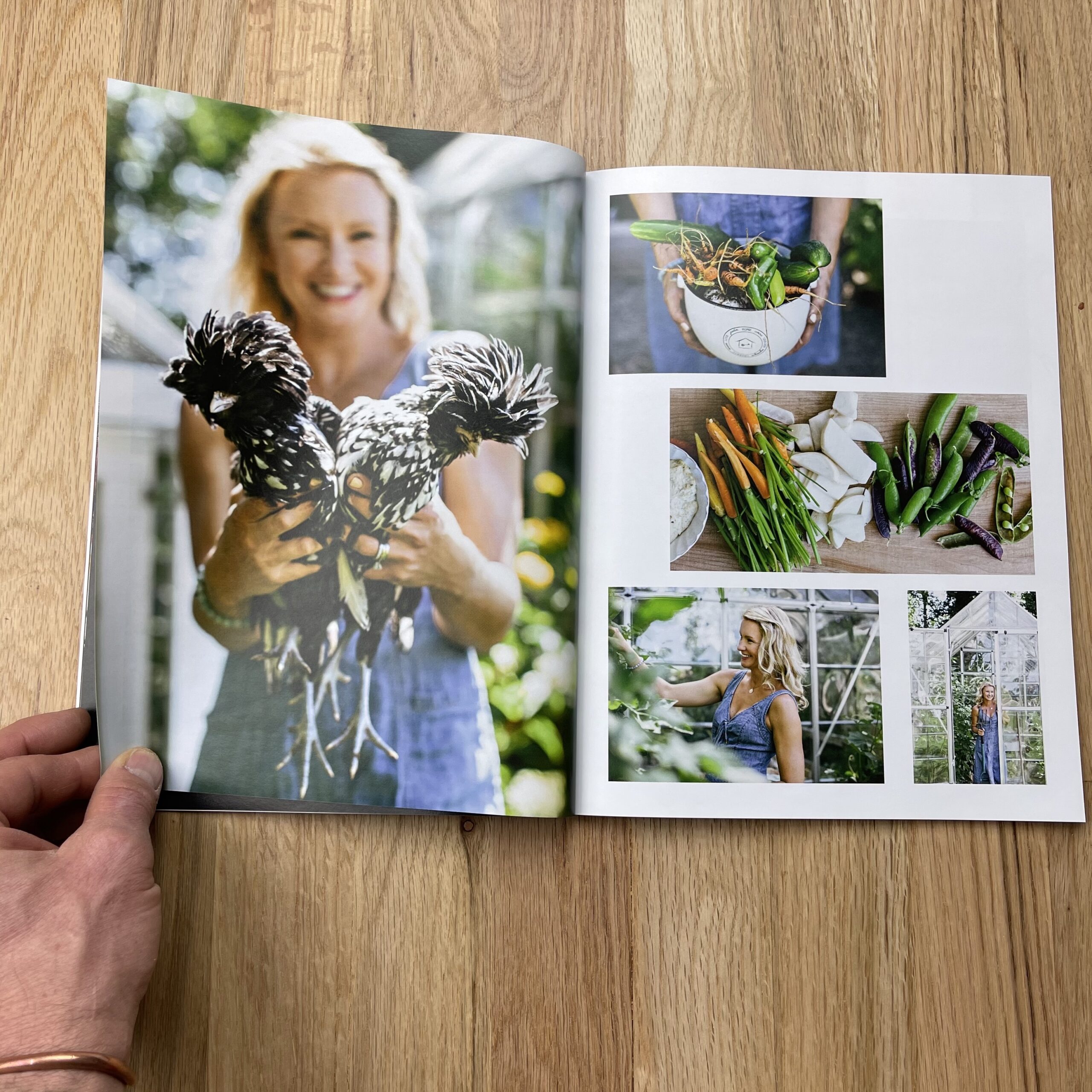
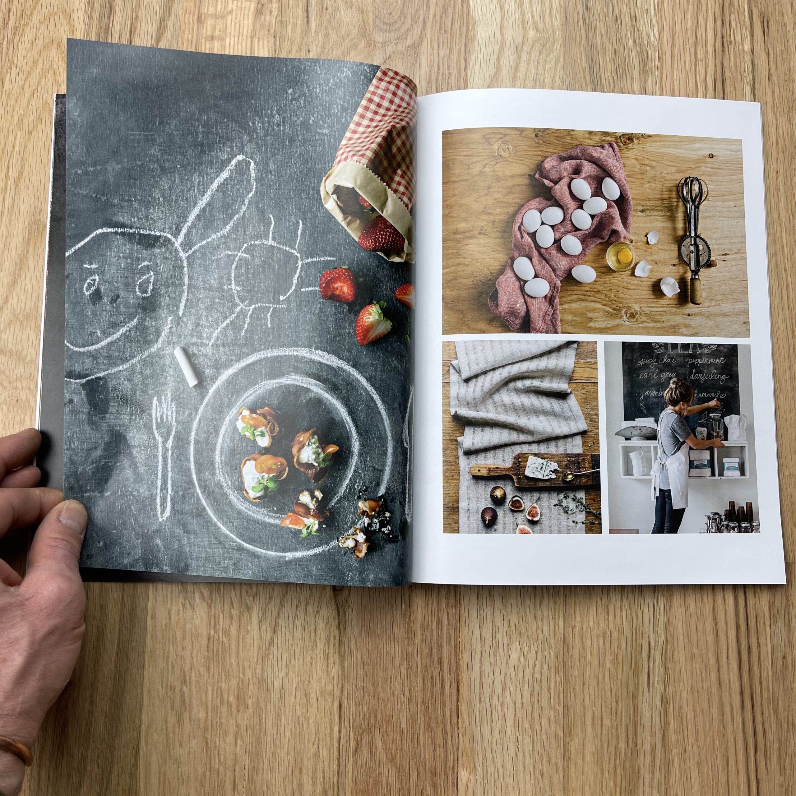
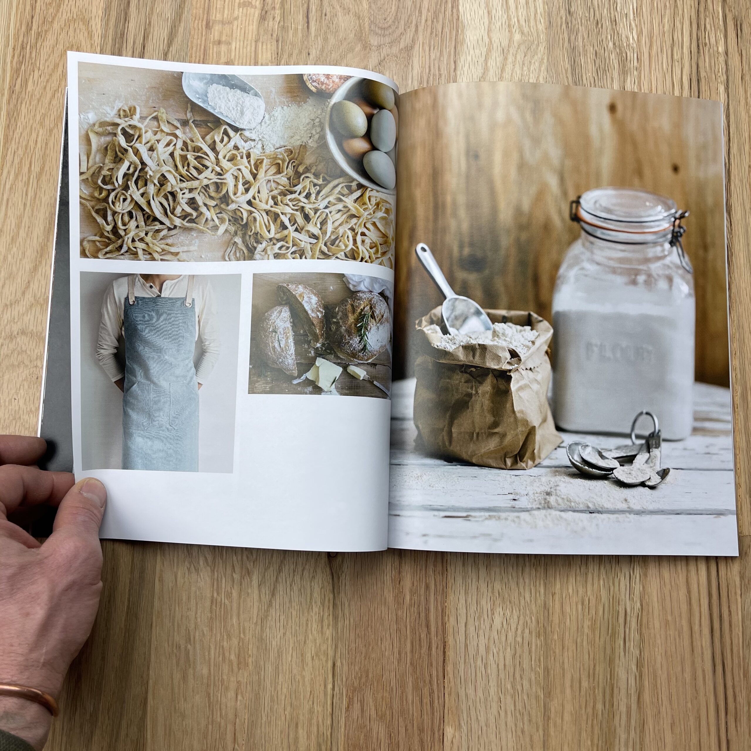
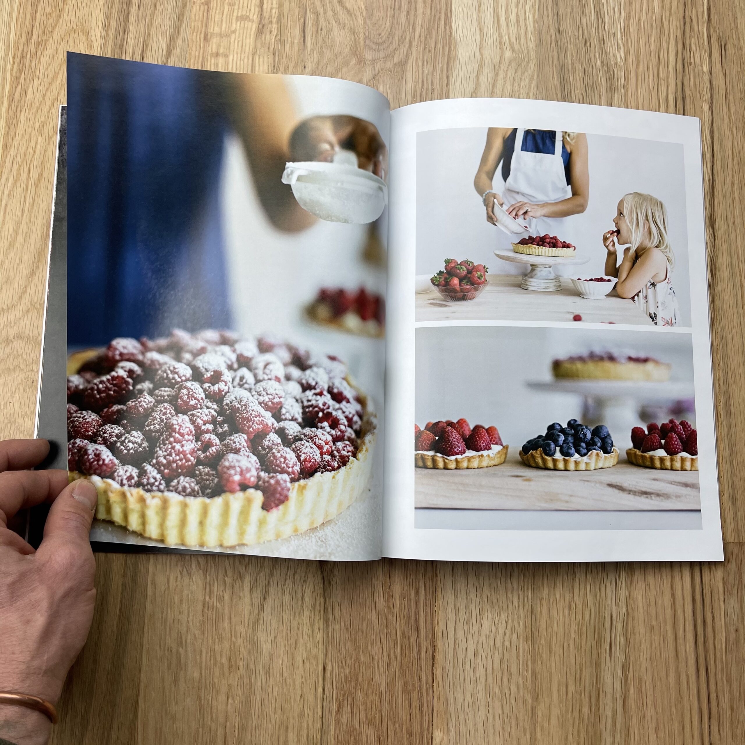
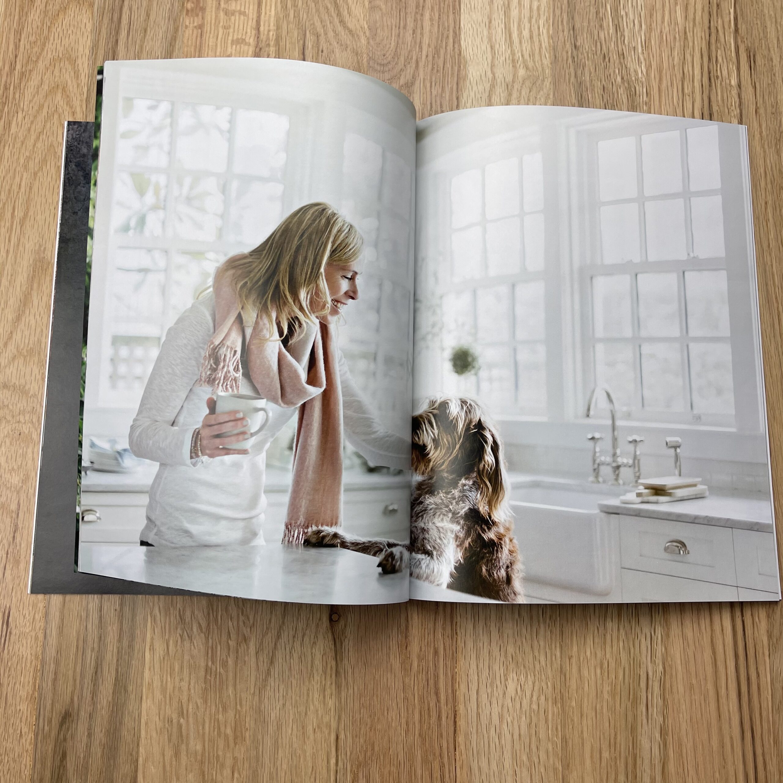
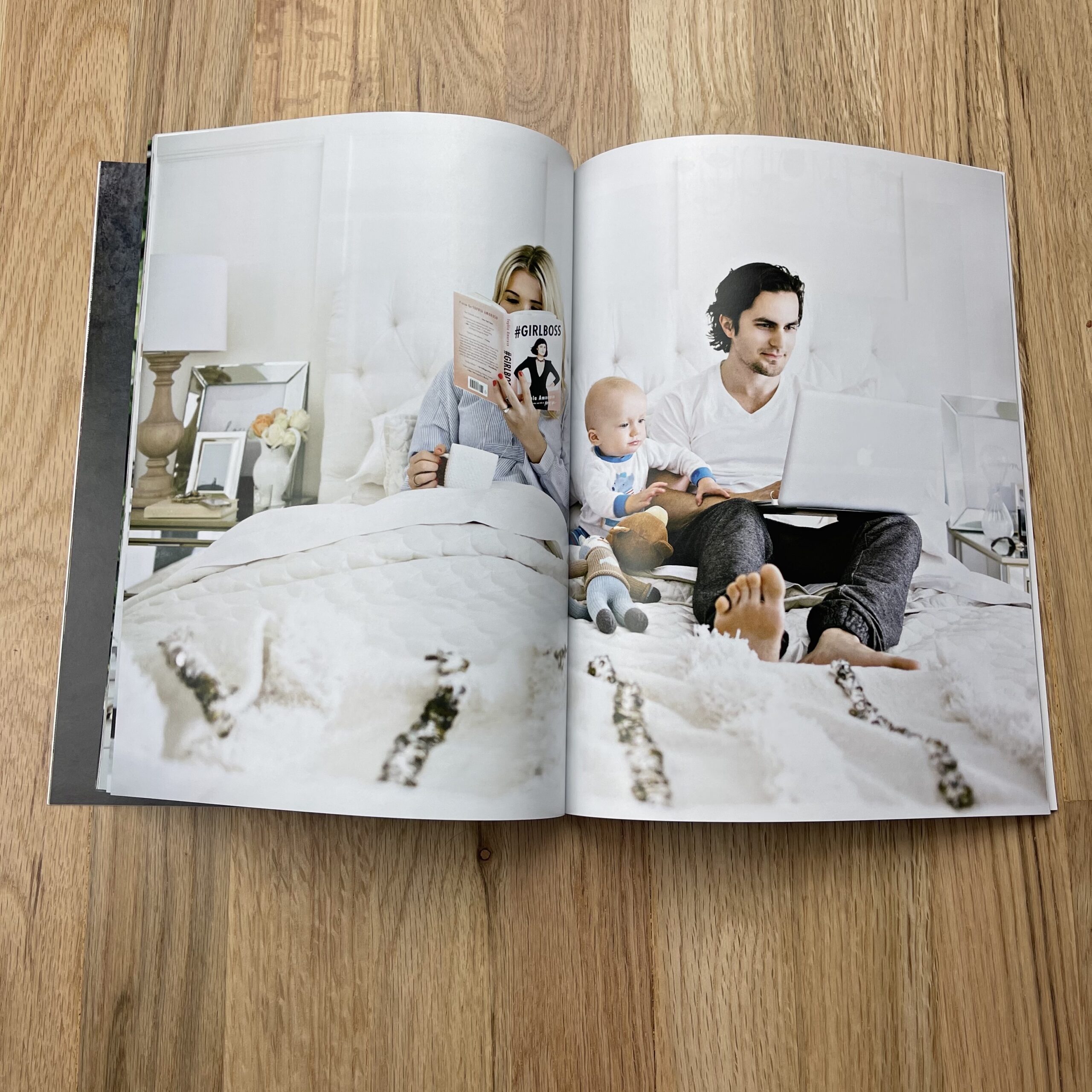
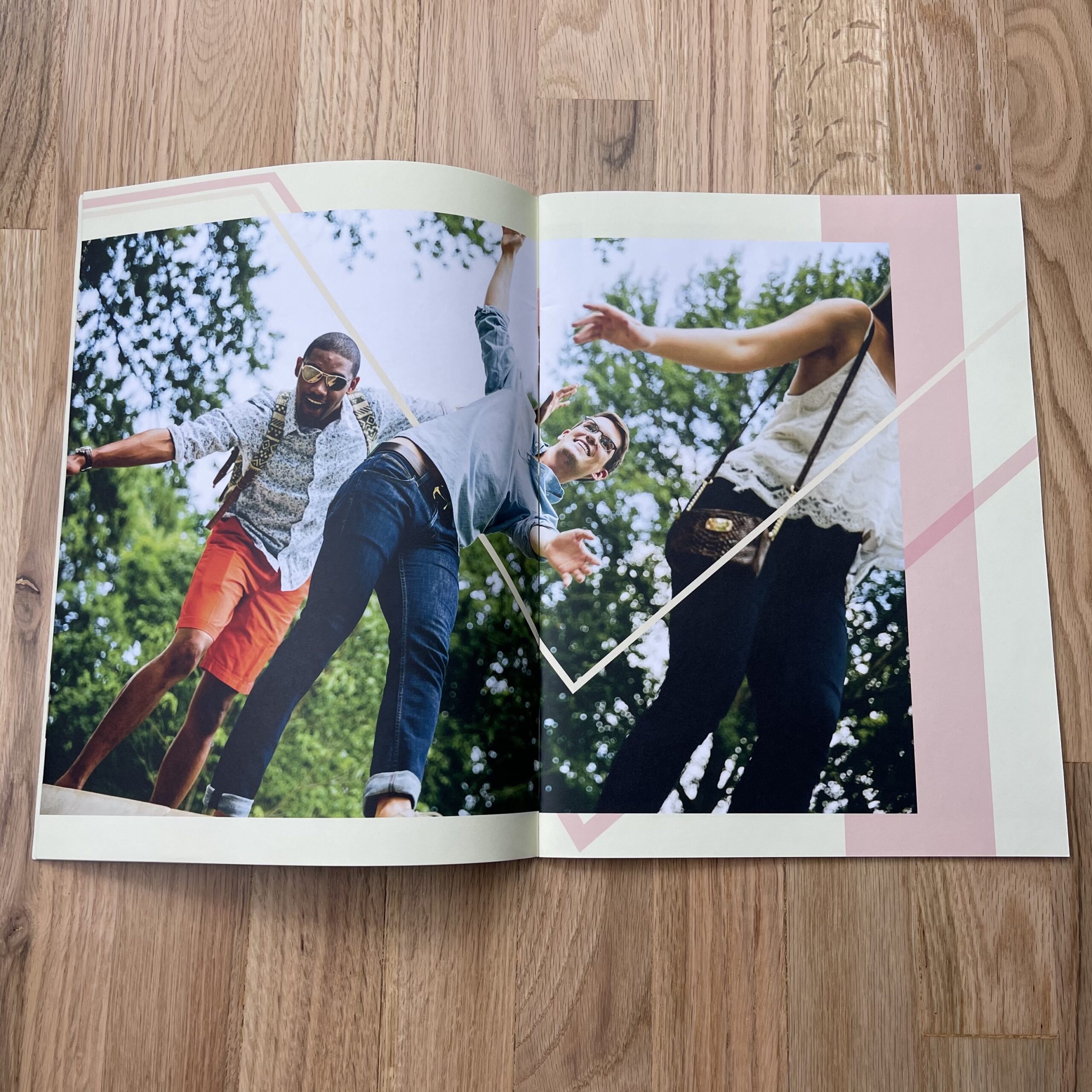
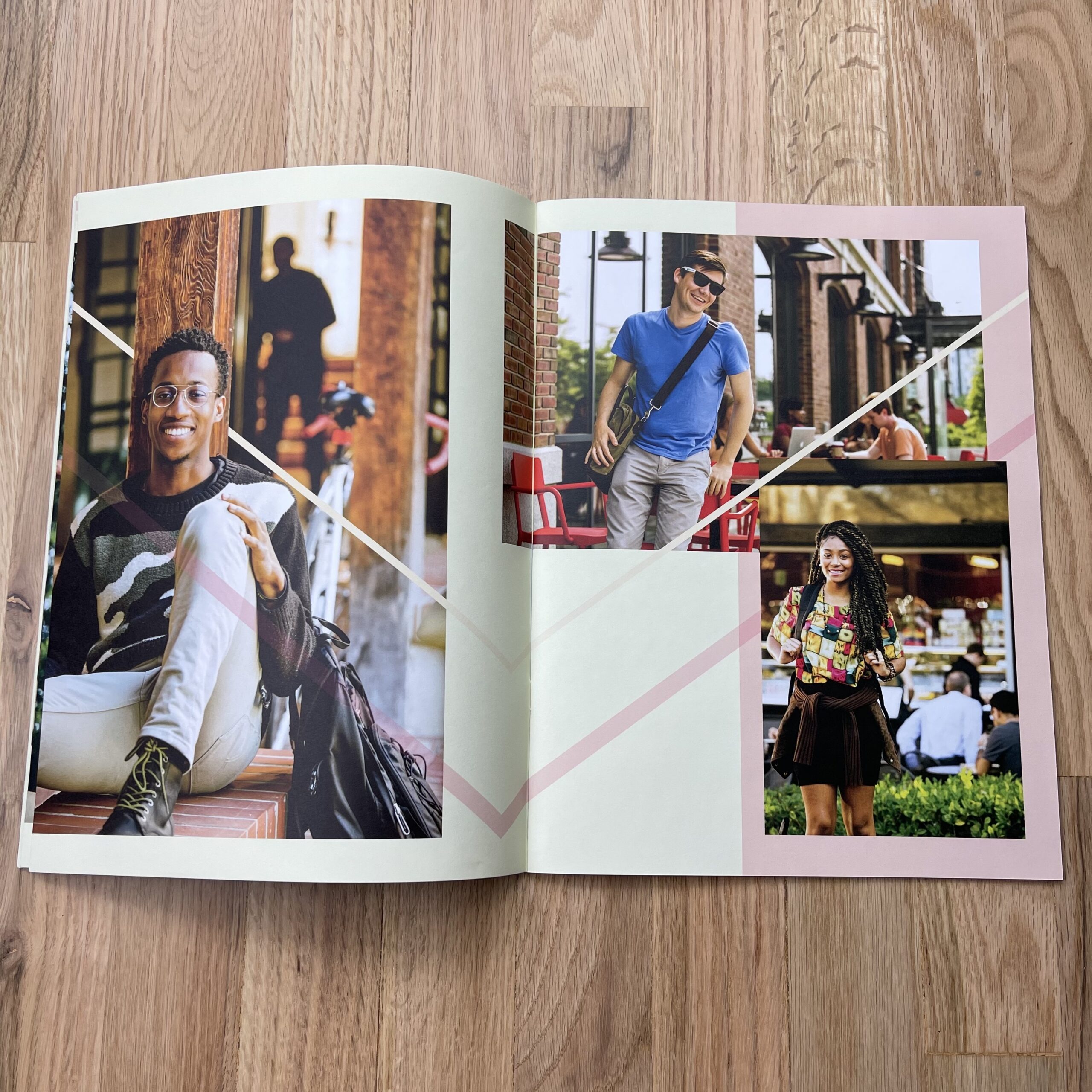
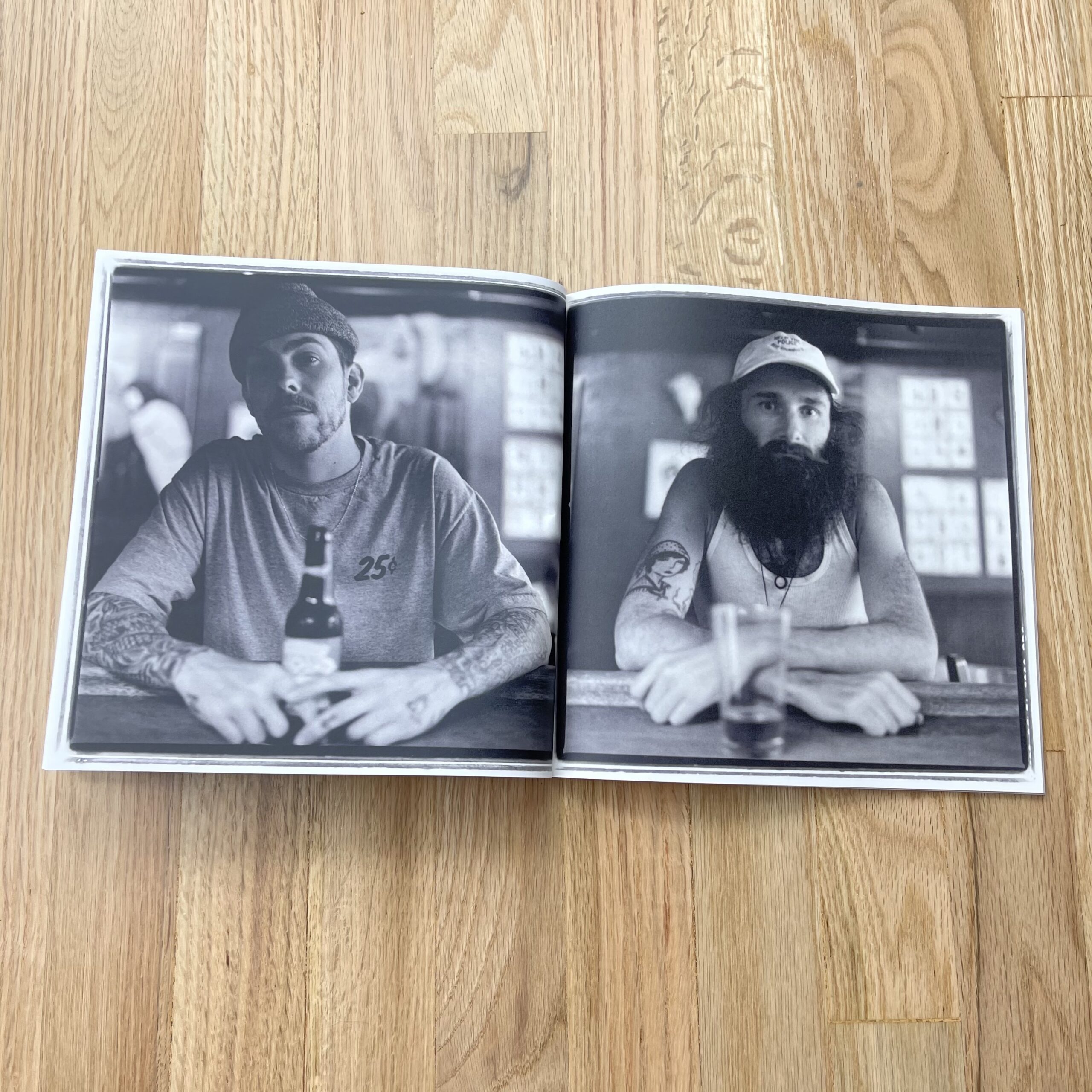
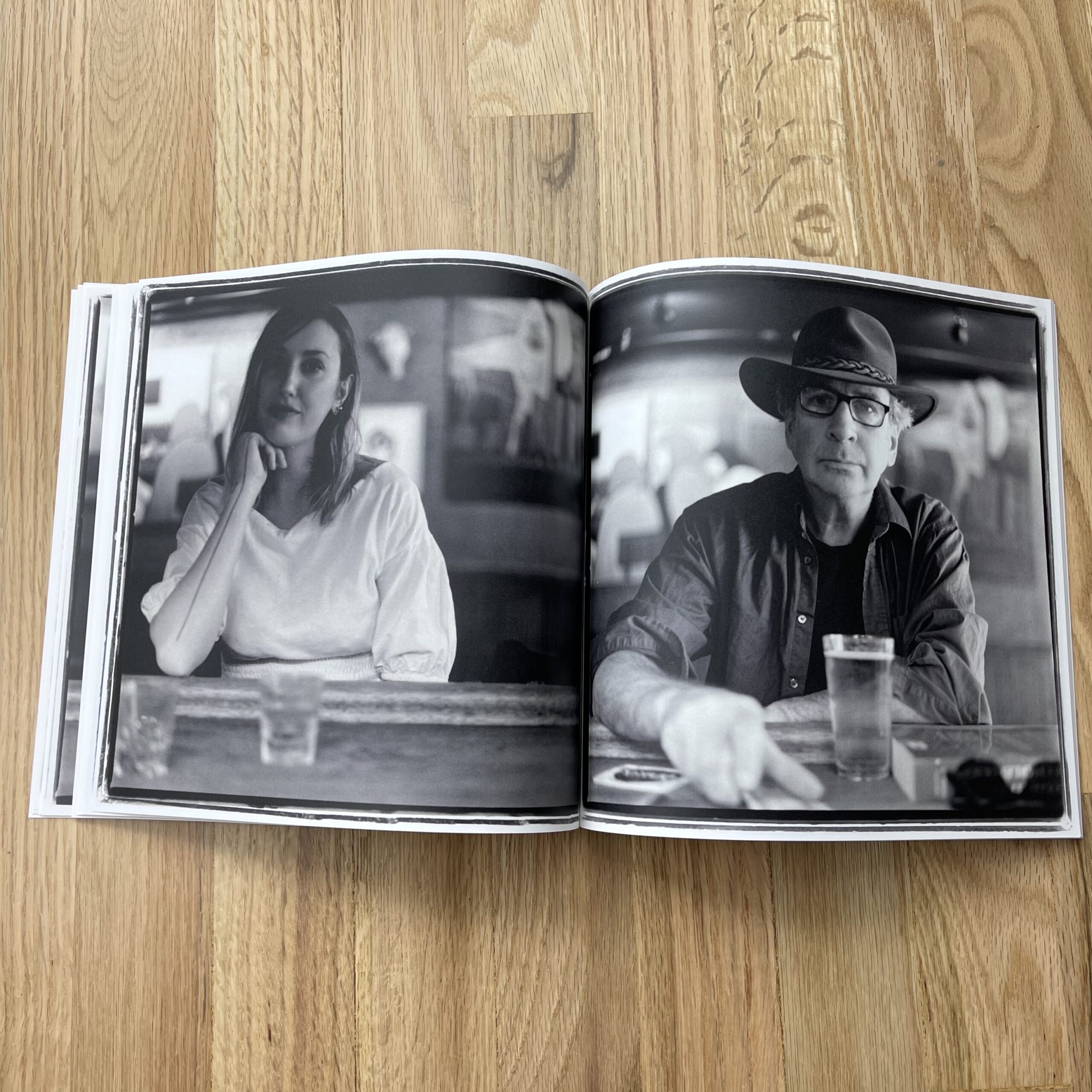
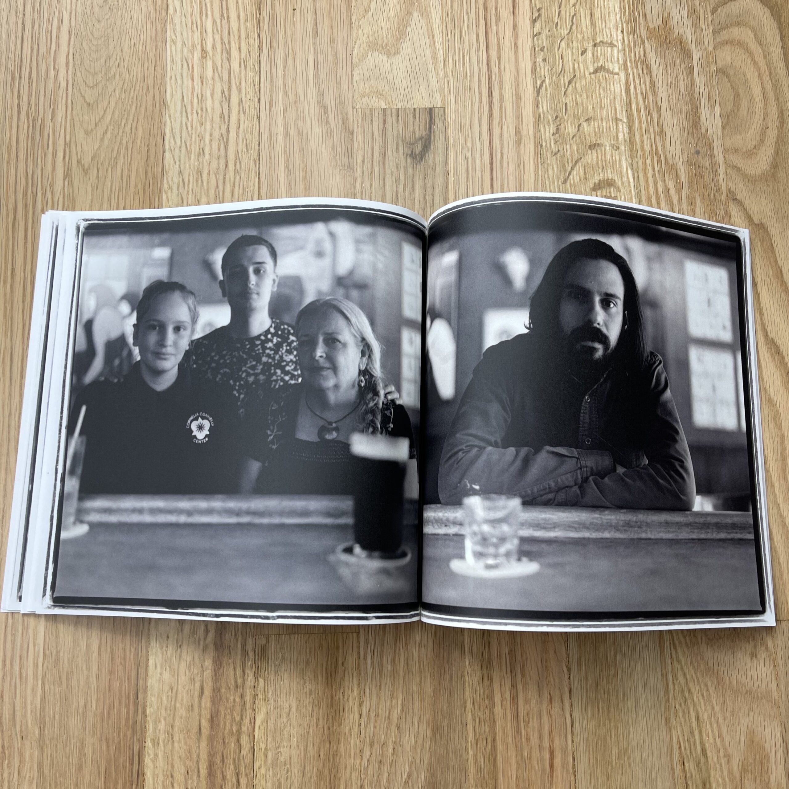
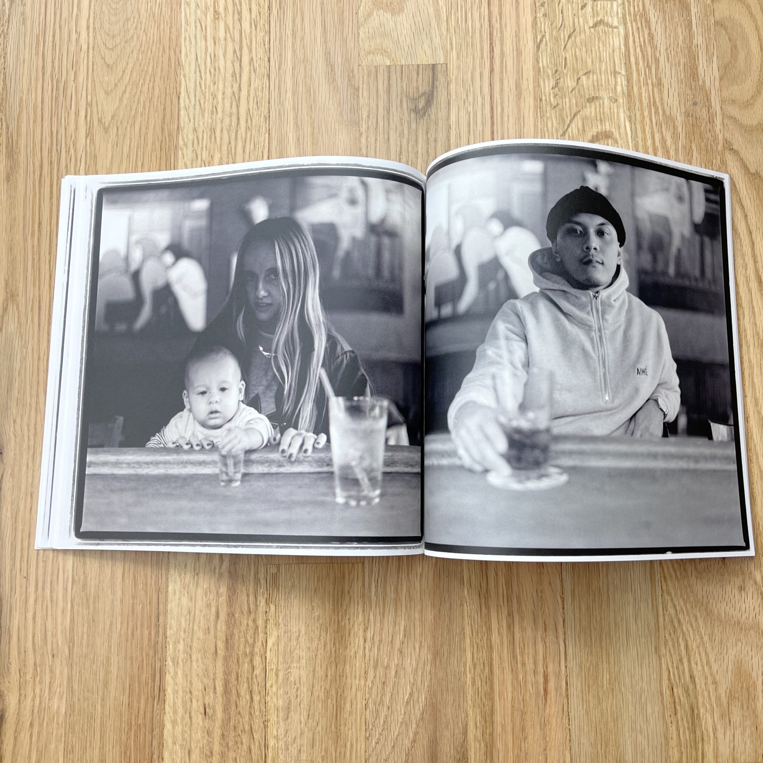
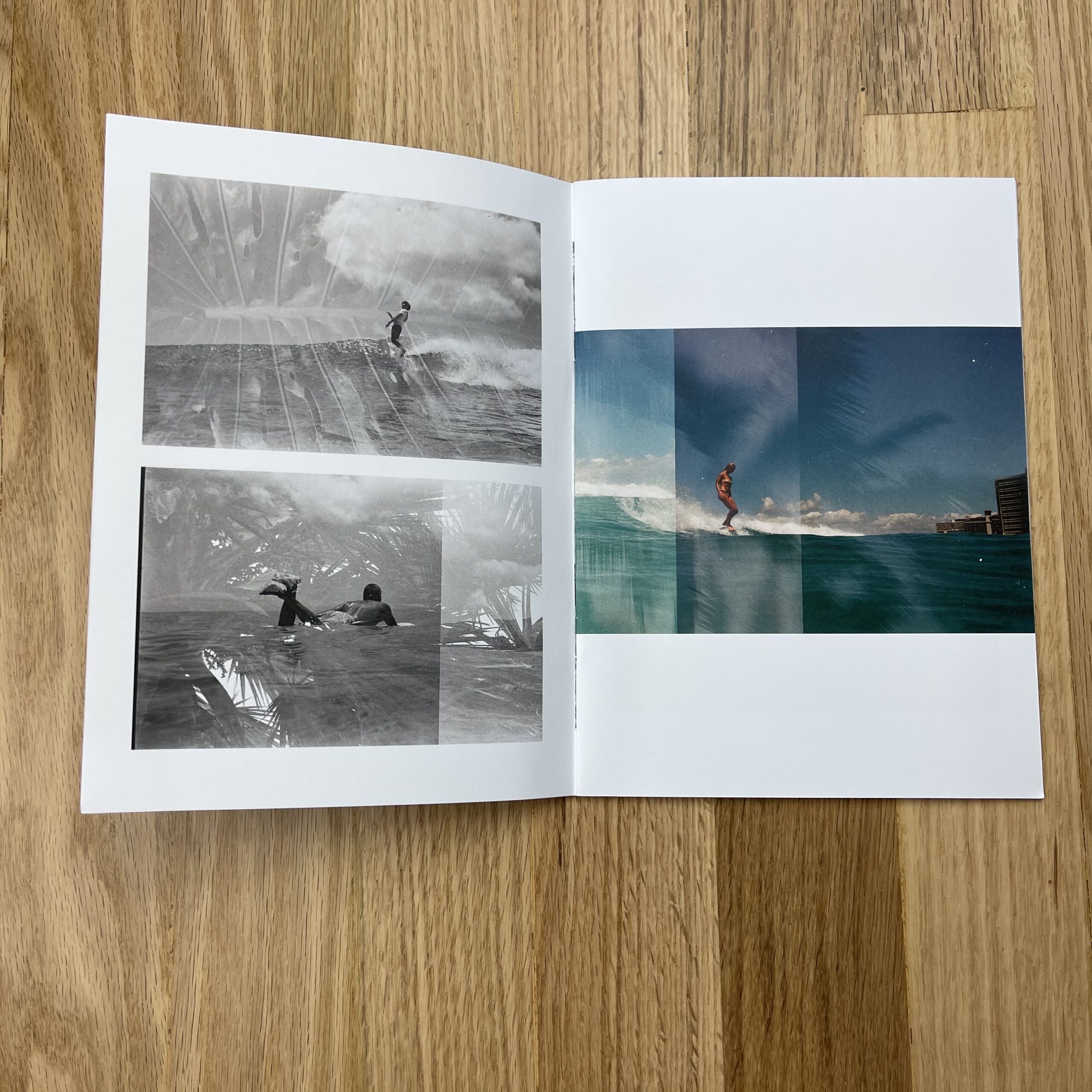
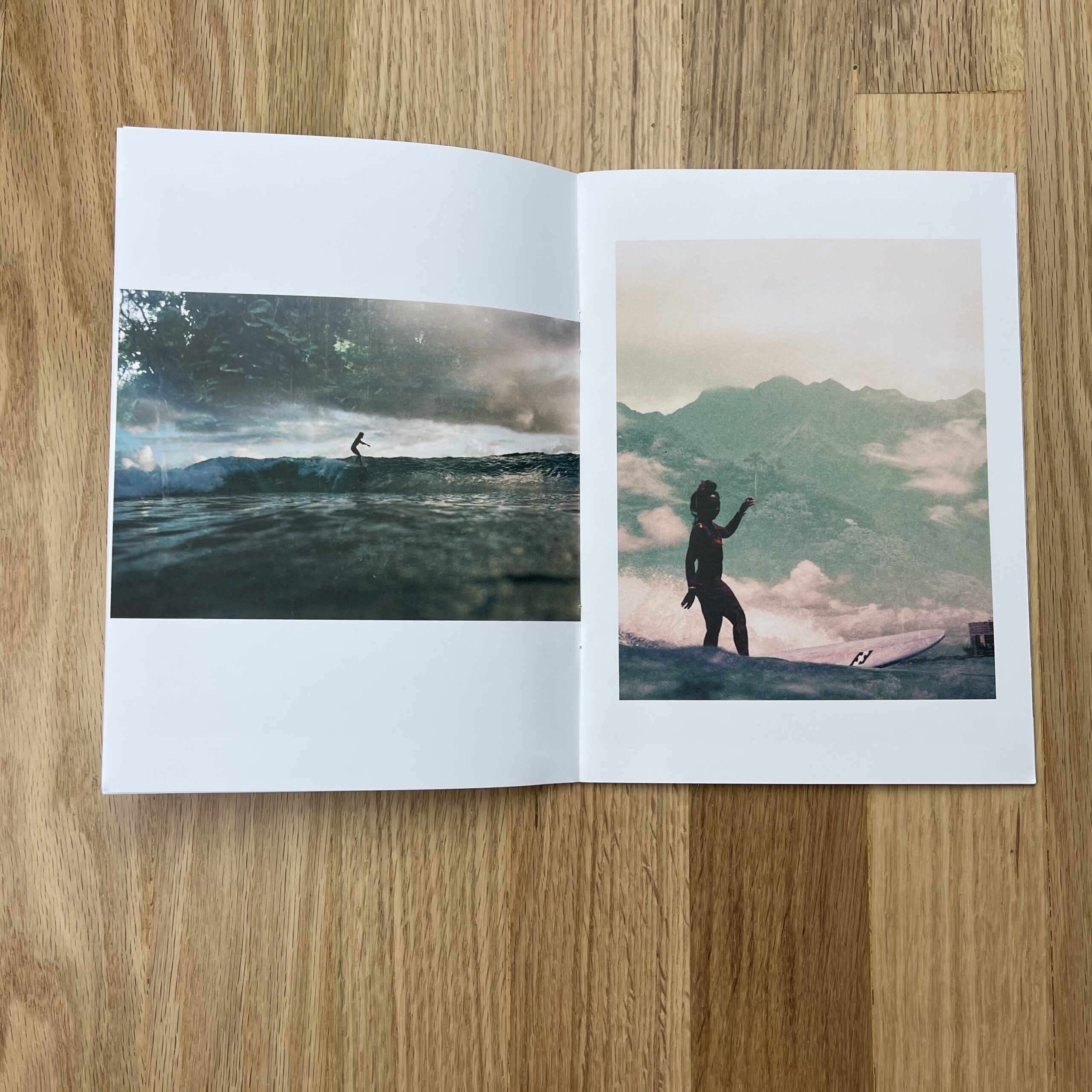
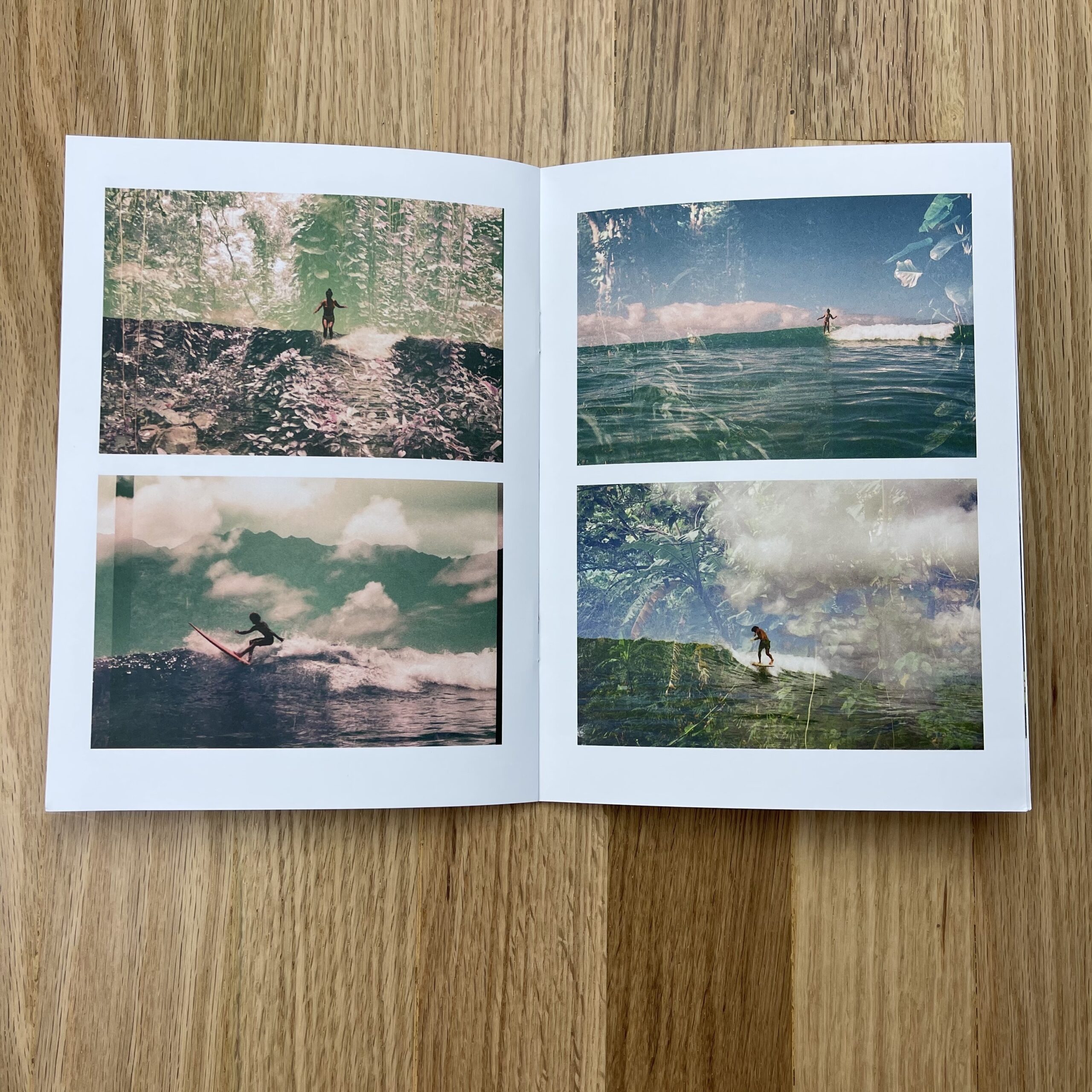
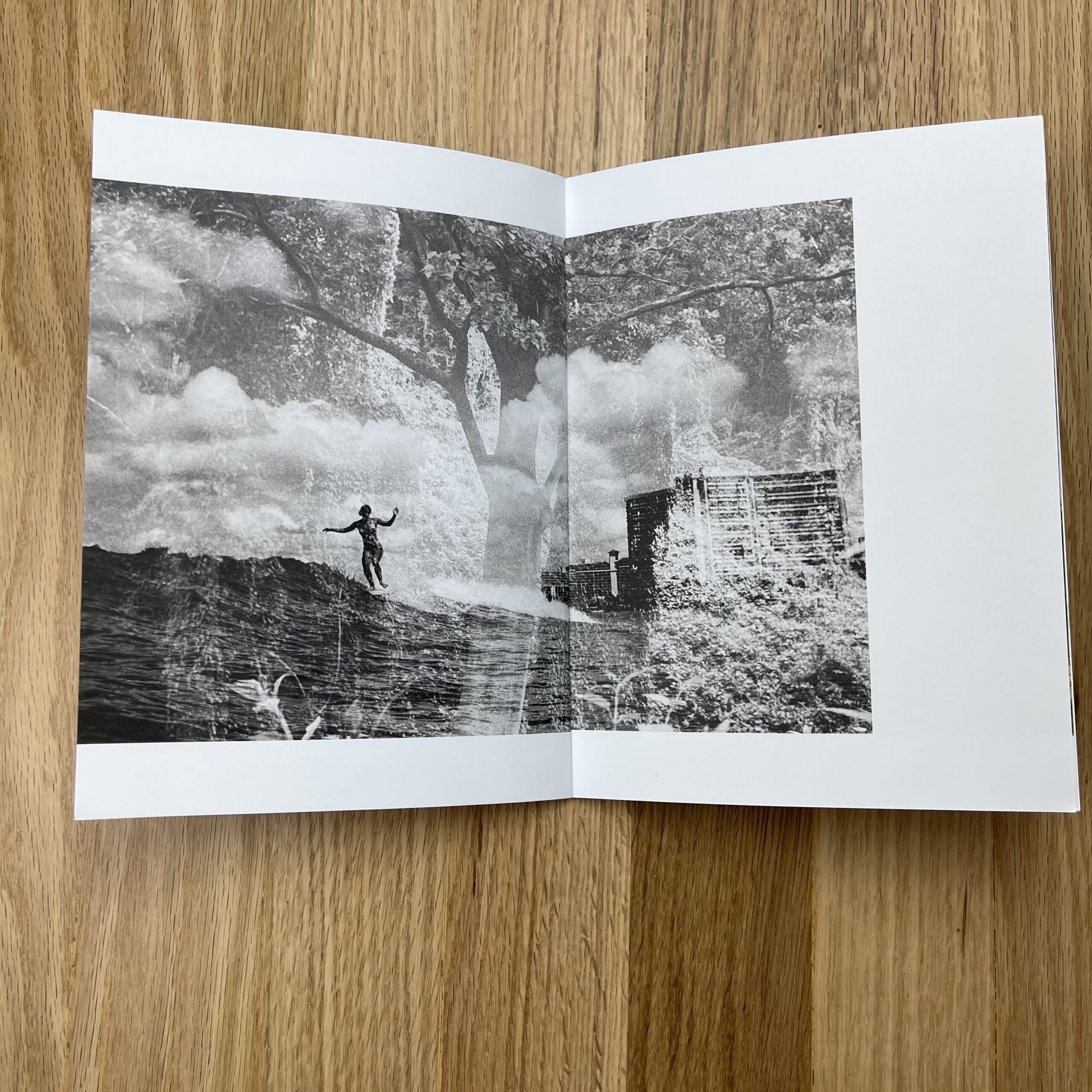
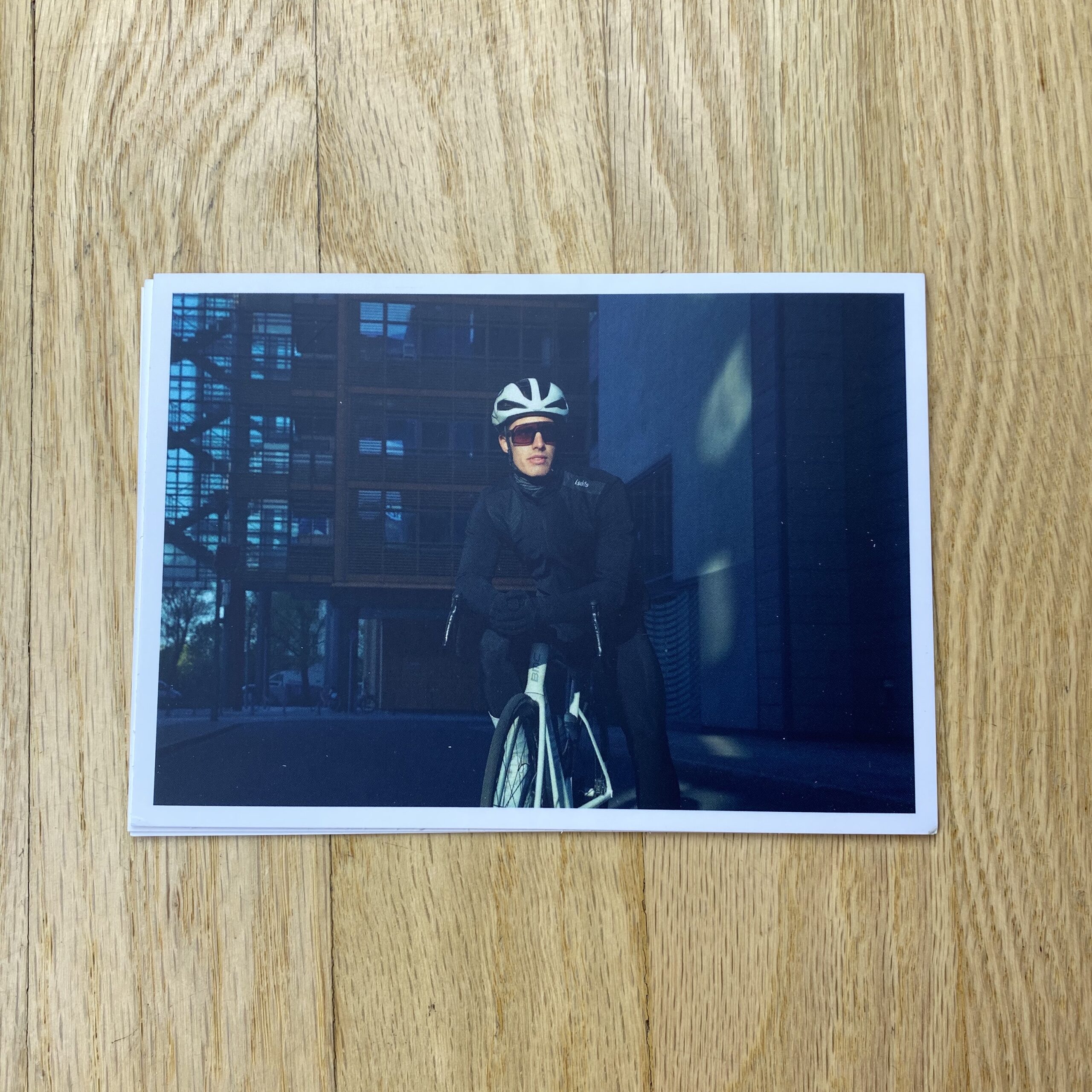
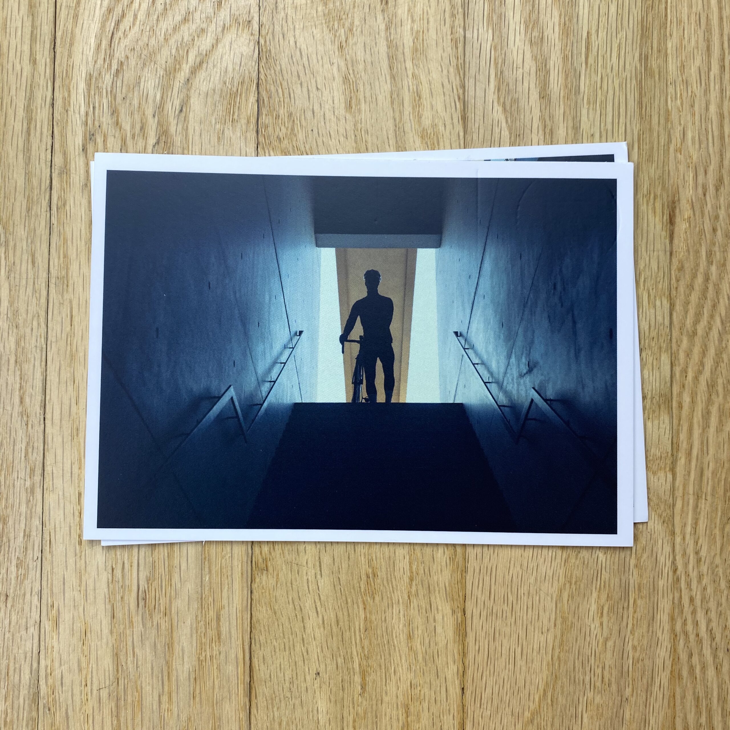
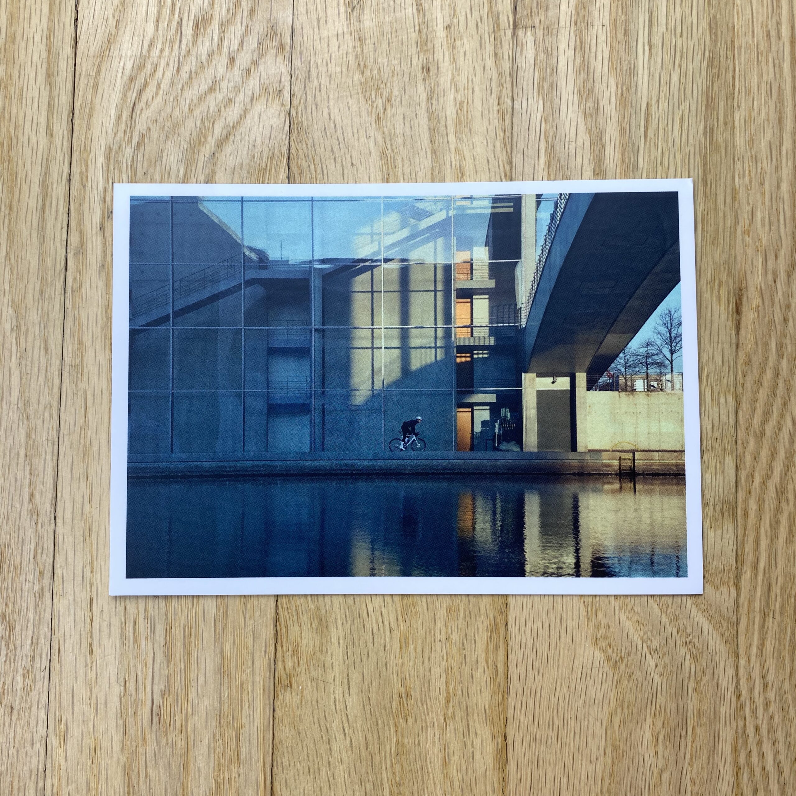
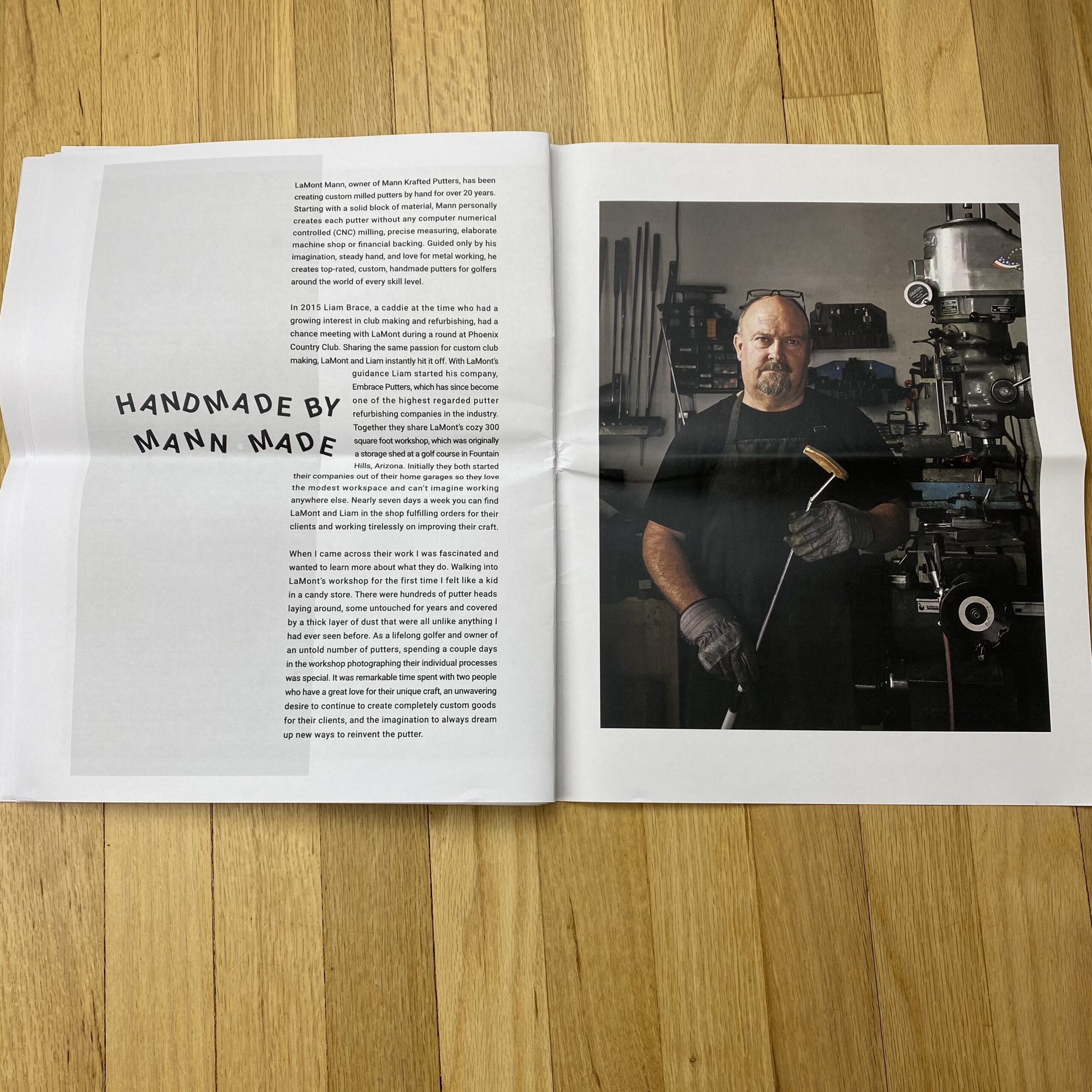
Tell me about the images?
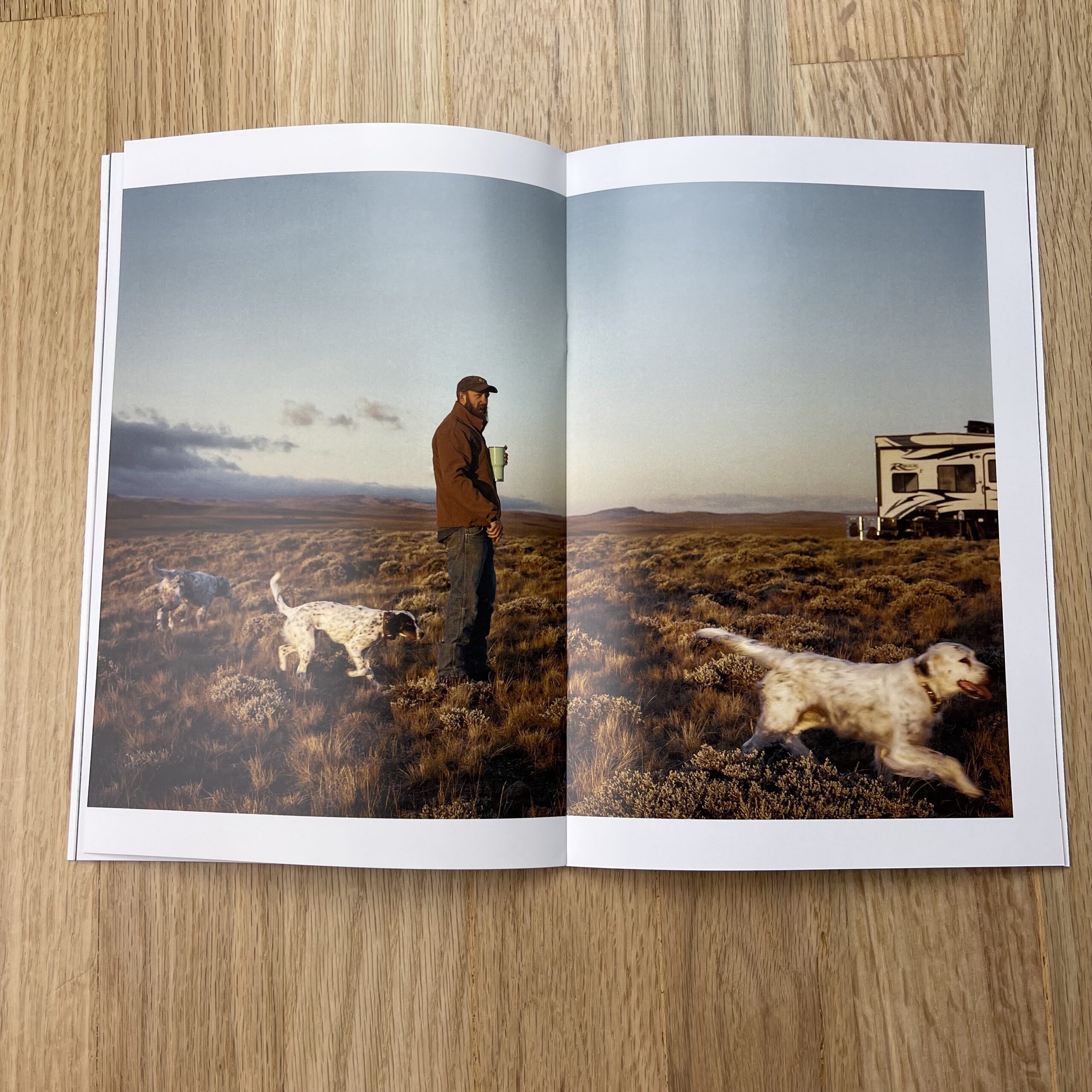
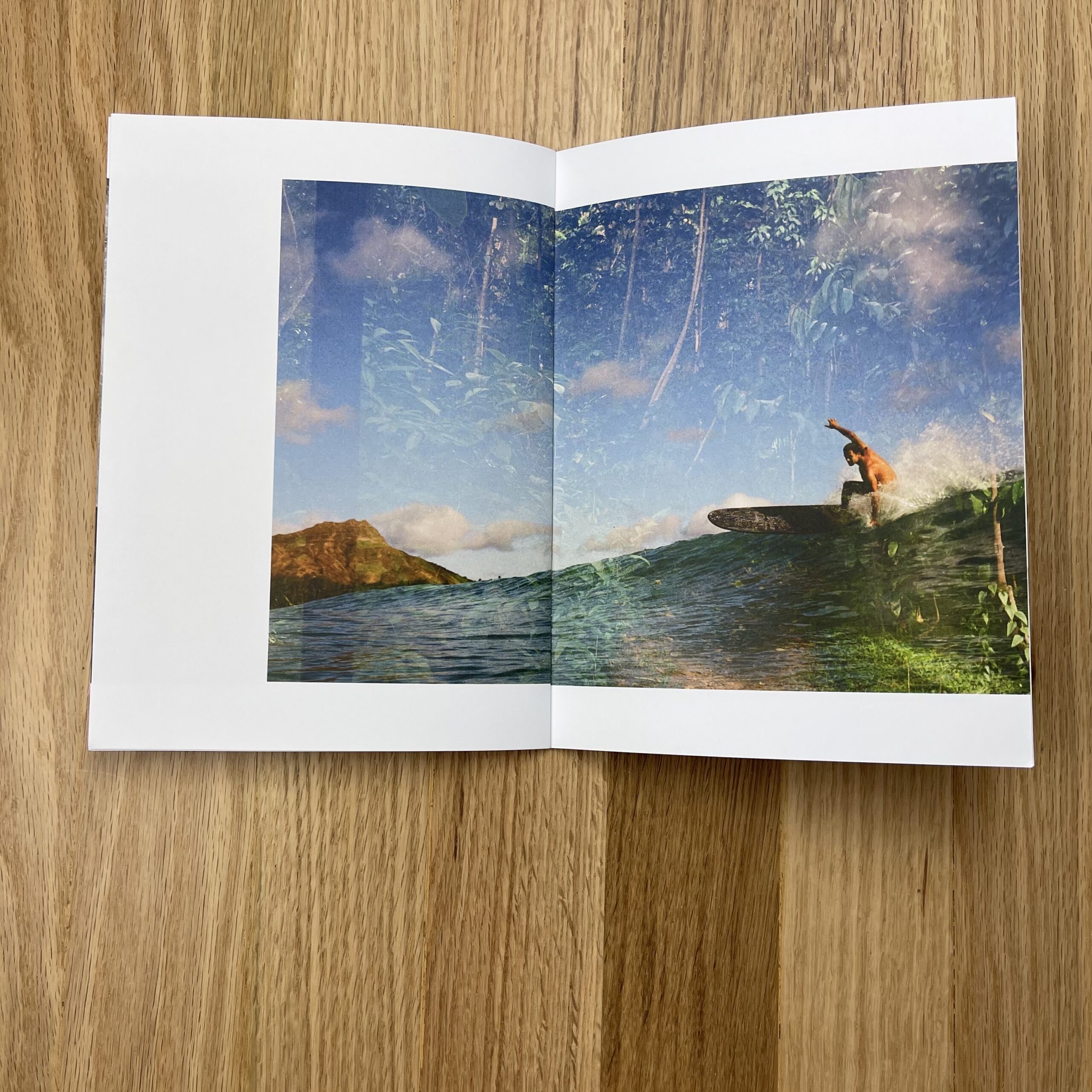
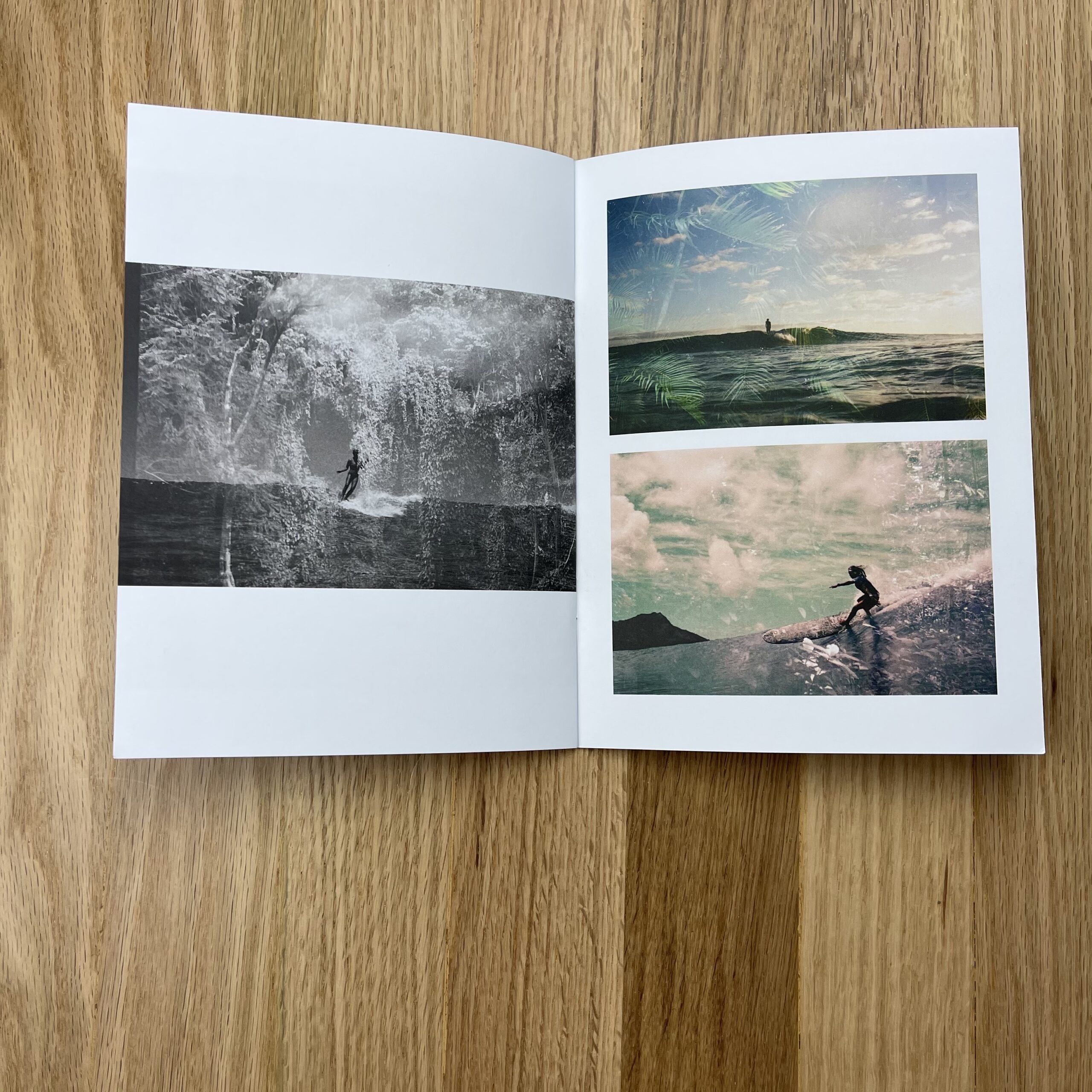
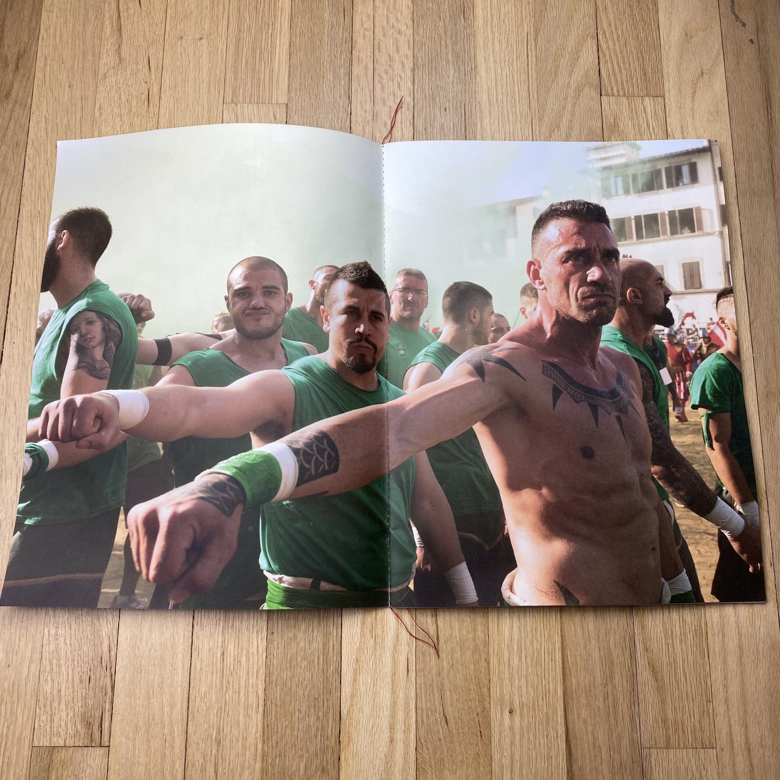
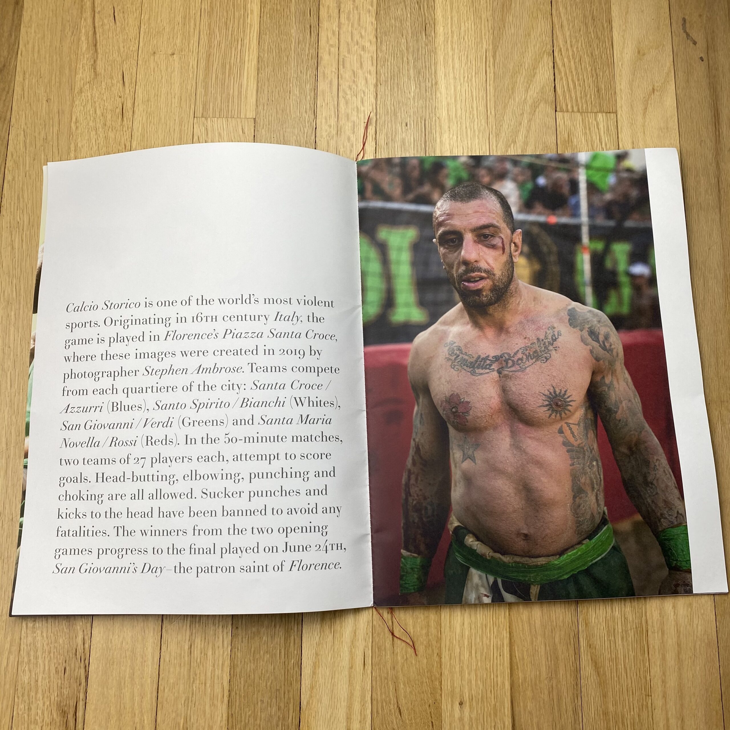
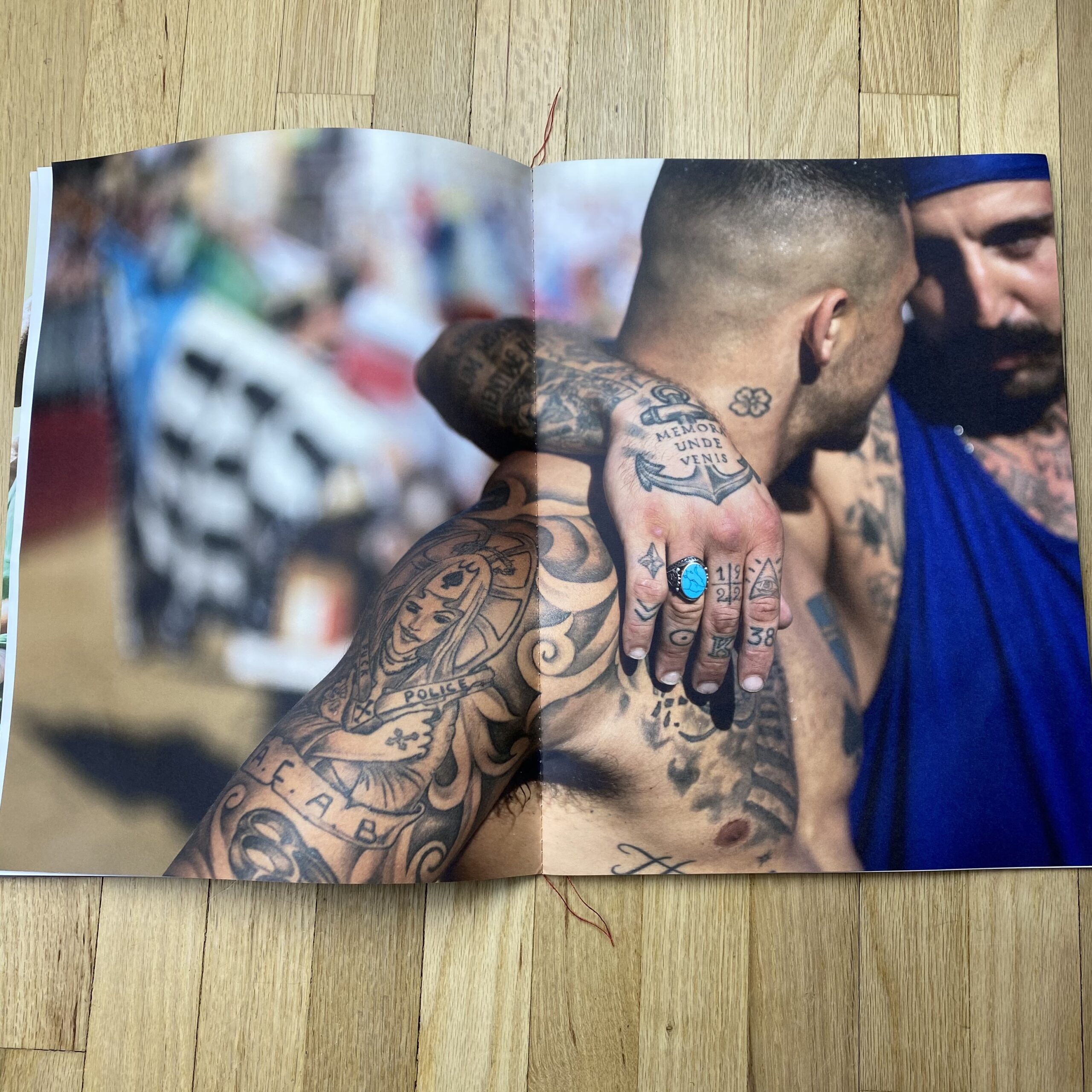
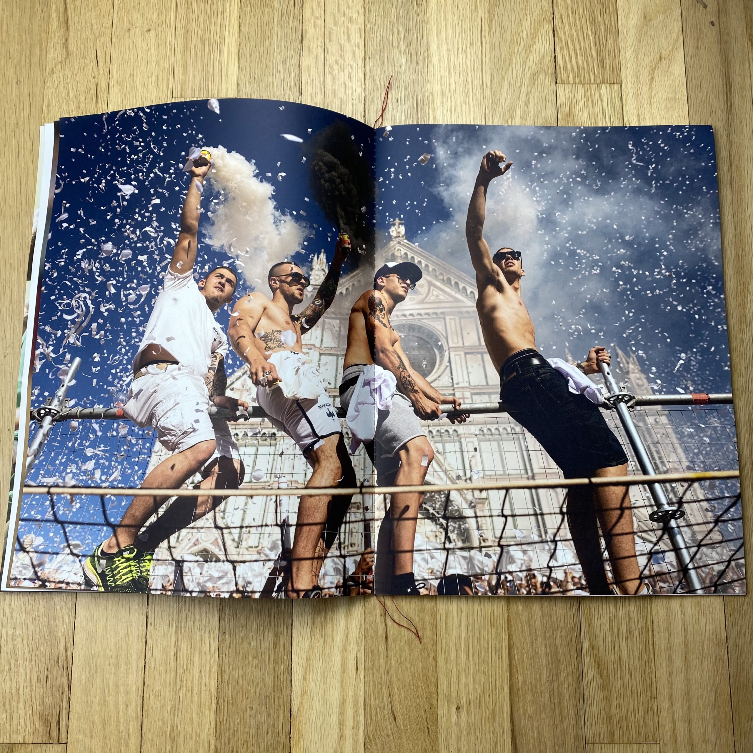
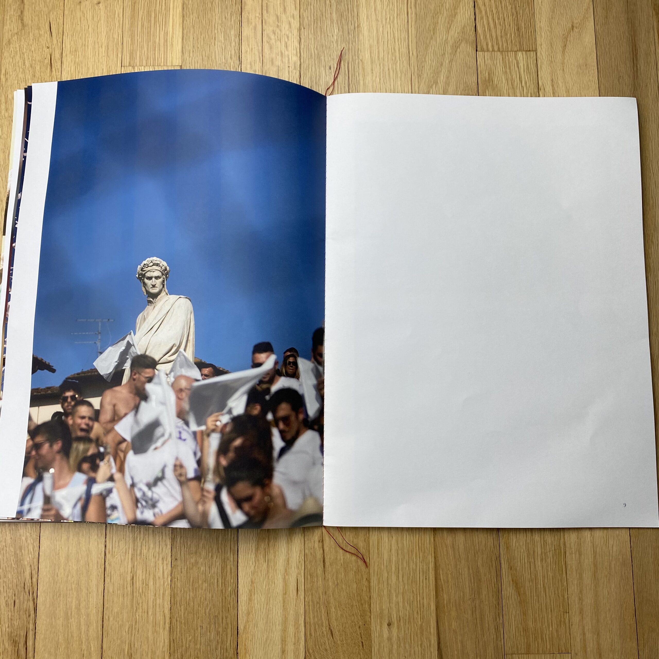
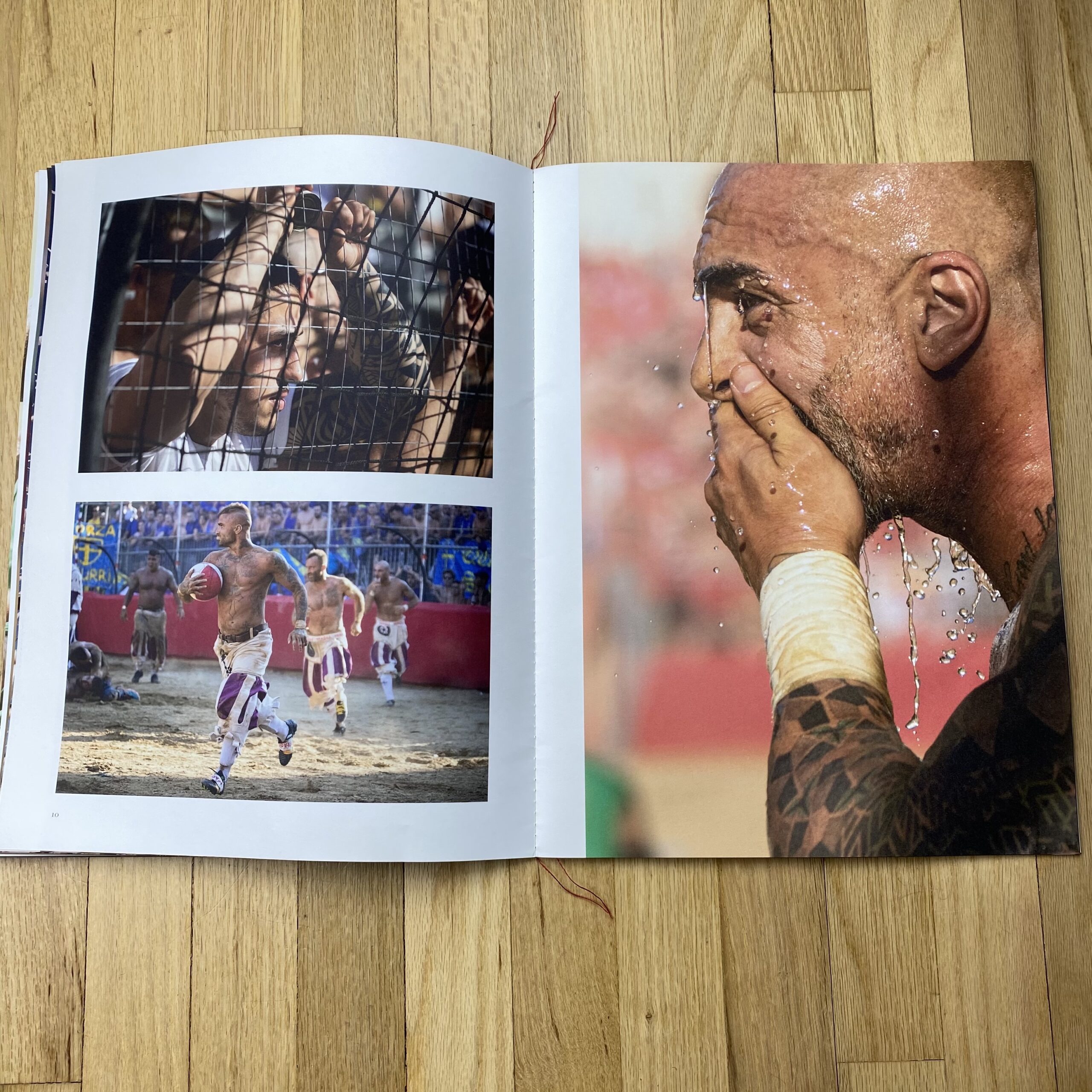
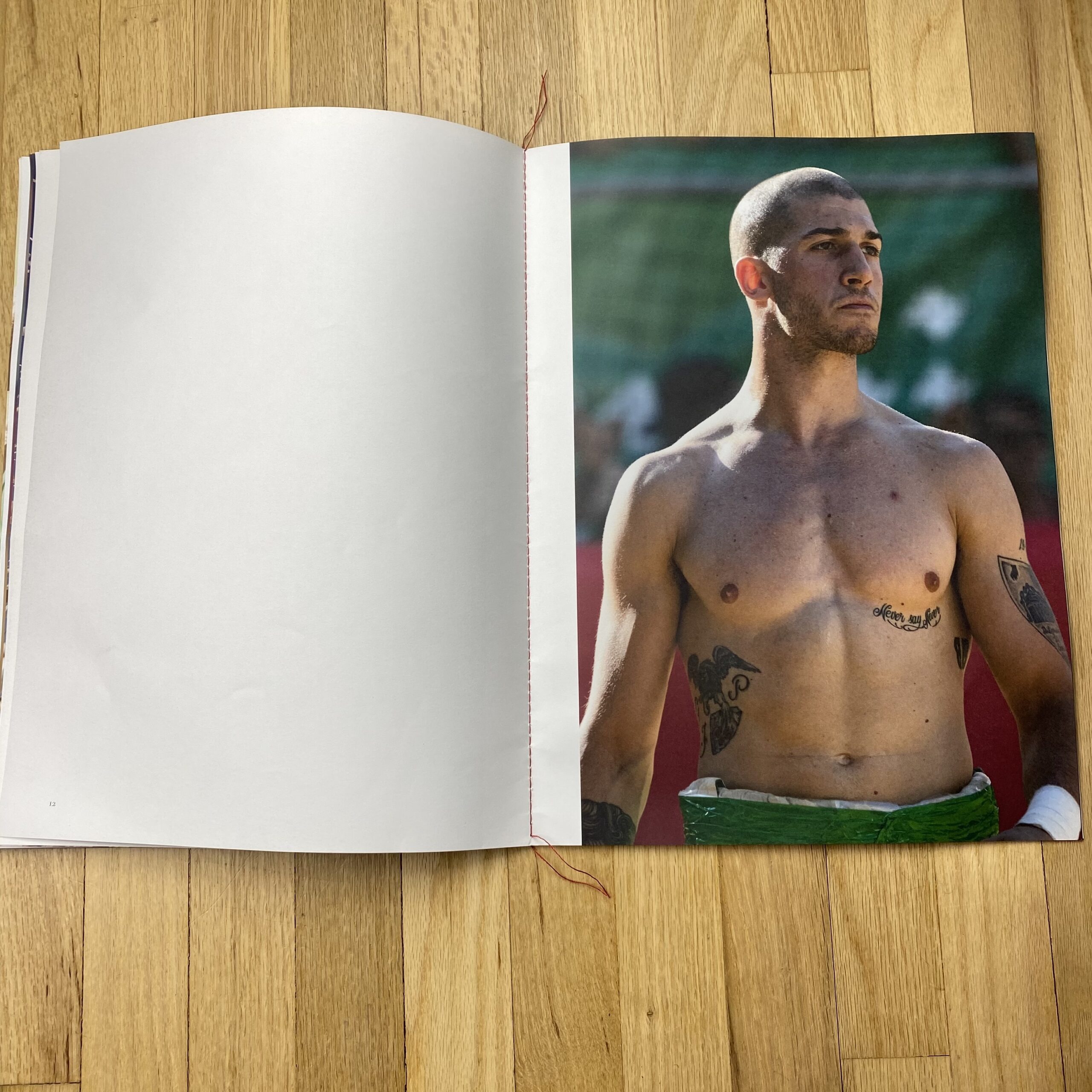
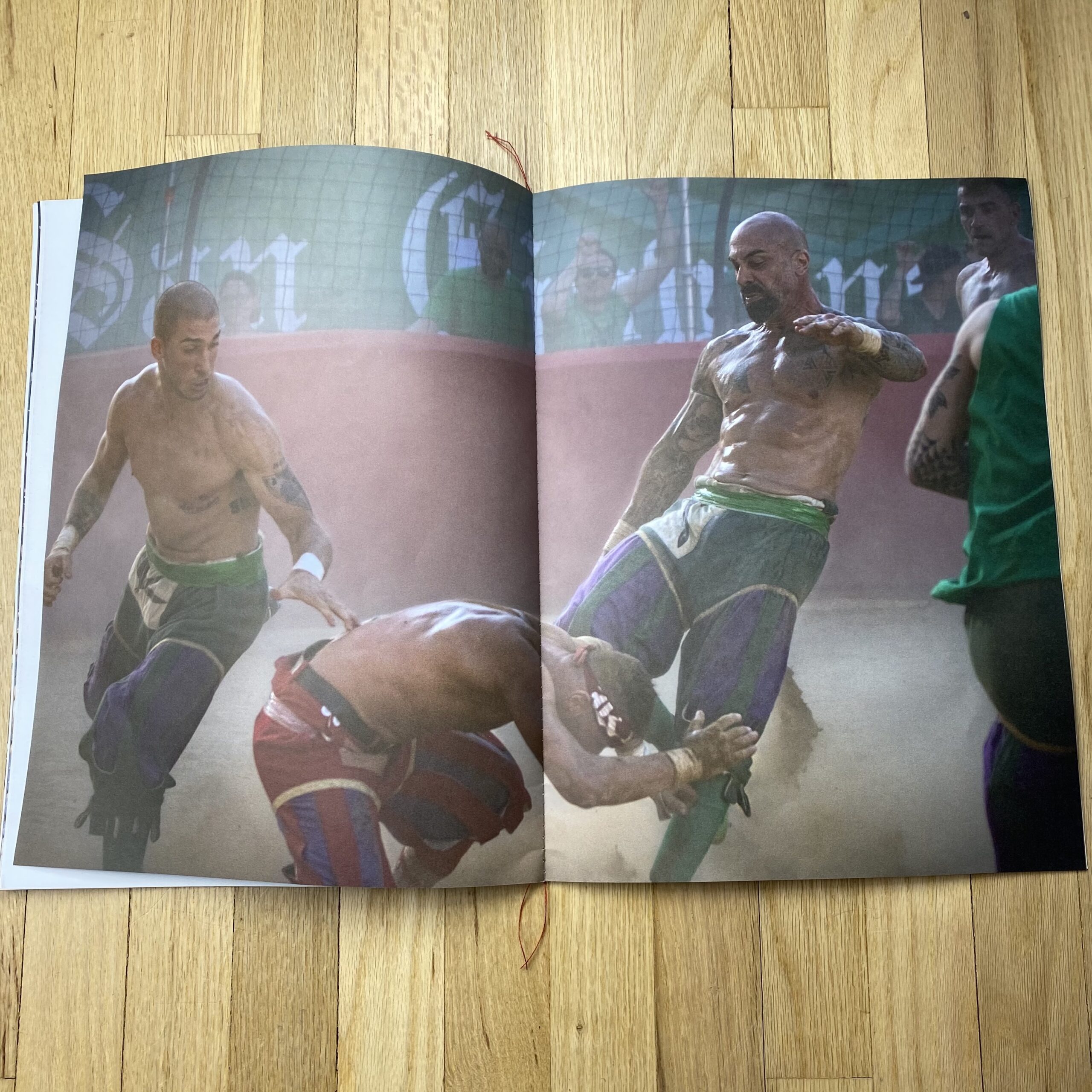
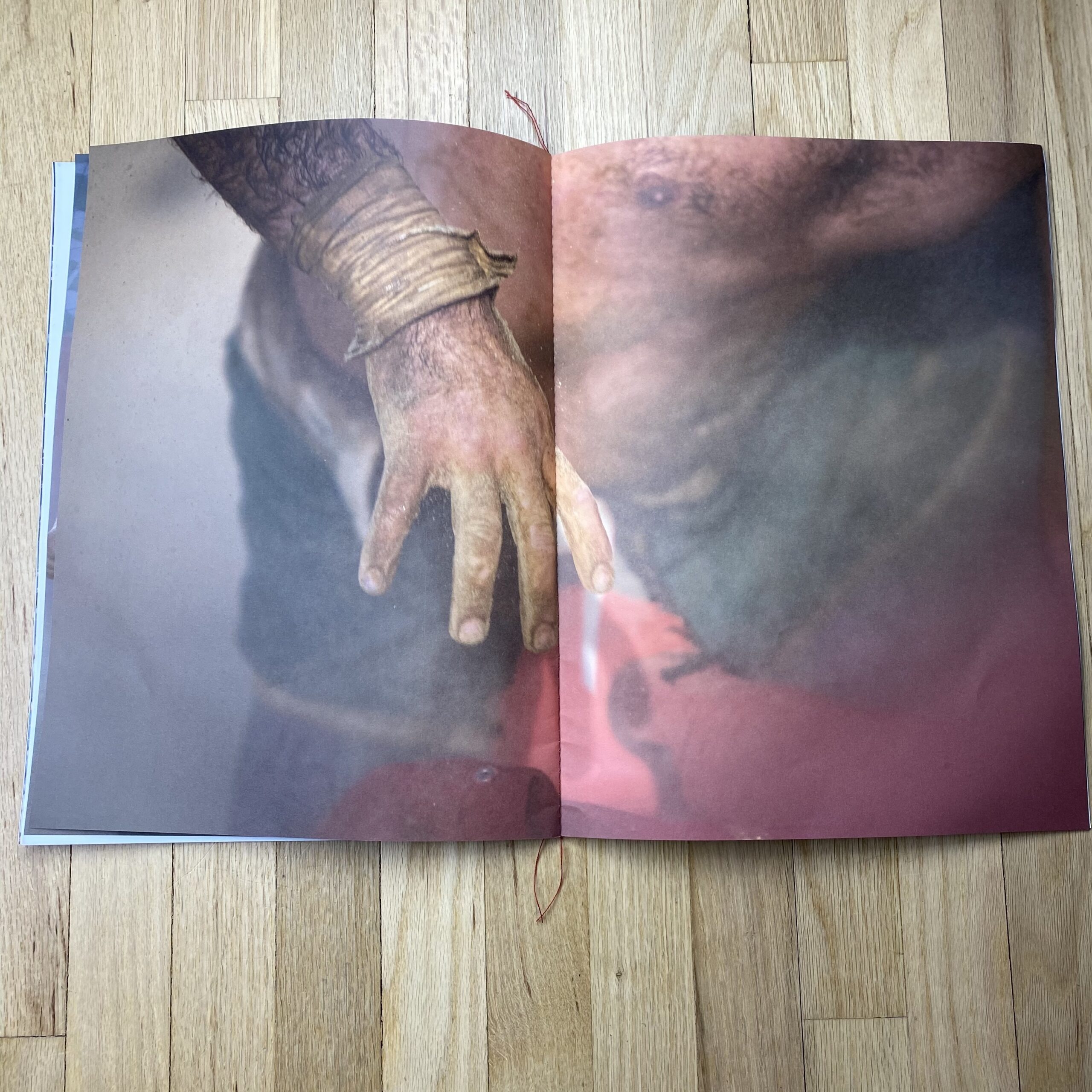
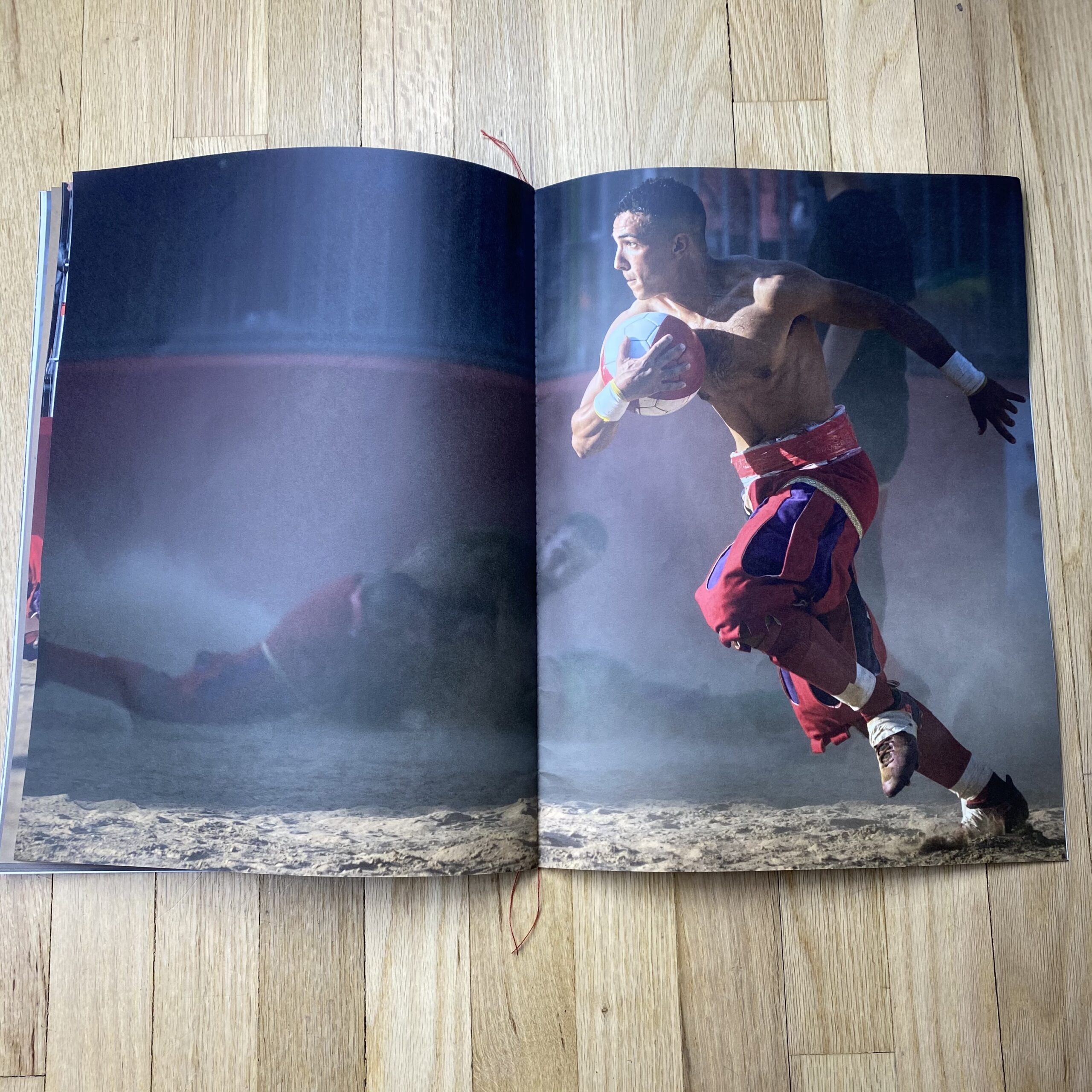
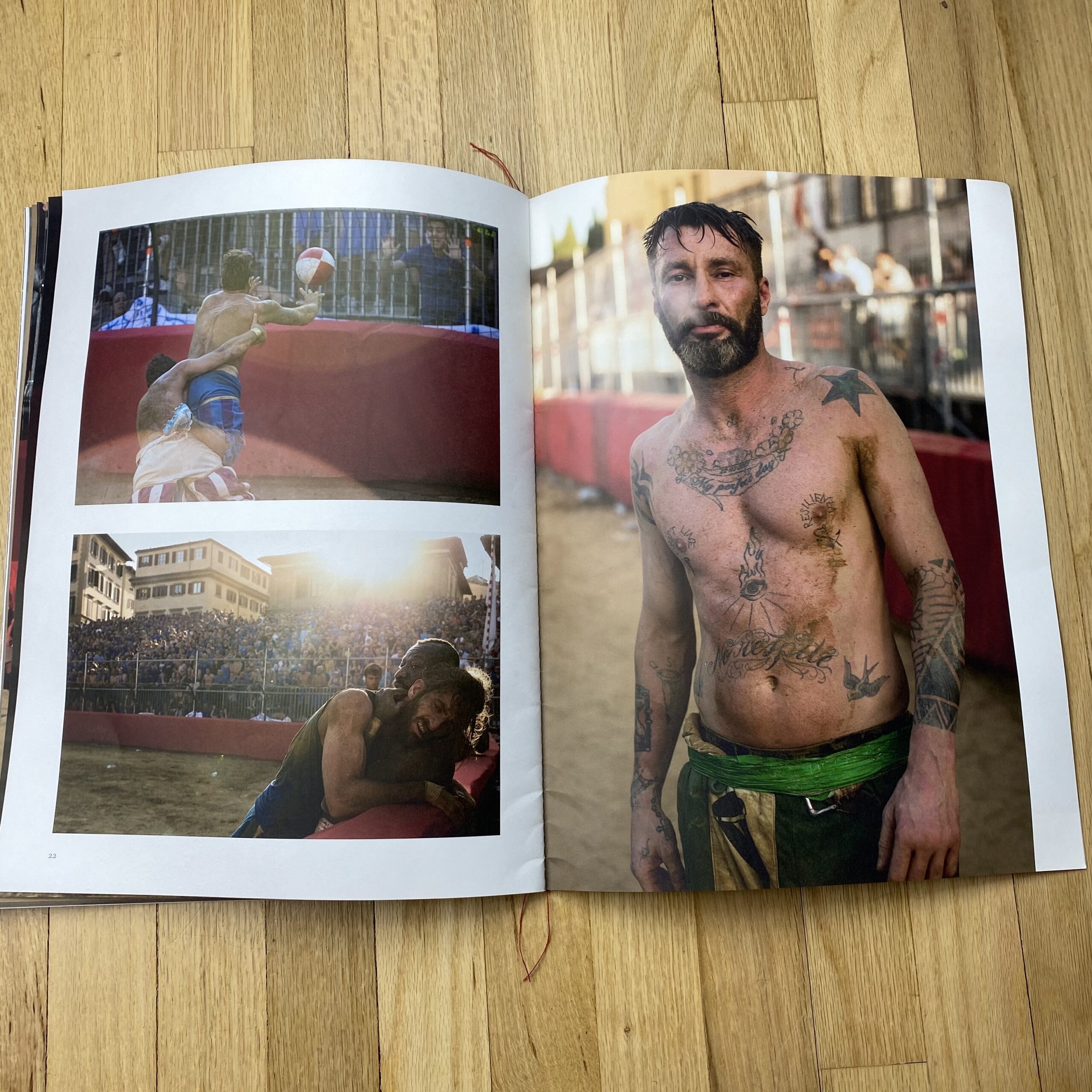
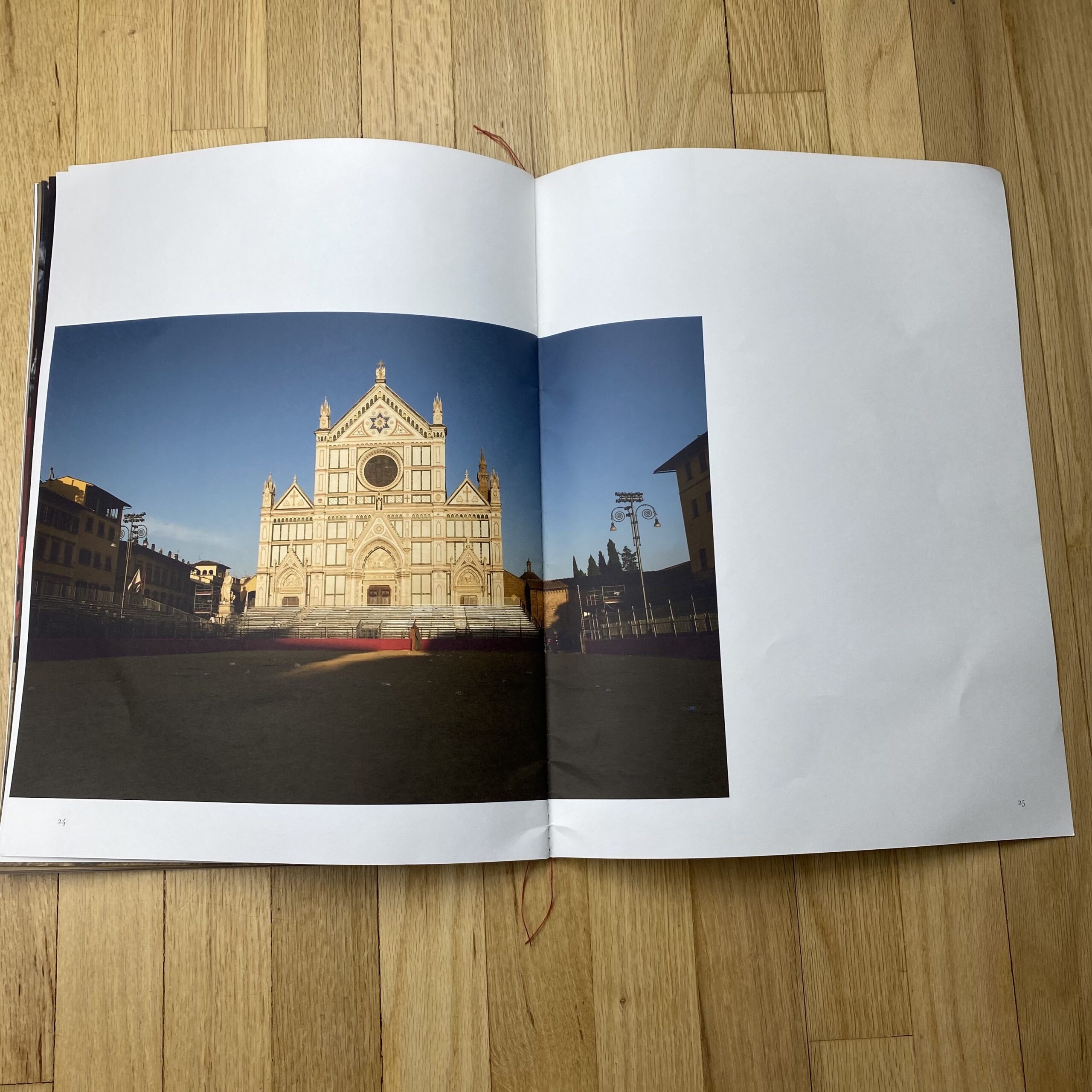
This project is from an historical sports event that’s fought every year in the Piazza Santa Croce, Florence, Italy on the third weekend of June with the final being played on the 24th June which is the Feast of John the Baptist. Four teams play and they represent the four districts of Florence. I first became aware of Calcio Storico after seeing a film that Vice magazine had shot a couple of years previously and having spent the best part of a year shooting footballers for Adidas I was inspired to turn my lens to other less well known sports. Something where no money was involved and it was about camaraderie and passion for the team game. The players live, work in, and represent the four districts of Florence. The objective was to make a project out of two 50 minute games which was going to be difficult as I needed portraits, action, violence, details and landscapes/overviews to make it a coherent body of work.
How did you gain access to the event?
I applied for a press pass from the Florentine government in January 2019 and didn’t hear anything back until 5 days before the first game, I’d been approved, I immediately booked a flight and hotel. Unfortunately, meanwhile I had just ruptured my main bicep tendon in my right arm which meant I couldn’t take any weight with my right arm/hand but I could operate the camera and with a long lens on you take the weight with your left hand. My last minute flight and hotel were non refundable and I didn’t know if I’d get this opportunity again so I had to go.
I got to Florence on the Friday afternoon and had to pick up the press pass from the press office. When I arrived they issued me with a press pass for the stands only. I pleaded for access all areas but to no avail. I knew I could not get the shots I wanted unless I could get right up to the barriers on the pitch. I needed the position to be up close and personal.
On game day I joined the procession through the streets but after a short while I headed off to the pitch. A security guard showed me to the stands and then I asked if I could walk around the pitch. He looked at my pass and said no. I explained my predicament but there was a language barrier. Undeterred I went to the gates. I introduced myself to another security guard and again tried to explain my plight. Again we had a language barrier, but amazingly he got his phone out and called his English speaking wife to translate. I explained about the press pass and my desire to get closer than the stands allowed and after a short conversation back with her husband she told me to ‘go in and stay in, get in against the barriers and it should be ok’. It was such a relief, that moment, that conversation was a real turning point that made the project what it is. So for two days and the two matches I did the same, wandered in and stayed in and nobody bothered me. Everyone else with fully visible ‘access all areas’ badges and me with mine turned over and tucked away. In the chaos that is Calcio Storico I’d got away with it.
How many did you make?
I had 250 printed with Paul Belfords initial idea being to have them stitched with cotton in the four colours of the teams but that turned out to be almost impossible so we opted to split the print run in to blue, green, white and red cotton that represented the four team colours, Azzuri, Verdi, Bianchi, Rossi. Which is also the wording we used for the front cover.
How many times a year do you send out promos?
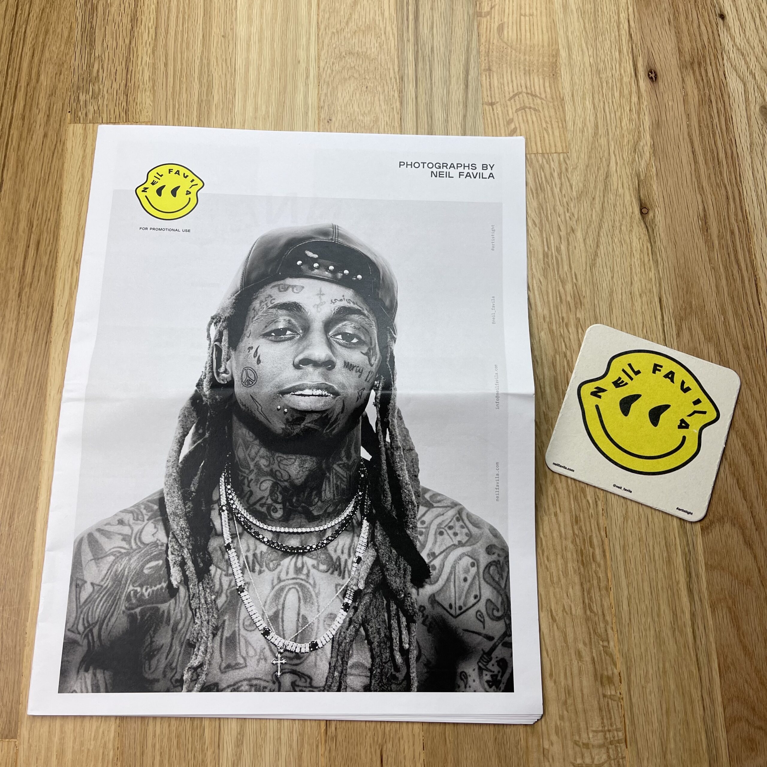
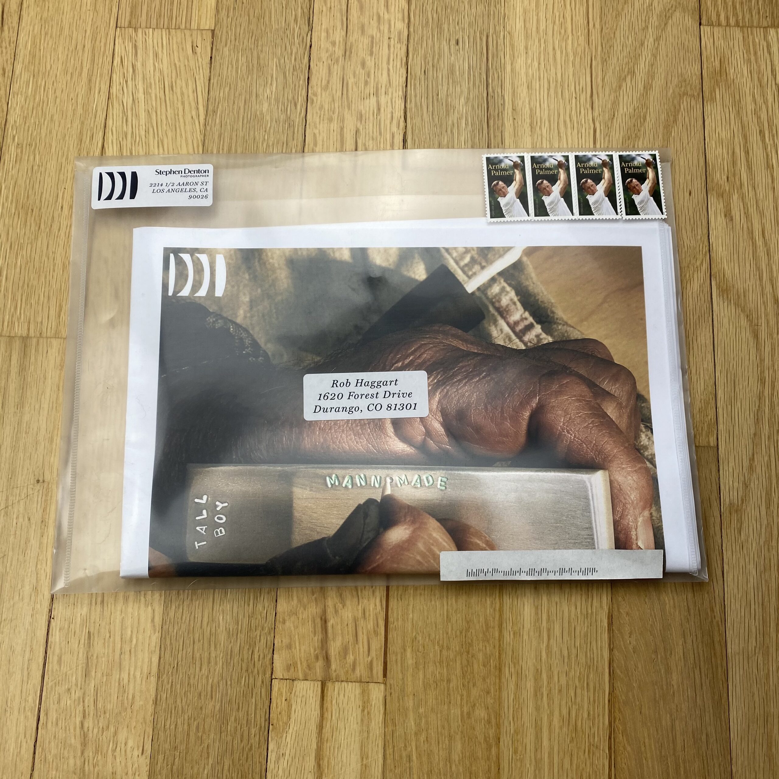
I usually send out postcards only once a year and this is the first book promo I’ve done.
Do you think printed promos are effective for marketing your work?
Yes definitely, at the moment more so as I think clients appreciate something tactile. But generally it is a good introduction to getting through the door with your folio.